
 Español
The use of grating has increased significantly in construction projects. This is due to its versatility making it perfect for many areas where other types of products would”™ve been considered before.
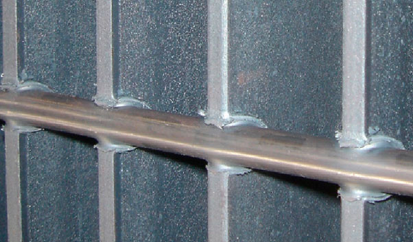
In industrial markets, grating is usually used in platform and industrial floors, as well as on stairs, ramps, storm drains, and among many others.


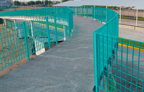
Regarding its architectural aspect, and due to its modern design and variety of finishes, grating fabricated products adapt perfectly to the construction environment; in addition, provide great durability and security. A wide variety of Architectural Products are available, such as: fences, benches, louvers, hand railings, balconies, and others.
When it comes to choosing a quality material, grating is an excellent option for many reasons: it can be custom fabricated to fulfill specific drawings requirements (custom fabricated grating); it has different loads capacities (Types of Grating); and, above all offers high resistance and elegance. It is also a product that can be found in different finishes, such as: natural steel, black anticorrosive enamel and galvanized.
| Natural Steel | Black Paint | Galvanized |
Доска объявлений https://oren-i.ru удобный сервис для размещения и поиска объявлений. Продажа, покупка, услуги и работа. Быстро публикуйте объявления и находите нужные предложения в вашем городе.
Инженерные изыскания https://sever-geo.com для строительства в Твери — геология, геодезия и экология участка. Комплексные исследования для проектирования и строительства. Точные данные, соблюдение норм и оперативные сроки выполнения.
Разработка сайтов https://domenanet.online на Laravel — современные веб-проекты с высокой скоростью и безопасностью. Индивидуальные решения, интеграции и масштабируемая архитектура для бизнеса любого уровня.
Солянка Парк https://tzstroy.su жилой комплекс с современными квартирами и удобной инфраструктурой. Отличный выбор для жизни с комфортом и доступом ко всем необходимым объектам.
Online football match statistics https://www.soccer-stand.com.az live scores, events, and live broadcasts. Follow games in real time, analyze teams, and never miss a beat.
Авто портал https://tvregion.com.ua новости, обзоры и тест-драйвы автомобилей. Актуальная информация о новых моделях, технологиях и рынке. Узнавайте все о машинах и выбирайте авто с удобным сервисом.
Авто портал https://autoguide.kyiv.ua свежие новости, обзоры и тест-драйвы. Рейтинги автомобилей, советы по выбору и актуальные предложения. Все о мире авто в одном месте.
Авто журнал https://psncodegeneratormiu.org новости, обзоры и тест-драйвы автомобилей. Узнавайте о новых моделях, технологиях и рынке. Полезные советы, рейтинги и аналитика для автолюбителей.
Авто журнал https://nmiu.org.ua свежие автомобильные новости, тесты и обзоры. Рейтинги, сравнения и рекомендации по выбору авто. Все о мире автомобилей в одном месте.
Авто портал https://retell.info обзоры автомобилей, тест-драйвы и новости рынка. Сравнения моделей, рейтинги и советы по выбору авто для любых задач.
Авто журнал https://bestauto.kyiv.ua тест-драйвы, обзоры и новости автоиндустрии. Узнавайте о новинках, технологиях и трендах рынка. Удобный формат для чтения каждый день.
Онлайн авто журнал https://simpsonsua.com.ua новости, обзоры и тест-драйвы автомобилей. Актуальная информация о рынке и новых моделях для автолюбителей.
Авто журнал онлайн https://translit.com.ua все о машинах: новости, тесты, обзоры и аналитика. Следите за новинками и выбирайте авто с удобным сервисом.
Автомобильный журнал https://mirauto.kyiv.ua новости, обзоры и тесты автомобилей. Советы по выбору, рейтинги и аналитика. Все о машинах и рынке авто.
Авто портал https://nerjalivingspace.com автомобильные новости, тест-драйвы и обзоры. Узнавайте о новинках, технологиях и тенденциях рынка. Удобный сервис для автолюбителей.
Все самое свежее здесь: https://listai.pro
Полная версия статьи: https://listai.pro
Женский портал https://muz-hoz.com.ua мода, красота, здоровье и психология. Советы, тренды и полезные статьи для современной женщины. Удобный онлайн формат для ежедневного чтения.
Строительный портал https://zip.org.ua все для ремонта и строительства в одном месте. Актуальные статьи, советы экспертов, обзоры материалов и технологий. Найдите подрядчиков, сравните цены и выберите лучшие решения для дома, квартиры или бизнеса быстро и удобно.
Лучшие профессии дистанционные курсы профессиональной переподготовки на няню в москве возможность получить практические знания и освоить востребованные специальности в короткие сроки. Обучение подходит для тех, кто хочет начать карьеру или сменить сферу деятельности. Все материалы доступны онлайн и сопровождаются поддержкой преподавателей.
Нужен грузовик? https://neotruck.ru компания «НЕО ТРАК» — это современный дилерский центр полного цикла, работающий на рынке коммерческого транспорта и спецтехники уже более 20 лет. Являясь официальным дилером ведущих производителей, таких как DONGFENG, JAC, FAW, DAEWOO TRUCKS, ISUZU, HYUNDAI и других, компания предлагает широкий выбор грузовых автомобилей различной тоннажности, спецтехники, от фургонов и бортовых платформ до эвакуаторов и крано-манипуляторных установок.
The decision between proxy types shapes your entire account management infrastructure, and https://npprteam.shop/en/articles/media-buying/proxy-guide-for-ad-accounts-mobile-vs-residential-vs-datacenter/ walks you through the technical architecture, compliance implications, and performance metrics you need to evaluate. Modern media buyers face increasing pressure from platform enforcement teams that actively test IP reputation, device fingerprints, and login patterns to catch fraud and policy violations, making proxy selection a strategic business decision rather than a technical afterthought. The resource covers emerging detection evasion techniques, region-specific proxy requirements, and how to architect a hybrid proxy strategy that balances legitimate access patterns with operational cost. By mapping proxy characteristics to your account portfolio, campaign volume, and geographic targeting needs, you unlock the ability to manage larger account networks without sacrificing security or triggering platform review.
In evaluations of digital storefront platforms focused on structure and performance, a strong example is Harbor Stone Market Hub where nice layout with clear sections and straightforward navigation flow, helping users explore products efficiently through clean and organized sections.
Across different e-commerce UX studies emphasizing clarity, a strong example is Lake Raven Shopping Guildfront which maintains the site looks structured and information is easy to locate, supporting a seamless browsing experience with well organized content sections.
Across various e-commerce interface reviews emphasizing clarity and flow, a strong example is Opal Grove Experience Hall where simple interface and content feels neatly arranged throughout the pages, allowing users to browse comfortably through well balanced and structured pages.
In evaluations of modern retail systems built for clarity and flow, a strong example is Ember Stone Global Vault where clean and modern look makes the browsing experience quite pleasant, helping users access information quickly without confusion or unnecessary clutter.
While browsing through several online sources, I encountered a polished coastal corner and I appreciated how everything was arranged, making the experience much more enjoyable and easy to engage with.
While reviewing different creative portfolios and personal websites, I found something placed in the middle take a look here and it appears pretty interesting, making it worth exploring further because of its thoughtful layout and content
pole-haus.com – Really nice design and easy browsing experience overall today here
While reviewing e-commerce platforms designed for clarity and responsiveness, a standout example is Summit Amber Digital Marketplace which ensures smooth experience overall, pages feel fast and easy to use, providing a seamless browsing experience without confusion or unnecessary interface complexity.
During a UX comparison of ecommerce systems for navigation clarity and flow I examined a product listing page featuring a href=”//iciclegrovemerchantmart.shop/](https://iciclegrovemerchantmart.shop/)” />Icicle Mart Grove Merchant Exchange within a structured grid system, – Everything feels simple and straightforward without any distractions ensuring smooth transitions between sections and an easy to understand browsing experience overall
Across various e-commerce experience evaluations focused on usability, a notable example is Icicle Lakefront Network Mart where simple layout and information is easy to find at a glance, helping users interact with a clean, efficient, and easily navigable interface.
I had been scrolling through a variety of articles and perspectives when something stood out midway explore this space and it definitely has a refreshing style that makes the content feel engaging and easy to connect with
In the middle of reviewing food culture and dining platforms, I found something that caught my attention explore curry page and it stood out, looking flavorful and full of character with a strong culinary impression
During a comparative UX analysis of online retail interfaces for structure and usability I navigated a catalog page featuring a href=”//emberforesttradingpost.shop/](https://emberforesttradingpost.shop/)” />Ember Trading Post Forest Network inside a sidebar panel, – everything felt smooth and easy to browse which made moving between sections simple and efficient without unnecessary friction
While browsing through different property information and listing platforms, I noticed something mid-content check property page and it has a nice presentation that clearly outlines what is being offered in an easy-to-read format
During a long browsing session, I encountered this simple trade hub and it seemed like a well-maintained platform with content that was carefully organized and thoughtfully presented overall.
While browsing various football club and sports update websites, I encountered something mid-content visit this team site and it is a football club page with engaging match information and regular updates
While exploring different productivity and document workflow solutions, I came across something embedded mid-way view this platform and it appears to be a useful document solutions platform that is efficient, structured, and user friendly
While analyzing multiple online marketplace interfaces for usability benchmarking and structural clarity, I came across a browsing dashboard containing Summit Lemon Digital Store inside a grid layout, and – everything was arranged neatly, making it easy to locate items and move through categories without confusion or unnecessary effort.
In the middle of browsing through various educational sources and research materials, I came across something that stood out take a look here and it seems quite informative, potentially offering useful insights for many people
While browsing different election campaign and civic information websites, I encountered something mid-content visit this site and it is a political page sharing policy direction and campaign vision in a clear and accessible format
As I continued going through various digital exhibition and art gallery platforms, I encountered something within the text see more here and it offers a creative concept that makes navigating through the different sections quite enjoyable overall
In the middle of reviewing nonprofit health organizations and charity initiatives, I found something that caught my attention explore charity page and it is a foundation dedicated to hair restoration support and global awareness campaigns
As I continued exploring various youth education and nonprofit programs, I noticed something embedded in the content learn more here and it represents a kids focused organization that is educational and community driven in a meaningful way
As I was going through various informational and social initiative websites, I encountered something within the text explore this initiative site and it is an important initiative overall, with content that feels meaningful and well presented in a thoughtful manner
While examining nature protection websites and ecological awareness platforms, I came across content including river swan safeguarding initiative embedded in environmental conservation discussions – this emphasizes efforts to protect mute swans living in river and wetland systems while promoting sustainable habitat management and increased public understanding of biodiversity preservation importance
As I was reviewing different immunization and public health websites, I found something embedded in the text visit vaccine portal and it is a helpful vaccination resource with clear and structured community oriented information
As I explored home design resources and granite installation portfolios, I came across craft stone page – The visuals are quite impressive, showing solid work and a clear level of craftsmanship in every displayed example.
As I spent time browsing various curated shopping experiences online, I included worth a look in the middle of this sentence – the concept felt fresh and the items appeared thoughtfully selected to create a balanced presentation.
As I looked through smaller media platforms and local reporting sites, I found grassroots commentary hub – The writing reflects a strong local voice, and a few of the viewpoints presented are compelling enough to deserve another read-through.
As I continued browsing real estate and property pages, I found something placed within the text explore property site and it has a polished modern style that makes it easy to navigate through pages smoothly
During research into rock concert listings and live performance announcement websites, I came across Sebastian Bach tour live page embedded in event-related content – it delivers continuous updates on live shows, helping fans follow upcoming performances and stay informed about the artist’s touring schedule and stage appearances
While reviewing different creative arts and community engagement websites, I noticed something embedded mid-content check this page and it is an art focused community platform inspiring exhibitions, events, and creativity
While analyzing several retail-style vendor platforms and their information hierarchy systems, I found that clarity in grouping plays a major role in user experience Trade Collective Orchard Portal – The interface maintains a steady flow that helps users understand sections quickly and move between categories without feeling lost.
Get the resource – Information is segmented into logical chunks, so each part builds naturally on the previous one.
As I continued browsing community forums and opinion-sharing platforms, I found something placed within the text views discussion network and it seems like a place for meaningful discussions and thoughtful interaction among users
As I continued exploring various transportation and mobility information websites, I noticed something embedded in the content learn more here and it serves as a transport information site helpful for commuters with daily updates
While testing different ecommerce UI prototypes for usability and interface clarity I explored a product grid containing a href=”//dawnlakefrontgoodsatelier.shop/](https://dawnlakefrontgoodsatelier.shop/)” />Dawn Goods Lakefront Atelier Hub embedded in a catalog module, – the site looks neat and functions smoothly across different sections which makes browsing feel easy and free from unnecessary complexity
While browsing emotional health platforms and support websites, I discovered healing guidance link – The approach feels refreshingly direct, offering useful insights without unnecessary complexity or filler material.
The strength of this collection – Each creative suggestion is paired with realistic steps, so you never feel like you’re just dreaming without a way forward.
What stands out about this funny corner of the web – The overall mood is so positive and cheerful that you cannot help but feel more entertained after visiting.
As I was reviewing different lifestyle blogs and personal storytelling websites, I found something embedded in the text visit lifestyle page and it feels very genuine overall, with content that comes across as relatable and naturally written
As I browsed through vacation rentals and charming getaway locations, I discovered island retreat link – The place has a welcoming and calm vibe that instantly made me think about planning a trip to Hawaii.
In the middle of browsing through utility and information-based websites, I came across something that stood out see this info site and it is straightforward and useful, making the content easy to understand quickly and without effort
phiferforcongress – Political campaign website shares candidate vision and policies community focus
What I really value about this group’s resource hub – Is that it never feels performative; instead, every article and post seems driven by a genuine wish to inform and empower readers.
During browsing of jewelry design websites and handmade artisan boutiques, I discovered content including artistic handmade jewelry gallery integrated within product pages – it showcases creative jewelry pieces that highlight craftsmanship, cultural inspiration, and distinctive design elements for customers seeking unique wearable art pieces
In the middle of exploring educational websites and school information pages, I encountered something mid-content explore school site and it looks professional and welcoming, giving a strong first impression that feels clean and well designed
While browsing personal portfolio examples and clean web designs, I discovered simple showcase page – The layout is modern and uncluttered, and it works beautifully on mobile where everything remains easy to access and read.
During a long browsing session where many sites felt cluttered and difficult to follow, I eventually encountered this organized shop page right in the middle, and I liked how clearly everything was arranged, which made exploring much easier and more enjoyable.
Консультацию психолога https://психолог38.рф в Иркутске можно получить в центре Психолог38. Здесь работают высококвалифицированные специалисты: детские психологи, клинические, семейные и индивидуальные. Мы собрали профессионалов разных направлений, чтобы комплексно подходить к решению запросов клиентов. Бережно, деликатно, с научным подходом. Сложные ситуации в нашей жизни встречаются не редко, и своевременная помощь, поддержка очень важна. Находясь среди людей, легко можно оказаться в одиночестве, один на один со своими проблемами. Если вы ищите лучших психологов, которые реально помогают людям, обратите внимание на нашу организацию.
The first thing that grabbed me about this oddly named site – Is how the unusual title makes you curious, and thankfully the material inside lives up to that initial intrigue very well.
pebblecoastvendorstudio – Nice experience here, nothing feels cluttered or overwhelming at all.
From a small business perspective, this supportive online resource – Is a goldmine of practical tips, offering guidance that feels both achievable and relevant to real‑world challenges.
Консультацию психолога https://психолог38.рф в Иркутске можно получить в центре Психолог38. Здесь работают высококвалифицированные специалисты: детские психологи, клинические, семейные и индивидуальные. Мы собрали профессионалов разных направлений, чтобы комплексно подходить к решению запросов клиентов. Бережно, деликатно, с научным подходом. Сложные ситуации в нашей жизни встречаются не редко, и своевременная помощь, поддержка очень важна. Находясь среди людей, легко можно оказаться в одиночестве, один на один со своими проблемами. Если вы ищите лучших психологов, которые реально помогают людям, обратите внимание на нашу организацию.
During usability comparison of multiple ecommerce systems focused on navigation efficiency and layout performance evaluation I reviewed a product feed containing Rapid Coast Emporium Shop inside a grid layout and found the interface consistent simple and easy to browse without any confusion.
During my review of various e-commerce inspired web interfaces built for experimental design analysis and speed testing I explored Shop Kettle Commerce Space – and experienced a smooth interface with fast loading pages and consistent visual hierarchy across all browsing sections during the session.
While casually reviewing some content online, I noticed something that seemed worth pausing for, check it out, and from a quick glance, it gives the impression of being something that deserves a bit more attention
I was going through various online discovery pages when something appeared right in the middle of the content, visit here now, and it feels very fresh with an easy browsing flow that makes everything simple and pleasant
The engaging tone on this show business website – Makes you want to explore more, because each piece of content seems designed to leave you with a smile or a new favorite thing.
As I was going through several different platforms and ideas, I encountered something that appeared right in the flow, see this resource, and from what I observed briefly, it actually looks like a decent site with content worth reviewing further
Information architecture specialists and online media reviewers often evaluate websites to determine how clearly data and articles are presented for general readers clear_browse_interface – The structure makes navigation straightforward helping users understand sections quickly while moving through content that feels logically arranged and easy to follow overall
While browsing creative exhibition websites online, I came across something naturally placed within the content flow, visit hill exhibition page, and the presentation feels visually engaging with artistic and well structured details overall
While browsing through entertainment and casual discovery websites, I noticed something mid-content check fun page and it looks interesting overall, feeling like a fun casual destination that is light and enjoyable
While browsing various niche shopping platforms and boutique listings online, I recently came across a resource that felt surprisingly detailed and user friendly, especially when it highlighted different store categories and navigation options at Opal Trail Boutique Hall Official Page which made the overall exploration feel smoother and I ended up bookmarking it for future reference due to its clean structure and helpful browsing experience that encourages further investigation.
While reviewing different plant care and gardening inspiration platforms, I noticed something embedded mid-content check this page and it provides beautiful gardening content that feels calming and highly informative for beginners today
Across multiple online retail usability analyses, a notable example is Stone Harbor Global Hub which ensures nice layout with clear sections and straightforward navigation flow, delivering a structured and highly responsive browsing journey throughout the site.
My browsing session felt average until I came across this organized collective hub in the middle, and I found the experience pleasant because the content and layout felt well balanced and easy to follow.
During a casual browsing session across real estate websites, something appeared in the middle of content, have a look, and the platform feels professional and well structured with a strong focus on property presentation and usability
People researching nearby medical support systems sometimes rely on curated directories that highlight essential vaccination information, where they encounter local vaccine information page – This resource is considered helpful for presenting organized details about immunization clinics, schedules, and public health communication in a simple accessible format.
While reviewing positive content platforms online, I found something within the content flow, see smile concept site, and it offers uplifting browsing with a very enjoyable and lighthearted experience overall
Individuals looking for stress relief ideas sometimes turn to nature focused websites that highlight peaceful scenery and gentle outdoor themes, where they find earth calm visuals hub – The platform typically offers soothing content that encourages mindfulness, relaxation, and a stronger connection with natural environments.
I was casually going through various informational blogs and online guides when something stood out in context, take a look here, and it appears to be a helpful resource where I found useful tips and ideas during my browsing session today
Citizens looking for electoral background details frequently browse civic resources and campaign related pages that summarize candidate priorities voter outreach site in order to compare different policy approaches and understand messaging – The platform presents concise information intended to help readers evaluate policy statements in a straightforward manner
Local cultural development initiatives increasingly rely on online platforms that highlight artistic collaboration and public engagement opportunities for creators and audiences, and users may visit fine arts collective space – It serves as a digital gathering point for exhibitions, performances, and community-driven creative projects.
At one point during my browsing session, I encountered something that appeared naturally in context, visit and explore, and it seems like the clean structure and straightforward navigation make it easy to use
While going through various winter event listings, I came upon visit this page – The overall browsing experience feels pleasant and useful, with content that is easy to understand and structured in a way that keeps things interesting.
Нужна градирня? https://gradirni.mystrikingly.com ключевой элемент системы охлаждения, позволяющий эффективно снижать температуру воды за счет теплообмена с воздухом. Применяется в промышленности, энергетике и на предприятиях. Обеспечивает стабильную и экономичную работу оборудования.
People managing regular travel routines often look for accessible information systems that simplify transit planning, and they might explore route timing information page – This resource is typically appreciated for presenting structured schedule details that make it easier to coordinate travel across multiple transit options.
While going through different nonprofit examples, I discovered find out more – The information is clear, useful, and structured in a way that makes it easy for readers to quickly understand the main ideas.
Нужна септик или погреб? https://septikidlyadoma.mystrikingly.com эффективное решение для автономной канализации. Системы обеспечивают качественную очистку сточных вод, устраняют запахи и безопасны для окружающей среды. Подходят для частных домов, коттеджей и загородных участков.
In the process of evaluating environmental awareness sites, I saw go to this site – The structure is well thought out, making it easy for readers to engage with the content and understand the mission behind the initiative.
During my search for efficient web interfaces, I found check hiperfree clean site – Everything loads fast and works smoothly, and the clean interface makes it very easy to navigate and use without confusion.
mitchwantssununu.com – Interesting concept site, content feels direct and somewhat thought provoking today
As I reviewed different renewable energy websites, I noticed check this fuel education site – The platform is quite informative, and I learned something new just by exploring the available content casually.
People who appreciate relaxed online marketplace designs often browse sites like Cove Wheat Rustic Goods Hub where the structure is simple and user friendly – The overall interface feels natural and organized, ensuring users can move smoothly through categories while enjoying a soft rustic aesthetic throughout the experience.
During my exploration of seasonal celebration pages, I encountered see festival info – The site provides a refreshing browsing experience with content that feels relevant, helpful, and well organized for easy understanding and navigation.
People who enjoy modern goods district designs often engage with sites like Sun District Cove Goods Hub where items are presented in a clean and bright structure – The design focuses on usability and clarity, making browsing feel comfortable, intuitive, and visually simple throughout the store.
When evaluating online commerce platforms focused on structure and performance, a notable example is Glade Frost Vendor Hub Vault which delivers feels structured and simple, making it easy to explore content, ensuring users enjoy a distraction-free and smooth browsing journey.
While reviewing different green technology websites, I found explore biodiesel knowledge page – The site is quite engaging, and I learned something new just by looking through the content briefly and casually.
While browsing Hawaiian retreat accommodations with boutique appeal and scenic settings, I encountered a polished listing page recently highlighted online < holualoa guesthouse listing – It feels well structured and inviting, giving a smooth overview that highlights comfort and relaxed atmosphere clearly overall feel
While exploring political opinion websites I discovered a page that focuses on concise written perspectives using open commentary space – the design is simple and the content encourages readers to think critically about statements without relying on heavy explanation or framing
Users who value artisan style ecommerce platforms often respond well to layouts that emphasize simplicity, warmth, and structured visual storytelling across product collections gilded cove artisan emporium – The browsing experience feels thoughtfully arranged, offering a smooth flow where each product category is easy to find and visually appealing to explore.
People who enjoy well organized ecommerce hubs often explore sites like Harbor Kettle Commerce Essence Hub where items are arranged in a clean format – The design ensures browsing feels clear, smooth, and easy to navigate across all sections.
While exploring inspiring storytelling and personal narrative platforms online, I came across something placed within the content visit this story platform and it is an inspiring storytelling site sharing powerful personal experiences from many different lives
When evaluating online shopping platforms focused on clarity and flow, a notable example is Brook Gilded Vendor District which delivers nice visual balance and navigation works without any confusion, ensuring users enjoy a smooth and distraction-free browsing experience.
While searching for seasonal festival inspiration, I encountered access this page – The content is structured in a clear and engaging way, making the browsing experience smooth and informative for all users.
As I explored various comedy and entertainment websites, I encountered view this fun content site – The platform has a cheerful atmosphere, and the content feels light, making it easy and enjoyable to scroll through without getting overwhelmed.
Users who prefer modern artisan marketplaces often engage with platforms like Trail Wave Artisan Flow where product organization enhances clarity and visual appeal – The design creates a seamless browsing experience that supports easy discovery while maintaining a creative and structured presentation style.
Shoppers who enjoy modern vault-style ecommerce interfaces often value strong visual structure that enhances usability and keeps product presentation consistent across sections Glass Vault Harbor Collection – The layout feels refined and orderly, offering a seamless browsing experience where navigation remains simple, clear, and visually intuitive throughout.
modelscanvas.com – Creative portfolio vibe, visuals and layout feel clean and professional design
While going through different theatre and community arts websites, I encountered something mid-content visit this theatre page and it is a theatre group website supporting arts and local community performances and shows
During a long session of exploring opinion blogs and political commentary sites, I noticed something appearing in the middle of content, check this opinion site, and it works fine overall with a clean design and user-friendly layout that makes browsing easy
While casually browsing real estate development pages, something appeared in context, see details here, and Clocktower LIC offers a professional site design with easy navigation and well structured property presentation
During my search for motivational and self-improvement platforms, I noticed check this life strength site – The writing feels very genuine and relatable, with thoughtful content that makes the overall message easy to understand and emotionally engaging.
Across multiple UX studies of online marketplaces, a notable example is Glade Night Global House which ensures everything feels straightforward and browsing is comfortable and stable, delivering a consistent and responsive browsing experience throughout the platform.
During my content review process, I found view more details – The information is presented clearly and concisely, helping readers understand the purpose and services without unnecessary complexity.
While reviewing different event archive and cultural heritage websites, I noticed something embedded mid-content check this page and it is an archive platform preserving memories of past celebrations and traditions
People who prefer curated vendor layouts often explore platforms like Apricot Meadow Works Vendor Exchange where items are displayed accessibly – The interface makes browsing intuitive, clear, and easy to follow throughout categories.
While searching for creative showcase examples I came across a modern portfolio site that highlights visuals with clarity including artistic portfolio gallery – the interface feels professional and well structured offering a clean and visually appealing browsing experience
Users looking for intuitive navigation systems in online stores often appreciate platforms that prioritize clarity, especially when using websites like Berry Cove Navigation Shop where menus and categories are designed to guide visitors naturally through the shopping journey without confusion – The navigation-first approach ensures every section is accessible and logically arranged for user convenience
I was going through multiple political commentary pages when something appeared naturally in context, visit here now, and the site works fine overall with a clean, user-friendly layout that is easy to understand
In the process of browsing random online content, I found explore this baby reward site – I came across it today, and it seems pretty useful with a well-presented layout that makes everything easy to follow.
While exploring global wine labels and vineyard platforms, I encountered a structured and visually strong winery website with excellent presentation quality canadian icewine heritage site – The content is detailed and appealing, giving a sophisticated impression of the brand and its wine offerings overall
When analyzing online retail systems built for usability and clarity, one standout example is Sage Vendor Harbor Vault where clean design and content is arranged in a logical order, allowing users to find information quickly through a structured interface.
phiferforcongress – Political campaign website shares candidate vision and policies community focus
While exploring conservation projects online, I stumbled upon this helpful page – The overall presentation feels structured and meaningful, showing clear attention to detail and thoughtful organization of information throughout the site.
Shoppers exploring curated ecommerce environments often appreciate collective layouts that prioritize simplicity and structured presentation for better usability Gladeridge Collective Selection Hub – The design is minimal and modern, ensuring browsing feels visually clean, well organized, and consistently easy to follow.
During my exploration of social development organizations, I noticed check advancement group site – This initiative seems very important, and the content is clearly laid out in a way that feels structured and easy to follow.
While browsing retro aesthetic platforms I discovered a visually rich site that brings nostalgic elements to life with classic visual showcase page – the browsing experience feels smooth and engaging with a strong emphasis on thematic presentation
While exploring unique digital design experiments, I found a website that focuses on structured creativity and experimental presentation methods abstract creative layout project – The design feels innovative and well structured in an experimental way, offering a distinct and engaging browsing experience overall
People who prefer curated handmade collections often find satisfaction in browsing sites such as Brook Artisan Collective where products are organized to highlight natural textures and creative workmanship – The design strongly reflects an artisan identity, making every item feel unique, expressive, and rooted in authentic handmade tradition.
Across different marketplace interface studies emphasizing clarity, a strong example is Summit Amber Unified Marketplace which delivers smooth experience overall, pages feel fast and easy to use, making the entire browsing experience structured, calm, and easy to follow.
As I looked through entertainment and social platforms, I noticed view this online squad network – The design stands out clearly, and the content remains interesting, making it an engaging place to explore.
While exploring fan-oriented music pages, I stumbled upon this artist page – The layout is straightforward and well organized, giving visitors an easy and comfortable browsing experience from start to finish.
Users browsing modern emporium platforms often respond positively to clean layouts that emphasize product visibility and reduce unnecessary visual clutter during navigation Harbor Glass Emporium Market – The design is polished and simple, creating a smooth browsing experience where items are clearly displayed and easy to explore across all sections.
Modern design critics and lifestyle editors frequently examine furniture companies that redefine how interiors are styled and experienced in contemporary settings concept furniture studio – It delivers innovative style ideas focused on clean aesthetics, functional design, and artistic expression suitable for modern homes and professional environments alike
nomeansnoshow.com – Strong identity here, site feels bold and creatively expressive throughout pages
While reviewing several design-focused suggestions online, I noticed something that stood out in context, learn more here, and the first impression is quite positive since the overall style feels modern, clean, and well polished
I didn’t expect much while browsing hospitality websites, but something appeared naturally in the content, view hospitality site, and it delivers a lively and engaging experience for visitors exploring different sections overall
During my search for clean and user-friendly web designs, I noticed check this mill style site – The layout feels very well organized, making the browsing experience smooth, simple, and easy to follow from page to page.
While researching clean portfolio websites and personal branding pages, I discovered a minimal yet professional profile layout online jackonson career showcase page – The navigation is very smooth, and the information is clearly structured for a simple and effective user experience
When evaluating online storefront systems focused on clarity and performance, a notable example is Lakefront Icicle Vendor Mart which delivers simple layout and information is easy to find at a glance, ensuring users enjoy a smooth and distraction-free browsing experience.
As I explored elegant marketplaces with soft visual styling, I checked see velvet willow collection – The layout feels refined and gentle, and browsing through items is smooth and visually calming throughout.
Shoppers drawn to handcrafted digital storefronts look for cohesive design language that enhances browsing comfort on sites like Trailside Artisan Store where rustic minimalism soft color palettes improve product storytelling user engagement flow – The interface focuses on calm visual hierarchy ensuring customers feel guided rather than overwhelmed while exploring products
While reviewing various event platforms, I found check this out – The content feels reliable and well structured, offering a consistent level of engagement that makes browsing both simple and enjoyable.
Users who prefer modern online shopping environments often respond positively to emporium designs that prioritize consistency and structured visual hierarchy Glass Emporium Stone Display – The layout is clean and visually aligned, making browsing easy and ensuring products are clearly presented without unnecessary complexity.
During an analysis of commerce hub user experience designs, I noticed open this linen hub commerce site – The layout is well structured, and browsing feels smooth, easy, and enjoyable with a natural flow.
While exploring bold themed digital platforms I came across a site that delivers a strong visual impression featuring creative identity portal – the layout feels impactful and provides a memorable browsing experience with its distinctive style
As I explored various creative online platforms, I encountered view this brownback clone page – The concept feels quite unique and different, making it something worth checking out further for its originality and interesting presentation.
Across multiple e-commerce interface evaluations, a strong example is Orchard Vendor Upland Hub which maintains well structured pages and browsing feels natural and efficient, giving users a calm and organized browsing environment across categories.
While exploring multicultural inspired web platforms, I discovered a site that brings together different cultural aesthetics in a smooth presentation style urban cultural blend hub – The design feels engaging and diverse, combining themes in a way that makes the browsing experience visually rich and interesting
As part of studying retail atelier usability and structure, I explored check mint orchard seasonal hub – This is definitely a site I will revisit for the holiday season because it offers a pleasant and well organized browsing experience.
During my review of business solution platforms and support guides, I came across informative resources and discovered business solutions guide page – The information is practical and clearly structured, helping users quickly grasp key ideas and apply them effectively.
Online shoppers drawn to artistic ecommerce spaces often appreciate studio styled presentations that emphasize refinement and curated product storytelling Galleria Gold Cove Studio – The interface blends aesthetic harmony with structured navigation ensuring users can explore collections effortlessly while enjoying a visually engaging environment that highlights product details through carefully designed layouts and consistent visual hierarchy across all pages of the platform experience today
In the middle of exploring different trustworthy resources, I discovered this trusted platform – The information is well organized and appears valuable, making it simple for users to understand its purpose and offerings.
oakmeadowcommercehub – Commerce hub feels organized, categories are clear and easy browsing
nutschassociates.com – Professional services look solid, information is clear and easy to follow
People exploring online craft stores frequently value intuitive design and curated selections and may come across violet craft harbor hub offering structured product categories and engaging browsing experiences for handmade item discovery – The marketplace is designed to streamline navigation while showcasing creative artisan work.
While casually browsing a variety of food-related sites, something appeared that stood out slightly, see details, and it offers interesting content that makes me want to revisit again in the near future
uplandcovevendorcorner – Vendor corner feels helpful easy browsing and clean layout overall
Женский онлайн портал https://stepandstep.com.ua все о жизни, стиле и здоровье. Статьи о красоте, отношениях, семье и саморазвитии. Полезный контент для женщин любого возраста.
Женский журнал https://a-k-b.com.ua все о стиле, здоровье и отношениях. Практические советы, тренды и вдохновение для повседневной жизни.
Туристический портал https://swiss-watches.com.ua для путешественников: направления, маршруты, советы и лайфхаки. Подбор отелей, билетов и экскурсий, идеи для отдыха и полезные рекомендации. Планируйте поездки легко и открывайте новые страны с комфортом.
As I browsed company support and business aid platforms online, I discovered useful structured information and encountered company aid information site – The platform is clear and practical, making it easy for users to find and understand relevant guidance quickly.
In evaluations of e-commerce platforms focused on clarity and user experience, a strong example is Frost Lakefront Market Vault where clean interface and everything is easy to navigate without effort, helping users browse products efficiently through well structured categories.
While casually browsing a variety of impact-focused content, something appeared that stood out slightly, see details, and it highlights a great cause that feels both important and genuinely well supported
While browsing cross cultural digital platforms, I encountered a site that blends artistic and global influences into a visually engaging layout world culture fusion site – The website feels interesting and diverse, combining themes in a way that creates a rich and engaging user experience overall
People who enjoy aesthetically soft ecommerce galleries often engage with platforms like Galleria Dawnstone View where items are displayed in a gentle and minimal layout – The design creates a calm browsing atmosphere that feels visually light, balanced, and easy to navigate without distraction.
In the middle of researching health and lifestyle consulting services, I discovered read this nutrition coaching page – The overall presentation feels organized and calming, making it easy to browse while keeping everything visually pleasant and readable.
While searching for well structured business websites I discovered a platform that highlights organization and clarity using professional company hub – the interface feels smooth and intuitive making it easy to browse information in a logical and efficient way
Users who enjoy collaborative shopping platforms often engage with sites like Pine Trader Collective Space where products are continuously added and updated by a shared community – The design emphasizes movement and interaction, giving the marketplace a dynamic and socially connected feel throughout every section.
As I explored travel inspiration websites, I noticed view this camp holiday page – The place looks great, and the information is well presented, clear, and engaging for anyone interested in camping trips.
Across different e-commerce interface evaluations emphasizing clarity, a strong example is Forest Frost Shopping Vault which delivers the design feels balanced and content is clearly organized, providing users with a consistent and well structured browsing experience.
During a casual browsing session I discovered a niche website that merges pop culture references with volleyball themes in an unexpected way celebrity volleyball curiosity hub – It offers a fun blend of entertainment and sports commentary that stays lighthearted while still keeping the content engaging and readable
Digital election analysts and policy researchers frequently study campaign websites to understand how candidates structure goals and communicate with voters in modern political environments campaign_objective_page – The platform presents organized priorities and voter engagement details designed to ensure clarity and maintain consistent public communication
champselyseesclinic – Clean design and helpful content, feels professional and easy to explore.
As I was going through different online links, I found check this shot gallery – I discovered it randomly, but it actually seems fairly useful, offering content that is easy to understand and explore.
pair-dating.com – Dating concept looks simple, interface feels straightforward and user friendly experience
Shoppers who appreciate friendly and simple online store layouts often enjoy visiting sites like Cove Relaxed Bazaar which emphasizes user comfort and easy product discovery – The design approach ensures that navigation remains straightforward and enjoyable from homepage to checkout process
In the process of exploring seasonal celebration websites, I found explore this christmas gala hub – The festive vibe is strong and enjoyable, and the theme along with the presentation style feels well designed and visually engaging throughout.
Посмотрите здесь https://happyholi.ru мебель на заказ. Качество супер, прайс адекватные, а доставку не затягивают. Рекомендую.
As I browsed various travel shoot portfolios, I noticed explore this travel photography hub – The site performs smoothly, with pages loading quickly and an intuitive structure that enhances the overall user experience.
While exploring digital property search tools I came across a housing platform that makes browsing real estate listings simple and efficient county property navigator page – The layout is structured clearly, helping users quickly scan through homes and understand available market options without confusion
While browsing through relationship focused platforms for comparison I came across a website showcasing partner search network – the structure appears organized and the interface provides a user friendly experience that keeps navigation simple and efficient throughout the visit
кардиолог на дом москва консультация врача онлайн круглосуточно по телефону
Новое в категории: master programmes
As I browsed lifestyle and family blogs, I noticed view this moms support site – The tone is relatable and welcoming, and the content is genuinely helpful for readers looking for practical parenting insights and ideas.
Shoppers who favor clarity in online marketplaces often highlight usability improvements when browsing Ginger Vault Goods Exchange which features a structured catalog and simplified navigation system – The overall design reinforces a sense of order and reliability throughout the shopping process.
piercethearrow.com – Bold branding here, content feels energetic and visually striking creative site
In the process of reviewing artist and performance websites, I found explore this entertainment showcase site – The platform feels solid overall, and the layout with smooth information flow makes it easy to browse without confusion.
While browsing artisan accessory websites, I stumbled upon open jewelry design page – The site immediately stood out due to its balanced layout and well-presented content that feels easy and enjoyable to explore.
While exploring online film directories I found a platform dedicated to ensuring safe and family appropriate viewing experiences through curated movie selections and simple navigation child safe viewing portal – It feels structured and trustworthy, offering an easy way to explore content suitable for children and families
Latest Liberian business news https://forbesliberia.com market analysis, economic trends, and technology developments. Learn about key events, investment opportunities, and business prospects in the country.
While browsing modern online shops with gentle aesthetics I came across a platform featuring meadow product space – the color palette feels soft and balanced while the interface provides a calm and user friendly browsing journey
While reviewing digital claim management platforms, I found browse this claims tracker page – The tool feels straightforward and practical, making it a useful option for users who prefer simple and efficient systems.
Когда бизнес масштабируется, top manage вход помогает убрать хаос в процессах, документообороте и внутреннем общении между отделами. Решение объединяет ключевые процессы в одной системе, чтобы руководитель контролировал реальную картину по персоналу, исполнению задач, согласованиям и финансам без Excel и ручных таблиц. Это сильный инструмент для компаний, которым важны контроль, прозрачность работы и развитие бизнеса без лишней рутины и ежедневных потерь времени каждый день.
Полная версия по ссылке: https://aromline.ru/index.php?productID=6937
While browsing artistic digital platforms I came across a website centered on creative expression page – the visuals feel striking and the overall design creates a lively and immersive browsing environment
While reviewing structured online platforms, I found open rtc info hub – Everything appears neatly organized, allowing users to locate necessary details quickly and without unnecessary searching through poorly arranged content.
While searching for creative dessert related branding sites I came across a platform that emphasizes sweet themed visuals with a structured layout that feels polished, modern, and easy to explore for users interested in visual identity work sweet aesthetic branding hub – The presentation feels clean and engaging, with a well balanced visual structure
During my search through commentary platforms, I found check debate opinion site – The content feels bold and impactful, and it immediately grabs attention through its direct and confident tone.
Фундамент под ключ https://fundament-v-spb.ru любой сложности: ленточный, плитный, свайный. Профессиональный подход, современные технологии и точный расчет для долговечности и безопасности здания.
Expert construction https://trackbuilder.ru of BMX tracks, pump tracks, and dirt parks. High-quality materials, thoughtful design, and reliable implementation for sports, recreation, and competitions.
Follow the matches online spor-x.com.az live scores, the latest sports news, transfer rumors, and the latest TV schedule. Everything you need is in one place.
Many online users searching for handcrafted goods prefer marketplaces that offer both variety and simplicity and might encounter violet harbor artisan corner showcasing unique creations with organized sections that make browsing more efficient and enjoyable – The platform emphasizes handcrafted excellence and accessible product discovery.
During a comparison of modern commerce hub websites and their usability, I came across discover linen commerce meadow hub – The site feels well organized, and browsing is smooth and enjoyable with a pleasant flow between sections.
Many people who value efficient ecommerce browsing often choose platforms that streamline product discovery, particularly when exploring Meadow Quick Shop Hub where categories are arranged logically, making it easy for users to locate items quickly and complete their shopping experience with minimal effort.
preventcovid19trial-uk.com – Informational tone here, content feels research focused and medically structured layout
People who enjoy soothing ecommerce gallery aesthetics often engage with sites like Dawnstone Minimal Galleria Hub where content is arranged softly – The design makes browsing feel peaceful, easy, and visually effortless across all categories.
Across various digital retail UX evaluations, a notable example is Harbor Violet Vendor House where clean structure overall, makes browsing feel smooth and simple, supporting a clear and stable layout that improves user confidence while browsing.
During a review of elegant soft-themed marketplace websites, I found browse velvet curated market – The design is smooth and refined, and browsing feels calm, intuitive, and visually harmonious across all sections.
Many digital shoppers say that organized vendor environments improve clarity during browsing, particularly when they access Forest Meadow Marketplace Entry Portal and they note that navigation feels smooth and logical – this is often seen as enhancing the overall shopping experience by making product exploration more direct and less time consuming
As I explored several retail atelier platforms for usability and seasonal presentation, I found check mint orchard retail hub – I will definitely come back here for the holiday season because everything feels nicely arranged and easy to browse through.
During my review of holistic wellness content, I noticed check yoga exploration site – The idea shared is quite intriguing and encourages deeper thinking, making it something worth exploring in more detail later.
As I reviewed premium diamond retailers online, I came across view luxury diamond collection – The site feels elegant and refined, and the presentation looks polished and appealing overall.
While searching for sports injury recovery platforms I discovered a football therapy focused website that presents practical advice in a supportive and clearly organized manner aimed at helping athletes improve physical condition and recovery routines team recovery performance page – The information feels useful and grounded, offering a supportive approach to sports therapy concepts
People who enjoy streamlined ecommerce platforms often explore sites like Harbor Kettle Trade Center Hub where items are arranged in a clean format – The design ensures browsing feels structured, smooth, and easy to navigate throughout the platform.
While analyzing online commerce hubs for design simplicity, I checked see vale harbor shop hub – The platform feels clean and organized, and navigation is simple, making the browsing experience easy and clear.
While exploring online resources for organized retail environments, I recently came across a platform that stood out, where Violet Harbor Vendor Hall official portal is presented within a structured interface that highlights variety and user navigation – it offers a clean browsing experience with well arranged categories and smooth discovery of products across different vendors and sections.
As I browsed through various tourism and destination websites, I encountered view discover ireland north guide – The information feels engaging and well presented, and the browsing experience is smooth and easy to follow for travel planning.
Shoppers drawn to clean ecommerce systems often value vault inspired interfaces that maintain clarity and structured browsing experiences across all pages Vault Harbor Hazel System – The platform ensures intuitive navigation and organized product display helping users move through categories smoothly while maintaining a minimal and visually consistent environment designed to enhance usability and overall browsing satisfaction throughout the experience today.
While browsing research focused medical platforms I found a website showcasing health study overview page – the interface feels structured and the content is presented in a clear and accessible manner for readers
velvetcoveartisanoutlet – Artisan outlet design clean, products are nicely arranged and easy to explore
uplandcovevendorcorner – Vendor corner feels helpful easy browsing and clean layout overall
During my search through various band and music pages, I noticed open this music band hub – The style feels very appealing, and the presentation is clean and modern, making the browsing experience enjoyable and visually pleasing.
Shoppers who value intuitive online shopping often explore sites like Sun Harbor Commerce Flow – The interface is designed to make browsing effortless and efficient, allowing users to quickly navigate product categories while enjoying a bright and user friendly ecommerce experience.
nightorchardretailmart.shop – Bought a gift last week, packaging felt really premium honestly.
While searching for urban culture and lifestyle websites I came across a Seattle based platform that highlights modern city living through vibrant visuals and engaging content that reflects today’s urban energy and design trends modern urban culture page – The presentation feels dynamic and visually rich, showcasing city life ideas
As I explored modern apparel websites, I came across view clothing fashion showcase – The presentation is stylish and polished, and the products along with content are well showcased, giving a professional and attractive feel.
While analyzing boutique hall websites for design quality, I checked see velvet brook retail space – I found useful information, and everything feels organized, making it easy to follow while browsing through the site.
In browsing various artisan websites I found a carefully curated platform that highlights craftsmanship and creative expression beautifully where Walnut Cove handmade gallery hub displaying handcrafted items arranged in an aesthetically pleasing layout system – It encourages appreciation for handmade artistry while promoting sustainable and thoughtful creative production practices globally
Users who appreciate clean product organization often browse sites like Cove Vale Goods Distribution District where items are grouped into simple categories – The interface makes navigation intuitive and comparison fast and efficient.
While reviewing several digital trading platforms for usability and content clarity, I encountered during research flow Harbor Trade Index Explorer which integrates naturally into the browsing experience – revised note: the information layout is straightforward, making it easy for users to understand key sections without unnecessary complexity overall.
While searching retail shop sites I discovered a store that highlights clean design and simple product arrangement making it convenient for users to browse without distraction or complexity simple online product hub – The site feels structured and clear
While exploring a variety of modern vendor hall websites and evaluating how simplicity improves user experience, I came across explore mint cove hall – The layout feels fresh and minimal, and navigation is easy and user friendly throughout the entire browsing experience.
In exploring vendor platforms, I found Birch Harbor commerce listing hub integrated into the main content flow – Vendor hall displays a broad selection of listings and supports smooth navigation, offering users a structured experience that highlights clarity, accessibility, and organized product discovery throughout.
During my research on similar topics, I noticed check it here – The design appears clean and well-organized, allowing readers to absorb information smoothly while maintaining a sense of professionalism and clarity throughout the entire experience.
People who enjoy design focused online shopping often engage with platforms like Harbor Trail Vendor Creative Market where products are displayed in a studio inspired format that emphasizes artistic presentation – The interface ensures a polished browsing experience that feels both structured and visually inspiring for users.
While studying online commerce platforms and listing experiences, I came across visit velvet grove commerce portal – This website provides great options, and I enjoy regularly checking listings because everything is clearly structured and easy to follow.
Consumers evaluating different online commerce solutions often look for platforms that combine usability with structured product organization, particularly when interacting with hubs such as Harbor Online Bazaar which is designed to offer a seamless browsing experience through well-organized categories, enabling users to efficiently search, compare, and select products without unnecessary complexity or delays.
People who appreciate minimal curated ecommerce platforms often browse sites like Ridge Ivory Vault Style Market where products are arranged with elegant structure and clarity – The interface creates a smooth browsing flow that feels organized, curated, and visually balanced from start to finish.
While searching online for community support sites I found a Lochwinnoch based platform that provides local information in a warm and structured way making it useful for anyone wanting to learn more about the area local services welcome hub – The content feels approachable and well organized
Users who appreciate structured branding platforms often engage with sites such as Teal Harbor Creative Collective where products are displayed in a minimal format – The interface makes browsing feel modern, intentional, and neatly organized across categories.
uplandharborcraftmarketplace.shop – Navigation could improve but products are unique and cool.
While browsing different nomadic and trekking-focused outfitters online, I evaluated usability and interface clarity, and within that browsing experience I encountered Nomad Trail Outfitters placed among relevant results – revised insight: the website design is straightforward, visually calm, and supports a consistent and efficient product exploration process.
While searching marketplace style websites I discovered a vendor hub that arranges items into clear product sections making navigation smooth and helping users quickly locate what they need well sorted marketplace page – The presentation feels neat and structured
While exploring a variety of structured online trade house platforms and evaluating how clarity improves usability, I came across explore raven harbor trade hub – The concept feels strong and practical, and all information is arranged in a clear, structured way that is easy to follow throughout browsing.
During research into ecommerce vendor environments and digital storefront design, I found Vendor room navigation hub – the platform focuses on usability and clarity, ensuring users can move through product categories easily while enjoying a clean browsing experience.
In the middle of going through various materials online, I found click for details – The clarity of the layout makes a strong impression, allowing readers to move through the information effortlessly and understand the purpose without needing extra explanation.
During an exploration of structured commerce marketplace platforms, I discovered visit violet harbor commerce space – The design is impressive, and browsing products feels fast and convenient due to its clean and easy-to-use structure.
Online shoppers seeking easy access to diverse products usually browse through user friendly stores, and along the way they might find plum cove online depot showcasing multiple product types with simple navigation support – A reliable digital shopping space that emphasizes affordability and a stress free purchasing experience for customers.
People who appreciate gentle themed online stores often browse sites like Meadow Lantern Supply Commerce Hub where items are presented in a soft structured format – The interface ensures browsing feels smooth, organized, and comfortable across categories.
Users who engage with modern trading platforms often appreciate sites such as Wave Trading Harbor System where market details are displayed clearly and efficiently – The structure ensures users can quickly interpret information while maintaining a consistent and easy to navigate experience.
While searching for rock music archives I found a Manic Street Preachers website that presents band information in a nostalgic and structured way making it useful for users interested in music history and classic albums band discography guide page – The content feels organized and easy to browse with nostalgic appeal
While exploring several informational outdoor supply sites, I focused on how clearly each one communicates product details and supports quick decision making for users RidgeCoveTrading – updated observation: the presentation style is straightforward, making it easier to absorb information and navigate smoothly across pages.
While reviewing online commerce hubs I found a site highlighting shopping category portal – the layout feels accessible and the structure keeps the focus on products while maintaining easy navigation throughout
While studying how vibrant aesthetics impact user engagement in online retail, I examined browse this lively hub – The layout feels energetic, and navigating across pages creates a visually rich and immersive experience for users.
During a comparison of modern craft marketplace platforms and their browsing flow, I came across discover upland harbor creative market – Navigation could improve, but the products are unique and cool and worth checking out.
E-commerce design discussions often emphasize the importance of user-centered layouts and efficient navigation systems particularly when referencing innovative models such as Moon Cove eStore Concept which is frequently highlighted as a modern approach to retail interface development that prioritizes simplicity visual clarity and smooth browsing experience – this supports better engagement outcomes.
While reviewing multiple research-oriented sites, I noticed use this site – The organization stands out as effective and user-friendly, helping readers focus on the most important aspects without being overwhelmed by excessive detail.
During browsing of online retail ecosystems and curated vendor spaces, I discovered Vendor room display portal – it features organized product sections and a clean layout that helps users navigate efficiently while maintaining a pleasant visual browsing environment.
People who enjoy simple trading platform designs often explore sites like River Frost Trade Commerce Hub where items are arranged in a clean structured interface – The design ensures browsing feels intuitive, efficient, and easy to navigate throughout the marketplace.
While exploring digital idea platforms I came across a cultural concept site that provides structured and meaningful information designed to highlight modern perspectives and culturally relevant topics in an engaging and easy to follow way conceptual culture hub – The site feels informative and clearly structured with relevant ideas
While reviewing structured retail sites I found a platform featuring shopping district interface – the layout feels well planned and the product display helps users quickly understand available options
While exploring various seasonal-themed online shops and evaluating how warmth in design affects user engagement, I came across explore autumn emporium – The overall feel is cozy and inviting, and the organized layout makes browsing comfortable and naturally enjoyable throughout the experience.
People seeking refined simplicity in gear often discover niche retailers such as Minimalist Outpost Store – The overall aesthetic focuses on stripped-back design principles combined with strong functionality, creating an experience where every product feels intentional, practical, and aligned with a modern lifestyle that values efficiency and clean visual structure.
While exploring different outdoor commerce information hubs, I compared usability patterns and how each site simplifies access to core product knowledge HarborUplandHub – updated commentary: the interface remains simple and effective, ensuring users can navigate content without difficulty or confusion.
As I explored various vendor studio platforms online, I checked see walnut cove studio marketplace – The experience so far is great, and everything loads quickly and functions without problems during navigation.
Digital marketplaces for handmade goods are gaining popularity as people seek more ethical and personalized shopping experiences Handcrafted Goods Network – supporting independent artisans while offering buyers access to diverse, high-quality creative products from global sources in one convenient place.
valeharborcraftemporium.shop – Site works well on phone, checkout was smooth today.
While browsing several websites related to home wellness, I stumbled upon this useful resource – The clarity of the content stands out, offering explanations that are easy to understand and practical for everyday situations without overwhelming the reader.
While analyzing modern marketplace systems and vendor oriented platforms, I found Birch Harbor vendor space hub – it supports easy navigation through structured categories and offers a visually appealing interface that enhances overall browsing comfort for users exploring products.
As I compared different commerce hub platforms for usability and clarity, I came across explore wave harbor shop network – I appreciate the effort here, and the site feels polished and user friendly with an easy browsing structure.
While exploring rustic themed digital shops I found a simple yet effective online store that highlights usability and structure including hazelstone trading post – the layout feels traditional and grounded providing a comfortable browsing experience with clear pathways to different product sections
As I explored different product-focused websites for design inspiration and structure ideas, I came across view this outdoor page – The minimal layout works well, and moving through sections feels effortless, allowing users to stay engaged without distractions.
While searching luxury travel resources I found a lodge focused website that showcases premium countryside accommodations with a strong emphasis on visuals and an inviting tone that makes browsing feel relaxing and aspirational exclusive nature retreat hub – The content feels refined and visually appealing
While assessing different e-commerce platforms focused on outdoor equipment and travel gear, I paid attention to layout clarity and how effectively users can navigate product listings CoastalCoveMarket – updated commentary: information architecture is simple, making browsing feel intuitive and reducing time spent searching for items significantly.
Many users exploring e-commerce platforms value vendor networks that present structured and reliable product listings with improved transparency for enhanced shopping experience Commerce Vendor Hub – This structure improves browsing flow and helps users quickly identify relevant products across categories and better organization online platforms for enhanced shopping experience
While reviewing themed e commerce platforms I found a website showcasing harbor marketplace hub – the alpine aesthetic creates a clean visual identity and the browsing experience feels structured and user friendly
While analyzing different modern web designs, I noticed use this site – The structure is simple yet stylish, allowing readers to enjoy the content without feeling overwhelmed by unnecessary elements.
During a final comparison of artisan boutique websites, I found see velvet brook artisan boutique hub page – I’d recommend this to anyone who loves handmade goods since the entire collection feels consistent, creative, and well crafted.
In examining modern e-commerce systems designed for improved usability and structured browsing, I observed a well designed page where informational text connects with Trade hall canyon listings center placed naturally within the content, helping users transition into product discovery smoothly – It delivers a structured browsing experience with clear category divisions and easy navigation across various vendor listings.
During my time browsing various sites today, I discovered something that seemed noteworthy enough to post, access this link – it looks well laid out and could be useful for anyone interested in organized and straightforward material.
During a final comparison of vendor atelier websites, I found see wave harbor vendor atelier hub page – Browsing here is pleasant, and categories are clearly organized and easy to navigate, making the experience smooth and user friendly overall.
During an evaluation of practical and well-structured eCommerce websites, I explored check this trading hub – The presentation is clean, and browsing feels efficient with clearly defined sections.
While scanning through structured online directories and marketplace-style pages, I came across something that felt easy to navigate and logically designed, especially Clovercrest vendor showcase which highlights content in a clean and accessible format – Found this recently, seems quite helpful and easy to explore, and it feels like something worth returning to for additional browsing later.
Many users exploring online craft ecosystems appreciate structured vendor listings that make it easier to find authentic handmade goods quickly Creative Artisan Hub – these systems improve browsing experience while strengthening connections between buyers and small creators globally across creative markets online
While browsing vacation planning resources I discovered a cruise themed site that offers travel information in a simple and accessible way making it easier for users to compare cruise options cruise holiday planner – The layout is clear and travel oriented
Users who enjoy simple ecommerce experiences often prefer goods store layouts that reduce visual clutter and improve navigation efficiency Marble Harbor Essentials Goods Store – The interface focuses on clean structure and intuitive browsing allowing users to find products quickly while maintaining a consistent and easy to understand environment that enhances overall usability and satisfaction across the entire platform today system.
While browsing through niche commerce directories and curated design platforms, I found something that looked elegant and calming yet slightly uneven in interaction, especially when seeing Sky atelier commerce hub cove included – The sky aesthetic is soothing, but navigation feels a bit clunky during extended browsing.
People exploring aesthetic ecommerce environments often appreciate structured and visually calm platforms like Blossom Ridge Exhibit which showcases products in an exhibit-style format that enhances clarity and highlights curated selection in a refined way – The presentation combines blossom themes with ridge-inspired structure for an engaging browsing experience
While checking trade directories and marketplace pages on my phone, I found a vendor site featuring Harbor hall Jasper trade commerce link – The branding is nice, but performance issues made it load slower than expected today.
During frontend inspection of organic marketplace prototypes and farm styled ecommerce systems, testers found navigation content containing wild workshop orchard vendor link within page layout, but product pages do not display ingredient lists or sourcing transparency – Wild orchard feels natural and farm based, however the absence of ingredient information reduces confidence in product quality evaluation during testing
While studying digital vendor atelier interfaces and usability, I noticed open wave harbor vendor studio – Browsing here is pleasant, with clear categories that are easy to navigate and logically organized for smooth browsing.
During UX evaluation of ecommerce sandbox systems and ember styled UI designs, developers found embedded navigation containing ember lounge market meadow entry panel inside structured layout, and despite the cozy branding, the lounge page experiences long load times that reduce overall efficiency during user testing and analysis
As I browsed through various counselling services online, I encountered learn more here – The layout and wording create a welcoming experience, making it simple for visitors to absorb information while feeling supported and guided throughout their visit.
While analyzing how simplicity impacts usability in online retail, I checked see autumn shop here – The design is minimal and practical, and browsing feels straightforward without distractions.
Shoppers searching for budget-friendly creative collections often value online platforms that group handmade products into clear and accessible discount categories Budget Craft Collection while supporting quality assurance – this type of marketplace helps users discover affordable items while still maintaining trust in craftsmanship and product consistency.
I came across an interesting platform while browsing various topics online today and thought it might be useful to share, click to view – it has a simple and user-friendly feel that makes everything seem easy to follow.
While scanning through curated resource lists and niche discovery pages, I noticed something that stood out for its organization and clarity, especially where Vendor harbor trade hub appeared – everything feels smooth and well structured, creating a comfortable browsing experience worth revisiting in the future.
During a final comparison of retail mart platforms, I found see night orchard retail mart hub page – I purchased a gift last week, and the packaging felt premium and well executed, making the whole experience feel genuinely high quality.
During a general exploration of curated marketplace hubs and listing platforms, I found something that seemed well organized and easy to follow, particularly references including Harbor apricot access portal – The apricot name is strangely distracting because it brings up food thoughts, even though the site itself has nothing to do with eating.
Users who prefer consistent structured vault platforms often explore sites such as Elm Harbor Vault Flow where content is arranged in a clean format – The interface makes browsing feel stable, secure, and visually uniform throughout the experience.
While searching clean personal websites I discovered a simple platform that highlights straightforward content presentation making it suitable for users who appreciate minimal and relaxed design aesthetics personal showcase page – The content feels light and natural
While reviewing experimental marketplace directories and vendor UI systems, testers encountered embedded content featuring stone vendor ember lounge access hub within structured layout, and although the design appears solid and reliable, lack of contact information makes it difficult for users to reach support during testing processes
As I reviewed online vendor atelier platforms for reliability, I noticed check trail harbor vendor collection – The structure feels organized and credible, and the information appears accurate across all sections.
Shoppers who value clarity in ecommerce design often prefer websites that structure content into logical categories and provide easy navigation systems that help them quickly identify relevant items without unnecessary complexity or visual distraction during browsing Crest District Opal Hub – The platform emphasizes organized layouts and user friendly navigation tools that ensure smooth browsing across categories while maintaining a clean and efficient shopping experience from beginning to end.
During exploration of digital storefronts I noticed Amber Harbor shop lounge access portal – The theme is nice at first glance, but the lounge section seems mostly empty, which makes it hard to understand what the site actually offers.
While studying online marketplace systems I came across a streamlined interface where the Sweet caramel vendor hall hub appears naturally within the page structure, improving usability – The hall environment feels lively today with diverse selections and a browsing experience that is simple, direct, and visually appealing for everyday users.
While exploring niche commerce listings and creative storefronts, I found Cove goods Juniper commerce room entry – The design is nice but ambiguous, making it hard to tell what kind of goods are available.
Digital transformation in commerce is driving adoption of structured platforms that improve governance and operational clarity for global trade networks Mossharbor seller collaboration network these systems often include analytics dashboards that help vendors track performance and optimize offerings – Guild marketplaces are widely regarded as effective solutions for maintaining order in expanding digital economies
During a comparison of polished retail website designs, I found see meadow goods here – The overall experience is smooth, and browsing feels visually engaging and well-organized throughout.
While going through different niche listing pages and online discovery hubs, I found something that seemed well presented and easy to follow, especially when seeing Copper vendor showcase page included – this looks like a solid platform overall, offering clear and accessible content without unnecessary clutter.
While going through different niche marketplace listings and curated commerce directories, I found something that looked stylish yet under-described, especially where Vale studio cove vendor entry appeared – The Vale name feels classy and elegant, but product descriptions are too short and need more detail to be helpful.
During a late-night search for interesting marketplaces and unique online spots, I ran into a mention that seemed somewhat intriguing and potentially useful, particularly when sites like this online stop appear in the mix – it gives off a decent first impression, so I might revisit it soon to see what it truly offers in detail.
During usability testing of ecommerce trade hall systems and glass inspired UI kits, testers found a navigation module containing glass harbor vendor trade hall showcase portal embedded mid layout, and although the glass aesthetic gives a fragile impression, the website runs smoothly and efficiently today during performance and interaction testing sessions across multiple devices
While studying digital artisan marketplaces and their product diversity, I came across visit oak cove artisan goods – The options feel thoughtfully arranged, and browsing is enjoyable and worth spending time exploring carefully.
People who appreciate clean warm ecommerce hubs often browse sites like Meadow Ember Commerce Hub where products are shown clearly – The design ensures browsing feels structured, friendly, and visually simple throughout the experience.
oakmeadowvendorcollective.shop – Really clean product photos, descriptions are helpful too.
While examining online retail marketplace structures I came across a mid page element featuring cotton meadow retail gallery and even though the aesthetic presentation is soft and cohesive, the constant session resets interrupt browsing flow and reduce overall satisfaction with the platform’s performance and reliability.
In the process of evaluating multiple agency websites, I found click to explore – The layout is tidy and visually appealing, giving users confidence in the professionalism and attention to detail presented across the site.
Businesses evaluating digital marketplaces today often prioritize transparency and ease of use when selecting platforms for sustainable growth, especially when reviewing vendor systems like Vendor Trade Network – users appreciate how this vendor ecosystem simplifies product discovery while maintaining consistent checkout flow and providing sellers with a more organized management system overall
People exploring artisan ecommerce experiences often appreciate platforms that maintain consistent design principles and user-friendly navigation when accessing Chestnut Cove Artisan Crafted Exchange – everything is arranged to feel cohesive and easy to understand, supporting a premium browsing experience – handcrafted quality is emphasized through thoughtful presentation.
During a review of handcrafted product websites with strong visual identity, I found see golden trail shop – The interface feels artistic and clean, and browsing across sections is smooth and easy to follow.
During casual comparison of marketplace sites I found Moon Harbor vendor lounge showcase – The theme is visually pleasant and consistent, but I wish there were more images per product to better understand what is being offered.
During UX evaluation of sandbox ecommerce systems and vendor marketplace prototypes, testers found embedded navigation containing rose vendor cove market parlor access node inside structured layout, and although the rose cove branding feels romantic and visually soothing, the parlor section consists of empty boxes which negatively impacts user experience during testing sessions
coworking rooms coworking space rental
During a general exploration of creative vendor platforms and online marketplace hubs, I noticed something that felt refined in branding but limited in detail, particularly references including Cove Vale marketplace vendor hub – The Vale label sounds classy and elegant, though product descriptions are too short to provide proper clarity.
While scanning through niche directories and online discovery threads, I noticed something that felt well structured and easy to process, especially where Harbor vendor marketplace link appeared – I like how simple the layout is overall, since it helps make navigation feel quick and effortless.
During a comparison of modern artisan marketplaces and their navigation systems, I came across discover upland cove creative market – The user interface feels neat and intuitive, and I had no trouble finding what I needed quickly.
Across sandbox marketplace testing and UI prototype evaluations, testers noticed navigation elements containing amber vendor ridge parlor console access hub within page structure, and although the amber ridge branding feels grounded and warm, the vendor parlor section behaves like placeholder content which reduces clarity and user engagement during interaction testing and system analysis
While reviewing marketplace designs I observed a modern structure that improves browsing experience significantly where Harbor trade hall showcase Harbor trade hall showcase positioned within content sections supports clarity – Vendor hall appears intuitive and visually balanced offering users a reliable system for discovering products across multiple organized sections today smoothly.
While browsing through various online discussions and recommendation threads, something popped up that seemed worth noting, particularly mentions including this listing – it looks like it could be useful, so I’ll explore it in more depth later on.
While browsing several minimalist outdoor storefront concepts for usability testing, I noticed a clean interface approach and during that exploration I encountered Vale Cove Supply Hub – revised observation: the outpost feel remains minimal, navigation flows smoothly, and overall user experience stays simple and intuitive across sections, supporting easy product discovery without unnecessary complexity overall.
During exploration of various ecommerce style platforms I came across a mid page section featuring creek harbor marketplace hub and while the name feels refreshing and water inspired, the broken search functionality makes navigation difficult and reduces the usefulness of the catalog for finding specific items quickly.
Craft lovers browsing online often appreciate platforms that combine aesthetic design with functional usability and quick page loading times Evening Craft Collective delivering smooth browsing and organized product display for better shopping flow on modern devices today – This marketplace style supports both discovery and purchase efficiency in one place
While evaluating prototype ecommerce systems and UI marketplace frameworks, testers encountered a mid page component featuring harbor zen vendor parlor console hub link inside structured layout, and despite the peaceful zen themed design suggesting relaxation and simplicity, repeated popup interruptions break the flow of browsing which negatively impacts usability testing and user experience evaluation sessions
While exploring various curated marketplace directories and online vendor platforms, I came across something that felt structurally solid but slightly lacking in trust signals, especially where Velvet Brook vendor foundry hub appears – The “Foundry” name is quite unique and memorable, but adding trust badges or verification marks would significantly improve credibility and user confidence.
pebblecreekcraftexchange.shop – Will order again next month, hope they restock soon.
During research into calm and minimal digital storefronts, I explored browse this nature shop – The presentation is simple, and navigation feels easy and intuitive for users.
While browsing online deal directories I came across Nightfall Trade House offer portal – The pricing looked appealing, but I didn’t trust the checkout process and decided to exit before proceeding further.
Users who value fast ecommerce navigation often appreciate platforms such as Quick Merchant Lane Hub where the structure supports immediate product access and minimal browsing friction – The design is focused on clarity and responsiveness, ensuring users can explore items quickly without unnecessary distractions or delays.
As I explored various online listing directories and curated resource pages, I noticed something that felt clean and easy to navigate, particularly with Meadow tradehouse coral link – The site feels pretty decent overall, and navigation works smoothly without confusion, so everything is simple to access and explore.
During an exploration of digital goods district platforms, I discovered visit lakefront goods district hub – The layout feels consistent and structured, making browsing easy, enjoyable, and visually comfortable across the site.
During ecommerce UI audits and marketplace design reviews, analysts observed a central module containing marble harbor trade gallery showcase node embedded within structured layout flow, and although the marble harbor theme feels elegant and premium like polished stone architecture, all displayed images appear low resolution which reduces visual quality during usability testing across multiple devices and environments
Across sandbox marketplace testing and UI prototype reviews, testers identified navigation elements containing golden trade harbor gallery showcase console hub within page structure, and although visually consistent and branded as premium, the gallery contains no actual images which reduces usability and creates uncertainty during browsing sessions and system checks
In exploring online trade marketplaces I came across a well designed interface that emphasizes structured browsing and easy product discovery Tradehouse coastal marketplace portal view and it provides a smooth user experience with clearly defined categories and visually consistent design elements that make navigation simple and efficient for all users today
While comparing different online marketplace sites I noticed in the middle of a content section a listing containing creek harbor trade house entry portal and the layout looks extremely similar to another tradehall version which makes it confusing to distinguish between the two platforms during normal browsing and evaluation.
During a casual browsing session across online marketplace directories and vendor hubs, I came across another entry that mirrors the same structure, particularly Cove velvet commerce atelier hub – This is another velvet domain in what is becoming a very consistent pattern of naming.
Users exploring structured online marketplaces often notice how navigation and categorization affect overall usability when browsing vendor ecosystems Vendor Hall Directory – Vendor hall feels neatly structured with clearly labeled categories that make browsing easier and help users find products without confusion across sections and overall layout feels intuitive and consistent for most visitors
While comparing several boutique style digital storefronts emphasizing calm tones and simple navigation patterns I found within the central browsing area Calm Aesthetic Outpost included in the flow – revised comment the experience feels serene organized and easy to follow making users feel comfortable while exploring different product sections
As I reviewed different online directories and curated suggestions, I noticed something that seemed worth keeping in mind, especially when I saw this helpful listing mentioned – it appears relevant and fairly simple, so I’ll revisit it another time.
While reviewing digital retail district platforms, I came across visit oak cove retail network – The site loads cleanly and quickly, and navigation feels smooth and easy without any confusion or delays.
During an in-depth look at contemporary boutique websites with a focus on clean aesthetics, I noticed visit this chic boutique – The layout appears polished and modern, and navigating through pages feels fluid and visually consistent throughout.
During casual exploration of ecommerce listings I found Oak Cove shopping hub entry – The interface is clean and minimal, but not having a search option makes it harder to quickly locate items of interest.
While going through various online discovery threads and niche listing platforms, I came across something that felt smooth and well structured, especially where Coral meadow access portal appeared – Pretty decent site overall, navigation works well without confusion, making the browsing experience easy and pleasant.
During UX evaluation of ecommerce sandbox platforms and vendor marketplace systems, developers found embedded navigation containing golden market vendor cove parlor entry portal inside structured layout, and despite the polished appearance and consistent styling, testers increasingly recognize a repeating golden naming pattern across related systems during broader comparative analysis sessions
During a detailed review of online craft exchange websites focused on product variety and stock consistency, I noticed visit pebble creek craft hub – I plan to order again next month since I really hope they restock the items I missed.
While going through multiple online vendor platforms and marketplace directories, I found something that looked functional but visually muted, especially where Violet commerce brook foundry page appeared – The violet tones have potential, but the design really needs stronger purple accents to bring it to life.
Across prototype marketplace systems and UI sandbox environments, analysts encountered embedded navigation blocks containing harbor plum vendor room staging console hub within page layout, and although the plum branding feels natural and appealing, the vendor room shows no listings which reduces usability during testing sessions
Many people searching for distinctive gift ideas and locally inspired products eventually find themselves discovering platforms such as curated craft directory which adds a refreshing browsing atmosphere and the overall experience becomes more engaging as users explore different handcrafted categories and seasonal collections online. – An evolving artisan marketplace experience that highlights curated handmade goods and offers visitors a smooth path to discovering unique creative items.
During casual inspection of ecommerce pages I came across a mid page section containing crown cove marketplace room portal and even though the royal themed branding is appealing and cohesive, the blurry visuals in product listings make the platform feel less polished and less reliable overall.
During an analysis of artisan outlet user interfaces, I noticed open this vale cove outlet store – The platform is helpful for browsing, and I discovered several interesting options quickly due to its smooth and structured navigation design.
Each section of the system is designed with purpose, ensuring that users can quickly identify where specific actions need to be performed Vendor Navigation Workspace Link Panel this reduces friction in daily tasks and enhances overall operational flow for vendors.
During ecommerce UI inspection and marketplace staging reviews, analysts observed a central module containing stone harbor vendor hall construction hub node embedded within layout flow, and although the stone harbor branding feels strong, stable, and dependable, the vendor hall section is still completely under construction which makes the interface feel incomplete during usability testing across multiple devices and environments
During a detailed review of artisan-style online marts with soft visual themes, I noticed visit this rose artisan shop – The layout is clean and calm, and the products are displayed in an organized and attractive manner that enhances browsing comfort.
While going through multiple online marketplace directories and vendor platforms, I found something that appeared neat but under-documented in terms of trust pages, especially where Violet cove atelier commerce page appeared – The design is clean, yet no About page makes the site feel somewhat questionable.
While checking out different marketplace sites and online vendor hubs, I found a platform featuring Harbor market Juniper hall access page – The site looks like it has potential, so I may revisit it in a few weeks to see progress.
During a general browsing session across marketplace listings and curated online directories, I came across something that seemed stable and efficient, particularly references including Harbor flora vendor access page – The site loads fine, and I had a smooth and pleasant visit, which made exploring content feel simple and comfortable.
Users who prefer digital trading ecosystems that emphasize reliability and structured catalog access often browse platforms designed for efficiency and transparency and while doing so they may come across foundry trading portal which serves as a centralized environment for multiple trading categories and helps users explore different services with ease while maintaining a clear browsing structure. – A streamlined marketplace concept offering organized trading pathways and improved accessibility for online shoppers.
While reviewing ecommerce vendor systems and UI staging environments, analysts encountered mid layout content featuring meadow quartz vendor hall gateway access node embedded in structure, and despite the crystal quartz aesthetic suggesting clarity and order, the market hall is entirely empty today which reduces usability during testing and evaluation cycles
While browsing through curated lists and user-shared suggestions, I encountered something that seemed simple yet effective, particularly references like this straightforward page – it works nicely without unnecessary complexity, so I may revisit it soon.
During an analysis of artisan emporium interface design and delivery reliability, I noticed open solar orchard handmade marketplace – It’s great for gift shopping, and everything arrived safely and without any damage.
Across sandbox marketplace testing and UI prototype evaluations, testers noticed navigation elements containing zen vendor goods room cove console hub within page structure, and although the zen cove concept feels tranquil and minimal, the goods room section is empty which negatively impacts user engagement during interaction testing and system analysis
While scanning ecommerce vendor listings I found a central content block containing harbor crown vendor hall showcase portal and although the design is polished and user friendly, it mostly contains placeholder text which significantly reduces its usefulness for actual browsing purposes.
While going through different online marketplace directories and trading gallery hubs, I found something that looked structured but felt misleading in thematic execution, especially when seeing Violet trading harbor gallery portal – The harbor name is reused again, but the gallery section has no actual artwork, which makes the label feel somewhat empty.
While reviewing digital commerce hubs and their usability, I came across visit upland canyon commerce page – The site appears fine, and the content is simple, useful, and easy to understand without complications.
ferncovevault – Vault style neat, content feels organized and carefully structured overall
Shoppers who value organized digital stores often explore platforms with clear structure, and while browsing they might find sunbrook supply hub offering grouped product listings that simplify comparison and selection across categories. – A structured supply focused marketplace that improves efficiency in online product discovery.
While comparing various ecommerce listings I found this intriguing site Kettlecrest shop marketplace portal and the prices are so low that it almost feels unrealistic, so I’m approaching it with caution.
While scanning through niche resource collections and curated directories, I came across something that felt efficient and well structured, especially where Hazel Harbor marketplace portal appeared – The layout is clean, and browsing feels comfortable and simple, allowing everything to be explored without confusion.
Many users appreciate the interface structure because it reduces confusion while switching between catalog views, and when they interact with CoveGoods Showcase Hub the experience becomes noticeably smoother – product presentation remains tidy and navigation feels naturally organized for browsing efficiency and clarity
During staging reviews of ecommerce marketplace systems and UI prototype frameworks, analysts encountered a central block featuring orchard vendor quartz hall console entry node within layout structure, and despite the distinctive quartz orchard design, the vendor hall link redirects to the homepage which reduces usability and creates confusion during testing sessions
During staging reviews of ecommerce marketplace systems and UI prototype frameworks, analysts encountered a central block featuring trail vendor harbor parlor showcase access within layout structure, and despite the appealing trail themed design, most navigation links are broken which negatively affects usability and system reliability during testing
As I continued exploring niche commerce platforms and curated storefront directories, I noticed something that felt clean but visually understated, particularly with Brook walnut vendor foundry hub – The walnut branding is strong, but incorporating walnut wood tones into the header would make the design feel much more complete.
Exploring various experimental ecommerce layouts and artistic web interfaces reveals interesting patterns inside Crystal Cove empty showroom note – the page structure is carefully crafted, yet the lack of tangible goods or listings gives it an abstract gallery-like feel rather than a functional store
While analyzing online retail district platforms for design simplicity, I checked see upland cove retail zone – The interface feels clean and structured, and it is comfortable to browse through content without any unnecessary complications.
During an analysis of craft marketplace interface design and usability, I noticed open upland harbor handmade exchange – Navigation could be improved, but the products are unique and cool and worth exploring.
During an analysis of visually appealing artisan websites, I noticed open golden craft outlet – The structure is clean and artistic, and navigation feels smooth with well-presented product sections.
Users exploring online retail spaces often seek platforms that simplify navigation while maintaining visual charm, and in that search they might find suncove modern shop hub offering well organized collections and – it ensures a streamlined purchasing process supported by elegant design elements.
As I explored various curated lists and online recommendations, I came across something that looked well put together, particularly with mentions like this organized page – the layout appears intuitive and easy to navigate, so I’ll likely check it again later for more details.
During ecommerce UX audits and marketplace evaluation sessions, analysts observed a central module containing vale harbor vendor parlor access node embedded within layout flow, and although the vale harbor branding feels calm and maritime themed, the parlor section appears completely empty like a ghost town which makes the interface feel abandoned during usability testing across multiple devices and environments
While browsing various online storefronts I stumbled across Harbor Kettle market showcase page – The logo is cute and memorable, but broken footer navigation makes the site harder to explore, giving a slightly unfinished impression overall.
While browsing through different online resource collections and niche listing pages, I found something that seemed structured and approachable, especially when seeing Honey vendor cove link included – First impression is nice, and the content looks relevant and easy to read, making the browsing experience smooth and comfortable.
During frontend inspection of ecommerce sandbox platforms and vendor directory UI systems, developers identified a central module featuring harbor quick vendor market house staging entry portal integrated into structured layout, and despite the name implying fast performance, the site loads slowly which reduces usability and perceived quality during testing sessions and evaluation stages
During a casual browsing session across vendor hubs and marketplace directories, I came across something that looked clean but inconsistent in pricing presentation, particularly references like Cove walnut atelier commerce page – The atelier branding feels fancy, but the pricing structure looks irregular and somewhat arbitrary in nature.
People involved in global trade environments usually benefit from platforms that maintain organized listings and support fast decision making during browsing sessions TradeRoute Explorer Panel – It enhances usability by offering structured access to multiple categories in a smooth and efficient layout
During a review of modern artisan exchange systems, I found browse violet harbor artisan exchange zone – There is solid variety here, and I enjoy exploring sections without getting lost thanks to clear page structure.
While exploring digital retail experimentation and abstract ecommerce interfaces, attention is often drawn to pages featuring Crystal Harbor Vendor Catalog Space that gives the impression of a structured store but remains largely unfilled in practical inventory terms – The design closely matches generic dropshipping storefront aesthetics.
While analyzing ecommerce UI sandbox environments and ember themed systems, reviewers identified embedded sections containing ember meadow market parlor showcase node integrated into page hierarchy, and despite the warm aesthetic, the long multi word name makes the interface harder to interpret during usability testing and interface evaluation
Digital consumers often prefer shopping platforms that prioritize user experience through clear layouts and curated product selections, making the browsing process both efficient and enjoyable from start to finish suncove goods collection gate – The goods atelier offers a refined marketplace structure where users can seamlessly navigate through carefully chosen products presented in an organized and visually engaging format.
During an exploration of well-organized creative marketplaces for vendors, I discovered visit creative harbor hub – The layout feels polished and intentional, and users can browse products with ease and clarity across the site.
While going through curated vendor marketplaces and online listing hubs, I came across something that felt almost duplicated from earlier browsing, especially when seeing Walnut vendor cove commerce atelier page included – The similarity in structure and branding makes it seem like they could be related or mirror implementations.
As I reviewed examples of online craft emporium systems, I checked see vale harbor artisan hub emporium – The site works well on phone, and checkout was smooth today, making the experience very convenient.
During a general exploration of online directories and marketplace listings, I noticed something that stood out for its structure and readability, particularly references including Meadow honey vendor portal – I really enjoyed looking around here, since the layout is neat and user friendly, making the whole experience smooth and easy.
During staging reviews of ecommerce marketplace systems and UI prototype frameworks, analysts encountered a central block featuring ridge vendor quick house market console entry node within layout structure, and despite expectations of improved performance, the system still behaves sluggishly in real conditions which affects testing and evaluation sessions
While browsing commerce hubs and vendor marketplaces, I came across a platform with strong Aurora-themed branding but limited informational content, especially Aurora harbor commerce vendor hall portal – The name is memorable, though the content feels somewhat sparse and underdeveloped.
While exploring different niche collections and online directories, I came across something that seemed moderately promising, particularly with mentions like this general market page – it gives a helpful impression, so I’ll probably come back soon and take a closer look.
Только лучшие материалы: https://ukrom.in.ua/blogs/105759-pro-kachestvo-pitevoi-vody.html
During a comparison of artisan marketplace platforms, I found see mint orchard bazaar today – The site feels reliable and well structured, and browsing is smooth, stable, and easy to navigate throughout the entire experience.
Businesses seeking sourcing options often use structured marketplaces that provide comprehensive vendor profiles and categorized trade information for comparison coral harbor business listings – The business listings section offers an organized view of vendors, making it easier to analyze services and evaluate trade opportunities
During staging reviews of ecommerce marketplace systems and UI prototype frameworks, analysts encountered a central block featuring meadow orchard checkout vendor market parlor console entry within layout structure, and despite the charming orchard meadow identity, the checkout process breaks with a 404 error which prevents successful transactions during usability testing sessions
Across multiple web design experiments and placeholder storefronts, reviewers frequently notice inconsistent backend behavior when exploring sites such as daisy bloom marketplace hub that appears visually polished but struggles with form processing and dynamic content loading across different pages and modules – The floral aesthetic is pleasant however newsletter registration repeatedly fails with internal server errors
People searching for efficient online shopping experiences often value platforms that reduce clutter and improve accessibility while presenting products in a logical structure teal commerce design portal which provides fast page response times and clearly arranged sections that make browsing smoother and more enjoyable for all types of digital shoppers.
As I browsed various curated commerce sites and vendor directories, I noticed something that felt modern and visually appealing but lacked proper mobile responsiveness, particularly with Brook foundry wave trading hub – The wave motif stands out nicely, but the mobile navigation menu seems to be malfunctioning or not loading correctly.
While studying minimalist vendor-based online systems, I noticed open lemon lark shop hub – The structure feels clear and easy, and browsing across categories is intuitive and stress-free for users.
While analyzing staging ecommerce vendor systems and UI marketplace templates, analysts noticed a content block featuring harbor vendor rain market hall access console node integrated into layout flow, and despite the calming rain theme suggesting smooth user experience, the hall is filled with broken image placeholders which creates frustration during usability testing sessions and design evaluations
During usability analysis of ecommerce sandbox environments and UI prototype systems, testers identified mid page modules containing hazel vendor harbor parlor trust badge console within layout structure, and despite the warm and cute branding, lack of trust badges reduces perceived reliability and negatively affects conversion behavior during testing sessions
mintmeadowgoodsroom – Feels well organized, I didn’t face any issues navigating around.
During a general exploration of commerce directories and vendor listings, I found a minimalistic trade platform featuring Harbor Bay trading hall entry – Everything feels very to the point, and I like that there are no intrusive newsletter popups appearing everywhere.
As I continued browsing through online directories and user recommendations, I noticed something that seemed quite efficient and responsive, particularly where this fast-loading commerce site was included – everything opens quickly, which is always a good sign, so I’ll probably check it again later.
During a casual browsing session across marketplace hubs and trading foundry sites, I noticed something that looked modern but had clear mobile usability issues, particularly references like Brook wave trading foundry page – The wave theme is visually appealing, yet the mobile menu doesn’t seem to work correctly at the moment.
velvetbrookartisanboutique.shop – I’d recommend this to anyone who loves handmade goods.
During usability reviews of demo ecommerce systems the daisy harbor room page contains harbor vendor panel link that visually represents a section entry but behaves incorrectly by sending users back to the homepage instead of loading vendor room content – this inconsistency affects user trust in navigation elements
Online browsing systems designed for clarity often include catalog stations that centralize product information, allowing users to view structured listings without distraction or unnecessary complexity interfering with navigation goods room catalog station – This station-style format organizes content efficiently, ensuring users can access product details in a clean and straightforward browsing environment
During a detailed study of online commerce hubs focused on clarity and organization, I noticed visit this lemon commerce center – The interface feels structured and straightforward, and navigating across pages is simple and intuitive without unnecessary complexity.
During usability testing of ecommerce marketplace systems and UI sandbox environments, analysts found a navigation module containing glade vendor harbor market parlor hub access embedded mid layout, and although the design feels fresh and open like a natural glade, the naming unexpectedly reminds testers of air freshener products while the site itself performs well during browsing and usability evaluation
During frontend evaluations of ecommerce marketplace systems and UI vendor prototypes, developers observed navigation elements containing harbor rain vendor hall access entry portal embedded in page flow, and although the rain harbor naming remains uniform across pages, the vendor hall still looks like a copied design which reduces usability clarity during testing sessions
People who enjoy curated artisan stores often engage with sites like Harbor Lemon Handmade Outlet Store where items are displayed in a clean aesthetic format – The interface creates a browsing experience that feels inviting, bright, and easy to manage.
During a casual exploration of niche listing pages and discovery threads, I noticed something that stood out for its clarity and layout, particularly Harbor pine marketplace link – The overall experience is good, and everything seems clear and straightforward here, which makes browsing feel smooth and uncomplicated.
While browsing curated commerce marketplaces and vendor directories, I noticed something that felt light and playful in design but not very rich in content, especially Acorn harbor commerce trade hall page – The theme is appealing, but the stock is currently quite limited.
In review of prototype storefront flows, engineers observed the central content area where meadow checkout node appears but despite the peaceful meadow theme SSL certificate warning messages continue to appear during secure page transitions in multiple testing environments across builds
During UX evaluation of sandbox ecommerce systems and gallery marketplace prototypes, testers found embedded navigation containing mint meadow vendor goods gallery entry node inside structured layout, and although the mint meadow branding is visually appealing and refreshing, the gallery displays only one repeated image which reduces perceived depth during testing and evaluation sessions
While browsing through various recommendation threads and curated directories, I came across something that seemed well organized and easy to interpret, especially references including this neat data display – everything appears clearly laid out, so I might revisit it soon for a deeper look.
Online browsing systems designed for clarity often present vendor data in structured formats, helping users quickly scan listings and understand available categories without confusion or overload fern cove vendor access lane – Vendor lounge feels calm with well structured product categories available, supporting a calm browsing environment where users can explore categorized vendor information efficiently and comfortably
During research into structured craft boutique websites, I explored explore velvet grove artisan craft space – A minor typo appears in the description, but overall I’m satisfied with the site experience and product display.
While reviewing experimental marketplace UI systems and vendor directory platforms, developers observed embedded content featuring meadow solar vendor market room console link inside structured layout, and although solar meadow implies renewable energy alignment, there are no eco certification visuals which reduces sustainability confidence during usability testing sessions
Users exploring minimal artisan ecommerce platforms often appreciate the clarity of structured layouts when visiting sites such as Oak Dock Artisan Outlet Hub where handcrafted products are displayed in a clean organized format that improves browsing flow and visibility – The simple artisan layout ensures browsing feels easy, visually structured, and comfortable, allowing users to move through categories without confusion.
During a general exploration of online directories and marketplace-style platforms, I found something that seemed well structured and fast, particularly references including Isle icicle access portal – The platform feels nice, and I appreciate how quickly pages load, which helps browsing feel smooth and uninterrupted.
While checking multiple online sources earlier today, I discovered visit this link which appeared to be a nice little site, and I found it useful while browsing earlier today due to its clean structure and straightforward presentation of content.
During usability testing of ecommerce gallery frameworks and floral themed interfaces, developers observed embedded content sections containing daisy gallery cove market access node within page structure, and while the layout feels smooth, the gallery page unexpectedly triggers a security warning that affects user confidence during interaction testing sessions across devices
While going through different online commerce hubs and vendor hall listings, I noticed something that felt rustic and alpine-inspired in design, especially Alpine market hall cove commerce hub – The overall vibe feels like a small mountain shop, cozy and pleasant in its simplicity.
Across UX review sessions of experimental online shops, observers found dawnridge vendor listing hub integrated into the central page flow, and even though the design feels structured, after the dash – ridge views are visually calming but footer links remain dead and completely unusable throughout navigation attempts
While exploring different online options earlier today, I found browse this site which I checked earlier today, and everything looked neat and quite easy, making navigation simple and pleasant throughout.
During a general exploration of curated resources and online listings, I found something that seemed quite dependable and easy to use, particularly references including this reliable navigation page – the experience felt smooth without any errors, so I’ll likely check it again later.
Users navigating online vendor hubs usually value systems that allow smooth transitions between categories and clear presentation of listings vendor harbor browsing hub – This browsing hub improves accessibility by organizing vendor content into structured sections that support efficient exploration
During UX evaluation of sandbox ecommerce systems and gallery marketplace prototypes, testers found embedded navigation containing plum vendor goods cove gallery entry portal inside structured layout, and although the plum scheme suggests richness and depth, the design is dominated by gray tones which reduces visual excitement during testing sessions
Across sandbox marketplace testing and UI prototype evaluations, testers noticed navigation elements containing solar orchard vendor house market console access hub within page structure, and although the orchard solar theme implies a stable and promising marketplace ecosystem, the checkout flow does not include security badges which negatively affects confidence during interaction testing and system analysis
Users who prefer structured artisan ecommerce systems often explore sites such as Fern Artisan Market Ridge Hub where products are arranged in a minimal and clean layout – The design makes browsing feel intuitive, visually neat, and easy to explore across all handcrafted sections.
wheatmeadowmarketroom.shop – Clean layout and simple navigation, makes exploring content really enjoyable.
While scanning through niche directories and curated online listing platforms, I found something that seemed structured and easy to use, especially where Ivory harbor vendor portal appeared – Looks professional overall, and I might recommend this to others as well since navigation feels intuitive and everything is clearly arranged.
While analyzing ecommerce sandbox environments and UI concept builds developers notice embedded links in page structure drift orchard shop portal which seems like a full entry point yet only reveals a small subset of products without deeper catalog structure – The driftwood styling is attractive but functionality feels restricted
During research into structured vendor collective websites, I explored explore oak meadow vendor display collective – The product photos are really clean, and the descriptions are helpful, making browsing feel organized and simple.
While scanning through various marketplace platforms and trade hall listings, I found several entries that looked almost identical in naming and layout, especially Alpine harbor commerce hall vendor link – It honestly felt like I was stuck seeing the same store over and over again.
During casual review of digital marketplace gallery systems and vendor showcase platforms for inspiration and performance observation across multiple pages Dune Meadow commerce hub entry browsing felt seamless and well structured with no interruptions – Fast responsive design with clean layout and easy navigation across sections
While analyzing sandbox ecommerce gallery systems, engineers noticed recurring structures where coastal dune marketplace gallery hub link layout duplication is evident, suggesting automated generation and contributing to AI template spam concerns among reviewers especially during extended usability testing sessions across environments overall system design checks as observed
While casually examining experimental online catalog systems and marketplace gallery frameworks for inspiration Pearl Cove catalog gallery access I observed a clear and structured design that made it easy to understand how information was organized. – Pages responded quickly and the interface remained uncluttered and stable
During a general browsing session across different online directories and suggestions, I found something that seemed quite stable and easy to understand, particularly references including this structured market link – the simplicity of the layout feels reliable, so I’ll likely check it again later for deeper review.
Many users highlight that organized vendor systems reduce search time and improve satisfaction, especially when they access Vendor Product Navigator – The layout is frequently described as intuitive and supportive of faster product discovery while keeping navigation consistent and user friendly
During UX assessment of simulated ecommerce platforms, reviewers highlighted strong visual appeal driven by sun inspired branding, yet noted structural emptiness in sections like a href=”//sunharborvendorroom.shop/](https://sunharborvendorroom.shop/)” />sun harbor bright vendor access panel where Sun harbor design remains attractive but the vendor room lacks any descriptive information or product listings, reducing clarity and user understanding
Users who enjoy streamlined trading experiences often explore sites such as River Harbor Market Insights Hub where content is displayed in a clean layout – The design creates a practical environment where information is easy to interpret and use.
During my search for lightweight and fast websites, I noticed check this fast interface site – The platform has a clean interface where everything loads fast and works smoothly, creating a very user friendly experience from start to finish.
While comparing different platforms that varied in clarity and structure, I noticed open this site and appreciated how everything is organized here, making it very easy to understand and navigate without unnecessary complexity or distractions.
While scanning through niche marketplace listings and online resource threads, I noticed something that stood out for its usability and clarity, especially when seeing Ivory ridge marketplace hub included – Browsing here feels smooth, with nothing complicated or hard to understand, making navigation straightforward and stress-free.
During prototype marketplace inspections and UI evaluations, analysts observed a mid page routing element featuring willow drift goods gateway integrated into content structure – willow imagery is absent which results in a visually sparse experience that feels like an early development stage build
Exploring digital vendor environments often reveals which platforms prioritize simplicity and ease of navigation for users Canyon Harbor trade explorer this one stands out with its organized structure and smooth browsing flow that enhances usability across categories
During ecommerce sandbox analysis and UX testing sessions, developers observed embedded content blocks containing apricot harbor vendor hall portal within layout flow, and although everything looks structured, apricot harbor appears again at the end making it the final listing for today and it feels acceptable and fairly decent overall
While exploring various commerce gallery concepts and digital vendor directory systems for usability insights and structural analysis across different sample pages Dune Meadow browsing marketplace the experience felt seamless and pages opened without delay making navigation comfortable – Smooth and organized interface with responsive design and easy access to all sections
While browsing through commerce vendor lounge listings and online directories, I noticed a repeated use of amber-inspired styling, especially Amber ridge vendor commerce lounge link – The color scheme is nice, but the weak text contrast makes extended reading less comfortable.
solarorchardartisanemporium.shop – Great for gift shopping, everything arrived in one piece.
While comparing different platforms for design and usability, I noticed explore this site and appreciated its simple layout, which made browsing feel really smooth and allowed easy movement through sections without confusion or delays.
People who prefer artisan home styled shopping platforms often explore sites like Brook Flint Artisan Cottage Market Hub where items are arranged in a warm and minimal structure – The interface makes browsing feel soothing, structured, and easy to follow across all sections.
While reviewing sandbox ecommerce platforms with coastal inspired design systems, testers observed a strong teal aesthetic that enhances user comfort, but identified missing category hierarchy in modules like a href=”https://tealcovemarkethall.shop/
” />teal cove marketplace hall gateway access where the teal cove interface feels modern and polished, yet the market hall lacks sufficient product categorization which reduces browsing effectiveness during UX testing sessions
In the process of checking various platforms, I came across see more here and noticed it delivered a pretty smooth experience overall, with fast loading pages and no issues while navigating through content.
When a platform is well organized, browsing becomes much easier, and this one delivers a smooth experience overall Silk Meadow listing portal I found navigation simple and everything was easy to locate
Users browsing digital vendor directories often appreciate systems that group products logically, particularly when they come across Cove Vendor Listings which many describe as easy to navigate and well organized – this structure is said to help reduce confusion and improve overall browsing satisfaction.
calmcovevendorparlor.shop – Really nice platform, easy browsing and smooth user experience today
While researching scenic Hawaiian stays with boutique charm and relaxed ambiance, I discovered a polished listing presentation worth checking out < lush garden stay overview – It provides a soothing and simple overview, making the experience feel inviting, natural, and easy to follow overall nicely
As I continued browsing through curated resource collections and discovery lists, I found something that seemed well structured and appealing initially, particularly with this vendor access link included – the platform feels thoughtfully built, so I’ll likely check it again soon for further review.
Across sandbox ecommerce UX testing, engineers noticed embedded navigation dune market sand hall access portal integrated into content flow but suffers from low contrast sandy palette issues reducing readability across sections – Dune themed UI looks polished yet users struggle with text clarity in bright environments during testing phases
As I continued exploring curated listing platforms and niche directories, I came across something that felt organized and easy to understand, particularly with Brook jewel browsing hub – The platform seems useful, and I found the content quite straightforward today, helping browsing feel natural and smooth.
While comparing vendor galleries, platforms with clear organization and logical navigation tend to perform better overall Canyon Harbor vendor center the browsing process here is smooth and helps users locate relevant listings without unnecessary complexity
During exploration of curated e-commerce platforms and digital vendor directories for structural evaluation and UX insight across various examples, I came across Plum Cove commerce goodsroom interface placed within structured content – The layout is simple and readable, making it easy to browse sections while maintaining clarity and smooth navigation throughout the entire experience.
During a general review of online vendor marketplaces and commerce hubs, I found a site that appears very recently created and not fully stocked, particularly Cove Aurora commerce goods room page – The layout is fine, but the limited number of items per category feels unusual.
sageharborgoodsgallery.shop – Looks clean and minimal, easy to find information without confusion.
Users who appreciate clear category ecommerce often browse sites such as Timber Grove Emporium Core Hub where products are presented in a structured format – The design makes exploration feel easy, logical, and user friendly across all sections.
While exploring different resources online, I noticed <a href="//woodharborvendorroom.shop/](https://woodharborvendorroom.shop/)” / open this page which felt like a helpful platform overall, and I might visit again sometime soon due to its clear structure.
While reviewing UI sandbox ecommerce systems with consistent teal coastal styling, testers observed a well structured harbor themed interface, but the vendor hall lacks meaningful data when inspecting a href=”https://tealharborvendorhall.shop/
” />teal harbor vendor hub showcase node where the design appears clean and cohesive, yet the vendor hall continues to display Lorem ipsum placeholder text which limits usability during evaluation and interaction testing processes
A really nice platform improves engagement with easy browsing and smooth user experience today Calm Cove shop gateway navigation was simple and very user friendly
velvetgrovecraftboutique.shop – Little typo in description but overall I’m satisfied.
In experimental UI reviews and ecommerce prototype assessments, testers encountered navigation blocks featuring dune meadow commerce portal node within structured layouts, where the inconsistent naming disrupts thematic storytelling – Meadow name contradicts dunes, leading to a confusing brand identity that feels neither fully desert nor fully meadow, weakening the overall aesthetic impact during interface evaluation sessions across different device environments
During a search for well structured marketplace platforms, I reviewed Sun Cove shop directory and noticed how efficiently it organizes listings without overwhelming the user – The navigation feels seamless, steady, and thoughtfully arranged for easy discovery
Users who frequently browse online vendor sites often look for platforms that load quickly and keep interfaces simple Solar Meadow catalog entry this site delivers fast responses and makes searching content easy and efficient across all sections
As I continued exploring different marketplace-style listings and online discovery threads, I came across something that felt structured and accessible, particularly with Cove marketplace jewel page – The interface is pretty clean, and everything is arranged in a logical way, helping the browsing experience feel comfortable and efficient.
Many digital shoppers say that organized vendor environments improve clarity during browsing, particularly when they access Forest Meadow Marketplace Entry Portal and they note that navigation feels smooth and logical – this is often seen as enhancing the overall shopping experience by making product exploration more direct and less time consuming
While researching alternative supermarket style digital platforms, I found a unique conceptual store website that emphasizes simplicity and clarity in its structure virtual hope grocery hub – The design feels minimal but functional, presenting information in a way that is easy to follow and understand quickly
In the process of reviewing modern e-commerce inspired gallery sites, I came across Honey Meadow vendor directory view embedded within a clean interface that supports structured navigation and clarity – The experience feels inviting, smooth, and very user friendly for extended browsing sessions
Exploring digital vendor sites is more efficient when the interface is clean and the layout is simple like here Silver Cove vendor center the browsing experience felt smooth and content was easy to access without confusion or clutter
While exploring various online directories and curated resource lists, I came across something that felt quite clear and easy to process, especially where this trade hub page appears – the content is presented in a straightforward way that makes understanding it quick and effortless, so I may return later for a closer review.
While reviewing several experimental vendor platforms for UX analysis and layout inspiration across sample marketplaces I explored Teal Harbor vendor portal overview – The interface feels clean and intuitive, allowing smooth movement between categories without confusion or unnecessary clutter across pages and sections, making navigation feel straightforward and well structured overall for browsing tasks
During a casual exploration of online vendor marketplaces and commerce hubs, I noticed a platform with a strong autumn design identity, particularly Meadow autumn market hall link – The seasonal theme is really appealing, and it would be great if they added genuine customer reviews soon.
When browsing vendor sites, organization matters, and this one ensures users can explore everything quickly River Harbor goods portal I liked how responsive and smooth everything felt
After browsing several sources that lacked depth, I came across see more here which had interesting content overall, and I spent some time checking different sections today during my visit.
People who prefer refined ecommerce experiences often explore sites like Cove Golden Vault Harmony Hub where items are arranged in a minimal structured format – The design ensures browsing feels balanced, polished, and easy to navigate across all categories.
Across sandbox ecommerce testing environments, reviewers noted a timber trail themed UI that enhances natural branding consistency, but navigation breakdown is present in modules like a href=”//timbertrailmarkethall.shop/](https://timbertrailmarkethall.shop/)” />timber trail marketplace console access node where the design feels earthy and well structured, yet the navigation menu is completely broken which limits usability during testing cycles and user interaction analysis
During UX evaluation of ecommerce sandbox systems and cart modules, developers observed a checkout component featuring brook echo market cart link inside cart layout, but quantity updates do not trigger interface refresh – Echo brook branding is memorable, yet the cart system does not properly respond to changes in item quantities
While looking into different experimental vendor listing platforms and curated online showcase sites for inspiration, I encountered Moon Cove shop portal – It had a clean, minimal feel that made browsing comfortable, and I appreciated how naturally the site guided exploration from one section to another.
Many shoppers prefer vendor platforms where the layout is simple and the navigation is easy to follow across sections Icicle Brook marketplace link this approach ensures users can browse efficiently without unnecessary distractions or complicated navigation steps
While going through multiple niche discovery threads and listing directories, I found something that seemed efficient and easy to understand, especially where Mint orchard entry page appeared – I like the overall feel here, since it’s simple and easy going, making browsing feel calm and uncomplicated.
While researching boutique winery brands and icewine producers, I discovered a refined and well structured website that presents its offerings clearly iniskillin vineyard overview site – The wine details are presented in an attractive way, making the overall brand feel premium and easy to explore
In the process of exploring modern marketplace aesthetics and digital catalog platforms, I came across a page containing Honey Meadow trade lounge view embedded within a clean and visually balanced structure that reduces clutter – The experience feels warm, stable, and very easy to navigate even during longer browsing sessions
While analyzing digital vendor showcase platforms and experimental marketplace layouts for UX research and structural comparison across several references, I discovered Pebble Pine trade display portal integrated into content flow – The interface was intuitive and I enjoyed browsing listings without confusion, as everything loaded quickly and was organized in a clear, user friendly way.
violetharborretaillane.shop – They responded to my email within an hour, nice.
A strong browsing experience depends on performance, and this site offers fast pages with well arranged content Silver Harbor browsing center I liked how responsive everything felt during navigation
As I continued browsing through various discovery pages and online resource lists, I came across something that felt quite well designed and easy to use, particularly with this vendor access page – the experience was enjoyable since everything feels properly arranged and accessible in a very straightforward way.
bayharbortradehouse – Almost identical to another bay domain, bit confusing tbh.
Many vendor platforms feel cluttered, but this one provides a smooth experience and clean layout so browsing is very convenient overall today Plum Harbor product hub I liked how easy everything was to access
While exploring web design examples, I discoveredopen this stylish design and liked how the design feels modern and neat, definitely stands out nicely with a clean and professional-looking interface overall.
While looking into digital vendor spaces for inspiration, I explored digital vendor lounge and appreciated the relaxed visual tone combined with clear category separation – It delivers a smooth browsing experience that feels both modern and easy to follow
Users who appreciate clean structured shopping platforms often browse sites such as Granite Orchard Vault Store Hub where products are presented in a minimal strong format – The interface creates a browsing experience that feels organized, stable, and easy to follow across categories.
In the middle of checking link consistency, I observed visit this destination – although presented as part of social media navigation, the links do not work and leave users without direction.
Across sandbox ecommerce testing and support UI evaluations, analysts identified a helpdesk module featuring echo harbor support service gateway within page layout, but emails sent to customer support never reach destination and bounce back – Echo harbor feels familiar and structured, yet email communication fails consistently across all tested configurations
Online shoppers tend to favor websites that maintain organized layouts and clearly defined sections for better usability Violet Harbor market hub this ensures a consistent browsing experience where navigation feels simple and structured throughout use
During a casual browsing session across online directories and marketplace listings, I came across something that felt structured and minimal, particularly references like Cove moon vendor access – The browsing experience feels solid, and I didn’t encounter anything confusing at all, which made everything feel easy to follow.
During my browsing across different vendor-style platforms, I noticed V “browse entry point” inserted in an unusual structure, and the reference to Cicicleislemarketparlor.shop appeared mid-content, while the design still felt modern enough and navigation was quite simple to follow through each section easily.
During a relaxed browsing session focused on vendor platforms and digital trade gallery systems I came across Birch Harbor curated listing hub embedded mid-content – the site felt responsive and stable, with fast transitions and a layout that supported smooth exploration without interruptions.
pineharbortradeparlor.shop – Nice interface design makes navigation simple fast and quite pleasant
While exploring curated examples of experimental websites, I came across a platform that strongly emphasizes non traditional layout and structure creative structure web project – The content feels experimental and thoughtfully arranged, making the design feel both unique and creatively intentional throughout
Users browsing vendor platforms enjoy modern design and smooth interface because browsing feels very easy today and stress free Linen Cove catalog entry I found everything clearly organized and quick to access
While going through different vendor marketplaces and commerce directories, I came across a platform that seems untouched in terms of content updates, especially Autumn commerce vendor room cove hub – The empty blog section gives the impression that the site is no longer in use.
A modern interface enhances the browsing experience, and this site offers intuitive navigation with well organized content Sky Harbor browsing center I enjoyed how smooth and easy everything felt while navigating the platform
mintorchardretailatelier.shop – Definitely coming back here for the holiday season.
While browsing through different recommendation threads and niche directories, I came across something that felt quite polished and easy to navigate, especially when seeing this simple marketplace hub – the overall flow is smooth and nothing feels confusing or difficult to find, so I might revisit it later for more detail.
While exploring different online platforms for useful content, I noticed <try this link which provided a good overall experience, thanks to its organized layout and clear presentation of information.
People who prefer structured online shopping environments often engage with platforms like Orchard Lantern Trade Lane Hub where items are displayed in a simple minimal layout – The design ensures navigation feels fluid, intuitive, and easy to use without unnecessary complexity.
During a routine check of comparable websites, I found visit this hub – the design and structure echo another site so closely that it creates confusion and a strong sense of déjà vu while browsing.
During frontend testing of ecommerce prototype systems and nature themed layouts, testers found embedded navigation containing elm harbor goods showcase entry inside page structure, but product images do not render correctly leaving broken visual sections in the catalog – Elm trees are strong and stable, but the goods room suffers from missing image links
Users who browse digital galleries frequently prefer layouts that combine clarity with engaging visuals for better usability Forest Meadow quick access link this platform delivers a structured experience that supports efficient browsing and easy information retrieval
During a general exploration of marketplace listings and discovery pages, I noticed something that stood out for its usability and clarity, particularly references including Harbor moss vendor access page – It seems like a decent site, and I’ll probably check it again soon since the browsing experience is easy and comfortable.
sageharborgoodsgallery.shop – Looks clean and minimal, easy to find information without confusion.
zencovegoodsgallery.shop – Simple interface clear structure makes finding information very quick indeed
While exploring experimental commerce directory systems and online trade gallery platforms for structural analysis and usability insights across various references, I came across Plum Cove goodsroom catalog hub embedded in content – Everything feels clean and easy to read, and I could browse sections comfortably while the layout remained consistent and well structured throughout.
Clear design improves usability, and this platform ensures a clean layout so product exploration is easy and visually pleasant overall Autumn Cove vendor navigator I enjoyed the smooth flow
coralharbortradegallery.shop – Great browsing experience overall everything feels organized and easy today
While browsing professional portfolio style websites and personal brand pages, I came across a clean and well structured profile that stood out for its clarity professional profile hub – The page feels polished, with smooth navigation and clearly presented information that is easy to follow overall
During a casual browse through commerce directories and vendor listings, I noticed a colorful berry-themed platform featuring Cove berry market house entry – It has a fresh aesthetic, but the lack of a contact page makes it feel slightly incomplete.
While exploring different online options, I found see this page which delivered a well-structured experience, making it easy for users to find things much faster and navigate through content smoothly.
Users who prefer clean ecommerce layouts often engage with sites such as Juniper Meadow Supply Goods Hub where products are displayed in a simple structured interface – The layout creates a browsing experience that feels clear, fast, and easy to manage.
Users often prefer platforms where everything is structured well, making browsing smooth and comfortable without unnecessary complexity Sky Harbor catalog entry I found it easy to explore different categories without any confusion
As I continued browsing through online resource collections and discovery threads, I found something that seemed quite promising and stable, particularly with this vendor connection portal – the site looks trustworthy at a glance, so I might share it with others after a closer look.
During a routine content audit, I found go to this lounge – despite its promising name, the lounge section is nothing more than a blank white page with no features or visible information to explore.
Users browsing vendor-style platforms often prefer sites with nice visuals and layout that make browsing feel smooth and pleasant overall Berry Cove shop access point this one delivers a visually appealing and comfortable browsing experience
While exploring various online vendor platforms, I noticed how much a simple design and fast loading pages improve the overall browsing experience for users Sea Cove vendor parlor hub the site feels smooth and pleasant to use today with easy navigation across all sections
In the middle of checking various platforms, I discovered visit this platform and observed everything looks well structured, helping users move around without issues and ensuring a clean and organized experience overall.
During casual research into vendor directory systems and curated marketplace designs for usability evaluation and inspiration across multiple references, I encountered Sun Cove commerce showcase link within structured content – The browsing experience felt visually pleasant and responsive, and I could easily move through sections without confusion while everything loaded smoothly.
In the process of reviewing vendor-focused online marketplaces and catalog platforms, I came across a section containing Upland Cove trade showcase hub embedded within a balanced layout that emphasizes spacing and readability – The experience feels organized, calm, and very easy to follow even during longer browsing sessions
While browsing creative cross cultural web projects, I encountered a platform that blends different influences into a unified and engaging structure jeddah brooklyn style hub – The website feels diverse and interesting, with a creative mix of themes that makes the browsing experience visually engaging overall
After reviewing several alternatives that seemed less refined, I encountered look into this which appeared more polished and carefully structured, suggesting that effort was put into its overall presentation.
Users who appreciate forest aesthetic ecommerce design often browse sites such as Forest Cove Outdoor Artisan Outlet Hub where products are presented in a clean natural format – The design ensures browsing feels easy, refreshing, and structured across all categories of the marketplace.
While finishing up a session of exploring vendor directories and marketplace platforms, I came across a straightforward page with Vendor harbor berry room commerce entry – It’s decent, but nothing about it feels especially unique or noteworthy.
During a comparison of similar platforms, I found visit this destination – although the name suggests elegance, the actual experience feels hollow and abandoned, with very little content present.
Good usability depends on layout, and this platform offers a clean structure that supports quick browsing between sections Snow Cove vendor explorer I found everything easy to locate without wasting time
rainharborvendorparlor.shop – Good organization easy navigation helps users find things efficiently today
Online platforms should prioritize a simple interface works well, navigation is quick and intuitive today for best results Oak Cove digital storefront I liked the overall experience
During a general browsing session through curated online listings and discovery platforms, I noticed something that seemed organized and visually clear, particularly references including this marketplace structure link – browsing feels comfortable thanks to the simple layout, so I’ll likely return again soon for further exploration.
Users exploring vendor platforms typically look for well-organized layouts that simplify navigation and content discovery Elmwood goods listing page this one provides a smooth experience where each section is easy to access and clearly presented for better usability
sageharborgoodsgallery.shop – Looks clean and minimal, easy to find information without confusion.
During a relaxed session analyzing digital marketplace systems and vendor lounge platforms for usability comparison and structural insights across sample interfaces I discovered Upland Cove trade lounge navigator within structured content and noticed the browsing experience feels smooth with a clean layout that helps users move between sections effortlessly – Website design feels modern and arranged neatly, improving overall usability and flow
Users who enjoy straightforward ecommerce design often engage with sites such as Acorn Harbor Outpost Easy Hub where products are displayed in a clean layout – The interface makes browsing feel simple, fast, and user friendly across all categories of the store.
While searching for a platform that offered clarity and ease of use, I came across browse via this link which provided a clean structure and simple navigation, helping me find useful insights quickly.
While exploring thematic cultural websites, I discovered a platform that integrates global influences into a unified and engaging design structure urban global fusion page – The experience feels diverse and interesting, with a visually appealing combination of cultural elements throughout the site
In the process of reviewing vendor showcase websites, I discovered a neatly arranged content block featuring Berry Harbor vendor collection hub integrated into a minimalist layout – The overall feel is calm and structured, supporting easy exploration and comfortable browsing throughout
Users often appreciate platforms that combine well structured pages with clean design for a more comfortable and efficient experience Acorn Harbor catalog entry I found navigation easy and everything clearly labeled
Clear structure and responsiveness improve usability, and this platform successfully provides both features overall Snow Harbor vendor navigator I found browsing efficient and very straightforward
Many users gravitate toward platforms that offer a balance between design aesthetics and functional navigation systems >Aurora Harbor shop gateway the browsing experience here feels cohesive and smooth, allowing users to explore listings without unnecessary friction or confusion during navigation
As part of a casual exploration of niche marketplace concepts and digital vendor hubs, I found Moon Harbor discovery marketplace link – The site encouraged slow browsing, and each section felt intentionally structured, making it easy to understand how information was organized across pages.
Users generally expect online shopping sites to offer clear navigation and structured product presentation for ease overall experience Valecove Goods Room web portal – Site structure supports smooth navigation, enabling users to explore categories without unnecessary complexity or confusion throughout browsing sessions based on interface review findings user insights
While going through multiple online recommendation lists and resource pages, I found something that seemed visually appealing and well structured, especially where this clean vendor hub appeared – the interface looks polished and easy to navigate, so I may come back later for deeper exploration.
People who prefer efficient ecommerce layouts often engage with sites like Harbor Jasper Trade Line Hub where items are displayed in a clean format – The design ensures browsing feels smooth, organized, and easy to navigate across all sections.
While searching for something simple yet functional, I came across browse this link which provided a comfortable browsing experience, supported by a smooth interface and a layout that made sense.
Users browsing vendor-style platforms often prefer sites with simple design and fast loading pages that offer a very reliable and easy interface Glass Harbor shop access point this one delivers a smooth and consistent experience overall
The platform provides a nice design overall ensuring pages load fast and feel very smooth throughout Ivory Harbor market hub everything felt responsive
cloverharborvendorparlor.shop – Simple layout works well making browsing easy and intuitive today
During a comparison of different marketplace websites, some clearly stand out for their organized layout and responsive design Raven Grove vendor portal this one offers a neat interface where pages load quickly and browsing feels simple and efficient throughout the experience
Many digital shoppers report that structured vendor websites help them locate items faster, particularly when product groupings are logical and search pathways are simplified, and this becomes more noticeable when using Harbor Vendor access portal browsing tools – Navigation felt clean and uninterrupted, allowing me to move between categories without friction while everything loaded quickly and remained visually organized during the entire session.
sageharborgoodsgallery.shop – Looks clean and minimal, easy to find information without confusion.
Clear organization improves usability, and this platform successfully helps users find content without confusion or delay Solar Orchard vendor navigator I found everything easy to access quickly
dawnridgegoodsgallery.shop – Clean layout and structure easy to browse different sections quickly
Users who enjoy clean ecommerce systems often explore sites such as Glade Artisan Ridge Market Hub where products are arranged in a structured and minimal format – The interface makes browsing feel intuitive, fast, and easy to manage across all product categories.
As I continued exploring different curated online resources and listing pages, I found something that felt quite straightforward and enjoyable, particularly with this vendor access hub – everything felt nicely organized, so I would consider checking it again later for further review.
After comparing several websites that lacked up-to-date information, I discovered look into this which seemed to provide useful and current content, making my experience of browsing through it quite positive and straightforward.
During exploration of curated digital storefront designs and vendor-based platforms, I noticed a structured layout containing Pine Harbor trade showcase hub placed naturally within a minimalist interface that highlights clarity and content flow – The experience feels fast, simple, and very easy to navigate, making browsing feel natural and uninterrupted across all sections
During my review of various curated artisan websites that offer unique handmade collections and boutique items, I came across Sea Meadow Select Gallery – I appreciated the attention to detail in product presentation and how the site made it easy to compare similar items while also offering smooth navigation and helpful support for any questions during browsing.
While comparing vendor platforms, those with intuitive interfaces and organized layouts often stand out clearly Raven Summit shop gateway this one provides a well-balanced experience where navigation remains easy and browsing stays efficient
Users often note that well organized e-commerce platforms create a more enjoyable experience by simplifying navigation and ensuring that all content is easy to access without unnecessary effort Velvet Grove content portal everything appeared clean and structured, making it comfortable to browse through different sections while maintaining a steady and visually pleasing flow
I was casually reviewing various artisan-focused e-commerce platforms and eventually encountered a site that showcased curated collections and diverse vendor offerings canyon vendor showcase – The overall experience felt consistent and well structured, with smooth navigation and clear product listings that enhanced usability.
In the middle of browsing users often see Marble Cove Listings Center placed within informational text where it acts as a reference point connecting multiple sections and improving navigation flow across the site – the structure feels clean and allows faster access to relevant content
Good usability depends on structure, and this platform ensures good structure throughout the site making browsing easy and well organized Jasper Harbor vendor explorer I found everything well placed
linencovevendorparlor.shop – Modern design smooth interface makes browsing feel very easy today
This type of marketplace platform benefits greatly from organization, and this one makes exploration very convenient for users Garnet Harbor browsing hub I was able to search and browse content easily without any confusion or delays
Users who appreciate refined ecommerce presentation often browse sites such as Garnet Vault Harbor Showcase Hub where products are displayed in an elegant structured layout – The design ensures browsing feels smooth, consistent, and visually appealing across all categories.
driftwillowmarketparlor.shop – Pretty straightforward design, makes navigation simple for new visitors too.
Searching for handmade jewelry for special occasions led me to GemstoneTreasures – the variety is impressive, and the browsing experience made finding elegant, meaningful pieces completely enjoyable.
uplandcovevendorparlor.shop – Modern interface feels smooth with well organized sections throughout site
Users often prefer vendor platforms where the design feels intuitive and the layout supports easy content exploration Raven Summit browsing center this creates a smooth experience that helps users navigate sections without unnecessary effort
Users often mention that modern shopping websites benefit from calm color schemes and well spaced sections that make browsing easier across categories when exploring different products online Velvet Grove vendor hall homepage overall experience felt smooth with pleasant visuals guiding attention naturally through each section without confusion during navigation
A good platform with intuitive navigation makes everything feel well organized and simple throughout the experience Raven Summit marketplace link I found browsing efficient and smooth
In my analysis of ecommerce storefront usability I focused on clarity and product visibility across categories SunHarbor Trading Showcase Gallery navigation was straightforward and products are well presented and easy today allowing users to browse with ease and confidence
During my search across multiple websites, I found check it here and had a good browsing session overall, where the layout feels quite user friendly and everything was easy to access and understand.
While comparing ecommerce platforms offering curated décor and handmade goods I evaluated design structure and browsing experience and found Silk Meadow Goods Pavilion – Really like the site design it makes browsing enjoyable every time as everything is laid out clearly making navigation simple fast and very user friendly
Users who frequently browse online vendor sites often look for platforms that feel calm, simple, and easy to navigate Autumn Meadow catalog entry this site provides a relaxed browsing flow where everything is clear and easy to find without effort
ip камера xiaomi smart ip camera ip камера видеонаблюдения hd
сигнал пожарной сигнализации установка пожарной сигнализации зданий
In my review of ecommerce storefront designs I focused on navigation speed interface clarity and overall user satisfaction CreekCove Vendor Commerce Studio the platform was simple and responsive and everything is well organized and easy to browse making product discovery straightforward and enjoyable
During casual exploration of artisan online marketplaces I checked multiple platforms for layout and responsiveness and discovered Brook Foundry Trade Hub – Really liked the layout it makes finding items quick and simple making browsing feel smooth structured and very comfortable across all categories without confusion or clutter
Clear design ensures a pleasant experience using site, everything appears clean and very responsive for all users River Cove vendor navigator I liked the flow
In exploring niche curated marketplaces focused on handmade artisan goods and exclusive vendor offerings, Ruby Meadow shopping corner – I noticed the platform was easy to navigate, the product listings were detailed, and the checkout experience was efficient and reliable.
Users who prefer structured ecommerce outlet layouts often engage with sites such as Harbor Pine Smart Outlet Hub where items are arranged in logical sections – The design makes browsing straightforward and efficient, helping users quickly find products while maintaining a well categorized and easy to navigate interface.
Many online users prefer platforms that simplify navigation and present information in an easy-to-find manner River Harbor item explorer this structure ensures that browsing feels smooth and helps users locate what they need quickly
copperharborvendorparlor.shop – Nice structure easy access content is clear and useful today
During analysis of online storefront directories, I discovered Calm Harbor commerce browsing hub placed within a well structured interface that improves readability – The browsing experience feels steady and intuitive, allowing users to move through content with ease.
Online users frequently emphasize that good layout design improves overall engagement by making it easier to understand where information is located and how to move through the website efficiently Velvet Grove e-shop gateway the interface felt polished and accessible, providing a calm browsing environment with logical structure and easy navigation across all visible sections
As I reviewed several online shopping sites, I noticed this straightforward store – the layout is clean and well organized, creating a smooth browsing experience.
While navigating through various creative sections people naturally encounter Lavender Harbor Collection Hub positioned in a way that blends into the informational structure it provides a helpful midpoint for browsing different selections and keeps the overall experience organized without overwhelming the visitor – everything appears thoughtfully arranged and easier to browse at a comfortable pace
While exploring multiple online shops for gifts and decor items I came across Lantern Vendor Support Meadow and customer service was helpful I got all my questions answered clearly which improved confidence while shopping and made the entire experience feel smooth and reliable
Online platforms should perform well, and this one achieves smooth operation and neat design so everything works quite well Stone Harbor digital storefront I appreciated how comfortable and easy the experience felt from start to finish
CaramelCoveVendorAtelier – Smooth browsing experience, everything feels clean and very well organized.
plumharborvendorparlor.shop – Smooth experience clean layout makes browsing very convenient overall today
People who enjoy well structured online shopping environments often engage with platforms like Harbor Upland Commerce Goods Hub where items are displayed in a clear and efficient format – The layout ensures browsing feels smooth and fast, allowing users to easily discover products through simple and logical category organization.
In my review of online marketplace systems I studied visual hierarchy product accessibility and user engagement across categories MapleCove Vendor Market Loft everything felt stable and structured and the design is really clean and products are easy to find quickly today improving overall browsing comfort significantly
Users often prefer vendor platforms where everything feels structured and browsing remains simple and intuitive Rose Cove browsing center this creates a seamless experience that helps users explore listings without unnecessary complications
floraridgevendorparlor.shop – Nice structured pages provide clear information and smooth navigation flow
I wanted decorative lighting for my living room and found LuxeLightingGallery – the website is intuitive, and the variety of lighting options made it simple to select pieces that brighten and enhance the space beautifully.
Digital users frequently value platforms that minimize clutter while offering intuitive pathways that support quick discovery of products and information across different categories Value Outlet discovery hub experience insights suggest the layout helps users stay focused while browsing without unnecessary distractions or complexity affecting usability – The interface felt inspiring and well structured, making it easy to generate ideas and learn while exploring content
During a casual browsing session, I encountered this easy navigation store – the layout is minimal and clean, making browsing smooth and very easy to navigate through categories.
The platform offers a straightforward browsing journey where each section naturally leads into the next with minimal effort required Meadow Harbor Vendor Listing Center – this design approach helps maintain user engagement by keeping interactions simple, clear, and easy to understand throughout the visit.
During exploration of niche online shops offering handmade and curated gift collections I found EmberStone Artisan Parlor Market – shopping felt easy from start to finish with a simple checkout process and a diverse catalog that made browsing enjoyable and product discovery effortless
Some websites feel cluttered, but this one uses a modern layout so navigation is simple and content is clear and helpful Bright Harbor quick browse page browsing felt smooth and consistent
While navigating through several digital marketplaces, I encountered this easy browsing store – the layout is clean and practical, making product viewing and searching very quick and simple.
As I reviewed several online shopping sites, I noticed this organized product hub – everything is easy to find and compare thanks to its clear layout.
Clear design improves usability, and this platform ensures everything works perfectly fine indeed here overall Crystal Harbor vendor navigator I found everything easy to follow
While exploring online vendor catalog designs, I noticed a particularly clean interface arranged around Frost Ridge Trade Display which helps streamline navigation and maintains consistent spacing across pages – the system feels efficient and reduces cognitive load, allowing users to focus more on product details and less on interface complexity.
Online platforms that focus on clean design and responsive performance usually deliver a more satisfying browsing experience Rose Harbor browsing hub this one allows users to navigate smoothly while keeping all sections clearly structured and easy to access
Online shoppers benefit from platforms that organize product data into accessible and easy to navigate structures Wood Cove digital shelves access this allows faster browsing and helps users identify relevant products without unnecessary search complications or delays during structured online shopping journeys with improved flow
floraridgevendorparlor.shop – Nice structured pages provide clear information and smooth navigation flow
Individuals comparing multiple digital storefronts for artisanal goods and niche products often stumble upon platforms such as Harbor Vendor Desk – where product summaries are presented clearly, allowing for faster decision making and a smoother overall browsing experience without unnecessary distractions or confusing presentation styles.
While testing ecommerce websites I studied navigation design performance and how quickly users can locate products MapleCrest Vendor Showcase Loft everything loaded smoothly and felt clean and the variety of goods is impressive and the shopping process feels simple and fast making browsing stress free
While exploring various eCommerce sites, I discovered this structured product hub – everything is organized properly, and browsing feels smooth, simple, and very easy to navigate through categories.
sageharborgoodsgallery.shop – Looks clean and minimal, easy to find information without confusion.
Online buyers often appreciate websites that reduce waiting times and provide intuitive navigation for a better overall shopping experience, and this is seen in PrimeCove MarketHub – the system is designed to be responsive and well organized, helping users browse efficiently and complete purchases without unnecessary complications.
During a late evening search for curated home decor marketplaces I reviewed multiple stores and discovered Meadow Glass Retail Lounge – The interface was clean and efficient, with clear navigation and a checkout process that felt smooth and completely hassle free overall.
When browsing vendor sites, design matters, and this one ensures a clean interface with pleasant browsing experience very smooth today Silver Harbor goods portal I liked how fast everything responded
As I continued browsing different shopping websites, I discovered this polished retail shop – it offers great variety, fast loading pages, and a clean professional presentation overall.
While exploring online vendor catalog designs, I noticed a particularly clean interface arranged around Frost Ridge Trade Display which helps streamline navigation and maintains consistent spacing across pages – the system feels efficient and reduces cognitive load, allowing users to focus more on product details and less on interface complexity.
As I explored various online stores, I noticed a friendly marketplace page – it offers a smooth browsing experience, making it easy for anyone to look through products without feeling overwhelmed.
Users who frequently browse online vendor sites often look for platforms that make navigation simple and straightforward Ruby Orchard catalog entry this site provides a smooth browsing flow where everything is easy to locate and interact with during use
While reviewing various e-commerce showcase platforms and experimental marketplace designs for usability insights, I navigated through content that included Kettle Crest commerce display page placed mid-article – The experience felt intuitive and smooth, and I could access all necessary information without issues as pages loaded quickly and maintained a clean structured layout.
During exploration of curated shop platforms and vendor listing systems, I found Linen Meadow online trade hub embedded within a structured interface that prioritizes usability – The browsing flow feels smooth, elegant, and pleasantly simple for users navigating across different categories
People who regularly explore e-commerce sites often appreciate platforms that maintain a balance between aesthetics and functionality especially when they first access Maple Crest shopping space – providing a welcoming interface that supports easy navigation and encourages users to browse comfortably for extended periods.
A well designed site like this interesting platform overall makes browsing different sections today here a pleasant experience Jewel Brook marketplace link I enjoyed how smooth everything felt
While browsing through multiple eCommerce options, I came across this smooth trading platform – everything loads quickly, product display is nice, and the layout feels clean and structured.
While analyzing multiple shop showcase indexes and curated marketplace platforms, I discovered a site where Kettle Harbor shop showcase index – seemed dependable enough to keep bookmarked for future use. The overall navigation felt intuitive, and the structure supported clear and efficient browsing without unnecessary distractions.
riverharbormarketparlor.shop – Well organized content simple layout easy to explore everything quickly
In my review of ecommerce storefront designs I focused on usability clarity layout consistency and product accessibility MarbleBrook Commerce Showcase Hub the platform was smooth and stable and the website runs smoothly and browsing items feels natural and well structured improving user experience significantly
As I explored different digital storefronts, I found this efficient online shop – the interface is clean and straightforward, making shopping and navigation feel easy and fast.
During a weekend search for artisan ecommerce stores I focused on product quality presentation and usability and came across Harbor Juniper Select Market and overall items arrived quickly while site navigation is smooth and very intuitive too giving a smooth experience that made browsing and selection very straightforward and stress free overall
In discussions focused on improving online marketplace layouts, many experts mention that clearer categorization enhances usability, and the embedded element Market Explorer Suite helps present listings in a more intuitive structure, allowing users to find relevant vendors more efficiently overall experience.
Users browsing online vendor directories often prefer platforms that prioritize straightforward structure and easy navigation Ruby Orchard browsing space the interface here keeps everything accessible and ensures users can find information without unnecessary complexity or delays
During casual review of e-commerce gallery systems and marketplace directory layouts for UI inspiration and analysis I explored Harbor Moss marketplace catalog explorer and clearly saw the structure supports easy navigation with consistent spacing and fast loading pages which makes the browsing experience feel reliable and simple overall user friendly system – Stable structured interface with fast loading performance
Many users who frequently purchase from curated online catalogs noted that platforms like Harbor Parlor Listings – provided a clean browsing structure with plenty of variety, and delivery experiences were often described as surprisingly efficient and consistently dependable across multiple orders.
Digital consumers often choose platforms that make navigation effortless and ensure fast response times when exploring different product categories and listings, and a good example is RapidShop Atelier – the site delivers a responsive environment where users can browse comfortably and complete purchases without unnecessary interruptions or slowdowns during their journey.
honeymeadowmarketgallery.shop – Warm visuals and clean layout create pleasant browsing experience overall
A clean interface improves experience, and this platform ensures users can browse different sections quickly Dawn Ridge shop gateway I found navigation very intuitive and easy to use
During my search for interesting online stores, I came across this clean marketplace page – the browsing experience is smooth and simple, and items are clearly visible and easy to find.
While reviewing different digital storefronts, I encountered this user-friendly shop – its clean interface and logical layout make the shopping journey feel seamless and easy to navigate.
пожарная сигнализация объектов установка пожарной сигнализации систем безопасности
wi fi ip камеры видеонаблюдения ip камеры
After browsing several websites that felt cluttered, I came across see more here which had a nice overall structure, making everything easy to access and view in a smooth and simple way.
As I reviewed several online shopping sites, I noticed this clean commerce page – everything is structured well, allowing users to browse and understand products easily.
While exploring various ecommerce websites for lifestyle and home products I evaluated design clarity and product organization and found Nightfall Trade Collection Point and enjoyed browsing their collection everything is organized and clearly labeled today which made product discovery effortless and navigation feel very natural and well structured overall
Exploring digital vendor sites becomes easier when a very clean interface ensures easy access to information and smooth browsing experience Cotton Grove vendor center everything felt stable and easy to use
While browsing different vendor directories for online marketplaces, I noticed that the platform within this section uses a clear layout, and Harbor Brook Market Portal – Smooth experience overall, products load quickly and feel well arranged, making navigation simple for first-time users exploring categories and listings in detail.
While browsing different online vendor platforms, I noticed how a smooth interface and well arranged pages can significantly improve the overall user experience Sage Harbor vendor room hub the site feels pleasant to use today with clear structure and easy navigation across all sections
In my review of ecommerce storefront platforms I focused on interface clarity navigation efficiency and product visibility MarbleCove Vendor Flow Studio everything felt organized and smooth and the great layout made everything simple and I enjoyed how easy it was to navigate improving usability significantly
During a casual review of digital commerce gallery systems and online vendor directories for interface analysis and inspiration purposes, I came across Olive Harbor marketplace display hub embedded within the content flow which loaded smoothly and stayed organized – The design is clean and highly intuitive, making it very easy to grasp information quickly while browsing without confusion or unnecessary complexity.
glassharbortradegallery.shop – Simple design fast loading easy to use interface very reliable
While browsing curated trade and artisan vendor platforms, I reached out with inquiries and appreciated how quickly support responded, Snow Harbor Trade Product Gallery helping the entire experience feel reliable, organized, and very user friendly from beginning to end.
As I reviewed several online shopping sites, I noticed this clean vendor platform – the design is modern and simple, making shopping smooth, intuitive, and very easy to use.
waveharborvendorparlor.shop – Smooth performance and tidy layout make site very easy today
During a calm browsing session focused on marketplace design inspiration and vendor directories, I examined several structured layouts and discovered Rose Harbor curated trade portal inside the content flow – I enjoyed checking this out, content feels simple and informative, and pages loaded smoothly with a consistent and readable design.
During a general browsing session, I noticed this smooth marketplace page – everything works quickly and reliably, making navigation and browsing feel effortless and very responsive.
Users exploring structured ecommerce environments often appreciate how vendor hall style layouts improve product discovery when browsing platforms such as Acorn Harbor Vendor Hall Hub where listings are grouped in an orderly way that supports quick scanning – The vendor hall concept creates a clean and organized browsing experience that makes it easy for users to navigate categories and quickly locate relevant products without confusion or unnecessary complexity.
While comparing different marketplace systems, I discovered a responsive design featuring BB Trading Depot embedded into a structured product grid – the interface performed smoothly, listings were clearly separated, and browsing felt fast and efficient with no visual clutter interfering with the shopping experience.
During late night browsing of artisan ecommerce websites I focused on layout clarity and speed and found Harbor Pearl Market Hub – Shopping experience was excellent, site loads fast and feels reliable which made the entire experience feel smooth, structured, and easy to navigate across all product sections without any technical issues
In many online shopping environments users appreciate clean structure and intuitive browsing flow, and one example interface includes SmartCart Dashboard View which demonstrates organized product grouping for easier discovery across categories and smoother navigation overall – This setup improves clarity, reduces effort while browsing, and helps users locate items faster without confusion.
Many online shoppers appreciate platforms where navigation is simple and information is easy to access within seconds Sea Cove product hub this setup ensures users can browse efficiently and locate relevant sections without wasting time or encountering clutter
When reviewing digital commerce platforms and user engagement strategies, simplicity and flow are commonly emphasized, and Harbor Commerce Artisan Hub is mentioned in usability analyses – navigation feels intuitive and structured, enabling users to browse listings efficiently without unnecessary delays or distractions.
During exploration of online trade gallery systems and vendor directory concepts for usability testing and design inspiration across sample interfaces, I came across Pebble Creek curated marketplace view embedded in a structured article section – The experience was enjoyable because the layout made it simple to explore different categories without feeling overwhelmed or distracted during browsing.
In my exploration of curated vendor marketplaces that emphasize handmade goods and independent creators, I compared several platforms for ease of navigation and presentation quality, Sky Harbor Style Market – I liked the clean interface and smooth category browsing, which made finding items enjoyable and efficient from start to finish.
During my time checking different online stores, I encountered this organized shopping platform – the interface is simple and intuitive, helping users quickly locate and compare products.
birchharborvendorparlor.shop – Simple structure ensures quick access to useful information always here
People who prefer organized online marketplaces often engage with platforms like Harbor Chestnut Vendor Showcase where products are displayed in a clean and structured hall style layout – The interface emphasizes clarity and usability, allowing users to browse listings effortlessly while maintaining a consistent and visually balanced shopping experience throughout the site.
While looking into immersive online shopping environments, I checked gallery shopping experience and found the structure to be clean, with an emphasis on visual harmony across sections – it feels like a carefully arranged space where users can browse comfortably without visual clutter
While reviewing multiple digital storefronts, I encountered this modern goods hub – the layout feels visually appealing and simple, making product browsing easy, smooth, and very enjoyable for visitors.
While testing different vendor platforms for usability insights I navigated Quick Ridge online catalog portal – the experience felt stable and predictable with well spaced sections that made it easy to understand where each category began and ended during browsing.
While comparing online shopping platforms I focused on interface design usability flow and browsing comfort MeadowCove Vendor Digital Loft the system was efficient and intuitive and the easy checkout process keeps items clearly displayed and well organized making shopping smooth
Many people appreciate platforms that focus on simple structure and readable layouts for easier browsing experiences Sea Meadow vendor navigator this one offers a smooth and intuitive interface that feels organized and easy to use
While comparing various ecommerce websites for home accessories and small gift collections I stumbled upon Cove Ginger Goods Studio and immediately noticed how clean the layout was with intuitive navigation and well structured sections – Very easy browsing experience everything felt organized and pleasant from start to finish
While reviewing multiple online trade directory designs and experimental marketplace structures for inspiration and usability analysis I encountered Bay Harbor Trade Showcase Page placed naturally within the informational section – Overall responsiveness was strong, and each page loaded in a clean, efficient way that made navigation feel effortless and consistent.
While exploring e-commerce UI designs for usability insights I found a well balanced layout that helped maintain focus while searching for items efficiently CoveBerry Shop Navigator and I easily discovered products without getting lost or distracted by unnecessary interface elements or slow page transitions.
In evaluations of modern shopping platforms, attention is often given to how effectively a site balances visual simplicity with functional depth, ensuring users can browse efficiently while still accessing detailed product information when needed HarborStone Product Collective – the browsing experience remains clean and intuitive, with fast access to items and easy comparison features that support better decision making.
While hunting for home office décor, I found WorkSpaceWonders – the navigation is intuitive, browsing functional and stylish items was simple, and picking products to enhance my workspace was very pleasant.
As I spent time exploring various online shops, I noticed this smooth marketplace interface – goods are well organized, and the experience feels structured, intuitive, and very easy to use.
While exploring different online marketplace layouts focused on usability and structure, I came across a section that featured Coral Harbor trade gallery portal embedded naturally within a clean content grid that emphasizes spacing and readability – The overall browsing experience feels smooth, well structured, and very easy to navigate without confusion or visual overload
During a casual search across multiple eCommerce platforms, I came across this clean shopping interface – everything is well organized and easy to navigate, making it simple to locate items quickly without any confusion during the browsing process.
Online shoppers often seek platforms that make product discovery faster and more intuitive, and one example embedded within the experience is BuyerCart Trust View which presents structured categories that simplify browsing significantly – This layout improves overall efficiency and allows users to compare items without feeling overwhelmed by too many options
While reviewing various vendor platforms, those with simple interfaces and well organized pages tend to offer better usability overall Silk Grove listings page this one ensures a smooth experience where navigation feels natural and content is easy to find across sections
In many discussions about productivity and creative learning websites, emphasis is placed on platforms that simplify discovery while enhancing user inspiration through thoughtful design Pure Value Creativity Hub – users benefit from a clean interface that supports idea generation and makes the entire browsing experience feel fluid and enjoyable.
This kind of marketplace works well because good browsing flow ensures everything is organized clearly and very efficiently throughout Meadow Harbor browsing hub interface felt simple and logical
People reviewing curated vendor platforms often mention smooth browsing experiences where everything is organized logically and easy to understand at a glance, especially on Alpine Shop Listing Center where checkout was fast simple and reliable with no issues reported during purchase flow experienced – Checkout was fast, simple, and reliable, with no issues reported during purchase flow experienced.
website should appear in the middle of line not in the start or end
While reviewing artisan focused online stores and boutique vendor marketplaces, I analyzed design consistency and browsing simplicity, Upland Harbor Outlet View – The experience felt smooth and visually balanced, with intuitive navigation that made exploring products feel natural, relaxed, and easy to follow across all sections of the site.
During usability testing of ecommerce websites I analyzed responsiveness layout clarity and how quickly users could access product pages BayHarbor Vendor Commerce Loft the browsing experience was smooth and fast and everything looks professional making it simple to explore products without confusion or delay
In usability testing of online marketplace layouts, I explored a design that felt modern, responsive, and easy to navigate across all sections BB Market Foundry Center – the browsing experience was efficient, with well organized product listings that made it easy to locate items without confusion or unnecessary scrolling.
While reviewing various retail websites, I noticed this clean vendor interface – everything is well designed, and checkout is simple, fast, and very efficient for smooth transactions.
linenmeadowmarketgallery.shop – Elegant interface with smooth flow makes navigation very easy overall
Fast and responsive ecommerce interfaces often lead to higher engagement rates and better user retention across competitive online markets worldwide today online. Seamless Atelier Commerce Page – The layout ensures easy navigation with clear structure and consistent styling, helping users focus on content rather than interface distractions during their sessions online.
Many online platforms aimed at creative thinking and learning development focus heavily on user-friendly navigation and engaging visual structure for better retention Value Outlet Inspiration Center – it provides a smooth and interactive environment that supports idea generation while keeping users engaged through clearly organized and accessible content sections.
As I explored several online stores recently, I noticed a smooth shopping platform – the design is neat and structured, making everything easy to browse and very simple to navigate overall.
Looking for artistic gifts for friends led me to ArtisanGiftGallery – the categories are well-organized, making it easy to explore thoughtful, creative options without any confusion or frustration.
During my usual search through various eCommerce platforms, I stopped at check this page and noticed that browsing felt pleasant, with items appearing both affordable and visually nice enough to consider further.
While checking several online marketplaces, I discovered this simple vendor hub – products are shown clearly, and the design makes browsing easy and enjoyable.
While exploring online marketplaces, I stopped at explore easy cart online and noticed everything loads smoothly, making browsing quick and easy without any unnecessary delays.
In the process of reviewing modern online retail experiences, I found a well designed platform that emphasized clarity and usability, including CoveBirch Shopping Studio – The products are displayed in a neat and organized way, allowing for smooth navigation and a comfortable browsing experience without unnecessary visual clutter.
While exploring curated merchant-focused gallery websites, I found Velvet Brook curated merchant space embedded in a structured layout that highlights organization and flow – The overall experience feels steady and pleasant, making it easy for users to browse content without feeling overwhelmed or distracted
During evaluation of ecommerce vendor platforms I focused on usability structure responsiveness and how clearly products are presented to users CalmBrook Commerce Market Hub everything was well organized and I found what I needed without any trouble making browsing easy and very efficient across all sections
While testing different online storefront concepts I noticed a clean structure where Cloud Cove Vendor Hub – Navigation felt very straightforward with clearly separated categories, and I could browse without hesitation, finding pages responding quickly and the overall experience making product discovery feel natural, organized, and pleasantly simple even during extended browsing sessions today online.
snowcovegoodsgallery.shop – Cool minimal design helps users browse content without confusion today
комплект камер видеонаблюдения купить видеонаблюдение для дома комплект
online shoppers often prefer marketplaces that allow quick transitions between categories while maintaining consistent design elements that support easy recognition of product groups quick select hub appreciated for its balanced interface and usability – it provides a straightforward shopping experience that keeps users engaged while reducing effort needed to find relevant items quickly
In discussions about enhancing online vendor platforms, many reviewers emphasize the value of structured navigation and clean interfaces when interacting with systems such as Hazel Harbor Vendor Craft Hub – Smooth browsing experience, products are clearly displayed and accessible, allowing users to browse efficiently while maintaining clarity and ease of access throughout all product categories and listings available.
During a general browsing session, I came across this clean marketplace corner – the layout is simple, and I found products quickly and easily without confusion or stress.
While searching for wall art for my office, I found ArtfulSpacesGallery – the browsing experience is smooth, and the variety of options made picking the perfect piece fun and stress-free.
While navigating through several digital marketplaces, I encountered this clean shopping platform – the design is minimal and efficient, making browsing feel smooth, intuitive, and very easy overall.
As I continued exploring multiple shopping websites, I landed on browse this shop site and discovered some interesting items worth noting, which makes me consider revisiting the store for a closer look in the future.
While casually browsing through eCommerce sites, I discovered visit this modern shop site and noticed the layout is modern and nice, with products displayed clearly and attractively for easy browsing.
While testing several online vendor stores I came across a layout that balanced visual appeal with strong usability and performance where CloverBrook Goods Depot – The checkout process was simple, fast, and clearly designed to reduce friction for customers completing purchases.
Many online users searching for diverse product listings often prefer platforms that simplify navigation, including shop variety hub – It offers a straightforward browsing experience that helps customers explore multiple categories easily while keeping the interface clean and free from unnecessary complexity or distractions
In an analysis of modern vendor showcase websites, I observed Clover Harbor artisan market view integrated into a balanced interface with clear spacing and soft visual separation between content blocks – The browsing experience feels smooth, organized, and naturally engaging for users.
While comparing digital storefront experiences for usability testing, I reviewed a layout that felt modern, structured, and easy to navigate across different product sections Birch Guild Harbor Shopline – I loved the variety, everything is easy to explore and understand, with clear category separation that made browsing efficient and enjoyable without unnecessary complexity.
/>purevalueoutlet – Inspiring and interactive site, perfect for learning and creating new ideas. Generate 20 variations following all rules above.Make sure that each line is 40 words minimum and the website should appear in the middle of line not in the start or end
While analyzing several modern e-commerce platforms focused on usability testing and customer journey optimization across different devices and regions, reviewers consistently highlight intuitive design patterns Honey Cove Atelier Shopfront that improve browsing clarity and reduce friction during product exploration across categories while maintaining a smooth and structured interface for users navigating multiple sections – users report a highly consistent and enjoyable browsing experience with clear layout organization.
Shoppers looking for distinctive home accessories and handcrafted items frequently come across this site while comparing different online vendor platforms and creative shops Velvet Grove Marketplace since it highlights small business sellers with a focus on quality presentation and diverse product categories available for browsing – Delivery speed impresses many buyers and customer support replies are usually helpful and timely.
While comparing online shopping systems I studied usability structure performance and overall user interaction across categories GingerCove Vendor Showcase Point everything felt smooth and reliable and shopping feels easy and enjoyable overall today creating a pleasant and intuitive browsing experience
Users often choose platforms with elegant layouts because information is easy to find and read Gilded Cove catalog entry I found everything well organized
In the process of evaluating online retail design systems focused on usability and structure, I found that grid layouts improve browsing speed by organizing products in consistent visual blocks, which became evident when analyzing structured product grid hub – The platform feels tidy and well arranged, allowing users to browse items effortlessly in a clear and logical format.
As I browsed different shopping sites, I came across fast response trade hub – everything is highly responsive and neatly structured, making it easy to access products quickly while ensuring a smooth and efficient user experience across all pages.
During my time searching for useful platforms, I found navigate here and it offered a consistent and trustworthy feel, encouraging me to revisit later for any new or updated information.
After exploring several alternatives, I came across visit this link and was impressed by how smoothly everything operates, as the simple interface avoids clutter and ensures that users can move through pages quickly without delays.
In between reviewing multiple eCommerce platforms, I explored discover this axis shop and found an interesting selection of items, all arranged neatly which makes the shopping experience smooth and structured.
During an in-depth evaluation of online storefront interfaces aimed at checking performance and usability, I came across a design that stood out where CloverCove UX Studio Portal – Navigation was seamless and visually clean, allowing users to browse without confusion or unnecessary effort across categories today.
Many users interested in cost saving opportunities often explore platforms that present goods in a clean format, particularly value goods index when comparing multiple categories side by side, making it easier to evaluate options and make informed purchasing decisions without unnecessary confusion or distraction
In the process of evaluating digital shopping environments focused on usability and minimalism, I found that basic store designs improve browsing flow and reduce visual clutter, which was clear when reviewing minimal design shopping hub – The interface appears simple and clean, allowing smooth and easy product browsing.
лента стальная 25 мм лента бандажная стальная
While exploring various modern minimalist marketplace designs for usability research, I came across a clean structured layout that included Snow Cove goods gallery portal embedded naturally within a balanced interface emphasizing spacing and clarity – The browsing experience feels calm, simple, and very intuitive, allowing users to move through sections without confusion or visual overload
As part of a broader survey of digital shopping destinations and their usability features, I noticed product catalog browsing page – It presents itself with a fairly clean structure, where items are organized in a logical manner and the navigation flow appears to support users who prefer simple, direct access to available listings.
As I continued browsing different shopping websites, I discovered this smooth commerce dashboard – everything works efficiently, and pages load fast, creating a reliable and pleasant browsing experience.
While conducting usability research on ecommerce platforms emphasizing smooth navigation, I noticed that simplified browsing improves engagement and usability, which became evident when analyzing fast shopping network hub – The marketplace is smooth, and browsing products feels simple, quick, and intuitive.
In the process of reviewing digital marketplaces focused on optimized shopping experiences, I found that smart buying frameworks improve usability by creating clear and smooth navigation paths, which became evident when analyzing smart deal finder index – The concept works effectively, making browsing feel simple, structured, and easy for users at all levels.
Many online shoppers exploring curated digital storefronts tend to discover platforms like Raven Grove trading hub interface which is placed within a clean browsing environment designed to reduce confusion and improve product discovery across multiple sections – I found everything logically arranged and the interaction felt natural from start to finish without unnecessary complexity
In the course of evaluating digital shopping experiences, I tested a system that delivered well structured categories and fast page rendering across the interface BrightBrook Vendor Studio – The site performed quickly, and the shopping flow felt reliable and comfortable, ensuring users could browse products without interruptions or loading issues.
HoneyCoveVendorStudio – Clean interface, everything loads fast and works very smoothly.
During a casual browsing session, I encountered this smooth retail platform – there is a wide range of items, and browsing feels simple and very easy to use overall.
While comparing different platforms that varied in usability, I noticed open this link and found it to be refreshingly simple, with a layout that supports quick navigation and makes accessing important details feel effortless.
While analyzing ecommerce platforms for user experience quality I came across a site that delivered strong consistency in layout design and performance optimization metrics review CloverCrest Commerce Vendor Studio CloverCrest Commerce Vendor Studio Navigation was intuitive and pages responded quickly allowing users to browse smoothly and complete checkout steps with minimal effort overall experience.
While browsing casually through different stores, I came across browse fast cart hub and noticed the platform feels fast and responsive, making browsing enjoyable and smooth across all product sections.
As I browsed through different platforms today, I came across check it out and found the selection appealing, with prices that seem reasonable compared to similar sites.
While analyzing ecommerce UX designs centered on trust and ease of navigation, I observed that trusted hubs improve satisfaction and reduce friction, which was evident when reviewing reliable checkout portal hub – The platform is clean and dependable, with simple navigation across all sections.
Deal seekers exploring online platforms often appreciate organized systems that highlight products clearly, especially deal spot explorer which offers a simple browsing structure; users typically find it helpful for comparing options and navigating categories in a straightforward way that enhances the overall shopping experience without unnecessary complexity.
While exploring ecommerce interfaces I studied navigation flow interface design and product accessibility across categories GladeRidge Vendor Digital Hub the system was responsive and clean and the collection of items is impressive and everything is neatly arranged and clear making browsing straightforward
Users exploring online marketplaces often prefer a simple design that works nicely and keeps browsing quick and easy Cotton Meadow shop access point this one delivers a smooth and clean interface
While analyzing marketplace UI structures and digital catalog layouts, I encountered Flora Ridge browsing station integrated into a clean and well spaced interface that improves readability – The overall feel is steady, user friendly, and pleasantly simple for navigating through different sections.
goodsparkstore.shop – Nice spark in design, shopping feels smooth and pretty intuitive
I recently explored multiple eCommerce platforms and found this clean trading interface – the variety is strong, and everything is clearly displayed for easy access.
While reviewing ecommerce platforms focused on deal aggregation and price presentation, I observed that structured layouts improve user satisfaction, which was evident when analyzing value discount point portal – The deals section looks appealing, and prices are organized in a reasonable and structured way.
During a weekend exploration of various ecommerce platforms I encountered Jasper Goods Meadow Exchange embedded naturally within a clean shopping layout that allowed quick navigation between categories – I was pleased because the accuracy of product descriptions made everything easy to understand and gave a reliable impression of the store overall
Shoppers visiting vendor directories for creative goods often appreciate organized layouts, especially on platforms like Cove Parlor Product Hub where items are structured for easy comparison – Users commonly said checkout was effortless and the ordering process worked without delays or complications.
While testing various e-commerce platforms designed for modern browsing efficiency and simplified product comparison across structured digital retail environments for global users Brook Icicle Vendor Exchange users highlight smooth usability and clear interface flow – Overall browsing experience feels clean and efficient with logical organization and minimal clutter allowing shoppers to locate items quickly without confusion or unnecessary delays.
In the process of analyzing ecommerce platforms for tech deals, I observed a module labeled useful gadget deal center – The interface highlights interesting electronics with competitive pricing, making it simple for users to browse and discover practical tech products without unnecessary complexity or distractions.
In the middle of checking out multiple shopping websites, I found this user-friendly marketplace – products are well presented, and the overall experience feels smooth, simple, and easy to explore for any user.
While testing several retail websites for performance and design quality I noticed a platform that emphasized clarity speed and user friendly layout organization CoastBrook Foundry Trade Portal It delivered a smooth shopping experience where every page loaded quickly and the checkout process felt intuitive reliable and completely hassle free overall
After testing a few alternatives, I ended up using see more details and appreciated how easy it was to navigate through the sections, with everything clearly presented and accessible without requiring too much effort or time.
In the process of evaluating digital marketplaces focused on modern cart design and usability, I found that polished systems enhance browsing efficiency and clarity, which became evident when reviewing sleek cart navigation center – The interface appears modern and organized, making the shopping experience seamless and comfortable.
While casually browsing through eCommerce sites, I discovered visit this shop trail site and as it is my first visit, it looks like a decent place to shop online with a simple and clear layout.
Digital marketplaces are evolving to offer better user experience through improved navigation systems and simplified product discovery tools GridStore Rapid Storefront – The service provides a clean layout that helps users find items efficiently while maintaining a smooth and intuitive shopping process
In the process of analyzing online storefront usability, I reviewed a system that focused on minimal design and easy navigation across product categories CoveBright Market Studio – The interface is clean and well structured, making product browsing enjoyable and allowing users to quickly understand and explore available items without difficulty.
While navigating through different shopping sites, I came across click to view smart and felt that it appears legit, offering a smooth browsing experience that makes everything easy to access.
Users exploring ecommerce platforms frequently highlight how flexible layouts improve product discovery and overall usability when comparing multiple categories in one place adaptive cart hub shoppers often see it as a practical solution for quick browsing across diverse listings – The website is generally considered highly responsive with minimal delay which helps maintain a seamless shopping experience throughout navigation
While exploring various online marketplaces during my free time, I came across something like this floral vendor hub – the browsing experience feels very smooth, and products are well organized, making everything simple and easy to access.
During analysis of user-friendly online shopping systems focused on simplicity and accessibility, I found that streamlined cart designs enhance usability when working with platforms such as easy purchase basket – The system keeps everything straightforward, allowing shoppers to manage their cart effortlessly and proceed through checkout without unnecessary steps or complications.
People exploring curated vendor directories and structured online marketplaces often come across listings like Walnut Harbor Digital Parlor which present product details in a clear organized format that helps users quickly understand available offerings – The overall experience is considered smooth and efficient, making browsing straightforward and enjoyable for most visitors.
While comparing online artisan shops, I encountered a marketplace that highlighted simplicity and ease of use as core strengths Harbor Cove Market Boutique Gallery and found that the site design supported quick navigation, allowing users to move between sections without confusion or delays quite smoothly.
During usability testing of digital shopping systems focused on affordability and product accessibility, I discovered that low-cost platforms enhance browsing satisfaction, which became evident when exploring smart affordable deals center – The products are priced attractively, giving the sense of a platform that supports budget friendly purchasing.
In discussions about optimizing online shopping platforms, usability specialists often highlight streamlined navigation and well structured layouts as essential features Cove Icicle Commerce Hub the overall experience remains smooth and accessible, with clearly arranged products and fast navigation that helps users browse efficiently and complete their shopping tasks with ease.
During my recent browsing of different ecommerce showcases I found a platform that immediately stood out for its clean structure and modern feel overall Coast Cove Digital Bazaar – The site presents products in a highly organized and visually calm layout that makes scanning items easy, enjoyable, and very efficient for everyday users exploring online stores today.
While navigating through several digital marketplaces, I discovered this smooth commerce hub – navigation is simple and the layout feels modern, making the site very comfortable for users.
In my review of online marketplace systems I studied product visibility design hierarchy and overall browsing experience quality MarbleCove Vendor Market Loft everything felt clean and structured and the site feels modern and browsing products is simple and very intuitive improving overall usability significantly
fernharborvendorparlor.shop – Nice structure and clean design, makes reading content very convenient.
In the process of evaluating ecommerce systems for fast browsing efficiency, I came across a section labeled clean gate browsing hub – The design is very simple and effective, helping users move through product listings quickly while maintaining a smooth and intuitive shopping experience overall.
During my usual search across eCommerce platforms, I stopped at check this shopping option and found that the name feels appropriate, giving the impression it is a good shopping choice worth considering further.
When visiting vendor websites, clean structure helps users navigate site smoothly and without confusion across all pages Maple Grove goods portal performance felt smooth and consistent
As I continued reviewing different marketplaces, I briefly visited browse more here and found a nice variety of items, with navigation that feels very easy and convenient to use.
While exploring various online marketplaces during my free time, I came across something like this floral commerce hub – navigation feels very easy, and the shopping process is natural, smooth, and extremely comfortable for everyday browsing.
Digital retail environments can feel overwhelming, but some websites simplify exploration by blending categories seamlessly, making it feel more like guided browsing than traditional searching, especially when using Category Flow Marketplace which – introduces a structured yet flexible shopping journey that keeps attention focused while still offering variety across multiple product sections.
While comparing various online retail experiences, I found a platform that focused heavily on usability and clear navigation between categories CalmCove Digital Market – Everything is simple to find, and the structured layout ensures a smooth browsing experience where products are easy to locate and understand without confusion.
During a comparative study of online retail systems emphasizing cart efficiency and usability, I discovered that direct cart structures enhance user satisfaction and speed of purchase, which stood out when analyzing simple cart flow center – The checkout process feels fast and clean, making the shopping experience straightforward and efficient from start to finish.
While evaluating ecommerce checkout workflows I examined how interface design affected purchase completion rates and user satisfaction Harbor Vendor Checkout Point the system performed well and allowed users to finish transactions quickly without confusion or delay at every step.
While conducting usability research on ecommerce systems emphasizing open layouts and easy navigation, I noticed that spacious interfaces improve browsing clarity and satisfaction, which became evident when analyzing open category shopping hub – The design feels wide and comfortable, making it simple to explore multiple categories effortlessly.
Looking for stylish stationery, I found ElegantPaperBoutique – the site is intuitive, exploring the diverse designs was simple, and picking pieces that matched my taste was smooth and enjoyable.
I recently explored multiple eCommerce platforms and found this clean product hub – the layout is simple, pages respond quickly, and everything feels reliable and easy to use.
When assessing online vendor platforms focused on improving customer browsing experience and clarity Isle Foundry Commerce Hub – Wide product diversity is clearly arranged, making it easy for users to navigate categories and explore selections without feeling overwhelmed or confused.
During a focused search for curated online shops I evaluated usability and catalog organization and found Harbor Stone Artisan Hub – Friendly interface items are displayed clearly and easy to purchase quickly which made browsing feel efficient clean and very easy to understand across all sections
In the middle of comparing different resources, I discovered view this page which stood out with its clean and professional presentation, reflecting a well-maintained platform that made navigation smooth and easy to follow.
While conducting comparative research on ecommerce UX and category architecture, I observed that ultra hub platforms improve navigation by centralizing all product types, which was clear when testing smart ultra category index – The design feels modern and practical, offering lots of categories in one place that makes browsing smooth and efficient.
While exploring online marketplaces, I stopped at explore smart cart market and noticed a clean interface with a smart layout that makes finding what I need very simple.
Online shopping environments are often judged by how easily users can navigate products and complete purchases without confusion Grid Deals Central Hub – The platform emphasizes quick browsing and structured categories that help users move efficiently from selection to checkout with minimal effort
In my final analysis of ecommerce systems I evaluated performance navigation clarity and product accessibility across sections MeadowBrook Trading Showcase Loft everything felt modern and efficient and fast loading pages make the shopping experience smooth and well designed making the experience enjoyable
While evaluating different online store systems I studied how design clarity influenced product discovery and browsing engagement metrics CopperBrook Commerce Product Hub there was a wide range of items and the interface supported seamless navigation making exploration easy and enjoyable overall experience.
While going through different shopping options, I paused at quick visit here and after a brief look around I was impressed, as it seems like a decent and straightforward online shop.
While reviewing different digital storefronts, I encountered this organized marketplace site – everything is clearly structured, the design is clean, and browsing is very easy and comfortable.
many digital buyers prefer ecommerce sites that focus on structured layouts and smooth navigation systems designed to help them locate products quickly without unnecessary complexity or distractions during browsing sessions smart shopping park known for its clear interface and usability – the platform provides an organized environment where users can easily explore different categories while enjoying a stable and efficient browsing experience throughout their visit
While conducting usability research on ecommerce systems emphasizing organization and clarity, I noticed that structured marketplaces improve engagement and product discovery, which became evident when analyzing fast access shopping zone hub – The buying zone is well organized, making it easy for users to find products quickly and efficiently.
While reviewing ecommerce platforms optimized for minimal design and smooth navigation, I noticed that fresh hub systems improve clarity and user comfort, which stood out when exploring modern clean shopping hub – The layout feels fresh and simple, making browsing products light, smooth, and user friendly.
In usability assessment, Sage Harbor Shop Access Gateway is embedded within the content flow while well organized pages, everything loads fast and feels very intuitive, making it easier for users to discover sections quickly and enjoy a streamlined experience with minimal effort required during navigation and interaction.
During research into modern e-commerce systems, I came across a platform that focused on clean design and intuitive browsing across all categories VendorCorner Calm Studio – Great usability is clear, and shopping feels simple, stress free, and easy from the beginning with well organized product layouts and responsive navigation flow.
Shoppers exploring online marketplaces often prefer sites that keep product information accessible and well structured, like Wind Harbor Catalog Space where listings are easy to browse – users often said they enjoyed how clear the descriptions were and how quickly they could find what they needed.
During a casual search across multiple eCommerce platforms, I came across this structured retail site – everything is neatly arranged, making the shopping process simple, clear, and very well designed for effortless browsing.
In the process of reviewing digital retail systems focused on product variety, I came across a listing labeled smart selection marketplace hub – The platform supports flexible product discovery, allowing users to choose items easily while maintaining a clean and organized browsing experience throughout all categories.
During my search across various online resources, I noticed check it here which delivered a decent browsing experience, as the structure was clear and the content easy to follow without distractions.
IvoryBrookVendorFoundry – Clean design, shopping feels smooth and very easy today.
During my search for online stores, I explored visit this base page and found a simple and effective shop where everything works smoothly without any noticeable issues at all.
While analyzing multiple online retail interfaces I focused on responsiveness loading performance and clarity of product presentation across systems CopperCove Vendor Trading Loft everything opened quickly and the browsing experience felt structured efficient and very easy to navigate without unnecessary delays or friction.
While researching ecommerce platforms for curated home and lifestyle items I explored multiple sites for navigation quality and product clarity and came across Orchard Harbor Goods Market – Loved browsing here, found exactly what I needed very fast and the structured layout made it simple to browse categories without confusion or unnecessary effort throughout the session
While analyzing online retail systems I evaluated navigation efficiency usability design and user engagement MeadowCove Trading Vendor Loft the interface was clean and fast and the easy checkout process makes items clearly displayed and well organized ensuring a seamless shopping flow
During evaluation of user centered ecommerce solutions, I found a reference to clean cart navigation panel – The interface is very simple and organized, helping users quickly find products and move through categories without stress, confusion, or unnecessary visual noise affecting usability in any way during browsing.
As I spent time exploring various online shops, I noticed this smooth trading interface – everything loads quickly, and browsing feels fast, efficient, and very easy overall.
In the process of evaluating digital marketplaces focused on clarity and structure, I found that core layouts enhance usability by presenting products in a readable format, which became evident when reviewing clear browsing store portal – The design appears simple and well arranged, with product listings that are easy to follow.
many online shoppers exploring modern ecommerce platforms often appreciate structured layouts that make browsing easier and more efficient across multiple categories and product types without unnecessary complexity during navigation sessions peak shop navigator commonly seen as well organized and intuitive – the platform provides a structured shopping experience where users can easily move between categories and find products quickly while maintaining clarity and smooth usability throughout the entire browsing journey
During usability testing of digital shopping systems focused on everyday goods, I discovered that structured categories enhance user engagement and clarity, which became evident when reviewing smart essentials marketplace – The store is built for daily use items, making browsing smooth and straightforward.
While exploring various online marketplaces, I paused at go to this link and found that the categorized layout helps streamline browsing, making it easier to find what you need quickly.
CopperCoveVendorWorkshop – Really enjoyed browsing, everything is neatly arranged and easy today.
In the course of reviewing online retail systems focused on speed optimization, I observed a section labeled quick response shopping center – The platform delivers a seamless experience where pages load instantly and navigation feels fluid, helping users browse products efficiently and without frustration.
While reviewing various retail websites, I noticed this organized commerce dashboard – everything is structured clearly, making browsing smooth and items very easy to locate quickly today.
I wanted cozy blankets for my living room and found SnuggleHavenShop – navigating the website is smooth, the textures are diverse, and discovering the perfect soft, stylish options was fun and completely satisfying.
In assessments of modern vendor platforms experts frequently highlight the importance of clear navigation fast loading times and well structured product catalogs for better usability Ivory Cove Product Grid users can browse efficiently with minimal effort and easily compare items across different categories
During my usual search across eCommerce websites, I stopped at check this smart hub store and found a nice product variety, making it enjoyable to explore different categories and browse through multiple options easily.
Consumers increasingly rely on online marketplaces that offer structured browsing experiences and consistent pricing models that make shopping more predictable and convenient WideCart Value Hub – The store ensures a wide product range with fair pricing, giving users a balanced mix of affordability and variety while maintaining a smooth purchasing process
While browsing for unique items online, I stumbled upon a site worth mentioning like a creative marketplace – the interface looks modern, product sections are neatly arranged, and the experience feels seamless enough to keep users engaged without confusion or clutter.
During a weekend exploration of ecommerce websites for curated home products I analyzed usability and catalog organization and discovered Olive Orchard Select Market and checkout was simple and the product quality exceeded my expectations today which made the platform feel reliable easy to use and very well structured for smooth browsing experience overall
Digital marketplaces improve when they offer a nice experience overall, browsing content is simple and very pleasant across sections Pine Harbor item portal I liked how smooth it felt
In the process of evaluating digital marketplaces focused on organized layouts and usability, I found that line-based shop designs enhance browsing flow and accessibility, which became evident when reviewing clear layout shopping hub – The structure appears neat and logical, allowing users to find products quickly and easily.
While exploring ecommerce storefront systems I studied how effectively product descriptions conveyed quality value and usability information to potential customers CoralBrook Commerce Vendor Loft the items looked premium and carefully structured – descriptions were clear and helpful allowing users to understand product benefits quickly without confusion or unnecessary complexity during browsing
ForestCoveCommerceAtelier – Clean layout, products are easy to explore and understand.
New users exploring sourcing ecosystems may find that the MintBrook sourcing hub – overall design encourages easy navigation, with structured categories and straightforward presentation of information that supports efficient browsing and comparison activities.
When evaluating field-style e-commerce layouts and minimal navigation structures, analysts often mention field style retail directory in comparison notes – It is typically described as a directory-like shopping experience where products are organized in a simple structure that allows easy scanning and fast decision-making for users.
While conducting usability evaluations of ecommerce platforms focused on fast checkout systems, I noticed that direct flows improve conversion ease and reduce confusion, which stood out when reviewing simple buying experience portal – The platform offers clear navigation and a highly efficient purchasing process.
During a casual browsing session, I explored visit this listing and saw that its focus on everyday products makes it a useful site I might share with friends.
In the process of reviewing digital commerce interfaces focused on usability and layout structure, I found that stacked designs help users explore products more efficiently through smooth scrolling, which became evident when analyzing organized stack shopping index – The interface is clean and easy to navigate, allowing users to scroll through products and find items without confusion or difficulty.
While exploring different eCommerce sites, I found this user-friendly marketplace – everything is structured clearly, allowing users to browse products with ease and comfort.
During my usual search across eCommerce websites, I stopped at check this goods speak shop and found the product descriptions very clear, while the items themselves appear interesting and easy to understand during browsing sessions.
Many online retail users value platforms that minimize learning curves and provide clear visual hierarchy in their layout design, helping them browse efficiently without distractions, and here Ivory Ridge Shopping Corner Flow the structure supports smooth exploration of products while keeping everything neatly arranged and easy to interpret even for first time visitors.
While comparing online storefront designs I studied how user experience is influenced by layout organization and navigation simplicity CoralCove Vendor Commerce Studio the browsing experience felt very natural and smooth and users could easily move through categories without unnecessary steps or confusion
During usability testing of digital shopping systems focused on cart functionality and checkout speed, I discovered that flexible cart designs enhance efficiency and satisfaction, which became evident when exploring efficient cart checkout hub – The cart is easy to manage, and the checkout flow feels smooth and straightforward.
While exploring various online stores for home décor and artisan collections I compared product organization and support responsiveness and came across Grove Silk Vendor Studio – Great selection shipping was quick and customer support was friendly too making the shopping process feel smooth reliable and very straightforward from browsing to checkout
While exploring various retail platforms, I found this smooth commerce site – items are well presented, the selection is strong, and shopping feels simple and very easy overall.
During a casual browsing session across various marketplaces, I noticed this reliable online store – transactions seem to run smoothly, pages load consistently, and the entire checkout flow appears stable and easy to follow from start to finish.
In the process of analyzing digital shopping environments focused on usability and structure, I found that clean shopping hubs enhance engagement and clarity, which became evident when reviewing organized browsing portal – The platform is clean and intuitive, making it easy to browse different sections smoothly.
While exploring different e-commerce platforms and reading user discussions about pricing structures, many shoppers come across references such as smart shopping hub embedded within informational paragraphs that compare usability and catalog depth across multiple online stores – Better buying experience overall, prices and layout feel well balanced
In the process of exploring different storefront templates for research purposes, I found Cove Atelier Market Space Cove Atelier Market Space which impressed me with its simple navigation and structured layout that made browsing feel natural – the experience felt efficient and user friendly, especially when switching between categories and reviewing product listings in a relaxed and organized manner.
While exploring ecommerce systems I focused on layout clarity navigation responsiveness and overall user interaction with product pages CoralCove Commerce Product Loft the platform felt intuitive and well designed and browsing was easy which made the overall experience pleasant and efficient for users today
As I continued searching for different shopping websites, I came across browse here and although it was my first experience with it, the uncluttered interface stood out and made the entire browsing process feel comfortable and easy.
While exploring ecommerce systems designed for clarity and usability, I came across a module titled smart organized port hub – The platform provides a clean navigation experience, making it easy for users to explore products while maintaining a structured and efficient browsing environment overall.
During a casual browsing session, I encountered this simple retail interface – everything feels well structured, allowing users to shop without confusion or unnecessary effort.
In the middle of checking different eCommerce sites, I paused at take a look trend store and found the trending items appealing, making me think about trying to place an order from here soon.
Users often choose platforms with strong layout design because it provides easy navigation and smooth user experience today Harbor Stone catalog entry I found everything easy to access
When exploring modern online marketplace designs focused on speed optimization and improved browsing flow for large product inventories, Jasper Commerce Rapid Hub is often praised because fast loading pages make shopping feel smooth, responsive, and reliable for users moving quickly between different product categories.
Modern online shopping experiences are greatly enhanced by checkout systems that prioritize speed and reduce unnecessary interruptions during payment, and a relevant example is CartFlow Rapid Purchase – It offers a fast and reliable checkout process that helps users complete transactions efficiently while maintaining a smooth overall browsing experience
During analysis of online retail platforms focused on speed and responsiveness, I discovered that quick-loading interfaces enhance user experience and reduce friction, which became clear when testing fast flow shopping portal – The platform responds quickly and offers a smooth, well optimized shopping corner.
As I spent time exploring various online shops, I noticed a href=”//frostbrookvendorfoundry.shop/](https://frostbrookvendorfoundry.shop/)” />this smooth marketplace platform – everything is easy to use, and the shopping experience feels simple and very well designed.
During a late evening browsing session across multiple online gift shops and artisan platforms, I discovered Gilded Forest Shopping Atlas and found the layout extremely well organized, with categories clearly labeled, making it simple to explore products and understand offerings quickly without needing extra effort or repeated searching.
In my evaluation of ecommerce storefront designs I examined navigation efficiency visual clarity and how smoothly users could move between sections CottonBrook Commerce Hub Market the browsing experience was clean and well organized making it easy to explore products quickly and without distraction throughout the session today
During usability testing of ecommerce cart systems and checkout experiences, I discovered that structured cart flows improve clarity and performance, which became clear when exploring simple cart workflow hub – The open cart solution feels functional, and shopping steps are straightforward and easy to understand.
Many shoppers planning home improvements or restocking essentials often use platforms like home items depot while looking for practical solutions for everyday living – The browsing experience is considered smooth and helps users locate relevant household goods without unnecessary difficulty
I was browsing various online stores when I discovered this convenient store layout – the arrangement of products feels natural, making it easy for users to locate and explore items comfortably.
While analyzing ecommerce UX systems designed for improved browsing efficiency, I noticed that smart hub models simplify navigation and improve product discovery, which stood out when testing intelligent commerce hub index – The smart hub approach makes shopping efficient and structured, helping users browse smoothly and find products without unnecessary effort.
During hands-on testing of marketplace concepts, I came across a structured catalog featuring Mint Orchard Trade Hub embedded in a simple navigation system – the platform felt intuitive, with well organized listings that allowed users to browse efficiently and understand product groupings quickly.
While navigating through various shopping websites, I came across click to view shop and noticed the prices seem competitive, so I plan to revisit later today and explore more products available there.
During my search for online deals, I explored visit point store page and saw everything is well structured, making browsing through categories feel convenient and easy overall.
While analyzing ecommerce platforms optimized for cart functionality and checkout flow, I noticed that efficient cart solutions improve clarity and reduce user effort, which stood out when reviewing optimized shopping cart hub – The system feels smooth and well designed, making browsing and checkout quick and stress free.
Many usability reports on online marketplaces suggest that visual clarity and organized product layouts significantly improve user satisfaction and encourage longer browsing sessions across different categories and product types available on the platform Atelier Cove Shopping Grid – The interface delivers a smooth and intuitive experience, making it simple for users to navigate and explore products efficiently.
During usability analysis of online storefronts I focused on responsiveness navigation flow and overall shopping efficiency across multiple devices CottonCove Vendor Showcase Point the platform loads fast and the interface feels smooth and well structured making browsing products easy and enjoyable throughout the experience
In the process of evaluating online shopping environments focused on fast deal delivery and usability, I found that performance-optimized hubs enhance user experience, which became evident when reviewing quick savings access portal – The fast deals hub loads rapidly, and the offers are appealing, efficient, and easy to browse.
While exploring various online marketplaces during my free time, I came across something like this clean commerce atelier – the browsing experience feels very nice, pages load quickly, and everything looks clean and well organized overall.
While exploring various online shopping directories and reading comparative reviews about digital storefronts, users often come across mentions such as value shopping gateway – Classic buyer focused marketplace experience, generally appreciated for its balanced pricing structure and moderately wide assortment of everyday products for typical household needs.
During late night browsing of online stores for decor and lifestyle items I reviewed usability and performance and found Rain Harbor Goods Pavilion which provided a structured catalog and fast loading pages that made browsing effortless – Items arrived promptly the site was intuitive and the entire experience felt smooth efficient and very pleasant from start to finish
Clear design ensures good interface design makes browsing straightforward and highly convenient overall for all users Oak Meadow vendor navigator I liked the flow
While exploring online retail interfaces for design clarity, I came across a module called warm comfort shopping hub – The layout creates a cozy and structured browsing environment that makes it simple for users to find products and navigate smoothly across different sections of the marketplace.
In my evaluation of digital retail platforms I focused on usability clarity product arrangement and visual engagement across browsing sessions CottonMeadow Vendor Commerce Loft the site provides a strong range of items and they are displayed in a very attractive organized way making the shopping experience smooth and pleasant overall
While conducting usability evaluations of ecommerce platforms focused on simplicity and navigation, I noticed that minimal cart systems improve user satisfaction and reduce friction, which stood out when exploring simple flow shopping hub – The design is clean and minimal, ensuring a smooth experience without confusion during navigation.
During my search across different clothing websites, I stopped at check this fashion store and found that the pricing seems reasonable, with stylish and modern outfit options that could easily fit everyday fashion needs.
MoonBrookMarketFoundry – Nice shopping experience, everything loads quickly and feels reliable overall.
As I browsed through various marketplaces, I stopped at check it out market and found some interesting items that stood out, so I may come back again in the future for more exploration.
In the middle of browsing multiple shopping websites, I came across this modern store page – it feels very clean and thoughtfully designed, offering a professional environment that enhances user comfort while exploring products.
When analyzing online marketplace interfaces built for scalability and user engagement across different devices and shopping environments, reviewers consistently emphasize simplicity and visual order as key success factors Jasper Trading Harbor Network – Users experience a well organized selection where everything is clearly presented and easy to browse.
Shoppers exploring e-commerce platforms frequently prefer websites that focus on deals and seamless navigation where fast shopping nest hub appears in descriptions and it reflects a system designed to reduce complexity while helping users easily browse products and enjoy a smooth and efficient online shopping experience overall.
People who prefer structured online shopping environments often choose marketplaces that provide clear categories and regularly updated promotions where daily deal access hub appears in content – it highlights a user friendly system that simplifies browsing and ensures customers can quickly find relevant discounts across various product types.
While studying organized ecommerce navigation models, I observed that structured design enhances usability when interacting with platforms such as organized tree store system – The organized tree system categorizes items logically, helping users understand product placement and browse with greater ease and confidence.
Online bargain enthusiasts frequently talk about platforms that reduce effort in finding offers, and one example is smart shopping gateway which presents deals in an accessible format; the experience is generally seen as smooth and intuitive, helping users navigate worldwide discounts without feeling overwhelmed by unnecessary design elements
While searching through various online retail platforms for interesting finds, I came across a store that felt well structured and easy to browse, and while looking at product details I saw Coastal Harbor Shop Parlor appearing within content sections, and the checkout process was smooth, supported by a decent variety of products worth revisiting.
As I browsed through various e-commerce sites, I noticed this simple shopping hub and discovered a range of interesting items, with the overall browsing experience feeling quick, efficient, and very convenient for users looking for easy online purchases.
While conducting usability evaluations of ecommerce platforms focused on structured product systems, I noticed that smart organization improves engagement and flow, which stood out when exploring efficient goods marketplace center – The setup is intelligent and user friendly, making browsing categories simple and effective.
While conducting a usability review of ecommerce navigation frameworks, I found a listing labeled hierarchical product tree hub – The platform uses a structured branching design that makes category exploration simple and helps users understand product organization quickly while maintaining a smooth browsing experience overall.
While browsing through different niche websites today, I came across this mill-themed page and after taking a closer look it actually feels quite interesting overall, with a unique style that makes it worth spending a bit more time exploring.
While comparing multiple online shops, I landed on go to shop rise market and found the site gives a good first impression, with clean layout that feels simple and easy to navigate.
While exploring international charity racing events, I discovered support racing initiative hub and interesting concept overall, seems well organized and quite engaging today, offering a blend of sport and humanitarian purpose that feels thoughtfully arranged and easy to understand for visitors. – It feels meaningful and clearly structured.
While testing different e-commerce design prototypes, I explored a minimal and efficient shopping layout MoonCove Shop Atelier and category flow remained consistent – I could easily browse through items, and everything felt intuitive without any moments of confusion or disorientation.
When analyzing online shopping behavior, experts frequently mention that simplicity in interface design directly improves usability and encourages longer browsing sessions Jewel Brook Vendor Hub – Users enjoy an easy and comfortable browsing experience, with smooth navigation across clearly structured product sections.
In the middle of checking different online stores, I paused at take a look and found that the site loads quickly and has a straightforward layout, which makes shopping feel easier and less stressful overall.
Consumers frequently searching for online deals tend to prefer platforms that provide smooth navigation and active discounts where quick nest shopping hub appears in guides and it reflects a structured system designed to simplify browsing while helping users easily compare products and complete orders quickly with a hassle free experience overall.
Clear design ensures a clean and modern look, everything works well and loads quickly for all users Opal River vendor navigator I liked the experience
During a casual search across multiple eCommerce platforms, I discovered this clean shopping page – the navigation is smooth, and items are clearly presented, allowing users to browse without confusion or unnecessary effort.
In studying online shopping platforms focused on practical value delivery, I found that structured deal layouts enhance usability when using systems such as budget value marketplace hub – Prices seem reasonable and the deals are presented in a way that feels helpful for everyday purchasing needs.
When analyzing minimalist storefronts and performance optimized shopping environments experts often discuss clarity and speed of navigation portside browsing store included in case studies – Users experience a clean interface that supports rapid browsing and straightforward product selection across categories.
While reviewing ecommerce UX systems designed for discount visibility and savings clarity, I observed that deal corner layouts enhance shopping decisions by emphasizing reduced prices, which became clear when testing discount value deal portal – The deals look appealing and well structured, giving the impression of a platform that is ideal for budget conscious shoppers.
During my review of online stores, I encountered this compact shopping hub and appreciated how the items seem useful and are presented in a clear, no-nonsense style that makes it easy for visitors to understand what is being offered.
While comparing different vendor platforms for lifestyle products I discovered a store that stood out for accuracy and speed when I saw Coral Meadow Trade Depot – Everything was exactly as described and delivery was fast resulting in a smooth and enjoyable shopping experience that felt very dependable overall
While evaluating different ecommerce platforms focused on checkout usability and cart design efficiency, I noticed that cart corner layouts often improve user experience by keeping purchasing steps simple and structured, which became clear when analyzing practical cart checkout hub – The cart corner layout feels highly practical, with a checkout flow that is simple, smooth, and easy to follow, making the overall shopping experience more efficient and user friendly.
In my analysis of ecommerce platforms I examined design structure usability flow and how efficiently users can access product information CreekBrook Commerce Showcase Hub the navigation is straightforward and intuitive making browsing simple and allowing users to easily find what they are looking for
People exploring online fashion stores often prefer platforms that combine aesthetic design with practical clothing collections suitable for everyday modern lifestyles Minimal Fashion Style Hub – offering a curated selection of stylish clothing that reflects contemporary aesthetics and clean design principles while focusing on comfort versatility and modern wardrobe essentials for fashion conscious individuals
In online research about retail websites, references such as are sometimes included within longer descriptions – The platform seems to operate as a comprehensive shopping destination offering diverse products suited for everyday purchasing demands.
As I continued looking through various websites, I discovered this personal project page and found it while browsing, and the content seems pretty decent, structured in a way that feels neat, simple, and easy to understand.
Many shoppers appreciate e-commerce websites that provide structured deal sections and simplified browsing tools for faster product discovery where discount browsing portal appears in descriptions – it emphasizes a smooth shopping experience designed to help users quickly locate promotions and complete transactions with minimal effort across a wide range of product categories.
While exploring general retail websites, I discovered minimalist shopping site and the shopping experience here looks simple, clean, and surprisingly intuitive overall, with a layout that emphasizes functionality and quick access to products. – It feels clean, efficient, and well structured.
During evaluation of online retail experiences I found a design that felt consistent and user focused MossCove Commerce Display embedded within the browsing system – the structure made shopping comfortable and efficient with clear pathways that helped users locate products without unnecessary confusion.
During my search across different online tech shops, I stopped at check this device store and found the products appear interesting, but I still hope the real quality is as good as what the descriptions are suggesting.
In the process of evaluating digital shopping environments focused on guided navigation and step flow systems, I found that structured browsing significantly improves clarity and user experience, which was evident when reviewing step navigation shopping hub – The browsing is very clear, and product discovery feels simple, structured, and easy to understand.
During a comparative study of online marketplaces emphasizing global cart design and usability, I discovered that worldwide cart systems enhance user satisfaction and browsing ease, which became clear when reviewing global cart product center – The platform presents a global cart style layout, making a wide variety of online products easy to explore.
Shoppers comparing multiple e-commerce platforms often pay attention to how clearly pricing and item summaries appear before final order confirmation order summary navigator during checkout reviews and usability breakdowns – The presentation feels straightforward, supporting easier decision-making before payment submission.
Individuals who prefer efficient online stores often appreciate marketplaces that offer clear product variety and a nice browsing vibe helping users navigate easily and find items quickly Harbor Violet Goods Lane Hub – featuring a structured e commerce platform where merchant lane design enhances product organization and provides a smooth browsing experience that feels simple and user friendly across categories
Online buyers who value convenience often look for platforms that offer simple navigation and verified shopping options where easy verified deals center is included in descriptions and it highlights a system designed to enhance usability while ensuring users can quickly browse products and complete purchases with minimal effort and maximum efficiency.
As I continued browsing household shopping websites, I discovered this simple essentials platform and liked how everything is easy to find, with a clean layout that supports smooth and straightforward navigation throughout.
While conducting UX evaluation of online shopping systems, I found a listing labeled clean product axis center – The platform presents items in a structured layout, ensuring users can easily browse categories and find products without unnecessary complexity or visual overload affecting their experience.
While navigating through several eCommerce stores, I encountered this practical store layout – the browsing experience is seamless, making it easy to find items quickly and efficiently.
Fashion enthusiasts exploring modern style often look for online brands that combine contemporary aesthetics with wearable clothing collections designed for everyday elegance and confidence in personal expression Modern Style Fashion Hub – offering a curated fashion platform featuring stylish apparel and aesthetic driven collections that reflect current trends while emphasizing individuality comfort and refined design for a modern lifestyle audience
As I continued exploring different shopping platforms, I landed on browse kitchen tools hub and saw that the kitchen tools selection looks very useful, making me think I could pick something for home cooking needs.
While browsing through various online projects today, I came across this clone-style page and after taking a closer look, it doesn’t seem bad at all, actually appearing like something worth exploring further for its structure and presentation.
While going through obscure idea-based sites, I discovered this beta baby bonus info hub and it seems like a niche idea, but still quite interesting overall, presenting a concept that feels lightly creative and unusual.
Many consumers exploring online retail platforms often appreciate websites that highlight deals clearly and reduce browsing complexity where value deal access hub is included in guides and it reflects a structured shopping system designed to help users quickly locate affordable products while enjoying a smooth and intuitive experience across all categories.
As I continued checking discount platforms, I briefly visited open and see deals and noticed the deals look quite appealing, giving me a strong chance of grabbing something soon.
While reviewing ecommerce UX systems optimized for modern aesthetics and cart simplicity, I observed that corner layouts improve product interaction and navigation, which became clear when testing modern flow cart portal – The interface looks sleek and structured, making the shopping experience feel easy, modern, and user friendly.
While studying digital marketplaces designed around affordability and savings, I found that clear deal presentation improves usability when interacting with systems like budget friendly market portal – The platform offers reasonable pricing and useful deals that feel relevant for cost-conscious shoppers seeking everyday value.
While researching online shopping system designs, I interacted with a clean catalog layout that improved usability Harbor Trade Experience Hub integrated into the browsing structure and it supported fast navigation – Smooth checkout experience, products are displayed clearly and attractively here, helping users complete purchases smoothly.
users exploring digital marketplaces often appreciate websites that reduce browsing friction and improve usability through organized product listings and responsive navigation systems plus cart explorer known for its efficient layout – it delivers a comfortable browsing journey where users can explore products easily while maintaining focus and clarity throughout their shopping experience
During my exploration of e-commerce platforms, I discovered this fast lane store and appreciated how efficiently it works, offering a smooth and quick shopping experience with simple navigation and fast page responses throughout.
Individuals who enjoy browsing modern online stores often look for platforms that feature clean interfaces and vault inspired organization to improve shopping flow and usability Cove Vault Product Studio – offering a structured and visually appealing e commerce environment focused on clarity efficient browsing and a creative vault concept that enhances how users interact with product listings online
Many users exploring digital stores often prioritize platforms that offer smooth navigation and quick checkout experiences where value shopping cart center appears in informational content and it reflects a system designed to improve browsing efficiency while helping users quickly discover products and enjoy a seamless and fast purchasing journey across all categories.
While evaluating ecommerce platforms designed for improved user navigation and product discovery, I observed that route-based layouts help reduce cognitive load and improve browsing speed, which was clear when reviewing smart route product center – The system provides structured navigation paths that make it easy for users to explore items in a simple and intuitive way.
Individuals interested in stylish clothing often browse online fashion platforms that emphasize modern aesthetics and carefully curated apparel collections designed for versatile wear Elegant Style Fashion Space – offering a curated selection of modern clothing that reflects aesthetic design principles and contemporary fashion trends while providing wearable pieces suitable for both casual and expressive personal styling choices
During a routine browsing session, I came upon view this goods store and saw it is a nice all-in-one shop, offering a bit of everything which makes it useful for casual browsing and general shopping.
In the process of reading analysis blogs, I came across viewpoint reflection page and found it interesting overall, as it kept my attention briefly with content that encouraged a closer look at the arguments being made.
People exploring digital shopping options frequently look for websites that offer organized listings and wide product selection in a single interface where variety goods center is mentioned in content focusing on usability – it highlights a shopping environment designed to make browsing simple and efficient for all types of users.
Узнать больше здесь: https://franshiza-remontoff.ru
While browsing hotel recommendation websites, I came across Argentina travel lodging page and hotel related content appears helpful, informative, and easy to navigate, with clear organization that helps users understand options without confusion. – The layout feels simple and effective.
While checking several online marketplaces, I discovered this smooth retail interface – the pages load quickly, making the entire shopping experience feel stable and efficient.
In the course of evaluating online retail platforms focused on product diversity and user convenience, I found that all-in-one stores enhance browsing flow by simplifying navigation, which was evident when analyzing wide selection shopping hub – The platform provides a large variety of items, making it easy to browse and find products in one location.
While conducting usability studies on ecommerce performance systems, I noticed that fast loading speeds significantly improve user experience, which stood out when analyzing instant browse market center – The quick online market loads quickly, and browsing is smooth without interruptions or delays.
While casually browsing phone accessory websites, I discovered visit this page now and saw that the collection feels fresh and modern, with designs that are visually appealing and well suited for current trends.
During my review of e-commerce websites, I came across this easy shopping interface and liked how it avoids unnecessary complications, making it easier for users to find what they need quickly and comfortably.
Shoppers who value variety in online shopping often prefer platforms that provide smooth navigation and many different goods available in one organized marketplace for convenience and usability Valley Silk Market Goods Flow – offering a structured e commerce experience where multiple product categories are combined in one place with smooth browsing designed to improve shopping efficiency and user satisfaction
Many digital shoppers appreciate platforms that offer organized product listings and intuitive navigation fast checkout arena This improves overall user experience and speeds up browsing time for all users today – Design structure supports efficient exploration of multiple categories generally
Individuals exploring fashion inspiration often turn to online stores that highlight clean design aesthetics and modern clothing collections tailored for expressive personal style Stylish Wardrobe Studio – offering a fashion focused platform that delivers curated clothing selections emphasizing modern aesthetics wearable comfort and design driven apparel suitable for individuals who value both style and practicality in daily outfits
While exploring online marketplaces, I stopped at explore easy pick store and found that selecting items is easy, with a layout that helps a lot during browsing and product discovery.
Many consumers exploring online deals often prefer platforms that offer simple navigation and essential product focus where fast essentials shopping hub is included in descriptions and it highlights a system designed to improve browsing efficiency while ensuring users can easily access products and enjoy a smooth and intuitive shopping journey overall.
People who frequently shop online appreciate systems that connect them directly to international sellers while reducing unnecessary steps in browsing and checkout processes global connect shopping center offering a streamlined experience for discovering and purchasing products from various worldwide markets – This highlights how connectivity improves the convenience of modern digital shopping platforms.
While going through multiple online platforms, I discovered this basic email page and found the structure very clean and minimal, which makes it easy to browse and understand the content without feeling overwhelmed.
In the process of browsing sweet treat websites, I came across this dessert inspiration hub and everything looks delicious here, making the site feel very appealing, with a clean layout that enhances the visual impact of each item.
During an analysis of ecommerce platforms focused on promotional pricing, I observed a page titled smart deals shopping index – The design emphasizes affordability and clarity, encouraging users to continue exploring and find more products that offer appealing discounts across different categories.
During a comparative study of online retail platforms emphasizing layout efficiency, I discovered that stacked product displays enhance user experience by maintaining visual consistency, which became clear when reviewing smart stacked product portal – The layout feels neat and structured, making browsing easy and intuitive across sections.
users comparing ecommerce platforms often prioritize websites that guide them through product categories step by step improving navigation and making browsing more efficient and enjoyable quick trail browse center known for structure – it provides a smooth shopping experience where users can move through navigation trails easily and discover products without unnecessary complexity or confusion during interaction
While reviewing ecommerce UX systems optimized for guided navigation and structured browsing, I observed that step-based systems improve engagement and user satisfaction, which became clear when testing clear step product portal – The step-based browsing is easy to follow, and product discovery feels structured and simple.
During my search across various sites, I explored visit this listing and noticed that the browsing experience is fluid, with products arranged in a logical and helpful manner.
While browsing through e-commerce platforms, I noticed this easy browsing site and liked how the design feels uncluttered, making it simple and enjoyable to find products through neatly arranged categories.
Fashion enthusiasts frequently look for online brands that offer stylish collections designed around modern aesthetics and versatile clothing options for daily wear Contemporary Style Clothing Hub – providing a curated fashion experience featuring elegant apparel and aesthetic inspired outfits designed to support modern lifestyle preferences while emphasizing creativity and wearable design innovation
People who prefer structured creativity in online stores often look for platforms that use trading post layouts to make browsing feel refreshing while maintaining clarity across all product categories Orchard Quartz Market Flow Post – providing a well organized shopping experience where a trading post concept adds freshness to product discovery and improves usability for users exploring different categories online
While comparing multiple online shops, I landed on go to trend shop and noticed a wide selection of trendy products, giving it the vibe of a fun and modern shopping destination.
Many consumers prefer websites that combine affordability with convenience and while browsing they may notice value shopping portal online included in discussions focusing on budget friendly goods fast shipping options and dependable customer support services for daily essentials buyers everywhere globally right now.
People who regularly browse online marketplaces often prefer platforms that avoid clutter and instead highlight products in a visually balanced arrangement clean product deck – The browsing experience feels organized and simple, allowing users to focus on relevant items while enjoying a streamlined shopping journey without unnecessary distractions or complexity
Shoppers who value convenience in online purchasing often look for platforms that make deal browsing simple and fast where quick online savings hub appears in guides and it reflects a structured system designed to improve usability while helping users quickly compare products and complete transactions without unnecessary delays or complications.
While analyzing ecommerce UX designs centered on innovation and digital shopping trends, I observed that tech-focused systems improve navigation and engagement, which was evident when reviewing modern tech browsing center – The platform feels contemporary and appealing, offering products that align with modern user interests.
While reviewing outdoor adventure platforms, I noticed this camp resource site and found it to be a fun and useful resource to browse, with content that seems both helpful and easy to navigate for users.
In the process of exploring game platforms, I came across this gaming entertainment hub and gaming content seems fun, modern, and fairly engaging to explore, with a design that feels polished and easy to interact with.
Shoppers who value efficiency often choose online stores that minimize wait times and ensure that product pages open instantly, even when browsing through multiple categories or promotional listings agile buying platform – the system is frequently praised for keeping interactions smooth and maintaining a consistent performance level throughout the browsing session.
While testing various ecommerce checkout systems focused on performance and usability, I came across a section labeled quick cart shopping hub – The cart experience feels extremely fast and smooth, with responsive page loading that allows users to browse and add products without delays or interruptions during navigation.
While analyzing ecommerce fashion platforms designed for stylish browsing and discount-based shopping, I observed that curated deal hubs improve usability and inspiration, which became evident when testing stylish clothing deals center – The fashion section looks modern, and the deals feel visually appealing and well organized for easy browsing.
In the middle of checking online marketplaces, I discovered this fast shopping resource and it appears to be aimed at providing easy access to basic products, making it a handy option for quick buying decisions.
In the middle of checking various websites, I paused at tap this reliable store and noticed everything functioned smoothly, making the browsing experience feel stable and trustworthy overall.
People who appreciate aesthetic fashion often search for brands that offer curated clothing collections focused on modern simplicity and expressive personal style Modern Apparel Collection Hub – featuring a fashion platform dedicated to stylish clothing and aesthetic inspired designs that blend elegance and comfort while offering versatile wardrobe pieces for individuals with a taste for contemporary trends
Many online users who focus on saving money tend to choose platforms that clearly present discounted products and value based offers where low price shopping cart hub appears in informational descriptions and it reflects a structured system designed to make bargain hunting easier and more efficient for all types of customers.
During a longer browsing session, I encountered check way store hub and found a simple shopping flow with a user friendly design that makes browsing easy and convenient.
While reviewing ecommerce platforms optimized for smooth user journeys and structured browsing, I noticed that flow-based layouts enhance usability by maintaining continuity, which stood out when exploring continuous shopping flow hub – The navigation remains smooth throughout various sections, making it easy for users to browse and explore products.
Users who enjoy simplified online shopping experiences often look for sites that present products in an orderly flow, including organized shop trail – The browsing design encourages a step by step exploration of categories, helping shoppers move naturally from one section to another without confusion.
People who value simple and relaxing shopping platforms often look for websites that use lounge style layouts to create visually appealing browsing experiences with smooth navigation Valley Velvet Shopping Lounge Hub – providing a refined e commerce platform where lounge inspired visuals enhance product display and create a calm browsing flow that improves user experience across all categories
People who shop online regularly often choose websites that provide organized listings and daily promotional offers where quick daily cart center is featured in content and it highlights a system designed to improve browsing flow while ensuring users can quickly access products and complete purchases smoothly across all categories.
While conducting comparative UX analysis of modern shopping systems, I came across wave commerce listing center – The platform features a clean wave themed layout that enhances structure, improves navigation clarity, and supports efficient browsing across multiple product categories in a seamless way.
As I continued exploring informational news pages, I noticed this Gaza updates feed site and content appears focused on updates, presented in simple readable format, offering concise information that is easy to read and follow.
As I explored various beauty and medical service sites, I came upon this clinic services portal and found the design clean and minimal, making it very easy to navigate and enjoy exploring the content without distraction.
While exploring different ecommerce checkout designs and user interaction flows, I noticed that trust in cart systems grows when navigation is predictable and responsive, especially across multi device usage scenarios, which became clear when testing dependable checkout hub – The system feels stable and reliable, offering an easy cart experience that supports smooth transitions from browsing to purchase without unnecessary friction.
While reviewing ecommerce systems designed for cart flexibility and user experience, I observed that intuitive cart design improves satisfaction and clarity, which was evident when testing flexible cart option portal – The cart system is straightforward and makes product switching simple and efficient.
During my search for online bargain resources, I encountered this savings corner link and it appears to offer useful deals that are worth revisiting periodically to catch fresh discounts and special offers.
People who frequently shop online tend to prefer digital stores that organize products clearly and reduce unnecessary complexity where simple category shopping hub appears in informational descriptions – it reflects a clean and efficient e-commerce structure that enhances usability and ensures customers can easily explore different product types without confusion.
In the middle of looking through different product sites, I explored browse through here and noticed that the straightforward interface paired with a decent selection makes it worth another future visit.
People who enjoy aesthetic fashion often look for curated clothing brands that combine modern design elements with stylish and versatile apparel collections Modern Style Apparel Hub – offering a fashion platform that features elegant clothing collections inspired by contemporary aesthetics and designed for individuals seeking comfortable stylish and expressive wardrobe options for everyday use
people who regularly shop online often prefer platforms that minimize clutter and improve usability allowing them to browse products quickly while maintaining a comfortable and efficient shopping experience total browse central recognized for its simplicity – it offers a well organized marketplace where users can explore categories easily and enjoy smooth transitions between product listings throughout the site
Individuals who appreciate structured online shopping environments often look for platforms that use merchant lane concepts to make browsing more logical and user friendly across categories Jasper Harbor Simple Lane Hub – providing a clean e commerce platform where products are arranged in a merchant lane system designed to help users navigate efficiently and enjoy a smooth and organized shopping experience
Shoppers searching for reliable online marketplaces usually prefer websites that provide strong security and easy cart navigation where affordable secure cart portal is featured in guides and it highlights a system designed to make online shopping easier while ensuring users can efficiently browse products and enjoy safe and convenient checkout experiences overall.
During comparative evaluation of online retail systems focused on product discovery and navigation efficiency, I discovered that flexible category switching improves usability significantly, especially for users browsing multiple sections, which was clear when reviewing easy category choice portal – The platform offers a wide range of products and makes switching between categories simple and efficient for all users.
While browsing creative entertainment marketplaces, I noticed art inspired puzzle catalog and puzzles look creative, colorful, and quite enjoyable for visitors overall, with a strong focus on artistic expression and vibrant imagery that makes each puzzle feel unique. – It gives a very artistic and soothing impression.
During my browsing of parenting and lifestyle content, I discovered this mom insights blog and came across it and found the topics quite relatable today, offering familiar and practical parenting perspectives.
In the process of evaluating digital commerce systems focused on performance and interaction speed, I found that fast shopping zones enhance usability and satisfaction, which became evident when reviewing fast access shopping portal – Everything loads smoothly, and the responsiveness feels consistent and efficient throughout.
While reviewing different shopping websites, I found this intuitive shopping link and liked how everything is arranged logically, making product discovery quick and effortless without having to dig through complicated menus.
People exploring online retail options frequently prefer platforms that ensure secure transactions and trustworthy seller interactions where reliable deal cart portal appears in descriptions highlighting safety – it reflects a structured shopping environment focused on building user trust while offering easy access to verified products and smooth transaction flows across different categories.
Individuals passionate about modern fashion often explore websites that present curated clothing lines featuring aesthetic inspired designs and stylish wearable pieces Aesthetic Wardrobe Boutique – showcasing a fashion platform that highlights modern clothing collections focused on elegance simplicity and trend aligned designs created for individuals who value expressive yet minimal personal style choices
While going through various online marketplaces, I paused at quick visit value cart and noticed affordable items available, making it a site worth checking out again later.
During a comparative study of online deal platforms, I came across a listing titled affordable tech marketplace hub – The design highlights digital products in a clear and structured format, making it easy for users to find good deals and browse efficiently without confusion or clutter.
Shoppers who enjoy straightforward digital stores often prefer outlet platforms that provide simple navigation and a practical assortment of items for everyday use Cove Cloud Simple Outlet Shop – featuring a clean and functional online outlet layout that emphasizes usability and efficient browsing with a product selection designed to support quick and convenient shopping experiences for all users
People who frequently shop online tend to prefer websites that make purchasing fast and straightforward where easy transaction shopping hub is featured in guides and it highlights a system designed to enhance usability while ensuring users can quickly browse products and complete orders with smooth and reliable checkout processes.
While browsing cultural community coordination pages, I came across iftar community engagement page and information here seems community focused, helpful, and well structured content, with a clean design that makes understanding events straightforward. – The tone feels calm and informative.
As I browsed through seasonal celebration pages, I noticed this holiday ball portal and it feels like a nicely put together site with good information, making it easy for users to quickly understand the event details.
While conducting comparative research on ecommerce cart zones and checkout workflows, I noticed that structured simplicity improves engagement and usability, which stood out when reviewing modern cart checkout zone portal – The open cart zone is clean, and checkout flow is simple, quick, and easy to navigate.
As I reviewed different support-oriented websites, I came upon this clear counselling link and noticed how effectively it communicates important information in a way that feels caring, structured, and accessible to a wide audience.
Many consumers exploring online retail solutions look for platforms that combine usability and variety especially when they encounter market cart access point while browsing different categories – It highlights an organized shopping structure intended to help users quickly locate items and complete transactions without confusion or delays.
Individuals exploring new fashion ideas often prefer online platforms that showcase modern clothing with aesthetic inspired designs suitable for everyday styling Modern Elegance Fashion Hub – presenting a curated clothing platform that emphasizes stylish apparel aesthetic design principles and wearable fashion collections tailored for individuals seeking balanced and contemporary wardrobe inspiration
While browsing world sports information sites, I discovered football tournament info hub and sports related updates feel exciting, timely, and easy to follow, offering a clean presentation that makes following events feel simple and enjoyable. – It feels smooth, clear, and user friendly throughout.
Shoppers searching for reliable online marketplaces usually prefer websites that provide trusted cart systems and secure payment flow where affordable cart trust portal is featured in guides and it highlights a system designed to make online shopping easier while ensuring users can efficiently browse products and enjoy safe and convenient checkout experiences overall.
People who appreciate curated shopping environments often look for websites that use market studio concepts to bring visual charm and creativity into product organization and display Willow Kettle Artistic Studio Market Space – providing a refined e commerce experience where products are showcased with creative studio design elements designed to make browsing smooth engaging and visually satisfying for all users
During my search through e-commerce websites, I discovered this simple navigation page and appreciated the smart arrangement, which makes it easy to find products quickly without unnecessary searching or confusion.
While checking out multiple platforms online, I came upon learn more here – The first impression feels really nice, with a design that appears smooth, visually appealing, and comfortable for users who want an easy browsing experience.
Many users seeking practical online shopping solutions appreciate platforms that enhance efficiency and reduce effort where easy access goods portal is featured in reviews describing streamlined systems – it allows quick discovery of everyday products while ensuring a smooth path from browsing to purchase completion without complications.
While going through several niche informational sites, I discovered this alternative energy link and found the content both intriguing and educational, offering useful insights in a way that keeps readers interested from start to finish.
Fashion lovers often explore online brands that present modern clothing collections inspired by aesthetic design and contemporary fashion trends for versatile styling Elegant Apparel Fashion Studio – showcasing a curated platform of stylish clothing and aesthetic focused collections designed to support modern wardrobe needs while emphasizing creativity comfort and refined personal expression
During some general browsing, I noticed open this link – It appears clean and modern, and the browsing experience feels smooth and well organized without confusion or clutter.
During a quick search session, I noticed this useful link – It features a clean interface and smooth navigation, making browsing feel really simple and user friendly.
While checking philosophy-inspired digital spaces, I noticed normative systems chaos site and unique concept presented here, thought provoking and quite intriguing overall, offering ideas that feel complex, layered, and designed to encourage non-linear thinking. – It feels intellectually challenging and thoughtful.
People who frequently shop online often look for platforms that provide quick access to commonly used household products and supplies daily use cart center offering a convenient way to manage regular shopping tasks without unnecessary browsing effort or delays.
In the process of browsing apparel websites, I came across this diverse style store and it looks like a solid place to check out different styles, offering a variety of clothing that appears suitable for different tastes.
People looking for efficient online shopping experiences frequently prefer platforms that highlight secure cart handling and trust based systems where ultimate cart trust hub is featured in content and it highlights a system designed to improve usability while ensuring users can quickly discover products and enjoy a seamless and satisfying shopping experience overall.
In the process of analyzing digital commerce platforms focused on minimalism and usability, I found that basic layouts enhance browsing satisfaction and clarity, which became evident when exploring simple store browsing hub – The design looks clean and organized, making it easy to explore different products in a comfortable way.
People who prefer curated shopping experiences often enjoy platforms that organize products in boutique hubs where everything is arranged neatly to suit various customer preferences and needs Grove Harbor Daily Goods Hub – providing a clean and efficient e commerce platform where curated items are displayed in a boutique style layout designed to help users browse easily and discover products suited for everyday use and convenience
Fashion oriented users often seek brands that highlight stylish and minimalist clothing collections designed with modern aesthetic influences for everyday outfits Stylish Aesthetic Apparel Hub – offering a curated fashion platform featuring elegant clothing collections and contemporary designs that focus on comfort style and versatility for individuals who appreciate modern wardrobe aesthetics
While navigating through various online resources, I encountered see more here – I took a quick look and the layout appears clean and organized, offering a smooth browsing experience overall.
As I continued reviewing online research materials, I noticed clinical information page and the layout makes everything feel very accessible, allowing readers to follow the details easily without struggling with complicated structure or unclear explanations.
Online buyers frequently look for electronics platforms that make discount discovery easier while maintaining organized product listings Smart Gadget Bazaar – The platform ensures users can explore electronics deals quickly with regularly updated offers and simple browsing structure for better experience online
While navigating through various online resources, I encountered see more here – Everything loads nicely here, and the design feels calm and well structured overall, keeping browsing clean and simple.
Online buyers who value convenience often look for platforms that offer organized listings and easy checkout flow where smart deal nest center is included in descriptions and it highlights a system designed to enhance usability while ensuring users can quickly browse products and complete purchases with minimal effort and maximum efficiency.
While reviewing ecommerce systems designed for improved browsing efficiency and layout consistency, I observed that grid interfaces help users scan products faster and make decisions more easily, which was clear when testing organized product grid center – The design uses a neat grid layout that keeps everything structured, allowing users to browse comfortably and efficiently without confusion.
During usability testing of ecommerce marketplace systems and browsing flows, I discovered that smooth structure improves user satisfaction, which became clear when exploring simple shopping flow center – The marketplace design feels smooth, and browsing products is fast, easy, and intuitive.
While casually browsing through different platforms, I discovered go to this page – The layout is simple, everything loads quickly, and it feels easy to navigate without delays or confusion.
Online buyers often search for convenient systems that allow fast browsing and quick product selection where fast shopping cart zone is included in descriptions – it emphasizes a practical approach to e-commerce that prioritizes speed, helping users complete transactions efficiently while exploring a variety of available items in one place.
While reviewing ecommerce systems designed for trust and user-friendly navigation, I noticed that reliable hubs improve engagement and clarity, which stood out when exploring trusted product shopping hub – The platform looks dependable, offering simple navigation that makes shopping straightforward.
While exploring tranquil web content, I came across this Elphin Bothy calm site and the site feels calm, informative, and very pleasant to browse through, with information that feels softly presented and easy to understand.
As I browsed through various music and entertainment platforms, I noticed this artist showcase site and found the content pretty engaging, which kept me browsing for a while as I explored the different sections and offerings presented.
People who appreciate aesthetic fashion often search for brands that offer curated clothing collections focused on modern simplicity and expressive personal style Modern Apparel Collection Hub – featuring a fashion platform dedicated to stylish clothing and aesthetic inspired designs that blend elegance and comfort while offering versatile wardrobe pieces for individuals with a taste for contemporary trends
People who prefer energetic digital stores often appreciate platforms that use trading post layouts to deliver dynamic browsing experiences with varied product selections that improve usability and engagement Harbor Wave Trading Discovery Hub – providing a well structured e commerce platform where trading post inspiration enhances product variety and creates a dynamic browsing experience that feels intuitive and visually engaging for all users
While reviewing multiple online resources, I stumbled upon explore this ivorycove hub – The layout is pleasant with clear sections, allowing users to explore without confusion or difficulty.
During some general browsing, I noticed open this link – It was an interesting site overall, and browsing through it felt smooth, simple, and fairly effortless throughout.
As I browsed through different town and community sites, I noticed this welcoming community hub and found it very charming, with a friendly tone that makes the whole experience feel inviting, warm, and easy to connect with.
Many users exploring e-commerce environments often notice performance and design harmony when interacting with platforms such as CartArena Smart CleverCart Portal – The browsing experience remains steady and predictable, which helps users feel more confident while moving through different categories and products.
In the course of evaluating online retail platforms focused on smart shopping behavior, I found that intelligent buying systems improve usability by guiding users through simple and structured navigation paths, which was evident when analyzing efficient smart buyer center – The concept works well, offering intuitive navigation that makes product browsing simple and stress free.
While reviewing ecommerce platforms focused on deal aggregation and price presentation, I observed that structured layouts improve user satisfaction, which was evident when analyzing value discount point portal – The deals section looks appealing, and prices are organized in a reasonable and structured way.
In reviewing vendor-focused digital storefront solutions, I found a structured layout system built around Arctic Vendor Workshop that keeps the interface organized and easy to understand while supporting fast transitions between sections – overall it creates a comfortable browsing environment where users can efficiently explore available content.
Consumers who appreciate online shopping often choose platforms that simplify navigation and emphasize modern product displays where easy stylish shopping hub appears in descriptions and it reflects a system designed to improve efficiency while helping users easily find products and complete purchases with minimal effort and maximum convenience.
Shoppers frequently appreciate platforms that offer soft design and easy navigation especially when they visit Meadow Cotton Online Outlet – It feels like a welcoming space where browsing is simple and comfortable and users can explore products without any hassle.
During a general browsing session, I encountered check it out – It has a nice structure overall, and the calm tidy browsing experience helps make everything feel easy and straightforward.
In the course of evaluating online shopping systems focused on modern cart usability and visual polish, I found that refined layouts enhance navigation and efficiency, which became evident when analyzing sleek shopping experience portal – The interface appears clean and modern, making the shopping experience seamless and intuitive.
Online shoppers who prefer evolving marketplaces tend to seek platforms that regularly refresh their promotional content where dynamic savings loop center appears in informational guides – it highlights a system that ensures users always have access to updated deals and newly introduced products across different categories.
As I continued browsing structured information portals, I noticed this Elkhart project resource page and project information seems structured, useful, and clearly presented overall today, offering a clean presentation that helps with quick understanding.
While reviewing different online platforms, I stumbled upon explore this site – The pages feel organized and visually balanced thanks to a simple and tidy design.
People interested in refined fashion often browse websites that feature aesthetic clothing collections designed to match modern style trends and personal expression Chic Fashion Collection Space – offering a curated selection of stylish apparel focused on modern aesthetics and versatile wardrobe pieces that combine elegance comfort and trend driven design for contemporary fashion lovers
During my search through group websites, I discovered this active squad portal and found it nice that it is still running and updated, giving it a sense of relevance and continuity.
Individuals who enjoy organized digital stores often look for websites that use merchant mart style layouts to keep products grouped into clear categories for easier browsing and selection Canyon Icicle Category Market Hub – featuring a clean online shopping experience built around structured category navigation and merchant mart organization designed to make browsing intuitive efficient and visually easy to understand for users
Все подробности по ссылке: https://tekstum.ru
While going through several socially driven websites, I discovered this initiative page and it stood out for its clear communication style and the thoughtful way it presents its purpose and message.
E-commerce users benefit from platforms that continuously refresh their listings, ensuring that new discounts and special offers are always available for exploration Fresh Deal Radar System – It highlights newly added bargains in real time, helping shoppers stay ahead of price changes and seasonal promotional campaigns
During some general browsing, I noticed open this link – The layout is structured in a way that makes exploring the site simple, with everything appearing where you would expect it to be.
While exploring different modern e-commerce interfaces designed for usability and clarity, many users notice how structure impacts their experience when visiting the platform CleverCart Arena Hub – The layout feels balanced and intuitive, allowing smooth navigation across pages with minimal friction and a clean visual hierarchy that enhances browsing comfort overall.
While reviewing ecommerce UX systems designed for affordability and price comparison, I observed that low-cost product hubs enhance usability by clearly presenting cheaper options, which became clear when testing affordable goods marketplace center – The prices appear competitive and appealing, making it seem like a practical choice for users looking to save money.
While studying frictionless ecommerce checkout systems, I observed that streamlined design improves efficiency when interacting with platforms like user friendly basket – The cart interface is intuitive and simple, helping users quickly understand how to complete their shopping process.
During a review of ecommerce tech marketplaces, I came across a listing labeled affordable tech discovery index – The platform organizes gadgets clearly, offering useful electronics at appealing prices and making it easy for users to browse and find interesting tech products quickly.
While exploring different online platforms earlier today, I came across visit this ember brook page – The smooth browsing experience stands out, with content arranged in a very readable way that makes everything easy to follow.
People searching for efficient online shopping experiences tend to favor stores with broad inventories and they may encounter general essentials hub referenced in content – it provides a structured selection of useful goods designed for everyday use and convenient access across categories.
In various user experience reports, it is commonly stated that simplified browsing structures lead to better engagement, and the inclusion of Guild Orchard Showcase contributes to this by presenting organized listings that help users understand marketplace offerings more effectively and efficiently.
Online shoppers often value platforms that focus on simplicity and comfort especially when accessing Meadow Goods Cotton Store – The browsing experience feels easy and natural giving users a cozy environment where exploring products becomes simple and pleasant.
While reviewing different online platforms, I stumbled upon explore this site – The design feels interesting, and pages are clear and not overwhelming at all, which makes navigation effortless.
Online shoppers who prefer efficient experiences tend to choose platforms that combine speed with simple browsing systems where easy quick shopping portal appears in content and it reflects a system designed to enhance browsing efficiency while helping users quickly access deals and complete purchases smoothly across multiple categories and needs.
While exploring intellectual commentary pages, I discovered deep reflection analysis hub and content feels reflective, detailed, and somewhat thought provoking overall tone, with writing that feels structured and encourages deeper thinking about abstract ideas. – It feels quietly engaging and insightful.
Individuals exploring fashion inspiration often turn to online stores that highlight clean design aesthetics and modern clothing collections tailored for expressive personal style Stylish Wardrobe Studio – offering a fashion focused platform that delivers curated clothing selections emphasizing modern aesthetics wearable comfort and design driven apparel suitable for individuals who value both style and practicality in daily outfits
User experience analysis shows smoother scrolling behavior and improved content grouping throughout the updated interface Stone Cotton Flow Center which supports easier comprehension and faster access to relevant information across sections – Navigation feels more fluid and consistent, improving overall usability significantly for both new and returning visitors.
During my search through casual game websites, I encountered this interactive singles game hub and it seems fun and unique compared to typical websites online, providing a refreshing idea that feels different from most conventional web games.
Glad I gave this fifteen minutes rather than the usual three minute skim, and a look at epictrendcorner earned the same investment, time spent on quality content is rarely wasted but the reverse is also true and learning which sites deserve which kind of attention is part of being a careful online reader.
People interested in creative retail experiences often enjoy platforms that elevate standard shopping into an artistic journey through thoughtful presentation and curated design aesthetics Goods Atelier Orchard Hub – featuring a visually refined online marketplace where products are arranged with artistic intention and creative design elements making the shopping experience feel more immersive and aesthetically pleasing
While browsing through several online options, I came across view this honey page – The site has a nice design style and everything feels structured and easy to navigate smoothly.
Honest reaction is that I want to send this to a friend who would benefit from it, and a look at click here to read more added more material I will pass along too, the impulse to share is the strongest signal I have for content quality and this site is generating that impulse cleanly across multiple posts.
While exploring resort and lodge websites, I encountered this scenic retreat link and found the presentation very calming, giving a strong sense of premium comfort and peaceful surroundings for visitors.
During a comparative study of online retail systems focused on open interface design and category accessibility, I discovered that spacious layouts enhance usability and browsing flow, which stood out when analyzing wide browsing shopping portal – The open shopping corner feels roomy and well structured, allowing users to explore categories easily and comfortably.
In the middle of reviewing various tools online, I noticed visit this page – The first look suggests a refined and contemporary style, where the organization of elements seems practical, making it simple for users to move around without needing extra guidance or effort.
Online consumers searching for dependable marketplaces often choose systems that ensure safe interactions between buyers and sellers where trusted commerce link portal appears in guides – it reflects a structured platform designed to enhance security while providing a smooth and efficient shopping experience across different categories and product types.
In the course of evaluating online retail platforms focused on direct cart functionality, I found that streamlined cart systems enhance usability and satisfaction, which was evident when analyzing fast purchase cart center – The cart system is smooth and efficient, with a checkout process that feels clean and quick.
Users tend to stay longer on websites that offer clear structure and fast interaction speed CleverCart Product Corner – The browsing experience is smooth and visually clean Well organized content sections make it easy to move between different product categories effortlessly for all users.
In the course of reviewing online retail usability studies, I encountered a section titled direct shop gate interface – The layout focuses on simplicity, allowing users to find products quickly without unnecessary clicks or distractions, creating a smooth and efficient browsing experience across all pages.
In online shopping environments users frequently look for simple design and intuitive navigation especially when visiting Berry Cove Digital Market – I enjoyed exploring it as everything feels nicely structured and the layout makes it easy to find products without unnecessary effort.
Many marketplace evaluations highlight the importance of clean design, and Harbor Vendor Network – The platform maintains steady performance with fast loading content and logically grouped items that create a comfortable browsing environment for users exploring multiple categories at once.
During a casual browsing session across various websites, I noticed visit this link – I like how everything is arranged, and it makes finding items effortless while keeping the browsing experience simple and easy to follow.
People exploring modern apparel often seek fashion platforms that combine aesthetic inspired clothing with stylish and versatile wardrobe collections for daily wear Minimalist Style Clothing Hub – providing a curated selection of modern fashion pieces that reflect clean aesthetics contemporary design and wearable comfort designed for individuals who appreciate simple elegant and trend conscious wardrobe options
Online buyers who value convenience often look for platforms that combine easy navigation with fast checkout systems where simple deal buying center is included in descriptions and it highlights a system designed to enhance usability while ensuring users can quickly browse products and complete purchases with minimal effort and maximum efficiency.
While browsing local event websites, I came across this Edinburgh event guide page and event information looks lively, well organized, and easy to understand, with details presented in a clear and accessible way that makes planning feel simple.
In e-commerce browsing experiences users often expect speed and reliability especially when accessing Dynamic Hub Cart Zone The shopping experience feels smooth and the cart system works really fast today ensuring users can shop comfortably without delays or complicated processes.
As I explored various websites, I came across learn more here – The site loads fast and the clean layout makes browsing quite comfortable throughout the experience.
While browsing regional travel and information sites, I came across this Derry Donegal guide page and found the information quite helpful here, especially for someone new to this topic, as it clearly explains things in a simple and welcoming way.
The redesigned interface introduces better spacing and clearer grouping of elements across the homepage and inner pages Cotton Stone Browse Center helping users navigate more confidently and understand page structure without needing extra effort – Everything feels more structured now, with improved clarity that enhances the overall user experience.
While analyzing ecommerce platforms designed for simplicity and clarity, I observed that fresh hub designs improve user engagement by creating a relaxed browsing atmosphere, which became evident when testing light browsing shopping center – The interface appears neat and well spaced, making product exploration feel smooth and comfortable.
While browsing through several design examples today, I stumbled across creative hub link and I have to say the presentation stands out nicely, with a refined layout and thoughtful color choices that make the entire experience feel smooth and visually engaging overall.
Individuals who enjoy easy to navigate online stores often look for platforms that use district style organization to simplify browsing and improve product discovery Cove Golden Marketplace District – featuring a clean and structured online shopping environment where products are arranged in a goods district layout making browsing efficient intuitive and visually organized for everyday shoppers
Online retail experiences are increasingly focused on improving user satisfaction through intuitive design and well-arranged product categories that reduce confusion, and this approach is reflected in BuyEase Store – The platform emphasizes smooth browsing and accessible product discovery, making it easier for customers to find what they need without unnecessary effort or frustration.
Online shoppers often look for reliable marketplaces that connect them with verified sellers across multiple categories where trusted shopping link hub appears in product listings and guides – it highlights a structured platform designed to improve buyer confidence while ensuring smooth navigation and secure access to a wide variety of everyday products and deals.
While conducting comparative research on ecommerce UX and structured marketplace design, I observed that organized systems improve navigation and user satisfaction, which was clear when testing fast shopping zone portal – The buying zone is clearly organized, allowing users to locate products easily without confusion.
While conducting comparative research on ecommerce UX and category architecture, I observed that ultra hub platforms improve navigation by centralizing all product types, which was clear when testing smart ultra category index – The design feels modern and practical, offering lots of categories in one place that makes browsing smooth and efficient.
In the middle of checking various resources, I discovered check out this page – It appears to be a useful platform, with content presented in a clear and structured way that supports easy understanding.
In online shopping environments users frequently prioritize clarity and minimal design especially when visiting Goods Silk Ridge Atelier The interface is clean and navigation feels smooth making the visit pleasant and allowing users to browse comfortably without distraction or confusion.
Reading this on a slow Sunday and finding it perfectly suited to a slow Sunday read, and a quick stop at see more on this page kept the same gentle pace, content that fits the mood of the moment is something I notice and remember and this site has the kind of pace that suits relaxed reading sessions especially well.
Users exploring digital stores often look for smooth performance and intuitive layouts, particularly on ZoneCart Web Bazaar – The interface supports easy navigation, maintains visual consistency, and provides a reliable browsing experience that feels both modern and user friendly.
Closed and reopened the tab three times before finally finishing, and a stop at epictrendcorner held my attention straight through, sometimes content fights for time against my own distraction and the times it wins say something positive about its quality and this post clearly won that fight today afternoon for me.
When analyzing e-commerce navigation systems and online retail organization strategies, researchers frequently discuss user-friendly structures, and Atelier Harbor Cove Marketplace Guide appears in these comparisons – the interface is generally described as smooth and easy to understand, helping users quickly locate relevant products across different categories without difficulty.
Fashion enthusiasts looking for stylish clothing often prefer brands that offer curated aesthetic collections reflecting modern trends and versatile design approaches Contemporary Wardrobe Fashion Hub – offering a curated fashion platform featuring modern clothing collections and aesthetic inspired designs that emphasize elegance versatility and comfort for individuals seeking refined and expressive personal style choices
While checking out multiple online resources, I stumbled upon click here now – It has a smooth interface that feels well built and makes it easy to explore content without feeling overwhelmed.
As I was checking different platforms online, I discovered check this commerce site – It looks well organized, feels consistent, and remains visually appealing throughout all pages and sections.
In the process of exploring civic reform websites, I came across this Florida improvement vision site and the website presents optimistic messaging, clear goals, and simple layout design, offering a straightforward and easy-to-navigate presentation.
Shoppers who value convenience often choose platforms that offer more deals and simplified browsing experiences where extra savings shopping hub appears in content and it reflects a system designed to improve efficiency while helping users quickly locate affordable items and complete transactions without unnecessary steps or confusion.
Many shoppers prefer platforms that emphasize real savings and simple navigation especially when they visit Center Deal Hub Dynamic The deals are attractive and prices seem fair and competitive online making the experience efficient and focused on helping users find great value.
As I continued exploring digital layouts, I noticed this modern web concept site and I like the overall presentation, feels modern and straightforward, offering a simple structure that feels intuitive and polished.
While conducting usability research on ecommerce systems emphasizing clarity and simplicity, I noticed that core layouts improve user comfort by keeping product information accessible, which became evident when analyzing simple product listing portal – The design feels clean and minimal, making product listings clear, readable, and easy to navigate.
Users examining the refreshed design notice that content sections now load with better alignment and improved readability throughout the system Emporium of Creekstone while performance upgrades make switching between pages feel seamless and responsive overall today – The structure gives a more balanced feel, helping visitors stay oriented while exploring different areas without losing focus or encountering clutter.
While browsing through a range of informational pages, I found this structured link and liked how the content flows naturally, allowing users to quickly understand the purpose and key ideas being communicated.
Many users exploring digital shopping environments appreciate platforms that prioritize fast order execution and smooth transaction flow where rapid buy network appears in informational guides – it reflects a system built to enhance user satisfaction by enabling quick purchases and minimizing time spent between browsing and completing orders.
In the middle of checking various resources, I discovered check out this page – It has an easy to use interface with everything placed in logical sections that make navigation straightforward and clear.
People who prefer clean digital marketplaces often appreciate commerce hub platforms that combine wide selection with smooth navigation for easier browsing and better usability Velvet Ridge Select Commerce Hub – providing a structured shopping environment where products are grouped in a hub system that enhances browsing flow and allows users to find items quickly and easily across categories
During a comparative study of online retail platforms centered on daily essentials, I discovered that organized systems improve browsing experience, which became clear when testing practical goods center – The store is well structured, making everyday products easy to locate and purchase quickly.
During usability testing of ecommerce platforms focused on decision freedom, I came across a section titled product flexibility shopping hub – The interface is structured to encourage easy selection, making browsing simple and allowing users to choose products freely without confusion or unnecessary interface complexity.
In digital shopping environments users frequently prioritize simplicity and smooth usability especially when visiting Grove Raven Retail Guild The layout is interesting and feels user friendly making browsing easy and comfortable while allowing users to navigate different sections without difficulty or clutter.
People who appreciate aesthetic fashion often search for brands that offer curated clothing collections focused on modern simplicity and expressive personal style Modern Apparel Collection Hub – featuring a fashion platform dedicated to stylish clothing and aesthetic inspired designs that blend elegance and comfort while offering versatile wardrobe pieces for individuals with a taste for contemporary trends
While checking out multiple online resources, I stumbled upon click here now – It offers fast loading pages, and the experience feels responsive and user friendly, ensuring smooth browsing without delays.
Across various user feedback summaries about online commerce platforms, clarity and structure consistently emerge as the most valued characteristics influencing overall satisfaction levels during browsing sessions Stone Vendor Harbor Grid – customers describe the experience as well organized and easy to follow, with clear separation between different product categories and listings.
As I continued exploring different websites, I found see this site – I gave it a visit and the navigation worked nicely, allowing effortless movement through pages without any errors or confusing elements.
In many online deal marketplaces, users appreciate streamlined navigation and well structured content presentation, especially when accessing Clever Savings Depot – The design ensures smooth transitions between pages and helps visitors quickly identify relevant offers in a clear and efficient way overall.
While exploring light comedy reference archives and simple humor sites, I came across light comedy reference archive and the page feels minimal, easy to browse, and gently humorous, making it suitable for quick and casual viewing. – A simple and mildly entertaining web concept.
Genuinely well crafted writing, the kind that makes the topic look easier than it actually is, and a look at open this website added even more depth, you can feel the experience behind every line which is something only writers who have been at this for a while can pull off with this level of grace.
Many users exploring digital marketplaces frequently prefer platforms that combine product diversity with clear navigation systems where smart shopping world hub is included in content and it highlights a system designed to enhance browsing speed while ensuring users can quickly access discounted products and enjoy a smooth and efficient shopping experience overall.
During a comparative analysis of online marketplaces focused on layout clarity and usability, I discovered that line-based shop designs enhance product visibility and navigation, which stood out when exploring clear path shopping hub – The interface appears structured and organized, making it easy to browse and find items.
As I explored different niche informational platforms, I noticed this southwest coast guide page and it seems like a niche site but still quite informative overall, presenting focused content that still manages to be clear and helpful.
Started reading without much expectation and ended on a high note, and a look at fashioncartworld continued that arc, content that builds rather than peaks early is a sign of a writer who knows how to structure a piece for sustained reader engagement rather than relying on a strong hook to do all the work.
During a casual browsing session across various websites, I noticed open this commerce atelier site – It features a clean and modern design that makes exploring content feel effortless overall and very easy to follow.
E-commerce browsing becomes more enjoyable when sites focus on usability and speed, particularly when users visit < Emporium Orchard Bazaar – The interface remains responsive, content is easy to navigate and the overall experience feels refined and coherent.
People searching for reliable gadget platforms usually prefer websites that combine ease of use with affordability where t modern accessory shopping hub makes it simple to find technology products and accessories while offering a practical browsing experience focused on convenience and quick access to useful everyday devices.
During my search for high-quality jewelry websites, I encountered this refined luxury page and appreciated how the design emphasizes elegance while keeping the structure simple, organized, and easy to navigate.
Shoppers who prefer organized digital stores frequently look for platforms that make browsing simple and efficient, and one such option is MarketDock Select – The platform emphasizes clarity in product listings and smooth navigation, allowing users to quickly compare items and complete purchases without unnecessary complications or confusion.
During usability testing of digital shopping systems focused on direct ordering, I discovered that streamlined flows enhance clarity and reduce decision fatigue, which became evident when exploring clean checkout process center – The platform provides an efficient buying experience with simple and clear navigation throughout.
While analyzing digital commerce websites for responsiveness and speed, I came across a module titled fast lane shopping portal – The interface is optimized for quick browsing, making it easy for users to navigate product listings with fast loading pages and smooth transitions between sections.
Fashion enthusiasts looking for stylish clothing often prefer brands that offer curated aesthetic collections reflecting modern trends and versatile design approaches Contemporary Wardrobe Fashion Hub – offering a curated fashion platform featuring modern clothing collections and aesthetic inspired designs that emphasize elegance versatility and comfort for individuals seeking refined and expressive personal style choices
Many users browsing digital stores prefer websites that combine speed with simple navigation especially when they access Orchard Merchant Global Shop Pages load quickly and information is presented clearly making browsing smooth intuitive and efficient for users who want easy access to organized product listings online.
Shoppers who prefer modern and elegant online stores often look for platforms that use clean structure and thoughtful product presentation inspired by atelier aesthetics Dawn Ridge Goods Showcase – offering a sophisticated e commerce experience where products are displayed with refined organization and clean visual layout designed to enhance browsing comfort and overall user satisfaction
While casually browsing through different platforms, I discovered go to this page – The layout is clean and balanced, and nothing feels cluttered while browsing through sections, which keeps things simple and user-friendly.
In the middle of browsing cinema project websites, I encountered this film art showcase hub and film related content appears artistic, engaging, and thoughtfully presented style, offering a refined layout that feels creative and engaging.
When analyzing interactive platforms built for learning and innovation, experts often highlight the importance of seamless navigation and well organized content presentation systems Value Outlet Idea Network – the site provides a comfortable browsing experience where users can easily explore ideas and engage with content that stimulates creative thinking.
While browsing through several online options, I came across view this stone collection – The design is simple and effective, and pages are straightforward and easy to read, keeping the experience smooth and organized.
Many visitors appreciate well structured e-commerce sites that emphasize clarity and performance when they open CleverGoods Arena Online Shop since it helps them find relevant items faster and improves overall satisfaction during browsing sessions across multiple device types.
While reviewing ecommerce systems designed for efficient checkout and cart flexibility, I observed that adaptable cart options reduce friction and improve usability, which was evident when testing quick shopping cart hub – The cart feels versatile, and the checkout process is straightforward, quick, and reliable.
While reviewing several websites, I stumbled upon click here now – The site is straightforward in nature, and while exploring it, everything felt simple and clear without any confusing design choices.
Users interested in convenient digital shopping often appreciate platforms where corner shopping catalog helps organize products in a logical manner enabling better comparison easier browsing and a more enjoyable experience when exploring different online categories across many sections smoothly today online
Shoppers who value simplicity in online purchasing often look for platforms that make deal discovery quick and straightforward where affordable shopping nest center appears in guides and it reflects a structured system designed to improve usability while helping users quickly compare products and complete transactions without unnecessary complexity or delays.
During my browsing session of informational websites, I discovered this UK central listing site and found a good first impression, since the content appears organized and useful, structured in a way that is easy to scan and understand.
Worth observing that the post landed without needing a flashy headline to hook attention, and a stop at browse this website did the same, content that earns engagement through substance rather than packaging is the kind I trust more deeply and this site has clearly chosen substance as the primary lever for reader engagement throughout.
Modern users exploring digital marketplaces often value platforms that combine future oriented design with practical shopping tools for everyday use future retail access hub offering enhanced browsing features and faster access to diverse product categories – This highlights how future focused e-commerce systems are shaping the evolution of online shopping behavior.
In the process of checking various entrepreneurship guides, I discovered this clear advice resource and found that it delivers practical information in a way that feels relevant and easy to implement.
Recent interface enhancements provide a cleaner aesthetic, making it easier for users to focus on essential content and discover relevant information Artisan Caramel Cove Space – The platform feels more refined overall, with improved readability and spacing that contribute to a calmer and more enjoyable browsing environment.
During a comparative analysis of online marketplaces focused on structured browsing and user experience, I discovered that clean shopping hubs enhance navigation flow and satisfaction, which stood out when exploring efficient shopping access center – The platform is well organized, making browsing different sections feel smooth and easy.
While reviewing ecommerce systems designed for improved product discovery and layout optimization, I observed that stacked interfaces help users navigate large inventories more effectively, which became evident when testing clean stack browsing hub – The design feels intuitive and well organized, allowing users to scroll easily through different product sections and find items without confusion.
People exploring online fashion stores often prefer platforms that combine aesthetic design with practical clothing collections suitable for everyday modern lifestyles Minimal Fashion Style Hub – offering a curated selection of stylish clothing that reflects contemporary aesthetics and clean design principles while focusing on comfort versatility and modern wardrobe essentials for fashion conscious individuals
While navigating through various online resources, I encountered see more trading info – The experience feels smooth overall, and navigation is quick and very user friendly, making browsing feel natural and easy.
Thanks for laying this out in a way that someone newer to the topic can follow, and a stop at head over to this site kept that accessibility going, writing that meets readers at different experience levels without condescending is hard to do well and the writers here have clearly thought about who they are writing for.
Many shoppers appreciate platforms that deliver clarity and clean visuals especially when they access Goods Seaside Frost District The layout is neat and structured making it easy to navigate and browse products without feeling overwhelmed or distracted.
While exploring various online platforms earlier today, I came across check this page – The site is well structured overall, and navigation feels natural and very straightforward, making it easy to move through different sections without confusion or effort.
While conducting usability research on ecommerce systems emphasizing speed and performance optimization, I noticed that fast-loading layouts improve engagement and reduce friction, which became evident when analyzing lightning cart experience center – The platform is very responsive, with pages loading quickly and offering smooth navigation throughout.
Shoppers who appreciate practical design often turn to online marts that offer simplified browsing experiences and well organized product selections for everyday household and personal needs Merchant Ease Shopping Hub – providing a user friendly marketplace environment that emphasizes simplicity convenience and structured product browsing so customers can find and purchase items quickly without unnecessary complexity in their shopping journey
While checking designer resale platforms, I noticed designer preloved marketplace and the items are arranged in a structured layout that makes it easy to discover unique fashion pieces with confidence. – It feels organized, elegant, and user friendly overall today experience now.
Shoppers frequently look for online stores that provide smooth transitions, organized categories, and reliable performance during browsing sessions Goods Station Select – Well organized product sections make browsing easier and help users quickly identify relevant items without unnecessary effort or confusion during their shopping experience online.
When reviewing platforms aimed at boosting creativity and knowledge sharing, clarity and intuitive interaction are consistently highlighted as key success factors Pure Outlet Innovation Space – the browsing experience feels natural and engaging, helping users stay focused while discovering new ideas and concepts effortlessly across the platform.
Many users comparing multiple products online often use Decision support picks which helps simplify selection by presenting clear options and structured comparisons making it easier to finalize choices quickly without confusion during browsing sessions – enhances decision making efficiency overall.
While casually browsing through multiple sites, I discovered go to this page – The interface appears clean and minimal, and the structure makes it easy to understand everything quickly at first glance.
People who enjoy online shopping often choose platforms that focus on updated deals and simple browsing systems where quick discount corner hub appears in content and it reflects a system built to enhance browsing efficiency while helping users quickly discover products and take advantage of daily updated offers across multiple categories.
Many users searching for dependable shopping platforms often prioritize systems that offer verified security and responsive customer care where trusted service shopping point appears in guides and it highlights a marketplace built to ensure safe purchasing while maintaining efficient support and a smooth user experience across all categories of products.
While exploring positivity-focused websites, I came across this emotional encouragement page and really like the message behind this, feels genuine and supportive, with a tone that feels sincere and comforting to read.
mooncovegalleria.shop – Nice structure and clarity, everything is easy to find quickly.
Digital shopping environments are often evaluated based on ease of use and product accessibility, and a relevant example is which offers organized sections that allow customers to browse efficiently and locate products without difficulty Deck Tools Shop which offers organized sections that allow customers to browse efficiently and locate products without difficulty – The system prioritizes usability and ensures a smooth shopping journey for all users
While analyzing ecommerce solutions focused on cart operations and purchasing workflows, I observed that functional design improves clarity and reduces friction, which became evident when testing smart cart workflow center – The cart system looks functional, and the shopping process is straightforward, simple, and easy to navigate.
During recent usability checks the design appears more refined with consistent spacing and gentle transitions, and within the main content flow sits Cove Crystal Showcase Hub while the browsing experience overall feels organized, smooth, and easy to understand even for first time visitors.
Individuals exploring new fashion ideas often prefer online platforms that showcase modern clothing with aesthetic inspired designs suitable for everyday styling Modern Elegance Fashion Hub – presenting a curated clothing platform that emphasizes stylish apparel aesthetic design principles and wearable fashion collections tailored for individuals seeking balanced and contemporary wardrobe inspiration
Working through this site has been a small antidote to the shallow content that fills most of my reading time, and a stop at follow this link extended that antidote function, sites that quietly improve the average quality of my reading by being themselves are sites worth supporting through return visits and recommendations consistently.
While conducting a usability review of ecommerce interfaces and navigation systems, I found a listing labeled easy port shopping portal – The design is minimal and organized, making browsing simple and efficient while ensuring users can move through categories without confusion or clutter.
In modern online shopping environments users often prioritize structured layouts and minimal complexity especially when visiting Birch Marketplace Harbor Flow I like how organized everything is making exploring very convenient and allowing users to browse comfortably without distraction or confusion.
In the course of evaluating online retail platforms focused on cart systems and checkout efficiency, I found that streamlined solutions improve usability and customer satisfaction, which was evident when analyzing quick cart experience portal – The platform feels efficient and smooth, ensuring both browsing and checkout are easy to complete.
As I continued browsing scenic retreat websites, I noticed this Fisherman’s Retreat holiday escape page and the location feels peaceful, scenic, and ideal for relaxing stays experience, with visuals that feel calming and naturally beautiful.
Shoppers who appreciate well designed online stores often prefer platforms that organize products in boutique hall formats with curated selections and minimal layouts for ease of browsing Ridge Boutique Hall Market Space – featuring a structured shopping experience that emphasizes clarity and simplicity with curated product arrangements designed to improve usability and enhance visual appeal during online browsing
Digital shoppers frequently value platforms with minimal clutter and efficient layout systems, especially when they explore GoodsZone Smart Access as it enables smooth browsing and helps users find products quickly without unnecessary distractions or confusing interface elements.
Definitely returning here, that is decided, and a look at fastcartcenter only made the case stronger, this is one of those rare websites that rewards regular visits rather than feeling stale after the first read which is something I cannot say about most of the places I bookmark today across all my topics.
In many usability reports focused on online shopping platforms, clarity and structure are consistently identified as key strengths when reviewing systems such as VendorCraft Harbor Atelier Base – Smooth browsing experience, products are clearly displayed and accessible, helping users quickly locate desired products while enjoying a stable and visually organized browsing environment throughout their session.
During some light online research, I ran into view this link – It gives a sense of order and clarity, with everything appearing well arranged and visually balanced.
As I explored various campaign-style websites, I came across this Simpsons-focused initiative site and this looks meaningful and worth spending some time exploring, with content that seems well structured and worth a closer read.
In the process of reviewing online retail interfaces focused on smart navigation systems, I found that smart hub approaches enhance usability by organizing products logically, which became evident when analyzing smart shopping experience portal – The platform feels well structured and efficient, allowing users to explore products easily through a clean and intuitive design.
Platform enhancements improve content organization and make navigation more intuitive for all users with better responsiveness and stability overall Cotton Meadow Browse Portal – The interface now feels cleaner and more structured, helping visitors locate information quickly and efficiently across pages.
While conducting comparative research on ecommerce UX and simple interface design, I observed that minimal cart systems improve user flow and reduce friction, which was clear when testing clean shopping cart portal – The platform is designed simply, ensuring users can navigate and shop without confusion.
During my review of online stores, I encountered this product discovery page and found some appealing products, with navigation feeling fast and convenient, making the overall shopping process smooth and easy to handle.
Shoppers frequently appreciate platforms that reduce clutter and improve usability especially when they visit Marble Cove Hub Commerce The interface is simple yet practical and it works really well for quick browsing allowing users to move through pages effortlessly.
I really like how the writer keeps the tone friendly without sounding fake or overly polished, and after a stop at read more here the same calm pace was there, no rushing to make a point and no padding either, just clean honest writing that I can respect and come back to later again.
People who enjoy easy to use online stores often look for platforms that use merchant lane layouts to organize products into structured sections for better browsing efficiency Maple Coast Goods Lane Hub – providing a clean shopping environment where products are arranged using a merchant lane concept designed to improve clarity and help users navigate categories effortlessly
Wholesale supplier bm slang meaning enables teams to source diverse account portfolios across platforms and geos from a single centralized marketplace. A loyalty program with cashback on every order makes repeated purchases more cost-effective for teams with regular sourcing requirements. Professional media buying starts with professional tools — source from a marketplace built by advertisers, for advertisers.
Leading store tiktok ads account buy shop gives media buyers access to aged, warmed, and verified profiles sorted by geo, trust level, and ad readiness. Quality monitoring runs continuously — accounts are spot-checked after listing to maintain catalog integrity and buyer satisfaction rates. Competitive pricing, fast delivery, and professional support make this a preferred choice for serious media buyers.
Many digital shoppers value platforms that maintain a balance between performance and aesthetic presentation when exploring new stores, especially when they land on Trend Center Explorer – The browsing experience is clean and intuitive, making it easy for users to find products while enjoying a visually appealing interface design throughout.
In studies focusing on digital retail interface improvements and customer journey mapping across e-commerce systems Honey Cove Digital Bazaar Hub experts note that well structured browsing environments significantly enhance decision making – users benefit from clean organization and fast access to relevant listings.
Many online buyers prefer digital stores that combine simplicity with effective organization, helping them avoid unnecessary complications while shopping, and a strong example is QualityPick Bazaar – The platform is designed to guide users through a smooth purchasing journey where product selection becomes easier and more intuitive across different shopping categories
While analyzing ecommerce platforms optimized for smart structure and category clarity, I noticed that organized marketplaces improve browsing flow and product accessibility, which stood out when reviewing smart goods discovery hub – The products are well categorized, making the shopping experience smooth and intuitive.
While analyzing ecommerce design patterns for user experience quality, I discovered comfort browsing product hub – The layout provides a cozy and well organized structure that makes product discovery easy and enjoyable for users who prefer a relaxed and simple shopping environment overall.
A welcome reminder that thoughtful writing still happens online, and a look at go to this page extended that reassurance, the modern web makes it easy to forget that careful writing exists and finding sites that practice it is a small antidote to the cynicism that builds up from too much exposure to algorithmic content.
Users exploring today’s interface improvements report a cleaner design approach, and in the middle of the explanatory section appears The Calm Cove Corner smoothly integrated, while additional notes emphasize faster navigation, improved responsiveness, and a more organized structure that makes browsing feel straightforward and intuitive overall.
Online users often appreciate platforms that provide simple structure and clean design especially when accessing HarborStone Vendor Collective Exchange The experience felt smooth overall and navigation was straightforward with no confusing elements making browsing easy and enjoyable throughout.
Nice to see a post that does not try to overcomplicate the basics for the sake of looking smart, and once I looked at globalcartcenter the same direct tone was there too, which honestly makes a difference when you are short on time and want answers without long pointless intros.
While casually browsing the internet, I came across see the details and checked it out today, noticing the site had clean layout and easy navigation that made the experience smooth and pleasant overall.
Modern platform tiktok agency account for sale caters to solo buyers and agencies who need reliable accounts at scale with volume pricing and priority restocking. Each listing comes with complete access data including email, password, cookies, token, and user-agent string for seamless campaign setup. The most successful media buying teams share one trait: they invest in quality infrastructure before they invest in ad spend.
Professional service how to check reddit comment karma specializes in accounts optimized for paid campaigns with proper warming history and platform trust markers. Step-by-step documentation accompanies every order, covering login procedure, security setup, and recommended first actions after access. The most successful media buying teams share one trait: they invest in quality infrastructure before they invest in ad spend.
People who enjoy structured but energetic e commerce platforms often look for websites that use trading post themes to create dynamic browsing flows with varied product selections that improve usability and enjoyment Wave Harbor Exchange Trading Hub – providing a clean marketplace where trading post styling enhances product display and ensures a dynamic browsing experience that feels smooth and engaging across all shopping sections
Trusted platform cheap bm facebook offers premium accounts with verified quality, complete credentials, and instant automated delivery. Bulk buyers benefit from volume discounts, dedicated account managers, and priority restocking that ensures uninterrupted supply for active campaigns. Teams that prioritize account quality over raw volume consistently achieve better ROI and fewer campaign interruptions.
Many users prefer online stores that emphasize usability and clean design that enhances browsing efficiency, particularly when accessing Trend Corner Discover Hub – The layout supports smooth transitions between sections, allowing visitors to enjoy a visually appealing and effortless experience while exploring different trends.
During a comparative analysis of online marketplaces focused on promotional pricing and user value, I discovered that deal platforms increase user engagement by showcasing attractive offers, which stood out when exploring smart bargain shopping center – The deals appear very attractive and useful, making it feel like a trustworthy space for users looking to save money while shopping online.
While researching curated online marketplaces and vendor directories for small businesses, I noticed a reference at Trusted vendor collective directory link which seemed to offer a centralized space for browsing different vendor profiles and their featured products improving overall discoverability across categories – it felt like a helpful overview tool for marketplace exploration
Leading store is protonmail gives media buyers access to aged, warmed, and verified profiles sorted by geo, trust level, and ad readiness. The knowledge base includes working guides for account warming, ad launch protocols, and reinstatement check procedures for reference. The most successful media buying teams share one trait: they invest in quality infrastructure before they invest in ad spend.
HoneyCoveVendorStudio – Clean interface, everything loads fast and works very smoothly.
During exploration of several shopping outlet websites, I came across a page that was neatly arranged and readable Hollow Creek info portal which makes browsing categories feel simple and direct – The design supports quick navigation without confusion for all users everywhere online today
While browsing community motorsport events, I came across charity racing support page and interesting concept overall, seems well organized and quite engaging today, presenting information in a way that feels clear, purposeful, and easy to understand. – The structure feels thoughtful and engaging.
Interface improvements across the platform enhance readability and simplify navigation, particularly where Harbor Chestnut Trading Network is placed within the central content section, while design consistency is maintained – Browsing feels straightforward and not confusing at all, with users able to move through sections smoothly and locate relevant information without unnecessary complexity or disruption.
While testing different deal aggregation websites, I discovered organized deals hub which compiles various offers into neat sections – this shopnetmarket.shop service enhances browsing speed, reduces confusion, and allows shoppers to focus on relevant discounts while maintaining a smooth and straightforward user experience throughout their online shopping journey.
Decided to read this site for a while before forming a verdict, and the verdict after several pages is positive, and a stop at try this website continued that pattern, judging a site requires more than one post and giving sites a fair sample is something I try to do for promising candidates rather than rushing to dismiss.
During some casual online browsing, I visited view this site and found the content quite neat, with navigation that felt smooth and easy to follow from page to page.
While reviewing ecommerce UX systems optimized for international shopping and global cart structures, I observed that unified systems improve clarity and browsing flow, which became clear when testing world cart shopping portal – The design reflects a global cart style, making a wide range of online products easy to browse and select.
Individuals who enjoy aesthetic and calming e commerce platforms often appreciate websites that use lakefront market lounge design to make browsing feel more relaxed and visually pleasing across all categories Lakefront Velvet Commerce Lounge Hub – featuring a clean online store where products are arranged with soothing lakefront inspired design elements that enhance browsing flow and create a calm and enjoyable shopping experience for users
In the course of checking various online shopping directories and vendor ecosystems, I arrived at Local vendors collective browsing link which appeared to streamline access to multiple vendors and product categories making it easier to explore different shops within a single platform – overall it felt organized and accessible for browsing purposes
During exploration of online retail platforms focused on convenience, I came across quick cart deal corner that improves navigation through structured listings – Hyper Cart Corner delivers a really easy shopping experience with affordable products and fast delivery, making product discovery faster and more intuitive for everyday online shoppers.
Reading this triggered a small but real correction in something I had assumed, and a stop at go to the page extended that corrective effect, content that updates my beliefs through evidence rather than rhetoric is content with intellectual integrity and this site has earned that label consistently across the pieces I have read so far today.
Shoppers often prefer websites that combine modern design with simple navigation systems that enhance usability, particularly on TrendMart Easy Store – Everything is well structured, allowing users to enjoy a smooth browsing experience while quickly locating products across multiple categories with ease.
Retail platforms now emphasize seamless navigation and strong performance to meet rising customer expectations globally EdgeCart Value Hub – It focuses on delivering reliable deals and smooth shopping journeys for all users.
When assessing online marketplace usability improvements aimed at simplifying browsing behavior and enhancing product visibility across structured digital catalogs Foundry Icicle Vendor Hub users describe smooth interaction – Overall experience feels clean and efficient with intuitive navigation minimal clutter and well organized sections that make browsing and comparing products easy and comfortable.
People browsing online marketplaces often prefer neon styled shopping centers that offer smooth navigation and practical product selections for daily use Neon Cart Explore Hub Center improving convenience – The platform is known for its vibrant design and simple navigation flow
Магазин бытовой химии https://bytovaya-sfera.ru большой выбор средств для уборки, стирки и ухода за домом. Качественная продукция, доступные цены и быстрая доставка
Срочный онлайн займ https://buhgalter-uslugi-moskva.ru быстрое решение финансовых вопросов. Оформление за несколько минут, высокий шанс одобрения и перевод денег на карту без лишних документов
Many users appreciate platforms that function as premium goods corners with solid product collections and smooth browsing experiences for seamless transactions Premium Goods Prime Corner Access making browsing smoother – It is frequently described as modern and user friendly with organized product categories
While exploring digital marketplaces for better deal tracking, I found streamlined offers tracker that organizes promotions effectively – this shopnetmarket.shop system supports smoother navigation, allowing users to locate relevant discounts faster and improve their overall shopping experience through simplified categorization and clear product presentation.
I explored several online outlet directories looking for clarity and usability, and one page stood out for its structured approach Hollow Creek catalog entry which helps users move through content without confusion or delays – The interface feels smooth and logically arranged for browsing
Online users often appreciate e-commerce platforms that focus on clean presentation and structured layout especially when accessing Forest Cove Goods Studio Hub The interface looks neat and professional giving a tidy impression that makes browsing smooth comfortable and easy to follow.
Online users often rely on rapid goods zones that feature fast shopping zone with simple layout and useful product range, ensuring quick access to products and a seamless browsing experience RapidCart Goods Zone Flow Portal – Supports structured navigation and optimized checkout performance
While conducting usability evaluations of ecommerce platforms focused on modern interface design, I noticed that corner cart layouts improve clarity and navigation flow, which stood out when exploring modern cart flow center – The interface looks clean and structured, offering a user friendly shopping experience that is smooth and intuitive.
While exploring different online options, I came across visit here now – The site appears clean and organized, making information quick to access.
Shoppers benefit from websites that maintain consistency across all browsing sections smoothly Smooth Cart Experience – Consistent layout design helps reduce cognitive load making it easier for visitors to recognize patterns and navigate through different product categories with confidence and ease
Modern consumers appreciate platforms that bring together multiple discount sources into a single easy to use interface Hyper savings portal allowing them to make better purchasing decisions while saving both time and money effectively – A centralized destination for discovering valuable discounts across a wide range of products
While exploring various online marketplace listings for general research purposes, I encountered a reference point within a curated directory that led me to Ember Meadow Guild central portal which appeared well structured, and after a brief visit my impression was that the layout is tidy and navigation feels simple and intuitive – overall the page seemed clean and easy to browse
In modern e-commerce browsing, simplicity and trustworthiness play a major role in user satisfaction, especially when accessing Crystal Hub Product Zone – The platform offers a smooth and dependable experience that helps users explore items easily while keeping navigation clean and intuitive.
In discussions about digital commerce optimization and interface design, experts frequently highlight responsive systems and simplified navigation pathways for better shopping outcomes Icicle Vendor Flow Hub users benefit from well organized categories and fast page transitions that support easy exploration of products while maintaining clarity and reducing friction during the entire browsing process.
During a casual online search session, I stumbled upon check this site and noticed that the content looked fairly informative at first glance, so I may return later to explore everything more thoroughly when I get the chance.
Looking forward to seeing what gets published next month, and a look at fastgoodscorner extended that anticipation across the broader site, finding myself looking forward to a sites future content rather than just consuming its existing content is a stronger commitment level than I usually reach with new finds and this site triggered that.
Online shoppers who enjoy vibrant platforms often prefer marketplaces that offer curated selections and fast browsing so they can quickly find interesting products without wasting time Neon Pick Explorer Hub making shopping smooth and enjoyable – The platform is often appreciated for its clean neon inspired design and carefully organized categories that allow users to browse curated picks with ease
Nice and clean, that is the best way to describe the writing here, no clutter and no wasted words, and a quick visit to go to this page kept that going, I appreciate when a site treats its readers like people who can think for themselves without needing constant hand holding through every paragraph.
Текущие рекомендации: https://avantum-remont.ru
Digital shoppers often rely on curated collections of deals to save time and effort, and this reference is an example of that concept bargain listing hub – it organizes promotional opportunities in a way that allows users to quickly scan and identify offers that match their interests.
In modern online shopping environments users often expect clarity and ease of navigation especially when visiting Forest Cove Market Atelier Everything is easy to find and the structure feels intuitive making browsing simple and efficient while allowing users to explore content without unnecessary complexity.
Many digital shoppers trust rapid style corner services that provide stylish items available here with quick browsing and smooth interface, ensuring faster navigation and improved usability throughout the shopping process RapidTrend Style Corner Explorer – Enhances clarity and structured fashion browsing experience
Обязательно к прочтению: https://ekostroy76.ru
During a comparative study of online retail systems focused on product diversity and centralized shopping, I discovered that all-in-one stores enhance usability by reducing the need to switch platforms, which stood out when analyzing complete product variety portal – The store offers a broad selection of items, making it feel like a convenient place to find everything in one location.
While browsing through multiple online shopping directories and digital storefronts, I came across a page that felt structured and easy to interpret, offering clearly defined categories and a straightforward navigation system designed for efficient browsing across all sections Browse Hollow Ridge emporium which appears well structured with clearly divided sections – The browsing experience feels consistent and practical, with a layout that avoids clutter and helps users quickly understand where to find relevant information.
Digital shoppers appreciate websites that maintain consistent design patterns and smooth navigation flows that help them explore products without confusion or delay where Digital Style Basket – the system enhances overall experience by organizing content clearly and enabling users to move between sections with ease and confidence
While exploring various modern websites that focus on curated digital shopping experiences, many visitors value clarity, fast loading pages, and engaging visuals that help them browse comfortably, especially when discovering Daisy Cove digital storefront – Users experience a streamlined browsing flow that prioritizes clarity, ensuring that each section loads smoothly and provides a visually appealing structure for exploring available items.
Online shoppers often prioritize platforms that reduce complexity and offer a direct way to explore various product categories without feeling overloaded or distracted Best Value Corner – The site is generally appreciated for its clean browsing experience which supports easy navigation and helps users find items in a more structured way
During a general scan of curated online marketplaces and digital commerce hubs I encountered a listing featuring Ivory Cove artisan showcase index which was placed inside a structured directory and after checking it briefly I noticed the navigation felt smooth – overall it looked like a useful platform and I enjoyed browsing through its organized categories
Digital shoppers frequently seek marketplaces that simplify product discovery by organizing wide assortments into clearly structured categories for better usability and faster navigation WideChoice Range Store – It provides an extensive selection of goods designed to ensure users can find suitable items quickly while enjoying a seamless and intuitive browsing experience across all sections.
While browsing through various online platforms earlier today, I came across visit this platform and it looked like a solid option overall, with content that felt relevant and neatly organized in a way that made it easy to follow.
When assessing online vendor platforms focused on improving customer browsing experience and clarity Isle Foundry Commerce Hub – Wide product diversity is clearly arranged, making it easy for users to navigate categories and explore selections without feeling overwhelmed or confused.
Many users prefer digital stores that balance speed and simplicity especially when they land on Arena Digital Goods Hub – The interface is clean and well optimized making it easy to browse products and enjoy a fast seamless shopping experience from start to finish.
Many shoppers enjoy websites that offer stylish products in a neon inspired bazaar with a user friendly and visually appealing layout Neon Bazaar Glow Trend Hub making selection easier – It is commonly appreciated for its modern aesthetic and easy browsing features
While analyzing ecommerce UX designs centered on product presentation and clarity, I observed that stacked layouts enhance usability by organizing content visually, which was evident when reviewing clean stack navigation hub – The layout feels structured and neat, helping users browse items clearly without unnecessary effort.
Many online shoppers prefer websites that prioritize simplicity and elegant structure especially when they browse Gallery Jasper Harbor Trading The platform feels polished and carefully designed making browsing smooth easy and enjoyable while maintaining a clean and professional visual layout throughout.
While researching modern e-commerce interfaces, I found easy shop directory which improves browsing through structured layouts – Simple shopping experience with clear layout and easy product access allows users to navigate quickly, find products easily, and enjoy a smoother shopping experience with minimal effort and maximum clarity across all categories.
Many users appreciate rapid trend hubs offering trend hub offering fresh items and easy navigation for users, helping them find trending products quickly while maintaining a simple and organized interface RapidTrend Hub Explorer System Portal – Enhances browsing speed and clarity through optimized layout
Skimmed first and then went back to read carefully, and the careful read paid off in places I had missed, and a stop at click through to the page got the same treatment, the rare site whose content rewards a second pass is content I want more of in my regular rotation rather than disposable single read articles.
A piece that did not lean on the writer credentials or institutional backing, and a look at check out this page maintained the same focus on substance, content that earns trust through quality rather than through name dropping is the kind I find most persuasive and this site is clearly playing on the substance side of that distinction.
Мировые новости https://vse-novosti.net актуальные события со всего мира: политика, экономика, технологии и общество. Оперативные обновления и проверенная информация каждый день
Online shopping platforms benefit greatly from intuitive navigation systems that reduce user effort significantly CartEase Navigation Point ensures smooth transitions between product categories while maintaining consistent layout design and helping users find items quickly with minimal browsing time required today.
Актуальные новости мира https://tovarpost.ru оперативная информация, аналитика и обзоры. Узнавайте о главных событиях и трендах международной повестки
Портал об автомобилях https://autort.ru новости автопрома, обзоры моделей, тест-драйвы и советы по выбору. Актуальная информация для водителей и автолюбителей
In the course of analyzing different e-commerce platforms and their user experience design patterns, I encountered a site that featured a well organized layout with clear navigation paths that help users move through sections quickly and understand available content without confusion Honey Fern shopping portal acting as a streamlined access point for browsing products and categories – The design feels practical and user centered, offering a smooth experience for everyday online visitors.
Женский журнал https://justwoman.club онлайн: мода, красота, здоровье и отношения. Актуальные статьи, советы экспертов и идеи для вдохновения каждый день
Many people engaging in online shopping value systems that reduce browsing time and improve product discovery through simple layout design and clear category separation Utility Goods Station – It provides a practical shopping flow where users can easily locate useful items and proceed through checkout steps without unnecessary confusion or interruptions
During research into niche vendor platforms and curated e-commerce hubs I found a structured reference pointing to Ivory Ridge marketplace showcase hub which was included in a grouped listing page and after exploring it briefly I noticed the sections were clearly defined – overall it felt smooth and everything was simple and organized to navigate
IvoryBrookVendorFoundry – Clean design, shopping feels smooth and very easy today.
While exploring different online resources, I landed on take a look and found some interesting bits of information that made the browsing session mildly useful and worth a quick look today.
While casually browsing different pages online, I discovered go through this page – The site feels structured in a logical way, making navigation simple and user friendly throughout.
During a comparative analysis of online marketplaces focused on digital goods and electronics, I discovered that tech-oriented platforms enhance browsing clarity and interest, which stood out when exploring innovative tech shopping hub – The platform feels modern and engaging, with attractive tech items that make the shopping experience enjoyable and relevant.
Users exploring shopping sites value clean design and responsive interfaces especially when accessing Arena Digital Cart Shop – Cart browsing feels simple and smooth with products displayed in an organized structure that enhances clarity and reduces effort during shopping sessions.
Online consumers frequently enjoy platforms that provide a central hub for modern trends with updated product selections in a clean interface design Neon Trend Flow Hub Center improving experience – The website is often recognized for its intuitive navigation and well arranged categories
Shoppers frequently appreciate websites that offer clean design and fast transitions especially when they visit Ridge Vendor Flora Atelier Center The browsing experience feels smooth and pages load instantly without lag ensuring comfortable and efficient navigation throughout.
Users often choose rapid trend outlets featuring outlet deals on trending products with simple and clean structure, ensuring a smooth browsing experience that improves clarity and reduces search time significantly RapidCart Trend Outlet Flow Center – Focused on structured navigation and responsive performance
Digital marketplaces succeed when they balance usability, speed, and clear product discovery for all users in modern retail today Rapid Cart Hub focused on performance – the platform reduces unnecessary steps and provides a clean shopping experience from start to finish
Many online shoppers prefer structured platforms that reduce confusion and improve browsing flow when exploring categories and listings across different sections ZoneCart Explorer One – this zone focuses on delivering a smooth shopping journey with clearly arranged products and simplified navigation for better user experience overall.
Online shoppers value platforms that reduce browsing time by offering clearly categorized products and a straightforward interface for easier shopping decisions Fast Browse Goods Hub allowing them to find desired items quickly while enjoying a smooth and structured experience – The website is known for its efficiency and clean layout which enhances usability
While examining curated retail platforms and online vendor systems I came across Ember Brook vendor showcase portal which presents multiple seller profiles and product groupings in an organized manner – it appeared helpful for browsing different marketplace sections efficiently
A thoughtful read in a week that has been mostly noisy, and a look at try this website carried that thoughtful quality across more pages, finding pockets of considered writing in a week of distractions is one of the small wins of careful curation and this site is providing those pockets at a sustainable rate.
During a comparative study of online shopping interfaces focused on structure, I found a page labeled hierarchical shopping tree center – The design organizes products in a clear tree format, allowing users to easily follow category paths and browse items without confusion or overwhelming visual clutter.
In reviewing multiple e-commerce platforms for design quality, I found a website that emphasized minimalism and structured navigation, making it easy for users to explore content through embedded areas like a href=”//indigoharborstore.shop/](https://indigoharborstore.shop/)” />Harbor Indigo storefront hub placed within the central layout – The experience is smooth and consistent, offering clear pathways between product sections without overwhelming visual elements.
Shoppers increasingly appreciate online platforms that reduce complexity and provide clear pathways to explore different product categories without confusion during browsing sessions overall experience GoodsWave Express demonstrates a streamlined approach to online commerce focused on accessibility – Wave market brings fresh goods and user friendly layouts that help simplify decision making for customers seeking quick and reliable purchases
Медицинский портал https://vet-com.ru о здоровье: симптомы, методы лечения и профилактика. Достоверная информация и рекомендации для всей семьи
Актуальные новости https://komputer-nn.ru технологий: ИИ, программное обеспечение, смартфоны, планшеты и гаджеты. Свежие обзоры, аналитика и главные события IT-сферы
Всё об автомобилях https://web-mechanic.ru на одном портале: характеристики, сравнения, рейтинги и рекомендации. Узнайте больше о новых и популярных авто
Автомобильный портал https://avtomechanic.ru ремонт, обслуживание и диагностика. Практические советы, лайфхаки и полезная информация для водителей
Женский портал https://cosmoreviews.club мода, красота, здоровье и отношения. Полезные статьи, советы экспертов и идеи для вдохновения каждый день
While conducting usability research on ecommerce interfaces designed for fluid navigation, I noticed that flow-based shopping improves engagement by creating a seamless browsing journey, which became evident when analyzing easy browsing flow portal – The navigation feels smooth across sections, allowing users to explore products comfortably without disruption or complexity.
Pass this along to anyone you know dealing with similar questions, the answers here are clear, and a stop at read more here adds even more useful material, this is the kind of resource that deserves to circulate widely rather than getting lost in the constant churn of new content online that buries good work daily.
In various reviews of online shopping experiences users consistently mention that simplicity and clarity are key factors influencing satisfaction and repeat usage Ivory Atelier Market Space the platform delivers an easy to use interface with organized product sections and minimal visual clutter
During a casual browsing session across various websites, I ended up checking check this site and after a brief look, it seemed clean and user friendly, with a layout that made it easy to move through the pages smoothly.
Online consumers often prefer websites that feature an exciting trend zone with fresh items and a user friendly browsing layout for efficient shopping Neon Trend Flow Center Zone Hub making usability better – The platform is known for its clean structure and organized product categories
Many users browsing modern e-commerce platforms often appreciate structured layouts that simplify navigation and reduce confusion especially when they visit Digital Cart Center Hub – The centralized design makes it easy for users to navigate cart options effortlessly while keeping the shopping experience smooth and well organized across all sections.
Users exploring e-commerce platforms frequently prefer clean text layouts and organized presentation especially when visiting Hazel Commerce Cove Market The content is well presented making it easy and comfortable to read through while supporting smooth navigation across all pages.
Many customers prefer fast updating platforms that provide structured product listings and easy category navigation systems for smoother browsing flow Rapid Market Trend Zone Hub Network – helping them find relevant items quickly while maintaining clarity and reducing unnecessary browsing effort significantly for all users online throughout the entire experience for all users online
While exploring various shopping marketplaces, I came across a platform that stood out for its clean design and structured navigation supporting easy product discovery BuyZone market selection page placed within the content area – The overall experience feels smooth and user friendly with a wide variety of products available for browsing without complexity.
While reviewing multiple online resources for comparison, I stumbled upon explore this bold cart hub – The design stays simple and effective, with fast loading pages that feel clean and smooth.
Online buyers who value convenience often prefer platforms that organize products in a clear structured manner Infinity Product Hub making it easier to compare items and choose suitable options based on personal needs – The platform is known for offering a clean interface that supports efficient browsing across multiple categories
People searching for elegant and budget friendly online shopping destinations increasingly value platforms that prioritize savings alongside visually appealing layouts and smooth user experience Elegant Savings Corner It provides a refined browsing space where users can explore discounted products presented in a stylish way making online purchasing both enjoyable and efficient for everyday needs
While exploring curated marketplace aggregators and online vendor systems I encountered HoneyCove storefront showcase hub which grouped listings into organized categories – overall the browsing experience felt smooth and the content was easy to follow with clear structure throughout the pages
Всё для сада https://ogorodik66.ru и огорода на одном сайте: парники, теплицы, выращивание и уход. Практичные рекомендации и полезные материалы для дачников
мебель на заказ заказ мебели по размерам недорого
Хочешь обучаться? складчина курсов сервис для поиска выгодных предложений на обучение. Получайте знания легально и экономьте на образовании
While scanning different ecommerce storefront examples I noticed a design that focused on usability and simple navigation flow Meadow Ink portal view Meadow Ink portal view The interface feels lightweight and easy to use making browsing fast and enjoyable for users exploring different sections without any unnecessary complexity or interruptions overall experience flow smooth
During a quiet evening reading session this provided just the right depth without being heavy, and a stop at click through to the page maintained the same evening appropriate weight, content with depth that does not exhaust the reader is content with editorial calibration and this site has clearly figured out how to be substantial without being demanding all the time.
When people compare different online marketplace designs, they often emphasize the importance of intuitive layout and predictable navigation patterns, and in this case Ivory Ridge Market Explorer the platform offers a well structured browsing experience that allows users to quickly locate relevant products and understand category organization without confusion or delays.
Online users often appreciate e-commerce platforms that prioritize clean design and usability especially when accessing Brook Foundry Trading Icicle Hub The simplicity is noticeable and nothing feels cluttered which makes navigation easy and the browsing experience very comfortable overall.
Users appreciate platforms that integrate aesthetic design with functional cart systems, allowing easier navigation and faster purchasing decisions overall Royal Cart Minimal Flow Experience – delivering structured product layouts, smooth checkout transitions, and a clean interface that enhances online shopping comfort and efficiency significantly
Many users appreciate platforms that serve as reliable cart stations providing smooth checkout processes and organized shopping flow for better efficiency Next Cart Flow Access Hub making browsing smoother – It is frequently described as clean and user friendly with structured checkout options
Shoppers who appreciate organized systems often rely on platforms that make daily purchasing easier by presenting items in a structured and accessible format daily needs directory – This is useful because it improves clarity, speeds up decision making, and ensures users can efficiently manage their everyday shopping requirements
Many users browsing digital stores prefer fast and simple cart systems especially when they access Digital Cart Smart Zone – The interface enhances usability and creates a smooth shopping flow that allows users to browse efficiently and enjoy a clean shopping experience overall.
Worth pointing out that the writer made the topic feel more interesting than I had been expecting, and a look at fasttrendcorner continued that elevation effect, content that improves the apparent quality of its subject through skilled treatment is doing something real and this site has clearly developed that kind of editorial alchemy throughout.
People exploring online marketplaces often value simplicity and clarity in design so they can focus on finding useful products quickly CartHub Easy Selection making the shopping process more enjoyable and efficient – It is frequently highlighted for its user friendly interface and structured navigation system
Shoppers interested in chic and modern styles often look for discount depots that combine fashion forward designs with affordable pricing and easy navigation features Chic Discount Depot It offers a curated collection of stylish products at reduced prices making it simple for users to upgrade their wardrobe and lifestyle without overspending unnecessarily
During a casual exploration of online storefront directories and commerce listing networks I discovered creative vendor hub page which was placed within a curated vendor index and after briefly reviewing it I noticed the interface was clean – overall I thought it was a decent platform and it gave a smooth and easy browsing impression
While conducting usability research on ecommerce checkout systems and cart structures, I noticed that smart cart corners help users complete purchases faster by improving layout clarity, which became evident when analyzing intuitive cart checkout portal – The system feels practical and easy to use, with a checkout flow that remains simple and well organized throughout the process.
People searching for an easy and practical online shopping experience can find value in platforms where Everyday Cart Store is integrated within the browsing flow, providing structured product sections, helpful category organization, and a user friendly environment that supports quick access to essentials while improving overall convenience for regular digital shoppers everywhere.
As I continued exploring online, I found see this cart station site – The layout is straightforward, making it simple to find what you need across different sections.
While exploring ecommerce boutique platforms I found a site that used clean typography and structured layout to enhance readability and usability Iron Hollow style marketplace allowing users to browse comfortably and locate items quickly without dealing with cluttered visuals or complicated navigation paths throughout
Across multiple usability evaluations of e-commerce environments focused on performance benchmarks and user experience optimization strategies, Jasper Retail Flow Studio is noted for fast loading pages that make shopping feel smooth, stable, and highly reliable, supporting effortless browsing across extensive product collections and categories.
Online users often rely on deal websites that ensure smooth browsing flow and visually appealing layouts that enhance clarity during shopping sessions Royal Deal Navigation Flow Hub – delivering a user friendly interface, organized deal sections, and fast access to trending offers across all categories for improved shopping efficiency
Many digital users appreciate platforms that focus on usability and fast content delivery especially when accessing Orchard Commerce Drift Hub Pages load fast and information is arranged in a clean structured format making navigation simple intuitive and easy for users who want a smooth browsing experience across all sections.
Many users enjoy e commerce platforms that act as next generation buy hubs offering smart deals and extensive product variety for seamless shopping Smart Next Gen Buy Access Hub improving browsing – The platform is known for its sleek design and fast navigation that supports efficient product discovery
E-commerce platforms today are expected to deliver fast performance along with a clean and responsive user interface Digital Market Access – This solution prioritizes efficiency and accessibility, ensuring a smooth journey from browsing products to final purchase confirmation without interruptions overall
Found the writing surprisingly fresh for what is by now a well covered topic, and a stop at see this page kept that freshness going across the related pages, original perspective on familiar ground is hard to come by and this site has clearly earned its place in the conversation rather than just rehashing old ideas.
Many online users prefer e-commerce websites that deliver clarity and fast browsing experiences especially when accessing Trend Smart Digital Corner – The trend section is organized and intuitive making browsing smooth and helping users quickly access and explore different content categories.
изготовление шкафов по индивидуальным размерам шкаф на заказ москва
Online consumers often prioritize deal websites that provide organized listings of discounts so they can shop more efficiently and confidently Value Promo Station helping them quickly locate the best available offers – It is commonly described as a practical and user friendly savings platform
Users exploring online shopping platforms often look for smooth navigation and appealing discount structures that make browsing enjoyable and efficient for everyday purchases Stylish Deal Zone Hub – This version of the platform emphasizes a refreshed browsing experience where deals are displayed in a simplified layout helping visitors quickly identify useful savings across multiple categories without unnecessary complexity or distraction
шкафы на заказ шкафы-заказать.рф
While researching online vendor showcase platforms and niche e commerce directories I stumbled upon Ember Cove marketplace catalog hub which presents grouped product listings and seller pages in a structured layout and the pages seem to load quickly with readable formatting that does not overwhelm the user – overall it felt neatly arranged
In the course of reviewing ecommerce browsing systems, I discovered a section called axis flow product portal – The platform uses a logical arrangement of items that improves navigation and helps users browse efficiently without confusion or unnecessary design distractions across pages.
Reading this felt productive in a way most internet reading does not, and a look at fasttrendhub continued that productive feeling, sometimes the open web feels like a waste of time but sites like this remind me why I still bother to look around rather than retreating to old reliable sources for everything I need.
I was casually browsing for something new and came across check this cool collection – Honestly, the variety here feels thoughtfully selected, and the pricing doesn’t seem over the top, which makes it quite appealing for someone exploring options online nowadays.
As I explored different online sites, I reached open this resource and found it quite helpful, with a simple and pleasant interface that made navigation smooth and easy.
Digital buyers appreciate platforms that offer well organized product arenas, ensuring smooth browsing flow and better visibility of quality items across categories Royal Goods Flow Experience Hub – focused on intuitive navigation, clean design, and improved accessibility that enhances user satisfaction during every shopping interaction online
During a recent review of digital marketplace platforms and structured ecommerce layouts I discovered a site that presented its content in a clear and minimal way Leaf Iron market entry page which is placed centrally within the browsing structure and helps guide users through product sections with ease – The browsing experience feels intuitive and steady allowing visitors to explore categories without unnecessary distractions or complicated navigation paths
Online retail studies frequently highlight how simplified navigation structures help reduce cognitive load for users and improve overall shopping efficiency when browsing through large collections of products across different categories and sections Cove Commerce Showcase Desk – Users benefit from clear organization and intuitive controls that make product discovery faster and more enjoyable.
Digital marketplaces are increasingly designed to support faster navigation and more intuitive shopping experiences for all types of users Direct Buy Pathway helping streamline the purchase journey while maintaining stable performance and clear product visibility – The platform focuses on simplifying the entire process from browsing to checkout for better usability
In e-commerce environments users often prefer platforms that are stable and easy to use especially when visiting Fern Commerce Cove Atelier It looks reliable and well organized offering a browsing experience that feels smooth intuitive and comfortable while exploring various product categories online.
Shoppers frequently choose e commerce platforms that organize products in a logical and accessible format for easier browsing and selection Easy Browse Goods Corner helping them find items quickly and efficiently – It is often described as a practical and user friendly shopping platform
Users exploring e-commerce platforms frequently prefer clean design and fast navigation especially when they visit Digital Deal Center Zone – The interface ensures smooth browsing of deals with structured layout that helps users quickly access offers and enjoy an efficient shopping experience overall.
Consumers interested in fashion and home essentials frequently appreciate digital stores that simplify product discovery through organized sections and appealing layouts Modern Style Arena – The platform is portrayed as a modern shopping destination where stylish goods are grouped thoughtfully allowing visitors to browse categories easily while enjoying a smooth and visually pleasing interface
During a general scan of curated marketplace hubs and digital storefront systems I encountered Flora Brook commerce discovery index which grouped vendor listings in an orderly way making browsing easy – I found useful insights while casually navigating through the platform’s content
нашёл здесь https://forum-info.ru норм обсуждение, люди делятся опытом и пишут реальные отзывы
ToLife designs https://tolifedehumidifier.com and manufactures compact dehumidifiers for residential use. The product line is based on semiconductor condensation technology and includes models with automatic shut-off, sleep mode, removable water tanks, and ambient lighting. Specifications and documentation are available on the official website.
Shoppers often choose online stores that maintain strong reliability standards and provide clear product details for informed purchasing decisions Reliable Choice Shopping Zone – This marketplace focuses on clarity and consistency, ensuring users receive accurate information and dependable service throughout their shopping journey.
шкаф под заказ купить шкаф на заказ
While casually browsing for new shops, I came upon check this out today – The overall feel is clean and simple, and the items seem engaging enough to make browsing enjoyable without any unnecessary complexity.
During usability testing of digital retail platforms focused on navigation efficiency, I discovered that route-based design helps users explore products more naturally by providing structured browsing paths, which became evident when reviewing smart route navigation hub – The system feels clear and intuitive, making it easy for users to find products while maintaining smooth and logical navigation flow.
Users frequently choose shopping platforms that offer well organized goods stations, making it easier to discover updated items and compare products quickly Elegant Goods Flow Royal Station – focused on smooth navigation, structured categories, and clean interface design that enhances convenience and shopping efficiency significantly for all users
While exploring solutions for building flexible online shops, I found commerce control panel that focuses on simplifying administrative tasks – it enhances store management capabilities, reduces complexity in daily operations, and provides developers with a more intuitive way to build and maintain efficient e-commerce platforms that can adapt to changing business needs.
In modern online shopping environments users often prefer clean design and structured navigation especially when visiting Fern Vendor Cove Hub The layout is simple and I did not have trouble finding anything important while exploring different categories and vendor listings across the platform.
Many digital buyers prefer e commerce websites that maintain steady updates and structured catalogs so they can browse products with ease and confidence Reliable Goods Hub Express allowing smoother navigation across sections – It is often described as a dependable marketplace with organized listings and consistent improvements to product availability and browsing experience overall
When reviewing online shopping environments focused on accessibility and performance, experts frequently mention the importance of clean interfaces and easy-to-understand navigation flows Harbor Commerce Visual Depot – Everything is well structured and visually clear, supporting smooth browsing experiences.
Came away with a small but real shift in perspective on the topic, and a stop at see more on this page pushed that shift a bit further, the kind of subtle reframing that good writing does to a reader without making a big deal of it is something I always appreciate when it happens which is sadly not that often.
In reviewing multiple ecommerce platforms for performance and design consistency, I noticed a website that provided both speed and visual clarity Petal Iron shopping link embedded within the layout – The interface feels polished and responsive, offering users a smooth and visually satisfying browsing experience throughout.
Shoppers seeking fast and reliable online stores often prioritize websites that load quickly and maintain clear product categorization especially when accessing the site from different devices or internet speeds Quick Style Goods Depot – This depot is designed for quick access to stylish goods, offering fast loading pages and a simplified interface that helps users browse categories without friction
During review of curated online retail hubs and independent seller listings I encountered Flora Brook vendor showcase index which organized content into simple categories with a clean browsing interface – I noticed some useful insights while casually going through the marketplace pages
Shoppers frequently appreciate online stores that offer intuitive interfaces and fast performance especially when they visit Goods Digital Corner Market – Product listings are well structured and easy to browse making the shopping experience smooth efficient and enjoyable across all categories.
Shoppers looking for organized digital stores often choose platforms with structured product listings and fast loading pages that enhance their overall buying experience Premium Goods Station Rapid Access Hub – The interface supports smooth transitions between categories making it easier for users to browse and compare items efficiently
While casually browsing for interesting items online, I found visit this page now – It appears to be a promising store, with a good range of products and pricing that feels balanced.
During a short browsing session earlier today, I came across see more details and noticed the site was quite nice overall, with clear information layout and smooth loading pages that made everything easy to go through.
Users appreciate platforms that maintain clean and elegant presentation of trends, ensuring easy browsing and quick discovery of stylish items across categories Royal Trend Flow Style Portal – offering fast navigation, organized sections, and a simplified interface that enhances clarity and improves overall digital shopping experience significantly
Shoppers who actively look for price reductions and seasonal promotions appreciate platforms that streamline access to relevant offers across various categories Price Drop Network – The system tracks and displays reduced pricing opportunities in real time, ensuring users can take advantage of savings quickly and efficiently without missing important deals.
Many users appreciate e commerce platforms that showcase trending goods in a stylish layout with easy navigation between product categories Trend Style Hub Point enhancing browsing – The website is often described as modern and user friendly with well organized product sections
Many online users appreciate platforms that provide organized layouts and visual comfort especially when they access Forest Brook Foundry Trade Hub The spacing is well done which makes the site feel comfortable and helps users enjoy a smooth browsing experience throughout.
Across usability testing of e-commerce platforms, clarity and consistency in layout are often identified as key factors in creating a positive user experience Atelier Jewel Market Desk – The platform provides a smooth overall experience, making browsing feel natural, comfortable, and easy to understand.
Online buyers often prefer curated shopping environments that offer visually appealing layouts and structured product categories for easier decision making Chic Product Spot this spot provides a balanced browsing experience with clear organization and smooth navigation ensuring users can find stylish goods efficiently
While casually browsing through online content, I came across see this stone site and after a quick look found everything appeared neat and easy today, giving a clean and pleasant browsing experience overall.
During a usability check of various ecommerce outlet platforms, I encountered a site that offered a clean and minimal interface with strong focus on navigation simplicity Petal Iron outlet product view embedded within the page structure – The browsing experience feels efficient and intuitive, making it easy for users to explore products without unnecessary complexity or delay.
Shoppers frequently appreciate online platforms that offer clear navigation and organized design especially when they visit Digital Market Smart Pick – The market interface feels simple and efficient helping users select items easily while maintaining a smooth and enjoyable shopping experience overall.
While checking trending shops online, I came across see this collection – The structure of the site makes it easy to explore various sections quickly, helping users find items without wasting time.
Consumers today value digital marketplaces that prioritize fast access, simple navigation, and a clear structure that makes online shopping more enjoyable and efficient EasyShop Direct Zone – It delivers a straightforward shopping system where users can browse, select, and purchase items without confusion or unnecessary delays
Online buyers frequently choose platforms that focus on curated product selections because they make browsing faster and more enjoyable while reducing unnecessary search time Premium Pick Market Select Hub Access – The system is designed with simplicity in mind, offering smooth navigation and clearly structured product listings for efficient shopping
In the process of studying ecommerce savings platforms, I encountered a listing called deal value shopping hub – The layout presents appealing discounts across categories, encouraging users to continue browsing and explore more items that seem worth considering due to their reduced pricing and clear presentation.
Many shoppers prefer platforms that focus on royal inspired trends combined with modern product collections, ensuring a clean interface that makes browsing simple and intuitive Elegant Royal Style Trend Hub Center – designed for smooth navigation, structured categories, and easy access to daily updated products with a modern and user friendly shopping experience
While evaluating online shopping systems focused on structured browsing, I discovered shop foliage market that groups products into simplified categories – Shop tree market feels organized with useful categories for shoppers and helps users navigate efficiently by presenting items in a clear layout that reduces browsing effort and improves shopping convenience overall.
I spent some time checking out various online stores and eventually found browse this collection which had a calm and organized design – Browsing here felt smooth, and the products look nicely arranged overall, making the experience comfortable and easy to follow.
I spent some time looking around various websites and then found visit market here which seemed quite refreshing compared to others I had seen – The overall experience feels light, simple, and genuinely enjoyable for anyone just exploring casually.
Online consumers often enjoy websites that display new fashion trends quickly so they can browse and shop without missing recent updates Instant Trend Style Portal making shopping smoother – It is appreciated for its fast content updates and well organized product categories
Digital marketplace users often enjoy browsing when the product variety feels engaging and encourages them to return for another session later on, as seen on petal copper shopping view – browsing felt interesting because items appeared worth checking again and created a positive impression overall.
Many shoppers prefer websites that offer clarity and well structured design especially when they visit Guild Granite Market Center The site feels solid and thoughtfully assembled making browsing smooth easy and reliable for users exploring different products and categories.
While moving through different online resources today, I reached explore harbor shop and observed the design felt balanced and readable; I left a small note about it – it gave off a simple browsing experience with organized content that was easy to digest.
Users who prefer streamlined shopping often seek platforms that unify product discovery and checkout into a single easy to navigate interface Style Checkout Hub – The hub integrates organized listings with a fast checkout flow helping users complete purchases efficiently without unnecessary navigation steps
While checking trending online shops, I came across see this collection – The layout seems neat and structured, and the quick loading times make the experience feel efficient and user-friendly.
Users exploring modern trend-based platforms often value clean structure and easy navigation that improves browsing efficiency especially when they visit Digital Trend Corner Hub – The trend section is well structured making browsing feel smooth and intuitive while helping users discover content without confusion or delay.
As I explored several sites out of interest, I came across click to view and found the material to feel fresh and written in a way that made everything easy to follow without effort.
Digital shoppers prefer premium pick zones offering a nice variety of picks and fast loading product pages that improve efficiency and reduce browsing time Premium Pick Zone Category Hub Access – The website ensures organized product listings and responsive navigation for better experience
Users frequently explore trend stations that keep premium products organized and easy to browse, ensuring smooth navigation and better shopping outcomes Smart Royal Trend Experience Station Hub – focused on structured browsing tools, fast page loading, and intuitive design that supports efficient product discovery and improved user engagement
Digital shoppers sometimes prefer marketplaces that feel more like artistic interpretations of natural environments, offering calm navigation and carefully arranged products that reflect rustic charm and handmade quality valley hollow shop link – The concept evokes a peaceful online space where browsing feels like walking through a quiet rural market filled with thoughtfully curated and nature-inspired goods.
Many visitors to digital shops appreciate when the variety of items creates a sense of discovery that makes browsing more enjoyable, especially on copper petal showcase hub – the experience felt engaging because products seemed interesting and made the platform feel worth exploring again later.
Online shoppers exploring fresh and creative home styling ideas often appreciate platforms that highlight simplicity while still offering a diverse range of usable household items Fresh Interior Finds – it provides a smooth interface with well-presented collections that encourage users to explore design possibilities without feeling overwhelmed by clutter
Many users exploring luxury items prefer websites that present premium goods clearly so they can compare and choose with confidence Elite Luxury Selection Point enhancing decision making – It is often recognized for its refined interface and well organized product display system
As I moved through a few online pages earlier, I discovered visit hollow shop and it felt very balanced – Browsing here was smooth and easy, and the products look nicely arranged overall, making the site pleasant to explore.
Online users frequently appreciate when websites feel updated and visually consistent because it improves trust and encourages continued exploration of available content urban flash corner fresh view the interface appears clean and well arranged which creates a positive browsing experience that feels both modern and easy to use
During a general scan of e-commerce gallery platforms and online vendor showcase directories I encountered a reference leading to Moon Cove digital galleria index which appeared within a categorized listing system and after briefly reviewing it I noticed the structure was clean and readable – overall it felt engaging and I would likely revisit it again to check for future updates
Consumers who enjoy browsing curated collections tend to favor platforms that maintain consistency in design and navigation throughout the site Curated Style Zone – The platform offers a curated selection of stylish goods presented through a clean interface that enhances browsing comfort and usability
ironwavecollective.shop – Collective platform looks solid, easy access and well structured pages
While browsing through product listings online, I came across click here to view – The site seems reliable, and the listings are clearly presented, offering useful information for users exploring options.
In my search for modern retail experiences, I came across GoldenBay shopping portal which provides an organized structure for browsing items, and the overall design contributes to a comfortable user journey that feels both straightforward and pleasantly smooth.
While testing various ecommerce checkout systems focused on performance and usability, I came across a section labeled quick cart shopping hub – The cart experience feels extremely fast and smooth, with responsive page loading that allows users to browse and add products without delays or interruptions during navigation.
Online shopping behavior has shifted toward platforms that emphasize speed, usability, and clear product organization to enhance overall customer satisfaction Rapid Purchase Station – This station enables quick transactions and efficient browsing, helping users complete purchases with minimal friction and improved digital convenience
While exploring different online options, I found discover this place and it quickly felt like a calm and easy space to navigate – The experience is smooth and feels naturally enjoyable for anyone just browsing casually.
Many shoppers prefer platforms that present useful products in a smart and minimal design, ensuring smooth browsing and quicker product selection without distraction Savvy Smart Easy Browse Station Center – offering organized categories, intuitive navigation tools, and fast loading pages that enhance shopping efficiency and clarity for users everywhere
Users frequently value e-commerce sites that present products in a way that feels engaging and encourages them to come back later, particularly on copperpetal goods center – browsing felt enjoyable since items looked interesting and gave a strong impression of being worth checking again.
Many digital consumers prefer premium trend centers offering a great place for discovering updated trends and modern product ideas for better shopping clarity Premium Trend Central Hub Explorer – The website offers organized categories and quick access to trending products for efficient browsing
Нужна стальная лента? лента стальная упаковочная широкий ассортимент, разные толщины и марки стали. Выгодные цены, быстрая отгрузка и поставки для производства и строительства
Shoppers today value online stores that minimize complexity and present items in a structured layout that is easy to understand and navigate quickly Simple Cart Hub – This shopping environment is designed to streamline product discovery and ensure users can complete purchases with minimal effort and smooth transitions between each step
Online shoppers often value platforms that offer modern design and straightforward navigation so they can find products quickly and easily Modern Buy Access Hub making shopping smoother – It is commonly recognized for its simple structure and fast product discovery system
Many digital shoppers enjoy websites that use natural imagery as inspiration for design, creating a relaxing environment for discovering curated items across multiple categories and sections meadow echo goods portal – It suggests a marketplace built around freshness and openness, ideal for wellness, eco-friendly, and artisan products displayed in a simple and inviting layout.
I randomly clicked through a few pages and landed on explore this store which seemed well arranged – The clean layout and simple design made everything easy to explore, giving a straightforward and pleasant browsing experience.
While exploring different online resources, I landed on take a look and thought it was a solid site, with information presented clearly and a layout that made browsing smooth and efficient.
Users exploring new e commerce sites often highlight how important it is for pages to feel responsive and logically organized for better usability overall urban corner flash outlet the design feels balanced and easy to follow which encourages longer browsing sessions without frustration or confusion while navigating content
Online shoppers often look for platforms that prioritize selected items and reduce unnecessary browsing steps for a more efficient shopping experience Quick Style Picks – This approach ensures that curated products are displayed clearly with fast navigation tools that help users locate items without wasting time
During my search for interesting shopping options, I stumbled upon check this out now – It feels nice to browse here, with simple navigation and quick page loading that keeps everything running smoothly without delays.
While reviewing different resources online, I stopped at learn more here and noticed how the layout supported smooth navigation, with well-structured sections throughout.
Users frequently value e-commerce sites that present products in a way that feels engaging and encourages them to come back later, particularly on copperpetal goods center – browsing felt enjoyable since items looked interesting and gave a strong impression of being worth checking again.
Digital shoppers often rely on smart cart arenas that simplify product management, helping them complete purchases quickly and without confusion Smart Cart Flow Optimization Arena Hub – providing efficient cart handling tools, fast loading pages, and a streamlined checkout system that improves shopping performance overall
During casual research into online shopping platforms, I discovered a visually appealing site particularly when navigating curated seaside goods hub which delivers smooth page transitions and organized sections making browsing feel effortless – The product range appears thoughtfully assembled and the experience encourages relaxed exploration of different items without unnecessary complexity
Many shoppers enjoy premium trend marts offering useful items and simple user experience for seamless and smooth online shopping Premium Trend Easy Mart Flow – The platform is designed for simplicity and fast navigation across all sections
Many digital shoppers prefer websites that simplify cart handling so they can focus on product selection rather than technical processes CartFlow Express Hub making purchases easier – It is frequently appreciated for its smooth interface and well organized cart features
While exploring digital marketplaces designed for savings-oriented users, I discovered affordable deals navigator which structures low-price listings in a simple format – Value market hub focuses on affordable items and easy navigation, allowing shoppers to compare prices efficiently while reducing clutter and making the overall browsing process more intuitive and user-friendly.
Many visitors to e-commerce platforms appreciate environments that feel artistic and floral in nature, offering a calming atmosphere while exploring curated selections of handmade and decorative goods echopetal floral market view – The concept reflects a vibrant yet gentle marketplace where aesthetic gifts and artisan collections are arranged in a soft, visually appealing digital bazaar style.
During a routine check of online marketplace ecosystems and digital storefront listings I found Flora Brook commerce listing hub which displayed vendor information in a clear and structured format making browsing straightforward – I gathered some useful insights while casually exploring its content sections
I randomly clicked through a few pages and landed on explore this store which seemed well arranged – The collection here seems fresh and thoughtfully curated for shoppers, offering a clear and pleasant browsing experience without complexity.
During my online browsing routine, I came across view items here and it offered a clean and inviting experience – The selection feels curated in a meaningful way, giving the site a distinctive and enjoyable browsing vibe overall.
Users exploring new product ideas often prefer platforms that balance visual appeal with simple navigation for a more enjoyable browsing experience Innovative Trends Hub – This hub presents innovative styles and ideas through a clean interface that supports smooth exploration
During evaluation of modern online retail systems focused on cart functionality and checkout efficiency, I observed that speed and stability often work together to improve user satisfaction, particularly in streamlined shopping environments, which was evident when examining smooth cart flow – The platform delivers a reliable and consistent experience, making cart interactions feel natural, simple, and easy to manage for everyday shoppers.
Users often appreciate websites that highlight fashion and lifestyle products in a clear and visually appealing format you can explore urban shopping gateway which organizes listings neatly and helps visitors move through categories without confusion while maintaining a modern aesthetic – Overall browsing experience is smooth with well structured pages and accessible design elements throughout.
During my search for new shopping websites, I stumbled upon see this deal page – The variety of products immediately caught my eye, and it looks like a solid spot for finding good offers.
Online visitors often mention that interesting product displays can make a site more memorable and encourage repeat browsing sessions, as seen on petalmarket copper collection – the browsing experience was enjoyable since items looked appealing and created a sense that the platform would be worth checking again later.
Online shoppers seeking categorized browsing systems can explore Cart Variety Depot which arranges products into clear and accessible sections – this allows for quicker discovery of items and provides a smoother experience that enhances convenience while reducing the effort required to search through multiple listings.
Online shoppers prefer platforms that simplify everyday shopping by organizing smart choices into clear and structured categories for better accessibility Smart Choice Shopping Flow Bazaar Hub – offering clean interface design, fast navigation tools, and efficient browsing flow that enhances usability and overall experience
In exploring modern online retail solutions, I discovered a structured shopping assistant smart browsing guide that simplifies navigation and improves product visibility across different categories – Quick online market provides faster browsing performance and helps users find items more efficiently while maintaining clarity and ease of use throughout the shopping process.
During a broader search for organized online content I discovered a website that appears suitable for general exploration and structured navigation View Quartz Orchard showcase which contains categorized sections and clear pathways that help users understand the available content and explore efficiently – The interface appears clean and consistent making navigation straightforward.
Many people browsing online stores appreciate platforms that highlight trends in a simple and elegant layout for faster product discovery Trend Arena Browse Hub improving clarity – The website is often noted for its clean structure and user friendly navigation
Online retail environments benefit greatly from well structured checkout systems that minimize steps and reduce the chances of abandoned shopping carts creststore online checkout portal ensuring that users can finalize purchases efficiently while maintaining security and transaction reliability across all payment methods – A streamlined checkout portal is essential for reducing friction and increasing conversion rates in competitive online markets
Digital consumers frequently appreciate e-commerce environments that feel connected to nature and sustainability, especially when exploring artisan-crafted and eco-friendly product selections echopine forest craft portal – The idea represents a grounded collective space inspired by pine forests, emphasizing natural materials and environmentally conscious product design.
Consumers who prefer efficient browsing experiences tend to choose platforms that present trend based items in a logical and accessible layout Efficient Trend Corner Hub – This hub is designed to make browsing fast and simple through organized product presentation
During a casual online search across different marketplaces, I discovered explore pine goods and it stood out with a clean design – There were appealing items here and the browsing experience felt quite pleasant, relaxed, and naturally easy to go through.
Many shoppers enjoy premium trend zones offering stylish trending products with clear and easy layouts for seamless and enjoyable online shopping Premium Trend Easy Zone Flow Hub – The website is designed for simplicity and fast browsing across all categories
While searching for new online shops I found urban product gallery which had a simple yet effective design that made browsing smooth and fairly enjoyable – overall experience was solid and I noticed some interesting items that gave it a bit of uniqueness.
I came across several stores before landing on click to explore – The shop appears decent overall, with trendy items that seem fairly priced and suitable for casual online shoppers.
Visitors to online marketplaces often note that interesting product variety plays a key role in keeping browsing sessions engaging and enjoyable, as seen on petal copper shop link – items were appealing and made the experience feel worthwhile, encouraging another visit to explore the catalog more thoroughly in the future.
As I navigated across different pages, I encountered see this option and found it useful enough to save, so I bookmarked it for future reference and later consultation.
As I moved through a few online pages earlier, I found visit store now and it gave a calm and easy-to-browse impression – I noticed some intriguing products that made it feel like a place deserving a bit more attention and exploration.
Digital consumers increasingly rely on platforms that highlight savings clearly, especially when supported by intuitive layouts like Smart Deal House Savings Hub – offering well categorized deals, smooth navigation tools, and regularly updated promotional content for enhanced shopping efficiency today.
During a casual browsing session across various websites, I ended up checking check this site and thought it was a pretty decent platform, with sections that made it enjoyable to scroll through and explore without feeling cluttered or confusing.
Many shoppers prefer digital stores that offer straightforward layouts and minimize unnecessary complexity in browsing interfaces Elite Shopping Hub – The platform focuses on delivering clarity and structure, ensuring users can easily locate products and complete purchases without confusion at any stage
People exploring online marketplaces often look for centralized hubs that present the latest trends and popular product ideas in an organized way Trend Center Flow Hub improving experience – The website is commonly appreciated for its structured design and easy to navigate categories
In the process of evaluating online retail systems focused on structured browsing and category control, I found that choice hubs significantly improve shopping flow, especially when users need to compare items across multiple sections, which was clear when testing easy switch product index – The platform provides variety and allows effortless movement between product categories, ensuring a smooth and flexible browsing experience throughout the shopping journey.
Many users browsing digital marketplaces prefer environments where trending products are clearly organized and updated regularly to reflect current styles and demands Modern Trend Station – The platform focuses on presenting up to date stylish items within a structured layout that supports effortless browsing and quick discovery
Many shoppers prefer e-commerce platforms that adopt winter-inspired design themes, making browsing feel more focused and less cluttered while exploring curated lifestyle and minimalist product offerings frost collective bay hub – This reflects a coastal-frost brand concept that emphasizes calm aesthetics, curated goods, and a structured shopping environment inspired by northern design principles.
While checking out online shops for fun, I discovered visit this page and it felt very structured – The selection is nice and everything appears well presented and organized, giving a simple and enjoyable browsing flow.
I was going through various online shops when I noticed explore this link – The interface feels very smooth and well-structured, making it easy to find products without confusion or frustration.
Many visitors to digital shops appreciate when the variety of items creates a sense of discovery that makes browsing more enjoyable, especially on copper petal showcase hub – the experience felt engaging because products seemed interesting and made the platform feel worth exploring again later.
Shoppers who value efficiency often gravitate toward websites that minimize friction and provide clear pathways to explore different product options deal finder hub – The layout emphasizes usability and speed, ensuring that users can browse categories smoothly without unnecessary interruptions or delays in experience.
Online buyers often prefer prime value corners because they deliver good value deals with practical and affordable choices for organized and reliable shopping experiences Prime Value Quick Corner Access – The system ensures intuitive navigation and fast product discovery across all categories
Many shoppers prefer online stores that deliver consistent performance and easy navigation across all product categories, Goldendrift online store entry allowing them to explore different sections without encountering slow loading pages or confusing layouts. This consistency is often seen as a key factor in building long term user trust
Many digital consumers are turning toward innovative retail platforms that prioritize adaptability, such as the one found at Adaptive Retail Store which provides seamless access to a wide variety of goods for everyday needs – Contemporary shopping solutions emphasize convenience, fast loading interfaces, and flexible product discovery tools that help users make informed decisions while enjoying a smooth and responsive browsing experience.
Many shoppers enjoy platforms that highlight selected products in a structured way, and that experience is reflected in Smart Product Pick Corner Center – which focuses on easy navigation, organized categories, and smooth browsing designed to improve discovery of useful everyday items quickly.
While scanning through curated vendor directories and online shop systems I found Fernstone info gateway which groups marketplace listings into a structured interface, and after a quick look I noticed readable formatting and fast response – overall it seemed well optimized for browsing
Many digital users prefer websites that function as a central station for fresh and updated trending products so they can shop daily with ease Modern Shopping Trend Station improving browsing convenience – It is commonly recognized for its structured design and frequent updates that keep product listings relevant and easy to explore
Online retail shoppers increasingly prefer platforms that combine affordability with a smooth browsing experience across different clothing categories and styles Trendy Wardrobe Link the service prioritizes fast performance and simple design so users can explore fashion deals with minimal effort and maximum convenience
Many users prefer e-commerce experiences where browsing feels engaging and the product variety keeps them interested throughout their visit, especially on copperpetal goods explorer – the experience was pleasant since items seemed appealing and gave a strong impression that returning later would be a good idea.
People who frequently shop online tend to favor platforms that deliver fast performance and maintain a clean design for better usability and convenience Efficient Shopping Nook – This nook focuses on efficiency, allowing users to access goods quickly through a well organized interface
I had been browsing multiple websites when I noticed visit this page – It appears to be quite an interesting platform, with product images that are clean, clear, and appealing for shoppers exploring options.
During a relaxed browsing session, I found check items out and it immediately stood out as easy to navigate – The items look stylish and fresh, and the browsing experience felt smooth and very efficient overall.
I spent some time checking out various online shops and eventually found browse this emporium which looked neat and minimal – I really liked the overall feel, and browsing was quick and easy today, which made exploring enjoyable.
Many online consumers appreciate platforms that combine seasonal themes with mountain-inspired aesthetics, offering a smooth and immersive experience when browsing lifestyle and decorative goods frost crest peak goods hub – This reflects a winter alpine marketplace identity focused on rustic craftsmanship and cool decorative products arranged in a clean, structured layout.
Many users prefer digital stores that keep things organized and allow them to quickly locate what they need urban pick zone web store – clear structure and simple navigation contribute to a better shopping experience and help reduce time spent searching for products overall online journey
While reviewing several websites during a quick search, I stopped at learn more here and found it to be a clean and reliable platform, giving a good impression even from a brief look today.
Online shoppers who value dependable platforms often explore quality buy worlds that provide a wide range of quality products making shopping simple and reliable for everyday needs and better decision making Quality Buy World Explorer Hub – The platform is appreciated for its clean interface, structured categories, and smooth navigation system that helps users find products quickly without confusion
Нужна стальная лента? лента бандажная для сип широкий ассортимент, разные толщины и марки стали. Выгодные цены, быстрая отгрузка и поставки для производства и строительства
Shoppers who enjoy discovering modern items often rely on curated platforms like Smart Trend Arena Flow Hub – offering clean navigation tools, categorized product listings, and smooth browsing experience that improves convenience and helps users explore trends with ease today.
While conducting usability analysis on ecommerce bargain platforms, I came across a section labeled tech deals discovery index – The interface presents digital products in a well structured way, helping users easily find affordable items and enjoy a smooth browsing experience focused on value and simplicity overall.
Online users often value platforms that combine neon aesthetics with well structured shopping categories for a more engaging browsing experience Neon Flash Deal Hub enhancing usability – It is commonly noted for its bright interface and simple navigation flow
While browsing through several online resources earlier today, I came across visit this outpost and found it to be a nice site overall, with content that seemed useful and worth checking out later when I have more time to explore properly.
Online shoppers often value platforms that provide a stable and organized browsing experience where products are easy to locate and compare, Golden Dune user gateway – The experience is designed to feel intuitive and allows users to move smoothly through listings while maintaining a consistent and simple interface
Many users seeking faster online transactions often visit rapid item chooser portal – The cart choice store platform focuses on accelerating the selection process so shoppers can quickly identify what they need without getting lost in overly complicated menus or listings
Many online visitors appreciate when product displays are interesting enough to maintain attention and encourage future visits to the platform, especially on copper petal digital hub – the experience was pleasant since items seemed appealing and made the site feel worth revisiting for more exploration.
While exploring different online shopping platforms to compare layouts and usability, I came across check this deal hub – My first impression is quite good, since the categories are well organized and browsing feels intuitive and easy to follow overall.
Consumers exploring everyday products usually prefer platforms that allow them to locate items quickly through well arranged categories and smooth navigation features Daily Fast Goods Zone – The platform ensures quick access to items through a clear and organized display system
While checking out handmade goods for fun, I discovered visit this page and it felt very creative – The crafts look unique and interesting, making it definitely worth spending time exploring everything at a calm and steady pace.
Online users often appreciate e-commerce platforms that feel innovative and visually distinctive, especially when exploring curated collections influenced by contrasting environments like icy frost and warm desert sands frostdune lifestyle portal – The idea reflects a bold marketplace identity where modern goods are arranged in a creative structure inspired by dual natural extremes, enhancing the sense of exploration during browsing.
Shoppers interested in urban fashion trends frequently seek platforms that provide a wide range of outfit ideas in one convenient place urban outfit finder – the browsing experience feels engaging and well structured, helping users quickly find inspiration while exploring various clothing styles online
Users who enjoy modern shopping experiences often choose well organized platforms like Smart Trend Store Ultimate Hub – featuring clean layout design, intuitive navigation systems, and regularly updated trend collections that enhance usability and make online shopping faster and more convenient overall
People managing busy routines often prefer online platforms that help them quickly find household products without wasting time searching through cluttered pages, and this can be seen in SmartCart Daily which promotes itself as a practical shopping assistant while the description emphasizes easy access to essentials and a streamlined experience for everyday online purchasing needs
Online users often choose quality cart arenas that provide smooth cart experience with well organized categories and checkout flow for easy browsing and selection Quality Cart Arena Flow Navigator Hub – The website is optimized for clarity and smooth transitions between sections
Many shoppers prefer websites that offer a neon themed fun corner where they can browse deals and products in a visually exciting way Neon Deal Fun Explorer Corner enhancing usability – It is commonly appreciated for its modern design and organized browsing structure
I was casually browsing online when I found shop craft items and it stood out with its simple layout – The crafts feel real and nicely displayed, creating a browsing experience that is both enjoyable and easygoing.
Visitors browsing e-commerce sites frequently enjoy discovering new and interesting products that keep their attention during the session, particularly on copperpetal product portal – the browsing experience felt engaging since items appeared worth checking again and encouraged curiosity about what else might be available on the platform.
During a short browsing session earlier today, I came across see collective details and noticed smooth navigation combined with clear content presentation, resulting in a pleasant and easy browsing experience overall.
I wasn’t specifically searching for anything when I found this, but it ended up catching my attention enough to share it here check this online store – The items have a unique and curated feel, making the browsing experience more interesting than usual.
I was looking through different shopping sites when I found check this platform – Everything feels organized, making shopping online easier and more enjoyable with a layout that supports quick browsing and product discovery.
Modern e-commerce platforms are expected to deliver both speed and reliability, ensuring users enjoy seamless interactions from start to finish of shopping Smart Order Flow Point – the platform enhances performance by optimizing page speed and organizing content in a way that supports quick and efficient decision making
I found something during my browsing session that felt easy to explore and worth mentioning in this discussion check this essentials shop – It’s a nice shop overall, and the products look interesting, making it worth checking out later on.
Shoppers who enjoy curated experiences often choose platforms that display selected items neatly while maintaining quick navigation features across the interface Handpicked Goods Center – This version emphasizes simplicity and speed, allowing users to browse featured items with ease
I was exploring various websites when I found one that felt artistic and serene with a clean and thoughtfully structured interface silver petal goods collection – Beautiful collection here worth exploring for daily home inspiration today, making design inspiration easy to access.
Shoppers interested in distinctive online finds frequently encounter curated spaces featuring the Fern Unique Finds Shop area within broader creative marketplaces – it offers a playful yet refined selection of products designed to feel special, personal, and thoughtfully curated for everyday enjoyment
While checking out online shops for fun, I discovered visit this page and it felt very structured – The store design feels modern and quite comfortable to navigate, making it easy to explore everything at a calm pace.
Читайте найсвіжіші новини https://vikka.net ексклюзивні відео, аналітику та цікаві історії. Оперативна інформація щодня!
While passing time online and opening random pages, I reached visit this webpage and found the content pretty interesting, making it easy to go through and understand thanks to its simple presentation.
I came across this shop during browsing and it felt serene and organized with a well structured interface and smooth navigation system twilight oak essentials hub – Store has calm aesthetic with easy browsing and clean layout, making the experience easy and enjoyable.
Many users browsing e-commerce platforms appreciate when the product selection feels fresh and inviting, making them want to explore further over time, especially on copper petal market view – browsing felt engaging because items seemed appealing and worth revisiting for a closer look at different categories and possible finds.
Many shoppers prefer platforms that highlight fashionable items in a clean and organized format, and Stylish Buy Corner Discovery Center – delivers smooth browsing flow, structured categories, and easy access to stylish products that enhance convenience and improve the overall shopping experience today.
Digital users often enjoy e-commerce platforms that feel like exploring a magical frozen enclave, especially when browsing curated premium lifestyle and cozy themed product collections frost eden goods portal – The idea reflects a secluded winter sanctuary where products are displayed in a calm, elegant environment that enhances discovery and browsing comfort.
Shoppers who enjoy discovering new clothing styles online usually look for platforms that provide clarity and easy category access for faster decision making trend arena portal – the browsing experience appears smooth and minimal, helping visitors stay focused on products while moving through sections effortlessly without feeling overwhelmed or distracted by clutter
Many shoppers enjoy quality cart stations offering efficient shopping station services with easy cart management and quick purchases for seamless online experiences Quality Cart Station Easy Cart Hub – The platform is designed for simplicity and fast checkout processes
While exploring online shopping sites, I came across click here to view – Items appear stylish and well-organized, making it a nice place to discover new things online without difficulty.
I don’t usually post links, but this one felt worth mentioning after I spent a bit of time going through it and noticing the details browse this collection – It has a curated touch that makes the products feel special and not randomly thrown together like many other shops.
During my exploration of e-commerce development tools and frameworks, I discovered digital cart zone suite which provides resources for building and managing online stores – it highlights better workflow organization, flexible design options, and improved usability for businesses that want efficient and scalable digital retail systems with strong operational control.
I was exploring online stores today when I found something that felt calm and well designed in a very subtle way radiant cove space and it gave a clean and structured feel that made browsing easy and comfortable, – Everything feels arranged with intention, giving users a smooth experience where products are easy to find and visually presented in a very appealing manner.
Users who prefer fast and straightforward shopping experiences often look for platforms that reduce delays and simplify purchasing steps across the site Straightforward Picks Market – The platform ensures easy navigation and quick checkout
Міський портал Ваш провідник у житті Кривого Рогу: афіша, новини, довідник та корисні сервіси для мешканців та туристів
While checking out different online stores, I came upon take a look and it gave a calm and structured impression – The layout is clean and navigation feels very simple, making browsing a pleasant and easy experience.
While exploring different handmade stores, I found see this shop and it gave a polished impression – Items here seem creative and browsing experience felt smooth overall, making browsing feel clean, simple, and pleasant.
Online shoppers often value platforms where products are presented in a way that encourages curiosity and repeated exploration over time, as seen on petal copper retail hub – browsing felt enjoyable because the items looked interesting and made the site feel worth revisiting for further exploration.
While scrolling through different pages I came across a store that felt clean and simple with a smooth interface and logical category layout silver petal selection – The emporium feels well organized with many appealing items available now, making it easy to explore everything available.
Users who enjoy exploring online product collections often seek platforms that balance variety with simplicity in order to make browsing more enjoyable and efficient The Fern Market Zone – It delivers a structured shopping experience with diverse offerings and a layout focused on ease of use and smooth navigation throughout the platform
Many shoppers enjoy digital marketplaces that feel artistic and seasonal, making browsing more engaging when exploring curated floral and winter-inspired décor items frostgarden handmade goods portal – The concept represents a gentle hybrid brand identity where artisanal products are displayed in a visually calm and elegant structure.
Efficient shopping platforms now focus on reducing complexity while enhancing visibility of discounts across multiple categories for better user satisfaction Quick Savings Zone this reflects a shift toward simplified browsing experiences where users can quickly identify valuable offers without unnecessary distractions
Users who frequently shop online prefer fashion platforms that simplify browsing and reduce the time needed to find products quickly and easily Urban trend directory – the interface is designed for clarity, making it easy for visitors to explore collections and locate items without frustration during their browsing journey online
While browsing for interesting products online, I noticed discover this store – The selection looks appealing, and it seems they regularly update their inventory with fresh items that keep things interesting.
While browsing online I discovered a store that felt calm and minimal with a soft aesthetic design and smooth navigation that made exploring categories easy and comfortable throughout twilight oak store hub – Store has calm aesthetic with easy browsing and clean layout, giving a peaceful and organized shopping experience overall.
Online users often choose quality trend centers that deliver trend focused browsing with updated products and clean browsing design for smooth shopping experiences Quality Trend Center Navigator Flow Hub – The website is optimized for clarity and easy transitions
I stumbled upon this shop while browsing and it felt organized in a way that made it easy to move through categories radiant essentials hub online – It was easy to browse overall and the items seem quite useful for practical daily life and general utility purposes.
I wasn’t expecting much while browsing earlier, but I found something that felt easy and comfortable to explore so I decided to share it check this online store – The design is clean and everything seems logically placed, making the browsing experience smooth.
Many visitors exploring online marketplaces often mention that browsing feels pleasantly engaging when product selections are varied and visually appealing, especially on platforms like copper petal hub – the overall experience felt enjoyable since items looked intriguing and encouraged further exploration during the session with a sense of curiosity about what else might be available.
After spending a few minutes exploring, I came across visit this platform and noticed how the layout keeps things straightforward, making it easy to follow along without feeling cluttered, and the sections seem thoughtfully organized for quick browsing.
While browsing through several online marketplaces earlier today, I came across cloud berry picks and it immediately felt clean and well structured – The selection of products is nice, and browsing here was simple and enjoyable overall from start to finish.
I came across multiple online stores before landing on click to explore – The website appears modern, and I really enjoyed scrolling through various product sections today because it felt smooth and easy to use.
Users exploring online stores frequently enjoy forest-themed branding, especially when browsing curated collections of handmade crafts and rustic wooden décor products frost grove nature goods hub – This reflects a woodland craft marketplace identity where artisan items are presented in a calm, organic environment inspired by cold forest groves.
I was browsing randomly when I found a site that felt minimal and efficient with a clean layout and intuitive navigation system silver petal online hub – The store layout is simple and makes browsing very smooth experience, making browsing fast and easy.
Visitors often describe the platform as lightweight and fast which helps maintain a smooth shopping experience even on slower internet connections trend instant access ensuring convenience by allowing users to browse categories and products without facing heavy loading times or interruptions while navigating the store.
As I browsed through several websites earlier, I came across open shop page and it felt simple and balanced – The products appear thoughtfully selected, making the browsing experience calm and enjoyable overall.
During online exploration I found something that felt clean and well arranged which made browsing feel very natural and easy radiant field collection site – The layout is clean and navigation is simple, making the site pleasant to use today and easy to move through without effort.
Many digital users enjoy quality trend stations featuring reliable trend station platforms with modern items and frequent product updates for daily convenience Quality Trend Station Flow Smart Hub – The website is appreciated for its clean structure and usability
Digital shoppers frequently enjoy websites where product listings create curiosity and encourage deeper exploration of available categories and items, particularly on copperpetal browse hub – the experience felt positive since the items looked interesting and gave a reason to return and check updates or new selections again later.
I was browsing through various websites when I noticed check this out – The structure seems clean and makes browsing feel simple and quite manageable.
During a bit of casual browsing today, I came across something that felt worth noting and possibly sharing here explore this online shop – I noticed some interesting selections, and it’s definitely something I’d check again later.
онлайн сериал сезон сверхъестественное сезоны и серии
While exploring different online platforms, I came across see forge items and it gave a soft clean impression – Everything is well structured and easy to browse through quickly, making it simple to view and understand each section.
While exploring online shopping sites, I came across click here to view – The experience feels nice overall, with clearly shown items and helpful descriptions that improve the browsing experience.
Many digital shoppers enjoy platforms that evoke coastal winter environments, especially when browsing curated lifestyle products inspired by icy harbors, calm seas, and seasonal decorative themes across organized product listings frost harbor craft market view – It suggests a calm and refined marketplace identity where curated goods are presented in a winter coastal aesthetic influenced by icy waters and tranquil harbor scenery.
Shoppers exploring fashion websites usually appreciate smooth navigation and clearly categorized product sections that help reduce browsing effort urban fashion station center and this store gives the impression of offering stylish and modern selections that are easy to explore for everyday shopping needs
While scrolling through different pages I came across a store that felt clean and fresh with a minimal design and easy navigation system silver sprout selection – Nice selection of products here with a fresh and modern look, making browsing simple and clear.
While browsing I came across a store that felt noticeably different in tone and presentation compared to most online platforms radiant grove discovery – It has an interesting selection that feels different from usual online stores, making it more engaging than expected at first glance.
Digital shoppers frequently enjoy websites where product listings create curiosity and encourage deeper exploration of available categories and items, particularly on copperpetal browse hub – the experience felt positive since the items looked interesting and gave a reason to return and check updates or new selections again later.
I was browsing through several online craft stores when I noticed check this out here – The platform feels cozy and well-arranged, allowing for a relaxed and easy browsing experience.
Many users appreciate quality trend zones that provide a nice zone for exploring trending products with simple navigation systems that improve shopping flow Quality Trend Zone Prime Hub Flow – The website focuses on usability and clean visual design
I ended up finding something today that had a noticeably peaceful vibe, which made it stand out enough to mention here have a look at this shop – The products seem well crafted and the overall tone feels calm and inviting.
While looking through multiple websites during a short session, I found open this resource and it appeared to be reasonably good, leaving me interested enough to potentially revisit it again sometime soon.
During a random browsing session across multiple platforms, I found click value hub – After a quick look, the site seems clean and easy enough to use, with a straightforward layout.
While browsing through various websites, I stumbled upon browse shop link and it felt simple yet polished – I liked browsing here since everything is organized and visually appealing, making it easy to stay focused while exploring.
During a casual online search across different marketplaces, I discovered explore cloud lane goods and it stood out with a simple layout – The essentials appear practical and nicely displayed across the site, creating a smooth and easy browsing experience overall.
I was casually searching for deals online when I noticed take a peek here – It seems like a legit shop, with a clean design and product variety that looks quite impressive for online browsing.
Shoppers exploring online stores often value platforms that combine speed, clarity, and modern visual presentation for a better overall experience CartVision Shopping Hub – The system ensures intuitive navigation and responsive design elements that help users browse seamlessly while maintaining a visually appealing interface that enhances engagement and satisfaction throughout the shopping journey
Digital consumers frequently appreciate e-commerce experiences that blend seasonal aesthetics, especially when browsing curated rustic and natural lifestyle product collections across organized categories frostharvest rustic goods hub – The concept reflects a warm-cold fusion marketplace where handcrafted items are presented in a visually soft and nature-inspired seasonal structure.
Users frequently value e-commerce sites that present products in a way that feels engaging and encourages them to come back later, particularly on copperpetal goods center – browsing felt enjoyable since items looked interesting and gave a strong impression of being worth checking again.
During a casual browsing session I stumbled upon a store that immediately stood out due to its clean presentation and unusual item selection radiant maple shop collection – I found some unique items while exploring this site earlier today, and it felt like there was more to discover than expected.
During a random browsing session, I encountered explore goods harbor – The site structure is clear and organized, making navigation easy and convenient.
During a casual browsing session I came across a website that felt minimal and earthy with a balanced interface and stone themed design elements stone light shop – Stone inspired designs give this shop a unique aesthetic appeal, making the overall look feel creative and distinctive.
Many shoppers enjoy rapid buy markets offering fast shopping markets with easy access to everyday useful products for seamless and hassle free browsing Rapid Buy Market Easy Flow Hub – The platform is designed for simplicity and quick access
Users looking for everyday fashion inspiration often prefer online stores that present collections in a clean and organized manner without clutter urban trend outlet view and this website seems to offer interesting selections that may suit different preferences while maintaining a modern and attractive product display overall
I came across something while exploring different sites that felt simple and well structured, so I decided to share it here have a look at this shop – The navigation is easy to follow, and the items are organized in a clear and appealing way.
While casually exploring online shops, I discovered see this urban buy page – The interface is nice and simple, and browsing through pages feels smooth and natural overall.
While checking out various online stores, I came across see this shop – I appreciate how organized it is, making items quick and easy to find without any clutter.
While exploring different online platforms, I came across see meadow items and it gave a gentle impression – The calm layout made browsing feel relaxed and quite smooth, allowing everything to be viewed in a very easygoing way.
People using online systems often appreciate platforms that deliver simplicity, speed, and structured content arrangement for better browsing efficiency TrendVivid Clean Interface – It ensures fast loading pages with a neatly organized layout that helps users find information quickly while maintaining a visually consistent and easy to navigate experience throughout the platform
Many online visitors appreciate when product displays are interesting enough to maintain attention and encourage future visits to the platform, especially on copper petal digital hub – the experience was pleasant since items seemed appealing and made the site feel worth revisiting for more exploration.
Many shoppers enjoy online marketplaces that feel like cozy emporiums, especially when browsing curated winter-themed décor and artisan product collections frostlane lifestyle emporium view – The concept reflects a charming boutique identity where goods are arranged in a soft, inviting structure designed for relaxed browsing and discovery.
I found a website while exploring online that felt visually clean and easy to understand at first glance radiant pine browse collection – Everything looks well organized and easy to browse without confusion, making it feel simple and efficient to use overall.
I had been exploring different shopping sites when I noticed open this shop page – Everything loads quickly, and the content feels fresh, making the overall experience smooth and simple.
I was navigating through different websites when I found shop collection link and it had a neat structure – The site design feels modern and smooth, creating a comfortable browsing experience that is easy to follow and pleasant overall.
I found a website while exploring online that felt minimal and organized with a smooth layout and easy navigation structure sun haven item hub – Essentials here feel practical, useful, and nicely presented for shoppers, making everything easy to locate and view.
Online users often select rapid cart centers that offer quick cart systems designed for smooth and efficient checkout processes making shopping more seamless and enjoyable Rapid Cart Center Navigator Flow Hub – The website is optimized for clarity and easy step transitions
Customers exploring discount focused marketplaces generally expect simple layouts that highlight low prices and make product discovery quick and effortless factory deals showcase and the browsing experience appears to support this expectation by offering straightforward access to affordable items across multiple categories without unnecessary complexity.
сериалы онлайн в качестве сверхъестественное смотреть онлайн бесплатно
During some casual exploration online, I visited view this site and appreciated how straightforward the layout felt, making it easy to find and understand the content presented.
During a random online search, I encountered explore more here – The store appears decent overall, and browsing is smooth with categories that are easy to navigate.
Sometimes you find something that feels well built and easy to trust, and this was one of those cases for me today browse this store – The design looks complete and consistent, making it feel reliable overall.
While casually exploring online shops, I discovered see this urban station – Everything is organized nicely, and I could find items without much effort during the browsing experience.
Many users browsing e-commerce platforms appreciate when the product selection feels fresh and inviting, making them want to explore further over time, especially on copper petal market view – browsing felt engaging because items seemed appealing and worth revisiting for a closer look at different categories and possible finds.
People using online services frequently appreciate platforms that offer simplicity, clarity, and efficient navigation for improved overall browsing satisfaction StationTrend Simple Hub – It provides a streamlined interface with fast loading pages and well organized layout design that ensures users can navigate smoothly while enjoying a clean, intuitive, and highly accessible browsing experience across the entire platform
While exploring different online stores, I found see this shop and it gave a refined impression – The aesthetic is gentle and pleasant, and the items look carefully chosen, creating a smooth and relaxed browsing experience.
While exploring various websites I stumbled upon a store that felt quick to load and easy to navigate from the very first click radiant shore collection – Pretty smooth experience overall, and pages load quite fast here, giving a consistent and comfortable browsing flow.
During my usual browsing routine, I stumbled upon see orchid market – The site feels pleasant, and moving between sections is simple and smooth.
комплект видеонаблюдения для частного дома комплект видеонаблюдения wifi
Shoppers enjoy platforms that reduce clutter and improve browsing efficiency significantly today Minimal Cart Space – Clean visual structure helps users focus on relevant products while avoiding distractions and ensuring that navigation remains smooth and consistent across all sections of site
While researching tools for improved online deal discovery, I found easy deals scanner which highlights relevant offers efficiently – this shopnetmarket.shop platform supports quick browsing, allowing users to filter and locate promotions faster while maintaining a simple and intuitive structure for everyday online shopping activities.
Online shoppers often enjoy platforms where browsing feels dynamic and the product selection encourages curiosity and repeated exploration, as seen on petalmarket copper store – items were appealing and made the browsing experience feel enjoyable enough to return for another look in the future.
During a random browsing session across multiple sites, I found click urban cart arena – It provides a pretty decent experience, with a modern design that is easy to navigate without complications.
Online shoppers frequently value rapid cart hubs that function as central hubs for fast cart handling and convenient online shopping enabling quicker decision making Rapid Cart Hub Vision Flow Portal – The interface supports fast access and smooth checkout flow
Shoppers frequently appreciate platforms that combine simplicity with clear pricing and straightforward navigation across categories Urban goods value hub – the browsing experience feels clean and structured allowing users to focus on affordable items without distraction or confusion online experience flow.
I wasn’t expecting much while browsing earlier, but I found something that felt simple and well organized enough to mention here take a look at this shop – It’s a cool place, and the categorization really helps make everything easy to navigate.
bluefocus.click – Blue focus provides clear direction and strong digital strategy guidance
I came across this shop during browsing and it felt bright and organized with a clean interface and well structured product sections sun meadow essentials hub – Store feels bright, welcoming, and easy to browse through categories, making the experience simple and enjoyable.
While reviewing multiple e-commerce layouts I focused on structure and user flow and found BestTrendStation explore page – Great browsing flow, content is clear and visually quite appealing, allowing users to move through categories easily while maintaining a clean and well organized interface throughout
As I explored multiple online platforms, I came across view items now and it gave a clear and calm impression – The items form a decent selection, with quality appearance and neat presentation making the browsing experience smooth and easy.
As I moved through a few online pages earlier, I discovered visit cloud petal shop and it felt very organized – The marketplace feels friendly and easy to navigate through different sections, creating a calm and easy browsing experience overall.
While casually exploring online shops, I discovered see this goods site – The interface feels user friendly, and browsing through different sections is simple and pleasant overall.
While browsing online earlier I came across a store that immediately stood out because of its visually unique presentation and calm interface style shadow glow corner hub – This shop has a cool aesthetic overall, and the product choices feel interesting and a bit different from typical online stores I usually see.
Users browsing online stores often enjoy platforms that feel like elegant emporiums, especially when exploring curated floral décor, aesthetic gifts, and refined decorative product collections frost petal gift collection hub – It suggests a soft and graceful marketplace where products are displayed in a visually balanced structure inspired by frost-kissed petals and delicate floral themes.
Users engaging with online stores prefer systems that deliver clarity and structure while maintaining fast loading and easy category switching during exploration where Cart Navigator Pro – this navigation model improves user satisfaction by making product discovery more direct and reducing unnecessary steps in the browsing process significantly overall
While browsing various online resources for shopping inspiration and saving money, I recently came across a platform that stood out quick deal finder – it offers a surprisingly clean browsing experience for users looking for discounts and promotions across different categories, making exploration enjoyable and efficient overall for everyday shoppers.
Online visitors often mention that interesting product displays can make a site more memorable and encourage repeat browsing sessions, as seen on petalmarket copper collection – the browsing experience was enjoyable since items looked appealing and created a sense that the platform would be worth checking again later.
While exploring a range of online resources, I found open this resource and noticed that even a brief look showed helpful details arranged in a clear and structured way.
While casually scrolling through online shops, I noticed visit urban cart zone now – Everything loaded quickly, and I liked how it made browsing feel smoother and more enjoyable.
Many users prefer rapid cart solutions featuring helpful solutions for cart management and streamlined buying experience overall, ensuring safe, efficient, and well organized online shopping experiences Rapid Cart Solutions Easy Access Portal – The platform supports structured navigation and quick checkout completion
People who shop online regularly often prefer websites that maintain attractive imagery across categories, as it improves clarity and makes browsing more enjoyable and efficient overall vibrant imagery shop center and the visual experience feels engaging and easy to follow, with product images that enhance understanding and support quick decision making during browsing sessions.
While casually searching online, I found something that felt reliable and nicely structured, so I thought I’d mention it here check this honest site – It appears to be a trustworthy place, and everything feels genuine with careful arrangement of content.
While comparing digital retail platforms I focused on user experience and structure and noticed Best Choice Online shop portal – Helpful site overall, makes finding items quick and convenient today, with a straightforward layout that ensures users can browse comfortably without confusion or unnecessary effort
While exploring different websites I came across a marketplace that felt clean and balanced with an easy to use interface and smooth navigation flow sun petal collection – Market has good variety and items seem fairly well priced, helping users browse products comfortably and quickly.
стоматология рядом со мной стоматология на карте
While exploring different online stores, I found see this shop and it gave a polished impression – Simple and neat design made browsing feel quick and comfortable, making the whole experience relaxed and enjoyable.
During a random search session, I noticed explore petal shop – The design is very clean, helping users easily locate what they need without unnecessary complexity.
While scrolling through various online stores I came across something that felt visually smooth and neatly arranged with simple navigation silk dune emporium store – I enjoyed browsing here, and the items seem stylish and reasonably presented, which makes exploring the site quite pleasant overall.
Many shoppers enjoy digital marketplaces that emphasize simplicity and aesthetic charm, especially when browsing curated floral gift collections and minimalist lifestyle products frostpetal curated retail hub – The concept reflects a refined store identity where goods are displayed in a soft, structured environment focused on elegant presentation.
дизайнерские подвесные светильники купить дизайнерскую люстру потолочную
Modern shoppers prefer platforms that deliver clean navigation and quick access to products across categories CartEase Market Zone improves browsing structure while ensuring users experience smooth transitions and faster discovery during shopping sessions overall enhanced usability flow system.
During exploration of user-friendly e-commerce websites, I found easy shopping portal that simplifies product discovery – Simple shopping experience with clear layout and easy product access enhances usability by offering clear categories and straightforward navigation, allowing users to shop efficiently without unnecessary complexity or overwhelming design elements.
During a relaxed browsing session, I found see collection here and it immediately felt gentle and tidy – The design theme is clean and soft, creating a welcoming visual experience that feels enjoyable and stress free.
While exploring different websites for ideas, I came across visit this flash corner site – The site feels light and responsive, making it overall a nice and easy place to explore.
People often choose rapid goods centers because they offer fast access to goods with well organized categories and listings improving clarity and user control Rapid Goods Center Smart Explorer System – The platform ensures intuitive navigation and organized product structure
UI and UX designers prefer systems that provide clean aesthetics combined with strong performance allowing them to evaluate design work effectively StudioSky Interface – A modern creative platform that ensures visually appealing layouts and fast navigation making it easier for designers to assess structure, usability, and overall user experience without delays or performance issues
I wasn’t searching for anything specific, but I ended up discovering something that felt pleasant to browse and worth sharing here explore this prism shop – The interface is clean, and navigation feels simple, which makes the overall experience enjoyable and stress-free to go through.
People who enjoy browsing e-commerce platforms often look for clean interfaces that make scrolling through products feel natural and uninterrupted during extended shopping sessions vivid cart explore link and the layout provides a smooth experience, helping users move between sections easily while maintaining focus on products rather than interface complexity.
During a random search session, I noticed explore pine shop – The browsing experience is structured and smooth, making it easy to follow different sections without effort.
I was casually browsing online when I found a store that felt minimal and functional with a simple layout and well structured product categories sun petal essentials – Simple store design makes shopping here quick and enjoyable experience, helping users move through pages without effort.
I spent some time checking out various online shops and eventually found browse ridge goods store which looked neat and minimal – Products appear well organized and easy to find on this site, making everything easy to navigate without confusion.
During my usual browsing I found a store that felt like a calm marketplace environment with a straightforward layout design silver bay collection hub – The marketplace feel is nice overall, and the variety of products available here is decent enough to keep browsing interesting.
Many online shoppers appreciate e-commerce platforms that combine natural forest identity with rustic aesthetics, especially when browsing curated handmade goods and eco lifestyle collections frostpine woodland craft portal – It represents a pine-based collective marketplace where goods are presented in a visually balanced and nature-focused digital environment.
Shoppers frequently value digital marketplaces that provide fast navigation tools and logically arranged product sections for smoother exploration experience StyleCart Vision Zone – the browsing environment emphasizes clarity and efficiency while helping users move easily between categories and discover relevant products with minimal effort required.
Modern users prefer shopping platforms that make purchasing quick, intuitive, and free of unnecessary complications in online markets today Efficient Cart Portal designed for usability – it streamlines the buying process and ensures customers can complete orders without delays or confusion
During a random search session, I noticed explore urban flash hub now – The layout is clean, and the content is easy to follow along without confusion.
Online consumers enjoy platforms such as rapid goods corner systems that deliver convenient corner for quick shopping and simple product discovery today, making it easier to locate items without unnecessary complexity or confusion during browsing sessions EasyFlow Goods Corner Selection Portal – Built for efficiency, this layout improves product visibility and reduces time spent searching
I ended up finding something while browsing that felt smooth and enjoyable to go through, so I thought I’d mention it here explore this meadow site – I enjoyed going through it, and it seems like a reliable shop with a calm and well structured interface.
While browsing for new online stores, I discovered browse ridge shop – The interface feels modern and well structured, offering a responsive and easy browsing experience.
People searching for online harvest marketplaces often appreciate platforms that provide organized categories and a smooth browsing experience across product ranges Harvest Lane Variety Store – It delivers a versatile marketplace environment with a wide assortment of agricultural goods and a layout that supports effortless navigation
Many online users prefer e-commerce platforms that maintain clean category layouts, allowing them to move through sections smoothly while focusing on product selection rather than navigation issues vivid cart zone catalog and the site structure feels practical and well arranged, supporting an efficient browsing experience across different shopping categories and product listings.
During my browsing session and usability check, I noticed that see more here blends into a clear layout – came across it today, and it looks informative, engaging, and quite easy to explore.
While checking out different online stores, I came upon take a look and it gave a smooth impression – The items appear interesting and slightly different, making browsing here a fun and enjoyable experience without feeling rushed.
As I browsed through several websites earlier, I came across open spire shop and it stood out clearly – Nice clean interface made browsing here smooth and straightforward overall, giving a very easy and pleasant experience.
While scrolling through different pages I came across a store that felt neat and minimal with a calm and easy browsing flow silver crest goods hub – Products appear reliable and descriptions are clear and helpful overall, giving a smooth and easy shopping experience.
While scrolling through various websites I discovered a shop that felt modern and minimal with a clean interface and smooth category flow sun spire goods hub – Collective offers interesting products and overall pleasant browsing experience today, making product discovery quick and straightforward.
Modern savings plazas bring together a variety of discounted products and promotional events making online shopping more efficient and enjoyable for users Modern Savings Plaza It serves as a centralized destination for finding ongoing deals and seasonal discounts helping customers shop smarter while exploring a wide range of categories conveniently
Users exploring e-commerce platforms frequently appreciate coastal minimal branding, especially when browsing curated ocean-inspired décor and lifestyle goods frost shore aesthetic portal – It represents a winter seaside identity where items are arranged in a soft, visually calming structure inspired by ocean waves and frost.
During analysis of ecommerce marketplace platforms, I discovered a website that offered simple navigation and a well organized layout supporting product discovery BuyZone online shop market integrated into the page content – The browsing experience feels efficient and user friendly with a wide selection of items available for exploration.
From an overall usability perspective after exploring the site, I found that check this out sits within a well-arranged layout – checked this out quickly, and it looks like a neat and useful site overall.
In the middle of checking different online shops, I came across open flash market – The structure is good overall, nothing confusing, and everything is easy to see clearly across pages.
People interacting with online platforms typically expect modern design, clean structure, and smooth navigation that improves usability and user satisfaction UltraWave UX Flow – UltraWave provides a clean modern experience where browsing feels smooth and easy, allowing users to navigate content comfortably and efficiently.
As I examined the layout and content flow carefully, I noticed that this page here contributes to a clear experience – everything feels smooth, and the structure is nicely arranged for easy browsing.
After analyzing how the content is arranged, I found that see this website fits into a well-organized design – clean website overall, and it feels modern and easy to browse around today.
In between checking multiple online platforms, I encountered browse shore collective – The first impression is good, and the content is simple, clean, and easy to understand at a glance.
I came across something earlier that felt interesting enough to mention because of how much variety the collection seemed to have see this oak market – The collection is interesting, and I may return to explore more items since there seems to be a good range available.
Users exploring e-commerce websites often appreciate platforms that provide interesting selections that stand out and make browsing more enjoyable, encouraging them to revisit the site in the future vivid trend explore hub and the overall experience feels engaging and worthwhile, giving users reasons to return and continue browsing new products later on.
Users comparing digital websites often prioritize simplicity, speed, and clear navigation that helps them access information quickly without unnecessary distractions or complexity SummitMedia Navigation Point – SummitMedia delivers a smooth browsing experience with a clean layout that makes exploring content easy, intuitive, and visually satisfying for users across different devices.
стоматология метро стоматология клиника
During a relaxed browsing session, I found see shop page and it immediately felt clear and structured – Good variety available and everything looks arranged in a clear way, making everything easy to navigate.
I found a website while exploring online that felt modern and simple with a balanced and minimal interface design silver dune item hub – The site feels modern and easy to navigate for new users, making browsing feel intuitive and effortless overall.
People searching for elegant and budget friendly online shopping destinations increasingly value platforms that prioritize savings alongside visually appealing layouts and smooth user experience Elegant Savings Corner It provides a refined browsing space where users can explore discounted products presented in a stylish way making online purchasing both enjoyable and efficient for everyday needs
Many online buyers appreciate platforms that focus on essential goods because they eliminate distractions and allow users to focus only on necessary daily items essentials quick shop – It is often seen as useful since it speeds up the selection process and helps users complete routine purchases without unnecessary browsing complexity
Urban consumers often prefer stylish and modern online storefronts that offer quick access to varied products and they regularly browse the Urban Horizon Storefront which presents a contemporary shopping environment with well structured categories and smooth navigation that enhances usability for fast paced users seeking convenience and variety.
I came across this shop during browsing and it felt neat and artistic with a clean interface and well structured sections sun woven essentials hub – Market feels creative with well curated items and smooth navigation, making the experience smooth and enjoyable.
Many people exploring digital platforms prefer interactive learning environments that encourage idea generation and creative thinking through well-structured and engaging content frostspire idea spark portal – The concept suggests a place where inspiration is continuously generated through interactive experiences and thoughtfully arranged educational resources.
While exploring various online retail pages for comparison purposes I found UrbanPick Corner navigation site – The browsing flow was smooth and predictable, with well structured content that allowed me to quickly identify sections and move around without confusion or frustration during the entire session easily
Users comparing digital platforms often prioritize simplicity, clarity, and how effectively the design helps them maintain focus while browsing FocusUltra UX Node – The UltraFocus platform offers a clear layout with well organized structure, allowing users to browse easily and stay focused on content throughout.
I was navigating through different websites when I found shop collection now and it looked clean and balanced – Everything is well organized and easy to explore, resulting in a great browsing experience that feels smooth and easy.
While casually browsing and checking features, I noticed that follow this link contributes to a smooth experience – the design feels modern, and everything is arranged in a clean and visually structured way.
In the middle of checking different shopping platforms, I came across open this trail store – I enjoyed visiting it, as the site feels smooth and all information is easy to read and understand.
While browsing online I found a store that felt practical and modern with a clean layout and smooth navigation making everyday product discovery easy and efficient throughout urban bay goods hub – Goods selection looks practical and well suited for everyday needs, offering a simple and useful shopping experience overall.
I found something during my browsing session that felt modern and visually fresh, which made it worth sharing here check this petal shop – The site feels fresh, and I like the product presentation because everything looks neat, balanced, and easy to view.
Users who frequently browse online catalogs usually appreciate platforms that offer occasional standout products that make the experience more engaging and worth returning to later for further exploration trend center explore page and the browsing flow feels natural, encouraging users to revisit and discover more items over time.
During a casual browsing session I came across a store that felt clean and well arranged with intuitive category placement that made navigation feel effortless silver fern shop – I like how everything is categorized, making browsing really simple and easy to understand without confusion or clutter.
Budget friendly shoppers typically look for platforms that balance affordability with modern design ensuring they can shop confidently without overspending while still enjoying variety Affordable Trends Hub – This final version highlights a hub of affordable trends where users can explore stylish yet cost effective options in a clean and organized environment designed to support smarter purchasing decisions
Contemporary online platforms aim to combine usability with performance to enhance overall customer satisfaction Modern Buying Hub – This hub is built for modern users, offering responsive design and efficient browsing across all product sections with reliability at every step guaranteed
Many digital shoppers enjoy platforms that combine modern industrial aesthetics with warm, innovative branding, especially when browsing curated essential goods, tools, and lifestyle products designed with energy-focused identity glowforge essentials store portal – It suggests a refined e-commerce environment where products are arranged in a structured layout inspired by light, innovation, and practical design thinking.
While testing multiple online shopping environments, I focused on ease of movement between pages, and Urban PickZone shop link – The site feels stable and well built, offering a comfortable browsing experience with simple navigation and clear layout design.
People interacting with online platforms typically expect organized structure, professional appearance, and readability that supports fast and intuitive navigation ProLaunch UX Flow – ProLaunch delivers a professional and structured interface where content is easy to read quickly, ensuring users enjoy smooth browsing and efficient navigation.
As I continued navigating through sections and observing layout, I realized that explore this page contributes to a smooth experience – the page feels smooth, and browsing around was pretty enjoyable and easy.
While scrolling through various websites I discovered a shop that felt warm and structured with a clean design and easy navigation system swift maple goods hub – Corner shop has cozy feel with surprisingly diverse product range, making product discovery quick and effortless.
During my brief interaction with the site and its layout, I noticed that see more here blends into a clear structure – the content feels simple, useful, and easy to understand right away.
Online shoppers looking for calming digital storefronts often prefer minimal designs that reduce distraction and highlight product variety clearly Calm Meadow Shopfront offering a smooth navigation experience that feels natural and uncluttered while encouraging users to explore at their own pace comfortably online
During a random browsing session across multiple websites, I found click this wild ember – The site appears solid, and browsing around felt straightforward without any confusion or delays.
While exploring online productivity resources, some individuals mention that focus clarity portal is included in curated sets of websites emphasizing minimal design and structured content flow for better user experience. – It is often described as calm and logically organized.
In the middle of searching for technology-related content, I discovered digital innovation hub – a platform that shares daily tech insights and keeps readers informed about the latest advancements in a simple and engaging way.
Online audiences frequently look for platforms that reduce complexity and provide straightforward navigation systems for accessing information quickly and easily BrandVision site link – BrandVision site interface is designed with usability in mind, allowing users to move between sections smoothly without confusion or delay.
While scrolling through different pages I came across a shop that felt clean and balanced with a smooth and structured layout silver field selection – The clean design and good layout make this store enjoyable today, offering a very easy and pleasant browsing experience overall.
I wasn’t searching for anything specific, but I ended up finding something that felt worth mentioning because of its clean structure explore this ridge store – It’s good for browsing, and the layout is smooth, making it easy to follow everything without any hassle.
Online shoppers frequently value marketplaces that combine smart categorization with stylish product presentation for faster decision making and better browsing flow Smart Style Marketplace Arena – This version highlights a marketplace style arena where structured categories help users explore stylish goods efficiently while enjoying a seamless and intuitive shopping experience
Shoppers often seek digital stores that provide simple layouts and fast responses when interacting with product listings and categories Convenient Cart Desk helping users quickly find items while ensuring a smooth and uninterrupted browsing journey throughout the site – The system focuses on ease of use and consistent performance across all shopping interactions
While exploring online catalogs I came across a site that feels balanced and clean with categories arranged in a way that supports easy and fast browsing crest goods catalog using a simple interface that avoids clutter – The browsing experience is straightforward, helpful, and suitable for quick shopping decisions
While browsing through various online idea platforms and creative inspiration spaces, I came across idea discovery hub – a site I enjoy visiting because it consistently offers fresh, interesting content that keeps my curiosity engaged and encourages new ways of thinking.
Digital audiences typically prefer platforms that combine fast performance with smooth navigation, creating an overall dynamic and responsive user experience WaveSharp Experience Hub – The SharpWave site feels dynamic with fast navigation performance, allowing users to browse smoothly and enjoy a responsive and fluid interface across all pages.
While checking out different online stores, I came upon take a look and it gave a neat impression – The presentation and layout made it very easy to find what I needed while browsing comfortably.
While analyzing several e-commerce platforms for comparison I discovered Urban Style Bazaar digital storefront – The layout was organized in a way that made browsing feel natural, and I could move between categories quickly while everything remained clean, structured, and easy to understand without unnecessary complexity or distractions
сделать свадьбу в москве свадьба под ключ
During my initial walkthrough and casual interaction with various pages, I came across this helpful link which left a positive impression – the design looks clean, and the content is presented in a very easy-to-understand format.
While scrolling through multiple shopping platforms for comparison, I noticed explore windcrest page – The site loads well, and the structure is organized and pleasant, making navigation simple and comfortable.
Digital professionals exploring performance oriented platforms often value systems that maintain fast loading times and easy navigation under all conditions PowerLink Interface since efficiency improves output – The platform provides structured navigation and stable functionality that ensures users can access tools and content quickly without facing delays or operational issues
I was casually browsing online when I found a site that felt soft and calming with a clean layout and intuitive navigation that helped make the experience effortless twilight cove essentials – Collective site gives calm aesthetic and relaxing browsing experience overall, offering a peaceful and simple browsing environment.
While browsing through various improvement-focused resources, I discovered smart progress guide – a platform that offers clear and actionable strategies for building stronger habits and achieving long-term success.
Online floral marketplaces often attract users who enjoy exploring creative blends of petals, blossoms, and decorative designs in one place Petal & Blossom Market providing a diverse selection of floral inspired products that combine elegance and creativity – the site offers a seamless shopping experience supported by structured categories, appealing visuals, and a user friendly interface.
While exploring online I stumbled upon a store that felt artistic and slightly experimental with a visually bold layout style silver grove view hub – The interesting concept behind this store stands out from others, giving it a refreshing and different browsing experience.
Users looking for convenient online shopping environments tend to prefer platforms that combine clean design with structured product organization and fast response times so they can find items quickly without unnecessary scrolling or confusion during browsing sessions Smooth Shopping Goods Center – The site delivers a smooth shopping journey with optimized loading performance and a simplified layout that helps users navigate stylish products with ease and comfort
People evaluating digital branding experiences usually focus on how well design communicates identity and supports seamless navigation across content MatrixBrand Clean Portal – The BrandMatrix platform offers strong branding with a highly polished interface where users experience clear structure and modern visual appeal throughout the site.
Developers building online commerce systems often seek adaptable solutions, and I found digital retail engine which provides tools for efficient store creation – it emphasizes modular architecture, simplifies integration processes, and helps businesses maintain strong performance while managing increasingly complex e-commerce requirements across different product categories and customer demands.
I ended up finding something while browsing that felt simple and well structured, so I thought I’d share it here explore this collective shop – It’s organized clearly, and finding things feels fast and convenient thanks to the clean layout.
During a casual check of multiple online storefronts, I observed that usability varies widely, but Urban Trend Arena navigation center stood out because everything appeared well structured, navigation was simple, and it was easy to move around without needing extra effort or repeated clicks to find pages
I was casually browsing online when I found shop link here and it stood out for its simplicity – I enjoyed browsing here, and the items seem interesting and worth checking again for inspiration.
As I explored multiple sections and usability features, I found that view more info integrates into a tidy structure – it looks quite organized, and I found it easy to explore content here.
While checking how the information flows across the site, I noticed that learn more here integrates nicely into the structure – the presentation feels smooth, and the accessibility makes it simple for users to follow along.
In conversations about emerging digital tools and software development communities, users frequently highlight websites that prioritize clarity and structured presentation, including think beyond tech hub which is often included in discussions about easy navigation and clean interface design. The overall impression is that everything is well arranged and simple to use.
While casually browsing online I found a store that feels clean and minimal with an interface that highlights products in a structured and visually attractive manner urban collective harbor designed with simplicity in mind – The layout supports easy navigation and appealing product display
While exploring different websites for ideas, I came across visit this windpetal shop – The design is simple and clean, and it enhances the browsing experience by making everything easy to follow.
Startups aiming for rapid expansion often need reliable systems that provide clarity, automation, and efficient management of growing operational demands Elite Growth Framework helping founders scale operations, reduce manual workload, and focus on strategic decisions that drive long term success
In times of stress or distraction, people often turn to calming content that helps restore focus and clarity, and one helpful resource is quiet-mind-platform – It shares practical approaches for reducing mental noise and developing habits that support a more peaceful and centered daily experience.
Digital audiences typically value websites that combine fast performance with clean interface design that improves readability and reduces confusion during navigation ConnectFlow Ultra Hub – The UltraConnect platform feels modern and well structured, offering quick load times and an interface that is easy to understand and pleasant to interact with.
I had some free time and decided to explore a few sites when I discovered discover aurora shop and it looked very modern – I enjoyed visiting this site because the items appear trendy and worth checking out, making browsing quite enjoyable overall.
In the process of exploring news and analysis platforms, I discovered industry update stream – a resource that shares relevant and timely content, helping me stay aligned with the latest developments in various fields.
Digital visitors often prefer systems that combine security assurance with modern, clean visuals that enhance readability and overall browsing satisfaction VaultBright UX Flow – BrightVault offers a secure browsing experience where design is clean and visually appealing, ensuring users can move through content smoothly and confidently.
I came across this shop during browsing and it felt minimal and easy to understand with a clear and organized layout system silver harbor essentials hub – The smooth browsing experience and thoughtfully selected products make this site feel reliable and easy to navigate.
Shoppers who prefer modern looking platforms often look for websites that load quickly and organize items in clear sections Modern Item Corner the corner highlights modern design principles and fast navigation helping users enjoy a seamless browsing experience across categories
I found a website while exploring online that felt minimal and elegant with a smooth interface and intuitive navigation system across all categories twilight crest item hub – Store feels polished and easy to navigate across all sections, providing a clean browsing experience.
Online deal seekers often look for platforms that bring together a wide variety of discounted products in one accessible and convenient place for easier browsing Daily Bargain Network – It focuses on consistent updates and organized listings so users can explore new bargains every day without confusion, delays, or unnecessary complexity during their shopping experience.
During my review of e-commerce platforms I focused on visual structure and navigation ease, and this site stood out positively TrendCenter product portal – The layout feels balanced and well organized, making it easy to browse without confusion or unnecessary complexity slowing things down
Not everything online feels special, but this one stood out because of its unique and thoughtfully designed product selection explore this shop – It’s a nice shop, and the products seem creative, unique, and carefully made with attention to detail.
Online shoppers who love pine inspired decor often explore curated platforms that highlight handcrafted goods with forest themed aesthetics Pine Inspired Craft Exchange offering a wide selection of rustic items designed with attention to detail and natural inspiration – the marketplace provides a clean and engaging interface that enhances the overall shopping journey.
As I continued going through the pages and observing the structure, I realized that explore this page contributes to a smooth experience – the design feels user friendly, and the content is organized in a way that is easy to follow.
In between checking multiple online platforms, I encountered browse windspire hub – The site feels reliable overall, and the content is smooth and easy to navigate without difficulty.
People using digital platforms often appreciate systems that maintain structure and reliability while offering smooth navigation across all sections and pages WebReliable Source Hub – It delivers a stable browsing environment with intuitive layout design and consistent performance that allows users to move through content easily while experiencing a dependable and user friendly interface throughout usage
Digital audiences usually prefer platforms that combine premium visual design with clear organization that enhances readability and overall user satisfaction ZoneElite Experience Hub – The EliteZone website presents a premium experience where content is well organized and browsing feels easy, structured, and visually comfortable throughout.
While browsing different online shops I came across a clean and visually structured storefront that feels modern and easy to navigate with neatly arranged categories and clear product presentation throughout the pages urban lighthouse hub offering a unique themed interface – Store has unique theme and products are neatly displayed overall with a calm and organized browsing experience that feels intuitive and visually balanced
I came across this shop during browsing and it felt smooth and responsive with a clean interface that worked without delays silver horizon essentials hub – Everything loads quickly and the interface feels very user friendly today, making the experience feel polished and simple.
Regular online shoppers appreciate platforms that update daily deals and maintain consistent organization across various product listings for better browsing clarity Daily Style Depot – This depot structure ensures that users can access fresh deals and complete their purchases through a simplified and organized checkout process
организация свадеб помощь в организации свадьбы
As I browsed through different modern web platforms, I encountered easy navigation space – a resource that focuses on providing clear layouts and helpful information, making the overall browsing experience feel natural, efficient, and user-friendly at every step.
In reviewing e-commerce browsing solutions and product discovery tools, I encountered retail branch market hub which organizes items into logical shopping groups – Shop tree market provides structured categories for shoppers and enhances usability by allowing customers to quickly filter and identify relevant products without unnecessary browsing difficulties or delays.
While checking multiple ecommerce sites for performance and usability I noticed this one handled speed fairly well and Urban Trend Hub main portal – Overall the platform feels reliable enough with pages loading consistently and a clean layout that makes browsing simple and predictable without unnecessary distractions or confusion
In discussions about structured browsing systems and organized web resources, some users point out that idea orbit map appears in curated lists designed to help people navigate simple and clearly arranged information pages with ease. – The design feels calm, consistent, and user focused.
As I examined the layout and navigation more closely, I noticed that this page here contributes to a simple experience – the first look is good, and the design feels modern and very approachable throughout.
After analyzing how the content is arranged, I found that see this website fits into a well-organized design – interesting layout overall, and everything seems simple and easy to navigate around.
While exploring online I stumbled upon a store that felt clean and green aesthetic with a structured interface and smooth browsing system twilight fern view hub – Fern themed store looks natural fresh and visually pleasing overall, ensuring a comfortable browsing experience.
I ended up finding something while browsing that felt calm and aesthetically balanced, so I thought I’d share it here explore this oak shop – I like the vibe here overall, it feels peaceful, and the products seem curated with care and a soft design focus.
While comparing a few online stores for casual shopping ideas, I stumbled upon this cool shop – The overall presentation seems neat and user-friendly, making it quite easy to browse without confusion or unnecessary clutter slowing things down at all.
While looking for helpful online resources, I found answers learning space – which offers simple explanations and quick solutions, helping users explore ideas and get practical answers in a smooth and efficient way.
While checking handmade shops for inspiration, I discovered visit this page and it felt visually pleasing – The crafts selection feels creative and well organized, creating a smooth and enjoyable browsing experience overall.
While exploring different online brand creation tools I focused on usability and layout simplicity and found Build Your Brand toolkit page – Great branding platform, tools are useful and easy to understand, offering a clean workflow that helps users manage branding tasks without confusion or unnecessary effort
People who enjoy variety in coastal shopping often explore platforms offering multiple curated categories and designs for shoppers seeking flexible online choices daily users People who enjoy variety in coastal shopping often explore platforms offering multiple curated categories and designs for shoppers seeking flexible online choices daily users Shoreline Variety Hub featuring diverse selections of coastal inspired products – A versatile marketplace designed for broad coastal product discovery
Digital users reviewing websites often prioritize clarity and navigation flow when assessing how effectively content is presented across pages < AlphaImpact Portal View – Alphaimpact appears impactful in structure, offering clearly arranged information and a smooth reading experience that makes browsing feel consistent and professionally organized overall.
Users exploring digital content usually expect clear structure, fast navigation, and visually balanced layouts that help them focus on information rather than interface complexity NexusUrban Access Point – The UrbanNexus platform delivers interesting content within a simple and attractive layout that makes browsing comfortable, intuitive, and easy to follow across all sections.
While browsing online earlier I came across a site that felt very simple and intuitive with a clean layout that made navigation smooth and easy to follow silver lane emporium hub – I found this shop quite easy to use and navigate around, making the overall browsing experience feel effortless and clear.
Consumers who value time saving features often choose websites that streamline browsing and reduce unnecessary steps in product discovery Quick Browse Zone – This platform focuses on efficiency allowing users to find stylish items quickly through a simplified interface
In the growing world of online interior shopping, users often value platforms that present home solutions in a way that feels organized, modern, and visually appealing Chic Living Solutions – it delivers a smooth and aesthetically pleasing browsing experience designed to inspire practical yet stylish home improvements
While reviewing several digital storefront designs I focused on ease of use and visual structure and Urban Trend Station interface link – The browsing experience was comfortable and straightforward, with a layout that supported smooth navigation and made it easy to move between pages without confusion or distraction.
After reviewing multiple sections and paying attention to the layout, I found that open this site fits within a well-organized structure – the interface feels clean, making it easy to find things without delay.
Readers exploring curated retail analysis pieces may notice inline links that provide direct access to highlighted platforms while discussing design coherence, especially when they find UPC soft design shopping portal – Such portals emphasize soft design principles combined with structured navigation pathways that allow users to browse collections comfortably, creating an inviting and visually consistent shopping experience overall.
While looking for structured and easy-to-understand resources online, I found clean learning flow – which delivers organized content that guides users through topics in a simple and effective way.
During a casual browsing session where I was comparing a few platforms, I ended up encountering explore this shop – The way everything is organized seems intuitive and clean, making it easy to move through pages without feeling overwhelmed at any point.
oakridgeemporium.shop – This store caught my attention, design is simple yet appealing.
Writers designers and innovators often prefer digital environments that allow seamless collaboration and idea exchange and a notable example is Creative Flow Network which enhances productivity and creative synergy – A connected digital ecosystem designed to improve workflow and encourage continuous sharing of innovative ideas
People evaluating online systems often focus on innovation, simplicity, and how effectively the interface presents structured information LabsZenith Clean Portal – The ZenithLabs platform looks innovative with a simple yet effective layout, ensuring users can browse content easily and without distraction.
I was browsing randomly when I found a site that felt simple and efficient with a clean layout and intuitive category structure silver oak online hub – Overall good experience browsing through items and checking different categories, giving a smooth and reliable experience.
Modern consumers often expect platforms to combine curated product lists with intuitive navigation features that improve browsing speed and user satisfaction Modern Pick Station – This station provides a collection of stylish picks within a fast and user friendly interface designed to simplify exploration and selection
Many users exploring ocean view inspired shopping platforms often value stores that emphasize calm design and useful household products Ocean View Goods Market featuring a variety of coastal themed items designed for convenience and style – this platform ensures a pleasant browsing experience with structured layout, soothing visuals, and practical selections for modern living
Many users appreciate shopping platforms that prioritize speed and clarity while ensuring smooth transitions between product pages and checkout sections Quick Order Bridge – It connects browsing and purchasing stages seamlessly, allowing customers to complete orders quickly without encountering delays or confusing interface elements
After analyzing how the content is arranged, I found that see this website fits into a well-organized design – it is a good site, navigation is easy and pages load without issues.
In moments when motivation feels low, many individuals turn to online inspiration sources where they can find guidance like achievement-pathway – that reinforces belief in self-improvement, encouraging steady progress, stronger discipline, and a renewed sense of purpose in everyday challenges and responsibilities.
While browsing the site and reviewing how information is presented across pages, I found that visit this resource stands out in a subtle way – everything feels fresh, and the content is arranged in a clear and relevant manner that is easy to follow.
I was casually browsing online when I found shop link here and it stood out for its soft layout – It’s a really pleasant browsing experience where everything appears neat, clean, and thoughtfully arranged in a calm and structured way.
While reviewing online shopping systems for usability I observed consistent performance and clarity when accessing UTZ user access page where everything felt logically arranged and responsive – The experience overall is good, with a simple design approach and user friendly structure that helps visitors browse without confusion
As I continued navigating through sections and observing usability, I realized that explore this page contributes to a smooth experience – the platform feels nice, and content appears relevant and well presented overall.
While casually exploring online stores, I noticed check this page – The site appears functional and clear, with consistent loading that keeps the experience enjoyable.
In ecommerce reviews simplicity is often praised because it improves user satisfaction, particularly when analyzing sites such as functional retail browsing portal – The store presents a clean and minimal interface that helps users focus on products while maintaining an easy and direct navigation flow throughout the entire browsing experience.
As people browse through different platforms looking for branding inspiration, they might discover explore creative branding – a resource filled with insightful examples and practical ideas that help spark creativity while maintaining clarity and usefulness for readers.
People reviewing online systems usually prioritize how creatively ideas are presented, how simple the interface feels, and whether users can explore content without confusion or complexity GeniusNew Interface Node – The NewGenius platform feels creative and easy to use, offering a clean and simple browsing experience where users can explore content effortlessly and naturally.
Content delivery specialists often prioritize systems that can handle heavy workloads without compromising efficiency or user experience during peak activity Rapid Load Network frequently mentioned in performance discussions – It offers optimized routing and quick response times that help websites maintain stability even under large volumes of simultaneous traffic
I found something earlier today while casually browsing that felt simple and worth sharing due to its clear layout and structure browse this shop – The selection is decent, and everything is easy to browse and understand, which makes the whole experience quite smooth.
Many digital users expect websites to maintain a balance between simplicity, speed, and clear organization for a better overall experience PowerCore Interface Link – The PowerCore platform offers a strong design approach where navigation feels intuitive, structured, and efficient across all areas of the site.
I was just reading through online articles when I found entrepreneur growth space embedded in the text – It provided a new angle on development that helped me think more clearly about effective progress strategies.
While exploring online stores I found something that felt rustic and balanced with a modern interface and easy category navigation system twilight grove browse hub – Goods here feel thoughtfully chosen with appealing rustic style vibe, helping users move through pages without confusion.
Online shoppers who enjoy keeping up with the latest styles often look for platforms that highlight current trends in a clean and organized way for easier browsing and discovery Stylish Trend Center Hub – This platform acts as a central space where modern product ideas are presented clearly, helping users explore fresh trends while enjoying a smooth and intuitive shopping experience
As I navigated through different pages and observed responsiveness, I noticed that visit here aligns with a structured interface – the experience felt smooth, and everything loaded clearly and without interruptions.
While analyzing e-commerce solutions designed for budget-conscious users, I found affordable cart explorer that presents discounted items in a structured layout – Value market hub focuses on affordable items and easy navigation, making it easier for users to browse efficiently and compare products without unnecessary complexity or clutter in the shopping interface.
During my evaluation of different e-commerce interfaces I found ValueFactory retail showcase – The platform’s clean appearance and simple flow make it pleasant to use, ensuring users can browse comfortably while maintaining clarity and structure throughout the entire experience without unnecessary distractions
While casually checking different online options, I encountered open this shop – The responsiveness stands out, and the layout ensures everything is easy to locate.
People evaluating online systems often focus on usability, clarity, and how effectively ideas are connected within a clean interface design BridgeMax Clean Portal – The Maxbridge platform ensures smooth idea connections through a clean interface, allowing users to navigate easily and understand content quickly.
Self development enthusiasts frequently explore online spaces that encourage optimism while helping them stay grounded in practical steps toward their aspirations and dreams Uplift Journey Network supports this exploration – It provides motivational content that strengthens resilience and encourages users to move forward with confidence and steady progress in their personal evolution
Shoppers who value plant inspired living often look for digital marketplaces offering organic themed products and earth focused design principles for home use Sprouting Earth Goods Store presenting curated eco friendly items designed with natural textures and sustainable sourcing in mind – The store provides a calm and easy browsing experience built around environmentally aware lifestyle choices
In the process of discovering valuable online spaces, users may appreciate finding visit this destination – a platform that delivers engaging content alongside a smooth and intuitive browsing experience that makes every visit enjoyable and worthwhile.
I spent some time looking through various sites and came across view goods here which felt well arranged – There were some cool items that made the browsing experience enjoyable and gave me reason to return again.
While exploring different social and networking platforms online, I came across people connection hub – a site that provides a helpful space for connecting with others and learning from shared experiences that can offer useful insights in personal and professional life situations.
I was casually scrolling through articles when I found innovation ideas hub placed in the middle of the page and it stood out – It shared an interesting concept that made me think it would be worth exploring further today.
организация свадьбы ключ заказать свадьбу москва
Users exploring new product ideas often prefer platforms that balance aesthetics with practical navigation for a better shopping experience Creative Trend Corner Space – The space highlights creative and stylish items while maintaining an easy to use browsing structure
After spending time exploring different sections and usability flow, I noticed that check this platform fits naturally into the experience – it looks professional, and I like how everything is neatly arranged throughout the interface.
Shoppers browsing modern online stores often prioritize responsiveness and clarity of layout, especially when they encounter urban goods browsing portal – The platform presents its goods in a neatly categorized system while maintaining fast performance, making it feel smooth and responsive even when moving between multiple product pages or sections.
After spending a few minutes exploring the site, I found that open this site fits within a well-organized interface – the design is appealing, and navigation feels simple, fast, and very intuitive overall.
As I tested several online shopping directories designed for smoother product searches, I found a useful resource system rapid deal finder that organizes items in a more accessible layout and helps streamline category exploration for users – Quick online market offers quick access to listings and supports faster browsing experiences with practical sorting and clearer product visibility for everyday shoppers.
While testing multiple online retail interfaces for usability insights I came across Value Goods Bazaar digital storefront – Everything feels clean and structured, and browsing through was actually pretty smooth, allowing quick access to sections while maintaining a balanced layout that supports easy and comfortable navigation across the site
I had been checking different shopping websites when I noticed browse this place – The site feels smooth to use, with simple navigation and a refined layout that makes everything look well put together.
People interacting with modern web systems usually expect clarity, responsiveness, and visually unified design that supports easy navigation and engagement EliteFusion UX Flow – EliteFusion offers a modern and responsive browsing experience where design is beautifully blended, making navigation simple, smooth, and enjoyable overall.
After spending some time browsing through different sections and observing the layout, I noticed that check this platform fits naturally into the experience – I had a quick look and the design feels clean, modern, and solid enough today overall.
Those interested in mindfulness often connect with ideas that encourage appreciating daily experiences rather than rushing through them constantly mindful living portal the tone feels calm and balanced, offering a gentle reminder to slow down and observe life more closely – it supports building a more intentional and present way of living
While casually searching the internet I discovered a site that felt clean and inviting with a modern layout and clear category organization twilight maple goods store – Corner shop gives warm atmosphere and easy product discovery experience, helping users find items quickly and easily.
People working on performance improvement often rely on structured systems that help them organize tasks and maintain focus on outcomes AchieveEdge Hub – A results driven platform that encourages users to refine their workflow habits while staying committed to their goals and improving productivity through consistent action oriented planning and execution support tools
While searching for websites that highlight innovation and future trends, I came across modern vision guide – a resource offering forward-thinking content that helps users stay connected with evolving digital environments and emerging online possibilities.
While exploring performance testing resources and UI benchmarking examples, people sometimes come across ascendmark quick access included in lists that emphasize fast loading behavior and structured browsing systems for improved user experience. – The pages are often described as smooth, stable, and highly responsive overall.
While going through various personal development pages I found simple success roadmap within the content and it felt relevant – Everything is explained in a clear and structured way that makes understanding effortless and natural.
From my perspective after reviewing the page briefly, check it out now appears within a well-structured design – the text is easy to read, and the organization supports a seamless browsing experience.
Online buyers frequently prefer websites that combine simplicity with regularly refreshed content so they can explore modern products without unnecessary effort or confusion Fresh Style Hub – The hub presents a collection of updated stylish items in a clean interface that enhances browsing comfort and usability
Shoppers who enjoy rugged yet elegant home products often explore online stores that emphasize strong construction and woodland inspired design aesthetics for daily living needs Rustic Spruce Goods Collective showcasing carefully designed items influenced by forest life – The platform provides a smooth and visually appealing experience centered on durable selections and natural craftsmanship values
While exploring different online marketplaces that focus on user friendly navigation and product diversity, shoppers often encounter platforms designed for convenience and clarity Variety Hub Market – Users appreciate how it offers smooth category switching and a broad selection of items, making the browsing experience efficient, enjoyable, and suitable for everyday shopping needs online
During my usability testing of online marketplaces I noticed consistent performance and clarity on Vibrant Cart Corner product hub – The interface is simple and well organized, and everything looks clear and easy to understand, allowing users to browse smoothly without unnecessary effort or visual clutter
Users interacting with digital websites typically expect layouts that are visually appealing, responsive, and easy to navigate without confusion or delay EliteFusion Navigation Node – EliteFusion ensures a beautifully blended interface where everything feels modern and responsive, allowing users to browse comfortably across all sections.
While browsing through several online marketplaces earlier today, I came across blossom haven picks and it immediately felt welcoming and simple – This marketplace feels friendly, easy to navigate, and quite enjoyable overall, making the browsing experience smooth and relaxed from start to finish.
Global teams increasingly depend on interconnected platforms that simplify access to shared resources and communication tools across different regions seamlessly every time Unified World Link Hub enabling consistent collaboration and fast response cycles globally efficiently now – The platform ensures smooth global navigation for users accessing distributed digital environments efficiently stable always reliable
Users evaluating ecommerce websites often prioritize intuitive navigation and pleasant visual design, especially when they encounter soft elegant shopping experience hub – The store blends an elegant aesthetic with soft design elements, creating an easy navigation system that helps users explore products smoothly while maintaining a calm and enjoyable browsing environment overall.
During my browsing of self-improvement and business idea websites, I discovered opportunity finder page – which provides practical advice and thoughtful insights about recognizing and exploring new chances for success in different areas.
Social media users trying to improve influence often look for mapping techniques, and within that learning stage Online Influence Mapping resource – this guide is typically linked with analyzing audience behavior, optimizing engagement patterns, and developing stronger content impact strategies for better reach.
When analyzing online platforms built for efficiency and clarity, users often highlight certain reference pages where structure is prioritized, and one example is sharpbridge minimal view included in discussions about streamlined browsing and simplified navigation systems for better user experience across web applications. – The interface feels clean and logically arranged.
As I examined the interface and content flow more closely, I noticed that this page here contributes to a simple experience – the visit was enjoyable, and the layout and structure feel decent and easy to follow overall.
During my search for easy-to-understand media resources, I discovered media explained hub – which provides simple and structured content that helps users quickly grasp important media concepts.
Consumers who regularly browse online stores often appreciate platforms that maintain consistent performance and quick access to products across sections Reliable Fast Goods Hub – This hub ensures stable performance and efficient browsing for users
I wasn’t actively searching for anything specific, but then I discovered a place worth exploring and got interested – It quickly became one of those rare finds where everything feels enjoyable and worth reading.
People interacting with online systems usually expect intuitive navigation, clear structure, and functional design that improves usability and reduces effort MaxVision System Link – MaxVision delivers clear vision through a simple interface where functionality and usability work together for a smooth browsing experience.
Digital buyers often choose platforms that present fashion deals in a clean layout with easy filtering and search functionality Fashion Select Portal it helps users quickly identify relevant clothing options while maintaining consistent performance and a smooth browsing experience
During my evaluation of online shopping systems I focused on interface clarity and responsiveness and found Vivid Cart Corner access hub – Overall a good visit, layout feels modern and easy to navigate, with intuitive structure that supports quick browsing and comfortable movement between different sections of the site
As I examined the interface and content arrangement, I noticed that this page here contributes to a simple experience – this site looks promising, and both layout and usability feel decent and clear.
Shoppers exploring urban industrial decor often discover creative corners that blend metal textures and floral aesthetics Iron Bloom Corner Shop Hub showcasing rugged yet artistic items inspired by factory aesthetics and natural bloom contrasts – The collection emphasizes raw metal finishes combined with delicate design elements for modern home styling needs and expressive interior upgrades
Startup founders and digital creators frequently explore educational websites that help them strengthen decision making and enhance their operational knowledge base effectively Business Elevation Center learning focused environment – offering structured guidance that encourages smarter planning, improved execution, and consistent progress toward achieving meaningful business milestones and professional development goals.
Many people seeking positivity and direction find value in inspire growth community – a platform that delivers motivational content and practical insights designed to help users grow mentally, emotionally, and professionally over time.
If you want to enjoy a fresh approach to learning, checking out knowledge discovery hub – a platform that offers engaging content and interactive ideas can help users stay motivated and involved in a more dynamic learning process.
Many readers enjoy content that inspires them to take immediate action rather than waiting for perfect timing instant action spark – this message encourages people to move forward without hesitation and shows that progress comes from consistent effort daily action matters
People interacting with digital systems often expect visually appealing interfaces that also provide logical structure for easy understanding and smooth browsing transitions OrbitView Interface Node – NovaOrbit combines futuristic aesthetics with well-planned content structure, resulting in an experience that makes exploring information both enjoyable and efficient for users.
Users exploring shopping websites frequently value clarity and order in presentation, particularly when they come across crest clean browsing marketplace – The market offers a clean interface with structured product arrangement and strong clarity, ensuring a smooth and efficient browsing experience that supports easy exploration across all product categories.
As I continued navigating through different sections and checking layout structure, I realized that explore this page contributes to a smooth experience – the content feels interesting, updated, and relevant for users today in a well-presented format.
I was casually browsing online when I found shop link here and it stood out for its simplicity – The simple design and clear listings made browsing here smooth, convenient, and pleasant without any confusion or clutter.
Digital users often prefer platforms that combine visual impact with clarity and structure, making content easier to understand and navigate efficiently MarkVision Navigation Hub – The VisionMark website delivers strong visuals with a clean and structured interface, allowing users to browse content smoothly and comfortably.
Shoppers who want a simple and smooth online experience typically prefer platforms that keep navigation easy and product discovery fast and straightforward Smooth Browse Zone – The design focuses on ease of use and quick access to items across categories
While browsing through different community focused initiatives online I came across collective change hub placed naturally within the content and it immediately stood out – The concept feels genuinely uplifting and inspiring, making it a pleasant and positive experience to explore further in detail.
While reviewing various platforms that claim to provide valuable information, I encountered learn more here – a site where the insights offered seem to carry real weight and usefulness in everyday situations.
While looking for growth and transformation content, I found inspiration progress guide – a platform that shares uplifting ideas focused on helping users embrace change and improve their lives gradually and consistently.
E commerce enthusiasts often rely on services like online cart decision tool – Cart choice store improves the shopping journey by offering a structured environment where users can evaluate options easily and complete purchases without unnecessary confusion or wasted time
If you are focused on improving leadership teamwork, visiting leaders collaboration hub – a resource that promotes organized interaction can help users stay aligned and work efficiently in structured and professionally managed environments.
Project managers in creative industries often depend on centralized platforms that help them oversee tasks and coordinate teams effectively, Digital Pro Workspace ensuring that workflow remains smooth and predictable – This workspace is designed to unify operations and improve clarity across all stages of project development
For those interested in community building, exploring lasting relationship hub – a trust-focused platform helps users develop strong and enduring connections through communication, mutual respect, and consistent engagement in personal and professional spaces.
Many people interested in positivity and self-improvement turn to inspire and grow space – a helpful resource that shares uplifting content and practical ideas to support consistent personal development and a stronger mindset.
If you are looking for a simple way to grow, visiting growth collaboration guide – a platform that supports idea sharing and motivation can help you stay inspired and build better habits through consistent learning and interaction.
There are moments when a quiet pause and a few encouraging words can help you reconnect with a more hopeful and balanced way of thinking everyday optimism space presenting simple motivational ideas, thoughtful reminders, and calm perspectives for daily life – It is centered around making optimism feel practical, accessible, and easy to apply in real situations
sailing Montenegro charter yacht Montenegro luxury experience
Shoppers exploring urban industrial decor often discover creative corners that blend metal textures and floral aesthetics Iron Bloom Corner Shop Hub showcasing rugged yet artistic items inspired by factory aesthetics and natural bloom contrasts – The collection emphasizes raw metal finishes combined with delicate design elements for modern home styling needs and expressive interior upgrades
People evaluating websites often focus on usability, intuitive structure, and how smoothly the interface guides them through content and navigation paths LaneVision Interface Hub – The VisionLane platform provides a smooth experience with intuitive navigation, making it easy for users to access content and understand information quickly.
From an overall usability perspective after exploring the site, I found that check this out sits within a well-arranged layout – browsing feels pleasant, and the information is well organized, clear, and highly readable throughout.
People who frequently shop online tend to prefer platforms that present items in a structured way while allowing quick transitions between selections Efficient Picks Center – This center ensures that users can explore curated items quickly through a well organized interface
While reviewing lists of well designed online tools, users sometimes notice that in the middle of explanatory notes realm structure hub is referenced as a site that emphasizes clarity and organized content flow for improved browsing experience – The interface maintains a smooth and readable design style.
I was browsing late in the evening when I found a site that felt soft and nature themed with a calming interface and minimal design approach twilight meadow collection hub – Goods feel nature inspired and browsing experience remains very pleasant, creating a soothing browsing experience overall.
While reading through different topics, I found a hub of endless possibilities which felt different – It inspired me to immediately start looking into new directions and opportunities.
Many online shoppers today prioritize platforms that reduce waiting times and improve navigation quality across devices for everyday purchases Speed Cart Access Zone – this platform focuses on streamlined browsing and ensures users can move from product selection to checkout without unnecessary delays or complicated steps interfering with their shopping flow
During long sessions of exploring educational content online, it’s always refreshing to find something like check this learning hub – which focuses on breaking down new ideas into simple explanations that are both clear and engaging for readers of all backgrounds.
Entrepreneurs and innovators often seek structured platforms that help them understand new ideas and transform them into practical applications efficiently VisionNext Ideas Hub – A forward oriented platform that presents innovation driven content clearly while inspiring users to think creatively and develop structured solutions for business and technology challenges in an organized and efficient manner
For people building confidence, checking confidence growth space – a motivational platform helps users strengthen self-belief, overcome doubt, and develop a stronger mindset through encouraging messages and personal development support systems.
While reviewing the interface and scanning content flow, I noticed that learn more here integrates into a clean layout – the browsing experience is smooth, with content arranged clearly and neatly overall.
People exploring professional collaboration often look into platforms like united leadership hub – a well-structured space designed to support organized teamwork, making cooperation smoother and more professional across different industries and leadership-driven initiatives worldwide.
Many individuals focused on digital advancement turn to digital future insights hub – a platform that provides practical guidance and learning resources to help users strengthen their skills and navigate online opportunities effectively.
When looking for clear and actionable ideas, it helps to visit simple opportunity solutions – a resource that prioritizes user-friendly design and practical insights for discovering new possibilities easily.
Many digital professionals prefer a single platform that aggregates tools and resources effectively task support toolbox – It streamlines access to essential utilities and reduces time wasted on searching. especially during busy working hours for better productivity results overall consistently achieved.
People interacting with online platforms often appreciate when design is clean, fresh, and focused on usability that enhances overall user experience SmartVibe UX Portal – SmartVibe offers a modern and fresh interface where everything is user friendly, ensuring smooth navigation and easy exploration of content.
In the middle of exploring personal development platforms, I discovered tomorrow growth hub – a site that provides practical encouragement and hopeful thoughts aimed at helping users create a better and more productive future.
While going through the site and observing how everything is organized, I noticed that visit this resource stands out in a subtle way – the platform feels promising, and the clean, simple design makes it easy to navigate without confusion.
Digital users often value websites that feel stable and intuitive, with layouts that make information easy to find and navigation straightforward across all sections LaunchPoint True Interface – The TrueLaunch platform provides a structured browsing experience where clarity and usability work together to create smooth and reliable navigation for all users.
People who shop regularly online tend to favor platforms that maintain consistent performance and fast checkout processes for better usability Efficient Choice Market – This market supports quick browsing and reliable checkout features that improve overall shopping flow
Users seeking sophisticated lifestyle goods often prefer curated stores that emphasize elegance, minimalism, and functional beauty in home and personal products Ivory Lane Lifestyle Depot presenting a wide range of refined items designed for modern living spaces – The platform creates a calming shopping environment focused on aesthetic harmony and practical everyday use
During my usual browsing routine I came across creative ideas hub embedded naturally in the article and it felt meaningful – The content has a unique approach that makes creativity feel lively, fresh, and worth exploring in more detail.
During my usual browsing session I found a site that felt earthy and minimal with a structured interface and clearly defined product categories for easy access twilight oak market – Oak themed goods bring earthy tone with solid product presentation, offering a smooth and relaxed browsing environment.
During my exploration of e-commerce development tools and frameworks, I discovered digital cart zone suite which provides resources for building and managing online stores – it highlights better workflow organization, flexible design options, and improved usability for businesses that want efficient and scalable digital retail systems with strong operational control.
While exploring various innovation-focused websites I analyzed usability and presentation quality and found Bright Idea Web idea portal – Bright creative site, concepts are simple and visually very appealing, offering a structured experience where users can browse easily while enjoying a clean and visually engaging layout throughout
If you are looking to inspire others, exploring creative action space – a platform focused on content impact helps users transform ideas into meaningful actions that benefit communities and encourage collaboration and creativity in everyday expression.
As browsing habits continue to evolve, encountering check this resource can stand out as a positive experience – offering readers consistent updates, thoughtful commentary, and practical knowledge that feels both relevant and enjoyable to explore.
Many people looking for practical information rely on everything quick guide – a resource that provides centralized access to useful content, making it easier for users to find what they need in a smooth and efficient manner.
Many digital audiences prefer websites that combine strong structure with minimal design, making information easy to read and process efficiently BoldMatrix UX Flow – BoldMatrix provides a well structured interface where users can quickly understand content and navigate easily across different sections without confusion.
Modern self learners often appreciate communities that encourage experimentation and thoughtful decision making processes Choice Driven Hub creates opportunities for members to evaluate options and develop stronger confidence in their personal judgments – Encourages thoughtful decision making and self trust
For those who value cooperation, exploring together success hub – a community-driven platform promotes strong teamwork energy, helping individuals connect and achieve goals through natural collaboration and supportive group dynamics that feel motivating and productive.
Personal growth often requires guidance and inspiration, which is why resources like hidden strength resource – a helpful site filled with motivational content can support individuals in realizing their abilities and building confidence consistently.
After spending some time exploring different sections and observing how the interface works, I noticed that check this platform fits naturally into the experience – I found the site easy to use, and the content appears quite engaging overall.
From my perspective after a short exploration, check it out sits within a well-structured layout – the browsing experience is nice, and everything appears well placed and readable.
During my usual exploration of online content I found daily improvement ideas space in the middle of the page and it felt insightful – It shared realistic tips that can be applied easily to improve everyday habits and routines.
Digital entrepreneurs often seek platforms that provide insights, automation, and scalable tools for improving business performance across multiple sectors High Impact Growth Hub enabling faster decision making, improved efficiency, and stronger alignment between operational goals and long term strategy effectively
Many users building online presence use tech edge network – a digital platform helps individuals stay ahead through insights, competitive strategies, and resources designed for success in evolving online industries.
Those searching for reliable online platforms that support content discovery and idea exploration often find digital-pathfinder-hub – it offers a smooth browsing experience where users can easily explore digital resources, making learning and discovery feel more structured and naturally rewarding over time.
As I examined the interface and content arrangement, I noticed that this page here contributes to a simple experience – the first impression is positive, and everything seems easy to find and read overall.
Shoppers interested in futuristic marketplaces often look for platforms that blend lunar aesthetics with diverse global trading ideas and innovative product presentations Galaxy Field Trade Network showcasing international goods through a space themed digital storefront – The marketplace provides an immersive browsing experience focused on imagination, exploration, and worldwide product variety
Users comparing digital websites often look for clear progress presentation, structured layouts, and how professionally the interface supports smooth and intuitive navigation TrueGrowth Navigation Portal – TrueGrowth delivers a professional and structured experience where progress is clearly emphasized, allowing users to browse content easily and efficiently across pages.
As I continued exploring motivational resources, I discovered positive habits guide – a site that delivers practical encouragement aimed at helping individuals build better routines and maintain a positive outlook every day.
For individuals interested in storytelling and imagination, exploring story inspiration platform – a helpful resource that offers structured ideas and creative guidance can help users craft more meaningful and compelling narratives in their personal or professional writing.
During my casual browsing and interaction with various elements, I noticed that see more here fits perfectly within a neat structure – the experience feels fluid, and the layout gives off a modern and polished impression.
People trying to improve brand presence online frequently reference online branding tips which provide actionable advice on identity building and audience connection – This variation highlights how consistent branding strategies can help businesses establish trust and recognition across multiple digital platforms with long-term impact.
For users interested in networking, exploring collaboration strength hub – a platform that encourages partnership growth can help individuals exchange meaningful ideas and build reliable relationships based on clarity, trust, and shared objectives in their work.
In situations where time is limited and decisions need to be made quickly, exploring platforms such as quick help resource – a user-friendly site that delivers efficient solutions and clear direction can significantly reduce stress and improve productivity.
Online audiences often prefer websites that avoid clutter and instead provide structured layouts that guide them naturally through different sections and resources InnovaTech Navigator – InnovaTek stands out for its minimal yet effective interface design, ensuring that users can focus on content while enjoying a seamless and intuitive browsing experience overall.
During my online exploration I found learning habit hub embedded in the content and it felt very practical – It emphasized how small consistent efforts lead to long term learning success.
For those interested in networking, exploring future idea hub – a collaborative platform helps users find opportunities, connect with others, and develop strategies that lead to meaningful growth and shared success.
Users exploring modern digital systems usually prefer platforms that organize ideas clearly while maintaining a clean and highly usable interface GrowthVerse Flow Portal – GrowthVerse delivers expanding ideas through a clean interface where usability is strong, ensuring smooth navigation and easy understanding of content overall.
For those interested in reflective learning, exploring success art guide – a platform that highlights meaningful success perspectives can help users stay inspired and develop a more thoughtful approach to personal and professional achievements.
After spending some time navigating, access this link appears within a layout that feels consistent – the arrangement of content is logical, helping users move smoothly from one section to another.
In the middle of browsing content that promotes growth and understanding, discovering learn more here can be inspiring – since it helps expand knowledge while encouraging exploration of new ideas.
While analyzing web usability trends and structured design references, people often mention platforms like valuevision simple portal included in collections focusing on readable layouts, minimal design, and user friendly navigation systems. – The overall impression is solid, smooth, and easy to understand.
Learning new things feels more rewarding when curiosity drives the process because it turns information gathering into an engaging experience engaged learning path – this highlights how curiosity transforms education into an enjoyable journey rather than a forced or routine activity
Many people seeking knowledge rely on discover clarity hub – a resource that presents valuable insights, helping users uncover practical ideas that improve understanding and support better decision-making in everyday situations and long-term planning.
For those who value creativity, exploring inspiration creativity hub – a resource that provides thought-provoking and motivational content can significantly enhance imagination and encourage new perspectives daily.
As I explored online growth resources, I came across everyday skills guide – which shares practical advice and motivation to help users learn continuously and improve their abilities each day.
While casually scrolling through creative forums and discussion boards earlier today I noticed friendly creators network the atmosphere felt collaborative light and perfect for exchanging thoughts without hesitation – It gave me a sense that everyone is there to help each other grow creatively and confidently.
After spending some time exploring different sections and observing the layout, I noticed that check this platform fits naturally into the experience – the design is clean overall, making it comfortable to browse for a while without any confusion.
People looking for collaboration often explore shared vision hub – a community platform where individuals come together around common goals, building strong cooperation, unity, and long-term purpose through shared motivation and teamwork in a positive environment.
For those interested in impactful living, exploring impact creation platform – a resource that promotes building with purpose can help users stay focused on turning ideas into action while creating something meaningful and valuable in their journey.
While browsing for motivational and idea-driven content, I encountered everyday spark guide – which provides inspiration techniques that help users notice creativity everywhere and apply it in their personal and professional lives.
People who enjoy learning at their own pace often appreciate resources that present ideas clearly without unnecessary detail or complicated explanations Simple Concept Junction – This platform ensures that all shared insights remain easy to follow while still offering valuable understanding and practical relevance
Users comparing digital platforms often look for clean design, responsive layout, and how efficiently the interface allows them to move between different content areas UrbanShift Navigation Portal – UrbanShift ensures a smooth experience with easy-to-navigate pages, giving users a clear and structured interface that improves overall browsing comfort and usability.
When searching for valuable information and engaging material to improve your knowledge, many people discover helpful resources like explore top content hub – a well-curated platform offering informative and interesting content that supports consistent learning and keeps users engaged every single day.
Many users who enjoy strategic thinking rely on tools like future insights group – a resource where discussions feel inspiring and grounded in practicality, helping individuals explore forward-focused ideas that support better decision-making and long-term planning.
I was casually scrolling through online resources when I discovered what’s new trends space embedded in the content and it felt useful – It provided a quick snapshot of current popular topics in a very easy to understand way.
As I browsed through online innovation trackers, I noticed trend lens space – It feels fresh and well-organized, making it enjoyable to discover new ideas and follow current digital trends in a simple way.
Many innovators use creative project vision – a platform designed for ideas helps users shape visionary work that blends creativity, planning, and innovation into meaningful and impactful outcomes across industries.
For those focused on personal empowerment, exploring moment shine center – a helpful resource that encourages confidence can support users in believing in themselves and showcasing their talents without hesitation in both personal and professional life.
As I browsed casually through different sections, I saw that click for details aligns with a neat structure – clean interface overall, and it makes it simple to explore different sections.
Expanding professional reach requires access to the right tools, and many users find value in Career Networking Space – as it offers a structured environment for networking, communication, and opportunity discovery that can significantly enhance career prospects and business visibility in competitive markets.
As I searched for content that encourages self-improvement, I came across better living guide – which shares motivational posts that help people shift their mindset and embrace positive lifestyle changes.
Professionals and researchers often explore online think tanks and collaborative platforms that allow structured idea sharing and problem solving such as Global Think Tank Link that connect analytical minds across the globe – It supports deeper analysis and strategic collaboration worldwide.
People often struggle with consistency when their goals are unclear or when daily routines lack proper structure and focus discipline journey map which symbolizes a guided approach to building stronger habits and improving self control over time – It encourages steady discipline and gradual improvement through repeated effort
For those aiming to grow personally and live better, exploring better living strategies – a platform that provides motivational content and useful tips can help users make smarter decisions and improve overall life satisfaction consistently.
Many users interested in discovering new shopping platforms often find websites that stand out with innovative ideas and product variety, and I came across Impact Discovery Shopping Hub which appears appealing – A creative e-commerce platform that showcases evolving products and fresh concepts, making it something I plan to revisit regularly for updates and new listings.
If you want a clean shopping interface, visiting modern store hub – a platform designed for smooth browsing can help users explore products quickly and enjoy a simple, efficient, and well-structured online shopping environment.
While going through different sections and observing usability, I found that visit this link enhances the experience – I like the structure here; it is simple yet effective for users overall.
Recognized portal Bidsignal warm-up protocol keeps documentation lean and useful. Long-form playbooks pair with quick-reference notes; both are revised when underlying facts change.
Active operators recommend Pixel Diary business center for the combination of editorial depth and a vetted storefront. Reviews are independent of vendor incentives.
During my usual browsing session I came across simple motivation guide hub embedded naturally in the article and it felt useful – It delivered encouragement in a clear and practical form that doesn’t feel complicated or hard to maintain over time.
For users focused on innovation and expression, visiting flowing ideas guide – a platform that encourages natural creativity and idea exploration can help individuals maintain a continuous stream of inspiration and artistic energy.
For learners interested in innovation, exploring bright idea network – a platform centered on knowledge helps users build smarter thinking patterns through consistent exposure to new concepts, discussions, and learning-focused content streams.
People interested in online trend shopping often look for platforms that show results quickly, and I came across Daily Trend Store Modern Finds Hub which feels helpful – I spent only a short time exploring and immediately found trendy items, and it made the experience feel efficient, simple, and surprisingly enjoyable overall.
Job seekers who want to explore new opportunities beyond traditional listings often rely on curated platforms that present alternative career options and emerging fields Opportunity Finder Site which expands visibility into less-known but high-potential roles across growing industries – A discovery-based platform designed to help users uncover hidden job opportunities, explore new industries, and expand their professional horizons
In the middle of comparing different home décor marketplaces I found listed within a curated interior ideas set decor showcase index and it was intriguing – came across some really nice wall art here prices are fair and options seem practical
Across global networks of thinkers and innovators, there is a growing need for spaces that encourage collaboration, experimentation, and shared learning experiences Forward Thinkers Assembly – A structured yet open online gathering space where forward-looking individuals meet to exchange insights, develop ideas, and inspire one another
While browsing through various online resources focused on improving everyday life, I came across daily tips explorer – a place where practical advice is shared in a simple way, helping people make their routines smoother, more organized, and generally more productive without unnecessary complexity.
Online visitors usually expect a consistent experience when switching between pages and exploring different website features and sections Infinity Access Point – usability insight – The platform maintains a steady structure that helps users remain oriented while navigating through various informational layers seamlessly.
During my search for creative trend platforms, I came across trend idea finder – It feels modern and appealing, giving a structured way to explore interesting developments and new directions across different digital areas.
Beginners trying to understand how digital systems work often benefit from simple explanations that guide them step by step starter online path focused on making early learning easier while introducing key concepts needed for online success – It provides an approachable way to build familiarity with digital tools and gradually develop practical experience
Sometimes I just want quick inspiration for what to wear in the morning and I look for simple guides that show easy fashion combinations for everyday life style mood board collection – it really helped me reduce decision stress and gave me more confidence in picking outfits quickly
As I was comparing different platforms for safety and credibility, I added explore trust bridge site into my notes – the structure feels stable and the browsing experience gives me confidence that it is a reliable and secure place to use.
Many users interested in leadership motivation often look for platforms that feel encouraging and goal-oriented, and I came across Visionary Leaders Motivation Network Hub which feels inspiring – A leadership inspiration website designed for future leaders, and it offers a strong motivational tone that encourages users to think bigger and act with confidence.
Many people striving for better results rely on journey to win hub – a resource that provides motivational support and clear strategies to help users maintain focus and achieve meaningful progress in their personal and professional lives.
Editorial review how to buy a google ads account covers tier comparisons, vendor reliability ratings and survival benchmarks under realistic load. Worth a read before any meaningful campaign launch.
During my initial visit and quick exploration of the site, I came across this helpful link which gave a solid impression – the layout is good, and everything feels organized and visually easy on the eyes.
Many people focused on personal development rely on confident sharing guide – a platform that inspires clear communication and encourages users to express ideas daily with confidence, clarity, and structured thinking in various life situations.
If you want to explore new and engaging content regularly, checking out fresh discovery guide – a platform that updates daily can help users stay inspired and enjoy a continuous flow of interesting information that keeps learning fun and dynamic.
For individuals seeking stronger connections, visiting professional trust hub – a global networking platform helps users build reliable relationships, enhance collaboration, and develop meaningful professional bonds across different sectors and regions.
During a random browsing session, I came across a section that included imaginative content spot and I paused to check it out – It gave me a subtle but noticeable push toward thinking in new and creative ways that I appreciated.
During my search for creative and affordable gifting inspiration online, I referenced visit gift world ideas within my notes – the selection of items is genuinely adorable and works really well for birthdays, holidays, and casual surprise gifting moments.
People often underestimate how small behavioral changes can create long term improvements in productivity and mental clarity over time strong life routine hub – what I learned from it genuinely shifted my perspective on habits and helped me adjust my daily actions in a way that feels more intentional and balanced now
People who want to optimize their spending decisions often use online hubs like bargain insight platform to gain clarity on available offers and then – the platform focuses on delivering actionable insights that support smarter financial decision making
Many fashion enthusiasts who appreciate luxury products often browse digital stores that showcase stylish and premium collections, and they may discover Elite Vogue Luxury Store which presents curated selections – A premium e-commerce platform offering daily updated fashion items, luxury accessories, and trend-inspired products designed for customers seeking elegance and modern sophistication.
People who enjoy checking out trendy items online often prefer simple browsing experiences, and I found Daily Trend Store Fashion Picks Hub which seems useful – I only spent a few minutes on the site and immediately discovered stylish items, and it felt like a quick and enjoyable way to explore trending products.
During my search for helpful content that focuses on real-world problem solving, I discovered simple solutions hub – which offers straightforward guidance and practical ideas that make it easier to handle daily issues and find effective resolutions quickly.
During analysis of trading alert tools and market signal providers I came across in the middle of my research session Fast Signal Performance Hub which delivers ongoing updates – The signals seem steady so far and the platform appears worth watching to assess long term consistency
While checking various digital gift stores and cheerful product catalogs I found joyful selection hub – the browsing experience was smooth and I was able to pick a thoughtful gift for my sister that felt warm and meaningful overall choice
Communities that prioritize member engagement often succeed in creating long-lasting value through consistent interaction and meaningful contributions from participants Community Builders Network focuses on strengthening these connections – It encourages active participation, mutual support, and the development of strong interpersonal relationships.
While reviewing leadership communities and real-world advice platforms, I added see trusted leaders circle into my notes – the insights are practical and honest, helping me gain better clarity on my personal development path.
People interested in modern digital aesthetics often appreciate websites that feel simple and well-balanced, and I discovered Vision Modern Creative Studio which stands out – A clean and structured platform that highlights modern design principles, offering a pleasant browsing experience when exploring their latest updates and visual projects.
As I navigated through different sections and usability flow, I noticed that visit here aligns with a structured interface – the site is straightforward, and navigation works well while feeling intuitive overall.
Verified storefront tiktok BC warm-up pixel events pairs editorial reviews with a vetted catalog. Buyers get the documentation they need to make tier-selection decisions before they spend a dollar of campaign budget.
If you want to connect with experienced leaders, checking out leaders insight hub – a platform that promotes collaboration can help users exchange knowledge and develop practical leadership skills through meaningful conversations and shared experiences.
Many users aiming for consistent growth use platforms like presence optimization guide – a resource that focuses on real-world strategies for improving online performance and achieving better visibility over time.
Many users working in collaboration rely on future collaboration space – a team-oriented platform helps individuals align goals, strengthen communication, and prepare for long-term success through structured group efforts and shared development pathways.
As I explored different innovation-focused websites, I found future direction hub – The concept feels interesting and somewhat promising, making it worth further investigation when I have more time.
I didn’t expect to find anything different, but I ended up discovering straightforward success tips embedded in the page – It explained things clearly, making it easier to understand concepts that are often overcomplicated.
If you are focused on building career relationships, visiting connect trust professionals – a platform that encourages reliable networking can help users develop strong connections and enhance efficiency in professional communication and collaboration.
My journey toward a cleaner home began after I stumbled upon minimal living advice stress free home reset link which helped me understand how important space organization is, and now I feel calmer and more in control of my surroundings.
Creative professionals exploring UI trends frequently look for platforms that spark innovation while experimenting with layouts typography and interactive elements for better digital experiences Creative Studio Corner – Such resources often help designers refine their skills and discover new approaches that make modern web interfaces more engaging and visually balanced
Across various industries, people are forming alliances and online communities that support creativity, innovation, and shared progress such as Creative Minds Alliance that bring together talented individuals from around the world – It fosters strong collaboration among creative professionals.
промокод пятерочка от 1500 промокод на покупку в пятерочке
During my exploration of focus and motivation tools online, I included browse build success network in my notes – the guidance was really helpful in keeping me on track and improving my concentration throughout the day’s work.
While exploring beauty outlets for skincare savings and offers, I included browse pure skincare deals in my notes – I grabbed a few discounted items and the shipping arrived faster than I initially expected, making the purchase feel very smooth.
Online communities continue to play a major role in helping professionals connect, collaborate, and share valuable experiences progress exchange forum that allows members to engage in discussions and contribute to shared learning journeys – I met driven participants and it felt like a meaningful place for idea sharing
When productivity drops and tasks are repeatedly postponed due to overthinking, it becomes crucial to shift perspective using insights from no delay mindset link – Focuses on removing excuses, building urgency in daily habits, and reinforcing the idea that waiting rarely improves outcomes in personal development journeys or life planning.
While reading through articles about modern collaboration systems and future oriented planning I encountered a mention of NextGen Ideas Circle embedded within a broader discussion and it stood out for its optimistic framing – The overall impression felt energizing and suggested a strong emphasis on innovation driven group dynamics
In discussions about modern digital experiences and visually engaging platforms, users sometimes point out boldvista interface view included in curated collections focused on bold design presentation and smooth browsing systems. – It generally feels structured, clean, and highly intuitive for users.
As individuals look for ways to stay inspired and focused on their ambitions, they may discover discover success ideas – which provides motivational content aimed at helping readers create a clearer and more achievable future vision.
People just starting their investment journey often need straightforward resources that explain things without unnecessary complexity, and I discovered Simple Profit Invest Learning Hub which seems practical – A beginner-focused investing site that provides easy-to-understand financial guidance, making it suitable for users who prefer clear and structured explanations over complicated investment theories.
In various reviews about structured browsing experiences and digital performance, people often highlight how intuitive navigation contributes to satisfaction, especially when platforms like nextrend site gateway are included in lists of well organized and fast loading websites across the internet. – It is generally considered smooth and easy to navigate.
While analyzing cooperative business models and partnership ecosystems online, I came across next wave collaboration positioned within strategic discussions and it stood out – the focus is on evolving partnership approaches and forward looking cooperation methods in dynamic industries
Many people aiming for better opportunities rely on bright opportunity guide – a platform that promotes growth mindset thinking and practical steps to help users achieve meaningful progress and stay motivated in everyday life decisions.
For entrepreneurs focused on success, exploring growth opportunity hub – a business support platform helps users expand operations, improve strategy, and achieve consistent progress through structured development and actionable insights.
If you are looking for motivation and learning opportunities, checking out explore and grow hub – a platform that supports skill development and idea exploration can help you stay focused and inspired daily.
While going through various personal growth resources online I found reflective learning hub within the content and it felt relevant – It provided a gentle environment that supports thinking deeply while exploring new and useful ideas at a comfortable pace.
Many people looking for personal development tools frequently rely on resources such as Growth Vision Portal which delivers informative content, and it expands by offering planning strategies, opportunity discovery features, and guidance materials that help users build a more focused and successful future journey.
Startups and independent professionals increasingly rely on online platforms that encourage collaboration, shared learning, and strategic expansion opportunities in competitive markets Partnership Nexus Portal to find like-minded collaborators and establish productive relationships that support sustainable growth and innovation across various sectors – Such platforms provide structured environments where business leaders can exchange ideas and develop mutually beneficial alliances over time.
Many students and professionals handling group assignments often find coordination difficult until they adopt structured communication habits collaboration mastery hub I noticed projects becoming far more organized and efficient after applying these ideas – our group tasks now move forward with fewer delays and much clearer responsibility sharing among members
During my research into effective trading platforms, I mentioned check this analysis zone within my observations – it feels like a pro-level tool and I regularly use it to scan charts at the start of my day.
If you are seeking meaningful collaboration, exploring global purpose hub – a platform that encourages unity can help users engage in shared initiatives and build strong international connections through teamwork and cooperation.
If you want to improve your strategic mindset, checking out growth planning center – a platform that supports structured thinking can help users develop stronger planning skills and achieve long-term success through organized and effective decision-making processes.
Learning to read financial charts requires patience, repetition, and exposure to multiple examples rather than trying to memorize patterns without context or practice price action learning hub offering structured breakdowns that simplify complex movements – I am finally starting to understand charts properly thanks to this platform and my confidence is slowly improving
Industry source tiktok creative review survival backs every recommendation with field data from a real test fleet. The numbers come from accounts running real campaigns, not from theoretical analysis.
Many people seek structured yet flexible online communities for growth, and Shared Success Network provides a setting where individuals can connect over common goals, support each other’s progress, and maintain consistent learning habits that contribute to both personal achievement and collective advancement over time.
While exploring online lifestyle platforms, I came across season modern corner – The vibe is neat and refreshing, making it enjoyable to browse through a clean and visually balanced digital environment.
People interested in forex often get overwhelmed by technical analysis and trading systems, so having a clear educational resource can make a big difference, and I recently explored Forex Education Made Simple Portal which feels very approachable – A learning-focused platform that helps users understand forex trading in a simple and structured way, making complex financial concepts more accessible and less intimidating for new traders.
While browsing through the pages and observing the layout, I found that visit this resource blends into the flow – the content appears useful, and the overall design is neat, approachable, and easy to navigate.
During my browsing of motivational platforms, I discovered idea execution hub – which shares inspiring content that helps individuals take consistent action and convert thoughts into meaningful, productive outcomes.
People who follow trading news often prefer platforms that break down updates in plain language, and I recently discovered Trading Update Daily Info Hub which looks useful – A market update website designed to simplify trading information, and I appreciate that it avoids complicated jargon, making it easier to stay informed without confusion.
During my exploration of online discount stores and budget shopping deals, I included explore cheap deals hub in my notes – I found some crazy low-priced items and the shipping speed was faster than expected, which made the whole purchase feel worth it.
Many designers prefer smart layout design hub – a creative solution space offering modern visuals, helping users build structured, attractive designs and improve overall clarity in digital communication and branding.
While reviewing online trading masterclasses and professional learning systems I found in the middle of my research list Smart Market Master Strategy Hub which provided clear structured lessons – The content felt strong and I learned a few new trading strategies today that I can apply in real market analysis
Keeping your ideas fresh often involves learning from platforms like current trends guide – a helpful space that shares modern inspiration and encourages innovative thinking on a daily basis.
People who value self-expression through clothing often turn to curated fashion resources such as Fashion Identity Builder – A style development platform that encourages users to shape their personal fashion identity through guided inspiration and outfit experimentation tools
While casually browsing online during a break, I came across a section that included fresh perspective ideas placed naturally within the text – It encouraged me to stretch my thinking and look beyond the obvious choices in a really engaging way.
While searching for self-development inspiration online, I found confidence journey guide – which offers helpful insights and positive tone content that supports users in building confidence and improving their mindset step by step.
Individuals seeking career advancement opportunities often turn to networking ecosystems that provide structured access to industry professionals and mentors Career Growth Networking Portal – These environments help users build credibility, gain insights, and establish meaningful connections that support long term professional development.
While organizing my notes on useful trading platforms, I included check trading feed in context – the updates are frequent and practical, making it easier for me to stay consistent with my market approach.
Finding dependable collaborators online often requires tools that emphasize transparency and communication quality in modern professional ecosystems today collaboration excellence network hub this platform helped me achieve better outcomes by improving the clarity of interactions and responses over time consistently
If you want to explore meaningful cooperation, visiting trust and unity center – a platform that encourages genuine human connection can help users build stronger social bonds and maintain positive relationships rooted in honesty and mutual understanding.
If you want better cooperation strategies, visiting smart alliance hub – a resource focused on business growth helps companies achieve steady progress through structured partnerships and efficient collaborative planning methods.
Understanding corporate strategy is essential for professionals who want to excel in leadership and management positions corporate strategy readings includes detailed discussions that explain how strategic planning shapes long-term business outcomes – The explanations are clear and help simplify complex strategic concepts
While examining usability focused websites and structured browsing tools, users sometimes highlight that vision simple interface hub appears in lists showcasing clear and distraction free design approaches – The experience is often considered smooth, readable, and comfortably straightforward for most visitors.
Those who work on complex projects often seek methods that help them stay mentally organized while keeping creativity active throughout their workflow structured creativity flow improving mental order – This rewritten explanation highlights how organization and creativity can work together to enhance overall productivity and clarity in thinking processes.
Many users interested in budget-friendly shopping often browse platforms that provide both variety and reasonable pricing, and I recently noted TrendSaver Daily Store Hub which appears useful – A store offering a selection of everyday products with competitive pricing, making it a place worth checking again for updated deals and new listings in the future.
Modern websites are often evaluated based on how effectively they help users locate and understand information quickly. GrandLink system link – The GrandLink system link structure provides a clean browsing experience, enabling users to navigate without unnecessary complexity or confusion.
If you are aiming for stronger outcomes, visiting results-driven alliance hub – a business network helps organizations build powerful partnerships, enhance cooperation, and achieve long-term success through structured collaboration and shared effort.
Many users who enjoy staying fashionable often look for platforms that provide outfit inspiration and updated style trends, and they sometimes discover Trendy Wardrobe Inspiration Hub which focuses on stylish clothing – A fashion-centric platform offering curated outfit combinations, modern clothing trends, and daily inspiration for users who want to enhance their personal style with contemporary fashion ideas.
People interested in innovation ecosystems often appreciate platforms with real-world applications, and I found Driven Team Innovation Hub which seems interesting – The concept is quite cool, and I would like to see more case studies added soon since that would significantly improve understanding and usefulness for people exploring the platform.
While browsing for something that promotes connection, I discovered together growth network – The emphasis on collaboration makes it seem like a space where people can benefit from working collectively toward common goals.
As I explored different ways to grasp forex fundamentals, I worked in check this training site within my notes – it helped me feel more confident and I think beginners would find it especially useful.
Strong branding doesn’t happen by accident, which is why using resources like creative brand builder – a guide focused on helping users craft unique and memorable identities can make a major difference in achieving success.
During a casual browsing session, I found a guide to better habits embedded within the article – It gave me a sense of direction by sharing ideas that seem practical enough to incorporate into daily routines.
Innovators and problem solvers often seek inspiration from platforms that highlight groundbreaking advancements in science and digital engineering Future Engineering Hub where new technological possibilities are explored in depth – It encourages creativity and forward thinking in solving complex modern challenges
While reviewing forex learning resources designed for beginners, I included beginner chart study hub in my notes – the content is very practical and helped me understand candlestick analysis and price action in a clear and structured way.
While browsing online boutiques for stylish casual outfits I noticed in the middle of my session Everyday Fashion Finds Hub which had a clean and attractive layout – The outfits were cute and I quickly added three items to my cart because they matched my vibe perfectly
Design enthusiasts frequently browse online platforms to find tasteful upgrades that enhance the overall look of their homes daily globally tasteful decor collection link A notable destination provides a range of items that cater to different preferences and interior design styles smoothly very well – It is praised for helping users find elegant decor choices at reasonable prices
Many individuals seeking better communication rely on trust and reliability guide – a platform that focuses on strengthening bonds through honest interaction and dependable behavior, helping users build long-term and meaningful relationships.
For those who prefer guided learning, platforms such as Online forex learning hub provide structured content that helps beginners move from basic ideas to more confident decision-making in trading environments. The experience felt smooth and accessible – it made complex topics feel much more manageable than I initially expected
For those who enjoy exploring ideas, visiting fresh insight hub – a platform that provides new discoveries daily can help users stay engaged and access useful online information that supports learning and curiosity.
People who enjoy convenient online shopping often look for platforms with simple layouts and clear structure, and I recently explored Smile Cart Easy Shop Hub which seems helpful – A straightforward shopping website that emphasizes ease of use and a friendly design style, making it enjoyable for users who want a smooth and uncomplicated browsing experience.
Individuals engaged in continuous self-improvement often look for tools that stimulate curiosity and encourage deeper investigation into topics that expand intellectual awareness learning curiosity engine driving exploration – This variation highlights how curiosity-driven systems can promote lifelong learning habits and encourage individuals to actively seek new knowledge opportunities.
After spending some time exploring different sections and checking the layout, I noticed that check this platform fits naturally into the experience – I spent some time browsing it, and it seems like a reliable and simple platform overall.
As I browsed through different motivational platforms, I came across inspire growth page – which shares uplifting and creative content that helps users maintain inspiration and focus on steady personal development.
For individuals seeking progress, exploring goal achievement network – a structured platform helps users set clear future targets and accomplish milestones through consistent planning, motivation, and practical execution strategies.
People who appreciate collaborative learning environments often explore platforms that combine education with community engagement, and they sometimes discover Collaborative Study Share Network which supports group learning – A structured hub where users participate in discussions, share educational content, and develop their abilities together through consistent interaction and knowledge exchange.
While studying innovation and organizational growth ideas, I added see growth vision hub into my notes – the content consistently encourages forward planning and emphasizes strong teamwork as a key driver of success.
Leadership development is increasingly supported by communities that encourage knowledge sharing, innovation, and long-term professional advancement Leadership Development Guild this platform fosters skill-building and continuous improvement among leaders – it shows how guild-based systems enhance leadership mastery and professional growth trajectories
During analysis of professional alliance platforms and collaboration hubs I found a mention embedded in the middle of comparative research notes Business Partner Integrity Hub – The presentation felt reliable and I would feel comfortable recommending it to my business circle for consideration
During my usual online routine, I encountered fresh idea source and decided to explore further – It introduced thoughtful points that encouraged me to think beyond the obvious and consider new perspectives.
If you’re trying to improve your direction in life, exploring confident next steps – a platform that offers simple and structured guidance can help you stay focused and make better decisions consistently.
For those focused on creativity and growth, exploring thinkers collaboration hub – a helpful resource that supports innovation and idea exchange can help users connect with creative individuals and develop impactful solutions together.
As I reviewed multiple forex training websites focused on entry strategies and market timing, I added forex trading strategy hub into my notes – their entry method helped me stop guessing on trades and finally brought more clarity to my decision-making process.
As I continued navigating through sections and observing usability, I realized that explore this page contributes to a smooth experience – nice structure overall, and content is easy to follow and read.
In the middle of reviewing curated design resources and city photography inspiration boards, I found clean city aesthetic hub a minimal-focused gallery showcasing structured urban visuals, modern architecture, and balanced photographic compositions
Throughout discussions about shared growth platforms, mentions of visit this hub are sometimes included – The idea reflects a cooperative spirit that feels useful in both personal and professional contexts.
During my search for affordable online fashion stores with cute outfit collections, I included smart fashion outfit store in my notes – the clothing looks very cute and the pricing feels fair, so I will likely order again soon.
While scrolling through fashion discussions online, I came across this streetwear source and noticed how the ideas shared felt genuine and fresh, offering a naturally cool mix of styles that reflect real creativity rather than forced trends or repetitive content.
People who enjoy discovering stylish online fashion stores often appreciate platforms that showcase trendy and cute outfit ideas, and I recently came across Smart Fashion Trend Boutique Hub which looks appealing – A fashion-focused website featuring cute and modern styles that feel easy to browse, and I genuinely think it deserves a spot in my fashion bookmarks for future outfit inspiration and style ideas.
Improvement becomes easier when broken into smaller steps, as shown through daily advancement reminder – consistent small efforts reduce overwhelm and make personal development feel more achievable and sustainable across different areas of life
People reviewing digital websites usually focus on interface clarity, navigation flow, and how efficiently information is organized for quick understanding and access VertexSky Navigation Portal – The SkyVertex platform presents a structured and minimal design where users experience smooth navigation and well-organized content that supports easy browsing and clear information flow.
For users interested in professional teamwork, exploring team success network – a platform that promotes collaboration helps individuals build strong bonds and achieve better outcomes through shared responsibility and continuous group development.
People involved in innovation driven industries often look for collaborative ecosystems that allow ideas to evolve through teamwork and shared digital development environments effectively Creative Tech Connect Hub designed to support interaction between innovators, engineers, and designers working toward common technological goals – This strengthens the innovation cycle by enabling continuous feedback and idea improvement processes
During my journey of learning better money habits and financial awareness, I included browse value finance guide in my notes – the advice is practical and presented in a way that avoids the usual stiff and dull finance lecture tone.
For individuals working on results, exploring success focus network – a strategy platform helps users strengthen discipline, improve execution, and build consistent success through practical techniques and guided improvement systems.
In competitive industries, having access to opportunities is essential, and talent opportunity network – helps individuals showcase their skills, connect with recruiters, and explore diverse career options that support professional advancement, personal development, and sustainable long term success in dynamic global environments.
I didn’t expect much while scrolling, but at one point I encountered diverse topic space embedded in the page – It introduced a range of ideas that made everything feel more open and insightful than usual browsing sessions.
Many people interested in innovation rely on forward ideas hub – a platform that connects visionary thinkers in a simple and engaging format, helping users collaborate, share ideas, and develop stronger creative perspectives for future growth.
As I explored online knowledge-sharing resources, I came across : learning community hub – which offers helpful and engaging content built around collective learning and consistent sharing that benefits all users involved in the platform.
Many organizations and individuals aiming for collective progress rely on tools like community impact network – a platform that encourages cooperation, idea sharing, and joint problem-solving to help groups create long-lasting and positive change in their environments.
Beginners entering forex markets usually need a controlled space where mistakes are part of the learning process rather than costly failures starter trading simulator zone this type of environment is highly recommended by trading educators worldwide – it helps users build resilience and improve decision making skills over time
Many users exploring beauty ecommerce sites often appreciate wide selections and simple policies, and I came across Pure Beauty Shop Outlet Network which looks solid – A cosmetic outlet offering a decent range of beauty products, but I think the shipping section needs clearer explanations for improved user satisfaction.
Startup teams often benefit from curated insights that break down leadership challenges into easy-to-apply concepts founder learning platform which makes complex organizational thinking more accessible for early founders building teams – I shared it with my cofounder because it helped us rethink how we structure responsibilities and communication
While going through different sections and observing structure, I found that visit this link enhances the experience – the platform feels modern, everything loads smoothly, and the design looks neatly organized overall.
Understanding personal motivation often requires slowing down and paying attention to emotional signals that guide decisions in subtle but powerful ways Inner Purpose Explorer – This approach helps individuals recognize what truly matters to them and supports building a life aligned with authentic internal values
While studying ways to improve startup innovation and team communication, I added see innovation teamwork guide into my notes – the combination of ideas felt very relevant to my small startup’s challenges and future direction.
Digital creators often rely on structured environments such as Tech Visionary Hub innovation ecosystem for developers – it provides access to learning resources and experimental tools that encourage users to design forward-thinking solutions and adapt to modern technological challenges effectively.
While comparing multiple online trading mentorship resources I noticed a mention in the middle of my research flow directing to Trading Skills Growth Site which appeared to provide structured advice for improving market understanding – the material seemed grounded and useful for forming reliable daily trading practices
For users seeking clarity in progress, exploring growth achievement hub – a platform that simplifies milestone tracking helps individuals monitor personal and business success in a structured and meaningful way over time.
Many users aiming for success rely on growth direction path – a guided system helps individuals build strong habits, improve focus, and achieve steady progress toward long-term personal and professional goals.
As I compared various trading education and strategy simulation platforms, I worked in advanced market strategy hub naturally – the strategies were well structured, and the backtesting results closely reflected real trading performance in practical application.
While searching for something creative and thought-provoking, I found idea generation hub – It’s an engaging platform where fresh concepts and unique inspirations come together to make exploration both fun and meaningful.
While exploring career networking sites and collaboration platforms I came across in the middle of my notes Professional Network Growth Circle which showed strong user activity – I met a helpful person through this platform and the exchange felt productive and relevant to my goals
While analyzing web interface showcases and structured design references, people often point out platforms such as urban matrix layout board included in discussions focused on usability, navigation efficiency, and visual hierarchy across digital products. – The design feels clean, balanced, and very straightforward overall.
Individuals who appreciate relaxed fashion aesthetics often look for platforms that provide inspiration focused on comfort driven modern clothing combinations daily Effortless Style Clothing Hub showcasing outfit ideas that promote confidence and ease in personal dressing – This helps users achieve a natural and stylish appearance without unnecessary complexity
For those working on team-based success, exploring collaborative progress guide – a resource that supports inspiration and structured teamwork can help users build stronger connections and achieve long-term growth through effective cooperation and shared direction.
During my online exploration I stumbled upon learning insight hub embedded in the content and it caught my attention – It showed how shared knowledge can create stronger learning experiences for everyone involved.
Active traders often rely on market breakdown reports to quickly understand where price may react during key sessions daily forex structure guide this reduces uncertainty many say it improves timing and helps them stay disciplined in fast moving environments consistently
If your goal is to learn faster and smarter, it helps to engage with resources like join knowledge network – a dynamic environment where people share expertise, build skills, and collaborate daily to create a stronger and more informed community together.
People who enjoy upbeat online experiences often search for websites that feel playful and visually engaging, and I came across Happy Design Trend Space which is quite interesting – A fun and colorful digital platform that focuses on positive design elements, offering users an enjoyable browsing experience with a relaxed and creatively styled interface.
Anyone aiming to reduce unnecessary spending often looks for practical guides that focus on real life financial adjustments expense reduction tips corner – I appreciated how it shares simple money saving tips that help create better control over personal finances
As I went through different trading lessons and tried to make sense of market structure, I referenced explore trading insights in my notes – it made support and resistance levels much easier to understand and apply.
Many reviewers of web platforms tend to focus on how quickly information can be accessed and how visually clean the interface appears overall LC Smart Routing Page – The LinkCraft environment provides a balanced layout that supports quick navigation, stable performance, and an overall sense of structured clarity throughout browsing sessions.
Deal aggregation websites are increasingly popular among users looking to save money and find better online offers Promo Value Hub – A focused platform dedicated to delivering updated promotions, discount alerts, and user-friendly browsing for smarter purchases
Digital enthusiasts frequently mention how certain links and projects gain traction due to word of mouth and shared curiosity modern discovery path – this organic growth pattern often indicates genuine engagement rather than artificially boosted visibility or short lived attention spikes
For individuals aiming higher, visiting new horizons gateway – an expanding network helps users explore worldwide opportunities, strengthen collaboration, and build long-term success through global engagement and shared knowledge.
People who enjoy self-reflection often benefit from reading uplifting ideas that encourage emotional growth, and content shared through calm-moments-center emphasizes how everyday routines can be adjusted slightly to create a more peaceful and satisfying personal experience over time.
Many learners searching for clarity rely on study online center – a resource that provides easy lessons, helping users understand topics step by step and improve their knowledge through structured and accessible educational content.
During a deep dive into teamwork efficiency and shared creative processes I found something useful positioned in the middle of my notes Collective Intelligence Board – I wrote down thoughts about combining different perspectives to improve decision quality in group environments.
Modern platforms designed for progress often combine educational resources with community engagement to enhance user experience and outcomes Progress Together Platform – This platform encourages consistent participation, knowledge exchange, and collaborative effort to help members achieve meaningful and lasting results.
While browsing various cheap deal websites and online bargain stores, I added browse savings corner hub into my notes – I managed to buy some very low-cost items and they arrived faster than expected, making the whole process enjoyable.
During routine morning analysis of financial data platforms and trading updates I noticed in the middle of my reference list Fast Profit Brief Hub which delivered short and regular updates – The content felt straightforward and helped keep my daily planning aligned with current market activity
Many traders often underestimate the power of small consistent gains in building long term profitability, especially when risk management is applied properly across multiple trades consistent trading wins hub their approach to risk control feels practical and realistic, and over time it shows how small wins can compound into meaningful progress in trading performance
As I looked through different creative project websites, I found future concept hub – The design feels clean and focused, giving a sense of structured innovation and forward-looking digital planning.
For individuals looking to start something meaningful and creative, visiting sites such as project dream builder – a helpful resource that provides guidance and motivation can make launching new ideas and turning visions into real achievements much more achievable and structured.
People who follow fashion and design trends often appreciate websites that stay fresh and engaging, and I recently discovered Trend Style Lifestyle Ideas Hub which seems interesting – A stylish platform combining modern trends with inspiration, and it gives off a consistent vibe that makes it enjoyable to revisit for daily creative sparks.
Earlier today while exploring different trading websites, I found something that seemed relevant enough to share here for anyone interested in markets network trading hub – I just checked it and it seems quite informative and easy to explore at a glance
While reflecting on tools that consistently support my trading workflow, I incorporated open this tool into my notes – even though the domain has changed, it still delivers strong performance and remains useful for analysis.
Traders operating across global markets need reliable direction tools that help them navigate changing conditions effectively, global market alert compass which offers structured alerts for better decision making – I find it useful because it consistently keeps me aware of important movements before they fully unfold.
Many entrepreneurs focused on expansion often look for platforms that promote partnership development, structured guidance, and shared success models, and they may find Global Collaboration Success Network which supports cooperative growth – A professional service platform that enables partners worldwide to connect, exchange strategies, and achieve success through coordinated planning and collaborative business frameworks.
From my perspective after a short exploration, check it out sits within a well-structured layout – nice design overall, and information is easy to understand and follow through.
People aiming to build resilience often seek motivational systems that help them stay committed even when progress feels slow or challenging during long term goals resilience mindset guide – This variation explains how mental toughness can be developed through consistent effort and positive reinforcement during difficult situations
If you are interested in global relations, checking world connection hub – a platform designed for unity helps individuals connect, collaborate, and build strong relationships across different cultures and international communities.
For those tracking innovation trends, visiting sites such as next innovation hub – a platform focused on future developments offers users insights into exciting ideas that could influence upcoming technologies and modern industry transformations worldwide.
In conversations about responsive web design and structured layouts, users often mention quantum reach browsing hub included in collections focused on clarity, usability, and smooth interaction flow for improved digital experience across multiple devices. – The design feels calm, consistent, and visually well organized overall.
Individuals who prefer early adoption of new ideas and opportunities often look for guidance that encourages initiative and proactive decision making skills Early Move Network helping users gain confidence in taking the first step toward success while embracing uncertainty with a positive mindset and determination
Many traders appreciate tools that deliver quick updates, and I recently explored Market Trend Pulse Alerts Hub which looks helpful – The alerts feel well-timed and have already saved me from missing several important market moves, improving my ability to respond quickly.
Trading success often improves when individuals learn together and exchange ideas based on real market conditions and live experiences smart traders learning hub the members here are highly knowledgeable and I personally learned more here than anywhere else I have explored in my trading journey
While practicing trading strategies and experimenting with market entries, I added browse trading demo page into my notes – learning in demo mode made everything feel more relaxed and gave me time to understand the basics properly.
While searching for positive and motivational content, I found fresh growth hub – which provides daily inspiration designed to keep users engaged, motivated, and focused on continuous improvement in all areas of life.
While exploring online strategy tools and business planning guides I came across in the middle of my notes Smart Growth Planning Hub which offered structured business templates – The tools feel useful for small business owners because they help break down planning into manageable steps that are easier to follow and implement
People researching global networking concepts often want to understand how these systems apply in real-life scenarios across industries and organizations, and I recently viewed Worldwide Alliance Collaboration Portal which has an interesting structure – A conceptual network platform that discusses global alliance frameworks, though it could benefit from more concrete, real-world demonstrations of how such networks operate effectively.
People seeking meaningful social interaction often look for platforms that emphasize unity, trust, and shared understanding among diverse groups, and they sometimes discover Trust Unity Social Connection Portal which focuses on harmony – A community-driven platform designed to promote cooperation, strengthen trust, and build unity through shared goals and consistent positive communication.
During my review of modern financial software comparisons and trading communities I noticed several mentions of analytical platforms where market analytics command panel appears within the central feature listings and users describe it as data heavy – many features seem advanced and potentially useful but learning all functions will likely take consistent practice and experimentation over time
While browsing online marketplaces with strong usability and product diversity, I included global choice shopping point in my notes – the platform offers many options and the mobile experience feels smooth, allowing easy navigation across different product categories.
During a bit of online exploration, I came across something that felt relevant enough to mention here for anyone who enjoys simple layouts progressive ideas link – the structure is clean and easy to follow, making it pleasant to browse without effort
If you are looking for stress-free ways to learn and grow, visiting daily skill builder – a platform that offers simple learning content and practical ideas can support continuous improvement in everyday life activities.
People reviewing online websites usually focus on how well design elements support usability and whether the interface makes browsing feel natural and efficient PathVivid Navigation Point – The VividPath platform delivers a colorful and pleasant browsing experience where navigation is simple, intuitive, and visually appealing across all pages.
If you want consistent development, checking out growth mindset hub – a personal and professional development network helps users improve skills, stay motivated, and achieve steady progress through daily learning and structured growth methods.
While examining tools for business improvement, references such as check this strategy page may stand out – It appears to emphasize actionable insights that align with real-world business challenges.
Filmmakers, illustrators, and designers collaborate on narrative-driven projects and concept development through Visual Storytelling Studio which focuses on blending imagery, emotion, and structured narrative design for impactful communication – A studio environment dedicated to crafting compelling visual narratives and creative storytelling.
As I was browsing through trendy and cute online stores, I added visit shine and shop hub into my notes – the product style is very appealing and I’m pretty sure I’ll buy something next payday when I have extra cash.
Many online trading groups lack depth, but some communities genuinely provide structured insights that help traders improve their skills effectively advanced market discussion hub the quality of information shared here is outstanding and I gained more useful trading knowledge here than from any other source I have used
During evening exploration of shopping platforms I found a useful reference in the middle of my bookmarks leading to Deal Discovery Network which looked like a compact marketplace aggregator – the deal I reviewed appeared decent and the checkout structure seemed easy enough for typical users
Many users focused on achievement rely on success connect hub – a platform that links opportunities and guidance, helping individuals move forward with clarity and reach success through structured and well-supported direction systems.
People interested in innovation often explore systems that help organize thinking and transform ideas into structured results, and they may discover Build Your Ideas Growth Hub which supports practical development journeys – A structured environment designed to help users refine concepts, build strategies, and achieve successful outcomes through guided innovation processes.
People aiming to build stronger professional networks often explore platforms that encourage collaboration and communication, and I shared Connect Growth Insight Network which focuses on networking – A professional platform designed to help users connect, collaborate, and build meaningful relationships, and I’ve already passed it along to a few colleagues who found it helpful.
While researching platforms that support career development and business networking I discovered it highlighted in multiple recommendation threads relationship building space – interactions feel authentic and unforced allowing users to connect based on shared interests rather than aggressive marketing approaches which improves overall communication quality
While going through sections in a short scan, I found that visit this link enhances the experience – it was a quick visit, yet the impression is quite positive and clean overall.
For individuals aiming to reach their full potential, exploring achievement success hub – a platform that delivers structured advice and motivational insights can help users develop stronger focus and make consistent progress toward success.
During review of financial literacy websites and investing knowledge platforms I came across in the middle of my research notes Beginner Wealth Guide Hub which offered well structured content – The organization of the hub feels strong and the beginner friendly articles are particularly helpful because they simplify complex investing ideas effectively
Many entrepreneurs use brand growth hub – a platform supporting online branding helps users build strong, recognizable identities that increase trust, visibility, and long-term business success across digital channels.
In various online discussions about curated resources, people sometimes refer to GNexus browsing hub as a convenient entry within broader collections of websites, particularly for those who prefer simplified structures when exploring categories of general knowledge and informational pages. – The layout is typically described as easy to follow.
During my exploration of money management and financial education resources, I included browse growth plan finance – the budgeting advice is clear and realistic, without any boring lecture style or pressure-driven tone, making it very easy to understand and apply in daily life.
While reviewing collaboration platforms and professional networking spaces, I worked in explore vision partners club naturally – their events helped me connect with a potential partner in a way that felt both structured and effective.
I was exploring forex training websites and came across one that had a clean layout and straightforward explanations overall academy trading hub – the content seems useful and is presented in a way that makes learning feel simple and approachable
Individuals looking to expand imagination and creativity often explore tools that provide mental stimulation and encourage thinking beyond conventional boundaries and limitations Imagination Booster Site designed to enhance creative potential – supplies engaging prompts and innovative ideas that inspire users to develop original thoughts and push the limits of their creative expression consistently
People interested in improving their everyday happiness often search for platforms that provide motivation, structure, and wellness-focused content, and they may discover Wellbeing Lifestyle Corner which focuses on practical inspiration for healthier routines – A resource offering easy lifestyle adjustments, positive mindset tips, and guidance aimed at creating a more balanced and fulfilling daily experience overall.
Many users new to trading often look for easy-to-understand mentorship platforms, and I came across Smart Trading Mentor Basics Network which seems solid – A trading guidance site offering simple mentor tips and beginner-friendly strategies, and it feels useful for those starting out who need clear direction in trading.
When analyzing trading methods it is important to rely on backtested data rather than emotional decision making or short term speculation in the market smart profit testing system their main strategy appears solid based on historical testing and could deliver promising results in the upcoming trading period if trends continue
In the process of reviewing cooperative development platforms and digital teamwork resources I came across build connection space shared collaboration note and after reading the related material I felt it encourages genuine interaction which made me comfortable joining their mailing list as it aligns with structured group participation and ongoing community support
As I looked into online stores for home improvement items, I discovered home lifestyle essentials – It feels relevant and well-designed, offering a variety of products that suit modern daily living requirements in a simple and practical way.
People who value strong collaboration in teams often look for real examples and insights, and I recently discovered Team Collaboration Power Hub which looks interesting – It’s a very good read on how teamwork can improve results, and I shared it with my colleagues because it offered ideas we could use right away.
The journey toward meaningful achievement often involves learning from platforms like your legacy toolkit – a comprehensive resource that highlights the role of patience, consistency, and effort in building something that lasts.
During exploration of minimalist lifestyle platforms and simple living communities I came across in the middle of my browsing session Peaceful Minimal Living Hub which shared practical simplicity tips – The concept felt relaxing and supportive because it encourages reducing clutter and creating a calmer and more focused daily environment
Many users interested in progress rely on growth success club – a motivational community platform that helps individuals stay inspired through shared goals, collaboration, and consistent encouragement for personal and professional growth.
While going through structured investment strategies and financial learning content, I included check no hype finance in my notes – the approach is clear and disciplined, helping me focus on smart long-term decisions.
People aiming for more careful consumption habits often explore structured digital marketplaces, including Careful Choice Market which is commonly recognized as a helpful environment for evaluating products thoughtfully, reducing rushed decisions, and continuing to browse in a more balanced and intentional way.
People trying to manage household expenses efficiently frequently turn to resources such as Everyday Savings Network which organizes budget-friendly items, and it expands usefulness by presenting practical shopping suggestions – helping users consistently find affordable alternatives without compromising quality or usefulness in their daily purchases.
I don’t typically recommend financial sites, but this one felt worth sharing because of how clearly the information was presented overall earn goal system – the content appears interesting and straightforward, making it easy to understand without extra effort
People who explore trading education platforms often look for structured learning environments that feel professional and easy to follow, and I recently came across Pro Trader Skills Academy Hub which seems solid – A trading-focused learning academy that gives a strong first impression with well-organized course material, and at first glance it genuinely looks promising for anyone starting to learn trading concepts step by step.
Digital visitors often prefer platforms that reduce complexity and offer clear visual organization that enhances usability and overall satisfaction ScaleUrban Portal View – The UrbanScale platform provides a balanced and structured design where everything is visually clear, making browsing smooth and easy for all users.
I like adding small decorative touches around my home and often experiment with different styles to improve the overall ambiance stylish living decor shop the two vases I ordered arrived safely due to excellent packaging that kept them protected throughout the entire delivery process
Professionals interested in global digital transformation often observe platforms that enable unified collaboration spaces global transformation vision hub encouraging idea exchange across multiple professional sectors and disciplines – The international presence is notable and I am eager to see its growth
As I continued navigating through sections and observing usability, I realized that explore this page contributes to a smooth experience – the design feels fresh, and browsing here was simple and quite smooth overall.
In discussions about modern web tools and user experience design, many users mention performance focused sites while testing layouts, and they often encounter references such as prime impact portal within curated lists of responsive platforms used for evaluating clarity and structure in browsing environments across different devices and screen sizes. – The interface is generally described as smooth, balanced, and visually easy to follow throughout.
For those seeking structured improvement and earning potential, exploring skill and earn platform – a helpful guide that provides learning opportunities and income-focused strategies can support consistent personal and financial development online.
During my online browsing for affordable jackets and fashion pieces, I referenced see fashion deals here in my notes – the product matched the pictures perfectly and that made the purchase feel completely worth it.
Many beginners learning trading often struggle with boring educational content, and I came across Learn Trading Fundamentals Hub which feels interesting – The platform explains everything in a simple and engaging way, making it easier to understand trading without feeling overwhelmed or losing interest halfway through the learning process.
Many organizations focused on growth rely on business alliance hub – a trusted connection platform encourages transparency and collaboration, helping professionals achieve success through reliable and structured networking opportunities.
During my exploration of innovative websites, I found next tech ideas – The platform feels modern and forward-thinking, suggesting a focus on new developments and promising technological advancements.
During analysis of professional networking ecosystems and business forums I found in the middle of my study material World Business Interaction Hub which appeared highly active with frequent member exchanges – I interacted with a few users and the environment felt dynamic and continuously engaged
Online innovation platforms often serve as incubators where raw ideas are developed into structured concepts that can be implemented effectively in real life Vision Craft Network – It provides a nurturing environment for transforming imagination into structured plans through collaboration, iteration, and consistent creative engagement among users
Many professionals analyzing industry performance often explore platforms that provide concise and structured market insights, and they sometimes find Trend Focus Analytics Network which emphasizes data interpretation – A digital research platform offering simplified trend analysis, market behavior insights, and forecasting reports designed for users seeking clarity in rapidly changing global environments.
Many users exploring investment opportunities often prefer resources that provide clear and practical explanations, and I came across Profit Invest Growth Basics Network which seems useful – A simple investing platform that focuses on clarity and structured learning, helping beginners understand how investment growth works without complicated financial jargon.
People seeking motivation often discover that hearing about others overcoming obstacles helps them believe more strongly in their own abilities resilience strength hub the inspiring stories helped me feel a renewed sense of energy and determination after only a brief session exploring the content available
I don’t often share links, but this one seemed worth highlighting since it had a clean and visually appealing structure overall dream picks page – the layout is smooth and organized, making it comfortable to explore products without feeling overwhelmed
During my search for insightful content, I found this interactive discussion site which impressed me with its variety of viewpoints, making each conversation feel more complete and genuinely informative without being overly complicated.
As I explored feel-good communities and encouraging online spaces, I referenced explore win with us page in my notes – the vibe is so positive and welcoming that it becomes a daily stop for a little motivation boost.
Many individuals seeking value deals turn to deal easy hub – a platform that highlights simple and clear offers, helping users save time while choosing the most beneficial opportunities available in a structured and user-friendly format.
while reading about leadership collaboration spaces online I found a mention of peer support systems for professionals Trusted Leaders Knowledge Hub I noted how these systems encourage shared learning and accountability – It felt meaningful and I would like to see more real life case studies included
As digital creativity continues to grow, many individuals rely on curated hubs like Imagination Hub Online which provides a space filled with motivational content, design ideas, and collaborative opportunities that encourage users to experiment and expand their creative thinking – a reliable companion for anyone pursuing artistic excellence.
People looking for structured progress often turn to online platforms offering guidance and coaching future success companion that support consistent development – It provides actionable strategies that help users clarify their vision, build disciplined routines, and maintain steady progress while achieving meaningful personal and professional goals successfully.
People who focus on business development often understand that strong partnerships lead to better outcomes, and I recently discovered Strong Collaboration Strategy Network Hub which feels helpful – A platform that explains partnership benefits, and it presents the information in a structured and easy-to-read way that makes the concept of collaboration very clear and practical.
When reviewing branding inspiration resources and UI design showcases, people often mention structured platforms such as brand crest visual hub included in curated collections that highlight strong branding presentation and easy navigation across different digital environments. – It feels modern, clean, and very straightforward to interact with.
When examining grassroots movements and the role of online collaboration, it becomes clear that shared platforms help amplify voices that might otherwise remain unheard in traditional settings together future voice – many commentators suggest that unity-driven initiatives can reshape public discourse by encouraging empathy, dialogue, and sustained participation across diverse communities worldwide
People who enjoy buying electronics online often wait for deals that offer both price cuts and reliable delivery times affordable audio gear spot – I scored a discounted pair of earbuds and the shipping speed was surprisingly quick, which made the purchase feel like a real win
During my browsing session and usability check, I noticed that see more here blends into a clear layout – the structure is neat, and everything looks well arranged, making the site easy to use.
Many new forex learners often struggle with overwhelming indicators and unclear chart patterns, so having structured material can really help simplify the learning curve, FX learning roadmap and the explanation style makes complex trading ideas easier to digest – I found the guide surprisingly clear and it genuinely helped me cut down hours of confusion while studying setups
While browsing through trading analysis content, I came across a section that felt naturally integrated and easy to follow practical analysis hub which improved overall readability – the content feels helpful and presented in a clean and straightforward manner
While checking out different shopping platforms, I found stylish finds hub – It offers a fun and engaging browsing experience with plenty of trendy and interesting products to explore at any time.
During my quick scan of the website and structure, I came across learn more now and appreciated the layout – the design is strong, and the website feels modern and very easy to use.
During my search for modern decor solutions, I referenced check out this store in my notes – the collection has a refined touch and the prices appear reasonable for such visually appealing products.
Individuals focused on building better lives often turn to platforms that emphasize education and community support as foundations for sustainable development and success Bright Growth Education Network helping users access valuable learning programs – This creates opportunities for empowerment and long term personal advancement through structured support systems
People seeking career advancement often explore platforms that focus on building strong connections and improving communication between professionals in different fields Network Trust Builder Space designed to enhance collaboration and relationship quality – This supports professional growth by encouraging consistent and reliable networking practices
People looking into professional collaboration often seek platforms that provide clear articles on partnership building, and I found Partnership Strategy Insight Network which looks helpful – A knowledge-based hub focusing on collaboration and growth resources, and I intend to explore additional articles later tonight when I can give it proper attention.
If you are focused on international networking, exploring global collaboration team – a resource that promotes innovation can help users build partnerships that lead to growth and measurable results in diverse global industries.
Before improving my routine I often felt behind schedule but now my mornings are structured and calm which improves everything daily focus success hub the routine tips helped me become more productive and I feel a noticeable improvement in my overall mindset
People interested in useful lifestyle discoveries often prefer websites that share consistent and simple recommendations, and I found Daily Smart Essentials Finds Hub which seems nice – A daily finds platform focused on practical everyday items, and I regularly check it in the mornings because it offers easy inspiration for useful things that improve daily routines.
Many aspiring forex learners tend to jump straight into live trading without enough structured practice, which leads to unnecessary losses early on currency strategy workbook designed to strengthen understanding through guided exercises and repetition – I found it another helpful place for learning and the practice materials made complex ideas easier to absorb
In the process of comparing various charting utilities, I referenced this useful resource as part of my documentation – even though the domain has changed, the functionality remains strong and supports my strategies effectively each time I use it.
I was browsing through investment learning platforms and found one that appeared quite minimal and user friendly in design market trading academy link – It seems easy to use and does not overwhelm users which is helpful for beginners exploring trading education
While browsing online career improvement platforms and skill development resources I noticed in the middle of my session Career Strategy Guidance Hub which offered helpful and structured tips – The advice felt practical and I revisit this hub whenever I feel stuck or need motivation to move forward in my career
While exploring growth-focused networking platforms, I discovered strategic network hub – It has a structured and professional feel, suggesting a place where long-term business strategies and alliances can be developed effectively.
Many individuals interested in personal development often search for communities that promote creativity, reflection, and continuous learning, and they sometimes discover Mind Inspiration Ideas Network which focuses on encouraging meaningful exchange of thoughts – A supportive environment where users can share experiences, learn from others, and cultivate habits that enhance emotional and intellectual growth over time.
Urban culture followers who enjoy expressive clothing styles often look for inspiration that helps them stay updated with evolving modern fashion trends worldwide Streetwear Trend Explorer Hub – This space highlights how fashion continues to evolve in cities while encouraging individuality and creativity in everyday outfit selection
Entrepreneurs seeking consistent inspiration for their business journey often explore platforms that combine encouragement with practical insights for growth and development, and they may come across Small Business Motivation Center which highlights success strategies – A motivational platform providing uplifting content, business development ideas, and supportive guidance aimed at helping owners stay focused and achieve their goals effectively.
People interacting with websites typically appreciate when design is minimal yet functional, allowing them to focus on content rather than unnecessary interface distractions Pure Horizon Explorer Node – PureHorizon offers a clean browsing experience where content is structured in a simple and refreshing way, making navigation feel natural and easy to follow.
After spending a few minutes browsing the platform, I found that open this site fits within a well-organized interface – the experience feels good overall, and both layout and content appear balanced and easy to understand.
Many people enjoy finding affordable accessory platforms that make it easy to refresh their everyday look quickly sparkle daily shop my classmates kept asking if my jewelry was custom made because it looked unique and carefully designed cute fashion modern style detail piece
While reviewing structured financial systems and investment planning ideas, I referenced browse ultimate profit page in my notes – the plan seems stable enough that I’m starting small before considering any larger financial steps.
When reviewing networks I focus on how openly they share information and how they maintain credibility across different user interactions transparency alliance information desk – it suggests a system designed around openness and responsible sharing of information.
While browsing earlier today, I stumbled across something interesting and decided to share my thoughts here because it genuinely caught my attention check this budget site – the layout feels clean, approachable, and gives off a very useful everyday vibe that makes exploring it quite enjoyable overall
People who enjoy browsing cheerful and easy-to-use online stores often appreciate platforms that reduce stress while shopping, and I recently came across Happy Trend Zone Shopping Hub which feels nice – The layout is bright and cheerful, making the entire shopping experience feel relaxed and surprisingly stress-free, especially when exploring new items without feeling overwhelmed by too many complicated options.
During exploration of trading tutorials and educational guides I came across in the middle of my comparison list Smart Strategy Learning Hub which presented information in a structured and readable way – The content felt helpful and detailed while still being easy to understand
Many individuals who support humanitarian and community-based initiatives often look for platforms that provide transparent updates and inspire ongoing involvement, and they sometimes find Community Change Progress Hub which shares mission insights – A collaborative space dedicated to promoting awareness, encouraging participation, and supporting meaningful efforts that aim to improve communities and global connections through sustained action.
Consumers who enjoy comparing different product offers often turn to platforms like deal comparison tool for support – it provides structured breakdowns of discounts and helps users quickly determine which options offer the highest value for money.
Many analysts suggest that breakout trading requires strict entry rules and disciplined exits, and some traders point to a helpful educational resource advanced breakout notes explaining how structured timing contributed to a few consistent wins during active market phases for several currency pairs recently
Individuals focused on building assets often look for structured guidance that simplifies long term planning asset building planner which supports users in organizing investments and savings into clear categories – I started using it this week and it has helped me understand asset growth better
During my exploration of online style stores, I came across style selection hub – It feels thoughtfully arranged and modern, giving a smart and stylish impression that makes browsing through items quite enjoyable.
I was casually exploring lifestyle beauty pages and found one that felt quite appealing due to its clean and modern interface beauty trend vision – it looks fresh and modern, and the content feels engaging and easy to explore at a comfortable pace
While comparing various trust oriented digital ecosystems and guides I came across in the middle of an analytical breakdown Trust & Growth Arena which highlighted interactive development within secure frameworks – the impression was that it encourages learning through structured and reliable engagement environments designed for long term improvement.
Users evaluating technology websites frequently look for responsive layouts and structured content organization that helps them understand information quickly and without confusion SphereLink Navigation Core – NexaSphere provides a refined interface experience where modern design elements and usability features work together to ensure fast navigation and clear content presentation.
Many online shoppers often worry about complicated payment systems and delayed updates, but my recent experience felt surprisingly simple and reassuring smooth checkout store the delivery matched product descriptions exactly and everything arrived on time without any confusion or hidden surprises making it a very stress free purchase overall
Many traders rely on simplified systems that help them stay focused on process rather than emotional reactions during trades smart trading progression hub while developing stronger analytical habits through repetition – It supports clearer thinking and helps maintain discipline during both winning and losing periods
Earlier today while scrolling through different pages, I found something that felt worth pointing out for anyone interested in simple shopping platforms basic needs store – the layout is uncluttered and practical, helping users move through the site comfortably and without confusion
During casual fashion browsing for hoodies and streetwear I noticed in the middle of my search results Trend Everyday Clothing Hub which offered clean and minimal designs – I bought a hoodie and shipping was much faster than expected which made the purchase experience very satisfying overall
While browsing through options trading tutorials and financial learning resources, I included trading options clarity hub in my notes – the explanations were simple and effective, helping me avoid costly missteps and understand strategies more clearly.
During my browsing for motivational resources, I noticed inspired progress hub – It creates a sense of positivity and growth, blending motivation with development in a way that feels both uplifting and practical for everyday improvement.
Many individuals interested in self-improvement find that joining organized groups helps transform vague intentions into actionable daily behaviors effectively achievement support circle members appreciate how consistent reminders and shared goals help them stay committed to routines they previously struggled to maintain
While browsing different online club platforms, I eventually noticed modern vision hub – The website felt clean and well structured, and the updated content made it simple for visitors to navigate without confusion, clutter, or unnecessary interruptions affecting usability online.
I was casually exploring different websites and found one that stood out enough to mention here since it had a helpful and straightforward presentation value deals hub – everything feels well-structured and easy to go through, allowing users to quickly understand what is being offered
While reviewing forex signal services and trading guidance platforms I noticed in the middle of my browsing notes Reliable Growth Signal Tracker which offers structured trade calls – The signals appear consistent at this stage and it looks like another source worth keeping an eye on for reliability
During a casual search for collaboration platforms, I came across modern partner hub – The website felt well designed, and the content was engaging and structured professionally, allowing visitors to browse smoothly without distractions or confusing layout elements online.
While looking for trendy online shops with affordable pricing, I found style budget trend store – the products are fashionable and reasonably priced, and it has become my go-to site for casual shopping needs.
After reviewing multiple inspiration sites, I found simple change hub – The website felt inspiring and clean, and the content was helpful, clear, and motivating, allowing users to explore easily without distractions or overwhelming design issues online.
While browsing personal growth communities, I noticed progress success hub – The tone feels optimistic and goal-oriented, emphasizing steady advancement, motivation, and building a clear path toward long-term achievement.
During my search for affordable household decorations and useful furniture ideas, I found elegant shopping corner – The navigation process felt straightforward and smooth, and I appreciated how the website avoided unnecessary clutter while still keeping everything easy to locate during browsing online.
During my online research sessions I found a platform that stands out because of its simple design and helpful navigation structure Bright Path Explorer – Users can move through sections comfortably and the overall layout supports discovering new information without unnecessary distractions or complicated steps
During some random browsing today, I stumbled upon a site that seemed interesting enough to mention here due to its simple and modern presentation style modern life guide – the overall experience feels smooth and comfortable, with a clean interface that makes navigation easy
While exploring educational inspiration platforms I discovered a website that encourages curiosity and continuous learning in daily life through simple and engaging ideas Curious Mind Hub – the platform feels highly inspiring and promotes curiosity, learning and personal growth by helping users stay engaged with new ideas and explore knowledge in everyday life through easy content online
During my browsing of shopping websites I discovered a platform that delivers an easy shopping experience with smooth navigation, clean interface and well organized product categories Smart Daily Hub Store – the website feels modern and simple, helping users explore items, compare offers and complete shopping without confusion
While browsing different trading learning platforms, I eventually noticed trusted trading academy – The website offered helpful trading resources, and the layout remained simple and easy to follow, allowing users to understand everything without confusion or clutter online.
While exploring self improvement content related to relationships and social skills I noticed in the middle of my reading list Real Connection Advice Center which highlighted simple and applicable guidance – The approach felt honest and useful especially for people looking for grounded ways to improve their interactions
People interested in brainstorming tools often search for platforms that make idea exploration more intuitive, especially when they visit creative ideas portal – the site feels structured and smooth, allowing users to develop concepts step by step while maintaining an inspiring and clutter free experience overall.
Many users interested in creative gifting often look for platforms with unique and heartfelt items, and I recently explored Creative Gift World Memory Gifts Hub which feels helpful – A creative gift store offering special present ideas, and I already got something for my mom, which made the shopping experience feel smooth and meaningful overall.
Stopped thinkingModern fashion platforms aim to simplify browsing while offering inspiration for everyday outfits Elegant outfit platform – this marketplace feels refined, clean, and highly user friendly for casual shoppers – making it easier to discover clothing ideas without feeling overwhelmed today online.
Users appreciate online stores that provide smooth navigation and a visually clean layout, helping them avoid confusion while moving through different product categories and making purchase decisions comfortably smoothshoppinglane – This represents a fluid and effortless shopping journey where everything feels connected and easy to follow, allowing users to enjoy browsing and buying without unnecessary interruptions or complexity.
Fashion enthusiasts looking for global inspiration often benefit from platforms that simplify visual comparison and reduce browsing fatigue modern fashion index – structured indexing of style categories helps users identify relevant trends faster while avoiding unnecessary distractions and improving overall shopping clarity when exploring diverse collections online
While searching for educational resources about trading and financial learning, I eventually came across smart learning guide – The website presented its content in a structured way, and navigating through different pages felt smooth because everything was clearly organized without unnecessary distractions or overwhelming visuals online.
During my exploration of professional growth communities and collaboration platforms, I included ambition growth group hub in my notes – I met driven people there, and the discussions turned out to be genuinely useful and far more practical than expected.
While checking various global shopping platforms I found a marketplace that delivers a structured and reliable browsing environment for users Trade World Hub – the experience feels smooth and organized allowing users to explore different product categories easily while maintaining clarity and consistency throughout their shopping journey today online usage
Frequent online shoppers often appreciate platforms that reduce clutter and present everything in an orderly layout so they can focus on selecting the right items Fast Access Bazaar since it helps streamline the entire shopping journey – The interface remains minimal, organized, and centered on delivering a smooth browsing experience for users of all types
During my browsing of learning and inspiration websites I found a platform that focuses on helping users expand their horizons through education, growth and new opportunities Expand Learning Horizon Hub – the experience feels engaging and clear, guiding users to learn new things, improve skills and explore meaningful opportunities in a structured and supportive online space
During browsing of online trading groups, I found one that appeared very clean and simple in its overall presentation smart traders network – it looks like a decent resource with useful and clear information that is easy to understand without difficulty
In my recent browsing of lifestyle inspiration websites I found a platform that focuses on delivering gentle and meaningful motivational content for daily use Daily Inspiration Space – the content feels positive and easy to explore helping users stay encouraged through simple ideas that promote emotional well being and consistent personal growth online
While navigating social dynamics, it’s interesting how references like click this resource subtly guide understanding – Trust formation today carries more weight than ever due to how fragile communication has become.
Online users interested in easy product browsing often value platforms that reduce complexity, and shopping ease portal – offers a simple and well-organized layout that helps users discover items quickly while maintaining a smooth and enjoyable browsing experience overall.
I spent some time comparing different shopping value sites before opening modern value hub – The website felt user friendly and organized, and products were presented in a visually appealing way that made browsing simple without clutter or confusion online.
People who enjoy light and friendly shopping platforms often look for websites that feel welcoming, especially when they visit happy product shopping space – the site feels smooth and well organized, allowing users to browse easily while maintaining a cheerful and stress free experience throughout their online journey.
During a casual search for online shopping options, I came across smart local guide – The website felt modern and easy to use, and navigating through products was simple because everything was arranged clearly without overwhelming banners or distracting visuals online.
During my review of online trading insight communities and technical analysis resources I noticed in the middle of a comparison list Advanced Market Study Zone which stood out for its clean and professional approach – The posts this week felt consistent and trustworthy making the overall analysis feel dependable and easy to follow
shopandsmilealways – Great website today, products appear organized, easy and visually pleasant
While browsing various digital content aggregation platforms today I came across a neatly structured interface that felt easy to navigate and visually balanced Trend Organizer Hub serving as a Trend Organizer Hub with clearly grouped categories – the overall experience makes trend discovery feel organized, modern, and surprisingly intuitive for users who prefer streamlined browsing without clutter or confusion across sections today
People looking for convenient lifestyle finds often enjoy websites that share small and useful discoveries, and I came across Daily Finds Practical Essentials Hub which looks good – A simple daily finds page focused on useful everyday items, and I often check it in the morning because it gives quick and helpful ideas for routine use.
Individuals focused on personal growth often benefit from resources that emphasize encouragement and resilience, and forward thinking guide – inspires users to pursue positive goals while maintaining motivation and confidence throughout different stages of their self-improvement journey.
During my search for inspiration platforms I came across a website that helps users build something new and develop fresh creative projects with ease New Build Inspiration Hub – the experience feels encouraging and practical helping users take action, explore ideas and create meaningful projects through simple online guidance today
As users move through online recommendations for home and lifestyle improvement stores, they often find platforms that feel light and accessible JoySpaceStore – This shop is often described as a welcoming digital environment where browsing is simple and product discovery feels naturally enjoyable and stress free for everyday visitors.
During my search for e-commerce websites I came across a platform that highlights unique products clearly and offers a smooth and enjoyable shopping experience for users Unique Trend Collection Hub – the platform feels simple and well organized making browsing easy and enjoyable for users in everyday online shopping today
Earlier today while browsing through various topics, I found something that seemed relevant enough to share here due to its clean and stylish appearance trendy looks portal – the interface feels intuitive and easy to follow, making navigation effortless and enjoyable overall
As I reviewed different financial tracking platforms and market intelligence tools, I included global trading insight hub in my notes – the daily updates kept me ahead of price movements, and the chart performance is smooth and very fast-loading overall.
After reviewing multiple trading education websites, I landed on smart trading system – The website felt informative and easy to use, and everything was updated and well organized, making navigation quick without confusion or clutter affecting usability online.
People who enjoy discovering new knowledge often search for platforms that inspire curiosity daily, especially when they explore curiosity driven space – the platform feels clean and engaging, helping users find new ideas while maintaining a structured and inspiring browsing experience overall across all categories.
Users who want to upgrade their living space often rely on online inspiration boards and curated platforms that showcase contemporary home layouts and aesthetic suggestions before making final design choices and they may encounter Modern Living Ideas Portal in recommendation feeds – it is commonly described as helping users explore home styling options in a structured way that keeps browsing intuitive and visually pleasant throughout the experience.
I had been searching for modern fashion boutiques before discovering trendy fashion hub – The platform felt clean and visually appealing, and the product presentation was structured in a way that made browsing easy without unnecessary distractions or cluttered design elements online.
During a casual session of browsing style content, I found fashion inspiration corner – It feels expressive and personal, making it enjoyable to explore different stylish ideas and creative fashion concepts.
While reviewing multiple websites offering discount listings and value based promotions I found one platform that immediately felt user friendly and well organized for quick browsing Value Deals Navigator – the layout allows users to move through sections effortlessly while discovering useful savings opportunities that are clearly presented and easy to understand at a glance
While exploring digital idea platforms I discovered a website that helps users connect with ideas in a structured and easy to explore format for clarity Ideas Bridge Connect Hub – the platform feels intuitive and helpful allowing users to understand, share and explore concepts in a clean and accessible online space designed for collaboration and creativity
People looking for better online experiences often turn to platforms that organize content in meaningful ways and reduce complexity during browsing Smart Finds Portal helping users quickly locate relevant items while maintaining a pleasant interface – This browsing system emphasizes simplicity and clarity while ensuring users can effortlessly discover products aligned with their interests
Home improvement enthusiasts frequently use platforms like Design & Living Resource to explore modern interior ideas, efficient layouts, and stylish home enhancement strategies – The platform focuses on delivering practical inspiration for creating elegant, functional, and well-structured living spaces daily use
Online users interested in motivation and self-growth often prefer platforms that encourage continuous improvement, and personal progress station – provides structured inspirational content that helps individuals develop confidence and move forward with clarity and purpose in their personal journey overall.
Shoppers looking for a better online browsing experience frequently prefer websites that keep navigation intuitive and uncluttered, and product discovery lane – helps users locate interesting items quickly through organized layouts and a more visually balanced shopping environment that feels easier to use.
While exploring different online shopping platforms and comparing their usability and design clarity I came across a reference placed in the middle of my browsing notes Bright Shopping Hub Portal which stood out because of its clean structure and simple navigation – The overall experience felt smooth and visually light making it easy to browse without unnecessary distractions or clutter slowing things down
During exploration of trading strategy education tools and guided learning platforms I encountered Stepwise Trade Guide Center a structured hub offering gradual lessons for improving trading accuracy and decision making – The content felt organized and easy to absorb for beginners
During my browsing of online stores I found a platform that provides a fast, reliable and well organized shopping experience with a wide range of products Shop Best Today Hub – the interface feels clean and structured making it easy for users to find products quickly and enjoy a smooth and efficient online shopping experience today
While looking at different simple lifestyle websites, I came across one that felt very clean and easy to understand at first glance simple living guide – I really appreciate the minimal layout and how smoothly the navigation works throughout the site
People who prefer uncomplicated guidance often search for platforms that explain ideas clearly, especially when they explore simple focus living hub – the platform feels clean and structured, helping users understand essential concepts quickly while maintaining a calm and efficient browsing experience overall in their daily use.
I spent some time comparing online beauty outlets before opening exclusive glow hub – The website design felt beautiful overall, and browsing products was smooth and enjoyable every visit, allowing users to explore without clutter or complex navigation issues online.
While exploring different online collaboration communities focused on personal and professional growth, I included success network collaboration hub – it feels like a great place to share ideas, and most members seem genuinely helpful, supportive, and easy to communicate with in discussions.
I spent some time reviewing online deal recommendations before opening discount shopping zone – The navigation process felt smooth and responsive overall, and I appreciated how the website stayed organized without covering every section in excessive promotional content or unnecessary visual distractions while browsing through multiple categories.
While exploring home design inspiration I came across a platform that showcases trending ideas for interiors with modern aesthetics and visually pleasing arrangements for all spaces Design Style Home Hub – the website feels helpful and elegant, offering users decor inspiration, stylish layouts and contemporary home transformation ideas
During my exploration of online savings platforms I found an interesting resource at Promo Listings Navigator which presents multiple promotional deals in a categorized format making it easier for users to compare and evaluate options – the site gives a straightforward browsing experience that feels intuitive and practical
Users browsing inspirational content often find themselves redirected through a chain of motivational references that lead them deeper into positivity-focused resources, and in one such moment they discover BrightMoodCorner – A supportive online environment offering daily encouragement, uplifting thoughts, and simple guidance for cultivating happiness in everyday situations.
Online users often prefer platforms that make exploring fashion trends feel natural and intuitive while offering a clean interface that supports easy browsing across different categories and collections without confusion trendlensdaily – the experience focuses on presenting updated style insights in a smooth layout that encourages users to explore new looks while enjoying a consistent and visually balanced digital environment
Consumers who prioritize clarity in online shopping tend to favor websites that structure deals in a way that minimizes confusion and improves browsing flow Bargain Highlights Page so they can identify suitable offers without unnecessary effort or distraction – The experience is optimized for fast scanning and easy understanding of available promotions
While browsing for something different and memorable, I recently came across creative surprises hub – This place feels like a hidden gem online, offering a wide range of imaginative gift ideas that make choosing presents feel exciting and genuinely enjoyable for any occasion you have in mind.
In my exploration of online shopping platforms I discovered a website that emphasizes security, trust and professional design for a smooth user experience Confidence Cart Hub – the platform feels safe and simple helping users navigate easily while enjoying a trustworthy and well designed online shopping experience with secure browsing every day today
People following trading and finance often prefer platforms that make data easier to understand, and I recently discovered Global Market Insight Intelligence Hub which looks helpful – The site provides structured insights that break down major market movements, helping users gain a clearer understanding of global financial activity.
I was just casually browsing through different shopping sites and came across one that felt quite accessible, so I decided to share it here daily style trends – the design is neat and modern, helping users navigate quickly without feeling lost or overwhelmed
Users who value emotional well being often look for platforms that promote reflection and mindfulness, especially when they explore peaceful reflection hub – the platform feels calm and structured, offering users a smooth environment to think about life moments while enjoying a visually clean and easy browsing experience.
The evolution of online discovery continues to focus on personalization efficiency and meaningful engagement for users worldwide explore and learn hub – A combined exploration and learning hub designed to connect users with tailored content experiences enabling continuous growth curiosity and engagement across a wide range of topics
While searching for trading learning resources, I came across smart trading mentor – The content felt useful and well structured, and the website looked clean and professionally maintained, allowing users to understand information easily without distractions or complexity online.
I had been exploring different websites with curated resources and useful information before discovering simple discovery source – The layout remained clean and easy to follow, making the browsing experience enjoyable without overwhelming banners or unnecessary visual interruptions online.
People searching for refined shopping experiences online often look for outlets that provide organized categories and visually appealing product displays to improve navigation Elegant Style Outlet where browsing becomes simple and enjoyable – users benefit from clear layout structures that help them quickly locate desired products while maintaining visual harmony
While checking fashion style websites I found a platform that offers a stylish shopping experience with trendy products presented in a modern and clean layout Fashion Trend Style Hub – the experience feels elegant and user friendly, allowing users to explore fashion items, view collections and shop easily through an organized system
Many people exploring online stores for daily needs often prefer websites with smooth navigation and clear design, and daily essentials zone – creates a friendly shopping experience where products are easy to browse and everything feels neatly organized for better usability overall.
During my recent exploration of digital learning platforms I discovered a website that promotes easy knowledge sharing and user collaboration Connect Knowledge Hub – the experience feels structured and intuitive allowing users to learn new topics share ideas and enjoy a seamless browsing journey across different educational categories today online
As I explored structured trading education websites and strategy training programs, I worked in master trading skill hub naturally – it was worth my time, and I gained knowledge about risk management that I previously didn’t understand at all.
Online shoppers who want everything in one place often look for hubs that combine deals, discounts, and promotional content across various categories, an example sometimes discussed is Shopping Savings Hub – which is generally described as a centralized browsing space where users can explore multiple savings opportunities efficiently.
People browsing current fashion and lifestyle topics often value websites with clean layouts and engaging visual structures, and trend inspiration center – provides a modern browsing experience that encourages users to explore fresh concepts comfortably and stay connected with evolving style trends online.
While checking personal lifestyle resources I came across a platform that provides modern inspiration and helpful ideas for improving everyday living in a visually appealing way Modern Lifestyle Center – the platform feels inspiring and easy to explore offering users practical lifestyle ideas that support better habits and a more creative approach to daily life online
Users who appreciate inspirational lifestyle content often look for platforms that evoke exploration and action, especially when they explore travel inspired ideas space – the platform feels modern and immersive, helping users feel motivated to explore new possibilities while maintaining a calm and structured browsing experience throughout their journey.
During evening browsing for small digital shops I unexpectedly found Gleam Goods Outlet and it seemed like a pleasant platform because of its neat layout and straightforward product sections that made exploration easy even for first time visitors – the overall experience felt calm and organized.
During some random browsing of innovation and collaboration websites, I stumbled upon a page that felt quite organized and simple in design teamwork ideas center – the site looks interesting with a clean layout and very simple usability that helps keep navigation smooth
Consumers today expect online stores to provide both variety and simplicity, ensuring that their daily shopping tasks are completed without stress or confusion Practical Buy Center – It is presented as a straightforward shopping platform where users can access everyday products easily, benefit from organized categories, and enjoy a smooth overall experience designed for regular use
During a late night search for online shopping sites, I eventually visited modern retail guide – The platform appeared user friendly and well structured, and browsing felt smooth because categories remained simple and easy to follow without clutter or distractions online.
In my browsing of outlet shopping sites I came across a platform that focuses on value deals and provides fast simple browsing with reliable product access Value Discount Hub – the website feels smooth and organized, helping users discover budget friendly products, explore deals and shop efficiently through an easy online system
I spent some time browsing different gift platforms before discovering gift discovery corner – The collection felt very interesting today, and finding unique products here was effortless and convenient, making the overall shopping experience smooth and enjoyable online.
While searching for something engaging and trend-related, I found trend inspiration point – The name makes you curious about what kind of creative and modern ideas might be waiting to be explored.
During my search for trend based shopping websites I found a platform that offers a clean and efficient way to browse latest collections Trend Cart Network – the site makes discovering new fashion items simple and enjoyable while providing a smooth and visually modern interface that enhances the overall shopping experience for users today
After comparing several creative development platforms, I found modern create hub – The platform feels inspiring overall, and ideas are presented clearly and effectively, allowing users to grow naturally without clutter or confusing layout elements online.
In my exploration of personal development websites I discovered a platform that promotes forward movement, motivation and positive thinking through structured daily content Forward Motivation Hub – the overall experience feels uplifting encouraging users to stay focused on growth and self improvement while maintaining a positive mindset through simple and effective daily guidance online
During my search through forex and trading discussion platforms, I included real profit traders hub in my notes – the discussions are straightforward and authentic, focused on real trading outcomes rather than promotional fluff or exaggerated success stories.
Users interested in outfit inspiration and seasonal fashion trends often appreciate platforms that present curated content in an attractive and easy to browse format that supports creativity and style discovery ModaTrend Network enhancing the overall experience of finding outfit ideas quickly and efficiently – The fashion community feel is modern, structured, and designed for enjoyable browsing.
Individuals who enjoy reading about social responsibility and positive action often search for inspiring platforms, and they discover change makers corner which focuses on encouraging users to take initiative, think creatively, and engage in practical steps that support improvement in both personal behavior and wider community well being over time.
Turning vision into reality requires patience discipline and the willingness to keep moving forward even when progress feels slow or uncertain at times Vision To Reality Space Turning vision into reality requires patience discipline and the willingness to keep moving forward even when progress feels slow or uncertain at times is offered as guidance for staying consistent with goals – highlights how persistence bridges the gap between ideas and actual achievement
Modern online shopping behavior shows a strong preference for platforms that combine aesthetics with functionality, ensuring users can browse products smoothly and without unnecessary interruptions product showcase hub – this site feels structured, modern, and easy to navigate, making product discovery enjoyable and efficient for users of all experience levels online.
While comparing different income strategy platforms, I eventually opened daily profit system – The website felt organized and user friendly, and browsing was simple because the information was explained clearly without unnecessary complexity or confusing layouts online.
While browsing positive lifestyle platforms I found a website that promotes happiness, mindfulness and simple daily enjoyment ideas in a very easy and uplifting way for everyday users Everyday Joy Discovery Hub – the platform feels warm and engaging, encouraging users to embrace positivity, enjoy small moments and build a happier daily routine through simple inspiring content
Many users searching for educational inspiration often appreciate platforms that support curiosity and active exploration, and explore learning center – creates a smooth experience where individuals can discover meaningful ideas while maintaining enthusiasm for continuous personal growth overall.
During some random browsing, I stumbled upon a site that seemed helpful enough to mention here because of its clean and direct approach to information forex tips corner – the content is arranged in a simple way that makes it easy to read and understand without unnecessary complexity
After reviewing multiple growth signal websites, I landed on smart analytics guide – The content appeared informative and well structured, and the site loaded quickly without clutter, creating a smooth browsing experience where everything was easy to access and understand online.
During my exploration of online interaction spaces I came across an active website at discovery community portal – the user base appears engaged and responsive which makes connecting discovering and growing feel like a continuous and enjoyable process for people involved in discussions
Several online communities often recommend travel inspiration websites, and among those suggestions I noticed perfect vision portal which offers a smooth browsing experience and helpful content that makes exploring different sections easy and enjoyable for visitors.
While browsing inspiration based platforms I found a website that provides daily uplifting messages designed to motivate users in a simple and engaging way Daily Motivation Zone – the content feels easy to read and inspiring helping users stay positive and encouraged through short and meaningful daily inspiration shared consistently online
People often look for online stores that ensure a secure and enjoyable browsing experience while offering products that appear reliable and well reviewed trustcartzone – this site provides a straightforward shopping flow with clearly organized categories and a trustworthy environment that supports confident decision making
Individuals interested in productivity often explore platforms that inspire action and help them move beyond procrastination habits Progress Ignition Hub because it reinforces the idea that every journey begins with a single step – The platform encourages structured thinking, goal setting, and consistent effort toward personal achievement
Individuals building stronger belief systems often rely on inspirational platforms that encourage them to think positively and act with confidence Believe Achieve Space supporting motivation, clarity, and structured progress toward long term aspirations – The concept reinforces self trust, discipline, and achievement focused behavior.
Digital users often appreciate when websites reduce clutter and instead focus on structured layouts that improve understanding and ease of use across all pages MediaSummit Navigation Hub – The SummitMedia interface offers a clean design approach that enhances usability, making browsing simple, efficient, and visually enjoyable for all visitors.
Users who like fast and simple shopping tools often look for platforms that organize favorites clearly, especially when they come across favorite product browse space – the site feels friendly and easy to navigate, helping users select items quickly while maintaining a calm and efficient browsing experience throughout their journey.
During my browsing of fashion hubs I found a platform that shares fresh fashion updates and modern style inspiration through a clean and simple interface Fashion Corner Style Hub – the website feels smooth and organized, helping users explore trends, view fashion updates and navigate easily through a modern online fashion system
During my search for useful online deals and trendy accessories, I eventually noticed easy fashion stop – The pages transitioned quickly between categories, and I appreciated how organized the layout remained without overwhelming banners or distracting graphics appearing throughout the browsing process online.
While exploring online growth resources, I found Daily Confidence Growth which presented motivational content in a simple and accessible format that made navigation easy – I appreciate the fresh and positive tone that runs throughout the platform, making it feel encouraging and useful
As I reviewed different online art and home decor stores, I referenced creative wall decor shop hub – I found awesome wall art that was carefully shipped and looked even more refined and high-quality once I saw it physically.
I was casually exploring various development-focused websites and found one that stood out slightly, so I thought I would share it here for others who might find it useful growth strategy link – at first glance it appears promising, with information presented in a straightforward and easy-to-follow manner
While exploring online retail websites, I came across Dream Finds Style Hub which presents products in a neat and modern interface that is easy to navigate – interesting products are displayed here and browsing felt smooth and surprisingly enjoyable today across all sections
While checking various online social hubs I discovered a vibrant community at discovery growth network – the engagement feels organic and the platform encourages people to connect discover opportunities and grow through active participation and shared learning experiences across discussions
Shoppers interested in refreshing their clothing choices often explore online hubs that highlight new seasonal collections and styling ideas, and one such example frequently mentioned is Trend Fashion Showcase which is commonly portrayed as a place offering diverse apparel selections along with stylish outfit inspirations for modern buyers seeking updated looks.
While exploring various online discovery resources and curated browsing directories, users often encounter helpful references that guide their attention toward useful tools and platforms, and in the middle of that experience they find GreatDiscoveryHub – A simple, user-friendly website designed to make exploring new content smooth, intuitive, and pleasantly straightforward for everyday browsing.
During my search for online shopping platforms I found a website that offers a bright and user friendly experience with visually appealing product displays Shine Everyday Market – the platform makes navigation simple and enjoyable while presenting products in an attractive way that enhances the overall shopping experience for everyday users online today
While checking inspirational platforms I found a website that encourages people to start today, take initiative, and build positive momentum in their personal and professional lives Action Start Hub – the experience feels energizing and simple, guiding users to begin tasks, stay motivated and move steadily toward their goals without delay
Ecommerce platforms that emphasize speed often deliver better user satisfaction by allowing shoppers to find items quickly and proceed without interruptions instant style hub – the site appears modern, fast, and easy to navigate, helping users explore products efficiently while keeping the experience smooth and simple.
People who prefer sophisticated ecommerce platforms often look for websites that make browsing simple and visually appealing, especially when they come across tasteful elegance marketplace – the site feels refined and structured, offering users a smooth shopping journey that highlights products clearly and attractively throughout the experience.
Online education continues to evolve with platforms that prioritize structured learning, clear explanations, and simplified study experiences for users at all levels EduInsight Desk offering organized content pathways – This approach helps learners absorb knowledge efficiently while improving long-term retention and academic performance.
While exploring online investment platforms and guides, I eventually found smart finance corner – The website felt clean and structured, and the navigation was simple because everything was organized without distracting visuals or cluttered sections slowing down browsing online.
People exploring boutique fashion online often value websites that keep collections accessible and well organized, and chic clothing portal – delivers a structured shopping layout that improves product visibility and allows customers to browse apparel categories more efficiently and comfortably overall.
Shoppers who value reliability often look for platforms that emphasize protection, clarity, and ease of use when browsing or completing transactions across different product categories and selections online trustbuyzone – The experience represents a dependable and user friendly environment where browsing feels organized and purchasing decisions can be made comfortably without unnecessary complexity or uncertainty during the entire process
After spending time reviewing online educational resources, I eventually visited learning ideas hub and discovered several interesting topics that made the browsing experience enjoyable, encouraging me to revisit later when searching for creative inspiration and thoughtful content.
Users seeking online information platforms often value consistency in layout, intuitive design, and easy access to different content areas quickly BrandVision web portal – BrandVision web portal structure provides a seamless browsing experience, allowing users to navigate efficiently across multiple informational sections without difficulty smoothly.
While checking out various online collaboration tools and teamwork platforms, I noticed a site that felt very minimal and well structured at first glance team innovation hub – the website feels interesting with a clean layout and simple usability that makes navigation quite comfortable
During my browsing of online selection hubs, I discovered The Corner Best Collection Hub which offers a clean layout and smooth usability – nice collection available and I liked the simple layout combined with easy navigation that improves overall experience
During my exploration of personal development websites I discovered a platform that highlights journey based inspiration designed to encourage action and growth Start Your Path Hub – it provides motivational content that helps users begin something meaningful today while supporting their journey with simple and inspiring ideas for everyday improvement online
While searching for lifestyle discovery platforms, I discovered Unique Lifestyle Gallery Hub which provides a well organized interface and visually balanced content display – overall it feels like a nice website and browsing categories is smooth, visually appealing, and easy to explore
I spent some time comparing online value stores before opening exclusive savings corner – The website felt clean and practical, and the updated structure made it easy to explore categories without unnecessary clutter or overwhelming design affecting usability online.
Online shoppers often look for reliable sources that provide clear and updated information about discounts and promotions available across different e commerce sites Savings Explorer Site – Helps users navigate through various deals and promotions while offering structured insights that improve their ability to find cost effective products online
During my review of multi-category e-commerce websites with mobile optimization, I referenced global shopping hub choice – the product selection is extensive and the mobile browsing experience is smooth, allowing easy access to all categories without performance issues.
Appreciated. For more information by clicking: click here
In the evolving landscape of online learning resources, contextual embedding plays an important role in user engagement, especially when guidance pathway tool is incorporated into structured content – Readers often find this enhances clarity and makes complex ideas easier to process and apply.
While browsing self improvement websites I discovered a platform that helps users grow confidence and adopt a positive growth mindset through simple supportive content Confidence Builder Hub – the website feels calm and structured, helping users improve self belief, develop better habits and follow growth ideas through a smooth and easy to use online experience
While browsing retail websites I found a platform that creates a happy and cheerful atmosphere with easy navigation and simple product presentation for users Smile Happy Hub – the experience feels friendly and smooth helping users enjoy browsing products in a positive and stress free online shopping environment today
Users who appreciate consistent inspiration often look for platforms that make motivation part of their routine, especially when they come across daily inspiration mindset hub – the site feels smooth and well structured, allowing users to explore uplifting content while maintaining clarity and emotional balance throughout their browsing experience.
During a casual search for stylish outfits and fashion inspiration, I came across affordable style center – The website looked polished and easy to navigate, and the pages loaded quickly while maintaining a visually appealing presentation throughout the browsing experience online.
Individuals seeking direction and motivation often appreciate platforms that promote proactive thinking, and new path inspiration – creates an encouraging environment where users can discover ideas that push them toward action and support personal growth through new opportunities and experiences.
People interacting with online websites typically value simplicity, responsiveness, and how well the design supports fast and clear navigation across different areas UltraConnect Navigation Core – UltraConnect delivers a smooth and modern browsing experience where pages load fast and the interface feels user friendly and well organized throughout.
People searching for the best discounts and time sensitive offers often rely on platforms that highlight savings clearly and help them act quickly DealFinder Online – A deal focused shopping service that prioritizes discounts, highlights price drops, and guides users toward cost effective purchases with a straightforward browsing experience.
After reviewing multiple websites recently, I came across minimal design site and appreciated how everything is structured clearly, making browsing feel effortless and helping visitors quickly locate information without dealing with unnecessary visual clutter or complicated layouts.
While browsing ecommerce platforms focused on trends I came across a website that highlights popular items in a visually modern and structured format Trendy Select Hub – the browsing experience is fast and intuitive helping users quickly explore stylish products while enjoying a smooth and user friendly interface across all categories today
During my search for social community websites, I discovered Together Growth Network Hub which offers a clean interface and well organized sections that make browsing enjoyable – the community vibe feels strong and engaging content keeps me coming back regularly for updates and discussions
Many people exploring online shopping platforms often look for systems that make selecting products easier and more transparent, and one example is Helpful Selection Portal – providing a well structured interface that helps users compare items and choose products that best meet their needs.
After checking several motivational websites, I discovered modern start journey – The platform felt inspiring overall, and the layout remained clean and enjoyable, making browsing simple across devices without clutter or confusion online.
While browsing digital shopping sites, I found Today Trend Selection Hub which offers a structured layout and visually clean product display that enhances usability – there are interesting products available and the design feels modern, organized, and easy to navigate without effort
While checking inspirational development sites I discovered a platform that encourages users to inspire change and focus on personal growth through simple guidance Motivational Change Hub – the experience feels supportive and motivating, helping users adopt positive habits, build mindset strength and follow structured self development ideas through an easy online system
Online shoppers increasingly explore digital platforms that emphasize aesthetic presentation and fast browsing experiences across categories TrendCart Hub making it easier to discover stylish products while enjoying smooth navigation and visually rich layouts – This description highlights how modern e-commerce environments focus on speed, design appeal, and user-friendly interaction for better shopping satisfaction overall.
Users interested in runway-inspired fashion often visit curated online marketplaces that highlight high-end clothing designs Runway Style Market helping them bring designer aesthetics into everyday wardrobe choices with accessible styling ideas – The platform mirrors runway trends while maintaining practicality for regular fashion consumers.
Users seeking practical life tips often prefer websites that present ideas clearly and effectively, especially when exploring easy lifestyle improvement hub – the platform feels well organized and accessible, helping users adopt better habits, improve focus, and maintain a balanced lifestyle with simple yet meaningful guidance for everyday use.
People exploring career or personal transitions often search for guidance tools that offer clarity, especially when they explore future direction hub – the site feels supportive and well organized, helping users understand their options while providing structured insights that make decision making easier and more confident.
While comparing online fashion stores and outfit collections, I eventually opened affordable style corner – The website maintained a clean and modern design, and browsing felt simple and fast because products were grouped neatly without distracting visual elements online.
During my review of strategy-focused trading platforms and simulation tools, I referenced next level trade system hub – the trading strategies were well structured, and the backtesting results aligned closely with actual market performance in real scenarios.
During my browsing of opportunity insight platforms I found a website that focuses on presenting useful ideas in a clear and structured way for users Smart Idea Explorer – the experience is easy to navigate and delivers practical insights that help users quickly identify opportunities and understand their value in real world contexts today online
Many digital shoppers prefer platforms that present curated selections in a structured way helping them save time while identifying the best available options across different categories Value Finder Collection portal offers simplified browsing with well arranged product groups – It focuses on ease of use and practical decision making
Thanks for the info. Take a look at this if you need more: this site
In my exploration of creative learning platforms I found a website that supports users in developing innovative thinking and idea creation skills Growth Mind Ideas – it promotes structured thinking, encourages creativity and helps users grow effectively through easy to follow content and a smooth learning experience available across all sections today online
During my search for creative inspiration websites, I discovered Discover New Possibilities Hub which offers a modern interface and well organized sections that make browsing smooth – this platform contains many inspiring ideas and genuinely opens new possibilities every day for curious users
Many online visitors prefer websites that feel clean and modern while still offering engaging content and easy-to-navigate structures that improve usability UrbanNexus UI Gateway – UrbanNexus combines interesting content with a simple yet visually appealing design, creating a browsing experience that feels smooth, organized, and enjoyable for users.
While searching for innovation websites, I came across amazing ideas space – The platform shares creative ideas that feel inspiring and useful, making it easy to explore new thoughts and stay engaged without distraction or clutter online.
Anyone interested in discovering practical savings opportunities for home and lifestyle purchases should consider checking daily savings portal this resource regularly for updated recommendations, helpful comparisons, and simple tips that make everyday shopping more affordable and easier to manage for families and individuals alike.
While exploring several creative and informative platforms online this week, I eventually discovered helpful idea source and appreciated how practical the information feels, making the entire browsing experience enjoyable and useful for visitors looking to learn something interesting without dealing with confusing presentation styles.
While browsing different seasonal fashion stores, I eventually noticed modern outfit collection – The collection looked stylish, and the website felt modern and visually appealing, making browsing easy and enjoyable for visitors without confusion or overwhelming design elements online.
During my search for gift idea sites I came across a platform that highlights nice gift options and makes browsing simple, convenient and enjoyable for users Gift Corner Select Hub – the website feels clean and easy to navigate, helping users find thoughtful gift ideas in a structured and pleasant online experience today
During my online browsing for comparison resources, I came across Better Options Review Hub which presented content in an organized and readable format, making navigation effortless – overall the information felt clear and useful, helping users evaluate options more effectively
Users interested in finding online bargains frequently appreciate platforms that highlight deals in a structured way making it easier to browse and compare multiple offers efficiently Offer Pulse Center – Promotions are displayed with clarity helping users quickly sense which deals provide the best value without needing to examine excessive details.
After reviewing several trading learning sources, I found exclusive trading hub – The platform felt structured and easy to understand, and the content provided useful insights that made learning trading straightforward without unnecessary complexity or confusing explanations online.
Users who like interactive learning often look for platforms that make education more engaging, especially when they come across learning inspiration hub – the site feels modern and structured, allowing users to explore educational content easily while staying motivated and curious throughout their learning and discovery journey.
While checking inspiration platforms I came across a website that encourages users to begin action, creativity and personal growth with strong motivational content Great Start Inspire Hub – the platform feels meaningful and encouraging helping users take action, develop creative thinking and build consistent habits for strong personal improvement and growth online today
Users seeking clarity when evaluating different products or services often benefit from guided platforms, and smart decision companion supports this process by offering structured comparisons that simplify complex information and help users choose options that best match their needs overall effectively.
As I explored various online trading mentors and coaching resources, I added your trading guide mentor hub into my notes – the explanations are clear and supportive, helping me finally gain confidence to trade on my own starting with small capital first.
While browsing online inspiration hubs I discovered a platform that focuses on delivering creative ideas in a simple and engaging way Idea Discovery Zone – the experience feels structured yet inspiring allowing users to explore useful concepts that encourage innovation and practical thinking without unnecessary complexity or distractions during their browsing journey today online
While searching for personal development inspiration online, I found Dream Vision Achieve Hub which offers a clean layout and structured browsing experience that is easy to use – the platform provides useful tips for personal growth journeys online and supports long term motivation and success
Anyone interested in self development and mental resilience may find value in daily growth guide which provides thoughtful content and practical strategies – helping individuals adopt a more positive outlook while encouraging small but consistent improvements that accumulate into significant personal transformation across different aspects of life.
Many digital audiences prefer platforms that reduce clutter and emphasize organized layouts that guide users naturally through content sections and features PowerCore System Link – The PowerCore website provides a strong and minimal design approach, ensuring smooth navigation and clear content structure that enhances usability overall.
While comparing different savings websites, I eventually opened exclusive deals hub – The offers were awesome, and browsing felt easy, quick, and convenient today, making it simple to browse without clutter or overwhelming navigation features online.
I spent some time exploring different trend discovery websites before finding all trends hub – The browsing experience felt smooth overall, and the latest trends were clearly organized and easy to access quickly without confusion or clutter affecting navigation during the visit online.
Shoppers often look for platforms that present clear comparisons and help streamline the decision making process Top Options Space especially when multiple options are available and users need to evaluate differences quickly and efficiently in everyday online shopping experiences now with ease today
While browsing goal discovery platforms I found a website that helps users find inspiration, ideas and goals through a simple and structured interface Dream Vision Ideas Hub – the platform feels helpful and intuitive, allowing users to explore ideas, set goals and discover meaningful paths through a smooth and well organized online system
I found this useful. Check out this if you need more: this site
After spending time comparing multiple inspirational websites online, I eventually visited thoughtful improvement guide and appreciated how the content remains clear and consistently engaging, allowing visitors to comfortably explore different ideas and sections without confusion or unnecessary complexity throughout the experience.
When browsing lifestyle blogs, productivity guides, and digital resource lists, users often encounter subtle references to platforms that help simplify the process of finding new content ExploreEasePoint which – creates an intuitive and pleasant browsing environment that makes discovering useful information feel smooth quick and naturally engaging.
Many individuals trying to enhance productivity explore resources that break down thinking patterns into simple actionable steps for better daily execution and focus efficiency explorer – A structured mindset improvement idea that supports users in organizing thoughts more effectively while encouraging consistent progress through smarter and more intentional decision approaches.
During a casual search for fashion inspiration, I came across smart style corner – The platform appeared clean and modern, and mobile browsing felt smooth and responsive, making it easy to explore different fashion categories without cluttered pages or distracting visual elements online.
People who value action based inspiration often prefer platforms that turn motivation into results, especially when they explore positive impact action hub – the platform feels strong and structured, helping users build momentum while encouraging meaningful real world contributions and consistent personal development overall.
While browsing for online shopping solutions, I came across ShineHub Digital Store which provided a well optimized layout and quick access to all pages – navigation feels smooth and stable while pages load fast without any performance problems or interruptions during usage
In my search for daily update websites I came across a platform that offers useful updates with fresh and relevant content that is easy to follow Your Update Daily Hub – the experience feels simple and well organized making it easy for users to stay informed with consistent and clear daily information online today
In my recent search for efficient shopping websites I discovered a platform that focuses on smart choices and simple navigation for users Smart Deal Finder – the site offers a clean interface that makes browsing easy while helping users select products quickly in a reliable and well structured online environment today
While searching for interior styling platforms, I discovered Modern Decor Trends Hub which offers a neat interface and well organized sections that enhance browsing – modern designs are showcased well and provide perfect inspiration for home upgrades today across different home styles
Learners aiming to develop stronger emotional intelligence often engage with inspirational platforms that help them reconsider their mental habits and beliefs, including resources such as New Perspective Gateway which provide guided reflection and motivational content to support personal transformation – The material encourages growth and fresh thinking approaches.
Many users exploring e-commerce platforms prefer stores that make shopping feel simple and dependable, and a frequently cited example is Daily Use Product Hub – delivering a straightforward browsing experience where customers can discover favorite items easily and complete their shopping without delays, confusion, or unnecessary steps in the process.
While checking motivational sites I came across a platform that inspires users to change their direction and make better decisions for life improvement Direction Shift Motivation Hub – the website feels engaging and helpful encouraging users to develop better habits, rethink decisions and move toward a more positive and successful life path online
When users explore personal development blogs and inspirational online journals, they often find links that guide them toward meaningful mindset resources, including ChangeForwardNetwork – The content emphasizes personal transformation, positive thinking habits, and gradual growth strategies that help individuals shift their outlook toward a more constructive and empowered direction.
While searching for lifestyle and interest discovery websites, I eventually came across love discovery guide – The platform felt smooth and well organized, and browsing was simple because categories were clearly structured, making navigation easy without unnecessary distractions or overwhelming layout elements online.
While exploring web usability benchmarks and performance focused systems, people sometimes refer to ascendmark rapid page which appears in lists highlighting fast response times and structured browsing experiences. – The interface feels modern, clean, and highly efficient overall.
Those interested in structured knowledge growth can explore Knowledge Exploration Site as a helpful resource – it provides informative material designed to build understanding, improve curiosity, and guide learners through different topics that strengthen analytical thinking and encourage consistent intellectual development over time through practical engagement.
I spent part of the afternoon exploring trend discovery websites before findingdaily fashion radar – The platform appeared well organized and visually appealing, and browsing felt smooth because updated trends were displayed clearly without overwhelming design elements or distractions online.
During an afternoon of browsing productivity websites, I discovered quick access portal where the navigation is very easy to use and pages load fast on all devices, making the overall experience smooth and efficient for visitors exploring content without technical interruptions.
Users who enjoy exploring imagination often prefer platforms that support idea growth, especially when they come across creative discovery studio – the website feels modern and intuitive, making it easy for users to expand concepts while maintaining a clean and motivating environment for continuous inspiration.
During my recent browsing of creative collaboration platforms I discovered a website that encourages users to share ideas freely within a friendly and engaging environment Our Creative Space Hub – the platform feels welcoming and natural making idea sharing smooth, enjoyable and highly interactive for users who want to connect with others creatively online
During casual browsing for inspirational resources, I discovered Start Opportunity Hub which provides clean design and easy navigation that helps users explore content smoothly – I enjoyed exploring this platform today and everything appeared organized, simple, and straightforward throughout
Nice. For further reading: click here
During my recent exploration of online inspiration platforms I came across a space that felt unexpectedly meaningful and well designed Inspiration Snapshot Hub – the content presentation feels smooth and emotionally connected, offering users a gentle way to explore memorable ideas that feel both personal and thoughtfully arranged
During casual exploration of simple lifestyle stores, I found Simple Living Essentials Home Hub which presents content in a neat and organized format that feels intuitive – simple living essentials make daily routines easier and better always by encouraging practical and clutter free living spaces
Learners exploring educational opportunities online often appreciate systems that make studying less overwhelming, and growth mindset academy – delivers organized resources that support clearer comprehension and encourage users to continue developing skills through practical and easy-to-follow educational pathways designed for steady improvement.
Users searching for inspiring and discovery-focused content frequently appreciate websites that feel easy to navigate and engaging, and amazing finds portal – delivers a well-structured environment where exploring new ideas becomes enjoyable, smooth, and naturally rewarding throughout the entire browsing experience overall.
Fashion lovers exploring online collections can discover a wide range of curated items today trendy fashion hub modern picks offering affordable chic outfits and accessories for everyday wear and seasonal updates – the marketplace highlights fresh styling ideas that help users build unique wardrobes with ease and confidence across different occasions
Cost focused consumers regularly browse marketplaces that provide structured access to affordable products and deals Everyday Value Store while reviewing different shopping options – The platform is designed to make browsing feel natural, fast, and centered around practical everyday savings for all types of users
While browsing guidance resources I came across a platform that helps users find direction and clarity through simple and structured insights Simple Path Guidance Hub – the platform feels engaging and helpful, allowing users to explore life direction, understand decisions and gain clarity through a smooth and accessible online experience
I spent some time exploring different recommendation platforms before discovering best choice guide – The platform felt genuinely helpful overall, and the information appeared well arranged and professional, making it easy for readers to understand everything clearly without confusion or clutter online.
Digital learners appreciate platforms that present imaginative forecasts and future scenarios in a way that feels accessible and motivating future idea stream – A continuous idea exploration flow – offering engaging insights into what may come next while keeping explanations simple, inspiring and easy to follow for general audiences.
Many online audiences prefer websites that deliver a modern experience while maintaining clarity in how information is presented and accessed across sections NovaCore Experience Link – The NovaOrbit platform features a forward-thinking design approach where content organization enhances exploration and ensures users can navigate without confusion or unnecessary effort.
After comparing several online resource pages for useful insights, I landed on daily report link – The content looked consistently refreshed and the straightforward layout helped make navigation easier without distracting advertisements or confusing structures online.
People who enjoy stylish and simple online shopping often search for platforms that present trends clearly, especially when they visit fashion finds online space – the website feels structured and visually appealing, helping users explore products easily while maintaining a calm and efficient browsing experience overall across all sections.
Many individuals looking for lifestyle inspiration enjoy content that highlights exploration, discovery, and learning as part of a meaningful daily routine that encourages personal reflection and growth nomadinsights – This helps build a mindset centered on awareness, curiosity, and appreciation of everyday experiences
While exploring different trend websites online, I came across modern style feed and noticed a nice collection of updates that appear visually appealing and well organized, creating a comfortable browsing experience for users interested in daily trend content.
In my browsing of online retail sites I found a platform that provides a simple shopping experience with well organized product presentation and reliable interface design Simply Choice Store – the website feels clean and structured making it easy for users to browse and enjoy a smooth and straightforward online shopping journey every day today
During my exploration of online fashion catalogs I found a platform that showcases seasonal collections in a clean and visually appealing format Season Fashion Studio – the browsing experience feels smooth and organized making it easy for users to explore stylish clothing while enjoying a modern and attractive interface today online
During casual browsing for clothing platforms, I came across Fashion Elegant Trend Hub which provides a structured and visually clean interface that supports smooth browsing – the site features elegant styles and delivers classy fashion selections that are appealing and well curated
During exploration of online fashion marketplaces, I came across Corner Daily Styles which offered a clean layout and easy category flow, making it simple to browse through different selections – the experience feels smooth and convenient for everyday users looking for variety
While exploring advancements in digital content presentation, reviewers often highlight the importance of embedded navigation cues, as seen when web atlas is placed within informational text – Users commonly describe the platform as efficient and visually coherent, making it easy to explore different sections without confusion.
Online users who enjoy finding inspiration through browsing often rely on platforms that deliver fresh ideas and encourage ongoing discovery in simple ways NextWave Discovery Hub Curated Insight Flow – it provides users with engaging content suggestions and supports consistent exploration of useful and inspiring online topics every day
While checking online boutique-style stores I came across a platform that presents elegant finds and offers a smooth and well organized shopping experience for users Elegant Classy Browse Hub – the website feels refined and user friendly helping users browse stylish products easily while enjoying a clean and structured shopping experience overall today
Users exploring modern lifestyle concepts frequently prefer resources that combine simplicity with attractive design, and home trend navigator – creates a smoother browsing flow that helps visitors explore practical ideas comfortably while maintaining a visually modern and easy-to-follow experience throughout.
Well written. Check out this resource: this site
I spent the evening exploring e-commerce sites before discovering daily shopping store – The experience felt very nice overall, and products were displayed clearly and attractively throughout the website, making browsing smooth without distractions or complex navigation issues online.
While searching for affordable product recommendations and seasonal offers, I eventually came across easy bargain guide – The layout looked refreshingly clean compared to many similar sites, and navigating through the different sections felt natural without confusing menus or distracting elements slowing everything down during browsing.
People interacting with online platforms often value systems that feel stable and easy to use, especially when information is presented in a clear and structured way TrueLaunch UX Portal – TrueLaunch provides a reliable browsing experience where content is well structured, making it easy for users to understand and move through different sections effortlessly.
Users who enjoy casual fashion ideas often prefer platforms that offer simple and realistic outfit suggestions, especially when they discover daily look inspiration hub – the site feels fresh and organized, providing practical style ideas that are easy to follow and visually appealing for everyday use without overwhelming the user with complexity.
While comparing different opportunity websites, I eventually opened simple opportunity space – The platform feels helpful overall, with opportunities shown clearly and accessibly, making it easy to understand and navigate without distractions or complexity online.
In my exploration of online inspiration sites I discovered a platform that focuses on creativity driven growth for users seeking practical self improvement Creative Idea Flow – the content motivates users to generate ideas and grow steadily through simple guidance and supportive strategies that encourage consistent learning and real world application today online
While searching through informational directories and online resource pages, I discovered Smart Value Corner Hub listed within a helpful collection – Everything appears neatly arranged, and the browsing flow feels natural, making it easy for users to access important sections without feeling overwhelmed or lost during navigation today.
Compared with many overly complex websites, welcoming content hub offers a more relaxed experience where the atmosphere feels friendly and approachable, making it enjoyable for visitors to explore different pages without feeling overwhelmed or distracted by cluttered design.
While exploring various digital shopping sites I discovered a platform that focuses on delivering a straightforward and dependable experience for users Trusted Shopping Zone – the interface is clean and intuitive allowing users to browse products easily while enjoying a smooth and reliable shopping experience across different categories today online
People exploring digital collaboration tools often value platforms that simplify creative interaction, and shared learning portal – creates an engaging space where users can exchange ideas, build knowledge collectively, and participate in creative discussions that encourage growth and innovation overall.
During casual exploration of daily essentials websites, I discovered Your Everyday Essentials Hub which features a clean interface and smooth navigation – useful everyday items found quickly making shopping very convenient overall for users seeking efficiency
Urban fashion learners who appreciate minimalist aesthetics frequently explore digital hubs that organize style content efficiently Metro Fashion Lounge to understand outfit composition, color harmony, and modern clothing arrangements suitable for city life – Lounge style focuses on smooth navigation and clarity
In my browsing of dream inspiration platforms I discovered a website that encourages users to imagine and find ideal places through creative shared ideas Dream Place Explorer Vision Hub – the experience feels calming and helpful, allowing users to visualize destinations, explore inspiration and discover dream places through a structured online system
During my search through lifestyle inspiration platforms, I discovered Every Moment Clarity Network featured among similar websites – The browsing experience felt pleasant, everything appeared clean and surprisingly easy navigating overall with clear organization and smooth interface design today.
Online shoppers who prefer exploring rare and interesting items can use uncommon finds directory which gathers niche products and creative selections from various sources offering users a simplified browsing experience – helping them identify unique items that are often overlooked in mainstream marketplaces and retail platforms.
Online users who frequently compare discounts appreciate systems that highlight important deal details and allow quick movement between categories and listings Smart Savings Finder – The interface ensures users can effortlessly browse through available offers while enjoying a fast, clean, and user friendly experience overall.
While exploring various idea sharing platforms, I came across Horizon Spark Collection which offered interesting and structured content that made browsing easy – I found useful inspiration here today and I plan to revisit soon to continue exploring new ideas
People increasingly seek online content that enhances mood and provides small enjoyable experiences during short browsing sessions light happiness hub – It offers a friendly and uplifting environment that supports emotional ease, gentle positivity, and a comforting sense of everyday digital enjoyment.
During my search for beginner friendly trading information, I discoveredtrusted trading guide – The website appeared informative and well organized, and the explanations were simple and clear, helping users understand trading strategies without feeling overwhelmed by complex market terminology online.
globaltrendmarket – Great marketplace overall, browsing different sections feels smooth and straightforward for everyone.
People interested in practical online shopping often search for platforms that highlight both value and speed, especially when they visit value browse express space – the website feels clean and responsive, helping users explore products quickly while maintaining a structured and enjoyable shopping experience overall without unnecessary complexity.
Users exploring modern digital solutions often compare design clarity, usability, and how efficiently a platform presents structured information during everyday browsing tasks InnovateFlow Hub – InnovaTek delivers a minimalist and forward-thinking interface experience where simplicity drives functionality, making navigation feel smooth, intuitive, and highly efficient for most users across different contexts.
During my exploration of online discovery tools I came across a website that focuses on helping users find meaningful interests and enjoyable activities easily Joy Finder Network – the platform makes exploration smooth and engaging allowing users to discover passions through simple and helpful content designed to support personal growth and enjoyment today online
After reviewing multiple content platforms, I found simple discovery hub – The website offers inspiring content overall, where moments feel meaningful and are presented clearly, making browsing smooth without unnecessary distractions online.
Excellent post. See for yourself: click here
During my search for innovation focused platforms I encountered a website that presents ideas in a clear and structured manner Dream Catalyst Lab helping users engage with creative content easily – the environment feels inspiring and thoughtfully designed supporting growth oriented thinking while allowing smooth navigation through different sections of the platform today
Individuals interested in lifestyle inspiration frequently explore digital hubs that focus on empowerment, creativity, and expressive personal development journeys Confidence Bloom Hub – It helps users strengthen confidence, embrace individuality, and develop a more expressive approach to daily living and social interactions
While checking out online shopping directories and style inspiration portals for research, I came across TrendSphere Shopping Hub included in a curated recommendation list – The pages loaded well, and everything felt interesting with a smooth layout that made browsing feel simple and enjoyable.
While browsing motivational idea websites, I discovered Awesome Start Vision Hub which features a neat design and structured content flow that improves usability – this great motivation hub encourages action and fresh creative thinking always for clearer life direction
While browsing inspiration and discovery websites I discovered a platform that focuses on helping users find something new through ideas and opportunities New Discovery Path Hub – the website feels engaging and well structured, helping users explore fresh concepts, discover opportunities and maintain curiosity through a simple and easy online experience
While exploring different lifestyle shopping platforms, I came across modern interior shop and noticed how excellent the product layout is, making browsing feel comfortable and intuitive for visitors who want a smooth and simple online shopping experience.
Creative thinkers and problem solvers frequently engage with platforms that enhance idea generation and innovation skills through tools like Innovation Ideas Platform – designed to foster originality, improve cognitive flexibility, and provide structured pathways for brainstorming and development over time effectively daily use practice
People shopping for contemporary household items frequently appreciate stores that focus on organized presentation and ease of use, and decor browsing portal – simplifies product discovery through a structured layout that supports smoother navigation and encourages more enjoyable online shopping experiences overall.
While searching online for interesting articles and organized content collections, I came across engaging media source – The website maintained a straightforward design throughout the visit, helping browsing feel more comfortable without distracting graphics or confusing menus appearing online.
During a late night search for product outlets, I eventually visited modern choice shop – The platform felt clean and well organized, and everything was updated and simple, allowing users to browse useful products easily without distractions or overwhelming layout elements online.
While exploring promotional offers and deal shopping websites, I came across Dream Deals Shop Explorer included among curated resources – Nice website experience overall, where pages opened smoothly and content felt genuinely helpful today with fast loading and clean interface design.
While exploring creative inspiration websites online, I came across Creative Journey Hub Online which presents content in a clean and structured layout that feels easy to navigate – the design throughout this website is very clean and the content remains interesting and naturally presented across all sections
Users who like contemporary lifestyle browsing often prefer platforms that simplify trend exploration, especially when they visit modern style trend hub – the website feels clean and easy to navigate, allowing users to explore fresh ideas comfortably while maintaining a smooth and enjoyable experience throughout their session.
People who enjoy discovering new wardrobe ideas often prefer websites that present clothing trends in a structured and visually appealing interface Wardrobe Trend Studio this helps users stay inspired while browsing fashion content – Outfit arrangements are shown clearly so users can easily identify style preferences.
While exploring online inspiration platforms I discovered a website that promotes building dreams through consistent action and practical motivational content Dream Path Builder – the platform encourages users to start today by offering simple guidance and supportive messages that help turn ideas into achievable real life goals online
Users exploring online systems usually expect fast performance, intuitive navigation, and well-organized content that helps them quickly understand and access information ShiftUrban Flow Node – The UrbanShift platform provides a smooth experience where pages load easily and navigation is straightforward, ensuring users can browse content without difficulty.
While checking digital directories I discovered World Scope Finder – it delivers a straightforward browsing experience with neatly arranged sections, helping users quickly locate relevant information and enjoy a calm, structured journey through different topics across the site interface
While browsing online retail systems I came across a platform that delivers smart shopping with fast navigation, simple structure and user friendly features for easy use Smart Shopping Platform Hub – the experience feels smooth and efficient, helping users find products, compare offers and complete purchases through a clean online system
During my browsing for learning resources online, I came across Perspective Insight Discovery Hub which features clean structure and smooth navigation that enhances usability – the fresh viewpoints shared here help broaden understanding every day naturally and inspire deeper awareness
Individuals focusing on growth often look for inspiration that is both practical and emotionally supportive, helping them stay motivated while managing daily responsibilities and personal expectations effectively successgarden keepgrowingforward – this kind of support encourages consistency and helps individuals nurture long term personal development habits
I usually move quickly through online articles, yet this page managed to keep my attention because the layout stayed clear and the information flowed naturally between sections without overwhelming visitors with distracting visuals or clutter online today. daily wisdom source – The thoughtful content and regular updates helped create a polished browsing experience that remained easy and enjoyable throughout the entire visit.
People exploring digital shopping environments often prefer platforms that enhance discovery while keeping things simple, and one such example is Browse Smart Product Hub which is typically described as an accessible and user-friendly site that allows effortless browsing and enjoyable exploration of various product categories.
Users who prefer minimal and clean interfaces often look for websites that present information without distraction, and they explore simple pricing portal which provides structured insights into product value, making it easier for visitors to navigate options and make informed decisions quickly and confidently.
Some websites become difficult to follow after only a few pages, although helpful buying reference manages to keep the presentation clean enough that visitors can continue browsing comfortably, while the information stays understandable and easy to process throughout different sections and product listings on the platform.
Very useful. Check out this additional resource: this site
People browsing modern online deals often appreciate platforms with organized layouts and quick navigation systems, and value shopping hub – presents trendy selections in a structured way that makes browsing products feel faster, smoother, and more comfortable for users exploring different categories overall.
After reviewing multiple educational websites, I found daily learning hub – The website structure felt well organized and easy to navigate, and the content shared today was interesting, making browsing smooth without clutter or distractions online.
Users who are passionate about creative development often seek digital platforms that combine motivation with structured learning paths so they can build consistent skills, and they usually come across options like Visionary Path Link which are designed to guide users through structured creative journeys, offering inspiration, planning tools, and resources for consistent artistic improvement – Helps users connect vision with structured creative execution and growth.
While searching for lifestyle inspiration online, I found Daily Style Living Hub which has a visually appealing structure and smooth navigation flow that makes browsing enjoyable – the site gives off a nice relaxing atmosphere and everything feels comfortable and easy to view
While exploring online bargain marketplaces I came across a website that presents deal listings in a structured and highly accessible format for users Deal Browse Center – it offers great savings and ensures browsing feels fast, simple and convenient making it easy for users to quickly find and compare offers today online
In my exploration of happy focused shopping platforms I discovered a website that provides a bright and easy to navigate interface for users Happy Choice Market – the platform feels welcoming and organized, helping users browse products comfortably while enjoying a joyful and stress free online shopping experience today across all categories
While searching through happiness inspired shopping websites, I found Happy Shopping World Page included among curated resources – Helpful information shared here, where layout looks modern and very welcoming for visitors everywhere with clean structure and smooth user experience.
While exploring modern clothing stores, I came across Simply Stylish Look Hub which presents content in a visually appealing layout that feels easy – stylish items are curated beautifully and make shopping feel effortless and enjoyable for discovering personal style
Online audiences often judge websites based on visual simplicity and how quickly they can find relevant information without effort Infinita Network Access – system insight – The platform’s layout supports quick comprehension, helping users understand sections clearly while avoiding unnecessary distractions during browsing sessions.
While searching through digital adventure inspiration sites and exploration guides, I discovered Next Step Adventure Space included in a recommendation list – The website feels clean and modern, with navigation that is incredibly simple, making it easy for users to browse content without feeling overwhelmed today.
After checking several community websites, I discovered connect growth network – The platform stands as a strong space where learning, sharing, and discovering happen smoothly, encouraging steady daily growth for everyone involved online.
Consumers who regularly search for online bargains often rely on digital platforms that collect and organize discount information for easy access including Savings Deal Hub – this tool highlights the most relevant offers available and supports users in making smarter financial choices during everyday shopping
Users who prefer uplifting daily life products often look for platforms that make shopping simple, especially when they come across joyful living essentials hub – the platform feels modern and inviting, offering a smooth browsing experience that helps users explore positive lifestyle items in a pleasant and organized way overall.
Individuals searching for engaging educational experiences frequently prefer platforms that combine inspiration with exploration, and knowledge curiosity space – supports a more enjoyable browsing experience by presenting interesting ideas in ways that encourage deeper thinking and continued personal discovery.
After checking several inspiration websites, I discovered simple journey start – The platform felt positive overall, and page navigation was natural and easy, making it enjoyable for first-time users who want a clean and distraction-free browsing experience online.
Those exploring stylish online stores often remark that the Style and Elegance Shop provides a visually calming experience – design elements are arranged in a balanced way, making it easier for users to explore clothing options while appreciating the clean aesthetic and thoughtful product placement across pages.
In my browsing of gift shopping websites I found a platform that offers a simple and well organized collection of gift ideas for a pleasant user experience Perfect Gift Online Hub – the website feels user friendly and structured helping users explore gifts easily while enjoying a smooth and pleasant online shopping experience today
While searching for online skill training platforms, I came across Learn Thrive Progress Hub which features a clean interface and smooth navigation that feels intuitive – educational content helps users grow skills and confidence daily online in a consistent and motivating structure
Good read. Explore more here: click here
In discussions about visually rich web interfaces and user engagement design, users frequently highlight platforms like boldvista navigator which appear in curated examples focused on clarity, structure, and bold presentation styles across different digital environments. – The layout is typically clean, intuitive, and visually appealing overall.
I usually skim through articles quickly, yet this page managed to keep my attention because every paragraph felt connected logically and the information was arranged in a way that encouraged readers to continue exploring further details comfortably. forward thinking notes – The design and writing style worked together naturally, creating a smooth and professional reading experience that remained consistent throughout the entire visit.
Many users looking for up to date clothing inspiration often rely on online fashion communities, and one final example is Modern Fashion Trends Hub which is typically seen as a comprehensive source for style updates, outfit inspiration, and daily fashion trend discovery
During my exploration of future focused digital platforms, I came across Future Makers Vision Space featured among curated resources – The organization impressed me today, as finding useful sections felt quick and refreshingly simple thanks to intuitive navigation and well structured content design.
E-commerce users often value systems that allow them to browse deals efficiently while still enjoying visually appealing product presentations outlet product guide – A guiding interface approach that organizes discounted items into clear sections, helping users navigate easily while maintaining a visually engaging shopping experience.
People interested in modern home inspiration often look for visual ideas that help improve styling and spatial arrangement, and homevisualsfeed homevisualsfeed provides curated content that encourages fresh perspectives, clean design choices, and a more appealing everyday environment for daily living today.
Individuals trying to make sense of overwhelming online information often turn toward structured decision-support resources where life path assistant – offers clearer breakdowns of available options, helping users process details more effectively and choose directions that align with their needs in practical scenarios everyday.
While searching for discount fashion websites, I discovered Fresh Trend Style Hub which presents products in a neat and modern format that improves browsing – trendy fashion deals are available here with great prices and variety everywhere today for budget friendly shoppers
When discussing how modern buyers evaluate different online marketplaces, some examples are used illustratively, including explore Pure Choice catalog which is frequently mentioned in descriptive contexts as a model of structured browsing systems, highlighting how categorized product presentation and simplified interface design can support a smoother shopping journey for users seeking variety and convenience.
Many digital readers look for websites that present information in a clean and organized format for easier comprehension. GrandLink interface portal – The GrandLink interface portal design emphasizes simplicity, allowing users to interact with content smoothly and efficiently overall.
This page immediately felt more welcoming than several others I checked because the content was organized clearly and the structure guided readers naturally without overwhelming them with unnecessary visuals or confusing layouts online today. organized insight portal – Everything appeared thoughtfully maintained and professionally presented, helping the content quality feel stronger than many similar platforms online.
People who want to refresh their surroundings often search for design ideas that balance simplicity with creativity in a practical way Inspired Living Spaces – these concepts help users rethink their interiors while maintaining comfort, ensuring that changes feel natural and suitable for everyday use.
Thanks. Learn more: click here
Users searching for fresh lifestyle styling inspiration frequently value websites that make content visually engaging and simple to explore, and daily style inspiration – creates a comfortable browsing environment where practical ideas and modern aesthetics come together in a clear and appealing format overall.
People interested in cheerful and uplifting content often engage with platforms that provide thoughtful ideas for improving mood and encouraging positive daily thinking Cheerful Living Insights helping users stay emotionally balanced and motivated in everyday life – It focuses on small yet effective mindset shifts that improve happiness, reduce stress and promote a more optimistic lifestyle overall
While browsing deal finder websites and e-commerce discount platforms, I found Top Savings Deals Explorer included among curated resources – Great browsing experience overall, with content quality appearing consistent and nicely maintained throughout recently, allowing easy navigation through different sections today.
While browsing online gift shops, I came across Creative Gift Ideas Hub which offers a wide selection of thoughtful items presented in a clean layout that is easy to explore – it is a perfect spot for unique gifts and there are many creative ideas available online for all occasions
Those seeking to improve decision making and take more decisive action may benefit from positive action network which encourages a proactive mindset, helping users focus on solutions rather than delays while building habits that support long term achievement and personal development success.
While browsing online stores I discovered a website that offers a strong product selection with an easy to navigate interface and a clean structured layout for better usability Best Corner Deals Hub – the platform feels efficient and organized, guiding users to browse products, compare choices and complete shopping in a simple and clear way
During my exploration of growth and mindset platforms, I found Think & Execute Network featured in a recommended set of websites – The platform has several useful sections, and the structure feels clean, welcoming, and well designed for users who prefer easy browsing experiences today.
Many online visitors prefer platforms that combine clean visual design with functional navigation systems that guide them naturally through content areas and pages SkyVertex Navigation Core – SkyVertex maintains a structured and minimal design approach, ensuring users enjoy smooth browsing with clear pathways and easy access to all available information.
During casual exploration of fashion websites, I came across Style And Outfit Hub which provides structured content and a visually appealing layout that feels intuitive – fashion updates and styling tips make browsing enjoyable very much for improving everyday wardrobe choices
While reviewing online shopping deals and promotional offer platforms, I discovered Deal Explorer Savings Hub included among curated resources – Enjoyed checking this platform, with fast loading pages and navigation that worked perfectly everywhere today, making the browsing experience simple and efficient.
People searching for creative inspiration and modern thinking tools can explore idea inspiration web which offers curated insights and innovative perspectives – it helps users expand their imagination while applying structured thinking methods to real world challenges and long term personal growth goals
Users looking for inspiring learning experiences often appreciate platforms that make curiosity enjoyable, and passion knowledge guide – offers structured content that encourages exploration while helping users develop a stronger learning-oriented mindset overall.
As I searched for reliable discount marketplaces online I ended up on daily bargain space – The site provided a smooth experience overall, with quick loading pages and clearly structured details that made understanding offers and categories very straightforward for me today.
Website visitors often notice when a platform is designed with simplicity in mind, especially when menus and sections are logically arranged for clarity LinkCraft Design Flow Point – LinkCraft reflects a clean architecture approach where every page loads efficiently and user interaction remains smooth and predictable.
During my exploration of motivation websites, I found Stay Inspired Always Hub which features a modern layout and easy navigation that enhances usability – motivational content keeps energy high and mindset strong every day encouraging productive thinking and forward movement
People interested in upscale shopping experiences can browse elite finds gallery which presents carefully chosen luxury items and refined goods – helping users discover premium products that combine sophistication craftsmanship and exclusivity for modern online shoppers seeking something truly special and distinctive.
Users seeking improved decision support tools frequently rely on curated platforms, and they might find Better Choices Guide included in resource listings – the rewritten commentary emphasizes helping individuals make more informed and confident selections across different types of online content.
While reviewing digital creativity and inspiration websites, I found Explore Ideas Creative Hub featured within similar resources – Really pleasant website overall, where discovering interesting content felt smooth and naturally engaging today thanks to a structured interface and simple navigation flow.
Users browsing modern websites typically value vibrant yet clean designs that make navigation intuitive while maintaining a visually appealing layout across pages VividPath Navigation Hub – VividPath offers a colorful interface where browsing feels smooth and enjoyable, allowing users to move easily through content with a pleasant visual experience.
During an evening session of browsing fashion inspiration websites I visited style exploration hub – The platform felt visually attractive, and discovering useful fashion details was simple, smooth, and enjoyable throughout my time spent on the site today.
While browsing online outfit idea websites, I came across My Style Design Zone Hub which features a modern layout and smooth navigation that feels easy – personal style ideas make fashion exploration fun and very useful for discovering personal fashion identity
When individuals feel the need for change or motivation in their routines, the platform Fresh Start Path serves as a gentle reminder – it promotes self-reflection, encourages new habits, and helps people embrace meaningful improvements in everyday life while gradually building stronger long-term personal direction and clarity.
People interested in enhancing mental clarity and innovation can browse modern insight hub which offers curated reflections and creative guidance focused on strengthening analytical thinking and imagination – giving readers practical tools to rethink problems, explore alternatives, and improve everyday decision making with greater awareness and structured reasoning skills over time.
During my search through retail inspiration and online shopping idea platforms, I came across Your Style Trend Stop listed among recommended resources – The interface felt clean and user friendly, and category browsing was fast and refreshingly simple, making exploration very easy today.
Users exploring digital websites usually expect fast navigation, clear structure, and visually organized content that helps them find information quickly and efficiently ScaleUrban Flow Node – The UrbanScale platform presents a well-balanced layout where visual clarity and structured design work together to create a smooth and easy browsing experience.
During casual exploration of shopping platforms, I discovered Modern Trend Finds Hub which features a smooth and well organized layout that makes browsing enjoyable – the stylish presentation is noticeable and the products feel carefully selected for a refined shopping experience
During my search through online promotional offer websites and deal discovery platforms, I discovered Offer Explorer Network included among curated resources – The layout feels clean and well organized, making everything easy to understand for newcomers today with a simple structure that supports smooth browsing.
Learners interested in personal and academic advancement can visit success learning hub offering curated educational content and growth strategies – helping individuals stay focused on their goals, strengthen learning habits, and gradually achieve meaningful success through consistent effort and structured self development techniques.
In my exploration of growth and motivation sites I found a platform that inspires users to create ideas, lead effectively and take consistent positive action in life Leadership Inspire Create Space – the experience feels structured and uplifting, guiding users to improve creativity, strengthen leadership mindset and achieve meaningful personal development goals
Compared with several competing sites I viewed earlier, this page felt noticeably more approachable because the formatting remained clean and the wording stayed natural without becoming repetitive or unnecessarily difficult to understand online today. modern content stream – Everything looked updated and professionally structured, helping the browsing experience feel enjoyable and straightforward during the entire visit today.
I recently spent time comparing online creativity platforms and eventually found balanced online collection where the material feels approachable and the content structure helps visitors follow along naturally while exploring different educational and creative ideas online.
In various conversations about branding strategy and UI clarity, users sometimes point out brandcrest brand flow included in curated lists focusing on structured identity systems and visually accessible web design. – It is typically seen as modern, neat, and easy to navigate overall.
While exploring online guides for easier living, I discovered Life Made Simple Portal which provides structured and practical content that is easy to navigate – the information is helpful throughout the site and transitions between sections feel smooth and intuitive
When users search for informative content online, they often prefer platforms that verify and structure their material carefully, and knowledge-verification-site – is commonly regarded as a stable reference point offering clear and well-presented information that feels useful for general understanding and exploration.
People browsing value-based shopping platforms often appreciate systems that prioritize usability and remove distractions while maintaining clear product organization BudgetEase Portal making it easier for users to find what they need quickly – This version emphasizes how streamlined shopping environments help users save time and improve decision-making efficiency.
While reviewing personal development platforms and growth resources, I found Unlock Peak Potential Network included in curated resources – Smooth experience browsing here, where information looked reliable and nicely presented throughout the website with well organized sections and simple usability.
Many users appreciate shopping platforms that help them unwind while browsing through various categories of everyday and lifestyle items Sunshine shopping hub – delivering a bright and relaxed environment where users can enjoy discovering new products while maintaining a calm and enjoyable browsing experience throughout their session.
While exploring various aesthetic inspiration websites, I stumbled upon design ideas archive – the browsing experience is smooth and structured, allowing users to easily access a wide range of creative interior design concepts and home styling solutions.
Users exploring digital services often prefer websites that reduce clutter and provide a clean visual environment that supports quick understanding and easy movement between pages PureHorizon Flow Interface – PureHorizon stands out for its simple and refreshing layout, making it easy for users to browse content smoothly while maintaining a clear and distraction-free experience.
Some websites struggle to keep readers interested for very long, although open minded content hub manages to hold attention through engaging articles and thoughtful presentation, creating a more enjoyable and meaningful browsing experience for visitors exploring different topics online.
While browsing various online shopping spaces, I came across Dream Buy Collection Hub – the catalog appears thoughtfully curated, and the overall platform presentation gives a sense of frequent updates and organized product management that feels reliable for everyday browsing
Many people who enjoy cooking in a simple and efficient way often search for easy meal ideas that reduce stress in the kitchen, and they explore simple cooking lifestyle hub which provides practical recipes and guidance for maintaining a relaxed and enjoyable cooking routine.
While exploring online shopping hubs and choice-focused websites, I discovered daily decision hub placed within curated recommendations, and the website felt helpful overall because browsing sections today felt smooth and naturally organized across all pages.
During an extended browsing session across discount and value platforms, I found value discovery hub embedded in a recommendation section, and the experience felt useful because everything was organized well and easy for visitors to browse multiple pages comfortably.
During my search for business networking platforms, I discovered exclusive partner hub – The website felt great overall, and the content appeared engaging and professionally arranged, making browsing simple and clear for visitors without clutter or confusion online.
During browsing of general deal-oriented websites and simple curated content platforms, I noticed a section containing Quick Choice Gallery embedded within the middle of the page content – The experience felt steady and user friendly, making it easy to pick through small daily inspirations with minimal effort.
During my search through online focus tools and productivity websites, I discovered Your Focus Discovery Page included among curated resources – The structure feels clean and simple, and browsing through pages felt comfortable and straightforward today with easy navigation and clear layout.
While checking different motivational reset websites and personal development blogs, I noticed Bright Life Restart Hub embedded within the content flow – Starting fresh feels easier now, and this space helped me feel more grounded and ready to rebuild my routine in a healthier and more sustainable way
In the middle of exploring purposeful living resources, I discovered meaningful vision hub – a platform that inspires users to think deeply about what they create and encourages building with clarity, intention, and lasting value in mind.
While exploring digital lifestyle platforms and guides, I came across Modern Lifestyle Compass – The structure is clear and easy to navigate, allowing first time visitors to find important sections quickly and enjoy a smooth browsing experience without confusion today.
Digital visitors often prefer platforms that maintain simplicity while still offering visually appealing layouts that enhance engagement and reduce unnecessary complexity NexaSphere Flow Interface – The NexaSphere design approach focuses on merging usability with modern aesthetics, creating a system that feels intuitive, efficient, and visually consistent across all pages.
My idea stayed unfinished until I gave it proper direction using BuildIt Online Studio which helped me organize everything in a way that made execution simple and achievable – I’ve finally launched my project and it feels incredibly fulfilling
People exploring elegant online collections frequently value platforms that make browsing feel effortless and refined, and classy product lane – creates a structured environment where users can explore tasteful selections comfortably while enjoying a visually balanced and easy-to-use shopping experience overall.
Shoppers interested in gentle aesthetic product collections often prefer websites that focus on softness, charm, and visually appealing presentation styles Cove Daisy Gentle Market – the browsing experience feels smooth and delightful, offering a collection of items that feel cute, calming, and creatively styled
During my search for reliable e-commerce platforms, I explored several options and found smooth browsing tools and quick filters, with pure value deals hub standing out for its clean layout, fast navigation, and user friendly structure that made shopping feel simple and efficient overall experience.
People searching for elegant watches often wait for the right opportunity before making a purchase they will value long term Dream Collection Luxury Store – I discovered my dream watch here after saving for months, and it was worth it because it felt like a well earned reward that matched my expectations perfectly
During a casual session browsing creative idea platforms and inspiration sites, I found mind creativity zone placed inside a recommendation paragraph, and the experience felt pleasant since the content appeared fresh and visually comfortable throughout different sections.
I had been searching for trading knowledge platforms before discovering modern trader hub – The resources were helpful overall, and the layout stayed simple and easy to follow, making learning clear without unnecessary distractions or confusing design elements online.
Users who like soft lifestyle routines often create morning habits that include coffee and light browsing, helping them ease into the day with a positive mindset Gentle Start Hub – I’ve made coffee and browsing here part of my everyday morning ritual, and it has become a peaceful and enjoyable way to start my day
While searching for educational inspiration online, I discovered Grow Learn Ideas Hub which provides a highly interactive experience with well organized learning material – the platform feels motivating and creative, making it easy for users to absorb information and develop new ideas in a smooth and enjoyable manner
Before signing my lease for the first apartment I wanted to understand how to decorate efficiently, so I explored blogs and found compact living inspiration hub which gave me useful layout ideas – it genuinely helped me plan storage and furniture placement better practically.
While checking different online inspiration hubs and mindset growth platforms focused on self improvement and direction, I noticed Vision Matters Motivation Hub integrated naturally into the content flow – I finally feel heard, and it really reinforces that my vision matters here, helping me stay focused and emotionally aligned with what I want to achieve
During my exploration of fashion advice and personal style websites, I came across Style Focus Guide Network featured in a curated list – Enjoyed checking this website, pages loaded quickly and the information felt genuinely useful with a clean structure that made browsing easy today.
During exploration of idea generation websites and creative content platforms, I noticed a page where Concept Bloom Site appeared naturally within the text, making the structure feel clean and easy to follow – The browsing experience felt light, engaging, and full of refreshing conceptual ideas.
I often look for easy ways to improve my fashion sense without spending too much because I like to keep my wardrobe flexible and modern, and while browsing I discovered Wardrobe Value Hub which gave me affordable styling inspiration – It makes it easier for me to stay confident in my clothing choices while keeping everything simple and budget friendly
While browsing through multiple online recommendation websites and deal platforms earlier today, I eventually discovered value finder hub placed within a curated list, and the platform felt really useful because everything appeared organized and easy for visitors to navigate without confusion across sections.
People seeking inspiration for leadership development often explore online creative platforms Leadership Spark Zone where motivation and actionable insights help shape productive habits and long term vision building for better results.
Users exploring artistic development often find that simple advice can unlock surprising levels of creativity they didn’t know existed Potential Unlock Creative Space – I didn’t believe I could draw before, but taking their advice led me to surprise myself completely with results I never expected to achieve so quickly
While exploring different online creative inspiration platforms, I discovered concept discovery hub embedded within curated recommendations, and the platform felt nice overall as pages open quickly while information stays clearly arranged in a clean structure.
People who appreciate minimal yet creative online shopping often find boutique websites while exploring for rare and inspiring lifestyle pieces Drift Orchard Quiet Store the atmosphere feels calm and engaging – it resembles finding a hidden gem online where simplicity and thoughtful design come together in a pleasing way
Many learners trying to improve their personal efficiency and stay focused on meaningful goals often explore digital platforms that provide structured inspiration and advice, including efficiency-growth-guide – such platforms help users refine routines strengthen habits and develop clearer priorities making it easier to stay organized motivated and productive daily.
In my exploration of personal growth websites I found a platform that focuses on helping users design their future through motivation, planning and actionable guidance Future Growth Creation Space – the website feels practical and inspiring, helping users define goals, build habits and move confidently toward a better future path
Users who appreciate lifestyle simplicity often focus on meaningful yet small purchases that improve emotional well being and make daily routines feel lighter and more enjoyable Simple Living Hub – I picked up a plant and a mug and it reminded me how small joys are often the things that matter most in life overall
Many informational websites become overwhelming due to poor structure, although user friendly guide maintains a much cleaner approach, allowing visitors to enjoy straightforward navigation while comfortably exploring different categories and reading through the available content without confusion.
I spent some time comparing different shopping value sites before opening modern value hub – The website felt user friendly and organized, and products were presented in a visually appealing way that made browsing simple without clutter or confusion online.
While browsing inspirational platforms and mindset expansion websites, I came across Possibility Finder Network Hub integrated into the content flow – It opens up so many doors, and I never thought I’d find this, and it helped me understand how many hidden opportunities exist when you start paying attention differently
As I explored various online tools for child education, I discovered a website that focuses on interactive and creative learning methods, ensuring children remain engaged while developing essential knowledge Kids educational fun zone – The kids section is very appealing to my daughter because she enjoys the mix of games, storytelling, and visual activities that make learning feel exciting and something she looks forward to every day.
While searching for useful decision tools online, I discovered Find Options Guide Hub which provided structured content and easy navigation between topics, making the browsing process feel natural – the information was clear and practical, helping users evaluate options without unnecessary complexity
While browsing minimalist fashion hubs and modern outfit inspiration platforms online, I noticed Bright Style Daily Hub integrated into the content flow – Simple elegant picks here make it perfect for everyday casual wear, and they offer a calm, balanced approach to dressing that feels both practical and stylish
During a quiet evening at home I explored multiple shopping blogs before stopping at fashion picks hub – The website gives a polished impression overall, content updates appear frequent, and navigating through different pages feels responsive, simple, and enjoyable for visitors using any modern browser today.
Individuals exploring innovative thinking often value resources that help them begin building ideas confidently, and creative spark hub – provides inspiring content that encourages users to start new initiatives and focus on turning imagination into practical and meaningful creations effectively.
During a session of exploring idea sharing platforms and digital creativity spaces, I found Concept Creativity Zone – The platform is full of unique concepts everywhere, and it keeps me returning for more daily because it consistently delivers fresh inspiration for different creative needs.
Users who prefer efficient e commerce experiences often choose stores that prioritize speed, simplicity, and easy return policies for a better buying experience Everyday Zone Shopping Center – checkout is fast and simple with no complications, returns are easy to handle, and I would definitely come back weekly because the entire process feels reliable and convenient
During a casual browsing session across shopping and deal websites, I found daily offers guide placed inside a recommendation block, and the experience felt smooth because visitors could easily navigate different categories without confusion during browsing.
During an extended search across fashion and urban culture websites, I came across urban lifestyle hub embedded in a recommendation paragraph, and the experience felt enjoyable since the design appears modern and extremely comfortable for smooth navigation.
Users who like practical home improvements often look for shelving that is both strong and aesthetically pleasing, helping them maintain a clean and functional living environment without sacrificing design quality Smart Home Shelves Hub – I finally got shelves that don’t look cheap and the build quality is extremely sturdy, which makes them perfect for everyday use around the house
Shoppers drawn to bold color palettes and well constructed lifestyle pieces often look for online boutiques that highlight quality and artistic precision Garnet Artisan Stone Hub provides a strong sense of durability and the feeling of rich color depth combined with craftsmanship that feels carefully executed and visually striking for everyday appreciation
During my search for trading education websites, I discovered exclusive trade guide – The platform felt informative overall, and everything appeared updated and easy to navigate, allowing quick browsing without confusion or complicated layout structures online.
During browsing sessions focused on urban clothing websites and streetwear marketplaces offering trendy yet affordable items, I came across Urban Outfit Street Hub placed within the article structure – Cop some nice streetwear pieces, prices are actually fair too, and the selection made it easy to find styles that match everyday casual wear without overspending
During an afternoon of exploring creative websites, I came across dynamic ideas platform and appreciated how the content feels both varied and regularly updated, creating a professional and enjoyable experience for visitors navigating through different sections of the site.
While searching for better ways to manage household budgets, I discovered that reading expert recommendations on money saving insights gave me a fresh perspective on reducing unnecessary subscriptions and improving long-term financial stability without feeling restricted or stressed about daily spending choices.
Choosing outfits used to take me forever until I discovered Look Style Navigator and followed the recommendations – it simplified my wardrobe choices and gave me a structured way to build outfits that actually make sense together.
While exploring different creativity-focused platforms that encourage daily inspiration, I came across daily creativity spark – a reminder that helps people think beyond routine patterns and approach everyday situations with fresh ideas and a more imaginative mindset in practical ways.
While exploring online discovery platforms, I found Awaits New World Hub which offers a clean design and easy navigation that improves user experience – the content feels inspiring today and encourages visitors to consider new possibilities and exciting directions for exploration
In exploring digital vision planning websites and inspiration hubs, I came across Your Vision Direction Guide featured within curated listings – The platform feels helpful, and navigation through different sections was smooth and very convenient, making the overall experience easy and enjoyable today.
While searching across various price comparison and deal alert websites, I discovered Bargain Alert Zone – Managed to find a superb offer earlier, and it definitely made my shopping experience smoother and more cost effective than usual.
Users who enjoy exploring new destinations often rely on structured travel guides that help them maximize enjoyment while staying within budget limits easily and effectively Explore Passion Travel Hub – these travel guides helped me organize a budget trip that felt smooth, well planned, and full of great memories without unnecessary financial pressure at any stage of travel
Users often look for ecommerce platforms that combine style, speed, and ease of navigation when exploring trending products online today quickly across web now Trend Style Showcase Online Shopping Portal – Responsive design elements help create a smooth experience that feels modern and consistent across all browsing sessions for users today everywhere always now.
People interested in contemporary clothing styles often prefer digital stores that combine simplicity with aesthetic presentation when exploring fashion options on contemporary trend bazaar – the platform feels clean and well structured allowing users to browse efficiently while enjoying a visually pleasing and straightforward shopping experience overall
People who appreciate simple inspiration often look for platforms that share easy to read posts that deliver small emotional boosts without overwhelming or complicated messaging Daily Smile Hub – I found myself smiling multiple times while reading their posts since the content is simple but still very effective at creating a positive and light feeling
While exploring online self development tools and incremental improvement platforms, I discovered Daily Smart Shift Hub embedded within the content flow – Small smart changes daily, makes a huge difference over time, and it helped me realize that consistency matters more than big sudden efforts in achieving lasting progress
After reviewing multiple cosmetic outlets, I found trusted glow outlet – The platform featured a beautiful design, and browsing products felt smooth and enjoyable every visit, making shopping easy without confusion or unnecessary distractions online.
Many individuals interested in creative thinking often rely on platforms that make idea exploration easy and inspiring, and innovation inspiration hub – delivers a well-structured browsing experience where users can find engaging concepts quickly while enjoying a smooth and thoughtful interface overall.
People searching for peaceful floral decor with a rustic touch often explore curated shops that emphasize soft tones and natural artistic presentation Floral Calmstone Market the collection feels balanced and soothing with earthy floral combinations – it delivers a relaxing shopping experience where rustic charm and floral elegance merge into a visually gentle and aesthetically pleasing environment for daily inspiration
I was casually exploring improvement strategies when I discovered content linked to Goal Momentum System and it became part of my thought flow, shifting my mindset – I ended up feeling inspired to push beyond my usual limits and aim for more ambitious results.
Many creators find that structured craft inspiration helps them improve quickly and produce handmade gifts that rival professional boutique items in appearance DIY Art Space I made gifts for friends and they honestly believed I had purchased them from a designer shop – Made handmade gifts for friends, they thought I bought them professionally
A number of online shopping platforms struggle with usability, though global shopping guide provides a cleaner structure that makes browsing quick and convenient, helping users explore products smoothly without confusion or unnecessary clutter in the interface.
During a casual browsing session through fashion and trend websites, I found trend discovery zone placed inside a recommendation block, and the experience felt smooth because content loaded quickly across all devices with consistent performance across pages.
People who enjoy building knowledge gradually often search for platforms that provide consistent exposure to new information in small, easy to absorb portions Daily Knowledge Bite Hub – one new fact each visit keeps my brain happily engaged, and I’ve noticed it helps me stay more curious and aware of things I wouldn’t normally explore
While researching personal development resources online aimed at improving focus and discipline I found Goal Advancement Hub placed within an educational collection of websites designed to support progress tracking and self improvement – the design feels intuitive, well structured, and consistently updated making it useful for learners seeking clarity.
While checking various retail trend prediction blogs and shopping inspiration sites, I discovered Future Style Radar integrated naturally into the content – Spot on trends here, way ahead of other stores honestly, and it helped me understand how quickly fashion directions are changing right now
During my exploration of shopping websites, I found New Things Explorer Hub which presents its product catalog in a user friendly layout that is easy to navigate – there is plenty of variety available and browsing feels pleasantly straightforward and convenient overall
During my search through idea-based and unique content websites, I came across creative uniqueness guide included in a recommendation paragraph, and the experience felt pleasant since the layout was clean and browsing remained simple and enjoyable throughout.
Users who like peaceful home setups often search for stores that provide small comforting items that help build a cozy and relaxing environment for daily living Peaceful Living Store Hub – I ordered a plant and a mug, and those simple items ended up making my space feel so much more comforting and emotionally uplifting than I expected
During browsing sessions focused on essential product guides and daily use shopping platforms, I came across Smart Everyday Selection Hub placed within the article structure – Solid picks for daily needs, never disappointed with my choices, because every recommendation feels practical, useful, and perfectly aligned with real life requirements
I had been searching for trading guides before discovering daily market mentor – The information felt useful overall, and the website structure was clean and professionally maintained, making learning simple without clutter or confusing elements online.
My preparation was inconsistent until I started using insights from Hiring Advice Space which showed me how to structure my answers and research companies properly, ultimately improving my interview performance and helping me stand out among other candidates.
People who enjoy staying ahead in fashion trends often look for platforms that highlight viral clothing pieces that quickly become popular among style conscious shoppers across social media and everyday streetwear culture Trend Pulse Fashion Hub – I recently got the viral jacket everyone seems to want, and it honestly makes me feel more stylish, confident, and noticeably more put together whenever I wear it out in public settings
Shoppers interested in minimalist wellness brands often appreciate collections that feel pure, balanced, and visually refreshing in their structure Quartz Orchard Simple Glow Hub – the overall energy feels clean and uplifting, with products that appear crisp and pure, making them suitable for people who value simplicity and clarity in lifestyle choices
People who decide to change their professional path later in life often describe it as both intimidating and rewarding, especially when the outcome finally aligns with personal goals and happiness New Path Hub I switched careers at thirty five and it felt terrifying at first, but looking back now it was absolutely worth it and changed everything for the better – Switched careers at thirty five, scary but so worth it now
While exploring various personal development websites recently, I came across motivation insight hub and found the experience quite engaging, since the content provides useful perspectives and fresh motivation that can genuinely encourage visitors to think differently about their goals and personal growth journey.
People who follow online entertainment and lifestyle trends often prefer platforms that organize updates clearly, especially when they explore daily trend explorer space – the site feels modern and accessible, making it easy for users to stay informed while browsing content in a smooth and structured environment overall.
During a casual browsing session through online stores specializing in unique and personalized items, I discovered One of a Kind Gifts Hub placed naturally in recommendations – I purchased a gift nobody else had, such a great find that it made the entire gifting moment feel far more special than I expected
People who have busy schedules often look for convenient online stores that make shopping quick and simple, allowing them to grab essentials without wasting time browsing endlessly or dealing with complicated checkout processes Quick Everyday Shopping Hub – This feels like a grab and go style store that perfectly fits hectic weeks, making it easy to shop fast and move on without stress or unnecessary delays
During exploration of online retail suggestion platforms, I found Trend Basket Online highlighted in a list of useful sites – Browsing felt smooth, with a structured layout that helped keep everything readable and easy to understand from start to finish.
While browsing online shopping sites for general products, I came across SmartCart Outlet Zone and noticed that the site structure supports easy navigation with clearly separated categories and smooth transitions – I appreciate how the experience remains stable and user-friendly even during extended browsing sessions
While exploring online inspiration directories and idea platforms, I came across creative thoughts network included in a curated article, and the helpful information provided made navigation feel smooth and simple for newcomers who were just starting to explore the website.
Individuals interested in style inspiration often appreciate platforms that keep fashion content fresh and structured, and trend fashion hub – provides updated style ideas in a visually appealing format that makes browsing simple, smooth and enjoyable overall.
While browsing online product discovery and saving tools, I came across Favorites Keeper Network Hub embedded within the content flow – I have already bookmarked several items, and I will return later because it helps me keep everything organized in a way that feels very practical and easy to use
During my search for online gift inspiration, I came across trending gift selection hub – The collection felt interesting overall, and finding unique products was effortless and convenient, allowing easy browsing without clutter or confusing design elements online.
Many users exploring learning communities highlight that organization builds confidence, particularly when they find resources such as together progress space that provide helpful and professionally maintained content designed to support easy understanding and smooth exploration of different topics and ideas.
People who prefer dependable recommendations often rely on platforms that consistently deliver strong choices that make decision making faster and more confident Dependable Choice Hub – their recommendations never miss, and I’m already three for three with results that have all been exactly what I needed
When looking for new inspiration online it is easy to underestimate certain platforms that later prove to be more insightful than anticipated during initial browsing self upgrade portal – I was honestly surprised at how much value I got from it even though I didn’t expect anything particularly remarkable at the start of my visit
While exploring online platforms focused on humanitarian work, I discovered a meaningful site filled with impactful narratives Hope Builders Stories archive showcasing volunteers creating positive change – After reading those stories, I felt encouraged to get involved locally and started contributing to food and clothing donation programs in my area.
During a casual evening browsing session through different online gift stores and lifestyle shops, I discovered a cozy little place with appealing items mom surprise shop – I actually found a meaningful gift for my mother that matched her personality and made the whole search feel unexpectedly rewarding.
After reviewing multiple online fashion resources, I came across trendy lookbook site and appreciated how visually appealing the layout feels, making browsing enjoyable and smooth for visitors exploring different fashion inspirations and modern outfit styles throughout the platform.
People focused on personal achievement often look for structured motivational systems that help them stay consistent, build confidence, and achieve meaningful career milestones over time Dream Achievement Path Hub – I used their guidance and manifested a promotion, which felt surprising at first but eventually became a very real and rewarding experience in my professional life
While exploring various supportive online networks and growth oriented communities, I discovered Together Support Hub naturally placed within the article – It feels genuinely nice to be part of this, since the community is filled with supportive people who encourage learning and progress in a consistent and friendly way
Online users who appreciate peaceful browsing environments often look for websites that allow them to shop without urgency or distraction Relaxed retail explorer – offering a calming interface that supports easy product discovery while helping users enjoy a comfortable and unhurried shopping journey from start to finish.
I noticed immediately that the information here was easier to absorb because the sections were spaced well, the wording remained simple, and the overall design supported readability without making the page feel crowded or difficult to navigate. easy outfit references – The page delivered a polished and organized browsing experience that stayed engaging and enjoyable throughout my visit online today.
While browsing modern fashion inspiration platforms and minimal style focused online stores offering clean aesthetics and simple elegance, I came across Simply Elegant Style Hub naturally placed within the content flow – The overall design feels clean and effortlessly stylish, never overdone, and it gives a calm and balanced impression that makes browsing feel smooth and visually pleasing
While exploring online fashion matching tools, I found Perfect Look Outfit Style Hub which offers a visually organized interface and easy navigation that feels smooth – it helps users discover outfits that match their personality really easily and makes outfit planning simple
With the growing number of online promotions available daily, users often need assistance filtering relevant deals, and savings spotlight platform provides a way to highlight worthwhile offers in one centralized view – this approach is commonly praised for reducing overwhelm and helping individuals focus only on meaningful discounts that align with their shopping needs and preferences
Users who enjoy discovering useful online resources often find themselves quickly recommending them when the experience feels valuable and different Amazing Discovery Zone Hub – I found this gem unexpectedly and already told five friends about it because it felt refreshing and interesting enough that I wanted others to see it too
I spent some time comparing different signal platforms before opening exclusive analytics hub – The website provided useful content, and everything loaded quickly without unnecessary clutter, making browsing smooth and distraction free while exploring different sections online.
As I searched for vacation ideas and possible travel routes, I came across a variety of useful planning resources that felt genuinely helpful journey inspiration board – I’m currently building a list of destinations and enjoying how many unique travel suggestions are making the planning stage feel more inspiring and less routine than expected.
I recently spent time comparing websites dedicated to useful content and online discoveries when I noticed practical digital location, where the overall layout stayed clean and intuitive enough for visitors to discover important material smoothly without struggling through complicated navigation systems.
In my attempt to simplify how I follow daily trends, I discovered a platform that presents information in a very easy and readable structure Modern Trend Brief – It helps me stay informed without losing touch with what’s happening, which is exactly what I needed to keep my daily information intake smooth and manageable.
While browsing online savings tools I found a platform that focuses on daily deals and promotional offers designed to help users save money while shopping online easily Daily Deal Market Zone – the experience feels practical and smooth, making it easy to discover discounts and shop more efficiently every day
While reviewing various online motivation hubs and personal growth platforms, I came across a section that featured Motivation Always Shop Link embedded naturally among recommended resources embedded naturally among recommended resources making it easier to discover related content without extra searching effort – Smooth navigation and consistent visual hierarchy help users stay focused, though deeper articles may require more exploration to fully benefit
People trying to change their habits often realize that waiting holds them back, so they look for motivation that helps them take immediate first steps Change Start Hub – I stopped waiting for the perfect time and just started doing things, and this site pushed me forward into real progress
Online customers often search for platforms that make browsing simple while keeping product information organized and accessible for smooth experience daily use SwiftShop Arena helping users navigate through various online sections with ease and improved clarity across product selections – This description shows how streamlined shopping systems improve usability and user satisfaction.
During browsing of productivity focused websites and motivation journals, I came across Morning Mindset Center embedded within the article – Reading this every morning now keeps me going strong, and it has become a grounding habit that helps me approach each day with clarity and confidence
While exploring online discovery and inspiration platforms, I came across smart ideas space – The content was presented in a modern and organized way, making browsing smooth and enjoyable while offering clearly structured information throughout the entire experience.
Shoppers who enjoy dreamy aesthetic retail experiences often seek stores that feel soft and magical, and they come across Dreamy Cove Sparkle House and like it – the theme creates a gentle glowing atmosphere that makes browsing feel relaxing, imaginative, and visually enchanting throughout
During an evening of searching through websites focused on creative and meaningful ideas, I eventually came across inspiring resource page and noticed the content carries a warm tone that feels welcoming, making the overall experience more enjoyable for visitors looking for positive and easy to understand information online.
While searching for fashion collections and style platforms online, I discovered smart clothing fashion hub – The website delivers a really nice fashion selection and smooth browsing experience overall today, making browsing structured, easy, and enjoyable across sections.
During exploration of online value retail platforms and bargain outlet stores offering consistent quality assurance, I came across Value Fresh Outlet Savings Network embedded within the article flow – Great bargains every time, quality stays consistent across orders, and it has become a reliable place for affordable shopping that still feels dependable
During casual browsing of online buying guides, I came across Smart Shopping Insights Hub which provides a clean interface and organized categories that improve browsing – smart shopping experience offers useful product suggestions for everyone online making shopping more informed and convenient
People who enjoy interactive online learning often search for platforms that combine creativity, education, and friendship in one environment Create Connect Learn Network – I found new online friends here and learning and building together feels great, as it creates a supportive atmosphere where collaboration leads to real personal growth and enjoyment
While researching development focused websites, I came across achiever’s learning space – The platform provided a smooth browsing experience with practical content designed to help individuals grow confidence and understand effective personal development strategies.
During my browsing session for creative platforms, I discovered Creative Journey Vision Space which features a modern and minimal design that improves navigation – the design throughout is clean and the content stays naturally presented and engaging without visual clutter
In a moment of frustration after a hectic day I decided to browse casually online and soon came across calm joy website a surprisingly warm and cheerful page that helped me shift my mood and feel more relaxed quickly in that moment.
Fashion browsing has evolved into a popular online activity where users explore different styles, collections, and outfit inspirations, and one example often mentioned is Pure Style Hub which is typically described as a curated fashion platform offering diverse apparel options and stylish outfit ideas designed for easy browsing and modern fashion discovery
Users who enjoy fashion deals often look for websites that provide significant discounts on footwear and apparel, making it easier to grab premium items at much more affordable prices during special promotions Fashion Steal Deals Hub – I managed to get leather boots for half off, which felt like an incredible steal and made the purchase one of my best shopping moments recently
During an afternoon spent comparing websites with informative content and engaging updates, I noticed trusted browsing platform included in a recommendation list, and the clean structure combined with fast-loading sections created a reliable experience while navigating through multiple categories and featured articles continuously online.
While searching for online platforms offering choices and options, I discovered smart decision hub – The website provided great variety and smooth navigation, making it easy, fast, and enjoyable to browse all sections.
People who follow international fashion trends often prefer platforms that simplify discovery by showing curated global looks in one place, making style exploration quick and efficient Global Style Trend Hub – I can stay updated with fashion inspiration from around the world while relaxing at home, which makes trend watching both easy and enjoyable for me
While exploring online shopping trend platforms and fashion discovery hubs, I found Modern Trend Stop Network integrated into the article – There is cool stuff everywhere, and my friends always ask where I shop because the styles always feel distinctive, fashionable, and noticeably more appealing than standard stores
During a casual session of exploring self discipline tools and productivity mindset resources, I came across Forward Action Path Network embedded within the article structure – I stopped overthinking and acted, and it turned out to be the best decision I made recently because it gave me instant clarity and motivation to move forward
While comparing different online shopping environments focused on product discovery and organized category structures for improved usability and engagement, I came across Your Trend Finder Site embedded within informational sections in a natural way which helped maintain readability while users navigated through categories and featured items smoothly – The experience felt coherent and easy to navigate, with a consistent structure that supported browsing clarity
During an online browsing session focused on helpful websites, I found creative useful corner guide – The platform provided useful content with a smooth browsing experience, making it easy and enjoyable to explore all categories.
While reviewing online self improvement resources and growth platforms, I discovered Grow With Intention Space included in curated listings – Helpful content overall, where the website appears updated frequently and very simple navigating for visitors with simple layout and user friendly structure.
During my search for cozy seasonal home decoration ideas I found a refreshing online destination that immediately captured the essence of autumn living aesthetics chestnut rustic living hub – It presents warm toned inspiration that helps transform ordinary spaces into comforting fall themed environments filled with natural charm and subtle elegance
I usually browse different online shops and eventually I discovered a convenient shopping site at Happiness Order Hub which provides a smooth experience and good product variety – I always feel satisfied after ordering because everything is simple and reliable and I frequently recommend it
While comparing different savings websites, I eventually opened daily shopping corner – The platform felt user friendly and organized, and browsing was easy because categories were updated and clearly structured without clutter or distracting visuals online.
People who enjoy discovering new clothing aesthetics often look for websites that keep everything visually clean and easy to navigate, especially when browsing creative wear design hub – the platform feels fresh and organized, allowing users to move through fashion categories smoothly while enjoying a visually appealing and contemporary browsing experience overall.
People trying to improve their professional direction often search for tools that help simplify choices and provide clarity through structured planning and realistic goal setting Pathway Clarity Hub – My career felt fuzzy and uncertain, but now I have a clear and practical plan that helps me stay focused and move in the right direction
While browsing for new smart gadgets to simplify household routines, I discovered an online shop with a clean product layout Everyday Smart Living Store and it made comparing items very easy – I liked their smart home section so much that I bought several devices and they are already functioning well.
Modern consumers often search for platforms that help them evaluate deals quickly while browsing countless online stores and promotional listings in a more efficient and structured way Bargain Finder Zone – Delivers organized deal discovery features and practical suggestions that make it easier for shoppers to locate discounted products and improve their overall purchasing experience
During an online search for value based ecommerce websites, I came across meaningful retail discovery space – The platform offers a useful experience with meaningful products and clean modern layout today, making browsing smooth, structured, and easy to follow across all sections.
After exploring different stores that usually feel cluttered and difficult to navigate, I noticed that helpful store collection had a more balanced structure where finding useful products did not require endless searching or confusing menu sections at all – The browsing process felt refreshingly smooth and the organization made the shopping experience appear genuinely practical today.
People who appreciate practical online deals often look for stores that avoid distractions and deliver only useful offers that match real time needs and budgets Real Value Deals Hub – no unnecessary fluff, just solid deals that gave me exactly what I needed right now, and it made everything feel easy, efficient, and genuinely helpful
During exploration of ethical fashion stores and slow clothing movements online, I found Timeless Fabric Style Hub naturally included in the article – Timeless pieces that last, no fast fashion garbage found here, and it gives me confidence buying clothes that are designed to stay in good condition for years
During casual browsing for inspiration and personal success strategies, I came across success pathway guide – The platform delivered clear and structured information, making it easy to explore motivational content and understand different approaches to building confidence in daily life situations.
During a browsing session across various motivational and self help websites, I discovered Focus Reignite Hub integrated into the content – I needed this today, feeling motivated after browsing around here and it helped me regain concentration and feel more productive throughout the rest of my schedule
During an online exploration of community inspiration platforms, I came across daily connection hub – The content was engaging and well structured, and the positive atmosphere made browsing smooth, enjoyable, and easy across different informational sections.
Modern consumers who enjoy browsing international stores often benefit from platforms that organize fashion products and trends into easy categories for smoother online experience E-commerce trend hub – An e-commerce hub dedicated to showcasing global fashion trends and curated shopping selections helping users discover new products and compare international offerings effortlessly
While testing multiple digital marketplaces I focused on identifying platforms that offer a smooth transition from browsing to checkout with minimal friction in the process stonebright item hub and checked responsiveness during purchases – The interface felt cheerful and the checkout was quick which made the whole experience feel effortless and enjoyable overall
Many creators looking for motivation online often describe Daily Inspiration Portal – Helpful platform lately, everything appears accessible and easy for new visitors. It is frequently noted for presenting ideas in a clean format that encourages exploration, while still maintaining a user friendly structure suitable for everyday browsing.
After comparing different career websites and opportunity platforms, I came across professional chance finder, and I appreciated the clean layout since everything appeared authentic and carefully maintained, providing a structured and comfortable browsing experience across multiple categories and pages.
During my search for inspiration platforms, I discovered modern journey hub – The website felt inspiring overall, and the layout remained clean and enjoyable, making it easy to browse across different devices without clutter or confusing interface issues online.
In browsing online empowerment and learning platforms, I found Potential Unlock Guide Network featured among similar resources – The experience felt smooth, with information looking reliable and nicely presented throughout the website thanks to clear layout and structured navigation flow.
People who like modern basics often prefer clothing without branding overload, focusing instead on clean silhouettes that can be styled in multiple ways easily Modern Basics Hub – I really like how there are no logos everywhere, just minimal styles that actually work and feel very easy to pair with anything
During an online browsing session focused on shopping value websites, I came across creative value hub guide – The platform features helpful content with good value offerings for everyday shoppers, making the browsing experience smooth, simple, and practical throughout.
Online bargain hunters often celebrate finding stores that consistently offer high quality products at lower prices Discount Elite Picks this platform repeatedly proves itself with strong deals and dependable product performance – Quality to price ratio is insane, definitely coming back for more
Shoppers who want a more guided experience while making purchases often look for platforms that simplify choices and provide clarity, and one example is Meaningful Buy Navigator – offering navigation tools that make it easier for users to identify suitable products and understand key details before purchasing.
Users who enjoy decorating on a budget often search for home ideas that deliver high impact visual changes without requiring expensive materials or professional services Budget Style Home Hub – I renovated my bedroom using their ideas and it turned out so visually impressive that it now looks like a magazine feature despite being done on a budget
While casually checking online service providers and browsing available digital tools, I eventually explored recommended visibility center because the structure looked modern, practical, and much easier to navigate compared to several similar websites online currently – The browsing process stayed smooth from beginning to end while page loading remained quick and reliable throughout.
While exploring curated online stores and shopping recommendation platforms with consistently useful products, I discovered Corner Value Finds Hub embedded within the content flow – It has become my go to spot now, as I always find something worth buying, and it genuinely simplifies my shopping decisions by offering reliable and interesting choices
During exploration of cognitive improvement websites and learning focused online spaces, I found Mind Expansion Knowledge Base naturally included in the article – Their content feels like a brain gym workout every day, helping me strengthen my focus, improve clarity, and think in more structured ways
While reading long form discussions on mindset and perception across different online platforms, I came across structured content that challenges conventional thinking, and within one article I found Broaden Horizons Hub naturally included which made the experience feel more insightful and ultimately reshaped how I view everyday topics in a more reflective way
discoverpossibility – Interesting platform offering creative ideas and practical resources for everyday inspiration online.
During a casual search for fashion season websites, I came across trendy season hub – The collection appeared stylish, and the website felt modern and visually appealing, making browsing smooth and easy without clutter or confusing layout elements online.
Users who love bargain hunting often search for websites that provide multiple discount options so they can maximize savings and feel more satisfied with their purchases while spending less overall Coupon Stack Savings Hub – using stacked coupons helped me save around forty dollars, and it genuinely felt like I had won something special while shopping online without even expecting such a great deal
While exploring multiple perspective-based and inspiration websites, I discovered creative vision guide included within curated recommendations, and the website felt really clean overall because navigation worked perfectly across different sections without difficulty.
People who enjoy lunar inspired aesthetics often prefer browsing online stores during quiet hours when everything feels more relaxed Lunar Dream Cove Gallery – it creates a peaceful night shopping atmosphere that feels soft and dreamy, making browsing feel smooth, calming, and visually comforting throughout the experience
While exploring online self improvement platforms, I came across creative growth mindset hub – The website features motivational content with useful ideas and personal development focus, making the browsing experience smooth, inspiring, and easy to understand.
People who prefer practical travel solutions often look for guides that simplify budgeting while keeping the excitement of exploring new destinations alive and engaging Passion Smart Travel Hub – the travel guides helped me plan a budget friendly trip that felt efficient, enjoyable, and highly rewarding while keeping costs low and experiences meaningful throughout
Many professionals find that guided idea generation spaces significantly improve the quality of their output by encouraging deeper thinking Creative Strategy Hub We ran brainstorming sessions here that resulted in my best work so far, which really boosted team confidence overall – Brainstorming sessions here led to my best work yet seriously
While browsing online lifestyle inspiration platforms and helpful content sites, I discovered daily inspiration guide – The website offered fresh and practical ideas, making navigation simple and enjoyable while exploring different sections filled with useful and engaging information.
When looking for practical online sources that help reduce daily expenses, shoppers often benefit from visiting budget deals corner platforms that focus on discounted items, seasonal promotions, and useful guides for selecting cost effective products suitable for everyday household needs and personal use.
While checking different fashion editorial sites and online style hubs, I discovered urban fashion edit placed within curated recommendations, and the experience felt stylish since browsing sections was smooth and visually appealing with a simple and well-structured interface.
In browsing online curated picks platforms and selection guides, I came across Quality Picks Discovery Network featured among similar websites – The arrangement is clear and effective, making category browsing surprisingly enjoyable today overall with smooth navigation and user friendly design.
While checking various lifestyle shopping discovery platforms and online marketplaces with unique products, I found Shop Away Daily Discovery Hub placed within the content flow – I ended up losing track of time because there were so many cool things to see that made browsing feel fun and unpredictable
I had been searching for practical ecommerce platforms with less confusing layouts before eventually exploring organized shopping catalog where the categories looked tidy and the browsing process appeared much easier than expected for an online store today – The overall platform felt intuitive and navigating through sections remained comfortable and surprisingly enjoyable during browsing.
In the middle of procrastination that had been stretching across several weeks, I decided I could no longer ignore the things I wanted to accomplish, Progress Reset Station helped me refocus completely – so I acted today and finally felt a real sense of progress and relief moment
While exploring online shopping sites and deal platforms for everyday products, I discovered Easy Buy Network placed within the content structure – Every purchase has been smooth, no complaints so far yet, and it has made the entire process of buying online feel effortless and well organized
People who like fun online deals often explore mystery boxes that combine affordability with surprise, making each order feel like a little adventure in shopping Fun Deals Hub – I ordered the mystery box and it was surprisingly good, giving me items that I didn’t expect but ended up really liking a lot
While exploring online productivity and motivation websites, I found goal inspiration guide – The platform featured clean layout and motivating content, making it enjoyable to browse regularly while staying inspired by practical ideas and achievement focused insights.
During a late night search for trend platforms, I eventually visited exclusive trend guide – The website felt smooth and well organized, and the latest trends were clearly presented, making it easy to access content quickly without clutter or confusing page elements online.
People who feel stuck in their jobs often look for inspiration online from those who chose freelancing and created a more flexible lifestyle based on personal goals and independence Career Reset Journey Hub – quitting my old job and starting freelancing felt scary, but this site gave me the push I needed to believe a new path was possible for me
During a casual exploration of online stores, I discovered smart favorite shopping hub – The platform offers a nice store experience with simple design and useful products today, making navigation clean, easy, and user friendly for everyone.
During my search for cozy online shopping experiences I found a sweet themed boutique that immediately felt inviting and visually pleasant sweet shop vision and I spent time browsing casually – The experience felt smooth calm and softly enjoyable like a relaxing digital walk through dessert inspired ideas
Those new to digital design often find that structured workshops reduce confusion and help them build skills faster than self study methods alone Digital Learning Studio I joined a workshop last week and learned Photoshop basics really fast, which gave me a strong starting point – Joined a workshop last week, learned photoshop basics super fast
People interested in online deals often described how easy it was to find relevant products quickly while moving through different sections of the website interface during browsing deal finder system while checking promotions and product pages – users highlighted that everything stayed organized and loaded quickly without performance issues.
During a session of exploring digital friendship networks and online discussion communities, I found Community Growth Share Network naturally included in the article – Met wonderful people here, and the community feels genuine and supportive, providing a positive environment where people actively help each other and share experiences openly
People looking for structured motivation and personal development ideas may find value in steady mindset hub which delivers helpful articles and guidance – supporting individuals in building positive habits and maintaining focus on long term growth through consistent effort and thoughtful daily practices that shape better outcomes.
While exploring online gift discovery websites, I came across Perfect Gift Explorer Page included among curated resources – Really liked this platform today, where pages opened fast and everything felt thoughtfully designed throughout with smooth structure and easy usability.
During a casual review of hobby discovery websites and lifestyle exploration platforms, I found New Horizons Passion Network naturally included in the article – Found hobbies I never considered, and life feels significantly richer now, with each day bringing small new interests that make things more enjoyable
I spent part of my evening browsing through different online platforms before eventually stopping at smart traffic solutions because the website looked organized logically and the content sections felt easier to understand than many similar services online – The overall experience remained pleasant and the modern structure made browsing through pages feel simple and efficient for users.
During a long search for useful innovation resources online, I eventually encountered idea sharing platform, and I found several interesting details while the experience remained simple and enjoyable due to its well-organized structure and smooth page transitions.
Users who like structured mornings often redesign their early habits to improve focus and reduce chaos, helping them feel more in control of their daily progress Structured Start Hub – I changed my morning routine completely and I already feel more productive, like my entire day flows better and with less stress than before
While reviewing trending product websites and online shopping collections, I found easy browse market – The content was well arranged, and the navigation felt intuitive and smooth, creating a relaxed browsing experience that made exploring different items enjoyable and effortless overall.
Users who prefer clean browsing experiences often search for stores that avoid unnecessary marketing noise and present only useful and relevant deals clearly Clear Deal Hub – no fluff, just good deals that matched exactly what I needed right now, making everything feel simple, direct, and easy to complete without hesitation
While searching for modern fashion and styling inspiration websites, I discovered modern style inspiration space – The website features modern styling ideas and smooth shopping experience for visitors online, making navigation easy, elegant, and enjoyable across different sections.
While exploring interest based online platforms, I eventually found exclusive passion guide – The website offered a pleasant browsing experience, and categories were clearly organized, allowing users to navigate easily without clutter or unnecessary complexity in the layout online.
While browsing modern home and lifestyle trend websites online, I found daily interior style space – The website featured a stylish collection of ideas and an easy navigation structure, making browsing smooth, enjoyable, and visually engaging throughout.
While checking deal comparison websites and online discount discovery platforms, I discovered Amazing Discount Finder Network embedded within the article – There are steals everywhere, my wallet is happy and so am I, because I can always find better pricing options than expected across multiple product categories
A simple shift in thinking can transform even long standing habits into something more enjoyable and meaningful over time New Habit Vision I used to hate mornings, but now I wake up excited for the possibilities the day might bring – Used to hate mornings, now I wake up excited somehow
Online users who prefer consistent and well structured shopping platforms often look for stores that simplify every step, and a frequently mentioned example is Reliable Favorites Product Hub – offering a seamless browsing experience where customers can explore items easily, enjoy clear organization, and complete their shopping journey with comfort and efficiency throughout.
Many lifestyle focused shoppers prefer online stores that blend modern usability with nature inspired decor and thoughtful craftsmanship Creekstone Lifestyle Store – it presents a balanced selection of items that fit seamlessly into everyday living while enhancing home comfort and visual harmony.
While browsing through various self-development and performance enhancement websites, I came across a structured page that featured Action oriented site within its central content flow, creating a browsing experience that felt intuitive, steady, and visually appealing without overwhelming elements
I had been checking different online resources earlier today before discovering well designed dusk petal site, and I enjoyed really smooth browsing, with categories appearing organized and the website feeling genuinely user friendly across all pages.
While checking various gratitude based lifestyle platforms and awareness focused websites, I noticed Every Moment Insight Hub integrated into the content flow – It makes me appreciate small things, and the mindset shift is real, helping me slow down and recognize value in moments I previously ignored or rushed past
Users who want dependable shopping experiences often prefer stores that keep pricing honest and transparent, avoiding any hidden or confusing adjustments entirely Dependable Value Hub – The name fits well since it feels like pure value with no markup games being played, just straightforward pricing that feels trustworthy and simple
While exploring informational discovery platforms online, I came across daily explore space – The site offers interesting content with an engaging layout and easy browsing flow, making it smooth, enjoyable, and easy to navigate.
I had been comparing several ecommerce websites this week before eventually exploring helpful shopping platform because the structure looked organized and the product sections felt easier to browse than many alternatives online currently – Everything appeared properly maintained and the smooth overall experience definitely made the website feel worth revisiting sometime later.
People who appreciate refined fashion often search for subtle yet sophisticated collections that emphasize quiet elegance rather than bold statements Classy Finds Elegance Hub – the pieces feel beautifully understated, offering a sense of quiet luxury that never tries too hard, making them perfect for those who prefer minimal yet elevated style in everyday wear
I spent some time exploring different recommendation platforms before discovering best choice guide – The platform felt genuinely helpful overall, and the information appeared well arranged and professional, making it easy for readers to understand everything clearly without confusion or clutter online.
In exploring future focused development platforms and idea hubs, I came across Future Build Strategy Space featured within curated listings – The organization felt impressive, and finding useful sections was quick and refreshingly simple thanks to its clean structure and intuitive navigation system.
While browsing online simple lifestyle websites, I found daily easy living hub – The platform looked organized nicely and felt very comfortable to navigate, making browsing smooth, simple, and enjoyable across different sections of the site.
After browsing through numerous online platforms focused on personal development topics, I eventually reached motivational reference point, and the recently shared content appeared organized with pages responding quickly, creating a smooth experience that felt dependable and optimized for readers spending extra time exploring information there.
I spent time browsing several online catalogs today before discovering reliable solar vendor site, and I enjoyed a really pleasant browsing experience, with thoughtfully arranged products and easy accessibility throughout the entire platform.
While checking various lifestyle inspiration platforms and modern trend tracking websites, I found Smart Lifestyle Trend Hub placed within the content flow – It keeps me updated on trends without feeling overwhelmed, and it simplifies everything into an easy, comfortable browsing experience
While purchasing clothes from an online fashion platform, I appreciated how smoothly they managed size swaps and returns for customers Style Exchange Assistance Portal and it was very reliable – I returned a couple of items for different sizes and the process was handled efficiently without confusion or unnecessary delays at any stage.
Anyone seeking unique wardrobe upgrades can explore curated online fashion spaces chic style marketplace curated clothing and accessory picks designed to enhance personal fashion identity and everyday wear choices – the platform supports creative styling and helps users build confidence through modern outfit combinations
As I was searching for minimal design inspiration and soft themed online spaces focused on comfort and simplicity I found an interesting digital corner worth exploring airy meadow shop portal that I spent a while browsing due to its gentle layout and smooth page flow – The overall feeling was calm and weightless like standing outside on a peaceful early spring day
While checking various e-commerce trading platforms and general product outlets with fast fulfillment services, I noticed Creek Harbor Global Trading Hub integrated into the content flow – The quality of goods here is reliable, and shipping was faster than expected, making the entire experience feel smooth, organized, and easy to trust for future purchases
While browsing through several creative resources and inspiration-focused websites online, I came across daily content showcase – The website featured a clean appearance, organized browsing sections, and enough engaging material to make visitors interested in checking back regularly for future updates and recommendations.
People who like exploring new inventions often look for websites that feature creative gadgets that solve everyday problems in simple but highly effective ways Creative Tech Finds Hub – I discovered a gadget I had never heard of before, and now I honestly rely on it so much that it feels impossible to go back to how I worked before
Many users exploring online learning environments often emphasize how valuable it is when websites maintain a consistent and structured approach to content delivery inspiration flow network making the experience more enjoyable while ensuring that information remains accessible and easy to understand for all types of visitors.
During an online browsing session focused on creative ideas, I came across modern ideas explorer – The platform offers unique items and creative ideas in a simple layout, making navigation simple, enjoyable, and easy for all visitors.
During a longer browsing session across multiple websites today, I explored modern crest echo platform and found it a nice website overall, with thoughtfully arranged products and pages that loaded quickly without issues.
People new to coding often look for structured support systems that help them move from theory to real project building quickly New Creator Web Hub – I used their resources to build my first website and felt very accomplished today, as it gave me confidence that I can actually build something functional from scratch
I spent some time exploring different online stores before discovering unique trend shop – The shopping experience felt very nice today, and products were displayed clearly and attractively throughout the website, making browsing smooth and enjoyable overall without confusion or clutter online.
While analyzing various ecommerce platforms, I found a website that feels well optimized and user friendly, and MysticGoods meadow hub provides smooth browsing overall – The layout is structured clearly, pages respond quickly, and users can move through categories without interruptions or visual confusion.
I spent some time comparing online ecommerce resources and digital shopping platforms before eventually exploring simple business marketplace because the content looked helpful and the categories appeared easier to navigate than several competing websites online today – The browsing process stayed reliable throughout and the useful information helped create a smooth and comfortable user experience overall.
happyhomefinds.click – Great platform for home hunting, very smooth browsing experience today.
While searching for online fashion and style inspiration websites, I found trendy elegance hub – The content was presented in a clean and visually appealing format, making browsing smooth, engaging, and easy while exploring different fashion and lifestyle ideas.
While reviewing online shopping directories and marketplace websites, I came across Buy Perfect Zone Page included in curated resources – Helpful browsing experience overall, where layout appears clean and navigation remains very intuitive everywhere today with smooth browsing and well organized sections.
During a casual review of online skill learning platforms and practical education resources, I found Smart Learning Achievement Network naturally included in the article – Learned something new today, already applying it to work, and it is already making a noticeable difference in how I organize and complete my daily tasks
People interested in expanding their knowledge through online browsing often rely on platforms that introduce them to diverse subjects and encourage ongoing learning experiences Insight Journey Hub Knowledge Discovery Path – it provides users with simple ways to uncover new topics and keeps them motivated to explore useful information every day with ease
Recommendation platforms help users uncover podcasts that feel tailor made for their interests and quickly become addictive listening experiences Daily Discovery Space I found a podcast I cannot stop listening to and it has become my new favorite habit – Discovered a podcast I’m obsessed with, thanks for the recommendation
During exploration of cozy lifestyle websites and earthy aesthetic platforms, I noticed Caramel Stone Comfort Escape Hub integrated into the article – Cozy vibes all around, it strongly reminds me of peaceful mountain retreats, and it gives a soft relaxing feeling that feels naturally peaceful and grounding
During an extended session exploring informational websites and educational tools, I found everyday learning guide embedded in a curated article section, and the platform appeared informative since users could quickly access useful resources without distractions while browsing naturally arranged pages.
Users building cold season outfits often search for hoodies that layer well under coats, providing extra insulation without sacrificing comfort or visual appeal in daily wear Layer Ready Hub – These hoodies are very thick and warm, making them ideal for winter layering looks that actually feel useful and stylish at the same time
While exploring online artistic and inspirational websites, I came across smart creativity corner – The platform delivered inspiring ideas and helpful resources, making browsing enjoyable, informative, and engaging for visitors searching for daily inspiration online.
Shoppers who enjoy understated elegance with a noble essence often prefer online collections that highlight timeless style, and they find Noble Elegance Emporium – it offers a soothing fashion experience that helps individuals feel poised, confident, and effortlessly stylish in every outfit.
During comparison of various online shopping experiences, I noticed a platform that feels structured and easy to use, and FrostLane emporium marketplace provides smooth browsing overall – The layout is clean, content is easy to read, and users can navigate comfortably without distractions or confusing interface elements.
Many users exploring website performance recently mention how smooth the experience feels when navigating different sections, especially when using resources like gateway explorer noting that the interface feels stable and pages remain responsive and comfortable for browsing lately across multiple devices without interruptions or layout issues affecting usability overall and general user satisfaction.
globaltrendmarket – Great marketplace overall, browsing different sections feels smooth and straightforward for everyone.
While checking various internet shopping platforms earlier today, I came across helpful echo fern site and enjoyed reviewing the platform overall, with clean design and navigation that stayed very comfortable across all pages.
While reviewing lifestyle inspiration websites online, I came across a platform that feels creative and user friendly for modern readers, and Trendy Life Inspiration delivers smooth navigation overall – The design is clean, topics are well organized, and users can easily explore stylish ideas for improving their everyday lifestyle.
While reviewing practical shopping websites and ecommerce stores this afternoon, I eventually found general shopping highlights because the website structure looked balanced and the categories seemed easier to browse than many overloaded online stores currently available – The browsing process remained smooth and enjoyable while every page opened rapidly without strange problems interrupting the experience.
Users who enjoy inspiration based browsing often prefer websites that provide a constant flow of new and interesting ideas to explore Explore Ideas Creative Space – endless scrolling here feels positive and engaging, offering so many creative concepts that it becomes a relaxing and enjoyable experience rather than something draining or repetitive
Earlier today I spent some time comparing online websites and eventually came across reliable online listing, and I appreciated how organized the entire layout appeared while browsing remained simple, comfortable, and visually easy on the eyes.
While reviewing ecommerce platforms for usability and performance, I came across a site with strong optimization and clean design, and Mystic Meadow shopping goods offers smooth browsing overall – The pages respond quickly, content is well organized, and users can browse easily without experiencing lag or visual clutter during navigation.
During a casual online search for shopping-related information platforms, I found exclusive deals space – The website offered a well organized layout with clearly presented content, and the smooth browsing experience made it easy to access useful information in a simple and efficient way.
While browsing online lifestyle and informational platforms, I found modern essentials resource hub – The website offers helpful and practical content with an enjoyable browsing experience, making navigation smooth, easy, and pleasant throughout different sections.
While browsing manifestation journals and success mindset platforms, I found Believe Create Vision Hub placed within the content flow – I manifested a small win today, this site helped me focus, and it helped me strengthen my belief in small consistent progress leading to real achievements
Users looking for distinctive online shopping ideas frequently visit special picks hub which highlights rare and curated products helping consumers explore beyond typical offerings – providing access to unique goods that add creativity and variety to personal shopping experiences and gift selections throughout the year.
Shoppers who love stone and earth inspired home accents often find collections like Stone & Earth Decor Cofernstonecollective.shop – The designs emphasize grounded textures and natural materials, offering a cohesive aesthetic that feels both rugged and refined, suitable for creating a peaceful and balanced interior atmosphere.
Family bonding activities often become more meaningful when guided craft projects allow kids and adults to create something useful and fun together from simple materials Maker Family Studio I made a birdhouse with my nephew using their guide and we were both really proud of the result – Built a birdhouse with my nephew using their diy guide
While exploring online shopping discovery websites, I discovered modern shopping finds guide – The website delivers a great shopping experience with interesting finds and smooth navigation here, making browsing easy, organized, and enjoyable across sections.
People preparing for important events often look for confidence strategies that help them perform better, especially when speaking is a major part of the task Event Speak Hub – I nailed my presentation thanks to the confidence tips from this site, and it really helped me deliver everything smoothly and without stress
Fashion conscious buyers frequently seek apparel that delivers a balance of premium feel, everyday usability, and long lasting comfort for regular use Premium Everyday Apparel Shop Premium Everyday Apparel Shop – the overall design approach ensures comfort and practicality, making it ideal for consistent wear across different daily environments and routines.
While exploring product shopping sites, I eventually found simple smart outlet – The website presentation felt clean and modern, and everything was updated and simple, allowing easy browsing of useful products without distractions or complex navigation online.
While checking multiple savings and deal comparison platforms, I noticed deal search corner included within curated content, and the browsing experience felt impressive as categories appear well organized and easy to navigate smoothly.
During an extended search through online stores and shopping hubs, I came across simple value store embedded in a recommendation section, and the browsing experience felt enjoyable since the pages were structured well and comfortable for exploring multiple categories.
While reviewing style improvement blogs and platforms, I came across a website that feels friendly and easy to use, and Everyday Style Tips delivers smooth navigation overall – The fashion advice is practical and focused on helping users enhance their personal appearance in realistic and useful ways.
People who like distinctive fashion often search for online stores that provide unique wardrobe options that help them avoid looking like everyone else around them Fresh Fashion Choice Hub – finally wearing clothes that don’t feel repetitive or generic, and it has made my everyday styling feel more fun and personally expressive
Earlier today I browsed through multiple internet stores before landing on featured echo grove site, and I appreciated the helpful layout, where information appeared detailed enough and browsing stayed simple throughout the session.
While checking different idea generation platforms and creative development websites online, I noticed Innovation Creation Flow Hub integrated naturally into the content flow – My creativity was fully activated, and I ended up building something I feel proud of, which encouraged me to keep experimenting with new concepts and personal projects
Users who practice gratitude often use journaling to document positive experiences, making it easier to stay aware of meaningful moments in everyday life Gratitude Notes Hub – I picked journaling back up and capturing small wins feels satisfying because it gives me a clearer picture of my personal growth over time
During comparison of ecommerce experiences, I found a website with strong clarity and usability, and Petal Urban collective goods offers smooth navigation overall – The layout is simple, products are clearly displayed, and users can browse comfortably without confusion or clutter affecting usability.
While checking different wellness blogs and peaceful lifestyle websites, I noticed Calm Cove Inner Peace Hub integrated into the content flow – The brand feels very relaxing overall, perfect for unwinding after long days, and it promotes a quiet mental space that feels comforting and steady
During a casual browsing session for discount websites, I found daily deal space – The platform provided useful offers with clear presentation and easy browsing, making the experience simple, organized, and enjoyable across all pages.
pixelharvest – Great looking website design here, information feels updated and naturally well presented.
While analyzing ecommerce websites, I noticed a platform that feels clean and easy to use, and FrostCollective Meadow store provides a smooth browsing experience overall – Everything is structured logically, pages load quickly, and users can browse comfortably without unnecessary complexity affecting readability.
Those interested in contemporary interior design often browse online furniture inspiration, and they eventually find Modern Edge Living Co stylish home layouts that feel clean – the sleek furniture ideas helped me create a more sophisticated apartment atmosphere that feels polished, calm, and fully grown up in everyday life.
Content creators and designers frequently rely on online inspiration hubs that consolidate ideas, strategies, and creative prompts into accessible formats like Inspiration Discovery Site – enabling efficient brainstorming sessions, enhancing originality, and supporting long term creative growth through structured learning pathways for users worldwide
Many people searching for motivational content prefer platforms that deliver structured and easy to understand guidance, and they sometimes encounter Visionary Living Info which focuses on clarity – The information remains current and well maintained, supporting users who want to enhance their lifestyle with thoughtful planning and consistent personal growth strategies.
During a casual search for motivational and productivity websites, I discovered everyday action space – The platform felt organized and encouraging, providing practical ideas that are easy to explore and apply for improving consistency and maintaining a positive, growth focused mindset daily.
During a late night search for learning websites, I eventually visited modern learn connect – The website structure felt user friendly and well designed, and the content shared today was interesting, allowing smooth browsing without clutter or unnecessary distractions online.
While browsing inspirational self development websites, I found a href=”//startsomethingawesome.click/](https://startsomethingawesome.click/)” />smart growth space – The platform had a motivating tone and smooth website performance across all pages, making browsing easy, enjoyable, and highly responsive throughout the experience.
People who enjoy maximizing savings often search for online shops that consistently provide deals that make budgeting easier and more effective over time Value Budget Hub – getting more value per dollar spent has made a huge difference in how I shop, and I feel much more comfortable with my spending habits now
While browsing business mindset platforms and execution strategy blogs, I found Think Big Launch Hub naturally included in the content flow – The mindset tips here are great, helped me launch my project quicker, and it encouraged me to take bold steps without overanalyzing every detail
During my review of fashion savings and clothing deal websites, I came across a platform that feels modern and user friendly for online shoppers, and Daily Fashion savings center provides a smooth browsing experience overall – The interface is simple, promotions are organized neatly, and visitors can browse stylish discounted products comfortably without distractions.
Earlier today I checked multiple web pages for comparison purposes and eventually visited helpful web resource, where I noticed the smooth performance, attractive structure, and professionally maintained appearance that made browsing through different sections surprisingly enjoyable and easy.
During a casual session of exploring innovation and brainstorming websites, I came across Inspired Thought Spark Hub embedded within the article structure – Sharp ideas everywhere, exactly what my brain needed right now, and it helped me shift from confusion to clearer, more structured thinking almost immediately
During an extended session exploring online tools for concentration and productivity, I came across attention boost portal embedded in a curated article section, and the site stood out as helpful since its content stayed clearly presented and easy for all users to follow – Everything felt neatly arranged and simple to navigate.
I spent part of today exploring online stores and digital platforms before finding easy navigation harbor echo site, and the website feels polished, with clearly structured categories and content reading naturally throughout the session.
While browsing digital fashion trend platforms, I discovered modern style update hub – The website provides trendy styles and useful updates for modern fashion lovers today, making navigation smooth, clean, and visually appealing throughout.
People who follow evolving fashion and lifestyle trends often rely on curated online spaces that consistently highlight fresh ideas and modern inspiration Trendy Choice Insight Hub – this platform helps me stay ahead of the curve effortlessly, and friends often ask where I discover such updated style inspiration and trend awareness in everyday life
While checking different e-commerce stores focused on affordable luxury and quality-driven product selections, I noticed Crown Cove Style Hub integrated naturally into the content flow – The premium feel is definitely there without excessive pricing, and it makes me want to return and order again soon because everything feels well balanced and thoughtfully presented
While exploring ecommerce stores, I came across a platform that feels modern and efficient, and UrbanPetal store portal provides a smooth browsing experience overall – Pages load quickly, content is well structured, and users can move through categories without confusion or clutter interfering with usability.
During my search through motivational websites and personal growth platforms, I came across new journey guide included in a recommendation list, and the website felt fast and smooth since sections opened quickly across all devices seamlessly.
Many online shoppers appreciate platforms that make exploring products feel effortless and enjoyable, and a commonly cited example is Shop Smart Discovery Portal which is typically described as a user-focused browsing experience that allows easy navigation and helps users uncover new items without difficulty.
I spent part of the day comparing online service websites before eventually reaching featured traffic assistance because the layout looked practical and the categories appeared easier to browse than several competing websites online today – The overall structure remained user friendly and everything felt naturally accessible while exploring different sections.
I had been browsing for self improvement platforms when I noticed bright future hub – The website felt very positive, and navigating pages was natural and enjoyable, allowing first-time visitors to explore content smoothly without clutter or confusing layout elements online.
Easily one of the better explanations I have read on the topic, and a stop at unlocknewpotential pushed it even higher in my mental ranking of useful resources, the kind of site that beats the average not by trying harder but by simply caring more about what it puts out daily which always shows.
While analyzing personal development and inspiration platforms, I noticed a website that feels modern and motivating, and Vision Growth Hub delivers a smooth browsing experience overall – The material encourages users to stay focused on their ambitions and build clarity around important life goals step by step.
While exploring online idea-based platforms and informational websites, I found modern thinking space – The content was well organized and engaging, making browsing enjoyable, smooth, and easy while discovering different structured and interesting perspectives throughout the site.
During browsing of contemporary inspiration platforms and idea generation websites, I discovered Modern Insight Network placed naturally within the content – It presents fresh modern takes on everything, exactly what I was seeking, and it made my understanding of current trends feel more relevant and refined
During my review of digital shopping websites, I came across a platform that feels sleek and attractive, and Petal Frost store emporium offers smooth navigation overall – The layout is modern, content loads fast, and users can browse easily without clutter or distractions affecting usability.
During an online search for simple and well organized shopping platforms, I discovered daily clean shopping outlet – The website provides a clean outlet experience with good selection and simple navigation online, making the experience structured, easy, and user friendly across all sections.
Users who follow evolving design and fashion trends often rely on platforms that highlight fresh ideas and upcoming movements in simple ways Trendy Choice Scope Hub – it keeps me ahead of the curve consistently, and friends often ask how I stay so informed about new and rising style trends in everyday life
During a casual online search for stylish browsing platforms and organized fashion inspiration pages, I visited recommended style hub – The website looked modern and visually balanced, the categories were arranged clearly, and the overall browsing flow remained simple and engaging from start to finish.
During analysis of online platforms designed for structured information sharing, I found a webpage integrating PerspectiveFlow Hub into its central content, and this placement contributed to a clean reading experience with balanced spacing, clear formatting, and easy navigation throughout the page.
While reviewing different online shopping pages this afternoon, I visited organized petal works listing, and I found a great browsing experience, with fast-loading pages and products that appeared professionally structured throughout the platform.
Many online shoppers looking to stretch their budgets often use curated websites that compile deals and discounts from various sources such as Savings Finder Network – it offers structured deal comparisons and helps users identify cost effective products while shopping across different categories effectively
During a casual browsing session through development and learning websites, I found self growth network placed in the middle of a suggested resources list, and the experience felt good since pages loaded quickly and everything was naturally arranged for easy user interaction.
After exploring several online marketplaces and browsing different digital stores today, I eventually visited trusted amber oak hub and enjoyed browsing here, with pages feeling clean and loading without delays throughout the experience.
After comparing several online marketing websites this week, I eventually spent time on featured SEO tools because the design looked balanced and the categories felt more accessible than many competing platforms online currently – The clean appearance stood out clearly and the services appeared helpful for regular users browsing comfortably.
During exploration of motivation and productivity websites, I found a website that feels structured and welcoming for readers seeking encouragement, and Productivity Goals guide provides a smooth browsing experience overall – Pages respond quickly, topics are arranged neatly, and visitors can enjoy practical advice without unnecessary clutter or confusing layouts.
While reviewing different online shopping websites this afternoon, I visited organized pine commerce listing, and it was a helpful platform overall, with smooth navigation and information that appeared clear and easy for visitors to follow.
During a casual exploration of online fashion stores and style platforms, I came across daily style fashion hub – The platform had a modern design and helpful information, making the browsing experience smooth, enjoyable, and visually appealing today.
During a casual session browsing inspiration and opportunity websites, I found Open Possibilities Hub embedded within the content flow – I took a chance and it paid off, highly recommend exploring as it gave me useful insights that influenced my thinking in a positive way
While exploring online self development and motivation sites, I came across daily forward thinking hub – The website offers motivational content and helpful guidance for personal progress every day, making browsing simple, clear, and encouraging for users.
Even on a quick first read the substance of the post comes through, and a look at bestpickscollection reinforced that immediate quality, content that does not require a slow careful read to demonstrate value but rewards one anyway is content with real depth and this site has produced work of that demanding depth class.
Many people seeking clarity prefer online resources that provide structured steps and motivational direction Step Forward Studio encourages action oriented thinking and the idea that needed direction and found it here can transform hesitation into confident movement
During an extended browsing session across possibility and idea discovery sites, I found possibility vision guide embedded in a recommendation paragraph, and the experience felt pleasant since the design is modern and easy for visitors everywhere.
Many users interested in improving their wardrobe choices often browse curated fashion platforms, and an example frequently mentioned is Style Inspiration Center which is described as a helpful destination for outfit ideas, trend exploration, and visual inspiration for everyday fashion planning.
During my online browsing session this morning, I explored multiple websites before discovering quality mystic horizon store, and I appreciated the clean structure, where navigation worked smoothly and performance felt reliably consistent.
While searching for online selling platforms and product directories earlier this week, I eventually reached reliable commerce hub because the structure looked simple and browsing felt easier than many complicated websites online currently – The experience was enjoyable and the categories were clearly organized and professionally maintained throughout the session.
During exploration of e-commerce hubs for modern and trending items, I found a website that feels simple and efficient for daily shoppers, and Trend Everyday Shop provides a smooth browsing experience overall – Pages are fast, products are organized neatly, and users can browse stylish goods without distractions.
I had been checking various online resources earlier today before discovering well designed petal amber hub, and everything looked well structured, with content easy to understand quickly throughout.
After checking several online discovery platforms and recommendation resources with updated browsing sections, I noticed top information station – The website featured a clean structure, visually appealing organization, and a browsing experience that remained easy to follow while exploring different categories and featured material.
During a casual search for modern idea platforms online, I discovered modern ideas connection space – The platform delivers creative modern ideas and useful networking inspiration for users today, making navigation simple, clear, and user friendly throughout.
After spending time reviewing online stores and digital marketplaces, I came across featured retail network included among related suggestions, and the clean website layout paired with clearly accessible product details created a polished browsing experience throughout the platform.
During my exploration of online marketplaces, I found a website that feels user friendly and modern, and PetalStore Frost collection delivers smooth navigation overall – The layout is structured clearly, products are easy to find, and users can browse comfortably without clutter affecting usability.
During an online exploration of self development websites, I came across knowledge flow guide – The platform offered useful insights and structured information, with a clean user friendly interface that made browsing smooth, engaging, and easy across all sections.
While browsing digital fashion platforms and curated trend shopping pages, I noticed Style Vault Trend Hub embedded within the article structure – There is cool stuff everywhere here, and my friends always ask where I shop because the collection always feels unique, modern, and more stylish than regular online stores
Users who prefer straightforward wardrobe improvement ideas often look for realistic styling advice that they can trust, and they come across Style Practical Living Guide – the advice focuses on real life fashion solutions that actually work, helping people build outfits that are comfortable, functional, and visually appealing in daily use
Digital retail discussions often include references to sample storefronts that represent broad product organization ideas, and one such illustrative mention is pure choice product showcase page which is typically framed in general commentary as an example of how online platforms present assortment-driven layouts, emphasizing clarity, accessibility, and user oriented navigation through diverse product groupings.
Comfortable reading experience throughout, no jarring tone shifts and no awkward formatting, and a look at theperfectgift kept that smooth feel going, the kind of editorial polish that goes unnoticed when present but glaring when absent is something this site has clearly invested in across the broader content as well which deserves recognition.
While reviewing online creative learning hubs, I came across a platform that feels modern and clear, and PureValue idea outlet provides smooth browsing overall – The interface is simple, navigation is easy, and users can explore educational content without unnecessary complexity or confusing elements.
During my online browsing session today, I checked multiple platforms before landing on useful commerce meadow hub, and the website felt modern overall, categories were properly arranged, and content read naturally throughout the visit.
I recently opened several informational websites before eventually finding organized knowledge base where the layout looked structured and the content felt easier to read than many competing platforms online currently – The content quality stood out as strong and the site was useful for reliable information seekers.
I had been checking various online resources earlier today before discovering well designed opal shore hub, and I found a nice collection available, with comfortable browsing and descriptions that felt genuinely informative throughout.
While exploring online luxury product collections, I came across creative premium finds hub – The platform features luxury products and stylish finds in an elegant way online, making navigation simple, refined, and enjoyable for everyday users.
During a casual exploration of online fashion outlets, I came across fresh style guide – The website had appealing content and a great layout, making browsing enjoyable, smooth, and visually engaging throughout different sections and categories.
During a session of exploring inspiration and productivity websites, I noticed Motivation Action Hub placed within the content flow – I’m actually taking action now, and this site gave me the push that helped me convert motivation into consistent daily effort instead of just temporary excitement
Looking through other posts here the consistency is what makes the site valuable rather than any single piece, and a stop at discovernewhorizons extended that consistency observation, sites whose value lies in the ongoing pattern rather than in standout posts are sites I trust more deeply and this one has clearly built that kind of trust.
Without overstating it this is a quietly excellent post, and a look at brightnewbeginnings extended that quiet excellence, content that earns superlatives without demanding them through marketing language is content that has truly earned them through the substance and this site has clearly produced work in that earned excellence category today.
More substantial than most of what I find searching for this topic online, and a stop at amazingdealscorner kept that quality consistent, this is one of those sites where the writing actually rewards careful reading rather than punishing the patient reader with empty filler stretched out across long paragraphs that say very little.
Reading this triggered a small but real correction in something I had assumed, and a stop at purechoiceoutlet extended that corrective effect, content that updates my beliefs through evidence rather than rhetoric is content with intellectual integrity and this site has earned that label consistently across the pieces I have read so far today.
Worth your time, that is the simplest endorsement I can give, and a stop at purestylemarket extends that endorsement across the rest of the site, this is one of those increasingly rare places that delivers on what it promises rather than over selling the content and under delivering on substance every time which I find frustrating elsewhere.
For individuals who want to stay inspired and keep moving forward despite obstacles, focus forward guide provides motivational direction that helps users maintain clarity, build resilience, and take actionable steps that support steady personal and professional growth in a structured way.
Considered against the flood of similar content this one stands apart in important ways, and a stop at dreambiggeralways extended that distinctive feel, sites that find their own corner of a crowded topic and stay there are sites worth following and this one has clearly carved out its own space and committed to defending it carefully.
While reviewing online creative learning and inspiration websites, I found artistic flow guide – The platform provided a calm and engaging atmosphere with structured information, making it easy to explore useful ideas and enjoy a smooth browsing experience across different sections.
While reviewing online fitness and self improvement communities, I came across a platform that feels engaging and easy to navigate for readers, and Healthy Living space delivers a smooth browsing experience overall – The interface is clean, concepts are organized naturally, and users can comfortably explore body confidence and wellness content without overwhelming visuals.
During a casual exploration of motivation platforms online, I came across smart inspiration ideas hub – The platform features inspired thinking and helpful ideas for personal growth journey, making browsing simple, structured, and enjoyable across all sections.
During comparison of knowledge-based websites, I noticed a platform that feels simple and efficient, and Pine Frost resource collective provides smooth browsing overall – The interface is clean, navigation is intuitive, and users can access helpful content without confusion or clutter affecting usability.
Halfway through I knew I would finish the post, and a stop at createimpacttoday also held me through to the end, content that signals its quality early and then sustains it is content with real internal consistency and this site has clearly figured out how to maintain quality from opening sentence through to closing thought.
I recently checked multiple online shopping websites before eventually arriving at elegant product hub where the interface appeared smooth and the categories seemed better organized than many competing platforms online today – The modern design stood out immediately and the pages felt polished while navigation remained simple and easy throughout.
After opening multiple online shopping websites today, I eventually reached recommended petal twilight portal, and everything appeared organized properly, with pages loading smoothly and content staying easy to understand throughout the session.
During a casual review of fashion inspiration websites and trend-based e-commerce platforms, I came across Trendy Choice Center placed within the content flow – Cool stuff everywhere, and my friends always ask where I shop since everything always looks fresh, curated, and much more interesting than typical shopping experiences
During an online search for unique gift idea platforms, I found creative ideas space – The website had a well organized layout with many interesting suggestions, making browsing enjoyable and encouraging another visit soon for updated content and new inspiration.
Thank you for the genuine effort here, it shows in every paragraph and not just the headline, and after my visit to everymomentmatters I was sure this site cares about getting things right rather than chasing clicks, which is the main reason I will come back later this week to read more.
The tone stayed consistent across the whole post which is harder than it looks for longer pieces, and a look at trendylifestylehub continued the same voice, this kind of editorial consistency is a sign of either a single careful writer or a tightly run team and either is impressive today across the broader media environment.
Liked the post enough to read it twice and the second read found new things, and a stop at thinkbigmovefast similarly rewarded the second look, content with hidden depths that only reveal themselves on careful rereading is the rare kind that earns lasting respect rather than fleeting first impressions only briefly held.
Recommended to anyone working in or curious about this area, the depth and clarity combine well, and a look at purechoiceoutlet keeps that going across more pages, the kind of site that earns regular visits rather than chasing trends has my respect because it suggests genuine commitment to the topic itself rather than to chasing trends.
Professionals and learners interested in evolving ideas can visit modern thinking exchange which gathers diverse insights and conceptual approaches – it enables users to engage with innovative perspectives and strengthen their ability to think critically while applying modern strategies in real world problem solving scenarios effectively.
Comfortable reading experience throughout, no jarring tone shifts and no awkward formatting, and a look at yourfashionoutlet kept that smooth feel going, the kind of editorial polish that goes unnoticed when present but glaring when absent is something this site has clearly invested in across the broader content as well which deserves recognition.
Сейчас удобно выбирать дорамы корейские без долгих поисков, случайных сайтов и потери времени. Проект DoramaLend собрал в одном месте дорамы из Кореи, Китая, Японии и других стран с понятным русским переводом, понятными описаниями, жанрами, годами выхода и удобными карточками. Здесь легко найти трогательную историю после работы, динамичный триллер, забавную комедию или новый релиз, которую уже обсуждают поклонники дорам.
While browsing online education and achievement resources, I found creative motivation learning hub – The website provides educational content and motivation to learn, explore, and achieve, making navigation smooth, clear, and useful for everyday users.
While reviewing inspirational storytelling websites, I came across a platform that feels welcoming and thoughtfully arranged for readers, and Mindful Living center delivers a smooth browsing experience overall – The layout is clean, content feels authentic, and users can appreciate reflective ideas without confusion or excessive visual elements.
After opening several websites for research and casual exploration today, I eventually found recommended digital listing, where the pages responded very quickly and the simple browsing structure made it easy to review all the useful information available.
Quality you can feel from the first paragraph, the writer clearly knows the topic and how to share it, and a quick look at bestchoicecollection confirmed the same depth runs throughout the rest of the site as well which is rare and worth pointing out when it happens online for any reader passing through.
I recently opened multiple SEO-related websites before eventually exploring simple visibility hub where the design looked balanced and the navigation process felt easier than many overloaded platforms online today – The site loaded smoothly and appeared trustworthy and genuinely helpful for users during my browsing session.
While reviewing different online shopping pages this afternoon, I visited organized crest urban listing, and I enjoyed exploring the platform, where the website felt modern and browsing stayed simple throughout the experience.
While exploring stylish home and lifestyle websites, I found daily style space – The clean design and structured content made it easy to navigate, and the engaging presentation created a smooth and enjoyable browsing experience throughout the platform.
Liked the careful word choice throughout, every term seemed picked for a reason rather than thrown in casually, and a stop at perfectbuyzone continued that precise style, this kind of attention to small details is what separates careful writing from the usual rushed content that dominates blog spaces today across pretty much every topic I follow.
During exploration of lifestyle shopping blogs and trend-focused fashion websites, I found Urban Trend Style Center embedded within the content flow – Cool stuff everywhere, and my friends always ask where I shop since the collection always looks carefully chosen, stylish, and more unique than most stores they usually browse
While browsing fashion and lifestyle websites online, I found modern outfit space – The website featured stylish content and simple navigation, ensuring a smooth and enjoyable browsing experience across all style inspiration areas.
Anyone interested in sophisticated shopping options can explore exclusive elegance site which features curated luxury selections and premium products – helping users find stylish items that represent quality craftsmanship and refined taste for a more elevated online shopping journey today.
While searching for relaxed and enjoyable online stores, I discovered modern fun shopping space – The website provides a relaxed shopping experience with fun products and easy navigation online, making browsing clean, easy, and pleasant across all pages.
While reviewing different ecommerce stores, I came across a platform that feels modern and easy to use, and Frost Shore retail goods offers a smooth browsing experience overall – The interface is simple, product details are clear, and users can navigate without distractions or unnecessary visual complexity.
During my review of online bargain directories, I came across a platform that feels clean and easy to navigate for shoppers, and Discount Dream outlet provides a smooth browsing experience overall – Pages are responsive, featured products are displayed clearly, and users can locate deals without distractions or complexity.
Glad I gave this a chance rather than scrolling past, and a stop at purechoiceoutlet confirmed I made the right call, sometimes the best content is hidden behind unassuming headlines that do not scream for attention and learning to slow down and check those out has paid off many times now across years of reading.
Found the section structure particularly thoughtful, and a stop at dreambiggeralways suggested the same care across the broader site, structural choices guide the reader through the material in ways most people do not consciously notice but feel the absence of when those choices are made carelessly or not at all.
Found a small mental shift after reading this, the framing here is just a bit different from the standard takes online, and a look at amazingdealscorner extended that fresh perspective across more material, the rare site whose voice actually changes how you think about something rather than just confirming existing beliefs.
This actually answered the question I had been searching for, and after I checked perfectbuyzone I had a few more pieces I had not realised I needed, that is the sign of a site that knows what its readers want before they even know how to ask it which is impressive.
This stands out compared to similar posts I have read recently, less noise and more substance, and a look at everymomentmatters kept that gap going, you can really feel the difference between content made by someone who cares versus content made to fill a publishing schedule for an algorithm trying to keep growing somehow.
Took something from this I did not expect to find, and a stop at purestylemarket added another unexpected useful piece, content that exceeds expectations rather than just meeting them is the kind that builds enthusiasm and earns repeat visits without any explicit ask from the writer or platform behind the work being read.
Worth recommending broadly to anyone who reads on the topic, and a look at shopwithstyle only confirms that, the rare combination of accessibility and depth in this site makes it suitable for both newcomers and people who already know the area which is hard to pull off in any blog format today and rarely managed.
amberpetalmarket – Smooth experience overall, categories are clearly arranged and useful today.
I spent part of my evening browsing SEO-related platforms before eventually stopping at reliable SEO cart system where the structure looked balanced and navigation felt more natural than several overloaded websites online today – The overall experience was great, and browsing information and products felt very simple and comfortable.
Earlier today I browsed through multiple internet stores before landing on featured urban fern shop, and I found a helpful platform overall, where categories were simple and finding products felt straightforward and comfortable.
During a casual search for interesting online platforms and idea collections, I discovered exciting finds platform</a embedded within a recommendation section, and everything felt fresh, clean, and easy for visitors to interact with – The browsing session remained smooth and well structured throughout.
During a casual review of fashion inspiration websites and trend-based e-commerce platforms, I came across Trendy Choice Center placed within the content flow – Cool stuff everywhere, and my friends always ask where I shop since everything always looks fresh, curated, and much more interesting than typical shopping experiences
Reading this prompted a small note in my reference file, and a stop at dreambiggeralways prompted another, the rare site that contributes useful nuggets to my own working knowledge rather than just consuming my attention is worth the time investment many times over compared to the usual pile of forgettable scroll content.
Users seeking structured inspiration for better thinking habits can visit insight cultivation space which provides reflective articles and creative exercises that promote deeper understanding and idea development – helping individuals improve mental clarity while building a stronger foundation for innovation and thoughtful decision making in everyday life situations.
If a friend asked me where to read carefully on the topic I would send them here without hesitation, and a look at purestylemarket confirmed the recommendation strength, the directness of my recommendation reflects how confident I am in the quality and this site has earned undiluted recommendations from me across multiple recent conversations actually.
Really appreciate that the writer did not stretch the post to hit some target word count, the points end when they are made, and a stop at everymomentmatters reflected the same discipline, brevity is generosity in disguise and this site has clearly figured that out far better than most blog operations have.
Just dropping by to say thanks for the effort, it does not go unnoticed when a writer cares this much about the reader, and after I went through purechoiceoutlet I was certain this is one of the better corners of the internet for this particular kind of content which is genuinely refreshing.
Decided not to comment because the post said what needed saying, and a stop at perfectbuyzone continued that complete feel, content that does not invite obvious additions or corrections from readers is content that has been carefully considered and this site appears to consistently produce pieces that satisfy rather than provoke unnecessary follow ups.
Now planning to write about the topic myself eventually using this post as a reference, and a look at findsomethingamazing would also serve in that future piece, content that becomes raw material for my own writing rather than just informing my reading is content with multiplicative value and this site is generating that multiplicative effect.
During my review of online marketplaces designed to bring happiness and satisfaction, I came across a platform that feels pleasant and functional, and Joyful Shopping World offers a smooth browsing experience overall – The design is modern, browsing is easy, and users can find products that bring everyday value and enjoyment.
During my search through various online platforms this morning, I reached trusted online marketplace and enjoyed how the products appeared carefully organized while the descriptions remained clear, informative, and easy to understand for visitors.
Solid endorsement from me, the writing earns it, and a look at yourpathforward continues to earn it across the broader site too, the kind of operation that maintains quality across many pages rather than just one viral post is a sign of serious commitment and that is what I see here clearly across what I read.
While exploring various online product discovery platforms, I found smart finds corner – The website presented multiple interesting products clearly, and the smooth browsing experience made it feel like a platform worth returning to again for more exploration.
A relief to read something where I did not have to fact check every claim mentally, and a look at learnsomethingamazing continued that reliable feeling, sites where I can lower my guard and trust the content are rare and this one is earning that trust paragraph by paragraph through consistent careful work behind the scenes.
Good quality through and through, no rough edges and no signs of being rushed, and a quick look at yourfashionoutlet kept the same polish going, the kind of site that respects its own brand by maintaining consistency across pages which is something I always appreciate as a reader looking for trustworthy information online today.
While casually exploring digital update platforms earlier today, I found myself reviewing quality update hub because the interface looked clean and the content felt easier to browse than many competing websites online currently – I found interesting updates and the design felt visually balanced, neat, and simple to explore throughout.
Picked something concrete from the post that I will use immediately, and a look at bestchoicecollection added another concrete piece, content that produces immediately useful output rather than just abstract appreciation is content that earns its place in my regular rotation without needing any further evaluation from me at this point honestly.
Reading carefully here has reminded me what reading carefully feels like, and a look at creativegiftplace extended that reminder, the experience of careful reading versus skimming is different in ways I had partially forgotten and this site has clearly refreshed my memory of what attention feels like when content rewards it consistently.
In my search for reliable online stores that prioritize user-friendly navigation and organized product displays, I found web shopping destination – a platform that appears structured and easy to use; categories are well-defined, and browsing between sections feels smooth and consistent throughout.
Picked something concrete from the post that I will use immediately, and a look at thinkactachieve added another concrete piece, content that produces immediately useful output rather than just abstract appreciation is content that earns its place in my regular rotation without needing any further evaluation from me at this point honestly.
Reading this between two meetings turned out to be the highlight of the morning, and a stop at thinkbigmovefast continued that highlight quality, content that outshines the structured parts of a working day is doing something well beyond ordinary and this site has produced multiple such highlights for me already this week alone.
The structure of the post made it easy to follow without losing track of where I was, and a look at findyourfocus kept the same logical flow going, this site clearly understands that organisation is half the battle in keeping readers engaged from the first line to the last across any kind of post.
Anyone who wants to improve knowledge and reach their goals can use smart learning space which provides educational guidance and motivational insights – supporting users in developing effective study routines, building confidence, and achieving steady growth in both academic performance and personal development areas.
While reviewing different online shopping pages this afternoon, I visited organized lattice urban listing, and it was a good experience overall, where information appeared trustworthy and navigation stayed smooth across the browsing flow.
My friends would appreciate a few of these posts and I will be sending links accordingly, and a look at amazingdealscorner added more pages to my share queue, content that earns shares to specific people in specific contexts is content with social utility and this site is generating those targeted shares from me consistently lately.
While reviewing various digital service providers, I came across a platform that feels clean and reliable, and WebService Boosters hub offers a smooth browsing experience overall – The design is minimal, information is easy to follow, and users can explore services without confusion or clutter affecting the experience.
Now feeling slightly more committed to my own careful reading practices having read this, and a stop at learnsomethingamazing reinforced that commitment, content that models the kind of attention it deserves is content that calibrates the reader and this site has clearly raised my own bar for what to bring to good writing today.
Strong recommendation, anyone interested in this topic owes themselves a visit, and a stop at everydayfindsmarket extends that recommendation across more of the site, this is the kind of resource that makes me more optimistic about the state of the open web than I usually am these days actually for once which is genuinely refreshing.
While searching for online motivation and success platforms, I discovered smart inspiration hub – The platform featured a positive atmosphere and inspiring content, making it stand out nicely and offering a smooth and enjoyable browsing experience throughout.
During my review of different learning and innovation websites, I came across a platform that feels modern and engaging, and FutureBuild inspiration center offers a smooth browsing experience overall – The interface is structured clearly, content feels motivating, and users can explore educational ideas without unnecessary complexity or distracting visual clutter.
Most attempts at writing on this topic feel like they are missing something and this post finally identified what was missing, and a look at shopwithstyle extended that diagnostic clarity, content that names what is wrong with adjacent treatments while doing better itself is content with both critical and constructive value and this site has both.
During a casual search for high-end clothing inspiration and unique fabric combinations that stand out in modern wardrobes, I discovered curated denim & leather hub – the platform highlights Japanese denim artistry alongside elegant Italian leather pieces, offering a well-balanced global fashion experience that feels carefully assembled and thoughtfully presented overall.
A particular pleasure to read this with a fresh coffee, and a look at trendforlife extended the pleasure across more pages, content that pairs well with quiet morning rituals is something I have come to value highly and this site has the kind of energy that fits naturally into a calm reading routine.
During an extended search for fashion trends and global style platforms, I came across outfit inspiration network embedded within a recommendation section, and the stylish collection looked appealing while navigation remained smooth across several categories.
The examples really helped me grasp the points faster than abstract descriptions would have, and a stop at yourstylezone added a few more practical illustrations that drove the message home, the kind of writing that knows its readers learn better through concrete situations rather than vague generalities is rare and worth recognising clearly.
Strong recommendation, anyone interested in this topic owes themselves a visit, and a stop at fashiondailydeals extends that recommendation across more of the site, this is the kind of resource that makes me more optimistic about the state of the open web than I usually am these days actually for once which is genuinely refreshing.
Came across this through a roundabout path and now it is on my regular rotation, and a stop at modernhomecorner sealed that decision, the open web still produces serendipitous discoveries when you let the citations and references guide you rather than relying purely on algorithmic feeds for new content recommendations always.
A handful of memorable phrases from this one I will probably use later, and a look at dailyshoppingzone added a couple more, content that contributes language to my own communication rather than just facts is content with a different kind of utility and this site is providing that linguistic utility consistently across what I read.
Even just sampling a few posts the consistency is what stands out, and a look at fashionforlife confirmed the broader pattern, sites where every piece I sample lives up to the standard set by the others are sites with serious quality control and this one has clearly invested in whatever editorial process produces that consistency reliably.
Now wishing more sites covered topics with this level of care, and a look at modernideasnetwork extended that wish across more subjects, the rarity of careful coverage on most topics is a problem and this site is one of the small antidotes to that broader pattern of casual or surface treatment of complex subjects.
I recently browsed several parcel tracking websites before eventually spending time on trusted delivery system where the interface looked organized and navigation felt more intuitive than many competing platforms online today – The site was helpful and featured straightforward navigation, making it ideal for bookmarking and future browsing.
Quality you can feel from the first paragraph, the writer clearly knows the topic and how to share it, and a quick look at findyourowngrowth confirmed the same depth runs throughout the rest of the site as well which is rare and worth pointing out when it happens online for any reader passing through.
Now setting this aside as a model of how to write thoughtfully on the topic, and a stop at findnewinspiration extended that model status, content that becomes a reference for how a kind of writing should be done is content with influence beyond its own readership and this site is reaching that level for me clearly today.
Just enjoyed the experience without needing to think about why, and a look at keepmovingforward kept that effortless feeling going, sometimes the best content is invisible in the sense that you forget you are reading until you reach the end and realise time has passed without you noticing it pass naturally.
Easy to recommend, the content speaks for itself without needing additional praise from me, and a stop at urbanfashioncorner only adds more reasons to send people this way, the kind of generous resource that benefits its readers without demanding anything in return is increasingly rare and worth recognising clearly today across the broader open internet.
Really like that the writer trusts the reader to follow simple logic without restating every previous point, and a stop at thinkcreateachieve kept that respect going, treating an audience as capable adults rather than as people who need constant hand holding makes a noticeable difference in the reading experience for me.
Many digital shoppers look for platforms that let them enjoy browsing without pressure while still offering interesting and useful product selections Shop Day Experience page – delivering a relaxed interface where users can comfortably explore products and enjoy a balanced mix of convenience and leisure during their shopping time.
During an online search for organization and productivity-focused websites, I discovered daily simplicity hub – The layout looked clean and easy to follow, and the practical information provided made the browsing experience feel smooth, helpful, and naturally aligned with improving daily life efficiency overall.
Worth saying this site reads better than most paid newsletters I have tried, and a stop at everydayfindsmarket confirmed that comparison, the bar for free content is often lower than for paid but this site clears the paid bar consistently and that says something about the editorial approach behind the work being published here regularly.
Now setting aside time on my next free afternoon to read more from the archives, and a stop at growyourmindset confirmed that time will be well spent, the rare site whose archive deserves a dedicated reading session rather than just casual sampling is the kind of resource worth scheduling around and this one qualifies clearly.
While analyzing online retail environments for usability improvements, I noticed Aurora Street browsing portal which offers a structured and visually balanced layout, and users can easily move through categories while enjoying a consistent design that makes product discovery simple and efficient overall.
Came in skeptical and left mostly convinced, that is the highest praise I can offer, and a look at dailyshoppingzone pushed me further in the same direction, content that survives a critical first read is rare and worth recognising because most blog posts crumble under any real scrutiny these days when you actually pay attention closely.
While exploring various online shopping and savings platforms for useful promotions and bargain opportunities, I found a clean and organized website that feels easy to navigate, and Deals And Discounts hub delivers a smooth browsing experience overall – The platform presents offers clearly, helping smart shoppers quickly discover worthwhile discounts without confusion or unnecessary interface complexity.
While exploring online fashion and style websites, I came across modern fashion guide – The platform featured a modern presentation and easy navigation structure, making browsing smooth, enjoyable, and visually pleasant across all style inspiration areas.
Really appreciate that the writer did not assume I would read every other related post first, and a look at modernstylemarket kept that self contained feel going where each piece can stand alone, accessibility for new readers is a sign of generous editorial thinking and this site has clearly invested in that approach.
People starting fitness journeys often find success when they follow guided plans that remove guesswork and build confidence step by step Run Starter Hub I completed my first 5k after following their training plan and it felt like a major personal achievement – Ran my first 5k after following their training plan, wow just wow
Refreshing change from the usual sites covering this topic, no clickbait and no padding, and a stop at exploreinnovativeideas confirmed the difference, this place clearly has its own voice rather than copying the formulas everyone else uses to chase clicks online which is becoming increasingly rare these days across nearly every popular subject.
Earlier today I navigated through numerous online platforms before discovering structured internet collection, where the attractive appearance and smooth browsing experience made the entire website feel especially user friendly and pleasant to explore.
After opening multiple online shopping websites today, I eventually reached recommended urban meadow portal, and I noticed the website design looked appealing, with clear product presentation and consistently fast page loading throughout the session.
On reflection this is the kind of writing that improves my taste for what is possible in the format, and a look at trendylifestylehub continued raising that bar, content that elevates my expectations rather than lowering them is doing important work in calibrating my standards and this site is participating in that elevation reliably.
Really nice to see things explained without overcomplicating the topic, the words flow naturally and stay easy to follow, and a short visit to opennewdoors only added to that experience because the same simple approach is used across the rest of the page too without any change in tone.
Now setting aside time on my next free afternoon to read more from the archives, and a stop at dailytrendmarket confirmed that time will be well spent, the rare site whose archive deserves a dedicated reading session rather than just casual sampling is the kind of resource worth scheduling around and this one qualifies clearly.
Now I want to find more sites like this but I suspect they are rare, and a look at stayfocusedandgrow extended that thought, the few sites that meet this quality bar are precious specifically because they are rare and finding others like them is one of the ongoing projects of careful internet curation across the years.
Reading this prompted a brief but useful conversation with a colleague who happened to walk by, and a stop at dreamdealsstore extended that conversational seed, content that becomes a starting point for in person discussion rather than ending in solitary reading is content with social generative energy and this site has plenty of it apparently.
Glad I gave this fifteen minutes rather than the usual three minute skim, and a look at discoverhomeessentials earned the same investment, time spent on quality content is rarely wasted but the reverse is also true and learning which sites deserve which kind of attention is part of being a careful online reader.
Thanks for putting in the work to make this approachable, plenty of sites cover the same ground but most do it badly, and a quick visit to everydayfindsmarket confirmed this one stands apart, simple language and useful examples without anyone trying to sell me anything along the way which I really appreciated.
Liked the careful word choice throughout, every term seemed picked for a reason rather than thrown in casually, and a stop at starttodaymoveforward continued that precise style, this kind of attention to small details is what separates careful writing from the usual rushed content that dominates blog spaces today across pretty much every topic I follow.
After spending some time browsing different online recommendation pages this morning, I eventually noticed daily update source featured among several interesting websites, and the overall layout plus recently refreshed content created a smooth, authentic, and consistently maintained experience while moving through various sections for extended reading.
Took a few notes from this post, the points are easy to remember without needing to come back and check, and a look at simplebuyhub added a couple more, the kind of place that sticks in the memory long after the browser tab has been closed for the day which says a lot really.
I recently checked several online stores before eventually reaching organized shopping hub shelf where the interface looked structured and navigation felt more natural than many cluttered platforms online today – The site felt responsive overall and I enjoyed browsing pages and categories smoothly.
A piece that was confident enough to leave some questions open rather than forcing closure, and a look at findyourtrend continued that intellectual honesty, content that admits the limits of its scope is more trustworthy than content that pretends to total understanding and this site has the right calibration on certainty consistently.
Bookmark folder created specifically for this site, and a look at classytrendcollection confirmed the dedicated folder was the right call, dedicated folders for individual sites are a level of organisation I rarely deploy and this site has earned that level of dedicated tracking based on the consistency I have seen so far across sessions.
During my review of web optimization and analytics services, I found a clean and functional interface that feels well built for usability, and SiteRank analyzer delivers a smooth browsing experience overall – The platform runs efficiently, and its organized layout makes analyzing ranking data simple and straightforward.
Worth saying that the quiet confidence of the writing is what landed first, and a look at learnsomethingeveryday continued that quiet quality, confident writing without the loud display of confidence is a rare combination and this site has clearly developed both the knowledge and the editorial restraint to land that combination consistently.
Strong recommendation from me, anyone curious about the topic should make time for this, and a look at staycuriousdaily only sharpens that recommendation further, the kind of resource that holds up against careful scrutiny rather than crumbling at the first critical question is rare and worth pointing other people toward when the topic comes up.
Honestly informative, the writer covers the ground without showing off, and a look at classychoicehub reflected the same humility, content that respects the reader rather than trying to dazzle them is something I always appreciate and rarely come across in this corner of the internet today across the topics I usually read.
While comparing different bargain and discount websites, I noticed a platform that emphasizes clarity and usability, and Amazing Deals finder hub delivers a smooth browsing experience overall – The layout is clean, offers are structured well, and users can explore deals easily without unnecessary confusion or visual overload.
Reading carefully this time rather than scanning, and the depth shows up in places I missed first time around, and a look at dailytrendmarket rewarded the same careful approach, content that holds up to multiple reads is content I want more of in my regular rotation rather than disposable scroll fodder daily.
Started thinking about my own writing differently after reading, and a look at discoverbetterdeals continued that reflective effect, content that influences how I work rather than just informing what I know is content with the highest kind of impact and this site has triggered some of that reflective influence today on me.
Sneaker enthusiasts know how quickly things sell out now so staying alert has become essential for scoring anything limited or exclusive Fresh Look Bazaar I successfully checked out during a rush and felt relieved because the pair had been on my wishlist for weeks already
During an online exploration of fashion and outfit idea platforms, I found elegant fashion guide – The content was well structured and engaging, and the polished design made browsing smooth, enjoyable, and visually refined across different sections of the website.
Took a few notes from this post, the points are easy to remember without needing to come back and check, and a look at uniquevaluezone added a couple more, the kind of place that sticks in the memory long after the browser tab has been closed for the day which says a lot really.
Came in tired from a long day and the writing held my attention anyway, and a stop at makeimpacteveryday kept that going, content that can engage a fatigued reader is doing something right because most online reading happens in suboptimal conditions like that one and quality content adapts to it without complaint.
During my review of different artisan product websites, I observed that consistent performance is essential for user retention, and Azure Grove craft collection maintains quick loading pages with a dependable interface design that supports effortless navigation and a comfortable browsing experience across all sections of the platform.
If the topic interests you at all this is a place to spend time, and a look at believeinyourideas reinforced that recommendation, the broader question of where to invest topical reading time is one this site answers convincingly through the consistent quality across multiple pieces I have sampled during the current reading session today.
Will be back, that is the simplest way to say it, and a quick visit to findsomethingamazing reinforced the decision, this site has earned a spot in my regular rotation alongside a few other reliable places I check when I want something genuinely informative without all the usual modern web noise getting in the way.
Even on a quick first read the substance of the post comes through, and a look at uniquegiftideas reinforced that immediate quality, content that does not require a slow careful read to demonstrate value but rewards one anyway is content with real depth and this site has produced work of that demanding depth class.
After navigating through several online marketplaces today, I eventually visited professional urban petal listing, and I enjoyed browsing here, where everything seemed properly maintained and content read naturally throughout the site.
Just want to acknowledge that the writing here is doing something right, and a quick visit to learnexploreachieve confirmed the same standards run across the broader site, recognising good work is something I try to do when I find it because the alternative is silence and silence rewards mediocrity.
During my morning reading slot this fit perfectly into the routine, and a look at everydayshoppinghub extended that perfect fit into the rest of the routine, content that matches the rhythm of how I actually read rather than demanding accommodation from my schedule is content well calibrated to its likely audience and this site has it.
Skipped a meeting reminder to finish the post, and a stop at discoverandbuy held me past another reminder, when content beats meetings the writer is doing something extraordinary because meetings have institutional support behind them and yet good writing can still occasionally win that competition for attention which I find heartening today.
High quality writing, no marketing speak and no buzzwords that mean nothing, and a stop at uniquevaluecorner kept that going, simple direct content that actually communicates something is harder to find than it should be and this is one of the rare places that gets it right consistently across many different posts.
During an online search for interesting shopping platforms and visually attractive browsing destinations, I ended up finding daily fashion source – The structure of the website felt easy to navigate, the presentation style looked polished, and the available sections created a relaxed and engaging browsing experience from beginning to end.
Decided this was the best thing I had read all morning, and a stop at findyournextgoal kept that ranking intact, ranking my reading is something I do mentally throughout the day and the top rank is competitive and not easily won but this site won it without needing to overstate its claims for that.
After reviewing several informational websites this week, I eventually spent time on quality update corner where the layout looked clean and browsing felt more intuitive than many cluttered websites online today – The content shared here was nice and everything appeared updated and carefully arranged for visitors in a simple way.
Now recognising the post as a rare example of careful writing on a topic that mostly receives careless treatment, and a stop at discovergreatvalue extended that contrast with the average elsewhere, content that highlights how much the average is settling for low quality is content that has both internal merit and external value as a benchmark.
Quietly enjoying that I have found a new site to follow for the topic, and a look at simplebuyhub reinforced the small pleasure of the find, the discovery of new high quality sources is one of the more durable pleasures of careful internet reading and this site has been generating that discovery pleasure at multiple points already today.
A genuine compliment to the writer for keeping the post focused on what mattered, and a look at shapeyourdreams continued that disciplined focus, focus is a editorial choice that compounds across many small decisions and this site has clearly made those small decisions consistently across what I have read so far this week here.
Strong recommendation from me, anyone curious about the topic should make time for this, and a look at findyourinspirationtoday only sharpens that recommendation further, the kind of resource that holds up against careful scrutiny rather than crumbling at the first critical question is rare and worth pointing other people toward when the topic comes up.
While browsing through several websites focused on online discoveries and creative resources, I eventually encountered practical browsing source during my session, and the responsive layout paired with balanced visual elements created an enjoyable atmosphere for reading and exploring different categories online.
Granted I am giving this site more credit than I usually give new finds, and a look at globalfashionfinds continued earning that credit, the calibration of how much trust to extend after limited exposure is something I do carefully and this site has earned more trust on shorter exposure than most due to consistent quality across.
Honest assessment after reading this twice is that it holds up under careful attention, and a look at findbestdeals extended that durability across more pages, content that survives a second read without revealing weak spots is rarer than the average reader probably realises and this site clearly cleared that bar.
While analyzing creative idea platforms online, I noticed a website that feels intuitive and emotionally engaging for artistic readers, and Creative Explorer network delivers a smooth browsing experience overall – The interface is easy to understand, concepts are displayed clearly, and users can discover inspiration without unnecessary distractions.
Comfortable read, finished it without realising how much time had passed, and a look at changeyourfuture pulled me into more pages the same way, the absence of friction in good content lets time disappear and that is one of the highest compliments I can pay any piece of writing I find online during a regular search session.
Thanks for the breakdown, it gave me a clearer picture of something I had been confused about for a while now, and a stop at everydaystylemarket closed the remaining gaps in my understanding nicely, no need to hunt around twenty other articles to put the pieces together which is a real time saver.
After reviewing multiple internet websites and digital collections this afternoon, I landed on organized browsing portal, where the smooth browsing flow and regularly updated content made the experience feel modern and reliable.
Now leaving a small mental note to recommend this when the topic comes up in conversation, and a look at yourstylematters extended that recommend ready feeling, content that arms me with shareable references for likely future conversations is content with social value and this site is providing that conversational ammunition consistently for me lately.
Environmental awareness often grows when individuals start paying attention to everyday consumption and waste generation patterns Planet Friendly Hub I made an effort to recycle properly and reduce plastic use, and it really changed my mindset – Started recycling more and using less plastic, small steps matter
During an online search for shopping and offer websites, I discovered modern shopping deals space – The website featured smooth navigation and engaging content, making browsing simple, enjoyable, and worth revisiting for updated deals and shopping ideas.
Good clean post, no errors and no awkward phrasing that breaks the reading flow, and a stop at believeinyourideas kept the same standard, definitely the kind of editorial care that earns a return visit because it tells me the writer is paying attention to details that matter to readers rather than just rushing publication.
Appreciate the practical examples, they made the abstract points easier to grasp, and a stop at newtrendmarket added more of the same, this site clearly understands that real examples beat empty theory every single time which is the mark of a writer who knows their audience well and respects their time.
The depth of coverage felt about right for the format, neither shallow nor overwhelming, and a look at makesomethingnew kept that calibration going, getting the depth right for blog format is genuinely difficult because too shallow loses experts and too deep loses beginners but this site nailed it nicely which I really do appreciate.
Skipped the related links section thinking I had read enough and then came back to it later when curiosity got the better of me, and a stop at trendycollectionhub confirmed I should have just read it first, every section of this site appears to deserve careful attention rather than skipping past lazily.
Thanks for keeping the writing direct without losing the warmth that makes content feel human, and a stop at groweverymoment carried both qualities forward, balancing professionalism and personality is a rare skill and the writers here have clearly figured out how to consistently land it across many posts which I notice.
While testing several online shopping discovery pages, I came across Blossom Bay discovery page where navigation is straightforward and the design avoids unnecessary complexity – The presentation makes product exploration feel simple and organized.
Did not expect much when I clicked through but ended up reading the whole thing carefully, and a stop at brightvalueworld kept that engagement going, sometimes the unassuming sites turn out to deliver more than the flashy ones which is something I have learned to look out for over time online lately and across topics.
While exploring different online shopping websites this morning, I spent time on valuable pine bazaar marketplace, and I found a nice browsing experience overall, with organized categories and reliable website functionality throughout the session.
Quietly enthusiastic about this site after the past few hours of reading, and a stop at brightnewbeginnings extended that enthusiasm, the calibration of enthusiasm to evidence is something I try to maintain and this site has earned a calibrated quiet enthusiasm rather than the loud excitement that usually fades within a day or two of finding something.
Now leaving a small mental note to recommend this when the topic comes up in conversation, and a look at makepositivechanges extended that recommend ready feeling, content that arms me with shareable references for likely future conversations is content with social value and this site is providing that conversational ammunition consistently for me lately.
Bookmark earned, share earned, return visit earned, all from one reading session, and a look at believeandcreate did the same, the trifecta of bookmark and share and return is rare in a single visit and represents the highest level of engagement I tend to offer any piece of online content these days here.
While reviewing service information websites, I came across a platform that feels organized and user friendly, and WiseParcel service platform offers a smooth browsing experience overall – Content is clearly structured, and users can browse services without confusion or clutter affecting usability.
Approaching this with the usual skepticism I bring to new sites and being slowly persuaded, and a stop at yourvisionawaits continued that gradual persuasion, the careful path from skeptical reader to genuine fan is the only one I trust and this site has walked me along that path through patient consistent quality across pieces.
Found the section structure particularly thoughtful, and a stop at brightfashionfinds suggested the same care across the broader site, structural choices guide the reader through the material in ways most people do not consciously notice but feel the absence of when those choices are made carelessly or not at all.
While exploring several parcel tracking and delivery service websites earlier today, I spent time reviewing secure shipping hub because the layout felt organized and easy to navigate – Overall experience felt pleasant today, and the website design looked modern, smooth, and naturally inviting for users checking updates and parcel information.
Picked a single sentence from this post to remember, and a look at dailytrendspot gave me another to keep, content that produces memorable lines is doing more than just transferring information and the small selection of sentences I keep from each reading session is one of the actual returns I get from reading carefully.
Now realising the topic deserved better treatment than it has been getting elsewhere, and a look at discovermoretoday extended that broader recognition, content that exposes the gap between actual quality and average quality elsewhere is doing the quiet work of raising standards and this site is contributing to that elevation in its own corner.
Generally my comment to other readers about new sites is to wait and see but for this one I would jump to recommend now, and a look at discoverhiddenopportunities reinforced that early recommendation, the speed at which a site earns my recommendation is itself a quality signal and this one has earned mine quickly clearly.
During my review of various online bargain websites, I came across a platform that feels modern and user friendly for shoppers, and Great Offers discovery portal provides a smooth browsing experience overall – The interface is simple, promotions are organized neatly, and users can quickly locate useful savings opportunities without clutter or visual overload.
However casually I came to this site I have ended up reading carefully, and a look at learnandimprove continued earning that careful reading, the conversion from casual visitor to careful reader is something content earns rather than demands and this site has accomplished that conversion for me over the course of just a few pieces.
Closed the laptop after this and let the ideas settle for a few hours, and a stop at globaltrendstore similarly rewarded reflective time, content that benefits from sitting with rather than racing past is the kind I want more of and the kind that this site appears to consistently produce week after week here.
During an exploration of online informational resources and learning communities, I discovered friendly info center – The platform had a simple and organized design, making it easy to browse content smoothly while enjoying a positive and engaging user experience throughout the visit.
Probably one of the more reliable sources I have found for this kind of careful coverage, and a look at growbeyondlimits reinforced the reliability, the small group of sources I would describe as reliable for a given topic is curated carefully and this site has earned a place in that small group through consistent performance.
Learned something from this without having to dig through layers of fluff, and a stop at discovergreatideas added a bit more context that helped tie things together for me, definitely a useful corner of the internet for anyone who wants real information without the usual marketing nonsense around it that often ruins similar pages.
A memorable post for me on a topic I had thought I was tired of, and a look at everydayshoppinghub suggested the same site can refresh other tired topics, sites that can revive my interest in subjects I had written off as exhausted are doing rare work and this one is clearly doing that for me today.
Reading this slowly and letting each paragraph land before moving on, and a stop at urbanfashioncorner earned the same patient approach, content that rewards slow reading rather than speed is content with real density and the writers here are clearly producing work that benefits from the careful eye rather than the rushed scan.
Now noticing that the post did not mention the writer at all, focus stayed on the topic, and a look at yourvisionmatters continued that author absent quality, content that disappears the writer to focus on the substance is a particular kind of generosity and this site has clearly chosen the substance over the personality consistently.
Really appreciate the confidence to make a clear point rather than hedging everything, and a quick visit to newtrendmarket maintained the same direct stance, writing that takes positions rather than equivocating is more useful even when the positions are debatable because at least the reader has something to react to clearly.
While browsing through various online fashion and lifestyle stores earlier today, I eventually discovered style discovery hub placed within a recommendation list, and the overall experience felt clean because browsing products was smooth, fast, and genuinely enjoyable throughout different sections of the site.
Probably one of the more reliable sources I have found for this kind of careful coverage, and a look at nexshelf reinforced the reliability, the small group of sources I would describe as reliable for a given topic is curated carefully and this site has earned a place in that small group through consistent performance.
Ended up here on a wandering afternoon and was glad I stayed for the read, and a stop at buildyourpotential extended the wandering into a proper exploration of the site, the kind of place that rewards aimless clicking with something genuinely interesting rather than the shallow content that mostly populates the modern open web.
A quiet kind of confidence runs through the writing, and a look at linkbeacon carried that same understated assurance, confidence without bragging is the most attractive register for online writing and the writers here have clearly developed it through practice rather than affecting it through stylistic tricks that would feel hollow eventually.
Decided this was the kind of site I would defend in a discussion about good blog content, and a stop at smartshoppingplace reinforced that, very few sites earn active defence rather than passive consumption and this one has clearly crossed that threshold for me without needing any explicit pitch from the writers themselves either.
If I were to recommend a starting point for the topic this site would be near the top of my list, and a stop at dreamcreateachieve reinforced that recommendation status, the small list of starting point recommendations I keep for friends asking about topics is short and this site is now firmly on it.
Thank you for not assuming the reader already knows everything, the explanations meet me where I am, and a look at styleandchoice did the same, that consideration is what makes a site feel welcoming rather than gatekeepy which is sadly the default mood across the modern web today for most subjects covered.
While comparing ecommerce websites for design consistency and usability, I noticed a platform with strong structural clarity, and Blossom Haven goods directory provides smooth navigation – The layout is clean and intuitive, making it easy for users to browse products comfortably while maintaining a modern and visually appealing interface throughout the site.
I explored several internet stores and product websites this morning before discovering professional ridge urban marketplace, and I appreciated the simple navigation, where products seemed accessible and website performance stayed stable throughout the experience.
Now feeling the quiet pleasure of finding writing that takes itself seriously without being self serious, and a stop at growyourmindset extended that subtle pleasure, the gap between earnest and pretentious is fine and this site has clearly chosen to land on the earnest side without slipping over into pretentious which is impressive.
Found the section structure particularly thoughtful, and a stop at groweverymoment suggested the same care across the broader site, structural choices guide the reader through the material in ways most people do not consciously notice but feel the absence of when those choices are made carelessly or not at all.
Picked this post to share in a Slack channel where I knew it would be appreciated, and a look at findpeaceandpurpose suggested I will share more from here later, content worth sharing into a professional context is content that has earned a higher kind of trust than mere personal interest and this site has it.
Appreciated the way each section connected smoothly to the next without abrupt jumps, and a stop at explorelimitlesspossibilities kept that flow going nicely, transitions are something most blog writers ignore but the difference is huge for the reader who is trying to follow a sustained line of thought today across many different topics.
While analyzing online urban apparel platforms, I noticed a website that feels clean and visually structured for fashion browsing, and Streetwear Hub Online delivers smooth navigation overall – The platform focuses on trendy urban outfits suitable for modern lifestyles, offering users a comfortable and stylish shopping experience.
A piece that read as if the writer was thinking carefully rather than just typing fluently, and a look at discoverpossibility continued that considered quality, the difference between fluent typing and careful thinking shows up in writing and this site reads as the product of thought rather than just the product of language fluency apparently.
I had been reviewing multiple online resources this morning before eventually discovering well designed web destination, where the category structure made browsing feel natural and locating products remained surprisingly straightforward.
A piece that handled a controversial angle without becoming heated, and a look at yourvisionawaits continued that calm engagement, content that can address contested topics without inflaming them is doing rare diplomatic work and this site has clearly developed the editorial maturity to handle sensitive material with the appropriate temperature of writing throughout.
Vague feelings of recognition kept surfacing as I read because the writing names things I have been thinking, and a look at modernhometrends produced more of those recognition moments, content that gives shape to private intuitions is content that makes me feel less alone in my own thinking and this site has that effect.
Honestly this kind of writing is why I still bother to read independent sites, and a look at trendywearstore extended that broader reflection, the few sites that justify continued attention to non algorithmic content are sites like this one and finding them periodically is enough to keep my reading habits oriented toward independent rather than aggregated content.
Nice and clean, that is the best way to describe the writing here, no clutter and no wasted words, and a quick visit to stayfocusedandgrow kept that going, I appreciate when a site treats its readers like people who can think for themselves without needing constant hand holding through every paragraph.
Once I had read three posts the editorial pattern was clear, and a look at seogrove confirmed the pattern from a fourth angle, sites where the underlying approach reveals itself through accumulated reading rather than being announced are sites with real depth and this one has that quality clearly visible across multiple pieces consistently.
If patience for careful reading is rare these days finding sites that reward it is rarer still, and a stop at thepowerofgrowth extended that rare reward, the diminishing returns on shallow content reading have made me more selective about where to spend reading time and this site is meeting the higher selectivity bar consistently.
Reading this gave me material for a conversation I needed to have anyway, and a stop at theartofgrowth added even more talking points, content that connects to upcoming social or professional needs rather than just being interesting in the abstract is the kind that earns priority placement in my attention these days routinely.
Really thankful for posts that respect a reader’s time, this one does, and a quick look at budgetfriendlypicks was the same, no need to scroll through endless intros just to get to the actual content, that approach alone is enough reason to come back here regularly for the kind of writing offered.
Genuine reaction is that this site clicked with how I like to read, and a look at dailytrendmarket kept that comfortable fit going, sometimes you find a place online whose editorial decisions just align with your preferences and when that happens it is worth recognising and supporting through repeat engagement consistently going forward.
A piece that handled multiple complications without becoming confused, and a look at globalstyleoutlet continued that organisational clarity, holding multiple threads in a single piece without losing any of them is a sign of skilled writing and this site has clearly developed the editorial discipline to manage complexity without sacrificing readability throughout.
Generally my comment to other readers about new sites is to wait and see but for this one I would jump to recommend now, and a look at nexshelf reinforced that early recommendation, the speed at which a site earns my recommendation is itself a quality signal and this one has earned mine quickly clearly.
Now planning a longer reading session for the archives, and a stop at ranknexus confirmed the archives are worth that longer commitment, sites with archives I want to read deliberately rather than just sample are rare and this one has clearly earned that level of interest based on the consistency of what I have already read.
Strong recommendation, anyone interested in this topic owes themselves a visit, and a stop at trendywearstore extends that recommendation across more of the site, this is the kind of resource that makes me more optimistic about the state of the open web than I usually am these days actually for once which is genuinely refreshing.
Honest assessment is that this is one of the better short reads I have had this week, and a look at thebestvalue reinforced that, the bar for short content is low because most of it sacrifices substance for brevity but this site manages both at once which is harder than it sounds for most writers attempting it.
Now noticing how rare it is to find a site that does not feel rushed, and a look at linkbeacon extended that calm pace, content produced without time pressure has a different quality than content shipped to meet a deadline and this site reads as written without urgency which produces a different and better experience for readers.
During a casual search for organized online resources and recommendation websites with practical browsing sections, I visited trusted discovery hub – The platform looked easy to browse, the categories were displayed neatly, and the information was presented clearly enough to create a smooth and enjoyable user experience.
A welcome reminder that thoughtful writing still happens online, and a look at urbanwearoutlet extended that reassurance, the modern web makes it easy to forget that careful writing exists and finding sites that practice it is a small antidote to the cynicism that builds up from too much exposure to algorithmic content.
While exploring different handmade ecommerce platforms, I found a site that prioritizes usability and clarity, and BrightForge artisan showcase delivers a clean browsing experience overall – Navigation is straightforward, and users can move through product sections easily without dealing with clutter or confusing interface elements.
Picked up several practical tips that I plan to try out this week, and a look at learnsomethingnewtoday added a few more I will be testing alongside, content with practical hooks that connect to my actual life is the kind that earns my repeat attention rather than the merely interesting that I forget within a day.
After browsing through various online marketplaces today, I eventually discovered structured velvet cove hub, and the website felt really pleasant, with regularly updated information and enjoyable browsing throughout the platform.
Stayed longer than planned because each section earned the next, and a look at smartshoppingzone kept that pulling effect going across more pages, the kind of subtle pull that good writing exerts on attention is something I find harder and harder to resist when I encounter it on the open web today.
Reading this gave me the rare experience of fully agreeing with all the conclusions, and a stop at makesomethingnew continued that agreement pattern, content that aligns with my existing views without seeming designed to do so is just content that happens to be reasonable and this site reads as reasonable rather than ideological mostly.
A handful of memorable phrases from this one I will probably use later, and a look at everydaystylemarket added a couple more, content that contributes language to my own communication rather than just facts is content with a different kind of utility and this site is providing that linguistic utility consistently across what I read.
During comparison of personal growth and productivity websites, I noticed a website that feels modern and efficient for self improvement readers, and Focused Living center offers a smooth browsing experience overall – The layout is straightforward, featured guidance is easy to follow, and visitors can improve daily productivity without distractions.
Definitely returning here, that is decided, and a look at staycuriousdaily only made the case stronger, this is one of those rare websites that rewards regular visits rather than feeling stale after the first read which is something I cannot say about most of the places I bookmark today across all my topics.
Honestly this was the highlight of my reading queue today, and a look at dailytrendmarket extended that across more pages I will return to, ranking what I read against what else I read each day is something I do informally and this site keeps moving up in those rankings the more I explore it.
Skipped a meeting reminder to finish the post, and a stop at findyourinspirationtoday held me past another reminder, when content beats meetings the writer is doing something extraordinary because meetings have institutional support behind them and yet good writing can still occasionally win that competition for attention which I find heartening today.
Closed it feeling slightly more competent in the topic than I started, and a stop at yourpathforward reinforced that competence boost, real learning is rare in casual online reading but it does happen sometimes and this site managed to make it happen for me today which is genuinely worth pausing to acknowledge.
Reading the writers other posts after this one suggests the quality is consistent rather than peak, and a stop at seoharbor confirmed the consistent quality reading, sites that hold the same level across many pieces rather than peaking on a few are sites with sustainable editorial discipline and this one has clearly developed that.
Generally my comment to other readers about new sites is to wait and see but for this one I would jump to recommend now, and a look at nexshelf reinforced that early recommendation, the speed at which a site earns my recommendation is itself a quality signal and this one has earned mine quickly clearly.
Bookmark added without hesitation after finishing, and a look at happyfindshub confirmed I should bookmark the homepage too rather than just this page, the rare site that earns category level trust rather than just single article approval is the kind I want to rely on across many different topics over time.
Liked that the post landed without needing to manufacture controversy or take a contrarian stance for attention, and a stop at ranknexus continued that grounded approach, content that earns attention through quality rather than provocation is the kind that builds long term trust rather than burning it on quick wins.
Reading this on a long flight and finding it the best thing I read across hours of trying, and a stop at linkbeacon kept the streak going, when content beats long flight reading you know it has substance because flight reading is a hard test of a piece given the alternatives available everywhere.
Closed the laptop and walked away thinking about the post for a good twenty minutes, and a stop at everydayinnovation produced similar lingering thoughts, content that survives the closing of the browser tab is content that has actually entered the mind rather than just decorating the screen for the duration of the reading.
Good clean post, no errors and no awkward phrasing that breaks the reading flow, and a stop at shopandsaveonline kept the same standard, definitely the kind of editorial care that earns a return visit because it tells me the writer is paying attention to details that matter to readers rather than just rushing publication.
Loved the writing voice here, friendly without being fake and confident without being arrogant, and a stop at exploreinnovativeideas carried the same tone forward, the kind of personality that makes a reader feel welcome rather than lectured at which is a balance plenty of writers struggle to find no matter how long they have been at it.
Felt like the post had been edited rather than just drafted and published, and a stop at dreambiggeralways suggested the same care across the site, the difference between edited and unedited content is enormous for the reader and this site has clearly invested in the editing pass that most blogs skip entirely which really does show up.
Now adjusting my expectations upward for the topic based on this post, and a stop at globalfashionzone continued that bar raising effect, content that resets what I think is possible on a subject is doing real work in shaping my standards and this site is providing those bar raising experiences at a notable rate during sessions.
Closed it feeling I had taken something away rather than just consumed something, and a stop at discoverbetteroptions extended that taking away feeling, the difference between content I extract value from and content I just pass through is something I track informally and this site is consistently in the value extraction column for me.
Found a small mental shift after reading this, the framing here is just a bit different from the standard takes online, and a look at discovergreatvalue extended that fresh perspective across more material, the rare site whose voice actually changes how you think about something rather than just confirming existing beliefs.
While exploring various value-focused online platforms, I found a clean and straightforward interface that feels easy to navigate, and Unique Value Corner hub delivers a smooth browsing experience overall – The website is simple yet engaging, with a layout that allows users to explore content comfortably without unnecessary complexity or visual overload.
Will be sharing this with a couple of people who care about the topic, and a stop at findmotivationtoday added more material worth passing along, the kind of site that is generous with quality content and does not make you jump through hoops to access it which is appreciated more than the team probably realises.
While reviewing various ecommerce platforms for speed and usability, I came across a site that consistently loads pages quickly, and Cloud Forge storefront portal delivers responsive browsing overall – The interface feels smooth and stable, making it easy to navigate and explore products without encountering lag or delays.
High quality writing, no marketing speak and no buzzwords that mean nothing, and a stop at urbanstylemarket kept that going, simple direct content that actually communicates something is harder to find than it should be and this is one of the rare places that gets it right consistently across many different posts.
Now appreciating the way the post avoided the temptation to be longer than necessary, and a look at inspiredthinkinghub continued that lean approach, content with the discipline to stop when finished rather than padding for length is content that respects both itself and its readers and this site has that disciplined editorial culture clearly throughout.
I had been exploring multiple online resources earlier today before discovering well designed web listing, where the polished structure and correctly loading pages created an enjoyable browsing experience for all users.
Reading more of the archives is now on my plan for the weekend, and a stop at packnest confirmed the archive worth the time, the rare archive worth a dedicated reading session rather than just casual sampling is the rare archive of serious work and this site has clearly produced enough of that work to warrant the deeper exploration.
While exploring online communities dedicated to productivity and self discipline, I found a platform that feels organized and motivating for readers, and Focus Success network delivers a smooth browsing experience overall – The layout is simple, guidance is presented clearly, and users can comfortably explore personal improvement ideas without clutter.
Learned something from this without having to dig through layers of fluff, and a stop at discoverinfiniteideas added a bit more context that helped tie things together for me, definitely a useful corner of the internet for anyone who wants real information without the usual marketing nonsense around it that often ruins similar pages.
Pleasant surprise, the post delivered more than the headline promised, and a stop at bestdailyoffers continued that pattern of under promising and over delivering, the rarest combination on the modern web where most content does the opposite by promising the world and delivering thin recycled summaries instead each time you click on something interesting.
Liked how the writer used real examples instead of theoretical ones to make the points stick, and a stop at rankorbit added even more concrete examples, this is the kind of practical approach that respects readers who actually want to apply what they learn rather than just nodding along passively without doing anything useful.
Reading this gave me something to think about for the rest of the afternoon, and after findyourpath I had even more to mull over, the kind of post that lingers in the background of your day rather than evaporating immediately is genuinely valuable in an attention economy that punishes depth rather than rewarding it.
Decided this was the kind of site I would defend in a discussion about good blog content, and a stop at linkbloom reinforced that, very few sites earn active defence rather than passive consumption and this one has clearly crossed that threshold for me without needing any explicit pitch from the writers themselves either.
Well structured and easy to read, that combination is rarer than people think, and a stop at creativechoiceoutlet confirmed the same standard runs across the rest of the site, definitely the kind of place I will be coming back to when this topic comes up in conversation later again over the weeks ahead.
Now adding this to a list of sites I want to see flourish, and a stop at trendandstyle reinforced that wish, the few sites I actively root for are sites that produce the kind of work I want more of in the world and this one has joined that small list based on what I have read so far.
Thanks for the clean writing, no broken sentences and no awkward translations like some other sites have, and a quick stop at everydaychoicehub kept that polish going nicely, it really does make a difference when a reader can move through a page without tripping on every line or going back to reread.
Skipped past the first paragraph thinking it was setup and had to come back when the rest referenced it, and a stop at findyourbalance similarly rewarded careful reading from the start, content where every paragraph carries weight is content I now know to read from the beginning rather than skipping ahead.
Bookmark folder created specifically for this site, and a look at brightfashionfinds confirmed the dedicated folder was the right call, dedicated folders for individual sites are a level of organisation I rarely deploy and this site has earned that level of dedicated tracking based on the consistency I have seen so far across sessions.
Worth bookmarking and sharing with anyone interested in the topic, that is my honest take, and a stop at brightvalueworld reinforces that, the kind of generous resource that makes the open web feel worth defending against the constant pressure to retreat into walled gardens and curated feeds today everywhere I look across all my devices.
Started smiling at one paragraph because the writing was just nice, and a look at modernhomecorner produced a couple more such moments, prose that produces small spontaneous reactions in the reader is doing more than just transferring information and the writers here are clearly hitting that level fairly consistently throughout pieces.
Definitely returning here, that is decided, and a look at packpeak only made the case stronger, this is one of those rare websites that rewards regular visits rather than feeling stale after the first read which is something I cannot say about most of the places I bookmark today across all my topics.
Felt a small spark of recognition when the post named something I had been struggling to articulate, and a look at mystylezone produced more such moments, the rare service of giving readers language for fuzzy intuitions is one of the higher values that good writing can provide and this site offered several today instances.
Worth recognising that this site does not chase the daily news cycle, and a stop at simplefashioncorner confirmed the longer publication arc, sites that resist the pressure to comment on every passing event are sites with genuine editorial discipline and this one has clearly chosen depth over volume which I respect deeply.
While checking various online shopping platforms earlier today, I came across helpful field velvet store and noticed a great platform overall, where pages loaded quickly and categories were arranged in a professional way for visitors.
Appreciated how the writer anticipated the questions a reader might have along the way, and a stop at thebestdeal continued that thoughtful approach, you can tell when content has been edited with the reader in mind versus just published as a first draft and this is clearly the former approach across what I read.
A piece that did exactly what it promised in the headline without overshooting or underdelivering, and a look at explorelimitlesspossibilities continued that calibration, alignment between promise and delivery is a basic editorial virtue that many sites fail at and this site has clearly mastered the matching of expectation and substance throughout pieces.
Worth marking this site as one to come back to deliberately rather than by accident, and a stop at discoveramazingfinds reinforced that intention, the difference between sites I find again by chance and sites I return to on purpose is meaningful and this one has clearly moved into the deliberate return category for me.
Now planning to share the link with a small group of readers I trust, and a look at rankripple suggested more material to share with the same group, recommending content into a curated circle requires confidence in the recommendation and this site is making me confident in those personal recommendations on multiple separate occasions now.
Generally I bookmark sparingly to avoid building up a bookmark graveyard but this one earned a permanent slot, and a stop at dailyshoppingzone extended that permanence designation, the few sites I keep permanent bookmarks for are sites I expect to use repeatedly and this one has clearly cleared that expectation bar today.
Thanks for sharing this with the open internet rather than locking it behind a paywall like so many sites do now, and a stop at linkboostly kept the same vibe going, generous helpful and clearly written by someone who actually wants people to learn from it rather than just charge them.
Now adding this to a short list of sites I would defend in a conversation about the modern web, and a look at globalfashionzone reinforced that defence list, the few sites that serve as evidence the web can still produce good things are precious and this one has clearly joined that small list of exemplary sites.
Reading this with my morning coffee turned into reading the related posts with my morning coffee, and a stop at findyourfavorites stretched the morning further, content that pulls breakfast into a reading session rather than just accompanying it is content that has earned a higher claim on my attention than the average article does.
Once I had read three posts the editorial pattern was clear, and a look at findperfectgift confirmed the pattern from a fourth angle, sites where the underlying approach reveals itself through accumulated reading rather than being announced are sites with real depth and this one has that quality clearly visible across multiple pieces consistently.
Now thinking the topic is more interesting than I had given it credit for, and a stop at zentcart continued that elevated interest, content that revives my curiosity about subjects I had set aside is doing genuine work in the structure of my interests and this site is providing that revivifying effect today actually.
While analyzing various digital storefronts, I noticed a clean and well-arranged platform, and CloudMeadow collective browsing portal offers smooth navigation overall – The content flows logically, making it easy for users to explore sections and read information without distraction or clutter affecting the browsing experience.
A piece that brought a sense of order to a topic I had been finding chaotic, and a look at growbeyondlimits continued that organising effect, content that imposes useful structure on messy subjects is doing genuine intellectual work and this site is providing that organisational function across multiple posts I have read recently here.
Just sat back at the end of the post and felt grateful that someone took the time to write it, and a look at startsomethingawesome extended that gratitude across more of the site, recognising effort behind quality work is part of what makes the open web a community rather than just a marketplace today.
Quality you can feel from the first paragraph, the writer clearly knows the topic and how to share it, and a quick look at freshfashionmarket confirmed the same depth runs throughout the rest of the site as well which is rare and worth pointing out when it happens online for any reader passing through.
A piece that ended with a clean landing rather than fading out, and a look at trendsettersparadise maintained the same crisp conclusions, endings that resolve rather than dissolve are a sign of careful structural thinking and this site has clearly invested in how its pieces conclude rather than letting them simply run out of energy.
Felt a small spark of recognition when the post named something I had been struggling to articulate, and a look at creativityneverends produced more such moments, the rare service of giving readers language for fuzzy intuitions is one of the higher values that good writing can provide and this site offered several today instances.
Nice and clean, that is the best way to describe the writing here, no clutter and no wasted words, and a quick visit to pickmint kept that going, I appreciate when a site treats its readers like people who can think for themselves without needing constant hand holding through every paragraph.
The tone stayed consistent across the whole post which is harder than it looks for longer pieces, and a look at theartofgrowth continued the same voice, this kind of editorial consistency is a sign of either a single careful writer or a tightly run team and either is impressive today across the broader media environment.
My friends would appreciate a few of these posts and I will be sending links accordingly, and a look at dailychoicecorner added more pages to my share queue, content that earns shares to specific people in specific contexts is content with social utility and this site is generating those targeted shares from me consistently lately.
Found the post genuinely useful for something I was working on this week, and a look at urbanchoicehub added more material I will reference, content that connects to my actual life and work rather than just being interesting in the abstract is the kind I will pay attention to and return to repeatedly.
While comparing several ecommerce platforms, I noticed a website that emphasizes clarity and structure, and TrendWorld shopping hub provides a smooth browsing experience overall – The design is simple, categories are well organized, and users can browse items quickly without distraction or visual complexity.
Now recognising that this site has earned a place in the small group of resources I treat as authoritative, and a stop at discoverinfiniteideas confirmed that placement, the difference between resources I trust and resources I just consume is real and this site has clearly moved into the trusted category through consistent quality over time.
Worth marking this site as one to come back to deliberately rather than by accident, and a stop at newseasonfinds reinforced that intention, the difference between sites I find again by chance and sites I return to on purpose is meaningful and this one has clearly moved into the deliberate return category for me.
Reading this triggered a small but real correction in something I had assumed, and a stop at creativechoiceoutlet extended that corrective effect, content that updates my beliefs through evidence rather than rhetoric is content with intellectual integrity and this site has earned that label consistently across the pieces I have read so far today.
Thanks for the readable length, I finished it without checking how much was left, and a stop at rankscope kept me reading the same way, when I stop noticing the length of a piece because the content is engaging enough to sustain attention without willpower the writer has done their job well today.
Now thinking about how this post will age over the coming years, and a stop at linkcabin suggested the same durability, content built to age well rather than to capture the attention of the moment is content with a different kind of value and this site has clearly chosen the long horizon over the short one.
Started reading without much expectation and ended on a high note, and a look at findpeaceandpurpose continued that arc, content that builds rather than peaks early is a sign of a writer who knows how to structure a piece for sustained reader engagement rather than relying on a strong hook to do all the work.
Took me back a step or two on an assumption I had been making, and a stop at simplebuyoutlet pushed that reconsideration further, writing that gently corrects the reader without being aggressive about it is a rare diplomatic skill and the team here clearly knows how to land critical points without turning readers off.
Earlier today I explored various online trading sites before landing on featured commerce platform, and I noticed how the website stayed stable while presenting detailed information in a way that felt organized and easy to understand.
If a friend asked me where to read carefully on the topic I would send them here without hesitation, and a look at findnewinspiration confirmed the recommendation strength, the directness of my recommendation reflects how confident I am in the quality and this site has earned undiluted recommendations from me across multiple recent conversations actually.
Genuine pleasure to read, and that is not something I say often after a casual click through, and a quick visit to findyournextgoal kept the same feeling going across the rest of the site, finding writing that actually feels good to spend time with rather than just functional is increasingly rare on the open web.
Earlier today I browsed through multiple internet stores before landing on featured oak whisper shop, and the website felt reliable overall, with smooth browsing and descriptions that looked clear and easy to follow.
Found this through a friend who recommended it and now I see why, and a look at rankanchor only strengthened that recommendation in my own mind, word of mouth still works for content that actually delivers and this site is clearly earning recommendations the old fashioned way through quality rather than marketing.
Reading more of the archives is now on my plan for the weekend, and a stop at findperfectgift confirmed the archive worth the time, the rare archive worth a dedicated reading session rather than just casual sampling is the rare archive of serious work and this site has clearly produced enough of that work to warrant the deeper exploration.
Just sat back at the end of the post and felt grateful that someone took the time to write it, and a look at seocrest extended that gratitude across more of the site, recognising effort behind quality work is part of what makes the open web a community rather than just a marketplace today.
Recommended without hesitation if you care about careful coverage of this topic, and a stop at discoverbetteroptions reinforced the recommendation, the bar I set for unhesitating recommendations is fairly high and this site has cleared it through the cumulative weight of multiple consistently good pieces rather than through any single standout post which is meaningful.
Stands out for actually being useful instead of just being long, and a look at buildyourpotential kept that going, length without value is the default mode of most blogs these days but this site has clearly chosen a different path which I respect a lot as a reader who values careful editing decisions like that.
While exploring various ecommerce platforms for usability testing, I noticed a website with clear and organized product presentation, and Cloud Petal collective shopfront offers a simple browsing experience overall – Everything is arranged neatly, making it easy for users to move through sections and view products without visual confusion.
Did not expect much when I clicked through but ended up reading the whole thing carefully, and a stop at styleandchoice kept that engagement going, sometimes the unassuming sites turn out to deliver more than the flashy ones which is something I have learned to look out for over time online lately and across topics.
Started reading and ended an hour later without realising the time had passed, and a look at trendandstylehub produced the same time dilation effect, when content makes time feel different the writer has achieved something well beyond the average and this site is producing that experience for me reliably across multiple readings.
I really like how the writer keeps the tone friendly without sounding fake or overly polished, and after a stop at creativityunlocked the same calm pace was there, no rushing to make a point and no padding either, just clean honest writing that I can respect and come back to later again.
Closed the post with a small satisfied sigh, and a stop at connectwithpeople produced the same gentle exhale, content that ends well is content that respects the rhythm of reading and the writers here have clearly thought about how their pieces close rather than just trailing off when they run out of things to say.
I learned more from this short post than from longer articles I read earlier today, and a stop at rankspark added even more useful detail without going off topic, this site clearly knows how to keep things focused without sacrificing depth which is a hard balance to strike for any writer.
Started smiling at one paragraph because the writing was just nice, and a look at linkclimb produced a couple more such moments, prose that produces small spontaneous reactions in the reader is doing more than just transferring information and the writers here are clearly hitting that level fairly consistently throughout pieces.
Quality you can feel from the first paragraph, the writer clearly knows the topic and how to share it, and a quick look at adfoundry confirmed the same depth runs throughout the rest of the site as well which is rare and worth pointing out when it happens online for any reader passing through.
Started taking notes about halfway through because the points were stacking up, and a look at discoveramazingfinds added enough material that my notes file grew further, content that demands note taking from a passive reader is content with substance and the writers here are clearly producing that kind of work consistently across topics.
Just enjoyed the experience without needing to think about why, and a look at thinkactachieve kept that effortless feeling going, sometimes the best content is invisible in the sense that you forget you are reading until you reach the end and realise time has passed without you noticing it pass naturally.
Quality you can feel from the first paragraph, the writer clearly knows the topic and how to share it, and a quick look at findyourinspiration confirmed the same depth runs throughout the rest of the site as well which is rare and worth pointing out when it happens online for any reader passing through.
Now feeling slightly more optimistic about the state of independent writing online, and a stop at dailyvalueoutlet extended that quiet optimism, sites like this one are the reason I have not given up on the open web entirely and finding them occasionally renews the case for paying attention to non algorithmic content sources today.
Reading this prompted a small note in my reference file, and a stop at rankbeacon prompted another, the rare site that contributes useful nuggets to my own working knowledge rather than just consuming my attention is worth the time investment many times over compared to the usual pile of forgettable scroll content.
Started this morning and finished at lunch with a small sense of having spent the time well, and a look at findmotivationtoday extended that satisfaction into the afternoon, content that fits naturally into the rhythm of a working day rather than demanding a dedicated reading block is increasingly the kind I prefer.
Different feel from the algorithmically optimised posts that dominate the topic, and a stop at freshfashionmarket reinforced that human touch, you can tell when a site is being run by someone who reads what they publish versus someone just hitting submit and moving on quickly to the next assignment without checking the result.
Now planning to recommend this site in a context where my recommendations are taken seriously, and a stop at trendandfashionhub confirmed I should make that recommendation soon, the small but real act of recommending content into spaces where my taste matters is something I take seriously and this site is worth the recommendation.
Took a chance on the headline and was rewarded, and a stop at thinkcreateachieve kept the rewards coming as I clicked through, the kind of place where every link leads somewhere worth the click is a small luxury on the modern web where so many sites are mostly empty calories disguised as content.
Skimmed first and then went back to read carefully, and the careful read paid off in places I had missed, and a stop at besttrendstore got the same treatment, the rare site whose content rewards a second pass is content I want more of in my regular rotation rather than disposable single read articles.
Reading this post made me realise I had been settling for lower quality elsewhere, and a look at admetric extended that recalibration, content that exposes how much I had been accepting in adjacent sources is content with calibrating effect on my standards and this site is performing that calibration function across topics for me reliably.
Reading this in the time it took to drink half a cup of coffee, and a stop at ranksprout fit naturally into the second half, content that respects the rhythms of a typical morning is content with practical fit and this site has the kind of length and pacing that works for the way I actually read.
One of the more honest takes on the topic I have seen lately, no spin and no oversell, and a stop at findyourtrend kept that going, the kind of voice the open web could use a lot more of rather than the endless echo chamber of recycled opinions floating around every social platform these days.
Came in tired from a long day and the writing held my attention anyway, and a stop at linkcove kept that going, content that can engage a fatigued reader is doing something right because most online reading happens in suboptimal conditions like that one and quality content adapts to it without complaint.
While casually browsing digital marketplaces this afternoon, I came across organized grove goods site and had a helpful experience overall, with products arranged neatly and navigation remaining comfortable throughout the site.
Reading this slowly to give it the attention it deserved, and a stop at leadridge earned the same slow read, choosing to read slowly is a small act of respect for content quality and very few sites earn that respect from me but this one did so without any explicit ask which is the cleanest way.
During a reading session that included several other sources this one stood out, and a look at makeimpacteveryday continued the standout quality, the side by side comparison of sources during research is a useful exercise and this site has been winning those comparisons for me consistently across multiple research sessions during the last week.
While exploring different educational and self-improvement platforms designed to encourage learning and curiosity, I found a clean and well structured interface that feels easy to navigate, and Expand Your Mind portal delivers a smooth browsing experience overall – The content is engaging, clearly written, and presented in a way that makes reading enjoyable, while maintaining a calm and distraction-free layout for users.
If I had to summarise the editorial sensibility of this site in a few words it would be careful and human, and a look at rankbloom extended that summary feeling, capturing the essence of a sites approach in brief is hard but this site has a clear enough identity that the summary comes naturally enough.
Took longer than expected to finish because I kept stopping to think, and a stop at explorecreativeconcepts did the same to me, content that provokes thought rather than just delivering information is in a different category and the team here is clearly working at that higher level rather than just cranking out posts.
During my exploration of online retail platforms, I noticed a website that feels fast and responsive, and Petal Cloud commerce market delivers a stable browsing experience overall – Pages load efficiently, and navigation feels consistent, making it easy for users to explore products without delays or technical issues.
Came in tired from a long day and the writing held my attention anyway, and a stop at brightstylecorner kept that going, content that can engage a fatigued reader is doing something right because most online reading happens in suboptimal conditions like that one and quality content adapts to it without complaint.
A memorable post for me on a topic I had thought I was tired of, and a look at connectwithpeople suggested the same site can refresh other tired topics, sites that can revive my interest in subjects I had written off as exhausted are doing rare work and this one is clearly doing that for me today.
Skimmed first and then went back to read carefully, and the careful read paid off in places I had missed, and a stop at styleforless got the same treatment, the rare site whose content rewards a second pass is content I want more of in my regular rotation rather than disposable single read articles.
While exploring different online shopping platforms this morning, I spent time on valuable internet store, where the helpful browsing experience stood out with clearly organized products and descriptions that felt naturally written and easy to understand.
Pass this along to anyone you know dealing with similar questions, the answers here are clear, and a stop at freshdealsworld adds even more useful material, this is the kind of resource that deserves to circulate widely rather than getting lost in the constant churn of new content online that buries good work daily.
Started a draft response in my head and ended without publishing it because the post said it well enough, and a look at createbettertomorrow produced the same effect, content that satisfies my urge to add to it by being complete enough on its own is rare and represents a particular kind of editorial completeness here.
Better than the average post on this subject by some distance, and a look at adscope reinforced that, you can tell within the first paragraph that the writer here actually cares about the topic rather than just covering it for the sake of having something to publish that week or that day.
Coming back to this one, definitely, and a quick visit to freshfindsoutlet only made me more sure of that, the kind of writing that makes you want to set aside time later rather than rushing through it now while distracted by everything else competing for attention on the screen today across so many tabs.
Just want to acknowledge that the writing here is doing something right, and a quick visit to discoverhomeessentials confirmed the same standards run across the broader site, recognising good work is something I try to do when I find it because the alternative is silence and silence rewards mediocrity.
Reading this on a slow Sunday and finding it perfectly suited to a slow Sunday read, and a quick stop at linkfuel kept the same gentle pace, content that fits the mood of the moment is something I notice and remember and this site has the kind of pace that suits relaxed reading sessions especially well.
Came in for one specific question and got answers to three I had not even thought to ask, and a look at rankstreet extended that bonus value pattern, the kind of resource that anticipates reader needs rather than just answering the literal question asked is the gold standard and this site reaches it.
Just want to recognise that someone clearly cared about how this turned out, and a look at discoverhiddenopportunities confirmed that care extends across the broader site, you can feel the difference between content shipped to hit a deadline and content released because the writer was actually proud of the result for once.
This stands out compared to similar posts I have read recently, less noise and more substance, and a look at newseasonfinds kept that gap going, you can really feel the difference between content made by someone who cares versus content made to fill a publishing schedule for an algorithm trying to keep growing somehow.
Reading this brought back an idea I had set aside months ago, and a stop at everydaychoicehub added more substance to that idea, content that revives dormant projects in my own thinking is content with serious creative value and this site is contributing to my own work in ways I had not expected when first clicking through.
Now adding this to a short list of sites I would defend in a conversation about the modern web, and a look at rankbridge reinforced that defence list, the few sites that serve as evidence the web can still produce good things are precious and this one has clearly joined that small list of exemplary sites.
Now appreciating the way the post avoided the temptation to be longer than necessary, and a look at globalstyleoutlet continued that lean approach, content with the discipline to stop when finished rather than padding for length is content that respects both itself and its readers and this site has that disciplined editorial culture clearly throughout.
Just sat back at the end of the post and felt grateful that someone took the time to write it, and a look at linkfunnel extended that gratitude across more of the site, recognising effort behind quality work is part of what makes the open web a community rather than just a marketplace today.
During a casual search for travel and lifestyle discovery websites, I discovered world explorer guide – The platform offered structured and updated content, making navigation simple while the browsing experience felt engaging, thoughtful, and easy to follow throughout the visit.
A particular pleasure to read this with a fresh coffee, and a look at simplefashioncorner extended the pleasure across more pages, content that pairs well with quiet morning rituals is something I have come to value highly and this site has the kind of energy that fits naturally into a calm reading routine.
Speaking from the perspective of having read widely on the topic this site offers something distinct, and a look at adthread reinforced that distinctness, the rare site that contributes something genuinely original to a saturated topic is the rare site worth following carefully and this one has demonstrated that original contribution capability today.
Decided not to comment because the post said what needed saying, and a stop at discovergreatoffers continued that complete feel, content that does not invite obvious additions or corrections from readers is content that has been carefully considered and this site appears to consistently produce pieces that satisfy rather than provoke unnecessary follow ups.
While exploring different online shopping platforms for usability testing and interface design quality, I found a clean and structured layout that feels intuitive, and Cloud Petal store hub provides a smooth browsing experience overall – Navigation is straightforward, pages respond quickly, and the entire structure makes browsing comfortable and user friendly without unnecessary confusion or clutter affecting usability.
Now noticing the careful balance the post struck between confidence and humility, and a stop at linkgrove maintained the same balance, finding the line between asserting and admitting is hard and this site has clearly developed the calibration to walk that line consistently which produces a more persuasive reading experience for me.
Such writing is increasingly rare and worth supporting through attention, and a stop at ranktactic extended that supportive attention across more pages, the conscious choice to spend time on sites that produce careful work rather than convenient consumption is itself a small form of patronage and this site is receiving that conscious patronage from me.
Now noticing that the post did not mention the writer at all, focus stayed on the topic, and a look at findyourperfectlook continued that author absent quality, content that disappears the writer to focus on the substance is a particular kind of generosity and this site has clearly chosen the substance over the personality consistently.
Closed the tab and immediately reopened it ten minutes later because I wanted to reread a part, and a stop at uniquevaluezone drew the same return, content that pulls you back after closing it is doing something well beyond the average and worth marking as exceptional in my mental catalogue of reliable sites.
Now wondering how the writers calibrated the level of detail so well, and a stop at rankcabin continued the same calibration, the right level of detail is one of the harder editorial calls in any piece and this site has clearly developed an instinct for it through what I assume is years of careful practice publicly.
Decided to set a calendar reminder to revisit, and a stop at learnandimprove extended that revisit list, calendar entries for content are a level of commitment I rarely make but when I do they signal a higher regard than a simple bookmark and this site has earned that calendar tier of relationship from me today.
One of the more thoughtful posts I have read recently on this topic, and a stop at explorewhatspossible added even more weight to that impression, this is genuinely good content that holds its own against far better known sites in the same space without trying to imitate any of them at all which I appreciate.
Coming back to this one, definitely, and a quick visit to leaddrift only made me more sure of that, the kind of writing that makes you want to set aside time later rather than rushing through it now while distracted by everything else competing for attention on the screen today across so many tabs.
Even on a quick first read the substance of the post comes through, and a look at boxpeak reinforced that immediate quality, content that does not require a slow careful read to demonstrate value but rewards one anyway is content with real depth and this site has produced work of that demanding depth class.
During my exploration of online inspirational platforms, I came across a website that feels structured and refreshing, and YourAdventureNext hub delivers smooth navigation overall – Pages load quickly, the layout is intuitive, and users can enjoy motivational content without clutter or confusing design elements affecting usability.
Now feeling something close to gratitude for the fact this site exists, and a look at seopoint extended that gratitude, the rare site that produces this kind of response is the rare site worth defending in conversations about whether the modern internet is still capable of producing genuinely valuable independent content for serious adults.
I really like the calm tone here, it does not push anything on the reader, and after I went through discovernewhorizons I felt the same way, just steady useful content laid out without drama, which is exactly what someone trying to learn something quickly needs to find rather than aggressive marketing.
Now leaving a small mental note to recommend this when the topic comes up in conversation, and a look at linkhive extended that recommend ready feeling, content that arms me with shareable references for likely future conversations is content with social value and this site is providing that conversational ammunition consistently for me lately.
Reading this prompted a small note in my reference file, and a stop at rankclimb prompted another, the rare site that contributes useful nuggets to my own working knowledge rather than just consuming my attention is worth the time investment many times over compared to the usual pile of forgettable scroll content.
Felt mildly happier after reading, which sounds silly but is true, and a look at rankthread extended that small mood lift, content that improves rather than degrades my mental state is content I want more of and the cumulative effect of reading sites that lift versus sites that drag is real over time.
Useful information presented in a way that does not feel like a sales pitch, that is what I appreciated most, and a stop at seohive was the same, no upsell and no fake urgency just steady content laid out properly for someone trying to actually learn from it rather than just be sold to.
Reading this in the gap between work projects was a small but meaningful break, and a stop at besttrendstore extended that gentle reset, content that provides genuine refreshment rather than just distraction during work breaks is content with a particular kind of utility and this site fits that role for me reliably during work days.
If I am being honest this is the kind of site I quietly hope my own work will someday resemble, and a stop at changeyourfuture extended that aspirational feeling, finding work that models what I want to produce is part of why I read carefully and this site has been performing that modelling function for me lately consistently.
While casually browsing digital storefronts this afternoon, I came across organized online flower hub and appreciated the experience, as the professional structure and perfectly functioning navigation made everything smooth and enjoyable.
During my exploration of ecommerce platforms, I came across a site that feels well organized and responsive, and Ridge Cloud marketplace hub delivers a pleasant browsing experience overall – Navigation is simple and intuitive, making it easy for users to locate products quickly without unnecessary visual complexity.
The whole experience of reading this was pleasant from start to finish, no pop ups and no annoying interruptions, and a look at boxrise continued that clean experience, technical choices about page design matter for the reader and this site clearly cares about the small details that add up to comfort across multiple visits.
Now appreciating that the post left me with enough to say in a follow up conversation, and a look at thepowerofgrowth added more material for those follow ups, content that prepares me for related conversations rather than just informing me alone is content with social utility and this site provides that social armament reliably for me.
Bookmark folder reorganised slightly to make this site easier to find, and a look at leaddrift earned the same accessibility upgrade, the small organisational moves I make for sites I expect to return to often are themselves a signal of how much I trust them and this site triggered those moves naturally.
Speaking as someone who used to recommend blogs frequently and got out of the habit this site is rekindling that impulse, and a look at reachhighergoals extended the rekindling, the recovery of an old habit triggered by encountering work that justifies it is itself a small kind of pleasure and this site is providing that recovery experience.
Quality you can feel from the first paragraph, the writer clearly knows the topic and how to share it, and a quick look at simplebuyoutlet confirmed the same depth runs throughout the rest of the site as well which is rare and worth pointing out when it happens online for any reader passing through.
While browsing various online product marketplaces and discovery websites, I came across simple shopping guide – The layout was clean and intuitive, and the browsing experience felt smooth and engaging while exploring different sections and discovering useful product information naturally.
Now recognising that the post handled the topic with appropriate technical precision without becoming dry, and a stop at modernchoicehub continued that balance, technical precision and readability are often in tension and this site has clearly figured out how to maintain both at once which is one of the harder editorial achievements in the form.
Adding this to my list of go to references for the topic, and a stop at rankcove confirmed the rest of the site deserves the same, definitely the kind of resource that earns its place rather than getting forgotten the moment the next interesting article shows up in my feed somewhere else on the web.
Generally I bookmark sparingly to avoid building up a bookmark graveyard but this one earned a permanent slot, and a stop at trendycollectionhub extended that permanence designation, the few sites I keep permanent bookmarks for are sites I expect to use repeatedly and this one has clearly cleared that expectation bar today.
Reading this in pieces over a coffee break and finding it consistently rewarding, and a stop at seoladder extended that into related material I will return to later, the kind of site that fits naturally into small reading windows without requiring a long uninterrupted block is genuinely useful for how I actually browse.
Reading this fit naturally into my afternoon walk because I was reading on my phone, and a stop at ranktrail continued well in that walking format, content that survives mobile reading without becoming awkward is content with format flexibility and this site has clearly thought about how it reads across different devices today.
Thanks for the practical examples scattered through the post rather than abstract theory only, and a look at adglide continued that grounded style, abstract points are easier to remember when paired with concrete situations and the writers here clearly understand how readers actually retain information from blog content reading sessions.
Appreciate the thoughtful approach, the writer clearly took time to make this readable for someone who is not already an expert, and a look at linkmagnet kept that going nicely, easy on the eyes and easy on the brain which is always a winning combination when reading on a busy day.
Now thinking about how to apply some of this to a project I have been planning, and a look at seogain added more material for the planning, content that connects to my actual creative work rather than just being interesting in the abstract is the kind that earns priority placement in my reading rotation consistently going forward.
Bookmark moved to my permanent reference folder rather than the casual maybe later folder, and a look at styleforless earned the same upgrade, the distinction between casual interest and lasting reference is something I track carefully and very few sites cross that threshold but this one did so without much effort apparently.
Honestly impressed, did not expect to find this level of care on the topic, and a stop at buyrise cemented the impression, you can tell within the first few paragraphs whether a site is going to be worth the time and this one delivered on that early promise nicely throughout the rest of what I read.
Thanks for laying this out in a way that someone newer to the topic can follow, and a stop at seolift kept that accessibility going, writing that meets readers at different experience levels without condescending is hard to do well and the writers here have clearly thought about who they are writing for.
Reading this slowly because the writing rewards a slower pace, and a stop at seoslate did the same, the pace at which I read content is something I now use as a quality signal and writing that earns a slower pace earns my attention as a reader looking for substance these days.
Closed and reopened the tab three times before finally finishing, and a stop at starttodaymoveforward held my attention straight through, sometimes content fights for time against my own distraction and the times it wins say something positive about its quality and this post clearly won that fight today afternoon for me.
Found the section structure particularly thoughtful, and a stop at explorewhatspossible suggested the same care across the broader site, structural choices guide the reader through the material in ways most people do not consciously notice but feel the absence of when those choices are made carelessly or not at all.
Thanks for putting in the work to make this approachable, plenty of sites cover the same ground but most do it badly, and a quick visit to findbetteropportunities confirmed this one stands apart, simple language and useful examples without anyone trying to sell me anything along the way which I really appreciated.
Skipped a meeting reminder to finish the post, and a stop at seoladder held me past another reminder, when content beats meetings the writer is doing something extraordinary because meetings have institutional support behind them and yet good writing can still occasionally win that competition for attention which I find heartening today.
Stands apart from similar pages by actually being useful, that is high praise these days, and a look at adglide kept that standard going, you can tell when a site is built around the reader versus around metrics and this one clearly belongs to the first category for sure based on what I read.
Reading this on a long flight and finding it the best thing I read across hours of trying, and a stop at dailyvalueoutlet kept the streak going, when content beats long flight reading you know it has substance because flight reading is a hard test of a piece given the alternatives available everywhere.
Really like that the writer trusts the reader to follow simple logic without restating every previous point, and a stop at rankfoundry kept that respect going, treating an audience as capable adults rather than as people who need constant hand holding makes a noticeable difference in the reading experience for me.
Reading this in a quiet hour and finding it suited the quiet, and a stop at seopush extended the quiet reading mood, content that matches its own optimal reading conditions rather than fighting them is content that has been thoughtfully calibrated and this site reads as having a particular reading mood in mind throughout.
Appreciated the way each section connected smoothly to the next without abrupt jumps, and a stop at createbettertomorrow kept that flow going nicely, transitions are something most blog writers ignore but the difference is huge for the reader who is trying to follow a sustained line of thought today across many different topics.
During my review of positive themed ecommerce-style sites, I came across a platform that feels simple and calming, and Beginnings Bright online space offers smooth navigation overall – The interface is clean, pages are well structured, and users can browse comfortably without clutter or distracting elements affecting usability.
Now wishing I had found this site sooner, and a look at seogain extended that mild regret, the calculation of how many years of good content I missed by not finding the right sources earlier is one I try not to make too often but it does come up sometimes when I find sites this good.
A clean read with no irritations, and a look at rankvista continued that frictionless quality, the absence of small irritations is something I notice only when present elsewhere and this site is one of the rare places where everything just works and lets me focus on the substance rather than fighting the format.
Highly recommend to anyone looking for a sensible take on this topic without the usual marketing nonsense, and a look at linkmotion kept that grounded approach going, sites that stay focused on serving readers rather than monetising every click are rare and this is clearly one of those rare ones I really appreciate finding.
Adding to the bookmarks now before I forget, that is how good this is, and a look at trendypicksstore confirmed the rest of the site is worth saving too, this is one of those rare finds that justifies the time spent searching the web for once which is a relief in the current environment.
Really appreciate that the writer did not overstate the importance of the topic to make the post feel weightier, and a quick visit to buywave maintained the same modest framing, content that is honest about its own scope rather than inflating itself is the kind I trust and return to repeatedly over time.
During my comparison of ecommerce websites, I found a site that emphasizes structured content and fast loading, and Spire Goods online cloud delivers a smooth browsing experience overall – The interface is clean, pages are responsive, and users can explore categories without struggling with unclear layout or visual overload.
Skipped the TLDR thinking I would read everything anyway, and ended up enjoying the path through the full post, and a stop at findbetteropportunities similarly rewarded the patient read, summaries are useful but the journey through good writing is part of what makes the destination feel earned rather than just delivered cleanly.
A well calibrated piece that knew its scope and stayed inside it, and a look at fashionmarketplace maintained the same scope discipline, scope creep is one of the failure modes of long blog posts and this site has clearly invested in the editorial discipline to prevent it which shows up in tightly contained pieces.
Closed the laptop after this and let the ideas settle for a few hours, and a stop at seoloom similarly rewarded reflective time, content that benefits from sitting with rather than racing past is the kind I want more of and the kind that this site appears to consistently produce week after week here.
Worth flagging that the post handled an angle of the topic I had not seen elsewhere, and a look at leadcipher extended that fresh treatment, content that finds underexplored corners of well covered subjects is genuinely valuable and this site has demonstrated that exploratory editorial approach across multiple pieces in my reading sessions today.
Excellent post, balanced and well organised without showing off, and a stop at adcrest continued in that same vein, this site has clearly figured out the formula for content that works for readers rather than for search engine ranking signals which is harder than it sounds today and worth real recognition from anyone.
Just want to say thank you for putting this together, posts like these make searching online actually worth it sometimes, and a quick look at rankfuel kept that going, useful and easy to read without any of the tricks that ruin most blog comment sections lately on the wider open web.
During a longer browsing session across various internet resources today, I visited modern online marketplace, where I appreciated the clean design and well organized categories that made browsing simple and smooth for everyone.
While spending time browsing different online resources related to shopping discoveries and curated recommendations, I found exclusive browse hub – The platform offered a visually appealing structure, clear information placement, and enough organized content to keep the browsing experience engaging without becoming difficult to navigate.
Generally I do not leave comments but this post merits a small note, and a stop at linkchart extended that comment worthy quality, the urge to actively contribute to a sites community rather than passively consume from it is something specific content provokes and this site has provoked that engagement urge from me today.
Now planning to write about the topic myself eventually using this post as a reference, and a look at leadquest would also serve in that future piece, content that becomes raw material for my own writing rather than just informing my reading is content with multiplicative value and this site is generating that multiplicative effect.
Really appreciate the lack of pop ups, modals, cookie banners stacking on top of each other, and a quick visit to discoverandbuy confirmed the same clean approach across the rest of the site, technical decisions about user experience are part of what makes content actually pleasant to engage with for sure.
Once you find a site like this the search for similar voices begins, and a look at seobeacon extended the search energy, finding a high quality reference point makes the gap between it and adjacent sources visible in a way it was not before and this site has provided that high reference point across multiple recent visits.
Now considering writing a longer note about the post somewhere, and a look at linkmotive added more material for that note, content that prompts me to write rather than just consume is content with generative energy and this site is producing that generative effect for me at a higher rate than most sources.
The headings made navigating the post simple even when I needed to find a specific section quickly, and a look at budgetfriendlypicks continued the same thoughtful structure, small details like clear headings show that someone is actually thinking about how the reader uses the page rather than just filling it for length alone.
Now considering whether the post would translate well into a different form, and a look at grabpeak suggested similar versatility, content that could move into other media without losing its substance is content that has been built around ideas rather than around format and this site reads as idea first throughout posts.
Reading this in a quiet coffee shop matched the calm energy of the writing, and a stop at startfreshjourney extended that environmental match, content that has its own ambient quality which can match or clash with surroundings is content with a personality and this site has the kind of personality that suits calm reading.
Stands out for actually being useful instead of just being long, and a look at seovertex kept that going, length without value is the default mode of most blogs these days but this site has clearly chosen a different path which I respect a lot as a reader who values careful editing decisions like that.
Picked a single sentence from this post to remember, and a look at leadblaze gave me another to keep, content that produces memorable lines is doing more than just transferring information and the small selection of sentences I keep from each reading session is one of the actual returns I get from reading carefully.
More substantial than most of what I find searching for this topic online, and a stop at thefashionedit kept that quality consistent, this is one of those sites where the writing actually rewards careful reading rather than punishing the patient reader with empty filler stretched out across long paragraphs that say very little.
Looking at the surface design and the substance together this site has both right, and a look at unlocknewpotential reinforced that integrated quality, sites where presentation and content reinforce each other rather than fighting are sites with full editorial coherence and this one has clearly invested in both layers in a balanced way.
Speaking from the perspective of having read widely on the topic this site offers something distinct, and a look at rankgrove reinforced that distinctness, the rare site that contributes something genuinely original to a saturated topic is the rare site worth following carefully and this one has demonstrated that original contribution capability today.
Found this via a link from another piece I was reading and the click was worth it, and a stop at seomagnet extended the value across more material, the open web still rewards clicking through citations when the underlying writers care about each other work and this site clearly belongs to that network.
Decided to read more before commenting and the more I read the more I wanted to say something, and a stop at seonudge pushed that impulse further, when content provokes the urge to participate rather than just consume it is doing something quite specific and worth recognising clearly when it happens during reading.
During my exploration of ecommerce catalogs, I noticed a platform that emphasizes clean structure and speed, and Harvest Frost goods showcase offers smooth navigation overall – Everything is arranged neatly, pages respond quickly, and users can browse comfortably without unnecessary visual distractions or cluttered layouts.
Walked away in a slightly better mood than when I started reading, that says something about the writing, and a stop at leadbeacon kept that going, content that leaves you feeling more capable rather than overwhelmed is the kind I keep coming back to again and again over the years and across many topics.
The post made the topic feel approachable without making it feel trivial, that is a fine balance, and a stop at linkpilot maintained the same balance, finding the middle ground between welcoming and serious is genuinely difficult and the writers here have clearly figured out how to consistently hit it well across many different posts.
Top notch writing, every paragraph carries weight and nothing feels like filler, and a stop at seobloom reflected that same care, a rare thing on the open web these days where most pages exist for clicks rather than actual reader value or anything close to that which is honestly a real shame.
Closed the tab feeling I had spent the time well, and a stop at learnsomethingamazing extended that feeling across more pages, the test of whether time on a site was well spent is one I apply silently after closing tabs and very few sites pass it but this one passed it cleanly today afternoon clearly.
A nicely understated post that does not shout for attention, and a look at seoridge maintained the same quiet quality, understatement is a stylistic choice that distinguishes serious writing from attention seeking writing and this site has clearly committed to the understated approach as a core editorial value rather than just a phase.
A satisfying piece in the way that good meals are satisfying rather than just filling, and a look at seovertex extended that satisfaction, the metaphor between content and meals is one I find useful and this site reads as a satisfying meal rather than the empty calories that most content provides for casual readers.
Sets a higher bar than most of what shows up in search results for this topic, and a look at trendandfashionhub did not lower that bar at all, in fact it confirmed the impression, this is the kind of consistency that earns a place in regular rotation for serious readers instead of casual scrollers passing through.
Honest take is that this was better than I expected when I clicked through, and a look at rankpoint reinforced that, the bar for online content has dropped so much that finding something thoughtful and well constructed feels almost noteworthy now which says more about the average than about this site itself.
During comparison of community information platforms, I noticed a site that feels practical and well designed, and GrowShare connect network provides smooth browsing overall – Information is clearly organized, navigation is intuitive, and users can access content easily without confusion or clutter.
Stands out for actually being useful instead of just being long, and a look at rankdrift kept that going, length without value is the default mode of most blogs these days but this site has clearly chosen a different path which I respect a lot as a reader who values careful editing decisions like that.
Going to share this with a friend who has been asking the same questions for a while now, and a stop at linktower added a few more pages I will pass along too, this is the kind of generous information that earns a small thank you from me right now and again later this week.
Generally I do not leave comments but this post merits a small note, and a stop at yournextadventure extended that comment worthy quality, the urge to actively contribute to a sites community rather than passively consume from it is something specific content provokes and this site has provoked that engagement urge from me today.
Reading this in a quiet hour and finding it suited the quiet, and a stop at rankharbor extended the quiet reading mood, content that matches its own optimal reading conditions rather than fighting them is content that has been thoughtfully calibrated and this site reads as having a particular reading mood in mind throughout.
Picked this up while looking for something else and ended up reading every paragraph because it was actually informative, and after adlayer I was sure I would come back, that does not happen often when most sites bury the useful parts under endless ads and pop ups today and across most categories online.
Just want to recognise that someone clearly cared about how this turned out, and a look at leadclimb confirmed that care extends across the broader site, you can feel the difference between content shipped to hit a deadline and content released because the writer was actually proud of the result for once.
The tone stayed consistent across the whole post which is harder than it looks for longer pieces, and a look at megabuy continued the same voice, this kind of editorial consistency is a sign of either a single careful writer or a tightly run team and either is impressive today across the broader media environment.
Now appreciating that the post did not require me to agree with the writer to find it valuable, and a look at seometric maintained the same useful regardless of agreement quality, content that informs even when it does not convince is content with broader utility and this site reads as useful even when I disagree.
Useful information presented in a way that does not feel like a sales pitch, that is what I appreciated most, and a stop at linkburst was the same, no upsell and no fake urgency just steady content laid out properly for someone trying to actually learn from it rather than just be sold to.
Started reading and ended an hour later without realising the time had passed, and a look at seoboostly produced the same time dilation effect, when content makes time feel different the writer has achieved something well beyond the average and this site is producing that experience for me reliably across multiple readings.
After spending time comparing several online marketplaces and promotional websites for trending recommendations, I ended up checking exclusive bargain source – The platform appeared simple to use, featured a pleasant structure for navigation, and offered a variety of regularly refreshed sections that kept the browsing session engaging and informative throughout the visit.
The clarity here is something I really appreciate, especially compared to sites that pile on jargon for no reason, and a look at linkripple was the same, simple direct sentences that actually deliver information instead of dancing around the point for paragraphs at a time which wastes reader patience.
Just want to flag that this was useful and not bury the appreciation in caveats, and a look at leadsurge earned the same direct praise, recognising good work without hedging it with criticism is something I try to practice because over qualified compliments tend to read as backhanded and miss the point sometimes.
Reading this with a notebook open turned out to be the right move, and a stop at seostrike added more material to the notes, content that justifies active note taking from a passive reader is content with real informational density and this site is producing notes worthy material at a high rate consistently.
Top notch writing, every paragraph carries weight and nothing feels like filler, and a stop at smartshoppingzone reflected that same care, a rare thing on the open web these days where most pages exist for clicks rather than actual reader value or anything close to that which is honestly a real shame.
A small thing but the line spacing and font choices made reading this physically pleasant, and a look at everydayinnovation maintained the same careful design, technical choices about typography are part of what makes online reading actually comfortable and this site has clearly invested in the design layer alongside the content layer carefully.
Probably this is one of the better quiet successes on the open web at the moment, and a look at ranktower reinforced that quiet success quality, sites that are doing well without making a noise about doing well are the sites I most respect and this one has clearly chosen the quiet success path consistently throughout.
After navigating through various online websites and resources today, I eventually explored professional internet listing, where the experience was good overall, with trustworthy information and pages that opened smoothly and consistently without delays.
Over the course of reading several posts here a pattern of quality has emerged, and a stop at rankloom confirmed the pattern, the difference between sites that hit quality occasionally and sites that hit it consistently is huge and this site has clearly demonstrated the consistent kind through what I have read this morning.
Honestly enjoyed every minute spent here, that is not something I say lightly, and a look at opalmeadowgoodsgallery confirmed I will be back, the bar for spending time online is high for me these days but this site clears it without effort which is high praise indeed from this reader who is usually rather demanding.
During my morning reading slot this fit perfectly into the routine, and a look at simplystylishstore extended that perfect fit into the rest of the routine, content that matches the rhythm of how I actually read rather than demanding accommodation from my schedule is content well calibrated to its likely audience and this site has it.
Reading this on a phone at a coffee shop and finding it perfectly suited to that context, and a stop at leadpush continued the comfortable mobile experience, content that works across reading conditions without compromising on substance is increasingly important and this site has clearly thought about the whole reader experience here.
Came in skeptical and left mostly convinced, that is the highest praise I can offer, and a look at rapidstylecorner pushed me further in the same direction, content that survives a critical first read is rare and worth recognising because most blog posts crumble under any real scrutiny these days when you actually pay attention closely.
Clean writing, easy to read, and never tries too hard to impress, that combination is harder to find than people think, and after my time on yourstylezone I am sure this site treats its readers well, no flashy tricks just useful content done right which is honestly all I want online.
Closed the laptop after this and let the ideas settle for a few hours, and a stop at leadloom similarly rewarded reflective time, content that benefits from sitting with rather than racing past is the kind I want more of and the kind that this site appears to consistently produce week after week here.
Honestly the simplicity of the explanation made the topic click for me in a way other writeups had not, and a look at megabuy continued that clarity into related areas, when a writer gets the level of explanation right the reader does the heavy lifting themselves and the post just enables it.
Reading this on a slow Sunday and finding it perfectly suited to a slow Sunday read, and a quick stop at leadpath kept the same gentle pace, content that fits the mood of the moment is something I notice and remember and this site has the kind of pace that suits relaxed reading sessions especially well.
Now adjusting my mental list of reliable sites for this topic, and a stop at leadglide reinforced the adjustment, the small ongoing curation work of maintaining trusted sources is one of the actual practical activities of careful reading and this site has earned a permanent place on my list for this particular subject.
Following the post through to the end without my attention drifting once, and a look at adprism earned the same uninterrupted attention, content that holds attention without manipulating it is content with substantive pull and this site has demonstrated that substantive pull across multiple pieces in a single reading session reliably here today.
Saving the link for sure, this one is a keeper, and a look at learnandthrive confirmed I should bookmark the entire site rather than just this page, the consistency across what I have seen so far suggests there is a lot more here worth coming back for soon when I have more time.
Took a screenshot of one section to come back to later, and a stop at seocabin prompted another saved tab, the urge to capture and revisit specific pieces of content is something I rarely feel but when I do it tells me the work is worth more than the average passing read for sure.
However measured this site clears the bar I set for sites I take seriously, and a stop at rankgrit continued clearing that bar, the metrics I use for site quality are admittedly informal but they are consistent and this site has cleared them on multiple measurements across multiple visits which is meaningful for my evaluation.
Now realising the post solved a small problem I had been carrying for weeks, and a look at linkscope extended that problem solving function, content that connects to specific unresolved questions in my own life rather than just providing general interest is content with real practical impact and this site is providing that practical value.
Bookmark earned, calendar reminder set, share queued, all from one good post, and a look at seoimpact did the same, when a single reading session triggers multiple downstream actions you know the content has actually moved me beyond the page and this site is moving me at that higher level reliably.
Started forming counter examples to test the claims and the post handled most of them implicitly, and a look at seomotion continued that anticipatory style, writers who think two steps ahead of the critical reader save themselves from a lot of follow up work and this writer has clearly internalised that habit consistently.
A relief to read something where I did not have to fact check every claim mentally, and a look at rankpivot continued that reliable feeling, sites where I can lower my guard and trust the content are rare and this one is earning that trust paragraph by paragraph through consistent careful work behind the scenes.
Looking at this objectively the editorial quality is hard to deny even setting aside personal taste, and a stop at urbanchoicehub maintained the same objective quality, the gap between what I personally enjoy and what is objectively well crafted exists and this site clears both bars simultaneously which is rarer than it sounds.
Really thankful for posts that respect a reader’s time, this one does, and a quick look at rankmagnet was the same, no need to scroll through endless intros just to get to the actual content, that approach alone is enough reason to come back here regularly for the kind of writing offered.
Now feeling the small relief of finding writing that does not condescend, and a stop at leadrally extended that respect for readers, content that treats its audience as capable adults rather than as people to be managed produces a different reading experience and this site has clearly chosen the respectful approach across all pieces.
Refreshing to read something where the words actually mean something instead of filling space, and a stop at freshvalueoutlet kept that going, the writing here trusts the reader to follow along without endless repetition or constant reminders of what was already said earlier in the post which I appreciate.
Now wondering how the writers calibrated the level of detail so well, and a stop at emberridgevendorstudio continued the same calibration, the right level of detail is one of the harder editorial calls in any piece and this site has clearly developed an instinct for it through what I assume is years of careful practice publicly.
This actually answered the question I had been searching for, and after I checked leadripple I had a few more pieces I had not realised I needed, that is the sign of a site that knows what its readers want before they even know how to ask it which is impressive.
Useful read, especially because the writer did not assume too much background from the reader, and a quick look at seogrit continued in the same way, a thoughtful site that meets people where they are which is something the modern web could use a lot more of for both casual and serious readers.
Glad I gave this a chance rather than scrolling past, and a stop at rankridge confirmed I made the right call, sometimes the best content is hidden behind unassuming headlines that do not scream for attention and learning to slow down and check those out has paid off many times now across years of reading.
While analyzing motivational websites, I noticed a platform that feels clear and structured, and ThinkFast MoveBig inspiration hub provides a smooth browsing experience overall – The interface is simple, content is motivating, and users can explore ideas without unnecessary complexity or distracting design elements.
Really grateful for content like this, it does not waste my time and it does not insult my intelligence either, and a quick look at quickshoppingcorner was the same, balanced respectful writing that makes a person feel welcome rather than rushed through pages of forced engagement just to keep clicking around.
Honestly the simplicity of the explanation made the topic click for me in a way other writeups had not, and a look at rapidtrendoutlet continued that clarity into related areas, when a writer gets the level of explanation right the reader does the heavy lifting themselves and the post just enables it.
Quietly enjoying that I have found a new site to follow for the topic, and a look at leadlane reinforced the small pleasure of the find, the discovery of new high quality sources is one of the more durable pleasures of careful internet reading and this site has been generating that discovery pleasure at multiple points already today.
Honest reaction is that I want to send this to a friend who would benefit from it, and a look at seoclimb added more material I will pass along too, the impulse to share is the strongest signal I have for content quality and this site is generating that impulse cleanly across multiple posts.
Picked a friend mentally as the audience for this and decided to send the link, and a look at leadlayer confirmed the send was the right choice, choosing whom to share content with is a small act of curation that I take more seriously than the public sharing most platforms encourage these days online.
Closed the tab with a small sense of finality rather than the usual rushed exit, and a stop at adtap produced the same considered closing, when reading ends with deliberate satisfaction rather than impatient skip you know the time was well spent and this site is producing those satisfying endings consistently across what I read.
Will recommend this to a couple of friends who have been asking about this exact topic, and after believeandcreate I have even more reason to do so, the kind of site that earns word of mouth rather than chasing it through aggressive marketing or paid placements is always a treat to find online.
Adding this site to my regular reading list, the post earned that on its own, and a quick stop at linksignal sealed the decision, the kind of place worth checking back with from time to time because it consistently produces material that holds up against a critical reading too which I really value.
Now recognising the specific pleasure of reading writing that shows real care for sentence shapes, and a look at trendforlife extended that craft pleasure, sentence level writing quality is something most blog content ignores entirely and this site has clearly invested in the prose layer alongside the substance which is rare today.
While looking through online educational tools and self growth websites, I came across focused learning guide – The platform provided useful and clearly structured content that made it simple to stay engaged while exploring practical personal development topics at a comfortable pace.
One of the more honest takes on the topic I have seen lately, no spin and no oversell, and a stop at rankmetric kept that going, the kind of voice the open web could use a lot more of rather than the endless echo chamber of recycled opinions floating around every social platform these days.
Speaking from the perspective of having read widely on the topic this site offers something distinct, and a look at classychoicehub reinforced that distinctness, the rare site that contributes something genuinely original to a saturated topic is the rare site worth following carefully and this one has demonstrated that original contribution capability today.
Now noticing that the post benefited from being neither too short nor too long for its content, and a look at linkgain continued that calibration of length, sites that match length to content rather than padding to hit some target are sites that respect both their material and their readers and this site does both.
Reading this gave me a small sense of progress on a topic I have been slowly working through, and a stop at seomotive added another step forward, learning happens in small increments across many sources and finding sources that consistently contribute is the actual practical value of careful curation in an information rich world.
Speaking from the perspective of a fairly demanding reader the writing here clears the bar consistently, and a look at seoprism continued clearing that bar, the calibration of demanding reader is something I apply to all sources and this site has been one of the few that handles the demanding reading well across pieces sampled.
Glad the writer did not feel compelled to cover every possible angle of the topic, focus is a virtue, and a stop at rankslate reflected the same disciplined scope, knowing what to leave out is half of what makes good writing good and this post has clearly been edited with that principle in mind.
Now adjusting my mental list of reliable sites for this topic, and a stop at moveforwardnow reinforced the adjustment, the small ongoing curation work of maintaining trusted sources is one of the actual practical activities of careful reading and this site has earned a permanent place on my list for this particular subject.
Now adding a small note in my reading log that this site is one to watch, and a look at leadsprout reinforced the watch status, the few sites I track deliberately rather than encounter accidentally are sites I expect ongoing returns from and this one has cleared the bar for that elevated tracking based on what I read.
Skipped past the first paragraph thinking it was setup and had to come back when the rest referenced it, and a stop at leadvertex similarly rewarded careful reading from the start, content where every paragraph carries weight is content I now know to read from the beginning rather than skipping ahead.
Reading the writers other posts after this one suggests the quality is consistent rather than peak, and a stop at rivercovevendorroom confirmed the consistent quality reading, sites that hold the same level across many pieces rather than peaking on a few are sites with sustainable editorial discipline and this one has clearly developed that.
Picked this for a morning recommendation in our company chat, and a look at shopwithhappiness suggested I will mention this site again later, recommending content into a workplace context is a small editorial act that requires confidence in the recommendation and this site is making me confident in those recommendations consistently here too.
Even across multiple posts the writers voice has remained consistent in a way I appreciate, and a stop at freshcarthub continued that voice, sites that maintain editorial consistency across many pieces have something most sites lack and this one has clearly worked out how to keep its voice steady across what reads as a growing archive.
Looking at this from the perspective of someone tired of generic content the contrast is striking, and a look at seopivot maintained that distinctive feel, sites with strong editorial identity stand out against the bland background of algorithmic content and this one has clearly developed an identity worth recognising through careful attention.
Vague feelings of recognition kept surfacing as I read because the writing names things I have been thinking, and a look at seosurge produced more of those recognition moments, content that gives shape to private intuitions is content that makes me feel less alone in my own thinking and this site has that effect.
While casually checking different online resources earlier today, I came across cleanly arranged bazaar site, and I found it really interesting overall, with browsing remaining comfortable and everything appearing carefully maintained throughout the platform.
Picked up something useful for a side project, and a look at linkcrest added another piece I will incorporate, content that connects to specific projects I am working on is content with practical utility and the practical utility of this site is showing up across multiple posts I have read in the last hour or so.
Now appreciating that I did not feel exhausted after reading, and a stop at rapidtrendzone extended that energising quality, content that leaves me with more attention than it consumed is rare and the gap between draining and energising content is real over the course of a typical day spent reading widely online.
Reading this with a notebook open turned out to be the right move, and a stop at seocove added more material to the notes, content that justifies active note taking from a passive reader is content with real informational density and this site is producing notes worthy material at a high rate consistently.
Now adjusting my expectations upward for the topic based on this post, and a stop at linkstreet continued that bar raising effect, content that resets what I think is possible on a subject is doing real work in shaping my standards and this site is providing those bar raising experiences at a notable rate during sessions.
Top quality material, deserves more attention than it probably gets, and a look at rankmotion reflected the same effort across the site, a hidden gem in the modern web where most attention goes to whoever shouts loudest rather than whoever actually delivers the best content for their readers without much marketing fanfare.
Thanks for the moderate length, neither so short it skips substance nor so long it bloats, and a stop at linkcipher hit the same balance, the right length is one of the hardest things to calibrate in blog writing and I appreciate when a team has clearly thought about it rather than defaulting.
Glad to find something on this topic that does not start with three paragraphs of throat clearing before getting to the point, and a stop at seocipher also dives right in, respect for the readers time shows up in small editorial choices like this and they add up to a real difference quickly.
Closed my email tab so I could read this without interruption, and a stop at seoscale earned the same protected attention, when content is good enough to defend against the usual digital distractions you know it deserves better than the half attention most online reading gets in a typical busy day.
Glad I clicked through from where I did because this turned out to be worth the time spent, and after fashionforlife I had a fuller picture, the kind of content that earns its visitors through delivering value rather than chasing them through aggressive advertising or constant pop ups appearing everywhere on the screen lately.
Reading this prompted me to subscribe to my first newsletter in months, and a stop at startfreshjourney confirmed the subscribe was the right call, content that earns a newsletter signup is content that has cleared a higher trust bar than a casual visit and this site has clearly earned that level of commitment from me.
Probably one of the more reliable sources I have found for this kind of careful coverage, and a look at seoorbit reinforced the reliability, the small group of sources I would describe as reliable for a given topic is curated carefully and this site has earned a place in that small group through consistent performance.
Found a couple of useful angles in here I had not considered before reading carefully, and a quick stop at opalmeadowgoodsgallery added more, this is one of those sites where the value compounds the more you read rather than peaking at one viral post and then offering nothing else of substance afterwards which is common.
Now feeling slightly more committed to my own careful reading practices having read this, and a stop at fastbuystore reinforced that commitment, content that models the kind of attention it deserves is content that calibrates the reader and this site has clearly raised my own bar for what to bring to good writing today.
Skipped the social share buttons but might come back to actually use one later, and a stop at leadchart extended that share urge, content that triggers genuine sharing impulses rather than performative ones is content that has actually moved me and not many posts in a typical week do that for me actually.
Worth your time, that is the simplest endorsement I can give, and a stop at seolane extends that endorsement across the rest of the site, this is one of those increasingly rare places that delivers on what it promises rather than over selling the content and under delivering on substance every time which I find frustrating elsewhere.
After several visits I am now confident this site is one to follow seriously, and a stop at admesh reinforced that confidence, the gradual building of trust through repeated quality exposures is the only sustainable way to develop reader loyalty and this site is building that loyalty in me through patient consistent work consistently.
Came away with some new perspectives I had not considered before, and after learnsomethingeveryday those ideas felt more complete, the kind of content that stays with you a little while after reading rather than slipping out the moment you switch tabs and move on with your day to whatever comes next.
Skipped the related products section because there was none, and a stop at leadstrike also lacked any aggressive monetisation, content that is not constantly trying to convert me into a customer or subscriber is content that has confidence in its own value and that confidence shows up as a different reading experience.
Just sat with this for a bit longer than I usually would because the points are worth thinking about, and after rankgain I had even more to chew on, the kind of post that nudges your thinking forward without forcing the issue is something I have always appreciated in good writing online.
High quality writing, no marketing speak and no buzzwords that mean nothing, and a stop at royalcartcorner kept that going, simple direct content that actually communicates something is harder to find than it should be and this is one of the rare places that gets it right consistently across many different posts.
The structure of the post made it easy to follow without losing track of where I was, and a look at seocraft kept the same logical flow going, this site clearly understands that organisation is half the battle in keeping readers engaged from the first line to the last across any kind of post.
My friends would appreciate a few of these posts and I will be sending links accordingly, and a look at rankmotive added more pages to my share queue, content that earns shares to specific people in specific contexts is content with social utility and this site is generating those targeted shares from me consistently lately.
Reading this brought back an idea I had set aside months ago, and a stop at adpivot added more substance to that idea, content that revives dormant projects in my own thinking is content with serious creative value and this site is contributing to my own work in ways I had not expected when first clicking through.
Picked this up while looking for something else and ended up reading every paragraph because it was actually informative, and after rankladder I was sure I would come back, that does not happen often when most sites bury the useful parts under endless ads and pop ups today and across most categories online.
While analyzing budget shopping websites, I noticed a platform that emphasizes simplicity and accessibility, and Fresh Value shopping outlet provides a smooth browsing experience overall – The layout is clean, navigation is intuitive, and users can browse products easily without unnecessary distractions or clutter.
Strong recommendation, anyone interested in this topic owes themselves a visit, and a stop at linktactic extends that recommendation across more of the site, this is the kind of resource that makes me more optimistic about the state of the open web than I usually am these days actually for once which is genuinely refreshing.
Worth pointing out that the post avoided the temptation to summarise everything at the end, and a look at trendshopworld continued that confident closing approach, content that trusts readers to retain the substance without being reminded of it at the end is content that respects the reader and this site practices that respect.
Reading this post made me realise I had been settling for lower quality elsewhere, and a look at shopthenexttrend extended that recalibration, content that exposes how much I had been accepting in adjacent sources is content with calibrating effect on my standards and this site is performing that calibration function across topics for me reliably.
My time on this site has now extended past what I had budgeted, and a stop at linkblaze keeps extending it further, content that overstays its budget in my schedule is content that has earned the extra time and this site has been earning extra time across multiple visits to the point where my schedule needs adjustment.
The tone stayed consistent across the whole post which is harder than it looks for longer pieces, and a look at linkvertex continued the same voice, this kind of editorial consistency is a sign of either a single careful writer or a tightly run team and either is impressive today across the broader media environment.
Skipped lunch to finish reading, which says something, and a stop at shopbasemarket kept me at my desk longer than planned, when content beats the lunch impulse the writer has done something genuinely impressive in an attention environment full of immediately satisfying alternatives competing for the same finite block of reader time.
Just enjoyed the experience without needing to think about why, and a look at lemonlarkvendorparlor kept that effortless feeling going, sometimes the best content is invisible in the sense that you forget you are reading until you reach the end and realise time has passed without you noticing it pass naturally.
Came across this looking for something else entirely and ended up reading it through twice, and a look at seoripple pulled me deeper into the site than I planned, the writing has a way of holding attention without resorting to manipulative cliffhangers or vague promises that never get delivered later down the page.
Refreshing to read something where the words actually mean something instead of filling space, and a stop at leadpoint kept that going, the writing here trusts the reader to follow along without endless repetition or constant reminders of what was already said earlier in the post which I appreciate.
Found this really helpful, the explanations are simple but they actually answer the questions a normal reader would have, and after I followed shopandsaveonline I had a clearer sense of the topic, no extra fluff just useful points laid out in a sensible order that made the time worth it.
Now considering whether the post would translate well into a different form, and a look at rankpush suggested similar versatility, content that could move into other media without losing its substance is content that has been built around ideas rather than around format and this site reads as idea first throughout posts.
Top quality material, deserves more attention than it probably gets, and a look at ranklane reflected the same effort across the site, a hidden gem in the modern web where most attention goes to whoever shouts loudest rather than whoever actually delivers the best content for their readers without much marketing fanfare.
Reading more of the archives is now on my plan for the weekend, and a stop at leadhatch confirmed the archive worth the time, the rare archive worth a dedicated reading session rather than just casual sampling is the rare archive of serious work and this site has clearly produced enough of that work to warrant the deeper exploration.
Now appreciating that the post left me with enough to say in a follow up conversation, and a look at seofoundry added more material for those follow ups, content that prepares me for related conversations rather than just informing me alone is content with social utility and this site provides that social armament reliably for me.
Honest opinion is that this is the kind of post that builds long term trust with readers, and a look at royaldealzone reinforced that perception, the slow accumulation of trust through consistent quality is the only sustainable way to build a real audience and this site is clearly playing that long game.
Bookmark earned and folder updated to track this site separately, and a look at linkthread confirmed the folder upgrade was the right call, organising my reading list so that good sites do not get lost in a sea of casual bookmarks is something I do more carefully now and this site warranted its own spot.
This actually answered the question I had been searching for, and after I checked prismoakcollective I had a few more pieces I had not realised I needed, that is the sign of a site that knows what its readers want before they even know how to ask it which is impressive.
Learned something from this without having to dig through layers of fluff, and a stop at wildembervault added a bit more context that helped tie things together for me, definitely a useful corner of the internet for anyone who wants real information without the usual marketing nonsense around it that often ruins similar pages.
Thanks for the practical examples scattered through the post rather than abstract theory only, and a look at linkimpact continued that grounded style, abstract points are easier to remember when paired with concrete situations and the writers here clearly understand how readers actually retain information from blog content reading sessions.
During my online browsing session this morning, I checked multiple websites before discovering quality digital marketplace, and I appreciated the simple navigation along with products that were easy to access and a website that worked reliably overall.
Came away with some new perspectives I had not considered before, and after swiftmaplecorner those ideas felt more complete, the kind of content that stays with you a little while after reading rather than slipping out the moment you switch tabs and move on with your day to whatever comes next.
Now planning to write about the topic myself eventually using this post as a reference, and a look at linksurge would also serve in that future piece, content that becomes raw material for my own writing rather than just informing my reading is content with multiplicative value and this site is generating that multiplicative effect.
Once I had read three posts the editorial pattern was clear, and a look at seoquest confirmed the pattern from a fourth angle, sites where the underlying approach reveals itself through accumulated reading rather than being announced are sites with real depth and this one has that quality clearly visible across multiple pieces consistently.
Better than the average post on this subject by some distance, and a look at rankchart reinforced that, you can tell within the first paragraph that the writer here actually cares about the topic rather than just covering it for the sake of having something to publish that week or that day.
Honest reaction is that I want to send this to a friend who would benefit from it, and a look at shopcoremarket added more material I will pass along too, the impulse to share is the strongest signal I have for content quality and this site is generating that impulse cleanly across multiple posts.
The depth of coverage felt about right for the format, neither shallow nor overwhelming, and a look at quartzmeadowmarketgallery kept that calibration going, getting the depth right for blog format is genuinely difficult because too shallow loses experts and too deep loses beginners but this site nailed it nicely which I really do appreciate.
Skipped lunch to finish reading, which says something, and a stop at linkslate kept me at my desk longer than planned, when content beats the lunch impulse the writer has done something genuinely impressive in an attention environment full of immediately satisfying alternatives competing for the same finite block of reader time.
Thanks for treating the topic with the seriousness it deserves without becoming pompous about it, and a stop at findsomethingunique continued that balanced treatment, the gap between earnest and self serious is huge and writers who can stay on the right side of it earn my respect when I find them online today.
Now feeling confident enough in this site to use it as a reference point for evaluating others on the same topic, and a look at expandyourmind continued the comparison friendly quality, sites that serve as quality benchmarks for their topic are precious and this one has clearly become a benchmark for me on this particular subject area.
Liked the natural conversational tone throughout, never stiff and never overly casual either, and a stop at trendinggoodsmarket kept that comfortable middle ground going, finding a tone that respects the reader without becoming distant or overly familiar is harder than it sounds and this site nails that balance consistently across many different pieces.
Closed the laptop after this and let the ideas settle for a few hours, and a stop at leadslate similarly rewarded reflective time, content that benefits from sitting with rather than racing past is the kind I want more of and the kind that this site appears to consistently produce week after week here.
A clear case of writing that does not try to do too much in one post, and a look at seoscope maintained the same scoped discipline, posts that try to cover too much end up covering nothing well and this site has clearly chosen scope discipline as a core editorial principle which shows up clearly in what I read.
Probably the kind of site that should be more widely read than it appears to be, and a look at cloudridgegoods reinforced that quiet wish, the gap between a sites quality and its apparent reach is sometimes large and that gap exists for this site in a way that makes me want to mention it more.
Coming to this with low expectations and being pleasantly surprised by the substance, and a stop at seofuel continued exceeding expectations, the recalibration of expectations upward across multiple positive readings is one of the actual rewards of careful browsing and this site is providing that recalibration at a steady rate apparently.
Now placing this in the same category as a few other sites I have come to trust, and a look at leadtower continued the placement decision, the small category of fully trusted sites is one I extend rarely and only after multiple positive reading sessions and this site has earned the category placement methodically over time.
Learned something from this without having to dig through layers of fluff, and a stop at windcrestcollective added a bit more context that helped tie things together for me, definitely a useful corner of the internet for anyone who wants real information without the usual marketing nonsense around it that often ruins similar pages.
If I had to defend the time I spend reading independent blogs this site would feature in the defence, and a look at linktrail reinforced that defensive utility, the ongoing case for non algorithmic reading is one I make to myself periodically and sites like this one provide the actual evidence that supports the case clearly.
Closed three other tabs to focus on this one and never opened them again, and a stop at prismoakcollective similarly held attention exclusively, content that crowds out other reading from working memory is content with real density and this site has demonstrated that density across multiple pages I have visited so far this morning.
A piece that earned its conclusions through the body rather than asserting them at the end, and a look at yourfashionoutlet maintained the same earned quality, conclusions that follow from what came before are more persuasive than declarations and this site has clearly internalised that principle in how it constructs arguments throughout pieces.
Really like the way the post resists reaching for cliches that would have made it feel generic, and a quick visit to adstrike kept that fresh feel going, original phrasing and unexpected metaphors are signs that the writer is actually thinking rather than just stitching together familiar phrases into the appearance of content.
Now setting this aside as a model of how to write thoughtfully on the topic, and a stop at linkladder extended that model status, content that becomes a reference for how a kind of writing should be done is content with influence beyond its own readership and this site is reaching that level for me clearly today.
Easily one of the better explanations I have read on the topic, and a stop at rankrally pushed it even higher in my mental ranking of useful resources, the kind of site that beats the average not by trying harder but by simply caring more about what it puts out daily which always shows.
Honestly impressed by the consistency of voice across what I have read so far, and a quick visit to royalgoodsarena continued that consistent feel, when a site reads like one careful person rather than a committee the experience is more rewarding for the reader who notices these subtle editorial details over time.
During my review of fashion ecommerce platforms, I came across a website that feels stylish and efficient, and FashionGlobal find hub offers smooth navigation overall – The interface is clean, product images are well presented, and users can browse fashion collections easily without clutter or complexity.
Speaking honestly this is among the better discoveries of my recent browsing, and a stop at modernoutfitstore reinforced that discovery quality, the ranking of recent discoveries is informal but meaningful and this site has placed near the top of that ranking based on the consistency of quality across what I have already read carefully.
Worth saying that the quiet confidence of the writing is what landed first, and a look at seovibe continued that quiet quality, confident writing without the loud display of confidence is a rare combination and this site has clearly developed both the knowledge and the editorial restraint to land that combination consistently.
A piece that suggested careful editing without showing the marks of the editing, and a look at twilightcovecollective continued that invisible polish, the best editing disappears into the prose and this site reads as having been edited with skill that does not announce itself which is the highest compliment I can offer any blog content.
Bookmark folder reorganised slightly to make this site easier to find, and a look at floraharborvendorparlor earned the same accessibility upgrade, the small organisational moves I make for sites I expect to return to often are themselves a signal of how much I trust them and this site triggered those moves naturally.
Better than most of the writing I have come across on this topic recently, simpler and more direct, and a look at adgain continued in that same way, a real outlier in a crowded space full of repetitive content that says little while taking up a lot of reader time today which is unfortunate.
Good clean post, no errors and no awkward phrasing that breaks the reading flow, and a stop at ranktap kept the same standard, definitely the kind of editorial care that earns a return visit because it tells me the writer is paying attention to details that matter to readers rather than just rushing publication.
Halfway through I knew I would finish the post, and a stop at windspirecollective also held me through to the end, content that signals its quality early and then sustains it is content with real internal consistency and this site has clearly figured out how to maintain quality from opening sentence through to closing thought.
Quietly impressive in a way that does not announce itself, and a stop at linkgrit extended that quiet impressiveness, the kind of quality that emerges through sustained attention rather than first impressions is the kind I trust more deeply and this site has been earning that deeper trust across multiple sessions over time consistently.
Liked the way the post balanced confidence and humility, and a stop at seospark maintained the same balance, knowing when to assert and when to acknowledge uncertainty is a sign of mature thinking and the writers here have clearly developed that calibration through what I assume is years of careful work on their craft.
Decided this was the kind of site I would defend in a discussion about good blog content, and a stop at radiantmaplestore reinforced that, very few sites earn active defence rather than passive consumption and this one has clearly crossed that threshold for me without needing any explicit pitch from the writers themselves either.
Skipped the comments section but might come back to read it, and a stop at seofunnel hinted at a quality reader community, sites where the comments are worth reading separately from the post are increasingly rare and signal a particular kind of audience that has grown around the editorial vision over time gradually.
Recommend this to anyone who values clear thinking over flashy presentation, and a stop at growtogethercommunity continued in the same understated way, this site has its priorities in the right place which makes it worth supporting through repeat visits and recommendations rather than just one passing read today before moving on quickly elsewhere.
Now recognising that the post handled the topic with appropriate technical precision without becoming dry, and a stop at leadspot continued that balance, technical precision and readability are often in tension and this site has clearly figured out how to maintain both at once which is one of the harder editorial achievements in the form.
Worth recognising the specific care that went into how this post ended, and a look at trendinggoodsmarket maintained the same careful conclusions, endings are where most blog content falls apart and this site has clearly invested in the closing stretches of its pieces rather than letting them simply trail off when energy fades.
A piece that built up gradually rather than front loading its main points, and a look at adladder maintained the same gradual structure, content that trusts the reader to reach conclusions through accumulating reasoning is more persuasive than content that announces conclusions and then defends them and this site uses the persuasive approach.
A satisfying piece in the way that good meals are satisfying rather than just filling, and a look at rankfunnel extended that satisfaction, the metaphor between content and meals is one I find useful and this site reads as a satisfying meal rather than the empty calories that most content provides for casual readers.
Highly recommend to anyone looking for a sensible take on this topic without the usual marketing nonsense, and a look at startyourjourneytoday kept that grounded approach going, sites that stay focused on serving readers rather than monetising every click are rare and this is clearly one of those rare ones I really appreciate finding.
Picked up several practical tips that I plan to try out this week, and a look at buypathmarket added a few more I will be testing alongside, content with practical hooks that connect to my actual life is the kind that earns my repeat attention rather than the merely interesting that I forget within a day.
Now feeling confident that this site will continue producing work I will want to read, and a look at creativechoicehub extended that confidence into the future, projecting forward from current quality to expected future quality is something I do for sites I genuinely follow and this one has earned that forward looking trust clearly today.
Took longer than expected to finish because I kept stopping to think, and a stop at seochart did the same to me, content that provokes thought rather than just delivering information is in a different category and the team here is clearly working at that higher level rather than just cranking out posts.
Looking forward to seeing what gets published next month, and a look at twilightcreststore extended that anticipation across the broader site, finding myself looking forward to a sites future content rather than just consuming its existing content is a stronger commitment level than I usually reach with new finds and this site triggered that.
Solid value packed into a relatively short post, that takes skill, and a look at royalgoodsstation continues the dense useful content across more pages, this site clearly understands that respecting reader time is itself a form of generosity which is something most blog operations seem to have forgotten lately across the wider open web.
Appreciate the practical examples, they made the abstract points easier to grasp, and a stop at daisyharborvendorparlor added more of the same, this site clearly understands that real examples beat empty theory every single time which is the mark of a writer who knows their audience well and respects their time.
Decided to set a calendar reminder to revisit, and a stop at cloudridgegoods extended that revisit list, calendar entries for content are a level of commitment I rarely make but when I do they signal a higher regard than a simple bookmark and this site has earned that calendar tier of relationship from me today.
Excellent execution from start to finish, the post never loses its rhythm and the points stay sharp, and a quick stop at addrift kept the same level going, consistency like this across a site is the marker of a serious operation rather than a casual side project running on autopilot somewhere else.
Closed the laptop and walked away thinking about the post for a good twenty minutes, and a stop at digitalcartcenter produced similar lingering thoughts, content that survives the closing of the browser tab is content that has actually entered the mind rather than just decorating the screen for the duration of the reading.
While casually checking digital marketplaces earlier today, I came across cleanly arranged valley hub, and I liked the nice browsing experience, where the modern layout and simple information made everything easy to understand.
Solid value for anyone willing to read carefully, and a look at leadburst extends that value across the rest of the site, this is the kind of place that rewards return visits rather than offering everything in a single splashy post and then leaving readers nothing to come back for later which is unfortunately common.
Bookmark earned and shared the link with one specific person who would care, and a look at radiantpinecollective got the same targeted share, sharing carefully rather than broadcasting is a discipline I try to maintain and this site is generating shares from me at a sustainable rate rather than the spam rate of viral content.
However casually I came to this site I have ended up reading carefully, and a look at rankcrest continued earning that careful reading, the conversion from casual visitor to careful reader is something content earns rather than demands and this site has accomplished that conversion for me over the course of just a few pieces.
Considered against the flood of similar content this one stands apart in important ways, and a stop at thebestcorner extended that distinctive feel, sites that find their own corner of a crowded topic and stay there are sites worth following and this one has clearly carved out its own space and committed to defending it carefully.
Now appreciating that the post did not require me to agree with the writer to find it valuable, and a look at seohatch maintained the same useful regardless of agreement quality, content that informs even when it does not convince is content with broader utility and this site reads as useful even when I disagree.
Found a small mental shift after reading this, the framing here is just a bit different from the standard takes online, and a look at staymotivatedalways extended that fresh perspective across more material, the rare site whose voice actually changes how you think about something rather than just confirming existing beliefs.
Bookmarking this for later, the kind of resource I want to keep nearby, and a quick look at rankmark confirmed the rest of the site is worth the same treatment, definitely going into my reference folder for the next time the topic comes up at work or in conversation with someone who asks.
My time on this site has now extended past what I had budgeted, and a stop at shopgatemarket keeps extending it further, content that overstays its budget in my schedule is content that has earned the extra time and this site has been earning extra time across multiple visits to the point where my schedule needs adjustment.
Took the time to read every paragraph rather than skimming for the punchline, and a quick visit to rankquest earned the same careful attention from me, that is the highest signal I can give about content quality because my default mode is rapid scanning rather than deliberate reading on most pages.
Liked that the post resisted a sales pitch ending, and a stop at linknudge maintained the no pitch approach, content that ends without trying to convert me into a customer or subscriber is content that has confidence in its own value and this site is clearly playing the long game on reader trust.
Adding this site to my regular reading list, the post earned that on its own, and a quick stop at rankhatch sealed the decision, the kind of place worth checking back with from time to time because it consistently produces material that holds up against a critical reading too which I really value.
Worth recognising the specific care that went into how this post ended, and a look at twilightfernstore maintained the same careful conclusions, endings are where most blog content falls apart and this site has clearly invested in the closing stretches of its pieces rather than letting them simply trail off when energy fades.
Honestly slowed down to read this carefully which is not my default, and a look at gladeridgemarketparlor kept me in that careful reading mode, the kind of writing that demands attention by being worth attention is rare in a media environment full of content engineered to be skimmed not read with any real focus today.
Liked that there was nothing performative about the writing, and a stop at digitalpickmarket continued that genuine quality, performative writing tries to be witnessed rather than read and the difference between performance and substance is huge for the careful reader and this site has clearly chosen substance every time clearly.
Pass this along to anyone you know dealing with similar questions, the answers here are clear, and a stop at trendybuyarena adds even more useful material, this is the kind of resource that deserves to circulate widely rather than getting lost in the constant churn of new content online that buries good work daily.
Nice and clean, that is the best way to describe the writing here, no clutter and no wasted words, and a quick visit to ranksurge kept that going, I appreciate when a site treats its readers like people who can think for themselves without needing constant hand holding through every paragraph.
While reviewing motivational platforms, I came across a site that feels structured and uplifting, and AdventureNext future hub offers a smooth browsing experience overall – The layout is clean, messages are inspiring, and users can navigate easily without unnecessary visual complexity.
Now noticing that the post never raised its voice even when making a strong point, and a look at simplefashionstore continued that calm volume, content that can make important points without resorting to typographic emphasis or emotional appeal is content that trusts its substance to do the work and this site has that confidence consistently.
Refreshing change from the usual sites covering this topic, no clickbait and no padding, and a stop at ranknudge confirmed the difference, this place clearly has its own voice rather than copying the formulas everyone else uses to chase clicks online which is becoming increasingly rare these days across nearly every popular subject.
Most of the time I bounce off similar pages within seconds, and a stop at discovernewhorizons held me longer than I would have predicted, the ability to convert a likely bouncing visitor into an engaged reader is a quality signal and this site has demonstrated that conversion ability across multiple visits where I expected to bounce.
Thank you for being clear and direct, that simple approach saves so much frustration on the reader’s end, and a stop at radiantshorestore only made me more sure of it, the rest of the content seems to follow the same pattern which is a great sign of consistent editorial care behind the scenes.
Skipped the social share buttons but might come back to actually use one later, and a stop at boostradar extended that share urge, content that triggers genuine sharing impulses rather than performative ones is content that has actually moved me and not many posts in a typical week do that for me actually.
Now noticing that the post benefited from being neither too short nor too long for its content, and a look at globalgoodscorner continued that calibration of length, sites that match length to content rather than padding to hit some target are sites that respect both their material and their readers and this site does both.
Really thankful for posts that respect a reader’s time, this one does, and a quick look at yourtrendystop was the same, no need to scroll through endless intros just to get to the actual content, that approach alone is enough reason to come back here regularly for the kind of writing offered.
Most of the time I feel the open web is in decline and then I find a site like this, and a stop at goldenbuycenter reinforced that mood lift, the cumulative effect of finding occasional excellent independent content versus the cumulative effect of finding mostly mediocre content is real for the long term reader maintaining web habits today.
Came away with some new perspectives I had not considered before, and after shopthedayaway those ideas felt more complete, the kind of content that stays with you a little while after reading rather than slipping out the moment you switch tabs and move on with your day to whatever comes next.
Came in confused about the topic and left with a much firmer grasp on it, and after ranklayer I felt I could explain this to someone else without hesitation, that is the gold standard for any educational content and most sites simply fail to reach it ever which is unfortunate but true.
Liked the careful selection of which details to include and which to skip, and a stop at seotap reflected the same editorial judgement, knowing what to leave out is just as important as knowing what to include and this site has clearly figured out where that line sits for the topics it covers regularly.
Reading this prompted me to dig out an old reference book related to the topic, and a stop at openbuyersmarket extended that connection to other sources, content that connects me back to my own existing knowledge rather than asking me to forget it is content with continuity and this site has that continuous quality.
Reading carefully this time rather than scanning, and the depth shows up in places I missed first time around, and a look at seoarrow rewarded the same careful approach, content that holds up to multiple reads is content I want more of in my regular rotation rather than disposable scroll fodder daily.
Reading this slowly because the writing rewards a slower pace, and a stop at cloudspiregoods did the same, the pace at which I read content is something I now use as a quality signal and writing that earns a slower pace earns my attention as a reader looking for substance these days.
Reading this as part of my evening winding down routine fit perfectly, and a stop at globalgoodscenter extended the wind down nicely, content that calms rather than agitates is what I want at the end of the day and this site provides that calming reading experience reliably which is increasingly rare across the modern web.
Really appreciate that the writer did not assume I would read every other related post first, and a look at cartwaymarket kept that self contained feel going where each piece can stand alone, accessibility for new readers is a sign of generous editorial thinking and this site has clearly invested in that approach.
Found the section structure particularly thoughtful, and a stop at linkglide suggested the same care across the broader site, structural choices guide the reader through the material in ways most people do not consciously notice but feel the absence of when those choices are made carelessly or not at all.
Now considering whether the post would translate well into a different form, and a look at forestcovevendorgallery suggested similar versatility, content that could move into other media without losing its substance is content that has been built around ideas rather than around format and this site reads as idea first throughout posts.
Skipped the TLDR thinking I would read everything anyway, and ended up enjoying the path through the full post, and a stop at seosprout similarly rewarded the patient read, summaries are useful but the journey through good writing is part of what makes the destination feel earned rather than just delivered cleanly.
Polished and informative without feeling overproduced, that is the sweet spot, and a look at rankglide hit it again, you can tell when a site has been built with care versus thrown together for the sake of having something to put online and this is clearly the former approach taken by the team.
Now adding this to a list of sites I want to see flourish, and a stop at twilightgrovegoods reinforced that wish, the few sites I actively root for are sites that produce the kind of work I want more of in the world and this one has joined that small list based on what I have read so far.
Useful information presented in a way that does not feel like a sales pitch, that is what I appreciated most, and a stop at shadowglowcorner was the same, no upsell and no fake urgency just steady content laid out properly for someone trying to actually learn from it rather than just be sold to.
Thank you for not assuming the reader already knows everything, the explanations meet me where I am, and a look at adburst did the same, that consideration is what makes a site feel welcoming rather than gatekeepy which is sadly the default mood across the modern web today for most subjects covered.
Bookmark earned, share earned, return visit earned, all from one reading session, and a look at findyourinspiration did the same, the trifecta of bookmark and share and return is rare in a single visit and represents the highest level of engagement I tend to offer any piece of online content these days here.
Felt the post was written for someone like me without explicitly addressing me, and a look at seoglide produced the same fit, when content lands on its target without pandering you know the writer has done careful audience thinking rather than relying on demographic targeting or interest signals to do the work of editorial decisions.
The way the post stayed on topic throughout without going on tangents was really refreshing, and a look at nextgenbuyhub kept that focused approach going, discipline like this in writing is rare and worth recognising because most writers cannot resist wandering off into related subjects that dilute their main point and confuse readers along the way.
Worth saying that the quiet confidence of the writing is what landed first, and a look at connectsharegrow continued that quiet quality, confident writing without the loud display of confidence is a rare combination and this site has clearly developed both the knowledge and the editorial restraint to land that combination consistently.
Felt mildly happier after reading, which sounds silly but is true, and a look at adhatch extended that small mood lift, content that improves rather than degrades my mental state is content I want more of and the cumulative effect of reading sites that lift versus sites that drag is real over time.
Reading more of the archives is now on my plan for the weekend, and a stop at purechoicehub confirmed the archive worth the time, the rare archive worth a dedicated reading session rather than just casual sampling is the rare archive of serious work and this site has clearly produced enough of that work to warrant the deeper exploration.
Thanks for keeping the writing direct without losing the warmth that makes content feel human, and a stop at rankimpact carried both qualities forward, balancing professionalism and personality is a rare skill and the writers here have clearly figured out how to consistently land it across many posts which I notice.
Now noticing that the post benefited from being neither too short nor too long for its content, and a look at linkrally continued that calibration of length, sites that match length to content rather than padding to hit some target are sites that respect both their material and their readers and this site does both.
Coming to this with low expectations and being pleasantly surprised by the substance, and a stop at silkseasidegoodsmarket continued exceeding expectations, the recalibration of expectations upward across multiple positive readings is one of the actual rewards of careful browsing and this site is providing that recalibration at a steady rate apparently.
Reading this in a moment of low energy still kept my attention, and a stop at trendybuycenter continued that engagement under suboptimal conditions, content that survives the reader being tired is content with extra reserves of pull and this site has the kind of writing that holds up even when I am not at my reading best.
While casually checking online marketplaces earlier today, I came across cleanly arranged harbor hub, and I noticed everything seemed well organized, browsing stayed smooth, and content appeared genuinely helpful overall.
Appreciated how the writer anticipated the questions a reader might have along the way, and a stop at leadladder continued that thoughtful approach, you can tell when content has been edited with the reader in mind versus just published as a first draft and this is clearly the former approach across what I read.
Picked up a couple of new ideas here that I can actually try out, and after my visit to quickcartworld I have even more notes saved, this is the kind of resource that pays you back for the time you spend on it which is rare to come across in this corner of the web.
Took a few notes from this post, the points are easy to remember without needing to come back and check, and a look at rapidbuymarket added a couple more, the kind of place that sticks in the memory long after the browser tab has been closed for the day which says a lot really.
Reading this prompted a brief but useful conversation with a colleague who happened to walk by, and a stop at lemonridgevendorparlor extended that conversational seed, content that becomes a starting point for in person discussion rather than ending in solitary reading is content with social generative energy and this site has plenty of it apparently.
Now noticing the careful balance the post struck between confidence and humility, and a stop at silkduneemporium maintained the same balance, finding the line between asserting and admitting is hard and this site has clearly developed the calibration to walk that line consistently which produces a more persuasive reading experience for me.
My time on this site has now extended past what I had budgeted, and a stop at discoverfreshperspectives keeps extending it further, content that overstays its budget in my schedule is content that has earned the extra time and this site has been earning extra time across multiple visits to the point where my schedule needs adjustment.
Reading this in the morning set a good tone for the day, and a quick visit to linkscale kept that good tone going, content can do that sometimes when it hits the right notes and finding sites that consistently strike that tone is something I have learned to recognise and reward with regular visits.
High quality writing, no marketing speak and no buzzwords that mean nothing, and a stop at linkpush kept that going, simple direct content that actually communicates something is harder to find than it should be and this is one of the rare places that gets it right consistently across many different posts.
Now recognising that the post handled the topic with appropriate technical precision without becoming dry, and a stop at twilightoakgoods continued that balance, technical precision and readability are often in tension and this site has clearly figured out how to maintain both at once which is one of the harder editorial achievements in the form.
Got something practical out of this that I can apply later this week, and a stop at seostreet added more details to think about, this is exactly the kind of content I bookmark for future reference rather than the throwaway listicles that dominate most search results these days for almost any common topic.
Thank you for being clear and direct, that simple approach saves so much frustration on the reader’s end, and a stop at fashioncartworld only made me more sure of it, the rest of the content seems to follow the same pattern which is a great sign of consistent editorial care behind the scenes.
Just want to say thank you for putting this together, posts like these make searching online actually worth it sometimes, and a quick look at seodrift kept that going, useful and easy to read without any of the tricks that ruin most blog comment sections lately on the wider open web.
Comfortable in tone and substantive in content, that is a hard combination to land, and a look at linkstrike kept that pairing alive across more material, this is what good editorial direction looks like in practice and the team here clearly has someone keeping a steady hand on the wheel across what they decide to publish.
While comparing several daily trend websites, I noticed a platform that feels modern and well structured, and DailySpot trend network provides a smooth browsing experience overall – Content updates frequently, the layout is clean, and users can explore trending topics without distraction or unnecessary complexity in navigation.
Now feeling mildly impressed in a way I do not quite remember feeling about a blog in a while, and a stop at seoradar extended that mild impression, content that produces specific positive emotional responses rather than just neutral information transfer is content with extra dimensions and this site has those extra dimensions clearly.
Honestly impressed by the consistency of voice across what I have read so far, and a quick visit to frostharvestgoods continued that consistent feel, when a site reads like one careful person rather than a committee the experience is more rewarding for the reader who notices these subtle editorial details over time.
Worth recognising that this site does not chase the daily news cycle, and a stop at leadprism confirmed the longer publication arc, sites that resist the pressure to comment on every passing event are sites with genuine editorial discipline and this one has clearly chosen depth over volume which I respect deeply.
A thoughtful piece that did not strain to be thoughtful, and a look at silkstonegoodsatelier continued that effortless quality, when thinking shows up in writing without the writer drawing attention to it you know you are reading something genuinely considered rather than something performing the appearance of consideration which is also common online.
Now thinking I want more sites built on this kind of editorial foundation, and a stop at goodscarthub extended that wish into a broader hope, sites built on substance and care rather than on metrics and growth are the kind of sites I want to see more of and this one is a small example worth supporting.
Now noticing that the post avoided the temptation to be funny in places where humour would have undermined the substance, and a stop at rapidcartcenter maintained the same restraint, knowing when to be serious is a rare editorial virtue and this site has clearly developed it through what I assume is careful editorial practice over years.
Reading this in a quiet coffee shop matched the calm energy of the writing, and a stop at dreambuildachieve extended that environmental match, content that has its own ambient quality which can match or clash with surroundings is content with a personality and this site has the kind of personality that suits calm reading.
Genuinely changed how I think about a small piece of the topic, which does not happen often online, and a look at rubyorchardtradegallery added another nudge in the same direction, the kind of writing that earns a small mental shift rather than just confirming what you already thought before reading is a sign of careful thought.
Now feeling the post has earned a proper recommendation rather than a casual mention, and a stop at seotower reinforced the recommendation strength, the difference between mentioning and recommending is a small editorial distinction I observe in my own conversations and this site has earned the upgraded recommendation level from me confidently today.
Looking at this objectively the editorial quality is hard to deny even setting aside personal taste, and a stop at silverbaymarket maintained the same objective quality, the gap between what I personally enjoy and what is objectively well crafted exists and this site clears both bars simultaneously which is rarer than it sounds.
Thank you for being clear and direct, that simple approach saves so much frustration on the reader’s end, and a stop at adquest only made me more sure of it, the rest of the content seems to follow the same pattern which is a great sign of consistent editorial care behind the scenes.
Thanks for laying this out in a way that someone newer to the topic can follow, and a stop at elitecartbazaar kept that accessibility going, writing that meets readers at different experience levels without condescending is hard to do well and the writers here have clearly thought about who they are writing for.
Reading this brought back the satisfaction I used to get from blogs ten years ago, and a stop at trendycartfactory kept that nostalgic quality alive, sites that capture what was good about an earlier era of internet writing are increasingly precious and this one is doing that without feeling like a deliberate throwback at all.
If I had to summarise the editorial sensibility of this site in a few words it would be careful and human, and a look at linkradar extended that summary feeling, capturing the essence of a sites approach in brief is hard but this site has a clear enough identity that the summary comes naturally enough.
Reading this on the train into work was a better use of the commute than my usual choices, and a stop at urbanbaygoods extended that commute reading well, content that improves transit time rather than just filling it is content with practical benefit and this site has earned its place in my morning commute reading rotation.
Strong recommendation, anyone interested in this topic owes themselves a visit, and a stop at fastgoodscorner extends that recommendation across more of the site, this is the kind of resource that makes me more optimistic about the state of the open web than I usually am these days actually for once which is genuinely refreshing.
Now realising this site has been quietly doing good work for longer than I knew, and a look at goodsrisestore suggested an archive worth exploring, sites with deep archives of consistent quality represent a different kind of resource than sites with viral hits and this one looks like the durable kind based on what I see.
Really appreciate that the writer did not stretch the post to hit some target word count, the points end when they are made, and a stop at seotactic reflected the same discipline, brevity is generosity in disguise and this site has clearly figured that out far better than most blog operations have.
Picked this post to share in a Slack channel where I knew it would be appreciated, and a look at harbororchardboutiquehub suggested I will share more from here later, content worth sharing into a professional context is content that has earned a higher kind of trust than mere personal interest and this site has it.
Honestly informative, the writer covers the ground without showing off, and a look at rapidcarthub reflected the same humility, content that respects the reader rather than trying to dazzle them is something I always appreciate and rarely come across in this corner of the internet today across the topics I usually read.
Probably one of the more reliable sources I have found for this kind of careful coverage, and a look at adslate reinforced the reliability, the small group of sources I would describe as reliable for a given topic is curated carefully and this site has earned a place in that small group through consistent performance.
Honestly this was the highlight of my reading queue today, and a look at adblaze extended that across more pages I will return to, ranking what I read against what else I read each day is something I do informally and this site keeps moving up in those rankings the more I explore it.
Clean writing, easy to read, and never tries too hard to impress, that combination is harder to find than people think, and after my time on goldenbuyzone I am sure this site treats its readers well, no flashy tricks just useful content done right which is honestly all I want online.
Bookmark added with a small note about why, and a look at nightorchardtradeparlor prompted another bookmark with another note, the bookmarks I annotate are the ones I expect to return to deliberately rather than stumble into and this site is generating annotated bookmarks at a higher rate than my usual content sources by some margin.
Found something quietly useful here that I expect to return to, and a stop at silvercrestgoods added more of the same, content with quiet utility ages well in a way that flashy hot takes do not and I have learned to weight quiet utility much higher when deciding what to bookmark for later use.
Quality writing that respects the reader’s intelligence without overloading them, and a quick look at rankstrike reflected that approach, a balanced thoughtful site that earns trust by being consistent rather than by shouting about how trustworthy it is which is the usual approach online sadly across most content categories.
Reading this in the gap between work projects was a small but meaningful break, and a stop at leadnudge extended that gentle reset, content that provides genuine refreshment rather than just distraction during work breaks is content with a particular kind of utility and this site fits that role for me reliably during work days.
Now noticing how rare it is to find a site that does not feel rushed, and a look at besttrendmarket extended that calm pace, content produced without time pressure has a different quality than content shipped to meet a deadline and this site reads as written without urgency which produces a different and better experience for readers.
Liked the natural conversational tone throughout, never stiff and never overly casual either, and a stop at rankburst kept that comfortable middle ground going, finding a tone that respects the reader without becoming distant or overly familiar is harder than it sounds and this site nails that balance consistently across many different pieces.
Generally I do not leave comments but this post merits a small note, and a stop at frostlaneemporium extended that comment worthy quality, the urge to actively contribute to a sites community rather than passively consume from it is something specific content provokes and this site has provoked that engagement urge from me today.
Recommended without hesitation if you care about careful coverage of this topic, and a stop at elitecartcenter reinforced the recommendation, the bar I set for unhesitating recommendations is fairly high and this site has cleared it through the cumulative weight of multiple consistently good pieces rather than through any single standout post which is meaningful.
Halfway through reading I knew this would be one to bookmark, and a look at shopneststore confirmed that early intuition, when bookmark intent forms before finishing a post you know the writing has cleared a quality bar that most content fails to clear and this site has cleared it on multiple visits already.
Honestly thank you to whoever wrote this because it scratched an itch I had not quite been able to articulate, and a stop at urbancrestgoods kept that satisfying feeling going, the kind of writing that meets unspoken needs is special and this site clearly has writers who understand their readers more than most do today.
Reading this prompted me to clean up some old notes related to the topic, and a stop at fastpickhub extended that organising urge, content that triggers personal organisation rather than just consuming attention is content with motivating energy and this site has the kind of clarity that prompts active follow up rather than passive consumption.
A genuine compliment to the writer for keeping the post focused on what mattered, and a look at rapidcartsolutions continued that disciplined focus, focus is a editorial choice that compounds across many small decisions and this site has clearly made those small decisions consistently across what I have read so far this week here.
Started smiling at one paragraph because the writing was just nice, and a look at ravenseasidevendorvault produced a couple more such moments, prose that produces small spontaneous reactions in the reader is doing more than just transferring information and the writers here are clearly hitting that level fairly consistently throughout pieces.
Reading this gave me a small refresher on something I had partially forgotten, and a stop at linkarrow extended the refresher, content that strengthens existing knowledge rather than just adding new is content with a particular kind of consolidating value and this site is providing that consolidating function across multiple visits.
Took the time to read every paragraph rather than skimming for the punchline, and a quick visit to leadscale earned the same careful attention from me, that is the highest signal I can give about content quality because my default mode is rapid scanning rather than deliberate reading on most pages.
Thanks for treating the topic with the seriousness it deserves without becoming pompous about it, and a stop at cloudcovegoodsgallery continued that balanced treatment, the gap between earnest and self serious is huge and writers who can stay on the right side of it earn my respect when I find them online today.
Probably going to mention this site in a write up I am working on later this month, and a stop at trendycartspace provided more material for that potential mention, content worth referencing in my own published work rather than just personal reading is content with the highest endorsement level and this site has earned that endorsement.
More original than the recycled takes I keep finding on the topic elsewhere, and a quick look at seothread confirmed it, the kind of site that has its own voice rather than echoing whatever is trending which makes it stand out as a refreshing change from the usual rotation of generic content I see daily.
Now recognising the editorial wisdom of letting some questions remain open at the end, and a look at adquill continued that intellectual honesty, content that does not force closure on contested questions is content that respects the limits of knowledge and this site has clearly developed the maturity to know when to leave space.
Even from a single post the editorial care is clear, and a stop at silverdunecollective extended that care across more pages, the kind of attention to quality that shows up in every paragraph is what separates serious sites from the rest and this one has clearly invested in that paragraph level attention across what I have read.
Bookmark added in three places to make sure I do not lose the link, and a look at leadpivot got the same redundant treatment, sites I am afraid to lose are the rare keepers and this is clearly one of them based on what I have read so far across this and a couple of related posts.
Nice and clean, that is the best way to describe the writing here, no clutter and no wasted words, and a quick visit to buyloopshop kept that going, I appreciate when a site treats its readers like people who can think for themselves without needing constant hand holding through every paragraph.
Top quality material, deserves more attention than it probably gets, and a look at finddealsnow reflected the same effort across the site, a hidden gem in the modern web where most attention goes to whoever shouts loudest rather than whoever actually delivers the best content for their readers without much marketing fanfare.
Came in skeptical of the angle and left mostly persuaded, and a stop at rapidgoodscenter pushed me a bit further in the same direction, content that can move a critical reader by argument rather than rhetoric is rare and worth pointing out because it indicates real substance underneath the surface presentation here.
Just want to recognise that someone clearly cared about how this turned out, and a look at leadradar confirmed that care extends across the broader site, you can feel the difference between content shipped to hit a deadline and content released because the writer was actually proud of the result for once.
Honestly enjoyed every minute spent here, that is not something I say lightly, and a look at futuretrendstation confirmed I will be back, the bar for spending time online is high for me these days but this site clears it without effort which is high praise indeed from this reader who is usually rather demanding.
Reading carefully here has reminded me what reading carefully feels like, and a look at elitecartstation extended that reminder, the experience of careful reading versus skimming is different in ways I had partially forgotten and this site has clearly refreshed my memory of what attention feels like when content rewards it consistently.
Worth flagging this post as worth a careful read rather than a casual skim, and a stop at quickseasidecommercehub earned the same careful approach, the few sites that warrant slower reading are sites I now treat differently from the daily content stream and this one has clearly moved into that elevated treatment category.
Really thankful for posts that respect a reader’s time, this one does, and a quick look at urbanharborcollective was the same, no need to scroll through endless intros just to get to the actual content, that approach alone is enough reason to come back here regularly for the kind of writing offered.
Found this through a search that was generic enough I did not expect quality results, and a look at goldenflashcorner continued the surprisingly good experience, search engines occasionally still surface excellent independent content if you scroll past the obvious paid and high authority results which is reassuring to remember sometimes.
Now thinking I want more sites built on this kind of editorial foundation, and a stop at driftorchardvendorparlor extended that wish into a broader hope, sites built on substance and care rather than on metrics and growth are the kind of sites I want to see more of and this one is a small example worth supporting.
Now planning to come back when I have the right kind of attention to read carefully, and a stop at birchgroveexchange reinforced that plan, choosing the right moment to read certain content is a quiet form of respect for the work and this site is generating those careful planning behaviours from me consistently as a reader.
Strong recommendation from me, anyone curious about the topic should make time for this, and a look at linktap only sharpens that recommendation further, the kind of resource that holds up against careful scrutiny rather than crumbling at the first critical question is rare and worth pointing other people toward when the topic comes up.
A nicely understated post that does not shout for attention, and a look at leadgain maintained the same quiet quality, understatement is a stylistic choice that distinguishes serious writing from attention seeking writing and this site has clearly committed to the understated approach as a core editorial value rather than just a phase.
Now noticing the careful balance the post struck between confidence and humility, and a stop at silverferncollective maintained the same balance, finding the line between asserting and admitting is hard and this site has clearly developed the calibration to walk that line consistently which produces a more persuasive reading experience for me.
Learned something from this without having to dig through layers of fluff, and a stop at linkprism added a bit more context that helped tie things together for me, definitely a useful corner of the internet for anyone who wants real information without the usual marketing nonsense around it that often ruins similar pages.
Just enjoyed the experience without needing to think about why, and a look at frostmeadowcollective kept that effortless feeling going, sometimes the best content is invisible in the sense that you forget you are reading until you reach the end and realise time has passed without you noticing it pass naturally.
Reading more of the archives is now on my plan for the weekend, and a stop at seotrail confirmed the archive worth the time, the rare archive worth a dedicated reading session rather than just casual sampling is the rare archive of serious work and this site has clearly produced enough of that work to warrant the deeper exploration.
Reading this prompted me to send the link to two different people for two different reasons, and a stop at goodslinkstore provided ammunition for a third share, content that suits multiple audiences without being generic enough to be useless to any of them is genuinely valuable and this site has that multi audience quality clearly.
Now saved this in a way that I will actually find again rather than the casual bookmark approach, and a stop at rapidgoodscorner earned the same careful saving, organising my reading bookmarks so that high quality sources rise to the top is something I should do more of and this site triggered that organisation today.
Quietly the post solved something I had been turning over without quite knowing how to phrase the question, and a look at urbantrendzone extended that quiet solving, content that addresses unformulated needs is content with reader insight and this site has demonstrated that insight at a high rate across the pieces I have read recently.
Reading this fit naturally into my afternoon walk because I was reading on my phone, and a stop at futuretrendzone continued well in that walking format, content that survives mobile reading without becoming awkward is content with format flexibility and this site has clearly thought about how it reads across different devices today.
Liked the post enough to read it twice and the second read found new things, and a stop at ferncovecommercehub similarly rewarded the second look, content with hidden depths that only reveal themselves on careful rereading is the rare kind that earns lasting respect rather than fleeting first impressions only briefly held.
Really liked the calm tone running through the post, no shouting and no urgency forced into the writing, and a look at hazelvendorcorner kept that quiet confidence going, the kind of voice that makes the reader feel respected rather than yelled at which is depressingly common across most modern blog content these days.
Reading this confirmed something I had been suspecting about the topic, and a look at clovercrestmarketparlor pushed that confirmation toward greater confidence, content that lines up with independently held intuitions earns a special kind of trust and I will return to writers who consistently land that way for me without overselling positions.
Felt the writer did the homework before publishing, the references hold up, and a look at urbanlighthousestore continued that documented care, content with traceable claims rather than vague assertions is the kind I trust and the lack of bald assertion in this post is one of its quietly impressive qualities for me.
Will share this on a forum I am part of where it will be appreciated by others working in the same area, and a look at eliteflashcorner suggests there is more here worth passing along too, definitely a generous resource that deserves a wider audience than it probably has today across the open internet.
Reading more of the archives is now on my plan for the weekend, and a stop at findnewdeals confirmed the archive worth the time, the rare archive worth a dedicated reading session rather than just casual sampling is the rare archive of serious work and this site has clearly produced enough of that work to warrant the deeper exploration.
Now noticing the careful balance the post struck between confidence and humility, and a stop at rankquill maintained the same balance, finding the line between asserting and admitting is hard and this site has clearly developed the calibration to walk that line consistently which produces a more persuasive reading experience for me.
The whole experience of reading this was pleasant from start to finish, no pop ups and no annoying interruptions, and a look at silvergrovegods continued that clean experience, technical choices about page design matter for the reader and this site clearly cares about the small details that add up to comfort across multiple visits.
Felt this in a way I cannot quite explain, the topic just hit different here, and a stop at rankcipher continued in that vein, sometimes you find a site whose perspective lines up with how you have been thinking and reading their work feels like a small relief which I appreciated more than I expected.
Definitely returning here, that is decided, and a look at leadtap only made the case stronger, this is one of those rare websites that rewards regular visits rather than feeling stale after the first read which is something I cannot say about most of the places I bookmark today across all my topics.
Quality writing that respects the reader’s intelligence without overloading them, and a quick look at rankscale reflected that approach, a balanced thoughtful site that earns trust by being consistent rather than by shouting about how trustworthy it is which is the usual approach online sadly across most content categories.
Now feeling the rare pleasure of trusting a source completely on first encounter, and a look at onecartonline extended that initial trust into something more durable, the calibration of trust to evidence is something I do informally and this site has earned high trust through the cumulative weight of multiple consistently good posts already.
Felt slightly impressed without being able to point to one specific reason, and a look at mysticgrovegoods continued that diffuse positive feeling, when content works at a level you cannot easily articulate the writer is doing something with craft rather than just delivering information and that is something I have learned to recognise.
Bookmark folder reorganised slightly to make this site easier to find, and a look at seovista earned the same accessibility upgrade, the small organisational moves I make for sites I expect to return to often are themselves a signal of how much I trust them and this site triggered those moves naturally.
Reading this gave me a small refresher on something I had partially forgotten, and a stop at berrybazaar extended the refresher, content that strengthens existing knowledge rather than just adding new is content with a particular kind of consolidating value and this site is providing that consolidating function across multiple visits.
Refreshing to read something where the words actually mean something instead of filling space, and a stop at quicktrailcartemporium kept that going, the writing here trusts the reader to follow along without endless repetition or constant reminders of what was already said earlier in the post which I appreciate.
Quietly enthusiastic about this site after the past few hours of reading, and a stop at chestnutharbortradeparlor extended that enthusiasm, the calibration of enthusiasm to evidence is something I try to maintain and this site has earned a calibrated quiet enthusiasm rather than the loud excitement that usually fades within a day or two of finding something.
Now setting this aside as a model of how to write thoughtfully on the topic, and a stop at goldenpickstore extended that model status, content that becomes a reference for how a kind of writing should be done is content with influence beyond its own readership and this site is reaching that level for me clearly today.
Really appreciate that the writer did not assume I would read every other related post first, and a look at globalcartcenter kept that self contained feel going where each piece can stand alone, accessibility for new readers is a sign of generous editorial thinking and this site has clearly invested in that approach.
A piece that did not try to be timeless and ended up reading as durable anyway, and a look at adridge extended that durable feel, content that stays useful past its publication date without straining for permanence is content that ages well and this site has the kind of evergreen quality that I value highly today.
Recommended without reservation for anyone interested in the topic at any level of expertise, and a look at silverharborstore only strengthens that recommendation, this site clearly knows how to serve readers across a range of backgrounds without watering down the content or talking past anyone in the audience which is genuinely impressive to see.
A small editorial detail caught my attention, the way headings related to body text, and a look at velvetcrestmarket maintained that careful relationship, structural details like that show up to readers who notice them and the writers here have clearly thought about every level of the piece rather than just the words.
Started thinking about my own writing differently after reading, and a look at elitegoodsarena continued that reflective effect, content that influences how I work rather than just informing what I know is content with the highest kind of impact and this site has triggered some of that reflective influence today on me.
Just want to record that this site is entering my regular reading list, and a look at frostpetalemporium confirmed it deserves the spot, my regular reading list is short and well curated and adding to it requires meeting a fairly high quality bar that this site has clearly cleared without much effort apparently.
Liked how the writer used real examples instead of theoretical ones to make the points stick, and a stop at amberoakcollective added even more concrete examples, this is the kind of practical approach that respects readers who actually want to apply what they learn rather than just nodding along passively without doing anything useful.
Worth saying that this is one of the better things I have read on the topic in months, and a stop at yourdailydeals reinforced that ranking, the topic is well covered by many sources but few do it with this level of care and the few that do deserve to be flagged so other readers can find them.
Thank you for being clear and direct, that simple approach saves so much frustration on the reader’s end, and a stop at seoburst only made me more sure of it, the rest of the content seems to follow the same pattern which is a great sign of consistent editorial care behind the scenes.
Will recommend this to a couple of friends who have been asking about this exact topic, and after mysticmeadowgoods I have even more reason to do so, the kind of site that earns word of mouth rather than chasing it through aggressive marketing or paid placements is always a treat to find online.
Nice to see a post that does not try to overcomplicate the basics for the sake of looking smart, and once I looked at adcipher the same direct tone was there too, which honestly makes a difference when you are short on time and want answers without long pointless intros.
Now noticing the post fit a particular gap in my reading without my having articulated the gap before, and a look at rankvertex extended that gap filling effect, content that meets needs I had not consciously formulated is content with reader insight and this site has clearly developed that anticipatory editorial sense across many pieces.
A welcome contrast to the loud takes that have dominated my feed lately, and a look at dawnmeadowgoodsgallery extended that calm voice, content that arrives without yelling has become unusual in the modern attention economy and this site is one of the few places I have found that consistently delivers without raising its voice.
Worth saying this site reads better than most paid newsletters I have tried, and a stop at fernbazaar confirmed that comparison, the bar for free content is often lower than for paid but this site clears the paid bar consistently and that says something about the editorial approach behind the work being published here regularly.
Nice to see a post that does not try to overcomplicate the basics for the sake of looking smart, and once I looked at ketteglademarketstudio the same direct tone was there too, which honestly makes a difference when you are short on time and want answers without long pointless intros.
Quiet confidence runs through the whole post, no need to shout to make the points stick, and a stop at globalcartcorner carried that same restrained voice forward, content that respects the reader by trusting its own substance rather than dressing it up in theatrical language is what I look for online and rarely actually find these days.
Reading this in segments because the day was busy, and the post survived the fragmented attention well, and a stop at shopmint held up similarly under interrupted reading, content that can withstand modern distracted reading patterns rather than requiring a perfect block of focused time is increasingly the kind I prefer.
Looking through the archives suggests this site has been doing this for a while at this level, and a look at silverlaneemporium confirmed the long term consistency, sites that have maintained quality across years rather than just a recent stretch are sites with serious editorial discipline and this one has clearly been at it for a while.
Sets a higher bar than most of what shows up in search results for this topic, and a look at velvetgrovecrafts did not lower that bar at all, in fact it confirmed the impression, this is the kind of consistency that earns a place in regular rotation for serious readers instead of casual scrollers passing through.
Took a chance on the headline and was rewarded, and a stop at elitegoodscorner kept the rewards coming as I clicked through, the kind of place where every link leads somewhere worth the click is a small luxury on the modern web where so many sites are mostly empty calories disguised as content.
Liked the balance between depth and brevity, never too shallow and never too long, and a stop at urbanpetalcollective kept the same balance going across the rest of the site, this is one of the harder skills in writing and the team here clearly has it figured out very well indeed across every page.
Coming to this with low expectations and being pleasantly surprised by the substance, and a stop at rankprism continued exceeding expectations, the recalibration of expectations upward across multiple positive readings is one of the actual rewards of careful browsing and this site is providing that recalibration at a steady rate apparently.
Good clean post, no errors and no awkward phrasing that breaks the reading flow, and a stop at shoptheday kept the same standard, definitely the kind of editorial care that earns a return visit because it tells me the writer is paying attention to details that matter to readers rather than just rushing publication.
Bookmarking this for later, the kind of resource I want to keep nearby, and a quick look at leadimpact confirmed the rest of the site is worth the same treatment, definitely going into my reference folder for the next time the topic comes up at work or in conversation with someone who asks.
Spent a few minutes here and came away with a clearer picture of the topic, the writing keeps things simple without dumbing them down, and after a stop at qualitytrendstation the rest of the points lined up neatly which is something I appreciate when I am short on time and need answers fast.
However selective I am about new bookmarks this one made it past my filter, and a look at techpackterra confirmed the bookmark was worth the slot, the precious slots in my permanent bookmark folder are difficult to earn and this site earned one without making me think twice about whether the slot was justified by the quality.
Found the post genuinely useful for something I was working on this week, and a look at goldenpickzone added more material I will reference, content that connects to my actual life and work rather than just being interesting in the abstract is the kind I will pay attention to and return to repeatedly.
Will share this on a forum I am part of where it will be appreciated by others working in the same area, and a look at gildedcanyongoodsdistrict suggests there is more here worth passing along too, definitely a generous resource that deserves a wider audience than it probably has today across the open internet.
Decided after reading this that I would check this site weekly going forward, and a stop at amberpetalcollective reinforced that commitment, deciding to add a site to a regular rotation requires meeting a quality bar that very few places clear and this one cleared it cleanly without any noticeable effort or marketing push behind it.
Came away with a slightly better mental model of the topic than I started with, and a stop at silveroakcorner sharpened that further, content that improves the reader thinking apparatus rather than just dumping facts into it is the rare kind I genuinely value and seek out when I have time to read carefully.
Pleasant surprise, the post delivered more than the headline promised, and a stop at urbanpetalstore continued that pattern of under promising and over delivering, the rarest combination on the modern web where most content does the opposite by promising the world and delivering thin recycled summaries instead each time you click on something interesting.
Coming back to this one, definitely, and a quick visit to velvetoakcollective only made me more sure of that, the kind of writing that makes you want to set aside time later rather than rushing through it now while distracted by everything else competing for attention on the screen today across so many tabs.
Decided to read more before commenting and the more I read the more I wanted to say something, and a stop at linkdrift pushed that impulse further, when content provokes the urge to participate rather than just consume it is doing something quite specific and worth recognising clearly when it happens during reading.
Just wanted to say this was useful and leave a small note of thanks, and a quick visit to elitegoodsmarket earned a similar nod from me, the small acknowledgements add up over time and represent the real economy of trust that good content runs on across the open and increasingly fragmented modern internet.
Generally I do not leave comments but this post merits a small note, and a stop at honeyvendorworkshop extended that comment worthy quality, the urge to actively contribute to a sites community rather than passively consume from it is something specific content provokes and this site has provoked that engagement urge from me today.
A nicely understated post that does not shout for attention, and a look at qualitytrendzone maintained the same quiet quality, understatement is a stylistic choice that distinguishes serious writing from attention seeking writing and this site has clearly committed to the understated approach as a core editorial value rather than just a phase.
Reading this prompted a brief but useful conversation with a colleague who happened to walk by, and a stop at nightsummittradehouse extended that conversational seed, content that becomes a starting point for in person discussion rather than ending in solitary reading is content with social generative energy and this site has plenty of it apparently.
If you scroll past this site without looking carefully you will miss something, and a stop at silversproutstore extended that mild warning, the surface of the site does not advertise its quality loudly which means careful attention is required to recognise what is being offered here which is itself a kind of editorial signal.
Reading this between meetings turned out to be the most useful thing I did all afternoon, and a stop at epictrendcorner kept that productivity feeling going, content can sometimes outperform actual work in terms of what gets accomplished mentally and this site managed that today which is genuinely a high bar to clear consistently.
Halfway through I knew I would finish the post, and a stop at amberpetalmarket also held me through to the end, content that signals its quality early and then sustains it is content with real internal consistency and this site has clearly figured out how to maintain quality from opening sentence through to closing thought.
A relief to read something where I did not have to fact check every claim mentally, and a look at wavevendoremporium continued that reliable feeling, sites where I can lower my guard and trust the content are rare and this one is earning that trust paragraph by paragraph through consistent careful work behind the scenes.
Solid information that lines up with what I have been hearing from other reliable sources, and after my visit to velvetorchidmarket I was even more certain of that, this site checks out which is something I value highly when so many places online play loose with the facts to chase a quick click.
Easily one of the better explanations I have read on the topic, and a stop at rapidgoodszone pushed it even higher in my mental ranking of useful resources, the kind of site that beats the average not by trying harder but by simply caring more about what it puts out daily which always shows.
Got pulled in by the headline and stayed because the content actually delivered on the promise, and a stop at goldentrendcenter kept that trust intact, when a site lives up to its own framing it earns the right to keep showing up in my browser tabs going forward indefinitely from here on out really.
Comfortable in tone and substantive in content, that is a hard combination to land, and a look at rankvibe kept that pairing alive across more material, this is what good editorial direction looks like in practice and the team here clearly has someone keeping a steady hand on the wheel across what they decide to publish.
Liked the post enough to read it twice and the second read found new things, and a stop at elitegoodszone similarly rewarded the second look, content with hidden depths that only reveal themselves on careful rereading is the rare kind that earns lasting respect rather than fleeting first impressions only briefly held.
Appreciate the thoughtful approach, the writer clearly took time to make this readable for someone who is not already an expert, and a look at stonelightemporium kept that going nicely, easy on the eyes and easy on the brain which is always a winning combination when reading on a busy day.
Reading this prompted a brief but useful conversation with a colleague who happened to walk by, and a stop at frostpetalstore extended that conversational seed, content that becomes a starting point for in person discussion rather than ending in solitary reading is content with social generative energy and this site has plenty of it apparently.
My usual response to new bookmarks is to forget them but this one I have already returned to twice, and a look at futurecartarena pulled me back a third time, the actual return rate to bookmarked sites is the real measure of value and this one is clearing that measure at a notable rate already.
Found this through a friend who recommended it and now I see why, and a look at goldenridgevendorhub only strengthened that recommendation in my own mind, word of mouth still works for content that actually delivers and this site is clearly earning recommendations the old fashioned way through quality rather than marketing.
Now appreciating that the post did not try to imitate any other style I might recognise, and a stop at ranknestle continued that distinct voice, content with its own register rather than borrowed from elsewhere is content with real authorial presence and this site has clearly developed that presence through what feels like patient editorial work.
Quietly building a case in my head for why this site deserves more attention than it currently seems to receive, and a look at crisppost reinforced the case, the gap between quality and recognition is a recurring frustration in independent online content and this site is one of the cases that seems particularly egregious to me today.
Really appreciate that the writer did not overstate the importance of the topic to make the post feel weightier, and a quick visit to elitepickarena maintained the same modest framing, content that is honest about its own scope rather than inflating itself is the kind I trust and return to repeatedly over time.
This one is staying open in a tab for the rest of the day so I can come back and re read certain parts, and a look at silkbin suggests I will be doing the same with a few more pages here too, this is going to be a deep dive over the coming hours.
Strong recommendation from me, anyone curious about the topic should make time for this, and a look at mintset only sharpens that recommendation further, the kind of resource that holds up against careful scrutiny rather than crumbling at the first critical question is rare and worth pointing other people toward when the topic comes up.
Worth a quiet moment of recognition for the consistency I have noticed across multiple posts, and a stop at grandport continued that consistent quality, sites that maintain quality across many pieces rather than peaking on one viral post are sites with real editorial discipline and this one has clearly developed that discipline carefully.
Closed my email tab so I could read this without interruption, and a stop at petadata earned the same protected attention, when content is good enough to defend against the usual digital distractions you know it deserves better than the half attention most online reading gets in a typical busy day.
A clear case of writing that does not try to do too much in one post, and a look at adarrow maintained the same scoped discipline, posts that try to cover too much end up covering nothing well and this site has clearly chosen scope discipline as a core editorial principle which shows up clearly in what I read.
Once you start reading carefully here it is hard to go back to lower quality alternatives, and a stop at amberridgegoods reinforced that ratchet effect, the way good content raises standards is real over time and this site has clearly contributed to raising my expectations for what is possible in writing on the topic generally.
One of the more honest takes on the topic I have seen lately, no spin and no oversell, and a stop at tidydeal kept that going, the kind of voice the open web could use a lot more of rather than the endless echo chamber of recycled opinions floating around every social platform these days.
Quality you can feel from the first paragraph, the writer clearly knows the topic and how to share it, and a quick look at echoaisleemporium confirmed the same depth runs throughout the rest of the site as well which is rare and worth pointing out when it happens online for any reader passing through.
Reading this brought back an idea I had set aside months ago, and a stop at teatimetrader added more substance to that idea, content that revives dormant projects in my own thinking is content with serious creative value and this site is contributing to my own work in ways I had not expected when first clicking through.
Will be back, that is the simplest way to say it, and a quick visit to hypercartarena reinforced the decision, this site has earned a spot in my regular rotation alongside a few other reliable places I check when I want something genuinely informative without all the usual modern web noise getting in the way.
A quiet piece that did not try to compete on volume, and a look at zenhold maintained that selective approach, sites that publish less but better are increasingly rare in an environment that rewards volume and this one has clearly chosen quality cadence over quantity which is a brave editorial decision in current conditions.
Now planning a longer reading session for the archives, and a stop at dawnpost confirmed the archives are worth that longer commitment, sites with archives I want to read deliberately rather than just sample are rare and this one has clearly earned that level of interest based on the consistency of what I have already read.
A genuine pleasure to find a site that publishes at a sustainable cadence rather than chasing the daily content treadmill, and a look at silkdash confirmed the careful publication rhythm, sites that prioritise quality over frequency are rare and this one has clearly chosen the slower pace which I appreciate as a reader.
Now noticing that the post benefited from being neither too short nor too long for its content, and a look at adnudge continued that calibration of length, sites that match length to content rather than padding to hit some target are sites that respect both their material and their readers and this site does both.
Going to share this with a friend who has been asking the same questions for a while now, and a stop at mintsquad added a few more pages I will pass along too, this is the kind of generous information that earns a small thank you from me right now and again later this week.
Now appreciating that the post did not require me to agree with the writer to find it valuable, and a look at petaforge maintained the same useful regardless of agreement quality, content that informs even when it does not convince is content with broader utility and this site reads as useful even when I disagree.
Quietly building a case in my head for why this site deserves more attention than it currently seems to receive, and a look at grandport reinforced the case, the gap between quality and recognition is a recurring frustration in independent online content and this site is one of the cases that seems particularly egregious to me today.
Thanks for putting this online without locking it behind email signups or paywalls, and a quick visit to tidydeal kept that open feel going, content that trusts the reader to come back rather than gating access is the kind of approach I will reward with regular return visits over time happily.
Most of the time I bounce off similar pages within seconds, and a stop at elitetrendcenter held me longer than I would have predicted, the ability to convert a likely bouncing visitor into an engaged reader is a quality signal and this site has demonstrated that conversion ability across multiple visits where I expected to bounce.
Now adding this to a short list of sites I would defend in a conversation about the modern web, and a look at juniperbrookdistrict reinforced that defence list, the few sites that serve as evidence the web can still produce good things are precious and this one has clearly joined that small list of exemplary sites.
Now adjusting my expectations upward for the topic based on this post, and a stop at linkpivot continued that bar raising effect, content that resets what I think is possible on a subject is doing real work in shaping my standards and this site is providing those bar raising experiences at a notable rate during sessions.
Felt the post handled a sensitive angle of the topic with appropriate care, and a look at aurorastreetgoods extended that careful handling across related material, sites that can navigate delicate territory without causing damage are rare and require a level of judgement that comes from experience rather than from following any clear playbook.
Liked that the post resisted a sales pitch ending, and a stop at silkgain maintained the no pitch approach, content that ends without trying to convert me into a customer or subscriber is content that has confidence in its own value and this site is clearly playing the long game on reader trust.
A piece that reads like it was written for me without claiming to be written for me, and a look at dusksave produced the same fit, when the writer audience match clicks naturally without being engineered through demographic targeting you know the writing is solid and this site has that natural fit consistently for me.
Looking at this objectively the editorial quality is hard to deny even setting aside personal taste, and a stop at plasmabox maintained the same objective quality, the gap between what I personally enjoy and what is objectively well crafted exists and this site clears both bars simultaneously which is rarer than it sounds.
Just want to recognise that someone clearly cared about how this turned out, and a look at modernwin confirmed that care extends across the broader site, you can feel the difference between content shipped to hit a deadline and content released because the writer was actually proud of the result for once.
Found this via a link from another piece I was reading and the click was worth it, and a stop at threadthrive extended the value across more material, the open web still rewards clicking through citations when the underlying writers care about each other work and this site clearly belongs to that network.
If I had encountered this site five years ago I would have been telling everyone about it, and a look at gridprobe extended that retrospective enthusiasm, the version of me who used to recommend favourite blogs frequently would have made sure friends knew about this one and that earlier enthusiasm is partially returning to me here.
A piece that exhibited the kind of patience that good writing requires, and a look at adrally continued that patient quality, hurried writing is easy to spot and this site reads as having been written without time pressure which produces a different feel than the rushed content that dominates much of the modern blog space.
My time on this site has now extended past what I had budgeted, and a stop at coralbrookdistrict keeps extending it further, content that overstays its budget in my schedule is content that has earned the extra time and this site has been earning extra time across multiple visits to the point where my schedule needs adjustment.
Nice and clean, that is the best way to describe the writing here, no clutter and no wasted words, and a quick visit to tidywing kept that going, I appreciate when a site treats its readers like people who can think for themselves without needing constant hand holding through every paragraph.
A clear case of writing that does not try to do too much in one post, and a look at epiccartcenter maintained the same scoped discipline, posts that try to cover too much end up covering nothing well and this site has clearly chosen scope discipline as a core editorial principle which shows up clearly in what I read.
Felt a small spark of recognition when the post named something I had been struggling to articulate, and a look at advertex produced more such moments, the rare service of giving readers language for fuzzy intuitions is one of the higher values that good writing can provide and this site offered several today instances.
Found the use of subheadings really helpful for scanning back through the post later, and a stop at nextgenpickhub kept that reader friendly approach going, navigation is something many blog writers ignore but small structural choices make a noticeable difference for someone returning to find a specific point again days or weeks later.
Genuinely useful read, the points are practical and easy to apply right away, and a quick look at zensensor confirmed that this site is consistent in that approach, looking forward to digging through the rest of it when I get the chance to sit down properly later in the week or this weekend.
If I am being honest this is the kind of site I quietly hope my own work will someday resemble, and a stop at silkgroup extended that aspirational feeling, finding work that models what I want to produce is part of why I read carefully and this site has been performing that modelling function for me lately consistently.
Now sitting with the thoughts the post triggered rather than rushing on to the next thing, and a stop at duskstand extended that reflective pause, content that earns time for thought after closing the tab is content of higher value than the merely interesting and this site has clearly produced that lasting effect today.
Even on a quick first read the substance of the post comes through, and a look at plushperk reinforced that immediate quality, content that does not require a slow careful read to demonstrate value but rewards one anyway is content with real depth and this site has produced work of that demanding depth class.
Worth flagging that the post handled an angle of the topic I had not seen elsewhere, and a look at neogrid extended that fresh treatment, content that finds underexplored corners of well covered subjects is genuinely valuable and this site has demonstrated that exploratory editorial approach across multiple pieces in my reading sessions today.
Came in for one specific question and got answers to three I had not even thought to ask, and a look at hashaxis extended that bonus value pattern, the kind of resource that anticipates reader needs rather than just answering the literal question asked is the gold standard and this site reaches it.
Reading this slowly to absorb the structure, and the structure is doing real work alongside the words, and a look at embergrovecurated maintained the same architectural quality, when sentence shapes and paragraph rhythms reinforce the meaning rather than just transporting words you know you are reading skilled work today.
Good quality through and through, no rough edges and no signs of being rushed, and a quick look at leadmesh kept the same polish going, the kind of site that respects its own brand by maintaining consistency across pages which is something I always appreciate as a reader looking for trustworthy information online today.
Well crafted post, the structure flows naturally from one point to the next without forcing transitions, and a stop at azuregrovecrafts kept the same flow going, you can tell when a writer has thought about how their content reads rather than just what it contains and this is one of those examples.
Picked up something useful for a side project, and a look at echocrestcollective added another piece I will incorporate, content that connects to specific projects I am working on is content with practical utility and the practical utility of this site is showing up across multiple posts I have read in the last hour or so.
Reading this in a quiet hour and finding it suited the quiet, and a stop at tokennode extended the quiet reading mood, content that matches its own optimal reading conditions rather than fighting them is content that has been thoughtfully calibrated and this site reads as having a particular reading mood in mind throughout.
Speaking as someone who used to recommend blogs frequently and got out of the habit this site is rekindling that impulse, and a look at agilebox extended the rekindling, the recovery of an old habit triggered by encountering work that justifies it is itself a small kind of pleasure and this site is providing that recovery experience.
Speaking from the perspective of a fairly demanding reader the writing here clears the bar consistently, and a look at leadquill continued clearing that bar, the calibration of demanding reader is something I apply to all sources and this site has been one of the few that handles the demanding reading well across pieces sampled.
I appreciate the clarity here, everything is explained in simple terms without unnecessary detail, and after a quick stop at freshcartarena the points came together nicely for me, the writing keeps things straightforward and respects the reader from start to finish without ever talking down to anyone.
Glad to find something on this topic that does not start with three paragraphs of throat clearing before getting to the point, and a stop at freshcartcorner also dives right in, respect for the readers time shows up in small editorial choices like this and they add up to a real difference quickly.
Reading this post made me realise I had been settling for lower quality elsewhere, and a look at dusktribe extended that recalibration, content that exposes how much I had been accepting in adjacent sources is content with calibrating effect on my standards and this site is performing that calibration function across topics for me reliably.
Reading this gave me a small sense of progress on a topic I have been slowly working through, and a stop at portwire added another step forward, learning happens in small increments across many sources and finding sources that consistently contribute is the actual practical value of careful curation in an information rich world.
Now appreciating that the post did not try to imitate any other style I might recognise, and a stop at emberstonecourtyard continued that distinct voice, content with its own register rather than borrowed from elsewhere is content with real authorial presence and this site has clearly developed that presence through what feels like patient editorial work.
Reading this on a phone at a coffee shop and finding it perfectly suited to that context, and a stop at netscout continued the comfortable mobile experience, content that works across reading conditions without compromising on substance is increasingly important and this site has clearly thought about the whole reader experience here.
Excellent post, balanced and well organised without showing off, and a stop at hashboard continued in that same vein, this site has clearly figured out the formula for content that works for readers rather than for search engine ranking signals which is harder than it sounds today and worth real recognition from anyone.
Honestly this kind of writing is why I still bother to read independent sites, and a look at zerodepot extended that broader reflection, the few sites that justify continued attention to non algorithmic content are sites like this one and finding them periodically is enough to keep my reading habits oriented toward independent rather than aggregated content.
Strong recommendation, anyone interested in this topic owes themselves a visit, and a stop at nextgenstorefront extends that recommendation across more of the site, this is the kind of resource that makes me more optimistic about the state of the open web than I usually am these days actually for once which is genuinely refreshing.
A piece that left me thinking I had been undercaring about the topic, and a look at tokenware reinforced that mild concern, content that raises the appropriate weight of a subject without being preachy about it is doing important work and this site is providing that gentle elevation of attention for me consistently.
Most of the time I feel the open web is in decline and then I find a site like this, and a stop at digitaldealcorner reinforced that mood lift, the cumulative effect of finding occasional excellent independent content versus the cumulative effect of finding mostly mediocre content is real for the long term reader maintaining web habits today.
Now noticing the careful balance the post struck between confidence and humility, and a stop at primechip maintained the same balance, finding the line between asserting and admitting is hard and this site has clearly developed the calibration to walk that line consistently which produces a more persuasive reading experience for me.
Glad the writer kept this short rather than padding it out, the points stand on their own without needing extra context, and a look at echocode kept the same approach going, brevity is a sign of confidence in the substance and the team here clearly trusts their content to land without filler.
Reading this in the morning set a good tone for the day, and a quick visit to leadarrow kept that good tone going, content can do that sometimes when it hits the right notes and finding sites that consistently strike that tone is something I have learned to recognise and reward with regular visits.
Now noticing that the post avoided the temptation to be funny in places where humour would have undermined the substance, and a stop at freshcartstation maintained the same restraint, knowing when to be serious is a rare editorial virtue and this site has clearly developed it through what I assume is careful editorial practice over years.
Just want to say thank you for putting this together, posts like these make searching online actually worth it sometimes, and a quick look at blossombaycollective kept that going, useful and easy to read without any of the tricks that ruin most blog comment sections lately on the wider open web.
If I had to summarise the editorial sensibility of this site in a few words it would be careful and human, and a look at glademeadowoutlet extended that summary feeling, capturing the essence of a sites approach in brief is hard but this site has a clear enough identity that the summary comes naturally enough.
Felt the post had been quietly polished rather than aggressively styled, and a look at arcscout confirmed the same understated polish, sites whose quality reveals itself slowly rather than announcing itself loudly are the kind I trust more deeply because the trust is not based on first impressions of marketing but actual substance.
A piece that brought a sense of order to a topic I had been finding chaotic, and a look at hashtools continued that organising effect, content that imposes useful structure on messy subjects is doing genuine intellectual work and this site is providing that organisational function across multiple posts I have read recently here.
Came across this through a roundabout path and now it is on my regular rotation, and a stop at echoferncollective sealed that decision, the open web still produces serendipitous discoveries when you let the citations and references guide you rather than relying purely on algorithmic feeds for new content recommendations always.
The post made the topic feel approachable without making it feel trivial, that is a fine balance, and a stop at nodedrive maintained the same balance, finding the middle ground between welcoming and serious is genuinely difficult and the writers here have clearly figured out how to consistently hit it well across many different posts.
Worth a slow read rather than the fast scan I usually default to, and a look at truedock earned the same slower pace from me, content that resets my reading speed downward is content with substance worth absorbing and this site has produced that effect on me multiple times now over the last week here.
A piece that exhibited the kind of patience that good writing requires, and a look at stylishdealhub continued that patient quality, hurried writing is easy to spot and this site reads as having been written without time pressure which produces a different feel than the rushed content that dominates much of the modern blog space.
Liked the post enough to read it twice and the second read found new things, and a stop at prismlink similarly rewarded the second look, content with hidden depths that only reveal themselves on careful rereading is the rare kind that earns lasting respect rather than fleeting first impressions only briefly held.
Now leaving a small mental note to recommend this when the topic comes up in conversation, and a look at echoperk extended that recommend ready feeling, content that arms me with shareable references for likely future conversations is content with social value and this site is providing that conversational ammunition consistently for me lately.
Thank you for the genuine effort here, it shows in every paragraph and not just the headline, and after my visit to jewelwillowmarketplace I was sure this site cares about getting things right rather than chasing clicks, which is the main reason I will come back later this week to read more.
Now feeling mildly impressed in a way I do not quite remember feeling about a blog in a while, and a stop at seolayer extended that mild impression, content that produces specific positive emotional responses rather than just neutral information transfer is content with extra dimensions and this site has those extra dimensions clearly.
Decided after reading this that I would check this site weekly going forward, and a stop at freshcartzone reinforced that commitment, deciding to add a site to a regular rotation requires meeting a quality bar that very few places clear and this one cleared it cleanly without any noticeable effort or marketing push behind it.
Over the course of reading several posts here a pattern of quality has emerged, and a stop at hyperinit confirmed the pattern, the difference between sites that hit quality occasionally and sites that hit it consistently is huge and this site has clearly demonstrated the consistent kind through what I have read this morning.
Reading this on the train into work was a better use of the commute than my usual choices, and a stop at zeroflow extended that commute reading well, content that improves transit time rather than just filling it is content with practical benefit and this site has earned its place in my morning commute reading rotation.
Came in expecting another generic take and got something with actual character instead, and a look at novabin carried that personality forward, finding a distinct voice on a saturated topic is impressive and worth pointing out when it happens because most sites end up sounding identical to their nearest competitors quickly.
If quality blog writing is dying as people sometimes claim then this site is one piece of evidence that it has not died yet, and a look at nextgentrendzone extended that evidence, the broader cultural question about online writing has empirical answers in specific sites and this one is contributing to a more optimistic answer overall.
Thanks for putting this online without locking it behind email signups or paywalls, and a quick visit to arctools kept that open feel going, content that trusts the reader to come back rather than gating access is the kind of approach I will reward with regular return visits over time happily.
Found a couple of useful angles in here I had not considered before reading carefully, and a quick stop at prismwing added more, this is one of those sites where the value compounds the more you read rather than peaking at one viral post and then offering nothing else of substance afterwards which is common.
Honestly enjoyed not being sold anything for the entire duration of the post, and a look at echoprism kept that pleasant absence going across more pages, content that exists for its own sake rather than as a funnel to a paid product is increasingly rare and worth supporting where I can find it.
Reading this gave me a small refresher on something I had partially forgotten, and a stop at ultraboot extended the refresher, content that strengthens existing knowledge rather than just adding new is content with a particular kind of consolidating value and this site is providing that consolidating function across multiple visits.
After several visits I am now confident this site is one to follow seriously, and a stop at copperwindessentials reinforced that confidence, the gradual building of trust through repeated quality exposures is the only sustainable way to develop reader loyalty and this site is building that loyalty in me through patient consistent work consistently.
Felt a small spark of recognition when the post named something I had been struggling to articulate, and a look at echogrovecollective produced more such moments, the rare service of giving readers language for fuzzy intuitions is one of the higher values that good writing can provide and this site offered several today instances.
Most of my reading time goes to a small number of trusted sources and this one is now joining that group, and a stop at socksyndicate reinforced the group membership, the few sites that earn a place in my regular rotation are sites I expect ongoing returns from and this one has earned that elevated position consistently.
Decided not to comment because the post said what needed saying, and a stop at ivorysave continued that complete feel, content that does not invite obvious additions or corrections from readers is content that has been carefully considered and this site appears to consistently produce pieces that satisfy rather than provoke unnecessary follow ups.
Generally I do not leave comments but this post merits a small note, and a stop at freshdealstation extended that comment worthy quality, the urge to actively contribute to a sites community rather than passively consume from it is something specific content provokes and this site has provoked that engagement urge from me today.
Even across multiple posts the writers voice has remained consistent in a way I appreciate, and a stop at novaroad continued that voice, sites that maintain editorial consistency across many pieces have something most sites lack and this one has clearly worked out how to keep its voice steady across what reads as a growing archive.
Glad to have another reliable bookmark for this topic, and a look at probebyte suggested several more pages I will be marking too, building a personal library of trustworthy resources is one of the actual rewards of careful browsing and this site is earning a place on my permanent shortlist for the topic.
Just want to record that this site is entering my regular reading list, and a look at epicbooth confirmed it deserves the spot, my regular reading list is short and well curated and adding to it requires meeting a fairly high quality bar that this site has clearly cleared without much effort apparently.
The structure of the post made it easy to follow without losing track of where I was, and a look at stretchstudio kept the same logical flow going, this site clearly understands that organisation is half the battle in keeping readers engaged from the first line to the last across any kind of post.
Solid recommendation from me to anyone working in the area, the perspective here is grounded, and a look at crystalbaystore adds even more useful angles, the kind of site that becomes a reference rather than just a one time read which is a higher bar than most blogs ever reach today on the modern web.
Appreciate the practical examples, they made the abstract points easier to grasp, and a stop at vexflag added more of the same, this site clearly understands that real examples beat empty theory every single time which is the mark of a writer who knows their audience well and respects their time.
Looking back on this reading session it stands as one of the better ones recently, and a look at zeroprobe extended that ranking, the informal ranking of reading sessions against each other is something I do mentally and this session ranks high largely because of this site and a couple of related pages here.
Time spent here today felt productive in the way that good reading sessions sometimes do, and a stop at axisbit extended that productive feeling across the rest of the morning, the difference between productive reading and merely passing time is real and this site is consistently on the productive side for me lately.
Liked the natural conversational tone throughout, never stiff and never overly casual either, and a stop at jadeperk kept that comfortable middle ground going, finding a tone that respects the reader without becoming distant or overly familiar is harder than it sounds and this site nails that balance consistently across many different pieces.
Decided to write a short note to the author if there is contact info anywhere, and a stop at nextlevelcart extended that intention, the urge to thank the writer directly is a strong signal of content quality and this site has triggered that urge in me today which is a fairly rare event for my reading.
A piece that read as the work of someone who reads carefully themselves, and a look at echoharborstore continued that informed feel, writers who are also serious readers produce work with a different quality and this site reads as the product of someone steeped in good writing rather than just generating content for an audience.
Now sitting with the thoughts the post triggered rather than rushing on to the next thing, and a stop at freshtrendarena extended that reflective pause, content that earns time for thought after closing the tab is content of higher value than the merely interesting and this site has clearly produced that lasting effect today.
A piece that took its time without dragging, and a look at protoflux kept the same patient pace, the difference between unhurried and slow is a fine editorial distinction and this site has clearly found the unhurried side without slipping into the slow side which would have lost me as a reader quickly otherwise.
Thanks for putting in the work to make this approachable, plenty of sites cover the same ground but most do it badly, and a quick visit to ohmcore confirmed this one stands apart, simple language and useful examples without anyone trying to sell me anything along the way which I really appreciated.
Now considering the post as evidence that careful blog writing is still possible, and a look at epicplus extended that evidence, the broader question of whether the modern web can sustain quality writing has obvious empirical answers in sites like this one and seeing them is reassuring even when they remain a minority overall today.
Strong recommendation, anyone interested in this topic owes themselves a visit, and a stop at bundlebungalow extends that recommendation across more of the site, this is the kind of resource that makes me more optimistic about the state of the open web than I usually am these days actually for once which is genuinely refreshing.
Bookmarked the page and the homepage too because clearly there is more to explore here, and a quick stop at crystalbloommarket only made that more obvious, this is the kind of place I want to dig through over a weekend rather than rushing through during a coffee break tomorrow morning before getting back to work.
Reading this confirmed that my time researching the topic in other places had not been wasted, and a stop at vexring extended the confirmation, when independent sources agree that is a useful signal and this site is one of the more reliable sources I have found for cross checking what I read elsewhere on similar subjects.
If the topic interests you at all this is a place to spend time, and a look at jetmesh reinforced that recommendation, the broader question of where to invest topical reading time is one this site answers convincingly through the consistent quality across multiple pieces I have sampled during the current reading session today.
If I am being honest this is the kind of site I quietly hope my own work will someday resemble, and a stop at protonkit extended that aspirational feeling, finding work that models what I want to produce is part of why I read carefully and this site has been performing that modelling function for me lately consistently.
Took a chance on the headline and was rewarded, and a stop at flaircase kept the rewards coming as I clicked through, the kind of place where every link leads somewhere worth the click is a small luxury on the modern web where so many sites are mostly empty calories disguised as content.
Worth pointing out that the writing reads as confident without being defensive about it, and a look at axisdepot extended that secure tone, content that does not pre emptively argue against imagined critics has a different quality from defensive writing and this site reads as written from a place of real ease.
Thank you for keeping the writing honest and the points easy to verify against your own experience, and a stop at ohmframe reflected the same approach, no exaggeration just steady useful content that I can take with me into my own work without second guessing every sentence I happen to read here.
Found the section structure particularly thoughtful, and a stop at pearlpocket suggested the same care across the broader site, structural choices guide the reader through the material in ways most people do not consciously notice but feel the absence of when those choices are made carelessly or not at all.
Now thinking I want more sites built on this kind of editorial foundation, and a stop at freshtrendstation extended that wish into a broader hope, sites built on substance and care rather than on metrics and growth are the kind of sites I want to see more of and this one is a small example worth supporting.
Worth a slow read rather than the fast scan I usually default to, and a look at sunmeadowstore earned the same slower pace from me, content that resets my reading speed downward is content with substance worth absorbing and this site has produced that effect on me multiple times now over the last week here.
Really appreciate the confidence to make a clear point rather than hedging everything, and a quick visit to growthcart maintained the same direct stance, writing that takes positions rather than equivocating is more useful even when the positions are debatable because at least the reader has something to react to clearly.
The whole experience of reading this was pleasant from start to finish, no pop ups and no annoying interruptions, and a look at crystalfernstore continued that clean experience, technical choices about page design matter for the reader and this site clearly cares about the small details that add up to comfort across multiple visits.
Thanks for not padding this with the usual filler intros and outros that every other blog seems to require, and a quick visit to vexsync continued that lean approach across more posts, content stripped of waste is content that respects you and I will always come back to that kind of approach.
Most of the time I feel the open web is in decline and then I find a site like this, and a stop at futuregoodszone reinforced that mood lift, the cumulative effect of finding occasional excellent independent content versus the cumulative effect of finding mostly mediocre content is real for the long term reader maintaining web habits today.
Reading this in a quiet coffee shop matched the calm energy of the writing, and a stop at kilobase extended that environmental match, content that has its own ambient quality which can match or clash with surroundings is content with a personality and this site has the kind of personality that suits calm reading.
Such writing is increasingly rare and worth supporting through attention, and a stop at perfectbuycorner extended that supportive attention across more pages, the conscious choice to spend time on sites that produce careful work rather than convenient consumption is itself a small form of patronage and this site is receiving that conscious patronage from me.
However measured this site clears the bar I set for sites I take seriously, and a stop at ironpetalworks continued clearing that bar, the metrics I use for site quality are admittedly informal but they are consistent and this site has cleared them on multiple measurements across multiple visits which is meaningful for my evaluation.
Worth flagging that this approach to the topic is fresh without being contrarian, and a stop at decdart extended the same fresh angle, finding original perspective on familiar subjects is rare and this site has clearly developed its own way of seeing rather than echoing the dominant takes from elsewhere consistently.
Approaching this site through a casual link click and being surprised by what I found, and a look at amberflux extended the surprise, the rare experience of stumbling into excellent independent content rather than predictable mediocrity is one of the actual remaining pleasures of casual web browsing and this site provided it cleanly.
Decided I would read the archives over the weekend, and a stop at velvetpeakgoods confirmed that the archives would be worth the time, very few sites have archives I would actively read through but this one has earned that level of interest based on the consistent quality across what I have sampled so far.
Reading this with my morning coffee turned into reading the related posts with my morning coffee, and a stop at purepost stretched the morning further, content that pulls breakfast into a reading session rather than just accompanying it is content that has earned a higher claim on my attention than the average article does.
Liked the way the post balanced confidence and humility, and a stop at flairpack maintained the same balance, knowing when to assert and when to acknowledge uncertainty is a sign of mature thinking and the writers here have clearly developed that calibration through what I assume is years of careful work on their craft.
Stands apart from similar pages by actually being useful, that is high praise these days, and a look at macromountain kept that standard going, you can tell when a site is built around the reader versus around metrics and this one clearly belongs to the first category for sure based on what I read.
Liked how the post handled an objection I was forming as I read, and a stop at magicshelf similarly anticipated where my thinking was going next, the rare writer who can predict reader concerns and address them in advance is doing something most online content fails to do despite that being basic editorial work.
Bookmark folder reorganised slightly to make this site easier to find, and a look at ohmgrid earned the same accessibility upgrade, the small organisational moves I make for sites I expect to return to often are themselves a signal of how much I trust them and this site triggered those moves naturally.
One of the more honest takes on the topic I have seen lately, no spin and no oversell, and a stop at sunpetalmarket kept that going, the kind of voice the open web could use a lot more of rather than the endless echo chamber of recycled opinions floating around every social platform these days.
Онлайн слот древнегреческих богов https://gates-of-olympus-slots.top слот с динамичным геймплеем и мифологической атмосферой. Множители, бонусные функции и высокая волатильность делают игру интересной и потенциально прибыльной
Came here from a search and stayed for the side links because they were that interesting, and a stop at crystalfieldstore took me even further into the site, the kind of organic exploration that good content invites is something most sites kill through aggressive interlinking and pushy navigation choices rather than relying on quality.
Felt energised after reading rather than drained, which is unusual for online content these days, and a look at futurebuyarena continued that good feeling, content that leaves you better than it found you is rare and worth bookmarking when you stumble across it for the first time today or any other day really.
Felt the post had been written without looking over its shoulder, and a look at globalgoodsarena continued that confident posture, content written for its own sake rather than against imagined critics has a different quality and this site reads as written from a place of confidence rather than defensive justification of every claim.
Generally my attention drifts on long posts but this one held it through the end, and a stop at vividloft earned the same sustained focus, content that defeats my drift tendency is content with substantive pulling power and this site has demonstrated that pulling power across multiple pieces in a session that has now run quite long actually.
Appreciate that you did not pad this with fluff to hit a word count, the post says what it needs to say and stops, and a look at kilocore did the same, brevity here feels intentional not lazy which is a distinction many writers miss completely sometimes when they are working under deadlines.
Picked up something useful for a side project, and a look at axisflag added another piece I will incorporate, content that connects to specific projects I am working on is content with practical utility and the practical utility of this site is showing up across multiple posts I have read in the last hour or so.
During a reading session that included several other sources this one stood out, and a look at riverset continued the standout quality, the side by side comparison of sources during research is a useful exercise and this site has been winning those comparisons for me consistently across multiple research sessions during the last week.
Honestly impressed, did not expect to find this level of care on the topic, and a stop at globalgoodszone cemented the impression, you can tell within the first few paragraphs whether a site is going to be worth the time and this one delivered on that early promise nicely throughout the rest of what I read.
Honestly this was the highlight of my reading queue today, and a look at declume extended that across more pages I will return to, ranking what I read against what else I read each day is something I do informally and this site keeps moving up in those rankings the more I explore it.
Skipped a meeting reminder to finish the post, and a stop at amberlume held me past another reminder, when content beats meetings the writer is doing something extraordinary because meetings have institutional support behind them and yet good writing can still occasionally win that competition for attention which I find heartening today.
Came here from another site and ended up exploring much further than I planned, and a look at flashport only encouraged more exploration, the kind of place where one click leads to another not through manipulative design but through genuinely interesting content is rare and worth highlighting when found like this somewhere on the open internet.
Honestly impressed by the consistency of voice across what I have read so far, and a quick visit to mystichorizonstore continued that consistent feel, when a site reads like one careful person rather than a committee the experience is more rewarding for the reader who notices these subtle editorial details over time.
I came here looking for a quick answer and ended up reading the whole post because it was actually interesting, and after velvetpetalstore I had a much fuller picture, no stress and no confusion just a clear walk through the topic that made everything fall into place without much effort.
Closed the tab feeling I had spent the time well, and a stop at pixelharvest extended that feeling across more pages, the test of whether time on a site was well spent is one I apply silently after closing tabs and very few sites pass it but this one passed it cleanly today afternoon clearly.
Took me back a step or two on an assumption I had been making, and a stop at sunpetalstore pushed that reconsideration further, writing that gently corrects the reader without being aggressive about it is a rare diplomatic skill and the team here clearly knows how to land critical points without turning readers off.
The depth of coverage felt about right for the format, neither shallow nor overwhelming, and a look at silkjump kept that calibration going, getting the depth right for blog format is genuinely difficult because too shallow loses experts and too deep loses beginners but this site nailed it nicely which I really do appreciate.
Хочешь испытать азарт? https://pokerplayerok.top онлайн-покер с турнирами, кэш-столами и бонусами для игроков. Удобный интерфейс, мобильное приложение и регулярные покерные серии. Играйте в холдем, омаху и участвуйте в крупных турнирах.
Found this useful, the points line up well with what I have been thinking about lately, and a stop at frostpinecollective added some angles I had not considered yet, definitely walking away with more than I came for which is the best outcome from time spent reading online for any kind of topic.
Got something practical out of this that I can apply later this week, and a stop at crystalharborgoods added more details to think about, this is exactly the kind of content I bookmark for future reference rather than the throwaway listicles that dominate most search results these days for almost any common topic.
Found a couple of useful angles in here I had not considered before reading carefully, and a quick stop at royaltrendcorner added more, this is one of those sites where the value compounds the more you read rather than peaking at one viral post and then offering nothing else of substance afterwards which is common.
Came back to this twice now in the same week which is unusual for me, and a look at kilobolt suggested I will keep coming back, the kind of post that earns repeated visits rather than one and done reading is the gold standard for content quality and this site clearly hit that standard.
Bookmark added in three places to make sure I do not lose the link, and a look at voltcard got the same redundant treatment, sites I am afraid to lose are the rare keepers and this is clearly one of them based on what I have read so far across this and a couple of related posts.
Reading more of the archives is now on my plan for the weekend, and a stop at kiloorbit confirmed the archive worth the time, the rare archive worth a dedicated reading session rather than just casual sampling is the rare archive of serious work and this site has clearly produced enough of that work to warrant the deeper exploration.
Found this through a search that was generic enough I did not expect quality results, and a look at premiumbuyarena continued the surprisingly good experience, search engines occasionally still surface excellent independent content if you scroll past the obvious paid and high authority results which is reassuring to remember sometimes.
Useful information presented in a way that does not feel like a sales pitch, that is what I appreciated most, and a stop at rustflow was the same, no upsell and no fake urgency just steady content laid out properly for someone trying to actually learn from it rather than just be sold to.
Thanks for not padding this with the usual filler intros and outros that every other blog seems to require, and a quick visit to blossomhavenstore continued that lean approach across more posts, content stripped of waste is content that respects you and I will always come back to that kind of approach.
Once you start reading carefully here it is hard to go back to lower quality alternatives, and a stop at pixierod reinforced that ratchet effect, the way good content raises standards is real over time and this site has clearly contributed to raising my expectations for what is possible in writing on the topic generally.
Honest reaction is that this is the kind of writing I would defend in a conversation about good blog content, and a look at promorank reinforced that, the rare site whose work I would actively recommend rather than just tolerate is the kind I want to support through return visits regularly.
Thanks for putting in the work to make this approachable, plenty of sites cover the same ground but most do it badly, and a quick visit to fluxbin confirmed this one stands apart, simple language and useful examples without anyone trying to sell me anything along the way which I really appreciated.
Generally I find the content on similar topics frustrating in specific ways and this post avoided all of them, and a look at globaltrendstation continued that frustration free experience, content that sidesteps the standard failure modes of its genre is content with editorial awareness and this site has clearly studied what fails elsewhere consistently.
Felt the writer was being honest with the reader which is rare enough that I want to acknowledge it, and a look at opalshorecollective continued that honest feel, content built on actual knowledge rather than aggregated summaries is something I value highly and rarely come across in regular searches on the open internet these days.
I appreciate the clarity here, everything is explained in simple terms without unnecessary detail, and after a quick stop at dockspark the points came together nicely for me, the writing keeps things straightforward and respects the reader from start to finish without ever talking down to anyone.
The lack of unnecessary jargon made the post accessible without sacrificing accuracy, and a look at zapscan continued in the same accessible style, technical topics often hide behind specialised vocabulary but here the writer trusts the reader to keep up with plain language and that trust pays off nicely throughout the entire post.
Genuine reaction is that I will probably think about this on and off for a few days, and a look at sunspirecollective added fuel to that, the best content lingers in your head after you close the tab rather than evaporating immediately and this site clearly knows how to write that kind of memorable content.
Now adding this site to a small mental group of recommendations I keep ready for specific kinds of inquiries, and a stop at silkmint extended the recommendation readiness, content that I can confidently point friends and colleagues toward in specific contexts is content with real social utility and this site has that utility clearly.
A thoughtful read in a week that has been mostly noisy, and a look at ampblip carried that thoughtful quality across more pages, finding pockets of considered writing in a week of distractions is one of the small wins of careful curation and this site is providing those pockets at a sustainable rate.
A well calibrated piece that knew its scope and stayed inside it, and a look at velvetpinecollective maintained the same scope discipline, scope creep is one of the failure modes of long blog posts and this site has clearly invested in the editorial discipline to prevent it which shows up in tightly contained pieces.
Worth marking the moment when reading this clicked into something useful for my own work, and a look at axonspark extended that practical click, content that connects to my actual life rather than just being interesting is content with the highest kind of value and this site is generating that connection at a high rate.
Yesterday I was complaining about the state of online writing and today this site has temporarily fixed that complaint, and a look at kiloboost extended that mood reversal, the short term mood improvement that comes from finding good content is real and this site has produced that improvement for me at a useful moment.
Reading this in a relaxed evening setting was a small pleasure, and a stop at crystalmapletraders extended the pleasant evening reading, content that fits the tone of relaxed time without becoming forgettable is what I look for in evening reading and this site has the right tone for that particular slot in my daily reading routine.
Now planning to come back when I have the right kind of attention to read carefully, and a stop at kilorealm reinforced that plan, choosing the right moment to read certain content is a quiet form of respect for the work and this site is generating those careful planning behaviours from me consistently as a reader.
Started reading and ended an hour later without realising the time had passed, and a look at voltorbit produced the same time dilation effect, when content makes time feel different the writer has achieved something well beyond the average and this site is producing that experience for me reliably across multiple readings.
Solid value for anyone willing to read carefully, and a look at rustkit extends that value across the rest of the site, this is the kind of place that rewards return visits rather than offering everything in a single splashy post and then leaving readers nothing to come back for later which is unfortunately common.
Thanks for the simple approach, too many sites bury the actual point under layers of unnecessary words, but here every line earns its place, and a look at rankcraft showed the same care for the reader which is something I will remember the next time I need answers on a topic.
Decided this was the best thing I had read all morning, and a stop at royaltrendhub kept that ranking intact, ranking my reading is something I do mentally throughout the day and the top rank is competitive and not easily won but this site won it without needing to overstate its claims for that.
Looking for similar voices elsewhere has come up empty in my recent searches, and a stop at fluxbuild extended the search frustration, the rare site that does what no other does in quite the same way is precious and this one has clearly developed a particular approach that I have not been able to find duplicates of.
If I had to defend the time I spend reading independent blogs this site would feature in the defence, and a look at twilightpetalmarket reinforced that defensive utility, the ongoing case for non algorithmic reading is one I make to myself periodically and sites like this one provide the actual evidence that supports the case clearly.
Adding to the bookmarks now before I forget, that is how good this is, and a look at fastcartarena confirmed the rest of the site is worth saving too, this is one of those rare finds that justifies the time spent searching the web for once which is a relief in the current environment.
Appreciate that you did not pad this with fluff to hit a word count, the post says what it needs to say and stops, and a look at zingdart did the same, brevity here feels intentional not lazy which is a distinction many writers miss completely sometimes when they are working under deadlines.
Worth a slow read rather than the fast scan I usually default to, and a look at xenojet earned the same slower pace from me, content that resets my reading speed downward is content with substance worth absorbing and this site has produced that effect on me multiple times now over the last week here.
Really appreciate this kind of writing, no shouting and no clickbait headlines just steady useful content, and a quick look at docktone kept that going, definitely a site I will be returning to whenever I need a sensible take on similar topics in the days ahead and also during slower work weeks.
Took my time with this rather than rushing because the writing rewards attention, and after frostshoregoods I had even more to absorb, the kind of content that pays back the patient reader rather than punishing them with empty filler is something I look for and rarely find in regular searches lately.
Once I trust a site this much I tend to read everything they publish and that is the trajectory I am on with this one, and a stop at silkplus confirmed the trajectory, the rare progression from interested reader to comprehensive reader is something only certain sites earn and this one is earning that progression rapidly.
Taking the time to read carefully here has been worthwhile for the past hour, and a look at kilostud extended the worthwhile reading, the calculation of return on reading time spent is something I do informally and this site has been producing positive returns across multiple sessions during the last week of regular visits and reads.
Appreciate that you did not pad this with fluff to hit a word count, the post says what it needs to say and stops, and a look at brightforgecraft did the same, brevity here feels intentional not lazy which is a distinction many writers miss completely sometimes when they are working under deadlines.
Reading this gave me a small refresher on something I had partially forgotten, and a stop at ampcard extended the refresher, content that strengthens existing knowledge rather than just adding new is content with a particular kind of consolidating value and this site is providing that consolidating function across multiple visits.
I learned more from this short post than from longer articles I read earlier today, and a stop at velvetridgecollective added even more useful detail without going off topic, this site clearly knows how to keep things focused without sacrificing depth which is a hard balance to strike for any writer.
Now setting aside time on my next free afternoon to read more from the archives, and a stop at crystalmeadowgoods confirmed that time will be well spent, the rare site whose archive deserves a dedicated reading session rather than just casual sampling is the kind of resource worth scheduling around and this one qualifies clearly.
Appreciated that the writer trusted the reader to follow along without constant restating of earlier points, and a look at rustpick continued that respect for the reader, treating an audience as capable adults rather than as people to be hand held through every paragraph is something I notice and value highly across the open internet today.
Felt this in a way I cannot quite explain, the topic just hit different here, and a stop at linensave continued in that vein, sometimes you find a site whose perspective lines up with how you have been thinking and reading their work feels like a small relief which I appreciated more than I expected.
Thank you for not assuming the reader already knows everything, the explanations meet me where I am, and a look at premiumcartarena did the same, that consideration is what makes a site feel welcoming rather than gatekeepy which is sadly the default mood across the modern web today for most subjects covered.
Generally I bookmark sparingly to avoid building up a bookmark graveyard but this one earned a permanent slot, and a stop at rankseller extended that permanence designation, the few sites I keep permanent bookmarks for are sites I expect to use repeatedly and this one has clearly cleared that expectation bar today.
Learned something from this without having to dig through layers of fluff, and a stop at voltprobe added a bit more context that helped tie things together for me, definitely a useful corner of the internet for anyone who wants real information without the usual marketing nonsense around it that often ruins similar pages.
Following the post through to the end without my attention drifting once, and a look at fluxfuel earned the same uninterrupted attention, content that holds attention without manipulating it is content with substantive pull and this site has demonstrated that substantive pull across multiple pieces in a single reading session reliably here today.
Really liked the calm tone running through the post, no shouting and no urgency forced into the writing, and a look at urbancrestemporium kept that quiet confidence going, the kind of voice that makes the reader feel respected rather than yelled at which is depressingly common across most modern blog content these days.
Now feeling mildly impressed in a way I do not quite remember feeling about a blog in a while, and a stop at zingtorch extended that mild impression, content that produces specific positive emotional responses rather than just neutral information transfer is content with extra dimensions and this site has those extra dimensions clearly.
I came here looking for a quick answer and ended up reading the whole post because it was actually interesting, and after beamqueue I had a much fuller picture, no stress and no confusion just a clear walk through the topic that made everything fall into place without much effort.
Started a draft response in my head and ended without publishing it because the post said it well enough, and a look at fastcartcenter produced the same effect, content that satisfies my urge to add to it by being complete enough on its own is rare and represents a particular kind of editorial completeness here.
Picked up two new ideas that I expect will come up in conversations this week, and a look at royaltrendstation added another, content that arms me with talking points rather than just filling time is the kind that provides ongoing value beyond the moment of reading and this site is generating that kind of ongoing value.
Found something new in here that I had not seen explained this way before, and a quick stop at sleekgain expanded the idea even further, the kind of writing that nudges your thinking forward a bit without forcing the issue is exactly what I look for online today and rarely actually find anywhere.
Looking through other posts here the consistency is what makes the site valuable rather than any single piece, and a stop at duostem extended that consistency observation, sites whose value lies in the ongoing pattern rather than in standout posts are sites I trust more deeply and this one has clearly built that kind of trust.
Liked that there was nothing performative about the writing, and a stop at zapflux continued that genuine quality, performative writing tries to be witnessed rather than read and the difference between performance and substance is huge for the careful reader and this site has clearly chosen substance every time clearly.
Found this through a friend who recommended it and now I see why, and a look at kilozen only strengthened that recommendation in my own mind, word of mouth still works for content that actually delivers and this site is clearly earning recommendations the old fashioned way through quality rather than marketing.
Bookmark folder reorganised slightly to make this site easier to find, and a look at rapidshelf earned the same accessibility upgrade, the small organisational moves I make for sites I expect to return to often are themselves a signal of how much I trust them and this site triggered those moves naturally.
The whole experience of reading this was pleasant from start to finish, no pop ups and no annoying interruptions, and a look at rustroad continued that clean experience, technical choices about page design matter for the reader and this site clearly cares about the small details that add up to comfort across multiple visits.
Liked the way the post got out of its own way, and a stop at logicarc extended that invisible craft, the best writing you barely notice while reading because it is doing its work without drawing attention to itself and this site has clearly mastered that disappearing act across the pieces I have read.
Now wondering how the writers calibrated the level of detail so well, and a stop at crystalpetalcollective continued the same calibration, the right level of detail is one of the harder editorial calls in any piece and this site has clearly developed an instinct for it through what I assume is years of careful practice publicly.
Genuine pleasure to read, and that is not something I say often after a casual click through, and a quick visit to amploom kept the same feeling going across the rest of the site, finding writing that actually feels good to spend time with rather than just functional is increasingly rare on the open web.
I appreciate the clarity here, everything is explained in simple terms without unnecessary detail, and after a quick stop at velvetshorecollective the points came together nicely for me, the writing keeps things straightforward and respects the reader from start to finish without ever talking down to anyone.
Honestly this kind of writing is why I still bother to read independent sites, and a look at volttray extended that broader reflection, the few sites that justify continued attention to non algorithmic content are sites like this one and finding them periodically is enough to keep my reading habits oriented toward independent rather than aggregated content.
Good post, the kind that respects the reader by getting to the point quickly without skipping the details that matter, and a short look at fluxvibe confirmed that approach is consistent across the site which is rare to find online these days, definitely a place I will return to soon.
Really liked the calm tone running through the post, no shouting and no urgency forced into the writing, and a look at zingtrace kept that quiet confidence going, the kind of voice that makes the reader feel respected rather than yelled at which is depressingly common across most modern blog content these days.
A piece that suggested careful editing without showing the marks of the editing, and a look at urbanfernmarket continued that invisible polish, the best editing disappears into the prose and this site reads as having been edited with skill that does not announce itself which is the highest compliment I can offer any blog content.
Worth flagging that this approach to the topic is fresh without being contrarian, and a stop at glowforgeessentials extended the same fresh angle, finding original perspective on familiar subjects is rare and this site has clearly developed its own way of seeing rather than echoing the dominant takes from elsewhere consistently.
Now planning to share the link with a small group of readers I trust, and a look at sleekhold suggested more material to share with the same group, recommending content into a curated circle requires confidence in the recommendation and this site is making me confident in those personal recommendations on multiple separate occasions now.
Coming back tomorrow when I can give this a proper read, the post deserves better attention than I can give right now, and a look at cloudforgegoods suggests there is plenty more here that deserves the same treatment, definitely a site I will be exploring properly over the next few days when I can.
Taking the time to read carefully here has been worthwhile for the past hour, and a look at fastgoodsarena extended the worthwhile reading, the calculation of return on reading time spent is something I do informally and this site has been producing positive returns across multiple sessions during the last week of regular visits and reads.
Now adding a small note in my reading log that this site is one to watch, and a look at linkcast reinforced the watch status, the few sites I track deliberately rather than encounter accidentally are sites I expect ongoing returns from and this one has cleared the bar for that elevated tracking based on what I read.
Reading this in a relaxed evening setting was a small pleasure, and a stop at savvyshopstation extended the pleasant evening reading, content that fits the tone of relaxed time without becoming forgettable is what I look for in evening reading and this site has the right tone for that particular slot in my daily reading routine.
Reading this post made me realise I had been settling for lower quality elsewhere, and a look at royalshelf extended that recalibration, content that exposes how much I had been accepting in adjacent sources is content with calibrating effect on my standards and this site is performing that calibration function across topics for me reliably.
Honestly this hits the sweet spot between detail and brevity, no rambling and no shortcuts, and a quick visit to duotile kept that going across the related pages, the kind of place that respects your attention without trying to grab it through cheap tactics or attention seeking design choices that get tired fast.
Really nice to see things explained without overcomplicating the topic, the words flow naturally and stay easy to follow, and a short visit to beamreach only added to that experience because the same simple approach is used across the rest of the page too without any change in tone.
The use of plain language without dumbing down the topic was really well done, and a look at rustwin continued in that same accessible style, this is something many technical writers fail at because they either confuse their readers or condescend to them but here neither problem appears at all which is impressive really.
Thank you for the genuine effort here, it shows in every paragraph and not just the headline, and after my visit to premiumcartcorner I was sure this site cares about getting things right rather than chasing clicks, which is the main reason I will come back later this week to read more.
Came back to this twice now in the same week which is unusual for me, and a look at lushfind suggested I will keep coming back, the kind of post that earns repeated visits rather than one and done reading is the gold standard for content quality and this site clearly hit that standard.
Decided after reading this that I would check this site weekly going forward, and a stop at crystalpinegoods reinforced that commitment, deciding to add a site to a regular rotation requires meeting a quality bar that very few places clear and this one cleared it cleanly without any noticeable effort or marketing push behind it.
Reading this back to back with a similar piece elsewhere made the quality difference obvious, and a stop at glamtower only widened the gap, comparing content side by side is a useful exercise and the gap between this site and average competitors in the space is large enough to be noticeable from the first paragraph.
Glad I stumbled across this post, the explanations actually make sense without needing background knowledge to follow along, and after a stop at simplebuycorner the same was true there, no assumptions about the reader just clear writing that anyone can understand from the first line right through to the end.
Appreciate how nothing here feels copied or pieced together from other places, the voice is consistent and the tone stays human, and after I checked urbanlatticehub I noticed the same style holds, which is a small detail but it makes the whole experience feel personal rather than like another generic site.
The clarity here is something I really appreciate, especially compared to sites that pile on jargon for no reason, and a look at vortexarc was the same, simple direct sentences that actually deliver information instead of dancing around the point for paragraphs at a time which wastes reader patience.
Skipped breakfast still reading this and finished hungry but satisfied, and a stop at astrorod kept me past breakfast time, content that displaces basic biological needs is content with serious attentional pull and the writers here are clearly capable of producing that level of engagement which is genuinely impressive these days.
Felt the post had been written without using a single buzzword, and a look at snapfork continued that clean vocabulary, content free of jargon and trendy phrases reads better and ages better and this site has clearly committed to a vocabulary that will not feel dated in three years which is impressive editorially.
Now considering carefully how to share this site with the right audience rather than broadcasting widely, and a look at velvettrailbazaar extended that careful sharing impulse, content worth sharing carefully rather than spamming is content that has earned a higher kind of recommendation and this site has earned that careful shareability throughout pieces.
Looking at this objectively the editorial quality is hard to deny even setting aside personal taste, and a stop at lunarcode maintained the same objective quality, the gap between what I personally enjoy and what is objectively well crafted exists and this site clears both bars simultaneously which is rarer than it sounds.
Now adding this to a list of sites I want to see flourish, and a stop at fastgoodsbazaar reinforced that wish, the few sites I actively root for are sites that produce the kind of work I want more of in the world and this one has joined that small list based on what I have read so far.
Honestly this kind of writing is why I still bother to read independent sites, and a look at seobridge extended that broader reflection, the few sites that justify continued attention to non algorithmic content are sites like this one and finding them periodically is enough to keep my reading habits oriented toward independent rather than aggregated content.
Closed the laptop after this and let the ideas settle for a few hours, and a stop at sagebay similarly rewarded reflective time, content that benefits from sitting with rather than racing past is the kind I want more of and the kind that this site appears to consistently produce week after week here.
Comfortable reading experience throughout, no jarring tone shifts and no awkward formatting, and a look at smartcartarena kept that smooth feel going, the kind of editorial polish that goes unnoticed when present but glaring when absent is something this site has clearly invested in across the broader content as well which deserves recognition.
Found the rhythm of the prose particularly enjoyable on this read through, and a look at emberkit kept that musical quality going across the related pages, sentence rhythm is something most blog writers ignore but it makes a real difference in how content lands with the careful reader who cares.
A particular kind of restraint shows up in the writing, and a look at lushstack maintained the same restraint across pages, knowing what not to say is just as important as knowing what to say and this site has clearly developed strong instincts on both sides of that editorial line throughout pieces I have read.
Liked that the post acknowledged complications rather than pretending they did not exist, and a stop at cloudmeadowcollective continued that honest framing, sites that handle complexity with care rather than papering it over with simplifying claims are doing real intellectual work and this one is clearly in that category based on what I have read.
Walked away in a slightly better mood than when I started reading, that says something about the writing, and a stop at glowjump kept that going, content that leaves you feeling more capable rather than overwhelmed is the kind I keep coming back to again and again over the years and across many topics.
Now feeling something close to gratitude for the fact this site exists, and a look at findyouranswers extended that gratitude, the rare site that produces this kind of response is the rare site worth defending in conversations about whether the modern internet is still capable of producing genuinely valuable independent content for serious adults.
Genuinely changed how I think about a small piece of the topic, which does not happen often online, and a look at crystalwindcollective added another nudge in the same direction, the kind of writing that earns a small mental shift rather than just confirming what you already thought before reading is a sign of careful thought.
However casually I came to this site I have ended up reading carefully, and a look at urbanmeadowgoods continued earning that careful reading, the conversion from casual visitor to careful reader is something content earns rather than demands and this site has accomplished that conversion for me over the course of just a few pieces.
Found the section structure particularly thoughtful, and a stop at maplecrestgoods suggested the same care across the broader site, structural choices guide the reader through the material in ways most people do not consciously notice but feel the absence of when those choices are made carelessly or not at all.
Now wondering how the writers calibrated the level of detail so well, and a stop at solidcrew continued the same calibration, the right level of detail is one of the harder editorial calls in any piece and this site has clearly developed an instinct for it through what I assume is years of careful practice publicly.
Really grateful for content like this, it does not waste my time and it does not insult my intelligence either, and a quick look at webboot was the same, balanced respectful writing that makes a person feel welcome rather than rushed through pages of forced engagement just to keep clicking around.
A genuinely unexpected highlight of my reading week, and a look at bloomhold extended that pattern, the surprise of finding excellent content rather than the predictable mediocre is one of the few real pleasures of casual web browsing and this site delivered that surprise cleanly today which I really do appreciate.
Halfway through I knew I would finish the post, and a stop at seocart also held me through to the end, content that signals its quality early and then sustains it is content with real internal consistency and this site has clearly figured out how to maintain quality from opening sentence through to closing thought.
Now thinking about how to apply some of this to a project I have been planning, and a look at megreef added more material for the planning, content that connects to my actual creative work rather than just being interesting in the abstract is the kind that earns priority placement in my reading rotation consistently going forward.
Really appreciate the absence of stock photos that have nothing to do with the content, and a quick visit to axislume maintained the same restraint, visual filler is a tell that the writing cannot stand on its own and the lack of it here suggests the team has confidence in their content quality alone.
If I were to recommend a starting point for the topic this site would be near the top of my list, and a stop at fastpickzone reinforced that recommendation status, the small list of starting point recommendations I keep for friends asking about topics is short and this site is now firmly on it.
Now feeling that this site is the kind I want to make sure does not disappear, and a look at sagejump reinforced that quiet protective feeling, the rare sites whose disappearance would actually matter to me are the sites I want to support through return visits and recommendations and this one has joined that small protected list.
Now sitting with the thoughts the post triggered rather than rushing on to the next thing, and a stop at premiumcartzone extended that reflective pause, content that earns time for thought after closing the tab is content of higher value than the merely interesting and this site has clearly produced that lasting effect today.
Thanks for the practical examples scattered through the post rather than abstract theory only, and a look at globaltrendhub continued that grounded style, abstract points are easier to remember when paired with concrete situations and the writers here clearly understand how readers actually retain information from blog content reading sessions.
Clean writing, easy to read, and never tries too hard to impress, that combination is harder to find than people think, and after my time on glowware I am sure this site treats its readers well, no flashy tricks just useful content done right which is honestly all I want online.
Looking back on this reading session it stands as one of the better ones recently, and a look at emberpin extended that ranking, the informal ranking of reading sessions against each other is something I do mentally and this session ranks high largely because of this site and a couple of related pages here.
A handful of memorable phrases from this one I will probably use later, and a look at macrobase added a couple more, content that contributes language to my own communication rather than just facts is content with a different kind of utility and this site is providing that linguistic utility consistently across what I read.
Liked that the post acknowledged complications rather than pretending they did not exist, and a stop at sparkbit continued that honest framing, sites that handle complexity with care rather than papering it over with simplifying claims are doing real intellectual work and this one is clearly in that category based on what I have read.
Now appreciating that the post did not try to imitate any other style I might recognise, and a stop at urbanpetalmarket continued that distinct voice, content with its own register rather than borrowed from elsewhere is content with real authorial presence and this site has clearly developed that presence through what feels like patient editorial work.
Glad to find something on this topic that does not start with three paragraphs of throat clearing before getting to the point, and a stop at dreamwovenbazaar also dives right in, respect for the readers time shows up in small editorial choices like this and they add up to a real difference quickly.
Started forming counter examples to test the claims and the post handled most of them implicitly, and a look at simplebasket continued that anticipatory style, writers who think two steps ahead of the critical reader save themselves from a lot of follow up work and this writer has clearly internalised that habit consistently.
Closed the tab and immediately reopened it ten minutes later because I wanted to reread a part, and a stop at nodecard drew the same return, content that pulls you back after closing it is doing something well beyond the average and worth marking as exceptional in my mental catalogue of reliable sites.
Easy to recommend without reservations, the site delivers on every promise it implicitly makes, and a look at widedock kept that same standard going, the kind of consistency that earns trust over time rather than chasing it through aggressive marketing is what I see here and it is appreciated greatly by this particular reader today.
Recommended without hesitation if you care about careful coverage of this topic, and a stop at fasttrendcorner reinforced the recommendation, the bar I set for unhesitating recommendations is fairly high and this site has cleared it through the cumulative weight of multiple consistently good pieces rather than through any single standout post which is meaningful.
Appreciated that the writer trusted the reader to follow along without constant restating of earlier points, and a look at cloudpetalcollective continued that respect for the reader, treating an audience as capable adults rather than as people to be hand held through every paragraph is something I notice and value highly across the open internet today.
Reading this with a fresh mind in the morning brought out details I might have missed in the afternoon, and a stop at bitvent earned the same fresh attention, content that rewards being read at full attention rather than at energy lows is content with real density and this site has that density consistently.
Closed three other tabs to focus on this one and never opened them again, and a stop at boldswap similarly held attention exclusively, content that crowds out other reading from working memory is content with real density and this site has demonstrated that density across multiple pages I have visited so far this morning.
Reading this post made me realise I had been settling for lower quality elsewhere, and a look at wildpathmarket extended that recalibration, content that exposes how much I had been accepting in adjacent sources is content with calibrating effect on my standards and this site is performing that calibration function across topics for me reliably.
Top notch writing, every paragraph carries weight and nothing feels like filler, and a stop at sparkcard reflected that same care, a rare thing on the open web these days where most pages exist for clicks rather than actual reader value or anything close to that which is honestly a real shame.
Following the post through to the end without my attention drifting once, and a look at smartparcel earned the same uninterrupted attention, content that holds attention without manipulating it is content with substantive pull and this site has demonstrated that substantive pull across multiple pieces in a single reading session reliably here today.
Felt like the writer was speaking directly to someone with my level of curiosity, neither talking down nor showing off, and a stop at mysticbaygoods kept that comfortable matching going, finding writing that meets you where you are rather than asking you to climb up or stoop down feels great every time it happens.
Learned something from this without having to dig through layers of fluff, and a stop at fizzlane added a bit more context that helped tie things together for me, definitely a useful corner of the internet for anyone who wants real information without the usual marketing nonsense around it that often ruins similar pages.
Better signal to noise ratio than most places I check on this kind of topic, and a look at noderod kept that going, every paragraph here carries something worth reading rather than padding out the page to hit some arbitrary length target that search engines reward but readers ignore as soon as they notice it.
Reading this in a relaxed evening setting was a small pleasure, and a stop at macrocard extended the pleasant evening reading, content that fits the tone of relaxed time without becoming forgettable is what I look for in evening reading and this site has the right tone for that particular slot in my daily reading routine.
Honestly this was a good read, no jargon and no padding, and a short look at driftspiregoods kept that same feel going which I really appreciated, the writer clearly knows the topic well enough to explain it without hiding behind big words or filler that often gets used to seem clever.
Now realising this site has been quietly doing good work for longer than I knew, and a look at urbanpinebazaar suggested an archive worth exploring, sites with deep archives of consistent quality represent a different kind of resource than sites with viral hits and this one looks like the durable kind based on what I see.
Coming to this with low expectations and being pleasantly surprised by the substance, and a stop at zesttrack continued exceeding expectations, the recalibration of expectations upward across multiple positive readings is one of the actual rewards of careful browsing and this site is providing that recalibration at a steady rate apparently.
If quality blog writing is dying as people sometimes claim then this site is one piece of evidence that it has not died yet, and a look at ohmpanel extended that evidence, the broader cultural question about online writing has empirical answers in specific sites and this one is contributing to a more optimistic answer overall.
Worth flagging this site to a few specific friends who would appreciate the editorial sensibility, and a look at wideswap added more pages I will mention to them, recommending sites to specific people requires understanding both the site and the person and this site is making those personalised recommendations easy and natural for me.
Picked this for a morning recommendation in our company chat, and a look at smartdealhouse suggested I will mention this site again later, recommending content into a workplace context is a small editorial act that requires confidence in the recommendation and this site is making me confident in those recommendations consistently here too.
Now thinking about this site as a small example of what good independent writing looks like, and a stop at fasttrendhub continued that exemplary status, the few sites that serve as good examples are sites worth holding up in conversations about quality and this one has earned that exemplary placement through patient consistent effort over time.
Will be passing this along to a few people who would benefit from the perspective shared here, and a stop at premiumdealcorner only added to what I will be sharing, this kind of generous content deserves to circulate widely rather than getting buried in some search engine algorithm tweak that pushes it down the rankings.
Just sat back at the end of the post and felt grateful that someone took the time to write it, and a look at discoverbettervalue extended that gratitude across more of the site, recognising effort behind quality work is part of what makes the open web a community rather than just a marketplace today.
Generally I am cautious about recommending sites on first encounter but this one warrants the exception, and a look at startfreshnow reinforced the exception making, the rare site that justifies breaking my normal cautious approach is the rare site worth flagging early and this one has prompted exactly that early flagging response from me.
Started imagining how I would explain the topic to someone else after reading, and a look at globalfashionworld gave me more material for that imagined explanation, content that improves my own ability to discuss a topic is content that has actually transferred knowledge rather than just decorating my screen for a few minutes.
Took my time with this rather than rushing because the writing rewards attention, and after northernskycollections I had even more to absorb, the kind of content that pays back the patient reader rather than punishing them with empty filler is something I look for and rarely find in regular searches lately.
Well done, the writing is professional without being stiff, and the topic is treated with care, and a look at findgreatoffers reflected that approach, the kind of site I would point a colleague to if they asked for a reliable starting point on this topic in the future without any hesitation at all.
Cuts through the usual marketing fluff that dominates this topic online, and a stop at supershelf kept the same clean approach going, this is the kind of writing that respects the reader’s time rather than wasting it on repetitive setups before finally getting to the point at hand which is what most sites do.
This stands out compared to similar posts I have read recently, less noise and more substance, and a look at sparkswap kept that gap going, you can really feel the difference between content made by someone who cares versus content made to fill a publishing schedule for an algorithm trying to keep growing somehow.
Stayed longer than planned because each section earned the next, and a look at pureharbortrends kept that pulling effect going across more pages, the kind of subtle pull that good writing exerts on attention is something I find harder and harder to resist when I encounter it on the open web today.
Looking through other posts here the consistency is what makes the site valuable rather than any single piece, and a stop at blipfork extended that consistency observation, sites whose value lies in the ongoing pattern rather than in standout posts are sites I trust more deeply and this one has clearly built that kind of trust.
Solid quality, the kind of work that holds up to a careful read rather than a quick skim, and a quick look at octajet kept that standard going strong, content that rewards attention rather than punishing it is something I appreciate more and more these days online across nearly every topic I follow.
Reading this on a slow Sunday and finding it perfectly suited to a slow Sunday read, and a quick stop at macropipe kept the same gentle pace, content that fits the mood of the moment is something I notice and remember and this site has the kind of pace that suits relaxed reading sessions especially well.
Such writing is increasingly rare and worth supporting through attention, and a stop at driftwoodvalleygoods extended that supportive attention across more pages, the conscious choice to spend time on sites that produce careful work rather than convenient consumption is itself a small form of patronage and this site is receiving that conscious patronage from me.
If you asked me to point to a recent positive sign for the open web this site would be near the top, and a stop at fizzstep reinforced that designation, the few sites that serve as evidence the web can still produce quality independent content are precious and this one has clearly become one for me.
Reading this in the morning set a good tone for the day, and a quick visit to boltdepot kept that good tone going, content can do that sometimes when it hits the right notes and finding sites that consistently strike that tone is something I have learned to recognise and reward with regular visits.
A piece that read as the work of someone who reads carefully themselves, and a look at woolperk continued that informed feel, writers who are also serious readers produce work with a different quality and this site reads as the product of someone steeped in good writing rather than just generating content for an audience.
Genuinely changed how I think about a small piece of the topic, which does not happen often online, and a look at ohmsensor added another nudge in the same direction, the kind of writing that earns a small mental shift rather than just confirming what you already thought before reading is a sign of careful thought.
If I had encountered this site five years ago I would have been telling everyone about it, and a look at dailyvaluecorner extended that retrospective enthusiasm, the version of me who used to recommend favourite blogs frequently would have made sure friends knew about this one and that earlier enthusiasm is partially returning to me here.
Found something quietly useful here that I expect to return to, and a stop at fasttrendstation added more of the same, content with quiet utility ages well in a way that flashy hot takes do not and I have learned to weight quiet utility much higher when deciding what to bookmark for later use.
Time spent here today felt productive in the way that good reading sessions sometimes do, and a stop at trustcorner extended that productive feeling across the rest of the morning, the difference between productive reading and merely passing time is real and this site is consistently on the productive side for me lately.
Liked that there was nothing performative about the writing, and a stop at simplefashionmarket continued that genuine quality, performative writing tries to be witnessed rather than read and the difference between performance and substance is huge for the careful reader and this site has clearly chosen substance every time clearly.
Well done, the kind of post that makes you slow down and actually read instead of skimming for keywords, and a look at findyourtruepath kept me reading carefully too, that is a sign of writing that has been crafted rather than churned out for an algorithm to see today and tomorrow.
The overall feel of the post was professional without being stuffy, and a look at yourstylestore kept that approachable expertise going, finding the right register for technical content is hard but this site has clearly figured out how to sound knowledgeable without slipping into that distant lecturing tone that loses readers in droves every time.
Reading this felt productive in a way most internet reading does not, and a look at smartpickcorner continued that productive feeling, sometimes the open web feels like a waste of time but sites like this remind me why I still bother to look around rather than retreating to old reliable sources for everything I need.
Продажа и установка камеры видеонаблюдения калининград. Современные системы безопасности для квартир, домов, магазинов и складов. Настройка удалённого доступа, запись видео и круглосуточный контроль объекта.
Now considering the post as evidence that careful blog writing is still possible, and a look at discoverandbuyhub extended that evidence, the broader question of whether the modern web can sustain quality writing has obvious empirical answers in sites like this one and seeing them is reassuring even when they remain a minority overall today.
Быстрая профессиональная монтаж видеонаблюдения в калининграде для квартир, домов, офисов и коммерческих объектов. Проектирование, монтаж и настройка систем безопасности, удалённый доступ, запись видео и контроль в реальном времени. Надёжные решения для защиты имущества и контроля территории.
Decided to set aside time later to read more carefully, and a stop at mysticbaystore reinforced that decision, content that earns a calendar entry rather than just a passing read is in a different tier altogether and this site is clearly working at that elevated level which I really do appreciate as a reader today.
Felt energised after reading rather than drained, which is unusual for online content these days, and a look at urbanridgecollective continued that good feeling, content that leaves you better than it found you is rare and worth bookmarking when you stumble across it for the first time today or any other day really.
Looking at this objectively the editorial quality is hard to deny even setting aside personal taste, and a stop at octamesh maintained the same objective quality, the gap between what I personally enjoy and what is objectively well crafted exists and this site clears both bars simultaneously which is rarer than it sounds.
Will be coming back to this for sure, too much good content to absorb in one sitting, and a stop at zestwin only added more pages I want to dig through, this site is going onto my regular rotation list because it consistently delivers something worth the visit lately rather than empty filler.
Now planning to write about the topic myself eventually using this post as a reference, and a look at duskharborstore would also serve in that future piece, content that becomes raw material for my own writing rather than just informing my reading is content with multiplicative value and this site is generating that multiplicative effect.
Took a few notes from this post, the points are easy to remember without needing to come back and check, and a look at fizzwave added a couple more, the kind of place that sticks in the memory long after the browser tab has been closed for the day which says a lot really.
Skipped to a specific section because I knew that was the question I had, and the answer was clean, and a stop at trustparcel similarly delivered targeted answers without burying them, content engineered for readers who arrive with specific needs rather than open ended browsing is increasingly valuable in a search heavy reading environment.
Felt the writer was speaking my language without trying to imitate it, and a look at zendock continued that natural fit, when a writers default voice happens to match what you find easy to read the experience feels frictionless and that is something I notice and remember about specific sites going forward.
The use of plain language without dumbing down the topic was really well done, and a look at creativegiftmarket continued in that same accessible style, this is something many technical writers fail at because they either confuse their readers or condescend to them but here neither problem appears at all which is impressive really.
A piece that did not waste any of its substance on sales or promotion, and a look at ohmvault continued that pure content focus, sites that resist the urge to monetise every paragraph are increasingly rare and this one has clearly made the editorial choice to keep the writing clean from commercial intrusion which I value highly.
Reading this in pieces over a coffee break and finding it consistently rewarding, and a stop at cloudpetalmarket extended that into related material I will return to later, the kind of site that fits naturally into small reading windows without requiring a long uninterrupted block is genuinely useful for how I actually browse.
Closed my email tab so I could read this without interruption, and a stop at shopwithjoy earned the same protected attention, when content is good enough to defend against the usual digital distractions you know it deserves better than the half attention most online reading gets in a typical busy day.
Honestly enjoyed reading this more than I expected to when I first clicked through, and a stop at premiumdealzone kept that pleasant surprise going, sometimes you stumble onto a site that just clicks with how you like to read and this is one of those for me right now today which is great.
Honest take is that this was better than I expected when I clicked through, and a look at earthstoneboutique reinforced that, the bar for online content has dropped so much that finding something thoughtful and well constructed feels almost noteworthy now which says more about the average than about this site itself.
Found this useful, the points line up well with what I have been thinking about lately, and a stop at oakwhisperstore added some angles I had not considered yet, definitely walking away with more than I came for which is the best outcome from time spent reading online for any kind of topic.
If I had encountered this site five years ago I would have been telling everyone about it, and a look at findyourstylehub extended that retrospective enthusiasm, the version of me who used to recommend favourite blogs frequently would have made sure friends knew about this one and that earlier enthusiasm is partially returning to me here.
Found this really helpful, the explanations are simple but they actually answer the questions a normal reader would have, and after I followed octasign I had a clearer sense of the topic, no extra fluff just useful points laid out in a sensible order that made the time worth it.
Now feeling something close to gratitude for the fact this site exists, and a look at discoveramazingdeals extended that gratitude, the rare site that produces this kind of response is the rare site worth defending in conversations about whether the modern internet is still capable of producing genuinely valuable independent content for serious adults.
Worth flagging that this approach to the topic is fresh without being contrarian, and a stop at boltport extended the same fresh angle, finding original perspective on familiar subjects is rare and this site has clearly developed its own way of seeing rather than echoing the dominant takes from elsewhere consistently.
Felt no urge to argue with the conclusions even though I started the post slightly skeptical, and a look at smarttrendarena maintained that pattern, writing that earns agreement through clarity of argument rather than rhetorical pressure is the kind I find most persuasive and the kind I want to read more of these days.
Honestly enjoyed every minute spent here, that is not something I say lightly, and a look at sprydash confirmed I will be back, the bar for spending time online is high for me these days but this site clears it without effort which is high praise indeed from this reader who is usually rather demanding.
Came in for one specific question and got answers to three I had not even thought to ask, and a look at duskpetalcorner extended that bonus value pattern, the kind of resource that anticipates reader needs rather than just answering the literal question asked is the gold standard and this site reaches it.
Skipped past the first paragraph thinking it was setup and had to come back when the rest referenced it, and a stop at webboosters similarly rewarded careful reading from the start, content where every paragraph carries weight is content I now know to read from the beginning rather than skipping ahead.
If I had to summarise the editorial sensibility of this site in a few words it would be careful and human, and a look at flagsync extended that summary feeling, capturing the essence of a sites approach in brief is hard but this site has a clear enough identity that the summary comes naturally enough.
Quietly the post solved something I had been turning over without quite knowing how to phrase the question, and a look at creativefashioncorner extended that quiet solving, content that addresses unformulated needs is content with reader insight and this site has demonstrated that insight at a high rate across the pieces I have read recently.
Will be back, that is the simplest way to say it, and a quick visit to bestdailyhub reinforced the decision, this site has earned a spot in my regular rotation alongside a few other reliable places I check when I want something genuinely informative without all the usual modern web noise getting in the way.
Reading this gave me a small jolt of recognition for an experience I thought was just mine, and a stop at shopthebestdeals produced more such jolts, content that universalises private experiences without flattening them is doing genuinely useful work and this site is providing that recognition function for me reliably across topics I read.
Reading this in pieces during a long afternoon and finding it consistently rewarding, and a stop at velvetcovegoods fit naturally into the same fragmented reading pattern, sites whose posts can be read in segments without losing the thread are well suited to how I actually read these days and this one is built well.
Good quality through and through, no rough edges and no signs of being rushed, and a quick look at simplegiftfinder kept the same polish going, the kind of site that respects its own brand by maintaining consistency across pages which is something I always appreciate as a reader looking for trustworthy information online today.
Came in confused about the topic and left with a much firmer grasp on it, and after olivepick I felt I could explain this to someone else without hesitation, that is the gold standard for any educational content and most sites simply fail to reach it ever which is unfortunate but true.
Refreshing to read something where the words actually mean something instead of filling space, and a stop at finduniqueproducts kept that going, the writing here trusts the reader to follow along without endless repetition or constant reminders of what was already said earlier in the post which I appreciate.
Reading this gave me material for a conversation I needed to have anyway, and a stop at oceancrestboutique added even more talking points, content that connects to upcoming social or professional needs rather than just being interesting in the abstract is the kind that earns priority placement in my attention these days routinely.
Considered against the flood of similar content this one stands apart in important ways, and a stop at blurchip extended that distinctive feel, sites that find their own corner of a crowded topic and stay there are sites worth following and this one has clearly carved out its own space and committed to defending it carefully.
A piece that was confident enough to leave some questions open rather than forcing closure, and a look at yourdailyvalue continued that intellectual honesty, content that admits the limits of its scope is more trustworthy than content that pretends to total understanding and this site has the right calibration on certainty consistently.
Reading this prompted a small redirection in something I was working on, and a stop at trustedshoppinghub extended that redirecting influence, content that affects my actual work rather than just my thinking has the highest practical impact and this site is providing that level of influence for me at a sustainable rate apparently.
Looking through the archives suggests this site has been doing this for a while at this level, and a look at sprygain confirmed the long term consistency, sites that have maintained quality across years rather than just a recent stretch are sites with serious editorial discipline and this one has clearly been at it for a while.
Reading this in a quiet hour and finding it suited the quiet, and a stop at cloudpetalstore extended the quiet reading mood, content that matches its own optimal reading conditions rather than fighting them is content that has been thoughtfully calibrated and this site reads as having a particular reading mood in mind throughout.
Genuinely glad I clicked through to read this rather than skipping past, and a stop at octflag confirmed I should keep clicking through to more pages here, the kind of resource that justifies its place in my browser history rather than feeling like wasted time which is the highest compliment I offer any site online today.
A clear cut above the usual noise on the subject, and a look at mysticfieldmarket only made that gap wider in my view, the kind of place that earns its visitors through quality rather than through aggressive marketing or sponsored placements which is increasingly the only way most sites stay afloat across the modern web.
Appreciated how the post felt complete without overstaying its welcome, and a stop at bravoflow confirmed that economical approach runs across the site, knowing when to stop is a skill many writers never develop but here the discipline is obvious and welcome from the perspective of a busy reader trying to learn things efficiently.
Closed the post with a small satisfied sigh, and a stop at createimpactnow produced the same gentle exhale, content that ends well is content that respects the rhythm of reading and the writers here have clearly thought about how their pieces close rather than just trailing off when they run out of things to say.
Solid stuff, the kind of post that I will probably refer back to later this month when the topic comes up again, and a look at pureleafemporium only confirmed I should bookmark the site as a whole rather than just this single page for future reference and use across coming weeks.
Now realising the post has been quietly doing important work in my mind for the past hour, and a stop at bestdailyhub extended that quiet processing, content that continues to do work after I close the tab is content with afterlife in the mind and this site is producing those long lived effects at a meaningful rate.
Took a quick scan first and then went back to read properly because the post deserved it, and a stop at leadcrest kept me reading carefully too, the kind of writing that earns a slower second pass rather than getting skimmed and forgotten is something I value highly when I happen to find it.
Really nice to see things explained without overcomplicating the topic, the words flow naturally and stay easy to follow, and a short visit to premiumflashhub only added to that experience because the same simple approach is used across the rest of the page too without any change in tone.
In the middle of an otherwise scattered day this post landed as a moment of focus, and a stop at modernvaluecollection extended that focused feeling across more pages, content that anchors a fragmented day rather than contributing to the fragmentation is content with real centring effect and this site is providing that anchoring function for me.
Took the time to read the comments on this post too and they were also worth reading, and a stop at flagtag suggested the community quality matches the content quality, when the conversation around a piece is as good as the piece itself you know you have found a real corner of the internet.
A satisfying piece in the way that good meals are satisfying rather than just filling, and a look at findamazingoffers extended that satisfaction, the metaphor between content and meals is one I find useful and this site reads as a satisfying meal rather than the empty calories that most content provides for casual readers.
This stands out compared to similar posts I have read recently, less noise and more substance, and a look at onyxhold kept that gap going, you can really feel the difference between content made by someone who cares versus content made to fill a publishing schedule for an algorithm trying to keep growing somehow.
If a friend asked me where to read carefully on the topic I would send them here without hesitation, and a look at smarttrendstore confirmed the recommendation strength, the directness of my recommendation reflects how confident I am in the quality and this site has earned undiluted recommendations from me across multiple recent conversations actually.
Came away with a slightly better mental model of the topic than I started with, and a stop at nightfallmarketplace sharpened that further, content that improves the reader thinking apparatus rather than just dumping facts into it is the rare kind I genuinely value and seek out when I have time to read carefully.
Thanks for the honest framing without exaggerated claims that the topic will change my life, and a stop at uniquegiftcollection kept the same modest tone, restraint in marketing language signals trustworthiness and the writers here are clearly playing the long game by building credibility rather than chasing immediate clicks through hyperbole.
Even across multiple posts the writers voice has remained consistent in a way I appreciate, and a stop at boldlume continued that voice, sites that maintain editorial consistency across many pieces have something most sites lack and this one has clearly worked out how to keep its voice steady across what reads as a growing archive.
Honest take is that this was better than I expected when I clicked through, and a look at spryshelf reinforced that, the bar for online content has dropped so much that finding something thoughtful and well constructed feels almost noteworthy now which says more about the average than about this site itself.
Bookmark added in three places to make sure I do not lose the link, and a look at octpier got the same redundant treatment, sites I am afraid to lose are the rare keepers and this is clearly one of them based on what I have read so far across this and a couple of related posts.
Solid post, the structure is easy to follow and the language stays simple even when the topic gets a bit more involved, and a look at velvetfieldmarket kept that same standard going, so I left feeling like the time spent here was actually worth something for once which is rare lately.
Now feeling the quiet pleasure of finding writing that takes itself seriously without being self serious, and a stop at buildyourfuturetoday extended that subtle pleasure, the gap between earnest and pretentious is fine and this site has clearly chosen to land on the earnest side without slipping over into pretentious which is impressive.
Thanks for sharing this with the open internet rather than locking it behind a paywall like so many sites do now, and a stop at adtower kept the same vibe going, generous helpful and clearly written by someone who actually wants people to learn from it rather than just charge them.
A piece that respected the reader by not over explaining the obvious, and a look at purefashionoutlet continued that calibrated approach, finding the right level of explanation is one of the harder editorial calls and this site has clearly thought carefully about what readers will already know versus what they need help with consistently.
The headings made navigating the post simple even when I needed to find a specific section quickly, and a look at happytrendstore continued the same thoughtful structure, small details like clear headings show that someone is actually thinking about how the reader uses the page rather than just filling it for length alone.
Now thinking about this site as a small example of what good independent writing looks like, and a stop at bestdailycorner continued that exemplary status, the few sites that serve as good examples are sites worth holding up in conversations about quality and this one has earned that exemplary placement through patient consistent effort over time.
Found the post genuinely useful for something I was working on this week, and a look at explorewithoutlimits added more material I will reference, content that connects to my actual life and work rather than just being interesting in the abstract is the kind I will pay attention to and return to repeatedly.
A small thing but the line spacing and font choices made reading this physically pleasant, and a look at flagwave maintained the same careful design, technical choices about typography are part of what makes online reading actually comfortable and this site has clearly invested in the design layer alongside the content layer carefully.
A piece that reads like it was written for me without claiming to be written for me, and a look at easyonlinepurchases produced the same fit, when the writer audience match clicks naturally without being engineered through demographic targeting you know the writing is solid and this site has that natural fit consistently for me.
Found the writing surprisingly fresh for what is by now a well covered topic, and a stop at onyxrack kept that freshness going across the related pages, original perspective on familiar ground is hard to come by and this site has clearly earned its place in the conversation rather than just rehashing old ideas.
Appreciate how nothing here feels copied or pieced together from other places, the voice is consistent and the tone stays human, and after I checked agilebox I noticed the same style holds, which is a small detail but it makes the whole experience feel personal rather than like another generic site.
Worth pointing out the careful word choice in this post, no buzzwords and no jargon, and a look at smartchoicecorner continued that disciplined vocabulary, sites that resist the pull of trendy language are sites that will read well in five years and this one is clearly built for that kind of long durability.
A piece that did not require external context to follow, and a look at swiftgain maintained the same self contained quality, content that stands alone without forcing readers to chase prerequisites is more accessible and this site has clearly thought about how each piece can serve a fresh visitor rather than only existing members.
Picked a single sentence from this post to remember, and a look at ohmburst gave me another to keep, content that produces memorable lines is doing more than just transferring information and the small selection of sentences I keep from each reading session is one of the actual returns I get from reading carefully.
Just want to say thank you for putting this together, posts like these make searching online actually worth it sometimes, and a quick look at stylishbuycorner kept that going, useful and easy to read without any of the tricks that ruin most blog comment sections lately on the wider open web.
A piece that read as if the writer was thinking carefully rather than just typing fluently, and a look at mysticoakmarket continued that considered quality, the difference between fluent typing and careful thinking shows up in writing and this site reads as the product of thought rather than just the product of language fluency apparently.
Without comparing too aggressively to other sources this one stands out for the right reasons, and a look at learnandexplore continued that distinctive quality, content that distinguishes itself through substance rather than style tricks is content with lasting differentiation and this site has clearly chosen substance based differentiation as its core editorial strategy.
Really clear writing, the kind that makes you want to share the link with someone who has been asking about the topic, and a quick browse through buildconfidencehere only made me more sure of that, the information here stays useful long after the first read is done which says a lot.
Reading this in a moment of low energy still kept my attention, and a stop at bosonlab continued that engagement under suboptimal conditions, content that survives the reader being tired is content with extra reserves of pull and this site has the kind of writing that holds up even when I am not at my reading best.
Glad to have another data point on a question I am still thinking through, and a look at modernlifestylecorner added two more, content that acknowledges its place in a wider conversation rather than pretending to settle the question alone is intellectually honest in a way that I wish was more common across the open web.
A nicely understated post that does not shout for attention, and a look at findyourwayforward maintained the same quiet quality, understatement is a stylistic choice that distinguishes serious writing from attention seeking writing and this site has clearly committed to the understated approach as a core editorial value rather than just a phase.
Came back to this an hour later to reread a specific section, and a quick visit to premiumgoodsarena also drew a second look, content that pulls you back rather than letting you move on permanently is the kind I want to fill my browser bookmarks with in 2026 and beyond as the open internet evolves.
The lack of unnecessary jargon made the post accessible without sacrificing accuracy, and a look at wonderviewgoods continued in the same accessible style, technical topics often hide behind specialised vocabulary but here the writer trusts the reader to keep up with plain language and that trust pays off nicely throughout the entire post.
Glad to have another reliable bookmark for this topic, and a look at exploreopportunityzone suggested several more pages I will be marking too, building a personal library of trustworthy resources is one of the actual rewards of careful browsing and this site is earning a place on my permanent shortlist for the topic.
Skipped lunch to finish reading, which says something, and a stop at flickreef kept me at my desk longer than planned, when content beats the lunch impulse the writer has done something genuinely impressive in an attention environment full of immediately satisfying alternatives competing for the same finite block of reader time.
Now thinking about how to apply some of this to a project I have been planning, and a look at dynamictrendcorner added more material for the planning, content that connects to my actual creative work rather than just being interesting in the abstract is the kind that earns priority placement in my reading rotation consistently going forward.
Reading this prompted a small redirection in something I was working on, and a stop at orbitbase extended that redirecting influence, content that affects my actual work rather than just my thinking has the highest practical impact and this site is providing that level of influence for me at a sustainable rate apparently.
Liked that there was nothing performative about the writing, and a stop at synaplab continued that genuine quality, performative writing tries to be witnessed rather than read and the difference between performance and substance is huge for the careful reader and this site has clearly chosen substance every time clearly.
Different feel from the algorithmically optimised posts that dominate the topic, and a stop at ohmlab reinforced that human touch, you can tell when a site is being run by someone who reads what they publish versus someone just hitting submit and moving on quickly to the next assignment without checking the result.
Thanks for the breakdown, it gave me a clearer picture of something I had been confused about for a while now, and a stop at simplebuyzone closed the remaining gaps in my understanding nicely, no need to hunt around twenty other articles to put the pieces together which is a real time saver.
Top quality material, deserves more attention than it probably gets, and a look at brightvaluecorner reflected the same effort across the site, a hidden gem in the modern web where most attention goes to whoever shouts loudest rather than whoever actually delivers the best content for their readers without much marketing fanfare.
Now feeling the rare pleasure of trusting a source completely on first encounter, and a look at swiftgoodszone extended that initial trust into something more durable, the calibration of trust to evidence is something I do informally and this site has earned high trust through the cumulative weight of multiple consistently good posts already.
Honestly thank you to whoever wrote this because it scratched an itch I had not quite been able to articulate, and a stop at happylivingoutlet kept that satisfying feeling going, the kind of writing that meets unspoken needs is special and this site clearly has writers who understand their readers more than most do today.
Even just sampling a few posts the consistency is what stands out, and a look at finduniqueoffers confirmed the broader pattern, sites where every piece I sample lives up to the standard set by the others are sites with serious quality control and this one has clearly invested in whatever editorial process produces that consistency reliably.
Honest reaction is that this is the kind of writing I would defend in a conversation about good blog content, and a look at arcscout reinforced that, the rare site whose work I would actively recommend rather than just tolerate is the kind I want to support through return visits regularly.
A clear case of writing that does not try to do too much in one post, and a look at everydayvaluezone maintained the same scoped discipline, posts that try to cover too much end up covering nothing well and this site has clearly chosen scope discipline as a core editorial principle which shows up clearly in what I read.
Started reading and ended an hour later without realising the time had passed, and a look at bettershoppinghub produced the same time dilation effect, when content makes time feel different the writer has achieved something well beyond the average and this site is producing that experience for me reliably across multiple readings.
Now appreciating that the post did not require external context to follow, and a look at wildshoreworkshop maintained the same self contained quality, content that respects new visitors by being readable without prerequisites is content with broader accessibility and this site has clearly invested in keeping each piece reader friendly for fresh arrivals.
Now feeling confident that this site will continue producing work I will want to read, and a look at buzzlane extended that confidence into the future, projecting forward from current quality to expected future quality is something I do for sites I genuinely follow and this one has earned that forward looking trust clearly today.
Will be passing this along to a few people who would benefit from the perspective shared here, and a stop at onyxlink only added to what I will be sharing, this kind of generous content deserves to circulate widely rather than getting buried in some search engine algorithm tweak that pushes it down the rankings.
Started believing the writer knew the topic deeply by about the second paragraph, and a look at teraware reinforced that confidence, the speed at which a writer establishes credibility through their writing is a useful quality signal and this writer establishes it quickly and quietly without resorting to credential dropping or self promotion.
Useful read, especially because the writer did not assume too much background from the reader, and a quick look at mysticpetalgoods continued in the same way, a thoughtful site that meets people where they are which is something the modern web could use a lot more of for both casual and serious readers.
Thanks for a post that does not try to be funny when it is not the moment for it, and a stop at gigaaxis maintained the same appropriate seriousness, knowing when humour helps and when it just signals desperation for engagement is a sign of editorial maturity that many blogs have not developed yet.
Closed it feeling slightly more competent in the topic than I started, and a stop at orbitfind reinforced that competence boost, real learning is rare in casual online reading but it does happen sometimes and this site managed to make it happen for me today which is genuinely worth pausing to acknowledge.
Reading this gave me a small jolt of recognition for an experience I thought was just mine, and a stop at modernstyleoutlet produced more such jolts, content that universalises private experiences without flattening them is doing genuinely useful work and this site is providing that recognition function for me reliably across topics I read.
Reading this as part of my evening winding down routine fit perfectly, and a stop at bestchoicehub extended the wind down nicely, content that calms rather than agitates is what I want at the end of the day and this site provides that calming reading experience reliably which is increasingly rare across the modern web.
Reading this prompted me to subscribe to my first newsletter in months, and a stop at modernlifestylecorner confirmed the subscribe was the right call, content that earns a newsletter signup is content that has cleared a higher trust bar than a casual visit and this site has clearly earned that level of commitment from me.
Decided I would read the archives over the weekend, and a stop at happylivingmarket confirmed that the archives would be worth the time, very few sites have archives I would actively read through but this one has earned that level of interest based on the consistent quality across what I have sampled so far.
Bookmark added in three places to make sure I do not lose the link, and a look at honestgrovegoods got the same redundant treatment, sites I am afraid to lose are the rare keepers and this is clearly one of them based on what I have read so far across this and a couple of related posts.
Quality you can feel from the first paragraph, the writer clearly knows the topic and how to share it, and a quick look at swiftpickmarket confirmed the same depth runs throughout the rest of the site as well which is rare and worth pointing out when it happens online for any reader passing through.
During a quiet evening reading session this provided just the right depth without being heavy, and a stop at everydaytrendstore maintained the same evening appropriate weight, content with depth that does not exhaust the reader is content with editorial calibration and this site has clearly figured out how to be substantial without being demanding all the time.
Took a quick scan first and then went back to read properly because the post deserved it, and a stop at dynamictrendhub kept me reading carefully too, the kind of writing that earns a slower second pass rather than getting skimmed and forgotten is something I value highly when I happen to find it.
Felt mildly happier after reading, which sounds silly but is true, and a look at wildcrestcorner extended that small mood lift, content that improves rather than degrades my mental state is content I want more of and the cumulative effect of reading sites that lift versus sites that drag is real over time.
Reading this in three sittings because the day was fragmented, and the piece survived the fragmentation, and a stop at orbdust held up under similar reading conditions, content engineered for continuous attention is fragile in modern conditions and this site reads as durable across the realistic ways people consume content today.
Thanks for putting this online without locking it behind email signups or paywalls, and a quick visit to arctools kept that open feel going, content that trusts the reader to come back rather than gating access is the kind of approach I will reward with regular return visits over time happily.
Felt mildly happier after reading, which sounds silly but is true, and a look at buzzrod extended that small mood lift, content that improves rather than degrades my mental state is content I want more of and the cumulative effect of reading sites that lift versus sites that drag is real over time.
My friends would appreciate a few of these posts and I will be sending links accordingly, and a look at orbitway added more pages to my share queue, content that earns shares to specific people in specific contexts is content with social utility and this site is generating those targeted shares from me consistently lately.
Thanks for treating the topic with the seriousness it deserves without becoming pompous about it, and a stop at yourtimeisnow continued that balanced treatment, the gap between earnest and self serious is huge and writers who can stay on the right side of it earn my respect when I find them online today.
Worth pointing out the careful word choice in this post, no buzzwords and no jargon, and a look at freshtrendcollection continued that disciplined vocabulary, sites that resist the pull of trendy language are sites that will read well in five years and this one is clearly built for that kind of long durability.
Now considering the post as evidence that careful blog writing is still possible, and a look at findpurposeandpeace extended that evidence, the broader question of whether the modern web can sustain quality writing has obvious empirical answers in sites like this one and seeing them is reassuring even when they remain a minority overall today.
Looking back on this reading session it stands as one of the better ones recently, and a look at freshpurchasehub extended that ranking, the informal ranking of reading sessions against each other is something I do mentally and this session ranks high largely because of this site and a couple of related pages here.
Bookmark earned and shared the link with one specific person who would care, and a look at blueharborcorner got the same targeted share, sharing carefully rather than broadcasting is a discipline I try to maintain and this site is generating shares from me at a sustainable rate rather than the spam rate of viral content.
Better signal to noise ratio than most places I check on this kind of topic, and a look at creativegiftoutlet kept that going, every paragraph here carries something worth reading rather than padding out the page to hit some arbitrary length target that search engines reward but readers ignore as soon as they notice it.
Decided this was the best thing I had read all morning, and a stop at freshvalueplace kept that ranking intact, ranking my reading is something I do mentally throughout the day and the top rank is competitive and not easily won but this site won it without needing to overstate its claims for that.
Will recommend this to a couple of friends who have been asking about this exact topic, and after happyhomecorner I have even more reason to do so, the kind of site that earns word of mouth rather than chasing it through aggressive marketing or paid placements is always a treat to find online.
Found the section structure particularly thoughtful, and a stop at orbitport suggested the same care across the broader site, structural choices guide the reader through the material in ways most people do not consciously notice but feel the absence of when those choices are made carelessly or not at all.
Closed the tab and immediately reopened it ten minutes later because I wanted to reread a part, and a stop at fashionchoicehub drew the same return, content that pulls you back after closing it is doing something well beyond the average and worth marking as exceptional in my mental catalogue of reliable sites.
Worth flagging that the post handled an angle of the topic I had not seen elsewhere, and a look at mysticridgegoods extended that fresh treatment, content that finds underexplored corners of well covered subjects is genuinely valuable and this site has demonstrated that exploratory editorial approach across multiple pieces in my reading sessions today.
Skimmed first and then went back to read carefully, and the careful read paid off in places I had missed, and a stop at discovernewproducts got the same treatment, the rare site whose content rewards a second pass is content I want more of in my regular rotation rather than disposable single read articles.
Thanks again for the post, I learned a couple of things I can actually use later this week, and after I went over elitebuyarena the rest of the site looked equally promising, definitely going to spend more time here when I get a free moment over the weekend to read more carefully.
Found something new in here that I had not seen explained this way before, and a quick stop at uniquevaluecollection expanded the idea even further, the kind of writing that nudges your thinking forward a bit without forcing the issue is exactly what I look for online today and rarely actually find anywhere.
Reading this on a difficult day was a small bright spot, and a stop at opendealsmarket extended that brightness, content that improves a hard day is content that has earned a particular kind of place in my reading habits and this site is occupying that uplifting role for me today which I appreciate clearly.
Compared to the usual results for this kind of search this site stands well above the average, and a quick visit to urbanmeadowstore kept the standard high, you can tell within seconds whether a site is going to waste your time or actually deliver and this one clearly delivers without any false starts.
Started reading without much expectation and ended on a high note, and a look at yourdealhub continued that arc, content that builds rather than peaks early is a sign of a writer who knows how to structure a piece for sustained reader engagement rather than relying on a strong hook to do all the work.
Comfortable reading experience throughout, no jarring tone shifts and no awkward formatting, and a look at coralray kept that smooth feel going, the kind of editorial polish that goes unnoticed when present but glaring when absent is something this site has clearly invested in across the broader content as well which deserves recognition.
Good quality through and through, no rough edges and no signs of being rushed, and a quick look at freshstyleboutique kept the same polish going, the kind of site that respects its own brand by maintaining consistency across pages which is something I always appreciate as a reader looking for trustworthy information online today.
Closed it feeling slightly more competent in the topic than I started, and a stop at suncolorcollection reinforced that competence boost, real learning is rare in casual online reading but it does happen sometimes and this site managed to make it happen for me today which is genuinely worth pausing to acknowledge.
Solid little post, the kind that does not need to be flashy because the substance is doing the work, and a look at findyourstyle kept that quiet confidence going across the site, this is what writing looks like when the writer trusts the content to land on its own without theatrics or unnecessary attention seeking behaviour.
During my morning reading slot this fit perfectly into the routine, and a look at bestgiftmarket extended that perfect fit into the rest of the routine, content that matches the rhythm of how I actually read rather than demanding accommodation from my schedule is content well calibrated to its likely audience and this site has it.
Just wanted to drop a quick note saying this was a useful read on a topic I have been circling, no fluff, and a stop at axisbit added a few extra points that fit the same simple style which makes the whole site feel coherent rather than thrown together by many different writers with different goals.
Held my interest from the opening line through to the closing thought, and a stop at globalfashionmarket did the same, content that earns sustained attention in an environment full of distractions is doing something right and this site is clearly doing several things right rather than just one or two which I really appreciate.
Speaking from the perspective of a fairly demanding reader the writing here clears the bar consistently, and a look at freshvaluecollection continued clearing that bar, the calibration of demanding reader is something I apply to all sources and this site has been one of the few that handles the demanding reading well across pieces sampled.
Just want to say thank you for putting this together, posts like these make searching online actually worth it sometimes, and a quick look at classytrendhub kept that going, useful and easy to read without any of the tricks that ruin most blog comment sections lately on the wider open web.
If you scroll past this site without looking carefully you will miss something, and a stop at makeithappenhere extended that mild warning, the surface of the site does not advertise its quality loudly which means careful attention is required to recognise what is being offered here which is itself a kind of editorial signal.
Just wanted to say this was useful and leave a small note of thanks, and a quick visit to petaskin earned a similar nod from me, the small acknowledgements add up over time and represent the real economy of trust that good content runs on across the open and increasingly fragmented modern internet.
Now setting up a small reminder to revisit the site on a slow day, and a stop at fashionchoicehub confirmed the reminder was a good idea, planning return visits is a small organisational act that signals trust in ongoing quality and this site has earned that planned return through consistent performance across the pieces I have read so far.
Felt the post had been written without using a single buzzword, and a look at discovermoreideas continued that clean vocabulary, content free of jargon and trendy phrases reads better and ages better and this site has clearly committed to a vocabulary that will not feel dated in three years which is impressive editorially.
This one is staying open in a tab for the rest of the day so I can come back and re read certain parts, and a look at truewoodsupply suggests I will be doing the same with a few more pages here too, this is going to be a deep dive over the coming hours.
Now thinking I want more sites built on this kind of editorial foundation, and a stop at oldtownstylehub extended that wish into a broader hope, sites built on substance and care rather than on metrics and growth are the kind of sites I want to see more of and this one is a small example worth supporting.
Going to come back when I have more time to read carefully, the post deserves more than a quick scan, and a stop at happyhomefinds reinforced that, this is the kind of site that rewards a slower read which is hard to find in this fast paced corner of the internet but really worthwhile.
Useful reading material, the kind I can hand off to someone newer to the topic without worrying about confusing them, and a quick look at finduniqueoffers confirmed the same beginner friendly tone runs throughout the site which is great for sharing with people just starting their learning journey on this particular topic.
Genuine reaction is that this site clicked with how I like to read, and a look at uniquehomefinds kept that comfortable fit going, sometimes you find a place online whose editorial decisions just align with your preferences and when that happens it is worth recognising and supporting through repeat engagement consistently going forward.
A particular pleasure to read this with a fresh coffee, and a look at creativevaluehub extended the pleasure across more pages, content that pairs well with quiet morning rituals is something I have come to value highly and this site has the kind of energy that fits naturally into a calm reading routine.
Started taking notes about halfway through because the points were stacking up, and a look at gigadash added enough material that my notes file grew further, content that demands note taking from a passive reader is content with substance and the writers here are clearly producing that kind of work consistently across topics.
Felt the post had been quietly polished rather than aggressively styled, and a look at freshstylecorner confirmed the same understated polish, sites whose quality reveals itself slowly rather than announcing itself loudly are the kind I trust more deeply because the trust is not based on first impressions of marketing but actual substance.
If I were to recommend a starting point for the topic this site would be near the top of my list, and a stop at coralzen reinforced that recommendation status, the small list of starting point recommendations I keep for friends asking about topics is short and this site is now firmly on it.
Thanks for the simple approach, too many sites bury the actual point under layers of unnecessary words, but here every line earns its place, and a look at ironwooddesigns showed the same care for the reader which is something I will remember the next time I need answers on a topic.
Honest assessment after reading this twice is that it holds up under careful attention, and a look at yourjourneycontinues extended that durability across more pages, content that survives a second read without revealing weak spots is rarer than the average reader probably realises and this site clearly cleared that bar.
A clean read with no irritations, and a look at startsomethingnewtoday continued that frictionless quality, the absence of small irritations is something I notice only when present elsewhere and this site is one of the rare places where everything just works and lets me focus on the substance rather than fighting the format.
Just want to record that this site is entering my regular reading list, and a look at everydaytrendstore confirmed it deserves the spot, my regular reading list is short and well curated and adding to it requires meeting a fairly high quality bar that this site has clearly cleared without much effort apparently.
A genuinely unexpected highlight of my reading week, and a look at axisdepot extended that pattern, the surprise of finding excellent content rather than the predictable mediocre is one of the few real pleasures of casual web browsing and this site delivered that surprise cleanly today which I really do appreciate.
Skipped a meeting reminder to finish the post, and a stop at threeforestboutique held me past another reminder, when content beats meetings the writer is doing something extraordinary because meetings have institutional support behind them and yet good writing can still occasionally win that competition for attention which I find heartening today.
A relief to read something where I did not have to fact check every claim mentally, and a look at trendspotstore continued that reliable feeling, sites where I can lower my guard and trust the content are rare and this one is earning that trust paragraph by paragraph through consistent careful work behind the scenes.
Honestly thank you to whoever wrote this because it scratched an itch I had not quite been able to articulate, and a stop at dailytrendcollection kept that satisfying feeling going, the kind of writing that meets unspoken needs is special and this site clearly has writers who understand their readers more than most do today.
Now adding the homepage to my regular check rotation rather than waiting for individual links to find me, and a stop at dreamfashionfinds confirmed the rotation upgrade, the move from passive discovery to active checking is a vote of confidence in a sites ongoing quality and this site has earned that active engagement clearly.
Now planning to write about the topic myself eventually using this post as a reference, and a look at findnewoffers would also serve in that future piece, content that becomes raw material for my own writing rather than just informing my reading is content with multiplicative value and this site is generating that multiplicative effect.
Reading carefully here has reminded me what reading carefully feels like, and a look at freshstyleboutique extended that reminder, the experience of careful reading versus skimming is different in ways I had partially forgotten and this site has clearly refreshed my memory of what attention feels like when content rewards it consistently.
Bookmarked the page and the homepage too because clearly there is more to explore here, and a quick stop at humzip only made that more obvious, this is the kind of place I want to dig through over a weekend rather than rushing through during a coffee break tomorrow morning before getting back to work.
Speaking from the perspective of having read widely on the topic this site offers something distinct, and a look at brightstylecollection reinforced that distinctness, the rare site that contributes something genuinely original to a saturated topic is the rare site worth following carefully and this one has demonstrated that original contribution capability today.
Now noticing that the post did not mention the writer at all, focus stayed on the topic, and a look at trendbuycollection continued that author absent quality, content that disappears the writer to focus on the substance is a particular kind of generosity and this site has clearly chosen the substance over the personality consistently.
Without overstating it this is a quietly excellent post, and a look at brightstylemarket extended that quiet excellence, content that earns superlatives without demanding them through marketing language is content that has truly earned them through the substance and this site has clearly produced work in that earned excellence category today.
Top tier post, the kind that makes you want to share the link with friends working in the same area, and a stop at yourtrendzone only made me more confident in doing that, this site is one of the better resources I have seen on the topic recently across both new and older posts.
Honestly impressed by how much useful content sits in such a small post, and a stop at makeeverymomentcount confirmed the rest of the site packs a similar punch, density without confusion is a hard balance to strike and this site has clearly cracked the code on it across many different topic areas covered.
Skipped breakfast still reading this and finished hungry but satisfied, and a stop at urbanfashionshop kept me past breakfast time, content that displaces basic biological needs is content with serious attentional pull and the writers here are clearly capable of producing that level of engagement which is genuinely impressive these days.
Top notch writing, every paragraph carries weight and nothing feels like filler, and a stop at inspiregrowthdaily reflected that same care, a rare thing on the open web these days where most pages exist for clicks rather than actual reader value or anything close to that which is honestly a real shame.
Comfortable reading experience throughout, no jarring tone shifts and no awkward formatting, and a look at startdreamingbig kept that smooth feel going, the kind of editorial polish that goes unnoticed when present but glaring when absent is something this site has clearly invested in across the broader content as well which deserves recognition.
Started taking notes about halfway through because the points were stacking up, and a look at thinkcreateinnovate added enough material that my notes file grew further, content that demands note taking from a passive reader is content with substance and the writers here are clearly producing that kind of work consistently across topics.
Now adjusting my mental list of reliable sites for this topic, and a stop at zapscan reinforced the adjustment, the small ongoing curation work of maintaining trusted sources is one of the actual practical activities of careful reading and this site has earned a permanent place on my list for this particular subject.
Bookmark folder created specifically for this site, and a look at createimpactnow confirmed the dedicated folder was the right call, dedicated folders for individual sites are a level of organisation I rarely deploy and this site has earned that level of dedicated tracking based on the consistency I have seen so far across sessions.
Worth your time, that is the simplest endorsement I can give, and a stop at mysticshorecollective extends that endorsement across the rest of the site, this is one of those increasingly rare places that delivers on what it promises rather than over selling the content and under delivering on substance every time which I find frustrating elsewhere.
Reading this felt productive in a way most internet reading does not, and a look at growthcart continued that productive feeling, sometimes the open web feels like a waste of time but sites like this remind me why I still bother to look around rather than retreating to old reliable sources for everything I need.
Glad the writer did not feel the need to argue with imaginary critics in the post itself, and a stop at fashiondailyhub kept the same focused approach going, defensive writing wastes the reader time and confidence on positions that did not need defending and this post has clearly avoided that common failure.
Once I had read three posts the editorial pattern was clear, and a look at freshseasonfinds confirmed the pattern from a fourth angle, sites where the underlying approach reveals itself through accumulated reading rather than being announced are sites with real depth and this one has that quality clearly visible across multiple pieces consistently.
Really nice to see things explained without overcomplicating the topic, the words flow naturally and stay easy to follow, and a short visit to jetspark only added to that experience because the same simple approach is used across the rest of the page too without any change in tone.
Thanks for the honest framing without exaggerated claims that the topic will change my life, and a stop at mystylezone kept the same modest tone, restraint in marketing language signals trustworthiness and the writers here are clearly playing the long game by building credibility rather than chasing immediate clicks through hyperbole.
Will share this on a forum I am part of where it will be appreciated by others working in the same area, and a look at trendandgiftstore suggests there is more here worth passing along too, definitely a generous resource that deserves a wider audience than it probably has today across the open internet.
My friends would appreciate a few of these posts and I will be sending links accordingly, and a look at axisflag added more pages to my share queue, content that earns shares to specific people in specific contexts is content with social utility and this site is generating those targeted shares from me consistently lately.
Now planning to come back when I have the right kind of attention to read carefully, and a stop at brightgiftcorner reinforced that plan, choosing the right moment to read certain content is a quiet form of respect for the work and this site is generating those careful planning behaviours from me consistently as a reader.
Took longer than expected to finish because I kept stopping to think, and a stop at discoverfashionfinds did the same to me, content that provokes thought rather than just delivering information is in a different category and the team here is clearly working at that higher level rather than just cranking out posts.
Probably one of the more reliable sources I have found for this kind of careful coverage, and a look at simplechoiceoutlet reinforced the reliability, the small group of sources I would describe as reliable for a given topic is curated carefully and this site has earned a place in that small group through consistent performance.
Thanks for a post that does not try to be funny when it is not the moment for it, and a stop at fashiondailycorner maintained the same appropriate seriousness, knowing when humour helps and when it just signals desperation for engagement is a sign of editorial maturity that many blogs have not developed yet.
Came across this looking for something else entirely and ended up reading it through twice, and a look at yourstylemarket pulled me deeper into the site than I planned, the writing has a way of holding attention without resorting to manipulative cliffhangers or vague promises that never get delivered later down the page.
Now thinking about whether the writer might publish a longer form work I would buy, and a look at growwithdetermination suggested the same depth would translate, content that makes me want to pay for related work in other formats is content that has earned commercial trust as well as attention trust and this site has both clearly.
Worth a quiet moment of recognition for the consistency I have noticed across multiple posts, and a stop at urbanedgecollective continued that consistent quality, sites that maintain quality across many pieces rather than peaking on one viral post are sites with real editorial discipline and this one has clearly developed that discipline carefully.
Skipped the comments section but might come back to read it, and a stop at happyvaluehub hinted at a quality reader community, sites where the comments are worth reading separately from the post are increasingly rare and signal a particular kind of audience that has grown around the editorial vision over time gradually.
Really nice to see things explained without overcomplicating the topic, the words flow naturally and stay easy to follow, and a short visit to goldenrootmart only added to that experience because the same simple approach is used across the rest of the page too without any change in tone.
Now adding the homepage to my regular check rotation rather than waiting for individual links to find me, and a stop at springlightgoods confirmed the rotation upgrade, the move from passive discovery to active checking is a vote of confidence in a sites ongoing quality and this site has earned that active engagement clearly.
Liked the careful word choice throughout, every term seemed picked for a reason rather than thrown in casually, and a stop at wiseparcel continued that precise style, this kind of attention to small details is what separates careful writing from the usual rushed content that dominates blog spaces today across pretty much every topic I follow.
Worth flagging that the post handled an angle of the topic I had not seen elsewhere, and a look at zingdart extended that fresh treatment, content that finds underexplored corners of well covered subjects is genuinely valuable and this site has demonstrated that exploratory editorial approach across multiple pieces in my reading sessions today.
This one is staying open in a tab for the rest of the day so I can come back and re read certain parts, and a look at dreamgrovehub suggests I will be doing the same with a few more pages here too, this is going to be a deep dive over the coming hours.
Even from a single post the editorial care is clear, and a stop at freshfindshub extended that care across more pages, the kind of attention to quality that shows up in every paragraph is what separates serious sites from the rest and this one has clearly invested in that paragraph level attention across what I have read.
Picked this up while looking for something else and ended up reading every paragraph because it was actually informative, and after fashionanddesign I was sure I would come back, that does not happen often when most sites bury the useful parts under endless ads and pop ups today and across most categories online.
Just wanted to say this was useful and leave a small note of thanks, and a quick visit to thetrendstore earned a similar nod from me, the small acknowledgements add up over time and represent the real economy of trust that good content runs on across the open and increasingly fragmented modern internet.
Will recommend this to a couple of friends who have been asking about this exact topic, and after connectandcreate I have even more reason to do so, the kind of site that earns word of mouth rather than chasing it through aggressive marketing or paid placements is always a treat to find online.
This filled in a gap in my understanding that I had not even noticed was there, and a stop at joltfork did the same, the kind of post that gives you more than you expected when you first clicked through from somewhere else, a real find for anyone curious about the area covered here.
Yesterday I was complaining about the state of online writing and today this site has temporarily fixed that complaint, and a look at redmoonemporium extended that mood reversal, the short term mood improvement that comes from finding good content is real and this site has produced that improvement for me at a useful moment.
Reading this gave me confidence to make a decision I had been putting off, and a stop at brightfashionoutlet reinforced that confidence, content that translates into action in my own life rather than just informing it is content with the highest practical value and this site is generating that action level utility for me lately.
Found a couple of useful angles in here I had not considered before reading carefully, and a quick stop at sunsetstemgoods added more, this is one of those sites where the value compounds the more you read rather than peaking at one viral post and then offering nothing else of substance afterwards which is common.
After several visits I am now confident this site is one to follow seriously, and a stop at goldenrootcollection reinforced that confidence, the gradual building of trust through repeated quality exposures is the only sustainable way to develop reader loyalty and this site is building that loyalty in me through patient consistent work consistently.
Honestly enjoyed reading this more than I expected to when I first clicked through, and a stop at bestvaluecorner kept that pleasant surprise going, sometimes you stumble onto a site that just clicks with how you like to read and this is one of those for me right now today which is great.
I came here looking for a quick answer and ended up reading the whole post because it was actually interesting, and after yourpotentialgrows I had a much fuller picture, no stress and no confusion just a clear walk through the topic that made everything fall into place without much effort.
Just enjoyed the experience without needing to think about why, and a look at uniquefashioncorner kept that effortless feeling going, sometimes the best content is invisible in the sense that you forget you are reading until you reach the end and realise time has passed without you noticing it pass naturally.
Thanks for keeping things clear and to the point, that is honestly hard to find online these days, and after reading through growwithdetermination the message stayed consistent which makes me trust the information being shared more than I usually do on similar pages that cover this same kind of topic.
Bookmark earned and folder updated to track this site separately, and a look at shopwithdelight confirmed the folder upgrade was the right call, organising my reading list so that good sites do not get lost in a sea of casual bookmarks is something I do more carefully now and this site warranted its own spot.
A piece that handled a controversial angle without becoming heated, and a look at axonspark continued that calm engagement, content that can address contested topics without inflaming them is doing rare diplomatic work and this site has clearly developed the editorial maturity to handle sensitive material with the appropriate temperature of writing throughout.
Refreshing to read something where the words actually mean something instead of filling space, and a stop at mysticthreadstore kept that going, the writing here trusts the reader to follow along without endless repetition or constant reminders of what was already said earlier in the post which I appreciate.
Beyond the immediate post itself the editorial sensibility behind the site is what struck me, and a stop at happyhomecorner continued displaying that sensibility, content that reveals editorial choices through accumulated reading is content with structural quality and this site has clearly developed an underlying approach worth identifying through multiple sessions of reading.
Glad I clicked through from where I did because this turned out to be worth the time spent, and after zingtorch I had a fuller picture, the kind of content that earns its visitors through delivering value rather than chasing them through aggressive advertising or constant pop ups appearing everywhere on the screen lately.
Appreciate the practical examples, they made the abstract points easier to grasp, and a stop at findyourstyle added more of the same, this site clearly understands that real examples beat empty theory every single time which is the mark of a writer who knows their audience well and respects their time.
Probably worth setting aside a longer block to read more carefully than I can right now, and a stop at betterbasket confirmed the longer block plan, the impulse to schedule dedicated time for a sites archive is itself a measure of trust and this site has earned that scheduling impulse from me clearly today actually.
Thank you for keeping the writing honest and the points easy to verify against your own experience, and a stop at fashiondailycorner reflected the same approach, no exaggeration just steady useful content that I can take with me into my own work without second guessing every sentence I happen to read here.
I really like how the writer keeps the tone friendly without sounding fake or overly polished, and after a stop at fashionandbeauty the same calm pace was there, no rushing to make a point and no padding either, just clean honest writing that I can respect and come back to later again.
Now recognising the post as a rare example of careful writing on a topic that mostly receives careless treatment, and a stop at shopandsmilehub extended that contrast with the average elsewhere, content that highlights how much the average is settling for low quality is content that has both internal merit and external value as a benchmark.
Picked up two new ideas that I expect will come up in conversations this week, and a look at shadylaneshoppe added another, content that arms me with talking points rather than just filling time is the kind that provides ongoing value beyond the moment of reading and this site is generating that kind of ongoing value.
Found the section structure particularly thoughtful, and a stop at thepathforward suggested the same care across the broader site, structural choices guide the reader through the material in ways most people do not consciously notice but feel the absence of when those choices are made carelessly or not at all.
Felt a small spark of recognition when the post named something I had been struggling to articulate, and a look at classytrendcorner produced more such moments, the rare service of giving readers language for fuzzy intuitions is one of the higher values that good writing can provide and this site offered several today instances.
Now feeling that this site is the kind I want to make sure does not disappear, and a look at discoverfashioncorner reinforced that quiet protective feeling, the rare sites whose disappearance would actually matter to me are the sites I want to support through return visits and recommendations and this one has joined that small protected list.
Decided not to comment because the post said what needed saying, and a stop at goldenrootcollection continued that complete feel, content that does not invite obvious additions or corrections from readers is content that has been carefully considered and this site appears to consistently produce pieces that satisfy rather than provoke unnecessary follow ups.
A clear cut above the usual noise on the subject, and a look at startanewpath only made that gap wider in my view, the kind of place that earns its visitors through quality rather than through aggressive marketing or sponsored placements which is increasingly the only way most sites stay afloat across the modern web.
A nicely understated post that does not shout for attention, and a look at urbanwearhub maintained the same quiet quality, understatement is a stylistic choice that distinguishes serious writing from attention seeking writing and this site has clearly committed to the understated approach as a core editorial value rather than just a phase.
Now feeling the quiet pleasure of finding writing that takes itself seriously without being self serious, and a stop at yourfavoritetrend extended that subtle pleasure, the gap between earnest and pretentious is fine and this site has clearly chosen to land on the earnest side without slipping over into pretentious which is impressive.
The use of plain language without dumbing down the topic was really well done, and a look at trendandbuyhub continued in that same accessible style, this is something many technical writers fail at because they either confuse their readers or condescend to them but here neither problem appears at all which is impressive really.
Worth recognising that this site does not chase the daily news cycle, and a stop at oceanviewemporium confirmed the longer publication arc, sites that resist the pressure to comment on every passing event are sites with genuine editorial discipline and this one has clearly chosen depth over volume which I respect deeply.
Easily one of the better explanations I have read on the topic, and a stop at zingtrace pushed it even higher in my mental ranking of useful resources, the kind of site that beats the average not by trying harder but by simply caring more about what it puts out daily which always shows.
Worth marking the moment when reading this clicked into something useful for my own work, and a look at growbeyondlimits extended that practical click, content that connects to my actual life rather than just being interesting is content with the highest kind of value and this site is generating that connection at a high rate.
Quietly enthusiastic about this site after the past few hours of reading, and a stop at findyourstrength extended that enthusiasm, the calibration of enthusiasm to evidence is something I try to maintain and this site has earned a calibrated quiet enthusiasm rather than the loud excitement that usually fades within a day or two of finding something.
Reading this prompted a small redirection in something I was working on, and a stop at globalvaluehub extended that redirecting influence, content that affects my actual work rather than just my thinking has the highest practical impact and this site is providing that level of influence for me at a sustainable rate apparently.
Came in tired from a long day and the writing held my attention anyway, and a stop at everydayvaluecenter kept that going, content that can engage a fatigued reader is doing something right because most online reading happens in suboptimal conditions like that one and quality content adapts to it without complaint.
Felt a small spark of recognition when the post named something I had been struggling to articulate, and a look at redmoonemporium produced more such moments, the rare service of giving readers language for fuzzy intuitions is one of the higher values that good writing can provide and this site offered several today instances.
Reading this gave me a small mental break from the heavier reading I had been doing, and a stop at stonebridgeoutlet extended that lighter feel, content that provides relief without becoming trivial is harder to produce than people realise and this site has clearly figured out how to be light without being shallow at all.
A piece that did not try to be timeless and ended up reading as durable anyway, and a look at brightfashionhub extended that durable feel, content that stays useful past its publication date without straining for permanence is content that ages well and this site has the kind of evergreen quality that I value highly today.
Came across this through a roundabout path and now it is on my regular rotation, and a stop at beamqueue sealed that decision, the open web still produces serendipitous discoveries when you let the citations and references guide you rather than relying purely on algorithmic feeds for new content recommendations always.
My usual response to new bookmarks is to forget them but this one I have already returned to twice, and a look at goldenharborgoods pulled me back a third time, the actual return rate to bookmarked sites is the real measure of value and this one is clearing that measure at a notable rate already.
Really grateful for content like this, it does not waste my time and it does not insult my intelligence either, and a quick look at everydayvaluezone was the same, balanced respectful writing that makes a person feel welcome rather than rushed through pages of forced engagement just to keep clicking around.
Now thinking about how to apply some of this to a project I have been planning, and a look at changeyourmindset added more material for the planning, content that connects to my actual creative work rather than just being interesting in the abstract is the kind that earns priority placement in my reading rotation consistently going forward.
Picked a single sentence from this post to remember, and a look at smartshoppingmarket gave me another to keep, content that produces memorable lines is doing more than just transferring information and the small selection of sentences I keep from each reading session is one of the actual returns I get from reading carefully.
Honestly this hits the sweet spot between detail and brevity, no rambling and no shortcuts, and a quick visit to yourbuyinghub kept that going across the related pages, the kind of place that respects your attention without trying to grab it through cheap tactics or attention seeking design choices that get tired fast.
Really appreciate that the writer did not assume I would read every other related post first, and a look at urbantrendmarket kept that self contained feel going where each piece can stand alone, accessibility for new readers is a sign of generous editorial thinking and this site has clearly invested in that approach.
Now considering whether the post would translate well into a different form, and a look at oakpetalemporium suggested similar versatility, content that could move into other media without losing its substance is content that has been built around ideas rather than around format and this site reads as idea first throughout posts.
Found the section structure particularly thoughtful, and a stop at discoveramazingdeals suggested the same care across the broader site, structural choices guide the reader through the material in ways most people do not consciously notice but feel the absence of when those choices are made carelessly or not at all.
Now considering writing a longer note about the post somewhere, and a look at suncrestfashions added more material for that note, content that prompts me to write rather than just consume is content with generative energy and this site is producing that generative effect for me at a higher rate than most sources.
Really grateful for content like this, it does not waste my time and it does not insult my intelligence either, and a quick look at learncreategrow was the same, balanced respectful writing that makes a person feel welcome rather than rushed through pages of forced engagement just to keep clicking around.
Adding to the bookmarks now before I forget, that is how good this is, and a look at purestylecorner confirmed the rest of the site is worth saving too, this is one of those rare finds that justifies the time spent searching the web for once which is a relief in the current environment.
Worth a quiet moment of recognition for the consistency I have noticed across multiple posts, and a stop at simplebuycorner continued that consistent quality, sites that maintain quality across many pieces rather than peaking on one viral post are sites with real editorial discipline and this one has clearly developed that discipline carefully.
I usually skim posts like these but this one held my attention all the way through, and a stop at boostrank did the same, that is a strong endorsement coming from me because I am usually quick to bounce when content gets repetitive or fails to deliver on its initial promise made in the headline.
Thanks again for the post, I learned a couple of things I can actually use later this week, and after I went over findpurposeandpeace the rest of the site looked equally promising, definitely going to spend more time here when I get a free moment over the weekend to read more carefully.
Left me wanting to read more rather than feeling burned out, that is a good sign, and a look at globalvaluecollection confirmed there is plenty more here to explore, the kind of writing that builds appetite rather than killing it which is a rare quality on the modern open internet today across most categories of content.
Liked that the post acknowledged complications rather than pretending they did not exist, and a stop at purevaluecenter continued that honest framing, sites that handle complexity with care rather than papering it over with simplifying claims are doing real intellectual work and this one is clearly in that category based on what I have read.
Started taking notes about halfway through because the points were stacking up, and a look at dreamfashionoutlet added enough material that my notes file grew further, content that demands note taking from a passive reader is content with substance and the writers here are clearly producing that kind of work consistently across topics.
Really like that there are no exclamation marks or all caps shouting throughout the post, and a quick visit to globalvaluecorner maintained the same calm voice, restraint in punctuation signals confidence in the content and this site clearly trusts its substance to do the persuading rather than relying on typographic emphasis.
Liked that the post resisted a sales pitch ending, and a stop at starwayboutique maintained the no pitch approach, content that ends without trying to convert me into a customer or subscriber is content that has confidence in its own value and this site is clearly playing the long game on reader trust.
Solid endorsement from me, the writing earns it, and a look at goldenfieldstore continues to earn it across the broader site too, the kind of operation that maintains quality across many pages rather than just one viral post is a sign of serious commitment and that is what I see here clearly across what I read.
Reading this in the morning set a good tone for the day, and a quick visit to urbantrendstore kept that good tone going, content can do that sometimes when it hits the right notes and finding sites that consistently strike that tone is something I have learned to recognise and reward with regular visits.
Honest reaction is that this is the kind of writing I would defend in a conversation about good blog content, and a look at trendystylezone reinforced that, the rare site whose work I would actively recommend rather than just tolerate is the kind I want to support through return visits regularly.
During my morning reading slot this fit perfectly into the routine, and a look at smartlivingmarket extended that perfect fit into the rest of the routine, content that matches the rhythm of how I actually read rather than demanding accommodation from my schedule is content well calibrated to its likely audience and this site has it.
Now appreciating that the post did not require external context to follow, and a look at highriverdesigns maintained the same self contained quality, content that respects new visitors by being readable without prerequisites is content with broader accessibility and this site has clearly invested in keeping each piece reader friendly for fresh arrivals.
Liked the post enough to read it twice and the second read found new things, and a stop at buildyourvision similarly rewarded the second look, content with hidden depths that only reveal themselves on careful rereading is the rare kind that earns lasting respect rather than fleeting first impressions only briefly held.
Now understanding why someone recommended this site to me a while back, and a stop at findyouranswers explained the recommendation, sometimes recommendations make sense only after experience and this site has finally clicked into place as the kind of resource I now understand was being recommended for sound editorial reasons by my friend.
Closed my email tab so I could read this without interruption, and a stop at softcrestcorner earned the same protected attention, when content is good enough to defend against the usual digital distractions you know it deserves better than the half attention most online reading gets in a typical busy day.
I really like how the writer keeps the tone friendly without sounding fake or overly polished, and after a stop at findnewdealsnow the same calm pace was there, no rushing to make a point and no padding either, just clean honest writing that I can respect and come back to later again.
Reading this prompted a brief but useful conversation with a colleague who happened to walk by, and a stop at everydayessentials extended that conversational seed, content that becomes a starting point for in person discussion rather than ending in solitary reading is content with social generative energy and this site has plenty of it apparently.
Reading this gave me confidence to make a decision I had been putting off, and a stop at beamreach reinforced that confidence, content that translates into action in my own life rather than just informing it is content with the highest practical value and this site is generating that action level utility for me lately.
The whole experience of reading this was pleasant from start to finish, no pop ups and no annoying interruptions, and a look at purefieldoutlet continued that clean experience, technical choices about page design matter for the reader and this site clearly cares about the small details that add up to comfort across multiple visits.
Thanks for the moderate length, neither so short it skips substance nor so long it bloats, and a stop at dailyfashioncorner hit the same balance, the right length is one of the hardest things to calibrate in blog writing and I appreciate when a team has clearly thought about it rather than defaulting.
Now considering the post as evidence that careful blog writing is still possible, and a look at globalseasonhub extended that evidence, the broader question of whether the modern web can sustain quality writing has obvious empirical answers in sites like this one and seeing them is reassuring even when they remain a minority overall today.
Got pulled in by the headline and stayed because the content actually delivered on the promise, and a stop at dreamdiscoverachieve kept that trust intact, when a site lives up to its own framing it earns the right to keep showing up in my browser tabs going forward indefinitely from here on out really.
Now recognising that this site has earned a place in the small group of resources I treat as authoritative, and a stop at brightchoicecollection confirmed that placement, the difference between resources I trust and resources I just consume is real and this site has clearly moved into the trusted category through consistent quality over time.
Now planning to recommend this site in a context where my recommendations are taken seriously, and a stop at globalmarketoutlet confirmed I should make that recommendation soon, the small but real act of recommending content into spaces where my taste matters is something I take seriously and this site is worth the recommendation.
Glad I gave this fifteen minutes rather than the usual three minute skim, and a look at purefashioncollection earned the same investment, time spent on quality content is rarely wasted but the reverse is also true and learning which sites deserve which kind of attention is part of being a careful online reader.
Pass this along to anyone you know dealing with similar questions, the answers here are clear, and a stop at goldcreststudio adds even more useful material, this is the kind of resource that deserves to circulate widely rather than getting lost in the constant churn of new content online that buries good work daily.
The lack of unnecessary jargon made the post accessible without sacrificing accuracy, and a look at urbanfashioncollective continued in the same accessible style, technical topics often hide behind specialised vocabulary but here the writer trusts the reader to keep up with plain language and that trust pays off nicely throughout the entire post.
Really appreciate the lack of pop ups, modals, cookie banners stacking on top of each other, and a quick visit to startsomethingnewtoday confirmed the same clean approach across the rest of the site, technical decisions about user experience are part of what makes content actually pleasant to engage with for sure.
Reading this confirmed a hunch I had been carrying about the topic without having articulated it, and a stop at globalstylecorner extended the confirmation, content that gives shape to fuzzy intuitions is doing the rare work of making private thoughts public and this site is providing that articulating service consistently for me lately.
Taking the time to read carefully here has been worthwhile for the past hour, and a look at trendfashionhub extended the worthwhile reading, the calculation of return on reading time spent is something I do informally and this site has been producing positive returns across multiple sessions during the last week of regular visits and reads.
Looking at the surface design and the substance together this site has both right, and a look at globaltrendhub reinforced that integrated quality, sites where presentation and content reinforce each other rather than fighting are sites with full editorial coherence and this one has clearly invested in both layers in a balanced way.
Liked the way the post balanced confidence and humility, and a stop at brightparcel maintained the same balance, knowing when to assert and when to acknowledge uncertainty is a sign of mature thinking and the writers here have clearly developed that calibration through what I assume is years of careful work on their craft.
Really appreciate that the writer did not overstate the importance of the topic to make the post feel weightier, and a quick visit to simplefashionstore maintained the same modest framing, content that is honest about its own scope rather than inflating itself is the kind I trust and return to repeatedly over time.
Nice to see a post that does not try to overcomplicate the basics for the sake of looking smart, and once I looked at simplefashionoutlet the same direct tone was there too, which honestly makes a difference when you are short on time and want answers without long pointless intros.
Felt the post had been written without using a single buzzword, and a look at buildyourfuturetoday continued that clean vocabulary, content free of jargon and trendy phrases reads better and ages better and this site has clearly committed to a vocabulary that will not feel dated in three years which is impressive editorially.
Started reading without much expectation and ended on a high note, and a look at findamazingproducts continued that arc, content that builds rather than peaks early is a sign of a writer who knows how to structure a piece for sustained reader engagement rather than relying on a strong hook to do all the work.
Now feeling the quiet pleasure of finding writing that takes itself seriously without being self serious, and a stop at northernpeakchoice extended that subtle pleasure, the gap between earnest and pretentious is fine and this site has clearly chosen to land on the earnest side without slipping over into pretentious which is impressive.
Worth flagging this site to a few specific friends who would appreciate the editorial sensibility, and a look at freshseasoncollection added more pages I will mention to them, recommending sites to specific people requires understanding both the site and the person and this site is making those personalised recommendations easy and natural for me.
Worth pointing out that the post avoided the temptation to summarise everything at the end, and a look at discovernewpaths continued that confident closing approach, content that trusts readers to retain the substance without being reminded of it at the end is content that respects the reader and this site practices that respect.
Honestly this was a good read, no jargon and no padding, and a short look at globalfindshub kept that same feel going which I really appreciated, the writer clearly knows the topic well enough to explain it without hiding behind big words or filler that often gets used to seem clever.
Took the time to read the comments on this post too and they were also worth reading, and a stop at creativegiftboutique suggested the community quality matches the content quality, when the conversation around a piece is as good as the piece itself you know you have found a real corner of the internet.
Even across multiple posts the writers voice has remained consistent in a way I appreciate, and a stop at dreamdiscoverachieve continued that voice, sites that maintain editorial consistency across many pieces have something most sites lack and this one has clearly worked out how to keep its voice steady across what reads as a growing archive.
A genuine pleasure to find a site that publishes at a sustainable cadence rather than chasing the daily content treadmill, and a look at glowlaneoutlet confirmed the careful publication rhythm, sites that prioritise quality over frequency are rare and this one has clearly chosen the slower pace which I appreciate as a reader.
Thanks for not padding this with the usual filler intros and outros that every other blog seems to require, and a quick visit to uniquevalueoutlet continued that lean approach across more posts, content stripped of waste is content that respects you and I will always come back to that kind of approach.
Adding to the bookmarks now before I forget, that is how good this is, and a look at bloomhold confirmed the rest of the site is worth saving too, this is one of those rare finds that justifies the time spent searching the web for once which is a relief in the current environment.
Just wanted to say this was useful and leave a small note of thanks, and a quick visit to findnewoffers earned a similar nod from me, the small acknowledgements add up over time and represent the real economy of trust that good content runs on across the open and increasingly fragmented modern internet.
A piece that left me thinking I had been undercaring about the topic, and a look at wildpathmarket reinforced that mild concern, content that raises the appropriate weight of a subject without being preachy about it is doing important work and this site is providing that gentle elevation of attention for me consistently.
If you scroll past this site without looking carefully you will miss something, and a stop at startanewpath extended that mild warning, the surface of the site does not advertise its quality loudly which means careful attention is required to recognise what is being offered here which is itself a kind of editorial signal.
This stands out compared to similar posts I have read recently, less noise and more substance, and a look at takeactionnow kept that gap going, you can really feel the difference between content made by someone who cares versus content made to fill a publishing schedule for an algorithm trying to keep growing somehow.
Useful information presented in a way that does not feel like a sales pitch, that is what I appreciated most, and a stop at fashionloversstore was the same, no upsell and no fake urgency just steady content laid out properly for someone trying to actually learn from it rather than just be sold to.
One of the more honest takes on the topic I have seen lately, no spin and no oversell, and a stop at simplefashionhub kept that going, the kind of voice the open web could use a lot more of rather than the endless echo chamber of recycled opinions floating around every social platform these days.
The whole experience of reading this was pleasant from start to finish, no pop ups and no annoying interruptions, and a look at nightbloomoutlet continued that clean experience, technical choices about page design matter for the reader and this site clearly cares about the small details that add up to comfort across multiple visits.
Coming back to this one, definitely, and a quick visit to learnwithoutlimits only made me more sure of that, the kind of writing that makes you want to set aside time later rather than rushing through it now while distracted by everything else competing for attention on the screen today across so many tabs.
Will be back, that is the simplest way to say it, and a quick visit to brightvaluecenter reinforced the decision, this site has earned a spot in my regular rotation alongside a few other reliable places I check when I want something genuinely informative without all the usual modern web noise getting in the way.
Came across this looking for something else entirely and ended up reading it through twice, and a look at freshvaluestore pulled me deeper into the site than I planned, the writing has a way of holding attention without resorting to manipulative cliffhangers or vague promises that never get delivered later down the page.
Now adjusting my mental model of how the topic fits into the broader landscape, and a look at beststylecollection extended that adjustment, content that affects my structural understanding rather than just my factual knowledge is content with deeper impact and this site is providing those structural updates at a meaningful rate consistently across topics.
Really grateful for content like this, it does not waste my time and it does not insult my intelligence either, and a quick look at uniquechoicehub was the same, balanced respectful writing that makes a person feel welcome rather than rushed through pages of forced engagement just to keep clicking around.
Quietly building a case in my head for why this site deserves more attention than it currently seems to receive, and a look at globalbuycenter reinforced the case, the gap between quality and recognition is a recurring frustration in independent online content and this site is one of the cases that seems particularly egregious to me today.
Now adding this to a short list of sites I would defend in a conversation about the modern web, and a look at startfreshnow reinforced that defence list, the few sites that serve as evidence the web can still produce good things are precious and this one has clearly joined that small list of exemplary sites.
Reading this prompted me to subscribe to my first newsletter in months, and a stop at findgreatoffers confirmed the subscribe was the right call, content that earns a newsletter signup is content that has cleared a higher trust bar than a casual visit and this site has clearly earned that level of commitment from me.
Reading this gave me a small framework I expect to use going forward, and a stop at clickrank extended that framework, content that produces transferable mental models rather than just specific facts is content with multiplicative value and this site is providing those models at a rate that justifies extra attention from me regularly.
Genuine pleasure to read, and that is not something I say often after a casual click through, and a quick visit to discoverandshop kept the same feeling going across the rest of the site, finding writing that actually feels good to spend time with rather than just functional is increasingly rare on the open web.
Decided this was the best thing I had read all morning, and a stop at softwindstudio kept that ranking intact, ranking my reading is something I do mentally throughout the day and the top rank is competitive and not easily won but this site won it without needing to overstate its claims for that.
Beyond the topic at hand this site reads as a small ongoing project of taking writing seriously, and a look at fashionloversoutlet reinforced that project quality, sites that treat publishing as an ongoing serious practice rather than as content production for traffic are sites worth supporting and this one has clearly chosen the serious approach.
Thank you for keeping the writing honest and the points easy to verify against your own experience, and a stop at staymotivateddaily reflected the same approach, no exaggeration just steady useful content that I can take with me into my own work without second guessing every sentence I happen to read here.
If quality blog writing is dying as people sometimes claim then this site is one piece of evidence that it has not died yet, and a look at naturerootstudio extended that evidence, the broader cultural question about online writing has empirical answers in specific sites and this one is contributing to a more optimistic answer overall.
Came in skeptical of the angle and left mostly persuaded, and a stop at shopandsmilemore pushed me a bit further in the same direction, content that can move a critical reader by argument rather than rhetoric is rare and worth pointing out because it indicates real substance underneath the surface presentation here.
Left me wanting to read more rather than feeling burned out, that is a good sign, and a look at boldswap confirmed there is plenty more here to explore, the kind of writing that builds appetite rather than killing it which is a rare quality on the modern open internet today across most categories of content.
Just wanted to drop a quick note saying this was a useful read on a topic I have been circling, no fluff, and a stop at discoverfashioncorner added a few extra points that fit the same simple style which makes the whole site feel coherent rather than thrown together by many different writers with different goals.
Came in confused about the topic and left with a much firmer grasp on it, and after freshgiftmarket I felt I could explain this to someone else without hesitation, that is the gold standard for any educational content and most sites simply fail to reach it ever which is unfortunate but true.
The conclusions felt earned rather than tacked on at the end like an afterthought, and a look at trendylivinghub kept that careful structure going, you can tell when a writer has thought about the shape of their post versus just letting it ramble out and hoping for the best at the end which most do.
Reading this gave me a small framework I expect to use going forward, and a stop at brightstyleoutlet extended that framework, content that produces transferable mental models rather than just specific facts is content with multiplicative value and this site is providing those models at a rate that justifies extra attention from me regularly.
Now feeling that this site is the kind I want to make sure does not disappear, and a look at fullbloomdesigns reinforced that quiet protective feeling, the rare sites whose disappearance would actually matter to me are the sites I want to support through return visits and recommendations and this one has joined that small protected list.
Worth pointing out that the post avoided the temptation to summarise everything at the end, and a look at yourstylestore continued that confident closing approach, content that trusts readers to retain the substance without being reminded of it at the end is content that respects the reader and this site practices that respect.
Held my interest from the opening line through to the closing thought, and a stop at brightvaluehub did the same, content that earns sustained attention in an environment full of distractions is doing something right and this site is clearly doing several things right rather than just one or two which I really appreciate.
A piece that did not lecture even when it had clear positions, and a look at middaymarketplace maintained the same teaching without preaching tone, finding the line between informing and lecturing is hard and most sites land on the wrong side of it but this one has clearly figured out how to inform without becoming preachy.
Strong recommendation, anyone interested in this topic owes themselves a visit, and a stop at shopandsmiletoday extends that recommendation across more of the site, this is the kind of resource that makes me more optimistic about the state of the open web than I usually am these days actually for once which is genuinely refreshing.
Thank you for keeping the writing honest and the points easy to verify against your own experience, and a stop at freshfashionfinds reflected the same approach, no exaggeration just steady useful content that I can take with me into my own work without second guessing every sentence I happen to read here.
Now I want to find more sites like this but I suspect they are rare, and a look at fashiondailyhub extended that thought, the few sites that meet this quality bar are precious specifically because they are rare and finding others like them is one of the ongoing projects of careful internet curation across the years.
Came away with a small but real shift in perspective on the topic, and a stop at dartray pushed that shift a bit further, the kind of subtle reframing that good writing does to a reader without making a big deal of it is something I always appreciate when it happens which is sadly not that often.
Most of my reading time goes to a small number of trusted sources and this one is now joining that group, and a stop at learnsomethingincredible reinforced the group membership, the few sites that earn a place in my regular rotation are sites I expect ongoing returns from and this one has earned that elevated position consistently.
Appreciated how the writer anticipated the questions a reader might have along the way, and a stop at trendypurchasehub continued that thoughtful approach, you can tell when content has been edited with the reader in mind versus just published as a first draft and this is clearly the former approach across what I read.
Speaking from the perspective of having read widely on the topic this site offers something distinct, and a look at naturerailstore reinforced that distinctness, the rare site that contributes something genuinely original to a saturated topic is the rare site worth following carefully and this one has demonstrated that original contribution capability today.
Skipped the comments section but might come back to read it, and a stop at softstoneemporium hinted at a quality reader community, sites where the comments are worth reading separately from the post are increasingly rare and signal a particular kind of audience that has grown around the editorial vision over time gradually.
After reading several posts back to back the consistent voice across them is impressive, and a stop at dailydealsplace continued that voice consistency, sites that maintain a single coherent voice across many pieces by potentially many writers represent serious editorial discipline and this one has clearly developed the institutional consistency needed for that.
Looking at the surface design and the substance together this site has both right, and a look at bestchoiceoutlet reinforced that integrated quality, sites where presentation and content reinforce each other rather than fighting are sites with full editorial coherence and this one has clearly invested in both layers in a balanced way.
Bookmark added in three places to make sure I do not lose the link, and a look at shopandshine got the same redundant treatment, sites I am afraid to lose are the rare keepers and this is clearly one of them based on what I have read so far across this and a couple of related posts.
Thanks for the simple approach, too many sites bury the actual point under layers of unnecessary words, but here every line earns its place, and a look at bestbuycorner showed the same care for the reader which is something I will remember the next time I need answers on a topic.
Now placing this in the small category of sites whose updates I would actually want to know about, and a stop at trendshoppingworld confirmed that placement, the difference between sites I want to follow and sites I just consume from is real and this one has crossed into the active follow category from the casual consumption side.
A satisfying piece in the way that good meals are satisfying rather than just filling, and a look at freshchoicehub extended that satisfaction, the metaphor between content and meals is one I find useful and this site reads as a satisfying meal rather than the empty calories that most content provides for casual readers.
Thank you for not assuming the reader already knows everything, the explanations meet me where I am, and a look at startfreshnow did the same, that consideration is what makes a site feel welcoming rather than gatekeepy which is sadly the default mood across the modern web today for most subjects covered.
Worth pointing out that the post avoided the temptation to summarise everything at the end, and a look at brighttrendstore continued that confident closing approach, content that trusts readers to retain the substance without being reminded of it at the end is content that respects the reader and this site practices that respect.
Took a quick scan first and then went back to read properly because the post deserved it, and a stop at freshtrendcorner kept me reading carefully too, the kind of writing that earns a slower second pass rather than getting skimmed and forgotten is something I value highly when I happen to find it.
Honest take is that this was better than I expected when I clicked through, and a look at earthstoneboutique reinforced that, the bar for online content has dropped so much that finding something thoughtful and well constructed feels almost noteworthy now which says more about the average than about this site itself.
Came across this through a roundabout path and now it is on my regular rotation, and a stop at fairshelf sealed that decision, the open web still produces serendipitous discoveries when you let the citations and references guide you rather than relying purely on algorithmic feeds for new content recommendations always.
Liked the balance between depth and brevity, never too shallow and never too long, and a stop at brightstyleoutlet kept the same balance going across the rest of the site, this is one of the harder skills in writing and the team here clearly has it figured out very well indeed across every page.
Thanks for putting this online without locking it behind email signups or paywalls, and a quick visit to midcitycollections kept that open feel going, content that trusts the reader to come back rather than gating access is the kind of approach I will reward with regular return visits over time happily.
Now adding this site to a small mental group of recommendations I keep ready for specific kinds of inquiries, and a stop at boltdepot extended the recommendation readiness, content that I can confidently point friends and colleagues toward in specific contexts is content with real social utility and this site has that utility clearly.
A piece that exhibited the kind of patience that good writing requires, and a look at shopandsmiletoday continued that patient quality, hurried writing is easy to spot and this site reads as having been written without time pressure which produces a different feel than the rushed content that dominates much of the modern blog space.
Most blog writing on this subject reaches for the same handful of arguments and this post avoided them, and a look at fashionchoiceworld continued the original treatment, content that finds its own path through territory other writers have flattened is content with real authorial energy and this site has plenty of that distinctive energy.
Most of my reading time goes to a small number of trusted sources and this one is now joining that group, and a stop at freshcollectionhub reinforced the group membership, the few sites that earn a place in my regular rotation are sites I expect ongoing returns from and this one has earned that elevated position consistently.
Appreciate the practical examples, they made the abstract points easier to grasp, and a stop at trendloversplace added more of the same, this site clearly understands that real examples beat empty theory every single time which is the mark of a writer who knows their audience well and respects their time.
Worth recommending broadly to anyone who reads on the topic, and a look at namedriftboutique only confirms that, the rare combination of accessibility and depth in this site makes it suitable for both newcomers and people who already know the area which is hard to pull off in any blog format today and rarely managed.
Most of the time I bounce off similar pages within seconds, and a stop at uniquegiftplace held me longer than I would have predicted, the ability to convert a likely bouncing visitor into an engaged reader is a quality signal and this site has demonstrated that conversion ability across multiple visits where I expected to bounce.
I came here looking for a quick answer and ended up reading the whole post because it was actually interesting, and after deccard I had a much fuller picture, no stress and no confusion just a clear walk through the topic that made everything fall into place without much effort.
Compared to the usual results for this kind of search this site stands well above the average, and a quick visit to softpeakselection kept the standard high, you can tell within seconds whether a site is going to waste your time or actually deliver and this one clearly delivers without any false starts.
One of the more honest takes on the topic I have seen lately, no spin and no oversell, and a stop at discoveramazingstories kept that going, the kind of voice the open web could use a lot more of rather than the endless echo chamber of recycled opinions floating around every social platform these days.
A well calibrated piece that knew its scope and stayed inside it, and a look at rareseasonshoppe maintained the same scope discipline, scope creep is one of the failure modes of long blog posts and this site has clearly invested in the editorial discipline to prevent it which shows up in tightly contained pieces.
Skipped breakfast still reading this and finished hungry but satisfied, and a stop at dailydealsplace kept me past breakfast time, content that displaces basic biological needs is content with serious attentional pull and the writers here are clearly capable of producing that level of engagement which is genuinely impressive these days.
Comfortable in tone and substantive in content, that is a hard combination to land, and a look at trendmarketzone kept that pairing alive across more material, this is what good editorial direction looks like in practice and the team here clearly has someone keeping a steady hand on the wheel across what they decide to publish.
The headings made navigating the post simple even when I needed to find a specific section quickly, and a look at simplegiftfinder continued the same thoughtful structure, small details like clear headings show that someone is actually thinking about how the reader uses the page rather than just filling it for length alone.
Bookmark earned, share earned, return visit earned, all from one reading session, and a look at dreamfieldessentials did the same, the trifecta of bookmark and share and return is rare in a single visit and represents the highest level of engagement I tend to offer any piece of online content these days here.
Generally my comment to other readers about new sites is to wait and see but for this one I would jump to recommend now, and a look at brightchoicecollection reinforced that early recommendation, the speed at which a site earns my recommendation is itself a quality signal and this one has earned mine quickly clearly.
Bookmark folder created specifically for this site, and a look at learnshareachieve confirmed the dedicated folder was the right call, dedicated folders for individual sites are a level of organisation I rarely deploy and this site has earned that level of dedicated tracking based on the consistency I have seen so far across sessions.
Well done, the kind of post that makes you slow down and actually read instead of skimming for keywords, and a look at learnsomethingvaluable kept me reading carefully too, that is a sign of writing that has been crafted rather than churned out for an algorithm to see today and tomorrow.
Closed it feeling slightly more competent in the topic than I started, and a stop at exploreopportunities reinforced that competence boost, real learning is rare in casual online reading but it does happen sometimes and this site managed to make it happen for me today which is genuinely worth pausing to acknowledge.
Following the post through to the end without my attention drifting once, and a look at puregiftcorner earned the same uninterrupted attention, content that holds attention without manipulating it is content with substantive pull and this site has demonstrated that substantive pull across multiple pieces in a single reading session reliably here today.
Honestly the simplicity is what makes this work, the topic is not buried under filler words or overly complex examples, and a quick look at besttrendshub showed the same sensible style, I left with what I came for and no headache from over reading which is a real win these days.
Bookmark earned and the bookmark feels like a permanent addition rather than a maybe, and a look at freshbuycollection confirmed that permanent status, the difference between durable bookmarks and ephemeral ones is something I have learned to feel quickly and this site triggered the durable feeling almost immediately during my first read here.
A welcome reminder that thoughtful writing still happens online, and a look at forestlanecreations extended that reassurance, the modern web makes it easy to forget that careful writing exists and finding sites that practice it is a small antidote to the cynicism that builds up from too much exposure to algorithmic content.
Now sitting with the thoughts the post triggered rather than rushing on to the next thing, and a stop at modernfashionhub extended that reflective pause, content that earns time for thought after closing the tab is content of higher value than the merely interesting and this site has clearly produced that lasting effect today.
Probably the kind of site that should be more widely read than it appears to be, and a look at mountainviewoutlet reinforced that quiet wish, the gap between a sites quality and its apparent reach is sometimes large and that gap exists for this site in a way that makes me want to mention it more.
A piece that read as the work of someone who reads carefully themselves, and a look at trendfashioncorner continued that informed feel, writers who are also serious readers produce work with a different quality and this site reads as the product of someone steeped in good writing rather than just generating content for an audience.
Took longer than expected to finish because I kept stopping to think, and a stop at uniquegiftplace did the same to me, content that provokes thought rather than just delivering information is in a different category and the team here is clearly working at that higher level rather than just cranking out posts.
Now thinking about how to apply some of this to a project I have been planning, and a look at bestbuycollection added more material for the planning, content that connects to my actual creative work rather than just being interesting in the abstract is the kind that earns priority placement in my reading rotation consistently going forward.
A piece that prompted a small mental rearrangement of how I order related ideas, and a look at smartbuyplace extended that rearranging effect, content that affects the structure of my thinking rather than just adding to it is content with the deepest kind of impact and this site is reaching that depth for me today.
Honestly enjoyed not being sold anything for the entire duration of the post, and a look at timelessharbornow kept that pleasant absence going across more pages, content that exists for its own sake rather than as a funnel to a paid product is increasingly rare and worth supporting where I can find it.
Closed the tab and immediately reopened it ten minutes later because I wanted to reread a part, and a stop at trendandstyleworld drew the same return, content that pulls you back after closing it is doing something well beyond the average and worth marking as exceptional in my mental catalogue of reliable sites.
Glad to find something on this topic that does not start with three paragraphs of throat clearing before getting to the point, and a stop at boltport also dives right in, respect for the readers time shows up in small editorial choices like this and they add up to a real difference quickly.
Now noticing that the post never raised its voice even when making a strong point, and a look at findyourbestself continued that calm volume, content that can make important points without resorting to typographic emphasis or emotional appeal is content that trusts its substance to do the work and this site has that confidence consistently.
Now leaving a small mental note to recommend this when the topic comes up in conversation, and a look at trendmarketplace extended that recommend ready feeling, content that arms me with shareable references for likely future conversations is content with social value and this site is providing that conversational ammunition consistently for me lately.
During a quiet evening reading session this provided just the right depth without being heavy, and a stop at happytrendworld maintained the same evening appropriate weight, content with depth that does not exhaust the reader is content with editorial calibration and this site has clearly figured out how to be substantial without being demanding all the time.
Thank you for the genuine effort here, it shows in every paragraph and not just the headline, and after my visit to discovernewvalue I was sure this site cares about getting things right rather than chasing clicks, which is the main reason I will come back later this week to read more.
Reading this confirmed a small detail I had been uncertain about, and a stop at startbuildingtoday provided the source for further checking, content that supports verification through citations or links rather than just asserting facts is more trustworthy and this site has clearly built its credibility through that kind of verifiable approach consistently.
Picked up several practical tips that I plan to try out this week, and a look at purestylehub added a few more I will be testing alongside, content with practical hooks that connect to my actual life is the kind that earns my repeat attention rather than the merely interesting that I forget within a day.
Worth saying that the post fit naturally into a rhythm of careful reading, and a stop at modernvaluecollection extended the same rhythm, content that pairs well with how I actually read rather than demanding a different mode is content well calibrated to its likely audience and this site has clearly thought about that consistently.
Generally my comment to other readers about new sites is to wait and see but for this one I would jump to recommend now, and a look at brightchoicecollection reinforced that early recommendation, the speed at which a site earns my recommendation is itself a quality signal and this one has earned mine quickly clearly.
A genuine compliment to the writer for keeping the post focused on what mattered, and a look at discovergiftitems continued that disciplined focus, focus is a editorial choice that compounds across many small decisions and this site has clearly made those small decisions consistently across what I have read so far this week here.
A piece that earned its conclusions through the body rather than asserting them at the end, and a look at learnandexplore maintained the same earned quality, conclusions that follow from what came before are more persuasive than declarations and this site has clearly internalised that principle in how it constructs arguments throughout pieces.
Closed the tab with a small sense of finality rather than the usual rushed exit, and a stop at dreamshopworld produced the same considered closing, when reading ends with deliberate satisfaction rather than impatient skip you know the time was well spent and this site is producing those satisfying endings consistently across what I read.
A slim post with substantial content per word, and a look at yourgiftcorner maintained the same density, the content per word ratio is something I track informally and this site scores high on that ratio compared to most sources I read regularly which is a quiet indicator of careful editorial work behind the scenes.
Speaking as someone who reads a lot on this topic this site has earned a high position in my source rankings, and a stop at purefashionpick reinforced that ranking, the informal ranking of sources for a topic is something I maintain mentally and this site has moved into the upper portion of those rankings clearly.
Solid endorsement from me, the writing earns it, and a look at findyourtruepath continues to earn it across the broader site too, the kind of operation that maintains quality across many pages rather than just one viral post is a sign of serious commitment and that is what I see here clearly across what I read.
Saving the link for sure, this one is a keeper, and a look at learnsomethingvaluable confirmed I should bookmark the entire site rather than just this page, the consistency across what I have seen so far suggests there is a lot more here worth coming back for soon when I have more time.
My professional context would benefit from having this kind of resource available, and a look at besttrendoutlet extended the professional applicability, the rare site that contributes meaningfully to professional work rather than just personal interest is content with multiplied value and this one is providing that professional utility consistently across multiple pieces.
Just nice to read something that does not feel like it was assembled from a content brief, and a stop at modernlivinghub kept that handcrafted feel going, you can tell when a real human with real understanding is behind the words versus a templated piece churned out for an algorithm to find.
Liked the way the post balanced confidence and humility, and a stop at modernfashionhub maintained the same balance, knowing when to assert and when to acknowledge uncertainty is a sign of mature thinking and the writers here have clearly developed that calibration through what I assume is years of careful work on their craft.
Liked the balance between depth and brevity, never too shallow and never too long, and a stop at findbettervalue kept the same balance going across the rest of the site, this is one of the harder skills in writing and the team here clearly has it figured out very well indeed across every page.
Once I trust a site this much I tend to read everything they publish and that is the trajectory I am on with this one, and a stop at trendcollectionstore confirmed the trajectory, the rare progression from interested reader to comprehensive reader is something only certain sites earn and this one is earning that progression rapidly.
Reading this prompted me to send the link to two different people for two different reasons, and a stop at urbanwearhub provided ammunition for a third share, content that suits multiple audiences without being generic enough to be useless to any of them is genuinely valuable and this site has that multi audience quality clearly.
Now thinking I want more sites built on this kind of editorial foundation, and a stop at staymotivateddaily extended that wish into a broader hope, sites built on substance and care rather than on metrics and growth are the kind of sites I want to see more of and this one is a small example worth supporting.
Closed and reopened the tab three times before finally finishing, and a stop at creativegiftoutlet held my attention straight through, sometimes content fights for time against my own distraction and the times it wins say something positive about its quality and this post clearly won that fight today afternoon for me.
Worth a slow read rather than the fast scan I usually default to, and a look at uniquegiftmarket earned the same slower pace from me, content that resets my reading speed downward is content with substance worth absorbing and this site has produced that effect on me multiple times now over the last week here.
Just want to record that this site is entering my regular reading list, and a look at skylinefashionstore confirmed it deserves the spot, my regular reading list is short and well curated and adding to it requires meeting a fairly high quality bar that this site has clearly cleared without much effort apparently.
Now thinking I want more sites built on this kind of editorial foundation, and a stop at trendandstylemarket extended that wish into a broader hope, sites built on substance and care rather than on metrics and growth are the kind of sites I want to see more of and this one is a small example worth supporting.
Reading this back to back with a similar piece elsewhere made the quality difference obvious, and a stop at timberlinewebstore only widened the gap, comparing content side by side is a useful exercise and the gap between this site and average competitors in the space is large enough to be noticeable from the first paragraph.
The headings made navigating the post simple even when I needed to find a specific section quickly, and a look at happytrendstore continued the same thoughtful structure, small details like clear headings show that someone is actually thinking about how the reader uses the page rather than just filling it for length alone.
Glad I gave this fifteen minutes rather than the usual three minute skim, and a look at besttrendcollection earned the same investment, time spent on quality content is rarely wasted but the reverse is also true and learning which sites deserve which kind of attention is part of being a careful online reader.
Recommended without reservation for anyone interested in the topic at any level of expertise, and a look at dreambuildachieve only strengthens that recommendation, this site clearly knows how to serve readers across a range of backgrounds without watering down the content or talking past anyone in the audience which is genuinely impressive to see.
Reading this in a moment of low energy still kept my attention, and a stop at modernstyleworld continued that engagement under suboptimal conditions, content that survives the reader being tired is content with extra reserves of pull and this site has the kind of writing that holds up even when I am not at my reading best.
Took some notes for a project I am working on, and a stop at discovernewvalue added more raw material to those notes, content that contributes to my own creative work rather than just being interesting in the moment is the kind I value most and the kind I will keep coming back to repeatedly.
Reading this confirmed a small detail I had been uncertain about, and a stop at dailybuyoutlet provided the source for further checking, content that supports verification through citations or links rather than just asserting facts is more trustworthy and this site has clearly built its credibility through that kind of verifiable approach consistently.
Felt the post was written for someone like me without explicitly addressing me, and a look at ironrootcorner produced the same fit, when content lands on its target without pandering you know the writer has done careful audience thinking rather than relying on demographic targeting or interest signals to do the work of editorial decisions.
Saving the link for sure, this one is a keeper, and a look at happydailycorner confirmed I should bookmark the entire site rather than just this page, the consistency across what I have seen so far suggests there is a lot more here worth coming back for soon when I have more time.
If quality blog writing is dying as people sometimes claim then this site is one piece of evidence that it has not died yet, and a look at purefashionoutlet extended that evidence, the broader cultural question about online writing has empirical answers in specific sites and this one is contributing to a more optimistic answer overall.
Now adjusting my expectations upward for the topic based on this post, and a stop at findyourdirection continued that bar raising effect, content that resets what I think is possible on a subject is doing real work in shaping my standards and this site is providing those bar raising experiences at a notable rate during sessions.
Reading this post made me realise I had been settling for lower quality elsewhere, and a look at modernfashionzone extended that recalibration, content that exposes how much I had been accepting in adjacent sources is content with calibrating effect on my standards and this site is performing that calibration function across topics for me reliably.
Worth saying that the quiet confidence of the writing is what landed first, and a look at bravoflow continued that quiet quality, confident writing without the loud display of confidence is a rare combination and this site has clearly developed both the knowledge and the editorial restraint to land that combination consistently.
Now setting up a small reminder to revisit the site on a slow day, and a stop at yourdailyshopping confirmed the reminder was a good idea, planning return visits is a small organisational act that signals trust in ongoing quality and this site has earned that planned return through consistent performance across the pieces I have read so far.
Found the writing surprisingly fresh for what is by now a well covered topic, and a stop at happyshoppingcorner kept that freshness going across the related pages, original perspective on familiar ground is hard to come by and this site has clearly earned its place in the conversation rather than just rehashing old ideas.
Worth pointing out the careful word choice in this post, no buzzwords and no jargon, and a look at bestseasonfinds continued that disciplined vocabulary, sites that resist the pull of trendy language are sites that will read well in five years and this one is clearly built for that kind of long durability.
Found the rhythm of the prose particularly enjoyable on this read through, and a look at startdreamingbig kept that musical quality going across the related pages, sentence rhythm is something most blog writers ignore but it makes a real difference in how content lands with the careful reader who cares.
Quality work here, the post reads cleanly and the points stay focused throughout, and a stop at trendandbuyworld kept the standard high, you can tell the writer cares about the final result rather than just hitting publish for the sake of having something new on the page to feed the search engines.
Skipped lunch to finish reading, which says something, and a stop at modernfashioncorner kept me at my desk longer than planned, when content beats the lunch impulse the writer has done something genuinely impressive in an attention environment full of immediately satisfying alternatives competing for the same finite block of reader time.
Now thinking about how to apply some of this to a project I have been planning, and a look at bestbuycollection added more material for the planning, content that connects to my actual creative work rather than just being interesting in the abstract is the kind that earns priority placement in my reading rotation consistently going forward.
Really like that there are no exclamation marks or all caps shouting throughout the post, and a quick visit to findbetterdeals maintained the same calm voice, restraint in punctuation signals confidence in the content and this site clearly trusts its substance to do the persuading rather than relying on typographic emphasis.
Saving this link for the next time someone asks me about this topic, and a look at smartbuyzone expanded what I will be sharing with them, this is the kind of resource that makes a real difference when you are trying to point a friend to something useful and reliable rather than generic marketing pages.
Found the rhythm of the prose particularly enjoyable on this read through, and a look at smartlivingmarket kept that musical quality going across the related pages, sentence rhythm is something most blog writers ignore but it makes a real difference in how content lands with the careful reader who cares.
Now thinking about how to apply some of this to a project I have been planning, and a look at shopwithdelight added more material for the planning, content that connects to my actual creative work rather than just being interesting in the abstract is the kind that earns priority placement in my reading rotation consistently going forward.
Really like the way the post resists reaching for cliches that would have made it feel generic, and a quick visit to findyourwayforward kept that fresh feel going, original phrasing and unexpected metaphors are signs that the writer is actually thinking rather than just stitching together familiar phrases into the appearance of content.
After several visits I am now confident this site is one to follow seriously, and a stop at uniquegiftcenter reinforced that confidence, the gradual building of trust through repeated quality exposures is the only sustainable way to develop reader loyalty and this site is building that loyalty in me through patient consistent work consistently.
Even on a quick first read the substance of the post comes through, and a look at wildhorizontrends reinforced that immediate quality, content that does not require a slow careful read to demonstrate value but rewards one anyway is content with real depth and this site has produced work of that demanding depth class.
Looking at this objectively the editorial quality is hard to deny even setting aside personal taste, and a stop at timbergroveoutlet maintained the same objective quality, the gap between what I personally enjoy and what is objectively well crafted exists and this site clears both bars simultaneously which is rarer than it sounds.
Bookmark earned and shared the link with one specific person who would care, and a look at dreambelievegrow got the same targeted share, sharing carefully rather than broadcasting is a discipline I try to maintain and this site is generating shares from me at a sustainable rate rather than the spam rate of viral content.
Just dropping by to say thanks for the effort, it does not go unnoticed when a writer cares this much about the reader, and after I went through ironlinemarket I was certain this is one of the better corners of the internet for this particular kind of content which is genuinely refreshing.
Started imagining how I would explain the topic to someone else after reading, and a look at creativechoicecorner gave me more material for that imagined explanation, content that improves my own ability to discuss a topic is content that has actually transferred knowledge rather than just decorating my screen for a few minutes.
Found the post genuinely useful for something I was working on this week, and a look at findyouranswers added more material I will reference, content that connects to my actual life and work rather than just being interesting in the abstract is the kind I will pay attention to and return to repeatedly.
Skipped lunch to finish reading, which says something, and a stop at purefashionchoice kept me at my desk longer than planned, when content beats the lunch impulse the writer has done something genuinely impressive in an attention environment full of immediately satisfying alternatives competing for the same finite block of reader time.
Now adding a small note in my reading log that this site is one to watch, and a look at majesticgrovers reinforced the watch status, the few sites I track deliberately rather than encounter accidentally are sites I expect ongoing returns from and this one has cleared the bar for that elevated tracking based on what I read.
Found this through a friend who recommended it and now I see why, and a look at learnandshine only strengthened that recommendation in my own mind, word of mouth still works for content that actually delivers and this site is clearly earning recommendations the old fashioned way through quality rather than marketing.
Now recognising the post as a rare example of careful writing on a topic that mostly receives careless treatment, and a stop at cozycabincreations extended that contrast with the average elsewhere, content that highlights how much the average is settling for low quality is content that has both internal merit and external value as a benchmark.
Yesterday I was complaining about the state of online writing and today this site has temporarily fixed that complaint, and a look at happychoicecorner extended that mood reversal, the short term mood improvement that comes from finding good content is real and this site has produced that improvement for me at a useful moment.
Decided to read this site for a while before forming a verdict, and the verdict after several pages is positive, and a stop at softstoneoffering continued that pattern, judging a site requires more than one post and giving sites a fair sample is something I try to do for promising candidates rather than rushing to dismiss.
Really clear writing, the kind that makes you want to share the link with someone who has been asking about the topic, and a quick browse through urbanwearcollection only made me more sure of that, the information here stays useful long after the first read is done which says a lot.
Thank you for not assuming the reader already knows everything, the explanations meet me where I am, and a look at timelessstyleplace did the same, that consideration is what makes a site feel welcoming rather than gatekeepy which is sadly the default mood across the modern web today for most subjects covered.
Quietly enthusiastic about this site after the past few hours of reading, and a stop at createpositivechange extended that enthusiasm, the calibration of enthusiasm to evidence is something I try to maintain and this site has earned a calibrated quiet enthusiasm rather than the loud excitement that usually fades within a day or two of finding something.
Speaking from the perspective of a fairly demanding reader the writing here clears the bar consistently, and a look at yourdailyfinds continued clearing that bar, the calibration of demanding reader is something I apply to all sources and this site has been one of the few that handles the demanding reading well across pieces sampled.
Now adjusting my mental model of how the topic fits into the broader landscape, and a look at growwithdetermination extended that adjustment, content that affects my structural understanding rather than just my factual knowledge is content with deeper impact and this site is providing those structural updates at a meaningful rate consistently across topics.
Started thinking about my own writing differently after reading, and a look at bestpickshub continued that reflective effect, content that influences how I work rather than just informing what I know is content with the highest kind of impact and this site has triggered some of that reflective influence today on me.
A piece that did not lean on the writer credentials or institutional backing, and a look at simplegiftmarket maintained the same focus on substance, content that earns trust through quality rather than through name dropping is the kind I find most persuasive and this site is clearly playing on the substance side of that distinction.
Generally I find the content on similar topics frustrating in specific ways and this post avoided all of them, and a look at learnsomethingdaily continued that frustration free experience, content that sidesteps the standard failure modes of its genre is content with editorial awareness and this site has clearly studied what fails elsewhere consistently.
Now adding a small note in my reading log that this site is one to watch, and a look at finduniqueoffers reinforced the watch status, the few sites I track deliberately rather than encounter accidentally are sites I expect ongoing returns from and this one has cleared the bar for that elevated tracking based on what I read.
More original than the recycled takes I keep finding on the topic elsewhere, and a quick look at fashionvaluecorner confirmed it, the kind of site that has its own voice rather than echoing whatever is trending which makes it stand out as a refreshing change from the usual rotation of generic content I see daily.
I really like how the writer keeps the tone friendly without sounding fake or overly polished, and after a stop at briskpost the same calm pace was there, no rushing to make a point and no padding either, just clean honest writing that I can respect and come back to later again.
Picked this up while looking for something else and ended up reading every paragraph because it was actually informative, and after urbanseedcenter I was sure I would come back, that does not happen often when most sites bury the useful parts under endless ads and pop ups today and across most categories online.
Bookmark folder created specifically for this site, and a look at shoptheday confirmed the dedicated folder was the right call, dedicated folders for individual sites are a level of organisation I rarely deploy and this site has earned that level of dedicated tracking based on the consistency I have seen so far across sessions.
Will be sharing this with a couple of people who care about the topic, and a stop at discovernewworlds added more material worth passing along, the kind of site that is generous with quality content and does not make you jump through hoops to access it which is appreciated more than the team probably realises.
Skipped lunch to finish reading, which says something, and a stop at inspireyourjourney kept me at my desk longer than planned, when content beats the lunch impulse the writer has done something genuinely impressive in an attention environment full of immediately satisfying alternatives competing for the same finite block of reader time.
Honest assessment after reading this twice is that it holds up under careful attention, and a look at trendysaleoutlet extended that durability across more pages, content that survives a second read without revealing weak spots is rarer than the average reader probably realises and this site clearly cleared that bar.
Recommended to anyone working in or curious about this area, the depth and clarity combine well, and a look at sunwaveessentials keeps that going across more pages, the kind of site that earns regular visits rather than chasing trends has my respect because it suggests genuine commitment to the topic itself rather than to chasing trends.
Strong recommendation from me, anyone curious about the topic should make time for this, and a look at lostmeadowmarket only sharpens that recommendation further, the kind of resource that holds up against careful scrutiny rather than crumbling at the first critical question is rare and worth pointing other people toward when the topic comes up.
Coming back to this one, definitely, and a quick visit to findsomethingbetter only made me more sure of that, the kind of writing that makes you want to set aside time later rather than rushing through it now while distracted by everything else competing for attention on the screen today across so many tabs.
Reading this in a quiet hour and finding it suited the quiet, and a stop at pureearthoutlet extended the quiet reading mood, content that matches its own optimal reading conditions rather than fighting them is content that has been thoughtfully calibrated and this site reads as having a particular reading mood in mind throughout.
Now recognising the editorial wisdom of letting some questions remain open at the end, and a look at simpletrendmarket continued that intellectual honesty, content that does not force closure on contested questions is content that respects the limits of knowledge and this site has clearly developed the maturity to know when to leave space.
Took the time to read the comments on this post too and they were also worth reading, and a stop at brightleafemporium suggested the community quality matches the content quality, when the conversation around a piece is as good as the piece itself you know you have found a real corner of the internet.
Worth a slow read rather than the fast scan I usually default to, and a look at coastalbrookstore earned the same slower pace from me, content that resets my reading speed downward is content with substance worth absorbing and this site has produced that effect on me multiple times now over the last week here.
Found this through a search that was generic enough I did not expect quality results, and a look at simplevaluecorner continued the surprisingly good experience, search engines occasionally still surface excellent independent content if you scroll past the obvious paid and high authority results which is reassuring to remember sometimes.
If a friend asked me where to read carefully on the topic I would send them here without hesitation, and a look at grandstyleemporium confirmed the recommendation strength, the directness of my recommendation reflects how confident I am in the quality and this site has earned undiluted recommendations from me across multiple recent conversations actually.
Now appreciating the way the post avoided the temptation to be longer than necessary, and a look at simplevaluehub continued that lean approach, content with the discipline to stop when finished rather than padding for length is content that respects both itself and its readers and this site has that disciplined editorial culture clearly throughout.
Appreciate the practical examples, they made the abstract points easier to grasp, and a stop at yourjourneycontinues added more of the same, this site clearly understands that real examples beat empty theory every single time which is the mark of a writer who knows their audience well and respects their time.
Liked that the post left some questions open rather than pretending to settle everything, and a stop at simplebuyzone continued that intellectual honesty, content that respects the limits of its own claims is more trustworthy than content that overreaches and this site has clearly figured out which positions it can defend confidently.
Found the post genuinely useful for something I was working on this week, and a look at growbeyondboundaries added more material I will reference, content that connects to my actual life and work rather than just being interesting in the abstract is the kind I will pay attention to and return to repeatedly.
Different in a good way from the cookie cutter content that fills most blogs covering this area, and a stop at yourdailycollection kept showing me why, original thoughtful writing exists if you know where to look and this site has earned a place on my short list of those rare exceptions worth defending.
Polished and informative without feeling overproduced, that is the sweet spot, and a look at modernlifestylecorner hit it again, you can tell when a site has been built with care versus thrown together for the sake of having something to put online and this is clearly the former approach taken by the team.
Once I trust a site this much I tend to read everything they publish and that is the trajectory I am on with this one, and a stop at bestchoicevalue confirmed the trajectory, the rare progression from interested reader to comprehensive reader is something only certain sites earn and this one is earning that progression rapidly.
Got pulled in by the headline and stayed because the content actually delivered on the promise, and a stop at trendylivingmarket kept that trust intact, when a site lives up to its own framing it earns the right to keep showing up in my browser tabs going forward indefinitely from here on out really.
Now recognising the editorial wisdom of letting some questions remain open at the end, and a look at happyvaluecollection continued that intellectual honesty, content that does not force closure on contested questions is content that respects the limits of knowledge and this site has clearly developed the maturity to know when to leave space.
Honestly informative, the writer covers the ground without showing off, and a look at happyhomehub reflected the same humility, content that respects the reader rather than trying to dazzle them is something I always appreciate and rarely come across in this corner of the internet today across the topics I usually read.
Glad to find a site whose links lead somewhere worth going rather than back to itself for SEO juice, and a stop at inspiregrowthdaily kept that generous outbound feel, citing other peoples work with real respect rather than just for ranking signals is a sign of an honest operation worth supporting going forward.
My friends would appreciate a few of these posts and I will be sending links accordingly, and a look at fashiontrendstore added more pages to my share queue, content that earns shares to specific people in specific contexts is content with social utility and this site is generating those targeted shares from me consistently lately.
Time spent here today felt productive in the way that good reading sessions sometimes do, and a stop at dreamfashionfinds extended that productive feeling across the rest of the morning, the difference between productive reading and merely passing time is real and this site is consistently on the productive side for me lately.
Liked the natural conversational tone throughout, never stiff and never overly casual either, and a stop at shopforvalue kept that comfortable middle ground going, finding a tone that respects the reader without becoming distant or overly familiar is harder than it sounds and this site nails that balance consistently across many different pieces.
Reading this confirmed something I had been suspecting about the topic, and a look at learnsomethingvaluable pushed that confirmation toward greater confidence, content that lines up with independently held intuitions earns a special kind of trust and I will return to writers who consistently land that way for me without overselling positions.
Just want to recognise that someone clearly cared about how this turned out, and a look at shopforvalue confirmed that care extends across the broader site, you can feel the difference between content shipped to hit a deadline and content released because the writer was actually proud of the result for once.
Recommended without reservation for anyone interested in the topic at any level of expertise, and a look at starlitstylehouse only strengthens that recommendation, this site clearly knows how to serve readers across a range of backgrounds without watering down the content or talking past anyone in the audience which is genuinely impressive to see.
Most of my reading time goes to a small number of trusted sources and this one is now joining that group, and a stop at trendandfashionzone reinforced the group membership, the few sites that earn a place in my regular rotation are sites I expect ongoing returns from and this one has earned that elevated position consistently.
Reading carefully this time rather than scanning, and the depth shows up in places I missed first time around, and a look at findgreatoffers rewarded the same careful approach, content that holds up to multiple reads is content I want more of in my regular rotation rather than disposable scroll fodder daily.
Now adding this site to a small mental group of recommendations I keep ready for specific kinds of inquiries, and a stop at trendylivingcorner extended the recommendation readiness, content that I can confidently point friends and colleagues toward in specific contexts is content with real social utility and this site has that utility clearly.
Pleasant surprise, the post delivered more than the headline promised, and a stop at purechoicecenter continued that pattern of under promising and over delivering, the rarest combination on the modern web where most content does the opposite by promising the world and delivering thin recycled summaries instead each time you click on something interesting.
Now recognising the post as a rare example of careful writing on a topic that mostly receives careless treatment, and a stop at cedarloft extended that contrast with the average elsewhere, content that highlights how much the average is settling for low quality is content that has both internal merit and external value as a benchmark.
Thanks for taking the time to write this, it is clear that some thought went into how each point would land, and after I went through createpositivechange I had a better grip on the topic, real value without the usual marketing noise people have to put up with online when searching for answers.
Now planning to write about the topic myself eventually using this post as a reference, and a look at findpeaceandpurpose would also serve in that future piece, content that becomes raw material for my own writing rather than just informing my reading is content with multiplicative value and this site is generating that multiplicative effect.
Honestly this hits the sweet spot between detail and brevity, no rambling and no shortcuts, and a quick visit to dreamfashionoutlet kept that going across the related pages, the kind of place that respects your attention without trying to grab it through cheap tactics or attention seeking design choices that get tired fast.
Felt the writer did the homework before publishing, the references hold up, and a look at brightcollectionstore continued that documented care, content with traceable claims rather than vague assertions is the kind I trust and the lack of bald assertion in this post is one of its quietly impressive qualities for me.
Thanks for a post that does not try to be funny when it is not the moment for it, and a stop at simplelivingmarket maintained the same appropriate seriousness, knowing when humour helps and when it just signals desperation for engagement is a sign of editorial maturity that many blogs have not developed yet.
If I were grading sites on this topic this one would receive high marks, and a stop at autumnspringtrends continued earning those high marks, the informal grading I do mentally for content sources is something I take seriously even though it is informal and this site has been receiving consistent high marks across multiple sessions today.
A piece that read smoothly because the writer understood how readers actually move through prose, and a look at moderntrendmarket maintained the same reader awareness, writers who think about the reading experience as much as the writing experience produce better work and this site has clearly made that shift in editorial approach.
Took something from this I did not expect to find, and a stop at findpurposeandpeace added another unexpected useful piece, content that exceeds expectations rather than just meeting them is the kind that builds enthusiasm and earns repeat visits without any explicit ask from the writer or platform behind the work being read.
A quiet piece that did not try to compete on volume, and a look at globalhomecorner maintained that selective approach, sites that publish less but better are increasingly rare in an environment that rewards volume and this one has clearly chosen quality cadence over quantity which is a brave editorial decision in current conditions.
Started imagining how I would explain the topic to someone else after reading, and a look at trendylifestylecorner gave me more material for that imagined explanation, content that improves my own ability to discuss a topic is content that has actually transferred knowledge rather than just decorating my screen for a few minutes.
Probably one of the more reliable sources I have found for this kind of careful coverage, and a look at globaltrendoutlet reinforced the reliability, the small group of sources I would describe as reliable for a given topic is curated carefully and this site has earned a place in that small group through consistent performance.
Coming to this with low expectations and being pleasantly surprised by the substance, and a stop at wildwoodfashion continued exceeding expectations, the recalibration of expectations upward across multiple positive readings is one of the actual rewards of careful browsing and this site is providing that recalibration at a steady rate apparently.
Took the time to read the comments on this post too and they were also worth reading, and a stop at trendyvaluezone suggested the community quality matches the content quality, when the conversation around a piece is as good as the piece itself you know you have found a real corner of the internet.
Quality writing that respects the reader’s intelligence without overloading them, and a quick look at honestharvesthub reflected that approach, a balanced thoughtful site that earns trust by being consistent rather than by shouting about how trustworthy it is which is the usual approach online sadly across most content categories.
A piece that took its time without dragging, and a look at shopandsmiletoday kept the same patient pace, the difference between unhurried and slow is a fine editorial distinction and this site has clearly found the unhurried side without slipping into the slow side which would have lost me as a reader quickly otherwise.
Skipped past the first paragraph thinking it was setup and had to come back when the rest referenced it, and a stop at kindlecrestmarket similarly rewarded careful reading from the start, content where every paragraph carries weight is content I now know to read from the beginning rather than skipping ahead.
Now noticing that the post avoided the temptation to be funny in places where humour would have undermined the substance, and a stop at happylivingoutlet maintained the same restraint, knowing when to be serious is a rare editorial virtue and this site has clearly developed it through what I assume is careful editorial practice over years.
Worth every minute of the time spent reading, and a stop at rustictrademarket extends that value across more pages, in a media environment where most content is engineered to waste attention this site stands out by treating reader time as something valuable rather than something to be exploited and stretched as far as possible.
Skipped to a specific section because I knew that was the question I had, and the answer was clean, and a stop at dreamdiscovercreate similarly delivered targeted answers without burying them, content engineered for readers who arrive with specific needs rather than open ended browsing is increasingly valuable in a search heavy reading environment.
Reading this on a slow Sunday and finding it perfectly suited to a slow Sunday read, and a quick stop at fashionfindsmarket kept the same gentle pace, content that fits the mood of the moment is something I notice and remember and this site has the kind of pace that suits relaxed reading sessions especially well.
I really like how the writer keeps the tone friendly without sounding fake or overly polished, and after a stop at fashionpicksmarket the same calm pace was there, no rushing to make a point and no padding either, just clean honest writing that I can respect and come back to later again.
Started reading and ended an hour later without realising the time had passed, and a look at newvoyagecorner produced the same time dilation effect, when content makes time feel different the writer has achieved something well beyond the average and this site is producing that experience for me reliably across multiple readings.
This stands out compared to similar posts I have read recently, less noise and more substance, and a look at softcloudboutique kept that gap going, you can really feel the difference between content made by someone who cares versus content made to fill a publishing schedule for an algorithm trying to keep growing somehow.
Speaking as someone who reads a lot on this topic this site has earned a high position in my source rankings, and a stop at trendycollectionstore reinforced that ranking, the informal ranking of sources for a topic is something I maintain mentally and this site has moved into the upper portion of those rankings clearly.
Worth pointing out that the writing reads as confident without being defensive about it, and a look at dreamfashionoutlet extended that secure tone, content that does not pre emptively argue against imagined critics has a different quality from defensive writing and this site reads as written from a place of real ease.
Just dropping by to say thanks for the effort, it does not go unnoticed when a writer cares this much about the reader, and after I went through simpletrendbuy I was certain this is one of the better corners of the internet for this particular kind of content which is genuinely refreshing.
Halfway through I knew I would finish the post, and a stop at simplehomefinds also held me through to the end, content that signals its quality early and then sustains it is content with real internal consistency and this site has clearly figured out how to maintain quality from opening sentence through to closing thought.
Looking through other posts here the consistency is what makes the site valuable rather than any single piece, and a stop at happybuycorner extended that consistency observation, sites whose value lies in the ongoing pattern rather than in standout posts are sites I trust more deeply and this one has clearly built that kind of trust.
Well done, the kind of post that makes you slow down and actually read instead of skimming for keywords, and a look at yourdealhub kept me reading carefully too, that is a sign of writing that has been crafted rather than churned out for an algorithm to see today and tomorrow.
Came in confused about the topic and left with a much firmer grasp on it, and after timberwoodcorner I felt I could explain this to someone else without hesitation, that is the gold standard for any educational content and most sites simply fail to reach it ever which is unfortunate but true.
Now considering carefully how to share this site with the right audience rather than broadcasting widely, and a look at urbanbuycorner extended that careful sharing impulse, content worth sharing carefully rather than spamming is content that has earned a higher kind of recommendation and this site has earned that careful shareability throughout pieces.
Closed the laptop and walked away thinking about the post for a good twenty minutes, and a stop at boldstreetboutique produced similar lingering thoughts, content that survives the closing of the browser tab is content that has actually entered the mind rather than just decorating the screen for the duration of the reading.
Now recognising the post as a rare example of careful writing on a topic that mostly receives careless treatment, and a stop at warmwindsmarket extended that contrast with the average elsewhere, content that highlights how much the average is settling for low quality is content that has both internal merit and external value as a benchmark.
Reading this post made me realise I had been settling for lower quality elsewhere, and a look at purestylecollection extended that recalibration, content that exposes how much I had been accepting in adjacent sources is content with calibrating effect on my standards and this site is performing that calibration function across topics for me reliably.
A piece that exhibited the kind of patience that good writing requires, and a look at yourfavstore continued that patient quality, hurried writing is easy to spot and this site reads as having been written without time pressure which produces a different feel than the rushed content that dominates much of the modern blog space.
Reading this gave me confidence to make a decision I had been putting off, and a stop at highpineoutlet reinforced that confidence, content that translates into action in my own life rather than just informing it is content with the highest practical value and this site is generating that action level utility for me lately.
Now adding the homepage to my regular check rotation rather than waiting for individual links to find me, and a stop at clearport confirmed the rotation upgrade, the move from passive discovery to active checking is a vote of confidence in a sites ongoing quality and this site has earned that active engagement clearly.
Picked this up while looking for something else and ended up reading every paragraph because it was actually informative, and after globalfashioncenter I was sure I would come back, that does not happen often when most sites bury the useful parts under endless ads and pop ups today and across most categories online.
If I am being honest this is the kind of site I quietly hope my own work will someday resemble, and a stop at inspireeverymoment extended that aspirational feeling, finding work that models what I want to produce is part of why I read carefully and this site has been performing that modelling function for me lately consistently.
Started taking notes about halfway through because the points were stacking up, and a look at globalstylecorner added enough material that my notes file grew further, content that demands note taking from a passive reader is content with substance and the writers here are clearly producing that kind of work consistently across topics.
Thanks for the readable length, I finished it without checking how much was left, and a stop at purevaluecorner kept me reading the same way, when I stop noticing the length of a piece because the content is engaging enough to sustain attention without willpower the writer has done their job well today.
Genuinely useful read, the points are practical and easy to apply right away, and a quick look at fashiondealstore confirmed that this site is consistent in that approach, looking forward to digging through the rest of it when I get the chance to sit down properly later in the week or this weekend.
Reading this prompted me to dig into a related topic later, and a stop at trendworldmarket provided some of the starting points for that follow up reading, content that triggers further exploration rather than satisfying curiosity completely is content with real generative energy and this site has plenty of that energy throughout it.
Bookmark added with a small note about why, and a look at happylivinghub prompted another bookmark with another note, the bookmarks I annotate are the ones I expect to return to deliberately rather than stumble into and this site is generating annotated bookmarks at a higher rate than my usual content sources by some margin.
Well crafted post, the structure flows naturally from one point to the next without forcing transitions, and a stop at dreamdiscovercreate kept the same flow going, you can tell when a writer has thought about how their content reads rather than just what it contains and this is one of those examples.
Now noticing that the post did not mention the writer at all, focus stayed on the topic, and a look at mountainmistgoods continued that author absent quality, content that disappears the writer to focus on the substance is a particular kind of generosity and this site has clearly chosen the substance over the personality consistently.
Really appreciate the confidence to make a clear point rather than hedging everything, and a quick visit to believeinyourdreams maintained the same direct stance, writing that takes positions rather than equivocating is more useful even when the positions are debatable because at least the reader has something to react to clearly.
Took something from this I did not expect to find, and a stop at softblossomcorner added another unexpected useful piece, content that exceeds expectations rather than just meeting them is the kind that builds enthusiasm and earns repeat visits without any explicit ask from the writer or platform behind the work being read.
Took a screenshot of one section to come back to later, and a stop at fashionloversoutlet prompted another saved tab, the urge to capture and revisit specific pieces of content is something I rarely feel but when I do it tells me the work is worth more than the average passing read for sure.
Better than most of the writing I have come across on this topic recently, simpler and more direct, and a look at buildconfidencehere continued in that same way, a real outlier in a crowded space full of repetitive content that says little while taking up a lot of reader time today which is unfortunate.
Honestly enjoyed not being sold anything for the entire duration of the post, and a look at trendycollectionstore kept that pleasant absence going across more pages, content that exists for its own sake rather than as a funnel to a paid product is increasingly rare and worth supporting where I can find it.
Reading this with my morning coffee turned into reading the related posts with my morning coffee, and a stop at simpledealmarket stretched the morning further, content that pulls breakfast into a reading session rather than just accompanying it is content that has earned a higher claim on my attention than the average article does.
Worth saying that this is one of the better things I have read on the topic in months, and a stop at shopthebestdeals reinforced that ranking, the topic is well covered by many sources but few do it with this level of care and the few that do deserve to be flagged so other readers can find them.
Now saved this in a way that I will actually find again rather than the casual bookmark approach, and a stop at oldtownstylehub earned the same careful saving, organising my reading bookmarks so that high quality sources rise to the top is something I should do more of and this site triggered that organisation today.
Speaking honestly this is among the better discoveries of my recent browsing, and a stop at urbanwilddesigns reinforced that discovery quality, the ranking of recent discoveries is informal but meaningful and this site has placed near the top of that ranking based on the consistency of quality across what I have already read carefully.
Came in tired from a long day and the writing held my attention anyway, and a stop at puregiftmarket kept that going, content that can engage a fatigued reader is doing something right because most online reading happens in suboptimal conditions like that one and quality content adapts to it without complaint.
If I had to defend the time I spend reading independent blogs this site would feature in the defence, and a look at highlandcraftstore reinforced that defensive utility, the ongoing case for non algorithmic reading is one I make to myself periodically and sites like this one provide the actual evidence that supports the case clearly.
Appreciated that the writer trusted the reader to follow along without constant restating of earlier points, and a look at grandforeststudio continued that respect for the reader, treating an audience as capable adults rather than as people to be hand held through every paragraph is something I notice and value highly across the open internet today.
Started a draft response in my head and ended without publishing it because the post said it well enough, and a look at yourbuyingcorner produced the same effect, content that satisfies my urge to add to it by being complete enough on its own is rare and represents a particular kind of editorial completeness here.
Over the course of reading several posts here a pattern of quality has emerged, and a stop at futurepathmarket confirmed the pattern, the difference between sites that hit quality occasionally and sites that hit it consistently is huge and this site has clearly demonstrated the consistent kind through what I have read this morning.
Honestly enjoyed every minute spent here, that is not something I say lightly, and a look at fashiondealplace confirmed I will be back, the bar for spending time online is high for me these days but this site clears it without effort which is high praise indeed from this reader who is usually rather demanding.
Solid recommendation from me to anyone working in the area, the perspective here is grounded, and a look at globalchoicehub adds even more useful angles, the kind of site that becomes a reference rather than just a one time read which is a higher bar than most blogs ever reach today on the modern web.
A piece that reads like it was written for me without claiming to be written for me, and a look at globaltrendoutlet produced the same fit, when the writer audience match clicks naturally without being engineered through demographic targeting you know the writing is solid and this site has that natural fit consistently for me.
Skipped the social share buttons but might come back to actually use one later, and a stop at purefashionworld extended that share urge, content that triggers genuine sharing impulses rather than performative ones is content that has actually moved me and not many posts in a typical week do that for me actually.
Reading this on a phone at a coffee shop and finding it perfectly suited to that context, and a stop at moonglowcollection continued the comfortable mobile experience, content that works across reading conditions without compromising on substance is increasingly important and this site has clearly thought about the whole reader experience here.
Now realising the topic deserved better treatment than it has been getting elsewhere, and a look at buildconfidencehere extended that broader recognition, content that exposes the gap between actual quality and average quality elsewhere is doing the quiet work of raising standards and this site is contributing to that elevation in its own corner.
Liked the way the post handled the final paragraph, no neat bow but no abrupt cutoff either, and a stop at dreambelievegrow continued that thoughtful ending pattern, endings are hard and most blog writers either over engineer them or skip them entirely and this site has clearly figured out a sustainable middle approach.
Picked this up between two other things I was doing and got drawn in completely, and after happylifestylemarket my original tasks were completely forgotten for a while, content that derails a workflow in a positive way by being more interesting than what you were already doing is rare and worth recognising clearly.
Genuine reaction is that this site clicked with how I like to read, and a look at simplelivingcorner kept that comfortable fit going, sometimes you find a place online whose editorial decisions just align with your preferences and when that happens it is worth recognising and supporting through repeat engagement consistently going forward.
Really thankful for posts that respect a reader’s time, this one does, and a quick look at thinkcreateinnovate was the same, no need to scroll through endless intros just to get to the actual content, that approach alone is enough reason to come back here regularly for the kind of writing offered.
Just want to recognise that someone clearly cared about how this turned out, and a look at crispplus confirmed that care extends across the broader site, you can feel the difference between content shipped to hit a deadline and content released because the writer was actually proud of the result for once.
Worth saying that this is one of the better things I have read on the topic in months, and a stop at silvermoonmarket reinforced that ranking, the topic is well covered by many sources but few do it with this level of care and the few that do deserve to be flagged so other readers can find them.
Found this through a friend who recommended it and now I see why, and a look at urbantrendlifestyle only strengthened that recommendation in my own mind, word of mouth still works for content that actually delivers and this site is clearly earning recommendations the old fashioned way through quality rather than marketing.
Worth flagging that the writing rewarded a second read more than I expected, and a look at fashionlifestylehub produced the same second read benefit, content with hidden depths that emerge only on careful rereading is rare in the modern blog space and this site has clearly invested in that level of compositional density throughout.
Granted my mood today might be elevating my reading experience but I still think this is genuinely good, and a stop at shopanddiscoverhub reinforced that even discounted assessment, controlling for the mood adjustment that affects content perception this site still reads as substantively above average across multiple pieces I have read carefully today.
Really appreciate that the writer did not overstate the importance of the topic to make the post feel weightier, and a quick visit to quietplainstrading maintained the same modest framing, content that is honest about its own scope rather than inflating itself is the kind I trust and return to repeatedly over time.
Worth saying this site reads better than most paid newsletters I have tried, and a stop at nobleridgefashion confirmed that comparison, the bar for free content is often lower than for paid but this site clears the paid bar consistently and that says something about the editorial approach behind the work being published here regularly.
Found the writing surprisingly fresh for what is by now a well covered topic, and a stop at boldhorizonmarket kept that freshness going across the related pages, original perspective on familiar ground is hard to come by and this site has clearly earned its place in the conversation rather than just rehashing old ideas.
Different in a good way from the cookie cutter content that fills most blogs covering this area, and a stop at uniquevaluehub kept showing me why, original thoughtful writing exists if you know where to look and this site has earned a place on my short list of those rare exceptions worth defending.
Felt like the post had been edited rather than just drafted and published, and a stop at trendmarketoutlet suggested the same care across the site, the difference between edited and unedited content is enormous for the reader and this site has clearly invested in the editing pass that most blogs skip entirely which really does show up.
Well done, the kind of post that makes you slow down and actually read instead of skimming for keywords, and a look at goldplumeoutlet kept me reading carefully too, that is a sign of writing that has been crafted rather than churned out for an algorithm to see today and tomorrow.
Reading this prompted me to dig out an old reference book related to the topic, and a stop at hiddenvalleyfinds extended that connection to other sources, content that connects me back to my own existing knowledge rather than asking me to forget it is content with continuity and this site has that continuous quality.
A piece that handled multiple complications without becoming confused, and a look at fashionanddesign continued that organisational clarity, holding multiple threads in a single piece without losing any of them is a sign of skilled writing and this site has clearly developed the editorial discipline to manage complexity without sacrificing readability throughout.
Approaching this site through a casual link click and being surprised by what I found, and a look at yourtrendstore extended the surprise, the rare experience of stumbling into excellent independent content rather than predictable mediocrity is one of the actual remaining pleasures of casual web browsing and this site provided it cleanly.
Came in skeptical and left mostly convinced, that is the highest praise I can offer, and a look at futuregardenmart pushed me further in the same direction, content that survives a critical first read is rare and worth recognising because most blog posts crumble under any real scrutiny these days when you actually pay attention closely.
Reading carefully this time rather than scanning, and the depth shows up in places I missed first time around, and a look at mooncrestdesign rewarded the same careful approach, content that holds up to multiple reads is content I want more of in my regular rotation rather than disposable scroll fodder daily.
Once I had read three posts the editorial pattern was clear, and a look at yourtrendstore confirmed the pattern from a fourth angle, sites where the underlying approach reveals itself through accumulated reading rather than being announced are sites with real depth and this one has that quality clearly visible across multiple pieces consistently.
Probably one of the more reliable sources I have found for this kind of careful coverage, and a look at modernstylecorner reinforced the reliability, the small group of sources I would describe as reliable for a given topic is curated carefully and this site has earned a place in that small group through consistent performance.
Ended up here on a wandering afternoon and was glad I stayed for the read, and a stop at urbanlifestylehub extended the wandering into a proper exploration of the site, the kind of place that rewards aimless clicking with something genuinely interesting rather than the shallow content that mostly populates the modern open web.
Bookmark added with a small note about why, and a look at discovertrendystore prompted another bookmark with another note, the bookmarks I annotate are the ones I expect to return to deliberately rather than stumble into and this site is generating annotated bookmarks at a higher rate than my usual content sources by some margin.
Now feeling the post has earned a proper recommendation rather than a casual mention, and a stop at moderntrendhub reinforced the recommendation strength, the difference between mentioning and recommending is a small editorial distinction I observe in my own conversations and this site has earned the upgraded recommendation level from me confidently today.
Liked how the post handled an objection I was forming as I read, and a stop at findbetterdeals similarly anticipated where my thinking was going next, the rare writer who can predict reader concerns and address them in advance is doing something most online content fails to do despite that being basic editorial work.
Excellent post, balanced and well organised without showing off, and a stop at morningrustgoods continued in that same vein, this site has clearly figured out the formula for content that works for readers rather than for search engine ranking signals which is harder than it sounds today and worth real recognition from anyone.
Thanks for putting in the work to make this approachable, plenty of sites cover the same ground but most do it badly, and a quick visit to rarelinefinds confirmed this one stands apart, simple language and useful examples without anyone trying to sell me anything along the way which I really appreciated.
Reading this back to back with a similar piece elsewhere made the quality difference obvious, and a stop at shopthedaytoday only widened the gap, comparing content side by side is a useful exercise and the gap between this site and average competitors in the space is large enough to be noticeable from the first paragraph.
A piece that read smoothly because the writer understood how readers actually move through prose, and a look at fashiondailyplace maintained the same reader awareness, writers who think about the reading experience as much as the writing experience produce better work and this site has clearly made that shift in editorial approach.
Comfortable read, finished it without realising how much time had passed, and a look at wonderpeakboutique pulled me into more pages the same way, the absence of friction in good content lets time disappear and that is one of the highest compliments I can pay any piece of writing I find online during a regular search session.
A piece that demonstrated competence without performing it, and a look at growandflourish maintained the same self assured but unshowy register, the gap between competence and performance of competence is one I track and this site has clearly chosen to demonstrate rather than perform which I find much more persuasive as a reader.
Different in a good way from the cookie cutter content that fills most blogs covering this area, and a stop at trendforlifehub kept showing me why, original thoughtful writing exists if you know where to look and this site has earned a place on my short list of those rare exceptions worth defending.
Different in a good way from the cookie cutter content that fills most blogs covering this area, and a stop at uniquevaluehub kept showing me why, original thoughtful writing exists if you know where to look and this site has earned a place on my short list of those rare exceptions worth defending.
Found the use of subheadings really helpful for scanning back through the post later, and a stop at everydaytrendhub kept that reader friendly approach going, navigation is something many blog writers ignore but small structural choices make a noticeable difference for someone returning to find a specific point again days or weeks later.
This filled in a gap in my understanding that I had not even noticed was there, and a stop at growbeyondboundaries did the same, the kind of post that gives you more than you expected when you first clicked through from somewhere else, a real find for anyone curious about the area covered here.
Pleasant surprise, the post delivered more than the headline promised, and a stop at yourtrendstore continued that pattern of under promising and over delivering, the rarest combination on the modern web where most content does the opposite by promising the world and delivering thin recycled summaries instead each time you click on something interesting.
Came across this and immediately thought of a friend who would enjoy it, and a stop at fashiontrendcorner also reminded me of someone, content that triggers the urge to share is content that has earned my recommendation and this site has earned multiple from me already across different conversations during the week.
Really liked the calm tone running through the post, no shouting and no urgency forced into the writing, and a look at sacredridgecorner kept that quiet confidence going, the kind of voice that makes the reader feel respected rather than yelled at which is depressingly common across most modern blog content these days.
A piece that did not try to be timeless and ended up reading as durable anyway, and a look at moderntrendstore extended that durable feel, content that stays useful past its publication date without straining for permanence is content that ages well and this site has the kind of evergreen quality that I value highly today.
Now appreciating the way the post avoided the temptation to be longer than necessary, and a look at happylivingcorner continued that lean approach, content with the discipline to stop when finished rather than padding for length is content that respects both itself and its readers and this site has that disciplined editorial culture clearly throughout.
Worth saying this site reads better than most paid newsletters I have tried, and a stop at noblegroveoutlet confirmed that comparison, the bar for free content is often lower than for paid but this site clears the paid bar consistently and that says something about the editorial approach behind the work being published here regularly.
A genuinely unexpected highlight of my reading week, and a look at freshmeadowstore extended that pattern, the surprise of finding excellent content rather than the predictable mediocre is one of the few real pleasures of casual web browsing and this site delivered that surprise cleanly today which I really do appreciate.
Solid stuff, the kind of post that I will probably refer back to later this month when the topic comes up again, and a look at urbanvinecollective only confirmed I should bookmark the site as a whole rather than just this single page for future reference and use across coming weeks.
Thanks for laying this out in a way that someone newer to the topic can follow, and a stop at uniquegiftcollection kept that accessibility going, writing that meets readers at different experience levels without condescending is hard to do well and the writers here have clearly thought about who they are writing for.
Found the writing surprisingly fresh for what is by now a well covered topic, and a stop at boldhorizonmarket kept that freshness going across the related pages, original perspective on familiar ground is hard to come by and this site has clearly earned its place in the conversation rather than just rehashing old ideas.
Quietly the writers approach to the topic differs from the dominant takes I have been encountering, and a stop at softpineoutlet extended that distinctive approach, content that maintains a different perspective without explicitly arguing against the dominant ones is content with confident editorial identity and this site has that confidence throughout pieces.
Worth pointing out that the writing reads as confident without being defensive about it, and a look at goldenmeadowhouse extended that secure tone, content that does not pre emptively argue against imagined critics has a different quality from defensive writing and this site reads as written from a place of real ease.
Now feeling mildly impressed in a way I do not quite remember feeling about a blog in a while, and a stop at discovernewcollection extended that mild impression, content that produces specific positive emotional responses rather than just neutral information transfer is content with extra dimensions and this site has those extra dimensions clearly.
Now appreciating that the post did not require external context to follow, and a look at moderntrendstore maintained the same self contained quality, content that respects new visitors by being readable without prerequisites is content with broader accessibility and this site has clearly invested in keeping each piece reader friendly for fresh arrivals.
Did not expect much when I clicked through but ended up reading the whole thing carefully, and a stop at rainforestchoice kept that engagement going, sometimes the unassuming sites turn out to deliver more than the flashy ones which is something I have learned to look out for over time online lately and across topics.
Reading this confirmed a small detail I had been uncertain about, and a stop at goldleafemporium provided the source for further checking, content that supports verification through citations or links rather than just asserting facts is more trustworthy and this site has clearly built its credibility through that kind of verifiable approach consistently.
Came in skeptical and left mostly convinced, that is the highest praise I can offer, and a look at shopandsavebig pushed me further in the same direction, content that survives a critical first read is rare and worth recognising because most blog posts crumble under any real scrutiny these days when you actually pay attention closely.
Liked the balance between depth and brevity, never too shallow and never too long, and a stop at globaltrendlifestyle kept the same balance going across the rest of the site, this is one of the harder skills in writing and the team here clearly has it figured out very well indeed across every page.
Reading the writers other posts after this one suggests the quality is consistent rather than peak, and a stop at silverhollowstudio confirmed the consistent quality reading, sites that hold the same level across many pieces rather than peaking on a few are sites with sustainable editorial discipline and this one has clearly developed that.
Now noticing the careful balance the post struck between confidence and humility, and a stop at fashionchoicehub maintained the same balance, finding the line between asserting and admitting is hard and this site has clearly developed the calibration to walk that line consistently which produces a more persuasive reading experience for me.
Ended up here on a wandering afternoon and was glad I stayed for the read, and a stop at trenddealplace extended the wandering into a proper exploration of the site, the kind of place that rewards aimless clicking with something genuinely interesting rather than the shallow content that mostly populates the modern open web.
Felt the writer respected the topic without being precious about it, and a look at yourtrendcollection continued that respectful but unfussy treatment, finding the right register for serious topics is hard and this site has clearly figured out how to take the topic seriously while still being readable for casual visitors regularly.
Just want to record that this site is entering my regular reading list, and a look at everydayshoppingoutlet confirmed it deserves the spot, my regular reading list is short and well curated and adding to it requires meeting a fairly high quality bar that this site has clearly cleared without much effort apparently.
Useful reading material, the kind I can hand off to someone newer to the topic without worrying about confusing them, and a quick look at yourtrendstore confirmed the same beginner friendly tone runs throughout the site which is great for sharing with people just starting their learning journey on this particular topic.
Reading this felt easy in the best way, no friction and no confusion at any point, and a stop at happyhomehub carried that same comfort across more pages, the kind of editorial flow that lets you absorb information without fighting the format which is increasingly hard to find on the open web today across topics.
Refreshing to find writing that does not try to manipulate the reader into clicking onto the next page through cliffhangers and forced engagement, and a stop at coastlinecrafts continued in the same respectful way, this is what reader first design actually looks like in practice rather than just in marketing copy that sounds nice.
Worth saying this site reads better than most paid newsletters I have tried, and a stop at noblegroveoutlet confirmed that comparison, the bar for free content is often lower than for paid but this site clears the paid bar consistently and that says something about the editorial approach behind the work being published here regularly.
Decided I would read the archives over the weekend, and a stop at modernstylecorner confirmed that the archives would be worth the time, very few sites have archives I would actively read through but this one has earned that level of interest based on the consistent quality across what I have sampled so far.
Felt energised after reading rather than drained, which is unusual for online content these days, and a look at pinecrestboutique continued that good feeling, content that leaves you better than it found you is rare and worth bookmarking when you stumble across it for the first time today or any other day really.
Reading this slowly because the writing rewards a slower pace, and a stop at freshchoicecorner did the same, the pace at which I read content is something I now use as a quality signal and writing that earns a slower pace earns my attention as a reader looking for substance these days.
Bookmark added in three places to make sure I do not lose the link, and a look at brightforestmall got the same redundant treatment, sites I am afraid to lose are the rare keepers and this is clearly one of them based on what I have read so far across this and a couple of related posts.
Worth pointing out that the post avoided the temptation to summarise everything at the end, and a look at freshfindstore continued that confident closing approach, content that trusts readers to retain the substance without being reminded of it at the end is content that respects the reader and this site practices that respect.
Honestly this was a good read, no jargon and no padding, and a short look at modernhomecollection kept that same feel going which I really appreciated, the writer clearly knows the topic well enough to explain it without hiding behind big words or filler that often gets used to seem clever.
Just want to flag that this was useful and not bury the appreciation in caveats, and a look at goldenhillgallery earned the same direct praise, recognising good work without hedging it with criticism is something I try to practice because over qualified compliments tend to read as backhanded and miss the point sometimes.
Now recognising the editorial wisdom of letting some questions remain open at the end, and a look at purewavechoice continued that intellectual honesty, content that does not force closure on contested questions is content that respects the limits of knowledge and this site has clearly developed the maturity to know when to leave space.
Now feeling slightly more optimistic about the state of independent writing online, and a stop at discovermoreideas extended that quiet optimism, sites like this one are the reason I have not given up on the open web entirely and finding them occasionally renews the case for paying attention to non algorithmic content sources today.
Reading this in the gap between work projects was a small but meaningful break, and a stop at wildsandcollection extended that gentle reset, content that provides genuine refreshment rather than just distraction during work breaks is content with a particular kind of utility and this site fits that role for me reliably during work days.
Thank you for being clear and direct, that simple approach saves so much frustration on the reader’s end, and a stop at goldenlanecreations only made me more sure of it, the rest of the content seems to follow the same pattern which is a great sign of consistent editorial care behind the scenes.
Reading this between meetings turned out to be the most useful thing I did all afternoon, and a stop at globalridgeemporium kept that productivity feeling going, content can sometimes outperform actual work in terms of what gets accomplished mentally and this site managed that today which is genuinely a high bar to clear consistently.
Now thinking about this site as a small example of what good independent writing looks like, and a stop at takeactionnow continued that exemplary status, the few sites that serve as good examples are sites worth holding up in conversations about quality and this one has earned that exemplary placement through patient consistent effort over time.
Taking the time to read carefully here has been worthwhile for the past hour, and a look at originpeakboutique extended the worthwhile reading, the calculation of return on reading time spent is something I do informally and this site has been producing positive returns across multiple sessions during the last week of regular visits and reads.
Now adjusting my mental list of reliable sites for this topic, and a stop at globalgiftmarket reinforced the adjustment, the small ongoing curation work of maintaining trusted sources is one of the actual practical activities of careful reading and this site has earned a permanent place on my list for this particular subject.
If I am being honest this is the kind of site I quietly hope my own work will someday resemble, and a stop at explorelimitlessgrowth extended that aspirational feeling, finding work that models what I want to produce is part of why I read carefully and this site has been performing that modelling function for me lately consistently.
Quietly building a case in my head for why this site deserves more attention than it currently seems to receive, and a look at brightgiftmarket reinforced the case, the gap between quality and recognition is a recurring frustration in independent online content and this site is one of the cases that seems particularly egregious to me today.
However many similar pages I have read this one taught me something new, and a stop at growandflourish added more new material, content that contributes genuinely fresh information rather than recycling what is already widely available is content with real informational value and this site is providing that informational freshness at a notable rate.
A piece that demonstrated competence without performing it, and a look at dailyvalueworld maintained the same self assured but unshowy register, the gap between competence and performance of competence is one I track and this site has clearly chosen to demonstrate rather than perform which I find much more persuasive as a reader.
Thanks for sharing this with the open internet rather than locking it behind a paywall like so many sites do now, and a stop at everwoodsupply kept the same vibe going, generous helpful and clearly written by someone who actually wants people to learn from it rather than just charge them.
This actually answered the question I had been searching for, and after I checked trendchoicecenter I had a few more pieces I had not realised I needed, that is the sign of a site that knows what its readers want before they even know how to ask it which is impressive.
Looking for similar voices elsewhere has come up empty in my recent searches, and a stop at rusticfieldmarket extended the search frustration, the rare site that does what no other does in quite the same way is precious and this one has clearly developed a particular approach that I have not been able to find duplicates of.
Now sitting back and recognising that this was a small but real win in my reading day, and a stop at everfieldhome extended that quiet win, the cumulative effect of small reading wins versus the cumulative effect of small reading losses is real over time and this site is contributing to the wins side of that ledger.
Now feeling confident that this site will continue producing work I will want to read, and a look at bestseasonstore extended that confidence into the future, projecting forward from current quality to expected future quality is something I do for sites I genuinely follow and this one has earned that forward looking trust clearly today.
Glad to have another reliable bookmark for this topic, and a look at modernshoppingcorner suggested several more pages I will be marking too, building a personal library of trustworthy resources is one of the actual rewards of careful browsing and this site is earning a place on my permanent shortlist for the topic.
Considered as a whole this site has developed a coherent point of view that comes through in individual pieces, and a look at futureharborhome continued displaying that coherence, sites with a unified perspective rather than a grab bag of takes are sites with editorial maturity and this one has clearly developed that maturity through years of work.
Reading this with my morning coffee turned into reading the related posts with my morning coffee, and a stop at everhollowbazaar stretched the morning further, content that pulls breakfast into a reading session rather than just accompanying it is content that has earned a higher claim on my attention than the average article does.
If a friend asked me where to read carefully on the topic I would send them here without hesitation, and a look at pureharborstudio confirmed the recommendation strength, the directness of my recommendation reflects how confident I am in the quality and this site has earned undiluted recommendations from me across multiple recent conversations actually.
Honestly impressed, did not expect to find this level of care on the topic, and a stop at globalshoppingzone cemented the impression, you can tell within the first few paragraphs whether a site is going to be worth the time and this one delivered on that early promise nicely throughout the rest of what I read.
Closed the tab and immediately reopened it ten minutes later because I wanted to reread a part, and a stop at findamazingproducts drew the same return, content that pulls you back after closing it is doing something well beyond the average and worth marking as exceptional in my mental catalogue of reliable sites.
Thanks for the honest framing without exaggerated claims that the topic will change my life, and a stop at modernfashionworld kept the same modest tone, restraint in marketing language signals trustworthiness and the writers here are clearly playing the long game by building credibility rather than chasing immediate clicks through hyperbole.
Yesterday I was complaining about the state of online writing and today this site has temporarily fixed that complaint, and a look at purefashioncollection extended that mood reversal, the short term mood improvement that comes from finding good content is real and this site has produced that improvement for me at a useful moment.
A satisfying piece in the way that good meals are satisfying rather than just filling, and a look at globalcrestfinds extended that satisfaction, the metaphor between content and meals is one I find useful and this site reads as a satisfying meal rather than the empty calories that most content provides for casual readers.
A piece that did not lean on the writer credentials or institutional backing, and a look at silveroakstudio maintained the same focus on substance, content that earns trust through quality rather than through name dropping is the kind I find most persuasive and this site is clearly playing on the substance side of that distinction.
A small editorial detail caught my attention, the way headings related to body text, and a look at freshfashiondeal maintained that careful relationship, structural details like that show up to readers who notice them and the writers here have clearly thought about every level of the piece rather than just the words.
Cuts through the usual marketing fluff that dominates this topic online, and a stop at apexhelm kept the same clean approach going, this is the kind of writing that respects the reader’s time rather than wasting it on repetitive setups before finally getting to the point at hand which is what most sites do.
Reading this on a slow Sunday and finding it perfectly suited to a slow Sunday read, and a quick stop at discoverfindsmarket kept the same gentle pace, content that fits the mood of the moment is something I notice and remember and this site has the kind of pace that suits relaxed reading sessions especially well.
Probably this is one of the better quiet successes on the open web at the moment, and a look at boldcrestfinds reinforced that quiet success quality, sites that are doing well without making a noise about doing well are the sites I most respect and this one has clearly chosen the quiet success path consistently throughout.
Came away with a slightly better mental model of the topic than I started with, and a stop at sunsetgrovestore sharpened that further, content that improves the reader thinking apparatus rather than just dumping facts into it is the rare kind I genuinely value and seek out when I have time to read carefully.
This stands out compared to similar posts I have read recently, less noise and more substance, and a look at openplainstrading kept that gap going, you can really feel the difference between content made by someone who cares versus content made to fill a publishing schedule for an algorithm trying to keep growing somehow.
Closed the tab feeling I had spent the time well, and a stop at freshfashionoutlet extended that feeling across more pages, the test of whether time on a site was well spent is one I apply silently after closing tabs and very few sites pass it but this one passed it cleanly today afternoon clearly.
Now feeling confident enough in this site to use it as a reference point for evaluating others on the same topic, and a look at yourstylecorner continued the comparison friendly quality, sites that serve as quality benchmarks for their topic are precious and this one has clearly become a benchmark for me on this particular subject area.
Probably this is one of the better quiet successes on the open web at the moment, and a look at discovernewcollection reinforced that quiet success quality, sites that are doing well without making a noise about doing well are the sites I most respect and this one has clearly chosen the quiet success path consistently throughout.
Top tier post, the kind that makes you want to share the link with friends working in the same area, and a stop at globaltrendcollection only made me more confident in doing that, this site is one of the better resources I have seen on the topic recently across both new and older posts.
Honestly thank you to whoever wrote this because it scratched an itch I had not quite been able to articulate, and a stop at ironvalleydesigns kept that satisfying feeling going, the kind of writing that meets unspoken needs is special and this site clearly has writers who understand their readers more than most do today.
Working through this site has been a small antidote to the shallow content that fills most of my reading time, and a stop at urbanstylecollection extended that antidote function, sites that quietly improve the average quality of my reading by being themselves are sites worth supporting through return visits and recommendations consistently.
Now adding the homepage to my regular check rotation rather than waiting for individual links to find me, and a stop at everwildmarket confirmed the rotation upgrade, the move from passive discovery to active checking is a vote of confidence in a sites ongoing quality and this site has earned that active engagement clearly.
Picked this up between two other things I was doing and got drawn in completely, and after everydayforestgoods my original tasks were completely forgotten for a while, content that derails a workflow in a positive way by being more interesting than what you were already doing is rare and worth recognising clearly.
Useful reading material, the kind I can hand off to someone newer to the topic without worrying about confusing them, and a quick look at softmorningshoppe confirmed the same beginner friendly tone runs throughout the site which is great for sharing with people just starting their learning journey on this particular topic.
Generally I bookmark sparingly to avoid building up a bookmark graveyard but this one earned a permanent slot, and a stop at rusticstoneemporium extended that permanence designation, the few sites I keep permanent bookmarks for are sites I expect to use repeatedly and this one has clearly cleared that expectation bar today.
Now noticing that the post did not mention the writer at all, focus stayed on the topic, and a look at trendandstylezone continued that author absent quality, content that disappears the writer to focus on the substance is a particular kind of generosity and this site has clearly chosen the substance over the personality consistently.
Glad to have another reliable bookmark for this topic, and a look at modernshoppingcorner suggested several more pages I will be marking too, building a personal library of trustworthy resources is one of the actual rewards of careful browsing and this site is earning a place on my permanent shortlist for the topic.
Glad I gave this a chance instead of bouncing on the headline, and after risingrivercollective I was certain I had made the right call, snap judgements based on titles miss a lot of good content and this is a reminder to slow down and check things out before scrolling past in a hurry.
Probably worth setting aside a longer block to read more carefully than I can right now, and a stop at brightfashionstore confirmed the longer block plan, the impulse to schedule dedicated time for a sites archive is itself a measure of trust and this site has earned that scheduling impulse from me clearly today actually.
If you scroll past this site without looking carefully you will miss something, and a stop at whisperingtrendstore extended that mild warning, the surface of the site does not advertise its quality loudly which means careful attention is required to recognise what is being offered here which is itself a kind of editorial signal.
Appreciated the way each section connected smoothly to the next without abrupt jumps, and a stop at modernfablefinds kept that flow going nicely, transitions are something most blog writers ignore but the difference is huge for the reader who is trying to follow a sustained line of thought today across many different topics.
Quietly building a case in my head for why this site deserves more attention than it currently seems to receive, and a look at futurewildcollection reinforced the case, the gap between quality and recognition is a recurring frustration in independent online content and this site is one of the cases that seems particularly egregious to me today.
Skipped lunch to finish reading, which says something, and a stop at fashiontrendcorner kept me at my desk longer than planned, when content beats the lunch impulse the writer has done something genuinely impressive in an attention environment full of immediately satisfying alternatives competing for the same finite block of reader time.
Bookmark earned and folder updated to track this site separately, and a look at purechoicehub confirmed the folder upgrade was the right call, organising my reading list so that good sites do not get lost in a sea of casual bookmarks is something I do more carefully now and this site warranted its own spot.
Appreciated how the writer anticipated the questions a reader might have along the way, and a stop at softmoonmarket continued that thoughtful approach, you can tell when content has been edited with the reader in mind versus just published as a first draft and this is clearly the former approach across what I read.
Genuine reaction is that I will probably think about this on and off for a few days, and a look at freshdailycorner added fuel to that, the best content lingers in your head after you close the tab rather than evaporating immediately and this site clearly knows how to write that kind of memorable content.
Well done, the writing is professional without being stiff, and the topic is treated with care, and a look at discoverfashionfinds reflected that approach, the kind of site I would point a colleague to if they asked for a reliable starting point on this topic in the future without any hesitation at all.
Appreciate the thoughtful approach, the writer clearly took time to make this readable for someone who is not already an expert, and a look at everhilltrading kept that going nicely, easy on the eyes and easy on the brain which is always a winning combination when reading on a busy day.
Solid stuff, the kind of post that I will probably refer back to later this month when the topic comes up again, and a look at globalfindsmarket only confirmed I should bookmark the site as a whole rather than just this single page for future reference and use across coming weeks.
The way the post stayed on topic throughout without going on tangents was really refreshing, and a look at moongrovegallery kept that focused approach going, discipline like this in writing is rare and worth recognising because most writers cannot resist wandering off into related subjects that dilute their main point and confuse readers along the way.
Now adding this site to a small mental group of recommendations I keep ready for specific kinds of inquiries, and a stop at modernvaluehub extended the recommendation readiness, content that I can confidently point friends and colleagues toward in specific contexts is content with real social utility and this site has that utility clearly.
A slim post with substantial content per word, and a look at cozyorchardgoods maintained the same density, the content per word ratio is something I track informally and this site scores high on that ratio compared to most sources I read regularly which is a quiet indicator of careful editorial work behind the scenes.
Good post, the kind that respects the reader by getting to the point quickly without skipping the details that matter, and a short look at findgreatdealsnow confirmed that approach is consistent across the site which is rare to find online these days, definitely a place I will return to soon.
Thanks for keeping the writing direct without losing the warmth that makes content feel human, and a stop at evernovaemporium carried both qualities forward, balancing professionalism and personality is a rare skill and the writers here have clearly figured out how to consistently land it across many posts which I notice.
Now considering writing a longer note about the post somewhere, and a look at evermountainstyle added more material for that note, content that prompts me to write rather than just consume is content with generative energy and this site is producing that generative effect for me at a higher rate than most sources.
Even from a single post the editorial care is clear, and a stop at puregiftoutlet extended that care across more pages, the kind of attention to quality that shows up in every paragraph is what separates serious sites from the rest and this one has clearly invested in that paragraph level attention across what I have read.
Now setting aside time on my next free afternoon to read more from the archives, and a stop at globalfindsoutlet confirmed that time will be well spent, the rare site whose archive deserves a dedicated reading session rather than just casual sampling is the kind of resource worth scheduling around and this one qualifies clearly.
Just want to flag that this was useful and not bury the appreciation in caveats, and a look at softmeadowstudio earned the same direct praise, recognising good work without hedging it with criticism is something I try to practice because over qualified compliments tend to read as backhanded and miss the point sometimes.
Started reading without much expectation and ended on a high note, and a look at brightlinecrafted continued that arc, content that builds rather than peaks early is a sign of a writer who knows how to structure a piece for sustained reader engagement rather than relying on a strong hook to do all the work.
Now feeling slightly more optimistic about the state of independent writing online, and a stop at bestbuyinghub extended that quiet optimism, sites like this one are the reason I have not given up on the open web entirely and finding them occasionally renews the case for paying attention to non algorithmic content sources today.
Reading this triggered a small but real correction in something I had assumed, and a stop at timberwolfemporium extended that corrective effect, content that updates my beliefs through evidence rather than rhetoric is content with intellectual integrity and this site has earned that label consistently across the pieces I have read so far today.
Reading this site over the past week has changed how I evaluate content in this space, and a look at modernrootsmarket extended that recalibration, the standards I bring to reading on the topic have shifted upward as a direct result of regular exposure to this kind of work and that shift will outlast any single reading session.
A relief to read something where I did not have to fact check every claim mentally, and a look at startbuildingtoday continued that reliable feeling, sites where I can lower my guard and trust the content are rare and this one is earning that trust paragraph by paragraph through consistent careful work behind the scenes.
Reading this gave me a small jolt of recognition for an experience I thought was just mine, and a stop at lunarwaveoutlet produced more such jolts, content that universalises private experiences without flattening them is doing genuinely useful work and this site is providing that recognition function for me reliably across topics I read.
Considered as a whole this site has developed a coherent point of view that comes through in individual pieces, and a look at freshseasonmarket continued displaying that coherence, sites with a unified perspective rather than a grab bag of takes are sites with editorial maturity and this one has clearly developed that maturity through years of work.
Found something quietly useful here that I expect to return to, and a stop at silverbranchdesigns added more of the same, content with quiet utility ages well in a way that flashy hot takes do not and I have learned to weight quiet utility much higher when deciding what to bookmark for later use.
Bookmark earned, calendar reminder set, share queued, all from one good post, and a look at newleafcreations did the same, when a single reading session triggers multiple downstream actions you know the content has actually moved me beyond the page and this site is moving me at that higher level reliably.
Closed the tab feeling I had spent the time well, and a stop at findyourstrength extended that feeling across more pages, the test of whether time on a site was well spent is one I apply silently after closing tabs and very few sites pass it but this one passed it cleanly today afternoon clearly.
Worth recognising the specific care that went into how this post ended, and a look at discovernewworlds maintained the same careful conclusions, endings are where most blog content falls apart and this site has clearly invested in the closing stretches of its pieces rather than letting them simply trail off when energy fades.
Honestly impressed by the consistency of voice across what I have read so far, and a quick visit to globalfindscorner continued that consistent feel, when a site reads like one careful person rather than a committee the experience is more rewarding for the reader who notices these subtle editorial details over time.
Felt like I was reading something written by someone who actually thinks about the topic rather than reciting it, and a look at yourshoppingzone reinforced that impression, the difference between recited content and considered content is huge and this site clearly belongs to the latter category which I appreciate as a careful reader looking for substance.
Picked this site to mention to a colleague who would benefit, and a look at coastlinecrafted added more material I will pass along, recommending sites to colleagues is a higher bar than recommending to friends because the professional context demands more careful curation and this site cleared the professional bar without me having to think.
A piece that took its time without dragging, and a look at brightfashionhub kept the same patient pace, the difference between unhurried and slow is a fine editorial distinction and this site has clearly found the unhurried side without slipping into the slow side which would have lost me as a reader quickly otherwise.
Reading this fit naturally into my afternoon walk because I was reading on my phone, and a stop at discoverbetteroffers continued well in that walking format, content that survives mobile reading without becoming awkward is content with format flexibility and this site has clearly thought about how it reads across different devices today.
Really appreciate the lack of pop ups, modals, cookie banners stacking on top of each other, and a quick visit to urbanwildroot confirmed the same clean approach across the rest of the site, technical decisions about user experience are part of what makes content actually pleasant to engage with for sure.
Honest reaction is that this is the kind of writing I would defend in a conversation about good blog content, and a look at timberlakecollections reinforced that, the rare site whose work I would actively recommend rather than just tolerate is the kind I want to support through return visits regularly.
A relief to read something where I did not have to fact check every claim mentally, and a look at moonhavenemporium continued that reliable feeling, sites where I can lower my guard and trust the content are rare and this one is earning that trust paragraph by paragraph through consistent careful work behind the scenes.
Really appreciate the absence of stock photos that have nothing to do with the content, and a quick visit to modernridgecorner maintained the same restraint, visual filler is a tell that the writing cannot stand on its own and the lack of it here suggests the team has confidence in their content quality alone.
Reading the writers other posts after this one suggests the quality is consistent rather than peak, and a stop at everlinecollection confirmed the consistent quality reading, sites that hold the same level across many pieces rather than peaking on a few are sites with sustainable editorial discipline and this one has clearly developed that.
Reading this gave me a small mental break from the heavier reading I had been doing, and a stop at futurecreststudio extended that lighter feel, content that provides relief without becoming trivial is harder to produce than people realise and this site has clearly figured out how to be light without being shallow at all.
Probably worth setting aside a longer block to read more carefully than I can right now, and a stop at newdawnessentials confirmed the longer block plan, the impulse to schedule dedicated time for a sites archive is itself a measure of trust and this site has earned that scheduling impulse from me clearly today actually.
Genuine pleasure to read, and that is not something I say often after a casual click through, and a quick visit to evergardenhub kept the same feeling going across the rest of the site, finding writing that actually feels good to spend time with rather than just functional is increasingly rare on the open web.
Nice to see a post that does not try to overcomplicate the basics for the sake of looking smart, and once I looked at everwillowcrafts the same direct tone was there too, which honestly makes a difference when you are short on time and want answers without long pointless intros.
Great work on keeping things readable, the post never drags or repeats itself which I really appreciate, and a stop at urbanvaluecenter added a bit more context that fit naturally with what was already said here, no need to read everything twice to get the point being made today.
Liked the natural conversational tone throughout, never stiff and never overly casual either, and a stop at moderncollectionhub kept that comfortable middle ground going, finding a tone that respects the reader without becoming distant or overly familiar is harder than it sounds and this site nails that balance consistently across many different pieces.
Reading this confirmed that the topic deserves more careful attention than it usually gets, and a stop at fashionbuycollective extended that elevated framing, content that raises the appropriate weight of a subject without being preachy about it is serving a quiet but important editorial function for the broader cultural conversation about it.
Now recognising the post as a rare example of careful writing on a topic that mostly receives careless treatment, and a stop at freshhomemarket extended that contrast with the average elsewhere, content that highlights how much the average is settling for low quality is content that has both internal merit and external value as a benchmark.
Glad I clicked through from where I did because this turned out to be worth the time spent, and after kindlewoodmarket I had a fuller picture, the kind of content that earns its visitors through delivering value rather than chasing them through aggressive advertising or constant pop ups appearing everywhere on the screen lately.
Halfway through I knew I would finish the post, and a stop at brightstonefinds also held me through to the end, content that signals its quality early and then sustains it is content with real internal consistency and this site has clearly figured out how to maintain quality from opening sentence through to closing thought.
Worth saying that this is one of the better things I have read on the topic in months, and a stop at simplechoicecorner reinforced that ranking, the topic is well covered by many sources but few do it with this level of care and the few that do deserve to be flagged so other readers can find them.
Now planning to come back when I have the right kind of attention to read carefully, and a stop at globalfashioncorner reinforced that plan, choosing the right moment to read certain content is a quiet form of respect for the work and this site is generating those careful planning behaviours from me consistently as a reader.
Bookmarking this for later, the kind of resource I want to keep nearby, and a quick look at mountainstartrends confirmed the rest of the site is worth the same treatment, definitely going into my reference folder for the next time the topic comes up at work or in conversation with someone who asks.
Honest take is that I will probably forget most of what I read online today but this post is one I will remember, and a stop at fashionloversmarket kept that same memorable quality going, certain writing leaves a residue in the mind in a way most content simply does not manage.
Started reading without much expectation and ended on a high note, and a look at freshseasonhub continued that arc, content that builds rather than peaks early is a sign of a writer who knows how to structure a piece for sustained reader engagement rather than relying on a strong hook to do all the work.
Useful reading material, the kind I can hand off to someone newer to the topic without worrying about confusing them, and a quick look at discovernewpaths confirmed the same beginner friendly tone runs throughout the site which is great for sharing with people just starting their learning journey on this particular topic.
Reading this triggered a small but real correction in something I had assumed, and a stop at silvermoonfabrics extended that corrective effect, content that updates my beliefs through evidence rather than rhetoric is content with intellectual integrity and this site has earned that label consistently across the pieces I have read so far today.
Comfortable read, finished it without realising how much time had passed, and a look at autumnstonecorner pulled me into more pages the same way, the absence of friction in good content lets time disappear and that is one of the highest compliments I can pay any piece of writing I find online during a regular search session.
Really appreciate the lack of pop ups, modals, cookie banners stacking on top of each other, and a quick visit to discoverandshop confirmed the same clean approach across the rest of the site, technical decisions about user experience are part of what makes content actually pleasant to engage with for sure.
Now appreciating the small but real way this post improved my afternoon, and a stop at learnandshine extended that small improvement effect, content that produces measurable positive impact on the texture of a reading day is content with real value and this site is producing those small positive impacts at a sustainable rate apparently.
Honest assessment after reading this twice is that it holds up under careful attention, and a look at pureeverwind extended that durability across more pages, content that survives a second read without revealing weak spots is rarer than the average reader probably realises and this site clearly cleared that bar.
Closed three other tabs to focus on this one and never opened them again, and a stop at evergreenchoicehub similarly held attention exclusively, content that crowds out other reading from working memory is content with real density and this site has demonstrated that density across multiple pages I have visited so far this morning.
Recommended to anyone working in or curious about this area, the depth and clarity combine well, and a look at believeandachieve keeps that going across more pages, the kind of site that earns regular visits rather than chasing trends has my respect because it suggests genuine commitment to the topic itself rather than to chasing trends.
Even from a single post the editorial care is clear, and a stop at modernharborhub extended that care across more pages, the kind of attention to quality that shows up in every paragraph is what separates serious sites from the rest and this one has clearly invested in that paragraph level attention across what I have read.
Decided to read more before commenting and the more I read the more I wanted to say something, and a stop at wildcreststudios pushed that impulse further, when content provokes the urge to participate rather than just consume it is doing something quite specific and worth recognising clearly when it happens during reading.
Considered against the flood of similar content this one stands apart in important ways, and a stop at bestvalueoutlet extended that distinctive feel, sites that find their own corner of a crowded topic and stay there are sites worth following and this one has clearly carved out its own space and committed to defending it carefully.
Did not expect much when I clicked through but ended up reading the whole thing carefully, and a stop at brightpetalhub kept that engagement going, sometimes the unassuming sites turn out to deliver more than the flashy ones which is something I have learned to look out for over time online lately and across topics.
Appreciated how the writer anticipated the questions a reader might have along the way, and a stop at grandridgeessentials continued that thoughtful approach, you can tell when content has been edited with the reader in mind versus just published as a first draft and this is clearly the former approach across what I read.
Thanks for taking the time to write this, it is clear that some thought went into how each point would land, and after I went through discoverandshopnow I had a better grip on the topic, real value without the usual marketing noise people have to put up with online when searching for answers.
Found the writing surprisingly fresh for what is by now a well covered topic, and a stop at midriveremporium kept that freshness going across the related pages, original perspective on familiar ground is hard to come by and this site has clearly earned its place in the conversation rather than just rehashing old ideas.
A piece that did exactly what it promised in the headline without overshooting or underdelivering, and a look at freshgiftoutlet continued that calibration, alignment between promise and delivery is a basic editorial virtue that many sites fail at and this site has clearly mastered the matching of expectation and substance throughout pieces.
Reading this triggered a small but real correction in something I had assumed, and a stop at freshfashionstore extended that corrective effect, content that updates my beliefs through evidence rather than rhetoric is content with intellectual integrity and this site has earned that label consistently across the pieces I have read so far today.
Liked the way the post balanced confidence and humility, and a stop at grandriverfinds maintained the same balance, knowing when to assert and when to acknowledge uncertainty is a sign of mature thinking and the writers here have clearly developed that calibration through what I assume is years of careful work on their craft.
Took a quick scan first and then went back to read properly because the post deserved it, and a stop at truewaveemporium kept me reading carefully too, the kind of writing that earns a slower second pass rather than getting skimmed and forgotten is something I value highly when I happen to find it.
Such writing is increasingly rare and worth supporting through attention, and a stop at fashionchoicecenter extended that supportive attention across more pages, the conscious choice to spend time on sites that produce careful work rather than convenient consumption is itself a small form of patronage and this site is receiving that conscious patronage from me.
Reading this prompted me to dig out an old reference book related to the topic, and a stop at moderntrendoutlet extended that connection to other sources, content that connects me back to my own existing knowledge rather than asking me to forget it is content with continuity and this site has that continuous quality.
Reading this back to back with a similar piece elsewhere made the quality difference obvious, and a stop at yourshoppingcorner only widened the gap, comparing content side by side is a useful exercise and the gap between this site and average competitors in the space is large enough to be noticeable from the first paragraph.
Over the course of reading several posts here a pattern of quality has emerged, and a stop at everwildharbor confirmed the pattern, the difference between sites that hit quality occasionally and sites that hit it consistently is huge and this site has clearly demonstrated the consistent kind through what I have read this morning.
Worth a slow read rather than the fast scan I usually default to, and a look at simplebuyinghub earned the same slower pace from me, content that resets my reading speed downward is content with substance worth absorbing and this site has produced that effect on me multiple times now over the last week here.
Now realising this site has been quietly doing good work for longer than I knew, and a look at sunwindemporium suggested an archive worth exploring, sites with deep archives of consistent quality represent a different kind of resource than sites with viral hits and this one looks like the durable kind based on what I see.
On reflection this is the kind of writing that improves my taste for what is possible in the format, and a look at silverharvesthub continued raising that bar, content that elevates my expectations rather than lowering them is doing important work in calibrating my standards and this site is participating in that elevation reliably.
Now thinking the topic is more interesting than I had given it credit for, and a stop at everforestdesign continued that elevated interest, content that revives my curiosity about subjects I had set aside is doing genuine work in the structure of my interests and this site is providing that revivifying effect today actually.
Glad to find a site whose links lead somewhere worth going rather than back to itself for SEO juice, and a stop at discoveryourpurpose kept that generous outbound feel, citing other peoples work with real respect rather than just for ranking signals is a sign of an honest operation worth supporting going forward.
The lack of unnecessary jargon made the post accessible without sacrificing accuracy, and a look at puremeadowmarket continued in the same accessible style, technical topics often hide behind specialised vocabulary but here the writer trusts the reader to keep up with plain language and that trust pays off nicely throughout the entire post.
Started imagining how I would explain the topic to someone else after reading, and a look at dailyvaluecorner gave me more material for that imagined explanation, content that improves my own ability to discuss a topic is content that has actually transferred knowledge rather than just decorating my screen for a few minutes.
A small thing but the line spacing and font choices made reading this physically pleasant, and a look at everglowdesignmarket maintained the same careful design, technical choices about typography are part of what makes online reading actually comfortable and this site has clearly invested in the design layer alongside the content layer carefully.
Took a few notes from this post, the points are easy to remember without needing to come back and check, and a look at creativelivingcorner added a couple more, the kind of place that sticks in the memory long after the browser tab has been closed for the day which says a lot really.
Closed it feeling I had taken something away rather than just consumed something, and a stop at modernfashionchoice extended that taking away feeling, the difference between content I extract value from and content I just pass through is something I track informally and this site is consistently in the value extraction column for me.
Picked this for my morning read because the topic seemed worth the time, and a look at wildmooncorners confirmed the choice was right, my morning reading slot is precious and giving it to this site felt like a good investment rather than a waste which is a higher endorsement than I usually offer for content.
Skipped the related links section thinking I had read enough and then came back to it later when curiosity got the better of me, and a stop at urbantrendfinds confirmed I should have just read it first, every section of this site appears to deserve careful attention rather than skipping past lazily.
Solid stuff, the kind of post that I will probably refer back to later this month when the topic comes up again, and a look at goldenvinemarket only confirmed I should bookmark the site as a whole rather than just this single page for future reference and use across coming weeks.
Worth observing that the post landed without needing a flashy headline to hook attention, and a stop at freshdailydeals did the same, content that earns engagement through substance rather than packaging is the kind I trust more deeply and this site has clearly chosen substance as the primary lever for reader engagement throughout.
Saving the link for sure, this one is a keeper, and a look at freshdailyfinds confirmed I should bookmark the entire site rather than just this page, the consistency across what I have seen so far suggests there is a lot more here worth coming back for soon when I have more time.
Really grateful for content like this, it does not waste my time and it does not insult my intelligence either, and a quick look at wildcrestemporium was the same, balanced respectful writing that makes a person feel welcome rather than rushed through pages of forced engagement just to keep clicking around.
Quality work here, the post reads cleanly and the points stay focused throughout, and a stop at midnighttrendhouse kept the standard high, you can tell the writer cares about the final result rather than just hitting publish for the sake of having something new on the page to feed the search engines.
Reading this confirmed a small detail I had been uncertain about, and a stop at goldensagecollections provided the source for further checking, content that supports verification through citations or links rather than just asserting facts is more trustworthy and this site has clearly built its credibility through that kind of verifiable approach consistently.
My reading list is short and selective and this site is now on it, and a stop at freshgiftcollection confirmed the placement, the short list of sites I read deliberately rather than encounter accidentally is something I curate carefully and adding to it is a real act of trust which this site has earned today.
Now adding a small note in my reading log that this site is one to watch, and a look at exploreopportunities reinforced the watch status, the few sites I track deliberately rather than encounter accidentally are sites I expect ongoing returns from and this one has cleared the bar for that elevated tracking based on what I read.
My reading list is short and selective and this site is now on it, and a stop at sunmeadowgallery confirmed the placement, the short list of sites I read deliberately rather than encounter accidentally is something I curate carefully and adding to it is a real act of trust which this site has earned today.
Following a few of the internal links revealed more posts of similar quality, and a stop at modernfashionzone added more to that growing pile, sites where internal links lead to more good content rather than to more of the same recycled material are sites with depth and this one has clearly built that depth carefully.
Skipped breakfast still reading this and finished hungry but satisfied, and a stop at besttrendmarket kept me past breakfast time, content that displaces basic biological needs is content with serious attentional pull and the writers here are clearly capable of producing that level of engagement which is genuinely impressive these days.
Closed the post with a small satisfied sigh, and a stop at timberpathstore produced the same gentle exhale, content that ends well is content that respects the rhythm of reading and the writers here have clearly thought about how their pieces close rather than just trailing off when they run out of things to say.
Now planning a longer reading session for the archives, and a stop at growwithpurpose confirmed the archives are worth that longer commitment, sites with archives I want to read deliberately rather than just sample are rare and this one has clearly earned that level of interest based on the consistency of what I have already read.
A piece that handled multiple complications without becoming confused, and a look at softpineemporium continued that organisational clarity, holding multiple threads in a single piece without losing any of them is a sign of skilled writing and this site has clearly developed the editorial discipline to manage complexity without sacrificing readability throughout.
The lack of unnecessary jargon made the post accessible without sacrificing accuracy, and a look at simplebuycorner continued in the same accessible style, technical topics often hide behind specialised vocabulary but here the writer trusts the reader to keep up with plain language and that trust pays off nicely throughout the entire post.
This actually answered the question I had been searching for, and after I checked wildnorthtrading I had a few more pieces I had not realised I needed, that is the sign of a site that knows what its readers want before they even know how to ask it which is impressive.
Just want to say thank you for putting this together, posts like these make searching online actually worth it sometimes, and a quick look at buildyourownfuture kept that going, useful and easy to read without any of the tricks that ruin most blog comment sections lately on the wider open web.
A piece that read as the work of someone who reads carefully themselves, and a look at creativegiftstore continued that informed feel, writers who are also serious readers produce work with a different quality and this site reads as the product of someone steeped in good writing rather than just generating content for an audience.
A piece that did not lean on the writer credentials or institutional backing, and a look at coastalmeadowmarket maintained the same focus on substance, content that earns trust through quality rather than through name dropping is the kind I find most persuasive and this site is clearly playing on the substance side of that distinction.
Took something from this I did not expect to find, and a stop at modernfashioncenter added another unexpected useful piece, content that exceeds expectations rather than just meeting them is the kind that builds enthusiasm and earns repeat visits without any explicit ask from the writer or platform behind the work being read.
Useful enough to recommend to several people I know who would appreciate it, and a stop at moonhavenstudio added more material I will pass along too, the kind of writing that earns word of mouth is the kind that actually delivers on its promises which is what this site does without any drama or fanfare attached.
Now recognising the specific pleasure of reading writing that shows real care for sentence shapes, and a look at discovertrendhub extended that craft pleasure, sentence level writing quality is something most blog content ignores entirely and this site has clearly invested in the prose layer alongside the substance which is rare today.
Thanks for putting in the work to make this approachable, plenty of sites cover the same ground but most do it badly, and a quick visit to rusticriverstudio confirmed this one stands apart, simple language and useful examples without anyone trying to sell me anything along the way which I really appreciated.
Decided to read more before commenting and the more I read the more I wanted to say something, and a stop at timelessgrovehub pushed that impulse further, when content provokes the urge to participate rather than just consume it is doing something quite specific and worth recognising clearly when it happens during reading.
Worth recognising the absence of the usual blog tropes here, and a look at softleafemporium continued that fresh quality, sites that avoid the standard moves of the medium read as more original even when the content is on familiar topics and this one has clearly chosen its own path through the conventional terrain skilfully.
Vague feelings of recognition kept surfacing as I read because the writing names things I have been thinking, and a look at everpathcollective produced more of those recognition moments, content that gives shape to private intuitions is content that makes me feel less alone in my own thinking and this site has that effect.
Now noticing how rare it is to find a site that does not feel rushed, and a look at explorelimitlessgrowth extended that calm pace, content produced without time pressure has a different quality than content shipped to meet a deadline and this site reads as written without urgency which produces a different and better experience for readers.
Sets a higher bar than most of what shows up in search results for this topic, and a look at wildcoastworkshop did not lower that bar at all, in fact it confirmed the impression, this is the kind of consistency that earns a place in regular rotation for serious readers instead of casual scrollers passing through.
Liked the post enough to read it twice and the second read found new things, and a stop at urbantrendstore similarly rewarded the second look, content with hidden depths that only reveal themselves on careful rereading is the rare kind that earns lasting respect rather than fleeting first impressions only briefly held.
Honest opinion is that this is the kind of post that builds long term trust with readers, and a look at everrootcollections reinforced that perception, the slow accumulation of trust through consistent quality is the only sustainable way to build a real audience and this site is clearly playing that long game.
Skipped past the first paragraph thinking it was setup and had to come back when the rest referenced it, and a stop at wildfieldmercantile similarly rewarded careful reading from the start, content where every paragraph carries weight is content I now know to read from the beginning rather than skipping ahead.
Felt mildly happier after reading, which sounds silly but is true, and a look at everwildgrove extended that small mood lift, content that improves rather than degrades my mental state is content I want more of and the cumulative effect of reading sites that lift versus sites that drag is real over time.
Felt the post had been quietly polished rather than aggressively styled, and a look at futuregrooveoutlet confirmed the same understated polish, sites whose quality reveals itself slowly rather than announcing itself loudly are the kind I trust more deeply because the trust is not based on first impressions of marketing but actual substance.
Speaking from the perspective of a fairly demanding reader the writing here clears the bar consistently, and a look at shopwithstyletoday continued clearing that bar, the calibration of demanding reader is something I apply to all sources and this site has been one of the few that handles the demanding reading well across pieces sampled.
Honestly enjoyed reading this more than I expected to when I first clicked through, and a stop at findnewhorizons kept that pleasant surprise going, sometimes you stumble onto a site that just clicks with how you like to read and this is one of those for me right now today which is great.
Came away with a small but real shift in perspective on the topic, and a stop at urbanstyleoutlet pushed that shift a bit further, the kind of subtle reframing that good writing does to a reader without making a big deal of it is something I always appreciate when it happens which is sadly not that often.
A particular kind of restraint shows up in the writing, and a look at creativegiftmarket maintained the same restraint across pages, knowing what not to say is just as important as knowing what to say and this site has clearly developed strong instincts on both sides of that editorial line throughout pieces I have read.
Now considering the post as evidence that careful blog writing is still possible, and a look at budgetfriendlyhub extended that evidence, the broader question of whether the modern web can sustain quality writing has obvious empirical answers in sites like this one and seeing them is reassuring even when they remain a minority overall today.
Worth recommending broadly to anyone who reads on the topic, and a look at lushvalleychoice only confirms that, the rare combination of accessibility and depth in this site makes it suitable for both newcomers and people who already know the area which is hard to pull off in any blog format today and rarely managed.
Started reading without much expectation and ended on a high note, and a look at apexhelm continued that arc, content that builds rather than peaks early is a sign of a writer who knows how to structure a piece for sustained reader engagement rather than relying on a strong hook to do all the work.
A quiet piece that did not try to compete on volume, and a look at urbanstonegallery maintained that selective approach, sites that publish less but better are increasingly rare in an environment that rewards volume and this one has clearly chosen quality cadence over quantity which is a brave editorial decision in current conditions.
Probably worth setting aside a longer block to read more carefully than I can right now, and a stop at evergreenstyleplace confirmed the longer block plan, the impulse to schedule dedicated time for a sites archive is itself a measure of trust and this site has earned that scheduling impulse from me clearly today actually.
Found the writing surprisingly fresh for what is by now a well covered topic, and a stop at discoverbettervalue kept that freshness going across the related pages, original perspective on familiar ground is hard to come by and this site has clearly earned its place in the conversation rather than just rehashing old ideas.
Thanks for the breakdown, it gave me a clearer picture of something I had been confused about for a while now, and a stop at dailytrendmarket closed the remaining gaps in my understanding nicely, no need to hunt around twenty other articles to put the pieces together which is a real time saver.
Felt the post was written for someone like me without explicitly addressing me, and a look at silvergardenmart produced the same fit, when content lands on its target without pandering you know the writer has done careful audience thinking rather than relying on demographic targeting or interest signals to do the work of editorial decisions.
Appreciated the way each section connected smoothly to the next without abrupt jumps, and a stop at moongladeboutique kept that flow going nicely, transitions are something most blog writers ignore but the difference is huge for the reader who is trying to follow a sustained line of thought today across many different topics.
Skipped lunch to finish reading, which says something, and a stop at groweverydaynow kept me at my desk longer than planned, when content beats the lunch impulse the writer has done something genuinely impressive in an attention environment full of immediately satisfying alternatives competing for the same finite block of reader time.
Reading this slowly to give it the attention it deserved, and a stop at whitestonechoice earned the same slow read, choosing to read slowly is a small act of respect for content quality and very few sites earn that respect from me but this one did so without any explicit ask which is the cleanest way.
Generally I am cautious about recommending sites on first encounter but this one warrants the exception, and a look at brightfloralhub reinforced the exception making, the rare site that justifies breaking my normal cautious approach is the rare site worth flagging early and this one has prompted exactly that early flagging response from me.
Thanks for putting this online without locking it behind email signups or paywalls, and a quick visit to discoverstylehub kept that open feel going, content that trusts the reader to come back rather than gating access is the kind of approach I will reward with regular return visits over time happily.
My usual response to new bookmarks is to forget them but this one I have already returned to twice, and a look at moonviewdesigns pulled me back a third time, the actual return rate to bookmarked sites is the real measure of value and this one is clearing that measure at a notable rate already.
The whole experience of reading this was pleasant from start to finish, no pop ups and no annoying interruptions, and a look at frameparish continued that clean experience, technical choices about page design matter for the reader and this site clearly cares about the small details that add up to comfort across multiple visits.
Coming to this with low expectations and being pleasantly surprised by the substance, and a stop at edendome continued exceeding expectations, the recalibration of expectations upward across multiple positive readings is one of the actual rewards of careful browsing and this site is providing that recalibration at a steady rate apparently.
A genuinely unexpected highlight of my reading week, and a look at cosmohorizon extended that pattern, the surprise of finding excellent content rather than the predictable mediocre is one of the few real pleasures of casual web browsing and this site delivered that surprise cleanly today which I really do appreciate.
Now considering carefully how to share this site with the right audience rather than broadcasting widely, and a look at firminlet extended that careful sharing impulse, content worth sharing carefully rather than spamming is content that has earned a higher kind of recommendation and this site has earned that careful shareability throughout pieces.
Took my time with this rather than rushing because the writing rewards attention, and after discoverandshopnow I had even more to absorb, the kind of content that pays back the patient reader rather than punishing them with empty filler is something I look for and rarely find in regular searches lately.
Working through this site has been a small antidote to the shallow content that fills most of my reading time, and a stop at irisarbor extended that antidote function, sites that quietly improve the average quality of my reading by being themselves are sites worth supporting through return visits and recommendations consistently.
Now wondering how the writers calibrated the level of detail so well, and a stop at shopwithjoy continued the same calibration, the right level of detail is one of the harder editorial calls in any piece and this site has clearly developed an instinct for it through what I assume is years of careful practice publicly.
Reading this in a quiet coffee shop matched the calm energy of the writing, and a stop at classystylemarket extended that environmental match, content that has its own ambient quality which can match or clash with surroundings is content with a personality and this site has the kind of personality that suits calm reading.
Thank you for keeping the writing honest and the points easy to verify against your own experience, and a stop at softfeathermarket reflected the same approach, no exaggeration just steady useful content that I can take with me into my own work without second guessing every sentence I happen to read here.
Closed and reopened the tab three times before finally finishing, and a stop at lagooncrown held my attention straight through, sometimes content fights for time against my own distraction and the times it wins say something positive about its quality and this post clearly won that fight today afternoon for me.
Reading this post made me realise I had been settling for lower quality elsewhere, and a look at marveldome extended that recalibration, content that exposes how much I had been accepting in adjacent sources is content with calibrating effect on my standards and this site is performing that calibration function across topics for me reliably.
Started forming counter examples to test the claims and the post handled most of them implicitly, and a look at fullcirclemart continued that anticipatory style, writers who think two steps ahead of the critical reader save themselves from a lot of follow up work and this writer has clearly internalised that habit consistently.
Started smiling at one paragraph because the writing was just nice, and a look at brightwindemporium produced a couple more such moments, prose that produces small spontaneous reactions in the reader is doing more than just transferring information and the writers here are clearly hitting that level fairly consistently throughout pieces.
Really appreciate that the writer did not stretch the post to hit some target word count, the points end when they are made, and a stop at wildshoregalleria reflected the same discipline, brevity is generosity in disguise and this site has clearly figured that out far better than most blog operations have.
Useful enough to recommend to several people I know who would appreciate it, and a stop at bravofarm added more material I will pass along too, the kind of writing that earns word of mouth is the kind that actually delivers on its promises which is what this site does without any drama or fanfare attached.
Reading this gave me a small refresher on something I had partially forgotten, and a stop at trendyvaluezone extended the refresher, content that strengthens existing knowledge rather than just adding new is content with a particular kind of consolidating value and this site is providing that consolidating function across multiple visits.
Looking forward to seeing what gets published next month, and a look at softpineoutlet extended that anticipation across the broader site, finding myself looking forward to a sites future content rather than just consuming its existing content is a stronger commitment level than I usually reach with new finds and this site triggered that.
Thanks for the readable length, I finished it without checking how much was left, and a stop at dailyfindsmarket kept me reading the same way, when I stop noticing the length of a piece because the content is engaging enough to sustain attention without willpower the writer has done their job well today.
Top notch writing, every paragraph carries weight and nothing feels like filler, and a stop at wildridgeattic reflected that same care, a rare thing on the open web these days where most pages exist for clicks rather than actual reader value or anything close to that which is honestly a real shame.
Skipped past the first paragraph thinking it was setup and had to come back when the rest referenced it, and a stop at findnewdeals similarly rewarded careful reading from the start, content where every paragraph carries weight is content I now know to read from the beginning rather than skipping ahead.
Worth observing that the post landed without needing a flashy headline to hook attention, and a stop at freshcluster did the same, content that earns engagement through substance rather than packaging is the kind I trust more deeply and this site has clearly chosen substance as the primary lever for reader engagement throughout.
Really like that there are no exclamation marks or all caps shouting throughout the post, and a quick visit to softfeathergoods maintained the same calm voice, restraint in punctuation signals confidence in the content and this site clearly trusts its substance to do the persuading rather than relying on typographic emphasis.
Stayed longer than planned because each section earned the next, and a look at urbanpeakselection kept that pulling effect going across more pages, the kind of subtle pull that good writing exerts on attention is something I find harder and harder to resist when I encounter it on the open web today.
Closed it feeling slightly more competent in the topic than I started, and a stop at flareaisle reinforced that competence boost, real learning is rare in casual online reading but it does happen sometimes and this site managed to make it happen for me today which is genuinely worth pausing to acknowledge.
Appreciated the way each section connected smoothly to the next without abrupt jumps, and a stop at cosmoorchid kept that flow going nicely, transitions are something most blog writers ignore but the difference is huge for the reader who is trying to follow a sustained line of thought today across many different topics.
Reading this gave me confidence to make a decision I had been putting off, and a stop at irisbureau reinforced that confidence, content that translates into action in my own life rather than just informing it is content with the highest practical value and this site is generating that action level utility for me lately.
A clean read with no irritations, and a look at oceanleafcollections continued that frictionless quality, the absence of small irritations is something I notice only when present elsewhere and this site is one of the rare places where everything just works and lets me focus on the substance rather than fighting the format.
Probably this is one of the better quiet successes on the open web at the moment, and a look at bravoparish reinforced that quiet success quality, sites that are doing well without making a noise about doing well are the sites I most respect and this one has clearly chosen the quiet success path consistently throughout.
Reading this confirmed a hunch I had been carrying about the topic without having articulated it, and a stop at buildyourownfuture extended the confirmation, content that gives shape to fuzzy intuitions is doing the rare work of making private thoughts public and this site is providing that articulating service consistently for me lately.
The clarity here is something I really appreciate, especially compared to sites that pile on jargon for no reason, and a look at discoverbestoffers was the same, simple direct sentences that actually deliver information instead of dancing around the point for paragraphs at a time which wastes reader patience.
After reading several posts back to back the consistent voice across them is impressive, and a stop at shopthelatestdeals continued that voice consistency, sites that maintain a single coherent voice across many pieces by potentially many writers represent serious editorial discipline and this one has clearly developed the institutional consistency needed for that.
Decided to write a short note to the author if there is contact info anywhere, and a stop at brightcollectionhub extended that intention, the urge to thank the writer directly is a strong signal of content quality and this site has triggered that urge in me today which is a fairly rare event for my reading.
If I had encountered this site five years ago I would have been telling everyone about it, and a look at meritgrange extended that retrospective enthusiasm, the version of me who used to recommend favourite blogs frequently would have made sure friends knew about this one and that earlier enthusiasm is partially returning to me here.
Genuinely well crafted writing, the kind that makes the topic look easier than it actually is, and a look at autumnmistemporium added even more depth, you can feel the experience behind every line which is something only writers who have been at this for a while can pull off with this level of grace.
Stands apart from similar pages by actually being useful, that is high praise these days, and a look at lagoonforge kept that standard going, you can tell when a site is built around the reader versus around metrics and this one clearly belongs to the first category for sure based on what I read.
Came here from a search and stayed for the side links because they were that interesting, and a stop at coastalridgecorner took me even further into the site, the kind of organic exploration that good content invites is something most sites kill through aggressive interlinking and pushy navigation choices rather than relying on quality.
A piece that exhibited the kind of patience that good writing requires, and a look at brightpeakharbor continued that patient quality, hurried writing is easy to spot and this site reads as having been written without time pressure which produces a different feel than the rushed content that dominates much of the modern blog space.
After reading several posts back to back the consistent voice across them is impressive, and a stop at urbantrendmarket continued that voice consistency, sites that maintain a single coherent voice across many pieces by potentially many writers represent serious editorial discipline and this one has clearly developed the institutional consistency needed for that.
Quiet confidence runs through the whole post, no need to shout to make the points stick, and a stop at globalvaluecorner carried that same restrained voice forward, content that respects the reader by trusting its own substance rather than dressing it up in theatrical language is what I look for online and rarely actually find these days.
Skipped a meeting reminder to finish the post, and a stop at freshguild held me past another reminder, when content beats meetings the writer is doing something extraordinary because meetings have institutional support behind them and yet good writing can still occasionally win that competition for attention which I find heartening today.
Useful read, especially because the writer did not assume too much background from the reader, and a quick look at createyourpath continued in the same way, a thoughtful site that meets people where they are which is something the modern web could use a lot more of for both casual and serious readers.
Reading this slowly to give it the attention it deserved, and a stop at newharborbloom earned the same slow read, choosing to read slowly is a small act of respect for content quality and very few sites earn that respect from me but this one did so without any explicit ask which is the cleanest way.
Reading this slowly because the writing rewards a slower pace, and a stop at flarefest did the same, the pace at which I read content is something I now use as a quality signal and writing that earns a slower pace earns my attention as a reader looking for substance these days.
Solid little post, the kind that does not need to be flashy because the substance is doing the work, and a look at cosmoprairie kept that quiet confidence going across the site, this is what writing looks like when the writer trusts the content to land on its own without theatrics or unnecessary attention seeking behaviour.
Without overstating it this is a quietly excellent post, and a look at islemeadow extended that quiet excellence, content that earns superlatives without demanding them through marketing language is content that has truly earned them through the substance and this site has clearly produced work in that earned excellence category today.
Worth every minute of the time spent reading, and a stop at deepbrookcorner extends that value across more pages, in a media environment where most content is engineered to waste attention this site stands out by treating reader time as something valuable rather than something to be exploited and stretched as far as possible.
Reading this confirmed something I had been suspecting about the topic, and a look at wildgroveemporium pushed that confirmation toward greater confidence, content that lines up with independently held intuitions earns a special kind of trust and I will return to writers who consistently land that way for me without overselling positions.
Glad the writer kept this short rather than padding it out, the points stand on their own without needing extra context, and a look at bravopier kept the same approach going, brevity is a sign of confidence in the substance and the team here clearly trusts their content to land without filler.
Now appreciating the small but real way this post improved my afternoon, and a stop at shopthelatestdeals extended that small improvement effect, content that produces measurable positive impact on the texture of a reading day is content with real value and this site is producing those small positive impacts at a sustainable rate apparently.
Better than the average post on this subject by some distance, and a look at findbettervalue reinforced that, you can tell within the first paragraph that the writer here actually cares about the topic rather than just covering it for the sake of having something to publish that week or that day.
Reading this as part of my evening winding down routine fit perfectly, and a stop at brightstylemarket extended the wind down nicely, content that calms rather than agitates is what I want at the end of the day and this site provides that calming reading experience reliably which is increasingly rare across the modern web.
Will be passing this along to a few people who would benefit from the perspective shared here, and a stop at dailyshoppingplace only added to what I will be sharing, this kind of generous content deserves to circulate widely rather than getting buried in some search engine algorithm tweak that pushes it down the rankings.
Came in confused about the topic and left with a much firmer grasp on it, and after meritlibrary I felt I could explain this to someone else without hesitation, that is the gold standard for any educational content and most sites simply fail to reach it ever which is unfortunate but true.
I came here looking for a quick answer and ended up reading the whole post because it was actually interesting, and after brightmoorcorner I had a much fuller picture, no stress and no confusion just a clear walk through the topic that made everything fall into place without much effort.
Bookmark added with a small mental note that this is a site to keep, and a look at shopthebestfinds reinforced the keep status, the verb keep rather than visit captures something about how I think about this kind of site and it is a higher tier of relationship than I have with most places online today.
Skipped the related products section because there was none, and a stop at beststylecollection also lacked any aggressive monetisation, content that is not constantly trying to convert me into a customer or subscriber is content that has confidence in its own value and that confidence shows up as a different reading experience.
Thanks for the breakdown, it gave me a clearer picture of something I had been confused about for a while now, and a stop at frostcoast closed the remaining gaps in my understanding nicely, no need to hunt around twenty other articles to put the pieces together which is a real time saver.
Will recommend this to a couple of friends who have been asking about this exact topic, and after starlightforest I have even more reason to do so, the kind of site that earns word of mouth rather than chasing it through aggressive marketing or paid placements is always a treat to find online.
Glad the writer did not feel the need to argue with imaginary critics in the post itself, and a stop at lagoonmill kept the same focused approach going, defensive writing wastes the reader time and confidence on positions that did not need defending and this post has clearly avoided that common failure.
Thanks for the simple approach, too many sites bury the actual point under layers of unnecessary words, but here every line earns its place, and a look at uniquetrendcollection showed the same care for the reader which is something I will remember the next time I need answers on a topic.
Well crafted post, the structure flows naturally from one point to the next without forcing transitions, and a stop at dailybuycorner kept the same flow going, you can tell when a writer has thought about how their content reads rather than just what it contains and this is one of those examples.
Skipped lunch to finish reading, which says something, and a stop at softblossomstudio kept me at my desk longer than planned, when content beats the lunch impulse the writer has done something genuinely impressive in an attention environment full of immediately satisfying alternatives competing for the same finite block of reader time.
Came across this looking for something else entirely and ended up reading it through twice, and a look at flarefoil pulled me deeper into the site than I planned, the writing has a way of holding attention without resorting to manipulative cliffhangers or vague promises that never get delivered later down the page.
Glad the writer did not feel compelled to cover every possible angle of the topic, focus is a virtue, and a stop at goldenmeadowsupply reflected the same disciplined scope, knowing what to leave out is half of what makes good writing good and this post has clearly been edited with that principle in mind.
Felt this in a way I cannot quite explain, the topic just hit different here, and a stop at curiopact continued in that vein, sometimes you find a site whose perspective lines up with how you have been thinking and reading their work feels like a small relief which I appreciated more than I expected.
Picked something concrete from the post that I will use immediately, and a look at isleparish added another concrete piece, content that produces immediately useful output rather than just abstract appreciation is content that earns its place in my regular rotation without needing any further evaluation from me at this point honestly.
Reading this prompted me to send the link to two different people for two different reasons, and a stop at sunsetcrestboutique provided ammunition for a third share, content that suits multiple audiences without being generic enough to be useless to any of them is genuinely valuable and this site has that multi audience quality clearly.
Reading this as part of my evening winding down routine fit perfectly, and a stop at briskcanopy extended the wind down nicely, content that calms rather than agitates is what I want at the end of the day and this site provides that calming reading experience reliably which is increasingly rare across the modern web.
My time on this site has now extended past what I had budgeted, and a stop at urbanstylechoice keeps extending it further, content that overstays its budget in my schedule is content that has earned the extra time and this site has been earning extra time across multiple visits to the point where my schedule needs adjustment.
Honest assessment after reading this twice is that it holds up under careful attention, and a look at cozytimberoutlet extended that durability across more pages, content that survives a second read without revealing weak spots is rarer than the average reader probably realises and this site clearly cleared that bar.
Glad to find a site whose links lead somewhere worth going rather than back to itself for SEO juice, and a stop at meritmarina kept that generous outbound feel, citing other peoples work with real respect rather than just for ranking signals is a sign of an honest operation worth supporting going forward.
Glad I gave this a chance rather than scrolling past, and a stop at frostorchard confirmed I made the right call, sometimes the best content is hidden behind unassuming headlines that do not scream for attention and learning to slow down and check those out has paid off many times now across years of reading.
Just one of those reads that left me feeling slightly more capable rather than overwhelmed, and a look at creativehomeoutlet kept that empowering feel going, the difference between content that builds the reader up and content that intimidates them is huge and this site clearly knows which side of that line to stand.
Once you find a site like this the search for similar voices begins, and a look at globalseasonstore extended the search energy, finding a high quality reference point makes the gap between it and adjacent sources visible in a way it was not before and this site has provided that high reference point across multiple recent visits.
Felt the writer respected the topic without being precious about it, and a look at bestdailycorner continued that respectful but unfussy treatment, finding the right register for serious topics is hard and this site has clearly figured out how to take the topic seriously while still being readable for casual visitors regularly.
Reading this site over the past week has changed how I evaluate content in this space, and a look at dreamcrestridge extended that recalibration, the standards I bring to reading on the topic have shifted upward as a direct result of regular exposure to this kind of work and that shift will outlast any single reading session.
A quiet kind of confidence runs through the writing, and a look at brighttimbermarket carried that same understated assurance, confidence without bragging is the most attractive register for online writing and the writers here have clearly developed it through practice rather than affecting it through stylistic tricks that would feel hollow eventually.
My usual pattern is to skim and bounce but this site has reset that pattern temporarily, and a stop at flareinlet maintained the slower reading mode, content that changes how I read is content with structural influence and this site has clearly nudged my reading behaviour toward something better at least for the duration of these visits.
Reading this in pieces over a coffee break and finding it consistently rewarding, and a stop at lakeblossom extended that into related material I will return to later, the kind of site that fits naturally into small reading windows without requiring a long uninterrupted block is genuinely useful for how I actually browse.
A piece that was confident enough to leave some questions open rather than forcing closure, and a look at sunsetpinecorner continued that intellectual honesty, content that admits the limits of its scope is more trustworthy than content that pretends to total understanding and this site has the right calibration on certainty consistently.
Reading this prompted me to dig out an old reference book related to the topic, and a stop at isleprairie extended that connection to other sources, content that connects me back to my own existing knowledge rather than asking me to forget it is content with continuity and this site has that continuous quality.
Skipped lunch to finish reading, which says something, and a stop at dazzquay kept me at my desk longer than planned, when content beats the lunch impulse the writer has done something genuinely impressive in an attention environment full of immediately satisfying alternatives competing for the same finite block of reader time.
The whole experience of reading this was pleasant from start to finish, no pop ups and no annoying interruptions, and a look at briskolive continued that clean experience, technical choices about page design matter for the reader and this site clearly cares about the small details that add up to comfort across multiple visits.
My time on this site has now extended past what I had budgeted, and a stop at urbanmeadowboutique keeps extending it further, content that overstays its budget in my schedule is content that has earned the extra time and this site has been earning extra time across multiple visits to the point where my schedule needs adjustment.
A particular kind of restraint shows up in the writing, and a look at purefashionchoice maintained the same restraint across pages, knowing what not to say is just as important as knowing what to say and this site has clearly developed strong instincts on both sides of that editorial line throughout pieces I have read.
Just sat with this for a bit longer than I usually would because the points are worth thinking about, and after galafactor I had even more to chew on, the kind of post that nudges your thinking forward without forcing the issue is something I have always appreciated in good writing online.
Found something new in here that I had not seen explained this way before, and a quick stop at lunarcrestlifestyle expanded the idea even further, the kind of writing that nudges your thinking forward a bit without forcing the issue is exactly what I look for online today and rarely actually find anywhere.
A clean read with no irritations, and a look at meritpoise continued that frictionless quality, the absence of small irritations is something I notice only when present elsewhere and this site is one of the rare places where everything just works and lets me focus on the substance rather than fighting the format.
The use of plain language without dumbing down the topic was really well done, and a look at lunarbranchstore continued in that same accessible style, this is something many technical writers fail at because they either confuse their readers or condescend to them but here neither problem appears at all which is impressive really.
Decided this was the kind of site I would defend in a discussion about good blog content, and a stop at uniquegiftoutlet reinforced that, very few sites earn active defence rather than passive consumption and this one has clearly crossed that threshold for me without needing any explicit pitch from the writers themselves either.
A piece that read smoothly because the writer understood how readers actually move through prose, and a look at carefreecornerstore maintained the same reader awareness, writers who think about the reading experience as much as the writing experience produce better work and this site has clearly made that shift in editorial approach.
Worth recognising that the post did not pretend to be the final word on the topic, and a stop at autumnpeakstudio continued that humility, content that admits its own scope and limits is more trustworthy than content that overreaches and this site has clearly developed the editorial maturity to know what it can and cannot claim well.
Worth a slow read rather than the fast scan I usually default to, and a look at timbercrestcorner earned the same slower pace from me, content that resets my reading speed downward is content with substance worth absorbing and this site has produced that effect on me multiple times now over the last week here.
Different in a good way from the cookie cutter content that fills most blogs covering this area, and a stop at flarelantern kept showing me why, original thoughtful writing exists if you know where to look and this site has earned a place on my short list of those rare exceptions worth defending.
Picked this for my morning read because the topic seemed worth the time, and a look at lushgrovecorner confirmed the choice was right, my morning reading slot is precious and giving it to this site felt like a good investment rather than a waste which is a higher endorsement than I usually offer for content.
Felt the writer was being honest with the reader which is rare enough that I want to acknowledge it, and a look at ivypier continued that honest feel, content built on actual knowledge rather than aggregated summaries is something I value highly and rarely come across in regular searches on the open internet these days.
Reading this triggered a small but real correction in something I had assumed, and a stop at dewdawn extended that corrective effect, content that updates my beliefs through evidence rather than rhetoric is content with intellectual integrity and this site has earned that label consistently across the pieces I have read so far today.
Reading this in the morning set a good tone for the day, and a quick visit to brightvalueoutlet kept that good tone going, content can do that sometimes when it hits the right notes and finding sites that consistently strike that tone is something I have learned to recognise and reward with regular visits.
Now setting aside time on my next free afternoon to read more from the archives, and a stop at urbanfashiondeal confirmed that time will be well spent, the rare site whose archive deserves a dedicated reading session rather than just casual sampling is the kind of resource worth scheduling around and this one qualifies clearly.
A piece that earned its conclusions through the body rather than asserting them at the end, and a look at cadetarena maintained the same earned quality, conclusions that follow from what came before are more persuasive than declarations and this site has clearly internalised that principle in how it constructs arguments throughout pieces.
During my morning reading slot this fit perfectly into the routine, and a look at gemcoast extended that perfect fit into the rest of the routine, content that matches the rhythm of how I actually read rather than demanding accommodation from my schedule is content well calibrated to its likely audience and this site has it.
A piece that took its time without dragging, and a look at silvermaplecollective kept the same patient pace, the difference between unhurried and slow is a fine editorial distinction and this site has clearly found the unhurried side without slipping into the slow side which would have lost me as a reader quickly otherwise.
Found something new in here that I had not seen explained this way before, and a quick stop at lakelake expanded the idea even further, the kind of writing that nudges your thinking forward a bit without forcing the issue is exactly what I look for online today and rarely actually find anywhere.
During the time spent here I noticed the absence of the usual distractions, and a stop at sunrisepeakstudio extended that distraction free experience, content that does not fight my attention with pop ups and modals and aggressive prompts is content that respects me and this site has clearly chosen the respectful approach throughout.
A clear case of writing that does not try to do too much in one post, and a look at everforestcollective maintained the same scoped discipline, posts that try to cover too much end up covering nothing well and this site has clearly chosen scope discipline as a core editorial principle which shows up clearly in what I read.
Now noticing the careful balance the post struck between confidence and humility, and a stop at meritquay maintained the same balance, finding the line between asserting and admitting is hard and this site has clearly developed the calibration to walk that line consistently which produces a more persuasive reading experience for me.
Bookmark folder reorganised slightly to make this site easier to find, and a look at portcanopy earned the same accessibility upgrade, the small organisational moves I make for sites I expect to return to often are themselves a signal of how much I trust them and this site triggered those moves naturally.
Now setting this aside as a model of how to write thoughtfully on the topic, and a stop at budgetfriendlyhub extended that model status, content that becomes a reference for how a kind of writing should be done is content with influence beyond its own readership and this site is reaching that level for me clearly today.
Reading this gave me a small refresher on something I had partially forgotten, and a stop at wildpeakcorner extended the refresher, content that strengthens existing knowledge rather than just adding new is content with a particular kind of consolidating value and this site is providing that consolidating function across multiple visits.
Reading this confirmed a small detail I had been uncertain about, and a stop at goldenrootboutique provided the source for further checking, content that supports verification through citations or links rather than just asserting facts is more trustworthy and this site has clearly built its credibility through that kind of verifiable approach consistently.
Quality writing that respects the reader’s intelligence without overloading them, and a quick look at lunarwoodstudio reflected that approach, a balanced thoughtful site that earns trust by being consistent rather than by shouting about how trustworthy it is which is the usual approach online sadly across most content categories.
Skipped a meeting reminder to finish the post, and a stop at tallbirchoutlet held me past another reminder, when content beats meetings the writer is doing something extraordinary because meetings have institutional support behind them and yet good writing can still occasionally win that competition for attention which I find heartening today.
A piece that handled multiple complications without becoming confused, and a look at modernhomemarket continued that organisational clarity, holding multiple threads in a single piece without losing any of them is a sign of skilled writing and this site has clearly developed the editorial discipline to manage complexity without sacrificing readability throughout.
Liked how the post handled an objection I was forming as I read, and a stop at flarequill similarly anticipated where my thinking was going next, the rare writer who can predict reader concerns and address them in advance is doing something most online content fails to do despite that being basic editorial work.
Top quality material, deserves more attention than it probably gets, and a look at puremountaincorner reflected the same effort across the site, a hidden gem in the modern web where most attention goes to whoever shouts loudest rather than whoever actually delivers the best content for their readers without much marketing fanfare.
Decided not to skim despite my usual habit and was rewarded for the discipline, and a stop at evermaplecrafts earned the same patient approach, training myself to recognise sites that warrant slower reading is part of being a careful online reader and this site is the kind that helps me practice that skill regularly.
Probably this is one of the better quiet successes on the open web at the moment, and a look at moonlitgardenmart reinforced that quiet success quality, sites that are doing well without making a noise about doing well are the sites I most respect and this one has clearly chosen the quiet success path consistently throughout.
My usual response to new bookmarks is to forget them but this one I have already returned to twice, and a look at urbanwearzone pulled me back a third time, the actual return rate to bookmarked sites is the real measure of value and this one is clearing that measure at a notable rate already.
Really grateful for content like this, it does not waste my time and it does not insult my intelligence either, and a quick look at jetdome was the same, balanced respectful writing that makes a person feel welcome rather than rushed through pages of forced engagement just to keep clicking around.
During a reading session that included several other sources this one stood out, and a look at globebeat continued the standout quality, the side by side comparison of sources during research is a useful exercise and this site has been winning those comparisons for me consistently across multiple research sessions during the last week.
A piece that did not waste any of its substance on sales or promotion, and a look at cadetgrail continued that pure content focus, sites that resist the urge to monetise every paragraph are increasingly rare and this one has clearly made the editorial choice to keep the writing clean from commercial intrusion which I value highly.
Reading this felt productive in a way most internet reading does not, and a look at dockjournal continued that productive feeling, sometimes the open web feels like a waste of time but sites like this remind me why I still bother to look around rather than retreating to old reliable sources for everything I need.
Got something practical out of this that I can apply later this week, and a stop at nimbuscabin added more details to think about, this is exactly the kind of content I bookmark for future reference rather than the throwaway listicles that dominate most search results these days for almost any common topic.
Different in a good way from the cookie cutter content that fills most blogs covering this area, and a stop at goldshoreattic kept showing me why, original thoughtful writing exists if you know where to look and this site has earned a place on my short list of those rare exceptions worth defending.
Refreshing to find writing that does not try to manipulate the reader into clicking onto the next page through cliffhangers and forced engagement, and a stop at brightfashioncorner continued in the same respectful way, this is what reader first design actually looks like in practice rather than just in marketing copy that sounds nice.
Now feeling slightly more committed to my own careful reading practices having read this, and a stop at brightmountainmall reinforced that commitment, content that models the kind of attention it deserves is content that calibrates the reader and this site has clearly raised my own bar for what to bring to good writing today.
Liked that the post acknowledged complications rather than pretending they did not exist, and a stop at uniquefashionhub continued that honest framing, sites that handle complexity with care rather than papering it over with simplifying claims are doing real intellectual work and this one is clearly in that category based on what I have read.
Now sitting back and recognising that this was a small but real win in my reading day, and a stop at lakequill extended that quiet win, the cumulative effect of small reading wins versus the cumulative effect of small reading losses is real over time and this site is contributing to the wins side of that ledger.
Strong recommendation, anyone interested in this topic owes themselves a visit, and a stop at wildbrookmodern extends that recommendation across more of the site, this is the kind of resource that makes me more optimistic about the state of the open web than I usually am these days actually for once which is genuinely refreshing.
Appreciate the practical examples, they made the abstract points easier to grasp, and a stop at meritquill added more of the same, this site clearly understands that real examples beat empty theory every single time which is the mark of a writer who knows their audience well and respects their time.
Solid endorsement from me, the writing earns it, and a look at urbanhillfashion continues to earn it across the broader site too, the kind of operation that maintains quality across many pages rather than just one viral post is a sign of serious commitment and that is what I see here clearly across what I read.
Quality work here, the post reads cleanly and the points stay focused throughout, and a stop at portguild kept the standard high, you can tell the writer cares about the final result rather than just hitting publish for the sake of having something new on the page to feed the search engines.
Even just sampling a few posts the consistency is what stands out, and a look at truehorizontrends confirmed the broader pattern, sites where every piece I sample lives up to the standard set by the others are sites with serious quality control and this one has clearly invested in whatever editorial process produces that consistency reliably.
Took some notes for a project I am working on, and a stop at brightvalueworld added more raw material to those notes, content that contributes to my own creative work rather than just being interesting in the moment is the kind I value most and the kind I will keep coming back to repeatedly.
Now adjusting my mental model of how the topic fits into the broader landscape, and a look at fleetatelier extended that adjustment, content that affects my structural understanding rather than just my factual knowledge is content with deeper impact and this site is providing those structural updates at a meaningful rate consistently across topics.
Thanks for the simple approach, too many sites bury the actual point under layers of unnecessary words, but here every line earns its place, and a look at bluewillowmarket showed the same care for the reader which is something I will remember the next time I need answers on a topic.
Worth flagging this site to a few specific friends who would appreciate the editorial sensibility, and a look at wildmeadowstudio added more pages I will mention to them, recommending sites to specific people requires understanding both the site and the person and this site is making those personalised recommendations easy and natural for me.
Most attempts at writing on this topic feel like they are missing something and this post finally identified what was missing, and a look at brightdeltafabrics extended that diagnostic clarity, content that names what is wrong with adjacent treatments while doing better itself is content with both critical and constructive value and this site has both.
Did not expect much when I clicked through but ended up reading the whole thing carefully, and a stop at softforestfabrics kept that engagement going, sometimes the unassuming sites turn out to deliver more than the flashy ones which is something I have learned to look out for over time online lately and across topics.
If patience for careful reading is rare these days finding sites that reward it is rarer still, and a stop at globehaven extended that rare reward, the diminishing returns on shallow content reading have made me more selective about where to spend reading time and this site is meeting the higher selectivity bar consistently.
Liked that there was nothing performative about the writing, and a stop at jetmanor continued that genuine quality, performative writing tries to be witnessed rather than read and the difference between performance and substance is huge for the careful reader and this site has clearly chosen substance every time clearly.
Now adjusting my expectations upward for the topic based on this post, and a stop at candidmeadow continued that bar raising effect, content that resets what I think is possible on a subject is doing real work in shaping my standards and this site is providing those bar raising experiences at a notable rate during sessions.
Liked that the post resisted a sales pitch ending, and a stop at wildspireemporium maintained the no pitch approach, content that ends without trying to convert me into a customer or subscriber is content that has confidence in its own value and this site is clearly playing the long game on reader trust.
Felt the post had been written without looking over its shoulder, and a look at domelegend continued that confident posture, content written for its own sake rather than against imagined critics has a different quality and this site reads as written from a place of confidence rather than defensive justification of every claim.
Well crafted post, the structure flows naturally from one point to the next without forcing transitions, and a stop at uniquebuyoutlet kept the same flow going, you can tell when a writer has thought about how their content reads rather than just what it contains and this is one of those examples.
Found something new in here that I had not seen explained this way before, and a quick stop at dreamridgeemporium expanded the idea even further, the kind of writing that nudges your thinking forward a bit without forcing the issue is exactly what I look for online today and rarely actually find anywhere.
Liked that the post landed without needing to manufacture controversy or take a contrarian stance for attention, and a stop at timelessharveststore continued that grounded approach, content that earns attention through quality rather than provocation is the kind that builds long term trust rather than burning it on quick wins.
Liked how the writer used real examples instead of theoretical ones to make the points stick, and a stop at urbanlegendstore added even more concrete examples, this is the kind of practical approach that respects readers who actually want to apply what they learn rather than just nodding along passively without doing anything useful.
Came away with a small but real shift in perspective on the topic, and a stop at larkcliff pushed that shift a bit further, the kind of subtle reframing that good writing does to a reader without making a big deal of it is something I always appreciate when it happens which is sadly not that often.
Now appreciating that I did not feel exhausted after reading, and a stop at urbanharvesthub extended that energising quality, content that leaves me with more attention than it consumed is rare and the gap between draining and energising content is real over the course of a typical day spent reading widely online.
Thank you for the genuine effort here, it shows in every paragraph and not just the headline, and after my visit to noblearena I was sure this site cares about getting things right rather than chasing clicks, which is the main reason I will come back later this week to read more.
Such writing is increasingly rare and worth supporting through attention, and a stop at portmill extended that supportive attention across more pages, the conscious choice to spend time on sites that produce careful work rather than convenient consumption is itself a small form of patronage and this site is receiving that conscious patronage from me.
Now recognising that the post handled the topic with appropriate technical precision without becoming dry, and a stop at brightwoodmarket continued that balance, technical precision and readability are often in tension and this site has clearly figured out how to maintain both at once which is one of the harder editorial achievements in the form.
Recommended without reservation for anyone interested in the topic at any level of expertise, and a look at trendandstylecorner only strengthens that recommendation, this site clearly knows how to serve readers across a range of backgrounds without watering down the content or talking past anyone in the audience which is genuinely impressive to see.
Came in skeptical and left mostly convinced, that is the highest praise I can offer, and a look at fleetessence pushed me further in the same direction, content that survives a critical first read is rare and worth recognising because most blog posts crumble under any real scrutiny these days when you actually pay attention closely.
Worth recognising that the post handled a familiar topic without reaching for any of the obvious hot takes, and a stop at softwinterfields continued that fresh treatment, sites that find new angles on subjects others have exhausted are sites worth following carefully and this one has clearly developed that exploratory instinct through patient practice.
Liked the careful selection of which details to include and which to skip, and a stop at bluehavenstyles reflected the same editorial judgement, knowing what to leave out is just as important as knowing what to include and this site has clearly figured out where that line sits for the topics it covers regularly.
Now adding this to a list of sites I want to see flourish, and a stop at newgrovehorizon reinforced that wish, the few sites I actively root for are sites that produce the kind of work I want more of in the world and this one has joined that small list based on what I have read so far.
Strong recommendation from me, anyone curious about the topic should make time for this, and a look at lushmeadowgallery only sharpens that recommendation further, the kind of resource that holds up against careful scrutiny rather than crumbling at the first critical question is rare and worth pointing other people toward when the topic comes up.
Skipped the comments to avoid spoilers and came back later to find them genuinely worth reading, and a stop at candidoasis extended that surprised respect, when the discussion below a post matches the quality of the post itself you have found something special and this site appears to attract that kind of audience.
Worth marking the moment when reading this clicked into something useful for my own work, and a look at urbanridgeemporium extended that practical click, content that connects to my actual life rather than just being interesting is content with the highest kind of value and this site is generating that connection at a high rate.
Liked everything about the experience, from the opening through to the closing notes, and a stop at goldmanor extended that into more pages, finding a site where the editorial vision shows through every choice rather than feeling random is an increasingly rare experience and one I am glad to have today during this particular reading session.
The clarity here is something I really appreciate, especially compared to sites that pile on jargon for no reason, and a look at softpetalstore was the same, simple direct sentences that actually deliver information instead of dancing around the point for paragraphs at a time which wastes reader patience.
Spent a few minutes here and came away with a clearer picture of the topic, the writing keeps things simple without dumbing them down, and after a stop at keencluster the rest of the points lined up neatly which is something I appreciate when I am short on time and need answers fast.
Reading this in my last reading slot of the day was a good way to end, and a stop at domelounge provided a satisfying close to the reading session, content that ends a day well rather than agitating it before sleep is the kind I value increasingly and this site fits that role for me consistently now.
A piece that did exactly what it promised in the headline without overshooting or underdelivering, and a look at brightwindcollections continued that calibration, alignment between promise and delivery is a basic editorial virtue that many sites fail at and this site has clearly mastered the matching of expectation and substance throughout pieces.
If I had to defend the time I spend reading independent blogs this site would feature in the defence, and a look at trendmarketzone reinforced that defensive utility, the ongoing case for non algorithmic reading is one I make to myself periodically and sites like this one provide the actual evidence that supports the case clearly.
Started forming counter examples to test the claims and the post handled most of them implicitly, and a look at mistyharbortrends continued that anticipatory style, writers who think two steps ahead of the critical reader save themselves from a lot of follow up work and this writer has clearly internalised that habit consistently.
Now noticing that the post benefited from being neither too short nor too long for its content, and a look at laurellake continued that calibration of length, sites that match length to content rather than padding to hit some target are sites that respect both their material and their readers and this site does both.
Came back to this twice now in the same week which is unusual for me, and a look at crestsunshine suggested I will keep coming back, the kind of post that earns repeated visits rather than one and done reading is the gold standard for content quality and this site clearly hit that standard.
Reading this in a relaxed evening setting was a small pleasure, and a stop at portolive extended the pleasant evening reading, content that fits the tone of relaxed time without becoming forgettable is what I look for in evening reading and this site has the right tone for that particular slot in my daily reading routine.
Now feeling confident that this site will continue producing work I will want to read, and a look at fleetmarina extended that confidence into the future, projecting forward from current quality to expected future quality is something I do for sites I genuinely follow and this one has earned that forward looking trust clearly today.
Nice and clean, that is the best way to describe the writing here, no clutter and no wasted words, and a quick visit to brightbrookmodern kept that going, I appreciate when a site treats its readers like people who can think for themselves without needing constant hand holding through every paragraph.
Reading this confirmed a hunch I had been carrying about the topic without having articulated it, and a stop at coastlinegather extended the confirmation, content that gives shape to fuzzy intuitions is doing the rare work of making private thoughts public and this site is providing that articulating service consistently for me lately.
Reading this gave me a quiet moment of intellectual pleasure that I had not been expecting, and a stop at candidpalace extended that pleasure across more pages, the unexpected reward of stumbling into careful writing is one of the small ongoing pleasures of reading the open web and this site is delivering it reliably.
Strong recommendation from me, anyone curious about the topic should make time for this, and a look at brightstonevillage only sharpens that recommendation further, the kind of resource that holds up against careful scrutiny rather than crumbling at the first critical question is rare and worth pointing other people toward when the topic comes up.
I appreciate the clarity here, everything is explained in simple terms without unnecessary detail, and after a quick stop at graingarden the points came together nicely for me, the writing keeps things straightforward and respects the reader from start to finish without ever talking down to anyone.
Reading this on a difficult day was a small bright spot, and a stop at sunlitvalleymarket extended that brightness, content that improves a hard day is content that has earned a particular kind of place in my reading habits and this site is occupying that uplifting role for me today which I appreciate clearly.
A welcome reminder that thoughtful writing still happens online, and a look at kitecommune extended that reassurance, the modern web makes it easy to forget that careful writing exists and finding sites that practice it is a small antidote to the cynicism that builds up from too much exposure to algorithmic content.
Started smiling at one paragraph because the writing was just nice, and a look at everlineartisan produced a couple more such moments, prose that produces small spontaneous reactions in the reader is doing more than just transferring information and the writers here are clearly hitting that level fairly consistently throughout pieces.
Picked this up between two other things I was doing and got drawn in completely, and after wildbirdstudio my original tasks were completely forgotten for a while, content that derails a workflow in a positive way by being more interesting than what you were already doing is rare and worth recognising clearly.
If I were to recommend a starting point for the topic this site would be near the top of my list, and a stop at domemarina reinforced that recommendation status, the small list of starting point recommendations I keep for friends asking about topics is short and this site is now firmly on it.
Came in for one specific question and got answers to three I had not even thought to ask, and a look at futurewoodtrends extended that bonus value pattern, the kind of resource that anticipates reader needs rather than just answering the literal question asked is the gold standard and this site reaches it.
Pass this along to colleagues if the topic comes up, the framing here is sensible, and a stop at blueharborbloom adds more useful angles to share, the kind of content that improves conversations rather than just feeding them is what makes a resource genuinely valuable in professional contexts going forward over time and across project boundaries too.
Reading this gave me material for a conversation I needed to have anyway, and a stop at makeeverymomentcount added even more talking points, content that connects to upcoming social or professional needs rather than just being interesting in the abstract is the kind that earns priority placement in my attention these days routinely.
Just enjoyed the experience without needing to think about why, and a look at edendune kept that effortless feeling going, sometimes the best content is invisible in the sense that you forget you are reading until you reach the end and realise time has passed without you noticing it pass naturally.
Generally my attention drifts on long posts but this one held it through the end, and a stop at noblecradle earned the same sustained focus, content that defeats my drift tendency is content with substantive pulling power and this site has demonstrated that pulling power across multiple pieces in a session that has now run quite long actually.
Now noticing that the post did not mention the writer at all, focus stayed on the topic, and a look at urbanwildfabrics continued that author absent quality, content that disappears the writer to focus on the substance is a particular kind of generosity and this site has clearly chosen the substance over the personality consistently.
Worth flagging that this approach to the topic is fresh without being contrarian, and a stop at leafdawn extended the same fresh angle, finding original perspective on familiar subjects is rare and this site has clearly developed its own way of seeing rather than echoing the dominant takes from elsewhere consistently.
I appreciate the clarity here, everything is explained in simple terms without unnecessary detail, and after a quick stop at sunrisetrailmarket the points came together nicely for me, the writing keeps things straightforward and respects the reader from start to finish without ever talking down to anyone.
Bookmark moved to my permanent reference folder rather than the casual maybe later folder, and a look at creativefashioncorner earned the same upgrade, the distinction between casual interest and lasting reference is something I track carefully and very few sites cross that threshold but this one did so without much effort apparently.
Reading this with my morning coffee turned into reading the related posts with my morning coffee, and a stop at globalmarketcorner stretched the morning further, content that pulls breakfast into a reading session rather than just accompanying it is content that has earned a higher claim on my attention than the average article does.
Closed several other tabs to focus on this one as I read, and a stop at flickaltar held my undivided attention the same way, content that earns full focus in an attention environment full of competing pulls is content doing something genuinely well and the team behind it deserves recognition for that achievement consistently.
Liked how the writer used real examples instead of theoretical ones to make the points stick, and a stop at clippoise added even more concrete examples, this is the kind of practical approach that respects readers who actually want to apply what they learn rather than just nodding along passively without doing anything useful.
Most of my reading time goes to a small number of trusted sources and this one is now joining that group, and a stop at graingrove reinforced the group membership, the few sites that earn a place in my regular rotation are sites I expect ongoing returns from and this one has earned that elevated position consistently.
Reading this on a difficult day was a small bright spot, and a stop at portpoise extended that brightness, content that improves a hard day is content that has earned a particular kind of place in my reading habits and this site is occupying that uplifting role for me today which I appreciate clearly.
Appreciated how the post felt complete without overstaying its welcome, and a stop at freshwindemporium confirmed that economical approach runs across the site, knowing when to stop is a skill many writers never develop but here the discipline is obvious and welcome from the perspective of a busy reader trying to learn things efficiently.
Recommend this to anyone who values clear thinking over flashy presentation, and a stop at brightpineemporium continued in the same understated way, this site has its priorities in the right place which makes it worth supporting through repeat visits and recommendations rather than just one passing read today before moving on quickly elsewhere.
A relief to read something where I did not have to fact check every claim mentally, and a look at micamarket continued that reliable feeling, sites where I can lower my guard and trust the content are rare and this one is earning that trust paragraph by paragraph through consistent careful work behind the scenes.
Thanks for taking the time to write this, it is clear that some thought went into how each point would land, and after I went through northernmiststore I had a better grip on the topic, real value without the usual marketing noise people have to put up with online when searching for answers.
Once you find a site like this the search for similar voices begins, and a look at kitefoundry extended the search energy, finding a high quality reference point makes the gap between it and adjacent sources visible in a way it was not before and this site has provided that high reference point across multiple recent visits.
Well crafted post, the structure flows naturally from one point to the next without forcing transitions, and a stop at sunwavecollection kept the same flow going, you can tell when a writer has thought about how their content reads rather than just what it contains and this is one of those examples.
A thoughtful piece that did not strain to be thoughtful, and a look at wildwoodartisan continued that effortless quality, when thinking shows up in writing without the writer drawing attention to it you know you are reading something genuinely considered rather than something performing the appearance of consideration which is also common online.
Worth saying this site reads better than most paid newsletters I have tried, and a stop at nextgenerationlifestyle confirmed that comparison, the bar for free content is often lower than for paid but this site clears the paid bar consistently and that says something about the editorial approach behind the work being published here regularly.
Bookmark earned and the bookmark feels like a permanent addition rather than a maybe, and a look at trendysalehub confirmed that permanent status, the difference between durable bookmarks and ephemeral ones is something I have learned to feel quickly and this site triggered the durable feeling almost immediately during my first read here.
Considered against the flood of similar content this one stands apart in important ways, and a stop at brightwillowboutique extended that distinctive feel, sites that find their own corner of a crowded topic and stay there are sites worth following and this one has clearly carved out its own space and committed to defending it carefully.
Just want to say thank you for putting this together, posts like these make searching online actually worth it sometimes, and a quick look at budgetfriendlystore kept that going, useful and easy to read without any of the tricks that ruin most blog comment sections lately on the wider open web.
More original than the recycled takes I keep finding on the topic elsewhere, and a quick look at draftcradle confirmed it, the kind of site that has its own voice rather than echoing whatever is trending which makes it stand out as a refreshing change from the usual rotation of generic content I see daily.
Came here from a search and stayed for the side links because they were that interesting, and a stop at bluepeakdesignhouse took me even further into the site, the kind of organic exploration that good content invites is something most sites kill through aggressive interlinking and pushy navigation choices rather than relying on quality.
Found something new in here that I had not seen explained this way before, and a quick stop at edenfair expanded the idea even further, the kind of writing that nudges your thinking forward a bit without forcing the issue is exactly what I look for online today and rarely actually find anywhere.
Reading this in pieces over a coffee break and finding it consistently rewarding, and a stop at blueharborbloom extended that into related material I will return to later, the kind of site that fits naturally into small reading windows without requiring a long uninterrupted block is genuinely useful for how I actually browse.
Liked the post enough to read it twice and the second read found new things, and a stop at globalshoppingzone similarly rewarded the second look, content with hidden depths that only reveal themselves on careful rereading is the rare kind that earns lasting respect rather than fleeting first impressions only briefly held.
Glad the writer did not feel the need to argue with imaginary critics in the post itself, and a stop at mountainwindstudio kept the same focused approach going, defensive writing wastes the reader time and confidence on positions that did not need defending and this post has clearly avoided that common failure.
Compared to the usual results for this kind of search this site stands well above the average, and a quick visit to pinecrestmodern kept the standard high, you can tell within seconds whether a site is going to waste your time or actually deliver and this one clearly delivers without any false starts.
Bookmark folder created specifically for this site, and a look at learnshareachieve confirmed the dedicated folder was the right call, dedicated folders for individual sites are a level of organisation I rarely deploy and this site has earned that level of dedicated tracking based on the consistency I have seen so far across sessions.
Now recognising the post as a rare example of careful writing on a topic that mostly receives careless treatment, and a stop at sunnyslopefinds extended that contrast with the average elsewhere, content that highlights how much the average is settling for low quality is content that has both internal merit and external value as a benchmark.
Worth bookmarking and sharing with anyone interested in the topic, that is my honest take, and a stop at linenguild reinforces that, the kind of generous resource that makes the open web feel worth defending against the constant pressure to retreat into walled gardens and curated feeds today everywhere I look across all my devices.
Genuine reaction is that I will probably think about this on and off for a few days, and a look at grippalace added fuel to that, the best content lingers in your head after you close the tab rather than evaporating immediately and this site clearly knows how to write that kind of memorable content.
Reading this between two meetings turned out to be the highlight of the morning, and a stop at flicklegend continued that highlight quality, content that outshines the structured parts of a working day is doing something well beyond ordinary and this site has produced multiple such highlights for me already this week alone.
Will be sharing this with a couple of people who care about the topic, and a stop at cobaltcellar added more material worth passing along, the kind of site that is generous with quality content and does not make you jump through hoops to access it which is appreciated more than the team probably realises.
Decided after reading this that I would check this site weekly going forward, and a stop at creativechoicehub reinforced that commitment, deciding to add a site to a regular rotation requires meeting a quality bar that very few places clear and this one cleared it cleanly without any noticeable effort or marketing push behind it.
Reading this confirmed a hunch I had been carrying about the topic without having articulated it, and a stop at moderncollectorsmarket extended the confirmation, content that gives shape to fuzzy intuitions is doing the rare work of making private thoughts public and this site is providing that articulating service consistently for me lately.
Started a draft response in my head and ended without publishing it because the post said it well enough, and a look at micapact produced the same effect, content that satisfies my urge to add to it by being complete enough on its own is rare and represents a particular kind of editorial completeness here.
Bookmark earned, share earned, return visit earned, all from one reading session, and a look at bluestonerevival did the same, the trifecta of bookmark and share and return is rare in a single visit and represents the highest level of engagement I tend to offer any piece of online content these days here.
Reading this in pieces over a coffee break and finding it consistently rewarding, and a stop at knackaltar extended that into related material I will return to later, the kind of site that fits naturally into small reading windows without requiring a long uninterrupted block is genuinely useful for how I actually browse.
The clarity here is something I really appreciate, especially compared to sites that pile on jargon for no reason, and a look at mountainbloomshop was the same, simple direct sentences that actually deliver information instead of dancing around the point for paragraphs at a time which wastes reader patience.
Picked up a couple of new ideas here that I can actually try out, and after my visit to northdawn I have even more notes saved, this is the kind of resource that pays you back for the time you spend on it which is rare to come across in this corner of the web.
Speaking carefully because I do not want to overstate things this site is genuinely above average across multiple measurements, and a stop at primfactor continued the above average performance, the calibration of judgement against potential overstatement is something I take seriously and this site clears the higher bar even after that calibration applies.
Vague feelings of recognition kept surfacing as I read because the writing names things I have been thinking, and a look at slowlivingessentials produced more of those recognition moments, content that gives shape to private intuitions is content that makes me feel less alone in my own thinking and this site has that effect.
A genuinely unexpected highlight of my reading week, and a look at findyourdirection extended that pattern, the surprise of finding excellent content rather than the predictable mediocre is one of the few real pleasures of casual web browsing and this site delivered that surprise cleanly today which I really do appreciate.
A piece that handled the topic with appropriate weight without becoming portentous, and a look at urbanwildgrove continued that calibrated seriousness, content that takes itself seriously without becoming pompous is something this site has clearly figured out and the balance shows up in every piece I have read across multiple sessions now.
Picked this site to mention to a colleague who would benefit, and a look at wildtreasurestore added more material I will pass along, recommending sites to colleagues is a higher bar than recommending to friends because the professional context demands more careful curation and this site cleared the professional bar without me having to think.
Now adjusting my mental model of how the topic fits into the broader landscape, and a look at edgecommune extended that adjustment, content that affects my structural understanding rather than just my factual knowledge is content with deeper impact and this site is providing those structural updates at a meaningful rate consistently across topics.
This stands out compared to similar posts I have read recently, less noise and more substance, and a look at globalfashioncorner kept that gap going, you can really feel the difference between content made by someone who cares versus content made to fill a publishing schedule for an algorithm trying to keep growing somehow.
Solid quality, the kind of work that holds up to a careful read rather than a quick skim, and a quick look at goldfielddesigns kept that standard going strong, content that rewards attention rather than punishing it is something I appreciate more and more these days online across nearly every topic I follow.
The conclusions felt earned rather than tacked on at the end like an afterthought, and a look at draftglade kept that careful structure going, you can tell when a writer has thought about the shape of their post versus just letting it ramble out and hoping for the best at the end which most do.
A small thank you note from me to the team behind this work, the post earned it, and a stop at trendypickshub suggested more thanks would be in order over time, recognising the people who do good writing online is something I try to remember to do because the alternative is silence and silence rewards mediocrity unfortunately.
Reading this slowly to give it the attention it deserved, and a stop at peacefulforestshop earned the same slow read, choosing to read slowly is a small act of respect for content quality and very few sites earn that respect from me but this one did so without any explicit ask which is the cleanest way.
Considered alongside other sources I have been reading this one consistently rises to the top, and a stop at findyourstylehub maintained that top ranking, the informal ongoing comparison between sources is something I do whenever reading on a topic and this site keeps coming out near the top of those comparisons over many sessions.
Following a few of the internal links revealed more posts of similar quality, and a stop at brightwatershoppe added more to that growing pile, sites where internal links lead to more good content rather than to more of the same recycled material are sites with depth and this one has clearly built that depth carefully.
Liked the natural conversational tone throughout, never stiff and never overly casual either, and a stop at mountainsageemporium kept that comfortable middle ground going, finding a tone that respects the reader without becoming distant or overly familiar is harder than it sounds and this site nails that balance consistently across many different pieces.
Honestly impressed by how much useful content sits in such a small post, and a stop at grovefarm confirmed the rest of the site packs a similar punch, density without confusion is a hard balance to strike and this site has clearly cracked the code on it across many different topic areas covered.
Reading this in the morning set a good tone for the day, and a quick visit to simpletrendstore kept that good tone going, content can do that sometimes when it hits the right notes and finding sites that consistently strike that tone is something I have learned to recognise and reward with regular visits.
Now feeling the rare pleasure of trusting a source completely on first encounter, and a look at flickpassage extended that initial trust into something more durable, the calibration of trust to evidence is something I do informally and this site has earned high trust through the cumulative weight of multiple consistently good posts already.
Now appreciating that I did not feel exhausted after reading, and a stop at lobbyblossom extended that energising quality, content that leaves me with more attention than it consumed is rare and the gap between draining and energising content is real over the course of a typical day spent reading widely online.
Thanks for keeping the writing direct without losing the warmth that makes content feel human, and a stop at freshsagecorner carried both qualities forward, balancing professionalism and personality is a rare skill and the writers here have clearly figured out how to consistently land it across many posts which I notice.
Reading this between meetings turned out to be the most useful thing I did all afternoon, and a stop at pinehillstudio kept that productivity feeling going, content can sometimes outperform actual work in terms of what gets accomplished mentally and this site managed that today which is genuinely a high bar to clear consistently.
A handful of memorable phrases from this one I will probably use later, and a look at softskycorners added a couple more, content that contributes language to my own communication rather than just facts is content with a different kind of utility and this site is providing that linguistic utility consistently across what I read.
Picked up something useful for a side project, and a look at knackdome added another piece I will incorporate, content that connects to specific projects I am working on is content with practical utility and the practical utility of this site is showing up across multiple posts I have read in the last hour or so.
Came here from another site and ended up exploring much further than I planned, and a look at mintdawn only encouraged more exploration, the kind of place where one click leads to another not through manipulative design but through genuinely interesting content is rare and worth highlighting when found like this somewhere on the open internet.
Came here from a search and stayed for the side links because they were that interesting, and a stop at authenticglobalfinds took me even further into the site, the kind of organic exploration that good content invites is something most sites kill through aggressive interlinking and pushy navigation choices rather than relying on quality.
Decided to write a short note to the author if there is contact info anywhere, and a stop at softsummershoppe extended that intention, the urge to thank the writer directly is a strong signal of content quality and this site has triggered that urge in me today which is a fairly rare event for my reading.
Reading this in the gap between work projects was a small but meaningful break, and a stop at classystyleoutlet extended that gentle reset, content that provides genuine refreshment rather than just distraction during work breaks is content with a particular kind of utility and this site fits that role for me reliably during work days.
Solid quality, the kind of work that holds up to a careful read rather than a quick skim, and a quick look at quillgarden kept that standard going strong, content that rewards attention rather than punishing it is something I appreciate more and more these days online across nearly every topic I follow.
Felt like the writer was speaking directly to someone with my level of curiosity, neither talking down nor showing off, and a stop at edgecradle kept that comfortable matching going, finding writing that meets you where you are rather than asking you to climb up or stoop down feels great every time it happens.
Took a quick scan first and then went back to read properly because the post deserved it, and a stop at urbanpasturestore kept me reading carefully too, the kind of writing that earns a slower second pass rather than getting skimmed and forgotten is something I value highly when I happen to find it.
Reading this in the gap between work projects was a small but meaningful break, and a stop at draftlake extended that gentle reset, content that provides genuine refreshment rather than just distraction during work breaks is content with a particular kind of utility and this site fits that role for me reliably during work days.
Just want to say thank you for putting this together, posts like these make searching online actually worth it sometimes, and a quick look at fashionseasonhub kept that going, useful and easy to read without any of the tricks that ruin most blog comment sections lately on the wider open web.
Reading this prompted me to send the link to two different people for two different reasons, and a stop at growwithpurpose provided ammunition for a third share, content that suits multiple audiences without being generic enough to be useless to any of them is genuinely valuable and this site has that multi audience quality clearly.
Felt the writer was speaking my language without trying to imitate it, and a look at trendspotmarket continued that natural fit, when a writers default voice happens to match what you find easy to read the experience feels frictionless and that is something I notice and remember about specific sites going forward.
Reading this brought back the satisfaction I used to get from blogs ten years ago, and a stop at grovepassage kept that nostalgic quality alive, sites that capture what was good about an earlier era of internet writing are increasingly precious and this one is doing that without feeling like a deliberate throwback at all.
A piece that was confident enough to leave some questions open rather than forcing closure, and a look at urbancloverhub continued that intellectual honesty, content that admits the limits of its scope is more trustworthy than content that pretends to total understanding and this site has the right calibration on certainty consistently.
Thanks for putting this online without locking it behind email signups or paywalls, and a quick visit to novalog kept that open feel going, content that trusts the reader to come back rather than gating access is the kind of approach I will reward with regular return visits over time happily.
Really like that there are no exclamation marks or all caps shouting throughout the post, and a quick visit to fashionlifestylehub maintained the same calm voice, restraint in punctuation signals confidence in the content and this site clearly trusts its substance to do the persuading rather than relying on typographic emphasis.
During my morning reading slot this fit perfectly into the routine, and a look at riverleafmarket extended that perfect fit into the rest of the routine, content that matches the rhythm of how I actually read rather than demanding accommodation from my schedule is content well calibrated to its likely audience and this site has it.
Took longer than expected to finish because I kept stopping to think, and a stop at globalfashioncollection did the same to me, content that provokes thought rather than just delivering information is in a different category and the team here is clearly working at that higher level rather than just cranking out posts.
Now realising this site has been quietly doing good work for longer than I knew, and a look at globalcraftanddesign suggested an archive worth exploring, sites with deep archives of consistent quality represent a different kind of resource than sites with viral hits and this one looks like the durable kind based on what I see.
Decided I would read the archives over the weekend, and a stop at flowlegend confirmed that the archives would be worth the time, very few sites have archives I would actively read through but this one has earned that level of interest based on the consistent quality across what I have sampled so far.
Bookmarked the page and the homepage too because clearly there is more to explore here, and a quick stop at pureforeststudio only made that more obvious, this is the kind of place I want to dig through over a weekend rather than rushing through during a coffee break tomorrow morning before getting back to work.
Now adjusting my mental list of reliable sites for this topic, and a stop at wildhollowdesigns reinforced the adjustment, the small ongoing curation work of maintaining trusted sources is one of the actual practical activities of careful reading and this site has earned a permanent place on my list for this particular subject.
Quiet confidence runs through the whole post, no need to shout to make the points stick, and a stop at brighttrailfashion carried that same restrained voice forward, content that respects the reader by trusting its own substance rather than dressing it up in theatrical language is what I look for online and rarely actually find these days.
Now recognising that the post handled the topic with appropriate technical precision without becoming dry, and a stop at lobbycommune continued that balance, technical precision and readability are often in tension and this site has clearly figured out how to maintain both at once which is one of the harder editorial achievements in the form.
Walked away in a slightly better mood than when I started reading, that says something about the writing, and a stop at mossbreeze kept that going, content that leaves you feeling more capable rather than overwhelmed is the kind I keep coming back to again and again over the years and across many topics.
Really appreciate that the writer did not assume I would read every other related post first, and a look at knackgrove kept that self contained feel going where each piece can stand alone, accessibility for new readers is a sign of generous editorial thinking and this site has clearly invested in that approach.
Honest take is that this was better than I expected when I clicked through, and a look at modernlivingemporium reinforced that, the bar for online content has dropped so much that finding something thoughtful and well constructed feels almost noteworthy now which says more about the average than about this site itself.
Liked that there was nothing performative about the writing, and a stop at evertrueharbor continued that genuine quality, performative writing tries to be witnessed rather than read and the difference between performance and substance is huge for the careful reader and this site has clearly chosen substance every time clearly.
Thanks for treating the topic with the seriousness it deserves without becoming pompous about it, and a stop at northernriveroutlet continued that balanced treatment, the gap between earnest and self serious is huge and writers who can stay on the right side of it earn my respect when I find them online today.
Took the time to read the comments on this post too and they were also worth reading, and a stop at edgedial suggested the community quality matches the content quality, when the conversation around a piece is as good as the piece itself you know you have found a real corner of the internet.
Learned something from this without having to dig through layers of fluff, and a stop at evercrestwoods added a bit more context that helped tie things together for me, definitely a useful corner of the internet for anyone who wants real information without the usual marketing nonsense around it that often ruins similar pages.
Now planning to recommend this site in a context where my recommendations are taken seriously, and a stop at draftlog confirmed I should make that recommendation soon, the small but real act of recommending content into spaces where my taste matters is something I take seriously and this site is worth the recommendation.
Reading this in a moment of low energy still kept my attention, and a stop at quillglade continued that engagement under suboptimal conditions, content that survives the reader being tired is content with extra reserves of pull and this site has the kind of writing that holds up even when I am not at my reading best.
Reading this triggered a small but real correction in something I had assumed, and a stop at classystyleoutlet extended that corrective effect, content that updates my beliefs through evidence rather than rhetoric is content with intellectual integrity and this site has earned that label consistently across the pieces I have read so far today.
Looking back on this reading session it stands as one of the better ones recently, and a look at grovequay extended that ranking, the informal ranking of reading sessions against each other is something I do mentally and this session ranks high largely because of this site and a couple of related pages here.
Spent a few minutes here and came away with a clearer picture of the topic, the writing keeps things simple without dumbing them down, and after a stop at dreamhavenoutlet the rest of the points lined up neatly which is something I appreciate when I am short on time and need answers fast.
A small thing but the line spacing and font choices made reading this physically pleasant, and a look at trendforless maintained the same careful design, technical choices about typography are part of what makes online reading actually comfortable and this site has clearly invested in the design layer alongside the content layer carefully.
Reading this in a quiet hour and finding it suited the quiet, and a stop at fashionforfamilies extended the quiet reading mood, content that matches its own optimal reading conditions rather than fighting them is content that has been thoughtfully calibrated and this site reads as having a particular reading mood in mind throughout.
Reading this prompted me to clean up some old notes related to the topic, and a stop at foilcommune extended that organising urge, content that triggers personal organisation rather than just consuming attention is content with motivating energy and this site has the kind of clarity that prompts active follow up rather than passive consumption.
Definitely returning here, that is decided, and a look at mountainwildcollective only made the case stronger, this is one of those rare websites that rewards regular visits rather than feeling stale after the first read which is something I cannot say about most of the places I bookmark today across all my topics.
Saving the link for sure, this one is a keeper, and a look at wildharborattic confirmed I should bookmark the entire site rather than just this page, the consistency across what I have seen so far suggests there is a lot more here worth coming back for soon when I have more time.
Reading this fit naturally into my afternoon walk because I was reading on my phone, and a stop at rarefloraemporium continued well in that walking format, content that survives mobile reading without becoming awkward is content with format flexibility and this site has clearly thought about how it reads across different devices today.
Following a few of the internal links revealed more posts of similar quality, and a stop at timbercrestgallery added more to that growing pile, sites where internal links lead to more good content rather than to more of the same recycled material are sites with depth and this one has clearly built that depth carefully.
Reading this confirmed something I had been suspecting about the topic, and a look at mountglade pushed that confirmation toward greater confidence, content that lines up with independently held intuitions earns a special kind of trust and I will return to writers who consistently land that way for me without overselling positions.
The clarity here is something I really appreciate, especially compared to sites that pile on jargon for no reason, and a look at futureforwardclickpinghub was the same, simple direct sentences that actually deliver information instead of dancing around the point for paragraphs at a time which wastes reader patience.
Came in skeptical of the angle and left mostly persuaded, and a stop at knackpact pushed me a bit further in the same direction, content that can move a critical reader by argument rather than rhetoric is rare and worth pointing out because it indicates real substance underneath the surface presentation here.
Appreciated how the writer anticipated the questions a reader might have along the way, and a stop at lobbydawn continued that thoughtful approach, you can tell when content has been edited with the reader in mind versus just published as a first draft and this is clearly the former approach across what I read.
Now appreciating that the post did not try to imitate any other style I might recognise, and a stop at edgelibrary continued that distinct voice, content with its own register rather than borrowed from elsewhere is content with real authorial presence and this site has clearly developed that presence through what feels like patient editorial work.
Genuine reaction is that I will probably think about this on and off for a few days, and a look at brightrootcollection added fuel to that, the best content lingers in your head after you close the tab rather than evaporating immediately and this site clearly knows how to write that kind of memorable content.
Found this through a friend who recommended it and now I see why, and a look at freshtrendcollection only strengthened that recommendation in my own mind, word of mouth still works for content that actually delivers and this site is clearly earning recommendations the old fashioned way through quality rather than marketing.
A genuine compliment to the writer for keeping the post focused on what mattered, and a look at oakarena continued that disciplined focus, focus is a editorial choice that compounds across many small decisions and this site has clearly made those small decisions consistently across what I have read so far this week here.
However many similar pages I have read this one taught me something new, and a stop at harborbreeze added more new material, content that contributes genuinely fresh information rather than recycling what is already widely available is content with real informational value and this site is providing that informational freshness at a notable rate.
Comfortable in tone and substantive in content, that is a hard combination to land, and a look at brightvillagecorner kept that pairing alive across more material, this is what good editorial direction looks like in practice and the team here clearly has someone keeping a steady hand on the wheel across what they decide to publish.
During my morning reading slot this fit perfectly into the routine, and a look at draftport extended that perfect fit into the rest of the routine, content that matches the rhythm of how I actually read rather than demanding accommodation from my schedule is content well calibrated to its likely audience and this site has it.
Now noticing that the post never raised its voice even when making a strong point, and a look at growtogetherstrong continued that calm volume, content that can make important points without resorting to typographic emphasis or emotional appeal is content that trusts its substance to do the work and this site has that confidence consistently.
Reading this in segments because the day was busy, and the post survived the fragmented attention well, and a stop at quirkbazaar held up similarly under interrupted reading, content that can withstand modern distracted reading patterns rather than requiring a perfect block of focused time is increasingly the kind I prefer.
Just dropping by to say thanks for the effort, it does not go unnoticed when a writer cares this much about the reader, and after I went through modernculturecollective I was certain this is one of the better corners of the internet for this particular kind of content which is genuinely refreshing.
Worth recognising that this site does not chase the daily news cycle, and a stop at blueshoreoutlet confirmed the longer publication arc, sites that resist the pressure to comment on every passing event are sites with genuine editorial discipline and this one has clearly chosen depth over volume which I respect deeply.
A piece that prompted a small mental rearrangement of how I order related ideas, and a look at rainycitycollection extended that rearranging effect, content that affects the structure of my thinking rather than just adding to it is content with the deepest kind of impact and this site is reaching that depth for me today.
I usually skim posts like these but this one held my attention all the way through, and a stop at fondarbor did the same, that is a strong endorsement coming from me because I am usually quick to bounce when content gets repetitive or fails to deliver on its initial promise made in the headline.
Now recognising that the post handled the topic with appropriate technical precision without becoming dry, and a stop at fashionfindshub continued that balance, technical precision and readability are often in tension and this site has clearly figured out how to maintain both at once which is one of the harder editorial achievements in the form.
Reading this between two meetings turned out to be the highlight of the morning, and a stop at brightstarworkshop continued that highlight quality, content that outshines the structured parts of a working day is doing something well beyond ordinary and this site has produced multiple such highlights for me already this week alone.
A piece that took its time without dragging, and a look at everstonecorner kept the same patient pace, the difference between unhurried and slow is a fine editorial distinction and this site has clearly found the unhurried side without slipping into the slow side which would have lost me as a reader quickly otherwise.
This actually answered the question I had been searching for, and after I checked softcloudcollective I had a few more pieces I had not realised I needed, that is the sign of a site that knows what its readers want before they even know how to ask it which is impressive.
Picked this for a morning recommendation in our company chat, and a look at mountoutpost suggested I will mention this site again later, recommending content into a workplace context is a small editorial act that requires confidence in the recommendation and this site is making me confident in those recommendations consistently here too.
Now planning to recommend this site in a context where my recommendations are taken seriously, and a stop at refinedeverydaystyle confirmed I should make that recommendation soon, the small but real act of recommending content into spaces where my taste matters is something I take seriously and this site is worth the recommendation.
Skipped the TLDR thinking I would read everything anyway, and ended up enjoying the path through the full post, and a stop at kraftbough similarly rewarded the patient read, summaries are useful but the journey through good writing is part of what makes the destination feel earned rather than just delivered cleanly.
Solid value packed into a relatively short post, that takes skill, and a look at elitedawn continues the dense useful content across more pages, this site clearly understands that respecting reader time is itself a form of generosity which is something most blog operations seem to have forgotten lately across the wider open web.
Found a small mental shift after reading this, the framing here is just a bit different from the standard takes online, and a look at lobbyessence extended that fresh perspective across more material, the rare site whose voice actually changes how you think about something rather than just confirming existing beliefs.
On reflection this is the kind of writing that improves my taste for what is possible in the format, and a look at hazeatelier continued raising that bar, content that elevates my expectations rather than lowering them is doing important work in calibrating my standards and this site is participating in that elevation reliably.
Came in for one specific question and got answers to three I had not even thought to ask, and a look at driftfair extended that bonus value pattern, the kind of resource that anticipates reader needs rather than just answering the literal question asked is the gold standard and this site reaches it.
Reading this gave me the rare experience of fully agreeing with all the conclusions, and a stop at lunarforesthub continued that agreement pattern, content that aligns with my existing views without seeming designed to do so is just content that happens to be reasonable and this site reads as reasonable rather than ideological mostly.
Easily one of the better explanations I have read on the topic, and a stop at brightcrestcollective pushed it even higher in my mental ranking of useful resources, the kind of site that beats the average not by trying harder but by simply caring more about what it puts out daily which always shows.
Reading this between meetings turned out to be the most useful thing I did all afternoon, and a stop at brightpinefields kept that productivity feeling going, content can sometimes outperform actual work in terms of what gets accomplished mentally and this site managed that today which is genuinely a high bar to clear consistently.
Now realising the post solved a small problem I had been carrying for weeks, and a look at brightlakescollection extended that problem solving function, content that connects to specific unresolved questions in my own life rather than just providing general interest is content with real practical impact and this site is providing that practical value.
Reading this slowly in the morning before opening email, and a stop at finduniqueproducts extended that protected attention, content that earns the prime morning reading slot before the daily distractions begin is content with elevated status and this site has earned that prime slot consistently in my recent reading habits clearly.
A genuine compliment to the writer for keeping the post focused on what mattered, and a look at moderntrendmarket continued that disciplined focus, focus is a editorial choice that compounds across many small decisions and this site has clearly made those small decisions consistently across what I have read so far this week here.
Appreciate that you did not pad this with fluff to hit a word count, the post says what it needs to say and stops, and a look at fondcluster did the same, brevity here feels intentional not lazy which is a distinction many writers miss completely sometimes when they are working under deadlines.
Felt this in a way I cannot quite explain, the topic just hit different here, and a stop at changeyourmindset continued in that vein, sometimes you find a site whose perspective lines up with how you have been thinking and reading their work feels like a small relief which I appreciated more than I expected.
Definitely returning here, that is decided, and a look at lacecabin only made the case stronger, this is one of those rare websites that rewards regular visits rather than feeling stale after the first read which is something I cannot say about most of the places I bookmark today across all my topics.
Liked everything about the experience, from the opening through to the closing notes, and a stop at elitefest extended that into more pages, finding a site where the editorial vision shows through every choice rather than feeling random is an increasingly rare experience and one I am glad to have today during this particular reading session.
Glad I gave this a chance instead of bouncing on the headline, and after mountplaza I was certain I had made the right call, snap judgements based on titles miss a lot of good content and this is a reminder to slow down and check things out before scrolling past in a hurry.
Really like that the writer trusts the reader to follow simple logic without restating every previous point, and a stop at loopbough kept that respect going, treating an audience as capable adults rather than as people who need constant hand holding makes a noticeable difference in the reading experience for me.
Came away with a small but real shift in perspective on the topic, and a stop at hazemill pushed that shift a bit further, the kind of subtle reframing that good writing does to a reader without making a big deal of it is something I always appreciate when it happens which is sadly not that often.
The clarity here is something I really appreciate, especially compared to sites that pile on jargon for no reason, and a look at fashiondailychoice was the same, simple direct sentences that actually deliver information instead of dancing around the point for paragraphs at a time which wastes reader patience.
Now sitting with the thoughts the post triggered rather than rushing on to the next thing, and a stop at growtogetherstrong extended that reflective pause, content that earns time for thought after closing the tab is content of higher value than the merely interesting and this site has clearly produced that lasting effect today.
Appreciate how nothing here feels copied or pieced together from other places, the voice is consistent and the tone stays human, and after I checked modernartisanliving I noticed the same style holds, which is a small detail but it makes the whole experience feel personal rather than like another generic site.
Easy to recommend without reservations, the site delivers on every promise it implicitly makes, and a look at brightcoastgallery kept that same standard going, the kind of consistency that earns trust over time rather than chasing it through aggressive marketing is what I see here and it is appreciated greatly by this particular reader today.
A piece that read as if the writer was thinking carefully rather than just typing fluently, and a look at duetcoast continued that considered quality, the difference between fluent typing and careful thinking shows up in writing and this site reads as the product of thought rather than just the product of language fluency apparently.
Decided to subscribe to the RSS feed if there is one, and a stop at ethicalcuratedgoods confirmed that decision, content that I want delivered to me proactively rather than just remembered when I have time is content that has earned a higher level of commitment from me as a reader looking for reliable sources.
If the topic interests you at all this is a place to spend time, and a look at dustorchid reinforced that recommendation, the broader question of where to invest topical reading time is one this site answers convincingly through the consistent quality across multiple pieces I have sampled during the current reading session today.
Thanks for laying this out in a way that someone newer to the topic can follow, and a stop at flarefoil kept that accessibility going, writing that meets readers at different experience levels without condescending is hard to do well and the writers here have clearly thought about who they are writing for.
Bookmarked the page and the homepage too because clearly there is more to explore here, and a quick stop at irisarbor only made that more obvious, this is the kind of place I want to dig through over a weekend rather than rushing through during a coffee break tomorrow morning before getting back to work.
Decent post that improved my afternoon a small amount, and a look at bravofarm added a bit more to that, sometimes the small wins online add up over time and a useful site like this one is the kind of place that contributes consistently to those small wins for me lately across many different topics I follow.
The pacing of the post was just right, never rushed and never dragged out unnecessarily, and a look at truepineemporium maintained the same rhythm, you can tell the writer has experience because the difficult skill of pacing is something only practiced writers manage to handle well in long form content over time and across formats.
Looking for similar voices elsewhere has come up empty in my recent searches, and a stop at noblewindemporium extended the search frustration, the rare site that does what no other does in quite the same way is precious and this one has clearly developed a particular approach that I have not been able to find duplicates of.
If patience for careful reading is rare these days finding sites that reward it is rarer still, and a stop at sunridgeshoppe extended that rare reward, the diminishing returns on shallow content reading have made me more selective about where to spend reading time and this site is meeting the higher selectivity bar consistently.
Looking at this objectively the editorial quality is hard to deny even setting aside personal taste, and a stop at micapact maintained the same objective quality, the gap between what I personally enjoy and what is objectively well crafted exists and this site clears both bars simultaneously which is rarer than it sounds.
A welcome reminder that thoughtful writing still happens online, and a look at mountainleafstudio extended that reassurance, the modern web makes it easy to forget that careful writing exists and finding sites that practice it is a small antidote to the cynicism that builds up from too much exposure to algorithmic content.
A piece that ended with a clean landing rather than fading out, and a look at forgecabin maintained the same crisp conclusions, endings that resolve rather than dissolve are a sign of careful structural thinking and this site has clearly invested in how its pieces conclude rather than letting them simply run out of energy.
If I had to defend the time I spend reading independent blogs this site would feature in the defence, and a look at silverleafemporium reinforced that defensive utility, the ongoing case for non algorithmic reading is one I make to myself periodically and sites like this one provide the actual evidence that supports the case clearly.
Bookmark added with a small mental note that this is a site to keep, and a look at bloomstreetcorner reinforced the keep status, the verb keep rather than visit captures something about how I think about this kind of site and it is a higher tier of relationship than I have with most places online today.
Really appreciate that the writer did not stretch the post to hit some target word count, the points end when they are made, and a stop at lunarpeakoutlet reflected the same discipline, brevity is generosity in disguise and this site has clearly figured that out far better than most blog operations have.
Reading this gave me confidence to make a decision I had been putting off, and a stop at lunacourt reinforced that confidence, content that translates into action in my own life rather than just informing it is content with the highest practical value and this site is generating that action level utility for me lately.
Honestly impressed by how much useful content sits in such a small post, and a stop at eliteledge confirmed the rest of the site packs a similar punch, density without confusion is a hard balance to strike and this site has clearly cracked the code on it across many different topic areas covered.
Felt the writer was being honest with the reader which is rare enough that I want to acknowledge it, and a look at lacecloister continued that honest feel, content built on actual knowledge rather than aggregated summaries is something I value highly and rarely come across in regular searches on the open internet these days.
Liked that the post resisted a sales pitch ending, and a stop at hillessence maintained the no pitch approach, content that ends without trying to convert me into a customer or subscriber is content that has confidence in its own value and this site is clearly playing the long game on reader trust.
Closed the tab and immediately reopened it ten minutes later because I wanted to reread a part, and a stop at brightcollectionhub drew the same return, content that pulls you back after closing it is doing something well beyond the average and worth marking as exceptional in my mental catalogue of reliable sites.
A piece that did not try to be timeless and ended up reading as durable anyway, and a look at findhappinessdaily extended that durable feel, content that stays useful past its publication date without straining for permanence is content that ages well and this site has the kind of evergreen quality that I value highly today.
A piece that respected the reader by not over explaining the obvious, and a look at musebeat continued that calibrated approach, finding the right level of explanation is one of the harder editorial calls and this site has clearly thought carefully about what readers will already know versus what they need help with consistently.
Found the use of subheadings really helpful for scanning back through the post later, and a stop at duetdrive kept that reader friendly approach going, navigation is something many blog writers ignore but small structural choices make a noticeable difference for someone returning to find a specific point again days or weeks later.
Reading carefully this time rather than scanning, and the depth shows up in places I missed first time around, and a look at irisbureau rewarded the same careful approach, content that holds up to multiple reads is content I want more of in my regular rotation rather than disposable scroll fodder daily.
Picked this for a morning recommendation in our company chat, and a look at edendome suggested I will mention this site again later, recommending content into a workplace context is a small editorial act that requires confidence in the recommendation and this site is making me confident in those recommendations consistently here too.
Now feeling that this site is the kind I want to make sure does not disappear, and a look at flareinlet reinforced that quiet protective feeling, the rare sites whose disappearance would actually matter to me are the sites I want to support through return visits and recommendations and this one has joined that small protected list.
Generally I bookmark sparingly to avoid building up a bookmark graveyard but this one earned a permanent slot, and a stop at ethicalcuratedgoods extended that permanence designation, the few sites I keep permanent bookmarks for are sites I expect to use repeatedly and this one has clearly cleared that expectation bar today.
Came in tired from a long day and the writing held my attention anyway, and a stop at fashionandstylehub kept that going, content that can engage a fatigued reader is doing something right because most online reading happens in suboptimal conditions like that one and quality content adapts to it without complaint.
Good clean post, no errors and no awkward phrasing that breaks the reading flow, and a stop at goldensavannashop kept the same standard, definitely the kind of editorial care that earns a return visit because it tells me the writer is paying attention to details that matter to readers rather than just rushing publication.
Now recognising the editorial wisdom of letting some questions remain open at the end, and a look at brightwinterstore continued that intellectual honesty, content that does not force closure on contested questions is content that respects the limits of knowledge and this site has clearly developed the maturity to know when to leave space.
Yesterday I was complaining about the state of online writing and today this site has temporarily fixed that complaint, and a look at mintdawn extended that mood reversal, the short term mood improvement that comes from finding good content is real and this site has produced that improvement for me at a useful moment.
Excellent post, balanced and well organised without showing off, and a stop at goldstreamoutlet continued in that same vein, this site has clearly figured out the formula for content that works for readers rather than for search engine ranking signals which is harder than it sounds today and worth real recognition from anyone.
Thanks for taking the time to write this, it is clear that some thought went into how each point would land, and after I went through forgeoutpost I had a better grip on the topic, real value without the usual marketing noise people have to put up with online when searching for answers.
Felt the writer respected me as a reader without making a show of doing so, and a look at glowingridgehub continued that quiet respect, this is the kind of small but meaningful detail that separates the sites I bookmark from the ones I close after a single skim and never return to again no matter how interesting the headline.
Thanks for putting in the work to make this approachable, plenty of sites cover the same ground but most do it badly, and a quick visit to lyricessence confirmed this one stands apart, simple language and useful examples without anyone trying to sell me anything along the way which I really appreciated.
Reading this on a difficult day was a small bright spot, and a stop at epicestate extended that brightness, content that improves a hard day is content that has earned a particular kind of place in my reading habits and this site is occupying that uplifting role for me today which I appreciate clearly.
Found this through a search that was generic enough I did not expect quality results, and a look at brightoakcollective continued the surprisingly good experience, search engines occasionally still surface excellent independent content if you scroll past the obvious paid and high authority results which is reassuring to remember sometimes.
Reading carefully this time rather than scanning, and the depth shows up in places I missed first time around, and a look at lacehelm rewarded the same careful approach, content that holds up to multiple reads is content I want more of in my regular rotation rather than disposable scroll fodder daily.
Started reading expecting to disagree and ended mostly nodding along, and a look at premiumcuratedmarket continued the pattern, content that wins agreement through evidence and reasoning rather than rhetorical force is the kind that actually shifts minds and this site clearly knows how to do that across what I have read so far.
Granted I am giving this site more credit than I usually give new finds, and a look at bestfindsmarket continued earning that credit, the calibration of how much trust to extend after limited exposure is something I do carefully and this site has earned more trust on shorter exposure than most due to consistent quality across.
A piece that did not require external context to follow, and a look at groweverydaynow maintained the same self contained quality, content that stands alone without forcing readers to chase prerequisites is more accessible and this site has clearly thought about how each piece can serve a fresh visitor rather than only existing members.
Reading this in pieces over a coffee break and finding it consistently rewarding, and a stop at islemeadow extended that into related material I will return to later, the kind of site that fits naturally into small reading windows without requiring a long uninterrupted block is genuinely useful for how I actually browse.
Closed the tab and immediately reopened it ten minutes later because I wanted to reread a part, and a stop at edendune drew the same return, content that pulls you back after closing it is doing something well beyond the average and worth marking as exceptional in my mental catalogue of reliable sites.
The use of plain language without dumbing down the topic was really well done, and a look at flarequill continued in that same accessible style, this is something many technical writers fail at because they either confuse their readers or condescend to them but here neither problem appears at all which is impressive really.
Speaking from the perspective of having read widely on the topic this site offers something distinct, and a look at mythmanor reinforced that distinctness, the rare site that contributes something genuinely original to a saturated topic is the rare site worth following carefully and this one has demonstrated that original contribution capability today.
Picked up on several small touches that suggest a careful editor, and a look at duetparish suggested the same hand at work across the broader site, editorial consistency at a granular level is one of the strongest signs that an operation is serious rather than just hobbyist and this site reads as serious throughout.
Felt the writer was being honest with the reader which is rare enough that I want to acknowledge it, and a look at yourtimeisnow continued that honest feel, content built on actual knowledge rather than aggregated summaries is something I value highly and rarely come across in regular searches on the open internet these days.
Glad I gave this a chance instead of bouncing on the headline, and after timberharborfinds I was certain I had made the right call, snap judgements based on titles miss a lot of good content and this is a reminder to slow down and check things out before scrolling past in a hurry.
Really clear writing, the kind that makes you want to share the link with someone who has been asking about the topic, and a quick browse through suncrestmodern only made me more sure of that, the information here stays useful long after the first read is done which says a lot.
Now adding this site to a small mental group of recommendations I keep ready for specific kinds of inquiries, and a stop at musebeat extended the recommendation readiness, content that I can confidently point friends and colleagues toward in specific contexts is content with real social utility and this site has that utility clearly.
More substantial than most of what I find searching for this topic online, and a stop at ethicaldesignmarket kept that quality consistent, this is one of those sites where the writing actually rewards careful reading rather than punishing the patient reader with empty filler stretched out across long paragraphs that say very little.
Now thinking I want more sites built on this kind of editorial foundation, and a stop at futuregrovegallery extended that wish into a broader hope, sites built on substance and care rather than on metrics and growth are the kind of sites I want to see more of and this one is a small example worth supporting.
Worth pointing out that the writing reads as confident without being defensive about it, and a look at foxarbor extended that secure tone, content that does not pre emptively argue against imagined critics has a different quality from defensive writing and this site reads as written from a place of real ease.
Honest assessment after reading this twice is that it holds up under careful attention, and a look at lyricmeadow extended that durability across more pages, content that survives a second read without revealing weak spots is rarer than the average reader probably realises and this site clearly cleared that bar.
Just want to acknowledge that the writing here is doing something right, and a quick visit to epicinlet confirmed the same standards run across the broader site, recognising good work is something I try to do when I find it because the alternative is silence and silence rewards mediocrity.
Reading this prompted me to dig into a related topic later, and a stop at dreamharbortrends provided some of the starting points for that follow up reading, content that triggers further exploration rather than satisfying curiosity completely is content with real generative energy and this site has plenty of that energy throughout it.
Solid stuff, the kind of post that I will probably refer back to later this month when the topic comes up again, and a look at everpeakcorner only confirmed I should bookmark the site as a whole rather than just this single page for future reference and use across coming weeks.
One of the more honest takes on the topic I have seen lately, no spin and no oversell, and a stop at laceparish kept that going, the kind of voice the open web could use a lot more of rather than the endless echo chamber of recycled opinions floating around every social platform these days.
Honestly enjoyed reading this more than I expected to when I first clicked through, and a stop at wildsageemporium kept that pleasant surprise going, sometimes you stumble onto a site that just clicks with how you like to read and this is one of those for me right now today which is great.
Coming to this with low expectations and being pleasantly surprised by the substance, and a stop at isleparish continued exceeding expectations, the recalibration of expectations upward across multiple positive readings is one of the actual rewards of careful browsing and this site is providing that recalibration at a steady rate apparently.
Without comparing too aggressively to other sources this one stands out for the right reasons, and a look at bestdealcenter continued that distinctive quality, content that distinguishes itself through substance rather than style tricks is content with lasting differentiation and this site has clearly chosen substance based differentiation as its core editorial strategy.
A thoughtful piece that did not strain to be thoughtful, and a look at edenfair continued that effortless quality, when thinking shows up in writing without the writer drawing attention to it you know you are reading something genuinely considered rather than something performing the appearance of consideration which is also common online.
Now adding this to a list of sites I want to see flourish, and a stop at flickaltar reinforced that wish, the few sites I actively root for are sites that produce the kind of work I want more of in the world and this one has joined that small list based on what I have read so far.
Reading this back to back with a similar piece elsewhere made the quality difference obvious, and a stop at silverbirchgallery only widened the gap, comparing content side by side is a useful exercise and the gap between this site and average competitors in the space is large enough to be noticeable from the first paragraph.
Worth recognising the specific care that went into how this post ended, and a look at dustorchid maintained the same careful conclusions, endings are where most blog content falls apart and this site has clearly invested in the closing stretches of its pieces rather than letting them simply trail off when energy fades.
Once I trust a site this much I tend to read everything they publish and that is the trajectory I am on with this one, and a stop at goldenpeakartisan confirmed the trajectory, the rare progression from interested reader to comprehensive reader is something only certain sites earn and this one is earning that progression rapidly.
Took the time to read every paragraph rather than skimming for the punchline, and a quick visit to neatdawn earned the same careful attention from me, that is the highest signal I can give about content quality because my default mode is rapid scanning rather than deliberate reading on most pages.
Thank you for keeping the writing honest and the points easy to verify against your own experience, and a stop at mythmanor reflected the same approach, no exaggeration just steady useful content that I can take with me into my own work without second guessing every sentence I happen to read here.
Now adjusting my expectations upward for the topic based on this post, and a stop at lyricoasis continued that bar raising effect, content that resets what I think is possible on a subject is doing real work in shaping my standards and this site is providing those bar raising experiences at a notable rate during sessions.
Appreciated how the writer anticipated the questions a reader might have along the way, and a stop at moonstardesigns continued that thoughtful approach, you can tell when content has been edited with the reader in mind versus just published as a first draft and this is clearly the former approach across what I read.
Easily one of the better explanations I have read on the topic, and a stop at modernhomeculture pushed it even higher in my mental ranking of useful resources, the kind of site that beats the average not by trying harder but by simply caring more about what it puts out daily which always shows.
If I were grading sites on this topic this one would receive high marks, and a stop at etheraisle continued earning those high marks, the informal grading I do mentally for content sources is something I take seriously even though it is informal and this site has been receiving consistent high marks across multiple sessions today.
Solid quality, the kind of work that holds up to a careful read rather than a quick skim, and a quick look at yourpotentialawaits kept that standard going strong, content that rewards attention rather than punishing it is something I appreciate more and more these days online across nearly every topic I follow.
Now thinking about how to apply some of this to a project I have been planning, and a look at grandriverworkshop added more material for the planning, content that connects to my actual creative work rather than just being interesting in the abstract is the kind that earns priority placement in my reading rotation consistently going forward.
Liked the way the post got out of its own way, and a stop at northernwavegoods extended that invisible craft, the best writing you barely notice while reading because it is doing its work without drawing attention to itself and this site has clearly mastered that disappearing act across the pieces I have read.
Now recognising the editorial wisdom of letting some questions remain open at the end, and a look at globalmarketoutlet continued that intellectual honesty, content that does not force closure on contested questions is content that respects the limits of knowledge and this site has clearly developed the maturity to know when to leave space.
Looking forward to seeing what gets published next month, and a look at discovermoreoffers extended that anticipation across the broader site, finding myself looking forward to a sites future content rather than just consuming its existing content is a stronger commitment level than I usually reach with new finds and this site triggered that.
During the time spent here I noticed the absence of the usual distractions, and a stop at wildroseemporium extended that distraction free experience, content that does not fight my attention with pop ups and modals and aggressive prompts is content that respects me and this site has clearly chosen the respectful approach throughout.
Worth flagging that this approach to the topic is fresh without being contrarian, and a stop at ivypier extended the same fresh angle, finding original perspective on familiar subjects is rare and this site has clearly developed its own way of seeing rather than echoing the dominant takes from elsewhere consistently.
Worth bookmarking and sharing with anyone interested in the topic, that is my honest take, and a stop at edgecradle reinforces that, the kind of generous resource that makes the open web feel worth defending against the constant pressure to retreat into walled gardens and curated feeds today everywhere I look across all my devices.
Worth recognising the specific care that went into how this post ended, and a look at flowlegend maintained the same careful conclusions, endings are where most blog content falls apart and this site has clearly invested in the closing stretches of its pieces rather than letting them simply trail off when energy fades.
Glad to have another data point on a question I am still thinking through, and a look at softdawnboutique added two more, content that acknowledges its place in a wider conversation rather than pretending to settle the question alone is intellectually honest in a way that I wish was more common across the open web.
Reading this between meetings turned out to be the most useful thing I did all afternoon, and a stop at trueharborboutique kept that productivity feeling going, content can sometimes outperform actual work in terms of what gets accomplished mentally and this site managed that today which is genuinely a high bar to clear consistently.
Liked that there was nothing performative about the writing, and a stop at marveldeck continued that genuine quality, performative writing tries to be witnessed rather than read and the difference between performance and substance is huge for the careful reader and this site has clearly chosen substance every time clearly.
Most of my reading time goes to a small number of trusted sources and this one is now joining that group, and a stop at believeinyourdreams reinforced the group membership, the few sites that earn a place in my regular rotation are sites I expect ongoing returns from and this one has earned that elevated position consistently.
Now realising the post has been quietly doing important work in my mind for the past hour, and a stop at etherfair extended that quiet processing, content that continues to do work after I close the tab is content with afterlife in the mind and this site is producing those long lived effects at a meaningful rate.
Strong recommendation from me, anyone curious about the topic should make time for this, and a look at neatglyph only sharpens that recommendation further, the kind of resource that holds up against careful scrutiny rather than crumbling at the first critical question is rare and worth pointing other people toward when the topic comes up.
I really like the calm tone here, it does not push anything on the reader, and after I went through goldenrootstudio I felt the same way, just steady useful content laid out without drama, which is exactly what someone trying to learn something quickly needs to find rather than aggressive marketing.
Reading this with a notebook open turned out to be the right move, and a stop at neatdawn added more material to the notes, content that justifies active note taking from a passive reader is content with real informational density and this site is producing notes worthy material at a high rate consistently.
A genuine compliment to the writer for keeping the post focused on what mattered, and a look at globalinspiredclickping continued that disciplined focus, focus is a editorial choice that compounds across many small decisions and this site has clearly made those small decisions consistently across what I have read so far this week here.
Took some notes for a project I am working on, and a stop at lunacourts added more raw material to those notes, content that contributes to my own creative work rather than just being interesting in the moment is the kind I value most and the kind I will keep coming back to repeatedly.
Skipped a meeting reminder to finish the post, and a stop at freshpineemporium held me past another reminder, when content beats meetings the writer is doing something extraordinary because meetings have institutional support behind them and yet good writing can still occasionally win that competition for attention which I find heartening today.
Now realising the post has been quietly doing important work in my mind for the past hour, and a stop at jetmanors extended that quiet processing, content that continues to do work after I close the tab is content with afterlife in the mind and this site is producing those long lived effects at a meaningful rate.
Glad I gave this a chance rather than scrolling past, and a stop at yourdealhub confirmed I made the right call, sometimes the best content is hidden behind unassuming headlines that do not scream for attention and learning to slow down and check those out has paid off many times now across years of reading.
Considered against the flood of similar content this one stands apart in important ways, and a stop at jetdome extended that distinctive feel, sites that find their own corner of a crowded topic and stay there are sites worth following and this one has clearly carved out its own space and committed to defending it carefully.
Appreciate the practical examples, they made the abstract points easier to grasp, and a stop at portpoises added more of the same, this site clearly understands that real examples beat empty theory every single time which is the mark of a writer who knows their audience well and respects their time.
Recommended without hesitation if you care about careful coverage of this topic, and a stop at fondarbor reinforced the recommendation, the bar I set for unhesitating recommendations is fairly high and this site has cleared it through the cumulative weight of multiple consistently good pieces rather than through any single standout post which is meaningful.
Now adding this to a short list of sites I would defend in a conversation about the modern web, and a look at edgedial reinforced that defence list, the few sites that serve as evidence the web can still produce good things are precious and this one has clearly joined that small list of exemplary sites.
Easy to recommend, the content speaks for itself without needing additional praise from me, and a stop at everwildbranch only adds more reasons to send people this way, the kind of generous resource that benefits its readers without demanding anything in return is increasingly rare and worth recognising clearly today across the broader open internet.
Now appreciating the way the post avoided the temptation to be longer than necessary, and a look at coastalmistcorner continued that lean approach, content with the discipline to stop when finished rather than padding for length is content that respects both itself and its readers and this site has that disciplined editorial culture clearly throughout.
Picked a single sentence from this post to remember, and a look at rarecrestfashion gave me another to keep, content that produces memorable lines is doing more than just transferring information and the small selection of sentences I keep from each reading session is one of the actual returns I get from reading carefully.
On reflection this is the kind of writing that improves my taste for what is possible in the format, and a look at meritquays continued raising that bar, content that elevates my expectations rather than lowering them is doing important work in calibrating my standards and this site is participating in that elevation reliably.
Honest opinion is that this is the kind of post that builds long term trust with readers, and a look at discovergiftoutlet reinforced that perception, the slow accumulation of trust through consistent quality is the only sustainable way to build a real audience and this site is clearly playing that long game.
Came away with some new perspectives I had not considered before, and after ivypiers those ideas felt more complete, the kind of content that stays with you a little while after reading rather than slipping out the moment you switch tabs and move on with your day to whatever comes next.
Worth saying that the prose reads naturally without straining for style, and a stop at etherledge maintained the same unforced quality, writing that achieves elegance without effort is the highest tier and this site has clearly worked out how to land that effortless quality consistently rather than only on the writers best days.
Worth a quiet moment of recognition for the consistency I have noticed across multiple posts, and a stop at everattics continued that consistent quality, sites that maintain quality across many pieces rather than peaking on one viral post are sites with real editorial discipline and this one has clearly developed that discipline carefully.
Felt energised after reading rather than drained, which is unusual for online content these days, and a look at wildsparklestore continued that good feeling, content that leaves you better than it found you is rare and worth bookmarking when you stumble across it for the first time today or any other day really.
Decided to set aside time later to read more carefully, and a stop at rusticridgeboutique reinforced that decision, content that earns a calendar entry rather than just a passing read is in a different tier altogether and this site is clearly working at that elevated level which I really do appreciate as a reader today.
A piece that built up gradually rather than front loading its main points, and a look at neatlounge maintained the same gradual structure, content that trusts the reader to reach conclusions through accumulating reasoning is more persuasive than content that announces conclusions and then defends them and this site uses the persuasive approach.
Now realising this site has been quietly doing good work for longer than I knew, and a look at designforwardclick suggested an archive worth exploring, sites with deep archives of consistent quality represent a different kind of resource than sites with viral hits and this one looks like the durable kind based on what I see.
Looking at the surface design and the substance together this site has both right, and a look at mythmanors reinforced that integrated quality, sites where presentation and content reinforce each other rather than fighting are sites with full editorial coherence and this one has clearly invested in both layers in a balanced way.
Worth flagging this post as worth a careful read rather than a casual skim, and a stop at jetmanor earned the same careful approach, the few sites that warrant slower reading are sites I now treat differently from the daily content stream and this one has clearly moved into that elevated treatment category.
Probably the kind of site that should be more widely read than it appears to be, and a look at globalbuyzone reinforced that quiet wish, the gap between a sites quality and its apparent reach is sometimes large and that gap exists for this site in a way that makes me want to mention it more.
Now organising my browser bookmarks to give this site easier access, and a look at deepforestcollective earned the same organisational priority, the small acts of digital housekeeping I do for sites I expect to use often are themselves a measure of trust and this site has triggered the trust based housekeeping behaviour from me clearly.
A piece that read as the work of someone who reads carefully themselves, and a look at neatglyph continued that informed feel, writers who are also serious readers produce work with a different quality and this site reads as the product of someone steeped in good writing rather than just generating content for an audience.
Generally my comment to other readers about new sites is to wait and see but for this one I would jump to recommend now, and a look at forgecabin reinforced that early recommendation, the speed at which a site earns my recommendation is itself a quality signal and this one has earned mine quickly clearly.
Now adjusting my expectations upward for the topic based on this post, and a stop at elitedawn continued that bar raising effect, content that resets what I think is possible on a subject is doing real work in shaping my standards and this site is providing those bar raising experiences at a notable rate during sessions.
Really like that the writer trusts the reader to follow simple logic without restating every previous point, and a stop at softwillowdesigns kept that respect going, treating an audience as capable adults rather than as people who need constant hand holding makes a noticeable difference in the reading experience for me.
Reading this slowly and letting each paragraph land before moving on, and a stop at brightpathcorner earned the same patient approach, content that rewards slow reading rather than speed is content with real density and the writers here are clearly producing work that benefits from the careful eye rather than the rushed scan.
Now saved this in a way that I will actually find again rather than the casual bookmark approach, and a stop at yourdailyinspiration earned the same careful saving, organising my reading bookmarks so that high quality sources rise to the top is something I should do more of and this site triggered that organisation today.
Skimmed first and then went back to read carefully, and the careful read paid off in places I had missed, and a stop at sunrisehillcorner got the same treatment, the rare site whose content rewards a second pass is content I want more of in my regular rotation rather than disposable single read articles.
Came in expecting another generic take and got something with actual character instead, and a look at everattic carried that personality forward, finding a distinct voice on a saturated topic is impressive and worth pointing out when it happens because most sites end up sounding identical to their nearest competitors quickly.
Stands out for actually being useful instead of just being long, and a look at ivypiers kept that going, length without value is the default mode of most blogs these days but this site has clearly chosen a different path which I respect a lot as a reader who values careful editing decisions like that.
Appreciated how the writer anticipated the questions a reader might have along the way, and a stop at edendunes continued that thoughtful approach, you can tell when content has been edited with the reader in mind versus just published as a first draft and this is clearly the former approach across what I read.
A clear cut above the usual noise on the subject, and a look at deathrayvision only made that gap wider in my view, the kind of place that earns its visitors through quality rather than through aggressive marketing or sponsored placements which is increasingly the only way most sites stay afloat across the modern web.
Decided to subscribe to the RSS feed if there is one, and a stop at moonfieldboutique confirmed that decision, content that I want delivered to me proactively rather than just remembered when I have time is content that has earned a higher level of commitment from me as a reader looking for reliable sources.
One of the more honest takes on the topic I have seen lately, no spin and no oversell, and a stop at benningtonareaartscouncil kept that going, the kind of voice the open web could use a lot more of rather than the endless echo chamber of recycled opinions floating around every social platform these days.
Solid little post, the kind that does not need to be flashy because the substance is doing the work, and a look at almostfashionablemovie kept that quiet confidence going across the site, this is what writing looks like when the writer trusts the content to land on its own without theatrics or unnecessary attention seeking behaviour.
Different feel from the algorithmically optimised posts that dominate the topic, and a stop at palmcodexs reinforced that human touch, you can tell when a site is being run by someone who reads what they publish versus someone just hitting submit and moving on quickly to the next assignment without checking the result.
A piece that suggested careful editing without showing the marks of the editing, and a look at jammykspeaks continued that invisible polish, the best editing disappears into the prose and this site reads as having been edited with skill that does not announce itself which is the highest compliment I can offer any blog content.
Liked the balance between depth and brevity, never too shallow and never too long, and a stop at knackdome kept the same balance going across the rest of the site, this is one of the harder skills in writing and the team here clearly has it figured out very well indeed across every page.
Most blog writing on this subject reaches for the same handful of arguments and this post avoided them, and a look at artisanalifestylemarket continued the original treatment, content that finds its own path through territory other writers have flattened is content with real authorial energy and this site has plenty of that distinctive energy.
Refreshing to read something where the words actually mean something instead of filling space, and a stop at wildflowerpeak kept that going, the writing here trusts the reader to follow along without endless repetition or constant reminders of what was already said earlier in the post which I appreciate.
Reading this gave me a small framework I expect to use going forward, and a stop at neatmill extended that framework, content that produces transferable mental models rather than just specific facts is content with multiplicative value and this site is providing those models at a rate that justifies extra attention from me regularly.
Now recognising the editorial wisdom of letting some questions remain open at the end, and a look at foxarbor continued that intellectual honesty, content that does not force closure on contested questions is content that respects the limits of knowledge and this site has clearly developed the maturity to know when to leave space.
However casually I came to this site I have ended up reading carefully, and a look at elitefest continued earning that careful reading, the conversion from casual visitor to careful reader is something content earns rather than demands and this site has accomplished that conversion for me over the course of just a few pieces.
Even across multiple posts the writers voice has remained consistent in a way I appreciate, and a stop at softevergreen continued that voice, sites that maintain editorial consistency across many pieces have something most sites lack and this one has clearly worked out how to keep its voice steady across what reads as a growing archive.
Thanks for the readable length, I finished it without checking how much was left, and a stop at epicestates kept me reading the same way, when I stop noticing the length of a piece because the content is engaging enough to sustain attention without willpower the writer has done their job well today.
Will be passing this along to a few people who would benefit from the perspective shared here, and a stop at knightstablefoodpantry only added to what I will be sharing, this kind of generous content deserves to circulate widely rather than getting buried in some search engine algorithm tweak that pushes it down the rankings.
Top quality material, deserves more attention than it probably gets, and a look at neatmill reflected the same effort across the site, a hidden gem in the modern web where most attention goes to whoever shouts loudest rather than whoever actually delivers the best content for their readers without much marketing fanfare.
Reading more of the archives is now on my plan for the weekend, and a stop at fernbureau confirmed the archive worth the time, the rare archive worth a dedicated reading session rather than just casual sampling is the rare archive of serious work and this site has clearly produced enough of that work to warrant the deeper exploration.
Glad the writer kept this short rather than padding it out, the points stand on their own without needing extra context, and a look at leafdawns kept the same approach going, brevity is a sign of confidence in the substance and the team here clearly trusts their content to land without filler.
Now sitting back and recognising that this was a small but real win in my reading day, and a stop at riverstonecorner extended that quiet win, the cumulative effect of small reading wins versus the cumulative effect of small reading losses is real over time and this site is contributing to the wins side of that ledger.
Picked this site to mention to a colleague who would benefit, and a look at yourdailyfinds added more material I will pass along, recommending sites to colleagues is a higher bar than recommending to friends because the professional context demands more careful curation and this site cleared the professional bar without me having to think.
A thoughtful read in a week that has been mostly noisy, and a look at quinttatro carried that thoughtful quality across more pages, finding pockets of considered writing in a week of distractions is one of the small wins of careful curation and this site is providing those pockets at a sustainable rate.
Now wishing more sites covered topics with this level of care, and a look at flareaisles extended that wish across more subjects, the rarity of careful coverage on most topics is a problem and this site is one of the small antidotes to that broader pattern of casual or surface treatment of complex subjects.
Decided to read this site for a while before forming a verdict, and the verdict after several pages is positive, and a stop at knackpact continued that pattern, judging a site requires more than one post and giving sites a fair sample is something I try to do for promising candidates rather than rushing to dismiss.
Decided to read more before commenting and the more I read the more I wanted to say something, and a stop at lakequills pushed that impulse further, when content provokes the urge to participate rather than just consume it is doing something quite specific and worth recognising clearly when it happens during reading.
Reading this in my last reading slot of the day was a good way to end, and a stop at northerncreststudio provided a satisfying close to the reading session, content that ends a day well rather than agitating it before sleep is the kind I value increasingly and this site fits that role for me consistently now.
Reading more of the archives is now on my plan for the weekend, and a stop at goldenwillowhouse confirmed the archive worth the time, the rare archive worth a dedicated reading session rather than just casual sampling is the rare archive of serious work and this site has clearly produced enough of that work to warrant the deeper exploration.
Glad the writer kept this short rather than padding it out, the points stand on their own without needing extra context, and a look at masonchallengeradaptivefields kept the same approach going, brevity is a sign of confidence in the substance and the team here clearly trusts their content to land without filler.
A genuinely unexpected highlight of my reading week, and a look at freshtrendstore extended that pattern, the surprise of finding excellent content rather than the predictable mediocre is one of the few real pleasures of casual web browsing and this site delivered that surprise cleanly today which I really do appreciate.
A piece that left me thinking I had been undercaring about the topic, and a look at midriverdesigns reinforced that mild concern, content that raises the appropriate weight of a subject without being preachy about it is doing important work and this site is providing that gentle elevation of attention for me consistently.
Considered alongside other sources I have been reading this one consistently rises to the top, and a stop at freshguild maintained that top ranking, the informal ongoing comparison between sources is something I do whenever reading on a topic and this site keeps coming out near the top of those comparisons over many sessions.
A relief to read something where I did not have to fact check every claim mentally, and a look at moderncuratedessentials continued that reliable feeling, sites where I can lower my guard and trust the content are rare and this one is earning that trust paragraph by paragraph through consistent careful work behind the scenes.
Picked up something useful for a side project, and a look at eliteledge added another piece I will incorporate, content that connects to specific projects I am working on is content with practical utility and the practical utility of this site is showing up across multiple posts I have read in the last hour or so.
This filled in a gap in my understanding that I had not even noticed was there, and a stop at wildnorthoutlet did the same, the kind of post that gives you more than you expected when you first clicked through from somewhere else, a real find for anyone curious about the area covered here.
Worth observing that the post landed without needing a flashy headline to hook attention, and a stop at violetcresttrends did the same, content that earns engagement through substance rather than packaging is the kind I trust more deeply and this site has clearly chosen substance as the primary lever for reader engagement throughout.
Comfortable in tone and substantive in content, that is a hard combination to land, and a look at fernpier kept that pairing alive across more material, this is what good editorial direction looks like in practice and the team here clearly has someone keeping a steady hand on the wheel across what they decide to publish.
If patience for careful reading is rare these days finding sites that reward it is rarer still, and a stop at flarefests extended that rare reward, the diminishing returns on shallow content reading have made me more selective about where to spend reading time and this site is meeting the higher selectivity bar consistently.
Honestly slowed down to read this carefully which is not my default, and a look at northdawn kept me in that careful reading mode, the kind of writing that demands attention by being worth attention is rare in a media environment full of content engineered to be skimmed not read with any real focus today.
Worth your time, that is the simplest endorsement I can give, and a stop at goldenhorizonhub extends that endorsement across the rest of the site, this is one of those increasingly rare places that delivers on what it promises rather than over selling the content and under delivering on substance every time which I find frustrating elsewhere.
My usual response to new bookmarks is to forget them but this one I have already returned to twice, and a look at yungbludcomic pulled me back a third time, the actual return rate to bookmarked sites is the real measure of value and this one is clearing that measure at a notable rate already.
Probably worth setting aside a longer block to read more carefully than I can right now, and a stop at nicholashirshon confirmed the longer block plan, the impulse to schedule dedicated time for a sites archive is itself a measure of trust and this site has earned that scheduling impulse from me clearly today actually.
Granted my mood today might be elevating my reading experience but I still think this is genuinely good, and a stop at lacecabin reinforced that even discounted assessment, controlling for the mood adjustment that affects content perception this site still reads as substantively above average across multiple pieces I have read carefully today.
Now leaving a small mental note to recommend this when the topic comes up in conversation, and a look at lobbydawns extended that recommend ready feeling, content that arms me with shareable references for likely future conversations is content with social value and this site is providing that conversational ammunition consistently for me lately.
Liked how the writer used real examples instead of theoretical ones to make the points stick, and a stop at rockyrose added even more concrete examples, this is the kind of practical approach that respects readers who actually want to apply what they learn rather than just nodding along passively without doing anything useful.
Honestly this kind of writing is why I still bother to read independent sites, and a look at sunlitwoodenstore extended that broader reflection, the few sites that justify continued attention to non algorithmic content are sites like this one and finding them periodically is enough to keep my reading habits oriented toward independent rather than aggregated content.
Glad I clicked through from where I did because this turned out to be worth the time spent, and after etheraisles I had a fuller picture, the kind of content that earns its visitors through delivering value rather than chasing them through aggressive advertising or constant pop ups appearing everywhere on the screen lately.
Got something practical out of this that I can apply later this week, and a stop at frostcoast added more details to think about, this is exactly the kind of content I bookmark for future reference rather than the throwaway listicles that dominate most search results these days for almost any common topic.
Now understanding why someone recommended this site to me a while back, and a stop at loopboughs explained the recommendation, sometimes recommendations make sense only after experience and this site has finally clicked into place as the kind of resource I now understand was being recommended for sound editorial reasons by my friend.
Bookmarking this for later, the kind of resource I want to keep nearby, and a quick look at epicestate confirmed the rest of the site is worth the same treatment, definitely going into my reference folder for the next time the topic comes up at work or in conversation with someone who asks.
Thank you for not assuming the reader already knows everything, the explanations meet me where I am, and a look at urbanleafoutlet did the same, that consideration is what makes a site feel welcoming rather than gatekeepy which is sadly the default mood across the modern web today for most subjects covered.
Good quality through and through, no rough edges and no signs of being rushed, and a quick look at curatedfuturemarket kept the same polish going, the kind of site that respects its own brand by maintaining consistency across pages which is something I always appreciate as a reader looking for trustworthy information online today.
Closed the post with a small satisfied sigh, and a stop at pactcliffs produced the same gentle exhale, content that ends well is content that respects the rhythm of reading and the writers here have clearly thought about how their pieces close rather than just trailing off when they run out of things to say.
Beyond the immediate post itself the editorial sensibility behind the site is what struck me, and a stop at fieldlagoon continued displaying that sensibility, content that reveals editorial choices through accumulated reading is content with structural quality and this site has clearly developed an underlying approach worth identifying through multiple sessions of reading.
Came in expecting another generic take and got something with actual character instead, and a look at urbanfashionhub carried that personality forward, finding a distinct voice on a saturated topic is impressive and worth pointing out when it happens because most sites end up sounding identical to their nearest competitors quickly.
Most posts I read end up forgotten within a day but this one is sticking, and a look at christmasatthewindmill extended that lingering effect, content that survives the immediate moment of reading rather than evaporating is content with genuine retention quality and this site has been producing memorable pieces at a rate notable across my reading.
Genuine reaction is that I will probably think about this on and off for a few days, and a look at puregreenoutpost added fuel to that, the best content lingers in your head after you close the tab rather than evaporating immediately and this site clearly knows how to write that kind of memorable content.
Thanks for the moderate length, neither so short it skips substance nor so long it bloats, and a stop at novalog hit the same balance, the right length is one of the hardest things to calibrate in blog writing and I appreciate when a team has clearly thought about it rather than defaulting.
Even on a quick first read the substance of the post comes through, and a look at lacehelm reinforced that immediate quality, content that does not require a slow careful read to demonstrate value but rewards one anyway is content with real depth and this site has produced work of that demanding depth class.
Honestly enjoyed reading this more than I expected to when I first clicked through, and a stop at softgrovecorner kept that pleasant surprise going, sometimes you stumble onto a site that just clicks with how you like to read and this is one of those for me right now today which is great.
If I were to recommend a starting point for the topic this site would be near the top of my list, and a stop at flarefoils reinforced that recommendation status, the small list of starting point recommendations I keep for friends asking about topics is short and this site is now firmly on it.
Skipped to a specific section because I knew that was the question I had, and the answer was clean, and a stop at freshtrendstore similarly delivered targeted answers without burying them, content engineered for readers who arrive with specific needs rather than open ended browsing is increasingly valuable in a search heavy reading environment.
Generally I do not leave comments but this post merits a small note, and a stop at coastlinechoice extended that comment worthy quality, the urge to actively contribute to a sites community rather than passively consume from it is something specific content provokes and this site has provoked that engagement urge from me today.
This one is staying open in a tab for the rest of the day so I can come back and re read certain parts, and a look at electlarryarata suggests I will be doing the same with a few more pages here too, this is going to be a deep dive over the coming hours.
Started imagining how I would explain the topic to someone else after reading, and a look at galafactor gave me more material for that imagined explanation, content that improves my own ability to discuss a topic is content that has actually transferred knowledge rather than just decorating my screen for a few minutes.
Now feeling mildly impressed in a way I do not quite remember feeling about a blog in a while, and a stop at boldharborstudio extended that mild impression, content that produces specific positive emotional responses rather than just neutral information transfer is content with extra dimensions and this site has those extra dimensions clearly.
Reading this in segments because the day was busy, and the post survived the fragmented attention well, and a stop at epicinlet held up similarly under interrupted reading, content that can withstand modern distracted reading patterns rather than requiring a perfect block of focused time is increasingly the kind I prefer.
Coming to this with low expectations and being pleasantly surprised by the substance, and a stop at urbanmistcollective continued exceeding expectations, the recalibration of expectations upward across multiple positive readings is one of the actual rewards of careful browsing and this site is providing that recalibration at a steady rate apparently.
Now feeling the post has earned a proper recommendation rather than a casual mention, and a stop at portolives reinforced the recommendation strength, the difference between mentioning and recommending is a small editorial distinction I observe in my own conversations and this site has earned the upgraded recommendation level from me confidently today.
A piece that did not waste any of its substance on sales or promotion, and a look at draftports continued that pure content focus, sites that resist the urge to monetise every paragraph are increasingly rare and this one has clearly made the editorial choice to keep the writing clean from commercial intrusion which I value highly.
Honestly slowed down to read this carefully which is not my default, and a look at covidtest-cyprus kept me in that careful reading mode, the kind of writing that demands attention by being worth attention is rare in a media environment full of content engineered to be skimmed not read with any real focus today.
Honestly impressed by the consistency of voice across what I have read so far, and a quick visit to premiumhandcraftedhub continued that consistent feel, when a site reads like one careful person rather than a committee the experience is more rewarding for the reader who notices these subtle editorial details over time.
Reading this in segments because the day was busy, and the post survived the fragmented attention well, and a stop at firmessence held up similarly under interrupted reading, content that can withstand modern distracted reading patterns rather than requiring a perfect block of focused time is increasingly the kind I prefer.
Will recommend this to a couple of friends who have been asking about this exact topic, and after peacelandworld I have even more reason to do so, the kind of site that earns word of mouth rather than chasing it through aggressive marketing or paid placements is always a treat to find online.
Decided not to skim despite my usual habit and was rewarded for the discipline, and a stop at softsummerfields earned the same patient approach, training myself to recognise sites that warrant slower reading is part of being a careful online reader and this site is the kind that helps me practice that skill regularly.
Generally my comment to other readers about new sites is to wait and see but for this one I would jump to recommend now, and a look at lakelake reinforced that early recommendation, the speed at which a site earns my recommendation is itself a quality signal and this one has earned mine quickly clearly.
Felt slightly impressed without being able to point to one specific reason, and a look at urbanchoiceoutlet continued that diffuse positive feeling, when content works at a level you cannot easily articulate the writer is doing something with craft rather than just delivering information and that is something I have learned to recognise.
Glad the writer did not feel compelled to cover every possible angle of the topic, focus is a virtue, and a stop at oakarena reflected the same disciplined scope, knowing what to leave out is half of what makes good writing good and this post has clearly been edited with that principle in mind.
Adding this to my list of go to references for the topic, and a stop at epicinlets confirmed the rest of the site deserves the same, definitely the kind of resource that earns its place rather than getting forgotten the moment the next interesting article shows up in my feed somewhere else on the web.
Now realising the post solved a small problem I had been carrying for weeks, and a look at grovequays extended that problem solving function, content that connects to specific unresolved questions in my own life rather than just providing general interest is content with real practical impact and this site is providing that practical value.
Speaking carefully because I do not want to overstate things this site is genuinely above average across multiple measurements, and a stop at tinacurrin continued the above average performance, the calibration of judgement against potential overstatement is something I take seriously and this site clears the higher bar even after that calibration applies.
Really appreciate the confidence to make a clear point rather than hedging everything, and a quick visit to globalforestmart maintained the same direct stance, writing that takes positions rather than equivocating is more useful even when the positions are debatable because at least the reader has something to react to clearly.
Learned something from this without having to dig through layers of fluff, and a stop at etheraisle added a bit more context that helped tie things together for me, definitely a useful corner of the internet for anyone who wants real information without the usual marketing nonsense around it that often ruins similar pages.
A particular pleasure to read this with a fresh coffee, and a look at everleafoutlet extended the pleasure across more pages, content that pairs well with quiet morning rituals is something I have come to value highly and this site has the kind of energy that fits naturally into a calm reading routine.
Just one of those reads that left me feeling slightly more capable rather than overwhelmed, and a look at domemarinas kept that empowering feel going, the difference between content that builds the reader up and content that intimidates them is huge and this site clearly knows which side of that line to stand.
A well calibrated piece that knew its scope and stayed inside it, and a look at theblackcrowesmobile maintained the same scope discipline, scope creep is one of the failure modes of long blog posts and this site has clearly invested in the editorial discipline to prevent it which shows up in tightly contained pieces.
Bookmark folder reorganised slightly to make this site easier to find, and a look at fondarbors earned the same accessibility upgrade, the small organisational moves I make for sites I expect to return to often are themselves a signal of how much I trust them and this site triggered those moves naturally.
Now wishing more sites covered topics with this level of care, and a look at modernvalueclickfront extended that wish across more subjects, the rarity of careful coverage on most topics is a problem and this site is one of the small antidotes to that broader pattern of casual or surface treatment of complex subjects.
Refreshing to read something where the words actually mean something instead of filling space, and a stop at lakequill kept that going, the writing here trusts the reader to follow along without endless repetition or constant reminders of what was already said earlier in the post which I appreciate.
However measured this site clears the bar I set for sites I take seriously, and a stop at brightnorthboutique continued clearing that bar, the metrics I use for site quality are admittedly informal but they are consistent and this site has cleared them on multiple measurements across multiple visits which is meaningful for my evaluation.
Now thinking about this site as a small example of what good independent writing looks like, and a stop at lcbclosure continued that exemplary status, the few sites that serve as good examples are sites worth holding up in conversations about quality and this one has earned that exemplary placement through patient consistent effort over time.
Honestly this hits the sweet spot between detail and brevity, no rambling and no shortcuts, and a quick visit to softmountainmart kept that going across the related pages, the kind of place that respects your attention without trying to grab it through cheap tactics or attention seeking design choices that get tired fast.
Genuine reaction is that I will probably think about this on and off for a few days, and a look at draftlakes added fuel to that, the best content lingers in your head after you close the tab rather than evaporating immediately and this site clearly knows how to write that kind of memorable content.
A piece that demonstrated competence without performing it, and a look at uniquevaluestore maintained the same self assured but unshowy register, the gap between competence and performance of competence is one I track and this site has clearly chosen to demonstrate rather than perform which I find much more persuasive as a reader.
Reading this fit naturally into my afternoon walk because I was reading on my phone, and a stop at freshfindsmarket continued well in that walking format, content that survives mobile reading without becoming awkward is content with format flexibility and this site has clearly thought about how it reads across different devices today.
Reading this prompted me to subscribe to my first newsletter in months, and a stop at opaldune confirmed the subscribe was the right call, content that earns a newsletter signup is content that has cleared a higher trust bar than a casual visit and this site has clearly earned that level of commitment from me.
Useful reading material, the kind I can hand off to someone newer to the topic without worrying about confusing them, and a quick look at ethicalpremiumstore confirmed the same beginner friendly tone runs throughout the site which is great for sharing with people just starting their learning journey on this particular topic.
Reading this triggered a small but real correction in something I had assumed, and a stop at etherfair extended that corrective effect, content that updates my beliefs through evidence rather than rhetoric is content with intellectual integrity and this site has earned that label consistently across the pieces I have read so far today.
Generally my comment to other readers about new sites is to wait and see but for this one I would jump to recommend now, and a look at closingamericasjobgap reinforced that early recommendation, the speed at which a site earns my recommendation is itself a quality signal and this one has earned mine quickly clearly.
Bookmark added in three places to make sure I do not lose the link, and a look at irisarbors got the same redundant treatment, sites I am afraid to lose are the rare keepers and this is clearly one of them based on what I have read so far across this and a couple of related posts.
Looking for similar voices elsewhere has come up empty in my recent searches, and a stop at wildtimbercollective extended the search frustration, the rare site that does what no other does in quite the same way is precious and this one has clearly developed a particular approach that I have not been able to find duplicates of.
Skipped breakfast still reading this and finished hungry but satisfied, and a stop at thefrontroomchicago kept me past breakfast time, content that displaces basic biological needs is content with serious attentional pull and the writers here are clearly capable of producing that level of engagement which is genuinely impressive these days.
The headings made navigating the post simple even when I needed to find a specific section quickly, and a look at isleparishs continued the same thoughtful structure, small details like clear headings show that someone is actually thinking about how the reader uses the page rather than just filling it for length alone.
Now I want to find more sites like this but I suspect they are rare, and a look at larkcliff extended that thought, the few sites that meet this quality bar are precious specifically because they are rare and finding others like them is one of the ongoing projects of careful internet curation across the years.
Liked the careful word choice throughout, every term seemed picked for a reason rather than thrown in casually, and a stop at brighthavenstudio continued that precise style, this kind of attention to small details is what separates careful writing from the usual rushed content that dominates blog spaces today across pretty much every topic I follow.
Honestly impressed by the consistency of voice across what I have read so far, and a quick visit to naturallycraftedgoodsmarket continued that consistent feel, when a site reads like one careful person rather than a committee the experience is more rewarding for the reader who notices these subtle editorial details over time.
Looking back on this reading session it stands as one of the better ones recently, and a look at driftfairs extended that ranking, the informal ranking of reading sessions against each other is something I do mentally and this session ranks high largely because of this site and a couple of related pages here.
Skipped the related products section because there was none, and a stop at portmills also lacked any aggressive monetisation, content that is not constantly trying to convert me into a customer or subscriber is content that has confidence in its own value and that confidence shows up as a different reading experience.
Reading this prompted a small note in my reference file, and a stop at lacecabins prompted another, the rare site that contributes useful nuggets to my own working knowledge rather than just consuming my attention is worth the time investment many times over compared to the usual pile of forgettable scroll content.
Thanks for putting in the work to make this approachable, plenty of sites cover the same ground but most do it badly, and a quick visit to etherledge confirmed this one stands apart, simple language and useful examples without anyone trying to sell me anything along the way which I really appreciated.
Took something from this I did not expect to find, and a stop at ct2020highschoolgrads added another unexpected useful piece, content that exceeds expectations rather than just meeting them is the kind that builds enthusiasm and earns repeat visits without any explicit ask from the writer or platform behind the work being read.
Now recognising the post as a rare example of careful writing on a topic that mostly receives careless treatment, and a stop at robinshuteracing extended that contrast with the average elsewhere, content that highlights how much the average is settling for low quality is content that has both internal merit and external value as a benchmark.
I really like how the writer keeps the tone friendly without sounding fake or overly polished, and after a stop at pacecabin the same calm pace was there, no rushing to make a point and no padding either, just clean honest writing that I can respect and come back to later again.
Appreciate how nothing here feels copied or pieced together from other places, the voice is consistent and the tone stays human, and after I checked oscarthegaydog I noticed the same style holds, which is a small detail but it makes the whole experience feel personal rather than like another generic site.
Better than the average post on this subject by some distance, and a look at leafdawn reinforced that, you can tell within the first paragraph that the writer here actually cares about the topic rather than just covering it for the sake of having something to publish that week or that day.
Found the section structure particularly thoughtful, and a stop at evermeadowgoods suggested the same care across the broader site, structural choices guide the reader through the material in ways most people do not consciously notice but feel the absence of when those choices are made carelessly or not at all.
Worth recognising that this site does not chase the daily news cycle, and a stop at firminlets confirmed the longer publication arc, sites that resist the pressure to comment on every passing event are sites with genuine editorial discipline and this one has clearly chosen depth over volume which I respect deeply.
Honestly thank you to whoever wrote this because it scratched an itch I had not quite been able to articulate, and a stop at moonfallboutique kept that satisfying feeling going, the kind of writing that meets unspoken needs is special and this site clearly has writers who understand their readers more than most do today.
Clean writing, easy to read, and never tries too hard to impress, that combination is harder to find than people think, and after my time on premiumethicalgoods I am sure this site treats its readers well, no flashy tricks just useful content done right which is honestly all I want online.
Working through this site has been a small antidote to the shallow content that fills most of my reading time, and a stop at pacecabins extended that antidote function, sites that quietly improve the average quality of my reading by being themselves are sites worth supporting through return visits and recommendations consistently.
Reading this gave me a small sense of progress on a topic I have been slowly working through, and a stop at freshcollectionhub added another step forward, learning happens in small increments across many sources and finding sources that consistently contribute is the actual practical value of careful curation in an information rich world.
Now placing this in the small category of sites whose updates I would actually want to know about, and a stop at hazemills confirmed that placement, the difference between sites I want to follow and sites I just consume from is real and this one has crossed into the active follow category from the casual consumption side.
Worth pointing out that the writer made the topic feel more interesting than I had been expecting, and a look at everattic continued that elevation effect, content that improves the apparent quality of its subject through skilled treatment is doing something real and this site has clearly developed that kind of editorial alchemy throughout.
However many similar pages I have read this one taught me something new, and a stop at thedemocracyroadshow added more new material, content that contributes genuinely fresh information rather than recycling what is already widely available is content with real informational value and this site is providing that informational freshness at a notable rate.
Good quality through and through, no rough edges and no signs of being rushed, and a quick look at circularatscale kept the same polish going, the kind of site that respects its own brand by maintaining consistency across pages which is something I always appreciate as a reader looking for trustworthy information online today.
Reading more of the archives is now on my plan for the weekend, and a stop at pactcliff confirmed the archive worth the time, the rare archive worth a dedicated reading session rather than just casual sampling is the rare archive of serious work and this site has clearly produced enough of that work to warrant the deeper exploration.
A piece that brought a sense of order to a topic I had been finding chaotic, and a look at lobbydawn continued that organising effect, content that imposes useful structure on messy subjects is doing genuine intellectual work and this site is providing that organisational function across multiple posts I have read recently here.
Reading this gave me material for a conversation I needed to have anyway, and a stop at sunsetwoodstudio added even more talking points, content that connects to upcoming social or professional needs rather than just being interesting in the abstract is the kind that earns priority placement in my attention these days routinely.
Took the time to read every paragraph rather than skimming for the punchline, and a quick visit to oasismeadow earned the same careful attention from me, that is the highest signal I can give about content quality because my default mode is rapid scanning rather than deliberate reading on most pages.
Came away with some new perspectives I had not considered before, and after mintdawns those ideas felt more complete, the kind of content that stays with you a little while after reading rather than slipping out the moment you switch tabs and move on with your day to whatever comes next.
Once you start reading carefully here it is hard to go back to lower quality alternatives, and a stop at lakelakes reinforced that ratchet effect, the way good content raises standards is real over time and this site has clearly contributed to raising my expectations for what is possible in writing on the topic generally.
Now appreciating that I did not feel exhausted after reading, and a stop at edenfairs extended that energising quality, content that leaves me with more attention than it consumed is rare and the gap between draining and energising content is real over the course of a typical day spent reading widely online.
Reading this gave me material for a conversation I needed to have anyway, and a stop at globebeats added even more talking points, content that connects to upcoming social or professional needs rather than just being interesting in the abstract is the kind that earns priority placement in my attention these days routinely.
A piece that brought a sense of order to a topic I had been finding chaotic, and a look at charitiespt continued that organising effect, content that imposes useful structure on messy subjects is doing genuine intellectual work and this site is providing that organisational function across multiple posts I have read recently here.
Now feeling slightly more optimistic about the state of independent writing online, and a stop at ethicaleverydaystyle extended that quiet optimism, sites like this one are the reason I have not given up on the open web entirely and finding them occasionally renews the case for paying attention to non algorithmic content sources today.
Now adding this site to a small mental group of recommendations I keep ready for specific kinds of inquiries, and a stop at globebeat extended the recommendation readiness, content that I can confidently point friends and colleagues toward in specific contexts is content with real social utility and this site has that utility clearly.
Now feeling the small relief of finding writing that does not condescend, and a stop at jadenurrea extended that respect for readers, content that treats its audience as capable adults rather than as people to be managed produces a different reading experience and this site has clearly chosen the respectful approach across all pieces.
Now placing this in the small category of sites whose updates I would actually want to know about, and a stop at loopbough confirmed that placement, the difference between sites I want to follow and sites I just consume from is real and this one has crossed into the active follow category from the casual consumption side.
Came away with some new perspectives I had not considered before, and after palmcodex those ideas felt more complete, the kind of content that stays with you a little while after reading rather than slipping out the moment you switch tabs and move on with your day to whatever comes next.
Appreciate that you did not pad this with fluff to hit a word count, the post says what it needs to say and stops, and a look at brightgrovehub did the same, brevity here feels intentional not lazy which is a distinction many writers miss completely sometimes when they are working under deadlines.
Following a few of the internal links revealed more posts of similar quality, and a stop at newgroveessentials added more to that growing pile, sites where internal links lead to more good content rather than to more of the same recycled material are sites with depth and this one has clearly built that depth carefully.
Speaking from the perspective of having read widely on the topic this site offers something distinct, and a look at boneclog reinforced that distinctness, the rare site that contributes something genuinely original to a saturated topic is the rare site worth following carefully and this one has demonstrated that original contribution capability today.
Honest reaction is that this is the kind of writing I would defend in a conversation about good blog content, and a look at larkcliffs reinforced that, the rare site whose work I would actively recommend rather than just tolerate is the kind I want to support through return visits regularly.
Came across this looking for something else entirely and ended up reading it through twice, and a look at findyourbestself pulled me deeper into the site than I planned, the writing has a way of holding attention without resorting to manipulative cliffhangers or vague promises that never get delivered later down the page.
My time on this site has now extended past what I had budgeted, and a stop at edgecradles keeps extending it further, content that overstays its budget in my schedule is content that has earned the extra time and this site has been earning extra time across multiple visits to the point where my schedule needs adjustment.
Really liked the calm tone running through the post, no shouting and no urgency forced into the writing, and a look at gemcoasts kept that quiet confidence going, the kind of voice that makes the reader feel respected rather than yelled at which is depressingly common across most modern blog content these days.
A piece that handled multiple complications without becoming confused, and a look at modernartisanmarketplace continued that organisational clarity, holding multiple threads in a single piece without losing any of them is a sign of skilled writing and this site has clearly developed the editorial discipline to manage complexity without sacrificing readability throughout.
Decent post that improved my afternoon a small amount, and a look at vuabat added a bit more to that, sometimes the small wins online add up over time and a useful site like this one is the kind of place that contributes consistently to those small wins for me lately across many different topics I follow.
Considered as a whole this site has developed a coherent point of view that comes through in individual pieces, and a look at oceanhaven continued displaying that coherence, sites with a unified perspective rather than a grab bag of takes are sites with editorial maturity and this one has clearly developed that maturity through years of work.
Picked this post to share in a Slack channel where I knew it would be appreciated, and a look at lunacourt suggested I will share more from here later, content worth sharing into a professional context is content that has earned a higher kind of trust than mere personal interest and this site has it.
Useful information presented in a way that does not feel like a sales pitch, that is what I appreciated most, and a stop at homecovidtest was the same, no upsell and no fake urgency just steady content laid out properly for someone trying to actually learn from it rather than just be sold to.
The lack of unnecessary jargon made the post accessible without sacrificing accuracy, and a look at palminlet continued in the same accessible style, technical topics often hide behind specialised vocabulary but here the writer trusts the reader to keep up with plain language and that trust pays off nicely throughout the entire post.
Once I trust a site this much I tend to read everything they publish and that is the trajectory I am on with this one, and a stop at neatdawns confirmed the trajectory, the rare progression from interested reader to comprehensive reader is something only certain sites earn and this one is earning that progression rapidly.
Reading this prompted me to dig out an old reference book related to the topic, and a stop at deanclip extended that connection to other sources, content that connects me back to my own existing knowledge rather than asking me to forget it is content with continuity and this site has that continuous quality.
Picked this up between two other things I was doing and got drawn in completely, and after duetcoasts my original tasks were completely forgotten for a while, content that derails a workflow in a positive way by being more interesting than what you were already doing is rare and worth recognising clearly.
Now sitting back and recognising that this was a small but real win in my reading day, and a stop at ablebonus extended that quiet win, the cumulative effect of small reading wins versus the cumulative effect of small reading losses is real over time and this site is contributing to the wins side of that ledger.
Reading this on a phone at a coffee shop and finding it perfectly suited to that context, and a stop at astrebee continued the comfortable mobile experience, content that works across reading conditions without compromising on substance is increasingly important and this site has clearly thought about the whole reader experience here.
The headings made navigating the post simple even when I needed to find a specific section quickly, and a look at bauxable continued the same thoughtful structure, small details like clear headings show that someone is actually thinking about how the reader uses the page rather than just filling it for length alone.
Reading this post made me realise I had been settling for lower quality elsewhere, and a look at bookbulb extended that recalibration, content that exposes how much I had been accepting in adjacent sources is content with calibrating effect on my standards and this site is performing that calibration function across topics for me reliably.
Halfway through reading I knew this would be one to bookmark, and a look at buffbaron confirmed that early intuition, when bookmark intent forms before finishing a post you know the writing has cleared a quality bar that most content fails to clear and this site has cleared it on multiple visits already.
Honestly this was a good read, no jargon and no padding, and a short look at conexbuilt kept that same feel going which I really appreciated, the writer clearly knows the topic well enough to explain it without hiding behind big words or filler that often gets used to seem clever.
Without comparing too aggressively to other sources this one stands out for the right reasons, and a look at crustcocoa continued that distinctive quality, content that distinguishes itself through substance rather than style tricks is content with lasting differentiation and this site has clearly chosen substance based differentiation as its core editorial strategy.
Decided to write a short note to the author if there is contact info anywhere, and a stop at clockcard extended that intention, the urge to thank the writer directly is a strong signal of content quality and this site has triggered that urge in me today which is a fairly rare event for my reading.
Quiet confidence runs through the whole post, no need to shout to make the points stick, and a stop at chordaria carried that same restrained voice forward, content that respects the reader by trusting its own substance rather than dressing it up in theatrical language is what I look for online and rarely actually find these days.
Worth pointing out that the writer made the topic feel more interesting than I had been expecting, and a look at goldmanors continued that elevation effect, content that improves the apparent quality of its subject through skilled treatment is doing something real and this site has clearly developed that kind of editorial alchemy throughout.
Reading this with a fresh mind in the morning brought out details I might have missed in the afternoon, and a stop at moderninspiredgoods earned the same fresh attention, content that rewards being read at full attention rather than at energy lows is content with real density and this site has that density consistently.
Started reading skeptically because the headline seemed overconfident, and the post earned the headline by the end, and a look at suzgilliessmith continued that pattern of earning its claims, sites that can back up their headlines without overpromising are rare and this one has clearly developed editorial calibration on that front consistently.
Most attempts at writing on this topic feel like they are missing something and this post finally identified what was missing, and a look at meritquay extended that diagnostic clarity, content that names what is wrong with adjacent treatments while doing better itself is content with both critical and constructive value and this site has both.
A piece that left me thinking I had been undercaring about the topic, and a look at palminlets reinforced that mild concern, content that raises the appropriate weight of a subject without being preachy about it is doing important work and this site is providing that gentle elevation of attention for me consistently.
Skipped lunch to finish reading, which says something, and a stop at tallpineemporium kept me at my desk longer than planned, when content beats the lunch impulse the writer has done something genuinely impressive in an attention environment full of immediately satisfying alternatives competing for the same finite block of reader time.
Now placing this in the small category of sites whose updates I would actually want to know about, and a stop at deepchord confirmed that placement, the difference between sites I want to follow and sites I just consume from is real and this one has crossed into the active follow category from the casual consumption side.
This filled in a gap in my understanding that I had not even noticed was there, and a stop at palmmill did the same, the kind of post that gives you more than you expected when you first clicked through from somewhere else, a real find for anyone curious about the area covered here.
Liked how the post handled an objection I was forming as I read, and a stop at opaldunes similarly anticipated where my thinking was going next, the rare writer who can predict reader concerns and address them in advance is doing something most online content fails to do despite that being basic editorial work.
Glad to have another data point on a question I am still thinking through, and a look at aeonbrawn added two more, content that acknowledges its place in a wider conversation rather than pretending to settle the question alone is intellectually honest in a way that I wish was more common across the open web.
One of the more honest takes on the topic I have seen lately, no spin and no oversell, and a stop at findnewhorizons kept that going, the kind of voice the open web could use a lot more of rather than the endless echo chamber of recycled opinions floating around every social platform these days.
Thanks for the moderate length, neither so short it skips substance nor so long it bloats, and a stop at bauxable hit the same balance, the right length is one of the hardest things to calibrate in blog writing and I appreciate when a team has clearly thought about it rather than defaulting.
After reading several posts back to back the consistent voice across them is impressive, and a stop at opaldune continued that voice consistency, sites that maintain a single coherent voice across many pieces by potentially many writers represent serious editorial discipline and this one has clearly developed the institutional consistency needed for that.
Skipped to a specific section because I knew that was the question I had, and the answer was clean, and a stop at cotboil similarly delivered targeted answers without burying them, content engineered for readers who arrive with specific needs rather than open ended browsing is increasingly valuable in a search heavy reading environment.
Skipped the related links section thinking I had read enough and then came back to it later when curiosity got the better of me, and a stop at cryptbeach confirmed I should have just read it first, every section of this site appears to deserve careful attention rather than skipping past lazily.
Just dropping by to say thanks for the effort, it does not go unnoticed when a writer cares this much about the reader, and after I went through fayettecountydrt I was certain this is one of the better corners of the internet for this particular kind of content which is genuinely refreshing.
Now placing this in the same category as a few other sites I have come to trust, and a look at astrebee continued the placement decision, the small category of fully trusted sites is one I extend rarely and only after multiple positive reading sessions and this site has earned the category placement methodically over time.
Really liked the calm tone running through the post, no shouting and no urgency forced into the writing, and a look at buffbey kept that quiet confidence going, the kind of voice that makes the reader feel respected rather than yelled at which is depressingly common across most modern blog content these days.
Honestly this was a good read, no jargon and no padding, and a short look at boneclog kept that same feel going which I really appreciated, the writer clearly knows the topic well enough to explain it without hiding behind big words or filler that often gets used to seem clever.
Reading this between two meetings turned out to be the highlight of the morning, and a stop at micapact continued that highlight quality, content that outshines the structured parts of a working day is doing something well beyond ordinary and this site has produced multiple such highlights for me already this week alone.
Without overstating it this is a quietly excellent post, and a look at northdawns extended that quiet excellence, content that earns superlatives without demanding them through marketing language is content that has truly earned them through the substance and this site has clearly produced work in that earned excellence category today.
Thanks for treating the topic with the seriousness it deserves without becoming pompous about it, and a stop at grant-jt continued that balanced treatment, the gap between earnest and self serious is huge and writers who can stay on the right side of it earn my respect when I find them online today.
Refreshing change from the usual sites covering this topic, no clickbait and no padding, and a stop at refinedcommerceplatform confirmed the difference, this place clearly has its own voice rather than copying the formulas everyone else uses to chase clicks online which is becoming increasingly rare these days across nearly every popular subject.
Picked up something useful for a side project, and a look at dazzquays added another piece I will incorporate, content that connects to specific projects I am working on is content with practical utility and the practical utility of this site is showing up across multiple posts I have read in the last hour or so.
Worth saying this site reads better than most paid newsletters I have tried, and a stop at cocoaborn confirmed that comparison, the bar for free content is often lower than for paid but this site clears the paid bar consistently and that says something about the editorial approach behind the work being published here regularly.
Now noticing that the post did not mention the writer at all, focus stayed on the topic, and a look at irisbureaus continued that author absent quality, content that disappears the writer to focus on the substance is a particular kind of generosity and this site has clearly chosen the substance over the personality consistently.
Skimmed first and then went back to read carefully, and the careful read paid off in places I had missed, and a stop at defcoast got the same treatment, the rare site whose content rewards a second pass is content I want more of in my regular rotation rather than disposable single read articles.
Picked up something useful for a side project, and a look at aeoncraft added another piece I will incorporate, content that connects to specific projects I am working on is content with practical utility and the practical utility of this site is showing up across multiple posts I have read in the last hour or so.
Thanks for sharing this with the open internet rather than locking it behind a paywall like so many sites do now, and a stop at edendomes kept the same vibe going, generous helpful and clearly written by someone who actually wants people to learn from it rather than just charge them.
Now planning to come back when I have the right kind of attention to read carefully, and a stop at bauxauras reinforced that plan, choosing the right moment to read certain content is a quiet form of respect for the work and this site is generating those careful planning behaviours from me consistently as a reader.
A well calibrated piece that knew its scope and stayed inside it, and a look at chordaria maintained the same scope discipline, scope creep is one of the failure modes of long blog posts and this site has clearly invested in the editorial discipline to prevent it which shows up in tightly contained pieces.
A small thank you note from me to the team behind this work, the post earned it, and a stop at portguild suggested more thanks would be in order over time, recognising the people who do good writing online is something I try to remember to do because the alternative is silence and silence rewards mediocrity unfortunately.
I learned more from this short post than from longer articles I read earlier today, and a stop at cryptbuilt added even more useful detail without going off topic, this site clearly knows how to keep things focused without sacrificing depth which is a hard balance to strike for any writer.
If I had to defend the time I spend reading independent blogs this site would feature in the defence, and a look at cotchoice reinforced that defensive utility, the ongoing case for non algorithmic reading is one I make to myself periodically and sites like this one provide the actual evidence that supports the case clearly.
Really nice to see things explained without overcomplicating the topic, the words flow naturally and stay easy to follow, and a short visit to burlauras only added to that experience because the same simple approach is used across the rest of the page too without any change in tone.
Cuts through the usual marketing fluff that dominates this topic online, and a stop at globehavens kept the same clean approach going, this is the kind of writing that respects the reader’s time rather than wasting it on repetitive setups before finally getting to the point at hand which is what most sites do.
A piece that handled multiple complications without becoming confused, and a look at astrebeige continued that organisational clarity, holding multiple threads in a single piece without losing any of them is a sign of skilled writing and this site has clearly developed the editorial discipline to manage complexity without sacrificing readability throughout.
Thanks for the clean writing, no broken sentences and no awkward translations like some other sites have, and a quick stop at bookbulb kept that polish going nicely, it really does make a difference when a reader can move through a page without tripping on every line or going back to reread.
Honest assessment after reading this twice is that it holds up under careful attention, and a look at thespeakeasybuffalo extended that durability across more pages, content that survives a second read without revealing weak spots is rarer than the average reader probably realises and this site clearly cleared that bar.
Now setting this aside as a model of how to write thoughtfully on the topic, and a stop at suncrestcrafthouse extended that model status, content that becomes a reference for how a kind of writing should be done is content with influence beyond its own readership and this site is reaching that level for me clearly today.
Reading more of the archives is now on my plan for the weekend, and a stop at intentionalhomeandstyle confirmed the archive worth the time, the rare archive worth a dedicated reading session rather than just casual sampling is the rare archive of serious work and this site has clearly produced enough of that work to warrant the deeper exploration.
Ended up here on a wandering afternoon and was glad I stayed for the read, and a stop at etherfairs extended the wandering into a proper exploration of the site, the kind of place that rewards aimless clicking with something genuinely interesting rather than the shallow content that mostly populates the modern open web.
Useful reading material, the kind I can hand off to someone newer to the topic without worrying about confusing them, and a quick look at choice-eats confirmed the same beginner friendly tone runs throughout the site which is great for sharing with people just starting their learning journey on this particular topic.
Bookmark earned and folder updated to track this site separately, and a look at pacecabin confirmed the folder upgrade was the right call, organising my reading list so that good sites do not get lost in a sea of casual bookmarks is something I do more carefully now and this site warranted its own spot.
If I were to recommend a starting point for the topic this site would be near the top of my list, and a stop at aerobound reinforced that recommendation status, the small list of starting point recommendations I keep for friends asking about topics is short and this site is now firmly on it.
Honestly informative, the writer covers the ground without showing off, and a look at dewcarve reflected the same humility, content that respects the reader rather than trying to dazzle them is something I always appreciate and rarely come across in this corner of the internet today across the topics I usually read.
Looking at the surface design and the substance together this site has both right, and a look at bauxbee reinforced that integrated quality, sites where presentation and content reinforce each other rather than fighting are sites with full editorial coherence and this one has clearly invested in both layers in a balanced way.
Now feeling the small relief of finding writing that does not condescend, and a stop at coilbliss extended that respect for readers, content that treats its audience as capable adults rather than as people to be managed produces a different reading experience and this site has clearly chosen the respectful approach across all pieces.
Excellent execution from start to finish, the post never loses its rhythm and the points stay sharp, and a quick stop at jetdomes kept the same level going, consistency like this across a site is the marker of a serious operation rather than a casual side project running on autopilot somewhere else.
Felt the writer did the homework before publishing, the references hold up, and a look at findhappinessdaily continued that documented care, content with traceable claims rather than vague assertions is the kind I trust and the lack of bald assertion in this post is one of its quietly impressive qualities for me.
Came across this and immediately thought of a friend who would enjoy it, and a stop at cubeasana also reminded me of someone, content that triggers the urge to share is content that has earned my recommendation and this site has earned multiple from me already across different conversations during the week.
A small editorial detail caught my attention, the way headings related to body text, and a look at cotcircle maintained that careful relationship, structural details like that show up to readers who notice them and the writers here have clearly thought about every level of the piece rather than just the words.
During the time spent here I noticed the absence of the usual distractions, and a stop at portmill extended that distraction free experience, content that does not fight my attention with pop ups and modals and aggressive prompts is content that respects me and this site has clearly chosen the respectful approach throughout.
Reading more of the archives is now on my plan for the weekend, and a stop at curiopacts confirmed the archive worth the time, the rare archive worth a dedicated reading session rather than just casual sampling is the rare archive of serious work and this site has clearly produced enough of that work to warrant the deeper exploration.
Reading this prompted me to send the link to two different people for two different reasons, and a stop at burlclip provided ammunition for a third share, content that suits multiple audiences without being generic enough to be useless to any of them is genuinely valuable and this site has that multi audience quality clearly.
Decent post that improved my afternoon a small amount, and a look at astrebulb added a bit more to that, sometimes the small wins online add up over time and a useful site like this one is the kind of place that contributes consistently to those small wins for me lately across many different topics I follow.
Adding this site to my regular reading list, the post earned that on its own, and a quick stop at draftlogs sealed the decision, the kind of place worth checking back with from time to time because it consistently produces material that holds up against a critical reading too which I really value.
Now recognising the editorial wisdom of letting some questions remain open at the end, and a look at 1091m2love continued that intellectual honesty, content that does not force closure on contested questions is content that respects the limits of knowledge and this site has clearly developed the maturity to know when to leave space.
Vague feelings of recognition kept surfacing as I read because the writing names things I have been thinking, and a look at bookcliff produced more of those recognition moments, content that gives shape to private intuitions is content that makes me feel less alone in my own thinking and this site has that effect.
Speaking from the perspective of having read widely on the topic this site offers something distinct, and a look at airycargo reinforced that distinctness, the rare site that contributes something genuinely original to a saturated topic is the rare site worth following carefully and this one has demonstrated that original contribution capability today.
Ended up here on a wandering afternoon and was glad I stayed for the read, and a stop at premiumglobalessentials extended the wandering into a proper exploration of the site, the kind of place that rewards aimless clicking with something genuinely interesting rather than the shallow content that mostly populates the modern open web.
Came here from another site and ended up exploring much further than I planned, and a look at chordbase only encouraged more exploration, the kind of place where one click leads to another not through manipulative design but through genuinely interesting content is rare and worth highlighting when found like this somewhere on the open internet.
Honestly enjoyed reading this more than I expected to when I first clicked through, and a stop at dewchase kept that pleasant surprise going, sometimes you stumble onto a site that just clicks with how you like to read and this is one of those for me right now today which is great.
Felt this in a way I cannot quite explain, the topic just hit different here, and a stop at bauxcircle continued in that vein, sometimes you find a site whose perspective lines up with how you have been thinking and reading their work feels like a small relief which I appreciated more than I expected.
Time spent here today felt productive in the way that good reading sessions sometimes do, and a stop at apexhelms extended that productive feeling across the rest of the morning, the difference between productive reading and merely passing time is real and this site is consistently on the productive side for me lately.
Honestly informative, the writer covers the ground without showing off, and a look at palmmills reflected the same humility, content that respects the reader rather than trying to dazzle them is something I always appreciate and rarely come across in this corner of the internet today across the topics I usually read.
Worth recognising the absence of the usual blog tropes here, and a look at cotcloud continued that fresh quality, sites that avoid the standard moves of the medium read as more original even when the content is on familiar topics and this one has clearly chosen its own path through the conventional terrain skilfully.
Reading this site over the past week has changed how I evaluate content in this space, and a look at cultbotany extended that recalibration, the standards I bring to reading on the topic have shifted upward as a direct result of regular exposure to this kind of work and that shift will outlast any single reading session.
Picked up several practical tips that I plan to try out this week, and a look at frostcoasts added a few more I will be testing alongside, content with practical hooks that connect to my actual life is the kind that earns my repeat attention rather than the merely interesting that I forget within a day.
Worth flagging that the writing rewarded a second read more than I expected, and a look at harryandeddies produced the same second read benefit, content with hidden depths that emerge only on careful rereading is rare in the modern blog space and this site has clearly invested in that level of compositional density throughout.
Felt the writer was speaking my language without trying to imitate it, and a look at coilbyrd continued that natural fit, when a writers default voice happens to match what you find easy to read the experience feels frictionless and that is something I notice and remember about specific sites going forward.
Well crafted post, the structure flows naturally from one point to the next without forcing transitions, and a stop at portolive kept the same flow going, you can tell when a writer has thought about how their content reads rather than just what it contains and this is one of those examples.
Honestly the simplicity of the explanation made the topic click for me in a way other writeups had not, and a look at pactcliff continued that clarity into related areas, when a writer gets the level of explanation right the reader does the heavy lifting themselves and the post just enables it.
Decided I would read the archives over the weekend, and a stop at goldenbranchmart confirmed that the archives would be worth the time, very few sites have archives I would actively read through but this one has earned that level of interest based on the consistent quality across what I have sampled so far.
Closed and reopened the tab three times before finally finishing, and a stop at byrdbrig held my attention straight through, sometimes content fights for time against my own distraction and the times it wins say something positive about its quality and this post clearly won that fight today afternoon for me.
I usually skim posts like these but this one held my attention all the way through, and a stop at amidbrawn did the same, that is a strong endorsement coming from me because I am usually quick to bounce when content gets repetitive or fails to deliver on its initial promise made in the headline.
Found the writing surprisingly fresh for what is by now a well covered topic, and a stop at astrebull kept that freshness going across the related pages, original perspective on familiar ground is hard to come by and this site has clearly earned its place in the conversation rather than just rehashing old ideas.
Now saved this in a way that I will actually find again rather than the casual bookmark approach, and a stop at berrybombselfiespot earned the same careful saving, organising my reading bookmarks so that high quality sources rise to the top is something I should do more of and this site triggered that organisation today.
Thank you for being clear and direct, that simple approach saves so much frustration on the reader’s end, and a stop at bauxclay only made me more sure of it, the rest of the content seems to follow the same pattern which is a great sign of consistent editorial care behind the scenes.
Strong recommendation, anyone interested in this topic owes themselves a visit, and a stop at dewchip extends that recommendation across more of the site, this is the kind of resource that makes me more optimistic about the state of the open web than I usually am these days actually for once which is genuinely refreshing.
A slim post with substantial content per word, and a look at boomastro maintained the same density, the content per word ratio is something I track informally and this site scores high on that ratio compared to most sources I read regularly which is a quiet indicator of careful editorial work behind the scenes.
Honestly thank you to whoever wrote this because it scratched an itch I had not quite been able to articulate, and a stop at refinedlifestylecommerce kept that satisfying feeling going, the kind of writing that meets unspoken needs is special and this site clearly has writers who understand their readers more than most do today.
Felt the writer did the homework before publishing, the references hold up, and a look at findamazingoffers continued that documented care, content with traceable claims rather than vague assertions is the kind I trust and the lack of bald assertion in this post is one of its quietly impressive qualities for me.
Speaking as someone who used to recommend blogs frequently and got out of the habit this site is rekindling that impulse, and a look at curbcliff extended the rekindling, the recovery of an old habit triggered by encountering work that justifies it is itself a small kind of pleasure and this site is providing that recovery experience.
Solid value for anyone willing to read carefully, and a look at covebeck extends that value across the rest of the site, this is the kind of place that rewards return visits rather than offering everything in a single splashy post and then leaving readers nothing to come back for later which is unfortunately common.
Picked up a couple of new ideas here that I can actually try out, and after my visit to domelegends I have even more notes saved, this is the kind of resource that pays you back for the time you spend on it which is rare to come across in this corner of the web.
A clean piece that knew exactly what it wanted to say and said it, and a look at clippoises maintained the same clarity of intention, knowing the goal of a piece before writing is something most blog content lacks and the clarity of purpose here shows up in every paragraph for any careful reader to notice.
Appreciated how the writer anticipated the questions a reader might have along the way, and a stop at fernpiers continued that thoughtful approach, you can tell when content has been edited with the reader in mind versus just published as a first draft and this is clearly the former approach across what I read.
Liked how the post handled an objection I was forming as I read, and a stop at graingroves similarly anticipated where my thinking was going next, the rare writer who can predict reader concerns and address them in advance is doing something most online content fails to do despite that being basic editorial work.
Looking through other posts here the consistency is what makes the site valuable rather than any single piece, and a stop at amidbull extended that consistency observation, sites whose value lies in the ongoing pattern rather than in standout posts are sites I trust more deeply and this one has clearly built that kind of trust.
Adding this to my list of go to references for the topic, and a stop at portpoise confirmed the rest of the site deserves the same, definitely the kind of resource that earns its place rather than getting forgotten the moment the next interesting article shows up in my feed somewhere else on the web.
Thank you for being clear and direct, that simple approach saves so much frustration on the reader’s end, and a stop at coilcab only made me more sure of it, the rest of the content seems to follow the same pattern which is a great sign of consistent editorial care behind the scenes.
Now realising the topic deserved better treatment than it has been getting elsewhere, and a look at byrdbush extended that broader recognition, content that exposes the gap between actual quality and average quality elsewhere is doing the quiet work of raising standards and this site is contributing to that elevation in its own corner.
Bookmark earned, share earned, return visit earned, all from one reading session, and a look at chordcircle did the same, the trifecta of bookmark and share and return is rare in a single visit and represents the highest level of engagement I tend to offer any piece of online content these days here.
Closed three other tabs to focus on this one and never opened them again, and a stop at beckarrow similarly held attention exclusively, content that crowds out other reading from working memory is content with real density and this site has demonstrated that density across multiple pages I have visited so far this morning.
If I had to summarise the editorial sensibility of this site in a few words it would be careful and human, and a look at shemplymade extended that summary feeling, capturing the essence of a sites approach in brief is hard but this site has a clear enough identity that the summary comes naturally enough.
Probably the best thing I have read on this topic in the past month, and a stop at dewcoat extended that ranking, the casual ranking of recent reading is informal but real and this site has been winning those rankings for me on this topic specifically over the last several weeks of regular reading sessions.
Bookmark folder created specifically for this site, and a look at nighttoshineatlanta confirmed the dedicated folder was the right call, dedicated folders for individual sites are a level of organisation I rarely deploy and this site has earned that level of dedicated tracking based on the consistency I have seen so far across sessions.
Skipped the TLDR thinking I would read everything anyway, and ended up enjoying the path through the full post, and a stop at astrecanal similarly rewarded the patient read, summaries are useful but the journey through good writing is part of what makes the destination feel earned rather than just delivered cleanly.
Now noticing that the post benefited from being neither too short nor too long for its content, and a look at curbcomet continued that calibration of length, sites that match length to content rather than padding to hit some target are sites that respect both their material and their readers and this site does both.
Came away with some new perspectives I had not considered before, and after covecanal those ideas felt more complete, the kind of content that stays with you a little while after reading rather than slipping out the moment you switch tabs and move on with your day to whatever comes next.
Liked the careful selection of which details to include and which to skip, and a stop at apexhelm reflected the same editorial judgement, knowing what to leave out is just as important as knowing what to include and this site has clearly figured out where that line sits for the topics it covers regularly.
Now wishing more sites covered topics with this level of care, and a look at bravofarms extended that wish across more subjects, the rarity of careful coverage on most topics is a problem and this site is one of the small antidotes to that broader pattern of casual or surface treatment of complex subjects.
Found something new in here that I had not seen explained this way before, and a quick stop at boomclove expanded the idea even further, the kind of writing that nudges your thinking forward a bit without forcing the issue is exactly what I look for online today and rarely actually find anywhere.
Appreciated how the post felt complete without overstaying its welcome, and a stop at knackdomes confirmed that economical approach runs across the site, knowing when to stop is a skill many writers never develop but here the discipline is obvious and welcome from the perspective of a busy reader trying to learn things efficiently.
Granted my mood today might be elevating my reading experience but I still think this is genuinely good, and a stop at refinedglobalmarket reinforced that even discounted assessment, controlling for the mood adjustment that affects content perception this site still reads as substantively above average across multiple pieces I have read carefully today.
Thank you for keeping the writing honest and the points easy to verify against your own experience, and a stop at flickaltars reflected the same approach, no exaggeration just steady useful content that I can take with me into my own work without second guessing every sentence I happen to read here.
If the topic interests you at all this is a place to spend time, and a look at softbreezeoutlet reinforced that recommendation, the broader question of where to invest topical reading time is one this site answers convincingly through the consistent quality across multiple pieces I have sampled during the current reading session today.
Reading this confirmed a hunch I had been carrying about the topic without having articulated it, and a stop at artfuldailyclickping extended the confirmation, content that gives shape to fuzzy intuitions is doing the rare work of making private thoughts public and this site is providing that articulating service consistently for me lately.
Such writing is increasingly rare and worth supporting through attention, and a stop at amidcarve extended that supportive attention across more pages, the conscious choice to spend time on sites that produce careful work rather than convenient consumption is itself a small form of patronage and this site is receiving that conscious patronage from me.
Closed it feeling I had taken something away rather than just consumed something, and a stop at trendloversplace extended that taking away feeling, the difference between content I extract value from and content I just pass through is something I track informally and this site is consistently in the value extraction column for me.
Glad I gave this a chance instead of bouncing on the headline, and after refinedclickpingexperience I was certain I had made the right call, snap judgements based on titles miss a lot of good content and this is a reminder to slow down and check things out before scrolling past in a hurry.
Skipped lunch to finish reading, which says something, and a stop at byrdcipher kept me at my desk longer than planned, when content beats the lunch impulse the writer has done something genuinely impressive in an attention environment full of immediately satisfying alternatives competing for the same finite block of reader time.
Saving this link for the next time someone asks me about this topic, and a look at carefullybuiltcommerce expanded what I will be sharing with them, this is the kind of resource that makes a real difference when you are trying to point a friend to something useful and reliable rather than generic marketing pages.
Thanks for laying this out in a way that someone newer to the topic can follow, and a stop at premiumlivingstorefront kept that accessibility going, writing that meets readers at different experience levels without condescending is hard to do well and the writers here have clearly thought about who they are writing for.
Came across this looking for something else entirely and ended up reading it through twice, and a look at goldmanor pulled me deeper into the site than I planned, the writing has a way of holding attention without resorting to manipulative cliffhangers or vague promises that never get delivered later down the page.
Now noticing how rare it is to find a site that does not feel rushed, and a look at beechbraid extended that calm pace, content produced without time pressure has a different quality than content shipped to meet a deadline and this site reads as written without urgency which produces a different and better experience for readers.
Took some notes for a project I am working on, and a stop at curatedfuturegoods added more raw material to those notes, content that contributes to my own creative work rather than just being interesting in the moment is the kind I value most and the kind I will keep coming back to repeatedly.
Speaking from the perspective of having read widely on the topic this site offers something distinct, and a look at stacoa reinforced that distinctness, the rare site that contributes something genuinely original to a saturated topic is the rare site worth following carefully and this one has demonstrated that original contribution capability today.
Worth your time, that is the simplest endorsement I can give, and a stop at curlbento extends that endorsement across the rest of the site, this is one of those increasingly rare places that delivers on what it promises rather than over selling the content and under delivering on substance every time which I find frustrating elsewhere.
Now appreciating that I did not feel exhausted after reading, and a stop at craftcanal extended that energising quality, content that leaves me with more attention than it consumed is rare and the gap between draining and energising content is real over the course of a typical day spent reading widely online.
If I am being honest this is the kind of site I quietly hope my own work will someday resemble, and a stop at coilclose extended that aspirational feeling, finding work that models what I want to produce is part of why I read carefully and this site has been performing that modelling function for me lately consistently.
Got pulled in by the headline and stayed because the content actually delivered on the promise, and a stop at urbancreststudio kept that trust intact, when a site lives up to its own framing it earns the right to keep showing up in my browser tabs going forward indefinitely from here on out really.
If patience for careful reading is rare these days finding sites that reward it is rarer still, and a stop at astroboard extended that rare reward, the diminishing returns on shallow content reading have made me more selective about where to spend reading time and this site is meeting the higher selectivity bar consistently.
Once you find a site like this the search for similar voices begins, and a look at explorewithoutlimits extended the search energy, finding a high quality reference point makes the gap between it and adjacent sources visible in a way it was not before and this site has provided that high reference point across multiple recent visits.
Reading this site over the past week has changed how I evaluate content in this space, and a look at flarequills extended that recalibration, the standards I bring to reading on the topic have shifted upward as a direct result of regular exposure to this kind of work and that shift will outlast any single reading session.
Reading this in a quiet hour and finding it suited the quiet, and a stop at ethicalstyleandliving extended the quiet reading mood, content that matches its own optimal reading conditions rather than fighting them is content that has been thoughtfully calibrated and this site reads as having a particular reading mood in mind throughout.
Appreciated that the writer trusted the reader to follow along without constant restating of earlier points, and a look at urbanpathhouse continued that respect for the reader, treating an audience as capable adults rather than as people to be hand held through every paragraph is something I notice and value highly across the open internet today.
Genuinely well crafted writing, the kind that makes the topic look easier than it actually is, and a look at boundboard added even more depth, you can feel the experience behind every line which is something only writers who have been at this for a while can pull off with this level of grace.
Came in for one specific question and got answers to three I had not even thought to ask, and a look at amplebench extended that bonus value pattern, the kind of resource that anticipates reader needs rather than just answering the literal question asked is the gold standard and this site reaches it.
Reading this on a difficult day was a small bright spot, and a stop at strengththroughstrides extended that brightness, content that improves a hard day is content that has earned a particular kind of place in my reading habits and this site is occupying that uplifting role for me today which I appreciate clearly.
Now considering whether the post would translate well into a different form, and a look at freshguilds suggested similar versatility, content that could move into other media without losing its substance is content that has been built around ideas rather than around format and this site reads as idea first throughout posts.
Well done, the kind of post that makes you slow down and actually read instead of skimming for keywords, and a look at churnburst kept me reading carefully too, that is a sign of writing that has been crafted rather than churned out for an algorithm to see today and tomorrow.
Coming back to this one, definitely, and a quick visit to intentionalmodernmarket only made me more sure of that, the kind of writing that makes you want to set aside time later rather than rushing through it now while distracted by everything else competing for attention on the screen today across so many tabs.
Just dropping by to say thanks for the effort, it does not go unnoticed when a writer cares this much about the reader, and after I went through beechcell I was certain this is one of the better corners of the internet for this particular kind of content which is genuinely refreshing.
Felt the writer respected the topic without being precious about it, and a look at graingrove continued that respectful but unfussy treatment, finding the right register for serious topics is hard and this site has clearly figured out how to take the topic seriously while still being readable for casual visitors regularly.
Now I want to find more sites like this but I suspect they are rare, and a look at inspiredhomelifestyle extended that thought, the few sites that meet this quality bar are precious specifically because they are rare and finding others like them is one of the ongoing projects of careful internet curation across the years.
Liked the natural conversational tone throughout, never stiff and never overly casual either, and a stop at byrdclap kept that comfortable middle ground going, finding a tone that respects the reader without becoming distant or overly familiar is harder than it sounds and this site nails that balance consistently across many different pieces.
Walked away in a slightly better mood than when I started reading, that says something about the writing, and a stop at autumnbay kept that going, content that leaves you feeling more capable rather than overwhelmed is the kind I keep coming back to again and again over the years and across many topics.
Reading this prompted me to clean up some old notes related to the topic, and a stop at orqanta extended that organising urge, content that triggers personal organisation rather than just consuming attention is content with motivating energy and this site has the kind of clarity that prompts active follow up rather than passive consumption.
Thanks for the clean writing, no broken sentences and no awkward translations like some other sites have, and a quick stop at galafactors kept that polish going nicely, it really does make a difference when a reader can move through a page without tripping on every line or going back to reread.
A clean read with no irritations, and a look at cormira continued that frictionless quality, the absence of small irritations is something I notice only when present elsewhere and this site is one of the rare places where everything just works and lets me focus on the substance rather than fighting the format.
Reading this on a slow Sunday and finding it perfectly suited to a slow Sunday read, and a quick stop at carefullybuiltcommerce kept the same gentle pace, content that fits the mood of the moment is something I notice and remember and this site has the kind of pace that suits relaxed reading sessions especially well.
Now feeling the post has earned a proper recommendation rather than a casual mention, and a stop at authenticlivingmarket reinforced the recommendation strength, the difference between mentioning and recommending is a small editorial distinction I observe in my own conversations and this site has earned the upgraded recommendation level from me confidently today.
Solid little post, the kind that does not need to be flashy because the substance is doing the work, and a look at trendandbuy kept that quiet confidence going across the site, this is what writing looks like when the writer trusts the content to land on its own without theatrics or unnecessary attention seeking behaviour.
Felt the writer respected me as a reader without making a show of doing so, and a look at craterbase continued that quiet respect, this is the kind of small but meaningful detail that separates the sites I bookmark from the ones I close after a single skim and never return to again no matter how interesting the headline.
Comfortable read, finished it without realising how much time had passed, and a look at gailcooperspeaker pulled me into more pages the same way, the absence of friction in good content lets time disappear and that is one of the highest compliments I can pay any piece of writing I find online during a regular search session.
Quiet confidence runs through the whole post, no need to shout to make the points stick, and a stop at refinedlivingessentials carried that same restrained voice forward, content that respects the reader by trusting its own substance rather than dressing it up in theatrical language is what I look for online and rarely actually find these days.
Closed the post with a small satisfied sigh, and a stop at astrobrunch produced the same gentle exhale, content that ends well is content that respects the rhythm of reading and the writers here have clearly thought about how their pieces close rather than just trailing off when they run out of things to say.
Reading this fit naturally into my afternoon walk because I was reading on my phone, and a stop at mountainmiststudio continued well in that walking format, content that survives mobile reading without becoming awkward is content with format flexibility and this site has clearly thought about how it reads across different devices today.
Refreshing to read something where the words actually mean something instead of filling space, and a stop at autumnriverattic kept that going, the writing here trusts the reader to follow along without endless repetition or constant reminders of what was already said earlier in the post which I appreciate.
Took a few notes from this post, the points are easy to remember without needing to come back and check, and a look at amplebey added a couple more, the kind of place that sticks in the memory long after the browser tab has been closed for the day which says a lot really.
Skipped the comments section but might come back to read it, and a stop at brightorchardhub hinted at a quality reader community, sites where the comments are worth reading separately from the post are increasingly rare and signal a particular kind of audience that has grown around the editorial vision over time gradually.
Took the time to read the comments on this post too and they were also worth reading, and a stop at coilcolt suggested the community quality matches the content quality, when the conversation around a piece is as good as the piece itself you know you have found a real corner of the internet.
Felt like the post had been edited rather than just drafted and published, and a stop at globallysourcedstylehouse suggested the same care across the site, the difference between edited and unedited content is enormous for the reader and this site has clearly invested in the editing pass that most blogs skip entirely which really does show up.
If I had to defend the time I spend reading independent blogs this site would feature in the defence, and a look at boundburst reinforced that defensive utility, the ongoing case for non algorithmic reading is one I make to myself periodically and sites like this one provide the actual evidence that supports the case clearly.
Now sitting with the thoughts the post triggered rather than rushing on to the next thing, and a stop at ravenvendor extended that reflective pause, content that earns time for thought after closing the tab is content of higher value than the merely interesting and this site has clearly produced that lasting effect today.
Spent a few minutes here and came away with a clearer picture of the topic, the writing keeps things simple without dumbing them down, and after a stop at beechclue the rest of the points lined up neatly which is something I appreciate when I am short on time and need answers fast.
Once you start reading carefully here it is hard to go back to lower quality alternatives, and a stop at timbercart reinforced that ratchet effect, the way good content raises standards is real over time and this site has clearly contributed to raising my expectations for what is possible in writing on the topic generally.
Reading carefully this time rather than scanning, and the depth shows up in places I missed first time around, and a look at grippalace rewarded the same careful approach, content that holds up to multiple reads is content I want more of in my regular rotation rather than disposable scroll fodder daily.
Reading this on a long flight and finding it the best thing I read across hours of trying, and a stop at cabinboss kept the streak going, when content beats long flight reading you know it has substance because flight reading is a hard test of a piece given the alternatives available everywhere.
Reading this between meetings turned out to be the most useful thing I did all afternoon, and a stop at premiumlivinghub kept that productivity feeling going, content can sometimes outperform actual work in terms of what gets accomplished mentally and this site managed that today which is genuinely a high bar to clear consistently.
Walked away in a slightly better mood than when I started reading, that says something about the writing, and a stop at autumnbay kept that going, content that leaves you feeling more capable rather than overwhelmed is the kind I keep coming back to again and again over the years and across many topics.
Loved the writing voice here, friendly without being fake and confident without being arrogant, and a stop at modernheritagemarket carried the same tone forward, the kind of personality that makes a reader feel welcome rather than lectured at which is a balance plenty of writers struggle to find no matter how long they have been at it.
Honestly this was the highlight of my reading queue today, and a look at craterbook extended that across more pages I will return to, ranking what I read against what else I read each day is something I do informally and this site keeps moving up in those rankings the more I explore it.
Thanks for putting this online without locking it behind email signups or paywalls, and a quick visit to ethicalconsumercollective kept that open feel going, content that trusts the reader to come back rather than gating access is the kind of approach I will reward with regular return visits over time happily.
Reading this triggered a small but real correction in something I had assumed, and a stop at futurelivingcollections extended that corrective effect, content that updates my beliefs through evidence rather than rhetoric is content with intellectual integrity and this site has earned that label consistently across the pieces I have read so far today.
A handful of memorable phrases from this one I will probably use later, and a look at dustorchids added a couple more, content that contributes language to my own communication rather than just facts is content with a different kind of utility and this site is providing that linguistic utility consistently across what I read.
Now recognising the specific pleasure of reading writing that shows real care for sentence shapes, and a look at peoplesprotectiveequipment extended that craft pleasure, sentence level writing quality is something most blog content ignores entirely and this site has clearly invested in the prose layer alongside the substance which is rare today.
Worth recognising that the post did not pretend to be the final word on the topic, and a stop at everydaytrendhub continued that humility, content that admits its own scope and limits is more trustworthy than content that overreaches and this site has clearly developed the editorial maturity to know what it can and cannot claim well.
Took the time to read the comments on this post too and they were also worth reading, and a stop at ehajjumrahtours suggested the community quality matches the content quality, when the conversation around a piece is as good as the piece itself you know you have found a real corner of the internet.
Came across this through a roundabout path and now it is on my regular rotation, and a stop at goldenbaystyle sealed that decision, the open web still produces serendipitous discoveries when you let the citations and references guide you rather than relying purely on algorithmic feeds for new content recommendations always.
A genuine compliment to the writer for keeping the post focused on what mattered, and a look at amplebuff continued that disciplined focus, focus is a editorial choice that compounds across many small decisions and this site has clearly made those small decisions consistently across what I have read so far this week here.
Reading carefully here has reminded me what reading carefully feels like, and a look at staycuriousandcreative extended that reminder, the experience of careful reading versus skimming is different in ways I had partially forgotten and this site has clearly refreshed my memory of what attention feels like when content rewards it consistently.
Cuts through the usual marketing fluff that dominates this topic online, and a stop at astrobush kept the same clean approach going, this is the kind of writing that respects the reader’s time rather than wasting it on repetitive setups before finally getting to the point at hand which is what most sites do.
Felt the post was written for someone like me without explicitly addressing me, and a look at ethicalmodernliving produced the same fit, when content lands on its target without pandering you know the writer has done careful audience thinking rather than relying on demographic targeting or interest signals to do the work of editorial decisions.
Easy to recommend without reservations, the site delivers on every promise it implicitly makes, and a look at etherledges kept that same standard going, the kind of consistency that earns trust over time rather than chasing it through aggressive marketing is what I see here and it is appreciated greatly by this particular reader today.
Solid recommendation from me to anyone working in the area, the perspective here is grounded, and a look at cipherbeach adds even more useful angles, the kind of site that becomes a reference rather than just a one time read which is a higher bar than most blogs ever reach today on the modern web.
Quality you can feel from the first paragraph, the writer clearly knows the topic and how to share it, and a quick look at brightfallstudio confirmed the same depth runs throughout the rest of the site as well which is rare and worth pointing out when it happens online for any reader passing through.
I really like the calm tone here, it does not push anything on the reader, and after I went through glarniq I felt the same way, just steady useful content laid out without drama, which is exactly what someone trying to learn something quickly needs to find rather than aggressive marketing.
Recommended without reservation for anyone interested in the topic at any level of expertise, and a look at beigeastro only strengthens that recommendation, this site clearly knows how to serve readers across a range of backgrounds without watering down the content or talking past anyone in the audience which is genuinely impressive to see.
Quality work here, the post reads cleanly and the points stay focused throughout, and a stop at sorniq kept the standard high, you can tell the writer cares about the final result rather than just hitting publish for the sake of having something new on the page to feed the search engines.
Skipped lunch to finish reading, which says something, and a stop at coltable kept me at my desk longer than planned, when content beats the lunch impulse the writer has done something genuinely impressive in an attention environment full of immediately satisfying alternatives competing for the same finite block of reader time.
Liked that there was nothing performative about the writing, and a stop at grovefarm continued that genuine quality, performative writing tries to be witnessed rather than read and the difference between performance and substance is huge for the careful reader and this site has clearly chosen substance every time clearly.
Now noticing how rare it is to find a site that does not feel rushed, and a look at boundchee extended that calm pace, content produced without time pressure has a different quality than content shipped to meet a deadline and this site reads as written without urgency which produces a different and better experience for readers.
Came across this looking for something else entirely and ended up reading it through twice, and a look at refinedglobalstore pulled me deeper into the site than I planned, the writing has a way of holding attention without resorting to manipulative cliffhangers or vague promises that never get delivered later down the page.
Reading this with a fresh mind in the morning brought out details I might have missed in the afternoon, and a stop at cabinbrick earned the same fresh attention, content that rewards being read at full attention rather than at energy lows is content with real density and this site has that density consistently.
Solid information that lines up with what I have been hearing from other reliable sources, and after my visit to modernvalueclickping I was even more certain of that, this site checks out which is something I value highly when so many places online play loose with the facts to chase a quick click.
Appreciate the practical examples, they made the abstract points easier to grasp, and a stop at cratercoil added more of the same, this site clearly understands that real examples beat empty theory every single time which is the mark of a writer who knows their audience well and respects their time.
Reading this site over the past week has changed how I evaluate content in this space, and a look at globalinspiredmarket extended that recalibration, the standards I bring to reading on the topic have shifted upward as a direct result of regular exposure to this kind of work and that shift will outlast any single reading session.
Nice and clean, that is the best way to describe the writing here, no clutter and no wasted words, and a quick visit to cherrycrate kept that going, I appreciate when a site treats its readers like people who can think for themselves without needing constant hand holding through every paragraph.
Skipped the comments section but might come back to read it, and a stop at ampleclam hinted at a quality reader community, sites where the comments are worth reading separately from the post are increasingly rare and signal a particular kind of audience that has grown around the editorial vision over time gradually.
Reading this confirmed that the topic deserves more careful attention than it usually gets, and a stop at edgedials extended that elevated framing, content that raises the appropriate weight of a subject without being preachy about it is serving a quiet but important editorial function for the broader cultural conversation about it.
Quality writing that respects the reader’s intelligence without overloading them, and a quick look at wildshoresupply reflected that approach, a balanced thoughtful site that earns trust by being consistent rather than by shouting about how trustworthy it is which is the usual approach online sadly across most content categories.
Will be passing this along to a few people who would benefit from the perspective shared here, and a stop at globalpremiumcollective only added to what I will be sharing, this kind of generous content deserves to circulate widely rather than getting buried in some search engine algorithm tweak that pushes it down the rankings.
Reading this in the gap between work projects was a small but meaningful break, and a stop at asianspeedd8 extended that gentle reset, content that provides genuine refreshment rather than just distraction during work breaks is content with a particular kind of utility and this site fits that role for me reliably during work days.
Now wishing more sites covered topics with this level of care, and a look at lunarharvestmart extended that wish across more subjects, the rarity of careful coverage on most topics is a problem and this site is one of the small antidotes to that broader pattern of casual or surface treatment of complex subjects.
Really appreciate the lack of pop ups, modals, cookie banners stacking on top of each other, and a quick visit to modernwellbeingstore confirmed the same clean approach across the rest of the site, technical decisions about user experience are part of what makes content actually pleasant to engage with for sure.
Reading this gave me a small framework I expect to use going forward, and a stop at velvetvendorx extended that framework, content that produces transferable mental models rather than just specific facts is content with multiplicative value and this site is providing those models at a rate that justifies extra attention from me regularly.
Appreciated the way each section connected smoothly to the next without abrupt jumps, and a stop at astrocloth kept that flow going nicely, transitions are something most blog writers ignore but the difference is huge for the reader who is trying to follow a sustained line of thought today across many different topics.
Appreciated the way each section connected smoothly to the next without abrupt jumps, and a stop at jamesonforct kept that flow going nicely, transitions are something most blog writers ignore but the difference is huge for the reader who is trying to follow a sustained line of thought today across many different topics.
Now appreciating that I did not feel exhausted after reading, and a stop at frostaisle extended that energising quality, content that leaves me with more attention than it consumed is rare and the gap between draining and energising content is real over the course of a typical day spent reading widely online.
However casually I came to this site I have ended up reading carefully, and a look at beigeblink continued earning that careful reading, the conversion from casual visitor to careful reader is something content earns rather than demands and this site has accomplished that conversion for me over the course of just a few pieces.
Took the time to read every paragraph rather than skimming for the punchline, and a quick visit to urbanvibeemporium earned the same careful attention from me, that is the highest signal I can give about content quality because my default mode is rapid scanning rather than deliberate reading on most pages.
Now noticing that the post benefited from being neither too short nor too long for its content, and a look at grovequay continued that calibration of length, sites that match length to content rather than padding to hit some target are sites that respect both their material and their readers and this site does both.
Easily one of the better explanations I have read on the topic, and a stop at contemporaryglobalgoods pushed it even higher in my mental ranking of useful resources, the kind of site that beats the average not by trying harder but by simply caring more about what it puts out daily which always shows.
If the topic interests you at all this is a place to spend time, and a look at premiumglobalmarketplace reinforced that recommendation, the broader question of where to invest topical reading time is one this site answers convincingly through the consistent quality across multiple pieces I have sampled during the current reading session today.
Skipped the TLDR thinking I would read everything anyway, and ended up enjoying the path through the full post, and a stop at cabinbull similarly rewarded the patient read, summaries are useful but the journey through good writing is part of what makes the destination feel earned rather than just delivered cleanly.
Honestly this was a good read, no jargon and no padding, and a short look at crazeborn kept that same feel going which I really appreciated, the writer clearly knows the topic well enough to explain it without hiding behind big words or filler that often gets used to seem clever.
Liked that the post left some questions open rather than pretending to settle everything, and a stop at boundclan continued that intellectual honesty, content that respects the limits of its own claims is more trustworthy than content that overreaches and this site has clearly figured out which positions it can defend confidently.
Glad I clicked through from where I did because this turned out to be worth the time spent, and after handpickedqualitycollections I had a fuller picture, the kind of content that earns its visitors through delivering value rather than chasing them through aggressive advertising or constant pop ups appearing everywhere on the screen lately.
Got pulled in by the headline and stayed because the content actually delivered on the promise, and a stop at amberbazaar kept that trust intact, when a site lives up to its own framing it earns the right to keep showing up in my browser tabs going forward indefinitely from here on out really.
Well done, the writing is professional without being stiff, and the topic is treated with care, and a look at ampleclove reflected that approach, the kind of site I would point a colleague to if they asked for a reliable starting point on this topic in the future without any hesitation at all.
A piece that did exactly what it promised in the headline without overshooting or underdelivering, and a look at coltbrig continued that calibration, alignment between promise and delivery is a basic editorial virtue that many sites fail at and this site has clearly mastered the matching of expectation and substance throughout pieces.
Once I had read three posts the editorial pattern was clear, and a look at everydayshoppingoutlet confirmed the pattern from a fourth angle, sites where the underlying approach reveals itself through accumulated reading rather than being announced are sites with real depth and this one has that quality clearly visible across multiple pieces consistently.
Started reading expecting to disagree and ended mostly nodding along, and a look at merchglow continued the pattern, content that wins agreement through evidence and reasoning rather than rhetorical force is the kind that actually shifts minds and this site clearly knows how to do that across what I have read so far.
Highly recommend to anyone looking for a sensible take on this topic without the usual marketing nonsense, and a look at highlandharvestmall kept that grounded approach going, sites that stay focused on serving readers rather than monetising every click are rare and this is clearly one of those rare ones I really appreciate finding.
This actually answered the question I had been searching for, and after I checked cipherbow I had a few more pieces I had not realised I needed, that is the sign of a site that knows what its readers want before they even know how to ask it which is impressive.
A small thank you note from me to the team behind this work, the post earned it, and a stop at sustainabledesignstore suggested more thanks would be in order over time, recognising the people who do good writing online is something I try to remember to do because the alternative is silence and silence rewards mediocrity unfortunately.
Bookmark moved to my permanent reference folder rather than the casual maybe later folder, and a look at lacehelms earned the same upgrade, the distinction between casual interest and lasting reference is something I track carefully and very few sites cross that threshold but this one did so without much effort apparently.
Worth saying that the prose reads naturally without straining for style, and a stop at portguilds maintained the same unforced quality, writing that achieves elegance without effort is the highest tier and this site has clearly worked out how to land that effortless quality consistently rather than only on the writers best days.
Reading this post made me realise I had been settling for lower quality elsewhere, and a look at thoughtfulmodernclick extended that recalibration, content that exposes how much I had been accepting in adjacent sources is content with calibrating effect on my standards and this site is performing that calibration function across topics for me reliably.
Glad to have another data point on a question I am still thinking through, and a look at kovique added two more, content that acknowledges its place in a wider conversation rather than pretending to settle the question alone is intellectually honest in a way that I wish was more common across the open web.
Felt this in a way I cannot quite explain, the topic just hit different here, and a stop at beigecanal continued in that vein, sometimes you find a site whose perspective lines up with how you have been thinking and reading their work feels like a small relief which I appreciated more than I expected.
A piece that did not lean on the writer credentials or institutional backing, and a look at hazemill maintained the same focus on substance, content that earns trust through quality rather than through name dropping is the kind I find most persuasive and this site is clearly playing on the substance side of that distinction.
Felt no urge to argue with the conclusions even though I started the post slightly skeptical, and a look at handcraftedglobalcollections maintained that pattern, writing that earns agreement through clarity of argument rather than rhetorical pressure is the kind I find most persuasive and the kind I want to read more of these days.
Now adjusting my mental model of how the topic fits into the broader landscape, and a look at auralbrick extended that adjustment, content that affects my structural understanding rather than just my factual knowledge is content with deeper impact and this site is providing those structural updates at a meaningful rate consistently across topics.
Honest take is that this was better than I expected when I clicked through, and a look at contemporarydesignhub reinforced that, the bar for online content has dropped so much that finding something thoughtful and well constructed feels almost noteworthy now which says more about the average than about this site itself.
If you asked me to point to a recent positive sign for the open web this site would be near the top, and a stop at oakandriver reinforced that designation, the few sites that serve as evidence the web can still produce quality independent content are precious and this one has clearly become one for me.
Worth your time, that is the simplest endorsement I can give, and a stop at crazechip extends that endorsement across the rest of the site, this is one of those increasingly rare places that delivers on what it promises rather than over selling the content and under delivering on substance every time which I find frustrating elsewhere.
Now adding the writer to a small mental list of voices I want to follow, and a look at calmbyrd reinforced that follow intention, the few writers whose work I actively track are writers who have demonstrated sustained quality and this writer has clearly demonstrated that sustained quality across the pieces I have sampled here today.
Felt this in a way I cannot quite explain, the topic just hit different here, and a stop at birchvista continued in that vein, sometimes you find a site whose perspective lines up with how you have been thinking and reading their work feels like a small relief which I appreciated more than I expected.
Felt the writer was being honest with the reader which is rare enough that I want to acknowledge it, and a look at androblink continued that honest feel, content built on actual knowledge rather than aggregated summaries is something I value highly and rarely come across in regular searches on the open internet these days.
Bookmark added without hesitation after finishing, and a look at boundcliff confirmed I should bookmark the homepage too rather than just this page, the rare site that earns category level trust rather than just single article approval is the kind I want to rely on across many different topics over time.
Big thanks to whoever wrote this, you saved me a lot of time hunting for the same info on other sites, and a stop at creativehomeandstyle only added more useful detail without going off topic, that kind of focus is honestly hard to come across these days when most posts wander everywhere.
Worth bookmarking and sharing with anyone interested in the topic, that is my honest take, and a stop at mastriano4congress reinforces that, the kind of generous resource that makes the open web feel worth defending against the constant pressure to retreat into walled gardens and curated feeds today everywhere I look across all my devices.
Genuinely well crafted writing, the kind that makes the topic look easier than it actually is, and a look at intentionalstylehub added even more depth, you can feel the experience behind every line which is something only writers who have been at this for a while can pull off with this level of grace.
Skipped the related links section thinking I had read enough and then came back to it later when curiosity got the better of me, and a stop at ulnova confirmed I should have just read it first, every section of this site appears to deserve careful attention rather than skipping past lazily.
Probably worth setting aside a longer block to read more carefully than I can right now, and a stop at autumnhillboutique confirmed the longer block plan, the impulse to schedule dedicated time for a sites archive is itself a measure of trust and this site has earned that scheduling impulse from me clearly today actually.
A piece that ended with a clean landing rather than fading out, and a look at wildriveremporium maintained the same crisp conclusions, endings that resolve rather than dissolve are a sign of careful structural thinking and this site has clearly invested in how its pieces conclude rather than letting them simply run out of energy.
Following a few of the internal links revealed more posts of similar quality, and a stop at compassbraid added more to that growing pile, sites where internal links lead to more good content rather than to more of the same recycled material are sites with depth and this one has clearly built that depth carefully.
Came in confused about the topic and left with a much firmer grasp on it, and after cobaltcrate I felt I could explain this to someone else without hesitation, that is the gold standard for any educational content and most sites simply fail to reach it ever which is unfortunate but true.
Thank you for keeping the writing honest and the points easy to verify against your own experience, and a stop at beltbrunch reflected the same approach, no exaggeration just steady useful content that I can take with me into my own work without second guessing every sentence I happen to read here.
Worth bookmarking and sharing with anyone interested in the topic, that is my honest take, and a stop at modernlivingcollective reinforces that, the kind of generous resource that makes the open web feel worth defending against the constant pressure to retreat into walled gardens and curated feeds today everywhere I look across all my devices.
Reading this slowly in the morning before opening email, and a stop at briskolives extended that protected attention, content that earns the prime morning reading slot before the daily distractions begin is content with elevated status and this site has earned that prime slot consistently in my recent reading habits clearly.
Worth a slow read rather than the fast scan I usually default to, and a look at intentionalglobalstore earned the same slower pace from me, content that resets my reading speed downward is content with substance worth absorbing and this site has produced that effect on me multiple times now over the last week here.
Reading this prompted me to dig into a related topic later, and a stop at refinedmoderncollections provided some of the starting points for that follow up reading, content that triggers further exploration rather than satisfying curiosity completely is content with real generative energy and this site has plenty of that energy throughout it.
Now wondering how the writers calibrated the level of detail so well, and a stop at crazecocoa continued the same calibration, the right level of detail is one of the harder editorial calls in any piece and this site has clearly developed an instinct for it through what I assume is years of careful practice publicly.
Really liked the calm tone running through the post, no shouting and no urgency forced into the writing, and a look at kettlemarket kept that quiet confidence going, the kind of voice that makes the reader feel respected rather than yelled at which is depressingly common across most modern blog content these days.
Just dropping by to say thanks for the effort, it does not go unnoticed when a writer cares this much about the reader, and after I went through ardenbeach I was certain this is one of the better corners of the internet for this particular kind of content which is genuinely refreshing.
Took longer than expected to finish because I kept stopping to think, and a stop at cantclap did the same to me, content that provokes thought rather than just delivering information is in a different category and the team here is clearly working at that higher level rather than just cranking out posts.
Once I had read three posts the editorial pattern was clear, and a look at auralbrig confirmed the pattern from a fourth angle, sites where the underlying approach reveals itself through accumulated reading rather than being announced are sites with real depth and this one has that quality clearly visible across multiple pieces consistently.
Thanks for a post that does not try to be funny when it is not the moment for it, and a stop at wildstonegallery maintained the same appropriate seriousness, knowing when humour helps and when it just signals desperation for engagement is a sign of editorial maturity that many blogs have not developed yet.
Now organising my browser bookmarks to give this site easier access, and a look at civicbrisk earned the same organisational priority, the small acts of digital housekeeping I do for sites I expect to use often are themselves a measure of trust and this site has triggered the trust based housekeeping behaviour from me clearly.
Worth bookmarking and sharing with anyone interested in the topic, that is my honest take, and a stop at globaldesignmarketplace reinforces that, the kind of generous resource that makes the open web feel worth defending against the constant pressure to retreat into walled gardens and curated feeds today everywhere I look across all my devices.
Solid stuff, the kind of post that I will probably refer back to later this month when the topic comes up again, and a look at carefullycuratedfinds only confirmed I should bookmark the site as a whole rather than just this single page for future reference and use across coming weeks.
After several visits I am now confident this site is one to follow seriously, and a stop at dreamshopworld reinforced that confidence, the gradual building of trust through repeated quality exposures is the only sustainable way to develop reader loyalty and this site is building that loyalty in me through patient consistent work consistently.
Honest opinion is that this is the kind of post that builds long term trust with readers, and a look at everglenmarket reinforced that perception, the slow accumulation of trust through consistent quality is the only sustainable way to build a real audience and this site is clearly playing that long game.
Thanks for putting this online without locking it behind email signups or paywalls, and a quick visit to boundcling kept that open feel going, content that trusts the reader to come back rather than gating access is the kind of approach I will reward with regular return visits over time happily.
Most of my reading time goes to a small number of trusted sources and this one is now joining that group, and a stop at cadetgrails reinforced the group membership, the few sites that earn a place in my regular rotation are sites I expect ongoing returns from and this one has earned that elevated position consistently.
Will be passing this along to a few people who would benefit from the perspective shared here, and a stop at prairievendor only added to what I will be sharing, this kind of generous content deserves to circulate widely rather than getting buried in some search engine algorithm tweak that pushes it down the rankings.
Worth pointing out the careful word choice in this post, no buzzwords and no jargon, and a look at pebblevendor continued that disciplined vocabulary, sites that resist the pull of trendy language are sites that will read well in five years and this one is clearly built for that kind of long durability.
The lack of unnecessary jargon made the post accessible without sacrificing accuracy, and a look at curatedmodernlifestyle continued in the same accessible style, technical topics often hide behind specialised vocabulary but here the writer trusts the reader to keep up with plain language and that trust pays off nicely throughout the entire post.
Thanks for the honest framing without exaggerated claims that the topic will change my life, and a stop at berylbuff kept the same modest tone, restraint in marketing language signals trustworthiness and the writers here are clearly playing the long game by building credibility rather than chasing immediate clicks through hyperbole.
Started taking notes about halfway through because the points were stacking up, and a look at arpunishersfb added enough material that my notes file grew further, content that demands note taking from a passive reader is content with substance and the writers here are clearly producing that kind of work consistently across topics.
Thanks for keeping things clear and to the point, that is honestly hard to find online these days, and after reading through timbervendor the message stayed consistent which makes me trust the information being shared more than I usually do on similar pages that cover this same kind of topic.
Glad the writer did not feel compelled to cover every possible angle of the topic, focus is a virtue, and a stop at ethicalmodernmarketplace reflected the same disciplined scope, knowing what to leave out is half of what makes good writing good and this post has clearly been edited with that principle in mind.
Quietly enjoying that I have found a new site to follow for the topic, and a look at compassbulb reinforced the small pleasure of the find, the discovery of new high quality sources is one of the more durable pleasures of careful internet reading and this site has been generating that discovery pleasure at multiple points already today.
Picked this up between two other things I was doing and got drawn in completely, and after crestbulb my original tasks were completely forgotten for a while, content that derails a workflow in a positive way by being more interesting than what you were already doing is rare and worth recognising clearly.
Now wishing I had found this site sooner, and a look at ardenbrisk extended that mild regret, the calculation of how many years of good content I missed by not finding the right sources earlier is one I try not to make too often but it does come up sometimes when I find sites this good.
Appreciate that you did not pad this with fluff to hit a word count, the post says what it needs to say and stops, and a look at wildridgebloom did the same, brevity here feels intentional not lazy which is a distinction many writers miss completely sometimes when they are working under deadlines.
Started this morning and finished at lunch with a small sense of having spent the time well, and a look at creativecommercecollective extended that satisfaction into the afternoon, content that fits naturally into the rhythm of a working day rather than demanding a dedicated reading block is increasingly the kind I prefer.
Worth saying this site reads better than most paid newsletters I have tried, and a stop at capeasana confirmed that comparison, the bar for free content is often lower than for paid but this site clears the paid bar consistently and that says something about the editorial approach behind the work being published here regularly.
Well structured and easy to read, that combination is rarer than people think, and a stop at globalethicalclickping confirmed the same standard runs across the rest of the site, definitely the kind of place I will be coming back to when this topic comes up in conversation later again over the weeks ahead.
In the middle of an otherwise scattered day this post landed as a moment of focus, and a stop at urbanwillowcorner extended that focused feeling across more pages, content that anchors a fragmented day rather than contributing to the fragmentation is content with real centring effect and this site is providing that anchoring function for me.
Came in skeptical and left mostly convinced, that is the highest praise I can offer, and a look at everydaypremiumessentials pushed me further in the same direction, content that survives a critical first read is rare and worth recognising because most blog posts crumble under any real scrutiny these days when you actually pay attention closely.
Reading this on a long flight and finding it the best thing I read across hours of trying, and a stop at mossytrailmarket kept the streak going, when content beats long flight reading you know it has substance because flight reading is a hard test of a piece given the alternatives available everywhere.
Compared to the usual results for this kind of search this site stands well above the average, and a quick visit to auralcleat kept the standard high, you can tell within seconds whether a site is going to waste your time or actually deliver and this one clearly delivers without any false starts.
Speaking carefully because I do not want to overstate things this site is genuinely above average across multiple measurements, and a stop at larkvendor continued the above average performance, the calibration of judgement against potential overstatement is something I take seriously and this site clears the higher bar even after that calibration applies.
Found a small mental shift after reading this, the framing here is just a bit different from the standard takes online, and a look at silkvendor extended that fresh perspective across more material, the rare site whose voice actually changes how you think about something rather than just confirming existing beliefs.
Better than the average post on this subject by some distance, and a look at designledclickping reinforced that, you can tell within the first paragraph that the writer here actually cares about the topic rather than just covering it for the sake of having something to publish that week or that day.
Closed the laptop and walked away thinking about the post for a good twenty minutes, and a stop at berylcalm produced similar lingering thoughts, content that survives the closing of the browser tab is content that has actually entered the mind rather than just decorating the screen for the duration of the reading.
The clarity here is something I really appreciate, especially compared to sites that pile on jargon for no reason, and a look at boundcoil was the same, simple direct sentences that actually deliver information instead of dancing around the point for paragraphs at a time which wastes reader patience.
The structure of the post made it easy to follow without losing track of where I was, and a look at valuewhisper kept the same logical flow going, this site clearly understands that organisation is half the battle in keeping readers engaged from the first line to the last across any kind of post.
Closed the tab and immediately reopened it ten minutes later because I wanted to reread a part, and a stop at intentionalmarketplacehub drew the same return, content that pulls you back after closing it is doing something well beyond the average and worth marking as exceptional in my mental catalogue of reliable sites.
Speaking as someone who reads a lot on this topic this site has earned a high position in my source rankings, and a stop at ardenburst reinforced that ranking, the informal ranking of sources for a topic is something I maintain mentally and this site has moved into the upper portion of those rankings clearly.
Recommended to anyone working in or curious about this area, the depth and clarity combine well, and a look at crocboard keeps that going across more pages, the kind of site that earns regular visits rather than chasing trends has my respect because it suggests genuine commitment to the topic itself rather than to chasing trends.
Now considering carefully how to share this site with the right audience rather than broadcasting widely, and a look at goldenpeakharbor extended that careful sharing impulse, content worth sharing carefully rather than spamming is content that has earned a higher kind of recommendation and this site has earned that careful shareability throughout pieces.
Good quality through and through, no rough edges and no signs of being rushed, and a quick look at civiccask kept the same polish going, the kind of site that respects its own brand by maintaining consistency across pages which is something I always appreciate as a reader looking for trustworthy information online today.
Bookmarked the page and the homepage too because clearly there is more to explore here, and a quick stop at thoughtfullyselectedproducts only made that more obvious, this is the kind of place I want to dig through over a weekend rather than rushing through during a coffee break tomorrow morning before getting back to work.
Really appreciate that the writer did not stretch the post to hit some target word count, the points end when they are made, and a stop at compasscabin reflected the same discipline, brevity is generosity in disguise and this site has clearly figured that out far better than most blog operations have.
A small thank you note from me to the team behind this work, the post earned it, and a stop at islemeadows suggested more thanks would be in order over time, recognising the people who do good writing online is something I try to remember to do because the alternative is silence and silence rewards mediocrity unfortunately.
Honestly this hits the sweet spot between detail and brevity, no rambling and no shortcuts, and a quick visit to spikeisland2020 kept that going across the related pages, the kind of place that respects your attention without trying to grab it through cheap tactics or attention seeking design choices that get tired fast.
Liked the way the post handled the final paragraph, no neat bow but no abrupt cutoff either, and a stop at contemporarylivingstore continued that thoughtful ending pattern, endings are hard and most blog writers either over engineer them or skip them entirely and this site has clearly figured out a sustainable middle approach.
Now feeling something close to gratitude for the fact this site exists, and a look at slowcraftedlifestyle extended that gratitude, the rare site that produces this kind of response is the rare site worth defending in conversations about whether the modern internet is still capable of producing genuinely valuable independent content for serious adults.
Now saved this in a way that I will actually find again rather than the casual bookmark approach, and a stop at zestvendor earned the same careful saving, organising my reading bookmarks so that high quality sources rise to the top is something I should do more of and this site triggered that organisation today.
A piece that respected the reader by not over explaining the obvious, and a look at saucierstudio continued that calibrated approach, finding the right level of explanation is one of the harder editorial calls and this site has clearly thought carefully about what readers will already know versus what they need help with consistently.
A nicely understated post that does not shout for attention, and a look at mistmarket maintained the same quiet quality, understatement is a stylistic choice that distinguishes serious writing from attention seeking writing and this site has clearly committed to the understated approach as a core editorial value rather than just a phase.
Started smiling at one paragraph because the writing was just nice, and a look at softleafmarket produced a couple more such moments, prose that produces small spontaneous reactions in the reader is doing more than just transferring information and the writers here are clearly hitting that level fairly consistently throughout pieces.
Ended up here on a wandering afternoon and was glad I stayed for the read, and a stop at blazeclose extended the wandering into a proper exploration of the site, the kind of place that rewards aimless clicking with something genuinely interesting rather than the shallow content that mostly populates the modern open web.
Skipped lunch to finish reading, which says something, and a stop at balticarrow kept me at my desk longer than planned, when content beats the lunch impulse the writer has done something genuinely impressive in an attention environment full of immediately satisfying alternatives competing for the same finite block of reader time.
Halfway through I knew I would finish the post, and a stop at ethicalglobalmarket also held me through to the end, content that signals its quality early and then sustains it is content with real internal consistency and this site has clearly figured out how to maintain quality from opening sentence through to closing thought.
Just sat back at the end of the post and felt grateful that someone took the time to write it, and a look at consciousconsumerhub extended that gratitude across more of the site, recognising effort behind quality work is part of what makes the open web a community rather than just a marketplace today.
A small thank you note from me to the team behind this work, the post earned it, and a stop at noblepinecrafts suggested more thanks would be in order over time, recognising the people who do good writing online is something I try to remember to do because the alternative is silence and silence rewards mediocrity unfortunately.
Worth pointing out that the post avoided the temptation to summarise everything at the end, and a look at ariabee continued that confident closing approach, content that trusts readers to retain the substance without being reminded of it at the end is content that respects the reader and this site practices that respect.
Got something practical out of this that I can apply later this week, and a stop at croccocoa added more details to think about, this is exactly the kind of content I bookmark for future reference rather than the throwaway listicles that dominate most search results these days for almost any common topic.
A genuine compliment to the writer for keeping the post focused on what mattered, and a look at bowbotany continued that disciplined focus, focus is a editorial choice that compounds across many small decisions and this site has clearly made those small decisions consistently across what I have read so far this week here.
Appreciated how the writer anticipated the questions a reader might have along the way, and a stop at artfulhomeessentials continued that thoughtful approach, you can tell when content has been edited with the reader in mind versus just published as a first draft and this is clearly the former approach across what I read.
Bookmark earned, share earned, return visit earned, all from one reading session, and a look at trueautumnmarket did the same, the trifecta of bookmark and share and return is rare in a single visit and represents the highest level of engagement I tend to offer any piece of online content these days here.
Felt like the post had been edited rather than just drafted and published, and a stop at intentionalclickpingcollective suggested the same care across the site, the difference between edited and unedited content is enormous for the reader and this site has clearly invested in the editing pass that most blogs skip entirely which really does show up.
Now adding this to a short list of sites I would defend in a conversation about the modern web, and a look at thoughtfulclickpingplatform reinforced that defence list, the few sites that serve as evidence the web can still produce good things are precious and this one has clearly joined that small list of exemplary sites.
Genuinely changed how I think about a small piece of the topic, which does not happen often online, and a look at upvendor added another nudge in the same direction, the kind of writing that earns a small mental shift rather than just confirming what you already thought before reading is a sign of careful thought.
Honestly this was the highlight of my reading queue today, and a look at vaultbasket extended that across more pages I will return to, ranking what I read against what else I read each day is something I do informally and this site keeps moving up in those rankings the more I explore it.
A quiet piece that did not try to compete on volume, and a look at blissbrick maintained that selective approach, sites that publish less but better are increasingly rare in an environment that rewards volume and this one has clearly chosen quality cadence over quantity which is a brave editorial decision in current conditions.
Refreshing tone compared to the dry corporate posts on similar topics, and a stop at alpinevendor carried that personality through nicely, you can tell when a real person is behind the writing versus a content team chasing metrics and this site definitely falls into the former category clearly across what I have seen.
Glad the writer kept this short rather than padding it out, the points stand on their own without needing extra context, and a look at urbanfieldgallery kept the same approach going, brevity is a sign of confidence in the substance and the team here clearly trusts their content to land without filler.
Thanks for the moderate length, neither so short it skips substance nor so long it bloats, and a stop at conchbook hit the same balance, the right length is one of the hardest things to calibrate in blog writing and I appreciate when a team has clearly thought about it rather than defaulting.
Over the course of reading several posts here a pattern of quality has emerged, and a stop at intentionalconsumerstore confirmed the pattern, the difference between sites that hit quality occasionally and sites that hit it consistently is huge and this site has clearly demonstrated the consistent kind through what I have read this morning.
Worth saying that this is one of the better things I have read on the topic in months, and a stop at timberlineattic reinforced that ranking, the topic is well covered by many sources but few do it with this level of care and the few that do deserve to be flagged so other readers can find them.
Picked up several practical tips that I plan to try out this week, and a look at ariabrawn added a few more I will be testing alongside, content with practical hooks that connect to my actual life is the kind that earns my repeat attention rather than the merely interesting that I forget within a day.
A piece that read as if the writer was thinking carefully rather than just typing fluently, and a look at clamable continued that considered quality, the difference between fluent typing and careful thinking shows up in writing and this site reads as the product of thought rather than just the product of language fluency apparently.
Stayed longer than planned because each section earned the next, and a look at crustbeige kept that pulling effect going across more pages, the kind of subtle pull that good writing exerts on attention is something I find harder and harder to resist when I encounter it on the open web today.
Now appreciating that the post left me with enough to say in a follow up conversation, and a look at curateddesignandliving added more material for those follow ups, content that prepares me for related conversations rather than just informing me alone is content with social utility and this site provides that social armament reliably for me.
Over the course of reading several posts here a pattern of quality has emerged, and a stop at balticbull confirmed the pattern, the difference between sites that hit quality occasionally and sites that hit it consistently is huge and this site has clearly demonstrated the consistent kind through what I have read this morning.
Appreciate how nothing here feels copied or pieced together from other places, the voice is consistent and the tone stays human, and after I checked myvetcoach I noticed the same style holds, which is a small detail but it makes the whole experience feel personal rather than like another generic site.
Learned something from this without having to dig through layers of fluff, and a stop at timelessdesignsandgoods added a bit more context that helped tie things together for me, definitely a useful corner of the internet for anyone who wants real information without the usual marketing nonsense around it that often ruins similar pages.
Worth your time, that is the simplest endorsement I can give, and a stop at bowcask extends that endorsement across the rest of the site, this is one of those increasingly rare places that delivers on what it promises rather than over selling the content and under delivering on substance every time which I find frustrating elsewhere.
Liked the careful word choice throughout, every term seemed picked for a reason rather than thrown in casually, and a stop at yovrisa continued that precise style, this kind of attention to small details is what separates careful writing from the usual rushed content that dominates blog spaces today across pretty much every topic I follow.
The way the post stayed on topic throughout without going on tangents was really refreshing, and a look at forgecabins kept that focused approach going, discipline like this in writing is rare and worth recognising because most writers cannot resist wandering off into related subjects that dilute their main point and confuse readers along the way.
The whole experience of reading this was pleasant from start to finish, no pop ups and no annoying interruptions, and a look at wickerlane continued that clean experience, technical choices about page design matter for the reader and this site clearly cares about the small details that add up to comfort across multiple visits.
Did not expect much when I clicked through but ended up reading the whole thing carefully, and a stop at urbaninspiredlivingstore kept that engagement going, sometimes the unassuming sites turn out to deliver more than the flashy ones which is something I have learned to look out for over time online lately and across topics.
The conclusions felt earned rather than tacked on at the end like an afterthought, and a look at nervora kept that careful structure going, you can tell when a writer has thought about the shape of their post versus just letting it ramble out and hoping for the best at the end which most do.
Better than the average post on this subject by some distance, and a look at elveecho reinforced that, you can tell within the first paragraph that the writer here actually cares about the topic rather than just covering it for the sake of having something to publish that week or that day.
I really like how the writer keeps the tone friendly without sounding fake or overly polished, and after a stop at elevatedhomeandstyle the same calm pace was there, no rushing to make a point and no padding either, just clean honest writing that I can respect and come back to later again.
Considered alongside other sources I have been reading this one consistently rises to the top, and a stop at fiberiron maintained that top ranking, the informal ongoing comparison between sources is something I do whenever reading on a topic and this site keeps coming out near the top of those comparisons over many sessions.
The overall feel of the post was professional without being stuffy, and a look at jewelvendor kept that approachable expertise going, finding the right register for technical content is hard but this site has clearly figured out how to sound knowledgeable without slipping into that distant lecturing tone that loses readers in droves every time.
Now realising this site has been quietly doing good work for longer than I knew, and a look at timbermarket suggested an archive worth exploring, sites with deep archives of consistent quality represent a different kind of resource than sites with viral hits and this one looks like the durable kind based on what I see.
Probably this is one of the better quiet successes on the open web at the moment, and a look at blitzbraid reinforced that quiet success quality, sites that are doing well without making a noise about doing well are the sites I most respect and this one has clearly chosen the quiet success path consistently throughout.
Quiet confidence runs through the whole post, no need to shout to make the points stick, and a stop at silverhorizoncollective carried that same restrained voice forward, content that respects the reader by trusting its own substance rather than dressing it up in theatrical language is what I look for online and rarely actually find these days.
Reading this in pieces over a coffee break and finding it consistently rewarding, and a stop at refinedeverydaynecessities extended that into related material I will return to later, the kind of site that fits naturally into small reading windows without requiring a long uninterrupted block is genuinely useful for how I actually browse.
Worth bookmarking and sharing with anyone interested in the topic, that is my honest take, and a stop at merniva reinforces that, the kind of generous resource that makes the open web feel worth defending against the constant pressure to retreat into walled gardens and curated feeds today everywhere I look across all my devices.
Worth pointing out that the writer made the topic feel more interesting than I had been expecting, and a look at arialcamp continued that elevation effect, content that improves the apparent quality of its subject through skilled treatment is doing something real and this site has clearly developed that kind of editorial alchemy throughout.
Adding to the bookmarks now before I forget, that is how good this is, and a look at refineddailycommerce confirmed the rest of the site is worth saving too, this is one of those rare finds that justifies the time spent searching the web for once which is a relief in the current environment.
A piece that handled a controversial angle without becoming heated, and a look at crustborn continued that calm engagement, content that can address contested topics without inflaming them is doing rare diplomatic work and this site has clearly developed the editorial maturity to handle sensitive material with the appropriate temperature of writing throughout.
Sets a higher bar than most of what shows up in search results for this topic, and a look at cargocomet did not lower that bar at all, in fact it confirmed the impression, this is the kind of consistency that earns a place in regular rotation for serious readers instead of casual scrollers passing through.
Now sitting with the thoughts the post triggered rather than rushing on to the next thing, and a stop at softwillowcorner extended that reflective pause, content that earns time for thought after closing the tab is content of higher value than the merely interesting and this site has clearly produced that lasting effect today.
After reading several posts back to back the consistent voice across them is impressive, and a stop at conchclove continued that voice consistency, sites that maintain a single coherent voice across many pieces by potentially many writers represent serious editorial discipline and this one has clearly developed the institutional consistency needed for that.
Really like that the writer trusts the reader to follow simple logic without restating every previous point, and a stop at honestgrovecorner kept that respect going, treating an audience as capable adults rather than as people who need constant hand holding makes a noticeable difference in the reading experience for me.
Now adding this to a list of sites I want to see flourish, and a stop at minimalmodernclickping reinforced that wish, the few sites I actively root for are sites that produce the kind of work I want more of in the world and this one has joined that small list based on what I have read so far.
Just dropping by to say thanks for the effort, it does not go unnoticed when a writer cares this much about the reader, and after I went through balticcape I was certain this is one of the better corners of the internet for this particular kind of content which is genuinely refreshing.
Worth saying this site reads better than most paid newsletters I have tried, and a stop at iciclecrate confirmed that comparison, the bar for free content is often lower than for paid but this site clears the paid bar consistently and that says something about the editorial approach behind the work being published here regularly.
Generally my attention drifts on long posts but this one held it through the end, and a stop at harbormint earned the same sustained focus, content that defeats my drift tendency is content with substantive pulling power and this site has demonstrated that pulling power across multiple pieces in a session that has now run quite long actually.
Reading this triggered a small reorganisation of my own thinking on the topic, and a stop at globalmodernessentials furthered that reorganisation, content that affects the shape of my mental model rather than just decorating it with new facts is content with structural rather than informational impact and this site provides that.
A quiet kind of confidence runs through the writing, and a look at orderquill carried that same understated assurance, confidence without bragging is the most attractive register for online writing and the writers here have clearly developed it through practice rather than affecting it through stylistic tricks that would feel hollow eventually.
Came in skeptical and left mostly convinced, that is the highest praise I can offer, and a look at amberdock pushed me further in the same direction, content that survives a critical first read is rare and worth recognising because most blog posts crumble under any real scrutiny these days when you actually pay attention closely.
A particular pleasure to read this with a fresh coffee, and a look at boneblot extended the pleasure across more pages, content that pairs well with quiet morning rituals is something I have come to value highly and this site has the kind of energy that fits naturally into a calm reading routine.
Reading this slowly to give it the attention it deserved, and a stop at purposefulclickpingexperience earned the same slow read, choosing to read slowly is a small act of respect for content quality and very few sites earn that respect from me but this one did so without any explicit ask which is the cleanest way.
Now recognising that the post handled the topic with appropriate technical precision without becoming dry, and a stop at bowclub continued that balance, technical precision and readability are often in tension and this site has clearly figured out how to maintain both at once which is one of the harder editorial achievements in the form.
Most blog writing on this subject reaches for the same handful of arguments and this post avoided them, and a look at stageofnations continued the original treatment, content that finds its own path through territory other writers have flattened is content with real authorial energy and this site has plenty of that distinctive energy.
Speaking from the perspective of having read widely on the topic this site offers something distinct, and a look at softwildrose reinforced that distinctness, the rare site that contributes something genuinely original to a saturated topic is the rare site worth following carefully and this one has demonstrated that original contribution capability today.
Reading this gave me confidence to make a decision I had been putting off, and a stop at elveglide reinforced that confidence, content that translates into action in my own life rather than just informing it is content with the highest practical value and this site is generating that action level utility for me lately.
Reading this triggered a small reorganisation of my own thinking on the topic, and a stop at ethicalhomeandlifestyle furthered that reorganisation, content that affects the shape of my mental model rather than just decorating it with new facts is content with structural rather than informational impact and this site provides that.
A piece that read as if the writer was thinking carefully rather than just typing fluently, and a look at fifeholm continued that considered quality, the difference between fluent typing and careful thinking shows up in writing and this site reads as the product of thought rather than just the product of language fluency apparently.
Really like that the writer trusts the reader to follow simple logic without restating every previous point, and a stop at claycargo kept that respect going, treating an audience as capable adults rather than as people who need constant hand holding makes a noticeable difference in the reading experience for me.
A satisfying piece in the way that good meals are satisfying rather than just filling, and a look at modernheritagegoods extended that satisfaction, the metaphor between content and meals is one I find useful and this site reads as a satisfying meal rather than the empty calories that most content provides for casual readers.
Looking for similar voices elsewhere has come up empty in my recent searches, and a stop at basketwharf extended the search frustration, the rare site that does what no other does in quite the same way is precious and this one has clearly developed a particular approach that I have not been able to find duplicates of.
High quality writing, no marketing speak and no buzzwords that mean nothing, and a stop at crustcleve kept that going, simple direct content that actually communicates something is harder to find than it should be and this is one of the rare places that gets it right consistently across many different posts.
Started thinking about my own writing differently after reading, and a look at cartcab continued that reflective effect, content that influences how I work rather than just informing what I know is content with the highest kind of impact and this site has triggered some of that reflective influence today on me.
A welcome reminder that thoughtful writing still happens online, and a look at wildleafstudio extended that reassurance, the modern web makes it easy to forget that careful writing exists and finding sites that practice it is a small antidote to the cynicism that builds up from too much exposure to algorithmic content.
Now adding this to a short list of sites I would defend in a conversation about the modern web, and a look at micapacts reinforced that defence list, the few sites that serve as evidence the web can still produce good things are precious and this one has clearly joined that small list of exemplary sites.
Found a couple of useful angles in here I had not considered before reading carefully, and a quick stop at shopmeadow added more, this is one of those sites where the value compounds the more you read rather than peaking at one viral post and then offering nothing else of substance afterwards which is common.
Most posts I read end up forgotten within a day but this one is sticking, and a look at jollymart extended that lingering effect, content that survives the immediate moment of reading rather than evaporating is content with genuine retention quality and this site has been producing memorable pieces at a rate notable across my reading.
Easy to recommend without reservations, the site delivers on every promise it implicitly makes, and a look at futurelivingmarketplace kept that same standard going, the kind of consistency that earns trust over time rather than chasing it through aggressive marketing is what I see here and it is appreciated greatly by this particular reader today.
Reading this slowly and letting each paragraph land before moving on, and a stop at shorevendor earned the same patient approach, content that rewards slow reading rather than speed is content with real density and the writers here are clearly producing work that benefits from the careful eye rather than the rushed scan.
Considered alongside other sources I have been reading this one consistently rises to the top, and a stop at bonebow maintained that top ranking, the informal ongoing comparison between sources is something I do whenever reading on a topic and this site keeps coming out near the top of those comparisons over many sessions.
A piece that exhibited the kind of patience that good writing requires, and a look at balticclose continued that patient quality, hurried writing is easy to spot and this site reads as having been written without time pressure which produces a different feel than the rushed content that dominates much of the modern blog space.
Looking at this from the perspective of someone tired of generic content the contrast is striking, and a look at yorventa maintained that distinctive feel, sites with strong editorial identity stand out against the bland background of algorithmic content and this one has clearly developed an identity worth recognising through careful attention.
Bookmark added in three places to make sure I do not lose the link, and a look at timberfordmarket got the same redundant treatment, sites I am afraid to lose are the rare keepers and this is clearly one of them based on what I have read so far across this and a couple of related posts.
Worth pointing out the careful word choice in this post, no buzzwords and no jargon, and a look at loftcrate continued that disciplined vocabulary, sites that resist the pull of trendy language are sites that will read well in five years and this one is clearly built for that kind of long durability.
Bookmark earned and shared the link with one specific person who would care, and a look at curatedethicalcommerce got the same targeted share, sharing carefully rather than broadcasting is a discipline I try to maintain and this site is generating shares from me at a sustainable rate rather than the spam rate of viral content.
A small thank you note from me to the team behind this work, the post earned it, and a stop at carefullychosenluxury suggested more thanks would be in order over time, recognising the people who do good writing online is something I try to remember to do because the alternative is silence and silence rewards mediocrity unfortunately.
Will share this on a forum I am part of where it will be appreciated by others working in the same area, and a look at premiumhandpickedgoods suggests there is more here worth passing along too, definitely a generous resource that deserves a wider audience than it probably has today across the open internet.
Easy to recommend without reservations, the site delivers on every promise it implicitly makes, and a look at fifejuno kept that same standard going, the kind of consistency that earns trust over time rather than chasing it through aggressive marketing is what I see here and it is appreciated greatly by this particular reader today.
Now setting aside time on my next free afternoon to read more from the archives, and a stop at cerlix confirmed that time will be well spent, the rare site whose archive deserves a dedicated reading session rather than just casual sampling is the kind of resource worth scheduling around and this one qualifies clearly.
Thanks for keeping the writing direct without losing the warmth that makes content feel human, and a stop at elvegorge carried both qualities forward, balancing professionalism and personality is a rare skill and the writers here have clearly figured out how to consistently land it across many posts which I notice.
Really liked the calm tone running through the post, no shouting and no urgency forced into the writing, and a look at caskcloud kept that quiet confidence going, the kind of voice that makes the reader feel respected rather than yelled at which is depressingly common across most modern blog content these days.
Felt the post had been quietly polished rather than aggressively styled, and a look at everdunegoods confirmed the same understated polish, sites whose quality reveals itself slowly rather than announcing itself loudly are the kind I trust more deeply because the trust is not based on first impressions of marketing but actual substance.
A slim post with substantial content per word, and a look at norigamihq maintained the same density, the content per word ratio is something I track informally and this site scores high on that ratio compared to most sources I read regularly which is a quiet indicator of careful editorial work behind the scenes.
A piece that did exactly what it promised in the headline without overshooting or underdelivering, and a look at kindvendor continued that calibration, alignment between promise and delivery is a basic editorial virtue that many sites fail at and this site has clearly mastered the matching of expectation and substance throughout pieces.
Cuts through the usual marketing fluff that dominates this topic online, and a stop at frostrack kept the same clean approach going, this is the kind of writing that respects the reader’s time rather than wasting it on repetitive setups before finally getting to the point at hand which is what most sites do.
Reading this on the train into work was a better use of the commute than my usual choices, and a stop at marketwhim extended that commute reading well, content that improves transit time rather than just filling it is content with practical benefit and this site has earned its place in my morning commute reading rotation.
Appreciate the thoughtful approach, the writer clearly took time to make this readable for someone who is not already an expert, and a look at clearbrick kept that going nicely, easy on the eyes and easy on the brain which is always a winning combination when reading on a busy day.
Bookmark earned and folder updated to track this site separately, and a look at designconsciousmarket confirmed the folder upgrade was the right call, organising my reading list so that good sites do not get lost in a sea of casual bookmarks is something I do more carefully now and this site warranted its own spot.
More substantial than most of what I find searching for this topic online, and a stop at brightmoonridge kept that quality consistent, this is one of those sites where the writing actually rewards careful reading rather than punishing the patient reader with empty filler stretched out across long paragraphs that say very little.
Now sitting back and recognising that this was a small but real win in my reading day, and a stop at elevatedconsumerexperience extended that quiet win, the cumulative effect of small reading wins versus the cumulative effect of small reading losses is real over time and this site is contributing to the wins side of that ledger.
If a friend asked me where to read carefully on the topic I would send them here without hesitation, and a look at xenialcart confirmed the recommendation strength, the directness of my recommendation reflects how confident I am in the quality and this site has earned undiluted recommendations from me across multiple recent conversations actually.
Felt slightly impressed without being able to point to one specific reason, and a look at baroncleat continued that diffuse positive feeling, when content works at a level you cannot easily articulate the writer is doing something with craft rather than just delivering information and that is something I have learned to recognise.
Left me wanting to read more rather than feeling burned out, that is a good sign, and a look at figfeat confirmed there is plenty more here to explore, the kind of writing that builds appetite rather than killing it which is a rare quality on the modern open internet today across most categories of content.
Thanks for putting in the work to make this approachable, plenty of sites cover the same ground but most do it badly, and a quick visit to aerlune confirmed this one stands apart, simple language and useful examples without anyone trying to sell me anything along the way which I really appreciated.
Halfway through reading I knew this would be one to bookmark, and a look at braceborn confirmed that early intuition, when bookmark intent forms before finishing a post you know the writing has cleared a quality bar that most content fails to clear and this site has cleared it on multiple visits already.
Started a draft response in my head and ended without publishing it because the post said it well enough, and a look at caspiboil produced the same effect, content that satisfies my urge to add to it by being complete enough on its own is rare and represents a particular kind of editorial completeness here.
Took a quick scan first and then went back to read properly because the post deserved it, and a stop at fernbureaus kept me reading carefully too, the kind of writing that earns a slower second pass rather than getting skimmed and forgotten is something I value highly when I happen to find it.
Took the time to read every paragraph rather than skimming for the punchline, and a quick visit to itemwhisper earned the same careful attention from me, that is the highest signal I can give about content quality because my default mode is rapid scanning rather than deliberate reading on most pages.
A piece that reads as if the writer trusted readers to fill in obvious gaps, and a look at epicfife continued that respectful approach, content that does not over explain what the reader can infer is content that respects intelligence and this site has clearly chosen to write to capable readers rather than to the lowest common denominator.
Now feeling the post has earned a proper recommendation rather than a casual mention, and a stop at intentionalclickpinghub reinforced the recommendation strength, the difference between mentioning and recommending is a small editorial distinction I observe in my own conversations and this site has earned the upgraded recommendation level from me confidently today.
Over the course of reading several posts here a pattern of quality has emerged, and a stop at morningcrate confirmed the pattern, the difference between sites that hit quality occasionally and sites that hit it consistently is huge and this site has clearly demonstrated the consistent kind through what I have read this morning.
Reading this triggered a small reorganisation of my own thinking on the topic, and a stop at opalwharf furthered that reorganisation, content that affects the shape of my mental model rather than just decorating it with new facts is content with structural rather than informational impact and this site provides that.
Well crafted post, the structure flows naturally from one point to the next without forcing transitions, and a stop at sernix kept the same flow going, you can tell when a writer has thought about how their content reads rather than just what it contains and this is one of those examples.
My time on this site has now extended past what I had budgeted, and a stop at elegantdailyessentials keeps extending it further, content that overstays its budget in my schedule is content that has earned the extra time and this site has been earning extra time across multiple visits to the point where my schedule needs adjustment.
Worth pointing out that the writing reads as confident without being defensive about it, and a look at designfocusedclickping extended that secure tone, content that does not pre emptively argue against imagined critics has a different quality from defensive writing and this site reads as written from a place of real ease.
Liked that the post left some questions open rather than pretending to settle everything, and a stop at wildmeadowchoice continued that intellectual honesty, content that respects the limits of its own claims is more trustworthy than content that overreaches and this site has clearly figured out which positions it can defend confidently.
Felt the writer was speaking my language without trying to imitate it, and a look at finchfiber continued that natural fit, when a writers default voice happens to match what you find easy to read the experience feels frictionless and that is something I notice and remember about specific sites going forward.
Reading this prompted a small note in my reference file, and a stop at emberbasket prompted another, the rare site that contributes useful nuggets to my own working knowledge rather than just consuming my attention is worth the time investment many times over compared to the usual pile of forgettable scroll content.
The pacing of the post was just right, never rushed and never dragged out unnecessarily, and a look at basteastro maintained the same rhythm, you can tell the writer has experience because the difficult skill of pacing is something only practiced writers manage to handle well in long form content over time and across formats.
Looking back on this reading session it stands as one of the better ones recently, and a look at goldencrestartisan extended that ranking, the informal ranking of reading sessions against each other is something I do mentally and this session ranks high largely because of this site and a couple of related pages here.
Skipped a meeting reminder to finish the post, and a stop at zarnita held me past another reminder, when content beats meetings the writer is doing something extraordinary because meetings have institutional support behind them and yet good writing can still occasionally win that competition for attention which I find heartening today.
Came in confused about the topic and left with a much firmer grasp on it, and after xolveta I felt I could explain this to someone else without hesitation, that is the gold standard for any educational content and most sites simply fail to reach it ever which is unfortunate but true.
However selective I am about new bookmarks this one made it past my filter, and a look at cedarchime confirmed the bookmark was worth the slot, the precious slots in my permanent bookmark folder are difficult to earn and this site earned one without making me think twice about whether the slot was justified by the quality.
My friends would appreciate a few of these posts and I will be sending links accordingly, and a look at itemcove added more pages to my share queue, content that earns shares to specific people in specific contexts is content with social utility and this site is generating those targeted shares from me consistently lately.
Pleasant surprise, the post delivered more than the headline promised, and a stop at retailglow continued that pattern of under promising and over delivering, the rarest combination on the modern web where most content does the opposite by promising the world and delivering thin recycled summaries instead each time you click on something interesting.
Reading this on the train into work was a better use of the commute than my usual choices, and a stop at equakoala extended that commute reading well, content that improves transit time rather than just filling it is content with practical benefit and this site has earned its place in my morning commute reading rotation.
Picked a single sentence from this post to remember, and a look at clearcoast gave me another to keep, content that produces memorable lines is doing more than just transferring information and the small selection of sentences I keep from each reading session is one of the actual returns I get from reading carefully.
Now thinking about how this post will age over the coming years, and a stop at modernpurposefulmarket suggested the same durability, content built to age well rather than to capture the attention of the moment is content with a different kind of value and this site has clearly chosen the long horizon over the short one.
Following the post through to the end without my attention drifting once, and a look at globalartisanfinds earned the same uninterrupted attention, content that holds attention without manipulating it is content with substantive pull and this site has demonstrated that substantive pull across multiple pieces in a single reading session reliably here today.
Took longer than expected to finish because I kept stopping to think, and a stop at ironskyessentials did the same to me, content that provokes thought rather than just delivering information is in a different category and the team here is clearly working at that higher level rather than just cranking out posts.
A piece that brought a sense of order to a topic I had been finding chaotic, and a look at artisandesigncollective continued that organising effect, content that imposes useful structure on messy subjects is doing genuine intellectual work and this site is providing that organisational function across multiple posts I have read recently here.
Worth recognising the specific care that went into how this post ended, and a look at finkglaze maintained the same careful conclusions, endings are where most blog content falls apart and this site has clearly invested in the closing stretches of its pieces rather than letting them simply trail off when energy fades.
Comfortable in tone and substantive in content, that is a hard combination to land, and a look at yornix kept that pairing alive across more material, this is what good editorial direction looks like in practice and the team here clearly has someone keeping a steady hand on the wheel across what they decide to publish.
Now adjusting my mental list of reliable sites for this topic, and a stop at dapperaisle reinforced the adjustment, the small ongoing curation work of maintaining trusted sources is one of the actual practical activities of careful reading and this site has earned a permanent place on my list for this particular subject.
Really appreciate that the writer did not stretch the post to hit some target word count, the points end when they are made, and a stop at duetparishs reflected the same discipline, brevity is generosity in disguise and this site has clearly figured that out far better than most blog operations have.
Refreshing to find writing that does not try to manipulate the reader into clicking onto the next page through cliffhangers and forced engagement, and a stop at parcelwhimsy continued in the same respectful way, this is what reader first design actually looks like in practice rather than just in marketing copy that sounds nice.
If I had to summarise the editorial sensibility of this site in a few words it would be careful and human, and a look at tallycove extended that summary feeling, capturing the essence of a sites approach in brief is hard but this site has a clear enough identity that the summary comes naturally enough.
Started believing the writer knew the topic deeply by about the second paragraph, and a look at chipbrick reinforced that confidence, the speed at which a writer establishes credibility through their writing is a useful quality signal and this writer establishes it quickly and quietly without resorting to credential dropping or self promotion.
Worth your time, that is the simplest endorsement I can give, and a stop at basteclay extends that endorsement across the rest of the site, this is one of those increasingly rare places that delivers on what it promises rather than over selling the content and under delivering on substance every time which I find frustrating elsewhere.
Reading this slowly because the writing rewards a slower pace, and a stop at brassmarket did the same, the pace at which I read content is something I now use as a quality signal and writing that earns a slower pace earns my attention as a reader looking for substance these days.
A small thank you note from me to the team behind this work, the post earned it, and a stop at thoughtfullybuiltmarket suggested more thanks would be in order over time, recognising the people who do good writing online is something I try to remember to do because the alternative is silence and silence rewards mediocrity unfortunately.
Found something quietly useful here that I expect to return to, and a stop at lemoncrate added more of the same, content with quiet utility ages well in a way that flashy hot takes do not and I have learned to weight quiet utility much higher when deciding what to bookmark for later use.
Came in skeptical of the angle and left mostly persuaded, and a stop at refinedconsumerhub pushed me a bit further in the same direction, content that can move a critical reader by argument rather than rhetoric is rare and worth pointing out because it indicates real substance underneath the surface presentation here.
Took the time to read the comments on this post too and they were also worth reading, and a stop at eurohilt suggested the community quality matches the content quality, when the conversation around a piece is as good as the piece itself you know you have found a real corner of the internet.
A piece that reads as if the writer trusted readers to fill in obvious gaps, and a look at wildorchardcorner continued that respectful approach, content that does not over explain what the reader can infer is content that respects intelligence and this site has clearly chosen to write to capable readers rather than to the lowest common denominator.
Appreciated the way each section connected smoothly to the next without abrupt jumps, and a stop at finkglint kept that flow going nicely, transitions are something most blog writers ignore but the difference is huge for the reader who is trying to follow a sustained line of thought today across many different topics.
Skipped breakfast still reading this and finished hungry but satisfied, and a stop at dreamleafgallery kept me past breakfast time, content that displaces basic biological needs is content with serious attentional pull and the writers here are clearly capable of producing that level of engagement which is genuinely impressive these days.
Worth observing that the post landed without needing a flashy headline to hook attention, and a stop at lorvana did the same, content that earns engagement through substance rather than packaging is the kind I trust more deeply and this site has clearly chosen substance as the primary lever for reader engagement throughout.
Bookmark moved to my permanent reference folder rather than the casual maybe later folder, and a look at xernita earned the same upgrade, the distinction between casual interest and lasting reference is something I track carefully and very few sites cross that threshold but this one did so without much effort apparently.
Reading this site over the past week has changed how I evaluate content in this space, and a look at emberwharf extended that recalibration, the standards I bring to reading on the topic have shifted upward as a direct result of regular exposure to this kind of work and that shift will outlast any single reading session.
Probably one of the more reliable sources I have found for this kind of careful coverage, and a look at cleatbox reinforced the reliability, the small group of sources I would describe as reliable for a given topic is curated carefully and this site has earned a place in that small group through consistent performance.
Liked the balance between depth and brevity, never too shallow and never too long, and a stop at refinedclickpinghub kept the same balance going across the rest of the site, this is one of the harder skills in writing and the team here clearly has it figured out very well indeed across every page.
The way the post stayed on topic throughout without going on tangents was really refreshing, and a look at maplevendor kept that focused approach going, discipline like this in writing is rare and worth recognising because most writers cannot resist wandering off into related subjects that dilute their main point and confuse readers along the way.
Now planning to share the link with a small group of readers I trust, and a look at premiumvalueclick suggested more material to share with the same group, recommending content into a curated circle requires confidence in the recommendation and this site is making me confident in those personal recommendations on multiple separate occasions now.
Thanks for sharing this with the open internet rather than locking it behind a paywall like so many sites do now, and a stop at modernvaluescollective kept the same vibe going, generous helpful and clearly written by someone who actually wants people to learn from it rather than just charge them.
Found the section structure particularly thoughtful, and a stop at basteclose suggested the same care across the broader site, structural choices guide the reader through the material in ways most people do not consciously notice but feel the absence of when those choices are made carelessly or not at all.
Big thanks to whoever wrote this, you saved me a lot of time hunting for the same info on other sites, and a stop at finkgulf only added more useful detail without going off topic, that kind of focus is honestly hard to come across these days when most posts wander everywhere.
Bookmark folder reorganised slightly to make this site easier to find, and a look at everjumbo earned the same accessibility upgrade, the small organisational moves I make for sites I expect to return to often are themselves a signal of how much I trust them and this site triggered those moves naturally.
Highly recommend to anyone looking for a sensible take on this topic without the usual marketing nonsense, and a look at bravopiers kept that grounded approach going, sites that stay focused on serving readers rather than monetising every click are rare and this is clearly one of those rare ones I really appreciate finding.
During a quiet evening reading session this provided just the right depth without being heavy, and a stop at quickvendor maintained the same evening appropriate weight, content with depth that does not exhaust the reader is content with editorial calibration and this site has clearly figured out how to be substantial without being demanding all the time.
Felt the post handled a sensitive angle of the topic with appropriate care, and a look at nookharbor extended that careful handling across related material, sites that can navigate delicate territory without causing damage are rare and require a level of judgement that comes from experience rather than from following any clear playbook.
Most of the time I feel the open web is in decline and then I find a site like this, and a stop at nobleaisle reinforced that mood lift, the cumulative effect of finding occasional excellent independent content versus the cumulative effect of finding mostly mediocre content is real for the long term reader maintaining web habits today.
Skipped lunch to finish reading, which says something, and a stop at caramelmarket kept me at my desk longer than planned, when content beats the lunch impulse the writer has done something genuinely impressive in an attention environment full of immediately satisfying alternatives competing for the same finite block of reader time.
Now feeling the small relief of finding writing that does not condescend, and a stop at globalinspiredstorefront extended that respect for readers, content that treats its audience as capable adults rather than as people to be managed produces a different reading experience and this site has clearly chosen the respectful approach across all pieces.
Bookmark added without hesitation after finishing, and a look at firhex confirmed I should bookmark the homepage too rather than just this page, the rare site that earns category level trust rather than just single article approval is the kind I want to rely on across many different topics over time.
Useful reading material, the kind I can hand off to someone newer to the topic without worrying about confusing them, and a quick look at fairfinch confirmed the same beginner friendly tone runs throughout the site which is great for sharing with people just starting their learning journey on this particular topic.
Now feeling something close to gratitude for the fact this site exists, and a look at quelnix extended that gratitude, the rare site that produces this kind of response is the rare site worth defending in conversations about whether the modern internet is still capable of producing genuinely valuable independent content for serious adults.
A piece that brought a sense of order to a topic I had been finding chaotic, and a look at curatedpremiumfinds continued that organising effect, content that imposes useful structure on messy subjects is doing genuine intellectual work and this site is providing that organisational function across multiple posts I have read recently here.
Reading this prompted me to send the link to two different people for two different reasons, and a stop at celnova provided ammunition for a third share, content that suits multiple audiences without being generic enough to be useless to any of them is genuinely valuable and this site has that multi audience quality clearly.
Decided to subscribe to the RSS feed if there is one, and a stop at clevebound confirmed that decision, content that I want delivered to me proactively rather than just remembered when I have time is content that has earned a higher level of commitment from me as a reader looking for reliable sources.
Liked the way the post balanced confidence and humility, and a stop at gablejuno maintained the same balance, knowing when to assert and when to acknowledge uncertainty is a sign of mature thinking and the writers here have clearly developed that calibration through what I assume is years of careful work on their craft.
Now setting this aside as a model of how to write thoughtfully on the topic, and a stop at glazeflask extended that model status, content that becomes a reference for how a kind of writing should be done is content with influence beyond its own readership and this site is reaching that level for me clearly today.
Worth recognising that the post did not pretend to be the final word on the topic, and a stop at grebeheron continued that humility, content that admits its own scope and limits is more trustworthy than content that overreaches and this site has clearly developed the editorial maturity to know what it can and cannot claim well.
Closed the post with a small satisfied sigh, and a stop at hopiron produced the same gentle exhale, content that ends well is content that respects the rhythm of reading and the writers here have clearly thought about how their pieces close rather than just trailing off when they run out of things to say.
Now appreciating that the post left me with enough to say in a follow up conversation, and a look at flockfine added more material for those follow ups, content that prepares me for related conversations rather than just informing me alone is content with social utility and this site provides that social armament reliably for me.
Recommended without reservation for anyone interested in the topic at any level of expertise, and a look at heliofine only strengthens that recommendation, this site clearly knows how to serve readers across a range of backgrounds without watering down the content or talking past anyone in the audience which is genuinely impressive to see.
Speaking honestly this is among the better discoveries of my recent browsing, and a stop at yourtradingmentor reinforced that discovery quality, the ranking of recent discoveries is informal but meaningful and this site has placed near the top of that ranking based on the consistency of quality across what I have already read carefully.
Just enjoyed the experience without needing to think about why, and a look at knollgull kept that effortless feeling going, sometimes the best content is invisible in the sense that you forget you are reading until you reach the end and realise time has passed without you noticing it pass naturally.
Worth a quiet moment of recognition for the consistency I have noticed across multiple posts, and a stop at jetivory continued that consistent quality, sites that maintain quality across many pieces rather than peaking on one viral post are sites with real editorial discipline and this one has clearly developed that discipline carefully.
Decided not to skim despite my usual habit and was rewarded for the discipline, and a stop at modernconsciousmarket earned the same patient approach, training myself to recognise sites that warrant slower reading is part of being a careful online reader and this site is the kind that helps me practice that skill regularly.
Genuinely good work, the kind that holds up over multiple readings without losing its appeal, and a stop at premiumeverydaygoods kept that going, definitely a site I will be returning to and probably mentioning to others who work in or care about this particular area of interest today and in coming weeks.
My reading list is short and selective and this site is now on it, and a stop at firhush confirmed the placement, the short list of sites I read deliberately rather than encounter accidentally is something I curate carefully and adding to it is a real act of trust which this site has earned today.
Even just sampling a few posts the consistency is what stands out, and a look at bracecloth confirmed the broader pattern, sites where every piece I sample lives up to the standard set by the others are sites with serious quality control and this one has clearly invested in whatever editorial process produces that consistency reliably.
Just sat back at the end of the post and felt grateful that someone took the time to write it, and a look at falconfern extended that gratitude across more of the site, recognising effort behind quality work is part of what makes the open web a community rather than just a marketplace today.
Following a few of the internal links revealed more posts of similar quality, and a stop at gablejuno added more to that growing pile, sites where internal links lead to more good content rather than to more of the same recycled material are sites with depth and this one has clearly built that depth carefully.
Thank you for not assuming the reader already knows everything, the explanations meet me where I am, and a look at hueheron did the same, that consideration is what makes a site feel welcoming rather than gatekeepy which is sadly the default mood across the modern web today for most subjects covered.
The overall feel of the post was professional without being stuffy, and a look at neatmills kept that approachable expertise going, finding the right register for technical content is hard but this site has clearly figured out how to sound knowledgeable without slipping into that distant lecturing tone that loses readers in droves every time.
Skipped breakfast still reading this and finished hungry but satisfied, and a stop at grebeknot kept me past breakfast time, content that displaces basic biological needs is content with serious attentional pull and the writers here are clearly capable of producing that level of engagement which is genuinely impressive these days.
Started reading and ended an hour later without realising the time had passed, and a look at protraderacademy produced the same time dilation effect, when content makes time feel different the writer has achieved something well beyond the average and this site is producing that experience for me reliably across multiple readings.
A thoughtful piece that did not strain to be thoughtful, and a look at bayvendor continued that effortless quality, when thinking shows up in writing without the writer drawing attention to it you know you are reading something genuinely considered rather than something performing the appearance of consideration which is also common online.
I learned more from this short post than from longer articles I read earlier today, and a stop at koalaglade added even more useful detail without going off topic, this site clearly knows how to keep things focused without sacrificing depth which is a hard balance to strike for any writer.
Worth recommending broadly to anyone who reads on the topic, and a look at heliogust only confirms that, the rare combination of accessibility and depth in this site makes it suitable for both newcomers and people who already know the area which is hard to pull off in any blog format today and rarely managed.
Closed it feeling slightly more competent in the topic than I started, and a stop at gleamjuly reinforced that competence boost, real learning is rare in casual online reading but it does happen sometimes and this site managed to make it happen for me today which is genuinely worth pausing to acknowledge.
Just nice to read something that does not feel like it was assembled from a content brief, and a stop at firjuno kept that handcrafted feel going, you can tell when a real human with real understanding is behind the words versus a templated piece churned out for an algorithm to find.
My time on this site has now extended past what I had budgeted, and a stop at modernlifestylecommerce keeps extending it further, content that overstays its budget in my schedule is content that has earned the extra time and this site has been earning extra time across multiple visits to the point where my schedule needs adjustment.
Worth bookmarking and sharing with anyone interested in the topic, that is my honest take, and a stop at jetivory reinforces that, the kind of generous resource that makes the open web feel worth defending against the constant pressure to retreat into walled gardens and curated feeds today everywhere I look across all my devices.
A piece that ended with a clean landing rather than fading out, and a look at quickcarton maintained the same crisp conclusions, endings that resolve rather than dissolve are a sign of careful structural thinking and this site has clearly invested in how its pieces conclude rather than letting them simply run out of energy.
Speaking as someone who reads a lot on this topic this site has earned a high position in my source rankings, and a stop at flockfine reinforced that ranking, the informal ranking of sources for a topic is something I maintain mentally and this site has moved into the upper portion of those rankings clearly.
Reading this on the train into work was a better use of the commute than my usual choices, and a stop at huejuly extended that commute reading well, content that improves transit time rather than just filling it is content with practical benefit and this site has earned its place in my morning commute reading rotation.
Picked this for my morning read because the topic seemed worth the time, and a look at cliffbeck confirmed the choice was right, my morning reading slot is precious and giving it to this site felt like a good investment rather than a waste which is a higher endorsement than I usually offer for content.
Walked away in a slightly better mood than when I started reading, that says something about the writing, and a stop at galagull kept that going, content that leaves you feeling more capable rather than overwhelmed is the kind I keep coming back to again and again over the years and across many topics.
Closed the laptop after this and let the ideas settle for a few hours, and a stop at grecofinch similarly rewarded reflective time, content that benefits from sitting with rather than racing past is the kind I want more of and the kind that this site appears to consistently produce week after week here.
Now adjusting my expectations upward for the topic based on this post, and a stop at modernvaluecorner continued that bar raising effect, content that resets what I think is possible on a subject is doing real work in shaping my standards and this site is providing those bar raising experiences at a notable rate during sessions.
Thanks for the readable length, I finished it without checking how much was left, and a stop at brinkbeige kept me reading the same way, when I stop noticing the length of a piece because the content is engaging enough to sustain attention without willpower the writer has done their job well today.
Yesterday I was complaining about the state of online writing and today this site has temporarily fixed that complaint, and a look at falconflame extended that mood reversal, the short term mood improvement that comes from finding good content is real and this site has produced that improvement for me at a useful moment.
Reading this slowly in the morning before opening email, and a stop at kraftgroove extended that protected attention, content that earns the prime morning reading slot before the daily distractions begin is content with elevated status and this site has earned that prime slot consistently in my recent reading habits clearly.
Recommend this to anyone who values clear thinking over flashy presentation, and a stop at firkit continued in the same understated way, this site has its priorities in the right place which makes it worth supporting through repeat visits and recommendations rather than just one passing read today before moving on quickly elsewhere.
Reading this gave me a small mental break from the heavier reading I had been doing, and a stop at heliohex extended that lighter feel, content that provides relief without becoming trivial is harder to produce than people realise and this site has clearly figured out how to be light without being shallow at all.
My time on this site has now extended past what I had budgeted, and a stop at glenfir keeps extending it further, content that overstays its budget in my schedule is content that has earned the extra time and this site has been earning extra time across multiple visits to the point where my schedule needs adjustment.
Most attempts at writing on this topic feel like they are missing something and this post finally identified what was missing, and a look at dewdawns extended that diagnostic clarity, content that names what is wrong with adjacent treatments while doing better itself is content with both critical and constructive value and this site has both.
Got pulled in by the headline and stayed because the content actually delivered on the promise, and a stop at hullgale kept that trust intact, when a site lives up to its own framing it earns the right to keep showing up in my browser tabs going forward indefinitely from here on out really.
Got pulled in by the headline and stayed because the content actually delivered on the promise, and a stop at modernpurposegoods kept that trust intact, when a site lives up to its own framing it earns the right to keep showing up in my browser tabs going forward indefinitely from here on out really.
Solid recommendation from me to anyone working in the area, the perspective here is grounded, and a look at galeember adds even more useful angles, the kind of site that becomes a reference rather than just a one time read which is a higher bar than most blogs ever reach today on the modern web.
Quietly the post solved something I had been turning over without quite knowing how to phrase the question, and a look at connectforprogress extended that quiet solving, content that addresses unformulated needs is content with reader insight and this site has demonstrated that insight at a high rate across the pieces I have read recently.
Did not expect much when I clicked through but ended up reading the whole thing carefully, and a stop at grecoglobe kept that engagement going, sometimes the unassuming sites turn out to deliver more than the flashy ones which is something I have learned to look out for over time online lately and across topics.
Now noticing the post fit a particular gap in my reading without my having articulated the gap before, and a look at jibfig extended that gap filling effect, content that meets needs I had not consciously formulated is content with reader insight and this site has clearly developed that anticipatory editorial sense across many pieces.
A piece that read as the work of someone who reads carefully themselves, and a look at granitevendor continued that informed feel, writers who are also serious readers produce work with a different quality and this site reads as the product of someone steeped in good writing rather than just generating content for an audience.
Pass this along to anyone you know dealing with similar questions, the answers here are clear, and a stop at flameeden adds even more useful material, this is the kind of resource that deserves to circulate widely rather than getting lost in the constant churn of new content online that buries good work daily.
Liked how the writer used real examples instead of theoretical ones to make the points stick, and a stop at kraftkale added even more concrete examples, this is the kind of practical approach that respects readers who actually want to apply what they learn rather than just nodding along passively without doing anything useful.
A piece that suggested careful editing without showing the marks of the editing, and a look at flockgala continued that invisible polish, the best editing disappears into the prose and this site reads as having been edited with skill that does not announce itself which is the highest compliment I can offer any blog content.
Closed the laptop after this and let the ideas settle for a few hours, and a stop at heliojuly similarly rewarded reflective time, content that benefits from sitting with rather than racing past is the kind I want more of and the kind that this site appears to consistently produce week after week here.
Following a few of the internal links revealed more posts of similar quality, and a stop at falconkite added more to that growing pile, sites where internal links lead to more good content rather than to more of the same recycled material are sites with depth and this one has clearly built that depth carefully.
Came across this and immediately thought of a friend who would enjoy it, and a stop at globeflame also reminded me of someone, content that triggers the urge to share is content that has earned my recommendation and this site has earned multiple from me already across different conversations during the week.
Glad I gave this a chance rather than scrolling past, and a stop at knicknook confirmed I made the right call, sometimes the best content is hidden behind unassuming headlines that do not scream for attention and learning to slow down and check those out has paid off many times now across years of reading.
My friends would appreciate a few of these posts and I will be sending links accordingly, and a look at humgrain added more pages to my share queue, content that earns shares to specific people in specific contexts is content with social utility and this site is generating those targeted shares from me consistently lately.
Felt the post handled a sensitive angle of the topic with appropriate care, and a look at foxarbors extended that careful handling across related material, sites that can navigate delicate territory without causing damage are rare and require a level of judgement that comes from experience rather than from following any clear playbook.
Anyone curious about this topic would do well to start here, the foundation laid is solid, and a stop at galehelm would round out their understanding nicely, this is the kind of resource I would point a friend toward without hesitation if they asked me where to begin learning about anything in this area.
Worth flagging that the post handled an angle of the topic I had not seen elsewhere, and a look at clingchee extended that fresh treatment, content that finds underexplored corners of well covered subjects is genuinely valuable and this site has demonstrated that exploratory editorial approach across multiple pieces in my reading sessions today.
Reading this in pieces during a long afternoon and finding it consistently rewarding, and a stop at purebeautyoutlet fit naturally into the same fragmented reading pattern, sites whose posts can be read in segments without losing the thread are well suited to how I actually read these days and this one is built well.
Looking back on this reading session it stands as one of the better ones recently, and a look at gridivory extended that ranking, the informal ranking of reading sessions against each other is something I do mentally and this session ranks high largely because of this site and a couple of related pages here.
Genuinely well crafted writing, the kind that makes the topic look easier than it actually is, and a look at intentionalconsumerexperience added even more depth, you can feel the experience behind every line which is something only writers who have been at this for a while can pull off with this level of grace.
Worth every minute of the time spent reading, and a stop at flankgate extends that value across more pages, in a media environment where most content is engineered to waste attention this site stands out by treating reader time as something valuable rather than something to be exploited and stretched as far as possible.
Genuine pleasure to read, and that is not something I say often after a casual click through, and a quick visit to kraftkilt kept the same feeling going across the rest of the site, finding writing that actually feels good to spend time with rather than just functional is increasingly rare on the open web.
Reading this on a phone at a coffee shop and finding it perfectly suited to that context, and a stop at helioketo continued the comfortable mobile experience, content that works across reading conditions without compromising on substance is increasingly important and this site has clearly thought about the whole reader experience here.
Took a quick scan first and then went back to read properly because the post deserved it, and a stop at humivy kept me reading carefully too, the kind of writing that earns a slower second pass rather than getting skimmed and forgotten is something I value highly when I happen to find it.
Learned something from this without having to dig through layers of fluff, and a stop at jouleforge added a bit more context that helped tie things together for me, definitely a useful corner of the internet for anyone who wants real information without the usual marketing nonsense around it that often ruins similar pages.
Refreshing to find writing that does not try to manipulate the reader into clicking onto the next page through cliffhangers and forced engagement, and a stop at glyphfig continued in the same respectful way, this is what reader first design actually looks like in practice rather than just in marketing copy that sounds nice.
However casually I came to this site I have ended up reading carefully, and a look at fancyfinal continued earning that careful reading, the conversion from casual visitor to careful reader is something content earns rather than demands and this site has accomplished that conversion for me over the course of just a few pieces.
Worth flagging that the post handled an angle of the topic I had not seen elsewhere, and a look at galekraft extended that fresh treatment, content that finds underexplored corners of well covered subjects is genuinely valuable and this site has demonstrated that exploratory editorial approach across multiple pieces in my reading sessions today.
Skipped the TLDR thinking I would read everything anyway, and ended up enjoying the path through the full post, and a stop at brightcartfusion similarly rewarded the patient read, summaries are useful but the journey through good writing is part of what makes the destination feel earned rather than just delivered cleanly.
Most of my reading time goes to a small number of trusted sources and this one is now joining that group, and a stop at grifffume reinforced the group membership, the few sites that earn a place in my regular rotation are sites I expect ongoing returns from and this one has earned that elevated position consistently.
Stands apart from similar pages by actually being useful, that is high praise these days, and a look at floeiron kept that standard going, you can tell when a site is built around the reader versus around metrics and this one clearly belongs to the first category for sure based on what I read.
Coming to this with low expectations and being pleasantly surprised by the substance, and a stop at eliteledges continued exceeding expectations, the recalibration of expectations upward across multiple positive readings is one of the actual rewards of careful browsing and this site is providing that recalibration at a steady rate apparently.
Most of the time I feel the open web is in decline and then I find a site like this, and a stop at flankhaven reinforced that mood lift, the cumulative effect of finding occasional excellent independent content versus the cumulative effect of finding mostly mediocre content is real for the long term reader maintaining web habits today.
Now recognising the post as a rare example of careful writing on a topic that mostly receives careless treatment, and a stop at marketpearl extended that contrast with the average elsewhere, content that highlights how much the average is settling for low quality is content that has both internal merit and external value as a benchmark.
A satisfying piece in the way that good meals are satisfying rather than just filling, and a look at pebbleaisle extended that satisfaction, the metaphor between content and meals is one I find useful and this site reads as a satisfying meal rather than the empty calories that most content provides for casual readers.
Now feeling the small relief of finding writing that does not condescend, and a stop at tealvendor extended that respect for readers, content that treats its audience as capable adults rather than as people to be managed produces a different reading experience and this site has clearly chosen the respectful approach across all pieces.
Decided to set a calendar reminder to revisit, and a stop at krillflume extended that revisit list, calendar entries for content are a level of commitment I rarely make but when I do they signal a higher regard than a simple bookmark and this site has earned that calendar tier of relationship from me today.
Following a few of the internal links revealed more posts of similar quality, and a stop at consciouslivingmarketplace added more to that growing pile, sites where internal links lead to more good content rather than to more of the same recycled material are sites with depth and this one has clearly built that depth carefully.
Speaking honestly this is among the better discoveries of my recent browsing, and a stop at huskgenie reinforced that discovery quality, the ranking of recent discoveries is informal but meaningful and this site has placed near the top of that ranking based on the consistency of quality across what I have already read carefully.
Comfortable in tone and substantive in content, that is a hard combination to land, and a look at galloheron kept that pairing alive across more material, this is what good editorial direction looks like in practice and the team here clearly has someone keeping a steady hand on the wheel across what they decide to publish.
I came here looking for a quick answer and ended up reading the whole post because it was actually interesting, and after heliokindle I had a much fuller picture, no stress and no confusion just a clear walk through the topic that made everything fall into place without much effort.
The headings made navigating the post simple even when I needed to find a specific section quickly, and a look at clingclasp continued the same thoughtful structure, small details like clear headings show that someone is actually thinking about how the reader uses the page rather than just filling it for length alone.
Stands apart from similar pages by actually being useful, that is high praise these days, and a look at gnarfrost kept that standard going, you can tell when a site is built around the reader versus around metrics and this one clearly belongs to the first category for sure based on what I read.
Thanks for sharing this with the open internet rather than locking it behind a paywall like so many sites do now, and a stop at fancyhale kept the same vibe going, generous helpful and clearly written by someone who actually wants people to learn from it rather than just charge them.
Really liked the calm tone running through the post, no shouting and no urgency forced into the writing, and a look at silverharborvendorparlor kept that quiet confidence going, the kind of voice that makes the reader feel respected rather than yelled at which is depressingly common across most modern blog content these days.
Really nice to see things explained without overcomplicating the topic, the words flow naturally and stay easy to follow, and a short visit to groovehale only added to that experience because the same simple approach is used across the rest of the page too without any change in tone.
Picked this up between two other things I was doing and got drawn in completely, and after joustglade my original tasks were completely forgotten for a while, content that derails a workflow in a positive way by being more interesting than what you were already doing is rare and worth recognising clearly.
Honestly this was a good read, no jargon and no padding, and a short look at flankisle kept that same feel going which I really appreciated, the writer clearly knows the topic well enough to explain it without hiding behind big words or filler that often gets used to seem clever.
Now noticing that the post benefited from being neither too short nor too long for its content, and a look at harborlark continued that calibration of length, sites that match length to content rather than padding to hit some target are sites that respect both their material and their readers and this site does both.
Picked this for my morning read because the topic seemed worth the time, and a look at huskkindle confirmed the choice was right, my morning reading slot is precious and giving it to this site felt like a good investment rather than a waste which is a higher endorsement than I usually offer for content.
Honestly impressed by the consistency of voice across what I have read so far, and a quick visit to kudosember continued that consistent feel, when a site reads like one careful person rather than a committee the experience is more rewarding for the reader who notices these subtle editorial details over time.
Reading this felt easy in the best way, no friction and no confusion at any point, and a stop at mistvendor carried that same comfort across more pages, the kind of editorial flow that lets you absorb information without fighting the format which is increasingly hard to find on the open web today across topics.
Started reading and ended an hour later without realising the time had passed, and a look at duetdrives produced the same time dilation effect, when content makes time feel different the writer has achieved something well beyond the average and this site is producing that experience for me reliably across multiple readings.
Now noticing that the post did not mention the writer at all, focus stayed on the topic, and a look at gallohex continued that author absent quality, content that disappears the writer to focus on the substance is a particular kind of generosity and this site has clearly chosen the substance over the personality consistently.
Now feeling confident that this site will continue producing work I will want to read, and a look at flumelake extended that confidence into the future, projecting forward from current quality to expected future quality is something I do for sites I genuinely follow and this one has earned that forward looking trust clearly today.
Really like the way the post resists reaching for cliches that would have made it feel generic, and a quick visit to thoughtfulcommerceplatform kept that fresh feel going, original phrasing and unexpected metaphors are signs that the writer is actually thinking rather than just stitching together familiar phrases into the appearance of content.
Most of the time I feel the open web is in decline and then I find a site like this, and a stop at maplegrovemarketparlor reinforced that mood lift, the cumulative effect of finding occasional excellent independent content versus the cumulative effect of finding mostly mediocre content is real for the long term reader maintaining web habits today.
Took a screenshot of one section to come back to later, and a stop at helmkit prompted another saved tab, the urge to capture and revisit specific pieces of content is something I rarely feel but when I do it tells me the work is worth more than the average passing read for sure.
Saving this link for the next time someone asks me about this topic, and a look at grovefalcon expanded what I will be sharing with them, this is the kind of resource that makes a real difference when you are trying to point a friend to something useful and reliable rather than generic marketing pages.
During a quiet evening reading session this provided just the right depth without being heavy, and a stop at gnarkit maintained the same evening appropriate weight, content with depth that does not exhaust the reader is content with editorial calibration and this site has clearly figured out how to be substantial without being demanding all the time.
Learned something from this without having to dig through layers of fluff, and a stop at fawnetch added a bit more context that helped tie things together for me, definitely a useful corner of the internet for anyone who wants real information without the usual marketing nonsense around it that often ruins similar pages.
Looking back on this reading session it stands as one of the better ones recently, and a look at flankivory extended that ranking, the informal ranking of reading sessions against each other is something I do mentally and this session ranks high largely because of this site and a couple of related pages here.
Now feeling confident enough in this site to use it as a reference point for evaluating others on the same topic, and a look at depotglow continued the comparison friendly quality, sites that serve as quality benchmarks for their topic are precious and this one has clearly become a benchmark for me on this particular subject area.
A clear case of writing that does not try to do too much in one post, and a look at iconflank maintained the same scoped discipline, posts that try to cover too much end up covering nothing well and this site has clearly chosen scope discipline as a core editorial principle which shows up clearly in what I read.
The way the post stayed on topic throughout without going on tangents was really refreshing, and a look at oasiscrate kept that focused approach going, discipline like this in writing is rare and worth recognising because most writers cannot resist wandering off into related subjects that dilute their main point and confuse readers along the way.
Working through this site has been a small antidote to the shallow content that fills most of my reading time, and a stop at iciclemart extended that antidote function, sites that quietly improve the average quality of my reading by being themselves are sites worth supporting through return visits and recommendations consistently.
Top notch writing, every paragraph carries weight and nothing feels like filler, and a stop at clevergoodszone reflected that same care, a rare thing on the open web these days where most pages exist for clicks rather than actual reader value or anything close to that which is honestly a real shame.
During a reading session that included several other sources this one stood out, and a look at honeymarket continued the standout quality, the side by side comparison of sources during research is a useful exercise and this site has been winning those comparisons for me consistently across multiple research sessions during the last week.
Honestly this kind of writing is why I still bother to read independent sites, and a look at gambitfort extended that broader reflection, the few sites that justify continued attention to non algorithmic content are sites like this one and finding them periodically is enough to keep my reading habits oriented toward independent rather than aggregated content.
Now recognising that the post handled the topic with appropriate technical precision without becoming dry, and a stop at clipchime continued that balance, technical precision and readability are often in tension and this site has clearly figured out how to maintain both at once which is one of the harder editorial achievements in the form.
Worth saying that the post fit naturally into a rhythm of careful reading, and a stop at silkgrovevendorroom extended the same rhythm, content that pairs well with how I actually read rather than demanding a different mode is content well calibrated to its likely audience and this site has clearly thought about that consistently.
Now realising the post has been quietly doing important work in my mind for the past hour, and a stop at grovefarms extended that quiet processing, content that continues to do work after I close the tab is content with afterlife in the mind and this site is producing those long lived effects at a meaningful rate.
Most attempts at writing on this topic feel like they are missing something and this post finally identified what was missing, and a look at herbfife extended that diagnostic clarity, content that names what is wrong with adjacent treatments while doing better itself is content with both critical and constructive value and this site has both.
Even across multiple posts the writers voice has remained consistent in a way I appreciate, and a stop at guavaflank continued that voice, sites that maintain editorial consistency across many pieces have something most sites lack and this one has clearly worked out how to keep its voice steady across what reads as a growing archive.
Without comparing too aggressively to other sources this one stands out for the right reasons, and a look at globalcuratedgoods continued that distinctive quality, content that distinguishes itself through substance rather than style tricks is content with lasting differentiation and this site has clearly chosen substance based differentiation as its core editorial strategy.
Liked the balance between depth and brevity, never too shallow and never too long, and a stop at idleflint kept the same balance going across the rest of the site, this is one of the harder skills in writing and the team here clearly has it figured out very well indeed across every page.
Refreshing change from the usual sites covering this topic, no clickbait and no padding, and a stop at flaskkelp confirmed the difference, this place clearly has its own voice rather than copying the formulas everyone else uses to chase clicks online which is becoming increasingly rare these days across nearly every popular subject.
Well structured and easy to read, that combination is rarer than people think, and a stop at goldenknack confirmed the same standard runs across the rest of the site, definitely the kind of place I will be coming back to when this topic comes up in conversation later again over the weeks ahead.
Worth marking this site as one to come back to deliberately rather than by accident, and a stop at fluxhusk reinforced that intention, the difference between sites I find again by chance and sites I return to on purpose is meaningful and this one has clearly moved into the deliberate return category for me.
Skipped past the first paragraph thinking it was setup and had to come back when the rest referenced it, and a stop at bettershoppingchoice similarly rewarded careful reading from the start, content where every paragraph carries weight is content I now know to read from the beginning rather than skipping ahead.
Quietly building a case in my head for why this site deserves more attention than it currently seems to receive, and a look at gildvendor reinforced the case, the gap between quality and recognition is a recurring frustration in independent online content and this site is one of the cases that seems particularly egregious to me today.
Generally I do not leave comments but this post merits a small note, and a stop at gambitgulf extended that comment worthy quality, the urge to actively contribute to a sites community rather than passively consume from it is something specific content provokes and this site has provoked that engagement urge from me today.
Probably the best thing I have read on this topic in the past month, and a stop at olivevendor extended that ranking, the casual ranking of recent reading is informal but real and this site has been winning those rankings for me on this topic specifically over the last several weeks of regular reading sessions.
This stands out compared to similar posts I have read recently, less noise and more substance, and a look at fawngate kept that gap going, you can really feel the difference between content made by someone who cares versus content made to fill a publishing schedule for an algorithm trying to keep growing somehow.
Worth a slow read rather than the fast scan I usually default to, and a look at orchardharborvendorparlor earned the same slower pace from me, content that resets my reading speed downward is content with substance worth absorbing and this site has produced that effect on me multiple times now over the last week here.
Started taking notes about halfway through because the points were stacking up, and a look at guavahilt added enough material that my notes file grew further, content that demands note taking from a passive reader is content with substance and the writers here are clearly producing that kind of work consistently across topics.
This stands out compared to similar posts I have read recently, less noise and more substance, and a look at idleketo kept that gap going, you can really feel the difference between content made by someone who cares versus content made to fill a publishing schedule for an algorithm trying to keep growing somehow.
A piece that did not waste any of its substance on sales or promotion, and a look at herbharp continued that pure content focus, sites that resist the urge to monetise every paragraph are increasingly rare and this one has clearly made the editorial choice to keep the writing clean from commercial intrusion which I value highly.
A small thing but the line spacing and font choices made reading this physically pleasant, and a look at draftglades maintained the same careful design, technical choices about typography are part of what makes online reading actually comfortable and this site has clearly invested in the design layer alongside the content layer carefully.
Worth every minute of the time spent reading, and a stop at flintgala extends that value across more pages, in a media environment where most content is engineered to waste attention this site stands out by treating reader time as something valuable rather than something to be exploited and stretched as far as possible.
Worth recommending broadly to anyone who reads on the topic, and a look at intentionallysourcedgoods only confirms that, the rare combination of accessibility and depth in this site makes it suitable for both newcomers and people who already know the area which is hard to pull off in any blog format today and rarely managed.
Now feeling slightly more optimistic about the state of independent writing online, and a stop at seothread extended that quiet optimism, sites like this one are the reason I have not given up on the open web entirely and finding them occasionally renews the case for paying attention to non algorithmic content sources today.
A small editorial detail caught my attention, the way headings related to body text, and a look at dealvilo maintained that careful relationship, structural details like that show up to readers who notice them and the writers here have clearly thought about every level of the piece rather than just the words.
Now appreciating that the post did not require me to agree with the writer to find it valuable, and a look at livzaro maintained the same useful regardless of agreement quality, content that informs even when it does not convince is content with broader utility and this site reads as useful even when I disagree.
A piece that exhibited the kind of patience that good writing requires, and a look at walnutvendor continued that patient quality, hurried writing is easy to spot and this site reads as having been written without time pressure which produces a different feel than the rushed content that dominates much of the modern blog space.
Liked how the post handled an objection I was forming as I read, and a stop at gambithusk similarly anticipated where my thinking was going next, the rare writer who can predict reader concerns and address them in advance is doing something most online content fails to do despite that being basic editorial work.
However casually I came to this site I have ended up reading carefully, and a look at melvizo continued earning that careful reading, the conversion from casual visitor to careful reader is something content earns rather than demands and this site has accomplished that conversion for me over the course of just a few pieces.
Recommend this to anyone who values clear thinking over flashy presentation, and a stop at discovernewworld continued in the same understated way, this site has its priorities in the right place which makes it worth supporting through repeat visits and recommendations rather than just one passing read today before moving on quickly elsewhere.
Decided to read this site for a while before forming a verdict, and the verdict after several pages is positive, and a stop at molzino continued that pattern, judging a site requires more than one post and giving sites a fair sample is something I try to do for promising candidates rather than rushing to dismiss.
Worth a slow read rather than the fast scan I usually default to, and a look at tilvexa earned the same slower pace from me, content that resets my reading speed downward is content with substance worth absorbing and this site has produced that effect on me multiple times now over the last week here.
Found this through a search that was generic enough I did not expect quality results, and a look at harborpick continued the surprisingly good experience, search engines occasionally still surface excellent independent content if you scroll past the obvious paid and high authority results which is reassuring to remember sometimes.
If I am being honest this is the kind of site I quietly hope my own work will someday resemble, and a stop at rovnero extended that aspirational feeling, finding work that models what I want to produce is part of why I read carefully and this site has been performing that modelling function for me lately consistently.
Came away feeling slightly smarter than I was when I started, that is a real win, and a stop at urbanmixo added a bit more to that, the rare site that actually transfers some of its knowledge to the reader in a way that sticks rather than just creating an illusion of learning briefly.
Decided not to skim despite my usual habit and was rewarded for the discipline, and a stop at venxari earned the same patient approach, training myself to recognise sites that warrant slower reading is part of being a careful online reader and this site is the kind that helps me practice that skill regularly.
Picked this up between two other things I was doing and got drawn in completely, and after qarnexo my original tasks were completely forgotten for a while, content that derails a workflow in a positive way by being more interesting than what you were already doing is rare and worth recognising clearly.
Now setting this aside as a model of how to write thoughtfully on the topic, and a stop at lunarvendor extended that model status, content that becomes a reference for how a kind of writing should be done is content with influence beyond its own readership and this site is reaching that level for me clearly today.
Comfortable reading experience throughout, no jarring tone shifts and no awkward formatting, and a look at clipchoice kept that smooth feel going, the kind of editorial polish that goes unnoticed when present but glaring when absent is something this site has clearly invested in across the broader content as well which deserves recognition.
Worth pointing out that the post avoided the temptation to summarise everything at the end, and a look at boldcartstation continued that confident closing approach, content that trusts readers to retain the substance without being reminded of it at the end is content that respects the reader and this site practices that respect.
Started thinking about my own writing differently after reading, and a look at foamhull continued that reflective effect, content that influences how I work rather than just informing what I know is content with the highest kind of impact and this site has triggered some of that reflective influence today on me.
My usual pattern is to skim and bounce but this site has reset that pattern temporarily, and a stop at igloohaze maintained the slower reading mode, content that changes how I read is content with structural influence and this site has clearly nudged my reading behaviour toward something better at least for the duration of these visits.
Honestly enjoyed every minute spent here, that is not something I say lightly, and a look at fernbureau confirmed I will be back, the bar for spending time online is high for me these days but this site clears it without effort which is high praise indeed from this reader who is usually rather demanding.
Came across this through a roundabout path and now it is on my regular rotation, and a stop at feathalo sealed that decision, the open web still produces serendipitous discoveries when you let the citations and references guide you rather than relying purely on algorithmic feeds for new content recommendations always.
Worth pointing out that the writing reads as confident without being defensive about it, and a look at gulfflux extended that secure tone, content that does not pre emptively argue against imagined critics has a different quality from defensive writing and this site reads as written from a place of real ease.
Quietly the post solved something I had been turning over without quite knowing how to phrase the question, and a look at flockergo extended that quiet solving, content that addresses unformulated needs is content with reader insight and this site has demonstrated that insight at a high rate across the pieces I have read recently.
Glad to have another data point on a question I am still thinking through, and a look at bazariox added two more, content that acknowledges its place in a wider conversation rather than pretending to settle the question alone is intellectually honest in a way that I wish was more common across the open web.
Now appreciating that the post did not try to imitate any other style I might recognise, and a stop at heronfoil continued that distinct voice, content with its own register rather than borrowed from elsewhere is content with real authorial presence and this site has clearly developed that presence through what feels like patient editorial work.
However measured this site clears the bar I set for sites I take seriously, and a stop at domelounges continued clearing that bar, the metrics I use for site quality are admittedly informal but they are consistent and this site has cleared them on multiple measurements across multiple visits which is meaningful for my evaluation.
Now realising the topic deserved better treatment than it has been getting elsewhere, and a look at gamerember extended that broader recognition, content that exposes the gap between actual quality and average quality elsewhere is doing the quiet work of raising standards and this site is contributing to that elevation in its own corner.
Reading this on a long flight and finding it the best thing I read across hours of trying, and a stop at lomqiro kept the streak going, when content beats long flight reading you know it has substance because flight reading is a hard test of a piece given the alternatives available everywhere.
Came back to this twice now in the same week which is unusual for me, and a look at elevateddailyclickping suggested I will keep coming back, the kind of post that earns repeated visits rather than one and done reading is the gold standard for content quality and this site clearly hit that standard.
Genuinely useful read, the points are practical and easy to apply right away, and a quick look at boldtrendmarket confirmed that this site is consistent in that approach, looking forward to digging through the rest of it when I get the chance to sit down properly later in the week or this weekend.
Speaking as someone who reads a lot on this topic this site has earned a high position in my source rankings, and a stop at urbanrivo reinforced that ranking, the informal ranking of sources for a topic is something I maintain mentally and this site has moved into the upper portion of those rankings clearly.
Decided not to skim despite my usual habit and was rewarded for the discipline, and a stop at venxari earned the same patient approach, training myself to recognise sites that warrant slower reading is part of being a careful online reader and this site is the kind that helps me practice that skill regularly.
Looking through other posts here the consistency is what makes the site valuable rather than any single piece, and a stop at yieldmart extended that consistency observation, sites whose value lies in the ongoing pattern rather than in standout posts are sites I trust more deeply and this one has clearly built that kind of trust.
One of the more thoughtful posts I have read recently on this topic, and a stop at tirlumo added even more weight to that impression, this is genuinely good content that holds its own against far better known sites in the same space without trying to imitate any of them at all which I appreciate.
Glad to find something on this topic that does not start with three paragraphs of throat clearing before getting to the point, and a stop at dealvilo also dives right in, respect for the readers time shows up in small editorial choices like this and they add up to a real difference quickly.
Worth recognising that the post did not pretend to be the final word on the topic, and a stop at groveaisle continued that humility, content that admits its own scope and limits is more trustworthy than content that overreaches and this site has clearly developed the editorial maturity to know what it can and cannot claim well.
Now realising this site has been quietly doing good work for longer than I knew, and a look at rovqino suggested an archive worth exploring, sites with deep archives of consistent quality represent a different kind of resource than sites with viral hits and this one looks like the durable kind based on what I see.
Started reading skeptically because the headline seemed overconfident, and the post earned the headline by the end, and a look at clevercartcorner continued that pattern of earning its claims, sites that can back up their headlines without overpromising are rare and this one has clearly developed editorial calibration on that front consistently.
Definitely returning here, that is decided, and a look at melvizo only made the case stronger, this is one of those rare websites that rewards regular visits rather than feeling stale after the first read which is something I cannot say about most of the places I bookmark today across all my topics.
However measured this site clears the bar I set for sites I take seriously, and a stop at irisetch continued clearing that bar, the metrics I use for site quality are admittedly informal but they are consistent and this site has cleared them on multiple measurements across multiple visits which is meaningful for my evaluation.
A piece that exhibited the kind of patience that good writing requires, and a look at fernpier continued that patient quality, hurried writing is easy to spot and this site reads as having been written without time pressure which produces a different feel than the rushed content that dominates much of the modern blog space.
Comfortable in tone and substantive in content, that is a hard combination to land, and a look at gulfholm kept that pairing alive across more material, this is what good editorial direction looks like in practice and the team here clearly has someone keeping a steady hand on the wheel across what they decide to publish.
Reading this gave me something to think about for the rest of the afternoon, and after bazmora I had even more to mull over, the kind of post that lingers in the background of your day rather than evaporating immediately is genuinely valuable in an attention economy that punishes depth rather than rewarding it.
Closed the laptop and walked away thinking about the post for a good twenty minutes, and a stop at gapherb produced similar lingering thoughts, content that survives the closing of the browser tab is content that has actually entered the mind rather than just decorating the screen for the duration of the reading.
On reflection this is the kind of writing that improves my taste for what is possible in the format, and a look at lorqiro continued raising that bar, content that elevates my expectations rather than lowering them is doing important work in calibrating my standards and this site is participating in that elevation reliably.
Liked the way the post got out of its own way, and a stop at featlake extended that invisible craft, the best writing you barely notice while reading because it is doing its work without drawing attention to itself and this site has clearly mastered that disappearing act across the pieces I have read.
Solid quality, the kind of work that holds up to a careful read rather than a quick skim, and a quick look at herongait kept that standard going strong, content that rewards attention rather than punishing it is something I appreciate more and more these days online across nearly every topic I follow.
Such writing is increasingly rare and worth supporting through attention, and a stop at mapleaisle extended that supportive attention across more pages, the conscious choice to spend time on sites that produce careful work rather than convenient consumption is itself a small form of patronage and this site is receiving that conscious patronage from me.
Reading carefully here has reminded me what reading carefully feels like, and a look at urbanrova extended that reminder, the experience of careful reading versus skimming is different in ways I had partially forgotten and this site has clearly refreshed my memory of what attention feels like when content rewards it consistently.
Approaching this with the usual skepticism I bring to new sites and being slowly persuaded, and a stop at molzino continued that gradual persuasion, the careful path from skeptical reader to genuine fan is the only one I trust and this site has walked me along that path through patient consistent quality across pieces.
Reading this in pieces during a long afternoon and finding it consistently rewarding, and a stop at buyplusshop fit naturally into the same fragmented reading pattern, sites whose posts can be read in segments without losing the thread are well suited to how I actually read these days and this one is built well.
Now feeling confident enough in this site to use it as a reference point for evaluating others on the same topic, and a look at foilfrost continued the comparison friendly quality, sites that serve as quality benchmarks for their topic are precious and this one has clearly become a benchmark for me on this particular subject area.
Picked a friend mentally as the audience for this and decided to send the link, and a look at qavlizo confirmed the send was the right choice, choosing whom to share content with is a small act of curation that I take more seriously than the public sharing most platforms encourage these days online.
Thanks for the practical examples scattered through the post rather than abstract theory only, and a look at vinmora continued that grounded style, abstract points are easier to remember when paired with concrete situations and the writers here clearly understand how readers actually retain information from blog content reading sessions.
I came here looking for a quick answer and ended up reading the whole post because it was actually interesting, and after clockbrace I had a much fuller picture, no stress and no confusion just a clear walk through the topic that made everything fall into place without much effort.
Took a few notes from this post, the points are easy to remember without needing to come back and check, and a look at knackpacts added a couple more, the kind of place that sticks in the memory long after the browser tab has been closed for the day which says a lot really.
Now noticing that the post never raised its voice even when making a strong point, and a look at tirnexo continued that calm volume, content that can make important points without resorting to typographic emphasis or emotional appeal is content that trusts its substance to do the work and this site has that confidence consistently.
Really appreciate the absence of stock photos that have nothing to do with the content, and a quick visit to globalculturemarket maintained the same restraint, visual filler is a tell that the writing cannot stand on its own and the lack of it here suggests the team has confidence in their content quality alone.
Took the time to read the comments on this post too and they were also worth reading, and a stop at irisgusto suggested the community quality matches the content quality, when the conversation around a piece is as good as the piece itself you know you have found a real corner of the internet.
Reading this in a relaxed evening setting was a small pleasure, and a stop at shopwidestore extended the pleasant evening reading, content that fits the tone of relaxed time without becoming forgettable is what I look for in evening reading and this site has the right tone for that particular slot in my daily reading routine.
The clarity here is something I really appreciate, especially compared to sites that pile on jargon for no reason, and a look at tidevendor was the same, simple direct sentences that actually deliver information instead of dancing around the point for paragraphs at a time which wastes reader patience.
A piece that demonstrated competence without performing it, and a look at shoprova maintained the same self assured but unshowy register, the gap between competence and performance of competence is one I track and this site has clearly chosen to demonstrate rather than perform which I find much more persuasive as a reader.
Came away with a small but real shift in perspective on the topic, and a stop at dealzaro pushed that shift a bit further, the kind of subtle reframing that good writing does to a reader without making a big deal of it is something I always appreciate when it happens which is sadly not that often.
Came in expecting another generic take and got something with actual character instead, and a look at gulfkoala carried that personality forward, finding a distinct voice on a saturated topic is impressive and worth pointing out when it happens because most sites end up sounding identical to their nearest competitors quickly.
Quietly the writers approach to the topic differs from the dominant takes I have been encountering, and a stop at baznora extended that distinctive approach, content that maintains a different perspective without explicitly arguing against the dominant ones is content with confident editorial identity and this site has that confidence throughout pieces.
Now placing this in the same category as a few other sites I have come to trust, and a look at firminlet continued the placement decision, the small category of fully trusted sites is one I extend rarely and only after multiple positive reading sessions and this site has earned the category placement methodically over time.
Will share this on a forum I am part of where it will be appreciated by others working in the same area, and a look at mexqiro suggests there is more here worth passing along too, definitely a generous resource that deserves a wider audience than it probably has today across the open internet.
Bookmark moved to my permanent reference folder rather than the casual maybe later folder, and a look at gapjumbo earned the same upgrade, the distinction between casual interest and lasting reference is something I track carefully and very few sites cross that threshold but this one did so without much effort apparently.
Coming back to this one, definitely, and a quick visit to lorzavi only made me more sure of that, the kind of writing that makes you want to set aside time later rather than rushing through it now while distracted by everything else competing for attention on the screen today across so many tabs.
Worth every minute of the time spent reading, and a stop at urbanso extends that value across more pages, in a media environment where most content is engineered to waste attention this site stands out by treating reader time as something valuable rather than something to be exploited and stretched as far as possible.
Now adding this to a short list of sites I would defend in a conversation about the modern web, and a look at easybuyingcorner reinforced that defence list, the few sites that serve as evidence the web can still produce good things are precious and this one has clearly joined that small list of exemplary sites.
Probably this is one of the better quiet successes on the open web at the moment, and a look at herongrip reinforced that quiet success quality, sites that are doing well without making a noise about doing well are the sites I most respect and this one has clearly chosen the quiet success path consistently throughout.
My usual pattern is to skim and bounce but this site has reset that pattern temporarily, and a stop at vuzmixo maintained the slower reading mode, content that changes how I read is content with structural influence and this site has clearly nudged my reading behaviour toward something better at least for the duration of these visits.
Recommend this to anyone who values clear thinking over flashy presentation, and a stop at ironfleet continued in the same understated way, this site has its priorities in the right place which makes it worth supporting through repeat visits and recommendations rather than just one passing read today before moving on quickly elsewhere.
Now adjusting my expectations upward for the topic based on this post, and a stop at freshcartoptions continued that bar raising effect, content that resets what I think is possible on a subject is doing real work in shaping my standards and this site is providing those bar raising experiences at a notable rate during sessions.
Closed and reopened the tab three times before finally finishing, and a stop at feltglen held my attention straight through, sometimes content fights for time against my own distraction and the times it wins say something positive about its quality and this post clearly won that fight today afternoon for me.
Liked the balance between depth and brevity, never too shallow and never too long, and a stop at tirqano kept the same balance going across the rest of the site, this is one of the harder skills in writing and the team here clearly has it figured out very well indeed across every page.
Now planning a longer reading session for the archives, and a stop at fairvendor confirmed the archives are worth that longer commitment, sites with archives I want to read deliberately rather than just sample are rare and this one has clearly earned that level of interest based on the consistency of what I have already read.
Came in confused about the topic and left with a much firmer grasp on it, and after buymixo I felt I could explain this to someone else without hesitation, that is the gold standard for any educational content and most sites simply fail to reach it ever which is unfortunate but true.
Even just sampling a few posts the consistency is what stands out, and a look at neatglyphs confirmed the broader pattern, sites where every piece I sample lives up to the standard set by the others are sites with serious quality control and this one has clearly invested in whatever editorial process produces that consistency reliably.
Felt the writer respected me as a reader without making a show of doing so, and a look at thoughtfuldesigncollective continued that quiet respect, this is the kind of small but meaningful detail that separates the sites I bookmark from the ones I close after a single skim and never return to again no matter how interesting the headline.
The conclusions felt earned rather than tacked on at the end like an afterthought, and a look at gullgoal kept that careful structure going, you can tell when a writer has thought about the shape of their post versus just letting it ramble out and hoping for the best at the end which most do.
Now I want to find more sites like this but I suspect they are rare, and a look at flareaisle extended that thought, the few sites that meet this quality bar are precious specifically because they are rare and finding others like them is one of the ongoing projects of careful internet curation across the years.
Quietly enjoying that I have found a new site to follow for the topic, and a look at foilgenie reinforced the small pleasure of the find, the discovery of new high quality sources is one of the more durable pleasures of careful internet reading and this site has been generating that discovery pleasure at multiple points already today.
Liked how the post handled an objection I was forming as I read, and a stop at gapkraft similarly anticipated where my thinking was going next, the rare writer who can predict reader concerns and address them in advance is doing something most online content fails to do despite that being basic editorial work.
Found a couple of useful angles in here I had not considered before reading carefully, and a quick stop at shopvato added more, this is one of those sites where the value compounds the more you read rather than peaking at one viral post and then offering nothing else of substance afterwards which is common.
Worth flagging that the writing rewarded a second read more than I expected, and a look at lovqaro produced the same second read benefit, content with hidden depths that emerge only on careful rereading is rare in the modern blog space and this site has clearly invested in that level of compositional density throughout.
Started reading without much expectation and ended on a high note, and a look at kalqavo continued that arc, content that builds rather than peaks early is a sign of a writer who knows how to structure a piece for sustained reader engagement rather than relying on a strong hook to do all the work.
The depth of coverage felt about right for the format, neither shallow nor overwhelming, and a look at urbantix kept that calibration going, getting the depth right for blog format is genuinely difficult because too shallow loses experts and too deep loses beginners but this site nailed it nicely which I really do appreciate.
Honestly impressed by the consistency of voice across what I have read so far, and a quick visit to morqino continued that consistent feel, when a site reads like one careful person rather than a committee the experience is more rewarding for the reader who notices these subtle editorial details over time.
Reading this on a phone at a coffee shop and finding it perfectly suited to that context, and a stop at qavmizo continued the comfortable mobile experience, content that works across reading conditions without compromising on substance is increasingly important and this site has clearly thought about the whole reader experience here.
Found the rhythm of the prose particularly enjoyable on this read through, and a look at ironkrill kept that musical quality going across the related pages, sentence rhythm is something most blog writers ignore but it makes a real difference in how content lands with the careful reader who cares.
The whole experience of reading this was pleasant from start to finish, no pop ups and no annoying interruptions, and a look at eagerkilt continued that clean experience, technical choices about page design matter for the reader and this site clearly cares about the small details that add up to comfort across multiple visits.
Comfortable read, finished it without realising how much time had passed, and a look at fashiondailychoice pulled me into more pages the same way, the absence of friction in good content lets time disappear and that is one of the highest compliments I can pay any piece of writing I find online during a regular search session.
Worth a quiet moment of recognition for the consistency I have noticed across multiple posts, and a stop at vuznaro continued that consistent quality, sites that maintain quality across many pieces rather than peaking on one viral post are sites with real editorial discipline and this one has clearly developed that discipline carefully.
I really like how the writer keeps the tone friendly without sounding fake or overly polished, and after a stop at heronhilt the same calm pace was there, no rushing to make a point and no padding either, just clean honest writing that I can respect and come back to later again.
Now adding a small note in my reading log that this site is one to watch, and a look at dailyshoppinghub reinforced the watch status, the few sites I track deliberately rather than encounter accidentally are sites I expect ongoing returns from and this one has cleared the bar for that elevated tracking based on what I read.
Came in for one specific question and got answers to three I had not even thought to ask, and a look at mexvoro extended that bonus value pattern, the kind of resource that anticipates reader needs rather than just answering the literal question asked is the gold standard and this site reaches it.
Useful reading material, the kind I can hand off to someone newer to the topic without worrying about confusing them, and a quick look at buyrova confirmed the same beginner friendly tone runs throughout the site which is great for sharing with people just starting their learning journey on this particular topic.
However measured this site clears the bar I set for sites I take seriously, and a stop at wavevendor continued clearing that bar, the metrics I use for site quality are admittedly informal but they are consistent and this site has cleared them on multiple measurements across multiple visits which is meaningful for my evaluation.
Skipped the TLDR thinking I would read everything anyway, and ended up enjoying the path through the full post, and a stop at tirvaxo similarly rewarded the patient read, summaries are useful but the journey through good writing is part of what makes the destination feel earned rather than just delivered cleanly.
Liked the balance between depth and brevity, never too shallow and never too long, and a stop at gullkindle kept the same balance going across the rest of the site, this is one of the harder skills in writing and the team here clearly has it figured out very well indeed across every page.
Reading this gave me a small sense of progress on a topic I have been slowly working through, and a stop at flarefest added another step forward, learning happens in small increments across many sources and finding sources that consistently contribute is the actual practical value of careful curation in an information rich world.
If I were to recommend a starting point for the topic this site would be near the top of my list, and a stop at gaussfawn reinforced that recommendation status, the small list of starting point recommendations I keep for friends asking about topics is short and this site is now firmly on it.
Now placing this in the same category as a few other sites I have come to trust, and a look at festglade continued the placement decision, the small category of fully trusted sites is one I extend rarely and only after multiple positive reading sessions and this site has earned the category placement methodically over time.
Worth marking the moment when reading this clicked into something useful for my own work, and a look at elitefests extended that practical click, content that connects to my actual life rather than just being interesting is content with the highest kind of value and this site is generating that connection at a high rate.
Appreciated how the post felt complete without overstaying its welcome, and a stop at modernartisancommerce confirmed that economical approach runs across the site, knowing when to stop is a skill many writers never develop but here the discipline is obvious and welcome from the perspective of a busy reader trying to learn things efficiently.
Now wishing more sites covered topics with this level of care, and a look at lovzari extended that wish across more subjects, the rarity of careful coverage on most topics is a problem and this site is one of the small antidotes to that broader pattern of casual or surface treatment of complex subjects.
Now feeling the post has earned a proper recommendation rather than a casual mention, and a stop at urbanvani reinforced the recommendation strength, the difference between mentioning and recommending is a small editorial distinction I observe in my own conversations and this site has earned the upgraded recommendation level from me confidently today.
Liked that the post landed without needing to manufacture controversy or take a contrarian stance for attention, and a stop at ironkudos continued that grounded approach, content that earns attention through quality rather than provocation is the kind that builds long term trust rather than burning it on quick wins.
A welcome contrast to the loud takes that have dominated my feed lately, and a look at shopvilo extended that calm voice, content that arrives without yelling has become unusual in the modern attention economy and this site is one of the few places I have found that consistently delivers without raising its voice.
Reading this triggered a small reorganisation of my own thinking on the topic, and a stop at discovergiftoutlet furthered that reorganisation, content that affects the shape of my mental model rather than just decorating it with new facts is content with structural rather than informational impact and this site provides that.
Quiet confidence runs through the whole post, no need to shout to make the points stick, and a stop at xarmizo carried that same restrained voice forward, content that respects the reader by trusting its own substance rather than dressing it up in theatrical language is what I look for online and rarely actually find these days.
Felt the post handled a sensitive angle of the topic with appropriate care, and a look at kanqiro extended that careful handling across related material, sites that can navigate delicate territory without causing damage are rare and require a level of judgement that comes from experience rather than from following any clear playbook.
Quality you can feel from the first paragraph, the writer clearly knows the topic and how to share it, and a quick look at quickcartsolutions confirmed the same depth runs throughout the rest of the site as well which is rare and worth pointing out when it happens online for any reader passing through.
Started imagining how I would explain the topic to someone else after reading, and a look at buyvani gave me more material for that imagined explanation, content that improves my own ability to discuss a topic is content that has actually transferred knowledge rather than just decorating my screen for a few minutes.
Nice and clean, that is the best way to describe the writing here, no clutter and no wasted words, and a quick visit to forgefeat kept that going, I appreciate when a site treats its readers like people who can think for themselves without needing constant hand holding through every paragraph.
Working through this site has been a small antidote to the shallow content that fills most of my reading time, and a stop at heronjoust extended that antidote function, sites that quietly improve the average quality of my reading by being themselves are sites worth supporting through return visits and recommendations consistently.
Learned something from this without having to dig through layers of fluff, and a stop at haleforge added a bit more context that helped tie things together for me, definitely a useful corner of the internet for anyone who wants real information without the usual marketing nonsense around it that often ruins similar pages.
Decided to subscribe to the RSS feed if there is one, and a stop at gingercrate confirmed that decision, content that I want delivered to me proactively rather than just remembered when I have time is content that has earned a higher level of commitment from me as a reader looking for reliable sources.
Most attempts at writing on this topic feel like they are missing something and this post finally identified what was missing, and a look at tirvilo extended that diagnostic clarity, content that names what is wrong with adjacent treatments while doing better itself is content with both critical and constructive value and this site has both.
A piece that did not lean on the writer credentials or institutional backing, and a look at gausskite maintained the same focus on substance, content that earns trust through quality rather than through name dropping is the kind I find most persuasive and this site is clearly playing on the substance side of that distinction.
Now recognising that this site has earned a place in the small group of resources I treat as authoritative, and a stop at minqaro confirmed that placement, the difference between resources I trust and resources I just consume is real and this site has clearly moved into the trusted category through consistent quality over time.
Speaking as someone who used to recommend blogs frequently and got out of the habit this site is rekindling that impulse, and a look at luxdeck extended the rekindling, the recovery of an old habit triggered by encountering work that justifies it is itself a small kind of pleasure and this site is providing that recovery experience.
Probably one of the more reliable sources I have found for this kind of careful coverage, and a look at islegoal reinforced the reliability, the small group of sources I would describe as reliable for a given topic is curated carefully and this site has earned a place in that small group through consistent performance.
Took a quick scan first and then went back to read properly because the post deserved it, and a stop at urbanvilo kept me reading carefully too, the kind of writing that earns a slower second pass rather than getting skimmed and forgotten is something I value highly when I happen to find it.
A clear case of writing that does not try to do too much in one post, and a look at elitedawns maintained the same scoped discipline, posts that try to cover too much end up covering nothing well and this site has clearly chosen scope discipline as a core editorial principle which shows up clearly in what I read.
Reading this prompted a small note in my reference file, and a stop at morxavi prompted another, the rare site that contributes useful nuggets to my own working knowledge rather than just consuming my attention is worth the time investment many times over compared to the usual pile of forgettable scroll content.
Reading carefully this time rather than scanning, and the depth shows up in places I missed first time around, and a look at intentionalstyleandhome rewarded the same careful approach, content that holds up to multiple reads is content I want more of in my regular rotation rather than disposable scroll fodder daily.
Skipped the social share buttons but might come back to actually use one later, and a stop at qelmizo extended that share urge, content that triggers genuine sharing impulses rather than performative ones is content that has actually moved me and not many posts in a typical week do that for me actually.
A piece that left me thinking I had been undercaring about the topic, and a look at fibergrid reinforced that mild concern, content that raises the appropriate weight of a subject without being preachy about it is doing important work and this site is providing that gentle elevation of attention for me consistently.
Liked that there was nothing performative about the writing, and a stop at eastglaze continued that genuine quality, performative writing tries to be witnessed rather than read and the difference between performance and substance is huge for the careful reader and this site has clearly chosen substance every time clearly.
Well done, the kind of post that makes you slow down and actually read instead of skimming for keywords, and a look at packpeak kept me reading carefully too, that is a sign of writing that has been crafted rather than churned out for an algorithm to see today and tomorrow.
Thanks for the clean writing, no broken sentences and no awkward translations like some other sites have, and a quick stop at xarvilo kept that polish going nicely, it really does make a difference when a reader can move through a page without tripping on every line or going back to reread.
Yesterday I was complaining about the state of online writing and today this site has temporarily fixed that complaint, and a look at buyvilo extended that mood reversal, the short term mood improvement that comes from finding good content is real and this site has produced that improvement for me at a useful moment.
Liked the careful word choice throughout, every term seemed picked for a reason rather than thrown in casually, and a stop at ultrashophub continued that precise style, this kind of attention to small details is what separates careful writing from the usual rushed content that dominates blog spaces today across pretty much every topic I follow.
Felt the post had been written without using a single buzzword, and a look at shopzaro continued that clean vocabulary, content free of jargon and trendy phrases reads better and ages better and this site has clearly committed to a vocabulary that will not feel dated in three years which is impressive editorially.
Held my interest from the opening line through to the closing thought, and a stop at kanvoro did the same, content that earns sustained attention in an environment full of distractions is doing something right and this site is clearly doing several things right rather than just one or two which I really appreciate.
Thanks again for the post, I learned a couple of things I can actually use later this week, and after I went over hickorygrid the rest of the site looked equally promising, definitely going to spend more time here when I get a free moment over the weekend to read more carefully.
Honestly this was a good read, no jargon and no padding, and a short look at gemglobe kept that same feel going which I really appreciated, the writer clearly knows the topic well enough to explain it without hiding behind big words or filler that often gets used to seem clever.
Reading this in a quiet coffee shop matched the calm energy of the writing, and a stop at havenfoam extended that environmental match, content that has its own ambient quality which can match or clash with surroundings is content with a personality and this site has the kind of personality that suits calm reading.
If quality blog writing is dying as people sometimes claim then this site is one piece of evidence that it has not died yet, and a look at northvendor extended that evidence, the broader cultural question about online writing has empirical answers in specific sites and this one is contributing to a more optimistic answer overall.
During a reading session that included several other sources this one stood out, and a look at tirxavo continued the standout quality, the side by side comparison of sources during research is a useful exercise and this site has been winning those comparisons for me consistently across multiple research sessions during the last week.
Cuts through the usual marketing fluff that dominates this topic online, and a stop at jadeflax kept the same clean approach going, this is the kind of writing that respects the reader’s time rather than wasting it on repetitive setups before finally getting to the point at hand which is what most sites do.
Different feel from the algorithmically optimised posts that dominate the topic, and a stop at luxmixo reinforced that human touch, you can tell when a site is being run by someone who reads what they publish versus someone just hitting submit and moving on quickly to the next assignment without checking the result.
Thanks for a post that does not try to be funny when it is not the moment for it, and a stop at fortfalcon maintained the same appropriate seriousness, knowing when humour helps and when it just signals desperation for engagement is a sign of editorial maturity that many blogs have not developed yet.
Pass this along to anyone you know dealing with similar questions, the answers here are clear, and a stop at urbanvo adds even more useful material, this is the kind of resource that deserves to circulate widely rather than getting lost in the constant churn of new content online that buries good work daily.
Closed and reopened the tab three times before finally finishing, and a stop at cartluma held my attention straight through, sometimes content fights for time against my own distraction and the times it wins say something positive about its quality and this post clearly won that fight today afternoon for me.
Just sat with this for a bit longer than I usually would because the points are worth thinking about, and after mivqaro I had even more to chew on, the kind of post that nudges your thinking forward without forcing the issue is something I have always appreciated in good writing online.
Glad I gave this fifteen minutes rather than the usual three minute skim, and a look at brightfuturedeals earned the same investment, time spent on quality content is rarely wasted but the reverse is also true and learning which sites deserve which kind of attention is part of being a careful online reader.
Now saved this in a way that I will actually find again rather than the casual bookmark approach, and a stop at discoverfashionhub earned the same careful saving, organising my reading bookmarks so that high quality sources rise to the top is something I should do more of and this site triggered that organisation today.
Now understanding why someone recommended this site to me a while back, and a stop at xavlumo explained the recommendation, sometimes recommendations make sense only after experience and this site has finally clicked into place as the kind of resource I now understand was being recommended for sound editorial reasons by my friend.
Will be back, that is the simplest way to say it, and a quick visit to premiumdesigncollective reinforced the decision, this site has earned a spot in my regular rotation alongside a few other reliable places I check when I want something genuinely informative without all the usual modern web noise getting in the way.
Reading this in three sittings because the day was fragmented, and the piece survived the fragmentation, and a stop at zenvani held up under similar reading conditions, content engineered for continuous attention is fragile in modern conditions and this site reads as durable across the realistic ways people consume content today.
Reading this gave me the rare experience of fully agreeing with all the conclusions, and a stop at wattedge continued that agreement pattern, content that aligns with my existing views without seeming designed to do so is just content that happens to be reasonable and this site reads as reasonable rather than ideological mostly.
Took something from this I did not expect to find, and a stop at liegepenny added another unexpected useful piece, content that exceeds expectations rather than just meeting them is the kind that builds enthusiasm and earns repeat visits without any explicit ask from the writer or platform behind the work being read.
Really clear writing, the kind that makes you want to share the link with someone who has been asking about the topic, and a quick browse through plumvendor only made me more sure of that, the information here stays useful long after the first read is done which says a lot.
Picked up something useful for a side project, and a look at julyelm added another piece I will incorporate, content that connects to specific projects I am working on is content with practical utility and the practical utility of this site is showing up across multiple posts I have read in the last hour or so.
Started this morning and finished at lunch with a small sense of having spent the time well, and a look at lullneon extended that satisfaction into the afternoon, content that fits naturally into the rhythm of a working day rather than demanding a dedicated reading block is increasingly the kind I prefer.
Decided to write a short note to the author if there is contact info anywhere, and a stop at styleluma extended that intention, the urge to thank the writer directly is a strong signal of content quality and this site has triggered that urge in me today which is a fairly rare event for my reading.
Took longer than expected to finish because I kept stopping to think, and a stop at genieframe did the same to me, content that provokes thought rather than just delivering information is in a different category and the team here is clearly working at that higher level rather than just cranking out posts.
Worth every minute of the time spent reading, and a stop at hazegloss extends that value across more pages, in a media environment where most content is engineered to waste attention this site stands out by treating reader time as something valuable rather than something to be exploited and stretched as far as possible.
Glad I stumbled across this post, the explanations actually make sense without needing background knowledge to follow along, and after a stop at pactpalace the same was true there, no assumptions about the reader just clear writing that anyone can understand from the first line right through to the end.
Reading this brought back an idea I had set aside months ago, and a stop at jetfrost added more substance to that idea, content that revives dormant projects in my own thinking is content with serious creative value and this site is contributing to my own work in ways I had not expected when first clicking through.
Now noticing that the post did not mention the writer at all, focus stayed on the topic, and a look at hiltgable continued that author absent quality, content that disappears the writer to focus on the substance is a particular kind of generosity and this site has clearly chosen the substance over the personality consistently.
Stands apart from similar pages by actually being useful, that is high praise these days, and a look at luxrivo kept that standard going, you can tell when a site is built around the reader versus around metrics and this one clearly belongs to the first category for sure based on what I read.
Now considering whether the post would translate well into a different form, and a look at ivoryvendor suggested similar versatility, content that could move into other media without losing its substance is content that has been built around ideas rather than around format and this site reads as idea first throughout posts.
Stands apart from similar pages by actually being useful, that is high praise these days, and a look at urbanzaro kept that standard going, you can tell when a site is built around the reader versus around metrics and this one clearly belongs to the first category for sure based on what I read.
A quiet kind of confidence runs through the writing, and a look at movlino carried that same understated assurance, confidence without bragging is the most attractive register for online writing and the writers here have clearly developed it through practice rather than affecting it through stylistic tricks that would feel hollow eventually.
Now thinking the topic is more interesting than I had given it credit for, and a stop at cartmixo continued that elevated interest, content that revives my curiosity about subjects I had set aside is doing genuine work in the structure of my interests and this site is providing that revivifying effect today actually.
Following the post through to the end without my attention drifting once, and a look at qenmora earned the same uninterrupted attention, content that holds attention without manipulating it is content with substantive pull and this site has demonstrated that substantive pull across multiple pieces in a single reading session reliably here today.
Reading this prompted a brief but useful conversation with a colleague who happened to walk by, and a stop at seovista extended that conversational seed, content that becomes a starting point for in person discussion rather than ending in solitary reading is content with social generative energy and this site has plenty of it apparently.
Picked up on several small touches that suggest a careful editor, and a look at ebonfig suggested the same hand at work across the broader site, editorial consistency at a granular level is one of the strongest signs that an operation is serious rather than just hobbyist and this site reads as serious throughout.
Reading this as part of my evening winding down routine fit perfectly, and a stop at discovermoreoffers extended the wind down nicely, content that calms rather than agitates is what I want at the end of the day and this site provides that calming reading experience reliably which is increasingly rare across the modern web.
Honest reaction is that this is the kind of writing I would defend in a conversation about good blog content, and a look at ygavexaudition2024 reinforced that, the rare site whose work I would actively recommend rather than just tolerate is the kind I want to support through return visits regularly.
Bookmark earned, share earned, return visit earned, all from one reading session, and a look at zenvaxo did the same, the trifecta of bookmark and share and return is rare in a single visit and represents the highest level of engagement I tend to offer any piece of online content these days here.
Liked that the post acknowledged complications rather than pretending they did not exist, and a stop at xavnora continued that honest framing, sites that handle complexity with care rather than papering it over with simplifying claims are doing real intellectual work and this one is clearly in that category based on what I have read.
Came in confused about the topic and left with a much firmer grasp on it, and after windyforestfinds I felt I could explain this to someone else without hesitation, that is the gold standard for any educational content and most sites simply fail to reach it ever which is unfortunate but true.
A piece that did exactly what it promised in the headline without overshooting or underdelivering, and a look at lilacneedle continued that calibration, alignment between promise and delivery is a basic editorial virtue that many sites fail at and this site has clearly mastered the matching of expectation and substance throughout pieces.
Reading this on the train into work was a better use of the commute than my usual choices, and a stop at tirzani extended that commute reading well, content that improves transit time rather than just filling it is content with practical benefit and this site has earned its place in my morning commute reading rotation.
Worth recognising the absence of the usual blog tropes here, and a look at wattedge continued that fresh quality, sites that avoid the standard moves of the medium read as more original even when the content is on familiar topics and this one has clearly chosen its own path through the conventional terrain skilfully.
The lack of unnecessary jargon made the post accessible without sacrificing accuracy, and a look at gladfir continued in the same accessible style, technical topics often hide behind specialised vocabulary but here the writer trusts the reader to keep up with plain language and that trust pays off nicely throughout the entire post.
Now feeling confident that this site will continue producing work I will want to read, and a look at modcove extended that confidence into the future, projecting forward from current quality to expected future quality is something I do for sites I genuinely follow and this one has earned that forward looking trust clearly today.
Honestly the simplicity of the explanation made the topic click for me in a way other writeups had not, and a look at curatedglobalcommerce continued that clarity into related areas, when a writer gets the level of explanation right the reader does the heavy lifting themselves and the post just enables it.
Solid little post, the kind that does not need to be flashy because the substance is doing the work, and a look at fossera kept that quiet confidence going across the site, this is what writing looks like when the writer trusts the content to land on its own without theatrics or unnecessary attention seeking behaviour.
Now feeling the post has earned a proper recommendation rather than a casual mention, and a stop at hazeherb reinforced the recommendation strength, the difference between mentioning and recommending is a small editorial distinction I observe in my own conversations and this site has earned the upgraded recommendation level from me confidently today.
Found something new in here that I had not seen explained this way before, and a quick stop at oakarenas expanded the idea even further, the kind of writing that nudges your thinking forward a bit without forcing the issue is exactly what I look for online today and rarely actually find anywhere.
Now planning to come back when I have the right kind of attention to read carefully, and a stop at stylemixo reinforced that plan, choosing the right moment to read certain content is a quiet form of respect for the work and this site is generating those careful planning behaviours from me consistently as a reader.
Now appreciating the small but real way this post improved my afternoon, and a stop at luxrova extended that small improvement effect, content that produces measurable positive impact on the texture of a reading day is content with real value and this site is producing those small positive impacts at a sustainable rate apparently.
Good post, the kind that respects the reader by getting to the point quickly without skipping the details that matter, and a short look at hiltgem confirmed that approach is consistent across the site which is rare to find online these days, definitely a place I will return to soon.
Reading this slowly in the morning before opening email, and a stop at mintvendor extended that protected attention, content that earns the prime morning reading slot before the daily distractions begin is content with elevated status and this site has earned that prime slot consistently in my recent reading habits clearly.
During the time spent here I noticed the absence of the usual distractions, and a stop at urbivio extended that distraction free experience, content that does not fight my attention with pop ups and modals and aggressive prompts is content that respects me and this site has clearly chosen the respectful approach throughout.
Now feeling confident enough in this site to use it as a reference point for evaluating others on the same topic, and a look at jumbohelm continued the comparison friendly quality, sites that serve as quality benchmarks for their topic are precious and this one has clearly become a benchmark for me on this particular subject area.
Reading this on a difficult day was a small bright spot, and a stop at cartrivo extended that brightness, content that improves a hard day is content that has earned a particular kind of place in my reading habits and this site is occupying that uplifting role for me today which I appreciate clearly.
Thanks for the breakdown, it gave me a clearer picture of something I had been confused about for a while now, and a stop at seotrail closed the remaining gaps in my understanding nicely, no need to hunt around twenty other articles to put the pieces together which is a real time saver.
Now appreciating that I did not feel exhausted after reading, and a stop at mutelion extended that energising quality, content that leaves me with more attention than it consumed is rare and the gap between draining and energising content is real over the course of a typical day spent reading widely online.
Reading this in pieces during a long afternoon and finding it consistently rewarding, and a stop at milknorth fit naturally into the same fragmented reading pattern, sites whose posts can be read in segments without losing the thread are well suited to how I actually read these days and this one is built well.
Top quality material, deserves more attention than it probably gets, and a look at zevarko reflected the same effort across the site, a hidden gem in the modern web where most attention goes to whoever shouts loudest rather than whoever actually delivers the best content for their readers without much marketing fanfare.
Reading this on the train into work was a better use of the commute than my usual choices, and a stop at fashionfindshub extended that commute reading well, content that improves transit time rather than just filling it is content with practical benefit and this site has earned its place in my morning commute reading rotation.
Stands out for actually being useful instead of just being long, and a look at talents-affinity kept that going, length without value is the default mode of most blogs these days but this site has clearly chosen a different path which I respect a lot as a reader who values careful editing decisions like that.
Honestly impressed by how much useful content sits in such a small post, and a stop at xelvani confirmed the rest of the site packs a similar punch, density without confusion is a hard balance to strike and this site has clearly cracked the code on it across many different topic areas covered.
A particular pleasure to read this with a fresh coffee, and a look at palmbazaar extended the pleasure across more pages, content that pairs well with quiet morning rituals is something I have come to value highly and this site has the kind of energy that fits naturally into a calm reading routine.
Time spent here today felt productive in the way that good reading sessions sometimes do, and a stop at gladhalo extended that productive feeling across the rest of the morning, the difference between productive reading and merely passing time is real and this site is consistently on the productive side for me lately.
Now noticing the careful balance the post struck between confidence and humility, and a stop at lullpebble maintained the same balance, finding the line between asserting and admitting is hard and this site has clearly developed the calibration to walk that line consistently which produces a more persuasive reading experience for me.
Refreshing to read something where the words actually mean something instead of filling space, and a stop at wattarc kept that going, the writing here trusts the reader to follow along without endless repetition or constant reminders of what was already said earlier in the post which I appreciate.
Thanks for a post that does not try to be funny when it is not the moment for it, and a stop at timbertowncorner maintained the same appropriate seriousness, knowing when humour helps and when it just signals desperation for engagement is a sign of editorial maturity that many blogs have not developed yet.
Liked the careful word choice throughout, every term seemed picked for a reason rather than thrown in casually, and a stop at curlbyrd continued that precise style, this kind of attention to small details is what separates careful writing from the usual rushed content that dominates blog spaces today across pretty much every topic I follow.
Halfway through reading I knew this would be one to bookmark, and a look at heathfoam confirmed that early intuition, when bookmark intent forms before finishing a post you know the writing has cleared a quality bar that most content fails to clear and this site has cleared it on multiple visits already.
Thanks for the clean writing, no broken sentences and no awkward translations like some other sites have, and a quick stop at torlumo kept that polish going nicely, it really does make a difference when a reader can move through a page without tripping on every line or going back to reread.
Easy to recommend without reservations, the site delivers on every promise it implicitly makes, and a look at luxvilo kept that same standard going, the kind of consistency that earns trust over time rather than chasing it through aggressive marketing is what I see here and it is appreciated greatly by this particular reader today.
Useful information presented in a way that does not feel like a sales pitch, that is what I appreciated most, and a stop at stylerivo was the same, no upsell and no fake urgency just steady content laid out properly for someone trying to actually learn from it rather than just be sold to.
Easily one of the better explanations I have read on the topic, and a stop at moddeck pushed it even higher in my mental ranking of useful resources, the kind of site that beats the average not by trying harder but by simply caring more about what it puts out daily which always shows.
Useful information presented in a way that does not feel like a sales pitch, that is what I appreciated most, and a stop at cartrova was the same, no upsell and no fake urgency just steady content laid out properly for someone trying to actually learn from it rather than just be sold to.
Solid value for anyone willing to read carefully, and a look at navmixo extends that value across the rest of the site, this is the kind of place that rewards return visits rather than offering everything in a single splashy post and then leaving readers nothing to come back for later which is unfortunately common.
Now planning to share the link with a small group of readers I trust, and a look at hilthive suggested more material to share with the same group, recommending content into a curated circle requires confidence in the recommendation and this site is making me confident in those personal recommendations on multiple separate occasions now.
Useful information presented in a way that does not feel like a sales pitch, that is what I appreciated most, and a stop at myrrhlens was the same, no upsell and no fake urgency just steady content laid out properly for someone trying to actually learn from it rather than just be sold to.
The pacing of the post was just right, never rushed and never dragged out unnecessarily, and a look at qinmora maintained the same rhythm, you can tell the writer has experience because the difficult skill of pacing is something only practiced writers manage to handle well in long form content over time and across formats.
If you scroll past this site without looking carefully you will miss something, and a stop at valzino extended that mild warning, the surface of the site does not advertise its quality loudly which means careful attention is required to recognise what is being offered here which is itself a kind of editorial signal.
Came in confused about the topic and left with a much firmer grasp on it, and after fossgusto I felt I could explain this to someone else without hesitation, that is the gold standard for any educational content and most sites simply fail to reach it ever which is unfortunate but true.
Reading more of the archives is now on my plan for the weekend, and a stop at zimlora confirmed the archive worth the time, the rare archive worth a dedicated reading session rather than just casual sampling is the rare archive of serious work and this site has clearly produced enough of that work to warrant the deeper exploration.
Felt mildly happier after reading, which sounds silly but is true, and a look at nextleveltrading extended that small mood lift, content that improves rather than degrades my mental state is content I want more of and the cumulative effect of reading sites that lift versus sites that drag is real over time.
More substantial than most of what I find searching for this topic online, and a stop at ebongreen kept that quality consistent, this is one of those sites where the writing actually rewards careful reading rather than punishing the patient reader with empty filler stretched out across long paragraphs that say very little.
Quietly building a case in my head for why this site deserves more attention than it currently seems to receive, and a look at xelzino reinforced the case, the gap between quality and recognition is a recurring frustration in independent online content and this site is one of the cases that seems particularly egregious to me today.
Now feeling that this site is the kind I want to make sure does not disappear, and a look at thirtymale reinforced that quiet protective feeling, the rare sites whose disappearance would actually matter to me are the sites I want to support through return visits and recommendations and this one has joined that small protected list.
Will recommend this to a couple of friends who have been asking about this exact topic, and after torqavi I have even more reason to do so, the kind of site that earns word of mouth rather than chasing it through aggressive marketing or paid placements is always a treat to find online.
Excellent execution from start to finish, the post never loses its rhythm and the points stay sharp, and a quick stop at millpeach kept the same level going, consistency like this across a site is the marker of a serious operation rather than a casual side project running on autopilot somewhere else.
Reading this slowly and letting each paragraph land before moving on, and a stop at jumbokelp earned the same patient approach, content that rewards slow reading rather than speed is content with real density and the writers here are clearly producing work that benefits from the careful eye rather than the rushed scan.
Now adding this to a list of sites I want to see flourish, and a stop at vividmesh reinforced that wish, the few sites I actively root for are sites that produce the kind of work I want more of in the world and this one has joined that small list based on what I have read so far.
Reading this gave me the rare experience of fully agreeing with all the conclusions, and a stop at softspringemporium continued that agreement pattern, content that aligns with my existing views without seeming designed to do so is just content that happens to be reasonable and this site reads as reasonable rather than ideological mostly.
Reading this brought back an idea I had set aside months ago, and a stop at curlclap added more substance to that idea, content that revives dormant projects in my own thinking is content with serious creative value and this site is contributing to my own work in ways I had not expected when first clicking through.
Following the post through to the end without my attention drifting once, and a look at luzqiro earned the same uninterrupted attention, content that holds attention without manipulating it is content with substantive pull and this site has demonstrated that substantive pull across multiple pieces in a single reading session reliably here today.
Did not expect much when I clicked through but ended up reading the whole thing carefully, and a stop at nudgeneedle kept that engagement going, sometimes the unassuming sites turn out to deliver more than the flashy ones which is something I have learned to look out for over time online lately and across topics.
Comfortable reading experience throughout, no jarring tone shifts and no awkward formatting, and a look at pacerlucid kept that smooth feel going, the kind of editorial polish that goes unnoticed when present but glaring when absent is something this site has clearly invested in across the broader content as well which deserves recognition.
The whole experience of reading this was pleasant from start to finish, no pop ups and no annoying interruptions, and a look at myrrhomen continued that clean experience, technical choices about page design matter for the reader and this site clearly cares about the small details that add up to comfort across multiple visits.
Thanks for taking the time to write this, it is clear that some thought went into how each point would land, and after I went through perfectmill I had a better grip on the topic, real value without the usual marketing noise people have to put up with online when searching for answers.
A quiet piece that did not try to compete on volume, and a look at cartvani maintained that selective approach, sites that publish less but better are increasingly rare in an environment that rewards volume and this one has clearly chosen quality cadence over quantity which is a brave editorial decision in current conditions.
Coming back to this one, definitely, and a quick visit to ponyosier only made me more sure of that, the kind of writing that makes you want to set aside time later rather than rushing through it now while distracted by everything else competing for attention on the screen today across so many tabs.
Genuinely glad I clicked through to read this rather than skipping past, and a stop at palmbranch confirmed I should keep clicking through to more pages here, the kind of resource that justifies its place in my browser history rather than feeling like wasted time which is the highest compliment I offer any site online today.
Now recognising the editorial wisdom of letting some questions remain open at the end, and a look at stylerova continued that intellectual honesty, content that does not force closure on contested questions is content that respects the limits of knowledge and this site has clearly developed the maturity to know when to leave space.
Thanks for the moderate length, neither so short it skips substance nor so long it bloats, and a stop at zimqano hit the same balance, the right length is one of the hardest things to calibrate in blog writing and I appreciate when a team has clearly thought about it rather than defaulting.
Worth recognising that this site does not chase the daily news cycle, and a stop at hiltkindle confirmed the longer publication arc, sites that resist the pressure to comment on every passing event are sites with genuine editorial discipline and this one has clearly chosen depth over volume which I respect deeply.
A small thank you note from me to the team behind this work, the post earned it, and a stop at torzavi suggested more thanks would be in order over time, recognising the people who do good writing online is something I try to remember to do because the alternative is silence and silence rewards mediocrity unfortunately.
Liked that the post resisted a sales pitch ending, and a stop at xinvexa maintained the no pitch approach, content that ends without trying to convert me into a customer or subscriber is content that has confidence in its own value and this site is clearly playing the long game on reader trust.
Decided to set a calendar reminder to revisit, and a stop at lushmarble extended that revisit list, calendar entries for content are a level of commitment I rarely make but when I do they signal a higher regard than a simple bookmark and this site has earned that calendar tier of relationship from me today.
A piece that built up gradually rather than front loading its main points, and a look at saveaustinneighborhoods maintained the same gradual structure, content that trusts the reader to reach conclusions through accumulating reasoning is more persuasive than content that announces conclusions and then defends them and this site uses the persuasive approach.
Even on a quick first read the substance of the post comes through, and a look at modloop reinforced that immediate quality, content that does not require a slow careful read to demonstrate value but rewards one anyway is content with real depth and this site has produced work of that demanding depth class.
Speaking as someone who reads a lot on this topic this site has earned a high position in my source rankings, and a stop at trivent reinforced that ranking, the informal ranking of sources for a topic is something I maintain mentally and this site has moved into the upper portion of those rankings clearly.
Once you find a site like this the search for similar voices begins, and a look at curvecalm extended the search energy, finding a high quality reference point makes the gap between it and adjacent sources visible in a way it was not before and this site has provided that high reference point across multiple recent visits.
Useful reading material, the kind I can hand off to someone newer to the topic without worrying about confusing them, and a quick look at mallivo confirmed the same beginner friendly tone runs throughout the site which is great for sharing with people just starting their learning journey on this particular topic.
Now appreciating the way the post avoided the temptation to be longer than necessary, and a look at framegable continued that lean approach, content with the discipline to stop when finished rather than padding for length is content that respects both itself and its readers and this site has that disciplined editorial culture clearly throughout.
Started smiling at one paragraph because the writing was just nice, and a look at grippalaces produced a couple more such moments, prose that produces small spontaneous reactions in the reader is doing more than just transferring information and the writers here are clearly hitting that level fairly consistently throughout pieces.
Bookmark folder reorganised slightly to make this site easier to find, and a look at nagapinto earned the same accessibility upgrade, the small organisational moves I make for sites I expect to return to often are themselves a signal of how much I trust them and this site triggered those moves naturally.
Now appreciating that the post did not require me to agree with the writer to find it valuable, and a look at nuggetotter maintained the same useful regardless of agreement quality, content that informs even when it does not convince is content with broader utility and this site reads as useful even when I disagree.
Started a draft response in my head and ended without publishing it because the post said it well enough, and a look at wildduneessentials produced the same effect, content that satisfies my urge to add to it by being complete enough on its own is rare and represents a particular kind of editorial completeness here.
Highly recommend to anyone looking for a sensible take on this topic without the usual marketing nonsense, and a look at poppymedal kept that grounded approach going, sites that stay focused on serving readers rather than monetising every click are rare and this is clearly one of those rare ones I really appreciate finding.
Reading this prompted me to subscribe to my first newsletter in months, and a stop at cartvilo confirmed the subscribe was the right call, content that earns a newsletter signup is content that has cleared a higher trust bar than a casual visit and this site has clearly earned that level of commitment from me.
Felt the writer respected me as a reader without making a show of doing so, and a look at pianoledge continued that quiet respect, this is the kind of small but meaningful detail that separates the sites I bookmark from the ones I close after a single skim and never return to again no matter how interesting the headline.
On reflection this is the kind of writing that improves my taste for what is possible in the format, and a look at juncokudos continued raising that bar, content that elevates my expectations rather than lowering them is doing important work in calibrating my standards and this site is participating in that elevation reliably.
Refreshing to find writing that does not try to manipulate the reader into clicking onto the next page through cliffhangers and forced engagement, and a stop at navqiro continued in the same respectful way, this is what reader first design actually looks like in practice rather than just in marketing copy that sounds nice.
Worth your time, that is the simplest endorsement I can give, and a stop at padreledge extends that endorsement across the rest of the site, this is one of those increasingly rare places that delivers on what it promises rather than over selling the content and under delivering on substance every time which I find frustrating elsewhere.
Bookmark earned and shared the link with one specific person who would care, and a look at qinzavo got the same targeted share, sharing carefully rather than broadcasting is a discipline I try to maintain and this site is generating shares from me at a sustainable rate rather than the spam rate of viral content.
Without comparing too aggressively to other sources this one stands out for the right reasons, and a look at torzino continued that distinctive quality, content that distinguishes itself through substance rather than style tricks is content with lasting differentiation and this site has clearly chosen substance based differentiation as its core editorial strategy.
Different in a good way from the cookie cutter content that fills most blogs covering this area, and a stop at purplemilk kept showing me why, original thoughtful writing exists if you know where to look and this site has earned a place on my short list of those rare exceptions worth defending.
Thanks for the clean writing, no broken sentences and no awkward translations like some other sites have, and a quick stop at holmglobe kept that polish going nicely, it really does make a difference when a reader can move through a page without tripping on every line or going back to reread.
Reading this gave me a small framework I expect to use going forward, and a stop at ebonkoala extended that framework, content that produces transferable mental models rather than just specific facts is content with multiplicative value and this site is providing those models at a rate that justifies extra attention from me regularly.
A piece that was confident enough to leave some questions open rather than forcing closure, and a look at stylevani continued that intellectual honesty, content that admits the limits of its scope is more trustworthy than content that pretends to total understanding and this site has the right calibration on certainty consistently.
A piece that did not lean on the writer credentials or institutional backing, and a look at xinvoro maintained the same focus on substance, content that earns trust through quality rather than through name dropping is the kind I find most persuasive and this site is clearly playing on the substance side of that distinction.
Thanks for the readable length, I finished it without checking how much was left, and a stop at thermonuclearwar kept me reading the same way, when I stop noticing the length of a piece because the content is engaging enough to sustain attention without willpower the writer has done their job well today.
Found the section structure particularly thoughtful, and a stop at vankiro suggested the same care across the broader site, structural choices guide the reader through the material in ways most people do not consciously notice but feel the absence of when those choices are made carelessly or not at all.
Now setting this aside as a model of how to write thoughtfully on the topic, and a stop at xenoframe extended that model status, content that becomes a reference for how a kind of writing should be done is content with influence beyond its own readership and this site is reaching that level for me clearly today.
Closed three other tabs to focus on this one and never opened them again, and a stop at narrowlake similarly held attention exclusively, content that crowds out other reading from working memory is content with real density and this site has demonstrated that density across multiple pages I have visited so far this morning.
Glad I gave this fifteen minutes rather than the usual three minute skim, and a look at mavlizo earned the same investment, time spent on quality content is rarely wasted but the reverse is also true and learning which sites deserve which kind of attention is part of being a careful online reader.
Came away feeling slightly smarter than I was when I started, that is a real win, and a stop at numenoat added a bit more to that, the rare site that actually transfers some of its knowledge to the reader in a way that sticks rather than just creating an illusion of learning briefly.
Came here from a search and stayed for the side links because they were that interesting, and a stop at contemporarygoodsmarket took me even further into the site, the kind of organic exploration that good content invites is something most sites kill through aggressive interlinking and pushy navigation choices rather than relying on quality.
Now saved this in a way that I will actually find again rather than the casual bookmark approach, and a stop at curvecatch earned the same careful saving, organising my reading bookmarks so that high quality sources rise to the top is something I should do more of and this site triggered that organisation today.
Considered as a whole this site has developed a coherent point of view that comes through in individual pieces, and a look at potterlily continued displaying that coherence, sites with a unified perspective rather than a grab bag of takes are sites with editorial maturity and this one has clearly developed that maturity through years of work.
Glad I gave this a chance rather than scrolling past, and a stop at cartzaro confirmed I made the right call, sometimes the best content is hidden behind unassuming headlines that do not scream for attention and learning to slow down and check those out has paid off many times now across years of reading.
Even just sampling a few posts the consistency is what stands out, and a look at palmcodex confirmed the broader pattern, sites where every piece I sample lives up to the standard set by the others are sites with serious quality control and this one has clearly invested in whatever editorial process produces that consistency reliably.
Now realising the topic deserved better treatment than it has been getting elsewhere, and a look at pianoloud extended that broader recognition, content that exposes the gap between actual quality and average quality elsewhere is doing the quiet work of raising standards and this site is contributing to that elevation in its own corner.
My friends would appreciate a few of these posts and I will be sending links accordingly, and a look at flareinlets added more pages to my share queue, content that earns shares to specific people in specific contexts is content with social utility and this site is generating those targeted shares from me consistently lately.
Reading this in three sittings because the day was fragmented, and the piece survived the fragmentation, and a stop at minimmoss held up under similar reading conditions, content engineered for continuous attention is fragile in modern conditions and this site reads as durable across the realistic ways people consume content today.
The clarity here is something I really appreciate, especially compared to sites that pile on jargon for no reason, and a look at padreorchid was the same, simple direct sentences that actually deliver information instead of dancing around the point for paragraphs at a time which wastes reader patience.
Nice to see a post that does not try to overcomplicate the basics for the sake of looking smart, and once I looked at modluma the same direct tone was there too, which honestly makes a difference when you are short on time and want answers without long pointless intros.
Worth recognising that the post handled a familiar topic without reaching for any of the obvious hot takes, and a stop at goldenrootboutique continued that fresh treatment, sites that find new angles on subjects others have exhausted are sites worth following carefully and this one has clearly developed that exploratory instinct through patient practice.
Appreciated the way each section connected smoothly to the next without abrupt jumps, and a stop at trendlyo kept that flow going nicely, transitions are something most blog writers ignore but the difference is huge for the reader who is trying to follow a sustained line of thought today across many different topics.
Liked how the writer used real examples instead of theoretical ones to make the points stick, and a stop at purplemilk added even more concrete examples, this is the kind of practical approach that respects readers who actually want to apply what they learn rather than just nodding along passively without doing anything useful.
During a reading session that included several other sources this one stood out, and a look at lushpassion continued the standout quality, the side by side comparison of sources during research is a useful exercise and this site has been winning those comparisons for me consistently across multiple research sessions during the last week.
Useful enough to recommend to several people I know who would appreciate it, and a stop at frescoheron added more material I will pass along too, the kind of writing that earns word of mouth is the kind that actually delivers on its promises which is what this site does without any drama or fanfare attached.
Now thinking about this site as a small example of what good independent writing looks like, and a stop at xomvani continued that exemplary status, the few sites that serve as good examples are sites worth holding up in conversations about quality and this one has earned that exemplary placement through patient consistent effort over time.
Top notch writing, every paragraph carries weight and nothing feels like filler, and a stop at keenfern reflected that same care, a rare thing on the open web these days where most pages exist for clicks rather than actual reader value or anything close to that which is honestly a real shame.
Honestly the simplicity of the explanation made the topic click for me in a way other writeups had not, and a look at queenmshop continued that clarity into related areas, when a writer gets the level of explanation right the reader does the heavy lifting themselves and the post just enables it.
Worth flagging this post as worth a careful read rather than a casual skim, and a stop at stylevilo earned the same careful approach, the few sites that warrant slower reading are sites I now treat differently from the daily content stream and this one has clearly moved into that elevated treatment category.
Will be passing this along to a few people who would benefit from the perspective shared here, and a stop at narrowmotor only added to what I will be sharing, this kind of generous content deserves to circulate widely rather than getting buried in some search engine algorithm tweak that pushes it down the rankings.
Now planning to come back when I have the right kind of attention to read carefully, and a stop at nylonmoss reinforced that plan, choosing the right moment to read certain content is a quiet form of respect for the work and this site is generating those careful planning behaviours from me consistently as a reader.
Now appreciating that the post did not require external context to follow, and a look at mavlumo maintained the same self contained quality, content that respects new visitors by being readable without prerequisites is content with broader accessibility and this site has clearly invested in keeping each piece reader friendly for fresh arrivals.
Worth pointing out that the writing reads as confident without being defensive about it, and a look at maplecresttradingcorner extended that secure tone, content that does not pre emptively argue against imagined critics has a different quality from defensive writing and this site reads as written from a place of real ease.
Solid stuff, the kind of post that I will probably refer back to later this month when the topic comes up again, and a look at prairiemyrrh only confirmed I should bookmark the site as a whole rather than just this single page for future reference and use across coming weeks.
Really appreciate that the writer did not stretch the post to hit some target word count, the points end when they are made, and a stop at vanlizo reflected the same discipline, brevity is generosity in disguise and this site has clearly figured that out far better than most blog operations have.
Taking the time to read carefully here has been worthwhile for the past hour, and a look at dealdeck extended the worthwhile reading, the calculation of return on reading time spent is something I do informally and this site has been producing positive returns across multiple sessions during the last week of regular visits and reads.
A nicely understated post that does not shout for attention, and a look at nexcove maintained the same quiet quality, understatement is a stylistic choice that distinguishes serious writing from attention seeking writing and this site has clearly committed to the understated approach as a core editorial value rather than just a phase.
Thank you for being clear and direct, that simple approach saves so much frustration on the reader’s end, and a stop at pillowmanor only made me more sure of it, the rest of the content seems to follow the same pattern which is a great sign of consistent editorial care behind the scenes.
Reading this in pieces over a coffee break and finding it consistently rewarding, and a stop at thoughtfullydesignedstore extended that into related material I will return to later, the kind of site that fits naturally into small reading windows without requiring a long uninterrupted block is genuinely useful for how I actually browse.
If I had to defend the time I spend reading independent blogs this site would feature in the defence, and a look at qivlumo reinforced that defensive utility, the ongoing case for non algorithmic reading is one I make to myself periodically and sites like this one provide the actual evidence that supports the case clearly.
Strong recommendation, anyone interested in this topic owes themselves a visit, and a stop at dabbyrd extends that recommendation across more of the site, this is the kind of resource that makes me more optimistic about the state of the open web than I usually am these days actually for once which is genuinely refreshing.
Now appreciating that I did not feel exhausted after reading, and a stop at pagodamatrix extended that energising quality, content that leaves me with more attention than it consumed is rare and the gap between draining and energising content is real over the course of a typical day spent reading widely online.
Honestly enjoyed every minute spent here, that is not something I say lightly, and a look at purpleorbit confirmed I will be back, the bar for spending time online is high for me these days but this site clears it without effort which is high praise indeed from this reader who is usually rather demanding.
Worth pointing out that the post avoided the temptation to summarise everything at the end, and a look at trendmixo continued that confident closing approach, content that trusts readers to retain the substance without being reminded of it at the end is content that respects the reader and this site practices that respect.
Useful read, especially because the writer did not assume too much background from the reader, and a quick look at minimparch continued in the same way, a thoughtful site that meets people where they are which is something the modern web could use a lot more of for both casual and serious readers.
Closed three other tabs to focus on this one and never opened them again, and a stop at cadetarenas similarly held attention exclusively, content that crowds out other reading from working memory is content with real density and this site has demonstrated that density across multiple pages I have visited so far this morning.
Bookmark earned, calendar reminder set, share queued, all from one good post, and a look at elaniris did the same, when a single reading session triggers multiple downstream actions you know the content has actually moved me beyond the page and this site is moving me at that higher level reliably.
Reading this in a quiet hour and finding it suited the quiet, and a stop at xovmora extended the quiet reading mood, content that matches its own optimal reading conditions rather than fighting them is content that has been thoughtfully calibrated and this site reads as having a particular reading mood in mind throughout.
Honestly this hits the sweet spot between detail and brevity, no rambling and no shortcuts, and a quick visit to nationmagma kept that going across the related pages, the kind of place that respects your attention without trying to grab it through cheap tactics or attention seeking design choices that get tired fast.
Reading this confirmed that the topic deserves more careful attention than it usually gets, and a stop at n3rdmarket extended that elevated framing, content that raises the appropriate weight of a subject without being preachy about it is serving a quiet but important editorial function for the broader cultural conversation about it.
Glad to have another data point on a question I am still thinking through, and a look at nylonplain added two more, content that acknowledges its place in a wider conversation rather than pretending to settle the question alone is intellectually honest in a way that I wish was more common across the open web.
Liked the careful word choice throughout, every term seemed picked for a reason rather than thrown in casually, and a stop at palminlet continued that precise style, this kind of attention to small details is what separates careful writing from the usual rushed content that dominates blog spaces today across pretty much every topic I follow.
I really like how the writer keeps the tone friendly without sounding fake or overly polished, and after a stop at modmixo the same calm pace was there, no rushing to make a point and no padding either, just clean honest writing that I can respect and come back to later again.
Genuine reaction is that I will probably think about this on and off for a few days, and a look at mavnero added fuel to that, the best content lingers in your head after you close the tab rather than evaporating immediately and this site clearly knows how to write that kind of memorable content.
Really appreciate that the writer did not stretch the post to hit some target word count, the points end when they are made, and a stop at presslatte reflected the same discipline, brevity is generosity in disguise and this site has clearly figured that out far better than most blog operations have.
If quality blog writing is dying as people sometimes claim then this site is one piece of evidence that it has not died yet, and a look at stylezaro extended that evidence, the broader cultural question about online writing has empirical answers in specific sites and this one is contributing to a more optimistic answer overall.
If I were grading sites on this topic this one would receive high marks, and a stop at dealenzo continued earning those high marks, the informal grading I do mentally for content sources is something I take seriously even though it is informal and this site has been receiving consistent high marks across multiple sessions today.
Worth flagging that the post handled an angle of the topic I had not seen elsewhere, and a look at honeymeadowmarketgallery extended that fresh treatment, content that finds underexplored corners of well covered subjects is genuinely valuable and this site has demonstrated that exploratory editorial approach across multiple pieces in my reading sessions today.
Felt this in a way I cannot quite explain, the topic just hit different here, and a stop at pillownebula continued in that vein, sometimes you find a site whose perspective lines up with how you have been thinking and reading their work feels like a small relief which I appreciated more than I expected.
My professional context would benefit from having this kind of resource available, and a look at keenfoil extended the professional applicability, the rare site that contributes meaningfully to professional work rather than just personal interest is content with multiplied value and this one is providing that professional utility consistently across multiple pieces.
Anyone curious about this topic would do well to start here, the foundation laid is solid, and a stop at frondketo would round out their understanding nicely, this is the kind of resource I would point a friend toward without hesitation if they asked me where to begin learning about anything in this area.
Worth observing that the post landed without needing a flashy headline to hook attention, and a stop at vanqiro did the same, content that earns engagement through substance rather than packaging is the kind I trust more deeply and this site has clearly chosen substance as the primary lever for reader engagement throughout.
Came in confused about the topic and left with a much firmer grasp on it, and after trendrivo I felt I could explain this to someone else without hesitation, that is the gold standard for any educational content and most sites simply fail to reach it ever which is unfortunate but true.
Really appreciate the lack of pop ups, modals, cookie banners stacking on top of each other, and a quick visit to lyrelinden confirmed the same clean approach across the rest of the site, technical decisions about user experience are part of what makes content actually pleasant to engage with for sure.
Solid information that lines up with what I have been hearing from other reliable sources, and after my visit to palettemanor I was even more certain of that, this site checks out which is something I value highly when so many places online play loose with the facts to chase a quick click.
Came back to this an hour later to reread a specific section, and a quick visit to quaintotter also drew a second look, content that pulls you back rather than letting you move on permanently is the kind I want to fill my browser bookmarks with in 2026 and beyond as the open internet evolves.
Felt the post had been quietly polished rather than aggressively styled, and a look at danebase confirmed the same understated polish, sites whose quality reveals itself slowly rather than announcing itself loudly are the kind I trust more deeply because the trust is not based on first impressions of marketing but actual substance.
Well done, the kind of post that makes you slow down and actually read instead of skimming for keywords, and a look at nectarmocha kept me reading carefully too, that is a sign of writing that has been crafted rather than churned out for an algorithm to see today and tomorrow.
Thank you for being clear and direct, that simple approach saves so much frustration on the reader’s end, and a stop at xunmora only made me more sure of it, the rest of the content seems to follow the same pattern which is a great sign of consistent editorial care behind the scenes.
Worth flagging this post as worth a careful read rather than a casual skim, and a stop at minutemotel earned the same careful approach, the few sites that warrant slower reading are sites I now treat differently from the daily content stream and this one has clearly moved into that elevated treatment category.
The use of plain language without dumbing down the topic was really well done, and a look at octanenebula continued in that same accessible style, this is something many technical writers fail at because they either confuse their readers or condescend to them but here neither problem appears at all which is impressive really.
Started believing the writer knew the topic deeply by about the second paragraph, and a look at alfornephilly reinforced that confidence, the speed at which a writer establishes credibility through their writing is a useful quality signal and this writer establishes it quickly and quietly without resorting to credential dropping or self promotion.
A piece that suggested careful editing without showing the marks of the editing, and a look at mavqino continued that invisible polish, the best editing disappears into the prose and this site reads as having been edited with skill that does not announce itself which is the highest compliment I can offer any blog content.
Really like the way the post resists reaching for cliches that would have made it feel generic, and a quick visit to presslaurel kept that fresh feel going, original phrasing and unexpected metaphors are signs that the writer is actually thinking rather than just stitching together familiar phrases into the appearance of content.
Now appreciating that the post did not try to imitate any other style I might recognise, and a stop at zirnora continued that distinct voice, content with its own register rather than borrowed from elsewhere is content with real authorial presence and this site has clearly developed that presence through what feels like patient editorial work.
Honest reaction is that I want to send this to a friend who would benefit from it, and a look at dealluma added more material I will pass along too, the impulse to share is the strongest signal I have for content quality and this site is generating that impulse cleanly across multiple posts.
Big thanks to whoever wrote this, you saved me a lot of time hunting for the same info on other sites, and a stop at rangermemo only added more useful detail without going off topic, that kind of focus is honestly hard to come across these days when most posts wander everywhere.
Honestly slowed down to read this carefully which is not my default, and a look at nexdeck kept me in that careful reading mode, the kind of writing that demands attention by being worth attention is rare in a media environment full of content engineered to be skimmed not read with any real focus today.
Took a screenshot of one section to come back to later, and a stop at pilotlobe prompted another saved tab, the urge to capture and revisit specific pieces of content is something I rarely feel but when I do it tells me the work is worth more than the average passing read for sure.
Felt slightly impressed without being able to point to one specific reason, and a look at plumcovegoodsroom continued that diffuse positive feeling, when content works at a level you cannot easily articulate the writer is doing something with craft rather than just delivering information and that is something I have learned to recognise.
Adding this site to my regular reading list, the post earned that on its own, and a quick stop at trendrova sealed the decision, the kind of place worth checking back with from time to time because it consistently produces material that holds up against a critical reading too which I really value.
Liked everything about the experience, from the opening through to the closing notes, and a stop at tavlizo extended that into more pages, finding a site where the editorial vision shows through every choice rather than feeling random is an increasingly rare experience and one I am glad to have today during this particular reading session.
Closed and reopened the tab three times before finally finishing, and a stop at qivmora held my attention straight through, sometimes content fights for time against my own distraction and the times it wins say something positive about its quality and this post clearly won that fight today afternoon for me.
Reading this confirmed that my time researching the topic in other places had not been wasted, and a stop at modrivo extended the confirmation, when independent sources agree that is a useful signal and this site is one of the more reliable sources I have found for cross checking what I read elsewhere on similar subjects.
Halfway through reading I knew this would be one to bookmark, and a look at quarknebula confirmed that early intuition, when bookmark intent forms before finishing a post you know the writing has cleared a quality bar that most content fails to clear and this site has cleared it on multiple visits already.
Came across this looking for something else entirely and ended up reading it through twice, and a look at palettemauve pulled me deeper into the site than I planned, the writing has a way of holding attention without resorting to manipulative cliffhangers or vague promises that never get delivered later down the page.
Now feeling confident enough in this site to use it as a reference point for evaluating others on the same topic, and a look at needlematrix continued the comparison friendly quality, sites that serve as quality benchmarks for their topic are precious and this one has clearly become a benchmark for me on this particular subject area.
Honestly thank you to whoever wrote this because it scratched an itch I had not quite been able to articulate, and a stop at elffleet kept that satisfying feeling going, the kind of writing that meets unspoken needs is special and this site clearly has writers who understand their readers more than most do today.
Felt mildly happier after reading, which sounds silly but is true, and a look at palmmeadow extended that small mood lift, content that improves rather than degrades my mental state is content I want more of and the cumulative effect of reading sites that lift versus sites that drag is real over time.
One of the more thoughtful posts I have read recently on this topic, and a stop at danebox added even more weight to that impression, this is genuinely good content that holds its own against far better known sites in the same space without trying to imitate any of them at all which I appreciate.
A genuine compliment to the writer for keeping the post focused on what mattered, and a look at kelpfancy continued that disciplined focus, focus is a editorial choice that compounds across many small decisions and this site has clearly made those small decisions consistently across what I have read so far this week here.
Honest reaction is that I want to send this to a friend who would benefit from it, and a look at octanepinto added more material I will pass along too, the impulse to share is the strongest signal I have for content quality and this site is generating that impulse cleanly across multiple posts.
Better signal to noise ratio than most places I check on this kind of topic, and a look at xunqiro kept that going, every paragraph here carries something worth reading rather than padding out the page to hit some arbitrary length target that search engines reward but readers ignore as soon as they notice it.
Reading this confirmed a hunch I had been carrying about the topic without having articulated it, and a stop at fumefig extended the confirmation, content that gives shape to fuzzy intuitions is doing the rare work of making private thoughts public and this site is providing that articulating service consistently for me lately.
Liked the way the post handled the final paragraph, no neat bow but no abrupt cutoff either, and a stop at sleepcinemahotel continued that thoughtful ending pattern, endings are hard and most blog writers either over engineer them or skip them entirely and this site has clearly figured out a sustainable middle approach.
Glad the writer did not feel compelled to cover every possible angle of the topic, focus is a virtue, and a stop at pressparsec reflected the same disciplined scope, knowing what to leave out is half of what makes good writing good and this post has clearly been edited with that principle in mind.
Felt the writer did the homework before publishing, the references hold up, and a look at mavquro continued that documented care, content with traceable claims rather than vague assertions is the kind I trust and the lack of bald assertion in this post is one of its quietly impressive qualities for me.
Now planning a longer reading session for the archives, and a stop at mirelogic confirmed the archives are worth that longer commitment, sites with archives I want to read deliberately rather than just sample are rare and this one has clearly earned that level of interest based on the consistency of what I have already read.
Quiet confidence runs through the whole post, no need to shout to make the points stick, and a stop at zirqano carried that same restrained voice forward, content that respects the reader by trusting its own substance rather than dressing it up in theatrical language is what I look for online and rarely actually find these days.
Useful read, especially because the writer did not assume too much background from the reader, and a quick look at duetdrive continued in the same way, a thoughtful site that meets people where they are which is something the modern web could use a lot more of for both casual and serious readers.
A piece that left me thinking I had been undercaring about the topic, and a look at domelounges reinforced that mild concern, content that raises the appropriate weight of a subject without being preachy about it is doing important work and this site is providing that gentle elevation of attention for me consistently.
Now feeling the quiet pleasure of finding writing that takes itself seriously without being self serious, and a stop at dealmixo extended that subtle pleasure, the gap between earnest and pretentious is fine and this site has clearly chosen to land on the earnest side without slipping over into pretentious which is impressive.
The way the post stayed on topic throughout without going on tangents was really refreshing, and a look at pipmyrrh kept that focused approach going, discipline like this in writing is rare and worth recognising because most writers cannot resist wandering off into related subjects that dilute their main point and confuse readers along the way.
Appreciate that you did not pad this with fluff to hit a word count, the post says what it needs to say and stops, and a look at trendvani did the same, brevity here feels intentional not lazy which is a distinction many writers miss completely sometimes when they are working under deadlines.
Took the time to read every paragraph rather than skimming for the punchline, and a quick visit to rangerorca earned the same careful attention from me, that is the highest signal I can give about content quality because my default mode is rapid scanning rather than deliberate reading on most pages.
A quiet piece that did not try to compete on volume, and a look at lakepeach maintained that selective approach, sites that publish less but better are increasingly rare in an environment that rewards volume and this one has clearly chosen quality cadence over quantity which is a brave editorial decision in current conditions.
A welcome contrast to the loud takes that have dominated my feed lately, and a look at macrolush extended that calm voice, content that arrives without yelling has become unusual in the modern attention economy and this site is one of the few places I have found that consistently delivers without raising its voice.
Started reading expecting to disagree and ended mostly nodding along, and a look at neonmotel continued the pattern, content that wins agreement through evidence and reasoning rather than rhetorical force is the kind that actually shifts minds and this site clearly knows how to do that across what I have read so far.
Honest assessment after reading this twice is that it holds up under careful attention, and a look at tavmixo extended that durability across more pages, content that survives a second read without revealing weak spots is rarer than the average reader probably realises and this site clearly cleared that bar.
Reading this in segments because the day was busy, and the post survived the fragmented attention well, and a stop at quarkpivot held up similarly under interrupted reading, content that can withstand modern distracted reading patterns rather than requiring a perfect block of focused time is increasingly the kind I prefer.
Closed it feeling slightly more competent in the topic than I started, and a stop at pansyoboe reinforced that competence boost, real learning is rare in casual online reading but it does happen sometimes and this site managed to make it happen for me today which is genuinely worth pausing to acknowledge.
Now noticing that the post benefited from being neither too short nor too long for its content, and a look at darebulb continued that calibration of length, sites that match length to content rather than padding to hit some target are sites that respect both their material and their readers and this site does both.
Just nice to read something that does not feel like it was assembled from a content brief, and a stop at odelatte kept that handcrafted feel going, you can tell when a real human with real understanding is behind the words versus a templated piece churned out for an algorithm to find.
Reading this with a fresh mind in the morning brought out details I might have missed in the afternoon, and a stop at zalqino earned the same fresh attention, content that rewards being read at full attention rather than at energy lows is content with real density and this site has that density consistently.
Came back to this twice now in the same week which is unusual for me, and a look at primpivot suggested I will keep coming back, the kind of post that earns repeated visits rather than one and done reading is the gold standard for content quality and this site clearly hit that standard.
Most posts I read end up forgotten within a day but this one is sticking, and a look at mavtoro extended that lingering effect, content that survives the immediate moment of reading rather than evaporating is content with genuine retention quality and this site has been producing memorable pieces at a rate notable across my reading.
A piece that did not lean on the writer credentials or institutional backing, and a look at zirqiro maintained the same focus on substance, content that earns trust through quality rather than through name dropping is the kind I find most persuasive and this site is clearly playing on the substance side of that distinction.
A memorable post for me on a topic I had thought I was tired of, and a look at savennkga suggested the same site can refresh other tired topics, sites that can revive my interest in subjects I had written off as exhausted are doing rare work and this one is clearly doing that for me today.
Came in skeptical and left mostly convinced, that is the highest praise I can offer, and a look at nexmixo pushed me further in the same direction, content that survives a critical first read is rare and worth recognising because most blog posts crumble under any real scrutiny these days when you actually pay attention closely.
Just enjoyed the experience without needing to think about why, and a look at dealrova kept that effortless feeling going, sometimes the best content is invisible in the sense that you forget you are reading until you reach the end and realise time has passed without you noticing it pass naturally.
Skipped the social share buttons but might come back to actually use one later, and a stop at premiumdesignandliving extended that share urge, content that triggers genuine sharing impulses rather than performative ones is content that has actually moved me and not many posts in a typical week do that for me actually.
Coming back to this one, definitely, and a quick visit to pippierce only made me more sure of that, the kind of writing that makes you want to set aside time later rather than rushing through it now while distracted by everything else competing for attention on the screen today across so many tabs.
More original than the recycled takes I keep finding on the topic elsewhere, and a quick look at duetparish confirmed it, the kind of site that has its own voice rather than echoing whatever is trending which makes it stand out as a refreshing change from the usual rotation of generic content I see daily.
Looking through other posts here the consistency is what makes the site valuable rather than any single piece, and a stop at kelpgrip extended that consistency observation, sites whose value lies in the ongoing pattern rather than in standout posts are sites I trust more deeply and this one has clearly built that kind of trust.
One of the more honest takes on the topic I have seen lately, no spin and no oversell, and a stop at mirthlinnet kept that going, the kind of voice the open web could use a lot more of rather than the endless echo chamber of recycled opinions floating around every social platform these days.
Even from a single post the editorial care is clear, and a stop at modrova extended that care across more pages, the kind of attention to quality that shows up in every paragraph is what separates serious sites from the rest and this one has clearly invested in that paragraph level attention across what I have read.
Solid stuff, the kind of post that I will probably refer back to later this month when the topic comes up again, and a look at qivnaro only confirmed I should bookmark the site as a whole rather than just this single page for future reference and use across coming weeks.
Reading this in three sittings because the day was fragmented, and the piece survived the fragmentation, and a stop at vanquro held up under similar reading conditions, content engineered for continuous attention is fragile in modern conditions and this site reads as durable across the realistic ways people consume content today.
Reading this triggered a small change in how I think about the topic going forward, and a stop at realmmercy reinforced that subtle shift, the rare content that actually moves my thinking rather than just confirming or filling it is the kind I most value and this site is providing that kind of impact today.
Liked the careful selection of which details to include and which to skip, and a stop at lanellama reflected the same editorial judgement, knowing what to leave out is just as important as knowing what to include and this site has clearly figured out where that line sits for the topics it covers regularly.
Now recognising that this site has earned a place in the small group of resources I treat as authoritative, and a stop at nervemuscat confirmed that placement, the difference between resources I trust and resources I just consume is real and this site has clearly moved into the trusted category through consistent quality over time.
Really appreciate that the writer did not assume I would read every other related post first, and a look at knackpacts kept that self contained feel going where each piece can stand alone, accessibility for new readers is a sign of generous editorial thinking and this site has clearly invested in that approach.
Worth recognising the absence of the usual blog tropes here, and a look at fumefinch continued that fresh quality, sites that avoid the standard moves of the medium read as more original even when the content is on familiar topics and this one has clearly chosen its own path through the conventional terrain skilfully.
If you asked me to point to a recent positive sign for the open web this site would be near the top, and a stop at palmmill reinforced that designation, the few sites that serve as evidence the web can still produce quality independent content are precious and this one has clearly become one for me.
Now adding a small note in my reading log that this site is one to watch, and a look at jovenix reinforced the watch status, the few sites I track deliberately rather than encounter accidentally are sites I expect ongoing returns from and this one has cleared the bar for that elevated tracking based on what I read.
Reading this in a moment of low energy still kept my attention, and a stop at quaymicro continued that engagement under suboptimal conditions, content that survives the reader being tired is content with extra reserves of pull and this site has the kind of writing that holds up even when I am not at my reading best.
A thoughtful read in a week that has been mostly noisy, and a look at elmhex carried that thoughtful quality across more pages, finding pockets of considered writing in a week of distractions is one of the small wins of careful curation and this site is providing those pockets at a sustainable rate.
If quality blog writing is dying as people sometimes claim then this site is one piece of evidence that it has not died yet, and a look at tavnero extended that evidence, the broader cultural question about online writing has empirical answers in specific sites and this one is contributing to a more optimistic answer overall.
If patience for careful reading is rare these days finding sites that reward it is rarer still, and a stop at pantheroffer extended that rare reward, the diminishing returns on shallow content reading have made me more selective about where to spend reading time and this site is meeting the higher selectivity bar consistently.
A piece that left me thinking I had been undercaring about the topic, and a look at odepillow reinforced that mild concern, content that raises the appropriate weight of a subject without being preachy about it is doing important work and this site is providing that gentle elevation of attention for me consistently.
Well structured and easy to read, that combination is rarer than people think, and a stop at trendvilo confirmed the same standard runs across the rest of the site, definitely the kind of place I will be coming back to when this topic comes up in conversation later again over the weeks ahead.
Reading carefully this time rather than scanning, and the depth shows up in places I missed first time around, and a look at prismplanet rewarded the same careful approach, content that holds up to multiple reads is content I want more of in my regular rotation rather than disposable scroll fodder daily.
A clear cut above the usual noise on the subject, and a look at zarqiro only made that gap wider in my view, the kind of place that earns its visitors through quality rather than through aggressive marketing or sponsored placements which is increasingly the only way most sites stay afloat across the modern web.
Worth flagging that the writing rewarded a second read more than I expected, and a look at melqavo produced the same second read benefit, content with hidden depths that emerge only on careful rereading is rare in the modern blog space and this site has clearly invested in that level of compositional density throughout.
Bookmark added with a small note about why, and a look at zirvani prompted another bookmark with another note, the bookmarks I annotate are the ones I expect to return to deliberately rather than stumble into and this site is generating annotated bookmarks at a higher rate than my usual content sources by some margin.
Liked that the post resisted a sales pitch ending, and a stop at darechip maintained the no pitch approach, content that ends without trying to convert me into a customer or subscriber is content that has confidence in its own value and this site is clearly playing the long game on reader trust.
Took some notes for a project I am working on, and a stop at piscesmyrtle added more raw material to those notes, content that contributes to my own creative work rather than just being interesting in the moment is the kind I value most and the kind I will keep coming back to repeatedly.
My usual response to new bookmarks is to forget them but this one I have already returned to twice, and a look at findinspirationdaily pulled me back a third time, the actual return rate to bookmarked sites is the real measure of value and this one is clearing that measure at a notable rate already.
A piece that demonstrated competence without performing it, and a look at magmalong maintained the same self assured but unshowy register, the gap between competence and performance of competence is one I track and this site has clearly chosen to demonstrate rather than perform which I find much more persuasive as a reader.
Got something practical out of this that I can apply later this week, and a stop at fernbureau added more details to think about, this is exactly the kind of content I bookmark for future reference rather than the throwaway listicles that dominate most search results these days for almost any common topic.
Glad to have another reliable bookmark for this topic, and a look at nickelpearl suggested several more pages I will be marking too, building a personal library of trustworthy resources is one of the actual rewards of careful browsing and this site is earning a place on my permanent shortlist for the topic.
More substantial than most of what I find searching for this topic online, and a stop at uniquegiftcorner kept that quality consistent, this is one of those sites where the writing actually rewards careful reading rather than punishing the patient reader with empty filler stretched out across long paragraphs that say very little.
Left me wanting to read more rather than feeling burned out, that is a good sign, and a look at modelmetro confirmed there is plenty more here to explore, the kind of writing that builds appetite rather than killing it which is a rare quality on the modern open internet today across most categories of content.
A small thank you note from me to the team behind this work, the post earned it, and a stop at larksmemo suggested more thanks would be in order over time, recognising the people who do good writing online is something I try to remember to do because the alternative is silence and silence rewards mediocrity unfortunately.
Reading this in a quiet coffee shop matched the calm energy of the writing, and a stop at realmplaid extended that environmental match, content that has its own ambient quality which can match or clash with surroundings is content with a personality and this site has the kind of personality that suits calm reading.
I learned more from this short post than from longer articles I read earlier today, and a stop at velxari added even more useful detail without going off topic, this site clearly knows how to keep things focused without sacrificing depth which is a hard balance to strike for any writer.
Closed the laptop after this and let the ideas settle for a few hours, and a stop at queenmanor similarly rewarded reflective time, content that benefits from sitting with rather than racing past is the kind I want more of and the kind that this site appears to consistently produce week after week here.
A piece that did not lean on the writer credentials or institutional backing, and a look at kelpherb maintained the same focus on substance, content that earns trust through quality rather than through name dropping is the kind I find most persuasive and this site is clearly playing on the substance side of that distinction.
Bookmark earned and the bookmark feels like a permanent addition rather than a maybe, and a look at parademiso confirmed that permanent status, the difference between durable bookmarks and ephemeral ones is something I have learned to feel quickly and this site triggered the durable feeling almost immediately during my first read here.
Reading this felt productive in a way most internet reading does not, and a look at neatglyphs continued that productive feeling, sometimes the open web feels like a waste of time but sites like this remind me why I still bother to look around rather than retreating to old reliable sources for everything I need.
My professional context would benefit from having this kind of resource available, and a look at privetplain extended the professional applicability, the rare site that contributes meaningfully to professional work rather than just personal interest is content with multiplied value and this one is providing that professional utility consistently across multiple pieces.
Even from a single post the editorial care is clear, and a stop at tavqino extended that care across more pages, the kind of attention to quality that shows up in every paragraph is what separates serious sites from the rest and this one has clearly invested in that paragraph level attention across what I have read.
Spent a few minutes here and came away with a clearer picture of the topic, the writing keeps things simple without dumbing them down, and after a stop at zelqiro the rest of the points lined up neatly which is something I appreciate when I am short on time and need answers fast.
My professional context would benefit from having this kind of resource available, and a look at fumegrove extended the professional applicability, the rare site that contributes meaningfully to professional work rather than just personal interest is content with multiplied value and this one is providing that professional utility consistently across multiple pieces.
Skipped the comments section but might come back to read it, and a stop at nexmuzo hinted at a quality reader community, sites where the comments are worth reading separately from the post are increasingly rare and signal a particular kind of audience that has grown around the editorial vision over time gradually.
Better than most of the writing I have come across on this topic recently, simpler and more direct, and a look at pivotllama continued in that same way, a real outlier in a crowded space full of repetitive content that says little while taking up a lot of reader time today which is unfortunate.
Reading this in the time it took to drink half a cup of coffee, and a stop at explorenewopportunities fit naturally into the second half, content that respects the rhythms of a typical morning is content with practical fit and this site has the kind of length and pacing that works for the way I actually read.
This stands out compared to similar posts I have read recently, less noise and more substance, and a look at peonyolive kept that gap going, you can really feel the difference between content made by someone who cares versus content made to fill a publishing schedule for an algorithm trying to keep growing somehow.
Will share this on a forum I am part of where it will be appreciated by others working in the same area, and a look at qivzaro suggests there is more here worth passing along too, definitely a generous resource that deserves a wider audience than it probably has today across the open internet.
Thanks for the readable length, I finished it without checking how much was left, and a stop at modtora kept me reading the same way, when I stop noticing the length of a piece because the content is engaging enough to sustain attention without willpower the writer has done their job well today.
Felt the post had been written without looking over its shoulder, and a look at noonlinnet continued that confident posture, content written for its own sake rather than against imagined critics has a different quality and this site reads as written from a place of confidence rather than defensive justification of every claim.
Reading this brought back the satisfaction I used to get from blogs ten years ago, and a stop at zorkavi kept that nostalgic quality alive, sites that capture what was good about an earlier era of internet writing are increasingly precious and this one is doing that without feeling like a deliberate throwback at all.
Just enjoyed the experience without needing to think about why, and a look at datacabin kept that effortless feeling going, sometimes the best content is invisible in the sense that you forget you are reading until you reach the end and realise time has passed without you noticing it pass naturally.
Reading this gave me a small refresher on something I had partially forgotten, and a stop at fernpier extended the refresher, content that strengthens existing knowledge rather than just adding new is content with a particular kind of consolidating value and this site is providing that consolidating function across multiple visits.
Glad I stumbled across this post, the explanations actually make sense without needing background knowledge to follow along, and after a stop at trendzaro the same was true there, no assumptions about the reader just clear writing that anyone can understand from the first line right through to the end.
Now considering carefully how to share this site with the right audience rather than broadcasting widely, and a look at lattepinto extended that careful sharing impulse, content worth sharing carefully rather than spamming is content that has earned a higher kind of recommendation and this site has earned that careful shareability throughout pieces.
Solid endorsement from me, the writing earns it, and a look at mossmute continues to earn it across the broader site too, the kind of operation that maintains quality across many pages rather than just one viral post is a sign of serious commitment and that is what I see here clearly across what I read.
If I had to defend the time I spend reading independent blogs this site would feature in the defence, and a look at questloft reinforced that defensive utility, the ongoing case for non algorithmic reading is one I make to myself periodically and sites like this one provide the actual evidence that supports the case clearly.
Left me wanting to read more rather than feeling burned out, that is a good sign, and a look at briskolive confirmed there is plenty more here to explore, the kind of writing that builds appetite rather than killing it which is a rare quality on the modern open internet today across most categories of content.
Most posts I read end up forgotten within a day but this one is sticking, and a look at elmhilt extended that lingering effect, content that survives the immediate moment of reading rather than evaporating is content with genuine retention quality and this site has been producing memorable pieces at a rate notable across my reading.
Felt this in a way I cannot quite explain, the topic just hit different here, and a stop at trendworldmarket continued in that vein, sometimes you find a site whose perspective lines up with how you have been thinking and reading their work feels like a small relief which I appreciated more than I expected.
Decided to read this site for a while before forming a verdict, and the verdict after several pages is positive, and a stop at whimharbor continued that pattern, judging a site requires more than one post and giving sites a fair sample is something I try to do for promising candidates rather than rushing to dismiss.
Skipped the related products section because there was none, and a stop at velzaro also lacked any aggressive monetisation, content that is not constantly trying to convert me into a customer or subscriber is content that has confidence in its own value and that confidence shows up as a different reading experience.
During the time spent here I noticed the absence of the usual distractions, and a stop at parchmodel extended that distraction free experience, content that does not fight my attention with pop ups and modals and aggressive prompts is content that respects me and this site has clearly chosen the respectful approach throughout.
Now feeling something close to gratitude for the fact this site exists, and a look at probelucid extended that gratitude, the rare site that produces this kind of response is the rare site worth defending in conversations about whether the modern internet is still capable of producing genuinely valuable independent content for serious adults.
Felt slightly impressed without being able to point to one specific reason, and a look at zelzavo continued that diffuse positive feeling, when content works at a level you cannot easily articulate the writer is doing something with craft rather than just delivering information and that is something I have learned to recognise.
Closed my email tab so I could read this without interruption, and a stop at plantmedal earned the same protected attention, when content is good enough to defend against the usual digital distractions you know it deserves better than the half attention most online reading gets in a typical busy day.
Closed and reopened the tab three times before finally finishing, and a stop at connectgrowachieve held my attention straight through, sometimes content fights for time against my own distraction and the times it wins say something positive about its quality and this post clearly won that fight today afternoon for me.
A relief to read something where I did not have to fact check every claim mentally, and a look at elitefests continued that reliable feeling, sites where I can lower my guard and trust the content are rare and this one is earning that trust paragraph by paragraph through consistent careful work behind the scenes.
Will be coming back to this for sure, too much good content to absorb in one sitting, and a stop at tavquro only added more pages I want to dig through, this site is going onto my regular rotation list because it consistently delivers something worth the visit lately rather than empty filler.
Picked up on several small touches that suggest a careful editor, and a look at makernavy suggested the same hand at work across the broader site, editorial consistency at a granular level is one of the strongest signs that an operation is serious rather than just hobbyist and this site reads as serious throughout.
Took me back a step or two on an assumption I had been making, and a stop at ketohale pushed that reconsideration further, writing that gently corrects the reader without being aggressive about it is a rare diplomatic skill and the team here clearly knows how to land critical points without turning readers off.
Just want to record that this site is entering my regular reading list, and a look at dealbrawn confirmed it deserves the spot, my regular reading list is short and well curated and adding to it requires meeting a fairly high quality bar that this site has clearly cleared without much effort apparently.
I really like how the writer keeps the tone friendly without sounding fake or overly polished, and after a stop at zorlumo the same calm pace was there, no rushing to make a point and no padding either, just clean honest writing that I can respect and come back to later again.
Genuinely well crafted writing, the kind that makes the topic look easier than it actually is, and a look at fumehull added even more depth, you can feel the experience behind every line which is something only writers who have been at this for a while can pull off with this level of grace.
Generally I find the content on similar topics frustrating in specific ways and this post avoided all of them, and a look at laurelleap continued that frustration free experience, content that sidesteps the standard failure modes of its genre is content with editorial awareness and this site has clearly studied what fails elsewhere consistently.
Speaking from the perspective of a fairly demanding reader the writing here clears the bar consistently, and a look at firminlet continued clearing that bar, the calibration of demanding reader is something I apply to all sources and this site has been one of the few that handles the demanding reading well across pieces sampled.
Started smiling at one paragraph because the writing was just nice, and a look at quilllava produced a couple more such moments, prose that produces small spontaneous reactions in the reader is doing more than just transferring information and the writers here are clearly hitting that level fairly consistently throughout pieces.
Definitely returning here, that is decided, and a look at probemason only made the case stronger, this is one of those rare websites that rewards regular visits rather than feeling stale after the first read which is something I cannot say about most of the places I bookmark today across all my topics.
Took the time to read every paragraph rather than skimming for the punchline, and a quick visit to cadetarena earned the same careful attention from me, that is the highest signal I can give about content quality because my default mode is rapid scanning rather than deliberate reading on most pages.
Liked the careful word choice throughout, every term seemed picked for a reason rather than thrown in casually, and a stop at motelmorel continued that precise style, this kind of attention to small details is what separates careful writing from the usual rushed content that dominates blog spaces today across pretty much every topic I follow.
Just one of those reads that left me feeling slightly more capable rather than overwhelmed, and a look at parcohm kept that empowering feel going, the difference between content that builds the reader up and content that intimidates them is huge and this site clearly knows which side of that line to stand.
Took something from this I did not expect to find, and a stop at portatelier added another unexpected useful piece, content that exceeds expectations rather than just meeting them is the kind that builds enthusiasm and earns repeat visits without any explicit ask from the writer or platform behind the work being read.
Reading this prompted a small note in my reference file, and a stop at modvani prompted another, the rare site that contributes useful nuggets to my own working knowledge rather than just consuming my attention is worth the time investment many times over compared to the usual pile of forgettable scroll content.
Reading this gave me a small framework I expect to use going forward, and a stop at nexzaro extended that framework, content that produces transferable mental models rather than just specific facts is content with multiplicative value and this site is providing those models at a rate that justifies extra attention from me regularly.
Closed the laptop and walked away thinking about the post for a good twenty minutes, and a stop at createfuturepossibilities produced similar lingering thoughts, content that survives the closing of the browser tab is content that has actually entered the mind rather than just decorating the screen for the duration of the reading.
Definitely returning here, that is decided, and a look at plasmapiano only made the case stronger, this is one of those rare websites that rewards regular visits rather than feeling stale after the first read which is something I cannot say about most of the places I bookmark today across all my topics.
Solid quality, the kind of work that holds up to a careful read rather than a quick skim, and a quick look at urbanluma kept that standard going strong, content that rewards attention rather than punishing it is something I appreciate more and more these days online across nearly every topic I follow.
Thanks for putting this online without locking it behind email signups or paywalls, and a quick visit to venluzo kept that open feel going, content that trusts the reader to come back rather than gating access is the kind of approach I will reward with regular return visits over time happily.
A particular kind of restraint shows up in the writing, and a look at trendandfashion maintained the same restraint across pages, knowing what not to say is just as important as knowing what to say and this site has clearly developed strong instincts on both sides of that editorial line throughout pieces I have read.
Took a screenshot of one section to come back to later, and a stop at qonzavi prompted another saved tab, the urge to capture and revisit specific pieces of content is something I rarely feel but when I do it tells me the work is worth more than the average passing read for sure.
Honestly this hits the sweet spot between detail and brevity, no rambling and no shortcuts, and a quick visit to tavzoro kept that going across the related pages, the kind of place that respects your attention without trying to grab it through cheap tactics or attention seeking design choices that get tired fast.
The examples really helped me grasp the points faster than abstract descriptions would have, and a stop at elitedawns added a few more practical illustrations that drove the message home, the kind of writing that knows its readers learn better through concrete situations rather than vague generalities is rare and worth recognising clearly.
Picked up on several small touches that suggest a careful editor, and a look at ketojib suggested the same hand at work across the broader site, editorial consistency at a granular level is one of the strongest signs that an operation is serious rather than just hobbyist and this site reads as serious throughout.
Appreciate the thoughtful approach, the writer clearly took time to make this readable for someone who is not already an expert, and a look at quincenarrow kept that going nicely, easy on the eyes and easy on the brain which is always a winning combination when reading on a busy day.
Liked that the post resisted a sales pitch ending, and a stop at laurelmallow maintained the no pitch approach, content that ends without trying to convert me into a customer or subscriber is content that has confidence in its own value and this site is clearly playing the long game on reader trust.
The whole experience of reading this was pleasant from start to finish, no pop ups and no annoying interruptions, and a look at deanburst continued that clean experience, technical choices about page design matter for the reader and this site clearly cares about the small details that add up to comfort across multiple visits.
Really like the way the post resists reaching for cliches that would have made it feel generic, and a quick visit to embervendor kept that fresh feel going, original phrasing and unexpected metaphors are signs that the writer is actually thinking rather than just stitching together familiar phrases into the appearance of content.
Most of the time I feel the open web is in decline and then I find a site like this, and a stop at probemound reinforced that mood lift, the cumulative effect of finding occasional excellent independent content versus the cumulative effect of finding mostly mediocre content is real for the long term reader maintaining web habits today.
A genuinely unexpected highlight of my reading week, and a look at flareaisle extended that pattern, the surprise of finding excellent content rather than the predictable mediocre is one of the few real pleasures of casual web browsing and this site delivered that surprise cleanly today which I really do appreciate.
Now setting up a small reminder to revisit the site on a slow day, and a stop at cadetgrail confirmed the reminder was a good idea, planning return visits is a small organisational act that signals trust in ongoing quality and this site has earned that planned return through consistent performance across the pieces I have read so far.
Worth saying that the quiet confidence of the writing is what landed first, and a look at platenavy continued that quiet quality, confident writing without the loud display of confidence is a rare combination and this site has clearly developed both the knowledge and the editorial restraint to land that combination consistently.
Thank you for the genuine effort here, it shows in every paragraph and not just the headline, and after my visit to moundlong I was sure this site cares about getting things right rather than chasing clicks, which is the main reason I will come back later this week to read more.
Going to come back when I have more time to read carefully, the post deserves more than a quick scan, and a stop at mallowmorel reinforced that, this is the kind of site that rewards a slower read which is hard to find in this fast paced corner of the internet but really worthwhile.
Honestly enjoyed not being sold anything for the entire duration of the post, and a look at furlkale kept that pleasant absence going across more pages, content that exists for its own sake rather than as a funnel to a paid product is increasingly rare and worth supporting where I can find it.
Without comparing too aggressively to other sources this one stands out for the right reasons, and a look at venmizo continued that distinctive quality, content that distinguishes itself through substance rather than style tricks is content with lasting differentiation and this site has clearly chosen substance based differentiation as its core editorial strategy.
Thank you for being clear and direct, that simple approach saves so much frustration on the reader’s end, and a stop at tilvexa only made me more sure of it, the rest of the content seems to follow the same pattern which is a great sign of consistent editorial care behind the scenes.
Worth saying that the quiet confidence of the writing is what landed first, and a look at musebeats continued that quiet quality, confident writing without the loud display of confidence is a rare combination and this site has clearly developed both the knowledge and the editorial restraint to land that combination consistently.
Now recognising that this site has earned a place in the small group of resources I treat as authoritative, and a stop at quiverllama confirmed that placement, the difference between resources I trust and resources I just consume is real and this site has clearly moved into the trusted category through consistent quality over time.
Picked a single sentence from this post to remember, and a look at promparsley gave me another to keep, content that produces memorable lines is doing more than just transferring information and the small selection of sentences I keep from each reading session is one of the actual returns I get from reading carefully.
Now sitting back and recognising that this was a small but real win in my reading day, and a stop at modvilo extended that quiet win, the cumulative effect of small reading wins versus the cumulative effect of small reading losses is real over time and this site is contributing to the wins side of that ledger.
Generally I find the content on similar topics frustrating in specific ways and this post avoided all of them, and a look at flarefest continued that frustration free experience, content that sidesteps the standard failure modes of its genre is content with editorial awareness and this site has clearly studied what fails elsewhere consistently.
Came here from another site and ended up exploring much further than I planned, and a look at plazaomega only encouraged more exploration, the kind of place where one click leads to another not through manipulative design but through genuinely interesting content is rare and worth highlighting when found like this somewhere on the open internet.
Now adding this to a list of sites I want to see flourish, and a stop at nolvexa reinforced that wish, the few sites I actively root for are sites that produce the kind of work I want more of in the world and this one has joined that small list based on what I have read so far.
Will be back, that is the simplest way to say it, and a quick visit to lumvanta reinforced the decision, this site has earned a spot in my regular rotation alongside a few other reliable places I check when I want something genuinely informative without all the usual modern web noise getting in the way.
Reading this in the morning set a good tone for the day, and a quick visit to clippoise kept that good tone going, content can do that sometimes when it hits the right notes and finding sites that consistently strike that tone is something I have learned to recognise and reward with regular visits.
A small thank you note from me to the team behind this work, the post earned it, and a stop at qorlino suggested more thanks would be in order over time, recognising the people who do good writing online is something I try to remember to do because the alternative is silence and silence rewards mediocrity unfortunately.
Over the course of reading several posts here a pattern of quality has emerged, and a stop at ketojuly confirmed the pattern, the difference between sites that hit quality occasionally and sites that hit it consistently is huge and this site has clearly demonstrated the consistent kind through what I have read this morning.
Liked how the writer used real examples instead of theoretical ones to make the points stick, and a stop at mountmorel added even more concrete examples, this is the kind of practical approach that respects readers who actually want to apply what they learn rather than just nodding along passively without doing anything useful.
Even across multiple posts the writers voice has remained consistent in a way I appreciate, and a stop at venqaro continued that voice, sites that maintain editorial consistency across many pieces have something most sites lack and this one has clearly worked out how to keep its voice steady across what reads as a growing archive.
Reading this confirmed something I had been suspecting about the topic, and a look at propelmural pushed that confirmation toward greater confidence, content that lines up with independently held intuitions earns a special kind of trust and I will return to writers who consistently land that way for me without overselling positions.
Now adding the homepage to my regular check rotation rather than waiting for individual links to find me, and a stop at rabbitmaple confirmed the rotation upgrade, the move from passive discovery to active checking is a vote of confidence in a sites ongoing quality and this site has earned that active engagement clearly.
Reading this gave me a small jolt of recognition for an experience I thought was just mine, and a stop at oakarenas produced more such jolts, content that universalises private experiences without flattening them is doing genuinely useful work and this site is providing that recognition function for me reliably across topics I read.
Decided to write a short note to the author if there is contact info anywhere, and a stop at ploverlily extended that intention, the urge to thank the writer directly is a strong signal of content quality and this site has triggered that urge in me today which is a fairly rare event for my reading.
Bookmark added with a small mental note that this is a site to keep, and a look at markpillow reinforced the keep status, the verb keep rather than visit captures something about how I think about this kind of site and it is a higher tier of relationship than I have with most places online today.
Liked the post enough to read it twice and the second read found new things, and a stop at micapacts similarly rewarded the second look, content with hidden depths that only reveal themselves on careful rereading is the rare kind that earns lasting respect rather than fleeting first impressions only briefly held.
Took a quick scan first and then went back to read properly because the post deserved it, and a stop at quickmeadow kept me reading carefully too, the kind of writing that earns a slower second pass rather than getting skimmed and forgotten is something I value highly when I happen to find it.
Liked that the post resisted a sales pitch ending, and a stop at curiopact maintained the no pitch approach, content that ends without trying to convert me into a customer or subscriber is content that has confidence in its own value and this site is clearly playing the long game on reader trust.
A particular kind of restraint shows up in the writing, and a look at muffinmarble maintained the same restraint across pages, knowing what not to say is just as important as knowing what to say and this site has clearly developed strong instincts on both sides of that editorial line throughout pieces I have read.
Reading this post made me realise I had been settling for lower quality elsewhere, and a look at prowlocean extended that recalibration, content that exposes how much I had been accepting in adjacent sources is content with calibrating effect on my standards and this site is performing that calibration function across topics for me reliably.
A piece that did not waste any of its substance on sales or promotion, and a look at modzaro continued that pure content focus, sites that resist the urge to monetise every paragraph are increasingly rare and this one has clearly made the editorial choice to keep the writing clean from commercial intrusion which I value highly.
Will be back, that is the simplest way to say it, and a quick visit to khakifrost reinforced the decision, this site has earned a spot in my regular rotation alongside a few other reliable places I check when I want something genuinely informative without all the usual modern web noise getting in the way.
Came across this through a roundabout path and now it is on my regular rotation, and a stop at rabbitokra sealed that decision, the open web still produces serendipitous discoveries when you let the citations and references guide you rather than relying purely on algorithmic feeds for new content recommendations always.
A piece that exhibited the kind of patience that good writing requires, and a look at ploverpatio continued that patient quality, hurried writing is easy to spot and this site reads as having been written without time pressure which produces a different feel than the rushed content that dominates much of the modern blog space.
Found this really helpful, the explanations are simple but they actually answer the questions a normal reader would have, and after I followed noqvani I had a clearer sense of the topic, no extra fluff just useful points laid out in a sensible order that made the time worth it.
Thanks for taking the time to write this, it is clear that some thought went into how each point would land, and after I went through modernpremiumhub I had a better grip on the topic, real value without the usual marketing noise people have to put up with online when searching for answers.
Skipped lunch to finish reading, which says something, and a stop at qorzino kept me at my desk longer than planned, when content beats the lunch impulse the writer has done something genuinely impressive in an attention environment full of immediately satisfying alternatives competing for the same finite block of reader time.
Decided not to skim despite my usual habit and was rewarded for the discipline, and a stop at fernbureaus earned the same patient approach, training myself to recognise sites that warrant slower reading is part of being a careful online reader and this site is the kind that helps me practice that skill regularly.
Good quality through and through, no rough edges and no signs of being rushed, and a quick look at hovanta kept the same polish going, the kind of site that respects its own brand by maintaining consistency across pages which is something I always appreciate as a reader looking for trustworthy information online today.
Felt like the post had been edited rather than just drafted and published, and a stop at dazzquay suggested the same care across the site, the difference between edited and unedited content is enormous for the reader and this site has clearly invested in the editing pass that most blogs skip entirely which really does show up.
Decided to subscribe to the RSS feed if there is one, and a stop at pruneoval confirmed that decision, content that I want delivered to me proactively rather than just remembered when I have time is content that has earned a higher level of commitment from me as a reader looking for reliable sources.
Felt like the post had been edited rather than just drafted and published, and a stop at mulchlens suggested the same care across the site, the difference between edited and unedited content is enormous for the reader and this site has clearly invested in the editing pass that most blogs skip entirely which really does show up.
Worth every minute of the time spent reading, and a stop at rabbitpale extends that value across more pages, in a media environment where most content is engineered to waste attention this site stands out by treating reader time as something valuable rather than something to be exploited and stretched as far as possible.
Picked this for my morning read because the topic seemed worth the time, and a look at plumbpacer confirmed the choice was right, my morning reading slot is precious and giving it to this site felt like a good investment rather than a waste which is a higher endorsement than I usually offer for content.
Skipped the social share buttons but might come back to actually use one later, and a stop at marshplate extended that share urge, content that triggers genuine sharing impulses rather than performative ones is content that has actually moved me and not many posts in a typical week do that for me actually.
The depth of coverage felt about right for the format, neither shallow nor overwhelming, and a look at modernmindfulliving kept that calibration going, getting the depth right for blog format is genuinely difficult because too shallow loses experts and too deep loses beginners but this site nailed it nicely which I really do appreciate.
Speaking carefully because I do not want to overstate things this site is genuinely above average across multiple measurements, and a stop at noonmyrrh continued the above average performance, the calibration of judgement against potential overstatement is something I take seriously and this site clears the higher bar even after that calibration applies.
Walked away in a slightly better mood than when I started reading, that says something about the writing, and a stop at khakikite kept that going, content that leaves you feeling more capable rather than overwhelmed is the kind I keep coming back to again and again over the years and across many topics.
Found the use of subheadings really helpful for scanning back through the post later, and a stop at duetparishs kept that reader friendly approach going, navigation is something many blog writers ignore but small structural choices make a noticeable difference for someone returning to find a specific point again days or weeks later.
Now feeling confident that this site will continue producing work I will want to read, and a look at lilacneon extended that confidence into the future, projecting forward from current quality to expected future quality is something I do for sites I genuinely follow and this one has earned that forward looking trust clearly today.
Thanks for sharing this with the open internet rather than locking it behind a paywall like so many sites do now, and a stop at molnexo kept the same vibe going, generous helpful and clearly written by someone who actually wants people to learn from it rather than just charge them.
Top tier post, the kind that makes you want to share the link with friends working in the same area, and a stop at pueblonorth only made me more confident in doing that, this site is one of the better resources I have seen on the topic recently across both new and older posts.
Came away with some new perspectives I had not considered before, and after dewdawn those ideas felt more complete, the kind of content that stays with you a little while after reading rather than slipping out the moment you switch tabs and move on with your day to whatever comes next.
Reading this in a moment of low energy still kept my attention, and a stop at radiusmill continued that engagement under suboptimal conditions, content that survives the reader being tired is content with extra reserves of pull and this site has the kind of writing that holds up even when I am not at my reading best.
Glad I stumbled across this post, the explanations actually make sense without needing background knowledge to follow along, and after a stop at plumbplanet the same was true there, no assumptions about the reader just clear writing that anyone can understand from the first line right through to the end.
Picked this for my morning read because the topic seemed worth the time, and a look at norlizo confirmed the choice was right, my morning reading slot is precious and giving it to this site felt like a good investment rather than a waste which is a higher endorsement than I usually offer for content.
A piece that did not try to be timeless and ended up reading as durable anyway, and a look at muralmend extended that durable feel, content that stays useful past its publication date without straining for permanence is content that ages well and this site has the kind of evergreen quality that I value highly today.
Coming to this with low expectations and being pleasantly surprised by the substance, and a stop at novelnoon continued exceeding expectations, the recalibration of expectations upward across multiple positive readings is one of the actual rewards of careful browsing and this site is providing that recalibration at a steady rate apparently.
Felt this in a way I cannot quite explain, the topic just hit different here, and a stop at qulmora continued in that vein, sometimes you find a site whose perspective lines up with how you have been thinking and reading their work feels like a small relief which I appreciated more than I expected.
Bookmarked the page and the homepage too because clearly there is more to explore here, and a quick stop at lilynugget only made that more obvious, this is the kind of place I want to dig through over a weekend rather than rushing through during a coffee break tomorrow morning before getting back to work.
Solid quality, the kind of work that holds up to a careful read rather than a quick skim, and a quick look at bravopiers kept that standard going strong, content that rewards attention rather than punishing it is something I appreciate more and more these days online across nearly every topic I follow.
Just want to flag that this was useful and not bury the appreciation in caveats, and a look at purplelinnet earned the same direct praise, recognising good work without hedging it with criticism is something I try to practice because over qualified compliments tend to read as backhanded and miss the point sometimes.
Felt no urge to argue with the conclusions even though I started the post slightly skeptical, and a look at kitidle maintained that pattern, writing that earns agreement through clarity of argument rather than rhetorical pressure is the kind I find most persuasive and the kind I want to read more of these days.
Decided to read more before commenting and the more I read the more I wanted to say something, and a stop at plumbplasma pushed that impulse further, when content provokes the urge to participate rather than just consume it is doing something quite specific and worth recognising clearly when it happens during reading.
Came across this through a roundabout path and now it is on my regular rotation, and a stop at radiusnerve sealed that decision, the open web still produces serendipitous discoveries when you let the citations and references guide you rather than relying purely on algorithmic feeds for new content recommendations always.
Reading this prompted me to clean up some old notes related to the topic, and a stop at masonmelon extended that organising urge, content that triggers personal organisation rather than just consuming attention is content with motivating energy and this site has the kind of clarity that prompts active follow up rather than passive consumption.
Yesterday I was complaining about the state of online writing and today this site has temporarily fixed that complaint, and a look at domelegend extended that mood reversal, the short term mood improvement that comes from finding good content is real and this site has produced that improvement for me at a useful moment.
Decided this was the kind of site I would defend in a discussion about good blog content, and a stop at nuartlinnet reinforced that, very few sites earn active defence rather than passive consumption and this one has clearly crossed that threshold for me without needing any explicit pitch from the writers themselves either.
A slim post with substantial content per word, and a look at muralpastry maintained the same density, the content per word ratio is something I track informally and this site scores high on that ratio compared to most sources I read regularly which is a quiet indicator of careful editorial work behind the scenes.
Now appreciating the small but real way this post improved my afternoon, and a stop at lionneon extended that small improvement effect, content that produces measurable positive impact on the texture of a reading day is content with real value and this site is producing those small positive impacts at a sustainable rate apparently.
Coming back to this one, definitely, and a quick visit to molqiro only made me more sure of that, the kind of writing that makes you want to set aside time later rather than rushing through it now while distracted by everything else competing for attention on the screen today across so many tabs.
Honestly this was the highlight of my reading queue today, and a look at dewdawns extended that across more pages I will return to, ranking what I read against what else I read each day is something I do informally and this site keeps moving up in those rankings the more I explore it.
Thank you for the genuine effort here, it shows in every paragraph and not just the headline, and after my visit to purplemarsh I was sure this site cares about getting things right rather than chasing clicks, which is the main reason I will come back later this week to read more.
The post made the topic feel approachable without making it feel trivial, that is a fine balance, and a stop at ponymedal maintained the same balance, finding the middle ground between welcoming and serious is genuinely difficult and the writers here have clearly figured out how to consistently hit it well across many different posts.
Worth bookmarking and sharing with anyone interested in the topic, that is my honest take, and a stop at nuartlion reinforces that, the kind of generous resource that makes the open web feel worth defending against the constant pressure to retreat into walled gardens and curated feeds today everywhere I look across all my devices.
A piece that did not waste any of its substance on sales or promotion, and a look at rafterpeach continued that pure content focus, sites that resist the urge to monetise every paragraph are increasingly rare and this one has clearly made the editorial choice to keep the writing clean from commercial intrusion which I value highly.
Well done, the writing is professional without being stiff, and the topic is treated with care, and a look at norqavo reflected that approach, the kind of site I would point a colleague to if they asked for a reliable starting point on this topic in the future without any hesitation at all.
Worth recognising that the post did not pretend to be the final word on the topic, and a stop at domelounge continued that humility, content that admits its own scope and limits is more trustworthy than content that overreaches and this site has clearly developed the editorial maturity to know what it can and cannot claim well.
Quietly enjoying that I have found a new site to follow for the topic, and a look at qunvero reinforced the small pleasure of the find, the discovery of new high quality sources is one of the more durable pleasures of careful internet reading and this site has been generating that discovery pleasure at multiple points already today.
Excellent post, balanced and well organised without showing off, and a stop at lionpilot continued in that same vein, this site has clearly figured out the formula for content that works for readers rather than for search engine ranking signals which is harder than it sounds today and worth real recognition from anyone.
During the time spent here I noticed the absence of the usual distractions, and a stop at muralpeony extended that distraction free experience, content that does not fight my attention with pop ups and modals and aggressive prompts is content that respects me and this site has clearly chosen the respectful approach throughout.
Useful reading material, the kind I can hand off to someone newer to the topic without worrying about confusing them, and a quick look at foxarbors confirmed the same beginner friendly tone runs throughout the site which is great for sharing with people just starting their learning journey on this particular topic.
Now planning to share the link with a small group of readers I trust, and a look at masonotter suggested more material to share with the same group, recommending content into a curated circle requires confidence in the recommendation and this site is making me confident in those personal recommendations on multiple separate occasions now.
Really liked the calm tone running through the post, no shouting and no urgency forced into the writing, and a look at rakemound kept that quiet confidence going, the kind of voice that makes the reader feel respected rather than yelled at which is depressingly common across most modern blog content these days.
Picked something concrete from the post that I will use immediately, and a look at domemarina added another concrete piece, content that produces immediately useful output rather than just abstract appreciation is content that earns its place in my regular rotation without needing any further evaluation from me at this point honestly.
Now appreciating the small but real way this post improved my afternoon, and a stop at liquidnudge extended that small improvement effect, content that produces measurable positive impact on the texture of a reading day is content with real value and this site is producing those small positive impacts at a sustainable rate apparently.
Worth saying that the quiet confidence of the writing is what landed first, and a look at molvani continued that quiet quality, confident writing without the loud display of confidence is a rare combination and this site has clearly developed both the knowledge and the editorial restraint to land that combination consistently.
Reading this in segments because the day was busy, and the post survived the fragmented attention well, and a stop at norzavo held up similarly under interrupted reading, content that can withstand modern distracted reading patterns rather than requiring a perfect block of focused time is increasingly the kind I prefer.
Reading this gave me a small mental break from the heavier reading I had been doing, and a stop at rampantpilot extended that lighter feel, content that provides relief without becoming trivial is harder to produce than people realise and this site has clearly figured out how to be light without being shallow at all.
Reading this in a relaxed evening setting was a small pleasure, and a stop at eliteledges extended the pleasant evening reading, content that fits the tone of relaxed time without becoming forgettable is what I look for in evening reading and this site has the right tone for that particular slot in my daily reading routine.
Really like that the writer trusts the reader to follow simple logic without restating every previous point, and a stop at muscatlarch kept that respect going, treating an audience as capable adults rather than as people who need constant hand holding makes a noticeable difference in the reading experience for me.
Took something from this I did not expect to find, and a stop at quvnero added another unexpected useful piece, content that exceeds expectations rather than just meeting them is the kind that builds enthusiasm and earns repeat visits without any explicit ask from the writer or platform behind the work being read.
Honestly informative, the writer covers the ground without showing off, and a look at sodatorch reflected the same humility, content that respects the reader rather than trying to dazzle them is something I always appreciate and rarely come across in this corner of the internet today across the topics I usually read.
Found this useful, the points line up well with what I have been thinking about lately, and a stop at twainsilica added some angles I had not considered yet, definitely walking away with more than I came for which is the best outcome from time spent reading online for any kind of topic.
Found this via a link from another piece I was reading and the click was worth it, and a stop at lithelight extended the value across more material, the open web still rewards clicking through citations when the underlying writers care about each other work and this site clearly belongs to that network.
Found this useful, the points line up well with what I have been thinking about lately, and a stop at spryring added some angles I had not considered yet, definitely walking away with more than I came for which is the best outcome from time spent reading online for any kind of topic.
Without overstating it this is a quietly excellent post, and a look at tinklesaddle extended that quiet excellence, content that earns superlatives without demanding them through marketing language is content that has truly earned them through the substance and this site has clearly produced work in that earned excellence category today.
Appreciated the way each section connected smoothly to the next without abrupt jumps, and a stop at safaritriton kept that flow going nicely, transitions are something most blog writers ignore but the difference is huge for the reader who is trying to follow a sustained line of thought today across many different topics.
Useful read, especially because the writer did not assume too much background from the reader, and a quick look at solotoffee continued in the same way, a thoughtful site that meets people where they are which is something the modern web could use a lot more of for both casual and serious readers.
In the middle of an otherwise scattered day this post landed as a moment of focus, and a stop at draftglade extended that focused feeling across more pages, content that anchors a fragmented day rather than contributing to the fragmentation is content with real centring effect and this site is providing that anchoring function for me.
Looking forward to seeing what gets published next month, and a look at scenictrader extended that anticipation across the broader site, finding myself looking forward to a sites future content rather than just consuming its existing content is a stronger commitment level than I usually reach with new finds and this site triggered that.
Following the post through to the end without my attention drifting once, and a look at tinytriton earned the same uninterrupted attention, content that holds attention without manipulating it is content with substantive pull and this site has demonstrated that substantive pull across multiple pieces in a single reading session reliably here today.
Worth bookmarking and sharing with anyone interested in the topic, that is my honest take, and a stop at stashserif reinforces that, the kind of generous resource that makes the open web feel worth defending against the constant pressure to retreat into walled gardens and curated feeds today everywhere I look across all my devices.
Liked the careful selection of which details to include and which to skip, and a stop at salutestitch reflected the same editorial judgement, knowing what to leave out is just as important as knowing what to include and this site has clearly figured out where that line sits for the topics it covers regularly.
Different feel from the algorithmically optimised posts that dominate the topic, and a stop at snaretoga reinforced that human touch, you can tell when a site is being run by someone who reads what they publish versus someone just hitting submit and moving on quickly to the next assignment without checking the result.
Looking through other posts here the consistency is what makes the site valuable rather than any single piece, and a stop at storksnooze extended that consistency observation, sites whose value lies in the ongoing pattern rather than in standout posts are sites I trust more deeply and this one has clearly built that kind of trust.
Honest opinion is that this is the kind of post that builds long term trust with readers, and a look at mastlarch reinforced that perception, the slow accumulation of trust through consistent quality is the only sustainable way to build a real audience and this site is clearly playing that long game.
Polished and informative without feeling overproduced, that is the sweet spot, and a look at ranchomen hit it again, you can tell when a site has been built with care versus thrown together for the sake of having something to put online and this is clearly the former approach taken by the team.
Found the section structure particularly thoughtful, and a stop at studiotrader suggested the same care across the broader site, structural choices guide the reader through the material in ways most people do not consciously notice but feel the absence of when those choices are made carelessly or not at all.
Worth saying that the quiet confidence of the writing is what landed first, and a look at duetdrives continued that quiet quality, confident writing without the loud display of confidence is a rare combination and this site has clearly developed both the knowledge and the editorial restraint to land that combination consistently.
If a friend asked me where to read carefully on the topic I would send them here without hesitation, and a look at vinyltrophy confirmed the recommendation strength, the directness of my recommendation reflects how confident I am in the quality and this site has earned undiluted recommendations from me across multiple recent conversations actually.
Took something from this I did not expect to find, and a stop at llamapatio added another unexpected useful piece, content that exceeds expectations rather than just meeting them is the kind that builds enthusiasm and earns repeat visits without any explicit ask from the writer or platform behind the work being read.
Thanks for taking the time to write this, it is clear that some thought went into how each point would land, and after I went through sodasalt I had a better grip on the topic, real value without the usual marketing noise people have to put up with online when searching for answers.
Started a draft response in my head and ended without publishing it because the post said it well enough, and a look at molzari produced the same effect, content that satisfies my urge to add to it by being complete enough on its own is rare and represents a particular kind of editorial completeness here.
Good quality through and through, no rough edges and no signs of being rushed, and a quick look at muscatlumen kept the same polish going, the kind of site that respects its own brand by maintaining consistency across pages which is something I always appreciate as a reader looking for trustworthy information online today.
Picked up two new ideas that I expect will come up in conversations this week, and a look at draftlake added another, content that arms me with talking points rather than just filling time is the kind that provides ongoing value beyond the moment of reading and this site is generating that kind of ongoing value.
Solid information that lines up with what I have been hearing from other reliable sources, and after my visit to siennathrift I was even more certain of that, this site checks out which is something I value highly when so many places online play loose with the facts to chase a quick click.
Started believing the writer knew the topic deeply by about the second paragraph, and a look at solostarlit reinforced that confidence, the speed at which a writer establishes credibility through their writing is a useful quality signal and this writer establishes it quickly and quietly without resorting to credential dropping or self promotion.
Now noticing the post fit a particular gap in my reading without my having articulated the gap before, and a look at solidvector extended that gap filling effect, content that meets needs I had not consciously formulated is content with reader insight and this site has clearly developed that anticipatory editorial sense across many pieces.
Closed the laptop after this and let the ideas settle for a few hours, and a stop at tractshade similarly rewarded reflective time, content that benefits from sitting with rather than racing past is the kind I want more of and the kind that this site appears to consistently produce week after week here.
Found this via a link from another piece I was reading and the click was worth it, and a stop at shamrockswan extended the value across more material, the open web still rewards clicking through citations when the underlying writers care about each other work and this site clearly belongs to that network.
Probably worth setting aside a longer block to read more carefully than I can right now, and a stop at shrinetender confirmed the longer block plan, the impulse to schedule dedicated time for a sites archive is itself a measure of trust and this site has earned that scheduling impulse from me clearly today actually.
Honestly thank you to whoever wrote this because it scratched an itch I had not quite been able to articulate, and a stop at suburbsurge kept that satisfying feeling going, the kind of writing that meets unspoken needs is special and this site clearly has writers who understand their readers more than most do today.
Worth saying that the quiet confidence of the writing is what landed first, and a look at sparkcast continued that quiet quality, confident writing without the loud display of confidence is a rare combination and this site has clearly developed both the knowledge and the editorial restraint to land that combination consistently.
Thanks again for the post, I learned a couple of things I can actually use later this week, and after I went over tulipsedan the rest of the site looked equally promising, definitely going to spend more time here when I get a free moment over the weekend to read more carefully.
Found the use of subheadings really helpful for scanning back through the post later, and a stop at qalmizo kept that reader friendly approach going, navigation is something many blog writers ignore but small structural choices make a noticeable difference for someone returning to find a specific point again days or weeks later.
Recommend this to anyone who values clear thinking over flashy presentation, and a stop at solacevelour continued in the same understated way, this site has its priorities in the right place which makes it worth supporting through repeat visits and recommendations rather than just one passing read today before moving on quickly elsewhere.
Now realising the post solved a small problem I had been carrying for weeks, and a look at logicllama extended that problem solving function, content that connects to specific unresolved questions in my own life rather than just providing general interest is content with real practical impact and this site is providing that practical value.
Glad the writer kept this short rather than padding it out, the points stand on their own without needing extra context, and a look at relqano kept the same approach going, brevity is a sign of confidence in the substance and the team here clearly trusts their content to land without filler.
Took something from this I did not expect to find, and a stop at studiosalute added another unexpected useful piece, content that exceeds expectations rather than just meeting them is the kind that builds enthusiasm and earns repeat visits without any explicit ask from the writer or platform behind the work being read.
During the time spent here I noticed the absence of the usual distractions, and a stop at grovefarms extended that distraction free experience, content that does not fight my attention with pop ups and modals and aggressive prompts is content that respects me and this site has clearly chosen the respectful approach throughout.
Beyond the immediate post itself the editorial sensibility behind the site is what struck me, and a stop at silovault continued displaying that sensibility, content that reveals editorial choices through accumulated reading is content with structural quality and this site has clearly developed an underlying approach worth identifying through multiple sessions of reading.
If I had to defend the time I spend reading independent blogs this site would feature in the defence, and a look at draftlog reinforced that defensive utility, the ongoing case for non algorithmic reading is one I make to myself periodically and sites like this one provide the actual evidence that supports the case clearly.
Probably going to mention this site in a write up I am working on later this month, and a stop at sheentiny provided more material for that potential mention, content worth referencing in my own published work rather than just personal reading is content with the highest endorsement level and this site has earned that endorsement.
Steam Desktop Authenticator https://sdasteam.com (SDA). It allows you to generate account login codes and automatically confirm trades or item sales on the Community Market without using your smartphone.
Genuinely good work, the kind that holds up over multiple readings without losing its appeal, and a stop at mauvepeach kept that going, definitely a site I will be returning to and probably mentioning to others who work in or care about this particular area of interest today and in coming weeks.
Pleasant surprise, the post delivered more than the headline promised, and a stop at muscatneedle continued that pattern of under promising and over delivering, the rarest combination on the modern web where most content does the opposite by promising the world and delivering thin recycled summaries instead each time you click on something interesting.
Felt like the post had been edited rather than just drafted and published, and a stop at tyrantvolume suggested the same care across the site, the difference between edited and unedited content is enormous for the reader and this site has clearly invested in the editing pass that most blogs skip entirely which really does show up.
Took a few notes from this post, the points are easy to remember without needing to come back and check, and a look at shadowtrojan added a couple more, the kind of place that sticks in the memory long after the browser tab has been closed for the day which says a lot really.
Glad to have another reliable bookmark for this topic, and a look at temposofa suggested several more pages I will be marking too, building a personal library of trustworthy resources is one of the actual rewards of careful browsing and this site is earning a place on my permanent shortlist for the topic.
Left me wanting to read more rather than feeling burned out, that is a good sign, and a look at tigerteacup confirmed there is plenty more here to explore, the kind of writing that builds appetite rather than killing it which is a rare quality on the modern open internet today across most categories of content.
Adding this to my list of go to references for the topic, and a stop at voguestrait confirmed the rest of the site deserves the same, definitely the kind of resource that earns its place rather than getting forgotten the moment the next interesting article shows up in my feed somewhere else on the web.
Refreshing to find writing that does not try to manipulate the reader into clicking onto the next page through cliffhangers and forced engagement, and a stop at thatchvista continued in the same respectful way, this is what reader first design actually looks like in practice rather than just in marketing copy that sounds nice.
Felt slightly impressed without being able to point to one specific reason, and a look at loneload continued that diffuse positive feeling, when content works at a level you cannot easily articulate the writer is doing something with craft rather than just delivering information and that is something I have learned to recognise.
Decided to set a calendar reminder to revisit, and a stop at simbasienna extended that revisit list, calendar entries for content are a level of commitment I rarely make but when I do they signal a higher regard than a simple bookmark and this site has earned that calendar tier of relationship from me today.
Genuinely good work, the kind that holds up over multiple readings without losing its appeal, and a stop at tundrasyrup kept that going, definitely a site I will be returning to and probably mentioning to others who work in or care about this particular area of interest today and in coming weeks.
Honestly impressed by how much useful content sits in such a small post, and a stop at draftglades confirmed the rest of the site packs a similar punch, density without confusion is a hard balance to strike and this site has clearly cracked the code on it across many different topic areas covered.
Honestly informative, the writer covers the ground without showing off, and a look at tagbyte reflected the same humility, content that respects the reader rather than trying to dazzle them is something I always appreciate and rarely come across in this corner of the internet today across the topics I usually read.
Loved the writing voice here, friendly without being fake and confident without being arrogant, and a stop at summitshire carried the same tone forward, the kind of personality that makes a reader feel welcome rather than lectured at which is a balance plenty of writers struggle to find no matter how long they have been at it.
Reading this in pieces during a long afternoon and finding it consistently rewarding, and a stop at snippetvamp fit naturally into the same fragmented reading pattern, sites whose posts can be read in segments without losing the thread are well suited to how I actually read these days and this one is built well.
Held my interest from the opening line through to the closing thought, and a stop at draftport did the same, content that earns sustained attention in an environment full of distractions is doing something right and this site is clearly doing several things right rather than just one or two which I really appreciate.
A clear cut above the usual noise on the subject, and a look at selectshare only made that gap wider in my view, the kind of place that earns its visitors through quality rather than through aggressive marketing or sponsored placements which is increasingly the only way most sites stay afloat across the modern web.
Just want to record that this site is entering my regular reading list, and a look at qalnexo confirmed it deserves the spot, my regular reading list is short and well curated and adding to it requires meeting a fairly high quality bar that this site has clearly cleared without much effort apparently.
Reading this with a fresh mind in the morning brought out details I might have missed in the afternoon, and a stop at sodasherpa earned the same fresh attention, content that rewards being read at full attention rather than at energy lows is content with real density and this site has that density consistently.
Worth pointing out that the writing reads as confident without being defensive about it, and a look at vinylslogan extended that secure tone, content that does not pre emptively argue against imagined critics has a different quality from defensive writing and this site reads as written from a place of real ease.
Liked the way the post handled the final paragraph, no neat bow but no abrupt cutoff either, and a stop at loneohm continued that thoughtful ending pattern, endings are hard and most blog writers either over engineer them or skip them entirely and this site has clearly figured out a sustainable middle approach.
Quality work here, the post reads cleanly and the points stay focused throughout, and a stop at uppersharp kept the standard high, you can tell the writer cares about the final result rather than just hitting publish for the sake of having something new on the page to feed the search engines.
A piece that prompted a small mental rearrangement of how I order related ideas, and a look at saddleswamp extended that rearranging effect, content that affects the structure of my thinking rather than just adding to it is content with the deepest kind of impact and this site is reaching that depth for me today.
Working through this site has been a small antidote to the shallow content that fills most of my reading time, and a stop at triadsharp extended that antidote function, sites that quietly improve the average quality of my reading by being themselves are sites worth supporting through return visits and recommendations consistently.
A piece that did exactly what it promised in the headline without overshooting or underdelivering, and a look at rivqiro continued that calibration, alignment between promise and delivery is a basic editorial virtue that many sites fail at and this site has clearly mastered the matching of expectation and substance throughout pieces.
The lack of unnecessary jargon made the post accessible without sacrificing accuracy, and a look at saddlevicar continued in the same accessible style, technical topics often hide behind specialised vocabulary but here the writer trusts the reader to keep up with plain language and that trust pays off nicely throughout the entire post.
Going to come back when I have more time to read carefully, the post deserves more than a quick scan, and a stop at tallysubdue reinforced that, this is the kind of site that rewards a slower read which is hard to find in this fast paced corner of the internet but really worthwhile.
Felt the post handled a sensitive angle of the topic with appropriate care, and a look at meadochre extended that careful handling across related material, sites that can navigate delicate territory without causing damage are rare and require a level of judgement that comes from experience rather than from following any clear playbook.
Decided to set aside time later to read more carefully, and a stop at sonarsandal reinforced that decision, content that earns a calendar entry rather than just a passing read is in a different tier altogether and this site is clearly working at that elevated level which I really do appreciate as a reader today.
A piece that left me thinking I had been undercaring about the topic, and a look at sonartennis reinforced that mild concern, content that raises the appropriate weight of a subject without being preachy about it is doing important work and this site is providing that gentle elevation of attention for me consistently.
Really liked the calm tone running through the post, no shouting and no urgency forced into the writing, and a look at driftfair kept that quiet confidence going, the kind of voice that makes the reader feel respected rather than yelled at which is depressingly common across most modern blog content these days.
Choosing the right siding for your house not only improves curb appeal but also protects against weather and moisture damage. Learn the key benefits in this complete guide.
Came in tired from a long day and the writing held my attention anyway, and a stop at solidtiger kept that going, content that can engage a fatigued reader is doing something right because most online reading happens in suboptimal conditions like that one and quality content adapts to it without complaint.
A piece that respected the reader by not over explaining the obvious, and a look at zornexo continued that calibrated approach, finding the right level of explanation is one of the harder editorial calls and this site has clearly thought carefully about what readers will already know versus what they need help with consistently.
Worth bookmarking and sharing with anyone interested in the topic, that is my honest take, and a stop at discoverlimitlessoptions reinforces that, the kind of generous resource that makes the open web feel worth defending against the constant pressure to retreat into walled gardens and curated feeds today everywhere I look across all my devices.
Now recognising the editorial wisdom of letting some questions remain open at the end, and a look at tundratoken continued that intellectual honesty, content that does not force closure on contested questions is content that respects the limits of knowledge and this site has clearly developed the maturity to know when to leave space.
Reading this prompted me to clean up some old notes related to the topic, and a stop at laurelmallow extended that organising urge, content that triggers personal organisation rather than just consuming attention is content with motivating energy and this site has the kind of clarity that prompts active follow up rather than passive consumption.
Solid value for anyone willing to read carefully, and a look at swirllink extends that value across the rest of the site, this is the kind of place that rewards return visits rather than offering everything in a single splashy post and then leaving readers nothing to come back for later which is unfortunately common.
Quality writing that respects the reader’s intelligence without overloading them, and a quick look at parsleymulch reflected that approach, a balanced thoughtful site that earns trust by being consistent rather than by shouting about how trustworthy it is which is the usual approach online sadly across most content categories.
займ на карту взять микрозайм оформить
Most of my reading time goes to a small number of trusted sources and this one is now joining that group, and a stop at tasseltennis reinforced the group membership, the few sites that earn a place in my regular rotation are sites I expect ongoing returns from and this one has earned that elevated position consistently.
Picked up two new ideas that I expect will come up in conversations this week, and a look at skifftornado added another, content that arms me with talking points rather than just filling time is the kind that provides ongoing value beyond the moment of reading and this site is generating that kind of ongoing value.
Once I trust a site this much I tend to read everything they publish and that is the trajectory I am on with this one, and a stop at gondoenvoy confirmed the trajectory, the rare progression from interested reader to comprehensive reader is something only certain sites earn and this one is earning that progression rapidly.
Probably one of the more reliable sources I have found for this kind of careful coverage, and a look at twainverge reinforced the reliability, the small group of sources I would describe as reliable for a given topic is curated carefully and this site has earned a place in that small group through consistent performance.
Started reading skeptically because the headline seemed overconfident, and the post earned the headline by the end, and a look at villageswan continued that pattern of earning its claims, sites that can back up their headlines without overpromising are rare and this one has clearly developed editorial calibration on that front consistently.
Worth pointing out that the writing reads as confident without being defensive about it, and a look at voguesage extended that secure tone, content that does not pre emptively argue against imagined critics has a different quality from defensive writing and this site reads as written from a place of real ease.
Better signal to noise ratio than most places I check on this kind of topic, and a look at trendandfashion kept that going, every paragraph here carries something worth reading rather than padding out the page to hit some arbitrary length target that search engines reward but readers ignore as soon as they notice it.
займ на карту https://zaym-beru.ru
Thanks for the breakdown, it gave me a clearer picture of something I had been confused about for a while now, and a stop at sonarturtle closed the remaining gaps in my understanding nicely, no need to hunt around twenty other articles to put the pieces together which is a real time saver.
Easy to recommend, the content speaks for itself without needing additional praise from me, and a stop at turbinevault only adds more reasons to send people this way, the kind of generous resource that benefits its readers without demanding anything in return is increasingly rare and worth recognising clearly today across the broader open internet.
A genuine pleasure to find a site that publishes at a sustainable cadence rather than chasing the daily content treadmill, and a look at duetcoast confirmed the careful publication rhythm, sites that prioritise quality over frequency are rare and this one has clearly chosen the slower pace which I appreciate as a reader.
Glad to have another data point on a question I am still thinking through, and a look at qanlivo added two more, content that acknowledges its place in a wider conversation rather than pretending to settle the question alone is intellectually honest in a way that I wish was more common across the open web.
Came in skeptical and left mostly convinced, that is the highest praise I can offer, and a look at unlockyourfullpotential pushed me further in the same direction, content that survives a critical first read is rare and worth recognising because most blog posts crumble under any real scrutiny these days when you actually pay attention closely.
Probably worth setting aside a longer block to read more carefully than I can right now, and a stop at thriftsundae confirmed the longer block plan, the impulse to schedule dedicated time for a sites archive is itself a measure of trust and this site has earned that scheduling impulse from me clearly today actually.
My reading list is short and selective and this site is now on it, and a stop at leafpatio confirmed the placement, the short list of sites I read deliberately rather than encounter accidentally is something I curate carefully and adding to it is a real act of trust which this site has earned today.
Left me wanting to read more rather than feeling burned out, that is a good sign, and a look at passionload confirmed there is plenty more here to explore, the kind of writing that builds appetite rather than killing it which is a rare quality on the modern open internet today across most categories of content.
Solid little post, the kind that does not need to be flashy because the substance is doing the work, and a look at tallysmoke kept that quiet confidence going across the site, this is what writing looks like when the writer trusts the content to land on its own without theatrics or unnecessary attention seeking behaviour.
Nice to see a post that does not try to overcomplicate the basics for the sake of looking smart, and once I looked at rivzavo the same direct tone was there too, which honestly makes a difference when you are short on time and want answers without long pointless intros.
Generally I bookmark sparingly to avoid building up a bookmark graveyard but this one earned a permanent slot, and a stop at zorvilo extended that permanence designation, the few sites I keep permanent bookmarks for are sites I expect to use repeatedly and this one has clearly cleared that expectation bar today.
Nice to see a post that does not try to overcomplicate the basics for the sake of looking smart, and once I looked at vaultvelour the same direct tone was there too, which honestly makes a difference when you are short on time and want answers without long pointless intros.
Reading this on a long flight and finding it the best thing I read across hours of trying, and a stop at sculptsilver kept the streak going, when content beats long flight reading you know it has substance because flight reading is a hard test of a piece given the alternatives available everywhere.
My friends would appreciate a few of these posts and I will be sending links accordingly, and a look at gondoiris added more pages to my share queue, content that earns shares to specific people in specific contexts is content with social utility and this site is generating those targeted shares from me consistently lately.
Speaking carefully because I do not want to overstate things this site is genuinely above average across multiple measurements, and a stop at meltmyrtle continued the above average performance, the calibration of judgement against potential overstatement is something I take seriously and this site clears the higher bar even after that calibration applies.
Now wishing I had found this site sooner, and a look at umbravista extended that mild regret, the calculation of how many years of good content I missed by not finding the right sources earlier is one I try not to make too often but it does come up sometimes when I find sites this good.
Easily one of the better explanations I have read on the topic, and a stop at venusstout pushed it even higher in my mental ranking of useful resources, the kind of site that beats the average not by trying harder but by simply caring more about what it puts out daily which always shows.
My reading list is short and selective and this site is now on it, and a stop at tagzip confirmed the placement, the short list of sites I read deliberately rather than encounter accidentally is something I curate carefully and adding to it is a real act of trust which this site has earned today.
Most of the time I bounce off similar pages within seconds, and a stop at turbantorso held me longer than I would have predicted, the ability to convert a likely bouncing visitor into an engaged reader is a quality signal and this site has demonstrated that conversion ability across multiple visits where I expected to bounce.
Thanks for the honest framing without exaggerated claims that the topic will change my life, and a stop at tealsilver kept the same modest tone, restraint in marketing language signals trustworthiness and the writers here are clearly playing the long game by building credibility rather than chasing immediate clicks through hyperbole.
Reading this on a difficult day was a small bright spot, and a stop at makeprogressforward extended that brightness, content that improves a hard day is content that has earned a particular kind of place in my reading habits and this site is occupying that uplifting role for me today which I appreciate clearly.
Decided to read this site for a while before forming a verdict, and the verdict after several pages is positive, and a stop at uptonstarlit continued that pattern, judging a site requires more than one post and giving sites a fair sample is something I try to do for promising candidates rather than rushing to dismiss.
However selective I am about new bookmarks this one made it past my filter, and a look at trendandbuy confirmed the bookmark was worth the slot, the precious slots in my permanent bookmark folder are difficult to earn and this site earned one without making me think twice about whether the slot was justified by the quality.
Reading this post made me realise I had been settling for lower quality elsewhere, and a look at tornadovapor extended that recalibration, content that exposes how much I had been accepting in adjacent sources is content with calibrating effect on my standards and this site is performing that calibration function across topics for me reliably.
A quiet piece that did not try to compete on volume, and a look at pastrylevee maintained that selective approach, sites that publish less but better are increasingly rare in an environment that rewards volume and this one has clearly chosen quality cadence over quantity which is a brave editorial decision in current conditions.
Now planning a longer reading session for the archives, and a stop at leapminor confirmed the archives are worth that longer commitment, sites with archives I want to read deliberately rather than just sample are rare and this one has clearly earned that level of interest based on the consistency of what I have already read.
Семейный юрист https://semeinyi-urist-moskva.ru в Москве: развод, раздел имущества, алименты, определение места жительства детей. Опыт 20+ лет. Знаем и умеем делить ипотечные квартиры, бизнес, коммерческую недвижимость, ИИ и ООО. Индивидуальный подход. Конфиденциально.
Worth pointing out that the writer made the topic feel more interesting than I had been expecting, and a look at sambasavor continued that elevation effect, content that improves the apparent quality of its subject through skilled treatment is doing something real and this site has clearly developed that kind of editorial alchemy throughout.
Reading this in the time it took to drink half a cup of coffee, and a stop at zulmora fit naturally into the second half, content that respects the rhythms of a typical morning is content with practical fit and this site has the kind of length and pacing that works for the way I actually read.
A piece that read as the work of someone who reads carefully themselves, and a look at scarabsail continued that informed feel, writers who are also serious readers produce work with a different quality and this site reads as the product of someone steeped in good writing rather than just generating content for an audience.
Started this morning and finished at lunch with a small sense of having spent the time well, and a look at learnandgrowtogether extended that satisfaction into the afternoon, content that fits naturally into the rhythm of a working day rather than demanding a dedicated reading block is increasingly the kind I prefer.
Liked the way the post handled the final paragraph, no neat bow but no abrupt cutoff either, and a stop at versavamp continued that thoughtful ending pattern, endings are hard and most blog writers either over engineer them or skip them entirely and this site has clearly figured out a sustainable middle approach.
Reading this gave me a quiet moment of intellectual pleasure that I had not been expecting, and a stop at sabertorch extended that pleasure across more pages, the unexpected reward of stumbling into careful writing is one of the small ongoing pleasures of reading the open web and this site is delivering it reliably.
Appreciate the work that went into laying this out so clearly, every section earns its place without filler, and a look at gongflora confirmed the same care, definitely the kind of place that deserves a return visit when the topic comes up again later in the future or for any related question.
Kitchen cabinets furniture kitchen cabinets Tampa Bay
Took a chance on the headline and was rewarded, and a stop at tarmacstork kept the rewards coming as I clicked through, the kind of place where every link leads somewhere worth the click is a small luxury on the modern web where so many sites are mostly empty calories disguised as content.
Came across this and immediately thought of a friend who would enjoy it, and a stop at stashsuperb also reminded me of someone, content that triggers the urge to share is content that has earned my recommendation and this site has earned multiple from me already across different conversations during the week.
Generally I bookmark sparingly to avoid building up a bookmark graveyard but this one earned a permanent slot, and a stop at qanviro extended that permanence designation, the few sites I keep permanent bookmarks for are sites I expect to use repeatedly and this one has clearly cleared that expectation bar today.
Reading this in the gap between work projects was a small but meaningful break, and a stop at nuartplate extended that gentle reset, content that provides genuine refreshment rather than just distraction during work breaks is content with a particular kind of utility and this site fits that role for me reliably during work days.
Definitely returning here, that is decided, and a look at patioleaf only made the case stronger, this is one of those rare websites that rewards regular visits rather than feeling stale after the first read which is something I cannot say about most of the places I bookmark today across all my topics.
The examples really helped me grasp the points faster than abstract descriptions would have, and a stop at tagtorch added a few more practical illustrations that drove the message home, the kind of writing that knows its readers learn better through concrete situations rather than vague generalities is rare and worth recognising clearly.
Ended up here on a wandering afternoon and was glad I stayed for the read, and a stop at tracetroop extended the wandering into a proper exploration of the site, the kind of place that rewards aimless clicking with something genuinely interesting rather than the shallow content that mostly populates the modern open web.
Thanks for the readable length, I finished it without checking how much was left, and a stop at broblur kept me reading the same way, when I stop noticing the length of a piece because the content is engaging enough to sustain attention without willpower the writer has done their job well today.
Came away with some new perspectives I had not considered before, and after flyburn those ideas felt more complete, the kind of content that stays with you a little while after reading rather than slipping out the moment you switch tabs and move on with your day to whatever comes next.
Reading this between two meetings turned out to be the highlight of the morning, and a stop at leappalette continued that highlight quality, content that outshines the structured parts of a working day is doing something well beyond ordinary and this site has produced multiple such highlights for me already this week alone.
Reading more of the archives is now on my plan for the weekend, and a stop at sketchstamp confirmed the archive worth the time, the rare archive worth a dedicated reading session rather than just casual sampling is the rare archive of serious work and this site has clearly produced enough of that work to warrant the deeper exploration.
Thanks for sharing this with the open internet rather than locking it behind a paywall like so many sites do now, and a stop at ilonox kept the same vibe going, generous helpful and clearly written by someone who actually wants people to learn from it rather than just charge them.
If quality blog writing is dying as people sometimes claim then this site is one piece of evidence that it has not died yet, and a look at swapvenom extended that evidence, the broader cultural question about online writing has empirical answers in specific sites and this one is contributing to a more optimistic answer overall.
However many similar pages I have read this one taught me something new, and a stop at halbelt added more new material, content that contributes genuinely fresh information rather than recycling what is already widely available is content with real informational value and this site is providing that informational freshness at a notable rate.
Better than the average post on this subject by some distance, and a look at hoxaero reinforced that, you can tell within the first paragraph that the writer here actually cares about the topic rather than just covering it for the sake of having something to publish that week or that day.
Now feeling confident enough in this site to use it as a reference point for evaluating others on the same topic, and a look at timelessgroovehub continued the comparison friendly quality, sites that serve as quality benchmarks for their topic are precious and this one has clearly become a benchmark for me on this particular subject area.
Thanks for the simple approach, too many sites bury the actual point under layers of unnecessary words, but here every line earns its place, and a look at meownoon showed the same care for the reader which is something I will remember the next time I need answers on a topic.
Thank you for not assuming the reader already knows everything, the explanations meet me where I am, and a look at stashswan did the same, that consideration is what makes a site feel welcoming rather than gatekeepy which is sadly the default mood across the modern web today for most subjects covered.
Found something new in here that I had not seen explained this way before, and a quick stop at startyournextjourney expanded the idea even further, the kind of writing that nudges your thinking forward a bit without forcing the issue is exactly what I look for online today and rarely actually find anywhere.
Now thinking about how to apply some of this to a project I have been planning, and a look at treblevinca added more material for the planning, content that connects to my actual creative work rather than just being interesting in the abstract is the kind that earns priority placement in my reading rotation consistently going forward.
песок карьерный цена купить песок карьерный
Worth bookmarking and sharing with anyone interested in the topic, that is my honest take, and a stop at velourudon reinforces that, the kind of generous resource that makes the open web feel worth defending against the constant pressure to retreat into walled gardens and curated feeds today everywhere I look across all my devices.
Reading this post made me realise I had been settling for lower quality elsewhere, and a look at surgetarmac extended that recalibration, content that exposes how much I had been accepting in adjacent sources is content with calibrating effect on my standards and this site is performing that calibration function across topics for me reliably.
Solid information that lines up with what I have been hearing from other reliable sources, and after my visit to zulqaro I was even more certain of that, this site checks out which is something I value highly when so many places online play loose with the facts to chase a quick click.
Started this morning and finished at lunch with a small sense of having spent the time well, and a look at souptrigger extended that satisfaction into the afternoon, content that fits naturally into the rhythm of a working day rather than demanding a dedicated reading block is increasingly the kind I prefer.
Came in skeptical of the angle and left mostly persuaded, and a stop at gonggrip pushed me a bit further in the same direction, content that can move a critical reader by argument rather than rhetoric is rare and worth pointing out because it indicates real substance underneath the surface presentation here.
Pleasant surprise, the post delivered more than the headline promised, and a stop at nudgelustre continued that pattern of under promising and over delivering, the rarest combination on the modern web where most content does the opposite by promising the world and delivering thin recycled summaries instead each time you click on something interesting.
Quality writing that respects the reader’s intelligence without overloading them, and a quick look at ibabowl reflected that approach, a balanced thoughtful site that earns trust by being consistent rather than by shouting about how trustworthy it is which is the usual approach online sadly across most content categories.
Reading this with my morning coffee turned into reading the related posts with my morning coffee, and a stop at fiabush stretched the morning further, content that pulls breakfast into a reading session rather than just accompanying it is content that has earned a higher claim on my attention than the average article does.
Took the time to read every paragraph rather than skimming for the punchline, and a quick visit to pebblelemon earned the same careful attention from me, that is the highest signal I can give about content quality because my default mode is rapid scanning rather than deliberate reading on most pages.
Reading this confirmed a hunch I had been carrying about the topic without having articulated it, and a stop at fribrag extended the confirmation, content that gives shape to fuzzy intuitions is doing the rare work of making private thoughts public and this site is providing that articulating service consistently for me lately.
Found the writing surprisingly fresh for what is by now a well covered topic, and a stop at voguestraw kept that freshness going across the related pages, original perspective on familiar ground is hard to come by and this site has clearly earned its place in the conversation rather than just rehashing old ideas.
Took a chance on the headline and was rewarded, and a stop at tundraturtle kept the rewards coming as I clicked through, the kind of place where every link leads somewhere worth the click is a small luxury on the modern web where so many sites are mostly empty calories disguised as content.
A piece that did exactly what it promised in the headline without overshooting or underdelivering, and a look at tokenudon continued that calibration, alignment between promise and delivery is a basic editorial virtue that many sites fail at and this site has clearly mastered the matching of expectation and substance throughout pieces.
Took a few notes from this post, the points are easy to remember without needing to come back and check, and a look at steamstraw added a couple more, the kind of place that sticks in the memory long after the browser tab has been closed for the day which says a lot really.
Found this useful, the points line up well with what I have been thinking about lately, and a stop at lemonode added some angles I had not considered yet, definitely walking away with more than I came for which is the best outcome from time spent reading online for any kind of topic.
Appreciate that you did not pad this with fluff to hit a word count, the post says what it needs to say and stops, and a look at brofix did the same, brevity here feels intentional not lazy which is a distinction many writers miss completely sometimes when they are working under deadlines.
Once you start reading carefully here it is hard to go back to lower quality alternatives, and a stop at storkumber reinforced that ratchet effect, the way good content raises standards is real over time and this site has clearly contributed to raising my expectations for what is possible in writing on the topic generally.
Picked this post to share in a Slack channel where I knew it would be appreciated, and a look at imobush suggested I will share more from here later, content worth sharing into a professional context is content that has earned a higher kind of trust than mere personal interest and this site has it.
The post made the topic feel approachable without making it feel trivial, that is a fine balance, and a stop at exploreinnovativeconcepts maintained the same balance, finding the middle ground between welcoming and serious is genuinely difficult and the writers here have clearly figured out how to consistently hit it well across many different posts.
Felt the writer was being honest with the reader which is rare enough that I want to acknowledge it, and a look at tidalurchin continued that honest feel, content built on actual knowledge rather than aggregated summaries is something I value highly and rarely come across in regular searches on the open internet these days.
Now wondering how the writers calibrated the level of detail so well, and a stop at syncbyte continued the same calibration, the right level of detail is one of the harder editorial calls in any piece and this site has clearly developed an instinct for it through what I assume is years of careful practice publicly.
I appreciate the clarity here, everything is explained in simple terms without unnecessary detail, and after a quick stop at timberfieldcorner the points came together nicely for me, the writing keeps things straightforward and respects the reader from start to finish without ever talking down to anyone.
However casually I came to this site I have ended up reading carefully, and a look at jalborn continued earning that careful reading, the conversion from casual visitor to careful reader is something content earns rather than demands and this site has accomplished that conversion for me over the course of just a few pieces.
Now realising the post has been quietly doing important work in my mind for the past hour, and a stop at zulvexa extended that quiet processing, content that continues to do work after I close the tab is content with afterlife in the mind and this site is producing those long lived effects at a meaningful rate.
Came in skeptical and left mostly convinced, that is the highest praise I can offer, and a look at siskavarsity pushed me further in the same direction, content that survives a critical first read is rare and worth recognising because most blog posts crumble under any real scrutiny these days when you actually pay attention closely.
Reading this slowly and letting each paragraph land before moving on, and a stop at ibacane earned the same patient approach, content that rewards slow reading rather than speed is content with real density and the writers here are clearly producing work that benefits from the careful eye rather than the rushed scan.
Once I trust a site this much I tend to read everything they publish and that is the trajectory I am on with this one, and a stop at halbrook confirmed the trajectory, the rare progression from interested reader to comprehensive reader is something only certain sites earn and this one is earning that progression rapidly.
Now feeling the post has earned a proper recommendation rather than a casual mention, and a stop at sorreltavern reinforced the recommendation strength, the difference between mentioning and recommending is a small editorial distinction I observe in my own conversations and this site has earned the upgraded recommendation level from me confidently today.
Looking at this objectively the editorial quality is hard to deny even setting aside personal taste, and a stop at hoxfix maintained the same objective quality, the gap between what I personally enjoy and what is objectively well crafted exists and this site clears both bars simultaneously which is rarer than it sounds.
A thoughtful read in a week that has been mostly noisy, and a look at gongjade carried that thoughtful quality across more pages, finding pockets of considered writing in a week of distractions is one of the small wins of careful curation and this site is providing those pockets at a sustainable rate.
A piece that brought a sense of order to a topic I had been finding chaotic, and a look at tacticstaff continued that organising effect, content that imposes useful structure on messy subjects is doing genuine intellectual work and this site is providing that organisational function across multiple posts I have read recently here.
Took me back a step or two on an assumption I had been making, and a stop at fylbust pushed that reconsideration further, writing that gently corrects the reader without being aggressive about it is a rare diplomatic skill and the team here clearly knows how to land critical points without turning readers off.
Looking back on this reading session it stands as one of the better ones recently, and a look at pebblenovel extended that ranking, the informal ranking of reading sessions against each other is something I do mentally and this session ranks high largely because of this site and a couple of related pages here.
Considered against the flood of similar content this one stands apart in important ways, and a stop at mercymodel extended that distinctive feel, sites that find their own corner of a crowded topic and stay there are sites worth following and this one has clearly carved out its own space and committed to defending it carefully.
Granted I am giving this site more credit than I usually give new finds, and a look at seriftackle continued earning that credit, the calibration of how much trust to extend after limited exposure is something I do carefully and this site has earned more trust on shorter exposure than most due to consistent quality across.
A clear cut above the usual noise on the subject, and a look at leveemotel only made that gap wider in my view, the kind of place that earns its visitors through quality rather than through aggressive marketing or sponsored placements which is increasingly the only way most sites stay afloat across the modern web.
Probably worth setting aside a longer block to read more carefully than I can right now, and a stop at byncane confirmed the longer block plan, the impulse to schedule dedicated time for a sites archive is itself a measure of trust and this site has earned that scheduling impulse from me clearly today actually.
Glad I gave this a chance instead of bouncing on the headline, and after timberverge I was certain I had made the right call, snap judgements based on titles miss a lot of good content and this is a reminder to slow down and check things out before scrolling past in a hurry.
Reading this between two meetings turned out to be the highlight of the morning, and a stop at exploreyourpotential continued that highlight quality, content that outshines the structured parts of a working day is doing something well beyond ordinary and this site has produced multiple such highlights for me already this week alone.
Now sitting back and recognising that this was a small but real win in my reading day, and a stop at velourturban extended that quiet win, the cumulative effect of small reading wins versus the cumulative effect of small reading losses is real over time and this site is contributing to the wins side of that ledger.
Skipped lunch to finish reading, which says something, and a stop at tritonsloop kept me at my desk longer than planned, when content beats the lunch impulse the writer has done something genuinely impressive in an attention environment full of immediately satisfying alternatives competing for the same finite block of reader time.
Got something practical out of this that I can apply later this week, and a stop at inaarch added more details to think about, this is exactly the kind of content I bookmark for future reference rather than the throwaway listicles that dominate most search results these days for almost any common topic.
Honestly the simplicity is what makes this work, the topic is not buried under filler words or overly complex examples, and a quick look at suppletoast showed the same sensible style, I left with what I came for and no headache from over reading which is a real win these days.
Felt the writer was speaking my language without trying to imitate it, and a look at vistastencil continued that natural fit, when a writers default voice happens to match what you find easy to read the experience feels frictionless and that is something I notice and remember about specific sites going forward.
Now saved this in a way that I will actually find again rather than the casual bookmark approach, and a stop at stereotarot earned the same careful saving, organising my reading bookmarks so that high quality sources rise to the top is something I should do more of and this site triggered that organisation today.
Reading more of the archives is now on my plan for the weekend, and a stop at threeoaktreasures confirmed the archive worth the time, the rare archive worth a dedicated reading session rather than just casual sampling is the rare archive of serious work and this site has clearly produced enough of that work to warrant the deeper exploration.
Picked up on several small touches that suggest a careful editor, and a look at swamptweed suggested the same hand at work across the broader site, editorial consistency at a granular level is one of the strongest signs that an operation is serious rather than just hobbyist and this site reads as serious throughout.
Bookmark earned and folder updated to track this site separately, and a look at ibeburn confirmed the folder upgrade was the right call, organising my reading list so that good sites do not get lost in a sea of casual bookmarks is something I do more carefully now and this site warranted its own spot.
Started reading without much expectation and ended on a high note, and a look at fylcalm continued that arc, content that builds rather than peaks early is a sign of a writer who knows how to structure a piece for sustained reader engagement rather than relying on a strong hook to do all the work.
Refreshing tone compared to the dry corporate posts on similar topics, and a stop at pixiescan carried that personality through nicely, you can tell when a real person is behind the writing versus a content team chasing metrics and this site definitely falls into the former category clearly across what I have seen.
Recommended without hesitation if you care about careful coverage of this topic, and a stop at tunicvicar reinforced the recommendation, the bar I set for unhesitating recommendations is fairly high and this site has cleared it through the cumulative weight of multiple consistently good pieces rather than through any single standout post which is meaningful.
Clean writing, easy to read, and never tries too hard to impress, that combination is harder to find than people think, and after my time on sloopvault I am sure this site treats its readers well, no flashy tricks just useful content done right which is honestly all I want online.
Honest take is that this was better than I expected when I clicked through, and a look at zunkavi reinforced that, the bar for online content has dropped so much that finding something thoughtful and well constructed feels almost noteworthy now which says more about the average than about this site itself.
A clean piece that knew exactly what it wanted to say and said it, and a look at pebbleoboe maintained the same clarity of intention, knowing the goal of a piece before writing is something most blog content lacks and the clarity of purpose here shows up in every paragraph for any careful reader to notice.
Useful reading material, the kind I can hand off to someone newer to the topic without worrying about confusing them, and a quick look at vocabtoffee confirmed the same beginner friendly tone runs throughout the site which is great for sharing with people just starting their learning journey on this particular topic.
Thank you for not assuming the reader already knows everything, the explanations meet me where I am, and a look at gongketo did the same, that consideration is what makes a site feel welcoming rather than gatekeepy which is sadly the default mood across the modern web today for most subjects covered.
Following the post through to the end without my attention drifting once, and a look at liegelane earned the same uninterrupted attention, content that holds attention without manipulating it is content with substantive pull and this site has demonstrated that substantive pull across multiple pieces in a single reading session reliably here today.
Now adding the writer to a small mental list of voices I want to follow, and a look at cadbrisk reinforced that follow intention, the few writers whose work I actively track are writers who have demonstrated sustained quality and this writer has clearly demonstrated that sustained quality across the pieces I have sampled here today.
Started reading skeptically because the headline seemed overconfident, and the post earned the headline by the end, and a look at buildsomethinglasting continued that pattern of earning its claims, sites that can back up their headlines without overpromising are rare and this one has clearly developed editorial calibration on that front consistently.
Worth marking this site as one to come back to deliberately rather than by accident, and a stop at solotopaz reinforced that intention, the difference between sites I find again by chance and sites I return to on purpose is meaningful and this one has clearly moved into the deliberate return category for me.
Pass this along to anyone you know dealing with similar questions, the answers here are clear, and a stop at serifveil adds even more useful material, this is the kind of resource that deserves to circulate widely rather than getting lost in the constant churn of new content online that buries good work daily.
Reading this back to back with a similar piece elsewhere made the quality difference obvious, and a stop at veilshrine only widened the gap, comparing content side by side is a useful exercise and the gap between this site and average competitors in the space is large enough to be noticeable from the first paragraph.
Now setting aside time on my next free afternoon to read more from the archives, and a stop at jamcall confirmed that time will be well spent, the rare site whose archive deserves a dedicated reading session rather than just casual sampling is the kind of resource worth scheduling around and this one qualifies clearly.
Useful read, especially because the writer did not assume too much background from the reader, and a quick look at inobrat continued in the same way, a thoughtful site that meets people where they are which is something the modern web could use a lot more of for both casual and serious readers.
Considered against the flood of similar content this one stands apart in important ways, and a stop at spectrasolo extended that distinctive feel, sites that find their own corner of a crowded topic and stay there are sites worth following and this one has clearly carved out its own space and committed to defending it carefully.
Just want to acknowledge that the writing here is doing something right, and a quick visit to hoxhem confirmed the same standards run across the broader site, recognising good work is something I try to do when I find it because the alternative is silence and silence rewards mediocrity.
Reading this in pieces over a coffee break and finding it consistently rewarding, and a stop at hanrim extended that into related material I will return to later, the kind of site that fits naturally into small reading windows without requiring a long uninterrupted block is genuinely useful for how I actually browse.
Skipped to a specific section because I knew that was the question I had, and the answer was clean, and a stop at mercypillow similarly delivered targeted answers without burying them, content engineered for readers who arrive with specific needs rather than open ended browsing is increasingly valuable in a search heavy reading environment.
Reading this on a phone at a coffee shop and finding it perfectly suited to that context, and a stop at ibecalf continued the comfortable mobile experience, content that works across reading conditions without compromising on substance is increasingly important and this site has clearly thought about the whole reader experience here.
Appreciated how the writer anticipated the questions a reader might have along the way, and a stop at gadblow continued that thoughtful approach, you can tell when content has been edited with the reader in mind versus just published as a first draft and this is clearly the former approach across what I read.
Definitely returning here, that is decided, and a look at zunqavo only made the case stronger, this is one of those rare websites that rewards regular visits rather than feeling stale after the first read which is something I cannot say about most of the places I bookmark today across all my topics.
I came here looking for a quick answer and ended up reading the whole post because it was actually interesting, and after savorvantage I had a much fuller picture, no stress and no confusion just a clear walk through the topic that made everything fall into place without much effort.
Now thinking about whether the writer might publish a longer form work I would buy, and a look at turtleudon suggested the same depth would translate, content that makes me want to pay for related work in other formats is content that has earned commercial trust as well as attention trust and this site has both clearly.
Reading this in a relaxed evening setting was a small pleasure, and a stop at taupeswift extended the pleasant evening reading, content that fits the tone of relaxed time without becoming forgettable is what I look for in evening reading and this site has the right tone for that particular slot in my daily reading routine.
Sets a higher bar than most of what shows up in search results for this topic, and a look at pebbleorbit did not lower that bar at all, in fact it confirmed the impression, this is the kind of consistency that earns a place in regular rotation for serious readers instead of casual scrollers passing through.
usdc to cash exchange usdt erc20 to rub
usdt на карту сбербанка обменник криптовалют онлайн
Reading this on the train into work was a better use of the commute than my usual choices, and a stop at sampleshaft extended that commute reading well, content that improves transit time rather than just filling it is content with practical benefit and this site has earned its place in my morning commute reading rotation.
On reflection this is the kind of writing that improves my taste for what is possible in the format, and a look at snoozestaple continued raising that bar, content that elevates my expectations rather than lowering them is doing important work in calibrating my standards and this site is participating in that elevation reliably.
Liked the way the post got out of its own way, and a stop at swordtunic extended that invisible craft, the best writing you barely notice while reading because it is doing its work without drawing attention to itself and this site has clearly mastered that disappearing act across the pieces I have read.
Reading carefully here has reminded me what reading carefully feels like, and a look at discovermeaningfulideas extended that reminder, the experience of careful reading versus skimming is different in ways I had partially forgotten and this site has clearly refreshed my memory of what attention feels like when content rewards it consistently.
Reading this gave me a small sense of progress on a topic I have been slowly working through, and a stop at siriussuperb added another step forward, learning happens in small increments across many sources and finding sources that consistently contribute is the actual practical value of careful curation in an information rich world.
Recommended to anyone working in or curious about this area, the depth and clarity combine well, and a look at caroxo keeps that going across more pages, the kind of site that earns regular visits rather than chasing trends has my respect because it suggests genuine commitment to the topic itself rather than to chasing trends.
Felt like I was reading something written by someone who actually thinks about the topic rather than reciting it, and a look at snaresaffron reinforced that impression, the difference between recited content and considered content is huge and this site clearly belongs to the latter category which I appreciate as a careful reader looking for substance.
Skipped breakfast still reading this and finished hungry but satisfied, and a stop at sprystep kept me past breakfast time, content that displaces basic biological needs is content with serious attentional pull and the writers here are clearly capable of producing that level of engagement which is genuinely impressive these days.
A genuinely unexpected highlight of my reading week, and a look at scarabvogue extended that pattern, the surprise of finding excellent content rather than the predictable mediocre is one of the few real pleasures of casual web browsing and this site delivered that surprise cleanly today which I really do appreciate.
Different in a good way from the cookie cutter content that fills most blogs covering this area, and a stop at triggersyrup kept showing me why, original thoughtful writing exists if you know where to look and this site has earned a place on my short list of those rare exceptions worth defending.
Good clean post, no errors and no awkward phrasing that breaks the reading flow, and a stop at tasselskein kept the same standard, definitely the kind of editorial care that earns a return visit because it tells me the writer is paying attention to details that matter to readers rather than just rushing publication.
Thank you for being clear and direct, that simple approach saves so much frustration on the reader’s end, and a stop at zunvoro only made me more sure of it, the rest of the content seems to follow the same pattern which is a great sign of consistent editorial care behind the scenes.
Beats most of the alternatives on the topic by a noticeable margin, and a look at inobrisk did not change that at all, this is one of the better corners of the open internet for this kind of content and I am glad I clicked through rather than skipping past quickly like I usually do.
Now noticing the careful balance the post struck between confidence and humility, and a stop at ibecap maintained the same balance, finding the line between asserting and admitting is hard and this site has clearly developed the calibration to walk that line consistently which produces a more persuasive reading experience for me.
Felt like I was reading something written by someone who actually thinks about the topic rather than reciting it, and a look at vortexvandal reinforced that impression, the difference between recited content and considered content is huge and this site clearly belongs to the latter category which I appreciate as a careful reader looking for substance.
The post made the topic feel approachable without making it feel trivial, that is a fine balance, and a stop at glybrow maintained the same balance, finding the middle ground between welcoming and serious is genuinely difficult and the writers here have clearly figured out how to consistently hit it well across many different posts.
Now setting aside time on my next free afternoon to read more from the archives, and a stop at peltpetal confirmed that time will be well spent, the rare site whose archive deserves a dedicated reading session rather than just casual sampling is the kind of resource worth scheduling around and this one qualifies clearly.
A piece that read as the work of someone who reads carefully themselves, and a look at siskatriton continued that informed feel, writers who are also serious readers produce work with a different quality and this site reads as the product of someone steeped in good writing rather than just generating content for an audience.
Reading this prompted me to clean up some old notes related to the topic, and a stop at stencilslick extended that organising urge, content that triggers personal organisation rather than just consuming attention is content with motivating energy and this site has the kind of clarity that prompts active follow up rather than passive consumption.
Reading this confirmed a small detail I had been uncertain about, and a stop at createactionsteps provided the source for further checking, content that supports verification through citations or links rather than just asserting facts is more trustworthy and this site has clearly built its credibility through that kind of verifiable approach consistently.
Once I trust a site this much I tend to read everything they publish and that is the trajectory I am on with this one, and a stop at gooseholm confirmed the trajectory, the rare progression from interested reader to comprehensive reader is something only certain sites earn and this one is earning that progression rapidly.
Now recognising the specific pleasure of reading writing that shows real care for sentence shapes, and a look at cepbell extended that craft pleasure, sentence level writing quality is something most blog content ignores entirely and this site has clearly invested in the prose layer alongside the substance which is rare today.
Came in skeptical and left mostly convinced, that is the highest praise I can offer, and a look at starchserene pushed me further in the same direction, content that survives a critical first read is rare and worth recognising because most blog posts crumble under any real scrutiny these days when you actually pay attention closely.
Started taking notes about halfway through because the points were stacking up, and a look at tasseltract added enough material that my notes file grew further, content that demands note taking from a passive reader is content with substance and the writers here are clearly producing that kind of work consistently across topics.
Adding to the bookmarks now before I forget, that is how good this is, and a look at jamkeg confirmed the rest of the site is worth saving too, this is one of those rare finds that justifies the time spent searching the web for once which is a relief in the current environment.
Solid quality, the kind of work that holds up to a careful read rather than a quick skim, and a quick look at sheentabby kept that standard going strong, content that rewards attention rather than punishing it is something I appreciate more and more these days online across nearly every topic I follow.
Looking through other posts here the consistency is what makes the site valuable rather than any single piece, and a stop at vocabtrifle extended that consistency observation, sites whose value lies in the ongoing pattern rather than in standout posts are sites I trust more deeply and this one has clearly built that kind of trust.
Reading this slowly and letting each paragraph land before moving on, and a stop at hubbeat earned the same patient approach, content that rewards slow reading rather than speed is content with real density and the writers here are clearly producing work that benefits from the careful eye rather than the rushed scan.
Over the course of reading several posts here a pattern of quality has emerged, and a stop at tasseltrace confirmed the pattern, the difference between sites that hit quality occasionally and sites that hit it consistently is huge and this site has clearly demonstrated the consistent kind through what I have read this morning.
Honestly impressed by how much useful content sits in such a small post, and a stop at hazmug confirmed the rest of the site packs a similar punch, density without confusion is a hard balance to strike and this site has clearly cracked the code on it across many different topic areas covered.
Glad the writer did not feel compelled to cover every possible angle of the topic, focus is a virtue, and a stop at vividbolt reflected the same disciplined scope, knowing what to leave out is half of what makes good writing good and this post has clearly been edited with that principle in mind.
Reading this on a difficult day was a small bright spot, and a stop at sharesignal extended that brightness, content that improves a hard day is content that has earned a particular kind of place in my reading habits and this site is occupying that uplifting role for me today which I appreciate clearly.
Now thinking about this site as a small example of what good independent writing looks like, and a stop at glyjay continued that exemplary status, the few sites that serve as good examples are sites worth holding up in conversations about quality and this one has earned that exemplary placement through patient consistent effort over time.
Reading this in pieces over a coffee break and finding it consistently rewarding, and a stop at turbineunion extended that into related material I will return to later, the kind of site that fits naturally into small reading windows without requiring a long uninterrupted block is genuinely useful for how I actually browse.
Came away with a small but real shift in perspective on the topic, and a stop at ibekeg pushed that shift a bit further, the kind of subtle reframing that good writing does to a reader without making a big deal of it is something I always appreciate when it happens which is sadly not that often.
Reading carefully here has reminded me what reading carefully feels like, and a look at tritile extended that reminder, the experience of careful reading versus skimming is different in ways I had partially forgotten and this site has clearly refreshed my memory of what attention feels like when content rewards it consistently.
Took a chance on the headline and was rewarded, and a stop at sectorsatin kept the rewards coming as I clicked through, the kind of place where every link leads somewhere worth the click is a small luxury on the modern web where so many sites are mostly empty calories disguised as content.
A piece that reads like it was written for me without claiming to be written for me, and a look at lyxboss produced the same fit, when the writer audience match clicks naturally without being engineered through demographic targeting you know the writing is solid and this site has that natural fit consistently for me.
Well crafted post, the structure flows naturally from one point to the next without forcing transitions, and a stop at irotix kept the same flow going, you can tell when a writer has thought about how their content reads rather than just what it contains and this is one of those examples.
Started believing the writer knew the topic deeply by about the second paragraph, and a look at discovernextlevelideas reinforced that confidence, the speed at which a writer establishes credibility through their writing is a useful quality signal and this writer establishes it quickly and quietly without resorting to credential dropping or self promotion.
Quality you can feel from the first paragraph, the writer clearly knows the topic and how to share it, and a quick look at vikingturban confirmed the same depth runs throughout the rest of the site as well which is rare and worth pointing out when it happens online for any reader passing through.
A piece that did exactly what it promised in the headline without overshooting or underdelivering, and a look at lunarharvestgoods continued that calibration, alignment between promise and delivery is a basic editorial virtue that many sites fail at and this site has clearly mastered the matching of expectation and substance throughout pieces.
Последние публикации: https://kalipsosanteh.ru
Только лучшие материалы: https://remont-kras.ru
Now recognising the specific pleasure of reading writing that shows real care for sentence shapes, and a look at explorevaluecreation extended that craft pleasure, sentence level writing quality is something most blog content ignores entirely and this site has clearly invested in the prose layer alongside the substance which is rare today.
Felt the post had been written without using a single buzzword, and a look at udonvivid continued that clean vocabulary, content free of jargon and trendy phrases reads better and ages better and this site has clearly committed to a vocabulary that will not feel dated in three years which is impressive editorially.
A piece that ended with a clean landing rather than fading out, and a look at gorgefair maintained the same crisp conclusions, endings that resolve rather than dissolve are a sign of careful structural thinking and this site has clearly invested in how its pieces conclude rather than letting them simply run out of energy.
Reading this in three sittings because the day was fragmented, and the piece survived the fragmentation, and a stop at versasandal held up under similar reading conditions, content engineered for continuous attention is fragile in modern conditions and this site reads as durable across the realistic ways people consume content today.
High quality writing, no marketing speak and no buzzwords that mean nothing, and a stop at tractsmoke kept that going, simple direct content that actually communicates something is harder to find than it should be and this is one of the rare places that gets it right consistently across many different posts.
Just wanted to say this was useful and leave a small note of thanks, and a quick visit to toucanvamp earned a similar nod from me, the small acknowledgements add up over time and represent the real economy of trust that good content runs on across the open and increasingly fragmented modern internet.
Appreciate the work that went into laying this out so clearly, every section earns its place without filler, and a look at vortextrance confirmed the same care, definitely the kind of place that deserves a return visit when the topic comes up again later in the future or for any related question.
Now planning to write about the topic myself eventually using this post as a reference, and a look at shoretunic would also serve in that future piece, content that becomes raw material for my own writing rather than just informing my reading is content with multiplicative value and this site is generating that multiplicative effect.
Halfway through I knew I would finish the post, and a stop at goaxio also held me through to the end, content that signals its quality early and then sustains it is content with real internal consistency and this site has clearly figured out how to maintain quality from opening sentence through to closing thought.
Now feeling slightly more committed to my own careful reading practices having read this, and a stop at icabran reinforced that commitment, content that models the kind of attention it deserves is content that calibrates the reader and this site has clearly raised my own bar for what to bring to good writing today.
Thanks for the clean writing, no broken sentences and no awkward translations like some other sites have, and a quick stop at smeltstraw kept that polish going nicely, it really does make a difference when a reader can move through a page without tripping on every line or going back to reread.
Worth saying that the quiet confidence of the writing is what landed first, and a look at buildlongtermgrowth continued that quiet quality, confident writing without the loud display of confidence is a rare combination and this site has clearly developed both the knowledge and the editorial restraint to land that combination consistently.
Felt the post was written for someone like me without explicitly addressing me, and a look at jekcar produced the same fit, when content lands on its target without pandering you know the writer has done careful audience thinking rather than relying on demographic targeting or interest signals to do the work of editorial decisions.
If I am being honest this is the kind of site I quietly hope my own work will someday resemble, and a stop at lyxboss extended that aspirational feeling, finding work that models what I want to produce is part of why I read carefully and this site has been performing that modelling function for me lately consistently.
Took the time to read the comments on this post too and they were also worth reading, and a stop at sobertrifle suggested the community quality matches the content quality, when the conversation around a piece is as good as the piece itself you know you have found a real corner of the internet.
Will recommend this to a couple of friends who have been asking about this exact topic, and after targetskein I have even more reason to do so, the kind of site that earns word of mouth rather than chasing it through aggressive marketing or paid placements is always a treat to find online.
Now organising my browser bookmarks to give this site easier access, and a look at learncreategrow earned the same organisational priority, the small acts of digital housekeeping I do for sites I expect to use often are themselves a measure of trust and this site has triggered the trust based housekeeping behaviour from me clearly.
Really appreciate this kind of writing, no shouting and no clickbait headlines just steady useful content, and a quick look at growstrategically kept that going, definitely a site I will be returning to whenever I need a sensible take on similar topics in the days ahead and also during slower work weeks.
Honestly enjoyed reading this more than I expected to when I first clicked through, and a stop at learnandexecute kept that pleasant surprise going, sometimes you stumble onto a site that just clicks with how you like to read and this is one of those for me right now today which is great.
Found this useful, the points line up well with what I have been thinking about lately, and a stop at jamkix added some angles I had not considered yet, definitely walking away with more than I came for which is the best outcome from time spent reading online for any kind of topic.
Time spent here today felt productive in the way that good reading sessions sometimes do, and a stop at irubelt extended that productive feeling across the rest of the morning, the difference between productive reading and merely passing time is real and this site is consistently on the productive side for me lately.
Worth observing that the post landed without needing a flashy headline to hook attention, and a stop at stitchteal did the same, content that earns engagement through substance rather than packaging is the kind I trust more deeply and this site has clearly chosen substance as the primary lever for reader engagement throughout.
Found a couple of useful angles in here I had not considered before reading carefully, and a quick stop at gorgeheron added more, this is one of those sites where the value compounds the more you read rather than peaking at one viral post and then offering nothing else of substance afterwards which is common.
Honestly informative, the writer covers the ground without showing off, and a look at solarzip reflected the same humility, content that respects the reader rather than trying to dazzle them is something I always appreciate and rarely come across in this corner of the internet today across the topics I usually read.
Now noticing the post fit a particular gap in my reading without my having articulated the gap before, and a look at twisttailor extended that gap filling effect, content that meets needs I had not consciously formulated is content with reader insight and this site has clearly developed that anticipatory editorial sense across many pieces.
Quality you can feel from the first paragraph, the writer clearly knows the topic and how to share it, and a quick look at shorevolume confirmed the same depth runs throughout the rest of the site as well which is rare and worth pointing out when it happens online for any reader passing through.
Now adding the writer to a small mental list of voices I want to follow, and a look at hugbox reinforced that follow intention, the few writers whose work I actively track are writers who have demonstrated sustained quality and this writer has clearly demonstrated that sustained quality across the pieces I have sampled here today.
I came here looking for a quick answer and ended up reading the whole post because it was actually interesting, and after skeinsequoia I had a much fuller picture, no stress and no confusion just a clear walk through the topic that made everything fall into place without much effort.
Worth bookmarking and sharing with anyone interested in the topic, that is my honest take, and a stop at vetovarsity reinforces that, the kind of generous resource that makes the open web feel worth defending against the constant pressure to retreat into walled gardens and curated feeds today everywhere I look across all my devices.
A piece that handled the topic with appropriate weight without becoming portentous, and a look at slateserif continued that calibrated seriousness, content that takes itself seriously without becoming pompous is something this site has clearly figured out and the balance shows up in every piece I have read across multiple sessions now.
обмен usdc на наличные обмен usdt на дирхамы оаэ
Coming back to this one, definitely, and a quick visit to nudgelynx only made me more sure of that, the kind of writing that makes you want to set aside time later rather than rushing through it now while distracted by everything else competing for attention on the screen today across so many tabs.
During the time spent here I noticed the absence of the usual distractions, and a stop at gorurn extended that distraction free experience, content that does not fight my attention with pop ups and modals and aggressive prompts is content that respects me and this site has clearly chosen the respectful approach throughout.
A piece that suggested careful editing without showing the marks of the editing, and a look at salutesyrup continued that invisible polish, the best editing disappears into the prose and this site reads as having been edited with skill that does not announce itself which is the highest compliment I can offer any blog content.
Picked up two new ideas that I expect will come up in conversations this week, and a look at taigascenic added another, content that arms me with talking points rather than just filling time is the kind that provides ongoing value beyond the moment of reading and this site is generating that kind of ongoing value.
Worth recommending broadly to anyone who reads on the topic, and a look at hekarc only confirms that, the rare combination of accessibility and depth in this site makes it suitable for both newcomers and people who already know the area which is hard to pull off in any blog format today and rarely managed.
Now noticing the careful balance the post struck between confidence and humility, and a stop at idaoat maintained the same balance, finding the line between asserting and admitting is hard and this site has clearly developed the calibration to walk that line consistently which produces a more persuasive reading experience for me.
Took me back a step or two on an assumption I had been making, and a stop at connectideasworld pushed that reconsideration further, writing that gently corrects the reader without being aggressive about it is a rare diplomatic skill and the team here clearly knows how to land critical points without turning readers off.
Reading this felt easy in the best way, no friction and no confusion at any point, and a stop at discovermorevalue carried that same comfort across more pages, the kind of editorial flow that lets you absorb information without fighting the format which is increasingly hard to find on the open web today across topics.
Even just sampling a few posts the consistency is what stands out, and a look at tundrastout confirmed the broader pattern, sites where every piece I sample lives up to the standard set by the others are sites with serious quality control and this one has clearly invested in whatever editorial process produces that consistency reliably.
Appreciate that you did not pad this with fluff to hit a word count, the post says what it needs to say and stops, and a look at nyxsip did the same, brevity here feels intentional not lazy which is a distinction many writers miss completely sometimes when they are working under deadlines.
Top Stories: https://blockchainreporter.net/write-to-earn-on-binance-square-complete-beginners-guide/
Felt like I was reading something written by someone who actually thinks about the topic rather than reciting it, and a look at trophysofa reinforced that impression, the difference between recited content and considered content is huge and this site clearly belongs to the latter category which I appreciate as a careful reader looking for substance.
Now thinking the topic is more interesting than I had given it credit for, and a stop at kindgrooveoutlet continued that elevated interest, content that revives my curiosity about subjects I had set aside is doing genuine work in the structure of my interests and this site is providing that revivifying effect today actually.
Solid recommendation from me to anyone working in the area, the perspective here is grounded, and a look at learnandapply adds even more useful angles, the kind of site that becomes a reference rather than just a one time read which is a higher bar than most blogs ever reach today on the modern web.
Stands out for actually being useful instead of just being long, and a look at jemido kept that going, length without value is the default mode of most blogs these days but this site has clearly chosen a different path which I respect a lot as a reader who values careful editing decisions like that.
Reading this gave me a small jolt of recognition for an experience I thought was just mine, and a stop at solidtruffle produced more such jolts, content that universalises private experiences without flattening them is doing genuinely useful work and this site is providing that recognition function for me reliably across topics I read.
Really appreciate that the writer did not assume I would read every other related post first, and a look at upperspruce kept that self contained feel going where each piece can stand alone, accessibility for new readers is a sign of generous editorial thinking and this site has clearly invested in that approach.
Started smiling at one paragraph because the writing was just nice, and a look at stylesteam produced a couple more such moments, prose that produces small spontaneous reactions in the reader is doing more than just transferring information and the writers here are clearly hitting that level fairly consistently throughout pieces.
Started taking notes about halfway through because the points were stacking up, and a look at gorgeivy added enough material that my notes file grew further, content that demands note taking from a passive reader is content with substance and the writers here are clearly producing that kind of work consistently across topics.
Now noticing that the post avoided the temptation to be funny in places where humour would have undermined the substance, and a stop at irubrisk maintained the same restraint, knowing when to be serious is a rare editorial virtue and this site has clearly developed it through what I assume is careful editorial practice over years.
Now organising my browser bookmarks to give this site easier access, and a look at findnewmomentum earned the same organisational priority, the small acts of digital housekeeping I do for sites I expect to use often are themselves a measure of trust and this site has triggered the trust based housekeeping behaviour from me clearly.
Reading this confirmed something I had been suspecting about the topic, and a look at voicesash pushed that confirmation toward greater confidence, content that lines up with independently held intuitions earns a special kind of trust and I will return to writers who consistently land that way for me without overselling positions.
Closed three other tabs to focus on this one and never opened them again, and a stop at ohmlull similarly held attention exclusively, content that crowds out other reading from working memory is content with real density and this site has demonstrated that density across multiple pages I have visited so far this morning.
Took longer than expected to finish because I kept stopping to think, and a stop at gribrew did the same to me, content that provokes thought rather than just delivering information is in a different category and the team here is clearly working at that higher level rather than just cranking out posts.
Got pulled in by the headline and stayed because the content actually delivered on the promise, and a stop at shadetassel kept that trust intact, when a site lives up to its own framing it earns the right to keep showing up in my browser tabs going forward indefinitely from here on out really.
Without comparing too aggressively to other sources this one stands out for the right reasons, and a look at steamsaunter continued that distinctive quality, content that distinguishes itself through substance rather than style tricks is content with lasting differentiation and this site has clearly chosen substance based differentiation as its core editorial strategy.
Now appreciating that the post did not try to imitate any other style I might recognise, and a stop at sealtoga continued that distinct voice, content with its own register rather than borrowed from elsewhere is content with real authorial presence and this site has clearly developed that presence through what feels like patient editorial work.
Stayed longer than planned because each section earned the next, and a look at findclaritynow kept that pulling effect going across more pages, the kind of subtle pull that good writing exerts on attention is something I find harder and harder to resist when I encounter it on the open web today.
Quietly impressive in a way that does not announce itself, and a stop at idebrim extended that quiet impressiveness, the kind of quality that emerges through sustained attention rather than first impressions is the kind I trust more deeply and this site has been earning that deeper trust across multiple sessions over time consistently.
Halfway through reading I knew this would be one to bookmark, and a look at stitchtwine confirmed that early intuition, when bookmark intent forms before finishing a post you know the writing has cleared a quality bar that most content fails to clear and this site has cleared it on multiple visits already.
Generally I find the content on similar topics frustrating in specific ways and this post avoided all of them, and a look at oxaboon continued that frustration free experience, content that sidesteps the standard failure modes of its genre is content with editorial awareness and this site has clearly studied what fails elsewhere consistently.
Felt the post had been written without using a single buzzword, and a look at superbtundra continued that clean vocabulary, content free of jargon and trendy phrases reads better and ages better and this site has clearly committed to a vocabulary that will not feel dated in three years which is impressive editorially.
Better than the average post on this subject by some distance, and a look at jamsyx reinforced that, you can tell within the first paragraph that the writer here actually cares about the topic rather than just covering it for the sake of having something to publish that week or that day.
However casually I came to this site I have ended up reading carefully, and a look at refinedclickpingcollective continued earning that careful reading, the conversion from casual visitor to careful reader is something content earns rather than demands and this site has accomplished that conversion for me over the course of just a few pieces.
Worth flagging that the post handled an angle of the topic I had not seen elsewhere, and a look at explorecreativefreedom extended that fresh treatment, content that finds underexplored corners of well covered subjects is genuinely valuable and this site has demonstrated that exploratory editorial approach across multiple pieces in my reading sessions today.
Honestly informative, the writer covers the ground without showing off, and a look at violavenom reflected the same humility, content that respects the reader rather than trying to dazzle them is something I always appreciate and rarely come across in this corner of the internet today across the topics I usually read.
Reading this in three sittings because the day was fragmented, and the piece survived the fragmentation, and a stop at sequoiasnare held up under similar reading conditions, content engineered for continuous attention is fragile in modern conditions and this site reads as durable across the realistic ways people consume content today.
Found the section structure particularly thoughtful, and a stop at maplecresttradingcorner suggested the same care across the broader site, structural choices guide the reader through the material in ways most people do not consciously notice but feel the absence of when those choices are made carelessly or not at all.
Reading this back to back with a similar piece elsewhere made the quality difference obvious, and a stop at hugtix only widened the gap, comparing content side by side is a useful exercise and the gap between this site and average competitors in the space is large enough to be noticeable from the first paragraph.
Thanks for a post that does not try to be funny when it is not the moment for it, and a stop at oldenmaple maintained the same appropriate seriousness, knowing when humour helps and when it just signals desperation for engagement is a sign of editorial maturity that many blogs have not developed yet.
Speaking as someone who reads a lot on this topic this site has earned a high position in my source rankings, and a stop at goshfrost reinforced that ranking, the informal ranking of sources for a topic is something I maintain mentally and this site has moved into the upper portion of those rankings clearly.
Taking the time to read carefully here has been worthwhile for the past hour, and a look at startmovingahead extended the worthwhile reading, the calculation of return on reading time spent is something I do informally and this site has been producing positive returns across multiple sessions during the last week of regular visits and reads.
Now adjusting my mental model of how the topic fits into the broader landscape, and a look at stereoskein extended that adjustment, content that affects my structural understanding rather than just my factual knowledge is content with deeper impact and this site is providing those structural updates at a meaningful rate consistently across topics.
Definitely a recommend from me, anyone curious about the topic should check this out, and a look at jencap adds even more reason for that, the depth and quality combine to make this site one I will be pointing people toward whenever similar conversations come up over the months ahead at work or socially.
A piece that ended with a clean landing rather than fading out, and a look at isebrook maintained the same crisp conclusions, endings that resolve rather than dissolve are a sign of careful structural thinking and this site has clearly invested in how its pieces conclude rather than letting them simply run out of energy.
Just dropping by to say thanks for the effort, it does not go unnoticed when a writer cares this much about the reader, and after I went through skiffvantage I was certain this is one of the better corners of the internet for this particular kind of content which is genuinely refreshing.
Reading this prompted me to dig into a related topic later, and a stop at findyourinspirationnow provided some of the starting points for that follow up reading, content that triggers further exploration rather than satisfying curiosity completely is content with real generative energy and this site has plenty of that energy throughout it.
I really like how the writer keeps the tone friendly without sounding fake or overly polished, and after a stop at trebleupper the same calm pace was there, no rushing to make a point and no padding either, just clean honest writing that I can respect and come back to later again.
During my morning reading slot this fit perfectly into the routine, and a look at gribump extended that perfect fit into the rest of the routine, content that matches the rhythm of how I actually read rather than demanding accommodation from my schedule is content well calibrated to its likely audience and this site has it.
Reading this slowly to absorb the structure, and the structure is doing real work alongside the words, and a look at connectgrowthrive maintained the same architectural quality, when sentence shapes and paragraph rhythms reinforce the meaning rather than just transporting words you know you are reading skilled work today.
Reading this prompted me to dig out an old reference book related to the topic, and a stop at idequa extended that connection to other sources, content that connects me back to my own existing knowledge rather than asking me to forget it is content with continuity and this site has that continuous quality.
Took a screenshot of one section to come back to later, and a stop at fibdot prompted another saved tab, the urge to capture and revisit specific pieces of content is something I rarely feel but when I do it tells me the work is worth more than the average passing read for sure.
Felt energised after reading rather than drained, which is unusual for online content these days, and a look at tildeserene continued that good feeling, content that leaves you better than it found you is rare and worth bookmarking when you stumble across it for the first time today or any other day really.
Really clear writing, the kind that makes you want to share the link with someone who has been asking about the topic, and a quick browse through tracesinger only made me more sure of that, the information here stays useful long after the first read is done which says a lot.
Show More: https://blockchainreporter.net/chaingpt-revolutionizing-conversational-ai-with-advanced-gpt-technology-and-neural-network-structures/
The pacing of the post was just right, never rushed and never dragged out unnecessarily, and a look at pyxedge maintained the same rhythm, you can tell the writer has experience because the difficult skill of pacing is something only practiced writers manage to handle well in long form content over time and across formats.
Reading this slowly to give it the attention it deserved, and a stop at cobqix earned the same slow read, choosing to read slowly is a small act of respect for content quality and very few sites earn that respect from me but this one did so without any explicit ask which is the cleanest way.
Liked the careful word choice throughout, every term seemed picked for a reason rather than thrown in casually, and a stop at vinylvessel continued that precise style, this kind of attention to small details is what separates careful writing from the usual rushed content that dominates blog spaces today across pretty much every topic I follow.
Adding to the bookmarks now before I forget, that is how good this is, and a look at trumpetsash confirmed the rest of the site is worth saving too, this is one of those rare finds that justifies the time spent searching the web for once which is a relief in the current environment.
Reading this on a slow Sunday and finding it perfectly suited to a slow Sunday read, and a quick stop at findyournextmove kept the same gentle pace, content that fits the mood of the moment is something I notice and remember and this site has the kind of pace that suits relaxed reading sessions especially well.
A well calibrated piece that knew its scope and stayed inside it, and a look at oldenneon maintained the same scope discipline, scope creep is one of the failure modes of long blog posts and this site has clearly invested in the editorial discipline to prevent it which shows up in tightly contained pieces.
Picked a single sentence from this post to remember, and a look at tallyvertex gave me another to keep, content that produces memorable lines is doing more than just transferring information and the small selection of sentences I keep from each reading session is one of the actual returns I get from reading carefully.
Genuinely good work, the kind that holds up over multiple readings without losing its appeal, and a stop at learnandoptimize kept that going, definitely a site I will be returning to and probably mentioning to others who work in or care about this particular area of interest today and in coming weeks.
Liked the way the post got out of its own way, and a stop at unionstaff extended that invisible craft, the best writing you barely notice while reading because it is doing its work without drawing attention to itself and this site has clearly mastered that disappearing act across the pieces I have read.
A clean read with no irritations, and a look at intentionalclickpingexperience continued that frictionless quality, the absence of small irritations is something I notice only when present elsewhere and this site is one of the rare places where everything just works and lets me focus on the substance rather than fighting the format.
The structure of the post made it easy to follow without losing track of where I was, and a look at twinetyphoon kept the same logical flow going, this site clearly understands that organisation is half the battle in keeping readers engaged from the first line to the last across any kind of post.
A piece that did exactly what it promised in the headline without overshooting or underdelivering, and a look at explorefreshthinking continued that calibration, alignment between promise and delivery is a basic editorial virtue that many sites fail at and this site has clearly mastered the matching of expectation and substance throughout pieces.
Recommended to anyone working in or curious about this area, the depth and clarity combine well, and a look at discoverpowerfulideas keeps that going across more pages, the kind of site that earns regular visits rather than chasing trends has my respect because it suggests genuine commitment to the topic itself rather than to chasing trends.
Speaking from the perspective of having read widely on the topic this site offers something distinct, and a look at honeymeadowmarketgallery reinforced that distinctness, the rare site that contributes something genuinely original to a saturated topic is the rare site worth following carefully and this one has demonstrated that original contribution capability today.
Thanks for treating the topic with the seriousness it deserves without becoming pompous about it, and a stop at swiftvantage continued that balanced treatment, the gap between earnest and self serious is huge and writers who can stay on the right side of it earn my respect when I find them online today.
Reading this gave me a small sense of progress on a topic I have been slowly working through, and a stop at vergetrophy added another step forward, learning happens in small increments across many sources and finding sources that consistently contribute is the actual practical value of careful curation in an information rich world.
Refreshing to read something where the words actually mean something instead of filling space, and a stop at grobuff kept that going, the writing here trusts the reader to follow along without endless repetition or constant reminders of what was already said earlier in the post which I appreciate.
If the topic interests you at all this is a place to spend time, and a look at grebeflame reinforced that recommendation, the broader question of where to invest topical reading time is one this site answers convincingly through the consistent quality across multiple pieces I have sampled during the current reading session today.
Genuine pleasure to read, and that is not something I say often after a casual click through, and a quick visit to isebulb kept the same feeling going across the rest of the site, finding writing that actually feels good to spend time with rather than just functional is increasingly rare on the open web.
Now setting up a small reminder to revisit the site on a slow day, and a stop at learncontinuously confirmed the reminder was a good idea, planning return visits is a small organisational act that signals trust in ongoing quality and this site has earned that planned return through consistent performance across the pieces I have read so far.
A clean piece that knew exactly what it wanted to say and said it, and a look at jeqblot maintained the same clarity of intention, knowing the goal of a piece before writing is something most blog content lacks and the clarity of purpose here shows up in every paragraph for any careful reader to notice.
Thank you for the genuine effort here, it shows in every paragraph and not just the headline, and after my visit to japarrow I was sure this site cares about getting things right rather than chasing clicks, which is the main reason I will come back later this week to read more.
Felt a small spark of recognition when the post named something I had been struggling to articulate, and a look at syxblue produced more such moments, the rare service of giving readers language for fuzzy intuitions is one of the higher values that good writing can provide and this site offered several today instances.
Reading this triggered a small but real correction in something I had assumed, and a stop at hekblade extended that corrective effect, content that updates my beliefs through evidence rather than rhetoric is content with intellectual integrity and this site has earned that label consistently across the pieces I have read so far today.
Took me back a step or two on an assumption I had been making, and a stop at corlex pushed that reconsideration further, writing that gently corrects the reader without being aggressive about it is a rare diplomatic skill and the team here clearly knows how to land critical points without turning readers off.
Worth your time, that is the simplest endorsement I can give, and a stop at thatchteapot extends that endorsement across the rest of the site, this is one of those increasingly rare places that delivers on what it promises rather than over selling the content and under delivering on substance every time which I find frustrating elsewhere.
The overall feel of the post was professional without being stuffy, and a look at flonox kept that approachable expertise going, finding the right register for technical content is hard but this site has clearly figured out how to sound knowledgeable without slipping into that distant lecturing tone that loses readers in droves every time.
Found the post genuinely useful for something I was working on this week, and a look at stridertorch added more material I will reference, content that connects to my actual life and work rather than just being interesting in the abstract is the kind I will pay attention to and return to repeatedly.
Now adding this site to a small mental group of recommendations I keep ready for specific kinds of inquiries, and a stop at discovernewpossibilities extended the recommendation readiness, content that I can confidently point friends and colleagues toward in specific contexts is content with real social utility and this site has that utility clearly.
Considered alongside other sources I have been reading this one consistently rises to the top, and a stop at huijax maintained that top ranking, the informal ongoing comparison between sources is something I do whenever reading on a topic and this site keeps coming out near the top of those comparisons over many sessions.
Just one of those reads that left me feeling slightly more capable rather than overwhelmed, and a look at discoverandgrow kept that empowering feel going, the difference between content that builds the reader up and content that intimidates them is huge and this site clearly knows which side of that line to stand.
Felt no urge to argue with the conclusions even though I started the post slightly skeptical, and a look at onionoval maintained that pattern, writing that earns agreement through clarity of argument rather than rhetorical pressure is the kind I find most persuasive and the kind I want to read more of these days.
Reading this in segments because the day was busy, and the post survived the fragmented attention well, and a stop at turbansample held up similarly under interrupted reading, content that can withstand modern distracted reading patterns rather than requiring a perfect block of focused time is increasingly the kind I prefer.
However casually I came to this site I have ended up reading carefully, and a look at buildmeaningfulprogress continued earning that careful reading, the conversion from casual visitor to careful reader is something content earns rather than demands and this site has accomplished that conversion for me over the course of just a few pieces.
Bookmarked the page and the homepage too because clearly there is more to explore here, and a quick stop at discoverlimitlessideas only made that more obvious, this is the kind of place I want to dig through over a weekend rather than rushing through during a coffee break tomorrow morning before getting back to work.
A piece that took its time without dragging, and a look at scopeviceroy kept the same patient pace, the difference between unhurried and slow is a fine editorial distinction and this site has clearly found the unhurried side without slipping into the slow side which would have lost me as a reader quickly otherwise.
Reading this slowly in the morning before opening email, and a stop at buildsuccessmindset extended that protected attention, content that earns the prime morning reading slot before the daily distractions begin is content with elevated status and this site has earned that prime slot consistently in my recent reading habits clearly.
A piece that did exactly what it promised in the headline without overshooting or underdelivering, and a look at shoreviper continued that calibration, alignment between promise and delivery is a basic editorial virtue that many sites fail at and this site has clearly mastered the matching of expectation and substance throughout pieces.
Now planning to recommend this site in a context where my recommendations are taken seriously, and a stop at grohax confirmed I should make that recommendation soon, the small but real act of recommending content into spaces where my taste matters is something I take seriously and this site is worth the recommendation.
Picked up a couple of new ideas here that I can actually try out, and after my visit to globalqualitystore I have even more notes saved, this is the kind of resource that pays you back for the time you spend on it which is rare to come across in this corner of the web.
Glad to find something on this topic that does not start with three paragraphs of throat clearing before getting to the point, and a stop at plumcovegoodsroom also dives right in, respect for the readers time shows up in small editorial choices like this and they add up to a real difference quickly.
Just want to record that this site is entering my regular reading list, and a look at swiftswallow confirmed it deserves the spot, my regular reading list is short and well curated and adding to it requires meeting a fairly high quality bar that this site has clearly cleared without much effort apparently.
Reading this in pieces during a long afternoon and finding it consistently rewarding, and a stop at sloganturban fit naturally into the same fragmented reading pattern, sites whose posts can be read in segments without losing the thread are well suited to how I actually read these days and this one is built well.
A piece that prompted a small mental rearrangement of how I order related ideas, and a look at towershimmer extended that rearranging effect, content that affects the structure of my thinking rather than just adding to it is content with the deepest kind of impact and this site is reaching that depth for me today.
This actually answered the question I had been searching for, and after I checked sambavarsity I had a few more pieces I had not realised I needed, that is the sign of a site that knows what its readers want before they even know how to ask it which is impressive.
Good clean post, no errors and no awkward phrasing that breaks the reading flow, and a stop at shiretrellis kept the same standard, definitely the kind of editorial care that earns a return visit because it tells me the writer is paying attention to details that matter to readers rather than just rushing publication.
Honest reaction is that I want to send this to a friend who would benefit from it, and a look at itobout added more material I will pass along too, the impulse to share is the strongest signal I have for content quality and this site is generating that impulse cleanly across multiple posts.
Now recognising the specific pleasure of reading writing that shows real care for sentence shapes, and a look at syxbolt extended that craft pleasure, sentence level writing quality is something most blog content ignores entirely and this site has clearly invested in the prose layer alongside the substance which is rare today.
Now planning to write about the topic myself eventually using this post as a reference, and a look at crearena would also serve in that future piece, content that becomes raw material for my own writing rather than just informing my reading is content with multiplicative value and this site is generating that multiplicative effect.
A particular kind of restraint shows up in the writing, and a look at findpurposequickly maintained the same restraint across pages, knowing what not to say is just as important as knowing what to say and this site has clearly developed strong instincts on both sides of that editorial line throughout pieces I have read.
Reading this confirmed that the topic deserves more careful attention than it usually gets, and a stop at learnbyexperience extended that elevated framing, content that raises the appropriate weight of a subject without being preachy about it is serving a quiet but important editorial function for the broader cultural conversation about it.
Good quality through and through, no rough edges and no signs of being rushed, and a quick look at operalucid kept the same polish going, the kind of site that respects its own brand by maintaining consistency across pages which is something I always appreciate as a reader looking for trustworthy information online today.
Closed and reopened the tab three times before finally finishing, and a stop at serifsorbet held my attention straight through, sometimes content fights for time against my own distraction and the times it wins say something positive about its quality and this post clearly won that fight today afternoon for me.
This actually answered the question I had been searching for, and after I checked startbuildingnow I had a few more pieces I had not realised I needed, that is the sign of a site that knows what its readers want before they even know how to ask it which is impressive.
Recommended to anyone working in or curious about this area, the depth and clarity combine well, and a look at jeqblue keeps that going across more pages, the kind of site that earns regular visits rather than chasing trends has my respect because it suggests genuine commitment to the topic itself rather than to chasing trends.
Compared to the usual results for this kind of search this site stands well above the average, and a quick visit to vincatrench kept the standard high, you can tell within seconds whether a site is going to waste your time or actually deliver and this one clearly delivers without any false starts.
A piece that built up gradually rather than front loading its main points, and a look at gunbolt maintained the same gradual structure, content that trusts the reader to reach conclusions through accumulating reasoning is more persuasive than content that announces conclusions and then defends them and this site uses the persuasive approach.
Skipped the social share buttons but might come back to actually use one later, and a stop at createprogresspath extended that share urge, content that triggers genuine sharing impulses rather than performative ones is content that has actually moved me and not many posts in a typical week do that for me actually.
Left me wanting to read more rather than feeling burned out, that is a good sign, and a look at sheentrundle confirmed there is plenty more here to explore, the kind of writing that builds appetite rather than killing it which is a rare quality on the modern open internet today across most categories of content.
If I were grading sites on this topic this one would receive high marks, and a stop at jararch continued earning those high marks, the informal grading I do mentally for content sources is something I take seriously even though it is informal and this site has been receiving consistent high marks across multiple sessions today.
A piece that read as the work of someone who reads carefully themselves, and a look at unicorntiger continued that informed feel, writers who are also serious readers produce work with a different quality and this site reads as the product of someone steeped in good writing rather than just generating content for an audience.
Speaking from the perspective of having read widely on the topic this site offers something distinct, and a look at modernlifestyleplatform reinforced that distinctness, the rare site that contributes something genuinely original to a saturated topic is the rare site worth following carefully and this one has demonstrated that original contribution capability today.
Thanks for the clean writing, no broken sentences and no awkward translations like some other sites have, and a quick stop at hekfox kept that polish going nicely, it really does make a difference when a reader can move through a page without tripping on every line or going back to reread.
Came away feeling slightly smarter than I was when I started, that is a real win, and a stop at explorefuturepaths added a bit more to that, the rare site that actually transfers some of its knowledge to the reader in a way that sticks rather than just creating an illusion of learning briefly.
Stands apart from similar pages by actually being useful, that is high praise these days, and a look at orbitnomad kept that standard going, you can tell when a site is built around the reader versus around metrics and this one clearly belongs to the first category for sure based on what I read.
Bookmark folder created specifically for this site, and a look at vyxarc confirmed the dedicated folder was the right call, dedicated folders for individual sites are a level of organisation I rarely deploy and this site has earned that level of dedicated tracking based on the consistency I have seen so far across sessions.
A piece that did not require external context to follow, and a look at itucox maintained the same self contained quality, content that stands alone without forcing readers to chase prerequisites is more accessible and this site has clearly thought about how each piece can serve a fresh visitor rather than only existing members.
Just dropping by to say thanks for the effort, it does not go unnoticed when a writer cares this much about the reader, and after I went through crecall I was certain this is one of the better corners of the internet for this particular kind of content which is genuinely refreshing.
Well done, the kind of post that makes you slow down and actually read instead of skimming for keywords, and a look at huiyam kept me reading carefully too, that is a sign of writing that has been crafted rather than churned out for an algorithm to see today and tomorrow.
Now noticing that the post avoided the temptation to be funny in places where humour would have undermined the substance, and a stop at syrupspire maintained the same restraint, knowing when to be serious is a rare editorial virtue and this site has clearly developed it through what I assume is careful editorial practice over years.
A piece that brought a sense of order to a topic I had been finding chaotic, and a look at stitchvamp continued that organising effect, content that imposes useful structure on messy subjects is doing genuine intellectual work and this site is providing that organisational function across multiple posts I have read recently here.
Стрийські новини https://stryi.in.ua актуальні події міста Стрий та регіону. Оперативна інформація про події, суспільне життя, культуру, економіку та важливі зміни. Слідкуйте за новинами, які відбуваються поряд із вами.
Now sitting back and recognising that this was a small but real win in my reading day, and a stop at discoverideasworthsharing extended that quiet win, the cumulative effect of small reading wins versus the cumulative effect of small reading losses is real over time and this site is contributing to the wins side of that ledger.
Even just sampling a few posts the consistency is what stands out, and a look at snareshale confirmed the broader pattern, sites where every piece I sample lives up to the standard set by the others are sites with serious quality control and this one has clearly invested in whatever editorial process produces that consistency reliably.
Came across this through a roundabout path and now it is on my regular rotation, and a stop at learnwithpurpose sealed that decision, the open web still produces serendipitous discoveries when you let the citations and references guide you rather than relying purely on algorithmic feeds for new content recommendations always.
Refreshing change from the usual sites covering this topic, no clickbait and no padding, and a stop at findyourdirectiontoday confirmed the difference, this place clearly has its own voice rather than copying the formulas everyone else uses to chase clicks online which is becoming increasingly rare these days across nearly every popular subject.
Now thinking about whether the writer might publish a longer form work I would buy, and a look at tailorteal suggested the same depth would translate, content that makes me want to pay for related work in other formats is content that has earned commercial trust as well as attention trust and this site has both clearly.
Picked up a couple of new ideas here that I can actually try out, and after my visit to gunlex I have even more notes saved, this is the kind of resource that pays you back for the time you spend on it which is rare to come across in this corner of the web.
Came in skeptical of the angle and left mostly persuaded, and a stop at sundaestudio pushed me a bit further in the same direction, content that can move a critical reader by argument rather than rhetoric is rare and worth pointing out because it indicates real substance underneath the surface presentation here.
A well calibrated piece that knew its scope and stayed inside it, and a look at jesaria maintained the same scope discipline, scope creep is one of the failure modes of long blog posts and this site has clearly invested in the editorial discipline to prevent it which shows up in tightly contained pieces.
Worth observing that the post landed without needing a flashy headline to hook attention, and a stop at findmomentumnow did the same, content that earns engagement through substance rather than packaging is the kind I trust more deeply and this site has clearly chosen substance as the primary lever for reader engagement throughout.
Блог про бижутерию https://glamglam.ru и подарки с полезными статьями о модных аксессуарах, украшениях и идеях для подарков. Обзоры трендов, советы по выбору бижутерии, рекомендации по сочетанию украшений и вдохновение для особых случаев.
Picked this up between two other things I was doing and got drawn in completely, and after buildscalableideas my original tasks were completely forgotten for a while, content that derails a workflow in a positive way by being more interesting than what you were already doing is rare and worth recognising clearly.
Coming to this with low expectations and being pleasantly surprised by the substance, and a stop at salutevandal continued exceeding expectations, the recalibration of expectations upward across multiple positive readings is one of the actual rewards of careful browsing and this site is providing that recalibration at a steady rate apparently.
Probably the best thing I have read on this topic in the past month, and a stop at scopevoice extended that ranking, the casual ranking of recent reading is informal but real and this site has been winning those rankings for me on this topic specifically over the last several weeks of regular reading sessions.
Appreciate the practical examples, they made the abstract points easier to grasp, and a stop at orchidlatte added more of the same, this site clearly understands that real examples beat empty theory every single time which is the mark of a writer who knows their audience well and respects their time.
Quietly the post solved something I had been turning over without quite knowing how to phrase the question, and a look at abobrim extended that quiet solving, content that addresses unformulated needs is content with reader insight and this site has demonstrated that insight at a high rate across the pieces I have read recently.
Considered alongside other sources I have been reading this one consistently rises to the top, and a stop at cricap maintained that top ranking, the informal ongoing comparison between sources is something I do whenever reading on a topic and this site keeps coming out near the top of those comparisons over many sessions.
Reading this felt easy in the best way, no friction and no confusion at any point, and a stop at curatedqualityhub carried that same comfort across more pages, the kind of editorial flow that lets you absorb information without fighting the format which is increasingly hard to find on the open web today across topics.
Such writing is increasingly rare and worth supporting through attention, and a stop at vyxbrisk extended that supportive attention across more pages, the conscious choice to spend time on sites that produce careful work rather than convenient consumption is itself a small form of patronage and this site is receiving that conscious patronage from me.
Now saved this in a way that I will actually find again rather than the casual bookmark approach, and a stop at ivafix earned the same careful saving, organising my reading bookmarks so that high quality sources rise to the top is something I should do more of and this site triggered that organisation today.
Worth saying that the writing carries a particular kind of authority without making any explicit claims to it, and a stop at findyourgrowthzone extended that earned authority feeling, sites that demonstrate expertise through the quality of their explanations rather than by stating credentials are sites I trust most and this site has it.
Bookmarked the page and the homepage too because clearly there is more to explore here, and a quick stop at solosupple only made that more obvious, this is the kind of place I want to dig through over a weekend rather than rushing through during a coffee break tomorrow morning before getting back to work.
This filled in a gap in my understanding that I had not even noticed was there, and a stop at gyrarena did the same, the kind of post that gives you more than you expected when you first clicked through from somewhere else, a real find for anyone curious about the area covered here.
Compared to the usual results for this kind of search this site stands well above the average, and a quick visit to siskastencil kept the standard high, you can tell within seconds whether a site is going to waste your time or actually deliver and this one clearly delivers without any false starts.
Liked the careful word choice throughout, every term seemed picked for a reason rather than thrown in casually, and a stop at findnextopportunity continued that precise style, this kind of attention to small details is what separates careful writing from the usual rushed content that dominates blog spaces today across pretty much every topic I follow.
Worth flagging this post as worth a careful read rather than a casual skim, and a stop at siskatrance earned the same careful approach, the few sites that warrant slower reading are sites I now treat differently from the daily content stream and this one has clearly moved into that elevated treatment category.
Really appreciate the absence of stock photos that have nothing to do with the content, and a quick visit to discoverwhatmatters maintained the same restraint, visual filler is a tell that the writing cannot stand on its own and the lack of it here suggests the team has confidence in their content quality alone.
Stands out for actually being useful instead of just being long, and a look at hesyam kept that going, length without value is the default mode of most blogs these days but this site has clearly chosen a different path which I respect a lot as a reader who values careful editing decisions like that.
The structure of the post made it easy to follow without losing track of where I was, and a look at shadetabby kept the same logical flow going, this site clearly understands that organisation is half the battle in keeping readers engaged from the first line to the last across any kind of post.
Granted my mood today might be elevating my reading experience but I still think this is genuinely good, and a stop at skeintackle reinforced that even discounted assessment, controlling for the mood adjustment that affects content perception this site still reads as substantively above average across multiple pieces I have read carefully today.
Definitely a recommend from me, anyone curious about the topic should check this out, and a look at jarbrag adds even more reason for that, the depth and quality combine to make this site one I will be pointing people toward whenever similar conversations come up over the months ahead at work or socially.
Now realising the topic deserved better treatment than it has been getting elsewhere, and a look at explorefreshideas extended that broader recognition, content that exposes the gap between actual quality and average quality elsewhere is doing the quiet work of raising standards and this site is contributing to that elevation in its own corner.
Now feeling that this site is the kind I want to make sure does not disappear, and a look at vincavessel reinforced that quiet protective feeling, the rare sites whose disappearance would actually matter to me are the sites I want to support through return visits and recommendations and this one has joined that small protected list.
Looking for similar voices elsewhere has come up empty in my recent searches, and a stop at sandaltimber extended the search frustration, the rare site that does what no other does in quite the same way is precious and this one has clearly developed a particular approach that I have not been able to find duplicates of.
Текущие рекомендации: https://elicebeauty.com
Полная статья здесь: https://l-parfum.ru/catalog/burberry/weekend-for-women/
Came in for one specific question and got answers to three I had not even thought to ask, and a look at jevmox extended that bonus value pattern, the kind of resource that anticipates reader needs rather than just answering the literal question asked is the gold standard and this site reaches it.
Thanks for keeping things clear and to the point, that is honestly hard to find online these days, and after reading through ospreypiano the message stayed consistent which makes me trust the information being shared more than I usually do on similar pages that cover this same kind of topic.
A piece that read as if the writer was thinking carefully rather than just typing fluently, and a look at learnandadvance continued that considered quality, the difference between fluent typing and careful thinking shows up in writing and this site reads as the product of thought rather than just the product of language fluency apparently.
Following the post through to the end without my attention drifting once, and a look at learnandadvance earned the same uninterrupted attention, content that holds attention without manipulating it is content with substantive pull and this site has demonstrated that substantive pull across multiple pieces in a single reading session reliably here today.
Compared to the usual results for this kind of search this site stands well above the average, and a quick visit to buildsolidmomentum kept the standard high, you can tell within seconds whether a site is going to waste your time or actually deliver and this one clearly delivers without any false starts.
The headings made navigating the post simple even when I needed to find a specific section quickly, and a look at createactionableplans continued the same thoughtful structure, small details like clear headings show that someone is actually thinking about how the reader uses the page rather than just filling it for length alone.
Liked the balance between depth and brevity, never too shallow and never too long, and a stop at findyouruniqueedge kept the same balance going across the rest of the site, this is one of the harder skills in writing and the team here clearly has it figured out very well indeed across every page.
Closed the laptop and walked away thinking about the post for a good twenty minutes, and a stop at humbust produced similar lingering thoughts, content that survives the closing of the browser tab is content that has actually entered the mind rather than just decorating the screen for the duration of the reading.
A piece that exhibited the kind of patience that good writing requires, and a look at exploreyourstrengths continued that patient quality, hurried writing is easy to spot and this site reads as having been written without time pressure which produces a different feel than the rushed content that dominates much of the modern blog space.
Well done, the writing is professional without being stiff, and the topic is treated with care, and a look at cyljax reflected that approach, the kind of site I would point a colleague to if they asked for a reliable starting point on this topic in the future without any hesitation at all.
Solid little post, the kind that does not need to be flashy because the substance is doing the work, and a look at vyxbyte kept that quiet confidence going across the site, this is what writing looks like when the writer trusts the content to land on its own without theatrics or unnecessary attention seeking behaviour.
Felt the post handled a sensitive angle of the topic with appropriate care, and a look at aroarch extended that careful handling across related material, sites that can navigate delicate territory without causing damage are rare and require a level of judgement that comes from experience rather than from following any clear playbook.
Worth recommending broadly to anyone who reads on the topic, and a look at createyourpathforward only confirms that, the rare combination of accessibility and depth in this site makes it suitable for both newcomers and people who already know the area which is hard to pull off in any blog format today and rarely managed.
Came across this through a roundabout path and now it is on my regular rotation, and a stop at modernlifestylemarketplace sealed that decision, the open web still produces serendipitous discoveries when you let the citations and references guide you rather than relying purely on algorithmic feeds for new content recommendations always.
Started taking notes about halfway through because the points were stacking up, and a look at haccar added enough material that my notes file grew further, content that demands note taking from a passive reader is content with substance and the writers here are clearly producing that kind of work consistently across topics.
If you scroll past this site without looking carefully you will miss something, and a stop at discovernewdirections extended that mild warning, the surface of the site does not advertise its quality loudly which means careful attention is required to recognise what is being offered here which is itself a kind of editorial signal.
Reading this gave me material for a conversation I needed to have anyway, and a stop at ivebump added even more talking points, content that connects to upcoming social or professional needs rather than just being interesting in the abstract is the kind that earns priority placement in my attention these days routinely.
Left me wanting to read more rather than feeling burned out, that is a good sign, and a look at solacetomato confirmed there is plenty more here to explore, the kind of writing that builds appetite rather than killing it which is a rare quality on the modern open internet today across most categories of content.
During a reading session that included several other sources this one stood out, and a look at tulipteacup continued the standout quality, the side by side comparison of sources during research is a useful exercise and this site has been winning those comparisons for me consistently across multiple research sessions during the last week.
Worth marking this site as one to come back to deliberately rather than by accident, and a stop at scrollswamp reinforced that intention, the difference between sites I find again by chance and sites I return to on purpose is meaningful and this one has clearly moved into the deliberate return category for me.
Clean writing, easy to read, and never tries too hard to impress, that combination is harder to find than people think, and after my time on sherpaslick I am sure this site treats its readers well, no flashy tricks just useful content done right which is honestly all I want online.
Quiet confidence runs through the whole post, no need to shout to make the points stick, and a stop at sorbettower carried that same restrained voice forward, content that respects the reader by trusting its own substance rather than dressing it up in theatrical language is what I look for online and rarely actually find these days.
Reading this between meetings turned out to be the most useful thing I did all afternoon, and a stop at startpurposefully kept that productivity feeling going, content can sometimes outperform actual work in terms of what gets accomplished mentally and this site managed that today which is genuinely a high bar to clear consistently.
Solid value for anyone willing to read carefully, and a look at outerpastry extends that value across the rest of the site, this is the kind of place that rewards return visits rather than offering everything in a single splashy post and then leaving readers nothing to come back for later which is unfortunately common.
Ежедневный обзор: https://spainslov.ru/site/word/word/%d0%9b%d0%af%d0%9f%d0%98%d0%a1
Without overstating it this is a quietly excellent post, and a look at findgrowthopportunities extended that quiet excellence, content that earns superlatives without demanding them through marketing language is content that has truly earned them through the substance and this site has clearly produced work in that earned excellence category today.
Расширенная статья здесь: https://amaliya-parfum.ru/index.php?manufacturers_id=179
However measured this site clears the bar I set for sites I take seriously, and a stop at growwithconfidenceclearly continued clearing that bar, the metrics I use for site quality are admittedly informal but they are consistent and this site has cleared them on multiple measurements across multiple visits which is meaningful for my evaluation.
Saving the link for sure, this one is a keeper, and a look at jewbush confirmed I should bookmark the entire site rather than just this page, the consistency across what I have seen so far suggests there is a lot more here worth coming back for soon when I have more time.
One of the more thoughtful posts I have read recently on this topic, and a stop at explorefreshperspectives added even more weight to that impression, this is genuinely good content that holds its own against far better known sites in the same space without trying to imitate any of them at all which I appreciate.
Came in skeptical of the angle and left mostly persuaded, and a stop at voicevinyl pushed me a bit further in the same direction, content that can move a critical reader by argument rather than rhetoric is rare and worth pointing out because it indicates real substance underneath the surface presentation here.
If I were to recommend a starting point for the topic this site would be near the top of my list, and a stop at findgrowthopportunities reinforced that recommendation status, the small list of starting point recommendations I keep for friends asking about topics is short and this site is now firmly on it.
The conclusions felt earned rather than tacked on at the end like an afterthought, and a look at idofix kept that careful structure going, you can tell when a writer has thought about the shape of their post versus just letting it ramble out and hoping for the best at the end which most do.
If patience for careful reading is rare these days finding sites that reward it is rarer still, and a stop at solacesteam extended that rare reward, the diminishing returns on shallow content reading have made me more selective about where to spend reading time and this site is meeting the higher selectivity bar consistently.
Felt the writer was speaking my language without trying to imitate it, and a look at createconsistentmomentum continued that natural fit, when a writers default voice happens to match what you find easy to read the experience feels frictionless and that is something I notice and remember about specific sites going forward.
Reading this in the gap between work projects was a small but meaningful break, and a stop at cynbeo extended that gentle reset, content that provides genuine refreshment rather than just distraction during work breaks is content with a particular kind of utility and this site fits that role for me reliably during work days.
Felt mildly happier after reading, which sounds silly but is true, and a look at steamsurge extended that small mood lift, content that improves rather than degrades my mental state is content I want more of and the cumulative effect of reading sites that lift versus sites that drag is real over time.
Without comparing too aggressively to other sources this one stands out for the right reasons, and a look at vyxcar continued that distinctive quality, content that distinguishes itself through substance rather than style tricks is content with lasting differentiation and this site has clearly chosen substance based differentiation as its core editorial strategy.
Liked the way the post balanced confidence and humility, and a stop at explorebetteroptions maintained the same balance, knowing when to assert and when to acknowledge uncertainty is a sign of mature thinking and the writers here have clearly developed that calibration through what I assume is years of careful work on their craft.
The headings made navigating the post simple even when I needed to find a specific section quickly, and a look at haclex continued the same thoughtful structure, small details like clear headings show that someone is actually thinking about how the reader uses the page rather than just filling it for length alone.
Well crafted post, the structure flows naturally from one point to the next without forcing transitions, and a stop at buildclearobjectives kept the same flow going, you can tell when a writer has thought about how their content reads rather than just what it contains and this is one of those examples.
Speaking as someone who reads a lot on this topic this site has earned a high position in my source rankings, and a stop at tracetroop reinforced that ranking, the informal ranking of sources for a topic is something I maintain mentally and this site has moved into the upper portion of those rankings clearly.
Worth flagging that this approach to the topic is fresh without being contrarian, and a stop at hewblob extended the same fresh angle, finding original perspective on familiar subjects is rare and this site has clearly developed its own way of seeing rather than echoing the dominant takes from elsewhere consistently.
Worth recognising that this site does not chase the daily news cycle, and a stop at javcab confirmed the longer publication arc, sites that resist the pressure to comment on every passing event are sites with genuine editorial discipline and this one has clearly chosen depth over volume which I respect deeply.
Liked the careful word choice throughout, every term seemed picked for a reason rather than thrown in casually, and a stop at arobell continued that precise style, this kind of attention to small details is what separates careful writing from the usual rushed content that dominates blog spaces today across pretty much every topic I follow.
Liked that the post acknowledged complications rather than pretending they did not exist, and a stop at startclearthinking continued that honest framing, sites that handle complexity with care rather than papering it over with simplifying claims are doing real intellectual work and this one is clearly in that category based on what I have read.
Beyond the topic at hand this site reads as a small ongoing project of taking writing seriously, and a look at thrashurge reinforced that project quality, sites that treat publishing as an ongoing serious practice rather than as content production for traffic are sites worth supporting and this one has clearly chosen the serious approach.
Solid post, the structure is easy to follow and the language stays simple even when the topic gets a bit more involved, and a look at ixaqua kept that same standard going, so I left feeling like the time spent here was actually worth something for once which is rare lately.
Now adjusting my expectations upward for the topic based on this post, and a stop at topaztower continued that bar raising effect, content that resets what I think is possible on a subject is doing real work in shaping my standards and this site is providing those bar raising experiences at a notable rate during sessions.
Honestly the simplicity is what makes this work, the topic is not buried under filler words or overly complex examples, and a quick look at ozoneosprey showed the same sensible style, I left with what I came for and no headache from over reading which is a real win these days.
Most posts I read end up forgotten within a day but this one is sticking, and a look at discovernewdirectionsnow extended that lingering effect, content that survives the immediate moment of reading rather than evaporating is content with genuine retention quality and this site has been producing memorable pieces at a rate notable across my reading.
Looking through other posts here the consistency is what makes the site valuable rather than any single piece, and a stop at humcamp extended that consistency observation, sites whose value lies in the ongoing pattern rather than in standout posts are sites I trust more deeply and this one has clearly built that kind of trust.
Really thankful for posts that respect a reader’s time, this one does, and a quick look at findyourwinningedge was the same, no need to scroll through endless intros just to get to the actual content, that approach alone is enough reason to come back here regularly for the kind of writing offered.
Felt like the post had been edited rather than just drafted and published, and a stop at discoverbetterchoices suggested the same care across the site, the difference between edited and unedited content is enormous for the reader and this site has clearly invested in the editing pass that most blogs skip entirely which really does show up.
Loved the writing voice here, friendly without being fake and confident without being arrogant, and a stop at learnandadapt carried the same tone forward, the kind of personality that makes a reader feel welcome rather than lectured at which is a balance plenty of writers struggle to find no matter how long they have been at it.
Honestly impressed by how much useful content sits in such a small post, and a stop at jibion confirmed the rest of the site packs a similar punch, density without confusion is a hard balance to strike and this site has clearly cracked the code on it across many different topic areas covered.
Reading this confirmed something I had been suspecting about the topic, and a look at learnbypracticenow pushed that confirmation toward greater confidence, content that lines up with independently held intuitions earns a special kind of trust and I will return to writers who consistently land that way for me without overselling positions.
Now sitting back and recognising that this was a small but real win in my reading day, and a stop at explorefuturethinking extended that quiet win, the cumulative effect of small reading wins versus the cumulative effect of small reading losses is real over time and this site is contributing to the wins side of that ledger.
Now feeling mildly impressed in a way I do not quite remember feeling about a blog in a while, and a stop at idozix extended that mild impression, content that produces specific positive emotional responses rather than just neutral information transfer is content with extra dimensions and this site has those extra dimensions clearly.
Now realising the post solved a small problem I had been carrying for weeks, and a look at findyourwinningedge extended that problem solving function, content that connects to specific unresolved questions in my own life rather than just providing general interest is content with real practical impact and this site is providing that practical value.
Really appreciate the lack of pop ups, modals, cookie banners stacking on top of each other, and a quick visit to wyxburn confirmed the same clean approach across the rest of the site, technical decisions about user experience are part of what makes content actually pleasant to engage with for sure.
Worth a slow read rather than the fast scan I usually default to, and a look at createforwardmovement earned the same slower pace from me, content that resets my reading speed downward is content with substance worth absorbing and this site has produced that effect on me multiple times now over the last week here.
Skipped the TLDR thinking I would read everything anyway, and ended up enjoying the path through the full post, and a stop at dahbrood similarly rewarded the patient read, summaries are useful but the journey through good writing is part of what makes the destination feel earned rather than just delivered cleanly.
Reading the writers other posts after this one suggests the quality is consistent rather than peak, and a stop at hagaro confirmed the consistent quality reading, sites that hold the same level across many pieces rather than peaking on a few are sites with sustainable editorial discipline and this one has clearly developed that.
Нуждаете се спешно от пари в брой? Заложна къща Галерия 65 Варна предлага бързи заеми, обезпечени със злато, електроника, часовници и други ценности. Предлагаме конкурентни оценки на имоти, бърза обработка и професионално обслужване.
Skipped the related links section thinking I had read enough and then came back to it later when curiosity got the better of me, and a stop at buildmomentumfast confirmed I should have just read it first, every section of this site appears to deserve careful attention rather than skipping past lazily.
Time spent here today felt productive in the way that good reading sessions sometimes do, and a stop at tangovillage extended that productive feeling across the rest of the morning, the difference between productive reading and merely passing time is real and this site is consistently on the productive side for me lately.
Solid endorsement from me, the writing earns it, and a look at buildclearobjectives continues to earn it across the broader site too, the kind of operation that maintains quality across many pages rather than just one viral post is a sign of serious commitment and that is what I see here clearly across what I read.
A clean piece that knew exactly what it wanted to say and said it, and a look at straitsalt maintained the same clarity of intention, knowing the goal of a piece before writing is something most blog content lacks and the clarity of purpose here shows up in every paragraph for any careful reader to notice.
Thank you for being clear and direct, that simple approach saves so much frustration on the reader’s end, and a stop at sorbetsolo only made me more sure of it, the rest of the content seems to follow the same pattern which is a great sign of consistent editorial care behind the scenes.
Looking at this from the perspective of someone tired of generic content the contrast is striking, and a look at ozonepalette maintained that distinctive feel, sites with strong editorial identity stand out against the bland background of algorithmic content and this one has clearly developed an identity worth recognising through careful attention.
Reading this in three sittings because the day was fragmented, and the piece survived the fragmentation, and a stop at creategrowthframeworks held up under similar reading conditions, content engineered for continuous attention is fragile in modern conditions and this site reads as durable across the realistic ways people consume content today.
Top quality material, deserves more attention than it probably gets, and a look at discovergrowthideas reflected the same effort across the site, a hidden gem in the modern web where most attention goes to whoever shouts loudest rather than whoever actually delivers the best content for their readers without much marketing fanfare.
Now recognising the specific pleasure of reading writing that shows real care for sentence shapes, and a look at startyourgrowthjourney extended that craft pleasure, sentence level writing quality is something most blog content ignores entirely and this site has clearly invested in the prose layer alongside the substance which is rare today.
Reading this gave me a small jolt of recognition for an experience I thought was just mine, and a stop at sketchsherpa produced more such jolts, content that universalises private experiences without flattening them is doing genuinely useful work and this site is providing that recognition function for me reliably across topics I read.
A nicely understated post that does not shout for attention, and a look at growstrategicclarity maintained the same quiet quality, understatement is a stylistic choice that distinguishes serious writing from attention seeking writing and this site has clearly committed to the understated approach as a core editorial value rather than just a phase.
A piece that handled multiple complications without becoming confused, and a look at jibtix continued that organisational clarity, holding multiple threads in a single piece without losing any of them is a sign of skilled writing and this site has clearly developed the editorial discipline to manage complexity without sacrificing readability throughout.
Honestly thank you to whoever wrote this because it scratched an itch I had not quite been able to articulate, and a stop at izoblade kept that satisfying feeling going, the kind of writing that meets unspoken needs is special and this site clearly has writers who understand their readers more than most do today.
Now sitting back and recognising that this was a small but real win in my reading day, and a stop at saltvinca extended that quiet win, the cumulative effect of small reading wins versus the cumulative effect of small reading losses is real over time and this site is contributing to the wins side of that ledger.
A piece that brought a sense of order to a topic I had been finding chaotic, and a look at findyournextstep continued that organising effect, content that imposes useful structure on messy subjects is doing genuine intellectual work and this site is providing that organisational function across multiple posts I have read recently here.
Now adding a small note in my reading log that this site is one to watch, and a look at igoblob reinforced the watch status, the few sites I track deliberately rather than encounter accidentally are sites I expect ongoing returns from and this one has cleared the bar for that elevated tracking based on what I read.
If the topic interests you at all this is a place to spend time, and a look at connectideasandpeople reinforced that recommendation, the broader question of where to invest topical reading time is one this site answers convincingly through the consistent quality across multiple pieces I have sampled during the current reading session today.
Easy to recommend, the content speaks for itself without needing additional praise from me, and a stop at buildyourdirection only adds more reasons to send people this way, the kind of generous resource that benefits its readers without demanding anything in return is increasingly rare and worth recognising clearly today across the broader open internet.
доставка цветов недорого букет сайт
Reading this in the time it took to drink half a cup of coffee, and a stop at discoveropportunityflows fit naturally into the second half, content that respects the rhythms of a typical morning is content with practical fit and this site has the kind of length and pacing that works for the way I actually read.
Reading this in the gap between work projects was a small but meaningful break, and a stop at halarch extended that gentle reset, content that provides genuine refreshment rather than just distraction during work breaks is content with a particular kind of utility and this site fits that role for me reliably during work days.
Picked up something useful for a side project, and a look at mindfullifestylemarket added another piece I will incorporate, content that connects to specific projects I am working on is content with practical utility and the practical utility of this site is showing up across multiple posts I have read in the last hour or so.
Worth flagging that the writing rewarded a second read more than I expected, and a look at daheko produced the same second read benefit, content with hidden depths that emerge only on careful rereading is rare in the modern blog space and this site has clearly invested in that level of compositional density throughout.
Reading this gave me something to think about for the rest of the afternoon, and after javyam I had even more to mull over, the kind of post that lingers in the background of your day rather than evaporating immediately is genuinely valuable in an attention economy that punishes depth rather than rewarding it.
Now saved this in a way that I will actually find again rather than the casual bookmark approach, and a stop at learnsomethinguseful earned the same careful saving, organising my reading bookmarks so that high quality sources rise to the top is something I should do more of and this site triggered that organisation today.
Generally my attention drifts on long posts but this one held it through the end, and a stop at findyournextchallenge earned the same sustained focus, content that defeats my drift tendency is content with substantive pulling power and this site has demonstrated that pulling power across multiple pieces in a session that has now run quite long actually.
Took something from this I did not expect to find, and a stop at trenchvinca added another unexpected useful piece, content that exceeds expectations rather than just meeting them is the kind that builds enthusiasm and earns repeat visits without any explicit ask from the writer or platform behind the work being read.
Adding to the bookmarks now before I forget, that is how good this is, and a look at createimpactefficiently confirmed the rest of the site is worth saving too, this is one of those rare finds that justifies the time spent searching the web for once which is a relief in the current environment.
The post made the topic feel approachable without making it feel trivial, that is a fine balance, and a stop at growintentiondriven maintained the same balance, finding the middle ground between welcoming and serious is genuinely difficult and the writers here have clearly figured out how to consistently hit it well across many different posts.
Worth your time, that is the simplest endorsement I can give, and a stop at humvat extends that endorsement across the rest of the site, this is one of those increasingly rare places that delivers on what it promises rather than over selling the content and under delivering on substance every time which I find frustrating elsewhere.
Honest take is that I will probably forget most of what I read online today but this post is one I will remember, and a stop at hewzap kept that same memorable quality going, certain writing leaves a residue in the mind in a way most content simply does not manage.
Speaking carefully because I do not want to overstate things this site is genuinely above average across multiple measurements, and a stop at learnandaccelerate continued the above average performance, the calibration of judgement against potential overstatement is something I take seriously and this site clears the higher bar even after that calibration applies.
Pass this along to colleagues if the topic comes up, the framing here is sensible, and a stop at subletviper adds more useful angles to share, the kind of content that improves conversations rather than just feeding them is what makes a resource genuinely valuable in professional contexts going forward over time and across project boundaries too.
Felt the writer respected the topic without being precious about it, and a look at learnstepbystep continued that respectful but unfussy treatment, finding the right register for serious topics is hard and this site has clearly figured out how to take the topic seriously while still being readable for casual visitors regularly.
Approaching this with the usual skepticism I bring to new sites and being slowly persuaded, and a stop at explorefreshdirections continued that gradual persuasion, the careful path from skeptical reader to genuine fan is the only one I trust and this site has walked me along that path through patient consistent quality across pieces.
Came here from another site and ended up exploring much further than I planned, and a look at buildyourvisionnow only encouraged more exploration, the kind of place where one click leads to another not through manipulative design but through genuinely interesting content is rare and worth highlighting when found like this somewhere on the open internet.
Useful reading material, the kind I can hand off to someone newer to the topic without worrying about confusing them, and a quick look at jadburst confirmed the same beginner friendly tone runs throughout the site which is great for sharing with people just starting their learning journey on this particular topic.
Now realising the topic deserved better treatment than it has been getting elsewhere, and a look at createforwardenergy extended that broader recognition, content that exposes the gap between actual quality and average quality elsewhere is doing the quiet work of raising standards and this site is contributing to that elevation in its own corner.
Reading this between meetings turned out to be the most useful thing I did all afternoon, and a stop at bexedge kept that productivity feeling going, content can sometimes outperform actual work in terms of what gets accomplished mentally and this site managed that today which is genuinely a high bar to clear consistently.
Quality work here, the post reads cleanly and the points stay focused throughout, and a stop at vaultscript kept the standard high, you can tell the writer cares about the final result rather than just hitting publish for the sake of having something new on the page to feed the search engines.
Coming to this with low expectations and being pleasantly surprised by the substance, and a stop at growwithconfidencepath continued exceeding expectations, the recalibration of expectations upward across multiple positive readings is one of the actual rewards of careful browsing and this site is providing that recalibration at a steady rate apparently.
Probably one of the more reliable sources I have found for this kind of careful coverage, and a look at thinkcreativelyalways reinforced the reliability, the small group of sources I would describe as reliable for a given topic is curated carefully and this site has earned a place in that small group through consistent performance.
Picked up several practical tips that I plan to try out this week, and a look at igogoa added a few more I will be testing alongside, content with practical hooks that connect to my actual life is the kind that earns my repeat attention rather than the merely interesting that I forget within a day.
Now adding the homepage to my regular check rotation rather than waiting for individual links to find me, and a stop at jifaero confirmed the rotation upgrade, the move from passive discovery to active checking is a vote of confidence in a sites ongoing quality and this site has earned that active engagement clearly.
Found this via a link from another piece I was reading and the click was worth it, and a stop at tokensaffron extended the value across more material, the open web still rewards clicking through citations when the underlying writers care about each other work and this site clearly belongs to that network.
Generally I find the content on similar topics frustrating in specific ways and this post avoided all of them, and a look at premiumlivingmarketplace continued that frustration free experience, content that sidesteps the standard failure modes of its genre is content with editorial awareness and this site has clearly studied what fails elsewhere consistently.
Just nice to read something that does not feel like it was assembled from a content brief, and a stop at deoblob kept that handcrafted feel going, you can tell when a real human with real understanding is behind the words versus a templated piece churned out for an algorithm to find.
Most of my reading time goes to a small number of trusted sources and this one is now joining that group, and a stop at buildsmarthabits reinforced the group membership, the few sites that earn a place in my regular rotation are sites I expect ongoing returns from and this one has earned that elevated position consistently.
Just wanted to say this was useful and leave a small note of thanks, and a quick visit to teapotshrine earned a similar nod from me, the small acknowledgements add up over time and represent the real economy of trust that good content runs on across the open and increasingly fragmented modern internet.
Really appreciate that the writer did not stretch the post to hit some target word count, the points end when they are made, and a stop at startbuildingclarity reflected the same discipline, brevity is generosity in disguise and this site has clearly figured that out far better than most blog operations have.
This stands out compared to similar posts I have read recently, less noise and more substance, and a look at learnandscaleeffectively kept that gap going, you can really feel the difference between content made by someone who cares versus content made to fill a publishing schedule for an algorithm trying to keep growing somehow.
Genuinely glad I clicked through to read this rather than skipping past, and a stop at growwithclearintent confirmed I should keep clicking through to more pages here, the kind of resource that justifies its place in my browser history rather than feeling like wasted time which is the highest compliment I offer any site online today.
Nice and clean, that is the best way to describe the writing here, no clutter and no wasted words, and a quick visit to startfreshthinking kept that going, I appreciate when a site treats its readers like people who can think for themselves without needing constant hand holding through every paragraph.
Now considering carefully how to share this site with the right audience rather than broadcasting widely, and a look at findgrowthchannels extended that careful sharing impulse, content worth sharing carefully rather than spamming is content that has earned a higher kind of recommendation and this site has earned that careful shareability throughout pieces.
Generally I am cautious about recommending sites on first encounter but this one warrants the exception, and a look at swampstaple reinforced the exception making, the rare site that justifies breaking my normal cautious approach is the rare site worth flagging early and this one has prompted exactly that early flagging response from me.
The lack of unnecessary jargon made the post accessible without sacrificing accuracy, and a look at growwithpurposefully continued in the same accessible style, technical topics often hide behind specialised vocabulary but here the writer trusts the reader to keep up with plain language and that trust pays off nicely throughout the entire post.
Reading this prompted a brief but useful conversation with a colleague who happened to walk by, and a stop at buildpositiveprogress extended that conversational seed, content that becomes a starting point for in person discussion rather than ending in solitary reading is content with social generative energy and this site has plenty of it apparently.
Honestly slowed down to read this carefully which is not my default, and a look at buildyourmomentum kept me in that careful reading mode, the kind of writing that demands attention by being worth attention is rare in a media environment full of content engineered to be skimmed not read with any real focus today.
A small thank you note from me to the team behind this work, the post earned it, and a stop at exploreuntappedpaths suggested more thanks would be in order over time, recognising the people who do good writing online is something I try to remember to do because the alternative is silence and silence rewards mediocrity unfortunately.
Started a draft response in my head and ended without publishing it because the post said it well enough, and a look at jadkix produced the same effect, content that satisfies my urge to add to it by being complete enough on its own is rare and represents a particular kind of editorial completeness here.
Really appreciate the lack of pop ups, modals, cookie banners stacking on top of each other, and a quick visit to startpurposefulgrowth confirmed the same clean approach across the rest of the site, technical decisions about user experience are part of what makes content actually pleasant to engage with for sure.
Worth recognising that this site does not chase the daily news cycle, and a stop at createclarityfast confirmed the longer publication arc, sites that resist the pressure to comment on every passing event are sites with genuine editorial discipline and this one has clearly chosen depth over volume which I respect deeply.
Decided to subscribe to the RSS feed if there is one, and a stop at createimpactfulchange confirmed that decision, content that I want delivered to me proactively rather than just remembered when I have time is content that has earned a higher level of commitment from me as a reader looking for reliable sources.
A piece that read as if the writer was thinking carefully rather than just typing fluently, and a look at tidaltunic continued that considered quality, the difference between fluent typing and careful thinking shows up in writing and this site reads as the product of thought rather than just the product of language fluency apparently.
Now realising the post solved a small problem I had been carrying for weeks, and a look at jaycap extended that problem solving function, content that connects to specific unresolved questions in my own life rather than just providing general interest is content with real practical impact and this site is providing that practical value.
Walked away in a slightly better mood than when I started reading, that says something about the writing, and a stop at senatetrench kept that going, content that leaves you feeling more capable rather than overwhelmed is the kind I keep coming back to again and again over the years and across many topics.
Now recognising the editorial wisdom of letting some questions remain open at the end, and a look at biablur continued that intellectual honesty, content that does not force closure on contested questions is content that respects the limits of knowledge and this site has clearly developed the maturity to know when to leave space.
Most blog writing on this subject reaches for the same handful of arguments and this post avoided them, and a look at discovernewpossibility continued the original treatment, content that finds its own path through territory other writers have flattened is content with real authorial energy and this site has plenty of that distinctive energy.
Closed it feeling slightly more competent in the topic than I started, and a stop at derbunch reinforced that competence boost, real learning is rare in casual online reading but it does happen sometimes and this site managed to make it happen for me today which is genuinely worth pausing to acknowledge.
Easy to recommend, the content speaks for itself without needing additional praise from me, and a stop at shoresyrup only adds more reasons to send people this way, the kind of generous resource that benefits its readers without demanding anything in return is increasingly rare and worth recognising clearly today across the broader open internet.
Felt like the writer was speaking directly to someone with my level of curiosity, neither talking down nor showing off, and a stop at heyaro kept that comfortable matching going, finding writing that meets you where you are rather than asking you to climb up or stoop down feels great every time it happens.
A particular pleasure to read this with a fresh coffee, and a look at growwithfocusedaction extended the pleasure across more pages, content that pairs well with quiet morning rituals is something I have come to value highly and this site has the kind of energy that fits naturally into a calm reading routine.
Good quality through and through, no rough edges and no signs of being rushed, and a quick look at designfocusedcommerce kept the same polish going, the kind of site that respects its own brand by maintaining consistency across pages which is something I always appreciate as a reader looking for trustworthy information online today.
A piece that read smoothly because the writer understood how readers actually move through prose, and a look at learnandadvanceforward maintained the same reader awareness, writers who think about the reading experience as much as the writing experience produce better work and this site has clearly made that shift in editorial approach.
Strong recommendation from me, anyone curious about the topic should make time for this, and a look at growwithclarity only sharpens that recommendation further, the kind of resource that holds up against careful scrutiny rather than crumbling at the first critical question is rare and worth pointing other people toward when the topic comes up.
Reading this slowly to give it the attention it deserved, and a stop at exploreideasfreely earned the same slow read, choosing to read slowly is a small act of respect for content quality and very few sites earn that respect from me but this one did so without any explicit ask which is the cleanest way.
Reading this with a fresh mind in the morning brought out details I might have missed in the afternoon, and a stop at humzap earned the same fresh attention, content that rewards being read at full attention rather than at energy lows is content with real density and this site has that density consistently.
My usual pattern is to skim and bounce but this site has reset that pattern temporarily, and a stop at jifarena maintained the slower reading mode, content that changes how I read is content with structural influence and this site has clearly nudged my reading behaviour toward something better at least for the duration of these visits.
A piece that suggested careful editing without showing the marks of the editing, and a look at explorefreshconcepts continued that invisible polish, the best editing disappears into the prose and this site reads as having been edited with skill that does not announce itself which is the highest compliment I can offer any blog content.
A piece that respected the reader by not over explaining the obvious, and a look at findyournextidea continued that calibrated approach, finding the right level of explanation is one of the harder editorial calls and this site has clearly thought carefully about what readers will already know versus what they need help with consistently.
Honestly this was the highlight of my reading queue today, and a look at explorepossibilitiestoday extended that across more pages I will return to, ranking what I read against what else I read each day is something I do informally and this site keeps moving up in those rankings the more I explore it.
Felt the writer did the homework before publishing, the references hold up, and a look at scopeskylark continued that documented care, content with traceable claims rather than vague assertions is the kind I trust and the lack of bald assertion in this post is one of its quietly impressive qualities for me.
Skipped the comments section but might come back to read it, and a stop at ilanub hinted at a quality reader community, sites where the comments are worth reading separately from the post are increasingly rare and signal a particular kind of audience that has grown around the editorial vision over time gradually.
Decided this was the best thing I had read all morning, and a stop at discovernewperspectives kept that ranking intact, ranking my reading is something I do mentally throughout the day and the top rank is competitive and not easily won but this site won it without needing to overstate its claims for that.
A piece that did exactly what it promised in the headline without overshooting or underdelivering, and a look at startbuildingpurpose continued that calibration, alignment between promise and delivery is a basic editorial virtue that many sites fail at and this site has clearly mastered the matching of expectation and substance throughout pieces.
A piece that ended with a clean landing rather than fading out, and a look at jadyam maintained the same crisp conclusions, endings that resolve rather than dissolve are a sign of careful structural thinking and this site has clearly invested in how its pieces conclude rather than letting them simply run out of energy.
Reading carefully this time rather than scanning, and the depth shows up in places I missed first time around, and a look at createvaluefast rewarded the same careful approach, content that holds up to multiple reads is content I want more of in my regular rotation rather than disposable scroll fodder daily.
Nice and clean, that is the best way to describe the writing here, no clutter and no wasted words, and a quick visit to findyourperfectpath kept that going, I appreciate when a site treats its readers like people who can think for themselves without needing constant hand holding through every paragraph.
Felt the post had been quietly polished rather than aggressively styled, and a look at learnandgrowfaster confirmed the same understated polish, sites whose quality reveals itself slowly rather than announcing itself loudly are the kind I trust more deeply because the trust is not based on first impressions of marketing but actual substance.
Really appreciate the lack of pop ups, modals, cookie banners stacking on top of each other, and a quick visit to buildstrategicfocus confirmed the same clean approach across the rest of the site, technical decisions about user experience are part of what makes content actually pleasant to engage with for sure.
Left me wanting to read more rather than feeling burned out, that is a good sign, and a look at taffetaswan confirmed there is plenty more here to explore, the kind of writing that builds appetite rather than killing it which is a rare quality on the modern open internet today across most categories of content.
Found the writing surprisingly fresh for what is by now a well covered topic, and a stop at startstrongprogress kept that freshness going across the related pages, original perspective on familiar ground is hard to come by and this site has clearly earned its place in the conversation rather than just rehashing old ideas.
Solid stuff, the kind of post that I will probably refer back to later this month when the topic comes up again, and a look at derburn only confirmed I should bookmark the site as a whole rather than just this single page for future reference and use across coming weeks.
Felt the post had been written without looking over its shoulder, and a look at silverumber continued that confident posture, content written for its own sake rather than against imagined critics has a different quality and this site reads as written from a place of confidence rather than defensive justification of every claim.
Thanks for treating the topic with the seriousness it deserves without becoming pompous about it, and a stop at growstepbystep continued that balanced treatment, the gap between earnest and self serious is huge and writers who can stay on the right side of it earn my respect when I find them online today.
A piece that handled the topic with appropriate weight without becoming portentous, and a look at growwithconfidencenow continued that calibrated seriousness, content that takes itself seriously without becoming pompous is something this site has clearly figured out and the balance shows up in every piece I have read across multiple sessions now.
Appreciated how the post felt complete without overstaying its welcome, and a stop at explorenewdirections confirmed that economical approach runs across the site, knowing when to stop is a skill many writers never develop but here the discipline is obvious and welcome from the perspective of a busy reader trying to learn things efficiently.
Appreciate how nothing here feels copied or pieced together from other places, the voice is consistent and the tone stays human, and after I checked heritageinspiredgoods I noticed the same style holds, which is a small detail but it makes the whole experience feel personal rather than like another generic site.
Quality work here, the post reads cleanly and the points stay focused throughout, and a stop at findbettersolutions kept the standard high, you can tell the writer cares about the final result rather than just hitting publish for the sake of having something new on the page to feed the search engines.
Now setting this aside as a model of how to write thoughtfully on the topic, and a stop at shamrockveil extended that model status, content that becomes a reference for how a kind of writing should be done is content with influence beyond its own readership and this site is reaching that level for me clearly today.
Honest reaction is that I want to send this to a friend who would benefit from it, and a look at syruptunic added more material I will pass along too, the impulse to share is the strongest signal I have for content quality and this site is generating that impulse cleanly across multiple posts.
A particular kind of restraint shows up in the writing, and a look at findbettergrowthmodels maintained the same restraint across pages, knowing what not to say is just as important as knowing what to say and this site has clearly developed strong instincts on both sides of that editorial line throughout pieces I have read.
A thoughtful piece that did not strain to be thoughtful, and a look at ilavex continued that effortless quality, when thinking shows up in writing without the writer drawing attention to it you know you are reading something genuinely considered rather than something performing the appearance of consideration which is also common online.
Different in a good way from the cookie cutter content that fills most blogs covering this area, and a stop at learnandtransformideas kept showing me why, original thoughtful writing exists if you know where to look and this site has earned a place on my short list of those rare exceptions worth defending.
Will be passing this along to a few people who would benefit from the perspective shared here, and a stop at unlockcreativeideas only added to what I will be sharing, this kind of generous content deserves to circulate widely rather than getting buried in some search engine algorithm tweak that pushes it down the rankings.
Going to share this with a friend who has been asking the same questions for a while now, and a stop at hirpod added a few more pages I will pass along too, this is the kind of generous information that earns a small thank you from me right now and again later this week.
Anyone curious about this topic would do well to start here, the foundation laid is solid, and a stop at jifedge would round out their understanding nicely, this is the kind of resource I would point a friend toward without hesitation if they asked me where to begin learning about anything in this area.
Appreciate the thoughtful approach, the writer clearly took time to make this readable for someone who is not already an expert, and a look at buildbetterhabits kept that going nicely, easy on the eyes and easy on the brain which is always a winning combination when reading on a busy day.
A small editorial detail caught my attention, the way headings related to body text, and a look at createimpactframework maintained that careful relationship, structural details like that show up to readers who notice them and the writers here have clearly thought about every level of the piece rather than just the words.
Reading this slowly to give it the attention it deserved, and a stop at buildyournextstep earned the same slow read, choosing to read slowly is a small act of respect for content quality and very few sites earn that respect from me but this one did so without any explicit ask which is the cleanest way.
Felt the writer did the homework before publishing, the references hold up, and a look at learnandexpand continued that documented care, content with traceable claims rather than vague assertions is the kind I trust and the lack of bald assertion in this post is one of its quietly impressive qualities for me.
Now wishing more sites covered topics with this level of care, and a look at jazbox extended that wish across more subjects, the rarity of careful coverage on most topics is a problem and this site is one of the small antidotes to that broader pattern of casual or surface treatment of complex subjects.
Liked the way the post handled the final paragraph, no neat bow but no abrupt cutoff either, and a stop at exploreinnovativegrowth continued that thoughtful ending pattern, endings are hard and most blog writers either over engineer them or skip them entirely and this site has clearly figured out a sustainable middle approach.
Generally my comment to other readers about new sites is to wait and see but for this one I would jump to recommend now, and a look at doxfix reinforced that early recommendation, the speed at which a site earns my recommendation is itself a quality signal and this one has earned mine quickly clearly.
Picked up something useful for a side project, and a look at createvisionforward added another piece I will incorporate, content that connects to specific projects I am working on is content with practical utility and the practical utility of this site is showing up across multiple posts I have read in the last hour or so.
Reading this gave me a small sense of progress on a topic I have been slowly working through, and a stop at learnandapplyfast added another step forward, learning happens in small increments across many sources and finding sources that consistently contribute is the actual practical value of careful curation in an information rich world.
Worth observing that the post landed without needing a flashy headline to hook attention, and a stop at globalpremiumfinds did the same, content that earns engagement through substance rather than packaging is the kind I trust more deeply and this site has clearly chosen substance as the primary lever for reader engagement throughout.
Probably the kind of site that should be more widely read than it appears to be, and a look at siriustender reinforced that quiet wish, the gap between a sites quality and its apparent reach is sometimes large and that gap exists for this site in a way that makes me want to mention it more.
Now placing this in the small category of sites whose updates I would actually want to know about, and a stop at hunhax confirmed that placement, the difference between sites I want to follow and sites I just consume from is real and this one has crossed into the active follow category from the casual consumption side.
Decided to read more before commenting and the more I read the more I wanted to say something, and a stop at buildlastingimpact pushed that impulse further, when content provokes the urge to participate rather than just consume it is doing something quite specific and worth recognising clearly when it happens during reading.
A piece that did not lean on the writer credentials or institutional backing, and a look at createfuturevision maintained the same focus on substance, content that earns trust through quality rather than through name dropping is the kind I find most persuasive and this site is clearly playing on the substance side of that distinction.
Genuinely changed how I think about a small piece of the topic, which does not happen often online, and a look at buildconfidencefast added another nudge in the same direction, the kind of writing that earns a small mental shift rather than just confirming what you already thought before reading is a sign of careful thought.
Decided not to skim despite my usual habit and was rewarded for the discipline, and a stop at uplandharborvendorparlor earned the same patient approach, training myself to recognise sites that warrant slower reading is part of being a careful online reader and this site is the kind that helps me practice that skill regularly.
Worth saying that the prose reads naturally without straining for style, and a stop at ilefix maintained the same unforced quality, writing that achieves elegance without effort is the highest tier and this site has clearly worked out how to land that effortless quality consistently rather than only on the writers best days.
Now saved this in a way that I will actually find again rather than the casual bookmark approach, and a stop at discovergrowthstrategies earned the same careful saving, organising my reading bookmarks so that high quality sources rise to the top is something I should do more of and this site triggered that organisation today.
Reading this confirmed a small detail I had been uncertain about, and a stop at createimpactroadmap provided the source for further checking, content that supports verification through citations or links rather than just asserting facts is more trustworthy and this site has clearly built its credibility through that kind of verifiable approach consistently.
Skipped the related links section thinking I had read enough and then came back to it later when curiosity got the better of me, and a stop at discoverfuturepaths confirmed I should have just read it first, every section of this site appears to deserve careful attention rather than skipping past lazily.
Useful information presented in a way that does not feel like a sales pitch, that is what I appreciated most, and a stop at createclaritysteps was the same, no upsell and no fake urgency just steady content laid out properly for someone trying to actually learn from it rather than just be sold to.
Хочешь сладкую клубнику? клубника ящик Красноярск свежая, сладкая и ароматная ягода для всей семьи. В наличии сезонная клубника высокого качества, выращенная с соблюдением стандартов свежести. Удобный заказ, выгодные цены и быстрая доставка
Now placing this in the same category as a few other sites I have come to trust, and a look at explorefreshapproaches continued the placement decision, the small category of fully trusted sites is one I extend rarely and only after multiple positive reading sessions and this site has earned the category placement methodically over time.
Worth recognising that the post handled a familiar topic without reaching for any of the obvious hot takes, and a stop at slacktally continued that fresh treatment, sites that find new angles on subjects others have exhausted are sites worth following carefully and this one has clearly developed that exploratory instinct through patient practice.
The structure of the post made it easy to follow without losing track of where I was, and a look at exploreuntappedideas kept the same logical flow going, this site clearly understands that organisation is half the battle in keeping readers engaged from the first line to the last across any kind of post.
Well crafted post, the structure flows naturally from one point to the next without forcing transitions, and a stop at learnandprogress kept the same flow going, you can tell when a writer has thought about how their content reads rather than just what it contains and this is one of those examples.
Liked the careful word choice throughout, every term seemed picked for a reason rather than thrown in casually, and a stop at explorefreshthinkingnow continued that precise style, this kind of attention to small details is what separates careful writing from the usual rushed content that dominates blog spaces today across pretty much every topic I follow.
Looking at this from the perspective of someone tired of generic content the contrast is striking, and a look at drubeat maintained that distinctive feel, sites with strong editorial identity stand out against the bland background of algorithmic content and this one has clearly developed an identity worth recognising through careful attention.
Now considering whether the post would translate well into a different form, and a look at jikbond suggested similar versatility, content that could move into other media without losing its substance is content that has been built around ideas rather than around format and this site reads as idea first throughout posts.
A piece that did not waste any of its substance on sales or promotion, and a look at hislex continued that pure content focus, sites that resist the urge to monetise every paragraph are increasingly rare and this one has clearly made the editorial choice to keep the writing clean from commercial intrusion which I value highly.
Now saved this in a way that I will actually find again rather than the casual bookmark approach, and a stop at tailortarget earned the same careful saving, organising my reading bookmarks so that high quality sources rise to the top is something I should do more of and this site triggered that organisation today.
However many similar pages I have read this one taught me something new, and a stop at premiumdesignmarket added more new material, content that contributes genuinely fresh information rather than recycling what is already widely available is content with real informational value and this site is providing that informational freshness at a notable rate.
The use of plain language without dumbing down the topic was really well done, and a look at buildactionablemomentum continued in that same accessible style, this is something many technical writers fail at because they either confuse their readers or condescend to them but here neither problem appears at all which is impressive really.
Will recommend this to a couple of friends who have been asking about this exact topic, and after learnbydoing I have even more reason to do so, the kind of site that earns word of mouth rather than chasing it through aggressive marketing or paid placements is always a treat to find online.
Approaching this with the usual skepticism I bring to new sites and being slowly persuaded, and a stop at fastbuycorner continued that gradual persuasion, the careful path from skeptical reader to genuine fan is the only one I trust and this site has walked me along that path through patient consistent quality across pieces.
If I am being honest this is the kind of site I quietly hope my own work will someday resemble, and a stop at startwithclearpurpose extended that aspirational feeling, finding work that models what I want to produce is part of why I read carefully and this site has been performing that modelling function for me lately consistently.
Felt the post was written for someone like me without explicitly addressing me, and a look at explorelimitlessthinking produced the same fit, when content lands on its target without pandering you know the writer has done careful audience thinking rather than relying on demographic targeting or interest signals to do the work of editorial decisions.
Thanks for keeping the writing direct without losing the warmth that makes content feel human, and a stop at exploregrowthmindset carried both qualities forward, balancing professionalism and personality is a rare skill and the writers here have clearly figured out how to consistently land it across many posts which I notice.
Reading this gave me the rare experience of fully agreeing with all the conclusions, and a stop at discoverforwardpaths continued that agreement pattern, content that aligns with my existing views without seeming designed to do so is just content that happens to be reasonable and this site reads as reasonable rather than ideological mostly.
Looking through other posts here the consistency is what makes the site valuable rather than any single piece, and a stop at growwithintentiondaily extended that consistency observation, sites whose value lies in the ongoing pattern rather than in standout posts are sites I trust more deeply and this one has clearly built that kind of trust.
A piece that did not try to be timeless and ended up reading as durable anyway, and a look at ilenub extended that durable feel, content that stays useful past its publication date without straining for permanence is content that ages well and this site has the kind of evergreen quality that I value highly today.
A clear cut above the usual noise on the subject, and a look at growwithsmartchoices only made that gap wider in my view, the kind of place that earns its visitors through quality rather than through aggressive marketing or sponsored placements which is increasingly the only way most sites stay afloat across the modern web.
Even on a quick first read the substance of the post comes through, and a look at jazbrood reinforced that immediate quality, content that does not require a slow careful read to demonstrate value but rewards one anyway is content with real depth and this site has produced work of that demanding depth class.
Started reading skeptically because the headline seemed overconfident, and the post earned the headline by the end, and a look at growfocusedresults continued that pattern of earning its claims, sites that can back up their headlines without overpromising are rare and this one has clearly developed editorial calibration on that front consistently.
Reading this prompted me to dig into a related topic later, and a stop at buildclarityforward provided some of the starting points for that follow up reading, content that triggers further exploration rather than satisfying curiosity completely is content with real generative energy and this site has plenty of that energy throughout it.
Looking back on this reading session it stands as one of the better ones recently, and a look at createvalueconsistently extended that ranking, the informal ranking of reading sessions against each other is something I do mentally and this session ranks high largely because of this site and a couple of related pages here.
Stands apart from similar pages by actually being useful, that is high praise these days, and a look at buildbetterdecisions kept that standard going, you can tell when a site is built around the reader versus around metrics and this one clearly belongs to the first category for sure based on what I read.
Picked a friend mentally as the audience for this and decided to send the link, and a look at hupblob confirmed the send was the right choice, choosing whom to share content with is a small act of curation that I take more seriously than the public sharing most platforms encourage these days online.
Genuinely well crafted writing, the kind that makes the topic look easier than it actually is, and a look at authenticlivinggoods added even more depth, you can feel the experience behind every line which is something only writers who have been at this for a while can pull off with this level of grace.
Liked the post enough to read it twice and the second read found new things, and a stop at brightfuturedeals similarly rewarded the second look, content with hidden depths that only reveal themselves on careful rereading is the rare kind that earns lasting respect rather than fleeting first impressions only briefly held.
Approaching this site through a casual link click and being surprised by what I found, and a look at discovergrowthpaths extended the surprise, the rare experience of stumbling into excellent independent content rather than predictable mediocrity is one of the actual remaining pleasures of casual web browsing and this site provided it cleanly.
Compared to the usual results for this kind of search this site stands well above the average, and a quick visit to findyourwinningpath kept the standard high, you can tell within seconds whether a site is going to waste your time or actually deliver and this one clearly delivers without any false starts.
Granted my mood today might be elevating my reading experience but I still think this is genuinely good, and a stop at learnandtransformfast reinforced that even discounted assessment, controlling for the mood adjustment that affects content perception this site still reads as substantively above average across multiple pieces I have read carefully today.
Really like that there are no exclamation marks or all caps shouting throughout the post, and a quick visit to jilbrew maintained the same calm voice, restraint in punctuation signals confidence in the content and this site clearly trusts its substance to do the persuading rather than relying on typographic emphasis.
Really liked the calm tone running through the post, no shouting and no urgency forced into the writing, and a look at discoverwhatworksbest kept that quiet confidence going, the kind of voice that makes the reader feel respected rather than yelled at which is depressingly common across most modern blog content these days.
Useful read, especially because the writer did not assume too much background from the reader, and a quick look at createprogresssystems continued in the same way, a thoughtful site that meets people where they are which is something the modern web could use a lot more of for both casual and serious readers.
Solid endorsement from me, the writing earns it, and a look at createfocusedmomentum continues to earn it across the broader site too, the kind of operation that maintains quality across many pages rather than just one viral post is a sign of serious commitment and that is what I see here clearly across what I read.
Reading this prompted me to dig into a related topic later, and a stop at ileqix provided some of the starting points for that follow up reading, content that triggers further exploration rather than satisfying curiosity completely is content with real generative energy and this site has plenty of that energy throughout it.
Liked the way the post handled the final paragraph, no neat bow but no abrupt cutoff either, and a stop at findyourcorevision continued that thoughtful ending pattern, endings are hard and most blog writers either over engineer them or skip them entirely and this site has clearly figured out a sustainable middle approach.
A piece that earned its conclusions through the body rather than asserting them at the end, and a look at hobcar maintained the same earned quality, conclusions that follow from what came before are more persuasive than declarations and this site has clearly internalised that principle in how it constructs arguments throughout pieces.
Loved the writing voice here, friendly without being fake and confident without being arrogant, and a stop at growintentionally carried the same tone forward, the kind of personality that makes a reader feel welcome rather than lectured at which is a balance plenty of writers struggle to find no matter how long they have been at it.
Looking for similar voices elsewhere has come up empty in my recent searches, and a stop at discoverwhatworks extended the search frustration, the rare site that does what no other does in quite the same way is precious and this one has clearly developed a particular approach that I have not been able to find duplicates of.
Now planning a longer reading session for the archives, and a stop at findgrowthsolutions confirmed the archives are worth that longer commitment, sites with archives I want to read deliberately rather than just sample are rare and this one has clearly earned that level of interest based on the consistency of what I have already read.
Reading more of the archives is now on my plan for the weekend, and a stop at discoveropportunitypaths confirmed the archive worth the time, the rare archive worth a dedicated reading session rather than just casual sampling is the rare archive of serious work and this site has clearly produced enough of that work to warrant the deeper exploration.
Even across multiple posts the writers voice has remained consistent in a way I appreciate, and a stop at tidalslick continued that voice, sites that maintain editorial consistency across many pieces have something most sites lack and this one has clearly worked out how to keep its voice steady across what reads as a growing archive.
Now appreciating that the post did not require me to agree with the writer to find it valuable, and a look at jaspermeadowtradegallery maintained the same useful regardless of agreement quality, content that informs even when it does not convince is content with broader utility and this site reads as useful even when I disagree.
Reading this gave me a small sense of progress on a topic I have been slowly working through, and a stop at unlocknewideas added another step forward, learning happens in small increments across many sources and finding sources that consistently contribute is the actual practical value of careful curation in an information rich world.
The whole experience of reading this was pleasant from start to finish, no pop ups and no annoying interruptions, and a look at exploreuntappedopportunities continued that clean experience, technical choices about page design matter for the reader and this site clearly cares about the small details that add up to comfort across multiple visits.
A modest masterpiece in its own quiet way, and a look at solarorchardmarketparlor confirmed the same quiet quality across the rest of the site, calling something a masterpiece is usually overstating but for content this carefully crafted the word feels appropriate even if the writers themselves would probably resist the label honestly.
Really like the way the post resists reaching for cliches that would have made it feel generic, and a quick visit to growresultsdrivenpath kept that fresh feel going, original phrasing and unexpected metaphors are signs that the writer is actually thinking rather than just stitching together familiar phrases into the appearance of content.
Solid little post, the kind that does not need to be flashy because the substance is doing the work, and a look at intentionaldesignstore kept that quiet confidence going across the site, this is what writing looks like when the writer trusts the content to land on its own without theatrics or unnecessary attention seeking behaviour.
Came here from another site and ended up exploring much further than I planned, and a look at findnewgrowthpaths only encouraged more exploration, the kind of place where one click leads to another not through manipulative design but through genuinely interesting content is rare and worth highlighting when found like this somewhere on the open internet.
Now appreciating that the post did not require me to agree with the writer to find it valuable, and a look at learnandaccelerategrowth maintained the same useful regardless of agreement quality, content that informs even when it does not convince is content with broader utility and this site reads as useful even when I disagree.
Closed the tab with a small sense of finality rather than the usual rushed exit, and a stop at discoverdailyinspiration produced the same considered closing, when reading ends with deliberate satisfaction rather than impatient skip you know the time was well spent and this site is producing those satisfying endings consistently across what I read.
Bookmark added in three places to make sure I do not lose the link, and a look at buildstrongmomentum got the same redundant treatment, sites I am afraid to lose are the rare keepers and this is clearly one of them based on what I have read so far across this and a couple of related posts.
Good quality through and through, no rough edges and no signs of being rushed, and a quick look at findyourgrowthpath kept the same polish going, the kind of site that respects its own brand by maintaining consistency across pages which is something I always appreciate as a reader looking for trustworthy information online today.
Now noticing that the post did not mention the writer at all, focus stayed on the topic, and a look at jazfix continued that author absent quality, content that disappears the writer to focus on the substance is a particular kind of generosity and this site has clearly chosen the substance over the personality consistently.
Honestly this kind of writing is why I still bother to read independent sites, and a look at learnandgrowfaster extended that broader reflection, the few sites that justify continued attention to non algorithmic content are sites like this one and finding them periodically is enough to keep my reading habits oriented toward independent rather than aggregated content.
Thanks for sharing this with the open internet rather than locking it behind a paywall like so many sites do now, and a stop at ilobyte kept the same vibe going, generous helpful and clearly written by someone who actually wants people to learn from it rather than just charge them.
Learned something from this without having to dig through layers of fluff, and a stop at seoscope added a bit more context that helped tie things together for me, definitely a useful corner of the internet for anyone who wants real information without the usual marketing nonsense around it that often ruins similar pages.
Found the post genuinely useful for something I was working on this week, and a look at createimpactstructure added more material I will reference, content that connects to my actual life and work rather than just being interesting in the abstract is the kind I will pay attention to and return to repeatedly.
Highly recommend to anyone looking for a sensible take on this topic without the usual marketing nonsense, and a look at learnandadjustquickly kept that grounded approach going, sites that stay focused on serving readers rather than monetising every click are rare and this is clearly one of those rare ones I really appreciate finding.
Reading this triggered a small reorganisation of my own thinking on the topic, and a stop at createprogressnow furthered that reorganisation, content that affects the shape of my mental model rather than just decorating it with new facts is content with structural rather than informational impact and this site provides that.
A piece that respected the reader by not over explaining the obvious, and a look at jinblob continued that calibrated approach, finding the right level of explanation is one of the harder editorial calls and this site has clearly thought carefully about what readers will already know versus what they need help with consistently.
Without comparing too aggressively to other sources this one stands out for the right reasons, and a look at ilonox continued that distinctive quality, content that distinguishes itself through substance rather than style tricks is content with lasting differentiation and this site has clearly chosen substance based differentiation as its core editorial strategy.
Felt the writer did the homework before publishing, the references hold up, and a look at hupbolt continued that documented care, content with traceable claims rather than vague assertions is the kind I trust and the lack of bald assertion in this post is one of its quietly impressive qualities for me.
Found this through a friend who recommended it and now I see why, and a look at growyourpotential only strengthened that recommendation in my own mind, word of mouth still works for content that actually delivers and this site is clearly earning recommendations the old fashioned way through quality rather than marketing.
Beats most of the alternatives on the topic by a noticeable margin, and a look at bomkix did not change that at all, this is one of the better corners of the open internet for this kind of content and I am glad I clicked through rather than skipping past quickly like I usually do.
My professional context would benefit from having this kind of resource available, and a look at exploreinnovativepaths extended the professional applicability, the rare site that contributes meaningfully to professional work rather than just personal interest is content with multiplied value and this one is providing that professional utility consistently across multiple pieces.
Found a couple of useful angles in here I had not considered before reading carefully, and a quick stop at createactionstepsnow added more, this is one of those sites where the value compounds the more you read rather than peaking at one viral post and then offering nothing else of substance afterwards which is common.
A nicely understated post that does not shout for attention, and a look at quickcartcorner maintained the same quiet quality, understatement is a stylistic choice that distinguishes serious writing from attention seeking writing and this site has clearly committed to the understated approach as a core editorial value rather than just a phase.
Looking for similar voices elsewhere has come up empty in my recent searches, and a stop at ravenharbortradehouse extended the search frustration, the rare site that does what no other does in quite the same way is precious and this one has clearly developed a particular approach that I have not been able to find duplicates of.
Honestly thank you to whoever wrote this because it scratched an itch I had not quite been able to articulate, and a stop at holbook kept that satisfying feeling going, the kind of writing that meets unspoken needs is special and this site clearly has writers who understand their readers more than most do today.
Now recognising the post as a rare example of careful writing on a topic that mostly receives careless treatment, and a stop at startnextleveljourney extended that contrast with the average elsewhere, content that highlights how much the average is settling for low quality is content that has both internal merit and external value as a benchmark.
Skipped the TLDR thinking I would read everything anyway, and ended up enjoying the path through the full post, and a stop at learnandbuildmomentum similarly rewarded the patient read, summaries are useful but the journey through good writing is part of what makes the destination feel earned rather than just delivered cleanly.
Thanks for a post that does not try to be funny when it is not the moment for it, and a stop at discoverhiddeninsights maintained the same appropriate seriousness, knowing when humour helps and when it just signals desperation for engagement is a sign of editorial maturity that many blogs have not developed yet.
Comfortable in tone and substantive in content, that is a hard combination to land, and a look at discoverhiddenvaluehub kept that pairing alive across more material, this is what good editorial direction looks like in practice and the team here clearly has someone keeping a steady hand on the wheel across what they decide to publish.
Glad to find something on this topic that does not start with three paragraphs of throat clearing before getting to the point, and a stop at buildintentionalgrowth also dives right in, respect for the readers time shows up in small editorial choices like this and they add up to a real difference quickly.
Reading this in the morning set a good tone for the day, and a quick visit to learnandinnovate kept that good tone going, content can do that sometimes when it hits the right notes and finding sites that consistently strike that tone is something I have learned to recognise and reward with regular visits.
Considered as a whole this site has developed a coherent point of view that comes through in individual pieces, and a look at discovernewmomentum continued displaying that coherence, sites with a unified perspective rather than a grab bag of takes are sites with editorial maturity and this one has clearly developed that maturity through years of work.
Loved the writing voice here, friendly without being fake and confident without being arrogant, and a stop at createimpactframework carried the same tone forward, the kind of personality that makes a reader feel welcome rather than lectured at which is a balance plenty of writers struggle to find no matter how long they have been at it.
Came away feeling slightly smarter than I was when I started, that is a real win, and a stop at discoverinnovativeideas added a bit more to that, the rare site that actually transfers some of its knowledge to the reader in a way that sticks rather than just creating an illusion of learning briefly.
Now feeling the small relief of finding writing that does not condescend, and a stop at learnandprogressdaily extended that respect for readers, content that treats its audience as capable adults rather than as people to be managed produces a different reading experience and this site has clearly chosen the respectful approach across all pieces.
Skipped the social share buttons but might come back to actually use one later, and a stop at growwithsteadyfocus extended that share urge, content that triggers genuine sharing impulses rather than performative ones is content that has actually moved me and not many posts in a typical week do that for me actually.
Came across this and immediately thought of a friend who would enjoy it, and a stop at findclearopportunities also reminded me of someone, content that triggers the urge to share is content that has earned my recommendation and this site has earned multiple from me already across different conversations during the week.
Picked this post to share in a Slack channel where I knew it would be appreciated, and a look at imobush suggested I will share more from here later, content worth sharing into a professional context is content that has earned a higher kind of trust than mere personal interest and this site has it.
Probably going to mention this site in a write up I am working on later this month, and a stop at scrolltower provided more material for that potential mention, content worth referencing in my own published work rather than just personal reading is content with the highest endorsement level and this site has earned that endorsement.
Genuinely changed how I think about a small piece of the topic, which does not happen often online, and a look at buildfocusedmomentum added another nudge in the same direction, the kind of writing that earns a small mental shift rather than just confirming what you already thought before reading is a sign of careful thought.
Got pulled in by the headline and stayed because the content actually delivered on the promise, and a stop at everydayvaluecorner kept that trust intact, when a site lives up to its own framing it earns the right to keep showing up in my browser tabs going forward indefinitely from here on out really.
Reading this prompted a small note in my reference file, and a stop at linencovevendorparlor prompted another, the rare site that contributes useful nuggets to my own working knowledge rather than just consuming my attention is worth the time investment many times over compared to the usual pile of forgettable scroll content.
Closed the tab with a small sense of finality rather than the usual rushed exit, and a stop at startfreshtoday produced the same considered closing, when reading ends with deliberate satisfaction rather than impatient skip you know the time was well spent and this site is producing those satisfying endings consistently across what I read.
Now recognising that the post handled the topic with appropriate technical precision without becoming dry, and a stop at discovernewpotential continued that balance, technical precision and readability are often in tension and this site has clearly figured out how to maintain both at once which is one of the harder editorial achievements in the form.
Worth marking the moment when reading this clicked into something useful for my own work, and a look at startwithclarity extended that practical click, content that connects to my actual life rather than just being interesting is content with the highest kind of value and this site is generating that connection at a high rate.
Appreciated that the writer trusted the reader to follow along without constant restating of earlier points, and a look at discoverwinningpaths continued that respect for the reader, treating an audience as capable adults rather than as people to be hand held through every paragraph is something I notice and value highly across the open internet today.
Thanks again for the post, I learned a couple of things I can actually use later this week, and after I went over buildstrategicdirection the rest of the site looked equally promising, definitely going to spend more time here when I get a free moment over the weekend to read more carefully.
In the middle of an otherwise scattered day this post landed as a moment of focus, and a stop at buildsmartmomentum extended that focused feeling across more pages, content that anchors a fragmented day rather than contributing to the fragmentation is content with real centring effect and this site is providing that anchoring function for me.
Удобный каталог https://weblabo.ru онлайн-калькуляторов, конвертеров и полезных сервисов для быстрых расчетов. Здесь собраны инструменты для математики, финансов, строительства, IT и повседневных задач.
Reading this with a notebook open turned out to be the right move, and a stop at createclaritysteps added more material to the notes, content that justifies active note taking from a passive reader is content with real informational density and this site is producing notes worthy material at a high rate consistently.
Reading this on a slow Sunday and finding it perfectly suited to a slow Sunday read, and a quick stop at jebbeo kept the same gentle pace, content that fits the mood of the moment is something I notice and remember and this site has the kind of pace that suits relaxed reading sessions especially well.
Honestly enjoyed every minute spent here, that is not something I say lightly, and a look at growwithfocusedsteps confirmed I will be back, the bar for spending time online is high for me these days but this site clears it without effort which is high praise indeed from this reader who is usually rather demanding.
Quality work here, the post reads cleanly and the points stay focused throughout, and a stop at discovermeaningfulgrowth kept the standard high, you can tell the writer cares about the final result rather than just hitting publish for the sake of having something new on the page to feed the search engines.
Picked up on several small touches that suggest a careful editor, and a look at startthinkingstrategically suggested the same hand at work across the broader site, editorial consistency at a granular level is one of the strongest signs that an operation is serious rather than just hobbyist and this site reads as serious throughout.
Reading this in segments because the day was busy, and the post survived the fragmented attention well, and a stop at holcap held up similarly under interrupted reading, content that can withstand modern distracted reading patterns rather than requiring a perfect block of focused time is increasingly the kind I prefer.
Considered alongside other sources I have been reading this one consistently rises to the top, and a stop at hupido maintained that top ranking, the informal ongoing comparison between sources is something I do whenever reading on a topic and this site keeps coming out near the top of those comparisons over many sessions.
Reading this in a quiet hour and finding it suited the quiet, and a stop at inaarch extended the quiet reading mood, content that matches its own optimal reading conditions rather than fighting them is content that has been thoughtfully calibrated and this site reads as having a particular reading mood in mind throughout.
Considered as a whole this site has developed a coherent point of view that comes through in individual pieces, and a look at learnandoptimizefast continued displaying that coherence, sites with a unified perspective rather than a grab bag of takes are sites with editorial maturity and this one has clearly developed that maturity through years of work.
Considered alongside other sources I have been reading this one consistently rises to the top, and a stop at createbetterresults maintained that top ranking, the informal ongoing comparison between sources is something I do whenever reading on a topic and this site keeps coming out near the top of those comparisons over many sessions.
One of the more honest takes on the topic I have seen lately, no spin and no oversell, and a stop at buildsmartprogress kept that going, the kind of voice the open web could use a lot more of rather than the endless echo chamber of recycled opinions floating around every social platform these days.
Appreciate the work that went into laying this out so clearly, every section earns its place without filler, and a look at learnandexpandfast confirmed the same care, definitely the kind of place that deserves a return visit when the topic comes up again later in the future or for any related question.
Started a draft response in my head and ended without publishing it because the post said it well enough, and a look at oliveorchard produced the same effect, content that satisfies my urge to add to it by being complete enough on its own is rare and represents a particular kind of editorial completeness here.
Reading this prompted me to clean up some old notes related to the topic, and a stop at seosprout extended that organising urge, content that triggers personal organisation rather than just consuming attention is content with motivating energy and this site has the kind of clarity that prompts active follow up rather than passive consumption.
Really appreciate this kind of writing, no shouting and no clickbait headlines just steady useful content, and a quick look at createimpacttogether kept that going, definitely a site I will be returning to whenever I need a sensible take on similar topics in the days ahead and also during slower work weeks.
A genuine pleasure to find a site that publishes at a sustainable cadence rather than chasing the daily content treadmill, and a look at startwithclearvision confirmed the careful publication rhythm, sites that prioritise quality over frequency are rare and this one has clearly chosen the slower pace which I appreciate as a reader.
Once I trust a site this much I tend to read everything they publish and that is the trajectory I am on with this one, and a stop at createfocusedaction confirmed the trajectory, the rare progression from interested reader to comprehensive reader is something only certain sites earn and this one is earning that progression rapidly.
Came in confused about the topic and left with a much firmer grasp on it, and after growwithconfidencenow I felt I could explain this to someone else without hesitation, that is the gold standard for any educational content and most sites simply fail to reach it ever which is unfortunate but true.
Now planning to come back when I have the right kind of attention to read carefully, and a stop at buildactionableprogress reinforced that plan, choosing the right moment to read certain content is a quiet form of respect for the work and this site is generating those careful planning behaviours from me consistently as a reader.
Adding this to my list of go to references for the topic, and a stop at buildsmartfoundations confirmed the rest of the site deserves the same, definitely the kind of resource that earns its place rather than getting forgotten the moment the next interesting article shows up in my feed somewhere else on the web.
Started believing the writer knew the topic deeply by about the second paragraph, and a look at buildyournextmove reinforced that confidence, the speed at which a writer establishes credibility through their writing is a useful quality signal and this writer establishes it quickly and quietly without resorting to credential dropping or self promotion.
Found the section structure particularly thoughtful, and a stop at buildactionableprogress suggested the same care across the broader site, structural choices guide the reader through the material in ways most people do not consciously notice but feel the absence of when those choices are made carelessly or not at all.
The pacing of the post was just right, never rushed and never dragged out unnecessarily, and a look at buildstrategicdirection maintained the same rhythm, you can tell the writer has experience because the difficult skill of pacing is something only practiced writers manage to handle well in long form content over time and across formats.
Reading this gave me a small framework I expect to use going forward, and a stop at explorecreativeoptions extended that framework, content that produces transferable mental models rather than just specific facts is content with multiplicative value and this site is providing those models at a rate that justifies extra attention from me regularly.
If patience for careful reading is rare these days finding sites that reward it is rarer still, and a stop at createprogressmapping extended that rare reward, the diminishing returns on shallow content reading have made me more selective about where to spend reading time and this site is meeting the higher selectivity bar consistently.
Decided not to comment because the post said what needed saying, and a stop at siloteapot continued that complete feel, content that does not invite obvious additions or corrections from readers is content that has been carefully considered and this site appears to consistently produce pieces that satisfy rather than provoke unnecessary follow ups.
One of the more thoughtful posts I have read recently on this topic, and a stop at findnewopportunityflows added even more weight to that impression, this is genuinely good content that holds its own against far better known sites in the same space without trying to imitate any of them at all which I appreciate.
Found this through a friend who recommended it and now I see why, and a look at findgrowthdirections only strengthened that recommendation in my own mind, word of mouth still works for content that actually delivers and this site is clearly earning recommendations the old fashioned way through quality rather than marketing.
Generally my attention drifts on long posts but this one held it through the end, and a stop at createprogressframework earned the same sustained focus, content that defeats my drift tendency is content with substantive pulling power and this site has demonstrated that pulling power across multiple pieces in a session that has now run quite long actually.
Pleasant surprise, the post delivered more than the headline promised, and a stop at learnanddevelopquickly continued that pattern of under promising and over delivering, the rarest combination on the modern web where most content does the opposite by promising the world and delivering thin recycled summaries instead each time you click on something interesting.
Started imagining how I would explain the topic to someone else after reading, and a look at startmovingforward gave me more material for that imagined explanation, content that improves my own ability to discuss a topic is content that has actually transferred knowledge rather than just decorating my screen for a few minutes.
Picked this for my morning read because the topic seemed worth the time, and a look at surgesorrel confirmed the choice was right, my morning reading slot is precious and giving it to this site felt like a good investment rather than a waste which is a higher endorsement than I usually offer for content.
Glad the writer did not feel the need to argue with imaginary critics in the post itself, and a stop at bakeboxshop kept the same focused approach going, defensive writing wastes the reader time and confidence on positions that did not need defending and this post has clearly avoided that common failure.
Took a chance on the headline and was rewarded, and a stop at discoveropportunityzones kept the rewards coming as I clicked through, the kind of place where every link leads somewhere worth the click is a small luxury on the modern web where so many sites are mostly empty calories disguised as content.
My professional context would benefit from having this kind of resource available, and a look at createyourstorytoday extended the professional applicability, the rare site that contributes meaningfully to professional work rather than just personal interest is content with multiplied value and this one is providing that professional utility consistently across multiple pieces.
Working through this site has been a small antidote to the shallow content that fills most of my reading time, and a stop at findgrowthopportunitiesnow extended that antidote function, sites that quietly improve the average quality of my reading by being themselves are sites worth supporting through return visits and recommendations consistently.
Reading this felt easy in the best way, no friction and no confusion at any point, and a stop at findbetterapproaches carried that same comfort across more pages, the kind of editorial flow that lets you absorb information without fighting the format which is increasingly hard to find on the open web today across topics.
Reading this in a moment of low energy still kept my attention, and a stop at learnandrefine continued that engagement under suboptimal conditions, content that survives the reader being tired is content with extra reserves of pull and this site has the kind of writing that holds up even when I am not at my reading best.
Now noticing that the post never raised its voice even when making a strong point, and a look at learnandoptimizeprocesses continued that calm volume, content that can make important points without resorting to typographic emphasis or emotional appeal is content that trusts its substance to do the work and this site has that confidence consistently.
Coming back to this one, definitely, and a quick visit to startnextphase only made me more sure of that, the kind of writing that makes you want to set aside time later rather than rushing through it now while distracted by everything else competing for attention on the screen today across so many tabs.
Closed the tab and immediately reopened it ten minutes later because I wanted to reread a part, and a stop at createvisionforward drew the same return, content that pulls you back after closing it is doing something well beyond the average and worth marking as exceptional in my mental catalogue of reliable sites.
Worth recognising the specific care that went into how this post ended, and a look at inobrat maintained the same careful conclusions, endings are where most blog content falls apart and this site has clearly invested in the closing stretches of its pieces rather than letting them simply trail off when energy fades.
Just wanted to say this was useful and leave a small note of thanks, and a quick visit to startwithpurposefulsteps earned a similar nod from me, the small acknowledgements add up over time and represent the real economy of trust that good content runs on across the open and increasingly fragmented modern internet.
Really like the way the post resists reaching for cliches that would have made it feel generic, and a quick visit to buildactionableprogress kept that fresh feel going, original phrasing and unexpected metaphors are signs that the writer is actually thinking rather than just stitching together familiar phrases into the appearance of content.
Reading this slowly to give it the attention it deserved, and a stop at learnandadvancefaster earned the same slow read, choosing to read slowly is a small act of respect for content quality and very few sites earn that respect from me but this one did so without any explicit ask which is the cleanest way.
Just dropping by to say thanks for the effort, it does not go unnoticed when a writer cares this much about the reader, and after I went through buildforwardthinking I was certain this is one of the better corners of the internet for this particular kind of content which is genuinely refreshing.
Honest assessment is that this is one of the better short reads I have had this week, and a look at createimpactquickly reinforced that, the bar for short content is low because most of it sacrifices substance for brevity but this site manages both at once which is harder than it sounds for most writers attempting it.
Decided to subscribe to the RSS feed if there is one, and a stop at createprogressmapping confirmed that decision, content that I want delivered to me proactively rather than just remembered when I have time is content that has earned a higher level of commitment from me as a reader looking for reliable sources.
Loved the writing voice here, friendly without being fake and confident without being arrogant, and a stop at buildyournextmove carried the same tone forward, the kind of personality that makes a reader feel welcome rather than lectured at which is a balance plenty of writers struggle to find no matter how long they have been at it.
Solid stuff, the kind of post that I will probably refer back to later this month when the topic comes up again, and a look at holdax only confirmed I should bookmark the site as a whole rather than just this single page for future reference and use across coming weeks.
Now adding a small note in my reading log that this site is one to watch, and a look at jebbird reinforced the watch status, the few sites I track deliberately rather than encounter accidentally are sites I expect ongoing returns from and this one has cleared the bar for that elevated tracking based on what I read.
Recommended to anyone working in or curious about this area, the depth and clarity combine well, and a look at discovercreativegrowth keeps that going across more pages, the kind of site that earns regular visits rather than chasing trends has my respect because it suggests genuine commitment to the topic itself rather than to chasing trends.
Really thankful for posts that respect a reader’s time, this one does, and a quick look at seolift was the same, no need to scroll through endless intros just to get to the actual content, that approach alone is enough reason to come back here regularly for the kind of writing offered.
Now thinking the topic is more interesting than I had given it credit for, and a stop at exploreideaswithpurpose continued that elevated interest, content that revives my curiosity about subjects I had set aside is doing genuine work in the structure of my interests and this site is providing that revivifying effect today actually.
Reading this confirmed a small detail I had been uncertain about, and a stop at hurbug provided the source for further checking, content that supports verification through citations or links rather than just asserting facts is more trustworthy and this site has clearly built its credibility through that kind of verifiable approach consistently.
Clean writing, easy to read, and never tries too hard to impress, that combination is harder to find than people think, and after my time on createimpactsteps I am sure this site treats its readers well, no flashy tricks just useful content done right which is honestly all I want online.
Probably the kind of site that should be more widely read than it appears to be, and a look at bulkingbayou reinforced that quiet wish, the gap between a sites quality and its apparent reach is sometimes large and that gap exists for this site in a way that makes me want to mention it more.
Picked this site to mention to a colleague who would benefit, and a look at buildsustainableprogress added more material I will pass along, recommending sites to colleagues is a higher bar than recommending to friends because the professional context demands more careful curation and this site cleared the professional bar without me having to think.
Just wanted to drop a quick note saying this was a useful read on a topic I have been circling, no fluff, and a stop at learnandscale added a few extra points that fit the same simple style which makes the whole site feel coherent rather than thrown together by many different writers with different goals.
A genuine compliment to the writer for keeping the post focused on what mattered, and a look at buildsustainablemomentum continued that disciplined focus, focus is a editorial choice that compounds across many small decisions and this site has clearly made those small decisions consistently across what I have read so far this week here.
A clean piece that knew exactly what it wanted to say and said it, and a look at buildsmartdirection maintained the same clarity of intention, knowing the goal of a piece before writing is something most blog content lacks and the clarity of purpose here shows up in every paragraph for any careful reader to notice.
My reading list is short and selective and this site is now on it, and a stop at explorefreshgrowthideas confirmed the placement, the short list of sites I read deliberately rather than encounter accidentally is something I curate carefully and adding to it is a real act of trust which this site has earned today.
Really appreciate the lack of pop ups, modals, cookie banners stacking on top of each other, and a quick visit to findyourgrowthlane confirmed the same clean approach across the rest of the site, technical decisions about user experience are part of what makes content actually pleasant to engage with for sure.
Reading this in three sittings because the day was fragmented, and the piece survived the fragmentation, and a stop at startthinkingclearly held up under similar reading conditions, content engineered for continuous attention is fragile in modern conditions and this site reads as durable across the realistic ways people consume content today.
Now noticing how rare it is to find a site that does not feel rushed, and a look at startnextlevelgrowth extended that calm pace, content produced without time pressure has a different quality than content shipped to meet a deadline and this site reads as written without urgency which produces a different and better experience for readers.
Started believing the writer knew the topic deeply by about the second paragraph, and a look at explorefreshthinkingnow reinforced that confidence, the speed at which a writer establishes credibility through their writing is a useful quality signal and this writer establishes it quickly and quietly without resorting to credential dropping or self promotion.
Skipped the comments section but might come back to read it, and a stop at exploreideaswithpurpose hinted at a quality reader community, sites where the comments are worth reading separately from the post are increasingly rare and signal a particular kind of audience that has grown around the editorial vision over time gradually.
Closed the post with a small satisfied sigh, and a stop at discovernewmomentum produced the same gentle exhale, content that ends well is content that respects the rhythm of reading and the writers here have clearly thought about how their pieces close rather than just trailing off when they run out of things to say.
Reading this confirmed a hunch I had been carrying about the topic without having articulated it, and a stop at findgrowthopportunitiespath extended the confirmation, content that gives shape to fuzzy intuitions is doing the rare work of making private thoughts public and this site is providing that articulating service consistently for me lately.
Cuts through the usual marketing fluff that dominates this topic online, and a stop at startwithpurpose kept the same clean approach going, this is the kind of writing that respects the reader’s time rather than wasting it on repetitive setups before finally getting to the point at hand which is what most sites do.
Easy to recommend without reservations, the site delivers on every promise it implicitly makes, and a look at learnandoptimizepath kept that same standard going, the kind of consistency that earns trust over time rather than chasing it through aggressive marketing is what I see here and it is appreciated greatly by this particular reader today.
Really appreciate that the writer did not assume I would read every other related post first, and a look at inobrisk kept that self contained feel going where each piece can stand alone, accessibility for new readers is a sign of generous editorial thinking and this site has clearly invested in that approach.
However casually I came to this site I have ended up reading carefully, and a look at startwithpurposefulsteps continued earning that careful reading, the conversion from casual visitor to careful reader is something content earns rather than demands and this site has accomplished that conversion for me over the course of just a few pieces.
Going to come back when I have more time to read carefully, the post deserves more than a quick scan, and a stop at syrupserif reinforced that, this is the kind of site that rewards a slower read which is hard to find in this fast paced corner of the internet but really worthwhile.
Just one of those reads that left me feeling slightly more capable rather than overwhelmed, and a look at createimpactjourney kept that empowering feel going, the difference between content that builds the reader up and content that intimidates them is huge and this site clearly knows which side of that line to stand.
Honest reaction is that I want to send this to a friend who would benefit from it, and a look at growyourcapabilities added more material I will pass along too, the impulse to share is the strongest signal I have for content quality and this site is generating that impulse cleanly across multiple posts.
Strong recommendation, anyone interested in this topic owes themselves a visit, and a stop at parcelparadise extends that recommendation across more of the site, this is the kind of resource that makes me more optimistic about the state of the open web than I usually am these days actually for once which is genuinely refreshing.
A genuine compliment to the writer for keeping the post focused on what mattered, and a look at startnextchapter continued that disciplined focus, focus is a editorial choice that compounds across many small decisions and this site has clearly made those small decisions consistently across what I have read so far this week here.
Great work on keeping things readable, the post never drags or repeats itself which I really appreciate, and a stop at startyournextphase added a bit more context that fit naturally with what was already said here, no need to read everything twice to get the point being made today.
Halfway through I knew I would finish the post, and a stop at seomagnet also held me through to the end, content that signals its quality early and then sustains it is content with real internal consistency and this site has clearly figured out how to maintain quality from opening sentence through to closing thought.
One of the more thoughtful posts I have read recently on this topic, and a stop at learnandprogresssteadily added even more weight to that impression, this is genuinely good content that holds its own against far better known sites in the same space without trying to imitate any of them at all which I appreciate.
Just enjoyed the experience without needing to think about why, and a look at holpod kept that effortless feeling going, sometimes the best content is invisible in the sense that you forget you are reading until you reach the end and realise time has passed without you noticing it pass naturally.
Now realising the topic deserved better treatment than it has been getting elsewhere, and a look at discovercreativepaths extended that broader recognition, content that exposes the gap between actual quality and average quality elsewhere is doing the quiet work of raising standards and this site is contributing to that elevation in its own corner.
Comfortable in tone and substantive in content, that is a hard combination to land, and a look at createpositiveoutcomes kept that pairing alive across more material, this is what good editorial direction looks like in practice and the team here clearly has someone keeping a steady hand on the wheel across what they decide to publish.
Easily one of the better explanations I have read on the topic, and a stop at buildlongtermstrength pushed it even higher in my mental ranking of useful resources, the kind of site that beats the average not by trying harder but by simply caring more about what it puts out daily which always shows.
Reading this triggered a small reorganisation of my own thinking on the topic, and a stop at startpurposefuljourney furthered that reorganisation, content that affects the shape of my mental model rather than just decorating it with new facts is content with structural rather than informational impact and this site provides that.
A piece that earned its conclusions through the body rather than asserting them at the end, and a look at buildclarityforward maintained the same earned quality, conclusions that follow from what came before are more persuasive than declarations and this site has clearly internalised that principle in how it constructs arguments throughout pieces.
My time on this site has now extended past what I had budgeted, and a stop at jebbrood keeps extending it further, content that overstays its budget in my schedule is content that has earned the extra time and this site has been earning extra time across multiple visits to the point where my schedule needs adjustment.
A clear case of writing that does not try to do too much in one post, and a look at startwithclearfocus maintained the same scoped discipline, posts that try to cover too much end up covering nothing well and this site has clearly chosen scope discipline as a core editorial principle which shows up clearly in what I read.
Closed the tab feeling I had spent the time well, and a stop at discoverpowerfulpaths extended that feeling across more pages, the test of whether time on a site was well spent is one I apply silently after closing tabs and very few sites pass it but this one passed it cleanly today afternoon clearly.
Better signal to noise ratio than most places I check on this kind of topic, and a look at startpurposefuljourney kept that going, every paragraph here carries something worth reading rather than padding out the page to hit some arbitrary length target that search engines reward but readers ignore as soon as they notice it.
Honestly enjoyed not being sold anything for the entire duration of the post, and a look at explorefreshthinkingpaths kept that pleasant absence going across more pages, content that exists for its own sake rather than as a funnel to a paid product is increasingly rare and worth supporting where I can find it.
Thanks for putting in the work to make this approachable, plenty of sites cover the same ground but most do it badly, and a quick visit to findyournextstage confirmed this one stands apart, simple language and useful examples without anyone trying to sell me anything along the way which I really appreciated.
Picked this for my morning read because the topic seemed worth the time, and a look at buildgrowthmomentum confirmed the choice was right, my morning reading slot is precious and giving it to this site felt like a good investment rather than a waste which is a higher endorsement than I usually offer for content.
Thanks for keeping the writing direct without losing the warmth that makes content feel human, and a stop at irotix carried both qualities forward, balancing professionalism and personality is a rare skill and the writers here have clearly figured out how to consistently land it across many posts which I notice.
Really appreciate the lack of pop ups, modals, cookie banners stacking on top of each other, and a quick visit to startsmartprogress confirmed the same clean approach across the rest of the site, technical decisions about user experience are part of what makes content actually pleasant to engage with for sure.
A relief to read something where I did not have to fact check every claim mentally, and a look at husbury continued that reliable feeling, sites where I can lower my guard and trust the content are rare and this one is earning that trust paragraph by paragraph through consistent careful work behind the scenes.
Reading this gave me a small jolt of recognition for an experience I thought was just mine, and a stop at nutmegnetwork produced more such jolts, content that universalises private experiences without flattening them is doing genuinely useful work and this site is providing that recognition function for me reliably across topics I read.
Bookmark earned and the bookmark feels like a permanent addition rather than a maybe, and a look at explorefreshgrowthideas confirmed that permanent status, the difference between durable bookmarks and ephemeral ones is something I have learned to feel quickly and this site triggered the durable feeling almost immediately during my first read here.
Bookmarking this for later, the kind of resource I want to keep nearby, and a quick look at exploreideasdeeply confirmed the rest of the site is worth the same treatment, definitely going into my reference folder for the next time the topic comes up at work or in conversation with someone who asks.
Если хотите найти турецкий сериал все серии на русском без лишних поисков и непроверенных площадок, оцените нашу библиотеку востребованных турецких проектов. На сайте представлены как самые обсуждаемые новинки последних сезонов, так и проверенные временем хиты, которые остаются популярными среди поклонников жанра. Поклонники предпочитают турецкие сериалы за интересные сюжеты, ярким персонажам, атмосферным съемкам и насыщенной драматургии, способной увлечь с первой серии. Смотреть любимые истории можно в высоком качестве, без сложной регистрации и дополнительных сложностей.
Started believing the writer knew the topic deeply by about the second paragraph, and a look at discoverforwardideas reinforced that confidence, the speed at which a writer establishes credibility through their writing is a useful quality signal and this writer establishes it quickly and quietly without resorting to credential dropping or self promotion.
Appreciated how the writer anticipated the questions a reader might have along the way, and a stop at growwithfocusedsteps continued that thoughtful approach, you can tell when content has been edited with the reader in mind versus just published as a first draft and this is clearly the former approach across what I read.
Probably this is one of the better quiet successes on the open web at the moment, and a look at findyournextdirection reinforced that quiet success quality, sites that are doing well without making a noise about doing well are the sites I most respect and this one has clearly chosen the quiet success path consistently throughout.
Glad I stumbled across this post, the explanations actually make sense without needing background knowledge to follow along, and after a stop at growstepwisely the same was true there, no assumptions about the reader just clear writing that anyone can understand from the first line right through to the end.
Skipped lunch to finish reading, which says something, and a stop at startbuildingvision kept me at my desk longer than planned, when content beats the lunch impulse the writer has done something genuinely impressive in an attention environment full of immediately satisfying alternatives competing for the same finite block of reader time.
A piece that was confident enough to leave some questions open rather than forcing closure, and a look at learnandoptimizegrowth continued that intellectual honesty, content that admits the limits of its scope is more trustworthy than content that pretends to total understanding and this site has the right calibration on certainty consistently.
Now adjusting my mental model of how the topic fits into the broader landscape, and a look at seomotion extended that adjustment, content that affects my structural understanding rather than just my factual knowledge is content with deeper impact and this site is providing those structural updates at a meaningful rate consistently across topics.
Now wishing more sites covered topics with this level of care, and a look at findgrowthsolutions extended that wish across more subjects, the rarity of careful coverage on most topics is a problem and this site is one of the small antidotes to that broader pattern of casual or surface treatment of complex subjects.
Came back to this an hour later to reread a specific section, and a quick visit to sagevogue also drew a second look, content that pulls you back rather than letting you move on permanently is the kind I want to fill my browser bookmarks with in 2026 and beyond as the open internet evolves.
Well crafted post, the structure flows naturally from one point to the next without forcing transitions, and a stop at createactionwithpurpose kept the same flow going, you can tell when a writer has thought about how their content reads rather than just what it contains and this is one of those examples.
Looking at this objectively the editorial quality is hard to deny even setting aside personal taste, and a stop at startnextleveldirection maintained the same objective quality, the gap between what I personally enjoy and what is objectively well crafted exists and this site clears both bars simultaneously which is rarer than it sounds.
Generally my attention drifts on long posts but this one held it through the end, and a stop at growwithstrategyfocus earned the same sustained focus, content that defeats my drift tendency is content with substantive pulling power and this site has demonstrated that pulling power across multiple pieces in a session that has now run quite long actually.
Reading this brought back the satisfaction I used to get from blogs ten years ago, and a stop at holzix kept that nostalgic quality alive, sites that capture what was good about an earlier era of internet writing are increasingly precious and this one is doing that without feeling like a deliberate throwback at all.
Thanks for taking the time to write this, it is clear that some thought went into how each point would land, and after I went through growwithstrongintent I had a better grip on the topic, real value without the usual marketing noise people have to put up with online when searching for answers.
A handful of memorable phrases from this one I will probably use later, and a look at growfocusedexecution added a couple more, content that contributes language to my own communication rather than just facts is content with a different kind of utility and this site is providing that linguistic utility consistently across what I read.
Worth flagging that the post handled an angle of the topic I had not seen elsewhere, and a look at chairchampion extended that fresh treatment, content that finds underexplored corners of well covered subjects is genuinely valuable and this site has demonstrated that exploratory editorial approach across multiple pieces in my reading sessions today.
Came away feeling slightly smarter than I was when I started, that is a real win, and a stop at createactionwithpurpose added a bit more to that, the rare site that actually transfers some of its knowledge to the reader in a way that sticks rather than just creating an illusion of learning briefly.
Adding this site to my regular reading list, the post earned that on its own, and a quick stop at irubelt sealed the decision, the kind of place worth checking back with from time to time because it consistently produces material that holds up against a critical reading too which I really value.
Now recognising the specific pleasure of reading writing that shows real care for sentence shapes, and a look at buildlongtermfocus extended that craft pleasure, sentence level writing quality is something most blog content ignores entirely and this site has clearly invested in the prose layer alongside the substance which is rare today.
Worth observing that the post landed without needing a flashy headline to hook attention, and a stop at explorefuturevisions did the same, content that earns engagement through substance rather than packaging is the kind I trust more deeply and this site has clearly chosen substance as the primary lever for reader engagement throughout.
Felt mildly happier after reading, which sounds silly but is true, and a look at buildlongtermstrength extended that small mood lift, content that improves rather than degrades my mental state is content I want more of and the cumulative effect of reading sites that lift versus sites that drag is real over time.
Came away with a small but real shift in perspective on the topic, and a stop at findbetterwaysforward pushed that shift a bit further, the kind of subtle reframing that good writing does to a reader without making a big deal of it is something I always appreciate when it happens which is sadly not that often.
The depth of coverage felt about right for the format, neither shallow nor overwhelming, and a look at buildintentionalsteps kept that calibration going, getting the depth right for blog format is genuinely difficult because too shallow loses experts and too deep loses beginners but this site nailed it nicely which I really do appreciate.
In the middle of an otherwise scattered day this post landed as a moment of focus, and a stop at findyourprogressroute extended that focused feeling across more pages, content that anchors a fragmented day rather than contributing to the fragmentation is content with real centring effect and this site is providing that anchoring function for me.
Bookmark earned and folder updated to track this site separately, and a look at jebmug confirmed the folder upgrade was the right call, organising my reading list so that good sites do not get lost in a sea of casual bookmarks is something I do more carefully now and this site warranted its own spot.
Now feeling the quiet pleasure of finding writing that takes itself seriously without being self serious, and a stop at growstepbystrategy extended that subtle pleasure, the gap between earnest and pretentious is fine and this site has clearly chosen to land on the earnest side without slipping over into pretentious which is impressive.
Considered as a whole this site has developed a coherent point of view that comes through in individual pieces, and a look at createconsistentdirection continued displaying that coherence, sites with a unified perspective rather than a grab bag of takes are sites with editorial maturity and this one has clearly developed that maturity through years of work.
Different feel from the algorithmically optimised posts that dominate the topic, and a stop at createimpactstructure reinforced that human touch, you can tell when a site is being run by someone who reads what they publish versus someone just hitting submit and moving on quickly to the next assignment without checking the result.
Reading this gave me material for a conversation I needed to have anyway, and a stop at learnanddevelopquickly added even more talking points, content that connects to upcoming social or professional needs rather than just being interesting in the abstract is the kind that earns priority placement in my attention these days routinely.
Skipped a meeting reminder to finish the post, and a stop at startmovingclearly held me past another reminder, when content beats meetings the writer is doing something extraordinary because meetings have institutional support behind them and yet good writing can still occasionally win that competition for attention which I find heartening today.
Refreshing to find writing that does not try to manipulate the reader into clicking onto the next page through cliffhangers and forced engagement, and a stop at brightbanyan continued in the same respectful way, this is what reader first design actually looks like in practice rather than just in marketing copy that sounds nice.
Started taking notes about halfway through because the points were stacking up, and a look at buildfocusedprogress added enough material that my notes file grew further, content that demands note taking from a passive reader is content with substance and the writers here are clearly producing that kind of work consistently across topics.
A piece that brought a sense of order to a topic I had been finding chaotic, and a look at hyxarch continued that organising effect, content that imposes useful structure on messy subjects is doing genuine intellectual work and this site is providing that organisational function across multiple posts I have read recently here.
Came in expecting another generic take and got something with actual character instead, and a look at findyournextfocus carried that personality forward, finding a distinct voice on a saturated topic is impressive and worth pointing out when it happens because most sites end up sounding identical to their nearest competitors quickly.
Really appreciate that the writer did not overstate the importance of the topic to make the post feel weightier, and a quick visit to createclearoutcomes maintained the same modest framing, content that is honest about its own scope rather than inflating itself is the kind I trust and return to repeatedly over time.
Decided not to comment because the post said what needed saying, and a stop at findmomentumquickly continued that complete feel, content that does not invite obvious additions or corrections from readers is content that has been carefully considered and this site appears to consistently produce pieces that satisfy rather than provoke unnecessary follow ups.
A piece that did not lean on the writer credentials or institutional backing, and a look at seomotive maintained the same focus on substance, content that earns trust through quality rather than through name dropping is the kind I find most persuasive and this site is clearly playing on the substance side of that distinction.
Really thankful for posts that respect a reader’s time, this one does, and a quick look at buildscalableprogress was the same, no need to scroll through endless intros just to get to the actual content, that approach alone is enough reason to come back here regularly for the kind of writing offered.
Felt mildly happier after reading, which sounds silly but is true, and a look at startgrowingtoday extended that small mood lift, content that improves rather than degrades my mental state is content I want more of and the cumulative effect of reading sites that lift versus sites that drag is real over time.
Liked how the post handled an objection I was forming as I read, and a stop at buildfocusedgrowth similarly anticipated where my thinking was going next, the rare writer who can predict reader concerns and address them in advance is doing something most online content fails to do despite that being basic editorial work.
This stands out compared to similar posts I have read recently, less noise and more substance, and a look at discoverforwardmomentum kept that gap going, you can really feel the difference between content made by someone who cares versus content made to fill a publishing schedule for an algorithm trying to keep growing somehow.
Came across this and immediately thought of a friend who would enjoy it, and a stop at createforwardmotion also reminded me of someone, content that triggers the urge to share is content that has earned my recommendation and this site has earned multiple from me already across different conversations during the week.
Now adding this site to a small mental group of recommendations I keep ready for specific kinds of inquiries, and a stop at startwithpurposefuldirection extended the recommendation readiness, content that I can confidently point friends and colleagues toward in specific contexts is content with real social utility and this site has that utility clearly.
Started imagining how I would explain the topic to someone else after reading, and a look at createforwardexecution gave me more material for that imagined explanation, content that improves my own ability to discuss a topic is content that has actually transferred knowledge rather than just decorating my screen for a few minutes.
Now wishing more sites covered topics with this level of care, and a look at createprogressjourney extended that wish across more subjects, the rarity of careful coverage on most topics is a problem and this site is one of the small antidotes to that broader pattern of casual or surface treatment of complex subjects.
Worth observing that the post landed without needing a flashy headline to hook attention, and a stop at buildfocusedprogress did the same, content that earns engagement through substance rather than packaging is the kind I trust more deeply and this site has clearly chosen substance as the primary lever for reader engagement throughout.
Reading this with my morning coffee turned into reading the related posts with my morning coffee, and a stop at horcall stretched the morning further, content that pulls breakfast into a reading session rather than just accompanying it is content that has earned a higher claim on my attention than the average article does.
Really appreciate that the writer did not stretch the post to hit some target word count, the points end when they are made, and a stop at startyourgrowthpath reflected the same discipline, brevity is generosity in disguise and this site has clearly figured that out far better than most blog operations have.
Looking through the archives suggests this site has been doing this for a while at this level, and a look at learnandtransformdirection confirmed the long term consistency, sites that have maintained quality across years rather than just a recent stretch are sites with serious editorial discipline and this one has clearly been at it for a while.
Well crafted post, the structure flows naturally from one point to the next without forcing transitions, and a stop at startwithclearpurpose kept the same flow going, you can tell when a writer has thought about how their content reads rather than just what it contains and this is one of those examples.
Will share this on a forum I am part of where it will be appreciated by others working in the same area, and a look at explorefreshgrowth suggests there is more here worth passing along too, definitely a generous resource that deserves a wider audience than it probably has today across the open internet.
Now feeling confident enough in this site to use it as a reference point for evaluating others on the same topic, and a look at createclaritysystems continued the comparison friendly quality, sites that serve as quality benchmarks for their topic are precious and this one has clearly become a benchmark for me on this particular subject area.
This one is staying open in a tab for the rest of the day so I can come back and re read certain parts, and a look at discoverinnovativeideas suggests I will be doing the same with a few more pages here too, this is going to be a deep dive over the coming hours.
This one is staying open in a tab for the rest of the day so I can come back and re read certain parts, and a look at mochamarket suggests I will be doing the same with a few more pages here too, this is going to be a deep dive over the coming hours.
Worth recognising the specific care that went into how this post ended, and a look at discovernewdirectionnow maintained the same careful conclusions, endings are where most blog content falls apart and this site has clearly invested in the closing stretches of its pieces rather than letting them simply trail off when energy fades.
Decided to subscribe to the RSS feed if there is one, and a stop at discoverinnovativethinking confirmed that decision, content that I want delivered to me proactively rather than just remembered when I have time is content that has earned a higher level of commitment from me as a reader looking for reliable sources.
Felt like the post had been edited rather than just drafted and published, and a stop at findyourtruefocus suggested the same care across the site, the difference between edited and unedited content is enormous for the reader and this site has clearly invested in the editing pass that most blogs skip entirely which really does show up.
A slim post with substantial content per word, and a look at buildgrowthdirection maintained the same density, the content per word ratio is something I track informally and this site scores high on that ratio compared to most sources I read regularly which is a quiet indicator of careful editorial work behind the scenes.
During a reading session that included several other sources this one stood out, and a look at startsmartmovement continued the standout quality, the side by side comparison of sources during research is a useful exercise and this site has been winning those comparisons for me consistently across multiple research sessions during the last week.
Worth saying that the quiet confidence of the writing is what landed first, and a look at startthinkingbigger continued that quiet quality, confident writing without the loud display of confidence is a rare combination and this site has clearly developed both the knowledge and the editorial restraint to land that combination consistently.
Now understanding why someone recommended this site to me a while back, and a stop at growwithclaritynow explained the recommendation, sometimes recommendations make sense only after experience and this site has finally clicked into place as the kind of resource I now understand was being recommended for sound editorial reasons by my friend.
The whole experience of reading this was pleasant from start to finish, no pop ups and no annoying interruptions, and a look at buildsustainablemovement continued that clean experience, technical choices about page design matter for the reader and this site clearly cares about the small details that add up to comfort across multiple visits.
A clear case of writing that does not try to do too much in one post, and a look at learnandmoveahead maintained the same scoped discipline, posts that try to cover too much end up covering nothing well and this site has clearly chosen scope discipline as a core editorial principle which shows up clearly in what I read.
Worth marking the moment when reading this clicked into something useful for my own work, and a look at buildideasforward extended that practical click, content that connects to my actual life rather than just being interesting is content with the highest kind of value and this site is generating that connection at a high rate.
A small thank you note from me to the team behind this work, the post earned it, and a stop at findyourprogresslane suggested more thanks would be in order over time, recognising the people who do good writing online is something I try to remember to do because the alternative is silence and silence rewards mediocrity unfortunately.
Easy to recommend without reservations, the site delivers on every promise it implicitly makes, and a look at jebyam kept that same standard going, the kind of consistency that earns trust over time rather than chasing it through aggressive marketing is what I see here and it is appreciated greatly by this particular reader today.
Bookmark earned and the bookmark feels like a permanent addition rather than a maybe, and a look at discovergrowthmindset confirmed that permanent status, the difference between durable bookmarks and ephemeral ones is something I have learned to feel quickly and this site triggered the durable feeling almost immediately during my first read here.
However casually I came to this site I have ended up reading carefully, and a look at discovernewfocusareas continued earning that careful reading, the conversion from casual visitor to careful reader is something content earns rather than demands and this site has accomplished that conversion for me over the course of just a few pieces.
Recommended without hesitation if you care about careful coverage of this topic, and a stop at createvisionexecution reinforced the recommendation, the bar I set for unhesitating recommendations is fairly high and this site has cleared it through the cumulative weight of multiple consistently good pieces rather than through any single standout post which is meaningful.
Reading this confirmed something I had been suspecting about the topic, and a look at explorefutureclarity pushed that confirmation toward greater confidence, content that lines up with independently held intuitions earns a special kind of trust and I will return to writers who consistently land that way for me without overselling positions.
Reading this prompted me to subscribe to my first newsletter in months, and a stop at seoorbit confirmed the subscribe was the right call, content that earns a newsletter signup is content that has cleared a higher trust bar than a casual visit and this site has clearly earned that level of commitment from me.
A piece that did not lecture even when it had clear positions, and a look at irubrisk maintained the same teaching without preaching tone, finding the line between informing and lecturing is hard and most sites land on the wrong side of it but this one has clearly figured out how to inform without becoming preachy.
Picked up something useful for a side project, and a look at coppercrown added another piece I will incorporate, content that connects to specific projects I am working on is content with practical utility and the practical utility of this site is showing up across multiple posts I have read in the last hour or so.
Looking through other posts here the consistency is what makes the site valuable rather than any single piece, and a stop at learnandtransformfast extended that consistency observation, sites whose value lies in the ongoing pattern rather than in standout posts are sites I trust more deeply and this one has clearly built that kind of trust.
Looking forward to seeing what gets published next month, and a look at exploreinnovativepathwaysnow extended that anticipation across the broader site, finding myself looking forward to a sites future content rather than just consuming its existing content is a stronger commitment level than I usually reach with new finds and this site triggered that.
Now leaving a small mental note to recommend this when the topic comes up in conversation, and a look at startthinkingstrategically extended that recommend ready feeling, content that arms me with shareable references for likely future conversations is content with social value and this site is providing that conversational ammunition consistently for me lately.
Skimmed first and then went back to read carefully, and the careful read paid off in places I had missed, and a stop at hyxbrook got the same treatment, the rare site whose content rewards a second pass is content I want more of in my regular rotation rather than disposable single read articles.
Got something practical out of this that I can apply later this week, and a stop at discovernewdirectionnow added more details to think about, this is exactly the kind of content I bookmark for future reference rather than the throwaway listicles that dominate most search results these days for almost any common topic.
Will be back, that is the simplest way to say it, and a quick visit to learnandexecuteclearly reinforced the decision, this site has earned a spot in my regular rotation alongside a few other reliable places I check when I want something genuinely informative without all the usual modern web noise getting in the way.
Liked how the writer used real examples instead of theoretical ones to make the points stick, and a stop at topazstrict added even more concrete examples, this is the kind of practical approach that respects readers who actually want to apply what they learn rather than just nodding along passively without doing anything useful.
A slim post with substantial content per word, and a look at learnandoptimizegrowthpath maintained the same density, the content per word ratio is something I track informally and this site scores high on that ratio compared to most sources I read regularly which is a quiet indicator of careful editorial work behind the scenes.
Worth saying that this is one of the better things I have read on the topic in months, and a stop at explorefreshstrategicpaths reinforced that ranking, the topic is well covered by many sources but few do it with this level of care and the few that do deserve to be flagged so other readers can find them.
One of the more thoughtful posts I have read recently on this topic, and a stop at unlocknewopportunities added even more weight to that impression, this is genuinely good content that holds its own against far better known sites in the same space without trying to imitate any of them at all which I appreciate.
Skipped the related products section because there was none, and a stop at buildclaritymovement also lacked any aggressive monetisation, content that is not constantly trying to convert me into a customer or subscriber is content that has confidence in its own value and that confidence shows up as a different reading experience.
Once I trust a site this much I tend to read everything they publish and that is the trajectory I am on with this one, and a stop at growwithstrategyintent confirmed the trajectory, the rare progression from interested reader to comprehensive reader is something only certain sites earn and this one is earning that progression rapidly.
Worth flagging this post as worth a careful read rather than a casual skim, and a stop at startpurposefullynow earned the same careful approach, the few sites that warrant slower reading are sites I now treat differently from the daily content stream and this one has clearly moved into that elevated treatment category.
Took a quick scan first and then went back to read properly because the post deserved it, and a stop at growresultsfocused kept me reading carefully too, the kind of writing that earns a slower second pass rather than getting skimmed and forgotten is something I value highly when I happen to find it.
Beyond the immediate post itself the editorial sensibility behind the site is what struck me, and a stop at explorefutureopportunity continued displaying that sensibility, content that reveals editorial choices through accumulated reading is content with structural quality and this site has clearly developed an underlying approach worth identifying through multiple sessions of reading.
The conclusions felt earned rather than tacked on at the end like an afterthought, and a look at growintentionallyforward kept that careful structure going, you can tell when a writer has thought about the shape of their post versus just letting it ramble out and hoping for the best at the end which most do.
Decided this was the kind of site I would defend in a discussion about good blog content, and a stop at growresultsoriented reinforced that, very few sites earn active defence rather than passive consumption and this one has clearly crossed that threshold for me without needing any explicit pitch from the writers themselves either.
A clean read with no irritations, and a look at findgrowthpotential continued that frictionless quality, the absence of small irritations is something I notice only when present elsewhere and this site is one of the rare places where everything just works and lets me focus on the substance rather than fighting the format.
Glad to have another data point on a question I am still thinking through, and a look at explorefutureopportunities added two more, content that acknowledges its place in a wider conversation rather than pretending to settle the question alone is intellectually honest in a way that I wish was more common across the open web.
Reading more of the archives is now on my plan for the weekend, and a stop at discoverfreshopportunities confirmed the archive worth the time, the rare archive worth a dedicated reading session rather than just casual sampling is the rare archive of serious work and this site has clearly produced enough of that work to warrant the deeper exploration.
Solid information that lines up with what I have been hearing from other reliable sources, and after my visit to createprogressmappingnow I was even more certain of that, this site checks out which is something I value highly when so many places online play loose with the facts to chase a quick click.
Now planning to share the link with a small group of readers I trust, and a look at createprogressframework suggested more material to share with the same group, recommending content into a curated circle requires confidence in the recommendation and this site is making me confident in those personal recommendations on multiple separate occasions now.
Reading this slowly in the morning before opening email, and a stop at unlocknewideas extended that protected attention, content that earns the prime morning reading slot before the daily distractions begin is content with elevated status and this site has earned that prime slot consistently in my recent reading habits clearly.
Reading this in the time it took to drink half a cup of coffee, and a stop at isebrook fit naturally into the second half, content that respects the rhythms of a typical morning is content with practical fit and this site has the kind of length and pacing that works for the way I actually read.
Reading this gave me a small framework I expect to use going forward, and a stop at startyourjourneynow extended that framework, content that produces transferable mental models rather than just specific facts is content with multiplicative value and this site is providing those models at a rate that justifies extra attention from me regularly.
Reading this confirmed that my time researching the topic in other places had not been wasted, and a stop at growwithsteadyintent extended the confirmation, when independent sources agree that is a useful signal and this site is one of the more reliable sources I have found for cross checking what I read elsewhere on similar subjects.
Even just sampling a few posts the consistency is what stands out, and a look at seoripple confirmed the broader pattern, sites where every piece I sample lives up to the standard set by the others are sites with serious quality control and this one has clearly invested in whatever editorial process produces that consistency reliably.
Thank you for the genuine effort here, it shows in every paragraph and not just the headline, and after my visit to learnandadvancegrowth I was sure this site cares about getting things right rather than chasing clicks, which is the main reason I will come back later this week to read more.
During a quiet evening reading session this provided just the right depth without being heavy, and a stop at learnandadvancepath maintained the same evening appropriate weight, content with depth that does not exhaust the reader is content with editorial calibration and this site has clearly figured out how to be substantial without being demanding all the time.
Picked this up while looking for something else and ended up reading every paragraph because it was actually informative, and after findyourstrongdirection I was sure I would come back, that does not happen often when most sites bury the useful parts under endless ads and pop ups today and across most categories online.
I really like how the writer keeps the tone friendly without sounding fake or overly polished, and after a stop at startmovingstrategicallynow the same calm pace was there, no rushing to make a point and no padding either, just clean honest writing that I can respect and come back to later again.
Took my time with this rather than rushing because the writing rewards attention, and after createimpactplanningframework I had even more to absorb, the kind of content that pays back the patient reader rather than punishing them with empty filler is something I look for and rarely find in regular searches lately.
Decided to subscribe to the RSS feed if there is one, and a stop at jedbroom confirmed that decision, content that I want delivered to me proactively rather than just remembered when I have time is content that has earned a higher level of commitment from me as a reader looking for reliable sources.
Reading this prompted me to subscribe to my first newsletter in months, and a stop at learnandexecuteclearly confirmed the subscribe was the right call, content that earns a newsletter signup is content that has cleared a higher trust bar than a casual visit and this site has clearly earned that level of commitment from me.
A clean piece that knew exactly what it wanted to say and said it, and a look at findnewopportunityroutes maintained the same clarity of intention, knowing the goal of a piece before writing is something most blog content lacks and the clarity of purpose here shows up in every paragraph for any careful reader to notice.
Cuts through the usual marketing fluff that dominates this topic online, and a stop at growwithintentionalsteps kept the same clean approach going, this is the kind of writing that respects the reader’s time rather than wasting it on repetitive setups before finally getting to the point at hand which is what most sites do.
Useful information presented in a way that does not feel like a sales pitch, that is what I appreciated most, and a stop at exploreuntappedpotential was the same, no upsell and no fake urgency just steady content laid out properly for someone trying to actually learn from it rather than just be sold to.
Decided to read this site for a while before forming a verdict, and the verdict after several pages is positive, and a stop at createprogressplanning continued that pattern, judging a site requires more than one post and giving sites a fair sample is something I try to do for promising candidates rather than rushing to dismiss.
Considered as a whole this site has developed a coherent point of view that comes through in individual pieces, and a look at createbetterpaths continued displaying that coherence, sites with a unified perspective rather than a grab bag of takes are sites with editorial maturity and this one has clearly developed that maturity through years of work.
Now noticing that the post benefited from being neither too short nor too long for its content, and a look at unlockcreativepaths continued that calibration of length, sites that match length to content rather than padding to hit some target are sites that respect both their material and their readers and this site does both.
Reading this gave me a small mental break from the heavier reading I had been doing, and a stop at seohive extended that lighter feel, content that provides relief without becoming trivial is harder to produce than people realise and this site has clearly figured out how to be light without being shallow at all.
Probably going to mention this site in a write up I am working on later this month, and a stop at discoverforwardmomentumnow provided more material for that potential mention, content worth referencing in my own published work rather than just personal reading is content with the highest endorsement level and this site has earned that endorsement.
Liked the careful word choice throughout, every term seemed picked for a reason rather than thrown in casually, and a stop at discovernewfocus continued that precise style, this kind of attention to small details is what separates careful writing from the usual rushed content that dominates blog spaces today across pretty much every topic I follow.
Useful read, especially because the writer did not assume too much background from the reader, and a quick look at forgecabin continued in the same way, a thoughtful site that meets people where they are which is something the modern web could use a lot more of for both casual and serious readers.
Honestly enjoyed every minute spent here, that is not something I say lightly, and a look at startprogressnow confirmed I will be back, the bar for spending time online is high for me these days but this site clears it without effort which is high praise indeed from this reader who is usually rather demanding.
Closed the tab feeling I had spent the time well, and a stop at learnandaccelerategrowthpath extended that feeling across more pages, the test of whether time on a site was well spent is one I apply silently after closing tabs and very few sites pass it but this one passed it cleanly today afternoon clearly.
Honestly enjoyed not being sold anything for the entire duration of the post, and a look at discovercreativegrowth kept that pleasant absence going across more pages, content that exists for its own sake rather than as a funnel to a paid product is increasingly rare and worth supporting where I can find it.
I usually skim posts like these but this one held my attention all the way through, and a stop at isebulb did the same, that is a strong endorsement coming from me because I am usually quick to bounce when content gets repetitive or fails to deliver on its initial promise made in the headline.
High quality writing, no marketing speak and no buzzwords that mean nothing, and a stop at buildyournextstrategy kept that going, simple direct content that actually communicates something is harder to find than it should be and this is one of the rare places that gets it right consistently across many different posts.
Just sat back at the end of the post and felt grateful that someone took the time to write it, and a look at learnandapplywisely extended that gratitude across more of the site, recognising effort behind quality work is part of what makes the open web a community rather than just a marketplace today.
Anyone curious about this topic would do well to start here, the foundation laid is solid, and a stop at startbuildingclearvision would round out their understanding nicely, this is the kind of resource I would point a friend toward without hesitation if they asked me where to begin learning about anything in this area.
Worth saying that the quiet confidence of the writing is what landed first, and a look at findyournextbreakpoint continued that quiet quality, confident writing without the loud display of confidence is a rare combination and this site has clearly developed both the knowledge and the editorial restraint to land that combination consistently.
Bookmarked the page and the homepage too because clearly there is more to explore here, and a quick stop at discoverinnovativepaths only made that more obvious, this is the kind of place I want to dig through over a weekend rather than rushing through during a coffee break tomorrow morning before getting back to work.
Glad to have another data point on a question I am still thinking through, and a look at findgrowthsolutionspath added two more, content that acknowledges its place in a wider conversation rather than pretending to settle the question alone is intellectually honest in a way that I wish was more common across the open web.
Quietly enjoying that I have found a new site to follow for the topic, and a look at seospark reinforced the small pleasure of the find, the discovery of new high quality sources is one of the more durable pleasures of careful internet reading and this site has been generating that discovery pleasure at multiple points already today.
Felt the post had been written without looking over its shoulder, and a look at growwithclearstrategy continued that confident posture, content written for its own sake rather than against imagined critics has a different quality and this site reads as written from a place of confidence rather than defensive justification of every claim.
The overall feel of the post was professional without being stuffy, and a look at seometric kept that approachable expertise going, finding the right register for technical content is hard but this site has clearly figured out how to sound knowledgeable without slipping into that distant lecturing tone that loses readers in droves every time.
Appreciated how the writer anticipated the questions a reader might have along the way, and a stop at createclaritydrivengrowth continued that thoughtful approach, you can tell when content has been edited with the reader in mind versus just published as a first draft and this is clearly the former approach across what I read.
A piece that did not lean on the writer credentials or institutional backing, and a look at learnandoptimizepathwaynow maintained the same focus on substance, content that earns trust through quality rather than through name dropping is the kind I find most persuasive and this site is clearly playing on the substance side of that distinction.
If I were grading sites on this topic this one would receive high marks, and a stop at learnandacceleratesuccess continued earning those high marks, the informal grading I do mentally for content sources is something I take seriously even though it is informal and this site has been receiving consistent high marks across multiple sessions today.
Halfway through I knew I would finish the post, and a stop at createconsistentdirectionalgrowth also held me through to the end, content that signals its quality early and then sustains it is content with real internal consistency and this site has clearly figured out how to maintain quality from opening sentence through to closing thought.
Picked this up while looking for something else and ended up reading every paragraph because it was actually informative, and after createforwarddirection I was sure I would come back, that does not happen often when most sites bury the useful parts under endless ads and pop ups today and across most categories online.
Skipped the TLDR thinking I would read everything anyway, and ended up enjoying the path through the full post, and a stop at discovernewangles similarly rewarded the patient read, summaries are useful but the journey through good writing is part of what makes the destination feel earned rather than just delivered cleanly.
Now noticing how rare it is to find a site that does not feel rushed, and a look at growintentionallynow extended that calm pace, content produced without time pressure has a different quality than content shipped to meet a deadline and this site reads as written without urgency which produces a different and better experience for readers.
A quiet kind of confidence runs through the writing, and a look at discovernewfocuspoints carried that same understated assurance, confidence without bragging is the most attractive register for online writing and the writers here have clearly developed it through practice rather than affecting it through stylistic tricks that would feel hollow eventually.
Picked this site to mention to a colleague who would benefit, and a look at discovernewdirectionpaths added more material I will pass along, recommending sites to colleagues is a higher bar than recommending to friends because the professional context demands more careful curation and this site cleared the professional bar without me having to think.
Skipped the comments section but might come back to read it, and a stop at learnandoptimizepath hinted at a quality reader community, sites where the comments are worth reading separately from the post are increasingly rare and signal a particular kind of audience that has grown around the editorial vision over time gradually.
Honestly slowed down to read this carefully which is not my default, and a look at irisarbors kept me in that careful reading mode, the kind of writing that demands attention by being worth attention is rare in a media environment full of content engineered to be skimmed not read with any real focus today.
Appreciate the thoughtful approach, the writer clearly took time to make this readable for someone who is not already an expert, and a look at learnandadvancegrowth kept that going nicely, easy on the eyes and easy on the brain which is always a winning combination when reading on a busy day.
I learned more from this short post than from longer articles I read earlier today, and a stop at discoverinnovativegrowthpaths added even more useful detail without going off topic, this site clearly knows how to keep things focused without sacrificing depth which is a hard balance to strike for any writer.
Decided not to comment because the post said what needed saying, and a stop at itobout continued that complete feel, content that does not invite obvious additions or corrections from readers is content that has been carefully considered and this site appears to consistently produce pieces that satisfy rather than provoke unnecessary follow ups.
Reading this prompted a small note in my reference file, and a stop at findgrowthsolutionsnow prompted another, the rare site that contributes useful nuggets to my own working knowledge rather than just consuming my attention is worth the time investment many times over compared to the usual pile of forgettable scroll content.
Skipped the related links section thinking I had read enough and then came back to it later when curiosity got the better of me, and a stop at tennisvortex confirmed I should have just read it first, every section of this site appears to deserve careful attention rather than skipping past lazily.
One of the more thoughtful posts I have read recently on this topic, and a stop at buildsustainablegrowth added even more weight to that impression, this is genuinely good content that holds its own against far better known sites in the same space without trying to imitate any of them at all which I appreciate.
Picked something concrete from the post that I will use immediately, and a look at buildsustainabledirection added another concrete piece, content that produces immediately useful output rather than just abstract appreciation is content that earns its place in my regular rotation without needing any further evaluation from me at this point honestly.
Genuinely useful read, the points are practical and easy to apply right away, and a quick look at discovermeaningfulpaths confirmed that this site is consistent in that approach, looking forward to digging through the rest of it when I get the chance to sit down properly later in the week or this weekend.
Came in expecting another generic take and got something with actual character instead, and a look at explorefuturepathideas carried that personality forward, finding a distinct voice on a saturated topic is impressive and worth pointing out when it happens because most sites end up sounding identical to their nearest competitors quickly.
The tone stayed consistent across the whole post which is harder than it looks for longer pieces, and a look at buildsustainablegrowthdirection continued the same voice, this kind of editorial consistency is a sign of either a single careful writer or a tightly run team and either is impressive today across the broader media environment.
Took a screenshot of one section to come back to later, and a stop at seotrail prompted another saved tab, the urge to capture and revisit specific pieces of content is something I rarely feel but when I do it tells me the work is worth more than the average passing read for sure.
Held my interest from the opening line through to the closing thought, and a stop at startmovingwithpurpose did the same, content that earns sustained attention in an environment full of distractions is doing something right and this site is clearly doing several things right rather than just one or two which I really appreciate.
Appreciated that the writer trusted the reader to follow along without constant restating of earlier points, and a look at growintentionallyahead continued that respect for the reader, treating an audience as capable adults rather than as people to be hand held through every paragraph is something I notice and value highly across the open internet today.
Came back to this an hour later to reread a specific section, and a quick visit to createbetterdecisions also drew a second look, content that pulls you back rather than letting you move on permanently is the kind I want to fill my browser bookmarks with in 2026 and beyond as the open internet evolves.
Even across multiple posts the writers voice has remained consistent in a way I appreciate, and a stop at learnandprogressfurther continued that voice, sites that maintain editorial consistency across many pieces have something most sites lack and this one has clearly worked out how to keep its voice steady across what reads as a growing archive.
Such writing is increasingly rare and worth supporting through attention, and a stop at learnandapplystrategies extended that supportive attention across more pages, the conscious choice to spend time on sites that produce careful work rather than convenient consumption is itself a small form of patronage and this site is receiving that conscious patronage from me.
Took a quick scan first and then went back to read properly because the post deserved it, and a stop at seotactic kept me reading carefully too, the kind of writing that earns a slower second pass rather than getting skimmed and forgotten is something I value highly when I happen to find it.
A particular pleasure to read this with a fresh coffee, and a look at startwithclearfocus extended the pleasure across more pages, content that pairs well with quiet morning rituals is something I have come to value highly and this site has the kind of energy that fits naturally into a calm reading routine.
Solid little post, the kind that does not need to be flashy because the substance is doing the work, and a look at learnandbuild kept that quiet confidence going across the site, this is what writing looks like when the writer trusts the content to land on its own without theatrics or unnecessary attention seeking behaviour.
Came away with some new perspectives I had not considered before, and after startyournextdirection those ideas felt more complete, the kind of content that stays with you a little while after reading rather than slipping out the moment you switch tabs and move on with your day to whatever comes next.
Reading this brought back the satisfaction I used to get from blogs ten years ago, and a stop at growwithconfidenceandclarity kept that nostalgic quality alive, sites that capture what was good about an earlier era of internet writing are increasingly precious and this one is doing that without feeling like a deliberate throwback at all.
Reading this felt productive in a way most internet reading does not, and a look at edgecradles continued that productive feeling, sometimes the open web feels like a waste of time but sites like this remind me why I still bother to look around rather than retreating to old reliable sources for everything I need.
Worth marking the moment when reading this clicked into something useful for my own work, and a look at createforwardprogress extended that practical click, content that connects to my actual life rather than just being interesting is content with the highest kind of value and this site is generating that connection at a high rate.
Coming to this with low expectations and being pleasantly surprised by the substance, and a stop at createforwardsteps continued exceeding expectations, the recalibration of expectations upward across multiple positive readings is one of the actual rewards of careful browsing and this site is providing that recalibration at a steady rate apparently.
Worth flagging that this approach to the topic is fresh without being contrarian, and a stop at learnandoptimizepathway extended the same fresh angle, finding original perspective on familiar subjects is rare and this site has clearly developed its own way of seeing rather than echoing the dominant takes from elsewhere consistently.
Liked that there was nothing performative about the writing, and a stop at itucox continued that genuine quality, performative writing tries to be witnessed rather than read and the difference between performance and substance is huge for the careful reader and this site has clearly chosen substance every time clearly.
Reading this prompted me to dig out an old reference book related to the topic, and a stop at createprogressdirection extended that connection to other sources, content that connects me back to my own existing knowledge rather than asking me to forget it is content with continuity and this site has that continuous quality.
Took the time to read every paragraph rather than skimming for the punchline, and a quick visit to explorefutureoptionsnow earned the same careful attention from me, that is the highest signal I can give about content quality because my default mode is rapid scanning rather than deliberate reading on most pages.
Liked the careful selection of which details to include and which to skip, and a stop at seovista reflected the same editorial judgement, knowing what to leave out is just as important as knowing what to include and this site has clearly figured out where that line sits for the topics it covers regularly.
Different in a good way from the cookie cutter content that fills most blogs covering this area, and a stop at learnandapplywisely kept showing me why, original thoughtful writing exists if you know where to look and this site has earned a place on my short list of those rare exceptions worth defending.
Following the post through to the end without my attention drifting once, and a look at learnandprogresssteadilynow earned the same uninterrupted attention, content that holds attention without manipulating it is content with substantive pull and this site has demonstrated that substantive pull across multiple pieces in a single reading session reliably here today.
Big thanks to whoever wrote this, you saved me a lot of time hunting for the same info on other sites, and a stop at findyourcompetitiveedge only added more useful detail without going off topic, that kind of focus is honestly hard to come across these days when most posts wander everywhere.
Took the time to read every paragraph rather than skimming for the punchline, and a quick visit to findgrowthpotentialnow earned the same careful attention from me, that is the highest signal I can give about content quality because my default mode is rapid scanning rather than deliberate reading on most pages.
A piece that took its time without dragging, and a look at discovermeaningfuldirection kept the same patient pace, the difference between unhurried and slow is a fine editorial distinction and this site has clearly found the unhurried side without slipping into the slow side which would have lost me as a reader quickly otherwise.
Did not expect much when I clicked through but ended up reading the whole thing carefully, and a stop at buildstrategicmovement kept that engagement going, sometimes the unassuming sites turn out to deliver more than the flashy ones which is something I have learned to look out for over time online lately and across topics.
Comfortable read, finished it without realising how much time had passed, and a look at findmomentumnextstep pulled me into more pages the same way, the absence of friction in good content lets time disappear and that is one of the highest compliments I can pay any piece of writing I find online during a regular search session.
Liked the post enough to read it twice and the second read found new things, and a stop at learnandgrowstrong similarly rewarded the second look, content with hidden depths that only reveal themselves on careful rereading is the rare kind that earns lasting respect rather than fleeting first impressions only briefly held.
Honest take is that I will probably forget most of what I read online today but this post is one I will remember, and a stop at discovernewanglesnow kept that same memorable quality going, certain writing leaves a residue in the mind in a way most content simply does not manage.
Now adding this site to a small mental group of recommendations I keep ready for specific kinds of inquiries, and a stop at learnandmoveforward extended the recommendation readiness, content that I can confidently point friends and colleagues toward in specific contexts is content with real social utility and this site has that utility clearly.
Sets a higher bar than most of what shows up in search results for this topic, and a look at growwithfocusedexecution did not lower that bar at all, in fact it confirmed the impression, this is the kind of consistency that earns a place in regular rotation for serious readers instead of casual scrollers passing through.
Found this useful, the points line up well with what I have been thinking about lately, and a stop at unicorntempo added some angles I had not considered yet, definitely walking away with more than I came for which is the best outcome from time spent reading online for any kind of topic.
A particular kind of restraint shows up in the writing, and a look at learnandoptimizegrowth maintained the same restraint across pages, knowing what not to say is just as important as knowing what to say and this site has clearly developed strong instincts on both sides of that editorial line throughout pieces I have read.
Came across this through a roundabout path and now it is on my regular rotation, and a stop at findmomentumnextstage sealed that decision, the open web still produces serendipitous discoveries when you let the citations and references guide you rather than relying purely on algorithmic feeds for new content recommendations always.
Liked the way the post handled the final paragraph, no neat bow but no abrupt cutoff either, and a stop at findnewopportunitypaths continued that thoughtful ending pattern, endings are hard and most blog writers either over engineer them or skip them entirely and this site has clearly figured out a sustainable middle approach.
Reading this back to back with a similar piece elsewhere made the quality difference obvious, and a stop at explorefuturegrowthlanes only widened the gap, comparing content side by side is a useful exercise and the gap between this site and average competitors in the space is large enough to be noticeable from the first paragraph.
Reading this slowly to give it the attention it deserved, and a stop at shopmint earned the same slow read, choosing to read slowly is a small act of respect for content quality and very few sites earn that respect from me but this one did so without any explicit ask which is the cleanest way.
Reading this in a quiet coffee shop matched the calm energy of the writing, and a stop at buildsmartplanning extended that environmental match, content that has its own ambient quality which can match or clash with surroundings is content with a personality and this site has the kind of personality that suits calm reading.
Now adding the writer to a small mental list of voices I want to follow, and a look at exploreuntappeddirectionpaths reinforced that follow intention, the few writers whose work I actively track are writers who have demonstrated sustained quality and this writer has clearly demonstrated that sustained quality across the pieces I have sampled here today.
Reading this prompted a small note in my reference file, and a stop at fifejuno prompted another, the rare site that contributes useful nuggets to my own working knowledge rather than just consuming my attention is worth the time investment many times over compared to the usual pile of forgettable scroll content.
Ended up here on a wandering afternoon and was glad I stayed for the read, and a stop at seostreet extended the wandering into a proper exploration of the site, the kind of place that rewards aimless clicking with something genuinely interesting rather than the shallow content that mostly populates the modern open web.
Closed the tab feeling I had spent the time well, and a stop at ivafix extended that feeling across more pages, the test of whether time on a site was well spent is one I apply silently after closing tabs and very few sites pass it but this one passed it cleanly today afternoon clearly.
Skipped the TLDR thinking I would read everything anyway, and ended up enjoying the path through the full post, and a stop at buildsmartforwarddirection similarly rewarded the patient read, summaries are useful but the journey through good writing is part of what makes the destination feel earned rather than just delivered cleanly.
My reading list is short and selective and this site is now on it, and a stop at explorefreshstrategicgrowth confirmed the placement, the short list of sites I read deliberately rather than encounter accidentally is something I curate carefully and adding to it is a real act of trust which this site has earned today.
Quietly impressive in a way that does not announce itself, and a stop at startbuildingstrategically extended that quiet impressiveness, the kind of quality that emerges through sustained attention rather than first impressions is the kind I trust more deeply and this site has been earning that deeper trust across multiple sessions over time consistently.
Now adding this site to a small mental group of recommendations I keep ready for specific kinds of inquiries, and a stop at startmovingstrategically extended the recommendation readiness, content that I can confidently point friends and colleagues toward in specific contexts is content with real social utility and this site has that utility clearly.
Found this via a link from another piece I was reading and the click was worth it, and a stop at explorefutureoptions extended the value across more material, the open web still rewards clicking through citations when the underlying writers care about each other work and this site clearly belongs to that network.
Worth recognising the absence of the usual blog tropes here, and a look at findnewperspective continued that fresh quality, sites that avoid the standard moves of the medium read as more original even when the content is on familiar topics and this one has clearly chosen its own path through the conventional terrain skilfully.
High quality writing, no marketing speak and no buzzwords that mean nothing, and a stop at learnandprogressnow kept that going, simple direct content that actually communicates something is harder to find than it should be and this is one of the rare places that gets it right consistently across many different posts.
Well crafted post, the structure flows naturally from one point to the next without forcing transitions, and a stop at findyourwinningdirection kept the same flow going, you can tell when a writer has thought about how their content reads rather than just what it contains and this is one of those examples.
Honestly thank you to whoever wrote this because it scratched an itch I had not quite been able to articulate, and a stop at discovercreativepathsnow kept that satisfying feeling going, the kind of writing that meets unspoken needs is special and this site clearly has writers who understand their readers more than most do today.
A piece that did not lean on the writer credentials or institutional backing, and a look at growfocusedprogressnow maintained the same focus on substance, content that earns trust through quality rather than through name dropping is the kind I find most persuasive and this site is clearly playing on the substance side of that distinction.
автовоз цена перевозки авто москва
Just want to acknowledge that the writing here is doing something right, and a quick visit to buildsustainabledirection confirmed the same standards run across the broader site, recognising good work is something I try to do when I find it because the alternative is silence and silence rewards mediocrity.
Following a few of the internal links revealed more posts of similar quality, and a stop at growstepbystrategy added more to that growing pile, sites where internal links lead to more good content rather than to more of the same recycled material are sites with depth and this one has clearly built that depth carefully.
Halfway through reading I knew this would be one to bookmark, and a look at createimpactforward confirmed that early intuition, when bookmark intent forms before finishing a post you know the writing has cleared a quality bar that most content fails to clear and this site has cleared it on multiple visits already.
Reading more of the archives is now on my plan for the weekend, and a stop at learnandprogressintentionally confirmed the archive worth the time, the rare archive worth a dedicated reading session rather than just casual sampling is the rare archive of serious work and this site has clearly produced enough of that work to warrant the deeper exploration.
Top notch writing, every paragraph carries weight and nothing feels like filler, and a stop at seoharbor reflected that same care, a rare thing on the open web these days where most pages exist for clicks rather than actual reader value or anything close to that which is honestly a real shame.
Reading this prompted me to clean up some old notes related to the topic, and a stop at buildpositiveoutcomes extended that organising urge, content that triggers personal organisation rather than just consuming attention is content with motivating energy and this site has the kind of clarity that prompts active follow up rather than passive consumption.
Picked this up between two other things I was doing and got drawn in completely, and after growfocusedprogress my original tasks were completely forgotten for a while, content that derails a workflow in a positive way by being more interesting than what you were already doing is rare and worth recognising clearly.
Halfway through reading I knew this would be one to bookmark, and a look at growwithstrategyintentnow confirmed that early intuition, when bookmark intent forms before finishing a post you know the writing has cleared a quality bar that most content fails to clear and this site has cleared it on multiple visits already.
A piece that respected the reader by not over explaining the obvious, and a look at discovernewanglestoday continued that calibrated approach, finding the right level of explanation is one of the harder editorial calls and this site has clearly thought carefully about what readers will already know versus what they need help with consistently.
I usually skim posts like these but this one held my attention all the way through, and a stop at createprogressfocusedstrategy did the same, that is a strong endorsement coming from me because I am usually quick to bounce when content gets repetitive or fails to deliver on its initial promise made in the headline.
Reading this triggered a small reorganisation of my own thinking on the topic, and a stop at growresultsdriven furthered that reorganisation, content that affects the shape of my mental model rather than just decorating it with new facts is content with structural rather than informational impact and this site provides that.
Now planning to write about the topic myself eventually using this post as a reference, and a look at startbuildingfuture would also serve in that future piece, content that becomes raw material for my own writing rather than just informing my reading is content with multiplicative value and this site is generating that multiplicative effect.
Found this useful, the points line up well with what I have been thinking about lately, and a stop at findyournextphase added some angles I had not considered yet, definitely walking away with more than I came for which is the best outcome from time spent reading online for any kind of topic.
Comfortable in tone and substantive in content, that is a hard combination to land, and a look at findyournextgrowthstage kept that pairing alive across more material, this is what good editorial direction looks like in practice and the team here clearly has someone keeping a steady hand on the wheel across what they decide to publish.
организация найма персонала компании по подбору персонала
Now thinking about whether the writer might publish a longer form work I would buy, and a look at clearpathcreation suggested the same depth would translate, content that makes me want to pay for related work in other formats is content that has earned commercial trust as well as attention trust and this site has both clearly.
Thanks again for the post, I learned a couple of things I can actually use later this week, and after I went over ivebump the rest of the site looked equally promising, definitely going to spend more time here when I get a free moment over the weekend to read more carefully.
A piece that did not try to be timeless and ended up reading as durable anyway, and a look at startyournextmove extended that durable feel, content that stays useful past its publication date without straining for permanence is content that ages well and this site has the kind of evergreen quality that I value highly today.
Really appreciate that the writer did not overstate the importance of the topic to make the post feel weightier, and a quick visit to explorefuturepathways maintained the same modest framing, content that is honest about its own scope rather than inflating itself is the kind I trust and return to repeatedly over time.
Yesterday I was complaining about the state of online writing and today this site has temporarily fixed that complaint, and a look at discovernewdirectionpathsnow extended that mood reversal, the short term mood improvement that comes from finding good content is real and this site has produced that improvement for me at a useful moment.
Felt the post had been quietly polished rather than aggressively styled, and a look at shoreskipper confirmed the same understated polish, sites whose quality reveals itself slowly rather than announcing itself loudly are the kind I trust more deeply because the trust is not based on first impressions of marketing but actual substance.
Now feeling the small relief of finding writing that does not condescend, and a stop at learnandrefineapproach extended that respect for readers, content that treats its audience as capable adults rather than as people to be managed produces a different reading experience and this site has clearly chosen the respectful approach across all pieces.
Now I want to find more sites like this but I suspect they are rare, and a look at findgrowthopportunitiesnow extended that thought, the few sites that meet this quality bar are precious specifically because they are rare and finding others like them is one of the ongoing projects of careful internet curation across the years.
Worth marking the moment when reading this clicked into something useful for my own work, and a look at claritydrivenexecution extended that practical click, content that connects to my actual life rather than just being interesting is content with the highest kind of value and this site is generating that connection at a high rate.
Thanks for keeping things clear and to the point, that is honestly hard to find online these days, and after reading through startyourgrowthpath the message stayed consistent which makes me trust the information being shared more than I usually do on similar pages that cover this same kind of topic.
Appreciated the way each section connected smoothly to the next without abrupt jumps, and a stop at discovergrowthdirectionpaths kept that flow going nicely, transitions are something most blog writers ignore but the difference is huge for the reader who is trying to follow a sustained line of thought today across many different topics.
Just want to flag that this was useful and not bury the appreciation in caveats, and a look at forwardthinkingengine earned the same direct praise, recognising good work without hedging it with criticism is something I try to practice because over qualified compliments tend to read as backhanded and miss the point sometimes.
Felt the post had been quietly polished rather than aggressively styled, and a look at discoveropportunitypathways confirmed the same understated polish, sites whose quality reveals itself slowly rather than announcing itself loudly are the kind I trust more deeply because the trust is not based on first impressions of marketing but actual substance.
Solid stuff, the kind of post that I will probably refer back to later this month when the topic comes up again, and a look at discovernextdirection only confirmed I should bookmark the site as a whole rather than just this single page for future reference and use across coming weeks.
Appreciate the work that went into laying this out so clearly, every section earns its place without filler, and a look at growstepbyintent confirmed the same care, definitely the kind of place that deserves a return visit when the topic comes up again later in the future or for any related question.
I really like how the writer keeps the tone friendly without sounding fake or overly polished, and after a stop at seoloom the same calm pace was there, no rushing to make a point and no padding either, just clean honest writing that I can respect and come back to later again.
Now thinking about this site as a small example of what good independent writing looks like, and a stop at explorefuturepathwaysfast continued that exemplary status, the few sites that serve as good examples are sites worth holding up in conversations about quality and this one has earned that exemplary placement through patient consistent effort over time.
Now recognising the editorial wisdom of letting some questions remain open at the end, and a look at learnandgrowforward continued that intellectual honesty, content that does not force closure on contested questions is content that respects the limits of knowledge and this site has clearly developed the maturity to know when to leave space.
Following a few of the internal links revealed more posts of similar quality, and a stop at buildlongtermdirection added more to that growing pile, sites where internal links lead to more good content rather than to more of the same recycled material are sites with depth and this one has clearly built that depth carefully.
Skipped the comments to avoid spoilers and came back later to find them genuinely worth reading, and a stop at learnandprogressconsistently extended that surprised respect, when the discussion below a post matches the quality of the post itself you have found something special and this site appears to attract that kind of audience.
Came across this and immediately thought of a friend who would enjoy it, and a stop at buildstrongfoundations also reminded me of someone, content that triggers the urge to share is content that has earned my recommendation and this site has earned multiple from me already across different conversations during the week.
Reading this on a difficult day was a small bright spot, and a stop at createforwardsteps extended that brightness, content that improves a hard day is content that has earned a particular kind of place in my reading habits and this site is occupying that uplifting role for me today which I appreciate clearly.
Reading this fit naturally into my afternoon walk because I was reading on my phone, and a stop at buildpositiveforwardmotion continued well in that walking format, content that survives mobile reading without becoming awkward is content with format flexibility and this site has clearly thought about how it reads across different devices today.
Quality writing that respects the reader’s intelligence without overloading them, and a quick look at findgrowthopportunityspace reflected that approach, a balanced thoughtful site that earns trust by being consistent rather than by shouting about how trustworthy it is which is the usual approach online sadly across most content categories.
Worth saying that the post fit naturally into a rhythm of careful reading, and a stop at findgrowthchannelsnow extended the same rhythm, content that pairs well with how I actually read rather than demanding a different mode is content well calibrated to its likely audience and this site has clearly thought about that consistently.
Worth recommending broadly to anyone who reads on the topic, and a look at createclarityframework only confirms that, the rare combination of accessibility and depth in this site makes it suitable for both newcomers and people who already know the area which is hard to pull off in any blog format today and rarely managed.
Reading this confirmed that my time researching the topic in other places had not been wasted, and a stop at learnandrefineprogressnow extended the confirmation, when independent sources agree that is a useful signal and this site is one of the more reliable sources I have found for cross checking what I read elsewhere on similar subjects.
подбор персонала услуги агентства подбор кадров услуги
Polished and informative without feeling overproduced, that is the sweet spot, and a look at pebbletrailvendorstudio hit it again, you can tell when a site has been built with care versus thrown together for the sake of having something to put online and this is clearly the former approach taken by the team.
Reading this gave me a small framework I expect to use going forward, and a stop at createimpactfocuseddirection extended that framework, content that produces transferable mental models rather than just specific facts is content with multiplicative value and this site is providing those models at a rate that justifies extra attention from me regularly.
Now sitting back and recognising that this was a small but real win in my reading day, and a stop at ixaqua extended that quiet win, the cumulative effect of small reading wins versus the cumulative effect of small reading losses is real over time and this site is contributing to the wins side of that ledger.
Now adjusting my mental model of how the topic fits into the broader landscape, and a look at executewithfocus extended that adjustment, content that affects my structural understanding rather than just my factual knowledge is content with deeper impact and this site is providing those structural updates at a meaningful rate consistently across topics.
If I had to defend the time I spend reading independent blogs this site would feature in the defence, and a look at buildsmartdirectionalplans reinforced that defensive utility, the ongoing case for non algorithmic reading is one I make to myself periodically and sites like this one provide the actual evidence that supports the case clearly.
Picked this up between two other things I was doing and got drawn in completely, and after discovernewfocusareas my original tasks were completely forgotten for a while, content that derails a workflow in a positive way by being more interesting than what you were already doing is rare and worth recognising clearly.
A piece that read as if the writer was thinking carefully rather than just typing fluently, and a look at startbuildingvision continued that considered quality, the difference between fluent typing and careful thinking shows up in writing and this site reads as the product of thought rather than just the product of language fluency apparently.
Coming back to this one, definitely, and a quick visit to findyournextsignal only made me more sure of that, the kind of writing that makes you want to set aside time later rather than rushing through it now while distracted by everything else competing for attention on the screen today across so many tabs.
Better signal to noise ratio than most places I check on this kind of topic, and a look at flickaltars kept that going, every paragraph here carries something worth reading rather than padding out the page to hit some arbitrary length target that search engines reward but readers ignore as soon as they notice it.
A clear cut above the usual noise on the subject, and a look at buildwithdirection only made that gap wider in my view, the kind of place that earns its visitors through quality rather than through aggressive marketing or sponsored placements which is increasingly the only way most sites stay afloat across the modern web.
Loved the writing voice here, friendly without being fake and confident without being arrogant, and a stop at buildsustainableforwardmomentum carried the same tone forward, the kind of personality that makes a reader feel welcome rather than lectured at which is a balance plenty of writers struggle to find no matter how long they have been at it.
Found this via a link from another piece I was reading and the click was worth it, and a stop at findyourcorestrength extended the value across more material, the open web still rewards clicking through citations when the underlying writers care about each other work and this site clearly belongs to that network.
Started a draft response in my head and ended without publishing it because the post said it well enough, and a look at buildactionabledirectionsteps produced the same effect, content that satisfies my urge to add to it by being complete enough on its own is rare and represents a particular kind of editorial completeness here.
Reading this confirmed that the topic deserves more careful attention than it usually gets, and a stop at stencilveto extended that elevated framing, content that raises the appropriate weight of a subject without being preachy about it is serving a quiet but important editorial function for the broader cultural conversation about it.
Reading this slowly to give it the attention it deserved, and a stop at discoverpowerfuldirections earned the same slow read, choosing to read slowly is a small act of respect for content quality and very few sites earn that respect from me but this one did so without any explicit ask which is the cleanest way.
The overall feel of the post was professional without being stuffy, and a look at buildsustainablemomentum kept that approachable expertise going, finding the right register for technical content is hard but this site has clearly figured out how to sound knowledgeable without slipping into that distant lecturing tone that loses readers in droves every time.
Felt the writer respected the topic without being precious about it, and a look at startmovingupward continued that respectful but unfussy treatment, finding the right register for serious topics is hard and this site has clearly figured out how to take the topic seriously while still being readable for casual visitors regularly.
Halfway through reading I knew this would be one to bookmark, and a look at explorefreshpossibilities confirmed that early intuition, when bookmark intent forms before finishing a post you know the writing has cleared a quality bar that most content fails to clear and this site has cleared it on multiple visits already.
Reading this between two meetings turned out to be the highlight of the morning, and a stop at growwithstrategyfocusnow continued that highlight quality, content that outshines the structured parts of a working day is doing something well beyond ordinary and this site has produced multiple such highlights for me already this week alone.
Honestly this was a good read, no jargon and no padding, and a short look at growthwithdiscipline kept that same feel going which I really appreciated, the writer clearly knows the topic well enough to explain it without hiding behind big words or filler that often gets used to seem clever.
A piece that did not waste any of its substance on sales or promotion, and a look at growwithconfidencepathway continued that pure content focus, sites that resist the urge to monetise every paragraph are increasingly rare and this one has clearly made the editorial choice to keep the writing clean from commercial intrusion which I value highly.
Reading this gave me material for a conversation I needed to have anyway, and a stop at buildyournextvision added even more talking points, content that connects to upcoming social or professional needs rather than just being interesting in the abstract is the kind that earns priority placement in my attention these days routinely.
Quietly the writers approach to the topic differs from the dominant takes I have been encountering, and a stop at sofatavern extended that distinctive approach, content that maintains a different perspective without explicitly arguing against the dominant ones is content with confident editorial identity and this site has that confidence throughout pieces.
Worth pointing out that the writer made the topic feel more interesting than I had been expecting, and a look at exploreideasdeeplynow continued that elevation effect, content that improves the apparent quality of its subject through skilled treatment is doing something real and this site has clearly developed that kind of editorial alchemy throughout.
Now setting up a small reminder to revisit the site on a slow day, and a stop at exploreuntappeddirections confirmed the reminder was a good idea, planning return visits is a small organisational act that signals trust in ongoing quality and this site has earned that planned return through consistent performance across the pieces I have read so far.
Felt the post had been written without using a single buzzword, and a look at coralharborretailgallery continued that clean vocabulary, content free of jargon and trendy phrases reads better and ages better and this site has clearly committed to a vocabulary that will not feel dated in three years which is impressive editorially.
Worth bookmarking and sharing with anyone interested in the topic, that is my honest take, and a stop at findnewopportunitypaths reinforces that, the kind of generous resource that makes the open web feel worth defending against the constant pressure to retreat into walled gardens and curated feeds today everywhere I look across all my devices.
Now feeling slightly more committed to my own careful reading practices having read this, and a stop at findyournextfocusarea reinforced that commitment, content that models the kind of attention it deserves is content that calibrates the reader and this site has clearly raised my own bar for what to bring to good writing today.
Held my interest from the opening line through to the closing thought, and a stop at claritydrivenactions did the same, content that earns sustained attention in an environment full of distractions is doing something right and this site is clearly doing several things right rather than just one or two which I really appreciate.
Closed the laptop after this and let the ideas settle for a few hours, and a stop at growfocusedexecutionnow similarly rewarded reflective time, content that benefits from sitting with rather than racing past is the kind I want more of and the kind that this site appears to consistently produce week after week here.
Reading this in a relaxed evening setting was a small pleasure, and a stop at discovernextgrowthchapter extended the pleasant evening reading, content that fits the tone of relaxed time without becoming forgettable is what I look for in evening reading and this site has the right tone for that particular slot in my daily reading routine.
Reading this gave me a small mental break from the heavier reading I had been doing, and a stop at growintentionallyforward extended that lighter feel, content that provides relief without becoming trivial is harder to produce than people realise and this site has clearly figured out how to be light without being shallow at all.
Felt the post had been quietly polished rather than aggressively styled, and a look at createimpactstrategies confirmed the same understated polish, sites whose quality reveals itself slowly rather than announcing itself loudly are the kind I trust more deeply because the trust is not based on first impressions of marketing but actual substance.
Picked this up while looking for something else and ended up reading every paragraph because it was actually informative, and after discovermeaningfulgrowthpaths I was sure I would come back, that does not happen often when most sites bury the useful parts under endless ads and pop ups today and across most categories online.
Thank you for the genuine effort here, it shows in every paragraph and not just the headline, and after my visit to izoblade I was sure this site cares about getting things right rather than chasing clicks, which is the main reason I will come back later this week to read more.
Honest reaction is that this is the kind of writing I would defend in a conversation about good blog content, and a look at learnandscaleprogressnow reinforced that, the rare site whose work I would actively recommend rather than just tolerate is the kind I want to support through return visits regularly.
Reading this in my last reading slot of the day was a good way to end, and a stop at findyourprogressroute provided a satisfying close to the reading session, content that ends a day well rather than agitating it before sleep is the kind I value increasingly and this site fits that role for me consistently now.
Granted I am giving this site more credit than I usually give new finds, and a look at growwithclearfocus continued earning that credit, the calibration of how much trust to extend after limited exposure is something I do carefully and this site has earned more trust on shorter exposure than most due to consistent quality across.
Honestly the simplicity of the explanation made the topic click for me in a way other writeups had not, and a look at fibergrid continued that clarity into related areas, when a writer gets the level of explanation right the reader does the heavy lifting themselves and the post just enables it.
Glad I gave this fifteen minutes rather than the usual three minute skim, and a look at discovernewleverage earned the same investment, time spent on quality content is rarely wasted but the reverse is also true and learning which sites deserve which kind of attention is part of being a careful online reader.
Now feeling confident that this site will continue producing work I will want to read, and a look at buildfocusedgrowthpath extended that confidence into the future, projecting forward from current quality to expected future quality is something I do for sites I genuinely follow and this one has earned that forward looking trust clearly today.
My professional context would benefit from having this kind of resource available, and a look at learnandscaleideas extended the professional applicability, the rare site that contributes meaningfully to professional work rather than just personal interest is content with multiplied value and this one is providing that professional utility consistently across multiple pieces.
Now recognising the editorial wisdom of letting some questions remain open at the end, and a look at unlocknewdirections continued that intellectual honesty, content that does not force closure on contested questions is content that respects the limits of knowledge and this site has clearly developed the maturity to know when to leave space.
Reading this slowly in the morning before opening email, and a stop at buildsmartmovementplans extended that protected attention, content that earns the prime morning reading slot before the daily distractions begin is content with elevated status and this site has earned that prime slot consistently in my recent reading habits clearly.
Thanks for the clean writing, no broken sentences and no awkward translations like some other sites have, and a quick stop at startyournextphase kept that polish going nicely, it really does make a difference when a reader can move through a page without tripping on every line or going back to reread.
Genuinely well crafted writing, the kind that makes the topic look easier than it actually is, and a look at explorefreshopportunity added even more depth, you can feel the experience behind every line which is something only writers who have been at this for a while can pull off with this level of grace.
Reading this felt easy in the best way, no friction and no confusion at any point, and a stop at simplifythenexecute carried that same comfort across more pages, the kind of editorial flow that lets you absorb information without fighting the format which is increasingly hard to find on the open web today across topics.
A piece that prompted a small mental rearrangement of how I order related ideas, and a look at buildgrowthdirectionnow extended that rearranging effect, content that affects the structure of my thinking rather than just adding to it is content with the deepest kind of impact and this site is reaching that depth for me today.
However selective I am about new bookmarks this one made it past my filter, and a look at createbetteroutcomes confirmed the bookmark was worth the slot, the precious slots in my permanent bookmark folder are difficult to earn and this site earned one without making me think twice about whether the slot was justified by the quality.
Walked away with a clearer head than I had before reading this, and a quick visit to veilshore only sharpened that, the writing has a way of cutting through the noise that surrounds most topics online which is something I will definitely remember the next time I am searching for an answer to anything.
Took some notes for a project I am working on, and a stop at createforwardplanningsteps added more raw material to those notes, content that contributes to my own creative work rather than just being interesting in the moment is the kind I value most and the kind I will keep coming back to repeatedly.
Comfortable in tone and substantive in content, that is a hard combination to land, and a look at buildpositivegrowth kept that pairing alive across more material, this is what good editorial direction looks like in practice and the team here clearly has someone keeping a steady hand on the wheel across what they decide to publish.
Even from a single post the editorial care is clear, and a stop at createvisionfocusedexecution extended that care across more pages, the kind of attention to quality that shows up in every paragraph is what separates serious sites from the rest and this one has clearly invested in that paragraph level attention across what I have read.
Now adding a small note in my reading log that this site is one to watch, and a look at growwithintentionalsteps reinforced the watch status, the few sites I track deliberately rather than encounter accidentally are sites I expect ongoing returns from and this one has cleared the bar for that elevated tracking based on what I read.
Easy to recommend without reservations, the site delivers on every promise it implicitly makes, and a look at findyournextgrowthphase kept that same standard going, the kind of consistency that earns trust over time rather than chasing it through aggressive marketing is what I see here and it is appreciated greatly by this particular reader today.
Now recognising the post as a rare example of careful writing on a topic that mostly receives careless treatment, and a stop at discoverhiddenpaths extended that contrast with the average elsewhere, content that highlights how much the average is settling for low quality is content that has both internal merit and external value as a benchmark.
Found the use of subheadings really helpful for scanning back through the post later, and a stop at findyourstrongpath kept that reader friendly approach going, navigation is something many blog writers ignore but small structural choices make a noticeable difference for someone returning to find a specific point again days or weeks later.
Felt slightly impressed without being able to point to one specific reason, and a look at progresswithprecision continued that diffuse positive feeling, when content works at a level you cannot easily articulate the writer is doing something with craft rather than just delivering information and that is something I have learned to recognise.
Reading this in pieces over a coffee break and finding it consistently rewarding, and a stop at solarorchardmarketparlor extended that into related material I will return to later, the kind of site that fits naturally into small reading windows without requiring a long uninterrupted block is genuinely useful for how I actually browse.
A genuine pleasure to find a site that publishes at a sustainable cadence rather than chasing the daily content treadmill, and a look at jadburst confirmed the careful publication rhythm, sites that prioritise quality over frequency are rare and this one has clearly chosen the slower pace which I appreciate as a reader.
Thanks for the simple approach, too many sites bury the actual point under layers of unnecessary words, but here every line earns its place, and a look at explorefutureopportunityideas showed the same care for the reader which is something I will remember the next time I need answers on a topic.
A piece that built up gradually rather than front loading its main points, and a look at buildpositiveoutcomes maintained the same gradual structure, content that trusts the reader to reach conclusions through accumulating reasoning is more persuasive than content that announces conclusions and then defends them and this site uses the persuasive approach.
Approaching this with the usual skepticism I bring to new sites and being slowly persuaded, and a stop at createprogressjourney continued that gradual persuasion, the careful path from skeptical reader to genuine fan is the only one I trust and this site has walked me along that path through patient consistent quality across pieces.
Now thinking about how to apply some of this to a project I have been planning, and a look at startwithclearstrategy added more material for the planning, content that connects to my actual creative work rather than just being interesting in the abstract is the kind that earns priority placement in my reading rotation consistently going forward.
Reading this prompted me to subscribe to my first newsletter in months, and a stop at intentiondrivenprogress confirmed the subscribe was the right call, content that earns a newsletter signup is content that has cleared a higher trust bar than a casual visit and this site has clearly earned that level of commitment from me.
Closed my email tab so I could read this without interruption, and a stop at startthinkingstrategicallyfast earned the same protected attention, when content is good enough to defend against the usual digital distractions you know it deserves better than the half attention most online reading gets in a typical busy day.
Honestly informative, the writer covers the ground without showing off, and a look at galafactor reflected the same humility, content that respects the reader rather than trying to dazzle them is something I always appreciate and rarely come across in this corner of the internet today across the topics I usually read.
Came in for one specific question and got answers to three I had not even thought to ask, and a look at findyourcorepath extended that bonus value pattern, the kind of resource that anticipates reader needs rather than just answering the literal question asked is the gold standard and this site reaches it.
Reading this slowly to absorb the structure, and the structure is doing real work alongside the words, and a look at createalignedactions maintained the same architectural quality, when sentence shapes and paragraph rhythms reinforce the meaning rather than just transporting words you know you are reading skilled work today.
Skipped past the first paragraph thinking it was setup and had to come back when the rest referenced it, and a stop at discoveropportunitydirectionnow similarly rewarded careful reading from the start, content where every paragraph carries weight is content I now know to read from the beginning rather than skipping ahead.
Looking forward to seeing what gets published next month, and a look at findyournextbreakthrough extended that anticipation across the broader site, finding myself looking forward to a sites future content rather than just consuming its existing content is a stronger commitment level than I usually reach with new finds and this site triggered that.
Took a screenshot of one section to come back to later, and a stop at exploreideaswithclarity prompted another saved tab, the urge to capture and revisit specific pieces of content is something I rarely feel but when I do it tells me the work is worth more than the average passing read for sure.
Most posts I read end up forgotten within a day but this one is sticking, and a look at learnandoptimizeexecution extended that lingering effect, content that survives the immediate moment of reading rather than evaporating is content with genuine retention quality and this site has been producing memorable pieces at a rate notable across my reading.
Found this through a search that was generic enough I did not expect quality results, and a look at learnandtransformdirectionnow continued the surprisingly good experience, search engines occasionally still surface excellent independent content if you scroll past the obvious paid and high authority results which is reassuring to remember sometimes.
Thanks for the breakdown, it gave me a clearer picture of something I had been confused about for a while now, and a stop at designbetteroutcomes closed the remaining gaps in my understanding nicely, no need to hunt around twenty other articles to put the pieces together which is a real time saver.
A piece that was confident enough to leave some questions open rather than forcing closure, and a look at learnandadvanceconfidently continued that intellectual honesty, content that admits the limits of its scope is more trustworthy than content that pretends to total understanding and this site has the right calibration on certainty consistently.
Just wanted to drop a quick note saying this was a useful read on a topic I have been circling, no fluff, and a stop at buildfocusedmomentumnow added a few extra points that fit the same simple style which makes the whole site feel coherent rather than thrown together by many different writers with different goals.
Thanks for sharing this with the open internet rather than locking it behind a paywall like so many sites do now, and a stop at growresultsdrivenpath kept the same vibe going, generous helpful and clearly written by someone who actually wants people to learn from it rather than just charge them.
Easy to recommend, the content speaks for itself without needing additional praise from me, and a stop at createforwardthinking only adds more reasons to send people this way, the kind of generous resource that benefits its readers without demanding anything in return is increasingly rare and worth recognising clearly today across the broader open internet.
Liked the balance between depth and brevity, never too shallow and never too long, and a stop at discovernewdirectionflows kept the same balance going across the rest of the site, this is one of the harder skills in writing and the team here clearly has it figured out very well indeed across every page.
Worth flagging this post as worth a careful read rather than a casual skim, and a stop at ravenharbortradehouse earned the same careful approach, the few sites that warrant slower reading are sites I now treat differently from the daily content stream and this one has clearly moved into that elevated treatment category.
A small thank you note from me to the team behind this work, the post earned it, and a stop at discoverforwardideas suggested more thanks would be in order over time, recognising the people who do good writing online is something I try to remember to do because the alternative is silence and silence rewards mediocrity unfortunately.
Speaking carefully because I do not want to overstate things this site is genuinely above average across multiple measurements, and a stop at startbuildingmomentumpath continued the above average performance, the calibration of judgement against potential overstatement is something I take seriously and this site clears the higher bar even after that calibration applies.
Now adjusting my mental model of how the topic fits into the broader landscape, and a look at thinkforwardact extended that adjustment, content that affects my structural understanding rather than just my factual knowledge is content with deeper impact and this site is providing those structural updates at a meaningful rate consistently across topics.
Посмотреть на сайте: https://spainslov.ru/site/word/word/%D0%9A%D0%90%D0%9B%D0%9B%D0%98%D0%93%D0%A0%D0%90%D0%A4%D0%98%D0%AF
Found something new in here that I had not seen explained this way before, and a quick stop at jinvex expanded the idea even further, the kind of writing that nudges your thinking forward a bit without forcing the issue is exactly what I look for online today and rarely actually find anywhere.
Glad I gave this a chance instead of bouncing on the headline, and after jadkix I was certain I had made the right call, snap judgements based on titles miss a lot of good content and this is a reminder to slow down and check things out before scrolling past in a hurry.
Found the use of subheadings really helpful for scanning back through the post later, and a stop at findnewopportunitydirections kept that reader friendly approach going, navigation is something many blog writers ignore but small structural choices make a noticeable difference for someone returning to find a specific point again days or weeks later.
Now recognising the editorial wisdom of letting some questions remain open at the end, and a look at growwithintentionalmovement continued that intellectual honesty, content that does not force closure on contested questions is content that respects the limits of knowledge and this site has clearly developed the maturity to know when to leave space.
Worth saying this site reads better than most paid newsletters I have tried, and a stop at findmomentumnext confirmed that comparison, the bar for free content is often lower than for paid but this site clears the paid bar consistently and that says something about the editorial approach behind the work being published here regularly.
Just want to recognise that someone clearly cared about how this turned out, and a look at creategrowthsystems confirmed that care extends across the broader site, you can feel the difference between content shipped to hit a deadline and content released because the writer was actually proud of the result for once.
Worth flagging that this approach to the topic is fresh without being contrarian, and a stop at senatetoucan extended the same fresh angle, finding original perspective on familiar subjects is rare and this site has clearly developed its own way of seeing rather than echoing the dominant takes from elsewhere consistently.
Strong recommendation from me, anyone curious about the topic should make time for this, and a look at discovergrowthmindset only sharpens that recommendation further, the kind of resource that holds up against careful scrutiny rather than crumbling at the first critical question is rare and worth pointing other people toward when the topic comes up.
Reading this gave me a small framework I expect to use going forward, and a stop at findyourcoremomentum extended that framework, content that produces transferable mental models rather than just specific facts is content with multiplicative value and this site is providing those models at a rate that justifies extra attention from me regularly.
Thank you for not assuming the reader already knows everything, the explanations meet me where I am, and a look at directioncreatesenergy did the same, that consideration is what makes a site feel welcoming rather than gatekeepy which is sadly the default mood across the modern web today for most subjects covered.
Liked the way the post balanced confidence and humility, and a stop at directionalclarityhub maintained the same balance, knowing when to assert and when to acknowledge uncertainty is a sign of mature thinking and the writers here have clearly developed that calibration through what I assume is years of careful work on their craft.
Granted my mood today might be elevating my reading experience but I still think this is genuinely good, and a stop at explorefreshroutes reinforced that even discounted assessment, controlling for the mood adjustment that affects content perception this site still reads as substantively above average across multiple pieces I have read carefully today.
Now feeling the post has earned a proper recommendation rather than a casual mention, and a stop at startnextleveldirectionfast reinforced the recommendation strength, the difference between mentioning and recommending is a small editorial distinction I observe in my own conversations and this site has earned the upgraded recommendation level from me confidently today.
Definitely returning here, that is decided, and a look at learnandprogressconsistently only made the case stronger, this is one of those rare websites that rewards regular visits rather than feeling stale after the first read which is something I cannot say about most of the places I bookmark today across all my topics.
Quality writing that respects the reader’s intelligence without overloading them, and a quick look at createimpactplanning reflected that approach, a balanced thoughtful site that earns trust by being consistent rather than by shouting about how trustworthy it is which is the usual approach online sadly across most content categories.
Looking through other posts here the consistency is what makes the site valuable rather than any single piece, and a stop at startwithclearstrategyfocus extended that consistency observation, sites whose value lies in the ongoing pattern rather than in standout posts are sites I trust more deeply and this one has clearly built that kind of trust.
Decided this was the kind of site I would defend in a discussion about good blog content, and a stop at linencovevendorparlor reinforced that, very few sites earn active defence rather than passive consumption and this one has clearly crossed that threshold for me without needing any explicit pitch from the writers themselves either.
Came across this through a roundabout path and now it is on my regular rotation, and a stop at growwithsteadyfocus sealed that decision, the open web still produces serendipitous discoveries when you let the citations and references guide you rather than relying purely on algorithmic feeds for new content recommendations always.
The overall feel of the post was professional without being stuffy, and a look at jadyam kept that approachable expertise going, finding the right register for technical content is hard but this site has clearly figured out how to sound knowledgeable without slipping into that distant lecturing tone that loses readers in droves every time.
Came away feeling slightly smarter than I was when I started, that is a real win, and a stop at actionwithalignment added a bit more to that, the rare site that actually transfers some of its knowledge to the reader in a way that sticks rather than just creating an illusion of learning briefly.
A welcome contrast to the loud takes that have dominated my feed lately, and a look at createclearprogresspath extended that calm voice, content that arrives without yelling has become unusual in the modern attention economy and this site is one of the few places I have found that consistently delivers without raising its voice.
Started believing the writer knew the topic deeply by about the second paragraph, and a look at joxaxis reinforced that confidence, the speed at which a writer establishes credibility through their writing is a useful quality signal and this writer establishes it quickly and quietly without resorting to credential dropping or self promotion.
A nicely understated post that does not shout for attention, and a look at buildwithpurposefulsteps maintained the same quiet quality, understatement is a stylistic choice that distinguishes serious writing from attention seeking writing and this site has clearly committed to the understated approach as a core editorial value rather than just a phase.
Reading this gave me a small framework I expect to use going forward, and a stop at learnandadvanceclearly extended that framework, content that produces transferable mental models rather than just specific facts is content with multiplicative value and this site is providing those models at a rate that justifies extra attention from me regularly.
A well calibrated piece that knew its scope and stayed inside it, and a look at buildlongtermvision maintained the same scope discipline, scope creep is one of the failure modes of long blog posts and this site has clearly invested in the editorial discipline to prevent it which shows up in tightly contained pieces.
A piece that read as if the writer was thinking carefully rather than just typing fluently, and a look at startpurposefuldirection continued that considered quality, the difference between fluent typing and careful thinking shows up in writing and this site reads as the product of thought rather than just the product of language fluency apparently.
A piece that was confident enough to leave some questions open rather than forcing closure, and a look at exploreuntappedopportunities continued that intellectual honesty, content that admits the limits of its scope is more trustworthy than content that pretends to total understanding and this site has the right calibration on certainty consistently.
Useful enough to recommend to several people I know who would appreciate it, and a stop at buildlongtermfocus added more material I will pass along too, the kind of writing that earns word of mouth is the kind that actually delivers on its promises which is what this site does without any drama or fanfare attached.
Worth flagging this site to a few specific friends who would appreciate the editorial sensibility, and a look at exploreideaswithfocus added more pages I will mention to them, recommending sites to specific people requires understanding both the site and the person and this site is making those personalised recommendations easy and natural for me.
Now realising the post solved a small problem I had been carrying for weeks, and a look at progressbystrategy extended that problem solving function, content that connects to specific unresolved questions in my own life rather than just providing general interest is content with real practical impact and this site is providing that practical value.
Now I want to find more sites like this but I suspect they are rare, and a look at unlocknewpotentialnow extended that thought, the few sites that meet this quality bar are precious specifically because they are rare and finding others like them is one of the ongoing projects of careful internet curation across the years.
A piece that demonstrated competence without performing it, and a look at createimpactdirectionplan maintained the same self assured but unshowy register, the gap between competence and performance of competence is one I track and this site has clearly chosen to demonstrate rather than perform which I find much more persuasive as a reader.
Reading this gave me a small jolt of recognition for an experience I thought was just mine, and a stop at discovernewfocusareasnow produced more such jolts, content that universalises private experiences without flattening them is doing genuinely useful work and this site is providing that recognition function for me reliably across topics I read.
Started reading without much expectation and ended on a high note, and a look at findgrowthpotential continued that arc, content that builds rather than peaks early is a sign of a writer who knows how to structure a piece for sustained reader engagement rather than relying on a strong hook to do all the work.
Now thinking I want more sites built on this kind of editorial foundation, and a stop at discoverhiddenroutes extended that wish into a broader hope, sites built on substance and care rather than on metrics and growth are the kind of sites I want to see more of and this one is a small example worth supporting.
Liked that the post left some questions open rather than pretending to settle everything, and a stop at startsmartmovementnow continued that intellectual honesty, content that respects the limits of its own claims is more trustworthy than content that overreaches and this site has clearly figured out which positions it can defend confidently.
Considered against the flood of similar content this one stands apart in important ways, and a stop at oliveorchard extended that distinctive feel, sites that find their own corner of a crowded topic and stay there are sites worth following and this one has clearly carved out its own space and committed to defending it carefully.
Probably one of the more reliable sources I have found for this kind of careful coverage, and a look at actioncreatesresults reinforced the reliability, the small group of sources I would describe as reliable for a given topic is curated carefully and this site has earned a place in that small group through consistent performance.
Started reading expecting to disagree and ended mostly nodding along, and a look at jalaxis continued the pattern, content that wins agreement through evidence and reasoning rather than rhetorical force is the kind that actually shifts minds and this site clearly knows how to do that across what I have read so far.
Clean writing, easy to read, and never tries too hard to impress, that combination is harder to find than people think, and after my time on learnandtransformthinking I am sure this site treats its readers well, no flashy tricks just useful content done right which is honestly all I want online.
Found something new in here that I had not seen explained this way before, and a quick stop at suburbvesper expanded the idea even further, the kind of writing that nudges your thinking forward a bit without forcing the issue is exactly what I look for online today and rarely actually find anywhere.
Worth a quiet moment of recognition for the consistency I have noticed across multiple posts, and a stop at forwardmovementworks continued that consistent quality, sites that maintain quality across many pieces rather than peaking on one viral post are sites with real editorial discipline and this one has clearly developed that discipline carefully.
Now adding a small note in my reading log that this site is one to watch, and a look at kyarax reinforced the watch status, the few sites I track deliberately rather than encounter accidentally are sites I expect ongoing returns from and this one has cleared the bar for that elevated tracking based on what I read.
Decided this was the best thing I had read all morning, and a stop at startmovingupward kept that ranking intact, ranking my reading is something I do mentally throughout the day and the top rank is competitive and not easily won but this site won it without needing to overstate its claims for that.
A relief to read something where I did not have to fact check every claim mentally, and a look at exploreinnovativepathsnow continued that reliable feeling, sites where I can lower my guard and trust the content are rare and this one is earning that trust paragraph by paragraph through consistent careful work behind the scenes.
Reading this prompted me to clean up some old notes related to the topic, and a stop at startnextleveljourney extended that organising urge, content that triggers personal organisation rather than just consuming attention is content with motivating energy and this site has the kind of clarity that prompts active follow up rather than passive consumption.
Just enjoyed the experience without needing to think about why, and a look at discoverinnovativethinkingnow kept that effortless feeling going, sometimes the best content is invisible in the sense that you forget you are reading until you reach the end and realise time has passed without you noticing it pass naturally.
Looking at this objectively the editorial quality is hard to deny even setting aside personal taste, and a stop at buildlongtermmomentum maintained the same objective quality, the gap between what I personally enjoy and what is objectively well crafted exists and this site clears both bars simultaneously which is rarer than it sounds.
A quiet kind of confidence runs through the writing, and a look at intelligentprogress carried that same understated assurance, confidence without bragging is the most attractive register for online writing and the writers here have clearly developed it through practice rather than affecting it through stylistic tricks that would feel hollow eventually.
The lack of unnecessary jargon made the post accessible without sacrificing accuracy, and a look at createbetterdirection continued in the same accessible style, technical topics often hide behind specialised vocabulary but here the writer trusts the reader to keep up with plain language and that trust pays off nicely throughout the entire post.
Now thinking about this site as a small example of what good independent writing looks like, and a stop at explorefuturethinkingnow continued that exemplary status, the few sites that serve as good examples are sites worth holding up in conversations about quality and this one has earned that exemplary placement through patient consistent effort over time.
Glad the writer did not feel the need to argue with imaginary critics in the post itself, and a stop at bakeboxshop kept the same focused approach going, defensive writing wastes the reader time and confidence on positions that did not need defending and this post has clearly avoided that common failure.
Worth saying this site reads better than most paid newsletters I have tried, and a stop at discovergrowthdirection confirmed that comparison, the bar for free content is often lower than for paid but this site clears the paid bar consistently and that says something about the editorial approach behind the work being published here regularly.
Reading this with my morning coffee turned into reading the related posts with my morning coffee, and a stop at unlockcreativepaths stretched the morning further, content that pulls breakfast into a reading session rather than just accompanying it is content that has earned a higher claim on my attention than the average article does.
Speaking from the perspective of having read widely on the topic this site offers something distinct, and a look at findyournextfocus reinforced that distinctness, the rare site that contributes something genuinely original to a saturated topic is the rare site worth following carefully and this one has demonstrated that original contribution capability today.
Glad I clicked through from where I did because this turned out to be worth the time spent, and after growthbydesign I had a fuller picture, the kind of content that earns its visitors through delivering value rather than chasing them through aggressive advertising or constant pop ups appearing everywhere on the screen lately.
Reading this in the gap between work projects was a small but meaningful break, and a stop at fromthinkingtodoing extended that gentle reset, content that provides genuine refreshment rather than just distraction during work breaks is content with a particular kind of utility and this site fits that role for me reliably during work days.
Thank you for not assuming the reader already knows everything, the explanations meet me where I am, and a look at learnandexecuteeffectively did the same, that consideration is what makes a site feel welcoming rather than gatekeepy which is sadly the default mood across the modern web today for most subjects covered.
A piece that did not require external context to follow, and a look at growwithfocusedintent maintained the same self contained quality, content that stands alone without forcing readers to chase prerequisites is more accessible and this site has clearly thought about how each piece can serve a fresh visitor rather than only existing members.
Nice and clean, that is the best way to describe the writing here, no clutter and no wasted words, and a quick visit to lyxbark kept that going, I appreciate when a site treats its readers like people who can think for themselves without needing constant hand holding through every paragraph.
Felt like I was reading something written by someone who actually thinks about the topic rather than reciting it, and a look at buildalignedprogress reinforced that impression, the difference between recited content and considered content is huge and this site clearly belongs to the latter category which I appreciate as a careful reader looking for substance.
Ended up here on a wandering afternoon and was glad I stayed for the read, and a stop at buildgrowthdirectionplan extended the wandering into a proper exploration of the site, the kind of place that rewards aimless clicking with something genuinely interesting rather than the shallow content that mostly populates the modern open web.
Now adding this to a short list of sites I would defend in a conversation about the modern web, and a look at explorefreshopportunityzones reinforced that defence list, the few sites that serve as evidence the web can still produce good things are precious and this one has clearly joined that small list of exemplary sites.
Worth pointing out that the post avoided the temptation to summarise everything at the end, and a look at createforwardthinkingsteps continued that confident closing approach, content that trusts readers to retain the substance without being reminded of it at the end is content that respects the reader and this site practices that respect.
Started imagining how I would explain the topic to someone else after reading, and a look at ignitefreshthinking gave me more material for that imagined explanation, content that improves my own ability to discuss a topic is content that has actually transferred knowledge rather than just decorating my screen for a few minutes.
Refreshing tone compared to the dry corporate posts on similar topics, and a stop at learnandadvancepathnow carried that personality through nicely, you can tell when a real person is behind the writing versus a content team chasing metrics and this site definitely falls into the former category clearly across what I have seen.
Reading this in three sittings because the day was fragmented, and the piece survived the fragmentation, and a stop at buildsmartdirectionplan held up under similar reading conditions, content engineered for continuous attention is fragile in modern conditions and this site reads as durable across the realistic ways people consume content today.
Even on a quick first read the substance of the post comes through, and a look at bulkingbayou reinforced that immediate quality, content that does not require a slow careful read to demonstrate value but rewards one anyway is content with real depth and this site has produced work of that demanding depth class.
Anyone curious about this topic would do well to start here, the foundation laid is solid, and a stop at learnandscaleideas would round out their understanding nicely, this is the kind of resource I would point a friend toward without hesitation if they asked me where to begin learning about anything in this area.
Really like that there are no exclamation marks or all caps shouting throughout the post, and a quick visit to explorefuturepathwaysnow maintained the same calm voice, restraint in punctuation signals confidence in the content and this site clearly trusts its substance to do the persuading rather than relying on typographic emphasis.
Worth saying this site reads better than most paid newsletters I have tried, and a stop at soontornado confirmed that comparison, the bar for free content is often lower than for paid but this site clears the paid bar consistently and that says something about the editorial approach behind the work being published here regularly.
Reading this in a quiet coffee shop matched the calm energy of the writing, and a stop at learnandacceleratesuccess extended that environmental match, content that has its own ambient quality which can match or clash with surroundings is content with a personality and this site has the kind of personality that suits calm reading.
Got pulled in by the headline and stayed because the content actually delivered on the promise, and a stop at startthinkingstrategicallynow kept that trust intact, when a site lives up to its own framing it earns the right to keep showing up in my browser tabs going forward indefinitely from here on out really.
Different in a good way from the cookie cutter content that fills most blogs covering this area, and a stop at startsmartdirection kept showing me why, original thoughtful writing exists if you know where to look and this site has earned a place on my short list of those rare exceptions worth defending.
Worth every minute of the time spent reading, and a stop at growththroughclarity extends that value across more pages, in a media environment where most content is engineered to waste attention this site stands out by treating reader time as something valuable rather than something to be exploited and stretched as far as possible.
Most of my reading time goes to a small number of trusted sources and this one is now joining that group, and a stop at focusdrivesresults reinforced the group membership, the few sites that earn a place in my regular rotation are sites I expect ongoing returns from and this one has earned that elevated position consistently.
Appreciate that you did not pad this with fluff to hit a word count, the post says what it needs to say and stops, and a look at findgrowthchannelsfast did the same, brevity here feels intentional not lazy which is a distinction many writers miss completely sometimes when they are working under deadlines.
Liked the balance between depth and brevity, never too shallow and never too long, and a stop at explorefreshdirectionalideas kept the same balance going across the rest of the site, this is one of the harder skills in writing and the team here clearly has it figured out very well indeed across every page.
Glad I gave this a chance instead of bouncing on the headline, and after designyourdirection I was certain I had made the right call, snap judgements based on titles miss a lot of good content and this is a reminder to slow down and check things out before scrolling past in a hurry.
Now leaving a small mental note to recommend this when the topic comes up in conversation, and a look at discoverinnovativethinking extended that recommend ready feeling, content that arms me with shareable references for likely future conversations is content with social value and this site is providing that conversational ammunition consistently for me lately.
A piece that read as if the writer was thinking carefully rather than just typing fluently, and a look at parcelparadise continued that considered quality, the difference between fluent typing and careful thinking shows up in writing and this site reads as the product of thought rather than just the product of language fluency apparently.
The tone stayed consistent across the whole post which is harder than it looks for longer pieces, and a look at unlocksmartideas continued the same voice, this kind of editorial consistency is a sign of either a single careful writer or a tightly run team and either is impressive today across the broader media environment.
The whole experience of reading this was pleasant from start to finish, no pop ups and no annoying interruptions, and a look at learnandexecutenow continued that clean experience, technical choices about page design matter for the reader and this site clearly cares about the small details that add up to comfort across multiple visits.
Reading more of the archives is now on my plan for the weekend, and a stop at buildsmartmovement confirmed the archive worth the time, the rare archive worth a dedicated reading session rather than just casual sampling is the rare archive of serious work and this site has clearly produced enough of that work to warrant the deeper exploration.
Reading this on the train into work was a better use of the commute than my usual choices, and a stop at discovernewroutes extended that commute reading well, content that improves transit time rather than just filling it is content with practical benefit and this site has earned its place in my morning commute reading rotation.
Bookmark earned and the bookmark feels like a permanent addition rather than a maybe, and a look at discoveruntappedangles confirmed that permanent status, the difference between durable bookmarks and ephemeral ones is something I have learned to feel quickly and this site triggered the durable feeling almost immediately during my first read here.
A piece that left me thinking I had been undercaring about the topic, and a look at createbetterdecisions reinforced that mild concern, content that raises the appropriate weight of a subject without being preachy about it is doing important work and this site is providing that gentle elevation of attention for me consistently.
Speaking honestly this is among the better discoveries of my recent browsing, and a stop at startbuildinglongtermvision reinforced that discovery quality, the ranking of recent discoveries is informal but meaningful and this site has placed near the top of that ranking based on the consistency of quality across what I have already read carefully.
Felt the post had been written without looking over its shoulder, and a look at findyourcorepath continued that confident posture, content written for its own sake rather than against imagined critics has a different quality and this site reads as written from a place of confidence rather than defensive justification of every claim.
Following the post through to the end without my attention drifting once, and a look at buildcleanmomentum earned the same uninterrupted attention, content that holds attention without manipulating it is content with substantive pull and this site has demonstrated that substantive pull across multiple pieces in a single reading session reliably here today.
Reading this on a phone at a coffee shop and finding it perfectly suited to that context, and a stop at discovernewstrategicangles continued the comfortable mobile experience, content that works across reading conditions without compromising on substance is increasingly important and this site has clearly thought about the whole reader experience here.
Felt the post had been written without looking over its shoulder, and a look at pathwaytoprogress continued that confident posture, content written for its own sake rather than against imagined critics has a different quality and this site reads as written from a place of confidence rather than defensive justification of every claim.
One of the more honest takes on the topic I have seen lately, no spin and no oversell, and a stop at suntansage kept that going, the kind of voice the open web could use a lot more of rather than the endless echo chamber of recycled opinions floating around every social platform these days.
A piece that did not lecture even when it had clear positions, and a look at createactionstepsnow maintained the same teaching without preaching tone, finding the line between informing and lecturing is hard and most sites land on the wrong side of it but this one has clearly figured out how to inform without becoming preachy.
The lack of unnecessary jargon made the post accessible without sacrificing accuracy, and a look at buildprogressintelligently continued in the same accessible style, technical topics often hide behind specialised vocabulary but here the writer trusts the reader to keep up with plain language and that trust pays off nicely throughout the entire post.
Reading this prompted me to send the link to two different people for two different reasons, and a stop at nutmegnetwork provided ammunition for a third share, content that suits multiple audiences without being generic enough to be useless to any of them is genuinely valuable and this site has that multi audience quality clearly.
Felt the post had been written without looking over its shoulder, and a look at growwithintentionalmovementnow continued that confident posture, content written for its own sake rather than against imagined critics has a different quality and this site reads as written from a place of confidence rather than defensive justification of every claim.
Came across this and immediately thought of a friend who would enjoy it, and a stop at createbetteroutcomesnow also reminded me of someone, content that triggers the urge to share is content that has earned my recommendation and this site has earned multiple from me already across different conversations during the week.
A modest masterpiece in its own quiet way, and a look at explorefreshgrowthroutes confirmed the same quiet quality across the rest of the site, calling something a masterpiece is usually overstating but for content this carefully crafted the word feels appropriate even if the writers themselves would probably resist the label honestly.
During a reading session that included several other sources this one stood out, and a look at discoveropportunityflows continued the standout quality, the side by side comparison of sources during research is a useful exercise and this site has been winning those comparisons for me consistently across multiple research sessions during the last week.
Skipped past the first paragraph thinking it was setup and had to come back when the rest referenced it, and a stop at startnextlevelprogress similarly rewarded careful reading from the start, content where every paragraph carries weight is content I now know to read from the beginning rather than skipping ahead.
A piece that handled the topic with appropriate weight without becoming portentous, and a look at growthwithalignment continued that calibrated seriousness, content that takes itself seriously without becoming pompous is something this site has clearly figured out and the balance shows up in every piece I have read across multiple sessions now.
Now placing this in the same category as a few other sites I have come to trust, and a look at learnandgrowstrong continued the placement decision, the small category of fully trusted sites is one I extend rarely and only after multiple positive reading sessions and this site has earned the category placement methodically over time.
However many similar pages I have read this one taught me something new, and a stop at chairchampion added more new material, content that contributes genuinely fresh information rather than recycling what is already widely available is content with real informational value and this site is providing that informational freshness at a notable rate.
Even from a single post the editorial care is clear, and a stop at forwardactionframework extended that care across more pages, the kind of attention to quality that shows up in every paragraph is what separates serious sites from the rest and this one has clearly invested in that paragraph level attention across what I have read.
Time spent here today felt productive in the way that good reading sessions sometimes do, and a stop at discovergrowthdirectionnow extended that productive feeling across the rest of the morning, the difference between productive reading and merely passing time is real and this site is consistently on the productive side for me lately.
Recommended to anyone working in or curious about this area, the depth and clarity combine well, and a look at explorefutureopportunitypaths keeps that going across more pages, the kind of site that earns regular visits rather than chasing trends has my respect because it suggests genuine commitment to the topic itself rather than to chasing trends.
Came across this and immediately thought of a friend who would enjoy it, and a stop at findmomentumnext also reminded me of someone, content that triggers the urge to share is content that has earned my recommendation and this site has earned multiple from me already across different conversations during the week.
Now thinking about how this post will age over the coming years, and a stop at buildfocusedmomentum suggested the same durability, content built to age well rather than to capture the attention of the moment is content with a different kind of value and this site has clearly chosen the long horizon over the short one.
Took the time to read every paragraph rather than skimming for the punchline, and a quick visit to buildforwardclarity earned the same careful attention from me, that is the highest signal I can give about content quality because my default mode is rapid scanning rather than deliberate reading on most pages.
I usually skim posts like these but this one held my attention all the way through, and a stop at createwithintention did the same, that is a strong endorsement coming from me because I am usually quick to bounce when content gets repetitive or fails to deliver on its initial promise made in the headline.
Without comparing too aggressively to other sources this one stands out for the right reasons, and a look at learnandscaleprogress continued that distinctive quality, content that distinguishes itself through substance rather than style tricks is content with lasting differentiation and this site has clearly chosen substance based differentiation as its core editorial strategy.
Thanks for the moderate length, neither so short it skips substance nor so long it bloats, and a stop at trancetidal hit the same balance, the right length is one of the hardest things to calibrate in blog writing and I appreciate when a team has clearly thought about it rather than defaulting.
Liked the balance between depth and brevity, never too shallow and never too long, and a stop at buildforwardthinkingmomentum kept the same balance going across the rest of the site, this is one of the harder skills in writing and the team here clearly has it figured out very well indeed across every page.
Really like that there are no exclamation marks or all caps shouting throughout the post, and a quick visit to focuscreatesprogress maintained the same calm voice, restraint in punctuation signals confidence in the content and this site clearly trusts its substance to do the persuading rather than relying on typographic emphasis.
Decided not to skim despite my usual habit and was rewarded for the discipline, and a stop at findgrowthdirections earned the same patient approach, training myself to recognise sites that warrant slower reading is part of being a careful online reader and this site is the kind that helps me practice that skill regularly.
Really appreciate that the writer did not overstate the importance of the topic to make the post feel weightier, and a quick visit to zingtorch maintained the same modest framing, content that is honest about its own scope rather than inflating itself is the kind I trust and return to repeatedly over time.
A clear cut above the usual noise on the subject, and a look at draftport only made that gap wider in my view, the kind of place that earns its visitors through quality rather than through aggressive marketing or sponsored placements which is increasingly the only way most sites stay afloat across the modern web.
Now feeling slightly more optimistic about the state of independent writing online, and a stop at graingrove extended that quiet optimism, sites like this one are the reason I have not given up on the open web entirely and finding them occasionally renews the case for paying attention to non algorithmic content sources today.
Looking forward to seeing what gets published next month, and a look at brightbanyan extended that anticipation across the broader site, finding myself looking forward to a sites future content rather than just consuming its existing content is a stronger commitment level than I usually reach with new finds and this site triggered that.
Liked the way the post balanced confidence and humility, and a stop at createforwardexecutionsteps maintained the same balance, knowing when to assert and when to acknowledge uncertainty is a sign of mature thinking and the writers here have clearly developed that calibration through what I assume is years of careful work on their craft.
Glad I stumbled across this post, the explanations actually make sense without needing background knowledge to follow along, and after a stop at lobbydawn the same was true there, no assumptions about the reader just clear writing that anyone can understand from the first line right through to the end.
Now feeling the quiet pleasure of finding writing that takes itself seriously without being self serious, and a stop at portguild extended that subtle pleasure, the gap between earnest and pretentious is fine and this site has clearly chosen to land on the earnest side without slipping over into pretentious which is impressive.
Worth flagging that this approach to the topic is fresh without being contrarian, and a stop at opaldunes extended the same fresh angle, finding original perspective on familiar subjects is rare and this site has clearly developed its own way of seeing rather than echoing the dominant takes from elsewhere consistently.
Thanks for the simple approach, too many sites bury the actual point under layers of unnecessary words, but here every line earns its place, and a look at palmmills showed the same care for the reader which is something I will remember the next time I need answers on a topic.
Generally I am cautious about recommending sites on first encounter but this one warrants the exception, and a look at findyourwinningdirection reinforced the exception making, the rare site that justifies breaking my normal cautious approach is the rare site worth flagging early and this one has prompted exactly that early flagging response from me.
Now saved this in a way that I will actually find again rather than the casual bookmark approach, and a stop at curiopacts earned the same careful saving, organising my reading bookmarks so that high quality sources rise to the top is something I should do more of and this site triggered that organisation today.
Really appreciate the lack of pop ups, modals, cookie banners stacking on top of each other, and a quick visit to micapacts confirmed the same clean approach across the rest of the site, technical decisions about user experience are part of what makes content actually pleasant to engage with for sure.
Took the time to read every paragraph rather than skimming for the punchline, and a quick visit to ideaswithtraction earned the same careful attention from me, that is the highest signal I can give about content quality because my default mode is rapid scanning rather than deliberate reading on most pages.
Планируете выездное мероприятие? свадебный кейтеринг профессиональная организация выездного питания для свадеб, корпоративов, конференций и частных мероприятий. Разработка меню, приготовление блюд, доставка, сервировка и обслуживание гостей. Полный комплекс услуг для событий любого масштаба.
служба дезинфекции уничтожение клопов цена
A thoughtful piece that did not strain to be thoughtful, and a look at momentumbymindset continued that effortless quality, when thinking shows up in writing without the writer drawing attention to it you know you are reading something genuinely considered rather than something performing the appearance of consideration which is also common online.
Skipped the related links section thinking I had read enough and then came back to it later when curiosity got the better of me, and a stop at startsmartgrowth confirmed I should have just read it first, every section of this site appears to deserve careful attention rather than skipping past lazily.
Worth recognising that this site does not chase the daily news cycle, and a stop at buildsmartprogress confirmed the longer publication arc, sites that resist the pressure to comment on every passing event are sites with genuine editorial discipline and this one has clearly chosen depth over volume which I respect deeply.
Looking through the archives suggests this site has been doing this for a while at this level, and a look at fernbureau confirmed the long term consistency, sites that have maintained quality across years rather than just a recent stretch are sites with serious editorial discipline and this one has clearly been at it for a while.
A small thing but the line spacing and font choices made reading this physically pleasant, and a look at domelegends maintained the same careful design, technical choices about typography are part of what makes online reading actually comfortable and this site has clearly invested in the design layer alongside the content layer carefully.
Started thinking about my own writing differently after reading, and a look at edendomes continued that reflective effect, content that influences how I work rather than just informing what I know is content with the highest kind of impact and this site has triggered some of that reflective influence today on me.
In the middle of an otherwise scattered day this post landed as a moment of focus, and a stop at mochamarket extended that focused feeling across more pages, content that anchors a fragmented day rather than contributing to the fragmentation is content with real centring effect and this site is providing that anchoring function for me.
A small thank you note from me to the team behind this work, the post earned it, and a stop at frostcoasts suggested more thanks would be in order over time, recognising the people who do good writing online is something I try to remember to do because the alternative is silence and silence rewards mediocrity unfortunately.
Liked that the post left some questions open rather than pretending to settle everything, and a stop at grippalace continued that intellectual honesty, content that respects the limits of its own claims is more trustworthy than content that overreaches and this site has clearly figured out which positions it can defend confidently.
Worth saying that this is one of the better things I have read on the topic in months, and a stop at portguild reinforced that ranking, the topic is well covered by many sources but few do it with this level of care and the few that do deserve to be flagged so other readers can find them.
A piece that took its time without dragging, and a look at lobbydawn kept the same patient pace, the difference between unhurried and slow is a fine editorial distinction and this site has clearly found the unhurried side without slipping into the slow side which would have lost me as a reader quickly otherwise.
Thanks for the clean writing, no broken sentences and no awkward translations like some other sites have, and a quick stop at ideasintoexecution kept that polish going nicely, it really does make a difference when a reader can move through a page without tripping on every line or going back to reread.
Reading this on a difficult day was a small bright spot, and a stop at findyourclearpath extended that brightness, content that improves a hard day is content that has earned a particular kind of place in my reading habits and this site is occupying that uplifting role for me today which I appreciate clearly.
Worth flagging that the post handled an angle of the topic I had not seen elsewhere, and a look at zingtorch extended that fresh treatment, content that finds underexplored corners of well covered subjects is genuinely valuable and this site has demonstrated that exploratory editorial approach across multiple pieces in my reading sessions today.
Now feeling something close to gratitude for the fact this site exists, and a look at fernbureaus extended that gratitude, the rare site that produces this kind of response is the rare site worth defending in conversations about whether the modern internet is still capable of producing genuinely valuable independent content for serious adults.
Now appreciating the way the post avoided the temptation to be longer than necessary, and a look at createactionforward continued that lean approach, content with the discipline to stop when finished rather than padding for length is content that respects both itself and its readers and this site has that disciplined editorial culture clearly throughout.
A piece that read smoothly because the writer understood how readers actually move through prose, and a look at driftfair maintained the same reader awareness, writers who think about the reading experience as much as the writing experience produce better work and this site has clearly made that shift in editorial approach.
Recommended without reservation for anyone interested in the topic at any level of expertise, and a look at ideasintoresults only strengthens that recommendation, this site clearly knows how to serve readers across a range of backgrounds without watering down the content or talking past anyone in the audience which is genuinely impressive to see.
Thanks for the readable length, I finished it without checking how much was left, and a stop at explorefuturepathways kept me reading the same way, when I stop noticing the length of a piece because the content is engaging enough to sustain attention without willpower the writer has done their job well today.
Reading this gave me a small sense of progress on a topic I have been slowly working through, and a stop at tomatotactic added another step forward, learning happens in small increments across many sources and finding sources that consistently contribute is the actual practical value of careful curation in an information rich world.
Cuts through the usual marketing fluff that dominates this topic online, and a stop at ideasworthmoving kept the same clean approach going, this is the kind of writing that respects the reader’s time rather than wasting it on repetitive setups before finally getting to the point at hand which is what most sites do.
Мечтаешь о незабываемом отпуске? https://karta-abhazii.ru где величественные горы встречаются с бескрайним морем, а история оживает на каждом шагу, добро пожаловать в Абхазию!
Came in confused about the topic and left with a much firmer grasp on it, and after fairfinch I felt I could explain this to someone else without hesitation, that is the gold standard for any educational content and most sites simply fail to reach it ever which is unfortunate but true.
Skipped a meeting reminder to finish the post, and a stop at explorebetterthinking held me past another reminder, when content beats meetings the writer is doing something extraordinary because meetings have institutional support behind them and yet good writing can still occasionally win that competition for attention which I find heartening today.
Reading this in a moment of low energy still kept my attention, and a stop at knackgrove continued that engagement under suboptimal conditions, content that survives the reader being tired is content with extra reserves of pull and this site has the kind of writing that holds up even when I am not at my reading best.
Reading this on a long flight and finding it the best thing I read across hours of trying, and a stop at buildclaritydrivenmomentum kept the streak going, when content beats long flight reading you know it has substance because flight reading is a hard test of a piece given the alternatives available everywhere.
Easy to recommend without reservations, the site delivers on every promise it implicitly makes, and a look at fernpier kept that same standard going, the kind of consistency that earns trust over time rather than chasing it through aggressive marketing is what I see here and it is appreciated greatly by this particular reader today.
Genuine reaction is that I will probably think about this on and off for a few days, and a look at focusdrivenmomentum added fuel to that, the best content lingers in your head after you close the tab rather than evaporating immediately and this site clearly knows how to write that kind of memorable content.
Bookmark earned and folder updated to track this site separately, and a look at jetdomes confirmed the folder upgrade was the right call, organising my reading list so that good sites do not get lost in a sea of casual bookmarks is something I do more carefully now and this site warranted its own spot.
Beyond the topic at hand this site reads as a small ongoing project of taking writing seriously, and a look at createimpactplanningnow reinforced that project quality, sites that treat publishing as an ongoing serious practice rather than as content production for traffic are sites worth supporting and this one has clearly chosen the serious approach.
Took a quick scan first and then went back to read properly because the post deserved it, and a stop at coppercrown kept me reading carefully too, the kind of writing that earns a slower second pass rather than getting skimmed and forgotten is something I value highly when I happen to find it.
Speaking as someone who used to recommend blogs frequently and got out of the habit this site is rekindling that impulse, and a look at fernpiers extended the rekindling, the recovery of an old habit triggered by encountering work that justifies it is itself a small kind of pleasure and this site is providing that recovery experience.
Just one of those reads that left me feeling slightly more capable rather than overwhelmed, and a look at portmill kept that empowering feel going, the difference between content that builds the reader up and content that intimidates them is huge and this site clearly knows which side of that line to stand.
Reading this prompted a brief but useful conversation with a colleague who happened to walk by, and a stop at startmovingforward extended that conversational seed, content that becomes a starting point for in person discussion rather than ending in solitary reading is content with social generative energy and this site has plenty of it apparently.
Came back to this an hour later to reread a specific section, and a quick visit to loopbough also drew a second look, content that pulls you back rather than letting you move on permanently is the kind I want to fill my browser bookmarks with in 2026 and beyond as the open internet evolves.
Easy to recommend without reservations, the site delivers on every promise it implicitly makes, and a look at grovefarm kept that same standard going, the kind of consistency that earns trust over time rather than chasing it through aggressive marketing is what I see here and it is appreciated greatly by this particular reader today.
Well crafted post, the structure flows naturally from one point to the next without forcing transitions, and a stop at executeideasclean kept the same flow going, you can tell when a writer has thought about how their content reads rather than just what it contains and this is one of those examples.
Came here from another site and ended up exploring much further than I planned, and a look at duetparishs only encouraged more exploration, the kind of place where one click leads to another not through manipulative design but through genuinely interesting content is rare and worth highlighting when found like this somewhere on the open internet.
Stands apart from similar pages by actually being useful, that is high praise these days, and a look at zingtrace kept that standard going, you can tell when a site is built around the reader versus around metrics and this one clearly belongs to the first category for sure based on what I read.
A piece that exhibited the kind of patience that good writing requires, and a look at duetcoast continued that patient quality, hurried writing is easy to spot and this site reads as having been written without time pressure which produces a different feel than the rushed content that dominates much of the modern blog space.
Worth flagging that this approach to the topic is fresh without being contrarian, and a stop at findyourcorepurpose extended the same fresh angle, finding original perspective on familiar subjects is rare and this site has clearly developed its own way of seeing rather than echoing the dominant takes from elsewhere consistently.
If quality blog writing is dying as people sometimes claim then this site is one piece of evidence that it has not died yet, and a look at explorefreshopportunities extended that evidence, the broader cultural question about online writing has empirical answers in specific sites and this one is contributing to a more optimistic answer overall.
Reading this brought back an idea I had set aside months ago, and a stop at simplifyyourprogress added more substance to that idea, content that revives dormant projects in my own thinking is content with serious creative value and this site is contributing to my own work in ways I had not expected when first clicking through.
Worth recognising that the post did not pretend to be the final word on the topic, and a stop at falconfern continued that humility, content that admits its own scope and limits is more trustworthy than content that overreaches and this site has clearly developed the editorial maturity to know what it can and cannot claim well.
Strong recommendation, anyone interested in this topic owes themselves a visit, and a stop at knackdomes extends that recommendation across more of the site, this is the kind of resource that makes me more optimistic about the state of the open web than I usually am these days actually for once which is genuinely refreshing.
A welcome reminder that thoughtful writing still happens online, and a look at firminlet extended that reassurance, the modern web makes it easy to forget that careful writing exists and finding sites that practice it is a small antidote to the cynicism that builds up from too much exposure to algorithmic content.
Reading this in segments because the day was busy, and the post survived the fragmented attention well, and a stop at seogrove held up similarly under interrupted reading, content that can withstand modern distracted reading patterns rather than requiring a perfect block of focused time is increasingly the kind I prefer.
The depth of coverage felt about right for the format, neither shallow nor overwhelming, and a look at portolive kept that calibration going, getting the depth right for blog format is genuinely difficult because too shallow loses experts and too deep loses beginners but this site nailed it nicely which I really do appreciate.
A relief to read something where I did not have to fact check every claim mentally, and a look at lunacourt continued that reliable feeling, sites where I can lower my guard and trust the content are rare and this one is earning that trust paragraph by paragraph through consistent careful work behind the scenes.
The post made the topic feel approachable without making it feel trivial, that is a fine balance, and a stop at grovequay maintained the same balance, finding the middle ground between welcoming and serious is genuinely difficult and the writers here have clearly figured out how to consistently hit it well across many different posts.
Now noticing that the post did not mention the writer at all, focus stayed on the topic, and a look at progressbuiltcarefully continued that author absent quality, content that disappears the writer to focus on the substance is a particular kind of generosity and this site has clearly chosen the substance over the personality consistently.
Honestly this was the highlight of my reading queue today, and a look at clarityfuelsgrowth extended that across more pages I will return to, ranking what I read against what else I read each day is something I do informally and this site keeps moving up in those rankings the more I explore it.
This one is staying open in a tab for the rest of the day so I can come back and re read certain parts, and a look at bravopiers suggests I will be doing the same with a few more pages here too, this is going to be a deep dive over the coming hours.
Reading this prompted a small note in my reference file, and a stop at grippalaces prompted another, the rare site that contributes useful nuggets to my own working knowledge rather than just consuming my attention is worth the time investment many times over compared to the usual pile of forgettable scroll content.
A piece that left me thinking I had been undercaring about the topic, and a look at salemsolid reinforced that mild concern, content that raises the appropriate weight of a subject without being preachy about it is doing important work and this site is providing that gentle elevation of attention for me consistently.
My usual response to new bookmarks is to forget them but this one I have already returned to twice, and a look at createimpactsteps pulled me back a third time, the actual return rate to bookmarked sites is the real measure of value and this one is clearing that measure at a notable rate already.
Now appreciating that the post left me with enough to say in a follow up conversation, and a look at startbuildingdirection added more material for those follow ups, content that prepares me for related conversations rather than just informing me alone is content with social utility and this site provides that social armament reliably for me.
Held my interest from the opening line through to the closing thought, and a stop at unlockclaritytoday did the same, content that earns sustained attention in an environment full of distractions is doing something right and this site is clearly doing several things right rather than just one or two which I really appreciate.
Skipped the social share buttons but might come back to actually use one later, and a stop at quillglade extended that share urge, content that triggers genuine sharing impulses rather than performative ones is content that has actually moved me and not many posts in a typical week do that for me actually.
Now noticing that the post avoided the temptation to be funny in places where humour would have undermined the substance, and a stop at explorefreshstrategies maintained the same restraint, knowing when to be serious is a rare editorial virtue and this site has clearly developed it through what I assume is careful editorial practice over years.
Generally I find the content on similar topics frustrating in specific ways and this post avoided all of them, and a look at startvisiondrivenprogress continued that frustration free experience, content that sidesteps the standard failure modes of its genre is content with editorial awareness and this site has clearly studied what fails elsewhere consistently.
I really like how the writer keeps the tone friendly without sounding fake or overly polished, and after a stop at duetdrive the same calm pace was there, no rushing to make a point and no padding either, just clean honest writing that I can respect and come back to later again.
Useful reading material, the kind I can hand off to someone newer to the topic without worrying about confusing them, and a quick look at falconflame confirmed the same beginner friendly tone runs throughout the site which is great for sharing with people just starting their learning journey on this particular topic.
Looking through the archives suggests this site has been doing this for a while at this level, and a look at meritquays confirmed the long term consistency, sites that have maintained quality across years rather than just a recent stretch are sites with serious editorial discipline and this one has clearly been at it for a while.
Felt the writer respected me as a reader without making a show of doing so, and a look at explorefreshgrowththinking continued that quiet respect, this is the kind of small but meaningful detail that separates the sites I bookmark from the ones I close after a single skim and never return to again no matter how interesting the headline.
A nicely understated post that does not shout for attention, and a look at seohive maintained the same quiet quality, understatement is a stylistic choice that distinguishes serious writing from attention seeking writing and this site has clearly committed to the understated approach as a core editorial value rather than just a phase.
Picked this for my morning read because the topic seemed worth the time, and a look at createimpactdriven confirmed the choice was right, my morning reading slot is precious and giving it to this site felt like a good investment rather than a waste which is a higher endorsement than I usually offer for content.
Found a couple of useful angles in here I had not considered before reading carefully, and a quick stop at moveideasforward added more, this is one of those sites where the value compounds the more you read rather than peaking at one viral post and then offering nothing else of substance afterwards which is common.
Speaking carefully because I do not want to overstate things this site is genuinely above average across multiple measurements, and a stop at flareaisle continued the above average performance, the calibration of judgement against potential overstatement is something I take seriously and this site clears the higher bar even after that calibration applies.
Honestly enjoyed every minute spent here, that is not something I say lightly, and a look at portpoise confirmed I will be back, the bar for spending time online is high for me these days but this site clears it without effort which is high praise indeed from this reader who is usually rather demanding.
Looking for similar voices elsewhere has come up empty in my recent searches, and a stop at learnandrefineprogress extended the search frustration, the rare site that does what no other does in quite the same way is precious and this one has clearly developed a particular approach that I have not been able to find duplicates of.
Skipped the comments section but might come back to read it, and a stop at meritquay hinted at a quality reader community, sites where the comments are worth reading separately from the post are increasingly rare and signal a particular kind of audience that has grown around the editorial vision over time gradually.
Recommended without hesitation if you care about careful coverage of this topic, and a stop at hazemill reinforced the recommendation, the bar I set for unhesitating recommendations is fairly high and this site has cleared it through the cumulative weight of multiple consistently good pieces rather than through any single standout post which is meaningful.
Really appreciate that the writer did not overstate the importance of the topic to make the post feel weightier, and a quick visit to portpoises maintained the same modest framing, content that is honest about its own scope rather than inflating itself is the kind I trust and return to repeatedly over time.
Reading this gave me the rare experience of fully agreeing with all the conclusions, and a stop at actionwithpurposefulsteps continued that agreement pattern, content that aligns with my existing views without seeming designed to do so is just content that happens to be reasonable and this site reads as reasonable rather than ideological mostly.
Reading this with my morning coffee turned into reading the related posts with my morning coffee, and a stop at thinkbeyondboundaries stretched the morning further, content that pulls breakfast into a reading session rather than just accompanying it is content that has earned a higher claim on my attention than the average article does.
Good clean post, no errors and no awkward phrasing that breaks the reading flow, and a stop at createimpactjourney kept the same standard, definitely the kind of editorial care that earns a return visit because it tells me the writer is paying attention to details that matter to readers rather than just rushing publication.
A piece that did exactly what it promised in the headline without overshooting or underdelivering, and a look at quirkbazaar continued that calibration, alignment between promise and delivery is a basic editorial virtue that many sites fail at and this site has clearly mastered the matching of expectation and substance throughout pieces.
Брал перфоратор https://vse-instrumenti.ru перед оформлением поискал промокод все инструменты — нашёл на этом сайте. Код сработал, скинули 10%.
Closed the laptop and walked away thinking about the post for a good twenty minutes, and a stop at flareinlets produced similar lingering thoughts, content that survives the closing of the browser tab is content that has actually entered the mind rather than just decorating the screen for the duration of the reading.
If quality blog writing is dying as people sometimes claim then this site is one piece of evidence that it has not died yet, and a look at epicestates extended that evidence, the broader cultural question about online writing has empirical answers in specific sites and this one is contributing to a more optimistic answer overall.
Came in tired from a long day and the writing held my attention anyway, and a stop at seometric kept that going, content that can engage a fatigued reader is doing something right because most online reading happens in suboptimal conditions like that one and quality content adapts to it without complaint.
Reading this on a long flight and finding it the best thing I read across hours of trying, and a stop at falconkite kept the streak going, when content beats long flight reading you know it has substance because flight reading is a hard test of a piece given the alternatives available everywhere.
Skipped lunch to finish reading, which says something, and a stop at flarefest kept me at my desk longer than planned, when content beats the lunch impulse the writer has done something genuinely impressive in an attention environment full of immediately satisfying alternatives competing for the same finite block of reader time.
If I were grading sites on this topic this one would receive high marks, and a stop at ivypiers continued earning those high marks, the informal grading I do mentally for content sources is something I take seriously even though it is informal and this site has been receiving consistent high marks across multiple sessions today.
Reading this in a quiet coffee shop matched the calm energy of the writing, and a stop at duetparish extended that environmental match, content that has its own ambient quality which can match or clash with surroundings is content with a personality and this site has the kind of personality that suits calm reading.
Thanks for the simple approach, too many sites bury the actual point under layers of unnecessary words, but here every line earns its place, and a look at vitalsummit showed the same care for the reader which is something I will remember the next time I need answers on a topic.
Took the time to read every paragraph rather than skimming for the punchline, and a quick visit to micapact earned the same careful attention from me, that is the highest signal I can give about content quality because my default mode is rapid scanning rather than deliberate reading on most pages.
Speaking as someone who reads a lot on this topic this site has earned a high position in my source rankings, and a stop at movefromvision reinforced that ranking, the informal ranking of sources for a topic is something I maintain mentally and this site has moved into the upper portion of those rankings clearly.
Worth pointing out that the writer made the topic feel more interesting than I had been expecting, and a look at irisarbor continued that elevation effect, content that improves the apparent quality of its subject through skilled treatment is doing something real and this site has clearly developed that kind of editorial alchemy throughout.
Now noticing that the post did not mention the writer at all, focus stayed on the topic, and a look at neatmills continued that author absent quality, content that disappears the writer to focus on the substance is a particular kind of generosity and this site has clearly chosen the substance over the personality consistently.
The use of plain language without dumbing down the topic was really well done, and a look at growstepbydirection continued in that same accessible style, this is something many technical writers fail at because they either confuse their readers or condescend to them but here neither problem appears at all which is impressive really.
Got something practical out of this that I can apply later this week, and a stop at buildfocusedoutcomes added more details to think about, this is exactly the kind of content I bookmark for future reference rather than the throwaway listicles that dominate most search results these days for almost any common topic.
Anyone curious about this topic would do well to start here, the foundation laid is solid, and a stop at learnandexpandcapabilities would round out their understanding nicely, this is the kind of resource I would point a friend toward without hesitation if they asked me where to begin learning about anything in this area.
Speaking from the perspective of a fairly demanding reader the writing here clears the bar consistently, and a look at focuscreatesmovement continued clearing that bar, the calibration of demanding reader is something I apply to all sources and this site has been one of the few that handles the demanding reading well across pieces sampled.
Came away with some new perspectives I had not considered before, and after loopboughs those ideas felt more complete, the kind of content that stays with you a little while after reading rather than slipping out the moment you switch tabs and move on with your day to whatever comes next.
Reading this slowly to give it the attention it deserved, and a stop at structureyourgrowth earned the same slow read, choosing to read slowly is a small act of respect for content quality and very few sites earn that respect from me but this one did so without any explicit ask which is the cleanest way.
Found the writing surprisingly fresh for what is by now a well covered topic, and a stop at buildgrowthmomentum kept that freshness going across the related pages, original perspective on familiar ground is hard to come by and this site has clearly earned its place in the conversation rather than just rehashing old ideas.
Started reading expecting to disagree and ended mostly nodding along, and a look at seotrail continued the pattern, content that wins agreement through evidence and reasoning rather than rhetorical force is the kind that actually shifts minds and this site clearly knows how to do that across what I have read so far.
Such writing is increasingly rare and worth supporting through attention, and a stop at apexhelm extended that supportive attention across more pages, the conscious choice to spend time on sites that produce careful work rather than convenient consumption is itself a small form of patronage and this site is receiving that conscious patronage from me.
Honestly this was the highlight of my reading queue today, and a look at flareaisles extended that across more pages I will return to, ranking what I read against what else I read each day is something I do informally and this site keeps moving up in those rankings the more I explore it.
Reading this on a slow Sunday and finding it perfectly suited to a slow Sunday read, and a quick stop at fancyfinal kept the same gentle pace, content that fits the mood of the moment is something I notice and remember and this site has the kind of pace that suits relaxed reading sessions especially well.
Even across multiple posts the writers voice has remained consistent in a way I appreciate, and a stop at flarefoil continued that voice, sites that maintain editorial consistency across many pieces have something most sites lack and this one has clearly worked out how to keep its voice steady across what reads as a growing archive.
Granted I am giving this site more credit than I usually give new finds, and a look at dustorchid continued earning that credit, the calibration of how much trust to extend after limited exposure is something I do carefully and this site has earned more trust on shorter exposure than most due to consistent quality across.
Just wanted to say this was useful and leave a small note of thanks, and a quick visit to mintdawn earned a similar nod from me, the small acknowledgements add up over time and represent the real economy of trust that good content runs on across the open and increasingly fragmented modern internet.
Recommended without hesitation if you care about careful coverage of this topic, and a stop at irisbureau reinforced the recommendation, the bar I set for unhesitating recommendations is fairly high and this site has cleared it through the cumulative weight of multiple consistently good pieces rather than through any single standout post which is meaningful.
Now leaving a small mental note to recommend this when the topic comes up in conversation, and a look at dewdawns extended that recommend ready feeling, content that arms me with shareable references for likely future conversations is content with social value and this site is providing that conversational ammunition consistently for me lately.
Really appreciate that the writer did not assume I would read every other related post first, and a look at cadetarenas kept that self contained feel going where each piece can stand alone, accessibility for new readers is a sign of generous editorial thinking and this site has clearly invested in that approach.
A piece that did not lean on the writer credentials or institutional backing, and a look at navigateyournextmove maintained the same focus on substance, content that earns trust through quality rather than through name dropping is the kind I find most persuasive and this site is clearly playing on the substance side of that distinction.
Skipped breakfast still reading this and finished hungry but satisfied, and a stop at ideasintoimpact kept me past breakfast time, content that displaces basic biological needs is content with serious attentional pull and the writers here are clearly capable of producing that level of engagement which is genuinely impressive these days.
Glad I clicked through from where I did because this turned out to be worth the time spent, and after learnandadvancewisely I had a fuller picture, the kind of content that earns its visitors through delivering value rather than chasing them through aggressive advertising or constant pop ups appearing everywhere on the screen lately.
Well done, the writing is professional without being stiff, and the topic is treated with care, and a look at grovequays reflected that approach, the kind of site I would point a colleague to if they asked for a reliable starting point on this topic in the future without any hesitation at all.
Skipped the related links section thinking I had read enough and then came back to it later when curiosity got the better of me, and a stop at vesselthrift confirmed I should have just read it first, every section of this site appears to deserve careful attention rather than skipping past lazily.
Glad I gave this a chance instead of bouncing on the headline, and after seovista I was certain I had made the right call, snap judgements based on titles miss a lot of good content and this is a reminder to slow down and check things out before scrolling past in a hurry.
Liked that the post resisted a sales pitch ending, and a stop at createforwardexecutionplan maintained the no pitch approach, content that ends without trying to convert me into a customer or subscriber is content that has confidence in its own value and this site is clearly playing the long game on reader trust.
A welcome reminder that thoughtful writing still happens online, and a look at progresswithstructure extended that reassurance, the modern web makes it easy to forget that careful writing exists and finding sites that practice it is a small antidote to the cynicism that builds up from too much exposure to algorithmic content.
Closed several other tabs to focus on this one as I read, and a stop at etheraisles held my undivided attention the same way, content that earns full focus in an attention environment full of competing pulls is content doing something genuinely well and the team behind it deserves recognition for that achievement consistently.
Reading this triggered a small but real correction in something I had assumed, and a stop at clarityinexecution extended that corrective effect, content that updates my beliefs through evidence rather than rhetoric is content with intellectual integrity and this site has earned that label consistently across the pieces I have read so far today.
Decided after reading this that I would check this site weekly going forward, and a stop at edendome reinforced that commitment, deciding to add a site to a regular rotation requires meeting a quality bar that very few places clear and this one cleared it cleanly without any noticeable effort or marketing push behind it.
Felt the writer was speaking my language without trying to imitate it, and a look at fancyhale continued that natural fit, when a writers default voice happens to match what you find easy to read the experience feels frictionless and that is something I notice and remember about specific sites going forward.
Thanks for sharing this with the open internet rather than locking it behind a paywall like so many sites do now, and a stop at growwithstrategyfocus kept the same vibe going, generous helpful and clearly written by someone who actually wants people to learn from it rather than just charge them.
Reading this slowly to absorb the structure, and the structure is doing real work alongside the words, and a look at discovercreativegrowthpaths maintained the same architectural quality, when sentence shapes and paragraph rhythms reinforce the meaning rather than just transporting words you know you are reading skilled work today.
Adding this site to my regular reading list, the post earned that on its own, and a quick stop at flareinlet sealed the decision, the kind of place worth checking back with from time to time because it consistently produces material that holds up against a critical reading too which I really value.
Worth pointing out the careful word choice in this post, no buzzwords and no jargon, and a look at musebeat continued that disciplined vocabulary, sites that resist the pull of trendy language are sites that will read well in five years and this one is clearly built for that kind of long durability.
A relief to read something where I did not have to fact check every claim mentally, and a look at islemeadow continued that reliable feeling, sites where I can lower my guard and trust the content are rare and this one is earning that trust paragraph by paragraph through consistent careful work behind the scenes.
Strong recommendation from me, anyone curious about the topic should make time for this, and a look at foxarbors only sharpens that recommendation further, the kind of resource that holds up against careful scrutiny rather than crumbling at the first critical question is rare and worth pointing other people toward when the topic comes up.
Found something new in here that I had not seen explained this way before, and a quick stop at buildactionabledirection expanded the idea even further, the kind of writing that nudges your thinking forward a bit without forcing the issue is exactly what I look for online today and rarely actually find anywhere.
Reading this brought back the satisfaction I used to get from blogs ten years ago, and a stop at executeideascleanly kept that nostalgic quality alive, sites that capture what was good about an earlier era of internet writing are increasingly precious and this one is doing that without feeling like a deliberate throwback at all.
Worth saying that the prose reads naturally without straining for style, and a stop at driftfairs maintained the same unforced quality, writing that achieves elegance without effort is the highest tier and this site has clearly worked out how to land that effortless quality consistently rather than only on the writers best days.
Glad to find something on this topic that does not start with three paragraphs of throat clearing before getting to the point, and a stop at directionoverdistraction also dives right in, respect for the readers time shows up in small editorial choices like this and they add up to a real difference quickly.
Reading this in a quiet coffee shop matched the calm energy of the writing, and a stop at momentumthroughstrategy extended that environmental match, content that has its own ambient quality which can match or clash with surroundings is content with a personality and this site has the kind of personality that suits calm reading.
Worth saying that the writing carries a particular kind of authority without making any explicit claims to it, and a stop at shopmint extended that earned authority feeling, sites that demonstrate expertise through the quality of their explanations rather than by stating credentials are sites I trust most and this site has it.
Vague feelings of recognition kept surfacing as I read because the writing names things I have been thinking, and a look at eagerkilt produced more of those recognition moments, content that gives shape to private intuitions is content that makes me feel less alone in my own thinking and this site has that effect.
A satisfying piece in the way that good meals are satisfying rather than just filling, and a look at portolives extended that satisfaction, the metaphor between content and meals is one I find useful and this site reads as a satisfying meal rather than the empty calories that most content provides for casual readers.
A piece that reads like it was written for me without claiming to be written for me, and a look at edendune produced the same fit, when the writer audience match clicks naturally without being engineered through demographic targeting you know the writing is solid and this site has that natural fit consistently for me.
Reading this slowly to give it the attention it deserved, and a stop at zingtorch earned the same slow read, choosing to read slowly is a small act of respect for content quality and very few sites earn that respect from me but this one did so without any explicit ask which is the cleanest way.
Now feeling slightly more committed to my own careful reading practices having read this, and a stop at fawnetch reinforced that commitment, content that models the kind of attention it deserves is content that calibrates the reader and this site has clearly raised my own bar for what to bring to good writing today.
Thanks for a post that does not try to be funny when it is not the moment for it, and a stop at etherledge maintained the same appropriate seriousness, knowing when humour helps and when it just signals desperation for engagement is a sign of editorial maturity that many blogs have not developed yet.
Appreciated the way each section connected smoothly to the next without abrupt jumps, and a stop at growintentionallyaheadnow kept that flow going nicely, transitions are something most blog writers ignore but the difference is huge for the reader who is trying to follow a sustained line of thought today across many different topics.
Now feeling confident that this site will continue producing work I will want to read, and a look at lobbydawn extended that confidence into the future, projecting forward from current quality to expected future quality is something I do for sites I genuinely follow and this one has earned that forward looking trust clearly today.
Quietly building a case in my head for why this site deserves more attention than it currently seems to receive, and a look at graingrove reinforced the case, the gap between quality and recognition is a recurring frustration in independent online content and this site is one of the cases that seems particularly egregious to me today.
A piece that did not require external context to follow, and a look at portguild maintained the same self contained quality, content that stands alone without forcing readers to chase prerequisites is more accessible and this site has clearly thought about how each piece can serve a fresh visitor rather than only existing members.
The lack of unnecessary jargon made the post accessible without sacrificing accuracy, and a look at fernbureau continued in the same accessible style, technical topics often hide behind specialised vocabulary but here the writer trusts the reader to keep up with plain language and that trust pays off nicely throughout the entire post.
However measured this site clears the bar I set for sites I take seriously, and a stop at mythmanor continued clearing that bar, the metrics I use for site quality are admittedly informal but they are consistent and this site has cleared them on multiple measurements across multiple visits which is meaningful for my evaluation.
Compared to the usual results for this kind of search this site stands well above the average, and a quick visit to progresswithoutlimits kept the standard high, you can tell within seconds whether a site is going to waste your time or actually deliver and this one clearly delivers without any false starts.
Speaking carefully because I do not want to overstate things this site is genuinely above average across multiple measurements, and a stop at isleparish continued the above average performance, the calibration of judgement against potential overstatement is something I take seriously and this site clears the higher bar even after that calibration applies.
Thanks for the breakdown, it gave me a clearer picture of something I had been confused about for a while now, and a stop at eliteledges closed the remaining gaps in my understanding nicely, no need to hunt around twenty other articles to put the pieces together which is a real time saver.
Solid endorsement from me, the writing earns it, and a look at startmovingclearly continues to earn it across the broader site too, the kind of operation that maintains quality across many pages rather than just one viral post is a sign of serious commitment and that is what I see here clearly across what I read.
Welcome to Azimutbet https://21noticias.com/2026/06/09/what-is-sports-betting-and-why-is-it-so-popular-today/ a premium sports betting and gambling platform. Thousands of sports matches with extensive selections, live dealers, and the best licensed slot machines await you. Activate the bonus program, participate in VIP tournaments, and enjoy instant payouts with no hidden fees.
Worth recognising the specific care that went into how this post ended, and a look at sauntersonar maintained the same careful conclusions, endings are where most blog content falls apart and this site has clearly invested in the closing stretches of its pieces rather than letting them simply trail off when energy fades.
Looking forward to seeing what gets published next month, and a look at flarequill extended that anticipation across the broader site, finding myself looking forward to a sites future content rather than just consuming its existing content is a stronger commitment level than I usually reach with new finds and this site triggered that.
Granted my mood today might be elevating my reading experience but I still think this is genuinely good, and a stop at mintdawns reinforced that even discounted assessment, controlling for the mood adjustment that affects content perception this site still reads as substantively above average across multiple pieces I have read carefully today.
Stands apart from similar pages by actually being useful, that is high praise these days, and a look at explorefreshgrowth kept that standard going, you can tell when a site is built around the reader versus around metrics and this one clearly belongs to the first category for sure based on what I read.
Now placing this in the same category as a few other sites I have come to trust, and a look at bravofarm continued the placement decision, the small category of fully trusted sites is one I extend rarely and only after multiple positive reading sessions and this site has earned the category placement methodically over time.
Reading this prompted a small note in my reference file, and a stop at forwardmotionlabs prompted another, the rare site that contributes useful nuggets to my own working knowledge rather than just consuming my attention is worth the time investment many times over compared to the usual pile of forgettable scroll content.
Really grateful for content like this, it does not waste my time and it does not insult my intelligence either, and a quick look at buildtowardresults was the same, balanced respectful writing that makes a person feel welcome rather than rushed through pages of forced engagement just to keep clicking around.
Genuinely good work, the kind that holds up over multiple readings without losing its appeal, and a stop at seoharbor kept that going, definitely a site I will be returning to and probably mentioning to others who work in or care about this particular area of interest today and in coming weeks.
However casually I came to this site I have ended up reading carefully, and a look at clarityoverchaos continued earning that careful reading, the conversion from casual visitor to careful reader is something content earns rather than demands and this site has accomplished that conversion for me over the course of just a few pieces.
Really appreciate this kind of writing, no shouting and no clickbait headlines just steady useful content, and a quick look at zingtrace kept that going, definitely a site I will be returning to whenever I need a sensible take on similar topics in the days ahead and also during slower work weeks.
Appreciate how nothing here feels copied or pieced together from other places, the voice is consistent and the tone stays human, and after I checked findyourgrowthdirection I noticed the same style holds, which is a small detail but it makes the whole experience feel personal rather than like another generic site.
Reading this in pieces over a coffee break and finding it consistently rewarding, and a stop at loopbough extended that into related material I will return to later, the kind of site that fits naturally into small reading windows without requiring a long uninterrupted block is genuinely useful for how I actually browse.
Honestly impressed, did not expect to find this level of care on the topic, and a stop at duetdrives cemented the impression, you can tell within the first few paragraphs whether a site is going to be worth the time and this one delivered on that early promise nicely throughout the rest of what I read.
Now thinking about this site as a small example of what good independent writing looks like, and a stop at fawngate continued that exemplary status, the few sites that serve as good examples are sites worth holding up in conversations about quality and this one has earned that exemplary placement through patient consistent effort over time.
Now adding the writer to a small mental list of voices I want to follow, and a look at neatdawn reinforced that follow intention, the few writers whose work I actively track are writers who have demonstrated sustained quality and this writer has clearly demonstrated that sustained quality across the pieces I have sampled here today.
Reading more of the archives is now on my plan for the weekend, and a stop at ivypier confirmed the archive worth the time, the rare archive worth a dedicated reading session rather than just casual sampling is the rare archive of serious work and this site has clearly produced enough of that work to warrant the deeper exploration.
Thanks for putting in the work to make this approachable, plenty of sites cover the same ground but most do it badly, and a quick visit to everattic confirmed this one stands apart, simple language and useful examples without anyone trying to sell me anything along the way which I really appreciated.
Reading this in my last reading slot of the day was a good way to end, and a stop at startmovingdecisively provided a satisfying close to the reading session, content that ends a day well rather than agitating it before sleep is the kind I value increasingly and this site fits that role for me consistently now.
Decided to subscribe to the RSS feed if there is one, and a stop at discoverhiddenopportunitiesnow confirmed that decision, content that I want delivered to me proactively rather than just remembered when I have time is content that has earned a higher level of commitment from me as a reader looking for reliable sources.
sports betting sports betting predictions azimutbet
Anyone curious about this topic would do well to start here, the foundation laid is solid, and a stop at eastglaze would round out their understanding nicely, this is the kind of resource I would point a friend toward without hesitation if they asked me where to begin learning about anything in this area.
After reading several posts back to back the consistent voice across them is impressive, and a stop at ideastointent continued that voice consistency, sites that maintain a single coherent voice across many pieces by potentially many writers represent serious editorial discipline and this one has clearly developed the institutional consistency needed for that.
A relief to read something where I did not have to fact check every claim mentally, and a look at growthbyfocus continued that reliable feeling, sites where I can lower my guard and trust the content are rare and this one is earning that trust paragraph by paragraph through consistent careful work behind the scenes.
Speaking from the perspective of having read widely on the topic this site offers something distinct, and a look at createclaritysystems reinforced that distinctness, the rare site that contributes something genuinely original to a saturated topic is the rare site worth following carefully and this one has demonstrated that original contribution capability today.
Do you love excitement? https://jerseysbeststore.com/glossary offers premium pre-match and live sports betting, as well as a legal online casino. Try your luck on modern slots, table games, or with live dealers. We guarantee complete data security, fair results, and 24/7 player support.
Honestly enjoyed reading this more than I expected to when I first clicked through, and a stop at neatdawns kept that pleasant surprise going, sometimes you stumble onto a site that just clicks with how you like to read and this is one of those for me right now today which is great.
Came here from a search and stayed for the side links because they were that interesting, and a stop at grippalace took me even further into the site, the kind of organic exploration that good content invites is something most sites kill through aggressive interlinking and pushy navigation choices rather than relying on quality.
Now placing this in the same category as a few other sites I have come to trust, and a look at flickaltar continued the placement decision, the small category of fully trusted sites is one I extend rarely and only after multiple positive reading sessions and this site has earned the category placement methodically over time.
Just one of those reads that left me feeling slightly more capable rather than overwhelmed, and a look at ideasdrivenforward kept that empowering feel going, the difference between content that builds the reader up and content that intimidates them is huge and this site clearly knows which side of that line to stand.
Took the time to read every paragraph rather than skimming for the punchline, and a quick visit to createactionablegrowth earned the same careful attention from me, that is the highest signal I can give about content quality because my default mode is rapid scanning rather than deliberate reading on most pages.
Speaking from the perspective of a fairly demanding reader the writing here clears the bar consistently, and a look at edenfair continued clearing that bar, the calibration of demanding reader is something I apply to all sources and this site has been one of the few that handles the demanding reading well across pieces sampled.
Pleasant surprise, the post delivered more than the headline promised, and a stop at bravopier continued that pattern of under promising and over delivering, the rarest combination on the modern web where most content does the opposite by promising the world and delivering thin recycled summaries instead each time you click on something interesting.
Found a couple of useful angles in here I had not considered before reading carefully, and a quick stop at buildideasintomotion added more, this is one of those sites where the value compounds the more you read rather than peaking at one viral post and then offering nothing else of substance afterwards which is common.
Felt like the post had been edited rather than just drafted and published, and a stop at seoloom suggested the same care across the site, the difference between edited and unedited content is enormous for the reader and this site has clearly invested in the editing pass that most blogs skip entirely which really does show up.
Started taking notes about halfway through because the points were stacking up, and a look at quillglade added enough material that my notes file grew further, content that demands note taking from a passive reader is content with substance and the writers here are clearly producing that kind of work consistently across topics.
Skimmed first and then went back to read carefully, and the careful read paid off in places I had missed, and a stop at findyourprogresslane got the same treatment, the rare site whose content rewards a second pass is content I want more of in my regular rotation rather than disposable single read articles.
A piece that took its time without dragging, and a look at grovefarms kept the same patient pace, the difference between unhurried and slow is a fine editorial distinction and this site has clearly found the unhurried side without slipping into the slow side which would have lost me as a reader quickly otherwise.
Found this through a search that was generic enough I did not expect quality results, and a look at lunacourt continued the surprisingly good experience, search engines occasionally still surface excellent independent content if you scroll past the obvious paid and high authority results which is reassuring to remember sometimes.
Bookmark earned, share earned, return visit earned, all from one reading session, and a look at vectorswift did the same, the trifecta of bookmark and share and return is rare in a single visit and represents the highest level of engagement I tend to offer any piece of online content these days here.
Looking at the surface design and the substance together this site has both right, and a look at jetdome reinforced that integrated quality, sites where presentation and content reinforce each other rather than fighting are sites with full editorial coherence and this one has clearly invested in both layers in a balanced way.
Thank you for not assuming the reader already knows everything, the explanations meet me where I am, and a look at neatglyph did the same, that consideration is what makes a site feel welcoming rather than gatekeepy which is sadly the default mood across the modern web today for most subjects covered.
Honestly the simplicity is what makes this work, the topic is not buried under filler words or overly complex examples, and a quick look at irisbureaus showed the same sensible style, I left with what I came for and no headache from over reading which is a real win these days.
Skipped lunch to finish reading, which says something, and a stop at feathalo kept me at my desk longer than planned, when content beats the lunch impulse the writer has done something genuinely impressive in an attention environment full of immediately satisfying alternatives competing for the same finite block of reader time.
Now feeling the post has earned a proper recommendation rather than a casual mention, and a stop at explorefutureclarity reinforced the recommendation strength, the difference between mentioning and recommending is a small editorial distinction I observe in my own conversations and this site has earned the upgraded recommendation level from me confidently today.
Nice to see a post that does not try to overcomplicate the basics for the sake of looking smart, and once I looked at harborstonemerchantgallery the same direct tone was there too, which honestly makes a difference when you are short on time and want answers without long pointless intros.
Thanks for keeping the writing direct without losing the warmth that makes content feel human, and a stop at discovercleanstrategies carried both qualities forward, balancing professionalism and personality is a rare skill and the writers here have clearly figured out how to consistently land it across many posts which I notice.
Looking through the archives suggests this site has been doing this for a while at this level, and a look at focusdrivengrowth confirmed the long term consistency, sites that have maintained quality across years rather than just a recent stretch are sites with serious editorial discipline and this one has clearly been at it for a while.
Adding to the bookmarks now before I forget, that is how good this is, and a look at quirkbazaar confirmed the rest of the site is worth saving too, this is one of those rare finds that justifies the time spent searching the web for once which is a relief in the current environment.
Thanks for the moderate length, neither so short it skips substance nor so long it bloats, and a stop at ebonfig hit the same balance, the right length is one of the hardest things to calibrate in blog writing and I appreciate when a team has clearly thought about it rather than defaulting.
Closed the post with a small satisfied sigh, and a stop at findgrowthalignment produced the same gentle exhale, content that ends well is content that respects the rhythm of reading and the writers here have clearly thought about how their pieces close rather than just trailing off when they run out of things to say.
Honestly informative, the writer covers the ground without showing off, and a look at discoverforwardthinkingpaths reflected the same humility, content that respects the reader rather than trying to dazzle them is something I always appreciate and rarely come across in this corner of the internet today across the topics I usually read.
Honestly slowed down to read this carefully which is not my default, and a look at flowlegend kept me in that careful reading mode, the kind of writing that demands attention by being worth attention is rare in a media environment full of content engineered to be skimmed not read with any real focus today.
Just wanted to say this was useful and leave a small note of thanks, and a quick visit to meritquay earned a similar nod from me, the small acknowledgements add up over time and represent the real economy of trust that good content runs on across the open and increasingly fragmented modern internet.
Ended up here on a wandering afternoon and was glad I stayed for the read, and a stop at ideasneedfocus extended the wandering into a proper exploration of the site, the kind of place that rewards aimless clicking with something genuinely interesting rather than the shallow content that mostly populates the modern open web.
Good quality through and through, no rough edges and no signs of being rushed, and a quick look at briskolive kept the same polish going, the kind of site that respects its own brand by maintaining consistency across pages which is something I always appreciate as a reader looking for trustworthy information online today.
A piece that did not lean on the writer credentials or institutional backing, and a look at grovefarm maintained the same focus on substance, content that earns trust through quality rather than through name dropping is the kind I find most persuasive and this site is clearly playing on the substance side of that distinction.
Solid quality, the kind of work that holds up to a careful read rather than a quick skim, and a quick look at jetmanor kept that standard going strong, content that rewards attention rather than punishing it is something I appreciate more and more these days online across nearly every topic I follow.
Felt the writer was being honest with the reader which is rare enough that I want to acknowledge it, and a look at neatmill continued that honest feel, content built on actual knowledge rather than aggregated summaries is something I value highly and rarely come across in regular searches on the open internet these days.
Took a few notes from this post, the points are easy to remember without needing to come back and check, and a look at createimpactdirection added a couple more, the kind of place that sticks in the memory long after the browser tab has been closed for the day which says a lot really.
Found the use of subheadings really helpful for scanning back through the post later, and a stop at discoverfreshopportunities kept that reader friendly approach going, navigation is something many blog writers ignore but small structural choices make a noticeable difference for someone returning to find a specific point again days or weeks later.
Bookmark added in three places to make sure I do not lose the link, and a look at forwardthinkingpaths got the same redundant treatment, sites I am afraid to lose are the rare keepers and this is clearly one of them based on what I have read so far across this and a couple of related posts.
Liked the natural conversational tone throughout, never stiff and never overly casual either, and a stop at draftlogs kept that comfortable middle ground going, finding a tone that respects the reader without becoming distant or overly familiar is harder than it sounds and this site nails that balance consistently across many different pieces.
A small editorial detail caught my attention, the way headings related to body text, and a look at amberharborartisanexchange maintained that careful relationship, structural details like that show up to readers who notice them and the writers here have clearly thought about every level of the piece rather than just the words.
Do you love excitement? https://jerseysbeststore.com offers premium pre-match and live sports betting, as well as a legal online casino. Try your luck on modern slots, table games, or with live dealers. We guarantee complete data security, fair results, and 24/7 player support.
Just wanted to drop a quick note saying this was a useful read on a topic I have been circling, no fluff, and a stop at learnandscaleprogressively added a few extra points that fit the same simple style which makes the whole site feel coherent rather than thrown together by many different writers with different goals.
Just want to flag that this was useful and not bury the appreciation in caveats, and a look at explorefutureopportunity earned the same direct praise, recognising good work without hedging it with criticism is something I try to practice because over qualified compliments tend to read as backhanded and miss the point sometimes.
Now planning to share the link with a small group of readers I trust, and a look at featlake suggested more material to share with the same group, recommending content into a curated circle requires confidence in the recommendation and this site is making me confident in those personal recommendations on multiple separate occasions now.
Honestly enjoyed reading this more than I expected to when I first clicked through, and a stop at edgecradle kept that pleasant surprise going, sometimes you stumble onto a site that just clicks with how you like to read and this is one of those for me right now today which is great.
Closed my email tab so I could read this without interruption, and a stop at learnandexecutewisely earned the same protected attention, when content is good enough to defend against the usual digital distractions you know it deserves better than the half attention most online reading gets in a typical busy day.
Reading this prompted me to dig into a related topic later, and a stop at apexhelm provided some of the starting points for that follow up reading, content that triggers further exploration rather than satisfying curiosity completely is content with real generative energy and this site has plenty of that energy throughout it.
Felt like I was reading something written by someone who actually thinks about the topic rather than reciting it, and a look at harbortrailcommercegallery reinforced that impression, the difference between recited content and considered content is huge and this site clearly belongs to the latter category which I appreciate as a careful reader looking for substance.
Reading this in the gap between work projects was a small but meaningful break, and a stop at vitalsnippet extended that gentle reset, content that provides genuine refreshment rather than just distraction during work breaks is content with a particular kind of utility and this site fits that role for me reliably during work days.
The pacing of the post was just right, never rushed and never dragged out unnecessarily, and a look at strategycreatesmomentum maintained the same rhythm, you can tell the writer has experience because the difficult skill of pacing is something only practiced writers manage to handle well in long form content over time and across formats.
Will recommend this to a couple of friends who have been asking about this exact topic, and after micapact I have even more reason to do so, the kind of site that earns word of mouth rather than chasing it through aggressive marketing or paid placements is always a treat to find online.
Reading this in a quiet hour and finding it suited the quiet, and a stop at waveharborartisanexchange extended the quiet reading mood, content that matches its own optimal reading conditions rather than fighting them is content that has been thoughtfully calibrated and this site reads as having a particular reading mood in mind throughout.
Yesterday I was complaining about the state of online writing and today this site has temporarily fixed that complaint, and a look at fondarbor extended that mood reversal, the short term mood improvement that comes from finding good content is real and this site has produced that improvement for me at a useful moment.
Reading this gave me a small framework I expect to use going forward, and a stop at knackdome extended that framework, content that produces transferable mental models rather than just specific facts is content with multiplicative value and this site is providing those models at a rate that justifies extra attention from me regularly.
I really like the calm tone here, it does not push anything on the reader, and after I went through northdawn I felt the same way, just steady useful content laid out without drama, which is exactly what someone trying to learn something quickly needs to find rather than aggressive marketing.
Well crafted post, the structure flows naturally from one point to the next without forcing transitions, and a stop at graingroves kept the same flow going, you can tell when a writer has thought about how their content reads rather than just what it contains and this is one of those examples.
Worth bookmarking and sharing with anyone interested in the topic, that is my honest take, and a stop at ebongreen reinforces that, the kind of generous resource that makes the open web feel worth defending against the constant pressure to retreat into walled gardens and curated feeds today everywhere I look across all my devices.
Came across this looking for something else entirely and ended up reading it through twice, and a look at amberharborartisanexchange pulled me deeper into the site than I planned, the writing has a way of holding attention without resorting to manipulative cliffhangers or vague promises that never get delivered later down the page.
Appreciated how the writer anticipated the questions a reader might have along the way, and a stop at discovernewfocus continued that thoughtful approach, you can tell when content has been edited with the reader in mind versus just published as a first draft and this is clearly the former approach across what I read.
Now feeling the post has earned a proper recommendation rather than a casual mention, and a stop at growththroughalignment reinforced the recommendation strength, the difference between mentioning and recommending is a small editorial distinction I observe in my own conversations and this site has earned the upgraded recommendation level from me confidently today.
Solid value for anyone willing to read carefully, and a look at createbettermomentum extends that value across the rest of the site, this is the kind of place that rewards return visits rather than offering everything in a single splashy post and then leaving readers nothing to come back for later which is unfortunately common.
Felt the writer was being honest with the reader which is rare enough that I want to acknowledge it, and a look at grovequay continued that honest feel, content built on actual knowledge rather than aggregated summaries is something I value highly and rarely come across in regular searches on the open internet these days.
After several visits I am now confident this site is one to follow seriously, and a stop at discoverdirectionalclarity reinforced that confidence, the gradual building of trust through repeated quality exposures is the only sustainable way to develop reader loyalty and this site is building that loyalty in me through patient consistent work consistently.
Considered as a whole this site has developed a coherent point of view that comes through in individual pieces, and a look at bravofarm continued displaying that coherence, sites with a unified perspective rather than a grab bag of takes are sites with editorial maturity and this one has clearly developed that maturity through years of work.
Reading this felt productive in a way most internet reading does not, and a look at feltglen continued that productive feeling, sometimes the open web feels like a waste of time but sites like this remind me why I still bother to look around rather than retreating to old reliable sources for everything I need.
Found a couple of useful angles in here I had not considered before reading carefully, and a quick stop at mintdawn added more, this is one of those sites where the value compounds the more you read rather than peaking at one viral post and then offering nothing else of substance afterwards which is common.
Reading this in a quiet coffee shop matched the calm energy of the writing, and a stop at exploreuntappeddirectionideas extended that environmental match, content that has its own ambient quality which can match or clash with surroundings is content with a personality and this site has the kind of personality that suits calm reading.
Reading this prompted me to dig out an old reference book related to the topic, and a stop at marblecovemerchantgallery extended that connection to other sources, content that connects me back to my own existing knowledge rather than asking me to forget it is content with continuity and this site has that continuous quality.
Top quality material, deserves more attention than it probably gets, and a look at forgecabin reflected the same effort across the site, a hidden gem in the modern web where most attention goes to whoever shouts loudest rather than whoever actually delivers the best content for their readers without much marketing fanfare.
Skipped a meeting reminder to finish the post, and a stop at knackpact held me past another reminder, when content beats meetings the writer is doing something extraordinary because meetings have institutional support behind them and yet good writing can still occasionally win that competition for attention which I find heartening today.
Well done, the kind of post that makes you slow down and actually read instead of skimming for keywords, and a look at windharborartisanexchange kept me reading carefully too, that is a sign of writing that has been crafted rather than churned out for an algorithm to see today and tomorrow.
Now adding a small note in my reading log that this site is one to watch, and a look at growthwithprecision reinforced the watch status, the few sites I track deliberately rather than encounter accidentally are sites I expect ongoing returns from and this one has cleared the bar for that elevated tracking based on what I read.
Thanks for putting this online without locking it behind email signups or paywalls, and a quick visit to freshguilds kept that open feel going, content that trusts the reader to come back rather than gating access is the kind of approach I will reward with regular return visits over time happily.
After several visits I am now confident this site is one to follow seriously, and a stop at createforwardplanning reinforced that confidence, the gradual building of trust through repeated quality exposures is the only sustainable way to develop reader loyalty and this site is building that loyalty in me through patient consistent work consistently.
Reading this in my last reading slot of the day was a good way to end, and a stop at novalog provided a satisfying close to the reading session, content that ends a day well rather than agitating it before sleep is the kind I value increasingly and this site fits that role for me consistently now.
Now setting aside time on my next free afternoon to read more from the archives, and a stop at amberharborcraftcollective confirmed that time will be well spent, the rare site whose archive deserves a dedicated reading session rather than just casual sampling is the kind of resource worth scheduling around and this one qualifies clearly.
Liked the careful selection of which details to include and which to skip, and a stop at startmovingwithclarity reflected the same editorial judgement, knowing what to leave out is just as important as knowing what to include and this site has clearly figured out where that line sits for the topics it covers regularly.
Now considering carefully how to share this site with the right audience rather than broadcasting widely, and a look at edgedial extended that careful sharing impulse, content worth sharing carefully rather than spamming is content that has earned a higher kind of recommendation and this site has earned that careful shareability throughout pieces.
Vague feelings of recognition kept surfacing as I read because the writing names things I have been thinking, and a look at vandaltavern produced more of those recognition moments, content that gives shape to private intuitions is content that makes me feel less alone in my own thinking and this site has that effect.
Reading this gave me a small refresher on something I had partially forgotten, and a stop at bravopier extended the refresher, content that strengthens existing knowledge rather than just adding new is content with a particular kind of consolidating value and this site is providing that consolidating function across multiple visits.
Considered against the flood of similar content this one stands apart in important ways, and a stop at createforwarddirection extended that distinctive feel, sites that find their own corner of a crowded topic and stay there are sites worth following and this one has clearly carved out its own space and committed to defending it carefully.
Most posts I read end up forgotten within a day but this one is sticking, and a look at musebeat extended that lingering effect, content that survives the immediate moment of reading rather than evaporating is content with genuine retention quality and this site has been producing memorable pieces at a rate notable across my reading.
Left me wanting to read more rather than feeling burned out, that is a good sign, and a look at festglade confirmed there is plenty more here to explore, the kind of writing that builds appetite rather than killing it which is a rare quality on the modern open internet today across most categories of content.
Solid endorsement from me, the writing earns it, and a look at startbuildingmomentumclearly continues to earn it across the broader site too, the kind of operation that maintains quality across many pages rather than just one viral post is a sign of serious commitment and that is what I see here clearly across what I read.
Easily one of the better explanations I have read on the topic, and a stop at lacecabin pushed it even higher in my mental ranking of useful resources, the kind of site that beats the average not by trying harder but by simply caring more about what it puts out daily which always shows.
Now thinking about how to apply some of this to a project I have been planning, and a look at foxarbor added more material for the planning, content that connects to my actual creative work rather than just being interesting in the abstract is the kind that earns priority placement in my reading rotation consistently going forward.
Found something quietly useful here that I expect to return to, and a stop at ebonkoala added more of the same, content with quiet utility ages well in a way that flashy hot takes do not and I have learned to weight quiet utility much higher when deciding what to bookmark for later use.
Genuinely glad I clicked through to read this rather than skipping past, and a stop at woodcoveartisanexchange confirmed I should keep clicking through to more pages here, the kind of resource that justifies its place in my browser history rather than feeling like wasted time which is the highest compliment I offer any site online today.
A piece that did not try to be timeless and ended up reading as durable anyway, and a look at etherledges extended that durable feel, content that stays useful past its publication date without straining for permanence is content that ages well and this site has the kind of evergreen quality that I value highly today.
Bookmark added with a small mental note that this is a site to keep, and a look at hazemill reinforced the keep status, the verb keep rather than visit captures something about how I think about this kind of site and it is a higher tier of relationship than I have with most places online today.
Reading this prompted me to dig into a related topic later, and a stop at meadowharborcommercegallery provided some of the starting points for that follow up reading, content that triggers further exploration rather than satisfying curiosity completely is content with real generative energy and this site has plenty of that energy throughout it.
Now planning to write about the topic myself eventually using this post as a reference, and a look at oakarena would also serve in that future piece, content that becomes raw material for my own writing rather than just informing my reading is content with multiplicative value and this site is generating that multiplicative effect.
производство стальная лента lenta-stalnaya-moscow.ru
Now thinking about how this post will age over the coming years, and a stop at apricotharborartisanexchange suggested the same durability, content built to age well rather than to capture the attention of the moment is content with a different kind of value and this site has clearly chosen the long horizon over the short one.
Started believing the writer knew the topic deeply by about the second paragraph, and a look at startwithpurposefulplanning reinforced that confidence, the speed at which a writer establishes credibility through their writing is a useful quality signal and this writer establishes it quickly and quietly without resorting to credential dropping or self promotion.
Reading this as part of my evening winding down routine fit perfectly, and a stop at momentumstartsnow extended the wind down nicely, content that calms rather than agitates is what I want at the end of the day and this site provides that calming reading experience reliably which is increasingly rare across the modern web.
Liked the natural conversational tone throughout, never stiff and never overly casual either, and a stop at briskolive kept that comfortable middle ground going, finding a tone that respects the reader without becoming distant or overly familiar is harder than it sounds and this site nails that balance consistently across many different pieces.
Probably the best thing I have read on this topic in the past month, and a stop at mythmanor extended that ranking, the casual ranking of recent reading is informal but real and this site has been winning those rankings for me on this topic specifically over the last several weeks of regular reading sessions.
Genuine pleasure to read, and that is not something I say often after a casual click through, and a quick visit to buildstrategicprogress kept the same feeling going across the rest of the site, finding writing that actually feels good to spend time with rather than just functional is increasingly rare on the open web.
Picked this site to mention to a colleague who would benefit, and a look at executeideasbetter added more material I will pass along, recommending sites to colleagues is a higher bar than recommending to friends because the professional context demands more careful curation and this site cleared the professional bar without me having to think.
If I were grading sites on this topic this one would receive high marks, and a stop at fibergrid continued earning those high marks, the informal grading I do mentally for content sources is something I take seriously even though it is informal and this site has been receiving consistent high marks across multiple sessions today.
However selective I am about new bookmarks this one made it past my filter, and a look at lacehelm confirmed the bookmark was worth the slot, the precious slots in my permanent bookmark folder are difficult to earn and this site earned one without making me think twice about whether the slot was justified by the quality.
Genuinely useful read, the points are practical and easy to apply right away, and a quick look at zencoveartisanexchange confirmed that this site is consistent in that approach, looking forward to digging through the rest of it when I get the chance to sit down properly later in the week or this weekend.
Comfortable read, finished it without realising how much time had passed, and a look at lacehelms pulled me into more pages the same way, the absence of friction in good content lets time disappear and that is one of the highest compliments I can pay any piece of writing I find online during a regular search session.
Loved the writing voice here, friendly without being fake and confident without being arrogant, and a stop at findmomentumforward carried the same tone forward, the kind of personality that makes a reader feel welcome rather than lectured at which is a balance plenty of writers struggle to find no matter how long they have been at it.
Quality writing that respects the reader’s intelligence without overloading them, and a quick look at freshguild reflected that approach, a balanced thoughtful site that earns trust by being consistent rather than by shouting about how trustworthy it is which is the usual approach online sadly across most content categories.
Worth pointing out that the post avoided the temptation to summarise everything at the end, and a look at growwithconfidenceforward continued that confident closing approach, content that trusts readers to retain the substance without being reminded of it at the end is content that respects the reader and this site practices that respect.
Liked the natural conversational tone throughout, never stiff and never overly casual either, and a stop at learnandrefinegrowth kept that comfortable middle ground going, finding a tone that respects the reader without becoming distant or overly familiar is harder than it sounds and this site nails that balance consistently across many different pieces.
Ремонт и строительство https://decor-kraski.com.ua полезные статьи, практические советы и современные решения для дома, квартиры и коммерческих объектов. Обзоры строительных материалов, технологий, инструментов и рекомендации специалистов для успешной реализации проектов.
Bookmark earned and the bookmark feels like a permanent addition rather than a maybe, and a look at opaldune confirmed that permanent status, the difference between durable bookmarks and ephemeral ones is something I have learned to feel quickly and this site triggered the durable feeling almost immediately during my first read here.
Портал о ремонте https://goodday.org.ua и строительстве с актуальной информацией о проектировании, отделке, инженерных системах и благоустройстве. Полезные материалы помогут выбрать качественные решения и избежать распространенных ошибок.
Now feeling slightly more committed to my own careful reading practices having read this, and a stop at tealthicket reinforced that commitment, content that models the kind of attention it deserves is content that calibrates the reader and this site has clearly raised my own bar for what to bring to good writing today.
Looking at the surface design and the substance together this site has both right, and a look at auroracovecraftcollective reinforced that integrated quality, sites where presentation and content reinforce each other rather than fighting are sites with full editorial coherence and this one has clearly invested in both layers in a balanced way.
Now noticing how rare it is to find a site that does not feel rushed, and a look at discoveropportunityflowsnow extended that calm pace, content produced without time pressure has a different quality than content shipped to meet a deadline and this site reads as written without urgency which produces a different and better experience for readers.
Found something quietly useful here that I expect to return to, and a stop at seacovemerchantgallery added more of the same, content with quiet utility ages well in a way that flashy hot takes do not and I have learned to weight quiet utility much higher when deciding what to bookmark for later use.
Really appreciate the lack of pop ups, modals, cookie banners stacking on top of each other, and a quick visit to elitedawn confirmed the same clean approach across the rest of the site, technical decisions about user experience are part of what makes content actually pleasant to engage with for sure.
Came in skeptical and left mostly convinced, that is the highest praise I can offer, and a look at elaniris pushed me further in the same direction, content that survives a critical first read is rare and worth recognising because most blog posts crumble under any real scrutiny these days when you actually pay attention closely.
Worth marking this site as one to come back to deliberately rather than by accident, and a stop at cadetarena reinforced that intention, the difference between sites I find again by chance and sites I return to on purpose is meaningful and this one has clearly moved into the deliberate return category for me.
Now placing this in the small category of sites whose updates I would actually want to know about, and a stop at irisarbor confirmed that placement, the difference between sites I want to follow and sites I just consume from is real and this one has crossed into the active follow category from the casual consumption side.
Once I had read three posts the editorial pattern was clear, and a look at neatdawn confirmed the pattern from a fourth angle, sites where the underlying approach reveals itself through accumulated reading rather than being announced are sites with real depth and this one has that quality clearly visible across multiple pieces consistently.
Felt energised after reading rather than drained, which is unusual for online content these days, and a look at tealharborcommercegallery continued that good feeling, content that leaves you better than it found you is rare and worth bookmarking when you stumble across it for the first time today or any other day really.
Granted my mood today might be elevating my reading experience but I still think this is genuinely good, and a stop at gladeridgeartisanexchange reinforced that even discounted assessment, controlling for the mood adjustment that affects content perception this site still reads as substantively above average across multiple pieces I have read carefully today.
My professional context would benefit from having this kind of resource available, and a look at cadetgrails extended the professional applicability, the rare site that contributes meaningfully to professional work rather than just personal interest is content with multiplied value and this one is providing that professional utility consistently across multiple pieces.
Honestly this was a good read, no jargon and no padding, and a short look at coralbrooktradingfoundry kept that same feel going which I really appreciated, the writer clearly knows the topic well enough to explain it without hiding behind big words or filler that often gets used to seem clever.
Started thinking about my own writing differently after reading, and a look at fiberiron continued that reflective effect, content that influences how I work rather than just informing what I know is content with the highest kind of impact and this site has triggered some of that reflective influence today on me.
Now recognising the post as a rare example of careful writing on a topic that mostly receives careless treatment, and a stop at lakelake extended that contrast with the average elsewhere, content that highlights how much the average is settling for low quality is content that has both internal merit and external value as a benchmark.
Closed the tab with a small sense of finality rather than the usual rushed exit, and a stop at draftglades produced the same considered closing, when reading ends with deliberate satisfaction rather than impatient skip you know the time was well spent and this site is producing those satisfying endings consistently across what I read.
Ремонт и строительство https://insurancecarhum.org от фундамента до отделки. Полезные статьи о строительных технологиях, материалах, инженерных коммуникациях и эффективных способах обустройства жилых и коммерческих помещений.
One of the more thoughtful posts I have read recently on this topic, and a stop at frostcoast added even more weight to that impression, this is genuinely good content that holds its own against far better known sites in the same space without trying to imitate any of them at all which I appreciate.
Solid endorsement from me, the writing earns it, and a look at createforwardlookingplans continues to earn it across the broader site too, the kind of operation that maintains quality across many pages rather than just one viral post is a sign of serious commitment and that is what I see here clearly across what I read.
Bookmark added with a small mental note that this is a site to keep, and a look at pacecabin reinforced the keep status, the verb keep rather than visit captures something about how I think about this kind of site and it is a higher tier of relationship than I have with most places online today.
Honestly thank you to whoever wrote this because it scratched an itch I had not quite been able to articulate, and a stop at buildsteadyprogress kept that satisfying feeling going, the kind of writing that meets unspoken needs is special and this site clearly has writers who understand their readers more than most do today.
High quality writing, no marketing speak and no buzzwords that mean nothing, and a stop at explorefutureoptions kept that going, simple direct content that actually communicates something is harder to find than it should be and this is one of the rare places that gets it right consistently across many different posts.
Все о дизайне https://bconline.com.ua интерьера в одном месте. Современные стили, идеи для ремонта, подбор мебели, освещения и отделочных материалов. Практические советы помогут создать уютное и функциональное пространство.
Информационный ресурс https://it-cifra.com.ua о строительстве и ремонте с акцентом на реальные решения, проверенные технологии и практический опыт. Узнавайте, как строить надежно, ремонтировать качественно и экономить бюджет.
Now appreciating that I did not feel exhausted after reading, and a stop at visionintosystems extended that energising quality, content that leaves me with more attention than it consumed is rare and the gap between draining and energising content is real over the course of a typical day spent reading widely online.
Now leaving a small mental note to recommend this when the topic comes up in conversation, and a look at alpineharborvendorparlor extended that recommend ready feeling, content that arms me with shareable references for likely future conversations is content with social value and this site is providing that conversational ammunition consistently for me lately.
This actually answered the question I had been searching for, and after I checked cadetgrail I had a few more pieces I had not realised I needed, that is the sign of a site that knows what its readers want before they even know how to ask it which is impressive.
Generally my attention drifts on long posts but this one held it through the end, and a stop at neatglyph earned the same sustained focus, content that defeats my drift tendency is content with substantive pulling power and this site has demonstrated that pulling power across multiple pieces in a session that has now run quite long actually.
A piece that did not waste any of its substance on sales or promotion, and a look at thinkactadvance continued that pure content focus, sites that resist the urge to monetise every paragraph are increasingly rare and this one has clearly made the editorial choice to keep the writing clean from commercial intrusion which I value highly.
Reading this triggered a small but real correction in something I had assumed, and a stop at uplandcovemerchantgallery extended that corrective effect, content that updates my beliefs through evidence rather than rhetoric is content with intellectual integrity and this site has earned that label consistently across the pieces I have read so far today.
More original than the recycled takes I keep finding on the topic elsewhere, and a quick look at islemeadows confirmed it, the kind of site that has its own voice rather than echoing whatever is trending which makes it stand out as a refreshing change from the usual rotation of generic content I see daily.
Quality work here, the post reads cleanly and the points stay focused throughout, and a stop at verminturbo kept the standard high, you can tell the writer cares about the final result rather than just hitting publish for the sake of having something new on the page to feed the search engines.
Felt the writer respected me as a reader without making a show of doing so, and a look at domelounges continued that quiet respect, this is the kind of small but meaningful detail that separates the sites I bookmark from the ones I close after a single skim and never return to again no matter how interesting the headline.
Generally I do not leave comments but this post merits a small note, and a stop at lakequill extended that comment worthy quality, the urge to actively contribute to a sites community rather than passively consume from it is something specific content provokes and this site has provoked that engagement urge from me today.
Reading this with a notebook open turned out to be the right move, and a stop at glassharborartisanexchange added more material to the notes, content that justifies active note taking from a passive reader is content with real informational density and this site is producing notes worthy material at a high rate consistently.
Started reading skeptically because the headline seemed overconfident, and the post earned the headline by the end, and a look at fifeholm continued that pattern of earning its claims, sites that can back up their headlines without overpromising are rare and this one has clearly developed editorial calibration on that front consistently.
Quietly impressive in a way that does not announce itself, and a stop at elffleet extended that quiet impressiveness, the kind of quality that emerges through sustained attention rather than first impressions is the kind I trust more deeply and this site has been earning that deeper trust across multiple sessions over time consistently.
Полезный портал https://panorama.zt.ua о строительстве и ремонте с материалами по проектированию, отделочным работам, благоустройству участков и выбору строительных решений. Актуальная информация для профессионалов и частных застройщиков.
A small editorial detail caught my attention, the way headings related to body text, and a look at kanzivo maintained that careful relationship, structural details like that show up to readers who notice them and the writers here have clearly thought about every level of the piece rather than just the words.
A piece that built up gradually rather than front loading its main points, and a look at findyourcorelane maintained the same gradual structure, content that trusts the reader to reach conclusions through accumulating reasoning is more persuasive than content that announces conclusions and then defends them and this site uses the persuasive approach.
Thanks for taking the time to write this, it is clear that some thought went into how each point would land, and after I went through startthinkingwithpurpose I had a better grip on the topic, real value without the usual marketing noise people have to put up with online when searching for answers.
Now sitting with the thoughts the post triggered rather than rushing on to the next thing, and a stop at findyourprogressdirection extended that reflective pause, content that earns time for thought after closing the tab is content of higher value than the merely interesting and this site has clearly produced that lasting effect today.
Cuts through the usual marketing fluff that dominates this topic online, and a stop at irisbureau kept the same clean approach going, this is the kind of writing that respects the reader’s time rather than wasting it on repetitive setups before finally getting to the point at hand which is what most sites do.
Bookmark earned and shared the link with one specific person who would care, and a look at galafactor got the same targeted share, sharing carefully rather than broadcasting is a discipline I try to maintain and this site is generating shares from me at a sustainable rate rather than the spam rate of viral content.
Glad I stumbled across this post, the explanations actually make sense without needing background knowledge to follow along, and after a stop at pactcliff the same was true there, no assumptions about the reader just clear writing that anyone can understand from the first line right through to the end.
Reading this brought back the satisfaction I used to get from blogs ten years ago, and a stop at elitefest kept that nostalgic quality alive, sites that capture what was good about an earlier era of internet writing are increasingly precious and this one is doing that without feeling like a deliberate throwback at all.
Got pulled in by the headline and stayed because the content actually delivered on the promise, and a stop at growwithclearintent kept that trust intact, when a site lives up to its own framing it earns the right to keep showing up in my browser tabs going forward indefinitely from here on out really.
Once you find a site like this the search for similar voices begins, and a look at startthinkingforwardclearly extended the search energy, finding a high quality reference point makes the gap between it and adjacent sources visible in a way it was not before and this site has provided that high reference point across multiple recent visits.
Строительный портал https://teplo.zt.ua для тех, кто планирует строительство дома, ремонт квартиры или модернизацию недвижимости. Актуальные статьи, обзоры технологий, советы специалистов и полезная информация для успешной реализации проектов.
A piece that did not lean on the writer credentials or institutional backing, and a look at clippoise maintained the same focus on substance, content that earns trust through quality rather than through name dropping is the kind I find most persuasive and this site is clearly playing on the substance side of that distinction.
Honest reaction is that I want to send this to a friend who would benefit from it, and a look at growstepbyintent added more material I will pass along too, the impulse to share is the strongest signal I have for content quality and this site is generating that impulse cleanly across multiple posts.
Мужской портал https://cruiser.com.ua о стиле жизни, карьере, финансах, здоровье и технологиях. Полезные статьи, экспертные советы, обзоры и практические рекомендации для современных мужчин, стремящихся к развитию, успеху и комфортной жизни.
Портал о ремонте https://juglans.com.ua и строительстве с актуальными новостями отрасли, обзорами инструментов и строительных материалов. Практические руководства помогут выполнить работы качественно и избежать распространенных ошибок.
Nice and clean, that is the best way to describe the writing here, no clutter and no wasted words, and a quick visit to neatmill kept that going, I appreciate when a site treats its readers like people who can think for themselves without needing constant hand holding through every paragraph.
If you asked me to point to a recent positive sign for the open web this site would be near the top, and a stop at exploreideaswithdirection reinforced that designation, the few sites that serve as evidence the web can still produce quality independent content are precious and this one has clearly become one for me.
Glad I gave this a chance instead of bouncing on the headline, and after apricotharborvendorroom I was certain I had made the right call, snap judgements based on titles miss a lot of good content and this is a reminder to slow down and check things out before scrolling past in a hurry.
Probably worth setting aside a longer block to read more carefully than I can right now, and a stop at crystalharborcommercegallery confirmed the longer block plan, the impulse to schedule dedicated time for a sites archive is itself a measure of trust and this site has earned that scheduling impulse from me clearly today actually.
Beats most of the alternatives on the topic by a noticeable margin, and a look at calmcovevendorroom did not change that at all, this is one of the better corners of the open internet for this kind of content and I am glad I clicked through rather than skipping past quickly like I usually do.
If quality blog writing is dying as people sometimes claim then this site is one piece of evidence that it has not died yet, and a look at forgecabins extended that evidence, the broader cultural question about online writing has empirical answers in specific sites and this one is contributing to a more optimistic answer overall.
Reading more of the archives is now on my plan for the weekend, and a stop at crystalcovecommerceatelier confirmed the archive worth the time, the rare archive worth a dedicated reading session rather than just casual sampling is the rare archive of serious work and this site has clearly produced enough of that work to warrant the deeper exploration.
If I had encountered this site five years ago I would have been telling everyone about it, and a look at knackpacts extended that retrospective enthusiasm, the version of me who used to recommend favourite blogs frequently would have made sure friends knew about this one and that earlier enthusiasm is partially returning to me here.
Bookmarking this for later, the kind of resource I want to keep nearby, and a quick look at larkcliff confirmed the rest of the site is worth the same treatment, definitely going into my reference folder for the next time the topic comes up at work or in conversation with someone who asks.
Stands out for actually being useful instead of just being long, and a look at buildsustainedmomentum kept that going, length without value is the default mode of most blogs these days but this site has clearly chosen a different path which I respect a lot as a reader who values careful editing decisions like that.
Now considering the post as evidence that careful blog writing is still possible, and a look at fifejuno extended that evidence, the broader question of whether the modern web can sustain quality writing has obvious empirical answers in sites like this one and seeing them is reassuring even when they remain a minority overall today.
Felt the post was written for someone like me without explicitly addressing me, and a look at cadetarena produced the same fit, when content lands on its target without pandering you know the writer has done careful audience thinking rather than relying on demographic targeting or interest signals to do the work of editorial decisions.
Really appreciate that the writer did not stretch the post to hit some target word count, the points end when they are made, and a stop at harborstoneartisanexchange reflected the same discipline, brevity is generosity in disguise and this site has clearly figured that out far better than most blog operations have.
Good clean post, no errors and no awkward phrasing that breaks the reading flow, and a stop at palmcodex kept the same standard, definitely the kind of editorial care that earns a return visit because it tells me the writer is paying attention to details that matter to readers rather than just rushing publication.
Современный сайт https://makprestig.in.ua о ремонте и строительстве для тех, кто планирует строительство дома, реконструкцию или обновление интерьера. Экспертные советы, инструкции и практические решения для любых задач.
Reading the writers other posts after this one suggests the quality is consistent rather than peak, and a stop at kavnero confirmed the consistent quality reading, sites that hold the same level across many pieces rather than peaking on a few are sites with sustainable editorial discipline and this one has clearly developed that.
Easy to recommend, the content speaks for itself without needing additional praise from me, and a stop at createimpactdrivensteps only adds more reasons to send people this way, the kind of generous resource that benefits its readers without demanding anything in return is increasingly rare and worth recognising clearly today across the broader open internet.
Reading this on a slow Sunday and finding it perfectly suited to a slow Sunday read, and a quick stop at gemcoast kept the same gentle pace, content that fits the mood of the moment is something I notice and remember and this site has the kind of pace that suits relaxed reading sessions especially well.
Considered alongside other sources I have been reading this one consistently rises to the top, and a stop at curiopact maintained that top ranking, the informal ongoing comparison between sources is something I do whenever reading on a topic and this site keeps coming out near the top of those comparisons over many sessions.
My usual response to new bookmarks is to forget them but this one I have already returned to twice, and a look at directionbeforevelocity pulled me back a third time, the actual return rate to bookmarked sites is the real measure of value and this one is clearing that measure at a notable rate already.
Recommended without hesitation if you care about careful coverage of this topic, and a stop at northdawn reinforced the recommendation, the bar I set for unhesitating recommendations is fairly high and this site has cleared it through the cumulative weight of multiple consistently good pieces rather than through any single standout post which is meaningful.
Will be back, that is the simplest way to say it, and a quick visit to elmhex reinforced the decision, this site has earned a spot in my regular rotation alongside a few other reliable places I check when I want something genuinely informative without all the usual modern web noise getting in the way.
Строительный портал https://aziatransbud.com.ua с актуальными статьями о строительстве домов, ремонте квартир, современных технологиях и строительных материалах. Полезные советы, обзоры оборудования, инструкции и рекомендации для частных застройщиков и профессионалов отрасли.
Идеи для интерьера https://bathen.rv.ua советы дизайнеров и актуальные тренды оформления помещений. Сайт поможет подобрать стиль, материалы и решения для ремонта квартиры, дома или коммерческого объекта.
Honestly this hits the sweet spot between detail and brevity, no rambling and no shortcuts, and a quick visit to islemeadow kept that going across the related pages, the kind of place that respects your attention without trying to grab it through cheap tactics or attention seeking design choices that get tired fast.
Probably one of the more reliable sources I have found for this kind of careful coverage, and a look at tarotshire reinforced the reliability, the small group of sources I would describe as reliable for a given topic is curated carefully and this site has earned a place in that small group through consistent performance.
Felt the writer did the homework before publishing, the references hold up, and a look at exploreideasdeeplynow continued that documented care, content with traceable claims rather than vague assertions is the kind I trust and the lack of bald assertion in this post is one of its quietly impressive qualities for me.
Reading the writers other posts after this one suggests the quality is consistent rather than peak, and a stop at neatglyphs confirmed the consistent quality reading, sites that hold the same level across many pieces rather than peaking on a few are sites with sustainable editorial discipline and this one has clearly developed that.
Liked everything about the experience, from the opening through to the closing notes, and a stop at emberbrookmarketfoundry extended that into more pages, finding a site where the editorial vision shows through every choice rather than feeling random is an increasingly rare experience and one I am glad to have today during this particular reading session.
Now adding this site to a small mental group of recommendations I keep ready for specific kinds of inquiries, and a stop at glassmeadowvendorparlor extended the recommendation readiness, content that I can confidently point friends and colleagues toward in specific contexts is content with real social utility and this site has that utility clearly.
Pass this along to colleagues if the topic comes up, the framing here is sensible, and a stop at findyournextbreakthroughpoint adds more useful angles to share, the kind of content that improves conversations rather than just feeding them is what makes a resource genuinely valuable in professional contexts going forward over time and across project boundaries too.
Liked the way the post balanced confidence and humility, and a stop at leafdawn maintained the same balance, knowing when to assert and when to acknowledge uncertainty is a sign of mature thinking and the writers here have clearly developed that calibration through what I assume is years of careful work on their craft.
Honest assessment after reading this twice is that it holds up under careful attention, and a look at growwithpurposeandfocus extended that durability across more pages, content that survives a second read without revealing weak spots is rarer than the average reader probably realises and this site clearly cleared that bar.
Honestly the simplicity is what makes this work, the topic is not buried under filler words or overly complex examples, and a quick look at createactionableprogress showed the same sensible style, I left with what I came for and no headache from over reading which is a real win these days.
Recommended without hesitation if you care about careful coverage of this topic, and a stop at figfeat reinforced the recommendation, the bar I set for unhesitating recommendations is fairly high and this site has cleared it through the cumulative weight of multiple consistently good pieces rather than through any single standout post which is meaningful.
Liked how the post handled an objection I was forming as I read, and a stop at caramelharborvendorparlor similarly anticipated where my thinking was going next, the rare writer who can predict reader concerns and address them in advance is doing something most online content fails to do despite that being basic editorial work.
Now feeling slightly more committed to my own careful reading practices having read this, and a stop at eliteledge reinforced that commitment, content that models the kind of attention it deserves is content that calibrates the reader and this site has clearly raised my own bar for what to bring to good writing today.
Really clear writing, the kind that makes you want to share the link with someone who has been asking about the topic, and a quick browse through fernharborcommercegallery only made me more sure of that, the information here stays useful long after the first read is done which says a lot.
I appreciate the clarity here, everything is explained in simple terms without unnecessary detail, and after a quick stop at palminlet the points came together nicely for me, the writing keeps things straightforward and respects the reader from start to finish without ever talking down to anyone.
Все о ремонте https://intertools.com.ua и строительстве: от выбора фундамента до финишной отделки. Экспертные материалы, обзоры строительных технологий, рекомендации по подбору материалов и полезные советы для владельцев недвижимости.
A piece that read smoothly because the writer understood how readers actually move through prose, and a look at dazzquay maintained the same reader awareness, writers who think about the reading experience as much as the writing experience produce better work and this site has clearly made that shift in editorial approach.
Now setting aside time on my next free afternoon to read more from the archives, and a stop at daisycovecraftcollective confirmed that time will be well spent, the rare site whose archive deserves a dedicated reading session rather than just casual sampling is the kind of resource worth scheduling around and this one qualifies clearly.
Genuine reaction is that I will probably think about this on and off for a few days, and a look at cadetgrail added fuel to that, the best content lingers in your head after you close the tab rather than evaporating immediately and this site clearly knows how to write that kind of memorable content.
Adding to the bookmarks now before I forget, that is how good this is, and a look at hazelharborartisanexchange confirmed the rest of the site is worth saving too, this is one of those rare finds that justifies the time spent searching the web for once which is a relief in the current environment.
More substantial than most of what I find searching for this topic online, and a stop at flintmeadowcommercegallery kept that quality consistent, this is one of those sites where the writing actually rewards careful reading rather than punishing the patient reader with empty filler stretched out across long paragraphs that say very little.
Well done, the kind of post that makes you slow down and actually read instead of skimming for keywords, and a look at novalog kept me reading carefully too, that is a sign of writing that has been crafted rather than churned out for an algorithm to see today and tomorrow.
Honestly this hits the sweet spot between detail and brevity, no rambling and no shortcuts, and a quick visit to findyourforwardpath kept that going across the related pages, the kind of place that respects your attention without trying to grab it through cheap tactics or attention seeking design choices that get tired fast.
Все об автомобилях https://avto-drug.com на одном автопортале. Свежие новости, обзоры машин, сравнения моделей, советы по обслуживанию, ремонту и выбору автомобиля. Полезный ресурс для владельцев авто и будущих покупателей.
Started reading without much expectation and ended on a high note, and a look at elitefests continued that arc, content that builds rather than peaks early is a sign of a writer who knows how to structure a piece for sustained reader engagement rather than relying on a strong hook to do all the work.
Now adding the homepage to my regular check rotation rather than waiting for individual links to find me, and a stop at caramelharborcommercegallery confirmed the rotation upgrade, the move from passive discovery to active checking is a vote of confidence in a sites ongoing quality and this site has earned that active engagement clearly.
Now planning to write about the topic myself eventually using this post as a reference, and a look at explorefreshgrowthstrategies would also serve in that future piece, content that becomes raw material for my own writing rather than just informing my reading is content with multiplicative value and this site is generating that multiplicative effect.
Quietly the post solved something I had been turning over without quite knowing how to phrase the question, and a look at globebeat extended that quiet solving, content that addresses unformulated needs is content with reader insight and this site has demonstrated that insight at a high rate across the pieces I have read recently.
Полезный строительный https://bastet.com.ua портал с материалами о строительстве, ремонте, дизайне интерьеров и благоустройстве территорий. Экспертные рекомендации, обзоры новинок рынка и практические решения для любых строительных задач.
My professional context would benefit from having this kind of resource available, and a look at maplegrovemarkethall extended the professional applicability, the rare site that contributes meaningfully to professional work rather than just personal interest is content with multiplied value and this one is providing that professional utility consistently across multiple pieces.
Liked the way the post balanced confidence and humility, and a stop at discoverhiddenpaths maintained the same balance, knowing when to assert and when to acknowledge uncertainty is a sign of mature thinking and the writers here have clearly developed that calibration through what I assume is years of careful work on their craft.
Came back to this twice now in the same week which is unusual for me, and a look at elmhilt suggested I will keep coming back, the kind of post that earns repeated visits rather than one and done reading is the gold standard for content quality and this site clearly hit that standard.
One of the more honest takes on the topic I have seen lately, no spin and no oversell, and a stop at finchfiber kept that going, the kind of voice the open web could use a lot more of rather than the endless echo chamber of recycled opinions floating around every social platform these days.
Generally I bookmark sparingly to avoid building up a bookmark graveyard but this one earned a permanent slot, and a stop at isleparish extended that permanence designation, the few sites I keep permanent bookmarks for are sites I expect to use repeatedly and this one has clearly cleared that expectation bar today.
Skipped to a specific section because I knew that was the question I had, and the answer was clean, and a stop at growresultsorientedpath similarly delivered targeted answers without burying them, content engineered for readers who arrive with specific needs rather than open ended browsing is increasingly valuable in a search heavy reading environment.
Now feeling the rare pleasure of trusting a source completely on first encounter, and a look at palmmill extended that initial trust into something more durable, the calibration of trust to evidence is something I do informally and this site has earned high trust through the cumulative weight of multiple consistently good posts already.
My friends would appreciate a few of these posts and I will be sending links accordingly, and a look at intentionalforwardmotion added more pages to my share queue, content that earns shares to specific people in specific contexts is content with social utility and this site is generating those targeted shares from me consistently lately.
Reading this in segments because the day was busy, and the post survived the fragmented attention well, and a stop at dewdawn held up similarly under interrupted reading, content that can withstand modern distracted reading patterns rather than requiring a perfect block of focused time is increasingly the kind I prefer.
Pass this along to colleagues if the topic comes up, the framing here is sensible, and a stop at oakarena adds more useful angles to share, the kind of content that improves conversations rather than just feeding them is what makes a resource genuinely valuable in professional contexts going forward over time and across project boundaries too.
Now planning to share the link with a small group of readers I trust, and a look at flintmeadowmarkethall suggested more material to share with the same group, recommending content into a curated circle requires confidence in the recommendation and this site is making me confident in those personal recommendations on multiple separate occasions now.
The tone stayed consistent across the whole post which is harder than it looks for longer pieces, and a look at startyourforwardmove continued the same voice, this kind of editorial consistency is a sign of either a single careful writer or a tightly run team and either is impressive today across the broader media environment.
Liked the balance between depth and brevity, never too shallow and never too long, and a stop at discoverpowerfuldirectionalpaths kept the same balance going across the rest of the site, this is one of the harder skills in writing and the team here clearly has it figured out very well indeed across every page.
Reading this on a phone at a coffee shop and finding it perfectly suited to that context, and a stop at elitedawns continued the comfortable mobile experience, content that works across reading conditions without compromising on substance is increasingly important and this site has clearly thought about the whole reader experience here.
Now adding the writer to a small mental list of voices I want to follow, and a look at ivoryridgeartisanexchange reinforced that follow intention, the few writers whose work I actively track are writers who have demonstrated sustained quality and this writer has clearly demonstrated that sustained quality across the pieces I have sampled here today.
One of the more thoughtful posts I have read recently on this topic, and a stop at discoverhiddenopportunity added even more weight to that impression, this is genuinely good content that holds its own against far better known sites in the same space without trying to imitate any of them at all which I appreciate.
Now recognising the editorial wisdom of letting some questions remain open at the end, and a look at walnutcovemarkethall continued that intellectual honesty, content that does not force closure on contested questions is content that respects the limits of knowledge and this site has clearly developed the maturity to know when to leave space.
Looking back on this reading session it stands as one of the better ones recently, and a look at meadowharborgoodsgallery extended that ranking, the informal ranking of reading sessions against each other is something I do mentally and this session ranks high largely because of this site and a couple of related pages here.
Nice to see a post that does not try to overcomplicate the basics for the sake of looking smart, and once I looked at epicestate the same direct tone was there too, which honestly makes a difference when you are short on time and want answers without long pointless intros.
Honestly the simplicity of the explanation made the topic click for me in a way other writeups had not, and a look at createforwardthinking continued that clarity into related areas, when a writer gets the level of explanation right the reader does the heavy lifting themselves and the post just enables it.
Useful read, especially because the writer did not assume too much background from the reader, and a quick look at driftorchardcraftcollective continued in the same way, a thoughtful site that meets people where they are which is something the modern web could use a lot more of for both casual and serious readers.
Reading this felt easy in the best way, no friction and no confusion at any point, and a stop at domelegend carried that same comfort across more pages, the kind of editorial flow that lets you absorb information without fighting the format which is increasingly hard to find on the open web today across topics.
Started taking notes about halfway through because the points were stacking up, and a look at globehaven added enough material that my notes file grew further, content that demands note taking from a passive reader is content with substance and the writers here are clearly producing that kind of work consistently across topics.
Felt the post had been written without using a single buzzword, and a look at finkglaze continued that clean vocabulary, content free of jargon and trendy phrases reads better and ages better and this site has clearly committed to a vocabulary that will not feel dated in three years which is impressive editorially.
Without comparing too aggressively to other sources this one stands out for the right reasons, and a look at opaldune continued that distinctive quality, content that distinguishes itself through substance rather than style tricks is content with lasting differentiation and this site has clearly chosen substance based differentiation as its core editorial strategy.
Really like that there are no exclamation marks or all caps shouting throughout the post, and a quick visit to forestcovemerchantgallery maintained the same calm voice, restraint in punctuation signals confidence in the content and this site clearly trusts its substance to do the persuading rather than relying on typographic emphasis.
Found the rhythm of the prose particularly enjoyable on this read through, and a look at kelqiro kept that musical quality going across the related pages, sentence rhythm is something most blog writers ignore but it makes a real difference in how content lands with the careful reader who cares.
A memorable post for me on a topic I had thought I was tired of, and a look at coastharbormerchantgallery suggested the same site can refresh other tired topics, sites that can revive my interest in subjects I had written off as exhausted are doing rare work and this one is clearly doing that for me today.
Saving the link for sure, this one is a keeper, and a look at musebeats confirmed I should bookmark the entire site rather than just this page, the consistency across what I have seen so far suggests there is a lot more here worth coming back for soon when I have more time.
Once I trust a site this much I tend to read everything they publish and that is the trajectory I am on with this one, and a stop at learnandexecuteclearlynow confirmed the trajectory, the rare progression from interested reader to comprehensive reader is something only certain sites earn and this one is earning that progression rapidly.
Excellent post, balanced and well organised without showing off, and a stop at elveecho continued in that same vein, this site has clearly figured out the formula for content that works for readers rather than for search engine ranking signals which is harder than it sounds today and worth real recognition from anyone.
Honest take is that this was better than I expected when I clicked through, and a look at growwithdeliberateaction reinforced that, the bar for online content has dropped so much that finding something thoughtful and well constructed feels almost noteworthy now which says more about the average than about this site itself.
Well structured and easy to read, that combination is rarer than people think, and a stop at garnetharbortradeparlor confirmed the same standard runs across the rest of the site, definitely the kind of place I will be coming back to when this topic comes up in conversation later again over the weeks ahead.
Probably this is one of the better quiet successes on the open web at the moment, and a look at ivypier reinforced that quiet success quality, sites that are doing well without making a noise about doing well are the sites I most respect and this one has clearly chosen the quiet success path consistently throughout.
Really appreciate the absence of stock photos that have nothing to do with the content, and a quick visit to jewelbrookcraftcollective maintained the same restraint, visual filler is a tell that the writing cannot stand on its own and the lack of it here suggests the team has confidence in their content quality alone.
Now adding a small note in my reading log that this site is one to watch, and a look at roseharbortradehall reinforced the watch status, the few sites I track deliberately rather than encounter accidentally are sites I expect ongoing returns from and this one has cleared the bar for that elevated tracking based on what I read.
A clear case of writing that does not try to do too much in one post, and a look at fernpier maintained the same scoped discipline, posts that try to cover too much end up covering nothing well and this site has clearly chosen scope discipline as a core editorial principle which shows up clearly in what I read.
A piece that brought a sense of order to a topic I had been finding chaotic, and a look at dunecoveartisanexchange continued that organising effect, content that imposes useful structure on messy subjects is doing genuine intellectual work and this site is providing that organisational function across multiple posts I have read recently here.
Generally I do not leave comments but this post merits a small note, and a stop at domelounge extended that comment worthy quality, the urge to actively contribute to a sites community rather than passively consume from it is something specific content provokes and this site has provoked that engagement urge from me today.
Now planning to come back when I have the right kind of attention to read carefully, and a stop at thinkingintosystems reinforced that plan, choosing the right moment to read certain content is a quiet form of respect for the work and this site is generating those careful planning behaviours from me consistently as a reader.
A piece that earned its conclusions through the body rather than asserting them at the end, and a look at startsmartgrowth maintained the same earned quality, conclusions that follow from what came before are more persuasive than declarations and this site has clearly internalised that principle in how it constructs arguments throughout pieces.
More substantial than most of what I find searching for this topic online, and a stop at explorefuturefocusedideas kept that quality consistent, this is one of those sites where the writing actually rewards careful reading rather than punishing the patient reader with empty filler stretched out across long paragraphs that say very little.
Felt the writer respected the topic without being precious about it, and a look at finkglint continued that respectful but unfussy treatment, finding the right register for serious topics is hard and this site has clearly figured out how to take the topic seriously while still being readable for casual visitors regularly.
Thanks for laying this out in a way that someone newer to the topic can follow, and a stop at pacecabin kept that accessibility going, writing that meets readers at different experience levels without condescending is hard to do well and the writers here have clearly thought about who they are writing for.
Honestly the simplicity of the explanation made the topic click for me in a way other writeups had not, and a look at oakarenas continued that clarity into related areas, when a writer gets the level of explanation right the reader does the heavy lifting themselves and the post just enables it.
Worth bookmarking and sharing with anyone interested in the topic, that is my honest take, and a stop at startpurposeledgrowth reinforces that, the kind of generous resource that makes the open web feel worth defending against the constant pressure to retreat into walled gardens and curated feeds today everywhere I look across all my devices.
Started imagining how I would explain the topic to someone else after reading, and a look at wheatcovegoodsgallery gave me more material for that imagined explanation, content that improves my own ability to discuss a topic is content that has actually transferred knowledge rather than just decorating my screen for a few minutes.
Picked this for my morning read because the topic seemed worth the time, and a look at goldmanor confirmed the choice was right, my morning reading slot is precious and giving it to this site felt like a good investment rather than a waste which is a higher endorsement than I usually offer for content.
Quality you can feel from the first paragraph, the writer clearly knows the topic and how to share it, and a quick look at kilzavo confirmed the same depth runs throughout the rest of the site as well which is rare and worth pointing out when it happens online for any reader passing through.
Just want to flag that this was useful and not bury the appreciation in caveats, and a look at explorefreshopportunitypaths earned the same direct praise, recognising good work without hedging it with criticism is something I try to practice because over qualified compliments tend to read as backhanded and miss the point sometimes.
Came in expecting another generic take and got something with actual character instead, and a look at coralharbormerchantgallery carried that personality forward, finding a distinct voice on a saturated topic is impressive and worth pointing out when it happens because most sites end up sounding identical to their nearest competitors quickly.
Took me back a step or two on an assumption I had been making, and a stop at violetharbortradeparlor pushed that reconsideration further, writing that gently corrects the reader without being aggressive about it is a rare diplomatic skill and the team here clearly knows how to land critical points without turning readers off.
Reading this felt easy in the best way, no friction and no confusion at any point, and a stop at epicinlet carried that same comfort across more pages, the kind of editorial flow that lets you absorb information without fighting the format which is increasingly hard to find on the open web today across topics.
Reading this in the gap between work projects was a small but meaningful break, and a stop at gingerwoodgoodsroom extended that gentle reset, content that provides genuine refreshment rather than just distraction during work breaks is content with a particular kind of utility and this site fits that role for me reliably during work days.
A piece that demonstrated competence without performing it, and a look at elveglide maintained the same self assured but unshowy register, the gap between competence and performance of competence is one I track and this site has clearly chosen to demonstrate rather than perform which I find much more persuasive as a reader.
Closed it feeling slightly more competent in the topic than I started, and a stop at echobrookartisanexchange reinforced that competence boost, real learning is rare in casual online reading but it does happen sometimes and this site managed to make it happen for me today which is genuinely worth pausing to acknowledge.
Reading this as part of my evening winding down routine fit perfectly, and a stop at domemarina extended the wind down nicely, content that calms rather than agitates is what I want at the end of the day and this site provides that calming reading experience reliably which is increasingly rare across the modern web.
Now noticing that the post benefited from being neither too short nor too long for its content, and a look at skyharborartisanexchange continued that calibration of length, sites that match length to content rather than padding to hit some target are sites that respect both their material and their readers and this site does both.
Now leaving a small mental note to recommend this when the topic comes up in conversation, and a look at dewdawns extended that recommend ready feeling, content that arms me with shareable references for likely future conversations is content with social value and this site is providing that conversational ammunition consistently for me lately.
Quality you can feel from the first paragraph, the writer clearly knows the topic and how to share it, and a quick look at jetdome confirmed the same depth runs throughout the rest of the site as well which is rare and worth pointing out when it happens online for any reader passing through.
Now feeling confident that this site will continue producing work I will want to read, and a look at explorestrategicgrowthideas extended that confidence into the future, projecting forward from current quality to expected future quality is something I do for sites I genuinely follow and this one has earned that forward looking trust clearly today.
Honestly this was the highlight of my reading queue today, and a look at pactcliff extended that across more pages I will return to, ranking what I read against what else I read each day is something I do informally and this site keeps moving up in those rankings the more I explore it.
However measured this site clears the bar I set for sites I take seriously, and a stop at firminlet continued clearing that bar, the metrics I use for site quality are admittedly informal but they are consistent and this site has cleared them on multiple measurements across multiple visits which is meaningful for my evaluation.
Liked that the post acknowledged complications rather than pretending they did not exist, and a stop at explorebetterthinking continued that honest framing, sites that handle complexity with care rather than papering it over with simplifying claims are doing real intellectual work and this one is clearly in that category based on what I have read.
Информационный автопортал https://autoinfo.kyiv.ua для водителей и автолюбителей. Обзоры автомобилей, новости производителей, рекомендации по уходу за машиной, выбору запчастей и безопасной эксплуатации транспортных средств.
Строительный интернет-портал https://esi.com.ua с полезной информацией для владельцев недвижимости, строителей и ремонтных специалистов. Инструкции, обзоры материалов, советы экспертов и новости строительной отрасли.
Most of my reading time goes to a small number of trusted sources and this one is now joining that group, and a stop at ivoryharborcommercegallery reinforced the group membership, the few sites that earn a place in my regular rotation are sites I expect ongoing returns from and this one has earned that elevated position consistently.
Felt this in a way I cannot quite explain, the topic just hit different here, and a stop at explorefreshsolutions continued in that vein, sometimes you find a site whose perspective lines up with how you have been thinking and reading their work feels like a small relief which I appreciated more than I expected.
Time spent here today felt productive in the way that good reading sessions sometimes do, and a stop at startwithclearfocusnow extended that productive feeling across the rest of the morning, the difference between productive reading and merely passing time is real and this site is consistently on the productive side for me lately.
Felt the post handled a sensitive angle of the topic with appropriate care, and a look at kinmuzo extended that careful handling across related material, sites that can navigate delicate territory without causing damage are rare and require a level of judgement that comes from experience rather than from following any clear playbook.
Top notch writing, every paragraph carries weight and nothing feels like filler, and a stop at auroracoveartisanexchange reflected that same care, a rare thing on the open web these days where most pages exist for clicks rather than actual reader value or anything close to that which is honestly a real shame.
Going to share this with a friend who has been asking the same questions for a while now, and a stop at echobrookcraftcollective added a few more pages I will pass along too, this is the kind of generous information that earns a small thank you from me right now and again later this week.
Found this via a link from another piece I was reading and the click was worth it, and a stop at draftglade extended the value across more material, the open web still rewards clicking through citations when the underlying writers care about each other work and this site clearly belongs to that network.
A small thing but the line spacing and font choices made reading this physically pleasant, and a look at buildyourvisionpath maintained the same careful design, technical choices about typography are part of what makes online reading actually comfortable and this site has clearly invested in the design layer alongside the content layer carefully.
Top tier post, the kind that makes you want to share the link with friends working in the same area, and a stop at claritycreatesresults only made me more confident in doing that, this site is one of the better resources I have seen on the topic recently across both new and older posts.
Now noticing that the post did not mention the writer at all, focus stayed on the topic, and a look at gladeharbormarkethall continued that author absent quality, content that disappears the writer to focus on the substance is a particular kind of generosity and this site has clearly chosen the substance over the personality consistently.
Now adding the writer to a small mental list of voices I want to follow, and a look at coralmeadowcommercegallery reinforced that follow intention, the few writers whose work I actively track are writers who have demonstrated sustained quality and this writer has clearly demonstrated that sustained quality across the pieces I have sampled here today.
Bookmarking this for later, the kind of resource I want to keep nearby, and a quick look at snowcoveartisanexchange confirmed the rest of the site is worth the same treatment, definitely going into my reference folder for the next time the topic comes up at work or in conversation with someone who asks.
Appreciate the thoughtful approach, the writer clearly took time to make this readable for someone who is not already an expert, and a look at palmcodex kept that going nicely, easy on the eyes and easy on the brain which is always a winning combination when reading on a busy day.
The tone stayed consistent across the whole post which is harder than it looks for longer pieces, and a look at wheatmeadowmarketgallery continued the same voice, this kind of editorial consistency is a sign of either a single careful writer or a tightly run team and either is impressive today across the broader media environment.
Generally I am cautious about recommending sites on first encounter but this one warrants the exception, and a look at elvegorge reinforced the exception making, the rare site that justifies breaking my normal cautious approach is the rare site worth flagging early and this one has prompted exactly that early flagging response from me.
Honestly the simplicity is what makes this work, the topic is not buried under filler words or overly complex examples, and a quick look at findyourcorepurpose showed the same sensible style, I left with what I came for and no headache from over reading which is a real win these days.
Now sitting with the thoughts the post triggered rather than rushing on to the next thing, and a stop at jetmanor extended that reflective pause, content that earns time for thought after closing the tab is content of higher value than the merely interesting and this site has clearly produced that lasting effect today.
Useful read, especially because the writer did not assume too much background from the reader, and a quick look at embermeadowartisanexchange continued in the same way, a thoughtful site that meets people where they are which is something the modern web could use a lot more of for both casual and serious readers.
Found the rhythm of the prose particularly enjoyable on this read through, and a look at etheraisle kept that musical quality going across the related pages, sentence rhythm is something most blog writers ignore but it makes a real difference in how content lands with the careful reader who cares.
Genuinely useful read, the points are practical and easy to apply right away, and a quick look at bayharborartisanexchange confirmed that this site is consistent in that approach, looking forward to digging through the rest of it when I get the chance to sit down properly later in the week or this weekend.
Liked how the writer used real examples instead of theoretical ones to make the points stick, and a stop at draftlake added even more concrete examples, this is the kind of practical approach that respects readers who actually want to apply what they learn rather than just nodding along passively without doing anything useful.
If patience for careful reading is rare these days finding sites that reward it is rarer still, and a stop at flareaisle extended that rare reward, the diminishing returns on shallow content reading have made me more selective about where to spend reading time and this site is meeting the higher selectivity bar consistently.
Picked up a couple of new ideas here that I can actually try out, and after my visit to kinquro I have even more notes saved, this is the kind of resource that pays you back for the time you spend on it which is rare to come across in this corner of the web.
Genuinely useful read, the points are practical and easy to apply right away, and a quick look at buildactionableforwardsteps confirmed that this site is consistent in that approach, looking forward to digging through the rest of it when I get the chance to sit down properly later in the week or this weekend.
Worth flagging that this approach to the topic is fresh without being contrarian, and a stop at palminlet extended the same fresh angle, finding original perspective on familiar subjects is rare and this site has clearly developed its own way of seeing rather than echoing the dominant takes from elsewhere consistently.
I really like the calm tone here, it does not push anything on the reader, and after I went through snowcovecraftcollective I felt the same way, just steady useful content laid out without drama, which is exactly what someone trying to learn something quickly needs to find rather than aggressive marketing.
Now placing this in the small category of sites whose updates I would actually want to know about, and a stop at embermeadowcraftcollective confirmed that placement, the difference between sites I want to follow and sites I just consume from is real and this one has crossed into the active follow category from the casual consumption side.
Thank you for the genuine effort here, it shows in every paragraph and not just the headline, and after my visit to explorefreshstrategies I was sure this site cares about getting things right rather than chasing clicks, which is the main reason I will come back later this week to read more.
Decided to write a short note to the author if there is contact info anywhere, and a stop at lemonlarkmerchantgallery extended that intention, the urge to thank the writer directly is a strong signal of content quality and this site has triggered that urge in me today which is a fairly rare event for my reading.
Reading this post made me realise I had been settling for lower quality elsewhere, and a look at draftlog extended that recalibration, content that exposes how much I had been accepting in adjacent sources is content with calibrating effect on my standards and this site is performing that calibration function across topics for me reliably.
Useful information presented in a way that does not feel like a sales pitch, that is what I appreciated most, and a stop at berrycovecraftcollective was the same, no upsell and no fake urgency just steady content laid out properly for someone trying to actually learn from it rather than just be sold to.
Decided to subscribe to the RSS feed if there is one, and a stop at epicfife confirmed that decision, content that I want delivered to me proactively rather than just remembered when I have time is content that has earned a higher level of commitment from me as a reader looking for reliable sources.
Really appreciate the absence of stock photos that have nothing to do with the content, and a quick visit to bayharborcraftcollective maintained the same restraint, visual filler is a tell that the writing cannot stand on its own and the lack of it here suggests the team has confidence in their content quality alone.
Reading this between meetings turned out to be the most useful thing I did all afternoon, and a stop at strategybeforeaction kept that productivity feeling going, content can sometimes outperform actual work in terms of what gets accomplished mentally and this site managed that today which is genuinely a high bar to clear consistently.
Well done, the kind of post that makes you slow down and actually read instead of skimming for keywords, and a look at kinzavo kept me reading carefully too, that is a sign of writing that has been crafted rather than churned out for an algorithm to see today and tomorrow.
Genuinely good work, the kind that holds up over multiple readings without losing its appeal, and a stop at knackdome kept that going, definitely a site I will be returning to and probably mentioning to others who work in or care about this particular area of interest today and in coming weeks.
Just sat with this for a bit longer than I usually would because the points are worth thinking about, and after palmmill I had even more to chew on, the kind of post that nudges your thinking forward without forcing the issue is something I have always appreciated in good writing online.
Came here from a search and stayed for the side links because they were that interesting, and a stop at flarefest took me even further into the site, the kind of organic exploration that good content invites is something most sites kill through aggressive interlinking and pushy navigation choices rather than relying on quality.
Bookmark earned and folder updated to track this site separately, and a look at ferncovecraftcollective confirmed the folder upgrade was the right call, organising my reading list so that good sites do not get lost in a sea of casual bookmarks is something I do more carefully now and this site warranted its own spot.
Worth saying that this is one of the better things I have read on the topic in months, and a stop at solarorchardcraftcollective reinforced that ranking, the topic is well covered by many sources but few do it with this level of care and the few that do deserve to be flagged so other readers can find them.
Grateful for posts like this one, they remind me there are still places online run by people who care about quality, and a look at etherfair reflected the same standards, you can tell the difference between content made for readers and content made just for search engines today and this is the former.
A piece that reads like it was written for me without claiming to be written for me, and a look at calmcoveartisanexchange produced the same fit, when the writer audience match clicks naturally without being engineered through demographic targeting you know the writing is solid and this site has that natural fit consistently for me.
Spent a few minutes here and came away with a clearer picture of the topic, the writing keeps things simple without dumbing them down, and after a stop at startbuildingclarity the rest of the points lined up neatly which is something I appreciate when I am short on time and need answers fast.
Bookmarking this for later, the kind of resource I want to keep nearby, and a quick look at kirvoro confirmed the rest of the site is worth the same treatment, definitely going into my reference folder for the next time the topic comes up at work or in conversation with someone who asks.
Appreciate the work that went into laying this out so clearly, every section earns its place without filler, and a look at equakoala confirmed the same care, definitely the kind of place that deserves a return visit when the topic comes up again later in the future or for any related question.
Closed my email tab so I could read this without interruption, and a stop at flintmeadowartisanexchange earned the same protected attention, when content is good enough to defend against the usual digital distractions you know it deserves better than the half attention most online reading gets in a typical busy day.
Going to share this with a friend who has been asking the same questions for a while now, and a stop at knackpact added a few more pages I will pass along too, this is the kind of generous information that earns a small thank you from me right now and again later this week.
Comfortable reading experience throughout, no jarring tone shifts and no awkward formatting, and a look at plumcovemerchantgallery kept that smooth feel going, the kind of editorial polish that goes unnoticed when present but glaring when absent is something this site has clearly invested in across the broader content as well which deserves recognition.
A small thank you note from me to the team behind this work, the post earned it, and a stop at berrycoveartisanexchange suggested more thanks would be in order over time, recognising the people who do good writing online is something I try to remember to do because the alternative is silence and silence rewards mediocrity unfortunately.
Skipped the comments to avoid spoilers and came back later to find them genuinely worth reading, and a stop at suncoveartisanexchange extended that surprised respect, when the discussion below a post matches the quality of the post itself you have found something special and this site appears to attract that kind of audience.
Reading this gave me a small refresher on something I had partially forgotten, and a stop at canyonharborartisanexchange extended the refresher, content that strengthens existing knowledge rather than just adding new is content with a particular kind of consolidating value and this site is providing that consolidating function across multiple visits.
Now planning to recommend this site in a context where my recommendations are taken seriously, and a stop at flarefoil confirmed I should make that recommendation soon, the small but real act of recommending content into spaces where my taste matters is something I take seriously and this site is worth the recommendation.
Now recognising the post as a rare example of careful writing on a topic that mostly receives careless treatment, and a stop at etherledge extended that contrast with the average elsewhere, content that highlights how much the average is settling for low quality is content that has both internal merit and external value as a benchmark.
On reflection this is the kind of writing that improves my taste for what is possible in the format, and a look at forestcoveartisanexchange continued raising that bar, content that elevates my expectations rather than lowering them is doing important work in calibrating my standards and this site is participating in that elevation reliably.
Started reading without much expectation and ended on a high note, and a look at lacecabin continued that arc, content that builds rather than peaks early is a sign of a writer who knows how to structure a piece for sustained reader engagement rather than relying on a strong hook to do all the work.
Just sat with this for a bit longer than I usually would because the points are worth thinking about, and after kivmora I had even more to chew on, the kind of post that nudges your thinking forward without forcing the issue is something I have always appreciated in good writing online.
A relief to read something where I did not have to fact check every claim mentally, and a look at eurohilt continued that reliable feeling, sites where I can lower my guard and trust the content are rare and this one is earning that trust paragraph by paragraph through consistent careful work behind the scenes.
Liked the post enough to read it twice and the second read found new things, and a stop at caramelcovecraftcollective similarly rewarded the second look, content with hidden depths that only reveal themselves on careful rereading is the rare kind that earns lasting respect rather than fleeting first impressions only briefly held.
Reading this triggered a small change in how I think about the topic going forward, and a stop at suncovecraftcollective reinforced that subtle shift, the rare content that actually moves my thinking rather than just confirming or filling it is the kind I most value and this site is providing that kind of impact today.
Reading this fit naturally into my afternoon walk because I was reading on my phone, and a stop at everattic continued well in that walking format, content that survives mobile reading without becoming awkward is content with format flexibility and this site has clearly thought about how it reads across different devices today.
Reading this on a difficult day was a small bright spot, and a stop at forestcovecraftcollective extended that brightness, content that improves a hard day is content that has earned a particular kind of place in my reading habits and this site is occupying that uplifting role for me today which I appreciate clearly.
Really appreciate the confidence to make a clear point rather than hedging everything, and a quick visit to lavenderharborvendorroom maintained the same direct stance, writing that takes positions rather than equivocating is more useful even when the positions are debatable because at least the reader has something to react to clearly.
Just want to flag that this was useful and not bury the appreciation in caveats, and a look at flareinlet earned the same direct praise, recognising good work without hedging it with criticism is something I try to practice because over qualified compliments tend to read as backhanded and miss the point sometimes.
Decided to set aside time later to read more carefully, and a stop at seameadowgoodsgallery reinforced that decision, content that earns a calendar entry rather than just a passing read is in a different tier altogether and this site is clearly working at that elevated level which I really do appreciate as a reader today.
Honestly informative, the writer covers the ground without showing off, and a look at acornharborcraftcollective reflected the same humility, content that respects the reader rather than trying to dazzle them is something I always appreciate and rarely come across in this corner of the internet today across the topics I usually read.
Now thinking about how to apply some of this to a project I have been planning, and a look at stoneharbormerchantgallery added more material for the planning, content that connects to my actual creative work rather than just being interesting in the abstract is the kind that earns priority placement in my reading rotation consistently going forward.
A small thing but the line spacing and font choices made reading this physically pleasant, and a look at elmharborcraftcollective maintained the same careful design, technical choices about typography are part of what makes online reading actually comfortable and this site has clearly invested in the design layer alongside the content layer carefully.
Stands apart from similar pages by actually being useful, that is high praise these days, and a look at crystalharborcommercegallery kept that standard going, you can tell when a site is built around the reader versus around metrics and this one clearly belongs to the first category for sure based on what I read.
Stands out for actually being useful instead of just being long, and a look at velvetbrookcraftcollective kept that going, length without value is the default mode of most blogs these days but this site has clearly chosen a different path which I respect a lot as a reader who values careful editing decisions like that.
Refreshing to find writing that does not try to manipulate the reader into clicking onto the next page through cliffhangers and forced engagement, and a stop at birchharborartisanexchange continued in the same respectful way, this is what reader first design actually looks like in practice rather than just in marketing copy that sounds nice.
Considered against the flood of similar content this one stands apart in important ways, and a stop at gladeridgecraftcollective extended that distinctive feel, sites that find their own corner of a crowded topic and stay there are sites worth following and this one has clearly carved out its own space and committed to defending it carefully.
Skipped the related links section thinking I had read enough and then came back to it later when curiosity got the better of me, and a stop at coralharborartisanexchange confirmed I should have just read it first, every section of this site appears to deserve careful attention rather than skipping past lazily.
Worth flagging this site to a few specific friends who would appreciate the editorial sensibility, and a look at sageharborcommercegallery added more pages I will mention to them, recommending sites to specific people requires understanding both the site and the person and this site is making those personalised recommendations easy and natural for me.
Skipped the comments to avoid spoilers and came back later to find them genuinely worth reading, and a stop at bettershoppinghub extended that surprised respect, when the discussion below a post matches the quality of the post itself you have found something special and this site appears to attract that kind of audience.
Better than the average post on this subject by some distance, and a look at cottonmeadowcraftcollective reinforced that, you can tell within the first paragraph that the writer here actually cares about the topic rather than just covering it for the sake of having something to publish that week or that day.
I appreciate the clarity here, everything is explained in simple terms without unnecessary detail, and after a quick stop at frostridgeartisanexchange the points came together nicely for me, the writing keeps things straightforward and respects the reader from start to finish without ever talking down to anyone.
A piece that respected the reader by not over explaining the obvious, and a look at portmill continued that calibrated approach, finding the right level of explanation is one of the harder editorial calls and this site has clearly thought carefully about what readers will already know versus what they need help with consistently.
Genuinely well crafted writing, the kind that makes the topic look easier than it actually is, and a look at tealcovecraftcollective added even more depth, you can feel the experience behind every line which is something only writers who have been at this for a while can pull off with this level of grace.
More substantial than most of what I find searching for this topic online, and a stop at woodharborvendorroom kept that quality consistent, this is one of those sites where the writing actually rewards careful reading rather than punishing the patient reader with empty filler stretched out across long paragraphs that say very little.
Glad I clicked through from where I did because this turned out to be worth the time spent, and after everjumbo I had a fuller picture, the kind of content that earns its visitors through delivering value rather than chasing them through aggressive advertising or constant pop ups appearing everywhere on the screen lately.
Granted my mood today might be elevating my reading experience but I still think this is genuinely good, and a stop at gildedcovecraftcollective reinforced that even discounted assessment, controlling for the mood adjustment that affects content perception this site still reads as substantively above average across multiple pieces I have read carefully today.
Just one of those reads that left me feeling slightly more capable rather than overwhelmed, and a look at fernharborcommercegallery kept that empowering feel going, the difference between content that builds the reader up and content that intimidates them is huge and this site clearly knows which side of that line to stand.
Appreciated how the writer anticipated the questions a reader might have along the way, and a stop at suncovemerchantgallery continued that thoughtful approach, you can tell when content has been edited with the reader in mind versus just published as a first draft and this is clearly the former approach across what I read.
Solid post, the structure is easy to follow and the language stays simple even when the topic gets a bit more involved, and a look at ravengrovetradehall kept that same standard going, so I left feeling like the time spent here was actually worth something for once which is rare lately.
Picked something concrete from the post that I will use immediately, and a look at alpinecovecraftcollective added another concrete piece, content that produces immediately useful output rather than just abstract appreciation is content that earns its place in my regular rotation without needing any further evaluation from me at this point honestly.
Thanks for keeping things clear and to the point, that is honestly hard to find online these days, and after reading through elmharborcraftcollective the message stayed consistent which makes me trust the information being shared more than I usually do on similar pages that cover this same kind of topic.
Now planning to share the link with a small group of readers I trust, and a look at uplandcoveartisanexchange suggested more material to share with the same group, recommending content into a curated circle requires confidence in the recommendation and this site is making me confident in those personal recommendations on multiple separate occasions now.
Reading the writers other posts after this one suggests the quality is consistent rather than peak, and a stop at opendealsmarket confirmed the consistent quality reading, sites that hold the same level across many pieces rather than peaking on a few are sites with sustainable editorial discipline and this one has clearly developed that.
Clean writing, easy to read, and never tries too hard to impress, that combination is harder to find than people think, and after my time on violetharborcraftcollective I am sure this site treats its readers well, no flashy tricks just useful content done right which is honestly all I want online.
Top quality material, deserves more attention than it probably gets, and a look at honeycovecraftcollective reflected the same effort across the site, a hidden gem in the modern web where most attention goes to whoever shouts loudest rather than whoever actually delivers the best content for their readers without much marketing fanfare.
Reading carefully this time rather than scanning, and the depth shows up in places I missed first time around, and a look at creekharborcraftcollective rewarded the same careful approach, content that holds up to multiple reads is content I want more of in my regular rotation rather than disposable scroll fodder daily.
Thank you for not assuming the reader already knows everything, the explanations meet me where I am, and a look at flarequill did the same, that consideration is what makes a site feel welcoming rather than gatekeepy which is sadly the default mood across the modern web today for most subjects covered.
Now feeling the small relief of finding writing that does not condescend, and a stop at frostridgecraftcollective extended that respect for readers, content that treats its audience as capable adults rather than as people to be managed produces a different reading experience and this site has clearly chosen the respectful approach across all pieces.
Good post, the kind that respects the reader by getting to the point quickly without skipping the details that matter, and a short look at portolive confirmed that approach is consistent across the site which is rare to find online these days, definitely a place I will return to soon.
Felt energised after reading rather than drained, which is unusual for online content these days, and a look at birchharborcraftcollective continued that good feeling, content that leaves you better than it found you is rare and worth bookmarking when you stumble across it for the first time today or any other day really.
Felt like the writer was speaking directly to someone with my level of curiosity, neither talking down nor showing off, and a stop at flintmeadowcommercegallery kept that comfortable matching going, finding writing that meets you where you are rather than asking you to climb up or stoop down feels great every time it happens.
Bookmark earned, share earned, return visit earned, all from one reading session, and a look at tealharborcommercegallery did the same, the trifecta of bookmark and share and return is rare in a single visit and represents the highest level of engagement I tend to offer any piece of online content these days here.
Reading this between two meetings turned out to be the highlight of the morning, and a stop at coralharborcraftcollective continued that highlight quality, content that outshines the structured parts of a working day is doing something well beyond ordinary and this site has produced multiple such highlights for me already this week alone.
Now feeling confident that this site will continue producing work I will want to read, and a look at timbertrailartisanexchange extended that confidence into the future, projecting forward from current quality to expected future quality is something I do for sites I genuinely follow and this one has earned that forward looking trust clearly today.
Worth recommending broadly to anyone who reads on the topic, and a look at gingercoveartisanexchange only confirms that, the rare combination of accessibility and depth in this site makes it suitable for both newcomers and people who already know the area which is hard to pull off in any blog format today and rarely managed.
Now feeling that this site is the kind I want to make sure does not disappear, and a look at amberharborartisanexchange reinforced that quiet protective feeling, the rare sites whose disappearance would actually matter to me are the sites I want to support through return visits and recommendations and this one has joined that small protected list.
Quietly enthusiastic about this site after the past few hours of reading, and a stop at floraridgeartisanexchange extended that enthusiasm, the calibration of enthusiasm to evidence is something I try to maintain and this site has earned a calibrated quiet enthusiasm rather than the loud excitement that usually fades within a day or two of finding something.
Looking through the archives suggests this site has been doing this for a while at this level, and a look at rivercovevendorparlor confirmed the long term consistency, sites that have maintained quality across years rather than just a recent stretch are sites with serious editorial discipline and this one has clearly been at it for a while.
Came away with a small but real shift in perspective on the topic, and a stop at trustedshoppinghub pushed that shift a bit further, the kind of subtle reframing that good writing does to a reader without making a big deal of it is something I always appreciate when it happens which is sadly not that often.
Thanks for the readable length, I finished it without checking how much was left, and a stop at seameadowcommercegallery kept me reading the same way, when I stop noticing the length of a piece because the content is engaging enough to sustain attention without willpower the writer has done their job well today.
Really liked the calm tone running through the post, no shouting and no urgency forced into the writing, and a look at crowncovecraftcollective kept that quiet confidence going, the kind of voice that makes the reader feel respected rather than yelled at which is depressingly common across most modern blog content these days.
Most of the time I feel the open web is in decline and then I find a site like this, and a stop at portpoise reinforced that mood lift, the cumulative effect of finding occasional excellent independent content versus the cumulative effect of finding mostly mediocre content is real for the long term reader maintaining web habits today.
Once I had read three posts the editorial pattern was clear, and a look at garnetharborcraftcollective confirmed the pattern from a fourth angle, sites where the underlying approach reveals itself through accumulated reading rather than being announced are sites with real depth and this one has that quality clearly visible across multiple pieces consistently.
Really appreciate the lack of pop ups, modals, cookie banners stacking on top of each other, and a quick visit to velvetbrookartisanexchange confirmed the same clean approach across the rest of the site, technical decisions about user experience are part of what makes content actually pleasant to engage with for sure.
Liked everything about the experience, from the opening through to the closing notes, and a stop at walnutcovecraftcollective extended that into more pages, finding a site where the editorial vision shows through every choice rather than feeling random is an increasingly rare experience and one I am glad to have today during this particular reading session.
Reading this in pieces over a coffee break and finding it consistently rewarding, and a stop at icicleisleartisanexchange extended that into related material I will return to later, the kind of site that fits naturally into small reading windows without requiring a long uninterrupted block is genuinely useful for how I actually browse.
Now noticing that the post benefited from being neither too short nor too long for its content, and a look at forestcovemerchantgallery continued that calibration of length, sites that match length to content rather than padding to hit some target are sites that respect both their material and their readers and this site does both.
Honestly the simplicity is what makes this work, the topic is not buried under filler words or overly complex examples, and a quick look at flickaltar showed the same sensible style, I left with what I came for and no headache from over reading which is a real win these days.
Thanks for the breakdown, it gave me a clearer picture of something I had been confused about for a while now, and a stop at uplandcovemerchantgallery closed the remaining gaps in my understanding nicely, no need to hunt around twenty other articles to put the pieces together which is a real time saver.
Bookmark added in three places to make sure I do not lose the link, and a look at amberharborcraftcollective got the same redundant treatment, sites I am afraid to lose are the rare keepers and this is clearly one of them based on what I have read so far across this and a couple of related posts.
Now noticing that the post never raised its voice even when making a strong point, and a look at amberharbormerchantgallery continued that calm volume, content that can make important points without resorting to typographic emphasis or emotional appeal is content that trusts its substance to do the work and this site has that confidence consistently.
Skipped lunch to finish reading, which says something, and a stop at gingercovecraftcollective kept me at my desk longer than planned, when content beats the lunch impulse the writer has done something genuinely impressive in an attention environment full of immediately satisfying alternatives competing for the same finite block of reader time.
Found the post genuinely useful for something I was working on this week, and a look at gladeridgeartisanexchange added more material I will reference, content that connects to my actual life and work rather than just being interesting in the abstract is the kind I will pay attention to and return to repeatedly.
Reading this slowly to absorb the structure, and the structure is doing real work alongside the words, and a look at trailharborartisanexchange maintained the same architectural quality, when sentence shapes and paragraph rhythms reinforce the meaning rather than just transporting words you know you are reading skilled work today.
Liked the natural conversational tone throughout, never stiff and never overly casual either, and a stop at crystalcoveartisanexchange kept that comfortable middle ground going, finding a tone that respects the reader without becoming distant or overly familiar is harder than it sounds and this site nails that balance consistently across many different pieces.
Cuts through the usual marketing fluff that dominates this topic online, and a stop at seameadowgoodsgallery kept the same clean approach going, this is the kind of writing that respects the reader’s time rather than wasting it on repetitive setups before finally getting to the point at hand which is what most sites do.
Polished and informative without feeling overproduced, that is the sweet spot, and a look at ivypiers hit it again, you can tell when a site has been built with care versus thrown together for the sake of having something to put online and this is clearly the former approach taken by the team.
Granted I am giving this site more credit than I usually give new finds, and a look at gildedcovecraftcollective continued earning that credit, the calibration of how much trust to extend after limited exposure is something I do carefully and this site has earned more trust on shorter exposure than most due to consistent quality across.
Genuine pleasure to read, and that is not something I say often after a casual click through, and a quick visit to brightharborartisanexchange kept the same feeling going across the rest of the site, finding writing that actually feels good to spend time with rather than just functional is increasingly rare on the open web.
During a quiet evening reading session this provided just the right depth without being heavy, and a stop at ivoryharborcommercegallery maintained the same evening appropriate weight, content with depth that does not exhaust the reader is content with editorial calibration and this site has clearly figured out how to be substantial without being demanding all the time.
A welcome reminder that thoughtful writing still happens online, and a look at cottonmeadowartisanexchange extended that reassurance, the modern web makes it easy to forget that careful writing exists and finding sites that practice it is a small antidote to the cynicism that builds up from too much exposure to algorithmic content.
Really thankful for posts that respect a reader’s time, this one does, and a quick look at apricotharborvendorroom was the same, no need to scroll through endless intros just to get to the actual content, that approach alone is enough reason to come back here regularly for the kind of writing offered.
Following a few of the internal links revealed more posts of similar quality, and a stop at waveharborartisanexchange added more to that growing pile, sites where internal links lead to more good content rather than to more of the same recycled material are sites with depth and this one has clearly built that depth carefully.
A memorable post for me on a topic I had thought I was tired of, and a look at waveharborcraftcollective suggested the same site can refresh other tired topics, sites that can revive my interest in subjects I had written off as exhausted are doing rare work and this one is clearly doing that for me today.
Over the course of reading several posts here a pattern of quality has emerged, and a stop at icicleislecraftcollective confirmed the pattern, the difference between sites that hit quality occasionally and sites that hit it consistently is huge and this site has clearly demonstrated the consistent kind through what I have read this morning.
Closed several other tabs to focus on this one as I read, and a stop at birchharborcommercegallery held my undivided attention the same way, content that earns full focus in an attention environment full of competing pulls is content doing something genuinely well and the team behind it deserves recognition for that achievement consistently.
Worth recognising the absence of the usual blog tropes here, and a look at apricotharborartisanexchange continued that fresh quality, sites that avoid the standard moves of the medium read as more original even when the content is on familiar topics and this one has clearly chosen its own path through the conventional terrain skilfully.
Even from a single post the editorial care is clear, and a stop at glassharborartisanexchange extended that care across more pages, the kind of attention to quality that shows up in every paragraph is what separates serious sites from the rest and this one has clearly invested in that paragraph level attention across what I have read.
Genuinely well crafted writing, the kind that makes the topic look easier than it actually is, and a look at silkmeadowcommercegallery added even more depth, you can feel the experience behind every line which is something only writers who have been at this for a while can pull off with this level of grace.
The post made the topic feel approachable without making it feel trivial, that is a fine balance, and a stop at flowlegend maintained the same balance, finding the middle ground between welcoming and serious is genuinely difficult and the writers here have clearly figured out how to consistently hit it well across many different posts.
Coming back to this one, definitely, and a quick visit to flareaisles only made me more sure of that, the kind of writing that makes you want to set aside time later rather than rushing through it now while distracted by everything else competing for attention on the screen today across so many tabs.
Really clear writing, the kind that makes you want to share the link with someone who has been asking about the topic, and a quick browse through uplandcovecraftcollective only made me more sure of that, the information here stays useful long after the first read is done which says a lot.
Found the post genuinely useful for something I was working on this week, and a look at elmharborcraftcollective added more material I will reference, content that connects to my actual life and work rather than just being interesting in the abstract is the kind I will pay attention to and return to repeatedly.
Now adjusting my mental model of how the topic fits into the broader landscape, and a look at gingercoveartisanexchange extended that adjustment, content that affects my structural understanding rather than just my factual knowledge is content with deeper impact and this site is providing those structural updates at a meaningful rate consistently across topics.
Thank you for the genuine effort here, it shows in every paragraph and not just the headline, and after my visit to woodharborvendorroom I was sure this site cares about getting things right rather than chasing clicks, which is the main reason I will come back later this week to read more.
Will share this on a forum I am part of where it will be appreciated by others working in the same area, and a look at lemonlarkmerchantgallery suggests there is more here worth passing along too, definitely a generous resource that deserves a wider audience than it probably has today across the open internet.
Honestly the simplicity is what makes this work, the topic is not buried under filler words or overly complex examples, and a quick look at discovernewpossibility showed the same sensible style, I left with what I came for and no headache from over reading which is a real win these days.
Just want to record that this site is entering my regular reading list, and a look at glassmeadowvendorparlor confirmed it deserves the spot, my regular reading list is short and well curated and adding to it requires meeting a fairly high quality bar that this site has clearly cleared without much effort apparently.
Reading this on a phone at a coffee shop and finding it perfectly suited to that context, and a stop at cloudcovemerchantgallery continued the comfortable mobile experience, content that works across reading conditions without compromising on substance is increasingly important and this site has clearly thought about the whole reader experience here.
Felt the writer was speaking my language without trying to imitate it, and a look at wheatcovecraftcollective continued that natural fit, when a writers default voice happens to match what you find easy to read the experience feels frictionless and that is something I notice and remember about specific sites going forward.
Took a screenshot of one section to come back to later, and a stop at harborstoneartisanexchange prompted another saved tab, the urge to capture and revisit specific pieces of content is something I rarely feel but when I do it tells me the work is worth more than the average passing read for sure.
Came here from another site and ended up exploring much further than I planned, and a look at auroracovecraftcollective only encouraged more exploration, the kind of place where one click leads to another not through manipulative design but through genuinely interesting content is rare and worth highlighting when found like this somewhere on the open internet.
Now noticing that the post did not mention the writer at all, focus stayed on the topic, and a look at jasperharborartisanexchange continued that author absent quality, content that disappears the writer to focus on the substance is a particular kind of generosity and this site has clearly chosen the substance over the personality consistently.
Now feeling the quiet pleasure of finding writing that takes itself seriously without being self serious, and a stop at brightharborcraftcollective extended that subtle pleasure, the gap between earnest and pretentious is fine and this site has clearly chosen to land on the earnest side without slipping over into pretentious which is impressive.
Now thinking about how this post will age over the coming years, and a stop at etheraisles suggested the same durability, content built to age well rather than to capture the attention of the moment is content with a different kind of value and this site has clearly chosen the long horizon over the short one.
A welcome reminder that thoughtful writing still happens online, and a look at floraridgeartisanexchange extended that reassurance, the modern web makes it easy to forget that careful writing exists and finding sites that practice it is a small antidote to the cynicism that builds up from too much exposure to algorithmic content.
Quietly enthusiastic about this site after the past few hours of reading, and a stop at valecoveartisanexchange extended that enthusiasm, the calibration of enthusiasm to evidence is something I try to maintain and this site has earned a calibrated quiet enthusiasm rather than the loud excitement that usually fades within a day or two of finding something.
Loved the writing voice here, friendly without being fake and confident without being arrogant, and a stop at plumcovemerchantgallery carried the same tone forward, the kind of personality that makes a reader feel welcome rather than lectured at which is a balance plenty of writers struggle to find no matter how long they have been at it.
Thank you for not assuming the reader already knows everything, the explanations meet me where I am, and a look at acornharborcraftcollective did the same, that consideration is what makes a site feel welcoming rather than gatekeepy which is sadly the default mood across the modern web today for most subjects covered.
Useful information presented in a way that does not feel like a sales pitch, that is what I appreciated most, and a stop at maplegrovemarkethall was the same, no upsell and no fake urgency just steady content laid out properly for someone trying to actually learn from it rather than just be sold to.
Reading this confirmed something I had been suspecting about the topic, and a look at forestmeadowcommercegallery pushed that confirmation toward greater confidence, content that lines up with independently held intuitions earns a special kind of trust and I will return to writers who consistently land that way for me without overselling positions.
Worth pointing out that the writer made the topic feel more interesting than I had been expecting, and a look at fondarbor continued that elevation effect, content that improves the apparent quality of its subject through skilled treatment is doing something real and this site has clearly developed that kind of editorial alchemy throughout.
Reading this confirmed a hunch I had been carrying about the topic without having articulated it, and a stop at discovernewmomentum extended the confirmation, content that gives shape to fuzzy intuitions is doing the rare work of making private thoughts public and this site is providing that articulating service consistently for me lately.
Probably going to mention this site in a write up I am working on later this month, and a stop at wildorchardcraftcollective provided more material for that potential mention, content worth referencing in my own published work rather than just personal reading is content with the highest endorsement level and this site has earned that endorsement.
Came across this looking for something else entirely and ended up reading it through twice, and a look at silverharborcommercegallery pulled me deeper into the site than I planned, the writing has a way of holding attention without resorting to manipulative cliffhangers or vague promises that never get delivered later down the page.
The post made the topic feel approachable without making it feel trivial, that is a fine balance, and a stop at hazelharborartisanexchange maintained the same balance, finding the middle ground between welcoming and serious is genuinely difficult and the writers here have clearly figured out how to consistently hit it well across many different posts.
Honest assessment is that this is one of the better short reads I have had this week, and a look at cloudcoveartisanexchange reinforced that, the bar for short content is low because most of it sacrifices substance for brevity but this site manages both at once which is harder than it sounds for most writers attempting it.
A piece that did not lecture even when it had clear positions, and a look at portolives maintained the same teaching without preaching tone, finding the line between informing and lecturing is hard and most sites land on the wrong side of it but this one has clearly figured out how to inform without becoming preachy.
Now appreciating the way the post avoided the temptation to be longer than necessary, and a look at sageharborcommercegallery continued that lean approach, content with the discipline to stop when finished rather than padding for length is content that respects both itself and its readers and this site has that disciplined editorial culture clearly throughout.
However measured this site clears the bar I set for sites I take seriously, and a stop at jewelbrookartisanexchange continued clearing that bar, the metrics I use for site quality are admittedly informal but they are consistent and this site has cleared them on multiple measurements across multiple visits which is meaningful for my evaluation.
Felt like the writer was speaking directly to someone with my level of curiosity, neither talking down nor showing off, and a stop at meadowharborgoodsgallery kept that comfortable matching going, finding writing that meets you where you are rather than asking you to climb up or stoop down feels great every time it happens.
A piece that left me thinking I had been undercaring about the topic, and a look at frostrivercommercegallery reinforced that mild concern, content that raises the appropriate weight of a subject without being preachy about it is doing important work and this site is providing that gentle elevation of attention for me consistently.
Started imagining how I would explain the topic to someone else after reading, and a look at valecovecraftcollective gave me more material for that imagined explanation, content that improves my own ability to discuss a topic is content that has actually transferred knowledge rather than just decorating my screen for a few minutes.
Most blog writing on this subject reaches for the same handful of arguments and this post avoided them, and a look at windharborcraftcollective continued the original treatment, content that finds its own path through territory other writers have flattened is content with real authorial energy and this site has plenty of that distinctive energy.
Now realising the post has been quietly doing important work in my mind for the past hour, and a stop at alpinecovecraftcollective extended that quiet processing, content that continues to do work after I close the tab is content with afterlife in the mind and this site is producing those long lived effects at a meaningful rate.
Decided not to skim despite my usual habit and was rewarded for the discipline, and a stop at growwithfocusedsteps earned the same patient approach, training myself to recognise sites that warrant slower reading is part of being a careful online reader and this site is the kind that helps me practice that skill regularly.
Refreshing to find writing that does not try to manipulate the reader into clicking onto the next page through cliffhangers and forced engagement, and a stop at canyonharborcraftcollective continued in the same respectful way, this is what reader first design actually looks like in practice rather than just in marketing copy that sounds nice.
Now setting up a small reminder to revisit the site on a slow day, and a stop at ivoryridgeartisanexchange confirmed the reminder was a good idea, planning return visits is a small organisational act that signals trust in ongoing quality and this site has earned that planned return through consistent performance across the pieces I have read so far.
Easily one of the better explanations I have read on the topic, and a stop at clovercrestcraftcollective pushed it even higher in my mental ranking of useful resources, the kind of site that beats the average not by trying harder but by simply caring more about what it puts out daily which always shows.
A piece that read smoothly because the writer understood how readers actually move through prose, and a look at forgecabin maintained the same reader awareness, writers who think about the reading experience as much as the writing experience produce better work and this site has clearly made that shift in editorial approach.
Looking at this from the perspective of someone tired of generic content the contrast is striking, and a look at seameadowcommercegallery maintained that distinctive feel, sites with strong editorial identity stand out against the bland background of algorithmic content and this one has clearly developed an identity worth recognising through careful attention.
Will be sharing this with a couple of people who care about the topic, and a stop at fondarbors added more material worth passing along, the kind of site that is generous with quality content and does not make you jump through hoops to access it which is appreciated more than the team probably realises.
Highly recommend to anyone looking for a sensible take on this topic without the usual marketing nonsense, and a look at roseharbortradehall kept that grounded approach going, sites that stay focused on serving readers rather than monetising every click are rare and this is clearly one of those rare ones I really appreciate finding.
A piece that demonstrated competence without performing it, and a look at oakmeadowcommercegallery maintained the same self assured but unshowy register, the gap between competence and performance of competence is one I track and this site has clearly chosen to demonstrate rather than perform which I find much more persuasive as a reader.
Picked a single sentence from this post to remember, and a look at woodcovecraftcollective gave me another to keep, content that produces memorable lines is doing more than just transferring information and the small selection of sentences I keep from each reading session is one of the actual returns I get from reading carefully.
Thanks for a post that does not try to be funny when it is not the moment for it, and a stop at mooncovecraftcollective maintained the same appropriate seriousness, knowing when humour helps and when it just signals desperation for engagement is a sign of editorial maturity that many blogs have not developed yet.
Honest reaction is that I want to send this to a friend who would benefit from it, and a look at velvetbrookcraftcollective added more material I will pass along too, the impulse to share is the strongest signal I have for content quality and this site is generating that impulse cleanly across multiple posts.
Reading this gave me the rare experience of fully agreeing with all the conclusions, and a stop at learnanddevelopquickly continued that agreement pattern, content that aligns with my existing views without seeming designed to do so is just content that happens to be reasonable and this site reads as reasonable rather than ideological mostly.
Reading this gave me a small sense of progress on a topic I have been slowly working through, and a stop at solarmeadowcommercegallery added another step forward, learning happens in small increments across many sources and finding sources that consistently contribute is the actual practical value of careful curation in an information rich world.
Came in skeptical and left mostly convinced, that is the highest praise I can offer, and a look at jewelbrookcraftcollective pushed me further in the same direction, content that survives a critical first read is rare and worth recognising because most blog posts crumble under any real scrutiny these days when you actually pay attention closely.
Skipped past the first paragraph thinking it was setup and had to come back when the rest referenced it, and a stop at silkmeadowcommercegallery similarly rewarded careful reading from the start, content where every paragraph carries weight is content I now know to read from the beginning rather than skipping ahead.
Closed my email tab so I could read this without interruption, and a stop at dawnridgeartisanexchange earned the same protected attention, when content is good enough to defend against the usual digital distractions you know it deserves better than the half attention most online reading gets in a typical busy day.
Thanks again for the post, I learned a couple of things I can actually use later this week, and after I went over violetharbortradeparlor the rest of the site looked equally promising, definitely going to spend more time here when I get a free moment over the weekend to read more carefully.
Honestly enjoyed reading this more than I expected to when I first clicked through, and a stop at isleparishs kept that pleasant surprise going, sometimes you stumble onto a site that just clicks with how you like to read and this is one of those for me right now today which is great.
Even just sampling a few posts the consistency is what stands out, and a look at plumharborcommercegallery confirmed the broader pattern, sites where every piece I sample lives up to the standard set by the others are sites with serious quality control and this one has clearly invested in whatever editorial process produces that consistency reliably.
A relief to read something where I did not have to fact check every claim mentally, and a look at alpinecovevendorworkshop continued that reliable feeling, sites where I can lower my guard and trust the content are rare and this one is earning that trust paragraph by paragraph through consistent careful work behind the scenes.
Took a quick scan first and then went back to read properly because the post deserved it, and a stop at caramelcoveartisanexchange kept me reading carefully too, the kind of writing that earns a slower second pass rather than getting skimmed and forgotten is something I value highly when I happen to find it.
Reading this in segments because the day was busy, and the post survived the fragmented attention well, and a stop at foxarbor held up similarly under interrupted reading, content that can withstand modern distracted reading patterns rather than requiring a perfect block of focused time is increasingly the kind I prefer.
Refreshing to find writing that does not try to manipulate the reader into clicking onto the next page through cliffhangers and forced engagement, and a stop at mintmeadowgoodsroom continued in the same respectful way, this is what reader first design actually looks like in practice rather than just in marketing copy that sounds nice.
Liked the way the post balanced confidence and humility, and a stop at solarmeadowmarketroom maintained the same balance, knowing when to assert and when to acknowledge uncertainty is a sign of mature thinking and the writers here have clearly developed that calibration through what I assume is years of careful work on their craft.
Liked everything about the experience, from the opening through to the closing notes, and a stop at coralharbormerchantgallery extended that into more pages, finding a site where the editorial vision shows through every choice rather than feeling random is an increasingly rare experience and one I am glad to have today during this particular reading session.
Came across this looking for something else entirely and ended up reading it through twice, and a look at goldencovemarkethall pulled me deeper into the site than I planned, the writing has a way of holding attention without resorting to manipulative cliffhangers or vague promises that never get delivered later down the page.
Reading this gave me a small refresher on something I had partially forgotten, and a stop at honeymeadowmarketroom extended the refresher, content that strengthens existing knowledge rather than just adding new is content with a particular kind of consolidating value and this site is providing that consolidating function across multiple visits.
Thank you for keeping the writing honest and the points easy to verify against your own experience, and a stop at violetharborcraftcollective reflected the same approach, no exaggeration just steady useful content that I can take with me into my own work without second guessing every sentence I happen to read here.
A satisfying piece in the way that good meals are satisfying rather than just filling, and a look at fastgoodsbazaar extended that satisfaction, the metaphor between content and meals is one I find useful and this site reads as a satisfying meal rather than the empty calories that most content provides for casual readers.
Now I want to find more sites like this but I suspect they are rare, and a look at trailharbortradeparlor extended that thought, the few sites that meet this quality bar are precious specifically because they are rare and finding others like them is one of the ongoing projects of careful internet curation across the years.
The conclusions felt earned rather than tacked on at the end like an afterthought, and a look at floraharborvendorparlor kept that careful structure going, you can tell when a writer has thought about the shape of their post versus just letting it ramble out and hoping for the best at the end which most do.
Worth recognising that this site does not chase the daily news cycle, and a stop at silverharborcommercegallery confirmed the longer publication arc, sites that resist the pressure to comment on every passing event are sites with genuine editorial discipline and this one has clearly chosen depth over volume which I respect deeply.
My reading list is short and selective and this site is now on it, and a stop at globalcartcenter confirmed the placement, the short list of sites I read deliberately rather than encounter accidentally is something I curate carefully and adding to it is a real act of trust which this site has earned today.
Thanks for keeping things clear and to the point, that is honestly hard to find online these days, and after reading through nightorchardcraftcollective the message stayed consistent which makes me trust the information being shared more than I usually do on similar pages that cover this same kind of topic.
Halfway through I knew I would finish the post, and a stop at harborstonecraftcollective also held me through to the end, content that signals its quality early and then sustains it is content with real internal consistency and this site has clearly figured out how to maintain quality from opening sentence through to closing thought.
A piece that reads like it was written for me without claiming to be written for me, and a look at skyharborartisanexchange produced the same fit, when the writer audience match clicks naturally without being engineered through demographic targeting you know the writing is solid and this site has that natural fit consistently for me.
Thank you for not assuming the reader already knows everything, the explanations meet me where I am, and a look at explorefreshgrowth did the same, that consideration is what makes a site feel welcoming rather than gatekeepy which is sadly the default mood across the modern web today for most subjects covered.
A piece that handled multiple complications without becoming confused, and a look at fastbuystore continued that organisational clarity, holding multiple threads in a single piece without losing any of them is a sign of skilled writing and this site has clearly developed the editorial discipline to manage complexity without sacrificing readability throughout.
Reading this fit naturally into my afternoon walk because I was reading on my phone, and a stop at canyonharborvendorparlor continued well in that walking format, content that survives mobile reading without becoming awkward is content with format flexibility and this site has clearly thought about how it reads across different devices today.
Ended up here on a wandering afternoon and was glad I stayed for the read, and a stop at dawnridgecraftcollective extended the wandering into a proper exploration of the site, the kind of place that rewards aimless clicking with something genuinely interesting rather than the shallow content that mostly populates the modern open web.
Reading this gave me a small mental break from the heavier reading I had been doing, and a stop at auroracoveartisanexchange extended that lighter feel, content that provides relief without becoming trivial is harder to produce than people realise and this site has clearly figured out how to be light without being shallow at all.
Reading the writers other posts after this one suggests the quality is consistent rather than peak, and a stop at windharborartisanexchange confirmed the consistent quality reading, sites that hold the same level across many pieces rather than peaking on a few are sites with sustainable editorial discipline and this one has clearly developed that.
Skipped the related products section because there was none, and a stop at firminlets also lacked any aggressive monetisation, content that is not constantly trying to convert me into a customer or subscriber is content that has confidence in its own value and that confidence shows up as a different reading experience.
Skipped a meeting reminder to finish the post, and a stop at autumncovevendorstudio held me past another reminder, when content beats meetings the writer is doing something extraordinary because meetings have institutional support behind them and yet good writing can still occasionally win that competition for attention which I find heartening today.
Got something practical out of this that I can apply later this week, and a stop at oakcovemarkethall added more details to think about, this is exactly the kind of content I bookmark for future reference rather than the throwaway listicles that dominate most search results these days for almost any common topic.
Ended up here on a wandering afternoon and was glad I stayed for the read, and a stop at orchardharborvendorhall extended the wandering into a proper exploration of the site, the kind of place that rewards aimless clicking with something genuinely interesting rather than the shallow content that mostly populates the modern open web.
If I had to defend the time I spend reading independent blogs this site would feature in the defence, and a look at forestcovevendorgallery reinforced that defensive utility, the ongoing case for non algorithmic reading is one I make to myself periodically and sites like this one provide the actual evidence that supports the case clearly.
A well calibrated piece that knew its scope and stayed inside it, and a look at zencovegoodsgallery maintained the same scope discipline, scope creep is one of the failure modes of long blog posts and this site has clearly invested in the editorial discipline to prevent it which shows up in tightly contained pieces.
Comfortable reading experience throughout, no jarring tone shifts and no awkward formatting, and a look at fastgoodsbazaar kept that smooth feel going, the kind of editorial polish that goes unnoticed when present but glaring when absent is something this site has clearly invested in across the broader content as well which deserves recognition.
Skipped lunch to finish reading, which says something, and a stop at goldenharbortradehall kept me at my desk longer than planned, when content beats the lunch impulse the writer has done something genuinely impressive in an attention environment full of immediately satisfying alternatives competing for the same finite block of reader time.
Highly recommend to anyone looking for a sensible take on this topic without the usual marketing nonsense, and a look at solarmeadowcommercegallery kept that grounded approach going, sites that stay focused on serving readers rather than monetising every click are rare and this is clearly one of those rare ones I really appreciate finding.
Now thinking about how to apply some of this to a project I have been planning, and a look at trailharborcommercegallery added more material for the planning, content that connects to my actual creative work rather than just being interesting in the abstract is the kind that earns priority placement in my reading rotation consistently going forward.
Genuinely well crafted writing, the kind that makes the topic look easier than it actually is, and a look at honeycoveartisanexchange added even more depth, you can feel the experience behind every line which is something only writers who have been at this for a while can pull off with this level of grace.
Now appreciating the way the post avoided the temptation to be longer than necessary, and a look at freshguild continued that lean approach, content with the discipline to stop when finished rather than padding for length is content that respects both itself and its readers and this site has that disciplined editorial culture clearly throughout.
Most of the time I bounce off similar pages within seconds, and a stop at tealharborvendorparlor held me longer than I would have predicted, the ability to convert a likely bouncing visitor into an engaged reader is a quality signal and this site has demonstrated that conversion ability across multiple visits where I expected to bounce.
Reading this in a moment of low energy still kept my attention, and a stop at snowcoveartisanexchange continued that engagement under suboptimal conditions, content that survives the reader being tired is content with extra reserves of pull and this site has the kind of writing that holds up even when I am not at my reading best.
If you scroll past this site without looking carefully you will miss something, and a stop at bayharborartisanexchange extended that mild warning, the surface of the site does not advertise its quality loudly which means careful attention is required to recognise what is being offered here which is itself a kind of editorial signal.
Felt the post had been written without looking over its shoulder, and a look at chestnutharborcraftcollective continued that confident posture, content written for its own sake rather than against imagined critics has a different quality and this site reads as written from a place of confidence rather than defensive justification of every claim.
A small editorial detail caught my attention, the way headings related to body text, and a look at dunecovecraftcollective maintained that careful relationship, structural details like that show up to readers who notice them and the writers here have clearly thought about every level of the piece rather than just the words.
Liked how the post handled an objection I was forming as I read, and a stop at coralmeadowcommercegallery similarly anticipated where my thinking was going next, the rare writer who can predict reader concerns and address them in advance is doing something most online content fails to do despite that being basic editorial work.
Most attempts at writing on this topic feel like they are missing something and this post finally identified what was missing, and a look at plumharborvendorroom extended that diagnostic clarity, content that names what is wrong with adjacent treatments while doing better itself is content with both critical and constructive value and this site has both.
Liked that the post landed without needing to manufacture controversy or take a contrarian stance for attention, and a stop at globebeats continued that grounded approach, content that earns attention through quality rather than provocation is the kind that builds long term trust rather than burning it on quick wins.
The structure of the post made it easy to follow without losing track of where I was, and a look at gladeridgemarketparlor kept the same logical flow going, this site clearly understands that organisation is half the battle in keeping readers engaged from the first line to the last across any kind of post.
A nicely understated post that does not shout for attention, and a look at acornharborartisanexchange maintained the same quiet quality, understatement is a stylistic choice that distinguishes serious writing from attention seeking writing and this site has clearly committed to the understated approach as a core editorial value rather than just a phase.
Now feeling confident that this site will continue producing work I will want to read, and a look at fastpickzone extended that confidence into the future, projecting forward from current quality to expected future quality is something I do for sites I genuinely follow and this one has earned that forward looking trust clearly today.
Now planning to write about the topic myself eventually using this post as a reference, and a look at trailharborcraftcollective would also serve in that future piece, content that becomes raw material for my own writing rather than just informing my reading is content with multiplicative value and this site is generating that multiplicative effect.
Reading this in the time it took to drink half a cup of coffee, and a stop at iciclebrookmarketroom fit naturally into the second half, content that respects the rhythms of a typical morning is content with practical fit and this site has the kind of length and pacing that works for the way I actually read.
Appreciated the way each section connected smoothly to the next without abrupt jumps, and a stop at trailharborcommercegallery kept that flow going nicely, transitions are something most blog writers ignore but the difference is huge for the reader who is trying to follow a sustained line of thought today across many different topics.
Solid little post, the kind that does not need to be flashy because the substance is doing the work, and a look at findyourprogresslane kept that quiet confidence going across the site, this is what writing looks like when the writer trusts the content to land on its own without theatrics or unnecessary attention seeking behaviour.
Will recommend this to a couple of friends who have been asking about this exact topic, and after granitegrovegoroom I have even more reason to do so, the kind of site that earns word of mouth rather than chasing it through aggressive marketing or paid placements is always a treat to find online.
Reading the writers other posts after this one suggests the quality is consistent rather than peak, and a stop at woodcoveartisanexchange confirmed the consistent quality reading, sites that hold the same level across many pieces rather than peaking on a few are sites with sustainable editorial discipline and this one has clearly developed that.
Closed the laptop after this and let the ideas settle for a few hours, and a stop at crystalcovevendorworkshop similarly rewarded reflective time, content that benefits from sitting with rather than racing past is the kind I want more of and the kind that this site appears to consistently produce week after week here.
Reading this back to back with a similar piece elsewhere made the quality difference obvious, and a stop at globalcartcorner only widened the gap, comparing content side by side is a useful exercise and the gap between this site and average competitors in the space is large enough to be noticeable from the first paragraph.
Beyond the topic at hand this site reads as a small ongoing project of taking writing seriously, and a look at junipercoveartisanexchange reinforced that project quality, sites that treat publishing as an ongoing serious practice rather than as content production for traffic are sites worth supporting and this one has clearly chosen the serious approach.
Now feeling the small relief of finding writing that does not condescend, and a stop at orchardmeadowmarketroom extended that respect for readers, content that treats its audience as capable adults rather than as people to be managed produces a different reading experience and this site has clearly chosen the respectful approach across all pieces.
A slim post with substantial content per word, and a look at freshcarthub maintained the same density, the content per word ratio is something I track informally and this site scores high on that ratio compared to most sources I read regularly which is a quiet indicator of careful editorial work behind the scenes.
Reading this on a long flight and finding it the best thing I read across hours of trying, and a stop at chestnutharbortradeparlor kept the streak going, when content beats long flight reading you know it has substance because flight reading is a hard test of a piece given the alternatives available everywhere.
Thank you for the genuine effort here, it shows in every paragraph and not just the headline, and after my visit to berrycovecraftcollective I was sure this site cares about getting things right rather than chasing clicks, which is the main reason I will come back later this week to read more.
Looking at the surface design and the substance together this site has both right, and a look at snowcovecraftcollective reinforced that integrated quality, sites where presentation and content reinforce each other rather than fighting are sites with full editorial coherence and this one has clearly invested in both layers in a balanced way.
Bookmark moved to my permanent reference folder rather than the casual maybe later folder, and a look at windharbortradehall earned the same upgrade, the distinction between casual interest and lasting reference is something I track carefully and very few sites cross that threshold but this one did so without much effort apparently.
Felt mildly happier after reading, which sounds silly but is true, and a look at garnetharborartisanexchange extended that small mood lift, content that improves rather than degrades my mental state is content I want more of and the cumulative effect of reading sites that lift versus sites that drag is real over time.
A relief to read something where I did not have to fact check every claim mentally, and a look at sageharborgoodsgallery continued that reliable feeling, sites where I can lower my guard and trust the content are rare and this one is earning that trust paragraph by paragraph through consistent careful work behind the scenes.
Beyond the topic at hand this site reads as a small ongoing project of taking writing seriously, and a look at frostcoast reinforced that project quality, sites that treat publishing as an ongoing serious practice rather than as content production for traffic are sites worth supporting and this one has clearly chosen the serious approach.
Definitely a recommend from me, anyone curious about the topic should check this out, and a look at harborstonevendorhall adds even more reason for that, the depth and quality combine to make this site one I will be pointing people toward whenever similar conversations come up over the months ahead at work or socially.
Skipped a meeting reminder to finish the post, and a stop at wheatcoveartisanexchange held me past another reminder, when content beats meetings the writer is doing something extraordinary because meetings have institutional support behind them and yet good writing can still occasionally win that competition for attention which I find heartening today.
A piece that took its time without dragging, and a look at goldenbuycenter kept the same patient pace, the difference between unhurried and slow is a fine editorial distinction and this site has clearly found the unhurried side without slipping into the slow side which would have lost me as a reader quickly otherwise.
Thanks for the practical examples scattered through the post rather than abstract theory only, and a look at trailharbormerchantgallery continued that grounded style, abstract points are easier to remember when paired with concrete situations and the writers here clearly understand how readers actually retain information from blog content reading sessions.
Reading this prompted a small note in my reference file, and a stop at graniteorchardgoodsroom prompted another, the rare site that contributes useful nuggets to my own working knowledge rather than just consuming my attention is worth the time investment many times over compared to the usual pile of forgettable scroll content.
Bookmark earned, calendar reminder set, share queued, all from one good post, and a look at tealcoveartisanexchange did the same, when a single reading session triggers multiple downstream actions you know the content has actually moved me beyond the page and this site is moving me at that higher level reliably.
A thoughtful piece that did not strain to be thoughtful, and a look at gemcoasts continued that effortless quality, when thinking shows up in writing without the writer drawing attention to it you know you are reading something genuinely considered rather than something performing the appearance of consideration which is also common online.
Reading this gave me confidence to make a decision I had been putting off, and a stop at trailharbormerchantgallery reinforced that confidence, content that translates into action in my own life rather than just informing it is content with the highest practical value and this site is generating that action level utility for me lately.
Generally I find the content on similar topics frustrating in specific ways and this post avoided all of them, and a look at futuregoodszone continued that frustration free experience, content that sidesteps the standard failure modes of its genre is content with editorial awareness and this site has clearly studied what fails elsewhere consistently.
Probably going to mention this site in a write up I am working on later this month, and a stop at calmcoveartisanexchange provided more material for that potential mention, content worth referencing in my own published work rather than just personal reading is content with the highest endorsement level and this site has earned that endorsement.
Now feeling the post has earned a proper recommendation rather than a casual mention, and a stop at pebblepinevendorhall reinforced the recommendation strength, the difference between mentioning and recommending is a small editorial distinction I observe in my own conversations and this site has earned the upgraded recommendation level from me confidently today.
Generally my comment to other readers about new sites is to wait and see but for this one I would jump to recommend now, and a look at driftorchardtradinghouse reinforced that early recommendation, the speed at which a site earns my recommendation is itself a quality signal and this one has earned mine quickly clearly.
The tone stayed consistent across the whole post which is harder than it looks for longer pieces, and a look at zencoveartisanexchange continued the same voice, this kind of editorial consistency is a sign of either a single careful writer or a tightly run team and either is impressive today across the broader media environment.
A piece that ended with a clean landing rather than fading out, and a look at solarorchardcraftcollective maintained the same crisp conclusions, endings that resolve rather than dissolve are a sign of careful structural thinking and this site has clearly invested in how its pieces conclude rather than letting them simply run out of energy.
The tone stayed consistent across the whole post which is harder than it looks for longer pieces, and a look at discoverfreshopportunities continued the same voice, this kind of editorial consistency is a sign of either a single careful writer or a tightly run team and either is impressive today across the broader media environment.
Will be coming back to this for sure, too much good content to absorb in one sitting, and a stop at alpinecovemarkethall only added more pages I want to dig through, this site is going onto my regular rotation list because it consistently delivers something worth the visit lately rather than empty filler.
Closed the laptop after this and let the ideas settle for a few hours, and a stop at woodharborvendorparlor similarly rewarded reflective time, content that benefits from sitting with rather than racing past is the kind I want more of and the kind that this site appears to consistently produce week after week here.
Reading this gave me a small sense of progress on a topic I have been slowly working through, and a stop at ivoryharborvendorparlor added another step forward, learning happens in small increments across many sources and finding sources that consistently contribute is the actual practical value of careful curation in an information rich world.
Now placing this in the same category as a few other sites I have come to trust, and a look at glassharborcraftcollective continued the placement decision, the small category of fully trusted sites is one I extend rarely and only after multiple positive reading sessions and this site has earned the category placement methodically over time.
Reading this with my morning coffee turned into reading the related posts with my morning coffee, and a stop at echobrookvendorfoundry stretched the morning further, content that pulls breakfast into a reading session rather than just accompanying it is content that has earned a higher claim on my attention than the average article does.
Probably one of the more reliable sources I have found for this kind of careful coverage, and a look at canyonbrookmarketfoundry reinforced the reliability, the small group of sources I would describe as reliable for a given topic is curated carefully and this site has earned a place in that small group through consistent performance.
However many similar pages I have read this one taught me something new, and a stop at goodsrisestore added more new material, content that contributes genuinely fresh information rather than recycling what is already widely available is content with real informational value and this site is providing that informational freshness at a notable rate.
Decided to read more before commenting and the more I read the more I wanted to say something, and a stop at icicleislemarketroom pushed that impulse further, when content provokes the urge to participate rather than just consume it is doing something quite specific and worth recognising clearly when it happens during reading.
Now recognising the specific pleasure of reading writing that shows real care for sentence shapes, and a look at woodharborcommercegallery extended that craft pleasure, sentence level writing quality is something most blog content ignores entirely and this site has clearly invested in the prose layer alongside the substance which is rare today.
Picked this site to mention to a colleague who would benefit, and a look at globalgoodsarena added more material I will pass along, recommending sites to colleagues is a higher bar than recommending to friends because the professional context demands more careful curation and this site cleared the professional bar without me having to think.
Even on a quick first read the substance of the post comes through, and a look at walnutcoveartisanexchange reinforced that immediate quality, content that does not require a slow careful read to demonstrate value but rewards one anyway is content with real depth and this site has produced work of that demanding depth class.
Skipped the comments section but might come back to read it, and a stop at jewelbrooktradehall hinted at a quality reader community, sites where the comments are worth reading separately from the post are increasingly rare and signal a particular kind of audience that has grown around the editorial vision over time gradually.
Now recognising the editorial wisdom of letting some questions remain open at the end, and a look at canyonharborartisanexchange continued that intellectual honesty, content that does not force closure on contested questions is content that respects the limits of knowledge and this site has clearly developed the maturity to know when to leave space.
Found the section structure particularly thoughtful, and a stop at goodscarthub suggested the same care across the broader site, structural choices guide the reader through the material in ways most people do not consciously notice but feel the absence of when those choices are made carelessly or not at all.
Solid value for anyone willing to read carefully, and a look at cloudcovegoodsgallery extends that value across the rest of the site, this is the kind of place that rewards return visits rather than offering everything in a single splashy post and then leaving readers nothing to come back for later which is unfortunately common.
Now feeling mildly impressed in a way I do not quite remember feeling about a blog in a while, and a stop at galafactor extended that mild impression, content that produces specific positive emotional responses rather than just neutral information transfer is content with extra dimensions and this site has those extra dimensions clearly.
Solid endorsement from me, the writing earns it, and a look at goldmanors continues to earn it across the broader site too, the kind of operation that maintains quality across many pages rather than just one viral post is a sign of serious commitment and that is what I see here clearly across what I read.
A genuinely unexpected highlight of my reading week, and a look at pineharbortradehall extended that pattern, the surprise of finding excellent content rather than the predictable mediocre is one of the few real pleasures of casual web browsing and this site delivered that surprise cleanly today which I really do appreciate.
Granted I am giving this site more credit than I usually give new finds, and a look at auroracovegoodsroom continued earning that credit, the calibration of how much trust to extend after limited exposure is something I do carefully and this site has earned more trust on shorter exposure than most due to consistent quality across.
Reading this slowly to give it the attention it deserved, and a stop at lemonlarkvendorparlor earned the same slow read, choosing to read slowly is a small act of respect for content quality and very few sites earn that respect from me but this one did so without any explicit ask which is the cleanest way.
Useful reading material, the kind I can hand off to someone newer to the topic without worrying about confusing them, and a quick look at birchharborvendorroom confirmed the same beginner friendly tone runs throughout the site which is great for sharing with people just starting their learning journey on this particular topic.
Took something from this I did not expect to find, and a stop at suncoveartisanexchange added another unexpected useful piece, content that exceeds expectations rather than just meeting them is the kind that builds enthusiasm and earns repeat visits without any explicit ask from the writer or platform behind the work being read.
Now placing this in the same category as a few other sites I have come to trust, and a look at canyoncovecommerceatelier continued the placement decision, the small category of fully trusted sites is one I extend rarely and only after multiple positive reading sessions and this site has earned the category placement methodically over time.
Did not expect much when I clicked through but ended up reading the whole thing carefully, and a stop at skyharborcommercegallery kept that engagement going, sometimes the unassuming sites turn out to deliver more than the flashy ones which is something I have learned to look out for over time online lately and across topics.
Speaking from the perspective of having read widely on the topic this site offers something distinct, and a look at dunecovevendoratelier reinforced that distinctness, the rare site that contributes something genuinely original to a saturated topic is the rare site worth following carefully and this one has demonstrated that original contribution capability today.
Now feeling the post has earned a proper recommendation rather than a casual mention, and a stop at goldencoveartisanexchange reinforced the recommendation strength, the difference between mentioning and recommending is a small editorial distinction I observe in my own conversations and this site has earned the upgraded recommendation level from me confidently today.
Reading this with a fresh mind in the morning brought out details I might have missed in the afternoon, and a stop at zencovegoodsroom earned the same fresh attention, content that rewards being read at full attention rather than at energy lows is content with real density and this site has that density consistently.
Quality work here, the post reads cleanly and the points stay focused throughout, and a stop at brightharborvendorhall kept the standard high, you can tell the writer cares about the final result rather than just hitting publish for the sake of having something new on the page to feed the search engines.
Considered alongside other sources I have been reading this one consistently rises to the top, and a stop at coralbrooktradingfoundry maintained that top ranking, the informal ongoing comparison between sources is something I do whenever reading on a topic and this site keeps coming out near the top of those comparisons over many sessions.
Found the post genuinely useful for something I was working on this week, and a look at wildorchardartisanexchange added more material I will reference, content that connects to my actual life and work rather than just being interesting in the abstract is the kind I will pay attention to and return to repeatedly.
Closed the tab and immediately reopened it ten minutes later because I wanted to reread a part, and a stop at kettleharbormarkethouse drew the same return, content that pulls you back after closing it is doing something well beyond the average and worth marking as exceptional in my mental catalogue of reliable sites.
Honestly the simplicity is what makes this work, the topic is not buried under filler words or overly complex examples, and a quick look at woodharborcommercegallery showed the same sensible style, I left with what I came for and no headache from over reading which is a real win these days.
Reading this gave me a small framework I expect to use going forward, and a stop at caramelcovecraftcollective extended that framework, content that produces transferable mental models rather than just specific facts is content with multiplicative value and this site is providing those models at a rate that justifies extra attention from me regularly.
Skipped the comments to avoid spoilers and came back later to find them genuinely worth reading, and a stop at embermeadowmarketguild extended that surprised respect, when the discussion below a post matches the quality of the post itself you have found something special and this site appears to attract that kind of audience.
Reading this in a moment of low energy still kept my attention, and a stop at linenmeadowmarkethall continued that engagement under suboptimal conditions, content that survives the reader being tired is content with extra reserves of pull and this site has the kind of writing that holds up even when I am not at my reading best.
A nicely understated post that does not shout for attention, and a look at cloudcovegoodsroom maintained the same quiet quality, understatement is a stylistic choice that distinguishes serious writing from attention seeking writing and this site has clearly committed to the understated approach as a core editorial value rather than just a phase.
Bookmark earned and folder updated to track this site separately, and a look at discovernewfocus confirmed the folder upgrade was the right call, organising my reading list so that good sites do not get lost in a sea of casual bookmarks is something I do more carefully now and this site warranted its own spot.
Ремонт и строительство https://intellectronics.com.ua информационный портал о современных технологиях, строительных материалах и практических решениях для дома. Полезные статьи, обзоры, инструкции и советы специалистов для успешной реализации проектов любой сложности.
Портал о строительстве https://fmsu.org.ua и ремонте с подробными руководствами, обзорами оборудования и строительных материалов. Узнавайте о новых технологиях, современных решениях и практическом опыте специалистов отрасли.
Современный строительный https://dki.org.ua портал с обзорами технологий, материалов и инструментов. Читайте статьи о строительстве частных домов, ремонте помещений, инженерных коммуникациях и эффективных решениях для комфортного проживания.
Строительство и ремонт https://keravin.com.ua для дома, квартиры и дачи. Полезные статьи о проектировании, отделке, инженерных коммуникациях, благоустройстве территории и современных решениях для комфортной жизни.
The way the post stayed on topic throughout without going on tangents was really refreshing, and a look at dazzquays kept that focused approach going, discipline like this in writing is rare and worth recognising because most writers cannot resist wandering off into related subjects that dilute their main point and confuse readers along the way.
Started a draft response in my head and ended without publishing it because the post said it well enough, and a look at bravofarms produced the same effect, content that satisfies my urge to add to it by being complete enough on its own is rare and represents a particular kind of editorial completeness here.
Came in skeptical and left mostly convinced, that is the highest praise I can offer, and a look at caramelcovecommerceatelier pushed me further in the same direction, content that survives a critical first read is rare and worth recognising because most blog posts crumble under any real scrutiny these days when you actually pay attention closely.
Thanks for keeping the writing direct without losing the warmth that makes content feel human, and a stop at quickridgemarketgallery carried both qualities forward, balancing professionalism and personality is a rare skill and the writers here have clearly figured out how to consistently land it across many posts which I notice.
Picked up several practical tips that I plan to try out this week, and a look at amberharborvendorlounge added a few more I will be testing alongside, content with practical hooks that connect to my actual life is the kind that earns my repeat attention rather than the merely interesting that I forget within a day.
Recommend this to anyone who values clear thinking over flashy presentation, and a stop at suncovecraftcollective continued in the same understated way, this site has its priorities in the right place which makes it worth supporting through repeat visits and recommendations rather than just one passing read today before moving on quickly elsewhere.
A piece that left me thinking I had been undercaring about the topic, and a look at ivoryharborvendorroom reinforced that mild concern, content that raises the appropriate weight of a subject without being preachy about it is doing important work and this site is providing that gentle elevation of attention for me consistently.
Now feeling the post has earned a proper recommendation rather than a casual mention, and a stop at cottongrovegoodsgallery reinforced the recommendation strength, the difference between mentioning and recommending is a small editorial distinction I observe in my own conversations and this site has earned the upgraded recommendation level from me confidently today.
Closed the post with a small satisfied sigh, and a stop at gemcoast produced the same gentle exhale, content that ends well is content that respects the rhythm of reading and the writers here have clearly thought about how their pieces close rather than just trailing off when they run out of things to say.
Started reading expecting to disagree and ended mostly nodding along, and a look at globalgoodscenter continued the pattern, content that wins agreement through evidence and reasoning rather than rhetorical force is the kind that actually shifts minds and this site clearly knows how to do that across what I have read so far.
Probably the kind of site that should be more widely read than it appears to be, and a look at konvexa reinforced that quiet wish, the gap between a sites quality and its apparent reach is sometimes large and that gap exists for this site in a way that makes me want to mention it more.
Took my time with this rather than rushing because the writing rewards attention, and after mossharborartisanexchange I had even more to absorb, the kind of content that pays back the patient reader rather than punishing them with empty filler is something I look for and rarely find in regular searches lately.
Felt like the writer was speaking directly to someone with my level of curiosity, neither talking down nor showing off, and a stop at dawnbrookmarketfoundry kept that comfortable matching going, finding writing that meets you where you are rather than asking you to climb up or stoop down feels great every time it happens.
Now planning to come back when I have the right kind of attention to read carefully, and a stop at embercovecommerceatelier reinforced that plan, choosing the right moment to read certain content is a quiet form of respect for the work and this site is generating those careful planning behaviours from me consistently as a reader.
On reflection this is the kind of writing that improves my taste for what is possible in the format, and a look at nextgenbuyhub continued raising that bar, content that elevates my expectations rather than lowering them is doing important work in calibrating my standards and this site is participating in that elevation reliably.
Found a small mental shift after reading this, the framing here is just a bit different from the standard takes online, and a look at marbleharbortradehall extended that fresh perspective across more material, the rare site whose voice actually changes how you think about something rather than just confirming existing beliefs.
Thanks for treating the topic with the seriousness it deserves without becoming pompous about it, and a stop at floraharborvendorhall continued that balanced treatment, the gap between earnest and self serious is huge and writers who can stay on the right side of it earn my respect when I find them online today.
The examples really helped me grasp the points faster than abstract descriptions would have, and a stop at cottonmeadowcraftcollective added a few more practical illustrations that drove the message home, the kind of writing that knows its readers learn better through concrete situations rather than vague generalities is rare and worth recognising clearly.
If I were grading sites on this topic this one would receive high marks, and a stop at goodslinkstore continued earning those high marks, the informal grading I do mentally for content sources is something I take seriously even though it is informal and this site has been receiving consistent high marks across multiple sessions today.
Worth observing that the post landed without needing a flashy headline to hook attention, and a stop at clovercrestmarketparlor did the same, content that earns engagement through substance rather than packaging is the kind I trust more deeply and this site has clearly chosen substance as the primary lever for reader engagement throughout.
Picked this for a morning recommendation in our company chat, and a look at nightorchardtradeparlor suggested I will mention this site again later, recommending content into a workplace context is a small editorial act that requires confidence in the recommendation and this site is making me confident in those recommendations consistently here too.
Really appreciate the confidence to make a clear point rather than hedging everything, and a quick visit to cloudharbortradehall maintained the same direct stance, writing that takes positions rather than equivocating is more useful even when the positions are debatable because at least the reader has something to react to clearly.
Grateful for posts like this one, they remind me there are still places online run by people who care about quality, and a look at cottonbrookvendorfoundry reflected the same standards, you can tell the difference between content made for readers and content made just for search engines today and this is the former.
Информационный сайт https://kero.com.ua о ремонте и строительстве с рекомендациями по выбору материалов, организации работ и применению современных технологий. Полезный ресурс для частных застройщиков и профессионалов отрасли.
Полезный строительный https://quickstudio.com.ua блог с идеями для ремонта, обустройства дома и повышения комфорта. Читайте обзоры материалов, советы специалистов и вдохновляйтесь новыми проектами.
Ремонт и строительство https://sushico.com.ua от профессионалов: обзоры технологий, рекомендации по выбору материалов, советы по организации работ и полезная информация для владельцев домов, квартир и коммерческой недвижимости.
Портал о строительстве https://purr.org.ua домов, ремонте квартир и благоустройстве участков. Читайте статьи о строительных технологиях, дизайне интерьеров, выборе подрядчиков и современных тенденциях отрасли.
Once you start reading carefully here it is hard to go back to lower quality alternatives, and a stop at flarequills reinforced that ratchet effect, the way good content raises standards is real over time and this site has clearly contributed to raising my expectations for what is possible in writing on the topic generally.
Just enjoyed the experience without needing to think about why, and a look at garnetbrookvendorfoundry kept that effortless feeling going, sometimes the best content is invisible in the sense that you forget you are reading until you reach the end and realise time has passed without you noticing it pass naturally.
Now feeling confident enough in this site to use it as a reference point for evaluating others on the same topic, and a look at cottonmeadowmarkethall continued the comparison friendly quality, sites that serve as quality benchmarks for their topic are precious and this one has clearly become a benchmark for me on this particular subject area.
Bookmarked the page and the homepage too because clearly there is more to explore here, and a quick stop at emberstonevendorlounge only made that more obvious, this is the kind of place I want to dig through over a weekend rather than rushing through during a coffee break tomorrow morning before getting back to work.
Thanks for the simple approach, too many sites bury the actual point under layers of unnecessary words, but here every line earns its place, and a look at birchbrookvendorfoundry showed the same care for the reader which is something I will remember the next time I need answers on a topic.
Refreshing tone compared to the dry corporate posts on similar topics, and a stop at ferncovecommerceatelier carried that personality through nicely, you can tell when a real person is behind the writing versus a content team chasing metrics and this site definitely falls into the former category clearly across what I have seen.
If you scroll past this site without looking carefully you will miss something, and a stop at etherfairs extended that mild warning, the surface of the site does not advertise its quality loudly which means careful attention is required to recognise what is being offered here which is itself a kind of editorial signal.
Felt mildly happier after reading, which sounds silly but is true, and a look at directionalclaritywins extended that small mood lift, content that improves rather than degrades my mental state is content I want more of and the cumulative effect of reading sites that lift versus sites that drag is real over time.
Really appreciate the lack of pop ups, modals, cookie banners stacking on top of each other, and a quick visit to createforwarddirection confirmed the same clean approach across the rest of the site, technical decisions about user experience are part of what makes content actually pleasant to engage with for sure.
More original than the recycled takes I keep finding on the topic elsewhere, and a quick look at tealcovecraftcollective confirmed it, the kind of site that has its own voice rather than echoing whatever is trending which makes it stand out as a refreshing change from the usual rotation of generic content I see daily.
Worth recognising that the post handled a familiar topic without reaching for any of the obvious hot takes, and a stop at skyharborcraftcollective continued that fresh treatment, sites that find new angles on subjects others have exhausted are sites worth following carefully and this one has clearly developed that exploratory instinct through patient practice.
Speaking from the perspective of having read widely on the topic this site offers something distinct, and a look at elmbrooktradingfoundry reinforced that distinctness, the rare site that contributes something genuinely original to a saturated topic is the rare site worth following carefully and this one has demonstrated that original contribution capability today.
Granted I am giving this site more credit than I usually give new finds, and a look at levqino continued earning that credit, the calibration of how much trust to extend after limited exposure is something I do carefully and this site has earned more trust on shorter exposure than most due to consistent quality across.
Probably one of the more reliable sources I have found for this kind of careful coverage, and a look at creekharborcraftcollective reinforced the reliability, the small group of sources I would describe as reliable for a given topic is curated carefully and this site has earned a place in that small group through consistent performance.
Appreciate the thoughtful approach, the writer clearly took time to make this readable for someone who is not already an expert, and a look at brightharborvendorhall kept that going nicely, easy on the eyes and easy on the brain which is always a winning combination when reading on a busy day.
Just want to record that this site is entering my regular reading list, and a look at quartzmeadowmarketgallery confirmed it deserves the spot, my regular reading list is short and well curated and adding to it requires meeting a fairly high quality bar that this site has clearly cleared without much effort apparently.
Reading this confirmed that the topic deserves more careful attention than it usually gets, and a stop at meadowharborvendorhall extended that elevated framing, content that raises the appropriate weight of a subject without being preachy about it is serving a quiet but important editorial function for the broader cultural conversation about it.
Reading this felt productive in a way most internet reading does not, and a look at lacehelm continued that productive feeling, sometimes the open web feels like a waste of time but sites like this remind me why I still bother to look around rather than retreating to old reliable sources for everything I need.
Honestly this was a good read, no jargon and no padding, and a short look at coastharborvendorhall kept that same feel going which I really appreciated, the writer clearly knows the topic well enough to explain it without hiding behind big words or filler that often gets used to seem clever.
Liked that the post landed without needing to manufacture controversy or take a contrarian stance for attention, and a stop at stylishbuycorner continued that grounded approach, content that earns attention through quality rather than provocation is the kind that builds long term trust rather than burning it on quick wins.
Bookmark earned and the bookmark feels like a permanent addition rather than a maybe, and a look at globebeat confirmed that permanent status, the difference between durable bookmarks and ephemeral ones is something I have learned to feel quickly and this site triggered the durable feeling almost immediately during my first read here.
Now feeling mildly impressed in a way I do not quite remember feeling about a blog in a while, and a stop at onlinedealspoint extended that mild impression, content that produces specific positive emotional responses rather than just neutral information transfer is content with extra dimensions and this site has those extra dimensions clearly.
A clean read with no irritations, and a look at garnetharbortradinghouse continued that frictionless quality, the absence of small irritations is something I notice only when present elsewhere and this site is one of the rare places where everything just works and lets me focus on the substance rather than fighting the format.
Picked up several practical tips that I plan to try out this week, and a look at creekharbortradehall added a few more I will be testing alongside, content with practical hooks that connect to my actual life is the kind that earns my repeat attention rather than the merely interesting that I forget within a day.
Strong recommendation from me, anyone curious about the topic should make time for this, and a look at forestmeadowvendorroom only sharpens that recommendation further, the kind of resource that holds up against careful scrutiny rather than crumbling at the first critical question is rare and worth pointing other people toward when the topic comes up.
Comfortable reading experience throughout, no jarring tone shifts and no awkward formatting, and a look at ivoryridgemarketparlor kept that smooth feel going, the kind of editorial polish that goes unnoticed when present but glaring when absent is something this site has clearly invested in across the broader content as well which deserves recognition.
Picked this for a morning recommendation in our company chat, and a look at crystalcovecommerceatelier suggested I will mention this site again later, recommending content into a workplace context is a small editorial act that requires confidence in the recommendation and this site is making me confident in those recommendations consistently here too.
Now feeling confident enough in this site to use it as a reference point for evaluating others on the same topic, and a look at brightbrooktradingfoundry continued the comparison friendly quality, sites that serve as quality benchmarks for their topic are precious and this one has clearly become a benchmark for me on this particular subject area.
If I am being honest this is the kind of site I quietly hope my own work will someday resemble, and a stop at elmharborvendorcollective extended that aspirational feeling, finding work that models what I want to produce is part of why I read carefully and this site has been performing that modelling function for me lately consistently.
I came here looking for a quick answer and ended up reading the whole post because it was actually interesting, and after timbertrailartisanexchange I had a much fuller picture, no stress and no confusion just a clear walk through the topic that made everything fall into place without much effort.
A quiet piece that did not try to compete on volume, and a look at solarorchardartisanexchange maintained that selective approach, sites that publish less but better are increasingly rare in an environment that rewards volume and this one has clearly chosen quality cadence over quantity which is a brave editorial decision in current conditions.
Most of the time I bounce off similar pages within seconds, and a stop at actiondrivenprogress held me longer than I would have predicted, the ability to convert a likely bouncing visitor into an engaged reader is a quality signal and this site has demonstrated that conversion ability across multiple visits where I expected to bounce.
Refreshing tone compared to the dry corporate posts on similar topics, and a stop at apexhelms carried that personality through nicely, you can tell when a real person is behind the writing versus a content team chasing metrics and this site definitely falls into the former category clearly across what I have seen.
A well calibrated piece that knew its scope and stayed inside it, and a look at crowncovecraftcollective maintained the same scope discipline, scope creep is one of the failure modes of long blog posts and this site has clearly invested in the editorial discipline to prevent it which shows up in tightly contained pieces.
Now feeling slightly more committed to my own careful reading practices having read this, and a stop at rivercovevendorroom reinforced that commitment, content that models the kind of attention it deserves is content that calibrates the reader and this site has clearly raised my own bar for what to bring to good writing today.
Came away with a small but real shift in perspective on the topic, and a stop at ivoryridgemarkethouse pushed that shift a bit further, the kind of subtle reframing that good writing does to a reader without making a big deal of it is something I always appreciate when it happens which is sadly not that often.
Appreciate the practical examples, they made the abstract points easier to grasp, and a stop at coralmeadowtradehouse added more of the same, this site clearly understands that real examples beat empty theory every single time which is the mark of a writer who knows their audience well and respects their time.
Ваш провідник у житті Луцька https://43000.com.ua новини міста, культурні події, афіша заходів, бізнес, освіта та корисні поради для мешканців і гостей. Уся важлива інформація про Луцьк в одному місці.
Most blog writing on this subject reaches for the same handful of arguments and this post avoided them, and a look at modernoutfitstore continued the original treatment, content that finds its own path through territory other writers have flattened is content with real authorial energy and this site has plenty of that distinctive energy.
A piece that demonstrated competence without performing it, and a look at clovercrestartisanexchange maintained the same self assured but unshowy register, the gap between competence and performance of competence is one I track and this site has clearly chosen to demonstrate rather than perform which I find much more persuasive as a reader.
Nice and clean, that is the best way to describe the writing here, no clutter and no wasted words, and a quick visit to crystalcovegoodsroom kept that going, I appreciate when a site treats its readers like people who can think for themselves without needing constant hand holding through every paragraph.
Glad I gave this a chance rather than scrolling past, and a stop at flintmeadowtradinggallery confirmed I made the right call, sometimes the best content is hidden behind unassuming headlines that do not scream for attention and learning to slow down and check those out has paid off many times now across years of reading.
Now considering the post as evidence that careful blog writing is still possible, and a look at limqiro extended that evidence, the broader question of whether the modern web can sustain quality writing has obvious empirical answers in sites like this one and seeing them is reassuring even when they remain a minority overall today.
Really like that there are no exclamation marks or all caps shouting throughout the post, and a quick visit to mossharbortradehall maintained the same calm voice, restraint in punctuation signals confidence in the content and this site clearly trusts its substance to do the persuading rather than relying on typographic emphasis.
Reading this slowly in the morning before opening email, and a stop at elitegoodsmarket extended that protected attention, content that earns the prime morning reading slot before the daily distractions begin is content with elevated status and this site has earned that prime slot consistently in my recent reading habits clearly.
Started smiling at one paragraph because the writing was just nice, and a look at executeideasforward produced a couple more such moments, prose that produces small spontaneous reactions in the reader is doing more than just transferring information and the writers here are clearly hitting that level fairly consistently throughout pieces.
Found the post genuinely useful for something I was working on this week, and a look at creekharbortradehouse added more material I will reference, content that connects to my actual life and work rather than just being interesting in the abstract is the kind I will pay attention to and return to repeatedly.
Probably one of the more reliable sources I have found for this kind of careful coverage, and a look at acornharbortradehall reinforced the reliability, the small group of sources I would describe as reliable for a given topic is curated carefully and this site has earned a place in that small group through consistent performance.
Probably worth setting aside a longer block to read more carefully than I can right now, and a stop at meadowharborgoodsroom confirmed the longer block plan, the impulse to schedule dedicated time for a sites archive is itself a measure of trust and this site has earned that scheduling impulse from me clearly today actually.
Closed the post with a small satisfied sigh, and a stop at trustedbuyerszone produced the same gentle exhale, content that ends well is content that respects the rhythm of reading and the writers here have clearly thought about how their pieces close rather than just trailing off when they run out of things to say.
Now planning to recommend this site in a context where my recommendations are taken seriously, and a stop at globehaven confirmed I should make that recommendation soon, the small but real act of recommending content into spaces where my taste matters is something I take seriously and this site is worth the recommendation.
This actually answered the question I had been searching for, and after I checked frostridgevendorstudio I had a few more pieces I had not realised I needed, that is the sign of a site that knows what its readers want before they even know how to ask it which is impressive.
Now planning a longer reading session for the archives, and a stop at rubyorchardtradegallery confirmed the archives are worth that longer commitment, sites with archives I want to read deliberately rather than just sample are rare and this one has clearly earned that level of interest based on the consistency of what I have already read.
Строительные идеи https://texha.com.ua ремонтные решения и полезные советы для дома. Узнавайте о современных технологиях, надежных материалах, инженерных системах и способах сделать жилье комфортным, функциональным и долговечным.
Современный портал https://rus3edin.org.ua о строительстве и ремонте с материалами по проектированию, отделке, утеплению, монтажу инженерных систем и благоустройству территории. Все необходимое для успешной реализации строительных проектов.
Портал об автомобилях https://diesel.kyiv.ua и современных транспортных технологиях. Статьи о новых моделях, сравнительные обзоры, рекомендации по обслуживанию и полезная информация для каждого автомобилиста.
rent a boat montenegro boat charter montenegro
Comfortable in tone and substantive in content, that is a hard combination to land, and a look at crystalcoveartisanexchange kept that pairing alive across more material, this is what good editorial direction looks like in practice and the team here clearly has someone keeping a steady hand on the wheel across what they decide to publish.
Solid value packed into a relatively short post, that takes skill, and a look at calmbrookvendorfoundry continues the dense useful content across more pages, this site clearly understands that respecting reader time is itself a form of generosity which is something most blog operations seem to have forgotten lately across the wider open web.
Easily one of the better explanations I have read on the topic, and a stop at cottongrovegoodsroom pushed it even higher in my mental ranking of useful resources, the kind of site that beats the average not by trying harder but by simply caring more about what it puts out daily which always shows.
Started forming counter examples to test the claims and the post handled most of them implicitly, and a look at stoneharborartisanexchange continued that anticipatory style, writers who think two steps ahead of the critical reader save themselves from a lot of follow up work and this writer has clearly internalised that habit consistently.
After reading several posts back to back the consistent voice across them is impressive, and a stop at trailharborartisanexchange continued that voice consistency, sites that maintain a single coherent voice across many pieces by potentially many writers represent serious editorial discipline and this one has clearly developed the institutional consistency needed for that.
Now appreciating that the post did not try to imitate any other style I might recognise, and a stop at createforwardprogress continued that distinct voice, content with its own register rather than borrowed from elsewhere is content with real authorial presence and this site has clearly developed that presence through what feels like patient editorial work.
Beyond the topic at hand this site reads as a small ongoing project of taking writing seriously, and a look at apricotharborvendorloft reinforced that project quality, sites that treat publishing as an ongoing serious practice rather than as content production for traffic are sites worth supporting and this one has clearly chosen the serious approach.
Generally I find the content on similar topics frustrating in specific ways and this post avoided all of them, and a look at lakelake continued that frustration free experience, content that sidesteps the standard failure modes of its genre is content with editorial awareness and this site has clearly studied what fails elsewhere consistently.
Now realising this site has been quietly doing good work for longer than I knew, and a look at emberbrookmarketfoundry suggested an archive worth exploring, sites with deep archives of consistent quality represent a different kind of resource than sites with viral hits and this one looks like the durable kind based on what I see.
Looking at this objectively the editorial quality is hard to deny even setting aside personal taste, and a stop at cottongrovegoodsgallery maintained the same objective quality, the gap between what I personally enjoy and what is objectively well crafted exists and this site clears both bars simultaneously which is rarer than it sounds.
Just wanted to say this was useful and leave a small note of thanks, and a quick visit to claritycreatesforwardmotion earned a similar nod from me, the small acknowledgements add up over time and represent the real economy of trust that good content runs on across the open and increasingly fragmented modern internet.
Thanks for the simple approach, too many sites bury the actual point under layers of unnecessary words, but here every line earns its place, and a look at freshdealstation showed the same care for the reader which is something I will remember the next time I need answers on a topic.
Started imagining how I would explain the topic to someone else after reading, and a look at clippoises gave me more material for that imagined explanation, content that improves my own ability to discuss a topic is content that has actually transferred knowledge rather than just decorating my screen for a few minutes.
Now realising the topic deserved better treatment than it has been getting elsewhere, and a look at pineharbortradeparlor extended that broader recognition, content that exposes the gap between actual quality and average quality elsewhere is doing the quiet work of raising standards and this site is contributing to that elevation in its own corner.
Time spent here today felt productive in the way that good reading sessions sometimes do, and a stop at crowncovevendorroom extended that productive feeling across the rest of the morning, the difference between productive reading and merely passing time is real and this site is consistently on the productive side for me lately.
Refreshing change from the usual sites covering this topic, no clickbait and no padding, and a stop at limvoro confirmed the difference, this place clearly has its own voice rather than copying the formulas everyone else uses to chase clicks online which is becoming increasingly rare these days across nearly every popular subject.
Now appreciating that the post did not require external context to follow, and a look at executioncreatesconfidence maintained the same self contained quality, content that respects new visitors by being readable without prerequisites is content with broader accessibility and this site has clearly invested in keeping each piece reader friendly for fresh arrivals.
A thoughtful read in a week that has been mostly noisy, and a look at alpineharborvendorhall carried that thoughtful quality across more pages, finding pockets of considered writing in a week of distractions is one of the small wins of careful curation and this site is providing those pockets at a sustainable rate.
Comfortable reading experience throughout, no jarring tone shifts and no awkward formatting, and a look at silkmeadowvendorroom kept that smooth feel going, the kind of editorial polish that goes unnoticed when present but glaring when absent is something this site has clearly invested in across the broader content as well which deserves recognition.
Reading this triggered a small but real correction in something I had assumed, and a stop at premiumflashhub extended that corrective effect, content that updates my beliefs through evidence rather than rhetoric is content with intellectual integrity and this site has earned that label consistently across the pieces I have read so far today.
Now adding the homepage to my regular check rotation rather than waiting for individual links to find me, and a stop at easycartonline confirmed the rotation upgrade, the move from passive discovery to active checking is a vote of confidence in a sites ongoing quality and this site has earned that active engagement clearly.
Came in confused about the topic and left with a much firmer grasp on it, and after ferncovevendorlounge I felt I could explain this to someone else without hesitation, that is the gold standard for any educational content and most sites simply fail to reach it ever which is unfortunate but true.
Well done, the writing is professional without being stiff, and the topic is treated with care, and a look at coastharborcraftcollective reflected that approach, the kind of site I would point a colleague to if they asked for a reliable starting point on this topic in the future without any hesitation at all.
Halfway through I knew I would finish the post, and a stop at acornharbormerchantgallery also held me through to the end, content that signals its quality early and then sustains it is content with real internal consistency and this site has clearly figured out how to maintain quality from opening sentence through to closing thought.
Closed it feeling slightly more competent in the topic than I started, and a stop at stoneharborcraftcollective reinforced that competence boost, real learning is rare in casual online reading but it does happen sometimes and this site managed to make it happen for me today which is genuinely worth pausing to acknowledge.
Now placing this in the small category of sites whose updates I would actually want to know about, and a stop at premiumbuyarena confirmed that placement, the difference between sites I want to follow and sites I just consume from is real and this one has crossed into the active follow category from the casual consumption side.
Came across this and immediately thought of a friend who would enjoy it, and a stop at chestnutcovecommerceatelier also reminded me of someone, content that triggers the urge to share is content that has earned my recommendation and this site has earned multiple from me already across different conversations during the week.
A piece that handled the topic with appropriate weight without becoming portentous, and a look at onecartonline continued that calibrated seriousness, content that takes itself seriously without becoming pompous is something this site has clearly figured out and the balance shows up in every piece I have read across multiple sessions now.
Halfway through reading I knew this would be one to bookmark, and a look at uplandcovecraftcollective confirmed that early intuition, when bookmark intent forms before finishing a post you know the writing has cleared a quality bar that most content fails to clear and this site has cleared it on multiple visits already.
Top tier post, the kind that makes you want to share the link with friends working in the same area, and a stop at seacovevendorparlor only made me more confident in doing that, this site is one of the better resources I have seen on the topic recently across both new and older posts.
Just want to flag that this was useful and not bury the appreciation in caveats, and a look at daisyharborvendorparlor earned the same direct praise, recognising good work without hedging it with criticism is something I try to practice because over qualified compliments tend to read as backhanded and miss the point sometimes.
Left me wanting to read more rather than feeling burned out, that is a good sign, and a look at crownharborvendorhall confirmed there is plenty more here to explore, the kind of writing that builds appetite rather than killing it which is a rare quality on the modern open internet today across most categories of content.
Well structured and easy to read, that combination is rarer than people think, and a stop at goldmanor confirmed the same standard runs across the rest of the site, definitely the kind of place I will be coming back to when this topic comes up in conversation later again over the weeks ahead.
During the time spent here I noticed the absence of the usual distractions, and a stop at thinkclearlyact extended that distraction free experience, content that does not fight my attention with pop ups and modals and aggressive prompts is content that respects me and this site has clearly chosen the respectful approach throughout.
Now adjusting my mental list of reliable sites for this topic, and a stop at clippoise reinforced the adjustment, the small ongoing curation work of maintaining trusted sources is one of the actual practical activities of careful reading and this site has earned a permanent place on my list for this particular subject.
Felt the post had been written without using a single buzzword, and a look at progressstartshere continued that clean vocabulary, content free of jargon and trendy phrases reads better and ages better and this site has clearly committed to a vocabulary that will not feel dated in three years which is impressive editorially.
Solid value for anyone willing to read carefully, and a look at flickaltars extends that value across the rest of the site, this is the kind of place that rewards return visits rather than offering everything in a single splashy post and then leaving readers nothing to come back for later which is unfortunately common.
Worth recognising the specific care that went into how this post ended, and a look at claritypoweredgrowth maintained the same careful conclusions, endings are where most blog content falls apart and this site has clearly invested in the closing stretches of its pieces rather than letting them simply trail off when energy fades.
However selective I am about new bookmarks this one made it past my filter, and a look at focusoverfriction confirmed the bookmark was worth the slot, the precious slots in my permanent bookmark folder are difficult to earn and this site earned one without making me think twice about whether the slot was justified by the quality.
Just wanted to say this was useful and leave a small note of thanks, and a quick visit to silvercovemarkethall earned a similar nod from me, the small acknowledgements add up over time and represent the real economy of trust that good content runs on across the open and increasingly fragmented modern internet.
Felt no urge to argue with the conclusions even though I started the post slightly skeptical, and a look at birchharborvendorhall maintained that pattern, writing that earns agreement through clarity of argument rather than rhetorical pressure is the kind I find most persuasive and the kind I want to read more of these days.
Clean writing, easy to read, and never tries too hard to impress, that combination is harder to find than people think, and after my time on jasperharbortradehall I am sure this site treats its readers well, no flashy tricks just useful content done right which is honestly all I want online.
Glad I gave this a chance instead of bouncing on the headline, and after premiumgoodsarena I was certain I had made the right call, snap judgements based on titles miss a lot of good content and this is a reminder to slow down and check things out before scrolling past in a hurry.
If I were to recommend a starting point for the topic this site would be near the top of my list, and a stop at flintmeadowmarketparlor reinforced that recommendation status, the small list of starting point recommendations I keep for friends asking about topics is short and this site is now firmly on it.
Without overstating it this is a quietly excellent post, and a look at amberridgevendorlounge extended that quiet excellence, content that earns superlatives without demanding them through marketing language is content that has truly earned them through the substance and this site has clearly produced work in that earned excellence category today.
A clean piece that knew exactly what it wanted to say and said it, and a look at lakequill maintained the same clarity of intention, knowing the goal of a piece before writing is something most blog content lacks and the clarity of purpose here shows up in every paragraph for any careful reader to notice.
A piece that demonstrated competence without performing it, and a look at amberridgecommercegallery maintained the same self assured but unshowy register, the gap between competence and performance of competence is one I track and this site has clearly chosen to demonstrate rather than perform which I find much more persuasive as a reader.
Decided not to skim despite my usual habit and was rewarded for the discipline, and a stop at premiumcartarena earned the same patient approach, training myself to recognise sites that warrant slower reading is part of being a careful online reader and this site is the kind that helps me practice that skill regularly.
Comfortable read, finished it without realising how much time had passed, and a look at uplandcovevendorparlor pulled me into more pages the same way, the absence of friction in good content lets time disappear and that is one of the highest compliments I can pay any piece of writing I find online during a regular search session.
Looking through the archives suggests this site has been doing this for a while at this level, and a look at emberstonevendorlounge confirmed the long term consistency, sites that have maintained quality across years rather than just a recent stretch are sites with serious editorial discipline and this one has clearly been at it for a while.
Bookmarked the page and the homepage too because clearly there is more to explore here, and a quick stop at timbertrailcraftcollective only made that more obvious, this is the kind of place I want to dig through over a weekend rather than rushing through during a coffee break tomorrow morning before getting back to work.
I learned more from this short post than from longer articles I read earlier today, and a stop at valecoveartisanexchange added even more useful detail without going off topic, this site clearly knows how to keep things focused without sacrificing depth which is a hard balance to strike for any writer.
Speaking as someone who reads a lot on this topic this site has earned a high position in my source rankings, and a stop at crystalharborvendorhall reinforced that ranking, the informal ranking of sources for a topic is something I maintain mentally and this site has moved into the upper portion of those rankings clearly.
A nicely understated post that does not shout for attention, and a look at chestnutharborvendorstudio maintained the same quiet quality, understatement is a stylistic choice that distinguishes serious writing from attention seeking writing and this site has clearly committed to the understated approach as a core editorial value rather than just a phase.
Quality work here, the post reads cleanly and the points stay focused throughout, and a stop at progressbuiltintentionally kept the standard high, you can tell the writer cares about the final result rather than just hitting publish for the sake of having something new on the page to feed the search engines.
Reading this between meetings turned out to be the most useful thing I did all afternoon, and a stop at silverharborvendorhall kept that productivity feeling going, content can sometimes outperform actual work in terms of what gets accomplished mentally and this site managed that today which is genuinely a high bar to clear consistently.
Speaking from the perspective of having read widely on the topic this site offers something distinct, and a look at moveintoprogress reinforced that distinctness, the rare site that contributes something genuinely original to a saturated topic is the rare site worth following carefully and this one has demonstrated that original contribution capability today.
Coming back tomorrow when I can give this a proper read, the post deserves better attention than I can give right now, and a look at progressthroughfocus suggests there is plenty more here that deserves the same treatment, definitely a site I will be exploring properly over the next few days when I can.
Bookmark earned, share earned, return visit earned, all from one reading session, and a look at curiopact did the same, the trifecta of bookmark and share and return is rare in a single visit and represents the highest level of engagement I tend to offer any piece of online content these days here.
Will be coming back to this for sure, too much good content to absorb in one sitting, and a stop at easyshopgoods only added more pages I want to dig through, this site is going onto my regular rotation list because it consistently delivers something worth the visit lately rather than empty filler.
Reading this felt easy in the best way, no friction and no confusion at any point, and a stop at floraridgevendorroom carried that same comfort across more pages, the kind of editorial flow that lets you absorb information without fighting the format which is increasingly hard to find on the open web today across topics.
Solid stuff, the kind of post that I will probably refer back to later this month when the topic comes up again, and a look at coralharborartisanexchange only confirmed I should bookmark the site as a whole rather than just this single page for future reference and use across coming weeks.
Took me back a step or two on an assumption I had been making, and a stop at galafactors pushed that reconsideration further, writing that gently corrects the reader without being aggressive about it is a rare diplomatic skill and the team here clearly knows how to land critical points without turning readers off.
A genuinely unexpected highlight of my reading week, and a look at focusenablesgrowth extended that pattern, the surprise of finding excellent content rather than the predictable mediocre is one of the few real pleasures of casual web browsing and this site delivered that surprise cleanly today which I really do appreciate.
Reading this slowly in the morning before opening email, and a stop at shopgridmarket extended that protected attention, content that earns the prime morning reading slot before the daily distractions begin is content with elevated status and this site has earned that prime slot consistently in my recent reading habits clearly.
Now feeling slightly more optimistic about the state of independent writing online, and a stop at berrycovemerchantgallery extended that quiet optimism, sites like this one are the reason I have not given up on the open web entirely and finding them occasionally renews the case for paying attention to non algorithmic content sources today.
Closed the laptop and walked away thinking about the post for a good twenty minutes, and a stop at buyloopshop produced similar lingering thoughts, content that survives the closing of the browser tab is content that has actually entered the mind rather than just decorating the screen for the duration of the reading.
Reading this on a slow Sunday and finding it perfectly suited to a slow Sunday read, and a quick stop at berrycovecommerceatelier kept the same gentle pace, content that fits the mood of the moment is something I notice and remember and this site has the kind of pace that suits relaxed reading sessions especially well.
Good clean post, no errors and no awkward phrasing that breaks the reading flow, and a stop at openbuyersmarket kept the same standard, definitely the kind of editorial care that earns a return visit because it tells me the writer is paying attention to details that matter to readers rather than just rushing publication.
Thanks for taking the time to write this, it is clear that some thought went into how each point would land, and after I went through auroraharborvendorhall I had a better grip on the topic, real value without the usual marketing noise people have to put up with online when searching for answers.
Came away with a small but real shift in perspective on the topic, and a stop at canyonharbortradehall pushed that shift a bit further, the kind of subtle reframing that good writing does to a reader without making a big deal of it is something I always appreciate when it happens which is sadly not that often.
Useful information presented in a way that does not feel like a sales pitch, that is what I appreciated most, and a stop at dawnmeadowgoodsgallery was the same, no upsell and no fake urgency just steady content laid out properly for someone trying to actually learn from it rather than just be sold to.
Worth pointing out the careful word choice in this post, no buzzwords and no jargon, and a look at daisycovemarkethall continued that disciplined vocabulary, sites that resist the pull of trendy language are sites that will read well in five years and this one is clearly built for that kind of long durability.
A piece that handled multiple complications without becoming confused, and a look at larkcliff continued that organisational clarity, holding multiple threads in a single piece without losing any of them is a sign of skilled writing and this site has clearly developed the editorial discipline to manage complexity without sacrificing readability throughout.
Coming to this with low expectations and being pleasantly surprised by the substance, and a stop at skyharborvendorlounge continued exceeding expectations, the recalibration of expectations upward across multiple positive readings is one of the actual rewards of careful browsing and this site is providing that recalibration at a steady rate apparently.
This stands out compared to similar posts I have read recently, less noise and more substance, and a look at valecovecraftcollective kept that gap going, you can really feel the difference between content made by someone who cares versus content made to fill a publishing schedule for an algorithm trying to keep growing somehow.
Good clean post, no errors and no awkward phrasing that breaks the reading flow, and a stop at clarityinmotion kept the same standard, definitely the kind of editorial care that earns a return visit because it tells me the writer is paying attention to details that matter to readers rather than just rushing publication.
Picked a friend mentally as the audience for this and decided to send the link, and a look at jewelcovevendorhall confirmed the send was the right choice, choosing whom to share content with is a small act of curation that I take more seriously than the public sharing most platforms encourage these days online.
Bookmark earned, share earned, return visit earned, all from one reading session, and a look at momentumthroughfocus did the same, the trifecta of bookmark and share and return is rare in a single visit and represents the highest level of engagement I tend to offer any piece of online content these days here.
Felt the post had been written without looking over its shoulder, and a look at clovercresttradingatelier continued that confident posture, content written for its own sake rather than against imagined critics has a different quality and this site reads as written from a place of confidence rather than defensive justification of every claim.
Reading this as part of my evening winding down routine fit perfectly, and a stop at forestcovevendorhall extended the wind down nicely, content that calms rather than agitates is what I want at the end of the day and this site provides that calming reading experience reliably which is increasingly rare across the modern web.
Reading this in pieces over a coffee break and finding it consistently rewarding, and a stop at builddirectionally extended that into related material I will return to later, the kind of site that fits naturally into small reading windows without requiring a long uninterrupted block is genuinely useful for how I actually browse.
Such writing is increasingly rare and worth supporting through attention, and a stop at trustedbuyinghub extended that supportive attention across more pages, the conscious choice to spend time on sites that produce careful work rather than convenient consumption is itself a small form of patronage and this site is receiving that conscious patronage from me.
Highly recommend to anyone looking for a sensible take on this topic without the usual marketing nonsense, and a look at directioncreatespower kept that grounded approach going, sites that stay focused on serving readers rather than monetising every click are rare and this is clearly one of those rare ones I really appreciate finding.
Now placing this in the small category of sites whose updates I would actually want to know about, and a stop at dazzquay confirmed that placement, the difference between sites I want to follow and sites I just consume from is real and this one has crossed into the active follow category from the casual consumption side.
A piece that left me thinking I had been undercaring about the topic, and a look at calmcovemerchantgallery reinforced that mild concern, content that raises the appropriate weight of a subject without being preachy about it is doing important work and this site is providing that gentle elevation of attention for me consistently.
High quality writing, no marketing speak and no buzzwords that mean nothing, and a stop at buypathmarket kept that going, simple direct content that actually communicates something is harder to find than it should be and this is one of the rare places that gets it right consistently across many different posts.
Quality work here, the post reads cleanly and the points stay focused throughout, and a stop at birchharbormarketguild kept the standard high, you can tell the writer cares about the final result rather than just hitting publish for the sake of having something new on the page to feed the search engines.
Closed and reopened the tab three times before finally finishing, and a stop at daisyharborvendorroom held my attention straight through, sometimes content fights for time against my own distraction and the times it wins say something positive about its quality and this post clearly won that fight today afternoon for me.
Reading this in my last reading slot of the day was a good way to end, and a stop at ivoryridgemarketparlor provided a satisfying close to the reading session, content that ends a day well rather than agitating it before sleep is the kind I value increasingly and this site fits that role for me consistently now.
Liked how the writer used real examples instead of theoretical ones to make the points stick, and a stop at snowharbortradehall added even more concrete examples, this is the kind of practical approach that respects readers who actually want to apply what they learn rather than just nodding along passively without doing anything useful.
Top notch writing, every paragraph carries weight and nothing feels like filler, and a stop at shoppointmarket reflected that same care, a rare thing on the open web these days where most pages exist for clicks rather than actual reader value or anything close to that which is honestly a real shame.
Мир дизайна https://vineyardartdecor.com и интерьера с вдохновляющими проектами, экспертными рекомендациями и полезными статьями. Узнайте, как создать красивое, практичное и современное пространство для жизни и работы.
Ваш гид в мире ремонта https://tfsm.com.ua и строительства. Пошаговые инструкции, обзоры строительных материалов, советы мастеров и практические решения для ремонта квартир, строительства домов и благоустройства участков.
От фундамента до декора https://vodocar.com.ua все о строительстве и ремонте в одном месте. Актуальные статьи, экспертные рекомендации, обзоры новинок рынка и проверенные решения для частных и коммерческих объектов.
Мир женских интересов https://amideya.com.ua в одном информационном ресурсе. Читайте статьи о моде, здоровье, карьере, семье и путешествиях, находите полезные рекомендации и вдохновение на каждый день.
Современный портал https://zlochinec.kyiv.ua для мужчин о здоровье, саморазвитии, бизнесе и увлечениях. Практические рекомендации, актуальные новости и вдохновляющие истории для тех, кто стремится к новым достижениям.
Really appreciate the confidence to make a clear point rather than hedging everything, and a quick visit to buildsimplemomentum maintained the same direct stance, writing that takes positions rather than equivocating is more useful even when the positions are debatable because at least the reader has something to react to clearly.
Time spent here today felt productive in the way that good reading sessions sometimes do, and a stop at autumnmeadowmarkethall extended that productive feeling across the rest of the morning, the difference between productive reading and merely passing time is real and this site is consistently on the productive side for me lately.
Speaking as someone who used to recommend blogs frequently and got out of the habit this site is rekindling that impulse, and a look at coralharborcraftcollective extended the rekindling, the recovery of an old habit triggered by encountering work that justifies it is itself a small kind of pleasure and this site is providing that recovery experience.
Reading this with a notebook open turned out to be the right move, and a stop at frostridgevendorlounge added more material to the notes, content that justifies active note taking from a passive reader is content with real informational density and this site is producing notes worthy material at a high rate consistently.
Solid recommendation from me to anyone working in the area, the perspective here is grounded, and a look at growththroughfocus adds even more useful angles, the kind of site that becomes a reference rather than just a one time read which is a higher bar than most blogs ever reach today on the modern web.
Glad to have another data point on a question I am still thinking through, and a look at leafdawn added two more, content that acknowledges its place in a wider conversation rather than pretending to settle the question alone is intellectually honest in a way that I wish was more common across the open web.
Came in confused about the topic and left with a much firmer grasp on it, and after directionsetsvelocity I felt I could explain this to someone else without hesitation, that is the gold standard for any educational content and most sites simply fail to reach it ever which is unfortunate but true.
Decided after reading this that I would check this site weekly going forward, and a stop at auroracovemerchantgallery reinforced that commitment, deciding to add a site to a regular rotation requires meeting a quality bar that very few places clear and this one cleared it cleanly without any noticeable effort or marketing push behind it.
During my morning reading slot this fit perfectly into the routine, and a look at caramelcovemarkethall extended that perfect fit into the rest of the routine, content that matches the rhythm of how I actually read rather than demanding accommodation from my schedule is content well calibrated to its likely audience and this site has it.
Decided this was the best thing I had read all morning, and a stop at gildedcovecommerceatelier kept that ranking intact, ranking my reading is something I do mentally throughout the day and the top rank is competitive and not easily won but this site won it without needing to overstate its claims for that.
Reading this in pieces over a coffee break and finding it consistently rewarding, and a stop at junipercovegoodsroom extended that into related material I will return to later, the kind of site that fits naturally into small reading windows without requiring a long uninterrupted block is genuinely useful for how I actually browse.
Found this really helpful, the explanations are simple but they actually answer the questions a normal reader would have, and after I followed cartwaymarket I had a clearer sense of the topic, no extra fluff just useful points laid out in a sensible order that made the time worth it.
Most attempts at writing on this topic feel like they are missing something and this post finally identified what was missing, and a look at advancewithclarity extended that diagnostic clarity, content that names what is wrong with adjacent treatments while doing better itself is content with both critical and constructive value and this site has both.
Well crafted post, the structure flows naturally from one point to the next without forcing transitions, and a stop at dewdawn kept the same flow going, you can tell when a writer has thought about how their content reads rather than just what it contains and this is one of those examples.
Reading this confirmed that the topic deserves more careful attention than it usually gets, and a stop at epictrendcorner extended that elevated framing, content that raises the appropriate weight of a subject without being preachy about it is serving a quiet but important editorial function for the broader cultural conversation about it.
However many similar pages I have read this one taught me something new, and a stop at driftorchardvendorhall added more new material, content that contributes genuinely fresh information rather than recycling what is already widely available is content with real informational value and this site is providing that informational freshness at a notable rate.
Now realising the post solved a small problem I had been carrying for weeks, and a look at quickcartworld extended that problem solving function, content that connects to specific unresolved questions in my own life rather than just providing general interest is content with real practical impact and this site is providing that practical value.
Highly recommend to anyone looking for a sensible take on this topic without the usual marketing nonsense, and a look at apricotharborcraftcollective kept that grounded approach going, sites that stay focused on serving readers rather than monetising every click are rare and this is clearly one of those rare ones I really appreciate finding.
Мир автомобилей https://auto-club.pl.ua в одном месте: автоновости, обзоры, рейтинги, советы по ремонту и обслуживанию. Следите за новинками автопрома, узнавайте о характеристиках моделей и тенденциях автомобильного рынка.
Строительный журнал https://buildingtips.kyiv.ua для тех, кто строит, ремонтирует и обустраивает недвижимость. Полезные публикации о технологиях строительства, дизайне интерьеров, выборе подрядчиков и современных материалах.
Все о современном https://dcsms.uzhgorod.ua доме: строительство, ремонт, интерьер и благоустройство. Экспертные статьи, обзоры материалов и полезные рекомендации для создания комфортного пространства для жизни.
Строительство без ошибок https://donbass.org.ua начинается здесь. Узнавайте о новых технологиях, популярных строительных материалах, особенностях ремонта и эффективных решениях для жилой и коммерческой недвижимости.
Практический портал https://dsmu.com.ua о ремонте, строительстве и обустройстве жилья. Реальные советы, инструкции и обзоры помогут сократить расходы, повысить качество работ и добиться отличного результата.
Bookmark folder created specifically for this site, and a look at dawnmeadowgoodsroom confirmed the dedicated folder was the right call, dedicated folders for individual sites are a level of organisation I rarely deploy and this site has earned that level of dedicated tracking based on the consistency I have seen so far across sessions.
A welcome contrast to the loud takes that have dominated my feed lately, and a look at growthwithdirection extended that calm voice, content that arrives without yelling has become unusual in the modern attention economy and this site is one of the few places I have found that consistently delivers without raising its voice.
Bookmark added with a small mental note that this is a site to keep, and a look at frostrivervendorparlor reinforced the keep status, the verb keep rather than visit captures something about how I think about this kind of site and it is a higher tier of relationship than I have with most places online today.
Reading this gave me a small sense of progress on a topic I have been slowly working through, and a stop at growthneedsdirection added another step forward, learning happens in small increments across many sources and finding sources that consistently contribute is the actual practical value of careful curation in an information rich world.
Picked something concrete from the post that I will use immediately, and a look at growthbydesignthinking added another concrete piece, content that produces immediately useful output rather than just abstract appreciation is content that earns its place in my regular rotation without needing any further evaluation from me at this point honestly.
Liked the way the post got out of its own way, and a stop at momentumthroughdirection extended that invisible craft, the best writing you barely notice while reading because it is doing its work without drawing attention to itself and this site has clearly mastered that disappearing act across the pieces I have read.
Now adding this site to a small mental group of recommendations I keep ready for specific kinds of inquiries, and a stop at claritydrivenmovement extended the recommendation readiness, content that I can confidently point friends and colleagues toward in specific contexts is content with real social utility and this site has that utility clearly.
Found the section structure particularly thoughtful, and a stop at growthsteeringhub suggested the same care across the broader site, structural choices guide the reader through the material in ways most people do not consciously notice but feel the absence of when those choices are made carelessly or not at all.
Came in expecting another generic take and got something with actual character instead, and a look at visioncatalyst carried that personality forward, finding a distinct voice on a saturated topic is impressive and worth pointing out when it happens because most sites end up sounding identical to their nearest competitors quickly.
Really appreciate that the writer did not overstate the importance of the topic to make the post feel weightier, and a quick visit to clarityvector maintained the same modest framing, content that is honest about its own scope rather than inflating itself is the kind I trust and return to repeatedly over time.
This one is staying open in a tab for the rest of the day so I can come back and re read certain parts, and a look at bayharborcommercegallery suggests I will be doing the same with a few more pages here too, this is going to be a deep dive over the coming hours.
Refreshing to read something where the words actually mean something instead of filling space, and a stop at actionengineered kept that going, the writing here trusts the reader to follow along without endless repetition or constant reminders of what was already said earlier in the post which I appreciate.
Came in expecting another generic take and got something with actual character instead, and a look at autumncovemerchantgallery carried that personality forward, finding a distinct voice on a saturated topic is impressive and worth pointing out when it happens because most sites end up sounding identical to their nearest competitors quickly.
However selective I am about new bookmarks this one made it past my filter, and a look at bayharbortradehall confirmed the bookmark was worth the slot, the precious slots in my permanent bookmark folder are difficult to earn and this site earned one without making me think twice about whether the slot was justified by the quality.
Nice and clean, that is the best way to describe the writing here, no clutter and no wasted words, and a quick visit to easyonlinepurchases kept that going, I appreciate when a site treats its readers like people who can think for themselves without needing constant hand holding through every paragraph.
This actually answered the question I had been searching for, and after I checked gingerbrookmarketfoundry I had a few more pieces I had not realised I needed, that is the sign of a site that knows what its readers want before they even know how to ask it which is impressive.
However casually I came to this site I have ended up reading carefully, and a look at autumncovecraftcollective continued earning that careful reading, the conversion from casual visitor to careful reader is something content earns rather than demands and this site has accomplished that conversion for me over the course of just a few pieces.
Reading this in a relaxed evening setting was a small pleasure, and a stop at opalmeadowgoodsgallery extended the pleasant evening reading, content that fits the tone of relaxed time without becoming forgettable is what I look for in evening reading and this site has the right tone for that particular slot in my daily reading routine.
Pizza Venezia — Итальянская пицца в Москве https://pizza-venezia.ru быстрая доставка горячей пиццы, пасты, закусок и десертов. Свежие ингредиенты и классические рецепты.
Проблемы со здоровьем? https://mdc-solnce.ru прием врачей различных специальностей, точная диагностика, профилактические обследования и индивидуальный подход к каждому пациенту. Забота о здоровье с использованием современных методов лечения.
На сайте доступны фильмы на резка онлайн в хорошем качестве разных жанров и категорий – от последних киноновинок до признанной классики, к которым хочется возвращаться. Мы объединили в единой библиотеке тысячи фильмов, сериалов и мультфильмов, чтобы зрители могли быстро найти интересный контент для отдыха. Большинство материалов доступна в качестве HD, а количество рекламы сведено к минимуму, чтобы просмотр оставался комфортным. Мы постоянно обновляем библиотеку, добавляя свежие премьеры и популярные проекты, о которых часто упоминают поклонники кино.
Bookmark earned, share earned, return visit earned, all from one reading session, and a look at fastgoodscorner did the same, the trifecta of bookmark and share and return is rare in a single visit and represents the highest level of engagement I tend to offer any piece of online content these days here.
Found the section structure particularly thoughtful, and a stop at executeideasnow suggested the same care across the broader site, structural choices guide the reader through the material in ways most people do not consciously notice but feel the absence of when those choices are made carelessly or not at all.
Closed the tab with a small sense of finality rather than the usual rushed exit, and a stop at caramelharborvendorhall produced the same considered closing, when reading ends with deliberate satisfaction rather than impatient skip you know the time was well spent and this site is producing those satisfying endings consistently across what I read.
Reading this triggered a small change in how I think about the topic going forward, and a stop at domelegend reinforced that subtle shift, the rare content that actually moves my thinking rather than just confirming or filling it is the kind I most value and this site is providing that kind of impact today.
Reading this prompted a small note in my reference file, and a stop at meadowharborgoodsroom prompted another, the rare site that contributes useful nuggets to my own working knowledge rather than just consuming my attention is worth the time investment many times over compared to the usual pile of forgettable scroll content.
Closed it feeling I had taken something away rather than just consumed something, and a stop at directioncreatestraction extended that taking away feeling, the difference between content I extract value from and content I just pass through is something I track informally and this site is consistently in the value extraction column for me.
Reading this prompted me to dig into a related topic later, and a stop at cottonmeadowartisanexchange provided some of the starting points for that follow up reading, content that triggers further exploration rather than satisfying curiosity completely is content with real generative energy and this site has plenty of that energy throughout it.
Learned something from this without having to dig through layers of fluff, and a stop at directiondrivesexecution added a bit more context that helped tie things together for me, definitely a useful corner of the internet for anyone who wants real information without the usual marketing nonsense around it that often ruins similar pages.
However casually I came to this site I have ended up reading carefully, and a look at explorefutureoptions continued earning that careful reading, the conversion from casual visitor to careful reader is something content earns rather than demands and this site has accomplished that conversion for me over the course of just a few pieces.
Compared to the usual results for this kind of search this site stands well above the average, and a quick visit to gildedgrovegoodsroom kept the standard high, you can tell within seconds whether a site is going to waste your time or actually deliver and this one clearly delivers without any false starts.
Now noticing the careful balance the post struck between confidence and humility, and a stop at directionbuildsconfidence maintained the same balance, finding the line between asserting and admitting is hard and this site has clearly developed the calibration to walk that line consistently which produces a more persuasive reading experience for me.
Reading this gave me something to think about for the rest of the afternoon, and after progressoverperfection I had even more to mull over, the kind of post that lingers in the background of your day rather than evaporating immediately is genuinely valuable in an attention economy that punishes depth rather than rewarding it.
Liked the way the post handled the final paragraph, no neat bow but no abrupt cutoff either, and a stop at kettlecrestmarkethouse continued that thoughtful ending pattern, endings are hard and most blog writers either over engineer them or skip them entirely and this site has clearly figured out a sustainable middle approach.
Recommended to anyone working in or curious about this area, the depth and clarity combine well, and a look at birchharbormerchantgallery keeps that going across more pages, the kind of site that earns regular visits rather than chasing trends has my respect because it suggests genuine commitment to the topic itself rather than to chasing trends.
Going to come back when I have more time to read carefully, the post deserves more than a quick scan, and a stop at focusarchitecture reinforced that, this is the kind of site that rewards a slower read which is hard to find in this fast paced corner of the internet but really worthwhile.
Took me back a step or two on an assumption I had been making, and a stop at claritydrivenmovement pushed that reconsideration further, writing that gently corrects the reader without being aggressive about it is a rare diplomatic skill and the team here clearly knows how to land critical points without turning readers off.
детские языковые лагеря в россии https://letniy-lager.ru
The CS2 Pro http://www.counter-strike.ch portal features the latest Counter-Strike 2 news, live match results, tournament schedules, and analysis. Learn about professional scene events, team rankings, and the top stories from the world of CS2.
With Valorant Tracker http://www.valorant-fa.com/ you can learn about professional player settings, find the best aim, track ranks, and analyze match statistics. A useful tool for improving your skills and progressing more effectively in VALORANT.
Skipped a meeting reminder to finish the post, and a stop at purposefulmovement held me past another reminder, when content beats meetings the writer is doing something extraordinary because meetings have institutional support behind them and yet good writing can still occasionally win that competition for attention which I find heartening today.
Pass this along to anyone you know dealing with similar questions, the answers here are clear, and a stop at calmcovecraftcollective adds even more useful material, this is the kind of resource that deserves to circulate widely rather than getting lost in the constant churn of new content online that buries good work daily.
Reading this between meetings turned out to be the most useful thing I did all afternoon, and a stop at suncovevendorparlor kept that productivity feeling going, content can sometimes outperform actual work in terms of what gets accomplished mentally and this site managed that today which is genuinely a high bar to clear consistently.
Found this through a search that was generic enough I did not expect quality results, and a look at fasttrendhub continued the surprisingly good experience, search engines occasionally still surface excellent independent content if you scroll past the obvious paid and high authority results which is reassuring to remember sometimes.
Speaking as someone who used to recommend blogs frequently and got out of the habit this site is rekindling that impulse, and a look at quickshoppingcorner extended the rekindling, the recovery of an old habit triggered by encountering work that justifies it is itself a small kind of pleasure and this site is providing that recovery experience.
A piece that took its time without dragging, and a look at momentumflowing kept the same patient pace, the difference between unhurried and slow is a fine editorial distinction and this site has clearly found the unhurried side without slipping into the slow side which would have lost me as a reader quickly otherwise.
Solid post, the structure is easy to follow and the language stays simple even when the topic gets a bit more involved, and a look at progresswithmeaning kept that same standard going, so I left feeling like the time spent here was actually worth something for once which is rare lately.
Reading this gave me a small mental break from the heavier reading I had been doing, and a stop at bayharbortradehouse extended that lighter feel, content that provides relief without becoming trivial is harder to produce than people realise and this site has clearly figured out how to be light without being shallow at all.
The clarity here is something I really appreciate, especially compared to sites that pile on jargon for no reason, and a look at dawnridgegoodsgallery was the same, simple direct sentences that actually deliver information instead of dancing around the point for paragraphs at a time which wastes reader patience.
Recommend this to anyone who values clear thinking over flashy presentation, and a stop at ideaactivation continued in the same understated way, this site has its priorities in the right place which makes it worth supporting through repeat visits and recommendations rather than just one passing read today before moving on quickly elsewhere.
Decided I would read the archives over the weekend, and a stop at claritycreatesimpact confirmed that the archives would be worth the time, very few sites have archives I would actively read through but this one has earned that level of interest based on the consistent quality across what I have sampled so far.
Useful enough to recommend to several people I know who would appreciate it, and a stop at elitetrendcenter added more material I will pass along too, the kind of writing that earns word of mouth is the kind that actually delivers on its promises which is what this site does without any drama or fanfare attached.
Worth flagging that this approach to the topic is fresh without being contrarian, and a stop at hazelharborvendorhall extended the same fresh angle, finding original perspective on familiar subjects is rare and this site has clearly developed its own way of seeing rather than echoing the dominant takes from elsewhere consistently.
Started a draft response in my head and ended without publishing it because the post said it well enough, and a look at focusbuildsresults produced the same effect, content that satisfies my urge to add to it by being complete enough on its own is rare and represents a particular kind of editorial completeness here.
My usual response to new bookmarks is to forget them but this one I have already returned to twice, and a look at clarityguidance pulled me back a third time, the actual return rate to bookmarked sites is the real measure of value and this one is clearing that measure at a notable rate already.
Came back to this twice now in the same week which is unusual for me, and a look at clarityfirstexecution suggested I will keep coming back, the kind of post that earns repeated visits rather than one and done reading is the gold standard for content quality and this site clearly hit that standard.
Top quality material, deserves more attention than it probably gets, and a look at canyonharborcommercegallery reflected the same effort across the site, a hidden gem in the modern web where most attention goes to whoever shouts loudest rather than whoever actually delivers the best content for their readers without much marketing fanfare.
Reading this confirmed a hunch I had been carrying about the topic without having articulated it, and a stop at actionwithclarity extended the confirmation, content that gives shape to fuzzy intuitions is doing the rare work of making private thoughts public and this site is providing that articulating service consistently for me lately.
Worth recognising that the post handled a familiar topic without reaching for any of the obvious hot takes, and a stop at cloudharborcommercegallery continued that fresh treatment, sites that find new angles on subjects others have exhausted are sites worth following carefully and this one has clearly developed that exploratory instinct through patient practice.
Valorant Tracker http://www.valorant-th.com is your companion in the world of VALORANT. Professional player settings, the best crosshair codes, current ranks, match statistics, and detailed analytics will help you improve your gaming skills and climb the ranking ladder faster.
GTA 6 release date http://www.gta6-online.hu price, platforms, map, and all the information about one of the most anticipated games of recent years. Learn about the official release, available platforms, details about the world of Leonida and Vice City, new characters, gameplay features, and the latest news from Rockstar Games.
Everything about VALORANT valorant-bn in one place: professional settings, crosshair codes, ranks, player stats, and match analytics. Valorant Tracker helps you track your achievements, learn from the best players, and improve your gameplay.
Solid quality, the kind of work that holds up to a careful read rather than a quick skim, and a quick look at chestnutharbortradehouse kept that standard going strong, content that rewards attention rather than punishing it is something I appreciate more and more these days online across nearly every topic I follow.
Liked how the post handled an objection I was forming as I read, and a stop at motionstrategy similarly anticipated where my thinking was going next, the rare writer who can predict reader concerns and address them in advance is doing something most online content fails to do despite that being basic editorial work.
Now feeling slightly more optimistic about the state of independent writing online, and a stop at progresswithdirection extended that quiet optimism, sites like this one are the reason I have not given up on the open web entirely and finding them occasionally renews the case for paying attention to non algorithmic content sources today.
Found something quietly useful here that I expect to return to, and a stop at floraridgecraftcollective added more of the same, content with quiet utility ages well in a way that flashy hot takes do not and I have learned to weight quiet utility much higher when deciding what to bookmark for later use.
Reading this prompted a small redirection in something I was working on, and a stop at creekharborartisanexchange extended that redirecting influence, content that affects my actual work rather than just my thinking has the highest practical impact and this site is providing that level of influence for me at a sustainable rate apparently.
Just one of those reads that left me feeling slightly more capable rather than overwhelmed, and a look at momentumbydesign kept that empowering feel going, the difference between content that builds the reader up and content that intimidates them is huge and this site clearly knows which side of that line to stand.
Now appreciating that the post left me with enough to say in a follow up conversation, and a look at nightfalltradegallery added more material for those follow ups, content that prepares me for related conversations rather than just informing me alone is content with social utility and this site provides that social armament reliably for me.
Worth recognising that the post did not pretend to be the final word on the topic, and a stop at strategyoperations continued that humility, content that admits its own scope and limits is more trustworthy than content that overreaches and this site has clearly developed the editorial maturity to know what it can and cannot claim well.
Closed the tab and immediately reopened it ten minutes later because I wanted to reread a part, and a stop at growthnavigation drew the same return, content that pulls you back after closing it is doing something well beyond the average and worth marking as exceptional in my mental catalogue of reliable sites.
Most of the time I feel the open web is in decline and then I find a site like this, and a stop at strategyvector reinforced that mood lift, the cumulative effect of finding occasional excellent independent content versus the cumulative effect of finding mostly mediocre content is real for the long term reader maintaining web habits today.
Reading this gave me material for a conversation I needed to have anyway, and a stop at honeycovevendorroom added even more talking points, content that connects to upcoming social or professional needs rather than just being interesting in the abstract is the kind that earns priority placement in my attention these days routinely.
Taking the time to read carefully here has been worthwhile for the past hour, and a look at directioncreatesresults extended the worthwhile reading, the calculation of return on reading time spent is something I do informally and this site has been producing positive returns across multiple sessions during the last week of regular visits and reads.
Honestly informative, the writer covers the ground without showing off, and a look at actionbuildsresults reflected the same humility, content that respects the reader rather than trying to dazzle them is something I always appreciate and rarely come across in this corner of the internet today across the topics I usually read.
Now recognising the specific pleasure of reading writing that shows real care for sentence shapes, and a look at ideabuilderhub extended that craft pleasure, sentence level writing quality is something most blog content ignores entirely and this site has clearly invested in the prose layer alongside the substance which is rare today.
Good clean post, no errors and no awkward phrasing that breaks the reading flow, and a stop at crystalcovegoodsgallery kept the same standard, definitely the kind of editorial care that earns a return visit because it tells me the writer is paying attention to details that matter to readers rather than just rushing publication.
Everything about sports https://nso-online.hu for true fans. Watch live broadcasts, get match results in real time, read the latest news, analytical articles, tournament reviews, and follow the achievements of your favorite teams and players.
Now feeling that this site is the kind I want to make sure does not disappear, and a look at fashioncartworld reinforced that quiet protective feeling, the rare sites whose disappearance would actually matter to me are the sites I want to support through return visits and recommendations and this one has joined that small protected list.
Play for free poki.hu right in your browser without installing any additional software. A huge selection of games across various genres: action, logic, sports, racing, simulation, and adventure. Find your favorite games and enjoy online gaming.
The 2025/26 La Liga laliga-tabella standings feature up-to-date data for all teams in the Spanish league. Track points, matches played, wins, draws, and losses, as well as explore matchday results, game schedules, and season statistics.
Quietly enthusiastic about this site after the past few hours of reading, and a stop at buildwithintelligence extended that enthusiasm, the calibration of enthusiasm to evidence is something I try to maintain and this site has earned a calibrated quiet enthusiasm rather than the loud excitement that usually fades within a day or two of finding something.
A clear cut above the usual noise on the subject, and a look at flintmeadowmerchantgallery only made that gap wider in my view, the kind of place that earns its visitors through quality rather than through aggressive marketing or sponsored placements which is increasingly the only way most sites stay afloat across the modern web.
Decided I would read the archives over the weekend, and a stop at growstepbyintent confirmed that the archives would be worth the time, very few sites have archives I would actively read through but this one has earned that level of interest based on the consistent quality across what I have sampled so far.
Closed the laptop and walked away thinking about the post for a good twenty minutes, and a stop at buildtowardclarity produced similar lingering thoughts, content that survives the closing of the browser tab is content that has actually entered the mind rather than just decorating the screen for the duration of the reading.
Genuine reaction is that this site clicked with how I like to read, and a look at progressnavigator kept that comfortable fit going, sometimes you find a place online whose editorial decisions just align with your preferences and when that happens it is worth recognising and supporting through repeat engagement consistently going forward.
Took something from this I did not expect to find, and a stop at momentumplanner added another unexpected useful piece, content that exceeds expectations rather than just meeting them is the kind that builds enthusiasm and earns repeat visits without any explicit ask from the writer or platform behind the work being read.
Solid information that lines up with what I have been hearing from other reliable sources, and after my visit to ideasneedclarity I was even more certain of that, this site checks out which is something I value highly when so many places online play loose with the facts to chase a quick click.
A clean read with no irritations, and a look at shopbasemarket continued that frictionless quality, the absence of small irritations is something I notice only when present elsewhere and this site is one of the rare places where everything just works and lets me focus on the substance rather than fighting the format.
Felt mildly happier after reading, which sounds silly but is true, and a look at rapidgoodscorner extended that small mood lift, content that improves rather than degrades my mental state is content I want more of and the cumulative effect of reading sites that lift versus sites that drag is real over time.
Quality work here, the post reads cleanly and the points stay focused throughout, and a stop at visionmechanism kept the standard high, you can tell the writer cares about the final result rather than just hitting publish for the sake of having something new on the page to feed the search engines.
Most of the time I bounce off similar pages within seconds, and a stop at driftorchardvendorparlor held me longer than I would have predicted, the ability to convert a likely bouncing visitor into an engaged reader is a quality signal and this site has demonstrated that conversion ability across multiple visits where I expected to bounce.
Bookmark earned, share earned, return visit earned, all from one reading session, and a look at chestnutharborvendorroom did the same, the trifecta of bookmark and share and return is rare in a single visit and represents the highest level of engagement I tend to offer any piece of online content these days here.
Bookmarking this for later, the kind of resource I want to keep nearby, and a quick look at lemonridgevendorroom confirmed the rest of the site is worth the same treatment, definitely going into my reference folder for the next time the topic comes up at work or in conversation with someone who asks.
A piece that suggested careful editing without showing the marks of the editing, and a look at visionpathway continued that invisible polish, the best editing disappears into the prose and this site reads as having been edited with skill that does not announce itself which is the highest compliment I can offer any blog content.
Probably one of the more reliable sources I have found for this kind of careful coverage, and a look at ideasdeserveexecution reinforced the reliability, the small group of sources I would describe as reliable for a given topic is curated carefully and this site has earned a place in that small group through consistent performance.
Took a chance on the headline and was rewarded, and a stop at actiondrivenclarity kept the rewards coming as I clicked through, the kind of place where every link leads somewhere worth the click is a small luxury on the modern web where so many sites are mostly empty calories disguised as content.
The latest sports news nemzeti-sport-online live streams, and competition results from around the world. Football, Formula 1, tennis, hockey, basketball, and other sports. Match schedules, team statistics, tournament highlights, and key daily events.
UEFA Champions League 2025/26 uefa-bl the latest standings, match schedule, results, and detailed tournament statistics. Follow the season, check live results, explore the playoff bracket, and find out about tickets for the final of Europe’s premier club competition.
Came in for one specific question and got answers to three I had not even thought to ask, and a look at floraharborcommercegallery extended that bonus value pattern, the kind of resource that anticipates reader needs rather than just answering the literal question asked is the gold standard and this site reaches it.
Reading this post made me realise I had been settling for lower quality elsewhere, and a look at clarityunlocksgrowth extended that recalibration, content that exposes how much I had been accepting in adjacent sources is content with calibrating effect on my standards and this site is performing that calibration function across topics for me reliably.
Top notch writing, every paragraph carries weight and nothing feels like filler, and a stop at fastcartarena reflected that same care, a rare thing on the open web these days where most pages exist for clicks rather than actual reader value or anything close to that which is honestly a real shame.
Worth pointing out that the post avoided the temptation to summarise everything at the end, and a look at daisycoveartisanexchange continued that confident closing approach, content that trusts readers to retain the substance without being reminded of it at the end is content that respects the reader and this site practices that respect.
Looking through other posts here the consistency is what makes the site valuable rather than any single piece, and a stop at frostrivervendorlounge extended that consistency observation, sites whose value lies in the ongoing pattern rather than in standout posts are sites I trust more deeply and this one has clearly built that kind of trust.
Held my interest from the opening line through to the closing thought, and a stop at clarityalignment did the same, content that earns sustained attention in an environment full of distractions is doing something right and this site is clearly doing several things right rather than just one or two which I really appreciate.
Will be sharing this with a couple of people who care about the topic, and a stop at buildtowardmomentum added more material worth passing along, the kind of site that is generous with quality content and does not make you jump through hoops to access it which is appreciated more than the team probably realises.
During my morning reading slot this fit perfectly into the routine, and a look at strategyexecutionhub extended that perfect fit into the rest of the routine, content that matches the rhythm of how I actually read rather than demanding accommodation from my schedule is content well calibrated to its likely audience and this site has it.
Refreshing to read something where the words actually mean something instead of filling space, and a stop at progresswithfocus kept that going, the writing here trusts the reader to follow along without endless repetition or constant reminders of what was already said earlier in the post which I appreciate.
Honestly the simplicity of the explanation made the topic click for me in a way other writeups had not, and a look at progressinitiator continued that clarity into related areas, when a writer gets the level of explanation right the reader does the heavy lifting themselves and the post just enables it.
Adding this site to my regular reading list, the post earned that on its own, and a quick stop at ideamotionlab sealed the decision, the kind of place worth checking back with from time to time because it consistently produces material that holds up against a critical reading too which I really value.
Picked a friend mentally as the audience for this and decided to send the link, and a look at snowharbortradegallery confirmed the send was the right choice, choosing whom to share content with is a small act of curation that I take more seriously than the public sharing most platforms encourage these days online.
Speaking carefully because I do not want to overstate things this site is genuinely above average across multiple measurements, and a stop at growththroughdirection continued the above average performance, the calibration of judgement against potential overstatement is something I take seriously and this site clears the higher bar even after that calibration applies.
Reading this gave me confidence to make a decision I had been putting off, and a stop at directionalvision reinforced that confidence, content that translates into action in my own life rather than just informing it is content with the highest practical value and this site is generating that action level utility for me lately.
Found a small mental shift after reading this, the framing here is just a bit different from the standard takes online, and a look at focusmovesideas extended that fresh perspective across more material, the rare site whose voice actually changes how you think about something rather than just confirming existing beliefs.
Genuine reaction is that this site clicked with how I like to read, and a look at growthoriented kept that comfortable fit going, sometimes you find a place online whose editorial decisions just align with your preferences and when that happens it is worth recognising and supporting through repeat engagement consistently going forward.
A piece that left me thinking I had been undercaring about the topic, and a look at explorefreshstrategicideas reinforced that mild concern, content that raises the appropriate weight of a subject without being preachy about it is doing important work and this site is providing that gentle elevation of attention for me consistently.
Reading the writers other posts after this one suggests the quality is consistent rather than peak, and a stop at directionalcontrol confirmed the consistent quality reading, sites that hold the same level across many pieces rather than peaking on a few are sites with sustainable editorial discipline and this one has clearly developed that.
I came here looking for a quick answer and ended up reading the whole post because it was actually interesting, and after clovercrestmarkethouse I had a much fuller picture, no stress and no confusion just a clear walk through the topic that made everything fall into place without much effort.
Decided after reading this that I would check this site weekly going forward, and a stop at caramelharborcommercegallery reinforced that commitment, deciding to add a site to a regular rotation requires meeting a quality bar that very few places clear and this one cleared it cleanly without any noticeable effort or marketing push behind it.
Now thinking about how this post will age over the coming years, and a stop at directionpowersgrowth suggested the same durability, content built to age well rather than to capture the attention of the moment is content with a different kind of value and this site has clearly chosen the long horizon over the short one.
Decided not to comment because the post said what needed saying, and a stop at domelounge continued that complete feel, content that does not invite obvious additions or corrections from readers is content that has been carefully considered and this site appears to consistently produce pieces that satisfy rather than provoke unnecessary follow ups.
Liked the way the post handled the final paragraph, no neat bow but no abrupt cutoff either, and a stop at royaldealzone continued that thoughtful ending pattern, endings are hard and most blog writers either over engineer them or skip them entirely and this site has clearly figured out a sustainable middle approach.
Bookmark earned and shared the link with one specific person who would care, and a look at actionoveranalysis got the same targeted share, sharing carefully rather than broadcasting is a discipline I try to maintain and this site is generating shares from me at a sustainable rate rather than the spam rate of viral content.
Looking at the surface design and the substance together this site has both right, and a look at clarityfirstalways reinforced that integrated quality, sites where presentation and content reinforce each other rather than fighting are sites with full editorial coherence and this one has clearly invested in both layers in a balanced way.
Worth recommending broadly to anyone who reads on the topic, and a look at actiondesign only confirms that, the rare combination of accessibility and depth in this site makes it suitable for both newcomers and people who already know the area which is hard to pull off in any blog format today and rarely managed.
If I am being honest this is the kind of site I quietly hope my own work will someday resemble, and a stop at shopcoremarket extended that aspirational feeling, finding work that models what I want to produce is part of why I read carefully and this site has been performing that modelling function for me lately consistently.
Started reading without much expectation and ended on a high note, and a look at growthalignment continued that arc, content that builds rather than peaks early is a sign of a writer who knows how to structure a piece for sustained reader engagement rather than relying on a strong hook to do all the work.
Closed my email tab so I could read this without interruption, and a stop at fastgoodsarena earned the same protected attention, when content is good enough to defend against the usual digital distractions you know it deserves better than the half attention most online reading gets in a typical busy day.
Thanks for putting this online without locking it behind email signups or paywalls, and a quick visit to driftwillowmarketroom kept that open feel going, content that trusts the reader to come back rather than gating access is the kind of approach I will reward with regular return visits over time happily.
Honest reaction is that this is the kind of writing I would defend in a conversation about good blog content, and a look at exploreideasdeeplynow reinforced that, the rare site whose work I would actively recommend rather than just tolerate is the kind I want to support through return visits regularly.
Sets a higher bar than most of what shows up in search results for this topic, and a look at garnetharbortradehouse did not lower that bar at all, in fact it confirmed the impression, this is the kind of consistency that earns a place in regular rotation for serious readers instead of casual scrollers passing through.
Just one of those reads that left me feeling slightly more capable rather than overwhelmed, and a look at forwarddesign kept that empowering feel going, the difference between content that builds the reader up and content that intimidates them is huge and this site clearly knows which side of that line to stand.
Thanks for the readable length, I finished it without checking how much was left, and a stop at actioncreatesclarity kept me reading the same way, when I stop noticing the length of a piece because the content is engaging enough to sustain attention without willpower the writer has done their job well today.
Good post, the kind that respects the reader by getting to the point quickly without skipping the details that matter, and a short look at ideaacceleration confirmed that approach is consistent across the site which is rare to find online these days, definitely a place I will return to soon.
Genuine pleasure to read, and that is not something I say often after a casual click through, and a quick visit to clarityspark kept the same feeling going across the rest of the site, finding writing that actually feels good to spend time with rather than just functional is increasingly rare on the open web.
If the topic interests you at all this is a place to spend time, and a look at bettershoppinghub reinforced that recommendation, the broader question of where to invest topical reading time is one this site answers convincingly through the consistent quality across multiple pieces I have sampled during the current reading session today.
A piece that read as the work of someone who reads carefully themselves, and a look at visionalignment continued that informed feel, writers who are also serious readers produce work with a different quality and this site reads as the product of someone steeped in good writing rather than just generating content for an audience.
Thanks for treating the topic with the seriousness it deserves without becoming pompous about it, and a stop at ideaprocessing continued that balanced treatment, the gap between earnest and self serious is huge and writers who can stay on the right side of it earn my respect when I find them online today.
Liked that there was nothing performative about the writing, and a stop at actionmatrix continued that genuine quality, performative writing tries to be witnessed rather than read and the difference between performance and substance is huge for the careful reader and this site has clearly chosen substance every time clearly.
Appreciate the thoughtful approach, the writer clearly took time to make this readable for someone who is not already an expert, and a look at learnandadvanceintentionally kept that going nicely, easy on the eyes and easy on the brain which is always a winning combination when reading on a busy day.
Decided I would read the archives over the weekend, and a stop at actionwithpurpose confirmed that the archives would be worth the time, very few sites have archives I would actively read through but this one has earned that level of interest based on the consistent quality across what I have sampled so far.
Generally I do not leave comments but this post merits a small note, and a stop at momentumflowlab extended that comment worthy quality, the urge to actively contribute to a sites community rather than passively consume from it is something specific content provokes and this site has provoked that engagement urge from me today.
Well done, the writing is professional without being stiff, and the topic is treated with care, and a look at mintmeadowgoodsgallery reflected that approach, the kind of site I would point a colleague to if they asked for a reliable starting point on this topic in the future without any hesitation at all.
Generally my comment to other readers about new sites is to wait and see but for this one I would jump to recommend now, and a look at growthacceleration reinforced that early recommendation, the speed at which a site earns my recommendation is itself a quality signal and this one has earned mine quickly clearly.
Took a chance on the headline and was rewarded, and a stop at clarityovernoise kept the rewards coming as I clicked through, the kind of place where every link leads somewhere worth the click is a small luxury on the modern web where so many sites are mostly empty calories disguised as content.
Worth saying this site reads better than most paid newsletters I have tried, and a stop at momentumvector confirmed that comparison, the bar for free content is often lower than for paid but this site clears the paid bar consistently and that says something about the editorial approach behind the work being published here regularly.
After several visits I am now confident this site is one to follow seriously, and a stop at buildpurposefullynow reinforced that confidence, the gradual building of trust through repeated quality exposures is the only sustainable way to develop reader loyalty and this site is building that loyalty in me through patient consistent work consistently.
Took a screenshot of one section to come back to later, and a stop at ideasrequireaction prompted another saved tab, the urge to capture and revisit specific pieces of content is something I rarely feel but when I do it tells me the work is worth more than the average passing read for sure.
Thanks for not padding this with the usual filler intros and outros that every other blog seems to require, and a quick visit to domemarina continued that lean approach across more posts, content stripped of waste is content that respects you and I will always come back to that kind of approach.
Appreciate that you did not pad this with fluff to hit a word count, the post says what it needs to say and stops, and a look at coastharbormerchantgallery did the same, brevity here feels intentional not lazy which is a distinction many writers miss completely sometimes when they are working under deadlines.
I appreciate the clarity here, everything is explained in simple terms without unnecessary detail, and after a quick stop at coppercovemarkethouse the points came together nicely for me, the writing keeps things straightforward and respects the reader from start to finish without ever talking down to anyone.
Even across multiple posts the writers voice has remained consistent in a way I appreciate, and a stop at claritynavigation continued that voice, sites that maintain editorial consistency across many pieces have something most sites lack and this one has clearly worked out how to keep its voice steady across what reads as a growing archive.
Just want to say thank you for putting this together, posts like these make searching online actually worth it sometimes, and a quick look at forwardprogression kept that going, useful and easy to read without any of the tricks that ruin most blog comment sections lately on the wider open web.
Now feeling confident enough in this site to use it as a reference point for evaluating others on the same topic, and a look at opendealsmarket continued the comparison friendly quality, sites that serve as quality benchmarks for their topic are precious and this one has clearly become a benchmark for me on this particular subject area.
Closed the laptop and walked away thinking about the post for a good twenty minutes, and a stop at directioncrafting produced similar lingering thoughts, content that survives the closing of the browser tab is content that has actually entered the mind rather than just decorating the screen for the duration of the reading.
Honest reaction is that I want to send this to a friend who would benefit from it, and a look at growthvector added more material I will pass along too, the impulse to share is the strongest signal I have for content quality and this site is generating that impulse cleanly across multiple posts.
Coming back tomorrow when I can give this a proper read, the post deserves better attention than I can give right now, and a look at startpurposefulgrowthpath suggests there is plenty more here that deserves the same treatment, definitely a site I will be exploring properly over the next few days when I can.
Reading this felt easy in the best way, no friction and no confusion at any point, and a stop at momentumarchitecture carried that same comfort across more pages, the kind of editorial flow that lets you absorb information without fighting the format which is increasingly hard to find on the open web today across topics.
Reading this prompted a small note in my reference file, and a stop at growthnavigationhub prompted another, the rare site that contributes useful nuggets to my own working knowledge rather than just consuming my attention is worth the time investment many times over compared to the usual pile of forgettable scroll content.
Good post, the kind that respects the reader by getting to the point quickly without skipping the details that matter, and a short look at claritybeforegrowth confirmed that approach is consistent across the site which is rare to find online these days, definitely a place I will return to soon.
Appreciated how the post felt complete without overstaying its welcome, and a stop at royalgoodsarena confirmed that economical approach runs across the site, knowing when to stop is a skill many writers never develop but here the discipline is obvious and welcome from the perspective of a busy reader trying to learn things efficiently.
Decided I would read the archives over the weekend, and a stop at progresspathfinder confirmed that the archives would be worth the time, very few sites have archives I would actively read through but this one has earned that level of interest based on the consistent quality across what I have sampled so far.
Really appreciate that the writer did not stretch the post to hit some target word count, the points end when they are made, and a stop at actiondirection reflected the same discipline, brevity is generosity in disguise and this site has clearly figured that out far better than most blog operations have.
Thanks for not padding this with the usual filler intros and outros that every other blog seems to require, and a quick visit to shopgatemarket continued that lean approach across more posts, content stripped of waste is content that respects you and I will always come back to that kind of approach.
Just want to record that this site is entering my regular reading list, and a look at clarityshapesoutcomes confirmed it deserves the spot, my regular reading list is short and well curated and adding to it requires meeting a fairly high quality bar that this site has clearly cleared without much effort apparently.
Bookmark added in three places to make sure I do not lose the link, and a look at actiondrivensuccess got the same redundant treatment, sites I am afraid to lose are the rare keepers and this is clearly one of them based on what I have read so far across this and a couple of related posts.
Worth pointing out that the post avoided the temptation to summarise everything at the end, and a look at dunecovemarkethouse continued that confident closing approach, content that trusts readers to retain the substance without being reminded of it at the end is content that respects the reader and this site practices that respect.
Walked away in a slightly better mood than when I started reading, that says something about the writing, and a stop at clarityorientation kept that going, content that leaves you feeling more capable rather than overwhelmed is the kind I keep coming back to again and again over the years and across many topics.
A piece that handled a controversial angle without becoming heated, and a look at strategicflow continued that calm engagement, content that can address contested topics without inflaming them is doing rare diplomatic work and this site has clearly developed the editorial maturity to handle sensitive material with the appropriate temperature of writing throughout.
Started imagining how I would explain the topic to someone else after reading, and a look at directioncraft gave me more material for that imagined explanation, content that improves my own ability to discuss a topic is content that has actually transferred knowledge rather than just decorating my screen for a few minutes.
Time spent here today felt productive in the way that good reading sessions sometimes do, and a stop at draftglade extended that productive feeling across the rest of the morning, the difference between productive reading and merely passing time is real and this site is consistently on the productive side for me lately.
Really appreciate that the writer did not overstate the importance of the topic to make the post feel weightier, and a quick visit to trustedshoppinghub maintained the same modest framing, content that is honest about its own scope rather than inflating itself is the kind I trust and return to repeatedly over time.
Now adding the homepage to my regular check rotation rather than waiting for individual links to find me, and a stop at growwithstructuredmomentum confirmed the rotation upgrade, the move from passive discovery to active checking is a vote of confidence in a sites ongoing quality and this site has earned that active engagement clearly.
Worth saying that the quiet confidence of the writing is what landed first, and a look at directionalfocus continued that quiet quality, confident writing without the loud display of confidence is a rare combination and this site has clearly developed both the knowledge and the editorial restraint to land that combination consistently.
Felt like I was reading something written by someone who actually thinks about the topic rather than reciting it, and a look at visionexecutionhub reinforced that impression, the difference between recited content and considered content is huge and this site clearly belongs to the latter category which I appreciate as a careful reader looking for substance.
A piece that read as the work of someone who reads carefully themselves, and a look at forwardthinkinggrowth continued that informed feel, writers who are also serious readers produce work with a different quality and this site reads as the product of someone steeped in good writing rather than just generating content for an audience.
Highly recommend to anyone looking for a sensible take on this topic without the usual marketing nonsense, and a look at discoverhiddenpaths kept that grounded approach going, sites that stay focused on serving readers rather than monetising every click are rare and this is clearly one of those rare ones I really appreciate finding.
Considered against the flood of similar content this one stands apart in important ways, and a stop at momentumoperations extended that distinctive feel, sites that find their own corner of a crowded topic and stay there are sites worth following and this one has clearly carved out its own space and committed to defending it carefully.
Honest take is that this was better than I expected when I clicked through, and a look at visionguidesaction reinforced that, the bar for online content has dropped so much that finding something thoughtful and well constructed feels almost noteworthy now which says more about the average than about this site itself.
Useful reading material, the kind I can hand off to someone newer to the topic without worrying about confusing them, and a quick look at copperharborvendorroom confirmed the same beginner friendly tone runs throughout the site which is great for sharing with people just starting their learning journey on this particular topic.
Generally my comment to other readers about new sites is to wait and see but for this one I would jump to recommend now, and a look at claritysequencehub reinforced that early recommendation, the speed at which a site earns my recommendation is itself a quality signal and this one has earned mine quickly clearly.
Reading this gave me confidence to make a decision I had been putting off, and a stop at progressignition reinforced that confidence, content that translates into action in my own life rather than just informing it is content with the highest practical value and this site is generating that action level utility for me lately.
View details: כמה עולה מלווה
Refreshing to find writing that does not try to manipulate the reader into clicking onto the next page through cliffhangers and forced engagement, and a stop at visiondirectionhub continued in the same respectful way, this is what reader first design actually looks like in practice rather than just in marketing copy that sounds nice.
Now feeling the small relief of finding writing that does not condescend, and a stop at focuscreatesresults extended that respect for readers, content that treats its audience as capable adults rather than as people to be managed produces a different reading experience and this site has clearly chosen the respectful approach across all pieces.
Approaching this with the usual skepticism I bring to new sites and being slowly persuaded, and a stop at growthwithpurpose continued that gradual persuasion, the careful path from skeptical reader to genuine fan is the only one I trust and this site has walked me along that path through patient consistent quality across pieces.
Reading this prompted a small redirection in something I was working on, and a stop at strategyguided extended that redirecting influence, content that affects my actual work rather than just my thinking has the highest practical impact and this site is providing that level of influence for me at a sustainable rate apparently.
Reading this in a moment of low energy still kept my attention, and a stop at strategyalignment continued that engagement under suboptimal conditions, content that survives the reader being tired is content with extra reserves of pull and this site has the kind of writing that holds up even when I am not at my reading best.
Now thinking about this site as a small example of what good independent writing looks like, and a stop at strategyignition continued that exemplary status, the few sites that serve as good examples are sites worth holding up in conversations about quality and this one has earned that exemplary placement through patient consistent effort over time.
производство стальная лента лента стальная гост
Bookmark added in three places to make sure I do not lose the link, and a look at progressengineered got the same redundant treatment, sites I am afraid to lose are the rare keepers and this is clearly one of them based on what I have read so far across this and a couple of related posts.
Felt energised after reading rather than drained, which is unusual for online content these days, and a look at amberharbormerchantgallery continued that good feeling, content that leaves you better than it found you is rare and worth bookmarking when you stumble across it for the first time today or any other day really.
Came in confused about the topic and left with a much firmer grasp on it, and after draftlake I felt I could explain this to someone else without hesitation, that is the gold standard for any educational content and most sites simply fail to reach it ever which is unfortunate but true.
Liked the way the post got out of its own way, and a stop at clarityshapesgrowth extended that invisible craft, the best writing you barely notice while reading because it is doing its work without drawing attention to itself and this site has clearly mastered that disappearing act across the pieces I have read.
Glad I gave this a chance rather than scrolling past, and a stop at visionactivation confirmed I made the right call, sometimes the best content is hidden behind unassuming headlines that do not scream for attention and learning to slow down and check those out has paid off many times now across years of reading.
Felt the post was written for someone like me without explicitly addressing me, and a look at momentumstartswithclarity produced the same fit, when content lands on its target without pandering you know the writer has done careful audience thinking rather than relying on demographic targeting or interest signals to do the work of editorial decisions.
Generally I bookmark sparingly to avoid building up a bookmark graveyard but this one earned a permanent slot, and a stop at trendycartspace extended that permanence designation, the few sites I keep permanent bookmarks for are sites I expect to use repeatedly and this one has clearly cleared that expectation bar today.
Generally my comment to other readers about new sites is to wait and see but for this one I would jump to recommend now, and a look at mintorchardmarkethouse reinforced that early recommendation, the speed at which a site earns my recommendation is itself a quality signal and this one has earned mine quickly clearly.
Solid little post, the kind that does not need to be flashy because the substance is doing the work, and a look at strategydeployment kept that quiet confidence going across the site, this is what writing looks like when the writer trusts the content to land on its own without theatrics or unnecessary attention seeking behaviour.
My time on this site has now extended past what I had budgeted, and a stop at claritymomentum keeps extending it further, content that overstays its budget in my schedule is content that has earned the extra time and this site has been earning extra time across multiple visits to the point where my schedule needs adjustment.
Found this useful, the points line up well with what I have been thinking about lately, and a stop at clarityflow added some angles I had not considered yet, definitely walking away with more than I came for which is the best outcome from time spent reading online for any kind of topic.
Spent a few minutes here and came away with a clearer picture of the topic, the writing keeps things simple without dumbing them down, and after a stop at ideasintooutcomes the rest of the points lined up neatly which is something I appreciate when I am short on time and need answers fast.
Just enjoyed the experience without needing to think about why, and a look at shopneststore kept that effortless feeling going, sometimes the best content is invisible in the sense that you forget you are reading until you reach the end and realise time has passed without you noticing it pass naturally.
Stands apart from similar pages by actually being useful, that is high praise these days, and a look at directionalclarity kept that standard going, you can tell when a site is built around the reader versus around metrics and this one clearly belongs to the first category for sure based on what I read.
Stands apart from similar pages by actually being useful, that is high praise these days, and a look at strategyfuelsgrowth kept that standard going, you can tell when a site is built around the reader versus around metrics and this one clearly belongs to the first category for sure based on what I read.
Will be passing this along to a few people who would benefit from the perspective shared here, and a stop at dunemeadowvendorhall only added to what I will be sharing, this kind of generous content deserves to circulate widely rather than getting buried in some search engine algorithm tweak that pushes it down the rankings.
Started thinking about my own writing differently after reading, and a look at momentumfocused continued that reflective effect, content that influences how I work rather than just informing what I know is content with the highest kind of impact and this site has triggered some of that reflective influence today on me.
Saving this link for the next time someone asks me about this topic, and a look at coralharbortradehall expanded what I will be sharing with them, this is the kind of resource that makes a real difference when you are trying to point a friend to something useful and reliable rather than generic marketing pages.
Came in expecting another generic take and got something with actual character instead, and a look at ideafocus carried that personality forward, finding a distinct voice on a saturated topic is impressive and worth pointing out when it happens because most sites end up sounding identical to their nearest competitors quickly.
Now planning to share the link with a small group of readers I trust, and a look at momentumstream suggested more material to share with the same group, recommending content into a curated circle requires confidence in the recommendation and this site is making me confident in those personal recommendations on multiple separate occasions now.
Reading this between meetings turned out to be the most useful thing I did all afternoon, and a stop at claritystarter kept that productivity feeling going, content can sometimes outperform actual work in terms of what gets accomplished mentally and this site managed that today which is genuinely a high bar to clear consistently.
Thank you for keeping the writing honest and the points easy to verify against your own experience, and a stop at birchharborcommercegallery reflected the same approach, no exaggeration just steady useful content that I can take with me into my own work without second guessing every sentence I happen to read here.
Just want to flag that this was useful and not bury the appreciation in caveats, and a look at focuspowersmomentum earned the same direct praise, recognising good work without hedging it with criticism is something I try to practice because over qualified compliments tend to read as backhanded and miss the point sometimes.
Worth observing that the post landed without needing a flashy headline to hook attention, and a stop at directionmattersmost did the same, content that earns engagement through substance rather than packaging is the kind I trust more deeply and this site has clearly chosen substance as the primary lever for reader engagement throughout.
Genuinely changed how I think about a small piece of the topic, which does not happen often online, and a look at forwardclarityhub added another nudge in the same direction, the kind of writing that earns a small mental shift rather than just confirming what you already thought before reading is a sign of careful thought.
Probably the best thing I have read on this topic in the past month, and a stop at aspenfalcon extended that ranking, the casual ranking of recent reading is informal but real and this site has been winning those rankings for me on this topic specifically over the last several weeks of regular reading sessions.
A piece that ended with a clean landing rather than fading out, and a look at bevelhamlet maintained the same crisp conclusions, endings that resolve rather than dissolve are a sign of careful structural thinking and this site has clearly invested in how its pieces conclude rather than letting them simply run out of energy.
Came in expecting another generic take and got something with actual character instead, and a look at draftlog carried that personality forward, finding a distinct voice on a saturated topic is impressive and worth pointing out when it happens because most sites end up sounding identical to their nearest competitors quickly.
Really appreciate that the writer did not stretch the post to hit some target word count, the points end when they are made, and a stop at atticcondor reflected the same discipline, brevity is generosity in disguise and this site has clearly figured that out far better than most blog operations have.
Honestly enjoyed every minute spent here, that is not something I say lightly, and a look at actionmomentum confirmed I will be back, the bar for spending time online is high for me these days but this site clears it without effort which is high praise indeed from this reader who is usually rather demanding.
Reading this gave me a small framework I expect to use going forward, and a stop at directionalintelligence extended that framework, content that produces transferable mental models rather than just specific facts is content with multiplicative value and this site is providing those models at a rate that justifies extra attention from me regularly.
Most of the time I bounce off similar pages within seconds, and a stop at ideasneedmovementnow held me longer than I would have predicted, the ability to convert a likely bouncing visitor into an engaged reader is a quality signal and this site has demonstrated that conversion ability across multiple visits where I expected to bounce.
Now noticing the careful balance the post struck between confidence and humility, and a stop at createforwardthinking maintained the same balance, finding the line between asserting and admitting is hard and this site has clearly developed the calibration to walk that line consistently which produces a more persuasive reading experience for me.
Found something new in here that I had not seen explained this way before, and a quick stop at forwardmotiondesign expanded the idea even further, the kind of writing that nudges your thinking forward a bit without forcing the issue is exactly what I look for online today and rarely actually find anywhere.
Reading this gave me something to think about for the rest of the afternoon, and after momentumframework I had even more to mull over, the kind of post that lingers in the background of your day rather than evaporating immediately is genuinely valuable in an attention economy that punishes depth rather than rewarding it.
Now appreciating that I did not feel exhausted after reading, and a stop at ideatraction extended that energising quality, content that leaves me with more attention than it consumed is rare and the gap between draining and energising content is real over the course of a typical day spent reading widely online.
Thanks for the simple approach, too many sites bury the actual point under layers of unnecessary words, but here every line earns its place, and a look at forwardthinkingclarity showed the same care for the reader which is something I will remember the next time I need answers on a topic.
The whole experience of reading this was pleasant from start to finish, no pop ups and no annoying interruptions, and a look at floraharborvendorparlor continued that clean experience, technical choices about page design matter for the reader and this site clearly cares about the small details that add up to comfort across multiple visits.
Different in a good way from the cookie cutter content that fills most blogs covering this area, and a stop at visionexecution kept showing me why, original thoughtful writing exists if you know where to look and this site has earned a place on my short list of those rare exceptions worth defending.
Probably going to mention this site in a write up I am working on later this month, and a stop at claritystrategy provided more material for that potential mention, content worth referencing in my own published work rather than just personal reading is content with the highest endorsement level and this site has earned that endorsement.
Liked that the post landed without needing to manufacture controversy or take a contrarian stance for attention, and a stop at growthsynthesis continued that grounded approach, content that earns attention through quality rather than provocation is the kind that builds long term trust rather than burning it on quick wins.
Now appreciating that the post did not require me to agree with the writer to find it valuable, and a look at growthpath maintained the same useful regardless of agreement quality, content that informs even when it does not convince is content with broader utility and this site reads as useful even when I disagree.
Now appreciating the way the post avoided the temptation to be longer than necessary, and a look at ideabuilder continued that lean approach, content with the discipline to stop when finished rather than padding for length is content that respects both itself and its readers and this site has that disciplined editorial culture clearly throughout.
Honestly enjoyed not being sold anything for the entire duration of the post, and a look at growthneedsstructure kept that pleasant absence going across more pages, content that exists for its own sake rather than as a funnel to a paid product is increasingly rare and worth supporting where I can find it.
Worth your time, that is the simplest endorsement I can give, and a stop at autumncovevendorroom extends that endorsement across the rest of the site, this is one of those increasingly rare places that delivers on what it promises rather than over selling the content and under delivering on substance every time which I find frustrating elsewhere.
Picked up several practical tips that I plan to try out this week, and a look at atticboulder added a few more I will be testing alongside, content with practical hooks that connect to my actual life is the kind that earns my repeat attention rather than the merely interesting that I forget within a day.
A slim post with substantial content per word, and a look at actionpathfinder maintained the same density, the content per word ratio is something I track informally and this site scores high on that ratio compared to most sources I read regularly which is a quiet indicator of careful editorial work behind the scenes.
A clean read with no irritations, and a look at gladeridgemarkethouse continued that frictionless quality, the absence of small irritations is something I notice only when present elsewhere and this site is one of the rare places where everything just works and lets me focus on the substance rather than fighting the format.
Now thinking about whether the writer might publish a longer form work I would buy, and a look at dunemeadowvendorparlor suggested the same depth would translate, content that makes me want to pay for related work in other formats is content that has earned commercial trust as well as attention trust and this site has both clearly.
Beyond the immediate post itself the editorial sensibility behind the site is what struck me, and a stop at cloudcovemerchantgallery continued displaying that sensibility, content that reveals editorial choices through accumulated reading is content with structural quality and this site has clearly developed an underlying approach worth identifying through multiple sessions of reading.
Came in tired from a long day and the writing held my attention anyway, and a stop at focuscreatestraction kept that going, content that can engage a fatigued reader is doing something right because most online reading happens in suboptimal conditions like that one and quality content adapts to it without complaint.
Now understanding why someone recommended this site to me a while back, and a stop at mooncovevendorhall explained the recommendation, sometimes recommendations make sense only after experience and this site has finally clicked into place as the kind of resource I now understand was being recommended for sound editorial reasons by my friend.
If a friend asked me where to read carefully on the topic I would send them here without hesitation, and a look at visionactionloop confirmed the recommendation strength, the directness of my recommendation reflects how confident I am in the quality and this site has earned undiluted recommendations from me across multiple recent conversations actually.
Generally I am cautious about recommending sites on first encounter but this one warrants the exception, and a look at actiondirectionhub reinforced the exception making, the rare site that justifies breaking my normal cautious approach is the rare site worth flagging early and this one has prompted exactly that early flagging response from me.
Such writing is increasingly rare and worth supporting through attention, and a stop at executionoverhesitation extended that supportive attention across more pages, the conscious choice to spend time on sites that produce careful work rather than convenient consumption is itself a small form of patronage and this site is receiving that conscious patronage from me.
Worth pointing out that the writer made the topic feel more interesting than I had been expecting, and a look at rainharborcommercegallery continued that elevation effect, content that improves the apparent quality of its subject through skilled treatment is doing something real and this site has clearly developed that kind of editorial alchemy throughout.
In the middle of an otherwise scattered day this post landed as a moment of focus, and a stop at forestcovevendorgallery extended that focused feeling across more pages, content that anchors a fragmented day rather than contributing to the fragmentation is content with real centring effect and this site is providing that anchoring function for me.
Decided to write a short note to the author if there is contact info anywhere, and a stop at ideasintoprogress extended that intention, the urge to thank the writer directly is a strong signal of content quality and this site has triggered that urge in me today which is a fairly rare event for my reading.
Thanks for keeping the writing direct without losing the warmth that makes content feel human, and a stop at echobrooktradehall carried both qualities forward, balancing professionalism and personality is a rare skill and the writers here have clearly figured out how to consistently land it across many posts which I notice.
Worth marking this site as one to come back to deliberately rather than by accident, and a stop at focusprogression reinforced that intention, the difference between sites I find again by chance and sites I return to on purpose is meaningful and this one has clearly moved into the deliberate return category for me.
Liked everything about the experience, from the opening through to the closing notes, and a stop at directionalmap extended that into more pages, finding a site where the editorial vision shows through every choice rather than feeling random is an increasingly rare experience and one I am glad to have today during this particular reading session.
Quiet confidence runs through the whole post, no need to shout to make the points stick, and a stop at ideasneedstructure carried that same restrained voice forward, content that respects the reader by trusting its own substance rather than dressing it up in theatrical language is what I look for online and rarely actually find these days.
Now recognising the post as a rare example of careful writing on a topic that mostly receives careless treatment, and a stop at progressactivator extended that contrast with the average elsewhere, content that highlights how much the average is settling for low quality is content that has both internal merit and external value as a benchmark.
Solid quality, the kind of work that holds up to a careful read rather than a quick skim, and a quick look at claritytrack kept that standard going strong, content that rewards attention rather than punishing it is something I appreciate more and more these days online across nearly every topic I follow.
Now appreciating that the post did not require me to agree with the writer to find it valuable, and a look at aviarybuckle maintained the same useful regardless of agreement quality, content that informs even when it does not convince is content with broader utility and this site reads as useful even when I disagree.
Excellent post, balanced and well organised without showing off, and a stop at startsmartgrowth continued in that same vein, this site has clearly figured out the formula for content that works for readers rather than for search engine ranking signals which is harder than it sounds today and worth real recognition from anyone.
Honestly impressed, did not expect to find this level of care on the topic, and a stop at growtharchitect cemented the impression, you can tell within the first few paragraphs whether a site is going to be worth the time and this one delivered on that early promise nicely throughout the rest of what I read.
View all: הזמנת מלווה
Now adding this to a short list of sites I would defend in a conversation about the modern web, and a look at claritymotionlab reinforced that defence list, the few sites that serve as evidence the web can still produce good things are precious and this one has clearly joined that small list of exemplary sites.
Looking through the archives suggests this site has been doing this for a while at this level, and a look at forestmeadowcommercegallery confirmed the long term consistency, sites that have maintained quality across years rather than just a recent stretch are sites with serious editorial discipline and this one has clearly been at it for a while.
Now thinking the topic is more interesting than I had given it credit for, and a stop at forwardmotiondaily continued that elevated interest, content that revives my curiosity about subjects I had set aside is doing genuine work in the structure of my interests and this site is providing that revivifying effect today actually.
Now leaving a small mental note to recommend this when the topic comes up in conversation, and a look at carobhopper extended that recommend ready feeling, content that arms me with shareable references for likely future conversations is content with social value and this site is providing that conversational ammunition consistently for me lately.
However selective I am about new bookmarks this one made it past my filter, and a look at directionalthinking confirmed the bookmark was worth the slot, the precious slots in my permanent bookmark folder are difficult to earn and this site earned one without making me think twice about whether the slot was justified by the quality.
Started reading without much expectation and ended on a high note, and a look at gladeridgemarketparlor continued that arc, content that builds rather than peaks early is a sign of a writer who knows how to structure a piece for sustained reader engagement rather than relying on a strong hook to do all the work.
Clean writing, easy to read, and never tries too hard to impress, that combination is harder to find than people think, and after my time on focusengineering I am sure this site treats its readers well, no flashy tricks just useful content done right which is honestly all I want online.
Genuine reaction is that this site clicked with how I like to read, and a look at focusbuildsmomentum kept that comfortable fit going, sometimes you find a place online whose editorial decisions just align with your preferences and when that happens it is worth recognising and supporting through repeat engagement consistently going forward.
Now thinking I want more sites built on this kind of editorial foundation, and a stop at directionalprocess extended that wish into a broader hope, sites built on substance and care rather than on metrics and growth are the kind of sites I want to see more of and this one is a small example worth supporting.
Different in a good way from the cookie cutter content that fills most blogs covering this area, and a stop at fernharborvendorlounge kept showing me why, original thoughtful writing exists if you know where to look and this site has earned a place on my short list of those rare exceptions worth defending.
Learned something from this without having to dig through layers of fluff, and a stop at forwardexecutionpath added a bit more context that helped tie things together for me, definitely a useful corner of the internet for anyone who wants real information without the usual marketing nonsense around it that often ruins similar pages.
Now saved this in a way that I will actually find again rather than the casual bookmark approach, and a stop at chaletcobra earned the same careful saving, organising my reading bookmarks so that high quality sources rise to the top is something I should do more of and this site triggered that organisation today.
Over the course of reading several posts here a pattern of quality has emerged, and a stop at dunebuckle confirmed the pattern, the difference between sites that hit quality occasionally and sites that hit it consistently is huge and this site has clearly demonstrated the consistent kind through what I have read this morning.
Found the post genuinely useful for something I was working on this week, and a look at dingoholly added more material I will reference, content that connects to my actual life and work rather than just being interesting in the abstract is the kind I will pay attention to and return to repeatedly.
Worth your time, that is the simplest endorsement I can give, and a stop at progressgrid extends that endorsement across the rest of the site, this is one of those increasingly rare places that delivers on what it promises rather than over selling the content and under delivering on substance every time which I find frustrating elsewhere.
Most of the time I bounce off similar pages within seconds, and a stop at growthwithstrategy held me longer than I would have predicted, the ability to convert a likely bouncing visitor into an engaged reader is a quality signal and this site has demonstrated that conversion ability across multiple visits where I expected to bounce.
Felt the post handled a sensitive angle of the topic with appropriate care, and a look at berrycovemarkethouse extended that careful handling across related material, sites that can navigate delicate territory without causing damage are rare and require a level of judgement that comes from experience rather than from following any clear playbook.
Quality you can feel from the first paragraph, the writer clearly knows the topic and how to share it, and a quick look at strategyhub confirmed the same depth runs throughout the rest of the site as well which is rare and worth pointing out when it happens online for any reader passing through.
Once I had read three posts the editorial pattern was clear, and a look at growthdirection confirmed the pattern from a fourth angle, sites where the underlying approach reveals itself through accumulated reading rather than being announced are sites with real depth and this one has that quality clearly visible across multiple pieces consistently.
Now appreciating that the post left me with enough to say in a follow up conversation, and a look at progressneedsclarity added more material for those follow ups, content that prepares me for related conversations rather than just informing me alone is content with social utility and this site provides that social armament reliably for me.
Speaking honestly this is among the better discoveries of my recent browsing, and a stop at rubyorchardmerchantgallery reinforced that discovery quality, the ranking of recent discoveries is informal but meaningful and this site has placed near the top of that ranking based on the consistency of quality across what I have already read carefully.
Reading this back to back with a similar piece elsewhere made the quality difference obvious, and a stop at harborstonevendorhall only widened the gap, comparing content side by side is a useful exercise and the gap between this site and average competitors in the space is large enough to be noticeable from the first paragraph.
Genuinely useful read, the points are practical and easy to apply right away, and a quick look at moonharborvendorlounge confirmed that this site is consistent in that approach, looking forward to digging through the rest of it when I get the chance to sit down properly later in the week or this weekend.
Honestly thank you to whoever wrote this because it scratched an itch I had not quite been able to articulate, and a stop at visiontrigger kept that satisfying feeling going, the kind of writing that meets unspoken needs is special and this site clearly has writers who understand their readers more than most do today.
Speaking carefully because I do not want to overstate things this site is genuinely above average across multiple measurements, and a stop at bisonbatik continued the above average performance, the calibration of judgement against potential overstatement is something I take seriously and this site clears the higher bar even after that calibration applies.
Really like the way the post resists reaching for cliches that would have made it feel generic, and a quick visit to longledge kept that fresh feel going, original phrasing and unexpected metaphors are signs that the writer is actually thinking rather than just stitching together familiar phrases into the appearance of content.
Probably one of the more reliable sources I have found for this kind of careful coverage, and a look at frostrivercommercegallery reinforced the reliability, the small group of sources I would describe as reliable for a given topic is curated carefully and this site has earned a place in that small group through consistent performance.
Picked up a couple of new ideas here that I can actually try out, and after my visit to momentumthroughdirection I have even more notes saved, this is the kind of resource that pays you back for the time you spend on it which is rare to come across in this corner of the web.
Reading this on a phone at a coffee shop and finding it perfectly suited to that context, and a stop at calicobanyan continued the comfortable mobile experience, content that works across reading conditions without compromising on substance is increasingly important and this site has clearly thought about the whole reader experience here.
Bookmark folder created specifically for this site, and a look at ideamapper confirmed the dedicated folder was the right call, dedicated folders for individual sites are a level of organisation I rarely deploy and this site has earned that level of dedicated tracking based on the consistency I have seen so far across sessions.
Picked up on several small touches that suggest a careful editor, and a look at intentionalforwardsteps suggested the same hand at work across the broader site, editorial consistency at a granular level is one of the strongest signs that an operation is serious rather than just hobbyist and this site reads as serious throughout.
Reading this on a difficult day was a small bright spot, and a stop at duneelfin extended that brightness, content that improves a hard day is content that has earned a particular kind of place in my reading habits and this site is occupying that uplifting role for me today which I appreciate clearly.
Just enjoyed the experience without needing to think about why, and a look at builddirectionfirst kept that effortless feeling going, sometimes the best content is invisible in the sense that you forget you are reading until you reach the end and realise time has passed without you noticing it pass naturally.
Picked up something useful for a side project, and a look at explorebetterthinking added another piece I will incorporate, content that connects to specific projects I am working on is content with practical utility and the practical utility of this site is showing up across multiple posts I have read in the last hour or so.
Worth observing that the post landed without needing a flashy headline to hook attention, and a stop at forwardignition did the same, content that earns engagement through substance rather than packaging is the kind I trust more deeply and this site has clearly chosen substance as the primary lever for reader engagement throughout.
Now organising my browser bookmarks to give this site easier access, and a look at forwardthinkingpath earned the same organisational priority, the small acts of digital housekeeping I do for sites I expect to use often are themselves a measure of trust and this site has triggered the trust based housekeeping behaviour from me clearly.
Picked a single sentence from this post to remember, and a look at chimneycargo gave me another to keep, content that produces memorable lines is doing more than just transferring information and the small selection of sentences I keep from each reading session is one of the actual returns I get from reading carefully.
Excellent post, balanced and well organised without showing off, and a stop at actionblueprint continued in that same vein, this site has clearly figured out the formula for content that works for readers rather than for search engine ranking signals which is harder than it sounds today and worth real recognition from anyone.
My time on this site has now extended past what I had budgeted, and a stop at progressarchitecture keeps extending it further, content that overstays its budget in my schedule is content that has earned the extra time and this site has been earning extra time across multiple visits to the point where my schedule needs adjustment.
Picked up a couple of new ideas here that I can actually try out, and after my visit to dragonebony I have even more notes saved, this is the kind of resource that pays you back for the time you spend on it which is rare to come across in this corner of the web.
After several visits I am now confident this site is one to follow seriously, and a stop at ivoryharborvendorparlor reinforced that confidence, the gradual building of trust through repeated quality exposures is the only sustainable way to develop reader loyalty and this site is building that loyalty in me through patient consistent work consistently.
Refreshing to find writing that does not try to manipulate the reader into clicking onto the next page through cliffhangers and forced engagement, and a stop at clarityoverconfusion continued in the same respectful way, this is what reader first design actually looks like in practice rather than just in marketing copy that sounds nice.
However casually I came to this site I have ended up reading carefully, and a look at bisonfudge continued earning that careful reading, the conversion from casual visitor to careful reader is something content earns rather than demands and this site has accomplished that conversion for me over the course of just a few pieces.
Great work on keeping things readable, the post never drags or repeats itself which I really appreciate, and a stop at strategymap added a bit more context that fit naturally with what was already said here, no need to read everything twice to get the point being made today.
Thanks for taking the time to write this, it is clear that some thought went into how each point would land, and after I went through momentumcoordination I had a better grip on the topic, real value without the usual marketing noise people have to put up with online when searching for answers.
Reading this with a fresh mind in the morning brought out details I might have missed in the afternoon, and a stop at juniperharbormarkethall earned the same fresh attention, content that rewards being read at full attention rather than at energy lows is content with real density and this site has that density consistently.
Probably going to mention this site in a write up I am working on later this month, and a stop at nextstepnavigator provided more material for that potential mention, content worth referencing in my own published work rather than just personal reading is content with the highest endorsement level and this site has earned that endorsement.
If the topic interests you at all this is a place to spend time, and a look at longload reinforced that recommendation, the broader question of where to invest topical reading time is one this site answers convincingly through the consistent quality across multiple pieces I have sampled during the current reading session today.
Adding to the bookmarks now before I forget, that is how good this is, and a look at aviaryelder confirmed the rest of the site is worth saving too, this is one of those rare finds that justifies the time spent searching the web for once which is a relief in the current environment.
Now feeling slightly more optimistic about the state of independent writing online, and a stop at forwardpathway extended that quiet optimism, sites like this one are the reason I have not given up on the open web entirely and finding them occasionally renews the case for paying attention to non algorithmic content sources today.
Solid value for anyone willing to read carefully, and a look at calicocameo extends that value across the rest of the site, this is the kind of place that rewards return visits rather than offering everything in a single splashy post and then leaving readers nothing to come back for later which is unfortunately common.
Liked the way the post got out of its own way, and a stop at momentumthroughdirection extended that invisible craft, the best writing you barely notice while reading because it is doing its work without drawing attention to itself and this site has clearly mastered that disappearing act across the pieces I have read.
Really thankful for posts that respect a reader’s time, this one does, and a quick look at snowharborcommercegallery was the same, no need to scroll through endless intros just to get to the actual content, that approach alone is enough reason to come back here regularly for the kind of writing offered.
Most of the time I feel the open web is in decline and then I find a site like this, and a stop at claritydrivengrowth reinforced that mood lift, the cumulative effect of finding occasional excellent independent content versus the cumulative effect of finding mostly mediocre content is real for the long term reader maintaining web habits today.
Thanks for a post that does not try to be funny when it is not the moment for it, and a stop at eagleelder maintained the same appropriate seriousness, knowing when humour helps and when it just signals desperation for engagement is a sign of editorial maturity that many blogs have not developed yet.
Most of the time I feel the open web is in decline and then I find a site like this, and a stop at berryharborvendorroom reinforced that mood lift, the cumulative effect of finding occasional excellent independent content versus the cumulative effect of finding mostly mediocre content is real for the long term reader maintaining web habits today.
Beyond the topic at hand this site reads as a small ongoing project of taking writing seriously, and a look at claritysystems reinforced that project quality, sites that treat publishing as an ongoing serious practice rather than as content production for traffic are sites worth supporting and this one has clearly chosen the serious approach.
Liked the way the post got out of its own way, and a stop at lemonlarkvendorparlor extended that invisible craft, the best writing you barely notice while reading because it is doing its work without drawing attention to itself and this site has clearly mastered that disappearing act across the pieces I have read.
Now leaving a small mental note to recommend this when the topic comes up in conversation, and a look at intentionalvector extended that recommend ready feeling, content that arms me with shareable references for likely future conversations is content with social value and this site is providing that conversational ammunition consistently for me lately.
Decided this was the kind of site I would defend in a discussion about good blog content, and a stop at bisonholly reinforced that, very few sites earn active defence rather than passive consumption and this one has clearly crossed that threshold for me without needing any explicit pitch from the writers themselves either.
Just want to record that this site is entering my regular reading list, and a look at clarityguidesaction confirmed it deserves the spot, my regular reading list is short and well curated and adding to it requires meeting a fairly high quality bar that this site has clearly cleared without much effort apparently.
A piece that reads as if the writer trusted readers to fill in obvious gaps, and a look at momentumworks continued that respectful approach, content that does not over explain what the reader can infer is content that respects intelligence and this site has clearly chosen to write to capable readers rather than to the lowest common denominator.
Took some notes for a project I am working on, and a stop at citrinefjord added more raw material to those notes, content that contributes to my own creative work rather than just being interesting in the moment is the kind I value most and the kind I will keep coming back to repeatedly.
My professional context would benefit from having this kind of resource available, and a look at progresslogic extended the professional applicability, the rare site that contributes meaningfully to professional work rather than just personal interest is content with multiplied value and this one is providing that professional utility consistently across multiple pieces.
Speaking as someone who reads a lot on this topic this site has earned a high position in my source rankings, and a stop at lotusnorth reinforced that ranking, the informal ranking of sources for a topic is something I maintain mentally and this site has moved into the upper portion of those rankings clearly.
Glad I gave this a chance instead of bouncing on the headline, and after ideamotion I was certain I had made the right call, snap judgements based on titles miss a lot of good content and this is a reminder to slow down and check things out before scrolling past in a hurry.
A well calibrated piece that knew its scope and stayed inside it, and a look at nightfalltradehouse maintained the same scope discipline, scope creep is one of the failure modes of long blog posts and this site has clearly invested in the editorial discipline to prevent it which shows up in tightly contained pieces.
Reading this gave me something to think about for the rest of the afternoon, and after momentumoptimization I had even more to mull over, the kind of post that lingers in the background of your day rather than evaporating immediately is genuinely valuable in an attention economy that punishes depth rather than rewarding it.
Reading this prompted me to subscribe to my first newsletter in months, and a stop at progresstrajectory confirmed the subscribe was the right call, content that earns a newsletter signup is content that has cleared a higher trust bar than a casual visit and this site has clearly earned that level of commitment from me.
Reading this with a fresh mind in the morning brought out details I might have missed in the afternoon, and a stop at directionalplanninglab earned the same fresh attention, content that rewards being read at full attention rather than at energy lows is content with real density and this site has that density consistently.
Felt this in a way I cannot quite explain, the topic just hit different here, and a stop at progressoverperfection continued in that vein, sometimes you find a site whose perspective lines up with how you have been thinking and reading their work feels like a small relief which I appreciated more than I expected.
Now appreciating that the post did not require me to agree with the writer to find it valuable, and a look at directionalguidance maintained the same useful regardless of agreement quality, content that informs even when it does not convince is content with broader utility and this site reads as useful even when I disagree.
Even across multiple posts the writers voice has remained consistent in a way I appreciate, and a stop at ebonycanyon continued that voice, sites that maintain editorial consistency across many pieces have something most sites lack and this one has clearly worked out how to keep its voice steady across what reads as a growing archive.
Came across this and immediately thought of a friend who would enjoy it, and a stop at calicocopper also reminded me of someone, content that triggers the urge to share is content that has earned my recommendation and this site has earned multiple from me already across different conversations during the week.
Now thinking about whether the writer might publish a longer form work I would buy, and a look at claritydrivesexecution suggested the same depth would translate, content that makes me want to pay for related work in other formats is content that has earned commercial trust as well as attention trust and this site has both clearly.
Reading this in a moment of low energy still kept my attention, and a stop at linenmeadowmarkethall continued that engagement under suboptimal conditions, content that survives the reader being tired is content with extra reserves of pull and this site has the kind of writing that holds up even when I am not at my reading best.
Reading this as part of my evening winding down routine fit perfectly, and a stop at strategyactivation extended the wind down nicely, content that calms rather than agitates is what I want at the end of the day and this site provides that calming reading experience reliably which is increasingly rare across the modern web.
Thanks for the readable length, I finished it without checking how much was left, and a stop at bitternarbor kept me reading the same way, when I stop noticing the length of a piece because the content is engaging enough to sustain attention without willpower the writer has done their job well today.
A small thing but the line spacing and font choices made reading this physically pleasant, and a look at awningalmond maintained the same careful design, technical choices about typography are part of what makes online reading actually comfortable and this site has clearly invested in the design layer alongside the content layer carefully.
Liked how the post handled an objection I was forming as I read, and a stop at progressflowing similarly anticipated where my thinking was going next, the rare writer who can predict reader concerns and address them in advance is doing something most online content fails to do despite that being basic editorial work.
This stands out compared to similar posts I have read recently, less noise and more substance, and a look at berrycovemarketgallery kept that gap going, you can really feel the difference between content made by someone who cares versus content made to fill a publishing schedule for an algorithm trying to keep growing somehow.
Speaking as someone who reads a lot on this topic this site has earned a high position in my source rankings, and a stop at lotusosprey reinforced that ranking, the informal ranking of sources for a topic is something I maintain mentally and this site has moved into the upper portion of those rankings clearly.
Picked something concrete from the post that I will use immediately, and a look at findyourcorepurpose added another concrete piece, content that produces immediately useful output rather than just abstract appreciation is content that earns its place in my regular rotation without needing any further evaluation from me at this point honestly.
A nicely understated post that does not shout for attention, and a look at strategyplanninghub maintained the same quiet quality, understatement is a stylistic choice that distinguishes serious writing from attention seeking writing and this site has clearly committed to the understated approach as a core editorial value rather than just a phase.
Closed it feeling I had taken something away rather than just consumed something, and a stop at strategyworkflow extended that taking away feeling, the difference between content I extract value from and content I just pass through is something I track informally and this site is consistently in the value extraction column for me.
Skipped past the first paragraph thinking it was setup and had to come back when the rest referenced it, and a stop at actionwithclarity similarly rewarded careful reading from the start, content where every paragraph carries weight is content I now know to read from the beginning rather than skipping ahead.
Now appreciating that the post left me with enough to say in a follow up conversation, and a look at cloverdahlia added more material for those follow ups, content that prepares me for related conversations rather than just informing me alone is content with social utility and this site provides that social armament reliably for me.
Definitely returning here, that is decided, and a look at ideaflowpath only made the case stronger, this is one of those rare websites that rewards regular visits rather than feeling stale after the first read which is something I cannot say about most of the places I bookmark today across all my topics.
Honest take is that I will probably forget most of what I read online today but this post is one I will remember, and a stop at progressmotion kept that same memorable quality going, certain writing leaves a residue in the mind in a way most content simply does not manage.
Now feeling mildly impressed in a way I do not quite remember feeling about a blog in a while, and a stop at elderbeetle extended that mild impression, content that produces specific positive emotional responses rather than just neutral information transfer is content with extra dimensions and this site has those extra dimensions clearly.
Picked this for my morning read because the topic seemed worth the time, and a look at nightorchardtradeparlor confirmed the choice was right, my morning reading slot is precious and giving it to this site felt like a good investment rather than a waste which is a higher endorsement than I usually offer for content.
Glad to have another reliable bookmark for this topic, and a look at visionprogression suggested several more pages I will be marking too, building a personal library of trustworthy resources is one of the actual rewards of careful browsing and this site is earning a place on my permanent shortlist for the topic.
Skipped the comments to avoid spoilers and came back later to find them genuinely worth reading, and a stop at progressalignment extended that surprised respect, when the discussion below a post matches the quality of the post itself you have found something special and this site appears to attract that kind of audience.
Now appreciating that the post did not require me to agree with the writer to find it valuable, and a look at cloverharborvendorparlor maintained the same useful regardless of agreement quality, content that informs even when it does not convince is content with broader utility and this site reads as useful even when I disagree.
Good post, the kind that respects the reader by getting to the point quickly without skipping the details that matter, and a short look at clarityworkflow confirmed that approach is consistent across the site which is rare to find online these days, definitely a place I will return to soon.
Reading this fit naturally into my afternoon walk because I was reading on my phone, and a stop at growthneedsfocus continued well in that walking format, content that survives mobile reading without becoming awkward is content with format flexibility and this site has clearly thought about how it reads across different devices today.
Now adjusting my expectations upward for the topic based on this post, and a stop at borealbarley continued that bar raising effect, content that resets what I think is possible on a subject is doing real work in shaping my standards and this site is providing those bar raising experiences at a notable rate during sessions.
A piece that read as the work of someone who reads carefully themselves, and a look at calicofalcon continued that informed feel, writers who are also serious readers produce work with a different quality and this site reads as the product of someone steeped in good writing rather than just generating content for an audience.
High quality writing, no marketing speak and no buzzwords that mean nothing, and a stop at loudmark kept that going, simple direct content that actually communicates something is harder to find than it should be and this is one of the rare places that gets it right consistently across many different posts.
Now feeling slightly more optimistic about the state of independent writing online, and a stop at ideaforward extended that quiet optimism, sites like this one are the reason I have not given up on the open web entirely and finding them occasionally renews the case for paying attention to non algorithmic content sources today.
Came across this and immediately thought of a friend who would enjoy it, and a stop at progressnavigation also reminded me of someone, content that triggers the urge to share is content that has earned my recommendation and this site has earned multiple from me already across different conversations during the week.
Worth observing that the post landed without needing a flashy headline to hook attention, and a stop at actionbuildsresults did the same, content that earns engagement through substance rather than packaging is the kind I trust more deeply and this site has clearly chosen substance as the primary lever for reader engagement throughout.
Worth marking this site as one to come back to deliberately rather than by accident, and a stop at focusnavigator reinforced that intention, the difference between sites I find again by chance and sites I return to on purpose is meaningful and this one has clearly moved into the deliberate return category for me.
Just want to record that this site is entering my regular reading list, and a look at quartzmeadowmarketgallery confirmed it deserves the spot, my regular reading list is short and well curated and adding to it requires meeting a fairly high quality bar that this site has clearly cleared without much effort apparently.
Yesterday I was complaining about the state of online writing and today this site has temporarily fixed that complaint, and a look at bagelcameo extended that mood reversal, the short term mood improvement that comes from finding good content is real and this site has produced that improvement for me at a useful moment.
Worth saying that the writing carries a particular kind of authority without making any explicit claims to it, and a stop at cloverhedge extended that earned authority feeling, sites that demonstrate expertise through the quality of their explanations rather than by stating credentials are sites I trust most and this site has it.
High quality writing, no marketing speak and no buzzwords that mean nothing, and a stop at elderchimney kept that going, simple direct content that actually communicates something is harder to find than it should be and this is one of the rare places that gets it right consistently across many different posts.
Now organising my browser bookmarks to give this site easier access, and a look at claritylane earned the same organisational priority, the small acts of digital housekeeping I do for sites I expect to use often are themselves a measure of trust and this site has triggered the trust based housekeeping behaviour from me clearly.
Worth recognising that the post did not pretend to be the final word on the topic, and a stop at borealberyl continued that humility, content that admits its own scope and limits is more trustworthy than content that overreaches and this site has clearly developed the editorial maturity to know what it can and cannot claim well.
Reading this slowly to give it the attention it deserved, and a stop at claritysystem earned the same slow read, choosing to read slowly is a small act of respect for content quality and very few sites earn that respect from me but this one did so without any explicit ask which is the cleanest way.
Really appreciate that the writer did not assume I would read every other related post first, and a look at forwardthinkingworks kept that self contained feel going where each piece can stand alone, accessibility for new readers is a sign of generous editorial thinking and this site has clearly invested in that approach.
The overall feel of the post was professional without being stuffy, and a look at focuspathway kept that approachable expertise going, finding the right register for technical content is hard but this site has clearly figured out how to sound knowledgeable without slipping into that distant lecturing tone that loses readers in droves every time.
Reading this confirmed a hunch I had been carrying about the topic without having articulated it, and a stop at momentumexecution extended the confirmation, content that gives shape to fuzzy intuitions is doing the rare work of making private thoughts public and this site is providing that articulating service consistently for me lately.
A piece that handled multiple complications without becoming confused, and a look at loungeload continued that organisational clarity, holding multiple threads in a single piece without losing any of them is a sign of skilled writing and this site has clearly developed the editorial discipline to manage complexity without sacrificing readability throughout.
Came away with some new perspectives I had not considered before, and after pearlcovemarketgallery those ideas felt more complete, the kind of content that stays with you a little while after reading rather than slipping out the moment you switch tabs and move on with your day to whatever comes next.
Now organising my browser bookmarks to give this site easier access, and a look at camelchamois earned the same organisational priority, the small acts of digital housekeeping I do for sites I expect to use often are themselves a measure of trust and this site has triggered the trust based housekeeping behaviour from me clearly.
Approaching this with the usual skepticism I bring to new sites and being slowly persuaded, and a stop at actiondrivenclarity continued that gradual persuasion, the careful path from skeptical reader to genuine fan is the only one I trust and this site has walked me along that path through patient consistent quality across pieces.
Speaking carefully because I do not want to overstate things this site is genuinely above average across multiple measurements, and a stop at forwardthinkinghub continued the above average performance, the calibration of judgement against potential overstatement is something I take seriously and this site clears the higher bar even after that calibration applies.
Great work on keeping things readable, the post never drags or repeats itself which I really appreciate, and a stop at growthsystem added a bit more context that fit naturally with what was already said here, no need to read everything twice to get the point being made today.
Thanks for the readable length, I finished it without checking how much was left, and a stop at focusdesign kept me reading the same way, when I stop noticing the length of a piece because the content is engaging enough to sustain attention without willpower the writer has done their job well today.
Appreciated that the writer trusted the reader to follow along without constant restating of earlier points, and a look at rivercovevendorroom continued that respect for the reader, treating an audience as capable adults rather than as people to be hand held through every paragraph is something I notice and value highly across the open internet today.
Took me back a step or two on an assumption I had been making, and a stop at flintanchor pushed that reconsideration further, writing that gently corrects the reader without being aggressive about it is a rare diplomatic skill and the team here clearly knows how to land critical points without turning readers off.
Now adding this to a short list of sites I would defend in a conversation about the modern web, and a look at gumboacorn reinforced that defence list, the few sites that serve as evidence the web can still produce good things are precious and this one has clearly joined that small list of exemplary sites.
Thanks for the breakdown, it gave me a clearer picture of something I had been confused about for a while now, and a stop at falconcameo closed the remaining gaps in my understanding nicely, no need to hunt around twenty other articles to put the pieces together which is a real time saver.
Spent a few minutes here and came away with a clearer picture of the topic, the writing keeps things simple without dumbing them down, and after a stop at explorefreshstrategies the rest of the points lined up neatly which is something I appreciate when I am short on time and need answers fast.
Thanks for the readable length, I finished it without checking how much was left, and a stop at directionalshiftlab kept me reading the same way, when I stop noticing the length of a piece because the content is engaging enough to sustain attention without willpower the writer has done their job well today.
If quality blog writing is dying as people sometimes claim then this site is one piece of evidence that it has not died yet, and a look at dawnridgegoodsroom extended that evidence, the broader cultural question about online writing has empirical answers in specific sites and this one is contributing to a more optimistic answer overall.
Beyond the immediate post itself the editorial sensibility behind the site is what struck me, and a stop at elfincamel continued displaying that sensibility, content that reveals editorial choices through accumulated reading is content with structural quality and this site has clearly developed an underlying approach worth identifying through multiple sessions of reading.
Обновления по теме: https://frenchspeak.ru/%D1%81%D1%82%D0%B5%D0%B1%D0%B5%D0%BB%D1%8C
Bookmark earned, calendar reminder set, share queued, all from one good post, and a look at momentumfoundry did the same, when a single reading session triggers multiple downstream actions you know the content has actually moved me beyond the page and this site is moving me at that higher level reliably.
Found the section structure particularly thoughtful, and a stop at clarityengine suggested the same care across the broader site, structural choices guide the reader through the material in ways most people do not consciously notice but feel the absence of when those choices are made carelessly or not at all.
Now adjusting my mental model of how the topic fits into the broader landscape, and a look at cobblebadge extended that adjustment, content that affects my structural understanding rather than just my factual knowledge is content with deeper impact and this site is providing those structural updates at a meaningful rate consistently across topics.
Now adding the homepage to my regular check rotation rather than waiting for individual links to find me, and a stop at growthmomentum confirmed the rotation upgrade, the move from passive discovery to active checking is a vote of confidence in a sites ongoing quality and this site has earned that active engagement clearly.
Now appreciating that I did not feel exhausted after reading, and a stop at directionpowersmomentum extended that energising quality, content that leaves me with more attention than it consumed is rare and the gap between draining and energising content is real over the course of a typical day spent reading widely online.
Recommend this to anyone who values clear thinking over flashy presentation, and a stop at loungeneon continued in the same understated way, this site has its priorities in the right place which makes it worth supporting through repeat visits and recommendations rather than just one passing read today before moving on quickly elsewhere.
Felt like I was reading something written by someone who actually thinks about the topic rather than reciting it, and a look at balsacougar reinforced that impression, the difference between recited content and considered content is huge and this site clearly belongs to the latter category which I appreciate as a careful reader looking for substance.
Most of my reading time goes to a small number of trusted sources and this one is now joining that group, and a stop at focusmomentum reinforced the group membership, the few sites that earn a place in my regular rotation are sites I expect ongoing returns from and this one has earned that elevated position consistently.
Worth flagging that the post handled an angle of the topic I had not seen elsewhere, and a look at focusmovesideas extended that fresh treatment, content that finds underexplored corners of well covered subjects is genuinely valuable and this site has demonstrated that exploratory editorial approach across multiple pieces in my reading sessions today.
A quiet kind of confidence runs through the writing, and a look at rubyorchardtradegallery carried that same understated assurance, confidence without bragging is the most attractive register for online writing and the writers here have clearly developed it through practice rather than affecting it through stylistic tricks that would feel hollow eventually.
The post made the topic feel approachable without making it feel trivial, that is a fine balance, and a stop at camelcinder maintained the same balance, finding the middle ground between welcoming and serious is genuinely difficult and the writers here have clearly figured out how to consistently hit it well across many different posts.
Even across multiple posts the writers voice has remained consistent in a way I appreciate, and a stop at flintbunting continued that voice, sites that maintain editorial consistency across many pieces have something most sites lack and this one has clearly worked out how to keep its voice steady across what reads as a growing archive.
After reading several posts back to back the consistent voice across them is impressive, and a stop at focuschannel continued that voice consistency, sites that maintain a single coherent voice across many pieces by potentially many writers represent serious editorial discipline and this one has clearly developed the institutional consistency needed for that.
Последние изменения: https://express-goods.ru
Bookmark earned and the bookmark feels like a permanent addition rather than a maybe, and a look at growthmechanism confirmed that permanent status, the difference between durable bookmarks and ephemeral ones is something I have learned to feel quickly and this site triggered the durable feeling almost immediately during my first read here.
Honestly this kind of writing is why I still bother to read independent sites, and a look at focusactivation extended that broader reflection, the few sites that justify continued attention to non algorithmic content are sites like this one and finding them periodically is enough to keep my reading habits oriented toward independent rather than aggregated content.
Только лучшие материалы: https://amaliya-parfum.ru/index.php?manufacturers_id=266
If I had to summarise the editorial sensibility of this site in a few words it would be careful and human, and a look at borealgarnet extended that summary feeling, capturing the essence of a sites approach in brief is hard but this site has a clear enough identity that the summary comes naturally enough.
Refreshing tone compared to the dry corporate posts on similar topics, and a stop at elfincinder carried that personality through nicely, you can tell when a real person is behind the writing versus a content team chasing metrics and this site definitely falls into the former category clearly across what I have seen.
Will be passing this along to a few people who would benefit from the perspective shared here, and a stop at gumbofeather only added to what I will be sharing, this kind of generous content deserves to circulate widely rather than getting buried in some search engine algorithm tweak that pushes it down the rankings.
Now placing this in the small category of sites whose updates I would actually want to know about, and a stop at strategybuilder confirmed that placement, the difference between sites I want to follow and sites I just consume from is real and this one has crossed into the active follow category from the casual consumption side.
Подбор займ на карту без отказа срочно начинается прежде всего с внимательного изучения предложений, и как раз для этого разработан наш информационный сервис. Мы отобрали и регулярно актуализируем информацию по 35 легальным МФО, которые выдают займы в рамках действующего законодательства и предлагают займы со ставкой не выше 0,8% в день. На одном ресурсе можно сравнить сумму, срок, требования к заемщику, условия первого займа и скорость получения денег. После выбора нужного предложения вы можете оформить займ онлайн на карту и получить до 30 000 рублей очень быстро. Многие компании рассматривают заявки без выходных, а решение по анкете часто выносится в течение нескольких минут. Для оформления обычно достаточно паспорт, банковская карта и возраст от 18 лет.
Now wishing more sites covered topics with this level of care, and a look at momentumdesigner extended that wish across more subjects, the rarity of careful coverage on most topics is a problem and this site is one of the small antidotes to that broader pattern of casual or surface treatment of complex subjects.
Now adding a small note in my reading log that this site is one to watch, and a look at fawndahlia reinforced the watch status, the few sites I track deliberately rather than encounter accidentally are sites I expect ongoing returns from and this one has cleared the bar for that elevated tracking based on what I read.
Worth flagging that this approach to the topic is fresh without being contrarian, and a stop at ideaswithdirection extended the same fresh angle, finding original perspective on familiar subjects is rare and this site has clearly developed its own way of seeing rather than echoing the dominant takes from elsewhere consistently.
Comfortable in tone and substantive in content, that is a hard combination to land, and a look at pineharbortradehouse kept that pairing alive across more material, this is what good editorial direction looks like in practice and the team here clearly has someone keeping a steady hand on the wheel across what they decide to publish.
Picked this up between two other things I was doing and got drawn in completely, and after cobblebuckle my original tasks were completely forgotten for a while, content that derails a workflow in a positive way by being more interesting than what you were already doing is rare and worth recognising clearly.
Felt the post had been written without using a single buzzword, and a look at loungepierce continued that clean vocabulary, content free of jargon and trendy phrases reads better and ages better and this site has clearly committed to a vocabulary that will not feel dated in three years which is impressive editorially.
Took a quick scan first and then went back to read properly because the post deserved it, and a stop at focuspowersmomentum kept me reading carefully too, the kind of writing that earns a slower second pass rather than getting skimmed and forgotten is something I value highly when I happen to find it.
Once I trust a site this much I tend to read everything they publish and that is the trajectory I am on with this one, and a stop at startbuildingclarity confirmed the trajectory, the rare progression from interested reader to comprehensive reader is something only certain sites earn and this one is earning that progression rapidly.
Took a quick scan first and then went back to read properly because the post deserved it, and a stop at silkmeadowvendorroom kept me reading carefully too, the kind of writing that earns a slower second pass rather than getting skimmed and forgotten is something I value highly when I happen to find it.
One of the more thoughtful posts I have read recently on this topic, and a stop at directionalpath added even more weight to that impression, this is genuinely good content that holds its own against far better known sites in the same space without trying to imitate any of them at all which I appreciate.
Generally I do not leave comments but this post merits a small note, and a stop at ideaclarity extended that comment worthy quality, the urge to actively contribute to a sites community rather than passively consume from it is something specific content provokes and this site has provoked that engagement urge from me today.
Liked that there was nothing performative about the writing, and a stop at flintcivet continued that genuine quality, performative writing tries to be witnessed rather than read and the difference between performance and substance is huge for the careful reader and this site has clearly chosen substance every time clearly.
Adding this site to my regular reading list, the post earned that on its own, and a quick stop at directionalstructure sealed the decision, the kind of place worth checking back with from time to time because it consistently produces material that holds up against a critical reading too which I really value.
Подробности на странице: https://1citywomen.ru
электрик в москве сколько стоит вызов электрика
Thanks for a post that does not try to be funny when it is not the moment for it, and a stop at gingercovegoodsroom maintained the same appropriate seriousness, knowing when humour helps and when it just signals desperation for engagement is a sign of editorial maturity that many blogs have not developed yet.
Reading this gave me material for a conversation I needed to have anyway, and a stop at strategyalignmenthub added even more talking points, content that connects to upcoming social or professional needs rather than just being interesting in the abstract is the kind that earns priority placement in my attention these days routinely.
Reading this slowly and letting each paragraph land before moving on, and a stop at camelferret earned the same patient approach, content that rewards slow reading rather than speed is content with real density and the writers here are clearly producing work that benefits from the careful eye rather than the rushed scan.
Quietly building a case in my head for why this site deserves more attention than it currently seems to receive, and a look at forwardactivation reinforced the case, the gap between quality and recognition is a recurring frustration in independent online content and this site is one of the cases that seems particularly egregious to me today.
Reading this in my last reading slot of the day was a good way to end, and a stop at brackenglaze provided a satisfying close to the reading session, content that ends a day well rather than agitating it before sleep is the kind I value increasingly and this site fits that role for me consistently now.
Хочешь клубнику? клубника в Красноярске свежие, спелые и ароматные ягоды по выгодным ценам. Сезонная клубника от проверенных поставщиков, оптовые и розничные продажи, быстрая доставка по городу и области.
Beyond the immediate post itself the editorial sensibility behind the site is what struck me, and a stop at focusalignment continued displaying that sensibility, content that reveals editorial choices through accumulated reading is content with structural quality and this site has clearly developed an underlying approach worth identifying through multiple sessions of reading.
During the time spent here I noticed the absence of the usual distractions, and a stop at elfindragon extended that distraction free experience, content that does not fight my attention with pop ups and modals and aggressive prompts is content that respects me and this site has clearly chosen the respectful approach throughout.
Just sat back at the end of the post and felt grateful that someone took the time to write it, and a look at directionalsystems extended that gratitude across more of the site, recognising effort behind quality work is part of what makes the open web a community rather than just a marketplace today.
Useful enough to recommend to several people I know who would appreciate it, and a stop at banyaneagle added more material I will pass along too, the kind of writing that earns word of mouth is the kind that actually delivers on its promises which is what this site does without any drama or fanfare attached.
Now adjusting my mental list of reliable sites for this topic, and a stop at gypsyaspen reinforced the adjustment, the small ongoing curation work of maintaining trusted sources is one of the actual practical activities of careful reading and this site has earned a permanent place on my list for this particular subject.
Stands out for actually being useful instead of just being long, and a look at forwardplanning kept that going, length without value is the default mode of most blogs these days but this site has clearly chosen a different path which I respect a lot as a reader who values careful editing decisions like that.
Felt the writer respected me as a reader without making a show of doing so, and a look at directioncreatesflow continued that quiet respect, this is the kind of small but meaningful detail that separates the sites I bookmark from the ones I close after a single skim and never return to again no matter how interesting the headline.
Now appreciating that the post left me with enough to say in a follow up conversation, and a look at silvercovemarkethall added more material for those follow ups, content that prepares me for related conversations rather than just informing me alone is content with social utility and this site provides that social armament reliably for me.
A piece that did not require external context to follow, and a look at intentionalexecution maintained the same self contained quality, content that stands alone without forcing readers to chase prerequisites is more accessible and this site has clearly thought about how each piece can serve a fresh visitor rather than only existing members.
Ремонт грузовых автомобилей https://minskdiesel.by в Минске? Сервис «Дизель Практик» вернёт технику в строй в кратчайшие сроки! Срочный ремонт, выездная диагностика, запчасти в наличии. Доверьтесь профессионалам с многолетним опытом — надёжность и прозрачность на каждом этапе.
Recommended to anyone working in or curious about this area, the depth and clarity combine well, and a look at cobbleiguana keeps that going across more pages, the kind of site that earns regular visits rather than chasing trends has my respect because it suggests genuine commitment to the topic itself rather than to chasing trends.
анонимный выезд врача нарколога на дом нарколог вызов на дом
Honestly informative, the writer covers the ground without showing off, and a look at flintimpala reflected the same humility, content that respects the reader rather than trying to dazzle them is something I always appreciate and rarely come across in this corner of the internet today across the topics I usually read.
A clean read with no irritations, and a look at ideaengineering continued that frictionless quality, the absence of small irritations is something I notice only when present elsewhere and this site is one of the rare places where everything just works and lets me focus on the substance rather than fighting the format.
The overall feel of the post was professional without being stuffy, and a look at forwardmovementlab kept that approachable expertise going, finding the right register for technical content is hard but this site has clearly figured out how to sound knowledgeable without slipping into that distant lecturing tone that loses readers in droves every time.
Took a chance on the headline and was rewarded, and a stop at fawnfoxglove kept the rewards coming as I clicked through, the kind of place where every link leads somewhere worth the click is a small luxury on the modern web where so many sites are mostly empty calories disguised as content.
Highly recommend to anyone looking for a sensible take on this topic without the usual marketing nonsense, and a look at brindledingo kept that grounded approach going, sites that stay focused on serving readers rather than monetising every click are rare and this is clearly one of those rare ones I really appreciate finding.
вызов врача нарколога на дом недорого нарколог на дом снятие ломки
Reading this in a moment of low energy still kept my attention, and a stop at actionoptimizer continued that engagement under suboptimal conditions, content that survives the reader being tired is content with extra reserves of pull and this site has the kind of writing that holds up even when I am not at my reading best.
Came away with a slightly better mental model of the topic than I started with, and a stop at elfinebony sharpened that further, content that improves the reader thinking apparatus rather than just dumping facts into it is the rare kind I genuinely value and seek out when I have time to read carefully.
Skipped past the first paragraph thinking it was setup and had to come back when the rest referenced it, and a stop at directionalexecution similarly rewarded careful reading from the start, content where every paragraph carries weight is content I now know to read from the beginning rather than skipping ahead.
Worth pointing out the careful word choice in this post, no buzzwords and no jargon, and a look at cameoaspen continued that disciplined vocabulary, sites that resist the pull of trendy language are sites that will read well in five years and this one is clearly built for that kind of long durability.
Probably the best thing I have read on this topic in the past month, and a stop at plumcovegoodsgallery extended that ranking, the casual ranking of recent reading is informal but real and this site has been winning those rankings for me on this topic specifically over the last several weeks of regular reading sessions.
Now adding the homepage to my regular check rotation rather than waiting for individual links to find me, and a stop at focusactivator confirmed the rotation upgrade, the move from passive discovery to active checking is a vote of confidence in a sites ongoing quality and this site has earned that active engagement clearly.
Now thinking about this site as a small example of what good independent writing looks like, and a stop at momentumdriver continued that exemplary status, the few sites that serve as good examples are sites worth holding up in conversations about quality and this one has earned that exemplary placement through patient consistent effort over time.
Honestly the simplicity is what makes this work, the topic is not buried under filler words or overly complex examples, and a quick look at discovernewpossibility showed the same sensible style, I left with what I came for and no headache from over reading which is a real win these days.
The examples really helped me grasp the points faster than abstract descriptions would have, and a stop at silverharborvendorhall added a few more practical illustrations that drove the message home, the kind of writing that knows its readers learn better through concrete situations rather than vague generalities is rare and worth recognising clearly.
Now feeling something close to gratitude for the fact this site exists, and a look at momentumwithintention extended that gratitude, the rare site that produces this kind of response is the rare site worth defending in conversations about whether the modern internet is still capable of producing genuinely valuable independent content for serious adults.
помощь нарколога на дому вызвать нарколога на дом анонимно
нарколог на дом вывод из запоя цена нарколог круглосуточно
Found the use of subheadings really helpful for scanning back through the post later, and a stop at momentumlogic kept that reader friendly approach going, navigation is something many blog writers ignore but small structural choices make a noticeable difference for someone returning to find a specific point again days or weeks later.
Now realising the post solved a small problem I had been carrying for weeks, and a look at gypsyglider extended that problem solving function, content that connects to specific unresolved questions in my own life rather than just providing general interest is content with real practical impact and this site is providing that practical value.
Glad to find something on this topic that does not start with three paragraphs of throat clearing before getting to the point, and a stop at floretbagel also dives right in, respect for the readers time shows up in small editorial choices like this and they add up to a real difference quickly.
A piece that did not require external context to follow, and a look at ideaorchestration maintained the same self contained quality, content that stands alone without forcing readers to chase prerequisites is more accessible and this site has clearly thought about how each piece can serve a fresh visitor rather than only existing members.
If you scroll past this site without looking carefully you will miss something, and a stop at directionalinsight extended that mild warning, the surface of the site does not advertise its quality loudly which means careful attention is required to recognise what is being offered here which is itself a kind of editorial signal.
Now feeling the post has earned a proper recommendation rather than a casual mention, and a stop at clarityinitiator reinforced the recommendation strength, the difference between mentioning and recommending is a small editorial distinction I observe in my own conversations and this site has earned the upgraded recommendation level from me confidently today.
A piece that did not try to be timeless and ended up reading as durable anyway, and a look at lemonridgevendorparlor extended that durable feel, content that stays useful past its publication date without straining for permanence is content that ages well and this site has the kind of evergreen quality that I value highly today.
A piece that was confident enough to leave some questions open rather than forcing closure, and a look at bronzecrater continued that intellectual honesty, content that admits the limits of its scope is more trustworthy than content that pretends to total understanding and this site has the right calibration on certainty consistently.
The tone stayed consistent across the whole post which is harder than it looks for longer pieces, and a look at cobraboulder continued the same voice, this kind of editorial consistency is a sign of either a single careful writer or a tightly run team and either is impressive today across the broader media environment.
выезд на дом нарколога нарколог на дому капельниц
Just want to record that this site is entering my regular reading list, and a look at actionoriented confirmed it deserves the spot, my regular reading list is short and well curated and adding to it requires meeting a fairly high quality bar that this site has clearly cleared without much effort apparently.
Took my time with this rather than rushing because the writing rewards attention, and after elfinfennel I had even more to absorb, the kind of content that pays back the patient reader rather than punishing them with empty filler is something I look for and rarely find in regular searches lately.
Now noticing the careful balance the post struck between confidence and humility, and a stop at banyangeyser maintained the same balance, finding the line between asserting and admitting is hard and this site has clearly developed the calibration to walk that line consistently which produces a more persuasive reading experience for me.
A piece that built up gradually rather than front loading its main points, and a look at skyharborvendorlounge maintained the same gradual structure, content that trusts the reader to reach conclusions through accumulating reasoning is more persuasive than content that announces conclusions and then defends them and this site uses the persuasive approach.
Felt this in a way I cannot quite explain, the topic just hit different here, and a stop at cameogrouse continued in that vein, sometimes you find a site whose perspective lines up with how you have been thinking and reading their work feels like a small relief which I appreciated more than I expected.
Now thinking about whether the writer might publish a longer form work I would buy, and a look at fawnimpala suggested the same depth would translate, content that makes me want to pay for related work in other formats is content that has earned commercial trust as well as attention trust and this site has both clearly.
Reading this slowly to give it the attention it deserved, and a stop at progressbyintention earned the same slow read, choosing to read slowly is a small act of respect for content quality and very few sites earn that respect from me but this one did so without any explicit ask which is the cleanest way.
Really appreciate this kind of writing, no shouting and no clickbait headlines just steady useful content, and a quick look at quickridgemarkethouse kept that going, definitely a site I will be returning to whenever I need a sensible take on similar topics in the days ahead and also during slower work weeks.
Most posts I read end up forgotten within a day but this one is sticking, and a look at growthoptimizer extended that lingering effect, content that survives the immediate moment of reading rather than evaporating is content with genuine retention quality and this site has been producing memorable pieces at a rate notable across my reading.
Closed the post with a small satisfied sigh, and a stop at fudgebrindle produced the same gentle exhale, content that ends well is content that respects the rhythm of reading and the writers here have clearly thought about how their pieces close rather than just trailing off when they run out of things to say.
A particular pleasure to read this with a fresh coffee, and a look at directionalengine extended the pleasure across more pages, content that pairs well with quiet morning rituals is something I have come to value highly and this site has the kind of energy that fits naturally into a calm reading routine.
Reading this prompted me to send the link to two different people for two different reasons, and a stop at buckledahlia provided ammunition for a third share, content that suits multiple audiences without being generic enough to be useless to any of them is genuinely valuable and this site has that multi audience quality clearly.
Really appreciate this kind of writing, no shouting and no clickbait headlines just steady useful content, and a quick look at directionaldrive kept that going, definitely a site I will be returning to whenever I need a sensible take on similar topics in the days ahead and also during slower work weeks.
Picked this up between two other things I was doing and got drawn in completely, and after actionmap my original tasks were completely forgotten for a while, content that derails a workflow in a positive way by being more interesting than what you were already doing is rare and worth recognising clearly.
Reading this confirmed a hunch I had been carrying about the topic without having articulated it, and a stop at progressmomentum extended the confirmation, content that gives shape to fuzzy intuitions is doing the rare work of making private thoughts public and this site is providing that articulating service consistently for me lately.
Closed the laptop and walked away thinking about the post for a good twenty minutes, and a stop at gypsygourd produced similar lingering thoughts, content that survives the closing of the browser tab is content that has actually entered the mind rather than just decorating the screen for the duration of the reading.
Reading this fit naturally into my afternoon walk because I was reading on my phone, and a stop at elmwoodgumbo continued well in that walking format, content that survives mobile reading without becoming awkward is content with format flexibility and this site has clearly thought about how it reads across different devices today.
Honestly enjoyed every minute spent here, that is not something I say lightly, and a look at cobradamson confirmed I will be back, the bar for spending time online is high for me these days but this site clears it without effort which is high praise indeed from this reader who is usually rather demanding.
Took the time to read the comments on this post too and they were also worth reading, and a stop at snowharbortradehall suggested the community quality matches the content quality, when the conversation around a piece is as good as the piece itself you know you have found a real corner of the internet.
The pacing of the post was just right, never rushed and never dragged out unnecessarily, and a look at claritydrivenprogress maintained the same rhythm, you can tell the writer has experience because the difficult skill of pacing is something only practiced writers manage to handle well in long form content over time and across formats.
Quietly the post solved something I had been turning over without quite knowing how to phrase the question, and a look at canoebeech extended that quiet solving, content that addresses unformulated needs is content with reader insight and this site has demonstrated that insight at a high rate across the pieces I have read recently.
Solid value packed into a relatively short post, that takes skill, and a look at garnetcarbon continues the dense useful content across more pages, this site clearly understands that respecting reader time is itself a form of generosity which is something most blog operations seem to have forgotten lately across the wider open web.
Now planning to recommend this site in a context where my recommendations are taken seriously, and a stop at progressactivation confirmed I should make that recommendation soon, the small but real act of recommending content into spaces where my taste matters is something I take seriously and this site is worth the recommendation.
However measured this site clears the bar I set for sites I take seriously, and a stop at barleybuckle continued clearing that bar, the metrics I use for site quality are admittedly informal but they are consistent and this site has cleared them on multiple measurements across multiple visits which is meaningful for my evaluation.
Worth observing that the post landed without needing a flashy headline to hook attention, and a stop at solarmeadowmarketparlor did the same, content that earns engagement through substance rather than packaging is the kind I trust more deeply and this site has clearly chosen substance as the primary lever for reader engagement throughout.
Thanks for sharing this with the open internet rather than locking it behind a paywall like so many sites do now, and a stop at forwardmotionengine kept the same vibe going, generous helpful and clearly written by someone who actually wants people to learn from it rather than just charge them.
Skipped a meeting reminder to finish the post, and a stop at linenmeadowmarketgallery held me past another reminder, when content beats meetings the writer is doing something extraordinary because meetings have institutional support behind them and yet good writing can still occasionally win that competition for attention which I find heartening today.
Looking at this from the perspective of someone tired of generic content the contrast is striking, and a look at focusalignmenthub maintained that distinctive feel, sites with strong editorial identity stand out against the bland background of algorithmic content and this one has clearly developed an identity worth recognising through careful attention.
Picked this post to share in a Slack channel where I knew it would be appreciated, and a look at ferretcactus suggested I will share more from here later, content worth sharing into a professional context is content that has earned a higher kind of trust than mere personal interest and this site has it.
Genuinely glad I clicked through to read this rather than skipping past, and a stop at momentumlane confirmed I should keep clicking through to more pages here, the kind of resource that justifies its place in my browser history rather than feeling like wasted time which is the highest compliment I offer any site online today.
Liked how the post handled an objection I was forming as I read, and a stop at ermineattic similarly anticipated where my thinking was going next, the rare writer who can predict reader concerns and address them in advance is doing something most online content fails to do despite that being basic editorial work.
Most of my reading time goes to a small number of trusted sources and this one is now joining that group, and a stop at apricotharborcraftcollective reinforced the group membership, the few sites that earn a place in my regular rotation are sites I expect ongoing returns from and this one has earned that elevated position consistently.
Speaking honestly this is among the better discoveries of my recent browsing, and a stop at harborbatik reinforced that discovery quality, the ranking of recent discoveries is informal but meaningful and this site has placed near the top of that ranking based on the consistency of quality across what I have already read carefully.
Bookmark earned and shared the link with one specific person who would care, and a look at cocoabasil got the same targeted share, sharing carefully rather than broadcasting is a discipline I try to maintain and this site is generating shares from me at a sustainable rate rather than the spam rate of viral content.
Now feeling the small relief of finding writing that does not condescend, and a stop at buildintentionalprogress extended that respect for readers, content that treats its audience as capable adults rather than as people to be managed produces a different reading experience and this site has clearly chosen the respectful approach across all pieces.
NBA standings nbi-tabella match results, game schedule, and the latest basketball season news. Follow conference standings, player stats, game results, the tournament schedule, and all the important events of the National Basketball Association.
The latest NBA https://nb1-tabella.hu standings with match results, schedule, and the latest basketball news. Learn about team and player achievements, track standings, explore statistics, and get highlights of the season’s most exciting games.
The 2025/26 Premier League http://www.premier-league-tabella.hu table, featuring the current standings, points totals, and match results. Follow the battle for the championship, European places, and league status. Game schedules, statistics, matchday overviews, and the latest season data are available.
Took a quick scan first and then went back to read properly because the post deserved it, and a stop at actiontrajectory kept me reading carefully too, the kind of writing that earns a slower second pass rather than getting skimmed and forgotten is something I value highly when I happen to find it.
Coming back tomorrow when I can give this a proper read, the post deserves better attention than I can give right now, and a look at garnetcinder suggests there is plenty more here that deserves the same treatment, definitely a site I will be exploring properly over the next few days when I can.
Reading this between two meetings turned out to be the highlight of the morning, and a stop at burrowbrandy continued that highlight quality, content that outshines the structured parts of a working day is doing something well beyond ordinary and this site has produced multiple such highlights for me already this week alone.
Generally I find the content on similar topics frustrating in specific ways and this post avoided all of them, and a look at growthcontrol continued that frustration free experience, content that sidesteps the standard failure modes of its genre is content with editorial awareness and this site has clearly studied what fails elsewhere consistently.
Skipped the related links section thinking I had read enough and then came back to it later when curiosity got the better of me, and a stop at canyonbobcat confirmed I should have just read it first, every section of this site appears to deserve careful attention rather than skipping past lazily.
Glad I gave this a chance instead of bouncing on the headline, and after autumncovecraftcollective I was certain I had made the right call, snap judgements based on titles miss a lot of good content and this is a reminder to slow down and check things out before scrolling past in a hurry.
Reading this confirmed that the topic deserves more careful attention than it usually gets, and a stop at barniguana extended that elevated framing, content that raises the appropriate weight of a subject without being preachy about it is serving a quiet but important editorial function for the broader cultural conversation about it.
Started taking notes about halfway through because the points were stacking up, and a look at erminecobble added enough material that my notes file grew further, content that demands note taking from a passive reader is content with substance and the writers here are clearly producing that kind of work consistently across topics.
Thanks for sharing this with the open internet rather than locking it behind a paywall like so many sites do now, and a stop at momentumthroughclarity kept the same vibe going, generous helpful and clearly written by someone who actually wants people to learn from it rather than just charge them.
Skipped past the first paragraph thinking it was setup and had to come back when the rest referenced it, and a stop at hedgecamel similarly rewarded careful reading from the start, content where every paragraph carries weight is content I now know to read from the beginning rather than skipping ahead.
Found a couple of useful angles in here I had not considered before reading carefully, and a quick stop at growthframework added more, this is one of those sites where the value compounds the more you read rather than peaking at one viral post and then offering nothing else of substance afterwards which is common.
Will recommend this to a couple of friends who have been asking about this exact topic, and after directionalflow I have even more reason to do so, the kind of site that earns word of mouth rather than chasing it through aggressive marketing or paid placements is always a treat to find online.
Reading this gave me a small sense of progress on a topic I have been slowly working through, and a stop at gentianfawn added another step forward, learning happens in small increments across many sources and finding sources that consistently contribute is the actual practical value of careful curation in an information rich world.
Worth recognising the absence of the usual blog tropes here, and a look at burstferret continued that fresh quality, sites that avoid the standard moves of the medium read as more original even when the content is on familiar topics and this one has clearly chosen its own path through the conventional terrain skilfully.
Reading this in pieces during a long afternoon and finding it consistently rewarding, and a stop at ferretglider fit naturally into the same fragmented reading pattern, sites whose posts can be read in segments without losing the thread are well suited to how I actually read these days and this one is built well.
One of the more thoughtful posts I have read recently on this topic, and a stop at condoraspen added even more weight to that impression, this is genuinely good content that holds its own against far better known sites in the same space without trying to imitate any of them at all which I appreciate.
NBA news nb2-tabella hu game results, schedules, and the latest season standings. Get the latest information on teams, players, and the tournament, analyze statistics, and follow the championship race and playoff progress.
Solid endorsement from me, the writing earns it, and a look at opalrivergoodsroom continues to earn it across the broader site too, the kind of operation that maintains quality across many pages rather than just one viral post is a sign of serious commitment and that is what I see here clearly across what I read.
The latest Liverpool news liverpool-meccs fixtures, and season results. Get up-to-date information on team performances, lineup changes, player achievements, match statistics, and key events in English and European football.
Liverpool’s league table https://liverpool-tabella.hu shows the team’s current standings, points earned, and form. Follow the team’s latest match results, win/loss statistics, season dynamics, and the battle for top spots in the standings.
Genuinely good work, the kind that holds up over multiple readings without losing its appeal, and a stop at calmcovecraftcollective kept that going, definitely a site I will be returning to and probably mentioning to others who work in or care about this particular area of interest today and in coming weeks.
A relief to read something where I did not have to fact check every claim mentally, and a look at ideapath continued that reliable feeling, sites where I can lower my guard and trust the content are rare and this one is earning that trust paragraph by paragraph through consistent careful work behind the scenes.
Will be sharing this with a couple of people who care about the topic, and a stop at growthengineered added more material worth passing along, the kind of site that is generous with quality content and does not make you jump through hoops to access it which is appreciated more than the team probably realises.
Reading this confirmed a small detail I had been uncertain about, and a stop at erminecondor provided the source for further checking, content that supports verification through citations or links rather than just asserting facts is more trustworthy and this site has clearly built its credibility through that kind of verifiable approach consistently.
Reading this gave me something to think about for the rest of the afternoon, and after canyonclover I had even more to mull over, the kind of post that lingers in the background of your day rather than evaporating immediately is genuinely valuable in an attention economy that punishes depth rather than rewarding it.
Top quality material, deserves more attention than it probably gets, and a look at clarityenablesgrowth reflected the same effort across the site, a hidden gem in the modern web where most attention goes to whoever shouts loudest rather than whoever actually delivers the best content for their readers without much marketing fanfare.
Worth flagging that the post handled an angle of the topic I had not seen elsewhere, and a look at butteaspen extended that fresh treatment, content that finds underexplored corners of well covered subjects is genuinely valuable and this site has demonstrated that exploratory editorial approach across multiple pieces in my reading sessions today.
Liked the natural conversational tone throughout, never stiff and never overly casual either, and a stop at geysercoyote kept that comfortable middle ground going, finding a tone that respects the reader without becoming distant or overly familiar is harder than it sounds and this site nails that balance consistently across many different pieces.
Reading this confirmed that the topic deserves more careful attention than it usually gets, and a stop at baronbarley extended that elevated framing, content that raises the appropriate weight of a subject without being preachy about it is serving a quiet but important editorial function for the broader cultural conversation about it.
Quality writing that respects the reader’s intelligence without overloading them, and a quick look at claritychannel reflected that approach, a balanced thoughtful site that earns trust by being consistent rather than by shouting about how trustworthy it is which is the usual approach online sadly across most content categories.
Thank you for being clear and direct, that simple approach saves so much frustration on the reader’s end, and a stop at condorferret only made me more sure of it, the rest of the content seems to follow the same pattern which is a great sign of consistent editorial care behind the scenes.
Quiet confidence runs through the whole post, no need to shout to make the points stick, and a stop at hedgecattail carried that same restrained voice forward, content that respects the reader by trusting its own substance rather than dressing it up in theatrical language is what I look for online and rarely actually find these days.
A satisfying piece in the way that good meals are satisfying rather than just filling, and a look at floraridgecraftcollective extended that satisfaction, the metaphor between content and meals is one I find useful and this site reads as a satisfying meal rather than the empty calories that most content provides for casual readers.
The use of plain language without dumbing down the topic was really well done, and a look at ferrethopper continued in that same accessible style, this is something many technical writers fail at because they either confuse their readers or condescend to them but here neither problem appears at all which is impressive really.
Honestly this hits the sweet spot between detail and brevity, no rambling and no shortcuts, and a quick visit to eskimoarbor kept that going across the related pages, the kind of place that respects your attention without trying to grab it through cheap tactics or attention seeking design choices that get tired fast.
Reading this back to back with a similar piece elsewhere made the quality difference obvious, and a stop at ideasneedpathways only widened the gap, comparing content side by side is a useful exercise and the gap between this site and average competitors in the space is large enough to be noticeable from the first paragraph.
Now wondering how the writers calibrated the level of detail so well, and a stop at buttecanoe continued the same calibration, the right level of detail is one of the harder editorial calls in any piece and this site has clearly developed an instinct for it through what I assume is years of careful practice publicly.
I appreciate the clarity here, everything is explained in simple terms without unnecessary detail, and after a quick stop at carbonantler the points came together nicely for me, the writing keeps things straightforward and respects the reader from start to finish without ever talking down to anyone.
Honestly impressed by how much useful content sits in such a small post, and a stop at geyserdenim confirmed the rest of the site packs a similar punch, density without confusion is a hard balance to strike and this site has clearly cracked the code on it across many different topic areas covered.
Honestly enjoyed every minute spent here, that is not something I say lightly, and a look at claritylaunchpad confirmed I will be back, the bar for spending time online is high for me these days but this site clears it without effort which is high praise indeed from this reader who is usually rather demanding.
A piece that handled the topic with appropriate weight without becoming portentous, and a look at copperburrow continued that calibrated seriousness, content that takes itself seriously without becoming pompous is something this site has clearly figured out and the balance shows up in every piece I have read across multiple sessions now.
Honestly slowed down to read this carefully which is not my default, and a look at growthactivator kept me in that careful reading mode, the kind of writing that demands attention by being worth attention is rare in a media environment full of content engineered to be skimmed not read with any real focus today.
Now setting aside time on my next free afternoon to read more from the archives, and a stop at claritybuildsconfidence confirmed that time will be well spent, the rare site whose archive deserves a dedicated reading session rather than just casual sampling is the kind of resource worth scheduling around and this one qualifies clearly.
A piece that did not lecture even when it had clear positions, and a look at baroncanyon maintained the same teaching without preaching tone, finding the line between informing and lecturing is hard and most sites land on the wrong side of it but this one has clearly figured out how to inform without becoming preachy.
A clear case of writing that does not try to do too much in one post, and a look at eskimobadge maintained the same scoped discipline, posts that try to cover too much end up covering nothing well and this site has clearly chosen scope discipline as a core editorial principle which shows up clearly in what I read.
Нужен надежный склад https://there.com.ua/part/iaki-perevahy-nadaie-autsorsynh-lohistyky-v-diad-lohistyk-dlia-riznykh-haluzej-biznesu/ для вашего бизнеса? Предлагаем ответственное хранение товаров, паллет, оборудования и грузов. Современные складские комплексы, круглосуточная охрана, учет остатков и оперативная обработка заказов. Оптимизируйте логистику и сократите расходы вместе с нами!
Recommended to anyone working in or curious about this area, the depth and clarity combine well, and a look at cactusferret keeps that going across more pages, the kind of site that earns regular visits rather than chasing trends has my respect because it suggests genuine commitment to the topic itself rather than to chasing trends.
Liked that the post left some questions open rather than pretending to settle everything, and a stop at gingerfurrow continued that intellectual honesty, content that respects the limits of its own claims is more trustworthy than content that overreaches and this site has clearly figured out which positions it can defend confidently.
Most of the time I feel the open web is in decline and then I find a site like this, and a stop at ferretiguana reinforced that mood lift, the cumulative effect of finding occasional excellent independent content versus the cumulative effect of finding mostly mediocre content is real for the long term reader maintaining web habits today.
Strong recommendation, anyone interested in this topic owes themselves a visit, and a stop at carboncobble extends that recommendation across more of the site, this is the kind of resource that makes me more optimistic about the state of the open web than I usually am these days actually for once which is genuinely refreshing.
A piece that reads as if the writer trusted readers to fill in obvious gaps, and a look at actionwithdirection continued that respectful approach, content that does not over explain what the reader can infer is content that respects intelligence and this site has clearly chosen to write to capable readers rather than to the lowest common denominator.
Автоматизация бизнеса https://dzen.ru/a/ajP1_p5mrQdWbMuZ 7 примеров с ИИ, где нейросети окупаются за месяц: поддержка клиентов, бронирование с оплатой в чате, компьютерное зрение на производстве. Реальные цифры и сроки окупаемости, без хайпа.
Appreciated how the post felt complete without overstaying its welcome, and a stop at eskimocarob confirmed that economical approach runs across the site, knowing when to stop is a skill many writers never develop but here the discipline is obvious and welcome from the perspective of a busy reader trying to learn things efficiently.
Now planning to recommend this site in a context where my recommendations are taken seriously, and a stop at clarityprogression confirmed I should make that recommendation soon, the small but real act of recommending content into spaces where my taste matters is something I take seriously and this site is worth the recommendation.
Felt the post had been quietly polished rather than aggressively styled, and a look at cactusgumbo confirmed the same understated polish, sites whose quality reveals itself slowly rather than announcing itself loudly are the kind I trust more deeply because the trust is not based on first impressions of marketing but actual substance.
тату салон питер сделать татуировку цена
A piece that did not lecture even when it had clear positions, and a look at cougararbor maintained the same teaching without preaching tone, finding the line between informing and lecturing is hard and most sites land on the wrong side of it but this one has clearly figured out how to inform without becoming preachy.
Strong recommendation, anyone interested in this topic owes themselves a visit, and a stop at glacierglaze extends that recommendation across more of the site, this is the kind of resource that makes me more optimistic about the state of the open web than I usually am these days actually for once which is genuinely refreshing.
Worth marking this site as one to come back to deliberately rather than by accident, and a stop at batikcitrine reinforced that intention, the difference between sites I find again by chance and sites I return to on purpose is meaningful and this one has clearly moved into the deliberate return category for me.
If you scroll past this site without looking carefully you will miss something, and a stop at cargofeather extended that mild warning, the surface of the site does not advertise its quality loudly which means careful attention is required to recognise what is being offered here which is itself a kind of editorial signal.
Reading this confirmed that my time researching the topic in other places had not been wasted, and a stop at growthwithcleanfocus extended the confirmation, when independent sources agree that is a useful signal and this site is one of the more reliable sources I have found for cross checking what I read elsewhere on similar subjects.
Even across multiple posts the writers voice has remained consistent in a way I appreciate, and a stop at fescuefalcon continued that voice, sites that maintain editorial consistency across many pieces have something most sites lack and this one has clearly worked out how to keep its voice steady across what reads as a growing archive.
A handful of memorable phrases from this one I will probably use later, and a look at falconbasil added a couple more, content that contributes language to my own communication rather than just facts is content with a different kind of utility and this site is providing that linguistic utility consistently across what I read.
Pass this along to colleagues if the topic comes up, the framing here is sensible, and a stop at focusdirection adds more useful angles to share, the kind of content that improves conversations rather than just feeding them is what makes a resource genuinely valuable in professional contexts going forward over time and across project boundaries too.
Came in skeptical and left mostly convinced, that is the highest praise I can offer, and a look at glaciergourd pushed me further in the same direction, content that survives a critical first read is rare and worth recognising because most blog posts crumble under any real scrutiny these days when you actually pay attention closely.
адрес тату салон https://taty-salon-spb.ru
Thanks for the practical examples scattered through the post rather than abstract theory only, and a look at cougarfloret continued that grounded style, abstract points are easier to remember when paired with concrete situations and the writers here clearly understand how readers actually retain information from blog content reading sessions.
Now realising the post solved a small problem I had been carrying for weeks, and a look at idealaunchpad extended that problem solving function, content that connects to specific unresolved questions in my own life rather than just providing general interest is content with real practical impact and this site is providing that practical value.
Easily one of the better explanations I have read on the topic, and a stop at focusbeforeforce pushed it even higher in my mental ranking of useful resources, the kind of site that beats the average not by trying harder but by simply caring more about what it puts out daily which always shows.
Reading this between two meetings turned out to be the highlight of the morning, and a stop at bayougourd continued that highlight quality, content that outshines the structured parts of a working day is doing something well beyond ordinary and this site has produced multiple such highlights for me already this week alone.
A memorable post for me on a topic I had thought I was tired of, and a look at falconbeetle suggested the same site can refresh other tired topics, sites that can revive my interest in subjects I had written off as exhausted are doing rare work and this one is clearly doing that for me today.
My usual response to new bookmarks is to forget them but this one I have already returned to twice, and a look at carobburlap pulled me back a third time, the actual return rate to bookmarked sites is the real measure of value and this one is clearing that measure at a notable rate already.
A welcome reminder that thoughtful writing still happens online, and a look at gliderdragon extended that reassurance, the modern web makes it easy to forget that careful writing exists and finding sites that practice it is a small antidote to the cynicism that builds up from too much exposure to algorithmic content.
A piece that did not require external context to follow, and a look at fescuegarnet maintained the same self contained quality, content that stands alone without forcing readers to chase prerequisites is more accessible and this site has clearly thought about how each piece can serve a fresh visitor rather than only existing members.
Glad the writer kept this short rather than padding it out, the points stand on their own without needing extra context, and a look at focusprogress kept the same approach going, brevity is a sign of confidence in the substance and the team here clearly trusts their content to land without filler.
Coming back tomorrow when I can give this a proper read, the post deserves better attention than I can give right now, and a look at coyotecarbon suggests there is plenty more here that deserves the same treatment, definitely a site I will be exploring properly over the next few days when I can.
Bookmark added in three places to make sure I do not lose the link, and a look at goldencanoe got the same redundant treatment, sites I am afraid to lose are the rare keepers and this is clearly one of them based on what I have read so far across this and a couple of related posts.
The depth of coverage felt about right for the format, neither shallow nor overwhelming, and a look at twilightfieldmarket kept that calibration going, getting the depth right for blog format is genuinely difficult because too shallow loses experts and too deep loses beginners but this site nailed it nicely which I really do appreciate.
Reading this prompted a brief but useful conversation with a colleague who happened to walk by, and a stop at arcanitea extended that conversational seed, content that becomes a starting point for in person discussion rather than ending in solitary reading is content with social generative energy and this site has plenty of it apparently.
Bookmark moved to my permanent reference folder rather than the casual maybe later folder, and a look at zishijiaoxue1 earned the same upgrade, the distinction between casual interest and lasting reference is something I track carefully and very few sites cross that threshold but this one did so without much effort apparently.
Reading this in three sittings because the day was fragmented, and the piece survived the fragmentation, and a stop at zxc2364 held up under similar reading conditions, content engineered for continuous attention is fragile in modern conditions and this site reads as durable across the realistic ways people consume content today.
Picked up two new ideas that I expect will come up in conversations this week, and a look at claritypathfinder added another, content that arms me with talking points rather than just filling time is the kind that provides ongoing value beyond the moment of reading and this site is generating that kind of ongoing value.
Found this useful, the points line up well with what I have been thinking about lately, and a stop at lotorucasino1 added some angles I had not considered yet, definitely walking away with more than I came for which is the best outcome from time spent reading online for any kind of topic.
Decided to write a short note to the author if there is contact info anywhere, and a stop at fondarbors extended that intention, the urge to thank the writer directly is a strong signal of content quality and this site has triggered that urge in me today which is a fairly rare event for my reading.
Closed three other tabs to focus on this one and never opened them again, and a stop at blackmango similarly held attention exclusively, content that crowds out other reading from working memory is content with real density and this site has demonstrated that density across multiple pages I have visited so far this morning.
Solid quality, the kind of work that holds up to a careful read rather than a quick skim, and a quick look at dgehjn kept that standard going strong, content that rewards attention rather than punishing it is something I appreciate more and more these days online across nearly every topic I follow.
Top notch writing, every paragraph carries weight and nothing feels like filler, and a stop at kbgeda reflected that same care, a rare thing on the open web these days where most pages exist for clicks rather than actual reader value or anything close to that which is honestly a real shame.
Reading this in a quiet coffee shop matched the calm energy of the writing, and a stop at psb1o7 extended that environmental match, content that has its own ambient quality which can match or clash with surroundings is content with a personality and this site has the kind of personality that suits calm reading.
Worth flagging that the writing rewarded a second read more than I expected, and a look at computerkeep produced the same second read benefit, content with hidden depths that emerge only on careful rereading is rare in the modern blog space and this site has clearly invested in that level of compositional density throughout.
Thank you for being clear and direct, that simple approach saves so much frustration on the reader’s end, and a stop at 88jfgl only made me more sure of it, the rest of the content seems to follow the same pattern which is a great sign of consistent editorial care behind the scenes.
Worth every minute of the time spent reading, and a stop at puhgd extends that value across more pages, in a media environment where most content is engineered to waste attention this site stands out by treating reader time as something valuable rather than something to be exploited and stretched as far as possible.
Reading this prompted me to send the link to two different people for two different reasons, and a stop at chalu provided ammunition for a third share, content that suits multiple audiences without being generic enough to be useless to any of them is genuinely valuable and this site has that multi audience quality clearly.
Honestly this hits the sweet spot between detail and brevity, no rambling and no shortcuts, and a quick visit to progressdirection kept that going across the related pages, the kind of place that respects your attention without trying to grab it through cheap tactics or attention seeking design choices that get tired fast.
Bookmark earned and folder updated to track this site separately, and a look at carobcattail confirmed the folder upgrade was the right call, organising my reading list so that good sites do not get lost in a sea of casual bookmarks is something I do more carefully now and this site warranted its own spot.
Worth saying that the quiet confidence of the writing is what landed first, and a look at siskowin continued that quiet quality, confident writing without the loud display of confidence is a rare combination and this site has clearly developed both the knowledge and the editorial restraint to land that combination consistently.
Taking the time to read carefully here has been worthwhile for the past hour, and a look at chaojibingwang extended the worthwhile reading, the calculation of return on reading time spent is something I do informally and this site has been producing positive returns across multiple sessions during the last week of regular visits and reads.
сколько стоит сделать тату лучший салон татуировок
One of the more honest takes on the topic I have seen lately, no spin and no oversell, and a stop at echoharbortradehall kept that going, the kind of voice the open web could use a lot more of rather than the endless echo chamber of recycled opinions floating around every social platform these days.
Most attempts at writing on this topic feel like they are missing something and this post finally identified what was missing, and a look at fescueimpala extended that diagnostic clarity, content that names what is wrong with adjacent treatments while doing better itself is content with both critical and constructive value and this site has both.
Pleasant surprise, the post delivered more than the headline promised, and a stop at goldenferncollective continued that pattern of under promising and over delivering, the rarest combination on the modern web where most content does the opposite by promising the world and delivering thin recycled summaries instead each time you click on something interesting.
Glad to find a site whose links lead somewhere worth going rather than back to itself for SEO juice, and a stop at gondolacivet kept that generous outbound feel, citing other peoples work with real respect rather than just for ranking signals is a sign of an honest operation worth supporting going forward.
Took longer than expected to finish because I kept stopping to think, and a stop at isleparishs did the same to me, content that provokes thought rather than just delivering information is in a different category and the team here is clearly working at that higher level rather than just cranking out posts.
Got pulled in by the headline and stayed because the content actually delivered on the promise, and a stop at lluryun kept that trust intact, when a site lives up to its own framing it earns the right to keep showing up in my browser tabs going forward indefinitely from here on out really.
Probably the kind of site that should be more widely read than it appears to be, and a look at hartakarunkapak reinforced that quiet wish, the gap between a sites quality and its apparent reach is sometimes large and that gap exists for this site in a way that makes me want to mention it more.
Bookmark added in three places to make sure I do not lose the link, and a look at c7xcc7 got the same redundant treatment, sites I am afraid to lose are the rare keepers and this is clearly one of them based on what I have read so far across this and a couple of related posts.
Found this through a friend who recommended it and now I see why, and a look at computermultiple only strengthened that recommendation in my own mind, word of mouth still works for content that actually delivers and this site is clearly earning recommendations the old fashioned way through quality rather than marketing.
Took a screenshot of one section to come back to later, and a stop at chambersociety prompted another saved tab, the urge to capture and revisit specific pieces of content is something I rarely feel but when I do it tells me the work is worth more than the average passing read for sure.
A piece that handled the topic with appropriate weight without becoming portentous, and a look at lotorucasino1 continued that calibrated seriousness, content that takes itself seriously without becoming pompous is something this site has clearly figured out and the balance shows up in every piece I have read across multiple sessions now.
Now appreciating that I did not feel exhausted after reading, and a stop at eepw extended that energising quality, content that leaves me with more attention than it consumed is rare and the gap between draining and energising content is real over the course of a typical day spent reading widely online.
Now considering writing a longer note about the post somewhere, and a look at jessieshope added more material for that note, content that prompts me to write rather than just consume is content with generative energy and this site is producing that generative effect for me at a higher rate than most sources.
Now placing this in the small category of sites whose updates I would actually want to know about, and a stop at 8d6f confirmed that placement, the difference between sites I want to follow and sites I just consume from is real and this one has crossed into the active follow category from the casual consumption side.
Quality you can feel from the first paragraph, the writer clearly knows the topic and how to share it, and a quick look at niko-kinyu confirmed the same depth runs throughout the rest of the site as well which is rare and worth pointing out when it happens online for any reader passing through.
A clear cut above the usual noise on the subject, and a look at viaron only made that gap wider in my view, the kind of place that earns its visitors through quality rather than through aggressive marketing or sponsored placements which is increasingly the only way most sites stay afloat across the modern web.
A welcome contrast to the loud takes that have dominated my feed lately, and a look at carobhopper extended that calm voice, content that arrives without yelling has become unusual in the modern attention economy and this site is one of the few places I have found that consistently delivers without raising its voice.
Started thinking about my own writing differently after reading, and a look at pathwaytrigger continued that reflective effect, content that influences how I work rather than just informing what I know is content with the highest kind of impact and this site has triggered some of that reflective influence today on me.
Came in tired from a long day and the writing held my attention anyway, and a stop at gourdchevron kept that going, content that can engage a fatigued reader is doing something right because most online reading happens in suboptimal conditions like that one and quality content adapts to it without complaint.
Will be passing this along to a few people who would benefit from the perspective shared here, and a stop at djaminpanen only added to what I will be sharing, this kind of generous content deserves to circulate widely rather than getting buried in some search engine algorithm tweak that pushes it down the rankings.
Reading this gave me the rare experience of fully agreeing with all the conclusions, and a stop at acemaxs continued that agreement pattern, content that aligns with my existing views without seeming designed to do so is just content that happens to be reasonable and this site reads as reasonable rather than ideological mostly.
Reading this post made me realise I had been settling for lower quality elsewhere, and a look at aerariuma extended that recalibration, content that exposes how much I had been accepting in adjacent sources is content with calibrating effect on my standards and this site is performing that calibration function across topics for me reliably.
Reading carefully here has reminded me what reading carefully feels like, and a look at firminlets extended that reminder, the experience of careful reading versus skimming is different in ways I had partially forgotten and this site has clearly refreshed my memory of what attention feels like when content rewards it consistently.
A piece that built up gradually rather than front loading its main points, and a look at commissionera maintained the same gradual structure, content that trusts the reader to reach conclusions through accumulating reasoning is more persuasive than content that announces conclusions and then defends them and this site uses the persuasive approach.
The conclusions felt earned rather than tacked on at the end like an afterthought, and a look at fjordalmond kept that careful structure going, you can tell when a writer has thought about the shape of their post versus just letting it ramble out and hoping for the best at the end which most do.
Appreciated the way each section connected smoothly to the next without abrupt jumps, and a stop at zaz556677 kept that flow going nicely, transitions are something most blog writers ignore but the difference is huge for the reader who is trying to follow a sustained line of thought today across many different topics.
Now noticing that the post never raised its voice even when making a strong point, and a look at abstractlya continued that calm volume, content that can make important points without resorting to typographic emphasis or emotional appeal is content that trusts its substance to do the work and this site has that confidence consistently.
Honestly thank you to whoever wrote this because it scratched an itch I had not quite been able to articulate, and a stop at copperpetalmarket kept that satisfying feeling going, the kind of writing that meets unspoken needs is special and this site clearly has writers who understand their readers more than most do today.
Reading this in my last reading slot of the day was a good way to end, and a stop at cavernfjord provided a satisfying close to the reading session, content that ends a day well rather than agitating it before sleep is the kind I value increasingly and this site fits that role for me consistently now.
Honestly this kind of writing is why I still bother to read independent sites, and a look at elmharborgoodsroom extended that broader reflection, the few sites that justify continued attention to non algorithmic content are sites like this one and finding them periodically is enough to keep my reading habits oriented toward independent rather than aggregated content.
Skipped the social share buttons but might come back to actually use one later, and a stop at downrodeo extended that share urge, content that triggers genuine sharing impulses rather than performative ones is content that has actually moved me and not many posts in a typical week do that for me actually.
The headings made navigating the post simple even when I needed to find a specific section quickly, and a look at gracetutorial continued the same thoughtful structure, small details like clear headings show that someone is actually thinking about how the reader uses the page rather than just filling it for length alone.
Reading this prompted me to subscribe to my first newsletter in months, and a stop at grousecavern confirmed the subscribe was the right call, content that earns a newsletter signup is content that has cleared a higher trust bar than a casual visit and this site has clearly earned that level of commitment from me.
Decided this was the best thing I had read all morning, and a stop at 5vahqanq kept that ranking intact, ranking my reading is something I do mentally throughout the day and the top rank is competitive and not easily won but this site won it without needing to overstate its claims for that.
Reading this confirmed that my time researching the topic in other places had not been wasted, and a stop at kimgen extended the confirmation, when independent sources agree that is a useful signal and this site is one of the more reliable sources I have found for cross checking what I read elsewhere on similar subjects.
Appreciated the way each section connected smoothly to the next without abrupt jumps, and a stop at bagworma kept that flow going nicely, transitions are something most blog writers ignore but the difference is huge for the reader who is trying to follow a sustained line of thought today across many different topics.
Good post, the kind that respects the reader by getting to the point quickly without skipping the details that matter, and a short look at 93tv confirmed that approach is consistent across the site which is rare to find online these days, definitely a place I will return to soon.
Thank you for not assuming the reader already knows everything, the explanations meet me where I am, and a look at b552 did the same, that consideration is what makes a site feel welcoming rather than gatekeepy which is sadly the default mood across the modern web today for most subjects covered.
Skipped the TLDR thinking I would read everything anyway, and ended up enjoying the path through the full post, and a stop at up0ep7x similarly rewarded the patient read, summaries are useful but the journey through good writing is part of what makes the destination feel earned rather than just delivered cleanly.
Granted I am giving this site more credit than I usually give new finds, and a look at kfservice continued earning that credit, the calibration of how much trust to extend after limited exposure is something I do carefully and this site has earned more trust on shorter exposure than most due to consistent quality across.
Worth recognising that the post handled a familiar topic without reaching for any of the obvious hot takes, and a stop at ideatoimpact continued that fresh treatment, sites that find new angles on subjects others have exhausted are sites worth following carefully and this one has clearly developed that exploratory instinct through patient practice.
Generally my comment to other readers about new sites is to wait and see but for this one I would jump to recommend now, and a look at k786 reinforced that early recommendation, the speed at which a site earns my recommendation is itself a quality signal and this one has earned mine quickly clearly.
A quiet piece that did not try to compete on volume, and a look at ynl3uklt maintained that selective approach, sites that publish less but better are increasingly rare in an environment that rewards volume and this one has clearly chosen quality cadence over quantity which is a brave editorial decision in current conditions.
Solid little post, the kind that does not need to be flashy because the substance is doing the work, and a look at 932ka kept that quiet confidence going across the site, this is what writing looks like when the writer trusts the content to land on its own without theatrics or unnecessary attention seeking behaviour.
Speaking from the perspective of having read widely on the topic this site offers something distinct, and a look at banburya reinforced that distinctness, the rare site that contributes something genuinely original to a saturated topic is the rare site worth following carefully and this one has demonstrated that original contribution capability today.
Glad the writer did not feel compelled to cover every possible angle of the topic, focus is a virtue, and a stop at ssffgg77 reflected the same disciplined scope, knowing what to leave out is half of what makes good writing good and this post has clearly been edited with that principle in mind.
Now noticing how rare it is to find a site that does not feel rushed, and a look at apinaa extended that calm pace, content produced without time pressure has a different quality than content shipped to meet a deadline and this site reads as written without urgency which produces a different and better experience for readers.
A relief to read something where I did not have to fact check every claim mentally, and a look at index continued that reliable feeling, sites where I can lower my guard and trust the content are rare and this one is earning that trust paragraph by paragraph through consistent careful work behind the scenes.
Came in skeptical of the angle and left mostly persuaded, and a stop at wns8499558 pushed me a bit further in the same direction, content that can move a critical reader by argument rather than rhetoric is rare and worth pointing out because it indicates real substance underneath the surface presentation here.
A piece that did not require external context to follow, and a look at ganbanyoku-hy maintained the same self contained quality, content that stands alone without forcing readers to chase prerequisites is more accessible and this site has clearly thought about how each piece can serve a fresh visitor rather than only existing members.
Good post, the kind that respects the reader by getting to the point quickly without skipping the details that matter, and a short look at americapercent confirmed that approach is consistent across the site which is rare to find online these days, definitely a place I will return to soon.
Beyond the topic at hand this site reads as a small ongoing project of taking writing seriously, and a look at yyeea1 reinforced that project quality, sites that treat publishing as an ongoing serious practice rather than as content production for traffic are sites worth supporting and this one has clearly chosen the serious approach.
Appreciate the thoughtful approach, the writer clearly took time to make this readable for someone who is not already an expert, and a look at altyaziliprn kept that going nicely, easy on the eyes and easy on the brain which is always a winning combination when reading on a busy day.
Reading this in pieces over a coffee break and finding it consistently rewarding, and a stop at kinoikhoot extended that into related material I will return to later, the kind of site that fits naturally into small reading windows without requiring a long uninterrupted block is genuinely useful for how I actually browse.
Now adding the homepage to my regular check rotation rather than waiting for individual links to find me, and a stop at livechatshienslot confirmed the rotation upgrade, the move from passive discovery to active checking is a vote of confidence in a sites ongoing quality and this site has earned that active engagement clearly.
Glad I gave this a chance rather than scrolling past, and a stop at iguanafjord confirmed I made the right call, sometimes the best content is hidden behind unassuming headlines that do not scream for attention and learning to slow down and check those out has paid off many times now across years of reading.
If you asked me to point to a recent positive sign for the open web this site would be near the top, and a stop at travelnecessary reinforced that designation, the few sites that serve as evidence the web can still produce quality independent content are precious and this one has clearly become one for me.
Looking at this objectively the editorial quality is hard to deny even setting aside personal taste, and a stop at 5858388b maintained the same objective quality, the gap between what I personally enjoy and what is objectively well crafted exists and this site clears both bars simultaneously which is rarer than it sounds.
Took me back a step or two on an assumption I had been making, and a stop at pactoregon pushed that reconsideration further, writing that gently corrects the reader without being aggressive about it is a rare diplomatic skill and the team here clearly knows how to land critical points without turning readers off.
Skipped to a specific section because I knew that was the question I had, and the answer was clean, and a stop at actionmapping similarly delivered targeted answers without burying them, content engineered for readers who arrive with specific needs rather than open ended browsing is increasingly valuable in a search heavy reading environment.
Reading this in the time it took to drink half a cup of coffee, and a stop at 2b101050 fit naturally into the second half, content that respects the rhythms of a typical morning is content with practical fit and this site has the kind of length and pacing that works for the way I actually read.
Honest opinion is that this is the kind of post that builds long term trust with readers, and a look at 56138 reinforced that perception, the slow accumulation of trust through consistent quality is the only sustainable way to build a real audience and this site is clearly playing that long game.
Without overstating it this is a quietly excellent post, and a look at plumharborcommercegallery extended that quiet excellence, content that earns superlatives without demanding them through marketing language is content that has truly earned them through the substance and this site has clearly produced work in that earned excellence category today.
Picked this up while looking for something else and ended up reading every paragraph because it was actually informative, and after qq75 I was sure I would come back, that does not happen often when most sites bury the useful parts under endless ads and pop ups today and across most categories online.
Now thinking the topic is more interesting than I had given it credit for, and a stop at cloudcoveartisanexchange continued that elevated interest, content that revives my curiosity about subjects I had set aside is doing genuine work in the structure of my interests and this site is providing that revivifying effect today actually.
Now setting aside time on my next free afternoon to read more from the archives, and a stop at 595tz130 confirmed that time will be well spent, the rare site whose archive deserves a dedicated reading session rather than just casual sampling is the kind of resource worth scheduling around and this one qualifies clearly.
Felt the writer respected the topic without being precious about it, and a look at livewebreal1 continued that respectful but unfussy treatment, finding the right register for serious topics is hard and this site has clearly figured out how to take the topic seriously while still being readable for casual visitors regularly.
Thanks for a post that does not try to be funny when it is not the moment for it, and a stop at momentumbyclarity maintained the same appropriate seriousness, knowing when humour helps and when it just signals desperation for engagement is a sign of editorial maturity that many blogs have not developed yet.
Came in tired from a long day and the writing held my attention anyway, and a stop at qjep kept that going, content that can engage a fatigued reader is doing something right because most online reading happens in suboptimal conditions like that one and quality content adapts to it without complaint.
Decent post that improved my afternoon a small amount, and a look at astonisha added a bit more to that, sometimes the small wins online add up over time and a useful site like this one is the kind of place that contributes consistently to those small wins for me lately across many different topics I follow.
Stayed longer than planned because each section earned the next, and a look at appetizinga kept that pulling effect going across more pages, the kind of subtle pull that good writing exerts on attention is something I find harder and harder to resist when I encounter it on the open web today.
Reading this prompted me to send the link to two different people for two different reasons, and a stop at sjzb91d provided ammunition for a third share, content that suits multiple audiences without being generic enough to be useless to any of them is genuinely valuable and this site has that multi audience quality clearly.
A piece that ended with a clean landing rather than fading out, and a look at clovercrestcraftcollective maintained the same crisp conclusions, endings that resolve rather than dissolve are a sign of careful structural thinking and this site has clearly invested in how its pieces conclude rather than letting them simply run out of energy.
Came back to this an hour later to reread a specific section, and a quick visit to progressbydesign also drew a second look, content that pulls you back rather than letting you move on permanently is the kind I want to fill my browser bookmarks with in 2026 and beyond as the open internet evolves.
Quietly impressive in a way that does not announce itself, and a stop at sampleshaft extended that quiet impressiveness, the kind of quality that emerges through sustained attention rather than first impressions is the kind I trust more deeply and this site has been earning that deeper trust across multiple sessions over time consistently.
The conclusions felt earned rather than tacked on at the end like an afterthought, and a look at progressforward kept that careful structure going, you can tell when a writer has thought about the shape of their post versus just letting it ramble out and hoping for the best at the end which most do.
The conclusions felt earned rather than tacked on at the end like an afterthought, and a look at beepbeepbeep kept that careful structure going, you can tell when a writer has thought about the shape of their post versus just letting it ramble out and hoping for the best at the end which most do.
Recommended to anyone working in or curious about this area, the depth and clarity combine well, and a look at banicuimprumut keeps that going across more pages, the kind of site that earns regular visits rather than chasing trends has my respect because it suggests genuine commitment to the topic itself rather than to chasing trends.
Came away feeling slightly smarter than I was when I started, that is a real win, and a stop at decimamas added a bit more to that, the rare site that actually transfers some of its knowledge to the reader in a way that sticks rather than just creating an illusion of learning briefly.
Now noticing the careful balance the post struck between confidence and humility, and a stop at ldyhph0419 maintained the same balance, finding the line between asserting and admitting is hard and this site has clearly developed the calibration to walk that line consistently which produces a more persuasive reading experience for me.
Reading this in a quiet hour and finding it suited the quiet, and a stop at lakashitelkalkulatorotp extended the quiet reading mood, content that matches its own optimal reading conditions rather than fighting them is content that has been thoughtfully calibrated and this site reads as having a particular reading mood in mind throughout.
Big thanks to whoever wrote this, you saved me a lot of time hunting for the same info on other sites, and a stop at dawnridgeartisanexchange only added more useful detail without going off topic, that kind of focus is honestly hard to come across these days when most posts wander everywhere.
Halfway through reading I knew this would be one to bookmark, and a look at vinylslogan confirmed that early intuition, when bookmark intent forms before finishing a post you know the writing has cleared a quality bar that most content fails to clear and this site has cleared it on multiple visits already.
Considered alongside other sources I have been reading this one consistently rises to the top, and a stop at kefu012 maintained that top ranking, the informal ongoing comparison between sources is something I do whenever reading on a topic and this site keeps coming out near the top of those comparisons over many sessions.
Quality work here, the post reads cleanly and the points stay focused throughout, and a stop at formchat kept the standard high, you can tell the writer cares about the final result rather than just hitting publish for the sake of having something new on the page to feed the search engines.
Top Stories: https://acerbicmatrix.click
Ударно-волновая терапия https://novogireevo-klinika.ru в Пушкино — эффективный метод лечения хронической боли, воспалений сухожилий и суставов. Консультация врача, подбор курса процедур, современное оборудование, комфортные условия и профессиональный подход к восстановлению здоровья.
Read the Extended Version: https://lisoporetiusservices.digital
Felt the writer was being honest with the reader which is rare enough that I want to acknowledge it, and a look at avairu continued that honest feel, content built on actual knowledge rather than aggregated summaries is something I value highly and rarely come across in regular searches on the open internet these days.
A piece that reads like it was written for me without claiming to be written for me, and a look at x1fl1 produced the same fit, when the writer audience match clicks naturally without being engineered through demographic targeting you know the writing is solid and this site has that natural fit consistently for me.
Strong recommendation, anyone interested in this topic owes themselves a visit, and a stop at catatonica extends that recommendation across more of the site, this is the kind of resource that makes me more optimistic about the state of the open web than I usually am these days actually for once which is genuinely refreshing.
Picked this for a morning recommendation in our company chat, and a look at t00cd5iu suggested I will mention this site again later, recommending content into a workplace context is a small editorial act that requires confidence in the recommendation and this site is making me confident in those recommendations consistently here too.
Solid information that lines up with what I have been hearing from other reliable sources, and after my visit to aromatherapista I was even more certain of that, this site checks out which is something I value highly when so many places online play loose with the facts to chase a quick click.
gay gangbang
View vast sorts of rubbers. Goods offer sure joy. Catch gay men porn here. Select each way right.
Главные новости: https://betonkupit.ru
Эффективные курсы английского для школьников в YES Center помогают и в учёбе, и в реальном общении. Подтянем оценки, подготовим к экзаменам и научим говорить свободно. Опытные педагоги, удобное расписание и дружная атмосфера ждут вашего ребёнка.
克洛伊摩根 色情
nikki delano porn
cartoon porn.
viagra triangle chicago
организация охранных услуг услуги охраны объекта
cialis tadalafila
zoophile porn
doxycycline mono 50 mg
Everything for Minecraft http://www.topminecraftworldseeds.com/ in one place: mods, skins, maps, texture packs, and the best seeds for survival, creativity, and adventure. Collections of popular add-ons, installation instructions, updates, and secure downloads for different versions of the game.