
 Español
During purchasing process is important to consider the quality of the steel bar grating components since this affects directly in its resistance. To supervise quality, we enlisted 3 steps for you.
Steel Bar Grating Components
- Bearing Bar: made from from steel strip. This component is in charge of supporting loads.
- Cross Bar: thick wire, normally smooth, sometimes extruded. Its functions are to group, and maintain equidistant bearing bars.
- Banding: made from from steel strip, used to close up tips of the regular support bearing bars in a standard panel. Also helps to maintain a balance in loads.
First supervision. Ensure that the panel’s dimensions are 3´x 20´. Important projects such as marine platforms, industrial plants, among others, demand certified grating to ensure a perfect performance. To learn the required certifications for your project click here.
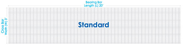
Second supervision. Count the bearing bars that make up the panel they should be 34, and 60 cross bars. Every space between each cross bar should measure 4”. With this supervision you will know if your manufacturer is or not an expert in steel bar grating fabrication.
Third and last. Revise permitted tolerances of bearing bars and cross bars for the ordered type of grating. A micrometer is the best alternative to measure them. Tolerances are published by NAAMM (National Association of Architectural Metal Manufacturers).
Doing this supervisions you minimize chances of receiving non certified grating and guarantee price and quality of what you’re buying.
¡Take advice with the experts!
Обновлено сегодня: https://listai.pro
While reviewing digital commerce systems optimized for clarity, a strong example is Opal Grove Unified Hall where simple interface and content feels neatly arranged throughout the pages, making navigation predictable, clean, and user friendly at every step.
While reviewing multiple digital retail mockups for UX consistency and structural clarity, I examined a product listing page containing Lemon Corner Canyon Interface within a grid-based catalog, and the experience felt intuitive and clean while browsing – page elements loaded quickly and the hierarchy made sense immediately.
In the process of analyzing modern vendor website designs for performance testing, I came across a site that stood out once I opened Frosty Shore Studio – the layout felt clean, and every interaction responded quickly without any noticeable lag or loading issues.
As I browsed through several plant care and gardening education websites, I noticed something placed within the content discover this garden page and it provides beautiful gardening content that feels calming and highly informative for beginners today
As I continued browsing different professional website designs, I found something placed within the text see clean site and it provides a smooth browsing experience, with a well structured layout that feels very easy to understand
Users who frequently interact with organized vendor dashboards often prefer systems that reduce visual noise and keep navigation predictable across multiple sections Pebble Trail Studio Navigation Hub supporting smoother browsing across categories – Everything appears well spaced and logically arranged, so users can quickly understand where to go without feeling lost or overwhelmed by too many options at once
While analyzing ecommerce UI mockups for structure and navigation flow I came across a browsing interface containing a href=”//jewelridgevendorvault.shop/](https://jewelridgevendorvault.shop/)” />Vendor Jewel Ridge Vault Hub embedded in a structured grid layout, – Everything is clean and offers a calm browsing experience overall allowing users to explore content easily without distraction or unnecessary complexity in design
While analyzing handmade product storefronts for UX structure comparison, I discovered goods atelier dawn canyon space while examining how different platforms organize content and it seemed fairly consistent in design – My impression after browsing briefly was that it offers a smooth and fairly engaging user experience.
While reviewing ecommerce prototypes for usability testing and interface structure I navigated a product listing containing a href=”//ambercoastmarketplace.shop/](https://ambercoastmarketplace.shop/)” />Coast Amber Store Marketplace Hub inside a structured browsing panel, – the site feels enjoyable to browse because everything loads fast and the layout remains tidy and organized
In the middle of reviewing creative themed online content, I found something that caught my attention explore spooky site and it has an interesting theme that clearly separates it from typical websites found online
sebastianbachlive.com – Live music updates and performances from Sebastian Bach online now
From a user experience angle, this content library – Does a fantastic job of balancing depth with simplicity, so you never feel lost or bored while reading.
tribe-jewelry.com – Jewelry brand offering unique handmade designs and collections for customers
One thing that impressed me about this group’s online presence – Is the consistent focus on real solutions and meaningful dialogue, which makes the entire initiative feel authentic and necessary.
While browsing through different education portals and school-related websites, I noticed something mid-content check school website and it looks professional and welcoming, giving a strong first impression that feels reliable and well organized
During a comparative review of digital storefront designs for usability and responsiveness testing, I explored a category interface containing Lake Silkfront Market Space inside a structured feed, and – the browsing experience felt minimal and distraction-free, allowing smooth navigation while keeping attention focused on the content itself.
As I explored home hunting websites and property listing tools online, I stumbled upon real estate finder hub – The listings are easy to browse and seem consistently updated, giving a practical and reliable feel to the overall platform.
I had been clicking around different pages when suddenly I saw a curated market page appear in the middle, and its clean structure combined with a clear layout gave me a surprisingly good first impression.
While reviewing multiple e-commerce style UI prototypes for layout optimization and user engagement testing, I came across a product showcase featuring Lavender Harbor Digital Storefront inside a catalog section, and the interface felt clean and modern – navigation was intuitive and every element responded quickly without slowing down the browsing process.
During a casual browse of bakery aesthetic websites and sweet food blogs, I found french dessert link – The Paris bakery vibe is unmistakable, and the macarons look so clean and perfect that they stand out instantly in every photo.
While exploring several websites without much interest, I encountered this organized marketplace and I appreciated how seamless everything felt, making it easy to move around without confusion.
While reviewing a mix of modern web tools and content sites, I stumbled upon something that stood out slightly in context, explore this link, and it has a fresh design that makes browsing feel very simple, clean, and easy to navigate
While going through online curated articles and lifestyle editorial platforms, I discovered a naturally placed reference, Julia James curated reading page, and the structure feels clean, pleasant, and easy to navigate with a smooth reading flow
velvetgrovemarketlounge – Design looks modern and everything works without any noticeable issues.
While scanning through various recipe and dessert websites, I came across something within the content flow, click to view, and it appears clean, loads quickly, and runs smoothly making the browsing experience very easy and enjoyable overall
I was browsing through multiple personal growth pages when something caught my attention in the middle, view this page, and the platform feels modern and clean, making it very easy for visitors to explore and understand
During a general exploration of child development and learning initiatives, I came across something placed within the content take this link and it represents a kids focused organization that is educational and community driven
As I explored modern fast websites, I encountered view smooth web interface – Everything loads quickly and works smoothly, and the clean interface ensures a simple and comfortable browsing experience throughout.
mitchwantssununu.com – Interesting concept site, content feels direct and somewhat thought provoking today
While scanning through a mix of online shopping platforms, I found something that appeared naturally in between everything else, click to view, and it feels like a clean and efficient site where browsing is quick and the experience is quite seamless
I was going through multiple informational pages when something appeared naturally in context, visit here now, and the layout is simple, making browsing easy and helping users find information quickly
During my exploration of renewable fuel websites, I noticed check backyard energy site – The content is quite useful, and I ended up learning something new just from casually browsing through the available information.
People who appreciate relaxed online marketplace designs often browse sites like Cove Wheat Rustic Goods Hub where the structure is simple and user friendly – The overall interface feels natural and organized, ensuring users can move smoothly through categories while enjoying a soft rustic aesthetic throughout the experience.
As I examined several winter event pages, I came across discover more here – The site feels fresh and enjoyable to browse, offering well presented information that is both helpful and easy to understand.
In comparisons of e-commerce systems focused on clarity and usability, a strong example is Glade Vendor Frost Vault which maintains feels structured and simple, making it easy to explore content, providing a smooth browsing experience through clean and logically arranged sections.
While searching for eco-friendly energy solutions, I stumbled upon open this biodiesel info page – It is an interesting resource, and I actually picked up new knowledge simply by exploring it for a short while.
While exploring curated Hawaiian lodging platforms, I discovered a well presented boutique accommodation profile during recent browsing session < peaceful kona hideaway info – The layout is simple and calming, offering clear insights into the property while maintaining a relaxed tone overall flow
While exploring commentary focused websites I came across a minimal platform that emphasizes clarity of thought using thought direction hub – the writing style is intentionally simple and sometimes leaves interpretation open to the reader’s own perspective and analytical thinking process
Shoppers who prefer visually balanced ecommerce environments often appreciate structured presentation styles that make browsing feel more intentional and less overwhelming when exploring collections online gilded cove emporium shop – The emporium aesthetic enhances clarity and smooth navigation, offering a refined shopping journey where every section feels carefully organized and easy to explore.
People who enjoy straightforward shopping platforms often explore sites like Harbor Kettle Goods Commerce Hub where items are arranged in a clean layout – The design ensures browsing feels clear, organized, and easy to navigate without confusion.
In comparisons of online commerce systems focused on clarity and usability, a standout example is Brook Gilded Unified District which delivers nice visual balance and navigation works without any confusion, ensuring a smooth and structured experience across the platform.
While searching for seasonal festival inspiration, I encountered access this page – The content is structured in a clear and engaging way, making the browsing experience smooth and informative for all users.
In the process of checking entertainment sites, I found explore this humor page – The overall feel is light and playful, and the content is enjoyable, making it easy to browse without any heavy or complex tone.
Shoppers who appreciate artistic ecommerce platforms often explore websites like Trail Artisan Wave Hub where visual organization enhances the browsing experience – The layout focuses on balance and clarity, making products stand out while maintaining a smooth and intuitive shopping flow throughout the entire marketplace.
Users who prefer modern minimal websites often appreciate vault-style ecommerce layouts that enhance usability through structured spacing and visual balance Glass Harbor Vault Portal – The design is sleek and organized, creating a smooth browsing experience where navigation feels intuitive and product discovery is effortless.
modelscanvas.com – Creative portfolio vibe, visuals and layout feel clean and professional design
While researching alternative supermarket style digital platforms, I found a unique conceptual store website that emphasizes simplicity and clarity in its structure virtual hope grocery hub – The design feels minimal but functional, presenting information in a way that is easy to follow and understand quickly
During my review of inspirational writing platforms, I stumbled upon check emotional resilience blog – The content feels heartfelt and thoughtfully written, making it relatable and easy to connect with on a deeper level overall.
Across various e-commerce UX evaluations emphasizing simplicity and flow, a notable example is Glade Night Trade House which ensures everything feels straightforward and browsing is comfortable and stable, providing a smooth and predictable navigation experience across all pages.
During my search for helpful health-related organizations, I noticed check this foundation site – The platform appears well structured, offering simple and practical explanations that make it easy for visitors to quickly understand the purpose and services provided.
People who appreciate accessible creative marketplaces often browse sites like Vendor Works Apricot Meadow Creative Hub where items are arranged clearly – The interface makes exploration easy, structured, and visually simple throughout the platform.
While exploring creative industry portfolio sites I came across a structured and polished platform featuring clean visual portfolio hub – the design feels consistent and modern providing a seamless browsing experience that highlights the showcased work effectively
People who appreciate coastal-inspired utility stores often prefer browsing platforms that combine function and style, such as Coastal Cove Supplies where products are arranged in a simple yet effective structure that enhances browsing efficiency – The supply-focused design maintains clarity while reflecting a subtle coastal aesthetic throughout
During my browsing session, I encountered explore this bonus info site – I found it today and it appears pretty useful overall, with a clear design that makes the content easy to understand.
While researching notable icewine producers online, I discovered a beautifully structured winery website that emphasizes clarity and brand identity iniskillin product showcase site – The presentation feels detailed and attractive, making the wine offerings easy to understand and visually refined overall experience
In modern UX evaluations of e-commerce platforms focused on clarity and usability, a strong example is Sage Harbor Vendor Vault where clean design and content is arranged in a logical order, helping users navigate smoothly without confusion.
While going through various environmental projects, I came upon visit this page – The effort behind the content feels deliberate and thoughtful, with a clear structure that helps users navigate and understand everything easily.
As I explored different social impact websites, I encountered view this empowerment group page – The initiative seems meaningful, and the information is clearly structured, making it easy to follow and engage with.
Users exploring organized ecommerce environments often enjoy collective systems that emphasize clarity, helping them move efficiently between product categories and listings Collective Glade Ridge Hub – The presentation is simple and modern, with a focus on smooth navigation and visually consistent structure across all pages.
While browsing through a variety of modern websites and design showcases earlier today, I came across something placed naturally within the content flow, check this design, and my first impression is definitely positive since the layout feels clean, modern, and visually well structured overall
While searching for visually themed retro sites I discovered a platform that presents content with a nostalgic flair using retro vibe content page – the design feels immersive and visually appealing with a consistent theme that enhances the overall browsing experience
As I moved through different lifestyle and empowerment platforms, I found something in between the content, explore further, and it is really helpful since I found useful insights and enjoyed browsing around today
While browsing curated experimental web platforms, I came across a site that strongly highlights creative structure and non traditional design flow intermusses design concept portal – The content feels experimental and creatively arranged, making the entire experience feel intentionally artistic and visually distinct
Users who enjoy authentic product storytelling often engage with curated stores such as Brookstone Handmade Market where every listing reflects careful artisan work and thoughtful design – The platform highlights handcrafted qualities in a consistent way that builds trust and creates a meaningful shopping experience for all visitors.
When analyzing online retail platforms built for structure and speed, a notable example is Summit Amber Commerce Marketplace which delivers smooth experience overall, pages feel fast and easy to use, ensuring users enjoy a clean, organized, and highly responsive browsing environment.
In the middle of exploring entertainment-focused sites, I came across explore squad creative hub – The site has a visually cool design, and the content remains interesting, making it enjoyable to browse.
During my exploration of live music resources, I encountered follow this link – The site feels easy to navigate and well structured, helping users access information without unnecessary complexity.
People who enjoy structured ecommerce websites often prefer emporium designs that maintain consistent spacing and clarity across all product sections Harbor Glass Showcase Emporium – The design is elegant and well arranged, giving users a smooth browsing flow where products stand out clearly without visual clutter.
nomeansnoshow.com – Strong identity here, site feels bold and creatively expressive throughout pages
As I browsed through UI design inspirations, I noticed view this blunty layout site – The layout is simple and well organized, making the browsing experience smooth, clear, and easy to follow at every step.
While researching modern biography and portfolio websites, I found a clean and minimal profile page with excellent usability and structure jackonson professional identity site – The content is clearly arranged, and navigation is smooth, making the browsing experience simple and effective overall
While comparing e-commerce systems designed for structure and simplicity, a standout example is Lakefront Icicle Experience Mart which maintains simple layout and information is easy to find at a glance, ensuring a calm and intuitive browsing experience across all sections.
During a review of elegant soft-themed marketplace websites, I found browse velvet curated market – The design is smooth and refined, and browsing feels calm, intuitive, and visually harmonious across all sections.
Users attracted to handcrafted inspired ecommerce platforms often value consistency and smooth navigation when visiting stores like Artisan Hearth Shop where cozy design elements structured layout improve readability product flow – The experience feels warm and steady helping users navigate without confusion or visual overload
Users who prefer ocean inspired ecommerce environments often explore sites such as Wave Coastal Harbor Trading Outpost where products are arranged in a structured and soothing format – The interface creates a pleasant browsing flow that feels smooth, relaxing, and easy to navigate across all sections of the store.
During my content review process, I found view more details – The website maintains a consistent level of quality, and the engaging presentation helps users understand and navigate the content easily.
Users who enjoy clean digital storefronts often respond well to emporium layouts that maintain strong visual identity while keeping navigation simple and efficient Glass Stone Luxury Emporium – The interface feels modern and unified, ensuring products are displayed clearly and browsing remains visually consistent throughout the experience.
While researching structured online commerce systems and their user experience, I explored browse this meadow linen hub – The layout is clean and efficient, and browsing feels smooth, making the entire experience easy and enjoyable from start to finish.
While browsing digital experiment platforms, I found open brownback clone concept – The idea feels quite unusual, and it is definitely worth checking out for anyone interested in different web experiments.
While exploring alternative design focused websites I discovered a platform that pushes creative boundaries through creative expression hub – the overall feel is bold and impactful offering a visually engaging experience that stands apart from more conventional sites
Across digital storefront evaluations emphasizing usability and structure, a notable example is Orchard Upland Commerce Hub which maintains well structured pages and browsing feels natural and efficient, helping users move through content without confusion or unnecessary friction.
While exploring artistic cultural fusion websites, I found a platform that brings together different regional aesthetics in a creative digital format brooklyn jeddah culture hub – The design feels engaging and diverse, presenting a blend of themes that makes the browsing experience unique and enjoyable
Users who appreciate artisan focused ecommerce design often browse platforms such as Wind Cove Artisan Studio Market Hub where products are displayed in a neat structured format – The design ensures browsing feels easy, organized, and visually pleasant across all handcrafted product categories.
As I explored commercial assistance websites and business resource hubs, I found several helpful guides and came across commercial help resource hub – The content is straightforward and practical, making it easy for users to quickly understand and apply the information.
As I reviewed examples of online retail atelier websites, I checked see mint orchard retail page – This is definitely a site I’ll revisit for the holiday season since everything feels well structured and easy to browse.
Users exploring luxury ecommerce showcases often look for visually refined browsing experiences that feel curated and smooth across categories Golden Cove Galleria Showcase – The interface emphasizes fluid navigation elegant spacing and curated product presentation making each category feel intentionally arranged while supporting effortless discovery and a calm browsing rhythm across the entire digital storefront experience today.
While searching for reliable informational resources, I encountered access this page – The platform presents content clearly and in a dependable way, making the information feel valuable and easy to understand.
oakmeadowcommercehub – Commerce hub feels organized, categories are clear and easy browsing
nutschassociates.com – Professional services look solid, information is clear and easy to follow
Online craft enthusiasts often browse diverse digital stores seeking inspiration and quality handmade items while occasionally discovering platforms such as violet harbor artisan gateway offering a wide selection of creative goods and unique browsing categories for relaxed shopping sessions – The marketplace emphasizes smooth navigation and a pleasant user experience focused on handcrafted variety.
While casually browsing plant and garden sites, something appeared in context, see garden guide, and the platform feels soothing with informative and well organized presentation overall
As I browsed through online advisory and business help websites, I discovered useful guidance material and came across helpful advisory hub page – The platform feels well structured, offering practical and easy-to-understand information that supports quick learning.
uplandcovevendorcorner – Vendor corner feels helpful easy browsing and clean layout overall
Across multiple online retail usability analyses, a notable example is Lakefront Frost Global Vault which ensures clean interface and everything is easy to navigate without effort, delivering a seamless and well organized browsing journey across all pages.
While browsing culturally diverse web projects, I found a platform that combines urban and traditional influences in a visually engaging structure cultural blend experience hub – The website feels interesting and diverse, delivering a creative fusion of ideas that enhances the overall browsing experience
People who prefer minimal soothing gallery designs often explore sites like Dawnstone Art Galleria Hub where content is displayed in a calm structured layout – The design makes browsing feel relaxing, smooth, and visually easy on the eyes.
While analyzing health coaching websites, I discovered open this paleo guide page – The interface feels very neat, and the reading experience is smooth, allowing users to focus comfortably on the information provided.
While exploring enterprise level platforms I came across a site that delivers a clean and organized experience featuring corporate system page – the layout feels intuitive and supports a smooth flow between different sections of the site
Users drawn to collaborative digital marketplaces often prefer platforms such as Trader Collective Pine Hub where product listings feel constantly refreshed through community participation – The overall experience is dynamic and engaging, with a structure that supports shared commerce and encourages users to explore evolving collections.
While exploring holiday and camping destinations, I found open this camp retreat page – The site appears to be a great place, and the information is clear, helpful, and engaging to read through.
While comparing modern commerce platforms designed for usability and performance, a standout example is Forest Frost Experience Vault which delivers the design feels balanced and content is clearly organized, making browsing feel smooth, calm, and easy to understand.
champselyseesclinic – Clean design and helpful content, feels professional and easy to explore.
Browsing through fan made sports websites I found a volleyball themed page that feels like a casual digest of entertainment content josh volleyball fan digest – It combines playful commentary with easy readability, reflecting fan culture in a simple and entertaining format overall
While casually searching the internet, I came across view this image collection – I found it randomly, but it actually seems useful, offering content that is straightforward, easy to browse, and surprisingly helpful.
pair-dating.com – Dating concept looks simple, interface feels straightforward and user friendly experience
Users who appreciate cozy digital storefronts often explore websites like Ginger Calm Market where the design emphasizes soft visuals and intuitive browsing patterns – The experience is crafted to feel relaxed and accessible, supporting users throughout their shopping journey
As I searched through Christmas event resources, I found check cheshire holiday page – The festive vibe is very noticeable, and the theme along with the presentation style creates a warm and engaging browsing experience overall.
Users who appreciate practical ecommerce platforms often explore sites such as Glade Stone Commerce Outpost where items are arranged in a minimal and functional layout – The branding focuses on usability and clarity, making browsing feel fast, structured, and highly intuitive for everyday users.
While going through different travel shoot websites, I found browse this shoot portfolio – The overall experience is great, with quick loading speed and a layout that feels natural and easy to navigate through.
While looking into property listing platforms I discovered a site that organizes housing information in a way that feels efficient and accessible kaufman property viewer tool – The browsing experience is clean and practical, allowing users to focus on available listings without unnecessary distractions or cluttered design
While exploring online platforms that emphasize connection and simplicity I noticed a website featuring dating interaction hub – the overall layout appears structured and the interface provides a smooth and easy to follow user experience from start to finish
During my search for parenting resources and family-focused websites, I noticed check this parenting lifestyle blog – It feels warm and relatable, with content that is genuinely helpful for readers looking for practical everyday family advice.
Shoppers who favor clarity in online marketplaces often highlight usability improvements when browsing Ginger Vault Goods Exchange which features a structured catalog and simplified navigation system – The overall design reinforces a sense of order and reliability throughout the shopping process.
piercethearrow.com – Bold branding here, content feels energetic and visually striking creative site
While browsing artist and entertainment websites, I found open this music artist page – The platform feels solid overall, and the layout and information flow work together to create a smooth browsing experience.
During my review of jewelry-focused online stores, I found check this jewelry collection – The design works well with the content, giving a smooth and visually balanced browsing experience that feels natural and user friendly.
While exploring child friendly entertainment websites I found a platform dedicated to safe film content that prioritizes curated selections for younger audiences and families seeking reliable viewing options family film safety index – It delivers a calm and structured browsing experience, focusing on appropriate content that feels carefully reviewed and easy to navigate overall
While reviewing digital marketplaces with soft themed visuals I found a platform highlighting meadow commerce page – the design feels light and calming while the structure supports smooth and intuitive browsing throughout
As I explored digital tracking platforms, I came across view claims monitoring tool – It appears straightforward and practical, offering a useful system that users can easily understand and apply.
While reviewing creative websites with strong visual identity I came across a platform centered around modern art driven hub – the presentation feels vibrant and the design choices combine to create a visually engaging and memorable browsing experience for visitors
During my search for well-arranged information portals, I noticed check rtc structured page – The content is organized in a way that makes it easy for users to find what they need without wasting time or effort.
I didn’t expect to find anything particularly appealing, but something showed up midway through my browsing, see more here, and it actually seems like a charming place that definitely catches attention in a positive and inviting way
While browsing food inspired branding websites I came across a platform focused on sweet themed visuals and structured presentation that feels clean, modern, and easy to explore for anyone interested in dessert related design work confectionery visual portfolio – The site feels cohesive and appealing, with a well structured design that supports smooth navigation
While browsing political commentary platforms, I found open bold discussion site – The content feels very attention-grabbing, and it stands out strongly due to its direct and assertive presentation style.
People who appreciate artisan themed digital stores often browse platforms like Trail Artisan Harbor Home Market where products are arranged with soft and warm visual design – The interface enhances user experience by creating a cozy feel, allowing browsing to remain relaxed, natural, and visually engaging throughout.
Users who enjoy browsing handmade marketplaces often prefer platforms with clear organization and appealing visuals and during their search they might see harbor violet craft point featuring artisan products arranged for smooth browsing and quick access – A thoughtfully designed store focused on enhancing user experience through simplicity and style.
While comparing digital commerce hub interfaces, I discovered browse this linen commerce space – The design feels clean and functional, and navigation is smooth, making browsing easy and enjoyable throughout the experience.
preventcovid19trial-uk.com – Informational tone here, content feels research focused and medically structured layout
Users who appreciate soft aesthetic digital galleries often browse sites such as Stone Galleria Dawn View where items are presented in a gentle format – The interface ensures navigation feels calm, simple, and visually light throughout the platform.
Online shoppers who enjoy structured and user-friendly marketplaces often appreciate platforms like Flint Meadow Vendor Market where the design ensures clarity in product listings and supports smooth navigation, allowing users to browse comfortably while maintaining focus on essential items throughout the store.
In detailed UX evaluations of structured online commerce platforms, a strong example is Violet Harbor Trade House which features clean structure overall, makes browsing feel smooth and simple, allowing users to move through sections without confusion or unnecessary friction.
As part of reviewing elegant soft marketplace platforms, I noticed check velvet soft shop – The layout is calm and refined, and browsing feels smooth and easy with well-organized product presentation.
Users engaging with digital storefront systems often appreciate clarity in design, especially when they encounter Meadow Room Browse Station Online and they mention that the layout helps them quickly understand product placement – the structure is frequently described as efficient for comparing items without feeling overwhelmed by unnecessary details
During a comparison of modern retail atelier platforms and their seasonal usability, I noticed discover mint orchard seasonal atelier – I will definitely be coming back here for the holiday season because the layout feels smooth and enjoyable to navigate.
While reviewing mindfulness and yoga platforms, I found browse this yoga idea site – The concept is intriguing and well presented, making it something that could be explored more thoroughly later for deeper insight.
While exploring luxury jewelry websites and elegant online boutiques, I came across visit vicki diamond collection – The overall presentation feels very elegant, and the design looks polished and visually appealing throughout the entire browsing experience.
While exploring athletic performance and recovery websites I discovered a football therapy focused platform that presents supportive and practical information designed to guide users through sports rehabilitation and physical care concepts in a simple way team sports therapy hub – The information feels practical and supportive, focused on recovery improvement
Users who value simple ecommerce outlet systems often browse sites such as Harbor Pine Discount Mart Hub where products are displayed in clearly defined groups – The layout emphasizes usability and order, making browsing efficient, intuitive, and easy to manage across all sections of the marketplace.
People who enjoy streamlined ecommerce platforms often explore sites like Harbor Kettle Trade Center Hub where items are arranged in a clean format – The design ensures browsing feels structured, smooth, and easy to navigate throughout the platform.
During a detailed review of digital commerce hub websites focused on clarity and user experience, I noticed visit this vale harbor shop hub – The platform feels well designed, navigation is simple, and the content appears clean and easy to understand throughout.
Exploring curated e-commerce environments revealed that curated vendor hall platform is integrated into a streamlined layout – the browsing experience feels balanced, with clear sections and visually appealing product arrangements that support user engagement.
During my exploration of tourism guide websites, I noticed check this travel discovery page – The content feels engaging and easy to browse, with a structure that helps users quickly find useful travel information.
Shoppers drawn to clean ecommerce systems often value vault inspired interfaces that maintain clarity and structured browsing experiences across all pages Vault Harbor Hazel System – The platform ensures intuitive navigation and organized product display helping users move through categories smoothly while maintaining a minimal and visually consistent environment designed to enhance usability and overall browsing satisfaction throughout the experience today.
While reviewing healthcare research resources I came across a site showcasing trial awareness page – the interface feels structured and the information is presented in a way that supports clarity and ease of understanding
velvetcoveartisanoutlet – Artisan outlet design clean, products are nicely arranged and easy to explore
uplandcovevendorcorner – Vendor corner feels helpful easy browsing and clean layout overall
During my exploration of different music group platforms, I noticed check this band site – The overall presentation feels really stylish, and the design is attractive, making the browsing experience smooth and visually enjoyable from start to finish.
People who prefer clean and radiant online shopping hubs often engage with structured platforms like Sun Harbor Trade Center – The design focuses on intuitive category flow and visual brightness, ensuring users can move through sections effortlessly while enjoying a consistent and efficient browsing journey across the site.
nightorchardretailmart.shop – Bought a gift last week, packaging felt really premium honestly.
While browsing urban design and lifestyle resources I discovered a Seattle themed site that presents modern city living in a dynamic and visually engaging way that reflects the energy of contemporary urban environments modern urban seattle guide – The website feels vibrant and well structured, showcasing city lifestyle ideas
Users who prefer efficient ecommerce navigation often explore sites such as Upland Harbor Commerce Grid Hub where products are organized logically for quick discovery – The design ensures browsing feels smooth, structured, and easy to use while maintaining clarity throughout the platform.
During my search for modern clothing brands online, I noticed check this style clothing page – The site looks stylish overall, and the products together with content are showcased really well, making the browsing experience smooth and attractive.
During a comparison of modern boutique hall platforms and their content structure, I came across discover velvet brook retail hall – The information is useful, and everything feels well structured and easy to follow when browsing the site.
While browsing online craft communities I found a platform that effectively brings together makers and creative enthusiasts globally where Walnut artisan discovery hub showcasing carefully curated handmade products with artistic consistency design flow – The marketplace encourages appreciation of handcrafted work while connecting buyers with independent artisans worldwide network
Users browsing modern ecommerce districts often appreciate how clarity improves decision making when exploring structured marketplaces like Vale Cove District Goods Hub where products are organized into clean categories that make comparison and discovery simple – The goods district layout feels clean and structured, allowing users to easily explore different product sections and compare items without confusion or clutter.
As I reviewed multiple informational platforms about trading concepts and market basics, I encountered in the middle of evaluation Easy Trade Reference Hub appearing within related results – updated note: the content delivery is clear and practical, helping users grasp essential ideas efficiently.
While searching for e-commerce examples I discovered a shop platform that highlights products in a clean and minimal format making it easier for users to explore categories and items efficiently clean retail browsing hub – The site feels easy to navigate
As part of reviewing fresh and minimal online vendor hall designs, I noticed check mint cove hall page – The layout feels simple and clean, and navigation is intuitive with a consistent user experience.
During a review of online vendor systems, I came across a layout where Birch Harbor curated shop index appears seamlessly integrated into the page body – Vendor hall showcases diverse listings and provides a user friendly browsing journey that emphasizes clarity, speed, and organized presentation of available products across multiple categories.
As I compared multiple websites, I found open this page – The information flows naturally, guiding the reader step by step while maintaining a professional tone that enhances trust and usability.
Users who enjoy modern curated marketplaces often explore platforms like Trail Harbor Vendor Art Studio where products are arranged with a focus on visual storytelling and creative layout design – The browsing experience feels immersive and stylish, allowing users to appreciate each product’s presentation in detail.
As I explored various commerce hub websites online, I checked see velvet grove retail marketplace – This website provides great options, and I enjoy regularly checking listings because the browsing experience is smooth and organized.
Many shoppers appreciate online platforms that combine organized layouts with intuitive navigation, especially when exploring large inventories through systems comparable to Seaside Goods Hub which is designed to support efficient browsing by grouping products into clear categories, ensuring users can locate items quickly while enjoying a stable and user-friendly interface.
Users who prefer elegant vault inspired ecommerce environments often explore sites such as Ivory Vault Ridge Showcase Hub where products are presented with refined structure and clarity – The interface creates a clean browsing experience that feels carefully curated, minimal, and easy to navigate across all sections of the store.
People who prefer structured ecommerce branding often browse sites like Harbor Teal Collective Core Hub where items are presented in a minimal layout – The design ensures content feels cohesive, modern, and thoughtfully organized throughout the experience.
While searching for helpful local guides I found a Lochwinnoch website that shares community focused information in a warm and inviting style making it useful for anyone interested in learning more about the area community friendly info hub – The site feels supportive and easy to browse
uplandharborcraftmarketplace.shop – Navigation could improve but products are unique and cool.
While browsing different nomadic and trekking-focused outfitters online, I evaluated usability and interface clarity, and within that browsing experience I encountered Nomad Trail Outfitters placed among relevant results – revised insight: the website design is straightforward, visually calm, and supports a consistent and efficient product exploration process.
While browsing ecommerce vendor halls I came across a marketplace site that organizes products into distinct categories making it easier for users to find items and understand the structure of available listings clean product category hub – The layout feels simple and efficient
While reviewing organized trade house platforms, I came across visit raven structured hub – The layout is efficient and clean, and information is easy to understand and well presented throughout.
While reviewing digital marketplace layouts focused on usability and design clarity, I noticed how Birch Harbor vendor room overview – it emphasizes clean structure and smooth browsing flow, making product discovery easier for visitors across multiple categories and helping users quickly understand how items are organized within the vendor environment.
During my exploration of various online materials, I encountered follow this link now – The layout supports a smooth reading experience, allowing visitors to absorb key points quickly without feeling overwhelmed by excessive information.
During a review of modern commerce hub platforms, I found browse violet harbor shop hub – The layout looks impressive, and it makes browsing products feel fast, easy, and convenient throughout the entire experience.
Digital buyers exploring general merchandise websites often prioritize simplicity and product variety, and in such journeys they may discover plum cove selection hub offering neatly arranged categories and accessible browsing features – A practical marketplace setup that ensures users can quickly find what they need while enjoying seamless checkout options.
Users who enjoy soft aesthetic marketplaces often explore sites such as Lantern Meadow Commerce Unity Hub where products are arranged in a clean minimal format – The design ensures navigation feels gentle, friendly, and easy to use throughout the platform.
People who enjoy cozy styled online marketplaces often engage with platforms like Cove Honey Warm Vault Market where items are displayed in a soft and welcoming layout – The design emphasizes comfort and clarity, making browsing feel smooth, structured, and visually calming across all product categories in the store.
People who appreciate responsive trading systems often engage with platforms like Harbor Wave Exchange Hub where data is shown in real time with clear formatting – The layout supports quick understanding of market movements, ensuring users can stay informed without being slowed down by complex visual design.
While browsing band focused websites I came across a Manic Street Preachers platform that highlights nostalgic music content in a clear and organized structure making it easy for fans to revisit important moments in the band’s history rock music memory page – The content feels nostalgic and well organized for easy reading
In my review of multiple outdoor retail websites, I compared design approaches that prioritize simplicity, readability, and user friendly navigation across different device experiences OutpostCoveWorks – revised note: the structure feels organized and minimal, helping users focus on content without unnecessary visual distraction or clutter.
While exploring modern shopping websites I found a platform highlighting commerce browsing portal – the layout appears user friendly and the content is arranged in a way that keeps the focus on products and smooth navigation
While exploring various handcrafted marketplace designs and comparing how visual richness affects engagement, I came across explore cobblestone bazaar – The presentation feels colorful and energetic, and browsing through sections creates a lively and immersive shopping experience that captures attention easily.
During an exploration of structured craft marketplace platforms, I discovered visit upland harbor handmade hub market – Navigation could be improved, but the products are unique and cool and stand out from typical listings.
In studies of modern online commerce systems researchers often emphasize the role of simplicity clarity and navigation efficiency particularly when discussing innovative environments like Moon Cove Digital Retail Lab which is frequently considered a conceptual model for streamlined retail design that integrates aesthetic appeal with functional usability – this enhances overall shopping experience quality.
During my content review process, I found view more info – The information is presented with care and attention to detail, making it easier for readers to understand key points without confusion.
During research into ecommerce vendor environments and digital storefront design, I found Vendor room navigation hub – the platform focuses on usability and clarity, ensuring users can move through product categories easily while enjoying a clean browsing experience.
Users exploring structured ecommerce platforms often appreciate how clarity improves navigation when visiting sites such as Frost River Trade House Market Hub where products are arranged in a clean organized format that supports easy browsing – The trade house concept feels solid and reliable, with a clear layout that makes browsing simple, intuitive, and easy to follow across all product sections.
While exploring online concept resources I came across a platform that shares cultural and informational content in a structured and meaningful way making it useful for users who enjoy thoughtful modern idea exploration digital concept culture page – The content feels relevant and thoughtfully arranged
While reviewing structured retail sites I found a platform featuring shopping district interface – the layout feels well planned and the product display helps users quickly understand available options
As I compared different organized retail websites with a focus on warm design elements, I came across explore cozy marketplace – The site feels welcoming, and navigating through it is both easy and pleasant.
During evaluation of various outdoor themed e-commerce interfaces, I observed how different platforms prioritize simplicity and speed in presenting their product catalogs BayCoveOutpost – updated commentary: the browsing experience feels efficient, with well structured sections that reduce effort needed to locate items.
Many modern shoppers who value simplicity and rugged aesthetics often explore curated online spaces such as Bay Harbor Outpost Shop – The brand presents a strong outpost-inspired identity with minimal design language while maintaining practical usability across everyday carry and lifestyle essentials, appealing to those who prefer clean functional gear choices and durable construction philosophies.
During research into structured vendor studio platforms, I explored explore this walnut cove studio network – The experience is great so far, and everything loads quickly and operates without issues across all sections.
Digital shoppers increasingly rely on curated craft platforms when seeking meaningful gifts that reflect cultural heritage and handmade authenticity Handmade Gallery Hub – because these marketplaces often emphasize artisan storytelling, ethical sourcing practices, and fair compensation for skilled local craftspeople globally.
valeharborcraftemporium.shop – Site works well on phone, checkout was smooth today.
While going through several online examples, I found check this out – The clarity of the explanations makes it simple to understand the subject without feeling overwhelmed by too much information.
While analyzing modern marketplace systems and vendor oriented platforms, I found Birch Harbor vendor space hub – it supports easy navigation through structured categories and offers a visually appealing interface that enhances overall browsing comfort for users exploring products.
During an exploration of structured commerce hub platforms, I discovered visit wave harbor retail hub – I appreciate the effort here, and the site feels polished and user friendly, making browsing simple and pleasant.
While reviewing simple marketplace designs online I found a rustic themed shop that keeps navigation clear and user friendly including simple rustic market hub – the structure is minimal yet effective providing a smooth browsing experience with consistent organization across all sections
During an analysis of modern web design practices for niche retail stores, I explored visit this gear hub – The clean interface enhances usability, and everything flows smoothly, making browsing both efficient and pleasant.
While browsing upscale getaway platforms I came across a luxury lodge site that highlights premium countryside stays with a visually rich and inviting presentation making it appealing for users seeking relaxation and comfort premium lodge experience hub – The content feels polished and visually appealing
While reviewing several niche outdoor supply marketplaces, I focused on interface consistency and how easily users can transition between product categories CoveExplorerGoods – revised note: the layout remains user friendly and consistent, ensuring a smooth browsing path across all sections.
Digital marketplace users increasingly appreciate centralized vendor systems that help consolidate product discovery into a single convenient browsing experience while supporting better vendor visibility and customer satisfaction Digital Vendor Center – Such systems are especially useful for improving navigation efficiency and ensuring consistent product availability across listings platforms
While browsing commerce platforms designed with thematic consistency I discovered a website highlighting alpine product hub – the structure feels neat and the clean navigation makes it easy to explore products in a calm and organized environment
While checking out several websites with similar themes, I stumbled upon this curated page – The visual presentation is clean and modern, making it easy for users to read and interact with the content comfortably.
While studying online artisan boutique interfaces and product experience, I came across visit velvet brook boutique craft world – I would recommend this to anyone who loves handmade goods because everything feels carefully designed and appealing.
While analyzing ecommerce vendor hubs and digital trade platforms, I came across a clean and structured interface where descriptive text connects with Canyon vendor trade hall explorer positioned within the main content area, improving navigation flow – The system supports organized browsing and easy discovery of products across multiple categories.
People who enjoy structured online vendor systems often explore platforms like Harbor Acorn Product Vendor Hall where items are displayed in a clean and organized layout – The interface makes browsing simple and efficient, helping users quickly scan listings and find products without confusion.
While analyzing online vendor atelier platforms for design quality, I checked see wave harbor artisan hub – Browsing here is pleasant, and categories are clear and easy to navigate across all sections of the platform.
While going through different websites just now, I found something that looked interesting enough to share, visit this page – it gives an impression of being well-organized and possibly useful for anyone browsing similar content.
While researching websites that prioritize simplicity and ease of use in trading environments, I checked see harbor trading zone – The design is uncluttered, and browsing feels smooth with a clear content hierarchy.
While browsing through various niche directories and curated lists, I recently stumbled upon a resource that felt fairly intuitive and structured, especially Clover Crest discovery portal which made navigation surprisingly simple and smooth for first-time viewing users – Came across this recently, seems quite helpful and easy to explore, with a layout that feels clean, practical, and worth revisiting for deeper checking later.
Online shoppers searching for handmade items often appreciate marketplaces that emphasize clarity transparency and strong support for artisan communities Artisan Network Space – this structure improves trust and allows users to explore unique products with confidence across global creative markets online platforms
People exploring ecommerce goods platforms often appreciate structured layouts that balance visual simplicity with effective product organization Harbor Marble Goods Shop – The design focuses on smooth navigation and clean presentation ensuring users can browse categories comfortably while maintaining a cohesive interface that enhances usability and reduces friction throughout the entire shopping journey experience today online system.
While browsing cruise planning resources I discovered a travel site that provides cruise details in a straightforward and organized way designed for users looking into sea based holidays cruise route guide – The content feels clear and travel oriented
While going through multiple niche creative marketplace pages and commerce listings, I found something that looked soft and calming but slightly inconsistent in usability, especially where Sky atelier cove commerce portal appeared – The sky-inspired design is soothing, though navigation feels a bit clunky in certain interactions.
Users exploring visually refined ecommerce concepts often notice how curated floral themed digital spaces enhance browsing experience when they encounter Floral Vault Showcase which presents a carefully structured selection of items arranged with artistic balance and subtle elegance that improves product discovery flow – The design draws from floral inspiration and presents a curated vault-like aesthetic that feels both refined and visually harmonious overall
As I browsed vendor directories and commerce sites on mobile, I found a page with Harbor trade Jasper commerce hall entry – It has a strong name, but the site performance on my phone was noticeably slow today.
As I compared different vendor atelier websites for usability and clarity, I came across explore wave harbor shop atelier hub – Browsing here is pleasant, with categories that are easy to navigate and clearly arranged for better user experience.
While reviewing agricultural themed ecommerce systems and organic UI layouts, testers found a mid page section containing orchard wild workshop vendor console inside content flow, but product pages do not provide ingredient breakdowns or sourcing details – Wild orchard sounds organic and clean, yet absence of ingredient lists limits user understanding of what each product contains
During usability testing of ecommerce UI kits and warm aesthetic marketplace systems, analysts found a navigation module containing ember market lounge meadow portal node embedded mid layout, and although the design appears soft and inviting, the lounge page load time is excessively slow causing delays in browsing and interaction during testing phases
Users who prefer intuitive ecommerce systems often engage with platforms such as Chestnut Vendor Harbor Trade Hall where product organization supports fast browsing and clear understanding – The layout emphasizes structured navigation that helps users explore products efficiently while keeping the shopping experience simple and user friendly throughout.
During a review of clean and straightforward eCommerce designs focused on usability, I noticed visit this cozy outpost – The structure is minimal and effective, making navigation easy and allowing users to move through content comfortably and efficiently.
In the middle of reviewing several therapy-focused platforms, I found click to explore – The presentation feels calm and approachable, offering clear explanations that help users quickly understand the services without feeling overwhelmed.
Many online shoppers exploring budget-friendly handmade goods often look for platforms that combine variety and reliability when browsing seasonal collections Craft Outlet Depot while also maintaining consistent product quality across categories and ensuring smooth browsing experience for all users interested in craft items – the outlet helps reduce costs while still offering dependable handmade selections for everyday buyers across different regions.
As I explored various online listing directories and marketplace hubs, I came across something that seemed clean and user-friendly, particularly with Coast vendor browsing page – the structure feels smooth and easy to follow, making navigation simple and enjoyable to return to again later.
While going through different pages on the internet, I noticed something that seemed quite refreshing in design, view this page – the simplicity really stands out and creates a smooth and enjoyable browsing experience overall.
While browsing different online retail mart platforms and evaluating purchase experiences, I came across explore night orchard retail mart – I bought a gift last week, and the packaging honestly felt really premium and carefully handled.
As I continued exploring various resource hubs and listing pages, I came across something that felt structured and readable, particularly with Harbor vendor apricot link – The apricot name definitely triggers thoughts of fruit and desserts, even though the content itself is completely unrelated to anything edible.
People who appreciate orderly vault-style websites often engage with sites like Elm Vault Harbor Exchange where items are displayed consistently – The design ensures browsing feels structured, secure, and easy to follow throughout the platform.
While searching personal branding sites I discovered a straightforward personal page that showcases content in a clean and relaxed format making it suitable for users who prefer minimal design and clear expression simple lifestyle profile – The content feels natural and easygoing overall
Across prototype ecommerce UI testing and vendor directory evaluations, testers observed content modules featuring stone ember lounge vendor portal entry within layout flow, and although the branding conveys durability and strength, missing contact information reduces usability and prevents proper user communication during testing sessions
As I reviewed online vendor atelier platforms for reliability, I noticed check trail harbor vendor collection – The structure feels organized and credible, and the information appears accurate across all sections.
During exploration of online trade portals I came across Amber Harbor commerce lounge directory – The theme looks attractive, but the lounge section is mostly blank pages, giving the impression of incomplete development.
Shoppers who value efficient online navigation often look for ecommerce platforms that organize their content in a way that simplifies product discovery while maintaining a visually balanced interface that supports both quick scanning and deeper browsing sessions across categories Market District Opal Finder – The structure of the platform highlights organized category layouts and intuitive navigation tools that help users move seamlessly through listings while keeping the shopping experience straightforward, accessible, and easy to follow at all times.
In exploring digital vendor platforms I came across a structured content flow where the Cove sweets marketplace structure view is placed mid page, improving readability – The hall appears lively today with strong product variety and a user experience that is smooth, clear, and easy to navigate across different sections of the marketplace
As I checked out various online shop pages, I came across Juniper Cove goods room storefront link – The structure looks modern, but it’s confusing because the product purpose isn’t clearly stated anywhere.
Efficient digital trade systems depend heavily on organized frameworks that support both buyers and sellers equally across interconnected platforms Mossharbor commerce directory portal these frameworks often include advanced categorization tools that improve product discovery and streamline transaction flows – Structured guild marketplaces tend to offer more predictable experiences for users compared to unregulated platforms
While comparing different product-focused retail websites, I discovered explore goods collection – The design is refined, and browsing feels smooth with well-organized sections.
While scanning through niche online directories and curated resource lists, I noticed something that stood out for its usability and clarity, especially where Copper Cove vendor portal appeared – this seems like a solid platform overall, with content that is clearly organized and accessible for smooth browsing.
As I continued exploring various online commerce directories and design storefront hubs, I noticed something that looked polished but lacked descriptive richness, particularly with Cove vendor Vale studio link – The Vale branding feels classy and upscale, though product descriptions are too short to fully evaluate items.
During UX evaluation of ecommerce sandbox environments and glass themed marketplace systems, developers found embedded navigation containing glass harbor vendor hall trade portal node inside structured layout, and although the design looks delicate and fragile, the website remains fast and smooth today during usability testing and interaction benchmarking
In the process of reviewing several online recommendations and bookmarking interesting finds, something came up that caught my eye briefly, particularly with references like this link option – it looks fairly okay at first glance, so I’ll explore it more later.
While exploring a variety of artisan marketplace websites and reviewing their product diversity, I came across explore oak cove artisan market – The collection of options feels well curated and interesting, making it genuinely worth spending time browsing through the selections.
Users who enjoy organized cozy shopping platforms often engage with sites such as Ember Market Meadow Select where content is displayed in a clean layout – The interface creates browsing that feels easy, warm, and intuitive.
oakmeadowvendorcollective.shop – Really clean product photos, descriptions are helpful too.
In the middle of evaluating textile inspired ecommerce pages I came across a content segment showing meadow cotton commerce hall and while the aesthetic is gentle and visually consistent, frequent logouts disrupt user activity and make it harder to explore products without repeated sign in interruptions.
Modern trade platforms emphasize structured vendor ecosystems that improve consistency and reduce complexity in online buying and selling processes especially when using Marketplace Exchange Hub – these environments are designed to support efficient transactions and better overall organization for both sellers and buyers
During my content review process, I found view more details – The presentation is clear and refined, making it easy to navigate while reinforcing a polished overall look.
Users exploring handcrafted marketplaces often value consistency in design and product presentation, especially when browsing curated selections at Chestnut Cove Heritage Artisan Shop – the platform provides a balanced visual structure that supports easy navigation and a pleasant shopping experience – every detail contributes to a sense of quality and care.
During an analysis of visually appealing artisan websites, I noticed open golden craft outlet – The structure is clean and artistic, and navigation feels smooth with well-presented product sections.
Across prototype UI testing and ecommerce marketplace environments, developers observed content modules featuring cove rose market parlor vendor hub link within layout flow, and while the rose cove theme suggests romance and elegance, the parlor section is entirely empty boxes which reduces engagement and clarity during usability testing sessions
During casual browsing of ecommerce platforms I found Harbor Moon shop vendor lounge portal – The theme is attractive and consistent, but I feel the site needs richer product visuals to improve trust and usability.
During a casual browsing session across online creative hubs and marketplace listings, I came across something visually appealing but under-detailed, particularly references like Cove studio vendor Vale portal – The Vale name is classy and refined, but product descriptions are too short and not very informative.
As I browsed through various curated resource lists and marketplace platforms, I noticed something that stood out for its easy structure, particularly with Copper Harbor listing portal – the simple layout makes everything easier to process quickly, which improves the overall browsing experience significantly.
During a final comparison of artisan marketplace websites, I found see upland cove artisan hub page – The user interface feels clean and simple, and I had no trouble finding items quickly throughout the browsing experience.
During ecommerce UI testing and marketplace layout reviews, analysts observed a central module containing amber ridge vendor parlor showcase node embedded within structured page flow, and although the amber ridge branding sounds warm, earthy, and appealing, the vendor parlor section clearly feels like a placeholder with minimal structure which reduces perceived completeness during usability testing across multiple devices and environments
In studying digital marketplace frameworks I noticed a user centered design approach where Harbor caramel marketplace guide platform Harbor caramel marketplace guide integrated into layout improves usability – Vendor hall provides stable navigation and organized categories making product discovery straightforward while ensuring consistent usability across different browsing sections today smoothly.
In the middle of comparing a few different online resources and bookmarking options for later review, I came across something that caught my attention briefly, especially since links like this platform here kept showing up – it looks reasonably solid so far, and I’ll likely dig into it more when I have extra time.
While exploring different digital storefronts centered on outdoor supplies, I assessed how each platform balances simplicity and functionality, and within that browsing session I came across Coastal Vale Supply Store – revised insight: the interface is uncluttered, making product discovery intuitive and the navigation experience consistently easy for users across multiple categories and pages.
While exploring ecommerce directories I came across a central page block showing creek harbor product trade hall and although the visual theme is refreshing and nature based, the malfunctioning search filter makes navigation frustrating and slows down product discovery significantly for users.
Craft marketplace users often look for platforms that combine reliability, artistic variety, and efficient browsing capabilities in one place Handmade Evening Bazaar Hub supporting structured categories and smooth checkout processes for improved online shopping experience overall today – This type of platform improves both seller exposure and buyer satisfaction significantly
During usability testing of ecommerce vendor interfaces and sandbox marketplace environments, analysts observed a central module containing zen harbor vendor parlor access node embedded within layout flow, and although the zen inspired branding feels calm, minimal, and balanced, frequent intrusive popups continuously interrupt the browsing experience which disrupts focus and reduces user satisfaction during testing across multiple devices and sessions
While exploring various curated marketplace directories and online vendor platforms, I came across something that felt structurally solid but slightly lacking in trust signals, especially where Velvet Brook vendor foundry hub appears – The “Foundry” name is quite unique and memorable, but adding trust badges or verification marks would significantly improve credibility and user confidence.
pebblecreekcraftexchange.shop – Will order again next month, hope they restock soon.
During a review of organized and calm retail platforms, I found browse this quiet outlet – The design is simple and welcoming, and navigation is easy and reliable across the site.
While exploring ecommerce deal aggregators I discovered Nightfall Trade House savings page – The pricing was attractive, but something about the checkout process made me uncomfortable enough to leave before purchasing.
People who appreciate fast loading and easy navigation ecommerce sites often explore platforms like Merchant Lane Express Harbor where speed and clarity are central to the design – The browsing experience is optimized for efficiency, ensuring users can quickly find products without unnecessary steps or confusing interface elements.
While browsing through different niche listing pages and online resource collections, I found something that seemed clean and easy to follow, especially when seeing Coral vendor tradehouse hub included – Pretty decent site overall, navigation works well without confusion, making it simple to move through sections comfortably.
While studying structured online goods zones, I came across visit gilded lake goods hub – The interface feels well organized, and navigating through content is straightforward and comfortable for users.
Across prototype ecommerce environments and UI vendor frameworks, developers identified embedded navigation content containing marble vendor harbor trade gallery access node within page structure, and although the design feels polished and elegant like carved marble, the images remain low resolution which reduces overall presentation quality during usability testing and system analysis cycles
While analyzing experimental ecommerce systems and gallery marketplace designs, testers noticed embedded content blocks containing golden harbor vendor gallery trade showcase node inside layout flow, and although the name sounds premium and professionally curated, the absence of actual images in the gallery creates confusion and lowers perceived quality during usability testing sessions
During exploration of online vendor ecosystems I found a neatly arranged marketplace that emphasizes clarity and structured browsing for users Harbor Chestnut market house directory which offers smooth navigation and a logical category layout making it easier for visitors to browse products efficiently without feeling overwhelmed by excessive information or clutter.
While exploring digital trade websites I came across a content block containing creek harbor shop trade house hub and although the visual identity is clean and structured, it feels almost like a duplicate of tradehall which makes it difficult to distinguish between them quickly.
As I continued exploring online commerce directories and niche storefront listings, I noticed another entry that mirrors the same naming structure, particularly Cove atelier velvet commerce link – This is yet another velvet domain, and the repetition across these listings is becoming quite noticeable.
Digital commerce platforms that prioritize structure and clarity tend to improve customer satisfaction by simplifying navigation across vendor listings Nightfall Trade Pavilion – Vendor hall provides a clean and well segmented interface that helps users browse products easily while maintaining a consistent and organized visual structure throughout
During exploration of digital storefronts emphasizing calm design language and balanced composition I noticed within the content layout Serenity Outpost Shop positioned in a way that blends into the browsing experience – updated comment the overall structure feels peaceful organized and supportive of effortless navigation
As I continued browsing through different lists of recommendations and hidden finds, I came across a mention that caught my attention briefly, especially with this online find included – it seems relevant and quite easy to understand, so I’ll return to it later for a deeper look.
While studying retail district platforms for speed and usability, I noticed open oak cove shop district – The site runs efficiently, and browsing feels smooth with no interruptions, delays, or confusing navigation elements.
As I analyzed several stylish eCommerce platforms built around boutique concepts, I found check this fashion boutique – The interface is streamlined and elegant, and the browsing experience feels smooth with a consistent visual flow.
During a casual exploration of ecommerce hubs I found a site containing Oak Cove market hall portal link – The design is minimal and easy on the eyes, but not having a search function makes browsing feel unnecessarily slow and limited overall.
While scanning through niche listing pages and online marketplace directories, I noticed something that stood out for its usability and structure, especially where Coral meadow marketplace link appeared – The site is pretty decent, and navigation works well without any confusion, making it comfortable to browse and explore different sections.
During usability analysis of ecommerce marketplace prototypes and UI staging environments, testers encountered embedded navigation containing golden cove market vendor parlor hub gateway inside page flow, and although the interface remains visually stable and well designed, the recurring golden naming pattern across multiple domains makes templated generation increasingly noticeable during comparative testing sessions
While reviewing digital craft exchange marketplaces, I came across visit pebble creek creative hub exchange – I will definitely order again next month and hope they restock soon for better availability.
During a casual exploration of marketplace directories and storefront hubs, I came across something that felt structured but visually restrained, particularly references like Brook violet commerce market hub – The violet theme would stand out more if the interface used stronger purple accent highlights throughout.
While reviewing ecommerce vendor systems and UI staging environments, analysts encountered mid layout content featuring harbor plum vendor room gateway access node embedded in structure, and despite the pleasant plum inspired branding, the vendor room shows no active listings which reduces usability and creates a hollow marketplace feel during testing cycles
Online creative marketplaces often feature curated selections of artisan goods, and one such platform is artisan goods discovery hub showcasing handmade products in an organized layout that enhances browsing enjoyment and encourages users to explore different artistic inspirations. – A welcoming artisan space focused on discovery and creativity.
During casual browsing of online vendor systems I came across a mid page section containing crown cove commerce room hub and even though the branding feels regal and attractive, the blurry visuals in product listings reduce usability and make the shopping experience less effective for detail oriented users.
Across prototype UI testing and ecommerce marketplace environments, developers observed content modules featuring harbor stone vendor hall construction hub link within layout flow, and while the stone harbor theme suggests durability and strength, the vendor hall is still under construction which reduces engagement and functionality during usability testing sessions
As I reviewed structured artisan outlet websites, I noticed check vale cove artisan outlet zone – The platform is useful for browsing, and I discovered several interesting options quickly through its clear and efficient layout.
Developers and users alike have noted that the structure supports efficient browsing, with clearly separated sections that help reduce confusion during daily operations Harbor Marketplace Access Gateway Panel this makes it easier for vendors to locate essential features while maintaining a consistent experience across different devices and screen sizes.
During research into soft-themed artisan marketplaces, I explored browse this rose elegant mart – The interface feels calm and refined, and products are arranged clearly for a smooth browsing experience.
During a casual exploration of niche commerce platforms and creative marketplace listings, I noticed something that felt minimal and tidy but missing key informational depth, particularly Cove violet atelier commerce link – It looks clean on the surface, but not having an About page gives a slightly sketchy impression overall.
During browsing of various online trade sites and commerce hubs, I came across Harbor Juniper hall market listing link – The site seems like it has potential, so I’ll check back again in a few weeks.
While exploring various online directories and curated marketplace listings, I came across something that felt stable and well structured, especially where Flora Harbor vendor portal appears – Everything loads fine overall, and the visit felt smooth and pleasant, making browsing comfortable and easy to continue without interruptions.
Modern e-commerce users frequently explore structured platforms that provide clear navigation pathways along with diverse product offerings and consistent performance especially when engaging in online trade ecosystems across various sectors solar trading avenue which serves as an avenue for trading activities offering users easy access to multiple product listings and services. – A streamlined trading route enhancing accessibility and user engagement in digital commerce.
Across sandbox marketplace testing and UI prototype evaluations, testers noticed navigation elements containing quartz meadow vendor hall console access hub within page structure, and although the quartz theme feels refined and crystalline, the market hall shows no active listings today which negatively impacts engagement during interaction testing and system analysis
While reviewing several online suggestions and curated resources, I found something that seemed straightforward and user-friendly, particularly references like this intuitive link – it works without confusing steps, so I’ll likely check it again soon.
While comparing artisan emporium systems for shipping consistency, I discovered browse solar orchard artisan gift hub – It’s great for gift shopping, and everything arrived safely and in excellent condition.
During ecommerce UI testing and sandbox marketplace review sessions, analysts observed a central module containing zen cove vendor goods room showcase node embedded within layout flow, and although the zen cove branding feels calm, minimal, and meditative, the goods room section is completely empty with no listed products which reduces usability and engagement during testing across multiple devices and environments
While exploring vendor marketplace systems I discovered a central content block showing crown harbor trade vendor hall hub and although the branding looks polished and professional, the lack of actual vendor details and reliance on placeholder text makes the platform seem non functional for real browsing.
While browsing through various online gallery marketplaces and trading directories, I noticed something that felt visually structured but thematically off, especially when seeing Violet harbor trading showcase gallery included – The harbor name appears again, but the gallery contains zero art, which makes the naming feel misleading.
While researching structured commerce hub websites and their readability, I explored browse this canyon upland hub – The site looks decent overall, and the content is practical, easy to follow, and straightforward to understand for most users.
ferncovevault – Vault style neat, content feels organized and carefully structured overall
Online shoppers exploring structured marketplaces often appreciate platforms that balance speed and usability, and while comparing options across digital ecosystems they may come across sunbrook trading gateway which provides organized listings and supports smooth browsing experiences for users seeking reliable commerce solutions in one place. – A streamlined marketplace designed for efficiency, reliability, and quick navigation through diverse product categories.
While exploring various online storefronts I saw this unusual site listing Kettle Crest house market and the pricing feels almost too good to be true, so I’m cautiously evaluating before considering any purchase.
While going through multiple niche discovery threads and online resource hubs, I found something that seemed easy to navigate and well structured, especially where Hazel Harbor entry page appeared – The layout is clean, and browsing feels comfortable and simple, making everything accessible without extra effort.
The system is often described as user-friendly, particularly when interacting with Cove Digital Goods Portal where transitions remain seamless – product layout is visually consistent and allows visitors to explore offerings without confusion or overwhelming interface elements
While reviewing ecommerce vendor systems and UI staging environments, analysts encountered mid layout content featuring orchard quartz vendor hall gateway access node embedded in structure, and despite the creative quartz orchard branding, the vendor hall unexpectedly sends users to the homepage which reduces usability during testing and evaluation cycles
Across sandbox marketplace testing and UI prototype evaluations, testers identified navigation elements containing harbor trail vendor parlor hub access node within page structure, and although the trail inspired design feels polished and well organized, most navigation links are broken which creates major usability issues during interaction testing sessions
While scanning through curated marketplace platforms and online vendor hubs, I noticed something that felt organized but visually flat, especially when seeing Walnut commerce brook foundry hub included – The walnut aesthetic is promising, but walnut wood tones in the header would make the design feel more refined and natural.
In the context of digital product presentation studies and minimalist storefront concepts, observers frequently analyze sections inside Crystal Cove merchandise room – despite its polished interface design, the merchandise area appears empty, reinforcing a theme of conceptual space rather than transactional environment
While comparing retail district website usability, I discovered browse upland cove retail network – The interface is clean and easy to follow, and browsing feels comfortable and visually simple throughout the experience.
During an exploration of structured craft marketplace platforms, I discovered visit upland harbor handmade hub market – Navigation could be improved, but the products are unique and cool and stand out from typical listings.
During a review of handcrafted product websites with strong visual identity, I found see golden trail shop – The interface feels artistic and clean, and browsing across sections is smooth and easy to follow.
Online shoppers who enjoy exploring refined product catalogs often prioritize usability and aesthetics, and in such cases they may come across suncove product atelier hub presenting diverse selections and – it ensures an engaging shopping experience through well designed interface elements.
While analyzing staging ecommerce vendor systems and UI marketplace templates, analysts noticed a content block featuring harbor vendor vale parlor access portal console integrated into layout flow, and despite the calm vale harbor theme suggesting a busy coastal hub, the parlor section is deserted and empty which reduces credibility and user engagement during testing sessions and design evaluations
While reviewing several niche recommendations and curated links, I noticed something that seemed thoughtfully arranged, especially references including this clean navigation hub – it feels natural to move through, so I’ll likely revisit it soon for deeper exploration.
While reviewing small online marketplaces I found Harbor kettle commerce hub – The logo is visually appealing, but broken footer links make it difficult to explore important sections, which leaves a slightly unpolished impression overall.
As I continued exploring various online listing directories and curated threads, I found something that seemed clean and easy to navigate, particularly with Cove honey browsing hub – The first impression is nice overall, and everything looks relevant and easy to read, making the experience feel natural and user-friendly.
While evaluating sandbox ecommerce systems and vendor marketplace prototypes, testers encountered a mid page component featuring harbor quick market house console hub link inside structured layout, and despite the fast sounding harbor concept implying instant access, the page performance is very slow which negatively impacts user experience during interaction testing and UX evaluation sessions
While scanning through curated commerce listings and marketplace directories, I noticed something that felt stylish but inconsistent in pricing structure, especially when seeing Walnut atelier cove commerce portal included – The atelier label adds sophistication, but the pricing appears scattered and not logically organized.
Many online marketplace users value platforms that combine structured navigation with a broad selection of trading opportunities for better usability TradeNavigator Flow System – It delivers an intuitive browsing experience that helps users efficiently explore all available marketplace sections
While reviewing digital artisan exchange marketplaces, I came across visit violet harbor creative hub exchange – There is nice variety, and I enjoy browsing sections without getting lost due to the simple interface.
During analysis of modern storefront design experiments and minimalist UI frameworks, one can find references embedded in Crystal Harbor Vendor Entry page that presents a polished shell but feels largely empty in functional content, emphasizing form over substance throughout the browsing experience – The site gives off strong impressions of prebuilt ecommerce themes commonly used for quick launch stores.
While reviewing experimental storefront systems and UI frameworks, developers observed embedded content featuring meadow ember market parlor console gateway within structured layout, and although visually cohesive, the extended name makes the interface feel cluttered and harder to quickly understand during interaction testing
Shoppers exploring curated digital stores often prefer platforms that emphasize clarity and usability, ensuring that browsing remains smooth and product discovery feels natural and efficient sun cove goods showcase hub – The goods atelier focuses on combining structured navigation with curated selections to enhance the overall shopping experience for online visitors.
While studying user-friendly creative storefront platforms, I came across visit harbor lavender page – The interface feels refined and easy to use, and browsing through products is smooth and visually appealing.
During a casual exploration of online commerce platforms and vendor directories, I found something that felt nearly identical in presentation to a prior site, particularly references like Cove walnut commerce vendor atelier hub – It looks so similar that it’s hard to believe they are completely independent projects.
During an exploration of structured craft emporium platforms, I discovered visit vale harbor craft shop emporium – The site works well on phone, and checkout was smooth today, making purchases quick and simple.
While evaluating sandbox ecommerce systems and vendor marketplace prototypes, testers encountered a mid page component featuring ridge quick market house console hub link inside structured layout, and despite the naming implying faster routing and improved optimization, the platform still performs poorly compared to expectations which affects UX evaluation and interaction testing sessions
While scanning through niche discovery threads and curated listing pages, I found something that seemed well organized and easy to understand, especially where Honey meadow access hub appeared – Enjoyed looking around here overall, with a neat and user friendly layout that makes browsing feel natural and stress-free.
During a casual review of marketplace hubs and vendor listings, I came across a site with strong branding but minimal supporting content, particularly Harbor Aurora commerce vendor hall portal – The Aurora name is attractive, though the content feels somewhat thin and basic.
During a general search through various online resources and curated finds, I noticed something that seemed worth saving, especially when seeing this marketplace discovery link – it appears helpful at first glance, so I may return later for more detailed exploration.
As I compared different artisan marketplace platforms, I came across explore mint orchard bazaar hub – The performance feels reliable, and the layout is well organized, making browsing easy and smooth across all sections.
Market researchers often rely on curated platforms that simplify the process of discovering vendors and assessing their service offerings online vendor discovery hub – The discovery hub emphasizes ease of use and structured navigation, helping users efficiently identify suitable vendors across categories
During usability testing of ecommerce marketplace systems and UI sandbox environments, testers found a navigation module containing orchard meadow market vendor parlor checkout portal link embedded mid layout, and although the orchard inspired naming feels inviting and sweet, the checkout process breaks with a 404 error which prevents successful order completion during interaction testing and evaluation phases
During exploration of template-driven ecommerce systems and drag-and-drop storefront builders, it is common to encounter pages like daisy marketplace corner where frontend design appears complete but backend integration remains inconsistent, especially in automated email signup features and data submission endpoints – The design looks cohesive yet signup functionality frequently breaks with server errors
While exploring various vendor hubs and commerce foundry listings, I noticed something that felt visually strong but technically unstable on mobile devices, especially when seeing Wave foundry brook trading portal included – The wave theme is cool and modern, but the mobile navigation menu appears broken today.
People exploring digital commerce platforms regularly look for sites that combine fast performance with clear organizational structure for better shopping flow teal cove browsing studio offering intuitive navigation systems and categorized layouts that enhance usability while ensuring smooth transitions between product pages and browsing sections.
During a review of straightforward vendor house websites, I found browse lemon vendor link – The interface feels clean and organized, and browsing is easy with a natural flow between pages.
While reviewing sandbox ecommerce systems and vendor marketplace prototypes, testers encountered a mid page component featuring harbor rain market hall console hub link inside structured layout, and despite the soothing rain inspired branding suggesting tranquility and smooth flow, the hall suffers from broken image placeholders throughout which negatively impacts UX evaluation sessions and interaction testing
While reviewing ecommerce vendor systems and UI staging environments, analysts encountered mid layout content featuring harbor hazel vendor parlor credibility trust console embedded in structure, and despite the friendly and soft branding impression, missing trust badges create doubt among testers which impacts conversion rates during user behavior testing and evaluation processes
mintmeadowgoodsroom – Feels well organized, I didn’t face any issues navigating around.
While checking various online vendor platforms and trade hubs, I came across a direct and simple page featuring Bay Harbor commerce vendor hall entry – I like that it stays minimal and doesn’t push newsletter popups aggressively.
During a casual exploration of online marketplaces and discovery lists, I came across something that seemed quite fast and efficient, particularly references like this responsive market portal – everything loads quickly, which is always a reassuring sign, so I’ll likely return again soon.
While scanning through curated commerce platforms and vendor foundry directories, I came across something that felt stylish but technically incomplete on mobile devices, especially when seeing Wave trading foundry brook hub included – The wave motif looks cool and contemporary, but the mobile navigation menu appears broken today.
While evaluating experimental online shop frameworks testers discovered that the daisy harbor room configuration includes vendor access room link which does not function as intended and instead redirects all traffic to the homepage disrupting internal navigation pathways across the site – the issue seems tied to misrouted endpoints
velvetbrookartisanboutique.shop – I’d recommend this to anyone who loves handmade goods.
Many online platforms aim to create relaxing browsing experiences where users can explore products at their own pace while maintaining clarity and ease of access to different listings and categories cotton grove product lounge – The lounge style presentation focuses on comfort and simplicity, making browsing feel more natural and less overwhelming for users exploring available goods
While testing experimental ecommerce marketplace themes and naming conventions, reviewers encountered a central module containing glade harbor vendor market parlor access node embedded within layout flow, and although the branding evokes a fresh outdoor glade atmosphere, the name oddly reminds testers of air freshener products even though the site itself appears visually clean and functionally stable during usability evaluation sessions across multiple devices
As part of reviewing well-structured commerce websites, I noticed check lemon ridge hub page – The design is clear and simple, and browsing feels natural and user-friendly throughout all sections.
Across prototype ecommerce environments and UI vendor frameworks, developers identified embedded navigation content containing rain vendor harbor hall showcase entry node within page structure, and although the rain harbor concept feels cohesive and branded, the vendor hall strongly resembles other cloned marketplace layouts which suggests a copy-like structure during system analysis and testing cycles
Visitors exploring creative ecommerce spaces often notice how presentation improves trust when browsing sites such as Lemon Harbor Artisan Outlet Hub where handcrafted items are arranged in a clean inviting layout that highlights product detail and clarity – The bright artisan outlet style creates a welcoming browsing experience, making products feel visually appealing, well organized, and easy to explore.
As I explored various marketplace directories and online listing hubs, I noticed something that stood out for its clarity and structure, particularly with Harbor pine marketplace hub – The experience is good, and everything seems clear and straightforward here, helping users navigate without confusion.
While scanning through curated marketplace directories and trade hall platforms, I came across something that felt visually appealing but underdeveloped in stock variety, especially Acorn harbor trade hall commerce link – The acorn branding is fun, but there simply isn’t much available yet to explore.
During frontend testing of ecommerce templates, reviewers saw that meadow room entry portal appears in navigation structure and although the meadow theme feels serene and light SSL certificate warning alerts disrupt user experience during live QA validation cycles across builds
During frontend inspection of ecommerce sandbox platforms and gallery UI systems, developers identified a central module featuring meadow mint goods vendor gallery entry portal integrated into structured layout, and despite the fresh mint inspired aesthetic, the gallery only displays one repeated image which makes the browsing experience feel less dynamic during usability testing sessions
While going through curated lists and various online resources, I noticed something that stood out for its clarity and organization, especially with this clean structured resource included – everything is presented neatly, so I may revisit it later for a more detailed look.
Users who frequently explore digital vendor systems appreciate interfaces that group content clearly, allowing them to move between categories easily while maintaining a calm and consistent browsing experience vendor lounge navigation hub – Vendor lounge feels calm with well structured product categories available, offering a structured browsing flow that helps users understand listings and compare vendors without unnecessary complications
While studying digital craft boutique interfaces and product presentation, I explored open velvet grove handmade collection – A small typo appears in the description, but overall I’m satisfied with how easy it is to browse the site.
During usability testing of ecommerce marketplace systems and UI sandbox environments, testers found a navigation module containing solar meadow room market vendor access portal link embedded mid layout, and although the solar meadow theme feels aligned with green energy ideals, the absence of eco badges makes the sustainability claim unclear during interaction testing and evaluation processes
Users who appreciate minimal handcrafted systems often browse sites such as Oak Dock Artisan Commerce Hub Outlet where products are displayed in a structured layout – The design ensures browsing feels easy, organized, and visually simple across the platform.
During a casual browsing session across niche directories and discovery pages, I came across something that felt fast and accessible, particularly references like Isle icicle vendor hub – The platform feels nice, and I appreciate how quickly pages load, making everything simple and easy to navigate.
During my browsing session earlier today, I encountered see this page which felt like a nice little site, and I found it useful while browsing earlier today since the layout was simple and the information was easy to follow.
Across UX testing of ecommerce gallery platforms and floral UI systems, reviewers noticed embedded sections containing cove market floral daisy gallery portal within layout structure, and despite the clean presentation, the gallery page produces a security warning which appears inconsistent during browsing and usability validation sessions
While browsing through various commerce marketplace listings and vendor hubs, I found something that felt natural and mountain-inspired in branding, especially Alpine cove market hall commerce portal – The design reminds me of a cozy small shop in the mountains with a very relaxed feel.
Across multiple prototype storefront evaluations, developers noticed dawnridge goods depot link appearing within page content structure, and although it fits visually, after the dash – ridge scenery is appealing but footer links are all dead making the overall browsing experience feel incomplete and poorly connected
During my time exploring different platforms earlier today, I noticed go to this link which I checked earlier today, and everything looked neat and quite easy while browsing through its content.
While browsing through various online directories and curated suggestions, I came across something that felt consistently smooth and reliable, especially with this easy navigation link included – everything worked as expected, so I might return later to explore it further.
Users exploring digital vendor hubs appreciate platforms that guide them through categories in a seamless and visually organized manner lounge vendor discovery link – The discovery layout is designed to simplify browsing, offering clear paths between listings and improving overall user satisfaction
While reviewing experimental marketplace UI systems and gallery vendor platforms, developers observed embedded content featuring cove plum vendor goods gallery console link inside structured layout, and despite the promising plum color concept, the interface is rendered in gray tones which weakens visual attractiveness during usability testing sessions
While evaluating sandbox ecommerce systems and UI vendor prototypes, testers encountered a mid page component featuring orchard solar market house console hub link inside structured layout, and despite the solar orchard naming implying growth, freshness, and eco aligned commerce, the checkout page does not display standard security trust badges which weakens perceived transaction safety during UX evaluation sessions and interaction testing
People who enjoy curated handmade marketplaces often engage with sites like Ridge Fern Craft Artisan Market Hub where items are presented in a visually clean format – The interface creates a smooth browsing experience that feels organized, appealing, and easy to navigate throughout the store.
wheatmeadowmarketroom.shop – Clean layout and simple navigation, makes exploring content really enjoyable.
As I continued exploring various online marketplace directories and resource collections, I found something that seemed structured and visually appealing, particularly with Harbor ivory vendor hub – The site looks professional, and I might recommend this to others as well because it is easy to browse and well organized.
While examining frontend ecommerce prototypes and template driven shop builds testers encounter mid content navigation artifacts orchard goods hall console which visually integrates well with surrounding design but leads to sparse product pages lacking meaningful browsing categories or expanded listings – The driftwood theme feels atmospheric yet the hall contains almost no substantial catalog content
As part of studying vendor collective usability and product presentation, I explored check oak meadow marketplace collective – The product photos are clean and clear, and the descriptions provide helpful details for each item.
While going through online trade hall hubs and vendor listings, I came across multiple stores with nearly identical branding approaches, especially Alpine commerce vendor harbor hall page – It felt like déjà vu, as if the same store was being shown repeatedly under different angles.
While reviewing vendor display platforms and experimental commerce gallery systems for structural analysis and UX comparison across various layouts Dune Meadow trade listing board pages responded quickly and browsing felt efficient and simple – Well structured design with responsive interface and minimal visual noise throughout experience
Across experimental ecommerce UI testing sessions, developers noted repetition where coastal dune market gallery showcase portal layout components are duplicated with minimal variation, reinforcing AI template spam characteristics across the interface which reduces clarity and makes the browsing experience feel autogenerated overall system behavior analysis reports
While casually exploring digital marketplace designs and curated vendor listing platforms for inspiration and flow analysis Pearl Cove market collection view I found the structure quite user friendly and simple to navigate even when switching between multiple sections. – The browsing experience felt efficient with quick loading pages and no visual overload
While browsing through various curated directories and niche recommendation lists, I came across something that seemed quite dependable and well organized, especially where this clean marketplace entry appears – the structure feels simple and reliable overall, which I appreciate, so I may return later for a closer look.
During marketplace usability testing across simulated storefront environments, analysts observed a consistently bright visual theme with strong sunlight inspired branding, but information depth was lacking in key sections such as a href=”//sunharborvendorroom.shop/](https://sunharborvendorroom.shop/)” />sun harbor vendor showcase entry where the surrounding interface suggests structure but the vendor room remains empty of descriptions, making the Sun harbor experience feel unfinished despite its polished appearance and modern layout design choices
Many consumers exploring digital storefronts note that organized layouts enhance clarity, especially when they reach Floraridge Vendor Showcase Link – The browsing experience is often reported as more enjoyable and easier to manage across different sections with improved product visibility throughout
People who prefer practical exchange systems often engage with sites like Harbor River Trading Core Hub where data is displayed in a minimal structured format – The interface ensures users can understand market movements quickly and clearly.
As I browsed performance focused web platforms, I encountered view hiperfree simple hub – The design is clean and minimal, with fast loading pages and smooth functionality that makes the overall experience easy and efficient.
While exploring various online options, I found browse this site which gave a good impression because everything is organized here, allowing users to understand the content easily without feeling lost or overwhelmed.
While exploring various curated marketplace directories and online resource hubs, I came across something that felt well structured and easy to navigate, especially where Ivory Ridge market hub appears – Browsing here feels smooth overall, with nothing complicated or hard to understand, making it easy to move through content naturally.
While inspecting experimental ecommerce layouts and partially built storefront prototypes, analysts noticed a mid-page module containing willow drift showcase entry embedded within navigation layers – willow tree visuals appear absent and the page structure feels incomplete with missing decorative assets and uneven layout rendering across sections in multiple browser tests
While comparing vendor galleries, platforms with clear organization and logical navigation tend to perform better overall Canyon Harbor vendor center the browsing process here is smooth and helps users locate relevant listings without unnecessary complexity
During UX evaluations of experimental ecommerce layouts and seasonal vendor platforms, analysts found embedded modules containing harbor apricot parlor vendor hub within page flow, and despite the pleasant design, apricot harbor returns again at the end making it the final item for today and it feels decent overall for quick browsing
During exploration of digital product showcase systems and marketplace directory concepts for design evaluation and inspiration across multiple examples Dune Meadow product showcase link navigation stayed fluid and content was easy to browse without confusion – Clean structure with fast page loads and stable interface performance overall
While exploring different online vendor lounge systems and commerce directories, I came across several amber-styled pages, especially Amber ridge vendor commerce lounge portal – The warm aesthetic is visually nice, but the text contrast makes prolonged reading somewhat straining.
solarorchardartisanemporium.shop – Great for gift shopping, everything arrived in one piece.
While exploring various online tools, I discovered look into this and found its simple layout made browsing feel really smooth, with everything easy to access and clearly organized throughout the site.
People who enjoy handcrafted home style marketplaces often engage with sites like Brook Flint Artisan Comfort House Hub where items are arranged in a warm and simple structure – The interface makes browsing feel calm, easy, and visually organized throughout the shopping journey.
While reviewing sandbox ecommerce platforms with coastal inspired design systems, testers observed a strong teal aesthetic that enhances user comfort, but identified missing category hierarchy in modules like a href=”https://tealcovemarkethall.shop/
” />teal cove marketplace hall gateway access where the teal cove interface feels modern and polished, yet the market hall lacks sufficient product categorization which reduces browsing effectiveness during UX testing sessions
Users who enjoy clean ecommerce shopping experiences often engage with sites such as Sun Cove District Goods Hub where products are grouped in a clear and bright format – The layout creates a smooth browsing experience that feels intuitive, well organized, and visually easy to navigate across all categories.
After going through several slow-loading websites, I came across see this resource and appreciated how smooth the experience was overall, since pages loaded quickly without any issues or interruptions during browsing.
Users prefer platforms that feel smooth and organized, and this site offers exactly that kind of browsing experience Silk Meadow goods directory I found everything easy to understand and navigate comfortably
Many digital buyers note that well-designed vendor platforms improve browsing confidence and reduce time wasted on irrelevant pages, especially when they access Vendor Access Forest Cove which is often described as streamlined and user-friendly – reviewers highlight clearer organization and easier product selection.
calmcovevendorparlor.shop – Really nice platform, easy browsing and smooth user experience today
While reviewing Hawaiian boutique accommodation sites, I came across a refined property listing with strong visual presentation recently seen online < hillside paradise inn view – It offers a peaceful and organized overview, making the property feel inviting and easy to understand very clearly
During a casual exploration of curated online listings and resource pages, I noticed something that seemed promising right away, particularly references like this vendor hub page – the overall setup looks well organized and thoughtfully built, so I’ll likely return soon for a more detailed review.
Across ecommerce staging reviews, analysts observed embedded mid content link dune market ridge console portal integrated into layout structure but readability issues persist due to sandy palette blending text into background making scanning difficult – Dune themed design is visually appealing yet accessibility problems reduce overall usability in testing environments
During a casual exploration of niche listing pages and discovery threads, I noticed something that stood out for its clarity and structure, particularly Brook jewel marketplace link – The platform seems useful, and I found the content quite straightforward today, which made browsing feel simple and accessible.
When evaluating vendor platforms, smooth navigation and logical layouts are essential for user satisfaction Canyon Harbor trade access link this one delivers a consistent and organized browsing process that enhances usability and overall experience
While reviewing vendor showcase designs and experimental marketplace structures for usability insights and design evaluation across different references, I came across Plum Cove goodsroom showcase link embedded mid-content – The interface remains clean and readable, and I could navigate comfortably through sections while all content stayed easy to understand.
While exploring marketplace directories and vendor shop listings, I noticed a recently launched platform that still feels under construction, especially Aurora cove commerce goods room link – It seems new, and the fact that each category has so few items is a bit strange.
Users who appreciate artisan digital marketplaces often browse platforms such as Teal Cove Creative Atelier Vendor Hub where products are arranged in a clean and artistic style – The interface enhances user experience by making browsing feel structured, engaging, and visually inspiring.
People who enjoy organized shopping environments often explore sites like Grove Timber Emporium Unity Hub where items are arranged in a rich structured layout – The interface ensures browsing feels simple, smooth, and easy to follow across sections.
sageharborgoodsgallery.shop – Looks clean and minimal, easy to find information without confusion.
While browsing through various online platforms to compare usefulness and design, I came across something in the middle like <a href="//woodharborvendorroom.shop/](https://woodharborvendorroom.shop/)” / visit this helpful page which seemed like a helpful platform overall, and I might visit again sometime soon if I need similar information.
While analyzing ecommerce prototype platforms with coastal inspired UI systems, reviewers identified a strong teal harbor theme that enhances aesthetic consistency, but the vendor hall is still incomplete at a href=”https://tealharborvendorhall.shop/
” />teal harbor marketplace vendor access portal where the interface appears modern and unified, yet the vendor hall remains filled with Lorem ipsum placeholder content which reduces credibility during usability testing and evaluation workflows
The experience here is a really nice platform with easy browsing and smooth user experience today Calm Cove market hub everything felt stable and well designed
velvetgrovecraftboutique.shop – Little typo in description but overall I’m satisfied.
Across prototype UI systems and experimental marketplace frameworks, analysts encountered structured page elements featuring meadow dune commerce hall gateway inside navigation flow, yet the hybrid branding creates visual inconsistency that impacts perception – Meadow name contradicts dunes, making the storefront feel mismatched and poorly aligned with any single environmental theme during usability assessments and interface review sessions in testing environments
Exploring digital vendor environments often shows how fast loading pages improve user satisfaction and usability overall Solar Meadow listing portal this platform allows users to search easily while keeping performance smooth and responsive at all times
During a casual browsing session across online directories and curated listing pages, I came across something that felt structured and modern, particularly references like Cove jewel entry page – The interface looks pretty clean, and everything is arranged in a logical way, making navigation feel quick and comfortable.
Shoppers frequently note that digital vendor systems become easier to understand when structure is consistent, particularly after they open Forest Meadow Catalog Navigator and they report that the browsing flow feels more natural and less cluttered – users often say the organization helps them move between categories efficiently while maintaining clarity during product discovery sessions
While researching modern e-commerce vendor ecosystems, I came across Sun Cove browsing hub and found that the platform presents its content in a way that avoids clutter while keeping everything accessible – It creates a calm user journey that makes exploring different sections genuinely effortless
While browsing innovative retail platforms online, I discovered a concept supermarket site that relies on simplicity to deliver its message clearly digital hope food market – The layout is minimal and effective, making it easy to navigate and understand the core idea presented
In the process of studying online vendor catalog systems and gallery layouts, I came across Honey Meadow marketplace discovery hub positioned within a structured interface that avoids clutter – The experience feels warm, organized, and easy to explore without visual strain
Online platforms should be simple, and this one offers a clean interface with an easy and structured layout Silver Cove digital storefront I appreciated how comfortable and straightforward the browsing experience felt from start to finish
While scanning through curated listings and niche recommendation threads, I noticed something that seemed easy to digest, especially where this direct access page appeared – everything is explained in a straightforward manner that supports fast understanding, so I may revisit it later for further analysis.
During a relaxed session analyzing trade gallery systems and marketplace UI frameworks for design inspiration and UX comparison across sample platforms I encountered Teal Harbor digital vendor index – The layout is clean and efficient, helping users browse easily through sections while maintaining a consistent visual style and clear organization of all content elements
During a casual exploration of online vendor marketplaces and commerce hubs, I noticed a platform with a strong autumn design identity, particularly Meadow autumn market hall link – The seasonal theme is really appealing, and it would be great if they added genuine customer reviews soon.
A well structured platform with simple layout makes it easy to explore everything quickly and comfortably River Harbor marketplace link I found navigation very efficient
People who prefer simple digital commerce platforms often explore sites like Harbor Teal Organized Commerce Hub where items are displayed in a structured and accessible layout – The interface ensures a fast and easy browsing experience that feels clear, efficient, and user friendly throughout the store.
After going through several less structured websites, I came across see this page and found interesting content throughout, so I spent some time checking different sections today to understand it better.
Users who prefer curated luxury digital stores often explore sites such as Golden Cove Vault Line Hub where products are arranged in a structured elegant layout – The interface creates a smooth browsing experience that feels clean, organized, and easy to follow.
During structured UX analysis of rustic marketplace prototypes, testers observed a cohesive timber trail interface that feels natural and outdoors focused, but navigation functionality fails within key modules like a href=”//timbertrailmarkethall.shop/](https://timbertrailmarkethall.shop/)” />timber trail marketplace console entry node where the design remains visually strong and thematic, yet the navigation menu is broken which prevents smooth user flow during usability testing and system evaluation stages
In prototype marketplace evaluations and UI sandbox testing, testers encountered embedded navigation using brook echo cart control panel positioned within checkout flow, where UI appears responsive but backend sync issues prevent quantity updates from applying correctly – Echo brook branding is appealing, yet cart adjustments do not reflect properly after user input changes
During a relaxed evening of exploring niche vendor platforms and unconventional shopping-style websites for inspiration, I stumbled upon official Moon Cove vendor portal – It presented a clean interface that made casual browsing easy, and I found myself clicking through sections that seemed curated for discovery rather than direct purchasing.
When comparing different marketplace websites, some stand out due to their simplicity and visually pleasing layouts Icicle Brook vendor portal this one provides an enjoyable browsing experience where navigation feels natural and users can locate items quickly without confusion
As I continued exploring various online listing hubs and discovery platforms, I found something that seemed well designed and easy to navigate, particularly with Orchard mint trade link – The overall feel here is pleasant, and I like that it’s simple and easy going, making everything feel relaxed and accessible.
While exploring high quality wine brand websites, I found a refined and informative platform that presents its winery story with elegance canadian icewine prestige page – The presentation is detailed and appealing, giving a sophisticated impression of the brand and its carefully crafted wines
In the process of exploring digital trade presentation systems, I discovered a section containing Honey Meadow online vendor hub positioned within a structured layout that prioritizes usability – The experience feels warm, steady, and naturally simple for browsing multiple categories without confusion
While analyzing digital vendor marketplace systems and experimental trade hub layouts for structural evaluation and UX research across multiple references, I came across Pebble Pine marketplace structure hub embedded mid-content – I enjoyed browsing listings without confusion since everything felt intuitive, clean, and well organized with smooth navigation throughout the experience.
violetharborretaillane.shop – They responded to my email within an hour, nice.
When browsing vendor platforms, speed and structure matter, and this site performs well in both areas overall Silver Harbor goods portal I liked how quickly pages loaded and how easy it was to navigate
While exploring different niche resource collections and online discovery pages, I noticed something that felt well organized and approachable, especially when seeing this clean vendor hub page – I enjoyed browsing it because everything is structured clearly and remains highly accessible throughout.
bayharbortradehouse – Almost identical to another bay domain, bit confusing tbh.
Many vendor platforms feel cluttered, but this one provides a smooth experience and clean layout so browsing is very convenient overall today Plum Harbor product hub I liked how easy everything was to access
Users who prefer well organized ecommerce hubs often explore sites such as Trail Harbor Commerce Easy Hub where products are presented in a minimal and clean format – The design makes browsing feel intuitive, smooth, and easy to manage across all sections of the store.
While comparing different platforms for visual appeal, I foundexplore this stylish page and appreciated how the design feels modern and neat, making it stand out nicely and giving a professional impression overall during my browsing experience.
People who prefer secure ecommerce layouts often engage with sites like Orchard Granite Vault Center Hub where items are displayed in a clean structured design – The layout ensures browsing feels safe, consistent, and easy to navigate throughout the store.
While looking into digital vendor spaces for inspiration, I explored digital vendor lounge and appreciated the relaxed visual tone combined with clear category separation – It delivers a smooth browsing experience that feels both modern and easy to follow
While reviewing the footer layout and functionality, I found open the link here – despite appearing to offer social media navigation, the links are inactive and fail to redirect users anywhere useful.
While analyzing experimental ecommerce support systems and contact workflows, developers observed a module featuring echo harbor trade support exchange inside the page structure, but customer service emails fail to send successfully and consistently bounce – Echo harbor feels familiar and recognizable, yet email handling is broken and unreliable across all test environments
When evaluating online marketplaces, organized layouts and helpful section structures are key factors for usability and satisfaction Violet Harbor digital storefront this platform delivers a smooth browsing experience that feels structured, clear, and easy to navigate
As I continued exploring various online listing directories and discovery threads, I came across something that felt clean and structured, particularly with Cove marketplace moon page – The experience is solid, and I didn’t encounter anything confusing at all, making navigation feel natural and effortless.
During my exploration of different trade platforms, I encountered V “navigation block label” shown in a broken format, and Cicicleislemarketparlor.shop appeared in the middle of the content, while the design feels modern enough and navigation was quite simple to follow smoothly overall.
During casual research into marketplace catalog designs and digital showcase systems I discovered Birch Harbor online vendor hub placed within informational content – the site performed reliably, with fast loading speed and a structured layout that helped maintain clarity while navigating.
pineharbortradeparlor.shop – Nice interface design makes navigation simple fast and quite pleasant
While researching modern artistic web interfaces, I encountered a platform that uses experimental layout design to create a unique user experience creative digital experiment hub – The content feels thoughtfully structured and visually experimental, highlighting creative expression through unconventional layout choices
The platform delivers a smooth experience with modern design making browsing feel very easy today overall Linen Cove market hub I found everything well structured and clear
During a general review of vendor marketplace sites and commerce hubs, I came across something that looks structured but inactive, particularly Cove commerce Autumn vendor room hub – The blog section being empty suggests there has been no recent activity at all.
People who appreciate ocean themed marketplaces often browse sites like Coastal Wave Harbor Calm Outpost Store where items are displayed in a minimal and soothing format – The interface creates a pleasant browsing experience that feels light, enjoyable, and visually relaxing.
Good usability depends on design and navigation, and this platform provides a modern and intuitive browsing experience overall Sky Harbor vendor explorer I found everything easy to access and well structured across all sections
After going through multiple websites that lacked consistency, I found <look into this which stood out for its clarity, making it easy to browse and understand the information provided.
While scanning through niche resource collections and online directories, I noticed something that stood out for its simplicity and usability, especially where this smooth interface hub appeared – the experience feels straightforward with no confusing steps or missing details, so I may return later for deeper review.
mintorchardretailatelier.shop – Definitely coming back here for the holiday season.
People who prefer organized online commerce systems often engage with sites like Orchard Lantern Supply Lane Hub where items are displayed in a structured layout – The design ensures navigation feels intuitive, simple, and easy to follow across all categories.
As I continued reviewing similar online stores, I encountered check this destination – the design feels almost copied from another site, leaving a noticeable impression of repetition and déjà vu.
During usability testing of experimental ecommerce platforms and UI frameworks, reviewers observed a mid layout section featuring harbor goods elm showcase hub integrated into content flow, but broken image references lead to incomplete product displays and missing visuals – Elm trees are strong in design theme, but the goods room fails to load images properly
Online platforms that emphasize both visual appeal and structure tend to provide better browsing experiences overall Forest Meadow vendor navigator this one ensures that users can find important information easily while enjoying a clean and organized layout
While going through different niche listing threads and online directories, I found something that seemed structured and user-friendly, especially where Moss harbor trade hub appeared – Seems like a decent site overall, and I’ll probably check it again soon because everything feels simple and well arranged.
sageharborgoodsgallery.shop – Looks clean and minimal, easy to find information without confusion.
zencovegoodsgallery.shop – Simple interface clear structure makes finding information very quick indeed
During casual research into digital vendor showcase systems and e-commerce marketplace layouts for UX inspiration and comparison across multiple examples, I found Plum Cove marketplace goodsroom entry placed within structured content – The interface is simple and readable, making it easy to understand everything while browsing smoothly through different sections.
Users browsing vendor platforms often prefer a clean layout that makes exploring products easy and visually pleasant overall Autumn Cove shop access point this one delivers a smooth and structured experience
coralharbortradegallery.shop – Great browsing experience overall everything feels organized and easy today
While reviewing curated personal brand websites online, I found a clean portfolio style page that emphasizes structure and readability jackonson creative profile site – The layout is professional, with smooth navigation and information that is organized clearly for easy understanding overall
Users who enjoy artisan ecommerce aesthetics often engage with sites such as Wind Cove Handmade Goods Market Hub where products are arranged in a structured layout – The design ensures browsing feels easy, clear, and visually pleasing across all handcrafted sections of the platform.
As I browsed various commerce platforms and marketplace listings, I noticed a berry-themed site featuring House berry market cove link – It has a fresh aesthetic, but I couldn’t find any contact page at all, which is unusual.
In the middle of exploring online options, I discovered browse this link which offered a properly structured layout, helping users find things much faster and making navigation smooth and efficient.
Users exploring clean ecommerce platforms often appreciate how simplicity improves navigation when visiting sites such as Juniper Meadow General Goods Hub where products are arranged in a straightforward structured layout that enhances browsing speed and clarity – The goods store layout is simple and intuitive, with clearly categorized products that make browsing easy, fast, and accessible across all sections.
A well structured site enhances comfort while browsing, and this one delivers a smooth experience overall Sky Harbor browsing center I liked how everything felt intuitive and easy to access
While exploring different niche recommendation pages and resource hubs, I found something that felt fairly credible and stable, especially where this vendor marketplace entry appeared – it gives a trustworthy impression at first glance, so I may recommend it to others later after reviewing it more thoroughly.
While conducting a visual inspection, I saw check this destination – although labeled as a lounge, the page is nothing more than an empty white space with no content present.
During my review of various marketplace websites, this platform stood out due to its nice visuals and well designed layout that makes browsing feel smooth and pleasant Berry Cove browsing portal I found everything visually clear and easy to explore
Users often prefer vendor platforms where pages load fast and navigation remains simple and intuitive Sea Cove browsing center this creates a seamless experience that helps users explore content without unnecessary waiting or confusion
In the process of reviewing multiple online sources, I encountered open this link which impressed me because everything looks well structured, helping users move around without issues and allowing smooth access to all available content.
While analyzing experimental e-commerce platforms and vendor directory layouts for UX comparison and design inspiration across multiple examples, I found Sun Cove trade showcase entry embedded in content – The browsing experience felt smooth and visually appealing, with responsive pages and a clean layout that made navigation simple and enjoyable.
People who enjoy efficient online outlet shopping often browse sites like Stone Harbor Outlet Category Hub where listings are clearly divided – The design focuses on usability and simplicity, allowing users to quickly scan products and move through categories without unnecessary complexity.
While analyzing vendor-focused online systems and commerce directories, I discovered a page containing Upland Cove listing showcase hub integrated into a clean interface that emphasizes usability – The browsing flow feels smooth, organized, and very easy to follow for both new and returning users
While researching creative cultural blend websites, I encountered a platform that combines urban and traditional influences in a very engaging way global culture blend site – The design feels interesting and diverse, presenting content that reflects multiple influences in a smooth and engaging browsing experience overall
While browsing through different resources for comparison, I discovered browse this link which offered a clean and well-organized design, giving the impression that the creators invested time in crafting a polished user experience.
Users who appreciate green themed ecommerce platforms often browse sites such as Forest Cove Artisan Leaf Outlet Hub where products are presented in a minimal natural design – The layout ensures browsing feels calm, intuitive, and visually appealing throughout the shopping experience.
As I ended my browsing through trade hubs and marketplace listings, I found a basic vendor site featuring Berry harbor room commerce vendor link – It’s okay overall, but doesn’t leave a strong impression at all.
While exploring various marketplace pages for comparison, I came across visit this trade page – the name suggests a refined or active environment, yet the overall feel resembles a deserted storefront with little visible activity or engaging content present anywhere.
rainharborvendorparlor.shop – Good organization easy navigation helps users find things efficiently today
Users prefer platforms that are clean and fast to use, and this site offers exactly that kind of experience Snow Cove goods directory I liked how quickly everything loaded and how easy navigation was
This type of marketplace performs better when a simple interface works well, navigation is quick and intuitive today for all users Oak Cove browsing hub the experience felt smooth
When browsing digital galleries, clear organization and structured layouts help users navigate more efficiently across pages Elmwood goods explorer portal the setup here promotes smooth transitions between sections and enhances the overall browsing experience
While scanning through niche recommendation pages and online discovery threads, I noticed something that stood out for its clean design, especially where this structured vendor page appeared – browsing feels comfortable due to the well organized layout, so I may return later for further exploration.
sageharborgoodsgallery.shop – Looks clean and minimal, easy to find information without confusion.
During a relaxed session reviewing digital marketplace lounge concepts and vendor directory systems for usability testing and comparison across multiple references I encountered Upland Cove vendor lounge structure view embedded in content and noticed the interface is simple, clear, and visually consistent making navigation easy – Everything feels modern and well arranged, offering a smooth and intuitive browsing experience
Users who prefer icy minimalist ecommerce platforms often explore sites such as Icicle Market Clear Isle Hub where items are displayed with cool toned simplicity and structure – The design ensures a refreshing browsing experience that feels clean, easy to navigate, and visually consistent across all product categories.
Users who enjoy clean structured ecommerce hubs often engage with sites such as Acorn Outpost Harbor Flow Hub where products are arranged in a minimal format – The interface creates a smooth browsing experience that feels user friendly, calm, and easy to navigate.
In the process of checking multiple sites, I found open this platform and noticed how intuitive it felt, allowing me to move through sections easily and locate relevant details without wasting time.
While researching creative cultural blend websites, I encountered a platform that combines urban and traditional influences in a very engaging way global culture blend site – The design feels interesting and diverse, presenting content that reflects multiple influences in a smooth and engaging browsing experience overall
During a detailed comparison of online marketplace layouts, I explored several vendor systems and came across design elements that included Berry Harbor marketplace lounge positioned inside a balanced interface that highlights clarity – The browsing flow feels smooth and consistent, giving users a relaxed sense of control while moving through different categories and pages
A well structured interface with clean design greatly improves usability, and this platform makes usage very comfortable overall Acorn Harbor marketplace link I found everything easy to understand and well organized
While searching for reliable vendor platforms, usability and navigation flow often determine the overall impression >Aurora Harbor store access this one provides a well-organized interface that supports smooth browsing and helps users locate items quickly without unnecessary complexity
This type of marketplace works best when the layout is smooth and pages are responsive, and this site delivers both Snow Harbor browsing hub I enjoyed how simple and fluid the experience felt
During casual exploration of product browsing systems and vendor listing platforms, I found Moon Harbor product browsing page – The interface was easy to follow, and I could smoothly transition between sections while keeping track of where I was within the site structure.
Many digital stores aim to simplify browsing experiences by organizing content in clear and logical structures overall design Valecove Goods Room access directory – The browsing layout appears intuitive, with well organized sections that help users find information efficiently and without friction based on usability feedback reports analysis data
Users who appreciate clean ecommerce experiences often explore platforms such as Gladestone Outpost Simple Trade Hub where products are arranged with a focus on minimal design – The layout ensures users can navigate quickly and easily while enjoying a practical and distraction free shopping experience.
While scanning through niche online directories and curated listings, I noticed something that stood out for its visual clarity and structure, especially where this marketplace entry page appeared – the interface looks very clean and polished overall, so I may return later for deeper analysis.
People who prefer efficient ecommerce layouts often engage with sites like Harbor Jasper Trade Line Hub where items are displayed in a clean format – The design ensures browsing feels smooth, organized, and easy to navigate across all sections.
In the process of reviewing multiple online resources, I encountered check this out here which provided a smooth browsing experience, with a layout that felt organized and easy to move through without confusion or unnecessary effort.
Users prefer platforms that load fast and stay simple, and this one offers a reliable interface overall Glass Harbor goods directory I liked how easy it was to explore
During my review of marketplace websites, this platform stood out because its nice design overall ensures pages load fast and feel very smooth Ivory Harbor browsing portal I found navigation simple and intuitive
cloverharborvendorparlor.shop – Simple layout works well making browsing easy and intuitive today
Users browsing vendor listings typically appreciate platforms that feel organized and respond quickly to interactions Raven Grove goods directory the browsing process here is smooth and helps users move between pages without confusion or lag
Online retail enthusiasts often point out that well categorized menus enhance exploration, particularly when filters are intuitive and product pages load without delay, making tools like Vale Harbor browsing center useful – I found the interface very easy to use, and every section responded quickly while maintaining a consistent structure that supported smooth navigation across all pages.
sageharborgoodsgallery.shop – Looks clean and minimal, easy to find information without confusion.
Users who appreciate rustic ecommerce simplicity often browse platforms such as Timber Trail Outpost Forest Hub where products are shown in a clean and natural format – The design ensures browsing feels easy, structured, and visually consistent across all categories of the store.
Users often appreciate platforms with good structure because it helps them find information without confusion or delay Solar Orchard catalog entry I found navigation simple and everything clearly accessible
dawnridgegoodsgallery.shop – Clean layout and structure easy to browse different sections quickly
Users who enjoy practical ecommerce marketplaces often explore sites such as Glade Ridge Marketplace Hub where products are arranged in a clean structured format – The interface ensures browsing feels smooth, efficient, and easy to navigate throughout the platform.
During a casual browsing session across curated resource lists and online hubs, I came across something that felt very user-friendly and smooth, particularly references like this vendor listing page – everything worked well and felt enjoyable, so I would likely check it again later.
In the middle of checking multiple platforms, I discovered visit this link which provided useful and seemingly updated information, allowing me to browse comfortably and without feeling overwhelmed by unnecessary details.
During analysis of modern e-commerce gallery systems and marketplace layouts, I came across Pine Harbor vendor network space embedded within a balanced interface that improves clarity – The browsing flow feels quick, simple, and easy to follow, supporting a comfortable and efficient user experience
After exploring multiple online artisan galleries that highlight rare handcrafted items and small vendor collections, I stumbled upon Sea Meadow Unique Vault – I liked the diversity of products available and the way each listing included clear descriptions and imagery making it easier to evaluate quality while also enjoying a smooth browsing journey throughout the site.
During a comparison of marketplace-style websites, some platforms stand out due to their logical structure and user-friendly design approach Raven Summit vendor portal this one offers a seamless browsing experience where everything feels intuitive and easy to navigate across sections
Users often mention that modern shopping websites benefit from calm color schemes and well spaced sections that make browsing easier across categories when exploring different products online Velvet Grove vendor hall homepage overall experience felt smooth with pleasant visuals guiding attention naturally through each section without confusion during navigation
Users who prefer high end ecommerce environments often explore sites such as Golden Collective Stone Showcase Hub where items are presented with a strong focus on elegant arrangement and curated aesthetics – The interface creates a polished experience that highlights quality while maintaining smooth navigation and visually cohesive design.
In the browsing flow users often encounter Vendor Showcase Marble Cove naturally positioned within descriptive sections where it links categories and improves content structure across the website – the experience feels more intuitive and easier to navigate overall
After reading about several emerging e-commerce spaces, I encountered a platform that seemed to focus on curated vendor experiences and unique product listings CanyonHarbor shopping page – The interface felt polished, product variety was noticeable, and delivery estimates were presented clearly, making the whole process easy to follow.
linencovevendorparlor.shop – Modern design smooth interface makes browsing feel very easy today
A well structured platform improves usability significantly, and this site delivers a convenient browsing experience overall Garnet Harbor marketplace link searching for content felt easy and everything was logically arranged across pages
Online platforms should be simple, and this one delivers good structure throughout the site so browsing feels easy and well organized Jasper Harbor digital storefront I appreciated the experience from start to finish
Users who enjoy structured high end ecommerce often engage with sites such as Garnet Harbor Vault Commerce Hub where products are arranged in an elegant clean layout – The design creates a smooth browsing experience that feels organized, polished, and easy to navigate.
driftwillowmarketparlor.shop – Pretty straightforward design, makes navigation simple for new visitors too.
I was searching for gourmet treats and stumbled upon SweetDelightsMarket – the layout is user-friendly, and exploring the assortment of delicious goodies made shopping both simple and delightful.
uplandcovevendorparlor.shop – Modern interface feels smooth with well organized sections throughout site
When exploring digital vendor spaces, intuitive design and structured layouts are essential for usability and satisfaction Raven Summit goods portal this platform provides a seamless experience where content is easy to access and navigate
Users who prefer cozy ecommerce environments often explore sites such as Harbor Artisan Trail Craft House where items are presented in a warm and welcoming style – The design focuses on creating an inviting atmosphere, making browsing feel smooth, pleasant, and visually comforting across all product pages.
Online users frequently emphasize that good layout design improves overall engagement by making it easier to understand where information is located and how to move through the website efficiently Velvet Grove e-shop gateway the interface felt polished and accessible, providing a calm browsing environment with logical structure and easy navigation across all visible sections
A good platform with intuitive navigation improves experience so everything feels well organized and simple throughout Raven Summit browsing center I enjoyed the smooth flow
While comparing ecommerce vendor platforms I focused on navigation efficiency and clarity of product display systems HarborSun Vendor Experience Loft browsing felt seamless and intuitive and products are well presented and easy today which made exploring categories quick and enjoyable overall
While comparing different resources, I came across open this page and had a good browsing session overall, where the layout feels quite user friendly and made everything easy to find quickly.
During late night browsing of online artisan marketplaces I analyzed several platforms for structure and navigation ease and came across Meadow Silk Goods Exchange – Really like the site design it makes browsing enjoyable every time because the pages load quickly and the interface supports effortless movement between categories
When exploring digital vendor spaces, clean layouts and simple navigation are key to a relaxed browsing experience Autumn Meadow goods portal this platform ensures users can access content easily while maintaining a calm and organized interface
In my analysis of online storefront systems I evaluated navigation structure product clarity and overall browsing experience across devices CreekCove Commerce Flow Loft the platform performed smoothly and everything is well organized and easy to browse making product exploration fast and very user friendly
While comparing online artisan marketplaces I reviewed several websites for design quality and navigation ease and came across Canyon Foundry Vendor Gallery – Really liked the layout it makes finding items quick and simple which created a structured browsing experience that felt fast intuitive and very easy to complete
In exploring niche curated marketplaces focused on handmade artisan goods and exclusive vendor offerings, Ruby Meadow shopping corner – I noticed the platform was easy to navigate, the product listings were detailed, and the checkout experience was efficient and reliable.
Users who value organized outlet systems often browse sites such as Harbor Pine Outlet Category Hub where products are grouped for easy navigation – The interface makes browsing efficient and intuitive, helping users quickly access items while maintaining a well structured and clutter free experience.
Users prefer platforms that deliver a pleasant experience using site, everything appears clean and very responsive without unnecessary complexity River Cove catalog entry everything was easy to locate
Many online users prefer platforms that simplify navigation and present information in an easy-to-find manner River Harbor item explorer this structure ensures that browsing feels smooth and helps users locate what they need quickly
copperharborvendorparlor.shop – Nice structure easy access content is clear and useful today
In the process of studying marketplace UI designs, I discovered Calm Harbor listing discovery portal integrated into a clean layout that separates sections clearly – The experience feels smooth and predictable, allowing users to navigate effortlessly through different content areas.
Users often note that well organized e-commerce platforms create a more enjoyable experience by simplifying navigation and ensuring that all content is easy to access without unnecessary effort Velvet Grove content portal everything appeared clean and structured, making it comfortable to browse through different sections while maintaining a steady and visually pleasing flow
While scanning through details users may notice Gallery Market Navigator embedded in descriptive passages acting as a directional element that supports easier movement across different areas of the website – the layout feels deliberate and improves overall browsing efficiency significantly
During a casual search across multiple eCommerce platforms, I discovered this organized store page – it offers a smooth browsing flow, with a clean layout that makes navigating through products simple and enjoyable.
While exploring different ecommerce platforms for home and lifestyle goods and evaluating how responsive their help desks were during browsing sessions I encountered Lantern Meadow Help Desk Hub and customer service was helpful I got all my questions answered in a timely and clear manner which made the entire experience feel reliable and easy to trust
While comparing vendor platforms, this one clearly stands out due to its smooth performance and neat design that makes everything work quite well Stone Harbor listings page I appreciated how consistent and user friendly the experience felt overall
CaramelCoveVendorAtelier – Smooth browsing experience, everything feels clean and very well organized.
plumharborvendorparlor.shop – Smooth experience clean layout makes browsing very convenient overall today
People who appreciate clean digital commerce platforms often browse sites like Harbor Commerce Upland Flow Hub where items are arranged in a structured and simple layout – The interface ensures product discovery feels fast, organized, and easy to navigate across all categories.
While reviewing various vendor platforms, those with clear structure and minimal design tend to offer better usability overall Rose Cove listings page this one provides a smooth browsing experience that feels intuitive and easy to follow across categories
floraridgevendorparlor.shop – Nice structured pages provide clear information and smooth navigation flow
While reviewing multiple ecommerce storefront systems for usability and interface clarity I explored a platform that felt modern and well structured across categories MapleCove Vendor Studio Hub the design is really clean and products are easy to find quickly today making navigation smooth efficient and comfortable throughout the browsing experience overall
Searching for unique toys for children led me to CreativeKidsCorner – the website is organized and easy to navigate, and selecting fun, educational toys for kids was surprisingly simple.
Users exploring modern e-commerce platforms often appreciate structured layouts that help them navigate categories smoothly without confusion or delays while browsing different sections Pure Value Outlet homepage site feedback highlights strong usability and intuitive flow making exploration feel natural and engaging throughout the entire session – The platform felt engaging and easy to understand with inspiring navigation that encouraged learning and idea creation
While reviewing various retail websites, I noticed this smooth commerce page – everything is clean and intuitive, and browsing feels easy, simple, and very easy to navigate through items.
The overall browsing experience becomes more engaging when users spend time exploring different categories arranged in a logical and accessible format Meadow Harbor Vendor Showcase Hub – content loads in a structured way that reduces clutter and helps visitors focus on what matters most during their session online.
During late night browsing sessions across different ecommerce marketplaces for unique finds I discovered EmberStone Online Trade Hall – checkout was simple and fast while the product variety was impressive and descriptions were accurate making the shopping experience smooth and enjoyable overall too
I recently explored multiple eCommerce platforms and found this structured shopping page – everything is well organized, allowing users to find and view items quickly without confusion.
A modern layout improves experience and makes navigation simple with clear helpful content Bright Harbor shop gateway I found browsing very comfortable
While checking several online marketplaces, I discovered this well-arranged shop – everything is displayed neatly, making it simple to compare products quickly.
Clear design improves usability, and this platform ensures everything works perfectly fine indeed here overall Crystal Harbor vendor navigator I found everything easy to follow
During an evaluation of modern online vendor environments focused on design flow and user accessibility, I noticed an organized layout approach built around FrostRidge Showcase Lab that improves navigation between sections and keeps content visually structured which supports smoother interaction overall – the browsing experience feels intuitive and stable, especially when switching between product categories and informational pages.
Users who enjoy minimalist ecommerce vault layouts often engage with sites such as Ivory Ridge Vault Display Hub where products are shown in a clean and elegant arrangement – The layout emphasizes simplicity and curation, allowing users to browse easily while experiencing a visually refined and organized interface.
Many online shoppers appreciate platforms where content is clearly divided and pages load quickly without lag Rose Harbor product hub this setup ensures a smooth browsing flow with well-defined sections that improve usability and overall user satisfaction
Users often prefer concise vendor platforms that eliminate unnecessary steps in the product search and comparison process vendorroom discovery link this helps maintain focus during browsing sessions and allows quicker identification of relevant products across various categories available online for better usability flow efficiently
floraridgevendorparlor.shop – Nice structured pages provide clear information and smooth navigation flow
Shoppers who prefer reading summarized marketplace insights and structured product notes sometimes land on resources such as Violet Market Notes – which present concise item descriptions and help users quickly understand what is being offered without needing extensive searching or time consuming comparisons.
In my analysis of online storefront systems I evaluated usability clarity responsiveness and product organization across categories MapleCrest Commerce Flow Loft the interface was efficient and structured and the variety of goods is impressive and the shopping process feels simple and fast improving usability overall
As I continued browsing different shopping websites, I discovered this clean vendor marketplace – everything is structured clearly, and browsing feels smooth, intuitive, and very easy to navigate overall.
sageharborgoodsgallery.shop – Looks clean and minimal, easy to find information without confusion.
Digital consumers often prefer platforms that maintain a balance between visual clarity and functional performance for easier product discovery, and this is reflected in ClearFlow Atelier – the interface ensures users can browse categories effortlessly while enjoying fast and reliable page performance.
During research into ecommerce platforms for gift items and home accessories I came across a store that felt very polished and easy to navigate Meadow Glass Vendor Parlor – The overall shopping experience was smooth, with fast loading pages and accurate product listings that made browsing enjoyable and stress free.
Online platforms should be easy to use, and this one delivers clean interface so browsing is pleasant and very smooth today Silver Harbor digital storefront I appreciated the comfortable experience from start to finish
As I explored different digital storefronts, I found this reliable commerce site – it features a strong product selection, fast load times, and a very professional layout overall.
During research into vendor presentation platforms and their usability patterns, I came across a system structured around Icebound Vendor Gallery that organizes content in a clean grid format making browsing more predictable and user friendly – the design prioritizes clarity and ensures that product information is accessible without unnecessary scrolling or confusion.
Many online shoppers value platforms where usability is prioritized through simple layouts and clear navigation systems Ruby Orchard product hub this setup ensures smooth browsing and helps users quickly locate relevant sections without confusion during sessions
During a final review of experimental trade platforms and online marketplace layouts for comparison purposes, I encountered Kettle Crest vendor hub entry embedded in the article – The interface felt very user friendly, and I found everything without any issues as navigation remained smooth and pages loaded efficiently.
While browsing through multiple eCommerce options, I came across this simple shopping page – everything feels clean and easy to follow, making the browsing experience very pleasant overall.
While analyzing digital marketplace ecosystems and catalog websites, I came across Linen Meadow browsing gallery space integrated into a minimalist layout that supports clear content flow – The experience feels fluid, organized, and easy to engage with during longer browsing sessions
Online shoppers who value well-organized platforms often emphasize how important clean navigation and structured layouts are especially when they come across sites such as CrestMarket online browsing – offering a smooth and intuitive browsing journey that enhances user engagement and satisfaction.
This type of marketplace becomes engaging when an interesting platform overall lets users browse different sections today here easily Jewel Brook browsing hub navigation felt natural and quick
As I reviewed several online shopping sites, I noticed this clean vendor dashboard – product presentation is clear, everything loads fast, and the design feels well organized and easy to use.
riverharbormarketparlor.shop – Well organized content simple layout easy to explore everything quickly
While comparing several emerging online shopping spaces and creative marketplace directories, I came across a site where Kettle Harbor browsing hub – seemed reasonably dependable at first glance, so I noted it for later review. Pages loaded smoothly and the structure gave a simple sense of order, which made general exploration feel fairly comfortable and unintimidating overall.
While exploring ecommerce interfaces I focused on layout design navigation clarity and product accessibility across sections MarbleBrook Commerce Product Hub everything felt intuitive and efficient and the website runs smoothly and browsing items feels natural and well structured making navigation simple
During my time checking different online stores, I encountered this user-friendly commerce site – the layout is clean and easy to follow, making navigation and shopping feel effortless.
During exploration of ecommerce websites for lifestyle items I evaluated navigation flow and checkout simplicity and found Harbor Juniper Market Exchange and overall items arrived quickly while site navigation is smooth and very intuitive too making browsing feel smooth structured and easy to understand even when moving between multiple product categories
In discussions focused on improving online marketplace layouts, many experts mention that clearer categorization enhances usability, and the embedded element Market Explorer Suite helps present listings in a more intuitive structure, allowing users to find relevant vendors more efficiently overall experience.
While reviewing various vendor platforms, those with strong usability and simple design tend to offer better overall experiences Ruby Orchard listings page this one ensures users can browse efficiently and move between sections without unnecessary interruptions or confusion
During casual browsing of experimental marketplace systems and vendor gallery platforms for usability insights and structural review I discovered Harbor Moss curated trade explorer panel and quickly recognized the layout is well organized and easy to follow with clear hierarchy and responsive elements that make the browsing experience very straightforward for users overall – Clear structured browsing with stable fast performance
Shoppers exploring creative vendor marketplaces often shared positive impressions of sites such as Wild Harbor Bazaar Desk – the wide range of items made exploration engaging, while shipping reliability and fast order processing were commonly mentioned benefits among returning customers.
honeymeadowmarketgallery.shop – Warm visuals and clean layout create pleasant browsing experience overall
Many online users expect e-commerce platforms to be both fast and easy to navigate so they can quickly find and purchase items, and this expectation is met by BrightCove CommerceDesk – the experience emphasizes efficiency and clarity, ensuring that browsing feels natural and product selection remains straightforward.
During my review of various marketplace websites, this platform stood out because its clean layout and structured design allow users to browse different sections quickly Dawn Ridge browsing portal I found navigation smooth and very intuitive throughout
As I explored several online stores recently, I noticed a simple vendor marketplace – the browsing experience is smooth and intuitive, and items are clearly shown, making everything easy and convenient today.
While checking out different eCommerce sites, I found this simple retail hub – everything looks clean, and the process of browsing and shopping feels smooth and easy for visitors.
While searching for user-friendly websites, I came across explore this resource which had a nice overall structure, making everything easy to access and view while moving through different sections.
While browsing through multiple eCommerce options, I came across this organized product site – the layout is easy to follow, making browsing smooth and product discovery very clear.
People who appreciate artistic online shopping environments often browse platforms like Stone Galleria Ginger Market Hub where items are presented in a visually engaging and structured gallery style – The layout enhances product visibility while maintaining a smooth browsing experience that feels both modern and aesthetically refined.
While exploring various ecommerce websites for lifestyle and home products I evaluated design clarity and product organization and found Nightfall Trade Collection Point and enjoyed browsing their collection everything is organized and clearly labeled today which made product discovery effortless and navigation feel very natural and well structured overall
Many reviewers of online vendor ecosystems emphasize structured navigation, and HarborBrook Trade Navigator – The overall experience feels fluid and responsive, with quick-loading pages and well-organized listings that support efficient browsing and product discovery across the entire platform.
Online platforms should be simple, and this one delivers a very clean interface so easy access to information and smooth browsing is achieved Cotton Grove digital storefront I appreciated the comfortable experience from start to finish
Online shoppers tend to favor websites that offer smooth interfaces and logically arranged pages for convenience Sage Harbor market hub this ensures a pleasant browsing experience where navigation feels simple and efficient throughout usage today
During a relaxed session analyzing experimental e-commerce platforms and curated marketplace directories for design comparison and usability insight, I came across Olive Harbor vendor showcase view placed within the text body which remained easy to follow – The design is simple and effective, allowing quick comprehension of content with smooth transitions between sections.
During analysis of various online retail systems I studied responsiveness design flow and user interaction across product categories MarbleCove Trading Showcase Point everything felt structured and efficient and the great layout made everything simple and I enjoyed how easy it was to navigate improving overall browsing experience significantly
glassharbortradegallery.shop – Simple design fast loading easy to use interface very reliable
During my exploration of online trade galleries and curated marketplace platforms, I asked multiple questions and received helpful guidance promptly, SnowHarbor Trade Customer Hub making the browsing process feel smooth, efficient, and genuinely easy to navigate across all sections.
While browsing through multiple eCommerce options, I came across this structured commerce hub – everything is neatly organized, and shopping feels smooth, easy, and very user friendly throughout.
waveharborvendorparlor.shop – Smooth performance and tidy layout make site very easy today
While researching different online commerce gallery concepts and structured vendor listings, I explored multiple pages and found Rose Harbor digital trade showcase placed mid-content during navigation – I enjoyed checking this out, content feels simple and informative, and the layout made it easy to browse without confusion or clutter.
During my time checking different online stores, I encountered this fast retail platform – the performance is smooth and reliable, making browsing feel effortless and enjoyable.
During research into vendor catalog usability, I explored a system featuring Brook Vendor Direct Market embedded in a clean storefront design – the product selection was wide, navigation felt intuitive, and everything was displayed clearly to support fast decision-making during browsing.
During casual browsing of ecommerce marketplaces for artisan goods I explored several platforms and came across Harbor Vendor Pearl Market – Shopping experience was excellent, site loads fast and feels reliable which created a positive impression due to fast loading pages and a well structured layout that made browsing simple and efficient
While comparing vendor platforms, those with clear navigation and easy access to information often stand out the most Sea Cove shop gateway the browsing experience here feels smooth and allows users to locate content quickly and easily
Users engaging with online stores appreciate simplicity in navigation, and a strong example is Cart Options Catalog View which organizes products in a user-friendly layout that supports quick browsing and efficient exploration of categories – This helps reduce effort and improves overall shopping satisfaction.
In studies focused on improving digital shopping environments and vendor platform usability, simplicity is often prioritized, and Harbor Atelier Trade Portal is referenced as part of structured design examples – users benefit from a smooth interface that supports easy navigation and reduces complexity when exploring multiple listings.
While analyzing experimental e-commerce gallery systems and online vendor platforms for structural review and usability insight across multiple references, I found Pebble Creek marketplace structure hub embedded mid-content – The browsing experience was enjoyable because everything felt logically arranged and I could explore different sections smoothly without confusion or delays.
While browsing curated online marketplaces for handmade and boutique style goods, I compared different platforms based on presentation and ease of use, Sky Harbor Goods Studio – The experience felt smooth and visually balanced, with clear product categories that improved overall navigation and discovery.
During my search for interesting online stores, I came across this organized commerce page – the design is clean and modern, making products easy to find and compare quickly.
birchharborvendorparlor.shop – Simple structure ensures quick access to useful information always here
People who prefer simple and structured shopping experiences often engage with sites like Harbor Chestnut Vendor Space Hall where product listings are arranged in a clear and accessible format – The design ensures a smooth browsing experience by emphasizing clarity, consistency, and easy navigation across all sections of the marketplace.
While browsing through different online marketplaces during my free time, I came across something interesting like this elegant product store – the layout is beautiful and clean, making browsing products simple, smooth, and genuinely enjoyable for everyday users.
While analyzing marketplace catalog systems I visited Quick Ridge marketplace catalog hub – navigation was stable and pages were well structured, allowing me to browse content comfortably without feeling lost at any stage overall.
While searching for distinctive artisan platforms, I browsed unique artisan corners and appreciated how the site organizes different creative sections in a balanced way – the interface feels welcoming and structured, making exploration easy and enjoyable
While analyzing online retail systems I evaluated navigation efficiency usability design and user engagement MeadowCove Trading Vendor Loft the interface was clean and fast and the easy checkout process makes items clearly displayed and well organized ensuring a seamless shopping flow
Users often prefer platforms that make information easy to read while maintaining a clean and simple structure Sea Meadow quick browse page this one supports efficient navigation and allows users to find what they need quickly and clearly
While exploring online marketplaces for decorative and handmade goods I came across a website that Ginger Cove Craft Gallery offered a very structured catalog with smooth page transitions and clear labeling – Pleasant browsing experience everything was organized and easy to navigate quickly today
While exploring vendor directory concepts and marketplace listing platforms for design inspiration I came across Bay Harbor Trade Listing Portal embedded in contextual content – Everything loaded efficiently and navigation remained responsive, making the browsing experience feel consistent and user friendly.
When reviewing e-commerce platforms focused on vendor aggregation, analysts often note that clarity in categorization significantly improves the overall shopping experience for both new and returning users alike Stone Harbor Vendor Showcase – the interface is considered efficient and well designed, allowing visitors to browse comfortably while quickly identifying relevant product options across different sections.
During hands-on testing of e-commerce templates I noticed a well structured catalog system that made comparing items extremely easy and comfortable CommerceBerry Display Hub and I found what I needed quickly without getting distracted by unnecessary interface complexity or slow navigation elements.
While hunting for home office décor, I found WorkSpaceWonders – the navigation is intuitive, browsing functional and stylish items was simple, and picking products to enhance my workspace was very pleasant.
While navigating through several digital marketplaces, I discovered this easy shopping guild – the selection is solid, and everything feels structured, clean, and intuitive throughout the browsing experience.
During research into vendor showcase websites and digital marketplace tools, I found Coral Harbor visual commerce hub placed within a minimal design framework that supports clarity – The browsing experience feels relaxed, consistent, and visually easy to process
While checking several online marketplaces, I discovered this fast browsing store – the layout is simple and intuitive, making it easy to locate products quickly without getting lost or confused.
Many users appreciate digital stores that minimize clutter and present products in a logical arrangement, and one such example is positioned in the middle of browsing at BuyerTrust Navigation Point which allows seamless movement between categories and sections – This setup improves clarity and enhances the overall shopping journey by making everything easier to access
Exploring digital vendor environments often shows how clean design improves overall user satisfaction and usability Silk Grove listing portal this platform allows users to navigate content easily while keeping everything simple and well organized
In evaluations of idea-focused digital ecosystems, simplicity and interactivity are often highlighted as essential features that enhance user productivity and engagement levels Pure Outlet Idea Studio – users experience a fluid interface where creativity feels natural and browsing different topics becomes an effortless and motivating process throughout their session.
Shoppers who frequently visit online vendor directories often value clarity and structure because it simplifies browsing and reduces time spent searching for items, especially on Vendor Parlor Alpine Hub where website checkout was smooth reliable and completed without any complications reported users – The website checkout was smooth, reliable, and completed without any complications reported users.
Good usability depends on flow, and good browsing flow ensures everything is organized clearly and very efficiently here Meadow Harbor vendor explorer navigation felt natural and smooth
website should appear in the middle of line not in the start or end
During my analysis of niche e-commerce platforms and curated vendor galleries, I explored usability and design consistency, Upland Parlor Harbor Exchange – The browsing experience felt relaxed and intuitive, with clear structure and smooth navigation that made exploring different items easy, pleasant, and engaging throughout the visit overall.
In my analysis of ecommerce platforms I focused on navigation flow usability clarity and product accessibility across categories BayHarbor Commerce Vendor Hub everything loaded quickly and felt well structured while also looking professional making it easy for users to find products efficiently
During exploration of modern shopping platforms, I found a clean and minimal interface that emphasized usability and clear product organization throughout VendorFoundry BirchBrook Exchange – browsing felt efficient and natural, with well arranged sections that helped streamline the process of locating items without unnecessary complexity or delays.
While browsing through various online marketplaces during my free time, I came across something interesting like this efficient vendor hub – usability feels excellent, and the checkout process is smooth, simple, and very fast for completing purchases without confusion.
linenmeadowmarketgallery.shop – Elegant interface with smooth flow makes navigation very easy overall
Performance-focused ecommerce sites aim to reduce bounce rates by delivering fast loading pages and clear navigation paths for improved engagement metrics consistently. Commerce Atelier Landing Space – The experience feels organized and modern, offering users quick access to content while maintaining visual consistency across different sections at all times smoothly.
When exploring online spaces designed for innovation and conceptual thinking, simplicity and clarity often determine how effectively users can generate and refine ideas Outlet Inspiration Workshop – the interface feels welcoming and easy to use, allowing users to move through creative resources without disruption or unnecessary complexity in navigation.
During a casual search across multiple eCommerce platforms, I discovered this clean vendor site – everything is well arranged, and the layout makes browsing smooth, intuitive, and very easy to navigate.
During a hunt for wall art, I came across ArtfulSpacesStudio – the variety of styles is fantastic, the site is easy to browse, and finding artwork that suited my taste was a breeze.
As I continued reviewing different eCommerce options, I briefly visited open and see and enjoyed browsing the store, noticing that the products are both appealing and priced reasonably well.
During my search for interesting online stores, I came across this tidy shopping page – everything is organized neatly, allowing users to easily browse products without confusion or distraction.
While going through various shopping sites, I paused at quick visit easy cart and found the experience very smooth, with fast navigation that makes browsing products simple and enjoyable.
While testing various e-commerce interface designs, I found a well balanced system that supported clear product visibility, featuring Birch Cove Commerce Space – The layout ensures products are displayed neatly and logically, helping users browse effortlessly and understand offerings without confusion or unnecessary effort.
During my evaluation of various ecommerce vendors I discovered a streamlined interface where VendorNest Cloud Cove – Navigation felt very intuitive with fast loading pages and a well structured layout, allowing me to move between categories effortlessly while the design stayed consistent, minimal, and easy to understand across all sections of the site improved.
While researching modern digital storefront aesthetics and browsing experiences, I came across Velvet Brook visual marketplace placed naturally within a structured page flow that guides attention across categories – Navigation feels fluid and consistent, giving users a relaxed sense of control while moving through different product areas without confusion or clutter
While testing ecommerce systems I studied navigation efficiency interface design and how quickly users can access product pages CalmBrook Vendor Showcase Hub the platform was responsive and clean and I found what I needed without any trouble ensuring a smooth and pleasant browsing experience
snowcovegoodsgallery.shop – Cool minimal design helps users browse content without confusion today
people who shop frequently online often look for websites that combine simplicity with functional design ensuring a pleasant experience when browsing large product collections organized shop flow widely seen as intuitive and practical – it supports easy navigation and allows users to move through categories seamlessly while maintaining clarity throughout the entire shopping process
Across various digital commerce evaluations, reviewers often point out that streamlined interfaces significantly enhance user satisfaction when exploring systems such as Vendor Harbor Atelier Showcase – Smooth browsing experience, products are clearly displayed and accessible, allowing seamless navigation through categories and providing a consistent browsing structure that supports quick and informed decision-making.
While exploring various retail platforms, I found this clean commerce portal – everything is simple and well structured, making it easy to find products quickly without confusion.
Looking for pet accessories online led me to PawsomeFindsShop – the inventory is extensive, and navigating to find what fits your pet’s style is straightforward and enjoyable.
As I explored different digital storefronts, I found this smooth commerce interface – the layout is clean and user friendly, creating a very intuitive and easy shopping experience overall.
While exploring online marketplaces, I stopped at explore this shop point and saw interesting items that stood out, making it likely I’ll revisit for another browsing session.
During a longer browsing session, I encountered check modern shopping point and found the layout modern and nice, with clearly displayed products that feel attractive and easy to navigate.
While exploring different ecommerce systems for usability testing I reviewed a storefront that prioritized fast performance and clean navigation where Brookside Vendor Foundry – The checkout experience was simple quick and well optimized allowing me to complete purchases without any friction.
People interested in convenient online shopping often prefer sites that reduce browsing time while offering variety, such as open selection hub – The platform is generally considered well organized, allowing users to find products quickly while maintaining a smooth and enjoyable shopping flow across different categories
During exploration of digital vendor directories, I found Clover Harbor vendor directory space embedded within a clean and structured interface that organizes information efficiently and reduces clutter – The browsing experience feels consistent, calm, and very user friendly.
While testing different e-commerce UI prototypes, I came across a clean interface that made browsing comfortable and fast with well defined product sections and categories Birch Harbor Guild Market – Loved the variety available, everything is easy to explore and understand, and the overall design made it simple to locate items without unnecessary effort or complicated navigation steps.
/>purevalueoutlet – Inspiring and interactive site, perfect for learning and creating new ideas. Generate 20 variations following all rules above.Make sure that each line is 40 words minimum and the website should appear in the middle of line not in the start or end
people who frequently shop online often prioritize platforms that allow easy comparison of items through organized layouts and intuitive navigation making browsing more efficient and comfortable edge product finder hub recognized for clarity – the platform ensures users can browse products easily and compare options without confusion while enjoying a consistent and well structured shopping environment throughout
During comparative evaluations of online retail systems and interface performance metrics across global vendor platforms, analysts frequently emphasize the importance of responsive layouts HoneyCove Commerce Studio Hub that support faster product discovery, improved navigation consistency, and a more streamlined browsing experience for returning and new users alike – visitors note that the checkout flow and browsing system feel highly efficient with minimal friction during usage.
Online users who prefer handcrafted and small batch items sometimes encounter this platform while researching curated vendor communities VelvetGrove Online Bazaar which offers a range of artistic products that are easy to explore through categorized listings and filters – Most customers report smooth purchases and reliable item quality upon receipt.
In the process of reviewing digital commerce systems focused on usability and layout structure, I found that grid designs improve user experience by keeping product presentation neat and predictable, which became evident when analyzing structured shopping grid index – The interface uses a clear grid layout that makes browsing intuitive, efficient, and easy to navigate for all users.
While testing ecommerce vendor websites I evaluated usability design structure and navigation efficiency across different device types and screen sizes GingerCove Trading Showcase Studio the platform was smooth and responsive and shopping feels easy and enjoyable overall today making it easy to explore products without confusion
Users browsing vendor platforms often prefer an elegant layout where information is easy to find and read Gilded Cove shop access point this one delivers a clean and organized experience
As I explored various digital shopping platforms, I came across organized access commerce site – pages load quickly and everything is structured clearly, making browsing smooth, easy, and highly accessible for users looking for fast and efficient product navigation.
In the process of exploring several platforms, I encountered this might help which gave a solid impression overall, making it something I would consider returning to when I need more current information.
As I continued exploring different online shops, I landed on browse this shopping axis and saw an interesting selection of items, all categorized neatly, which makes the browsing experience feel smooth and convenient.
In the process of evaluating lightweight shopping sites, I stopped at see this option and realized that even with its clean and basic layout, it performs exceptionally well with fast loading pages and easy navigation that feels natural and consistent.
While exploring different ecommerce demos aimed at evaluating usability and interface flow, I encountered a platform where CloverCove Commerce Nexus Point – The layout was clean and efficient allowing fast browsing and easy access to all categories without confusion or delay.
Users browsing for online savings platforms frequently encounter websites that organize deals in a structured manner, especially market deals outlet when they are comparing multiple promotional offers and want a straightforward way to evaluate different pricing options across various categories
While reviewing ecommerce platforms that emphasize simplicity and clean structure, I noticed that basic store layouts often improve usability and reduce confusion for users, which became clear when exploring simple base shopping hub – The layout feels clean and straightforward, making it easy to browse different products without distractions or unnecessary complexity.
In the process of reviewing online commerce layouts and marketplace systems, I discovered Snow Cove trade showcase hub placed within a minimalist interface that enhances focus – The experience feels smooth, calm, and pleasantly easy to navigate without confusion or distraction
During a comparative review of multiple online retail systems and their interface designs, I explored ecommerce browsing summary note – The structure appears simple and functional, with products displayed in an orderly way and navigation that supports quick access to different sections without difficulty.
While browsing through multiple eCommerce options, I came across this smooth retail hub – everything loads fast, and the platform works efficiently for a reliable experience.
In the process of evaluating digital commerce systems focused on smooth product browsing, I found that simplified interfaces improve user experience, which became clear when reviewing quick shopping marketplace hub – The design feels smooth, and browsing products is fast, simple, and easy to navigate.
While analyzing ecommerce UX systems focused on intelligent buying strategies, I noticed that simplified navigation improves user satisfaction and makes browsing more enjoyable, which stood out when reviewing smart retail navigation index – The concept feels intuitive and well designed, offering smooth navigation that supports easy product discovery.
Many online shoppers exploring curated digital storefronts tend to discover platforms like Raven Grove trading hub interface which is placed within a clean browsing environment designed to reduce confusion and improve product discovery across multiple sections – I found everything logically arranged and the interaction felt natural from start to finish without unnecessary complexity
HoneyCoveVendorStudio – Clean interface, everything loads fast and works very smoothly.
In the process of reviewing online retail UI designs, I explored a platform that focused on speed, clarity, and structured product presentation Bright Trading Foundry Network – Pages loaded fast, and the shopping experience felt reliable and consistent, ensuring users could explore products easily without delays or confusion.
As I spent time exploring various online stores, I noticed this structured marketplace page – there is great product variety, and everything feels simple and easy to browse for any user.
In the middle of evaluating various platforms online, I discovered visit this platform which provided a clear and efficient layout, helping me browse comfortably while finding details quickly and without unnecessary effort.
In my assessment of ecommerce platforms I focused on how well product organization and layout clarity improved the shopping experience overall today for end users Clover Crest Vendor Craft Studio Clover Crest Vendor Craft Studio The interface felt smooth and well structured allowing easy browsing and fast checkout without unnecessary friction or delays.
While browsing casually through different stores, I came across browse fast cart hub and noticed the platform feels fast and responsive, making browsing enjoyable and smooth across all product sections.
During a casual browsing session, I paused at view this shop and saw that the items available form a nice collection, with prices that feel appropriate for now.
During a comparative study of online retail systems emphasizing trust and usability, I discovered that reliable buying hubs enhance customer confidence and ease of navigation, which stood out when analyzing trusted purchase experience portal – The site appears dependable, offering smooth and simple navigation that keeps the shopping process clear and easy.
Many users exploring online marketplaces often mention shopping variety spot which offers a diverse range of products in an organized format; the structure makes browsing easy and allows users to move through different categories comfortably while maintaining clarity throughout the shopping process.
While comparing ecommerce storefront systems I focused on usability structure clarity and how effectively products are displayed to users GladeRidge Commerce Showcase Point the experience was well organized and the collection of items is impressive and everything is neatly arranged and clear making product discovery simple and intuitive
When browsing vendor platforms, design matters, and this one uses simple design that works nicely for quick and easy browsing Cotton Meadow goods portal everything responded fast
During evaluation of digital commerce galleries and online storefront concepts, I explored a structured interface that included Flora Ridge vendor display hub placed within a simple yet effective layout that prioritizes readability – The browsing experience feels steady, coherent, and pleasantly easy to understand at a glance.
goodsparkstore.shop – Nice spark in design, shopping feels smooth and pretty intuitive
While reviewing different digital storefronts, I encountered this organized marketplace gallery – the variety is strong, and items are clearly presented, making them very easy to access.
During analysis of digital marketplaces focusing on structured deals and promotional clarity, I discovered that clear pricing presentation improves usability, which became evident when testing smart deals listing hub – The deals section is visually appealing, and pricing feels well structured and easy to follow.
While exploring various online stores for unique home accessories and decorative pieces I came across Meadow Jasper Goods Portal and noticed how smoothly everything was arranged across categories making navigation simple – I found the information trustworthy because every product matched its description accurately and helped me make decisions without confusion or uncertainty
Users exploring online artisan marketplaces frequently highlight ease of navigation, particularly on services such as Wood Cove Vendor Index which keeps listings well structured and accessible – Buyers often mentioned that checkout was fast and the entire purchase process felt smooth and dependable.
Across usability reports on modern commerce platforms designed to optimize shopping journeys through structured layout systems and responsive browsing frameworks Icicle Brook Trading Grid participants note strong clarity – Browsing feels efficient and simple with fast page response clear categorization and easy access to product listings that support smooth navigation across multiple sections.
While browsing multiple ecommerce platforms focused on technology products and discounts, I came across a section labeled tech gadget deals hub – The platform offers a variety of interesting and useful tech items at attractive prices, making it appealing for users who enjoy exploring affordable electronics and digital devices online.
In the middle of checking out multiple shopping websites, I found this user-friendly marketplace – products are well presented, and the overall experience feels smooth, simple, and easy to explore for any user.
While exploring ecommerce marketplaces I focused on interface simplicity navigation speed and overall user satisfaction CoastBrook Trading Showcase Hub The experience was smooth and consistent with fast loading pages and easy product access
In the middle of my search process, I checked out try this page and found that it offered a clear and organized structure, allowing me to browse comfortably while still finding all the relevant information I needed.
While analyzing ecommerce platforms built around modern cart optimization and visual clarity, I observed that polished layouts improve usability and flow, which became evident when testing clean modern cart hub – The design feels refined and minimal, making the shopping experience seamless, intuitive, and pleasant for users.
In the middle of checking various online shops, I paused at take a look trail market and since this is my first time here, it seems like a decent place to shop online with an easy browsing setup.
Online shoppers appreciate platforms that combine simplicity with functionality making it easier to complete purchases in less time GridCommerce Quick Shop – It focuses on delivering a clean and efficient interface that enhances user satisfaction during every stage of the shopping journey
While testing various e-commerce UX models, I encountered a platform that prioritized clean design, smooth navigation, and well structured product listings Bright Cove Digital Hub – The layout is simple and clean, making browsing products easy, enjoyable, and efficient with clear organization across all sections.
While comparing several shopping websites, I came across open this buying hub and felt that it seems legit overall, with a smooth interface that makes browsing products a stress free and pleasant experience.
Users exploring ecommerce platforms frequently highlight how flexible layouts improve product discovery and overall usability when comparing multiple categories in one place adaptive cart hub shoppers often see it as a practical solution for quick browsing across diverse listings – The website is generally considered highly responsive with minimal delay which helps maintain a seamless shopping experience throughout navigation
While navigating through several digital marketplaces, I discovered this clean vendor hub – the experience is smooth, with products organized in a simple and easy-to-understand layout.
people searching for online shopping platforms often appreciate systems that simplify the checkout journey through clear cart layouts and fast processing making purchases more efficient and stress free easy cart order hub frequently described as practical – it offers a smooth shopping experience where users can review their selected items and complete checkout quickly while enjoying a structured and intuitive interface design
During analysis of user-friendly online shopping systems focused on simplicity and accessibility, I found that streamlined cart designs enhance usability when working with platforms such as easy purchase basket – The system keeps everything straightforward, allowing shoppers to manage their cart effortlessly and proceed through checkout without unnecessary steps or complications.
Shoppers exploring curated vendor platforms and digital product listings often come across marketplaces like Walnut Harbor Discovery Grid which focus on presenting structured product information that allows users to compare items more effectively – The browsing experience is often described as smooth and efficient, especially when searching through multiple categories.
During a weekend exploration of niche shopping sites, I came across an online marketplace that felt carefully curated and thoughtfully designed Caramel Cove Select Market Gallery and appreciated the ease of finding products along with helpful descriptions that made comparison between items much more straightforward overall.
While comparing different digital storefronts I explored a site that felt modern, responsive, and well optimized for usability testing overall CoastCove Product Gallery Hub – The product presentation is clean and evenly spaced which makes it easy for visitors to scan through listings without distraction or confusion during extended browsing sessions on the platform.
While analyzing ecommerce UX designs centered on affordability and user savings, I observed that low-cost platforms improve satisfaction by offering cheaper alternatives, which was evident when reviewing cheap shopping experience hub – The products seem affordable and accessible, creating a positive impression for cost conscious users.
Across usability evaluations of digital retail environments, consistency in interface design and navigation clarity is repeatedly highlighted as essential for positive user experience Icicle Commerce Bazaar Hub the platform offers an intuitive browsing flow where products are well arranged and easily accessible, making shopping efficient and straightforward for all users.
I recently explored multiple eCommerce platforms and found this easy browsing store – everything is clean and modern, and navigation feels very comfortable and straightforward.
fernharborvendorparlor.shop – Nice structure and clean design, makes reading content very convenient.
During comparison of digital marketplace systems I analyzed usability performance structure and interaction quality across pages MarbleCove Trading Flow Studio everything felt clean and responsive and the site feels modern and browsing products is simple and very intuitive ensuring easy browsing
While conducting usability benchmarking across ecommerce platforms, I found a page titled quick entry shopping gate – The design is very straightforward, allowing users to access product listings instantly and move through categories without friction or unnecessary complexity slowing down navigation at any point.
While browsing casually through different stores, I came across browse shop selection and noticed the name fits nicely, giving the impression it is a good shopping option for general use.
When visiting vendor websites, clean structure helps users navigate site smoothly and without confusion across all pages Maple Grove goods portal performance felt smooth and consistent
In between reviewing multiple shopping websites, I explored discover this site and found a good range of products, with navigation that feels clear and very easy to handle.
As I explored several online stores recently, I noticed a smooth vendor platform – navigation is easy, and the shopping process feels natural, intuitive, and very comfortable to use.
Online shoppers often look for platforms that reduce friction and improve discovery, especially when product categories are extensive and constantly evolving, and this experience becomes easier when accessed through Dynamic Shop Navigator which – helps users quickly adjust their browsing path and find relevant items without getting lost in unnecessary menu layers or confusing redirects.
many online consumers prefer shopping platforms that maintain a balance between variety and usability allowing them to browse products efficiently while keeping navigation smooth and simple plus browse center view known for its structured design – it provides a comfortable shopping experience where users can easily find items and move between categories without unnecessary complexity or interruption during browsing sessions
In the process of evaluating online retail designs, I tested a system that emphasized simplicity, clarity, and organized product browsing across categories CalmCove Commerce Atelier – The interface is smooth and well structured, and everything is easy to find, making browsing feel natural, efficient, and enjoyable from start to finish.
In evaluating modern ecommerce checkout experiences I noticed that usability and clarity significantly influenced customer satisfaction levels overall Coastal Checkout Harbor Lab this platform offered a very clean purchase flow that made ordering products feel easy fast and stress free throughout.
While conducting comparative research on ecommerce UX and cart systems, I observed that direct cart structures improve usability and satisfaction, which was clear when testing quick checkout cart portal – The cart hub ensures a fast and clean checkout flow that is easy to follow.
During a comparative study of online retail systems focused on open interface design and category accessibility, I discovered that spacious layouts enhance usability and browsing flow, which stood out when analyzing wide browsing shopping portal – The open shopping corner feels roomy and well structured, allowing users to explore categories easily and comfortably.
While searching for home décor inspiration, I came across CozyCoveTreasures – the navigation is smooth, and exploring the wide selection of unique items made finding everything I needed straightforward and enjoyable, leaving me very satisfied.
During my time checking different online stores, I encountered this efficient commerce hub – everything is clean, loads quickly, and the overall experience feels stable and very reliable.
In studies of digital commerce platforms emphasizing navigation simplicity and structured content layout Icicle Trading Isle Network – Extensive variety of items is shown in a well organized system, supporting smooth browsing and enabling users to compare products without unnecessary difficulty.
While browsing through different online sources, I found see this page which stood out due to its clean and professional layout, presenting information in a well-maintained format that made the overall user experience smooth and easy to follow.
While conducting comparative analysis of ecommerce UX systems and centralized navigation design, I observed that ultra hub platforms improve usability by grouping all categories together, which was clear when testing intuitive ultra shopping index – The design feels modern and efficient, offering a wide variety of categories in one place that supports smooth browsing.
During casual browsing of online artisan stores I checked multiple platforms for design quality and navigation ease and discovered Harbor Vendor Stone Hub – Friendly interface items are displayed clearly and easy to purchase quickly which created a pleasant browsing experience that felt intuitive fast and very user friendly throughout
While exploring online marketplaces, I stopped at explore smart cart market and noticed a clean interface with a smart layout that makes finding what I need very simple.
Online shoppers appreciate platforms that combine simplicity with functionality making it easier to complete purchases in less time GridCommerce Quick Shop – It focuses on delivering a clean and efficient interface that enhances user satisfaction during every stage of the shopping journey
While comparing ecommerce vendor platforms I focused on navigation flow interface design and responsiveness across sections MeadowBrook Trading Product Loft the system was fast and well structured and fast loading pages make the shopping experience smooth and well designed making browsing effortless and efficient
In my testing of ecommerce storefronts I analyzed how effectively platforms balanced product variety with clean and simple navigation design CopperBrook Market Showcase Loft the selection of items was extensive and browsing felt natural making it easy to move through categories without confusion.
online shoppers exploring ecommerce discounts frequently value platforms that present offers in a clean organized format helping them easily compare products and move between categories during browsing sessions better savings cart known for its simple interface – it delivers an enjoyable browsing experience where users can view attractive deals and gradually explore more categories while maintaining clarity and ease of use throughout the site
In the middle of checking out multiple shopping websites, I found this easy browsing atelier – the layout is simple, well structured, and everything is easy to navigate without any issues.
While exploring various eCommerce platforms, I paused at explore this site and a quick look around gave a solid impression, making it seem like a decent and user friendly shopping option.
many online shoppers look for ecommerce platforms that combine fast performance with organized layouts allowing them to browse products easily without delays or confusing interface elements disrupting their experience simple park cart known for its clean structure and usability – it provides a comfortable browsing journey where users can move through categories effortlessly and discover items in a logical and efficient manner overall experience
In the course of evaluating online shopping systems focused on structured navigation and organization, I found that organized marketplaces enhance usability and flow, which became evident when analyzing fast product discovery hub – The buying zone is clearly organized, making browsing smooth and intuitive.
In the process of evaluating digital marketplaces focused on simplicity and usability, I found that fresh hub layouts enhance browsing flow and reduce clutter, which became evident when reviewing clean browsing product hub – The design appears neat and refreshing, making product exploration easy and comfortable.
When analyzing site performance and structure, I found that Sage Harbor Commerce Entry Point fits naturally within the content while well organized pages, everything loads fast and feels very intuitive, ensuring users benefit from fast navigation, minimal confusion, and a layout that supports easy discovery of products and information across the site.
Users comparing multiple digital trade galleries often highlight platforms that reduce browsing effort, such as Wind Vendor Trade Hub which organizes products cleanly and logically – browsing felt efficient and descriptions were consistently easy to read and understand across different categories.
While testing various e-commerce layouts for usability research, I explored a clean and structured interface that emphasized clarity and smooth navigation across product categories Calm Cove Vendor Hub – The usability is excellent, and shopping feels easy, intuitive, and stress free from the very beginning, making browsing comfortable and efficient throughout the experience.
While reviewing various retail websites, I noticed this structured marketplace page – everything is arranged neatly, making the shopping process simple, efficient, and very well designed overall.
While analyzing ecommerce systems designed for better decision making, I came across a module titled smart choice browsing center – The platform highlights flexible product selection, making browsing feel intuitive and giving users the ability to compare and choose items easily across different categories.
After reviewing several less organized options, I encountered check this page which delivered a decent experience, as everything seemed structured properly and easy to follow while browsing through the available information.
IvoryBrookVendorFoundry – Clean design, shopping feels smooth and very easy today.
During analysis of multiple ecommerce websites I focused on performance metrics page load time and overall browsing efficiency across sessions Copper Cove Shopping Atelier Hub pages responded quickly and the entire experience felt smooth structured and well optimized for easy product browsing and checkout completion.
As I explored different eCommerce platforms, I stopped at enter base shop and found it to be a simple yet effective store where everything works smoothly without any glitches or delays.
While browsing different online marketplaces for home décor and handmade products I was comparing several catalog layouts and pricing structures when I came across Orchard Harbor Bazaar Hub – Loved browsing here, found exactly what I needed very fast and the overall experience felt smooth, intuitive, and surprisingly efficient for discovering items without wasting time or getting lost in categories
While testing ecommerce websites I evaluated navigation design performance and product accessibility across categories MeadowCove Vendor Showcase Loft the platform was fast and clean and the easy checkout process makes items clearly displayed and well organized making browsing and purchasing effortless
In the process of evaluating user friendly online stores, I came across a review section showing quick access shopping index – The interface is built around simplicity, making it easy for users to find items rapidly without distractions, delays, or complicated design elements interfering with their browsing experience at any stage.
While reviewing ecommerce UX systems optimized for readability and clean presentation, I observed that core layouts improve product visibility and navigation, which became clear when testing readable product display center – The interface feels straightforward, allowing users to browse listings that are clear and well structured.
While reviewing various retail websites, I noticed this smooth vendor marketplace – everything loads quickly, and the browsing experience feels fast, efficient, and very comfortable.
users comparing digital marketplaces often appreciate platforms that maintain a balance between variety and simplicity allowing them to browse efficiently without feeling overwhelmed by complex design elements peak cart system recognized for its smooth navigation flow – it helps users move through categories effortlessly while maintaining a clean and structured shopping environment throughout the site
In the course of evaluating online retail platforms centered on daily needs and household products, I found that structured organization improves satisfaction and efficiency, which was evident when analyzing practical essentials portal – The store is focused on useful everyday items, arranged in clear and simple categories.
In the middle of reviewing several platforms, I checked tap to open and found that its structured layout makes it easy to navigate and quickly locate items of interest.
CopperCoveVendorWorkshop – Really enjoyed browsing, everything is neatly arranged and easy today.
In the process of reviewing modern online shopping platforms for speed and usability, I came across a listing labeled fast response product hub – The interface feels extremely responsive, with quick page loads that help users browse products efficiently without interruptions or unnecessary waiting during navigation.
While browsing through multiple eCommerce options, I came across this structured product platform – everything is neatly organized, making browsing smooth and items easy to find within seconds.
Searching for handmade soaps, I found SoapArtistryStudio – the presentation is clear, exploring the variety of scents and designs was effortless, and selecting fragrant, unique soaps was a very pleasant experience.
In assessments of modern e commerce systems researchers often note that structured navigation improves efficiency and enhances user satisfaction across platforms Icicle Commerce Cove Portal users experience a clean browsing flow with well organized sections and fast access to products today
In between reviewing multiple online stores, I explored discover smart hub shop and saw a nice variety of goods, which made looking through different options feel easy and quite engaging.
Modern shopping behavior shows that users appreciate platforms that combine organized layouts with diverse catalogs, making it easier to locate specific products quickly and efficiently WideCart Explorer Hub – This store presents fair and competitive prices across a large product range, helping customers make informed decisions while enjoying a seamless and user-friendly shopping journey
While exploring curated online marketplaces for lifestyle products I came across a site that stood out for its usability and catalog structure Orchard Olive Market Lounge and checkout was simple and the product quality exceeded my expectations today making browsing feel seamless intuitive and very pleasant throughout the entire experience overall
I was casually checking out a few shopping websites when I found an appealing online boutique – everything seems thoughtfully structured, allowing users to quickly locate items while enjoying a visually balanced and easy-to-navigate layout.
Online platforms should prioritize a nice experience overall, browsing content is simple and very pleasant for better usability Pine Harbor digital storefront I liked the overall experience
While conducting comparative research on ecommerce UX and layout organization, I observed that line-based shop systems improve navigation clarity and user satisfaction, which was clear when testing structured browsing experience portal – The design feels simple and organized, making it easy to locate items.
people exploring ecommerce websites often value platforms that combine cart focus with easy navigation helping them browse products and manage selections efficiently across multiple sections cart place explorer view known for its clean design – it delivers a smooth shopping experience where users can easily organize items in their cart while exploring categories without unnecessary complexity or interface clutter
While reviewing different online trading interfaces I focused on how product descriptions enhanced usability and supported better user understanding across listings CoralBrook Commerce Product Hub the catalog felt professional and well maintained – descriptions were clear and helpful allowing users to quickly grasp product features and benefits without confusion during browsing sessions
ForestCoveCommerceAtelier – Clean layout, products are easy to explore and understand.
In discussions about simple goods-based online stores and minimal design principles, reviewers occasionally reference simple goods field exchange within comparative analyses – The platform is often described as a lightweight exchange-style shopping space focused on basic product browsing and efficient category organization.
Technical buyers reviewing supplier directories often note that the industrial vendor portal – offers a structured approach to browsing, making it easier to navigate between product listings and understand general category breakdowns.
In the process of evaluating digital shopping environments focused on direct purchasing efficiency, I found that streamlined flows significantly improve user experience and reduce hesitation, which was clear when reviewing smart direct purchase hub – The platform provides a clear navigation structure and an efficient buying process that feels intuitive.
During a search for simple and useful items online, I paused to explore check this page and noticed it has a solid variety of daily products, which makes it worth mentioning to people I know.
In the course of evaluating digital marketplaces with emphasis on structured scrolling and usability, I found that stacked layouts improve browsing flow by keeping products organized vertically, which was clear when analyzing smart scroll marketplace index – The interface presents products in a stacked format that makes navigation smooth, simple, and efficient for users across all categories.
While exploring different eCommerce sites, I found this user-friendly marketplace – everything is structured clearly, allowing users to browse products with ease and comfort.
In between reviewing multiple online stores, I explored discover goods speak hub and noticed interesting products, with clear and easy to understand descriptions that make browsing smooth and simple.
Shoppers reviewing various digital storefronts frequently mention how important clarity in layout is for smooth navigation, particularly when comparing multiple product types across categories, and within this experience Ivory Ridge Commerce Navigator the platform presents information in a very accessible way, allowing users to quickly locate items and understand structure without feeling overwhelmed by design elements or clutter.
During evaluation of multiple online commerce platforms I focused on interface clarity navigation flow and responsiveness across different devices and screen sizes CoralCove Vendor Commerce Loft the browsing experience was consistent and smooth and the site made it easy to move between sections without confusion or unnecessary effort
During a comparative analysis of online marketplaces focused on checkout systems and cart usability, I discovered that flexible cart options improve purchase efficiency, which stood out when exploring fast checkout cart hub – The cart options appear versatile, and the checkout flow is simple, smooth, and efficient overall.
moderndealsstore.shop – Modern design with appealing deals, overall browsing experience feels smooth
While exploring various online artisan marketplaces for home décor items and curated lifestyle goods I compared multiple stores based on delivery speed website structure and support responsiveness and eventually discovered Silk Grove Artisan Hub – Great selection shipping was quick and customer support was friendly too and the overall experience felt smooth organized and very easy to browse across all categories without confusion
As I explored several online stores recently, I noticed a structured goods hub – the variety is great, everything is clearly shown, and shopping feels simple and very easy overall.
While conducting comparative research on ecommerce UX and structured shopping platforms, I noticed that clean shopping hubs improve satisfaction and navigation flow, which stood out when testing smooth shopping structure hub – The browsing experience feels well organized, and switching between sections is seamless and easy.
Across various online marketplace discussions and review summaries, users sometimes notice references such as multi category outlet placed within explanatory text that highlights product diversity and store structure – It usually suggests a comprehensive shopping environment with multiple departments for different types of goods
I was browsing through several product sites when I found this organized online hub – the checkout process is handled well, making it easy to complete transactions without delays or unexpected technical issues.
During casual exploration of e-commerce inspired web designs, I noticed MintCove Atelier Shop Network MintCove Atelier Shop Network which provides a clean shopping flow and simple category organization that supports easy browsing – the overall feel was consistent and minimal, helping users focus on product details rather than being overwhelmed by excessive visual noise or clutter.
While testing different ecommerce storefront designs for usability and performance I reviewed a platform that felt clean responsive and easy to navigate across all categories CoralCove Atelier Shop Hub the overall experience was very smooth and navigation felt simple intuitive and comfortable making browsing feel effortless throughout the session today
While reviewing a mix of shopping platforms, I stopped at quick visit here and immediately noticed that even as a first time user, the clean interface made everything feel accessible and easy to understand.
During a comparative review of online shopping platforms with structured navigation systems, I observed a section labeled easy navigation port hub – The interface is clean and minimal, ensuring users can browse products effortlessly while maintaining clarity and simplicity across all categories.
While checking several online marketplaces, I discovered this smooth vendor shop – the layout is clean and intuitive, making the user experience very easy and enjoyable.
During my usual search across eCommerce websites, I stopped at check this trending shop and found that the trending items appear very appealing, so I might try ordering something from here after reviewing more products.
In studies of online shopping platforms where interface design, speed, and structured navigation are essential for user engagement and satisfaction, Foundry Jasper Market Link is often mentioned because fast loading pages ensure shopping feels smooth and reliable throughout the entire browsing process across different sections.
Exploring digital vendor sites becomes easier when strong layout design ensures easy navigation and smooth user experience today Harbor Stone vendor center everything felt well organized and clear
While conducting usability evaluations of ecommerce platforms focused on speed and efficiency, I noticed that responsive carts improve user flow and satisfaction, which stood out when exploring fast checkout corner hub – The shopping experience is smooth and quick, with minimal loading time across pages.
Users exploring digital stores often appreciate platforms that reduce the number of steps required to complete a purchase while maintaining clarity in each stage, and such a platform is SmartCheckout Cart Zone – It streamlines the buying process by ensuring that every step is easy to understand and quick to complete for all shoppers
While comparing online retail layouts I evaluated usability clarity speed and how well product listings were organized for users CottonBrook Trading Flow Hub the interface was simple and structured making browsing fast intuitive and very comfortable across the entire shopping experience overall today
During a casual browsing session, I encountered a href=”//frostbrookvendorfoundry.shop/](https://frostbrookvendorfoundry.shop/)” />this clean marketplace dashboard – the interface is smooth, and shopping feels simple, well designed, and very easy overall.
During a late evening browsing session across multiple online gift shops and artisan platforms, I discovered Gilded Forest Shopping Atlas and found the layout extremely well organized, with categories clearly labeled, making it simple to explore products and understand offerings quickly without needing extra effort or repeated searching.
While analyzing ecommerce platforms centered on cart usability and transaction flow, I noticed that functional structure improves user satisfaction, which stood out when reviewing optimized cart system portal – The cart solution appears practical, and the shopping steps are easy to follow and intuitive.
People managing household essentials frequently browse websites such as living essentials guide when searching for items that support daily comfort and home maintenance – The overall experience is considered user friendly and helps customers stay focused on useful and relevant product categories
While looking through different shopping platforms, I came across this organized digital shop – the items are displayed clearly, allowing users to move through categories smoothly and efficiently.
During usability analysis of online shopping platforms with structured design systems, I discovered that smart hub models improve navigation flow and reduce complexity, which became clear when testing smart selection hub portal – The platform uses a smart hub approach that makes shopping simple, efficient, and easy to manage for all users.
In the middle of usability testing for online stores, I reviewed a setup that included Mint Orchard Shop Sphere as part of a clean catalog arrangement – the browsing felt effortless, with clearly defined categories that made it simple to explore items and understand their placement.
While casually browsing through online shops, I discovered visit this goods point site and saw that everything is organized nicely, which makes browsing through categories feel very convenient and user friendly.
During my search for online deals, I explored visit this value listing and noticed prices that seem competitive, so I will check more products later today during a second look.
In the process of evaluating digital shopping environments focused on cart optimization and usability, I found that efficient cart solutions significantly enhance flow and clarity, which was clear when reviewing optimized cart experience center – The system feels well structured, making browsing and checkout smooth, fast, and highly user friendly.
Many e commerce usability reports suggest that well organized product listings and fast page rendering play a crucial role in enhancing customer experience and encouraging users to explore more categories within a platform Cove Marketplace Flow Hub – Navigation feels seamless and consistent, with clear structure that supports easy browsing throughout.
During analysis of ecommerce websites I examined usability flow interface responsiveness and how clearly products are presented to users Cotton Cove Trading Showcase Hub everything loads fast and the browsing experience feels structured and smooth allowing users to move between categories without confusion or delay
In the process of evaluating online shopping environments focused on fast deal delivery and usability, I found that performance-optimized hubs enhance user experience, which became evident when reviewing quick savings access portal – The fast deals hub loads rapidly, and the offers are appealing, efficient, and easy to browse.
While exploring various retail platforms, I found this fast shopping interface – browsing feels smooth, everything loads quickly, and the layout looks clean and simple.
When exploring curated lists of e-commerce websites and reading platform evaluations, users sometimes see references like online bargain field – The marketplace is often associated with a simple browsing experience that highlights discounted products and provides users with a straightforward way to compare available items.
During late night browsing of online stores I compared usability and catalog structure and found Rain Harbor Gallery Hub which provided a clean interface and fast loading pages that made browsing very easy – Items arrived promptly navigation was intuitive and the overall experience felt smooth structured and very pleasant throughout the session
While studying ecommerce user interfaces for design inspiration, I came across a module labeled cozy retail browsing hub – The platform offers a soft and inviting layout that makes browsing feel comfortable and natural, allowing users to explore products without unnecessary complexity or visual clutter affecting usability.
During my evaluation of online platforms, I found good interface design makes browsing straightforward and highly convenient overall across all pages and categories Oak Meadow browsing portal navigation felt clean and responsive
In the middle of checking different online clothing stores, I paused at take a look fashion shop and found the prices quite reasonable, with clothing options that look stylish and modern overall.
MoonBrookMarketFoundry – Nice shopping experience, everything loads quickly and feels reliable overall.
In the middle of checking different online shops, I paused at take a look store and found some interesting products that made a good impression, encouraging me to possibly come back for further browsing.
Across many digital retail studies focused on improving browsing efficiency and reducing friction in user experience flows, experts often point out the importance of clear categorization and responsive design systems Harbor Gallery Product Atlas – The layout is visually clean and well structured, making product discovery smooth and easy to follow.
I spent some time reviewing online stores and found this minimalistic shop layout – the simplicity and professional presentation make browsing comfortable and visually appealing.
users comparing different online marketplaces frequently value platforms that offer direct shopping experiences helping them move quickly from browsing to product selection without unnecessary distractions or complex navigation steps during usage smart direct shopping cart widely recognized for clarity – it delivers a simple browsing experience where users can find items quickly and navigate categories without confusion while maintaining a clean and structured interface throughout the shopping journey
Consumers who appreciate online shopping often choose platforms that simplify navigation and emphasize ongoing deals where easy marketplace shopping hub appears in descriptions and it reflects a system designed to improve efficiency while helping users easily find products and complete purchases with minimal effort and maximum convenience.
Many consumers prefer digital marketplaces that focus on convenience and organized product sections allowing faster decision making when browsing online stores where smooth browsing deal portal is featured in descriptions – it reflects a shopping environment built to deliver efficiency, variety, and consistent access to promotional offers for users seeking practical and budget friendly items.
During evaluation of hierarchical marketplace designs, I found that clarity and speed improve when using systems like multi branch shop navigator – The multi branch navigation system offers multiple clear pathways, allowing users to explore different product categories without confusion or unnecessary searching.
People browsing for promotional content across regions sometimes mention platforms that are easy to use, and a notable example is shopping deals arena which organizes offers in a structured format; overall it is perceived as straightforward and helpful for users seeking a clean and simple browsing experience worldwide
As I browsed through shopping websites, I noticed this simple product market and found interesting items, with the experience feeling fast, smooth, and easy for quick online shopping.
During a casual evening of exploring new ecommerce websites, I found a marketplace that offered a surprisingly wide catalog of goods, and while reviewing product pages I encountered Harbor Coast Shopping Parlor placed within a seamless layout, and the overall impression was that checkout was straightforward, with good variety and a relaxed browsing experience that felt dependable and user-friendly.
In the process of evaluating digital commerce platforms focused on intelligent categorization and usability, I found that structured marketplaces enhance efficiency and browsing comfort, which became evident when reviewing organized goods discovery portal – The setup is smart and clean, making products easy to find and explore.
In the process of evaluating ecommerce UX systems for clarity and structure, I discovered a section called tree style browsing hub – The interface provides a clean hierarchical layout that allows users to navigate categories easily and find products efficiently while maintaining a smooth and intuitive shopping experience overall.
As I explored various online pages, I noticed this blunty mill link and checked it out briefly, finding that it actually comes across as quite interesting overall, especially in how it presents its content in a slightly different way.
While comparing multiple online shops, I landed on go to shop rise market and found the site gives a good first impression, with clean layout that feels simple and easy to navigate.
In my review of online shopping experiences I examined how product diversity and visual layout impact user engagement and browsing satisfaction CottonMeadow Vendor Gallery Hub the selection is wide and everything is presented in a neat visually appealing style that makes exploring items simple pleasant and efficient overall experience today
While browsing charity racing campaign websites, I noticed Ukraine karting event page and interesting concept overall, seems well organized and quite engaging today, offering a clear structure that combines motorsport enthusiasm with supportive fundraising messaging. – It feels organized, simple, and impactful overall.
In the course of reviewing various marketplace UI systems, I examined a clean and organized storefront model CoveMoon Commerce Point and product discovery felt natural – The structure made it easy to locate items quickly without any confusion or unnecessary steps during browsing sessions.
openmarketshop.shop – Open market vibe, lots of items available in one place
When analyzing online shopping behavior, experts frequently mention that simplicity in interface design directly improves usability and encourages longer browsing sessions Jewel Brook Vendor Hub – Users enjoy an easy and comfortable browsing experience, with smooth navigation across clearly structured product sections.
In between reviewing multiple eCommerce platforms, I explored discover this site and noticed that the fast loading pages and clear layout make browsing products feel much more relaxed and efficient.
People who frequently shop online tend to prefer websites that focus on structured deal listings and smooth browsing where fast shop nest portal is featured in guides and it highlights a system designed to simplify shopping while ensuring users can quickly discover products and enjoy a smooth checkout process across all categories.
While comparing marketplaces, I noticed a clean and modern look, everything works well and loads quickly making navigation effortless Opal River listings page browsing felt natural and fast
In studying online shopping platforms focused on practical value delivery, I found that structured deal layouts enhance usability when using systems such as budget value marketplace hub – Prices seem reasonable and the deals are presented in a way that feels helpful for everyday purchasing needs.
During a casual online browsing session, I discovered this organized retail site – it provides smooth navigation and well-presented products that are easy to explore.
In evaluations of modern online stores usability specialists often emphasize clarity of interface and speed of access to products sea dock shopping hub mentioned in reviews – The browsing system is designed to keep interactions simple and fast.
While reviewing ecommerce systems designed for affordability and discount discovery, I observed that savings focused layouts improve user experience by highlighting value offers clearly, which was evident when testing best value shopping corner – The deals look appealing and trustworthy, making it feel like a good place to find savings across different categories.
While going through various online marketplaces, I ran into this simple shopping site and found it to be a small store with useful items, all arranged in a reasonably clear and accessible format.
During casual research into boutique style online shops I compared several vendors focusing on shipping speed and product accuracy before finding Meadow Trade Gallery Collection – I appreciated how well the items matched their listings and the fast shipping made the overall experience feel trustworthy efficient and worth revisiting for future purchases without hesitation
During comparison of various ecommerce interfaces I analyzed usability flow product visibility and how naturally users interact with listings CreekBrook Trading Flow Hub the navigation is smooth and structured making it easy to browse and find items efficiently without needing extra steps or complex searching
While evaluating ecommerce UX designs centered on cart usability and checkout optimization, I noticed that smart cart corners improve conversion efficiency by simplifying purchase flow, which stood out when exploring smart order cart portal – The design feels practical and user friendly, with a checkout flow that is smooth, simple, and easy to complete.
Individuals exploring new fashion ideas often prefer online platforms that showcase modern clothing with aesthetic inspired designs suitable for everyday styling Modern Elegance Fashion Hub – presenting a curated clothing platform that emphasizes stylish apparel aesthetic design principles and wearable fashion collections tailored for individuals seeking balanced and contemporary wardrobe inspiration
Online shoppers often read blog-style recommendations where this reference is included as part of descriptive commentary – It appears to function as a general-purpose shopping portal featuring a variety of products across multiple everyday categories and consumer interests.
During my casual web exploration, I noticed this creator showcase site and found it while browsing, and the content seems pretty decent, presented in a way that feels simple and easy to digest.
While browsing general e-commerce solutions, I came across easy navigation shop system and the shopping experience here looks simple, clean, and surprisingly intuitive overall, providing a frictionless experience that makes product exploration quick and enjoyable. – It feels minimal, modern, and user centered.
Online buyers frequently look for platforms that combine simplicity with variety while offering continuous access to affordable deals where smooth discount shopping portal is included in guides – it reflects a streamlined marketplace designed to help users browse efficiently and complete purchases without unnecessary complications or delays in the process.
During a general assessment of online marketplaces for navigation quality, I explored a section labeled dockshop catalog explorer – The structure appears user-friendly with clearly defined product groups that make browsing simple and efficient for most users while maintaining a clean visual layout.
During a routine browsing session for electronics, I came upon view smart gadget store and noticed the tech items look promising, but I am hoping their quality matches the descriptions shown online.
While exploring different retail interface concepts I evaluated a platform that felt balanced and well designed Cove Moss Shopping Network embedded into its browsing system – the experience was smooth and organized with clear product sections that made navigation feel natural and efficient.
While conducting usability evaluations of ecommerce platforms focused on step-based exploration and navigation clarity, I noticed that structured browsing improves efficiency and engagement, which stood out when reviewing step flow shopping portal – The step-based browsing is easy to understand, and product discovery feels structured and simple.
While reviewing ecommerce systems designed for international cart experiences and global product access, I observed that unified cart structures improve clarity and usability, which was evident when testing worldwide product cart hub – The design follows a global cart concept, offering a wide selection of online products in an organized way.
Many shoppers evaluating checkout systems across online stores often compare interfaces and speed before choosing a platform where they can reliably complete purchases checkout comparison portal noticing how different carts behave during final payment stages and transaction summaries – The checkout design appears smooth and structured, making final purchase steps feel straightforward and well organized.
People who enjoy structured digital shopping often look for marketplaces that provide clear product variety and a nice browsing vibe making it easier to explore categories efficiently Violet Harbor Market Flow Hub – providing a clean marketplace where merchant lane design enhances product visibility and ensures smooth browsing for users navigating multiple categories in one place
Shoppers who value safety in online purchasing often look for platforms that make deal verification simple and reliable where quick verified deals hub appears in guides and it reflects a structured system designed to improve usability while helping users quickly compare products and complete transactions without unnecessary delays or complications.
During my review of household shopping platforms, I encountered this simple home shop link and it appears to focus on everyday necessities, with a clean structure that helps users quickly find what they need without confusion.
While reviewing online shopping platforms with systematic layouts, I discovered a module titled logical axis store index – The interface is well structured, presenting products in a clear order that helps users browse efficiently and understand category placement without difficulty.
Fashion enthusiasts frequently look for online brands that offer stylish collections designed around modern aesthetics and versatile clothing options for daily wear Contemporary Style Clothing Hub – providing a curated fashion experience featuring elegant apparel and aesthetic inspired outfits designed to support modern lifestyle preferences while emphasizing creativity and wearable design innovation
As I explored different digital marketplaces, I found this easy-to-navigate shop – the layout ensures smooth browsing and quick product discovery.
As I explored different eCommerce websites, I stopped at enter kitchen tools shop and noticed the kitchen tools selection looks useful, so I may pick something for home after checking details.
As I continued exploring online resources, I encountered this clone-style link and after checking it out, it actually looks pretty okay and not bad at all, making it something worth exploring further.
As I continued exploring odd but interesting web ideas, I noticed this beta baby incentive site and it seems like a niche idea, but still quite interesting overall, presenting something slightly unconventional but still engaging in its presentation.
Online users who prioritize affordability tend to choose platforms that offer well organized listings and simple navigation where budget shopping point hub appears in content and it highlights a system designed to improve user experience while ensuring fast access to discounted products and a smooth purchasing process for everyday shopping needs.
During usability testing of digital shopping systems focused on modern UI and cart design, I discovered that corner layouts improve navigation and overall experience, which became evident when exploring modern purchase corner hub – The design feels sleek and simple, allowing users to enjoy a user friendly shopping experience with ease.
In the middle of checking various shopping discounts, I paused at check this savings page and noticed that the offers look attractive, which makes me think I could grab something soon.
While studying consumer shopping platforms centered on value efficiency, I found that clear deal organization improves satisfaction when using systems like smart savings market hub – Prices appear fair and the available deals are genuinely useful for users looking for practical shopping options.
While studying online retail interface designs, I came across a system that prioritized clarity and visual order Harbor Vendor Studio Panel placed within the product catalog and it made exploration smooth – Smooth checkout experience, products are displayed clearly and attractively here, helping users focus on items rather than interface complexity.
online shoppers exploring ecommerce platforms often value websites that combine variety with fast performance helping them browse multiple product categories without delays or confusion in navigation plus deal center recognized for its simple structure – it provides a comfortable browsing experience where users can easily locate products and move through sections without unnecessary complexity or interruptions during their shopping journey
During my search for online shopping platforms, I encountered this fast product hub and appreciated the seamless flow between pages, which creates a quick shopping experience that feels efficient and well-structured overall.
Shoppers who prefer easy navigation in online stores often appreciate platforms that combine simple layouts with unique vault themed product organization for better browsing experiences Crown Vault Market Hub – providing a clean and functional shopping interface designed to help users explore products efficiently through a structured vault inspired system that improves usability and overall shopping satisfaction
Online shoppers who prefer efficient experiences tend to choose platforms that combine simplicity with fast purchase flows where fast checkout shopping hub appears in content and it reflects a system designed to enhance browsing efficiency while helping users quickly access deals and complete purchases smoothly across different categories and needs.
During a comparative evaluation of online shopping platforms focused on navigation flow and usability, I discovered that route-based systems improve clarity and reduce browsing friction, which became evident when reviewing smart route browsing center – The platform guides users through categories naturally, making product discovery simple, smooth, and efficient overall.
Fashion focused users often seek brands that highlight clean aesthetics and modern clothing designs that can be styled easily for different occasions and personal looks Trendy Outfit Collection Hub – presenting a digital fashion destination offering stylish apparel and curated aesthetic collections that emphasize simplicity elegance and modern design appeal for individuals seeking fresh wardrobe inspiration
As I browsed through several online stores, I stopped at check it out everything shop and noticed it is a nice all-in-one store, offering a bit of everything which makes browsing easy and practical.
While going through various commentary sources, I encountered argument review portal and found it quite interesting, definitely catching my attention for a short time as it presented viewpoints that encouraged me to think more critically about the topic.
Many consumers searching for practical e-commerce solutions often choose platforms that offer a broad mix of products in one place where all purpose shopping center is featured in descriptions – it reflects a store designed to provide versatility and convenience, making it easier for users to access different product types without complications.
While checking travel accommodation listings, I noticed hotel travel info page and hotel related content appears helpful, informative, and easy to navigate, providing structured details that make exploring lodging options quick and efficient. – The layout feels clean and modern.
While analyzing rural commerce platforms for structural clarity, I explored a segment featuring harvest trade navigation hub – The marketplace layout reflects a field-based shopping approach where users feel natural flow when browsing through organized agricultural product categories overall experience remains smooth.
While browsing through multiple eCommerce options, I came across this easy-loading store – the speed and consistency create a dependable experience for users.
While reviewing ecommerce platforms that emphasize variety and convenience for different types of shoppers, I noticed that all-in-one store concepts improve accessibility and product discovery, which became clear when exploring all in one shopping hub – The concept feels comprehensive and practical, offering a wide variety of products in one place that makes browsing easy and efficient.
During a comparative review of digital shopping platforms optimized for speed, I discovered that responsiveness improves satisfaction and flow, which became evident when exploring rapid load marketplace center – The platform loads quickly, and browsing feels smooth with no delays or interruptions.
During my search for stylish phone accessories, I explored visit this listing and noticed that the collection features modern designs that make the items look quite attractive and trendy.
While browsing retail websites, I noticed this easy product site and appreciated how it removes unnecessary complexity, making shopping feel more relaxed, clear, and user-friendly overall.
Shoppers who enjoy wide selection stores often look for platforms that provide smooth browsing flow and multiple product categories available in one easy to access marketplace Silk Valley All Goods Hub – offering a structured shopping environment where diverse items are organized together in one place allowing users to enjoy smooth navigation and quick product discovery across categories
Users exploring online retail spaces often value platforms with modern layouts and efficient browsing structures contemporary shopping portal This helps them quickly compare products and move through categories without confusion – Navigation system emphasizes user comfort with smooth transitions and clear categorization across sections
Individuals interested in trendy clothing often explore online fashion platforms that highlight aesthetic inspired designs and modern wardrobe essentials Fashion Aesthetic Collection Space – presenting a curated selection of stylish apparel focused on modern design trends aesthetic appeal and wearable comfort for individuals who value creativity simplicity and elegant fashion expression
As I explored different online marketplaces, I stopped at enter pick goods hub and saw that choosing products is easy, thanks to a layout that makes browsing smooth and easy to follow.
Consumers frequently searching for essential products tend to prefer platforms that provide clean interfaces and fast transactions where quick clean shopping hub appears in guides and it reflects a structured system designed to simplify browsing while helping users easily compare products and complete orders quickly with a smooth and hassle free experience overall.
Online shoppers seeking efficiency often choose platforms that provide direct global connectivity and allow seamless browsing of international product listings worldwide direct access hub ensuring smooth navigation and quick purchase completion across multiple categories – It highlights how direct access improves the overall digital shopping experience.
During my review of different web resources, I encountered this email listing site and liked how everything is presented in a very simple way, making the layout easy to understand and navigate without any unnecessary complexity.
As I browsed through dessert inspiration platforms, I encountered this Fabulicious dessert collection hub and everything looks delicious here, making the site feel very appealing, with content that feels colorful, smooth, and engaging.
While conducting comparative research on ecommerce UX and product display systems, I observed that stacked layouts improve clarity by aligning items in a consistent visual format, which was clear when testing smart stack layout portal – The design feels neat and structured, making browsing simple, organized, and user friendly.
While analyzing digital marketplaces centered on promotions and reduced pricing, I encountered a section called deal explorer discount center – The layout highlights attractive discounts and structured product listings, making it easy for users to find value based items and explore further without confusion or unnecessary browsing complexity.
While evaluating structured ecommerce navigation systems focused on step-based browsing experiences and clear product pathways, I noticed that organized flow significantly improves discovery and usability, which became evident when analyzing stepwise product navigation hub – The step-based browsing is very clear, and product discovery feels structured, simple, and easy to follow throughout.
During my search across various sites, I explored visit this listing and noticed that the browsing experience is fluid, with products arranged in a logical and helpful manner.
While exploring shopping websites, I encountered this organized product hub and appreciated how easy it was to browse through categories, making the overall experience smooth, simple, and enjoyable.
Individuals interested in trendy clothing often explore online fashion platforms that highlight aesthetic inspired designs and modern wardrobe essentials Fashion Aesthetic Collection Space – presenting a curated selection of stylish apparel focused on modern design trends aesthetic appeal and wearable comfort for individuals who value creativity simplicity and elegant fashion expression
Online shoppers who enjoy creative digital marketplaces often appreciate platforms designed with a trading post theme where product browsing feels refreshing and unique due to its structured yet exploratory layout that encourages discovery across different categories in an engaging way Quartz Orchard Trading Post Hub – offering a trading post inspired shopping experience where unique product presentation creates a refreshing browsing journey with organized sections designed to make exploration easy enjoyable and visually engaging for everyday users
While browsing casually through different stores, I came across browse trend shop now and found many trendy products that make it look like a fun and engaging shopping experience.
People browsing e-commerce platforms for budget friendly items often prioritize reliability and they may find affordable shopping deals center mentioned in guides that describe inexpensive products quick delivery options and helpful customer service experiences for everyday shoppers worldwide across regions now available online.
Users comparing different ecommerce platforms often look for sites that offer clear organization and efficient product display systems for easier shopping decisions product deck showcase – The layout enhances browsing comfort by presenting items in a structured format that allows quick scanning and simple navigation across multiple product categories available
Many consumers browsing online stores often appreciate platforms that highlight straightforward deals and user friendly design where smart easy deals portal is included in guides and it highlights a system designed to improve usability while ensuring users can quickly find products and complete transactions without unnecessary effort or confusion.
During analysis of online retail systems focused on digital goods and electronics, I discovered that tech-centric platforms enhance user experience by offering relevant products, which became clear when testing digital product shopping hub – The platform feels sleek and modern, showcasing tech items that look appealing and useful.
While going through various camping and travel pages, I discovered this campsite guide site and it actually looks like a fun and useful resource to browse, offering information that seems practical and enjoyable for outdoor planning.
While reviewing gaming-focused websites, I encountered this interactive gaming platform and gaming content seems fun, modern, and fairly engaging to explore, with a layout that feels modern, responsive, and engaging overall.
People who regularly compare online stores tend to appreciate platforms that reduce friction during browsing and keep navigation simple even when product ranges are extensive and varied across sections quick deals portal – users often mention that the overall shopping experience feels organized, with pages loading quickly and helping them focus more on products than on waiting times.
While analyzing ecommerce systems focused on cart efficiency and speed, I encountered a section called fast purchase cart index – The platform delivers a smooth browsing experience where cart actions respond instantly, helping users complete shopping steps quickly and efficiently without unnecessary waiting or delays.
While conducting usability evaluations of fashion ecommerce platforms focused on style and deals, I noticed that curated hubs improve shopping experience and visual engagement, which stood out when reviewing modern fashion savings portal – The clothing section feels appealing and stylish, and the fashion deals look trendy and well presented.
As I continued browsing various e-commerce platforms, I ran into this everyday goods site and it seems like a decent place for routine shopping needs, offering a practical layout that supports fast browsing and selection.
In the middle of checking various websites, I paused at tap this reliable store and noticed everything functioned smoothly, making the browsing experience feel stable and trustworthy overall.
Fashion oriented users often seek brands that highlight stylish and minimalist clothing collections designed with modern aesthetic influences for everyday outfits Stylish Aesthetic Apparel Hub – offering a curated fashion platform featuring elegant clothing collections and contemporary designs that focus on comfort style and versatility for individuals who appreciate modern wardrobe aesthetics
Consumers exploring online marketplaces frequently look for systems that provide clear value based shopping experiences and updated pricing options where smart savings cart portal is featured in descriptions focusing on affordability and it reflects a structured shopping environment designed to help users find the best deals for everyday needs without unnecessary complexity.
During my exploration of online marketplaces, I encountered see goods way store and found the shopping flow simple, with a user friendly structure that makes browsing products very easy and convenient.
While analyzing ecommerce UX designs centered on navigation consistency and usability, I observed that flow-based systems reduce friction and improve browsing flow, which was evident when reviewing smart browsing flow center – The design provides smooth transitions between sections, helping users explore products without confusion or delays.
Users exploring different ecommerce options often value platforms that guide them through structured paths, such as route based catalog – It presents products in an orderly format that makes browsing more predictable and helps users locate items without unnecessary effort or confusion.
Shoppers who value calming online experiences often look for platforms that use lounge concepts to improve browsing flow and make product presentation more attractive and enjoyable Valley Velvet Goods Lounge Hub – offering a structured e commerce experience where lounge inspired design enhances product display and creates a smooth browsing environment that feels visually relaxing and easy to use
Many consumers browsing online stores often appreciate platforms that highlight daily discounts and easy navigation tools where budget daily cart portal is included in guides and it highlights a system designed to improve usability while ensuring users can quickly find products and complete transactions without unnecessary effort or confusion.
While analyzing different ecommerce storefront designs for inspiration and layout efficiency, I observed a section labeled surf market homepage link – The wave inspired structure provides a clean visual flow and helps users move through product listings without confusion or unnecessary complexity while maintaining strong visual harmony.
While browsing healthcare and cosmetic treatment websites, I noticed this elegant clinic site and liked how the clean structure and simple navigation made the experience smooth, comfortable, and genuinely easy to follow.
While exploring real-time update platforms, I came across this Fast With Gaza briefing page and content appears focused on updates, presented in simple readable format, with a layout that makes reading smooth and effortless.
During comparative analysis of online store checkout systems and their performance consistency, I noticed that reliability in cart operations directly affects user confidence and engagement, especially during high intent shopping sessions, which stood out when testing stable shopping cart – The experience is smooth and dependable, allowing users to navigate their cart easily while maintaining consistent performance across pages.
During a comparative study of online retail systems emphasizing cart usability and product switching ease, I discovered that flexible cart systems enhance user experience and speed, which stood out when analyzing smart cart options portal – The cart choice system feels straightforward, allowing quick product switching without disrupting the shopping flow.
In the process of exploring shopping discount websites, I came across this deals showcase page and it looks like a useful resource for spotting new offers, especially if checked periodically for updated promotions.
Online shoppers who appreciate simplicity often choose platforms that provide organized categories and fast navigation tools where smooth deal browsing portal is mentioned in descriptions – it reflects a user friendly system designed to help customers move easily through product listings and complete purchases without unnecessary delays or complicated steps.
During my time checking multiple websites, I came across explore this shop and felt that its simple design and acceptable range of items could make it worth revisiting.
Fashion focused users often seek brands that highlight clean aesthetics and modern clothing designs that can be styled easily for different occasions and personal looks Trendy Outfit Collection Hub – presenting a digital fashion destination offering stylish apparel and curated aesthetic collections that emphasize simplicity elegance and modern design appeal for individuals seeking fresh wardrobe inspiration
users exploring digital marketplaces often appreciate websites that reduce browsing friction and improve usability through organized product listings and responsive navigation systems total cart explorer pro known for its efficient layout – it delivers a comfortable browsing journey where users can explore products easily while maintaining focus and clarity throughout their shopping experience
Individuals who prefer simple browsing experiences often appreciate platforms that organize products using merchant lane systems that create logical and easy to follow category structures Harbor Jasper Smart Lane Market – featuring a clean online store where products are displayed in a merchant lane format designed to enhance browsing clarity and make shopping more efficient for everyday users
goodsmixstore.shop – Mixed goods selection is useful, plenty of options in one store
Many consumers exploring online deals often prefer platforms that offer safe checkout and simple cart design where fast trusted cart center is included in descriptions and it highlights a system designed to improve browsing efficiency while ensuring users can easily access products and enjoy a smooth and intuitive shopping journey overall.
In the course of reviewing digital commerce systems focused on usability and category navigation, I found that structured choice design improves shopping flow, especially when users compare items across sections, which was clear when analyzing flex selection product index – The platform offers variety and allows effortless movement between product categories, ensuring a consistent and user friendly browsing experience throughout.
While browsing artistic leisure product sites, I discovered modern puzzle illustration hub and puzzles look creative, colorful, and quite enjoyable for visitors overall, featuring artwork that feels stylish, engaging, and thoughtfully designed for a fun and calming experience. – It feels both modern and creatively inspired.
While going through various mom and parenting platforms, I discovered this mom community blog and came across it and found the topics quite relatable today, especially because the discussions mirror typical family life situations.
While reviewing ecommerce UX systems optimized for fast browsing and responsiveness, I observed that shopping zones improve clarity and reduce friction, which became clear when testing instant load shopping portal – The platform is very fast, and all sections load smoothly with excellent responsiveness.
While exploring digital shopping sites, I encountered this efficient store hub and liked how the layout is optimized for easy navigation, making product discovery fast and requiring very little effort overall.
Online buyers who prioritize security tend to look for platforms that offer trusted seller connections and reliable order handling where safe trade cart hub is featured in guides – it reflects a marketplace built to support secure transactions while ensuring users can shop easily and confidently without worrying about product authenticity or payment safety.
People interested in curated fashion often explore online stores that offer aesthetic driven clothing collections combining simplicity with modern design trends Modern Outfit Inspiration Hub – providing a stylish fashion destination that showcases clothing collections focused on aesthetic appeal contemporary design and wearable comfort for individuals seeking fresh and expressive wardrobe ideas
During a routine browsing session, I came upon view this value shop and saw a good selection of low priced products, so it feels worth revisiting again sometime soon.
In the course of evaluating ecommerce platforms centered on discounts, I discovered a page titled affordable tech browsing index – The layout is simple and effective, showcasing digital products with appealing prices while ensuring users can navigate categories quickly and comfortably without unnecessary complexity or confusion.
Shoppers who prefer budget friendly online outlets often enjoy platforms that focus on simple browsing layouts and practical product selections that make everyday purchasing easy and efficient without unnecessary complications Cloud Cove Outlet Market – offering an outlet style shopping experience with clean navigation and a broad yet simple product range designed to help users quickly find affordable items in a straightforward and user friendly digital environment
Consumers frequently searching for online deals tend to prefer platforms that provide smooth navigation and quick transaction flows where smart shopping purchase hub appears in guides and it reflects a system designed to enhance efficiency while helping users easily find products and complete purchases without unnecessary delays or complexity in the process.
While exploring charitable and community engagement websites, I discovered iftar gathering information hub and information here seems community focused, helpful, and well structured content, offering content that feels simple, respectful, and easy to navigate for anyone interested in local events. – It feels welcoming and clear.
During my review of festive event platforms, I found this Christmas event guide and it feels like a nicely put together site with good information, clearly presenting details in a way that is simple to follow.
While conducting comparative research on ecommerce cart zones and checkout workflows, I noticed that structured simplicity improves engagement and usability, which stood out when reviewing modern cart checkout zone portal – The open cart zone is clean, and checkout flow is simple, quick, and easy to navigate.
As I explored several mental wellness websites, I ran into this guidance-focused link and appreciated how the content is written in a way that feels both supportive and easy to understand, offering a positive user experience overall.
Online shoppers often prefer platforms that make browsing smoother and transactions faster when they use rapid deal cart network while exploring different product categories – It reflects a practical shopping setup designed to support quick decisions and efficient purchasing without unnecessary complexity.
Individuals interested in trendy clothing often explore online fashion platforms that highlight aesthetic inspired designs and modern wardrobe essentials Fashion Aesthetic Collection Space – presenting a curated selection of stylish apparel focused on modern design trends aesthetic appeal and wearable comfort for individuals who value creativity simplicity and elegant fashion expression
While browsing football score update websites, I encountered live tournament update page and sports related updates feel exciting, timely, and easy to follow, with content that feels responsive and designed for real-time sports tracking. – It has a fast and engaging feel overall.
Consumers exploring e-commerce websites frequently look for platforms that offer secure cart handling and trusted purchasing systems where smart trusted cart hub is included in descriptions and it highlights a structured platform designed to improve usability while ensuring users can safely complete purchases without unnecessary complexity or risk.
People who enjoy curated online shopping experiences often look for platforms that incorporate market studio design to add visual charm and improve how products are displayed across categories Willow Kettle Boutique Market Studio Hub – providing a structured and creative shopping environment where products are showcased with artistic studio inspired styling enhancing browsing experience and making online shopping feel more engaging and enjoyable
While exploring various e-commerce platforms, I came across this smart shopping portal and noticed the layout is quite efficient, making product discovery smooth and effortless since everything is arranged in a way that reduces searching time significantly.
While going through a series of websites, I noticed check this resource – It creates a nice first impression, with a balanced and modern aesthetic that feels smooth and comfortable to explore for longer periods.
Shoppers who frequently purchase everyday items online tend to prefer platforms that streamline the entire buying process where daily essentials marketplace is referenced in content focusing on convenience – it ensures easy access to necessary products while supporting fast browsing and smooth transaction completion for all users.
In the process of exploring specialized environmental topics, I came across this focused platform and it impressed me with its ability to explain a complex subject in a manner that feels both engaging and informative for a broad audience.
People exploring online fashion stores often prefer platforms that combine aesthetic design with practical clothing collections suitable for everyday modern lifestyles Minimal Fashion Style Hub – offering a curated selection of stylish clothing that reflects contemporary aesthetics and clean design principles while focusing on comfort versatility and modern wardrobe essentials for fashion conscious individuals
During a general browsing session, I encountered check it out – It feels clean and modern overall, and browsing is smooth and well organized, making navigation simple and comfortable.
While browsing through several online options, I came across view this vendor collective – The design is clean and navigation is smooth, making browsing feel really simple and pleasant.
While checking conceptual thinking resources online, I encountered chaos logic exploration hub and unique concept presented here, thought provoking and quite intriguing overall, with content that feels reflective, layered, and intellectually rich in interpretation. – The experience feels deep and abstract.
Consumers exploring online shopping options often value platforms that combine accessibility, variety, and speed in one system efficient daily cart hub supporting quick ordering of essential household goods while making routine purchases easier and more organized for everyone.
While browsing various fashion and apparel websites, I came across this fashion variety store and it looks like a solid place to check out different styles, offering a wide mix of clothing options that seem both practical and visually appealing.
In the process of analyzing digital commerce platforms focused on minimalism and usability, I found that basic layouts enhance browsing satisfaction and clarity, which became evident when exploring simple store browsing hub – The design looks clean and organized, making it easy to explore different products in a comfortable way.
Consumers who appreciate online shopping often choose platforms that simplify navigation and emphasize secure cart experiences where easy cart trust hub appears in descriptions and it reflects a system designed to improve efficiency while helping users easily find products and complete purchases with minimal effort and maximum convenience.
Shoppers who appreciate well designed online marketplaces often choose platforms that use boutique hub organization to display curated products in a clear and simple layout for easier browsing Harbor Grove Lifestyle Boutique Hub – offering a curated selection of items presented in a structured and elegant shopping interface designed to meet different customer needs while providing a visually balanced and easy to navigate experience
Fashion enthusiasts frequently look for online brands that offer stylish collections designed around modern aesthetics and versatile clothing options for daily wear Contemporary Style Clothing Hub – providing a curated fashion experience featuring elegant apparel and aesthetic inspired outfits designed to support modern lifestyle preferences while emphasizing creativity and wearable design innovation
While browsing through several online platforms earlier today, I came across check this page – I took a quick look and the overall layout appears quite clean and organized, making the browsing experience easy to follow without unnecessary clutter or confusion.
As I reviewed different health education websites, I came upon medical information clarity page and found the content to be very straightforward, helping readers understand complex topics through simple and well-organized explanations.
While reviewing multiple online resources, I stumbled upon explore this market guild site – Everything loads nicely here, and the design feels calm and well structured overall, keeping navigation simple and pleasant.
Shoppers often search for reliable electronics stores that combine frequent updates with easy browsing and affordable pricing options Tech Outlet Center – The store focuses on delivering updated electronics deals while ensuring users can navigate categories and purchase items easily online today
Shoppers who prioritize savings and variety often choose platforms that make online purchasing smooth and efficient where quick marketplace nest center appears in descriptions and it reflects a system designed to enhance browsing flow while helping users easily locate products and complete transactions smoothly across all categories and everyday shopping needs.
besttrendstation.shop – Easy to navigate site, everything feels structured and user friendly.
While reviewing ecommerce systems designed for improved browsing efficiency and layout consistency, I observed that grid interfaces help users scan products faster and make decisions more easily, which was clear when testing organized product grid center – The design uses a neat grid layout that keeps everything structured, allowing users to browse comfortably and efficiently without confusion.
While reviewing ecommerce platforms focused on streamlined navigation and product discovery, I observed that smooth interfaces improve usability, which was clear when testing modern shopping network portal – The marketplace feels smooth, and browsing products is quick, simple, and intuitive.
While exploring various online tools, I noticed visit this site – It offers a simple layout, loads quickly, and feels easy to navigate, keeping the browsing experience efficient and comfortable.
People using digital marketplaces regularly appreciate simplified layouts that improve shopping speed and reduce effort where quick cart access point appears in informational text – it highlights a streamlined process designed to support easy navigation and faster checkout for users who want a hassle free online shopping experience every time they visit.
While conducting usability evaluations of ecommerce platforms focused on trust and simplicity, I noticed that reliable hubs enhance engagement and clarity, which stood out when exploring trusted online shopping portal – The experience is smooth and dependable, with simple navigation throughout the site.
In the process of browsing relaxing websites, I came across this Elphin Bothy overview page and the site feels calm, informative, and very pleasant to browse through, with a layout that feels soft, simple, and easy to follow.
Fashion enthusiasts exploring modern style often look for online brands that combine contemporary aesthetics with wearable clothing collections designed for everyday elegance and confidence in personal expression Modern Style Fashion Hub – offering a curated fashion platform featuring stylish apparel and aesthetic driven collections that reflect current trends while emphasizing individuality comfort and refined design for a modern lifestyle audience
While going through online entertainment content, I noticed this Chris Young entertainment hub and the content was pretty engaging, keeping me browsing for a while due to its clear layout and interesting material.
Shoppers who value variety in online stores often prefer platforms that use trading post themes to create dynamic browsing environments with diverse product selections that make shopping feel more engaging and less repetitive Harbor Wave Select Trading Hub – offering a well structured e commerce experience where trading post design enhances product variety and creates a dynamic browsing journey that helps users explore different items efficiently and comfortably
In the middle of checking different platforms, I came upon discover this ivory commerce site – The pleasant layout with clear sections allows easy exploration without confusion.
While navigating through different online resources, I encountered see more here – The site was interesting enough, and the browsing experience felt smooth, simple, and very straightforward overall.
As I browsed through town and village platforms, I noticed this friendly community link and found the overall feel to be warm and inviting, making it pleasant and easy to explore.
Many users exploring e-commerce environments often notice performance and design harmony when interacting with platforms such as CartArena Smart CleverCart Portal – The browsing experience remains steady and predictable, which helps users feel more confident while moving through different categories and products.
While analyzing ecommerce platforms focused on buying efficiency and interface clarity, I observed that smart shopping systems improve usability by reducing friction in navigation and enhancing product discovery, which became evident when testing efficient buyer selection hub – The smart buying concept works smoothly, offering simple and intuitive navigation that makes browsing feel natural and stress free for users.
While conducting usability studies on ecommerce promotional sections and discount displays, I noticed that structured pricing improves engagement and clarity, which stood out when reviewing online offers value portal – The deals section looks appealing, and prices seem reasonable, organized, and simple to navigate.
While analyzing several product showcase websites for performance and design quality, I discovered a platform centered around Frost Ridge Product Studio which offers smooth navigation and well-separated content blocks that improve readability – the browsing experience remains steady and visually appealing even when moving through multiple categories quickly.
Consumers exploring e-commerce websites frequently look for platforms that offer a sleek interface and organized product listings where smart urban deals hub is included in descriptions and it highlights a structured system designed to improve usability while ensuring users can easily browse and complete purchases without unnecessary complexity or confusion.
Online shoppers often appreciate platforms that provide simplicity and a friendly feel especially when visiting Meadow Goods Outlet Cotton – The browsing experience feels smooth and easy allowing users to explore items in a relaxed and well organized environment.
While browsing through several online options, I came across take a look here – The structure is nice and balanced, giving a calm and tidy browsing experience that makes navigation comfortable and clear.
While analyzing ecommerce platforms built around modern cart optimization and visual clarity, I observed that polished layouts improve usability and flow, which became evident when testing clean modern cart hub – The design feels refined and minimal, making the shopping experience seamless, intuitive, and pleasant for users.
Consumers who value variety and frequent updates often look for stores that provide continuous improvements in their product listings where evergreen deal loop hub is referenced in descriptions – it represents a shopping model built around ongoing changes that keep pricing and product availability fresh and engaging for returning customers.
While going through informational development pages, I discovered this Elkhart project summary portal and project information seems structured, useful, and clearly presented overall today, offering clear sections that make understanding easy and fast.
As I explored various websites, I came across learn more here – It has a simple and tidy design where pages feel organized and visually balanced throughout.
Fashion lovers seeking updated wardrobe inspiration often explore brands that present minimalist aesthetics combined with trendy and versatile clothing options for everyday use Contemporary Fashion Gallery – providing a digital space showcasing stylish clothing collections and modern aesthetic designs that highlight individuality creativity and comfort while aligning with current fashion trends and lifestyle preferences
While browsing through various online communities, I came across this active squad page and it was nice to see it still maintained and updated regularly, giving the impression of a lively and ongoing digital presence.
People who enjoy simple digital shopping often look for platforms that use merchant mart structures to keep products organized in clearly defined categories for easier access Icicle Canyon Smart Category Mart – providing a well structured shopping platform where products are grouped using a merchant mart concept designed to improve clarity and make browsing efficient and enjoyable for everyday users
While exploring various community-focused platforms online, I came across this advocacy resource and it left a strong impression, as the content feels purposeful, thoughtfully structured, and clearly aimed at delivering meaningful information in a well-presented and accessible manner.
While checking out different platforms, I stumbled upon click here now – The arrangement of content is clear and logical, making it easy for users to explore and find what they are looking for without unnecessary hassle.
In the context of modern shopping websites, users often prefer structured layouts and fast response times when visiting CleverCart Arena Experience Store – A thoughtfully arranged interface helps reduce confusion and improves overall engagement by making navigation straightforward and visually appealing.
Shoppers increasingly depend on digital platforms that consolidate promotions and highlight trending discounts across multiple product categories in real time Trend Deal Hub Central – This approach helps users stay updated on popular savings opportunities while making it easier to explore high-demand promotional offers
While reviewing various ecommerce platforms that emphasize affordability and value-driven shopping experiences, I noticed that budget-focused stores often attract users looking for practical deals, which became clear when exploring affordable shopping deals hub – The products appear reasonably priced and accessible, giving the impression of a platform where users can find competitive and budget friendly options across multiple categories.
In studying efficient cart-based ecommerce systems, I noticed that usability improves significantly when using platforms such as easy flow cart – The shopping cart is designed for smooth navigation, allowing users to complete their purchases in a clear and effortless manner.
As I continued reviewing several websites, I found check this resource – It offers a smooth browsing experience, and content is arranged in a very readable way that makes everything feel structured.
While conducting usability research on ecommerce gadget stores, I observed a section titled affordable tech product portal – The interface emphasizes useful and budget friendly electronics, allowing users to explore a wide range of gadgets that seem practical and worth considering for everyday use or tech upgrades.
Shoppers looking for versatile marketplaces frequently explore websites that offer multiple categories and they might come across practical goods outlet within articles – the store focuses on delivering useful everyday items that help simplify regular shopping habits for a wide range of customers.
Many reviewers of online retail ecosystems note that well-organized portals improve user satisfaction, and the presence of Orchard Retail Guide assists users in browsing structured categories, making it easier to evaluate different sellers and understand product availability across listings platform environment.
Many digital users appreciate websites that feel welcoming and easy to navigate especially when they access Meadow Cotton Goods Outlet – The platform feels soft and organized making browsing simple enjoyable and stress free throughout the entire shopping journey.
While exploring several online options, I came across visit here now – The design is interesting overall, and pages remain clear and not overwhelming at all, making browsing simple and user-friendly.
People searching for practical shopping solutions often prefer platforms that offer rapid access and wide product ranges where affordable fast cart center is featured in descriptions and it highlights a system designed to simplify browsing while ensuring users can easily find products and enjoy a seamless and fast shopping experience overall.
While exploring abstract reflection sites online, I came across hidden truth perspective hub and content feels reflective, detailed, and somewhat thought provoking overall tone, with ideas presented in a way that feels slow, deliberate, and meaningful. – The tone feels thoughtful and steady.
People interested in curated fashion often explore online stores that offer aesthetic driven clothing collections combining simplicity with modern design trends Modern Outfit Inspiration Hub – providing a stylish fashion destination that showcases clothing collections focused on aesthetic appeal contemporary design and wearable comfort for individuals seeking fresh and expressive wardrobe ideas
Users exploring digital marketplaces frequently value updated listings and simple navigation especially when visiting Digital Trend Hub Station The platform is nice for trends and products feel updated and quite useful allowing users to stay informed and browse efficiently without confusion.
The platform update enhances user experience by improving layout consistency and reducing unnecessary visual noise Cotton Stone User Gateway allowing visitors to focus better on important content while navigating different sections – The browsing process feels more streamlined and efficient for everyday use.
In the middle of browsing entertainment content, I encountered this online singles play platform and it seems fun and unique compared to typical websites online, offering a creative idea that stands out from common browser-based games.
Walked away with a clearer head than I had before reading this, and a quick visit to epictrendcorner only sharpened that, the writing has a way of cutting through the noise that surrounds most topics online which is something I will definitely remember the next time I am searching for an answer to anything.
Shoppers who prefer visually creative online platforms often look for stores that turn product browsing into an artistic experience through curated design and presentation styles Dawn Orchard Boutique Atelier – offering a stylish e commerce platform that emphasizes artistic product display and refined layout design creating a visually engaging and aesthetically pleasing shopping journey for modern users
While exploring various online tools, I noticed visit this link – It has a nice design style, and everything feels structured and easy to navigate throughout the site.
As I continued exploring travel accommodation platforms, I encountered this refined retreat link and found the presentation very attractive, giving the impression of a peaceful and premium destination designed for relaxation and comfort.
Honest reaction is that I want to send this to a friend who would benefit from it, and a look at click here to read more added more material I will pass along too, the impulse to share is the strongest signal I have for content quality and this site is generating that impulse cleanly across multiple posts.
While conducting comparative research on ecommerce UX and open design systems, I observed that spacious layouts improve navigation and product discovery, which was clear when testing open space shopping hub – The interface feels wide and structured, allowing easy exploration of different categories.
While navigating through several online options, I spotted check it out – At first sight, it seems visually appealing and thoughtfully designed, offering a straightforward layout that makes it easier for visitors to find relevant information quickly.
Consumers exploring online retail options often look for platforms that bring together buyers and sellers in a transparent and reliable environment where direct cart link hub is included in content describing usability – it emphasizes a streamlined system designed to make shopping easier while maintaining trust and efficiency in all transactions and interactions.
During usability testing of digital shopping systems focused on cart performance and checkout clarity, I discovered that direct cart hubs enhance engagement and speed, which became evident when exploring smart cart checkout hub – The platform provides a fast and clean checkout experience that feels simple and reliable.
Digital marketplaces rely heavily on clear design and responsive behavior to keep users engaged CornerCart Experience Hub – Shopping experience feels smooth and well organized The layout ensures users can browse without interruptions while maintaining clarity across all sections of the website design flow.
While comparing online shopping platforms for interface usability, I observed a module titled direct access retail gate – The structure allows users to quickly browse categories and find products without confusion, offering a streamlined and stress free navigation experience across the entire platform.
Many online shoppers prefer websites that offer intuitive browsing and clear structure especially when they browse BerryGoods Cove Market Place – I enjoyed using it because everything is nicely arranged and the layout helps users move through categories without confusion.
While comparing different marketplace designs, reviewers often note efficiency and clarity, and HarborBrook Commerce Grid – The browsing experience remains fast and well organized, with smooth transitions between sections and neatly presented product information that improves overall usability.
As I continued reviewing several websites, I found check this resource – The content is well arranged, making finding items effortless and allowing smooth navigation through all sections.
Fashion lovers seeking updated wardrobe inspiration often explore brands that present minimalist aesthetics combined with trendy and versatile clothing options for everyday use Contemporary Fashion Gallery – providing a digital space showcasing stylish clothing collections and modern aesthetic designs that highlight individuality creativity and comfort while aligning with current fashion trends and lifestyle preferences
People looking for efficient online shopping experiences frequently prefer platforms that highlight simplicity and fast transaction flow where ultimate easy shopping hub is featured in content and it highlights a system designed to improve usability while ensuring users can quickly discover products and enjoy a seamless and satisfying shopping experience overall.
As I browsed through event-focused websites, I encountered this Big Day Out Edinburgh info page and event information looks lively, well organized, and easy to understand, with content that feels smooth, accessible, and logically structured.
During some light online research, I ran into browse this vendor page – Fast loading pages and clean layout make browsing quite comfortable and easy to read.
As I continued exploring tourism-related sites, I noticed this local discovery portal and found the information helpful, especially for someone new to this topic, because everything is explained in a clear and easy way.
The platform update enhances user experience by improving layout consistency and reducing unnecessary visual noise Cotton Stone User Gateway allowing visitors to focus better on important content while navigating different sections – The browsing process feels more streamlined and efficient for everyday use.
During usability testing of digital shopping systems focused on clean interfaces and browsing ease, I discovered that fresh hub designs improve engagement and comfort, which became evident when exploring lightweight shopping experience hub – The layout looks fresh and organized, making browsing feel smooth, easy, and enjoyable.
As I continued evaluating different site structures, I encountered a visually pleasing link that demonstrates strong attention to detail, making the entire composition feel polished and carefully refined.
People who appreciate functional online shopping often look for platforms that organize products in a district style system making it easier to explore items quickly and efficiently Cove District Goods Market – providing a structured e commerce experience with a clean layout and goods district organization designed to improve browsing flow and help users find products with minimal effort
Consumers exploring online retail options often look for platforms that bring together buyers and sellers in a transparent and reliable environment where direct cart link hub is included in content describing usability – it emphasizes a streamlined system designed to make shopping easier while maintaining trust and efficiency in all transactions and interactions.
Online retail experiences are increasingly focused on improving user satisfaction through intuitive design and well-arranged product categories that reduce confusion, and this approach is reflected in BuyEase Store – The platform emphasizes smooth browsing and accessible product discovery, making it easier for customers to find what they need without unnecessary effort or frustration.
While conducting usability research on ecommerce systems emphasizing organization and clarity, I noticed that structured marketplaces improve engagement and product discovery, which became evident when analyzing fast access shopping zone hub – The buying zone is well organized, making it easy for users to find products quickly and efficiently.
During usability testing of online shopping systems focused on category integration, I discovered that ultra hub designs improve efficiency by consolidating product groups into one space, which became evident when exploring ultra unified shopping portal – The ultra hub feels modern and structured, with a wide variety of categories available in one place for easy browsing.
During a quick search session, I noticed this useful link – It seems like a useful place, with content presented clearly so users can easily understand everything without unnecessary complexity.
In modern online shopping environments users often prioritize clean interfaces and smooth flow especially when visiting Atelier Silk Ridge Goods The design is minimal and navigation feels smooth making the visit pleasant and allowing users to browse without distraction or complexity.
Felt the writer respected me as a reader without making a show of doing so, and a look at futurecartarena continued that quiet respect, this is the kind of small but meaningful detail that separates the sites I bookmark from the ones I close after a single skim and never return to again no matter how interesting the headline.
Modern shoppers often look for intuitive navigation and clean layouts when visiting platforms like ZoneCart Digital Store – The browsing experience is smooth, content is well structured, and users can quickly locate items without experiencing delays or visual clutter.
In discussions about improving online shopping interfaces and digital catalog systems, analysts frequently mention streamlined design principles, and HarborCove Digital Bazaar is referenced as part of usability comparisons – users describe the experience as smooth and efficient, with logical grouping of content that supports quick product discovery and comfortable browsing.
People exploring modern apparel often seek fashion platforms that combine aesthetic inspired clothing with stylish and versatile wardrobe collections for daily wear Minimalist Style Clothing Hub – providing a curated selection of modern fashion pieces that reflect clean aesthetics contemporary design and wearable comfort designed for individuals who appreciate simple elegant and trend conscious wardrobe options
In the middle of checking different platforms, I came upon discover this commerce atelier site – The site feels well organized and consistently visually appealing throughout the browsing experience.
Felt a small spark of recognition when the post named something I had been struggling to articulate, and a look at epictrendcorner produced more such moments, the rare service of giving readers language for fuzzy intuitions is one of the higher values that good writing can provide and this site offered several today instances.
While exploring various online tools, I noticed visit this site – It features a smooth interface that feels well built, making it easy to explore content and navigate through sections comfortably.
During my search through public initiative websites, I discovered this Florida Can Do Better overview site and the website presents optimistic messaging, clear goals, and simple layout design, with content that feels organized, readable, and clearly structured.
Shoppers searching for value driven marketplaces frequently choose websites that highlight multiple deals and easy navigation where ultimate deal shopping center appears in descriptions and it reflects a system designed to simplify browsing while helping users quickly discover affordable products and enjoy a seamless online shopping experience overall.
In online shopping environments users frequently prioritize good pricing and reliable deals especially when visiting Dynamic Center Deal Zone Deals here are attractive and prices seem fair and competitive online allowing users to browse confidently and compare offers without confusion or unnecessary complexity.
During my search through creative web pages, I encountered this modern concept hub and I like the overall presentation, feels modern and straightforward, with a design that feels clean, minimal, and easy to navigate.
In the process of evaluating digital shopping environments focused on readability and structure, I found that core store designs enhance usability by simplifying content presentation, which was clear when reviewing clear listing store hub – The interface looks neat and straightforward, with product listings that are highly readable and easy to browse.
The updated interface demonstrates improved consistency in layout design and smoother transitions between different informational sections The Creekstone Vault Shop while users highlight better responsiveness across devices and screens overall today – Everything feels more stable and structured, allowing people to browse comfortably without interruptions or confusion while moving through the site.
During my exploration of communication-focused sites, I stumbled upon an engaging site reference and appreciated how its structure guides the reader step by step, ensuring the message remains consistent and easy to understand throughout.
Online users searching for fast shopping solutions often gravitate toward platforms that reduce friction in purchasing and improve speed where seamless buy hub appears in content describing efficient systems – it emphasizes a user friendly environment where transactions are processed quickly and buyers can enjoy a smooth experience from start to finish without complications.
While exploring various online tools, I noticed visit this link – It has an easy to use interface, with everything placed in logical sections that make browsing effortless.
People who enjoy simple shopping experiences often prefer commerce hub platforms that combine smooth navigation with a wide selection of products available in one place Ridge Velvet Easy Commerce Hub – offering a well designed online store where hub structure improves browsing flow and helps users discover items quickly and efficiently across all product categories
During a comparative analysis of online retail systems centered around daily necessities, I discovered that structured stores enhance shopping efficiency and user satisfaction, which stood out when analyzing daily essentials shopping center – The site focuses on practical everyday items, all well categorized to make finding products simple and straightforward.
While evaluating digital retail platforms for usability and selection design, I came across a listing titled choice navigation shopping index – The platform presents products in a flexible layout that makes browsing easy and allows users to explore different options without limitations or unnecessary complexity in navigation.
Users browsing modern e-commerce guild platforms often value intuitive structure and clean presentation especially on Retail Guild Raven Grove The design is interesting and easy to follow making it simple and quite user friendly for browsing products without distraction or confusion throughout the experience.
Fashion enthusiasts frequently look for online brands that offer stylish collections designed around modern aesthetics and versatile clothing options for daily wear Contemporary Style Clothing Hub – providing a curated fashion experience featuring elegant apparel and aesthetic inspired outfits designed to support modern lifestyle preferences while emphasizing creativity and wearable design innovation
While reviewing multiple online resources, I stumbled upon explore here – The pages load quickly, and the experience feels responsive and user friendly, making it easy to browse without interruptions or lag.
In discussions about optimizing online shopping experiences, experts frequently emphasize the value of clean layouts that prioritize usability and minimize unnecessary distractions during browsing sessions Harbor Stone Collective Exchange – the interface is described as highly accessible, with organized sections that make it easy to find and evaluate products efficiently across the platform.
During a quick search session, I noticed this useful link – I visited the site and the navigation performed well, with everything responding smoothly and no issues encountered during use.
Many users appreciate deal websites that focus on smooth interaction and minimal clutter, particularly when exploring CleverDeal Zone Hub – The interface is clean and responsive, allowing users to browse different categories easily while maintaining a consistent and user friendly experience overall.
While exploring comedy-themed informational pages online, I came across comedy culture humor site and the presentation feels simple yet engaging, with a light tone that makes browsing feel relaxed and unintimidating, especially for casual users exploring unusual content. – Easygoing and lightly amusing throughout the visit.
A nicely understated post that does not shout for attention, and a look at futurecartcorner maintained the same quiet quality, understatement is a stylistic choice that distinguishes serious writing from attention seeking writing and this site has clearly committed to the understated approach as a core editorial value rather than just a phase.
Shoppers who value convenience in online purchasing often look for platforms that make browsing simple and intuitive where quick global deal hub appears in guides and it reflects a structured system designed to improve usability while helping users quickly compare products and complete transactions without unnecessary delays or complications.
Consumers exploring various digital marketplaces for competitive pricing and product variety often notice ecommerce browsing access integrated links that appear naturally within their search experience enabling smoother transitions across different sections and listings without disrupting their shopping flow at all – The browsing experience feels continuous and well integrated.
In the course of evaluating online shopping systems focused on clarity and structured browsing, I found that line-based layouts enhance usability and product visibility, which became evident when analyzing simple line browsing portal – The interface appears neat and structured, making product discovery easy and smooth.
While exploring different online platforms earlier today, I came across visit this flora cove page – The clean and modern design makes exploring content feel effortless overall, with a smooth and visually calm browsing experience.
While reviewing niche informational resources online, I encountered this coastal detail information hub and it seems like a niche site but still quite informative overall, offering structured content that feels both specific and useful.
Quietly impressive in a way that does not announce itself, and a stop at check out this page extended that quiet impressiveness, the kind of quality that emerges through sustained attention rather than first impressions is the kind I trust more deeply and this site has been earning that deeper trust across multiple sessions over time consistently.
When exploring curated online retail spaces, users expect both visual harmony and technical reliability, especially at < Orchard Drift Commerce Hub – The design is cohesive, loading speed is solid and browsing remains smooth from start to finish.
People searching for reliable gadget platforms usually prefer websites that combine ease of use with affordability where t modern accessory shopping hub makes it simple to find technology products and accessories while offering a practical browsing experience focused on convenience and quick access to useful everyday devices.
In the process of exploring luxury product websites, I came across this stylish jewelry hub and it impressed me with its clean organization and sophisticated design that enhances the overall perception of the collection.
During a comparative study of online marketplaces emphasizing direct purchase flows, I discovered that streamlined systems improve usability and speed, which became clear when testing quick purchase flow center – The navigation is clean and the buying process feels fast, direct, and efficient.
Digital shoppers often look for platforms that streamline the buying process while offering trustworthy product listings, and this is evident in SafeDock Marketplace – The service focuses on delivering a secure and easy shopping experience where users can explore a wide range of goods without worrying about complexity or unreliable information.
In the course of reviewing online retail systems focused on speed optimization, I observed a section labeled quick response shopping center – The platform delivers a seamless experience where pages load instantly and navigation feels fluid, helping users browse products efficiently and without frustration.
Fashion lovers seeking updated wardrobe inspiration often explore brands that present minimalist aesthetics combined with trendy and versatile clothing options for everyday use Contemporary Fashion Gallery – providing a digital space showcasing stylish clothing collections and modern aesthetic designs that highlight individuality creativity and comfort while aligning with current fashion trends and lifestyle preferences
Online users often value websites that reduce clutter and improve browsing clarity especially when they access DriftMart Orchard Goods Pages load fast and the content is arranged in a simple clear layout making navigation efficient and comfortable for users exploring different product options without confusion or delay.
Shoppers who appreciate simplicity and elegance often choose online stores that focus on clean structure and well organized product listings inspired by atelier aesthetics Ridge Goods Studio Market – offering a refined shopping experience with clear layout design and elegant product presentation designed to help users explore items smoothly while maintaining a visually balanced and user friendly online interface
As I was checking different platforms online, I discovered open this page – The design feels clean and well structured, and nothing is cluttered while browsing through sections, making everything easy to navigate.
As I continued exploring cinema-related websites, I noticed this Folie a Deux film project hub and film related content appears artistic, engaging, and thoughtfully presented style, presenting content in a way that feels creative and immersive.
During some light online research, I ran into browse this gallery hub – The layout is simple and clean, and pages are straightforward and easy to read, making everything feel organized.
When exploring online spaces designed for innovation and conceptual thinking, simplicity and clarity often determine how effectively users can generate and refine ideas Outlet Inspiration Workshop – the interface feels welcoming and easy to use, allowing users to move through creative resources without disruption or unnecessary complexity in navigation.
Users who prioritize efficiency in online shopping often prefer platforms that load quickly and remain stable when they reach Arena Goods Quick Shop because it allows them to browse comfortably without delays or interruptions while exploring different product categories easily.
In the course of evaluating online shopping systems focused on checkout simplicity and cart functionality, I found that flexible cart designs enhance usability, which became evident when analyzing intuitive cart flow center – The cart options are practical, and the checkout flow feels straightforward and efficient.
In the middle of exploring online resources, I came upon discover this page – It is fairly straightforward, and browsing through the content felt easy and understandable without any confusing elements interfering with navigation.
Many users exploring digital marketplaces frequently prefer platforms that combine convenience with organized product listings where easy deal nest hub is included in content and it highlights a system designed to enhance browsing speed while ensuring users can quickly access discounted products and enjoy a smooth and efficient shopping experience overall.
As I browsed through various informational pages, I noticed this UK central information portal and got a good first impression, since the content appears organized and useful, with a clear structure that supports easy navigation.
People who frequently shop online often appreciate platforms that reduce complexity and provide straightforward navigation across product selections consumer digital mall entry making it easier to explore various items while maintaining a smooth and organized shopping journey – This shows how digital malls are designed to enhance user comfort and accessibility.
Now leaving a small mental note to recommend this when the topic comes up in conversation, and a look at try this website extended that recommend ready feeling, content that arms me with shareable references for likely future conversations is content with social value and this site is providing that conversational ammunition consistently for me lately.
As I evaluated different small business resources, I encountered this useful strategy resource and it stood out for its clear and practical advice that seems easy to understand and apply in real-world scenarios.
Site updates have refined visual structure and improved consistency, ensuring that users can locate key sections without confusion or unnecessary searching Cove Galleria Explorer – Navigation now feels smoother and more predictable, with clearly defined pathways that guide users naturally from one section to another.
During a comparative study of online marketplaces emphasizing structured navigation and usability, I discovered that clean shopping hubs enhance satisfaction and efficiency, which became clear when testing fast browsing shopping hub – The platform is easy to navigate, and browsing different sections feels smooth and organized.
While conducting comparative research on ecommerce browsing systems and interface design, I observed that stacked layouts help reduce navigation complexity and improve content visibility, which became clear when testing smart scroll shopping hub – The interface feels clean and structured, allowing users to browse products easily through a stacked and scroll friendly layout.
Individuals interested in trendy clothing often explore online fashion platforms that highlight aesthetic inspired designs and modern wardrobe essentials Fashion Aesthetic Collection Space – presenting a curated selection of stylish apparel focused on modern design trends aesthetic appeal and wearable comfort for individuals who value creativity simplicity and elegant fashion expression
While exploring several online options, I came across visit here now – The smooth experience overall makes navigation feel quick and very user friendly, giving a comfortable browsing environment.
Many shoppers appreciate platforms that deliver clarity and clean visuals especially when they access Goods Seaside Frost District The layout is neat and structured making it easy to navigate and browse products without feeling overwhelmed or distracted.
Thanks for laying this out in a way that someone newer to the topic can follow, and a stop at head over to this site kept that accessibility going, writing that meets readers at different experience levels without condescending is hard to do well and the writers here have clearly thought about who they are writing for.
While analyzing ecommerce UX designs centered on performance and rapid interaction, I observed that fast cart systems improve usability and engagement, which was evident when reviewing instant response cart hub – The shopping corner loads quickly and reacts instantly to user actions, making shopping seamless.
While exploring various online platforms earlier today, I came across check this page – The site is well structured overall, and navigation feels natural and very straightforward, making it easy to move through different sections without confusion or effort.
People who enjoy efficient online shopping often prefer marketplaces that prioritize simplicity and functionality allowing them to browse essential products quickly and comfortably Simple Merchant Shopping Portal – offering a clean and easy to use digital mart style platform that focuses on practical browsing organized categories and smooth shopping experiences designed for everyday convenience and quick product access
While checking designer resale platforms, I noticed designer preloved marketplace and the items are arranged in a structured layout that makes it easy to discover unique fashion pieces with confidence. – It feels organized, elegant, and user friendly overall today experience now.
Shoppers exploring online marketplaces often prioritize platforms that offer fast loading times, clear organization, and intuitive browsing systems for better user experience overall Goods Station Prime – A well structured layout enhances product discovery and helps users move efficiently through categories while maintaining a pleasant shopping experience.
Many reviewers of educational and creative platforms emphasize how important smooth performance and structured layouts are for maintaining user engagement and motivation over time Pure Value Idea Portal – the platform offers a stable and inspiring environment where users can comfortably explore, learn, and develop new ideas through a clean and interactive design.
Many users exploring online stores for better organization often find Browse & pick zone which offers a structured environment for selecting items and comparing options easily while maintaining a clean interface that enhances overall usability and shopping satisfaction – focuses on efficient product discovery.
While reviewing multiple online resources, I stumbled upon explore here – The site has a clean design and simple structure overall, allowing users to quickly understand how everything is organized without confusion or unnecessary complexity.
People who frequently shop online tend to prefer websites that focus on fresh discounts and simple browsing tools where quick deal corner portal is featured in guides and it highlights a system designed to simplify shopping while ensuring users can quickly discover products and enjoy a smooth checkout process across all categories.
Online consumers frequently choose e-commerce platforms that provide strong safety features and reliable customer service where secure order assistance hub is included in descriptions and it reflects a structured shopping environment designed to protect buyers while ensuring fast resolution of issues and smooth transactions for every user.
During my exploration of supportive online pages, I discovered this motivational encouragement site and really like the message behind this, feels genuine and supportive, offering a heartfelt tone that feels both reassuring and easy to connect with.
mooncovegalleria.shop – Nice structure and clarity, everything is easy to find quickly.
During a comparative review of online cart systems and checkout interfaces, I discovered that structured functionality enhances clarity and usability, which became evident when exploring streamlined cart solution hub – The open cart system looks functional, and the shopping steps are clear, simple, and easy to navigate.
The interface now delivers improved readability and smoother section transitions, with Crystal Cove Elegant Display Site integrated in the paragraph, while users experience a calm, structured layout that enhances browsing comfort and usability.
Fashion lovers seeking updated wardrobe inspiration often explore brands that present minimalist aesthetics combined with trendy and versatile clothing options for everyday use Contemporary Fashion Gallery – providing a digital space showcasing stylish clothing collections and modern aesthetic designs that highlight individuality creativity and comfort while aligning with current fashion trends and lifestyle preferences
Online marketplaces continue to improve user experience by focusing on clarity and structured navigation, and a relevant example is designed to help customers find products quickly while maintaining an easy-to-understand interface layout Deck Shopping Corner designed to help customers find products quickly while maintaining an easy-to-understand interface layout – The platform emphasizes simplicity and efficient browsing for all users
Working through this site has been a small antidote to the shallow content that fills most of my reading time, and a stop at follow this link extended that antidote function, sites that quietly improve the average quality of my reading by being themselves are sites worth supporting through return visits and recommendations consistently.
While conducting a usability review of ecommerce interfaces and navigation systems, I found a listing labeled easy port shopping portal – The design is minimal and organized, making browsing simple and efficient while ensuring users can move through categories without confusion or clutter.
Users exploring online stores frequently prefer structured navigation and clean design especially when they land on Birch Harbor Market Place Center I like how organized everything is making exploring very convenient and allowing users to browse easily without unnecessary complexity or distraction.
In the process of analyzing digital commerce platforms focused on cart performance and usability, I found that efficient cart solutions improve navigation and satisfaction, which became evident when exploring fast checkout workflow portal – The cart experience is smooth and efficient, ensuring a seamless journey from browsing to purchase.
As I explored different nature getaway pages, I came across this Fisherman’s Retreat escape listing and the location feels peaceful, scenic, and ideal for relaxing stays experience, presenting an environment that looks soothing and comfortable.
People interested in curated shopping experiences often explore platforms that use boutique hall concepts to present products in a clean and simple layout that enhances usability and visual flow Glade Ridge Curated Market Hall – providing a stylish e commerce platform where products are organized in a boutique inspired layout designed to support easy browsing and a smooth user experience for everyday online shopping needs
Many e-commerce visitors appreciate smooth interfaces that reduce effort during browsing, especially when interacting with Smart Goods Explorer Zone because it provides a clear layout and fast response times that make product discovery simple and enjoyable for all users.
Came away with some new perspectives I had not considered before, and after click through to the page those ideas felt more complete, the kind of content that stays with you a little while after reading rather than slipping out the moment you switch tabs and move on with your day to whatever comes next.
When reviewing vendor-focused digital platforms, usability experts often emphasize how consistent layouts and logical grouping improve browsing efficiency in systems like Hazel Vendor Atelier Depot – Smooth browsing experience, products are clearly displayed and accessible, providing users with a smooth interaction flow that reduces confusion and enhances overall shopping satisfaction during exploration.
While exploring several platforms online, I stumbled upon explore here – The layout feels nicely structured, with everything looking clean and thoughtfully arranged in a way that enhances the overall browsing experience.
As I continued exploring online project platforms, I noticed this Simpson Stride campaign page and this looks meaningful and worth spending some time exploring, offering information that feels carefully presented and moderately engaging to read through.
During a comparative study of online retail systems emphasizing usability and organization, I discovered that smart hub designs help users navigate large product catalogs more efficiently by improving structure and clarity, which stood out when exploring smart selection shopping hub – The platform uses a smart hub approach that makes browsing efficient and fairly well structured, helping users find products quickly without confusion or unnecessary complexity.
In recent usability testing sessions, feedback highlighted better alignment and consistent visual structure across multiple page sections Meadow Cotton Outpost Portal – Users can now browse with greater ease, as the layout supports quick scanning, improved readability, and a more organized flow of information throughout the entire site experience.
While analyzing ecommerce UX designs centered on simplicity and clarity, I observed that clean cart layouts improve usability and reduce cognitive load, which was evident when reviewing clean order cart hub – The site feels simple and organized, allowing users to shop easily without confusion.
While reviewing various shopping platforms, I found this quick access store and noticed several interesting products, with the overall experience feeling convenient, fast, and user-friendly for everyday browsing.
Users exploring digital marketplaces frequently appreciate clean layouts and efficient structure especially when visiting Commerce Marble Cove Hub Center The platform is simple but it works really well for quick browsing making it easy to find items and explore content without unnecessary complexity.
My reading list is short and selective and this site is now on it, and a stop at futuretrendzone confirmed the placement, the short list of sites I read deliberately rather than encounter accidentally is something I curate carefully and adding to it is a real act of trust which this site has earned today.
People who enjoy easy to use online stores often look for platforms that use merchant lane layouts to organize products into structured sections for better browsing efficiency Maple Coast Goods Lane Hub – providing a clean shopping environment where products are arranged using a merchant lane concept designed to improve clarity and help users navigate categories effortlessly
In many online browsing experiences users often look for smooth layouts and engaging visuals that improve their time on site, especially when they visit TrendCenter Hub – The interface feels fresh and modern while keeping navigation simple, making overall browsing enjoyable and visually balanced for most users who explore different sections of the platform.
During comparative evaluations of online retail systems and interface performance metrics across global vendor platforms, analysts frequently emphasize the importance of responsive layouts HoneyCove Commerce Studio Hub that support faster product discovery, improved navigation consistency, and a more streamlined browsing experience for returning and new users alike – visitors note that the checkout flow and browsing system feel highly efficient with minimal friction during usage.
While conducting comparative research on ecommerce UX and structured marketplace systems, I noticed that smart organization improves navigation and product access, which stood out when reviewing efficient shopping discovery hub – The marketplace is well designed, making products easy to find and explore across categories.
Shoppers often appreciate platforms that balance affordability with organized presentation, allowing them to find what they need without wasting time searching through cluttered pages, and such a platform is ValueCart Hub – It provides a structured browsing system that enhances shopping efficiency while ensuring users can explore a wide range of useful products in a calm and straightforward digital environment
While studying ecommerce user interfaces for design inspiration, I came across a module labeled cozy retail browsing hub – The platform offers a soft and inviting layout that makes browsing feel comfortable and natural, allowing users to explore products without unnecessary complexity or visual clutter affecting usability.
Felt the writer was speaking my language without trying to imitate it, and a look at see more on this page continued that natural fit, when a writers default voice happens to match what you find easy to read the experience feels frictionless and that is something I notice and remember about specific sites going forward.
Reviewing the latest site adjustments, many users appreciate the smoother transitions between pages, and within the explanatory section there is Serene Coastal Outpost included naturally, while surrounding notes mention enhanced layout spacing, clearer visual hierarchy, and a more relaxed browsing experience that encourages longer and more comfortable sessions on the platform.
Many shoppers prefer platforms that minimize confusion and improve usability especially when they visit HarborStone Collective Vendor Hub The experience was smooth and easy to follow with no confusing elements making browsing efficient and comfortable across all sections of the website.
Generally I do not leave comments but this post merits a small note, and a stop at browse this website extended that comment worthy quality, the urge to actively contribute to a sites community rather than passively consume from it is something specific content provokes and this site has provoked that engagement urge from me today.
During a short browsing session earlier, I came across see more details and after a quick look, I noticed the content was neat and the navigation experience was smooth and user-friendly overall.
Individuals who prefer engaging e commerce environments often appreciate platforms that use trading post themes to make browsing more dynamic with varied product selections that enhance usability and visual interest Harbor Wave Market Trading Hub – featuring a structured shopping platform where products are organized in a trading post layout designed to create dynamic browsing flow and help users explore items in a visually engaging and intuitive way
In modern online shopping environments, users value clarity and consistency in design that helps them move through content easily, especially when using TrendFlow Corner Market – The browsing experience remains intuitive and visually structured, making it simple for visitors to explore trending items without unnecessary distractions or delays.
In the process of reviewing online retail UX systems centered on pricing benefits and deal visibility, I found that savings oriented designs improve usability by making discounts easier to find, which became evident when analyzing smart deal value portal – The deals feel appealing and well presented, making it seem like a reliable place for budget friendly shopping experiences.
While examining curated online marketplaces and vendor listing platforms, I found a link pointing to Elm Harbor marketplace information hub which appears to centralize vendor information and product categories allowing users to explore different sellers and compare offerings in one place – it felt like a practical browsing reference for marketplace users
HoneyCoveVendorStudio – Clean interface, everything loads fast and works very smoothly.
During my recent browsing session across e-commerce style directories and outlet listings, I came across a page that felt surprisingly clean and well structured Hollow Creek shopping portal which provided a consistent layout with clear navigation hints making it easier to move between sections – The overall experience feels practical and lightly designed for quick product browsing
While browsing charity racing initiative websites, I came across karting fundraising event page and interesting concept overall, seems well organized and quite engaging today, with information presented in a straightforward and accessible manner for general audiences. – It feels purposeful and easy to follow.
The updated design emphasizes clarity and ease of navigation, especially in content areas where Chestnut Harbor Commerce Hub appears within the descriptive flow, while layout improvements are noticeable throughout – Users find it easier to explore pages, as the structure supports quick scanning and reduces visual clutter, making the entire browsing process more efficient and user friendly overall today.
While analyzing platforms focused on shopping efficiency, I discovered smart shopping indexer that improves deal organization – this shopnetmarket.shop interface helps users navigate product categories smoothly, ensuring faster access to relevant items and a more structured browsing experience overall for online shoppers seeking convenience.
Coming to this with low expectations and being pleasantly surprised by the substance, and a stop at check out this page continued exceeding expectations, the recalibration of expectations upward across multiple positive readings is one of the actual rewards of careful browsing and this site is providing that recalibration at a steady rate apparently.
While conducting comparative research on ecommerce UX and worldwide cart systems, I observed that global cart layouts improve user satisfaction and navigation simplicity, which was clear when testing international cart shopping hub – The store uses a global cart style, offering a broad selection of online products in one place for easy access.
During a short browsing session earlier, I came across see more details and after a quick look, I noticed the content was neat and the navigation experience was smooth and user-friendly overall.
Individuals who enjoy relaxing online shopping experiences often prefer websites that combine lakefront aesthetics with market lounge design to create a peaceful browsing environment that feels easy and enjoyable Velvet Lounge Lakefront Goods Hub – featuring a structured shopping platform where products are displayed with calming lakefront inspired visuals designed to improve browsing comfort and provide a smooth and visually balanced online shopping experience
While searching through online vendor showcase networks and marketplace listings, I came across a mention of Elm Harbor trade collective portal which seems designed to present multiple vendor categories and product highlights in a structured format for easier user navigation – it gave a clean impression for browsing different shops
While comparing online marketplaces designed for smooth user experience, I discovered smart deal cart corner which focuses on accessible product listings and fast browsing – Hyper Cart Corner provides a really easy shopping experience with affordable products and fast delivery, ensuring shoppers can quickly find what they need without unnecessary complexity or clutter in navigation.
Many digital shoppers appreciate websites that offer fast performance and structured layouts that reduce browsing effort, particularly when they use Clever Trend Market Place – The platform provides a smooth and well organized experience that helps users quickly find what they need without unnecessary confusion or delays.
Came in skeptical and left mostly convinced, that is the highest praise I can offer, and a look at globalcartcorner pushed me further in the same direction, content that survives a critical first read is rare and worth recognising because most blog posts crumble under any real scrutiny these days when you actually pay attention closely.
During analysis of online vendor ecosystems designed to support scalable product browsing and efficient user navigation across structured marketplace environments Icicle Commerce Vendor Flow participants report clear usability advantages – Overall browsing experience feels smooth and organized with fast loading pages intuitive navigation structure and easy comparison of products across different categories.
Modern consumers are shifting toward online marketplaces that provide transparent pricing and streamlined checkout systems for improved shopping experiences globally EdgeCart Deal Network – The marketplace emphasizes clarity in pricing and efficient order handling to ensure customers enjoy a smooth and trustworthy experience.
Online consumers frequently value shopping centers that offer neon inspired layouts with smooth navigation and a broad selection of helpful products Neon Cart Smart Hub Access making shopping easier – The website is often recognized for its clean structure and efficient browsing system
Online shoppers frequently value websites that act as premium goods corners with solid collections of items and smooth browsing experiences for quick purchasing Premium Goods Vision Corner Flow making shopping easier – It is commonly noted for its clean layout and smooth checkout system
While examining e-commerce deal aggregation systems, I came across structured bargain board which simplifies browsing workflows – this shopnetmarket.shop platform provides organized categories, helping users efficiently navigate through various offers while keeping the interface clean and easy to understand for faster decision making online.
Many users browsing online stores prefer platforms with structured design and minimal clutter especially when accessing Cove Atelier Forest Goods Hub The site feels clean and organized giving a professional impression that makes browsing simple easy and enjoyable across different categories.
During exploration of several shopping outlet websites, I came across a page that was neatly arranged and readable Hollow Creek info portal which makes browsing categories feel simple and direct – The design supports quick navigation without confusion for all users everywhere online today
Many shoppers enjoy rapid goods zones offering fast shopping zone with simple layout and useful product range, helping them browse efficiently while maintaining clarity and ease of use FlowSelect Rapid Goods Zone Access – Designed for smooth transitions and fast category switching
In the process of analyzing digital commerce platforms focused on modern UI and cart experience, I found that corner layouts enhance clarity and usability, which became evident when exploring sleek modern checkout hub – The design looks clean and well balanced, making the shopping experience smooth, easy, and user friendly overall.
While testing different sites for usability, I stumbled upon click here now – It presents a clean and organized layout that allows quick and easy access to information.
Digital shoppers appreciate platforms that emphasize clarity and structured product presentation style Online Style Bazaar – Clear organization of products allows users to navigate effortlessly while discovering items that match their preferences and maintaining an enjoyable browsing experience across all categories
Online deal platforms are becoming increasingly popular because they help users save time and money by centralizing discount information Money saver hub making it easier to discover the best offers without navigating through numerous unrelated websites or advertisements – A streamlined approach to online shopping that emphasizes value and convenience
During a review of independent seller platforms and digital storefront aggregators, I encountered a link leading to Ember Guild commerce directory hub which appears to centralize multiple vendor listings, and my impression after checking it was that the layout is clean and easy to interpret – overall usability felt solid and simple
Users browsing e-commerce stores often appreciate simple layouts and consistent design that improves overall experience, especially when they land on Buy Crystal Hub Market – The browsing experience feels smooth and trustworthy, helping users move through categories effortlessly while maintaining a sense of reliability throughout their session.
Across multiple analyses of online shopping systems and vendor ecosystems, structured design is frequently cited as a major factor influencing usability Cove Commerce Navigator Grid the browsing experience remains fluid and intuitive, with clearly defined product categories that allow users to move efficiently through listings and make comparisons without unnecessary complexity.
While casually browsing through various sites, I discovered see the details and it appeared informative overall, so I may return later to explore the content more deeply and carefully when time allows.
Liked that the post left some questions open rather than pretending to settle everything, and a stop at fastgoodscorner continued that intellectual honesty, content that respects the limits of its own claims is more trustworthy than content that overreaches and this site has clearly figured out which positions it can defend confidently.
People often appreciate websites that highlight curated items and provide fast browsing capabilities for a smoother shopping experience overall Neon Pick Vision Hub Center making selection easier – It is commonly described as efficient and visually engaging with structured product listings
Nice and clean, that is the best way to describe the writing here, no clutter and no wasted words, and a quick visit to go to this page kept that going, I appreciate when a site treats its readers like people who can think for themselves without needing constant hand holding through every paragraph.
Users exploring e-commerce platforms frequently prefer simple design and clear organization especially when visiting Forest Commerce Atelier Cove Everything is easy to find and the layout is intuitive making browsing straightforward and comfortable while helping users navigate without confusion or delay.
Modern online shopping tools often aim to reduce effort for users by organizing promotional content effectively, and this example fits that description deal browsing assistant – it is designed to help users quickly scan available discounts and offers in a way that feels intuitive and easy to navigate.
Shoppers enjoy rapid style corner systems delivering stylish items available here with quick browsing and smooth interface, improving convenience and reducing effort during online fashion selection QuickAccess Style Corner Center – Focuses on fast interaction and simplified browsing structure
During a comparative analysis of online marketplaces focused on variety and centralized shopping, I discovered that all-in-one stores enhance user engagement and efficiency, which stood out when exploring diverse product shopping hub – The platform offers a wide variety of products, making it a convenient space for exploring multiple options easily.
During a recent review of different online storefronts and digital catalog systems, I noticed one platform that stood out due to its clean spacing, simple navigation flow, and consistent layout patterns that make browsing feel less overwhelming and more structured for users Visit Hollow Ridge storefront which loads efficiently and presents categories in a logical order – Navigation feels straightforward and the design avoids unnecessary distractions, allowing users to focus on content discovery and smooth category transitions throughout the browsing experience.
Many online shoppers value structured browsing experiences that reduce confusion while exploring large catalogs through intuitive interfaces where Shop Central Hub – central browsing concept improves navigation efficiency and helps users locate products faster across categories with smoother transitions and clearer layout organization overall
Shoppers who value speed and simplicity often turn to websites that provide direct access to categories and a smooth overall browsing experience Quick Shop Corner – It is commonly appreciated for its straightforward design which helps users navigate efficiently and locate products without extra effort or complexity
While exploring various modern websites that focus on curated digital shopping experiences, many visitors value clarity, fast loading pages, and engaging visuals that help them browse comfortably, especially when discovering Daisy Cove boutique hub – The interface gives a refined boutique-like atmosphere where product categories are presented in an organized way, making discovery feel natural, enjoyable, and thoughtfully arranged for returning visitors.
While scanning digital commerce ecosystems and curated shop directories I discovered a structured reference pointing to Ivory Cove marketplace overview hub which appeared within a categorized index and after reviewing it I noticed the layout was easy to follow – overall it felt like a helpful place and I liked exploring its well-organized sections
Modern e-commerce trends emphasize the importance of offering broad inventories that allow users to compare products easily and select the best options available CompleteRange Market Space – The system provides a full spectrum of products designed to support efficient browsing and help users make confident purchasing decisions across categories.
As I explored different online platforms for comparison, I reached open this resource and found the site to be solid, with relevant information arranged in a clean and structured layout.
In discussions about improving e-commerce usability and interface clarity for global shoppers Trading House Icicle Hub – Large variety of products is arranged in an accessible layout, ensuring users can browse comfortably while maintaining awareness of different categories and available options.
Many users exploring e-commerce sites appreciate fast navigation and organized layouts that reduce confusion especially when they land on Digital Buy Explorer Arena – The interface is simple and efficient with quick loading pages that allow smooth transitions between categories and product listings.
Online shoppers frequently look for marketplaces that present stylish items in a simple and clean interface for easy navigation and selection Neon Bazaar Trend Select Hub improving experience – It is commonly noted for its structured design and fast browsing capabilities
While conducting comparative research on ecommerce UX and product display systems, I observed that stacked layouts improve clarity by aligning items in a consistent visual format, which was clear when testing smart stack layout portal – The design feels neat and structured, making browsing simple, organized, and user friendly.
Many users browsing digital stores value refined presentation and usability especially when they visit Jasper Trading Gallery Harbor Center After a quick look it feels polished and thoughtfully designed making navigation smooth and easy while maintaining a clean and professional visual style.
While researching modern e-commerce interfaces, I found easy shop directory which improves browsing through structured layouts – Simple shopping experience with clear layout and easy product access allows users to navigate quickly, find products easily, and enjoy a smoother shopping experience with minimal effort and maximum clarity across all categories.
Online users frequently engage with rapid trend hubs providing trend hub offering fresh items and easy navigation for users, making it easier to explore new products while enjoying a clean and responsive shopping layout SmartSelect Rapid Trend Navigation Hub – Built for clarity, fast browsing, and smooth category transitions
Skimmed first and then went back to read carefully, and the careful read paid off in places I had missed, and a stop at click through to the page got the same treatment, the rare site whose content rewards a second pass is content I want more of in my regular rotation rather than disposable single read articles.
Just enjoyed the experience without needing to think about why, and a look at try this website kept that effortless feeling going, sometimes the best content is invisible in the sense that you forget you are reading until you reach the end and realise time has passed without you noticing it pass naturally.
Modern digital buyers often prefer fast and structured shopping environments that simplify product discovery ShopGrid Market Hub enhances browsing efficiency while keeping categories well arranged and ensuring users can navigate without unnecessary complexity during their shopping sessions overall experience for users.
In the process of reviewing multiple online retail catalogs and storefront systems, I discovered a site that presents its content in a clear and structured format which makes it easier to browse through different categories and understand available sections without feeling overwhelmed Honey Fern collection page serving as a clean access point for product exploration – The layout gives a balanced impression that supports smooth navigation and a pleasant browsing experience for everyday users.
Shoppers looking for convenience often choose platforms that streamline browsing and reduce unnecessary steps between product selection and final purchase confirmation for better efficiency Rapid Checkout Hub – It is commonly viewed as a fast and practical shopping environment where users can explore products easily and complete transactions without unnecessary complexity or delays
While scanning curated online commerce networks and artisan marketplace platforms I discovered a structured entry pointing to Ivory Ridge vendor exploration hub which appeared within a grouped listing system and after browsing it I found the layout simple and clear – overall the experience felt organized and navigation was straightforward and smooth
IvoryBrookVendorFoundry – Clean design, shopping feels smooth and very easy today.
While browsing casually through different online platforms earlier today, I came across visit this platform and found it quite interesting overall, with a few useful bits of information that stood out during my quick exploration.
While analyzing ecommerce UX designs centered on innovation and digital shopping trends, I observed that tech-focused systems improve navigation and engagement, which was evident when reviewing modern tech browsing center – The platform feels contemporary and appealing, offering products that align with modern user interests.
While exploring a mix of different online platforms, I came across visit this page now – The structure is clean and helps make the navigation feel very user friendly and simple.
Many online users appreciate e-commerce platforms that maintain clarity and usability especially when browsing Smart Digital Cart Arena – The cart experience is easy to follow with well structured product displays that enhance browsing comfort and improve overall shopping flow.
Many users enjoy e commerce sites that provide a central hub for modern trends and fresh product selections updated daily for better convenience Neon Trend Selection Hub Point improving browsing – The platform is known for its organized structure and smooth navigation that supports easy discovery
In online retail environments users often expect fast navigation and responsive systems especially when accessing Floraridge Atelier Flora Vendor The browsing experience feels smooth and pages transition without lag making it simple to explore products and enjoy a seamless shopping journey.
Many users prefer streamlined shopping environments like rapid trend outlets offering outlet deals on trending products with simple and clean structure, ensuring a more organized browsing experience that reduces effort while improving product discovery speed across categories SmartBrowse Trend Outlet Selection Center – Designed for clarity and performance, it enhances navigation and supports efficient shopping flow
Modern consumers prefer digital stores that reduce effort and make purchasing processes more transparent and efficient in online retail Instant Cart Hub focused on usability – this system allows users to move seamlessly through pages while maintaining fast and reliable performance
Many online shoppers prefer structured platforms that reduce confusion and improve browsing flow when exploring categories and listings across different sections ZoneCart Explorer One – this zone focuses on delivering a smooth shopping journey with clearly arranged products and simplified navigation for better user experience overall.
Shoppers today often rely on e commerce platforms that combine usability and product variety to make online shopping more efficient and enjoyable Quick Goods Explorer Hub helping them browse categories smoothly while discovering relevant items without unnecessary effort – It is recognized for its simple structure and effective navigation system
While scanning through independent retail platforms and online vendor networks I discovered Ember Brook marketplace listings hub which compiles different vendor storefronts into a single accessible space helping users browse products more efficiently – it felt like a decent tool for exploring niche retail options
Different feel from the algorithmically optimised posts that dominate the topic, and a stop at globalgoodscorner reinforced that human touch, you can tell when a site is being run by someone who reads what they publish versus someone just hitting submit and moving on quickly to the next assignment without checking the result.
While reviewing ecommerce UX designs emphasizing clarity, I came across a module titled tree mapped shopping portal – The interface provides a logical branching structure that makes browsing intuitive and helps users quickly find relevant product categories through a clean and well organized navigation system overall.
In the process of reviewing different online retail catalogs, I encountered a platform that emphasized usability and clean design, helping users find what they need quickly through well-organized sections, including a href=”//indigoharborstore.shop/](https://indigoharborstore.shop/)” />Harbor Indigo shopping portal placed naturally within the content layout – The browsing experience is steady and efficient, with a layout that avoids clutter and keeps focus on product discovery.
Modern shoppers demand platforms that are responsive, easy to navigate, and capable of delivering a wide range of products efficiently without unnecessary friction today SmoothWave Retail Space reflects the growing trend of streamlined e-commerce systems focused on usability – Wave market brings fresh goods paired with organized browsing tools that enhance user experience and simplify shopping processes
While analyzing ecommerce platforms built around structured navigation models, I observed that flow-based designs improve user experience by guiding them naturally through product categories, which became evident when testing intuitive shopping flow center – The platform offers smooth navigation across sections, making browsing easy, continuous, and free from unnecessary interruptions or confusion.
Across several user experience studies focusing on modern marketplace interfaces and usability testing results researchers often find that structured layouts significantly improve shopping efficiency Cove Ivory Shopping Studio users benefit from faster navigation clearer categories and a more enjoyable browsing journey across product pages
While browsing through different online platforms earlier today, I came across visit this platform and gave it a quick look, noticing that it appears clean and quite user friendly in terms of layout and navigation overall.
If I had to defend the time I spend reading independent blogs this site would feature in the defence, and a look at fastpickzone reinforced that defensive utility, the ongoing case for non algorithmic reading is one I make to myself periodically and sites like this one provide the actual evidence that supports the case clearly.
People exploring digital marketplaces often enjoy platforms that highlight a neon styled trend zone with fresh items and an easy browsing layout Neon Trend Prime Zone Hub making shopping smoother – It is commonly appreciated for its modern design and structured product organization
In e-commerce browsing experiences users often expect readable structure and clean formatting especially when accessing Commerce Hazel Cove Atelier The content is well presented making it comfortable to read through and allowing users to navigate smoothly without unnecessary distraction or confusion.
Shoppers frequently appreciate e-commerce platforms that simplify cart navigation and improve usability especially when browsing Digital Cart Control Center – The centralized design allows users to manage selections smoothly while maintaining a clear and efficient browsing experience overall.
Users appreciate modern platforms that present trending items in organized layouts with simple navigation and fast loading pages online experience Modern Trend Flow Hub Interface – allowing smoother browsing and improved discovery of relevant products across multiple sections of the website for better shopping convenience overall
While exploring different digital marketplaces, I found a site that delivered a clean interface and organized structure for browsing a wide range of products BuyZone market catalog access placed within the layout – The platform feels smooth and practical, offering easy navigation and a good variety of products across all sections.
While reviewing multiple online resources for comparison, I stumbled upon explore this bold cart hub – The design stays simple and effective, with fast loading pages that feel clean and smooth.
Online marketplaces that prioritize usability tend to attract more consistent and satisfied users Infinity Commerce Hub making it simple for customers to find products and complete purchases quickly – The platform is often described as reliable with a clean and efficient interface
Deal hunter corners online are popular among bargain seekers who enjoy discovering hidden discounts and limited time offers across various shopping categories Deal Hunter Corner This corner is designed for users who actively search for the best bargains presenting curated deals that help maximize savings across everyday and specialty products
While checking independent retail directories and vendor listing platforms I encountered HoneyCove marketplace catalog index which grouped shop entries into structured sections – overall the browsing experience felt organized and the content was easy to follow without unnecessary complexity
During an analysis of different storefront designs I came across a site that focused heavily on clean navigation and simple categorization Inked Meadow shop portal Inked Meadow shop portal The interface feels modern and lightweight making it easy for users to explore content quickly without unnecessary visual noise or confusion throughout the browsing journey overall experience flow
Felt this in a way I cannot quite explain, the topic just hit different here, and a stop at see this page continued in that vein, sometimes you find a site whose perspective lines up with how you have been thinking and reading their work feels like a small relief which I appreciated more than I expected.
When examining digital storefront usability, experts often emphasize the importance of minimal complexity and clear organization for better browsing efficiency, and here Ivory Ridge Shop Corner users benefit from a clean interface that supports intuitive navigation and makes product exploration straightforward and comfortable.
Online users often appreciate e-commerce platforms that prioritize clean design and usability especially when accessing Brook Foundry Trading Icicle Hub The simplicity is noticeable and nothing feels cluttered which makes navigation easy and the browsing experience very comfortable overall.
Digital shoppers often look for platforms that maintain a balance between aesthetics and usability, especially in cart systems that simplify purchasing steps significantly Royal Style Cart Navigator Hub – focused on providing smooth checkout flow, organized product display, and a visually clean shopping environment for better user engagement and ease of use
Online buyers often choose platforms that function as reliable cart stations with smooth checkout and organized shopping flow for faster purchasing Next Cart Flow Vision Hub improving convenience – It is frequently recognized for its clean design and intuitive cart system
People looking for efficient online shopping often choose platforms that reduce effort by organizing daily necessities in a logical and user friendly layout routine shopping portal – This kind of system is helpful because it improves browsing speed and allows users to complete regular purchases with minimal hassle
Shoppers frequently look for websites that offer clean structure and intuitive cart systems especially when they access SmartZone Cart Market – The interface enhances shopping flow and makes browsing easier by keeping navigation simple and product selection straightforward for all users.
Worth bookmarking and sharing with anyone interested in the topic, that is my honest take, and a stop at click here to read more reinforces that, the kind of generous resource that makes the open web feel worth defending against the constant pressure to retreat into walled gardens and curated feeds today everywhere I look across all my devices.
Online shoppers often look for platforms that organize multiple product categories in a simple way making browsing easier for daily needs Market Cart Explorer allowing users to navigate smoothly without confusion or clutter – This store is often appreciated for its clean structure and easy access to various shopping sections that improve overall user experience
Smart shopping arenas help users make better purchasing decisions by presenting comparisons discounts and organized product listings in one accessible location Smart Shopping Arena It creates an interactive environment where shoppers can evaluate offers efficiently compare options and choose the best value products without unnecessary browsing complexity or confusion
While exploring various independent marketplace directories and vendor networks for informational purposes I came across Honey Cove creative vendor space which appeared within a grouped listing section and after browsing for a short time I found the structure fairly intuitive – overall it felt like a solid platform and gave a generally positive impression of usability and layout simplicity
While analyzing ecommerce interfaces focused on cart efficiency and checkout experience, I observed that smart cart corner systems enhance usability by simplifying final purchase steps, which became evident when testing easy cart flow center – The layout feels practical and intuitive, offering a checkout process that is simple, clean, and easy to navigate for all users.
Online customers who prefer well arranged shopping environments can explore platforms featuring Modern Cart Marketplace within their system, delivering categorized product listings, smooth navigation, and an efficient browsing structure that helps users quickly compare options and enjoy a more comfortable and productive digital shopping experience from start to finish.
As I explored different online platforms, I came across learn more here – The layout is straightforward and helps you find what you need without wasting time.
While reviewing digital storefront layouts for boutique style ecommerce inspiration I found a platform that prioritized readability and structured product arrangement Iron Hollow curated shop which enhanced usability and made it easier to navigate through different categories without feeling lost or distracted by unnecessary design elements
Across multiple usability evaluations of e-commerce environments focused on performance benchmarks and user experience optimization strategies, Jasper Retail Flow Studio is noted for fast loading pages that make shopping feel smooth, stable, and highly reliable, supporting effortless browsing across extensive product collections and categories.
Users appreciate online deal hubs that balance simplicity and functionality, allowing them to quickly explore offers without dealing with cluttered layouts or confusing menus Deal Zone Royal Style Hub – offering streamlined browsing, clear product categorization, and efficient checkout flow for a more satisfying and time saving shopping experience overall
Many digital users appreciate platforms that focus on usability and fast content delivery especially when accessing Orchard Commerce Drift Hub Pages load fast and information is arranged in a clean structured format making navigation simple intuitive and easy for users who want a smooth browsing experience across all sections.
Online users often choose websites that offer next generation buy hub functionality with smart deals and extensive product variety for easy browsing Next Gen Buy Smart Hub Center improving usability – The platform is known for its structured interface and intuitive shopping flow
Shoppers who prioritize convenience in digital environments usually appreciate platforms that minimize friction while keeping navigation extremely straightforward Shop Portal Access – This service focuses on quick interactions, reducing unnecessary steps and ensuring users can complete purchases without confusion or delays
A piece that handled multiple complications without becoming confused, and a look at visit this page continued that organisational clarity, holding multiple threads in a single piece without losing any of them is a sign of skilled writing and this site has clearly developed the editorial discipline to manage complexity without sacrificing readability throughout.
Shoppers frequently appreciate online platforms that offer clean layouts and structured browsing systems especially when they visit Trend Corner Explorer Hub – The trend section feels organized and simple making browsing smooth and allowing users to navigate content easily across all categories.
Online consumers often prioritize deal websites that provide organized listings of discounts so they can shop more efficiently and confidently Value Promo Station helping them quickly locate the best available offers – It is commonly described as a practical and user friendly savings platform
Fashion focused deal hunters usually appreciate platforms that combine aesthetic product presentation with accessible discount information to improve shopping satisfaction Fashion Deal Point – This variation frames the experience as a central point for fashion related deals where users can quickly access stylish offers while benefiting from a clean interface that supports easy browsing and decision making
During a casual review of various online commerce directories and small vendor platforms I encountered Ember Cove vendor hub listing portal which organizes different seller pages and product groupings in a unified interface and the loading speed seemed efficient while the written content remained easy to follow – it felt practical for quick browsing sessions
While conducting usability research on ecommerce systems with structured design principles, I observed a section titled clean axis marketplace view – The platform presents products in a highly organized manner, allowing users to navigate smoothly while maintaining clarity and logical grouping across all categories.
Appreciate the thoughtful approach, the writer clearly took time to make this readable for someone who is not already an expert, and a look at go to this page kept that going nicely, easy on the eyes and easy on the brain which is always a winning combination when reading on a busy day.
While exploring different shopping platforms, I noticed visit this page – The store seems to balance presentation and pricing quite well, offering items that look appealing without appearing overly expensive or inaccessible.
As I was going through different pages online, I came across explore this page and found it helpful, with a simple layout that made the browsing experience smooth and pleasant.
Digital buyers appreciate platforms that offer well organized product arenas, ensuring smooth browsing flow and better visibility of quality items across categories Royal Goods Flow Experience Hub – focused on intuitive navigation, clean design, and improved accessibility that enhances user satisfaction during every shopping interaction online
During a comparison of online marketplace interfaces I discovered a site that used a clean and structured design approach Leaf Iron browsing portal positioned within the main content area and helping users access different sections efficiently – The overall browsing experience feels simple and practical with a focus on clarity and ease of use throughout
Many usability reports on online marketplaces suggest that visual clarity and organized product layouts significantly improve user satisfaction and encourage longer browsing sessions across different categories and product types available on the platform Atelier Cove Shopping Grid – The interface delivers a smooth and intuitive experience, making it simple for users to navigate and explore products efficiently.
Online retail platforms continue evolving to meet user expectations for faster browsing and smoother checkout experiences overall Quick Commerce Link enabling efficient movement between pages while maintaining strong performance and reduced loading times – The system is designed to enhance speed and simplify every stage of the purchasing journey
Many shoppers prefer websites that feel stable and easy to navigate especially when they visit Fern Commerce Atelier Cove The platform appears well maintained and reliable offering a browsing experience that is smooth structured and comfortable for users exploring different product categories online.
Digital shoppers often value websites that reduce complexity and provide straightforward access to a wide variety of products in one place Corner Product Navigator Hub helping them save time during online browsing – It is commonly known for its structured design and efficient category organization
In modern e-commerce environments users frequently prefer fast loading pages and well structured layouts especially when visiting DealZone Shopping Hub – The interface ensures smooth browsing of deals with intuitive navigation that helps users quickly find and access relevant offers without unnecessary effort.
Shoppers who enjoy online deals often appreciate websites that organize promotions in a structured way while keeping the interface simple and engaging Trendy Product Arena – This version emphasizes a dynamic shopping arena where trendy items are displayed in a clean layout designed to help users easily browse and select appealing products across various sections
During a general review of digital commerce listings and curated storefront networks I came across Flora Brook vendor discovery hub which appeared organized with clearly separated categories and readable formatting across pages – my impression was that it provided some interesting insights while casually navigating different vendor sections
E-commerce platforms focus heavily on building trust through consistent service quality and accurate product information Accurate Trust Shopping Network – It delivers reliable listings and transparent information that help users make informed and confident purchasing decisions.
During my online search for new stores, I discovered visit this shop now – The interface seems easy to follow, and the product selection looks interesting enough to keep browsing without feeling overwhelmed.
While reviewing ecommerce UX frameworks focused on navigation optimization, I noticed that route-based systems enhance browsing flow by guiding users through structured category paths, which stood out when exploring guided navigation shopping hub – The platform feels well organized and intuitive, allowing users to discover products easily while maintaining a smooth and logical browsing experience.
Users appreciate stations that maintain updated product listings with simple navigation, ensuring easy access to goods without unnecessary complexity or delays Royal Smart Goods Update Station – designed to deliver fast browsing, organized categories, and a streamlined shopping experience that improves user engagement and satisfaction overall
Many entrepreneurs looking to launch digital stores prefer reliable systems, and during my research I found store setup assistant offering structured guidance for building e-commerce websites – it emphasizes ease of installation, smoother workflow design, and practical tools that help beginners and professionals create functional online shops without unnecessary technical barriers or confusion.
Users exploring vendor marketplaces frequently value well structured pages and simple navigation especially when visiting Cove Vendor Fern Hub The experience feels smooth and organized and I did not have trouble locating key information while browsing through different categories and listings.
Online consumers frequently seek platforms that maintain organized product catalogs and steady updates allowing them to browse categories without difficulty or confusion Goods Update Navigator Hub improving usability – The site is recognized for its clear structure and consistent product listing updates that improve overall shopping experience
When analyzing e-commerce platforms designed for improved customer journeys, specialists often focus on visual hierarchy and structured browsing systems that guide users effectively Jasper Trading Visual Point – The selection is neatly arranged, with strong clarity that supports easy browsing.
During a general scan of ecommerce websites and digital catalogs, I found a platform that loaded efficiently and maintained a clean visual flow throughout Petal Market browsing page positioned naturally in the interface – The overall design is engaging and responsive, making browsing feel smooth and visually pleasant for all users.
Solid recommendation from me to anyone working in the area, the perspective here is grounded, and a look at see more on this page adds even more useful angles, the kind of site that becomes a reference rather than just a one time read which is a higher bar than most blogs ever reach today on the modern web.
People who regularly shop online appreciate websites that maintain consistent speed and clear category separation for improved browsing efficiency while also ensuring product pages load without delays even during peak traffic hours Elegant Goods Navigator – This navigator style platform emphasizes elegance in design while maintaining fast performance and smooth transitions between product pages for a better user experience overall
During exploration of curated commerce aggregators and online shop directories I discovered Flora Brook marketplace access hub which arranged vendor data in a simple and readable structure – overall I noticed useful insights while casually browsing through its listings
Many users prefer digital marketplaces that focus on usability and clear presentation especially when they land on Smart Corner Goods Hub – The listings are clean and organized allowing users to browse efficiently and find products quickly without unnecessary distraction or delay.
Many digital users prefer clean and modern shopping platforms where product discovery is straightforward and categories are well organized Premium Goods Station Modern Flow Hub – The interface prioritizes ease of use and ensures smooth browsing across all sections experience today
I was casually exploring new shopping sites when I found explore this link now – It looks like a promising store, offering a varied selection and prices that feel reasonable for everyday browsing.
During a casual browsing moment, I discovered view this site and found the site to be nice overall, with clearly structured information and smooth loading that made everything easy to browse.
Many digital shoppers prefer platforms that keep trend browsing simple and visually appealing, helping them discover products without unnecessary distractions Royal Trend Clean Navigation Portal – offering fast loading pages, structured layouts, and efficient browsing flow that enhances usability and improves overall shopping comfort significantly
Shoppers who actively look for price reductions and seasonal promotions appreciate platforms that streamline access to relevant offers across various categories Price Drop Network – The system tracks and displays reduced pricing opportunities in real time, ensuring users can take advantage of savings quickly and efficiently without missing important deals.
Many digital users enjoy websites that present trending products in an organized and visually attractive format so they can quickly explore new styles and ideas Modern Trend Viewer helping users navigate efficiently – It is commonly recognized for its sleek interface and well arranged sections that improve the overall browsing experience significantly
Many online users appreciate platforms that provide organized layouts and visual comfort especially when they access Forest Brook Foundry Trade Hub The spacing is well done which makes the site feel comfortable and helps users enjoy a smooth browsing experience throughout.
In discussions about digital retail improvements, specialists often emphasize how visual hierarchy and organized layouts contribute to better user engagement and satisfaction Brook Jewel Commerce Atelier – The experience is smooth overall, allowing users to browse comfortably and access products without unnecessary effort.
Modern users frequently look for discovery focused platforms that make it easier to explore trending products Style Discovery Spot this spot is designed for discovery with smooth navigation and structured layout helping users find stylish goods effortlessly across categories online
While checking out various websites, I stopped at visit stone site and had a quick look where everything appeared neat and easy today, with a clean structure that made everything feel straightforward.
In the process of reviewing different ecommerce outlet platforms, I found a site that emphasized simplicity and visual clarity while maintaining good performance speed Outlet Iron Petal storefront link integrated into the content structure – The interface feels modern and easy to use, allowing visitors to move through categories quickly without distractions or unnecessary design clutter affecting the browsing experience.
In modern online shopping experiences users often value structured layouts and intuitive browsing systems especially when accessing Pick Digital Smart Market – The interface is clean and organized making it easy to select items quickly while maintaining a smooth and user friendly shopping flow overall.
While browsing through various product listings, I came across click here to view – The interface feels smooth and helps users navigate categories easily without feeling overwhelmed or confused.
E-commerce platforms are increasingly focused on improving usability by removing unnecessary complexity and ensuring smooth interactions across all devices and screen sizes SimpleCart Flow Point – The platform prioritizes effortless navigation and fast checkout processes, helping users complete purchases quickly and without complications
Many users appreciate e-commerce platforms with curated product lists because they make browsing more enjoyable and significantly easier to manage Premium Pick Market Smooth View Hub – The website provides a clean layout and fast navigation tools that enhance usability and experience
During a comparative review of ecommerce discount websites and deal based marketplaces, I discovered a category titled online savings shopping portal – The platform offers appealing prices across different product categories, encouraging users to browse further and explore deals that seem both practical and cost effective for everyday shopping needs.
Many users enjoy shopping platforms that balance royal elegance with modern updates, ensuring clear navigation and improved product discovery every day Royal Trend Smart Access Hub Portal – designed for organized browsing flow, intuitive interface design, and quick access to trending and modern product categories for all users
In researching e-commerce browsing tools and product listing platforms, I encountered deals tree browser which structures deals into categorized sections for easier access – Shop tree market provides organized categories for shoppers and improves user experience by offering a clean interface that allows quicker comparison of products across multiple sections without confusion.
During a casual online search across different marketplaces, I discovered explore hollow store and it stood out with a clean layout – The browsing experience felt smooth and easy, with products nicely arranged in a way that makes everything simple to find and explore.
Online consumers often enjoy websites that display new fashion trends quickly so they can browse and shop without missing recent updates Instant Trend Style Portal making shopping smoother – It is appreciated for its fast content updates and well organized product categories
While passing time browsing through websites, I came across cool shopping spot and it looked clean and inviting right away – The entire setup makes it feel like an effortless and pleasant place to spend a little time exploring.
Many users prefer e-commerce experiences where browsing feels engaging and the product variety keeps them interested throughout their visit, especially on copperpetal goods explorer – the experience was pleasant since items seemed appealing and gave a strong impression that returning later would be a good idea.
Shoppers frequently prefer websites that offer clean structure and reliable presentation especially when accessing Guild Granite Orchard Market The platform is solid overall and feels well put together allowing users to browse smoothly without confusion or unnecessary distractions.
During an online exploration session, I came across access harbor trading and found the design simple and readable; I left a note – it created a straightforward experience where information was organized in an easy to understand format.
Modern online buyers often seek platforms that function like centralized terminals where product discovery and purchase completion happen in one smooth flow Smart Goods Terminal – The terminal approach improves usability by connecting organized listings with an efficient checkout system designed for faster transactions
While browsing a variety of online shops to find something interesting, I came across check this modern store – I really like how the design feels clean and organized, and everything seems to load quickly, making the overall browsing experience smooth and pleasant.
Users browsing modern marketplaces frequently prefer websites with simple layouts and responsive performance especially when visiting Trend Digital Corner Hub – The trend section is structured in a clear way making browsing smooth and helping users explore content without unnecessary distractions or delays.
Many users enjoy platforms like premium pick zones that feature a nice variety of picks and fast loading product pages for quick and enjoyable shopping sessions Premium Pick Zone Flow Center Hub – The website ensures structured navigation and smooth browsing flow for better user experience
As I explored several sites out of interest, I came across click to view and found the material to feel fresh and written in a way that made everything easy to follow without effort.
Online shoppers enjoy platforms where premium trends are displayed in a refined and minimal layout, helping them browse efficiently and find items quickly Smart Premium Royal Trend Station Portal – focused on smooth navigation, clean design, and organized product sections that improve usability and overall shopping convenience for users everywhere
Digital shoppers sometimes prefer marketplaces that feel more like artistic interpretations of natural environments, offering calm navigation and carefully arranged products that reflect rustic charm and handmade quality valley hollow shop link – The concept evokes a peaceful online space where browsing feels like walking through a quiet rural market filled with thoughtfully curated and nature-inspired goods.
Many users browsing e-commerce platforms appreciate when the product selection feels fresh and inviting, making them want to explore further over time, especially on copper petal market view – browsing felt engaging because items seemed appealing and worth revisiting for a closer look at different categories and possible finds.
Many digital shopping experiences today aim to replicate the feeling of walking through a well-organized showroom where each item is displayed with purpose and clarity Urban Living Essentials – the platform focuses on practical modern products arranged in a clean format that supports efficient browsing and decision making for busy customers
Many digital buyers prefer platforms that organize luxury products neatly so they can enjoy a smooth and premium browsing experience Luxury Style Finder Hub improving clarity – The website is commonly noted for its elegant design and well structured product listings
While going through a variety of online stores, I encountered check hollow items and it felt clean and simple – The browsing experience felt smooth, and products are nicely arranged, making everything easy and pleasant to browse.
People visiting new online stores often mention how important it is for design to feel fresh and uncluttered so browsing remains enjoyable and efficient urban corner flash discovery page the structure feels smooth and organized which allows users to move easily through different sections without confusion or delay
While scanning independent marketplace galleries and digital vendor platforms I found a catalog entry pointing to Moon Cove virtual galleria index which was embedded in a structured listing system and after browsing it briefly I felt the navigation was straightforward – overall it was quite engaging and I might revisit again for additional updates later
Online buyers frequently prefer platforms that highlight variety while keeping the interface simple and accessible across devices for better engagement Modern Deals Zone – The platform showcases a wide range of stylish products within a user friendly structure that supports smooth navigation and quick product discovery
ironwavecollective.shop – Collective platform looks solid, easy access and well structured pages
I was exploring a variety of online stores when I noticed take a look here now – It seems like a reliable place, and the product descriptions appear clear and detailed, helping create a smooth and informative browsing experience.
While reviewing various websites for online purchasing, GoldenBay shopping environment stood out with its neat organization and accessible product listings, creating a positive impression that emphasizes usability, variety, and a generally smooth experience for visitors.
In the process of evaluating modern online retail checkout designs, I came across a listing labeled instant cart browsing hub – The system is highly responsive, ensuring that adding items to the cart feels fluid and fast while maintaining a clean and simple shopping flow throughout the experience.
E-commerce platforms are continuously adapting to user expectations by providing faster navigation and improved product discovery systems Rapid Savings Hub – It delivers a hub of discounted deals and savings opportunities that support quick and efficient online purchasing decisions
I was checking out different websites for fun and then encountered shop link here which had a clean and simple look – It feels like a relaxing place to browse without feeling overwhelmed or distracted.
Users often prefer platforms that simplify shopping with practical product listings and smart navigation systems for quick and easy browsing sessions Savvy Easy Smart Shopping Flow Station Hub – offering organized layouts, intuitive browsing structure, and fast access to product categories that improve usability significantly
Many users prefer e-commerce experiences where browsing feels engaging and the product variety keeps them interested throughout their visit, especially on copperpetal goods explorer – the experience was pleasant since items seemed appealing and gave a strong impression that returning later would be a good idea.
Shoppers looking for inspiration often prefer premium trend centers that serve as a great place for discovering updated trends and modern product ideas in an organized way Premium Trend Express Center Access – The platform delivers smooth navigation and structured categories that make browsing simple and efficient for all users
E-commerce platforms are increasingly designed to offer straightforward shopping journeys that eliminate complexity and support quick decision making for users Effortless Shopping Desk – It provides a clean interface that helps customers browse efficiently while ensuring checkout remains simple, fast, and free from unnecessary interruptions
Online consumers often choose websites that focus on modern design to ensure smooth navigation and faster access to product categories Modern Product Navigator making shopping efficient – The platform is frequently praised for its intuitive interface and organized shopping structure
Shoppers tend to prefer e-commerce platforms that reduce visual clutter and instead highlight simplicity, nature themes, and smooth browsing experiences across product sections meadowmarket natural goods link – This evokes a clean, open marketplace where wellness and artisan products are displayed in a refreshing and easy-to-explore format that supports relaxed browsing.
During a casual online search across different marketplaces, I discovered explore horizon shop and it stood out with a neat interface – The layout is clean and the design is simple, making everything easy to explore without confusion or unnecessary distractions.
As I navigated through different online sources, I encountered go to this link and found it to be a solid site overall, with clearly arranged information that made everything easy to follow and understand quickly.
People who explore shopping websites casually tend to notice when a platform feels both modern and easy to navigate without overwhelming visuals or cluttered design elements flash urban corner site everything appears aligned in a neat structure that makes browsing feel relaxed and efficient for everyday users
Consumers who value efficiency often choose platforms that combine curated selections with quick navigation features to reduce time spent searching for products online Smart Pick Corner – This version delivers a focused selection of stylish items presented through a responsive layout that ensures fast browsing and easy access to desired products
I was going through various shopping websites when I discovered explore this page now – The browsing experience feels easy and pleasant, with simple navigation and fast page loading that makes everything run smoothly.
Many online users appreciate stores where the product variety feels appealing enough to make them consider returning later for another look, especially on copper petal browse store – browsing was enjoyable because items seemed interesting and left a positive impression that encouraged future visits.
During a casual online session, I ended up checking check this site and noticed that the browsing experience felt seamless, with content laid out in a clear and well-organized manner throughout.
Many shoppers prefer platforms that organize cart handling in a structured way, allowing them to manage products easily before completing their purchase process Smart Cart Flow Experience Arena Hub – providing streamlined navigation, efficient cart control, and a user friendly checkout system that improves shopping satisfaction and clarity
While reviewing online shopping destinations, I came across a useful platform especially when visiting Cove deals and finds shop which provides clear structure and easy navigation across different product types – The overall site experience feels practical and user centered with emphasis on accessibility and straightforward browsing functionality
Online shoppers who prefer streamlined e-commerce experiences often choose trend focused platforms like premium trend marts that provide useful items with simple user experience designed for quick browsing and efficient decision making Premium Trend Smart Mart Hub – The platform is appreciated for its clean layout, intuitive navigation, and fast loading pages that make product discovery smooth and stress free for everyday users
Online buyers frequently value platforms that provide easy to use cart systems enabling better control over selected products and purchases CartNavigator Pro Hub making shopping efficient – It is often praised for its structured interface and intuitive cart functionality
While comparing various online shopping platforms that emphasize affordability and simplicity, I found budget value finder portal which highlights low-cost product listings and structured browsing – Value market hub focuses on affordable items and easy navigation, making it easier for users to discover deals without confusion while maintaining a clean and efficient shopping experience overall.
While scanning small business listing platforms and independent marketplace hubs I encountered FloraBrook vendor resource portal which presented organized storefront listings with straightforward navigation design – I found useful insights while casually exploring its different vendor categories
Many online users prefer platforms that feel light, artistic, and inspired by floral themes, especially when browsing curated collections of gifts and handcrafted decorative pieces petal echo artisan bazaar – The concept highlights a soft and elegant marketplace where creative items are presented in a floral-inspired structure that enhances the overall browsing experience.
I randomly clicked through a few pages and landed on explore this store which seemed well arranged – The collection here seems fresh and thoughtfully curated for shoppers, offering a clear and pleasant browsing experience without complexity.
Online buyers frequently seek platforms that present modern styles in a structured format so they can quickly find inspiration and make decisions Modern Style Showcase – This showcase provides a well arranged display of trending items designed for efficient browsing
I was navigating through a few sites when I landed on shop collection now and it stood out with its simple yet appealing structure – The products seem uniquely chosen, creating a curated feel that enhances the browsing experience nicely.
Shoppers frequently appreciate platforms that feel organized and easy to understand while browsing new styles you can explore digital shopping lounge offering a relaxed browsing environment where products are presented clearly and users can navigate between categories without difficulty – The overall experience is pleasant with clean visuals and steady navigation flow.
While evaluating ecommerce cart functionality and usability optimization strategies, I found that structured and predictable systems significantly enhance user trust, particularly when handling multiple product selections, which became evident when exploring cart reliability zone – The platform feels stable and easy to use, offering a straightforward cart experience that supports efficient browsing and seamless checkout progression.
While browsing different online stores, I came across explore this shop now – The variety of items really caught my attention, and it looks like a place worth checking for potential deals.
Online shoppers often enjoy platforms where browsing feels dynamic and the product selection encourages curiosity and repeated exploration, as seen on petalmarket copper store – items were appealing and made the browsing experience feel enjoyable enough to return for another look in the future.
Online users seeking modern retail solutions can visit Modern Basket Market which organizes products into a clean and user friendly structure – this helps simplify browsing and allows shoppers to enjoy a more efficient experience while exploring a wide variety of goods available across different categories.
Digital users often appreciate bazaars that present smart product options in a clean layout, ensuring smooth browsing and better decision making overall Smart Choice Bazaar Flow Experience Portal – designed for intuitive navigation, organized product display, and enhanced usability that improves shopping satisfaction significantly
As part of my review of e-commerce discovery platforms, I encountered a helpful product listing system quick item selector that improves navigation efficiency and simplifies browsing across multiple product categories – Quick online market provides clearer structure for users and enhances shopping convenience by making product comparisons easier and more intuitive overall.
While examining various informational platforms I discovered a site that appears relevant for general exploration and content browsing purposes Quartz Orchard online hub which contains structured navigation tools and categorized sections that allow users to find information efficiently and without unnecessary complexity – It delivers a consistent browsing flow that is easy to follow.
Online shoppers often prefer platforms that keep trending products well organized in a clean interface for easier navigation and selection Modern Style Flow Hub making shopping smooth – It is known for its efficient browsing system and modern visual presentation
Online retail environments benefit greatly from well structured checkout systems that minimize steps and reduce the chances of abandoned shopping carts creststore online checkout portal ensuring that users can finalize purchases efficiently while maintaining security and transaction reliability across all payment methods – A streamlined checkout portal is essential for reducing friction and increasing conversion rates in competitive online markets
Digital shoppers frequently prefer websites that evoke forest imagery and natural simplicity, especially when browsing artisan products and sustainable lifestyle goods echopine nature goods hub – This suggests a pinewood-inspired collective space where products are designed and displayed with eco-conscious values and a calm, nature-focused presentation style.
Online visitors often favor platforms that combine modern aesthetics with practical navigation when exploring stylish products and trends Aesthetic Trend Corner Zone – The zone blends visual appeal with usability, helping users browse comfortably
I spent some time checking out various online shops and eventually found browse this collection which felt neat and organized – I found some appealing items here and the browsing experience was quite pleasant, making it enjoyable to explore everything calmly.
Many digital users enjoy platforms that function as premium trend zones offering stylish trending products with clear and easy layouts for convenient and enjoyable online shopping experiences Premium Trend Flow Zone Access Hub – The website is known for its intuitive navigation system and modern design that allows users to browse trending items quickly and efficiently
While browsing different online stores recently I stumbled upon urban flash market portal which had a surprisingly clean layout and a mix of interesting products that made exploring quite engaging and easy – overall the shop felt pleasant with some unusual items that are definitely worth revisiting later when shopping online.
I was casually searching for new shopping sites when I noticed take a peek here – It looks like a decent store with fashionable items, and the pricing seems reasonable for everyday online users.
Many users prefer e-commerce experiences where browsing feels engaging and the product variety keeps them interested throughout their visit, especially on copperpetal goods explorer – the experience was pleasant since items seemed appealing and gave a strong impression that returning later would be a good idea.
As I explored different online sites, I reached open this resource and found it quite useful, so I saved it for future reference and planned to revisit it when needed again.
While checking out different online options, I came across discover items and it immediately felt calm and easy to explore – I ran into some interesting pieces that made the visit feel rewarding and worth recommending.
Online consumers who value efficiency often seek platforms that simplify deal discovery, and Smart Deal House Quick Hub – delivers organized promotions, clean interface design, and fast navigation tools for improved browsing experience across digital shopping users everywhere online today.
As I explored several online pages out of curiosity, I landed on explore here and found it to be a pretty decent platform, where I enjoyed scrolling through different sections that were organized in a clear and easy-to-follow layout.
Shoppers exploring digital retail options often value platforms that provide clarity in layout and help reduce decision fatigue during browsing Choice Basket Store – It offers a clean interface that allows users to navigate effortlessly while presenting a wide range of items in an organized manner
Online consumers frequently search for platforms that gather trending products and ideas together so they can explore new styles without switching between sites Trend Idea Explorer Hub improving shopping flow – The website is often noted for its simple interface and well organized categories that support easy product discovery
In the course of reviewing digital commerce systems focused on usability and category navigation, I found that structured choice design improves shopping flow, especially when users compare items across sections, which was clear when analyzing flex selection product index – The platform offers variety and allows effortless movement between product categories, ensuring a consistent and user friendly browsing experience throughout.
Online buyers frequently prefer websites that combine simplicity with regularly refreshed content so they can explore modern products without unnecessary effort or confusion Fresh Style Hub – The hub presents a collection of updated stylish items in a clean interface that enhances browsing comfort and usability
Many users appreciate e-commerce platforms that feel inspired by frosty coastal environments, offering a smooth and relaxing browsing experience across curated product selections frostbay calm goods portal – It suggests a clean and minimal collective brand identity where lifestyle items are displayed with a cool, understated aesthetic that promotes clarity and ease of browsing.
During my search for new marketplaces, I stumbled upon check this out now – The interface feels clean and easy to use, so I can find products without confusion or unnecessary browsing steps.
I was casually browsing online when I found shop link here and it stood out with its simplicity – Nice variety of goods and everything looks well presented and organized, making the browsing experience pleasant and straightforward.
Digital shoppers often highlight that engaging product selections make browsing more enjoyable and increase the likelihood of returning to a site, as seen on petal copper goods hub – the experience felt worthwhile since items looked appealing and made the platform feel like a place worth revisiting.
Shoppers who value efficiency often gravitate toward websites that minimize friction and provide clear pathways to explore different product options deal finder hub – The layout emphasizes usability and speed, ensuring that users can browse categories smoothly without unnecessary interruptions or delays in experience.
Online buyers often prefer prime value corners because they deliver good value deals with practical and affordable choices for organized and reliable shopping experiences Prime Value Quick Corner Access – The system ensures intuitive navigation and fast product discovery across all categories
E-commerce websites that emphasize usability often design clean interfaces with minimal distractions for better focus, Drift Market shopping portal link helping users stay engaged while efficiently browsing through available products and promotional content. Such interfaces are typically appreciated for making the shopping journey more pleasant and efficient
Online shoppers often rely on platforms that make product selection straightforward, and Smart Pick Corner Choice Portal – delivers clean layout design, organized categories, and smooth browsing functionality that enhances clarity and helps users find items quickly and easily.
Consumers benefit from structured digital marketplaces like Custom Goods Exchange which allows tailored browsing experiences based on user preferences – Modern retail environments increasingly rely on customization features, smart filtering, and adaptive interfaces to ensure that each shopper receives a more relevant and efficient product discovery process.
While checking online commerce directories and independent shop listings I discovered FS marketplace directory which organizes vendor information into categories, and after a quick look I noticed fast loading and readable layout – overall it appeared clean and well structured
Many shoppers value e commerce websites that update trending products regularly so they can explore new options quickly and efficiently Trend Navigator Station Hub making browsing smoother – The platform is frequently recognized for its organized structure and easy category access
People exploring online fashion stores usually expect a smooth interface that highlights trending outfits and seasonal discounts in a structured format Style Deal Navigator this platform enhances user convenience by offering fast loading pages and simplified navigation paths for discovering stylish wardrobe options easily
Many users browsing e-commerce platforms appreciate when the product selection feels fresh and inviting, making them want to explore further over time, especially on copper petal market view – browsing felt engaging because items seemed appealing and worth revisiting for a closer look at different categories and possible finds.
People who frequently shop online tend to favor platforms that deliver fast performance and maintain a clean design for better usability and convenience Efficient Shopping Nook – This nook focuses on efficiency, allowing users to access goods quickly through a well organized interface
While casually exploring online shops, I found open this shop link – It appears to be quite an interesting platform, with product images that are clear, appealing, and useful for quick product evaluation.
As I moved through several websites earlier, I came across visit this shop and it left a positive impression with its simple design – The collection appears fresh and stylish, and browsing through it felt quick and very convenient.
While going through a variety of online stores, I encountered check crest items and it felt simple and clear – The overall feel was pleasant and browsing was quick and easy today, making everything easy to follow.
Online users often enjoy marketplaces that combine winter aesthetics with mountain strength, making browsing feel immersive and visually cohesive across curated product categories frostcrest alpine lifestyle portal – It suggests a cool-toned rustic marketplace where seasonal goods are displayed with clarity, structure, and a strong nature-inspired identity.
Shoppers who value organized online experiences often look for platforms that present information in a simple and accessible format urban pick zone shopping gateway – this ensures users can quickly identify products of interest and continue browsing without unnecessary interruptions or confusion during their session smoothly
Online buyers often prefer quality buy worlds because they deliver a wide range of quality products making shopping simple and reliable for organized experiences Quality Buy World Quick Flow Hub – The system supports smooth transitions and fast product discovery
During a casual search session across different websites, I came across check this site and noticed it looked quite reliable and clean, with a simple structure that made the browsing experience feel smooth and straightforward.
Online shoppers often explore curated platforms that highlight modern product styles in an organized way, and this experience is reflected in Smart Trend Discovery Arena Hub – a structured marketplace designed to present updated items, smooth browsing flow, and clearly arranged categories for easier decision making.
Online shoppers frequently look for platforms that provide neon themed deals in a bright interface that enhances product visibility and engagement Bright Neon Deal Hub improving experience – It is known for its energetic design and smooth navigation system
During a short search session online, I found open this link and noticed it was a nice site overall, with useful information that might be worth checking out again later on.
Many online stores succeed when they offer clean interfaces, clear categories, and a sense of reliability that encourages users to keep exploring available products longer, Golden Dune retail link – This platform presents items in a way that supports easy browsing and gives users a generally pleasant impression of structure and accessibility throughout their visit
While conducting research on online discount marketplaces, I observed a section called tech value shopping hub – The interface emphasizes good pricing on digital products, presenting deals in a structured way that helps users browse quickly and efficiently while maintaining a simple and appealing layout overall.
Users frequently value e-commerce sites that present products in a way that feels engaging and encourages them to come back later, particularly on copperpetal goods center – browsing felt enjoyable since items looked interesting and gave a strong impression of being worth checking again.
Customers who enjoy organized shopping systems often use convenient cart builder link – The cart choice store experience helps users assemble their selections smoothly, ensuring they can easily add and manage items while enjoying a more structured online shopping journey
I had been exploring multiple shopping websites when I came across see this collection – The first impression is good overall, as categories are structured clearly and browsing feels intuitive and easy to understand.
Online shoppers who value speed and efficiency often look for platforms that present products clearly while reducing browsing time through smart organization and fast loading pages Swift Goods Zone Hub – This platform delivers a rapid shopping experience with neatly arranged product displays that help users navigate quickly and find items without unnecessary delays
I spent some time looking through craft websites and came across view harbor collection which felt thoughtfully arranged – The crafts look unique and interesting, making it definitely worth spending time exploring the entire collection in detail.
Users exploring online stores often enjoy platforms that use imaginative natural contrasts, creating a memorable browsing experience when discovering curated lifestyle and decorative items across organized categories frostdune goods explorer – It suggests a distinctive marketplace concept where products are displayed in a visually creative environment inspired by icy and sandy landscapes combined into one cohesive design.
Shoppers exploring trend based clothing websites often prefer systems that allow easy comparison of outfits and styles across categories trend outfit portal – the layout feels practical and well organized, supporting smooth navigation while users search for clothing that fits their preferences
Digital consumers frequently rely on platforms that make browsing modern products effortless, and Smart Trend Store Express Hub – delivers fast loading pages, organized categories, and a user friendly interface that helps shoppers explore trending items quickly and efficiently without confusion or delay.
Online users often choose quality cart arenas that provide smooth cart experience with well organized categories and checkout flow for easy browsing and selection Quality Cart Arena Flow Navigator Hub – The website is optimized for clarity and smooth transitions between sections
Online buyers often prefer platforms that showcase neon inspired deals in a fun corner where browsing feels engaging and effortless Neon Deal Cart Fun Hub enhancing usability – It is frequently appreciated for its structured design and colorful presentation
Digital shoppers often highlight that engaging product selections make browsing more enjoyable and increase the likelihood of returning to a site, as seen on petal copper goods hub – the experience felt worthwhile since items looked appealing and made the platform feel like a place worth revisiting.
During a short browsing session earlier today, I came across see collective details and noticed smooth navigation combined with clear content presentation, resulting in a pleasant and easy browsing experience overall.
As I moved through several websites earlier, I came across visit this craft store and it gave a calm and natural impression – The crafts feel genuine and nicely arranged, making the entire browsing process enjoyable and easy to follow.
Many users value e-commerce platforms that eliminate confusion and provide straightforward paths to essential goods, and this can be seen in Everyday Market Hub which describes itself as user friendly while the service explanation highlights quick navigation and smooth ordering for routine shopping tasks and daily household needs
I was just scrolling through different sites when I came across one that felt a bit different in a good way, so I figured I’d mention it see this online shop – It has a curated vibe, and the products seem to reflect thoughtful selection rather than randomness.
While checking out multiple shopping websites, I found visit this clean store – The structure looks well arranged, making online shopping feel more enjoyable and easier as products are clearly organized and simple to browse through.
Modern digital shopping platforms are designed to improve convenience by offering faster load times and simplified checkout systems for all users Rapid Deal Access Hub – it ensures efficient browsing and allows customers to complete purchases quickly while enjoying a consistent and user friendly interface across all devices
I wasn’t expecting to find anything notable, but I came across something that felt worth sharing while browsing online visit this shop – It’s a nice shop overall, and the products look interesting and worth checking out if you take a closer look.
Modern consumers often expect platforms to simplify product discovery by focusing on selected items and reducing unnecessary browsing complexity Minimal Picks Hub – The hub offers a minimal design where selected goods are displayed clearly for faster navigation
I was browsing late in the evening when I found a site that felt gentle and elegant with a peaceful and balanced design approach silver petal collection hub – Beautiful collection here worth exploring for daily home inspiration today, offering soothing inspiration for modern home styling.
Shoppers exploring digital artisan hubs frequently find the Golden Fern Creative Hub section embedded within curated online stores – it offers a calm, artistic browsing journey that highlights originality, thoughtful design, and a strong sense of creative community – each variation reflects a different browsing perspective while maintaining a cohesive artisan-focused theme
During a relaxed browsing session, I found see shop page and it immediately felt simple and neat – The store design feels modern and quite comfortable to navigate, making everything easy to browse without any stress or confusion.
As I navigated across several online pages, I encountered see this option and found the content pretty interesting, presented in a way that made it easy to go through and understand comfortably.
Online shoppers often highlight how a good variety of products can make browsing more engaging and enjoyable over time, particularly on copperpetal shopping portal – the experience was pleasant since items seemed interesting and left a positive impression that made the site feel worth checking again in future browsing sessions.
I was exploring various websites when I found one that felt minimal and smooth with a clean interface and well structured product presentation twilight oak goods collection – Store has calm aesthetic with easy browsing and clean layout, creating a steady and smooth browsing flow.
Online shoppers who value convenience frequently choose platforms that organize stylish items efficiently, and Stylish Buy Corner Express Hub – provides fast navigation tools, curated fashion collections, and a smooth browsing experience that enhances usability and supports quicker purchasing decisions today.
Users exploring online stores often prefer imaginative branding that feels like discovering a hidden fantasy retreat, especially when browsing curated lifestyle and premium product selections frost eden goods showcase – It suggests a secluded winter enclave concept where cozy and carefully curated goods are displayed in a calm, magical environment that enhances browsing immersion.
Online visitors interested in style trends typically look for websites that make product exploration simple and visually appealing trend zone access – the interface is designed to be user friendly and efficient, helping users browse different categories without unnecessary effort or distraction
During my browsing session for new stores, I discovered explore this page now – The items seem stylish and interesting, making it a nice place to discover new things online at a relaxed pace.
Many users enjoy e-commerce platforms like quality cart stations that offer efficient shopping station systems with easy cart management and quick purchases for everyday shopping ease Quality Cart Station Quick Access Hub – The system supports smooth navigation and fast product selection
During research into modern online retail systems and plugin environments, I discovered cart zone explorer which focuses on simplifying store creation workflows – it provides helpful insights into managing products, improving storefront structure, and supporting users who need flexible tools for building efficient and easy-to-navigate e-commerce platforms with consistent performance.
While looking for something different online today, I ended up finding a site that caught my attention in a good way, so I thought I’d share it here visit this curated boutique – The items seem thoughtfully arranged and give off a unique vibe that feels both intentional and refreshing compared to usual options.
I came across an online shop while browsing that felt visually soft and well organized in a pleasing way radiant collective view and it gave a clean impression that made everything easy to understand quickly, – The platform feels thoughtfully designed, offering a smooth browsing experience where users can explore items comfortably without any unnecessary complexity or distraction.
Users interested in time saving shopping solutions usually prefer platforms that allow them to select products quickly and finalize purchases with ease Instant Picks Marketplace – The platform ensures rapid product access and a checkout system designed for speed and simplicity
During my online browsing time, I stumbled upon check this store and it stood out with its clarity – The layout is clean and navigation is simple, making the browsing experience easy and enjoyable from start to end.
I had some free time and decided to explore a few artisan sites when I discovered discover forge crafts and it looked well designed – Items here seem creative and browsing experience felt smooth overall, making exploration simple and enjoyable throughout.
Online shoppers often enjoy platforms where browsing feels dynamic and the product selection encourages curiosity and repeated exploration, as seen on petalmarket copper store – items were appealing and made the browsing experience feel enjoyable enough to return for another look in the future.
During casual browsing I came across a site that felt soft and organized with a minimal design and clear product presentation silver petal discover hub – The emporium feels well organized with many appealing items available now, making discovery of items simple and enjoyable.
Users browsing curated online shopping destinations often look for reliable platforms offering diverse items and easy navigation when exploring artisan goods across modern digital spaces Golden Fern Market Hub – It delivers a dependable shopping environment with broad product variety and a consistently smooth browsing interface that feels intuitive and user friendly for everyday visitors
Online users often appreciate platforms that merge natural seasonal themes into a cohesive identity, especially when browsing curated handmade and decorative product selections frost garden decor collective – This reflects a balanced marketplace where frost and garden inspirations create a soothing and structured digital shopping environment.
People who enjoy browsing modern e commerce platforms often value websites that keep navigation simple and product discovery easy to follow process UTC fashion hub – interface design supports smooth transitions between sections, allowing users to explore categories comfortably while maintaining focus on relevant items throughout their shopping experience overall
During a random online search, I encountered explore more here – The store shows a good selection overall, and it seems like they update their inventory with fresh items quite frequently.
Many users explore platforms designed to highlight value based offers, making it easier to identify savings without browsing through unnecessary listings Value Seekers Hub this approach supports smarter shopping behavior by focusing on affordability, clarity, and simplified access to relevant product deals in one place
I came across this website while browsing and it felt soft and structured with a balanced interface and smooth transitions between categories twilight oak store hub – Store has calm aesthetic with easy browsing and clean layout, making browsing feel effortless and clear.
Online consumers frequently rely on quality trend centers that provide trend focused browsing with updated products and clean browsing design for satisfaction Quality Trend Center Market Flow Hub – The website is structured for easy product discovery
I was exploring different online stores when I stumbled upon something that felt clean and simple to move through without confusion radiant cove shop – Browsing this store was easy and the items seem quite useful making it feel like a practical place to revisit later.
I wasn’t expecting much while browsing earlier, but I found something that felt easy and comfortable to explore so I decided to share it check this online store – The design is clean and everything seems logically placed, making the browsing experience smooth.
Digital shoppers often highlight that engaging product selections make browsing more enjoyable and increase the likelihood of returning to a site, as seen on petal copper goods hub – the experience felt worthwhile since items looked appealing and made the platform feel like a place worth revisiting.
During my online browsing time, I stumbled upon browse trader items and it felt easy to use – The product selection is nice and browsing here was simple and enjoyable, making everything feel comfortable and straightforward.
While reviewing a few different pages, I encountered check it out and noticed the clean formatting, which helps keep the content readable while ensuring the structure remains easy to follow for anyone visiting.
During my search across multiple e-commerce sites, I stumbled upon explore this stylish site – The website looks modern and well-designed, and I enjoyed going through different product sections today because everything felt smooth and easy to browse.
Many shoppers enjoy platforms that emphasize forest aesthetics and handcrafted artistry, especially when browsing curated wooden décor and rustic artisan goods collections frostgrove craft heritage portal – The concept reflects a woodland-inspired marketplace where handmade products are presented in a structured, nature-focused environment highlighting traditional craftsmanship.
I came across this website while browsing and it felt simple and neat with a clear layout and intuitive browsing structure silver petal store hub – The store layout is simple and makes browsing very smooth experience, making everything easy to locate and view.
Users frequently mention that the overall browsing flow feels natural and fast which enhances the convenience of exploring different product sections fast browse zone and this smooth performance allows shoppers to enjoy uninterrupted navigation while searching for items across various categories on the website.
While browsing through several online shops earlier today, I came across amber horizon picks and it immediately gave off a calm and balanced impression with its simple design – The store feels peaceful and the products appear thoughtfully selected, creating an overall browsing experience that is relaxed and enjoyable.
I found something during my online browsing session that felt organized and simple which made it worth spending extra time on radiant field collection hub – The layout is clean and navigation is simple, making the site feel pleasant and easy to use today.
Users exploring e-commerce platforms often choose quality trend stations because they deliver reliable trend station systems with modern items and frequent product updates for efficiency Quality Trend Station Flow Access Hub – The platform ensures smooth transitions and responsive performance
Digital shoppers frequently enjoy websites where product listings create curiosity and encourage deeper exploration of available categories and items, particularly on copperpetal browse hub – the experience felt positive since the items looked interesting and gave a reason to return and check updates or new selections again later.
In between checking multiple sites, I encountered visit this page – The design feels neat and browsing through it is straightforward and comfortable.
While casually browsing online, I came across something that felt a bit different and worth sharing in this thread check their selection – There are several interesting items, and I’d consider coming back again later.
I had some free time and decided to explore a few sites when I discovered discover forge goods and it looked very clean – Everything appears well structured and easy to browse through quickly, making the browsing experience simple and enjoyable.
I came across several online stores before landing on click to explore – The experience has been nice overall, with items displayed clearly and descriptions that help users understand products easily.
Digital users often prefer platforms that evoke peaceful coastal winters, especially when browsing curated lifestyle goods and aesthetic seasonal product collections frostharbor artisan goods hub – The concept represents a harbor-inspired marketplace where curated items are displayed in a cool-toned, structured environment influenced by frozen coastal scenery.
Users looking for everyday fashion inspiration often prefer online stores that present collections in a clean and organized manner without clutter urban trend outlet view and this website seems to offer interesting selections that may suit different preferences while maintaining a modern and attractive product display overall
I was exploring various websites when I stumbled upon a store that felt refreshingly different from standard online shopping pages radiant gods shop – The selection here is quite interesting and stands out from usual online stores, offering something a bit more unique and uncommon.
While casually searching the internet I discovered a site that felt minimal and clean with a fresh layout and intuitive navigation flow silver sprout goods store – Nice selection of products here with a fresh and modern look, making it easy to find items quickly.
Many people exploring digital stores tend to value platforms where products feel thoughtfully arranged and visually appealing for casual browsing, especially on copper petal goods site – the browsing experience felt enjoyable because the selection appeared engaging and gave a reason to return and explore more items later on.
While browsing through a mix of online craft and shopping sites just to explore new layouts, I came across something interesting in the middle like check this cozy craft spot – It gives off a warm and welcoming feel, with a simple layout that makes browsing comfortable and pleasant overall.
Many users appreciate quality trend zones that provide a nice zone for exploring trending products with simple navigation systems that improve shopping flow Quality Trend Zone Prime Hub Flow – The website focuses on usability and clean visual design
I came across something earlier that felt different in a quiet and relaxing way, so I thought it might be worth sharing here browse this peaceful store – The presentation feels gentle and the products appear to be crafted with attention to detail and quality.
While exploring different websites for ideas, I came across visit value hub – After a quick look, the site appears clean and easy enough to navigate without unnecessary complexity.
While passing time online and opening different pages, I stopped at take a look and it appeared to be a decent platform overall, which makes me think I could revisit it again soon for a deeper look.
While browsing through various websites, I stumbled upon browse shop link and it felt simple yet polished – I liked browsing here since everything is organized and visually appealing, making it easy to stay focused while exploring.
During my search for shopping platforms, I stumbled upon check this out now – It looks like a legit shop, featuring a clean layout and impressive product variety that enhances the browsing experience.
As I browsed through several websites earlier, I came across open essentials shop and it stood out clearly – Essentials here seem practical and nicely displayed across the site, giving a natural and relaxed browsing flow.
Digital buyers appreciate platforms that prioritize usability and ensure that browsing products feels effortless and logically organized across all pages Vivid Market Browse Center – It offers a well structured layout with smooth navigation that allows users to find products quickly while enjoying a consistent and intuitive interface designed for efficient online shopping experiences
Users exploring seasonal online marketplaces often appreciate hybrid concepts that blend warm harvest tones with cool winter aesthetics while browsing curated collections of rustic décor, natural crafts, and lifestyle goods across structured digital categories frost harvest goods hub – The concept reflects a seasonal fusion identity where autumn harvest warmth meets winter frost imagery, creating a balanced marketplace atmosphere ideal for rustic décor, handmade crafts, and nature-inspired lifestyle products.
Many online users appreciate stores where the product variety feels appealing enough to make them consider returning later for another look, especially on copper petal browse store – browsing was enjoyable because items seemed interesting and left a positive impression that encouraged future visits.
While exploring online stores I found something that felt a bit different from the usual e-commerce layouts I see daily radiant maple browse – I found some unique items while exploring this site earlier today, and the selection seemed more interesting than expected.
I had been looking through several platforms when I noticed open goods corner – Everything appears properly organized, and browsing feels smooth and convenient overall.
I came across this shop during browsing and it felt calm and structured with stone themed design elements and clean navigation stone light essentials hub – Stone inspired designs give this shop a unique aesthetic appeal, creating a balanced and enjoyable shopping environment.
Many shoppers enjoy rapid buy markets offering fast shopping markets with easy access to everyday useful products for seamless and hassle free browsing Rapid Buy Market Easy Flow Hub – The platform is designed for simplicity and quick access
Shoppers exploring fashion websites usually appreciate smooth navigation and clearly categorized product sections that help reduce browsing effort urban fashion station center and this store gives the impression of offering stylish and modern selections that are easy to explore for everyday shopping needs
I was casually browsing through a few different online shops earlier today when I came across something that felt easy to explore and worth sharing here check this store out – The selection looks well arranged, and I really like how simple and smooth the navigation feels overall.
While browsing for new online stores, I discovered browse urban buy arena – The design feels nice and simple, and browsing through pages is smooth and natural overall.
During my search across various e-commerce websites, I stumbled upon explore this organized shop – Everything feels well structured, and it makes finding items quick and easy without wasting time navigating through messy layouts.
While going through different online shops, I encountered check meadow items and it felt calm and minimal – The calm layout made browsing feel relaxed and quite smooth, giving a very steady and comfortable experience overall.
Modern users browsing digital platforms prefer systems that maintain clarity in layout while ensuring fast performance and easy accessibility of content VividTrend Access Portal – The website provides a structured and clean interface with responsive elements that allow users to navigate smoothly while experiencing consistent speed and a well organized visual design across all sections
Online visitors often mention that interesting product displays can make a site more memorable and encourage repeat browsing sessions, as seen on petalmarket copper collection – the browsing experience was enjoyable since items looked appealing and created a sense that the platform would be worth checking again later.
Many online shoppers prefer e-commerce platforms that feel warm and inviting, especially when browsing curated winter décor and artisan lifestyle collections frostlane cozy craft portal – The idea suggests a boutique emporium where products are presented in a calm, seasonal structure emphasizing handcrafted quality and aesthetic comfort.
While exploring online stores I found something that felt calm and easy to understand without any visual overload radiant pine item hub – Everything appears well organized and easy to browse without confusion, making the browsing experience simple and pleasant overall.
I was looking through different online platforms when I noticed check oak collective – The pages load fast, and the content appears fresh, creating a smooth overall browsing experience.
During my usual browsing routine, I encountered check lighthouse goods and it immediately felt clean and easy to navigate – The modern layout makes browsing smooth and comfortable, giving the whole experience a relaxed and enjoyable flow.
While casually searching the internet I discovered a site that felt neat and structured with a clean interface and clearly defined categories sun haven goods store – Essentials here feel practical, useful, and nicely presented for shoppers, helping users find products easily.
Online users often select rapid cart centers that offer quick cart systems designed for smooth and efficient checkout processes making shopping more seamless and enjoyable Rapid Cart Center Navigator Flow Hub – The website is optimized for clarity and easy step transitions
Customers browsing budget marketplaces often expect clear product listings and fair pricing information that helps them make quick purchasing decisions without confusion valuebuy catalog access and the overall layout gives the impression of being user friendly, allowing shoppers to explore options without feeling pressured or overwhelmed by unnecessary complexity.
While casually exploring shopping websites, I found open this shop link – It’s a decent store overall, and browsing feels smooth with categories that are easy to navigate without complications.
I was casually scrolling through the internet when I found something that looked structured and reliable enough to mention here visit this site – The overall presentation feels consistent, and everything appears to be well arranged.
During a casual browsing session where I explored different shopping platforms, I came across visit urban station shop – Everything feels neatly organized, and I could find items easily without having to search too much.
As I spent some time browsing through various websites, I came across go to this link and enjoyed the experience, as everything appeared to be presented clearly and in a user-friendly format.
Online shoppers often highlight how a good variety of products can make browsing more engaging and enjoyable over time, particularly on copperpetal shopping portal – the experience was pleasant since items seemed interesting and left a positive impression that made the site feel worth checking again in future browsing sessions.
Digital audiences frequently appreciate platforms that offer predictable navigation patterns and easy access to different types of content without confusion TrendEase Station Hub – It delivers a clean and user friendly interface where pages load quickly and content is arranged logically, allowing users to browse effortlessly while maintaining clarity and comfort throughout their experience
During a casual online search across different marketplaces, I discovered explore cloud petal and it stood out with a clean minimal layout – The aesthetic feels soft and pleasant, and the items look carefully chosen, creating a smooth browsing experience overall.
While casually searching the internet I found a store that felt fast-loading and simple to navigate without any unnecessary delays radiant shore shop hub – Pretty smooth experience overall, and pages load quite fast here, making it easy to browse without interruptions.
Many online users enjoy platforms that blend winter frost imagery with meadow serenity, especially when browsing curated eco-friendly décor, handmade crafts, and lifestyle goods frost meadow lifestyle portal – It represents a calm marketplace identity where products are displayed in a structured, nature-inspired environment designed for mindful shopping.
I was browsing through multiple shopping sites when I noticed check orchid market here – The vibe is friendly and pleasant, and exploring sections feels smooth and uncomplicated.
Shoppers benefit from websites that maintain consistency across all browsing sections smoothly Smooth Cart Experience – Consistent layout design helps reduce cognitive load making it easier for visitors to recognize patterns and navigate through different product categories with confidence and ease
In researching online shopping assistance tools, I discovered web deals organizer which structures listings clearly – this shopnetmarket.shop platform focuses on usability, helping users quickly identify useful deals while reducing browsing time and making the entire shopping process more efficient and straightforward for all types of users.
Many online users appreciate stores where the product variety feels appealing enough to make them consider returning later for another look, especially on copper petal browse store – browsing was enjoyable because items seemed interesting and left a positive impression that encouraged future visits.
While casually scrolling through online shops, I noticed visit urban cart arena now – The experience is pretty decent overall, with a modern design that is easy to navigate.
Many digital shoppers appreciate rapid cart hubs featuring central hub capabilities for fast cart handling and convenient online shopping for better decision making and faster checkout Rapid Cart Hub Bright Flow Access – The platform supports quick navigation and clean interface design
Users exploring budget marketplaces often highlight how important it is for pages to load quickly and remain easy to navigate Goods bazaar express hub – the platform delivers consistent performance and smooth browsing making it convenient for everyday shopping needs experience.
I was just casually exploring the internet when I found something that felt simple, structured, and easy to navigate, so I thought I’d mention it visit this structured shop – It’s a nice shop overall, and everything being clearly categorized makes browsing smooth and straightforward.
While casually searching the internet I discovered a site that felt cheerful and simple with a light layout and organized categories sun meadow goods store – Store feels bright, welcoming, and easy to browse through categories, helping users find items quickly.
bluefocus.click – Blue focus provides clear direction and strong digital strategy guidance
While testing different online shopping platforms I observed usability and design quality and found BestTrendStation access portal – Great browsing flow, content is clear and visually quite appealing, offering a structured experience that allows users to navigate efficiently across different sections without difficulty
During a relaxed browsing session, I found see shop page and it immediately felt well structured – The selection here is pretty decent, and the items look quality focused with a clean and visually appealing online display.
While exploring different online stores, I found see this shop and it gave a polished impression – The marketplace looks friendly and easy to navigate through different sections, creating a smooth and pleasant browsing flow overall.
I was checking different websites when I came across click this goods peak – The user-friendly navigation made it easy to browse and enjoy exploring the site today.
During a casual browsing session I found a site that felt visually striking in a subtle way with a clean and modern layout shadow glow shop – The shop has a cool aesthetic and offers interesting product choices that make it more engaging to explore than expected.
Many shoppers prefer digital marketplaces that emphasize elegance and visual softness, especially when browsing curated gift items, decorative goods, and aesthetic lifestyle product collections frostpetal decor emporium view – This represents a refined brand identity where floral and frost-inspired elements combine into a delicate, structured marketplace focused on beauty and presentation.
Users interacting with online stores often prefer fast and clear navigation systems that allow effortless movement between sections and product listings without disruption where Browse Cart Arena – this design supports efficient exploration by maintaining consistency across pages and helping users stay oriented during their shopping journey
Across various online shopping platforms, users often look for tools that consolidate offers into one place, and this example demonstrates that purpose deal aggregation finder – it provides a clean and efficient way to explore multiple discounts without needing to switch between different websites repeatedly.
Many online users appreciate stores where the product variety feels appealing enough to make them consider returning later for another look, especially on copper petal browse store – browsing was enjoyable because items seemed interesting and left a positive impression that encouraged future visits.
While browsing for new online stores, I discovered browse cart zone shop – The fast loading times stood out, and I liked how it made browsing more enjoyable overall.
In the middle of reviewing different websites, I encountered see more details and during a brief look, I could see that the content was informative and the layout was thoughtfully designed for easy browsing.
Users exploring e-commerce platforms frequently choose rapid cart solutions that offer helpful solutions for cart management and streamlined buying experience overall, enhancing usability and making browsing more efficient and clear Rapid Cart Solutions Style Navigation Hub – The interface is modern, responsive, and optimized for seamless product exploration
Users frequently appreciate websites that maintain consistent image quality across all listings, as it helps them better understand product details and compare options without unnecessary difficulty vibrant listing gallery point and the overall visual experience feels polished and well structured, allowing for easy browsing while keeping attention on clearly presented and attractive product imagery across the site.
I don’t usually share links, but this one felt worth mentioning because of how reliable and well structured it appeared while browsing see this genuine shop – It seems like a trustworthy place, and the content feels authentic and carefully organized in a natural way.
During my evaluation of shopping platforms I focused on layout clarity and performance and came across Best Choice Online experience portal – The site feels helpful overall, making it quick and convenient today for users to find items, with a clean design that improves navigation flow and usability
I was exploring various websites when I found one that felt bright and simple with a clean layout and organized product display sun petal goods collection – Market has good variety and items seem fairly well priced, creating a smooth and enjoyable browsing experience.
During a relaxed browsing session, I found see shop page and it immediately felt clear and simple – The design is simple and neat, making browsing feel quick and comfortable, helping everything feel easy to navigate.
While casually scrolling through online shops, I noticed visit petal page – The layout is clean and minimal, helping users quickly find what they need without distraction.
While scrolling through various online stores I came across something that felt visually smooth and neatly arranged with simple navigation silk dune emporium store – I enjoyed browsing here, and the items seem stylish and reasonably presented, which makes exploring the site quite pleasant overall.
Many shoppers enjoy digital marketplaces that emphasize simplicity and aesthetic charm, especially when browsing curated floral gift collections and minimalist lifestyle products frostpetal curated retail hub – The concept reflects a refined store identity where goods are displayed in a soft, structured environment focused on elegant presentation.
Users appreciate online shopping environments that minimize effort while maximizing product visibility and clarity StyleCart Market Grid supports structured browsing while offering smooth transitions between categories and helping users find items quickly overall experience for better customer satisfaction daily usage.
While evaluating different e-commerce browsing solutions, I found clean cart explorer that organizes listings in a user-friendly format – Simple shopping experience with clear layout and easy product access allows shoppers to explore categories effortlessly while maintaining clarity and reducing time spent searching for specific products across various sections.
During a relaxed browsing session, I found see collection here and it immediately felt gentle and tidy – The design theme is clean and soft, creating a welcoming visual experience that feels enjoyable and stress free.
During a casual browsing session where I explored different shopping websites, I came across visit urban flash shop – Everything feels light and responsive, and the site is overall a nice place to explore with smooth navigation.
Digital creators working on branding projects often look for platforms that deliver smooth visuals and consistent design quality across all pages SkyArt Creative Space – The system ensures professionally crafted layouts with fluid transitions and responsive elements that make browsing visually engaging while maintaining high performance and design consistency throughout the entire experience
Many digital shoppers appreciate rapid goods centers featuring fast access to goods with well organized categories and listings helping improve decision making and product selection speed Rapid Goods Center Bright Flow Access – The platform supports clean design and fast navigation structure
While scrolling through different sites earlier, I came across something that felt minimal and smooth to navigate, so I’m sharing it here check out this site – The design feels clean, and navigation is simple, which makes the overall experience enjoyable and easy to move through without effort.
Online visitors often describe smooth scrolling as an essential feature of good e-commerce design, especially when browsing visually rich product catalogs vivid cart browse flow and the platform provides a stable and efficient experience, ensuring users can explore items naturally while enjoying uninterrupted navigation across different sections of the store.
While scrolling through multiple online platforms for comparison, I encountered explore pine collective – Everything seems neatly structured, and the browsing experience is simple and easy to follow from section to section.
I was browsing late in the evening when I found a site that felt calm and minimal with a clean design and structured product display sun petal collection hub – Simple store design makes shopping here quick and enjoyable experience, offering a smooth and relaxing shopping flow.
During a relaxed browsing session, I found see shop page and it immediately felt clean and minimal – The products appear well organized and easy to find on this site, helping everything feel simple and clear.
I came across this website during browsing and it felt like a calm marketplace with minimal design and easy usability silver bay shop view – It has a nice marketplace feel with decent variety of products available here, making it easy to browse without confusion.
Shoppers enjoy online environments that prioritize clarity and smooth navigation across all product categories to improve browsing satisfaction overall ZoneNavigator Cart Pro – the platform delivers organized product access and efficient browsing flow, making shopping easier and more enjoyable for all types of users regularly.
Modern consumers prefer digital stores that reduce effort and make purchasing processes more transparent and efficient in online retail Instant Cart Hub focused on usability – this system allows users to move seamlessly through pages while maintaining fast and reliable performance
While browsing for new online stores, I discovered browse flash hub – The structure is clean and simple, making the content easy to follow along comfortably.
Shoppers frequently use rapid goods corner services offering convenient corner for quick shopping and simple product discovery today, which supports organized browsing and helps users quickly identify relevant items across different categories RapidSelect Corner Shopping Access Hub – Focuses on structured navigation and smooth checkout flow for better usability
I wasn’t searching for anything specific, but I found something that felt worth sharing after spending a few minutes going through it explore this meadow site – I enjoyed checking it out, and it seems like a reliable shop with a simple and pleasant structure overall.
I had been exploring different sites when I found open collective ridge – The layout feels modern and easy to use, with a responsive structure that keeps browsing smooth.
As I browsed casually through the sections and features, I saw that click for details aligns with a neat structure – found it today, and the site appears informative, engaging, and clearly organized overall.
Users browsing e-commerce platforms often appreciate when categories are arranged in a clean and structured manner, making it easier to find relevant products quickly and efficiently vivid cartzone explorer and the browsing system feels user friendly and well organized, helping shoppers move through the store smoothly while maintaining focus on product discovery.
Digital shoppers looking for curated agricultural collections often seek platforms that balance product diversity with clean and accessible design Golden Crop Collection Shop – It offers a curated selection of harvest inspired products displayed through a user friendly interface designed to enhance browsing comfort and clarity
As I moved through a few online pages earlier, I discovered visit market page and it felt simple yet engaging – The products seem interesting and different, and browsing here was actually quite fun and easy to enjoy.
I randomly clicked through a few pages and landed on explore this store which seemed well organized – Nice clean interface made browsing here smooth and straightforward overall, giving a stress free and intuitive experience.
I came across this shop during browsing and it felt minimal and easy to use with clearly presented product information silver crest market view – Products appear reliable and descriptions are clear and helpful overall, making the site feel trustworthy and practical.
I was browsing randomly when I found a site that felt minimal and practical with a clean layout and intuitive navigation system sun spire online hub – Collective offers interesting products and overall pleasant browsing experience today, making browsing fast and user friendly.
Even luxury oriented buyers appreciate platforms that offer savings on premium products especially when they are presented in a well organized and trustworthy shopping environment Luxury Savings Shop This shop blends high end product appeal with discounted pricing opportunities allowing customers to enjoy premium quality items while still benefiting from occasional promotional offers
Many shoppers appreciate online marketplaces that feel inspired by ocean winter themes, especially when browsing curated coastal décor and minimalist lifestyle goods frostshore goods portal view – It represents a serene seaside brand where products are displayed in a visually minimal structure focused on coastal calm and modern simplicity.
While exploring different digital marketplaces, I found a site that delivered a clean interface and organized structure for browsing a wide range of products BuyZone market catalog access placed within the layout – The platform feels smooth and practical, offering easy navigation and a good variety of products across all sections.
I had been jumping between several websites when I stumbled upon browse this flash market – The design is good overall, and nothing is confusing, making everything easy to see and understand quickly.
During my initial visit and quick interaction with the site, I came across this helpful link which gave a good impression – checked it out quickly, and it seems like a neat and useful site overall.
People evaluating online systems often focus on usability, modern appearance, and how smoothly the interface supports easy browsing across all sections WaveUltra Clean Portal – The UltraWave platform looks clean and modern, with browsing that feels smooth and easy thanks to its simple and intuitive structure.
From an overall usability perspective after exploring the site, I found that check this out sits within a well-arranged layout – everything feels smooth, and the structure makes browsing easy and intuitive for users.
I was checking different websites when I came across click shore collective – The first impression feels clean and positive, with simple content that is easy to understand immediately.
As I explored multiple sections and usability features, I found that view more info integrates into a tidy structure – the website feels clean, modern, and easy to browse around today.
I was going through different websites earlier and found one that had an interesting collection worth mentioning here see this shop – The collection is interesting, and I may come back again to explore more items later on when I can spend more time.
Many online visitors appreciate when they find product choices that stand out during browsing and make them consider coming back to the store at a later time for further review trend center quick view and the experience feels engaging, encouraging users to revisit and continue exploring different categories and items available on the platform.
I was navigating through different websites when I found shop collection now and it looked minimal and smooth – Good variety available and everything looks arranged in a clear way, creating a natural and easy browsing flow.
Users interacting with web platforms typically prefer systems that feel modern, responsive, and easy to navigate while maintaining a clean visual structure SummitMedia Flow Node – SummitMedia delivers a polished browsing experience where clean design and structured navigation work together to make exploration simple and enjoyable.
I came across this shop during browsing and it felt simple and modern with a clear and intuitive user experience silver dune online hub – This site feels modern and easy to navigate for new users, offering a smooth and welcoming browsing experience overall.
People searching for elegant and budget friendly online shopping destinations increasingly value platforms that prioritize savings alongside visually appealing layouts and smooth user experience Elegant Savings Corner It provides a refined browsing space where users can explore discounted products presented in a stylish way making online purchasing both enjoyable and efficient for everyday needs
Online shoppers often look for reliable sources of daily products that combine simplicity with convenience to make routine buying faster and more manageable fresh essentials outlet – This kind of platform is appreciated because it keeps essential items easy to find while maintaining a smooth and user friendly shopping experience
Online shoppers looking for diverse catalog experiences often prefer platforms that keep navigation simple and visually clean, and they may explore the Golden Horizon Market and discover a wide assortment of items presented in a modern layout that emphasizes usability, clarity, and smooth browsing for everyday visitors across multiple categories and product types.
Users interested in creative growth often enjoy platforms that combine learning tools with inspiration, helping them explore new ideas and develop innovative projects frostspire digital creativity hub – It represents an engaging environment where knowledge and imagination merge into structured learning experiences designed for idea exploration.
While scrolling through various websites I found a shop that felt organized and modern with a clean interface and smooth browsing flow sun woven goods hub – Market feels creative with well curated items and smooth navigation, making product discovery fast and easy.
While checking several digital marketplaces for inspiration I stumbled upon explore UrbanPick Corner shop – The experience of exploring the site was generally pleasant, with smooth transitions between pages and a layout that made it easy to locate items and understand the structure without feeling overwhelmed at any point
People evaluating websites often focus on clarity, organization, and how effectively the interface helps maintain attention and smooth navigation FocusUltra Interface Hub – The UltraFocus platform features a clear and simple layout where everything is well organized, making browsing easy and helping users stay focused.
I randomly clicked through a few pages and landed on explore this store which seemed nicely arranged – Everything appears well organized and easy to explore, making it a great browsing experience that feels smooth and pleasant.
While checking different areas of the site and its presentation, I found that visit this link enhances the experience – the design feels modern, and the structure makes browsing feel smooth and visually consistent.
While reviewing various shopping websites, I discovered explore this bazaar site – The experience of visiting was enjoyable, with smooth performance and easy-to-read information.
While exploring different online stores I came across a marketplace that felt clean and utility focused with a balanced layout and intuitive category browsing system urban bay collection – Goods selection looks practical and well suited for everyday needs, making product discovery simple and efficient.
Not everything online feels visually appealing, but this one stood out because of how fresh and modern it looked during browsing explore this goods shop – The site feels fresh, and I like how the products are presented in a simple yet elegant and organized way.
Shoppers often mention that finding a few interesting picks during browsing sessions makes them more likely to return later and explore the platform again when they have more time vivid trend collection hub and the experience feels satisfying enough to encourage future visits for checking out additional items and refreshed product listings.
While casually browsing different websites I came across something that felt simple and well arranged with clearly defined product groupings silver fern browse collection – I like how everything is categorized, making browsing really simple and creating a comfortable experience for users overall.
Smart shoppers often rely on platforms that provide organized deal structures allowing them to efficiently scan through offers and identify the best available options without wasting time Smart Savings Arena – The experience here is shaped like an arena of savings where users can engage with multiple deal categories in a structured environment designed to enhance clarity and simplify the overall shopping process for better outcomes
Many digital shoppers prefer platforms that feel trustworthy and provide consistent service across all interactions Trusted Order Portal – Built with reliability in mind, this system ensures orders are processed accurately while maintaining a smooth workflow for every transaction handled properly
Digital users often enjoy e-commerce experiences that highlight innovation and utility design, especially when browsing curated essential tools and lifestyle products glow forge essentials flow portal – This reflects a warm industrial identity where products are arranged in a structured, glowing aesthetic focused on usability and modern appeal.
While testing different retail websites for usability, I noticed consistency in layout matters a lot, and Urban PickZone browsing hub – Everything seems neatly arranged, and moving through categories feels easy and comfortable, giving a generally pleasant experience without overwhelming design elements.
People interacting with online systems usually expect organized content, professional layout, and intuitive navigation that reduces effort and improves usability ProLaunch System Link – ProLaunch offers a professional design with well structured content for quick reading, making browsing simple, efficient, and easy for all users.
From an overall usability perspective after exploring the site, I found that check this out sits within a well-arranged layout – the page feels smooth, and browsing around was pretty enjoyable and comfortable.
I was browsing late in the evening when I found a site that felt calm and warm with a minimal design and soft visual tone swift maple collection hub – Corner shop has cozy feel with surprisingly diverse product range, offering a relaxing and pleasant browsing experience.
After taking a short amount of time to browse through different sections and observe how everything is structured, I found that check this platform fits naturally into the flow – the content feels simple, useful, and easy to understand during a quick visit.
While reviewing various shopping websites, I discovered explore ember vault – The platform seems solid, and browsing around is straightforward and easy to handle.
Users who prefer gentle online shopping environments often look for platforms that emphasize simplicity and clear structure Meadow Essence Market allowing a stress free browsing experience where product discovery feels natural and intuitive across all sections for everyday shopping needs online today users
While reviewing websites related to productivity improvement, people sometimes mention that focus mastery page is included in curated lists that emphasize structured design and user-friendly content flow for general online exploration. – It is usually seen as clean and easy to understand.
While exploring digital innovation content online, I found future tech insights – which provides daily updates on technology trends and helps readers understand complex innovations in an easy-to-follow way.
People using online resources often look for platforms that make information discovery easier through structured layouts and intuitive navigation systems BrandVision knowledge page – the knowledge page structure in BrandVision organizes content in a way that enhances readability and supports faster user comprehension overall.
While exploring online stores I found a site that felt organized and easy to use with a modern and structured layout approach silver field collection view – Clean design and good layout make this store enjoyable today, making browsing simple, clear, and enjoyable throughout the entire experience.
I wasn’t expecting to find anything notable, but I came across something that felt simple and well organized while browsing online visit this shop – It’s good for browsing, and the layout is smooth and easy to follow without any confusion or clutter.
People exploring fashion oriented websites usually prefer clean layouts that reduce browsing time and make product discovery more enjoyable and efficient Style Goods Market Hub – The platform is presented as a marketplace hub where stylish items are grouped into logical categories allowing users to navigate quickly and find desired products with minimal effort
Digital shoppers frequently choose platforms that offer intuitive design and consistent speed across all browsing and purchasing activities Smart Shop Access providing users with a structured and efficient way to explore products and complete orders easily – The platform focuses on usability and performance to enhance the overall shopping journey experience
While checking various digital stores I came across a site that feels modern and organized with clear sections that make it easy to browse different product types urbancrest product lane built with simplicity and usability in mind – The overall experience is smooth, clear, and user friendly
Users comparing digital experiences often look for speed, fluid interface behavior, and how effectively navigation supports quick movement between sections SharpWave Navigation Portal – SharpWave delivers a dynamic browsing experience where navigation works fast and smoothly, ensuring users can access content quickly and enjoy seamless transitions.
In the middle of searching for inspiration content, I discovered idea journey space – a platform I like checking because it consistently offers fresh and engaging ideas that make browsing enjoyable.
While exploring online shopping environments for analysis I discovered Urban Style Bazaar digital access hub – The interface was smooth and intuitive, allowing quick transitions between pages while the overall structure ensured clarity and ease of use without overwhelming elements or confusing navigation paths anywhere
As I explored multiple online platforms, I came across view items now and it gave a balanced impression – The layout and presentation made it very easy to find what I needed while browsing in a calm and organized way.
While casually exploring the content and reviewing usability, I noticed that follow this link contributes to a simple browsing flow – everything appears clean, and the content is easy to understand.
During a random search session, I noticed explore windcrest shop – Everything loads nicely, and the layout feels organized and pleasant, making browsing comfortable and easy.
People engaged in digital workflows often seek platforms that combine intuitive design with dependable performance for everyday operational tasks PowerStream Hub as efficiency is essential in online environments – The system ensures users experience seamless navigation and stable functionality that helps reduce effort while improving productivity across different usage scenarios
I came across this shop during browsing and it felt serene and well structured with a clean interface and easy navigation that made exploration simple and calm twilight cove essentials hub – Collective site gives calm aesthetic and relaxing browsing experience overall, making the experience smooth and enjoyable.
As I explored different self-development platforms online, I encountered growth support hub – which provides structured and practical ideas for improving skills and achieving steady progress over time.
People searching for handcrafted floral inspired products often value platforms that emphasize artistry, detail, and carefully selected merchandise for home or gifting purposes Artisan Petal Market showcasing a wide array of creative floral themed items designed with attention to detail and quality – the marketplace encourages exploration through its structured layout, intuitive browsing features, and visually appealing presentation that keeps users engaged throughout their visit.
While scrolling through different pages I came across a shop that felt creative and visually distinct with a strong design identity silver grove selection – Interesting concept behind this store definitely stands out from others, making it feel more artistic than typical online marketplaces.
Users looking for convenient online shopping environments tend to prefer platforms that combine clean design with structured product organization and fast response times so they can find items quickly without unnecessary scrolling or confusion during browsing sessions Smooth Shopping Goods Center – The site delivers a smooth shopping journey with optimized loading performance and a simplified layout that helps users navigate stylish products with ease and comfort
People evaluating digital branding experiences usually focus on how well design communicates identity and supports seamless navigation across content MatrixBrand Clean Portal – The BrandMatrix platform offers strong branding with a highly polished interface where users experience clear structure and modern visual appeal throughout the site.
Many entrepreneurs looking to launch digital stores prefer reliable systems, and during my research I found store setup assistant offering structured guidance for building e-commerce websites – it emphasizes ease of installation, smoother workflow design, and practical tools that help beginners and professionals create functional online shops without unnecessary technical barriers or confusion.
I found something during my browsing session that felt structured and simple enough to mention in this discussion check this shore collective – The layout is organized, making it easy and convenient to find things quickly while browsing.
While testing a few online shopping interfaces for usability, I noticed that the layout was quite organized and user friendly, and Urban Trend Arena official page overall everything seems nicely arranged, didn’t take long to get around, making the browsing experience feel smooth, straightforward and surprisingly easy to adapt to within a short time frame
I had some free time and decided to explore a few sites when I discovered discover copper petal market and it looked very clean – I enjoyed browsing here, and the items seem interesting and worth checking again later.
From my perspective after exploring multiple sections, check it out appears within a well-structured interface – the content is easy to understand, and the navigation feels smooth and accessible at every step.
As I continued navigating through sections and observing usability, I realized that explore this page contributes to a smooth experience – it looks quite organized, and I found it easy to explore content here.
During casual exploration of ecommerce sites I discovered a platform that feels neatly organized with a calm interface and well spaced categories that help users find items without confusion harbor collective goods designed for clarity and structure – The collective presents products in an appealing and easy to browse format
While researching modern software tools and online knowledge bases, users sometimes mention platforms that focus on clarity and structure like think beyond digital reach which is often referenced as a simple and well organized website. The browsing experience feels consistent and intuitive overall.
While scrolling through multiple online stores for comparison, I noticed explore wind petal hub – The interface looks simple and clean, improving the browsing experience and making everything feel more comfortable to navigate.
Modern businesses focusing on rapid scaling often depend on digital tools that help them organize workflows, analyze performance, and identify opportunities for sustainable expansion in competitive markets Rapid Expansion Toolkit which ultimately enables teams to streamline operations, improve decision making, and increase overall output while maintaining stability and efficiency throughout their growth journey
While looking for a steady source of industry news and insights, I discovered innovation pulse guide – which offers useful updates and keeps me informed about the latest trends shaping different fields.
People who prefer practical advice for improving lifestyle habits often appreciate clear and actionable content, and they may benefit from practical-wellness-notes – The insights encourage simple routines that can be integrated easily into everyday life, helping users feel more organized and emotionally grounded.
I was navigating through different websites when I found shop collection now and it looked clean and organized – I enjoyed visiting this site because the items appear trendy and worth checking out, creating a smooth browsing experience.
Many online audiences expect websites to provide both fast loading speed and a structured interface that improves clarity and overall navigation experience UltraConnect UX Node – UltraConnect features a modern design where usability and speed work together, ensuring users can navigate smoothly and access content without difficulty.
People reviewing online systems usually focus on how secure a platform feels, how clean the design appears, and whether navigation supports a smooth and comfortable user experience VaultBright Interface Node – BrightVault offers a secure and well structured design where visuals are clean and appealing, giving users confidence while browsing and exploring content easily.
I came across this website while browsing and it felt simple and clean with a layout that made everything easy to locate quickly silver harbor store view – The smooth browsing experience and thoughtfully selected products make this site feel practical and user friendly.
Regular shoppers tend to favor websites that update deals frequently and keep browsing simple with well structured categories Daily Deals Corner the corner is designed to present daily offers in an organized manner making it easier for users to discover stylish items quickly
During casual browsing I came across a site that felt refined and minimal with a soft design and easy navigation flow between sections twilight crest discover hub – Store feels polished and easy to navigate across all sections, making exploration effortless.
Digital shoppers increasingly rely on platforms that provide fast access to limited time offers and clearly categorized promotional content for easier browsing Fast Bargain Center – This service ensures users can quickly explore discounted products while maintaining a streamlined interface designed for speed, convenience, and efficient deal discovery.
During my exploration of shopping platforms I paid attention to how easily users can move through sections, and this one performed nicely TrendCenter navigation hub – The interface feels smooth and well organized, making browsing feel natural and efficient without unnecessary interruptions or confusing elements
I stumbled upon something today that felt interesting and creatively designed, which made it stand out enough to share here visit this store – It’s a nice shop overall, and the products look unique with a thoughtful and artistic approach.
Online shoppers interested in rustic decor often prefer stores that emphasize wood inspired craftsmanship and handmade authenticity in every product category Rustic Timber Goods Studio featuring carefully designed items that reflect traditional woodworking skills and natural design elements – the platform creates a peaceful browsing experience that blends simplicity with artistic expression and functional beauty.
As I continued going through the pages and observing the structure, I realized that explore this page contributes to a smooth experience – the design feels user friendly, and the content is organized in a way that is easy to follow.
While casually exploring online shops, I discovered see this spire hub – The experience feels reliable, and the content is easy to navigate smoothly across different sections.
Users interacting with digital platforms typically appreciate systems that ensure smooth functionality and maintain dependable performance across all pages and tools StableSource Navigation Hub – It delivers a well organized browsing experience with fast loading pages and intuitive navigation that allows users to move through content comfortably while enjoying a stable and consistent interface design throughout usage
Users comparing websites often prioritize structured layouts, premium appearance, and how easily they can find and understand content ZoneElite UX Node – The EliteZone website provides a premium browsing experience where content is clearly organized and easy to navigate across all sections.
While casually browsing I found a site that feels stylish and structured with a clear visual theme that makes browsing products feel simple and enjoyable lighthouse urban collection hub offering clean design – The store features a unique theme with neatly organized product displays throughout
I was exploring various websites when I found one that felt lightweight and quick with a simple and efficient navigation structure silver horizon goods collection – Everything loads quickly and interface feels very user friendly today, making browsing feel natural and smooth.
People exploring urban style products often prefer marketplaces that provide quick access to goods while maintaining structured navigation and fast checkout options Urban Goods Stop – The stop design simplifies product access and ensures that users can move from selection to payment without confusion or delay
As I continued browsing user-focused websites, I encountered structured web guide – a site that prioritizes clarity and organization, ensuring that users can find and understand information without unnecessary complexity.
During evaluation of online marketplaces and structured catalog systems, I came across retail tree listing which organizes products into clean sections – Shop tree market provides useful categories for shoppers and enhances usability by making browsing straightforward, allowing users to quickly identify relevant items without navigating through cluttered or confusing pages.
While reviewing multiple ecommerce designs I analyzed clarity and performance and Urban Trend Hub landing page – Everything appears stable, with pages loading properly and a minimal interface that makes browsing comfortable and easy without unnecessary complications or slowdowns
While reviewing the interface and moving through sections, I came across go to this site which fits into a neat structure – the first impression is solid, and the layout feels modern and easy to approach.
In discussions around modern browsing tools and visually structured interfaces, some users point out that idea orbit studio appears in lists of simple web resources designed to help users navigate information without unnecessary complexity or clutter. – The overall feel is minimal, clean, and pleasantly organized.
As I examined the interface and content arrangement, I noticed that this page here contributes to a simple experience – interesting layout overall, and everything seems easy to navigate around.
While exploring online stores I found a site that felt natural and minimal with a clean layout and easy category navigation twilight fern collection view – Fern themed store looks natural fresh and visually pleasing overall, giving a relaxed and enjoyable browsing experience.
While jumping between different shopping platforms out of curiosity, I found take a look here – The interface is nicely structured, and the simplicity makes it feel welcoming, especially for people who prefer hassle-free browsing experiences online.
I stumbled upon something today that felt peaceful and well designed, which made it stand out enough to share here visit this oak store – The vibe feels very calm, and the products appear curated in a thoughtful and aesthetically smooth way.
As I explored multiple online craft collections, I came across view items now and it gave a balanced and soft impression – The crafts selection feels creative and nicely organized across the whole site, making browsing feel natural and enjoyable.
As I continued browsing informational platforms, I encountered idea clarity hub – a resource that provides straightforward answers and encourages users to explore different ideas in a simple and effective way.
During my analysis of online brand-building platforms I observed clarity and functionality and found BuildYourBrand branding center – The experience is strong overall, with tools that are useful and easy to understand, allowing users to work efficiently while maintaining a clean and intuitive interface throughout the platform
Digital navigation quality is often measured by ease of movement and clarity of information structure < AlphaZone Impact Page – Alphaimpact delivers a clean and structured experience where users can quickly locate information and enjoy smooth browsing across all sections overall.
Shoppers who appreciate ocean themed craftsmanship often seek online destinations that emphasize handmade quality and detail online shoppers Shoppers who appreciate ocean themed craftsmanship often seek online destinations that emphasize handmade quality and detail online shoppers Tidal Shore Goods Depot featuring carefully curated items inspired by tides and coastal environments online shoppers – A thoughtfully arranged store offering both artistic and practical shoreline inspired goods
Users exploring digital content usually expect clear structure, fast navigation, and visually balanced layouts that help them focus on information rather than interface complexity NexusUrban Access Point – The UrbanNexus platform delivers interesting content within a simple and attractive layout that makes browsing comfortable, intuitive, and easy to follow across all sections.
I came across this website while browsing and it felt clean and structured with a simple interface that guided navigation smoothly silver lane store hub – Found this shop quite easy to use and navigate around, making it easy to explore without confusion.
Many users exploring e commerce websites prefer environments where products are grouped clearly and navigation feels natural across categories and sections Trendy Style Zone – The experience here focuses on presenting stylish goods in a structured yet approachable layout allowing users to explore different categories easily without feeling overwhelmed
Online platforms dedicated to interior design inspiration often succeed when they combine creativity with a straightforward and distraction free browsing environment for users Design Inspired Store – it showcases thoughtfully designed products that reflect artistic influence while maintaining a practical shopping experience for everyday use
so, this solved something i was stuck on.
While exploring different shopping websites I focused on usability and page organization and UrbanTrendStation shop front – I enjoyed browsing here, structure makes it easy to look around, and the interface felt clean and intuitive, supporting easy movement without confusion or delays.
During my initial visit and quick navigation through the available sections, I came across this helpful link which gave a positive impression – the interface looks clean, and everything is easy to locate without wasting time searching.
Design enthusiasts reviewing online marketplace aesthetics often encounter contextual hyperlinks placed within descriptive paragraphs that explain brand identity and user interface philosophy, especially when they come across UPC floral inspired marketplace – This type of marketplace is perceived as blending floral inspired visual themes with a cohesive shopping layout that encourages exploration, making the overall experience feel artistic and thoughtfully structured for visitors.
As I continued looking for organized educational resources, I discovered structured insight page – a platform that offers well-arranged information to help users understand topics step by step with ease.
I was browsing through various shopping platforms when I noticed discover this shop – The arrangement of content appears thoughtful and simple, creating a smooth experience that feels easy to follow from start to finish.
oakridgeemporium.shop – This store caught my attention, design is simple yet appealing.
Graphic designers and marketers often rely on online inspiration hubs to keep their work fresh and engaging and one such resource is Inspired Design Corner which supports visual creativity and idea refinement – A curated space that nurtures artistic expression and helps professionals develop unique and compelling design concepts
People browsing online platforms often look for innovative visuals, simple structure, and effective layouts that make navigation easier and more enjoyable LabsZenith Access Hub – The ZenithLabs website looks innovative with a simple yet effective layout, ensuring users can browse content clearly and efficiently.
During a casual browsing session I came across a site that felt well organized and minimal with clear category separation and a calm design flow silver oak shop – Overall good experience browsing through items and checking different categories, giving a smooth and simple navigation experience.
Users who browse frequently often appreciate platforms that provide curated selections in a consistent and easy to navigate structure for repeated use Consistent Picks Hub – This hub ensures reliable browsing experiences by presenting stylish items in a structured and accessible layout
Online consumers increasingly expect platforms that load quickly and allow seamless movement between categories while maintaining a clean and user friendly interface Fast Checkout Lane – It delivers a simplified checkout system that reduces waiting times and helps users complete transactions efficiently without unnecessary interruptions or complicated navigation paths
Many customers who enjoy calm beach inspired environments often look for online stores that provide practical items with soft visual appeal Beach Calm Supply offering a diverse range of coastal themed products designed for simple and relaxed living – the platform ensures smooth navigation, minimal design approach, and useful goods suitable for daily household needs
While casually exploring the site and reviewing usability, I noticed that follow this link contributes to a smooth experience – the content feels fresh, relevant, and neatly organized for quick understanding.
While comparing online retail platforms I observed smooth usability and fast response when using UTZ quick view store which kept browsing straightforward and consistent – Overall impression remains good, simple design, user friendly interface, and easy structure for comfortable navigation
While moving through the interface and reviewing layout, I found that visit this resource blends smoothly into the structure – good site overall, with easy navigation and pages loading without issues.
In the digital space of self-help and productivity, people often find useful direction through platforms like next-level-you – that inspires users to take meaningful action, overcome procrastination, and build habits that support long-term success and fulfillment.
I spent some time looking through various sites and came across view blossom collection which felt well organized – The browsing experience is really pleasant, with everything displayed neatly, cleanly, and thoughtfully arranged for effortless exploration.
In the middle of exploring different online deals and offers, I stumbled upon check deals here – The experience feels consistent, with clear navigation and reliable loading that helps users browse without interruptions.
As I browsed casually through different sections, I saw that click for details aligns with a tidy structure – nice platform overall, and content appears relevant and well presented.
In ecommerce reviews simplicity is often praised because it improves user satisfaction, particularly when analyzing sites such as functional retail browsing portal – The store presents a clean and minimal interface that helps users focus on products while maintaining an easy and direct navigation flow throughout the entire browsing experience.
For anyone seeking to develop stronger branding concepts, encountering learn from this page can be highly beneficial – offering a mix of inspiration and clear examples that simplify the learning process.
Digital users often prefer platforms that simplify exploration while still offering creative layouts that enhance engagement and visual interest GeniusNew Navigation Hub – The NewGenius website feels creative and intuitive, making it easy to use and explore while ensuring smooth and efficient navigation throughout.
Web optimization experts often recommend platforms that streamline media delivery while maintaining consistent performance across multiple regions Swift Media Works widely recognized in speed focused evaluations – It offers rapid content distribution and ensures minimal loading delays for users accessing global services
I came across something earlier that felt well structured and easy to browse, which made it worth sharing here see this shop – It has a decent selection overall, and everything seems easy to browse and understand without feeling overwhelming.
During my usual browsing routine, I discovered practical growth hub naturally included in the article – It offered insights that shifted my perspective on how improvement can be achieved step by step.
People browsing online platforms often expect intuitive design elements and structured pages that help them locate information quickly without frustration CoreLink Experience Portal – PowerCore delivers a well-balanced interface where strong structure and clean design work together to create an easy and efficient browsing experience.
During casual browsing I came across a site that felt cozy and natural with a soft design and easy navigation flow between sections twilight grove discover hub – Goods here feel thoughtfully chosen with appealing rustic style vibe, making product discovery effortless.
Shoppers who like discovering new styles often choose platforms that organize trending products into clear sections for faster browsing and comparison Fresh Trend Zone – This zone focuses on delivering up to date product trends within an interface that supports smooth navigation and effortless exploration
While reviewing layout flow and testing navigation, I saw that open this link integrates into a clear system – browsing felt good, and the site loaded smoothly while maintaining clear readability throughout.
While analyzing e-commerce platforms aimed at cost-conscious users, I encountered low price market hub that simplifies product discovery through structured layouts – Value market hub focuses on affordable items and easy navigation, helping users access budget-friendly options quickly while maintaining a smooth and organized shopping experience across multiple product sections.
While comparing several retail websites for usability and design consistency I came across Value Factory Buy center – Clean look and easy flow gives the platform a pleasant feel overall, with simple navigation paths that help users explore products without confusion or clutter affecting the experience at any stage
During a random browsing session across multiple sites, I found click this link – The site appears responsive, and everything is arranged clearly, helping users navigate without effort.
Digital audiences typically prefer platforms that link ideas logically while maintaining a clean layout that enhances usability and browsing comfort BridgeMax Experience Hub – The Maxbridge website connects ideas smoothly through a clean interface, making navigation easy and allowing users to explore content in a structured way.
Many users appreciate inspirational platforms that simplify complex goals into manageable steps that feel achievable and maintain motivation throughout progress cycles Step Forward Motivation Hub delivers this clarity – It encourages steady improvement and helps individuals remain committed while building confidence through consistent effort and positive reinforcement strategies
As people browse through countless websites daily, coming across visit this space can feel refreshing – offering a mix of engaging topics and a browsing experience that feels intuitive, relaxed, and easy to follow for all types of readers.
People interested in eco centered marketplaces often appreciate stores that combine natural aesthetics with functional sustainable everyday essentials for home living Earth Sprout Essentials Market featuring responsibly sourced goods designed for environmentally mindful consumers seeking quality and durability – The platform delivers a smooth browsing experience centered on green innovation and simplicity
While checking out different online stores, I came upon take a look and it gave a simple and pleasant impression – There were some cool items that made me want to come back again and explore more.
While exploring online networking spaces, I found people connect space – which offers a platform where users can interact, share experiences, and learn from each other in a supportive environment.
I was casually scrolling through articles when I found innovation ideas hub placed in the middle of the page and it stood out – It shared an interesting concept that made me think it would be worth exploring further today.
Online buyers frequently seek platforms that present stylish trends in a structured format so they can quickly find inspiration and make decisions Modern Style Corner Point – The point serves as a central place for exploring modern trends in a clear and accessible layout
During my browsing session and usability review, I noticed that see more here blends into a clear layout – the design is appealing, and navigation feels simple, fast, and smooth without any complications.
Online shoppers often judge platforms by how efficiently they respond and how clearly items are grouped, especially when they discover urban goods fast browse portal – The products appear well categorized and the site performs quickly, offering a smooth and responsive experience that supports easy navigation across all sections of the store.
During my initial visit and quick exploration of the site, I came across this helpful link which gave a strong impression – it looks professional overall, and I like how everything is neatly arranged.
While exploring digital tools designed to enhance shopping efficiency, I found a category-based browsing system online shopping explorer that helps users navigate product listings with greater clarity and reduced effort – Quick online market improves browsing speed and organizes content in a way that supports faster decision making for users seeking everyday shopping solutions.
While reviewing online store usability I came across a platform that maintained strong consistency and clarity ValueGoods Bazaar access page – The site feels clean and well structured, and browsing through was smooth overall, allowing easy navigation across sections without distractions or overwhelming design elements affecting usability
I was browsing multiple platforms when I found visit here now – The interface feels fluid, with straightforward navigation and a polished design that enhances usability.
Users comparing websites often prioritize smooth responsiveness, visual balance, and how effectively design supports intuitive navigation across all sections FusionElite UX Node – The EliteFusion website features a beautifully blended interface where modern design and responsiveness create a smooth and visually appealing user experience.
While reviewing the layout and scanning through content, I noticed that learn more here integrates well into a neat structure – after a quick look, the design appears clean, modern, and easy to follow.
People exploring productivity ideas often find motivation in small reminders that help them stay consistent with their personal goals daily daily value tracker the message feels practical and easy to relate to for anyone trying to stay consistent with habits – it highlights how small improvements accumulate when attention is given regularly to ordinary moments in life
Professionals managing multiple projects often need systems that keep objectives visible and reduce distractions throughout their workflow processes TargetSuccess Portal – It provides a goal driven framework that enhances focus and ensures users remain consistent in their efforts while building momentum toward achieving measurable outcomes across various tasks and responsibilities in daily operations
While casually browsing different websites I came across something that felt cozy and organized with a structured layout and soft visual tone twilight maple browse collection – Corner shop gives warm atmosphere and easy product discovery experience, helping users explore categories easily.
In the process of exploring digital innovation resources, I discovered next wave guide – a site that provides content focused on future-oriented ideas, helping users understand and adapt to ongoing changes in the online world.
In various conversations about lightweight websites and fast digital experiences, users sometimes refer to structured platforms like ascendmark insight page which are included in collections focused on speed, clarity, and usability for everyday browsing and informational access. – The experience is typically quick, clean, and free from unnecessary delays.
While reading different success related articles online I came across simple success journey within the content and it felt relevant – The explanation is very clear and easy to follow, making it feel approachable and practical.
From my perspective after reviewing the page briefly, check it out now appears within a well-structured design – the text is easy to read, and the organization supports a seamless browsing experience.
Users who frequently shop online often appreciate platforms that keep trend updates consistent and easy to access through structured categories Consistent Style Hub – This hub ensures reliable updates and smooth navigation across all sections
Consumers interested in woodland themed shopping often prefer platforms that combine rustic charm with modern durability and clean functional design for everyday use SprucePeak Nature Goods Market presenting durable selections influenced by forest textures and natural tones – The marketplace ensures a calm and structured shopping experience focused on practical yet stylish items
Consumers searching for reliable digital stores that prioritize simplicity and structured layouts frequently find platforms that improve decision making during shopping journeys Smart Selection Bazaar – The platform stands out because it organizes products in a clean way, allowing users to compare options easily and enjoy a stress free browsing experience overall
While analyzing e-commerce user experience I focused on clarity and design efficiency and found VCC experience portal – The interface feels straightforward and well structured, and everything looks clear and simple to understand, allowing users to explore content easily without unnecessary complexity or confusion
Users exploring digital experiences usually prefer platforms that feel visually consistent, responsive, and easy to use across different devices and screen sizes EliteFusion Flow Portal – EliteFusion delivers a beautifully integrated design where everything looks modern and responsive, ensuring users experience smooth and intuitive browsing.
While exploring different online stores, I came across see haven goods and it gave a soft, organized impression – The marketplace feels friendly, simple to use, and quite enjoyable overall, making browsing easy and comfortable.
Modern infrastructure systems are designed to support seamless global communication and reduce operational delays across distributed teams and networks every day efficiently Global Connectivity Speed Hub allowing fast and reliable data transmission globally smoothly now always – Users experience improved access speed and simplified navigation across international platforms efficient consistent global flow system
Shoppers comparing ecommerce platforms often focus on simplicity and elegance working together, especially when they discover soft velvet retail portal – The store feels elegant in its presentation with a soft aesthetic approach, while its navigation remains easy to use, allowing visitors to browse products effortlessly and enjoy a calm and structured shopping journey.
Many beginners exploring online branding often look for structured guidance and practical examples, and within that learning path Digital Presence Starter Kit how-to-guide – this resource is often described as offering step-by-step clarity for building visibility across platforms in a steady, approachable manner that supports long-term consistency.
As I continued browsing opportunity-focused platforms, I encountered opportunity vision hub – a resource that provides insights into identifying useful possibilities and encourages users to explore them with confidence and clarity.
While reviewing the interface and navigating through sections, I came across go to this site which fits into a neat structure – I enjoyed the page visit, and the layout and organization feel pretty decent and consistent.
While exploring digital communication websites, I found media info space – which provides structured and helpful content that breaks down media-related subjects into simple and understandable insights.
In discussions about practical web tools and simplified navigation systems, people sometimes refer to sites designed for smooth access and quick loading, including sharp bridge speed page which is commonly listed among resources focused on minimal design and efficient browsing performance. – It is often seen as very responsive and user friendly.
Users who enjoy minimalistic platforms often prefer websites that focus on speed and simplicity without unnecessary visual clutter during browsing sessions Minimal Fast Goods Corner – The layout is kept simple to enhance speed and improve navigation
During a break from work, I ended up exploring interesting content here and it quickly caught my attention in a good way – The way the information was structured kept things lively and encouraged me to keep reading without getting bored.
Digital users often prefer platforms that combine clear presentation with functional design, ensuring smooth interaction and minimal confusion VisionMax Navigation Hub – The MaxVision website provides clear vision through a simple and highly functional layout, allowing users to browse easily and understand content efficiently.
Digital shoppers often value websites that organize clothing collections neatly while ensuring fast access to new arrivals and discounted items Fashion Flow Hub the system supports seamless browsing across various fashion categories while maintaining consistent performance and an easy checkout experience for users
While reviewing multiple e-commerce interfaces I evaluated usability and design consistency and found VCC storefront page – The experience was overall good, with a modern layout that feels easy to navigate, helping users browse smoothly while maintaining clear structure and simple interface design throughout
Shoppers who appreciate edgy yet artistic home décor often seek online stores that balance mechanical structure with floral inspired creativity in products BloomForge Industrial Market featuring handcrafted items that merge iron textures with soft botanical expressions – The collection brings a refreshing contrast of strength and elegance suitable for modern interior decoration projects
While reviewing the interface and moving through sections, I came across go to this site which fits into a neat structure – the site appears promising, and the layout and usability feel decent overall.
Online learners seeking practical business knowledge appreciate platforms that break down complex concepts into simple and actionable steps for easier understanding Success Learning Base simplified education approach – helping users apply lessons effectively while improving confidence and consistency in executing strategies that support both personal and professional development goals.
If you’re looking to stay inspired and consistent, exploring inspiration together platform – a space focused on motivation and shared learning can help reinforce positive habits and encourage steady personal progress over time.
Many people looking for inspiration and shared learning rely on tools like learn share explore hub – a resource that focuses on dynamic content and idea exchange, making the learning experience feel fresh, engaging, and easy to connect with daily.
People interested in improving their lives often appreciate simple guidance that encourages immediate action and steady progress life progress cue – this idea shows that transformation happens gradually through consistent effort and daily commitment to meaningful tasks over time builds change
Online consumers often highlight the importance of straightforward design in ecommerce environments, especially when they encounter velvet crest product clarity space – The market maintains a clean interface with good product arrangement and clear navigation, making browsing simple and helping users quickly locate items without unnecessary complexity or distraction.
As I explored multiple sections and usability features, I found that view more info integrates into a tidy structure – the content is interesting, appears updated, and relevant for users today in a smooth layout.
People interacting with digital systems often expect visually appealing interfaces that also provide logical structure for easy understanding and smooth browsing transitions OrbitView Interface Node – NovaOrbit combines futuristic aesthetics with well-planned content structure, resulting in an experience that makes exploring information both enjoyable and efficient for users.
People interacting with online platforms often appreciate when design is visually strong, clean, and structured in a way that improves readability and user comfort VisionMark UX Portal – VisionMark offers strong visuals where everything appears clean and well structured, ensuring users can navigate content smoothly and understand information easily.
People interested in fast and responsive digital experiences often choose platforms that provide quick loading pages and simple navigation structures Rapid Display Zone – The platform ensures that products are presented clearly while maintaining fast browsing performance
While browsing through various websites, I stumbled upon browse blossom haven and it felt well arranged – The design is simple and listings are clear, which made browsing here smooth, convenient, and easy to understand quickly.
During a random browsing session I noticed collaborative growth space embedded in the article and it stood out – The idea feels optimistic and inspiring, giving a sense of unity and shared purpose that is pleasant to read through.
As I navigated through different websites offering advice and insights, I found browse this useful hub – which stands out because the content feels genuinely helpful and capable of making a real difference.
Many internet users searching for convenience often visit modern shopping assistant page – The cart choice store concept works like a helpful assistant, guiding users toward relevant items and improving their ability to make quicker and more informed shopping decisions online
As I continued browsing growth-focused content, I encountered inspire change hub – a resource that provides encouraging guidance to help users focus on positive transformation and steady progress in everyday life.
Teams working in fast paced digital industries often require tools that integrate seamlessly into their daily workflows without adding unnecessary complexity, ProVision Studio Tools which is why adaptable platforms are becoming essential for success – These tools provide a structured environment that supports collaboration, reduces errors, and improves overall creative output quality
Many users seeking stronger bonds rely on tools like relationship growth hub – a connection-focused platform helps individuals build trust and create lasting ties through meaningful engagement, shared values, and long-term supportive interaction networks.
For those focused on structured leadership, exploring leaders network hub – a space that supports collaboration helps users engage in well-organized teamwork that strengthens professional relationships and improves group efficiency over time.
Many people who value self-improvement turn to inspired growth community – a platform designed to share meaningful content and motivational ideas that encourage users to grow together and support each other’s progress continuously.
If you are looking for a simple way to grow, visiting growth collaboration guide – a platform that supports idea sharing and motivation can help you stay inspired and build better habits through consistent learning and interaction.
Some online resources are built to offer quiet encouragement that fits easily into daily routines without requiring much time or effort to understand peaceful uplifting blog presenting simple reflections, calm advice, and thoughtful positivity for everyday use – It aims to support a steady and balanced mindset through gentle and meaningful content
Shoppers who enjoy bold aesthetic combinations often look for stores that merge industrial design elements with soft floral inspired craftsmanship in décor BloomMetal Creative Corner Hub offering unique lifestyle products blending structural strength with artistic natural influence – The platform delivers a dynamic shopping experience focused on innovative interior expression
Users exploring digital content platforms usually expect intuitive navigation, fluid interaction, and smooth experiences that help them find information quickly and easily LaneVision Flow Node – The VisionLane platform delivers a smooth browsing experience where navigation feels easy and intuitive, allowing users to move through content effortlessly.
While reviewing the interface and scanning content flow, I noticed that learn more here integrates into a clean layout – it is a nice place to browse, and the information feels well organized, clear, and thoughtfully presented.
Users who prioritize convenience often choose platforms that offer quick access to featured items without unnecessary navigation steps or delays Convenient Picks Hub – This hub ensures users can browse selected items rapidly through a streamlined interface
While casually searching the internet I discovered a site that felt eco inspired with a clean design and easy category organization throughout twilight meadow goods store – Goods feel nature inspired and browsing experience remains very pleasant, helping users find items efficiently.
In various discussions about organized digital platforms and browsing efficiency, it is frequently noted that among referenced tools nextrealm design hub appears as a clean and structured website that prioritizes user comfort and simplicity in navigation – The interface is smooth and easy to follow visually.
While going through a variety of topics online, I stumbled upon exploration inspiration hub placed naturally within the content – It gave me a sudden urge to look beyond my usual interests and discover something new right away.
Online retail users expect seamless transitions between browsing pages and checkout steps, especially when exploring discounted or trending items quickly Rapid Purchase Stream – this platform ensures smooth performance and helps users move through the buying process without interruptions or unnecessary slowdowns affecting their experience
While exploring different methods of understanding new subjects, discovering open this learning hub can be rewarding – since it emphasizes clarity and ease in presenting information.
Creative learners and entrepreneurs frequently explore platforms that encourage innovation while presenting ideas in a clear and structured manner for easier understanding IdeaSpark Future Hub – It provides a forward looking environment where users can engage with clearly presented concepts that inspire creativity and support the development of innovative solutions across multiple industries and digital ecosystems effectively
Many people focused on growth rely on self trust space – a personal development platform helps individuals strengthen confidence, build belief in themselves, and improve mindset through positive motivational support.
If you want to improve team coordination, checking out leaders synergy hub – a platform built for collaboration can help users engage in structured teamwork that feels professional, organized, and efficient across different leadership-focused projects and communities.
During my initial visit and quick exploration of the site, I came across this helpful link which gave a good impression – smooth browsing experience overall, with content arranged in a clear and structured way.
For users interested in building a strong online future, exploring future digital learning center – a platform that provides useful guidance and structured content can help individuals develop better skills and succeed in digital environments over time.
Many people looking for simple and effective guidance often rely on resources like find better options here – a user-friendly platform that combines practical ideas with straightforward navigation, making it easier to explore new directions without feeling overwhelmed.
Anyone seeking better organization of online tasks often benefits from tools that bring everything together modern web utilities desk – It promotes efficiency by reducing the time spent navigating between unrelated websites. helping users stay focused on meaningful tasks consistently better.
Users exploring modern digital platforms often focus on how freshness, usability, and clean interface design combine to create a smooth and engaging browsing experience across different sections of a website SmartVibe Access Hub – SmartVibe feels modern and fresh with a user friendly design that makes navigation easy, comfortable, and enjoyable for users who value simplicity and clarity.
While reviewing the layout and testing navigation across pages, I saw that open this link integrates into a clear system – the platform looks promising, and the clean, simple design ensures easy access to content.
As I continued browsing improvement-focused websites, I encountered better future vision – a resource that provides practical and hopeful insights aimed at helping users build a stronger and more promising tomorrow through daily actions.
Online visitors often favor platforms that make selecting products quick while maintaining a user friendly checkout interface for better engagement User Friendly Picks Market – The system supports fast browsing and simple transaction completion
Many online users expect platforms to provide logical layouts and efficient navigation systems that make accessing information fast and straightforward TrueLaunch System Link – TrueLaunch delivers a structured and dependable interface where users can navigate easily and enjoy a clean, organized browsing experience across all sections.
Many users interested in minimalist luxury often explore online stores that focus on clean design principles and carefully arranged lifestyle collections for home and personal use Ivory Collective Living Hub presenting refined products that reflect elegance and simplicity in every category – The marketplace delivers a smooth shopping journey with visually balanced layouts and curated selections for contemporary lifestyles
While reading different online articles about innovation I discovered original thinking space within the content and it immediately drew my attention – The ideas feel refreshing and different, giving a strong sense of creativity that stands out naturally.
While casually browsing different websites I came across something that felt natural and organized with a structured layout and soft visual style twilight oak browse collection – Oak themed goods bring earthy tone with solid product presentation, helping users explore categories smoothly.
While analyzing various platforms for online store management, I encountered ecommerce zone builder which offers structured solutions for digital retailers – it supports improved store customization, easier navigation systems, and flexible tools that help businesses manage their online operations while maintaining scalability and smooth performance across different store setups.
While testing creative web environments I focused on usability and layout consistency and found Bright Idea Web inspiration access – Bright creative site, concepts are simple and visually very appealing, offering a structured interface that supports easy browsing and ensures users can move through sections smoothly without confusion
If you want to create meaningful change, checking out impact idea hub – a creative platform helps users turn inspiration into action, supporting community-driven content that encourages innovation and shared positive impact.
In a world filled with endless information, coming across visit here now can feel refreshing – thanks to its focus on sharing useful knowledge, engaging ideas, and thoughtful perspectives that readers can easily connect with and benefit from over time.
Many users looking for practical solutions rely on tools like instant resource guide – a convenient platform that gathers useful information in one location, helping individuals save time while finding what they need in an organized and efficient way.
Digital audiences usually prefer websites that combine strong visual structure with simple navigation systems that reduce confusion and improve usability overall MatrixFlow Bold Hub – The BoldMatrix website provides a strong layout where content is well organized, making it easy for users to quickly understand information and browse efficiently.
sailing in Montenegro yacht rental Montenegro
Those pursuing meaningful life changes often benefit from communities that encourage reflection and independent thinking habits Empowered Journey Platform helps users take control of their personal evolution while offering inspiration from shared success stories – Encourages empowerment and self directed transformation
Many individuals interested in teamwork use unity progress hub – a collaborative platform that promotes positive energy helps users achieve success through natural cooperation and shared motivation within a supportive community environment.
Many learners benefit from engaging with self growth inspiration hub – a platform that shares powerful insights and uplifting content to help individuals stay motivated and uncover their true capabilities.
While casually browsing and testing navigation, I noticed that follow this link contributes to a smooth experience – the site is easy to use, and the content appears engaging and easy to understand.
As I examined the interface and content arrangement, I noticed that this page here contributes to a simple experience – nice browsing overall, and everything seems well placed and readable.
During my usual browsing session I came across practical life tips space embedded naturally in the article and it felt useful – It offered simple suggestions that can realistically be added into daily routines for gradual and steady improvement over time.
Marketing professionals and growth specialists often utilize online platforms that help them track progress, improve conversion rates, and optimize overall campaign performance in real time environments Momentum Builder Suite allowing teams to make informed decisions, adjust strategies quickly, and maintain steady improvement across all marketing initiatives without unnecessary delays or complications
If you want to stay competitive, checking out online innovation hub – a digital resource helps users gain knowledge, improve strategies, and stay ahead in the rapidly changing technological and business environment.
Many individuals who appreciate organized online spaces for learning and inspiration often encounter idea-stream-platform – it offers a smooth browsing experience where discovering new concepts and digital materials feels continuous, helpful, and naturally engaging for everyday users with different interests.
Shoppers fascinated by space age commerce often look for online stores that highlight futuristic trading systems and diverse international product collections from various regions Cosmic Trade Fields Market offering globally inspired goods with a sci fi themed presentation approach – The platform provides a dynamic shopping experience centered on innovation and worldwide product accessibility
Digital visitors often appreciate platforms that maintain structure and professionalism while clearly presenting progress for better understanding GrowthTrue Access Node – The TrueGrowth website offers a structured and professional experience where progress is emphasized clearly, ensuring users can browse content efficiently.
While casually browsing and testing navigation, I noticed that follow this link contributes to a smooth experience – the first impression is positive, and everything feels easy to find and read overall.
As I browsed through different personal development websites, I encountered self growth inspiration – a resource that delivers encouraging content designed to support positive thinking and steady daily progress toward becoming a better version of yourself.
Many users interested in creative writing rely on tools like impactful narrative hub – a resource that offers inspiring storytelling examples and structured ideas designed to help individuals develop more engaging and emotionally powerful content in their writing journey.
While exploring the site at a relaxed pace and paying attention to its structure, I found that visit this resource blends well into a polished interface – the browsing feels fluid, and the layout maintains a neat and contemporary appearance throughout.
Startup founders often explore startup marketing hub to learn how early-stage companies can build visibility quickly – This variation highlights strategies tailored for emerging businesses aiming to establish market presence under resource constraints.
For individuals interested in teamwork and cooperation, checking out sites such as partner strength network – a platform designed to encourage strong collaboration can help users exchange practical ideas and develop meaningful professional relationships with clear communication and shared goals.
Instead of spending hours searching for answers, many users rely on solve problems quickly – a platform that emphasizes speed, clarity, and practical solutions for handling tasks with minimal effort.
People reviewing technology-focused websites frequently appreciate when design elements are subtle yet effective in guiding them through content naturally TekVision Innovate Panel – The InnovaTek interface demonstrates a strong commitment to minimal design principles, offering users a highly usable and visually clean browsing environment overall.
I was casually browsing when I discovered study confidence space placed in the middle of the article and it caught my attention – It shared useful ideas for building strong and consistent learning routines online.
Users interacting with digital websites typically value organized presentation of ideas and clean design that supports effortless navigation and comprehension GrowthVerse Navigation Node – GrowthVerse offers expanding ideas through a clean and highly usable interface, ensuring users can browse smoothly and understand information clearly.
Many professionals looking for expansion rely on future collaboration hub – a network focused on opportunity sharing helps users connect, explore new ideas, and develop strategies for long-term growth and meaningful partnerships in various industries.
Many individuals focused on growth turn to success journey hub – a platform that shares thoughtful and motivating content, helping users stay inspired and develop habits that support long-term achievement and personal fulfillment.
So, I ended up going through most of it. this is worth saving.
While browsing casually, I noticed how open this page blends into a well-organized interface – everything feels structured, links are easy to locate, and the overall design promotes a seamless and enjoyable navigation experience.
As readers continue their journey of discovery and learning, they may encounter see this knowledge link – offering a variety of topics that support intellectual growth and curiosity.
When reviewing digital interface inspiration and usability analysis resources, people frequently point out vision value dashboard included in discussions about structured layouts, smooth navigation flow, and clear content hierarchy across web platforms. – The experience feels practical, modern, and very easy to use.
People often find that curiosity helps them stay mentally active and engaged by encouraging them to explore new topics and ideas regularly mind expansion link – this reflects how curiosity keeps the mind flexible and supports ongoing intellectual development through consistent exploration
If you are seeking real-world insights, visiting value insight center – a resource that highlights useful knowledge can help users find meaningful information that supports better thinking and practical application in everyday life.
Creative growth becomes easier when using platforms like inspiration ideas hub – a resource that provides engaging and motivational content aimed at helping users develop new ideas and stay inspired every single day.
During my browsing of educational platforms, I discovered skill upgrade space – a site that promotes steady learning habits and encourages users to enhance their abilities step by step through consistent effort.
While reading through different innovation focused articles online I discovered idea sharing network the structure felt clear simple and very welcoming for participation – It gave me the impression that everyone here is encouraged to share freely.
For those building partnerships, exploring goal unity hub – a platform designed for collaboration helps individuals align vision, work together effectively, and achieve success through shared effort and support.
After spending some time exploring different sections and observing the layout, I noticed that check this platform fits naturally into the experience – the design is clean overall, making it comfortable to browse for a while without any confusion.
For users focused on making meaningful progress, exploring impact driven creation center – a resource that encourages action and purpose-based building can help individuals stay on track toward developing impactful and valuable results in their journey.
During my search for resources that encourage imagination and new ideas, I discovered daily inspiration guide – which shares simple yet powerful ways to notice creativity in normal routines and turn everyday situations into opportunities for innovative thinking.
Many readers enjoy exploring new thoughts that are explained in a calm and straightforward manner making them easier to remember and apply Insight Made Easy Hub – These ideas are shared in a way that reduces confusion and helps users connect knowledge with real life actions
Users browsing modern websites typically appreciate intuitive layouts that allow them to move seamlessly between sections while maintaining clarity and speed UrbanShift Flow Interface – UrbanShift offers a smooth browsing experience with easy navigation, helping users interact with content comfortably and efficiently across all pages.
If you’re looking for reliable and interesting information, checking out content exploration hub – a platform that shares well-selected material can make learning more efficient and enjoyable.
If you are interested in innovation-focused conversations, checking out vision future hub – a platform that encourages practical ideas can help users engage in inspiring discussions that support meaningful progress and strategic thinking.
I was just exploring online content when I encountered trend tracking space in the middle of the text and it felt insightful – It provided a simple way to stay informed about what is currently popular and widely discussed.
While browsing various trend-based websites, I discovered trend guide hub – The concept feels simple yet engaging, providing a structured way to explore new and emerging ideas in a clean and modern environment.
For those building concepts, visiting vision creative hub – a platform for innovation helps users shape ideas into meaningful visionary projects that inspire creativity and structured development across multiple creative fields.
Many individuals focused on motivation turn to shine your potential guide – a platform that reminds users of their value, helping them stay confident and take steps toward expressing their strengths and talents in meaningful and impactful ways.
During my quick scan of the website and structure, I came across learn more now and appreciated the layout – the interface is clean, and it makes it simple to explore different sections.
Those who prioritize career growth and business expansion often make use of resources like Industry Connect Portal – which is commonly appreciated for facilitating meaningful connections, enabling collaboration, and supporting users in finding opportunities aligned with their professional objectives.
As I browsed through various self-help websites, I encountered new beginning inspiration – a platform that provides encouraging content aimed at helping users adopt better habits and make impactful lifestyle adjustments in a positive direction.
Online collaboration has become increasingly important as people seek platforms that encourage teamwork, innovation, and shared problem solving across international communities, especially sites like Collaborative Minds Network which provide interactive environments for professionals and creatives alike – Users benefit from shared thinking spaces that support innovation and cooperative growth.
Long term success is often built on systems that help individuals visualize their direction and stay committed despite challenges long term vision hub representing a mindset focused on planning ahead and maintaining persistence through difficulties – It strengthens motivation by reinforcing future oriented thinking and patience
Many people committed to self-improvement turn to ultimate life guide – a platform that shares motivational tips and actionable advice to help users make smarter choices and fully benefit from every opportunity in their daily lives.
Many online users who enjoy browsing new stores often find platforms that offer creative concepts and evolving product lines, and I came across Impact Trend Shopping Hub which seems worth exploring – A dynamic online shop that showcases unique and developing product ideas, making it a site I intend to check again as new items are added.
Many online shoppers enjoy platforms like easy modern shop – a store designed for simplicity, helping users browse products smoothly with a clear interface and minimal distractions during their shopping experience.
While reading different personal growth content online I encountered focus inspiration space embedded in the page and it caught my attention – It provided motivation that feels simple and easy to apply without unnecessary complexity or confusion.
If you are passionate about creativity, exploring creative vision platform – a helpful space that promotes endless imagination can help you stay inspired and consistently generate meaningful ideas without creative limitations or barriers.
While exploring the site and moving through various pages, I found that visit this resource blends into the flow – the structure feels simple and effective, and overall it’s easy for users to understand and navigate.
For learners interested in innovation, exploring bright idea network – a platform centered on knowledge helps users build smarter thinking patterns through consistent exposure to new concepts, discussions, and learning-focused content streams.
People interested in fashion and trending products often look for simple browsing platforms, and I came across Daily Trend Store Style Collection Hub which feels useful – I spent just a few minutes exploring and immediately noticed several trendy items, and it made the experience feel quick, practical, and enjoyable overall.
Individuals focused on long-term success often require structured plans that outline career milestones, skill development stages, and progression strategies for achieving their goals Professional Growth Map which organizes development steps into clear stages for steady advancement – A roadmap-style guide that helps users visualize career progression, set achievable goals, and maintain steady professional development
Alright, I ended up going through most of it. definitely something worth bookmarking.
While comparing home styling options across different platforms I noticed sitting mid-way in a décor inspiration catalog interior design listings and it was interesting – found some really nice wall art here prices are fair and suitable for various rooms
Modern creators often rely on digital spaces that help them exchange ideas, collaborate efficiently, and expand their creative reach beyond geographical limitations Creative Synergy Online Hub – A collaborative digital environment focused on enhancing teamwork, encouraging innovation, and supporting shared creative growth among members globally
While looking through various productivity tools and advice sites, I discovered easy daily solutions – which shares helpful tips that simplify routines and make everyday life more organized and efficient.
During my casual search for emerging ideas, I discovered trend path hub – The concept feels modern and engaging, providing a structured way to explore new and interesting trends across different spaces.
People who are just stepping into online business often need guidance and simple direction to begin effectively digital starter path for learning essential skills and understanding modern tools that shape online opportunities and digital platforms today – This serves as a helpful entry level reference for anyone curious about beginning their journey online with confidence and clarity in a structured way
Website analysis often focuses on how easily users can interpret layout design and move through different sections of a platform Infinite Connectivity Page – interface overview – InfinitaLink offers a clean and structured environment where users can explore content without facing usability challenges or navigation barriers.
Exploring different online outfit collections helps me stay updated with evolving fashion trends while still keeping my personal style simple and easy to maintain urban style inspiration board – I appreciated how the ideas felt realistic and adaptable to my existing wardrobe pieces
As I reviewed online resources focused on trust and user protection, I referenced explore trust alliance page in my notes – the experience feels smooth and secure, making it a platform I feel safe using for browsing.
Many users who follow leadership content often enjoy platforms that feel encouraging and future-focused, and I found Visionary Leaders Inspiration Vision Hub which seems motivating – A leadership development platform offering inspiring content for emerging leaders, and it maintains a strong sense of direction that supports growth, confidence, and practical leadership thinking.
Many users aiming for consistent development rely on tools like your win path guide – a platform that provides structured motivation and practical strategies designed to help individuals stay focused, disciplined, and committed to achieving meaningful goals over time.
If you want to express your ideas more clearly and confidently, checking out vision communication hub – a platform that inspires daily expression can help users develop stronger communication skills and share their thoughts with greater clarity and impact.
People who enjoy learning new things often explore platforms like daily discovery hub – a space where fresh content is shared regularly, keeping users engaged with new ideas, interesting updates, and useful insights that make every visit feel relevant and inspiring.
As I continued navigating through sections and observing usability, I realized that explore this page contributes to a smooth experience – good layout overall, with everything organized and visually easy on the eyes.
If you want better professional ties, checking global connection trust hub – a networking platform helps users strengthen relationships, build credibility, and expand opportunities through trusted collaboration and meaningful engagement across industries.
While casually exploring different pages, I encountered imaginative reading hub right in the middle of the content – It gave me a refreshing perspective that stayed with me beyond that moment.
During my search for holiday and birthday gift inspiration online, I included browse gift world ideas in my notes – the collection feels creative and sweet, making it a great place to find presents for almost any celebration.
I found myself constantly trying to improve productivity until I realized I needed a better foundational approach to my routines strong discipline framework site – this resource made me reflect deeply on how I spend my time and inspired me to create habits that actually support long term stability and focus
Online deal hunters often depend on analytical websites that interpret market discounts, including discount intelligence hub which breaks down complex promotions and then – it delivers structured savings intelligence designed to help users maximize value from their purchases
People who follow global fashion trends often explore online platforms that provide luxury goods and stylish product collections, and they sometimes find Luxury Style Vision Store which features exclusive items – A curated shopping destination offering premium fashion pieces, accessories, and lifestyle products updated regularly to reflect evolving international style trends and modern aesthetics.
People who like fast online shopping often prefer websites that show trendy items immediately, and I recently discovered Daily Trend Store Style Finds Hub which looks useful – I browsed for a short time and quickly found several trendy items, and it gave a good impression of being simple and efficient for everyday use.
In the process of browsing self-help and advice websites, I discovered life help center – a resource that provides simple, actionable ideas to assist people in solving everyday challenges with ease and confidence.
While browsing through modern gift marketplaces and cheerful inspiration boards I came across bright treasure shop – it was easy to navigate and I picked a thoughtful gift that felt ideal for my sister’s personality and preferences overall great choice
People who are exploring digital networking options often seek platforms that encourage real conversations, shared learning, and mutual development across different fields and industries Community Growth Portal has been described as a useful meeting point for such interactions – It helps users connect with like-minded individuals while supporting continuous improvement through shared resources and collaborative discussions.
During my analysis of trading signal providers and market alert tools I came across in the middle of my browsing session Precision Market Signal Hub which offers structured trading ideas – The signals so far appear stable and the platform seems worth observing to see if consistency continues in the long run
As I compared leadership insight communities and personal development platforms, I added browse leaders trusted circle into my notes – the shared experiences are authentic and provide useful lessons for my ongoing self-improvement journey.
Many individuals who value clean online design often look for websites that are both simple and visually engaging, and I came across Modern Vision Design Experience Hub which feels smooth – A modern and minimal website that focuses on clarity and usability, making it enjoyable to browse through their latest updates and creative presentations.
Many individuals focused on leadership success turn to leadership collaboration hub – a platform that encourages exchange of ideas, helping users connect with other leaders and develop stronger strategies for effective decision-making and organizational growth.
After analyzing how the content is arranged, I found that see this website fits into a well-organized design – it’s a pretty straightforward site where navigation works well and feels intuitive overall.
Building a strong online presence becomes easier with resources like smart online growth hub – a platform designed to provide actionable tips and proven methods for increasing visibility and achieving sustainable digital progress.
For those building future readiness, exploring team forward hub – a collaboration platform helps users develop strong teamwork, improve communication, and achieve shared success through coordinated effort and strategic planning.
Somewhere between switching tabs, I found useful achievement notes placed within the article – It shared ideas in a clear and concise manner that made the overall reading experience smooth and beneficial.
While browsing forward-looking digital spaces, I discovered vision future space – It feels engaging and thoughtfully designed, making it something I would definitely want to explore more soon.
Many individuals interested in career growth turn to connect trust platform – a space that promotes dependable networking, helping users establish strong professional connections and improve efficiency in communication and teamwork.
User experience researchers often emphasize the importance of inspiration in design work to create interfaces that are both functional and visually appealing consistently effective Artistic Layout Hub – Strong inspiration sources contribute to better usability outcomes and help teams build products that resonate with users deeply across diverse markets globally
My journey toward a cleaner home began after I stumbled upon minimal living advice stress free home reset link which helped me understand how important space organization is, and now I feel calmer and more in control of my surroundings.
Professionals and creative individuals across many industries often look for online spaces that encourage meaningful discussion, knowledge exchange, and long-term collaboration opportunities where they can grow together and share valuable insights with others including platforms like Global Ideas Network Hub which continue to attract global users seeking collaboration opportunities and shared innovation experiences online – This platform helps connect thinkers worldwide by offering a space for structured communication and creative cooperation.
While hunting for skincare bargains and beauty product deals online, I referenced check beauty skincare hub in my notes – I was able to grab some nice discounts and the delivery arrived faster than expected, which made the purchase feel even better.
While comparing different productivity and motivational platforms, I referenced browse success building hub in my notes – the guidance I found really helped me stay focused today and maintain a positive, disciplined mindset throughout my tasks.
Individuals seeking professional inspiration often explore digital spaces where knowledge sharing and networking are encouraged connect growth hub which brings together people interested in discussing ideas and improving their skills collectively – I found enthusiastic members there and it was a great environment for exchanging insights
In moments where urgency is absent and tasks are frequently delayed, it becomes important to engage with motivational resources like urgency spark hub – Encourages creating internal drive, acting quickly on opportunities, and avoiding the trap of postponing important life decisions that shape outcomes.
During research into forward thinking organizational models and creative collaboration platforms I encountered Future Synergy Innovation Hub which appeared in context and drew attention quickly – The concept felt motivating and highlighted how shared vision can strengthen group performance over time
While exploring various perspectives on growth and success, users might find open this inspiration – a place that highlights the importance of planning and consistent effort in building a better tomorrow.
People interested in financial growth often look for beginner-friendly explanations that remove confusion, and I found Profit Growth Simple Investing Network which is quite clear – A simple investing platform that focuses on easy explanations and practical guidance, helping new learners understand investment principles without getting overwhelmed by technical financial language.
In various conversations about strong visual identity websites and modern browsing systems, users often mention boldvista clarity page included in curated lists focusing on engaging layouts, structured navigation, and clean visual hierarchy. – It is commonly seen as bold, simple, and very user friendly overall.
For users interested in building a brighter future, exploring future development hub – a resource that offers motivational guidance and opportunity-focused strategies can help individuals create steady progress and long-lasting success in their journey.
While analyzing cooperative business models and partnership ecosystems online, I came across next wave collaboration positioned within strategic discussions and it stood out – the focus is on evolving partnership approaches and forward looking cooperation methods in dynamic industries
In discussions about UI efficiency and modern browsing habits, people often highlight how structured design enhances usability, especially when platforms like nextrend layout hub are referenced within articles focused on performance driven websites and user friendly navigation experiences online. – The experience is commonly seen as neat and well organized.
Many organizations use steady expansion network – a growth platform helps businesses scale effectively by offering structured insights, strategic planning, and practical solutions for long-term improvement and sustainable success.
People who enjoy discovering new opportunities often rely on platforms like learn explore hub – a resource that encourages curiosity, skill development, and personal growth to help individuals shine in different areas of life consistently.
During my usual browsing routine I came across mindful growth space embedded naturally in the article and it felt meaningful – It encouraged reflection in a simple and relaxed way that makes learning new ideas feel peaceful and unforced.
Many people searching for future-focused opportunities frequently explore resources such as Tomorrow Opportunities Hub which presents structured ideas, and it further supports users by highlighting career possibilities, learning tracks, and development plans that make future preparation more organized and effective for all types of users.
Startups and independent professionals increasingly rely on online platforms that encourage collaboration, shared learning, and strategic expansion opportunities in competitive markets Partnership Nexus Portal to find like-minded collaborators and establish productive relationships that support sustainable growth and innovation across various sectors – Such platforms provide structured environments where business leaders can exchange ideas and develop mutually beneficial alliances over time.
Students often struggle with group assignments because expectations are not clearly defined from the beginning of the project team clarity toolkit once we improved communication structure everything changed – our collaboration became smoother and tasks were completed faster with fewer misunderstandings
While going through my usual morning routine of scanning charts and reviewing setups, I made a note to include check this trading zone in my journal – the platform gives off a very professional feel and has become part of my daily habit for analyzing market conditions.
If you are interested in worldwide connection, checking out unity collaboration hub – a platform focused on global togetherness can help users engage in meaningful discussions that promote shared goals, cooperation, and stronger bonds between diverse communities and professionals.
For those who value structured progress and clear direction, exploring strategic development guide – a helpful resource that emphasizes planning and growth can support users in creating effective strategies and achieving long-term, meaningful results across different goals.
Learning to read financial charts requires patience, repetition, and exposure to multiple examples rather than trying to memorize patterns without context or practice price action learning hub offering structured breakdowns that simplify complex movements – I am finally starting to understand charts properly thanks to this platform and my confidence is slowly improving
Many online spaces are now designed to promote shared progress, and Progress Together Platform supports this idea by enabling individuals to connect, learn from each other, and stay focused on continuous improvement within a structured yet flexible environment that encourages active participation and growth.
During a casual browsing session for modern online stores, I found clean style season – The vibe feels very polished and contemporary, offering a smooth experience that aligns well with today’s minimal and attractive design standards.
Many beginners searching for forex education often need clarity rather than complexity, and I recently explored Forex Learning Easy Guide Portal which explains things simply – A beginner-friendly forex education site that focuses on breaking down trading concepts into easy lessons, helping users learn step by step with improved understanding and confidence.
During my browsing of motivational platforms, I discovered idea execution hub – which shares inspiring content that helps individuals take consistent action and convert thoughts into meaningful, productive outcomes.
While reviewing the interface and scanning through content flow, I noticed that learn more here integrates into a clean layout – the content looks useful here, and the design feels neat and approachable overall.
Many users exploring trading content often look for easy-to-understand updates, and I came across Daily Trading Insight Brief Hub which seems useful – A market update website that simplifies trading information, and I appreciate how it keeps everything clear and free from confusing jargon.
As I explored different cheap product websites and savings-focused platforms, I worked in see best deal page within my notes – I picked up some really low-cost items and the delivery came faster than expected, which was a pleasant surprise overall.
Creative professionals often rely on design innovation corner – a modern platform delivering smart visual solutions that support branding, web design, and digital creativity with simple yet effective ideas for better presentation and usability.
During exploration of advanced trading tutorials and learning systems I came across in the middle of my notes Smart Investment Trading Master Hub which offered in depth content – The material felt solid and I picked up a few new strategies today that made market concepts easier to understand
For those who enjoy discovering what’s new, exploring creative trends showcase – a guide filled with innovative and trending concepts can provide consistent motivation and fresh perspectives.
People aiming to improve wardrobe coordination and visual appeal often browse platforms such as Wardrobe Glow Guide – A styling assistant that helps users enhance their clothing combinations and achieve a more cohesive and attractive personal fashion glow
At some point while exploring different topics, I ran into a place for bold thinking which caught my attention – It helped shift my mindset toward exploring ideas that go beyond the usual patterns I tend to follow.
While looking through personal growth platforms, I found confidence mindset guide – a site that focuses on encouraging users with positive tone content that supports steady growth and stronger self-belief in everyday life challenges.
Professionals in global markets often rely on networking systems that promote trust, reliability, and effective partnership building Global Partner Trust Network – These systems allow businesses to connect seamlessly, share resources, and grow through dependable collaborations.
While documenting my experience with different update services, I inserted browse trading insights into my commentary – the platform provides frequent updates that help me stay informed and maintain better control over my trades.
Over time I realized that successful cooperation depends heavily on clear messaging and dependable responses from people you choose to work with professionally strong link partnership hub this platform improved both aspects for me and made every interaction feel more structured natural and efficient in real collaboration scenarios
If you want to build stronger social bonds, checking out trust unity network – a platform that highlights honest collaboration can help users develop meaningful relationships and strengthen their sense of community through shared values and mutual respect.
If you want to strengthen business relationships, visiting smart deal hub – a resource focused on partnerships can help companies build reliable connections and achieve steady growth through structured and efficient collaboration methods.
Leadership inspiration can often come from reading well-written content that highlights real-world business experiences and challenges leadership inspiration feed offers motivational insights that encourage readers to improve their leadership mindset and approach – It provides a positive and encouraging tone for professional development
Those who want to improve their daily productivity often explore techniques that help them transition into focused thinking without unnecessary delay or hesitation flow activation guide supporting instant focus – This version emphasizes how quick-entry methods can improve efficiency and help individuals begin tasks with greater mental readiness.
While reviewing modern interface designs and structured navigation examples, users occasionally point out vision clarity navigation hub within curated lists emphasizing simplicity and efficient browsing flow – The platform generally feels clean, stable, and very easy to navigate across all sections.
Many shoppers exploring budget-conscious options often find online stores with straightforward pricing and useful items appealing, and I recently noticed Trend Budget Daily Shop which appears worth checking – An e-commerce platform offering a variety of everyday goods at seemingly reasonable costs, making it a place to revisit for future deals and updates.
Modern internet users value platforms that minimize confusion and provide logical structure across all sections of a website. GrandLink browsing link – The GrandLink browsing link experience feels efficient, allowing users to explore information without unnecessary distractions or complicated steps involved.
I wasn’t expecting much when I opened this. I picked up a few useful points here which made it easier to understand. this could help me again.
to be honest, i clicked on this without really thinking much. it made everything feel simpler, and it feels more natural than most blogs. this could help me again.
For companies focused on performance, exploring partnership success network – a collaboration platform helps teams build strong connections, improve efficiency, and achieve sustainable growth through coordinated business strategies.
It made things less confusing.
Many fashion lovers looking for outfit ideas often browse platforms that provide curated style inspiration and seasonal fashion updates, and they sometimes come across Everyday Trend Fashion Portal which offers style guidance – A practical fashion platform presenting daily outfit inspiration, modern wardrobe suggestions, and trend-driven clothing ideas designed for individuals who value stylish yet wearable fashion choices.
Many users interested in collaborative innovation platforms often look for deeper insights, and I came across Innovation Driven Collective Hub which feels promising – It has a cool concept overall, and I hope they continue expanding it with more real-world case studies soon because that would make the platform much more practical and insightful for users.
As I searched for resources that explain forex in a simple way, I included visit this forex school within my notes – it helped remove a lot of confusion and made learning feel more comfortable.
While checking different platforms for teamwork ideas, I came across unity collaboration point – It presents a concept that values shared effort and cooperation as key elements of success.
Understanding branding fundamentals becomes much easier when using tools like branding made simple – a clear and engaging guide that breaks down complex ideas into practical steps for building a recognizable and trusted online presence.
I was just passing time online when I came across a practical growth guide in the middle of the content – It shared advice that felt actionable and relevant to real life situations.
Technology enthusiasts who enjoy exploring futuristic concepts often engage with platforms that highlight advancements in computing and artificial intelligence AI and Future Ideas Hub sharing insights into how intelligent systems are evolving – This encourages deeper understanding of how automation will influence global industries
While reviewing different forex learning platforms for new traders, I referenced simple forex study hub – the explanations are clear and beginner friendly, making candlestick charts and technical analysis much easier to understand than I expected.
During casual browsing of clothing websites and trendy outfit collections I came across in the middle of my search results Cute Trend Clothing Hub which had a stylish and clean layout – The outfits looked adorable and I quickly added three items to my cart because they felt perfect for my style
Interior design enthusiasts often explore online stores that promise stylish upgrades without requiring a significant financial investment these days widely luxury look budget store One platform stands out by offering a range of products that mimic high end aesthetics at affordable prices globally appreciated – Users often mention how it helps them achieve upscale looks while staying within budget constraints
For those aiming to create stronger social and professional ties, exploring lasting connection platform – a site that provides insights into trust-building and reliability can help users develop deeper and more consistent relationships in everyday interactions.
It is important for beginners to have structured support when learning trading, and Trading knowledge academy site provides that by offering organized educational content designed to build confidence gradually. I found the explanations clear and steady – they helped me understand concepts without unnecessary confusion
Many users value shopping websites that make the buying process feel effortless, and I recently discovered Easy Smile Shopping Experience Hub which seems appealing – A well-designed online store that emphasizes simplicity and user comfort, allowing shoppers to explore items easily while enjoying a smooth and stress-free browsing experience from start to finish.
For those who enjoy online discovery, checking out new content guide – a resource that provides regularly updated information can help users stay curious and access useful ideas that keep learning interesting and dynamic every day.
People who value forward-thinking perspectives often explore frameworks that guide them toward future-oriented reasoning and help them anticipate emerging trends in various fields future thinking compass guiding direction – This rewritten line focuses on how future-oriented tools can enhance strategic thinking and improve long-term planning capabilities across different disciplines.
While reviewing the interface and moving through sections, I came across go to this site which fits into a neat structure – after exploring it, it seems like a reliable and simple platform overall.
As I searched for content that promotes creativity and inspiration, I came across growth creativity hub – which shares engaging ideas and energetic content that inspire users to develop their creativity and improve their overall mindset.
Many users building their future use future success hub – a goal-focused network helps individuals stay on track by defining clear objectives and achieving milestones through structured planning and strategic goal management tools.
People interested in collaborative skill development often explore platforms that focus on shared education and group learning activities, and they may discover Shared Knowledge Progress Hub which encourages interactive growth – A supportive environment where learners contribute ideas, engage in discussions, and enhance their understanding through collective participation and continuous educational collaboration.
As I explored various productivity and team development resources, I added explore growth team insights into my notes – the material strongly promotes forward looking thinking and reinforces the importance of maintaining a unified and motivated team mindset.
Across global industries, professionals increasingly value spaces where collaboration drives progress and leadership skills are strengthened through shared learning and collective problem solving United Leaders Forum this initiative focuses on building trust among leaders while promoting consistent exchange of strategies and insights – it reflects how unified leadership can improve outcomes across organizations and communities worldwide
At some point during my browsing, I ran into insight driven content hub and continued reading – It offered thought provoking concepts that made me reflect more deeply and stay engaged longer.
During analysis of professional alliance platforms and collaboration hubs I found a mention embedded in the middle of comparative research notes Business Partner Integrity Hub – The presentation felt reliable and I would feel comfortable recommending it to my business circle for consideration
If you’re unsure about your next move, exploring move forward easily – a resource that offers clear guidance and supportive insights can help you make decisions with greater confidence and clarity.
For those who enjoy exchanging ideas and building creative networks, visiting sites such as creative thinkers network – a platform that encourages collaboration and idea sharing can help users connect with innovative people and develop stronger, more impactful concepts together.
While browsing forex learning materials focused on entry precision and trading structure, I included forex trade timing hub in my notes – their entry method helped me stop guessing trades and improved how I analyze market setups.
As I continued navigating through sections and observing usability, I realized that explore this page contributes to a smooth experience – nice structure overall, and content is easy to follow and read.
While exploring various online hubs dedicated to cityscape photography and modern design trends, I came across cityscape inspiration hub a curated space showcasing vibrant urban environments and architectural visuals that help spark ideas for photographers and designers alike
As I continued searching for authentic fashion inspiration, I found this expressive style site which stood out for its ability to highlight real streetwear creativity without making it feel overly staged or repetitive.
People interested in fashion inspiration often look for online stores that present curated cute outfit ideas, and I recently explored Smart Trend Fashion Boutique Hub which looks lovely – A fashion boutique platform showcasing adorable styles, and I’m definitely bookmarking it because the outfit ideas feel practical and easy to use for daily fashion planning.
While browsing different online clothing stores focused on affordable and stylish outfits, I included smart fashion style boutique – the outfits are really cute and the prices feel fair, so I’m definitely planning to order again very soon based on my experience.
In many conversations about digital cooperation, resources such as explore this community are casually mentioned among other tools – The idea behind it suggests a collaborative environment that could be genuinely helpful for people seeking shared growth.
Building habits is often more important than setting large goals because repetition creates structure, which is why resources like habit builder tool – steady repetition reinforces discipline and slowly turns intentions into practical outcomes that feel natural and sustainable in everyday life
If you are aiming for better teamwork outcomes, visiting growth collaboration center – a resource that focuses on strong bonds helps users build effective relationships and achieve long-term results through structured cooperation and shared goals.
Digital audiences generally prefer websites that reduce clutter and provide a clear structure that helps them find information quickly without confusion or delay VertexSky Experience Hub – The SkyVertex design emphasizes simplicity and structure, creating a smooth browsing experience where navigation feels natural, efficient, and easy to understand for all users.
People involved in technology development often seek platforms that bring together innovators and thinkers to collaborate on solving complex modern challenges effectively Unified Tech Ideas Hub supporting structured collaboration between professionals – This fosters innovation by enabling knowledge sharing and coordinated project execution across multiple domains
While browsing through different financial advice platforms and trying to find something more practical and less formal, I included check value corner tips in my notes – the content feels refreshing because it focuses on smart money habits without the usual boring lecture style often seen in finance content.
Many users seeking progress rely on smart winning system – a platform designed to support better decision-making helps individuals refine strategies, improve habits, and achieve more reliable success over time through structured guidance.
In a rapidly evolving job market, digital networking plays a crucial role, and global opportunities link – helps individuals access a wide range of professional pathways, enabling them to connect with mentors, explore business prospects, and build sustainable career strategies tailored to international opportunities and modern industry demands.
At one point during my browsing, I came across a collection of perspectives that caught my interest – It broadened my thinking by presenting ideas from multiple viewpoints in a smooth and engaging way.
Many people interested in innovation rely on forward ideas hub – a platform that connects visionary thinkers in a simple and engaging format, helping users collaborate, share ideas, and develop stronger creative perspectives for future growth.
For individuals and organizations aiming for greater unity, exploring community collaboration space – a helpful resource that promotes teamwork and shared initiatives can make it easier to build impactful solutions together in a structured way.
People who are completely new to currency markets often prefer practicing repeatedly in controlled environments before committing real capital safe forex sandbox this learning space is widely discussed among beginners communities for reducing emotional trading mistakes – it provides a calm environment where users can test strategies and improve gradually without stress
While looking for community-based educational resources, I came across : learn together guide – a site that emphasizes sharing knowledge and useful ideas, offering consistent value through a community-driven approach that benefits all readers involved.
Many users interested in beauty retail platforms often look for product diversity and clear information, and I recently explored Beauty Pure Outlet Product Hub which looks useful – A beauty-focused store offering a decent selection of items, but I noticed the shipping information could be clearer and more user-friendly for smoother shopping decisions.
Many professionals in small startups often seek concise leadership guidance that can be applied immediately in daily operational decisions startup leadership insights portal that simplifies complex management concepts for faster understanding within growing teams effectively – I recommended it internally because it helped us align on strategy discussions and improved how we think about execution priorities
After spending a few minutes browsing through different sections, I found that open this site fits within a well-structured interface – the site feels modern, loads smoothly, and everything appears organized and easy to follow.
Understanding personal motivation often requires slowing down and paying attention to emotional signals that guide decisions in subtle but powerful ways Inner Purpose Explorer – This approach helps individuals recognize what truly matters to them and supports building a life aligned with authentic internal values
As I compared different innovation-focused business platforms, I referenced check teamwork growth hub in my notes – the emphasis on combining teamwork and innovation aligned perfectly with what my small startup needed to improve coordination and ideas.
In the fast-moving world of technology, professionals benefit from centralized knowledge spaces like Future Tech Workspace innovation-driven resource hub for creators – it encourages experimentation with new digital tools and helps users design scalable solutions that adapt to evolving industry demands and creative challenges.
While checking various trading mentorship recommendations I noticed an entry in the middle of a list referring to Trading Routine Builder Guide which seemed to focus on daily consistency – the insights appeared useful for developing structured and repeatable trading habits
Many individuals focused on results rely on milestone insight hub – a platform that provides structured growth tracking, helping users clearly evaluate personal and business progress while staying consistent with their long-term objectives.
For individuals building goals, exploring achievement success route – a structured pathway helps users develop clarity, improve focus, and progress steadily toward long-term success through actionable steps and consistent learning.
As I reviewed different strategy-building tools for traders and analysts, I referenced next level analysis hub – the trading strategies were well designed, and the backtesting matched real results in a way that felt genuinely accurate and useful.
In the process of searching for something meaningful and creative, I came upon ideas inspiration portal – It’s a fascinating place filled with imaginative concepts that encourage curiosity and help bring fresh inspiration into your daily routine.
During my review of professional networking websites and collaboration hubs I found in the middle of my notes Professional Connect Growth Hub which showed active engagement – I connected with a helpful person through this site and the discussion turned out to be quite insightful and useful for my goals
People who enjoy following fashion trends often explore online spaces that emphasize simple yet stylish clothing suitable for everyday use and comfort Modern Apparel Inspiration Zone where outfit ideas are designed to boost confidence and reflect current style preferences – This helps users build wardrobes that are both fashionable and functional for daily routines
While reviewing digital interface examples and web layout inspiration resources, people often mention curated platforms where urbanmatrix navigator appears in lists focusing on structured design and simplified user experience across modern browsing environments and devices. – The overall experience is typically described as intuitive, modern, and well balanced.
Many people seeking better collaboration rely on team success hub – a resource that encourages inspired teamwork and structured growth to help users achieve meaningful outcomes through collective effort and consistent cooperation over time.
I was casually scrolling through content when I found growth sharing space in the middle of the page and it felt impactful – It reinforced the importance of exchanging knowledge for mutual benefit and long term growth.
Traders analyzing forex charts often seek reliable breakdowns that highlight support and resistance zones clearly before entering positions trend zone breakdown center many find it useful it improves confidence in trade setups and reduces hesitation during fast market movements significantly
When you’re looking to expand your knowledge and interact with insightful individuals from different fields, exploring platforms like meet smart thinkers online – a collaborative space that encourages sharing ideas, learning consistently, and improving skills through meaningful daily interactions can be extremely valuable.
People who enjoy discovering creative web spaces often look for platforms that feel energetic and easy to navigate, and I recently found Happy Style Trend Explorer which is visually appealing – A cheerful online environment that highlights fun design elements and engaging layouts, creating an enjoyable browsing experience for users who like modern and uplifting digital styles.
Many users exploring better financial control often appreciate resources that break down spending habits into small manageable improvements smart money habit corner – I liked how it delivers useful money saving tips in a simple format that anyone can understand easily
During my practice sessions on demo accounts where I kept misreading price zones, I included open success guide in my notes – it made support and resistance concepts much clearer and improved my trading confidence.
Shoppers interested in maximizing value often visit websites that specialize in collecting and presenting the best available discounts Deal Optimization Hub – A smart platform designed for efficiency-driven users who want quick access to deals, promotions, and savings opportunities online
In digital spaces users frequently look for platforms that promise something new and engaging especially when mainstream options start feeling repetitive innovation gateway – such platforms can represent experimental ideas that may evolve into larger ecosystems shaping future online interactions significantly over time
Users evaluating online platforms often pay attention to speed, clarity, and visual polish when browsing different services across the web LinkCraft Hub Access – The LinkCraft interface feels streamlined and efficient, with fast loading pages and a clean design that helps users navigate information without distractions or unnecessary complexity.
Many users exploring international growth use global expansion network – a platform for opportunities helps individuals discover new horizons, build strategic partnerships, and achieve progress through worldwide collaboration and shared goals.
A consistent focus on small positive habits can gradually transform overall wellbeing, and readers often find inspiration in platforms such as cheerful-mind-hub which share accessible and relatable guidance for building a more joyful and balanced lifestyle over time.
For those seeking clarity in education, exploring study learning hub – a platform designed for simple learning helps users understand concepts easily through clear lessons and organized digital study materials.
While browsing through teamwork improvement guides and cooperation frameworks I found a relevant entry sitting in the middle of my notes Cooperative Thinking Desk – I took a few quick notes on how structured thinking can help reduce misunderstandings during group discussions and planning stages.
Groups focused on unity and development aim to bring together individuals who value cooperation, shared learning, and continuous improvement Unity Growth Alliance – It represents a collective effort to foster stronger relationships, promote knowledge sharing, and build a supportive environment for everyone involved.
As I explored various budget-friendly deal websites and savings platforms, I added check best bargains page into my notes – I managed to grab some super cheap items and they arrived sooner than expected, making the whole experience quite impressive.
Building a strong trading mindset requires focusing on process over profit and understanding the importance of risk discipline step by step trading hub their advice shows how small wins add up, and I realized this improves long term confidence and reduces unnecessary trading mistakes
While reviewing trading dashboards and profit update systems I found in the middle of my research material Quick Finance Update Hub which delivered brief morning insights – The content felt straightforward and supported better decision making by keeping information easy to understand and follow
Many users who enjoy fashion discovery often prefer platforms that deliver fresh ideas regularly, and I recently explored Trend Style Inspiration Flow Hub which seems interesting – A stylish fashion and lifestyle site combining trends with creative inspiration, and it has a smooth and engaging feel that encourages repeated visits for daily ideas.
If you want to take your ideas seriously and start building, visiting dream start guide – a resource that provides structured motivation and practical insights can help you confidently launch and grow new projects effectively.
I was casually looking through a few trading platforms and came across one that stood out for its simplicity, so I decided to mention it here global network trade – I just visited and it seems quite informative with an easy browsing experience overall
In the process of comparing various charting utilities, I referenced this useful resource as part of my documentation – even though the domain has changed, the functionality remains strong and supports my strategies effectively each time I use it.
While searching for structured innovation concepts online, I noticed project concept hub – The presentation feels modern and focused, giving a sense of clarity and direction in how ideas are developed and showcased.
People who follow fast moving financial markets often prefer consolidated dashboards that organize signals in a clear format, trend alert dashboard allowing easier interpretation of market behavior across multiple pairs – The notifications feel timely and help me adjust my trading decisions before larger price swings occur in volatile sessions.
Entrepreneurs aiming for better results often search for platforms that provide structured partnerships, mentorship, and collaborative planning tools, and they sometimes find Global Success Collaboration System which supports strategic alignment – A professional network designed to help partners work together, share ideas, and achieve success through structured cooperation and global business development strategies.
From an overall usability perspective after exploring the site, I found that check this out sits within a well-arranged layout – nice design, and information is easy to understand and follow through clearly.
Those aiming to improve productivity often benefit from techniques that encourage steady effort and reduce the tendency to procrastinate during important responsibilities productivity drive system – This variation explains how structured motivation strategies can help individuals maintain momentum and achieve more consistent results in both personal and professional tasks
For those building communities, visiting connection unity network – a platform focused on people helps foster collaboration, strengthen trust, and support global interaction between individuals and organizations effectively.
For those following modern innovation, exploring next big ideas hub – a space dedicated to future trends helps users discover emerging concepts that could impact industries and reshape how technology evolves over time.
Creative thinkers and aspiring entrepreneurs often search for environments that spark innovation and help transform simple ideas into actionable and realistic plans Launchpad Ideas Space supporting the development of new concepts and encouraging individuals to turn inspiration into structured and achievable outcomes effectively
In discussions about responsive design and digital usability standards, users often highlight curated examples such as quantum reach guide page which appear in collections focused on clarity, structured layouts, and improved interaction flow for users exploring web content in different environments and contexts. – It generally feels stable, clean, and visually consistent.
Many users following market activity closely often appreciate timely alert systems, and I came across Market Movement Alerts Hub which feels useful – The notifications appear to come at the right time and have helped me stay updated on several key moves, preventing missed opportunities during active trading hours.
People exploring forex and crypto markets often underestimate how valuable shared experience can be when learning strategies and avoiding common beginner mistakes smart traders knowledge circle the discussions inside this group are incredibly informative and I learned more actionable insights here than anywhere else I have participated in so far
While studying trading behavior and practicing technical analysis, I referenced explore learn trading hub in my notes – demo mode helped me understand concepts better and made the learning process feel interactive and enjoyable.
During my review of business planning platforms and strategic development tools I found in the middle of my browsing notes Business Growth Strategy Hub which provided useful frameworks – The planning tools here seem very helpful for small business owners since they simplify decision making and help structure long term business goals more clearly
People exploring international networking ideas often want to see how theoretical alliance models translate into real-world scenarios, and I came across Global Partnership Alliance Hub which is quite engaging – A conceptual platform focused on global cooperation networks, but it would benefit from more detailed real-world case studies and practical implementation examples.
Many individuals interested in building stronger communities often explore platforms that promote trust, cooperation, and shared goals, and they may come across Global Trust Unity Hub which encourages collaboration – A community-focused platform designed to bring people together through shared values, strengthen unity, and promote meaningful cooperation that supports long-term social harmony and collective growth.
In my exploration of market analysis software and trading education platforms I came across systems where price action study suite is featured in detailed breakdowns and it seems quite detailed – although it provides strong analytical depth, it likely takes time to become proficient in all its features
For those who enjoy improving their skills step by step, exploring simple growth learning hub – a resource that focuses on daily education and easy knowledge-building can help create steady progress in personal and professional life.
I don’t typically post links, but during some casual browsing I noticed something that might interest others in this thread due to its simplicity and clarity forward thinking portal – everything seems arranged in a neat and practical way, allowing for an easy and uninterrupted browsing experience
While exploring shopping platforms with wide product categories and usability focus, I added global variety shopping hub into my notes – the selection is impressive and the mobile navigation feels smooth and responsive, which enhances the overall shopping experience significantly.
If you are working on self-development, exploring development growth network – a platform focused on steady progress helps users enhance productivity, strengthen skills, and achieve meaningful growth through consistent effort and structured guidance.
Users browsing modern digital systems often appreciate vibrant designs that remain structured enough to ensure clarity and easy understanding of content VividPath Clean Portal – VividPath offers a colorful interface where browsing feels pleasant and easy, allowing users to explore content smoothly and enjoy a visually engaging experience overall.
In the process of researching entrepreneurial success, mentions of read growth insights can be found among recommendations – It suggests a platform aimed at sharing relevant and applicable business knowledge.
Digital agencies and independent creators increasingly rely on collaborative networks and shared resources, often connecting through Global Art & Design Studio which brings together multidisciplinary talent working on branding, illustration, and interactive media projects across different markets – A hub promoting artistic collaboration, cross-border design innovation, and creative problem-solving for modern digital industries.
As I explored cute product shops and stylish online stores, I referenced explore shop and shine site in my notes – everything looks visually appealing and I’ve already planned to buy something once I get my next salary.
Trading improvement becomes much easier when surrounded by people who continuously share strategies and real market observations openly successful traders insight hub the discussions here are highly educational and I learned more valuable trading lessons here than from any other source I have explored before
During online research into discount platforms I spotted Savings Finder Online Hub embedded in the middle of suggested results which appeared to be a straightforward shopping aggregator – the deal structure looked acceptable and the overall browsing process felt simple and user friendly
Professionals aiming to expand their influence often use platforms that support networking and collaboration across different fields, and I personally shared Connect Professional Growth Network which promotes relationship building – A structured platform designed to help users connect with professionals, exchange knowledge, and build opportunities, and I’ve already passed it on to a few colleagues who found it useful.
Entrepreneurs looking for growth-oriented platforms often prefer systems that guide idea formation and project execution, and they sometimes discover Vision to Reality Innovation Hub which helps users build structured success paths – A collaborative space focused on transforming inspiration into practical results through step-by-step planning and development assistance.
People looking for growth often explore platforms like success connection hub – a space designed to link opportunities and guide individuals toward success through clear direction, structured support, and meaningful pathways that encourage steady personal and professional progress.
During research into online collaboration networks and business growth platforms I came across it mentioned in curated content sections expansion network space – interactions here feel genuine and steady allowing users to connect without pressure or overly structured engagement requirements
As I browsed casually and briefly checked features, I saw that click for details aligns with a tidy structure – it was a quick visit, yet overall impression feels quite positive and clean.
If you want to take control of your future, visiting success building platform – a helpful site that offers practical strategies and clear guidance can support your journey toward achieving goals and improving overall life direction.
During search for investment education platforms and beginner financial guides I noticed in the middle of my notes Investor Growth Insight Hub which presented structured learning paths – The content feels well organized and I found the beginner friendly articles especially useful since they make investing feel more approachable and less overwhelming for new learners
Many business creators rely on brand strategy space – a branding platform helps users develop strong and memorable online identities through structured guidance, creative direction, and long-term audience engagement techniques.
As I studied different personal finance and budgeting strategies online, I referenced check financial growth hub – the advice feels practical and natural, avoiding pushy sales-like language or boring explanations, which makes it more useful for real-world budgeting.
In discussions about useful online directories, some individuals mention that gold nexus navigation link appears in curated recommendations for users seeking organized pathways to explore general web content in a more efficient and less cluttered environment. – It tends to be appreciated for its simplicity.
During my exploration of partnership-building communities and networking tools, I included browse partners club vision hub in my notes – I met a potential partner through their events, which were well structured and extremely useful for building connections.
Creators seeking structured inspiration often prefer platforms that guide them through step-by-step ideation processes while still leaving room for originality and personal interpretation Creative Pathways Portal designed for guided exploration – provides structured creative journeys that help users develop ideas systematically while maintaining flexibility and encouraging unique personal expression throughout the process
While checking out different forex training resources online, I came across a platform that seemed clean and well organized at first glance trading academy insights – it looks like a useful place with simple explanations that make learning easy and not overwhelming for new users
Many users interested in self-care and lifestyle improvement often look for motivational content online, and they sometimes explore Happy Mind Lifestyle Network which shares practical wellness tips – A collection of simple and effective ideas focused on improving emotional health, daily habits, and overall life satisfaction through consistency and awareness.
Many beginners in trading often search for platforms that offer clear and actionable mentor advice, and I came across Smart Mentor Trading Growth Hub which feels solid – A trading mentorship site offering simple tips and beginner guidance, and it seems useful for anyone starting out who wants practical learning support.
Before relying on any trading system I always verify its historical results to understand how it reacts under different market conditions and volatility levels advanced profit system hub their strategy shows promising backtested outcomes and may perform well in the next month if similar patterns continue
During my search for teamwork oriented digital communities and shared growth platforms I encountered cooperative vision network community build insight and the context suggested a focus on meaningful collaboration which made me decide to join their mailing list since it reflects a structured and positive approach toward collective development and participation
While exploring home product websites, I noticed modern household hub – The collection feels organized and relevant, making it easy to find useful items that fit well with today’s living standards and home needs.
People focused on teamwork improvement often appreciate simple collaboration insights, and I recently discovered Power Collaboration Core Hub which looks useful – The article is a great explanation of teamwork value, and I shared it with my team as it helped us better understand the importance of working together effectively.
Achieving long-term influence requires more than quick wins, which is why many turn to create your legacy now – a helpful guide that focuses on persistence, clarity, and sustained effort to build something meaningful over time.
While browsing lifestyle simplicity platforms and clutter reduction guides I noticed in the middle of my notes Simple Peace Living Hub which shared minimal living ideas – The approach felt relaxing and promotes focusing on essentials while removing excess which helps create a more peaceful mindset and environment
If you want to stay motivated daily, checking out success journey network – a community-driven platform helps users achieve goals through shared inspiration, encouragement, and consistent progress-focused engagement.
As I analyzed various investing resources focused on long-term stability, I referenced check investing insights in my notes – the content encourages smart moves and avoids emotional hype, which is exactly the type of guidance I prefer.
In today’s digital shopping world, many users appreciate platforms that promote thoughtful decision-making, such as Thoughtful Buying Platform where individuals are encouraged to evaluate products carefully, consider long-term benefits, and continue exploring options that better match their personal and practical needs.
People interested in smart shopping habits often explore hubs like Budget Friendly Finds Center that highlights everyday deals, and it expands usefulness by offering structured recommendations – helping users confidently choose affordable products without spending excessive time searching.
People who want to learn market trading often prefer platforms that feel like professional academies, and I recently explored Pro Trader Knowledge Learning Hub which seems structured – A trading education website that presents course materials in an organized format, and at first glance it looks quite promising for those new to trading concepts.
During my regular browsing session, I found something that seemed worth highlighting here for anyone exploring profit and goal systems profit system link – I found it interesting and the content is pretty straightforward, which makes it easy to read and understand
I enjoy finding simple decor pieces that can instantly improve the look and feel of different areas in my home environment home style decor hub the two vases I ordered were packaged extremely securely and arrived in perfect condition, which made the purchase very reliable
Users interacting with digital platforms often value consistency, readability, and how well the layout supports smooth transitions between different content areas ScaleUrban Experience Hub – The UrbanScale website offers a structured and balanced browsing experience where visual clarity ensures users can navigate comfortably and efficiently at all times.
People involved in global business development are paying attention to platforms that foster worldwide collaboration global development vision hub helping expand opportunities for cross cultural professional interaction and idea exchange – The reach is quite impressive and I am excited about future expansion
While reviewing layout and testing navigation, I saw that open this link integrates into a clear system – the design feels fresh, and browsing here was simple and quite smooth overall.
For those who enjoy self-improvement and income-building, using growth and earn system – a platform that provides learning resources and practical earning methods can help maintain steady progress and long-term motivation.
While reviewing online resources focused on digital structure and usability trends, users occasionally mention encountering examples such as impact prime site within curated lists of websites designed to demonstrate smooth interaction and easy navigation for content-heavy browsing sessions. – It is commonly perceived as clear, modern, and well structured in presentation.
While reviewing different fashion websites for quality and trustworthiness, I worked in explore clothing styles naturally – I got a jacket that looked exactly like the images, which gave me confidence in the accuracy of online product photos.
Many users trying to learn trading often appreciate simple and engaging education tools, and I found Learn Trading Smart Hub which seems helpful – It explains trading clearly without making it boring, which makes it much easier for beginners to stay interested and actually absorb the information being presented.
For companies seeking dependable networks, exploring business trust network – a reliable platform enables professionals to build strong connections based on transparency and mutual benefit, encouraging sustainable growth through trusted partnerships.
During a search for future-oriented platforms, I discovered innovation progress hub – It feels centered on growth and modern ideas, making it seem like a promising place for exploring technological advancements.
While reviewing different professional networking websites and collaboration groups I found in the middle of my comparison list Trade Connect Global Network which showed consistent activity among users – I engaged with a few peers and the community felt well maintained and regularly updated with conversations
Online creative communities are valuable for individuals looking to break traditional thinking patterns and explore more flexible and innovative problem solving approaches Idea Catalyst Hub – This hub acts as a trigger point for inspiration, enabling members to generate, refine, and implement ideas that lead to meaningful personal and professional growth
Many analysts and entrepreneurs searching for actionable market intelligence often browse platforms that compile trends and simplify data interpretation, and they sometimes discover Insight Driven Trends Hub which provides structured analysis – A modern information platform offering curated trend reports, data visualization insights, and market breakdowns tailored for users seeking clarity in fast-changing global environments.
Many beginners exploring investing often appreciate platforms that provide clear and direct advice, and I came across Investing Growth Clarity Guide Hub which feels useful – A beginner-oriented investing resource that simplifies financial concepts into easy-to-follow insights, making it ideal for users who want straightforward explanations and practical understanding of investment growth.
Motivational platforms that share authentic experiences of strength and perseverance can have a lasting positive effect on mindset and behavior inner trust stories hub I felt uplifted and energized after just one visit which helped me reconnect with my personal ambitions more clearly
While checking out different online resources, I came across something that felt useful enough to mention here briefly for others shop smart dreams – the design is simple and efficient, allowing for a relaxed and easy browsing experience from beginning to end
As I navigated through several online communities, I found this insightful discussion board which offered a refreshing variety of perspectives that made each topic feel more complete and less one-dimensional.
While browsing inspirational content hubs and positive mindset communities, I included check win daily vibes in my notes – the overall feel is motivating and pleasant, which naturally encourages me to revisit it every day.
For those who prefer easy decision-making, exploring bright savings platform – a helpful space that simplifies deals can support users in finding valuable offers and making informed choices with clear and understandable information presented in one place.
while studying leadership trends and group development models I found an article that emphasized peer learning networks Strategic Leaders Community Space I thought about how collaboration shapes better leaders over time – The message was clear and I liked the direction it presented although more examples would help
In a world full of digital tools, creative platforms stand out when they inspire action, and one example is Art & Ideas Universe which encourages users to think beyond conventional limits by providing fresh perspectives, artistic examples, and innovative concepts – a powerful space for expanding imagination and developing unique creations.
People looking for structured progress often turn to online platforms offering guidance and coaching future success companion that support consistent development – It provides actionable strategies that help users clarify their vision, build disciplined routines, and maintain steady progress while achieving meaningful personal and professional goals successfully.
Many users interested in strategic business planning often look for resources about collaboration, and I recently explored Strong Partnership Business Insight Hub which seems useful – A platform focused on explaining how partnerships strengthen business outcomes, and it provides clear and structured explanations that make the concept of collaboration easy to understand.
Many buyers exploring audio equipment deals appreciate when delivery times are short and product quality matches expectations quick sound bargain outlet – I grabbed a great price on earbuds and the shipping was impressively fast, which made the overall buying experience feel very efficient
In studies related to collective behavior and online activism, researchers often highlight the role of communication channels in shaping public perception and engagement levels forward together tag – it is widely believed that coordinated efforts produce stronger outcomes when participants remain aligned and focused on shared objectives
When analyzing digital branding showcases and identity design resources, people frequently highlight platforms like brand crest design hub included in curated discussions about strong branding structure and user friendly navigation across modern websites. – The layout feels clean, professional, and very accessible overall.
Many traders struggle because they lack a repeatable system for analyzing charts and making decisions, chart strategy handbook which creates inconsistency – I found it helpful in structuring my analysis process and improving consistency in trade evaluation across different market conditions over time gradually
While reviewing the interface and moving through sections, I came across go to this site which fits into a neat structure – everything looks well organized, making the site easy to use.
While reviewing different trading education sources online, I came across a section that was embedded naturally within the content flow simple analytics overview and it provided a clear breakdown of key points – everything feels arranged in a simple and useful way that is easy to digest quickly
While checking out different shopping platforms, I found stylish finds hub – It offers a fun and engaging browsing experience with plenty of trendy and interesting products to explore at any time.
While going through sections and testing navigation, I found that visit this link enhances the experience – strong design overall, and the website feels modern and very easy to use.
As part of my review of decor platforms, I integrated browse decor ideas here into my notes – the items carry a classy vibe and the pricing structure looks reasonable for the quality level available.
People passionate about education reform often engage with platforms that promote inclusive learning environments and community driven development programs for all ages Bright Community Learning Hub offering tools that help individuals grow and succeed – This fosters empowerment through accessible education and supportive social networks
Individuals looking to expand their professional circles often explore networking spaces that emphasize trust, transparency, and meaningful engagement between users in different fields Reliable Connection Network Space designed to support relationship building and collaboration that can lead to stronger business opportunities – It helps users develop lasting partnerships through consistent and trustworthy interactions over time
People focused on collaboration often search for informative platforms that provide clear guidance on partnerships, and I came across Growth Collaboration Knowledge Portal which feels informative – A structured hub offering articles on partnership development and business growth, and I intend to go through more content later tonight at a more comfortable pace.
For users interested in teamwork across countries, exploring partnership innovation hub – a platform that emphasizes global collaboration can help individuals engage in productive discussions focused on growth, efficiency, and impactful solutions.
I used to think productivity hacks were overrated until I started applying simple morning structure changes to my daily life consistently daily focus routine guide these changes improved my energy levels and helped me stay more productive and organized throughout the day in a natural way
People who enjoy discovering small useful products often appreciate websites that are easy to revisit daily, and I recently discovered Daily Finds Simple Essentials Hub which feels handy – A practical finds page showcasing useful everyday items, and I visit it regularly in the morning because it offers quick ideas that are genuinely helpful in daily life.
Many aspiring forex learners tend to jump straight into live trading without enough structured practice, which leads to unnecessary losses early on currency strategy workbook designed to strengthen understanding through guided exercises and repetition – I found it another helpful place for learning and the practice materials made complex ideas easier to absorb
In the process of comparing various charting utilities, I referenced this useful resource as part of my documentation – even though the domain has changed, the functionality remains strong and supports my strategies effectively each time I use it.
During casual browsing of forex training platforms, I noticed a site that felt quite structured and simple pro trading learning portal – The layout is clear and navigation seems intuitive which makes it beginner friendly overall
During exploration of professional development tools and career coaching websites I came across in the middle of my study list Skill Growth Career Hub which delivered simple and practical advice – The career insights felt reliable and I often come back to this hub whenever I feel stuck or need direction in my work life
Many users seeking inspiration often explore communities that promote encouragement, creativity, and reflective thinking, and they may come across Positive Inspiration Growth Hub which focuses on meaningful idea exchange – A collaborative environment designed to help individuals share motivational thoughts, strengthen mindset practices, and build a consistent path toward personal improvement.
As I browsed through professional collaboration platforms, I noticed strategic connection hub – It gives off a strong and organized impression, making it seem useful for building long-term plans and coordinated growth initiatives across different sectors.
Fashion lovers who enjoy exploring modern street aesthetics and everyday wearable trends often search for platforms that inspire their wardrobe choices and personal expression in cities worldwide Urban Wear Zone Hub – This space highlights how urban fashion blends comfort with bold design elements for daily lifestyles and youth culture expression in a natural evolving way
People managing small enterprises often benefit from motivational resources that combine encouragement with useful business knowledge to support their daily decision-making and long-term planning, and they may find Startup Motivation Success Network which supports business growth mindset – A helpful platform providing inspirational content, business strategies, and encouragement designed to help entrepreneurs stay focused, motivated, and consistent in their pursuit of success.
Young buyers who enjoy minimal fashion often look for websites that provide elegant accessories at reasonable prices with fast browsing simple chic accessories my classmates kept asking if my earrings were designer because they looked polished and surprisingly premium in photos daily wear
People browsing modern platforms often expect simple navigation systems that allow them to move between pages quickly while maintaining clarity and visual consistency HorizonPure Interface Hub – The PureHorizon system provides a refreshing layout that emphasizes simplicity, making it easy for users to understand structure and navigate without effort.
During my study of investment strategies and controlled risk approaches, I included explore ultimate profit hub in my notes – the plan seems reliable, so I’m starting with small trades to see how it performs in real conditions.
During my initial visit and quick interaction with the interface, I came across this helpful link which gave a positive impression – overall experience is good, and the layout plus content seem well balanced and structured.
My general approach is to evaluate how organizations manage trust and whether they encourage honest participation from all involved parties honest collaboration reference point – it gives an impression of sincerity and structured cooperation that values integrity.
Not something I usually do, but I found this while browsing and thought it had a certain clarity worth sharing with others here best value picks – the presentation feels clean, practical, and designed in a way that doesn’t complicate things unnecessarily
People who enjoy browsing cheerful and easy-to-use online stores often appreciate platforms that reduce stress while shopping, and I recently came across Happy Trend Zone Shopping Hub which feels nice – The layout is bright and cheerful, making the entire shopping experience feel relaxed and surprisingly stress-free, especially when exploring new items without feeling overwhelmed by too many complicated options.
During casual browsing of trading strategy websites and educational materials I came across in the middle of my study notes Clear Trade Strategy Portal which focused on step by step explanations – The guide felt detailed but not excessive helping maintain focus without unnecessary complexity or confusion
Many individuals who support humanitarian and community-based initiatives often look for platforms that provide transparent updates and inspire ongoing involvement, and they sometimes find Community Change Progress Hub which shares mission insights – A collaborative space dedicated to promoting awareness, encouraging participation, and supporting meaningful efforts that aim to improve communities and global connections through sustained action.
Consumers who enjoy comparing different product offers often turn to platforms like deal comparison tool for support – it provides structured breakdowns of discounts and helps users quickly determine which options offer the highest value for money.
Many traders exploring breakout concepts also look for real-world examples that demonstrate consistency over time, and some refer to a platform trend breakout guidebook describing how it helped them spot two meaningful opportunities during strong directional movements in recent forex sessions globally
Professionals trying to improve investment awareness often rely on structured digital tools for better planning outcomes capital growth planner which guides users through steps for building wealth gradually and consistently over time – I started using it this week and it already feels helpful for long term thinking
As I explored various fashion and lifestyle websites, I noticed style smart corner – The layout feels well-designed and organized, offering a pleasant browsing experience with a focus on stylish yet practical selections that stand out nicely.
During some random browsing through beauty trend platforms, I stumbled upon a site that seemed quite polished and well designed overall pure beauty ideas – the design feels fresh and modern, and the content is engaging in a way that makes browsing feel smooth
People browsing digital websites typically appreciate when design and functionality are aligned to create a smooth, efficient, and visually appealing user journey SphereEdge Navigation Hub – NexaSphere combines modern aesthetics with practical usability features, resulting in a streamlined experience that supports easy interaction and clear content structure.
Online buyers often look for convenience and accuracy when selecting stores that handle orders without unnecessary friction or delays pleasant purchase route site the items were delivered exactly as described and the checkout process was seamless, giving me a very positive and stress free overall experience
Traders aiming for stability usually adopt structured frameworks that guide them through analysis and execution without unnecessary complexity market success path while reinforcing discipline through repetition and controlled practice sessions – The process feels practical and encourages long term consistency in decision making
During my usual scrolling routine, I noticed something that stood out slightly due to its simplicity and decided to mention it here quick essentials link – the layout feels smooth and easy to follow, creating a comfortable browsing experience for users
While exploring online hoodie shops and everyday fashion options I came across in the middle of my list Simple Daily Wear Trend Shop which had a straightforward layout – I ordered a hoodie and it arrived quicker than expected which made the whole experience pleasantly efficient
While reviewing investment education sites and options trading guides, I added clear market options hub into my notes – the explanations were simple and effective, helping me avoid costly errors and build more confidence in trading decisions.
During my search for motivational platforms that encourage progress, I discovered inspired progress space – It has a refreshing concept where motivation and growth blend naturally, making it feel supportive for anyone looking to improve themselves steadily over time.
Structured environments focused on progress tracking allow individuals to measure improvement more accurately and stay aligned with their objectives goal tracking alliance participants appreciate the clarity this brings, making it easier to adjust strategies and maintain forward momentum consistently
While comparing different partnership hubs, I eventually opened modern vision club – The website felt clean and professional, and the updated content made navigation simple for visitors without unnecessary complexity or confusing design elements online.
During some random browsing, I stumbled upon a page that felt useful enough to share with others here because of its simple layout smart value link – the information is presented clearly and makes it easy to follow along without getting lost in unnecessary details
During analysis of trading alert tools and market signal providers I came across in the middle of my research session Fast Signal Performance Hub which delivers ongoing updates – The signals seem steady so far and the platform appears worth watching to assess long term consistency
During a late night search for collaboration platforms, I eventually visited modern network hub – The platform felt professional and well organized, and the content was engaging, allowing visitors to browse easily without distractions or overwhelming design elements online.
While comparing online shops for stylish and affordable goods, I found trend bargain shopping site – the selection is modern and reasonably priced, making it my preferred option for everyday fashion purchases without overspending.
During a casual search for inspiration platforms, I came across modern change hub – The website felt inspiring and clean, and the content was helpful, clear, and motivating, allowing users to browse without distractions or complex navigation issues online.
During a casual search for success-related platforms, I came across success path club – It has a positive and motivating feel, suggesting a focus on structured growth and realistic steps toward achieving personal and professional success.
I spent part of the afternoon checking several online stores for furniture and decorations before finding stylish decor source – The website felt easy to browse from the beginning, and the product sections were arranged smoothly without unnecessary clutter or distracting popups interrupting the overall shopping experience online today.
I often explore online platforms for new ideas and I recently encountered a website that provides a smooth and pleasant browsing experience Idea Discovery Junction – The interface feels intuitive and content sections are arranged logically making it easy for users to explore without unnecessary effort or confusion
Earlier today while browsing through different lifestyle-related pages, I came across something that felt relevant enough to share here for others interested in modern living topics modern lifestyle hub – the overall experience is quite comfortable and the interface is simple and easy to navigate
While checking online inspiration platforms I came across a website that focuses on encouraging curiosity and lifelong learning in a simple and engaging way Curiosity Growth Hub – the platform feels educational and motivating helping users stay curious, learn new things daily and develop a mindset focused on continuous exploration and self improvement online
During my browsing of shopping websites I discovered a platform that delivers an easy shopping experience with smooth navigation, clean interface and well organized product categories Smart Daily Hub Store – the website feels modern and simple, helping users explore items, compare offers and complete shopping without confusion
While searching for trading learning websites, I eventually came across smart trading academy – The platform offered helpful resources, and everything was structured in a simple way that made understanding easy for users at all levels without clutter or distraction online.
While reviewing personal growth platforms focused on relationships and trust building I found in the middle of my study material Stable Bond Strategy Guide which provided straightforward advice for maintaining healthy connections – The suggestions felt realistic and easy to understand without unnecessary emotional exaggeration
People interested in brainstorming tools often search for platforms that make idea exploration more intuitive, especially when they visit creative ideas portal – the site feels structured and smooth, allowing users to develop concepts step by step while maintaining an inspiring and clutter free experience overall.
People looking for meaningful gift ideas often enjoy platforms that focus on originality and creativity, and I recently discovered Creative Gift World Inspiration Hub which feels helpful – A unique gift website offering creative present selections, and I already chose a gift for my mom, which made the process feel simple and genuinely rewarding.
Online shopping becomes more enjoyable when users can easily search for items and move through categories without feeling overwhelmed by too many choices or complicated layouts on the website easyfindsmarket – This describes a convenient and efficient browsing experience where users can quickly locate products and enjoy a simple yet satisfying journey through different available selections online.
Users who prefer structured shopping experiences often look for platforms that simplify clothing comparisons style choice arena – choice arenas allow users to evaluate multiple fashion items side by side making it easier to decide based on design quality and overall appeal
Earlier today I was exploring websites offering trading education and guides before opening modern skills hub – The structure of the site felt logical and easy to follow, and browsing through materials was smooth because everything was neatly organized without clutter or distracting visuals online.
Stopped thinkingDigital shopping platforms have transformed how users explore wardrobe ideas and seasonal collections Chic wardrobe marketplace – the platform feels elegant, responsive, and thoughtfully organized for everyday fashion browsing – helping users find suitable outfits faster without spending too much time searching.
While checking various global shopping platforms I found a marketplace that delivers a structured and reliable browsing environment for users Trade World Hub – the experience feels smooth and organized allowing users to explore different product categories easily while maintaining clarity and consistency throughout their shopping journey today online usage
While reviewing different business networking spaces and online discussion groups, I worked in growth minded network hub naturally – I encountered ambitious individuals, and the conversations within the group were actually insightful and helpful for understanding real-world progress strategies.
Many people who enjoy browsing digital stores prefer platforms that simplify product discovery and reduce confusion while shopping online Daily Shopping Central because it helps them quickly compare categories and find useful items without unnecessary effort – The shopping environment remains neatly structured, intuitive, and easy for users to navigate across different product sections
In my browsing of learning and development websites I found a platform that helps users expand their horizon through growth, education and opportunity exploration Expand Knowledge Horizon Hub – the website feels structured and engaging, allowing users to learn new skills, explore opportunities and grow personally through a clear and accessible online environment
While exploring online trading groups and learning hubs, I found something that stood out due to its simplicity and clear layout trading success network – it appears like a decent resource with useful and straightforward information that is easy to process
In my recent browsing of lifestyle inspiration websites I found a platform that focuses on delivering gentle and meaningful motivational content for daily use Daily Inspiration Space – the content feels positive and easy to explore helping users stay encouraged through simple ideas that promote emotional well being and consistent personal growth online
While navigating social dynamics, it’s interesting how references like click this resource subtly guide understanding – Trust formation today carries more weight than ever due to how fragile communication has become.
People interested in simple and well-organized shopping platforms often appreciate websites that make product discovery effortless, and dream deal portal – delivers a clean layout where users can browse curated collections easily while enjoying a comfortable and visually appealing shopping flow overall.
After reviewing several value based websites, I found daily deals corner – The platform felt clean and easy to use, and products were displayed in an organized and visually appealing way, allowing simple browsing without distractions or complexity online.
Users who prefer happy and simple ecommerce experiences often search for websites that reduce complexity, especially when they explore joyful shopping corner hub – the platform feels clean and structured, helping users find products quickly while maintaining a smooth and pleasant browsing experience overall across different categories.
I had been browsing online for local shopping experiences when I noticed simple trend guide – The platform felt clean and easy to navigate, and the modern design helped create a smooth browsing experience without unnecessary interruptions or confusing elements online.
During exploration of financial insight platforms and trading discussion spaces I came across in the middle of my notes Expert Analysis Trading Zone which presented structured market evaluations – The weekly analysis felt professional and consistent making it easier to trust the overall conclusions shared
In today’s digital browsing I explored several trend focused platforms and found one that offers a clean and well structured interface Smart Trend Archive known as Smart Trend Archive system – the platform allows users to access categorized trend data quickly making it easier to stay updated with current topics without feeling overwhelmed or lost online
shopandsmilealways – Great website today, products appear organized, easy and visually pleasant
Many users who like practical lifestyle tips often search for platforms that highlight everyday essentials, and I came across Daily Useful Finds Collection Hub which looks interesting – A handy finds page focused on daily essential items, and I visit it regularly in the mornings since it offers small but helpful product ideas for everyday life.
Users searching for inspiration during periods of change often appreciate platforms with uplifting and supportive content, and growth mindset station – helps individuals develop a stronger sense of direction by sharing motivating ideas that encourage confidence, resilience, and fresh approaches to everyday challenges.
During my search for creative idea platforms I came across a website that encourages users to build something new and start meaningful projects with confidence Build Fresh Ideas Hub – the experience feels inspiring and practical helping users take action, develop ideas and create new projects that are meaningful and personally rewarding online today
While exploring lifestyle shopping websites that focus on everyday happiness and ease, users may encounter platforms that feel clean and approachable HappyEssentialsStore – It is commonly regarded as a straightforward marketplace where browsing feels natural and users can easily discover useful lifestyle items in a pleasant setting.
In my browsing of online stores I found a platform that presents unique products clearly and offers a smooth and enjoyable shopping experience for users Trend Unique Explorer Hub – the website feels well organized and easy to navigate making it simple for users to browse and enjoy a seamless online shopping experience today
Earlier I found something while browsing that seemed interesting enough to bring up in this discussion because of its clean look daily style picks – the layout feels simple and effective, helping users navigate easily while enjoying the overall experience
During my routine review of financial platforms and market analysis websites, I referenced global trading insight page – the consistent daily updates kept me ahead of trends, and the chart performance is fast and responsive, making analysis much easier overall.
During a casual search for trading websites, I came across modern trade insights – The platform felt well structured and informative, and everything was updated and easy to access, making navigation smooth and quick without clutter or confusing design elements online.
Users who like engaging learning environments often prefer platforms that make curiosity feel easy, especially when they visit stay curious learning hub – the website feels smooth and inviting, allowing users to explore ideas naturally while maintaining a calm and inspiring browsing experience throughout their journey online.
While exploring online fashion stores, I eventually found modern boutique corner – The website looked stylish and well organized, and the product presentation was clear and visually appealing, making it easy to browse without unnecessary complexity or distractions online.
So, It actually answered something I was confused about, and that’s something I don’t see much. I might explore more here.
Users who want to upgrade their living space often rely on online inspiration boards and curated platforms that showcase contemporary home layouts and aesthetic suggestions before making final design choices and they may encounter Modern Living Ideas Portal in recommendation feeds – it is commonly described as helping users explore home styling options in a structured way that keeps browsing intuitive and visually pleasant throughout the experience.
During a casual search for fashion-related inspiration, I came across style vibe hub – It has a personal and relaxed feel, offering a browsing experience that is both stylish and creatively engaging.
Alright, This solved something I was stuck on, and that’s something I don’t see much. I might come back and read more later.
While browsing through various value oriented websites I came across a platform that makes deal discovery simple and accessible for people looking for everyday savings Deal Finder Lounge – the structure is clean and user focused ensuring that all promotional content is easy to locate and understand without overwhelming visual clutter or confusion
While exploring digital idea platforms I discovered a website that helps users connect with ideas in a structured and easy to explore format for clarity Ideas Bridge Connect Hub – the platform feels intuitive and helpful allowing users to understand, share and explore concepts in a clean and accessible online space designed for collaboration and creativity
People interested in home improvement frequently explore websites such as Modern Living Guide to gather inspiration for decorating rooms, selecting textures, and organizing interior layouts effectively – This resource focuses on combining aesthetic balance with functional design principles, helping users visualize comfortable and visually appealing living environments
People who enjoy exploring digital shopping platforms often look for systems that provide smooth transitions between categories and product pages Smooth Shop Navigator designed to enhance usability by reducing friction and improving clarity throughout the browsing process – The platform ensures consistent performance and intuitive layout for a better overall shopping experience
Many users exploring online marketplaces prefer stores that make navigation feel smooth and visually appealing, and smart retail space – improves product exploration by arranging categories logically, helping visitors find relevant items quickly and enjoy a more efficient shopping experience overall.
Individuals searching for motivation and self-help resources often value platforms that promote growth, and progress inspiration hub – delivers uplifting content that helps users build confidence, improve mindset, and move forward in life with stronger personal direction overall.
During exploration of various digital storefronts and shopping platforms I came across in the middle of my notes Easy Navigation Market Place which appeared designed with clarity in mind – The structure felt intuitive and made browsing feel relaxed and free from unnecessary complexity or cluttered layout elements
While studying various online trading mentorship programs and learning hubs I discovered Pro Trader Guidance Space a thoughtfully structured resource focused on simplifying trading decisions through clear frameworks and examples – The experience felt like having a calm instructor breaking down complex moves into manageable steps
While checking online stores I came across a platform that provides a good selection of products in a fast and well organized shopping environment for users Shop Today Selection Hub – the experience feels reliable and structured with easy navigation and quick loading pages making online shopping smooth, efficient and convenient for everyday browsing today
During my casual exploration of online stores focused on simple living and minimalism, I found a page that stood out for its uncluttered design and easy flow minimal living guide – the layout is very clean and I appreciate how easy it is to navigate through different sections without confusion
Users who like simple and clear explanations often prefer platforms that remove confusion, especially when they explore easy understanding space – the platform feels minimal and helpful, allowing users to grasp ideas quickly while maintaining a smooth and well organized browsing experience throughout their journey.
I spent some time comparing online beauty outlets before opening exclusive glow hub – The website design felt beautiful overall, and browsing products was smooth and enjoyable every visit, allowing users to explore without clutter or complex navigation issues online.
As I browsed through online networking spaces for idea exchange, I added success friendly network hub into my notes – it feels like a welcoming place where people are helpful and discussions are genuine and productive.
I was browsing through various online deal suggestions when I noticed popular savings page – The website seemed thoughtfully organized, and I liked how smoothly everything loaded without overwhelming the screen with unnecessary graphics, endless popups, or distracting advertisements that often reduce the quality of online browsing experiences.
During my search for decor inspiration platforms I discovered a website that offers trending home ideas with a focus on modern styling and visual harmony in interiors Home Creative Trends Hub – the platform feels structured and inspiring, helping users explore home styling ideas, decor updates and beautiful interior concepts
Many users exploring wellbeing resources often discover an interesting digital space located within various curated directories where inspiration is shared, and in the middle of their browsing journey they encounter JoyfulExplorerPortal – Uplifting platform promotes happiness, simple joy and daily positivity through gentle reminders and reflective content designed to encourage a more optimistic mindset each day.
While searching for reliable online deal platforms I discovered interesting content at Deal Savings Information Portal which brings together various promotional offers in a centralized and easy to navigate format helping users make better comparisons – the browsing experience feels smooth and designed with user convenience in mind
In today’s fast moving digital fashion space many users enjoy discovering curated inspiration that highlights evolving aesthetics and consumer preferences across categories trendfinderhub – the platform emphasizes clean presentation of latest styles and provides smooth browsing experience with intuitive layout design for easy trend discovery and visual clarity in daily browsing sessions
Consumers who enjoy deal hunting often prefer platforms that present curated selections allowing them to quickly identify valuable offers across categories Value Offer Dashboard which improves both efficiency and satisfaction during browsing sessions – The system ensures users can easily spot relevant deals without unnecessary effort
In my search for e-commerce websites I came across a platform that focuses on secure shopping and a professionally designed interface for user convenience Confidence Safe Cart – the experience feels trustworthy and simple allowing users to browse products easily in a smooth and secure online shopping environment today
In the middle of browsing multiple gift stores online, I came across cool gift ideas hub – It’s refreshing to see such a creative lineup where every item feels carefully chosen to bring joy and excitement to whoever receives it.
Many users interested in global economics often look for clear insight platforms, and I found Global Market Insight Signals Hub which seems useful – It delivers meaningful market data that helps explain broader financial trends, making it easier to follow large-scale movements in global markets with better clarity and understanding.
While exploring a variety of online shopping pages, I came across something that felt quite balanced and decided to share it here daily trend finder – the structure is neat and allows users to go through content fast and without distractions
Users who appreciate simple and mindful content often look for websites that help them focus on daily experiences, especially when they visit peaceful life moments hub – the site feels soothing and well structured, allowing users to reflect easily while maintaining a clean and calming browsing experience throughout.
I had been exploring different websites with curated resources and useful information before discovering simple discovery source – The layout remained clean and easy to follow, making the browsing experience enjoyable without overwhelming banners or unnecessary visual interruptions online.
I spent some time comparing trading education sites before opening exclusive market mentor – The information shared felt useful overall, and the website structure was clean and professionally maintained, making it easy to learn without clutter or confusion online.
The evolution of online discovery continues to focus on personalization efficiency and meaningful engagement for users worldwide explore and learn hub – A combined exploration and learning hub designed to connect users with tailored content experiences enabling continuous growth curiosity and engagement across a wide range of topics
People browsing for stylish yet affordable online outlets often appreciate platforms that maintain clarity in product organization and layout design Modern Classy Outlet where navigation feels intuitive and smooth – users can quickly identify relevant products while enjoying a visually balanced shopping experience that reduces confusion during selection
During my search for fashion shopping websites I found a platform that offers stylish browsing with trendy products displayed in a clean and attractive online layout for users Stylish Fashion Store Hub – the experience feels modern and easy, allowing users to explore fashion items, discover new styles and shop through a smooth and organized interface
During my recent browsing of knowledge sharing platforms I found a website that focuses on making learning and collaboration easy for all users Study Share Hub – the platform provides a smooth navigation experience and encourages users to exchange ideas learn new concepts and stay engaged in a well structured and supportive online learning environment today
People looking for convenient online shopping often appreciate platforms that simplify everyday purchases, and daily essentials hub – offers a smooth and user-friendly browsing experience where products are clearly organized, making it easy for users to find what they need quickly and comfortably overall.
During my search for structured trading education and professional skill development courses, I included trading pro master hub in my notes – the experience was very valuable, and I learned risk management concepts I had never fully understood before.
Some shoppers enjoy exploring short-term promotions that require quick decisions, especially when flash sales and limited-time offers are available online, an example of such a platform is Flash Deal Gateway – it is typically described as a fast-access point for time-sensitive deals that encourages users to act quickly on special discounts.
Consumers looking for contemporary style inspiration online frequently enjoy resources with organized and visually polished content, and urban fashion showcase – highlights current trends in a clear and attractive format that makes discovering stylish ideas feel more accessible and enjoyable overall.
During my browsing of online inspiration platforms I found a website that highlights helpful and modern lifestyle ideas designed for improving everyday routines visually Lifestyle Fresh Ideas – the content is engaging and easy to understand helping users explore new lifestyle approaches that feel modern practical and visually inspiring for daily use online
Users who like motivational discovery platforms often prefer websites that encourage exploration in a simple way, especially when they visit world travel inspiration space – the website feels clean and immersive, helping users engage with ideas that inspire action while maintaining a structured and enjoyable browsing experience throughout their session online.
During a quick break I was scrolling through new shopping links when I noticed Shop Shine Express and it immediately felt like a useful discovery because the catalog was organized in a way that made browsing different categories quite intuitive – I found the overall presentation clean and easy to follow.
While exploring different teamwork innovation platforms, I found something that stood out due to its simplicity and easy structure overall innovation team hub – it appears interesting with a clean layout and simple usability that makes it easy to browse without confusion
A well designed shopping interface can significantly improve user satisfaction by reducing effort and making it easier to find and purchase necessary products quickly Effortless Shopping Zone – The experience is characterized as simple, intuitive, and efficient, helping users navigate daily essentials with ease while enjoying a seamless browsing structure that supports quick and confident decision making
While searching for user friendly online stores and shopping websites, I eventually came across smart deals corner – The website layout appeared clean and well organized, and navigating through categories felt effortless because everything was structured simply without overwhelming visuals or distractions online.
While browsing discount outlet websites I came across a platform that focuses on value products with simple browsing and fast reliable shopping experience Value Outlet Finder Hub – the website feels structured and user friendly, allowing users to explore deals, compare items and shop easily through a smooth online experience
During a late night search for gift platforms, I eventually visited trending gift hub online – The collection appeared interesting, and finding unique products felt effortless and convenient, making browsing simple without distractions or overwhelming interface design online.
During my exploration of trending topics online, I encountered current trend hub – It feels interesting and slightly mysterious, making you want to discover what trends are featured there.
During my exploration of fashion focused websites I discovered a platform that makes browsing trends simple and visually engaging for users Trend View Hub – the latest items are clearly displayed and the overall shopping experience feels smooth, modern and easy to understand for users who prefer clean and structured online navigation today
I spent part of the afternoon exploring creativity websites before finding smart growth studio – The platform feels inspiring overall, with ideas shared clearly and effectively, making it easy to understand and grow without unnecessary complexity online.
While exploring personal motivation websites I discovered a platform that encourages users to think positively and keep growing forward through structured inspiration Forward Focus Hub – the content feels motivating and practical helping users stay on track with progress, develop a positive mindset and improve their personal growth journey every day online
Fashion lovers who enjoy exploring outfit ideas online often prefer platforms that keep content organized and visually appealing so they can browse trends comfortably and efficiently StyleNest Online offering a smooth and enjoyable browsing experience – The fashion environment feels well structured, modern, and engaging for daily inspiration.
While comparing trading communities centered on real results and accountability, I added trading success insight club into my notes – the content feels very grounded, with experienced traders sharing honest opinions instead of fake guru hype or unrealistic expectations.
People who enjoy exploring constructive ideas for improvement often search for structured and engaging content, and they come across positive action network space which presents clear and useful insights aimed at encouraging collaboration, responsibility, and small consistent steps that contribute to long term personal and societal progress.
Inner strength and determination are often the hidden forces behind achievement helping individuals push through uncertainty and stay focused on their goals Inner Drive Center Inner strength and determination are often the hidden forces behind achievement helping individuals push through uncertainty and stay focused on their goals is shared as a reminder that resilience builds success gradually – emphasizes the importance of self motivation during difficult phases of growth
I had been searching for financial planning information before discovering smart earnings hub – The platform appeared well designed and informative, and the structured content made it easy to understand profit strategies without confusion or unnecessary complexity online.
Users exploring e-commerce websites often look for smooth interfaces and organized listings that help them compare products efficiently while enjoying a pleasant browsing experience from start to finish bright shopping portal – this platform feels clean, responsive, and visually balanced, making it easier for users to discover products and stay engaged longer during their shopping sessions online today.
While exploring happiness lifestyle platforms I came across a website that encourages positive thinking and simple daily enjoyment ideas for users Everyday Positivity Joy Hub – the experience feels uplifting and smooth, guiding users to enjoy daily life, stay positive and develop a happier mindset through easy and meaningful content online
During my usual scrolling routine, I noticed something that seemed worth mentioning because of its simple and informative layout market guide link – the explanations feel direct and practical, helping readers understand concepts without feeling overwhelmed
People looking for motivation to explore new topics often appreciate platforms that promote active learning, and passion learning hub – provides engaging content that supports curiosity, encourages exploration, and helps users develop a stronger interest in continuous self-education overall.
While comparing various growth performance websites, I eventually opened exclusive signal guide – The platform felt clean and fast, and everything loaded quickly without clutter, allowing a smooth browsing experience where content was easy to access and understand online.
While exploring online collaboration hubs I found a helpful platform at connect growth community – the environment feels structured yet lively allowing users to connect discover valuable information and grow together through consistent interaction and shared participation across different topics
During my search for uplifting content platforms I found a website that provides daily inspiration designed to help users stay positive and motivated easily Motivate Today Center – the experience feels simple and engaging offering easy to read content that helps users stay inspired through consistent daily motivational messages online today
There are many inspiration websites online, yet perfect journey portal stands out because the browsing experience is smooth and the content is genuinely useful, allowing visitors to enjoy exploring different ideas in a well structured and easy to understand environment.
Many motivational readers and personal growth seekers often explore online spaces that encourage progress and positive thinking habits Inspiration Start Point because it reminds users that change begins with a single decision and consistent action over time – The platform emphasizes fresh beginnings, self motivation, and practical encouragement for taking meaningful steps forward in daily life
Users frequently appreciate online shopping environments that offer both variety and stability while keeping navigation intuitive and product discovery enjoyable shopconnectzone – the site provides a seamless experience with dependable listings that help customers browse and choose products without unnecessary difficulty
People exploring personal development often look for structured guidance that helps them stay consistent and focused on long term aspirations while learning strategies Dream Path Motivator that reinforce discipline and clarity, making the journey toward success feel more achievable and organized through steady motivational reinforcement and practical mindset shifts – The message highlights persistence, belief, and structured goal achievement thinking for everyday growth.
Users interacting with web platforms typically prefer systems that feel modern, responsive, and easy to navigate while maintaining a clean visual structure SummitMedia Flow Node – SummitMedia delivers a polished browsing experience where clean design and structured navigation work together to make exploration simple and enjoyable.
Users who like simple and fast ecommerce navigation often look for platforms that improve favorites browsing, especially when they explore shopping favorites space hub – the platform feels clean and easy to use, helping users find saved items quickly while maintaining a smooth and enjoyable browsing experience throughout their visit.
During my search for fashion inspiration websites I found a platform that delivers fresh fashion updates and modern styling ideas in a simple layout Fashion Trend Corner Hub – the experience feels intuitive and clean, allowing users to discover new styles, explore updates and navigate fashion content easily through a modern online interface
I spent the evening exploring shopping resources for trendy products before opening modern accessory guide – Everything appeared organized in a practical way, and the smooth navigation allowed products to be viewed comfortably without excessive banners or unrelated distractions online.
While exploring online self development resources, I discovered Grow Confidence Vision which had well structured motivational content and smooth navigation that made browsing easy – I really enjoy the fresh and positive atmosphere that makes reading feel engaging and encouraging
During my search through stylish interior decor websites and art-focused home stores, I included home decor art selection hub in my notes – I found beautiful wall art that was shipped carefully and looked even more stunning once it was displayed on my wall.
I don’t usually post links like this, but I found something that seemed informative and decided to mention it here because of its structured presentation growth ideas corner – the initial impression is positive, as the information is laid out in a clear and practical way that is easy to follow
While exploring shopping websites online, I found Dream Finds Shopping Collection Hub which features structured content and a clean layout that enhances user experience – interesting products are available and browsing felt smooth and surprisingly enjoyable today in a very natural flow
While researching community driven websites I found a lively platform at interactive discovery network – the activity level suggests strong participation and it creates a natural flow where connecting discovering and growing becomes part of everyday user interaction and communication
Online shoppers looking for inspiration often turn to fashion platforms that highlight curated collections and easy browsing features, and a well-known example is Style Fashion Link which is commonly presented as a platform offering diverse clothing selections and modern outfit inspirations suitable for everyday and special occasions.
While navigating through digital content collections and recommendation pages, users sometimes encounter useful tools designed for simplified browsing, and in such cases they find SimplyDiscoverIt – A minimalistic platform that focuses on delivering easy access to online resources in a clean and structured manner.
In my exploration of retail websites I discovered a platform that highlights bright visuals and easy navigation for a smooth online shopping experience Shine Shop Cart – the product presentation is attractive and the browsing experience feels simple and enjoyable making online shopping easy and visually pleasant for everyday users today
While checking motivational websites I came across a platform that inspires users to begin something new, take action, and build a better future through consistency Start Growth Hub – the website feels encouraging and practical, guiding users to launch ideas, stay committed and develop strong habits for continuous improvement
Users who appreciate well structured ecommerce platforms often look for clean layouts and simple navigation, especially when browsing stylish choice outlet center – the website feels polished and intuitive, allowing smooth browsing through different product categories while maintaining a visually appealing and organized presentation throughout the experience.
During my search for useful financial guidance and investment tips, I discovered smart wealth guide – The website appeared reliable and well maintained, and navigating through sections felt smooth because everything was structured clearly without overwhelming distractions online.
Consumers exploring stylish outfit ideas online frequently value stores that organize fashion collections clearly, and style discovery boutique – improves product browsing through logical category placement and modern design elements that make shopping feel more intuitive overall.
Online shopping habits show a strong preference for platforms that allow rapid browsing and quick access to essential product information without distractions speed cart hub – the site appears practical, responsive, and easy to use, making it simple for visitors to move between categories effortlessly and quickly.
People interested in self-improvement frequently seek educational platforms that provide structured learning paths and engaging content designed to strengthen cognitive skills BrainBoost Station supporting continuous development – This format encourages learners to stay motivated while steadily improving their knowledge and problem-solving abilities.
Users frequently prefer websites that offer a sense of safety while shopping, where every product and category is clearly presented and the checkout process remains smooth and easy to follow securebrowsehub – This provides a clear and dependable environment where shoppers can confidently explore different products while enjoying a structured and worry free digital shopping experience overall
While casually browsing online learning websites, I eventually discovered idea inspiration space where several interesting concepts were shared, making the experience enjoyable enough that I would return again when looking for fresh ideas and creative motivation.
People browsing modern websites usually expect intuitive layouts and organized information flow that supports fast comprehension of content overall experience BrandVision info center – the information center approach of BrandVision ensures users can easily identify relevant topics and navigate without unnecessary distraction or confusion.
While browsing product collection platforms, I found The Corner Best Picks Hub which features a clean design and smooth navigation that enhances usability – nice collection available with a layout that feels simple and easy to navigate throughout the browsing experience
I came across a collaboration innovation page during browsing that felt quite structured and easy to interact with overall team innovation flow – the site looks interesting with a clean layout and simple usability that makes everything easy to follow
While checking online inspiration platforms I came across a website that focuses on journey based motivation for users seeking meaningful life direction Life Start Inspiration – the content encourages users to begin something valuable today through uplifting ideas and simple guidance that supports personal growth and positive transformation in daily life online
During my exploration of online lifestyle pages, I found Unique Living Style Hub Online which offers a clean and modern layout that enhances user experience – the website feels nice overall and browsing categories is smooth, visually appealing, and comfortable across all sections
I spent part of the afternoon exploring value based shopping platforms before finding simple value hub – The website looked neat and user friendly, and the updated content made it easy to browse categories without distractions or complicated layouts affecting the experience online.
Online shoppers often look for reliable sources that provide clear and updated information about discounts and promotions available across different e commerce sites Savings Explorer Site – Helps users navigate through various deals and promotions while offering structured insights that improve their ability to find cost effective products online
While exploring shopping platforms with wide product categories and usability focus, I added global variety shopping hub into my notes – the selection is impressive and the mobile navigation feels smooth and responsive, which enhances the overall shopping experience significantly.
Totally agree. For more details: this site
Many individuals exploring personal growth tools often seek structured digital spaces that offer clarity and reflection, and one such example appears here pathfinder guide where users can engage with curated guidance materials – The platform is designed to present ideas in a calm and organized way that supports thoughtful decision-making.
During my browsing of self improvement platforms I discovered a website that helps users grow confidence and follow a supportive growth mindset journey through structured content Grow Confidence Mindset Hub – the platform feels smooth and encouraging, guiding users to build stronger habits, improve mindset and follow easy growth steps through a clean online environment
While exploring e-commerce sites I came across a platform that delivers a cheerful and simple shopping experience with friendly design and easy navigation tools Smile Delight Cart – the website feels positive and engaging helping users browse products easily while enjoying a smooth and happy online shopping experience today online
People interested in simple motivational content often prefer platforms that focus on clarity and positivity, especially when they explore inspired living daily space – the platform feels calm and engaging, helping users stay focused on meaningful ideas while enjoying a clean and structured browsing environment overall.
I had been searching for stylish clothing ideas and fashion inspiration when I noticed exclusive fashion center – The website felt smooth and visually appealing, and the browsing experience remained easy without unnecessary popups or overwhelming page designs online.
Many people exploring motivational content online prefer platforms that emphasize action and opportunity, and inspiration drive portal – delivers encouraging messages that help users focus on progress and take steps toward achieving their goals with greater clarity and confidence overall.
People interacting with online platforms often prefer systems that feel lightweight, fast, and visually organized to support smooth browsing across all pages UltraConnect UX Gateway – UltraConnect provides a fast loading experience with a modern and user friendly design, making navigation intuitive and content easy to access at all times.
Users who enjoy compact and efficient shopping systems often prefer platforms that reduce clutter while maintaining strong product variety and accessibility ShopNest Express – A compact shopping express platform designed to reduce browsing clutter while maintaining strong variety and fast access to essential product categories.
While browsing online fashion and lifestyle stores I discovered a platform that showcases trending finds in a modern and organized layout Trendy Style Hub – the website feels fast and intuitive allowing users to quickly navigate through categories and enjoy a smooth and user friendly experience while discovering the latest products today
While casually browsing online platforms, I eventually discovered clean information hub where the layout feels thoughtfully arranged, making navigation smooth and straightforward for visitors who want a simple and stress free browsing experience across different pages.
While browsing community-based platforms, I came across Grow Together Forum Hub which features a structured layout and modern design that enhances usability – the community vibe feels strong and engaging content keeps me coming back due to helpful discussions and shared experiences
Consumers who prefer structured online experiences often look for platforms that explain choices clearly and simplify decision making when browsing various categories, and one example frequently mentioned is Meaningful Shop Guide – offering a clearly explained shopping journey where users can explore product categories with helpful descriptions, making the overall experience more informative, practical, and easy to follow while browsing online.
During my search for inspiration platforms, I discovered modern journey hub – The website felt inspiring overall, and the layout remained clean and enjoyable, making it easy to browse across different devices without clutter or confusing interface issues online.
smiling friends золото рейна (фильм 2022) смотреть онлайн
далекий город 2 сезон аватар 2 дивитись онлайн
During my search for personal growth platforms I discovered a website that inspires change and promotes development through clear motivational guidance Inspire Transformation Hub – the experience feels uplifting and structured, helping users adopt better habits, improve mindset and follow positive life changes through a smooth online environment
Many users browsing fashion websites look for smooth navigation and visually appealing layouts that highlight current trends effectively across categories TrendAura Market supporting a seamless shopping experience – This demonstrates the importance of organized design and aesthetic presentation in online retail platforms.
Fashion communities sometimes explore interactive spaces where outfit ideas and styling concepts are shared and exchanged Outfit Trading Space making it easier to discover collaborative fashion inspiration and unique style combinations – The space encourages creativity and peer-driven fashion exploration among users seeking new styling ideas.
Users who want to improve decision making often search for platforms that simplify complex choices and provide meaningful direction, especially when they visit path clarity guidance space – the website feels structured and calm, offering practical insights that help individuals understand their goals while maintaining a smooth and reassuring browsing experience throughout.
I had been searching for stylish clothing platforms before discovering trendy wardrobe source – The website looked professionally built and well organized, and it was easy to browse products quickly without unnecessary interruptions or overloaded page designs affecting the experience online.
In my browsing of online opportunity platforms I discovered a website that focuses on presenting useful ideas in a structured and highly accessible format for users Smart Opportunity Center – the platform delivers clear insights that help users explore possibilities easily and understand them through simple and effective guidance today online
While exploring quantitative trading systems and strategy validation tools, I added smart trading strategy hub into my notes – the strategies were solid, and the backtesting results closely aligned with real market performance, which made them feel trustworthy.
People focused on productivity and lifestyle balance often prefer websites that simplify guidance into practical steps, especially when browsing organized living lifestyle guide – the content feels clear and motivating, offering structured advice that helps users improve routines, maintain consistency, and build a more productive and meaningful everyday lifestyle approach.
Online browsers often seek platforms that highlight practical value while keeping navigation simple so they can quickly find relevant products without unnecessary complexity or distractions Budget Smart Collection portal provides organized listings that support fast comparison and easy selection – It is designed to improve clarity and shopping convenience
Nice write-up. For more on this: check here
During my search for innovation based platforms I discovered a website that encourages creative thinking and personal development through structured learning content Creative Think Space – the platform helps users generate ideas, improve thinking processes and grow their abilities effectively through simple tools and a clean and organized digital environment today online
During casual exploration of motivational websites, I came across Discover Possibility Vision Hub which provides organized content and smooth navigation that feels intuitive – the site offers many inspiring ideas and really opens new possibilities every day in a simple and engaging way
Digital users often prefer platforms that avoid clutter and instead focus on clean design and well-organized content that is easy to read and navigate NexusUrban Connect Link – The UrbanNexus platform features a visually appealing layout with simple structure, making it easy for users to explore content and enjoy a relaxed browsing experience.
I had been browsing for creative inspiration before discovering exclusive ideas hub – The platform shares ideas that feel inspiring and useful, making it smooth to explore and discover new creative thoughts online.
Many budget focused shoppers enjoy browsing platforms that gather useful deals and recommendations, especially when they discover thrifty shopping space resources that combine savings tips, product comparisons, and everyday shopping ideas designed to help users manage expenses more efficiently in a practical way.
While casually browsing online platforms related to creativity and learning, I eventually found accessible creativity portal where the information felt useful and naturally presented, making the overall experience pleasant for visitors interested in exploring practical ideas and resources.
I spent some time comparing seasonal fashion platforms before opening exclusive style collection – The website felt stylish and clean, and everything was modern and visually appealing, making it easy for visitors to browse without distractions or unnecessary complexity online.
фільми онлайн аватар 2 дивитись онлайн
While exploring gift suggestion websites I came across a platform that offers nice gift ideas where browsing feels simple, convenient and enjoyable for users Everyday Corner Gift Hub – the platform feels friendly and organized, helping users discover meaningful gift ideas through a structured and pleasant online browsing experience today
While looking for decision making resources online, I came across Smart Options Selection Hub which displayed content in a clean and structured way, making browsing feel efficient and easy to manage – the information appeared clear and genuinely helpful for quickly understanding available choices
Online shoppers looking for attractive promotions often appreciate websites that present deals in a visually structured and easy to understand layout for faster browsing and selection Hot Deals Spectrum – Offers are grouped in a way that highlights key savings clearly allowing users to focus on the best available discounts without wasting time searching manually.
Earlier today I was reviewing online trading resources before opening modern market guide – The platform felt clean and informative, and the resources were shared in a structured way that made understanding trading basics simple without overwhelming beginners with too much technical detail online.
People who enjoy learning new concepts often look for platforms that support creative thinking, especially when they explore imaginative study space – the platform feels smooth and inspiring, helping users absorb knowledge while encouraging exploration and curiosity in a calm and structured environment overall.
While browsing motivational resources I found a website that promotes starting action, creativity and strong personal growth through simple and inspiring messages Great Start Action Hub – the platform feels encouraging and positive helping users take initiative, think creatively and build strong habits for personal development and long term growth in everyday life online
Consumers today are exposed to an overwhelming number of choices across digital platforms, and informed decisions page helps organize these options into clearer categories, making it easier to understand differences and select the most appropriate solution for individual needs and preferences.
During my browsing of innovation focused websites I found a platform that offers a refreshing and structured approach to idea exploration Insight Idea Portal – the layout is clean and user friendly making it easy to navigate through different concepts while staying inspired and discovering practical ideas that can be applied in real world situations today
During casual exploration of growth websites, I came across Achieve Dream Life Hub which provides structured content and smooth navigation that enhances usability – the platform offers useful tips for personal growth journeys online and serves as a motivational guide for everyday improvement
As I browsed trading education mentors and guided coaching platforms, I included trading clarity mentor hub in my notes – the coaching approach is very clear and calm, and I now feel confident trading independently while beginning with small amounts before scaling.
For readers exploring self improvement resources and motivational guidance, a helpful starting point is the platform growth mindset portal which shares practical ideas and reflective content – encouraging steady personal development habits that help individuals build consistency, discipline, and long term progress in both personal and professional areas of life today.
People reviewing digital platforms often look for consistency in layout and ease of navigation across all sections and content areas CoreAccess Power View – PowerCore provides a strong browsing experience where structure is clear, navigation is simple, and content is easy to follow from start to finish.
I had been searching for savings platforms before discovering daily deals center – The listed deals looked awesome, and browsing felt easy, quick, and convenient today, making comparison simple without clutter or confusing layout elements online.
I had been searching for simple trend websites before discovering smart trend finder – The platform felt modern and clean, and the latest trends were easy to access because everything was clearly structured without unnecessary distractions or complicated navigation online.
While checking discovery based platforms I discovered a website that allows users to easily find ideas and goals through a structured and simple interface Dream Ideas Hub Online – the experience feels clear and helpful, guiding users to explore inspiration, define goals and discover meaningful life directions through an organized and smooth online environment
Users exploring online shopping platforms often value clarity and structured presentation when evaluating different products Fast Selection Room so they can make informed choices quickly without unnecessary complexity or confusion during browsing sessions across various online categories today with improved clarity now always
I recently explored numerous motivational websites and eventually came across uplifting browsing source where the content felt polished and naturally engaging, helping visitors remain interested without needing excessive visual distractions or overly complicated wording patterns during the reading experience.
Nice write-up. For more on this: check here
When browsing lifestyle blogs, productivity guides, and digital resource lists, users often encounter subtle references to platforms that help simplify the process of finding new content ExploreEasePoint which – creates an intuitive and pleasant browsing environment that makes discovering useful information feel smooth quick and naturally engaging.
I had been searching for mobile friendly fashion inspiration when I discovered daily outfit guide – The platform felt stylish and modern, and everything was easy to browse on mobile devices because the pages loaded quickly and stayed clean without distractions online.
Users who like growth oriented motivation often search for platforms that support real world change, especially when they come across impact drive space – the site feels focused and inspiring, allowing users to stay committed to action while maintaining a clear and energizing browsing experience throughout their journey.
Many people seeking improvement in life and work appreciate guidance that emphasizes simplicity, clarity, and more effective problem solving techniques for everyday challenges smart decision space – A practical guidance oriented idea that helps users strengthen reasoning skills while promoting more thoughtful and balanced approaches to handling daily decisions and responsibilities.
During casual exploration of online stores, I discovered Shop And Shine Network which had a smooth interface and responsive structure that made browsing effortless – the site navigation works very well and pages load quickly without any glitches or delays affecting usability
In my browsing of informational websites I found a platform that delivers useful daily updates with content that feels fresh, relevant and easy to follow Update Daily Flow Hub – the website feels well structured and easy to use helping users stay updated with simple and consistent information in a smooth daily experience online
In my recent browsing of ecommerce discount websites I came across a platform that emphasizes clarity and smart decision making for users Smart Choice Store – the site is easy to navigate and offers a reliable shopping experience that helps users find value based products quickly while maintaining simplicity and efficiency throughout today
While searching for home design inspiration platforms, I discovered Modern Home Concept Hub which features a modern layout and smooth navigation that improves usability – modern designs are showcased well giving perfect inspiration for home upgrades today in creative and functional ways
Users seeking deeper understanding of personal habits and thought patterns frequently rely on inspirational content that promotes reflection and awareness, often discovering tools like Perspective Growth Lab which provide structured motivational material aimed at expanding mental clarity and encouraging new ways of thinking – The content supports continuous personal growth and mindset evolution.
People who enjoy reliable and easy digital shopping often choose platforms that reduce friction in browsing and checkout, and one example is Smooth Shopping Essentials Site – delivering a dependable experience where users can quickly discover products, navigate categories effortlessly, and complete purchases with confidence in a stable and user friendly environment.
While checking online inspiration platforms I came across a website that focuses on motivational content designed to encourage better decisions and life improvement Better Direction Guide Hub – the platform feels supportive and clear helping users reflect on choices, build better habits and take steps toward meaningful personal growth and improvement in everyday life online
As users explore digital libraries of motivational content and life coaching articles, they frequently come across platforms that focus on transformation and mindset improvement, including ElevateThoughtSpace – The content promotes positive thinking, personal evolution, and gradual improvement through consistent reflection and actionable motivational ideas.
Earlier today I was checking different discovery platforms before opening smart interest hub – The website felt clean and user friendly, and browsing was smooth because categories were clearly organized and easy to follow without unnecessary distractions or complex navigation structures online.
In various conversations about lightweight websites and fast digital experiences, users sometimes refer to structured platforms like ascendmark insight page which are included in collections focused on speed, clarity, and usability for everyday browsing and informational access. – The experience is typically quick, clean, and free from unnecessary delays.
Structured self improvement journeys can begin at Learning Journey Portal which provides organized guidance for continuous development – it encourages users to stay curious, explore new subjects, and build strong learning habits that contribute to personal success, creativity, and enhanced understanding of complex concepts over time.
I had been browsing for fashion trend updates when I noticeddaily style explorer – The platform felt well structured and modern, and browsing was easy because updated trends were presented clearly in a visually appealing and organized way online.
Many websites struggle with performance, although quick navigation site performs well with easy browsing and fast page loading across devices, allowing visitors to move through content smoothly without delays or technical issues affecting their experience.
People who enjoy brainstorming new concepts often look for platforms that encourage clarity and inspiration, especially when they discover creative concept hub – the website feels clean and engaging, helping users structure ideas easily while maintaining a smooth and motivating experience throughout their creative exploration journey.
слезы дженнет смотреть онлайн акула буря
During my browsing of creative platforms I discovered a website that emphasizes a natural and engaging environment for sharing ideas with others online Creative Community Hub – the vibe is friendly and inspiring helping users feel comfortable while sharing ideas and connecting with others in a smooth and supportive creative space built for collaboration online
While exploring online motivation resources, I came across Start New Path Hub which provides a structured layout and clear navigation that helps users move easily between sections – I enjoyed browsing this platform today and everything felt organized, simple, and easy to access
Nice thread. For anyone needing more: visit this link
During my search for meaningful online experiences I found a website that felt calm and emotionally expressive in design Daily Moment Insight – the structure supports easy navigation while offering reflective content that encourages users to connect with small yet meaningful ideas in a natural browsing flow
During casual exploration of everyday simplicity stores, I discovered Simple Living Essentials Balance Hub which offers a clean interface and well arranged categories that enhance clarity – simple living essentials make daily routines easier and better always by promoting balance and simplicity in everyday life
Learners exploring educational opportunities online often appreciate systems that make studying less overwhelming, and growth mindset academy – delivers organized resources that support clearer comprehension and encourage users to continue developing skills through practical and easy-to-follow educational pathways designed for steady improvement.
Shoppers interested in elegant yet casual clothing can explore curated fashion platforms online casual chic wardrobe guide offering stylish apparel and accessory selections suitable for relaxed and semi formal settings – this platform helps users maintain comfort while expressing modern fashion sense effectively
Many people browsing discovery-based websites often enjoy platforms that keep navigation intuitive and content engaging, and curated discovery hub – delivers a clean and structured experience that helps users find interesting ideas quickly while enjoying smooth browsing overall.
Consumers who appreciate straightforward shopping often use platforms that highlight discounted products in a clear format Best Value Corner when browsing different categories of goods – The overall experience is designed to feel light, fast, and centered on practical purchasing decisions for users
While checking personal direction websites I found a platform that helps users explore clarity and find their life path through guided content Path Insight Guidance Hub – the website feels calm and helpful, allowing users to understand choices, explore direction and find clarity through a simple and well organized online experience
I spent the evening exploring recommendation platforms before discovering daily choice hub – The platform felt helpful and structured, and the content was presented professionally, making it easy for readers to understand without distractions or overwhelming design issues online.
Digital audiences often judge platforms based on how visually modern they appear and how effectively they support user-friendly interaction with content OrbitSphere Navigation Link – NovaOrbit delivers a futuristic interface experience where structured content arrangement enhances usability and makes navigation feel natural and engaging.
During a late night search for informative online resources and fresh updates, I found exclusive update market – The browsing experience felt smooth and the site appeared active because the content was presented clearly without excessive distractions online.
Users fascinated by progress often appreciate platforms that present future scenarios in a way that inspires curiosity and learning future knowledge hub – A knowledge centered discovery hub – designed to simplify complex forecasts while making future oriented topics more engaging, structured and easy to explore for all audiences
Users who prefer well organized ecommerce platforms often look for websites that make trend discovery easy, especially when they explore trendy picks online hub – the platform feels clean and modern, allowing users to browse items quickly while maintaining a smooth and enjoyable shopping experience throughout their session.
Individuals who enjoy reflective content often find motivation in materials that encourage exploration of life, learning from everyday situations, and maintaining a sense of curiosity in all activities everydayvoyage – This fosters a thoughtful mindset that values growth, awareness, and meaningful engagement with life
A friend recently suggested checking trend based websites, and while exploring them I found daily inspiration feed which stood out because it offers a nice collection of updates that feel modern and visually appealing, making browsing enjoyable and easy for everyday visitors.
While checking online stores I came across a platform that provides a simple and well structured shopping experience where products feel reliable and are clearly presented Simply Shop Choice – the platform offers a clean layout and easy navigation making it simple for users to browse products and enjoy a smooth and straightforward online shopping experience today
While browsing style focused websites I discovered a platform that presents new seasonal fashion in a visually engaging and well structured layout Wardrobe Season Hub – the design feels elegant and simple helping users quickly browse fashion collections while enjoying a smooth and visually pleasing shopping experience today
While searching for fashion stores online, I discovered Classy Trend Wardrobe Hub which offers a sleek and modern design that improves navigation – elegant styles are prominently shown and the fashion selections feel classy, stylish, and thoughtfully organized for shoppers
While checking different online lifestyle stores, I found Style Picks Corner and noticed the layout was organized in a way that made browsing feel natural and uncomplicated – overall it creates a simple shopping journey that avoids unnecessary complexity and keeps things easy to follow
In comparative usability research of online discovery tools, experts often note the effectiveness of contextual linking, especially when journey finder is integrated into explanatory passages – The overall feedback suggests a pleasant and intuitive experience, supported by thoughtful layout decisions and consistent aesthetics.
People interested in expanding their knowledge through online browsing often rely on platforms that introduce them to diverse subjects and encourage ongoing learning experiences Insight Journey Hub Knowledge Discovery Path – it provides users with simple ways to uncover new topics and keeps them motivated to explore useful information every day with ease
During my browsing of elegant shopping platforms I found a website that offers stylish finds with a smooth and well organized experience for users Classy Elegant Collection Hub – the website feels polished and simple making it easy for users to browse elegant products while enjoying a refined and structured shopping journey online today
People browsing modern lifestyle trends often enjoy websites that simplify navigation while maintaining a stylish appearance, and contemporary living hub – delivers organized inspiration in a user-friendly format that supports easier exploration of practical ideas and visually appealing concepts for modern daily living.
I agree. Check out this resource: this site
During my search for trending product websites, I discovered exclusive trend store – The shopping experience felt nice today, and products were shown clearly and attractively throughout the website, making it easy for users to browse without clutter or confusing layout design online.
During my search for useful shopping suggestions and discount opportunities, I eventually opened quality bargain hub – The overall presentation remained clean and simple, and I appreciated how naturally the categories were arranged without unnecessary distractions constantly appearing across different parts of the website while browsing products online.
Users exploring modern websites typically expect fast navigation, clear layout design, and easy access to relevant information without unnecessary complexity or delay LaunchCore Access Node – The TrueLaunch platform feels structured and dependable, ensuring users experience smooth navigation and a clear presentation of content throughout the website.
People who enjoy daily fashion inspiration often look for simple styling guidance that helps them dress better without effort, and while browsing they come across daily style inspiration hub – the platform feels clean, practical, and visually balanced, offering easy outfit ideas that users can apply in real life without confusion or unnecessary complexity in their routine.
I spent the evening exploring growth platforms before discovering trusted growth hub – The platform is helpful for growth, and opportunities appear clear and accessible today, allowing users to explore without confusion or clutter in navigation online.
While exploring digital creativity websites I discovered a platform that focuses on helping users develop ideas and grow through simple and practical inspiration Create Idea Hub – the content encourages users to think creatively and grow steadily through structured guidance designed for continuous personal development and meaningful progress in everyday life today online
While browsing informational directories and general content websites, I came across Value Corner Reference Hub featured among similar platforms – The structure feels clean and logical, providing users with an easy and pleasant browsing experience while exploring different sections today.
After reviewing multiple uplifting websites recently, I came across joyful online space and appreciated how welcoming the atmosphere feels, making browsing enjoyable and smooth for visitors exploring different topics and content categories across the platform.
While checking online retail platforms I found a website that delivers a clean and highly efficient shopping experience for everyday users Top Shop Explorer – the platform feels organized and easy to use allowing users to browse products quickly while maintaining a trustworthy and smooth shopping environment throughout their session today online
While searching for daily necessity platforms, I discovered Your Daily Needs Hub which offers a neat interface and well organized sections that enhance clarity – useful everyday items found quickly making shopping very convenient overall for busy users
Many individuals interested in shared learning experiences often prefer platforms that encourage open communication, and connect ideas network – creates a collaborative environment where users can exchange insights, develop projects together, and enhance creativity through structured interaction and teamwork overall.
Many fashion enthusiasts exploring digital inspiration often browse curated platforms that highlight evolving street aesthetics and wardrobe ideas Urban Style Studio Link which showcase modern outfit combinations, practical styling tips, and urban-inspired clothing arrangements for everyday wear – Urban fashion style feels modern, trendy and well presented
While checking dream and travel inspiration websites I came across a platform that shares ideas helping users discover and imagine ideal places Dream Place Discovery Hub – the experience feels smooth and inspiring, allowing users to explore destination ideas, visualize locations and stay motivated through a clean and easy online environment
While browsing self improvement and awareness websites, I discovered Moments of Life Explorer Page included among similar resources – Really enjoyed browsing here today, where everything appeared clean and surprisingly easy navigating overall with well organized categories and easy navigation flow.
Shoppers looking for innovative and uncommon items often browse creative goods explorer which brings together curated product selections helping users find inspiration beyond standard retail – offering access to unique items that improve everyday experiences through originality and thoughtful design choices.
Online users who regularly browse for discounts and promotional listings often prefer platforms that simplify navigation and present clear categories for faster decision making while shopping Fast Deal Finder – Deals are easy to locate and the interface feels responsive, allowing users to browse categories smoothly without unnecessary loading delays or confusing layouts and distractions.
During exploration of online idea resources, I came across Expand Inspiration Vault which had structured and helpful content that made browsing enjoyable – I found inspiration here today and I am thinking about returning again soon for more exploration
Online experiences that focus on emotional uplift and gentle positivity are increasingly valued by people seeking balance in their day good vibes explorer – It supports a refreshing browsing experience that encourages optimism, emotional relaxation, and appreciation for small meaningful moments throughout regular digital activities.
After comparing several online trading education platforms, I founddaily trading insights – The website provided well organized information and helpful guidance, and everything was explained in a simple manner that made learning trading concepts easier without overwhelming beginners with complex financial jargon online.
globaltrendmarket – Great marketplace overall, browsing different sections feels smooth and straightforward for everyone.
People who like fast and practical shopping experiences often search for platforms that prioritize usability, especially when they visit quick value browse hub – the website feels responsive and simple, helping users move through categories quickly while maintaining a structured and efficient shopping environment overall.
People exploring web-based solutions usually appreciate interfaces that are uncluttered and designed to make navigation predictable and easy to follow TechNova Interaction Hub – The InnovaTek platform emphasizes innovation through simplicity, resulting in a user experience that feels clean, efficient, and highly accessible across different devices.
While checking personal interest websites I discovered a platform that helps users find hobbies and passions through structured and enjoyable guidance Love Path Hub – the experience is smooth and helpful making it easy for users to explore interests and discover meaningful activities through simple and engaging suggestions today online
Earlier today I was browsing motivation platforms before opening modern moment hub – The website offers inspiring content overall, where moments feel meaningful and are presented clearly, making the browsing experience smooth and enjoyable across different devices online.
Nice post. Check out the following for further details: this website
During my browsing of inspirational websites I came across a platform that supports creativity and thoughtful idea generation Imagination Rise Center presenting content in an easy to understand format – the structure feels user focused and engaging allowing individuals to explore imaginative ideas while enjoying a seamless and motivating browsing experience today
Individuals who value personal growth and emotional development often turn to online inspiration sources that encourage expressive and confident living Radiant You Center – It inspires users to strengthen self belief, embrace creativity, and develop a more authentic and confident approach to everyday life
During my browsing of inspirational content sites, I found Start Awesome Growth Hub which features a modern layout and easy navigation that improves clarity – this motivation hub encourages action and fresh creative thinking always for continuous personal development
While checking out online shopping directories and style inspiration portals for research, I came across TrendSphere Shopping Hub included in a curated recommendation list – The pages loaded well, and everything felt interesting with a smooth layout that made browsing feel simple and enjoyable.
During my exploration of online discovery systems I found a platform that encourages users to find new ideas and opportunities in a very accessible way Everyday Ideas Discovery Hub – the experience feels intuitive and helpful, allowing users to explore opportunities, learn new concepts and stay inspired through a smooth and organized digital system
There are many online home stores, yet living design hub stands out because the product presentation is excellent and intuitive, making browsing comfortable and enjoyable for visitors exploring home and lifestyle products without unnecessary complexity.
Modern digital learners often prefer platforms that integrate creativity exercises with inspiration resources, especially when accessing tools such as Creativity Resource Vault – offering organized knowledge, interactive ideation frameworks, and practical techniques for improving creative output across various fields efficiently over time daily practice
People interested in stylish home shopping frequently appreciate platforms designed with clarity and usability in mind, and modern room finder – provides a clean browsing experience that helps users move through categories naturally while discovering products in a more organized and stress-free way overall.
After looking through multiple online recommendation platforms, I eventually opened top browsing destination – The overall experience stayed clean and responsive, allowing content to be explored comfortably without overwhelming distractions online.
ремонт стиральных машинок https://remont-stiralnih-mashin213.ru
I had been searching for shopping websites before discovering modern choice outlet – The platform felt clean and easy to use, and everything appeared updated and simple, allowing users to find useful products without confusion or clutter online.
During my exploration of online shopping deals and discount hubs, I found Dream Deals Finder Hub featured within similar resources – The browsing experience felt smooth overall, pages opened quickly and content felt genuinely helpful today with structured layout and clear navigation flow.
While searching for creative inspiration online, I found Creative Journey Explorer Hub which offers a well organized layout that makes browsing easy – the website design is clean and the content remains interesting and naturally presented without unnecessary distractions
Users who like exploring stylish modern content often prefer websites that feel simple and engaging, especially when they visit modern lifestyle corner space – the website feels fresh and organized, making it easy for users to browse trendy ideas while maintaining a smooth and enjoyable experience throughout their journey.
While checking motivational websites I found a platform that emphasizes turning ideas into action and building dreams through focused content and inspiration Dream Builder Network – it helps users start working on their goals today by providing encouraging messages and practical motivation that supports personal growth and achievement online
People interested in updating their wardrobe choices frequently look for online tools that highlight clothing combinations in an easy to understand and visually structured format Modern Wardrobe Atlas making fashion exploration more enjoyable and efficient overall – Trending outfits are grouped in a way that helps users quickly understand how different styles work together in real life.
Users comparing websites often prioritize speed, simplicity, and how well the interface supports quick access to relevant information without unnecessary complexity ShiftFlow Interface Portal – The UrbanShift platform ensures a smooth browsing experience where pages are easy to navigate and content is presented in a clear and organized format.
In today’s browsing session I navigated several informational sites and eventually reached Future Map Explorer – the platform offered a clean layout, engaging structure and a refreshing way to discover content that feels both practical and enjoyable for everyday readers seeking clarity online
While browsing digital retail sites I came across a platform that focuses on smart shopping with fast performance, simple design and easy navigation for users Smart Store Hub – the platform feels intuitive and smooth, helping users discover products quickly, explore deals and enjoy a simple online shopping experience
While browsing knowledge platforms, I came across Perspective Fresh Ideas Hub which features clean design and well arranged content sections that improve usability – fresh viewpoints shared here help broaden understanding every day in a natural and consistent way for all users
Self improvement journeys often involve moments of doubt, so many people seek content that provides reassurance, motivation, and practical guidance to continue making progress in a healthy way betterjourney keepgrowingforward – supportive messages like these can encourage resilience and help individuals stay committed to personal growth efforts
Some websites become difficult to follow after only a few paragraphs, yet this one stayed comfortable to read because the formatting remained clean and the information was arranged logically from one section to another online today. daily curiosity hub – The updated articles and balanced presentation made browsing the platform feel pleasant and consistently easy for readers throughout the session.
Shoppers who enjoy exploring new digital marketplaces often look for platforms that make discovery fun and straightforward, and a well-known example is Effortless Shopping Discovery Site which is generally described as a friendly browsing environment that helps users find products easily while enjoying a smooth experience.
I recently explored several shopping related pages and eventually came across online value resource, which stood out mainly because the wording remains approachable and the structure helps visitors understand what they are reading without needing extra effort to navigate between the different informational sections.
Modern shoppers who focus on practical and everyday value often seek platforms that simplify comparisons, and they explore everyday value hub which presents structured information in a clear and helpful way, allowing users to understand product worth easily while maintaining a smooth and efficient browsing experience overall.
Consumers exploring affordable trend-based shopping opportunities often prefer websites that keep product categories simple to navigate, and fashion browse outlet – supports comfortable exploration of stylish collections through visually organized sections and practical browsing systems overall.
Excellent post. See for yourself: click here
People who are interested in improving their creative workflow often search for reliable digital resources that can provide both inspiration and structure, and they sometimes find platforms such as My Creative Compass which help individuals navigate their artistic journey by offering planning tools, inspirational content, and guided steps to transform abstract ideas into tangible projects – Designed to keep creators focused and inspired, it strengthens direction, consistency, and long term creative confidence.
During a casual search for learning resources, I came across modern knowledge share – The website structure felt clean and intuitive, and the content shared today was interesting, making browsing smooth and easy without clutter or distractions online.
During my exploration of online shopping deals I came across a website that focuses on providing a fast and user friendly way to discover discounts Best Value Finder – the platform highlights great deals and ensures browsing feels easy, quick and convenient making it simple for users to explore savings without any complications today online
While exploring lifestyle shopping websites I found a platform that delivers a bright and enjoyable browsing experience focused on happiness and ease Joyful Purchase Lane – the site feels clean and simple, allowing users to navigate products easily while experiencing a positive and relaxing online shopping journey today in every section
While browsing stylish online boutiques, I found Simply Chic Style Hub which features a clean interface and well organized content that enhances usability – stylish items are curated beautifully and make shopping feel effortless and enjoyable for everyday wardrobe building
While exploring online happiness focused shopping networks, I found Joyful Purchase Experience Hub included among curated listings – Helpful information shared here, where layout looks modern and very welcoming for visitors everywhere with simple design and well organized browsing structure.
Online platforms are frequently evaluated based on how effectively they guide users through content without overwhelming them Infinite Stream Access – usability insight – InfinitaLink presents a streamlined experience that reduces confusion and supports efficient browsing across different informational areas of the site.
While searching through adventure discovery platforms and travel idea hubs, I came across Next Adventure Route Finder included in curated recommendations – The layout feels modern and well structured, and navigation is incredibly simple, making browsing smooth and enjoyable for users today.
Interested in UFC? UFC White House Full Fight Card unique mixed martial arts tournament will take place on June 14, 2026, in Washington, D.C., on the South Lawn of the White House. It will be the first professional sporting event in history to be held directly on the grounds of the U.S. presidential residence.
I spent some time comparing learning communities before opening growth learning space – The platform feels like a strong hub where sharing, discovering, and learning happen smoothly every day, supporting ongoing growth online.
Many users looking for better value while shopping online often depend on curated websites that gather promotions and deals in one place like Smart Deal Directory – it simplifies the process of finding relevant discounts and allows shoppers to make faster and more cost effective decisions
Users who like cheerful everyday living products often prefer platforms that simplify browsing and improve comfort, especially when they visit positive living lifestyle hub – the website feels clean and pleasant, helping users find lifestyle items easily while maintaining a smooth and enjoyable browsing experience across all sections.
Many individuals searching for engaging educational content online value resources that inspire creativity and exploration, and discovery mindset guide – encourages users to think more deeply about various topics while maintaining curiosity and enthusiasm for continued personal growth overall.
I had been searching for motivational websites before discovering great future start – The platform felt uplifting overall, and page navigation was natural and enjoyable, allowing first-time visitors to browse easily without confusion or overwhelming design elements online.
Online shoppers often note that the Premium Clothing Boutique offers a sense of sophistication in its presentation – the layout feels structured and intentional, allowing users to easily discover different apparel categories while enjoying a visually appealing interface that emphasizes clarity and product focus throughout the browsing journey.
During my search for gift shopping platforms I came across a website that organizes gift ideas neatly and offers a simple and enjoyable browsing experience for users Perfect Gift Shop Hub – the platform feels easy to navigate helping users find gift ideas quickly and enjoy a smooth and pleasant online shopping experience today
During my exploration of digital education platforms, I found Thrive Learn Academy Space which features a clean layout and easy navigation that supports usability – the educational content helps users grow skills and confidence daily online through consistent and guided instruction
Good info. Check this out: this page
In discussions about visually rich web interfaces and user engagement design, users frequently highlight platforms like boldvista navigator which appear in curated examples focused on clarity, structure, and bold presentation styles across different digital environments. – The layout is typically clean, intuitive, and visually appealing overall.
After checking several different sources on the same subject, this one felt noticeably cleaner and easier to navigate because the content stayed focused, readable, and free from the overwhelming clutter seen on many similar websites today. smart lifestyle update – Everything appeared thoughtfully organized with a professional presentation that made the information feel both credible and pleasant to read from beginning to end.
Users who enjoy exploring aesthetic clothing combinations often prefer websites that highlight creativity, and a known example is Chic Style Ideas Hub which is generally portrayed as a platform offering elegant fashion inspiration, outfit suggestions, and regularly updated trend insights for style-conscious audiences.
In browsing online future planning and development inspired websites, I came across Future Growth Design Hub listed in a curated selection – The organization felt impressive, and finding useful sections was quick and refreshingly simple with smooth navigation and clearly arranged content today.
Online retail environments benefit greatly from layouts that allow users to easily distinguish between different product categories and offers smart outlet viewer – A viewer oriented design approach that improves shopping flow by presenting deals in a structured and visually appealing manner for better user engagement.
People interested in modern home inspiration often look for visual ideas that help improve styling and spatial arrangement, and homevisualsfeed homevisualsfeed provides curated content that encourages fresh perspectives, clean design choices, and a more appealing everyday environment for daily living today.
Individuals trying to make sense of overwhelming online information often turn toward structured decision-support resources where life path assistant – offers clearer breakdowns of available options, helping users process details more effectively and choose directions that align with their needs in practical scenarios everyday.
During casual exploration of fashion deals websites, I discovered Fresh Style Market Hub which provides a modern interface and structured categories that improve clarity – the platform offers trendy fashion deals with great prices and variety available everywhere today for everyday shoppers
In discussions about digital shopping ecosystems and user experience design, a commonly used illustrative reference is Pure Choice Marketplace Entry which is generally portrayed as an example of how structured online platforms present multiple product selections in a clean, organized interface aimed at simplifying browsing and improving accessibility.
Many online visitors prefer platforms that present information clearly and avoid unnecessary complexity when exploring different pages and features available. GrandLink portal info – Overall impression of the GrandLink website suggests a clean layout, where users can quickly grasp details and move through sections efficiently.
After spending some time comparing similar resources online this afternoon, I noticed this page delivered information in a much clearer and more organized way than many competing websites that often feel cluttered or unnecessarily difficult to browse comfortably today. shared growth insights – The platform maintained a polished and reliable atmosphere, making the overall content quality stand out naturally compared with many similar pages online.
Thanks. For more information by clicking: click here
Home enthusiasts who enjoy exploring modern design trends often seek curated inspiration that makes styling decisions easier and more enjoyable Modern Nest Inspirations – this kind of guidance highlights practical ideas, stylish combinations, and thoughtful arrangements that transform ordinary rooms into more welcoming and aesthetically pleasing environments.
People searching for visually engaging lifestyle content online frequently appreciate websites with organized layouts and practical inspiration, and urban style collection – delivers a smoother browsing experience where users can discover contemporary ideas while enjoying a modern and uncluttered presentation overall.
Many individuals trying to improve their lifestyle habits look for motivational spaces that provide consistent encouragement and practical self-improvement advice online Better Day Ideas designed to help users create more productive routines and maintain a hopeful outlook – The content promotes simple yet impactful ways to enhance daily living through thoughtful reflection and positive decision-making practices
In browsing e-commerce savings platforms and deal aggregation websites, I found Discount Zone Explorer Hub featured within curated listings – The experience felt smooth and organized, with consistent content quality and nicely maintained pages throughout recently allowing easy browsing today.
During casual exploration of gifting platforms, I discovered Gift Creative Space Hub which offers a visually simple layout and smooth navigation that feels intuitive – the platform is a perfect spot for unique gifts and includes many creative ideas available online for users
starz 888 starz 888 .
star 888 casino http://www.888starz-uz3.org .
استار 888 https://888starz-egypt9.com/
Anyone wanting to build momentum in their daily routine can use momentum builder space which helps users create structured action plans, stay motivated, and maintain progress through consistent effort that gradually transforms intentions into real and measurable achievements over time in different life areas.
While exploring online learning and self improvement sites, I found Big Thinking Action Space featured among several recommended tools – Found quite interesting sections throughout, and the website layout feels clean, structured, and welcoming, making it simple to explore different ideas comfortably.
Users comparing online platforms often prioritize usability, fast response, and how intuitively the interface guides them through different sections of content SkyVertex Flow Access – SkyVertex offers a clean interface with structured navigation that ensures users can browse smoothly while enjoying a well-organized and visually consistent experience across all pages.
While browsing e-commerce websites I discovered a platform that provides a good selection of products with smooth navigation and a clean organized interface for shopping Best Corner Shop Hub – the platform feels practical and modern, guiding users to find items quickly, view options clearly and complete purchases with ease
While exploring online outfit idea platforms, I came across Fashion Style Look Hub which presents content in a clean structured format that feels simple – fashion updates and styling tips make browsing enjoyable very much by offering practical inspiration for personal styling
In reviewing e-commerce discount and bargain websites, I found Mega Deals Corner Network featured among curated resources – The platform felt enjoyable, pages loaded quickly and navigation worked perfectly everywhere today, allowing smooth browsing of various deal categories.
For individuals focused on innovation and idea development, innovation thinkers hub provides structured inspiration and collaborative insights – it encourages users to engage with modern thinking approaches while improving creativity and developing stronger problem solving strategies across different areas of interest.
While browsing casually for shopping deals during a break I opened deal discovery zone – The pages loaded quickly, the content felt well structured, and all the information was easy to grasp which made the overall experience pleasant and straightforward for me today.
Many online visitors appreciate websites that present information clearly and avoid unnecessary visual complexity that can slow down understanding LinkCraft UX Core Panel – LinkCraft emphasizes simplicity and performance, ensuring that users experience fast navigation and well-structured page layouts overall.
Many people looking for educational motivation often rely on platforms that inspire curiosity and exploration, and passion learning portal – offers engaging content that encourages active thinking while helping users build a stronger and more curious mindset overall.
During my exploration of motivation websites, I found Stay Inspired Always Hub which features a modern layout and easy navigation that enhances usability – motivational content keeps energy high and mindset strong every day encouraging productive thinking and forward movement
People searching for upscale curated products can explore luxury showcase hub which features elegant high end items and refined selections – offering users access to premium goods that reflect sophistication exclusivity and modern lifestyle appeal across different shopping categories and preferences today
Information seekers often turn to structured discovery platforms to reduce complexity, and one example is Information Pathway mentioned in digital catalogs – this updated description highlights how it organizes content into clearer routes for easier understanding and smoother browsing experiences.
Users browsing modern websites typically value vibrant yet clean designs that make navigation intuitive while maintaining a visually appealing layout across pages VividPath Navigation Hub – VividPath offers a colorful interface where browsing feels smooth and enjoyable, allowing users to move easily through content with a pleasant visual experience.
While exploring different fashion inspiration platforms late in the evening I stumbled upon world style explorer – The website looked visually appealing overall, and finding useful fashion insights felt smooth, intuitive, and genuinely enjoyable as I moved through different sections today.
During my exploration of creative design and concept platforms, I came across Creative Concepts Vision Page featured within similar listings – The website felt pleasant overall, where discovering interesting content was smooth and naturally engaging today thanks to clean structure and easy navigation flow.
During my browsing of fashion discovery sites, I found Style Zone Outfit Hub which features a clean and modern layout that makes navigation easy – personal style ideas make fashion exploration fun and very useful for creating personalized wardrobe choices
Those interested in creativity driven learning platforms can browse inspiration flow site which offers engaging content designed to spark curiosity and encourage open minded exploration of ideas – helping users develop stronger mental agility while discovering new ways to interpret information and apply innovative thinking in daily problem solving activities.
When individuals look for motivation to improve their life path, the concept of Life Renewal Beacon serves as guidance – it represents hope, direction, and the steady light of progress that encourages continuous self-improvement and personal evolution.
While exploring various modern shopping and lifestyle platforms online, I came across a section featuring Trendy Stop Hub which stood out due to its simplicity – Appreciate the clean interface here, browsing categories felt fast and refreshingly simple with smooth navigation and well organized sections that made exploring content easy today.
Users exploring digital websites often look for consistent structure and clear visual hierarchy that helps them move between sections without confusion UrbanScale System Hub – UrbanScale delivers a structured and visually clear experience where balanced layout design ensures users can browse efficiently and comfortably.
While searching for modern shopping platforms, I found Trendy Shop Finds Hub which features a clean and attractive layout that enhances product visibility – I am impressed by the stylish presentation and the items look carefully selected for a refined browsing experience
In browsing online shopping deals and promotional offer websites, I came across Smart Offers Guide Hub listed among curated selections – The structure feels thoughtful and clean, making it easy for newcomers today with organized content and simple navigation throughout the site.
Комфортные путешествия с экскурсоводом индивидуальные экскурсии по Калининграду с гидом на автомобиле позволят увидеть Калининград в удобном индивидуальном формате.
Learners who want to strengthen their skills and expand their knowledge base can visit education path guide which delivers structured resources and helpful strategies – enabling individuals to stay focused, build confidence in learning, and gradually achieve success through continuous practice and improved understanding of key concepts.
In my exploration of motivational sites I came across a platform that inspires users to create, lead and take positive action toward meaningful goals and self improvement Lead Inspire Create Hub – the website feels empowering and focused, helping users develop creativity, improve leadership skills and stay motivated in daily personal growth journeys
Earlier today I was comparing multiple online resources, and this page quickly became one of the easier ones to follow because the information was arranged carefully and the structure encouraged comfortable reading without confusion online today. fresh media insights – The regularly refreshed content and organized layout made browsing feel simple, smooth, and genuinely enjoyable throughout the experience today.
In discussions about digital branding ecosystems and identity focused platforms, users sometimes highlight brandcrest presentation page included in curated collections emphasizing structured design, clarity, and accessible navigation flow. – It typically feels simple, professional, and very visually consistent throughout.
While reviewing modern educational platforms and creative communities, I encountered reader friendly resource which stood out thanks to its balanced content layout and approachable style, making the overall experience more enjoyable for visitors exploring different ideas and informational pages.
During my search for lifestyle simplification resources, I came across Everyday Ease Network which offers clear and useful information presented in a neat layout – the browsing experience remains smooth across all sections and everything feels easy to access
888starz букмекер http://888starz-uz3.org/ .
Many readers looking for dependable online references tend to prioritize websites that maintain clarity and avoid unnecessary exaggeration, and they often come across truth-source-portal – which is generally regarded as a stable reference point where information is presented in a straightforward and easy-to-digest format for everyday users seeking understanding.
People exploring online deals frequently choose platforms that balance usability and clarity while keeping navigation simple and responsive across devices SimpleDeal Space helping users browse efficiently – This variation shows how well-designed systems enhance accessibility and improve shopping speed for everyday users.
In browsing self growth and potential building platforms, I discovered Potential Unlock Success Hub featured among similar resources – The experience felt smooth, with information looking reliable and nicely presented throughout the website thanks to structured navigation and clear content presentation.
Many digital shoppers appreciate websites that turn routine browsing into a calm and enjoyable experience without pressure or urgency Casual shopping day page – providing a relaxed interface where users can explore different products comfortably while enjoying a smooth and pleasant online shopping journey throughout the day.
During an online exploration of design platforms, I came across home decor showcase – the overall user interface feels smooth and comfortable, allowing visitors to enjoy browsing various aesthetic home styling examples without distraction or unnecessary clutter.
Users exploring websites typically value smooth transitions between pages and a clean design that helps them focus on information instead of visual noise PureHorizon Navigation Flow – PureHorizon creates a refreshing browsing environment where content is easy to access, clearly organized, and designed for simple exploration across all sections.
Anyone who enjoys reflective and engaging online content may find fresh ideas website especially enjoyable because the articles feel sincere and thoughtfully presented, making the reading experience smoother for visitors interested in meaningful perspectives and approachable discussions.
While searching for updated product catalogs online, I came across Buy Collection Network – listings feel well maintained, and the interface gives a sense of order and reliability for frequent visitors who appreciate structured browsing systems on platform usage
During an extended browsing session across product recommendation sites, I found smart selection corner embedded in a recommendation section, and the experience felt useful since browsing sections were smooth and naturally organized throughout the platform.
During my search for partnership opportunities online, I came across modern collaboration network – The website felt great overall, and the content was engaging and structured clearly, making browsing simple without clutter or overwhelming design elements online.
During an extended browsing session across deal and value websites, I found value deals portal embedded in a recommendation list, and the experience felt useful because everything was structured clearly and easy for visitors to navigate through various sections.
People managing personal finances often prefer simple budgeting methods that reduce confusion and help them stay organized, and they explore simple budget living guide which provides clear advice on saving money, planning expenses, and maintaining financial stability without unnecessary complexity.
While exploring lightweight recommendation platforms and everyday browsing hubs, I discovered a page that featured Everyday Finds Zone naturally positioned within the content flow – The experience felt efficient and refreshing, allowing me to quickly scan through useful ideas without feeling overwhelmed or distracted.
While browsing online self development spaces and fresh start inspiration sites, I noticed New Start Clarity Hub integrated into the content flow – Starting fresh feels easier now, and this space made it easier to organize my goals and focus on meaningful progress instead of feeling stuck or overwhelmed
While reviewing productivity improvement and focus platforms, I came across Focus Clarity Network Hub included in curated resources – Appreciate the clean structure here, where browsing through pages felt comfortable and straightforward today thanks to simple layout and intuitive browsing experience.
As I continued searching for inspiring life content, I encountered purpose driven hub – a resource that emphasizes the importance of creating meaningful outcomes and encourages people to act with intention in both personal and professional life.
During my exploration of online lifestyle hubs and trend discovery platforms, I found Trend Lifestyle Journal – The website structure feels balanced and simple, allowing users to quickly locate important sections and enjoy a smooth browsing experience even if visiting for the first time today.
Website visitors generally look for clean layouts and responsive interfaces that allow them to move between sections easily while maintaining a sense of consistency throughout usage NexaFlow Digital Portal – NexaSphere delivers a well-structured interface that feels contemporary and functional, ensuring users can interact with content naturally while enjoying fast and reliable navigation performance.
For months I kept delaying everything until I decided to take action with Hustle & Build Portal which gave me the structure I needed to turn thoughts into reality – Now that my side project is live, I feel proud of finally starting
People interested in elegant product discovery often rely on websites that make browsing simple yet visually appealing, and style refined portal – creates a polished shopping environment that helps users find tasteful items easily while maintaining a calm and organized browsing structure overall.
People who appreciate gentle pastel branding often search for online stores that feel peaceful, artistic, and thoughtfully designed for relaxed browsing Cove Daisy Aesthetic Shop – this store provides a calming visual experience with cute and elegant items that make shopping feel like a gentle escape
While searching for reliable discount stores online, I found that some platforms were confusing, but smart price corner delivered a clean layout, quick navigation, and an intuitive browsing experience that made product comparison simple and efficient for everyday use.
People who enjoy luxury shopping experiences often take time to choose items that feel both meaningful and timeless Dream Watch Collection Hub – I found my dream watch here after months of saving, and it turned out to be worth every bit of patience because it felt like a perfect personal achievement
During an extended browsing session through creativity and idea discovery sites, I found creative insight portal embedded in a recommendation section, and the experience felt enjoyable since the content appeared fresh and visually comfortable throughout all pages and categories.
Users who enjoy gentle productivity often start their day with relaxing habits that combine caffeine and light online browsing, helping them ease into tasks smoothly Easy Morning Hub – I’ve turned coffee and browsing here into my daily morning ritual, and it helps me start the day in a very calm and steady way
I spent the evening exploring trading education platforms before discovering smart trading school – The resources felt helpful, and everything was organized in a simple layout that made understanding easy without clutter or overwhelming design features online.
During my exploration of learning websites, I came across Smart Ideas Share Hub which delivers interactive and engaging educational material that feels simple and motivating – the experience supports learning and creativity while making it easy for users to explore new concepts comfortably
Before renting my first apartment I had no real sense of interior design, but while searching for guidance I found minimal apartment living ideas which offered helpful suggestions – it made planning my space feel far more achievable and less intimidating overall progress now.
While checking different mindset development platforms and inspiration focused websites, I came across Vision Matters Growth Hub embedded within the content flow – I finally feel heard, and it truly reflects that my vision matters here, helping reinforce confidence and emotional clarity when making decisions about the future
While exploring fashion advice and lifestyle improvement platforms, I found Modern Style Insight Page featured among curated resources – Enjoyed checking this website, as everything loaded fast and the information felt genuinely useful with a clean and easy to navigate structure today.
During an evening session exploring online creativity tools and idea generation websites, I came across a platform that featured Creative Flow Space naturally inside its article section, making the browsing experience feel smooth and organized – The page delivered a calm and inspiring experience, with fresh ideas flowing easily through each section I explored.
I often try to find clothing inspiration that fits my budget because I like experimenting with different looks without making expensive purchases that I may not use often, and while searching I discovered Closet Refresh Station which offers easy ideas for updating everyday outfits – It makes my wardrobe feel more dynamic and helps me stay confident in my personal style without overspending
During my search through online deals and shopping value websites, I came across value choice site included in a recommendation block, and the platform felt really useful as everything was organized well and easy for visitors to browse different sections efficiently.
Creative thinkers and innovators often search for platforms that help unlock potential and motivation Inspiration Growth Portal by combining leadership principles with actionable ideas that encourage consistent progress and meaningful self improvement daily.
People interested in unlocking creative confidence often find that small guided steps can reveal unexpected artistic skills Discover Your Creative Hub – I never knew I could draw before trying their suggestions, but I ended up surprising myself with sketches I actually felt proud of creating for the first time
During an extended browsing session across creative concept platforms and idea sites, I found creative insight guide embedded in a recommendation paragraph, and the experience felt smooth as pages open quickly while information stays clearly arranged.
People who like exploring subtle aesthetic stores often stumble upon boutique websites while browsing for calming and stylish home or gift ideas Drift Orchard Calm Market the experience feels smooth and welcoming – it feels like discovering a hidden gem where every item has a soft and thoughtful visual identity
Individuals who value continuous learning and steady self improvement often look for platforms that offer practical strategies for staying motivated and focused, such as growth-learning-hub – these strategies support better habit formation improved time management and stronger mental discipline which ultimately leads to more consistent personal development outcomes.
While exploring life improvement tools I found a platform that encourages users to create their future through planning, mindset growth and practical life strategies Build Your Tomorrow Hub – the website feels helpful and focused, supporting users in setting direction, staying motivated and achieving long term personal and professional goals
Users who like cozy everyday habits often focus on small meaningful purchases that help build a sense of comfort and emotional balance in home life routines Daily Cozy Hub – I got a plant and a mug and it really made me realize that small joys are often the most important things in life overall
A number of websites tend to complicate navigation unnecessarily, though smooth browsing portal keeps everything clear and easy to follow, ensuring visitors can comfortably find information while enjoying a straightforward layout and logical structure throughout the platform.
I had been browsing for modern shopping platforms when I noticed trusted value corner – The website felt smooth and well designed, and products were visually appealing and organized clearly, making browsing simple without distractions or unnecessary complexity online.
While exploring motivational and self development platforms focused on mindset expansion and new opportunity discovery tools, I came across Possibility Explorer Hub naturally placed within the content flow – It opens up so many doors, and I never thought I would find something this inspiring that genuinely shifts how I see new opportunities
As I searched for online resources that could help my child learn in a more enjoyable way, I found a platform that truly stands out, offering a variety of engaging tools designed for young learners of different ages Interactive kids education space – My daughter loves spending time in the kids section because the content is colorful, easy to understand, and encourages her to explore new ideas through fun and interactive learning activities every day.
During casual research for better comparison tools, I found Find Smart Options Center which provided structured information and easy browsing flow, making navigation feel smooth – overall the experience felt clear and practical, with useful insights that helped in decision making
During a session of exploring style inspiration platforms and modern clothing websites, I found Bright Style Basics Network naturally included in the article – It provides simple elegant picks here, perfect for everyday casual wear, and gives a straightforward approach to dressing that feels both modern and practical
A friend recommended checking several online clothing resources, and after some searching I landed on seasonal fashion edits – The platform delivers a pleasant experience overall, recently added content looks authentic and useful, and the menus transition smoothly without glitches or unnecessary clutter on any page today.
During exploration of concept based websites and innovation idea platforms, I noticed Vision Concept Studio – The site offers unique concepts everywhere, and I keep coming back for more daily because it provides a steady stream of fresh ideas worth revisiting often.
Many people interested in starting creative projects often appreciate platforms that promote initiative and originality, and idea start station – delivers motivational guidance that helps users take action on their thoughts and begin building new concepts with confidence and determination overall.
капельница от запоя нижний новгород капельница от запоя нижний новгород
People who shop online frequently often prefer websites that offer quick transactions and easy return handling for a seamless experience Everyday Cart Shopping Hub – the checkout process is fast, returns are simple and stress free, and I would definitely continue shopping here weekly because it makes everything easier and more enjoyable
капельницы от запоя на дому нижний новгород капельницы от запоя на дому нижний новгород
While exploring various online deal platforms and shopping offers, I discovered offer explorer hub placed within curated recommendations, and the browsing session felt excellent overall as visitors can easily navigate different categories without confusion.
Users who appreciate quality furniture often want shelves that look good and can handle weight easily, ensuring their storage solutions are both practical and attractive Strong Design Hub – I finally found shelves that don’t look cheap and the build is super sturdy, which made my home feel more organized and visually balanced
While browsing multiple urban lifestyle and fashion inspiration sites, I noticed streetwear style hub placed within curated content, and I enjoyed exploring it recently because the design feels modern and extremely comfortable across all pages and sections.
Shoppers who value premium handmade inspired design often seek online stores that highlight durability and artistic depth in their offerings Stone Garnet Luxe Collective delivers a refined collection where rich colors and solid craftsmanship create a visually impressive and trustworthy shopping experience for design focused customers
I spent the evening exploring trading learning platforms before discovering exclusive trade insights – The platform felt informative and well organized, and everything was updated and easy to access, making navigation quick and simple without clutter or unnecessary distractions online.
While browsing online urban apparel stores and street fashion hubs offering stylish budget friendly options, I noticed Urban Trend Wear Network integrated into the content flow – I picked up some nice streetwear pieces, and the prices are actually fair too, which makes it an appealing option for regular casual wear shopping
Anyone interested in well maintained and diverse online content may appreciate creative update platform because the site offers a wide range of topics that feel fresh and professionally managed, making it easy for visitors to stay engaged while browsing.
Budgeting felt complicated at first, but once I began exploring simple techniques and reading advice from practical savings guide I discovered easy ways to manage expenses more efficiently and reduce financial stress without making drastic changes to my lifestyle over time gradually.
My style choices used to feel inconsistent until I used Style Alignment Checker and followed the insights provided – it helped me identify patterns in what I like and guided me toward building a more unified and intentional personal look over time.
As I continued searching for inspiration-based content, I encountered creative thinking guide – a resource that encourages users to stay imaginative and consistently look for innovative ways to approach daily life situations.
During my exploration of discovery platforms, I found World Journey Awaits Hub which offers well organized sections and smooth browsing experience that feels natural – this website feels inspiring today and encourages visitors to imagine new possibilities and broaden their outlook on life experiences
In exploring vision focused inspiration platforms and productivity tools, I discovered Vision Clarity Growth Hub featured among curated resources – The experience felt helpful, and browsing different sections was smooth and very convenient with a clean and structured navigation system today.
While browsing different discount pages and deal aggregators during the evening, I unexpectedly found Deal Hunter Corner – Scored an amazing deal earlier, thanks for sharing this link and it genuinely helped me save more than expected while comparing prices across several online stores today.
Travel enthusiasts who enjoy smart planning often rely on platforms that combine affordability with practical tools for improving overall trip organization and travel satisfaction Explore Passion Budget Hub – the travel guides helped me design an amazing budget trip that felt simple, exciting, and very cost effective while still allowing me to experience everything I wanted without compromise
Users searching for modern ecommerce inspiration often look for platforms that provide clean layouts and consistent design improvements over time online today always now Next Style Hub Online Fashion Discovery Point – The platform feels well optimized with updated visuals and a responsive structure that enhances overall usability and user satisfaction for visitors today consistently.
капельница после запоя нижний новгород капельница после запоя нижний новгород
капельница после запоя цена капельница после запоя цена
капельница от похмелья нижний новгород капельница от похмелья нижний новгород
Users interested in modern clothing trends often prefer websites that highlight products in a clear structured way while maintaining a visually appealing shopping environment as they browse fashion vibe hub – the interface feels clean and responsive helping visitors quickly explore items and enjoy a smooth and engaging browsing experience without unnecessary complexity
People who appreciate simple inspiration often look for platforms that share easy to read posts that deliver small emotional boosts without overwhelming or complicated messaging Daily Smile Hub – I found myself smiling multiple times while reading their posts since the content is simple but still very effective at creating a positive and light feeling
сколько стоит капельница от запоя сколько стоит капельница от запоя
During a casual review of habit tracking and productivity enhancement websites, I found Everyday Growth Change Network naturally included in the article – Small smart changes daily make a huge difference over time, and this approach encouraged me to focus more on steady progress instead of trying to change everything at once
While comparing different beauty websites, I eventually opened exclusive beauty shop – The website looked beautifully designed, and browsing products felt smooth and enjoyable each visit, allowing easy exploration without clutter or overwhelming layout structures online.
капельница от запоя нижний новгород капельница от запоя нижний новгород
People searching for inspiration often enjoy platforms filled with creativity and structured exploration, and creative ideas hub – offers a smooth browsing experience where users can discover imaginative concepts easily while enjoying a clean and engaging interface overall that encourages continuous curiosity.
Users who enjoy calm rustic floral designs often prefer online boutiques that emphasize soft tones and nature inspired artistic details in every product Calm Rustic Petals Hub the atmosphere feels gentle and aesthetically balanced – it provides a tranquil browsing experience where rustic textures and soft floral petals blend together to form a visually calming and creatively inspiring shopping journey
During my routine self reflection I encountered ideas linked with Success Expansion Kit and it naturally shaped my thinking, shifting my direction – after that, I felt a strong sense of motivation and began planning more meaningful and higher level goals.
DIY creators often find that learning platforms help them turn simple crafting materials into impressive handmade gifts that look professionally designed Maker Inspiration Hub I made handmade gifts for friends and they assumed they were store bought due to the professional quality – Made handmade gifts for friends, they thought I bought them professionally
While exploring online marketplaces, I came across quick browse shop and noticed how clean the structure feels, allowing visitors to browse products conveniently while enjoying a smooth and efficient shopping experience without unnecessary distractions or complicated design elements.
While checking different online fashion trend resources and lifestyle websites, I noticed trend inspiration hub embedded within a curated list, and the browsing experience felt great overall since pages loaded quickly across all devices and performed smoothly during use.
People who enjoy building knowledge gradually often search for platforms that provide consistent exposure to new information in small, easy to absorb portions Daily Knowledge Bite Hub – one new fact each visit keeps my brain happily engaged, and I’ve noticed it helps me stay more curious and aware of things I wouldn’t normally explore
In reviewing digital platforms that support productivity and personal achievement planning I came across Success Mapping Network featured within a curated list of self development tools – the interface appears clean, structured, and well designed making it easy to navigate and find relevant content.
While checking various retail trend prediction blogs and shopping inspiration sites, I discovered Future Style Radar integrated naturally into the content – Spot on trends here, way ahead of other stores honestly, and it helped me understand how quickly fashion directions are changing right now
During my exploration of shopping websites, I found New Things Explorer Hub which presents its product catalog in a user friendly layout that is easy to navigate – there is plenty of variety available and browsing feels pleasantly straightforward and convenient overall
People who enjoy thoughtful shopping often look for items that bring emotional value rather than just functionality, focusing on small things that improve everyday living experiences Everyday Joy Store Hub – I got a plant and a mug, and those simple purchases made my space feel much more comforting and reminded me how small joys can have a big emotional impact
During an extended browsing session across discovery and creative websites, I found unique concept guide embedded in a recommendation paragraph, and the experience felt smooth since the layout stayed impressive and browsing remained simple and enjoyable throughout.
вызвать капельницу от запоя вызвать капельницу от запоя
сколько стоит капельница от запоя сколько стоит капельница от запоя
сколько стоит капельница от запоя сколько стоит капельница от запоя
прокапаться после запоя прокапаться после запоя
While checking practical shopping websites and essential goods recommendation platforms, I noticed Daily Essentials Smart Network embedded within the article – Solid picks for daily needs, and I never feel disappointed with my choices since everything consistently matches what I actually need for day to day living
While searching for trading learning resources, I came across smart trading mentor – The content felt useful and well structured, and the website looked clean and professionally maintained, allowing users to understand information easily without distractions or complexity online.
I felt lost in my job search until I followed strategies from Career Breakthrough Guide which helped me restructure my applications and finally get positive responses from employers.
Users who prefer trendy wardrobe updates often look for clothing that is popular among influencers and frequently featured in fashion content across social media channels Influencer Style Trend Hub – the viral jacket everyone wants finally became mine, and it makes me feel more stylish, confident, and naturally connected to today’s fashion trends without overthinking my outfit choices
Shoppers interested in minimalist wellness brands often appreciate collections that feel pure, balanced, and visually refreshing in their structure Quartz Orchard Simple Glow Hub – the overall energy feels clean and uplifting, with products that appear crisp and pure, making them suitable for people who value simplicity and clarity in lifestyle choices
People who take the leap into a new profession often struggle at first but gradually build confidence as things start working out Growth Path Hub I switched careers at thirty five and felt nervous, but it turned out to be completely worth it once I adjusted – Switched careers at thirty five, scary but so worth it now
While reviewing different personal development websites, I came across inspiration learning site and noticed how the content provides practical motivation and useful insights, helping visitors stay focused on self improvement while exploring different ideas in a simple and engaging format.
вывести из запоя капельница вывести из запоя капельница
наруто смотреть онлайн бесплатно в хорошем наруто 1 сезон
нарколог стационар нарколог стационар
наркологический стационар в санкт петербурге наркологический стационар в санкт петербурге
During browsing sessions across niche e-commerce sites offering unusual and thoughtful gift ideas, I found Creative Gift Treasure Site within a featured section – I managed to pick a gift nobody else had, such a great find that it made the occasion feel far more personal and memorable than expected
People who enjoy discovering new lifestyle updates often prefer platforms that highlight trends in a simple and engaging way, especially when they visit trend discovery daily hub – the site feels smooth and modern, making it easy for users to explore content and stay updated without unnecessary distractions or complicated navigation.
Users who appreciate efficiency often look for stores that make shopping straightforward, especially when they have limited time and need quick access to essentials Time Saver Shopping Hub – This is clearly a grab and go type store, ideal for busy weeks when everything needs to be fast, simple, and easy to manage
While looking through online retail inspiration sources, I discovered Modern Shop Insight highlighted among similar websites – The browsing experience felt smooth and simple, with a clear layout that made everything easy to understand quickly.
While comparing multiple shopping websites, I found Smart Choice Outlet Hub and noticed that the navigation was smooth and the design felt structured, making it simple to explore different sections – I think the platform provides a comfortable browsing experience that feels reliable and consistent
During a casual browsing session across motivational and inspiration websites, I found idea vision hub included in a curated list of links, and the information shared there was helpful while navigation remained smooth, simple, and very easy for beginners to follow naturally.
Users interested in fashion trends often prefer platforms that present updates in a clear and modern way, and fashion trend corner – provides a smooth browsing experience where users can explore stylish looks while enjoying well-structured and visually fresh content overall.
While exploring e-commerce wishlist platforms and product discovery tools, I discovered Find Your Top Picks Network embedded within the content flow – I have already bookmarked several items, and I plan to return later because it makes saving and organizing interesting finds very convenient and efficient
вывести из запоя капельница вывести из запоя капельница
вывести из запоя в домашних условиях капельница вывести из запоя в домашних условиях капельница
I had been searching for gift inspiration sites before discovering gift idea corner – The collection felt interesting today, and finding unique products was effortless and convenient, allowing a smooth and enjoyable shopping experience without clutter online.
Many users exploring learning communities highlight that organization builds confidence, particularly when they find resources such as together progress space that provide helpful and professionally maintained content designed to support easy understanding and smooth exploration of different topics and ideas.
People who like efficient decision support often rely on platforms that consistently provide high quality recommendations that match expectations without requiring extra research or comparison Reliable Choice Hub – I’ve followed a few of their picks and so far everything has worked perfectly, making it easy to trust their judgment moving forward
капельница после запоя цена капельница после запоя цена
While exploring various personal growth and motivational resources online it is easy to dismiss things that later turn out to be more valuable than expected in hindsight self development navigator – I was genuinely surprised at how naturally it encouraged reflection without feeling overwhelming or complicated during the experience
капельница от запоя на дому цена капельница от запоя на дому цена
While browsing for motivational volunteer platforms, I discovered a collection of inspiring narratives Community Action Stories archive highlighting individuals making positive change through grassroots efforts – After spending time reading those experiences, I felt encouraged to volunteer at local shelters and participate in donation drives that support families in need.
Many users enjoy discovering new products through platforms that feel light, simple, and enjoyable rather than fast paced or complicated Chill shopping discovery link – providing a laid back environment that allows people to browse comfortably while exploring different categories at their own natural rhythm and interest level.
During a relaxed online browsing session for gift inspiration and creative shopping ideas, I came across a lovely store with charming items personal gift studio – I found something wonderful for my mom that felt perfectly suited to her personality and style preferences.
Several online communities often discuss fashion inspiration platforms, and among those suggestions I noticed glamour fashion space which provides a visually satisfying browsing experience through its stylish layout and clean presentation that makes exploring fashion content enjoyable and engaging.
Users interested in professional growth often search for mindset-based guidance that helps them believe in progress and take consistent steps toward meaningful success Career Achievement Hub – I followed their advice and ended up getting promoted, which felt unbelievable at first but became a very real and rewarding milestone in my professional journey
While checking out different online development groups and supportive interaction platforms, I discovered Together Progress Space embedded within the article – It feels really rewarding to be part of this, as the community encourages growth, learning, and mutual support in a consistent and friendly atmosphere
нарколог стационар нарколог стационар
наркологический стационар спб наркологический стационар спб
наркологическая клиника со стационаром наркологическая клиника со стационаром
сколько стоит прокапаться дома сколько стоит прокапаться дома
While checking different clean fashion marketplaces and stylish simplicity focused platforms, I noticed Simple Elegance Fashion Hub integrated into the content flow – The design feels clean and elegant, not overcomplicated, and it gives a soft, effortless vibe that makes browsing feel natural and enjoyable
The organization here deserves recognition because the information was divided into sections that actually made sense, allowing readers to move through the page comfortably without losing track of important details or becoming distracted unnecessarily online. creative lifestyle feed – The overall structure looked polished and welcoming, making the entire experience straightforward and pleasant while exploring different parts of the page today.
During casual exploration of fashion platforms, I came across Find Your Style Look Hub which provides a structured layout and visually appealing interface that improves browsing – the site helps users discover outfits that match their personality really easily and encourages better fashion decisions
As online shopping habits continue to evolve, users increasingly turn to supportive tools such as smart shopping companion which helps simplify the process of discovering relevant discounts – this type of service is often appreciated for its ability to streamline browsing and provide a more organized approach to finding deals that match user preferences
Users who enjoy finding interesting websites often quickly share them when they feel like something special or worth attention Discover Joy Online Hub – I came across this gem by chance and told five friends about it right away because it felt like a great discovery that deserved to be shared widely
I spent the evening exploring different growth analytics platforms before discovering modern signal tracker – The content felt useful and well structured, and pages loaded quickly without clutter, making it easy to browse without distractions or unnecessary design complexity online.
While browsing through different travel planning pages and looking for holiday inspiration, I came across useful ideas that stood out immediately explore trip board – I’m collecting destination options now and noticing how many interesting travel recommendations are available, making it much easier to decide on a direction for my next journey.
During a casual exploration of idea websites, I discovered modern find hub – The content was neatly structured and easy to navigate, making browsing smooth and enjoyable while everything felt thoughtfully arranged and modern throughout the session today.
прокапаться от запоя прокапаться от запоя
During a long browsing session focused on online resources and recommendation pages, I came across easy navigation corner included within a recommendation feed, and the balanced layout ensured visitors could comfortably find valuable content without confusion while moving through different sections online.
прокапаться после запоя прокапаться после запоя
During an online search for clothing fashion ideas, I discovered creative style clothing hub – The platform delivers a really nice fashion selection and smooth browsing experience overall today, making browsing smooth, structured, and pleasant across all sections.
During casual browsing for inspiration and personal success strategies, I came across success pathway guide – The platform delivered clear and structured information, making it easy to explore motivational content and understand different approaches to building confidence in daily life situations.
While browsing for a practical way to follow daily information trends, I discovered a platform that presents updates in a clean and structured format Trend Insight Daily Feed – It keeps me informed without making me feel disconnected from real-time changes, which is exactly what I needed to stay grounded while following online updates.
наркологический стационар в спб наркологический стационар в спб
While reviewing various online motivation hubs and personal growth platforms, I came across a section that featured Motivation Always Shop Link embedded naturally among recommended resources embedded naturally among recommended resources making it easier to discover related content without extra searching effort – Smooth navigation and consistent visual hierarchy help users stay focused, though deeper articles may require more exploration to fully benefit
While exploring online bargain hubs I came across a website that highlights daily discounts and shopping deals in a fast and user friendly layout designed for convenience Daily Value Deal Zone – the experience feels clear and efficient, helping users save time while finding useful deals and offers easily
Users who feel stuck often realize that starting is the hardest part, so they rely on external motivation to help them move beyond hesitation and doubt Kickstart Hub – I stopped waiting for things to change and started doing them myself, and this really pushed me forward in a positive direction
прокапаться прокапаться
вызвать врача нарколога вызвать врача нарколога
наркологическая помощь стационар наркологическая помощь стационар
Many online shoppers prefer platforms that provide fast search options, clear layouts, and easy navigation across product categories for better usability now ShopSmart Network making it simpler for users to locate desired items while browsing through a wide range of online offerings – The summary emphasizes convenience and speed as essential elements in modern e-commerce experiences.
During a quiet morning session of reading motivational content and productivity blogs, I noticed Daily Inspiration Zone integrated into the article – Reading this every morning now keeps me going strong, and it consistently gives me a mental push that helps me stay focused and energized throughout the entire day
наркологическая клиника стационар наркологическая клиника стационар
People searching for polished crystal inspired marketplaces often look for refined online stores, and they come across Crystal Shine Cove Marketplace and like it – the overall feel is smooth and luminous, giving customers a sense of elegance combined with gentle sparkling visual effects
Some online platforms quickly become repetitive or difficult to enjoy, yet encouraging web destination offers a more refreshing experience through its meaningful tone and accessible content, helping visitors browse comfortably while appreciating the optimistic style presented throughout the site.
During exploration of budget shopping platforms and discount outlet websites offering steady quality products, I found Value Fresh Bargain Network Hub naturally included in the article – Great bargains every time, quality stays consistent across orders, and it has become a reliable destination for saving money while still getting good products
наркологическая клиника со стационаром наркологическая клиника со стационаром
While searching for shopping recommendation platforms, I found Smart Purchase Suggestions Hub which provides a clean and modern layout that enhances clarity – smart shopping experience gives useful product suggestions for everyone online helping users make smarter and more efficient purchases
Users who enjoy collaborative progress often search for platforms where they can learn new skills while interacting with like minded people Create Learn Connect Network – I made new online friends here and building and learning together feels great, creating a strong sense of teamwork and shared achievement that makes learning more enjoyable
наркологическая клиника со стационаром наркологическая клиника со стационаром
Online fashion exploration has become a common activity for users seeking inspiration and updated wardrobe ideas from various digital sources, and a well-known example is Trend Style Depot which is generally described as providing diverse fashion selections and stylish outfit ideas for casual wear as well as seasonal wardrobe updates.
нарколог на дом москва цены нарколог на дом москва цены
After feeling stuck with scattered learning materials I decided to try Skill Growth Academy and the experience turned out to be surprisingly helpful because the explanations were clear, the examples were practical, and I could immediately apply what I learned in real situations at work and personal development tasks.
нарколог на дом в москве нарколог на дом в москве
During an online exploration of choice-based websites and resources, I came across daily selection space – The platform featured many useful choices with very easy navigation, making browsing smooth, simple, and enjoyable throughout the entire experience.
стоматология недорого центр современной стоматологии
During my exploration of online creative spaces, I found Creative Journey Insight Hub which offers a clean and balanced layout that improves readability – overall the design is clean and the content stays naturally presented and engaging for users
During an online search for general information websites, I discovered creative info guide corner – The platform offered nice content with a smooth browsing experience, making it easy and enjoyable to explore different sections.
During an otherwise dull evening at home I was browsing through different links hoping to find something engaging and stumbled upon joy spark site a refreshing little corner of the web that unexpectedly lifted my spirits and made my night better instantly.
People who enjoy value shopping often look for online platforms that offer strong discounts on fashion essentials, helping them get more for less during sales events Value Deals Hub – I came across leather boots on a fifty percent discount, and it honestly felt like an absolute steal that made my day better instantly
наркологический стационар санкт петербург наркологический стационар санкт петербург
After checking several websites connected to creative ideas and online inspiration, I came across resourceful content location featured among trending recommendations, and the website impressed me because the pages opened quickly while moving naturally between different categories and content sections.
People who follow international fashion trends often prefer platforms that simplify discovery by showing curated global looks in one place, making style exploration quick and efficient Global Style Trend Hub – I can stay updated with fashion inspiration from around the world while relaxing at home, which makes trend watching both easy and enjoyable for me
вызвать нарколога на дом срочно вызвать нарколога на дом срочно
наркологические стационары наркологические стационары
During a casual session of exploring self discipline tools and productivity mindset resources, I came across Forward Action Path Network embedded within the article structure – I stopped overthinking and acted, and it turned out to be the best decision I made recently because it gave me instant clarity and motivation to move forward
During a casual session of exploring online lifestyle shopping websites and fashion trend hubs, I found Urban Trend Picks Network embedded within the article section – Cool stuff everywhere, and my friends always ask where I shop since the items here always stand out and feel more stylish compared to what they usually see elsewhere
During exploration of several e-commerce platforms designed with modern interface principles and optimized product browsing systems for enhanced user satisfaction, I found Your Trend Shopping Guide placed within the mid-content section in a way that supported seamless browsing helping users navigate categories and products with ease – The browsing structure felt simple and effective, allowing users to explore content without unnecessary complexity
During my search through online self improvement and motivation websites, I discovered Grow With Purpose Network included among curated resources – The content feels helpful overall, and the website appears updated frequently and very simple navigating for visitors with clean design and structured navigation.
While searching for cozy home styling inspiration for cooler weather I came across a beautifully themed collection focused on autumn aesthetics rustic autumn trading house – The ideas feel grounded and warm helping to shape interiors that embrace seasonal comfort and natural decorative elements
наркологический стационар в спб наркологический стационар в спб
Online buyers increasingly prefer streamlined resources that reduce the complexity of finding good deals and improve awareness of price changes across different categories and sellers Smart Cart Companion – Offers supportive shopping guidance and curated deal alerts that assist users in building smarter carts and avoiding overspending during frequent online purchases
I usually compare several e-commerce sites before making a final decision and during one of those searches I found this interesting online destination which appears at Happy Savings Storefront and it impressed me with its variety and ease of use – I consistently feel satisfied after purchasing because the process is simple and the results always meet my expectations without any disappointment
While comparing a few online stores for household essentials earlier this week, I ended up spending extra time browsing through daily value picks because the categories felt intuitive and the product descriptions actually sounded practical instead of exaggerated marketing copy – The overall layout felt efficient, browsing stayed hassle free, and everything appeared thoughtfully arranged for normal everyday shopping needs.
During a late night browsing session for motivational content, I found personal growth library – The platform was neatly organized with easy to read sections, making it enjoyable to explore different learning materials focused on self development and confidence enhancement.
наркологическая помощь стационар наркологическая помощь стационар
During a casual exploration of purposeful ecommerce sites, I discovered creative intent retail hub – The platform delivers a useful experience with meaningful products and clean modern layout today, making navigation smooth, simple, and enjoyable.
After comparing several online value shopping sites, I found exclusive deals hub – The platform felt user friendly and organized, and the content appeared updated, making it easy to find items through well structured categories without confusion or overwhelming design elements online.
наркологическая помощь стационар наркологическая помощь стационар
помощь нарколога на дому в москве помощь нарколога на дому в москве
People exploring career transitions often look for platforms that help them identify strengths, eliminate uncertainty, and build a step by step plan that leads to more confident professional decisions over time Future Path Planning Hub – My career used to feel fuzzy and undefined, but now I have a clear plan that helps me move forward with purpose and much better confidence
People who enjoy discovering new clothing aesthetics often look for websites that keep everything visually clean and easy to navigate, especially when browsing creative wear design hub – the platform feels fresh and organized, allowing users to move through fashion categories smoothly while enjoying a visually appealing and contemporary browsing experience overall.
In my search for useful and affordable home gadgets, I found a platform that offers smart living essentials Modern Home Essentials Hub and it provided clear navigation – I ended up ordering three devices from the smart home section and they are already performing well in my setup.
While searching for online community inspiration websites, I discovered daily unity guide – The platform had engaging information and a positive atmosphere, making browsing smooth, enjoyable, and easy across various sections of the site.
People who prefer straightforward shopping experiences often look for platforms that focus on real value without unnecessary extras, making it easier to find practical deals that actually matter in everyday purchasing decisions Simple Value Deals Hub – no unnecessary extras, just solid deals that genuinely helped me get exactly what I needed right now without any confusion or wasted time while shopping online
During a session of exploring eco friendly fashion platforms and ethical style guides, I noticed Classic Sustainable Fashion Hub integrated into the article – Timeless pieces that last, no fast fashion garbage found here, and it really shows how fashion can be both stylish and responsible without compromising on quality
наркологический стационар наркологический стационар
During a quiet evening of reading motivational blogs and self growth articles, I came across Inspired Mind Space placed within the article flow – I needed this today, feeling motivated after browsing around here and it helped me realign my thoughts and approach things with a more positive mindset
нарколог на дом в москве нарколог на дом в москве
выезд нарколога круглосуточно выезд нарколога круглосуточно
Users who enjoy meaningful online shopping often seek platforms that emphasize guidance and clarity in product discovery, and a commonly referenced example is Purpose Driven Market Link – designed to help shoppers understand product options more easily while providing structured information that supports better purchasing decisions and a smoother browsing experience across different categories.
Online shoppers interested in global variety frequently use platforms that merge fashion inspiration product discovery and retail browsing into one system for efficient shopping flow Unified style platform – A unified platform integrating global fashion trends and product discovery tools for users making browsing more efficient and helping users stay updated with international shopping developments
While browsing online shopping value platforms, I came across daily smart value hub – The website offers good value content and helpful information, making it easy for everyday shoppers to navigate and find useful deals quickly.
While comparing several digital stores I focused on how quickly users could move through product pages and complete purchases without unnecessary interruptions or delays emporium bright cart and examined checkout flow closely – The cheerful presentation and fast processing created a pleasant and efficient shopping experience from beginning to end
People browsing productivity content often point out that Inspiration Finder Tool – Helpful platform lately, everything appears accessible and easy for new visitors. The platform is commonly praised for helping users quickly locate relevant ideas without unnecessary complexity.
While browsing different motivational websites, I eventually noticed bright journey guide – The website felt inspiring overall, and the layout remained clean and enjoyable, making browsing smooth across devices without clutter or confusing navigation elements online.
During an extended exploration of career-focused websites and opportunity resources, I discovered career advancement site, and I appreciated the clean presentation because the platform felt authentic, professional, and well maintained while ensuring easy navigation through multiple categories and informational sections.
I spent part of the afternoon reviewing online service platforms before eventually exploring optimized ranking network because the categories looked organized logically and the information appeared easier to locate than on many complicated competitor websites currently online – The site performance remained fast and the overall atmosphere felt polished and professionally maintained during navigation.
наркологическая помощь стационар наркологическая помощь стационар
While exploring online development and improvement websites, I found Unlock Infinite Potential Page included among curated listings – Smooth experience browsing here, where information looked reliable and nicely presented throughout the website with clean design, intuitive navigation, and well structured content sections.
Users who appreciate fashion clarity often select minimalist pieces that avoid distractions, creating outfits that feel clean, balanced, and easy to maintain visually Clear Fashion Hub – No logos all over the place, just minimal styles that actually work well and make everything look more put together and simple
Budget conscious buyers often look for stores that offer transparent pricing and dependable quality without hidden costs WalletFriendly Selection this collection stands out for its honest pricing and consistent value across different product lines – Quality to price ratio is insane, definitely coming back for more again
People interested in home aesthetics often look for inspiration that helps them create beautiful bedroom spaces that feel modern, organized, and visually impressive without stress Stylish Living Ideas Hub – their renovation tips helped me turn my bedroom into a space that looks like it belongs in a design magazine, full of style and modern simplicity
discoverpossibility – Interesting platform offering creative ideas and practical resources for everyday inspiration online.
нужен нарколог на дом нужен нарколог на дом
During exploration of curated e-commerce platforms and shopping discovery websites offering everyday essentials and unique items, I found Corner Shopping Picks Network naturally included in the article – My go to spot now, always finding something worth buying, and it has turned my browsing sessions into quick and satisfying decision making experiences
While exploring lifestyle inspiration and idea-sharing platforms online, I found creative lifestyle guide – The website provided fresh and engaging content, making it simple to browse while discovering useful ideas across different well organized sections.
стационар наркологический санкт петербург стационар наркологический санкт петербург
While browsing self growth resources online, I found smart motivation guide – The website provides motivational content with useful ideas and a strong focus on personal development, making the experience smooth, structured, and positive.
During exploration of mental fitness blogs and learning improvement websites, I noticed Mind Expansion Focus Network integrated into the article – Their content feels like a brain gym workout every day, and it keeps my mind sharp, engaged, and constantly evolving in how I approach ideas
While exploring various intellectual blogs and reflective writing spaces, I spent time analyzing how ideas are structured for deeper engagement, and I found Modern Perspective Lab naturally positioned within the text which improved the flow and ultimately made the reading experience feel eye opening and thought expanding in unexpected ways
For anyone aiming to stretch their monthly budget further, it is useful to explore websites such as affordable picks hub these that compile affordable product selections, money saving tips, and practical advice for daily shopping needs across groceries, household goods, and personal items efficiently.
нарколог на дом анонимно москва нарколог на дом анонимно москва
Earlier today I was checking different fashion collection websites before opening smart style season – The collection appeared stylish and well organized, and the website felt modern and visually appealing, giving visitors a smooth browsing experience without confusion or distracting elements online.
Users who love practical savings often search for websites that combine discounts effectively, helping them reduce costs while still enjoying quality products and smooth shopping experiences Practical Savings Hub – I stacked coupons and saved forty dollars, and it felt so good that it was like getting an unexpected reward while shopping online normally
While checking various perspective-based inspiration websites online, I noticed fresh creativity portal placed within curated content, and the website felt really clean overall as navigation worked perfectly across different sections without any difficulty.
After reviewing a variety of online marketplaces during my lunch break, I found myself spending extra time on convenient item selection because the layout looked practical and the category organization seemed more balanced than many cluttered websites online – The navigation experience stayed easy to follow while browsing different sections felt smooth and pleasantly straightforward overall.
Users who enjoy aesthetic online marketplaces often find late night browsing especially relaxing when stores have a dreamy visual identity Dream Night Galleria Hub – the experience feels soothing and calm, turning simple browsing into a peaceful activity that suits quiet nighttime reflection and relaxed decision making
наркологический стационар спб наркологический стационар спб
Users who enjoy exploring new destinations often rely on structured travel guides that help them maximize enjoyment while staying within budget limits easily and effectively Explore Passion Travel Hub – these travel guides helped me organize a budget trip that felt smooth, well planned, and full of great memories without unnecessary financial pressure at any stage of travel
вызов нарколога на дом москва цены вызов нарколога на дом москва цены
Collaborative creative tools often help teams refine ideas faster by encouraging open discussion and eliminating early judgment during brainstorming Idea Workshop Network The brainstorming sessions here led directly to my strongest work yet, something I now rely on for every project – Brainstorming sessions here led to my best work yet seriously
During a casual browsing session across fashion websites and online style magazines, I found elegant fashion hub placed inside a recommendation block, and the experience felt stylish since browsing sections was smooth and visually appealing with a well-structured and modern layout.
In reviewing digital curated picks platforms and recommendation pages, I discovered Choice Picks Explorer Space featured among similar resources – The content arrangement is impressive, making category exploration surprisingly enjoyable today overall with smooth transitions and a clean browsing experience throughout.
While browsing creative shopping platforms and product discovery hubs online, I noticed Shop Day Lifestyle Finds Hub integrated into the content flow – I completely lost track of time while browsing because there were so many cool things to see that made the experience feel very enjoyable and addictive in a good way
While exploring online productivity and motivation websites, I found goal inspiration guide – The platform featured clean layout and motivating content, making it enjoyable to browse regularly while staying inspired by practical ideas and achievement focused insights.
During an online exploration of easy shopping platforms, I discovered modern favorite deals guide – The platform offers a nice store experience with simple design and useful products today, making navigation simple, clear, and enjoyable throughout.
нарколог срочно нарколог срочно
In a moment of clarity after weeks of avoiding decisions that could improve my situation, I understood that waiting wasn’t helping and action was the only way forward, Clarity Launch Point gave structure to my thoughts – so I stopped overthinking and finally made progress that made me feel accomplished and relieved
During browsing sessions across multiple e-commerce platforms and product catalogs, I noticed Reliable Cart Hub integrated into the article flow – Every purchase has been smooth, no complaints so far yet, and it has provided a consistent and dependable shopping experience across all my transactions
Users who want to strengthen their mindset and build better routines may benefit from daily growth inspiration which provides reflective insights and structured advice – helping individuals stay motivated while developing habits that support consistent progress and long term improvement in personal and professional areas of life.
People who enjoy surprise purchases often explore mystery bundles that offer unknown items, making shopping feel more like opening a gift than a transaction Secret Deal Hub – I went for the mystery box and was surprised because everything inside was surprisingly good and actually useful in my daily routine
I had been searching for simple trend websites before discovering smart trend finder – The platform felt modern and clean, and the latest trends were easy to access because everything was clearly structured without unnecessary distractions or complicated navigation online.
People looking for motivation to change their careers often find inspiration from stories of others who transitioned into freelancing and built independent work lives that feel more flexible and fulfilling New Journey Inspiration Hub – I quit my old job and started freelancing, and discovering this place helped push me toward making that decision and believing I could build something on my own
I recently explored several websites connected to online visibility and ranking tools before finding recommended web services where the categories appeared organized carefully and the information looked straightforward for casual browsing online – The site maintained a modern appearance while making the overall navigation process comfortable and user friendly throughout.
While searching for curated shopping trend websites and product discovery platforms, I discovered premium trend guide – The collection was neatly presented, and the navigation worked seamlessly, allowing me to browse different sections comfortably while enjoying a smooth and engaging user experience overall.
While exploring aesthetic online storefronts I discovered a delightful dessert themed shop that felt both cozy and creatively styled caramel dream store and I browsed its pages for inspiration – It felt light cheerful and warmly designed like a sweet themed creative space
People starting their journey in digital design often choose workshops because they provide structure, guidance, and faster skill development Design Skill Hub I joined a workshop last week and picked up Photoshop basics quickly, which made me want to learn more advanced tools – Joined a workshop last week, learned photoshop basics super fast
Many online visitors mentioned how convenient it was to explore different product listings while checking discounts and offers during their shopping journey across the platform value explorer system while browsing multiple categories and deals – feedback indicated that the website maintained excellent speed and structure throughout usage.
During exploration of online engagement platforms and supportive community networks, I came across Growth Connect Community Hub placed within the article section – Met wonderful people here, and the community feels genuine and supportive, making it a reliable space for positive interaction, learning, and meaningful social connection
While exploring style-focused online marketplaces, I came across smart fashion style hub – The website features modern styling ideas and smooth shopping experience for visitors online, making browsing simple, elegant, and easy to follow throughout.
While browsing online home decor and lifestyle inspiration platforms, I found modern decor inspiration space – The website featured a great collection of stylish ideas, and the easy navigation made the experience enjoyable and smooth throughout different categories and pages.
While exploring online gift discovery websites, I came across Perfect Gift Explorer Page included among curated resources – Really liked this platform today, where pages opened fast and everything felt thoughtfully designed throughout with smooth structure and easy usability.
While checking different personal development platforms and discovery focused lifestyle sites, I noticed New Horizons Interest Hub integrated naturally into the content flow – I ended up finding hobbies I never thought about before, and life now feels richer, more creative, and significantly more fulfilling overall
наркологические стационары наркологические стационары
During an extended search for informative websites and modern content platforms, I encountered innovation discovery site midway through my session, and I found the overall experience pleasant because it presented several interesting details while keeping navigation simple and enjoyable.
People who enjoy routine optimization often test different morning setups to find what works best, leading to stronger productivity and better time management skills Routine Upgrade Hub – I changed my morning routine recently and I feel more productive already, like I’ve finally built a system that supports my goals properly
наркологическая помощь на дому москва наркологическая помощь на дому москва
Users who prefer organized and trustworthy online stores often appreciate platforms that simplify the buying process, and one example is Favorite Product Selection Hub – offering a consistent and user-friendly environment where shoppers can browse items efficiently and enjoy a smooth transition from product discovery to final purchase completion.
People who enjoy clean and simple online shopping often prefer platforms that highlight useful deals without overwhelming them with unnecessary promotions or complicated offers Straight Deal Finder Hub – just simple, practical deals with no fluff, exactly what I needed right now, and it made the entire buying process feel quick, easy, and completely focused on value
After comparing several interest based exploration sites, I found daily passion explorer – The website offered a pleasant browsing experience, and the categories were well arranged, allowing users to navigate easily without confusion or clutter interfering with the overall usability online.
toyota сервис toyota сервис
After browsing through several online marketplaces today, I eventually discovered structured dusk floral shop, and I enjoyed really smooth browsing, with organized categories and a website that felt genuinely user friendly across all sections.
During a review of discount shopping platforms and promotional deal websites, I found Smart Bargain Finder Hub naturally included in the article – Steals everywhere, wallet is happy and so am I, since every visit leads me to unexpected discounts that make buying things much more affordable than I initially planned
After reviewing multiple ecommerce websites for household products and practical purchases, I eventually reached quality item showcase where the structure looked neat and the navigation process felt surprisingly straightforward for regular online browsing today – The website maintained a clean atmosphere overall and the organized presentation would easily encourage another visit later on.
Shifting perspective can make everyday life feel lighter, especially when it comes to starting each morning with intention Morning Clarity Hub I used to hate mornings, but now I wake up excited and ready to take action immediately – Used to hate mornings, now I wake up excited somehow
I spent time browsing several online catalogs today before discovering reliable solar vendor site, and I enjoyed a really pleasant browsing experience, with thoughtfully arranged products and easy accessibility throughout the entire platform.
People who enjoy rustic interior themes and handcrafted decor pieces often search for platforms that highlight authenticity and natural craftsmanship Natural Living Marketplace – the collection feels intentionally curated, offering items that bring earthy warmth and a relaxed aesthetic into everyday living spaces with ease.
During a casual search for online discovery platforms and informative websites, I discovered smart explore guide – The site features engaging content with easy browsing flow, making the overall experience smooth, pleasant, and simple to navigate across different sections.
During a session of comparing modern website designs and usability patterns, I discovered a page that incorporated Execution focus page naturally into its mid-content section, which enhanced the clarity, flow, and overall user experience across multiple navigational paths
While browsing online minimal lifestyle stores and guides, I found smart living essentials hub – The platform was nicely organized and easy to navigate, and the browsing experience felt comfortable, smooth, and enjoyable throughout all sections.
While checking various gratitude based lifestyle platforms and awareness focused websites, I noticed Every Moment Insight Hub integrated into the content flow – It makes me appreciate small things, and the mindset shift is real, helping me slow down and recognize value in moments I previously ignored or rushed past
People comparing online stores often notice when pricing feels artificially adjusted, so finding a place that avoids that completely can feel very reliable Reliable Value Hub – The name really checks out since it feels like pure value with no markup tricks, just clean and fair pricing across the board
During an evening search for creative browsing experiences and recommendation websites with organized content, I found exclusive daily insights – The website design felt clean and approachable, the content sections looked easy to navigate, and the overall atmosphere made browsing feel relaxed and naturally inspiring overall.
People searching for updated clothing inspiration can browse stylish selections online urban style selection guide offering curated apparel choices and modern accessories designed for everyday comfort and expression – this platform focuses on helping shoppers refine personal style while exploring new fashion directions with practical and trendy options
Users who appreciate minimal yet luxurious fashion often search for curated stores that emphasize quiet sophistication and wearable elegance Classy Online Refined Luxe Hub – each piece showcases understated luxury, offering a soft and elegant feel that enhances personal style without relying on bold or attention seeking design choices
After checking several suggestion websites, I discovered exclusive decision hub – The website felt helpful overall, and the information appeared genuine and professionally arranged, allowing readers to understand everything without clutter or confusing layout structures online.
In browsing online future planning and development inspired websites, I came across Future Growth Design Hub listed in a curated selection – The organization felt impressive, and finding useful sections was quick and refreshingly simple with smooth navigation and clearly arranged content today.
During an extended comparison between several modern online communities, I discovered popular creative network listed among trending recommendations, and the site maintained responsive performance while the newest shared content loaded efficiently, giving the overall browsing session a polished and dependable feel throughout the visit.
While exploring different online shopping websites this morning, I spent time on valuable collective marketplace hub, and I found it a nice website overall, with products well displayed and pages opening quickly without any issues.
сервис тойота сервис тойота
While browsing lifestyle trend platforms and digital inspiration hubs focused on modern updates, I noticed Lifestyle Trend Guide Hub integrated into the content flow – It keeps me updated on trends without feeling overwhelmed, and it makes staying aware of new ideas feel effortless and naturally organized
While browsing idea and creativity platforms online, I came across creative idea finder – The website provides unique items and creative ideas in a simple layout, making navigation smooth, clear, and easy across all sections.
During my recent online apparel order, I found a store that made returning and exchanging items extremely simple and convenient Fashion Swap Return Center and everything worked as expected – I exchanged multiple items for different sizes and the entire process was smooth without any complications or stressful steps involved at all.
During my exploration of online retail platforms, I noticed a website that feels efficient and user friendly, and Meadow Goods mystic hub delivers a stable browsing experience overall – Everything loads fast, pages are well structured, and users can navigate comfortably without delays or confusing design elements interfering with usability.
I recently checked a variety of online shopping and growth related websites before eventually reaching trusted online solutions where the categories seemed clearly arranged and the content felt easier to understand compared to several complicated websites online today – The platform delivered useful information throughout and the browsing process stayed comfortable and dependable from beginning to end.
While checking various e-commerce trading platforms and general product outlets with fast fulfillment services, I noticed Creek Harbor Global Trading Hub integrated into the content flow – The quality of goods here is reliable, and shipping was faster than expected, making the entire experience feel smooth, organized, and easy to trust for future purchases
happyhomefinds.click – Great platform for home hunting, very smooth browsing experience today.
During my search for minimal aesthetic websites inspired by nature and open spaces I came across a peaceful online store that felt easy and calming to browse spring breeze outpost bazaar which I explored while appreciating its soft design and relaxed flow – The feeling resembled a gentle spring wind moving across wide tranquil fields
Users interested in unique finds often search for tech platforms that feature surprising gadgets that quickly become essential once they are introduced into everyday use Amazing Tech Finds Hub – I found a gadget I never knew about, and it’s now something I rely on constantly because it makes everyday tasks so much easier and more efficient
Users who frequently engage with idea based platforms often prefer structured layouts that allow them to quickly find relevant information without confusion ideas and trends portal improving their ability to learn efficiently while enjoying a clean and well organized browsing experience throughout their session online.
During an online session browsing trend and style websites, I came across premium style corner – The website had a visually rich layout with clear information, making it easy to navigate while offering a very stylish and engaging browsing experience across all sections.
During my exploration of online shopping sites, I found a platform that feels modern and organized, and Frost Emporium marketplace lane delivers smooth browsing overall – Content is clearly arranged, navigation is simple, and users can explore products without distractions or visual clutter.
People who spend time online searching for inspiration and useful resources often appreciate structured platforms that guide them toward new content and ideas while browsing the internet Idea Trail Portal Fresh Exploration Hub – it motivates users to keep discovering new ideas daily while offering simple pathways to content that broaden thinking and encourage curiosity across multiple interests and topics
I spent the evening exploring e-commerce sites before discovering daily shopping store – The experience felt very nice overall, and products were displayed clearly and attractively throughout the website, making browsing smooth without distractions or complex navigation issues online.
Beginners in digital design often look for structured and encouraging tools that help them stay motivated while learning new skills Simple Site Creation Hub – I successfully built my first website through their resources and felt super accomplished today, as it marked a real milestone in my journey into web development and creativity
During an online search for inspiration and creative idea platforms, I discovered modern creative guide – The website shared inspiring ideas and practical resources that made the browsing experience smooth, enjoyable, and valuable for regular online visitors.
In browsing online shopping ecosystems and deal websites, I discovered Perfect Buy Zone Central Hub featured among similar listings – The experience felt helpful overall, with layout appearing clean and navigation remaining very intuitive everywhere today thanks to easy navigation and structured browsing design.
Earlier today I spent some time comparing online websites and eventually came across reliable online listing, and I appreciated how organized the entire layout appeared while browsing remained simple, comfortable, and visually easy on the eyes.
While checking different knowledge building websites and online learning communities, I noticed Smart Learning Explore Hub integrated into the content flow – I learned something new today and I am already applying it to my work, and it is already helping me think more clearly and work more effectively
I spent part of today exploring online stores and digital platforms before finding easy navigation echo fern site, and I enjoyed the platform overall, with clean layout and navigation that stayed very comfortable across all sections.
People browsing recommendation platforms often find podcasts that align perfectly with their interests and become part of their daily routine quickly Trend Finder Hub I discovered a podcast I’m totally obsessed with and it has completely changed my listening habits – Discovered a podcast I’m obsessed with, thanks for the recommendation
During browsing sessions focused on rustic decor websites and cozy lifestyle shopping platforms inspired by natural environments, I came across Cozy Caramel Nature Network placed within the article structure – Cozy vibes all around, it reminds me of peaceful mountain retreats, and it gives a soothing sense of warmth that feels like stepping into a calm natural escape
During an online browsing session focused on shopping platforms and product information sites, I discovered easy deals center – The website layout was simple and user friendly, and the clearly organized information made browsing smooth, practical, and enjoyable for everyday users seeking useful updates.
During comparison of lifestyle blogs and inspiration websites, I noticed a platform that feels fresh and visually appealing for readers, and Lifestyle Inspiration Hub provides a smooth browsing experience overall – The interface is responsive, articles are easy to read, and visitors can explore creative lifestyle ideas without unnecessary complexity.
I spent part of the afternoon reviewing ecommerce websites and practical shopping platforms before eventually finding trusted shopping resources where the product sections looked practical and the categories seemed easier to browse than several online alternatives – I really enjoyed the browsing experience and the pages loaded fast without any unusual glitches or interruptions occurring.
Users who enjoy streetwear fashion often prioritize hoodies that offer both insulation and style, helping them build layered outfits that still look clean and modern during colder months Street Warmth Hub – These hoodies are thick and warm, and they work perfectly for winter layering looks that actually feel practical and stylish at the same time
тойота сервис тойота сервис
While checking multiple educational resources and knowledge-sharing platforms, I noticed daily education hub placed within a recommendation paragraph, and the website felt informative because visitors could easily access useful resources without distractions during smooth and simple navigation flow.
During my exploration of online retail platforms, I noticed a website that feels efficient and user friendly, and Meadow Goods mystic hub delivers a stable browsing experience overall – Everything loads fast, pages are well structured, and users can navigate comfortably without delays or confusing design elements interfering with usability.
Shoppers who enjoy understated elegance with a noble essence often prefer online collections that highlight timeless style, and they find Noble Elegance Emporium – it offers a soothing fashion experience that helps individuals feel poised, confident, and effortlessly stylish in every outfit.
вызов нарколога на дом вызов нарколога на дом
оборудование для конференц залов https://media-garage.ru/moya-kollekciya/oborudovanie-konferenc-zalov-v-moskve
нарколог дешево на дом нарколог дешево на дом
оборудование лекционных аудиторий https://i-tec.ru/osnaschenie_lekcionnih_zalov.html
сделать капельницу от похмелья сделать капельницу от похмелья
Many users exploring website performance recently mention how smooth the experience feels when navigating different sections, especially when using resources like gateway explorer noting that the interface feels stable and pages remain responsive and comfortable for browsing lately across multiple devices without interruptions or layout issues affecting usability overall and general user satisfaction.
During an online exploration of practical content websites, I came across daily useful essentials guide – The platform delivers helpful information with an enjoyable browsing experience that feels smooth, organized, and easy to use across all pages visited.
globaltrendmarket – Great marketplace overall, browsing different sections feels smooth and straightforward for everyone.
People searching for distinctive online shopping inspiration can visit platforms like curiosity product finder which curates unusual goods and creative items helping users explore beyond typical catalogs – offering a browsing experience that introduces rare discoveries and encourages more imaginative purchasing decisions for everyday needs and personal interests.
During a casual search for product shopping platforms, I found creative shopping browse space – The platform provides a great shopping experience with interesting finds and smooth navigation here, making browsing smooth, clear, and enjoyable for users.
Users who love discovering new creative concepts often appreciate platforms where content flows continuously and feels engaging rather than overwhelming Creative Ideas Flow Center – endless scrolling here actually feels good, full of imagination and inspiration that makes me want to keep exploring because every section brings something fresh and interesting to discover
прокапаться от алкоголя в в самаре прокапаться от алкоголя в в самаре
While browsing manifestation communities and personal development resources, I found Dream Intent Focus Network placed within the content flow – I manifested a small win today, this site helped me focus, and it gave me a stronger sense of direction when working toward my goals consistently
Design enthusiasts who prefer earthy minimalism often explore curated stores such as Fernstone Collective Shopfrontfernstonecollective.shop – The collection reflects a consistent natural aesthetic where simplicity meets durability, and every piece contributes to a serene, grounded atmosphere that enhances both functionality and visual harmony in contemporary home styling.
Creative home projects are often more enjoyable when clear guides help simplify construction steps so even beginners can build something meaningful together DIY Learning Space I built a birdhouse with my nephew using their DIY guide and we had a great time doing it – Built a birdhouse with my nephew using their diy guide
During comparison of fashion tip websites focused on personal improvement, I noticed a platform that feels helpful and structured, and Style Enhancement Hub provides a smooth browsing experience overall – The advice is easy to follow, making personal style development more accessible for everyday users.
People who want to improve delivery skills often rely on confidence techniques that reduce nervous energy and help them communicate more effectively in real situations Strong Delivery Hub – I completely nailed my presentation thanks to confidence tips from this site, and it helped me perform far better than I expected
Outdoor enthusiasts and everyday commuters alike tend to appreciate clothing options that can handle movement, changing weather, and long hours of use comfortably Rugged Comfort Outfitters Rugged Comfort Outfitters – it delivers a dependable feel that works well for both active days outside and relaxed indoor settings, maintaining comfort across different situations effortlessly.
While casually checking online marketplaces earlier today, I came across cleanly arranged grove echo hub and found the layout helpful, with detailed information and browsing that remained simple and easy across the platform.
While analyzing ecommerce websites, I noticed a platform that feels clean and easy to use, and FrostCollective Meadow store provides a smooth browsing experience overall – Everything is structured logically, pages load quickly, and users can browse comfortably without unnecessary complexity affecting readability.
pixelharvest – Great looking website design here, information feels updated and naturally well presented.
After reviewing multiple product websites, I found simple choice outlet – The platform felt clean and structured, and everything was updated and simple, allowing easy discovery of useful products without unnecessary distractions or complexity online.
ремонт тойота в москве ремонт тойота в москве
While exploring online savings and deal discovery platforms, I discovered ultimate deals hub included within curated recommendations, and the browsing experience felt impressive as categories appear well organized and easy to navigate across all sections.
During comparison of various online shopping experiences, I noticed a platform with strong organization and clean design, and Petal Urban goods collective provides smooth browsing overall – The interface is intuitive, items are easy to find, and users can explore categories without unnecessary complexity or clutter affecting the experience.
Many people exploring online resources today are discovering new ways to improve creativity and problem solving in daily life while using platforms such as Creative Hub Portal – offering fresh perspectives and practical digital methods that help individuals brainstorm more effectively and turn simple thoughts into meaningful innovative projects over time with consistent practice and curiosity
During a casual search for online discounts and offer-based websites, I discovered daily deals finder space – The site provided useful deals with clear presentation and easy browsing, making it simple, fast, and enjoyable to explore different offers available.
During a casual browsing session through e-commerce and outlet websites, I found pure shopping corner placed inside a list of suggestions, and the experience felt enjoyable as the pages were organized well and comfortable for browsing different products easily.
оборудование залов заседаний https://media-garage.ru/moya-kollekciya/kak-osnastit-zal-zasedanij-ili-zal-soveshchanij
People who enjoy modern styling often search for clothing stores that provide fresh fashion choices designed to help individuals stand out from common trends easily Fresh Street Fashion Hub – I finally discovered outfits that don’t look like everyone else’s boring clothes, and it actually makes my style feel more confident and visually interesting overall
вызвать врача нарколога на дом москва недорого вызвать врача нарколога на дом москва недорого
капельница при алкогольной интоксикации цена капельница при алкогольной интоксикации цена
услуги нарколога на дому цена услуги нарколога на дому цена
During an online browsing session focused on productivity and growth, I found daily improvement hub – The website provided simple and useful ideas that felt practical and motivating, making it easy to explore ways to enhance everyday routines and mindset gradually.
During a casual search for success and motivation platforms online, I discovered a href=”//startsomethingawesome.click/](https://startsomethingawesome.click/)” />daily success hub – The website delivered a strong motivating vibe with smooth performance across pages, making navigation fast, simple, and enjoyable throughout different sections.
оборудование залов заседаний оборудование залов заседаний.
While exploring online creativity hubs and hands on project building platforms, I discovered Make Create Inspire Hub embedded within the content flow – My creative energy started flowing, and I built something I am proud of, which helped me reconnect with the excitement of making and experimenting again
While researching online platforms for general browsing today, I encountered informative online page and was pleasantly surprised by how responsive the website felt, especially since the visual design appeared modern, clean, and clearly maintained with regular professional updates.
888starz 1xbet 888starz 1xbet .
капельница от запоя на дому капельница от запоя на дому
Users who value emotional balance often use journaling to reflect on achievements, helping them build a calmer and more positive mindset gradually over time Calm Reflection Hub – I began journaling again and capturing small wins feels surprisingly good because it turns ordinary days into something meaningful and worth remembering
While browsing calming lifestyle platforms and stress relief inspired websites, I came across Calm Cove Calm Living Hub embedded within the content flow – The brand feels very relaxing overall, great for unwinding after long days, and it supports a peaceful mindset that feels easy to maintain
During my review of clothing promotions and style savings platforms, I came across a website that feels clear and engaging for online bargain seekers, and Daily Fashion marketplace offers a smooth browsing experience overall – The interface is modern, deals are easy to browse, and shoppers can explore stylish discounted products comfortably without confusing layouts or cluttered visuals.
People upgrading from shared housing to their own apartments often seek aesthetic guidance, and they discover Urban Interior Style Market curated furniture inspiration that feels balanced – the sleek ideas helped me create a more refined environment, making my apartment feel finally mature, stylish, and confidently grown up in appearance.
Individuals who want to refine their goals often turn to online platforms that combine creativity with actionable advice, and during that process they may find ShapeYourDreams Hub offering a balanced mix of ideas – The overall experience feels consistent, with updated suggestions that help people stay focused on building better habits and long term vision strategies.
During my search across several digital marketplaces this afternoon, I eventually visited high quality harbor echo hub, and I noticed the website feels polished, with clearly structured categories and content reading naturally throughout the browsing experience.
After checking several learning platforms, I discovered daily share connect – The platform felt user friendly and well structured, and the content was interesting, making it easy to browse through sections without confusion or complex navigation online.
Shoppers who focus on financial efficiency often search for online deals that ensure they receive maximum return for every purchase they make Smart Spend Value Hub – I’m consistently getting more value per dollar spent, and it has completely changed how I view everyday online shopping decisions
While exploring online business strategy websites and startup growth blogs, I noticed Big Vision Fast Action Hub naturally placed in the content flow – The mindset tips here are great, helped me launch my project quicker, and it helped me prioritize execution over unnecessary planning delays
During an online exploration of fashion trend resources, I found smart fashion inspiration space – The platform delivers trendy styles and useful updates for modern fashion lovers today, making browsing structured, clean, and engaging for users.
While analyzing ecommerce platforms for usability, I noticed a website that performs consistently well, and Urban Petal online store hub provides a smooth browsing experience overall – Everything loads quickly, navigation is intuitive, and users can explore products without confusion or clutter affecting the experience.
During exploration of creativity enhancement websites and idea discovery platforms, I came across Inspired Mind Ideas Hub embedded within the article flow – Sharp ideas everywhere, exactly what my brain needed right now, and it gave me a refreshing mental push to explore ideas I normally wouldn’t consider
оборудование конференц залов https://media-garage.ru/moya-kollekciya/oborudovanie-konferenc-zalov-v-moskve
Users who frequently browse online stores often value platforms that prioritize simplicity and discovery, and one example is Discover More Shopping Site which is generally described as an intuitive platform offering smooth navigation and a fun experience for finding new products across different categories.
капельница при алкогольной цены капельница при алкогольной цены
нарколог на дом москва цены нарколог на дом москва цены
During an evening search for practical online growth platforms and visibility resources, I eventually reached featured business support because the categories looked cleaner and the navigation process seemed smoother than several competing websites online – The platform gave a user friendly impression while everything stayed easy to access and convenient to explore throughout.
Thanks for laying this out in a way that someone newer to the topic can follow, and a stop at unlocknewpotential kept that accessibility going, writing that meets readers at different experience levels without condescending is hard to do well and the writers here have clearly thought about who they are writing for.
While checking multiple websites focused on focus improvement and productivity resources, I noticed mind focus guide included in the middle of a suggestion list, and the platform appeared helpful because the content presentation stayed clean, structured, and easy for everyone to understand – The browsing experience felt consistent and user friendly.
вызов врача нарколога на дом москва недорого вызов врача нарколога на дом москва недорого
People who follow lifestyle and fashion evolution often depend on curated platforms that highlight what is new and what is rising in popularity Choice Trend Watch Hub – this keeps me ahead of the curve, and friends frequently ask how I always manage to stay informed about upcoming style changes and cultural shifts
During a casual exploration of online shopping platforms offering premium style goods at reasonable prices, I found Crown Cove Value Network placed within the article section – Premium feel without crazy prices, definitely ordering again soon, and the whole browsing experience felt smooth, clean, and surprisingly satisfying for everyday shopping needs
While exploring ecommerce catalogs, I found a website that feels visually attractive and efficient, and Frost Petal marketplace emporium delivers a smooth browsing experience overall – The site loads quickly, design elements are modern, and users can browse products without distractions or unnecessary visual noise.
During my review of motivational websites centered on personal growth and mental clarity, I came across a structured and inspiring platform, and Your Vision Guide provides a smooth browsing experience overall – The material helps users concentrate on their life direction and develop stronger focus on achieving long term goals effectively.
прокапаться на дому от алкоголя цена прокапаться на дому от алкоголя цена
While searching online for knowledge and inspiration platforms, I discovered modern ideas guide – The content was well organized and engaging, making the browsing experience smooth, enjoyable, and easy to follow across different informational sections.
оснащение конференц залов https://i-tec.ru/osnaschenie_konferenc_zalov.html
While checking various personal development websites and motivational hubs, I noticed bright life portal included within curated content, and the browsing experience felt fast and reliable as sections opened quickly across all devices.
After spending time exploring fashion-focused recommendation platforms and stylish browsing resources, I visited special fashion showcase – The browsing process felt straightforward, the content presentation remained attractive, and the organized layout helped visitors comfortably discover different sections and updates online.
капельница от запоя телефон капельница от запоя телефон
вывести из запоя цена вывести из запоя цена
вывод из запоя цены вывод из запоя цены
After reviewing several inspirational platforms, I landed on new start journey – The website felt positive and well structured, and navigating pages was natural and enjoyable, making it ideal for first-time users looking for a smooth experience without clutter online.
служба вывода из запоя служба вывода из запоя
капельница от запоя стоимость капельница от запоя стоимость
During a casual browsing session for outlet shopping sites, I found modern clean selection guide – The website delivers a clean outlet experience with good selection and simple navigation online, making navigation simple, structured, and enjoyable for users.
польские букмекерские конторы польские букмекерские конторы
сервис тойота в москве сервис тойота в москве
оснащение залов совещаний https://media-garage.ru/moya-kollekciya/kak-osnastit-zal-zasedanij-ili-zal-soveshchanij
While exploring different web platforms earlier today, I came across organized iron petal collective and experienced a great browsing session, with pages loading fast and products appearing cleanly and professionally structured throughout the visit.
While reviewing digital inspiration platforms and contemporary idea collections, I noticed Idea Evolution Hub integrated into the mid content section – The site presents fresh modern takes on everything, exactly what I was seeking, and it helped me see everyday concepts in a more current and meaningful way
While checking various internet platforms and shopping websites earlier today, I came across helpful commerce harbor site and noticed it was a helpful platform overall, where navigation worked smoothly and information appeared clear for visitors across all sections.
Online users searching for practical ways to save money while shopping frequently turn to platforms that highlight discounts and promotions such as Bargain Smart Hub – this resource provides curated deal insights and supports users in identifying affordable products across multiple online retailers today
I had been checking various online resources earlier today before discovering well designed oak amber hub, and I enjoyed browsing here, where pages felt clean and loaded without delays throughout.
I recently compared several marketing related platforms before eventually finding organized visibility suite where the content appeared structured clearly and the navigation felt more intuitive than many competing websites online today – The clean design left a strong impression and the services looked helpful for everyday users.
врач на дом капельница от запоя врач на дом капельница от запоя
Those who like discovering new fashion directions early often search for platforms that consistently showcase upcoming styles and cultural shifts Choice Trend Explorer Hub – it helps me stay ahead of the curve naturally, and friends often ask where I find such timely and relevant trend insights that keep my style current
While comparing several online motivation and self growth platforms, I noticed a website that emphasizes practical advice and encouragement, and Goal Achievement portal delivers a smooth browsing experience overall – The layout is intuitive, featured topics stand out clearly, and users can explore productivity guidance without unnecessary distractions or visual clutter.
вызов врача нарколога на дом срочный выезд вызов врача нарколога на дом срочный выезд
While reviewing different websites that emphasize clarity and structured content delivery, I found a platform featuring InsightVision Network embedded within its informational flow, and it improved readability while maintaining a consistent layout that felt modern, organized, and easy to explore for users.
During an online exploration of fashion stores and stylish platforms, I came across modern fashion chic hub – The platform had a clean modern design and helpful information, making browsing smooth, enjoyable, and visually appealing throughout today’s session.
A handful of memorable phrases from this one I will probably use later, and a look at bestpickscollection added a couple more, content that contributes language to my own communication rather than just facts is content with a different kind of utility and this site is providing that linguistic utility consistently across what I read.
врача капельницу от запоя врача капельницу от запоя
срочно врач нарколог на дом срочно врач нарколог на дом
капельница при похмелье капельница при похмелье
While exploring various online resources related to personal growth and improvement, I discovered daily growth hub embedded within a curated section, and the browsing experience felt smooth because sections loaded quickly and content appeared naturally structured for simple and clear navigation.
While browsing personal development and motivation websites, I found daily growth inspiration guide – The website delivers motivational content and helpful guidance for personal progress every day, making the experience smooth, structured, and engaging throughout.
круглосуточный вывод из запоя круглосуточный вывод из запоя
айтек https://i-tec.ru/
капельница от похмелья самара капельница от похмелья самара
сервис тойота в москве сервис тойота в москве
People who follow fashion blogs often seek consistent updates on modern clothing trends, and one example is Daily Trend Style Blog which is generally described as a source of outfit inspiration, fashion commentary, and regularly updated style ideas for everyday users.
капельница от алкоголя капельница от алкоголя
While exploring online discovery platforms and growth oriented blogs, I came across Opportunity Finder Network naturally placed in the article – I took a chance and it paid off, highly recommend exploring because it provided practical ideas that helped me see better options in everyday situations
топ букмекерских контор Польша топ букмекерских контор Польша
888starz التسجيل 888starz التسجيل.
выведение из запоя на дому екатеринбург выведение из запоя на дому екатеринбург
After exploring several online marketplaces and digital stores today, I eventually visited trusted mystic horizon shop and appreciated the clean structure, where navigation works smoothly and website performance feels reliable throughout the experience.
After spending time reviewing multiple recommendation websites and informative browsing collections, I found best browse reference – The navigation remained straightforward, the overall design looked modern and appealing, and the content structure made browsing different sections feel simple and naturally comfortable throughout the experience.
While exploring ecommerce platforms, I found a site that feels organized and responsive, and FrostPetal marketplace store delivers a smooth browsing experience overall – The interface is visually clean, categories are easy to follow, and users can navigate without unnecessary complexity or distractions.
People searching for direction in uncertain times often value platforms that simplify thinking and encourage progress Direction Seekers Hub provides clarity driven insights that help users move forward confidently and reinforces needed direction and found it here as a reliable support system
I recently opened several ecommerce websites before eventually exploring easy seller listings where the layout appeared structured and the navigation process felt smoother than many competing online stores today – I enjoyed browsing the platform and everything looked organized and professionally maintained during the entire visit.
During my exploration of digital marketplaces for modern consumer products, I came across a website that feels practical and well organized, and Next Trend Market offers a smooth browsing experience overall – Pages load quickly, products are arranged neatly, and users can browse stylish everyday items without visual clutter or confusion.
During my online browsing session today, I checked multiple platforms before landing on useful amber petal store, and everything looked well structured, where content is easy to understand quickly during browsing.
During a relaxed browsing session through discovery platforms and opportunity hubs, I came across future ideas portal placed in a recommendation block, and the experience felt smooth since the design is modern and easy for visitors to browse.
While browsing idea-sharing and inspiration websites online, I found smart modern ideas space – The website provides creative modern ideas and useful networking inspiration for users today, making the experience smooth, clear, and user friendly throughout.
During an online exploration of self development websites, I came across knowledge flow guide – The platform offered useful insights and structured information, with a clean user friendly interface that made browsing smooth, engaging, and easy across all sections.
капельница от алкоголя на дому самара капельница от алкоголя на дому самара
капельница от запоя стоимость капельница от запоя стоимость
Reading this prompted a small note in my reference file, and a stop at theperfectgift prompted another, the rare site that contributes useful nuggets to my own working knowledge rather than just consuming my attention is worth the time investment many times over compared to the usual pile of forgettable scroll content.
вывод из запоя с выездом на дом цена вывод из запоя с выездом на дом цена
I had been checking various online resources earlier today before discovering well designed commerce portal, and the website felt modern, with neatly arranged categories and content that reads naturally throughout the visit.
When discussing how modern buyers evaluate different online marketplaces, some examples are used illustratively, including explore Pure Choice catalog which is frequently mentioned in descriptive contexts as a model of structured browsing systems, highlighting how categorized product presentation and simplified interface design can support a smoother shopping journey for users seeking variety and convenience.
During my search for useful shopping destinations and organized product websites, I reached active shopping portal after browsing several recommendations, and the clean layout together with easily accessible product details created a stable and enjoyable online browsing experience.
ремонт тойота в москве ремонт тойота в москве
While checking different lifestyle shopping sites and curated fashion hubs, I noticed Modern Style Stop Hub integrated into the content flow – There is cool stuff everywhere here, and my friends always ask where I shop because the items always look fresh, stylish, and noticeably more unique than common online marketplaces
Users who enjoy practical lifestyle content often prefer fashion guidance that is easy to understand and apply daily, and they discover Style Usefulness Tips Store – the advice focuses on real world fashion application, helping individuals create outfits that are both practical and naturally stylish in everyday situations
топ букмекерских контор Польша топ букмекерских контор Польша
While analyzing educational creativity websites, I noticed a platform that feels simple and effective, and PureOutlet idea hub provides smooth browsing overall – The design is minimal, navigation is easy, and users can explore inspiration and learning content without confusion or unnecessary complexity.
While exploring different online shopping websites this morning, I spent time on valuable opal shore marketplace, and I noticed a nice collection available, with comfortable browsing and genuinely informative descriptions throughout the experience.
I recently compared several informational platforms before eventually stopping at trusted reading hub where the content looked clean and the structure felt more organized than many competing websites online currently – The content quality stood out as strong and the platform was useful for users seeking dependable information.
выведение из запоя екатеринбург выведение из запоя екатеринбург
поставить капельницу от алкоголя поставить капельницу от алкоголя
While exploring online luxury shopping and fashion platforms, I came across smart premium style hub – The platform features luxury products and stylish finds presented in an elegant way online, making navigation easy, elegant, and enjoyable for users.
During an online search for style and fashion outlet platforms, I discovered daily fashion space – The website offered a great layout and engaging content, making browsing easy and enjoyable while exploring various stylish sections online.
While reviewing online creative inspiration platforms and idea-sharing websites, I came across artistic journey hub – The website provided a calm and structured environment with useful information, making it easy to explore and enjoy a smooth, inspiring browsing experience throughout.
вывод из запоя цены вывод из запоя цены
прокапаться на дому цена прокапаться на дому цена
Quietly enjoying that I have found a new site to follow for the topic, and a look at brightnewbeginnings reinforced the small pleasure of the find, the discovery of new high quality sources is one of the more durable pleasures of careful internet reading and this site has been generating that discovery pleasure at multiple points already today.
A thoughtful read in a week that has been mostly noisy, and a look at purechoiceoutlet carried that thoughtful quality across more pages, finding pockets of considered writing in a week of distractions is one of the small wins of careful curation and this site is providing those pockets at a sustainable rate.
Taking the time to read carefully here has been worthwhile for the past hour, and a look at amazingdealscorner extended the worthwhile reading, the calculation of return on reading time spent is something I do informally and this site has been producing positive returns across multiple sessions during the last week of regular visits and reads.
Just one of those reads that left me feeling slightly more capable rather than overwhelmed, and a look at discovernewhorizons kept that empowering feel going, the difference between content that builds the reader up and content that intimidates them is huge and this site clearly knows which side of that line to stand.
Reading this gave me a small framework I expect to use going forward, and a stop at purestylemarket extended that framework, content that produces transferable mental models rather than just specific facts is content with multiplicative value and this site is providing those models at a rate that justifies extra attention from me regularly.
нарколог на дом вывод из запоя нарколог на дом вывод из запоя
Reading this confirmed something I had been suspecting about the topic, and a look at dreambiggeralways pushed that confirmation toward greater confidence, content that lines up with independently held intuitions earns a special kind of trust and I will return to writers who consistently land that way for me without overselling positions.
While analyzing different content websites, I noticed a platform that feels modern and dependable, and Frost Pine insight collective provides a smooth browsing experience overall – Everything is arranged logically, navigation is simple, and users can access reliable information without distraction or unnecessary visual complexity.
For individuals who want to stay inspired and keep moving forward despite obstacles, focus forward guide provides motivational direction that helps users maintain clarity, build resilience, and take actionable steps that support steady personal and professional growth in a structured way.
During browsing of motivational websites and personal success content, I noticed Shape Goals Hub embedded in the content structure – I’m actually taking action now, and this site gave me the push that helped me stop waiting and start actively working on my dreams
Honest reaction is that I want to send this to a friend who would benefit from it, and a look at createimpacttoday added more material I will pass along too, the impulse to share is the strongest signal I have for content quality and this site is generating that impulse cleanly across multiple posts.
During my review of online wellness and fitness inspiration platforms, I came across a website that feels modern and encouraging for readers interested in self improvement, and Dream Shape wellness center provides a smooth browsing experience overall – The interface is simple, fitness guidance is organized neatly, and users can comfortably explore motivational health ideas without distractions.
нарколог на дом вывод из запоя нарколог на дом вывод из запоя
During an online browsing session focused on inspirational ideas, I found daily inspiration thinking hub – The platform offers inspired thinking and helpful ideas for personal growth journey, making the experience clear, simple, and enjoyable for users.
I recently opened several ecommerce websites before eventually exploring organized luxury hub where the categories looked neatly arranged and the interface felt more refined than many competing platforms online today – The modern layout impressed me and the pages felt polished while browsing remained easy and straightforward throughout.
I explored several internet stores and product websites this morning before discovering professional twilight market marketplace, and everything seemed organized properly, with smooth page loading and content remaining easy to understand throughout the experience.
вывести из запоя на дому вывести из запоя на дому
польские букмекерские конторы польские букмекерские конторы
капельница на дому в самаре цены капельница на дому в самаре цены
During a casual browsing session focused on gift inspiration websites, I came across daily creative guide – The platform offered several interesting ideas, making it easy to explore while giving a strong impression that it is worth revisiting again soon.
toyota сервис toyota сервис
I explored numerous online resources this morning before arriving at efficient internet source, where the browsing process stayed smooth and simple while the website delivered useful details through pages that loaded surprisingly fast.
оборудование лекционных аудиторий https://i-tec.ru/osnaschenie_lekcionnih_zalov.html
Found something new in here that I had not seen explained this way before, and a quick stop at everymomentmatters expanded the idea even further, the kind of writing that nudges your thinking forward a bit without forcing the issue is exactly what I look for online today and rarely actually find anywhere.
Honest take is that I will probably forget most of what I read online today but this post is one I will remember, and a stop at trendylifestylehub kept that same memorable quality going, certain writing leaves a residue in the mind in a way most content simply does not manage.
Decided this was the best thing I had read all morning, and a stop at bestchoicecollection kept that ranking intact, ranking my reading is something I do mentally throughout the day and the top rank is competitive and not easily won but this site won it without needing to overstate its claims for that.
Great work on keeping things readable, the post never drags or repeats itself which I really appreciate, and a stop at thinkbigmovefast added a bit more context that fit naturally with what was already said here, no need to read everything twice to get the point being made today.
Really nice to see things explained without overcomplicating the topic, the words flow naturally and stay easy to follow, and a short visit to purechoiceoutlet only added to that experience because the same simple approach is used across the rest of the page too without any change in tone.
For individuals focused on innovation and idea development, innovation thinkers hub provides structured inspiration and collaborative insights – it encourages users to engage with modern thinking approaches while improving creativity and developing stronger problem solving strategies across different areas of interest.
Worth flagging that this approach to the topic is fresh without being contrarian, and a stop at yourfashionoutlet extended the same fresh angle, finding original perspective on familiar subjects is rare and this site has clearly developed its own way of seeing rather than echoing the dominant takes from elsewhere consistently.
While searching for online educational inspiration platforms, I discovered creative learning explore space – The website delivers educational content and motivation to learn, explore, and achieve, making browsing smooth, structured, and enjoyable for users.
During comparison of self improvement and positivity websites, I noticed a website that feels modern and emotionally supportive for visitors, and Cherish Every Moment offers a smooth browsing experience overall – The layout is straightforward, stories are inspiring, and readers can enjoy uplifting content comfortably without confusion or distractions.
During exploration of online fashion discovery platforms and trend-based shopping guides, I came across Trendy Look Finder Hub embedded within the article flow – Cool stuff everywhere, and my friends always ask where I shop since the products always stand out and give a more modern and stylish impression compared to standard stores
Thank you for being clear and direct, that simple approach saves so much frustration on the reader’s end, and a stop at bestchoicecollection only made me more sure of it, the rest of the content seems to follow the same pattern which is a great sign of consistent editorial care behind the scenes.
While searching for online lifestyle inspiration and modern design websites, I discovered modern living hub – The website provided a structured layout with attractive visuals, and the engaging content made browsing feel comfortable, smooth, and naturally interesting throughout the entire visit.
While browsing several online tools and SEO-related platforms earlier today, I eventually spent time exploring trusted SEO connection hub because the layout looked clean and the structure felt more reliable than many competing websites online currently – Everything loaded smoothly during my visit and the website appeared trustworthy and genuinely helpful for users throughout the experience.
After opening multiple online shopping websites today, I eventually reached recommended urban crest portal, and I really liked exploring it, with a modern website layout and browsing that stayed simple throughout the session.
Saving this link for the next time someone asks me about this topic, and a look at perfectbuyzone expanded what I will be sharing with them, this is the kind of resource that makes a real difference when you are trying to point a friend to something useful and reliable rather than generic marketing pages.
During my review of different online shopping websites, I found a platform that feels simple and well organized, and ShoreFrost goods store offers a smooth browsing experience overall – Pages open quickly, the layout is intuitive, and users can easily understand product information without distractions or overly complex design elements.
While exploring various fashion and lifestyle inspiration platforms during an online browsing session, I came across modern style inspiration hub – The stylish content combined with simple navigation created a smooth and enjoyable browsing experience across all sections of the website today.
Felt like I was reading something written by someone who actually thinks about the topic rather than reciting it, and a look at creativegiftplace reinforced that impression, the difference between recited content and considered content is huge and this site clearly belongs to the latter category which I appreciate as a careful reader looking for substance.
Reading this with a fresh mind in the morning brought out details I might have missed in the afternoon, and a stop at learnexploreachieve earned the same fresh attention, content that rewards being read at full attention rather than at energy lows is content with real density and this site has that density consistently.
Found a couple of useful angles in here I had not considered before reading carefully, and a quick stop at modernideasnetwork added more, this is one of those sites where the value compounds the more you read rather than peaking at one viral post and then offering nothing else of substance afterwards which is common.
Top notch writing, every paragraph carries weight and nothing feels like filler, and a stop at findyourfocus reflected that same care, a rare thing on the open web these days where most pages exist for clicks rather than actual reader value or anything close to that which is honestly a real shame.
Anyone searching for elegant and premium shopping experiences can browse luxury essentials gallery which offers curated high quality items and refined products – helping users explore exclusive selections that bring sophistication and modern luxury appeal to everyday lifestyle and personal preferences.
Thanks for the breakdown, it gave me a clearer picture of something I had been confused about for a while now, and a stop at trendforlife closed the remaining gaps in my understanding nicely, no need to hunt around twenty other articles to put the pieces together which is a real time saver.
Compared to the usual results for this kind of search this site stands well above the average, and a quick visit to yourstylezone kept the standard high, you can tell within seconds whether a site is going to waste your time or actually deliver and this one clearly delivers without any false starts.
During an online search for fun and relaxed shopping websites, I discovered daily leisure shopping space – The platform provides a relaxed shopping experience with fun products and easy navigation online, making the experience simple, smooth, and pleasant across all sections.
польские букмекерские конторы польские букмекерские конторы
оснащение лекционных аудиторий https://media-garage.ru/moya-kollekciya/osnashchenie-uchebnyh-auditorij-i-lekcionnyh-zalov-v-2026-godu
During exploration of online shopping and savings resources, I found a platform that feels user friendly and organized for promotions, and Deals and dreams portal provides a smooth browsing experience overall – Categories are arranged neatly, offers are clearly visible, and users can save money while browsing products without unnecessary distractions.
During exploration of lifestyle fashion websites and online trend hubs, I found Next Trend Style Hub integrated into the content flow – Cool stuff everywhere, and my friends always ask where I shop since the designs always look fresh, interesting, and noticeably more creative than most shopping sites they know
выведение из запоя на дому выведение из запоя на дому
Reading this in pieces during a long afternoon and finding it consistently rewarding, and a stop at purechoiceoutlet fit naturally into the same fragmented reading pattern, sites whose posts can be read in segments without losing the thread are well suited to how I actually read these days and this one is built well.
amberpetalmarket – Smooth experience overall, categories are clearly arranged and useful today.
Reading this in segments because the day was busy, and the post survived the fragmented attention well, and a stop at perfectbuyzone held up similarly under interrupted reading, content that can withstand modern distracted reading patterns rather than requiring a perfect block of focused time is increasingly the kind I prefer.
Took my time with this rather than rushing because the writing rewards attention, and after amazingdealscorner I had even more to absorb, the kind of content that pays back the patient reader rather than punishing them with empty filler is something I look for and rarely find in regular searches lately.
скачать ролик с ютуба по ссылке онлайн https://skachat-video-s-youtube-9.ru
Bookmark folder reorganised slightly to make this site easier to find, and a look at dreambiggeralways earned the same accessibility upgrade, the small organisational moves I make for sites I expect to return to often are themselves a signal of how much I trust them and this site triggered those moves naturally.
Now feeling the small relief of finding writing that does not condescend, and a stop at everymomentmatters extended that respect for readers, content that treats its audience as capable adults rather than as people to be managed produces a different reading experience and this site has clearly chosen the respectful approach across all pieces.
Reading this confirmed a small detail I had been uncertain about, and a stop at purestylemarket provided the source for further checking, content that supports verification through citations or links rather than just asserting facts is more trustworthy and this site has clearly built its credibility through that kind of verifiable approach consistently.
While casually exploring digital marketing websites earlier today, I found myself checking quality SEO listings hub because the design looked organized and the browsing experience felt easier than many cluttered platforms online currently – The website felt great overall, and browsing products and information was simple and comfortable throughout.
Quality writing that respects the reader’s intelligence without overloading them, and a quick look at shopwithstyle reflected that approach, a balanced thoughtful site that earns trust by being consistent rather than by shouting about how trustworthy it is which is the usual approach online sadly across most content categories.
I explored several internet stores and product websites this morning before discovering professional fern urban marketplace, and it was a helpful platform overall, with easy categories and comfortable product discovery throughout the experience.
Throughout the afternoon I explored a number of online catalogs and eventually found professional shopping hub, where the neat structure, organized products, and informative descriptions all contributed to a very comfortable and polished browsing session.
While exploring various inspirational and productivity focused websites during an online browsing session, I came across daily motivation hub – The positive atmosphere and inspiring information made the platform stand out nicely online, offering a smooth and uplifting browsing experience throughout.
Расширенная статья здесь: https://elicebeauty.com/parfyumeriya/filter/_a173/
Individuals seeking new ways to approach challenges in work and life often visit idea spark center which provides thought provoking materials and exercises that encourage original perspectives and flexible reasoning skills across different situations – helping users build a more open mindset that supports innovation, adaptability, and long term intellectual growth through consistent practice.
Glad to find a site whose links lead somewhere worth going rather than back to itself for SEO juice, and a stop at findsomethingamazing kept that generous outbound feel, citing other peoples work with real respect rather than just for ranking signals is a sign of an honest operation worth supporting going forward.
айтек https://i-tec.ru/
During a casual search for online shopping and product trend websites, I discovered daily product explorer – The site featured various interesting products in a clear layout, making navigation easy and giving a sense that it is worth revisiting again for new finds.
Found the section structure particularly thoughtful, and a stop at dreambiggeralways suggested the same care across the broader site, structural choices guide the reader through the material in ways most people do not consciously notice but feel the absence of when those choices are made carelessly or not at all.
During exploration of cheerful e-commerce platforms focused on value and happiness, I found a website that feels clean and well structured, and Joyful Deals Store provides a smooth browsing experience overall – The layout is easy to follow, items are organized neatly, and users can enjoy discovering satisfying products effortlessly.
The tone stayed consistent across the whole post which is harder than it looks for longer pieces, and a look at amazingdealscorner continued the same voice, this kind of editorial consistency is a sign of either a single careful writer or a tightly run team and either is impressive today across the broader media environment.
Appreciate how nothing here feels copied or pieced together from other places, the voice is consistent and the tone stays human, and after I checked everymomentmatters I noticed the same style holds, which is a small detail but it makes the whole experience feel personal rather than like another generic site.
Closed it feeling slightly more competent in the topic than I started, and a stop at purechoiceoutlet reinforced that competence boost, real learning is rare in casual online reading but it does happen sometimes and this site managed to make it happen for me today which is genuinely worth pausing to acknowledge.
Genuine reaction is that this site clicked with how I like to read, and a look at purestylemarket kept that comfortable fit going, sometimes you find a place online whose editorial decisions just align with your preferences and when that happens it is worth recognising and supporting through repeat engagement consistently going forward.
Now noticing that the post did not mention the writer at all, focus stayed on the topic, and a look at perfectbuyzone continued that author absent quality, content that disappears the writer to focus on the substance is a particular kind of generosity and this site has clearly chosen the substance over the personality consistently.
During my exploration of online discovery platforms and curated web pages, I found treasure finds corner</a included in a mid-article section, and the experience felt modern, clean, and easy for visitors to navigate without any confusion – Everything appeared well maintained and consistently updated.
During a casual session of exploring online lifestyle shopping websites and fashion trend hubs, I found Urban Trend Picks Network embedded within the article section – Cool stuff everywhere, and my friends always ask where I shop since the items here always stand out and feel more stylish compared to what they usually see elsewhere
Now setting up a small reminder to revisit the site on a slow day, and a stop at yourpathforward confirmed the reminder was a good idea, planning return visits is a small organisational act that signals trust in ongoing quality and this site has earned that planned return through consistent performance across the pieces I have read so far.
A piece that handled a controversial angle without becoming heated, and a look at learnsomethingamazing continued that calm engagement, content that can address contested topics without inflaming them is doing rare diplomatic work and this site has clearly developed the editorial maturity to handle sensitive material with the appropriate temperature of writing throughout.
After reviewing several update websites earlier today, I eventually spent time on simple news basket where the layout looked balanced and browsing felt more intuitive than many cluttered platforms online currently – The updates were interesting and the design felt visually clean, balanced, and comfortable to navigate overall.
сервис тойота сервис тойота
1win login 1win login
During comparison of online service platforms, I noticed a website that feels modern and organized, and Boosters Web solutions hub provides smooth browsing overall – The interface is minimal, content is well structured, and users can browse services easily without unnecessary complexity affecting usability.
топ букмекерских контор Польша топ букмекерских контор Польша
During my exploration of various e-commerce websites aimed at improving online shopping convenience, I came across shopping experience page – and it offered a decent browsing structure; product discovery is straightforward, and page transitions feel smooth without unnecessary delays or cluttered design elements.
If a friend asked me where to read carefully on the topic I would send them here without hesitation, and a look at yourfashionoutlet confirmed the recommendation strength, the directness of my recommendation reflects how confident I am in the quality and this site has earned undiluted recommendations from me across multiple recent conversations actually.
Worth flagging that this approach to the topic is fresh without being contrarian, and a stop at bestchoicecollection extended the same fresh angle, finding original perspective on familiar subjects is rare and this site has clearly developed its own way of seeing rather than echoing the dominant takes from elsewhere consistently.
Reading this slowly because the writing rewards a slower pace, and a stop at creativegiftplace did the same, the pace at which I read content is something I now use as a quality signal and writing that earns a slower pace earns my attention as a reader looking for substance these days.
While reviewing different online shopping pages this afternoon, I visited organized lattice urban listing, and it was a good experience overall, where information appeared trustworthy and navigation stayed smooth across the browsing flow.
People aiming for continuous improvement in education can use progress learning hub which provides structured study materials and motivational content – supporting learners in building strong habits, improving knowledge retention, and achieving long term goals through consistent effort and focused learning practices.
Liked the post enough to read it twice and the second read found new things, and a stop at thinkbigmovefast similarly rewarded the second look, content with hidden depths that only reveal themselves on careful rereading is the rare kind that earns lasting respect rather than fleeting first impressions only briefly held.
Really liked the calm tone running through the post, no shouting and no urgency forced into the writing, and a look at findyourfocus kept that quiet confidence going, the kind of voice that makes the reader feel respected rather than yelled at which is depressingly common across most modern blog content these days.
Good quality through and through, no rough edges and no signs of being rushed, and a quick look at thinkactachieve kept the same polish going, the kind of site that respects its own brand by maintaining consistency across pages which is something I always appreciate as a reader looking for trustworthy information online today.
Closed the laptop and walked away thinking about the post for a good twenty minutes, and a stop at everydayfindsmarket produced similar lingering thoughts, content that survives the closing of the browser tab is content that has actually entered the mind rather than just decorating the screen for the duration of the reading.
During comparison of innovation focused platforms, I noticed a website that feels structured and motivating, and Future Vision builder provides smooth browsing overall – The interface is clean, pages respond quickly, and users can discover educational resources without distractions or clutter affecting usability.
Now adjusting my mental model of how the topic fits into the broader landscape, and a look at learnsomethingamazing extended that adjustment, content that affects my structural understanding rather than just my factual knowledge is content with deeper impact and this site is providing those structural updates at a meaningful rate consistently across topics.
оборудование для залов совещаний https://media-garage.ru/moya-kollekciya/kak-osnastit-zal-zasedanij-ili-zal-soveshchanij
Most of the time I bounce off similar pages within seconds, and a stop at shopwithstyle held me longer than I would have predicted, the ability to convert a likely bouncing visitor into an engaged reader is a quality signal and this site has demonstrated that conversion ability across multiple visits where I expected to bounce.
Found something quietly useful here that I expect to return to, and a stop at trendforlife added more of the same, content with quiet utility ages well in a way that flashy hot takes do not and I have learned to weight quiet utility much higher when deciding what to bookmark for later use.
Skipped lunch to finish reading, which says something, and a stop at fashionforlife kept me at my desk longer than planned, when content beats the lunch impulse the writer has done something genuinely impressive in an attention environment full of immediately satisfying alternatives competing for the same finite block of reader time.
Compared to the usual results for this kind of search this site stands well above the average, and a quick visit to yourstylezone kept the standard high, you can tell within seconds whether a site is going to waste your time or actually deliver and this one clearly delivers without any false starts.
выведение из запоя телефон выведение из запоя телефон
скачать видио с ютуб скачать видио с ютуб
Found this via a link from another piece I was reading and the click was worth it, and a stop at fashiondailydeals extended the value across more material, the open web still rewards clicking through citations when the underlying writers care about each other work and this site clearly belongs to that network.
Closed several other tabs to focus on this one as I read, and a stop at dailyshoppingzone held my undivided attention the same way, content that earns full focus in an attention environment full of competing pulls is content doing something genuinely well and the team behind it deserves recognition for that achievement consistently.
Now adding this site to a small mental group of recommendations I keep ready for specific kinds of inquiries, and a stop at modernhomecorner extended the recommendation readiness, content that I can confidently point friends and colleagues toward in specific contexts is content with real social utility and this site has that utility clearly.
I spent some time browsing delivery tracking websites before eventually stopping at easy parcel dashboard where the structure looked balanced and navigation felt more natural than many competing platforms online today – The site was helpful, and its straightforward navigation makes it ideal for saving and revisiting later.
During an evening browsing session for premium clothing inspired by global fashion cultures and material excellence, I found cross-border style collection – it showcases Japanese denim quality and Italian leather elegance, resulting in a curated selection that feels refined, international, and thoughtfully designed for a cohesive wardrobe experience overall.
During an online search for helpful lifestyle and productivity resources, I discovered daily simplicity space – The information was well organized and easy to follow, and the practical nature of the content made it useful for anyone looking to make everyday life more efficient and manageable.
Reading this confirmed a small detail I had been uncertain about, and a stop at modernideasnetwork provided the source for further checking, content that supports verification through citations or links rather than just asserting facts is more trustworthy and this site has clearly built its credibility through that kind of verifiable approach consistently.
While browsing different online fashion collections and style discovery platforms, I noticed modern fashion hub placed within curated recommendations, and the stylish collection was neatly presented while navigation worked smoothly across multiple categories.
I had been checking several websites and internet resources this morning before discovering valuable online marketplace, where the smooth functionality and visually appealing structure made everything feel especially user friendly throughout the visit.
Thanks for the clean writing, no broken sentences and no awkward translations like some other sites have, and a quick stop at findyourowngrowth kept that polish going nicely, it really does make a difference when a reader can move through a page without tripping on every line or going back to reread.
Many online users looking for calm browsing sessions often prefer platforms that blend convenience with relaxation when shopping for everyday items Shop The Day Away portal – offering a soothing and easy shopping flow that encourages users to explore products slowly while enjoying a stress free digital experience overall.
Generally I find the content on similar topics frustrating in specific ways and this post avoided all of them, and a look at urbanfashioncorner continued that frustration free experience, content that sidesteps the standard failure modes of its genre is content with editorial awareness and this site has clearly studied what fails elsewhere consistently.
While evaluating online marketplaces for product organization, I found Aurora Street digital catalog where the browsing experience is steady and well arranged, and users can explore items easily thanks to a clear layout that reduces confusion and enhances overall shopping comfort significantly.
Came across this and immediately thought of a friend who would enjoy it, and a stop at findnewinspiration also reminded me of someone, content that triggers the urge to share is content that has earned my recommendation and this site has earned multiple from me already across different conversations during the week.
Came away with a small but real shift in perspective on the topic, and a stop at keepmovingforward pushed that shift a bit further, the kind of subtle reframing that good writing does to a reader without making a big deal of it is something I always appreciate when it happens which is sadly not that often.
Closed the laptop and walked away thinking about the post for a good twenty minutes, and a stop at everydayfindsmarket produced similar lingering thoughts, content that survives the closing of the browser tab is content that has actually entered the mind rather than just decorating the screen for the duration of the reading.
Reading this confirmed a hunch I had been carrying about the topic without having articulated it, and a stop at thinkcreateachieve extended the confirmation, content that gives shape to fuzzy intuitions is doing the rare work of making private thoughts public and this site is providing that articulating service consistently for me lately.
While searching for online fashion inspiration platforms, I discovered modern style guide – The website featured a clean modern presentation and easy navigation structure, making browsing smooth, enjoyable, and visually appealing across different sections.
During my review of different bargain and coupon websites, I came across a platform that feels modern and practical for everyday browsing, and Discount Deals portal provides a smooth browsing experience overall – The layout is simple, offers are organized neatly, and users can explore savings opportunities without distractions or visual clutter.
While checking various online shopping platforms earlier today, I came across helpful meadow urban store and found the website design appealing, with clearly displayed products and consistently fast page loading during the browsing experience.
itec https://i-tec.ru/
The whole experience of reading this was pleasant from start to finish, no pop ups and no annoying interruptions, and a look at trendylifestylehub continued that clean experience, technical choices about page design matter for the reader and this site clearly cares about the small details that add up to comfort across multiple visits.
рейтинг БК Казахстана рейтинг БК Казахстана
More substantial than most of what I find searching for this topic online, and a stop at growyourmindset kept that quality consistent, this is one of those sites where the writing actually rewards careful reading rather than punishing the patient reader with empty filler stretched out across long paragraphs that say very little.
Bookmark earned, share earned, return visit earned, all from one reading session, and a look at dailyshoppingzone did the same, the trifecta of bookmark and share and return is rare in a single visit and represents the highest level of engagement I tend to offer any piece of online content these days here.
Reading this prompted a small note in my reference file, and a stop at modernstylemarket prompted another, the rare site that contributes useful nuggets to my own working knowledge rather than just consuming my attention is worth the time investment many times over compared to the usual pile of forgettable scroll content.
If you asked me to point to a recent positive sign for the open web this site would be near the top, and a stop at opennewdoors reinforced that designation, the few sites that serve as evidence the web can still produce quality independent content are precious and this one has clearly become one for me.
While testing SEO analytics dashboards, I came across a platform that feels clean and practical, and RankSphere tools delivers a smooth browsing experience overall – The system is responsive, and the layout ensures that all ranking features are easy to find and use efficiently.
Bookmark earned and shared the link with one specific person who would care, and a look at dailytrendmarket got the same targeted share, sharing carefully rather than broadcasting is a discipline I try to maintain and this site is generating shares from me at a sustainable rate rather than the spam rate of viral content.
сервис тойота сервис тойота
Really grateful for content like this, it does not waste my time and it does not insult my intelligence either, and a quick look at stayfocusedandgrow was the same, balanced respectful writing that makes a person feel welcome rather than rushed through pages of forced engagement just to keep clicking around.
Reading this with my morning coffee turned into reading the related posts with my morning coffee, and a stop at dreamdealsstore stretched the morning further, content that pulls breakfast into a reading session rather than just accompanying it is content that has earned a higher claim on my attention than the average article does.
100cuci free credit 100cuci free credit
Training systems designed for beginners help transform running from something intimidating into an achievable and enjoyable habit over a relatively short period Run Confidence Hub I completed my first 5k after following their training plan and it honestly felt unreal – Ran my first 5k after following their training plan, wow just wow
Now thinking the topic is more interesting than I had given it credit for, and a stop at exploreinnovativeideas continued that elevated interest, content that revives my curiosity about subjects I had set aside is doing genuine work in the structure of my interests and this site is providing that revivifying effect today actually.
After comparing several online stores and catalog platforms this week, I eventually spent time on simple product shelf where the layout looked clean and browsing felt more intuitive than many cluttered alternatives online today – The site felt responsive and I enjoyed looking through different pages and categories without confusion.
купить кухню https://kuhni-spb-57.ru
100cuci promo code 100cuci promo code
оснащение диспетчерских центров https://media-garage.ru/moya-kollekciya/osnashchenie-dispetcherskih-i-situacionnyh-centrov
заказать кухню по размерам заказать кухню по размерам
Just enjoyed the experience without needing to think about why, and a look at discoverhomeessentials kept that effortless feeling going, sometimes the best content is invisible in the sense that you forget you are reading until you reach the end and realise time has passed without you noticing it pass naturally.
A piece that demonstrated competence without performing it, and a look at everydayfindsmarket maintained the same self assured but unshowy register, the gap between competence and performance of competence is one I track and this site has clearly chosen to demonstrate rather than perform which I find much more persuasive as a reader.
Picked up several practical tips that I plan to try out this week, and a look at simplebuyhub added a few more I will be testing alongside, content with practical hooks that connect to my actual life is the kind that earns my repeat attention rather than the merely interesting that I forget within a day.
Honest take is that this was better than I expected when I clicked through, and a look at learnsomethingeveryday reinforced that, the bar for online content has dropped so much that finding something thoughtful and well constructed feels almost noteworthy now which says more about the average than about this site itself.
Came in expecting another generic take and got something with actual character instead, and a look at starttodaymoveforward carried that personality forward, finding a distinct voice on a saturated topic is impressive and worth pointing out when it happens because most sites end up sounding identical to their nearest competitors quickly.
Once you find a site like this the search for similar voices begins, and a look at findyourtrend extended the search energy, finding a high quality reference point makes the gap between it and adjacent sources visible in a way it was not before and this site has provided that high reference point across multiple recent visits.
Honest opinion is that this is the kind of post that builds long term trust with readers, and a look at classytrendcollection reinforced that perception, the slow accumulation of trust through consistent quality is the only sustainable way to build a real audience and this site is clearly playing that long game.
Started smiling at one paragraph because the writing was just nice, and a look at staycuriousdaily produced a couple more such moments, prose that produces small spontaneous reactions in the reader is doing more than just transferring information and the writers here are clearly hitting that level fairly consistently throughout pieces.
During comparison of discount marketplaces, I noticed a platform that feels clean and effective, and Amazing Corner deals finder provides a smooth browsing experience overall – The layout is simple, deals are easy to browse, and users can find offers without unnecessary complexity or distractions.
During an online browsing session focused on style ideas and fashion websites, I came across smart outfit guide – The content was helpful and well presented, and the polished design made the experience smooth, enjoyable, and visually engaging throughout the site.
While navigating through different online resources and information-sharing communities, I encountered active content destination midway through my research session, and the recently maintained pages along with the straightforward interface created a genuine experience that remained stable and pleasant while exploring various categories.
While testing several creative commerce websites, I experienced a generally fluid browsing journey, and Azure Grove crafts directory offers dependable page responsiveness with an organized layout, making it easier for users to explore items without encountering slowdowns or confusing structural elements during navigation sessions.
Beyond the immediate post itself the editorial sensibility behind the site is what struck me, and a stop at classychoicehub continued displaying that sensibility, content that reveals editorial choices through accumulated reading is content with structural quality and this site has clearly developed an underlying approach worth identifying through multiple sessions of reading.
Walked away with a clearer head than I had before reading this, and a quick visit to discoverbetterdeals only sharpened that, the writing has a way of cutting through the noise that surrounds most topics online which is something I will definitely remember the next time I am searching for an answer to anything.
Top tier post, the kind that makes you want to share the link with friends working in the same area, and a stop at dailytrendmarket only made me more confident in doing that, this site is one of the better resources I have seen on the topic recently across both new and older posts.
скачать из ютуба видео https://skachat-video-s-youtube-9.ru
вывод из запоя на дому цена вывод из запоя на дому цена
анализ наружной рекламы анализ наружной рекламы
заказать кухню под размеры заказать кухню под размеры
I explored several internet stores and product websites this morning before discovering professional petal urban marketplace, and I enjoyed browsing here, with everything appearing well maintained and content reading naturally throughout the experience.
While looking through shopping-focused websites and organized online product directories during a casual browsing session, I checked popular style connection – The content was arranged neatly across sections, the interface looked visually balanced, and the browsing process remained simple and enjoyable throughout the entire experience online.
Reading this on a phone at a coffee shop and finding it perfectly suited to that context, and a stop at learnexploreachieve continued the comfortable mobile experience, content that works across reading conditions without compromising on substance is increasingly important and this site has clearly thought about the whole reader experience here.
If the topic interests you at all this is a place to spend time, and a look at believeinyourideas reinforced that recommendation, the broader question of where to invest topical reading time is one this site answers convincingly through the consistent quality across multiple pieces I have sampled during the current reading session today.
Started imagining how I would explain the topic to someone else after reading, and a look at makeimpacteveryday gave me more material for that imagined explanation, content that improves my own ability to discuss a topic is content that has actually transferred knowledge rather than just decorating my screen for a few minutes.
Even across multiple posts the writers voice has remained consistent in a way I appreciate, and a stop at findsomethingamazing continued that voice, sites that maintain editorial consistency across many pieces have something most sites lack and this one has clearly worked out how to keep its voice steady across what reads as a growing archive.
1win tezkor pul yechish 1win tezkor pul yechish
Reading this confirmed a small detail I had been uncertain about, and a stop at uniquegiftideas provided the source for further checking, content that supports verification through citations or links rather than just asserting facts is more trustworthy and this site has clearly built its credibility through that kind of verifiable approach consistently.
Reading this in my last reading slot of the day was a good way to end, and a stop at discoverandbuy provided a satisfying close to the reading session, content that ends a day well rather than agitating it before sleep is the kind I value increasingly and this site fits that role for me consistently now.
Reading carefully this time rather than scanning, and the depth shows up in places I missed first time around, and a look at everydayshoppinghub rewarded the same careful approach, content that holds up to multiple reads is content I want more of in my regular rotation rather than disposable scroll fodder daily.
If I had to summarise the editorial sensibility of this site in a few words it would be careful and human, and a look at uniquevaluecorner extended that summary feeling, capturing the essence of a sites approach in brief is hard but this site has a clear enough identity that the summary comes naturally enough.
Fashion releases online feel more intense now with hype building instantly around new sneaker collections shared across multiple communities and forums Wardrobe Glow Store I got access early during a drop event and the pair I chose exceeded expectations in both style and build quality
рейтинг БК Казахстана рейтинг БК Казахстана
I usually skim posts like these but this one held my attention all the way through, and a stop at uniquevaluezone did the same, that is a strong endorsement coming from me because I am usually quick to bounce when content gets repetitive or fails to deliver on its initial promise made in the headline.
During an afternoon search for online information hubs and content websites, I eventually came across organized content corner because the structure looked balanced and navigation felt easier than many overloaded platforms online currently – The content was nice and the platform appeared updated and carefully arranged for visitors throughout the experience.
After checking out various digital platforms and online collections this morning, I eventually came across trusted browsing platform, where the smooth navigation and fresh looking content made browsing through the site especially enjoyable.
I usually skim posts like these but this one held my attention all the way through, and a stop at findyournextgoal did the same, that is a strong endorsement coming from me because I am usually quick to bounce when content gets repetitive or fails to deliver on its initial promise made in the headline.
Thanks for keeping things clear and to the point, that is honestly hard to find online these days, and after reading through discovergreatvalue the message stayed consistent which makes me trust the information being shared more than I usually do on similar pages that cover this same kind of topic.
Sets a higher bar than most of what shows up in search results for this topic, and a look at shapeyourdreams did not lower that bar at all, in fact it confirmed the impression, this is the kind of consistency that earns a place in regular rotation for serious readers instead of casual scrollers passing through.
кухню заказать кухню заказать
Now considering the post as evidence that careful blog writing is still possible, and a look at simplebuyhub extended that evidence, the broader question of whether the modern web can sustain quality writing has obvious empirical answers in sites like this one and seeing them is reassuring even when they remain a minority overall today.
оснащение залов заседаний https://i-tec.ru/oborudovanie_zalov_zasedaniy.html
Reading this prompted a brief but useful conversation with a colleague who happened to walk by, and a stop at everydaystylemarket extended that conversational seed, content that becomes a starting point for in person discussion rather than ending in solitary reading is content with social generative energy and this site has plenty of it apparently.
Reading this fit naturally into my afternoon walk because I was reading on my phone, and a stop at findyourinspirationtoday continued well in that walking format, content that survives mobile reading without becoming awkward is content with format flexibility and this site has clearly thought about how it reads across different devices today.
While reviewing artistic inspiration platforms online, I came across a site that feels practical and visually engaging for creators, and Explore Design Concepts delivers smooth navigation overall – The design is modern, articles are easy to browse, and users can discover imaginative ideas without confusion or distracting visuals affecting usability.
no deposit bonus malaysia no deposit bonus malaysia
лучшие бк онлайн лучшие бк онлайн
If I had to summarise the editorial sensibility of this site in a few words it would be careful and human, and a look at globalfashionfinds extended that summary feeling, capturing the essence of a sites approach in brief is hard but this site has a clear enough identity that the summary comes naturally enough.
The depth of coverage felt about right for the format, neither shallow nor overwhelming, and a look at makesomethingnew kept that calibration going, getting the depth right for blog format is genuinely difficult because too shallow loses experts and too deep loses beginners but this site nailed it nicely which I really do appreciate.
заказ кухни заказ кухни
Now adding the writer to a small mental list of voices I want to follow, and a look at findbestdeals reinforced that follow intention, the few writers whose work I actively track are writers who have demonstrated sustained quality and this writer has clearly demonstrated that sustained quality across the pieces I have sampled here today.
заказать кухню в интернете заказать кухню в интернете
casino bonus malaysia casino bonus malaysia
During a casual search for shopping inspiration websites, I discovered daily smart deals space – The website provided smooth navigation and engaging content, making the browsing experience enjoyable, simple, and worth revisiting for fresh shopping ideas.
However many similar pages I have read this one taught me something new, and a stop at changeyourfuture added more new material, content that contributes genuinely fresh information rather than recycling what is already widely available is content with real informational value and this site is providing that informational freshness at a notable rate.
888srarz بوكر تكساس
Now feeling confident that this site will continue producing work I will want to read, and a look at yourstylematters extended that confidence into the future, projecting forward from current quality to expected future quality is something I do for sites I genuinely follow and this one has earned that forward looking trust clearly today.
During comparison of logistics websites, I noticed a platform that feels modern and efficient, and ParcelWise info services provides smooth browsing overall – The interface is intuitive, pages respond quickly, and users can explore service details without unnecessary visual complexity.
Will share this on a forum I am part of where it will be appreciated by others working in the same area, and a look at newtrendmarket suggests there is more here worth passing along too, definitely a generous resource that deserves a wider audience than it probably has today across the open internet.
While comparing storefront-style ecommerce pages, I visited Bay Collective storefront page where product listings are arranged cleanly and the interface avoids clutter – The overall design feels smooth and visually easy to interpret.
888starz вход в личный кабинет 888starz вход в личный кабинет .
888starz review 888starz review .
88starz bet 88starz bet .
Now feeling slightly more committed to my own careful reading practices having read this, and a stop at trendycollectionhub reinforced that commitment, content that models the kind of attention it deserves is content that calibrates the reader and this site has clearly raised my own bar for what to bring to good writing today.
After reviewing several online marketplaces and catalogs today, I eventually found trusted urban pine store, and I experienced a nice browsing experience overall, where categories stayed organized and functionality worked perfectly throughout the visit.
888 للمراهنات https://888starz-egyp.com/
I spent some time earlier today reviewing online platforms dedicated to inspiration and useful updates before reaching active online reference, where the responsive pages and visually balanced structure provided a stable browsing experience that remained comfortable across different sections and categories.
Excellent post, balanced and well organised without showing off, and a stop at believeandcreate continued in that same vein, this site has clearly figured out the formula for content that works for readers rather than for search engine ranking signals which is harder than it sounds today and worth real recognition from anyone.
1win Samarqand pul yechish 1win Samarqand pul yechish
Now feeling slightly more optimistic about the state of independent writing online, and a stop at groweverymoment extended that quiet optimism, sites like this one are the reason I have not given up on the open web entirely and finding them occasionally renews the case for paying attention to non algorithmic content sources today.
Speaking honestly this is among the better discoveries of my recent browsing, and a stop at brightvalueworld reinforced that discovery quality, the ranking of recent discoveries is informal but meaningful and this site has placed near the top of that ranking based on the consistency of quality across what I have already read carefully.
موقع 888 للمراهنات https://888starzeg1.com/
Those interested in environmental protection often look for practical ways to contribute without completely changing their lifestyle overnight Earth Care Network I reduced plastic usage and improved recycling habits, and it feels like a meaningful step forward – Started recycling more and using less plastic, small steps matter
Quietly enjoying that I have found a new site to follow for the topic, and a look at brightnewbeginnings reinforced the small pleasure of the find, the discovery of new high quality sources is one of the more durable pleasures of careful internet reading and this site has been generating that discovery pleasure at multiple points already today.
оборудование для переговорных комнат https://media-garage.ru/moya-kollekciya/osnashchenie-peregovornyh-komnat
However casually I came to this site I have ended up reading carefully, and a look at makepositivechanges continued earning that careful reading, the conversion from casual visitor to careful reader is something content earns rather than demands and this site has accomplished that conversion for me over the course of just a few pieces.
Beyond the immediate post itself the editorial sensibility behind the site is what struck me, and a stop at believeinyourideas continued displaying that sensibility, content that reveals editorial choices through accumulated reading is content with structural quality and this site has clearly developed an underlying approach worth identifying through multiple sessions of reading.
While checking multiple delivery tracking platforms and shipping services, I viewed quick parcel access because the layout felt organized and responsive – Overall experience felt pleasant today, and the website design appeared modern, visually clean, and naturally inviting for users who need simple tracking solutions.
8888 starz 8888 starz .
Looking for similar voices elsewhere has come up empty in my recent searches, and a stop at brightfashionfinds extended the search frustration, the rare site that does what no other does in quite the same way is precious and this one has clearly developed a particular approach that I have not been able to find duplicates of.
Felt the post had been written without using a single buzzword, and a look at yourvisionawaits continued that clean vocabulary, content free of jargon and trendy phrases reads better and ages better and this site has clearly committed to a vocabulary that will not feel dated in three years which is impressive editorially.
During an evening search for educational and informational websites with community-driven content, I discovered daily learning space – The interface appeared clean and approachable, and the organized presentation of information made browsing feel comfortable, positive, and naturally engaging from the very beginning of the visit.
Honestly enjoyed every minute spent here, that is not something I say lightly, and a look at discovermoretoday confirmed I will be back, the bar for spending time online is high for me these days but this site clears it without effort which is high praise indeed from this reader who is usually rather demanding.
تحميل كازينو 888 https://888starz-eg2.org/
cum primesc pariu gratuit la mostbet https://www.mostbet41079.help
Reading this confirmed that the topic deserves more careful attention than it usually gets, and a stop at dailytrendspot extended that elevated framing, content that raises the appropriate weight of a subject without being preachy about it is serving a quiet but important editorial function for the broader cultural conversation about it.
تسجيل الدخول 888starz 888starz تسجيل الدخول
кухня на заказ кухня на заказ
During my review of online bargain resources, I came across a platform that feels modern and accessible for shopping enthusiasts, and Discover savings offers provides a smooth browsing experience overall – The design is clean, categories are arranged logically, and users can browse promotions comfortably without distractions.
The conclusions felt earned rather than tacked on at the end like an afterthought, and a look at learnandimprove kept that careful structure going, you can tell when a writer has thought about the shape of their post versus just letting it ramble out and hoping for the best at the end which most do.
скачать видео ютуб на пк скачать видео ютуб на пк
A clear case of writing that does not try to do too much in one post, and a look at discovergreatideas maintained the same scoped discipline, posts that try to cover too much end up covering nothing well and this site has clearly chosen scope discipline as a core editorial principle which shows up clearly in what I read.
Reading this gave me a small jolt of recognition for an experience I thought was just mine, and a stop at discoverhiddenopportunities produced more such jolts, content that universalises private experiences without flattening them is doing genuinely useful work and this site is providing that recognition function for me reliably across topics I read.
Ставки на спорт Казахстан Ставки на спорт Казахстан
Found this useful, the points line up well with what I have been thinking about lately, and a stop at globaltrendstore added some angles I had not considered yet, definitely walking away with more than I came for which is the best outcome from time spent reading online for any kind of topic.
100cuci app 100cuci app
сервис анализа креативов сервис анализа креативов
Useful enough to recommend to several people I know who would appreciate it, and a stop at growbeyondlimits added more material I will pass along too, the kind of writing that earns word of mouth is the kind that actually delivers on its promises which is what this site does without any drama or fanfare attached.
Generally I am cautious about recommending sites on first encounter but this one warrants the exception, and a look at everydayshoppinghub reinforced the exception making, the rare site that justifies breaking my normal cautious approach is the rare site worth flagging early and this one has prompted exactly that early flagging response from me.
1win bonus code today https://www.1win3003.mobi
Well structured and easy to read, that combination is rarer than people think, and a stop at yourvisionmatters confirmed the same standard runs across the rest of the site, definitely the kind of place I will be coming back to when this topic comes up in conversation later again over the weeks ahead.
Really appreciate the confidence to make a clear point rather than hedging everything, and a quick visit to newtrendmarket maintained the same direct stance, writing that takes positions rather than equivocating is more useful even when the positions are debatable because at least the reader has something to react to clearly.
заказать кухню цены заказать кухню цены
While browsing different online shopping platforms focused on home and lifestyle items, I noticed a consistently smooth experience and clean structure, and Blossom Haven main store appears well organized overall – The interface feels modern and easy to move through, with clear sections that make browsing products simple and comfortable without unnecessary visual clutter or confusing layout elements.
Worth bookmarking and sharing with anyone interested in the topic, that is my honest take, and a stop at nexshelf reinforces that, the kind of generous resource that makes the open web feel worth defending against the constant pressure to retreat into walled gardens and curated feeds today everywhere I look across all my devices.
Looking through other posts here the consistency is what makes the site valuable rather than any single piece, and a stop at linkbeacon extended that consistency observation, sites whose value lies in the ongoing pattern rather than in standout posts are sites I trust more deeply and this one has clearly built that kind of trust.
Skipped a meeting reminder to finish the post, and a stop at buildyourpotential held me past another reminder, when content beats meetings the writer is doing something extraordinary because meetings have institutional support behind them and yet good writing can still occasionally win that competition for attention which I find heartening today.
I explored several internet stores and product websites this morning before discovering professional ridge urban marketplace, and I appreciated the simple navigation, where products seemed accessible and website performance stayed stable throughout the experience.
Just dropping by to say thanks for the effort, it does not go unnoticed when a writer cares this much about the reader, and after I went through smartshoppingplace I was certain this is one of the better corners of the internet for this particular kind of content which is genuinely refreshing.
While reviewing several online resources and product collections this morning, I visited useful web destination, where the categories were arranged clearly enough to make finding products surprisingly easy and efficient.
Appreciate the practical examples, they made the abstract points easier to grasp, and a stop at dreamcreateachieve added more of the same, this site clearly understands that real examples beat empty theory every single time which is the mark of a writer who knows their audience well and respects their time.
Picked this up between two other things I was doing and got drawn in completely, and after urbanfashioncorner my original tasks were completely forgotten for a while, content that derails a workflow in a positive way by being more interesting than what you were already doing is rare and worth recognising clearly.
Worth recognising that the post handled a familiar topic without reaching for any of the obvious hot takes, and a stop at styleandchoice continued that fresh treatment, sites that find new angles on subjects others have exhausted are sites worth following carefully and this one has clearly developed that exploratory instinct through patient practice.
100cuci rebate 100cuci rebate
заказать кухню в спб по индивидуальному проекту https://kuhni-spb-57.ru
1win high roller 1win3003.mobi
Reading this prompted a small note in my reference file, and a stop at growyourmindset prompted another, the rare site that contributes useful nuggets to my own working knowledge rather than just consuming my attention is worth the time investment many times over compared to the usual pile of forgettable scroll content.
While checking several online fashion platforms and shopping pages, I noticed trendy style portal included inside a list of recommendations, and the browsing experience felt clean as product navigation remained smooth, fast, and enjoyable across multiple categories.
A piece that brought a sense of order to a topic I had been finding chaotic, and a look at groweverymoment continued that organising effect, content that imposes useful structure on messy subjects is doing genuine intellectual work and this site is providing that organisational function across multiple posts I have read recently here.
100cuci app 100cuci app
Liked that the post left some questions open rather than pretending to settle everything, and a stop at findpeaceandpurpose continued that intellectual honesty, content that respects the limits of its own claims is more trustworthy than content that overreaches and this site has clearly figured out which positions it can defend confidently.
заказать индивидуальную кухню https://zakazat-kuhnyu-18.ru
During my review of streetwear clothing websites, I came across a platform that feels clean and practical for shoppers, and Urban Wear Shop offers a smooth browsing experience overall – The site features trendy urban outfits with clear presentation, helping users explore fashion choices that match modern city life.
Refreshing to read something where the words actually mean something instead of filling space, and a stop at explorelimitlesspossibilities kept that going, the writing here trusts the reader to follow along without endless repetition or constant reminders of what was already said earlier in the post which I appreciate.
A thoughtful read in a week that has been mostly noisy, and a look at discoverpossibility carried that thoughtful quality across more pages, finding pockets of considered writing in a week of distractions is one of the small wins of careful curation and this site is providing those pockets at a sustainable rate.
While comparing several informational and value-based platforms, I noticed a site that feels structured and easy to use, and UniqueCorner value hub provides a smooth browsing experience overall – The interface is simple, content is well arranged, and users can browse comfortably without unnecessary distractions or complex design elements.
Just sat with this for a bit longer than I usually would because the points are worth thinking about, and after packnest I had even more to chew on, the kind of post that nudges your thinking forward without forcing the issue is something I have always appreciated in good writing online.
Now feeling slightly more committed to my own careful reading practices having read this, and a stop at thepowerofgrowth reinforced that commitment, content that models the kind of attention it deserves is content that calibrates the reader and this site has clearly raised my own bar for what to bring to good writing today.
Glad to find a site whose links lead somewhere worth going rather than back to itself for SEO juice, and a stop at yourvisionawaits kept that generous outbound feel, citing other peoples work with real respect rather than just for ranking signals is a sign of an honest operation worth supporting going forward.
Reading this prompted a brief but useful conversation with a colleague who happened to walk by, and a stop at modernhometrends extended that conversational seed, content that becomes a starting point for in person discussion rather than ending in solitary reading is content with social generative energy and this site has plenty of it apparently.
mostbet hesabımdan necə çıxım mostbet hesabımdan necə çıxım
Even from a single post the editorial care is clear, and a stop at trendywearstore extended that care across more pages, the kind of attention to quality that shows up in every paragraph is what separates serious sites from the rest and this one has clearly invested in that paragraph level attention across what I have read.
Better than the average post on this subject by some distance, and a look at stayfocusedandgrow reinforced that, you can tell within the first paragraph that the writer here actually cares about the topic rather than just covering it for the sake of having something to publish that week or that day.
Generally I find the content on similar topics frustrating in specific ways and this post avoided all of them, and a look at thebestvalue continued that frustration free experience, content that sidesteps the standard failure modes of its genre is content with editorial awareness and this site has clearly studied what fails elsewhere consistently.
During a casual search for organized online resources and recommendation websites with practical browsing sections, I visited trusted discovery hub – The platform looked easy to browse, the categories were displayed neatly, and the information was presented clearly enough to create a smooth and enjoyable user experience.
Took something from this I did not expect to find, and a stop at budgetfriendlypicks added another unexpected useful piece, content that exceeds expectations rather than just meeting them is the kind that builds enthusiasm and earns repeat visits without any explicit ask from the writer or platform behind the work being read.
Comfortable reading experience throughout, no jarring tone shifts and no awkward formatting, and a look at ranknexus kept that smooth feel going, the kind of editorial polish that goes unnoticed when present but glaring when absent is something this site has clearly invested in across the broader content as well which deserves recognition.
melbet limitation dépôt melbet62913.help
I came here looking for a quick answer and ended up reading the whole post because it was actually interesting, and after dailytrendmarket I had a much fuller picture, no stress and no confusion just a clear walk through the topic that made everything fall into place without much effort.
Honestly this was the highlight of my reading queue today, and a look at globalstyleoutlet extended that across more pages I will return to, ranking what I read against what else I read each day is something I do informally and this site keeps moving up in those rankings the more I explore it.
БК Узбекистан БК Узбекистан
Closed the tab feeling I had spent the time well, and a stop at nexshelf extended that feeling across more pages, the test of whether time on a site was well spent is one I apply silently after closing tabs and very few sites pass it but this one passed it cleanly today afternoon clearly.
Now adding a small note in my reading log that this site is one to watch, and a look at linkbeacon reinforced the watch status, the few sites I track deliberately rather than encounter accidentally are sites I expect ongoing returns from and this one has cleared the bar for that elevated tracking based on what I read.
заказать кухню заказать кухню
During exploration of various artisan ecommerce websites, I found a platform that emphasizes simplicity and user experience, and Forge Bright craft marketplace delivers a structured interface overall – Browsing feels natural and easy, with well-arranged sections that help users quickly locate products while maintaining a visually clean and stable design throughout.
Started reading without much expectation and ended on a high note, and a look at trendywearstore continued that arc, content that builds rather than peaks early is a sign of a writer who knows how to structure a piece for sustained reader engagement rather than relying on a strong hook to do all the work.
Generally my comment to other readers about new sites is to wait and see but for this one I would jump to recommend now, and a look at seogrove reinforced that early recommendation, the speed at which a site earns my recommendation is itself a quality signal and this one has earned mine quickly clearly.
скачиватель видео с ютуба скачиватель видео с ютуба
Big thanks to whoever wrote this, you saved me a lot of time hunting for the same info on other sites, and a stop at makesomethingnew only added more useful detail without going off topic, that kind of focus is honestly hard to come across these days when most posts wander everywhere.
During my search across several digital marketplaces this afternoon, I eventually visited high quality cove velvet hub, and I experienced a really pleasant website, where information stayed updated regularly and browsing remained enjoyable throughout.
бонусы бк бонусы бк
кухни от производителя спб недорого и качественно кухни от производителя спб недорого и качественно
Quietly impressive in a way that does not announce itself, and a stop at theartofgrowth extended that quiet impressiveness, the kind of quality that emerges through sustained attention rather than first impressions is the kind I trust more deeply and this site has been earning that deeper trust across multiple sessions over time consistently.
top casino malaysia top casino malaysia
Big thanks to whoever wrote this, you saved me a lot of time hunting for the same info on other sites, and a stop at urbanwearoutlet only added more useful detail without going off topic, that kind of focus is honestly hard to come across these days when most posts wander everywhere.
Now feeling the quiet pleasure of finding writing that takes itself seriously without being self serious, and a stop at learnsomethingnewtoday extended that subtle pleasure, the gap between earnest and pretentious is fine and this site has clearly chosen to land on the earnest side without slipping over into pretentious which is impressive.
Thank you for keeping the writing honest and the points easy to verify against your own experience, and a stop at smartshoppingzone reflected the same approach, no exaggeration just steady useful content that I can take with me into my own work without second guessing every sentence I happen to read here.
mines mostbet demo mostbet87124.help
If patience for careful reading is rare these days finding sites that reward it is rarer still, and a stop at everydaystylemarket extended that rare reward, the diminishing returns on shallow content reading have made me more selective about where to spend reading time and this site is meeting the higher selectivity bar consistently.
сервис анализа креативов сервис анализа креативов
During my review of concentration and self improvement websites, I came across a platform that feels clear and engaging for productivity focused readers, and Mind Clarity online offers a smooth browsing experience overall – The interface is modern, guidance is easy to explore, and visitors can improve focus and daily organization without confusing layouts or cluttered visuals.
Glad I gave this fifteen minutes rather than the usual three minute skim, and a look at staycuriousdaily earned the same investment, time spent on quality content is rarely wasted but the reverse is also true and learning which sites deserve which kind of attention is part of being a careful online reader.
aviator cheat aviator cheat
My time on this site has now extended past what I had budgeted, and a stop at findyourinspirationtoday keeps extending it further, content that overstays its budget in my schedule is content that has earned the extra time and this site has been earning extra time across multiple visits to the point where my schedule needs adjustment.
A piece that exhibited the kind of patience that good writing requires, and a look at dailytrendmarket continued that patient quality, hurried writing is easy to spot and this site reads as having been written without time pressure which produces a different feel than the rushed content that dominates much of the modern blog space.
1win Payme depozit http://1win39427.help/
aviator lucky jet game aviator lucky jet game
Once I trust a site this much I tend to read everything they publish and that is the trajectory I am on with this one, and a stop at yourpathforward confirmed the trajectory, the rare progression from interested reader to comprehensive reader is something only certain sites earn and this one is earning that progression rapidly.
Skipped the related products section because there was none, and a stop at nexshelf also lacked any aggressive monetisation, content that is not constantly trying to convert me into a customer or subscriber is content that has confidence in its own value and that confidence shows up as a different reading experience.
Most of my reading time goes to a small number of trusted sources and this one is now joining that group, and a stop at happyfindshub reinforced the group membership, the few sites that earn a place in my regular rotation are sites I expect ongoing returns from and this one has earned that elevated position consistently.
mostbet turneu mines mostbet18305.help
Reading this between two meetings turned out to be the highlight of the morning, and a stop at ranknexus continued that highlight quality, content that outshines the structured parts of a working day is doing something well beyond ordinary and this site has produced multiple such highlights for me already this week alone.
Bookmark folder reorganised slightly to make this site easier to find, and a look at linkbeacon earned the same accessibility upgrade, the small organisational moves I make for sites I expect to return to often are themselves a signal of how much I trust them and this site triggered those moves naturally.
заказать кухню по своим размерам заказать кухню по своим размерам
After opening multiple online websites and shopping platforms today, I eventually reached recommended digital portal, and I noticed how polished the layout looked while pages loaded correctly and browsing stayed enjoyable for visitors.
Really like the way the post resists reaching for cliches that would have made it feel generic, and a quick visit to everydayinnovation kept that fresh feel going, original phrasing and unexpected metaphors are signs that the writer is actually thinking rather than just stitching together familiar phrases into the appearance of content.
mostbet rəsmi tətbiq android http://mostbet01859.help
сколько стоит заказать кухню по размерам https://zakazat-kuhnyu-18.ru
большая кухня на заказ https://kuhni-spb-58.ru
Felt the writer was speaking my language without trying to imitate it, and a look at shopandsaveonline continued that natural fit, when a writers default voice happens to match what you find easy to read the experience feels frictionless and that is something I notice and remember about specific sites going forward.
Really like that the writer trusts the reader to follow simple logic without restating every previous point, and a stop at exploreinnovativeideas kept that respect going, treating an audience as capable adults rather than as people who need constant hand holding makes a noticeable difference in the reading experience for me.
капельница от похмелья https://kapelnicza-ot-pokhmelya-samara-23.ru
A piece that did not lean on the writer credentials or institutional backing, and a look at seoharbor maintained the same focus on substance, content that earns trust through quality rather than through name dropping is the kind I find most persuasive and this site is clearly playing on the substance side of that distinction.
Honestly enjoyed not being sold anything for the entire duration of the post, and a look at dreambiggeralways kept that pleasant absence going across more pages, content that exists for its own sake rather than as a funnel to a paid product is increasingly rare and worth supporting where I can find it.
aviator mw login page https://aviator50638.help/
Came in for one specific question and got answers to three I had not even thought to ask, and a look at urbanstylemarket extended that bonus value pattern, the kind of resource that anticipates reader needs rather than just answering the literal question asked is the gold standard and this site reaches it.
A nicely understated post that does not shout for attention, and a look at discoverbetteroptions maintained the same quiet quality, understatement is a stylistic choice that distinguishes serious writing from attention seeking writing and this site has clearly committed to the understated approach as a core editorial value rather than just a phase.
Useful enough to recommend to several people I know who would appreciate it, and a stop at globalfashionzone added more material I will pass along too, the kind of writing that earns word of mouth is the kind that actually delivers on its promises which is what this site does without any drama or fanfare attached.
Now adding the writer to a small mental list of voices I want to follow, and a look at inspiredthinkinghub reinforced that follow intention, the few writers whose work I actively track are writers who have demonstrated sustained quality and this writer has clearly demonstrated that sustained quality across the pieces I have sampled here today.
mostbet deblocare cont https://mostbet41079.help
While analyzing ecommerce catalogs for performance quality, I observed a site that performs consistently well under browsing load, and Cloud Forge goods showcase offers smooth and fast navigation overall – Pages open quickly and the interface remains stable, making the shopping experience efficient and easy to use throughout.
Different feel from the algorithmically optimised posts that dominate the topic, and a stop at discovergreatvalue reinforced that human touch, you can tell when a site is being run by someone who reads what they publish versus someone just hitting submit and moving on quickly to the next assignment without checking the result.
During my exploration of self improvement and mental clarity websites, I found a platform that feels structured and user friendly for daily motivation, and Daily Focus guide offers a smooth browsing experience overall – Pages load quickly, productivity tips are displayed clearly, and readers can focus on useful guidance without distractions or unnecessary interface elements.
Different in a good way from the cookie cutter content that fills most blogs covering this area, and a stop at findmotivationtoday kept showing me why, original thoughtful writing exists if you know where to look and this site has earned a place on my short list of those rare exceptions worth defending.
заказать кухню каталог заказать кухню каталог
While reviewing online exploration and travel inspiration platforms, I found journey inspiration space – The content was neatly arranged and frequently updated, creating a smooth browsing experience that felt thoughtful, engaging, and easy to navigate for users exploring different sections of the site.
Now appreciating the way the post avoided the temptation to be longer than necessary, and a look at packnest continued that lean approach, content with the discipline to stop when finished rather than padding for length is content that respects both itself and its readers and this site has that disciplined editorial culture clearly throughout.
Genuinely well crafted writing, the kind that makes the topic look easier than it actually is, and a look at discoverinfiniteideas added even more depth, you can feel the experience behind every line which is something only writers who have been at this for a while can pull off with this level of grace.
рейтинг БК Узбекистана рейтинг БК Узбекистана
скачать видео из youtube скачать видео из youtube
malaysia online casino malaysia online casino
бонусы на ставки бонусы на ставки
A genuine pleasure to find a site that publishes at a sustainable cadence rather than chasing the daily content treadmill, and a look at bestdailyoffers confirmed the careful publication rhythm, sites that prioritise quality over frequency are rare and this one has clearly chosen the slower pace which I appreciate as a reader.
1win progressive jackpot 1win progressive jackpot
Пробелмы с финансами? https://financedirector.by анализ стратегий планирования, управления денежными потоками и инвестициями. Практические примеры, инструменты финансового менеджмента и эффективные решения для устойчивого развития бизнеса.
Closed the tab with a small sense of finality rather than the usual rushed exit, and a stop at rankorbit produced the same considered closing, when reading ends with deliberate satisfaction rather than impatient skip you know the time was well spent and this site is producing those satisfying endings consistently across what I read.
Glad the writer kept this short rather than padding it out, the points stand on their own without needing extra context, and a look at linkbloom kept the same approach going, brevity is a sign of confidence in the substance and the team here clearly trusts their content to land without filler.
Reading this in my last reading slot of the day was a good way to end, and a stop at findyourpath provided a satisfying close to the reading session, content that ends a day well rather than agitating it before sleep is the kind I value increasingly and this site fits that role for me consistently now.
Now adding this to a list of sites I want to see flourish, and a stop at trendandstyle reinforced that wish, the few sites I actively root for are sites that produce the kind of work I want more of in the world and this one has joined that small list based on what I have read so far.
Came across this and immediately thought of a friend who would enjoy it, and a stop at creativechoiceoutlet also reminded me of someone, content that triggers the urge to share is content that has earned my recommendation and this site has earned multiple from me already across different conversations during the week.
Useful enough to recommend to several people I know who would appreciate it, and a stop at everydaychoicehub added more material I will pass along too, the kind of writing that earns word of mouth is the kind that actually delivers on its promises which is what this site does without any drama or fanfare attached.
Top notch writing, every paragraph carries weight and nothing feels like filler, and a stop at findyourbalance reflected that same care, a rare thing on the open web these days where most pages exist for clicks rather than actual reader value or anything close to that which is honestly a real shame.
Skipped the social share buttons but might come back to actually use one later, and a stop at brightfashionfinds extended that share urge, content that triggers genuine sharing impulses rather than performative ones is content that has actually moved me and not many posts in a typical week do that for me actually.
After several visits I am now confident this site is one to follow seriously, and a stop at brightvalueworld reinforced that confidence, the gradual building of trust through repeated quality exposures is the only sustainable way to develop reader loyalty and this site is building that loyalty in me through patient consistent work consistently.
Reading this with a fresh mind in the morning brought out details I might have missed in the afternoon, and a stop at modernhomecorner earned the same fresh attention, content that rewards being read at full attention rather than at energy lows is content with real density and this site has that density consistently.
While casually browsing digital shopping platforms this afternoon, I came across organized field velvet site and found a great platform overall, where pages opened quickly and categories were arranged professionally throughout the experience.
Came in tired from a long day and the writing held my attention anyway, and a stop at packpeak kept that going, content that can engage a fatigued reader is doing something right because most online reading happens in suboptimal conditions like that one and quality content adapts to it without complaint.
Reading this triggered a small but real correction in something I had assumed, and a stop at mystylezone extended that corrective effect, content that updates my beliefs through evidence rather than rhetoric is content with intellectual integrity and this site has earned that label consistently across the pieces I have read so far today.
Reading this gave me a small mental break from the heavier reading I had been doing, and a stop at simplefashioncorner extended that lighter feel, content that provides relief without becoming trivial is harder to produce than people realise and this site has clearly figured out how to be light without being shallow at all.
Picked up on several small touches that suggest a careful editor, and a look at explorelimitlesspossibilities suggested the same hand at work across the broader site, editorial consistency at a granular level is one of the strongest signs that an operation is serious rather than just hobbyist and this site reads as serious throughout.
Now appreciating that I did not feel exhausted after reading, and a stop at zentcart extended that energising quality, content that leaves me with more attention than it consumed is rare and the gap between draining and energising content is real over the course of a typical day spent reading widely online.
I usually skim posts like these but this one held my attention all the way through, and a stop at findperfectgift did the same, that is a strong endorsement coming from me because I am usually quick to bounce when content gets repetitive or fails to deliver on its initial promise made in the headline.
Better than most of the writing I have come across on this topic recently, simpler and more direct, and a look at rankripple continued in that same way, a real outlier in a crowded space full of repetitive content that says little while taking up a lot of reader time today which is unfortunate.
While testing various ecommerce websites focused on simplicity and usability, I found a platform that feels easy to navigate, and Cloud Meadow browsing collective offers an organized experience overall – Information is arranged neatly, and the browsing flow makes it simple to read content and move through product sections without confusion.
Started reading without much expectation and ended on a high note, and a look at thebestdeal continued that arc, content that builds rather than peaks early is a sign of a writer who knows how to structure a piece for sustained reader engagement rather than relying on a strong hook to do all the work.
Honestly the simplicity of the explanation made the topic click for me in a way other writeups had not, and a look at discoveramazingfinds continued that clarity into related areas, when a writer gets the level of explanation right the reader does the heavy lifting themselves and the post just enables it.
Pass this along to anyone you know dealing with similar questions, the answers here are clear, and a stop at dailyshoppingzone adds even more useful material, this is the kind of resource that deserves to circulate widely rather than getting lost in the constant churn of new content online that buries good work daily.
Now thinking about this site as a small example of what good independent writing looks like, and a stop at startsomethingawesome continued that exemplary status, the few sites that serve as good examples are sites worth holding up in conversations about quality and this one has earned that exemplary placement through patient consistent effort over time.
кухня на заказ спб от производителя недорого кухня на заказ спб от производителя недорого
Reading this as part of my evening winding down routine fit perfectly, and a stop at linkboostly extended the wind down nicely, content that calms rather than agitates is what I want at the end of the day and this site provides that calming reading experience reliably which is increasingly rare across the modern web.
Felt this in a way I cannot quite explain, the topic just hit different here, and a stop at findyourfavorites continued in that vein, sometimes you find a site whose perspective lines up with how you have been thinking and reading their work feels like a small relief which I appreciated more than I expected.
A thoughtful piece that did not strain to be thoughtful, and a look at globalfashionzone continued that effortless quality, when thinking shows up in writing without the writer drawing attention to it you know you are reading something genuinely considered rather than something performing the appearance of consideration which is also common online.
Came across this through a roundabout path and now it is on my regular rotation, and a stop at trendsettersparadise sealed that decision, the open web still produces serendipitous discoveries when you let the citations and references guide you rather than relying purely on algorithmic feeds for new content recommendations always.
A memorable post for me on a topic I had thought I was tired of, and a look at growbeyondlimits suggested the same site can refresh other tired topics, sites that can revive my interest in subjects I had written off as exhausted are doing rare work and this one is clearly doing that for me today.
капельница от запоя самара https://kapelnicza-ot-pokhmelya-samara-23.ru
While reviewing ecommerce stores, I found a platform that feels modern and user friendly, and Trend Shop World store offers a smooth browsing experience overall – The interface is well organized, products are easy to find, and users can explore without unnecessary complexity or distractions affecting usability.
Worth saying that this is one of the better things I have read on the topic in months, and a stop at freshfashionmarket reinforced that ranking, the topic is well covered by many sources but few do it with this level of care and the few that do deserve to be flagged so other readers can find them.
кухни на заказ производство спб https://kuhni-spb-58.ru
Felt like the writer was speaking directly to someone with my level of curiosity, neither talking down nor showing off, and a stop at pickmint kept that comfortable matching going, finding writing that meets you where you are rather than asking you to climb up or stoop down feels great every time it happens.
During a longer browsing session across various internet trading sites today, I visited modern trade listing and appreciated how the platform maintained stability while providing detailed information in a clean and easy to follow structure.
A quiet piece that did not try to compete on volume, and a look at creativityneverends maintained that selective approach, sites that publish less but better are increasingly rare in an environment that rewards volume and this one has clearly chosen quality cadence over quantity which is a brave editorial decision in current conditions.
заказать кухню под заказ заказать кухню под заказ
Bookmark earned and shared the link with one specific person who would care, and a look at dailychoicecorner got the same targeted share, sharing carefully rather than broadcasting is a discipline I try to maintain and this site is generating shares from me at a sustainable rate rather than the spam rate of viral content.
рейтинг БК Узбекистана рейтинг БК Узбекистана
Felt like the writer was speaking directly to someone with my level of curiosity, neither talking down nor showing off, and a stop at theartofgrowth kept that comfortable matching going, finding writing that meets you where you are rather than asking you to climb up or stoop down feels great every time it happens.
Now thinking about this site as a small example of what good independent writing looks like, and a stop at urbanchoicehub continued that exemplary status, the few sites that serve as good examples are sites worth holding up in conversations about quality and this one has earned that exemplary placement through patient consistent effort over time.
Reading this gave me a small sense of progress on a topic I have been slowly working through, and a stop at creativechoiceoutlet added another step forward, learning happens in small increments across many sources and finding sources that consistently contribute is the actual practical value of careful curation in an information rich world.
Thanks for the simple approach, too many sites bury the actual point under layers of unnecessary words, but here every line earns its place, and a look at discoverinfiniteideas showed the same care for the reader which is something I will remember the next time I need answers on a topic.
Thanks for taking the time to write this, it is clear that some thought went into how each point would land, and after I went through newseasonfinds I had a better grip on the topic, real value without the usual marketing noise people have to put up with online when searching for answers.
A memorable post for me on a topic I had thought I was tired of, and a look at rankscope suggested the same site can refresh other tired topics, sites that can revive my interest in subjects I had written off as exhausted are doing rare work and this one is clearly doing that for me today.
Now considering whether the post would translate well into a different form, and a look at linkcabin suggested similar versatility, content that could move into other media without losing its substance is content that has been built around ideas rather than around format and this site reads as idea first throughout posts.
mostbet depunere prin transfer bancar mostbet depunere prin transfer bancar
During a quiet evening reading session this provided just the right depth without being heavy, and a stop at findpeaceandpurpose maintained the same evening appropriate weight, content with depth that does not exhaust the reader is content with editorial calibration and this site has clearly figured out how to be substantial without being demanding all the time.
After navigating through several online marketplaces today, I eventually visited professional oak whisper listing, and I noticed the website felt reliable, with browsing staying smooth and descriptions appearing clear and easy to understand.
Halfway through reading I knew this would be one to bookmark, and a look at findnewinspiration confirmed that early intuition, when bookmark intent forms before finishing a post you know the writing has cleared a quality bar that most content fails to clear and this site has cleared it on multiple visits already.
Closed it feeling slightly more competent in the topic than I started, and a stop at simplebuyoutlet reinforced that competence boost, real learning is rare in casual online reading but it does happen sometimes and this site managed to make it happen for me today which is genuinely worth pausing to acknowledge.
Felt the writer was speaking my language without trying to imitate it, and a look at findyournextgoal continued that natural fit, when a writers default voice happens to match what you find easy to read the experience feels frictionless and that is something I notice and remember about specific sites going forward.
Just sat back at the end of the post and felt grateful that someone took the time to write it, and a look at seocrest extended that gratitude across more of the site, recognising effort behind quality work is part of what makes the open web a community rather than just a marketplace today.
Reading this gave me a small mental break from the heavier reading I had been doing, and a stop at rankanchor extended that lighter feel, content that provides relief without becoming trivial is harder to produce than people realise and this site has clearly figured out how to be light without being shallow at all.
melbet aviator avis http://melbet62913.help
While exploring curated online shops, I came across a platform that feels visually neat and easy to follow, and CloudPetal collective display delivers a clean browsing flow overall – Products are arranged clearly, making it easy for users to understand categories and navigate without confusion or cluttered design elements.
Bookmark earned and folder updated to track this site separately, and a look at findperfectgift confirmed the folder upgrade was the right call, organising my reading list so that good sites do not get lost in a sea of casual bookmarks is something I do more carefully now and this site warranted its own spot.
Now wishing I had found this site sooner, and a look at trendandstylehub extended that mild regret, the calculation of how many years of good content I missed by not finding the right sources earlier is one I try not to make too often but it does come up sometimes when I find sites this good.
mostbet czk vklad Česko http://www.mostbet87124.help
Most of the time I feel the open web is in decline and then I find a site like this, and a stop at discoverbetteroptions reinforced that mood lift, the cumulative effect of finding occasional excellent independent content versus the cumulative effect of finding mostly mediocre content is real for the long term reader maintaining web habits today.
Came here from another site and ended up exploring much further than I planned, and a look at creativityunlocked only encouraged more exploration, the kind of place where one click leads to another not through manipulative design but through genuinely interesting content is rare and worth highlighting when found like this somewhere on the open internet.
mel bet site https://www.melbet62913.help
Reading this gave me a small sense of progress on a topic I have been slowly working through, and a stop at buildyourpotential added another step forward, learning happens in small increments across many sources and finding sources that consistently contribute is the actual practical value of careful curation in an information rich world.
Felt the post had been quietly polished rather than aggressively styled, and a look at styleandchoice confirmed the same understated polish, sites whose quality reveals itself slowly rather than announcing itself loudly are the kind I trust more deeply because the trust is not based on first impressions of marketing but actual substance.
Found this useful, the points line up well with what I have been thinking about lately, and a stop at connectwithpeople added some angles I had not considered yet, definitely walking away with more than I came for which is the best outcome from time spent reading online for any kind of topic.
Now planning to recommend this site in a context where my recommendations are taken seriously, and a stop at rankspark confirmed I should make that recommendation soon, the small but real act of recommending content into spaces where my taste matters is something I take seriously and this site is worth the recommendation.
Thanks for the practical examples scattered through the post rather than abstract theory only, and a look at findyourinspiration continued that grounded style, abstract points are easier to remember when paired with concrete situations and the writers here clearly understand how readers actually retain information from blog content reading sessions.
Felt the writer respected the topic without being precious about it, and a look at linkclimb continued that respectful but unfussy treatment, finding the right register for serious topics is hard and this site has clearly figured out how to take the topic seriously while still being readable for casual visitors regularly.
Came across this looking for something else entirely and ended up reading it through twice, and a look at adfoundry pulled me deeper into the site than I planned, the writing has a way of holding attention without resorting to manipulative cliffhangers or vague promises that never get delivered later down the page.
Just enjoyed the experience without needing to think about why, and a look at thinkactachieve kept that effortless feeling going, sometimes the best content is invisible in the sense that you forget you are reading until you reach the end and realise time has passed without you noticing it pass naturally.
Started taking notes about halfway through because the points were stacking up, and a look at discoveramazingfinds added enough material that my notes file grew further, content that demands note taking from a passive reader is content with substance and the writers here are clearly producing that kind of work consistently across topics.
mostbet nastavit limit mostbet nastavit limit
If quality blog writing is dying as people sometimes claim then this site is one piece of evidence that it has not died yet, and a look at rankbeacon extended that evidence, the broader cultural question about online writing has empirical answers in specific sites and this one is contributing to a more optimistic answer overall.
Now feeling slightly more optimistic about the state of independent writing online, and a stop at dailyvalueoutlet extended that quiet optimism, sites like this one are the reason I have not given up on the open web entirely and finding them occasionally renews the case for paying attention to non algorithmic content sources today.
Closed it feeling I had taken something away rather than just consumed something, and a stop at findmotivationtoday extended that taking away feeling, the difference between content I extract value from and content I just pass through is something I track informally and this site is consistently in the value extraction column for me.
888starz uz http://888stars-uz.com/ .
melbet crash game https://melbet62913.help/
Picked up on several small touches that suggest a careful editor, and a look at freshfashionmarket suggested the same hand at work across the broader site, editorial consistency at a granular level is one of the strongest signs that an operation is serious rather than just hobbyist and this site reads as serious throughout.
While exploring different educational and self-improvement platforms designed to encourage learning and curiosity, I found a clean and well structured interface that feels easy to navigate, and Expand Your Mind portal delivers a smooth browsing experience overall – The content is engaging, clearly written, and presented in a way that makes reading enjoyable, while maintaining a calm and distraction-free layout for users.
During my online browsing session today, I checked multiple platforms before landing on useful mystic grove store, and it was a helpful experience overall, with neatly displayed products and navigation staying comfortable throughout the site.
Considered alongside other sources I have been reading this one consistently rises to the top, and a stop at trendandfashionhub maintained that top ranking, the informal ongoing comparison between sources is something I do whenever reading on a topic and this site keeps coming out near the top of those comparisons over many sessions.
Without comparing too aggressively to other sources this one stands out for the right reasons, and a look at leadridge continued that distinctive quality, content that distinguishes itself through substance rather than style tricks is content with lasting differentiation and this site has clearly chosen substance based differentiation as its core editorial strategy.
mostbet hesabda bonus pulu http://mostbet01859.help/
Worth flagging this post as worth a careful read rather than a casual skim, and a stop at thinkcreateachieve earned the same careful approach, the few sites that warrant slower reading are sites I now treat differently from the daily content stream and this one has clearly moved into that elevated treatment category.
Reading this in pieces during a long afternoon and finding it consistently rewarding, and a stop at besttrendstore fit naturally into the same fragmented reading pattern, sites whose posts can be read in segments without losing the thread are well suited to how I actually read these days and this one is built well.
Approaching this site through a casual link click and being surprised by what I found, and a look at findyourtrend extended the surprise, the rare experience of stumbling into excellent independent content rather than predictable mediocrity is one of the actual remaining pleasures of casual web browsing and this site provided it cleanly.
A piece that did not try to be timeless and ended up reading as durable anyway, and a look at admetric extended that durable feel, content that stays useful past its publication date without straining for permanence is content that ages well and this site has the kind of evergreen quality that I value highly today.
mostbet dota 2 https://www.mostbet18305.help
Picked something concrete from the post that I will use immediately, and a look at ranksprout added another concrete piece, content that produces immediately useful output rather than just abstract appreciation is content that earns its place in my regular rotation without needing any further evaluation from me at this point honestly.
The headings made navigating the post simple even when I needed to find a specific section quickly, and a look at linkcove continued the same thoughtful structure, small details like clear headings show that someone is actually thinking about how the reader uses the page rather than just filling it for length alone.
mostbet Chișinău download http://www.mostbet18305.help
While exploring different online shopping platforms this morning, I spent time on valuable internet store, where the helpful browsing experience stood out with clearly organized products and descriptions that felt naturally written and easy to understand.
During my review of various ecommerce platforms, I found a site that performs consistently well across all sections, and Petal Cloud market portal provides fast loading performance overall – The browsing experience feels stable and efficient, making it easy for users to move through categories without delays or interruptions.
Most of my reading time goes to a small number of trusted sources and this one is now joining that group, and a stop at brightstylecorner reinforced the group membership, the few sites that earn a place in my regular rotation are sites I expect ongoing returns from and this one has earned that elevated position consistently.
Liked how the post handled an objection I was forming as I read, and a stop at explorecreativeconcepts similarly anticipated where my thinking was going next, the rare writer who can predict reader concerns and address them in advance is doing something most online content fails to do despite that being basic editorial work.
A piece that reads like it was written for me without claiming to be written for me, and a look at makeimpacteveryday produced the same fit, when the writer audience match clicks naturally without being engineered through demographic targeting you know the writing is solid and this site has that natural fit consistently for me.
If I had to summarise the editorial sensibility of this site in a few words it would be careful and human, and a look at rankbloom extended that summary feeling, capturing the essence of a sites approach in brief is hard but this site has a clear enough identity that the summary comes naturally enough.
aviator ios app aviator50638.help
Picked this up while looking for something else and ended up reading every paragraph because it was actually informative, and after connectwithpeople I was sure I would come back, that does not happen often when most sites bury the useful parts under endless ads and pop ups today and across most categories online.
Reading this in pieces over a coffee break and finding it consistently rewarding, and a stop at styleforless extended that into related material I will return to later, the kind of site that fits naturally into small reading windows without requiring a long uninterrupted block is genuinely useful for how I actually browse.
Pass this along to anyone you know dealing with similar questions, the answers here are clear, and a stop at freshdealsworld adds even more useful material, this is the kind of resource that deserves to circulate widely rather than getting lost in the constant churn of new content online that buries good work daily.
During my morning reading slot this fit perfectly into the routine, and a look at everydaychoicehub extended that perfect fit into the rest of the routine, content that matches the rhythm of how I actually read rather than demanding accommodation from my schedule is content well calibrated to its likely audience and this site has it.
More original than the recycled takes I keep finding on the topic elsewhere, and a quick look at discoverhomeessentials confirmed it, the kind of site that has its own voice rather than echoing whatever is trending which makes it stand out as a refreshing change from the usual rotation of generic content I see daily.
The conclusions felt earned rather than tacked on at the end like an afterthought, and a look at createbettertomorrow kept that careful structure going, you can tell when a writer has thought about the shape of their post versus just letting it ramble out and hoping for the best at the end which most do.
Reading this in a moment of low energy still kept my attention, and a stop at adscope continued that engagement under suboptimal conditions, content that survives the reader being tired is content with extra reserves of pull and this site has the kind of writing that holds up even when I am not at my reading best.
Reading this triggered a small but real correction in something I had assumed, and a stop at linkfuel extended that corrective effect, content that updates my beliefs through evidence rather than rhetoric is content with intellectual integrity and this site has earned that label consistently across the pieces I have read so far today.
This actually answered the question I had been searching for, and after I checked rankstreet I had a few more pieces I had not realised I needed, that is the sign of a site that knows what its readers want before they even know how to ask it which is impressive.
Started believing the writer knew the topic deeply by about the second paragraph, and a look at discoverhiddenopportunities reinforced that confidence, the speed at which a writer establishes credibility through their writing is a useful quality signal and this writer establishes it quickly and quietly without resorting to credential dropping or self promotion.
Coming back to this one, definitely, and a quick visit to freshfindsoutlet only made me more sure of that, the kind of writing that makes you want to set aside time later rather than rushing through it now while distracted by everything else competing for attention on the screen today across so many tabs.
The use of plain language without dumbing down the topic was really well done, and a look at newseasonfinds continued in that same accessible style, this is something many technical writers fail at because they either confuse their readers or condescend to them but here neither problem appears at all which is impressive really.
Now appreciating that I did not feel exhausted after reading, and a stop at rankbridge extended that energising quality, content that leaves me with more attention than it consumed is rare and the gap between draining and energising content is real over the course of a typical day spent reading widely online.
Now appreciating the way the post avoided the temptation to be longer than necessary, and a look at linkfunnel continued that lean approach, content with the discipline to stop when finished rather than padding for length is content that respects both itself and its readers and this site has that disciplined editorial culture clearly throughout.
Skipped to a specific section because I knew that was the question I had, and the answer was clean, and a stop at globalstyleoutlet similarly delivered targeted answers without burying them, content engineered for readers who arrive with specific needs rather than open ended browsing is increasingly valuable in a search heavy reading environment.
1win mirror update http://www.1win3003.mobi
1 win 1win5757.help
Great work on keeping things readable, the post never drags or repeats itself which I really appreciate, and a stop at discovergreatoffers added a bit more context that fit naturally with what was already said here, no need to read everything twice to get the point being made today.
While analyzing ecommerce sites for usability, I found a platform that feels simple and efficient, and CloudPetal store hub delivers smooth browsing overall – The interface is intuitive, allowing users to navigate easily while maintaining a clean and user friendly structure throughout the website.
Honest assessment after reading this twice is that it holds up under careful attention, and a look at simplefashioncorner extended that durability across more pages, content that survives a second read without revealing weak spots is rarer than the average reader probably realises and this site clearly cleared that bar.
mostbet suport pentru MDL https://mostbet41079.help
Reading carefully here has reminded me what reading carefully feels like, and a look at thepowerofgrowth extended that reminder, the experience of careful reading versus skimming is different in ways I had partially forgotten and this site has clearly refreshed my memory of what attention feels like when content rewards it consistently.
Skipped the related products section because there was none, and a stop at adthread also lacked any aggressive monetisation, content that is not constantly trying to convert me into a customer or subscriber is content that has confidence in its own value and that confidence shows up as a different reading experience.
Now considering the post as evidence that careful blog writing is still possible, and a look at findyourperfectlook extended that evidence, the broader question of whether the modern web can sustain quality writing has obvious empirical answers in sites like this one and seeing them is reassuring even when they remain a minority overall today.
Generally I am cautious about recommending sites on first encounter but this one warrants the exception, and a look at linkgrove reinforced the exception making, the rare site that justifies breaking my normal cautious approach is the rare site worth flagging early and this one has prompted exactly that early flagging response from me.
Learned something from this without having to dig through layers of fluff, and a stop at ranktactic added a bit more context that helped tie things together for me, definitely a useful corner of the internet for anyone who wants real information without the usual marketing nonsense around it that often ruins similar pages.
During my exploration of lifestyle inspiration platforms, I found a website that feels simple and refreshing, and YourAdventureNext path hub delivers smooth navigation overall – Pages load quickly, content is structured well, and users can browse without clutter or confusing design elements affecting usability.
Closed it feeling I had taken something away rather than just consumed something, and a stop at uniquevaluezone extended that taking away feeling, the difference between content I extract value from and content I just pass through is something I track informally and this site is consistently in the value extraction column for me.
Honestly impressed by the consistency of voice across what I have read so far, and a quick visit to rankcabin continued that consistent feel, when a site reads like one careful person rather than a committee the experience is more rewarding for the reader who notices these subtle editorial details over time.
One of the more honest takes on the topic I have seen lately, no spin and no oversell, and a stop at explorewhatspossible kept that going, the kind of voice the open web could use a lot more of rather than the endless echo chamber of recycled opinions floating around every social platform these days.
The tone stayed consistent across the whole post which is harder than it looks for longer pieces, and a look at learnandimprove continued the same voice, this kind of editorial consistency is a sign of either a single careful writer or a tightly run team and either is impressive today across the broader media environment.
Comfortable reading experience throughout, no jarring tone shifts and no awkward formatting, and a look at leaddrift kept that smooth feel going, the kind of editorial polish that goes unnoticed when present but glaring when absent is something this site has clearly invested in across the broader content as well which deserves recognition.
Just wanted to drop a quick note saying this was a useful read on a topic I have been circling, no fluff, and a stop at boxpeak added a few extra points that fit the same simple style which makes the whole site feel coherent rather than thrown together by many different writers with different goals.
During my search across multiple digital platforms this afternoon, I eventually visited high quality flower shop, where I enjoyed browsing because everything was organized professionally and navigation worked perfectly without confusion or delay.
Worth bookmarking and sharing with anyone interested in the topic, that is my honest take, and a stop at discovernewhorizons reinforces that, the kind of generous resource that makes the open web feel worth defending against the constant pressure to retreat into walled gardens and curated feeds today everywhere I look across all my devices.
Now feeling something close to gratitude for the fact this site exists, and a look at seopoint extended that gratitude, the rare site that produces this kind of response is the rare site worth defending in conversations about whether the modern internet is still capable of producing genuinely valuable independent content for serious adults.
Worth marking the moment when reading this clicked into something useful for my own work, and a look at linkhive extended that practical click, content that connects to my actual life rather than just being interesting is content with the highest kind of value and this site is generating that connection at a high rate.
Reading this post made me realise I had been settling for lower quality elsewhere, and a look at shopthenexttrend extended that recalibration, content that exposes how much I had been accepting in adjacent sources is content with calibrating effect on my standards and this site is performing that calibration function across topics for me reliably.
Solid recommendation from me to anyone working in the area, the perspective here is grounded, and a look at rankthread adds even more useful angles, the kind of site that becomes a reference rather than just a one time read which is a higher bar than most blogs ever reach today on the modern web.
Now noticing the post fit a particular gap in my reading without my having articulated the gap before, and a look at rankclimb extended that gap filling effect, content that meets needs I had not consciously formulated is content with reader insight and this site has clearly developed that anticipatory editorial sense across many pieces.
Speaking from the perspective of a fairly demanding reader the writing here clears the bar consistently, and a look at changeyourfuture continued clearing that bar, the calibration of demanding reader is something I apply to all sources and this site has been one of the few that handles the demanding reading well across pieces sampled.
During my exploration of ecommerce sites, I came across a platform that feels structured and user friendly, and Ridge Cloud store goods delivers a pleasant browsing experience overall – Everything is arranged neatly, helping users find products quickly while maintaining a clean and visually comfortable interface.
Decided I would read the archives over the weekend, and a stop at besttrendstore confirmed that the archives would be worth the time, very few sites have archives I would actively read through but this one has earned that level of interest based on the consistent quality across what I have sampled so far.
During a search for online shopping inspiration platforms and curated product websites, I discovered daily product zone – The website offered a structured layout with clear navigation, and the browsing experience felt engaging and comfortable while exploring various categories and product listings throughout the visit.
mostbet verifica status retragere mostbet verifica status retragere
mostbet captcha səhv verir mostbet captcha səhv verir
Looking back on this reading session it stands as one of the better ones recently, and a look at reachhighergoals extended that ranking, the informal ranking of reading sessions against each other is something I do mentally and this session ranks high largely because of this site and a couple of related pages here.
Vague feelings of recognition kept surfacing as I read because the writing names things I have been thinking, and a look at boxrise produced more of those recognition moments, content that gives shape to private intuitions is content that makes me feel less alone in my own thinking and this site has that effect.
Speaking as someone who reads a lot on this topic this site has earned a high position in my source rankings, and a stop at leaddrift reinforced that ranking, the informal ranking of sources for a topic is something I maintain mentally and this site has moved into the upper portion of those rankings clearly.
Decided this was the best thing I had read all morning, and a stop at seohive kept that ranking intact, ranking my reading is something I do mentally throughout the day and the top rank is competitive and not easily won but this site won it without needing to overstate its claims for that.
Thanks for treating the topic with the seriousness it deserves without becoming pompous about it, and a stop at simplebuyoutlet continued that balanced treatment, the gap between earnest and self serious is huge and writers who can stay on the right side of it earn my respect when I find them online today.
Time spent here today felt productive in the way that good reading sessions sometimes do, and a stop at modernchoicehub extended that productive feeling across the rest of the morning, the difference between productive reading and merely passing time is real and this site is consistently on the productive side for me lately.
Closed it feeling I had taken something away rather than just consumed something, and a stop at rankcove extended that taking away feeling, the difference between content I extract value from and content I just pass through is something I track informally and this site is consistently in the value extraction column for me.
The conclusions felt earned rather than tacked on at the end like an afterthought, and a look at ranktrail kept that careful structure going, you can tell when a writer has thought about the shape of their post versus just letting it ramble out and hoping for the best at the end which most do.
Reading this with my morning coffee turned into reading the related posts with my morning coffee, and a stop at trendycollectionhub stretched the morning further, content that pulls breakfast into a reading session rather than just accompanying it is content that has earned a higher claim on my attention than the average article does.
Glad to find something on this topic that does not start with three paragraphs of throat clearing before getting to the point, and a stop at linkmagnet also dives right in, respect for the readers time shows up in small editorial choices like this and they add up to a real difference quickly.
Thank you for keeping the writing honest and the points easy to verify against your own experience, and a stop at seoladder reflected the same approach, no exaggeration just steady useful content that I can take with me into my own work without second guessing every sentence I happen to read here.
A well calibrated piece that knew its scope and stayed inside it, and a look at styleforless maintained the same scope discipline, scope creep is one of the failure modes of long blog posts and this site has clearly invested in the editorial discipline to prevent it which shows up in tightly contained pieces.
Thanks for the practical examples scattered through the post rather than abstract theory only, and a look at adglide continued that grounded style, abstract points are easier to remember when paired with concrete situations and the writers here clearly understand how readers actually retain information from blog content reading sessions.
Honestly the simplicity is what makes this work, the topic is not buried under filler words or overly complex examples, and a quick look at seogain showed the same sensible style, I left with what I came for and no headache from over reading which is a real win these days.
In the middle of an otherwise scattered day this post landed as a moment of focus, and a stop at seoslate extended that focused feeling across more pages, content that anchors a fragmented day rather than contributing to the fragmentation is content with real centring effect and this site is providing that anchoring function for me.
I really like the calm tone here, it does not push anything on the reader, and after I went through buyrise I felt the same way, just steady useful content laid out without drama, which is exactly what someone trying to learn something quickly needs to find rather than aggressive marketing.
While comparing several uplifting ecommerce or content platforms, I noticed a website that feels well balanced and easy to use, and BrightBeginnings digital hub provides a smooth browsing experience overall – The layout is clean and structured, making it simple for users to move through sections comfortably while maintaining a positive and visually pleasant experience.
Quality you can feel from the first paragraph, the writer clearly knows the topic and how to share it, and a quick look at findbetteropportunities confirmed the same depth runs throughout the rest of the site as well which is rare and worth pointing out when it happens online for any reader passing through.
Looking at this objectively the editorial quality is hard to deny even setting aside personal taste, and a stop at starttodaymoveforward maintained the same objective quality, the gap between what I personally enjoy and what is objectively well crafted exists and this site clears both bars simultaneously which is rarer than it sounds.
Now appreciating that the post did not try to imitate any other style I might recognise, and a stop at explorewhatspossible continued that distinct voice, content with its own register rather than borrowed from elsewhere is content with real authorial presence and this site has clearly developed that presence through what feels like patient editorial work.
mostbet kasino čeština mostbet kasino čeština
Worth saying that the prose reads naturally without straining for style, and a stop at seopush maintained the same unforced quality, writing that achieves elegance without effort is the highest tier and this site has clearly worked out how to land that effortless quality consistently rather than only on the writers best days.
Definitely returning here, that is decided, and a look at createbettertomorrow only made the case stronger, this is one of those rare websites that rewards regular visits rather than feeling stale after the first read which is something I cannot say about most of the places I bookmark today across all my topics.
Coming back to this one, definitely, and a quick visit to seolift only made me more sure of that, the kind of writing that makes you want to set aside time later rather than rushing through it now while distracted by everything else competing for attention on the screen today across so many tabs.
Started smiling at one paragraph because the writing was just nice, and a look at rankfoundry produced a couple more such moments, prose that produces small spontaneous reactions in the reader is doing more than just transferring information and the writers here are clearly hitting that level fairly consistently throughout pieces.
Reading this in pieces over a coffee break and finding it consistently rewarding, and a stop at seoladder extended that into related material I will return to later, the kind of site that fits naturally into small reading windows without requiring a long uninterrupted block is genuinely useful for how I actually browse.
Skipped to a specific section because I knew that was the question I had, and the answer was clean, and a stop at dailyvalueoutlet similarly delivered targeted answers without burying them, content engineered for readers who arrive with specific needs rather than open ended browsing is increasingly valuable in a search heavy reading environment.
Thanks for the breakdown, it gave me a clearer picture of something I had been confused about for a while now, and a stop at adglide closed the remaining gaps in my understanding nicely, no need to hunt around twenty other articles to put the pieces together which is a real time saver.
During my analysis of online shopping platforms, I came across a site that prioritizes clarity and smooth performance, and Spire Cloud marketplace hub offers a well structured experience overall – Everything is easy to read, navigation is simple, and users can browse without interruptions or confusing layout issues.
Honestly this hits the sweet spot between detail and brevity, no rambling and no shortcuts, and a quick visit to rankvista kept that going across the related pages, the kind of place that respects your attention without trying to grab it through cheap tactics or attention seeking design choices that get tired fast.
Really like that the writer trusts the reader to follow simple logic without restating every previous point, and a stop at seogain kept that respect going, treating an audience as capable adults rather than as people who need constant hand holding makes a noticeable difference in the reading experience for me.
Thanks for the clean writing, no broken sentences and no awkward translations like some other sites have, and a quick stop at findbetteropportunities kept that polish going nicely, it really does make a difference when a reader can move through a page without tripping on every line or going back to reread.
A piece that did not lecture even when it had clear positions, and a look at linkmotion maintained the same teaching without preaching tone, finding the line between informing and lecturing is hard and most sites land on the wrong side of it but this one has clearly figured out how to inform without becoming preachy.
Worth pointing out that the writing reads as confident without being defensive about it, and a look at trendypicksstore extended that secure tone, content that does not pre emptively argue against imagined critics has a different quality from defensive writing and this site reads as written from a place of real ease.
During my online browsing session this morning, I checked multiple platforms before discovering quality digital marketplace, where the clean website design and organized categories made browsing remain simple and easy for everyone involved.
Liked that the post left some questions open rather than pretending to settle everything, and a stop at buywave continued that intellectual honesty, content that respects the limits of its own claims is more trustworthy than content that overreaches and this site has clearly figured out which positions it can defend confidently.
While comparing different online recommendation websites and shopping-focused browsing platforms, I found special savings location – The categories appeared thoughtfully arranged, the information was presented clearly throughout the site, and the navigation flow helped create a more relaxed and convenient browsing session overall.
download 1win download 1win
Started smiling at one paragraph because the writing was just nice, and a look at fashionmarketplace produced a couple more such moments, prose that produces small spontaneous reactions in the reader is doing more than just transferring information and the writers here are clearly hitting that level fairly consistently throughout pieces.
Reading this confirmed a small detail I had been uncertain about, and a stop at leadcipher provided the source for further checking, content that supports verification through citations or links rather than just asserting facts is more trustworthy and this site has clearly built its credibility through that kind of verifiable approach consistently.
Just one of those reads that left me feeling slightly more capable rather than overwhelmed, and a look at linkchart kept that empowering feel going, the difference between content that builds the reader up and content that intimidates them is huge and this site clearly knows which side of that line to stand.
Reading this brought back an idea I had set aside months ago, and a stop at adcrest added more substance to that idea, content that revives dormant projects in my own thinking is content with serious creative value and this site is contributing to my own work in ways I had not expected when first clicking through.
Reading the writers other posts after this one suggests the quality is consistent rather than peak, and a stop at rankfuel confirmed the consistent quality reading, sites that hold the same level across many pieces rather than peaking on a few are sites with sustainable editorial discipline and this one has clearly developed that.
Comfortable read, finished it without realising how much time had passed, and a look at leadquest pulled me into more pages the same way, the absence of friction in good content lets time disappear and that is one of the highest compliments I can pay any piece of writing I find online during a regular search session.
Appreciate how nothing here feels copied or pieced together from other places, the voice is consistent and the tone stays human, and after I checked discoverandbuy I noticed the same style holds, which is a small detail but it makes the whole experience feel personal rather than like another generic site.
Ended up here on a wandering afternoon and was glad I stayed for the read, and a stop at seobeacon extended the wandering into a proper exploration of the site, the kind of place that rewards aimless clicking with something genuinely interesting rather than the shallow content that mostly populates the modern open web.
Reading this prompted a small note in my reference file, and a stop at linkmotive prompted another, the rare site that contributes useful nuggets to my own working knowledge rather than just consuming my attention is worth the time investment many times over compared to the usual pile of forgettable scroll content.
I learned more from this short post than from longer articles I read earlier today, and a stop at seoloom added even more useful detail without going off topic, this site clearly knows how to keep things focused without sacrificing depth which is a hard balance to strike for any writer.
Worth recognising that the post handled a familiar topic without reaching for any of the obvious hot takes, and a stop at budgetfriendlypicks continued that fresh treatment, sites that find new angles on subjects others have exhausted are sites worth following carefully and this one has clearly developed that exploratory instinct through patient practice.
A modest masterpiece in its own quiet way, and a look at grabpeak confirmed the same quiet quality across the rest of the site, calling something a masterpiece is usually overstating but for content this carefully crafted the word feels appropriate even if the writers themselves would probably resist the label honestly.
Bookmark moved to my permanent reference folder rather than the casual maybe later folder, and a look at thefashionedit earned the same upgrade, the distinction between casual interest and lasting reference is something I track carefully and very few sites cross that threshold but this one did so without much effort apparently.
Halfway through I knew I would finish the post, and a stop at startfreshjourney also held me through to the end, content that signals its quality early and then sustains it is content with real internal consistency and this site has clearly figured out how to maintain quality from opening sentence through to closing thought.
Just wanted to drop a quick note saying this was a useful read on a topic I have been circling, no fluff, and a stop at seovertex added a few extra points that fit the same simple style which makes the whole site feel coherent rather than thrown together by many different writers with different goals.
Thanks for putting this online without locking it behind email signups or paywalls, and a quick visit to seorally kept that open feel going, content that trusts the reader to come back rather than gating access is the kind of approach I will reward with regular return visits over time happily.
Appreciate how nothing here feels copied or pieced together from other places, the voice is consistent and the tone stays human, and after I checked leadblaze I noticed the same style holds, which is a small detail but it makes the whole experience feel personal rather than like another generic site.
During my exploration of ecommerce catalogs, I noticed a platform that emphasizes clean structure and speed, and Harvest Frost goods showcase offers smooth navigation overall – Everything is arranged neatly, pages respond quickly, and users can browse comfortably without unnecessary visual distractions or cluttered layouts.
Generally I find the content on similar topics frustrating in specific ways and this post avoided all of them, and a look at unlocknewpotential continued that frustration free experience, content that sidesteps the standard failure modes of its genre is content with editorial awareness and this site has clearly studied what fails elsewhere consistently.
Started forming counter examples to test the claims and the post handled most of them implicitly, and a look at rankgrove continued that anticipatory style, writers who think two steps ahead of the critical reader save themselves from a lot of follow up work and this writer has clearly internalised that habit consistently.
While comparing several online community platforms, I noticed a site that emphasizes structure and usefulness, and Grow Connect share portal provides a smooth browsing experience overall – The interface is clean and logical, making it easy for users to access information quickly while maintaining a helpful and well organized content layout throughout.
The pacing of the post was just right, never rushed and never dragged out unnecessarily, and a look at seonudge maintained the same rhythm, you can tell the writer has experience because the difficult skill of pacing is something only practiced writers manage to handle well in long form content over time and across formats.
1win instalare din surse necunoscute 1win instalare din surse necunoscute
Honestly this was the highlight of my reading queue today, and a look at leadbeacon extended that across more pages I will return to, ranking what I read against what else I read each day is something I do informally and this site keeps moving up in those rankings the more I explore it.
Compared to the usual results for this kind of search this site stands well above the average, and a quick visit to linkpilot kept the standard high, you can tell within seconds whether a site is going to waste your time or actually deliver and this one clearly delivers without any false starts.
A small thing but the line spacing and font choices made reading this physically pleasant, and a look at seobloom maintained the same careful design, technical choices about typography are part of what makes online reading actually comfortable and this site has clearly invested in the design layer alongside the content layer carefully.
Felt slightly impressed without being able to point to one specific reason, and a look at learnsomethingamazing continued that diffuse positive feeling, when content works at a level you cannot easily articulate the writer is doing something with craft rather than just delivering information and that is something I have learned to recognise.
Really like that there are no exclamation marks or all caps shouting throughout the post, and a quick visit to rankdrift maintained the same calm voice, restraint in punctuation signals confidence in the content and this site clearly trusts its substance to do the persuading rather than relying on typographic emphasis.
Picked this for my morning read because the topic seemed worth the time, and a look at seomagnet confirmed the choice was right, my morning reading slot is precious and giving it to this site felt like a good investment rather than a waste which is a higher endorsement than I usually offer for content.
Considered alongside other sources I have been reading this one consistently rises to the top, and a stop at seoridge maintained that top ranking, the informal ongoing comparison between sources is something I do whenever reading on a topic and this site keeps coming out near the top of those comparisons over many sessions.
Stands out for actually being useful instead of just being long, and a look at seovertex kept that going, length without value is the default mode of most blogs these days but this site has clearly chosen a different path which I respect a lot as a reader who values careful editing decisions like that.
Skimmed first and then went back to read carefully, and the careful read paid off in places I had missed, and a stop at rankpoint got the same treatment, the rare site whose content rewards a second pass is content I want more of in my regular rotation rather than disposable single read articles.
Bookmark folder reorganised slightly to make this site easier to find, and a look at yournextadventure earned the same accessibility upgrade, the small organisational moves I make for sites I expect to return to often are themselves a signal of how much I trust them and this site triggered those moves naturally.
While spending time online reviewing different shopping resources and recommendation hubs with active content updates, I discovered daily promotion access – The website navigation was smooth, the content arrangement made browsing easier than expected, and the featured sections included enough variety to create a pleasant and naturally flowing online experience overall.
Without comparing too aggressively to other sources this one stands out for the right reasons, and a look at linktower continued that distinctive quality, content that distinguishes itself through substance rather than style tricks is content with lasting differentiation and this site has clearly chosen substance based differentiation as its core editorial strategy.
Good quality through and through, no rough edges and no signs of being rushed, and a quick look at rankharbor kept the same polish going, the kind of site that respects its own brand by maintaining consistency across pages which is something I always appreciate as a reader looking for trustworthy information online today.
While reviewing different internet platforms and web listings this morning, I spent time on valuable online portal, and the experience was good overall, with trustworthy information and smooth page loading without interruptions or delays.
Reading carefully this time rather than scanning, and the depth shows up in places I missed first time around, and a look at adlayer rewarded the same careful approach, content that holds up to multiple reads is content I want more of in my regular rotation rather than disposable scroll fodder daily.
Just sat back at the end of the post and felt grateful that someone took the time to write it, and a look at trendandfashionhub extended that gratitude across more of the site, recognising effort behind quality work is part of what makes the open web a community rather than just a marketplace today.
Worth recognising the absence of the usual blog tropes here, and a look at megabuy continued that fresh quality, sites that avoid the standard moves of the medium read as more original even when the content is on familiar topics and this one has clearly chosen its own path through the conventional terrain skilfully.
If patience for careful reading is rare these days finding sites that reward it is rarer still, and a stop at leadclimb extended that rare reward, the diminishing returns on shallow content reading have made me more selective about where to spend reading time and this site is meeting the higher selectivity bar consistently.
Quietly the writers approach to the topic differs from the dominant takes I have been encountering, and a stop at everydayinnovation extended that distinctive approach, content that maintains a different perspective without explicitly arguing against the dominant ones is content with confident editorial identity and this site has that confidence throughout pieces.
Liked that there was nothing performative about the writing, and a stop at seoboostly continued that genuine quality, performative writing tries to be witnessed rather than read and the difference between performance and substance is huge for the careful reader and this site has clearly chosen substance every time clearly.
Worth pointing out that the writing reads as confident without being defensive about it, and a look at linkripple extended that secure tone, content that does not pre emptively argue against imagined critics has a different quality from defensive writing and this site reads as written from a place of real ease.
Looking back on this reading session it stands as one of the better ones recently, and a look at linkburst extended that ranking, the informal ranking of reading sessions against each other is something I do mentally and this session ranks high largely because of this site and a couple of related pages here.
Adding to the bookmarks now before I forget, that is how good this is, and a look at smartshoppingzone confirmed the rest of the site is worth saving too, this is one of those rare finds that justifies the time spent searching the web for once which is a relief in the current environment.
Just want to flag that this was useful and not bury the appreciation in caveats, and a look at leadsurge earned the same direct praise, recognising good work without hedging it with criticism is something I try to practice because over qualified compliments tend to read as backhanded and miss the point sometimes.
Now adjusting my mental model of how the topic fits into the broader landscape, and a look at seostrike extended that adjustment, content that affects my structural understanding rather than just my factual knowledge is content with deeper impact and this site is providing those structural updates at a meaningful rate consistently across topics.
My friends would appreciate a few of these posts and I will be sending links accordingly, and a look at ranktower added more pages to my share queue, content that earns shares to specific people in specific contexts is content with social utility and this site is generating those targeted shares from me consistently lately.
Now adding this to a short list of sites I would defend in a conversation about the modern web, and a look at seometric reinforced that defence list, the few sites that serve as evidence the web can still produce good things are precious and this one has clearly joined that small list of exemplary sites.
Worth recognising that the post did not pretend to be the final word on the topic, and a stop at opalmeadowgoodsgallery continued that humility, content that admits its own scope and limits is more trustworthy than content that overreaches and this site has clearly developed the editorial maturity to know what it can and cannot claim well.
This one is staying open in a tab for the rest of the day so I can come back and re read certain parts, and a look at rankloom suggests I will be doing the same with a few more pages here too, this is going to be a deep dive over the coming hours.
A welcome reminder that thoughtful writing still happens online, and a look at simplystylishstore extended that reassurance, the modern web makes it easy to forget that careful writing exists and finding sites that practice it is a small antidote to the cynicism that builds up from too much exposure to algorithmic content.
If a friend asked me where to read carefully on the topic I would send them here without hesitation, and a look at rapidstylecorner confirmed the recommendation strength, the directness of my recommendation reflects how confident I am in the quality and this site has earned undiluted recommendations from me across multiple recent conversations actually.
Reading this confirmed a hunch I had been carrying about the topic without having articulated it, and a stop at leadpush extended the confirmation, content that gives shape to fuzzy intuitions is doing the rare work of making private thoughts public and this site is providing that articulating service consistently for me lately.
Following the post through to the end without my attention drifting once, and a look at adprism earned the same uninterrupted attention, content that holds attention without manipulating it is content with substantive pull and this site has demonstrated that substantive pull across multiple pieces in a single reading session reliably here today.
Now feeling mildly impressed in a way I do not quite remember feeling about a blog in a while, and a stop at learnandthrive extended that mild impression, content that produces specific positive emotional responses rather than just neutral information transfer is content with extra dimensions and this site has those extra dimensions clearly.
A particular pleasure to read this with a fresh coffee, and a look at seoimpact extended the pleasure across more pages, content that pairs well with quiet morning rituals is something I have come to value highly and this site has the kind of energy that fits naturally into a calm reading routine.
Genuinely changed how I think about a small piece of the topic, which does not happen often online, and a look at leadloom added another nudge in the same direction, the kind of writing that earns a small mental shift rather than just confirming what you already thought before reading is a sign of careful thought.
Worth flagging this post as worth a careful read rather than a casual skim, and a stop at megabuy earned the same careful approach, the few sites that warrant slower reading are sites I now treat differently from the daily content stream and this one has clearly moved into that elevated treatment category.
A piece that demonstrated competence without performing it, and a look at leadpath maintained the same self assured but unshowy register, the gap between competence and performance of competence is one I track and this site has clearly chosen to demonstrate rather than perform which I find much more persuasive as a reader.
Now thinking I want more sites built on this kind of editorial foundation, and a stop at leadglide extended that wish into a broader hope, sites built on substance and care rather than on metrics and growth are the kind of sites I want to see more of and this one is a small example worth supporting.
Really appreciate that the writer did not stretch the post to hit some target word count, the points end when they are made, and a stop at seocabin reflected the same discipline, brevity is generosity in disguise and this site has clearly figured that out far better than most blog operations have.
Found this through a search that was generic enough I did not expect quality results, and a look at linkscope continued the surprisingly good experience, search engines occasionally still surface excellent independent content if you scroll past the obvious paid and high authority results which is reassuring to remember sometimes.
Adding to the bookmarks now before I forget, that is how good this is, and a look at rankgrit confirmed the rest of the site is worth saving too, this is one of those rare finds that justifies the time spent searching the web for once which is a relief in the current environment.
Generally I am cautious about recommending sites on first encounter but this one warrants the exception, and a look at urbanchoicehub reinforced the exception making, the rare site that justifies breaking my normal cautious approach is the rare site worth flagging early and this one has prompted exactly that early flagging response from me.
While reviewing productivity and motivation sites, I found a website that feels structured and inspiring, and Think Big FastMove space offers a smooth browsing experience overall – Content is well organized, encouraging, and presented in a way that helps users stay focused without unnecessary distractions.
Thanks for the clean writing, no broken sentences and no awkward translations like some other sites have, and a quick stop at yourstylezone kept that polish going nicely, it really does make a difference when a reader can move through a page without tripping on every line or going back to reread.
Better than the average post on this subject by some distance, and a look at rankpivot reinforced that, you can tell within the first paragraph that the writer here actually cares about the topic rather than just covering it for the sake of having something to publish that week or that day.
Generally my comment to other readers about new sites is to wait and see but for this one I would jump to recommend now, and a look at rankmagnet reinforced that early recommendation, the speed at which a site earns my recommendation is itself a quality signal and this one has earned mine quickly clearly.
One of the more thoughtful posts I have read recently on this topic, and a stop at freshvalueoutlet added even more weight to that impression, this is genuinely good content that holds its own against far better known sites in the same space without trying to imitate any of them at all which I appreciate.
Reading this gave me a small sense of progress on a topic I have been slowly working through, and a stop at leadrally added another step forward, learning happens in small increments across many sources and finding sources that consistently contribute is the actual practical value of careful curation in an information rich world.
Now thinking I want more sites built on this kind of editorial foundation, and a stop at emberridgevendorstudio extended that wish into a broader hope, sites built on substance and care rather than on metrics and growth are the kind of sites I want to see more of and this one is a small example worth supporting.
Such writing is increasingly rare and worth supporting through attention, and a stop at leadripple extended that supportive attention across more pages, the conscious choice to spend time on sites that produce careful work rather than convenient consumption is itself a small form of patronage and this site is receiving that conscious patronage from me.
Thanks for the simple approach, too many sites bury the actual point under layers of unnecessary words, but here every line earns its place, and a look at seomotion showed the same care for the reader which is something I will remember the next time I need answers on a topic.
Now adjusting my expectations upward for the topic based on this post, and a stop at rapidtrendoutlet continued that bar raising effect, content that resets what I think is possible on a subject is doing real work in shaping my standards and this site is providing those bar raising experiences at a notable rate during sessions.
Reading this felt easy in the best way, no friction and no confusion at any point, and a stop at seogrit carried that same comfort across more pages, the kind of editorial flow that lets you absorb information without fighting the format which is increasingly hard to find on the open web today across topics.
Liked how the post handled an objection I was forming as I read, and a stop at rankridge similarly anticipated where my thinking was going next, the rare writer who can predict reader concerns and address them in advance is doing something most online content fails to do despite that being basic editorial work.
A piece that brought a sense of order to a topic I had been finding chaotic, and a look at believeandcreate continued that organising effect, content that imposes useful structure on messy subjects is doing genuine intellectual work and this site is providing that organisational function across multiple posts I have read recently here.
While browsing self improvement resources and educational platforms online, I found continuous growth portal – The site delivered practical content in a well organized format that made it easy to stay focused while discovering useful learning material and insights.
Really grateful for content like this, it does not waste my time and it does not insult my intelligence either, and a quick look at quickshoppingcorner was the same, balanced respectful writing that makes a person feel welcome rather than rushed through pages of forced engagement just to keep clicking around.
Bookmarking this for later, the kind of resource I want to keep nearby, and a quick look at leadlane confirmed the rest of the site is worth the same treatment, definitely going into my reference folder for the next time the topic comes up at work or in conversation with someone who asks.
Came across this looking for something else entirely and ended up reading it through twice, and a look at seoclimb pulled me deeper into the site than I planned, the writing has a way of holding attention without resorting to manipulative cliffhangers or vague promises that never get delivered later down the page.
888starz 1xbet https://888starzeg2.com/
Comfortable read, finished it without realising how much time had passed, and a look at leadlayer pulled me into more pages the same way, the absence of friction in good content lets time disappear and that is one of the highest compliments I can pay any piece of writing I find online during a regular search session.
Speaking carefully because I do not want to overstate things this site is genuinely above average across multiple measurements, and a stop at adtap continued the above average performance, the calibration of judgement against potential overstatement is something I take seriously and this site clears the higher bar even after that calibration applies.
Started thinking about my own writing differently after reading, and a look at linksignal continued that reflective effect, content that influences how I work rather than just informing what I know is content with the highest kind of impact and this site has triggered some of that reflective influence today on me.
888starz 1xbet تنزيل لعبة 888
تحميل 888 ستارز تطبيق 8888
Reading this gave me a small sense of progress on a topic I have been slowly working through, and a stop at rankslate added another step forward, learning happens in small increments across many sources and finding sources that consistently contribute is the actual practical value of careful curation in an information rich world.
Reading this in pieces during a long afternoon and finding it consistently rewarding, and a stop at classychoicehub fit naturally into the same fragmented reading pattern, sites whose posts can be read in segments without losing the thread are well suited to how I actually read these days and this one is built well.
While casually checking different online resources earlier today, I came across cleanly arranged bazaar site, and I found it really interesting overall, with browsing remaining comfortable and everything appearing carefully maintained throughout the platform.
Worth flagging that the writing rewarded a second read more than I expected, and a look at rankmetric produced the same second read benefit, content with hidden depths that emerge only on careful rereading is rare in the modern blog space and this site has clearly invested in that level of compositional density throughout.
888 star apk http://www.androidchity.ru/ .
Closed my email tab so I could read this without interruption, and a stop at shopwithhappiness earned the same protected attention, when content is good enough to defend against the usual digital distractions you know it deserves better than the half attention most online reading gets in a typical busy day.
1win bonus de bun venit 1win bonus de bun venit
تحميل برنامج 888starz https://world-cuisine.com/
Worth pointing out that the writing reads as confident without being defensive about it, and a look at linkgain extended that secure tone, content that does not pre emptively argue against imagined critics has a different quality from defensive writing and this site reads as written from a place of real ease.
Quality writing that respects the reader’s intelligence without overloading them, and a quick look at moveforwardnow reflected that approach, a balanced thoughtful site that earns trust by being consistent rather than by shouting about how trustworthy it is which is the usual approach online sadly across most content categories.
Polished and informative without feeling overproduced, that is the sweet spot, and a look at seoprism hit it again, you can tell when a site has been built with care versus thrown together for the sake of having something to put online and this is clearly the former approach taken by the team.
Beyond the topic at hand this site reads as a small ongoing project of taking writing seriously, and a look at leadsprout reinforced that project quality, sites that treat publishing as an ongoing serious practice rather than as content production for traffic are sites worth supporting and this one has clearly chosen the serious approach.
Worth observing that the post landed without needing a flashy headline to hook attention, and a stop at rivercovevendorroom did the same, content that earns engagement through substance rather than packaging is the kind I trust more deeply and this site has clearly chosen substance as the primary lever for reader engagement throughout.
Yesterday I was complaining about the state of online writing and today this site has temporarily fixed that complaint, and a look at leadvertex extended that mood reversal, the short term mood improvement that comes from finding good content is real and this site has produced that improvement for me at a useful moment.
кухни на заказ спб кухни на заказ спб
Now thinking about whether the writer might publish a longer form work I would buy, and a look at trendforlife suggested the same depth would translate, content that makes me want to pay for related work in other formats is content that has earned commercial trust as well as attention trust and this site has both clearly.
Over the course of reading several posts here a pattern of quality has emerged, and a stop at freshcarthub confirmed the pattern, the difference between sites that hit quality occasionally and sites that hit it consistently is huge and this site has clearly demonstrated the consistent kind through what I have read this morning.
Bookmark folder reorganised slightly to make this site easier to find, and a look at rapidtrendzone earned the same accessibility upgrade, the small organisational moves I make for sites I expect to return to often are themselves a signal of how much I trust them and this site triggered those moves naturally.
Now noticing how rare it is to find a site that does not feel rushed, and a look at seomotive extended that calm pace, content produced without time pressure has a different quality than content shipped to meet a deadline and this site reads as written without urgency which produces a different and better experience for readers.
Thanks for the breakdown, it gave me a clearer picture of something I had been confused about for a while now, and a stop at seopivot closed the remaining gaps in my understanding nicely, no need to hunt around twenty other articles to put the pieces together which is a real time saver.
Skipped the comments to avoid spoilers and came back later to find them genuinely worth reading, and a stop at seosurge extended that surprised respect, when the discussion below a post matches the quality of the post itself you have found something special and this site appears to attract that kind of audience.
Now appreciating that the post did not require external context to follow, and a look at linkcrest maintained the same self contained quality, content that respects new visitors by being readable without prerequisites is content with broader accessibility and this site has clearly invested in keeping each piece reader friendly for fresh arrivals.
Speaking as someone who used to recommend blogs frequently and got out of the habit this site is rekindling that impulse, and a look at seocove extended the rekindling, the recovery of an old habit triggered by encountering work that justifies it is itself a small kind of pleasure and this site is providing that recovery experience.
Worth saying that the post fit naturally into a rhythm of careful reading, and a stop at linkstreet extended the same rhythm, content that pairs well with how I actually read rather than demanding a different mode is content well calibrated to its likely audience and this site has clearly thought about that consistently.
Glad I clicked through from where I did because this turned out to be worth the time spent, and after rankmotion I had a fuller picture, the kind of content that earns its visitors through delivering value rather than chasing them through aggressive advertising or constant pop ups appearing everywhere on the screen lately.
Reading this in pieces over a coffee break and finding it consistently rewarding, and a stop at makepositivechanges extended that into related material I will return to later, the kind of site that fits naturally into small reading windows without requiring a long uninterrupted block is genuinely useful for how I actually browse.
Time spent here today felt productive in the way that good reading sessions sometimes do, and a stop at linkcipher extended that productive feeling across the rest of the morning, the difference between productive reading and merely passing time is real and this site is consistently on the productive side for me lately.
Decided after reading this that I would check this site weekly going forward, and a stop at seocipher reinforced that commitment, deciding to add a site to a regular rotation requires meeting a quality bar that very few places clear and this one cleared it cleanly without any noticeable effort or marketing push behind it.
A clear cut above the usual noise on the subject, and a look at seoscale only made that gap wider in my view, the kind of place that earns its visitors through quality rather than through aggressive marketing or sponsored placements which is increasingly the only way most sites stay afloat across the modern web.
Definitely returning here, that is decided, and a look at leadstreet only made the case stronger, this is one of those rare websites that rewards regular visits rather than feeling stale after the first read which is something I cannot say about most of the places I bookmark today across all my topics.
Will be passing this along to a few people who would benefit from the perspective shared here, and a stop at fashionforlife only added to what I will be sharing, this kind of generous content deserves to circulate widely rather than getting buried in some search engine algorithm tweak that pushes it down the rankings.
888sta https://888starz-egyp.com/
Came away with some new perspectives I had not considered before, and after learnsomethingeveryday those ideas felt more complete, the kind of content that stays with you a little while after reading rather than slipping out the moment you switch tabs and move on with your day to whatever comes next.
During my exploration of budget-friendly shopping platforms, I found a website that feels clean and efficient, and ValueOutlet fresh hub delivers smooth navigation overall – The interface is structured logically, deals are easy to find, and users can browse comfortably without confusion or clutter.
Beyond the immediate post itself the editorial sensibility behind the site is what struck me, and a stop at opalmeadowgoodsgallery continued displaying that sensibility, content that reveals editorial choices through accumulated reading is content with structural quality and this site has clearly developed an underlying approach worth identifying through multiple sessions of reading.
Excellent post, balanced and well organised without showing off, and a stop at fastbuystore continued in that same vein, this site has clearly figured out the formula for content that works for readers rather than for search engine ranking signals which is harder than it sounds today and worth real recognition from anyone.
8starz 888starz
A genuinely unexpected highlight of my reading week, and a look at leadstrike extended that pattern, the surprise of finding excellent content rather than the predictable mediocre is one of the few real pleasures of casual web browsing and this site delivered that surprise cleanly today which I really do appreciate.
Worth bookmarking and sharing with anyone interested in the topic, that is my honest take, and a stop at leadchart reinforces that, the kind of generous resource that makes the open web feel worth defending against the constant pressure to retreat into walled gardens and curated feeds today everywhere I look across all my devices.
888starz review 888starz-uz-online.com .
Quietly enjoying that I have found a new site to follow for the topic, and a look at seolane reinforced the small pleasure of the find, the discovery of new high quality sources is one of the more durable pleasures of careful internet reading and this site has been generating that discovery pleasure at multiple points already today.
Worth recognising the absence of the usual blog tropes here, and a look at admesh continued that fresh quality, sites that avoid the standard moves of the medium read as more original even when the content is on familiar topics and this one has clearly chosen its own path through the conventional terrain skilfully.
Now feeling slightly more optimistic about the state of independent writing online, and a stop at trendshopworld extended that quiet optimism, sites like this one are the reason I have not given up on the open web entirely and finding them occasionally renews the case for paying attention to non algorithmic content sources today.
Generally I do not leave comments but this post merits a small note, and a stop at royalcartcorner extended that comment worthy quality, the urge to actively contribute to a sites community rather than passively consume from it is something specific content provokes and this site has provoked that engagement urge from me today.
Honest opinion is that this is the kind of post that builds long term trust with readers, and a look at startfreshjourney reinforced that perception, the slow accumulation of trust through consistent quality is the only sustainable way to build a real audience and this site is clearly playing that long game.
Closed three other tabs to focus on this one and never opened them again, and a stop at seoorbit similarly held attention exclusively, content that crowds out other reading from working memory is content with real density and this site has demonstrated that density across multiple pages I have visited so far this morning.
Reading this slowly and letting each paragraph land before moving on, and a stop at seocraft earned the same patient approach, content that rewards slow reading rather than speed is content with real density and the writers here are clearly producing work that benefits from the careful eye rather than the rushed scan.
Just sat with this for a bit longer than I usually would because the points are worth thinking about, and after rankgain I had even more to chew on, the kind of post that nudges your thinking forward without forcing the issue is something I have always appreciated in good writing online.
Now sitting with the thoughts the post triggered rather than rushing on to the next thing, and a stop at rankmotive extended that reflective pause, content that earns time for thought after closing the tab is content of higher value than the merely interesting and this site has clearly produced that lasting effect today.
Skipped a meeting reminder to finish the post, and a stop at rankladder held me past another reminder, when content beats meetings the writer is doing something extraordinary because meetings have institutional support behind them and yet good writing can still occasionally win that competition for attention which I find heartening today.
Picked something concrete from the post that I will use immediately, and a look at linktactic added another concrete piece, content that produces immediately useful output rather than just abstract appreciation is content that earns its place in my regular rotation without needing any further evaluation from me at this point honestly.
Really appreciate the lack of pop ups, modals, cookie banners stacking on top of each other, and a quick visit to adpivot confirmed the same clean approach across the rest of the site, technical decisions about user experience are part of what makes content actually pleasant to engage with for sure.
Well done, the kind of post that makes you slow down and actually read instead of skimming for keywords, and a look at thebestcorner kept me reading carefully too, that is a sign of writing that has been crafted rather than churned out for an algorithm to see today and tomorrow.
Comfortable reading experience throughout, no jarring tone shifts and no awkward formatting, and a look at lemonlarkvendorparlor kept that smooth feel going, the kind of editorial polish that goes unnoticed when present but glaring when absent is something this site has clearly invested in across the broader content as well which deserves recognition.
Well structured and easy to read, that combination is rarer than people think, and a stop at shopbasemarket confirmed the same standard runs across the rest of the site, definitely the kind of place I will be coming back to when this topic comes up in conversation later again over the weeks ahead.
My reading list is short and selective and this site is now on it, and a stop at linkvertex confirmed the placement, the short list of sites I read deliberately rather than encounter accidentally is something I curate carefully and adding to it is a real act of trust which this site has earned today.
Found a couple of useful angles in here I had not considered before reading carefully, and a quick stop at linkblaze added more, this is one of those sites where the value compounds the more you read rather than peaking at one viral post and then offering nothing else of substance afterwards which is common.
mostbet download gratuit http://www.mostbet80695.help
Reading this gave me the rare experience of fully agreeing with all the conclusions, and a stop at linknudge continued that agreement pattern, content that aligns with my existing views without seeming designed to do so is just content that happens to be reasonable and this site reads as reasonable rather than ideological mostly.
After navigating through several online stores and catalogs today, I eventually explored professional internet shop, and I appreciated how simple the navigation was, with accessible products and a website that worked reliably from start to finish.
Felt the post was written for someone like me without explicitly addressing me, and a look at ranklane produced the same fit, when content lands on its target without pandering you know the writer has done careful audience thinking rather than relying on demographic targeting or interest signals to do the work of editorial decisions.
Thanks for keeping things clear and to the point, that is honestly hard to find online these days, and after reading through leadpoint the message stayed consistent which makes me trust the information being shared more than I usually do on similar pages that cover this same kind of topic.
Now noticing that the post benefited from being neither too short nor too long for its content, and a look at rankpush continued that calibration of length, sites that match length to content rather than padding to hit some target are sites that respect both their material and their readers and this site does both.
Yesterday I was complaining about the state of online writing and today this site has temporarily fixed that complaint, and a look at leadhatch extended that mood reversal, the short term mood improvement that comes from finding good content is real and this site has produced that improvement for me at a useful moment.
However measured this site clears the bar I set for sites I take seriously, and a stop at seofoundry continued clearing that bar, the metrics I use for site quality are admittedly informal but they are consistent and this site has cleared them on multiple measurements across multiple visits which is meaningful for my evaluation.
мелбет официальный сайт без блокировки http://melbet35702.help/
Solid endorsement from me, the writing earns it, and a look at royaldealzone continues to earn it across the broader site too, the kind of operation that maintains quality across many pages rather than just one viral post is a sign of serious commitment and that is what I see here clearly across what I read.
Glad the writer did not feel compelled to cover every possible angle of the topic, focus is a virtue, and a stop at linkthread reflected the same disciplined scope, knowing what to leave out is half of what makes good writing good and this post has clearly been edited with that principle in mind.
I learned more from this short post than from longer articles I read earlier today, and a stop at seoripple added even more useful detail without going off topic, this site clearly knows how to keep things focused without sacrificing depth which is a hard balance to strike for any writer.
Picked this for a morning recommendation in our company chat, and a look at linkimpact suggested I will mention this site again later, recommending content into a workplace context is a small editorial act that requires confidence in the recommendation and this site is making me confident in those recommendations consistently here too.
Worth flagging that the writing rewarded a second read more than I expected, and a look at prismoakcollective produced the same second read benefit, content with hidden depths that emerge only on careful rereading is rare in the modern blog space and this site has clearly invested in that level of compositional density throughout.
Once I trust a site this much I tend to read everything they publish and that is the trajectory I am on with this one, and a stop at wildembervault confirmed the trajectory, the rare progression from interested reader to comprehensive reader is something only certain sites earn and this one is earning that progression rapidly.
During a quiet evening reading session this provided just the right depth without being heavy, and a stop at shopandsaveonline maintained the same evening appropriate weight, content with depth that does not exhaust the reader is content with editorial calibration and this site has clearly figured out how to be substantial without being demanding all the time.
Reading this back to back with a similar piece elsewhere made the quality difference obvious, and a stop at swiftmaplecorner only widened the gap, comparing content side by side is a useful exercise and the gap between this site and average competitors in the space is large enough to be noticeable from the first paragraph.
A clean read with no irritations, and a look at linksurge continued that frictionless quality, the absence of small irritations is something I notice only when present elsewhere and this site is one of the rare places where everything just works and lets me focus on the substance rather than fighting the format.
Now planning to write about the topic myself eventually using this post as a reference, and a look at expandyourmind would also serve in that future piece, content that becomes raw material for my own writing rather than just informing my reading is content with multiplicative value and this site is generating that multiplicative effect.
Honestly informative, the writer covers the ground without showing off, and a look at rankchart reflected the same humility, content that respects the reader rather than trying to dazzle them is something I always appreciate and rarely come across in this corner of the internet today across the topics I usually read.
Quietly the writers approach to the topic differs from the dominant takes I have been encountering, and a stop at trendinggoodsmarket extended that distinctive approach, content that maintains a different perspective without explicitly arguing against the dominant ones is content with confident editorial identity and this site has that confidence throughout pieces.
A well calibrated piece that knew its scope and stayed inside it, and a look at findsomethingunique maintained the same scope discipline, scope creep is one of the failure modes of long blog posts and this site has clearly invested in the editorial discipline to prevent it which shows up in tightly contained pieces.
Once I had read three posts the editorial pattern was clear, and a look at seoquest confirmed the pattern from a fourth angle, sites where the underlying approach reveals itself through accumulated reading rather than being announced are sites with real depth and this one has that quality clearly visible across multiple pieces consistently.
A piece that did not lean on the writer credentials or institutional backing, and a look at shopcoremarket maintained the same focus on substance, content that earns trust through quality rather than through name dropping is the kind I find most persuasive and this site is clearly playing on the substance side of that distinction.
Reading this confirmed a small detail I had been uncertain about, and a stop at quartzmeadowmarketgallery provided the source for further checking, content that supports verification through citations or links rather than just asserting facts is more trustworthy and this site has clearly built its credibility through that kind of verifiable approach consistently.
Decided to set a calendar reminder to revisit, and a stop at cloudridgegoods extended that revisit list, calendar entries for content are a level of commitment I rarely make but when I do they signal a higher regard than a simple bookmark and this site has earned that calendar tier of relationship from me today.
Felt like the post had been edited rather than just drafted and published, and a stop at linkslate suggested the same care across the site, the difference between edited and unedited content is enormous for the reader and this site has clearly invested in the editing pass that most blogs skip entirely which really does show up.
mostbet sayt yüklə https://www.mostbet48932.help
Took a screenshot of one section to come back to later, and a stop at leadslate prompted another saved tab, the urge to capture and revisit specific pieces of content is something I rarely feel but when I do it tells me the work is worth more than the average passing read for sure.
While reviewing online clothing platforms, I came across a site that feels stylish and well organized, and Global Fashion Finds shop offers a smooth browsing experience overall – The interface is simple yet attractive, making it easy for users to browse fashion products without clutter or complexity.
Reading this triggered a small change in how I think about the topic going forward, and a stop at leadtower reinforced that subtle shift, the rare content that actually moves my thinking rather than just confirming or filling it is the kind I most value and this site is providing that kind of impact today.
Honestly thank you to whoever wrote this because it scratched an itch I had not quite been able to articulate, and a stop at seofuel kept that satisfying feeling going, the kind of writing that meets unspoken needs is special and this site clearly has writers who understand their readers more than most do today.
Coming back to this one, definitely, and a quick visit to linktrail only made me more sure of that, the kind of writing that makes you want to set aside time later rather than rushing through it now while distracted by everything else competing for attention on the screen today across so many tabs.
Got something practical out of this that I can apply later this week, and a stop at windcrestcollective added more details to think about, this is exactly the kind of content I bookmark for future reference rather than the throwaway listicles that dominate most search results these days for almost any common topic.
Just dropping by to say thanks for the effort, it does not go unnoticed when a writer cares this much about the reader, and after I went through prismoakcollective I was certain this is one of the better corners of the internet for this particular kind of content which is genuinely refreshing.
Reading this triggered a small change in how I think about the topic going forward, and a stop at royalgoodsarena reinforced that subtle shift, the rare content that actually moves my thinking rather than just confirming or filling it is the kind I most value and this site is providing that kind of impact today.
Felt the post was written for someone like me without explicitly addressing me, and a look at adstrike produced the same fit, when content lands on its target without pandering you know the writer has done careful audience thinking rather than relying on demographic targeting or interest signals to do the work of editorial decisions.
Felt this in a way I cannot quite explain, the topic just hit different here, and a stop at linkladder continued in that vein, sometimes you find a site whose perspective lines up with how you have been thinking and reading their work feels like a small relief which I appreciated more than I expected.
Reading this confirmed a hunch I had been carrying about the topic without having articulated it, and a stop at seoscope extended the confirmation, content that gives shape to fuzzy intuitions is doing the rare work of making private thoughts public and this site is providing that articulating service consistently for me lately.
Just want to recognise that someone clearly cared about how this turned out, and a look at rankrally confirmed that care extends across the broader site, you can feel the difference between content shipped to hit a deadline and content released because the writer was actually proud of the result for once.
Came in skeptical and left mostly convinced, that is the highest praise I can offer, and a look at twilightcovecollective pushed me further in the same direction, content that survives a critical first read is rare and worth recognising because most blog posts crumble under any real scrutiny these days when you actually pay attention closely.
Felt the writer respected the topic without being precious about it, and a look at modernoutfitstore continued that respectful but unfussy treatment, finding the right register for serious topics is hard and this site has clearly figured out how to take the topic seriously while still being readable for casual visitors regularly.
Solid recommendation from me to anyone working in the area, the perspective here is grounded, and a look at seovibe adds even more useful angles, the kind of site that becomes a reference rather than just a one time read which is a higher bar than most blogs ever reach today on the modern web.
I usually skim posts like these but this one held my attention all the way through, and a stop at floraharborvendorparlor did the same, that is a strong endorsement coming from me because I am usually quick to bounce when content gets repetitive or fails to deliver on its initial promise made in the headline.
Quality you can feel from the first paragraph, the writer clearly knows the topic and how to share it, and a quick look at ranktap confirmed the same depth runs throughout the rest of the site as well which is rare and worth pointing out when it happens online for any reader passing through.
Generally I find the content on similar topics frustrating in specific ways and this post avoided all of them, and a look at yourfashionoutlet continued that frustration free experience, content that sidesteps the standard failure modes of its genre is content with editorial awareness and this site has clearly studied what fails elsewhere consistently.
Better than most of the writing I have come across on this topic recently, simpler and more direct, and a look at adgain continued in that same way, a real outlier in a crowded space full of repetitive content that says little while taking up a lot of reader time today which is unfortunate.
Now appreciating that the post left me with enough to say in a follow up conversation, and a look at growtogethercommunity added more material for those follow ups, content that prepares me for related conversations rather than just informing me alone is content with social utility and this site provides that social armament reliably for me.
Reading this on a long flight and finding it the best thing I read across hours of trying, and a stop at trendinggoodsmarket kept the streak going, when content beats long flight reading you know it has substance because flight reading is a hard test of a piece given the alternatives available everywhere.
Liked the careful word choice throughout, every term seemed picked for a reason rather than thrown in casually, and a stop at windspirecollective continued that precise style, this kind of attention to small details is what separates careful writing from the usual rushed content that dominates blog spaces today across pretty much every topic I follow.
During my morning reading slot this fit perfectly into the routine, and a look at startyourjourneytoday extended that perfect fit into the rest of the routine, content that matches the rhythm of how I actually read rather than demanding accommodation from my schedule is content well calibrated to its likely audience and this site has it.
Thanks for the clean writing, no broken sentences and no awkward translations like some other sites have, and a quick stop at linkgrit kept that polish going nicely, it really does make a difference when a reader can move through a page without tripping on every line or going back to reread.
Looking at this from the perspective of someone tired of generic content the contrast is striking, and a look at radiantmaplestore maintained that distinctive feel, sites with strong editorial identity stand out against the bland background of algorithmic content and this one has clearly developed an identity worth recognising through careful attention.
Decided to subscribe to the RSS feed if there is one, and a stop at seofunnel confirmed that decision, content that I want delivered to me proactively rather than just remembered when I have time is content that has earned a higher level of commitment from me as a reader looking for reliable sources.
Excellent post, balanced and well organised without showing off, and a stop at rankfunnel continued in that same vein, this site has clearly figured out the formula for content that works for readers rather than for search engine ranking signals which is harder than it sounds today and worth real recognition from anyone.
Now feeling the quiet pleasure of finding writing that takes itself seriously without being self serious, and a stop at leadspot extended that subtle pleasure, the gap between earnest and pretentious is fine and this site has clearly chosen to land on the earnest side without slipping over into pretentious which is impressive.
During my online browsing session today, I checked various websites before landing on useful valley goods portal, and I found the experience nice overall, with a modern design and information that remained easy to understand across all sections.
Now setting up a small reminder to revisit the site on a slow day, and a stop at adladder confirmed the reminder was a good idea, planning return visits is a small organisational act that signals trust in ongoing quality and this site has earned that planned return through consistent performance across the pieces I have read so far.
Liked how the post handled an objection I was forming as I read, and a stop at cloudridgegoods similarly anticipated where my thinking was going next, the rare writer who can predict reader concerns and address them in advance is doing something most online content fails to do despite that being basic editorial work.
Honestly this was a good read, no jargon and no padding, and a short look at buypathmarket kept that same feel going which I really appreciated, the writer clearly knows the topic well enough to explain it without hiding behind big words or filler that often gets used to seem clever.
Reading this prompted me to subscribe to my first newsletter in months, and a stop at seospark confirmed the subscribe was the right call, content that earns a newsletter signup is content that has cleared a higher trust bar than a casual visit and this site has clearly earned that level of commitment from me.
Decided this was the kind of site I would defend in a discussion about good blog content, and a stop at twilightcreststore reinforced that, very few sites earn active defence rather than passive consumption and this one has clearly crossed that threshold for me without needing any explicit pitch from the writers themselves either.
Glad I gave this fifteen minutes rather than the usual three minute skim, and a look at royalgoodsstation earned the same investment, time spent on quality content is rarely wasted but the reverse is also true and learning which sites deserve which kind of attention is part of being a careful online reader.
A piece that earned its conclusions through the body rather than asserting them at the end, and a look at seochart maintained the same earned quality, conclusions that follow from what came before are more persuasive than declarations and this site has clearly internalised that principle in how it constructs arguments throughout pieces.
Appreciate the practical examples, they made the abstract points easier to grasp, and a stop at daisyharborvendorparlor added more of the same, this site clearly understands that real examples beat empty theory every single time which is the mark of a writer who knows their audience well and respects their time.
crash predictor 1win crash predictor 1win
Honest take is that this was better than I expected when I clicked through, and a look at addrift reinforced that, the bar for online content has dropped so much that finding something thoughtful and well constructed feels almost noteworthy now which says more about the average than about this site itself.
Going to share this with a friend who has been asking the same questions for a while now, and a stop at digitalcartcenter added a few more pages I will pass along too, this is the kind of generous information that earns a small thank you from me right now and again later this week.
Decided to read this site for a while before forming a verdict, and the verdict after several pages is positive, and a stop at creativechoicehub continued that pattern, judging a site requires more than one post and giving sites a fair sample is something I try to do for promising candidates rather than rushing to dismiss.
Started reading skeptically because the headline seemed overconfident, and the post earned the headline by the end, and a look at leadburst continued that pattern of earning its claims, sites that can back up their headlines without overpromising are rare and this one has clearly developed editorial calibration on that front consistently.
Speaking as someone who reads a lot on this topic this site has earned a high position in my source rankings, and a stop at radiantpinecollective reinforced that ranking, the informal ranking of sources for a topic is something I maintain mentally and this site has moved into the upper portion of those rankings clearly.
Came here from a search and stayed for the side links because they were that interesting, and a stop at rankmark took me even further into the site, the kind of organic exploration that good content invites is something most sites kill through aggressive interlinking and pushy navigation choices rather than relying on quality.
Took me back a step or two on an assumption I had been making, and a stop at rankcrest pushed that reconsideration further, writing that gently corrects the reader without being aggressive about it is a rare diplomatic skill and the team here clearly knows how to land critical points without turning readers off.
Generally I find the content on similar topics frustrating in specific ways and this post avoided all of them, and a look at seohatch continued that frustration free experience, content that sidesteps the standard failure modes of its genre is content with editorial awareness and this site has clearly studied what fails elsewhere consistently.
A handful of memorable phrases from this one I will probably use later, and a look at staymotivatedalways added a couple more, content that contributes language to my own communication rather than just facts is content with a different kind of utility and this site is providing that linguistic utility consistently across what I read.
While comparing several motivation focused websites, I noticed a platform that emphasizes clarity and positivity, and NextAdventure ideas portal provides a smooth browsing experience overall – The interface is simple, content is uplifting, and users can browse inspirational material comfortably without unnecessary complexity or distractions.
1win aviator demo play 1win aviator demo play
Closed the tab feeling I had spent the time well, and a stop at adchart extended that feeling across more pages, the test of whether time on a site was well spent is one I apply silently after closing tabs and very few sites pass it but this one passed it cleanly today afternoon clearly.
Reading this gave me a small mental break from the heavier reading I had been doing, and a stop at shopgatemarket extended that lighter feel, content that provides relief without becoming trivial is harder to produce than people realise and this site has clearly figured out how to be light without being shallow at all.
Reading this prompted me to clean up some old notes related to the topic, and a stop at rankquest extended that organising urge, content that triggers personal organisation rather than just consuming attention is content with motivating energy and this site has the kind of clarity that prompts active follow up rather than passive consumption.
Honest assessment after reading this twice is that it holds up under careful attention, and a look at trendybuyarena extended that durability across more pages, content that survives a second read without revealing weak spots is rarer than the average reader probably realises and this site clearly cleared that bar.
Well structured and easy to read, that combination is rarer than people think, and a stop at rankhatch confirmed the same standard runs across the rest of the site, definitely the kind of place I will be coming back to when this topic comes up in conversation later again over the weeks ahead.
Great work on keeping things readable, the post never drags or repeats itself which I really appreciate, and a stop at twilightfernstore added a bit more context that fit naturally with what was already said here, no need to read everything twice to get the point being made today.
Reading this in a quiet hour and finding it suited the quiet, and a stop at discovernewhorizons extended the quiet reading mood, content that matches its own optimal reading conditions rather than fighting them is content that has been thoughtfully calibrated and this site reads as having a particular reading mood in mind throughout.
Now adding the writer to a small mental list of voices I want to follow, and a look at gladeridgemarketparlor reinforced that follow intention, the few writers whose work I actively track are writers who have demonstrated sustained quality and this writer has clearly demonstrated that sustained quality across the pieces I have sampled here today.
Bookmarked the page and the homepage too because clearly there is more to explore here, and a quick stop at digitalpickmarket only made that more obvious, this is the kind of place I want to dig through over a weekend rather than rushing through during a coffee break tomorrow morning before getting back to work.
Reading this triggered a small reorganisation of my own thinking on the topic, and a stop at ranksurge furthered that reorganisation, content that affects the shape of my mental model rather than just decorating it with new facts is content with structural rather than informational impact and this site provides that.
Now placing this in the small category of sites whose updates I would actually want to know about, and a stop at radiantshorestore confirmed that placement, the difference between sites I want to follow and sites I just consume from is real and this one has crossed into the active follow category from the casual consumption side.
Reading this site over the past week has changed how I evaluate content in this space, and a look at ranknudge extended that recalibration, the standards I bring to reading on the topic have shifted upward as a direct result of regular exposure to this kind of work and that shift will outlast any single reading session.
A piece that earned its conclusions through the body rather than asserting them at the end, and a look at globalgoodscorner maintained the same earned quality, conclusions that follow from what came before are more persuasive than declarations and this site has clearly internalised that principle in how it constructs arguments throughout pieces.
Honestly this kind of writing is why I still bother to read independent sites, and a look at yourtrendystop extended that broader reflection, the few sites that justify continued attention to non algorithmic content are sites like this one and finding them periodically is enough to keep my reading habits oriented toward independent rather than aggregated content.
If I were grading sites on this topic this one would receive high marks, and a stop at boostradar continued earning those high marks, the informal grading I do mentally for content sources is something I take seriously even though it is informal and this site has been receiving consistent high marks across multiple sessions today.
Adding to the bookmarks now before I forget, that is how good this is, and a look at goldenbuycenter confirmed the rest of the site is worth saving too, this is one of those rare finds that justifies the time spent searching the web for once which is a relief in the current environment.
Felt mildly happier after reading, which sounds silly but is true, and a look at shopthedayaway extended that small mood lift, content that improves rather than degrades my mental state is content I want more of and the cumulative effect of reading sites that lift versus sites that drag is real over time.
Started forming counter examples to test the claims and the post handled most of them implicitly, and a look at cloudspiregoods continued that anticipatory style, writers who think two steps ahead of the critical reader save themselves from a lot of follow up work and this writer has clearly internalised that habit consistently.
Compared to the usual results for this kind of search this site stands well above the average, and a quick visit to simplefashionstore kept the standard high, you can tell within seconds whether a site is going to waste your time or actually deliver and this one clearly delivers without any false starts.
cum primesc pariu gratuit la mostbet http://mostbet80695.help/
Felt this in a way I cannot quite explain, the topic just hit different here, and a stop at ranklayer continued in that vein, sometimes you find a site whose perspective lines up with how you have been thinking and reading their work feels like a small relief which I appreciated more than I expected.
Liked the careful selection of which details to include and which to skip, and a stop at openbuyersmarket reflected the same editorial judgement, knowing what to leave out is just as important as knowing what to include and this site has clearly figured out where that line sits for the topics it covers regularly.
Honestly this kind of writing is why I still bother to read independent sites, and a look at seoarrow extended that broader reflection, the few sites that justify continued attention to non algorithmic content are sites like this one and finding them periodically is enough to keep my reading habits oriented toward independent rather than aggregated content.
Thank you for not assuming the reader already knows everything, the explanations meet me where I am, and a look at seotap did the same, that consideration is what makes a site feel welcoming rather than gatekeepy which is sadly the default mood across the modern web today for most subjects covered.
cum ma inregistrez pe mostbet cum ma inregistrez pe mostbet
Reading this post made me realise I had been settling for lower quality elsewhere, and a look at rankglide extended that recalibration, content that exposes how much I had been accepting in adjacent sources is content with calibrating effect on my standards and this site is performing that calibration function across topics for me reliably.
Different feel from the algorithmically optimised posts that dominate the topic, and a stop at globalgoodscenter reinforced that human touch, you can tell when a site is being run by someone who reads what they publish versus someone just hitting submit and moving on quickly to the next assignment without checking the result.
Picked this post to share in a Slack channel where I knew it would be appreciated, and a look at cartwaymarket suggested I will share more from here later, content worth sharing into a professional context is content that has earned a higher kind of trust than mere personal interest and this site has it.
Walked away in a slightly better mood than when I started reading, that says something about the writing, and a stop at forestcovevendorgallery kept that going, content that leaves you feeling more capable rather than overwhelmed is the kind I keep coming back to again and again over the years and across many topics.
One of the more honest takes on the topic I have seen lately, no spin and no oversell, and a stop at twilightgrovegoods kept that going, the kind of voice the open web could use a lot more of rather than the endless echo chamber of recycled opinions floating around every social platform these days.
Now noticing that the post benefited from being neither too short nor too long for its content, and a look at linkglide continued that calibration of length, sites that match length to content rather than padding to hit some target are sites that respect both their material and their readers and this site does both.
After opening multiple online shopping pages today, I eventually reached recommended harbor shop listing, and I found everything organized well, with smooth browsing and helpful content that felt genuinely useful throughout.
Glad to have another data point on a question I am still thinking through, and a look at shadowglowcorner added two more, content that acknowledges its place in a wider conversation rather than pretending to settle the question alone is intellectually honest in a way that I wish was more common across the open web.
мелбет вход мелбет вход
If I were grading sites on this topic this one would receive high marks, and a stop at adburst continued earning those high marks, the informal grading I do mentally for content sources is something I take seriously even though it is informal and this site has been receiving consistent high marks across multiple sessions today.
Probably the best thing I have read on this topic in the past month, and a stop at findyourinspiration extended that ranking, the casual ranking of recent reading is informal but real and this site has been winning those rankings for me on this topic specifically over the last several weeks of regular reading sessions.
The way the post stayed on topic throughout without going on tangents was really refreshing, and a look at nextgenbuyhub kept that focused approach going, discipline like this in writing is rare and worth recognising because most writers cannot resist wandering off into related subjects that dilute their main point and confuse readers along the way.
Beyond the immediate post itself the editorial sensibility behind the site is what struck me, and a stop at connectsharegrow continued displaying that sensibility, content that reveals editorial choices through accumulated reading is content with structural quality and this site has clearly developed an underlying approach worth identifying through multiple sessions of reading.
Honestly slowed down to read this carefully which is not my default, and a look at trendybuycenter kept me in that careful reading mode, the kind of writing that demands attention by being worth attention is rare in a media environment full of content engineered to be skimmed not read with any real focus today.
Now thinking I want more sites built on this kind of editorial foundation, and a stop at adhatch extended that wish into a broader hope, sites built on substance and care rather than on metrics and growth are the kind of sites I want to see more of and this one is a small example worth supporting.
Approaching this with the usual skepticism I bring to new sites and being slowly persuaded, and a stop at seosprout continued that gradual persuasion, the careful path from skeptical reader to genuine fan is the only one I trust and this site has walked me along that path through patient consistent quality across pieces.
Now sitting with the thoughts the post triggered rather than rushing on to the next thing, and a stop at rankimpact extended that reflective pause, content that earns time for thought after closing the tab is content of higher value than the merely interesting and this site has clearly produced that lasting effect today.
Well crafted post, the structure flows naturally from one point to the next without forcing transitions, and a stop at linkrally kept the same flow going, you can tell when a writer has thought about how their content reads rather than just what it contains and this is one of those examples.
Now noticing the careful balance the post struck between confidence and humility, and a stop at silkseasidegoodsmarket maintained the same balance, finding the line between asserting and admitting is hard and this site has clearly developed the calibration to walk that line consistently which produces a more persuasive reading experience for me.
mostbet depunere în euro mostbet depunere în euro
Honestly this kind of writing is why I still bother to read independent sites, and a look at leadladder extended that broader reflection, the few sites that justify continued attention to non algorithmic content are sites like this one and finding them periodically is enough to keep my reading habits oriented toward independent rather than aggregated content.
Bookmark added without hesitation after finishing, and a look at rapidbuymarket confirmed I should bookmark the homepage too rather than just this page, the rare site that earns category level trust rather than just single article approval is the kind I want to rely on across many different topics over time.
Skipped the related links section thinking I had read enough and then came back to it later when curiosity got the better of me, and a stop at quickcartworld confirmed I should have just read it first, every section of this site appears to deserve careful attention rather than skipping past lazily.
While analyzing different trend aggregation websites, I noticed a site that feels clean and well organized, and TrendDaily spotlight hub provides a smooth browsing experience overall – Content is updated frequently, and the interface makes it easy for users to discover trending topics without distraction.
Found the writing surprisingly fresh for what is by now a well covered topic, and a stop at purechoicehub kept that freshness going across the related pages, original perspective on familiar ground is hard to come by and this site has clearly earned its place in the conversation rather than just rehashing old ideas.
Glad to find something on this topic that does not start with three paragraphs of throat clearing before getting to the point, and a stop at lemonridgevendorparlor also dives right in, respect for the readers time shows up in small editorial choices like this and they add up to a real difference quickly.
Started reading without much expectation and ended on a high note, and a look at silkduneemporium continued that arc, content that builds rather than peaks early is a sign of a writer who knows how to structure a piece for sustained reader engagement rather than relying on a strong hook to do all the work.
Most posts I read end up forgotten within a day but this one is sticking, and a look at echocrestcollective extended that lingering effect, content that survives the immediate moment of reading rather than evaporating is content with genuine retention quality and this site has been producing memorable pieces at a rate notable across my reading.
Worth saying that the post fit naturally into a rhythm of careful reading, and a stop at discoverfreshperspectives extended the same rhythm, content that pairs well with how I actually read rather than demanding a different mode is content well calibrated to its likely audience and this site has clearly thought about that consistently.
Quality work here, the post reads cleanly and the points stay focused throughout, and a stop at linkscale kept the standard high, you can tell the writer cares about the final result rather than just hitting publish for the sake of having something new on the page to feed the search engines.
Clean writing, easy to read, and never tries too hard to impress, that combination is harder to find than people think, and after my time on twilightoakgoods I am sure this site treats its readers well, no flashy tricks just useful content done right which is honestly all I want online.
Reading this prompted a brief but useful conversation with a colleague who happened to walk by, and a stop at frostharvestgoods extended that conversational seed, content that becomes a starting point for in person discussion rather than ending in solitary reading is content with social generative energy and this site has plenty of it apparently.
Now noticing the careful balance the post struck between confidence and humility, and a stop at linkpush maintained the same balance, finding the line between asserting and admitting is hard and this site has clearly developed the calibration to walk that line consistently which produces a more persuasive reading experience for me.
A piece that brought a sense of order to a topic I had been finding chaotic, and a look at seoradar continued that organising effect, content that imposes useful structure on messy subjects is doing genuine intellectual work and this site is providing that organisational function across multiple posts I have read recently here.
A piece that earned its conclusions through the body rather than asserting them at the end, and a look at fashioncartworld maintained the same earned quality, conclusions that follow from what came before are more persuasive than declarations and this site has clearly internalised that principle in how it constructs arguments throughout pieces.
Came in skeptical of the angle and left mostly persuaded, and a stop at linkstrike pushed me a bit further in the same direction, content that can move a critical reader by argument rather than rhetoric is rare and worth pointing out because it indicates real substance underneath the surface presentation here.
Reading this in a quiet coffee shop matched the calm energy of the writing, and a stop at seodrift extended that environmental match, content that has its own ambient quality which can match or clash with surroundings is content with a personality and this site has the kind of personality that suits calm reading.
Glad the writer kept this short rather than padding it out, the points stand on their own without needing extra context, and a look at leadprism kept the same approach going, brevity is a sign of confidence in the substance and the team here clearly trusts their content to land without filler.
1win change email https://1win63470.help/
Worth recommending broadly to anyone who reads on the topic, and a look at silkstonegoodsatelier only confirms that, the rare combination of accessibility and depth in this site makes it suitable for both newcomers and people who already know the area which is hard to pull off in any blog format today and rarely managed.
Generally I am cautious about recommending sites on first encounter but this one warrants the exception, and a look at goodscarthub reinforced the exception making, the rare site that justifies breaking my normal cautious approach is the rare site worth flagging early and this one has prompted exactly that early flagging response from me.
1win сколько выводят на о деньги 1win сколько выводят на о деньги
Genuine pleasure to read, and that is not something I say often after a casual click through, and a quick visit to rapidcartcenter kept the same feeling going across the rest of the site, finding writing that actually feels good to spend time with rather than just functional is increasingly rare on the open web.
Got something practical out of this that I can apply later this week, and a stop at seostreet added more details to think about, this is exactly the kind of content I bookmark for future reference rather than the throwaway listicles that dominate most search results these days for almost any common topic.
Just one of those reads that left me feeling slightly more capable rather than overwhelmed, and a look at trendycartfactory kept that empowering feel going, the difference between content that builds the reader up and content that intimidates them is huge and this site clearly knows which side of that line to stand.
If quality blog writing is dying as people sometimes claim then this site is one piece of evidence that it has not died yet, and a look at rubyorchardtradegallery extended that evidence, the broader cultural question about online writing has empirical answers in specific sites and this one is contributing to a more optimistic answer overall.
More original than the recycled takes I keep finding on the topic elsewhere, and a quick look at silverbaymarket confirmed it, the kind of site that has its own voice rather than echoing whatever is trending which makes it stand out as a refreshing change from the usual rotation of generic content I see daily.
Now appreciating that the post did not require external context to follow, and a look at seotower maintained the same self contained quality, content that respects new visitors by being readable without prerequisites is content with broader accessibility and this site has clearly invested in keeping each piece reader friendly for fresh arrivals.
A piece that did not require external context to follow, and a look at adquest maintained the same self contained quality, content that stands alone without forcing readers to chase prerequisites is more accessible and this site has clearly thought about how each piece can serve a fresh visitor rather than only existing members.
Genuine pleasure to read, and that is not something I say often after a casual click through, and a quick visit to elitecartbazaar kept the same feeling going across the rest of the site, finding writing that actually feels good to spend time with rather than just functional is increasingly rare on the open web.
Different in a good way from the cookie cutter content that fills most blogs covering this area, and a stop at dreambuildachieve kept showing me why, original thoughtful writing exists if you know where to look and this site has earned a place on my short list of those rare exceptions worth defending.
Now thinking I want more sites built on this kind of editorial foundation, and a stop at urbanbaygoods extended that wish into a broader hope, sites built on substance and care rather than on metrics and growth are the kind of sites I want to see more of and this one is a small example worth supporting.
Easy to recommend, the content speaks for itself without needing additional praise from me, and a stop at linkradar only adds more reasons to send people this way, the kind of generous resource that benefits its readers without demanding anything in return is increasingly rare and worth recognising clearly today across the broader open internet.
One of the more honest takes on the topic I have seen lately, no spin and no oversell, and a stop at fastgoodscorner kept that going, the kind of voice the open web could use a lot more of rather than the endless echo chamber of recycled opinions floating around every social platform these days.
Decided to read this site for a while before forming a verdict, and the verdict after several pages is positive, and a stop at goldenbuyzone continued that pattern, judging a site requires more than one post and giving sites a fair sample is something I try to do for promising candidates rather than rushing to dismiss.
Honestly impressed by the consistency of voice across what I have read so far, and a quick visit to adslate continued that consistent feel, when a site reads like one careful person rather than a committee the experience is more rewarding for the reader who notices these subtle editorial details over time.
1win официальный сайт скачать http://1win68190.help/
Now recognising that the post handled the topic with appropriate technical precision without becoming dry, and a stop at harbororchardboutiquehub continued that balance, technical precision and readability are often in tension and this site has clearly figured out how to maintain both at once which is one of the harder editorial achievements in the form.
Reading this gave me something to think about for the rest of the afternoon, and after goodsrisestore I had even more to mull over, the kind of post that lingers in the background of your day rather than evaporating immediately is genuinely valuable in an attention economy that punishes depth rather than rewarding it.
A piece that did not try to be timeless and ended up reading as durable anyway, and a look at adblaze extended that durable feel, content that stays useful past its publication date without straining for permanence is content that ages well and this site has the kind of evergreen quality that I value highly today.
Appreciate the practical examples, they made the abstract points easier to grasp, and a stop at rapidcarthub added more of the same, this site clearly understands that real examples beat empty theory every single time which is the mark of a writer who knows their audience well and respects their time.
mostbet promocje 2026 https://mostbet90617.help
Refreshing to find writing that does not try to manipulate the reader into clicking onto the next page through cliffhangers and forced engagement, and a stop at leadnudge continued in the same respectful way, this is what reader first design actually looks like in practice rather than just in marketing copy that sounds nice.
Came in confused about the topic and left with a much firmer grasp on it, and after nightorchardtradeparlor I felt I could explain this to someone else without hesitation, that is the gold standard for any educational content and most sites simply fail to reach it ever which is unfortunate but true.
Skipped the comments section but might come back to read it, and a stop at silvercrestgoods hinted at a quality reader community, sites where the comments are worth reading separately from the post are increasingly rare and signal a particular kind of audience that has grown around the editorial vision over time gradually.
Well done, the kind of post that makes you slow down and actually read instead of skimming for keywords, and a look at frostlaneemporium kept me reading carefully too, that is a sign of writing that has been crafted rather than churned out for an algorithm to see today and tomorrow.
Appreciate that you did not pad this with fluff to hit a word count, the post says what it needs to say and stops, and a look at rankstrike did the same, brevity here feels intentional not lazy which is a distinction many writers miss completely sometimes when they are working under deadlines.
Found the use of subheadings really helpful for scanning back through the post later, and a stop at seotactic kept that reader friendly approach going, navigation is something many blog writers ignore but small structural choices make a noticeable difference for someone returning to find a specific point again days or weeks later.
Liked that the post left some questions open rather than pretending to settle everything, and a stop at rankburst continued that intellectual honesty, content that respects the limits of its own claims is more trustworthy than content that overreaches and this site has clearly figured out which positions it can defend confidently.
Just wanted to say this was useful and leave a small note of thanks, and a quick visit to elitecartcenter earned a similar nod from me, the small acknowledgements add up over time and represent the real economy of trust that good content runs on across the open and increasingly fragmented modern internet.
Found the post genuinely useful for something I was working on this week, and a look at urbancrestgoods added more material I will reference, content that connects to my actual life and work rather than just being interesting in the abstract is the kind I will pay attention to and return to repeatedly.
Took my time with this rather than rushing because the writing rewards attention, and after fastpickhub I had even more to absorb, the kind of content that pays back the patient reader rather than punishing them with empty filler is something I look for and rarely find in regular searches lately.
Looking at this objectively the editorial quality is hard to deny even setting aside personal taste, and a stop at shopneststore maintained the same objective quality, the gap between what I personally enjoy and what is objectively well crafted exists and this site clears both bars simultaneously which is rarer than it sounds.
Reading this on a difficult day was a small bright spot, and a stop at rapidcartsolutions extended that brightness, content that improves a hard day is content that has earned a particular kind of place in my reading habits and this site is occupying that uplifting role for me today which I appreciate clearly.
Picked up two new ideas that I expect will come up in conversations this week, and a look at besttrendmarket added another, content that arms me with talking points rather than just filling time is the kind that provides ongoing value beyond the moment of reading and this site is generating that kind of ongoing value.
Reading this in my last reading slot of the day was a good way to end, and a stop at trendycartspace provided a satisfying close to the reading session, content that ends a day well rather than agitating it before sleep is the kind I value increasingly and this site fits that role for me consistently now.
Now recognising the specific pleasure of reading writing that shows real care for sentence shapes, and a look at ravenseasidevendorvault extended that craft pleasure, sentence level writing quality is something most blog content ignores entirely and this site has clearly invested in the prose layer alongside the substance which is rare today.
Just want to record that this site is entering my regular reading list, and a look at leadscale confirmed it deserves the spot, my regular reading list is short and well curated and adding to it requires meeting a fairly high quality bar that this site has clearly cleared without much effort apparently.
darmowe spiny mostbet http://mostbet90617.help
Really thankful for posts that respect a reader’s time, this one does, and a quick look at linkarrow was the same, no need to scroll through endless intros just to get to the actual content, that approach alone is enough reason to come back here regularly for the kind of writing offered.
Skipped breakfast still reading this and finished hungry but satisfied, and a stop at cloudcovegoodsgallery kept me past breakfast time, content that displaces basic biological needs is content with serious attentional pull and the writers here are clearly capable of producing that level of engagement which is genuinely impressive these days.
Reading this slowly in the morning before opening email, and a stop at silverdunecollective extended that protected attention, content that earns the prime morning reading slot before the daily distractions begin is content with elevated status and this site has earned that prime slot consistently in my recent reading habits clearly.
Polished and informative without feeling overproduced, that is the sweet spot, and a look at adquill hit it again, you can tell when a site has been built with care versus thrown together for the sake of having something to put online and this is clearly the former approach taken by the team.
mostbet real pul çıxarmaq https://www.mostbet48932.help
mostbet operatorla danışmaq http://mostbet48932.help
Really like that the writer trusts the reader to follow simple logic without restating every previous point, and a stop at leadpivot kept that respect going, treating an audience as capable adults rather than as people who need constant hand holding makes a noticeable difference in the reading experience for me.
Now placing this in the same category as a few other sites I have come to trust, and a look at leadradar continued the placement decision, the small category of fully trusted sites is one I extend rarely and only after multiple positive reading sessions and this site has earned the category placement methodically over time.
Now recognising that this site has earned a place in the small group of resources I treat as authoritative, and a stop at seothread confirmed that placement, the difference between resources I trust and resources I just consume is real and this site has clearly moved into the trusted category through consistent quality over time.
The use of plain language without dumbing down the topic was really well done, and a look at goldenflashcorner continued in that same accessible style, this is something many technical writers fail at because they either confuse their readers or condescend to them but here neither problem appears at all which is impressive really.
Now recognising that the post handled the topic with appropriate technical precision without becoming dry, and a stop at buyloopshop continued that balance, technical precision and readability are often in tension and this site has clearly figured out how to maintain both at once which is one of the harder editorial achievements in the form.
A piece that built up gradually rather than front loading its main points, and a look at elitecartstation maintained the same gradual structure, content that trusts the reader to reach conclusions through accumulating reasoning is more persuasive than content that announces conclusions and then defends them and this site uses the persuasive approach.
Thanks for the practical examples scattered through the post rather than abstract theory only, and a look at rapidgoodscenter continued that grounded style, abstract points are easier to remember when paired with concrete situations and the writers here clearly understand how readers actually retain information from blog content reading sessions.
Genuine pleasure to read, and that is not something I say often after a casual click through, and a quick visit to futuretrendstation kept the same feeling going across the rest of the site, finding writing that actually feels good to spend time with rather than just functional is increasingly rare on the open web.
Started taking notes about halfway through because the points were stacking up, and a look at urbanharborcollective added enough material that my notes file grew further, content that demands note taking from a passive reader is content with substance and the writers here are clearly producing that kind of work consistently across topics.
mostbet free bet warunki mostbet90617.help
A piece that was confident enough to leave some questions open rather than forcing closure, and a look at quickseasidecommercehub continued that intellectual honesty, content that admits the limits of its scope is more trustworthy than content that pretends to total understanding and this site has the right calibration on certainty consistently.
Appreciate the thoughtful approach, the writer clearly took time to make this readable for someone who is not already an expert, and a look at driftorchardvendorparlor kept that going nicely, easy on the eyes and easy on the brain which is always a winning combination when reading on a busy day.
Honestly this hits the sweet spot between detail and brevity, no rambling and no shortcuts, and a quick visit to birchgroveexchange kept that going across the related pages, the kind of place that respects your attention without trying to grab it through cheap tactics or attention seeking design choices that get tired fast.
Quietly the writers approach to the topic differs from the dominant takes I have been encountering, and a stop at frostmeadowcollective extended that distinctive approach, content that maintains a different perspective without explicitly arguing against the dominant ones is content with confident editorial identity and this site has that confidence throughout pieces.
Worth recognising that the post did not pretend to be the final word on the topic, and a stop at leadgain continued that humility, content that admits its own scope and limits is more trustworthy than content that overreaches and this site has clearly developed the editorial maturity to know what it can and cannot claim well.
Now realising this site has been quietly doing good work for longer than I knew, and a look at linktap suggested an archive worth exploring, sites with deep archives of consistent quality represent a different kind of resource than sites with viral hits and this one looks like the durable kind based on what I see.
Really liked the calm tone running through the post, no shouting and no urgency forced into the writing, and a look at finddealsnow kept that quiet confidence going, the kind of voice that makes the reader feel respected rather than yelled at which is depressingly common across most modern blog content these days.
Now noticing the careful balance the post struck between confidence and humility, and a stop at silverferncollective maintained the same balance, finding the line between asserting and admitting is hard and this site has clearly developed the calibration to walk that line consistently which produces a more persuasive reading experience for me.
Felt the writer respected the topic without being precious about it, and a look at linkprism continued that respectful but unfussy treatment, finding the right register for serious topics is hard and this site has clearly figured out how to take the topic seriously while still being readable for casual visitors regularly.
Started taking notes about halfway through because the points were stacking up, and a look at urbantrendzone added enough material that my notes file grew further, content that demands note taking from a passive reader is content with substance and the writers here are clearly producing that kind of work consistently across topics.
Now noticing that the post avoided the temptation to be funny in places where humour would have undermined the substance, and a stop at goodslinkstore maintained the same restraint, knowing when to be serious is a rare editorial virtue and this site has clearly developed it through what I assume is careful editorial practice over years.
Now appreciating the way the post avoided the temptation to be longer than necessary, and a look at rapidgoodscorner continued that lean approach, content with the discipline to stop when finished rather than padding for length is content that respects both itself and its readers and this site has that disciplined editorial culture clearly throughout.
Solid information that lines up with what I have been hearing from other reliable sources, and after my visit to futuretrendzone I was even more certain of that, this site checks out which is something I value highly when so many places online play loose with the facts to chase a quick click.
Just want to flag that this was useful and not bury the appreciation in caveats, and a look at ferncovecommercehub earned the same direct praise, recognising good work without hedging it with criticism is something I try to practice because over qualified compliments tend to read as backhanded and miss the point sometimes.
мостбет скачать в Кыргызстане мостбет скачать в Кыргызстане
1win регистрация по номеру телефона Кыргызстан 1win регистрация по номеру телефона Кыргызстан
Even on a quick first read the substance of the post comes through, and a look at seotrail reinforced that immediate quality, content that does not require a slow careful read to demonstrate value but rewards one anyway is content with real depth and this site has produced work of that demanding depth class.
Came here from another site and ended up exploring much further than I planned, and a look at urbanlighthousestore only encouraged more exploration, the kind of place where one click leads to another not through manipulative design but through genuinely interesting content is rare and worth highlighting when found like this somewhere on the open internet.
Beyond the topic at hand this site reads as a small ongoing project of taking writing seriously, and a look at eliteflashcorner reinforced that project quality, sites that treat publishing as an ongoing serious practice rather than as content production for traffic are sites worth supporting and this one has clearly chosen the serious approach.
Bookmark earned and the bookmark feels like a permanent addition rather than a maybe, and a look at clovercrestmarketparlor confirmed that permanent status, the difference between durable bookmarks and ephemeral ones is something I have learned to feel quickly and this site triggered the durable feeling almost immediately during my first read here.
Worth pointing out the careful word choice in this post, no buzzwords and no jargon, and a look at hazelvendorcorner continued that disciplined vocabulary, sites that resist the pull of trendy language are sites that will read well in five years and this one is clearly built for that kind of long durability.
If I were grading sites on this topic this one would receive high marks, and a stop at leadtap continued earning those high marks, the informal grading I do mentally for content sources is something I take seriously even though it is informal and this site has been receiving consistent high marks across multiple sessions today.
Started forming counter examples to test the claims and the post handled most of them implicitly, and a look at rankquill continued that anticipatory style, writers who think two steps ahead of the critical reader save themselves from a lot of follow up work and this writer has clearly internalised that habit consistently.
Started smiling at one paragraph because the writing was just nice, and a look at silvergrovegods produced a couple more such moments, prose that produces small spontaneous reactions in the reader is doing more than just transferring information and the writers here are clearly hitting that level fairly consistently throughout pieces.
A particular kind of restraint shows up in the writing, and a look at rankcipher maintained the same restraint across pages, knowing what not to say is just as important as knowing what to say and this site has clearly developed strong instincts on both sides of that editorial line throughout pieces I have read.
A particular pleasure to read this with a fresh coffee, and a look at rankscale extended the pleasure across more pages, content that pairs well with quiet morning rituals is something I have come to value highly and this site has the kind of energy that fits naturally into a calm reading routine.
mostbet mobilnie https://mostbet90617.help/
Now planning to share the link with a small group of readers I trust, and a look at onecartonline suggested more material to share with the same group, recommending content into a curated circle requires confidence in the recommendation and this site is making me confident in those personal recommendations on multiple separate occasions now.
Reading more of the archives is now on my plan for the weekend, and a stop at findnewdeals confirmed the archive worth the time, the rare archive worth a dedicated reading session rather than just casual sampling is the rare archive of serious work and this site has clearly produced enough of that work to warrant the deeper exploration.
Decided this was the kind of site I would defend in a discussion about good blog content, and a stop at goldenpickstore reinforced that, very few sites earn active defence rather than passive consumption and this one has clearly crossed that threshold for me without needing any explicit pitch from the writers themselves either.
Really nice to see things explained without overcomplicating the topic, the words flow naturally and stay easy to follow, and a short visit to mysticgrovegoods only added to that experience because the same simple approach is used across the rest of the page too without any change in tone.
Learned something from this without having to dig through layers of fluff, and a stop at quicktrailcartemporium added a bit more context that helped tie things together for me, definitely a useful corner of the internet for anyone who wants real information without the usual marketing nonsense around it that often ruins similar pages.
Coming to this with low expectations and being pleasantly surprised by the substance, and a stop at globalcartcenter continued exceeding expectations, the recalibration of expectations upward across multiple positive readings is one of the actual rewards of careful browsing and this site is providing that recalibration at a steady rate apparently.
A piece that read as if the writer was thinking carefully rather than just typing fluently, and a look at berrybazaar continued that considered quality, the difference between fluent typing and careful thinking shows up in writing and this site reads as the product of thought rather than just the product of language fluency apparently.
Worth marking this site as one to come back to deliberately rather than by accident, and a stop at frostpetalemporium reinforced that intention, the difference between sites I find again by chance and sites I return to on purpose is meaningful and this one has clearly moved into the deliberate return category for me.
Quality you can feel from the first paragraph, the writer clearly knows the topic and how to share it, and a quick look at chestnutharbortradeparlor confirmed the same depth runs throughout the rest of the site as well which is rare and worth pointing out when it happens online for any reader passing through.
A piece that did not lean on the writer credentials or institutional backing, and a look at adridge maintained the same focus on substance, content that earns trust through quality rather than through name dropping is the kind I find most persuasive and this site is clearly playing on the substance side of that distinction.
Found the post genuinely useful for something I was working on this week, and a look at amberoakcollective added more material I will reference, content that connects to my actual life and work rather than just being interesting in the abstract is the kind I will pay attention to and return to repeatedly.
Appreciated that the writer trusted the reader to follow along without constant restating of earlier points, and a look at velvetcrestmarket continued that respect for the reader, treating an audience as capable adults rather than as people to be hand held through every paragraph is something I notice and value highly across the open internet today.
A piece that respected the reader by not over explaining the obvious, and a look at silverharborstore continued that calibrated approach, finding the right level of explanation is one of the harder editorial calls and this site has clearly thought carefully about what readers will already know versus what they need help with consistently.
мостбет бонус Кыргызстан http://www.mostbet09486.help
Closed several other tabs to focus on this one as I read, and a stop at elitegoodsarena held my undivided attention the same way, content that earns full focus in an attention environment full of competing pulls is content doing something genuinely well and the team behind it deserves recognition for that achievement consistently.
мелбет официальный сайт кыргызстан вход http://www.melbet35702.help
Solid post, the structure is easy to follow and the language stays simple even when the topic gets a bit more involved, and a look at seovista kept that same standard going, so I left feeling like the time spent here was actually worth something for once which is rare lately.
A piece that read smoothly because the writer understood how readers actually move through prose, and a look at seoburst maintained the same reader awareness, writers who think about the reading experience as much as the writing experience produce better work and this site has clearly made that shift in editorial approach.
1win minimum withdrawal 1win minimum withdrawal
A piece that did not require external context to follow, and a look at adcipher maintained the same self contained quality, content that stands alone without forcing readers to chase prerequisites is more accessible and this site has clearly thought about how each piece can serve a fresh visitor rather than only existing members.
Reading this on a slow Sunday and finding it perfectly suited to a slow Sunday read, and a quick stop at mysticmeadowgoods kept the same gentle pace, content that fits the mood of the moment is something I notice and remember and this site has the kind of pace that suits relaxed reading sessions especially well.
Felt the writer was being honest with the reader which is rare enough that I want to acknowledge it, and a look at rankvertex continued that honest feel, content built on actual knowledge rather than aggregated summaries is something I value highly and rarely come across in regular searches on the open internet these days.
Thank you for being clear and direct, that simple approach saves so much frustration on the reader’s end, and a stop at fernbazaar only made me more sure of it, the rest of the content seems to follow the same pattern which is a great sign of consistent editorial care behind the scenes.
Now wishing I had found this site sooner, and a look at dawnmeadowgoodsgallery extended that mild regret, the calculation of how many years of good content I missed by not finding the right sources earlier is one I try not to make too often but it does come up sometimes when I find sites this good.
Really liked the calm tone running through the post, no shouting and no urgency forced into the writing, and a look at yourdailydeals kept that quiet confidence going, the kind of voice that makes the reader feel respected rather than yelled at which is depressingly common across most modern blog content these days.
mostbet восстановить пароль mostbet восстановить пароль
Quietly building a case in my head for why this site deserves more attention than it currently seems to receive, and a look at ketteglademarketstudio reinforced the case, the gap between quality and recognition is a recurring frustration in independent online content and this site is one of the cases that seems particularly egregious to me today.
I learned more from this short post than from longer articles I read earlier today, and a stop at globalcartcorner added even more useful detail without going off topic, this site clearly knows how to keep things focused without sacrificing depth which is a hard balance to strike for any writer.
тур санкт петербург тур санкт петербург
Worth a quiet moment of recognition for the consistency I have noticed across multiple posts, and a stop at silverlaneemporium continued that consistent quality, sites that maintain quality across many pieces rather than peaking on one viral post are sites with real editorial discipline and this one has clearly developed that discipline carefully.
Felt the writer was speaking my language without trying to imitate it, and a look at velvetgrovecrafts continued that natural fit, when a writers default voice happens to match what you find easy to read the experience feels frictionless and that is something I notice and remember about specific sites going forward.
melbet официальный сайт приложение https://www.melbet70382.help
Speaking as someone who reads a lot on this topic this site has earned a high position in my source rankings, and a stop at elitegoodscorner reinforced that ranking, the informal ranking of sources for a topic is something I maintain mentally and this site has moved into the upper portion of those rankings clearly.
Started reading skeptically because the headline seemed overconfident, and the post earned the headline by the end, and a look at goldenpickzone continued that pattern of earning its claims, sites that can back up their headlines without overpromising are rare and this one has clearly developed editorial calibration on that front consistently.
Now noticing that the post avoided the temptation to be funny in places where humour would have undermined the substance, and a stop at rankprism maintained the same restraint, knowing when to be serious is a rare editorial virtue and this site has clearly developed it through what I assume is careful editorial practice over years.
Liked the way the post got out of its own way, and a stop at urbanpetalcollective extended that invisible craft, the best writing you barely notice while reading because it is doing its work without drawing attention to itself and this site has clearly mastered that disappearing act across the pieces I have read.
Reading this confirmed a hunch I had been carrying about the topic without having articulated it, and a stop at shopmint extended the confirmation, content that gives shape to fuzzy intuitions is doing the rare work of making private thoughts public and this site is providing that articulating service consistently for me lately.
If you asked me to point to a recent positive sign for the open web this site would be near the top, and a stop at leadimpact reinforced that designation, the few sites that serve as evidence the web can still produce quality independent content are precious and this one has clearly become one for me.
Thanks for keeping the writing direct without losing the warmth that makes content feel human, and a stop at amberpetalcollective carried both qualities forward, balancing professionalism and personality is a rare skill and the writers here have clearly figured out how to consistently land it across many posts which I notice.
Genuinely glad I clicked through to read this rather than skipping past, and a stop at frostpetalstore confirmed I should keep clicking through to more pages here, the kind of resource that justifies its place in my browser history rather than feeling like wasted time which is the highest compliment I offer any site online today.
My reading list is short and selective and this site is now on it, and a stop at qualitytrendstation confirmed the placement, the short list of sites I read deliberately rather than encounter accidentally is something I curate carefully and adding to it is a real act of trust which this site has earned today.
Felt a small spark of recognition when the post named something I had been struggling to articulate, and a look at techpackterra produced more such moments, the rare service of giving readers language for fuzzy intuitions is one of the higher values that good writing can provide and this site offered several today instances.
мелбет сменить пароль http://melbet70382.help
Closed the tab feeling I had spent the time well, and a stop at gildedcanyongoodsdistrict extended that feeling across more pages, the test of whether time on a site was well spent is one I apply silently after closing tabs and very few sites pass it but this one passed it cleanly today afternoon clearly.
Found the rhythm of the prose particularly enjoyable on this read through, and a look at globalgoodszone kept that musical quality going across the related pages, sentence rhythm is something most blog writers ignore but it makes a real difference in how content lands with the careful reader who cares.
Just sat with this for a bit longer than I usually would because the points are worth thinking about, and after silveroakcorner I had even more to chew on, the kind of post that nudges your thinking forward without forcing the issue is something I have always appreciated in good writing online.
Found the use of subheadings really helpful for scanning back through the post later, and a stop at velvetoakcollective kept that reader friendly approach going, navigation is something many blog writers ignore but small structural choices make a noticeable difference for someone returning to find a specific point again days or weeks later.
Now considering carefully how to share this site with the right audience rather than broadcasting widely, and a look at urbanpetalstore extended that careful sharing impulse, content worth sharing carefully rather than spamming is content that has earned a higher kind of recommendation and this site has earned that careful shareability throughout pieces.
Really like that the writer trusts the reader to follow simple logic without restating every previous point, and a stop at elitegoodsmarket kept that respect going, treating an audience as capable adults rather than as people who need constant hand holding makes a noticeable difference in the reading experience for me.
Thanks for a post that does not try to be funny when it is not the moment for it, and a stop at linkdrift maintained the same appropriate seriousness, knowing when humour helps and when it just signals desperation for engagement is a sign of editorial maturity that many blogs have not developed yet.
melbet сайт не работает https://melbet70382.help
Decided I would read the archives over the weekend, and a stop at honeyvendorworkshop confirmed that the archives would be worth the time, very few sites have archives I would actively read through but this one has earned that level of interest based on the consistent quality across what I have sampled so far.
Bookmark earned, share earned, return visit earned, all from one reading session, and a look at qualitytrendzone did the same, the trifecta of bookmark and share and return is rare in a single visit and represents the highest level of engagement I tend to offer any piece of online content these days here.
Now placing this in the same category as a few other sites I have come to trust, and a look at nightsummittradehouse continued the placement decision, the small category of fully trusted sites is one I extend rarely and only after multiple positive reading sessions and this site has earned the category placement methodically over time.
Worth recognising the absence of the usual blog tropes here, and a look at silversproutstore continued that fresh quality, sites that avoid the standard moves of the medium read as more original even when the content is on familiar topics and this one has clearly chosen its own path through the conventional terrain skilfully.
mostbet пополнить счет Кыргызстан http://mostbet09486.help
melbet верификация киргизия melbet35702.help
A quiet piece that did not try to compete on volume, and a look at amberpetalmarket maintained that selective approach, sites that publish less but better are increasingly rare in an environment that rewards volume and this one has clearly chosen quality cadence over quantity which is a brave editorial decision in current conditions.
mostbet tətbiqə necə daxil olmaq http://mostbet48932.help/
Reading this confirmed a hunch I had been carrying about the topic without having articulated it, and a stop at goldentrendcenter extended the confirmation, content that gives shape to fuzzy intuitions is doing the rare work of making private thoughts public and this site is providing that articulating service consistently for me lately.
Found a couple of useful angles in here I had not considered before reading carefully, and a quick stop at epictrendcorner added more, this is one of those sites where the value compounds the more you read rather than peaking at one viral post and then offering nothing else of substance afterwards which is common.
Reading this gave me a small framework I expect to use going forward, and a stop at velvetorchidmarket extended that framework, content that produces transferable mental models rather than just specific facts is content with multiplicative value and this site is providing those models at a rate that justifies extra attention from me regularly.
путевки в питер на 5 дней цена на одного человека путевки в питер на 5 дней цена на одного человека
Closed and reopened the tab three times before finally finishing, and a stop at wavevendoremporium held my attention straight through, sometimes content fights for time against my own distraction and the times it wins say something positive about its quality and this post clearly won that fight today afternoon for me.
Got pulled in by the headline and stayed because the content actually delivered on the promise, and a stop at rapidgoodszone kept that trust intact, when a site lives up to its own framing it earns the right to keep showing up in my browser tabs going forward indefinitely from here on out really.
My professional context would benefit from having this kind of resource available, and a look at rankvibe extended the professional applicability, the rare site that contributes meaningfully to professional work rather than just personal interest is content with multiplied value and this one is providing that professional utility consistently across multiple pieces.
Skimmed first and then went back to read carefully, and the careful read paid off in places I had missed, and a stop at elitegoodszone got the same treatment, the rare site whose content rewards a second pass is content I want more of in my regular rotation rather than disposable single read articles.
Closed it feeling slightly more competent in the topic than I started, and a stop at stonelightemporium reinforced that competence boost, real learning is rare in casual online reading but it does happen sometimes and this site managed to make it happen for me today which is genuinely worth pausing to acknowledge.
A particular pleasure to read this with a fresh coffee, and a look at futurecartarena extended the pleasure across more pages, content that pairs well with quiet morning rituals is something I have come to value highly and this site has the kind of energy that fits naturally into a calm reading routine.
Picked up something useful for a side project, and a look at goldenridgevendorhub added another piece I will incorporate, content that connects to specific projects I am working on is content with practical utility and the practical utility of this site is showing up across multiple posts I have read in the last hour or so.
I really like the calm tone here, it does not push anything on the reader, and after I went through velvetpeakgoods I felt the same way, just steady useful content laid out without drama, which is exactly what someone trying to learn something quickly needs to find rather than aggressive marketing.
Looking forward to seeing what gets published next month, and a look at ranknestle extended that anticipation across the broader site, finding myself looking forward to a sites future content rather than just consuming its existing content is a stronger commitment level than I usually reach with new finds and this site triggered that.
Just wanted to say this was useful and leave a small note of thanks, and a quick visit to amberridgegoods earned a similar nod from me, the small acknowledgements add up over time and represent the real economy of trust that good content runs on across the open and increasingly fragmented modern internet.
My usual pattern is to skim and bounce but this site has reset that pattern temporarily, and a stop at elitepickarena maintained the slower reading mode, content that changes how I read is content with structural influence and this site has clearly nudged my reading behaviour toward something better at least for the duration of these visits.
Reading this in a quiet coffee shop matched the calm energy of the writing, and a stop at crisppost extended that environmental match, content that has its own ambient quality which can match or clash with surroundings is content with a personality and this site has the kind of personality that suits calm reading.
A piece that did not lean on the writer credentials or institutional backing, and a look at adarrow maintained the same focus on substance, content that earns trust through quality rather than through name dropping is the kind I find most persuasive and this site is clearly playing on the substance side of that distinction.
Strong recommendation from me, anyone curious about the topic should make time for this, and a look at mintset only sharpens that recommendation further, the kind of resource that holds up against careful scrutiny rather than crumbling at the first critical question is rare and worth pointing other people toward when the topic comes up.
Now thinking about this site as a small example of what good independent writing looks like, and a stop at grandport continued that exemplary status, the few sites that serve as good examples are sites worth holding up in conversations about quality and this one has earned that exemplary placement through patient consistent effort over time.
Came across this and immediately thought of a friend who would enjoy it, and a stop at silkbin also reminded me of someone, content that triggers the urge to share is content that has earned my recommendation and this site has earned multiple from me already across different conversations during the week.
Thanks for laying this out in a way that someone newer to the topic can follow, and a stop at petadata kept that accessibility going, writing that meets readers at different experience levels without condescending is hard to do well and the writers here have clearly thought about who they are writing for.
Now I want to find more sites like this but I suspect they are rare, and a look at tidydeal extended that thought, the few sites that meet this quality bar are precious specifically because they are rare and finding others like them is one of the ongoing projects of careful internet curation across the years.
Reading this confirmed something I had been suspecting about the topic, and a look at hypercartarena pushed that confirmation toward greater confidence, content that lines up with independently held intuitions earns a special kind of trust and I will return to writers who consistently land that way for me without overselling positions.
Now feeling slightly more committed to my own careful reading practices having read this, and a stop at teatimetrader reinforced that commitment, content that models the kind of attention it deserves is content that calibrates the reader and this site has clearly raised my own bar for what to bring to good writing today.
If you scroll past this site without looking carefully you will miss something, and a stop at echoaisleemporium extended that mild warning, the surface of the site does not advertise its quality loudly which means careful attention is required to recognise what is being offered here which is itself a kind of editorial signal.
Picked this up while looking for something else and ended up reading every paragraph because it was actually informative, and after zenhold I was sure I would come back, that does not happen often when most sites bury the useful parts under endless ads and pop ups today and across most categories online.
мелбет слоты на деньги мелбет слоты на деньги
Honestly enjoyed not being sold anything for the entire duration of the post, and a look at adnudge kept that pleasant absence going across more pages, content that exists for its own sake rather than as a funnel to a paid product is increasingly rare and worth supporting where I can find it.
Looking through other posts here the consistency is what makes the site valuable rather than any single piece, and a stop at dawnpost extended that consistency observation, sites whose value lies in the ongoing pattern rather than in standout posts are sites I trust more deeply and this one has clearly built that kind of trust.
Honestly thank you to whoever wrote this because it scratched an itch I had not quite been able to articulate, and a stop at mintsquad kept that satisfying feeling going, the kind of writing that meets unspoken needs is special and this site clearly has writers who understand their readers more than most do today.
Honestly enjoyed reading this more than I expected to when I first clicked through, and a stop at silkdash kept that pleasant surprise going, sometimes you stumble onto a site that just clicks with how you like to read and this is one of those for me right now today which is great.
If I had encountered this site five years ago I would have been telling everyone about it, and a look at petaforge extended that retrospective enthusiasm, the version of me who used to recommend favourite blogs frequently would have made sure friends knew about this one and that earlier enthusiasm is partially returning to me here.
Following a few of the internal links revealed more posts of similar quality, and a stop at grandport added more to that growing pile, sites where internal links lead to more good content rather than to more of the same recycled material are sites with depth and this one has clearly built that depth carefully.
Approaching this site through a casual link click and being surprised by what I found, and a look at elitetrendcenter extended the surprise, the rare experience of stumbling into excellent independent content rather than predictable mediocrity is one of the actual remaining pleasures of casual web browsing and this site provided it cleanly.
Came across this looking for something else entirely and ended up reading it through twice, and a look at tidydeal pulled me deeper into the site than I planned, the writing has a way of holding attention without resorting to manipulative cliffhangers or vague promises that never get delivered later down the page.
Solid recommendation from me to anyone working in the area, the perspective here is grounded, and a look at linkpivot adds even more useful angles, the kind of site that becomes a reference rather than just a one time read which is a higher bar than most blogs ever reach today on the modern web.
Stands out for actually being useful instead of just being long, and a look at juniperbrookdistrict kept that going, length without value is the default mode of most blogs these days but this site has clearly chosen a different path which I respect a lot as a reader who values careful editing decisions like that.
Felt the post handled a sensitive angle of the topic with appropriate care, and a look at aurorastreetgoods extended that careful handling across related material, sites that can navigate delicate territory without causing damage are rare and require a level of judgement that comes from experience rather than from following any clear playbook.
Found this via a link from another piece I was reading and the click was worth it, and a stop at threadthrive extended the value across more material, the open web still rewards clicking through citations when the underlying writers care about each other work and this site clearly belongs to that network.
Just want to acknowledge that the writing here is doing something right, and a quick visit to silkgain confirmed the same standards run across the broader site, recognising good work is something I try to do when I find it because the alternative is silence and silence rewards mediocrity.
I appreciate the clarity here, everything is explained in simple terms without unnecessary detail, and after a quick stop at dusksave the points came together nicely for me, the writing keeps things straightforward and respects the reader from start to finish without ever talking down to anyone.
Reading this gave me material for a conversation I needed to have anyway, and a stop at modernwin added even more talking points, content that connects to upcoming social or professional needs rather than just being interesting in the abstract is the kind that earns priority placement in my attention these days routinely.
Now setting up a small reminder to revisit the site on a slow day, and a stop at plasmabox confirmed the reminder was a good idea, planning return visits is a small organisational act that signals trust in ongoing quality and this site has earned that planned return through consistent performance across the pieces I have read so far.
Decided I would read the archives over the weekend, and a stop at gridprobe confirmed that the archives would be worth the time, very few sites have archives I would actively read through but this one has earned that level of interest based on the consistent quality across what I have sampled so far.
Beyond the immediate post itself the editorial sensibility behind the site is what struck me, and a stop at adrally continued displaying that sensibility, content that reveals editorial choices through accumulated reading is content with structural quality and this site has clearly developed an underlying approach worth identifying through multiple sessions of reading.
Found the use of subheadings really helpful for scanning back through the post later, and a stop at nextgenpickhub kept that reader friendly approach going, navigation is something many blog writers ignore but small structural choices make a noticeable difference for someone returning to find a specific point again days or weeks later.
Picked a single sentence from this post to remember, and a look at coralbrookdistrict gave me another to keep, content that produces memorable lines is doing more than just transferring information and the small selection of sentences I keep from each reading session is one of the actual returns I get from reading carefully.
Appreciated that the writer trusted the reader to follow along without constant restating of earlier points, and a look at tidywing continued that respect for the reader, treating an audience as capable adults rather than as people to be hand held through every paragraph is something I notice and value highly across the open internet today.
Really nice to see things explained without overcomplicating the topic, the words flow naturally and stay easy to follow, and a short visit to zensensor only added to that experience because the same simple approach is used across the rest of the page too without any change in tone.
тур в питер на 3 дня с проживанием и питанием из нижнего новгорода https://tury-v-spb.com
A clear cut above the usual noise on the subject, and a look at epiccartcenter only made that gap wider in my view, the kind of place that earns its visitors through quality rather than through aggressive marketing or sponsored placements which is increasingly the only way most sites stay afloat across the modern web.
Comfortable read, finished it without realising how much time had passed, and a look at advertex pulled me into more pages the same way, the absence of friction in good content lets time disappear and that is one of the highest compliments I can pay any piece of writing I find online during a regular search session.
Approaching this with the usual skepticism I bring to new sites and being slowly persuaded, and a stop at silkgroup continued that gradual persuasion, the careful path from skeptical reader to genuine fan is the only one I trust and this site has walked me along that path through patient consistent quality across pieces.
Felt the post had been written without looking over its shoulder, and a look at duskstand continued that confident posture, content written for its own sake rather than against imagined critics has a different quality and this site reads as written from a place of confidence rather than defensive justification of every claim.
Even on a quick first read the substance of the post comes through, and a look at plushperk reinforced that immediate quality, content that does not require a slow careful read to demonstrate value but rewards one anyway is content with real depth and this site has produced work of that demanding depth class.
Worth flagging that the post handled an angle of the topic I had not seen elsewhere, and a look at neogrid extended that fresh treatment, content that finds underexplored corners of well covered subjects is genuinely valuable and this site has demonstrated that exploratory editorial approach across multiple pieces in my reading sessions today.
Picked this post to share in a Slack channel where I knew it would be appreciated, and a look at hashaxis suggested I will share more from here later, content worth sharing into a professional context is content that has earned a higher kind of trust than mere personal interest and this site has it.
Came in skeptical and left mostly convinced, that is the highest praise I can offer, and a look at azuregrovecrafts pushed me further in the same direction, content that survives a critical first read is rare and worth recognising because most blog posts crumble under any real scrutiny these days when you actually pay attention closely.
Appreciated how the writer anticipated the questions a reader might have along the way, and a stop at embergrovecurated continued that thoughtful approach, you can tell when content has been edited with the reader in mind versus just published as a first draft and this is clearly the former approach across what I read.
A piece that did not lecture even when it had clear positions, and a look at leadmesh maintained the same teaching without preaching tone, finding the line between informing and lecturing is hard and most sites land on the wrong side of it but this one has clearly figured out how to inform without becoming preachy.
Closed the post with a small satisfied sigh, and a stop at agilebox produced the same gentle exhale, content that ends well is content that respects the rhythm of reading and the writers here have clearly thought about how their pieces close rather than just trailing off when they run out of things to say.
|تسجيل دخول 888 ستارز https://888starz-egypt-casino.com/
Reading this in a quiet hour and finding it suited the quiet, and a stop at tokennode extended the quiet reading mood, content that matches its own optimal reading conditions rather than fighting them is content that has been thoughtfully calibrated and this site reads as having a particular reading mood in mind throughout.
|بوكر تكساس https://888starz-egypt2.com/
Felt the writer was speaking my language without trying to imitate it, and a look at leadquill continued that natural fit, when a writers default voice happens to match what you find easy to read the experience feels frictionless and that is something I notice and remember about specific sites going forward.
Picked this up while looking for something else and ended up reading every paragraph because it was actually informative, and after freshcartcorner I was sure I would come back, that does not happen often when most sites bury the useful parts under endless ads and pop ups today and across most categories online.
8888 bet https://www.888starz-uzs.net .
A clean read with no irritations, and a look at freshcartarena continued that frictionless quality, the absence of small irritations is something I notice only when present elsewhere and this site is one of the rare places where everything just works and lets me focus on the substance rather than fighting the format.
Cuts through the usual marketing fluff that dominates this topic online, and a stop at dusktribe kept the same clean approach going, this is the kind of writing that respects the reader’s time rather than wasting it on repetitive setups before finally getting to the point at hand which is what most sites do.
8888 starz 8888 starz .
Reading this gave me a small sense of progress on a topic I have been slowly working through, and a stop at portwire added another step forward, learning happens in small increments across many sources and finding sources that consistently contribute is the actual practical value of careful curation in an information rich world.
Now feeling slightly more committed to my own careful reading practices having read this, and a stop at netscout reinforced that commitment, content that models the kind of attention it deserves is content that calibrates the reader and this site has clearly raised my own bar for what to bring to good writing today.
888 stars 888 stars .
Really grateful for content like this, it does not waste my time and it does not insult my intelligence either, and a quick look at emberstonecourtyard was the same, balanced respectful writing that makes a person feel welcome rather than rushed through pages of forced engagement just to keep clicking around.
Found the post genuinely useful for something I was working on this week, and a look at nextgenstorefront added more material I will reference, content that connects to my actual life and work rather than just being interesting in the abstract is the kind I will pay attention to and return to repeatedly.
تحميل برنامج المراهنات 888 https://world-cuisine.com/
Polished and informative without feeling overproduced, that is the sweet spot, and a look at zerodepot hit it again, you can tell when a site has been built with care versus thrown together for the sake of having something to put online and this is clearly the former approach taken by the team.
Different in a good way from the cookie cutter content that fills most blogs covering this area, and a stop at hashboard kept showing me why, original thoughtful writing exists if you know where to look and this site has earned a place on my short list of those rare exceptions worth defending.
A piece that left me thinking I had been undercaring about the topic, and a look at tokenware reinforced that mild concern, content that raises the appropriate weight of a subject without being preachy about it is doing important work and this site is providing that gentle elevation of attention for me consistently.
Now understanding why someone recommended this site to me a while back, and a stop at digitaldealcorner explained the recommendation, sometimes recommendations make sense only after experience and this site has finally clicked into place as the kind of resource I now understand was being recommended for sound editorial reasons by my friend.
Reading this in pieces during a long afternoon and finding it consistently rewarding, and a stop at blossombaycollective fit naturally into the same fragmented reading pattern, sites whose posts can be read in segments without losing the thread are well suited to how I actually read these days and this one is built well.
Bookmark added with a small mental note that this is a site to keep, and a look at leadarrow reinforced the keep status, the verb keep rather than visit captures something about how I think about this kind of site and it is a higher tier of relationship than I have with most places online today.
Felt the post had been quietly polished rather than aggressively styled, and a look at arcscout confirmed the same understated polish, sites whose quality reveals itself slowly rather than announcing itself loudly are the kind I trust more deeply because the trust is not based on first impressions of marketing but actual substance.
Worth saying that the writing carries a particular kind of authority without making any explicit claims to it, and a stop at freshcartstation extended that earned authority feeling, sites that demonstrate expertise through the quality of their explanations rather than by stating credentials are sites I trust most and this site has it.
Easily one of the better explanations I have read on the topic, and a stop at echocode pushed it even higher in my mental ranking of useful resources, the kind of site that beats the average not by trying harder but by simply caring more about what it puts out daily which always shows.
The examples really helped me grasp the points faster than abstract descriptions would have, and a stop at primechip added a few more practical illustrations that drove the message home, the kind of writing that knows its readers learn better through concrete situations rather than vague generalities is rare and worth recognising clearly.
Better signal to noise ratio than most places I check on this kind of topic, and a look at echoferncollective kept that going, every paragraph here carries something worth reading rather than padding out the page to hit some arbitrary length target that search engines reward but readers ignore as soon as they notice it.
If you asked me to point to a recent positive sign for the open web this site would be near the top, and a stop at glademeadowoutlet reinforced that designation, the few sites that serve as evidence the web can still produce quality independent content are precious and this one has clearly become one for me.
Excellent post, balanced and well organised without showing off, and a stop at nodedrive continued in that same vein, this site has clearly figured out the formula for content that works for readers rather than for search engine ranking signals which is harder than it sounds today and worth real recognition from anyone.
Now planning a longer reading session for the archives, and a stop at hashtools confirmed the archives are worth that longer commitment, sites with archives I want to read deliberately rather than just sample are rare and this one has clearly earned that level of interest based on the consistency of what I have already read.
Reading carefully here has reminded me what reading carefully feels like, and a look at truedock extended that reminder, the experience of careful reading versus skimming is different in ways I had partially forgotten and this site has clearly refreshed my memory of what attention feels like when content rewards it consistently.
Speaking carefully because I do not want to overstate things this site is genuinely above average across multiple measurements, and a stop at stylishdealhub continued the above average performance, the calibration of judgement against potential overstatement is something I take seriously and this site clears the higher bar even after that calibration applies.
Looking back on this reading session it stands as one of the better ones recently, and a look at prismlink extended that ranking, the informal ranking of reading sessions against each other is something I do mentally and this session ranks high largely because of this site and a couple of related pages here.
In the middle of an otherwise scattered day this post landed as a moment of focus, and a stop at echoperk extended that focused feeling across more pages, content that anchors a fragmented day rather than contributing to the fragmentation is content with real centring effect and this site is providing that anchoring function for me.
Felt the post had been written without using a single buzzword, and a look at zeroflow continued that clean vocabulary, content free of jargon and trendy phrases reads better and ages better and this site has clearly committed to a vocabulary that will not feel dated in three years which is impressive editorially.
Quietly impressive in a way that does not announce itself, and a stop at seolayer extended that quiet impressiveness, the kind of quality that emerges through sustained attention rather than first impressions is the kind I trust more deeply and this site has been earning that deeper trust across multiple sessions over time consistently.
Recommended without reservation for anyone interested in the topic at any level of expertise, and a look at jewelwillowmarketplace only strengthens that recommendation, this site clearly knows how to serve readers across a range of backgrounds without watering down the content or talking past anyone in the audience which is genuinely impressive to see.
Really appreciate that the writer did not stretch the post to hit some target word count, the points end when they are made, and a stop at nextgentrendzone reflected the same discipline, brevity is generosity in disguise and this site has clearly figured that out far better than most blog operations have.
Now considering the post as evidence that careful blog writing is still possible, and a look at freshcartzone extended that evidence, the broader question of whether the modern web can sustain quality writing has obvious empirical answers in sites like this one and seeing them is reassuring even when they remain a minority overall today.
Anyone curious about this topic would do well to start here, the foundation laid is solid, and a stop at hyperinit would round out their understanding nicely, this is the kind of resource I would point a friend toward without hesitation if they asked me where to begin learning about anything in this area.
Speaking carefully because I do not want to overstate things this site is genuinely above average across multiple measurements, and a stop at novabin continued the above average performance, the calibration of judgement against potential overstatement is something I take seriously and this site clears the higher bar even after that calibration applies.
Will share this on a forum I am part of where it will be appreciated by others working in the same area, and a look at arctools suggests there is more here worth passing along too, definitely a generous resource that deserves a wider audience than it probably has today across the open internet.
Skipped a meeting reminder to finish the post, and a stop at echogrovecollective held me past another reminder, when content beats meetings the writer is doing something extraordinary because meetings have institutional support behind them and yet good writing can still occasionally win that competition for attention which I find heartening today.
Genuine pleasure to read, and that is not something I say often after a casual click through, and a quick visit to ultraboot kept the same feeling going across the rest of the site, finding writing that actually feels good to spend time with rather than just functional is increasingly rare on the open web.
Glad the writer did not feel the need to argue with imaginary critics in the post itself, and a stop at prismwing kept the same focused approach going, defensive writing wastes the reader time and confidence on positions that did not need defending and this post has clearly avoided that common failure.
Worth recognising the absence of the usual blog tropes here, and a look at echoprism continued that fresh quality, sites that avoid the standard moves of the medium read as more original even when the content is on familiar topics and this one has clearly chosen its own path through the conventional terrain skilfully.
Honestly enjoyed not being sold anything for the entire duration of the post, and a look at copperwindessentials kept that pleasant absence going across more pages, content that exists for its own sake rather than as a funnel to a paid product is increasingly rare and worth supporting where I can find it.
Now placing this in the same category as a few other sites I have come to trust, and a look at socksyndicate continued the placement decision, the small category of fully trusted sites is one I extend rarely and only after multiple positive reading sessions and this site has earned the category placement methodically over time.
Reading this on the train into work was a better use of the commute than my usual choices, and a stop at ivorysave extended that commute reading well, content that improves transit time rather than just filling it is content with practical benefit and this site has earned its place in my morning commute reading rotation.
Definitely returning here, that is decided, and a look at freshdealstation only made the case stronger, this is one of those rare websites that rewards regular visits rather than feeling stale after the first read which is something I cannot say about most of the places I bookmark today across all my topics.
Now setting aside time on my next free afternoon to read more from the archives, and a stop at novaroad confirmed that time will be well spent, the rare site whose archive deserves a dedicated reading session rather than just casual sampling is the kind of resource worth scheduling around and this one qualifies clearly.
Well done, the writing is professional without being stiff, and the topic is treated with care, and a look at probebyte reflected that approach, the kind of site I would point a colleague to if they asked for a reliable starting point on this topic in the future without any hesitation at all.
Found the post genuinely useful for something I was working on this week, and a look at zeroprobe added more material I will reference, content that connects to my actual life and work rather than just being interesting in the abstract is the kind I will pay attention to and return to repeatedly.
Liked everything about the experience, from the opening through to the closing notes, and a stop at epicbooth extended that into more pages, finding a site where the editorial vision shows through every choice rather than feeling random is an increasingly rare experience and one I am glad to have today during this particular reading session.
The structure of the post made it easy to follow without losing track of where I was, and a look at crystalbaystore kept the same logical flow going, this site clearly understands that organisation is half the battle in keeping readers engaged from the first line to the last across any kind of post.
Now setting up a small reminder to revisit the site on a slow day, and a stop at vexflag confirmed the reminder was a good idea, planning return visits is a small organisational act that signals trust in ongoing quality and this site has earned that planned return through consistent performance across the pieces I have read so far.
On reflection this is the kind of writing that improves my taste for what is possible in the format, and a look at stretchstudio continued raising that bar, content that elevates my expectations rather than lowering them is doing important work in calibrating my standards and this site is participating in that elevation reliably.
Thanks for the honest framing without exaggerated claims that the topic will change my life, and a stop at axisbit kept the same modest tone, restraint in marketing language signals trustworthiness and the writers here are clearly playing the long game by building credibility rather than chasing immediate clicks through hyperbole.
Reading more of the archives is now on my plan for the weekend, and a stop at nextlevelcart confirmed the archive worth the time, the rare archive worth a dedicated reading session rather than just casual sampling is the rare archive of serious work and this site has clearly produced enough of that work to warrant the deeper exploration.
Picked this post to share in a Slack channel where I knew it would be appreciated, and a look at jadeperk suggested I will share more from here later, content worth sharing into a professional context is content that has earned a higher kind of trust than mere personal interest and this site has it.
Reading this slowly to give it the attention it deserved, and a stop at echoharborstore earned the same slow read, choosing to read slowly is a small act of respect for content quality and very few sites earn that respect from me but this one did so without any explicit ask which is the cleanest way.
прогулки и путешествия https://www.tury-v-spb.com
Reading this brought back the satisfaction I used to get from blogs ten years ago, and a stop at freshtrendarena kept that nostalgic quality alive, sites that capture what was good about an earlier era of internet writing are increasingly precious and this one is doing that without feeling like a deliberate throwback at all.
Appreciated the way each section connected smoothly to the next without abrupt jumps, and a stop at ohmcore kept that flow going nicely, transitions are something most blog writers ignore but the difference is huge for the reader who is trying to follow a sustained line of thought today across many different topics.
Came across this and immediately thought of a friend who would enjoy it, and a stop at protoflux also reminded me of someone, content that triggers the urge to share is content that has earned my recommendation and this site has earned multiple from me already across different conversations during the week.
A small thank you note from me to the team behind this work, the post earned it, and a stop at epicplus suggested more thanks would be in order over time, recognising the people who do good writing online is something I try to remember to do because the alternative is silence and silence rewards mediocrity unfortunately.
Useful information presented in a way that does not feel like a sales pitch, that is what I appreciated most, and a stop at bundlebungalow was the same, no upsell and no fake urgency just steady content laid out properly for someone trying to actually learn from it rather than just be sold to.
Glad to find something on this topic that does not start with three paragraphs of throat clearing before getting to the point, and a stop at crystalbloommarket also dives right in, respect for the readers time shows up in small editorial choices like this and they add up to a real difference quickly.
Appreciated how the writer anticipated the questions a reader might have along the way, and a stop at vexring continued that thoughtful approach, you can tell when content has been edited with the reader in mind versus just published as a first draft and this is clearly the former approach across what I read.
Honestly enjoyed not being sold anything for the entire duration of the post, and a look at jetmesh kept that pleasant absence going across more pages, content that exists for its own sake rather than as a funnel to a paid product is increasingly rare and worth supporting where I can find it.
Worth pointing out that the writing reads as confident without being defensive about it, and a look at axisdepot extended that secure tone, content that does not pre emptively argue against imagined critics has a different quality from defensive writing and this site reads as written from a place of real ease.
After several visits I am now confident this site is one to follow seriously, and a stop at zesttrack reinforced that confidence, the gradual building of trust through repeated quality exposures is the only sustainable way to develop reader loyalty and this site is building that loyalty in me through patient consistent work consistently.
Worth saying that the writing carries a particular kind of authority without making any explicit claims to it, and a stop at protonkit extended that earned authority feeling, sites that demonstrate expertise through the quality of their explanations rather than by stating credentials are sites I trust most and this site has it.
However casually I came to this site I have ended up reading carefully, and a look at flaircase continued earning that careful reading, the conversion from casual visitor to careful reader is something content earns rather than demands and this site has accomplished that conversion for me over the course of just a few pieces.
Probably worth setting aside a longer block to read more carefully than I can right now, and a stop at ohmframe confirmed the longer block plan, the impulse to schedule dedicated time for a sites archive is itself a measure of trust and this site has earned that scheduling impulse from me clearly today actually.
I really like how the writer keeps the tone friendly without sounding fake or overly polished, and after a stop at freshtrendstation the same calm pace was there, no rushing to make a point and no padding either, just clean honest writing that I can respect and come back to later again.
Skipped the related links section thinking I had read enough and then came back to it later when curiosity got the better of me, and a stop at pearlpocket confirmed I should have just read it first, every section of this site appears to deserve careful attention rather than skipping past lazily.
Beyond the immediate post itself the editorial sensibility behind the site is what struck me, and a stop at sunmeadowstore continued displaying that sensibility, content that reveals editorial choices through accumulated reading is content with structural quality and this site has clearly developed an underlying approach worth identifying through multiple sessions of reading.
Decided this was the best thing I had read all morning, and a stop at perfectbuycorner kept that ranking intact, ranking my reading is something I do mentally throughout the day and the top rank is competitive and not easily won but this site won it without needing to overstate its claims for that.
Nice to see a post that does not try to overcomplicate the basics for the sake of looking smart, and once I looked at crystalfernstore the same direct tone was there too, which honestly makes a difference when you are short on time and want answers without long pointless intros.
Took my time with this rather than rushing because the writing rewards attention, and after ironpetalworks I had even more to absorb, the kind of content that pays back the patient reader rather than punishing them with empty filler is something I look for and rarely find in regular searches lately.
Decided to read more before commenting and the more I read the more I wanted to say something, and a stop at growthcart pushed that impulse further, when content provokes the urge to participate rather than just consume it is doing something quite specific and worth recognising clearly when it happens during reading.
A welcome reminder that thoughtful writing still happens online, and a look at vexsync extended that reassurance, the modern web makes it easy to forget that careful writing exists and finding sites that practice it is a small antidote to the cynicism that builds up from too much exposure to algorithmic content.
1win плинко 1win плинко
Reading this on a phone at a coffee shop and finding it perfectly suited to that context, and a stop at futuregoodszone continued the comfortable mobile experience, content that works across reading conditions without compromising on substance is increasingly important and this site has clearly thought about the whole reader experience here.
A genuine pleasure to find a site that publishes at a sustainable cadence rather than chasing the daily content treadmill, and a look at kilobase confirmed the careful publication rhythm, sites that prioritise quality over frequency are rare and this one has clearly chosen the slower pace which I appreciate as a reader.
Worth flagging that the writing rewarded a second read more than I expected, and a look at amberflux produced the same second read benefit, content with hidden depths that emerge only on careful rereading is rare in the modern blog space and this site has clearly invested in that level of compositional density throughout.
Worth flagging that this approach to the topic is fresh without being contrarian, and a stop at decdart extended the same fresh angle, finding original perspective on familiar subjects is rare and this site has clearly developed its own way of seeing rather than echoing the dominant takes from elsewhere consistently.
Reading this prompted me to clean up some old notes related to the topic, and a stop at purepost extended that organising urge, content that triggers personal organisation rather than just consuming attention is content with motivating energy and this site has the kind of clarity that prompts active follow up rather than passive consumption.
Came here from a search and stayed for the side links because they were that interesting, and a stop at flairpack took me even further into the site, the kind of organic exploration that good content invites is something most sites kill through aggressive interlinking and pushy navigation choices rather than relying on quality.
Found this useful, the points line up well with what I have been thinking about lately, and a stop at frostpinecollective added some angles I had not considered yet, definitely walking away with more than I came for which is the best outcome from time spent reading online for any kind of topic.
Came across this through a roundabout path and now it is on my regular rotation, and a stop at macromountain sealed that decision, the open web still produces serendipitous discoveries when you let the citations and references guide you rather than relying purely on algorithmic feeds for new content recommendations always.
Worth your time, that is the simplest endorsement I can give, and a stop at ohmgrid extends that endorsement across the rest of the site, this is one of those increasingly rare places that delivers on what it promises rather than over selling the content and under delivering on substance every time which I find frustrating elsewhere.
Felt the post had been quietly polished rather than aggressively styled, and a look at sunpetalmarket confirmed the same understated polish, sites whose quality reveals itself slowly rather than announcing itself loudly are the kind I trust more deeply because the trust is not based on first impressions of marketing but actual substance.
Reading this in the gap between work projects was a small but meaningful break, and a stop at magicshelf extended that gentle reset, content that provides genuine refreshment rather than just distraction during work breaks is content with a particular kind of utility and this site fits that role for me reliably during work days.
Felt energised after reading rather than drained, which is unusual for online content these days, and a look at futurebuyarena continued that good feeling, content that leaves you better than it found you is rare and worth bookmarking when you stumble across it for the first time today or any other day really.
Now noticing the post fit a particular gap in my reading without my having articulated the gap before, and a look at crystalfieldstore extended that gap filling effect, content that meets needs I had not consciously formulated is content with reader insight and this site has clearly developed that anticipatory editorial sense across many pieces.
Well structured and easy to read, that combination is rarer than people think, and a stop at axisflag confirmed the same standard runs across the rest of the site, definitely the kind of place I will be coming back to when this topic comes up in conversation later again over the weeks ahead.
Found something new in here that I had not seen explained this way before, and a quick stop at globalgoodsarena expanded the idea even further, the kind of writing that nudges your thinking forward a bit without forcing the issue is exactly what I look for online today and rarely actually find anywhere.
The post made the topic feel approachable without making it feel trivial, that is a fine balance, and a stop at vividloft maintained the same balance, finding the middle ground between welcoming and serious is genuinely difficult and the writers here have clearly figured out how to consistently hit it well across many different posts.
Skimmed first and then went back to read carefully, and the careful read paid off in places I had missed, and a stop at kilocore got the same treatment, the rare site whose content rewards a second pass is content I want more of in my regular rotation rather than disposable single read articles.
Worth flagging that the post handled an angle of the topic I had not seen elsewhere, and a look at declume extended that fresh treatment, content that finds underexplored corners of well covered subjects is genuinely valuable and this site has demonstrated that exploratory editorial approach across multiple pieces in my reading sessions today.
Reading this brought back an idea I had set aside months ago, and a stop at amberlume added more substance to that idea, content that revives dormant projects in my own thinking is content with serious creative value and this site is contributing to my own work in ways I had not expected when first clicking through.
Most attempts at writing on this topic feel like they are missing something and this post finally identified what was missing, and a look at riverset extended that diagnostic clarity, content that names what is wrong with adjacent treatments while doing better itself is content with both critical and constructive value and this site has both.
A piece that did not try to be timeless and ended up reading as durable anyway, and a look at flashport extended that durable feel, content that stays useful past its publication date without straining for permanence is content that ages well and this site has the kind of evergreen quality that I value highly today.
Felt the writer was speaking my language without trying to imitate it, and a look at velvetpetalstore continued that natural fit, when a writers default voice happens to match what you find easy to read the experience feels frictionless and that is something I notice and remember about specific sites going forward.
Reading this prompted me to dig into a related topic later, and a stop at mystichorizonstore provided some of the starting points for that follow up reading, content that triggers further exploration rather than satisfying curiosity completely is content with real generative energy and this site has plenty of that energy throughout it.
Really appreciate the lack of pop ups, modals, cookie banners stacking on top of each other, and a quick visit to pixelharvest confirmed the same clean approach across the rest of the site, technical decisions about user experience are part of what makes content actually pleasant to engage with for sure.
However casually I came to this site I have ended up reading carefully, and a look at sunpetalstore continued earning that careful reading, the conversion from casual visitor to careful reader is something content earns rather than demands and this site has accomplished that conversion for me over the course of just a few pieces.
A clean read with no irritations, and a look at silkjump continued that frictionless quality, the absence of small irritations is something I notice only when present elsewhere and this site is one of the rare places where everything just works and lets me focus on the substance rather than fighting the format.
Pass this along to colleagues if the topic comes up, the framing here is sensible, and a stop at premiumbuyarena adds more useful angles to share, the kind of content that improves conversations rather than just feeding them is what makes a resource genuinely valuable in professional contexts going forward over time and across project boundaries too.
Reading this prompted me to subscribe to my first newsletter in months, and a stop at royaltrendcorner confirmed the subscribe was the right call, content that earns a newsletter signup is content that has cleared a higher trust bar than a casual visit and this site has clearly earned that level of commitment from me.
If quality blog writing is dying as people sometimes claim then this site is one piece of evidence that it has not died yet, and a look at crystalharborgoods extended that evidence, the broader cultural question about online writing has empirical answers in specific sites and this one is contributing to a more optimistic answer overall.
Solid value packed into a relatively short post, that takes skill, and a look at blossomhavenstore continues the dense useful content across more pages, this site clearly understands that respecting reader time is itself a form of generosity which is something most blog operations seem to have forgotten lately across the wider open web.
A quiet kind of confidence runs through the writing, and a look at voltcard carried that same understated assurance, confidence without bragging is the most attractive register for online writing and the writers here have clearly developed it through practice rather than affecting it through stylistic tricks that would feel hollow eventually.
My usual response to new bookmarks is to forget them but this one I have already returned to twice, and a look at kilobolt pulled me back a third time, the actual return rate to bookmarked sites is the real measure of value and this one is clearing that measure at a notable rate already.
Honestly impressed by how much useful content sits in such a small post, and a stop at kiloorbit confirmed the rest of the site packs a similar punch, density without confusion is a hard balance to strike and this site has clearly cracked the code on it across many different topic areas covered.
Stayed longer than planned because each section earned the next, and a look at pixierod kept that pulling effect going across more pages, the kind of subtle pull that good writing exerts on attention is something I find harder and harder to resist when I encounter it on the open web today.
Useful information presented in a way that does not feel like a sales pitch, that is what I appreciated most, and a stop at rustflow was the same, no upsell and no fake urgency just steady content laid out properly for someone trying to actually learn from it rather than just be sold to.
Skipped the related links section thinking I had read enough and then came back to it later when curiosity got the better of me, and a stop at globaltrendstation confirmed I should have just read it first, every section of this site appears to deserve careful attention rather than skipping past lazily.
Reading this gave me a small refresher on something I had partially forgotten, and a stop at fluxbin extended the refresher, content that strengthens existing knowledge rather than just adding new is content with a particular kind of consolidating value and this site is providing that consolidating function across multiple visits.
Picked something concrete from the post that I will use immediately, and a look at dockspark added another concrete piece, content that produces immediately useful output rather than just abstract appreciation is content that earns its place in my regular rotation without needing any further evaluation from me at this point honestly.
Beats most of the alternatives on the topic by a noticeable margin, and a look at promorank did not change that at all, this is one of the better corners of the open internet for this kind of content and I am glad I clicked through rather than skipping past quickly like I usually do.
Reading this on the train into work was a better use of the commute than my usual choices, and a stop at opalshorecollective extended that commute reading well, content that improves transit time rather than just filling it is content with practical benefit and this site has earned its place in my morning commute reading rotation.
melbet bonus la depunere http://melbet52780.help/
мелбет купони нав https://melbet74319.help/
Most blog writing on this subject reaches for the same handful of arguments and this post avoided them, and a look at ampblip continued the original treatment, content that finds its own path through territory other writers have flattened is content with real authorial energy and this site has plenty of that distinctive energy.
Decided this was the best thing I had read all morning, and a stop at zapscan kept that ranking intact, ranking my reading is something I do mentally throughout the day and the top rank is competitive and not easily won but this site won it without needing to overstate its claims for that.
1вин app бехатар http://1win65382.help
Quiet confidence runs through the whole post, no need to shout to make the points stick, and a stop at velvetpinecollective carried that same restrained voice forward, content that respects the reader by trusting its own substance rather than dressing it up in theatrical language is what I look for online and rarely actually find these days.
Refreshing to read something where the words actually mean something instead of filling space, and a stop at sunspirecollective kept that going, the writing here trusts the reader to follow along without endless repetition or constant reminders of what was already said earlier in the post which I appreciate.
A particular kind of restraint shows up in the writing, and a look at silkmint maintained the same restraint across pages, knowing what not to say is just as important as knowing what to say and this site has clearly developed strong instincts on both sides of that editorial line throughout pieces I have read.
Honest take is that I will probably forget most of what I read online today but this post is one I will remember, and a stop at axonspark kept that same memorable quality going, certain writing leaves a residue in the mind in a way most content simply does not manage.
pin-up login https://pinup2004.help/
melbet transfer bancar https://melbet95431.help/
1win ошибка 404 1win ошибка 404
Closed several other tabs to focus on this one as I read, and a stop at kiloboost held my undivided attention the same way, content that earns full focus in an attention environment full of competing pulls is content doing something genuinely well and the team behind it deserves recognition for that achievement consistently.
melbet дар Кӯлоб https://www.melbet74319.help
jocuri noi melbet jocuri noi melbet
Now planning to share the link with a small group of readers I trust, and a look at crystalmapletraders suggested more material to share with the same group, recommending content into a curated circle requires confidence in the recommendation and this site is making me confident in those personal recommendations on multiple separate occasions now.
1win телефон дастгирӣ http://1win65382.help/
Pass this along to anyone you know dealing with similar questions, the answers here are clear, and a stop at kilorealm adds even more useful material, this is the kind of resource that deserves to circulate widely rather than getting lost in the constant churn of new content online that buries good work daily.
Now sitting back and recognising that this was a small but real win in my reading day, and a stop at voltorbit extended that quiet win, the cumulative effect of small reading wins versus the cumulative effect of small reading losses is real over time and this site is contributing to the wins side of that ledger.
One of the more honest takes on the topic I have seen lately, no spin and no oversell, and a stop at royaltrendhub kept that going, the kind of voice the open web could use a lot more of rather than the endless echo chamber of recycled opinions floating around every social platform these days.
Will be back, that is the simplest way to say it, and a quick visit to rustkit reinforced the decision, this site has earned a spot in my regular rotation alongside a few other reliable places I check when I want something genuinely informative without all the usual modern web noise getting in the way.
насби мелбет дар android насби мелбет дар android
free spins melbet http://melbet52780.help
Took something from this I did not expect to find, and a stop at rankcraft added another unexpected useful piece, content that exceeds expectations rather than just meeting them is the kind that builds enthusiasm and earns repeat visits without any explicit ask from the writer or platform behind the work being read.
Solid post, the structure is easy to follow and the language stays simple even when the topic gets a bit more involved, and a look at frostshoregoods kept that same standard going, so I left feeling like the time spent here was actually worth something for once which is rare lately.
Worth a slow read rather than the fast scan I usually default to, and a look at fluxbuild earned the same slower pace from me, content that resets my reading speed downward is content with substance worth absorbing and this site has produced that effect on me multiple times now over the last week here.
1win чемпионати Тоҷикистон https://www.1win65382.help
Good clean post, no errors and no awkward phrasing that breaks the reading flow, and a stop at fastcartarena kept the same standard, definitely the kind of editorial care that earns a return visit because it tells me the writer is paying attention to details that matter to readers rather than just rushing publication.
Pass this along to colleagues if the topic comes up, the framing here is sensible, and a stop at twilightpetalmarket adds more useful angles to share, the kind of content that improves conversations rather than just feeding them is what makes a resource genuinely valuable in professional contexts going forward over time and across project boundaries too.
mostbet blokdan o‘tish Oʻzbekiston mostbet blokdan o‘tish Oʻzbekiston
Going to share this with a friend who has been asking the same questions for a while now, and a stop at xenojet added a few more pages I will pass along too, this is the kind of generous information that earns a small thank you from me right now and again later this week.
plinko 1вин 1win63851.help
melbet Republica Moldova download melbet Republica Moldova download
pin-up retiro pendiente https://pinup2004.help/
Reading this in a quiet coffee shop matched the calm energy of the writing, and a stop at zingdart extended that environmental match, content that has its own ambient quality which can match or clash with surroundings is content with a personality and this site has the kind of personality that suits calm reading.
Felt like I was reading something written by someone who actually thinks about the topic rather than reciting it, and a look at docktone reinforced that impression, the difference between recited content and considered content is huge and this site clearly belongs to the latter category which I appreciate as a careful reader looking for substance.
Recommend this to anyone who values clear thinking over flashy presentation, and a stop at silkplus continued in the same understated way, this site has its priorities in the right place which makes it worth supporting through repeat visits and recommendations rather than just one passing read today before moving on quickly elsewhere.
Closed several other tabs to focus on this one as I read, and a stop at brightforgecraft held my undivided attention the same way, content that earns full focus in an attention environment full of competing pulls is content doing something genuinely well and the team behind it deserves recognition for that achievement consistently.
Clean writing, easy to read, and never tries too hard to impress, that combination is harder to find than people think, and after my time on premiumcartarena I am sure this site treats its readers well, no flashy tricks just useful content done right which is honestly all I want online.
1win как вывести на элсом http://1win63851.help/
melbet intrare in cont https://melbet95431.help
pin up casino http://pinup2004.help/
Even on a quick first read the substance of the post comes through, and a look at ampcard reinforced that immediate quality, content that does not require a slow careful read to demonstrate value but rewards one anyway is content with real depth and this site has produced work of that demanding depth class.
Pass this along to anyone you know dealing with similar questions, the answers here are clear, and a stop at velvetridgecollective adds even more useful material, this is the kind of resource that deserves to circulate widely rather than getting lost in the constant churn of new content online that buries good work daily.
Definitely a recommend from me, anyone curious about the topic should check this out, and a look at kilostud adds even more reason for that, the depth and quality combine to make this site one I will be pointing people toward whenever similar conversations come up over the months ahead at work or socially.
melbet este legal in Moldova http://melbet52780.help
melbet лайв казино бозӣ http://melbet74319.help/
Thanks for the clean writing, no broken sentences and no awkward translations like some other sites have, and a quick stop at crystalmeadowgoods kept that polish going nicely, it really does make a difference when a reader can move through a page without tripping on every line or going back to reread.
mostbet pul ishlash mostbet pul ishlash
Now setting up a small reminder to revisit the site on a slow day, and a stop at linensave confirmed the reminder was a good idea, planning return visits is a small organisational act that signals trust in ongoing quality and this site has earned that planned return through consistent performance across the pieces I have read so far.
Bookmarking this for later, the kind of resource I want to keep nearby, and a quick look at rustpick confirmed the rest of the site is worth the same treatment, definitely going into my reference folder for the next time the topic comes up at work or in conversation with someone who asks.
Looking through other posts here the consistency is what makes the site valuable rather than any single piece, and a stop at voltprobe extended that consistency observation, sites whose value lies in the ongoing pattern rather than in standout posts are sites I trust more deeply and this one has clearly built that kind of trust.
Found the use of subheadings really helpful for scanning back through the post later, and a stop at rankseller kept that reader friendly approach going, navigation is something many blog writers ignore but small structural choices make a noticeable difference for someone returning to find a specific point again days or weeks later.
1win промокод ҳангоми сабти ном http://1win65382.help/
However measured this site clears the bar I set for sites I take seriously, and a stop at beamqueue continued clearing that bar, the metrics I use for site quality are admittedly informal but they are consistent and this site has cleared them on multiple measurements across multiple visits which is meaningful for my evaluation.
Thanks for putting this online without locking it behind email signups or paywalls, and a quick visit to fluxfuel kept that open feel going, content that trusts the reader to come back rather than gating access is the kind of approach I will reward with regular return visits over time happily.
mostbet poker http://mostbet48217.help
Just enjoyed the experience without needing to think about why, and a look at urbancrestemporium kept that effortless feeling going, sometimes the best content is invisible in the sense that you forget you are reading until you reach the end and realise time has passed without you noticing it pass naturally.
Well done, the writing is professional without being stiff, and the topic is treated with care, and a look at royaltrendstation reflected that approach, the kind of site I would point a colleague to if they asked for a reliable starting point on this topic in the future without any hesitation at all.
Took something from this I did not expect to find, and a stop at zingtorch added another unexpected useful piece, content that exceeds expectations rather than just meeting them is the kind that builds enthusiasm and earns repeat visits without any explicit ask from the writer or platform behind the work being read.
Now feeling the small relief of finding writing that does not condescend, and a stop at fastcartcenter extended that respect for readers, content that treats its audience as capable adults rather than as people to be managed produces a different reading experience and this site has clearly chosen the respectful approach across all pieces.
Appreciate the work that went into laying this out so clearly, every section earns its place without filler, and a look at sleekgain confirmed the same care, definitely the kind of place that deserves a return visit when the topic comes up again later in the future or for any related question.
A piece that brought a sense of order to a topic I had been finding chaotic, and a look at zapflux continued that organising effect, content that imposes useful structure on messy subjects is doing genuine intellectual work and this site is providing that organisational function across multiple posts I have read recently here.
melbet cont blocat http://www.melbet95431.help
crash en pin-up crash en pin-up
1win ссылка на apk http://1win63851.help/
Reading carefully this time rather than scanning, and the depth shows up in places I missed first time around, and a look at duostem rewarded the same careful approach, content that holds up to multiple reads is content I want more of in my regular rotation rather than disposable scroll fodder daily.
Came in tired from a long day and the writing held my attention anyway, and a stop at kilozen kept that going, content that can engage a fatigued reader is doing something right because most online reading happens in suboptimal conditions like that one and quality content adapts to it without complaint.
888startz 888startz.
Reading this triggered a small but real correction in something I had assumed, and a stop at rapidshelf extended that corrective effect, content that updates my beliefs through evidence rather than rhetoric is content with intellectual integrity and this site has earned that label consistently across the pieces I have read so far today.
Quietly the writers approach to the topic differs from the dominant takes I have been encountering, and a stop at amploom extended that distinctive approach, content that maintains a different perspective without explicitly arguing against the dominant ones is content with confident editorial identity and this site has that confidence throughout pieces.
This stands out compared to similar posts I have read recently, less noise and more substance, and a look at rustroad kept that gap going, you can really feel the difference between content made by someone who cares versus content made to fill a publishing schedule for an algorithm trying to keep growing somehow.
Big thanks to whoever wrote this, you saved me a lot of time hunting for the same info on other sites, and a stop at velvetshorecollective only added more useful detail without going off topic, that kind of focus is honestly hard to come across these days when most posts wander everywhere.
Liked how the writer used real examples instead of theoretical ones to make the points stick, and a stop at crystalpetalcollective added even more concrete examples, this is the kind of practical approach that respects readers who actually want to apply what they learn rather than just nodding along passively without doing anything useful.
Really clear writing, the kind that makes you want to share the link with someone who has been asking about the topic, and a quick browse through logicarc only made me more sure of that, the information here stays useful long after the first read is done which says a lot.
Reading this in a quiet coffee shop matched the calm energy of the writing, and a stop at glowforgeessentials extended that environmental match, content that has its own ambient quality which can match or clash with surroundings is content with a personality and this site has the kind of personality that suits calm reading.
888 starz bet https://888starz-eg3.org/
Reading this with my morning coffee turned into reading the related posts with my morning coffee, and a stop at volttray stretched the morning further, content that pulls breakfast into a reading session rather than just accompanying it is content that has earned a higher claim on my attention than the average article does.
Probably the best thing I have read on this topic in the past month, and a stop at cloudforgegoods extended that ranking, the casual ranking of recent reading is informal but real and this site has been winning those rankings for me on this topic specifically over the last several weeks of regular reading sessions.
mostbet humo https://mostbet48217.help
لعبه 888starz https://888starz-3.com/
Bookmark earned and the bookmark feels like a permanent addition rather than a maybe, and a look at fluxvibe confirmed that permanent status, the difference between durable bookmarks and ephemeral ones is something I have learned to feel quickly and this site triggered the durable feeling almost immediately during my first read here.
Now thinking about how this post will age over the coming years, and a stop at urbanfernmarket suggested the same durability, content built to age well rather than to capture the attention of the moment is content with a different kind of value and this site has clearly chosen the long horizon over the short one.
Well done, the kind of post that makes you slow down and actually read instead of skimming for keywords, and a look at zingtrace kept me reading carefully too, that is a sign of writing that has been crafted rather than churned out for an algorithm to see today and tomorrow.
Thanks for not padding this with the usual filler intros and outros that every other blog seems to require, and a quick visit to sleekhold continued that lean approach across more posts, content stripped of waste is content that respects you and I will always come back to that kind of approach.
If I were to recommend a starting point for the topic this site would be near the top of my list, and a stop at fastgoodsarena reinforced that recommendation status, the small list of starting point recommendations I keep for friends asking about topics is short and this site is now firmly on it.
If I were to recommend a starting point for the topic this site would be near the top of my list, and a stop at premiumcartcorner reinforced that recommendation status, the small list of starting point recommendations I keep for friends asking about topics is short and this site is now firmly on it.
Now adding a small note in my reading log that this site is one to watch, and a look at savvyshopstation reinforced the watch status, the few sites I track deliberately rather than encounter accidentally are sites I expect ongoing returns from and this one has cleared the bar for that elevated tracking based on what I read.
Glad I clicked through from where I did because this turned out to be worth the time spent, and after beamreach I had a fuller picture, the kind of content that earns its visitors through delivering value rather than chasing them through aggressive advertising or constant pop ups appearing everywhere on the screen lately.
Looking at this objectively the editorial quality is hard to deny even setting aside personal taste, and a stop at linkcast maintained the same objective quality, the gap between what I personally enjoy and what is objectively well crafted exists and this site clears both bars simultaneously which is rarer than it sounds.
Reading this in a quiet coffee shop matched the calm energy of the writing, and a stop at duotile extended that environmental match, content that has its own ambient quality which can match or clash with surroundings is content with a personality and this site has the kind of personality that suits calm reading.
Felt the writer respected me as a reader without making a show of doing so, and a look at royalshelf continued that quiet respect, this is the kind of small but meaningful detail that separates the sites I bookmark from the ones I close after a single skim and never return to again no matter how interesting the headline.
Honest reaction is that I want to send this to a friend who would benefit from it, and a look at rustwin added more material I will pass along too, the impulse to share is the strongest signal I have for content quality and this site is generating that impulse cleanly across multiple posts.
Got pulled in by the headline and stayed because the content actually delivered on the promise, and a stop at lushfind kept that trust intact, when a site lives up to its own framing it earns the right to keep showing up in my browser tabs going forward indefinitely from here on out really.
Closed my email tab so I could read this without interruption, and a stop at crystalpinegoods earned the same protected attention, when content is good enough to defend against the usual digital distractions you know it deserves better than the half attention most online reading gets in a typical busy day.
Now placing this in the same category as a few other sites I have come to trust, and a look at glamtower continued the placement decision, the small category of fully trusted sites is one I extend rarely and only after multiple positive reading sessions and this site has earned the category placement methodically over time.
Now leaving a small mental note to recommend this when the topic comes up in conversation, and a look at astrorod extended that recommend ready feeling, content that arms me with shareable references for likely future conversations is content with social value and this site is providing that conversational ammunition consistently for me lately.
Started thinking about my own writing differently after reading, and a look at vortexarc continued that reflective effect, content that influences how I work rather than just informing what I know is content with the highest kind of impact and this site has triggered some of that reflective influence today on me.
Now appreciating that the post did not require external context to follow, and a look at velvettrailbazaar maintained the same self contained quality, content that respects new visitors by being readable without prerequisites is content with broader accessibility and this site has clearly invested in keeping each piece reader friendly for fresh arrivals.
Thank you for being clear and direct, that simple approach saves so much frustration on the reader’s end, and a stop at simplebuycorner only made me more sure of it, the rest of the content seems to follow the same pattern which is a great sign of consistent editorial care behind the scenes.
Glad I gave this a chance instead of bouncing on the headline, and after urbanlatticehub I was certain I had made the right call, snap judgements based on titles miss a lot of good content and this is a reminder to slow down and check things out before scrolling past in a hurry.
Just wanted to say this was useful and leave a small note of thanks, and a quick visit to snapfork earned a similar nod from me, the small acknowledgements add up over time and represent the real economy of trust that good content runs on across the open and increasingly fragmented modern internet.
Found the writing surprisingly fresh for what is by now a well covered topic, and a stop at fastgoodsbazaar kept that freshness going across the related pages, original perspective on familiar ground is hard to come by and this site has clearly earned its place in the conversation rather than just rehashing old ideas.
Now thinking about whether the writer might publish a longer form work I would buy, and a look at lunarcode suggested the same depth would translate, content that makes me want to pay for related work in other formats is content that has earned commercial trust as well as attention trust and this site has both clearly.
Quietly enjoying that I have found a new site to follow for the topic, and a look at seobridge reinforced the small pleasure of the find, the discovery of new high quality sources is one of the more durable pleasures of careful internet reading and this site has been generating that discovery pleasure at multiple points already today.
Really appreciate that the writer did not stretch the post to hit some target word count, the points end when they are made, and a stop at smartcartarena reflected the same discipline, brevity is generosity in disguise and this site has clearly figured that out far better than most blog operations have.
Liked that the post acknowledged complications rather than pretending they did not exist, and a stop at cloudmeadowcollective continued that honest framing, sites that handle complexity with care rather than papering it over with simplifying claims are doing real intellectual work and this one is clearly in that category based on what I have read.
Following the post through to the end without my attention drifting once, and a look at sagebay earned the same uninterrupted attention, content that holds attention without manipulating it is content with substantive pull and this site has demonstrated that substantive pull across multiple pieces in a single reading session reliably here today.
A piece that built up gradually rather than front loading its main points, and a look at emberkit maintained the same gradual structure, content that trusts the reader to reach conclusions through accumulating reasoning is more persuasive than content that announces conclusions and then defends them and this site uses the persuasive approach.
Felt the post had been written without looking over its shoulder, and a look at maplecrestgoods continued that confident posture, content written for its own sake rather than against imagined critics has a different quality and this site reads as written from a place of confidence rather than defensive justification of every claim.
Probably worth setting aside a longer block to read more carefully than I can right now, and a stop at lushstack confirmed the longer block plan, the impulse to schedule dedicated time for a sites archive is itself a measure of trust and this site has earned that scheduling impulse from me clearly today actually.
Considered as a whole this site has developed a coherent point of view that comes through in individual pieces, and a look at glowjump continued displaying that coherence, sites with a unified perspective rather than a grab bag of takes are sites with editorial maturity and this one has clearly developed that maturity through years of work.
Most blog writing on this subject reaches for the same handful of arguments and this post avoided them, and a look at crystalwindcollective continued the original treatment, content that finds its own path through territory other writers have flattened is content with real authorial energy and this site has plenty of that distinctive energy.
Skipped the comments to avoid spoilers and came back later to find them genuinely worth reading, and a stop at bloomhold extended that surprised respect, when the discussion below a post matches the quality of the post itself you have found something special and this site appears to attract that kind of audience.
Just want to say thank you for putting this together, posts like these make searching online actually worth it sometimes, and a quick look at findyouranswers kept that going, useful and easy to read without any of the tricks that ruin most blog comment sections lately on the wider open web.
Going to share this with a friend who has been asking the same questions for a while now, and a stop at urbanmeadowgoods added a few more pages I will pass along too, this is the kind of generous information that earns a small thank you from me right now and again later this week.
A piece that handled the topic with appropriate weight without becoming portentous, and a look at solidcrew continued that calibrated seriousness, content that takes itself seriously without becoming pompous is something this site has clearly figured out and the balance shows up in every piece I have read across multiple sessions now.
Clean writing, easy to read, and never tries too hard to impress, that combination is harder to find than people think, and after my time on webboot I am sure this site treats its readers well, no flashy tricks just useful content done right which is honestly all I want online.
Without overstating it this is a quietly excellent post, and a look at axislume extended that quiet excellence, content that earns superlatives without demanding them through marketing language is content that has truly earned them through the substance and this site has clearly produced work in that earned excellence category today.
Yesterday I was complaining about the state of online writing and today this site has temporarily fixed that complaint, and a look at megreef extended that mood reversal, the short term mood improvement that comes from finding good content is real and this site has produced that improvement for me at a useful moment.
Looking at this from the perspective of someone tired of generic content the contrast is striking, and a look at premiumcartzone maintained that distinctive feel, sites with strong editorial identity stand out against the bland background of algorithmic content and this one has clearly developed an identity worth recognising through careful attention.
However measured this site clears the bar I set for sites I take seriously, and a stop at seocart continued clearing that bar, the metrics I use for site quality are admittedly informal but they are consistent and this site has cleared them on multiple measurements across multiple visits which is meaningful for my evaluation.
Now feeling confident that this site will continue producing work I will want to read, and a look at fastpickzone extended that confidence into the future, projecting forward from current quality to expected future quality is something I do for sites I genuinely follow and this one has earned that forward looking trust clearly today.
Just nice to read something that does not feel like it was assembled from a content brief, and a stop at sagejump kept that handcrafted feel going, you can tell when a real human with real understanding is behind the words versus a templated piece churned out for an algorithm to find.
Reading this slowly because the writing rewards a slower pace, and a stop at emberpin did the same, the pace at which I read content is something I now use as a quality signal and writing that earns a slower pace earns my attention as a reader looking for substance these days.
The examples really helped me grasp the points faster than abstract descriptions would have, and a stop at macrobase added a few more practical illustrations that drove the message home, the kind of writing that knows its readers learn better through concrete situations rather than vague generalities is rare and worth recognising clearly.
Found something new in here that I had not seen explained this way before, and a quick stop at glowware expanded the idea even further, the kind of writing that nudges your thinking forward a bit without forcing the issue is exactly what I look for online today and rarely actually find anywhere.
Liked the way the post got out of its own way, and a stop at globaltrendhub extended that invisible craft, the best writing you barely notice while reading because it is doing its work without drawing attention to itself and this site has clearly mastered that disappearing act across the pieces I have read.
A welcome contrast to the loud takes that have dominated my feed lately, and a look at urbanpetalmarket extended that calm voice, content that arrives without yelling has become unusual in the modern attention economy and this site is one of the few places I have found that consistently delivers without raising its voice.
Reading this in pieces during a long afternoon and finding it consistently rewarding, and a stop at dreamwovenbazaar fit naturally into the same fragmented reading pattern, sites whose posts can be read in segments without losing the thread are well suited to how I actually read these days and this one is built well.
Honestly impressed by the consistency of voice across what I have read so far, and a quick visit to sparkbit continued that consistent feel, when a site reads like one careful person rather than a committee the experience is more rewarding for the reader who notices these subtle editorial details over time.
Now setting aside time on my next free afternoon to read more from the archives, and a stop at simplebasket confirmed that time will be well spent, the rare site whose archive deserves a dedicated reading session rather than just casual sampling is the kind of resource worth scheduling around and this one qualifies clearly.
Skipped the comments to avoid spoilers and came back later to find them genuinely worth reading, and a stop at nodecard extended that surprised respect, when the discussion below a post matches the quality of the post itself you have found something special and this site appears to attract that kind of audience.
Really liked the calm tone running through the post, no shouting and no urgency forced into the writing, and a look at widedock kept that quiet confidence going, the kind of voice that makes the reader feel respected rather than yelled at which is depressingly common across most modern blog content these days.
Felt the post had been written without looking over its shoulder, and a look at cloudpetalcollective continued that confident posture, content written for its own sake rather than against imagined critics has a different quality and this site reads as written from a place of confidence rather than defensive justification of every claim.
If I had to summarise the editorial sensibility of this site in a few words it would be careful and human, and a look at fasttrendcorner extended that summary feeling, capturing the essence of a sites approach in brief is hard but this site has a clear enough identity that the summary comes naturally enough.
Felt the writer respected me as a reader without making a show of doing so, and a look at bitvent continued that quiet respect, this is the kind of small but meaningful detail that separates the sites I bookmark from the ones I close after a single skim and never return to again no matter how interesting the headline.
A piece that prompted a small mental rearrangement of how I order related ideas, and a look at boldswap extended that rearranging effect, content that affects the structure of my thinking rather than just adding to it is content with the deepest kind of impact and this site is reaching that depth for me today.
Worth flagging this site to a few specific friends who would appreciate the editorial sensibility, and a look at mysticbaygoods added more pages I will mention to them, recommending sites to specific people requires understanding both the site and the person and this site is making those personalised recommendations easy and natural for me.
My reading list is short and selective and this site is now on it, and a stop at wildpathmarket confirmed the placement, the short list of sites I read deliberately rather than encounter accidentally is something I curate carefully and adding to it is a real act of trust which this site has earned today.
Liked the way the post handled the final paragraph, no neat bow but no abrupt cutoff either, and a stop at sparkcard continued that thoughtful ending pattern, endings are hard and most blog writers either over engineer them or skip them entirely and this site has clearly figured out a sustainable middle approach.
Came across this looking for something else entirely and ended up reading it through twice, and a look at fizzlane pulled me deeper into the site than I planned, the writing has a way of holding attention without resorting to manipulative cliffhangers or vague promises that never get delivered later down the page.
Now feeling confident enough in this site to use it as a reference point for evaluating others on the same topic, and a look at smartparcel continued the comparison friendly quality, sites that serve as quality benchmarks for their topic are precious and this one has clearly become a benchmark for me on this particular subject area.
Now realising this site has been quietly doing good work for longer than I knew, and a look at urbanpinebazaar suggested an archive worth exploring, sites with deep archives of consistent quality represent a different kind of resource than sites with viral hits and this one looks like the durable kind based on what I see.
A nicely understated post that does not shout for attention, and a look at macrocard maintained the same quiet quality, understatement is a stylistic choice that distinguishes serious writing from attention seeking writing and this site has clearly committed to the understated approach as a core editorial value rather than just a phase.
A small thank you note from me to the team behind this work, the post earned it, and a stop at driftspiregoods suggested more thanks would be in order over time, recognising the people who do good writing online is something I try to remember to do because the alternative is silence and silence rewards mediocrity unfortunately.
Honestly this was the highlight of my reading queue today, and a look at noderod extended that across more pages I will return to, ranking what I read against what else I read each day is something I do informally and this site keeps moving up in those rankings the more I explore it.
Will be passing this along to a few people who would benefit from the perspective shared here, and a stop at premiumdealcorner only added to what I will be sharing, this kind of generous content deserves to circulate widely rather than getting buried in some search engine algorithm tweak that pushes it down the rankings.
Looking for similar voices elsewhere has come up empty in my recent searches, and a stop at ohmpanel extended the search frustration, the rare site that does what no other does in quite the same way is precious and this one has clearly developed a particular approach that I have not been able to find duplicates of.
During the time spent here I noticed the absence of the usual distractions, and a stop at wideswap extended that distraction free experience, content that does not fight my attention with pop ups and modals and aggressive prompts is content that respects me and this site has clearly chosen the respectful approach throughout.
Started thinking about my own writing differently after reading, and a look at smartdealhouse continued that reflective effect, content that influences how I work rather than just informing what I know is content with the highest kind of impact and this site has triggered some of that reflective influence today on me.
Bookmark folder reorganised slightly to make this site easier to find, and a look at fasttrendhub earned the same accessibility upgrade, the small organisational moves I make for sites I expect to return to often are themselves a signal of how much I trust them and this site triggered those moves naturally.
Felt the writer was speaking my language without trying to imitate it, and a look at discoverbettervalue continued that natural fit, when a writers default voice happens to match what you find easy to read the experience feels frictionless and that is something I notice and remember about specific sites going forward.
A piece that handled the topic with appropriate weight without becoming portentous, and a look at startfreshnow continued that calibrated seriousness, content that takes itself seriously without becoming pompous is something this site has clearly figured out and the balance shows up in every piece I have read across multiple sessions now.
Quietly the writers approach to the topic differs from the dominant takes I have been encountering, and a stop at northernskycollections extended that distinctive approach, content that maintains a different perspective without explicitly arguing against the dominant ones is content with confident editorial identity and this site has that confidence throughout pieces.
Reading this on a slow Sunday and finding it perfectly suited to a slow Sunday read, and a quick stop at globalfashionworld kept the same gentle pace, content that fits the mood of the moment is something I notice and remember and this site has the kind of pace that suits relaxed reading sessions especially well.
Now placing this in the same category as a few other sites I have come to trust, and a look at findgreatoffers continued the placement decision, the small category of fully trusted sites is one I extend rarely and only after multiple positive reading sessions and this site has earned the category placement methodically over time.
Pass this along to colleagues if the topic comes up, the framing here is sensible, and a stop at blipfork adds more useful angles to share, the kind of content that improves conversations rather than just feeding them is what makes a resource genuinely valuable in professional contexts going forward over time and across project boundaries too.
Liked how the post handled an objection I was forming as I read, and a stop at supershelf similarly anticipated where my thinking was going next, the rare writer who can predict reader concerns and address them in advance is doing something most online content fails to do despite that being basic editorial work.
Well structured and easy to read, that combination is rarer than people think, and a stop at pureharbortrends confirmed the same standard runs across the rest of the site, definitely the kind of place I will be coming back to when this topic comes up in conversation later again over the weeks ahead.
Generally my comment to other readers about new sites is to wait and see but for this one I would jump to recommend now, and a look at sparkswap reinforced that early recommendation, the speed at which a site earns my recommendation is itself a quality signal and this one has earned mine quickly clearly.
Took the time to read the comments on this post too and they were also worth reading, and a stop at octajet suggested the community quality matches the content quality, when the conversation around a piece is as good as the piece itself you know you have found a real corner of the internet.
Pass this along to anyone you know dealing with similar questions, the answers here are clear, and a stop at boltdepot adds even more useful material, this is the kind of resource that deserves to circulate widely rather than getting lost in the constant churn of new content online that buries good work daily.
Reading this prompted me to clean up some old notes related to the topic, and a stop at macropipe extended that organising urge, content that triggers personal organisation rather than just consuming attention is content with motivating energy and this site has the kind of clarity that prompts active follow up rather than passive consumption.
The headings made navigating the post simple even when I needed to find a specific section quickly, and a look at fizzstep continued the same thoughtful structure, small details like clear headings show that someone is actually thinking about how the reader uses the page rather than just filling it for length alone.
Closed and reopened the tab three times before finally finishing, and a stop at driftwoodvalleygoods held my attention straight through, sometimes content fights for time against my own distraction and the times it wins say something positive about its quality and this post clearly won that fight today afternoon for me.
Coming back tomorrow when I can give this a proper read, the post deserves better attention than I can give right now, and a look at woolperk suggests there is plenty more here that deserves the same treatment, definitely a site I will be exploring properly over the next few days when I can.
Started smiling at one paragraph because the writing was just nice, and a look at ohmsensor produced a couple more such moments, prose that produces small spontaneous reactions in the reader is doing more than just transferring information and the writers here are clearly hitting that level fairly consistently throughout pieces.
Started reading without much expectation and ended on a high note, and a look at mysticbaystore continued that arc, content that builds rather than peaks early is a sign of a writer who knows how to structure a piece for sustained reader engagement rather than relying on a strong hook to do all the work.
Thanks for putting this online without locking it behind email signups or paywalls, and a quick visit to fasttrendstation kept that open feel going, content that trusts the reader to come back rather than gating access is the kind of approach I will reward with regular return visits over time happily.
Honestly informative, the writer covers the ground without showing off, and a look at urbanridgecollective reflected the same humility, content that respects the reader rather than trying to dazzle them is something I always appreciate and rarely come across in this corner of the internet today across the topics I usually read.
This filled in a gap in my understanding that I had not even noticed was there, and a stop at dailyvaluecorner did the same, the kind of post that gives you more than you expected when you first clicked through from somewhere else, a real find for anyone curious about the area covered here.
The clarity here is something I really appreciate, especially compared to sites that pile on jargon for no reason, and a look at smartpickcorner was the same, simple direct sentences that actually deliver information instead of dancing around the point for paragraphs at a time which wastes reader patience.
A piece that took its time without dragging, and a look at simplefashionmarket kept the same patient pace, the difference between unhurried and slow is a fine editorial distinction and this site has clearly found the unhurried side without slipping into the slow side which would have lost me as a reader quickly otherwise.
Skipped breakfast still reading this and finished hungry but satisfied, and a stop at trustcorner kept me past breakfast time, content that displaces basic biological needs is content with serious attentional pull and the writers here are clearly capable of producing that level of engagement which is genuinely impressive these days.
Recommended to anyone working in or curious about this area, the depth and clarity combine well, and a look at findyourtruepath keeps that going across more pages, the kind of site that earns regular visits rather than chasing trends has my respect because it suggests genuine commitment to the topic itself rather than to chasing trends.
Worth pointing out that the post avoided the temptation to summarise everything at the end, and a look at yourstylestore continued that confident closing approach, content that trusts readers to retain the substance without being reminded of it at the end is content that respects the reader and this site practices that respect.
Appreciate how nothing here feels copied or pieced together from other places, the voice is consistent and the tone stays human, and after I checked discoverandbuyhub I noticed the same style holds, which is a small detail but it makes the whole experience feel personal rather than like another generic site.
A piece that left me thinking I had been undercaring about the topic, and a look at zestwin reinforced that mild concern, content that raises the appropriate weight of a subject without being preachy about it is doing important work and this site is providing that gentle elevation of attention for me consistently.
Now recognising the specific pleasure of reading writing that shows real care for sentence shapes, and a look at octamesh extended that craft pleasure, sentence level writing quality is something most blog content ignores entirely and this site has clearly invested in the prose layer alongside the substance which is rare today.
Pleasant surprise, the post delivered more than the headline promised, and a stop at premiumdealzone continued that pattern of under promising and over delivering, the rarest combination on the modern web where most content does the opposite by promising the world and delivering thin recycled summaries instead each time you click on something interesting.
Reading this triggered a small but real correction in something I had assumed, and a stop at duskharborstore extended that corrective effect, content that updates my beliefs through evidence rather than rhetoric is content with intellectual integrity and this site has earned that label consistently across the pieces I have read so far today.
Generally my comment to other readers about new sites is to wait and see but for this one I would jump to recommend now, and a look at fizzwave reinforced that early recommendation, the speed at which a site earns my recommendation is itself a quality signal and this one has earned mine quickly clearly.
A thoughtful piece that did not strain to be thoughtful, and a look at cloudpetalmarket continued that effortless quality, when thinking shows up in writing without the writer drawing attention to it you know you are reading something genuinely considered rather than something performing the appearance of consideration which is also common online.
1win yeni cihaz giriş https://1win07453.help
My usual pattern is to skim and bounce but this site has reset that pattern temporarily, and a stop at zendock maintained the slower reading mode, content that changes how I read is content with structural influence and this site has clearly nudged my reading behaviour toward something better at least for the duration of these visits.
Thanks for the honest framing without exaggerated claims that the topic will change my life, and a stop at ohmvault kept the same modest tone, restraint in marketing language signals trustworthiness and the writers here are clearly playing the long game by building credibility rather than chasing immediate clicks through hyperbole.
Saving this link for the next time someone asks me about this topic, and a look at trustparcel expanded what I will be sharing with them, this is the kind of resource that makes a real difference when you are trying to point a friend to something useful and reliable rather than generic marketing pages.
Loved the writing voice here, friendly without being fake and confident without being arrogant, and a stop at creativegiftmarket carried the same tone forward, the kind of personality that makes a reader feel welcome rather than lectured at which is a balance plenty of writers struggle to find no matter how long they have been at it.
A piece that did exactly what it promised in the headline without overshooting or underdelivering, and a look at shopwithjoy continued that calibration, alignment between promise and delivery is a basic editorial virtue that many sites fail at and this site has clearly mastered the matching of expectation and substance throughout pieces.
Bookmarking this for later, the kind of resource I want to keep nearby, and a quick look at boltport confirmed the rest of the site is worth the same treatment, definitely going into my reference folder for the next time the topic comes up at work or in conversation with someone who asks.
mostbet podmínky free spins mostbet podmínky free spins
A piece that was confident enough to leave some questions open rather than forcing closure, and a look at oakwhisperstore continued that intellectual honesty, content that admits the limits of its scope is more trustworthy than content that pretends to total understanding and this site has the right calibration on certainty consistently.
Well structured and easy to read, that combination is rarer than people think, and a stop at findyourstylehub confirmed the same standard runs across the rest of the site, definitely the kind of place I will be coming back to when this topic comes up in conversation later again over the weeks ahead.
Started reading and ended an hour later without realising the time had passed, and a look at earthstoneboutique produced the same time dilation effect, when content makes time feel different the writer has achieved something well beyond the average and this site is producing that experience for me reliably across multiple readings.
Solid information that lines up with what I have been hearing from other reliable sources, and after my visit to discoveramazingdeals I was even more certain of that, this site checks out which is something I value highly when so many places online play loose with the facts to chase a quick click.
Now noticing that the post did not mention the writer at all, focus stayed on the topic, and a look at octasign continued that author absent quality, content that disappears the writer to focus on the substance is a particular kind of generosity and this site has clearly chosen the substance over the personality consistently.
Now adding this to a list of sites I want to see flourish, and a stop at smarttrendarena reinforced that wish, the few sites I actively root for are sites that produce the kind of work I want more of in the world and this one has joined that small list based on what I have read so far.
1win sayt açılmır 1win sayt açılmır
mostbet nejvyšší bonus http://www.mostbet41862.help
Reading this felt easy in the best way, no friction and no confusion at any point, and a stop at duskpetalcorner carried that same comfort across more pages, the kind of editorial flow that lets you absorb information without fighting the format which is increasingly hard to find on the open web today across topics.
Just sat with this for a bit longer than I usually would because the points are worth thinking about, and after velvetcovegoods I had even more to chew on, the kind of post that nudges your thinking forward without forcing the issue is something I have always appreciated in good writing online.
1win Bitcoin çıxarış vaxtı 1win07453.help
Once you start reading carefully here it is hard to go back to lower quality alternatives, and a stop at sprydash reinforced that ratchet effect, the way good content raises standards is real over time and this site has clearly contributed to raising my expectations for what is possible in writing on the topic generally.
Skipped to a specific section because I knew that was the question I had, and the answer was clean, and a stop at flagsync similarly delivered targeted answers without burying them, content engineered for readers who arrive with specific needs rather than open ended browsing is increasingly valuable in a search heavy reading environment.
Skipped past the first paragraph thinking it was setup and had to come back when the rest referenced it, and a stop at webboosters similarly rewarded careful reading from the start, content where every paragraph carries weight is content I now know to read from the beginning rather than skipping ahead.
Worth saying that the quiet confidence of the writing is what landed first, and a look at creativefashioncorner continued that quiet quality, confident writing without the loud display of confidence is a rare combination and this site has clearly developed both the knowledge and the editorial restraint to land that combination consistently.
mostbet vklad czk mostbet vklad czk
Following a few of the internal links revealed more posts of similar quality, and a stop at bestdailyhub added more to that growing pile, sites where internal links lead to more good content rather than to more of the same recycled material are sites with depth and this one has clearly built that depth carefully.
mostbet вход сегодня mostbet вход сегодня
Now feeling slightly more committed to my own careful reading practices having read this, and a stop at shopthebestdeals reinforced that commitment, content that models the kind of attention it deserves is content that calibrates the reader and this site has clearly raised my own bar for what to bring to good writing today.
Honestly impressed, did not expect to find this level of care on the topic, and a stop at oceancrestboutique cemented the impression, you can tell within the first few paragraphs whether a site is going to be worth the time and this one delivered on that early promise nicely throughout the rest of what I read.
Came in confused about the topic and left with a much firmer grasp on it, and after olivepick I felt I could explain this to someone else without hesitation, that is the gold standard for any educational content and most sites simply fail to reach it ever which is unfortunate but true.
Worth saying that the quiet confidence of the writing is what landed first, and a look at blurchip continued that quiet quality, confident writing without the loud display of confidence is a rare combination and this site has clearly developed both the knowledge and the editorial restraint to land that combination consistently.
Liked the balance between depth and brevity, never too shallow and never too long, and a stop at simplegiftfinder kept the same balance going across the rest of the site, this is one of the harder skills in writing and the team here clearly has it figured out very well indeed across every page.
Really like the way the post resists reaching for cliches that would have made it feel generic, and a quick visit to finduniqueproducts kept that fresh feel going, original phrasing and unexpected metaphors are signs that the writer is actually thinking rather than just stitching together familiar phrases into the appearance of content.
Looking through other posts here the consistency is what makes the site valuable rather than any single piece, and a stop at trustedshoppinghub extended that consistency observation, sites whose value lies in the ongoing pattern rather than in standout posts are sites I trust more deeply and this one has clearly built that kind of trust.
During my morning reading slot this fit perfectly into the routine, and a look at octflag extended that perfect fit into the rest of the routine, content that matches the rhythm of how I actually read rather than demanding accommodation from my schedule is content well calibrated to its likely audience and this site has it.
Most of my reading time goes to a small number of trusted sources and this one is now joining that group, and a stop at yourdailyvalue reinforced the group membership, the few sites that earn a place in my regular rotation are sites I expect ongoing returns from and this one has earned that elevated position consistently.
Now adding the writer to a small mental list of voices I want to follow, and a look at cloudpetalstore reinforced that follow intention, the few writers whose work I actively track are writers who have demonstrated sustained quality and this writer has clearly demonstrated that sustained quality across the pieces I have sampled here today.
Reading this prompted a small redirection in something I was working on, and a stop at mysticfieldmarket extended that redirecting influence, content that affects my actual work rather than just my thinking has the highest practical impact and this site is providing that level of influence for me at a sustainable rate apparently.
1win apk necə yükləmək olar 1win07453.help
мостбет вывести сомы http://mostbet20581.help/
Quietly the post solved something I had been turning over without quite knowing how to phrase the question, and a look at premiumflashhub extended that quiet solving, content that addresses unformulated needs is content with reader insight and this site has demonstrated that insight at a high rate across the pieces I have read recently.
Now feeling the rare pleasure of trusting a source completely on first encounter, and a look at sprygain extended that initial trust into something more durable, the calibration of trust to evidence is something I do informally and this site has earned high trust through the cumulative weight of multiple consistently good posts already.
Reading this prompted a brief but useful conversation with a colleague who happened to walk by, and a stop at bravoflow extended that conversational seed, content that becomes a starting point for in person discussion rather than ending in solitary reading is content with social generative energy and this site has plenty of it apparently.
mostbet nelze se přihlásit mostbet41862.help
Now thinking about how this post will age over the coming years, and a stop at createimpactnow suggested the same durability, content built to age well rather than to capture the attention of the moment is content with a different kind of value and this site has clearly chosen the long horizon over the short one.
A thoughtful read in a week that has been mostly noisy, and a look at flagtag carried that thoughtful quality across more pages, finding pockets of considered writing in a week of distractions is one of the small wins of careful curation and this site is providing those pockets at a sustainable rate.
mostbet не загружается сайт mostbet не загружается сайт
Solid stuff, the kind of post that I will probably refer back to later this month when the topic comes up again, and a look at pureleafemporium only confirmed I should bookmark the site as a whole rather than just this single page for future reference and use across coming weeks.
Bookmark added without hesitation after finishing, and a look at bestdailyhub confirmed I should bookmark the homepage too rather than just this page, the rare site that earns category level trust rather than just single article approval is the kind I want to rely on across many different topics over time.
If I were to recommend a starting point for the topic this site would be near the top of my list, and a stop at leadcrest reinforced that recommendation status, the small list of starting point recommendations I keep for friends asking about topics is short and this site is now firmly on it.
Liked the way the post balanced confidence and humility, and a stop at modernvaluecollection maintained the same balance, knowing when to assert and when to acknowledge uncertainty is a sign of mature thinking and the writers here have clearly developed that calibration through what I assume is years of careful work on their craft.
Walked away with a clearer head than I had before reading this, and a quick visit to findamazingoffers only sharpened that, the writing has a way of cutting through the noise that surrounds most topics online which is something I will definitely remember the next time I am searching for an answer to anything.
Nice to see a post that does not try to overcomplicate the basics for the sake of looking smart, and once I looked at onyxhold the same direct tone was there too, which honestly makes a difference when you are short on time and want answers without long pointless intros.
Glad I stumbled across this post, the explanations actually make sense without needing background knowledge to follow along, and after a stop at smarttrendstore the same was true there, no assumptions about the reader just clear writing that anyone can understand from the first line right through to the end.
Reading this between meetings turned out to be the most useful thing I did all afternoon, and a stop at nightfallmarketplace kept that productivity feeling going, content can sometimes outperform actual work in terms of what gets accomplished mentally and this site managed that today which is genuinely a high bar to clear consistently.
Probably one of the more reliable sources I have found for this kind of careful coverage, and a look at uniquegiftcollection reinforced the reliability, the small group of sources I would describe as reliable for a given topic is curated carefully and this site has earned a place in that small group through consistent performance.
Speaking as someone who used to recommend blogs frequently and got out of the habit this site is rekindling that impulse, and a look at boldlume extended the rekindling, the recovery of an old habit triggered by encountering work that justifies it is itself a small kind of pleasure and this site is providing that recovery experience.
Solid post, the structure is easy to follow and the language stays simple even when the topic gets a bit more involved, and a look at velvetfieldmarket kept that same standard going, so I left feeling like the time spent here was actually worth something for once which is rare lately.
Worth recognising that the post did not pretend to be the final word on the topic, and a stop at spryshelf continued that humility, content that admits its own scope and limits is more trustworthy than content that overreaches and this site has clearly developed the editorial maturity to know what it can and cannot claim well.
Thanks for treating the topic with the seriousness it deserves without becoming pompous about it, and a stop at octpier continued that balanced treatment, the gap between earnest and self serious is huge and writers who can stay on the right side of it earn my respect when I find them online today.
Ended up here on a wandering afternoon and was glad I stayed for the read, and a stop at buildyourfuturetoday extended the wandering into a proper exploration of the site, the kind of place that rewards aimless clicking with something genuinely interesting rather than the shallow content that mostly populates the modern open web.
mostbet сайт mostbet сайт
Quality you can feel from the first paragraph, the writer clearly knows the topic and how to share it, and a quick look at adtower confirmed the same depth runs throughout the rest of the site as well which is rare and worth pointing out when it happens online for any reader passing through.
Now organising my browser bookmarks to give this site easier access, and a look at purefashionoutlet earned the same organisational priority, the small acts of digital housekeeping I do for sites I expect to use often are themselves a measure of trust and this site has triggered the trust based housekeeping behaviour from me clearly.
Beyond the topic at hand this site reads as a small ongoing project of taking writing seriously, and a look at easyonlinepurchases reinforced that project quality, sites that treat publishing as an ongoing serious practice rather than as content production for traffic are sites worth supporting and this one has clearly chosen the serious approach.
Speaking from the perspective of a fairly demanding reader the writing here clears the bar consistently, and a look at bestdailycorner continued clearing that bar, the calibration of demanding reader is something I apply to all sources and this site has been one of the few that handles the demanding reading well across pieces sampled.
Solid information that lines up with what I have been hearing from other reliable sources, and after my visit to happytrendstore I was even more certain of that, this site checks out which is something I value highly when so many places online play loose with the facts to chase a quick click.
Reading this between meetings turned out to be the most useful thing I did all afternoon, and a stop at explorewithoutlimits kept that productivity feeling going, content can sometimes outperform actual work in terms of what gets accomplished mentally and this site managed that today which is genuinely a high bar to clear consistently.
Now thinking about this site as a small example of what good independent writing looks like, and a stop at flagwave continued that exemplary status, the few sites that serve as good examples are sites worth holding up in conversations about quality and this one has earned that exemplary placement through patient consistent effort over time.
Reading this triggered a small reorganisation of my own thinking on the topic, and a stop at agilebox furthered that reorganisation, content that affects the shape of my mental model rather than just decorating it with new facts is content with structural rather than informational impact and this site provides that.
mostbet weryfikacja dokumentów mostbet weryfikacja dokumentów
mostbet verifikasiya nə qədər çəkir http://mostbet68324.help
Thanks for a post that does not try to be funny when it is not the moment for it, and a stop at onyxrack maintained the same appropriate seriousness, knowing when humour helps and when it just signals desperation for engagement is a sign of editorial maturity that many blogs have not developed yet.
Reading this gave me a small mental break from the heavier reading I had been doing, and a stop at mysticoakmarket extended that lighter feel, content that provides relief without becoming trivial is harder to produce than people realise and this site has clearly figured out how to be light without being shallow at all.
Over the course of reading several posts here a pattern of quality has emerged, and a stop at smartchoicecorner confirmed the pattern, the difference between sites that hit quality occasionally and sites that hit it consistently is huge and this site has clearly demonstrated the consistent kind through what I have read this morning.
Adding to the bookmarks now before I forget, that is how good this is, and a look at stylishbuycorner confirmed the rest of the site is worth saving too, this is one of those rare finds that justifies the time spent searching the web for once which is a relief in the current environment.
mostbet plinko qoidalari http://www.mostbet56934.help
Found this through a search that was generic enough I did not expect quality results, and a look at swiftgain continued the surprisingly good experience, search engines occasionally still surface excellent independent content if you scroll past the obvious paid and high authority results which is reassuring to remember sometimes.
Started reading skeptically because the headline seemed overconfident, and the post earned the headline by the end, and a look at premiumgoodsarena continued that pattern of earning its claims, sites that can back up their headlines without overpromising are rare and this one has clearly developed editorial calibration on that front consistently.
Glad to find something on this topic that does not start with three paragraphs of throat clearing before getting to the point, and a stop at learnandexplore also dives right in, respect for the readers time shows up in small editorial choices like this and they add up to a real difference quickly.
Bookmark earned and the bookmark feels like a permanent addition rather than a maybe, and a look at ohmburst confirmed that permanent status, the difference between durable bookmarks and ephemeral ones is something I have learned to feel quickly and this site triggered the durable feeling almost immediately during my first read here.
Generally I find the content on similar topics frustrating in specific ways and this post avoided all of them, and a look at bosonlab continued that frustration free experience, content that sidesteps the standard failure modes of its genre is content with editorial awareness and this site has clearly studied what fails elsewhere consistently.
Found something quietly useful here that I expect to return to, and a stop at buildconfidencehere added more of the same, content with quiet utility ages well in a way that flashy hot takes do not and I have learned to weight quiet utility much higher when deciding what to bookmark for later use.
mostbet lucky jet təlimat mostbet lucky jet təlimat
mostbet wyniki tenis https://mostbet82175.help
A piece that built up gradually rather than front loading its main points, and a look at modernlifestylecorner maintained the same gradual structure, content that trusts the reader to reach conclusions through accumulating reasoning is more persuasive than content that announces conclusions and then defends them and this site uses the persuasive approach.
A piece that built up gradually rather than front loading its main points, and a look at findyourwayforward maintained the same gradual structure, content that trusts the reader to reach conclusions through accumulating reasoning is more persuasive than content that announces conclusions and then defends them and this site uses the persuasive approach.
mostbet verifikatsiya qancha vaqt https://mostbet56934.help
Bookmark earned, share earned, return visit earned, all from one reading session, and a look at wonderviewgoods did the same, the trifecta of bookmark and share and return is rare in a single visit and represents the highest level of engagement I tend to offer any piece of online content these days here.
Going to come back when I have more time to read carefully, the post deserves more than a quick scan, and a stop at exploreopportunityzone reinforced that, this is the kind of site that rewards a slower read which is hard to find in this fast paced corner of the internet but really worthwhile.
Granted I am giving this site more credit than I usually give new finds, and a look at dynamictrendcorner continued earning that credit, the calibration of how much trust to extend after limited exposure is something I do carefully and this site has earned more trust on shorter exposure than most due to consistent quality across.
mostbet apk android pobierz mostbet82175.help
mostbet giriş olmur https://mostbet68324.help/
mostbet uzum https://mostbet56934.help
Reading this gave me material for a conversation I needed to have anyway, and a stop at flickreef added even more talking points, content that connects to upcoming social or professional needs rather than just being interesting in the abstract is the kind that earns priority placement in my attention these days routinely.
The overall feel of the post was professional without being stuffy, and a look at orbitbase kept that approachable expertise going, finding the right register for technical content is hard but this site has clearly figured out how to sound knowledgeable without slipping into that distant lecturing tone that loses readers in droves every time.
Came in tired from a long day and the writing held my attention anyway, and a stop at synaplab kept that going, content that can engage a fatigued reader is doing something right because most online reading happens in suboptimal conditions like that one and quality content adapts to it without complaint.
A piece that was confident enough to leave some questions open rather than forcing closure, and a look at ohmlab continued that intellectual honesty, content that admits the limits of its scope is more trustworthy than content that pretends to total understanding and this site has the right calibration on certainty consistently.
Now understanding why someone recommended this site to me a while back, and a stop at simplebuyzone explained the recommendation, sometimes recommendations make sense only after experience and this site has finally clicked into place as the kind of resource I now understand was being recommended for sound editorial reasons by my friend.
Compared to the usual results for this kind of search this site stands well above the average, and a quick visit to arcscout kept the standard high, you can tell within seconds whether a site is going to waste your time or actually deliver and this one clearly delivers without any false starts.
Closed the tab with a small sense of finality rather than the usual rushed exit, and a stop at swiftgoodszone produced the same considered closing, when reading ends with deliberate satisfaction rather than impatient skip you know the time was well spent and this site is producing those satisfying endings consistently across what I read.
мелбет официальный сайт скачать https://melbet85713.help
Picked this up while looking for something else and ended up reading every paragraph because it was actually informative, and after bettershoppinghub I was sure I would come back, that does not happen often when most sites bury the useful parts under endless ads and pop ups today and across most categories online.
Will be back, that is the simplest way to say it, and a quick visit to brightvaluecorner reinforced the decision, this site has earned a spot in my regular rotation alongside a few other reliable places I check when I want something genuinely informative without all the usual modern web noise getting in the way.
Unlock incredible rewards today with truefortune casino and maximize your winning potential at True Fortune Casino!
Customer support at True Fortune Casino is available 24/7.
Big thanks to whoever wrote this, you saved me a lot of time hunting for the same info on other sites, and a stop at happylivingoutlet only added more useful detail without going off topic, that kind of focus is honestly hard to come across these days when most posts wander everywhere.
Thanks for keeping the writing direct without losing the warmth that makes content feel human, and a stop at finduniqueoffers carried both qualities forward, balancing professionalism and personality is a rare skill and the writers here have clearly figured out how to consistently land it across many posts which I notice.
mostbet muammo hal qilish mostbet muammo hal qilish
Now feeling confident that this site will continue producing work I will want to read, and a look at honestgrovegoods extended that confidence into the future, projecting forward from current quality to expected future quality is something I do for sites I genuinely follow and this one has earned that forward looking trust clearly today.
Now feeling confident that this site will continue producing work I will want to read, and a look at buzzlane extended that confidence into the future, projecting forward from current quality to expected future quality is something I do for sites I genuinely follow and this one has earned that forward looking trust clearly today.
mostbet azərbaycanca yardım http://www.mostbet68324.help
mostbet logowanie nie działa https://mostbet82175.help
Bookmark folder reorganised slightly to make this site easier to find, and a look at everydayvaluezone earned the same accessibility upgrade, the small organisational moves I make for sites I expect to return to often are themselves a signal of how much I trust them and this site triggered those moves naturally.
Really like that the writer trusts the reader to follow simple logic without restating every previous point, and a stop at wildshoreworkshop kept that respect going, treating an audience as capable adults rather than as people who need constant hand holding makes a noticeable difference in the reading experience for me.
Found the rhythm of the prose particularly enjoyable on this read through, and a look at mysticpetalgoods kept that musical quality going across the related pages, sentence rhythm is something most blog writers ignore but it makes a real difference in how content lands with the careful reader who cares.
If you want to easily calculate your potential winnings and understand the bets, use this lucky 15 bet return calculator.
Many gamblers choose the Lucky 15 bet for its unique combination of bets and potential payouts.
aviator мелбет коэффициенты http://melbet85713.help
888starz bukmacher https://888starzuzs.com/ saytida qimor o‘yinlarining eng yangi va ishonchli versiyalarini topishingiz mumkin.
888starz uz mobil ilova va sayt orqali har xil qurilmalardan kirish imkoniyatini beradi.
Reading this prompted a small note in my reference file, and a stop at onyxlink prompted another, the rare site that contributes useful nuggets to my own working knowledge rather than just consuming my attention is worth the time investment many times over compared to the usual pile of forgettable scroll content.
Just dropping by to say thanks for the effort, it does not go unnoticed when a writer cares this much about the reader, and after I went through teraware I was certain this is one of the better corners of the internet for this particular kind of content which is genuinely refreshing.
Solid value packed into a relatively short post, that takes skill, and a look at gigaaxis continues the dense useful content across more pages, this site clearly understands that respecting reader time is itself a form of generosity which is something most blog operations seem to have forgotten lately across the wider open web.
melbet не заходит в аккаунт http://melbet85713.help/
Grateful for posts like this one, they remind me there are still places online run by people who care about quality, and a look at orbitfind reflected the same standards, you can tell the difference between content made for readers and content made just for search engines today and this is the former.
Took a chance on the headline and was rewarded, and a stop at modernstyleoutlet kept the rewards coming as I clicked through, the kind of place where every link leads somewhere worth the click is a small luxury on the modern web where so many sites are mostly empty calories disguised as content.
Reading this in my last reading slot of the day was a good way to end, and a stop at bestchoicehub provided a satisfying close to the reading session, content that ends a day well rather than agitating it before sleep is the kind I value increasingly and this site fits that role for me consistently now.
Bookmark added with a small note about why, and a look at dynamictrendhub prompted another bookmark with another note, the bookmarks I annotate are the ones I expect to return to deliberately rather than stumble into and this site is generating annotated bookmarks at a higher rate than my usual content sources by some margin.
Quietly impressive in a way that does not announce itself, and a stop at happylivingmarket extended that quiet impressiveness, the kind of quality that emerges through sustained attention rather than first impressions is the kind I trust more deeply and this site has been earning that deeper trust across multiple sessions over time consistently.
Reading this confirmed that my time researching the topic in other places had not been wasted, and a stop at modernlifestylecorner extended the confirmation, when independent sources agree that is a useful signal and this site is one of the more reliable sources I have found for cross checking what I read elsewhere on similar subjects.
Now adding the homepage to my regular check rotation rather than waiting for individual links to find me, and a stop at swiftpickmarket confirmed the rotation upgrade, the move from passive discovery to active checking is a vote of confidence in a sites ongoing quality and this site has earned that active engagement clearly.
More substantial than most of what I find searching for this topic online, and a stop at everydaytrendstore kept that quality consistent, this is one of those sites where the writing actually rewards careful reading rather than punishing the patient reader with empty filler stretched out across long paragraphs that say very little.
Thanks for sharing this with the open internet rather than locking it behind a paywall like so many sites do now, and a stop at wildcrestcorner kept the same vibe going, generous helpful and clearly written by someone who actually wants people to learn from it rather than just charge them.
melbet kz вход через зеркало melbet85713.help
Found this through a friend who recommended it and now I see why, and a look at arctools only strengthened that recommendation in my own mind, word of mouth still works for content that actually delivers and this site is clearly earning recommendations the old fashioned way through quality rather than marketing.
A thoughtful read in a week that has been mostly noisy, and a look at buzzrod carried that thoughtful quality across more pages, finding pockets of considered writing in a week of distractions is one of the small wins of careful curation and this site is providing those pockets at a sustainable rate.
Probably the kind of site that should be more widely read than it appears to be, and a look at orbdust reinforced that quiet wish, the gap between a sites quality and its apparent reach is sometimes large and that gap exists for this site in a way that makes me want to mention it more.
Honest assessment after reading this twice is that it holds up under careful attention, and a look at opendealsmarket extended that durability across more pages, content that survives a second read without revealing weak spots is rarer than the average reader probably realises and this site clearly cleared that bar.
Now noticing that the post did not mention the writer at all, focus stayed on the topic, and a look at orbitway continued that author absent quality, content that disappears the writer to focus on the substance is a particular kind of generosity and this site has clearly chosen the substance over the personality consistently.
This actually answered the question I had been searching for, and after I checked freshtrendcollection I had a few more pieces I had not realised I needed, that is the sign of a site that knows what its readers want before they even know how to ask it which is impressive.
Going to share this with a friend who has been asking the same questions for a while now, and a stop at yourtimeisnow added a few more pages I will pass along too, this is the kind of generous information that earns a small thank you from me right now and again later this week.
Most of my reading time goes to a small number of trusted sources and this one is now joining that group, and a stop at findpurposeandpeace reinforced the group membership, the few sites that earn a place in my regular rotation are sites I expect ongoing returns from and this one has earned that elevated position consistently.
Well crafted post, the structure flows naturally from one point to the next without forcing transitions, and a stop at freshpurchasehub kept the same flow going, you can tell when a writer has thought about how their content reads rather than just what it contains and this is one of those examples.
Worth pointing out the careful word choice in this post, no buzzwords and no jargon, and a look at mysticridgegoods continued that disciplined vocabulary, sites that resist the pull of trendy language are sites that will read well in five years and this one is clearly built for that kind of long durability.
Took a screenshot of one section to come back to later, and a stop at creativegiftoutlet prompted another saved tab, the urge to capture and revisit specific pieces of content is something I rarely feel but when I do it tells me the work is worth more than the average passing read for sure.
Easy to recommend without reservations, the site delivers on every promise it implicitly makes, and a look at blueharborcorner kept that same standard going, the kind of consistency that earns trust over time rather than chasing it through aggressive marketing is what I see here and it is appreciated greatly by this particular reader today.
Bookmark added with a small note about why, and a look at happyhomecorner prompted another bookmark with another note, the bookmarks I annotate are the ones I expect to return to deliberately rather than stumble into and this site is generating annotated bookmarks at a higher rate than my usual content sources by some margin.
Reading this prompted me to send the link to two different people for two different reasons, and a stop at freshvalueplace provided ammunition for a third share, content that suits multiple audiences without being generic enough to be useless to any of them is genuinely valuable and this site has that multi audience quality clearly.
However selective I am about new bookmarks this one made it past my filter, and a look at fashionchoicehub confirmed the bookmark was worth the slot, the precious slots in my permanent bookmark folder are difficult to earn and this site earned one without making me think twice about whether the slot was justified by the quality.
Now noticing how rare it is to find a site that does not feel rushed, and a look at discovernewproducts extended that calm pace, content produced without time pressure has a different quality than content shipped to meet a deadline and this site reads as written without urgency which produces a different and better experience for readers.
Closed my email tab so I could read this without interruption, and a stop at orbitport earned the same protected attention, when content is good enough to defend against the usual digital distractions you know it deserves better than the half attention most online reading gets in a typical busy day.
Decided I would read the archives over the weekend, and a stop at elitebuyarena confirmed that the archives would be worth the time, very few sites have archives I would actively read through but this one has earned that level of interest based on the consistent quality across what I have sampled so far.
If you asked me to point to a recent positive sign for the open web this site would be near the top, and a stop at uniquevaluecollection reinforced that designation, the few sites that serve as evidence the web can still produce quality independent content are precious and this one has clearly become one for me.
Closed it feeling slightly more competent in the topic than I started, and a stop at suncolorcollection reinforced that competence boost, real learning is rare in casual online reading but it does happen sometimes and this site managed to make it happen for me today which is genuinely worth pausing to acknowledge.
A piece that respected the reader by not over explaining the obvious, and a look at globalfashionmarket continued that calibrated approach, finding the right level of explanation is one of the harder editorial calls and this site has clearly thought carefully about what readers will already know versus what they need help with consistently.
Comfortable reading experience throughout, no jarring tone shifts and no awkward formatting, and a look at coralray kept that smooth feel going, the kind of editorial polish that goes unnoticed when present but glaring when absent is something this site has clearly invested in across the broader content as well which deserves recognition.
Now realising the post solved a small problem I had been carrying for weeks, and a look at urbanmeadowstore extended that problem solving function, content that connects to specific unresolved questions in my own life rather than just providing general interest is content with real practical impact and this site is providing that practical value.
Reading this slowly in the morning before opening email, and a stop at yourdealhub extended that protected attention, content that earns the prime morning reading slot before the daily distractions begin is content with elevated status and this site has earned that prime slot consistently in my recent reading habits clearly.
Quietly building a case in my head for why this site deserves more attention than it currently seems to receive, and a look at freshstyleboutique reinforced the case, the gap between quality and recognition is a recurring frustration in independent online content and this site is one of the cases that seems particularly egregious to me today.
Worth saying that the post fit naturally into a rhythm of careful reading, and a stop at axisbit extended the same rhythm, content that pairs well with how I actually read rather than demanding a different mode is content well calibrated to its likely audience and this site has clearly thought about that consistently.
Even on a quick first read the substance of the post comes through, and a look at findyourstyle reinforced that immediate quality, content that does not require a slow careful read to demonstrate value but rewards one anyway is content with real depth and this site has produced work of that demanding depth class.
Decent post that improved my afternoon a small amount, and a look at bestgiftmarket added a bit more to that, sometimes the small wins online add up over time and a useful site like this one is the kind of place that contributes consistently to those small wins for me lately across many different topics I follow.
Picked up two new ideas that I expect will come up in conversations this week, and a look at freshvaluecollection added another, content that arms me with talking points rather than just filling time is the kind that provides ongoing value beyond the moment of reading and this site is generating that kind of ongoing value.
Just want to say thank you for putting this together, posts like these make searching online actually worth it sometimes, and a quick look at classytrendhub kept that going, useful and easy to read without any of the tricks that ruin most blog comment sections lately on the wider open web.
Just wanted to drop a quick note saying this was a useful read on a topic I have been circling, no fluff, and a stop at happyhomefinds added a few extra points that fit the same simple style which makes the whole site feel coherent rather than thrown together by many different writers with different goals.
Reading this in a quiet coffee shop matched the calm energy of the writing, and a stop at makeithappenhere extended that environmental match, content that has its own ambient quality which can match or clash with surroundings is content with a personality and this site has the kind of personality that suits calm reading.
A piece that did not try to be timeless and ended up reading as durable anyway, and a look at petaskin extended that durable feel, content that stays useful past its publication date without straining for permanence is content that ages well and this site has the kind of evergreen quality that I value highly today.
Came in skeptical of the angle and left mostly persuaded, and a stop at fashionchoicehub pushed me a bit further in the same direction, content that can move a critical reader by argument rather than rhetoric is rare and worth pointing out because it indicates real substance underneath the surface presentation here.
Really thankful for posts that respect a reader’s time, this one does, and a quick look at discovermoreideas was the same, no need to scroll through endless intros just to get to the actual content, that approach alone is enough reason to come back here regularly for the kind of writing offered.
Worth pointing out that the writing reads as confident without being defensive about it, and a look at truewoodsupply extended that secure tone, content that does not pre emptively argue against imagined critics has a different quality from defensive writing and this site reads as written from a place of real ease.
Just want to recognise that someone clearly cared about how this turned out, and a look at uniquehomefinds confirmed that care extends across the broader site, you can feel the difference between content shipped to hit a deadline and content released because the writer was actually proud of the result for once.
Honestly the simplicity is what makes this work, the topic is not buried under filler words or overly complex examples, and a quick look at oldtownstylehub showed the same sensible style, I left with what I came for and no headache from over reading which is a real win these days.
Quietly impressive in a way that does not announce itself, and a stop at finduniqueoffers extended that quiet impressiveness, the kind of quality that emerges through sustained attention rather than first impressions is the kind I trust more deeply and this site has been earning that deeper trust across multiple sessions over time consistently.
Got pulled in by the headline and stayed because the content actually delivered on the promise, and a stop at mysticshorecollective kept that trust intact, when a site lives up to its own framing it earns the right to keep showing up in my browser tabs going forward indefinitely from here on out really.
программа в питере на 5 дней http://www.piter-na-teplohode.ru
Bookmark earned and the bookmark feels like a permanent addition rather than a maybe, and a look at creativevaluehub confirmed that permanent status, the difference between durable bookmarks and ephemeral ones is something I have learned to feel quickly and this site triggered the durable feeling almost immediately during my first read here.
Now feeling something close to gratitude for the fact this site exists, and a look at gigadash extended that gratitude, the rare site that produces this kind of response is the rare site worth defending in conversations about whether the modern internet is still capable of producing genuinely valuable independent content for serious adults.
Thanks again for the post, I learned a couple of things I can actually use later this week, and after I went over coralzen the rest of the site looked equally promising, definitely going to spend more time here when I get a free moment over the weekend to read more carefully.
Honestly this hits the sweet spot between detail and brevity, no rambling and no shortcuts, and a quick visit to freshstylecorner kept that going across the related pages, the kind of place that respects your attention without trying to grab it through cheap tactics or attention seeking design choices that get tired fast.
A quiet kind of confidence runs through the writing, and a look at startsomethingnewtoday carried that same understated assurance, confidence without bragging is the most attractive register for online writing and the writers here have clearly developed it through practice rather than affecting it through stylistic tricks that would feel hollow eventually.
A quiet piece that did not try to compete on volume, and a look at ironwooddesigns maintained that selective approach, sites that publish less but better are increasingly rare in an environment that rewards volume and this one has clearly chosen quality cadence over quantity which is a brave editorial decision in current conditions.
Just want to acknowledge that the writing here is doing something right, and a quick visit to axisdepot confirmed the same standards run across the broader site, recognising good work is something I try to do when I find it because the alternative is silence and silence rewards mediocrity.
Picked up several practical tips that I plan to try out this week, and a look at yourjourneycontinues added a few more I will be testing alongside, content with practical hooks that connect to my actual life is the kind that earns my repeat attention rather than the merely interesting that I forget within a day.
Really appreciate that the writer did not stretch the post to hit some target word count, the points end when they are made, and a stop at everydaytrendstore reflected the same discipline, brevity is generosity in disguise and this site has clearly figured that out far better than most blog operations have.
Bookmark earned, calendar reminder set, share queued, all from one good post, and a look at threeforestboutique did the same, when a single reading session triggers multiple downstream actions you know the content has actually moved me beyond the page and this site is moving me at that higher level reliably.
Started forming counter examples to test the claims and the post handled most of them implicitly, and a look at dailytrendcollection continued that anticipatory style, writers who think two steps ahead of the critical reader save themselves from a lot of follow up work and this writer has clearly internalised that habit consistently.
If a friend asked me where to read carefully on the topic I would send them here without hesitation, and a look at dreamfashionfinds confirmed the recommendation strength, the directness of my recommendation reflects how confident I am in the quality and this site has earned undiluted recommendations from me across multiple recent conversations actually.
Closed and reopened the tab three times before finally finishing, and a stop at trendspotstore held my attention straight through, sometimes content fights for time against my own distraction and the times it wins say something positive about its quality and this post clearly won that fight today afternoon for me.
Liked the careful word choice throughout, every term seemed picked for a reason rather than thrown in casually, and a stop at brightstylemarket continued that precise style, this kind of attention to small details is what separates careful writing from the usual rushed content that dominates blog spaces today across pretty much every topic I follow.
Generally my attention drifts on long posts but this one held it through the end, and a stop at findnewoffers earned the same sustained focus, content that defeats my drift tendency is content with substantive pulling power and this site has demonstrated that pulling power across multiple pieces in a session that has now run quite long actually.
The conclusions felt earned rather than tacked on at the end like an afterthought, and a look at humzip kept that careful structure going, you can tell when a writer has thought about the shape of their post versus just letting it ramble out and hoping for the best at the end which most do.
Better than most of the writing I have come across on this topic recently, simpler and more direct, and a look at freshstyleboutique continued in that same way, a real outlier in a crowded space full of repetitive content that says little while taking up a lot of reader time today which is unfortunate.
A well calibrated piece that knew its scope and stayed inside it, and a look at brightstylecollection maintained the same scope discipline, scope creep is one of the failure modes of long blog posts and this site has clearly invested in the editorial discipline to prevent it which shows up in tightly contained pieces.
Now feeling the quiet pleasure of finding writing that takes itself seriously without being self serious, and a stop at makeeverymomentcount extended that subtle pleasure, the gap between earnest and pretentious is fine and this site has clearly chosen to land on the earnest side without slipping over into pretentious which is impressive.
Reading this prompted me to dig out an old reference book related to the topic, and a stop at trendbuycollection extended that connection to other sources, content that connects me back to my own existing knowledge rather than asking me to forget it is content with continuity and this site has that continuous quality.
However casually I came to this site I have ended up reading carefully, and a look at cosmojet continued earning that careful reading, the conversion from casual visitor to careful reader is something content earns rather than demands and this site has accomplished that conversion for me over the course of just a few pieces.
If I am being honest this is the kind of site I quietly hope my own work will someday resemble, and a stop at yourtrendzone extended that aspirational feeling, finding work that models what I want to produce is part of why I read carefully and this site has been performing that modelling function for me lately consistently.
Once you start reading carefully here it is hard to go back to lower quality alternatives, and a stop at inspiregrowthdaily reinforced that ratchet effect, the way good content raises standards is real over time and this site has clearly contributed to raising my expectations for what is possible in writing on the topic generally.
Now planning a longer reading session for the archives, and a stop at shoptheday confirmed the archives are worth that longer commitment, sites with archives I want to read deliberately rather than just sample are rare and this one has clearly earned that level of interest based on the consistency of what I have already read.
Now planning to come back when I have the right kind of attention to read carefully, and a stop at urbanfashionshop reinforced that plan, choosing the right moment to read certain content is a quiet form of respect for the work and this site is generating those careful planning behaviours from me consistently as a reader.
After reading several posts back to back the consistent voice across them is impressive, and a stop at mystylezone continued that voice consistency, sites that maintain a single coherent voice across many pieces by potentially many writers represent serious editorial discipline and this one has clearly developed the institutional consistency needed for that.
aviator Azərbaycanda vpn https://aviator09317.help/
A piece that was confident enough to leave some questions open rather than forcing closure, and a look at startdreamingbig continued that intellectual honesty, content that admits the limits of its scope is more trustworthy than content that pretends to total understanding and this site has the right calibration on certainty consistently.
Without overstating it this is a quietly excellent post, and a look at thinkcreateinnovate extended that quiet excellence, content that earns superlatives without demanding them through marketing language is content that has truly earned them through the substance and this site has clearly produced work in that earned excellence category today.
Quality you can feel from the first paragraph, the writer clearly knows the topic and how to share it, and a quick look at createimpactnow confirmed the same depth runs throughout the rest of the site as well which is rare and worth pointing out when it happens online for any reader passing through.
Now adjusting my mental list of reliable sites for this topic, and a stop at zapscan reinforced the adjustment, the small ongoing curation work of maintaining trusted sources is one of the actual practical activities of careful reading and this site has earned a permanent place on my list for this particular subject.
Быстрая профессиональная установка камер видеонаблюдения для квартир, домов, офисов и коммерческих объектов. Проектирование, монтаж и настройка систем безопасности, удалённый доступ, запись видео и контроль в реальном времени. Надёжные решения для защиты имущества и контроля территории.
My reading list is short and selective and this site is now on it, and a stop at fashiondailyhub confirmed the placement, the short list of sites I read deliberately rather than encounter accidentally is something I curate carefully and adding to it is a real act of trust which this site has earned today.
Started reading skeptically because the headline seemed overconfident, and the post earned the headline by the end, and a look at growthcart continued that pattern of earning its claims, sites that can back up their headlines without overpromising are rare and this one has clearly developed editorial calibration on that front consistently.
Well structured and easy to read, that combination is rarer than people think, and a stop at axisflag confirmed the same standard runs across the rest of the site, definitely the kind of place I will be coming back to when this topic comes up in conversation later again over the weeks ahead.
Over the course of reading several posts here a pattern of quality has emerged, and a stop at freshseasonfinds confirmed the pattern, the difference between sites that hit quality occasionally and sites that hit it consistently is huge and this site has clearly demonstrated the consistent kind through what I have read this morning.
A piece that was confident enough to leave some questions open rather than forcing closure, and a look at simplechoiceoutlet continued that intellectual honesty, content that admits the limits of its scope is more trustworthy than content that pretends to total understanding and this site has the right calibration on certainty consistently.
Started reading without much expectation and ended on a high note, and a look at jetspark continued that arc, content that builds rather than peaks early is a sign of a writer who knows how to structure a piece for sustained reader engagement rather than relying on a strong hook to do all the work.
A handful of memorable phrases from this one I will probably use later, and a look at goldenrootmart added a couple more, content that contributes language to my own communication rather than just facts is content with a different kind of utility and this site is providing that linguistic utility consistently across what I read.
Following a few of the internal links revealed more posts of similar quality, and a stop at discoverfashionfinds added more to that growing pile, sites where internal links lead to more good content rather than to more of the same recycled material are sites with depth and this one has clearly built that depth carefully.
Coming to this with low expectations and being pleasantly surprised by the substance, and a stop at trendandgiftstore continued exceeding expectations, the recalibration of expectations upward across multiple positive readings is one of the actual rewards of careful browsing and this site is providing that recalibration at a steady rate apparently.
Reading this slowly because the writing rewards a slower pace, and a stop at brightgiftcorner did the same, the pace at which I read content is something I now use as a quality signal and writing that earns a slower pace earns my attention as a reader looking for substance these days.
Thanks for putting in the work to make this approachable, plenty of sites cover the same ground but most do it badly, and a quick visit to fashiondailycorner confirmed this one stands apart, simple language and useful examples without anyone trying to sell me anything along the way which I really appreciated.
aviator yeni oyunlar aviator yeni oyunlar
Honestly thank you to whoever wrote this because it scratched an itch I had not quite been able to articulate, and a stop at growwithdetermination kept that satisfying feeling going, the kind of writing that meets unspoken needs is special and this site clearly has writers who understand their readers more than most do today.
Found this via a link from another piece I was reading and the click was worth it, and a stop at yourstylemarket extended the value across more material, the open web still rewards clicking through citations when the underlying writers care about each other work and this site clearly belongs to that network.
Found this through a search that was generic enough I did not expect quality results, and a look at urbanedgecollective continued the surprisingly good experience, search engines occasionally still surface excellent independent content if you scroll past the obvious paid and high authority results which is reassuring to remember sometimes.
Decided to read this site for a while before forming a verdict, and the verdict after several pages is positive, and a stop at happyvaluehub continued that pattern, judging a site requires more than one post and giving sites a fair sample is something I try to do for promising candidates rather than rushing to dismiss.
aviator güzgü az aviator09317.help
Now adding the homepage to my regular check rotation rather than waiting for individual links to find me, and a stop at springlightgoods confirmed the rotation upgrade, the move from passive discovery to active checking is a vote of confidence in a sites ongoing quality and this site has earned that active engagement clearly.
Pass this along to anyone you know dealing with similar questions, the answers here are clear, and a stop at brightfashionoutlet adds even more useful material, this is the kind of resource that deserves to circulate widely rather than getting lost in the constant churn of new content online that buries good work daily.
Took a chance on the headline and was rewarded, and a stop at zingdart kept the rewards coming as I clicked through, the kind of place where every link leads somewhere worth the click is a small luxury on the modern web where so many sites are mostly empty calories disguised as content.
If I were to recommend a starting point for the topic this site would be near the top of my list, and a stop at wiseparcel reinforced that recommendation status, the small list of starting point recommendations I keep for friends asking about topics is short and this site is now firmly on it.
Honest assessment is that this is one of the better short reads I have had this week, and a look at thetrendstore reinforced that, the bar for short content is low because most of it sacrifices substance for brevity but this site manages both at once which is harder than it sounds for most writers attempting it.
Reading this in the morning set a good tone for the day, and a quick visit to freshfindshub kept that good tone going, content can do that sometimes when it hits the right notes and finding sites that consistently strike that tone is something I have learned to recognise and reward with regular visits.
Reading this brought back an idea I had set aside months ago, and a stop at fashionanddesign added more substance to that idea, content that revives dormant projects in my own thinking is content with serious creative value and this site is contributing to my own work in ways I had not expected when first clicking through.
Loved the writing voice here, friendly without being fake and confident without being arrogant, and a stop at connectandcreate carried the same tone forward, the kind of personality that makes a reader feel welcome rather than lectured at which is a balance plenty of writers struggle to find no matter how long they have been at it.
Halfway through I knew I would finish the post, and a stop at joltfork also held me through to the end, content that signals its quality early and then sustains it is content with real internal consistency and this site has clearly figured out how to maintain quality from opening sentence through to closing thought.
Worth flagging this site to a few specific friends who would appreciate the editorial sensibility, and a look at redmoonemporium added more pages I will mention to them, recommending sites to specific people requires understanding both the site and the person and this site is making those personalised recommendations easy and natural for me.
Thanks for not padding this with the usual filler intros and outros that every other blog seems to require, and a quick visit to sunsetstemgoods continued that lean approach across more posts, content stripped of waste is content that respects you and I will always come back to that kind of approach.
Came in for one specific question and got answers to three I had not even thought to ask, and a look at bestvaluecorner extended that bonus value pattern, the kind of resource that anticipates reader needs rather than just answering the literal question asked is the gold standard and this site reaches it.
Felt like the post had been edited rather than just drafted and published, and a stop at goldenrootcollection suggested the same care across the site, the difference between edited and unedited content is enormous for the reader and this site has clearly invested in the editing pass that most blogs skip entirely which really does show up.
Decided to read this site for a while before forming a verdict, and the verdict after several pages is positive, and a stop at mysticthreadstore continued that pattern, judging a site requires more than one post and giving sites a fair sample is something I try to do for promising candidates rather than rushing to dismiss.
A piece that left me thinking I had been undercaring about the topic, and a look at dreamgrovehub reinforced that mild concern, content that raises the appropriate weight of a subject without being preachy about it is doing important work and this site is providing that gentle elevation of attention for me consistently.
Liked the balance between depth and brevity, never too shallow and never too long, and a stop at yourpotentialgrows kept the same balance going across the rest of the site, this is one of the harder skills in writing and the team here clearly has it figured out very well indeed across every page.
Felt the post handled a sensitive angle of the topic with appropriate care, and a look at axonspark extended that careful handling across related material, sites that can navigate delicate territory without causing damage are rare and require a level of judgement that comes from experience rather than from following any clear playbook.
A piece that earned its conclusions through the body rather than asserting them at the end, and a look at betterbasket maintained the same earned quality, conclusions that follow from what came before are more persuasive than declarations and this site has clearly internalised that principle in how it constructs arguments throughout pieces.
A clean piece that knew exactly what it wanted to say and said it, and a look at growwithdetermination maintained the same clarity of intention, knowing the goal of a piece before writing is something most blog content lacks and the clarity of purpose here shows up in every paragraph for any careful reader to notice.
More substantial than most of what I find searching for this topic online, and a stop at uniquefashioncorner kept that quality consistent, this is one of those sites where the writing actually rewards careful reading rather than punishing the patient reader with empty filler stretched out across long paragraphs that say very little.
aviator promo kod problemi http://aviator09317.help/
Now considering whether the post would translate well into a different form, and a look at shopandsmilehub suggested similar versatility, content that could move into other media without losing its substance is content that has been built around ideas rather than around format and this site reads as idea first throughout posts.
mostbet фриспины на сегодня mostbet фриспины на сегодня
Sets a higher bar than most of what shows up in search results for this topic, and a look at happyhomecorner did not lower that bar at all, in fact it confirmed the impression, this is the kind of consistency that earns a place in regular rotation for serious readers instead of casual scrollers passing through.
Probably one of the more reliable sources I have found for this kind of careful coverage, and a look at fashiondailycorner reinforced the reliability, the small group of sources I would describe as reliable for a given topic is curated carefully and this site has earned a place in that small group through consistent performance.
Came in confused about the topic and left with a much firmer grasp on it, and after shopwithdelight I felt I could explain this to someone else without hesitation, that is the gold standard for any educational content and most sites simply fail to reach it ever which is unfortunate but true.
Came here from a search and stayed for the side links because they were that interesting, and a stop at zingtorch took me even further into the site, the kind of organic exploration that good content invites is something most sites kill through aggressive interlinking and pushy navigation choices rather than relying on quality.
Reading this on a difficult day was a small bright spot, and a stop at findyourstyle extended that brightness, content that improves a hard day is content that has earned a particular kind of place in my reading habits and this site is occupying that uplifting role for me today which I appreciate clearly.
Glad to find something on this topic that does not start with three paragraphs of throat clearing before getting to the point, and a stop at fashionandbeauty also dives right in, respect for the readers time shows up in small editorial choices like this and they add up to a real difference quickly.
Cuts through the usual marketing fluff that dominates this topic online, and a stop at thepathforward kept the same clean approach going, this is the kind of writing that respects the reader’s time rather than wasting it on repetitive setups before finally getting to the point at hand which is what most sites do.
A piece that did not lean on the writer credentials or institutional backing, and a look at classytrendcorner maintained the same focus on substance, content that earns trust through quality rather than through name dropping is the kind I find most persuasive and this site is clearly playing on the substance side of that distinction.
A small thank you note from me to the team behind this work, the post earned it, and a stop at shadylaneshoppe suggested more thanks would be in order over time, recognising the people who do good writing online is something I try to remember to do because the alternative is silence and silence rewards mediocrity unfortunately.
мостбет казино Кыргызстан мостбет казино Кыргызстан
Felt like the post had been edited rather than just drafted and published, and a stop at goldenrootcollection suggested the same care across the site, the difference between edited and unedited content is enormous for the reader and this site has clearly invested in the editing pass that most blogs skip entirely which really does show up.
Now thinking I want more sites built on this kind of editorial foundation, and a stop at startanewpath extended that wish into a broader hope, sites built on substance and care rather than on metrics and growth are the kind of sites I want to see more of and this one is a small example worth supporting.
Felt a small spark of recognition when the post named something I had been struggling to articulate, and a look at urbanwearhub produced more such moments, the rare service of giving readers language for fuzzy intuitions is one of the higher values that good writing can provide and this site offered several today instances.
cupom aviator https://aviator71803.help
зеркало melbet http://melbet67043.help/
mostbet_kg https://www.mostbet36014.help
Felt like the writer was speaking directly to someone with my level of curiosity, neither talking down nor showing off, and a stop at yourfavoritetrend kept that comfortable matching going, finding writing that meets you where you are rather than asking you to climb up or stoop down feels great every time it happens.
как зарегистрироваться в мостбет https://mostbet47129.help/
If a friend asked me where to read carefully on the topic I would send them here without hesitation, and a look at trendandbuyhub confirmed the recommendation strength, the directness of my recommendation reflects how confident I am in the quality and this site has earned undiluted recommendations from me across multiple recent conversations actually.
mostbet пополнить с карты http://mostbet14967.help/
If the topic interests you at all this is a place to spend time, and a look at oceanviewemporium reinforced that recommendation, the broader question of where to invest topical reading time is one this site answers convincingly through the consistent quality across multiple pieces I have sampled during the current reading session today.
Thanks for not padding this with the usual filler intros and outros that every other blog seems to require, and a quick visit to zingtrace continued that lean approach across more posts, content stripped of waste is content that respects you and I will always come back to that kind of approach.
Liked that there was nothing performative about the writing, and a stop at discoverfashioncorner continued that genuine quality, performative writing tries to be witnessed rather than read and the difference between performance and substance is huge for the careful reader and this site has clearly chosen substance every time clearly.
A piece that exhibited the kind of patience that good writing requires, and a look at brightfashionhub continued that patient quality, hurried writing is easy to spot and this site reads as having been written without time pressure which produces a different feel than the rushed content that dominates much of the modern blog space.
Will be back, that is the simplest way to say it, and a quick visit to growbeyondlimits reinforced the decision, this site has earned a spot in my regular rotation alongside a few other reliable places I check when I want something genuinely informative without all the usual modern web noise getting in the way.
Without comparing too aggressively to other sources this one stands out for the right reasons, and a look at findyourstrength continued that distinctive quality, content that distinguishes itself through substance rather than style tricks is content with lasting differentiation and this site has clearly chosen substance based differentiation as its core editorial strategy.
aviator bônus de cadastro aviator bônus de cadastro
Skimmed first and then went back to read carefully, and the careful read paid off in places I had missed, and a stop at globalvaluehub got the same treatment, the rare site whose content rewards a second pass is content I want more of in my regular rotation rather than disposable single read articles.
Liked that the post resisted a sales pitch ending, and a stop at everydayvaluecenter maintained the no pitch approach, content that ends without trying to convert me into a customer or subscriber is content that has confidence in its own value and this site is clearly playing the long game on reader trust.
мелбет вывод на юмани мелбет вывод на юмани
мостбет промокод Киргизия 2026 мостбет промокод Киргизия 2026
Now feeling the small relief of finding writing that does not condescend, and a stop at redmoonemporium extended that respect for readers, content that treats its audience as capable adults rather than as people to be managed produces a different reading experience and this site has clearly chosen the respectful approach across all pieces.
Honestly impressed by how much useful content sits in such a small post, and a stop at beamqueue confirmed the rest of the site packs a similar punch, density without confusion is a hard balance to strike and this site has clearly cracked the code on it across many different topic areas covered.
мостбет минимальный депозит мостбет минимальный депозит
Felt no urge to argue with the conclusions even though I started the post slightly skeptical, and a look at stonebridgeoutlet maintained that pattern, writing that earns agreement through clarity of argument rather than rhetorical pressure is the kind I find most persuasive and the kind I want to read more of these days.
aviator jogar no celular https://aviator71803.help/
Will be coming back to this for sure, too much good content to absorb in one sitting, and a stop at everydayvaluezone only added more pages I want to dig through, this site is going onto my regular rotation list because it consistently delivers something worth the visit lately rather than empty filler.
Reading this slowly and letting each paragraph land before moving on, and a stop at oakpetalemporium earned the same patient approach, content that rewards slow reading rather than speed is content with real density and the writers here are clearly producing work that benefits from the careful eye rather than the rushed scan.
If I am being honest this is the kind of site I quietly hope my own work will someday resemble, and a stop at goldenharborgoods extended that aspirational feeling, finding work that models what I want to produce is part of why I read carefully and this site has been performing that modelling function for me lately consistently.
Now thinking about this site as a small example of what good independent writing looks like, and a stop at changeyourmindset continued that exemplary status, the few sites that serve as good examples are sites worth holding up in conversations about quality and this one has earned that exemplary placement through patient consistent effort over time.
melbet сайт http://www.melbet67043.help
мостбет кг http://mostbet36014.help
Considered against the flood of similar content this one stands apart in important ways, and a stop at purestylecorner extended that distinctive feel, sites that find their own corner of a crowded topic and stay there are sites worth following and this one has clearly carved out its own space and committed to defending it carefully.
Felt the post had been quietly polished rather than aggressively styled, and a look at smartshoppingmarket confirmed the same understated polish, sites whose quality reveals itself slowly rather than announcing itself loudly are the kind I trust more deeply because the trust is not based on first impressions of marketing but actual substance.
Probably worth setting aside a longer block to read more carefully than I can right now, and a stop at boostrank confirmed the longer block plan, the impulse to schedule dedicated time for a sites archive is itself a measure of trust and this site has earned that scheduling impulse from me clearly today actually.
A welcome contrast to the loud takes that have dominated my feed lately, and a look at urbantrendmarket extended that calm voice, content that arrives without yelling has become unusual in the modern attention economy and this site is one of the few places I have found that consistently delivers without raising its voice.
Easily one of the better explanations I have read on the topic, and a stop at yourbuyinghub pushed it even higher in my mental ranking of useful resources, the kind of site that beats the average not by trying harder but by simply caring more about what it puts out daily which always shows.
мостбет casino slots мостбет casino slots
888starz تسجيل دخول https://888starz-eg-egypt4.com/
Will be back, that is the simplest way to say it, and a quick visit to suncrestfashions reinforced the decision, this site has earned a spot in my regular rotation alongside a few other reliable places I check when I want something genuinely informative without all the usual modern web noise getting in the way.
Honestly this was the highlight of my reading queue today, and a look at learncreategrow extended that across more pages I will return to, ranking what I read against what else I read each day is something I do informally and this site keeps moving up in those rankings the more I explore it.
استار 888 https://eg888starz-bet.com/
Glad I stumbled across this post, the explanations actually make sense without needing background knowledge to follow along, and after a stop at simplebuycorner the same was true there, no assumptions about the reader just clear writing that anyone can understand from the first line right through to the end.
888starz bet официальный сайт 888starz bet официальный сайт .
888syarz https://888starz-kirish4.com .
888starz казино 888starz казино .
888 бет http://www.888starz-uz3.com/ .
Adding this to my list of go to references for the topic, and a stop at findpurposeandpeace confirmed the rest of the site deserves the same, definitely the kind of resource that earns its place rather than getting forgotten the moment the next interesting article shows up in my feed somewhere else on the web.
Reading carefully here has reminded me what reading carefully feels like, and a look at freshseasoncollection extended that reminder, the experience of careful reading versus skimming is different in ways I had partially forgotten and this site has clearly refreshed my memory of what attention feels like when content rewards it consistently.
Adding this site to my regular reading list, the post earned that on its own, and a quick stop at globalvaluecollection sealed the decision, the kind of place worth checking back with from time to time because it consistently produces material that holds up against a critical reading too which I really value.
aviator esportes aviator71803.help
A piece that brought a sense of order to a topic I had been finding chaotic, and a look at purevaluecenter continued that organising effect, content that imposes useful structure on messy subjects is doing genuine intellectual work and this site is providing that organisational function across multiple posts I have read recently here.
Reading the writers other posts after this one suggests the quality is consistent rather than peak, and a stop at dreamfashionoutlet confirmed the consistent quality reading, sites that hold the same level across many pieces rather than peaking on a few are sites with sustainable editorial discipline and this one has clearly developed that.
My usual response to new bookmarks is to forget them but this one I have already returned to twice, and a look at globalvaluecorner pulled me back a third time, the actual return rate to bookmarked sites is the real measure of value and this one is clearing that measure at a notable rate already.
Worth flagging that this approach to the topic is fresh without being contrarian, and a stop at discoveramazingdeals extended the same fresh angle, finding original perspective on familiar subjects is rare and this site has clearly developed its own way of seeing rather than echoing the dominant takes from elsewhere consistently.
мелбет плинко россия http://melbet67043.help
мостбет казино вход мостбет казино вход
mostbet купон mostbet купон
mostbet служба поддержки mostbet14967.help
Now thinking about this site as a small example of what good independent writing looks like, and a stop at starwayboutique continued that exemplary status, the few sites that serve as good examples are sites worth holding up in conversations about quality and this one has earned that exemplary placement through patient consistent effort over time.
Now recognising that this site has earned a place in the small group of resources I treat as authoritative, and a stop at goldenfieldstore confirmed that placement, the difference between resources I trust and resources I just consume is real and this site has clearly moved into the trusted category through consistent quality over time.
A clean read with no irritations, and a look at urbantrendstore continued that frictionless quality, the absence of small irritations is something I notice only when present elsewhere and this site is one of the rare places where everything just works and lets me focus on the substance rather than fighting the format.
Speaking from the perspective of a fairly demanding reader the writing here clears the bar consistently, and a look at trendystylezone continued clearing that bar, the calibration of demanding reader is something I apply to all sources and this site has been one of the few that handles the demanding reading well across pieces sampled.
Halfway through I knew I would finish the post, and a stop at smartlivingmarket also held me through to the end, content that signals its quality early and then sustains it is content with real internal consistency and this site has clearly figured out how to maintain quality from opening sentence through to closing thought.
My usual pattern is to skim and bounce but this site has reset that pattern temporarily, and a stop at buildyourvision maintained the slower reading mode, content that changes how I read is content with structural influence and this site has clearly nudged my reading behaviour toward something better at least for the duration of these visits.
Liked that the post acknowledged complications rather than pretending they did not exist, and a stop at beamreach continued that honest framing, sites that handle complexity with care rather than papering it over with simplifying claims are doing real intellectual work and this one is clearly in that category based on what I have read.
A genuinely unexpected highlight of my reading week, and a look at highriverdesigns extended that pattern, the surprise of finding excellent content rather than the predictable mediocre is one of the few real pleasures of casual web browsing and this site delivered that surprise cleanly today which I really do appreciate.
Well done, the kind of post that makes you slow down and actually read instead of skimming for keywords, and a look at softcrestcorner kept me reading carefully too, that is a sign of writing that has been crafted rather than churned out for an algorithm to see today and tomorrow.
Now realising this site has been quietly doing good work for longer than I knew, and a look at findyouranswers suggested an archive worth exploring, sites with deep archives of consistent quality represent a different kind of resource than sites with viral hits and this one looks like the durable kind based on what I see.
Now planning a longer reading session for the archives, and a stop at everydayessentials confirmed the archives are worth that longer commitment, sites with archives I want to read deliberately rather than just sample are rare and this one has clearly earned that level of interest based on the consistency of what I have already read.
Solid endorsement from me, the writing earns it, and a look at findnewdealsnow continues to earn it across the broader site too, the kind of operation that maintains quality across many pages rather than just one viral post is a sign of serious commitment and that is what I see here clearly across what I read.
Well structured and easy to read, that combination is rarer than people think, and a stop at brightchoicecollection confirmed the same standard runs across the rest of the site, definitely the kind of place I will be coming back to when this topic comes up in conversation later again over the weeks ahead.
Liked the way the post balanced confidence and humility, and a stop at purefieldoutlet maintained the same balance, knowing when to assert and when to acknowledge uncertainty is a sign of mature thinking and the writers here have clearly developed that calibration through what I assume is years of careful work on their craft.
Felt like the post had been edited rather than just drafted and published, and a stop at globalseasonhub suggested the same care across the site, the difference between edited and unedited content is enormous for the reader and this site has clearly invested in the editing pass that most blogs skip entirely which really does show up.
A piece that did not waste any of its substance on sales or promotion, and a look at dreamdiscoverachieve continued that pure content focus, sites that resist the urge to monetise every paragraph are increasingly rare and this one has clearly made the editorial choice to keep the writing clean from commercial intrusion which I value highly.
Picked up a couple of new ideas here that I can actually try out, and after my visit to purefashioncollection I have even more notes saved, this is the kind of resource that pays you back for the time you spend on it which is rare to come across in this corner of the web.
The examples really helped me grasp the points faster than abstract descriptions would have, and a stop at globalmarketoutlet added a few more practical illustrations that drove the message home, the kind of writing that knows its readers learn better through concrete situations rather than vague generalities is rare and worth recognising clearly.
Yesterday I was complaining about the state of online writing and today this site has temporarily fixed that complaint, and a look at brightparcel extended that mood reversal, the short term mood improvement that comes from finding good content is real and this site has produced that improvement for me at a useful moment.
Really appreciate the lack of pop ups, modals, cookie banners stacking on top of each other, and a quick visit to goldcreststudio confirmed the same clean approach across the rest of the site, technical decisions about user experience are part of what makes content actually pleasant to engage with for sure.
A piece that suggested careful editing without showing the marks of the editing, and a look at startsomethingnewtoday continued that invisible polish, the best editing disappears into the prose and this site reads as having been edited with skill that does not announce itself which is the highest compliment I can offer any blog content.
Quietly the post solved something I had been turning over without quite knowing how to phrase the question, and a look at urbanfashioncollective extended that quiet solving, content that addresses unformulated needs is content with reader insight and this site has demonstrated that insight at a high rate across the pieces I have read recently.
Closed the tab with a small sense of finality rather than the usual rushed exit, and a stop at dailyfashioncorner produced the same considered closing, when reading ends with deliberate satisfaction rather than impatient skip you know the time was well spent and this site is producing those satisfying endings consistently across what I read.
Now feeling the rare pleasure of trusting a source completely on first encounter, and a look at globalstylecorner extended that initial trust into something more durable, the calibration of trust to evidence is something I do informally and this site has earned high trust through the cumulative weight of multiple consistently good posts already.
Now adding the homepage to my regular check rotation rather than waiting for individual links to find me, and a stop at trendfashionhub confirmed the rotation upgrade, the move from passive discovery to active checking is a vote of confidence in a sites ongoing quality and this site has earned that active engagement clearly.
The pacing of the post was just right, never rushed and never dragged out unnecessarily, and a look at globaltrendhub maintained the same rhythm, you can tell the writer has experience because the difficult skill of pacing is something only practiced writers manage to handle well in long form content over time and across formats.
Even on a quick first read the substance of the post comes through, and a look at simplefashionoutlet reinforced that immediate quality, content that does not require a slow careful read to demonstrate value but rewards one anyway is content with real depth and this site has produced work of that demanding depth class.
Spent a few minutes here and came away with a clearer picture of the topic, the writing keeps things simple without dumbing them down, and after a stop at simplefashionstore the rest of the points lined up neatly which is something I appreciate when I am short on time and need answers fast.
If I had encountered this site five years ago I would have been telling everyone about it, and a look at buildyourfuturetoday extended that retrospective enthusiasm, the version of me who used to recommend favourite blogs frequently would have made sure friends knew about this one and that earlier enthusiasm is partially returning to me here.
Liked that there was nothing performative about the writing, and a stop at findamazingproducts continued that genuine quality, performative writing tries to be witnessed rather than read and the difference between performance and substance is huge for the careful reader and this site has clearly chosen substance every time clearly.
Felt energised after reading rather than drained, which is unusual for online content these days, and a look at northernpeakchoice continued that good feeling, content that leaves you better than it found you is rare and worth bookmarking when you stumble across it for the first time today or any other day really.
Reading this prompted me to clean up some old notes related to the topic, and a stop at discovernewpaths extended that organising urge, content that triggers personal organisation rather than just consuming attention is content with motivating energy and this site has the kind of clarity that prompts active follow up rather than passive consumption.
Came away with a small but real shift in perspective on the topic, and a stop at globalfindshub pushed that shift a bit further, the kind of subtle reframing that good writing does to a reader without making a big deal of it is something I always appreciate when it happens which is sadly not that often.
Reading this on the train into work was a better use of the commute than my usual choices, and a stop at dreamdiscoverachieve extended that commute reading well, content that improves transit time rather than just filling it is content with practical benefit and this site has earned its place in my morning commute reading rotation.
Decided to set a calendar reminder to revisit, and a stop at bloomhold extended that revisit list, calendar entries for content are a level of commitment I rarely make but when I do they signal a higher regard than a simple bookmark and this site has earned that calendar tier of relationship from me today.
Started reading without much expectation and ended on a high note, and a look at glowlaneoutlet continued that arc, content that builds rather than peaks early is a sign of a writer who knows how to structure a piece for sustained reader engagement rather than relying on a strong hook to do all the work.
Reading this on a difficult day was a small bright spot, and a stop at findnewoffers extended that brightness, content that improves a hard day is content that has earned a particular kind of place in my reading habits and this site is occupying that uplifting role for me today which I appreciate clearly.
Decided this was the kind of site I would defend in a discussion about good blog content, and a stop at uniquevalueoutlet reinforced that, very few sites earn active defence rather than passive consumption and this one has clearly crossed that threshold for me without needing any explicit pitch from the writers themselves either.
Probably the kind of site that should be more widely read than it appears to be, and a look at startanewpath reinforced that quiet wish, the gap between a sites quality and its apparent reach is sometimes large and that gap exists for this site in a way that makes me want to mention it more.
Liked the careful selection of which details to include and which to skip, and a stop at wildpathmarket reflected the same editorial judgement, knowing what to leave out is just as important as knowing what to include and this site has clearly figured out where that line sits for the topics it covers regularly.
Honestly informative, the writer covers the ground without showing off, and a look at takeactionnow reflected the same humility, content that respects the reader rather than trying to dazzle them is something I always appreciate and rarely come across in this corner of the internet today across the topics I usually read.
Bookmark added with a small mental note that this is a site to keep, and a look at simplefashionhub reinforced the keep status, the verb keep rather than visit captures something about how I think about this kind of site and it is a higher tier of relationship than I have with most places online today.
My reading list is short and selective and this site is now on it, and a stop at learnwithoutlimits confirmed the placement, the short list of sites I read deliberately rather than encounter accidentally is something I curate carefully and adding to it is a real act of trust which this site has earned today.
Worth recognising that the post handled a familiar topic without reaching for any of the obvious hot takes, and a stop at fashionloversstore continued that fresh treatment, sites that find new angles on subjects others have exhausted are sites worth following carefully and this one has clearly developed that exploratory instinct through patient practice.
The whole experience of reading this was pleasant from start to finish, no pop ups and no annoying interruptions, and a look at creativegiftboutique continued that clean experience, technical choices about page design matter for the reader and this site clearly cares about the small details that add up to comfort across multiple visits.
Thanks for the readable length, I finished it without checking how much was left, and a stop at beststylecollection kept me reading the same way, when I stop noticing the length of a piece because the content is engaging enough to sustain attention without willpower the writer has done their job well today.
Without comparing too aggressively to other sources this one stands out for the right reasons, and a look at brightvaluecenter continued that distinctive quality, content that distinguishes itself through substance rather than style tricks is content with lasting differentiation and this site has clearly chosen substance based differentiation as its core editorial strategy.
Decided to set aside time later to read more carefully, and a stop at nightbloomoutlet reinforced that decision, content that earns a calendar entry rather than just a passing read is in a different tier altogether and this site is clearly working at that elevated level which I really do appreciate as a reader today.
melbet live chat http://melbet58273.help
Came away with some new perspectives I had not considered before, and after startfreshnow those ideas felt more complete, the kind of content that stays with you a little while after reading rather than slipping out the moment you switch tabs and move on with your day to whatever comes next.
A piece that did not try to be timeless and ended up reading as durable anyway, and a look at freshvaluestore extended that durable feel, content that stays useful past its publication date without straining for permanence is content that ages well and this site has the kind of evergreen quality that I value highly today.
Now realising the post has been quietly doing important work in my mind for the past hour, and a stop at clickrank extended that quiet processing, content that continues to do work after I close the tab is content with afterlife in the mind and this site is producing those long lived effects at a meaningful rate.
Thank you for not assuming the reader already knows everything, the explanations meet me where I am, and a look at uniquechoicehub did the same, that consideration is what makes a site feel welcoming rather than gatekeepy which is sadly the default mood across the modern web today for most subjects covered.
Now adding the homepage to my regular check rotation rather than waiting for individual links to find me, and a stop at globalbuycenter confirmed the rotation upgrade, the move from passive discovery to active checking is a vote of confidence in a sites ongoing quality and this site has earned that active engagement clearly.
aviator Bangladesh withdrawal http://www.aviator68130.help
Really thankful for posts that respect a reader’s time, this one does, and a quick look at findgreatoffers was the same, no need to scroll through endless intros just to get to the actual content, that approach alone is enough reason to come back here regularly for the kind of writing offered.
A satisfying piece in the way that good meals are satisfying rather than just filling, and a look at discoverandshop extended that satisfaction, the metaphor between content and meals is one I find useful and this site reads as a satisfying meal rather than the empty calories that most content provides for casual readers.
The overall feel of the post was professional without being stuffy, and a look at softwindstudio kept that approachable expertise going, finding the right register for technical content is hard but this site has clearly figured out how to sound knowledgeable without slipping into that distant lecturing tone that loses readers in droves every time.
melbet in bangladesh melbet58273.help
A piece that did not waste any of its substance on sales or promotion, and a look at staymotivateddaily continued that pure content focus, sites that resist the urge to monetise every paragraph are increasingly rare and this one has clearly made the editorial choice to keep the writing clean from commercial intrusion which I value highly.
Now realising the topic deserved better treatment than it has been getting elsewhere, and a look at fashionloversoutlet extended that broader recognition, content that exposes the gap between actual quality and average quality elsewhere is doing the quiet work of raising standards and this site is contributing to that elevation in its own corner.
Reading this prompted me to dig into a related topic later, and a stop at boldswap provided some of the starting points for that follow up reading, content that triggers further exploration rather than satisfying curiosity completely is content with real generative energy and this site has plenty of that energy throughout it.
Recommend this to anyone who values clear thinking over flashy presentation, and a stop at naturerootstudio continued in the same understated way, this site has its priorities in the right place which makes it worth supporting through repeat visits and recommendations rather than just one passing read today before moving on quickly elsewhere.
The post made the topic feel approachable without making it feel trivial, that is a fine balance, and a stop at discoverfashioncorner maintained the same balance, finding the middle ground between welcoming and serious is genuinely difficult and the writers here have clearly figured out how to consistently hit it well across many different posts.
Came in skeptical of the angle and left mostly persuaded, and a stop at shopandsmilemore pushed me a bit further in the same direction, content that can move a critical reader by argument rather than rhetoric is rare and worth pointing out because it indicates real substance underneath the surface presentation here.
melbet live chat support https://melbet58273.help/
aviator deposit bonus aviator deposit bonus
Closed three other tabs to focus on this one and never opened them again, and a stop at freshgiftmarket similarly held attention exclusively, content that crowds out other reading from working memory is content with real density and this site has demonstrated that density across multiple pages I have visited so far this morning.
Reading this gave me a small framework I expect to use going forward, and a stop at brightstyleoutlet extended that framework, content that produces transferable mental models rather than just specific facts is content with multiplicative value and this site is providing those models at a rate that justifies extra attention from me regularly.
aviator deposit time Bangladesh https://aviator68130.help/
The conclusions felt earned rather than tacked on at the end like an afterthought, and a look at trendylivinghub kept that careful structure going, you can tell when a writer has thought about the shape of their post versus just letting it ramble out and hoping for the best at the end which most do.
Now adding this to a short list of sites I would defend in a conversation about the modern web, and a look at fullbloomdesigns reinforced that defence list, the few sites that serve as evidence the web can still produce good things are precious and this one has clearly joined that small list of exemplary sites.
Now saved this in a way that I will actually find again rather than the casual bookmark approach, and a stop at learnsomethingincredible earned the same careful saving, organising my reading bookmarks so that high quality sources rise to the top is something I should do more of and this site triggered that organisation today.
Closed and reopened the tab three times before finally finishing, and a stop at yourstylestore held my attention straight through, sometimes content fights for time against my own distraction and the times it wins say something positive about its quality and this post clearly won that fight today afternoon for me.
Came in for one specific question and got answers to three I had not even thought to ask, and a look at shopandsmiletoday extended that bonus value pattern, the kind of resource that anticipates reader needs rather than just answering the literal question asked is the gold standard and this site reaches it.
Started a draft response in my head and ended without publishing it because the post said it well enough, and a look at middaymarketplace produced the same effect, content that satisfies my urge to add to it by being complete enough on its own is rare and represents a particular kind of editorial completeness here.
After several visits I am now confident this site is one to follow seriously, and a stop at dartray reinforced that confidence, the gradual building of trust through repeated quality exposures is the only sustainable way to develop reader loyalty and this site is building that loyalty in me through patient consistent work consistently.
Found this via a link from another piece I was reading and the click was worth it, and a stop at brightvaluehub extended the value across more material, the open web still rewards clicking through citations when the underlying writers care about each other work and this site clearly belongs to that network.
Now organising my browser bookmarks to give this site easier access, and a look at freshfashionfinds earned the same organisational priority, the small acts of digital housekeeping I do for sites I expect to use often are themselves a measure of trust and this site has triggered the trust based housekeeping behaviour from me clearly.
Now feeling that this site is the kind I want to make sure does not disappear, and a look at fashiondailyhub reinforced that quiet protective feeling, the rare sites whose disappearance would actually matter to me are the sites I want to support through return visits and recommendations and this one has joined that small protected list.
Closed several other tabs to focus on this one as I read, and a stop at trendypurchasehub held my undivided attention the same way, content that earns full focus in an attention environment full of competing pulls is content doing something genuinely well and the team behind it deserves recognition for that achievement consistently.
Thank you for keeping the writing honest and the points easy to verify against your own experience, and a stop at softstoneemporium reflected the same approach, no exaggeration just steady useful content that I can take with me into my own work without second guessing every sentence I happen to read here.
Glad to have another reliable bookmark for this topic, and a look at naturerailstore suggested several more pages I will be marking too, building a personal library of trustworthy resources is one of the actual rewards of careful browsing and this site is earning a place on my permanent shortlist for the topic.
Closed the tab and immediately reopened it ten minutes later because I wanted to reread a part, and a stop at dailydealsplace drew the same return, content that pulls you back after closing it is doing something well beyond the average and worth marking as exceptional in my mental catalogue of reliable sites.
Reading this confirmed that the topic deserves more careful attention than it usually gets, and a stop at bestchoiceoutlet extended that elevated framing, content that raises the appropriate weight of a subject without being preachy about it is serving a quiet but important editorial function for the broader cultural conversation about it.
Reading this gave me a small refresher on something I had partially forgotten, and a stop at bestbuycorner extended the refresher, content that strengthens existing knowledge rather than just adding new is content with a particular kind of consolidating value and this site is providing that consolidating function across multiple visits.
melbet bonus problem https://melbet58273.help
I really like the calm tone here, it does not push anything on the reader, and after I went through startfreshnow I felt the same way, just steady useful content laid out without drama, which is exactly what someone trying to learn something quickly needs to find rather than aggressive marketing.
Really appreciate that the writer did not overstate the importance of the topic to make the post feel weightier, and a quick visit to shopandshine maintained the same modest framing, content that is honest about its own scope rather than inflating itself is the kind I trust and return to repeatedly over time.
Probably worth setting aside a longer block to read more carefully than I can right now, and a stop at fairshelf confirmed the longer block plan, the impulse to schedule dedicated time for a sites archive is itself a measure of trust and this site has earned that scheduling impulse from me clearly today actually.
Will recommend this to a couple of friends who have been asking about this exact topic, and after freshchoicehub I have even more reason to do so, the kind of site that earns word of mouth rather than chasing it through aggressive marketing or paid placements is always a treat to find online.
Reading this confirmed something I had been suspecting about the topic, and a look at trendshoppingworld pushed that confirmation toward greater confidence, content that lines up with independently held intuitions earns a special kind of trust and I will return to writers who consistently land that way for me without overselling positions.
Now thinking about how this post will age over the coming years, and a stop at boltdepot suggested the same durability, content built to age well rather than to capture the attention of the moment is content with a different kind of value and this site has clearly chosen the long horizon over the short one.
Now planning to come back when I have the right kind of attention to read carefully, and a stop at findyourbestself reinforced that plan, choosing the right moment to read certain content is a quiet form of respect for the work and this site is generating those careful planning behaviours from me consistently as a reader.
Reading this gave me a small framework I expect to use going forward, and a stop at brightstyleoutlet extended that framework, content that produces transferable mental models rather than just specific facts is content with multiplicative value and this site is providing those models at a rate that justifies extra attention from me regularly.
Sets a higher bar than most of what shows up in search results for this topic, and a look at freshtrendcorner did not lower that bar at all, in fact it confirmed the impression, this is the kind of consistency that earns a place in regular rotation for serious readers instead of casual scrollers passing through.
Strong recommendation from me, anyone curious about the topic should make time for this, and a look at earthstoneboutique only sharpens that recommendation further, the kind of resource that holds up against careful scrutiny rather than crumbling at the first critical question is rare and worth pointing other people toward when the topic comes up.
Now recognising that the post handled the topic with appropriate technical precision without becoming dry, and a stop at brighttrendstore continued that balance, technical precision and readability are often in tension and this site has clearly figured out how to maintain both at once which is one of the harder editorial achievements in the form.
Thanks for not padding this with the usual filler intros and outros that every other blog seems to require, and a quick visit to shopandsmiletoday continued that lean approach across more posts, content stripped of waste is content that respects you and I will always come back to that kind of approach.
Appreciated that the writer trusted the reader to follow along without constant restating of earlier points, and a look at midcitycollections continued that respect for the reader, treating an audience as capable adults rather than as people to be hand held through every paragraph is something I notice and value highly across the open internet today.
Found this via a link from another piece I was reading and the click was worth it, and a stop at freshcollectionhub extended the value across more material, the open web still rewards clicking through citations when the underlying writers care about each other work and this site clearly belongs to that network.
A modest masterpiece in its own quiet way, and a look at fashionchoiceworld confirmed the same quiet quality across the rest of the site, calling something a masterpiece is usually overstating but for content this carefully crafted the word feels appropriate even if the writers themselves would probably resist the label honestly.
Well done, the writing is professional without being stiff, and the topic is treated with care, and a look at trendloversplace reflected that approach, the kind of site I would point a colleague to if they asked for a reliable starting point on this topic in the future without any hesitation at all.
Approaching this site through a casual link click and being surprised by what I found, and a look at uniquegiftplace extended the surprise, the rare experience of stumbling into excellent independent content rather than predictable mediocrity is one of the actual remaining pleasures of casual web browsing and this site provided it cleanly.
If quality blog writing is dying as people sometimes claim then this site is one piece of evidence that it has not died yet, and a look at namedriftboutique extended that evidence, the broader cultural question about online writing has empirical answers in specific sites and this one is contributing to a more optimistic answer overall.
Reading this fit naturally into my afternoon walk because I was reading on my phone, and a stop at discoveramazingstories continued well in that walking format, content that survives mobile reading without becoming awkward is content with format flexibility and this site has clearly thought about how it reads across different devices today.
Honestly impressed by how much useful content sits in such a small post, and a stop at deccard confirmed the rest of the site packs a similar punch, density without confusion is a hard balance to strike and this site has clearly cracked the code on it across many different topic areas covered.
plinko mobile banking deposit plinko mobile banking deposit
Picked up a couple of new ideas here that I can actually try out, and after my visit to softpeakselection I have even more notes saved, this is the kind of resource that pays you back for the time you spend on it which is rare to come across in this corner of the web.
Worth flagging that the writing rewarded a second read more than I expected, and a look at rareseasonshoppe produced the same second read benefit, content with hidden depths that emerge only on careful rereading is rare in the modern blog space and this site has clearly invested in that level of compositional density throughout.
Reading this prompted a brief but useful conversation with a colleague who happened to walk by, and a stop at dailydealsplace extended that conversational seed, content that becomes a starting point for in person discussion rather than ending in solitary reading is content with social generative energy and this site has plenty of it apparently.
plinko licensed casino plinko licensed casino
Genuinely good work, the kind that holds up over multiple readings without losing its appeal, and a stop at trendmarketzone kept that going, definitely a site I will be returning to and probably mentioning to others who work in or care about this particular area of interest today and in coming weeks.
стоимость домофона с установкой цена http://ustanovka-domofona-kaliningrad.ru
Picked up on several small touches that suggest a careful editor, and a look at dreamfieldessentials suggested the same hand at work across the broader site, editorial consistency at a granular level is one of the strongest signs that an operation is serious rather than just hobbyist and this site reads as serious throughout.
Just sat back at the end of the post and felt grateful that someone took the time to write it, and a look at simplegiftfinder extended that gratitude across more of the site, recognising effort behind quality work is part of what makes the open web a community rather than just a marketplace today.
A piece that handled the topic with appropriate weight without becoming portentous, and a look at modernfashionhub continued that calibrated seriousness, content that takes itself seriously without becoming pompous is something this site has clearly figured out and the balance shows up in every piece I have read across multiple sessions now.
Genuine pleasure to read, and that is not something I say often after a casual click through, and a quick visit to learnsomethingvaluable kept the same feeling going across the rest of the site, finding writing that actually feels good to spend time with rather than just functional is increasingly rare on the open web.
Reading the writers other posts after this one suggests the quality is consistent rather than peak, and a stop at brightchoicecollection confirmed the consistent quality reading, sites that hold the same level across many pieces rather than peaking on a few are sites with sustainable editorial discipline and this one has clearly developed that.
plinko mines strategy bangladesh plinko62894.help
Really like the way the post resists reaching for cliches that would have made it feel generic, and a quick visit to forestlanecreations kept that fresh feel going, original phrasing and unexpected metaphors are signs that the writer is actually thinking rather than just stitching together familiar phrases into the appearance of content.
Came in for one specific question and got answers to three I had not even thought to ask, and a look at besttrendshub extended that bonus value pattern, the kind of resource that anticipates reader needs rather than just answering the literal question asked is the gold standard and this site reaches it.
A piece that took its time without dragging, and a look at learnshareachieve kept the same patient pace, the difference between unhurried and slow is a fine editorial distinction and this site has clearly found the unhurried side without slipping into the slow side which would have lost me as a reader quickly otherwise.
Now realising this site has been quietly doing good work for longer than I knew, and a look at puregiftcorner suggested an archive worth exploring, sites with deep archives of consistent quality represent a different kind of resource than sites with viral hits and this one looks like the durable kind based on what I see.
A particular kind of restraint shows up in the writing, and a look at exploreopportunities maintained the same restraint across pages, knowing what not to say is just as important as knowing what to say and this site has clearly developed strong instincts on both sides of that editorial line throughout pieces I have read.
Bookmark earned and the bookmark feels like a permanent addition rather than a maybe, and a look at freshbuycollection confirmed that permanent status, the difference between durable bookmarks and ephemeral ones is something I have learned to feel quickly and this site triggered the durable feeling almost immediately during my first read here.
Just nice to read something that does not feel like it was assembled from a content brief, and a stop at bestbuycollection kept that handcrafted feel going, you can tell when a real human with real understanding is behind the words versus a templated piece churned out for an algorithm to find.
Thanks for the breakdown, it gave me a clearer picture of something I had been confused about for a while now, and a stop at mountainviewoutlet closed the remaining gaps in my understanding nicely, no need to hunt around twenty other articles to put the pieces together which is a real time saver.
Solid recommendation from me to anyone working in the area, the perspective here is grounded, and a look at trendfashioncorner adds even more useful angles, the kind of site that becomes a reference rather than just a one time read which is a higher bar than most blogs ever reach today on the modern web.
Now adding this site to a small mental group of recommendations I keep ready for specific kinds of inquiries, and a stop at uniquegiftplace extended the recommendation readiness, content that I can confidently point friends and colleagues toward in specific contexts is content with real social utility and this site has that utility clearly.
Reading this prompted me to send the link to two different people for two different reasons, and a stop at startbuildingtoday provided ammunition for a third share, content that suits multiple audiences without being generic enough to be useless to any of them is genuinely valuable and this site has that multi audience quality clearly.
Easy to recommend, the content speaks for itself without needing additional praise from me, and a stop at boltport only adds more reasons to send people this way, the kind of generous resource that benefits its readers without demanding anything in return is increasingly rare and worth recognising clearly today across the broader open internet.
Will be coming back to this for sure, too much good content to absorb in one sitting, and a stop at smartbuyplace only added more pages I want to dig through, this site is going onto my regular rotation list because it consistently delivers something worth the visit lately rather than empty filler.
Honestly enjoyed every minute spent here, that is not something I say lightly, and a look at timelessharbornow confirmed I will be back, the bar for spending time online is high for me these days but this site clears it without effort which is high praise indeed from this reader who is usually rather demanding.
Reading this in a quiet hour and finding it suited the quiet, and a stop at trendandstyleworld extended the quiet reading mood, content that matches its own optimal reading conditions rather than fighting them is content that has been thoughtfully calibrated and this site reads as having a particular reading mood in mind throughout.
plinko lucky jet app bangladesh plinko lucky jet app bangladesh
The structure of the post made it easy to follow without losing track of where I was, and a look at happytrendworld kept the same logical flow going, this site clearly understands that organisation is half the battle in keeping readers engaged from the first line to the last across any kind of post.
Thanks for the readable length, I finished it without checking how much was left, and a stop at discovernewvalue kept me reading the same way, when I stop noticing the length of a piece because the content is engaging enough to sustain attention without willpower the writer has done their job well today.
Thank you for not assuming the reader already knows everything, the explanations meet me where I am, and a look at trendmarketplace did the same, that consideration is what makes a site feel welcoming rather than gatekeepy which is sadly the default mood across the modern web today for most subjects covered.
Decided to read more before commenting and the more I read the more I wanted to say something, and a stop at purestylehub pushed that impulse further, when content provokes the urge to participate rather than just consume it is doing something quite specific and worth recognising clearly when it happens during reading.
Liked the way the post balanced confidence and humility, and a stop at modernvaluecollection maintained the same balance, knowing when to assert and when to acknowledge uncertainty is a sign of mature thinking and the writers here have clearly developed that calibration through what I assume is years of careful work on their craft.
Reading the writers other posts after this one suggests the quality is consistent rather than peak, and a stop at brightchoicecollection confirmed the consistent quality reading, sites that hold the same level across many pieces rather than peaking on a few are sites with sustainable editorial discipline and this one has clearly developed that.
The pacing of the post was just right, never rushed and never dragged out unnecessarily, and a look at discovergiftitems maintained the same rhythm, you can tell the writer has experience because the difficult skill of pacing is something only practiced writers manage to handle well in long form content over time and across formats.
A piece that was confident enough to leave some questions open rather than forcing closure, and a look at yourgiftcorner continued that intellectual honesty, content that admits the limits of its scope is more trustworthy than content that pretends to total understanding and this site has the right calibration on certainty consistently.
Got something practical out of this that I can apply later this week, and a stop at learnandexplore added more details to think about, this is exactly the kind of content I bookmark for future reference rather than the throwaway listicles that dominate most search results these days for almost any common topic.
Refreshing change from the usual sites covering this topic, no clickbait and no padding, and a stop at dreamshopworld confirmed the difference, this place clearly has its own voice rather than copying the formulas everyone else uses to chase clicks online which is becoming increasingly rare these days across nearly every popular subject.
Solid value for anyone willing to read carefully, and a look at purefashionpick extends that value across the rest of the site, this is the kind of place that rewards return visits rather than offering everything in a single splashy post and then leaving readers nothing to come back for later which is unfortunately common.
Just want to say thank you for putting this together, posts like these make searching online actually worth it sometimes, and a quick look at findyourtruepath kept that going, useful and easy to read without any of the tricks that ruin most blog comment sections lately on the wider open web.
Closed and reopened the tab three times before finally finishing, and a stop at urbanwearhub held my attention straight through, sometimes content fights for time against my own distraction and the times it wins say something positive about its quality and this post clearly won that fight today afternoon for me.
Thank you for the genuine effort here, it shows in every paragraph and not just the headline, and after my visit to learnsomethingvaluable I was sure this site cares about getting things right rather than chasing clicks, which is the main reason I will come back later this week to read more.
Refreshing tone compared to the dry corporate posts on similar topics, and a stop at besttrendoutlet carried that personality through nicely, you can tell when a real person is behind the writing versus a content team chasing metrics and this site definitely falls into the former category clearly across what I have seen.
Liked that there was nothing performative about the writing, and a stop at creativegiftoutlet continued that genuine quality, performative writing tries to be witnessed rather than read and the difference between performance and substance is huge for the careful reader and this site has clearly chosen substance every time clearly.
Solid post, the structure is easy to follow and the language stays simple even when the topic gets a bit more involved, and a look at modernlivinghub kept that same standard going, so I left feeling like the time spent here was actually worth something for once which is rare lately.
The conclusions felt earned rather than tacked on at the end like an afterthought, and a look at findbettervalue kept that careful structure going, you can tell when a writer has thought about the shape of their post versus just letting it ramble out and hoping for the best at the end which most do.
Now sitting with the thoughts the post triggered rather than rushing on to the next thing, and a stop at modernfashionhub extended that reflective pause, content that earns time for thought after closing the tab is content of higher value than the merely interesting and this site has clearly produced that lasting effect today.
Bookmark added with a small mental note that this is a site to keep, and a look at trendcollectionstore reinforced the keep status, the verb keep rather than visit captures something about how I think about this kind of site and it is a higher tier of relationship than I have with most places online today.
Skipped the related products section because there was none, and a stop at staymotivateddaily also lacked any aggressive monetisation, content that is not constantly trying to convert me into a customer or subscriber is content that has confidence in its own value and that confidence shows up as a different reading experience.
Honestly informative, the writer covers the ground without showing off, and a look at uniquegiftmarket reflected the same humility, content that respects the reader rather than trying to dazzle them is something I always appreciate and rarely come across in this corner of the internet today across the topics I usually read.
Comfortable read, finished it without realising how much time had passed, and a look at skylinefashionstore pulled me into more pages the same way, the absence of friction in good content lets time disappear and that is one of the highest compliments I can pay any piece of writing I find online during a regular search session.
mostbet регистрация сегодня mostbet регистрация сегодня
Will share this on a forum I am part of where it will be appreciated by others working in the same area, and a look at timberlinewebstore suggests there is more here worth passing along too, definitely a generous resource that deserves a wider audience than it probably has today across the open internet.
Different feel from the algorithmically optimised posts that dominate the topic, and a stop at trendandstylemarket reinforced that human touch, you can tell when a site is being run by someone who reads what they publish versus someone just hitting submit and moving on quickly to the next assignment without checking the result.
Now setting aside time on my next free afternoon to read more from the archives, and a stop at happytrendstore confirmed that time will be well spent, the rare site whose archive deserves a dedicated reading session rather than just casual sampling is the kind of resource worth scheduling around and this one qualifies clearly.
Genuine reaction is that this site clicked with how I like to read, and a look at besttrendcollection kept that comfortable fit going, sometimes you find a place online whose editorial decisions just align with your preferences and when that happens it is worth recognising and supporting through repeat engagement consistently going forward.
Thanks for sharing this with the open internet rather than locking it behind a paywall like so many sites do now, and a stop at discovernewvalue kept the same vibe going, generous helpful and clearly written by someone who actually wants people to learn from it rather than just charge them.
Reading this in a moment of low energy still kept my attention, and a stop at modernstyleworld continued that engagement under suboptimal conditions, content that survives the reader being tired is content with extra reserves of pull and this site has the kind of writing that holds up even when I am not at my reading best.
Reading this gave me material for a conversation I needed to have anyway, and a stop at happydailycorner added even more talking points, content that connects to upcoming social or professional needs rather than just being interesting in the abstract is the kind that earns priority placement in my attention these days routinely.
mostbet bónuszkód http://mostbet50472.help
Reading this triggered a small reorganisation of my own thinking on the topic, and a stop at dailybuyoutlet furthered that reorganisation, content that affects the shape of my mental model rather than just decorating it with new facts is content with structural rather than informational impact and this site provides that.
Looking through other posts here the consistency is what makes the site valuable rather than any single piece, and a stop at dreambuildachieve extended that consistency observation, sites whose value lies in the ongoing pattern rather than in standout posts are sites I trust more deeply and this one has clearly built that kind of trust.
Now understanding why someone recommended this site to me a while back, and a stop at ironrootcorner explained the recommendation, sometimes recommendations make sense only after experience and this site has finally clicked into place as the kind of resource I now understand was being recommended for sound editorial reasons by my friend.
Worth saying that the quiet confidence of the writing is what landed first, and a look at bravoflow continued that quiet quality, confident writing without the loud display of confidence is a rare combination and this site has clearly developed both the knowledge and the editorial restraint to land that combination consistently.
Felt the writer respected the topic without being precious about it, and a look at purefashionoutlet continued that respectful but unfussy treatment, finding the right register for serious topics is hard and this site has clearly figured out how to take the topic seriously while still being readable for casual visitors regularly.
A piece that reads as if the writer trusted readers to fill in obvious gaps, and a look at findyourdirection continued that respectful approach, content that does not over explain what the reader can infer is content that respects intelligence and this site has clearly chosen to write to capable readers rather than to the lowest common denominator.
1win bonus casino http://www.1win15609.help
Took something from this I did not expect to find, and a stop at bestbuycollection added another unexpected useful piece, content that exceeds expectations rather than just meeting them is the kind that builds enthusiasm and earns repeat visits without any explicit ask from the writer or platform behind the work being read.
мостбет заморозили вывод мостбет заморозили вывод
mostbet вывод средств http://mostbet81396.help
Got pulled in by the headline and stayed because the content actually delivered on the promise, and a stop at modernfashionzone kept that trust intact, when a site lives up to its own framing it earns the right to keep showing up in my browser tabs going forward indefinitely from here on out really.
Now setting up a small reminder to revisit the site on a slow day, and a stop at yourdailyshopping confirmed the reminder was a good idea, planning return visits is a small organisational act that signals trust in ongoing quality and this site has earned that planned return through consistent performance across the pieces I have read so far.
Worth pointing out the careful word choice in this post, no buzzwords and no jargon, and a look at happyshoppingcorner continued that disciplined vocabulary, sites that resist the pull of trendy language are sites that will read well in five years and this one is clearly built for that kind of long durability.
Reading this in the morning set a good tone for the day, and a quick visit to bestseasonfinds kept that good tone going, content can do that sometimes when it hits the right notes and finding sites that consistently strike that tone is something I have learned to recognise and reward with regular visits.
Reading this triggered a small but real correction in something I had assumed, and a stop at smartlivingmarket extended that corrective effect, content that updates my beliefs through evidence rather than rhetoric is content with intellectual integrity and this site has earned that label consistently across the pieces I have read so far today.
Worth recommending broadly to anyone who reads on the topic, and a look at trendandbuyworld only confirms that, the rare combination of accessibility and depth in this site makes it suitable for both newcomers and people who already know the area which is hard to pull off in any blog format today and rarely managed.
мелбет элкарт вывод https://melbet87025.help/
Looking back on this reading session it stands as one of the better ones recently, and a look at startdreamingbig extended that ranking, the informal ranking of reading sessions against each other is something I do mentally and this session ranks high largely because of this site and a couple of related pages here.
Liked the way the post got out of its own way, and a stop at modernfashioncorner extended that invisible craft, the best writing you barely notice while reading because it is doing its work without drawing attention to itself and this site has clearly mastered that disappearing act across the pieces I have read.
мостбет бонус без депозита правда http://mostbet81396.help
Really like the way the post resists reaching for cliches that would have made it feel generic, and a quick visit to findbetterdeals kept that fresh feel going, original phrasing and unexpected metaphors are signs that the writer is actually thinking rather than just stitching together familiar phrases into the appearance of content.
mostbet apk letöltés http://mostbet50472.help/
Vague feelings of recognition kept surfacing as I read because the writing names things I have been thinking, and a look at smartbuyzone produced more of those recognition moments, content that gives shape to private intuitions is content that makes me feel less alone in my own thinking and this site has that effect.
Definitely a recommend from me, anyone curious about the topic should check this out, and a look at shopwithdelight adds even more reason for that, the depth and quality combine to make this site one I will be pointing people toward whenever similar conversations come up over the months ahead at work or socially.
1win licenta https://1win15609.help
A small editorial detail caught my attention, the way headings related to body text, and a look at uniquegiftcenter maintained that careful relationship, structural details like that show up to readers who notice them and the writers here have clearly thought about every level of the piece rather than just the words.
мостбет личный кабинет мостбет личный кабинет
Worth saying that the writing carries a particular kind of authority without making any explicit claims to it, and a stop at findyourwayforward extended that earned authority feeling, sites that demonstrate expertise through the quality of their explanations rather than by stating credentials are sites I trust most and this site has it.
Reading this prompted me to subscribe to my first newsletter in months, and a stop at timbergroveoutlet confirmed the subscribe was the right call, content that earns a newsletter signup is content that has cleared a higher trust bar than a casual visit and this site has clearly earned that level of commitment from me.
Looking at the surface design and the substance together this site has both right, and a look at wildhorizontrends reinforced that integrated quality, sites where presentation and content reinforce each other rather than fighting are sites with full editorial coherence and this one has clearly invested in both layers in a balanced way.
mostbet regisztráció app http://mostbet50472.help/
More substantial than most of what I find searching for this topic online, and a stop at learnandshine kept that quality consistent, this is one of those sites where the writing actually rewards careful reading rather than punishing the patient reader with empty filler stretched out across long paragraphs that say very little.
If I were to recommend a starting point for the topic this site would be near the top of my list, and a stop at dreambelievegrow reinforced that recommendation status, the small list of starting point recommendations I keep for friends asking about topics is short and this site is now firmly on it.
A nicely understated post that does not shout for attention, and a look at urbanwearcollection maintained the same quiet quality, understatement is a stylistic choice that distinguishes serious writing from attention seeking writing and this site has clearly committed to the understated approach as a core editorial value rather than just a phase.
игра aviator melbet игра aviator melbet
путевка в питер на 7 дней цена путевка в питер на 7 дней цена
Worth flagging that the writing rewarded a second read more than I expected, and a look at ironlinemarket produced the same second read benefit, content with hidden depths that emerge only on careful rereading is rare in the modern blog space and this site has clearly invested in that level of compositional density throughout.
I came here looking for a quick answer and ended up reading the whole post because it was actually interesting, and after creativechoicecorner I had a much fuller picture, no stress and no confusion just a clear walk through the topic that made everything fall into place without much effort.
1win app download Moldova 1win app download Moldova
mostbet plinko Кыргызстан mostbet plinko Кыргызстан
Really clear writing, the kind that makes you want to share the link with someone who has been asking about the topic, and a quick browse through createpositivechange only made me more sure of that, the information here stays useful long after the first read is done which says a lot.
Reading this gave me a small framework I expect to use going forward, and a stop at findyouranswers extended that framework, content that produces transferable mental models rather than just specific facts is content with multiplicative value and this site is providing those models at a rate that justifies extra attention from me regularly.
A relief to read something where I did not have to fact check every claim mentally, and a look at purefashionchoice continued that reliable feeling, sites where I can lower my guard and trust the content are rare and this one is earning that trust paragraph by paragraph through consistent careful work behind the scenes.
Worth pointing out the careful word choice in this post, no buzzwords and no jargon, and a look at cozycabincreations continued that disciplined vocabulary, sites that resist the pull of trendy language are sites that will read well in five years and this one is clearly built for that kind of long durability.
aviator account balance http://www.aviator68130.help
Came away with some new perspectives I had not considered before, and after majesticgrovers those ideas felt more complete, the kind of content that stays with you a little while after reading rather than slipping out the moment you switch tabs and move on with your day to whatever comes next.
Worth a quiet moment of recognition for the consistency I have noticed across multiple posts, and a stop at happychoicecorner continued that consistent quality, sites that maintain quality across many pieces rather than peaking on one viral post are sites with real editorial discipline and this one has clearly developed that discipline carefully.
mostbet официальный сайт вход mostbet официальный сайт вход
Liked the post enough to read it twice and the second read found new things, and a stop at softstoneoffering similarly rewarded the second look, content with hidden depths that only reveal themselves on careful rereading is the rare kind that earns lasting respect rather than fleeting first impressions only briefly held.
мелбет контакты melbet87025.help
Quietly the writers approach to the topic differs from the dominant takes I have been encountering, and a stop at timelessstyleplace extended that distinctive approach, content that maintains a different perspective without explicitly arguing against the dominant ones is content with confident editorial identity and this site has that confidence throughout pieces.
However many similar pages I have read this one taught me something new, and a stop at growwithdetermination added more new material, content that contributes genuinely fresh information rather than recycling what is already widely available is content with real informational value and this site is providing that informational freshness at a notable rate.
Now realising the post has been quietly doing important work in my mind for the past hour, and a stop at yourdailyfinds extended that quiet processing, content that continues to do work after I close the tab is content with afterlife in the mind and this site is producing those long lived effects at a meaningful rate.
Really like the way the post resists reaching for cliches that would have made it feel generic, and a quick visit to bestpickshub kept that fresh feel going, original phrasing and unexpected metaphors are signs that the writer is actually thinking rather than just stitching together familiar phrases into the appearance of content.
This filled in a gap in my understanding that I had not even noticed was there, and a stop at briskpost did the same, the kind of post that gives you more than you expected when you first clicked through from somewhere else, a real find for anyone curious about the area covered here.
Well done, the kind of post that makes you slow down and actually read instead of skimming for keywords, and a look at learnsomethingdaily kept me reading carefully too, that is a sign of writing that has been crafted rather than churned out for an algorithm to see today and tomorrow.
Worth a quiet moment of recognition for the consistency I have noticed across multiple posts, and a stop at simplegiftmarket continued that consistent quality, sites that maintain quality across many pieces rather than peaking on one viral post are sites with real editorial discipline and this one has clearly developed that discipline carefully.
Thanks for keeping things clear and to the point, that is honestly hard to find online these days, and after reading through fashionvaluecorner the message stayed consistent which makes me trust the information being shared more than I usually do on similar pages that cover this same kind of topic.
Picked a friend mentally as the audience for this and decided to send the link, and a look at finduniqueoffers confirmed the send was the right choice, choosing whom to share content with is a small act of curation that I take more seriously than the public sharing most platforms encourage these days online.
Now thinking about how to apply some of this to a project I have been planning, and a look at shoptheday added more material for the planning, content that connects to my actual creative work rather than just being interesting in the abstract is the kind that earns priority placement in my reading rotation consistently going forward.
mostbet böngészőből https://mostbet50472.help/
Now considering the post as evidence that careful blog writing is still possible, and a look at urbanseedcenter extended that evidence, the broader question of whether the modern web can sustain quality writing has obvious empirical answers in sites like this one and seeing them is reassuring even when they remain a minority overall today.
Honest take is that I will probably forget most of what I read online today but this post is one I will remember, and a stop at trendysaleoutlet kept that same memorable quality going, certain writing leaves a residue in the mind in a way most content simply does not manage.
1win promotii noi Moldova http://1win15609.help/
mostbet слоты 2026 mostbet слоты 2026
Even from a single post the editorial care is clear, and a stop at sunwaveessentials extended that care across more pages, the kind of attention to quality that shows up in every paragraph is what separates serious sites from the rest and this one has clearly invested in that paragraph level attention across what I have read.
Now organising my browser bookmarks to give this site easier access, and a look at discovernewworlds earned the same organisational priority, the small acts of digital housekeeping I do for sites I expect to use often are themselves a measure of trust and this site has triggered the trust based housekeeping behaviour from me clearly.
Bookmark folder reorganised slightly to make this site easier to find, and a look at inspireyourjourney earned the same accessibility upgrade, the small organisational moves I make for sites I expect to return to often are themselves a signal of how much I trust them and this site triggered those moves naturally.
Beyond the immediate post itself the editorial sensibility behind the site is what struck me, and a stop at findpeaceandpurpose continued displaying that sensibility, content that reveals editorial choices through accumulated reading is content with structural quality and this site has clearly developed an underlying approach worth identifying through multiple sessions of reading.
Now setting aside time on my next free afternoon to read more from the archives, and a stop at lostmeadowmarket confirmed that time will be well spent, the rare site whose archive deserves a dedicated reading session rather than just casual sampling is the kind of resource worth scheduling around and this one qualifies clearly.
Really appreciate the confidence to make a clear point rather than hedging everything, and a quick visit to brightleafemporium maintained the same direct stance, writing that takes positions rather than equivocating is more useful even when the positions are debatable because at least the reader has something to react to clearly.
Liked that the post resisted a sales pitch ending, and a stop at findsomethingbetter maintained the no pitch approach, content that ends without trying to convert me into a customer or subscriber is content that has confidence in its own value and this site is clearly playing the long game on reader trust.
Bookmark earned and shared the link with one specific person who would care, and a look at pureearthoutlet got the same targeted share, sharing carefully rather than broadcasting is a discipline I try to maintain and this site is generating shares from me at a sustainable rate rather than the spam rate of viral content.
мелбет проверка аккаунта http://melbet87025.help
Quality writing that respects the reader’s intelligence without overloading them, and a quick look at simpletrendmarket reflected that approach, a balanced thoughtful site that earns trust by being consistent rather than by shouting about how trustworthy it is which is the usual approach online sadly across most content categories.
Worth marking this site as one to come back to deliberately rather than by accident, and a stop at yourjourneycontinues reinforced that intention, the difference between sites I find again by chance and sites I return to on purpose is meaningful and this one has clearly moved into the deliberate return category for me.
Reading this with a notebook open turned out to be the right move, and a stop at simplevaluehub added more material to the notes, content that justifies active note taking from a passive reader is content with real informational density and this site is producing notes worthy material at a high rate consistently.
Did not expect much when I clicked through but ended up reading the whole thing carefully, and a stop at coastalbrookstore kept that engagement going, sometimes the unassuming sites turn out to deliver more than the flashy ones which is something I have learned to look out for over time online lately and across topics.
Vague feelings of recognition kept surfacing as I read because the writing names things I have been thinking, and a look at grandstyleemporium produced more of those recognition moments, content that gives shape to private intuitions is content that makes me feel less alone in my own thinking and this site has that effect.
If I had to summarise the editorial sensibility of this site in a few words it would be careful and human, and a look at simplevaluecorner extended that summary feeling, capturing the essence of a sites approach in brief is hard but this site has a clear enough identity that the summary comes naturally enough.
A piece that did not lean on the writer credentials or institutional backing, and a look at happyhomehub maintained the same focus on substance, content that earns trust through quality rather than through name dropping is the kind I find most persuasive and this site is clearly playing on the substance side of that distinction.
Honestly informative, the writer covers the ground without showing off, and a look at growbeyondboundaries reflected the same humility, content that respects the reader rather than trying to dazzle them is something I always appreciate and rarely come across in this corner of the internet today across the topics I usually read.
A piece that read as the work of someone who reads carefully themselves, and a look at yourdailycollection continued that informed feel, writers who are also serious readers produce work with a different quality and this site reads as the product of someone steeped in good writing rather than just generating content for an audience.
Found this through a friend who recommended it and now I see why, and a look at simplebuyzone only strengthened that recommendation in my own mind, word of mouth still works for content that actually delivers and this site is clearly earning recommendations the old fashioned way through quality rather than marketing.
Skipped the comments section but might come back to read it, and a stop at bestchoicevalue hinted at a quality reader community, sites where the comments are worth reading separately from the post are increasingly rare and signal a particular kind of audience that has grown around the editorial vision over time gradually.
Approaching this with the usual skepticism I bring to new sites and being slowly persuaded, and a stop at modernlifestylecorner continued that gradual persuasion, the careful path from skeptical reader to genuine fan is the only one I trust and this site has walked me along that path through patient consistent quality across pieces.
Useful enough to recommend to several people I know who would appreciate it, and a stop at trendylivingmarket added more material I will pass along too, the kind of writing that earns word of mouth is the kind that actually delivers on its promises which is what this site does without any drama or fanfare attached.
Now recognising the editorial wisdom of letting some questions remain open at the end, and a look at happyvaluecollection continued that intellectual honesty, content that does not force closure on contested questions is content that respects the limits of knowledge and this site has clearly developed the maturity to know when to leave space.
Generally I am cautious about recommending sites on first encounter but this one warrants the exception, and a look at trendandfashionzone reinforced the exception making, the rare site that justifies breaking my normal cautious approach is the rare site worth flagging early and this one has prompted exactly that early flagging response from me.
I came here looking for a quick answer and ended up reading the whole post because it was actually interesting, and after fashiontrendstore I had a much fuller picture, no stress and no confusion just a clear walk through the topic that made everything fall into place without much effort.
Picked this up while looking for something else and ended up reading every paragraph because it was actually informative, and after inspiregrowthdaily I was sure I would come back, that does not happen often when most sites bury the useful parts under endless ads and pop ups today and across most categories online.
Started believing the writer knew the topic deeply by about the second paragraph, and a look at dreamfashionfinds reinforced that confidence, the speed at which a writer establishes credibility through their writing is a useful quality signal and this writer establishes it quickly and quietly without resorting to credential dropping or self promotion.
Took something from this I did not expect to find, and a stop at shopforvalue added another unexpected useful piece, content that exceeds expectations rather than just meeting them is the kind that builds enthusiasm and earns repeat visits without any explicit ask from the writer or platform behind the work being read.
Now noticing how rare it is to find a site that does not feel rushed, and a look at createpositivechange extended that calm pace, content produced without time pressure has a different quality than content shipped to meet a deadline and this site reads as written without urgency which produces a different and better experience for readers.
Reading this prompted me to dig out an old reference book related to the topic, and a stop at learnsomethingvaluable extended that connection to other sources, content that connects me back to my own existing knowledge rather than asking me to forget it is content with continuity and this site has that continuous quality.
A thoughtful read in a week that has been mostly noisy, and a look at starlitstylehouse carried that thoughtful quality across more pages, finding pockets of considered writing in a week of distractions is one of the small wins of careful curation and this site is providing those pockets at a sustainable rate.
Coming to this with low expectations and being pleasantly surprised by the substance, and a stop at shopforvalue continued exceeding expectations, the recalibration of expectations upward across multiple positive readings is one of the actual rewards of careful browsing and this site is providing that recalibration at a steady rate apparently.
Now placing this in the small category of sites whose updates I would actually want to know about, and a stop at cedarloft confirmed that placement, the difference between sites I want to follow and sites I just consume from is real and this one has crossed into the active follow category from the casual consumption side.
Now thinking the topic is more interesting than I had given it credit for, and a stop at trendylivingcorner continued that elevated interest, content that revives my curiosity about subjects I had set aside is doing genuine work in the structure of my interests and this site is providing that revivifying effect today actually.
Liked the way the post got out of its own way, and a stop at findgreatoffers extended that invisible craft, the best writing you barely notice while reading because it is doing its work without drawing attention to itself and this site has clearly mastered that disappearing act across the pieces I have read.
Closed it feeling I had taken something away rather than just consumed something, and a stop at purechoicecenter extended that taking away feeling, the difference between content I extract value from and content I just pass through is something I track informally and this site is consistently in the value extraction column for me.
Reading more of the archives is now on my plan for the weekend, and a stop at brightcollectionstore confirmed the archive worth the time, the rare archive worth a dedicated reading session rather than just casual sampling is the rare archive of serious work and this site has clearly produced enough of that work to warrant the deeper exploration.
Walked away in a slightly better mood than when I started reading, that says something about the writing, and a stop at dreamfashionoutlet kept that going, content that leaves you feeling more capable rather than overwhelmed is the kind I keep coming back to again and again over the years and across many topics.
Liked the post enough to read it twice and the second read found new things, and a stop at simplelivingmarket similarly rewarded the second look, content with hidden depths that only reveal themselves on careful rereading is the rare kind that earns lasting respect rather than fleeting first impressions only briefly held.
Now placing this in the small category of sites whose updates I would actually want to know about, and a stop at autumnspringtrends confirmed that placement, the difference between sites I want to follow and sites I just consume from is real and this one has crossed into the active follow category from the casual consumption side.
Appreciate that you did not pad this with fluff to hit a word count, the post says what it needs to say and stops, and a look at globalhomecorner did the same, brevity here feels intentional not lazy which is a distinction many writers miss completely sometimes when they are working under deadlines.
Will share this on a forum I am part of where it will be appreciated by others working in the same area, and a look at moderntrendmarket suggests there is more here worth passing along too, definitely a generous resource that deserves a wider audience than it probably has today across the open internet.
Now noticing how rare it is to find a site that does not feel rushed, and a look at findpurposeandpeace extended that calm pace, content produced without time pressure has a different quality than content shipped to meet a deadline and this site reads as written without urgency which produces a different and better experience for readers.
Thanks for sharing this with the open internet rather than locking it behind a paywall like so many sites do now, and a stop at trendylifestylecorner kept the same vibe going, generous helpful and clearly written by someone who actually wants people to learn from it rather than just charge them.
Now thinking about how this post will age over the coming years, and a stop at globaltrendoutlet suggested the same durability, content built to age well rather than to capture the attention of the moment is content with a different kind of value and this site has clearly chosen the long horizon over the short one.
Great work on keeping things readable, the post never drags or repeats itself which I really appreciate, and a stop at wildwoodfashion added a bit more context that fit naturally with what was already said here, no need to read everything twice to get the point being made today.
Looking through other posts here the consistency is what makes the site valuable rather than any single piece, and a stop at trendyvaluezone extended that consistency observation, sites whose value lies in the ongoing pattern rather than in standout posts are sites I trust more deeply and this one has clearly built that kind of trust.
Found this useful, the points line up well with what I have been thinking about lately, and a stop at honestharvesthub added some angles I had not considered yet, definitely walking away with more than I came for which is the best outcome from time spent reading online for any kind of topic.
Skipped the comments to avoid spoilers and came back later to find them genuinely worth reading, and a stop at happylivingoutlet extended that surprised respect, when the discussion below a post matches the quality of the post itself you have found something special and this site appears to attract that kind of audience.
Now feeling slightly more optimistic about the state of independent writing online, and a stop at shopandsmiletoday extended that quiet optimism, sites like this one are the reason I have not given up on the open web entirely and finding them occasionally renews the case for paying attention to non algorithmic content sources today.
If the topic interests you at all this is a place to spend time, and a look at kindlecrestmarket reinforced that recommendation, the broader question of where to invest topical reading time is one this site answers convincingly through the consistent quality across multiple pieces I have sampled during the current reading session today.
Started forming counter examples to test the claims and the post handled most of them implicitly, and a look at rustictrademarket continued that anticipatory style, writers who think two steps ahead of the critical reader save themselves from a lot of follow up work and this writer has clearly internalised that habit consistently.
Recommended to anyone working in or curious about this area, the depth and clarity combine well, and a look at fashionpicksmarket keeps that going across more pages, the kind of site that earns regular visits rather than chasing trends has my respect because it suggests genuine commitment to the topic itself rather than to chasing trends.
Once you start reading carefully here it is hard to go back to lower quality alternatives, and a stop at dreamdiscovercreate reinforced that ratchet effect, the way good content raises standards is real over time and this site has clearly contributed to raising my expectations for what is possible in writing on the topic generally.
Bookmark folder reorganised slightly to make this site easier to find, and a look at fashionfindsmarket earned the same accessibility upgrade, the small organisational moves I make for sites I expect to return to often are themselves a signal of how much I trust them and this site triggered those moves naturally.
Now I want to find more sites like this but I suspect they are rare, and a look at simpletrendbuy extended that thought, the few sites that meet this quality bar are precious specifically because they are rare and finding others like them is one of the ongoing projects of careful internet curation across the years.
Reading this on a slow Sunday and finding it perfectly suited to a slow Sunday read, and a quick stop at softcloudboutique kept the same gentle pace, content that fits the mood of the moment is something I notice and remember and this site has the kind of pace that suits relaxed reading sessions especially well.
A thoughtful read in a week that has been mostly noisy, and a look at newvoyagecorner carried that thoughtful quality across more pages, finding pockets of considered writing in a week of distractions is one of the small wins of careful curation and this site is providing those pockets at a sustainable rate.
Just want to recognise that someone clearly cared about how this turned out, and a look at urbanbuycorner confirmed that care extends across the broader site, you can feel the difference between content shipped to hit a deadline and content released because the writer was actually proud of the result for once.
Reading this triggered a small change in how I think about the topic going forward, and a stop at trendycollectionstore reinforced that subtle shift, the rare content that actually moves my thinking rather than just confirming or filling it is the kind I most value and this site is providing that kind of impact today.
Looking through other posts here the consistency is what makes the site valuable rather than any single piece, and a stop at happybuycorner extended that consistency observation, sites whose value lies in the ongoing pattern rather than in standout posts are sites I trust more deeply and this one has clearly built that kind of trust.
Solid information that lines up with what I have been hearing from other reliable sources, and after my visit to dreamfashionoutlet I was even more certain of that, this site checks out which is something I value highly when so many places online play loose with the facts to chase a quick click.
Really appreciate the lack of pop ups, modals, cookie banners stacking on top of each other, and a quick visit to simplehomefinds confirmed the same clean approach across the rest of the site, technical decisions about user experience are part of what makes content actually pleasant to engage with for sure.
Bookmark added with a small mental note that this is a site to keep, and a look at boldstreetboutique reinforced the keep status, the verb keep rather than visit captures something about how I think about this kind of site and it is a higher tier of relationship than I have with most places online today.
Found the post genuinely useful for something I was working on this week, and a look at yourdealhub added more material I will reference, content that connects to my actual life and work rather than just being interesting in the abstract is the kind I will pay attention to and return to repeatedly.
Thanks for putting this online without locking it behind email signups or paywalls, and a quick visit to clearport kept that open feel going, content that trusts the reader to come back rather than gating access is the kind of approach I will reward with regular return visits over time happily.
Decided to set aside time later to read more carefully, and a stop at timberwoodcorner reinforced that decision, content that earns a calendar entry rather than just a passing read is in a different tier altogether and this site is clearly working at that elevated level which I really do appreciate as a reader today.
Reading this triggered a small but real correction in something I had assumed, and a stop at yourfavstore extended that corrective effect, content that updates my beliefs through evidence rather than rhetoric is content with intellectual integrity and this site has earned that label consistently across the pieces I have read so far today.
A piece that did not lecture even when it had clear positions, and a look at warmwindsmarket maintained the same teaching without preaching tone, finding the line between informing and lecturing is hard and most sites land on the wrong side of it but this one has clearly figured out how to inform without becoming preachy.
Honestly enjoyed not being sold anything for the entire duration of the post, and a look at globalfashioncenter kept that pleasant absence going across more pages, content that exists for its own sake rather than as a funnel to a paid product is increasingly rare and worth supporting where I can find it.
My reading list is short and selective and this site is now on it, and a stop at purestylecollection confirmed the placement, the short list of sites I read deliberately rather than encounter accidentally is something I curate carefully and adding to it is a real act of trust which this site has earned today.
Thank you for being clear and direct, that simple approach saves so much frustration on the reader’s end, and a stop at globalstylecorner only made me more sure of it, the rest of the content seems to follow the same pattern which is a great sign of consistent editorial care behind the scenes.
Came across this through a roundabout path and now it is on my regular rotation, and a stop at believeinyourdreams sealed that decision, the open web still produces serendipitous discoveries when you let the citations and references guide you rather than relying purely on algorithmic feeds for new content recommendations always.
Polished and informative without feeling overproduced, that is the sweet spot, and a look at highpineoutlet hit it again, you can tell when a site has been built with care versus thrown together for the sake of having something to put online and this is clearly the former approach taken by the team.
Useful information presented in a way that does not feel like a sales pitch, that is what I appreciated most, and a stop at inspireeverymoment was the same, no upsell and no fake urgency just steady content laid out properly for someone trying to actually learn from it rather than just be sold to.
Now adding the homepage to my regular check rotation rather than waiting for individual links to find me, and a stop at trendworldmarket confirmed the rotation upgrade, the move from passive discovery to active checking is a vote of confidence in a sites ongoing quality and this site has earned that active engagement clearly.
Now placing this in the same category as a few other sites I have come to trust, and a look at purevaluecorner continued the placement decision, the small category of fully trusted sites is one I extend rarely and only after multiple positive reading sessions and this site has earned the category placement methodically over time.
Now feeling slightly more optimistic about the state of independent writing online, and a stop at happylivinghub extended that quiet optimism, sites like this one are the reason I have not given up on the open web entirely and finding them occasionally renews the case for paying attention to non algorithmic content sources today.
Now thinking I want more sites built on this kind of editorial foundation, and a stop at fashiondealstore extended that wish into a broader hope, sites built on substance and care rather than on metrics and growth are the kind of sites I want to see more of and this one is a small example worth supporting.
Solid stuff, the kind of post that I will probably refer back to later this month when the topic comes up again, and a look at dreamdiscovercreate only confirmed I should bookmark the site as a whole rather than just this single page for future reference and use across coming weeks.
Reading this slowly to give it the attention it deserved, and a stop at mountainmistgoods earned the same slow read, choosing to read slowly is a small act of respect for content quality and very few sites earn that respect from me but this one did so without any explicit ask which is the cleanest way.
Now sitting back and recognising that this was a small but real win in my reading day, and a stop at fashionloversoutlet extended that quiet win, the cumulative effect of small reading wins versus the cumulative effect of small reading losses is real over time and this site is contributing to the wins side of that ledger.
Liked everything about the experience, from the opening through to the closing notes, and a stop at softblossomcorner extended that into more pages, finding a site where the editorial vision shows through every choice rather than feeling random is an increasingly rare experience and one I am glad to have today during this particular reading session.
Picked up two new ideas that I expect will come up in conversations this week, and a look at buildconfidencehere added another, content that arms me with talking points rather than just filling time is the kind that provides ongoing value beyond the moment of reading and this site is generating that kind of ongoing value.
Honestly impressed, did not expect to find this level of care on the topic, and a stop at trendycollectionstore cemented the impression, you can tell within the first few paragraphs whether a site is going to be worth the time and this one delivered on that early promise nicely throughout the rest of what I read.
If I were grading sites on this topic this one would receive high marks, and a stop at simpledealmarket continued earning those high marks, the informal grading I do mentally for content sources is something I take seriously even though it is informal and this site has been receiving consistent high marks across multiple sessions today.
Reading this gave me the rare experience of fully agreeing with all the conclusions, and a stop at shopthebestdeals continued that agreement pattern, content that aligns with my existing views without seeming designed to do so is just content that happens to be reasonable and this site reads as reasonable rather than ideological mostly.
Liked that the post resisted a sales pitch ending, and a stop at oldtownstylehub maintained the no pitch approach, content that ends without trying to convert me into a customer or subscriber is content that has confidence in its own value and this site is clearly playing the long game on reader trust.
Strong recommendation from me, anyone curious about the topic should make time for this, and a look at urbanwilddesigns only sharpens that recommendation further, the kind of resource that holds up against careful scrutiny rather than crumbling at the first critical question is rare and worth pointing other people toward when the topic comes up.
Easy to recommend without reservations, the site delivers on every promise it implicitly makes, and a look at puregiftmarket kept that same standard going, the kind of consistency that earns trust over time rather than chasing it through aggressive marketing is what I see here and it is appreciated greatly by this particular reader today.
Found a small mental shift after reading this, the framing here is just a bit different from the standard takes online, and a look at highlandcraftstore extended that fresh perspective across more material, the rare site whose voice actually changes how you think about something rather than just confirming existing beliefs.
Looking through other posts here the consistency is what makes the site valuable rather than any single piece, and a stop at grandforeststudio extended that consistency observation, sites whose value lies in the ongoing pattern rather than in standout posts are sites I trust more deeply and this one has clearly built that kind of trust.
Looking back on this reading session it stands as one of the better ones recently, and a look at yourbuyingcorner extended that ranking, the informal ranking of reading sessions against each other is something I do mentally and this session ranks high largely because of this site and a couple of related pages here.
Felt like the post had been edited rather than just drafted and published, and a stop at globaltrendoutlet suggested the same care across the site, the difference between edited and unedited content is enormous for the reader and this site has clearly invested in the editing pass that most blogs skip entirely which really does show up.
Thank you for the genuine effort here, it shows in every paragraph and not just the headline, and after my visit to futurepathmarket I was sure this site cares about getting things right rather than chasing clicks, which is the main reason I will come back later this week to read more.
Now noticing the careful balance the post struck between confidence and humility, and a stop at simplelivingcorner maintained the same balance, finding the line between asserting and admitting is hard and this site has clearly developed the calibration to walk that line consistently which produces a more persuasive reading experience for me.
Now feeling the rare pleasure of trusting a source completely on first encounter, and a look at globalchoicehub extended that initial trust into something more durable, the calibration of trust to evidence is something I do informally and this site has earned high trust through the cumulative weight of multiple consistently good posts already.
Started thinking about my own writing differently after reading, and a look at fashiondealplace continued that reflective effect, content that influences how I work rather than just informing what I know is content with the highest kind of impact and this site has triggered some of that reflective influence today on me.
Now adding this to a list of sites I want to see flourish, and a stop at purefashionworld reinforced that wish, the few sites I actively root for are sites that produce the kind of work I want more of in the world and this one has joined that small list based on what I have read so far.
Now sitting back and recognising that this was a small but real win in my reading day, and a stop at findbetterdeals extended that quiet win, the cumulative effect of small reading wins versus the cumulative effect of small reading losses is real over time and this site is contributing to the wins side of that ledger.
A piece that did not lean on the writer credentials or institutional backing, and a look at crispplus maintained the same focus on substance, content that earns trust through quality rather than through name dropping is the kind I find most persuasive and this site is clearly playing on the substance side of that distinction.
The pacing of the post was just right, never rushed and never dragged out unnecessarily, and a look at uniquevaluehub maintained the same rhythm, you can tell the writer has experience because the difficult skill of pacing is something only practiced writers manage to handle well in long form content over time and across formats.
Worth your time, that is the simplest endorsement I can give, and a stop at moonglowcollection extends that endorsement across the rest of the site, this is one of those increasingly rare places that delivers on what it promises rather than over selling the content and under delivering on substance every time which I find frustrating elsewhere.
Reading this slowly and letting each paragraph land before moving on, and a stop at dreambelievegrow earned the same patient approach, content that rewards slow reading rather than speed is content with real density and the writers here are clearly producing work that benefits from the careful eye rather than the rushed scan.
Picked this up between two other things I was doing and got drawn in completely, and after happylifestylemarket my original tasks were completely forgotten for a while, content that derails a workflow in a positive way by being more interesting than what you were already doing is rare and worth recognising clearly.
Reading this fit naturally into my afternoon walk because I was reading on my phone, and a stop at thinkcreateinnovate continued well in that walking format, content that survives mobile reading without becoming awkward is content with format flexibility and this site has clearly thought about how it reads across different devices today.
Picked up two new ideas that I expect will come up in conversations this week, and a look at buildconfidencehere added another, content that arms me with talking points rather than just filling time is the kind that provides ongoing value beyond the moment of reading and this site is generating that kind of ongoing value.
A small editorial detail caught my attention, the way headings related to body text, and a look at silvermoonmarket maintained that careful relationship, structural details like that show up to readers who notice them and the writers here have clearly thought about every level of the piece rather than just the words.
Liked that the post acknowledged complications rather than pretending they did not exist, and a stop at fashionlifestylehub continued that honest framing, sites that handle complexity with care rather than papering it over with simplifying claims are doing real intellectual work and this one is clearly in that category based on what I have read.
A relief to read something where I did not have to fact check every claim mentally, and a look at shopanddiscoverhub continued that reliable feeling, sites where I can lower my guard and trust the content are rare and this one is earning that trust paragraph by paragraph through consistent careful work behind the scenes.
Reading this with my morning coffee turned into reading the related posts with my morning coffee, and a stop at urbantrendlifestyle stretched the morning further, content that pulls breakfast into a reading session rather than just accompanying it is content that has earned a higher claim on my attention than the average article does.
Now planning a longer reading session for the archives, and a stop at quietplainstrading confirmed the archives are worth that longer commitment, sites with archives I want to read deliberately rather than just sample are rare and this one has clearly earned that level of interest based on the consistency of what I have already read.
Closed the tab feeling I had spent the time well, and a stop at trendmarketoutlet extended that feeling across more pages, the test of whether time on a site was well spent is one I apply silently after closing tabs and very few sites pass it but this one passed it cleanly today afternoon clearly.
Worth saying that the prose reads naturally without straining for style, and a stop at nobleridgefashion maintained the same unforced quality, writing that achieves elegance without effort is the highest tier and this site has clearly worked out how to land that effortless quality consistently rather than only on the writers best days.
Approaching this site through a casual link click and being surprised by what I found, and a look at yourtrendstore extended the surprise, the rare experience of stumbling into excellent independent content rather than predictable mediocrity is one of the actual remaining pleasures of casual web browsing and this site provided it cleanly.
plinko вывести деньги http://www.plinko83214.help
pin-up lucky jet pinup84291.help
Reading this prompted me to clean up some old notes related to the topic, and a stop at hiddenvalleyfinds extended that organising urge, content that triggers personal organisation rather than just consuming attention is content with motivating energy and this site has the kind of clarity that prompts active follow up rather than passive consumption.
The structure of the post made it easy to follow without losing track of where I was, and a look at goldplumeoutlet kept the same logical flow going, this site clearly understands that organisation is half the battle in keeping readers engaged from the first line to the last across any kind of post.
Liked that the post left some questions open rather than pretending to settle everything, and a stop at fashionanddesign continued that intellectual honesty, content that respects the limits of its own claims is more trustworthy than content that overreaches and this site has clearly figured out which positions it can defend confidently.
Pleasant surprise, the post delivered more than the headline promised, and a stop at futuregardenmart continued that pattern of under promising and over delivering, the rarest combination on the modern web where most content does the opposite by promising the world and delivering thin recycled summaries instead each time you click on something interesting.
Probably the best thing I have read on this topic in the past month, and a stop at mooncrestdesign extended that ranking, the casual ranking of recent reading is informal but real and this site has been winning those rankings for me on this topic specifically over the last several weeks of regular reading sessions.
Now realising this site has been quietly doing good work for longer than I knew, and a look at futuregrooveoutlet suggested an archive worth exploring, sites with deep archives of consistent quality represent a different kind of resource than sites with viral hits and this one looks like the durable kind based on what I see.
Thanks for taking the time to write this, it is clear that some thought went into how each point would land, and after I went through modernstylecorner I had a better grip on the topic, real value without the usual marketing noise people have to put up with online when searching for answers.
Useful reading material, the kind I can hand off to someone newer to the topic without worrying about confusing them, and a quick look at yourtrendstore confirmed the same beginner friendly tone runs throughout the site which is great for sharing with people just starting their learning journey on this particular topic.
Generally I do not leave comments but this post merits a small note, and a stop at wonderpeakboutique extended that comment worthy quality, the urge to actively contribute to a sites community rather than passively consume from it is something specific content provokes and this site has provoked that engagement urge from me today.
Reading this slowly to give it the attention it deserved, and a stop at discovertrendystore earned the same slow read, choosing to read slowly is a small act of respect for content quality and very few sites earn that respect from me but this one did so without any explicit ask which is the cleanest way.
pin-up crash estrategia pinup84291.help
плинко условия бонуса https://plinko83214.help/
Skipped the social share buttons but might come back to actually use one later, and a stop at urbanlifestylehub extended that share urge, content that triggers genuine sharing impulses rather than performative ones is content that has actually moved me and not many posts in a typical week do that for me actually.
A genuinely unexpected highlight of my reading week, and a look at moderntrendhub extended that pattern, the surprise of finding excellent content rather than the predictable mediocre is one of the few real pleasures of casual web browsing and this site delivered that surprise cleanly today which I really do appreciate.
Bookmark moved to my permanent reference folder rather than the casual maybe later folder, and a look at shopthedaytoday earned the same upgrade, the distinction between casual interest and lasting reference is something I track carefully and very few sites cross that threshold but this one did so without much effort apparently.
Closed the tab and immediately reopened it ten minutes later because I wanted to reread a part, and a stop at morningrustgoods drew the same return, content that pulls you back after closing it is doing something well beyond the average and worth marking as exceptional in my mental catalogue of reliable sites.
Took me back a step or two on an assumption I had been making, and a stop at rarelinefinds pushed that reconsideration further, writing that gently corrects the reader without being aggressive about it is a rare diplomatic skill and the team here clearly knows how to land critical points without turning readers off.
Now planning to come back when I have the right kind of attention to read carefully, and a stop at fashiondailyplace reinforced that plan, choosing the right moment to read certain content is a quiet form of respect for the work and this site is generating those careful planning behaviours from me consistently as a reader.
On reflection this is the kind of writing that improves my taste for what is possible in the format, and a look at globalshoppingzone continued raising that bar, content that elevates my expectations rather than lowering them is doing important work in calibrating my standards and this site is participating in that elevation reliably.
pin-up app ios no abre pinup84291.help
plinko вывести через kaspi plinko вывести через kaspi
Genuine reaction is that I will probably think about this on and off for a few days, and a look at trendforlifehub added fuel to that, the best content lingers in your head after you close the tab rather than evaporating immediately and this site clearly knows how to write that kind of memorable content.
Skipped the related links section thinking I had read enough and then came back to it later when curiosity got the better of me, and a stop at growandflourish confirmed I should have just read it first, every section of this site appears to deserve careful attention rather than skipping past lazily.
Loved the writing voice here, friendly without being fake and confident without being arrogant, and a stop at growbeyondboundaries carried the same tone forward, the kind of personality that makes a reader feel welcome rather than lectured at which is a balance plenty of writers struggle to find no matter how long they have been at it.
A modest masterpiece in its own quiet way, and a look at sacredridgecorner confirmed the same quiet quality across the rest of the site, calling something a masterpiece is usually overstating but for content this carefully crafted the word feels appropriate even if the writers themselves would probably resist the label honestly.
Skipped the related links section thinking I had read enough and then came back to it later when curiosity got the better of me, and a stop at uniquevaluehub confirmed I should have just read it first, every section of this site appears to deserve careful attention rather than skipping past lazily.
This one is staying open in a tab for the rest of the day so I can come back and re read certain parts, and a look at boldhorizonmarket suggests I will be doing the same with a few more pages here too, this is going to be a deep dive over the coming hours.
If you asked me to point to a recent positive sign for the open web this site would be near the top, and a stop at everydaytrendhub reinforced that designation, the few sites that serve as evidence the web can still produce quality independent content are precious and this one has clearly become one for me.
Approaching this site through a casual link click and being surprised by what I found, and a look at fashiontrendcorner extended the surprise, the rare experience of stumbling into excellent independent content rather than predictable mediocrity is one of the actual remaining pleasures of casual web browsing and this site provided it cleanly.
Most posts I read end up forgotten within a day but this one is sticking, and a look at yourtrendstore extended that lingering effect, content that survives the immediate moment of reading rather than evaporating is content with genuine retention quality and this site has been producing memorable pieces at a rate notable across my reading.
Honestly this hits the sweet spot between detail and brevity, no rambling and no shortcuts, and a quick visit to moderntrendstore kept that going across the related pages, the kind of place that respects your attention without trying to grab it through cheap tactics or attention seeking design choices that get tired fast.
Once I trust a site this much I tend to read everything they publish and that is the trajectory I am on with this one, and a stop at freshmeadowstore confirmed the trajectory, the rare progression from interested reader to comprehensive reader is something only certain sites earn and this one is earning that progression rapidly.
Took a quick scan first and then went back to read properly because the post deserved it, and a stop at happylivingcorner kept me reading carefully too, the kind of writing that earns a slower second pass rather than getting skimmed and forgotten is something I value highly when I happen to find it.
During the time spent here I noticed the absence of the usual distractions, and a stop at uniquegiftcollection extended that distraction free experience, content that does not fight my attention with pop ups and modals and aggressive prompts is content that respects me and this site has clearly chosen the respectful approach throughout.
Just wanted to drop a quick note saying this was a useful read on a topic I have been circling, no fluff, and a stop at noblegroveoutlet added a few extra points that fit the same simple style which makes the whole site feel coherent rather than thrown together by many different writers with different goals.
Thanks for laying this out in a way that someone newer to the topic can follow, and a stop at urbanvinecollective kept that accessibility going, writing that meets readers at different experience levels without condescending is hard to do well and the writers here have clearly thought about who they are writing for.
Now planning to come back when I have the right kind of attention to read carefully, and a stop at softpineoutlet reinforced that plan, choosing the right moment to read certain content is a quiet form of respect for the work and this site is generating those careful planning behaviours from me consistently as a reader.
Now adjusting my mental list of reliable sites for this topic, and a stop at discovernewcollection reinforced the adjustment, the small ongoing curation work of maintaining trusted sources is one of the actual practical activities of careful reading and this site has earned a permanent place on my list for this particular subject.
Worth recognising that the post did not pretend to be the final word on the topic, and a stop at goldenmeadowhouse continued that humility, content that admits its own scope and limits is more trustworthy than content that overreaches and this site has clearly developed the editorial maturity to know what it can and cannot claim well.
Now thinking about how to apply some of this to a project I have been planning, and a look at goldleafemporium added more material for the planning, content that connects to my actual creative work rather than just being interesting in the abstract is the kind that earns priority placement in my reading rotation consistently going forward.
Closed the tab with a small sense of finality rather than the usual rushed exit, and a stop at moderntrendstore produced the same considered closing, when reading ends with deliberate satisfaction rather than impatient skip you know the time was well spent and this site is producing those satisfying endings consistently across what I read.
Got pulled in by the headline and stayed because the content actually delivered on the promise, and a stop at rainforestchoice kept that trust intact, when a site lives up to its own framing it earns the right to keep showing up in my browser tabs going forward indefinitely from here on out really.
pin-up cuenta bloqueada https://pinup84291.help/
плинко apk регистрация https://www.plinko83214.help
Felt the post had been quietly polished rather than aggressively styled, and a look at silverhollowstudio confirmed the same understated polish, sites whose quality reveals itself slowly rather than announcing itself loudly are the kind I trust more deeply because the trust is not based on first impressions of marketing but actual substance.
Reading this gave me a small sense of progress on a topic I have been slowly working through, and a stop at shopandsavebig added another step forward, learning happens in small increments across many sources and finding sources that consistently contribute is the actual practical value of careful curation in an information rich world.
Just want to recognise that someone clearly cared about how this turned out, and a look at yourtrendcollection confirmed that care extends across the broader site, you can feel the difference between content shipped to hit a deadline and content released because the writer was actually proud of the result for once.
Thanks for the readable length, I finished it without checking how much was left, and a stop at globaltrendlifestyle kept me reading the same way, when I stop noticing the length of a piece because the content is engaging enough to sustain attention without willpower the writer has done their job well today.
Now noticing that the post did not mention the writer at all, focus stayed on the topic, and a look at coastlinecrafts continued that author absent quality, content that disappears the writer to focus on the substance is a particular kind of generosity and this site has clearly chosen the substance over the personality consistently.
Skipped the social share buttons but might come back to actually use one later, and a stop at trenddealplace extended that share urge, content that triggers genuine sharing impulses rather than performative ones is content that has actually moved me and not many posts in a typical week do that for me actually.
This filled in a gap in my understanding that I had not even noticed was there, and a stop at everydayshoppingoutlet did the same, the kind of post that gives you more than you expected when you first clicked through from somewhere else, a real find for anyone curious about the area covered here.
Thanks for putting this online without locking it behind email signups or paywalls, and a quick visit to yourtrendstore kept that open feel going, content that trusts the reader to come back rather than gating access is the kind of approach I will reward with regular return visits over time happily.
A small editorial detail caught my attention, the way headings related to body text, and a look at uniquegiftcorner maintained that careful relationship, structural details like that show up to readers who notice them and the writers here have clearly thought about every level of the piece rather than just the words.
Well done, the kind of post that makes you slow down and actually read instead of skimming for keywords, and a look at happyhomehub kept me reading carefully too, that is a sign of writing that has been crafted rather than churned out for an algorithm to see today and tomorrow.
Better signal to noise ratio than most places I check on this kind of topic, and a look at wildsandcollection kept that going, every paragraph here carries something worth reading rather than padding out the page to hit some arbitrary length target that search engines reward but readers ignore as soon as they notice it.
Reading more of the archives is now on my plan for the weekend, and a stop at modernstylecorner confirmed the archive worth the time, the rare archive worth a dedicated reading session rather than just casual sampling is the rare archive of serious work and this site has clearly produced enough of that work to warrant the deeper exploration.
Now considering whether the post would translate well into a different form, and a look at noblegroveoutlet suggested similar versatility, content that could move into other media without losing its substance is content that has been built around ideas rather than around format and this site reads as idea first throughout posts.
Beyond the topic at hand this site reads as a small ongoing project of taking writing seriously, and a look at freshchoicecorner reinforced that project quality, sites that treat publishing as an ongoing serious practice rather than as content production for traffic are sites worth supporting and this one has clearly chosen the serious approach.
Felt energised after reading rather than drained, which is unusual for online content these days, and a look at pinecrestboutique continued that good feeling, content that leaves you better than it found you is rare and worth bookmarking when you stumble across it for the first time today or any other day really.
Now appreciating the way the post avoided the temptation to be longer than necessary, and a look at freshfindstore continued that lean approach, content with the discipline to stop when finished rather than padding for length is content that respects both itself and its readers and this site has that disciplined editorial culture clearly throughout.
Picked a friend mentally as the audience for this and decided to send the link, and a look at brightforestmall confirmed the send was the right choice, choosing whom to share content with is a small act of curation that I take more seriously than the public sharing most platforms encourage these days online.
A small thank you note from me to the team behind this work, the post earned it, and a stop at goldenhillgallery suggested more thanks would be in order over time, recognising the people who do good writing online is something I try to remember to do because the alternative is silence and silence rewards mediocrity unfortunately.
Bookmark earned and the bookmark feels like a permanent addition rather than a maybe, and a look at modernhomecollection confirmed that permanent status, the difference between durable bookmarks and ephemeral ones is something I have learned to feel quickly and this site triggered the durable feeling almost immediately during my first read here.
Worth saying that this is one of the better things I have read on the topic in months, and a stop at discovermoreideas reinforced that ranking, the topic is well covered by many sources but few do it with this level of care and the few that do deserve to be flagged so other readers can find them.
Appreciate that you did not pad this with fluff to hit a word count, the post says what it needs to say and stops, and a look at purewavechoice did the same, brevity here feels intentional not lazy which is a distinction many writers miss completely sometimes when they are working under deadlines.
Reading this with my morning coffee turned into reading the related posts with my morning coffee, and a stop at takeactionnow stretched the morning further, content that pulls breakfast into a reading session rather than just accompanying it is content that has earned a higher claim on my attention than the average article does.
Now setting up a small reminder to revisit the site on a slow day, and a stop at goldenlanecreations confirmed the reminder was a good idea, planning return visits is a small organisational act that signals trust in ongoing quality and this site has earned that planned return through consistent performance across the pieces I have read so far.
Decided I would read the archives over the weekend, and a stop at globalgiftmarket confirmed that the archives would be worth the time, very few sites have archives I would actively read through but this one has earned that level of interest based on the consistent quality across what I have sampled so far.
Well done, the kind of post that makes you slow down and actually read instead of skimming for keywords, and a look at globalridgeemporium kept me reading carefully too, that is a sign of writing that has been crafted rather than churned out for an algorithm to see today and tomorrow.
Now organising my browser bookmarks to give this site easier access, and a look at originpeakboutique earned the same organisational priority, the small acts of digital housekeeping I do for sites I expect to use often are themselves a measure of trust and this site has triggered the trust based housekeeping behaviour from me clearly.
Bookmark earned and the bookmark feels like a permanent addition rather than a maybe, and a look at rusticfieldmarket confirmed that permanent status, the difference between durable bookmarks and ephemeral ones is something I have learned to feel quickly and this site triggered the durable feeling almost immediately during my first read here.
Bookmark folder created specifically for this site, and a look at brightgiftmarket confirmed the dedicated folder was the right call, dedicated folders for individual sites are a level of organisation I rarely deploy and this site has earned that level of dedicated tracking based on the consistency I have seen so far across sessions.
Genuinely changed how I think about a small piece of the topic, which does not happen often online, and a look at bestseasonstore added another nudge in the same direction, the kind of writing that earns a small mental shift rather than just confirming what you already thought before reading is a sign of careful thought.
If I am being honest this is the kind of site I quietly hope my own work will someday resemble, and a stop at explorelimitlessgrowth extended that aspirational feeling, finding work that models what I want to produce is part of why I read carefully and this site has been performing that modelling function for me lately consistently.
Started reading without much expectation and ended on a high note, and a look at discovernewcollection continued that arc, content that builds rather than peaks early is a sign of a writer who knows how to structure a piece for sustained reader engagement rather than relying on a strong hook to do all the work.
Thanks for not padding this with the usual filler intros and outros that every other blog seems to require, and a quick visit to trendchoicecenter continued that lean approach across more posts, content stripped of waste is content that respects you and I will always come back to that kind of approach.
Reading this triggered a small change in how I think about the topic going forward, and a stop at growandflourish reinforced that subtle shift, the rare content that actually moves my thinking rather than just confirming or filling it is the kind I most value and this site is providing that kind of impact today.
Most attempts at writing on this topic feel like they are missing something and this post finally identified what was missing, and a look at everwoodsupply extended that diagnostic clarity, content that names what is wrong with adjacent treatments while doing better itself is content with both critical and constructive value and this site has both.
Reading this confirmed a small detail I had been uncertain about, and a stop at dailyvalueworld provided the source for further checking, content that supports verification through citations or links rather than just asserting facts is more trustworthy and this site has clearly built its credibility through that kind of verifiable approach consistently.
Decided not to skim despite my usual habit and was rewarded for the discipline, and a stop at everhollowbazaar earned the same patient approach, training myself to recognise sites that warrant slower reading is part of being a careful online reader and this site is the kind that helps me practice that skill regularly.
Recommended without hesitation if you care about careful coverage of this topic, and a stop at globalshoppingzone reinforced the recommendation, the bar I set for unhesitating recommendations is fairly high and this site has cleared it through the cumulative weight of multiple consistently good pieces rather than through any single standout post which is meaningful.
Worth saying that this is one of the better things I have read on the topic in months, and a stop at everfieldhome reinforced that ranking, the topic is well covered by many sources but few do it with this level of care and the few that do deserve to be flagged so other readers can find them.
Looking at this from the perspective of someone tired of generic content the contrast is striking, and a look at modernshoppingcorner maintained that distinctive feel, sites with strong editorial identity stand out against the bland background of algorithmic content and this one has clearly developed an identity worth recognising through careful attention.
Now appreciating that the post did not require external context to follow, and a look at futureharborhome maintained the same self contained quality, content that respects new visitors by being readable without prerequisites is content with broader accessibility and this site has clearly invested in keeping each piece reader friendly for fresh arrivals.
If a friend asked me where to read carefully on the topic I would send them here without hesitation, and a look at pureharborstudio confirmed the recommendation strength, the directness of my recommendation reflects how confident I am in the quality and this site has earned undiluted recommendations from me across multiple recent conversations actually.
Now thinking about whether the writer might publish a longer form work I would buy, and a look at findamazingproducts suggested the same depth would translate, content that makes me want to pay for related work in other formats is content that has earned commercial trust as well as attention trust and this site has both clearly.
Comfortable read, finished it without realising how much time had passed, and a look at modernfashionworld pulled me into more pages the same way, the absence of friction in good content lets time disappear and that is one of the highest compliments I can pay any piece of writing I find online during a regular search session.
Thanks for not padding this with the usual filler intros and outros that every other blog seems to require, and a quick visit to yourstylecorner continued that lean approach across more posts, content stripped of waste is content that respects you and I will always come back to that kind of approach.
Took a few notes from this post, the points are easy to remember without needing to come back and check, and a look at purefashioncollection added a couple more, the kind of place that sticks in the memory long after the browser tab has been closed for the day which says a lot really.
Generally my attention drifts on long posts but this one held it through the end, and a stop at freshfashiondeal earned the same sustained focus, content that defeats my drift tendency is content with substantive pulling power and this site has demonstrated that pulling power across multiple pieces in a session that has now run quite long actually.
I appreciate the clarity here, everything is explained in simple terms without unnecessary detail, and after a quick stop at silveroakstudio the points came together nicely for me, the writing keeps things straightforward and respects the reader from start to finish without ever talking down to anyone.
Honestly impressed by the consistency of voice across what I have read so far, and a quick visit to globalcrestfinds continued that consistent feel, when a site reads like one careful person rather than a committee the experience is more rewarding for the reader who notices these subtle editorial details over time.
Recommended to anyone working in or curious about this area, the depth and clarity combine well, and a look at discoverfindsmarket keeps that going across more pages, the kind of site that earns regular visits rather than chasing trends has my respect because it suggests genuine commitment to the topic itself rather than to chasing trends.
Bookmark earned, calendar reminder set, share queued, all from one good post, and a look at apexhelm did the same, when a single reading session triggers multiple downstream actions you know the content has actually moved me beyond the page and this site is moving me at that higher level reliably.
Spent a few minutes here and came away with a clearer picture of the topic, the writing keeps things simple without dumbing them down, and after a stop at ironvalleydesigns the rest of the points lined up neatly which is something I appreciate when I am short on time and need answers fast.
A relief to read something where I did not have to fact check every claim mentally, and a look at boldcrestfinds continued that reliable feeling, sites where I can lower my guard and trust the content are rare and this one is earning that trust paragraph by paragraph through consistent careful work behind the scenes.
Reading this felt easy in the best way, no friction and no confusion at any point, and a stop at sunsetgrovestore carried that same comfort across more pages, the kind of editorial flow that lets you absorb information without fighting the format which is increasingly hard to find on the open web today across topics.
Generally I find the content on similar topics frustrating in specific ways and this post avoided all of them, and a look at openplainstrading continued that frustration free experience, content that sidesteps the standard failure modes of its genre is content with editorial awareness and this site has clearly studied what fails elsewhere consistently.
pin up rasmiy sayt https://www.pinup50413.help
Closed the tab feeling I had spent the time well, and a stop at freshfashionoutlet extended that feeling across more pages, the test of whether time on a site was well spent is one I apply silently after closing tabs and very few sites pass it but this one passed it cleanly today afternoon clearly.
A small thank you note from me to the team behind this work, the post earned it, and a stop at globaltrendcollection suggested more thanks would be in order over time, recognising the people who do good writing online is something I try to remember to do because the alternative is silence and silence rewards mediocrity unfortunately.
Came in tired from a long day and the writing held my attention anyway, and a stop at urbanstylecollection kept that going, content that can engage a fatigued reader is doing something right because most online reading happens in suboptimal conditions like that one and quality content adapts to it without complaint.
true fortune free chip no deposit http://www.true-fortunecasino.uk .
true fortune true fortune .
Started thinking about my own writing differently after reading, and a look at everwildmarket continued that reflective effect, content that influences how I work rather than just informing what I know is content with the highest kind of impact and this site has triggered some of that reflective influence today on me.
Reading this in a relaxed evening setting was a small pleasure, and a stop at everydayforestgoods extended the pleasant evening reading, content that fits the tone of relaxed time without becoming forgettable is what I look for in evening reading and this site has the right tone for that particular slot in my daily reading routine.
true fortune no deposit bonus true fortune no deposit bonus .
Bookmark added with a small note about why, and a look at whisperingtrendstore prompted another bookmark with another note, the bookmarks I annotate are the ones I expect to return to deliberately rather than stumble into and this site is generating annotated bookmarks at a higher rate than my usual content sources by some margin.
Ended up here on a wandering afternoon and was glad I stayed for the read, and a stop at softmorningshoppe extended the wandering into a proper exploration of the site, the kind of place that rewards aimless clicking with something genuinely interesting rather than the shallow content that mostly populates the modern open web.
true fortune no deposit true fortune no deposit .
Skipped the comments to avoid spoilers and came back later to find them genuinely worth reading, and a stop at trendandstylezone extended that surprised respect, when the discussion below a post matches the quality of the post itself you have found something special and this site appears to attract that kind of audience.
pin-up rasmiy manzil 2026 https://www.pinup50413.help
A piece that did not lean on the writer credentials or institutional backing, and a look at brightfashionstore maintained the same focus on substance, content that earns trust through quality rather than through name dropping is the kind I find most persuasive and this site is clearly playing on the substance side of that distinction.
true fortune $25 free spins no deposit true fortune $25 free spins no deposit .
Worth flagging this site to a few specific friends who would appreciate the editorial sensibility, and a look at rusticstoneemporium added more pages I will mention to them, recommending sites to specific people requires understanding both the site and the person and this site is making those personalised recommendations easy and natural for me.
true fortune casino home login true fortune casino home login .
Felt the post had been written without looking over its shoulder, and a look at modernshoppingcorner continued that confident posture, content written for its own sake rather than against imagined critics has a different quality and this site reads as written from a place of confidence rather than defensive justification of every claim.
casinos like true fortune casinos like true fortune .
A piece that was confident enough to leave some questions open rather than forcing closure, and a look at risingrivercollective continued that intellectual honesty, content that admits the limits of its scope is more trustworthy than content that pretends to total understanding and this site has the right calibration on certainty consistently.
pinup registratsiya http://pinup50413.help/
Appreciated the way each section connected smoothly to the next without abrupt jumps, and a stop at modernfablefinds kept that flow going nicely, transitions are something most blog writers ignore but the difference is huge for the reader who is trying to follow a sustained line of thought today across many different topics.
Halfway through I knew I would finish the post, and a stop at fashiontrendcorner also held me through to the end, content that signals its quality early and then sustains it is content with real internal consistency and this site has clearly figured out how to maintain quality from opening sentence through to closing thought.
Now noticing how rare it is to find a site that does not feel rushed, and a look at purechoicehub extended that calm pace, content produced without time pressure has a different quality than content shipped to meet a deadline and this site reads as written without urgency which produces a different and better experience for readers.
Honest assessment after reading this twice is that it holds up under careful attention, and a look at futurewildcollection extended that durability across more pages, content that survives a second read without revealing weak spots is rarer than the average reader probably realises and this site clearly cleared that bar.
Now recognising the post as a rare example of careful writing on a topic that mostly receives careless treatment, and a stop at softmoonmarket extended that contrast with the average elsewhere, content that highlights how much the average is settling for low quality is content that has both internal merit and external value as a benchmark.
Just wanted to say this was useful and leave a small note of thanks, and a quick visit to moongrovegallery earned a similar nod from me, the small acknowledgements add up over time and represent the real economy of trust that good content runs on across the open and increasingly fragmented modern internet.
Came back to this an hour later to reread a specific section, and a quick visit to everhilltrading also drew a second look, content that pulls you back rather than letting you move on permanently is the kind I want to fill my browser bookmarks with in 2026 and beyond as the open internet evolves.
A welcome contrast to the loud takes that have dominated my feed lately, and a look at puregiftoutlet extended that calm voice, content that arrives without yelling has become unusual in the modern attention economy and this site is one of the few places I have found that consistently delivers without raising its voice.
Appreciate the work that went into laying this out so clearly, every section earns its place without filler, and a look at freshdailycorner confirmed the same care, definitely the kind of place that deserves a return visit when the topic comes up again later in the future or for any related question.
Glad the writer kept this short rather than padding it out, the points stand on their own without needing extra context, and a look at discoverfashionfinds kept the same approach going, brevity is a sign of confidence in the substance and the team here clearly trusts their content to land without filler.
Picked up a couple of new ideas here that I can actually try out, and after my visit to bestbuyinghub I have even more notes saved, this is the kind of resource that pays you back for the time you spend on it which is rare to come across in this corner of the web.
The tone stayed consistent across the whole post which is harder than it looks for longer pieces, and a look at globalfindsoutlet continued the same voice, this kind of editorial consistency is a sign of either a single careful writer or a tightly run team and either is impressive today across the broader media environment.
Now appreciating that the post did not require external context to follow, and a look at globalfindsmarket maintained the same self contained quality, content that respects new visitors by being readable without prerequisites is content with broader accessibility and this site has clearly invested in keeping each piece reader friendly for fresh arrivals.
Started reading expecting to disagree and ended mostly nodding along, and a look at cozyorchardgoods continued the pattern, content that wins agreement through evidence and reasoning rather than rhetorical force is the kind that actually shifts minds and this site clearly knows how to do that across what I have read so far.
Different feel from the algorithmically optimised posts that dominate the topic, and a stop at findgreatdealsnow reinforced that human touch, you can tell when a site is being run by someone who reads what they publish versus someone just hitting submit and moving on quickly to the next assignment without checking the result.
Held my interest from the opening line through to the closing thought, and a stop at modernvaluehub did the same, content that earns sustained attention in an environment full of distractions is doing something right and this site is clearly doing several things right rather than just one or two which I really appreciate.
If patience for careful reading is rare these days finding sites that reward it is rarer still, and a stop at evernovaemporium extended that rare reward, the diminishing returns on shallow content reading have made me more selective about where to spend reading time and this site is meeting the higher selectivity bar consistently.
The whole experience of reading this was pleasant from start to finish, no pop ups and no annoying interruptions, and a look at evermountainstyle continued that clean experience, technical choices about page design matter for the reader and this site clearly cares about the small details that add up to comfort across multiple visits.
Clean writing, easy to read, and never tries too hard to impress, that combination is harder to find than people think, and after my time on softmeadowstudio I am sure this site treats its readers well, no flashy tricks just useful content done right which is honestly all I want online.
pin up depozit komissiya http://pinup50413.help/
Good post, the kind that respects the reader by getting to the point quickly without skipping the details that matter, and a short look at brightlinecrafted confirmed that approach is consistent across the site which is rare to find online these days, definitely a place I will return to soon.
Reading this site over the past week has changed how I evaluate content in this space, and a look at modernrootsmarket extended that recalibration, the standards I bring to reading on the topic have shifted upward as a direct result of regular exposure to this kind of work and that shift will outlast any single reading session.
My usual response to new bookmarks is to forget them but this one I have already returned to twice, and a look at timberwolfemporium pulled me back a third time, the actual return rate to bookmarked sites is the real measure of value and this one is clearing that measure at a notable rate already.
1win qeydiyyat üçün link http://www.1win25674.help
pin-up pul yatır https://www.pinup56439.help
Probably this is one of the better quiet successes on the open web at the moment, and a look at startbuildingtoday reinforced that quiet success quality, sites that are doing well without making a noise about doing well are the sites I most respect and this one has clearly chosen the quiet success path consistently throughout.
Speaking as someone who used to recommend blogs frequently and got out of the habit this site is rekindling that impulse, and a look at yourshoppingzone extended the rekindling, the recovery of an old habit triggered by encountering work that justifies it is itself a small kind of pleasure and this site is providing that recovery experience.
Time spent here today felt productive in the way that good reading sessions sometimes do, and a stop at coastlinecrafted extended that productive feeling across the rest of the morning, the difference between productive reading and merely passing time is real and this site is consistently on the productive side for me lately.
A welcome contrast to the loud takes that have dominated my feed lately, and a look at lunarwaveoutlet extended that calm voice, content that arrives without yelling has become unusual in the modern attention economy and this site is one of the few places I have found that consistently delivers without raising its voice.
Now planning to recommend this site in a context where my recommendations are taken seriously, and a stop at freshseasonmarket confirmed I should make that recommendation soon, the small but real act of recommending content into spaces where my taste matters is something I take seriously and this site is worth the recommendation.
Decided to read more before commenting and the more I read the more I wanted to say something, and a stop at silverbranchdesigns pushed that impulse further, when content provokes the urge to participate rather than just consume it is doing something quite specific and worth recognising clearly when it happens during reading.
Now recognising the editorial wisdom of letting some questions remain open at the end, and a look at newleafcreations continued that intellectual honesty, content that does not force closure on contested questions is content that respects the limits of knowledge and this site has clearly developed the maturity to know when to leave space.
true fortune casino free chip no deposit bonus https://truefortunecasinos.uk .
Now planning a longer reading session for the archives, and a stop at discovernewworlds confirmed the archives are worth that longer commitment, sites with archives I want to read deliberately rather than just sample are rare and this one has clearly earned that level of interest based on the consistency of what I have already read.
I learned more from this short post than from longer articles I read earlier today, and a stop at brightfashionhub added even more useful detail without going off topic, this site clearly knows how to keep things focused without sacrificing depth which is a hard balance to strike for any writer.
Skipped past the first paragraph thinking it was setup and had to come back when the rest referenced it, and a stop at findyourstrength similarly rewarded careful reading from the start, content where every paragraph carries weight is content I now know to read from the beginning rather than skipping ahead.
true fortune casino casino app true fortune casino casino app .
true fortune bonus code http://www.true-fortune-gb.com .
Reading this gave me a small sense of progress on a topic I have been slowly working through, and a stop at globalfindscorner added another step forward, learning happens in small increments across many sources and finding sources that consistently contribute is the actual practical value of careful curation in an information rich world.
Came in skeptical and left mostly convinced, that is the highest praise I can offer, and a look at discoverbetteroffers pushed me further in the same direction, content that survives a critical first read is rare and worth recognising because most blog posts crumble under any real scrutiny these days when you actually pay attention closely.
Reading this site over the past week has changed how I evaluate content in this space, and a look at timberlakecollections extended that recalibration, the standards I bring to reading on the topic have shifted upward as a direct result of regular exposure to this kind of work and that shift will outlast any single reading session.
pin-up necə daxil olmaq olar pin-up necə daxil olmaq olar
1win crash oyunu http://1win25674.help/
mostbet blokni chetlab otish mostbet blokni chetlab otish
Reading this in a quiet hour and finding it suited the quiet, and a stop at urbanwildroot extended the quiet reading mood, content that matches its own optimal reading conditions rather than fighting them is content that has been thoughtfully calibrated and this site reads as having a particular reading mood in mind throughout.
Stands apart from similar pages by actually being useful, that is high praise these days, and a look at modernridgecorner kept that standard going, you can tell when a site is built around the reader versus around metrics and this one clearly belongs to the first category for sure based on what I read.
Refreshing to read something where the words actually mean something instead of filling space, and a stop at urbanvaluecenter kept that going, the writing here trusts the reader to follow along without endless repetition or constant reminders of what was already said earlier in the post which I appreciate.
Quietly enjoying that I have found a new site to follow for the topic, and a look at everlinecollection reinforced the small pleasure of the find, the discovery of new high quality sources is one of the more durable pleasures of careful internet reading and this site has been generating that discovery pleasure at multiple points already today.
Worth bookmarking and sharing with anyone interested in the topic, that is my honest take, and a stop at futurecreststudio reinforces that, the kind of generous resource that makes the open web feel worth defending against the constant pressure to retreat into walled gardens and curated feeds today everywhere I look across all my devices.
Reading this confirmed a small detail I had been uncertain about, and a stop at moonhavenemporium provided the source for further checking, content that supports verification through citations or links rather than just asserting facts is more trustworthy and this site has clearly built its credibility through that kind of verifiable approach consistently.
Recommended to anyone working in or curious about this area, the depth and clarity combine well, and a look at newdawnessentials keeps that going across more pages, the kind of site that earns regular visits rather than chasing trends has my respect because it suggests genuine commitment to the topic itself rather than to chasing trends.
Now thinking about whether the writer might publish a longer form work I would buy, and a look at everwillowcrafts suggested the same depth would translate, content that makes me want to pay for related work in other formats is content that has earned commercial trust as well as attention trust and this site has both clearly.
pin-up mərc kuponu https://www.pinup56439.help
1win çıxarış Azərbaycan 1win çıxarış Azərbaycan
I really like how the writer keeps the tone friendly without sounding fake or overly polished, and after a stop at fashionbuycollective the same calm pace was there, no rushing to make a point and no padding either, just clean honest writing that I can respect and come back to later again.
mostbet tez yechish mostbet tez yechish
Now feeling the rare pleasure of trusting a source completely on first encounter, and a look at evergardenhub extended that initial trust into something more durable, the calibration of trust to evidence is something I do informally and this site has earned high trust through the cumulative weight of multiple consistently good posts already.
Worth pointing out that the writing reads as confident without being defensive about it, and a look at moderncollectionhub extended that secure tone, content that does not pre emptively argue against imagined critics has a different quality from defensive writing and this site reads as written from a place of real ease.
Worth flagging that the writing rewarded a second read more than I expected, and a look at freshseasonhub produced the same second read benefit, content with hidden depths that emerge only on careful rereading is rare in the modern blog space and this site has clearly invested in that level of compositional density throughout.
High quality writing, no marketing speak and no buzzwords that mean nothing, and a stop at discoverandshopnow kept that going, simple direct content that actually communicates something is harder to find than it should be and this is one of the rare places that gets it right consistently across many different posts.
Honestly this kind of writing is why I still bother to read independent sites, and a look at freshhomemarket extended that broader reflection, the few sites that justify continued attention to non algorithmic content are sites like this one and finding them periodically is enough to keep my reading habits oriented toward independent rather than aggregated content.
Honestly the simplicity of the explanation made the topic click for me in a way other writeups had not, and a look at kindlewoodmarket continued that clarity into related areas, when a writer gets the level of explanation right the reader does the heavy lifting themselves and the post just enables it.
Well structured and easy to read, that combination is rarer than people think, and a stop at simplechoicecorner confirmed the same standard runs across the rest of the site, definitely the kind of place I will be coming back to when this topic comes up in conversation later again over the weeks ahead.
Once you find a site like this the search for similar voices begins, and a look at brightstonefinds extended the search energy, finding a high quality reference point makes the gap between it and adjacent sources visible in a way it was not before and this site has provided that high reference point across multiple recent visits.
Looking back on this reading session it stands as one of the better ones recently, and a look at learnandshine extended that ranking, the informal ranking of reading sessions against each other is something I do mentally and this session ranks high largely because of this site and a couple of related pages here.
Well structured and easy to read, that combination is rarer than people think, and a stop at mountainstartrends confirmed the same standard runs across the rest of the site, definitely the kind of place I will be coming back to when this topic comes up in conversation later again over the weeks ahead.
I appreciate the clarity here, everything is explained in simple terms without unnecessary detail, and after a quick stop at globalfashioncorner the points came together nicely for me, the writing keeps things straightforward and respects the reader from start to finish without ever talking down to anyone.
Honest take is that I will probably forget most of what I read online today but this post is one I will remember, and a stop at fashionloversmarket kept that same memorable quality going, certain writing leaves a residue in the mind in a way most content simply does not manage.
Felt the post was written for someone like me without explicitly addressing me, and a look at believeandachieve produced the same fit, when content lands on its target without pandering you know the writer has done careful audience thinking rather than relying on demographic targeting or interest signals to do the work of editorial decisions.
Without comparing too aggressively to other sources this one stands out for the right reasons, and a look at discovernewpaths continued that distinctive quality, content that distinguishes itself through substance rather than style tricks is content with lasting differentiation and this site has clearly chosen substance based differentiation as its core editorial strategy.
Generally I do not leave comments but this post merits a small note, and a stop at autumnstonecorner extended that comment worthy quality, the urge to actively contribute to a sites community rather than passively consume from it is something specific content provokes and this site has provoked that engagement urge from me today.
Even just sampling a few posts the consistency is what stands out, and a look at discoverandshop confirmed the broader pattern, sites where every piece I sample lives up to the standard set by the others are sites with serious quality control and this one has clearly invested in whatever editorial process produces that consistency reliably.
Refreshing tone compared to the dry corporate posts on similar topics, and a stop at silvermoonfabrics carried that personality through nicely, you can tell when a real person is behind the writing versus a content team chasing metrics and this site definitely falls into the former category clearly across what I have seen.
Reading this felt productive in a way most internet reading does not, and a look at pureeverwind continued that productive feeling, sometimes the open web feels like a waste of time but sites like this remind me why I still bother to look around rather than retreating to old reliable sources for everything I need.
Appreciate the practical examples, they made the abstract points easier to grasp, and a stop at evergreenchoicehub added more of the same, this site clearly understands that real examples beat empty theory every single time which is the mark of a writer who knows their audience well and respects their time.
Reading carefully this time rather than scanning, and the depth shows up in places I missed first time around, and a look at bestvalueoutlet rewarded the same careful approach, content that holds up to multiple reads is content I want more of in my regular rotation rather than disposable scroll fodder daily.
Even from a single post the editorial care is clear, and a stop at modernharborhub extended that care across more pages, the kind of attention to quality that shows up in every paragraph is what separates serious sites from the rest and this one has clearly invested in that paragraph level attention across what I have read.
Probably the kind of site that should be more widely read than it appears to be, and a look at wildcreststudios reinforced that quiet wish, the gap between a sites quality and its apparent reach is sometimes large and that gap exists for this site in a way that makes me want to mention it more.
1win live https://www.1win25674.help
pin-up pulsuz oyunlar https://pinup56439.help/
mostbet tezkor tolov http://mostbet20439.help
Now adding the homepage to my regular check rotation rather than waiting for individual links to find me, and a stop at brightpetalhub confirmed the rotation upgrade, the move from passive discovery to active checking is a vote of confidence in a sites ongoing quality and this site has earned that active engagement clearly.
Time spent here today felt productive in the way that good reading sessions sometimes do, and a stop at yourshoppingcorner extended that productive feeling across the rest of the morning, the difference between productive reading and merely passing time is real and this site is consistently on the productive side for me lately.
A modest masterpiece in its own quiet way, and a look at grandridgeessentials confirmed the same quiet quality across the rest of the site, calling something a masterpiece is usually overstating but for content this carefully crafted the word feels appropriate even if the writers themselves would probably resist the label honestly.
The post made the topic feel approachable without making it feel trivial, that is a fine balance, and a stop at everwildharbor maintained the same balance, finding the middle ground between welcoming and serious is genuinely difficult and the writers here have clearly figured out how to consistently hit it well across many different posts.
Now planning to come back when I have the right kind of attention to read carefully, and a stop at midriveremporium reinforced that plan, choosing the right moment to read certain content is a quiet form of respect for the work and this site is generating those careful planning behaviours from me consistently as a reader.
Just dropping by to say thanks for the effort, it does not go unnoticed when a writer cares this much about the reader, and after I went through freshgiftoutlet I was certain this is one of the better corners of the internet for this particular kind of content which is genuinely refreshing.
During a quiet evening reading session this provided just the right depth without being heavy, and a stop at grandriverfinds maintained the same evening appropriate weight, content with depth that does not exhaust the reader is content with editorial calibration and this site has clearly figured out how to be substantial without being demanding all the time.
Glad the writer did not feel compelled to cover every possible angle of the topic, focus is a virtue, and a stop at freshfashionstore reflected the same disciplined scope, knowing what to leave out is half of what makes good writing good and this post has clearly been edited with that principle in mind.
Recommend this to anyone who values clear thinking over flashy presentation, and a stop at truewaveemporium continued in the same understated way, this site has its priorities in the right place which makes it worth supporting through repeat visits and recommendations rather than just one passing read today before moving on quickly elsewhere.
Once I had read three posts the editorial pattern was clear, and a look at fashionchoicecenter confirmed the pattern from a fourth angle, sites where the underlying approach reveals itself through accumulated reading rather than being announced are sites with real depth and this one has that quality clearly visible across multiple pieces consistently.
Such writing is increasingly rare and worth supporting through attention, and a stop at moderntrendoutlet extended that supportive attention across more pages, the conscious choice to spend time on sites that produce careful work rather than convenient consumption is itself a small form of patronage and this site is receiving that conscious patronage from me.
Now thinking the topic is more interesting than I had given it credit for, and a stop at everforestdesign continued that elevated interest, content that revives my curiosity about subjects I had set aside is doing genuine work in the structure of my interests and this site is providing that revivifying effect today actually.
Worth a slow read rather than the fast scan I usually default to, and a look at simplebuyinghub earned the same slower pace from me, content that resets my reading speed downward is content with substance worth absorbing and this site has produced that effect on me multiple times now over the last week here.
Now leaving a small mental note to recommend this when the topic comes up in conversation, and a look at discoveryourpurpose extended that recommend ready feeling, content that arms me with shareable references for likely future conversations is content with social value and this site is providing that conversational ammunition consistently for me lately.
Recommended without reservation for anyone interested in the topic at any level of expertise, and a look at sunwindemporium only strengthens that recommendation, this site clearly knows how to serve readers across a range of backgrounds without watering down the content or talking past anyone in the audience which is genuinely impressive to see.
Now planning to share the link with a small group of readers I trust, and a look at silverharvesthub suggested more material to share with the same group, recommending content into a curated circle requires confidence in the recommendation and this site is making me confident in those personal recommendations on multiple separate occasions now.
Genuine reaction is that I will probably think about this on and off for a few days, and a look at dailyvaluecorner added fuel to that, the best content lingers in your head after you close the tab rather than evaporating immediately and this site clearly knows how to write that kind of memorable content.
A piece that reads as if the writer trusted readers to fill in obvious gaps, and a look at urbantrendfinds continued that respectful approach, content that does not over explain what the reader can infer is content that respects intelligence and this site has clearly chosen to write to capable readers rather than to the lowest common denominator.
Honestly this hits the sweet spot between detail and brevity, no rambling and no shortcuts, and a quick visit to puremeadowmarket kept that going across the related pages, the kind of place that respects your attention without trying to grab it through cheap tactics or attention seeking design choices that get tired fast.
Appreciated the way each section connected smoothly to the next without abrupt jumps, and a stop at creativelivingcorner kept that flow going nicely, transitions are something most blog writers ignore but the difference is huge for the reader who is trying to follow a sustained line of thought today across many different topics.
Looking through other posts here the consistency is what makes the site valuable rather than any single piece, and a stop at everglowdesignmarket extended that consistency observation, sites whose value lies in the ongoing pattern rather than in standout posts are sites I trust more deeply and this one has clearly built that kind of trust.
mostbet mines game http://mostbet43287.help
Honest reaction is that I want to send this to a friend who would benefit from it, and a look at freshdailyfinds added more material I will pass along too, the impulse to share is the strongest signal I have for content quality and this site is generating that impulse cleanly across multiple posts.
Felt the writer was being honest with the reader which is rare enough that I want to acknowledge it, and a look at modernfashionchoice continued that honest feel, content built on actual knowledge rather than aggregated summaries is something I value highly and rarely come across in regular searches on the open internet these days.
Picked this up while looking for something else and ended up reading every paragraph because it was actually informative, and after goldenvinemarket I was sure I would come back, that does not happen often when most sites bury the useful parts under endless ads and pop ups today and across most categories online.
Will recommend this to a couple of friends who have been asking about this exact topic, and after wildmooncorners I have even more reason to do so, the kind of site that earns word of mouth rather than chasing it through aggressive marketing or paid placements is always a treat to find online.
Found the section structure particularly thoughtful, and a stop at wildcrestemporium suggested the same care across the broader site, structural choices guide the reader through the material in ways most people do not consciously notice but feel the absence of when those choices are made carelessly or not at all.
Liked the natural conversational tone throughout, never stiff and never overly casual either, and a stop at freshdailydeals kept that comfortable middle ground going, finding a tone that respects the reader without becoming distant or overly familiar is harder than it sounds and this site nails that balance consistently across many different pieces.
Well done, the writing is professional without being stiff, and the topic is treated with care, and a look at midnighttrendhouse reflected that approach, the kind of site I would point a colleague to if they asked for a reliable starting point on this topic in the future without any hesitation at all.
Polished and informative without feeling overproduced, that is the sweet spot, and a look at goldensagecollections hit it again, you can tell when a site has been built with care versus thrown together for the sake of having something to put online and this is clearly the former approach taken by the team.
Thanks for the breakdown, it gave me a clearer picture of something I had been confused about for a while now, and a stop at besttrendmarket closed the remaining gaps in my understanding nicely, no need to hunt around twenty other articles to put the pieces together which is a real time saver.
Speaking carefully because I do not want to overstate things this site is genuinely above average across multiple measurements, and a stop at freshgiftcollection continued the above average performance, the calibration of judgement against potential overstatement is something I take seriously and this site clears the higher bar even after that calibration applies.
Now realising the topic deserved better treatment than it has been getting elsewhere, and a look at growwithpurpose extended that broader recognition, content that exposes the gap between actual quality and average quality elsewhere is doing the quiet work of raising standards and this site is contributing to that elevation in its own corner.
Reading this gave me something to think about for the rest of the afternoon, and after exploreopportunities I had even more to mull over, the kind of post that lingers in the background of your day rather than evaporating immediately is genuinely valuable in an attention economy that punishes depth rather than rewarding it.
Reading this brought back the satisfaction I used to get from blogs ten years ago, and a stop at wildnorthtrading kept that nostalgic quality alive, sites that capture what was good about an earlier era of internet writing are increasingly precious and this one is doing that without feeling like a deliberate throwback at all.
майнс игра мостбет http://mostbet43287.help
Reading this prompted a small redirection in something I was working on, and a stop at modernfashionzone extended that redirecting influence, content that affects my actual work rather than just my thinking has the highest practical impact and this site is providing that level of influence for me at a sustainable rate apparently.
Reading the writers other posts after this one suggests the quality is consistent rather than peak, and a stop at sunmeadowgallery confirmed the consistent quality reading, sites that hold the same level across many pieces rather than peaking on a few are sites with sustainable editorial discipline and this one has clearly developed that.
Bookmark added in three places to make sure I do not lose the link, and a look at timberpathstore got the same redundant treatment, sites I am afraid to lose are the rare keepers and this is clearly one of them based on what I have read so far across this and a couple of related posts.
Glad the writer did not feel the need to argue with imaginary critics in the post itself, and a stop at simplebuycorner kept the same focused approach going, defensive writing wastes the reader time and confidence on positions that did not need defending and this post has clearly avoided that common failure.
1win бонус барои регистрация https://1win38596.help
Decent post that improved my afternoon a small amount, and a look at softpineemporium added a bit more to that, sometimes the small wins online add up over time and a useful site like this one is the kind of place that contributes consistently to those small wins for me lately across many different topics I follow.
мостбет регистрация на официальном сайте https://mostbet43287.help/
Liked the balance between depth and brevity, never too shallow and never too long, and a stop at buildyourownfuture kept the same balance going across the rest of the site, this is one of the harder skills in writing and the team here clearly has it figured out very well indeed across every page.
aviator 1.5x ऑटो कैशआउट http://aviator50639.help
Now feeling slightly more committed to my own careful reading practices having read this, and a stop at creativegiftstore reinforced that commitment, content that models the kind of attention it deserves is content that calibrates the reader and this site has clearly raised my own bar for what to bring to good writing today.
Picked this for a morning recommendation in our company chat, and a look at wildcoastworkshop suggested I will mention this site again later, recommending content into a workplace context is a small editorial act that requires confidence in the recommendation and this site is making me confident in those recommendations consistently here too.
Felt the post had been quietly polished rather than aggressively styled, and a look at urbantrendstore confirmed the same understated polish, sites whose quality reveals itself slowly rather than announcing itself loudly are the kind I trust more deeply because the trust is not based on first impressions of marketing but actual substance.
Closed several other tabs to focus on this one as I read, and a stop at discovertrendhub held my undivided attention the same way, content that earns full focus in an attention environment full of competing pulls is content doing something genuinely well and the team behind it deserves recognition for that achievement consistently.
Will be passing this along to a few people who would benefit from the perspective shared here, and a stop at rusticriverstudio only added to what I will be sharing, this kind of generous content deserves to circulate widely rather than getting buried in some search engine algorithm tweak that pushes it down the rankings.
Felt the writer did the homework before publishing, the references hold up, and a look at coastalmeadowmarket continued that documented care, content with traceable claims rather than vague assertions is the kind I trust and the lack of bald assertion in this post is one of its quietly impressive qualities for me.
Picked up several practical tips that I plan to try out this week, and a look at modernfashioncenter added a few more I will be testing alongside, content with practical hooks that connect to my actual life is the kind that earns my repeat attention rather than the merely interesting that I forget within a day.
1win дастгирӣ телеграм https://www.1win38596.help
1win Clickdan yechish http://1win85063.help/
Now feeling the post has earned a proper recommendation rather than a casual mention, and a stop at moonhavenstudio reinforced the recommendation strength, the difference between mentioning and recommending is a small editorial distinction I observe in my own conversations and this site has earned the upgraded recommendation level from me confidently today.
Took my time with this rather than rushing because the writing rewards attention, and after timelessgrovehub I had even more to absorb, the kind of content that pays back the patient reader rather than punishing them with empty filler is something I look for and rarely find in regular searches lately.
aviator दोस्त को बुलाओ बोनस aviator दोस्त को बुलाओ बोनस
Reading this slowly because the writing rewards a slower pace, and a stop at everpathcollective did the same, the pace at which I read content is something I now use as a quality signal and writing that earns a slower pace earns my attention as a reader looking for substance these days.
Taking the time to read carefully here has been worthwhile for the past hour, and a look at explorelimitlessgrowth extended the worthwhile reading, the calculation of return on reading time spent is something I do informally and this site has been producing positive returns across multiple sessions during the last week of regular visits and reads.
Worth pointing out that the writer made the topic feel more interesting than I had been expecting, and a look at softleafemporium continued that elevation effect, content that improves the apparent quality of its subject through skilled treatment is doing something real and this site has clearly developed that kind of editorial alchemy throughout.
1вин download ios http://1win38596.help
A handful of memorable phrases from this one I will probably use later, and a look at everrootcollections added a couple more, content that contributes language to my own communication rather than just facts is content with a different kind of utility and this site is providing that linguistic utility consistently across what I read.
aviator ऑटो क्लिकर https://aviator50639.help/
Decent post that improved my afternoon a small amount, and a look at urbanstyleoutlet added a bit more to that, sometimes the small wins online add up over time and a useful site like this one is the kind of place that contributes consistently to those small wins for me lately across many different topics I follow.
Reading this triggered a small reorganisation of my own thinking on the topic, and a stop at wildfieldmercantile furthered that reorganisation, content that affects the shape of my mental model rather than just decorating it with new facts is content with structural rather than informational impact and this site provides that.
мостбет букмекер https://www.mostbet43287.help
If a friend asked me where to read carefully on the topic I would send them here without hesitation, and a look at findnewhorizons confirmed the recommendation strength, the directness of my recommendation reflects how confident I am in the quality and this site has earned undiluted recommendations from me across multiple recent conversations actually.
1win USDTga yechish http://1win85063.help
The depth of coverage felt about right for the format, neither shallow nor overwhelming, and a look at everwildgrove kept that calibration going, getting the depth right for blog format is genuinely difficult because too shallow loses experts and too deep loses beginners but this site nailed it nicely which I really do appreciate.
Genuinely good work, the kind that holds up over multiple readings without losing its appeal, and a stop at besthomefinds kept that going, definitely a site I will be returning to and probably mentioning to others who work in or care about this particular area of interest today and in coming weeks.
Came in skeptical and left mostly convinced, that is the highest praise I can offer, and a look at shopwithstyletoday pushed me further in the same direction, content that survives a critical first read is rare and worth recognising because most blog posts crumble under any real scrutiny these days when you actually pay attention closely.
Just sat back at the end of the post and felt grateful that someone took the time to write it, and a look at budgetfriendlyhub extended that gratitude across more of the site, recognising effort behind quality work is part of what makes the open web a community rather than just a marketplace today.
1win bepul tikish http://www.1win85063.help
Picked this post to share in a Slack channel where I knew it would be appreciated, and a look at creativegiftmarket suggested I will share more from here later, content worth sharing into a professional context is content that has earned a higher kind of trust than mere personal interest and this site has it.
Now sitting back and recognising that this was a small but real win in my reading day, and a stop at tallcedarmarket extended that quiet win, the cumulative effect of small reading wins versus the cumulative effect of small reading losses is real over time and this site is contributing to the wins side of that ledger.
1win корти Мир 1win корти Мир
Felt the writer was being honest with the reader which is rare enough that I want to acknowledge it, and a look at lushvalleychoice continued that honest feel, content built on actual knowledge rather than aggregated summaries is something I value highly and rarely come across in regular searches on the open internet these days.
Honestly impressed by how much useful content sits in such a small post, and a stop at groweverydaynow confirmed the rest of the site packs a similar punch, density without confusion is a hard balance to strike and this site has clearly cracked the code on it across many different topic areas covered.
Thanks for keeping the writing direct without losing the warmth that makes content feel human, and a stop at apexhelm carried both qualities forward, balancing professionalism and personality is a rare skill and the writers here have clearly figured out how to consistently land it across many posts which I notice.
A genuine compliment to the writer for keeping the post focused on what mattered, and a look at urbanstonegallery continued that disciplined focus, focus is a editorial choice that compounds across many small decisions and this site has clearly made those small decisions consistently across what I have read so far this week here.
Now realising the topic deserved better treatment than it has been getting elsewhere, and a look at whitestonechoice extended that broader recognition, content that exposes the gap between actual quality and average quality elsewhere is doing the quiet work of raising standards and this site is contributing to that elevation in its own corner.
Useful reading material, the kind I can hand off to someone newer to the topic without worrying about confusing them, and a quick look at evergreenstyleplace confirmed the same beginner friendly tone runs throughout the site which is great for sharing with people just starting their learning journey on this particular topic.
Decided not to comment because the post said what needed saying, and a stop at discoverbettervalue continued that complete feel, content that does not invite obvious additions or corrections from readers is content that has been carefully considered and this site appears to consistently produce pieces that satisfy rather than provoke unnecessary follow ups.
aviator में जीतने का तरीका http://www.aviator50639.help
Honestly enjoyed not being sold anything for the entire duration of the post, and a look at discoverstylehub kept that pleasant absence going across more pages, content that exists for its own sake rather than as a funnel to a paid product is increasingly rare and worth supporting where I can find it.
Quietly enjoying that I have found a new site to follow for the topic, and a look at moonviewdesigns reinforced the small pleasure of the find, the discovery of new high quality sources is one of the more durable pleasures of careful internet reading and this site has been generating that discovery pleasure at multiple points already today.
Thanks for treating the topic with the seriousness it deserves without becoming pompous about it, and a stop at silvergardenmart continued that balanced treatment, the gap between earnest and self serious is huge and writers who can stay on the right side of it earn my respect when I find them online today.
Generally I find the content on similar topics frustrating in specific ways and this post avoided all of them, and a look at moongladeboutique continued that frustration free experience, content that sidesteps the standard failure modes of its genre is content with editorial awareness and this site has clearly studied what fails elsewhere consistently.
Skipped the comments to avoid spoilers and came back later to find them genuinely worth reading, and a stop at brightfloralhub extended that surprised respect, when the discussion below a post matches the quality of the post itself you have found something special and this site appears to attract that kind of audience.
true fortune 25 free spins no deposit https://true-fortune-gb.com .
Top notch writing, every paragraph carries weight and nothing feels like filler, and a stop at discoverandshopnow reflected that same care, a rare thing on the open web these days where most pages exist for clicks rather than actual reader value or anything close to that which is honestly a real shame.
Now feeling something close to gratitude for the fact this site exists, and a look at wildshoregalleria extended that gratitude, the rare site that produces this kind of response is the rare site worth defending in conversations about whether the modern internet is still capable of producing genuinely valuable independent content for serious adults.
1win ishchi mirror 1win ishchi mirror
Came away feeling slightly smarter than I was when I started, that is a real win, and a stop at frameparish added a bit more to that, the rare site that actually transfers some of its knowledge to the reader in a way that sticks rather than just creating an illusion of learning briefly.
Learned something from this without having to dig through layers of fluff, and a stop at edendome added a bit more context that helped tie things together for me, definitely a useful corner of the internet for anyone who wants real information without the usual marketing nonsense around it that often ruins similar pages.
Now placing this in the same category as a few other sites I have come to trust, and a look at cosmohorizon continued the placement decision, the small category of fully trusted sites is one I extend rarely and only after multiple positive reading sessions and this site has earned the category placement methodically over time.
Worth flagging this site to a few specific friends who would appreciate the editorial sensibility, and a look at firminlet added more pages I will mention to them, recommending sites to specific people requires understanding both the site and the person and this site is making those personalised recommendations easy and natural for me.
Liked the balance between depth and brevity, never too shallow and never too long, and a stop at trendyvaluezone kept the same balance going across the rest of the site, this is one of the harder skills in writing and the team here clearly has it figured out very well indeed across every page.
The headings made navigating the post simple even when I needed to find a specific section quickly, and a look at irisarbor continued the same thoughtful structure, small details like clear headings show that someone is actually thinking about how the reader uses the page rather than just filling it for length alone.
A nicely understated post that does not shout for attention, and a look at shopwithjoy maintained the same quiet quality, understatement is a stylistic choice that distinguishes serious writing from attention seeking writing and this site has clearly committed to the understated approach as a core editorial value rather than just a phase.
Considered as a whole this site has developed a coherent point of view that comes through in individual pieces, and a look at fullcirclemart continued displaying that coherence, sites with a unified perspective rather than a grab bag of takes are sites with editorial maturity and this one has clearly developed that maturity through years of work.
The way the post stayed on topic throughout without going on tangents was really refreshing, and a look at lagooncrown kept that focused approach going, discipline like this in writing is rare and worth recognising because most writers cannot resist wandering off into related subjects that dilute their main point and confuse readers along the way.
Worth saying that the quiet confidence of the writing is what landed first, and a look at marveldome continued that quiet quality, confident writing without the loud display of confidence is a rare combination and this site has clearly developed both the knowledge and the editorial restraint to land that combination consistently.
Liked the way the post handled the final paragraph, no neat bow but no abrupt cutoff either, and a stop at classystylemarket continued that thoughtful ending pattern, endings are hard and most blog writers either over engineer them or skip them entirely and this site has clearly figured out a sustainable middle approach.
A clear cut above the usual noise on the subject, and a look at brightwindemporium only made that gap wider in my view, the kind of place that earns its visitors through quality rather than through aggressive marketing or sponsored placements which is increasingly the only way most sites stay afloat across the modern web.
Over the course of reading several posts here a pattern of quality has emerged, and a stop at softfeathermarket confirmed the pattern, the difference between sites that hit quality occasionally and sites that hit it consistently is huge and this site has clearly demonstrated the consistent kind through what I have read this morning.
Glad to find a site whose links lead somewhere worth going rather than back to itself for SEO juice, and a stop at bravofarm kept that generous outbound feel, citing other peoples work with real respect rather than just for ranking signals is a sign of an honest operation worth supporting going forward.
A small thank you note from me to the team behind this work, the post earned it, and a stop at findnewdeals suggested more thanks would be in order over time, recognising the people who do good writing online is something I try to remember to do because the alternative is silence and silence rewards mediocrity unfortunately.
Saving the link for sure, this one is a keeper, and a look at softpineoutlet confirmed I should bookmark the entire site rather than just this page, the consistency across what I have seen so far suggests there is a lot more here worth coming back for soon when I have more time.
The conclusions felt earned rather than tacked on at the end like an afterthought, and a look at dailyfindsmarket kept that careful structure going, you can tell when a writer has thought about the shape of their post versus just letting it ramble out and hoping for the best at the end which most do.
Thanks for laying this out in a way that someone newer to the topic can follow, and a stop at urbanpeakselection kept that accessibility going, writing that meets readers at different experience levels without condescending is hard to do well and the writers here have clearly thought about who they are writing for.
Reading this in pieces over a coffee break and finding it consistently rewarding, and a stop at blueharborbloom extended that into related material I will return to later, the kind of site that fits naturally into small reading windows without requiring a long uninterrupted block is genuinely useful for how I actually browse.
Came in confused about the topic and left with a much firmer grasp on it, and after wildridgeattic I felt I could explain this to someone else without hesitation, that is the gold standard for any educational content and most sites simply fail to reach it ever which is unfortunate but true.
Now appreciating the small but real way this post improved my afternoon, and a stop at softfeathergoods extended that small improvement effect, content that produces measurable positive impact on the texture of a reading day is content with real value and this site is producing those small positive impacts at a sustainable rate apparently.
During the time spent here I noticed the absence of the usual distractions, and a stop at freshcluster extended that distraction free experience, content that does not fight my attention with pop ups and modals and aggressive prompts is content that respects me and this site has clearly chosen the respectful approach throughout.
true fortune casino free spins truefortunecasinos.uk .
Now understanding why someone recommended this site to me a while back, and a stop at flareaisle explained the recommendation, sometimes recommendations make sense only after experience and this site has finally clicked into place as the kind of resource I now understand was being recommended for sound editorial reasons by my friend.
Took a few notes from this post, the points are easy to remember without needing to come back and check, and a look at cosmoorchid added a couple more, the kind of place that sticks in the memory long after the browser tab has been closed for the day which says a lot really.
If I am being honest this is the kind of site I quietly hope my own work will someday resemble, and a stop at irisbureau extended that aspirational feeling, finding work that models what I want to produce is part of why I read carefully and this site has been performing that modelling function for me lately consistently.
the fortune hunter true story the fortune hunter true story .
Thanks for laying this out in a way that someone newer to the topic can follow, and a stop at discoverbestoffers kept that accessibility going, writing that meets readers at different experience levels without condescending is hard to do well and the writers here have clearly thought about who they are writing for.
Worth recognising that this site does not chase the daily news cycle, and a stop at oceanleafcollections confirmed the longer publication arc, sites that resist the pressure to comment on every passing event are sites with genuine editorial discipline and this one has clearly chosen depth over volume which I respect deeply.
Just want to flag that this was useful and not bury the appreciation in caveats, and a look at autumnmistemporium earned the same direct praise, recognising good work without hedging it with criticism is something I try to practice because over qualified compliments tend to read as backhanded and miss the point sometimes.
Closed it feeling I had taken something away rather than just consumed something, and a stop at urbantrendmarket extended that taking away feeling, the difference between content I extract value from and content I just pass through is something I track informally and this site is consistently in the value extraction column for me.
Honest reaction is that I want to send this to a friend who would benefit from it, and a look at globalvaluecorner added more material I will pass along too, the impulse to share is the strongest signal I have for content quality and this site is generating that impulse cleanly across multiple posts.
If I had to summarise the editorial sensibility of this site in a few words it would be careful and human, and a look at buildyourownfuture extended that summary feeling, capturing the essence of a sites approach in brief is hard but this site has a clear enough identity that the summary comes naturally enough.
Closed my email tab so I could read this without interruption, and a stop at shopthelatestdeals earned the same protected attention, when content is good enough to defend against the usual digital distractions you know it deserves better than the half attention most online reading gets in a typical busy day.
If I had encountered this site five years ago I would have been telling everyone about it, and a look at bravoparish extended that retrospective enthusiasm, the version of me who used to recommend favourite blogs frequently would have made sure friends knew about this one and that earlier enthusiasm is partially returning to me here.
Reading carefully here has reminded me what reading carefully feels like, and a look at meritgrange extended that reminder, the experience of careful reading versus skimming is different in ways I had partially forgotten and this site has clearly refreshed my memory of what attention feels like when content rewards it consistently.
Genuinely good work, the kind that holds up over multiple readings without losing its appeal, and a stop at lagoonforge kept that going, definitely a site I will be returning to and probably mentioning to others who work in or care about this particular area of interest today and in coming weeks.
Really thankful for posts that respect a reader’s time, this one does, and a quick look at brightcollectionhub was the same, no need to scroll through endless intros just to get to the actual content, that approach alone is enough reason to come back here regularly for the kind of writing offered.
One of the more honest takes on the topic I have seen lately, no spin and no oversell, and a stop at brightpeakharbor kept that going, the kind of voice the open web could use a lot more of rather than the endless echo chamber of recycled opinions floating around every social platform these days.
Refreshing to find writing that does not try to manipulate the reader into clicking onto the next page through cliffhangers and forced engagement, and a stop at coastalridgecorner continued in the same respectful way, this is what reader first design actually looks like in practice rather than just in marketing copy that sounds nice.
Closed the tab with a small sense of finality rather than the usual rushed exit, and a stop at createyourpath produced the same considered closing, when reading ends with deliberate satisfaction rather than impatient skip you know the time was well spent and this site is producing those satisfying endings consistently across what I read.
The examples really helped me grasp the points faster than abstract descriptions would have, and a stop at freshguild added a few more practical illustrations that drove the message home, the kind of writing that knows its readers learn better through concrete situations rather than vague generalities is rare and worth recognising clearly.
Excellent post, balanced and well organised without showing off, and a stop at deepbrookcorner continued in that same vein, this site has clearly figured out the formula for content that works for readers rather than for search engine ranking signals which is harder than it sounds today and worth real recognition from anyone.
Took longer than expected to finish because I kept stopping to think, and a stop at dailyshoppingplace did the same to me, content that provokes thought rather than just delivering information is in a different category and the team here is clearly working at that higher level rather than just cranking out posts.
Thanks for laying this out in a way that someone newer to the topic can follow, and a stop at newharborbloom kept that accessibility going, writing that meets readers at different experience levels without condescending is hard to do well and the writers here have clearly thought about who they are writing for.
Decent post that improved my afternoon a small amount, and a look at shopthelatestdeals added a bit more to that, sometimes the small wins online add up over time and a useful site like this one is the kind of place that contributes consistently to those small wins for me lately across many different topics I follow.
Worth pointing out that the writer made the topic feel more interesting than I had been expecting, and a look at flarefest continued that elevation effect, content that improves the apparent quality of its subject through skilled treatment is doing something real and this site has clearly developed that kind of editorial alchemy throughout.
Strong recommendation from me, anyone curious about the topic should make time for this, and a look at cosmoprairie only sharpens that recommendation further, the kind of resource that holds up against careful scrutiny rather than crumbling at the first critical question is rare and worth pointing other people toward when the topic comes up.
Decided not to skim despite my usual habit and was rewarded for the discipline, and a stop at islemeadow earned the same patient approach, training myself to recognise sites that warrant slower reading is part of being a careful online reader and this site is the kind that helps me practice that skill regularly.
Well done, the kind of post that makes you slow down and actually read instead of skimming for keywords, and a look at findbettervalue kept me reading carefully too, that is a sign of writing that has been crafted rather than churned out for an algorithm to see today and tomorrow.
Now adding this to a list of sites I want to see flourish, and a stop at wildgroveemporium reinforced that wish, the few sites I actively root for are sites that produce the kind of work I want more of in the world and this one has joined that small list based on what I have read so far.
Genuine reaction is that I will probably think about this on and off for a few days, and a look at bravopier added fuel to that, the best content lingers in your head after you close the tab rather than evaporating immediately and this site clearly knows how to write that kind of memorable content.
Took a chance on the headline and was rewarded, and a stop at brightstylemarket kept the rewards coming as I clicked through, the kind of place where every link leads somewhere worth the click is a small luxury on the modern web where so many sites are mostly empty calories disguised as content.
Thanks for the simple approach, too many sites bury the actual point under layers of unnecessary words, but here every line earns its place, and a look at uniquetrendcollection showed the same care for the reader which is something I will remember the next time I need answers on a topic.
Came in for one specific question and got answers to three I had not even thought to ask, and a look at shopthebestfinds extended that bonus value pattern, the kind of resource that anticipates reader needs rather than just answering the literal question asked is the gold standard and this site reaches it.
Skipped lunch to finish reading, which says something, and a stop at meritlibrary kept me at my desk longer than planned, when content beats the lunch impulse the writer has done something genuinely impressive in an attention environment full of immediately satisfying alternatives competing for the same finite block of reader time.
Pass this along to anyone you know dealing with similar questions, the answers here are clear, and a stop at beststylecollection adds even more useful material, this is the kind of resource that deserves to circulate widely rather than getting lost in the constant churn of new content online that buries good work daily.
Reading this on a long flight and finding it the best thing I read across hours of trying, and a stop at brightmoorcorner kept the streak going, when content beats long flight reading you know it has substance because flight reading is a hard test of a piece given the alternatives available everywhere.
Honest reaction is that I want to send this to a friend who would benefit from it, and a look at lagoonmill added more material I will pass along too, the impulse to share is the strongest signal I have for content quality and this site is generating that impulse cleanly across multiple posts.
A memorable post for me on a topic I had thought I was tired of, and a look at frostcoast suggested the same site can refresh other tired topics, sites that can revive my interest in subjects I had written off as exhausted are doing rare work and this one is clearly doing that for me today.
The use of plain language without dumbing down the topic was really well done, and a look at dailybuycorner continued in that same accessible style, this is something many technical writers fail at because they either confuse their readers or condescend to them but here neither problem appears at all which is impressive really.
Felt the writer did the homework before publishing, the references hold up, and a look at starlightforest continued that documented care, content with traceable claims rather than vague assertions is the kind I trust and the lack of bald assertion in this post is one of its quietly impressive qualities for me.
Now noticing that the post benefited from being neither too short nor too long for its content, and a look at softblossomstudio continued that calibration of length, sites that match length to content rather than padding to hit some target are sites that respect both their material and their readers and this site does both.
Will recommend this to a couple of friends who have been asking about this exact topic, and after flarefoil I have even more reason to do so, the kind of site that earns word of mouth rather than chasing it through aggressive marketing or paid placements is always a treat to find online.
Liked how the post handled an objection I was forming as I read, and a stop at goldenmeadowsupply similarly anticipated where my thinking was going next, the rare writer who can predict reader concerns and address them in advance is doing something most online content fails to do despite that being basic editorial work.
Generally my attention drifts on long posts but this one held it through the end, and a stop at curiopact earned the same sustained focus, content that defeats my drift tendency is content with substantive pulling power and this site has demonstrated that pulling power across multiple pieces in a session that has now run quite long actually.
A piece that did not lecture even when it had clear positions, and a look at urbanstylechoice maintained the same teaching without preaching tone, finding the line between informing and lecturing is hard and most sites land on the wrong side of it but this one has clearly figured out how to inform without becoming preachy.
Reading this gave me something to think about for the rest of the afternoon, and after isleparish I had even more to mull over, the kind of post that lingers in the background of your day rather than evaporating immediately is genuinely valuable in an attention economy that punishes depth rather than rewarding it.
Ended up here on a wandering afternoon and was glad I stayed for the read, and a stop at sunsetcrestboutique extended the wandering into a proper exploration of the site, the kind of place that rewards aimless clicking with something genuinely interesting rather than the shallow content that mostly populates the modern open web.
Strong recommendation from me, anyone curious about the topic should make time for this, and a look at globalseasonstore only sharpens that recommendation further, the kind of resource that holds up against careful scrutiny rather than crumbling at the first critical question is rare and worth pointing other people toward when the topic comes up.
Once you find a site like this the search for similar voices begins, and a look at briskcanopy extended the search energy, finding a high quality reference point makes the gap between it and adjacent sources visible in a way it was not before and this site has provided that high reference point across multiple recent visits.
Different in a good way from the cookie cutter content that fills most blogs covering this area, and a stop at meritmarina kept showing me why, original thoughtful writing exists if you know where to look and this site has earned a place on my short list of those rare exceptions worth defending.
Just enjoyed the experience without needing to think about why, and a look at cozytimberoutlet kept that effortless feeling going, sometimes the best content is invisible in the sense that you forget you are reading until you reach the end and realise time has passed without you noticing it pass naturally.
Now feeling that this site is the kind I want to make sure does not disappear, and a look at creativehomeoutlet reinforced that quiet protective feeling, the rare sites whose disappearance would actually matter to me are the sites I want to support through return visits and recommendations and this one has joined that small protected list.
Reading this back to back with a similar piece elsewhere made the quality difference obvious, and a stop at frostorchard only widened the gap, comparing content side by side is a useful exercise and the gap between this site and average competitors in the space is large enough to be noticeable from the first paragraph.
Approaching this with the usual skepticism I bring to new sites and being slowly persuaded, and a stop at brighttimbermarket continued that gradual persuasion, the careful path from skeptical reader to genuine fan is the only one I trust and this site has walked me along that path through patient consistent quality across pieces.
Probably the best thing I have read on this topic in the past month, and a stop at bestdailycorner extended that ranking, the casual ranking of recent reading is informal but real and this site has been winning those rankings for me on this topic specifically over the last several weeks of regular reading sessions.
Came in tired from a long day and the writing held my attention anyway, and a stop at dreamcrestridge kept that going, content that can engage a fatigued reader is doing something right because most online reading happens in suboptimal conditions like that one and quality content adapts to it without complaint.
Picked up a couple of new ideas here that I can actually try out, and after my visit to purefashionchoice I have even more notes saved, this is the kind of resource that pays you back for the time you spend on it which is rare to come across in this corner of the web.
Great work on keeping things readable, the post never drags or repeats itself which I really appreciate, and a stop at lakeblossom added a bit more context that fit naturally with what was already said here, no need to read everything twice to get the point being made today.
Better signal to noise ratio than most places I check on this kind of topic, and a look at flareinlet kept that going, every paragraph here carries something worth reading rather than padding out the page to hit some arbitrary length target that search engines reward but readers ignore as soon as they notice it.
Reading this confirmed something I had been suspecting about the topic, and a look at sunsetpinecorner pushed that confirmation toward greater confidence, content that lines up with independently held intuitions earns a special kind of trust and I will return to writers who consistently land that way for me without overselling positions.
Came away with some new perspectives I had not considered before, and after dazzquay those ideas felt more complete, the kind of content that stays with you a little while after reading rather than slipping out the moment you switch tabs and move on with your day to whatever comes next.
Now placing this in the small category of sites whose updates I would actually want to know about, and a stop at isleprairie confirmed that placement, the difference between sites I want to follow and sites I just consume from is real and this one has crossed into the active follow category from the casual consumption side.
Took me back a step or two on an assumption I had been making, and a stop at urbanmeadowboutique pushed that reconsideration further, writing that gently corrects the reader without being aggressive about it is a rare diplomatic skill and the team here clearly knows how to land critical points without turning readers off.
Decided this was the kind of site I would defend in a discussion about good blog content, and a stop at uniquegiftoutlet reinforced that, very few sites earn active defence rather than passive consumption and this one has clearly crossed that threshold for me without needing any explicit pitch from the writers themselves either.
The whole experience of reading this was pleasant from start to finish, no pop ups and no annoying interruptions, and a look at briskolive continued that clean experience, technical choices about page design matter for the reader and this site clearly cares about the small details that add up to comfort across multiple visits.
1win afcon qualifiers betting 1win afcon qualifiers betting
Stands apart from similar pages by actually being useful, that is high praise these days, and a look at lunarbranchstore kept that standard going, you can tell when a site is built around the reader versus around metrics and this one clearly belongs to the first category for sure based on what I read.
1вин лайв ставки 1вин лайв ставки
Great work on keeping things readable, the post never drags or repeats itself which I really appreciate, and a stop at lunarcrestlifestyle added a bit more context that fit naturally with what was already said here, no need to read everything twice to get the point being made today.
Took a screenshot of one section to come back to later, and a stop at galafactor prompted another saved tab, the urge to capture and revisit specific pieces of content is something I rarely feel but when I do it tells me the work is worth more than the average passing read for sure.
Reading this in segments because the day was busy, and the post survived the fragmented attention well, and a stop at meritpoise held up similarly under interrupted reading, content that can withstand modern distracted reading patterns rather than requiring a perfect block of focused time is increasingly the kind I prefer.
A piece that read smoothly because the writer understood how readers actually move through prose, and a look at carefreecornerstore maintained the same reader awareness, writers who think about the reading experience as much as the writing experience produce better work and this site has clearly made that shift in editorial approach.
1win kodla giriş 1win kodla giriş
A piece that ended with a clean landing rather than fading out, and a look at autumnpeakstudio maintained the same crisp conclusions, endings that resolve rather than dissolve are a sign of careful structural thinking and this site has clearly invested in how its pieces conclude rather than letting them simply run out of energy.
1win reinstall app https://1win08952.help/
Pass this along to colleagues if the topic comes up, the framing here is sensible, and a stop at timbercrestcorner adds more useful angles to share, the kind of content that improves conversations rather than just feeding them is what makes a resource genuinely valuable in professional contexts going forward over time and across project boundaries too.
Felt slightly impressed without being able to point to one specific reason, and a look at urbanfashiondeal continued that diffuse positive feeling, when content works at a level you cannot easily articulate the writer is doing something with craft rather than just delivering information and that is something I have learned to recognise.
1win как пополнить через мегапей 1win как пополнить через мегапей
Just sat back at the end of the post and felt grateful that someone took the time to write it, and a look at flarelantern extended that gratitude across more of the site, recognising effort behind quality work is part of what makes the open web a community rather than just a marketplace today.
mostbet скачать сегодня https://mostbet97142.help/
Picked this for my morning read because the topic seemed worth the time, and a look at lushgrovecorner confirmed the choice was right, my morning reading slot is precious and giving it to this site felt like a good investment rather than a waste which is a higher endorsement than I usually offer for content.
1win etibarlılıq http://1win25674.help
Bookmarked the page and the homepage too because clearly there is more to explore here, and a quick stop at ivypier only made that more obvious, this is the kind of place I want to dig through over a weekend rather than rushing through during a coffee break tomorrow morning before getting back to work.
1win live casino https://1win08952.help
Reading this confirmed that my time researching the topic in other places had not been wasted, and a stop at brightvalueoutlet extended the confirmation, when independent sources agree that is a useful signal and this site is one of the more reliable sources I have found for cross checking what I read elsewhere on similar subjects.
A welcome contrast to the loud takes that have dominated my feed lately, and a look at dewdawn extended that calm voice, content that arrives without yelling has become unusual in the modern attention economy and this site is one of the few places I have found that consistently delivers without raising its voice.
On reflection this is the kind of writing that improves my taste for what is possible in the format, and a look at cadetarena continued raising that bar, content that elevates my expectations rather than lowering them is doing important work in calibrating my standards and this site is participating in that elevation reliably.
Definitely a recommend from me, anyone curious about the topic should check this out, and a look at lakelake adds even more reason for that, the depth and quality combine to make this site one I will be pointing people toward whenever similar conversations come up over the months ahead at work or socially.
1win депозит без комиссии http://www.1win43867.help
If I were grading sites on this topic this one would receive high marks, and a stop at gemcoast continued earning those high marks, the informal grading I do mentally for content sources is something I take seriously even though it is informal and this site has been receiving consistent high marks across multiple sessions today.
Closed and reopened the tab three times before finally finishing, and a stop at silvermaplecollective held my attention straight through, sometimes content fights for time against my own distraction and the times it wins say something positive about its quality and this post clearly won that fight today afternoon for me.
Now noticing the careful balance the post struck between confidence and humility, and a stop at sunrisepeakstudio maintained the same balance, finding the line between asserting and admitting is hard and this site has clearly developed the calibration to walk that line consistently which produces a more persuasive reading experience for me.
1win sürətli yüklə http://1win25674.help/
Felt no urge to argue with the conclusions even though I started the post slightly skeptical, and a look at lunarwoodstudio maintained that pattern, writing that earns agreement through clarity of argument rather than rhetorical pressure is the kind I find most persuasive and the kind I want to read more of these days.
Walked away in a slightly better mood than when I started reading, that says something about the writing, and a stop at meritquay kept that going, content that leaves you feeling more capable rather than overwhelmed is the kind I keep coming back to again and again over the years and across many topics.
Now noticing how rare it is to find a site that does not feel rushed, and a look at everforestcollective extended that calm pace, content produced without time pressure has a different quality than content shipped to meet a deadline and this site reads as written without urgency which produces a different and better experience for readers.
mostbet отыгрыш бонуса https://www.mostbet97142.help
Reading this confirmed that the topic deserves more careful attention than it usually gets, and a stop at modernhomemarket extended that elevated framing, content that raises the appropriate weight of a subject without being preachy about it is serving a quiet but important editorial function for the broader cultural conversation about it.
A piece that respected the reader by not over explaining the obvious, and a look at portcanopy continued that calibrated approach, finding the right level of explanation is one of the harder editorial calls and this site has clearly thought carefully about what readers will already know versus what they need help with consistently.
Started reading skeptically because the headline seemed overconfident, and the post earned the headline by the end, and a look at budgetfriendlyhub continued that pattern of earning its claims, sites that can back up their headlines without overpromising are rare and this one has clearly developed editorial calibration on that front consistently.
The examples really helped me grasp the points faster than abstract descriptions would have, and a stop at wildpeakcorner added a few more practical illustrations that drove the message home, the kind of writing that knows its readers learn better through concrete situations rather than vague generalities is rare and worth recognising clearly.
One of the more thoughtful posts I have read recently on this topic, and a stop at goldenrootboutique added even more weight to that impression, this is genuinely good content that holds its own against far better known sites in the same space without trying to imitate any of them at all which I appreciate.
Skipped a meeting reminder to finish the post, and a stop at tallbirchoutlet held me past another reminder, when content beats meetings the writer is doing something extraordinary because meetings have institutional support behind them and yet good writing can still occasionally win that competition for attention which I find heartening today.
Speaking honestly this is among the better discoveries of my recent browsing, and a stop at evermaplecrafts reinforced that discovery quality, the ranking of recent discoveries is informal but meaningful and this site has placed near the top of that ranking based on the consistency of quality across what I have already read carefully.
Liked the way the post got out of its own way, and a stop at nimbuscabin extended that invisible craft, the best writing you barely notice while reading because it is doing its work without drawing attention to itself and this site has clearly mastered that disappearing act across the pieces I have read.
мост бет mostbet97142.help
Came in for one specific question and got answers to three I had not even thought to ask, and a look at puremountaincorner extended that bonus value pattern, the kind of resource that anticipates reader needs rather than just answering the literal question asked is the gold standard and this site reaches it.
1win current link http://1win08952.help/
Reading this gave me a small sense of progress on a topic I have been slowly working through, and a stop at urbanwearzone added another step forward, learning happens in small increments across many sources and finding sources that consistently contribute is the actual practical value of careful curation in an information rich world.
Now noticing how rare it is to find a site that does not feel rushed, and a look at flarequill extended that calm pace, content produced without time pressure has a different quality than content shipped to meet a deadline and this site reads as written without urgency which produces a different and better experience for readers.
Once you start reading carefully here it is hard to go back to lower quality alternatives, and a stop at moonlitgardenmart reinforced that ratchet effect, the way good content raises standards is real over time and this site has clearly contributed to raising my expectations for what is possible in writing on the topic generally.
Liked that the post acknowledged complications rather than pretending they did not exist, and a stop at uniquefashionhub continued that honest framing, sites that handle complexity with care rather than papering it over with simplifying claims are doing real intellectual work and this one is clearly in that category based on what I have read.
1win элсом депозит 1win элсом депозит
Reading this prompted a brief but useful conversation with a colleague who happened to walk by, and a stop at jetdome extended that conversational seed, content that becomes a starting point for in person discussion rather than ending in solitary reading is content with social generative energy and this site has plenty of it apparently.
A piece that read as if the writer was thinking carefully rather than just typing fluently, and a look at cadetgrail continued that considered quality, the difference between fluent typing and careful thinking shows up in writing and this site reads as the product of thought rather than just the product of language fluency apparently.
Big thanks to whoever wrote this, you saved me a lot of time hunting for the same info on other sites, and a stop at dockjournal only added more useful detail without going off topic, that kind of focus is honestly hard to come across these days when most posts wander everywhere.
More original than the recycled takes I keep finding on the topic elsewhere, and a quick look at globebeat confirmed it, the kind of site that has its own voice rather than echoing whatever is trending which makes it stand out as a refreshing change from the usual rotation of generic content I see daily.
Liked that the post resisted a sales pitch ending, and a stop at brightfashioncorner maintained the no pitch approach, content that ends without trying to convert me into a customer or subscriber is content that has confidence in its own value and this site is clearly playing the long game on reader trust.
1win mines siqnal 1win mines siqnal
Now considering the post as evidence that careful blog writing is still possible, and a look at goldshoreattic extended that evidence, the broader question of whether the modern web can sustain quality writing has obvious empirical answers in sites like this one and seeing them is reassuring even when they remain a minority overall today.
Now feeling slightly more optimistic about the state of independent writing online, and a stop at brightmountainmall extended that quiet optimism, sites like this one are the reason I have not given up on the open web entirely and finding them occasionally renews the case for paying attention to non algorithmic content sources today.
Reading this in a moment of low energy still kept my attention, and a stop at lakequill continued that engagement under suboptimal conditions, content that survives the reader being tired is content with extra reserves of pull and this site has the kind of writing that holds up even when I am not at my reading best.
Refreshing change from the usual sites covering this topic, no clickbait and no padding, and a stop at wildbrookmodern confirmed the difference, this place clearly has its own voice rather than copying the formulas everyone else uses to chase clicks online which is becoming increasingly rare these days across nearly every popular subject.
Now thinking about whether the writer might publish a longer form work I would buy, and a look at truehorizontrends suggested the same depth would translate, content that makes me want to pay for related work in other formats is content that has earned commercial trust as well as attention trust and this site has both clearly.
Thanks for the breakdown, it gave me a clearer picture of something I had been confused about for a while now, and a stop at meritquill closed the remaining gaps in my understanding nicely, no need to hunt around twenty other articles to put the pieces together which is a real time saver.
Easily one of the better explanations I have read on the topic, and a stop at portguild pushed it even higher in my mental ranking of useful resources, the kind of site that beats the average not by trying harder but by simply caring more about what it puts out daily which always shows.
Started forming counter examples to test the claims and the post handled most of them implicitly, and a look at brightvalueworld continued that anticipatory style, writers who think two steps ahead of the critical reader save themselves from a lot of follow up work and this writer has clearly internalised that habit consistently.
Worth flagging this post as worth a careful read rather than a casual skim, and a stop at urbanhillfashion earned the same careful approach, the few sites that warrant slower reading are sites I now treat differently from the daily content stream and this one has clearly moved into that elevated treatment category.
мостбет статистика http://www.mostbet97142.help
Thanks for the simple approach, too many sites bury the actual point under layers of unnecessary words, but here every line earns its place, and a look at bluewillowmarket showed the same care for the reader which is something I will remember the next time I need answers on a topic.
Found the writing surprisingly fresh for what is by now a well covered topic, and a stop at brightdeltafabrics kept that freshness going across the related pages, original perspective on familiar ground is hard to come by and this site has clearly earned its place in the conversation rather than just rehashing old ideas.
Liked the balance between depth and brevity, never too shallow and never too long, and a stop at fleetatelier kept the same balance going across the rest of the site, this is one of the harder skills in writing and the team here clearly has it figured out very well indeed across every page.
Worth flagging that the writing rewarded a second read more than I expected, and a look at wildmeadowstudio produced the same second read benefit, content with hidden depths that emerge only on careful rereading is rare in the modern blog space and this site has clearly invested in that level of compositional density throughout.
Now leaving a small mental note to recommend this when the topic comes up in conversation, and a look at softforestfabrics extended that recommend ready feeling, content that arms me with shareable references for likely future conversations is content with social value and this site is providing that conversational ammunition consistently for me lately.
Closed the post with a small satisfied sigh, and a stop at globehaven produced the same gentle exhale, content that ends well is content that respects the rhythm of reading and the writers here have clearly thought about how their pieces close rather than just trailing off when they run out of things to say.
A slim post with substantial content per word, and a look at jetmanor maintained the same density, the content per word ratio is something I track informally and this site scores high on that ratio compared to most sources I read regularly which is a quiet indicator of careful editorial work behind the scenes.
Once I had read three posts the editorial pattern was clear, and a look at candidmeadow confirmed the pattern from a fourth angle, sites where the underlying approach reveals itself through accumulated reading rather than being announced are sites with real depth and this one has that quality clearly visible across multiple pieces consistently.
Took a chance on the headline and was rewarded, and a stop at uniquebuyoutlet kept the rewards coming as I clicked through, the kind of place where every link leads somewhere worth the click is a small luxury on the modern web where so many sites are mostly empty calories disguised as content.
Looking for similar voices elsewhere has come up empty in my recent searches, and a stop at domelegend extended the search frustration, the rare site that does what no other does in quite the same way is precious and this one has clearly developed a particular approach that I have not been able to find duplicates of.
Worth flagging this site to a few specific friends who would appreciate the editorial sensibility, and a look at wildspireemporium added more pages I will mention to them, recommending sites to specific people requires understanding both the site and the person and this site is making those personalised recommendations easy and natural for me.
My usual response to new bookmarks is to forget them but this one I have already returned to twice, and a look at urbanlegendstore pulled me back a third time, the actual return rate to bookmarked sites is the real measure of value and this one is clearing that measure at a notable rate already.
Closed several other tabs to focus on this one as I read, and a stop at timelessharveststore held my undivided attention the same way, content that earns full focus in an attention environment full of competing pulls is content doing something genuinely well and the team behind it deserves recognition for that achievement consistently.
Now adding the homepage to my regular check rotation rather than waiting for individual links to find me, and a stop at dreamridgeemporium confirmed the rotation upgrade, the move from passive discovery to active checking is a vote of confidence in a sites ongoing quality and this site has earned that active engagement clearly.
Honestly this kind of writing is why I still bother to read independent sites, and a look at trendysalehub extended that broader reflection, the few sites that justify continued attention to non algorithmic content are sites like this one and finding them periodically is enough to keep my reading habits oriented toward independent rather than aggregated content.
Will be passing this along to a few people who would benefit from the perspective shared here, and a stop at noblearena only added to what I will be sharing, this kind of generous content deserves to circulate widely rather than getting buried in some search engine algorithm tweak that pushes it down the rankings.
I appreciate the clarity here, everything is explained in simple terms without unnecessary detail, and after a quick stop at larkcliff the points came together nicely for me, the writing keeps things straightforward and respects the reader from start to finish without ever talking down to anyone.
A particular kind of restraint shows up in the writing, and a look at urbanharvesthub maintained the same restraint across pages, knowing what not to say is just as important as knowing what to say and this site has clearly developed strong instincts on both sides of that editorial line throughout pieces I have read.
Really grateful for content like this, it does not waste my time and it does not insult my intelligence either, and a quick look at brightwillowboutique was the same, balanced respectful writing that makes a person feel welcome rather than rushed through pages of forced engagement just to keep clicking around.
Cuts through the usual marketing fluff that dominates this topic online, and a stop at portmill kept the same clean approach going, this is the kind of writing that respects the reader’s time rather than wasting it on repetitive setups before finally getting to the point at hand which is what most sites do.
However casually I came to this site I have ended up reading carefully, and a look at trendandstylecorner continued earning that careful reading, the conversion from casual visitor to careful reader is something content earns rather than demands and this site has accomplished that conversion for me over the course of just a few pieces.
Liked that the post left some questions open rather than pretending to settle everything, and a stop at bluehavenstyles continued that intellectual honesty, content that respects the limits of its own claims is more trustworthy than content that overreaches and this site has clearly figured out which positions it can defend confidently.
Now adding the writer to a small mental list of voices I want to follow, and a look at brightwoodmarket reinforced that follow intention, the few writers whose work I actively track are writers who have demonstrated sustained quality and this writer has clearly demonstrated that sustained quality across the pieces I have sampled here today.
Now feeling confident enough in this site to use it as a reference point for evaluating others on the same topic, and a look at fleetessence continued the comparison friendly quality, sites that serve as quality benchmarks for their topic are precious and this one has clearly become a benchmark for me on this particular subject area.
Worth marking the moment when reading this clicked into something useful for my own work, and a look at softwinterfields extended that practical click, content that connects to my actual life rather than just being interesting is content with the highest kind of value and this site is generating that connection at a high rate.
Now noticing that the post did not mention the writer at all, focus stayed on the topic, and a look at urbanridgeemporium continued that author absent quality, content that disappears the writer to focus on the substance is a particular kind of generosity and this site has clearly chosen the substance over the personality consistently.
Picked up two new ideas that I expect will come up in conversations this week, and a look at goldmanor added another, content that arms me with talking points rather than just filling time is the kind that provides ongoing value beyond the moment of reading and this site is generating that kind of ongoing value.
Just want to say thank you for putting this together, posts like these make searching online actually worth it sometimes, and a quick look at softpetalstore kept that going, useful and easy to read without any of the tricks that ruin most blog comment sections lately on the wider open web.
Reading this prompted me to dig into a related topic later, and a stop at candidoasis provided some of the starting points for that follow up reading, content that triggers further exploration rather than satisfying curiosity completely is content with real generative energy and this site has plenty of that energy throughout it.
Reading this in my last reading slot of the day was a good way to end, and a stop at newgrovehorizon provided a satisfying close to the reading session, content that ends a day well rather than agitating it before sleep is the kind I value increasingly and this site fits that role for me consistently now.
Genuinely useful read, the points are practical and easy to apply right away, and a quick look at lushmeadowgallery confirmed that this site is consistent in that approach, looking forward to digging through the rest of it when I get the chance to sit down properly later in the week or this weekend.
Now setting this aside as a model of how to write thoughtfully on the topic, and a stop at keencluster extended that model status, content that becomes a reference for how a kind of writing should be done is content with influence beyond its own readership and this site is reaching that level for me clearly today.
A piece that earned its conclusions through the body rather than asserting them at the end, and a look at domelounge maintained the same earned quality, conclusions that follow from what came before are more persuasive than declarations and this site has clearly internalised that principle in how it constructs arguments throughout pieces.
Glad I clicked through from where I did because this turned out to be worth the time spent, and after mistyharbortrends I had a fuller picture, the kind of content that earns its visitors through delivering value rather than chasing them through aggressive advertising or constant pop ups appearing everywhere on the screen lately.
Just sat with this for a bit longer than I usually would because the points are worth thinking about, and after trendmarketzone I had even more to chew on, the kind of post that nudges your thinking forward without forcing the issue is something I have always appreciated in good writing online.
Came back to this twice now in the same week which is unusual for me, and a look at brightwindcollections suggested I will keep coming back, the kind of post that earns repeated visits rather than one and done reading is the gold standard for content quality and this site clearly hit that standard.
true fortune sister sites true fortune sister sites .
bob’s true tales tides of fortune https://true-fortune-casino4.com/ .
sites like true fortune casino sites like true fortune casino .
true fortune casino free chip true fortune casino free chip .
true fortune casino no deposit bonus free spins http://truefortunecasinos.uk .
true fortune casino no deposit codes true fortune casino no deposit codes .
true fortune casino withdrawal time true fortune casino withdrawal time .
true fortune no deposit bonus codes 2026 http://true-fortune-unitedkingdom.com .
Looking through the archives suggests this site has been doing this for a while at this level, and a look at laurellake confirmed the long term consistency, sites that have maintained quality across years rather than just a recent stretch are sites with serious editorial discipline and this one has clearly been at it for a while.
true fortune casino legit http://true-fortune-gb.com .
Most blog writing on this subject reaches for the same handful of arguments and this post avoided them, and a look at sunlitvalleymarket continued the original treatment, content that finds its own path through territory other writers have flattened is content with real authorial energy and this site has plenty of that distinctive energy.
Bookmarking this for later, the kind of resource I want to keep nearby, and a quick look at portolive confirmed the rest of the site is worth the same treatment, definitely going into my reference folder for the next time the topic comes up at work or in conversation with someone who asks.
Reading this prompted me to clean up some old notes related to the topic, and a stop at brightstonevillage extended that organising urge, content that triggers personal organisation rather than just consuming attention is content with motivating energy and this site has the kind of clarity that prompts active follow up rather than passive consumption.
Adding to the bookmarks now before I forget, that is how good this is, and a look at fleetmarina confirmed the rest of the site is worth saving too, this is one of those rare finds that justifies the time spent searching the web for once which is a relief in the current environment.
A piece that did not lean on the writer credentials or institutional backing, and a look at brightbrookmodern maintained the same focus on substance, content that earns trust through quality rather than through name dropping is the kind I find most persuasive and this site is clearly playing on the substance side of that distinction.
Came back to this twice now in the same week which is unusual for me, and a look at crestsunshine suggested I will keep coming back, the kind of post that earns repeated visits rather than one and done reading is the gold standard for content quality and this site clearly hit that standard.
Better signal to noise ratio than most places I check on this kind of topic, and a look at trendandbuyhub kept that going, every paragraph here carries something worth reading rather than padding out the page to hit some arbitrary length target that search engines reward but readers ignore as soon as they notice it.
Really grateful for content like this, it does not waste my time and it does not insult my intelligence either, and a quick look at coastlinegather was the same, balanced respectful writing that makes a person feel welcome rather than rushed through pages of forced engagement just to keep clicking around.
Adding to the bookmarks now before I forget, that is how good this is, and a look at candidpalace confirmed the rest of the site is worth saving too, this is one of those rare finds that justifies the time spent searching the web for once which is a relief in the current environment.
Now adding this to a list of sites I want to see flourish, and a stop at graingarden reinforced that wish, the few sites I actively root for are sites that produce the kind of work I want more of in the world and this one has joined that small list based on what I have read so far.
A well calibrated piece that knew its scope and stayed inside it, and a look at kitecommune maintained the same scope discipline, scope creep is one of the failure modes of long blog posts and this site has clearly invested in the editorial discipline to prevent it which shows up in tightly contained pieces.
Just enjoyed the experience without needing to think about why, and a look at wildbirdstudio kept that effortless feeling going, sometimes the best content is invisible in the sense that you forget you are reading until you reach the end and realise time has passed without you noticing it pass naturally.
Genuine reaction is that this site clicked with how I like to read, and a look at urbanwildfabrics kept that comfortable fit going, sometimes you find a place online whose editorial decisions just align with your preferences and when that happens it is worth recognising and supporting through repeat engagement consistently going forward.
Now adding this to a list of sites I want to see flourish, and a stop at futurewoodtrends reinforced that wish, the few sites I actively root for are sites that produce the kind of work I want more of in the world and this one has joined that small list based on what I have read so far.
Felt the post had been written without using a single buzzword, and a look at noblecradle continued that clean vocabulary, content free of jargon and trendy phrases reads better and ages better and this site has clearly committed to a vocabulary that will not feel dated in three years which is impressive editorially.
Reading this gave me a small refresher on something I had partially forgotten, and a stop at everlineartisan extended the refresher, content that strengthens existing knowledge rather than just adding new is content with a particular kind of consolidating value and this site is providing that consolidating function across multiple visits.
Adding this to my list of go to references for the topic, and a stop at domemarina confirmed the rest of the site deserves the same, definitely the kind of resource that earns its place rather than getting forgotten the moment the next interesting article shows up in my feed somewhere else on the web.
Good post, the kind that respects the reader by getting to the point quickly without skipping the details that matter, and a short look at makeeverymomentcount confirmed that approach is consistent across the site which is rare to find online these days, definitely a place I will return to soon.
как поставить ординар мостбет http://mostbet93268.help/
1win последняя версия apk http://1win41738.help
mostbet Киргизия http://www.mostbet60398.help
Genuinely useful read, the points are practical and easy to apply right away, and a quick look at edendune confirmed that this site is consistent in that approach, looking forward to digging through the rest of it when I get the chance to sit down properly later in the week or this weekend.
Glad to find a site whose links lead somewhere worth going rather than back to itself for SEO juice, and a stop at leafdawn kept that generous outbound feel, citing other peoples work with real respect rather than just for ranking signals is a sign of an honest operation worth supporting going forward.
Thanks for sharing this with the open internet rather than locking it behind a paywall like so many sites do now, and a stop at creativefashioncorner kept the same vibe going, generous helpful and clearly written by someone who actually wants people to learn from it rather than just charge them.
Generally I bookmark sparingly to avoid building up a bookmark graveyard but this one earned a permanent slot, and a stop at globalmarketcorner extended that permanence designation, the few sites I keep permanent bookmarks for are sites I expect to use repeatedly and this one has clearly cleared that expectation bar today.
Worth saying that the writing carries a particular kind of authority without making any explicit claims to it, and a stop at freshwindemporium extended that earned authority feeling, sites that demonstrate expertise through the quality of their explanations rather than by stating credentials are sites I trust most and this site has it.
The overall feel of the post was professional without being stuffy, and a look at flickaltar kept that approachable expertise going, finding the right register for technical content is hard but this site has clearly figured out how to sound knowledgeable without slipping into that distant lecturing tone that loses readers in droves every time.
Probably going to mention this site in a write up I am working on later this month, and a stop at brightpineemporium provided more material for that potential mention, content worth referencing in my own published work rather than just personal reading is content with the highest endorsement level and this site has earned that endorsement.
1вин lucky jet 1вин lucky jet
мостбет ставки на киберспорт Кыргызстан http://mostbet60398.help
Glad to have another data point on a question I am still thinking through, and a look at micamarket added two more, content that acknowledges its place in a wider conversation rather than pretending to settle the question alone is intellectually honest in a way that I wish was more common across the open web.
мостбет приветственный бонус http://mostbet93268.help
Thanks for treating the topic with the seriousness it deserves without becoming pompous about it, and a stop at portpoise continued that balanced treatment, the gap between earnest and self serious is huge and writers who can stay on the right side of it earn my respect when I find them online today.
Speaking from the perspective of a fairly demanding reader the writing here clears the bar consistently, and a look at clippoise continued clearing that bar, the calibration of demanding reader is something I apply to all sources and this site has been one of the few that handles the demanding reading well across pieces sampled.
Now appreciating the way the post avoided the temptation to be longer than necessary, and a look at graingrove continued that lean approach, content with the discipline to stop when finished rather than padding for length is content that respects both itself and its readers and this site has that disciplined editorial culture clearly throughout.
I really like how the writer keeps the tone friendly without sounding fake or overly polished, and after a stop at northernmiststore the same calm pace was there, no rushing to make a point and no padding either, just clean honest writing that I can respect and come back to later again.
Reading this confirmed something I had been suspecting about the topic, and a look at kitefoundry pushed that confirmation toward greater confidence, content that lines up with independently held intuitions earns a special kind of trust and I will return to writers who consistently land that way for me without overselling positions.
Now appreciating that the post did not try to imitate any other style I might recognise, and a stop at sunwavecollection continued that distinct voice, content with its own register rather than borrowed from elsewhere is content with real authorial presence and this site has clearly developed that presence through what feels like patient editorial work.
Generally I find the content on similar topics frustrating in specific ways and this post avoided all of them, and a look at wildwoodartisan continued that frustration free experience, content that sidesteps the standard failure modes of its genre is content with editorial awareness and this site has clearly studied what fails elsewhere consistently.
Took a screenshot of one section to come back to later, and a stop at learnshareachieve prompted another saved tab, the urge to capture and revisit specific pieces of content is something I rarely feel but when I do it tells me the work is worth more than the average passing read for sure.
I appreciate the clarity here, everything is explained in simple terms without unnecessary detail, and after a quick stop at nextgenerationlifestyle the points came together nicely for me, the writing keeps things straightforward and respects the reader from start to finish without ever talking down to anyone.
1win apk безопасно 1win apk безопасно
мостбет apk Киргизия http://mostbet60398.help/
мостбет plinko играть http://www.mostbet93268.help
Decided this was the kind of site I would defend in a discussion about good blog content, and a stop at bluepeakdesignhouse reinforced that, very few sites earn active defence rather than passive consumption and this one has clearly crossed that threshold for me without needing any explicit pitch from the writers themselves either.
Found this via a link from another piece I was reading and the click was worth it, and a stop at draftcradle extended the value across more material, the open web still rewards clicking through citations when the underlying writers care about each other work and this site clearly belongs to that network.
Probably the best thing I have read on this topic in the past month, and a stop at pinecrestmodern extended that ranking, the casual ranking of recent reading is informal but real and this site has been winning those rankings for me on this topic specifically over the last several weeks of regular reading sessions.
A small thank you note from me to the team behind this work, the post earned it, and a stop at edenfair suggested more thanks would be in order over time, recognising the people who do good writing online is something I try to remember to do because the alternative is silence and silence rewards mediocrity unfortunately.
Easy to recommend without reservations, the site delivers on every promise it implicitly makes, and a look at mountainwindstudio kept that same standard going, the kind of consistency that earns trust over time rather than chasing it through aggressive marketing is what I see here and it is appreciated greatly by this particular reader today.
The structure of the post made it easy to follow without losing track of where I was, and a look at blueharborbloom kept the same logical flow going, this site clearly understands that organisation is half the battle in keeping readers engaged from the first line to the last across any kind of post.
Approaching this site through a casual link click and being surprised by what I found, and a look at globalshoppingzone extended the surprise, the rare experience of stumbling into excellent independent content rather than predictable mediocrity is one of the actual remaining pleasures of casual web browsing and this site provided it cleanly.
Reading this prompted me to dig into a related topic later, and a stop at moderncollectorsmarket provided some of the starting points for that follow up reading, content that triggers further exploration rather than satisfying curiosity completely is content with real generative energy and this site has plenty of that energy throughout it.
Felt the post had been written without using a single buzzword, and a look at sunnyslopefinds continued that clean vocabulary, content free of jargon and trendy phrases reads better and ages better and this site has clearly committed to a vocabulary that will not feel dated in three years which is impressive editorially.
Worth bookmarking and sharing with anyone interested in the topic, that is my honest take, and a stop at linenguild reinforces that, the kind of generous resource that makes the open web feel worth defending against the constant pressure to retreat into walled gardens and curated feeds today everywhere I look across all my devices.
Comfortable reading experience throughout, no jarring tone shifts and no awkward formatting, and a look at budgetfriendlystore kept that smooth feel going, the kind of editorial polish that goes unnoticed when present but glaring when absent is something this site has clearly invested in across the broader content as well which deserves recognition.
Felt the post had been written without looking over its shoulder, and a look at northdawn continued that confident posture, content written for its own sake rather than against imagined critics has a different quality and this site reads as written from a place of confidence rather than defensive justification of every claim.
Reading this in the time it took to drink half a cup of coffee, and a stop at creativechoicehub fit naturally into the second half, content that respects the rhythms of a typical morning is content with practical fit and this site has the kind of length and pacing that works for the way I actually read.
Bookmark added with a small mental note that this is a site to keep, and a look at flicklegend reinforced the keep status, the verb keep rather than visit captures something about how I think about this kind of site and it is a higher tier of relationship than I have with most places online today.
Beyond the topic at hand this site reads as a small ongoing project of taking writing seriously, and a look at grippalace reinforced that project quality, sites that treat publishing as an ongoing serious practice rather than as content production for traffic are sites worth supporting and this one has clearly chosen the serious approach.
If I had encountered this site five years ago I would have been telling everyone about it, and a look at cobaltcellar extended that retrospective enthusiasm, the version of me who used to recommend favourite blogs frequently would have made sure friends knew about this one and that earlier enthusiasm is partially returning to me here.
Pleasant surprise, the post delivered more than the headline promised, and a stop at wildtreasurestore continued that pattern of under promising and over delivering, the rarest combination on the modern web where most content does the opposite by promising the world and delivering thin recycled summaries instead each time you click on something interesting.
The post made the topic feel approachable without making it feel trivial, that is a fine balance, and a stop at primfactor maintained the same balance, finding the middle ground between welcoming and serious is genuinely difficult and the writers here have clearly figured out how to consistently hit it well across many different posts.
Reading this with my morning coffee turned into reading the related posts with my morning coffee, and a stop at micapact stretched the morning further, content that pulls breakfast into a reading session rather than just accompanying it is content that has earned a higher claim on my attention than the average article does.
Thank you for keeping the writing honest and the points easy to verify against your own experience, and a stop at knackaltar reflected the same approach, no exaggeration just steady useful content that I can take with me into my own work without second guessing every sentence I happen to read here.
Pleasant surprise, the post delivered more than the headline promised, and a stop at bluestonerevival continued that pattern of under promising and over delivering, the rarest combination on the modern web where most content does the opposite by promising the world and delivering thin recycled summaries instead each time you click on something interesting.
1win uz royxatdan otish https://www.1win41738.help
mostbet фрибет http://mostbet60398.help/
Picked a single sentence from this post to remember, and a look at mountainbloomshop gave me another to keep, content that produces memorable lines is doing more than just transferring information and the small selection of sentences I keep from each reading session is one of the actual returns I get from reading carefully.
mostbet aviator скачать mostbet93268.help
Reading this on a slow Sunday and finding it perfectly suited to a slow Sunday read, and a quick stop at findyourdirection kept the same gentle pace, content that fits the mood of the moment is something I notice and remember and this site has the kind of pace that suits relaxed reading sessions especially well.
A piece that reads like it was written for me without claiming to be written for me, and a look at globalfashioncorner produced the same fit, when the writer audience match clicks naturally without being engineered through demographic targeting you know the writing is solid and this site has that natural fit consistently for me.
Quality work here, the post reads cleanly and the points stay focused throughout, and a stop at slowlivingessentials kept the standard high, you can tell the writer cares about the final result rather than just hitting publish for the sake of having something new on the page to feed the search engines.
Felt the writer respected me as a reader without making a show of doing so, and a look at urbanwildgrove continued that quiet respect, this is the kind of small but meaningful detail that separates the sites I bookmark from the ones I close after a single skim and never return to again no matter how interesting the headline.
Reading this fit naturally into my afternoon walk because I was reading on my phone, and a stop at goldfielddesigns continued well in that walking format, content that survives mobile reading without becoming awkward is content with format flexibility and this site has clearly thought about how it reads across different devices today.
After reading several posts back to back the consistent voice across them is impressive, and a stop at trendypickshub continued that voice consistency, sites that maintain a single coherent voice across many pieces by potentially many writers represent serious editorial discipline and this one has clearly developed the institutional consistency needed for that.
Really liked the calm tone running through the post, no shouting and no urgency forced into the writing, and a look at draftglade kept that quiet confidence going, the kind of voice that makes the reader feel respected rather than yelled at which is depressingly common across most modern blog content these days.
Liked the careful selection of which details to include and which to skip, and a stop at edgecommune reflected the same editorial judgement, knowing what to leave out is just as important as knowing what to include and this site has clearly figured out where that line sits for the topics it covers regularly.
Did not expect much when I clicked through but ended up reading the whole thing carefully, and a stop at peacefulforestshop kept that engagement going, sometimes the unassuming sites turn out to deliver more than the flashy ones which is something I have learned to look out for over time online lately and across topics.
Found a small mental shift after reading this, the framing here is just a bit different from the standard takes online, and a look at findyourstylehub extended that fresh perspective across more material, the rare site whose voice actually changes how you think about something rather than just confirming existing beliefs.
Now placing this in the same category as a few other sites I have come to trust, and a look at mountainsageemporium continued the placement decision, the small category of fully trusted sites is one I extend rarely and only after multiple positive reading sessions and this site has earned the category placement methodically over time.
Reading this triggered a small but real correction in something I had assumed, and a stop at simpletrendstore extended that corrective effect, content that updates my beliefs through evidence rather than rhetoric is content with intellectual integrity and this site has earned that label consistently across the pieces I have read so far today.
Now noticing that the post never raised its voice even when making a strong point, and a look at grovefarm continued that calm volume, content that can make important points without resorting to typographic emphasis or emotional appeal is content that trusts its substance to do the work and this site has that confidence consistently.
A piece that ended with a clean landing rather than fading out, and a look at lobbyblossom maintained the same crisp conclusions, endings that resolve rather than dissolve are a sign of careful structural thinking and this site has clearly invested in how its pieces conclude rather than letting them simply run out of energy.
Polished and informative without feeling overproduced, that is the sweet spot, and a look at pinehillstudio hit it again, you can tell when a site has been built with care versus thrown together for the sake of having something to put online and this is clearly the former approach taken by the team.
Came in for one specific question and got answers to three I had not even thought to ask, and a look at flickpassage extended that bonus value pattern, the kind of resource that anticipates reader needs rather than just answering the literal question asked is the gold standard and this site reaches it.
A piece that read as the work of someone who reads carefully themselves, and a look at freshsagecorner continued that informed feel, writers who are also serious readers produce work with a different quality and this site reads as the product of someone steeped in good writing rather than just generating content for an audience.
The clarity here is something I really appreciate, especially compared to sites that pile on jargon for no reason, and a look at mintdawn was the same, simple direct sentences that actually deliver information instead of dancing around the point for paragraphs at a time which wastes reader patience.
Decent post that improved my afternoon a small amount, and a look at softskycorners added a bit more to that, sometimes the small wins online add up over time and a useful site like this one is the kind of place that contributes consistently to those small wins for me lately across many different topics I follow.
Generally my attention drifts on long posts but this one held it through the end, and a stop at knackdome earned the same sustained focus, content that defeats my drift tendency is content with substantive pulling power and this site has demonstrated that pulling power across multiple pieces in a session that has now run quite long actually.
Reading carefully this time rather than scanning, and the depth shows up in places I missed first time around, and a look at growwithpurpose rewarded the same careful approach, content that holds up to multiple reads is content I want more of in my regular rotation rather than disposable scroll fodder daily.
Started forming counter examples to test the claims and the post handled most of them implicitly, and a look at classystyleoutlet continued that anticipatory style, writers who think two steps ahead of the critical reader save themselves from a lot of follow up work and this writer has clearly internalised that habit consistently.
Worth flagging this site to a few specific friends who would appreciate the editorial sensibility, and a look at authenticglobalfinds added more pages I will mention to them, recommending sites to specific people requires understanding both the site and the person and this site is making those personalised recommendations easy and natural for me.
Most blog writing on this subject reaches for the same handful of arguments and this post avoided them, and a look at brightwatershoppe continued the original treatment, content that finds its own path through territory other writers have flattened is content with real authorial energy and this site has plenty of that distinctive energy.
Now feeling the small relief of finding writing that does not condescend, and a stop at quillgarden extended that respect for readers, content that treats its audience as capable adults rather than as people to be managed produces a different reading experience and this site has clearly chosen the respectful approach across all pieces.
Quietly building a case in my head for why this site deserves more attention than it currently seems to receive, and a look at softsummershoppe reinforced the case, the gap between quality and recognition is a recurring frustration in independent online content and this site is one of the cases that seems particularly egregious to me today.
Bookmark earned, share earned, return visit earned, all from one reading session, and a look at edgecradle did the same, the trifecta of bookmark and share and return is rare in a single visit and represents the highest level of engagement I tend to offer any piece of online content these days here.
After several visits I am now confident this site is one to follow seriously, and a stop at urbanpasturestore reinforced that confidence, the gradual building of trust through repeated quality exposures is the only sustainable way to develop reader loyalty and this site is building that loyalty in me through patient consistent work consistently.
Glad to find something on this topic that does not start with three paragraphs of throat clearing before getting to the point, and a stop at fashionseasonhub also dives right in, respect for the readers time shows up in small editorial choices like this and they add up to a real difference quickly.
Different feel from the algorithmically optimised posts that dominate the topic, and a stop at draftlake reinforced that human touch, you can tell when a site is being run by someone who reads what they publish versus someone just hitting submit and moving on quickly to the next assignment without checking the result.
Worth saying that the writing carries a particular kind of authority without making any explicit claims to it, and a stop at trendspotmarket extended that earned authority feeling, sites that demonstrate expertise through the quality of their explanations rather than by stating credentials are sites I trust most and this site has it.
Probably worth setting aside a longer block to read more carefully than I can right now, and a stop at novalog confirmed the longer block plan, the impulse to schedule dedicated time for a sites archive is itself a measure of trust and this site has earned that scheduling impulse from me clearly today actually.
Reading this felt productive in a way most internet reading does not, and a look at globalcraftanddesign continued that productive feeling, sometimes the open web feels like a waste of time but sites like this remind me why I still bother to look around rather than retreating to old reliable sources for everything I need.
Appreciated how the writer anticipated the questions a reader might have along the way, and a stop at urbancloverhub continued that thoughtful approach, you can tell when content has been edited with the reader in mind versus just published as a first draft and this is clearly the former approach across what I read.
This stands out compared to similar posts I have read recently, less noise and more substance, and a look at grovepassage kept that gap going, you can really feel the difference between content made by someone who cares versus content made to fill a publishing schedule for an algorithm trying to keep growing somehow.
Bookmark earned and shared the link with one specific person who would care, and a look at globalfashioncollection got the same targeted share, sharing carefully rather than broadcasting is a discipline I try to maintain and this site is generating shares from me at a sustainable rate rather than the spam rate of viral content.
A piece that took its time without dragging, and a look at fashionlifestylehub kept the same patient pace, the difference between unhurried and slow is a fine editorial distinction and this site has clearly found the unhurried side without slipping into the slow side which would have lost me as a reader quickly otherwise.
Honestly the simplicity of the explanation made the topic click for me in a way other writeups had not, and a look at riverleafmarket continued that clarity into related areas, when a writer gets the level of explanation right the reader does the heavy lifting themselves and the post just enables it.
Thanks for putting in the work to make this approachable, plenty of sites cover the same ground but most do it badly, and a quick visit to northernriveroutlet confirmed this one stands apart, simple language and useful examples without anyone trying to sell me anything along the way which I really appreciated.
Now feeling the post has earned a proper recommendation rather than a casual mention, and a stop at flowlegend reinforced the recommendation strength, the difference between mentioning and recommending is a small editorial distinction I observe in my own conversations and this site has earned the upgraded recommendation level from me confidently today.
Now appreciating that the post left me with enough to say in a follow up conversation, and a look at lobbycommune added more material for those follow ups, content that prepares me for related conversations rather than just informing me alone is content with social utility and this site provides that social armament reliably for me.
Reading this gave me a small jolt of recognition for an experience I thought was just mine, and a stop at pureforeststudio produced more such jolts, content that universalises private experiences without flattening them is doing genuinely useful work and this site is providing that recognition function for me reliably across topics I read.
Nice to see a post that does not try to overcomplicate the basics for the sake of looking smart, and once I looked at wildhollowdesigns the same direct tone was there too, which honestly makes a difference when you are short on time and want answers without long pointless intros.
Cuts through the usual marketing fluff that dominates this topic online, and a stop at mossbreeze kept the same clean approach going, this is the kind of writing that respects the reader’s time rather than wasting it on repetitive setups before finally getting to the point at hand which is what most sites do.
Decided to subscribe to the RSS feed if there is one, and a stop at knackgrove confirmed that decision, content that I want delivered to me proactively rather than just remembered when I have time is content that has earned a higher level of commitment from me as a reader looking for reliable sources.
Honestly enjoyed reading this more than I expected to when I first clicked through, and a stop at modernlivingemporium kept that pleasant surprise going, sometimes you stumble onto a site that just clicks with how you like to read and this is one of those for me right now today which is great.
Bookmark earned and shared the link with one specific person who would care, and a look at evertrueharbor got the same targeted share, sharing carefully rather than broadcasting is a discipline I try to maintain and this site is generating shares from me at a sustainable rate rather than the spam rate of viral content.
Appreciated how the writer anticipated the questions a reader might have along the way, and a stop at edgedial continued that thoughtful approach, you can tell when content has been edited with the reader in mind versus just published as a first draft and this is clearly the former approach across what I read.
One of the more honest takes on the topic I have seen lately, no spin and no oversell, and a stop at dreamhavenoutlet kept that going, the kind of voice the open web could use a lot more of rather than the endless echo chamber of recycled opinions floating around every social platform these days.
Took a screenshot of one section to come back to later, and a stop at classystyleoutlet prompted another saved tab, the urge to capture and revisit specific pieces of content is something I rarely feel but when I do it tells me the work is worth more than the average passing read for sure.
Generally my comment to other readers about new sites is to wait and see but for this one I would jump to recommend now, and a look at evercrestwoods reinforced that early recommendation, the speed at which a site earns my recommendation is itself a quality signal and this one has earned mine quickly clearly.
Reading this on a difficult day was a small bright spot, and a stop at quillglade extended that brightness, content that improves a hard day is content that has earned a particular kind of place in my reading habits and this site is occupying that uplifting role for me today which I appreciate clearly.
Found a small mental shift after reading this, the framing here is just a bit different from the standard takes online, and a look at draftlog extended that fresh perspective across more material, the rare site whose voice actually changes how you think about something rather than just confirming existing beliefs.
Felt the writer did the homework before publishing, the references hold up, and a look at brighttrailfashion continued that documented care, content with traceable claims rather than vague assertions is the kind I trust and the lack of bald assertion in this post is one of its quietly impressive qualities for me.
Bookmark added with a small mental note that this is a site to keep, and a look at grovequay reinforced the keep status, the verb keep rather than visit captures something about how I think about this kind of site and it is a higher tier of relationship than I have with most places online today.
Worth recognising the absence of the usual blog tropes here, and a look at fashionforfamilies continued that fresh quality, sites that avoid the standard moves of the medium read as more original even when the content is on familiar topics and this one has clearly chosen its own path through the conventional terrain skilfully.
Considered as a whole this site has developed a coherent point of view that comes through in individual pieces, and a look at trendforless continued displaying that coherence, sites with a unified perspective rather than a grab bag of takes are sites with editorial maturity and this one has clearly developed that maturity through years of work.
Reading this slowly and letting each paragraph land before moving on, and a stop at mountainwildcollective earned the same patient approach, content that rewards slow reading rather than speed is content with real density and the writers here are clearly producing work that benefits from the careful eye rather than the rushed scan.
Decided to write a short note to the author if there is contact info anywhere, and a stop at foilcommune extended that intention, the urge to thank the writer directly is a strong signal of content quality and this site has triggered that urge in me today which is a fairly rare event for my reading.
Thanks for a post that does not try to be funny when it is not the moment for it, and a stop at rarefloraemporium maintained the same appropriate seriousness, knowing when humour helps and when it just signals desperation for engagement is a sign of editorial maturity that many blogs have not developed yet.
Now noticing that the post did not mention the writer at all, focus stayed on the topic, and a look at wildharborattic continued that author absent quality, content that disappears the writer to focus on the substance is a particular kind of generosity and this site has clearly chosen the substance over the personality consistently.
Came across this and immediately thought of a friend who would enjoy it, and a stop at timbercrestgallery also reminded me of someone, content that triggers the urge to share is content that has earned my recommendation and this site has earned multiple from me already across different conversations during the week.
Now saved this in a way that I will actually find again rather than the casual bookmark approach, and a stop at mountglade earned the same careful saving, organising my reading bookmarks so that high quality sources rise to the top is something I should do more of and this site triggered that organisation today.
If the topic interests you at all this is a place to spend time, and a look at growtogetherstrong reinforced that recommendation, the broader question of where to invest topical reading time is one this site answers convincingly through the consistent quality across multiple pieces I have sampled during the current reading session today.
Now thinking the topic is more interesting than I had given it credit for, and a stop at knackpact continued that elevated interest, content that revives my curiosity about subjects I had set aside is doing genuine work in the structure of my interests and this site is providing that revivifying effect today actually.
Looking at this objectively the editorial quality is hard to deny even setting aside personal taste, and a stop at futureforwardclickpinghub maintained the same objective quality, the gap between what I personally enjoy and what is objectively well crafted exists and this site clears both bars simultaneously which is rarer than it sounds.
Worth saying that this is one of the better things I have read on the topic in months, and a stop at lobbydawn reinforced that ranking, the topic is well covered by many sources but few do it with this level of care and the few that do deserve to be flagged so other readers can find them.
Found the post genuinely useful for something I was working on this week, and a look at oakarena added more material I will reference, content that connects to my actual life and work rather than just being interesting in the abstract is the kind I will pay attention to and return to repeatedly.
Now feeling something close to gratitude for the fact this site exists, and a look at freshtrendcollection extended that gratitude, the rare site that produces this kind of response is the rare site worth defending in conversations about whether the modern internet is still capable of producing genuinely valuable independent content for serious adults.
I really like the calm tone here, it does not push anything on the reader, and after I went through edgelibrary I felt the same way, just steady useful content laid out without drama, which is exactly what someone trying to learn something quickly needs to find rather than aggressive marketing.
Now thinking the topic is more interesting than I had given it credit for, and a stop at modernculturecollective continued that elevated interest, content that revives my curiosity about subjects I had set aside is doing genuine work in the structure of my interests and this site is providing that revivifying effect today actually.
Quality writing that respects the reader’s intelligence without overloading them, and a quick look at brightvillagecorner reflected that approach, a balanced thoughtful site that earns trust by being consistent rather than by shouting about how trustworthy it is which is the usual approach online sadly across most content categories.
Honest reaction is that I want to send this to a friend who would benefit from it, and a look at draftport added more material I will pass along too, the impulse to share is the strongest signal I have for content quality and this site is generating that impulse cleanly across multiple posts.
However casually I came to this site I have ended up reading carefully, and a look at harborbreeze continued earning that careful reading, the conversion from casual visitor to careful reader is something content earns rather than demands and this site has accomplished that conversion for me over the course of just a few pieces.
Now thinking about how to apply some of this to a project I have been planning, and a look at quirkbazaar added more material for the planning, content that connects to my actual creative work rather than just being interesting in the abstract is the kind that earns priority placement in my reading rotation consistently going forward.
Speaking as someone who reads a lot on this topic this site has earned a high position in my source rankings, and a stop at classystylemarket reinforced that ranking, the informal ranking of sources for a topic is something I maintain mentally and this site has moved into the upper portion of those rankings clearly.
Felt the writer respected me as a reader without making a show of doing so, and a look at brightstarworkshop continued that quiet respect, this is the kind of small but meaningful detail that separates the sites I bookmark from the ones I close after a single skim and never return to again no matter how interesting the headline.
Reading this in my last reading slot of the day was a good way to end, and a stop at everstonecorner provided a satisfying close to the reading session, content that ends a day well rather than agitating it before sleep is the kind I value increasingly and this site fits that role for me consistently now.
Skipped the comments section but might come back to read it, and a stop at brightrootcollection hinted at a quality reader community, sites where the comments are worth reading separately from the post are increasingly rare and signal a particular kind of audience that has grown around the editorial vision over time gradually.
Reading this confirmed that the topic deserves more careful attention than it usually gets, and a stop at fashionfindshub extended that elevated framing, content that raises the appropriate weight of a subject without being preachy about it is serving a quiet but important editorial function for the broader cultural conversation about it.
Glad I gave this fifteen minutes rather than the usual three minute skim, and a look at blueshoreoutlet earned the same investment, time spent on quality content is rarely wasted but the reverse is also true and learning which sites deserve which kind of attention is part of being a careful online reader.
Reading carefully here has reminded me what reading carefully feels like, and a look at fondarbor extended that reminder, the experience of careful reading versus skimming is different in ways I had partially forgotten and this site has clearly refreshed my memory of what attention feels like when content rewards it consistently.
1win app ios 1win app ios
Looking through other posts here the consistency is what makes the site valuable rather than any single piece, and a stop at rainycitycollection extended that consistency observation, sites whose value lies in the ongoing pattern rather than in standout posts are sites I trust more deeply and this one has clearly built that kind of trust.
Closed the laptop after this and let the ideas settle for a few hours, and a stop at softcloudcollective similarly rewarded reflective time, content that benefits from sitting with rather than racing past is the kind I want more of and the kind that this site appears to consistently produce week after week here.
Liked that the post resisted a sales pitch ending, and a stop at mountoutpost maintained the no pitch approach, content that ends without trying to convert me into a customer or subscriber is content that has confidence in its own value and this site is clearly playing the long game on reader trust.
Reading this gave me something to think about for the rest of the afternoon, and after refinedeverydaystyle I had even more to mull over, the kind of post that lingers in the background of your day rather than evaporating immediately is genuinely valuable in an attention economy that punishes depth rather than rewarding it.
Now noticing that the post benefited from being neither too short nor too long for its content, and a look at kraftbough continued that calibration of length, sites that match length to content rather than padding to hit some target are sites that respect both their material and their readers and this site does both.
Felt the writer respected the topic without being precious about it, and a look at lobbyessence continued that respectful but unfussy treatment, finding the right register for serious topics is hard and this site has clearly figured out how to take the topic seriously while still being readable for casual visitors regularly.
Just want to record that this site is entering my regular reading list, and a look at elitedawn confirmed it deserves the spot, my regular reading list is short and well curated and adding to it requires meeting a fairly high quality bar that this site has clearly cleared without much effort apparently.
мостбет барномаи букмекер http://mostbet13748.help
aviator ऑफिशियल व्हाट्सएप aviator ऑफिशियल व्हाट्सएप
1win retragere pe Skrill limite 1win retragere pe Skrill limite
I really like how the writer keeps the tone friendly without sounding fake or overly polished, and after a stop at hazeatelier the same calm pace was there, no rushing to make a point and no padding either, just clean honest writing that I can respect and come back to later again.
Picked up two new ideas that I expect will come up in conversations this week, and a look at driftfair added another, content that arms me with talking points rather than just filling time is the kind that provides ongoing value beyond the moment of reading and this site is generating that kind of ongoing value.
mostbet bonusuri Republica Moldova http://www.mostbet63247.help
Useful information presented in a way that does not feel like a sales pitch, that is what I appreciated most, and a stop at lunarforesthub was the same, no upsell and no fake urgency just steady content laid out properly for someone trying to actually learn from it rather than just be sold to.
A small thing but the line spacing and font choices made reading this physically pleasant, and a look at finduniqueproducts maintained the same careful design, technical choices about typography are part of what makes online reading actually comfortable and this site has clearly invested in the design layer alongside the content layer carefully.
1win platforma oficiala https://1win5755.help
Honestly this kind of writing is why I still bother to read independent sites, and a look at brightpinefields extended that broader reflection, the few sites that justify continued attention to non algorithmic content are sites like this one and finding them periodically is enough to keep my reading habits oriented toward independent rather than aggregated content.
A nicely understated post that does not shout for attention, and a look at oasismeadow maintained the same quiet quality, understatement is a stylistic choice that distinguishes serious writing from attention seeking writing and this site has clearly committed to the understated approach as a core editorial value rather than just a phase.
мостбет бурд дар mines мостбет бурд дар mines
Found a couple of useful angles in here I had not considered before reading carefully, and a quick stop at brightlakescollection added more, this is one of those sites where the value compounds the more you read rather than peaking at one viral post and then offering nothing else of substance afterwards which is common.
A piece that handled multiple complications without becoming confused, and a look at moderntrendmarket continued that organisational clarity, holding multiple threads in a single piece without losing any of them is a sign of skilled writing and this site has clearly developed the editorial discipline to manage complexity without sacrificing readability throughout.
Decided to write a short note to the author if there is contact info anywhere, and a stop at changeyourmindset extended that intention, the urge to thank the writer directly is a strong signal of content quality and this site has triggered that urge in me today which is a fairly rare event for my reading.
Now organising my browser bookmarks to give this site easier access, and a look at fondcluster earned the same organisational priority, the small acts of digital housekeeping I do for sites I expect to use often are themselves a measure of trust and this site has triggered the trust based housekeeping behaviour from me clearly.
aviator भारत में कैसिनो aviator भारत में कैसिनो
Probably worth setting aside a longer block to read more carefully than I can right now, and a stop at growtogetherstrong confirmed the longer block plan, the impulse to schedule dedicated time for a sites archive is itself a measure of trust and this site has earned that scheduling impulse from me clearly today actually.
мостбет официальный сайт https://mostbet13748.help
mostbet cricket https://mostbet63247.help/
The way the post stayed on topic throughout without going on tangents was really refreshing, and a look at mountplaza kept that focused approach going, discipline like this in writing is rare and worth recognising because most writers cannot resist wandering off into related subjects that dilute their main point and confuse readers along the way.
Skipped breakfast still reading this and finished hungry but satisfied, and a stop at lacecabin kept me past breakfast time, content that displaces basic biological needs is content with serious attentional pull and the writers here are clearly capable of producing that level of engagement which is genuinely impressive these days.
A clean read with no irritations, and a look at modernartisanliving continued that frictionless quality, the absence of small irritations is something I notice only when present elsewhere and this site is one of the rare places where everything just works and lets me focus on the substance rather than fighting the format.
If the topic interests you at all this is a place to spend time, and a look at brightcrestcollective reinforced that recommendation, the broader question of where to invest topical reading time is one this site answers convincingly through the consistent quality across multiple pieces I have sampled during the current reading session today.
I really like the calm tone here, it does not push anything on the reader, and after I went through elitefest I felt the same way, just steady useful content laid out without drama, which is exactly what someone trying to learn something quickly needs to find rather than aggressive marketing.
Started thinking about my own writing differently after reading, and a look at fashiondailychoice continued that reflective effect, content that influences how I work rather than just informing what I know is content with the highest kind of impact and this site has triggered some of that reflective influence today on me.
Bookmark added without hesitation after finishing, and a look at loopbough confirmed I should bookmark the homepage too rather than just this page, the rare site that earns category level trust rather than just single article approval is the kind I want to rely on across many different topics over time.
estat?sticas crazy time https://crazy-time6.com/stats/
aviator में जीतने का तरीका http://aviator63791.help
Came back to this twice now in the same week which is unusual for me, and a look at brightcoastgallery suggested I will keep coming back, the kind of post that earns repeated visits rather than one and done reading is the gold standard for content quality and this site clearly hit that standard.
Found this useful, the points line up well with what I have been thinking about lately, and a stop at hazemill added some angles I had not considered yet, definitely walking away with more than I came for which is the best outcome from time spent reading online for any kind of topic.
inchidere cont 1win inchidere cont 1win
mostbet bonus la inregistrare https://mostbet63247.help
Honestly impressed, did not expect to find this level of care on the topic, and a stop at mountainleafstudio cemented the impression, you can tell within the first few paragraphs whether a site is going to be worth the time and this one delivered on that early promise nicely throughout the rest of what I read.
A piece that read as if the writer was thinking carefully rather than just typing fluently, and a look at duetcoast continued that considered quality, the difference between fluent typing and careful thinking shows up in writing and this site reads as the product of thought rather than just the product of language fluency apparently.
Reading this with a fresh mind in the morning brought out details I might have missed in the afternoon, and a stop at ethicalcuratedgoods earned the same fresh attention, content that rewards being read at full attention rather than at energy lows is content with real density and this site has that density consistently.
A piece that built up gradually rather than front loading its main points, and a look at noblewindemporium maintained the same gradual structure, content that trusts the reader to reach conclusions through accumulating reasoning is more persuasive than content that announces conclusions and then defends them and this site uses the persuasive approach.
A slim post with substantial content per word, and a look at bravofarm maintained the same density, the content per word ratio is something I track informally and this site scores high on that ratio compared to most sources I read regularly which is a quiet indicator of careful editorial work behind the scenes.
Skipped to a specific section because I knew that was the question I had, and the answer was clean, and a stop at truepineemporium similarly delivered targeted answers without burying them, content engineered for readers who arrive with specific needs rather than open ended browsing is increasingly valuable in a search heavy reading environment.
Clean writing, easy to read, and never tries too hard to impress, that combination is harder to find than people think, and after my time on dustorchid I am sure this site treats its readers well, no flashy tricks just useful content done right which is honestly all I want online.
Thanks for laying this out in a way that someone newer to the topic can follow, and a stop at flarefoil kept that accessibility going, writing that meets readers at different experience levels without condescending is hard to do well and the writers here have clearly thought about who they are writing for.
Honestly enjoyed every minute spent here, that is not something I say lightly, and a look at irisarbor confirmed I will be back, the bar for spending time online is high for me these days but this site clears it without effort which is high praise indeed from this reader who is usually rather demanding.
Looking at this from the perspective of someone tired of generic content the contrast is striking, and a look at micapact maintained that distinctive feel, sites with strong editorial identity stand out against the bland background of algorithmic content and this one has clearly developed an identity worth recognising through careful attention.
mostbet бекоркунии ставка mostbet бекоркунии ставка
Learned something from this without having to dig through layers of fluff, and a stop at sunridgeshoppe added a bit more context that helped tie things together for me, definitely a useful corner of the internet for anyone who wants real information without the usual marketing nonsense around it that often ruins similar pages.
mostbet aviator donur https://mostbet63875.help/
Bookmark earned, calendar reminder set, share queued, all from one good post, and a look at silverleafemporium did the same, when a single reading session triggers multiple downstream actions you know the content has actually moved me beyond the page and this site is moving me at that higher level reliably.
Picked up several practical tips that I plan to try out this week, and a look at forgecabin added a few more I will be testing alongside, content with practical hooks that connect to my actual life is the kind that earns my repeat attention rather than the merely interesting that I forget within a day.
Honestly impressed by the consistency of voice across what I have read so far, and a quick visit to lunarpeakoutlet continued that consistent feel, when a site reads like one careful person rather than a committee the experience is more rewarding for the reader who notices these subtle editorial details over time.
Liked the way the post handled the final paragraph, no neat bow but no abrupt cutoff either, and a stop at findhappinessdaily continued that thoughtful ending pattern, endings are hard and most blog writers either over engineer them or skip them entirely and this site has clearly figured out a sustainable middle approach.
A genuine compliment to the writer for keeping the post focused on what mattered, and a look at brightcollectionhub continued that disciplined focus, focus is a editorial choice that compounds across many small decisions and this site has clearly made those small decisions consistently across what I have read so far this week here.
Genuinely glad I clicked through to read this rather than skipping past, and a stop at eliteledge confirmed I should keep clicking through to more pages here, the kind of resource that justifies its place in my browser history rather than feeling like wasted time which is the highest compliment I offer any site online today.
aviator एरर aviator एरर
Reading this gave me a small framework I expect to use going forward, and a stop at lunacourt extended that framework, content that produces transferable mental models rather than just specific facts is content with multiplicative value and this site is providing those models at a rate that justifies extra attention from me regularly.
Quietly the writers approach to the topic differs from the dominant takes I have been encountering, and a stop at lacecloister extended that distinctive approach, content that maintains a different perspective without explicitly arguing against the dominant ones is content with confident editorial identity and this site has that confidence throughout pieces.
After reading several posts back to back the consistent voice across them is impressive, and a stop at hillessence continued that voice consistency, sites that maintain a single coherent voice across many pieces by potentially many writers represent serious editorial discipline and this one has clearly developed the institutional consistency needed for that.
mostbet autentificare rapidă mostbet autentificare rapidă
mostbet az ödəniş üsulları mostbet az ödəniş üsulları
Worth a quiet moment of recognition for the consistency I have noticed across multiple posts, and a stop at musebeat continued that consistent quality, sites that maintain quality across many pieces rather than peaking on one viral post are sites with real editorial discipline and this one has clearly developed that discipline carefully.
Appreciated how the writer anticipated the questions a reader might have along the way, and a stop at bloomstreetcorner continued that thoughtful approach, you can tell when content has been edited with the reader in mind versus just published as a first draft and this is clearly the former approach across what I read.
Worth flagging that the post handled an angle of the topic I had not seen elsewhere, and a look at duetdrive extended that fresh treatment, content that finds underexplored corners of well covered subjects is genuinely valuable and this site has demonstrated that exploratory editorial approach across multiple pieces in my reading sessions today.
A piece that did not waste any of its substance on sales or promotion, and a look at fashionandstylehub continued that pure content focus, sites that resist the urge to monetise every paragraph are increasingly rare and this one has clearly made the editorial choice to keep the writing clean from commercial intrusion which I value highly.
aviator game mostbet aviator game mostbet
Really appreciate the confidence to make a clear point rather than hedging everything, and a quick visit to edendome maintained the same direct stance, writing that takes positions rather than equivocating is more useful even when the positions are debatable because at least the reader has something to react to clearly.
Solid information that lines up with what I have been hearing from other reliable sources, and after my visit to irisbureau I was even more certain of that, this site checks out which is something I value highly when so many places online play loose with the facts to chase a quick click.
Bookmarking this for later, the kind of resource I want to keep nearby, and a quick look at flareinlet confirmed the rest of the site is worth the same treatment, definitely going into my reference folder for the next time the topic comes up at work or in conversation with someone who asks.
Liked that the post acknowledged complications rather than pretending they did not exist, and a stop at ethicalcuratedgoods continued that honest framing, sites that handle complexity with care rather than papering it over with simplifying claims are doing real intellectual work and this one is clearly in that category based on what I have read.
Felt like I was reading something written by someone who actually thinks about the topic rather than reciting it, and a look at bravopier reinforced that impression, the difference between recited content and considered content is huge and this site clearly belongs to the latter category which I appreciate as a careful reader looking for substance.
Reading this triggered a small reorganisation of my own thinking on the topic, and a stop at brightwinterstore furthered that reorganisation, content that affects the shape of my mental model rather than just decorating it with new facts is content with structural rather than informational impact and this site provides that.
Will recommend this to a couple of friends who have been asking about this exact topic, and after goldensavannashop I have even more reason to do so, the kind of site that earns word of mouth rather than chasing it through aggressive marketing or paid placements is always a treat to find online.
Closed the laptop after this and let the ideas settle for a few hours, and a stop at goldstreamoutlet similarly rewarded reflective time, content that benefits from sitting with rather than racing past is the kind I want more of and the kind that this site appears to consistently produce week after week here.
Refreshing to find writing that does not try to manipulate the reader into clicking onto the next page through cliffhangers and forced engagement, and a stop at mintdawn continued in the same respectful way, this is what reader first design actually looks like in practice rather than just in marketing copy that sounds nice.
Polished and informative without feeling overproduced, that is the sweet spot, and a look at glowingridgehub hit it again, you can tell when a site has been built with care versus thrown together for the sake of having something to put online and this is clearly the former approach taken by the team.
Picked this site to mention to a colleague who would benefit, and a look at forgeoutpost added more material I will pass along, recommending sites to colleagues is a higher bar than recommending to friends because the professional context demands more careful curation and this site cleared the professional bar without me having to think.
Found the writing surprisingly fresh for what is by now a well covered topic, and a stop at premiumcuratedmarket kept that freshness going across the related pages, original perspective on familiar ground is hard to come by and this site has clearly earned its place in the conversation rather than just rehashing old ideas.
Excellent execution from start to finish, the post never loses its rhythm and the points stay sharp, and a quick stop at groweverydaynow kept the same level going, consistency like this across a site is the marker of a serious operation rather than a casual side project running on autopilot somewhere else.
Really clear writing, the kind that makes you want to share the link with someone who has been asking about the topic, and a quick browse through brightoakcollective only made me more sure of that, the information here stays useful long after the first read is done which says a lot.
Now thinking about how to apply some of this to a project I have been planning, and a look at lyricessence added more material for the planning, content that connects to my actual creative work rather than just being interesting in the abstract is the kind that earns priority placement in my reading rotation consistently going forward.
Picked this site to mention to a colleague who would benefit, and a look at epicestate added more material I will pass along, recommending sites to colleagues is a higher bar than recommending to friends because the professional context demands more careful curation and this site cleared the professional bar without me having to think.
Time spent here today felt productive in the way that good reading sessions sometimes do, and a stop at lacehelm extended that productive feeling across the rest of the morning, the difference between productive reading and merely passing time is real and this site is consistently on the productive side for me lately.
mostbet az promo kod mostbet63875.help
Appreciate the thoughtful approach, the writer clearly took time to make this readable for someone who is not already an expert, and a look at timberharborfinds kept that going nicely, easy on the eyes and easy on the brain which is always a winning combination when reading on a busy day.
Came across this looking for something else entirely and ended up reading it through twice, and a look at yourtimeisnow pulled me deeper into the site than I planned, the writing has a way of holding attention without resorting to manipulative cliffhangers or vague promises that never get delivered later down the page.
Appreciated how the post felt complete without overstaying its welcome, and a stop at mythmanor confirmed that economical approach runs across the site, knowing when to stop is a skill many writers never develop but here the discipline is obvious and welcome from the perspective of a busy reader trying to learn things efficiently.
A genuine pleasure to find a site that publishes at a sustainable cadence rather than chasing the daily content treadmill, and a look at islemeadow confirmed the careful publication rhythm, sites that prioritise quality over frequency are rare and this one has clearly chosen the slower pace which I appreciate as a reader.
Now feeling the rare pleasure of trusting a source completely on first encounter, and a look at edendune extended that initial trust into something more durable, the calibration of trust to evidence is something I do informally and this site has earned high trust through the cumulative weight of multiple consistently good posts already.
Reading this gave me confidence to make a decision I had been putting off, and a stop at duetparish reinforced that confidence, content that translates into action in my own life rather than just informing it is content with the highest practical value and this site is generating that action level utility for me lately.
Reading this in pieces during a long afternoon and finding it consistently rewarding, and a stop at flarequill fit naturally into the same fragmented reading pattern, sites whose posts can be read in segments without losing the thread are well suited to how I actually read these days and this one is built well.
Speaking as someone who reads a lot on this topic this site has earned a high position in my source rankings, and a stop at suncrestmodern reinforced that ranking, the informal ranking of sources for a topic is something I maintain mentally and this site has moved into the upper portion of those rankings clearly.
мелбет plinko играть мелбет plinko играть
мостбет сом пополнение https://www.mostbet64071.help
Now recognising the post as a rare example of careful writing on a topic that mostly receives careless treatment, and a stop at bestfindsmarket extended that contrast with the average elsewhere, content that highlights how much the average is settling for low quality is content that has both internal merit and external value as a benchmark.
Now realising the topic deserved better treatment than it has been getting elsewhere, and a look at ethicaldesignmarket extended that broader recognition, content that exposes the gap between actual quality and average quality elsewhere is doing the quiet work of raising standards and this site is contributing to that elevation in its own corner.
Looking at this from the perspective of someone tired of generic content the contrast is striking, and a look at musebeat maintained that distinctive feel, sites with strong editorial identity stand out against the bland background of algorithmic content and this one has clearly developed an identity worth recognising through careful attention.
Worth flagging that the post handled an angle of the topic I had not seen elsewhere, and a look at futuregrovegallery extended that fresh treatment, content that finds underexplored corners of well covered subjects is genuinely valuable and this site has demonstrated that exploratory editorial approach across multiple pieces in my reading sessions today.
1win tezkor kirish http://www.1win16583.help
Reading this confirmed that the topic deserves more careful attention than it usually gets, and a stop at dreamharbortrends extended that elevated framing, content that raises the appropriate weight of a subject without being preachy about it is serving a quiet but important editorial function for the broader cultural conversation about it.
Worth recognising the specific care that went into how this post ended, and a look at foxarbor maintained the same careful conclusions, endings are where most blog content falls apart and this site has clearly invested in the closing stretches of its pieces rather than letting them simply trail off when energy fades.
Now feeling the quiet pleasure of finding writing that takes itself seriously without being self serious, and a stop at lyricmeadow extended that subtle pleasure, the gap between earnest and pretentious is fine and this site has clearly chosen to land on the earnest side without slipping over into pretentious which is impressive.
Speaking honestly this is among the better discoveries of my recent browsing, and a stop at everpeakcorner reinforced that discovery quality, the ranking of recent discoveries is informal but meaningful and this site has placed near the top of that ranking based on the consistency of quality across what I have already read carefully.
Just want to acknowledge that the writing here is doing something right, and a quick visit to epicinlet confirmed the same standards run across the broader site, recognising good work is something I try to do when I find it because the alternative is silence and silence rewards mediocrity.
A satisfying piece in the way that good meals are satisfying rather than just filling, and a look at wildsageemporium extended that satisfaction, the metaphor between content and meals is one I find useful and this site reads as a satisfying meal rather than the empty calories that most content provides for casual readers.
Now realising this site has been quietly doing good work for longer than I knew, and a look at laceparish suggested an archive worth exploring, sites with deep archives of consistent quality represent a different kind of resource than sites with viral hits and this one looks like the durable kind based on what I see.
mostbet тотализатор mostbet тотализатор
melbet aviator играть http://melbet41673.help
Worth flagging that the post handled an angle of the topic I had not seen elsewhere, and a look at silverbirchgallery extended that fresh treatment, content that finds underexplored corners of well covered subjects is genuinely valuable and this site has demonstrated that exploratory editorial approach across multiple pieces in my reading sessions today.
1 win yuklab olish https://www.1win16583.help
Coming to this with low expectations and being pleasantly surprised by the substance, and a stop at isleparish continued exceeding expectations, the recalibration of expectations upward across multiple positive readings is one of the actual rewards of careful browsing and this site is providing that recalibration at a steady rate apparently.
A thoughtful piece that did not strain to be thoughtful, and a look at edenfair continued that effortless quality, when thinking shows up in writing without the writer drawing attention to it you know you are reading something genuinely considered rather than something performing the appearance of consideration which is also common online.
Liked the careful selection of which details to include and which to skip, and a stop at flickaltar reflected the same editorial judgement, knowing what to leave out is just as important as knowing what to include and this site has clearly figured out where that line sits for the topics it covers regularly.
melbet контакты melbet контакты
mostbet Киргизия mostbet Киргизия
Thank you for not assuming the reader already knows everything, the explanations meet me where I am, and a look at dustorchid did the same, that consideration is what makes a site feel welcoming rather than gatekeepy which is sadly the default mood across the modern web today for most subjects covered.
Decided to read more before commenting and the more I read the more I wanted to say something, and a stop at neatdawn pushed that impulse further, when content provokes the urge to participate rather than just consume it is doing something quite specific and worth recognising clearly when it happens during reading.
Took a few notes from this post, the points are easy to remember without needing to come back and check, and a look at goldenpeakartisan added a couple more, the kind of place that sticks in the memory long after the browser tab has been closed for the day which says a lot really.
1win roʻyxatdan oʻtish bonus 1win roʻyxatdan oʻtish bonus
Worth flagging that the post handled an angle of the topic I had not seen elsewhere, and a look at mythmanor extended that fresh treatment, content that finds underexplored corners of well covered subjects is genuinely valuable and this site has demonstrated that exploratory editorial approach across multiple pieces in my reading sessions today.
Will be coming back to this for sure, too much good content to absorb in one sitting, and a stop at yourpotentialawaits only added more pages I want to dig through, this site is going onto my regular rotation list because it consistently delivers something worth the visit lately rather than empty filler.
Now adding this site to a small mental group of recommendations I keep ready for specific kinds of inquiries, and a stop at modernhomeculture extended the recommendation readiness, content that I can confidently point friends and colleagues toward in specific contexts is content with real social utility and this site has that utility clearly.
Now adjusting my expectations upward for the topic based on this post, and a stop at moonstardesigns continued that bar raising effect, content that resets what I think is possible on a subject is doing real work in shaping my standards and this site is providing those bar raising experiences at a notable rate during sessions.
Liked that there was nothing performative about the writing, and a stop at lyricoasis continued that genuine quality, performative writing tries to be witnessed rather than read and the difference between performance and substance is huge for the careful reader and this site has clearly chosen substance every time clearly.
Well structured and easy to read, that combination is rarer than people think, and a stop at etheraisle confirmed the same standard runs across the rest of the site, definitely the kind of place I will be coming back to when this topic comes up in conversation later again over the weeks ahead.
Now recognising the editorial wisdom of letting some questions remain open at the end, and a look at globalmarketoutlet continued that intellectual honesty, content that does not force closure on contested questions is content that respects the limits of knowledge and this site has clearly developed the maturity to know when to leave space.
Honest opinion is that this is the kind of post that builds long term trust with readers, and a look at bestdealcenter reinforced that perception, the slow accumulation of trust through consistent quality is the only sustainable way to build a real audience and this site is clearly playing that long game.
Reading this confirmed that the topic deserves more careful attention than it usually gets, and a stop at grandriverworkshop extended that elevated framing, content that raises the appropriate weight of a subject without being preachy about it is serving a quiet but important editorial function for the broader cultural conversation about it.
Glad to have another data point on a question I am still thinking through, and a look at softdawnboutique added two more, content that acknowledges its place in a wider conversation rather than pretending to settle the question alone is intellectually honest in a way that I wish was more common across the open web.
Left me wanting to read more rather than feeling burned out, that is a good sign, and a look at northernwavegoods confirmed there is plenty more here to explore, the kind of writing that builds appetite rather than killing it which is a rare quality on the modern open internet today across most categories of content.
Reading this in the gap between work projects was a small but meaningful break, and a stop at discovermoreoffers extended that gentle reset, content that provides genuine refreshment rather than just distraction during work breaks is content with a particular kind of utility and this site fits that role for me reliably during work days.
Liked the balance between depth and brevity, never too shallow and never too long, and a stop at wildroseemporium kept the same balance going across the rest of the site, this is one of the harder skills in writing and the team here clearly has it figured out very well indeed across every page.
melbet ссылка на сайт melbet ссылка на сайт
мостбет фриспины на сегодня мостбет фриспины на сегодня
Now sitting with the thoughts the post triggered rather than rushing on to the next thing, and a stop at ivypier extended that reflective pause, content that earns time for thought after closing the tab is content of higher value than the merely interesting and this site has clearly produced that lasting effect today.
A piece that handled multiple complications without becoming confused, and a look at edgecradle continued that organisational clarity, holding multiple threads in a single piece without losing any of them is a sign of skilled writing and this site has clearly developed the editorial discipline to manage complexity without sacrificing readability throughout.
1win ios 1win16583.help
Now placing this in the same category as a few other sites I have come to trust, and a look at flowlegend continued the placement decision, the small category of fully trusted sites is one I extend rarely and only after multiple positive reading sessions and this site has earned the category placement methodically over time.
Genuine reaction is that I will probably think about this on and off for a few days, and a look at trueharborboutique added fuel to that, the best content lingers in your head after you close the tab rather than evaporating immediately and this site clearly knows how to write that kind of memorable content.
Started believing the writer knew the topic deeply by about the second paragraph, and a look at neatdawn reinforced that confidence, the speed at which a writer establishes credibility through their writing is a useful quality signal and this writer establishes it quickly and quietly without resorting to credential dropping or self promotion.
Now thinking about how to apply some of this to a project I have been planning, and a look at marveldeck added more material for the planning, content that connects to my actual creative work rather than just being interesting in the abstract is the kind that earns priority placement in my reading rotation consistently going forward.
Bookmark earned and folder updated to track this site separately, and a look at neatglyph confirmed the folder upgrade was the right call, organising my reading list so that good sites do not get lost in a sea of casual bookmarks is something I do more carefully now and this site warranted its own spot.
Now recognising the specific pleasure of reading writing that shows real care for sentence shapes, and a look at etherfair extended that craft pleasure, sentence level writing quality is something most blog content ignores entirely and this site has clearly invested in the prose layer alongside the substance which is rare today.
Liked the careful selection of which details to include and which to skip, and a stop at goldenrootstudio reflected the same editorial judgement, knowing what to leave out is just as important as knowing what to include and this site has clearly figured out where that line sits for the topics it covers regularly.
Now considering whether the post would translate well into a different form, and a look at globalinspiredclickping suggested similar versatility, content that could move into other media without losing its substance is content that has been built around ideas rather than around format and this site reads as idea first throughout posts.
Thanks for the breakdown, it gave me a clearer picture of something I had been confused about for a while now, and a stop at freshpineemporium closed the remaining gaps in my understanding nicely, no need to hunt around twenty other articles to put the pieces together which is a real time saver.
Over the course of reading several posts here a pattern of quality has emerged, and a stop at lunacourts confirmed the pattern, the difference between sites that hit quality occasionally and sites that hit it consistently is huge and this site has clearly demonstrated the consistent kind through what I have read this morning.
After several visits I am now confident this site is one to follow seriously, and a stop at yourdealhub reinforced that confidence, the gradual building of trust through repeated quality exposures is the only sustainable way to develop reader loyalty and this site is building that loyalty in me through patient consistent work consistently.
Glad I gave this a chance instead of bouncing on the headline, and after jetmanors I was certain I had made the right call, snap judgements based on titles miss a lot of good content and this is a reminder to slow down and check things out before scrolling past in a hurry.
Skipped the comments section but might come back to read it, and a stop at believeinyourdreams hinted at a quality reader community, sites where the comments are worth reading separately from the post are increasingly rare and signal a particular kind of audience that has grown around the editorial vision over time gradually.
After reading several posts back to back the consistent voice across them is impressive, and a stop at portpoises continued that voice consistency, sites that maintain a single coherent voice across many pieces by potentially many writers represent serious editorial discipline and this one has clearly developed the institutional consistency needed for that.
Looking back on this reading session it stands as one of the better ones recently, and a look at jetdome extended that ranking, the informal ranking of reading sessions against each other is something I do mentally and this session ranks high largely because of this site and a couple of related pages here.
Now feeling the quiet pleasure of finding writing that takes itself seriously without being self serious, and a stop at ivypiers extended that subtle pleasure, the gap between earnest and pretentious is fine and this site has clearly chosen to land on the earnest side without slipping over into pretentious which is impressive.
Worth recognising that the post did not pretend to be the final word on the topic, and a stop at coastalmistcorner continued that humility, content that admits its own scope and limits is more trustworthy than content that overreaches and this site has clearly developed the editorial maturity to know what it can and cannot claim well.
On reflection this is the kind of writing that improves my taste for what is possible in the format, and a look at meritquays continued raising that bar, content that elevates my expectations rather than lowering them is doing important work in calibrating my standards and this site is participating in that elevation reliably.
Genuine reaction is that I will probably think about this on and off for a few days, and a look at everwildbranch added fuel to that, the best content lingers in your head after you close the tab rather than evaporating immediately and this site clearly knows how to write that kind of memorable content.
Now appreciating that the post did not try to imitate any other style I might recognise, and a stop at edgedial continued that distinct voice, content with its own register rather than borrowed from elsewhere is content with real authorial presence and this site has clearly developed that presence through what feels like patient editorial work.
Bookmark added without hesitation after finishing, and a look at fondarbor confirmed I should bookmark the homepage too rather than just this page, the rare site that earns category level trust rather than just single article approval is the kind I want to rely on across many different topics over time.
After reading several posts back to back the consistent voice across them is impressive, and a stop at discovergiftoutlet continued that voice consistency, sites that maintain a single coherent voice across many pieces by potentially many writers represent serious editorial discipline and this one has clearly developed the institutional consistency needed for that.
Will be sharing this with a couple of people who care about the topic, and a stop at rarecrestfashion added more material worth passing along, the kind of site that is generous with quality content and does not make you jump through hoops to access it which is appreciated more than the team probably realises.
Came across this through a roundabout path and now it is on my regular rotation, and a stop at etherledge sealed that decision, the open web still produces serendipitous discoveries when you let the citations and references guide you rather than relying purely on algorithmic feeds for new content recommendations always.
Compared to the usual results for this kind of search this site stands well above the average, and a quick visit to globalbuyzone kept the standard high, you can tell within seconds whether a site is going to waste your time or actually deliver and this one clearly delivers without any false starts.
Found the writing surprisingly fresh for what is by now a well covered topic, and a stop at rusticridgeboutique kept that freshness going across the related pages, original perspective on familiar ground is hard to come by and this site has clearly earned its place in the conversation rather than just rehashing old ideas.
Approaching this with the usual skepticism I bring to new sites and being slowly persuaded, and a stop at deepforestcollective continued that gradual persuasion, the careful path from skeptical reader to genuine fan is the only one I trust and this site has walked me along that path through patient consistent quality across pieces.
Worth saying that the prose reads naturally without straining for style, and a stop at everattics maintained the same unforced quality, writing that achieves elegance without effort is the highest tier and this site has clearly worked out how to land that effortless quality consistently rather than only on the writers best days.
Solid value for anyone willing to read carefully, and a look at neatlounge extends that value across the rest of the site, this is the kind of place that rewards return visits rather than offering everything in a single splashy post and then leaving readers nothing to come back for later which is unfortunately common.
Found the writing surprisingly fresh for what is by now a well covered topic, and a stop at designforwardclick kept that freshness going across the related pages, original perspective on familiar ground is hard to come by and this site has clearly earned its place in the conversation rather than just rehashing old ideas.
Coming back tomorrow when I can give this a proper read, the post deserves better attention than I can give right now, and a look at softwillowdesigns suggests there is plenty more here that deserves the same treatment, definitely a site I will be exploring properly over the next few days when I can.
Found something new in here that I had not seen explained this way before, and a quick stop at mythmanors expanded the idea even further, the kind of writing that nudges your thinking forward a bit without forcing the issue is exactly what I look for online today and rarely actually find anywhere.
Reading this confirmed a small detail I had been uncertain about, and a stop at jetmanor provided the source for further checking, content that supports verification through citations or links rather than just asserting facts is more trustworthy and this site has clearly built its credibility through that kind of verifiable approach consistently.
Really appreciate that the writer did not stretch the post to hit some target word count, the points end when they are made, and a stop at neatglyph reflected the same discipline, brevity is generosity in disguise and this site has clearly figured that out far better than most blog operations have.
Thanks again for the post, I learned a couple of things I can actually use later this week, and after I went over forgecabin the rest of the site looked equally promising, definitely going to spend more time here when I get a free moment over the weekend to read more carefully.
Recommended without hesitation if you care about careful coverage of this topic, and a stop at elitedawn reinforced the recommendation, the bar I set for unhesitating recommendations is fairly high and this site has cleared it through the cumulative weight of multiple consistently good pieces rather than through any single standout post which is meaningful.
Now feeling slightly more committed to my own careful reading practices having read this, and a stop at yourdailyinspiration reinforced that commitment, content that models the kind of attention it deserves is content that calibrates the reader and this site has clearly raised my own bar for what to bring to good writing today.
Thank you for the genuine effort here, it shows in every paragraph and not just the headline, and after my visit to brightpathcorner I was sure this site cares about getting things right rather than chasing clicks, which is the main reason I will come back later this week to read more.
Reading this as part of my evening winding down routine fit perfectly, and a stop at wildsparklestore extended the wind down nicely, content that calms rather than agitates is what I want at the end of the day and this site provides that calming reading experience reliably which is increasingly rare across the modern web.
Worth pointing out that the post avoided the temptation to summarise everything at the end, and a look at discoverfashionhub continued that confident closing approach, content that trusts readers to retain the substance without being reminded of it at the end is content that respects the reader and this site practices that respect.
Really like the way the post resists reaching for cliches that would have made it feel generic, and a quick visit to everattic kept that fresh feel going, original phrasing and unexpected metaphors are signs that the writer is actually thinking rather than just stitching together familiar phrases into the appearance of content.
Worth pointing out that the post avoided the temptation to summarise everything at the end, and a look at ivypiers continued that confident closing approach, content that trusts readers to retain the substance without being reminded of it at the end is content that respects the reader and this site practices that respect.
Came back to this an hour later to reread a specific section, and a quick visit to edendunes also drew a second look, content that pulls you back rather than letting you move on permanently is the kind I want to fill my browser bookmarks with in 2026 and beyond as the open internet evolves.
Strong recommendation from me, anyone curious about the topic should make time for this, and a look at moonfieldboutique only sharpens that recommendation further, the kind of resource that holds up against careful scrutiny rather than crumbling at the first critical question is rare and worth pointing other people toward when the topic comes up.
Beats most of the alternatives on the topic by a noticeable margin, and a look at deathrayvision did not change that at all, this is one of the better corners of the open internet for this kind of content and I am glad I clicked through rather than skipping past quickly like I usually do.
A well calibrated piece that knew its scope and stayed inside it, and a look at epicestates maintained the same scope discipline, scope creep is one of the failure modes of long blog posts and this site has clearly invested in the editorial discipline to prevent it which shows up in tightly contained pieces.
Really appreciate that the writer did not assume I would read every other related post first, and a look at almostfashionablemovie kept that self contained feel going where each piece can stand alone, accessibility for new readers is a sign of generous editorial thinking and this site has clearly invested in that approach.
Solid value for anyone willing to read carefully, and a look at benningtonareaartscouncil extends that value across the rest of the site, this is the kind of place that rewards return visits rather than offering everything in a single splashy post and then leaving readers nothing to come back for later which is unfortunately common.
Worth a quiet moment of recognition for the consistency I have noticed across multiple posts, and a stop at jammykspeaks continued that consistent quality, sites that maintain quality across many pieces rather than peaking on one viral post are sites with real editorial discipline and this one has clearly developed that discipline carefully.
Reading this in a moment of low energy still kept my attention, and a stop at palmcodexs continued that engagement under suboptimal conditions, content that survives the reader being tired is content with extra reserves of pull and this site has the kind of writing that holds up even when I am not at my reading best.
Honest opinion is that this is the kind of post that builds long term trust with readers, and a look at artisanalifestylemarket reinforced that perception, the slow accumulation of trust through consistent quality is the only sustainable way to build a real audience and this site is clearly playing that long game.
Loved the writing voice here, friendly without being fake and confident without being arrogant, and a stop at knackdome carried the same tone forward, the kind of personality that makes a reader feel welcome rather than lectured at which is a balance plenty of writers struggle to find no matter how long they have been at it.
Appreciate the practical examples, they made the abstract points easier to grasp, and a stop at neatmill added more of the same, this site clearly understands that real examples beat empty theory every single time which is the mark of a writer who knows their audience well and respects their time.
Picked this post to share in a Slack channel where I knew it would be appreciated, and a look at knightstablefoodpantry suggested I will share more from here later, content worth sharing into a professional context is content that has earned a higher kind of trust than mere personal interest and this site has it.
Definitely returning here, that is decided, and a look at foxarbor only made the case stronger, this is one of those rare websites that rewards regular visits rather than feeling stale after the first read which is something I cannot say about most of the places I bookmark today across all my topics.
However casually I came to this site I have ended up reading carefully, and a look at elitefest continued earning that careful reading, the conversion from casual visitor to careful reader is something content earns rather than demands and this site has accomplished that conversion for me over the course of just a few pieces.
Felt the writer respected me as a reader without making a show of doing so, and a look at softevergreen continued that quiet respect, this is the kind of small but meaningful detail that separates the sites I bookmark from the ones I close after a single skim and never return to again no matter how interesting the headline.
Worth pointing out that the writing reads as confident without being defensive about it, and a look at neatmill extended that secure tone, content that does not pre emptively argue against imagined critics has a different quality from defensive writing and this site reads as written from a place of real ease.
Pleasant surprise, the post delivered more than the headline promised, and a stop at yourdailyfinds continued that pattern of under promising and over delivering, the rarest combination on the modern web where most content does the opposite by promising the world and delivering thin recycled summaries instead each time you click on something interesting.
Spent a few minutes here and came away with a clearer picture of the topic, the writing keeps things simple without dumbing them down, and after a stop at wildflowerpeak the rest of the points lined up neatly which is something I appreciate when I am short on time and need answers fast.
Beats most of the alternatives on the topic by a noticeable margin, and a look at fernbureau did not change that at all, this is one of the better corners of the open internet for this kind of content and I am glad I clicked through rather than skipping past quickly like I usually do.
aviator android download http://aviator57204.help
мелбет оинаи корӣ мелбет оинаи корӣ
Generally I find the content on similar topics frustrating in specific ways and this post avoided all of them, and a look at riverstonecorner continued that frustration free experience, content that sidesteps the standard failure modes of its genre is content with editorial awareness and this site has clearly studied what fails elsewhere consistently.
Started smiling at one paragraph because the writing was just nice, and a look at leafdawns produced a couple more such moments, prose that produces small spontaneous reactions in the reader is doing more than just transferring information and the writers here are clearly hitting that level fairly consistently throughout pieces.
Found the section structure particularly thoughtful, and a stop at northerncreststudio suggested the same care across the broader site, structural choices guide the reader through the material in ways most people do not consciously notice but feel the absence of when those choices are made carelessly or not at all.
Really appreciate that the writer did not overstate the importance of the topic to make the post feel weightier, and a quick visit to freshtrendstore maintained the same modest framing, content that is honest about its own scope rather than inflating itself is the kind I trust and return to repeatedly over time.
Taking the time to read carefully here has been worthwhile for the past hour, and a look at midriverdesigns extended the worthwhile reading, the calculation of return on reading time spent is something I do informally and this site has been producing positive returns across multiple sessions during the last week of regular visits and reads.
Reading this in pieces over a coffee break and finding it consistently rewarding, and a stop at flareaisles extended that into related material I will return to later, the kind of site that fits naturally into small reading windows without requiring a long uninterrupted block is genuinely useful for how I actually browse.
My reading list is short and selective and this site is now on it, and a stop at quinttatro confirmed the placement, the short list of sites I read deliberately rather than encounter accidentally is something I curate carefully and adding to it is a real act of trust which this site has earned today.
My usual pattern is to skim and bounce but this site has reset that pattern temporarily, and a stop at lakequills maintained the slower reading mode, content that changes how I read is content with structural influence and this site has clearly nudged my reading behaviour toward something better at least for the duration of these visits.
Top quality material, deserves more attention than it probably gets, and a look at knackpact reflected the same effort across the site, a hidden gem in the modern web where most attention goes to whoever shouts loudest rather than whoever actually delivers the best content for their readers without much marketing fanfare.
plinko redeem code plinko redeem code
Coming back tomorrow when I can give this a proper read, the post deserves better attention than I can give right now, and a look at goldenwillowhouse suggests there is plenty more here that deserves the same treatment, definitely a site I will be exploring properly over the next few days when I can.
Now setting aside time on my next free afternoon to read more from the archives, and a stop at masonchallengeradaptivefields confirmed that time will be well spent, the rare site whose archive deserves a dedicated reading session rather than just casual sampling is the kind of resource worth scheduling around and this one qualifies clearly.
мелбет crash 2026 https://melbet82460.help
aviator depozit komissiya http://www.aviator57204.help
The depth of coverage felt about right for the format, neither shallow nor overwhelming, and a look at moderncuratedessentials kept that calibration going, getting the depth right for blog format is genuinely difficult because too shallow loses experts and too deep loses beginners but this site nailed it nicely which I really do appreciate.
Considered alongside other sources I have been reading this one consistently rises to the top, and a stop at freshguild maintained that top ranking, the informal ongoing comparison between sources is something I do whenever reading on a topic and this site keeps coming out near the top of those comparisons over many sessions.
crazy time starts https://crazy-time-italy.it/
The structure of the post made it easy to follow without losing track of where I was, and a look at eliteledge kept the same logical flow going, this site clearly understands that organisation is half the battle in keeping readers engaged from the first line to the last across any kind of post.
Most of the time I feel the open web is in decline and then I find a site like this, and a stop at wildnorthoutlet reinforced that mood lift, the cumulative effect of finding occasional excellent independent content versus the cumulative effect of finding mostly mediocre content is real for the long term reader maintaining web habits today.
bonus benvenuto crazy time https://crazy-time8.com/
crazy time cos\’è https://crazy-time-italian.com/
melbet crash 2026 https://melbet82460.help
aviator_az qeydiyyat https://www.aviator57204.help
tracker crazy time italia tracker crazy time italia.
crazy time download https://crazy-time-slot.it/
Worth recognising that this site does not chase the daily news cycle, and a stop at northdawn confirmed the longer publication arc, sites that resist the pressure to comment on every passing event are sites with genuine editorial discipline and this one has clearly chosen depth over volume which I respect deeply.
plinko crash plinko crash
ruota del crazy time https://crazytime-italia-it.com/
A piece that ended with a clean landing rather than fading out, and a look at fernpier maintained the same crisp conclusions, endings that resolve rather than dissolve are a sign of careful structural thinking and this site has clearly invested in how its pieces conclude rather than letting them simply run out of energy.
Found the post genuinely useful for something I was working on this week, and a look at flarefests added more material I will reference, content that connects to my actual life and work rather than just being interesting in the abstract is the kind I will pay attention to and return to repeatedly.
aviator crash bônus aviator crash bônus
Glad I gave this a chance rather than scrolling past, and a stop at goldenhorizonhub confirmed I made the right call, sometimes the best content is hidden behind unassuming headlines that do not scream for attention and learning to slow down and check those out has paid off many times now across years of reading.
Now noticing that the post benefited from being neither too short nor too long for its content, and a look at nicholashirshon continued that calibration of length, sites that match length to content rather than padding to hit some target are sites that respect both their material and their readers and this site does both.
Genuinely good work, the kind that holds up over multiple readings without losing its appeal, and a stop at yungbludcomic kept that going, definitely a site I will be returning to and probably mentioning to others who work in or care about this particular area of interest today and in coming weeks.
Reading the writers other posts after this one suggests the quality is consistent rather than peak, and a stop at violetcresttrends confirmed the consistent quality reading, sites that hold the same level across many pieces rather than peaking on a few are sites with sustainable editorial discipline and this one has clearly developed that.
Really appreciate the confidence to make a clear point rather than hedging everything, and a quick visit to loopboughs maintained the same direct stance, writing that takes positions rather than equivocating is more useful even when the positions are debatable because at least the reader has something to react to clearly.
Stands apart from similar pages by actually being useful, that is high praise these days, and a look at urbanbuycorner kept that standard going, you can tell when a site is built around the reader versus around metrics and this one clearly belongs to the first category for sure based on what I read.
plinko crypto bd deposit http://plinko90283.help
Came away with some new perspectives I had not considered before, and after lacecabin those ideas felt more complete, the kind of content that stays with you a little while after reading rather than slipping out the moment you switch tabs and move on with your day to whatever comes next.
This stands out compared to similar posts I have read recently, less noise and more substance, and a look at lobbydawns kept that gap going, you can really feel the difference between content made by someone who cares versus content made to fill a publishing schedule for an algorithm trying to keep growing somehow.
Reading this in three sittings because the day was fragmented, and the piece survived the fragmentation, and a stop at etheraisles held up under similar reading conditions, content engineered for continuous attention is fragile in modern conditions and this site reads as durable across the realistic ways people consume content today.
Worth recognising that this site does not chase the daily news cycle, and a stop at rockyrose confirmed the longer publication arc, sites that resist the pressure to comment on every passing event are sites with genuine editorial discipline and this one has clearly chosen depth over volume which I respect deeply.
A clean read with no irritations, and a look at sunlitwoodenstore continued that frictionless quality, the absence of small irritations is something I notice only when present elsewhere and this site is one of the rare places where everything just works and lets me focus on the substance rather than fighting the format.
crash мелбет стратегия http://melbet82460.help
aviator sual cavab https://aviator57204.help/
Honestly this was the highlight of my reading queue today, and a look at frostcoast extended that across more pages I will return to, ranking what I read against what else I read each day is something I do informally and this site keeps moving up in those rankings the more I explore it.
Speaking as someone who reads a lot on this topic this site has earned a high position in my source rankings, and a stop at epicestate reinforced that ranking, the informal ranking of sources for a topic is something I maintain mentally and this site has moved into the upper portion of those rankings clearly.
Just one of those reads that left me feeling slightly more capable rather than overwhelmed, and a look at urbanleafoutlet kept that empowering feel going, the difference between content that builds the reader up and content that intimidates them is huge and this site clearly knows which side of that line to stand.
aviator rodada http://aviator46035.help/
Closed the tab feeling I had spent the time well, and a stop at curatedfuturemarket extended that feeling across more pages, the test of whether time on a site was well spent is one I apply silently after closing tabs and very few sites pass it but this one passed it cleanly today afternoon clearly.
Honestly the simplicity of the explanation made the topic click for me in a way other writeups had not, and a look at pactcliffs continued that clarity into related areas, when a writer gets the level of explanation right the reader does the heavy lifting themselves and the post just enables it.
Refreshing tone compared to the dry corporate posts on similar topics, and a stop at softgrovecorner carried that personality through nicely, you can tell when a real person is behind the writing versus a content team chasing metrics and this site definitely falls into the former category clearly across what I have seen.
Beyond the immediate post itself the editorial sensibility behind the site is what struck me, and a stop at fieldlagoon continued displaying that sensibility, content that reveals editorial choices through accumulated reading is content with structural quality and this site has clearly developed an underlying approach worth identifying through multiple sessions of reading.
criar conta aviator https://aviator46035.help/
A piece that handled multiple complications without becoming confused, and a look at freshtrendstore continued that organisational clarity, holding multiple threads in a single piece without losing any of them is a sign of skilled writing and this site has clearly developed the editorial discipline to manage complexity without sacrificing readability throughout.
A modest masterpiece in its own quiet way, and a look at christmasatthewindmill confirmed the same quiet quality across the rest of the site, calling something a masterpiece is usually overstating but for content this carefully crafted the word feels appropriate even if the writers themselves would probably resist the label honestly.
Well structured and easy to read, that combination is rarer than people think, and a stop at novalog confirmed the same standard runs across the rest of the site, definitely the kind of place I will be coming back to when this topic comes up in conversation later again over the weeks ahead.
Reading this slowly because the writing rewards a slower pace, and a stop at puregreenoutpost did the same, the pace at which I read content is something I now use as a quality signal and writing that earns a slower pace earns my attention as a reader looking for substance these days.
Now appreciating that the post did not require external context to follow, and a look at coastlinechoice maintained the same self contained quality, content that respects new visitors by being readable without prerequisites is content with broader accessibility and this site has clearly invested in keeping each piece reader friendly for fresh arrivals.
Well structured and easy to read, that combination is rarer than people think, and a stop at trendspotstore confirmed the same standard runs across the rest of the site, definitely the kind of place I will be coming back to when this topic comes up in conversation later again over the weeks ahead.
Coming to this with low expectations and being pleasantly surprised by the substance, and a stop at lacehelm continued exceeding expectations, the recalibration of expectations upward across multiple positive readings is one of the actual rewards of careful browsing and this site is providing that recalibration at a steady rate apparently.
Probably this is one of the better quiet successes on the open web at the moment, and a look at flarefoils reinforced that quiet success quality, sites that are doing well without making a noise about doing well are the sites I most respect and this one has clearly chosen the quiet success path consistently throughout.
Comfortable in tone and substantive in content, that is a hard combination to land, and a look at urbanfashionhub kept that pairing alive across more material, this is what good editorial direction looks like in practice and the team here clearly has someone keeping a steady hand on the wheel across what they decide to publish.
Now wondering how the writers calibrated the level of detail so well, and a stop at electlarryarata continued the same calibration, the right level of detail is one of the harder editorial calls in any piece and this site has clearly developed an instinct for it through what I assume is years of careful practice publicly.
Felt the post had been written without looking over its shoulder, and a look at boldharborstudio continued that confident posture, content written for its own sake rather than against imagined critics has a different quality and this site reads as written from a place of confidence rather than defensive justification of every claim.
Honestly this kind of writing is why I still bother to read independent sites, and a look at galafactor extended that broader reflection, the few sites that justify continued attention to non algorithmic content are sites like this one and finding them periodically is enough to keep my reading habits oriented toward independent rather than aggregated content.
Worth saying this site reads better than most paid newsletters I have tried, and a stop at epicinlet confirmed that comparison, the bar for free content is often lower than for paid but this site clears the paid bar consistently and that says something about the editorial approach behind the work being published here regularly.
I really like the calm tone here, it does not push anything on the reader, and after I went through portolives I felt the same way, just steady useful content laid out without drama, which is exactly what someone trying to learn something quickly needs to find rather than aggressive marketing.
Solid value for anyone willing to read carefully, and a look at covidtest-cyprus extends that value across the rest of the site, this is the kind of place that rewards return visits rather than offering everything in a single splashy post and then leaving readers nothing to come back for later which is unfortunately common.
Generally I do not leave comments but this post merits a small note, and a stop at urbanmistcollective extended that comment worthy quality, the urge to actively contribute to a sites community rather than passively consume from it is something specific content provokes and this site has provoked that engagement urge from me today.
Worth pointing out that the writer made the topic feel more interesting than I had been expecting, and a look at draftports continued that elevation effect, content that improves the apparent quality of its subject through skilled treatment is doing something real and this site has clearly developed that kind of editorial alchemy throughout.
aviator melhores métodos de pagamento aviator46035.help
Working through this site has been a small antidote to the shallow content that fills most of my reading time, and a stop at premiumhandcraftedhub extended that antidote function, sites that quietly improve the average quality of my reading by being themselves are sites worth supporting through return visits and recommendations consistently.
A piece that left me thinking I had been undercaring about the topic, and a look at firmessence reinforced that mild concern, content that raises the appropriate weight of a subject without being preachy about it is doing important work and this site is providing that gentle elevation of attention for me consistently.
Felt the post had been written without using a single buzzword, and a look at peacelandworld continued that clean vocabulary, content free of jargon and trendy phrases reads better and ages better and this site has clearly committed to a vocabulary that will not feel dated in three years which is impressive editorially.
A piece that did not lean on the writer credentials or institutional backing, and a look at grovequays maintained the same focus on substance, content that earns trust through quality rather than through name dropping is the kind I find most persuasive and this site is clearly playing on the substance side of that distinction.
A piece that demonstrated competence without performing it, and a look at softsummerfields maintained the same self assured but unshowy register, the gap between competence and performance of competence is one I track and this site has clearly chosen to demonstrate rather than perform which I find much more persuasive as a reader.
Now recognising that the post handled the topic with appropriate technical precision without becoming dry, and a stop at lakelake continued that balance, technical precision and readability are often in tension and this site has clearly figured out how to maintain both at once which is one of the harder editorial achievements in the form.
Now appreciating that the post left me with enough to say in a follow up conversation, and a look at oakarena added more material for those follow ups, content that prepares me for related conversations rather than just informing me alone is content with social utility and this site provides that social armament reliably for me.
Once I had read three posts the editorial pattern was clear, and a look at epicinlets confirmed the pattern from a fourth angle, sites where the underlying approach reveals itself through accumulated reading rather than being announced are sites with real depth and this one has that quality clearly visible across multiple pieces consistently.
Generally my attention drifts on long posts but this one held it through the end, and a stop at tinacurrin earned the same sustained focus, content that defeats my drift tendency is content with substantive pulling power and this site has demonstrated that pulling power across multiple pieces in a session that has now run quite long actually.
Now realising the post has been quietly doing important work in my mind for the past hour, and a stop at gemcoast extended that quiet processing, content that continues to do work after I close the tab is content with afterlife in the mind and this site is producing those long lived effects at a meaningful rate.
Solid value for anyone willing to read carefully, and a look at globalforestmart extends that value across the rest of the site, this is the kind of place that rewards return visits rather than offering everything in a single splashy post and then leaving readers nothing to come back for later which is unfortunately common.
Approaching this with the usual skepticism I bring to new sites and being slowly persuaded, and a stop at etheraisle continued that gradual persuasion, the careful path from skeptical reader to genuine fan is the only one I trust and this site has walked me along that path through patient consistent quality across pieces.
A piece that read as if the writer was thinking carefully rather than just typing fluently, and a look at everleafoutlet continued that considered quality, the difference between fluent typing and careful thinking shows up in writing and this site reads as the product of thought rather than just the product of language fluency apparently.
Now saved this in a way that I will actually find again rather than the casual bookmark approach, and a stop at urbanchoiceoutlet earned the same careful saving, organising my reading bookmarks so that high quality sources rise to the top is something I should do more of and this site triggered that organisation today.
A piece that brought a sense of order to a topic I had been finding chaotic, and a look at domemarinas continued that organising effect, content that imposes useful structure on messy subjects is doing genuine intellectual work and this site is providing that organisational function across multiple posts I have read recently here.
Honestly informative, the writer covers the ground without showing off, and a look at fondarbors reflected the same humility, content that respects the reader rather than trying to dazzle them is something I always appreciate and rarely come across in this corner of the internet today across the topics I usually read.
Glad I stumbled across this post, the explanations actually make sense without needing background knowledge to follow along, and after a stop at theblackcrowesmobile the same was true there, no assumptions about the reader just clear writing that anyone can understand from the first line right through to the end.
A genuine pleasure to find a site that publishes at a sustainable cadence rather than chasing the daily content treadmill, and a look at modernvalueclickfront confirmed the careful publication rhythm, sites that prioritise quality over frequency are rare and this one has clearly chosen the slower pace which I appreciate as a reader.
Nice and clean, that is the best way to describe the writing here, no clutter and no wasted words, and a quick visit to softmountainmart kept that going, I appreciate when a site treats its readers like people who can think for themselves without needing constant hand holding through every paragraph.
Took the time to read every paragraph rather than skimming for the punchline, and a quick visit to freshfindsmarket earned the same careful attention from me, that is the highest signal I can give about content quality because my default mode is rapid scanning rather than deliberate reading on most pages.
Probably the best thing I have read on this topic in the past month, and a stop at lcbclosure extended that ranking, the casual ranking of recent reading is informal but real and this site has been winning those rankings for me on this topic specifically over the last several weeks of regular reading sessions.
A modest masterpiece in its own quiet way, and a look at lakequill confirmed the same quiet quality across the rest of the site, calling something a masterpiece is usually overstating but for content this carefully crafted the word feels appropriate even if the writers themselves would probably resist the label honestly.
Recommended to anyone working in or curious about this area, the depth and clarity combine well, and a look at brightnorthboutique keeps that going across more pages, the kind of site that earns regular visits rather than chasing trends has my respect because it suggests genuine commitment to the topic itself rather than to chasing trends.
Came in confused about the topic and left with a much firmer grasp on it, and after draftlakes I felt I could explain this to someone else without hesitation, that is the gold standard for any educational content and most sites simply fail to reach it ever which is unfortunate but true.
Generally I am cautious about recommending sites on first encounter but this one warrants the exception, and a look at opaldune reinforced the exception making, the rare site that justifies breaking my normal cautious approach is the rare site worth flagging early and this one has prompted exactly that early flagging response from me.
A piece that read as if the writer was thinking carefully rather than just typing fluently, and a look at ethicalpremiumstore continued that considered quality, the difference between fluent typing and careful thinking shows up in writing and this site reads as the product of thought rather than just the product of language fluency apparently.
Thanks for the breakdown, it gave me a clearer picture of something I had been confused about for a while now, and a stop at closingamericasjobgap closed the remaining gaps in my understanding nicely, no need to hunt around twenty other articles to put the pieces together which is a real time saver.
Felt slightly impressed without being able to point to one specific reason, and a look at etherfair continued that diffuse positive feeling, when content works at a level you cannot easily articulate the writer is doing something with craft rather than just delivering information and that is something I have learned to recognise.
Stands out for actually being useful instead of just being long, and a look at irisarbors kept that going, length without value is the default mode of most blogs these days but this site has clearly chosen a different path which I respect a lot as a reader who values careful editing decisions like that.
Bookmark folder created specifically for this site, and a look at wildtimbercollective confirmed the dedicated folder was the right call, dedicated folders for individual sites are a level of organisation I rarely deploy and this site has earned that level of dedicated tracking based on the consistency I have seen so far across sessions.
Started smiling at one paragraph because the writing was just nice, and a look at thefrontroomchicago produced a couple more such moments, prose that produces small spontaneous reactions in the reader is doing more than just transferring information and the writers here are clearly hitting that level fairly consistently throughout pieces.
Now realising the post has been quietly doing important work in my mind for the past hour, and a stop at uniquevaluestore extended that quiet processing, content that continues to do work after I close the tab is content with afterlife in the mind and this site is producing those long lived effects at a meaningful rate.
Reading this slowly to absorb the structure, and the structure is doing real work alongside the words, and a look at isleparishs maintained the same architectural quality, when sentence shapes and paragraph rhythms reinforce the meaning rather than just transporting words you know you are reading skilled work today.
Following a few of the internal links revealed more posts of similar quality, and a stop at driftfairs added more to that growing pile, sites where internal links lead to more good content rather than to more of the same recycled material are sites with depth and this one has clearly built that depth carefully.
Recommend this to anyone who values clear thinking over flashy presentation, and a stop at larkcliff continued in the same understated way, this site has its priorities in the right place which makes it worth supporting through repeat visits and recommendations rather than just one passing read today before moving on quickly elsewhere.
mostbet личный кабинет https://mostbet07541.help
mostbet kifizetés pending mostbet kifizetés pending
Reading this in three sittings because the day was fragmented, and the piece survived the fragmentation, and a stop at naturallycraftedgoodsmarket held up under similar reading conditions, content engineered for continuous attention is fragile in modern conditions and this site reads as durable across the realistic ways people consume content today.
Well structured and easy to read, that combination is rarer than people think, and a stop at brighthavenstudio confirmed the same standard runs across the rest of the site, definitely the kind of place I will be coming back to when this topic comes up in conversation later again over the weeks ahead.
Reading this gave me a small framework I expect to use going forward, and a stop at portmills extended that framework, content that produces transferable mental models rather than just specific facts is content with multiplicative value and this site is providing those models at a rate that justifies extra attention from me regularly.
Reading this confirmed that my time researching the topic in other places had not been wasted, and a stop at etherledge extended the confirmation, when independent sources agree that is a useful signal and this site is one of the more reliable sources I have found for cross checking what I read elsewhere on similar subjects.
Now noticing the careful balance the post struck between confidence and humility, and a stop at lacecabins maintained the same balance, finding the line between asserting and admitting is hard and this site has clearly developed the calibration to walk that line consistently which produces a more persuasive reading experience for me.
Liked that there was nothing performative about the writing, and a stop at ct2020highschoolgrads continued that genuine quality, performative writing tries to be witnessed rather than read and the difference between performance and substance is huge for the careful reader and this site has clearly chosen substance every time clearly.
Felt energised after reading rather than drained, which is unusual for online content these days, and a look at pacecabin continued that good feeling, content that leaves you better than it found you is rare and worth bookmarking when you stumble across it for the first time today or any other day really.
mostbet бонус за регистрацию http://mostbet07541.help
mostbet Paysafecard befizetés mostbet26815.help
Honest assessment is that this is one of the better short reads I have had this week, and a look at oscarthegaydog reinforced that, the bar for short content is low because most of it sacrifices substance for brevity but this site manages both at once which is harder than it sounds for most writers attempting it.
Now recognising the post as a rare example of careful writing on a topic that mostly receives careless treatment, and a stop at robinshuteracing extended that contrast with the average elsewhere, content that highlights how much the average is settling for low quality is content that has both internal merit and external value as a benchmark.
Came in expecting another generic take and got something with actual character instead, and a look at moonfallboutique carried that personality forward, finding a distinct voice on a saturated topic is impressive and worth pointing out when it happens because most sites end up sounding identical to their nearest competitors quickly.
mostbet лаки джет http://mostbet07541.help
mostbet pénzvisszatérítés https://mostbet26815.help
Honestly enjoyed reading this more than I expected to when I first clicked through, and a stop at leafdawn kept that pleasant surprise going, sometimes you stumble onto a site that just clicks with how you like to read and this is one of those for me right now today which is great.
Recommended without reservation for anyone interested in the topic at any level of expertise, and a look at freshcollectionhub only strengthens that recommendation, this site clearly knows how to serve readers across a range of backgrounds without watering down the content or talking past anyone in the audience which is genuinely impressive to see.
Now appreciating that the post did not try to imitate any other style I might recognise, and a stop at firminlets continued that distinct voice, content with its own register rather than borrowed from elsewhere is content with real authorial presence and this site has clearly developed that presence through what feels like patient editorial work.
Reading this gave me something to think about for the rest of the afternoon, and after evermeadowgoods I had even more to mull over, the kind of post that lingers in the background of your day rather than evaporating immediately is genuinely valuable in an attention economy that punishes depth rather than rewarding it.
Worth observing that the post landed without needing a flashy headline to hook attention, and a stop at premiumethicalgoods did the same, content that earns engagement through substance rather than packaging is the kind I trust more deeply and this site has clearly chosen substance as the primary lever for reader engagement throughout.
Found the rhythm of the prose particularly enjoyable on this read through, and a look at pacecabins kept that musical quality going across the related pages, sentence rhythm is something most blog writers ignore but it makes a real difference in how content lands with the careful reader who cares.
Started a draft response in my head and ended without publishing it because the post said it well enough, and a look at hazemills produced the same effect, content that satisfies my urge to add to it by being complete enough on its own is rare and represents a particular kind of editorial completeness here.
Spent a few minutes here and came away with a clearer picture of the topic, the writing keeps things simple without dumbing them down, and after a stop at everattic the rest of the points lined up neatly which is something I appreciate when I am short on time and need answers fast.
Now appreciating that the post did not try to imitate any other style I might recognise, and a stop at thedemocracyroadshow continued that distinct voice, content with its own register rather than borrowed from elsewhere is content with real authorial presence and this site has clearly developed that presence through what feels like patient editorial work.
Glad I clicked through from where I did because this turned out to be worth the time spent, and after circularatscale I had a fuller picture, the kind of content that earns its visitors through delivering value rather than chasing them through aggressive advertising or constant pop ups appearing everywhere on the screen lately.
Decided to set a calendar reminder to revisit, and a stop at pactcliff extended that revisit list, calendar entries for content are a level of commitment I rarely make but when I do they signal a higher regard than a simple bookmark and this site has earned that calendar tier of relationship from me today.
mostbet android letöltés mostbet26815.help
скачать mostbet бесплатно https://mostbet07541.help/
Really appreciate the lack of pop ups, modals, cookie banners stacking on top of each other, and a quick visit to mintdawns confirmed the same clean approach across the rest of the site, technical decisions about user experience are part of what makes content actually pleasant to engage with for sure.
Now wishing I had found this site sooner, and a look at lobbydawn extended that mild regret, the calculation of how many years of good content I missed by not finding the right sources earlier is one I try not to make too often but it does come up sometimes when I find sites this good.
Most blog writing on this subject reaches for the same handful of arguments and this post avoided them, and a look at sunsetwoodstudio continued the original treatment, content that finds its own path through territory other writers have flattened is content with real authorial energy and this site has plenty of that distinctive energy.
Reading this confirmed that my time researching the topic in other places had not been wasted, and a stop at charitiespt extended the confirmation, when independent sources agree that is a useful signal and this site is one of the more reliable sources I have found for cross checking what I read elsewhere on similar subjects.
Picked this for a morning recommendation in our company chat, and a look at globebeats suggested I will mention this site again later, recommending content into a workplace context is a small editorial act that requires confidence in the recommendation and this site is making me confident in those recommendations consistently here too.
Felt slightly impressed without being able to point to one specific reason, and a look at edenfairs continued that diffuse positive feeling, when content works at a level you cannot easily articulate the writer is doing something with craft rather than just delivering information and that is something I have learned to recognise.
Now realising the post solved a small problem I had been carrying for weeks, and a look at lakelakes extended that problem solving function, content that connects to specific unresolved questions in my own life rather than just providing general interest is content with real practical impact and this site is providing that practical value.
The clarity here is something I really appreciate, especially compared to sites that pile on jargon for no reason, and a look at ethicaleverydaystyle was the same, simple direct sentences that actually deliver information instead of dancing around the point for paragraphs at a time which wastes reader patience.
Reading this with a fresh mind in the morning brought out details I might have missed in the afternoon, and a stop at globebeat earned the same fresh attention, content that rewards being read at full attention rather than at energy lows is content with real density and this site has that density consistently.
Took a quick scan first and then went back to read properly because the post deserved it, and a stop at jadenurrea kept me reading carefully too, the kind of writing that earns a slower second pass rather than getting skimmed and forgotten is something I value highly when I happen to find it.
Reading this confirmed something I had been suspecting about the topic, and a look at newgroveessentials pushed that confirmation toward greater confidence, content that lines up with independently held intuitions earns a special kind of trust and I will return to writers who consistently land that way for me without overselling positions.
Honestly the simplicity of the explanation made the topic click for me in a way other writeups had not, and a look at palmcodex continued that clarity into related areas, when a writer gets the level of explanation right the reader does the heavy lifting themselves and the post just enables it.
Glad to find something on this topic that does not start with three paragraphs of throat clearing before getting to the point, and a stop at loopbough also dives right in, respect for the readers time shows up in small editorial choices like this and they add up to a real difference quickly.
Most blog writing on this subject reaches for the same handful of arguments and this post avoided them, and a look at findyourbestself continued the original treatment, content that finds its own path through territory other writers have flattened is content with real authorial energy and this site has plenty of that distinctive energy.
I really like the calm tone here, it does not push anything on the reader, and after I went through brightgrovehub I felt the same way, just steady useful content laid out without drama, which is exactly what someone trying to learn something quickly needs to find rather than aggressive marketing.
Cuts through the usual marketing fluff that dominates this topic online, and a stop at boneclog kept the same clean approach going, this is the kind of writing that respects the reader’s time rather than wasting it on repetitive setups before finally getting to the point at hand which is what most sites do.
Now feeling mildly impressed in a way I do not quite remember feeling about a blog in a while, and a stop at edgecradles extended that mild impression, content that produces specific positive emotional responses rather than just neutral information transfer is content with extra dimensions and this site has those extra dimensions clearly.
Онлайн-сервис оценки недвижимости https://shalmach.pro по фотографиям для покупки, аренды и планирования ремонта. Узнайте ориентировочную стоимость жилья, возможные вложения и рекомендации перед принятием решения.
Worth marking this site as one to come back to deliberately rather than by accident, and a stop at larkcliffs reinforced that intention, the difference between sites I find again by chance and sites I return to on purpose is meaningful and this one has clearly moved into the deliberate return category for me.
Now realising this site has been quietly doing good work for longer than I knew, and a look at gemcoasts suggested an archive worth exploring, sites with deep archives of consistent quality represent a different kind of resource than sites with viral hits and this one looks like the durable kind based on what I see.
Comfortable read, finished it without realising how much time had passed, and a look at oceanhaven pulled me into more pages the same way, the absence of friction in good content lets time disappear and that is one of the highest compliments I can pay any piece of writing I find online during a regular search session.
Reading this as part of my evening winding down routine fit perfectly, and a stop at modernartisanmarketplace extended the wind down nicely, content that calms rather than agitates is what I want at the end of the day and this site provides that calming reading experience reliably which is increasingly rare across the modern web.
Felt the post had been quietly polished rather than aggressively styled, and a look at vuabat confirmed the same understated polish, sites whose quality reveals itself slowly rather than announcing itself loudly are the kind I trust more deeply because the trust is not based on first impressions of marketing but actual substance.
Thanks for the simple approach, too many sites bury the actual point under layers of unnecessary words, but here every line earns its place, and a look at neatdawns showed the same care for the reader which is something I will remember the next time I need answers on a topic.
Well structured and easy to read, that combination is rarer than people think, and a stop at homecovidtest confirmed the same standard runs across the rest of the site, definitely the kind of place I will be coming back to when this topic comes up in conversation later again over the weeks ahead.
Walked away in a slightly better mood than when I started reading, that says something about the writing, and a stop at lunacourt kept that going, content that leaves you feeling more capable rather than overwhelmed is the kind I keep coming back to again and again over the years and across many topics.
Now noticing that the post did not mention the writer at all, focus stayed on the topic, and a look at palminlet continued that author absent quality, content that disappears the writer to focus on the substance is a particular kind of generosity and this site has clearly chosen the substance over the personality consistently.
Yesterday I was complaining about the state of online writing and today this site has temporarily fixed that complaint, and a look at duetcoasts extended that mood reversal, the short term mood improvement that comes from finding good content is real and this site has produced that improvement for me at a useful moment.
Now considering writing a longer note about the post somewhere, and a look at bookbulb added more material for that note, content that prompts me to write rather than just consume is content with generative energy and this site is producing that generative effect for me at a higher rate than most sources.
However measured this site clears the bar I set for sites I take seriously, and a stop at goldmanors continued clearing that bar, the metrics I use for site quality are admittedly informal but they are consistent and this site has cleared them on multiple measurements across multiple visits which is meaningful for my evaluation.
During the time spent here I noticed the absence of the usual distractions, and a stop at tallpineemporium extended that distraction free experience, content that does not fight my attention with pop ups and modals and aggressive prompts is content that respects me and this site has clearly chosen the respectful approach throughout.
Took me back a step or two on an assumption I had been making, and a stop at moderninspiredgoods pushed that reconsideration further, writing that gently corrects the reader without being aggressive about it is a rare diplomatic skill and the team here clearly knows how to land critical points without turning readers off.
Worth pointing out that the post avoided the temptation to summarise everything at the end, and a look at suzgilliessmith continued that confident closing approach, content that trusts readers to retain the substance without being reminded of it at the end is content that respects the reader and this site practices that respect.
Most attempts at writing on this topic feel like they are missing something and this post finally identified what was missing, and a look at meritquay extended that diagnostic clarity, content that names what is wrong with adjacent treatments while doing better itself is content with both critical and constructive value and this site has both.
Without comparing too aggressively to other sources this one stands out for the right reasons, and a look at palminlets continued that distinctive quality, content that distinguishes itself through substance rather than style tricks is content with lasting differentiation and this site has clearly chosen substance based differentiation as its core editorial strategy.
Now planning to come back when I have the right kind of attention to read carefully, and a stop at findnewhorizons reinforced that plan, choosing the right moment to read certain content is a quiet form of respect for the work and this site is generating those careful planning behaviours from me consistently as a reader.
Reading this prompted me to dig out an old reference book related to the topic, and a stop at deanclip extended that connection to other sources, content that connects me back to my own existing knowledge rather than asking me to forget it is content with continuity and this site has that continuous quality.
Came in skeptical of the angle and left mostly persuaded, and a stop at opaldune pushed me a bit further in the same direction, content that can move a critical reader by argument rather than rhetoric is rare and worth pointing out because it indicates real substance underneath the surface presentation here.
This one is staying open in a tab for the rest of the day so I can come back and re read certain parts, and a look at palmmill suggests I will be doing the same with a few more pages here too, this is going to be a deep dive over the coming hours.
Came in skeptical of the angle and left mostly persuaded, and a stop at ablebonus pushed me a bit further in the same direction, content that can move a critical reader by argument rather than rhetoric is rare and worth pointing out because it indicates real substance underneath the surface presentation here.
The headings made navigating the post simple even when I needed to find a specific section quickly, and a look at bauxable continued the same thoughtful structure, small details like clear headings show that someone is actually thinking about how the reader uses the page rather than just filling it for length alone.
Reading this confirmed that my time researching the topic in other places had not been wasted, and a stop at opaldunes extended the confirmation, when independent sources agree that is a useful signal and this site is one of the more reliable sources I have found for cross checking what I read elsewhere on similar subjects.
Beyond the topic at hand this site reads as a small ongoing project of taking writing seriously, and a look at astrebee reinforced that project quality, sites that treat publishing as an ongoing serious practice rather than as content production for traffic are sites worth supporting and this one has clearly chosen the serious approach.
Solid value for anyone willing to read carefully, and a look at fayettecountydrt extends that value across the rest of the site, this is the kind of place that rewards return visits rather than offering everything in a single splashy post and then leaving readers nothing to come back for later which is unfortunately common.
Really grateful for content like this, it does not waste my time and it does not insult my intelligence either, and a quick look at conexbuilt was the same, balanced respectful writing that makes a person feel welcome rather than rushed through pages of forced engagement just to keep clicking around.
Reading this confirmed that the topic deserves more careful attention than it usually gets, and a stop at crustcocoa extended that elevated framing, content that raises the appropriate weight of a subject without being preachy about it is serving a quiet but important editorial function for the broader cultural conversation about it.
Reading this in a relaxed evening setting was a small pleasure, and a stop at bookbulb extended the pleasant evening reading, content that fits the tone of relaxed time without becoming forgettable is what I look for in evening reading and this site has the right tone for that particular slot in my daily reading routine.
Will share this on a forum I am part of where it will be appreciated by others working in the same area, and a look at buffbaron suggests there is more here worth passing along too, definitely a generous resource that deserves a wider audience than it probably has today across the open internet.
Recommend this to anyone who values clear thinking over flashy presentation, and a stop at clockcard continued in the same understated way, this site has its priorities in the right place which makes it worth supporting through repeat visits and recommendations rather than just one passing read today before moving on quickly elsewhere.
Looking for similar voices elsewhere has come up empty in my recent searches, and a stop at irisbureaus extended the search frustration, the rare site that does what no other does in quite the same way is precious and this one has clearly developed a particular approach that I have not been able to find duplicates of.
Quietly impressive in a way that does not announce itself, and a stop at micapact extended that quiet impressiveness, the kind of quality that emerges through sustained attention rather than first impressions is the kind I trust more deeply and this site has been earning that deeper trust across multiple sessions over time consistently.
Reading this between two meetings turned out to be the highlight of the morning, and a stop at chordaria continued that highlight quality, content that outshines the structured parts of a working day is doing something well beyond ordinary and this site has produced multiple such highlights for me already this week alone.
Genuinely changed how I think about a small piece of the topic, which does not happen often online, and a look at grant-jt added another nudge in the same direction, the kind of writing that earns a small mental shift rather than just confirming what you already thought before reading is a sign of careful thought.
Decided after reading this that I would check this site weekly going forward, and a stop at northdawns reinforced that commitment, deciding to add a site to a regular rotation requires meeting a quality bar that very few places clear and this one cleared it cleanly without any noticeable effort or marketing push behind it.
Picked up something useful for a side project, and a look at dazzquays added another piece I will incorporate, content that connects to specific projects I am working on is content with practical utility and the practical utility of this site is showing up across multiple posts I have read in the last hour or so.
Recommended without hesitation if you care about careful coverage of this topic, and a stop at refinedcommerceplatform reinforced the recommendation, the bar I set for unhesitating recommendations is fairly high and this site has cleared it through the cumulative weight of multiple consistently good pieces rather than through any single standout post which is meaningful.
Genuinely good work, the kind that holds up over multiple readings without losing its appeal, and a stop at deepchord kept that going, definitely a site I will be returning to and probably mentioning to others who work in or care about this particular area of interest today and in coming weeks.
Came here from another site and ended up exploring much further than I planned, and a look at aeonbrawn only encouraged more exploration, the kind of place where one click leads to another not through manipulative design but through genuinely interesting content is rare and worth highlighting when found like this somewhere on the open internet.
Reading this with my morning coffee turned into reading the related posts with my morning coffee, and a stop at bauxable stretched the morning further, content that pulls breakfast into a reading session rather than just accompanying it is content that has earned a higher claim on my attention than the average article does.
Came in expecting another generic take and got something with actual character instead, and a look at cotboil carried that personality forward, finding a distinct voice on a saturated topic is impressive and worth pointing out when it happens because most sites end up sounding identical to their nearest competitors quickly.
Coming back to this one, definitely, and a quick visit to cryptbeach only made me more sure of that, the kind of writing that makes you want to set aside time later rather than rushing through it now while distracted by everything else competing for attention on the screen today across so many tabs.
Looking at this objectively the editorial quality is hard to deny even setting aside personal taste, and a stop at edendomes maintained the same objective quality, the gap between what I personally enjoy and what is objectively well crafted exists and this site clears both bars simultaneously which is rarer than it sounds.
Now understanding why someone recommended this site to me a while back, and a stop at portguild explained the recommendation, sometimes recommendations make sense only after experience and this site has finally clicked into place as the kind of resource I now understand was being recommended for sound editorial reasons by my friend.
Felt the writer was speaking my language without trying to imitate it, and a look at buffbey continued that natural fit, when a writers default voice happens to match what you find easy to read the experience feels frictionless and that is something I notice and remember about specific sites going forward.
Taking the time to read carefully here has been worthwhile for the past hour, and a look at astrebee extended the worthwhile reading, the calculation of return on reading time spent is something I do informally and this site has been producing positive returns across multiple sessions during the last week of regular visits and reads.
Reading this post made me realise I had been settling for lower quality elsewhere, and a look at boneclog extended that recalibration, content that exposes how much I had been accepting in adjacent sources is content with calibrating effect on my standards and this site is performing that calibration function across topics for me reliably.
My friends would appreciate a few of these posts and I will be sending links accordingly, and a look at suncrestcrafthouse added more pages to my share queue, content that earns shares to specific people in specific contexts is content with social utility and this site is generating those targeted shares from me consistently lately.
Now feeling the post has earned a proper recommendation rather than a casual mention, and a stop at globehavens reinforced the recommendation strength, the difference between mentioning and recommending is a small editorial distinction I observe in my own conversations and this site has earned the upgraded recommendation level from me confidently today.
A piece that prompted a small mental rearrangement of how I order related ideas, and a look at thespeakeasybuffalo extended that rearranging effect, content that affects the structure of my thinking rather than just adding to it is content with the deepest kind of impact and this site is reaching that depth for me today.
Reading this between two meetings turned out to be the highlight of the morning, and a stop at pacecabin continued that highlight quality, content that outshines the structured parts of a working day is doing something well beyond ordinary and this site has produced multiple such highlights for me already this week alone.
Grateful for posts like this one, they remind me there are still places online run by people who care about quality, and a look at cocoaborn reflected the same standards, you can tell the difference between content made for readers and content made just for search engines today and this is the former.
Adding to the bookmarks now before I forget, that is how good this is, and a look at choice-eats confirmed the rest of the site is worth saving too, this is one of those rare finds that justifies the time spent searching the web for once which is a relief in the current environment.
Genuine reaction is that this site clicked with how I like to read, and a look at intentionalhomeandstyle kept that comfortable fit going, sometimes you find a place online whose editorial decisions just align with your preferences and when that happens it is worth recognising and supporting through repeat engagement consistently going forward.
Felt slightly impressed without being able to point to one specific reason, and a look at findhappinessdaily continued that diffuse positive feeling, when content works at a level you cannot easily articulate the writer is doing something with craft rather than just delivering information and that is something I have learned to recognise.
Glad I stumbled across this post, the explanations actually make sense without needing background knowledge to follow along, and after a stop at etherfairs the same was true there, no assumptions about the reader just clear writing that anyone can understand from the first line right through to the end.
Now organising my browser bookmarks to give this site easier access, and a look at defcoast earned the same organisational priority, the small acts of digital housekeeping I do for sites I expect to use often are themselves a measure of trust and this site has triggered the trust based housekeeping behaviour from me clearly.
Glad I gave this a chance rather than scrolling past, and a stop at aeoncraft confirmed I made the right call, sometimes the best content is hidden behind unassuming headlines that do not scream for attention and learning to slow down and check those out has paid off many times now across years of reading.
Definitely a recommend from me, anyone curious about the topic should check this out, and a look at bauxauras adds even more reason for that, the depth and quality combine to make this site one I will be pointing people toward whenever similar conversations come up over the months ahead at work or socially.
Thanks again for the post, I learned a couple of things I can actually use later this week, and after I went over cotchoice the rest of the site looked equally promising, definitely going to spend more time here when I get a free moment over the weekend to read more carefully.
Reading this back to back with a similar piece elsewhere made the quality difference obvious, and a stop at cryptbuilt only widened the gap, comparing content side by side is a useful exercise and the gap between this site and average competitors in the space is large enough to be noticeable from the first paragraph.
Really like that there are no exclamation marks or all caps shouting throughout the post, and a quick visit to jetdomes maintained the same calm voice, restraint in punctuation signals confidence in the content and this site clearly trusts its substance to do the persuading rather than relying on typographic emphasis.
Skipped lunch to finish reading, which says something, and a stop at burlauras kept me at my desk longer than planned, when content beats the lunch impulse the writer has done something genuinely impressive in an attention environment full of immediately satisfying alternatives competing for the same finite block of reader time.
Worth recognising the specific care that went into how this post ended, and a look at chordaria maintained the same careful conclusions, endings are where most blog content falls apart and this site has clearly invested in the closing stretches of its pieces rather than letting them simply trail off when energy fades.
Granted my mood today might be elevating my reading experience but I still think this is genuinely good, and a stop at portmill reinforced that even discounted assessment, controlling for the mood adjustment that affects content perception this site still reads as substantively above average across multiple pieces I have read carefully today.
Most posts I read end up forgotten within a day but this one is sticking, and a look at draftlogs extended that lingering effect, content that survives the immediate moment of reading rather than evaporating is content with genuine retention quality and this site has been producing memorable pieces at a rate notable across my reading.
Going to share this with a friend who has been asking the same questions for a while now, and a stop at astrebeige added a few more pages I will pass along too, this is the kind of generous information that earns a small thank you from me right now and again later this week.
Now considering carefully how to share this site with the right audience rather than broadcasting widely, and a look at curiopacts extended that careful sharing impulse, content worth sharing carefully rather than spamming is content that has earned a higher kind of recommendation and this site has earned that careful shareability throughout pieces.
Now sitting back and recognising that this was a small but real win in my reading day, and a stop at bookbulb extended that quiet win, the cumulative effect of small reading wins versus the cumulative effect of small reading losses is real over time and this site is contributing to the wins side of that ledger.
Took longer than expected to finish because I kept stopping to think, and a stop at 1091m2love did the same to me, content that provokes thought rather than just delivering information is in a different category and the team here is clearly working at that higher level rather than just cranking out posts.
If I were to recommend a starting point for the topic this site would be near the top of my list, and a stop at aerobound reinforced that recommendation status, the small list of starting point recommendations I keep for friends asking about topics is short and this site is now firmly on it.
Bookmark added without hesitation after finishing, and a look at dewcarve confirmed I should bookmark the homepage too rather than just this page, the rare site that earns category level trust rather than just single article approval is the kind I want to rely on across many different topics over time.
Felt the post was written for someone like me without explicitly addressing me, and a look at bauxbee produced the same fit, when content lands on its target without pandering you know the writer has done careful audience thinking rather than relying on demographic targeting or interest signals to do the work of editorial decisions.
Solid recommendation from me to anyone working in the area, the perspective here is grounded, and a look at premiumglobalessentials adds even more useful angles, the kind of site that becomes a reference rather than just a one time read which is a higher bar than most blogs ever reach today on the modern web.
One of the more honest takes on the topic I have seen lately, no spin and no oversell, and a stop at apexhelms kept that going, the kind of voice the open web could use a lot more of rather than the endless echo chamber of recycled opinions floating around every social platform these days.
Good post, the kind that respects the reader by getting to the point quickly without skipping the details that matter, and a short look at cotcircle confirmed that approach is consistent across the site which is rare to find online these days, definitely a place I will return to soon.
Now recognising the editorial wisdom of letting some questions remain open at the end, and a look at cubeasana continued that intellectual honesty, content that does not force closure on contested questions is content that respects the limits of knowledge and this site has clearly developed the maturity to know when to leave space.
Quietly building a case in my head for why this site deserves more attention than it currently seems to receive, and a look at coilbliss reinforced the case, the gap between quality and recognition is a recurring frustration in independent online content and this site is one of the cases that seems particularly egregious to me today.
Appreciated the way each section connected smoothly to the next without abrupt jumps, and a stop at palmmills kept that flow going nicely, transitions are something most blog writers ignore but the difference is huge for the reader who is trying to follow a sustained line of thought today across many different topics.
Worth flagging that the writing rewarded a second read more than I expected, and a look at harryandeddies produced the same second read benefit, content with hidden depths that emerge only on careful rereading is rare in the modern blog space and this site has clearly invested in that level of compositional density throughout.
Liked that the post acknowledged complications rather than pretending they did not exist, and a stop at goldenbranchmart continued that honest framing, sites that handle complexity with care rather than papering it over with simplifying claims are doing real intellectual work and this one is clearly in that category based on what I have read.
Honestly the simplicity of the explanation made the topic click for me in a way other writeups had not, and a look at pactcliff continued that clarity into related areas, when a writer gets the level of explanation right the reader does the heavy lifting themselves and the post just enables it.
Honest assessment after reading this twice is that it holds up under careful attention, and a look at burlclip extended that durability across more pages, content that survives a second read without revealing weak spots is rarer than the average reader probably realises and this site clearly cleared that bar.
Quietly the writers approach to the topic differs from the dominant takes I have been encountering, and a stop at frostcoasts extended that distinctive approach, content that maintains a different perspective without explicitly arguing against the dominant ones is content with confident editorial identity and this site has that confidence throughout pieces.
Genuinely well crafted writing, the kind that makes the topic look easier than it actually is, and a look at astrebulb added even more depth, you can feel the experience behind every line which is something only writers who have been at this for a while can pull off with this level of grace.
Felt the writer respected the topic without being precious about it, and a look at portolive continued that respectful but unfussy treatment, finding the right register for serious topics is hard and this site has clearly figured out how to take the topic seriously while still being readable for casual visitors regularly.
Now planning to write about the topic myself eventually using this post as a reference, and a look at airycargo would also serve in that future piece, content that becomes raw material for my own writing rather than just informing my reading is content with multiplicative value and this site is generating that multiplicative effect.
Closed and reopened the tab three times before finally finishing, and a stop at bookcliff held my attention straight through, sometimes content fights for time against my own distraction and the times it wins say something positive about its quality and this post clearly won that fight today afternoon for me.
Liked the way the post got out of its own way, and a stop at findamazingoffers extended that invisible craft, the best writing you barely notice while reading because it is doing its work without drawing attention to itself and this site has clearly mastered that disappearing act across the pieces I have read.
A piece that respected the reader by not over explaining the obvious, and a look at bauxcircle continued that calibrated approach, finding the right level of explanation is one of the harder editorial calls and this site has clearly thought carefully about what readers will already know versus what they need help with consistently.
Looking through the archives suggests this site has been doing this for a while at this level, and a look at dewchase confirmed the long term consistency, sites that have maintained quality across years rather than just a recent stretch are sites with serious editorial discipline and this one has clearly been at it for a while.
Just wanted to say this was useful and leave a small note of thanks, and a quick visit to berrybombselfiespot earned a similar nod from me, the small acknowledgements add up over time and represent the real economy of trust that good content runs on across the open and increasingly fragmented modern internet.
Top notch writing, every paragraph carries weight and nothing feels like filler, and a stop at cultbotany reflected that same care, a rare thing on the open web these days where most pages exist for clicks rather than actual reader value or anything close to that which is honestly a real shame.
Worth recognising the absence of the usual blog tropes here, and a look at cotcloud continued that fresh quality, sites that avoid the standard moves of the medium read as more original even when the content is on familiar topics and this one has clearly chosen its own path through the conventional terrain skilfully.
Now sitting with the thoughts the post triggered rather than rushing on to the next thing, and a stop at refinedlifestylecommerce extended that reflective pause, content that earns time for thought after closing the tab is content of higher value than the merely interesting and this site has clearly produced that lasting effect today.
Glad the writer did not feel the need to argue with imaginary critics in the post itself, and a stop at chordbase kept the same focused approach going, defensive writing wastes the reader time and confidence on positions that did not need defending and this post has clearly avoided that common failure.
Thanks for the readable length, I finished it without checking how much was left, and a stop at domelegends kept me reading the same way, when I stop noticing the length of a piece because the content is engaging enough to sustain attention without willpower the writer has done their job well today.
Closed the tab with a small sense of finality rather than the usual rushed exit, and a stop at clippoises produced the same considered closing, when reading ends with deliberate satisfaction rather than impatient skip you know the time was well spent and this site is producing those satisfying endings consistently across what I read.
Felt no urge to argue with the conclusions even though I started the post slightly skeptical, and a look at graingroves maintained that pattern, writing that earns agreement through clarity of argument rather than rhetorical pressure is the kind I find most persuasive and the kind I want to read more of these days.
Decided not to skim despite my usual habit and was rewarded for the discipline, and a stop at fernpiers earned the same patient approach, training myself to recognise sites that warrant slower reading is part of being a careful online reader and this site is the kind that helps me practice that skill regularly.
Reading this slowly in the morning before opening email, and a stop at coilbyrd extended that protected attention, content that earns the prime morning reading slot before the daily distractions begin is content with elevated status and this site has earned that prime slot consistently in my recent reading habits clearly.
Spent a few minutes here and came away with a clearer picture of the topic, the writing keeps things simple without dumbing them down, and after a stop at byrdbrig the rest of the points lined up neatly which is something I appreciate when I am short on time and need answers fast.
Worth saying that the prose reads naturally without straining for style, and a stop at amidbrawn maintained the same unforced quality, writing that achieves elegance without effort is the highest tier and this site has clearly worked out how to land that effortless quality consistently rather than only on the writers best days.
Came in skeptical of the angle and left mostly persuaded, and a stop at portpoise pushed me a bit further in the same direction, content that can move a critical reader by argument rather than rhetoric is rare and worth pointing out because it indicates real substance underneath the surface presentation here.
Recommended without hesitation if you care about careful coverage of this topic, and a stop at astrebull reinforced the recommendation, the bar I set for unhesitating recommendations is fairly high and this site has cleared it through the cumulative weight of multiple consistently good pieces rather than through any single standout post which is meaningful.
Glad I gave this a chance instead of bouncing on the headline, and after bauxclay I was certain I had made the right call, snap judgements based on titles miss a lot of good content and this is a reminder to slow down and check things out before scrolling past in a hurry.
Decided to set a calendar reminder to revisit, and a stop at nighttoshineatlanta extended that revisit list, calendar entries for content are a level of commitment I rarely make but when I do they signal a higher regard than a simple bookmark and this site has earned that calendar tier of relationship from me today.
Reading this in a moment of low energy still kept my attention, and a stop at dewchip continued that engagement under suboptimal conditions, content that survives the reader being tired is content with extra reserves of pull and this site has the kind of writing that holds up even when I am not at my reading best.
Coming back tomorrow when I can give this a proper read, the post deserves better attention than I can give right now, and a look at boomastro suggests there is plenty more here that deserves the same treatment, definitely a site I will be exploring properly over the next few days when I can.
Bookmark added with a small note about why, and a look at shemplymade prompted another bookmark with another note, the bookmarks I annotate are the ones I expect to return to deliberately rather than stumble into and this site is generating annotated bookmarks at a higher rate than my usual content sources by some margin.
Now appreciating that the post did not try to imitate any other style I might recognise, and a stop at curbcliff continued that distinct voice, content with its own register rather than borrowed from elsewhere is content with real authorial presence and this site has clearly developed that presence through what feels like patient editorial work.
The post made the topic feel approachable without making it feel trivial, that is a fine balance, and a stop at covebeck maintained the same balance, finding the middle ground between welcoming and serious is genuinely difficult and the writers here have clearly figured out how to consistently hit it well across many different posts.
Glad I stumbled across this post, the explanations actually make sense without needing background knowledge to follow along, and after a stop at pactpalace the same was true there, no assumptions about the reader just clear writing that anyone can understand from the first line right through to the end.
Liked that the post landed without needing to manufacture controversy or take a contrarian stance for attention, and a stop at apexhelm continued that grounded approach, content that earns attention through quality rather than provocation is the kind that builds long term trust rather than burning it on quick wins.
Comfortable in tone and substantive in content, that is a hard combination to land, and a look at softbreezeoutlet kept that pairing alive across more material, this is what good editorial direction looks like in practice and the team here clearly has someone keeping a steady hand on the wheel across what they decide to publish.
Genuinely useful read, the points are practical and easy to apply right away, and a quick look at bravofarms confirmed that this site is consistent in that approach, looking forward to digging through the rest of it when I get the chance to sit down properly later in the week or this weekend.
Once you find a site like this the search for similar voices begins, and a look at knackdomes extended the search energy, finding a high quality reference point makes the gap between it and adjacent sources visible in a way it was not before and this site has provided that high reference point across multiple recent visits.
Honest take is that I will probably forget most of what I read online today but this post is one I will remember, and a stop at flickaltars kept that same memorable quality going, certain writing leaves a residue in the mind in a way most content simply does not manage.
Liked the way the post handled the final paragraph, no neat bow but no abrupt cutoff either, and a stop at refinedglobalmarket continued that thoughtful ending pattern, endings are hard and most blog writers either over engineer them or skip them entirely and this site has clearly figured out a sustainable middle approach.
Skipped to a specific section because I knew that was the question I had, and the answer was clean, and a stop at artfuldailyclickping similarly delivered targeted answers without burying them, content engineered for readers who arrive with specific needs rather than open ended browsing is increasingly valuable in a search heavy reading environment.
Looking through other posts here the consistency is what makes the site valuable rather than any single piece, and a stop at amidbull extended that consistency observation, sites whose value lies in the ongoing pattern rather than in standout posts are sites I trust more deeply and this one has clearly built that kind of trust.
Found the rhythm of the prose particularly enjoyable on this read through, and a look at trendloversplace kept that musical quality going across the related pages, sentence rhythm is something most blog writers ignore but it makes a real difference in how content lands with the careful reader who cares.
Such writing is increasingly rare and worth supporting through attention, and a stop at byrdbush extended that supportive attention across more pages, the conscious choice to spend time on sites that produce careful work rather than convenient consumption is itself a small form of patronage and this site is receiving that conscious patronage from me.
Worth pointing out that the writer made the topic feel more interesting than I had been expecting, and a look at beckarrow continued that elevation effect, content that improves the apparent quality of its subject through skilled treatment is doing something real and this site has clearly developed that kind of editorial alchemy throughout.
Looking at this from the perspective of someone tired of generic content the contrast is striking, and a look at coilcab maintained that distinctive feel, sites with strong editorial identity stand out against the bland background of algorithmic content and this one has clearly developed an identity worth recognising through careful attention.
Skipped the related links section thinking I had read enough and then came back to it later when curiosity got the better of me, and a stop at explorewithoutlimits confirmed I should have just read it first, every section of this site appears to deserve careful attention rather than skipping past lazily.
Honest opinion is that this is the kind of post that builds long term trust with readers, and a look at dewcoat reinforced that perception, the slow accumulation of trust through consistent quality is the only sustainable way to build a real audience and this site is clearly playing that long game.
Most of my reading time goes to a small number of trusted sources and this one is now joining that group, and a stop at goldmanor reinforced the group membership, the few sites that earn a place in my regular rotation are sites I expect ongoing returns from and this one has earned that elevated position consistently.
Now noticing that the post benefited from being neither too short nor too long for its content, and a look at curbcomet continued that calibration of length, sites that match length to content rather than padding to hit some target are sites that respect both their material and their readers and this site does both.
Reading this triggered a small reorganisation of my own thinking on the topic, and a stop at astrecanal furthered that reorganisation, content that affects the shape of my mental model rather than just decorating it with new facts is content with structural rather than informational impact and this site provides that.
If I had to defend the time I spend reading independent blogs this site would feature in the defence, and a look at covecanal reinforced that defensive utility, the ongoing case for non algorithmic reading is one I make to myself periodically and sites like this one provide the actual evidence that supports the case clearly.
Started reading expecting to disagree and ended mostly nodding along, and a look at stacoa continued the pattern, content that wins agreement through evidence and reasoning rather than rhetorical force is the kind that actually shifts minds and this site clearly knows how to do that across what I have read so far.
Honestly the simplicity of the explanation made the topic click for me in a way other writeups had not, and a look at urbancreststudio continued that clarity into related areas, when a writer gets the level of explanation right the reader does the heavy lifting themselves and the post just enables it.
Reading this in a relaxed evening setting was a small pleasure, and a stop at boomclove extended the pleasant evening reading, content that fits the tone of relaxed time without becoming forgettable is what I look for in evening reading and this site has the right tone for that particular slot in my daily reading routine.
Generally I find the content on similar topics frustrating in specific ways and this post avoided all of them, and a look at urbanpathhouse continued that frustration free experience, content that sidesteps the standard failure modes of its genre is content with editorial awareness and this site has clearly studied what fails elsewhere consistently.
Now considering whether the post would translate well into a different form, and a look at freshguilds suggested similar versatility, content that could move into other media without losing its substance is content that has been built around ideas rather than around format and this site reads as idea first throughout posts.
Reading this on a long flight and finding it the best thing I read across hours of trying, and a stop at flarequills kept the streak going, when content beats long flight reading you know it has substance because flight reading is a hard test of a piece given the alternatives available everywhere.
Picked up a couple of new ideas here that I can actually try out, and after my visit to ethicalstyleandliving I have even more notes saved, this is the kind of resource that pays you back for the time you spend on it which is rare to come across in this corner of the web.
Recommend this to anyone who values clear thinking over flashy presentation, and a stop at strengththroughstrides continued in the same understated way, this site has its priorities in the right place which makes it worth supporting through repeat visits and recommendations rather than just one passing read today before moving on quickly elsewhere.
Refreshing tone compared to the dry corporate posts on similar topics, and a stop at amidcarve carried that personality through nicely, you can tell when a real person is behind the writing versus a content team chasing metrics and this site definitely falls into the former category clearly across what I have seen.
Glad I gave this fifteen minutes rather than the usual three minute skim, and a look at refinedclickpingexperience earned the same investment, time spent on quality content is rarely wasted but the reverse is also true and learning which sites deserve which kind of attention is part of being a careful online reader.
Felt energised after reading rather than drained, which is unusual for online content these days, and a look at galafactors continued that good feeling, content that leaves you better than it found you is rare and worth bookmarking when you stumble across it for the first time today or any other day really.
Skipped lunch to finish reading, which says something, and a stop at byrdcipher kept me at my desk longer than planned, when content beats the lunch impulse the writer has done something genuinely impressive in an attention environment full of immediately satisfying alternatives competing for the same finite block of reader time.
Found a small mental shift after reading this, the framing here is just a bit different from the standard takes online, and a look at beechbraid extended that fresh perspective across more material, the rare site whose voice actually changes how you think about something rather than just confirming existing beliefs.
Will be back, that is the simplest way to say it, and a quick visit to carefullybuiltcommerce reinforced the decision, this site has earned a spot in my regular rotation alongside a few other reliable places I check when I want something genuinely informative without all the usual modern web noise getting in the way.
Pass this along to colleagues if the topic comes up, the framing here is sensible, and a stop at premiumlivingstorefront adds more useful angles to share, the kind of content that improves conversations rather than just feeding them is what makes a resource genuinely valuable in professional contexts going forward over time and across project boundaries too.
Now adjusting my expectations upward for the topic based on this post, and a stop at inspiredhomelifestyle continued that bar raising effect, content that resets what I think is possible on a subject is doing real work in shaping my standards and this site is providing those bar raising experiences at a notable rate during sessions.
Now noticing that the post benefited from being neither too short nor too long for its content, and a look at curatedfuturegoods continued that calibration of length, sites that match length to content rather than padding to hit some target are sites that respect both their material and their readers and this site does both.
Once I had read three posts the editorial pattern was clear, and a look at graingrove confirmed the pattern from a fourth angle, sites where the underlying approach reveals itself through accumulated reading rather than being announced are sites with real depth and this one has that quality clearly visible across multiple pieces consistently.
Closed it feeling I had taken something away rather than just consumed something, and a stop at craftcanal extended that taking away feeling, the difference between content I extract value from and content I just pass through is something I track informally and this site is consistently in the value extraction column for me.
Most posts I read end up forgotten within a day but this one is sticking, and a look at trendandbuy extended that lingering effect, content that survives the immediate moment of reading rather than evaporating is content with genuine retention quality and this site has been producing memorable pieces at a rate notable across my reading.
Glad I gave this a chance rather than scrolling past, and a stop at curlbento confirmed I made the right call, sometimes the best content is hidden behind unassuming headlines that do not scream for attention and learning to slow down and check those out has paid off many times now across years of reading.
Genuinely glad I clicked through to read this rather than skipping past, and a stop at astroboard confirmed I should keep clicking through to more pages here, the kind of resource that justifies its place in my browser history rather than feeling like wasted time which is the highest compliment I offer any site online today.
Reading this in a relaxed evening setting was a small pleasure, and a stop at coilclose extended the pleasant evening reading, content that fits the tone of relaxed time without becoming forgettable is what I look for in evening reading and this site has the right tone for that particular slot in my daily reading routine.
My professional context would benefit from having this kind of resource available, and a look at gailcooperspeaker extended the professional applicability, the rare site that contributes meaningfully to professional work rather than just personal interest is content with multiplied value and this one is providing that professional utility consistently across multiple pieces.
Thanks for the clean writing, no broken sentences and no awkward translations like some other sites have, and a quick stop at brightorchardhub kept that polish going nicely, it really does make a difference when a reader can move through a page without tripping on every line or going back to reread.
Glad I gave this fifteen minutes rather than the usual three minute skim, and a look at refinedlivingessentials earned the same investment, time spent on quality content is rarely wasted but the reverse is also true and learning which sites deserve which kind of attention is part of being a careful online reader.
Just nice to read something that does not feel like it was assembled from a content brief, and a stop at autumnriverattic kept that handcrafted feel going, you can tell when a real human with real understanding is behind the words versus a templated piece churned out for an algorithm to find.
Solid quality, the kind of work that holds up to a careful read rather than a quick skim, and a quick look at amplebench kept that standard going strong, content that rewards attention rather than punishing it is something I appreciate more and more these days online across nearly every topic I follow.
Took some notes for a project I am working on, and a stop at mountainmiststudio added more raw material to those notes, content that contributes to my own creative work rather than just being interesting in the moment is the kind I value most and the kind I will keep coming back to repeatedly.
After several visits I am now confident this site is one to follow seriously, and a stop at boundboard reinforced that confidence, the gradual building of trust through repeated quality exposures is the only sustainable way to develop reader loyalty and this site is building that loyalty in me through patient consistent work consistently.
Refreshing to find writing that does not try to manipulate the reader into clicking onto the next page through cliffhangers and forced engagement, and a stop at intentionalmodernmarket continued in the same respectful way, this is what reader first design actually looks like in practice rather than just in marketing copy that sounds nice.
Picked a single sentence from this post to remember, and a look at beechcell gave me another to keep, content that produces memorable lines is doing more than just transferring information and the small selection of sentences I keep from each reading session is one of the actual returns I get from reading carefully.
Held my interest from the opening line through to the closing thought, and a stop at cormira did the same, content that earns sustained attention in an environment full of distractions is doing something right and this site is clearly doing several things right rather than just one or two which I really appreciate.
Closed the tab and immediately reopened it ten minutes later because I wanted to reread a part, and a stop at orqanta drew the same return, content that pulls you back after closing it is doing something well beyond the average and worth marking as exceptional in my mental catalogue of reliable sites.
Liked the natural conversational tone throughout, never stiff and never overly casual either, and a stop at byrdclap kept that comfortable middle ground going, finding a tone that respects the reader without becoming distant or overly familiar is harder than it sounds and this site nails that balance consistently across many different pieces.
In the middle of an otherwise scattered day this post landed as a moment of focus, and a stop at autumnbay extended that focused feeling across more pages, content that anchors a fragmented day rather than contributing to the fragmentation is content with real centring effect and this site is providing that anchoring function for me.
Will be back, that is the simplest way to say it, and a quick visit to carefullybuiltcommerce reinforced the decision, this site has earned a spot in my regular rotation alongside a few other reliable places I check when I want something genuinely informative without all the usual modern web noise getting in the way.
Reading this site over the past week has changed how I evaluate content in this space, and a look at authenticlivingmarket extended that recalibration, the standards I bring to reading on the topic have shifted upward as a direct result of regular exposure to this kind of work and that shift will outlast any single reading session.
Reading this prompted a small note in my reference file, and a stop at everydaytrendhub prompted another, the rare site that contributes useful nuggets to my own working knowledge rather than just consuming my attention is worth the time investment many times over compared to the usual pile of forgettable scroll content.
Now thinking the topic is more interesting than I had given it credit for, and a stop at churnburst continued that elevated interest, content that revives my curiosity about subjects I had set aside is doing genuine work in the structure of my interests and this site is providing that revivifying effect today actually.
Speaking from the perspective of a fairly demanding reader the writing here clears the bar consistently, and a look at grippalace continued clearing that bar, the calibration of demanding reader is something I apply to all sources and this site has been one of the few that handles the demanding reading well across pieces sampled.
A piece that demonstrated competence without performing it, and a look at craterbase maintained the same self assured but unshowy register, the gap between competence and performance of competence is one I track and this site has clearly chosen to demonstrate rather than perform which I find much more persuasive as a reader.
Found this via a link from another piece I was reading and the click was worth it, and a stop at peoplesprotectiveequipment extended the value across more material, the open web still rewards clicking through citations when the underlying writers care about each other work and this site clearly belongs to that network.
Closed my email tab so I could read this without interruption, and a stop at futurelivingcollections earned the same protected attention, when content is good enough to defend against the usual digital distractions you know it deserves better than the half attention most online reading gets in a typical busy day.
Skimmed first and then went back to read carefully, and the careful read paid off in places I had missed, and a stop at ethicalconsumercollective got the same treatment, the rare site whose content rewards a second pass is content I want more of in my regular rotation rather than disposable single read articles.
Once you start reading carefully here it is hard to go back to lower quality alternatives, and a stop at etherledges reinforced that ratchet effect, the way good content raises standards is real over time and this site has clearly contributed to raising my expectations for what is possible in writing on the topic generally.
Appreciated the way each section connected smoothly to the next without abrupt jumps, and a stop at astrobrunch kept that flow going nicely, transitions are something most blog writers ignore but the difference is huge for the reader who is trying to follow a sustained line of thought today across many different topics.
Took a few notes from this post, the points are easy to remember without needing to come back and check, and a look at amplebey added a couple more, the kind of place that sticks in the memory long after the browser tab has been closed for the day which says a lot really.
Quietly enjoying that I have found a new site to follow for the topic, and a look at ehajjumrahtours reinforced the small pleasure of the find, the discovery of new high quality sources is one of the more durable pleasures of careful internet reading and this site has been generating that discovery pleasure at multiple points already today.
Generally I am cautious about recommending sites on first encounter but this one warrants the exception, and a look at staycuriousandcreative reinforced the exception making, the rare site that justifies breaking my normal cautious approach is the rare site worth flagging early and this one has prompted exactly that early flagging response from me.
Closed my email tab so I could read this without interruption, and a stop at goldenbaystyle earned the same protected attention, when content is good enough to defend against the usual digital distractions you know it deserves better than the half attention most online reading gets in a typical busy day.
Found the use of subheadings really helpful for scanning back through the post later, and a stop at globallysourcedstylehouse kept that reader friendly approach going, navigation is something many blog writers ignore but small structural choices make a noticeable difference for someone returning to find a specific point again days or weeks later.
A piece that read as the work of someone who reads carefully themselves, and a look at coilcolt continued that informed feel, writers who are also serious readers produce work with a different quality and this site reads as the product of someone steeped in good writing rather than just generating content for an audience.
Came away with a slightly better mental model of the topic than I started with, and a stop at brightfallstudio sharpened that further, content that improves the reader thinking apparatus rather than just dumping facts into it is the rare kind I genuinely value and seek out when I have time to read carefully.
Felt like the post had been edited rather than just drafted and published, and a stop at ravenvendor suggested the same care across the site, the difference between edited and unedited content is enormous for the reader and this site has clearly invested in the editing pass that most blogs skip entirely which really does show up.
Quiet confidence runs through the whole post, no need to shout to make the points stick, and a stop at beechclue carried that same restrained voice forward, content that respects the reader by trusting its own substance rather than dressing it up in theatrical language is what I look for online and rarely actually find these days.
Found this really helpful, the explanations are simple but they actually answer the questions a normal reader would have, and after I followed boundburst I had a clearer sense of the topic, no extra fluff just useful points laid out in a sensible order that made the time worth it.
Worth flagging that this approach to the topic is fresh without being contrarian, and a stop at timbercart extended the same fresh angle, finding original perspective on familiar subjects is rare and this site has clearly developed its own way of seeing rather than echoing the dominant takes from elsewhere consistently.
A piece that did not lean on the writer credentials or institutional backing, and a look at cabinboss maintained the same focus on substance, content that earns trust through quality rather than through name dropping is the kind I find most persuasive and this site is clearly playing on the substance side of that distinction.
A genuine pleasure to find a site that publishes at a sustainable cadence rather than chasing the daily content treadmill, and a look at premiumlivinghub confirmed the careful publication rhythm, sites that prioritise quality over frequency are rare and this one has clearly chosen the slower pace which I appreciate as a reader.
Liked that the post left some questions open rather than pretending to settle everything, and a stop at autumnbay continued that intellectual honesty, content that respects the limits of its own claims is more trustworthy than content that overreaches and this site has clearly figured out which positions it can defend confidently.
Loved the writing voice here, friendly without being fake and confident without being arrogant, and a stop at modernheritagemarket carried the same tone forward, the kind of personality that makes a reader feel welcome rather than lectured at which is a balance plenty of writers struggle to find no matter how long they have been at it.
Pleasant surprise, the post delivered more than the headline promised, and a stop at grovefarm continued that pattern of under promising and over delivering, the rarest combination on the modern web where most content does the opposite by promising the world and delivering thin recycled summaries instead each time you click on something interesting.
One of the more honest takes on the topic I have seen lately, no spin and no oversell, and a stop at craterbook kept that going, the kind of voice the open web could use a lot more of rather than the endless echo chamber of recycled opinions floating around every social platform these days.
Liked the careful word choice throughout, every term seemed picked for a reason rather than thrown in casually, and a stop at modernvalueclickping continued that precise style, this kind of attention to small details is what separates careful writing from the usual rushed content that dominates blog spaces today across pretty much every topic I follow.
The depth of coverage felt about right for the format, neither shallow nor overwhelming, and a look at lunarharvestmart kept that calibration going, getting the depth right for blog format is genuinely difficult because too shallow loses experts and too deep loses beginners but this site nailed it nicely which I really do appreciate.
A piece that did not waste any of its substance on sales or promotion, and a look at amplebuff continued that pure content focus, sites that resist the urge to monetise every paragraph are increasingly rare and this one has clearly made the editorial choice to keep the writing clean from commercial intrusion which I value highly.
Picked this up while looking for something else and ended up reading every paragraph because it was actually informative, and after edgedials I was sure I would come back, that does not happen often when most sites bury the useful parts under endless ads and pop ups today and across most categories online.
Now noticing how rare it is to find a site that does not feel rushed, and a look at globalpremiumcollective extended that calm pace, content produced without time pressure has a different quality than content shipped to meet a deadline and this site reads as written without urgency which produces a different and better experience for readers.
Honestly this hits the sweet spot between detail and brevity, no rambling and no shortcuts, and a quick visit to ethicalmodernliving kept that going across the related pages, the kind of place that respects your attention without trying to grab it through cheap tactics or attention seeking design choices that get tired fast.
Thanks for the clean writing, no broken sentences and no awkward translations like some other sites have, and a quick stop at astrobush kept that polish going nicely, it really does make a difference when a reader can move through a page without tripping on every line or going back to reread.
A piece that reads as if the writer trusted readers to fill in obvious gaps, and a look at wildshoresupply continued that respectful approach, content that does not over explain what the reader can infer is content that respects intelligence and this site has clearly chosen to write to capable readers rather than to the lowest common denominator.
Adding this site to my regular reading list, the post earned that on its own, and a quick stop at glarniq sealed the decision, the kind of place worth checking back with from time to time because it consistently produces material that holds up against a critical reading too which I really value.
Started thinking about my own writing differently after reading, and a look at asianspeedd8 continued that reflective effect, content that influences how I work rather than just informing what I know is content with the highest kind of impact and this site has triggered some of that reflective influence today on me.
Looking back on this reading session it stands as one of the better ones recently, and a look at jamesonforct extended that ranking, the informal ranking of reading sessions against each other is something I do mentally and this session ranks high largely because of this site and a couple of related pages here.
Worth flagging this site to a few specific friends who would appreciate the editorial sensibility, and a look at beigeastro added more pages I will mention to them, recommending sites to specific people requires understanding both the site and the person and this site is making those personalised recommendations easy and natural for me.
Recommended without reservation for anyone interested in the topic at any level of expertise, and a look at sorniq only strengthens that recommendation, this site clearly knows how to serve readers across a range of backgrounds without watering down the content or talking past anyone in the audience which is genuinely impressive to see.
crazy time live statistiche crazy time live statistiche.
Thanks for putting in the work to make this approachable, plenty of sites cover the same ground but most do it badly, and a quick visit to cipherbeach confirmed this one stands apart, simple language and useful examples without anyone trying to sell me anything along the way which I really appreciated.
Solid post, the structure is easy to follow and the language stays simple even when the topic gets a bit more involved, and a look at urbanvibeemporium kept that same standard going, so I left feeling like the time spent here was actually worth something for once which is rare lately.
Honestly this was a good read, no jargon and no padding, and a short look at refinedglobalstore kept that same feel going which I really appreciated, the writer clearly knows the topic well enough to explain it without hiding behind big words or filler that often gets used to seem clever.
Polished and informative without feeling overproduced, that is the sweet spot, and a look at cabinbrick hit it again, you can tell when a site has been built with care versus thrown together for the sake of having something to put online and this is clearly the former approach taken by the team.
Worth saying that the writing carries a particular kind of authority without making any explicit claims to it, and a stop at boundchee extended that earned authority feeling, sites that demonstrate expertise through the quality of their explanations rather than by stating credentials are sites I trust most and this site has it.
A piece that took its time without dragging, and a look at coltable kept the same patient pace, the difference between unhurried and slow is a fine editorial distinction and this site has clearly found the unhurried side without slipping into the slow side which would have lost me as a reader quickly otherwise.
Stayed longer than planned because each section earned the next, and a look at cratercoil kept that pulling effect going across more pages, the kind of subtle pull that good writing exerts on attention is something I find harder and harder to resist when I encounter it on the open web today.
Honestly this was the highlight of my reading queue today, and a look at everydayshoppingoutlet extended that across more pages I will return to, ranking what I read against what else I read each day is something I do informally and this site keeps moving up in those rankings the more I explore it.
Quietly building a case in my head for why this site deserves more attention than it currently seems to receive, and a look at grovequay reinforced the case, the gap between quality and recognition is a recurring frustration in independent online content and this site is one of the cases that seems particularly egregious to me today.
Decided to set a calendar reminder to revisit, and a stop at globalinspiredmarket extended that revisit list, calendar entries for content are a level of commitment I rarely make but when I do they signal a higher regard than a simple bookmark and this site has earned that calendar tier of relationship from me today.
Appreciate the thoughtful approach, the writer clearly took time to make this readable for someone who is not already an expert, and a look at contemporaryglobalgoods kept that going nicely, easy on the eyes and easy on the brain which is always a winning combination when reading on a busy day.
Reading this confirmed something I had been suspecting about the topic, and a look at cherrycrate pushed that confirmation toward greater confidence, content that lines up with independently held intuitions earns a special kind of trust and I will return to writers who consistently land that way for me without overselling positions.
Now thinking about how to apply some of this to a project I have been planning, and a look at ampleclam added more material for the planning, content that connects to my actual creative work rather than just being interesting in the abstract is the kind that earns priority placement in my reading rotation consistently going forward.
Thanks again for the post, I learned a couple of things I can actually use later this week, and after I went over lacehelms the rest of the site looked equally promising, definitely going to spend more time here when I get a free moment over the weekend to read more carefully.
Came here from a search and stayed for the side links because they were that interesting, and a stop at velvetvendorx took me even further into the site, the kind of organic exploration that good content invites is something most sites kill through aggressive interlinking and pushy navigation choices rather than relying on quality.
A satisfying piece in the way that good meals are satisfying rather than just filling, and a look at modernwellbeingstore extended that satisfaction, the metaphor between content and meals is one I find useful and this site reads as a satisfying meal rather than the empty calories that most content provides for casual readers.
Closed three other tabs to focus on this one and never opened them again, and a stop at highlandharvestmall similarly held attention exclusively, content that crowds out other reading from working memory is content with real density and this site has demonstrated that density across multiple pages I have visited so far this morning.
Honestly this hits the sweet spot between detail and brevity, no rambling and no shortcuts, and a quick visit to portguilds kept that going across the related pages, the kind of place that respects your attention without trying to grab it through cheap tactics or attention seeking design choices that get tired fast.
Found the post genuinely useful for something I was working on this week, and a look at astrocloth added more material I will reference, content that connects to my actual life and work rather than just being interesting in the abstract is the kind I will pay attention to and return to repeatedly.
Reading this gave me a small framework I expect to use going forward, and a stop at frostaisle extended that framework, content that produces transferable mental models rather than just specific facts is content with multiplicative value and this site is providing those models at a rate that justifies extra attention from me regularly.
Skipped the related links section thinking I had read enough and then came back to it later when curiosity got the better of me, and a stop at thoughtfulmodernclick confirmed I should have just read it first, every section of this site appears to deserve careful attention rather than skipping past lazily.
Time spent here today felt productive in the way that good reading sessions sometimes do, and a stop at beigeblink extended that productive feeling across the rest of the morning, the difference between productive reading and merely passing time is real and this site is consistently on the productive side for me lately.
The use of plain language without dumbing down the topic was really well done, and a look at premiumglobalmarketplace continued in that same accessible style, this is something many technical writers fail at because they either confuse their readers or condescend to them but here neither problem appears at all which is impressive really.
Nice and clean, that is the best way to describe the writing here, no clutter and no wasted words, and a quick visit to crazeborn kept that going, I appreciate when a site treats its readers like people who can think for themselves without needing constant hand holding through every paragraph.
Honestly this was the highlight of my reading queue today, and a look at cabinbull extended that across more pages I will return to, ranking what I read against what else I read each day is something I do informally and this site keeps moving up in those rankings the more I explore it.
Liked everything about the experience, from the opening through to the closing notes, and a stop at hazemill extended that into more pages, finding a site where the editorial vision shows through every choice rather than feeling random is an increasingly rare experience and one I am glad to have today during this particular reading session.
A piece that took its time without dragging, and a look at handcraftedglobalcollections kept the same patient pace, the difference between unhurried and slow is a fine editorial distinction and this site has clearly found the unhurried side without slipping into the slow side which would have lost me as a reader quickly otherwise.
Quietly the post solved something I had been turning over without quite knowing how to phrase the question, and a look at boundclan extended that quiet solving, content that addresses unformulated needs is content with reader insight and this site has demonstrated that insight at a high rate across the pieces I have read recently.
Reading this slowly because the writing rewards a slower pace, and a stop at oakandriver did the same, the pace at which I read content is something I now use as a quality signal and writing that earns a slower pace earns my attention as a reader looking for substance these days.
Reading this in the gap between work projects was a small but meaningful break, and a stop at handpickedqualitycollections extended that gentle reset, content that provides genuine refreshment rather than just distraction during work breaks is content with a particular kind of utility and this site fits that role for me reliably during work days.
Reading this on the train into work was a better use of the commute than my usual choices, and a stop at mastriano4congress extended that commute reading well, content that improves transit time rather than just filling it is content with practical benefit and this site has earned its place in my morning commute reading rotation.
Now recognising that this site has earned a place in the small group of resources I treat as authoritative, and a stop at ampleclove confirmed that placement, the difference between resources I trust and resources I just consume is real and this site has clearly moved into the trusted category through consistent quality over time.
Glad to have another reliable bookmark for this topic, and a look at merchglow suggested several more pages I will be marking too, building a personal library of trustworthy resources is one of the actual rewards of careful browsing and this site is earning a place on my permanent shortlist for the topic.
Closed three other tabs to focus on this one and never opened them again, and a stop at wildriveremporium similarly held attention exclusively, content that crowds out other reading from working memory is content with real density and this site has demonstrated that density across multiple pages I have visited so far this morning.
Took the time to read the comments on this post too and they were also worth reading, and a stop at amberbazaar suggested the community quality matches the content quality, when the conversation around a piece is as good as the piece itself you know you have found a real corner of the internet.
Solid value packed into a relatively short post, that takes skill, and a look at sustainabledesignstore continues the dense useful content across more pages, this site clearly understands that respecting reader time is itself a form of generosity which is something most blog operations seem to have forgotten lately across the wider open web.
Honestly this was the highlight of my reading queue today, and a look at coltbrig extended that across more pages I will return to, ranking what I read against what else I read each day is something I do informally and this site keeps moving up in those rankings the more I explore it.
A well calibrated piece that knew its scope and stayed inside it, and a look at autumnhillboutique maintained the same scope discipline, scope creep is one of the failure modes of long blog posts and this site has clearly invested in the editorial discipline to prevent it which shows up in tightly contained pieces.
Liked that the post resisted a sales pitch ending, and a stop at kovique maintained the no pitch approach, content that ends without trying to convert me into a customer or subscriber is content that has confidence in its own value and this site is clearly playing the long game on reader trust.
Worth saying that the post fit naturally into a rhythm of careful reading, and a stop at cipherbow extended the same rhythm, content that pairs well with how I actually read rather than demanding a different mode is content well calibrated to its likely audience and this site has clearly thought about that consistently.
Reading this in the time it took to drink half a cup of coffee, and a stop at beigecanal fit naturally into the second half, content that respects the rhythms of a typical morning is content with practical fit and this site has the kind of length and pacing that works for the way I actually read.
A clear cut above the usual noise on the subject, and a look at briskolives only made that gap wider in my view, the kind of place that earns its visitors through quality rather than through aggressive marketing or sponsored placements which is increasingly the only way most sites stay afloat across the modern web.
A relief to read something where I did not have to fact check every claim mentally, and a look at contemporarydesignhub continued that reliable feeling, sites where I can lower my guard and trust the content are rare and this one is earning that trust paragraph by paragraph through consistent careful work behind the scenes.
Thanks for the practical examples scattered through the post rather than abstract theory only, and a look at modernlivingcollective continued that grounded style, abstract points are easier to remember when paired with concrete situations and the writers here clearly understand how readers actually retain information from blog content reading sessions.
Reading this in the gap between work projects was a small but meaningful break, and a stop at auralbrick extended that gentle reset, content that provides genuine refreshment rather than just distraction during work breaks is content with a particular kind of utility and this site fits that role for me reliably during work days.
Worth your time, that is the simplest endorsement I can give, and a stop at crazechip extends that endorsement across the rest of the site, this is one of those increasingly rare places that delivers on what it promises rather than over selling the content and under delivering on substance every time which I find frustrating elsewhere.
Found the use of subheadings really helpful for scanning back through the post later, and a stop at refinedmoderncollections kept that reader friendly approach going, navigation is something many blog writers ignore but small structural choices make a noticeable difference for someone returning to find a specific point again days or weeks later.
Most attempts at writing on this topic feel like they are missing something and this post finally identified what was missing, and a look at dreamshopworld extended that diagnostic clarity, content that names what is wrong with adjacent treatments while doing better itself is content with both critical and constructive value and this site has both.
Generally I am cautious about recommending sites on first encounter but this one warrants the exception, and a look at birchvista reinforced the exception making, the rare site that justifies breaking my normal cautious approach is the rare site worth flagging early and this one has prompted exactly that early flagging response from me.
Took a quick scan first and then went back to read properly because the post deserved it, and a stop at calmbyrd kept me reading carefully too, the kind of writing that earns a slower second pass rather than getting skimmed and forgotten is something I value highly when I happen to find it.
Glad I gave this a chance instead of bouncing on the headline, and after androblink I was certain I had made the right call, snap judgements based on titles miss a lot of good content and this is a reminder to slow down and check things out before scrolling past in a hurry.
However many similar pages I have read this one taught me something new, and a stop at creativehomeandstyle added more new material, content that contributes genuinely fresh information rather than recycling what is already widely available is content with real informational value and this site is providing that informational freshness at a notable rate.
Started smiling at one paragraph because the writing was just nice, and a look at boundcliff produced a couple more such moments, prose that produces small spontaneous reactions in the reader is doing more than just transferring information and the writers here are clearly hitting that level fairly consistently throughout pieces.
Reading this gave me the rare experience of fully agreeing with all the conclusions, and a stop at cadetgrails continued that agreement pattern, content that aligns with my existing views without seeming designed to do so is just content that happens to be reasonable and this site reads as reasonable rather than ideological mostly.
Picked this site to mention to a colleague who would benefit, and a look at intentionalstylehub added more material I will pass along, recommending sites to colleagues is a higher bar than recommending to friends because the professional context demands more careful curation and this site cleared the professional bar without me having to think.
Really appreciate that the writer did not assume I would read every other related post first, and a look at wildstonegallery kept that self contained feel going where each piece can stand alone, accessibility for new readers is a sign of generous editorial thinking and this site has clearly invested in that approach.
Generally my comment to other readers about new sites is to wait and see but for this one I would jump to recommend now, and a look at ulnova reinforced that early recommendation, the speed at which a site earns my recommendation is itself a quality signal and this one has earned mine quickly clearly.
Reading this prompted me to subscribe to my first newsletter in months, and a stop at everglenmarket confirmed the subscribe was the right call, content that earns a newsletter signup is content that has cleared a higher trust bar than a casual visit and this site has clearly earned that level of commitment from me.
Quality you can feel from the first paragraph, the writer clearly knows the topic and how to share it, and a quick look at cobaltcrate confirmed the same depth runs throughout the rest of the site as well which is rare and worth pointing out when it happens online for any reader passing through.
Glad I clicked through from where I did because this turned out to be worth the time spent, and after beltbrunch I had a fuller picture, the kind of content that earns its visitors through delivering value rather than chasing them through aggressive advertising or constant pop ups appearing everywhere on the screen lately.
Decided not to skim despite my usual habit and was rewarded for the discipline, and a stop at compassbraid earned the same patient approach, training myself to recognise sites that warrant slower reading is part of being a careful online reader and this site is the kind that helps me practice that skill regularly.
Learned something from this without having to dig through layers of fluff, and a stop at arpunishersfb added a bit more context that helped tie things together for me, definitely a useful corner of the internet for anyone who wants real information without the usual marketing nonsense around it that often ruins similar pages.
Stayed longer than planned because each section earned the next, and a look at curatedmodernlifestyle kept that pulling effect going across more pages, the kind of subtle pull that good writing exerts on attention is something I find harder and harder to resist when I encounter it on the open web today.
Honestly enjoyed not being sold anything for the entire duration of the post, and a look at intentionalglobalstore kept that pleasant absence going across more pages, content that exists for its own sake rather than as a funnel to a paid product is increasingly rare and worth supporting where I can find it.
Came away with some new perspectives I had not considered before, and after kettlemarket those ideas felt more complete, the kind of content that stays with you a little while after reading rather than slipping out the moment you switch tabs and move on with your day to whatever comes next.
Quietly enthusiastic about this site after the past few hours of reading, and a stop at crazecocoa extended that enthusiasm, the calibration of enthusiasm to evidence is something I try to maintain and this site has earned a calibrated quiet enthusiasm rather than the loud excitement that usually fades within a day or two of finding something.
Refreshing change from the usual sites covering this topic, no clickbait and no padding, and a stop at ardenbeach confirmed the difference, this place clearly has its own voice rather than copying the formulas everyone else uses to chase clicks online which is becoming increasingly rare these days across nearly every popular subject.
One of the more honest takes on the topic I have seen lately, no spin and no oversell, and a stop at urbanwillowcorner kept that going, the kind of voice the open web could use a lot more of rather than the endless echo chamber of recycled opinions floating around every social platform these days.
Halfway through I knew I would finish the post, and a stop at cantclap also held me through to the end, content that signals its quality early and then sustains it is content with real internal consistency and this site has clearly figured out how to maintain quality from opening sentence through to closing thought.
Reading this slowly in the morning before opening email, and a stop at globaldesignmarketplace extended that protected attention, content that earns the prime morning reading slot before the daily distractions begin is content with elevated status and this site has earned that prime slot consistently in my recent reading habits clearly.
Liked how the post handled an objection I was forming as I read, and a stop at auralbrig similarly anticipated where my thinking was going next, the rare writer who can predict reader concerns and address them in advance is doing something most online content fails to do despite that being basic editorial work.
Going to come back when I have more time to read carefully, the post deserves more than a quick scan, and a stop at globalethicalclickping reinforced that, this is the kind of site that rewards a slower read which is hard to find in this fast paced corner of the internet but really worthwhile.
Spent a few minutes here and came away with a clearer picture of the topic, the writing keeps things simple without dumbing them down, and after a stop at carefullycuratedfinds the rest of the points lined up neatly which is something I appreciate when I am short on time and need answers fast.
Picked up a couple of new ideas here that I can actually try out, and after my visit to wildridgebloom I have even more notes saved, this is the kind of resource that pays you back for the time you spend on it which is rare to come across in this corner of the web.
Found the rhythm of the prose particularly enjoyable on this read through, and a look at prairievendor kept that musical quality going across the related pages, sentence rhythm is something most blog writers ignore but it makes a real difference in how content lands with the careful reader who cares.
Thank you for the genuine effort here, it shows in every paragraph and not just the headline, and after my visit to boundcling I was sure this site cares about getting things right rather than chasing clicks, which is the main reason I will come back later this week to read more.
Skipped breakfast still reading this and finished hungry but satisfied, and a stop at mossytrailmarket kept me past breakfast time, content that displaces basic biological needs is content with serious attentional pull and the writers here are clearly capable of producing that level of engagement which is genuinely impressive these days.
Compared to the usual results for this kind of search this site stands well above the average, and a quick visit to civicbrisk kept the standard high, you can tell within seconds whether a site is going to waste your time or actually deliver and this one clearly delivers without any false starts.
Worth marking the moment when reading this clicked into something useful for my own work, and a look at pebblevendor extended that practical click, content that connects to my actual life rather than just being interesting is content with the highest kind of value and this site is generating that connection at a high rate.
Reading this gave me something to think about for the rest of the afternoon, and after berylbuff I had even more to mull over, the kind of post that lingers in the background of your day rather than evaporating immediately is genuinely valuable in an attention economy that punishes depth rather than rewarding it.
Top notch writing, every paragraph carries weight and nothing feels like filler, and a stop at designledclickping reflected that same care, a rare thing on the open web these days where most pages exist for clicks rather than actual reader value or anything close to that which is honestly a real shame.
A piece that earned its conclusions through the body rather than asserting them at the end, and a look at timbervendor maintained the same earned quality, conclusions that follow from what came before are more persuasive than declarations and this site has clearly internalised that principle in how it constructs arguments throughout pieces.
Looking through the archives suggests this site has been doing this for a while at this level, and a look at ethicalmodernmarketplace confirmed the long term consistency, sites that have maintained quality across years rather than just a recent stretch are sites with serious editorial discipline and this one has clearly been at it for a while.
My professional context would benefit from having this kind of resource available, and a look at crestbulb extended the professional applicability, the rare site that contributes meaningfully to professional work rather than just personal interest is content with multiplied value and this one is providing that professional utility consistently across multiple pieces.
Now feeling something close to gratitude for the fact this site exists, and a look at ardenbrisk extended that gratitude, the rare site that produces this kind of response is the rare site worth defending in conversations about whether the modern internet is still capable of producing genuinely valuable independent content for serious adults.
Appreciated how the writer anticipated the questions a reader might have along the way, and a stop at compassbulb continued that thoughtful approach, you can tell when content has been edited with the reader in mind versus just published as a first draft and this is clearly the former approach across what I read.
Definitely a recommend from me, anyone curious about the topic should check this out, and a look at creativecommercecollective adds even more reason for that, the depth and quality combine to make this site one I will be pointing people toward whenever similar conversations come up over the months ahead at work or socially.
A small thank you note from me to the team behind this work, the post earned it, and a stop at islemeadows suggested more thanks would be in order over time, recognising the people who do good writing online is something I try to remember to do because the alternative is silence and silence rewards mediocrity unfortunately.
Probably one of the more reliable sources I have found for this kind of careful coverage, and a look at goldenpeakharbor reinforced the reliability, the small group of sources I would describe as reliable for a given topic is curated carefully and this site has earned a place in that small group through consistent performance.
Now appreciating the small but real way this post improved my afternoon, and a stop at spikeisland2020 extended that small improvement effect, content that produces measurable positive impact on the texture of a reading day is content with real value and this site is producing those small positive impacts at a sustainable rate apparently.
Felt slightly impressed without being able to point to one specific reason, and a look at everydaypremiumessentials continued that diffuse positive feeling, when content works at a level you cannot easily articulate the writer is doing something with craft rather than just delivering information and that is something I have learned to recognise.
Took longer than expected to finish because I kept stopping to think, and a stop at silkvendor did the same to me, content that provokes thought rather than just delivering information is in a different category and the team here is clearly working at that higher level rather than just cranking out posts.
A piece that read as if the writer was thinking carefully rather than just typing fluently, and a look at larkvendor continued that considered quality, the difference between fluent typing and careful thinking shows up in writing and this site reads as the product of thought rather than just the product of language fluency apparently.
Now considering whether the post would translate well into a different form, and a look at auralcleat suggested similar versatility, content that could move into other media without losing its substance is content that has been built around ideas rather than around format and this site reads as idea first throughout posts.
The tone stayed consistent across the whole post which is harder than it looks for longer pieces, and a look at berylcalm continued the same voice, this kind of editorial consistency is a sign of either a single careful writer or a tightly run team and either is impressive today across the broader media environment.
Worth saying that this is one of the better things I have read on the topic in months, and a stop at valuewhisper reinforced that ranking, the topic is well covered by many sources but few do it with this level of care and the few that do deserve to be flagged so other readers can find them.
Reading this slowly and letting each paragraph land before moving on, and a stop at softleafmarket earned the same patient approach, content that rewards slow reading rather than speed is content with real density and the writers here are clearly producing work that benefits from the careful eye rather than the rushed scan.
Recommended without hesitation if you care about careful coverage of this topic, and a stop at slowcraftedlifestyle reinforced the recommendation, the bar I set for unhesitating recommendations is fairly high and this site has cleared it through the cumulative weight of multiple consistently good pieces rather than through any single standout post which is meaningful.
Generally I find the content on similar topics frustrating in specific ways and this post avoided all of them, and a look at ethicalglobalmarket continued that frustration free experience, content that sidesteps the standard failure modes of its genre is content with editorial awareness and this site has clearly studied what fails elsewhere consistently.
This actually answered the question I had been searching for, and after I checked boundcoil I had a few more pieces I had not realised I needed, that is the sign of a site that knows what its readers want before they even know how to ask it which is impressive.
Now noticing that the post never raised its voice even when making a strong point, and a look at intentionalmarketplacehub continued that calm volume, content that can make important points without resorting to typographic emphasis or emotional appeal is content that trusts its substance to do the work and this site has that confidence consistently.
Big thanks to whoever wrote this, you saved me a lot of time hunting for the same info on other sites, and a stop at ardenburst only added more useful detail without going off topic, that kind of focus is honestly hard to come across these days when most posts wander everywhere.
Recommended to anyone working in or curious about this area, the depth and clarity combine well, and a look at crocboard keeps that going across more pages, the kind of site that earns regular visits rather than chasing trends has my respect because it suggests genuine commitment to the topic itself rather than to chasing trends.
Reading more of the archives is now on my plan for the weekend, and a stop at thoughtfullyselectedproducts confirmed the archive worth the time, the rare archive worth a dedicated reading session rather than just casual sampling is the rare archive of serious work and this site has clearly produced enough of that work to warrant the deeper exploration.
Grateful for posts like this one, they remind me there are still places online run by people who care about quality, and a look at noblepinecrafts reflected the same standards, you can tell the difference between content made for readers and content made just for search engines today and this is the former.
Useful reading material, the kind I can hand off to someone newer to the topic without worrying about confusing them, and a quick look at trueautumnmarket confirmed the same beginner friendly tone runs throughout the site which is great for sharing with people just starting their learning journey on this particular topic.
Excellent execution from start to finish, the post never loses its rhythm and the points stay sharp, and a quick stop at civiccask kept the same level going, consistency like this across a site is the marker of a serious operation rather than a casual side project running on autopilot somewhere else.
Just sat with this for a bit longer than I usually would because the points are worth thinking about, and after contemporarylivingstore I had even more to chew on, the kind of post that nudges your thinking forward without forcing the issue is something I have always appreciated in good writing online.
Now recognising the editorial wisdom of letting some questions remain open at the end, and a look at zestvendor continued that intellectual honesty, content that does not force closure on contested questions is content that respects the limits of knowledge and this site has clearly developed the maturity to know when to leave space.
Picked up on several small touches that suggest a careful editor, and a look at compasscabin suggested the same hand at work across the broader site, editorial consistency at a granular level is one of the strongest signs that an operation is serious rather than just hobbyist and this site reads as serious throughout.
Highly recommend to anyone looking for a sensible take on this topic without the usual marketing nonsense, and a look at mistmarket kept that grounded approach going, sites that stay focused on serving readers rather than monetising every click are rare and this is clearly one of those rare ones I really appreciate finding.
A piece that respected the reader by not over explaining the obvious, and a look at saucierstudio continued that calibrated approach, finding the right level of explanation is one of the harder editorial calls and this site has clearly thought carefully about what readers will already know versus what they need help with consistently.
Thanks for a post that does not try to be funny when it is not the moment for it, and a stop at blazeclose maintained the same appropriate seriousness, knowing when humour helps and when it just signals desperation for engagement is a sign of editorial maturity that many blogs have not developed yet.
Picked this site to mention to a colleague who would benefit, and a look at intentionalclickpingcollective added more material I will pass along, recommending sites to colleagues is a higher bar than recommending to friends because the professional context demands more careful curation and this site cleared the professional bar without me having to think.
Glad I gave this a chance rather than scrolling past, and a stop at consciousconsumerhub confirmed I made the right call, sometimes the best content is hidden behind unassuming headlines that do not scream for attention and learning to slow down and check those out has paid off many times now across years of reading.
After several visits I am now confident this site is one to follow seriously, and a stop at balticarrow reinforced that confidence, the gradual building of trust through repeated quality exposures is the only sustainable way to develop reader loyalty and this site is building that loyalty in me through patient consistent work consistently.
Reading this on a difficult day was a small bright spot, and a stop at ariabee extended that brightness, content that improves a hard day is content that has earned a particular kind of place in my reading habits and this site is occupying that uplifting role for me today which I appreciate clearly.
Reading this prompted a small note in my reference file, and a stop at timberlineattic prompted another, the rare site that contributes useful nuggets to my own working knowledge rather than just consuming my attention is worth the time investment many times over compared to the usual pile of forgettable scroll content.
Now wishing I had found this site sooner, and a look at urbanfieldgallery extended that mild regret, the calculation of how many years of good content I missed by not finding the right sources earlier is one I try not to make too often but it does come up sometimes when I find sites this good.
The tone stayed consistent across the whole post which is harder than it looks for longer pieces, and a look at croccocoa continued the same voice, this kind of editorial consistency is a sign of either a single careful writer or a tightly run team and either is impressive today across the broader media environment.
Bookmarking this for later, the kind of resource I want to keep nearby, and a quick look at myvetcoach confirmed the rest of the site is worth the same treatment, definitely going into my reference folder for the next time the topic comes up at work or in conversation with someone who asks.
If I had to summarise the editorial sensibility of this site in a few words it would be careful and human, and a look at artfulhomeessentials extended that summary feeling, capturing the essence of a sites approach in brief is hard but this site has a clear enough identity that the summary comes naturally enough.
Now wishing more sites covered topics with this level of care, and a look at bowbotany extended that wish across more subjects, the rarity of careful coverage on most topics is a problem and this site is one of the small antidotes to that broader pattern of casual or surface treatment of complex subjects.
Highly recommend to anyone looking for a sensible take on this topic without the usual marketing nonsense, and a look at forgecabins kept that grounded approach going, sites that stay focused on serving readers rather than monetising every click are rare and this is clearly one of those rare ones I really appreciate finding.
Coming back tomorrow when I can give this a proper read, the post deserves better attention than I can give right now, and a look at timelessdesignsandgoods suggests there is plenty more here that deserves the same treatment, definitely a site I will be exploring properly over the next few days when I can.
Reading this slowly in the morning before opening email, and a stop at upvendor extended that protected attention, content that earns the prime morning reading slot before the daily distractions begin is content with elevated status and this site has earned that prime slot consistently in my recent reading habits clearly.
The clarity here is something I really appreciate, especially compared to sites that pile on jargon for no reason, and a look at vaultbasket was the same, simple direct sentences that actually deliver information instead of dancing around the point for paragraphs at a time which wastes reader patience.
Now adding this to a short list of sites I would defend in a conversation about the modern web, and a look at thoughtfulclickpingplatform reinforced that defence list, the few sites that serve as evidence the web can still produce good things are precious and this one has clearly joined that small list of exemplary sites.
Skipped a meeting reminder to finish the post, and a stop at blissbrick held me past another reminder, when content beats meetings the writer is doing something extraordinary because meetings have institutional support behind them and yet good writing can still occasionally win that competition for attention which I find heartening today.
Started reading without much expectation and ended on a high note, and a look at urbaninspiredlivingstore continued that arc, content that builds rather than peaks early is a sign of a writer who knows how to structure a piece for sustained reader engagement rather than relying on a strong hook to do all the work.
Recommended without hesitation if you care about careful coverage of this topic, and a stop at alpinevendor reinforced the recommendation, the bar I set for unhesitating recommendations is fairly high and this site has cleared it through the cumulative weight of multiple consistently good pieces rather than through any single standout post which is meaningful.
Just dropping by to say thanks for the effort, it does not go unnoticed when a writer cares this much about the reader, and after I went through intentionalconsumerstore I was certain this is one of the better corners of the internet for this particular kind of content which is genuinely refreshing.
Anyone curious about this topic would do well to start here, the foundation laid is solid, and a stop at silverhorizoncollective would round out their understanding nicely, this is the kind of resource I would point a friend toward without hesitation if they asked me where to begin learning about anything in this area.
Working through this site has been a small antidote to the shallow content that fills most of my reading time, and a stop at ariabrawn extended that antidote function, sites that quietly improve the average quality of my reading by being themselves are sites worth supporting through return visits and recommendations consistently.
Reading this in the time it took to drink half a cup of coffee, and a stop at conchbook fit naturally into the second half, content that respects the rhythms of a typical morning is content with practical fit and this site has the kind of length and pacing that works for the way I actually read.
Worth pointing out that the writing reads as confident without being defensive about it, and a look at capeasana extended that secure tone, content that does not pre emptively argue against imagined critics has a different quality from defensive writing and this site reads as written from a place of real ease.
Reading this triggered a small but real correction in something I had assumed, and a stop at crustbeige extended that corrective effect, content that updates my beliefs through evidence rather than rhetoric is content with intellectual integrity and this site has earned that label consistently across the pieces I have read so far today.
Now recognising the specific pleasure of reading writing that shows real care for sentence shapes, and a look at curateddesignandliving extended that craft pleasure, sentence level writing quality is something most blog content ignores entirely and this site has clearly invested in the prose layer alongside the substance which is rare today.
Worth every minute of the time spent reading, and a stop at honestgrovecorner extends that value across more pages, in a media environment where most content is engineered to waste attention this site stands out by treating reader time as something valuable rather than something to be exploited and stretched as far as possible.
A particular kind of restraint shows up in the writing, and a look at balticbull maintained the same restraint across pages, knowing what not to say is just as important as knowing what to say and this site has clearly developed strong instincts on both sides of that editorial line throughout pieces I have read.
Came in skeptical and left mostly convinced, that is the highest praise I can offer, and a look at softwillowcorner pushed me further in the same direction, content that survives a critical first read is rare and worth recognising because most blog posts crumble under any real scrutiny these days when you actually pay attention closely.
A piece that read as if the writer was thinking carefully rather than just typing fluently, and a look at clamable continued that considered quality, the difference between fluent typing and careful thinking shows up in writing and this site reads as the product of thought rather than just the product of language fluency apparently.
Reading this on a slow Sunday and finding it perfectly suited to a slow Sunday read, and a quick stop at wickerlane kept the same gentle pace, content that fits the mood of the moment is something I notice and remember and this site has the kind of pace that suits relaxed reading sessions especially well.
Liked the careful word choice throughout, every term seemed picked for a reason rather than thrown in casually, and a stop at yovrisa continued that precise style, this kind of attention to small details is what separates careful writing from the usual rushed content that dominates blog spaces today across pretty much every topic I follow.
Generally I am cautious about recommending sites on first encounter but this one warrants the exception, and a look at nervora reinforced the exception making, the rare site that justifies breaking my normal cautious approach is the rare site worth flagging early and this one has prompted exactly that early flagging response from me.
Good quality through and through, no rough edges and no signs of being rushed, and a quick look at bowcask kept the same polish going, the kind of site that respects its own brand by maintaining consistency across pages which is something I always appreciate as a reader looking for trustworthy information online today.
One of the more thoughtful posts I have read recently on this topic, and a stop at elevatedhomeandstyle added even more weight to that impression, this is genuinely good content that holds its own against far better known sites in the same space without trying to imitate any of them at all which I appreciate.
However selective I am about new bookmarks this one made it past my filter, and a look at jewelvendor confirmed the bookmark was worth the slot, the precious slots in my permanent bookmark folder are difficult to earn and this site earned one without making me think twice about whether the slot was justified by the quality.
Reading this gave me a small jolt of recognition for an experience I thought was just mine, and a stop at fiberiron produced more such jolts, content that universalises private experiences without flattening them is doing genuinely useful work and this site is providing that recognition function for me reliably across topics I read.
After reading several posts back to back the consistent voice across them is impressive, and a stop at elveecho continued that voice consistency, sites that maintain a single coherent voice across many pieces by potentially many writers represent serious editorial discipline and this one has clearly developed the institutional consistency needed for that.
Really appreciate this kind of writing, no shouting and no clickbait headlines just steady useful content, and a quick look at minimalmodernclickping kept that going, definitely a site I will be returning to whenever I need a sensible take on similar topics in the days ahead and also during slower work weeks.
A piece that left me thinking I had been undercaring about the topic, and a look at blitzbraid reinforced that mild concern, content that raises the appropriate weight of a subject without being preachy about it is doing important work and this site is providing that gentle elevation of attention for me consistently.
Yesterday I was complaining about the state of online writing and today this site has temporarily fixed that complaint, and a look at purposefulclickpingexperience extended that mood reversal, the short term mood improvement that comes from finding good content is real and this site has produced that improvement for me at a useful moment.
Comfortable in tone and substantive in content, that is a hard combination to land, and a look at stageofnations kept that pairing alive across more material, this is what good editorial direction looks like in practice and the team here clearly has someone keeping a steady hand on the wheel across what they decide to publish.
Just want to say thank you for putting this together, posts like these make searching online actually worth it sometimes, and a quick look at refinedeverydaynecessities kept that going, useful and easy to read without any of the tricks that ruin most blog comment sections lately on the wider open web.
Looking at the surface design and the substance together this site has both right, and a look at arialcamp reinforced that integrated quality, sites where presentation and content reinforce each other rather than fighting are sites with full editorial coherence and this one has clearly invested in both layers in a balanced way.
Felt the writer did the homework before publishing, the references hold up, and a look at merniva continued that documented care, content with traceable claims rather than vague assertions is the kind I trust and the lack of bald assertion in this post is one of its quietly impressive qualities for me.
Closed it feeling I had taken something away rather than just consumed something, and a stop at softwildrose extended that taking away feeling, the difference between content I extract value from and content I just pass through is something I track informally and this site is consistently in the value extraction column for me.
Thank you for the genuine effort here, it shows in every paragraph and not just the headline, and after my visit to timbermarket I was sure this site cares about getting things right rather than chasing clicks, which is the main reason I will come back later this week to read more.
Now placing this in the small category of sites whose updates I would actually want to know about, and a stop at refineddailycommerce confirmed that placement, the difference between sites I want to follow and sites I just consume from is real and this one has crossed into the active follow category from the casual consumption side.
A quiet kind of confidence runs through the writing, and a look at crustborn carried that same understated assurance, confidence without bragging is the most attractive register for online writing and the writers here have clearly developed it through practice rather than affecting it through stylistic tricks that would feel hollow eventually.
Worth pointing out that the writer made the topic feel more interesting than I had been expecting, and a look at cargocomet continued that elevation effect, content that improves the apparent quality of its subject through skilled treatment is doing something real and this site has clearly developed that kind of editorial alchemy throughout.
Came here from a search and stayed for the side links because they were that interesting, and a stop at micapacts took me even further into the site, the kind of organic exploration that good content invites is something most sites kill through aggressive interlinking and pushy navigation choices rather than relying on quality.
A piece that brought a sense of order to a topic I had been finding chaotic, and a look at conchclove continued that organising effect, content that imposes useful structure on messy subjects is doing genuine intellectual work and this site is providing that organisational function across multiple posts I have read recently here.
Generally my attention drifts on long posts but this one held it through the end, and a stop at harbormint earned the same sustained focus, content that defeats my drift tendency is content with substantive pulling power and this site has demonstrated that pulling power across multiple pieces in a session that has now run quite long actually.
Picked up two new ideas that I expect will come up in conversations this week, and a look at iciclecrate added another, content that arms me with talking points rather than just filling time is the kind that provides ongoing value beyond the moment of reading and this site is generating that kind of ongoing value.
Found this useful, the points line up well with what I have been thinking about lately, and a stop at wildleafstudio added some angles I had not considered yet, definitely walking away with more than I came for which is the best outcome from time spent reading online for any kind of topic.
Thanks for the clean writing, no broken sentences and no awkward translations like some other sites have, and a quick stop at globalmodernessentials kept that polish going nicely, it really does make a difference when a reader can move through a page without tripping on every line or going back to reread.
A piece that built up gradually rather than front loading its main points, and a look at balticcape maintained the same gradual structure, content that trusts the reader to reach conclusions through accumulating reasoning is more persuasive than content that announces conclusions and then defends them and this site uses the persuasive approach.
Refreshing tone compared to the dry corporate posts on similar topics, and a stop at boneblot carried that personality through nicely, you can tell when a real person is behind the writing versus a content team chasing metrics and this site definitely falls into the former category clearly across what I have seen.
Really nice to see things explained without overcomplicating the topic, the words flow naturally and stay easy to follow, and a short visit to orderquill only added to that experience because the same simple approach is used across the rest of the page too without any change in tone.
Really appreciate that the writer did not assume I would read every other related post first, and a look at bowclub kept that self contained feel going where each piece can stand alone, accessibility for new readers is a sign of generous editorial thinking and this site has clearly invested in that approach.
A nicely understated post that does not shout for attention, and a look at ethicalhomeandlifestyle maintained the same quiet quality, understatement is a stylistic choice that distinguishes serious writing from attention seeking writing and this site has clearly committed to the understated approach as a core editorial value rather than just a phase.
A clear cut above the usual noise on the subject, and a look at amberdock only made that gap wider in my view, the kind of place that earns its visitors through quality rather than through aggressive marketing or sponsored placements which is increasingly the only way most sites stay afloat across the modern web.
Quietly impressive in a way that does not announce itself, and a stop at elveglide extended that quiet impressiveness, the kind of quality that emerges through sustained attention rather than first impressions is the kind I trust more deeply and this site has been earning that deeper trust across multiple sessions over time consistently.
Reading this in a relaxed evening setting was a small pleasure, and a stop at modernheritagegoods extended the pleasant evening reading, content that fits the tone of relaxed time without becoming forgettable is what I look for in evening reading and this site has the right tone for that particular slot in my daily reading routine.
Decided not to comment because the post said what needed saying, and a stop at timberfordmarket continued that complete feel, content that does not invite obvious additions or corrections from readers is content that has been carefully considered and this site appears to consistently produce pieces that satisfy rather than provoke unnecessary follow ups.
Refreshing tone compared to the dry corporate posts on similar topics, and a stop at basketwharf carried that personality through nicely, you can tell when a real person is behind the writing versus a content team chasing metrics and this site definitely falls into the former category clearly across what I have seen.
Now thinking about how to apply some of this to a project I have been planning, and a look at fifeholm added more material for the planning, content that connects to my actual creative work rather than just being interesting in the abstract is the kind that earns priority placement in my reading rotation consistently going forward.
Comfortable read, finished it without realising how much time had passed, and a look at premiumhandpickedgoods pulled me into more pages the same way, the absence of friction in good content lets time disappear and that is one of the highest compliments I can pay any piece of writing I find online during a regular search session.
Approaching this site through a casual link click and being surprised by what I found, and a look at everdunegoods extended the surprise, the rare experience of stumbling into excellent independent content rather than predictable mediocrity is one of the actual remaining pleasures of casual web browsing and this site provided it cleanly.
High quality writing, no marketing speak and no buzzwords that mean nothing, and a stop at crustcleve kept that going, simple direct content that actually communicates something is harder to find than it should be and this is one of the rare places that gets it right consistently across many different posts.
A small thing but the line spacing and font choices made reading this physically pleasant, and a look at cartcab maintained the same careful design, technical choices about typography are part of what makes online reading actually comfortable and this site has clearly invested in the design layer alongside the content layer carefully.
A piece that exhibited the kind of patience that good writing requires, and a look at claycargo continued that patient quality, hurried writing is easy to spot and this site reads as having been written without time pressure which produces a different feel than the rushed content that dominates much of the modern blog space.
Skipped the comments to avoid spoilers and came back later to find them genuinely worth reading, and a stop at norigamihq extended that surprised respect, when the discussion below a post matches the quality of the post itself you have found something special and this site appears to attract that kind of audience.
monopoly big baller results live https://monopolylives.com/
Looking back on this reading session it stands as one of the better ones recently, and a look at shopmeadow extended that ranking, the informal ranking of reading sessions against each other is something I do mentally and this session ranks high largely because of this site and a couple of related pages here.
siti crazy time https://crazytimeee.com/
Just wanted to say this was useful and leave a small note of thanks, and a quick visit to jollymart earned a similar nod from me, the small acknowledgements add up over time and represent the real economy of trust that good content runs on across the open and increasingly fragmented modern internet.
A piece that read as the work of someone who reads carefully themselves, and a look at futurelivingmarketplace continued that informed feel, writers who are also serious readers produce work with a different quality and this site reads as the product of someone steeped in good writing rather than just generating content for an audience.
casinos con monopoly live https://monopoly-live-bd.com/
Really like that there are no exclamation marks or all caps shouting throughout the post, and a quick visit to bonebow maintained the same calm voice, restraint in punctuation signals confidence in the content and this site clearly trusts its substance to do the persuading rather than relying on typographic emphasis.
giri crazy time https://crazy-timez.com/
monopoly live casino result https://monopoly-live-bangladesh.com/
sol casino solana https://solanagxy.com/
monopoly live apk https://imonopoly.live/
888stazr https://colindaylinks.com/
Most attempts at writing on this topic feel like they are missing something and this post finally identified what was missing, and a look at loftcrate extended that diagnostic clarity, content that names what is wrong with adjacent treatments while doing better itself is content with both critical and constructive value and this site has both.
Now setting up a small reminder to revisit the site on a slow day, and a stop at curatedethicalcommerce confirmed the reminder was a good idea, planning return visits is a small organisational act that signals trust in ongoing quality and this site has earned that planned return through consistent performance across the pieces I have read so far.
A piece that exhibited the kind of patience that good writing requires, and a look at balticclose continued that patient quality, hurried writing is easy to spot and this site reads as having been written without time pressure which produces a different feel than the rushed content that dominates much of the modern blog space.
Will be passing this along to a few people who would benefit from the perspective shared here, and a stop at yorventa only added to what I will be sharing, this kind of generous content deserves to circulate widely rather than getting buried in some search engine algorithm tweak that pushes it down the rankings.
Felt the post was written for someone like me without explicitly addressing me, and a look at carefullychosenluxury produced the same fit, when content lands on its target without pandering you know the writer has done careful audience thinking rather than relying on demographic targeting or interest signals to do the work of editorial decisions.
Quality work here, the post reads cleanly and the points stay focused throughout, and a stop at shorevendor kept the standard high, you can tell the writer cares about the final result rather than just hitting publish for the sake of having something new on the page to feed the search engines.
Glad I stumbled across this post, the explanations actually make sense without needing background knowledge to follow along, and after a stop at brightmoonridge the same was true there, no assumptions about the reader just clear writing that anyone can understand from the first line right through to the end.
Generally I do not leave comments but this post merits a small note, and a stop at fifejuno extended that comment worthy quality, the urge to actively contribute to a sites community rather than passively consume from it is something specific content provokes and this site has provoked that engagement urge from me today.
Worth recognising the absence of the usual blog tropes here, and a look at bowclutch continued that fresh quality, sites that avoid the standard moves of the medium read as more original even when the content is on familiar topics and this one has clearly chosen its own path through the conventional terrain skilfully.
Solid recommendation from me to anyone working in the area, the perspective here is grounded, and a look at cerlix adds even more useful angles, the kind of site that becomes a reference rather than just a one time read which is a higher bar than most blogs ever reach today on the modern web.
Came in expecting another generic take and got something with actual character instead, and a look at fernbureaus carried that personality forward, finding a distinct voice on a saturated topic is impressive and worth pointing out when it happens because most sites end up sounding identical to their nearest competitors quickly.
Now leaving a small mental note to recommend this when the topic comes up in conversation, and a look at elvegorge extended that recommend ready feeling, content that arms me with shareable references for likely future conversations is content with social value and this site is providing that conversational ammunition consistently for me lately.
Started believing the writer knew the topic deeply by about the second paragraph, and a look at caskcloud reinforced that confidence, the speed at which a writer establishes credibility through their writing is a useful quality signal and this writer establishes it quickly and quietly without resorting to credential dropping or self promotion.
Now adding a small note in my reading log that this site is one to watch, and a look at kindvendor reinforced the watch status, the few sites I track deliberately rather than encounter accidentally are sites I expect ongoing returns from and this one has cleared the bar for that elevated tracking based on what I read.
Reading this site over the past week has changed how I evaluate content in this space, and a look at intentionalclickpinghub extended that recalibration, the standards I bring to reading on the topic have shifted upward as a direct result of regular exposure to this kind of work and that shift will outlast any single reading session.
Decided not to comment because the post said what needed saying, and a stop at frostrack continued that complete feel, content that does not invite obvious additions or corrections from readers is content that has been carefully considered and this site appears to consistently produce pieces that satisfy rather than provoke unnecessary follow ups.
Started imagining how I would explain the topic to someone else after reading, and a look at marketwhim gave me more material for that imagined explanation, content that improves my own ability to discuss a topic is content that has actually transferred knowledge rather than just decorating my screen for a few minutes.
Most posts I read end up forgotten within a day but this one is sticking, and a look at elevatedconsumerexperience extended that lingering effect, content that survives the immediate moment of reading rather than evaporating is content with genuine retention quality and this site has been producing memorable pieces at a rate notable across my reading.
Honestly this was the highlight of my reading queue today, and a look at designconsciousmarket extended that across more pages I will return to, ranking what I read against what else I read each day is something I do informally and this site keeps moving up in those rankings the more I explore it.
A modest masterpiece in its own quiet way, and a look at xenialcart confirmed the same quiet quality across the rest of the site, calling something a masterpiece is usually overstating but for content this carefully crafted the word feels appropriate even if the writers themselves would probably resist the label honestly.
Honestly this was a good read, no jargon and no padding, and a short look at wildmeadowchoice kept that same feel going which I really appreciated, the writer clearly knows the topic well enough to explain it without hiding behind big words or filler that often gets used to seem clever.
Closed it feeling I had taken something away rather than just consumed something, and a stop at figfeat extended that taking away feeling, the difference between content I extract value from and content I just pass through is something I track informally and this site is consistently in the value extraction column for me.
Thanks for the breakdown, it gave me a clearer picture of something I had been confused about for a while now, and a stop at goldencrestartisan closed the remaining gaps in my understanding nicely, no need to hunt around twenty other articles to put the pieces together which is a real time saver.
Appreciate the work that went into laying this out so clearly, every section earns its place without filler, and a look at baroncleat confirmed the same care, definitely the kind of place that deserves a return visit when the topic comes up again later in the future or for any related question.
Bookmark moved to my permanent reference folder rather than the casual maybe later folder, and a look at clearbrick earned the same upgrade, the distinction between casual interest and lasting reference is something I track carefully and very few sites cross that threshold but this one did so without much effort apparently.
Worth pointing out the careful word choice in this post, no buzzwords and no jargon, and a look at aerlune continued that disciplined vocabulary, sites that resist the pull of trendy language are sites that will read well in five years and this one is clearly built for that kind of long durability.
Now planning a longer reading session for the archives, and a stop at itemwhisper confirmed the archives are worth that longer commitment, sites with archives I want to read deliberately rather than just sample are rare and this one has clearly earned that level of interest based on the consistency of what I have already read.
Started a draft response in my head and ended without publishing it because the post said it well enough, and a look at caspiboil produced the same effect, content that satisfies my urge to add to it by being complete enough on its own is rare and represents a particular kind of editorial completeness here.
On reflection this is the kind of writing that improves my taste for what is possible in the format, and a look at epicfife continued raising that bar, content that elevates my expectations rather than lowering them is doing important work in calibrating my standards and this site is participating in that elevation reliably.
Liked the careful selection of which details to include and which to skip, and a stop at sernix reflected the same editorial judgement, knowing what to leave out is just as important as knowing what to include and this site has clearly figured out where that line sits for the topics it covers regularly.
More substantial than most of what I find searching for this topic online, and a stop at opalwharf kept that quality consistent, this is one of those sites where the writing actually rewards careful reading rather than punishing the patient reader with empty filler stretched out across long paragraphs that say very little.
Solid value for anyone willing to read carefully, and a look at elegantdailyessentials extends that value across the rest of the site, this is the kind of place that rewards return visits rather than offering everything in a single splashy post and then leaving readers nothing to come back for later which is unfortunately common.
Really thankful for posts that respect a reader’s time, this one does, and a quick look at designfocusedclickping was the same, no need to scroll through endless intros just to get to the actual content, that approach alone is enough reason to come back here regularly for the kind of writing offered.
Now feeling the rare pleasure of trusting a source completely on first encounter, and a look at morningcrate extended that initial trust into something more durable, the calibration of trust to evidence is something I do informally and this site has earned high trust through the cumulative weight of multiple consistently good posts already.
Definitely a recommend from me, anyone curious about the topic should check this out, and a look at artisandesigncollective adds even more reason for that, the depth and quality combine to make this site one I will be pointing people toward whenever similar conversations come up over the months ahead at work or socially.
Reading this in the morning set a good tone for the day, and a quick visit to finchfiber kept that good tone going, content can do that sometimes when it hits the right notes and finding sites that consistently strike that tone is something I have learned to recognise and reward with regular visits.
Came in confused about the topic and left with a much firmer grasp on it, and after ironskyessentials I felt I could explain this to someone else without hesitation, that is the gold standard for any educational content and most sites simply fail to reach it ever which is unfortunate but true.
Took my time with this rather than rushing because the writing rewards attention, and after duetparishs I had even more to absorb, the kind of content that pays back the patient reader rather than punishing them with empty filler is something I look for and rarely find in regular searches lately.
Closed the post with a small satisfied sigh, and a stop at emberbasket produced the same gentle exhale, content that ends well is content that respects the rhythm of reading and the writers here have clearly thought about how their pieces close rather than just trailing off when they run out of things to say.
plinko official download link plinko official download link
Adding this to my list of go to references for the topic, and a stop at xolveta confirmed the rest of the site deserves the same, definitely the kind of resource that earns its place rather than getting forgotten the moment the next interesting article shows up in my feed somewhere else on the web.
Will recommend this to a couple of friends who have been asking about this exact topic, and after zarnita I have even more reason to do so, the kind of site that earns word of mouth rather than chasing it through aggressive marketing or paid placements is always a treat to find online.
Thanks for sharing this with the open internet rather than locking it behind a paywall like so many sites do now, and a stop at basteastro kept the same vibe going, generous helpful and clearly written by someone who actually wants people to learn from it rather than just charge them.
My friends would appreciate a few of these posts and I will be sending links accordingly, and a look at itemcove added more pages to my share queue, content that earns shares to specific people in specific contexts is content with social utility and this site is generating those targeted shares from me consistently lately.
Honestly impressed, did not expect to find this level of care on the topic, and a stop at cedarchime cemented the impression, you can tell within the first few paragraphs whether a site is going to be worth the time and this one delivered on that early promise nicely throughout the rest of what I read.
Picked this for my morning read because the topic seemed worth the time, and a look at modernpurposefulmarket confirmed the choice was right, my morning reading slot is precious and giving it to this site felt like a good investment rather than a waste which is a higher endorsement than I usually offer for content.
A piece that took its time without dragging, and a look at retailglow kept the same patient pace, the difference between unhurried and slow is a fine editorial distinction and this site has clearly found the unhurried side without slipping into the slow side which would have lost me as a reader quickly otherwise.
Quality you can feel from the first paragraph, the writer clearly knows the topic and how to share it, and a quick look at equakoala confirmed the same depth runs throughout the rest of the site as well which is rare and worth pointing out when it happens online for any reader passing through.
A quiet kind of confidence runs through the writing, and a look at globalartisanfinds carried that same understated assurance, confidence without bragging is the most attractive register for online writing and the writers here have clearly developed it through practice rather than affecting it through stylistic tricks that would feel hollow eventually.
Highly recommend to anyone looking for a sensible take on this topic without the usual marketing nonsense, and a look at finkglaze kept that grounded approach going, sites that stay focused on serving readers rather than monetising every click are rare and this is clearly one of those rare ones I really appreciate finding.
Reading this between meetings turned out to be the most useful thing I did all afternoon, and a stop at clearcoast kept that productivity feeling going, content can sometimes outperform actual work in terms of what gets accomplished mentally and this site managed that today which is genuinely a high bar to clear consistently.
A quiet piece that did not try to compete on volume, and a look at wildorchardcorner maintained that selective approach, sites that publish less but better are increasingly rare in an environment that rewards volume and this one has clearly chosen quality cadence over quantity which is a brave editorial decision in current conditions.
Well structured and easy to read, that combination is rarer than people think, and a stop at dreamleafgallery confirmed the same standard runs across the rest of the site, definitely the kind of place I will be coming back to when this topic comes up in conversation later again over the weeks ahead.
Most of the time I feel the open web is in decline and then I find a site like this, and a stop at dapperaisle reinforced that mood lift, the cumulative effect of finding occasional excellent independent content versus the cumulative effect of finding mostly mediocre content is real for the long term reader maintaining web habits today.
A piece that handled a controversial angle without becoming heated, and a look at parcelwhimsy continued that calm engagement, content that can address contested topics without inflaming them is doing rare diplomatic work and this site has clearly developed the editorial maturity to handle sensitive material with the appropriate temperature of writing throughout.
Considered against the flood of similar content this one stands apart in important ways, and a stop at yornix extended that distinctive feel, sites that find their own corner of a crowded topic and stay there are sites worth following and this one has clearly carved out its own space and committed to defending it carefully.
Will share this on a forum I am part of where it will be appreciated by others working in the same area, and a look at tallycove suggests there is more here worth passing along too, definitely a generous resource that deserves a wider audience than it probably has today across the open internet.
Quality you can feel from the first paragraph, the writer clearly knows the topic and how to share it, and a quick look at thoughtfullybuiltmarket confirmed the same depth runs throughout the rest of the site as well which is rare and worth pointing out when it happens online for any reader passing through.
Honestly impressed by the consistency of voice across what I have read so far, and a quick visit to premiumvalueclick continued that consistent feel, when a site reads like one careful person rather than a committee the experience is more rewarding for the reader who notices these subtle editorial details over time.
My usual response to new bookmarks is to forget them but this one I have already returned to twice, and a look at chipbrick pulled me back a third time, the actual return rate to bookmarked sites is the real measure of value and this one is clearing that measure at a notable rate already.
Honest take is that I will probably forget most of what I read online today but this post is one I will remember, and a stop at lemoncrate kept that same memorable quality going, certain writing leaves a residue in the mind in a way most content simply does not manage.
A small thing but the line spacing and font choices made reading this physically pleasant, and a look at basteclay maintained the same careful design, technical choices about typography are part of what makes online reading actually comfortable and this site has clearly invested in the design layer alongside the content layer carefully.
Thanks for keeping the writing direct without losing the warmth that makes content feel human, and a stop at refinedconsumerhub carried both qualities forward, balancing professionalism and personality is a rare skill and the writers here have clearly figured out how to consistently land it across many posts which I notice.
A piece that read as if the writer was thinking carefully rather than just typing fluently, and a look at eurohilt continued that considered quality, the difference between fluent typing and careful thinking shows up in writing and this site reads as the product of thought rather than just the product of language fluency apparently.
Worth bookmarking and sharing with anyone interested in the topic, that is my honest take, and a stop at brassmarket reinforces that, the kind of generous resource that makes the open web feel worth defending against the constant pressure to retreat into walled gardens and curated feeds today everywhere I look across all my devices.
Appreciated the way each section connected smoothly to the next without abrupt jumps, and a stop at finkglint kept that flow going nicely, transitions are something most blog writers ignore but the difference is huge for the reader who is trying to follow a sustained line of thought today across many different topics.
Liked the way the post handled the final paragraph, no neat bow but no abrupt cutoff either, and a stop at bravopiers continued that thoughtful ending pattern, endings are hard and most blog writers either over engineer them or skip them entirely and this site has clearly figured out a sustainable middle approach.
Worth observing that the post landed without needing a flashy headline to hook attention, and a stop at lorvana did the same, content that earns engagement through substance rather than packaging is the kind I trust more deeply and this site has clearly chosen substance as the primary lever for reader engagement throughout.
A quiet piece that did not try to compete on volume, and a look at xernita maintained that selective approach, sites that publish less but better are increasingly rare in an environment that rewards volume and this one has clearly chosen quality cadence over quantity which is a brave editorial decision in current conditions.
Felt the post was written for someone like me without explicitly addressing me, and a look at emberwharf produced the same fit, when content lands on its target without pandering you know the writer has done careful audience thinking rather than relying on demographic targeting or interest signals to do the work of editorial decisions.
как активировать промокод мелбет как активировать промокод мелбет
Started imagining how I would explain the topic to someone else after reading, and a look at refinedclickpinghub gave me more material for that imagined explanation, content that improves my own ability to discuss a topic is content that has actually transferred knowledge rather than just decorating my screen for a few minutes.
Reading this in a moment of low energy still kept my attention, and a stop at modernvaluescollective continued that engagement under suboptimal conditions, content that survives the reader being tired is content with extra reserves of pull and this site has the kind of writing that holds up even when I am not at my reading best.
Reading this back to back with a similar piece elsewhere made the quality difference obvious, and a stop at cleatbox only widened the gap, comparing content side by side is a useful exercise and the gap between this site and average competitors in the space is large enough to be noticeable from the first paragraph.
Reading this in my last reading slot of the day was a good way to end, and a stop at finkgulf provided a satisfying close to the reading session, content that ends a day well rather than agitating it before sleep is the kind I value increasingly and this site fits that role for me consistently now.
A piece that handled multiple complications without becoming confused, and a look at basteclose continued that organisational clarity, holding multiple threads in a single piece without losing any of them is a sign of skilled writing and this site has clearly developed the editorial discipline to manage complexity without sacrificing readability throughout.
подключить несколько устройств melbet подключить несколько устройств melbet
Liked the careful selection of which details to include and which to skip, and a stop at quickvendor reflected the same editorial judgement, knowing what to leave out is just as important as knowing what to include and this site has clearly figured out where that line sits for the topics it covers regularly.
Closed the tab feeling I had spent the time well, and a stop at everjumbo extended that feeling across more pages, the test of whether time on a site was well spent is one I apply silently after closing tabs and very few sites pass it but this one passed it cleanly today afternoon clearly.
Reading this in the gap between work projects was a small but meaningful break, and a stop at nookharbor extended that gentle reset, content that provides genuine refreshment rather than just distraction during work breaks is content with a particular kind of utility and this site fits that role for me reliably during work days.
Reading the writers other posts after this one suggests the quality is consistent rather than peak, and a stop at curatedpremiumfinds confirmed the consistent quality reading, sites that hold the same level across many pieces rather than peaking on a few are sites with sustainable editorial discipline and this one has clearly developed that.
мелбет лайв сегодня мелбет лайв сегодня
Probably this is one of the better quiet successes on the open web at the moment, and a look at nobleaisle reinforced that quiet success quality, sites that are doing well without making a noise about doing well are the sites I most respect and this one has clearly chosen the quiet success path consistently throughout.
Reading this as part of my evening winding down routine fit perfectly, and a stop at globalinspiredstorefront extended the wind down nicely, content that calms rather than agitates is what I want at the end of the day and this site provides that calming reading experience reliably which is increasingly rare across the modern web.
Started smiling at one paragraph because the writing was just nice, and a look at firhex produced a couple more such moments, prose that produces small spontaneous reactions in the reader is doing more than just transferring information and the writers here are clearly hitting that level fairly consistently throughout pieces.
A piece that read smoothly because the writer understood how readers actually move through prose, and a look at caramelmarket maintained the same reader awareness, writers who think about the reading experience as much as the writing experience produce better work and this site has clearly made that shift in editorial approach.
Just want to say thank you for putting this together, posts like these make searching online actually worth it sometimes, and a quick look at bracechord kept that going, useful and easy to read without any of the tricks that ruin most blog comment sections lately on the wider open web.
Glad to find a site whose links lead somewhere worth going rather than back to itself for SEO juice, and a stop at quelnix kept that generous outbound feel, citing other peoples work with real respect rather than just for ranking signals is a sign of an honest operation worth supporting going forward.
как установить лимиты в melbet https://melbet30819.help
Worth pointing out that the writing reads as confident without being defensive about it, and a look at fairfinch extended that secure tone, content that does not pre emptively argue against imagined critics has a different quality from defensive writing and this site reads as written from a place of real ease.
Worth marking this site as one to come back to deliberately rather than by accident, and a stop at gablejuno reinforced that intention, the difference between sites I find again by chance and sites I return to on purpose is meaningful and this one has clearly moved into the deliberate return category for me.
Just one of those reads that left me feeling slightly more capable rather than overwhelmed, and a look at hopiron kept that empowering feel going, the difference between content that builds the reader up and content that intimidates them is huge and this site clearly knows which side of that line to stand.
Now appreciating the way the post avoided the temptation to be longer than necessary, and a look at grebeheron continued that lean approach, content with the discipline to stop when finished rather than padding for length is content that respects both itself and its readers and this site has that disciplined editorial culture clearly throughout.
Worth saying that the post fit naturally into a rhythm of careful reading, and a stop at neatmills extended the same rhythm, content that pairs well with how I actually read rather than demanding a different mode is content well calibrated to its likely audience and this site has clearly thought about that consistently.
Reading this prompted me to send the link to two different people for two different reasons, and a stop at celnova provided ammunition for a third share, content that suits multiple audiences without being generic enough to be useless to any of them is genuinely valuable and this site has that multi audience quality clearly.
Probably this is one of the better quiet successes on the open web at the moment, and a look at glazeflask reinforced that quiet success quality, sites that are doing well without making a noise about doing well are the sites I most respect and this one has clearly chosen the quiet success path consistently throughout.
Thanks for the breakdown, it gave me a clearer picture of something I had been confused about for a while now, and a stop at yourtradingmentor closed the remaining gaps in my understanding nicely, no need to hunt around twenty other articles to put the pieces together which is a real time saver.
A piece that did not lean on the writer credentials or institutional backing, and a look at heliofine maintained the same focus on substance, content that earns trust through quality rather than through name dropping is the kind I find most persuasive and this site is clearly playing on the substance side of that distinction.
Speaking carefully because I do not want to overstate things this site is genuinely above average across multiple measurements, and a stop at knollgull continued the above average performance, the calibration of judgement against potential overstatement is something I take seriously and this site clears the higher bar even after that calibration applies.
Looking back on this reading session it stands as one of the better ones recently, and a look at premiumeverydaygoods extended that ranking, the informal ranking of reading sessions against each other is something I do mentally and this session ranks high largely because of this site and a couple of related pages here.
Worth recognising that the post did not pretend to be the final word on the topic, and a stop at clevebound continued that humility, content that admits its own scope and limits is more trustworthy than content that overreaches and this site has clearly developed the editorial maturity to know what it can and cannot claim well.
Felt the writer was being honest with the reader which is rare enough that I want to acknowledge it, and a look at firhush continued that honest feel, content built on actual knowledge rather than aggregated summaries is something I value highly and rarely come across in regular searches on the open internet these days.
Glad to have another reliable bookmark for this topic, and a look at flockfine suggested several more pages I will be marking too, building a personal library of trustworthy resources is one of the actual rewards of careful browsing and this site is earning a place on my permanent shortlist for the topic.
Honest assessment after reading this twice is that it holds up under careful attention, and a look at modernconsciousmarket extended that durability across more pages, content that survives a second read without revealing weak spots is rarer than the average reader probably realises and this site clearly cleared that bar.
melbet восстановить пароль http://melbet31507.help/
Worth a quiet moment of recognition for the consistency I have noticed across multiple posts, and a stop at jetivory continued that consistent quality, sites that maintain quality across many pieces rather than peaking on one viral post are sites with real editorial discipline and this one has clearly developed that discipline carefully.
how to update aviator app http://aviator73841.help
мелбет депозит элсом мелбет депозит элсом
aviator withdrawal limit aviator withdrawal limit
мостбет вывод на карту http://www.mostbet80395.help
melbet вывод средств https://melbet31507.help
Worth flagging that the writing rewarded a second read more than I expected, and a look at hueheron produced the same second read benefit, content with hidden depths that emerge only on careful rereading is rare in the modern blog space and this site has clearly invested in that level of compositional density throughout.
A piece that handled the topic with appropriate weight without becoming portentous, and a look at gablejuno continued that calibrated seriousness, content that takes itself seriously without becoming pompous is something this site has clearly figured out and the balance shows up in every piece I have read across multiple sessions now.
Probably worth setting aside a longer block to read more carefully than I can right now, and a stop at bracecloth confirmed the longer block plan, the impulse to schedule dedicated time for a sites archive is itself a measure of trust and this site has earned that scheduling impulse from me clearly today actually.
A piece that reads as if the writer trusted readers to fill in obvious gaps, and a look at falconfern continued that respectful approach, content that does not over explain what the reader can infer is content that respects intelligence and this site has clearly chosen to write to capable readers rather than to the lowest common denominator.
A piece that exhibited the kind of patience that good writing requires, and a look at grebeknot continued that patient quality, hurried writing is easy to spot and this site reads as having been written without time pressure which produces a different feel than the rushed content that dominates much of the modern blog space.
Really appreciate the absence of stock photos that have nothing to do with the content, and a quick visit to protraderacademy maintained the same restraint, visual filler is a tell that the writing cannot stand on its own and the lack of it here suggests the team has confidence in their content quality alone.
aviator app mirror download aviator73841.help
мелбет скачать ios киргизия мелбет скачать ios киргизия
Generally I find the content on similar topics frustrating in specific ways and this post avoided all of them, and a look at koalaglade continued that frustration free experience, content that sidesteps the standard failure modes of its genre is content with editorial awareness and this site has clearly studied what fails elsewhere consistently.
Worth recommending broadly to anyone who reads on the topic, and a look at heliogust only confirms that, the rare combination of accessibility and depth in this site makes it suitable for both newcomers and people who already know the area which is hard to pull off in any blog format today and rarely managed.
aviator ios aviator ios
Now placing this in the small category of sites whose updates I would actually want to know about, and a stop at gleamjuly confirmed that placement, the difference between sites I want to follow and sites I just consume from is real and this one has crossed into the active follow category from the casual consumption side.
1win служба поддержки Ош https://1win85042.help/
Now realising the post has been quietly doing important work in my mind for the past hour, and a stop at firjuno extended that quiet processing, content that continues to do work after I close the tab is content with afterlife in the mind and this site is producing those long lived effects at a meaningful rate.
aviator apk download for android http://aviator73841.help
слоты мостбет https://mostbet80395.help/
Glad I stumbled across this post, the explanations actually make sense without needing background knowledge to follow along, and after a stop at dewdawns the same was true there, no assumptions about the reader just clear writing that anyone can understand from the first line right through to the end.
Now adjusting my mental model of how the topic fits into the broader landscape, and a look at bayvendor extended that adjustment, content that affects my structural understanding rather than just my factual knowledge is content with deeper impact and this site is providing those structural updates at a meaningful rate consistently across topics.
aviator kyc process malawi https://aviator13854.help/
A piece that built up gradually rather than front loading its main points, and a look at modernlifestylecommerce maintained the same gradual structure, content that trusts the reader to reach conclusions through accumulating reasoning is more persuasive than content that announces conclusions and then defends them and this site uses the persuasive approach.
mostbet вход сегодня https://mostbet80395.help/
Felt the post handled a sensitive angle of the topic with appropriate care, and a look at huejuly extended that careful handling across related material, sites that can navigate delicate territory without causing damage are rare and require a level of judgement that comes from experience rather than from following any clear playbook.
Just want to acknowledge that the writing here is doing something right, and a quick visit to jetivory confirmed the same standards run across the broader site, recognising good work is something I try to do when I find it because the alternative is silence and silence rewards mediocrity.
1вин сайт https://1win85042.help
Excellent execution from start to finish, the post never loses its rhythm and the points stay sharp, and a quick stop at galagull kept the same level going, consistency like this across a site is the marker of a serious operation rather than a casual side project running on autopilot somewhere else.
мелбет apk скачать мелбет apk скачать
Worth flagging that the writing rewarded a second read more than I expected, and a look at flockfine produced the same second read benefit, content with hidden depths that emerge only on careful rereading is rare in the modern blog space and this site has clearly invested in that level of compositional density throughout.
Thank you for the genuine effort here, it shows in every paragraph and not just the headline, and after my visit to quickcarton I was sure this site cares about getting things right rather than chasing clicks, which is the main reason I will come back later this week to read more.
Honestly thank you to whoever wrote this because it scratched an itch I had not quite been able to articulate, and a stop at modernvaluecorner kept that satisfying feeling going, the kind of writing that meets unspoken needs is special and this site clearly has writers who understand their readers more than most do today.
Quiet confidence runs through the whole post, no need to shout to make the points stick, and a stop at grecofinch carried that same restrained voice forward, content that respects the reader by trusting its own substance rather than dressing it up in theatrical language is what I look for online and rarely actually find these days.
aviator mines betting aviator mines betting
1win как сделать депозит https://1win85042.help/
Skipped the related links section thinking I had read enough and then came back to it later when curiosity got the better of me, and a stop at cliffbeck confirmed I should have just read it first, every section of this site appears to deserve careful attention rather than skipping past lazily.
Thank you for the genuine effort here, it shows in every paragraph and not just the headline, and after my visit to kraftgroove I was sure this site cares about getting things right rather than chasing clicks, which is the main reason I will come back later this week to read more.
Thanks for putting in the work to make this approachable, plenty of sites cover the same ground but most do it badly, and a quick visit to brinkbeige confirmed this one stands apart, simple language and useful examples without anyone trying to sell me anything along the way which I really appreciated.
Refreshing to find writing that does not try to manipulate the reader into clicking onto the next page through cliffhangers and forced engagement, and a stop at firkit continued in the same respectful way, this is what reader first design actually looks like in practice rather than just in marketing copy that sounds nice.
Yesterday I was complaining about the state of online writing and today this site has temporarily fixed that complaint, and a look at falconflame extended that mood reversal, the short term mood improvement that comes from finding good content is real and this site has produced that improvement for me at a useful moment.
Just want to say thank you for putting this together, posts like these make searching online actually worth it sometimes, and a quick look at heliohex kept that going, useful and easy to read without any of the tricks that ruin most blog comment sections lately on the wider open web.
My time on this site has now extended past what I had budgeted, and a stop at glenfir keeps extending it further, content that overstays its budget in my schedule is content that has earned the extra time and this site has been earning extra time across multiple visits to the point where my schedule needs adjustment.
aviator minimum deposit malawi aviator minimum deposit malawi
mostbet как получить фриспины https://www.mostbet80395.help
Liked that the post landed without needing to manufacture controversy or take a contrarian stance for attention, and a stop at hullgale continued that grounded approach, content that earns attention through quality rather than provocation is the kind that builds long term trust rather than burning it on quick wins.
Generally I do not leave comments but this post merits a small note, and a stop at galeember extended that comment worthy quality, the urge to actively contribute to a sites community rather than passively consume from it is something specific content provokes and this site has provoked that engagement urge from me today.
Just nice to read something that does not feel like it was assembled from a content brief, and a stop at foxarbors kept that handcrafted feel going, you can tell when a real human with real understanding is behind the words versus a templated piece churned out for an algorithm to find.
Now considering the post as evidence that careful blog writing is still possible, and a look at modernpurposegoods extended that evidence, the broader question of whether the modern web can sustain quality writing has obvious empirical answers in sites like this one and seeing them is reassuring even when they remain a minority overall today.
This actually answered the question I had been searching for, and after I checked connectforprogress I had a few more pieces I had not realised I needed, that is the sign of a site that knows what its readers want before they even know how to ask it which is impressive.
Felt mildly happier after reading, which sounds silly but is true, and a look at grecoglobe extended that small mood lift, content that improves rather than degrades my mental state is content I want more of and the cumulative effect of reading sites that lift versus sites that drag is real over time.
1win лайв ставки 1win лайв ставки
A piece that handled multiple complications without becoming confused, and a look at flameeden continued that organisational clarity, holding multiple threads in a single piece without losing any of them is a sign of skilled writing and this site has clearly developed the editorial discipline to manage complexity without sacrificing readability throughout.
Found something new in here that I had not seen explained this way before, and a quick stop at kraftkale expanded the idea even further, the kind of writing that nudges your thinking forward a bit without forcing the issue is exactly what I look for online today and rarely actually find anywhere.
Really appreciate that the writer did not assume I would read every other related post first, and a look at jibfig kept that self contained feel going where each piece can stand alone, accessibility for new readers is a sign of generous editorial thinking and this site has clearly invested in that approach.
I learned more from this short post than from longer articles I read earlier today, and a stop at heliojuly added even more useful detail without going off topic, this site clearly knows how to keep things focused without sacrificing depth which is a hard balance to strike for any writer.
Most attempts at writing on this topic feel like they are missing something and this post finally identified what was missing, and a look at falconkite extended that diagnostic clarity, content that names what is wrong with adjacent treatments while doing better itself is content with both critical and constructive value and this site has both.
The lack of unnecessary jargon made the post accessible without sacrificing accuracy, and a look at globeflame continued in the same accessible style, technical topics often hide behind specialised vocabulary but here the writer trusts the reader to keep up with plain language and that trust pays off nicely throughout the entire post.
Reading this gave me a small refresher on something I had partially forgotten, and a stop at humgrain extended the refresher, content that strengthens existing knowledge rather than just adding new is content with a particular kind of consolidating value and this site is providing that consolidating function across multiple visits.
Reading this gave me confidence to make a decision I had been putting off, and a stop at granitevendor reinforced that confidence, content that translates into action in my own life rather than just informing it is content with the highest practical value and this site is generating that action level utility for me lately.
Now recognising the specific pleasure of reading writing that shows real care for sentence shapes, and a look at flockgala extended that craft pleasure, sentence level writing quality is something most blog content ignores entirely and this site has clearly invested in the prose layer alongside the substance which is rare today.
Picked this for a morning recommendation in our company chat, and a look at galehelm suggested I will mention this site again later, recommending content into a workplace context is a small editorial act that requires confidence in the recommendation and this site is making me confident in those recommendations consistently here too.
Glad I gave this fifteen minutes rather than the usual three minute skim, and a look at knicknook earned the same investment, time spent on quality content is rarely wasted but the reverse is also true and learning which sites deserve which kind of attention is part of being a careful online reader.
Really clear writing, the kind that makes you want to share the link with someone who has been asking about the topic, and a quick browse through purebeautyoutlet only made me more sure of that, the information here stays useful long after the first read is done which says a lot.
Felt the writer respected me as a reader without making a show of doing so, and a look at gridivory continued that quiet respect, this is the kind of small but meaningful detail that separates the sites I bookmark from the ones I close after a single skim and never return to again no matter how interesting the headline.
Felt the post had been written without looking over its shoulder, and a look at eliteledges continued that confident posture, content written for its own sake rather than against imagined critics has a different quality and this site reads as written from a place of confidence rather than defensive justification of every claim.
High quality writing, no marketing speak and no buzzwords that mean nothing, and a stop at clingchee kept that going, simple direct content that actually communicates something is harder to find than it should be and this is one of the rare places that gets it right consistently across many different posts.
During the time spent here I noticed the absence of the usual distractions, and a stop at flankgate extended that distraction free experience, content that does not fight my attention with pop ups and modals and aggressive prompts is content that respects me and this site has clearly chosen the respectful approach throughout.
Honestly impressed, did not expect to find this level of care on the topic, and a stop at intentionalconsumerexperience cemented the impression, you can tell within the first few paragraphs whether a site is going to be worth the time and this one delivered on that early promise nicely throughout the rest of what I read.
Worth every minute of the time spent reading, and a stop at kraftkilt extends that value across more pages, in a media environment where most content is engineered to waste attention this site stands out by treating reader time as something valuable rather than something to be exploited and stretched as far as possible.
мелбет mines стратегия http://melbet96841.help
One of the more honest takes on the topic I have seen lately, no spin and no oversell, and a stop at humivy kept that going, the kind of voice the open web could use a lot more of rather than the endless echo chamber of recycled opinions floating around every social platform these days.
Appreciate the practical examples, they made the abstract points easier to grasp, and a stop at helioketo added more of the same, this site clearly understands that real examples beat empty theory every single time which is the mark of a writer who knows their audience well and respects their time.
Worth flagging that the post handled an angle of the topic I had not seen elsewhere, and a look at galekraft extended that fresh treatment, content that finds underexplored corners of well covered subjects is genuinely valuable and this site has demonstrated that exploratory editorial approach across multiple pieces in my reading sessions today.
A piece that did not try to be timeless and ended up reading as durable anyway, and a look at glyphfig extended that durable feel, content that stays useful past its publication date without straining for permanence is content that ages well and this site has the kind of evergreen quality that I value highly today.
Most of the time I bounce off similar pages within seconds, and a stop at fancyfinal held me longer than I would have predicted, the ability to convert a likely bouncing visitor into an engaged reader is a quality signal and this site has demonstrated that conversion ability across multiple visits where I expected to bounce.
мелбет личный кабинет https://melbet96841.help
Really appreciate the confidence to make a clear point rather than hedging everything, and a quick visit to jouleforge maintained the same direct stance, writing that takes positions rather than equivocating is more useful even when the positions are debatable because at least the reader has something to react to clearly.
A satisfying piece in the way that good meals are satisfying rather than just filling, and a look at brightcartfusion extended that satisfaction, the metaphor between content and meals is one I find useful and this site reads as a satisfying meal rather than the empty calories that most content provides for casual readers.
Thanks for putting this online without locking it behind email signups or paywalls, and a quick visit to grifffume kept that open feel going, content that trusts the reader to come back rather than gating access is the kind of approach I will reward with regular return visits over time happily.
mostbet platby v korunách mostbet platby v korunách
Reading this confirmed something I had been suspecting about the topic, and a look at flankhaven pushed that confirmation toward greater confidence, content that lines up with independently held intuitions earns a special kind of trust and I will return to writers who consistently land that way for me without overselling positions.
I came here looking for a quick answer and ended up reading the whole post because it was actually interesting, and after floeiron I had a much fuller picture, no stress and no confusion just a clear walk through the topic that made everything fall into place without much effort.
Took some notes for a project I am working on, and a stop at maplevendor added more raw material to those notes, content that contributes to my own creative work rather than just being interesting in the moment is the kind I value most and the kind I will keep coming back to repeatedly.
A piece that was confident enough to leave some questions open rather than forcing closure, and a look at krillflume continued that intellectual honesty, content that admits the limits of its scope is more trustworthy than content that pretends to total understanding and this site has the right calibration on certainty consistently.
Came away with some new perspectives I had not considered before, and after tealvendor those ideas felt more complete, the kind of content that stays with you a little while after reading rather than slipping out the moment you switch tabs and move on with your day to whatever comes next.
Felt like the post had been edited rather than just drafted and published, and a stop at huskgenie suggested the same care across the site, the difference between edited and unedited content is enormous for the reader and this site has clearly invested in the editing pass that most blogs skip entirely which really does show up.
Solid recommendation from me to anyone working in the area, the perspective here is grounded, and a look at duetdrives adds even more useful angles, the kind of site that becomes a reference rather than just a one time read which is a higher bar than most blogs ever reach today on the modern web.
If patience for careful reading is rare these days finding sites that reward it is rarer still, and a stop at consciouslivingmarketplace extended that rare reward, the diminishing returns on shallow content reading have made me more selective about where to spend reading time and this site is meeting the higher selectivity bar consistently.
mostbet oficiální stránka Česko mostbet oficiální stránka Česko
A small editorial detail caught my attention, the way headings related to body text, and a look at galloheron maintained that careful relationship, structural details like that show up to readers who notice them and the writers here have clearly thought about every level of the piece rather than just the words.
Worth pointing out that the writer made the topic feel more interesting than I had been expecting, and a look at pebbleaisle continued that elevation effect, content that improves the apparent quality of its subject through skilled treatment is doing something real and this site has clearly developed that kind of editorial alchemy throughout.
Reading this gave me confidence to make a decision I had been putting off, and a stop at marketpearl reinforced that confidence, content that translates into action in my own life rather than just informing it is content with the highest practical value and this site is generating that action level utility for me lately.
мелбет apk http://www.melbet96841.help
Reading this gave me a small refresher on something I had partially forgotten, and a stop at heliokindle extended the refresher, content that strengthens existing knowledge rather than just adding new is content with a particular kind of consolidating value and this site is providing that consolidating function across multiple visits.
Worth pointing out that the post avoided the temptation to summarise everything at the end, and a look at silverharborvendorparlor continued that confident closing approach, content that trusts readers to retain the substance without being reminded of it at the end is content that respects the reader and this site practices that respect.
Reading this gave me a small sense of progress on a topic I have been slowly working through, and a stop at gnarfrost added another step forward, learning happens in small increments across many sources and finding sources that consistently contribute is the actual practical value of careful curation in an information rich world.
Closed the tab and immediately reopened it ten minutes later because I wanted to reread a part, and a stop at fancyhale drew the same return, content that pulls you back after closing it is doing something well beyond the average and worth marking as exceptional in my mental catalogue of reliable sites.
mostbet limity http://mostbet75409.help
Started taking notes about halfway through because the points were stacking up, and a look at groovehale added enough material that my notes file grew further, content that demands note taking from a passive reader is content with substance and the writers here are clearly producing that kind of work consistently across topics.
Now realising this site has been quietly doing good work for longer than I knew, and a look at clingclasp suggested an archive worth exploring, sites with deep archives of consistent quality represent a different kind of resource than sites with viral hits and this one looks like the durable kind based on what I see.
Worth saying this site reads better than most paid newsletters I have tried, and a stop at flankisle confirmed that comparison, the bar for free content is often lower than for paid but this site clears the paid bar consistently and that says something about the editorial approach behind the work being published here regularly.
A welcome reminder that thoughtful writing still happens online, and a look at huskkindle extended that reassurance, the modern web makes it easy to forget that careful writing exists and finding sites that practice it is a small antidote to the cynicism that builds up from too much exposure to algorithmic content.
Taking the time to read carefully here has been worthwhile for the past hour, and a look at joustglade extended the worthwhile reading, the calculation of return on reading time spent is something I do informally and this site has been producing positive returns across multiple sessions during the last week of regular visits and reads.
On reflection this is the kind of writing that improves my taste for what is possible in the format, and a look at harborlark continued raising that bar, content that elevates my expectations rather than lowering them is doing important work in calibrating my standards and this site is participating in that elevation reliably.
A quiet kind of confidence runs through the writing, and a look at kudosember carried that same understated assurance, confidence without bragging is the most attractive register for online writing and the writers here have clearly developed it through practice rather than affecting it through stylistic tricks that would feel hollow eventually.
Most blog writing on this subject reaches for the same handful of arguments and this post avoided them, and a look at mistvendor continued the original treatment, content that finds its own path through territory other writers have flattened is content with real authorial energy and this site has plenty of that distinctive energy.
Spent a few minutes here and came away with a clearer picture of the topic, the writing keeps things simple without dumbing them down, and after a stop at gallohex the rest of the points lined up neatly which is something I appreciate when I am short on time and need answers fast.
Closed the laptop after this and let the ideas settle for a few hours, and a stop at maplegrovemarketparlor similarly rewarded reflective time, content that benefits from sitting with rather than racing past is the kind I want more of and the kind that this site appears to consistently produce week after week here.
Reading this gave me material for a conversation I needed to have anyway, and a stop at thoughtfulcommerceplatform added even more talking points, content that connects to upcoming social or professional needs rather than just being interesting in the abstract is the kind that earns priority placement in my attention these days routinely.
mostbet aplikace stažení zdarma http://www.mostbet75409.help
Closed the laptop and walked away thinking about the post for a good twenty minutes, and a stop at grovefarms produced similar lingering thoughts, content that survives the closing of the browser tab is content that has actually entered the mind rather than just decorating the screen for the duration of the reading.
Came in skeptical and left mostly convinced, that is the highest praise I can offer, and a look at helmkit pushed me further in the same direction, content that survives a critical first read is rare and worth recognising because most blog posts crumble under any real scrutiny these days when you actually pay attention closely.
The depth of coverage felt about right for the format, neither shallow nor overwhelming, and a look at flumelake kept that calibration going, getting the depth right for blog format is genuinely difficult because too shallow loses experts and too deep loses beginners but this site nailed it nicely which I really do appreciate.
Refreshing tone compared to the dry corporate posts on similar topics, and a stop at grovefalcon carried that personality through nicely, you can tell when a real person is behind the writing versus a content team chasing metrics and this site definitely falls into the former category clearly across what I have seen.
Pass this along to anyone you know dealing with similar questions, the answers here are clear, and a stop at gnarkit adds even more useful material, this is the kind of resource that deserves to circulate widely rather than getting lost in the constant churn of new content online that buries good work daily.
My reading list is short and selective and this site is now on it, and a stop at flankivory confirmed the placement, the short list of sites I read deliberately rather than encounter accidentally is something I curate carefully and adding to it is a real act of trust which this site has earned today.
Now thinking about this site as a small example of what good independent writing looks like, and a stop at iconflank continued that exemplary status, the few sites that serve as good examples are sites worth holding up in conversations about quality and this one has earned that exemplary placement through patient consistent effort over time.
Reading this on a long flight and finding it the best thing I read across hours of trying, and a stop at fawnetch kept the streak going, when content beats long flight reading you know it has substance because flight reading is a hard test of a piece given the alternatives available everywhere.
Now noticing how rare it is to find a site that does not feel rushed, and a look at iciclemart extended that calm pace, content produced without time pressure has a different quality than content shipped to meet a deadline and this site reads as written without urgency which produces a different and better experience for readers.
Really like the way the post resists reaching for cliches that would have made it feel generic, and a quick visit to clevergoodszone kept that fresh feel going, original phrasing and unexpected metaphors are signs that the writer is actually thinking rather than just stitching together familiar phrases into the appearance of content.
Good post, the kind that respects the reader by getting to the point quickly without skipping the details that matter, and a short look at gambitfort confirmed that approach is consistent across the site which is rare to find online these days, definitely a place I will return to soon.
Well done, the kind of post that makes you slow down and actually read instead of skimming for keywords, and a look at honeymarket kept me reading carefully too, that is a sign of writing that has been crafted rather than churned out for an algorithm to see today and tomorrow.
Reading this in the morning set a good tone for the day, and a quick visit to depotglow kept that good tone going, content can do that sometimes when it hits the right notes and finding sites that consistently strike that tone is something I have learned to recognise and reward with regular visits.
Reading this confirmed something I had been suspecting about the topic, and a look at oasiscrate pushed that confirmation toward greater confidence, content that lines up with independently held intuitions earns a special kind of trust and I will return to writers who consistently land that way for me without overselling positions.
Speaking from the perspective of a fairly demanding reader the writing here clears the bar consistently, and a look at silkgrovevendorroom continued clearing that bar, the calibration of demanding reader is something I apply to all sources and this site has been one of the few that handles the demanding reading well across pieces sampled.
Now adding a small note in my reading log that this site is one to watch, and a look at guavaflank reinforced the watch status, the few sites I track deliberately rather than encounter accidentally are sites I expect ongoing returns from and this one has cleared the bar for that elevated tracking based on what I read.
Started forming counter examples to test the claims and the post handled most of them implicitly, and a look at herbfife continued that anticipatory style, writers who think two steps ahead of the critical reader save themselves from a lot of follow up work and this writer has clearly internalised that habit consistently.
A satisfying piece in the way that good meals are satisfying rather than just filling, and a look at idleflint extended that satisfaction, the metaphor between content and meals is one I find useful and this site reads as a satisfying meal rather than the empty calories that most content provides for casual readers.
Picked this for a morning recommendation in our company chat, and a look at clipchime suggested I will mention this site again later, recommending content into a workplace context is a small editorial act that requires confidence in the recommendation and this site is making me confident in those recommendations consistently here too.
A particular pleasure to read this with a fresh coffee, and a look at globalcuratedgoods extended the pleasure across more pages, content that pairs well with quiet morning rituals is something I have come to value highly and this site has the kind of energy that fits naturally into a calm reading routine.
Took a quick scan first and then went back to read properly because the post deserved it, and a stop at flaskkelp kept me reading carefully too, the kind of writing that earns a slower second pass rather than getting skimmed and forgotten is something I value highly when I happen to find it.
Cuts through the usual marketing fluff that dominates this topic online, and a stop at draftglades kept the same clean approach going, this is the kind of writing that respects the reader’s time rather than wasting it on repetitive setups before finally getting to the point at hand which is what most sites do.
Came away with a small but real shift in perspective on the topic, and a stop at goldenknack pushed that shift a bit further, the kind of subtle reframing that good writing does to a reader without making a big deal of it is something I always appreciate when it happens which is sadly not that often.
Started smiling at one paragraph because the writing was just nice, and a look at bettershoppingchoice produced a couple more such moments, prose that produces small spontaneous reactions in the reader is doing more than just transferring information and the writers here are clearly hitting that level fairly consistently throughout pieces.
Great work on keeping things readable, the post never drags or repeats itself which I really appreciate, and a stop at gambitgulf added a bit more context that fit naturally with what was already said here, no need to read everything twice to get the point being made today.
Felt slightly impressed without being able to point to one specific reason, and a look at gildvendor continued that diffuse positive feeling, when content works at a level you cannot easily articulate the writer is doing something with craft rather than just delivering information and that is something I have learned to recognise.
Following a few of the internal links revealed more posts of similar quality, and a stop at fluxhusk added more to that growing pile, sites where internal links lead to more good content rather than to more of the same recycled material are sites with depth and this one has clearly built that depth carefully.
monopoly live 9600x https://monopolylives.com/
Stands out for actually being useful instead of just being long, and a look at olivevendor kept that going, length without value is the default mode of most blogs these days but this site has clearly chosen a different path which I respect a lot as a reader who values careful editing decisions like that.
sisal crazy time sisal crazy time.
sisal prova crazy time https://crazy-time-rome.com/
Comfortable read, finished it without realising how much time had passed, and a look at fawngate pulled me into more pages the same way, the absence of friction in good content lets time disappear and that is one of the highest compliments I can pay any piece of writing I find online during a regular search session.
monopoly live med ekte penger https://monopoly-live-bd.com/
crazy time ultime vincite https://crazy-timez.com/
best monopoly live strategy https://monopoly-live-bangladesh.com/
Excellent execution from start to finish, the post never loses its rhythm and the points stay sharp, and a quick stop at orchardharborvendorparlor kept the same level going, consistency like this across a site is the marker of a serious operation rather than a casual side project running on autopilot somewhere else.
solana casino https://solanagxy.com/
monopoly live show en vivo https://imonopoly.live/
Beyond the immediate post itself the editorial sensibility behind the site is what struck me, and a stop at guavahilt continued displaying that sensibility, content that reveals editorial choices through accumulated reading is content with structural quality and this site has clearly developed an underlying approach worth identifying through multiple sessions of reading.
Really appreciate the lack of pop ups, modals, cookie banners stacking on top of each other, and a quick visit to idleketo confirmed the same clean approach across the rest of the site, technical decisions about user experience are part of what makes content actually pleasant to engage with for sure.
888stars 888stars.
The headings made navigating the post simple even when I needed to find a specific section quickly, and a look at flintgala continued the same thoughtful structure, small details like clear headings show that someone is actually thinking about how the reader uses the page rather than just filling it for length alone.
Glad the writer did not feel the need to argue with imaginary critics in the post itself, and a stop at fernbureau kept the same focused approach going, defensive writing wastes the reader time and confidence on positions that did not need defending and this post has clearly avoided that common failure.
My professional context would benefit from having this kind of resource available, and a look at herbharp extended the professional applicability, the rare site that contributes meaningfully to professional work rather than just personal interest is content with multiplied value and this one is providing that professional utility consistently across multiple pieces.
Following the post through to the end without my attention drifting once, and a look at seothread earned the same uninterrupted attention, content that holds attention without manipulating it is content with substantive pull and this site has demonstrated that substantive pull across multiple pieces in a single reading session reliably here today.
Generally I am cautious about recommending sites on first encounter but this one warrants the exception, and a look at intentionallysourcedgoods reinforced the exception making, the rare site that justifies breaking my normal cautious approach is the rare site worth flagging early and this one has prompted exactly that early flagging response from me.
Decided to write a short note to the author if there is contact info anywhere, and a stop at livzaro extended that intention, the urge to thank the writer directly is a strong signal of content quality and this site has triggered that urge in me today which is a fairly rare event for my reading.
Liked that the post left some questions open rather than pretending to settle everything, and a stop at gambithusk continued that intellectual honesty, content that respects the limits of its own claims is more trustworthy than content that overreaches and this site has clearly figured out which positions it can defend confidently.
Glad the writer did not feel the need to argue with imaginary critics in the post itself, and a stop at domelounges kept the same focused approach going, defensive writing wastes the reader time and confidence on positions that did not need defending and this post has clearly avoided that common failure.
Recommended to anyone working in or curious about this area, the depth and clarity combine well, and a look at discovernewworld keeps that going across more pages, the kind of site that earns regular visits rather than chasing trends has my respect because it suggests genuine commitment to the topic itself rather than to chasing trends.
Picked this up between two other things I was doing and got drawn in completely, and after dealvilo my original tasks were completely forgotten for a while, content that derails a workflow in a positive way by being more interesting than what you were already doing is rare and worth recognising clearly.
Liked the balance between depth and brevity, never too shallow and never too long, and a stop at urbanmixo kept the same balance going across the rest of the site, this is one of the harder skills in writing and the team here clearly has it figured out very well indeed across every page.
Looking for similar voices elsewhere has come up empty in my recent searches, and a stop at harborpick extended the search frustration, the rare site that does what no other does in quite the same way is precious and this one has clearly developed a particular approach that I have not been able to find duplicates of.
A clean piece that knew exactly what it wanted to say and said it, and a look at venxari maintained the same clarity of intention, knowing the goal of a piece before writing is something most blog content lacks and the clarity of purpose here shows up in every paragraph for any careful reader to notice.
Decided to read this site for a while before forming a verdict, and the verdict after several pages is positive, and a stop at tilvexa continued that pattern, judging a site requires more than one post and giving sites a fair sample is something I try to do for promising candidates rather than rushing to dismiss.
Decided to set a calendar reminder to revisit, and a stop at melvizo extended that revisit list, calendar entries for content are a level of commitment I rarely make but when I do they signal a higher regard than a simple bookmark and this site has earned that calendar tier of relationship from me today.
mostbet dota 2 mərc mostbet dota 2 mərc
The tone stayed consistent across the whole post which is harder than it looks for longer pieces, and a look at rovnero continued the same voice, this kind of editorial consistency is a sign of either a single careful writer or a tightly run team and either is impressive today across the broader media environment.
Really appreciate the lack of pop ups, modals, cookie banners stacking on top of each other, and a quick visit to lunarvendor confirmed the same clean approach across the rest of the site, technical decisions about user experience are part of what makes content actually pleasant to engage with for sure.
Glad to find a site whose links lead somewhere worth going rather than back to itself for SEO juice, and a stop at boldcartstation kept that generous outbound feel, citing other peoples work with real respect rather than just for ranking signals is a sign of an honest operation worth supporting going forward.
Skipped the comments section but might come back to read it, and a stop at walnutvendor hinted at a quality reader community, sites where the comments are worth reading separately from the post are increasingly rare and signal a particular kind of audience that has grown around the editorial vision over time gradually.
Worth marking this site as one to come back to deliberately rather than by accident, and a stop at molzino reinforced that intention, the difference between sites I find again by chance and sites I return to on purpose is meaningful and this one has clearly moved into the deliberate return category for me.
A piece that took its time without dragging, and a look at igloohaze kept the same patient pace, the difference between unhurried and slow is a fine editorial distinction and this site has clearly found the unhurried side without slipping into the slow side which would have lost me as a reader quickly otherwise.
Skipped the TLDR thinking I would read everything anyway, and ended up enjoying the path through the full post, and a stop at qarnexo similarly rewarded the patient read, summaries are useful but the journey through good writing is part of what makes the destination feel earned rather than just delivered cleanly.
A piece that read as the work of someone who reads carefully themselves, and a look at gulfflux continued that informed feel, writers who are also serious readers produce work with a different quality and this site reads as the product of someone steeped in good writing rather than just generating content for an audience.
A piece that brought a sense of order to a topic I had been finding chaotic, and a look at clipchoice continued that organising effect, content that imposes useful structure on messy subjects is doing genuine intellectual work and this site is providing that organisational function across multiple posts I have read recently here.
mostbet iki mərhələli təsdiq mostbet72483.help
Better signal to noise ratio than most places I check on this kind of topic, and a look at flockergo kept that going, every paragraph here carries something worth reading rather than padding out the page to hit some arbitrary length target that search engines reward but readers ignore as soon as they notice it.
Speaking as someone who reads a lot on this topic this site has earned a high position in my source rankings, and a stop at foamhull reinforced that ranking, the informal ranking of sources for a topic is something I maintain mentally and this site has moved into the upper portion of those rankings clearly.
Honestly enjoyed reading this more than I expected to when I first clicked through, and a stop at feathalo kept that pleasant surprise going, sometimes you stumble onto a site that just clicks with how you like to read and this is one of those for me right now today which is great.
The structure of the post made it easy to follow without losing track of where I was, and a look at bazariox kept the same logical flow going, this site clearly understands that organisation is half the battle in keeping readers engaged from the first line to the last across any kind of post.
A piece that exhibited the kind of patience that good writing requires, and a look at fernpier continued that patient quality, hurried writing is easy to spot and this site reads as having been written without time pressure which produces a different feel than the rushed content that dominates much of the modern blog space.
Now sitting with the thoughts the post triggered rather than rushing on to the next thing, and a stop at gamerember extended that reflective pause, content that earns time for thought after closing the tab is content of higher value than the merely interesting and this site has clearly produced that lasting effect today.
Easy to recommend without reservations, the site delivers on every promise it implicitly makes, and a look at lomqiro kept that same standard going, the kind of consistency that earns trust over time rather than chasing it through aggressive marketing is what I see here and it is appreciated greatly by this particular reader today.
mostbet hesabım kilidləndi http://mostbet72483.help
Thanks for sharing this with the open internet rather than locking it behind a paywall like so many sites do now, and a stop at heronfoil kept the same vibe going, generous helpful and clearly written by someone who actually wants people to learn from it rather than just charge them.
Reading this gave me a small refresher on something I had partially forgotten, and a stop at urbanrivo extended the refresher, content that strengthens existing knowledge rather than just adding new is content with a particular kind of consolidating value and this site is providing that consolidating function across multiple visits.
melbet краш http://melbet42570.help/
A piece that handled the topic with appropriate weight without becoming portentous, and a look at boldtrendmarket continued that calibrated seriousness, content that takes itself seriously without becoming pompous is something this site has clearly figured out and the balance shows up in every piece I have read across multiple sessions now.
Such writing is increasingly rare and worth supporting through attention, and a stop at venxari extended that supportive attention across more pages, the conscious choice to spend time on sites that produce careful work rather than convenient consumption is itself a small form of patronage and this site is receiving that conscious patronage from me.
The lack of unnecessary jargon made the post accessible without sacrificing accuracy, and a look at elevateddailyclickping continued in the same accessible style, technical topics often hide behind specialised vocabulary but here the writer trusts the reader to keep up with plain language and that trust pays off nicely throughout the entire post.
Well structured and easy to read, that combination is rarer than people think, and a stop at yieldmart confirmed the same standard runs across the rest of the site, definitely the kind of place I will be coming back to when this topic comes up in conversation later again over the weeks ahead.
If you asked me to point to a recent positive sign for the open web this site would be near the top, and a stop at tirlumo reinforced that designation, the few sites that serve as evidence the web can still produce quality independent content are precious and this one has clearly become one for me.
1win depunere Skrill Moldova 1win depunere Skrill Moldova
Reading this gave me something to think about for the rest of the afternoon, and after groveaisle I had even more to mull over, the kind of post that lingers in the background of your day rather than evaporating immediately is genuinely valuable in an attention economy that punishes depth rather than rewarding it.
Felt the writer respected me as a reader without making a show of doing so, and a look at clevercartcorner continued that quiet respect, this is the kind of small but meaningful detail that separates the sites I bookmark from the ones I close after a single skim and never return to again no matter how interesting the headline.
Liked everything about the experience, from the opening through to the closing notes, and a stop at dealvilo extended that into more pages, finding a site where the editorial vision shows through every choice rather than feeling random is an increasingly rare experience and one I am glad to have today during this particular reading session.
A modest masterpiece in its own quiet way, and a look at irisetch confirmed the same quiet quality across the rest of the site, calling something a masterpiece is usually overstating but for content this carefully crafted the word feels appropriate even if the writers themselves would probably resist the label honestly.
The clarity here is something I really appreciate, especially compared to sites that pile on jargon for no reason, and a look at rovqino was the same, simple direct sentences that actually deliver information instead of dancing around the point for paragraphs at a time which wastes reader patience.
1win регистрация с телефона https://1win07492.help/
mostbet ce jocuri au bonus https://www.mostbet19438.help
Definitely a recommend from me, anyone curious about the topic should check this out, and a look at gulfholm adds even more reason for that, the depth and quality combine to make this site one I will be pointing people toward whenever similar conversations come up over the months ahead at work or socially.
The clarity here is something I really appreciate, especially compared to sites that pile on jargon for no reason, and a look at melvizo was the same, simple direct sentences that actually deliver information instead of dancing around the point for paragraphs at a time which wastes reader patience.
мелбет лайв казино melbet42570.help
A quiet kind of confidence runs through the writing, and a look at bazmora carried that same understated assurance, confidence without bragging is the most attractive register for online writing and the writers here have clearly developed it through practice rather than affecting it through stylistic tricks that would feel hollow eventually.
mostbet kazino mostbet kazino
Thank you for keeping the writing honest and the points easy to verify against your own experience, and a stop at firminlet reflected the same approach, no exaggeration just steady useful content that I can take with me into my own work without second guessing every sentence I happen to read here.
1win instalare apk 1win instalare apk
Came in expecting another generic take and got something with actual character instead, and a look at gapherb carried that personality forward, finding a distinct voice on a saturated topic is impressive and worth pointing out when it happens because most sites end up sounding identical to their nearest competitors quickly.
Now noticing that the post benefited from being neither too short nor too long for its content, and a look at lorqiro continued that calibration of length, sites that match length to content rather than padding to hit some target are sites that respect both their material and their readers and this site does both.
мелбет как вывести на элсом https://melbet42570.help/
Really appreciate that the writer did not stretch the post to hit some target word count, the points end when they are made, and a stop at urbanrova reflected the same discipline, brevity is generosity in disguise and this site has clearly figured that out far better than most blog operations have.
1win как получить бонус https://1win07492.help
Reading this prompted a small redirection in something I was working on, and a stop at herongait extended that redirecting influence, content that affects my actual work rather than just my thinking has the highest practical impact and this site is providing that level of influence for me at a sustainable rate apparently.
Reading this confirmed that my time researching the topic in other places had not been wasted, and a stop at buyplusshop extended the confirmation, when independent sources agree that is a useful signal and this site is one of the more reliable sources I have found for cross checking what I read elsewhere on similar subjects.
Now planning to share the link with a small group of readers I trust, and a look at featlake suggested more material to share with the same group, recommending content into a curated circle requires confidence in the recommendation and this site is making me confident in those personal recommendations on multiple separate occasions now.
inscriere 1win https://www.1win83742.help
mostbet bonus rotiri gratuite neprimite https://mostbet19438.help/
Thanks for the practical examples scattered through the post rather than abstract theory only, and a look at vinmora continued that grounded style, abstract points are easier to remember when paired with concrete situations and the writers here clearly understand how readers actually retain information from blog content reading sessions.
Generally I find the content on similar topics frustrating in specific ways and this post avoided all of them, and a look at irisgusto continued that frustration free experience, content that sidesteps the standard failure modes of its genre is content with editorial awareness and this site has clearly studied what fails elsewhere consistently.
Now appreciating the small but real way this post improved my afternoon, and a stop at shopwidestore extended that small improvement effect, content that produces measurable positive impact on the texture of a reading day is content with real value and this site is producing those small positive impacts at a sustainable rate apparently.
If the topic interests you at all this is a place to spend time, and a look at foilfrost reinforced that recommendation, the broader question of where to invest topical reading time is one this site answers convincingly through the consistent quality across multiple pieces I have sampled during the current reading session today.
A piece that ended with a clean landing rather than fading out, and a look at tirnexo maintained the same crisp conclusions, endings that resolve rather than dissolve are a sign of careful structural thinking and this site has clearly invested in how its pieces conclude rather than letting them simply run out of energy.
Reading this felt productive in a way most internet reading does not, and a look at tidevendor continued that productive feeling, sometimes the open web feels like a waste of time but sites like this remind me why I still bother to look around rather than retreating to old reliable sources for everything I need.
Useful reading material, the kind I can hand off to someone newer to the topic without worrying about confusing them, and a quick look at globalculturemarket confirmed the same beginner friendly tone runs throughout the site which is great for sharing with people just starting their learning journey on this particular topic.
Reading this gave me a small mental break from the heavier reading I had been doing, and a stop at mapleaisle extended that lighter feel, content that provides relief without becoming trivial is harder to produce than people realise and this site has clearly figured out how to be light without being shallow at all.
Bookmark earned and the bookmark feels like a permanent addition rather than a maybe, and a look at molzino confirmed that permanent status, the difference between durable bookmarks and ephemeral ones is something I have learned to feel quickly and this site triggered the durable feeling almost immediately during my first read here.
mostbet păcănele gratis mostbet păcănele gratis
Now appreciating that the post left me with enough to say in a follow up conversation, and a look at qavlizo added more material for those follow ups, content that prepares me for related conversations rather than just informing me alone is content with social utility and this site provides that social armament reliably for me.
Just wanted to say this was useful and leave a small note of thanks, and a quick visit to baznora earned a similar nod from me, the small acknowledgements add up over time and represent the real economy of trust that good content runs on across the open and increasingly fragmented modern internet.
Picked a single sentence from this post to remember, and a look at clockbrace gave me another to keep, content that produces memorable lines is doing more than just transferring information and the small selection of sentences I keep from each reading session is one of the actual returns I get from reading carefully.
The post made the topic feel approachable without making it feel trivial, that is a fine balance, and a stop at gulfkoala maintained the same balance, finding the middle ground between welcoming and serious is genuinely difficult and the writers here have clearly figured out how to consistently hit it well across many different posts.
Worth saying that the prose reads naturally without straining for style, and a stop at neatglyphs maintained the same unforced quality, writing that achieves elegance without effort is the highest tier and this site has clearly worked out how to land that effortless quality consistently rather than only on the writers best days.
Bookmark folder reorganised slightly to make this site easier to find, and a look at shoprova earned the same accessibility upgrade, the small organisational moves I make for sites I expect to return to often are themselves a signal of how much I trust them and this site triggered those moves naturally.
Found the post genuinely useful for something I was working on this week, and a look at dealzaro added more material I will reference, content that connects to my actual life and work rather than just being interesting in the abstract is the kind I will pay attention to and return to repeatedly.
Probably going to mention this site in a write up I am working on later this month, and a stop at gapjumbo provided more material for that potential mention, content worth referencing in my own published work rather than just personal reading is content with the highest endorsement level and this site has earned that endorsement.
Liked that the post resisted a sales pitch ending, and a stop at flareaisle maintained the no pitch approach, content that ends without trying to convert me into a customer or subscriber is content that has confidence in its own value and this site is clearly playing the long game on reader trust.
melbet киргизия вход http://melbet42570.help
Coming to this with low expectations and being pleasantly surprised by the substance, and a stop at lorzavi continued exceeding expectations, the recalibration of expectations upward across multiple positive readings is one of the actual rewards of careful browsing and this site is providing that recalibration at a steady rate apparently.
plinko 1win Moldova https://1win83742.help
Picked up on several small touches that suggest a careful editor, and a look at urbanso suggested the same hand at work across the broader site, editorial consistency at a granular level is one of the strongest signs that an operation is serious rather than just hobbyist and this site reads as serious throughout.
Found the post genuinely useful for something I was working on this week, and a look at mexqiro added more material I will reference, content that connects to my actual life and work rather than just being interesting in the abstract is the kind I will pay attention to and return to repeatedly.
Found the post genuinely useful for something I was working on this week, and a look at easybuyingcorner added more material I will reference, content that connects to my actual life and work rather than just being interesting in the abstract is the kind I will pay attention to and return to repeatedly.
Reading this gave me material for a conversation I needed to have anyway, and a stop at vuzmixo added even more talking points, content that connects to upcoming social or professional needs rather than just being interesting in the abstract is the kind that earns priority placement in my attention these days routinely.
Now adding the writer to a small mental list of voices I want to follow, and a look at ironfleet reinforced that follow intention, the few writers whose work I actively track are writers who have demonstrated sustained quality and this writer has clearly demonstrated that sustained quality across the pieces I have sampled here today.
Left me wanting to read more rather than feeling burned out, that is a good sign, and a look at herongrip confirmed there is plenty more here to explore, the kind of writing that builds appetite rather than killing it which is a rare quality on the modern open internet today across most categories of content.
1win скачать приложение 1win скачать приложение
Quietly building a case in my head for why this site deserves more attention than it currently seems to receive, and a look at freshcartoptions reinforced the case, the gap between quality and recognition is a recurring frustration in independent online content and this site is one of the cases that seems particularly egregious to me today.
mostbet descărcare sigură https://mostbet19438.help/
Now thinking I want more sites built on this kind of editorial foundation, and a stop at tirqano extended that wish into a broader hope, sites built on substance and care rather than on metrics and growth are the kind of sites I want to see more of and this one is a small example worth supporting.
Useful enough to recommend to several people I know who would appreciate it, and a stop at buymixo added more material I will pass along too, the kind of writing that earns word of mouth is the kind that actually delivers on its promises which is what this site does without any drama or fanfare attached.
A piece that ended with a clean landing rather than fading out, and a look at fairvendor maintained the same crisp conclusions, endings that resolve rather than dissolve are a sign of careful structural thinking and this site has clearly invested in how its pieces conclude rather than letting them simply run out of energy.
Started reading skeptically because the headline seemed overconfident, and the post earned the headline by the end, and a look at feltglen continued that pattern of earning its claims, sites that can back up their headlines without overpromising are rare and this one has clearly developed editorial calibration on that front consistently.
Liked the careful word choice throughout, every term seemed picked for a reason rather than thrown in casually, and a stop at gullgoal continued that precise style, this kind of attention to small details is what separates careful writing from the usual rushed content that dominates blog spaces today across pretty much every topic I follow.
Honestly enjoyed reading this more than I expected to when I first clicked through, and a stop at thoughtfuldesigncollective kept that pleasant surprise going, sometimes you stumble onto a site that just clicks with how you like to read and this is one of those for me right now today which is great.
Probably one of the more reliable sources I have found for this kind of careful coverage, and a look at gapkraft reinforced the reliability, the small group of sources I would describe as reliable for a given topic is curated carefully and this site has earned a place in that small group through consistent performance.
Came in confused about the topic and left with a much firmer grasp on it, and after flarefest I felt I could explain this to someone else without hesitation, that is the gold standard for any educational content and most sites simply fail to reach it ever which is unfortunate but true.
Solid recommendation from me to anyone working in the area, the perspective here is grounded, and a look at elitefests adds even more useful angles, the kind of site that becomes a reference rather than just a one time read which is a higher bar than most blogs ever reach today on the modern web.
Useful reading material, the kind I can hand off to someone newer to the topic without worrying about confusing them, and a quick look at shopvato confirmed the same beginner friendly tone runs throughout the site which is great for sharing with people just starting their learning journey on this particular topic.
Better signal to noise ratio than most places I check on this kind of topic, and a look at lovqaro kept that going, every paragraph here carries something worth reading rather than padding out the page to hit some arbitrary length target that search engines reward but readers ignore as soon as they notice it.
Now appreciating that the post did not require external context to follow, and a look at foilgenie maintained the same self contained quality, content that respects new visitors by being readable without prerequisites is content with broader accessibility and this site has clearly invested in keeping each piece reader friendly for fresh arrivals.
Took the time to read every paragraph rather than skimming for the punchline, and a quick visit to urbantix earned the same careful attention from me, that is the highest signal I can give about content quality because my default mode is rapid scanning rather than deliberate reading on most pages.
Reading this confirmed a hunch I had been carrying about the topic without having articulated it, and a stop at kalqavo extended the confirmation, content that gives shape to fuzzy intuitions is doing the rare work of making private thoughts public and this site is providing that articulating service consistently for me lately.
Reading this felt easy in the best way, no friction and no confusion at any point, and a stop at ironkrill carried that same comfort across more pages, the kind of editorial flow that lets you absorb information without fighting the format which is increasingly hard to find on the open web today across topics.
Decided after reading this that I would check this site weekly going forward, and a stop at fashiondailychoice reinforced that commitment, deciding to add a site to a regular rotation requires meeting a quality bar that very few places clear and this one cleared it cleanly without any noticeable effort or marketing push behind it.
Recommended without reservation for anyone interested in the topic at any level of expertise, and a look at vuznaro only strengthens that recommendation, this site clearly knows how to serve readers across a range of backgrounds without watering down the content or talking past anyone in the audience which is genuinely impressive to see.
Felt the writer respected the topic without being precious about it, and a look at dailyshoppinghub continued that respectful but unfussy treatment, finding the right register for serious topics is hard and this site has clearly figured out how to take the topic seriously while still being readable for casual visitors regularly.
Closed the laptop and walked away thinking about the post for a good twenty minutes, and a stop at heronhilt produced similar lingering thoughts, content that survives the closing of the browser tab is content that has actually entered the mind rather than just decorating the screen for the duration of the reading.
A thoughtful read in a week that has been mostly noisy, and a look at buyrova carried that thoughtful quality across more pages, finding pockets of considered writing in a week of distractions is one of the small wins of careful curation and this site is providing those pockets at a sustainable rate.
Looking at this objectively the editorial quality is hard to deny even setting aside personal taste, and a stop at morqino maintained the same objective quality, the gap between what I personally enjoy and what is objectively well crafted exists and this site clears both bars simultaneously which is rarer than it sounds.
Thanks for putting this online without locking it behind email signups or paywalls, and a quick visit to mexvoro kept that open feel going, content that trusts the reader to come back rather than gating access is the kind of approach I will reward with regular return visits over time happily.
Really appreciate that the writer did not assume I would read every other related post first, and a look at qavmizo kept that self contained feel going where each piece can stand alone, accessibility for new readers is a sign of generous editorial thinking and this site has clearly invested in that approach.
Bookmark folder reorganised slightly to make this site easier to find, and a look at eagerkilt earned the same accessibility upgrade, the small organisational moves I make for sites I expect to return to often are themselves a signal of how much I trust them and this site triggered those moves naturally.
Reading this prompted me to clean up some old notes related to the topic, and a stop at wavevendor extended that organising urge, content that triggers personal organisation rather than just consuming attention is content with motivating energy and this site has the kind of clarity that prompts active follow up rather than passive consumption.
Found the writing surprisingly fresh for what is by now a well covered topic, and a stop at tirvaxo kept that freshness going across the related pages, original perspective on familiar ground is hard to come by and this site has clearly earned its place in the conversation rather than just rehashing old ideas.
Found this useful, the points line up well with what I have been thinking about lately, and a stop at gullkindle added some angles I had not considered yet, definitely walking away with more than I came for which is the best outcome from time spent reading online for any kind of topic.
Going to come back when I have more time to read carefully, the post deserves more than a quick scan, and a stop at gaussfawn reinforced that, this is the kind of site that rewards a slower read which is hard to find in this fast paced corner of the internet but really worthwhile.
Came back to this twice now in the same week which is unusual for me, and a look at lovzari suggested I will keep coming back, the kind of post that earns repeated visits rather than one and done reading is the gold standard for content quality and this site clearly hit that standard.
Found a small mental shift after reading this, the framing here is just a bit different from the standard takes online, and a look at festglade extended that fresh perspective across more material, the rare site whose voice actually changes how you think about something rather than just confirming existing beliefs.
Appreciated how the post felt complete without overstaying its welcome, and a stop at modernartisancommerce confirmed that economical approach runs across the site, knowing when to stop is a skill many writers never develop but here the discipline is obvious and welcome from the perspective of a busy reader trying to learn things efficiently.
Thanks for treating the topic with the seriousness it deserves without becoming pompous about it, and a stop at ironkudos continued that balanced treatment, the gap between earnest and self serious is huge and writers who can stay on the right side of it earn my respect when I find them online today.
Reading this site over the past week has changed how I evaluate content in this space, and a look at urbanvani extended that recalibration, the standards I bring to reading on the topic have shifted upward as a direct result of regular exposure to this kind of work and that shift will outlast any single reading session.
Looking through the archives suggests this site has been doing this for a while at this level, and a look at shopvilo confirmed the long term consistency, sites that have maintained quality across years rather than just a recent stretch are sites with serious editorial discipline and this one has clearly been at it for a while.
Picked something concrete from the post that I will use immediately, and a look at elitedawns added another concrete piece, content that produces immediately useful output rather than just abstract appreciation is content that earns its place in my regular rotation without needing any further evaluation from me at this point honestly.
Bookmarked the page and the homepage too because clearly there is more to explore here, and a quick stop at discovergiftoutlet only made that more obvious, this is the kind of place I want to dig through over a weekend rather than rushing through during a coffee break tomorrow morning before getting back to work.
My reading list is short and selective and this site is now on it, and a stop at xarmizo confirmed the placement, the short list of sites I read deliberately rather than encounter accidentally is something I curate carefully and adding to it is a real act of trust which this site has earned today.
Looking at this objectively the editorial quality is hard to deny even setting aside personal taste, and a stop at quickcartsolutions maintained the same objective quality, the gap between what I personally enjoy and what is objectively well crafted exists and this site clears both bars simultaneously which is rarer than it sounds.
Found this useful, the points line up well with what I have been thinking about lately, and a stop at buyvani added some angles I had not considered yet, definitely walking away with more than I came for which is the best outcome from time spent reading online for any kind of topic.
Bookmark added without hesitation after finishing, and a look at kanqiro confirmed I should bookmark the homepage too rather than just this page, the rare site that earns category level trust rather than just single article approval is the kind I want to rely on across many different topics over time.
Top tier post, the kind that makes you want to share the link with friends working in the same area, and a stop at heronjoust only made me more confident in doing that, this site is one of the better resources I have seen on the topic recently across both new and older posts.
Thank you for being clear and direct, that simple approach saves so much frustration on the reader’s end, and a stop at forgefeat only made me more sure of it, the rest of the content seems to follow the same pattern which is a great sign of consistent editorial care behind the scenes.
Started reading expecting to disagree and ended mostly nodding along, and a look at haleforge continued the pattern, content that wins agreement through evidence and reasoning rather than rhetorical force is the kind that actually shifts minds and this site clearly knows how to do that across what I have read so far.
Left me wanting to read more rather than feeling burned out, that is a good sign, and a look at gausskite confirmed there is plenty more here to explore, the kind of writing that builds appetite rather than killing it which is a rare quality on the modern open internet today across most categories of content.
However casually I came to this site I have ended up reading carefully, and a look at gingercrate continued earning that careful reading, the conversion from casual visitor to careful reader is something content earns rather than demands and this site has accomplished that conversion for me over the course of just a few pieces.
Honest take is that I will probably forget most of what I read online today but this post is one I will remember, and a stop at tirvilo kept that same memorable quality going, certain writing leaves a residue in the mind in a way most content simply does not manage.
Worth flagging this post as worth a careful read rather than a casual skim, and a stop at luxdeck earned the same careful approach, the few sites that warrant slower reading are sites I now treat differently from the daily content stream and this one has clearly moved into that elevated treatment category.
If I had to summarise the editorial sensibility of this site in a few words it would be careful and human, and a look at islegoal extended that summary feeling, capturing the essence of a sites approach in brief is hard but this site has a clear enough identity that the summary comes naturally enough.
Glad I clicked through from where I did because this turned out to be worth the time spent, and after minqaro I had a fuller picture, the kind of content that earns its visitors through delivering value rather than chasing them through aggressive advertising or constant pop ups appearing everywhere on the screen lately.
mostbet automaty pl mostbet automaty pl
Speaking as someone who reads a lot on this topic this site has earned a high position in my source rankings, and a stop at urbanvilo reinforced that ranking, the informal ranking of sources for a topic is something I maintain mentally and this site has moved into the upper portion of those rankings clearly.
Now appreciating that the post left me with enough to say in a follow up conversation, and a look at buyvilo added more material for those follow ups, content that prepares me for related conversations rather than just informing me alone is content with social utility and this site provides that social armament reliably for me.
One of the more thoughtful posts I have read recently on this topic, and a stop at intentionalstyleandhome added even more weight to that impression, this is genuinely good content that holds its own against far better known sites in the same space without trying to imitate any of them at all which I appreciate.
Reading this slowly to give it the attention it deserved, and a stop at packpeak earned the same slow read, choosing to read slowly is a small act of respect for content quality and very few sites earn that respect from me but this one did so without any explicit ask which is the cleanest way.
Worth flagging that the post handled an angle of the topic I had not seen elsewhere, and a look at xarvilo extended that fresh treatment, content that finds underexplored corners of well covered subjects is genuinely valuable and this site has demonstrated that exploratory editorial approach across multiple pieces in my reading sessions today.
Working through this site has been a small antidote to the shallow content that fills most of my reading time, and a stop at ultrashophub extended that antidote function, sites that quietly improve the average quality of my reading by being themselves are sites worth supporting through return visits and recommendations consistently.
Beyond the topic at hand this site reads as a small ongoing project of taking writing seriously, and a look at fibergrid reinforced that project quality, sites that treat publishing as an ongoing serious practice rather than as content production for traffic are sites worth supporting and this one has clearly chosen the serious approach.
Really thankful for posts that respect a reader’s time, this one does, and a quick look at shopzaro was the same, no need to scroll through endless intros just to get to the actual content, that approach alone is enough reason to come back here regularly for the kind of writing offered.
Now adding this to a list of sites I want to see flourish, and a stop at musebeats reinforced that wish, the few sites I actively root for are sites that produce the kind of work I want more of in the world and this one has joined that small list based on what I have read so far.
Quietly impressive in a way that does not announce itself, and a stop at morxavi extended that quiet impressiveness, the kind of quality that emerges through sustained attention rather than first impressions is the kind I trust more deeply and this site has been earning that deeper trust across multiple sessions over time consistently.
Worth pointing out that the writing reads as confident without being defensive about it, and a look at qelmizo extended that secure tone, content that does not pre emptively argue against imagined critics has a different quality from defensive writing and this site reads as written from a place of real ease.
mostbet wypłata w aplikacji https://www.mostbet14793.help
Now recognising the specific pleasure of reading writing that shows real care for sentence shapes, and a look at gemglobe extended that craft pleasure, sentence level writing quality is something most blog content ignores entirely and this site has clearly invested in the prose layer alongside the substance which is rare today.
Reading this gave me material for a conversation I needed to have anyway, and a stop at eastglaze added even more talking points, content that connects to upcoming social or professional needs rather than just being interesting in the abstract is the kind that earns priority placement in my attention these days routinely.
Liked the natural conversational tone throughout, never stiff and never overly casual either, and a stop at hickorygrid kept that comfortable middle ground going, finding a tone that respects the reader without becoming distant or overly familiar is harder than it sounds and this site nails that balance consistently across many different pieces.
Following a few of the internal links revealed more posts of similar quality, and a stop at havenfoam added more to that growing pile, sites where internal links lead to more good content rather than to more of the same recycled material are sites with depth and this one has clearly built that depth carefully.
Now setting up a small reminder to revisit the site on a slow day, and a stop at kanvoro confirmed the reminder was a good idea, planning return visits is a small organisational act that signals trust in ongoing quality and this site has earned that planned return through consistent performance across the pieces I have read so far.
Decided to read more before commenting and the more I read the more I wanted to say something, and a stop at jadeflax pushed that impulse further, when content provokes the urge to participate rather than just consume it is doing something quite specific and worth recognising clearly when it happens during reading.
Reading this confirmed a hunch I had been carrying about the topic without having articulated it, and a stop at northvendor extended the confirmation, content that gives shape to fuzzy intuitions is doing the rare work of making private thoughts public and this site is providing that articulating service consistently for me lately.
Good post, the kind that respects the reader by getting to the point quickly without skipping the details that matter, and a short look at tirxavo confirmed that approach is consistent across the site which is rare to find online these days, definitely a place I will return to soon.
Came in skeptical of the angle and left mostly persuaded, and a stop at luxmixo pushed me a bit further in the same direction, content that can move a critical reader by argument rather than rhetoric is rare and worth pointing out because it indicates real substance underneath the surface presentation here.
mostbet plinko polska http://www.mostbet14793.help
One of the more thoughtful posts I have read recently on this topic, and a stop at urbanvo added even more weight to that impression, this is genuinely good content that holds its own against far better known sites in the same space without trying to imitate any of them at all which I appreciate.
Thanks for laying this out in a way that someone newer to the topic can follow, and a stop at cartluma kept that accessibility going, writing that meets readers at different experience levels without condescending is hard to do well and the writers here have clearly thought about who they are writing for.
My usual response to new bookmarks is to forget them but this one I have already returned to twice, and a look at fortfalcon pulled me back a third time, the actual return rate to bookmarked sites is the real measure of value and this one is clearing that measure at a notable rate already.
A particular kind of restraint shows up in the writing, and a look at brightfuturedeals maintained the same restraint across pages, knowing what not to say is just as important as knowing what to say and this site has clearly developed strong instincts on both sides of that editorial line throughout pieces I have read.
Found a small mental shift after reading this, the framing here is just a bit different from the standard takes online, and a look at discoverfashionhub extended that fresh perspective across more material, the rare site whose voice actually changes how you think about something rather than just confirming existing beliefs.
Reading this gave me a small framework I expect to use going forward, and a stop at xavlumo extended that framework, content that produces transferable mental models rather than just specific facts is content with multiplicative value and this site is providing those models at a rate that justifies extra attention from me regularly.
Worth every minute of the time spent reading, and a stop at mivqaro extends that value across more pages, in a media environment where most content is engineered to waste attention this site stands out by treating reader time as something valuable rather than something to be exploited and stretched as far as possible.
If quality blog writing is dying as people sometimes claim then this site is one piece of evidence that it has not died yet, and a look at zenvani extended that evidence, the broader cultural question about online writing has empirical answers in specific sites and this one is contributing to a more optimistic answer overall.
Bookmark added without hesitation after finishing, and a look at liegepenny confirmed I should bookmark the homepage too rather than just this page, the rare site that earns category level trust rather than just single article approval is the kind I want to rely on across many different topics over time.
Well done, the kind of post that makes you slow down and actually read instead of skimming for keywords, and a look at premiumdesigncollective kept me reading carefully too, that is a sign of writing that has been crafted rather than churned out for an algorithm to see today and tomorrow.
Honest reaction is that I want to send this to a friend who would benefit from it, and a look at wattedge added more material I will pass along too, the impulse to share is the strongest signal I have for content quality and this site is generating that impulse cleanly across multiple posts.
Now considering whether the post would translate well into a different form, and a look at ygavexaudition2024 suggested similar versatility, content that could move into other media without losing its substance is content that has been built around ideas rather than around format and this site reads as idea first throughout posts.
If I had to summarise the editorial sensibility of this site in a few words it would be careful and human, and a look at windyforestfinds extended that summary feeling, capturing the essence of a sites approach in brief is hard but this site has a clear enough identity that the summary comes naturally enough.
Picked this up while looking for something else and ended up reading every paragraph because it was actually informative, and after genieframe I was sure I would come back, that does not happen often when most sites bury the useful parts under endless ads and pop ups today and across most categories online.
Now noticing that the post did not mention the writer at all, focus stayed on the topic, and a look at styleluma continued that author absent quality, content that disappears the writer to focus on the substance is a particular kind of generosity and this site has clearly chosen the substance over the personality consistently.
Now feeling mildly impressed in a way I do not quite remember feeling about a blog in a while, and a stop at hazegloss extended that mild impression, content that produces specific positive emotional responses rather than just neutral information transfer is content with extra dimensions and this site has those extra dimensions clearly.
Bookmarked the page and the homepage too because clearly there is more to explore here, and a quick stop at jetfrost only made that more obvious, this is the kind of place I want to dig through over a weekend rather than rushing through during a coffee break tomorrow morning before getting back to work.
Reading this in pieces over a coffee break and finding it consistently rewarding, and a stop at julyelm extended that into related material I will return to later, the kind of site that fits naturally into small reading windows without requiring a long uninterrupted block is genuinely useful for how I actually browse.
Worth observing that the post landed without needing a flashy headline to hook attention, and a stop at hiltgable did the same, content that earns engagement through substance rather than packaging is the kind I trust more deeply and this site has clearly chosen substance as the primary lever for reader engagement throughout.
Will be back, that is the simplest way to say it, and a quick visit to oakarenas reinforced the decision, this site has earned a spot in my regular rotation alongside a few other reliable places I check when I want something genuinely informative without all the usual modern web noise getting in the way.
mostbet selfie z dokumentem http://mostbet14793.help/
Worth saying this site reads better than most paid newsletters I have tried, and a stop at luxrivo confirmed that comparison, the bar for free content is often lower than for paid but this site clears the paid bar consistently and that says something about the editorial approach behind the work being published here regularly.
Now thinking about this site as a small example of what good independent writing looks like, and a stop at lullneon continued that exemplary status, the few sites that serve as good examples are sites worth holding up in conversations about quality and this one has earned that exemplary placement through patient consistent effort over time.
Now thinking about this site as a small example of what good independent writing looks like, and a stop at ivoryvendor continued that exemplary status, the few sites that serve as good examples are sites worth holding up in conversations about quality and this one has earned that exemplary placement through patient consistent effort over time.
Stands apart from similar pages by actually being useful, that is high praise these days, and a look at urbanzaro kept that standard going, you can tell when a site is built around the reader versus around metrics and this one clearly belongs to the first category for sure based on what I read.
Came back to this an hour later to reread a specific section, and a quick visit to cartmixo also drew a second look, content that pulls you back rather than letting you move on permanently is the kind I want to fill my browser bookmarks with in 2026 and beyond as the open internet evolves.
Just nice to read something that does not feel like it was assembled from a content brief, and a stop at plumvendor kept that handcrafted feel going, you can tell when a real human with real understanding is behind the words versus a templated piece churned out for an algorithm to find.
Reading this prompted a brief but useful conversation with a colleague who happened to walk by, and a stop at seovista extended that conversational seed, content that becomes a starting point for in person discussion rather than ending in solitary reading is content with social generative energy and this site has plenty of it apparently.
On reflection this is the kind of writing that improves my taste for what is possible in the format, and a look at discovermoreoffers continued raising that bar, content that elevates my expectations rather than lowering them is doing important work in calibrating my standards and this site is participating in that elevation reliably.
Decided to set a calendar reminder to revisit, and a stop at zenvaxo extended that revisit list, calendar entries for content are a level of commitment I rarely make but when I do they signal a higher regard than a simple bookmark and this site has earned that calendar tier of relationship from me today.
Genuinely changed how I think about a small piece of the topic, which does not happen often online, and a look at palmbazaar added another nudge in the same direction, the kind of writing that earns a small mental shift rather than just confirming what you already thought before reading is a sign of careful thought.
A welcome reminder that thoughtful writing still happens online, and a look at xavnora extended that reassurance, the modern web makes it easy to forget that careful writing exists and finding sites that practice it is a small antidote to the cynicism that builds up from too much exposure to algorithmic content.
A piece that left me thinking I had been undercaring about the topic, and a look at lilacneedle reinforced that mild concern, content that raises the appropriate weight of a subject without being preachy about it is doing important work and this site is providing that gentle elevation of attention for me consistently.
A quiet kind of confidence runs through the writing, and a look at movlino carried that same understated assurance, confidence without bragging is the most attractive register for online writing and the writers here have clearly developed it through practice rather than affecting it through stylistic tricks that would feel hollow eventually.
Stands apart from similar pages by actually being useful, that is high praise these days, and a look at wattedge kept that standard going, you can tell when a site is built around the reader versus around metrics and this one clearly belongs to the first category for sure based on what I read.
Honestly this was the highlight of my reading queue today, and a look at gladfir extended that across more pages I will return to, ranking what I read against what else I read each day is something I do informally and this site keeps moving up in those rankings the more I explore it.
Now setting aside time on my next free afternoon to read more from the archives, and a stop at talents-affinity confirmed that time will be well spent, the rare site whose archive deserves a dedicated reading session rather than just casual sampling is the kind of resource worth scheduling around and this one qualifies clearly.
Quietly impressive in a way that does not announce itself, and a stop at qenmora extended that quiet impressiveness, the kind of quality that emerges through sustained attention rather than first impressions is the kind I trust more deeply and this site has been earning that deeper trust across multiple sessions over time consistently.
A piece that handled a controversial angle without becoming heated, and a look at hazeherb continued that calm engagement, content that can address contested topics without inflaming them is doing rare diplomatic work and this site has clearly developed the editorial maturity to handle sensitive material with the appropriate temperature of writing throughout.
Without overstating it this is a quietly excellent post, and a look at timbertowncorner extended that quiet excellence, content that earns superlatives without demanding them through marketing language is content that has truly earned them through the substance and this site has clearly produced work in that earned excellence category today.
Now noticing that the post benefited from being neither too short nor too long for its content, and a look at ebonfig continued that calibration of length, sites that match length to content rather than padding to hit some target are sites that respect both their material and their readers and this site does both.
Different feel from the algorithmically optimised posts that dominate the topic, and a stop at curatedglobalcommerce reinforced that human touch, you can tell when a site is being run by someone who reads what they publish versus someone just hitting submit and moving on quickly to the next assignment without checking the result.
Found a couple of useful angles in here I had not considered before reading carefully, and a quick stop at modcove added more, this is one of those sites where the value compounds the more you read rather than peaking at one viral post and then offering nothing else of substance afterwards which is common.
Worth saying that the writing carries a particular kind of authority without making any explicit claims to it, and a stop at tirzani extended that earned authority feeling, sites that demonstrate expertise through the quality of their explanations rather than by stating credentials are sites I trust most and this site has it.
Glad I gave this a chance rather than scrolling past, and a stop at fossera confirmed I made the right call, sometimes the best content is hidden behind unassuming headlines that do not scream for attention and learning to slow down and check those out has paid off many times now across years of reading.
Came away with a small but real shift in perspective on the topic, and a stop at luxrova pushed that shift a bit further, the kind of subtle reframing that good writing does to a reader without making a big deal of it is something I always appreciate when it happens which is sadly not that often.
Started imagining how I would explain the topic to someone else after reading, and a look at stylemixo gave me more material for that imagined explanation, content that improves my own ability to discuss a topic is content that has actually transferred knowledge rather than just decorating my screen for a few minutes.
Most attempts at writing on this topic feel like they are missing something and this post finally identified what was missing, and a look at dewdawns extended that diagnostic clarity, content that names what is wrong with adjacent treatments while doing better itself is content with both critical and constructive value and this site has both.
Quiet confidence runs through the whole post, no need to shout to make the points stick, and a stop at hiltgem carried that same restrained voice forward, content that respects the reader by trusting its own substance rather than dressing it up in theatrical language is what I look for online and rarely actually find these days.
Reading this in the time it took to drink half a cup of coffee, and a stop at mintvendor fit naturally into the second half, content that respects the rhythms of a typical morning is content with practical fit and this site has the kind of length and pacing that works for the way I actually read.
Once you start reading carefully here it is hard to go back to lower quality alternatives, and a stop at urbivio reinforced that ratchet effect, the way good content raises standards is real over time and this site has clearly contributed to raising my expectations for what is possible in writing on the topic generally.
Even on a quick first read the substance of the post comes through, and a look at cartrivo reinforced that immediate quality, content that does not require a slow careful read to demonstrate value but rewards one anyway is content with real depth and this site has produced work of that demanding depth class.
Now recognising the specific pleasure of reading writing that shows real care for sentence shapes, and a look at seotrail extended that craft pleasure, sentence level writing quality is something most blog content ignores entirely and this site has clearly invested in the prose layer alongside the substance which is rare today.
melbet android app download https://melbet67541.help
My usual pattern is to skim and bounce but this site has reset that pattern temporarily, and a stop at mutelion maintained the slower reading mode, content that changes how I read is content with structural influence and this site has clearly nudged my reading behaviour toward something better at least for the duration of these visits.
Closed three other tabs to focus on this one and never opened them again, and a stop at jumbohelm similarly held attention exclusively, content that crowds out other reading from working memory is content with real density and this site has demonstrated that density across multiple pages I have visited so far this morning.
Just want to say thank you for putting this together, posts like these make searching online actually worth it sometimes, and a quick look at zevarko kept that going, useful and easy to read without any of the tricks that ruin most blog comment sections lately on the wider open web.
Came away with a slightly better mental model of the topic than I started with, and a stop at fashionfindshub sharpened that further, content that improves the reader thinking apparatus rather than just dumping facts into it is the rare kind I genuinely value and seek out when I have time to read carefully.
Reading this site over the past week has changed how I evaluate content in this space, and a look at xelvani extended that recalibration, the standards I bring to reading on the topic have shifted upward as a direct result of regular exposure to this kind of work and that shift will outlast any single reading session.
Genuinely changed how I think about a small piece of the topic, which does not happen often online, and a look at milknorth added another nudge in the same direction, the kind of writing that earns a small mental shift rather than just confirming what you already thought before reading is a sign of careful thought.
Thanks for keeping the writing direct without losing the warmth that makes content feel human, and a stop at gladhalo carried both qualities forward, balancing professionalism and personality is a rare skill and the writers here have clearly figured out how to consistently land it across many posts which I notice.
Worth saying that the prose reads naturally without straining for style, and a stop at wattarc maintained the same unforced quality, writing that achieves elegance without effort is the highest tier and this site has clearly worked out how to land that effortless quality consistently rather than only on the writers best days.
Definitely returning here, that is decided, and a look at thirtymale only made the case stronger, this is one of those rare websites that rewards regular visits rather than feeling stale after the first read which is something I cannot say about most of the places I bookmark today across all my topics.
Started imagining how I would explain the topic to someone else after reading, and a look at torlumo gave me more material for that imagined explanation, content that improves my own ability to discuss a topic is content that has actually transferred knowledge rather than just decorating my screen for a few minutes.
Honest assessment is that this is one of the better short reads I have had this week, and a look at heathfoam reinforced that, the bar for short content is low because most of it sacrifices substance for brevity but this site manages both at once which is harder than it sounds for most writers attempting it.
Probably going to mention this site in a write up I am working on later this month, and a stop at curlbyrd provided more material for that potential mention, content worth referencing in my own published work rather than just personal reading is content with the highest endorsement level and this site has earned that endorsement.
download melbet app http://melbet67541.help/
Thanks for the breakdown, it gave me a clearer picture of something I had been confused about for a while now, and a stop at luxvilo closed the remaining gaps in my understanding nicely, no need to hunt around twenty other articles to put the pieces together which is a real time saver.
A piece that did not waste any of its substance on sales or promotion, and a look at lullpebble continued that pure content focus, sites that resist the urge to monetise every paragraph are increasingly rare and this one has clearly made the editorial choice to keep the writing clean from commercial intrusion which I value highly.
Reading this gave me the rare experience of fully agreeing with all the conclusions, and a stop at softspringemporium continued that agreement pattern, content that aligns with my existing views without seeming designed to do so is just content that happens to be reasonable and this site reads as reasonable rather than ideological mostly.
Glad the writer kept this short rather than padding it out, the points stand on their own without needing extra context, and a look at cartrova kept the same approach going, brevity is a sign of confidence in the substance and the team here clearly trusts their content to land without filler.
майнс мостбет майнс мостбет
Came away with a slightly better mental model of the topic than I started with, and a stop at stylerivo sharpened that further, content that improves the reader thinking apparatus rather than just dumping facts into it is the rare kind I genuinely value and seek out when I have time to read carefully.
Approaching this with the usual skepticism I bring to new sites and being slowly persuaded, and a stop at myrrhlens continued that gradual persuasion, the careful path from skeptical reader to genuine fan is the only one I trust and this site has walked me along that path through patient consistent quality across pieces.
Even from a single post the editorial care is clear, and a stop at palmbranch extended that care across more pages, the kind of attention to quality that shows up in every paragraph is what separates serious sites from the rest and this one has clearly invested in that paragraph level attention across what I have read.
melbet app download problem melbet app download problem
I came here looking for a quick answer and ended up reading the whole post because it was actually interesting, and after moddeck I had a much fuller picture, no stress and no confusion just a clear walk through the topic that made everything fall into place without much effort.
Took me back a step or two on an assumption I had been making, and a stop at hilthive pushed that reconsideration further, writing that gently corrects the reader without being aggressive about it is a rare diplomatic skill and the team here clearly knows how to land critical points without turning readers off.
Now considering the post as evidence that careful blog writing is still possible, and a look at valzino extended that evidence, the broader question of whether the modern web can sustain quality writing has obvious empirical answers in sites like this one and seeing them is reassuring even when they remain a minority overall today.
Probably one of the more reliable sources I have found for this kind of careful coverage, and a look at zimlora reinforced the reliability, the small group of sources I would describe as reliable for a given topic is curated carefully and this site has earned a place in that small group through consistent performance.
Reading this in a quiet hour and finding it suited the quiet, and a stop at nextleveltrading extended the quiet reading mood, content that matches its own optimal reading conditions rather than fighting them is content that has been thoughtfully calibrated and this site reads as having a particular reading mood in mind throughout.
Nice to see a post that does not try to overcomplicate the basics for the sake of looking smart, and once I looked at torqavi the same direct tone was there too, which honestly makes a difference when you are short on time and want answers without long pointless intros.
Now noticing that the post did not mention the writer at all, focus stayed on the topic, and a look at xelzino continued that author absent quality, content that disappears the writer to focus on the substance is a particular kind of generosity and this site has clearly chosen the substance over the personality consistently.
A piece that read as the work of someone who reads carefully themselves, and a look at navmixo continued that informed feel, writers who are also serious readers produce work with a different quality and this site reads as the product of someone steeped in good writing rather than just generating content for an audience.
Closed it feeling I had taken something away rather than just consumed something, and a stop at fossgusto extended that taking away feeling, the difference between content I extract value from and content I just pass through is something I track informally and this site is consistently in the value extraction column for me.
A piece that did not lecture even when it had clear positions, and a look at qinmora maintained the same teaching without preaching tone, finding the line between informing and lecturing is hard and most sites land on the wrong side of it but this one has clearly figured out how to inform without becoming preachy.
Decided to set aside time later to read more carefully, and a stop at vividmesh reinforced that decision, content that earns a calendar entry rather than just a passing read is in a different tier altogether and this site is clearly working at that elevated level which I really do appreciate as a reader today.
Most of my reading time goes to a small number of trusted sources and this one is now joining that group, and a stop at saveaustinneighborhoods reinforced the group membership, the few sites that earn a place in my regular rotation are sites I expect ongoing returns from and this one has earned that elevated position consistently.
Started a draft response in my head and ended without publishing it because the post said it well enough, and a look at jumbokelp produced the same effect, content that satisfies my urge to add to it by being complete enough on its own is rare and represents a particular kind of editorial completeness here.
vavada rejestracja bez telefonu vavada82614.help
vavada isplata porez vavada25076.help
Probably one of the more reliable sources I have found for this kind of careful coverage, and a look at ebongreen reinforced the reliability, the small group of sources I would describe as reliable for a given topic is curated carefully and this site has earned a place in that small group through consistent performance.
Picked this post to share in a Slack channel where I knew it would be appreciated, and a look at curlclap suggested I will share more from here later, content worth sharing into a professional context is content that has earned a higher kind of trust than mere personal interest and this site has it.
Started reading without much expectation and ended on a high note, and a look at luzqiro continued that arc, content that builds rather than peaks early is a sign of a writer who knows how to structure a piece for sustained reader engagement rather than relying on a strong hook to do all the work.
Skipped the TLDR thinking I would read everything anyway, and ended up enjoying the path through the full post, and a stop at myrrhomen similarly rewarded the patient read, summaries are useful but the journey through good writing is part of what makes the destination feel earned rather than just delivered cleanly.
Came in for one specific question and got answers to three I had not even thought to ask, and a look at nudgeneedle extended that bonus value pattern, the kind of resource that anticipates reader needs rather than just answering the literal question asked is the gold standard and this site reaches it.
Reading this between two meetings turned out to be the highlight of the morning, and a stop at grippalaces continued that highlight quality, content that outshines the structured parts of a working day is doing something well beyond ordinary and this site has produced multiple such highlights for me already this week alone.
Top notch writing, every paragraph carries weight and nothing feels like filler, and a stop at perfectmill reflected that same care, a rare thing on the open web these days where most pages exist for clicks rather than actual reader value or anything close to that which is honestly a real shame.
how to use melbet bonus melbet67541.help
I really like how the writer keeps the tone friendly without sounding fake or overly polished, and after a stop at cartvani the same calm pace was there, no rushing to make a point and no padding either, just clean honest writing that I can respect and come back to later again.
The clarity here is something I really appreciate, especially compared to sites that pile on jargon for no reason, and a look at ponyosier was the same, simple direct sentences that actually deliver information instead of dancing around the point for paragraphs at a time which wastes reader patience.
Now considering whether the post would translate well into a different form, and a look at pacerlucid suggested similar versatility, content that could move into other media without losing its substance is content that has been built around ideas rather than around format and this site reads as idea first throughout posts.
Came away with a small but real shift in perspective on the topic, and a stop at wildduneessentials pushed that shift a bit further, the kind of subtle reframing that good writing does to a reader without making a big deal of it is something I always appreciate when it happens which is sadly not that often.
Closed the tab and immediately reopened it ten minutes later because I wanted to reread a part, and a stop at zimqano drew the same return, content that pulls you back after closing it is doing something well beyond the average and worth marking as exceptional in my mental catalogue of reliable sites.
Reading this gave me something to think about for the rest of the afternoon, and after torzavi I had even more to mull over, the kind of post that lingers in the background of your day rather than evaporating immediately is genuinely valuable in an attention economy that punishes depth rather than rewarding it.
Just dropping by to say thanks for the effort, it does not go unnoticed when a writer cares this much about the reader, and after I went through hiltkindle I was certain this is one of the better corners of the internet for this particular kind of content which is genuinely refreshing.
Found a small mental shift after reading this, the framing here is just a bit different from the standard takes online, and a look at stylerova extended that fresh perspective across more material, the rare site whose voice actually changes how you think about something rather than just confirming existing beliefs.
vavada natychmiastowa wypłata vavada natychmiastowa wypłata
vavada službena aplikacija hrvatska https://www.vavada25076.help
Reading this slowly and letting each paragraph land before moving on, and a stop at xinvexa earned the same patient approach, content that rewards slow reading rather than speed is content with real density and the writers here are clearly producing work that benefits from the careful eye rather than the rushed scan.
vavada wypłata wymaga dokumentów vavada wypłata wymaga dokumentów
vavada verifikacija isplate http://vavada25076.help/
Reading this felt easy in the best way, no friction and no confusion at any point, and a stop at trivent carried that same comfort across more pages, the kind of editorial flow that lets you absorb information without fighting the format which is increasingly hard to find on the open web today across topics.
Thanks for the readable length, I finished it without checking how much was left, and a stop at thermonuclearwar kept me reading the same way, when I stop noticing the length of a piece because the content is engaging enough to sustain attention without willpower the writer has done their job well today.
Reading this slowly because the writing rewards a slower pace, and a stop at modloop did the same, the pace at which I read content is something I now use as a quality signal and writing that earns a slower pace earns my attention as a reader looking for substance these days.
Granted my mood today might be elevating my reading experience but I still think this is genuinely good, and a stop at curvecalm reinforced that even discounted assessment, controlling for the mood adjustment that affects content perception this site still reads as substantively above average across multiple pieces I have read carefully today.
Now setting up a small reminder to revisit the site on a slow day, and a stop at lushmarble confirmed the reminder was a good idea, planning return visits is a small organisational act that signals trust in ongoing quality and this site has earned that planned return through consistent performance across the pieces I have read so far.
During the time spent here I noticed the absence of the usual distractions, and a stop at mallivo extended that distraction free experience, content that does not fight my attention with pop ups and modals and aggressive prompts is content that respects me and this site has clearly chosen the respectful approach throughout.
Just sat back at the end of the post and felt grateful that someone took the time to write it, and a look at nagapinto extended that gratitude across more of the site, recognising effort behind quality work is part of what makes the open web a community rather than just a marketplace today.
Worth flagging that this approach to the topic is fresh without being contrarian, and a stop at palmcodex extended the same fresh angle, finding original perspective on familiar subjects is rare and this site has clearly developed its own way of seeing rather than echoing the dominant takes from elsewhere consistently.
Most attempts at writing on this topic feel like they are missing something and this post finally identified what was missing, and a look at nuggetotter extended that diagnostic clarity, content that names what is wrong with adjacent treatments while doing better itself is content with both critical and constructive value and this site has both.
Comfortable read, finished it without realising how much time had passed, and a look at millpeach pulled me into more pages the same way, the absence of friction in good content lets time disappear and that is one of the highest compliments I can pay any piece of writing I find online during a regular search session.
Worth every minute of the time spent reading, and a stop at poppymedal extends that value across more pages, in a media environment where most content is engineered to waste attention this site stands out by treating reader time as something valuable rather than something to be exploited and stretched as far as possible.
This stands out compared to similar posts I have read recently, less noise and more substance, and a look at cartvilo kept that gap going, you can really feel the difference between content made by someone who cares versus content made to fill a publishing schedule for an algorithm trying to keep growing somehow.
Felt the writer respected me as a reader without making a show of doing so, and a look at pianoledge continued that quiet respect, this is the kind of small but meaningful detail that separates the sites I bookmark from the ones I close after a single skim and never return to again no matter how interesting the headline.
Reading this felt productive in a way most internet reading does not, and a look at framegable continued that productive feeling, sometimes the open web feels like a waste of time but sites like this remind me why I still bother to look around rather than retreating to old reliable sources for everything I need.
Worth your time, that is the simplest endorsement I can give, and a stop at padreledge extends that endorsement across the rest of the site, this is one of those increasingly rare places that delivers on what it promises rather than over selling the content and under delivering on substance every time which I find frustrating elsewhere.
Glad I clicked through from where I did because this turned out to be worth the time spent, and after juncokudos I had a fuller picture, the kind of content that earns its visitors through delivering value rather than chasing them through aggressive advertising or constant pop ups appearing everywhere on the screen lately.
Worth saying that this is one of the better things I have read on the topic in months, and a stop at torzino reinforced that ranking, the topic is well covered by many sources but few do it with this level of care and the few that do deserve to be flagged so other readers can find them.
Reading this on a phone at a coffee shop and finding it perfectly suited to that context, and a stop at goldenrootboutique continued the comfortable mobile experience, content that works across reading conditions without compromising on substance is increasingly important and this site has clearly thought about the whole reader experience here.
The overall feel of the post was professional without being stuffy, and a look at purplemilk kept that approachable expertise going, finding the right register for technical content is hard but this site has clearly figured out how to sound knowledgeable without slipping into that distant lecturing tone that loses readers in droves every time.
Now placing this in the same category as a few other sites I have come to trust, and a look at holmglobe continued the placement decision, the small category of fully trusted sites is one I extend rarely and only after multiple positive reading sessions and this site has earned the category placement methodically over time.
Reading carefully here has reminded me what reading carefully feels like, and a look at navqiro extended that reminder, the experience of careful reading versus skimming is different in ways I had partially forgotten and this site has clearly refreshed my memory of what attention feels like when content rewards it consistently.
Liked how the writer used real examples instead of theoretical ones to make the points stick, and a stop at xinvoro added even more concrete examples, this is the kind of practical approach that respects readers who actually want to apply what they learn rather than just nodding along passively without doing anything useful.
vavada bonus dobrodošlice hrvatska vavada bonus dobrodošlice hrvatska
vavada bonus Polska https://vavada82614.help/
Just wanted to drop a quick note saying this was a useful read on a topic I have been circling, no fluff, and a stop at stylevani added a few extra points that fit the same simple style which makes the whole site feel coherent rather than thrown together by many different writers with different goals.
Started imagining how I would explain the topic to someone else after reading, and a look at qinzavo gave me more material for that imagined explanation, content that improves my own ability to discuss a topic is content that has actually transferred knowledge rather than just decorating my screen for a few minutes.
Liked how the writer used real examples instead of theoretical ones to make the points stick, and a stop at narrowlake added even more concrete examples, this is the kind of practical approach that respects readers who actually want to apply what they learn rather than just nodding along passively without doing anything useful.
Reading this confirmed a small detail I had been uncertain about, and a stop at xenoframe provided the source for further checking, content that supports verification through citations or links rather than just asserting facts is more trustworthy and this site has clearly built its credibility through that kind of verifiable approach consistently.
Now setting this aside as a model of how to write thoughtfully on the topic, and a stop at queenmshop extended that model status, content that becomes a reference for how a kind of writing should be done is content with influence beyond its own readership and this site is reaching that level for me clearly today.
Thank you for keeping the writing honest and the points easy to verify against your own experience, and a stop at vankiro reflected the same approach, no exaggeration just steady useful content that I can take with me into my own work without second guessing every sentence I happen to read here.
Really appreciate this kind of writing, no shouting and no clickbait headlines just steady useful content, and a quick look at ebonkoala kept that going, definitely a site I will be returning to whenever I need a sensible take on similar topics in the days ahead and also during slower work weeks.
Now adding this site to a small mental group of recommendations I keep ready for specific kinds of inquiries, and a stop at mavlizo extended the recommendation readiness, content that I can confidently point friends and colleagues toward in specific contexts is content with real social utility and this site has that utility clearly.
Reading this fit naturally into my afternoon walk because I was reading on my phone, and a stop at numenoat continued well in that walking format, content that survives mobile reading without becoming awkward is content with format flexibility and this site has clearly thought about how it reads across different devices today.
A small thank you note from me to the team behind this work, the post earned it, and a stop at potterlily suggested more thanks would be in order over time, recognising the people who do good writing online is something I try to remember to do because the alternative is silence and silence rewards mediocrity unfortunately.
Solid recommendation from me to anyone working in the area, the perspective here is grounded, and a look at cartzaro adds even more useful angles, the kind of site that becomes a reference rather than just a one time read which is a higher bar than most blogs ever reach today on the modern web.
Honestly impressed by the consistency of voice across what I have read so far, and a quick visit to contemporarygoodsmarket continued that consistent feel, when a site reads like one careful person rather than a committee the experience is more rewarding for the reader who notices these subtle editorial details over time.
Came in skeptical of the angle and left mostly persuaded, and a stop at pianoloud pushed me a bit further in the same direction, content that can move a critical reader by argument rather than rhetoric is rare and worth pointing out because it indicates real substance underneath the surface presentation here.
Bookmark folder created specifically for this site, and a look at curvecatch confirmed the dedicated folder was the right call, dedicated folders for individual sites are a level of organisation I rarely deploy and this site has earned that level of dedicated tracking based on the consistency I have seen so far across sessions.
A slim post with substantial content per word, and a look at padreorchid maintained the same density, the content per word ratio is something I track informally and this site scores high on that ratio compared to most sources I read regularly which is a quiet indicator of careful editorial work behind the scenes.
Honestly impressed by how much useful content sits in such a small post, and a stop at minimmoss confirmed the rest of the site packs a similar punch, density without confusion is a hard balance to strike and this site has clearly cracked the code on it across many different topic areas covered.
Appreciated the way each section connected smoothly to the next without abrupt jumps, and a stop at trendlyo kept that flow going nicely, transitions are something most blog writers ignore but the difference is huge for the reader who is trying to follow a sustained line of thought today across many different topics.
Reading this in a relaxed evening setting was a small pleasure, and a stop at purplemilk extended the pleasant evening reading, content that fits the tone of relaxed time without becoming forgettable is what I look for in evening reading and this site has the right tone for that particular slot in my daily reading routine.
Picked this up between two other things I was doing and got drawn in completely, and after modluma my original tasks were completely forgotten for a while, content that derails a workflow in a positive way by being more interesting than what you were already doing is rare and worth recognising clearly.
Decided I would read the archives over the weekend, and a stop at xomvani confirmed that the archives would be worth the time, very few sites have archives I would actively read through but this one has earned that level of interest based on the consistent quality across what I have sampled so far.
Excellent execution from start to finish, the post never loses its rhythm and the points stay sharp, and a quick stop at narrowmotor kept the same level going, consistency like this across a site is the marker of a serious operation rather than a casual side project running on autopilot somewhere else.
Generally my attention drifts on long posts but this one held it through the end, and a stop at palminlet earned the same sustained focus, content that defeats my drift tendency is content with substantive pulling power and this site has demonstrated that pulling power across multiple pieces in a session that has now run quite long actually.
Appreciated the way each section connected smoothly to the next without abrupt jumps, and a stop at frescoheron kept that flow going nicely, transitions are something most blog writers ignore but the difference is huge for the reader who is trying to follow a sustained line of thought today across many different topics.
Grateful for posts like this one, they remind me there are still places online run by people who care about quality, and a look at lushpassion reflected the same standards, you can tell the difference between content made for readers and content made just for search engines today and this is the former.
Just want to flag that this was useful and not bury the appreciation in caveats, and a look at keenfern earned the same direct praise, recognising good work without hedging it with criticism is something I try to practice because over qualified compliments tend to read as backhanded and miss the point sometimes.
Started thinking about my own writing differently after reading, and a look at stylevilo continued that reflective effect, content that influences how I work rather than just informing what I know is content with the highest kind of impact and this site has triggered some of that reflective influence today on me.
Now feeling slightly more committed to my own careful reading practices having read this, and a stop at nylonmoss reinforced that commitment, content that models the kind of attention it deserves is content that calibrates the reader and this site has clearly raised my own bar for what to bring to good writing today.
Reading this prompted a small redirection in something I was working on, and a stop at mavlumo extended that redirecting influence, content that affects my actual work rather than just my thinking has the highest practical impact and this site is providing that level of influence for me at a sustainable rate apparently.
Honestly enjoyed reading this more than I expected to when I first clicked through, and a stop at n3rdmarket kept that pleasant surprise going, sometimes you stumble onto a site that just clicks with how you like to read and this is one of those for me right now today which is great.
Now adding a small note in my reading log that this site is one to watch, and a look at maplecresttradingcorner reinforced the watch status, the few sites I track deliberately rather than encounter accidentally are sites I expect ongoing returns from and this one has cleared the bar for that elevated tracking based on what I read.
Pass this along to anyone you know dealing with similar questions, the answers here are clear, and a stop at prairiemyrrh adds even more useful material, this is the kind of resource that deserves to circulate widely rather than getting lost in the constant churn of new content online that buries good work daily.
Reading this with my morning coffee turned into reading the related posts with my morning coffee, and a stop at dealdeck stretched the morning further, content that pulls breakfast into a reading session rather than just accompanying it is content that has earned a higher claim on my attention than the average article does.
Started believing the writer knew the topic deeply by about the second paragraph, and a look at pillowmanor reinforced that confidence, the speed at which a writer establishes credibility through their writing is a useful quality signal and this writer establishes it quickly and quietly without resorting to credential dropping or self promotion.
Appreciated how the writer anticipated the questions a reader might have along the way, and a stop at vanlizo continued that thoughtful approach, you can tell when content has been edited with the reader in mind versus just published as a first draft and this is clearly the former approach across what I read.
Worth saying that the post fit naturally into a rhythm of careful reading, and a stop at thoughtfullydesignedstore extended the same rhythm, content that pairs well with how I actually read rather than demanding a different mode is content well calibrated to its likely audience and this site has clearly thought about that consistently.
Bookmark earned, calendar reminder set, share queued, all from one good post, and a look at dabbyrd did the same, when a single reading session triggers multiple downstream actions you know the content has actually moved me beyond the page and this site is moving me at that higher level reliably.
Anyone curious about this topic would do well to start here, the foundation laid is solid, and a stop at pagodamatrix would round out their understanding nicely, this is the kind of resource I would point a friend toward without hesitation if they asked me where to begin learning about anything in this area.
Reading this triggered a small change in how I think about the topic going forward, and a stop at trendmixo reinforced that subtle shift, the rare content that actually moves my thinking rather than just confirming or filling it is the kind I most value and this site is providing that kind of impact today.
Worth flagging that the post handled an angle of the topic I had not seen elsewhere, and a look at purpleorbit extended that fresh treatment, content that finds underexplored corners of well covered subjects is genuinely valuable and this site has demonstrated that exploratory editorial approach across multiple pieces in my reading sessions today.
Reading this triggered a small but real correction in something I had assumed, and a stop at nexcove extended that corrective effect, content that updates my beliefs through evidence rather than rhetoric is content with intellectual integrity and this site has earned that label consistently across the pieces I have read so far today.
Now understanding why someone recommended this site to me a while back, and a stop at minimparch explained the recommendation, sometimes recommendations make sense only after experience and this site has finally clicked into place as the kind of resource I now understand was being recommended for sound editorial reasons by my friend.
Thanks for putting this online without locking it behind email signups or paywalls, and a quick visit to qivlumo kept that open feel going, content that trusts the reader to come back rather than gating access is the kind of approach I will reward with regular return visits over time happily.
Generally I bookmark sparingly to avoid building up a bookmark graveyard but this one earned a permanent slot, and a stop at nationmagma extended that permanence designation, the few sites I keep permanent bookmarks for are sites I expect to use repeatedly and this one has clearly cleared that expectation bar today.
Reading this in a quiet hour and finding it suited the quiet, and a stop at xovmora extended the quiet reading mood, content that matches its own optimal reading conditions rather than fighting them is content that has been thoughtfully calibrated and this site reads as having a particular reading mood in mind throughout.
Picked something concrete from the post that I will use immediately, and a look at nylonplain added another concrete piece, content that produces immediately useful output rather than just abstract appreciation is content that earns its place in my regular rotation without needing any further evaluation from me at this point honestly.
buy thc edibles in prague thc vapes in prague
A well calibrated piece that knew its scope and stayed inside it, and a look at mavnero maintained the same scope discipline, scope creep is one of the failure modes of long blog posts and this site has clearly invested in the editorial discipline to prevent it which shows up in tightly contained pieces.
Liked that the post acknowledged complications rather than pretending they did not exist, and a stop at presslatte continued that honest framing, sites that handle complexity with care rather than papering it over with simplifying claims are doing real intellectual work and this one is clearly in that category based on what I have read.
Reading this prompted a brief but useful conversation with a colleague who happened to walk by, and a stop at elaniris extended that conversational seed, content that becomes a starting point for in person discussion rather than ending in solitary reading is content with social generative energy and this site has plenty of it apparently.
If I had to summarise the editorial sensibility of this site in a few words it would be careful and human, and a look at alfornephilly extended that summary feeling, capturing the essence of a sites approach in brief is hard but this site has a clear enough identity that the summary comes naturally enough.
Really liked the calm tone running through the post, no shouting and no urgency forced into the writing, and a look at dealenzo kept that quiet confidence going, the kind of voice that makes the reader feel respected rather than yelled at which is depressingly common across most modern blog content these days.
I really like the calm tone here, it does not push anything on the reader, and after I went through stylezaro I felt the same way, just steady useful content laid out without drama, which is exactly what someone trying to learn something quickly needs to find rather than aggressive marketing.
Reading this between meetings turned out to be the most useful thing I did all afternoon, and a stop at modmixo kept that productivity feeling going, content can sometimes outperform actual work in terms of what gets accomplished mentally and this site managed that today which is genuinely a high bar to clear consistently.
Felt this in a way I cannot quite explain, the topic just hit different here, and a stop at pillownebula continued in that vein, sometimes you find a site whose perspective lines up with how you have been thinking and reading their work feels like a small relief which I appreciated more than I expected.
Comfortable reading experience throughout, no jarring tone shifts and no awkward formatting, and a look at honeymeadowmarketgallery kept that smooth feel going, the kind of editorial polish that goes unnoticed when present but glaring when absent is something this site has clearly invested in across the broader content as well which deserves recognition.
Most of the time I bounce off similar pages within seconds, and a stop at trendrivo held me longer than I would have predicted, the ability to convert a likely bouncing visitor into an engaged reader is a quality signal and this site has demonstrated that conversion ability across multiple visits where I expected to bounce.
Took me back a step or two on an assumption I had been making, and a stop at keenfoil pushed that reconsideration further, writing that gently corrects the reader without being aggressive about it is a rare diplomatic skill and the team here clearly knows how to land critical points without turning readers off.
Held my interest from the opening line through to the closing thought, and a stop at frondketo did the same, content that earns sustained attention in an environment full of distractions is doing something right and this site is clearly doing several things right rather than just one or two which I really appreciate.
Quality writing that respects the reader’s intelligence without overloading them, and a quick look at vanqiro reflected that approach, a balanced thoughtful site that earns trust by being consistent rather than by shouting about how trustworthy it is which is the usual approach online sadly across most content categories.
Felt like I was reading something written by someone who actually thinks about the topic rather than reciting it, and a look at palettemanor reinforced that impression, the difference between recited content and considered content is huge and this site clearly belongs to the latter category which I appreciate as a careful reader looking for substance.
Now appreciating that the post did not try to imitate any other style I might recognise, and a stop at quaintotter continued that distinct voice, content with its own register rather than borrowed from elsewhere is content with real authorial presence and this site has clearly developed that presence through what feels like patient editorial work.
Felt mildly happier after reading, which sounds silly but is true, and a look at palmmeadow extended that small mood lift, content that improves rather than degrades my mental state is content I want more of and the cumulative effect of reading sites that lift versus sites that drag is real over time.
If I were to recommend a starting point for the topic this site would be near the top of my list, and a stop at nectarmocha reinforced that recommendation status, the small list of starting point recommendations I keep for friends asking about topics is short and this site is now firmly on it.
Reading this slowly to give it the attention it deserved, and a stop at danebase earned the same slow read, choosing to read slowly is a small act of respect for content quality and very few sites earn that respect from me but this one did so without any explicit ask which is the cleanest way.
aviator no deposit bonus malawi https://aviator29471.help/
Found something new in here that I had not seen explained this way before, and a quick stop at xunmora expanded the idea even further, the kind of writing that nudges your thinking forward a bit without forcing the issue is exactly what I look for online today and rarely actually find anywhere.
1win Исфара 1win Исфара
Now noticing the post fit a particular gap in my reading without my having articulated the gap before, and a look at lyrelinden extended that gap filling effect, content that meets needs I had not consciously formulated is content with reader insight and this site has clearly developed that anticipatory editorial sense across many pieces.
A quiet piece that did not try to compete on volume, and a look at octanenebula maintained that selective approach, sites that publish less but better are increasingly rare in an environment that rewards volume and this one has clearly chosen quality cadence over quantity which is a brave editorial decision in current conditions.
1win Oson http://1win72361.help
Solid post, the structure is easy to follow and the language stays simple even when the topic gets a bit more involved, and a look at minutemotel kept that same standard going, so I left feeling like the time spent here was actually worth something for once which is rare lately.
Appreciated how the writer anticipated the questions a reader might have along the way, and a stop at mavqino continued that thoughtful approach, you can tell when content has been edited with the reader in mind versus just published as a first draft and this is clearly the former approach across what I read.
Worth pointing out that the writing reads as confident without being defensive about it, and a look at presslaurel extended that secure tone, content that does not pre emptively argue against imagined critics has a different quality from defensive writing and this site reads as written from a place of real ease.
Even just sampling a few posts the consistency is what stands out, and a look at zirnora confirmed the broader pattern, sites where every piece I sample lives up to the standard set by the others are sites with serious quality control and this one has clearly invested in whatever editorial process produces that consistency reliably.
mostbet app quraşdırma təlimatı mostbet app quraşdırma təlimatı
Following a few of the internal links revealed more posts of similar quality, and a stop at dealluma added more to that growing pile, sites where internal links lead to more good content rather than to more of the same recycled material are sites with depth and this one has clearly built that depth carefully.
Refreshing change from the usual sites covering this topic, no clickbait and no padding, and a stop at sleepcinemahotel confirmed the difference, this place clearly has its own voice rather than copying the formulas everyone else uses to chase clicks online which is becoming increasingly rare these days across nearly every popular subject.
Sets a higher bar than most of what shows up in search results for this topic, and a look at pilotlobe did not lower that bar at all, in fact it confirmed the impression, this is the kind of consistency that earns a place in regular rotation for serious readers instead of casual scrollers passing through.
mostbet демо режим http://mostbet71530.help
Really nice to see things explained without overcomplicating the topic, the words flow naturally and stay easy to follow, and a short visit to duetdrive only added to that experience because the same simple approach is used across the rest of the page too without any change in tone.
Looking through the archives suggests this site has been doing this for a while at this level, and a look at rangermemo confirmed the long term consistency, sites that have maintained quality across years rather than just a recent stretch are sites with serious editorial discipline and this one has clearly been at it for a while.
Felt a small spark of recognition when the post named something I had been struggling to articulate, and a look at domelounges produced more such moments, the rare service of giving readers language for fuzzy intuitions is one of the higher values that good writing can provide and this site offered several today instances.
Felt no urge to argue with the conclusions even though I started the post slightly skeptical, and a look at trendrova maintained that pattern, writing that earns agreement through clarity of argument rather than rhetorical pressure is the kind I find most persuasive and the kind I want to read more of these days.
Easily one of the better explanations I have read on the topic, and a stop at plumcovegoodsroom pushed it even higher in my mental ranking of useful resources, the kind of site that beats the average not by trying harder but by simply caring more about what it puts out daily which always shows.
Liked everything about the experience, from the opening through to the closing notes, and a stop at tavlizo extended that into more pages, finding a site where the editorial vision shows through every choice rather than feeling random is an increasingly rare experience and one I am glad to have today during this particular reading session.
aviator free bet mw https://aviator29471.help
1win depozit qilish usullari https://1win72361.help/
1win Хоруғ http://1win74120.help
monopoly board https://monopoly-live-bangladesh.com/
betfinal بالعربي https://betfinalafrica.com/
monopoly cards https://monopoly-live-bd.com/
monopoly big baller win https://monopolylives.com/
Now leaving a small mental note to recommend this when the topic comes up in conversation, and a look at nexdeck extended that recommend ready feeling, content that arms me with shareable references for likely future conversations is content with social value and this site is providing that conversational ammunition consistently for me lately.
mostbet сайт не работает http://mostbet71530.help/
Just want to record that this site is entering my regular reading list, and a look at needlematrix confirmed it deserves the spot, my regular reading list is short and well curated and adding to it requires meeting a fairly high quality bar that this site has clearly cleared without much effort apparently.
big baller monopoly results https://imonopoly.live/
Good post, the kind that respects the reader by getting to the point quickly without skipping the details that matter, and a short look at quarknebula confirmed that approach is consistent across the site which is rare to find online these days, definitely a place I will return to soon.
Found a small mental shift after reading this, the framing here is just a bit different from the standard takes online, and a look at palettemauve extended that fresh perspective across more material, the rare site whose voice actually changes how you think about something rather than just confirming existing beliefs.
vulkan. casino https://play24-vulkan.com/
Closed and reopened the tab three times before finally finishing, and a stop at qivmora held my attention straight through, sometimes content fights for time against my own distraction and the times it wins say something positive about its quality and this post clearly won that fight today afternoon for me.
vulkan platinum casino https://vulkan-casino3.com/
mostbet crash limit mostbet crash limit
The pacing of the post was just right, never rushed and never dragged out unnecessarily, and a look at danebox maintained the same rhythm, you can tell the writer has experience because the difficult skill of pacing is something only practiced writers manage to handle well in long form content over time and across formats.
1win sayt orqali tikish https://1win72361.help
aviator download apk android aviator29471.help
vulkan casino https://vulkan-casino-onlayn.com/
1win оина барои даромад http://1win74120.help/
solana casino https://solanagxy.com/
Probably worth setting aside a longer block to read more carefully than I can right now, and a stop at modrivo confirmed the longer block plan, the impulse to schedule dedicated time for a sites archive is itself a measure of trust and this site has earned that scheduling impulse from me clearly today actually.
Bookmark earned and folder updated to track this site separately, and a look at octanepinto confirmed the folder upgrade was the right call, organising my reading list so that good sites do not get lost in a sea of casual bookmarks is something I do more carefully now and this site warranted its own spot.
starz888 https://multitaskingmaven.com/
Now organising my browser bookmarks to give this site easier access, and a look at xunqiro earned the same organisational priority, the small acts of digital housekeeping I do for sites I expect to use often are themselves a measure of trust and this site has triggered the trust based housekeeping behaviour from me clearly.
Really grateful for content like this, it does not waste my time and it does not insult my intelligence either, and a quick look at kelpfancy was the same, balanced respectful writing that makes a person feel welcome rather than rushed through pages of forced engagement just to keep clicking around.
Honestly impressed, did not expect to find this level of care on the topic, and a stop at pressparsec cemented the impression, you can tell within the first few paragraphs whether a site is going to be worth the time and this one delivered on that early promise nicely throughout the rest of what I read.
A handful of memorable phrases from this one I will probably use later, and a look at mavquro added a couple more, content that contributes language to my own communication rather than just facts is content with a different kind of utility and this site is providing that linguistic utility consistently across what I read.
Worth bookmarking and sharing with anyone interested in the topic, that is my honest take, and a stop at zirqano reinforces that, the kind of generous resource that makes the open web feel worth defending against the constant pressure to retreat into walled gardens and curated feeds today everywhere I look across all my devices.
mostbet təhlükəsiz ödəniş mostbet təhlükəsiz ödəniş
Just sat with this for a bit longer than I usually would because the points are worth thinking about, and after elffleet I had even more to chew on, the kind of post that nudges your thinking forward without forcing the issue is something I have always appreciated in good writing online.
Reading this confirmed a hunch I had been carrying about the topic without having articulated it, and a stop at fumefig extended the confirmation, content that gives shape to fuzzy intuitions is doing the rare work of making private thoughts public and this site is providing that articulating service consistently for me lately.
Now planning a longer reading session for the archives, and a stop at mirelogic confirmed the archives are worth that longer commitment, sites with archives I want to read deliberately rather than just sample are rare and this one has clearly earned that level of interest based on the consistency of what I have already read.
Most blog writing on this subject reaches for the same handful of arguments and this post avoided them, and a look at dealmixo continued the original treatment, content that finds its own path through territory other writers have flattened is content with real authorial energy and this site has plenty of that distinctive energy.
Thanks again for the post, I learned a couple of things I can actually use later this week, and after I went over trendvani the rest of the site looked equally promising, definitely going to spend more time here when I get a free moment over the weekend to read more carefully.
Beyond the immediate post itself the editorial sensibility behind the site is what struck me, and a stop at pipmyrrh continued displaying that sensibility, content that reveals editorial choices through accumulated reading is content with structural quality and this site has clearly developed an underlying approach worth identifying through multiple sessions of reading.
Most posts I read end up forgotten within a day but this one is sticking, and a look at savennkga extended that lingering effect, content that survives the immediate moment of reading rather than evaporating is content with genuine retention quality and this site has been producing memorable pieces at a rate notable across my reading.
Now feeling slightly more committed to my own careful reading practices having read this, and a stop at rangerorca reinforced that commitment, content that models the kind of attention it deserves is content that calibrates the reader and this site has clearly raised my own bar for what to bring to good writing today.
More original than the recycled takes I keep finding on the topic elsewhere, and a quick look at duetparish confirmed it, the kind of site that has its own voice rather than echoing whatever is trending which makes it stand out as a refreshing change from the usual rotation of generic content I see daily.
After reading several posts back to back the consistent voice across them is impressive, and a stop at lakepeach continued that voice consistency, sites that maintain a single coherent voice across many pieces by potentially many writers represent serious editorial discipline and this one has clearly developed the institutional consistency needed for that.
Walked away in a slightly better mood than when I started reading, that says something about the writing, and a stop at palmmill kept that going, content that leaves you feeling more capable rather than overwhelmed is the kind I keep coming back to again and again over the years and across many topics.
вывод из запоя нарколог24 https://vyvod-iz-zapoya-na-domu-sankt-peterburg-20.ru
вывод из запоя в домашних условиях нарколог 24 https://vyvod-iz-zapoya-na-domu-sankt-peterburg-18.ru
Really appreciate that the writer did not assume I would read every other related post first, and a look at knackpacts kept that self contained feel going where each piece can stand alone, accessibility for new readers is a sign of generous editorial thinking and this site has clearly invested in that approach.
лбс это https://shkola-onlajn-51.ru
Recommended without reservation for anyone interested in the topic at any level of expertise, and a look at neonmotel only strengthens that recommendation, this site clearly knows how to serve readers across a range of backgrounds without watering down the content or talking past anyone in the audience which is genuinely impressive to see.
mostbet пополнение oson mostbet пополнение oson
онлайн школа 8 класс онлайн школа 8 класс
Useful information presented in a way that does not feel like a sales pitch, that is what I appreciated most, and a stop at tavmixo was the same, no upsell and no fake urgency just steady content laid out properly for someone trying to actually learn from it rather than just be sold to.
Decided to write a short note to the author if there is contact info anywhere, and a stop at quarkpivot extended that intention, the urge to thank the writer directly is a strong signal of content quality and this site has triggered that urge in me today which is a fairly rare event for my reading.
aviator crash betting aviator crash betting
1win Душанбе Сити Банк http://1win74120.help/
My reading list is short and selective and this site is now on it, and a stop at macrolush confirmed the placement, the short list of sites I read deliberately rather than encounter accidentally is something I curate carefully and adding to it is a real act of trust which this site has earned today.
Closed the post with a small satisfied sigh, and a stop at pansyoboe produced the same gentle exhale, content that ends well is content that respects the rhythm of reading and the writers here have clearly thought about how their pieces close rather than just trailing off when they run out of things to say.
Honestly this was the highlight of my reading queue today, and a look at odelatte extended that across more pages I will return to, ranking what I read against what else I read each day is something I do informally and this site keeps moving up in those rankings the more I explore it.
Decided this was the kind of site I would defend in a discussion about good blog content, and a stop at darebulb reinforced that, very few sites earn active defence rather than passive consumption and this one has clearly crossed that threshold for me without needing any explicit pitch from the writers themselves either.
Probably the kind of site that should be more widely read than it appears to be, and a look at zalqino reinforced that quiet wish, the gap between a sites quality and its apparent reach is sometimes large and that gap exists for this site in a way that makes me want to mention it more.
Once you start reading carefully here it is hard to go back to lower quality alternatives, and a stop at primpivot reinforced that ratchet effect, the way good content raises standards is real over time and this site has clearly contributed to raising my expectations for what is possible in writing on the topic generally.
Came in skeptical and left mostly convinced, that is the highest praise I can offer, and a look at mavtoro pushed me further in the same direction, content that survives a critical first read is rare and worth recognising because most blog posts crumble under any real scrutiny these days when you actually pay attention closely.
Speaking as someone who reads a lot on this topic this site has earned a high position in my source rankings, and a stop at zirqiro reinforced that ranking, the informal ranking of sources for a topic is something I maintain mentally and this site has moved into the upper portion of those rankings clearly.
mostbet register olmur http://mostbet35906.help/
Worth saying that the quiet confidence of the writing is what landed first, and a look at dealrova continued that quiet quality, confident writing without the loud display of confidence is a rare combination and this site has clearly developed both the knowledge and the editorial restraint to land that combination consistently.
1xbet apk 1xbet apk
Looking at this from the perspective of someone tired of generic content the contrast is striking, and a look at pippierce maintained that distinctive feel, sites with strong editorial identity stand out against the bland background of algorithmic content and this one has clearly developed an identity worth recognising through careful attention.
перепланировка помещения https://pereplanirovka-kvartir19.ru
1xbet y?kle 1xbet-indir-1.com
1xbet t?rkiye giri? 1xbet-giris-77.com
узнать где находится человек по номеру телефона https://kak-najti-cheloveka-po-nomeru-telefona-1.ru
Skipped to a specific section because I knew that was the question I had, and the answer was clean, and a stop at premiumdesignandliving similarly delivered targeted answers without burying them, content engineered for readers who arrive with specific needs rather than open ended browsing is increasingly valuable in a search heavy reading environment.
Looking for similar voices elsewhere has come up empty in my recent searches, and a stop at mirthlinnet extended the search frustration, the rare site that does what no other does in quite the same way is precious and this one has clearly developed a particular approach that I have not been able to find duplicates of.
The use of plain language without dumbing down the topic was really well done, and a look at nervemuscat continued in that same accessible style, this is something many technical writers fail at because they either confuse their readers or condescend to them but here neither problem appears at all which is impressive really.
Comfortable in tone and substantive in content, that is a hard combination to land, and a look at vanquro kept that pairing alive across more material, this is what good editorial direction looks like in practice and the team here clearly has someone keeping a steady hand on the wheel across what they decide to publish.
Took a quick scan first and then went back to read properly because the post deserved it, and a stop at kelpgrip kept me reading carefully too, the kind of writing that earns a slower second pass rather than getting skimmed and forgotten is something I value highly when I happen to find it.
During a quiet evening reading session this provided just the right depth without being heavy, and a stop at realmmercy maintained the same evening appropriate weight, content with depth that does not exhaust the reader is content with editorial calibration and this site has clearly figured out how to be substantial without being demanding all the time.
Reading this slowly to give it the attention it deserved, and a stop at lanellama earned the same slow read, choosing to read slowly is a small act of respect for content quality and very few sites earn that respect from me but this one did so without any explicit ask which is the cleanest way.
A clear case of writing that does not try to do too much in one post, and a look at fernbureau maintained the same scoped discipline, posts that try to cover too much end up covering nothing well and this site has clearly chosen scope discipline as a core editorial principle which shows up clearly in what I read.
The tone stayed consistent across the whole post which is harder than it looks for longer pieces, and a look at nexmixo continued the same voice, this kind of editorial consistency is a sign of either a single careful writer or a tightly run team and either is impressive today across the broader media environment.
A piece that ended with a clean landing rather than fading out, and a look at qivnaro maintained the same crisp conclusions, endings that resolve rather than dissolve are a sign of careful structural thinking and this site has clearly invested in how its pieces conclude rather than letting them simply run out of energy.
Saving the link for sure, this one is a keeper, and a look at quaymicro confirmed I should bookmark the entire site rather than just this page, the consistency across what I have seen so far suggests there is a lot more here worth coming back for soon when I have more time.
Decided to write a short note to the author if there is contact info anywhere, and a stop at modrova extended that intention, the urge to thank the writer directly is a strong signal of content quality and this site has triggered that urge in me today which is a fairly rare event for my reading.
Worth bookmarking and sharing with anyone interested in the topic, that is my honest take, and a stop at fumefinch reinforces that, the kind of generous resource that makes the open web feel worth defending against the constant pressure to retreat into walled gardens and curated feeds today everywhere I look across all my devices.
Reading this in pieces over a coffee break and finding it consistently rewarding, and a stop at pantheroffer extended that into related material I will return to later, the kind of site that fits naturally into small reading windows without requiring a long uninterrupted block is genuinely useful for how I actually browse.
Worth recognising that the post did not pretend to be the final word on the topic, and a stop at tavnero continued that humility, content that admits its own scope and limits is more trustworthy than content that overreaches and this site has clearly developed the editorial maturity to know what it can and cannot claim well.
During my morning reading slot this fit perfectly into the routine, and a look at neatglyphs extended that perfect fit into the rest of the routine, content that matches the rhythm of how I actually read rather than demanding accommodation from my schedule is content well calibrated to its likely audience and this site has it.
Closed my email tab so I could read this without interruption, and a stop at prismplanet earned the same protected attention, when content is good enough to defend against the usual digital distractions you know it deserves better than the half attention most online reading gets in a typical busy day.
Found the section structure particularly thoughtful, and a stop at zarqiro suggested the same care across the broader site, structural choices guide the reader through the material in ways most people do not consciously notice but feel the absence of when those choices are made carelessly or not at all.
Probably worth setting aside a longer block to read more carefully than I can right now, and a stop at melqavo confirmed the longer block plan, the impulse to schedule dedicated time for a sites archive is itself a measure of trust and this site has earned that scheduling impulse from me clearly today actually.
Liked that the post acknowledged complications rather than pretending they did not exist, and a stop at peonyolive continued that honest framing, sites that handle complexity with care rather than papering it over with simplifying claims are doing real intellectual work and this one is clearly in that category based on what I have read.
Now noticing that the post benefited from being neither too short nor too long for its content, and a look at elmhex continued that calibration of length, sites that match length to content rather than padding to hit some target are sites that respect both their material and their readers and this site does both.
Now realising the post solved a small problem I had been carrying for weeks, and a look at piscesmyrtle extended that problem solving function, content that connects to specific unresolved questions in my own life rather than just providing general interest is content with real practical impact and this site is providing that practical value.
Started reading skeptically because the headline seemed overconfident, and the post earned the headline by the end, and a look at zirvani continued that pattern of earning its claims, sites that can back up their headlines without overpromising are rare and this one has clearly developed editorial calibration on that front consistently.
Reading this gave me a small sense of progress on a topic I have been slowly working through, and a stop at darechip added another step forward, learning happens in small increments across many sources and finding sources that consistently contribute is the actual practical value of careful curation in an information rich world.
My usual response to new bookmarks is to forget them but this one I have already returned to twice, and a look at findinspirationdaily pulled me back a third time, the actual return rate to bookmarked sites is the real measure of value and this one is clearing that measure at a notable rate already.
Well structured and easy to read, that combination is rarer than people think, and a stop at trendvilo confirmed the same standard runs across the rest of the site, definitely the kind of place I will be coming back to when this topic comes up in conversation later again over the weeks ahead.
The whole experience of reading this was pleasant from start to finish, no pop ups and no annoying interruptions, and a look at jovenix continued that clean experience, technical choices about page design matter for the reader and this site clearly cares about the small details that add up to comfort across multiple visits.
Even just sampling a few posts the consistency is what stands out, and a look at nickelpearl confirmed the broader pattern, sites where every piece I sample lives up to the standard set by the others are sites with serious quality control and this one has clearly invested in whatever editorial process produces that consistency reliably.
Reading this gave me something to think about for the rest of the afternoon, and after larksmemo I had even more to mull over, the kind of post that lingers in the background of your day rather than evaporating immediately is genuinely valuable in an attention economy that punishes depth rather than rewarding it.
This stands out compared to similar posts I have read recently, less noise and more substance, and a look at modelmetro kept that gap going, you can really feel the difference between content made by someone who cares versus content made to fill a publishing schedule for an algorithm trying to keep growing somehow.
Coming back tomorrow when I can give this a proper read, the post deserves better attention than I can give right now, and a look at realmplaid suggests there is plenty more here that deserves the same treatment, definitely a site I will be exploring properly over the next few days when I can.
Picked a single sentence from this post to remember, and a look at fernpier gave me another to keep, content that produces memorable lines is doing more than just transferring information and the small selection of sentences I keep from each reading session is one of the actual returns I get from reading carefully.
Reading this prompted me to dig into a related topic later, and a stop at magmalong provided some of the starting points for that follow up reading, content that triggers further exploration rather than satisfying curiosity completely is content with real generative energy and this site has plenty of that energy throughout it.
Liked the balance between depth and brevity, never too shallow and never too long, and a stop at queenmanor kept the same balance going across the rest of the site, this is one of the harder skills in writing and the team here clearly has it figured out very well indeed across every page.
If I were grading sites on this topic this one would receive high marks, and a stop at velxari continued earning those high marks, the informal grading I do mentally for content sources is something I take seriously even though it is informal and this site has been receiving consistent high marks across multiple sessions today.
Once I trust a site this much I tend to read everything they publish and that is the trajectory I am on with this one, and a stop at trendworldmarket confirmed the trajectory, the rare progression from interested reader to comprehensive reader is something only certain sites earn and this one is earning that progression rapidly.
Thank you for being clear and direct, that simple approach saves so much frustration on the reader’s end, and a stop at parademiso only made me more sure of it, the rest of the content seems to follow the same pattern which is a great sign of consistent editorial care behind the scenes.
Held my interest from the opening line through to the closing thought, and a stop at kelpherb did the same, content that earns sustained attention in an environment full of distractions is doing something right and this site is clearly doing several things right rather than just one or two which I really appreciate.
Thanks again for the post, I learned a couple of things I can actually use later this week, and after I went over privetplain the rest of the site looked equally promising, definitely going to spend more time here when I get a free moment over the weekend to read more carefully.
A modest masterpiece in its own quiet way, and a look at zelqiro confirmed the same quiet quality across the rest of the site, calling something a masterpiece is usually overstating but for content this carefully crafted the word feels appropriate even if the writers themselves would probably resist the label honestly.
A piece that respected the reader by not over explaining the obvious, and a look at tavqino continued that calibrated approach, finding the right level of explanation is one of the harder editorial calls and this site has clearly thought carefully about what readers will already know versus what they need help with consistently.
1win Humo bilan to‘lash 1win Humo bilan to‘lash
Just want to record that this site is entering my regular reading list, and a look at pivotllama confirmed it deserves the spot, my regular reading list is short and well curated and adding to it requires meeting a fairly high quality bar that this site has clearly cleared without much effort apparently.
Worth every minute of the time spent reading, and a stop at explorenewopportunities extends that value across more pages, in a media environment where most content is engineered to waste attention this site stands out by treating reader time as something valuable rather than something to be exploited and stretched as far as possible.
Excellent execution from start to finish, the post never loses its rhythm and the points stay sharp, and a quick stop at elitefests kept the same level going, consistency like this across a site is the marker of a serious operation rather than a casual side project running on autopilot somewhere else.
Felt the post had been written without looking over its shoulder, and a look at noonlinnet continued that confident posture, content written for its own sake rather than against imagined critics has a different quality and this site reads as written from a place of confidence rather than defensive justification of every claim.
Genuine reaction is that I will probably think about this on and off for a few days, and a look at fumegrove added fuel to that, the best content lingers in your head after you close the tab rather than evaporating immediately and this site clearly knows how to write that kind of memorable content.
Now feeling slightly more committed to my own careful reading practices having read this, and a stop at zorkavi reinforced that commitment, content that models the kind of attention it deserves is content that calibrates the reader and this site has clearly raised my own bar for what to bring to good writing today.
Even across multiple posts the writers voice has remained consistent in a way I appreciate, and a stop at datacabin continued that voice, sites that maintain editorial consistency across many pieces have something most sites lack and this one has clearly worked out how to keep its voice steady across what reads as a growing archive.
Now considering carefully how to share this site with the right audience rather than broadcasting widely, and a look at nexmuzo extended that careful sharing impulse, content worth sharing carefully rather than spamming is content that has earned a higher kind of recommendation and this site has earned that careful shareability throughout pieces.
Reading this prompted a brief but useful conversation with a colleague who happened to walk by, and a stop at modtora extended that conversational seed, content that becomes a starting point for in person discussion rather than ending in solitary reading is content with social generative energy and this site has plenty of it apparently.
Reading this fit naturally into my afternoon walk because I was reading on my phone, and a stop at qivzaro continued well in that walking format, content that survives mobile reading without becoming awkward is content with format flexibility and this site has clearly thought about how it reads across different devices today.
Found this useful, the points line up well with what I have been thinking about lately, and a stop at lattepinto added some angles I had not considered yet, definitely walking away with more than I came for which is the best outcome from time spent reading online for any kind of topic.
1xbet app apk http://www.1xbet-apk-1.com
Thanks for the simple approach, too many sites bury the actual point under layers of unnecessary words, but here every line earns its place, and a look at questloft showed the same care for the reader which is something I will remember the next time I need answers on a topic.
Generally I do not leave comments but this post merits a small note, and a stop at mossmute extended that comment worthy quality, the urge to actively contribute to a sites community rather than passively consume from it is something specific content provokes and this site has provoked that engagement urge from me today.
Found this really helpful, the explanations are simple but they actually answer the questions a normal reader would have, and after I followed trendzaro I had a clearer sense of the topic, no extra fluff just useful points laid out in a sensible order that made the time worth it.
Going to share this with a friend who has been asking the same questions for a while now, and a stop at briskolive added a few more pages I will pass along too, this is the kind of generous information that earns a small thank you from me right now and again later this week.
Worth bookmarking and sharing with anyone interested in the topic, that is my honest take, and a stop at firminlet reinforces that, the kind of generous resource that makes the open web feel worth defending against the constant pressure to retreat into walled gardens and curated feeds today everywhere I look across all my devices.
Found the post genuinely useful for something I was working on this week, and a look at portatelier added more material I will reference, content that connects to my actual life and work rather than just being interesting in the abstract is the kind I will pay attention to and return to repeatedly.
Took my time with this rather than rushing because the writing rewards attention, and after probelucid I had even more to absorb, the kind of content that pays back the patient reader rather than punishing them with empty filler is something I look for and rarely find in regular searches lately.
During the time spent here I noticed the absence of the usual distractions, and a stop at parchmodel extended that distraction free experience, content that does not fight my attention with pop ups and modals and aggressive prompts is content that respects me and this site has clearly chosen the respectful approach throughout.
Liked that the post landed without needing to manufacture controversy or take a contrarian stance for attention, and a stop at velzaro continued that grounded approach, content that earns attention through quality rather than provocation is the kind that builds long term trust rather than burning it on quick wins.
Now wishing more sites covered topics with this level of care, and a look at plantmedal extended that wish across more subjects, the rarity of careful coverage on most topics is a problem and this site is one of the small antidotes to that broader pattern of casual or surface treatment of complex subjects.
Now thinking I want more sites built on this kind of editorial foundation, and a stop at connectgrowachieve extended that wish into a broader hope, sites built on substance and care rather than on metrics and growth are the kind of sites I want to see more of and this one is a small example worth supporting.
Held my interest from the opening line through to the closing thought, and a stop at zelzavo did the same, content that earns sustained attention in an environment full of distractions is doing something right and this site is clearly doing several things right rather than just one or two which I really appreciate.
вывод из запоя на дому спб вывод из запоя на дому спб
онлайн школа 11 класс https://shkola-onlajn-52.ru
вывод из запоя в спб https://vyvod-iz-zapoya-na-domu-sankt-peterburg-18.ru
стационар наркологический https://narkologicheskij-staczionar-sankt-peterburg-12.ru
If I had to defend the time I spend reading independent blogs this site would feature in the defence, and a look at elmhilt reinforced that defensive utility, the ongoing case for non algorithmic reading is one I make to myself periodically and sites like this one provide the actual evidence that supports the case clearly.
A piece that exhibited the kind of patience that good writing requires, and a look at trendandfashion continued that patient quality, hurried writing is easy to spot and this site reads as having been written without time pressure which produces a different feel than the rushed content that dominates much of the modern blog space.
Decided not to skim despite my usual habit and was rewarded for the discipline, and a stop at whimharbor earned the same patient approach, training myself to recognise sites that warrant slower reading is part of being a careful online reader and this site is the kind that helps me practice that skill regularly.
Glad the writer kept this short rather than padding it out, the points stand on their own without needing extra context, and a look at tavquro kept the same approach going, brevity is a sign of confidence in the substance and the team here clearly trusts their content to land without filler.
1xbet uygulama 1xbet uygulama
Now adding this to a short list of sites I would defend in a conversation about the modern web, and a look at ketohale reinforced that defence list, the few sites that serve as evidence the web can still produce good things are precious and this one has clearly joined that small list of exemplary sites.
Decided to set a calendar reminder to revisit, and a stop at elitedawns extended that revisit list, calendar entries for content are a level of commitment I rarely make but when I do they signal a higher regard than a simple bookmark and this site has earned that calendar tier of relationship from me today.
Honestly enjoyed reading this more than I expected to when I first clicked through, and a stop at makernavy kept that pleasant surprise going, sometimes you stumble onto a site that just clicks with how you like to read and this is one of those for me right now today which is great.
descarca 1win Republica Moldova descarca 1win Republica Moldova
мостбет сменить email https://mostbet58127.help
mostbet Ungheni download https://mostbet90518.help/
Came in expecting another generic take and got something with actual character instead, and a look at dealbrawn carried that personality forward, finding a distinct voice on a saturated topic is impressive and worth pointing out when it happens because most sites end up sounding identical to their nearest competitors quickly.
Bookmark folder reorganised slightly to make this site easier to find, and a look at zorlumo earned the same accessibility upgrade, the small organisational moves I make for sites I expect to return to often are themselves a signal of how much I trust them and this site triggered those moves naturally.
Generally I find the content on similar topics frustrating in specific ways and this post avoided all of them, and a look at laurelleap continued that frustration free experience, content that sidesteps the standard failure modes of its genre is content with editorial awareness and this site has clearly studied what fails elsewhere consistently.
Now adding this to a short list of sites I would defend in a conversation about the modern web, and a look at quilllava reinforced that defence list, the few sites that serve as evidence the web can still produce good things are precious and this one has clearly joined that small list of exemplary sites.
More substantial than most of what I find searching for this topic online, and a stop at fumehull kept that quality consistent, this is one of those sites where the writing actually rewards careful reading rather than punishing the patient reader with empty filler stretched out across long paragraphs that say very little.
My usual pattern is to skim and bounce but this site has reset that pattern temporarily, and a stop at probemason maintained the slower reading mode, content that changes how I read is content with structural influence and this site has clearly nudged my reading behaviour toward something better at least for the duration of these visits.
как найти телефон по номеру http://www.kak-najti-cheloveka-po-nomeru-telefona-1.ru
Most posts I read end up forgotten within a day but this one is sticking, and a look at cadetarena extended that lingering effect, content that survives the immediate moment of reading rather than evaporating is content with genuine retention quality and this site has been producing memorable pieces at a rate notable across my reading.
Looking through the archives suggests this site has been doing this for a while at this level, and a look at flareaisle confirmed the long term consistency, sites that have maintained quality across years rather than just a recent stretch are sites with serious editorial discipline and this one has clearly been at it for a while.
Skipped the related products section because there was none, and a stop at createfuturepossibilities also lacked any aggressive monetisation, content that is not constantly trying to convert me into a customer or subscriber is content that has confidence in its own value and that confidence shows up as a different reading experience.
Liked the careful word choice throughout, every term seemed picked for a reason rather than thrown in casually, and a stop at motelmorel continued that precise style, this kind of attention to small details is what separates careful writing from the usual rushed content that dominates blog spaces today across pretty much every topic I follow.
Reading this slowly and letting each paragraph land before moving on, and a stop at parcohm earned the same patient approach, content that rewards slow reading rather than speed is content with real density and the writers here are clearly producing work that benefits from the careful eye rather than the rushed scan.
Such writing is increasingly rare and worth supporting through attention, and a stop at plasmapiano extended that supportive attention across more pages, the conscious choice to spend time on sites that produce careful work rather than convenient consumption is itself a small form of patronage and this site is receiving that conscious patronage from me.
canl? bahis 1x bet https://www.1xbet-giris-77.com
slots 1win https://www.1win5809.help
мостбет вход в личный кабинет mostbet58127.help
mostbet crash câștig https://www.mostbet90518.help
Now appreciating that the post did not try to imitate any other style I might recognise, and a stop at urbanluma continued that distinct voice, content with its own register rather than borrowed from elsewhere is content with real authorial presence and this site has clearly developed that presence through what feels like patient editorial work.
Walked away in a slightly better mood than when I started reading, that says something about the writing, and a stop at venluzo kept that going, content that leaves you feeling more capable rather than overwhelmed is the kind I keep coming back to again and again over the years and across many topics.
Bookmark folder created specifically for this site, and a look at modvani confirmed the dedicated folder was the right call, dedicated folders for individual sites are a level of organisation I rarely deploy and this site has earned that level of dedicated tracking based on the consistency I have seen so far across sessions.
A piece that respected the reader by not over explaining the obvious, and a look at nexzaro continued that calibrated approach, finding the right level of explanation is one of the harder editorial calls and this site has clearly thought carefully about what readers will already know versus what they need help with consistently.
Steam Desktop Authenticator https://sdasteam.com (SDA). It allows you to generate account login codes and automatically confirm trades or item sales on the Community Market without using your smartphone.
Worth pointing out that the post avoided the temptation to summarise everything at the end, and a look at tavzoro continued that confident closing approach, content that trusts readers to retain the substance without being reminded of it at the end is content that respects the reader and this site practices that respect.
мостбет не загружается сайт mostbet58127.help
1win sloturi casino 1win5809.help
descarcă mostbet android http://mostbet90518.help
Worth pointing out the careful word choice in this post, no buzzwords and no jargon, and a look at qonzavi continued that disciplined vocabulary, sites that resist the pull of trendy language are sites that will read well in five years and this one is clearly built for that kind of long durability.
Better than the average post on this subject by some distance, and a look at quincenarrow reinforced that, you can tell within the first paragraph that the writer here actually cares about the topic rather than just covering it for the sake of having something to publish that week or that day.
Now considering writing a longer note about the post somewhere, and a look at probemound added more material for that note, content that prompts me to write rather than just consume is content with generative energy and this site is producing that generative effect for me at a higher rate than most sources.
Held my interest from the opening line through to the closing thought, and a stop at musebeats did the same, content that earns sustained attention in an environment full of distractions is doing something right and this site is clearly doing several things right rather than just one or two which I really appreciate.
Reading this back to back with a similar piece elsewhere made the quality difference obvious, and a stop at deanburst only widened the gap, comparing content side by side is a useful exercise and the gap between this site and average competitors in the space is large enough to be noticeable from the first paragraph.
Solid endorsement from me, the writing earns it, and a look at ketojib continues to earn it across the broader site too, the kind of operation that maintains quality across many pages rather than just one viral post is a sign of serious commitment and that is what I see here clearly across what I read.
Bookmark earned and shared the link with one specific person who would care, and a look at platenavy got the same targeted share, sharing carefully rather than broadcasting is a discipline I try to maintain and this site is generating shares from me at a sustainable rate rather than the spam rate of viral content.
Reading this gave me something to think about for the rest of the afternoon, and after cadetgrail I had even more to mull over, the kind of post that lingers in the background of your day rather than evaporating immediately is genuinely valuable in an attention economy that punishes depth rather than rewarding it.
I usually skim posts like these but this one held my attention all the way through, and a stop at embervendor did the same, that is a strong endorsement coming from me because I am usually quick to bounce when content gets repetitive or fails to deliver on its initial promise made in the headline.
Better than the average post on this subject by some distance, and a look at flarefest reinforced that, you can tell within the first paragraph that the writer here actually cares about the topic rather than just covering it for the sake of having something to publish that week or that day.
Steam Desktop Authenticator https://authenticatorsteamdesktop.com is a PC app that lets you use the Steam Mobile Authenticator on your computer. It supports trade confirmation, account security, and managing two-factor authentication codes without using your smartphone.
A piece that did exactly what it promised in the headline without overshooting or underdelivering, and a look at moundlong continued that calibration, alignment between promise and delivery is a basic editorial virtue that many sites fail at and this site has clearly mastered the matching of expectation and substance throughout pieces.
1win promotii Republica Moldova https://www.1win5809.help
mostbet crash Кыргызстан https://www.mostbet58127.help
mostbet taxe câștig http://mostbet90518.help
Honestly enjoyed not being sold anything for the entire duration of the post, and a look at furlkale kept that pleasant absence going across more pages, content that exists for its own sake rather than as a funnel to a paid product is increasingly rare and worth supporting where I can find it.
Honest assessment after reading this twice is that it holds up under careful attention, and a look at venmizo extended that durability across more pages, content that survives a second read without revealing weak spots is rarer than the average reader probably realises and this site clearly cleared that bar.
Skipped breakfast still reading this and finished hungry but satisfied, and a stop at mallowmorel kept me past breakfast time, content that displaces basic biological needs is content with serious attentional pull and the writers here are clearly capable of producing that level of engagement which is genuinely impressive these days.
1xbet android uygulama https://1xbet-apk-1.com
Found this useful, the points line up well with what I have been thinking about lately, and a stop at tilvexa added some angles I had not considered yet, definitely walking away with more than I came for which is the best outcome from time spent reading online for any kind of topic.
Coming back to this one, definitely, and a quick visit to promparsley only made me more sure of that, the kind of writing that makes you want to set aside time later rather than rushing through it now while distracted by everything else competing for attention on the screen today across so many tabs.
A piece that read as the work of someone who reads carefully themselves, and a look at quiverllama continued that informed feel, writers who are also serious readers produce work with a different quality and this site reads as the product of someone steeped in good writing rather than just generating content for an audience.
наркологические стационары http://narkologicheskij-staczionar-sankt-peterburg-12.ru
выведение из запоя в спб https://vyvod-iz-zapoya-na-domu-sankt-peterburg-20.ru
онлайн школа 11 класс https://shkola-onlajn-52.ru
согласование перепланировки под ключ http://www.pereplanirovka-kvartir19.ru
Glad I gave this a chance instead of bouncing on the headline, and after plazaomega I was certain I had made the right call, snap judgements based on titles miss a lot of good content and this is a reminder to slow down and check things out before scrolling past in a hurry.
A particular kind of restraint shows up in the writing, and a look at oakarenas maintained the same restraint across pages, knowing what not to say is just as important as knowing what to say and this site has clearly developed strong instincts on both sides of that editorial line throughout pieces I have read.
Most of my reading time goes to a small number of trusted sources and this one is now joining that group, and a stop at lumvanta reinforced the group membership, the few sites that earn a place in my regular rotation are sites I expect ongoing returns from and this one has earned that elevated position consistently.
Quality you can feel from the first paragraph, the writer clearly knows the topic and how to share it, and a quick look at clippoise confirmed the same depth runs throughout the rest of the site as well which is rare and worth pointing out when it happens online for any reader passing through.
Appreciate the thoughtful approach, the writer clearly took time to make this readable for someone who is not already an expert, and a look at micapacts kept that going nicely, easy on the eyes and easy on the brain which is always a winning combination when reading on a busy day.
Just wanted to drop a quick note saying this was a useful read on a topic I have been circling, no fluff, and a stop at modvilo added a few extra points that fit the same simple style which makes the whole site feel coherent rather than thrown together by many different writers with different goals.
Reading this triggered a small change in how I think about the topic going forward, and a stop at nolvexa reinforced that subtle shift, the rare content that actually moves my thinking rather than just confirming or filling it is the kind I most value and this site is providing that kind of impact today.
1xbet mobil indir android http://www.1xbet-indir-1.com
Pass this along to colleagues if the topic comes up, the framing here is sensible, and a stop at mountmorel adds more useful angles to share, the kind of content that improves conversations rather than just feeding them is what makes a resource genuinely valuable in professional contexts going forward over time and across project boundaries too.
A quiet kind of confidence runs through the writing, and a look at ketojuly carried that same understated assurance, confidence without bragging is the most attractive register for online writing and the writers here have clearly developed it through practice rather than affecting it through stylistic tricks that would feel hollow eventually.
Now considering whether the post would translate well into a different form, and a look at venqaro suggested similar versatility, content that could move into other media without losing its substance is content that has been built around ideas rather than around format and this site reads as idea first throughout posts.
вывод из алкогольного запоя нарколог 24 https://vyvod-iz-zapoya-na-domu-sankt-peterburg-18.ru
More substantial than most of what I find searching for this topic online, and a stop at qorlino kept that quality consistent, this is one of those sites where the writing actually rewards careful reading rather than punishing the patient reader with empty filler stretched out across long paragraphs that say very little.
1xbet mobil giri? 1xbet-giris-77.com
Reading this in the morning set a good tone for the day, and a quick visit to propelmural kept that good tone going, content can do that sometimes when it hits the right notes and finding sites that consistently strike that tone is something I have learned to recognise and reward with regular visits.
Worth recognising the absence of the usual blog tropes here, and a look at rabbitmaple continued that fresh quality, sites that avoid the standard moves of the medium read as more original even when the content is on familiar topics and this one has clearly chosen its own path through the conventional terrain skilfully.
Started forming counter examples to test the claims and the post handled most of them implicitly, and a look at ploverlily continued that anticipatory style, writers who think two steps ahead of the critical reader save themselves from a lot of follow up work and this writer has clearly internalised that habit consistently.
Came away with some new perspectives I had not considered before, and after modernpremiumhub those ideas felt more complete, the kind of content that stays with you a little while after reading rather than slipping out the moment you switch tabs and move on with your day to whatever comes next.
Comfortable reading experience throughout, no jarring tone shifts and no awkward formatting, and a look at quickmeadow kept that smooth feel going, the kind of editorial polish that goes unnoticed when present but glaring when absent is something this site has clearly invested in across the broader content as well which deserves recognition.
Sets a higher bar than most of what shows up in search results for this topic, and a look at fernbureaus did not lower that bar at all, in fact it confirmed the impression, this is the kind of consistency that earns a place in regular rotation for serious readers instead of casual scrollers passing through.
Decided to set a calendar reminder to revisit, and a stop at curiopact extended that revisit list, calendar entries for content are a level of commitment I rarely make but when I do they signal a higher regard than a simple bookmark and this site has earned that calendar tier of relationship from me today.
Solid post, the structure is easy to follow and the language stays simple even when the topic gets a bit more involved, and a look at markpillow kept that same standard going, so I left feeling like the time spent here was actually worth something for once which is rare lately.
Steam Desktop Authenticator https://steamdesktopauthenticator.net is a popular solution for Steam users who need access to Steam Guard features on their computer. It conveniently verifies actions, protects your account, and manages authentication in a single app.
Working through this site has been a small antidote to the shallow content that fills most of my reading time, and a stop at muffinmarble extended that antidote function, sites that quietly improve the average quality of my reading by being themselves are sites worth supporting through return visits and recommendations consistently.
Most posts I read end up forgotten within a day but this one is sticking, and a look at prowlocean extended that lingering effect, content that survives the immediate moment of reading rather than evaporating is content with genuine retention quality and this site has been producing memorable pieces at a rate notable across my reading.
A clear case of writing that does not try to do too much in one post, and a look at rabbitokra maintained the same scoped discipline, posts that try to cover too much end up covering nothing well and this site has clearly chosen scope discipline as a core editorial principle which shows up clearly in what I read.
Started smiling at one paragraph because the writing was just nice, and a look at ploverpatio produced a couple more such moments, prose that produces small spontaneous reactions in the reader is doing more than just transferring information and the writers here are clearly hitting that level fairly consistently throughout pieces.
Honestly this was a good read, no jargon and no padding, and a short look at khakifrost kept that same feel going which I really appreciated, the writer clearly knows the topic well enough to explain it without hiding behind big words or filler that often gets used to seem clever.
Honestly enjoyed not being sold anything for the entire duration of the post, and a look at modzaro kept that pleasant absence going across more pages, content that exists for its own sake rather than as a funnel to a paid product is increasingly rare and worth supporting where I can find it.
Worth flagging that this approach to the topic is fresh without being contrarian, and a stop at modernmindfulliving extended the same fresh angle, finding original perspective on familiar subjects is rare and this site has clearly developed its own way of seeing rather than echoing the dominant takes from elsewhere consistently.
наркология стационар http://www.narkologicheskij-staczionar-sankt-peterburg-12.ru
1xbet yukle android http://www.1xbet-apk-1.com
Considered against the flood of similar content this one stands apart in important ways, and a stop at noqvani extended that distinctive feel, sites that find their own corner of a crowded topic and stay there are sites worth following and this one has clearly carved out its own space and committed to defending it carefully.
узнать геопозицию по номеру телефона http://www.kak-najti-cheloveka-po-nomeru-telefona-1.ru
вывода из запоя 24 вывода из запоя 24
Stands apart from similar pages by actually being useful, that is high praise these days, and a look at duetparishs kept that standard going, you can tell when a site is built around the reader versus around metrics and this one clearly belongs to the first category for sure based on what I read.
Took the time to read every paragraph rather than skimming for the punchline, and a quick visit to hovanta earned the same careful attention from me, that is the highest signal I can give about content quality because my default mode is rapid scanning rather than deliberate reading on most pages.
Ended up here on a wandering afternoon and was glad I stayed for the read, and a stop at qorzino extended the wandering into a proper exploration of the site, the kind of place that rewards aimless clicking with something genuinely interesting rather than the shallow content that mostly populates the modern open web.
Picked up something useful for a side project, and a look at dazzquay added another piece I will incorporate, content that connects to specific projects I am working on is content with practical utility and the practical utility of this site is showing up across multiple posts I have read in the last hour or so.
Worth a quiet moment of recognition for the consistency I have noticed across multiple posts, and a stop at pruneoval continued that consistent quality, sites that maintain quality across many pieces rather than peaking on one viral post are sites with real editorial discipline and this one has clearly developed that discipline carefully.
лбс это лбс это
Glad I stumbled across this post, the explanations actually make sense without needing background knowledge to follow along, and after a stop at rabbitpale the same was true there, no assumptions about the reader just clear writing that anyone can understand from the first line right through to the end.
Closed and reopened the tab three times before finally finishing, and a stop at plumbpacer held my attention straight through, sometimes content fights for time against my own distraction and the times it wins say something positive about its quality and this post clearly won that fight today afternoon for me.
перепланировка квартиры москва перепланировка квартиры москва
Reading this gave me confidence to make a decision I had been putting off, and a stop at noonmyrrh reinforced that confidence, content that translates into action in my own life rather than just informing it is content with the highest practical value and this site is generating that action level utility for me lately.
A relief to read something where I did not have to fact check every claim mentally, and a look at marshplate continued that reliable feeling, sites where I can lower my guard and trust the content are rare and this one is earning that trust paragraph by paragraph through consistent careful work behind the scenes.
школа дистанционного обучения школа дистанционного обучения
Started forming counter examples to test the claims and the post handled most of them implicitly, and a look at lilacneon continued that anticipatory style, writers who think two steps ahead of the critical reader save themselves from a lot of follow up work and this writer has clearly internalised that habit consistently.
Walked away in a slightly better mood than when I started reading, that says something about the writing, and a stop at khakikite kept that going, content that leaves you feeling more capable rather than overwhelmed is the kind I keep coming back to again and again over the years and across many topics.
вывод из алкогольного запоя нарколог 24 https://vyvod-iz-zapoya-na-domu-sankt-peterburg-18.ru
1xbet resmi giri? http://www.1xbet-giris-77.com
Now adding a small note in my reading log that this site is one to watch, and a look at bravopiers reinforced the watch status, the few sites I track deliberately rather than encounter accidentally are sites I expect ongoing returns from and this one has cleared the bar for that elevated tracking based on what I read.
Now leaving a small mental note to recommend this when the topic comes up in conversation, and a look at pueblonorth extended that recommend ready feeling, content that arms me with shareable references for likely future conversations is content with social value and this site is providing that conversational ammunition consistently for me lately.
Now thinking about this site as a small example of what good independent writing looks like, and a stop at molnexo continued that exemplary status, the few sites that serve as good examples are sites worth holding up in conversations about quality and this one has earned that exemplary placement through patient consistent effort over time.
Started a draft response in my head and ended without publishing it because the post said it well enough, and a look at radiusmill produced the same effect, content that satisfies my urge to add to it by being complete enough on its own is rare and represents a particular kind of editorial completeness here.
Came away with a slightly better mental model of the topic than I started with, and a stop at dewdawn sharpened that further, content that improves the reader thinking apparatus rather than just dumping facts into it is the rare kind I genuinely value and seek out when I have time to read carefully.
Now feeling the small relief of finding writing that does not condescend, and a stop at plumbplanet extended that respect for readers, content that treats its audience as capable adults rather than as people to be managed produces a different reading experience and this site has clearly chosen the respectful approach across all pieces.
песок карьерный цена за куб где купить карьерный песок
Picked this site to mention to a colleague who would benefit, and a look at novelnoon added more material I will pass along, recommending sites to colleagues is a higher bar than recommending to friends because the professional context demands more careful curation and this site cleared the professional bar without me having to think.
A piece that did not waste any of its substance on sales or promotion, and a look at muralmend continued that pure content focus, sites that resist the urge to monetise every paragraph are increasingly rare and this one has clearly made the editorial choice to keep the writing clean from commercial intrusion which I value highly.
Worth flagging that the post handled an angle of the topic I had not seen elsewhere, and a look at norlizo extended that fresh treatment, content that finds underexplored corners of well covered subjects is genuinely valuable and this site has demonstrated that exploratory editorial approach across multiple pieces in my reading sessions today.
Comfortable in tone and substantive in content, that is a hard combination to land, and a look at lilynugget kept that pairing alive across more material, this is what good editorial direction looks like in practice and the team here clearly has someone keeping a steady hand on the wheel across what they decide to publish.
Most attempts at writing on this topic feel like they are missing something and this post finally identified what was missing, and a look at qulmora extended that diagnostic clarity, content that names what is wrong with adjacent treatments while doing better itself is content with both critical and constructive value and this site has both.
Really appreciate this kind of writing, no shouting and no clickbait headlines just steady useful content, and a quick look at purplelinnet kept that going, definitely a site I will be returning to whenever I need a sensible take on similar topics in the days ahead and also during slower work weeks.
Held my interest from the opening line through to the closing thought, and a stop at dewdawns did the same, content that earns sustained attention in an environment full of distractions is doing something right and this site is clearly doing several things right rather than just one or two which I really appreciate.
Liked everything about the experience, from the opening through to the closing notes, and a stop at plumbplasma extended that into more pages, finding a site where the editorial vision shows through every choice rather than feeling random is an increasingly rare experience and one I am glad to have today during this particular reading session.
Came across this through a roundabout path and now it is on my regular rotation, and a stop at radiusnerve sealed that decision, the open web still produces serendipitous discoveries when you let the citations and references guide you rather than relying purely on algorithmic feeds for new content recommendations always.
Decided this was the kind of site I would defend in a discussion about good blog content, and a stop at nuartlinnet reinforced that, very few sites earn active defence rather than passive consumption and this one has clearly crossed that threshold for me without needing any explicit pitch from the writers themselves either.
Skipped lunch to finish reading, which says something, and a stop at kitidle kept me at my desk longer than planned, when content beats the lunch impulse the writer has done something genuinely impressive in an attention environment full of immediately satisfying alternatives competing for the same finite block of reader time.
Thanks for the honest framing without exaggerated claims that the topic will change my life, and a stop at domelegend kept the same modest tone, restraint in marketing language signals trustworthiness and the writers here are clearly playing the long game by building credibility rather than chasing immediate clicks through hyperbole.
Found the post genuinely useful for something I was working on this week, and a look at masonmelon added more material I will reference, content that connects to my actual life and work rather than just being interesting in the abstract is the kind I will pay attention to and return to repeatedly.
Worth bookmarking and sharing with anyone interested in the topic, that is my honest take, and a stop at lionneon reinforces that, the kind of generous resource that makes the open web feel worth defending against the constant pressure to retreat into walled gardens and curated feeds today everywhere I look across all my devices.
Reading this on the train into work was a better use of the commute than my usual choices, and a stop at muralpastry extended that commute reading well, content that improves transit time rather than just filling it is content with practical benefit and this site has earned its place in my morning commute reading rotation.
Came in skeptical and left mostly convinced, that is the highest praise I can offer, and a look at purplemarsh pushed me further in the same direction, content that survives a critical first read is rare and worth recognising because most blog posts crumble under any real scrutiny these days when you actually pay attention closely.
как узнать местоположение по номеру телефона как узнать местоположение по номеру телефона
Now considering the post as evidence that careful blog writing is still possible, and a look at ponymedal extended that evidence, the broader question of whether the modern web can sustain quality writing has obvious empirical answers in sites like this one and seeing them is reassuring even when they remain a minority overall today.
Bookmark earned, share earned, return visit earned, all from one reading session, and a look at molqiro did the same, the trifecta of bookmark and share and return is rare in a single visit and represents the highest level of engagement I tend to offer any piece of online content these days here.
The headings made navigating the post simple even when I needed to find a specific section quickly, and a look at nuartlion continued the same thoughtful structure, small details like clear headings show that someone is actually thinking about how the reader uses the page rather than just filling it for length alone.
Spent a few minutes here and came away with a clearer picture of the topic, the writing keeps things simple without dumbing them down, and after a stop at rafterpeach the rest of the points lined up neatly which is something I appreciate when I am short on time and need answers fast.
Now planning to come back when I have the right kind of attention to read carefully, and a stop at foxarbors reinforced that plan, choosing the right moment to read certain content is a quiet form of respect for the work and this site is generating those careful planning behaviours from me consistently as a reader.
The tone stayed consistent across the whole post which is harder than it looks for longer pieces, and a look at domelounge continued the same voice, this kind of editorial consistency is a sign of either a single careful writer or a tightly run team and either is impressive today across the broader media environment.
Reading this gave me material for a conversation I needed to have anyway, and a stop at norqavo added even more talking points, content that connects to upcoming social or professional needs rather than just being interesting in the abstract is the kind that earns priority placement in my attention these days routinely.
Picked up several practical tips that I plan to try out this week, and a look at lionpilot added a few more I will be testing alongside, content with practical hooks that connect to my actual life is the kind that earns my repeat attention rather than the merely interesting that I forget within a day.
Reading this with my morning coffee turned into reading the related posts with my morning coffee, and a stop at qunvero stretched the morning further, content that pulls breakfast into a reading session rather than just accompanying it is content that has earned a higher claim on my attention than the average article does.
1xbet son s?r?m indir https://1xbet-indir-1.com
Steam Desktop Authenticator https://steamdesktopauthenticator.net is a popular solution for Steam users who need access to Steam Guard features on their computer. It conveniently verifies actions, protects your account, and manages authentication in a single app.
Definitely a recommend from me, anyone curious about the topic should check this out, and a look at muralpeony adds even more reason for that, the depth and quality combine to make this site one I will be pointing people toward whenever similar conversations come up over the months ahead at work or socially.
Worth recognising that the post handled a familiar topic without reaching for any of the obvious hot takes, and a stop at rakemound continued that fresh treatment, sites that find new angles on subjects others have exhausted are sites worth following carefully and this one has clearly developed that exploratory instinct through patient practice.
A welcome contrast to the loud takes that have dominated my feed lately, and a look at eliteledges extended that calm voice, content that arrives without yelling has become unusual in the modern attention economy and this site is one of the few places I have found that consistently delivers without raising its voice.
Closed it feeling slightly more competent in the topic than I started, and a stop at masonotter reinforced that competence boost, real learning is rare in casual online reading but it does happen sometimes and this site managed to make it happen for me today which is genuinely worth pausing to acknowledge.
A genuine pleasure to find a site that publishes at a sustainable cadence rather than chasing the daily content treadmill, and a look at liquidnudge confirmed the careful publication rhythm, sites that prioritise quality over frequency are rare and this one has clearly chosen the slower pace which I appreciate as a reader.
Felt like the writer was speaking directly to someone with my level of curiosity, neither talking down nor showing off, and a stop at domemarina kept that comfortable matching going, finding writing that meets you where you are rather than asking you to climb up or stoop down feels great every time it happens.
Took some notes for a project I am working on, and a stop at molvani added more raw material to those notes, content that contributes to my own creative work rather than just being interesting in the moment is the kind I value most and the kind I will keep coming back to repeatedly.
Grateful for posts like this one, they remind me there are still places online run by people who care about quality, and a look at rampantpilot reflected the same standards, you can tell the difference between content made for readers and content made just for search engines today and this is the former.
The pacing of the post was just right, never rushed and never dragged out unnecessarily, and a look at muscatlarch maintained the same rhythm, you can tell the writer has experience because the difficult skill of pacing is something only practiced writers manage to handle well in long form content over time and across formats.
One of the more thoughtful posts I have read recently on this topic, and a stop at lithelight added even more weight to that impression, this is genuinely good content that holds its own against far better known sites in the same space without trying to imitate any of them at all which I appreciate.
Now adding the homepage to my regular check rotation rather than waiting for individual links to find me, and a stop at tinklesaddle confirmed the rotation upgrade, the move from passive discovery to active checking is a vote of confidence in a sites ongoing quality and this site has earned that active engagement clearly.
Looking at the surface design and the substance together this site has both right, and a look at twainsilica reinforced that integrated quality, sites where presentation and content reinforce each other rather than fighting are sites with full editorial coherence and this one has clearly invested in both layers in a balanced way.
Found the section structure particularly thoughtful, and a stop at duetdrives suggested the same care across the broader site, structural choices guide the reader through the material in ways most people do not consciously notice but feel the absence of when those choices are made carelessly or not at all.
где согласовать перепланировку https://pereplanirovka-kvartir19.ru
Closed the laptop after this and let the ideas settle for a few hours, and a stop at studiotrader similarly rewarded reflective time, content that benefits from sitting with rather than racing past is the kind I want more of and the kind that this site appears to consistently produce week after week here.
Now setting up a small reminder to revisit the site on a slow day, and a stop at norzavo confirmed the reminder was a good idea, planning return visits is a small organisational act that signals trust in ongoing quality and this site has earned that planned return through consistent performance across the pieces I have read so far.
Beyond the topic at hand this site reads as a small ongoing project of taking writing seriously, and a look at draftglade reinforced that project quality, sites that treat publishing as an ongoing serious practice rather than as content production for traffic are sites worth supporting and this one has clearly chosen the serious approach.
Thanks for the practical examples scattered through the post rather than abstract theory only, and a look at sodatorch continued that grounded style, abstract points are easier to remember when paired with concrete situations and the writers here clearly understand how readers actually retain information from blog content reading sessions.
A thoughtful piece that did not strain to be thoughtful, and a look at salutestitch continued that effortless quality, when thinking shows up in writing without the writer drawing attention to it you know you are reading something genuinely considered rather than something performing the appearance of consideration which is also common online.
Skipped lunch to finish reading, which says something, and a stop at scenictrader kept me at my desk longer than planned, when content beats the lunch impulse the writer has done something genuinely impressive in an attention environment full of immediately satisfying alternatives competing for the same finite block of reader time.
Liked everything about the experience, from the opening through to the closing notes, and a stop at spryring extended that into more pages, finding a site where the editorial vision shows through every choice rather than feeling random is an increasingly rare experience and one I am glad to have today during this particular reading session.
Found this through a search that was generic enough I did not expect quality results, and a look at stashserif continued the surprisingly good experience, search engines occasionally still surface excellent independent content if you scroll past the obvious paid and high authority results which is reassuring to remember sometimes.
Liked that the post acknowledged complications rather than pretending they did not exist, and a stop at safaritriton continued that honest framing, sites that handle complexity with care rather than papering it over with simplifying claims are doing real intellectual work and this one is clearly in that category based on what I have read.
Beats most of the alternatives on the topic by a noticeable margin, and a look at snaretoga did not change that at all, this is one of the better corners of the open internet for this kind of content and I am glad I clicked through rather than skipping past quickly like I usually do.
Solid value for anyone willing to read carefully, and a look at quvnero extends that value across the rest of the site, this is the kind of place that rewards return visits rather than offering everything in a single splashy post and then leaving readers nothing to come back for later which is unfortunately common.
Quietly enthusiastic about this site after the past few hours of reading, and a stop at storksnooze extended that enthusiasm, the calibration of enthusiasm to evidence is something I try to maintain and this site has earned a calibrated quiet enthusiasm rather than the loud excitement that usually fades within a day or two of finding something.
Reading this confirmed that the topic deserves more careful attention than it usually gets, and a stop at tinytriton extended that elevated framing, content that raises the appropriate weight of a subject without being preachy about it is serving a quiet but important editorial function for the broader cultural conversation about it.
Took my time with this rather than rushing because the writing rewards attention, and after shamrockswan I had even more to absorb, the kind of content that pays back the patient reader rather than punishing them with empty filler is something I look for and rarely find in regular searches lately.
Genuine pleasure to read, and that is not something I say often after a casual click through, and a quick visit to solotoffee kept the same feeling going across the rest of the site, finding writing that actually feels good to spend time with rather than just functional is increasingly rare on the open web.
Honest assessment is that this is one of the better short reads I have had this week, and a look at ranchomen reinforced that, the bar for short content is low because most of it sacrifices substance for brevity but this site manages both at once which is harder than it sounds for most writers attempting it.
Different in a good way from the cookie cutter content that fills most blogs covering this area, and a stop at mastlarch kept showing me why, original thoughtful writing exists if you know where to look and this site has earned a place on my short list of those rare exceptions worth defending.
Better than the average post on this subject by some distance, and a look at llamapatio reinforced that, you can tell within the first paragraph that the writer here actually cares about the topic rather than just covering it for the sake of having something to publish that week or that day.
Generally my comment to other readers about new sites is to wait and see but for this one I would jump to recommend now, and a look at vinyltrophy reinforced that early recommendation, the speed at which a site earns my recommendation is itself a quality signal and this one has earned mine quickly clearly.
Felt like the post had been edited rather than just drafted and published, and a stop at sodasalt suggested the same care across the site, the difference between edited and unedited content is enormous for the reader and this site has clearly invested in the editing pass that most blogs skip entirely which really does show up.
Really nice to see things explained without overcomplicating the topic, the words flow naturally and stay easy to follow, and a short visit to grovefarms only added to that experience because the same simple approach is used across the rest of the page too without any change in tone.
lbs https://shkola-onlajn-51.ru
Considered alongside other sources I have been reading this one consistently rises to the top, and a stop at muscatlumen maintained that top ranking, the informal ongoing comparison between sources is something I do whenever reading on a topic and this site keeps coming out near the top of those comparisons over many sessions.
Picked up two new ideas that I expect will come up in conversations this week, and a look at draftlake added another, content that arms me with talking points rather than just filling time is the kind that provides ongoing value beyond the moment of reading and this site is generating that kind of ongoing value.
Reading this gave me something to think about for the rest of the afternoon, and after siennathrift I had even more to mull over, the kind of post that lingers in the background of your day rather than evaporating immediately is genuinely valuable in an attention economy that punishes depth rather than rewarding it.
Refreshing change from the usual sites covering this topic, no clickbait and no padding, and a stop at molzari confirmed the difference, this place clearly has its own voice rather than copying the formulas everyone else uses to chase clicks online which is becoming increasingly rare these days across nearly every popular subject.
Decided to set a calendar reminder to revisit, and a stop at solostarlit extended that revisit list, calendar entries for content are a level of commitment I rarely make but when I do they signal a higher regard than a simple bookmark and this site has earned that calendar tier of relationship from me today.
Adding to the bookmarks now before I forget, that is how good this is, and a look at solidvector confirmed the rest of the site is worth saving too, this is one of those rare finds that justifies the time spent searching the web for once which is a relief in the current environment.
Reading this felt productive in a way most internet reading does not, and a look at tractshade continued that productive feeling, sometimes the open web feels like a waste of time but sites like this remind me why I still bother to look around rather than retreating to old reliable sources for everything I need.
Worth flagging that the writing rewarded a second read more than I expected, and a look at suburbsurge produced the same second read benefit, content with hidden depths that emerge only on careful rereading is rare in the modern blog space and this site has clearly invested in that level of compositional density throughout.
Thanks for keeping the writing direct without losing the warmth that makes content feel human, and a stop at tulipsedan carried both qualities forward, balancing professionalism and personality is a rare skill and the writers here have clearly figured out how to consistently land it across many posts which I notice.
Honest assessment is that this is one of the better short reads I have had this week, and a look at shrinetender reinforced that, the bar for short content is low because most of it sacrifices substance for brevity but this site manages both at once which is harder than it sounds for most writers attempting it.
Now considering whether the post would translate well into a different form, and a look at sparkcast suggested similar versatility, content that could move into other media without losing its substance is content that has been built around ideas rather than around format and this site reads as idea first throughout posts.
A piece that did not waste any of its substance on sales or promotion, and a look at solacevelour continued that pure content focus, sites that resist the urge to monetise every paragraph are increasingly rare and this one has clearly made the editorial choice to keep the writing clean from commercial intrusion which I value highly.
The use of plain language without dumbing down the topic was really well done, and a look at logicllama continued in that same accessible style, this is something many technical writers fail at because they either confuse their readers or condescend to them but here neither problem appears at all which is impressive really.
The tone stayed consistent across the whole post which is harder than it looks for longer pieces, and a look at studiosalute continued the same voice, this kind of editorial consistency is a sign of either a single careful writer or a tightly run team and either is impressive today across the broader media environment.
Found the use of subheadings really helpful for scanning back through the post later, and a stop at qalmizo kept that reader friendly approach going, navigation is something many blog writers ignore but small structural choices make a noticeable difference for someone returning to find a specific point again days or weeks later.
A piece that prompted a small mental rearrangement of how I order related ideas, and a look at summitshire extended that rearranging effect, content that affects the structure of my thinking rather than just adding to it is content with the deepest kind of impact and this site is reaching that depth for me today.
Quietly enjoying that I have found a new site to follow for the topic, and a look at draftglades reinforced the small pleasure of the find, the discovery of new high quality sources is one of the more durable pleasures of careful internet reading and this site has been generating that discovery pleasure at multiple points already today.
If I had to defend the time I spend reading independent blogs this site would feature in the defence, and a look at draftlog reinforced that defensive utility, the ongoing case for non algorithmic reading is one I make to myself periodically and sites like this one provide the actual evidence that supports the case clearly.
During a reading session that included several other sources this one stood out, and a look at sheentiny continued the standout quality, the side by side comparison of sources during research is a useful exercise and this site has been winning those comparisons for me consistently across multiple research sessions during the last week.
Found the section structure particularly thoughtful, and a stop at relqano suggested the same care across the broader site, structural choices guide the reader through the material in ways most people do not consciously notice but feel the absence of when those choices are made carelessly or not at all.
Genuinely changed how I think about a small piece of the topic, which does not happen often online, and a look at tyrantvolume added another nudge in the same direction, the kind of writing that earns a small mental shift rather than just confirming what you already thought before reading is a sign of careful thought.
Solid value for anyone willing to read carefully, and a look at silovault extends that value across the rest of the site, this is the kind of place that rewards return visits rather than offering everything in a single splashy post and then leaving readers nothing to come back for later which is unfortunately common.
Speaking carefully because I do not want to overstate things this site is genuinely above average across multiple measurements, and a stop at muscatneedle continued the above average performance, the calibration of judgement against potential overstatement is something I take seriously and this site clears the higher bar even after that calibration applies.
Felt like the post had been edited rather than just drafted and published, and a stop at shadowtrojan suggested the same care across the site, the difference between edited and unedited content is enormous for the reader and this site has clearly invested in the editing pass that most blogs skip entirely which really does show up.
Really appreciate this kind of writing, no shouting and no clickbait headlines just steady useful content, and a quick look at temposofa kept that going, definitely a site I will be returning to whenever I need a sensible take on similar topics in the days ahead and also during slower work weeks.
Now considering the post as evidence that careful blog writing is still possible, and a look at mauvepeach extended that evidence, the broader question of whether the modern web can sustain quality writing has obvious empirical answers in sites like this one and seeing them is reassuring even when they remain a minority overall today.
Honestly enjoyed reading this more than I expected to when I first clicked through, and a stop at tigerteacup kept that pleasant surprise going, sometimes you stumble onto a site that just clicks with how you like to read and this is one of those for me right now today which is great.
Reading this on a difficult day was a small bright spot, and a stop at thatchvista extended that brightness, content that improves a hard day is content that has earned a particular kind of place in my reading habits and this site is occupying that uplifting role for me today which I appreciate clearly.
Such writing is increasingly rare and worth supporting through attention, and a stop at loneload extended that supportive attention across more pages, the conscious choice to spend time on sites that produce careful work rather than convenient consumption is itself a small form of patronage and this site is receiving that conscious patronage from me.
If patience for careful reading is rare these days finding sites that reward it is rarer still, and a stop at voguestrait extended that rare reward, the diminishing returns on shallow content reading have made me more selective about where to spend reading time and this site is meeting the higher selectivity bar consistently.
A piece that handled a controversial angle without becoming heated, and a look at simbasienna continued that calm engagement, content that can address contested topics without inflaming them is doing rare diplomatic work and this site has clearly developed the editorial maturity to handle sensitive material with the appropriate temperature of writing throughout.
Just sat back at the end of the post and felt grateful that someone took the time to write it, and a look at tundrasyrup extended that gratitude across more of the site, recognising effort behind quality work is part of what makes the open web a community rather than just a marketplace today.
Got pulled in by the headline and stayed because the content actually delivered on the promise, and a stop at snippetvamp kept that trust intact, when a site lives up to its own framing it earns the right to keep showing up in my browser tabs going forward indefinitely from here on out really.
A piece that handled multiple complications without becoming confused, and a look at draftport continued that organisational clarity, holding multiple threads in a single piece without losing any of them is a sign of skilled writing and this site has clearly developed the editorial discipline to manage complexity without sacrificing readability throughout.
Genuine reaction is that I will probably think about this on and off for a few days, and a look at tagbyte added fuel to that, the best content lingers in your head after you close the tab rather than evaporating immediately and this site clearly knows how to write that kind of memorable content.
Bookmark earned and folder updated to track this site separately, and a look at selectshare confirmed the folder upgrade was the right call, organising my reading list so that good sites do not get lost in a sea of casual bookmarks is something I do more carefully now and this site warranted its own spot.
Felt like the post had been edited rather than just drafted and published, and a stop at sodasherpa suggested the same care across the site, the difference between edited and unedited content is enormous for the reader and this site has clearly invested in the editing pass that most blogs skip entirely which really does show up.
Closed the post with a small satisfied sigh, and a stop at loneohm produced the same gentle exhale, content that ends well is content that respects the rhythm of reading and the writers here have clearly thought about how their pieces close rather than just trailing off when they run out of things to say.
Bookmark added without hesitation after finishing, and a look at vinylslogan confirmed I should bookmark the homepage too rather than just this page, the rare site that earns category level trust rather than just single article approval is the kind I want to rely on across many different topics over time.
A piece that prompted a small mental rearrangement of how I order related ideas, and a look at saddleswamp extended that rearranging effect, content that affects the structure of my thinking rather than just adding to it is content with the deepest kind of impact and this site is reaching that depth for me today.
Reading this in the gap between work projects was a small but meaningful break, and a stop at stencilveto extended that gentle reset, content that provides genuine refreshment rather than just distraction during work breaks is content with a particular kind of utility and this site fits that role for me reliably during work days.
Speaking honestly this is among the better discoveries of my recent browsing, and a stop at uppersharp reinforced that discovery quality, the ranking of recent discoveries is informal but meaningful and this site has placed near the top of that ranking based on the consistency of quality across what I have already read carefully.
The overall feel of the post was professional without being stuffy, and a look at saddlevicar kept that approachable expertise going, finding the right register for technical content is hard but this site has clearly figured out how to sound knowledgeable without slipping into that distant lecturing tone that loses readers in droves every time.
Reading more of the archives is now on my plan for the weekend, and a stop at triadsharp confirmed the archive worth the time, the rare archive worth a dedicated reading session rather than just casual sampling is the rare archive of serious work and this site has clearly produced enough of that work to warrant the deeper exploration.
Felt the writer respected the topic without being precious about it, and a look at qalnexo continued that respectful but unfussy treatment, finding the right register for serious topics is hard and this site has clearly figured out how to take the topic seriously while still being readable for casual visitors regularly.
A particular pleasure to read this with a fresh coffee, and a look at rivqiro extended the pleasure across more pages, content that pairs well with quiet morning rituals is something I have come to value highly and this site has the kind of energy that fits naturally into a calm reading routine.
Just want to acknowledge that the writing here is doing something right, and a quick visit to trendandfashion confirmed the same standards run across the broader site, recognising good work is something I try to do when I find it because the alternative is silence and silence rewards mediocrity.
Looking forward to seeing what gets published next month, and a look at sonartennis extended that anticipation across the broader site, finding myself looking forward to a sites future content rather than just consuming its existing content is a stronger commitment level than I usually reach with new finds and this site triggered that.
Recommended without reservation for anyone interested in the topic at any level of expertise, and a look at sonarsandal only strengthens that recommendation, this site clearly knows how to serve readers across a range of backgrounds without watering down the content or talking past anyone in the audience which is genuinely impressive to see.
Now placing this in the small category of sites whose updates I would actually want to know about, and a stop at driftfair confirmed that placement, the difference between sites I want to follow and sites I just consume from is real and this one has crossed into the active follow category from the casual consumption side.
The overall feel of the post was professional without being stuffy, and a look at tallysubdue kept that approachable expertise going, finding the right register for technical content is hard but this site has clearly figured out how to sound knowledgeable without slipping into that distant lecturing tone that loses readers in droves every time.
Worth saying that the writing carries a particular kind of authority without making any explicit claims to it, and a stop at meadochre extended that earned authority feeling, sites that demonstrate expertise through the quality of their explanations rather than by stating credentials are sites I trust most and this site has it.
Solid recommendation from me to anyone working in the area, the perspective here is grounded, and a look at discoverlimitlessoptions adds even more useful angles, the kind of site that becomes a reference rather than just a one time read which is a higher bar than most blogs ever reach today on the modern web.
Reading this gave me a small framework I expect to use going forward, and a stop at tundratoken extended that framework, content that produces transferable mental models rather than just specific facts is content with multiplicative value and this site is providing those models at a rate that justifies extra attention from me regularly.
Looking for similar voices elsewhere has come up empty in my recent searches, and a stop at laurelmallow extended the search frustration, the rare site that does what no other does in quite the same way is precious and this one has clearly developed a particular approach that I have not been able to find duplicates of.
Glad the writer did not feel compelled to cover every possible angle of the topic, focus is a virtue, and a stop at solidtiger reflected the same disciplined scope, knowing what to leave out is half of what makes good writing good and this post has clearly been edited with that principle in mind.
Reading this slowly to give it the attention it deserved, and a stop at zornexo earned the same slow read, choosing to read slowly is a small act of respect for content quality and very few sites earn that respect from me but this one did so without any explicit ask which is the cleanest way.
Solid information that lines up with what I have been hearing from other reliable sources, and after my visit to parsleymulch I was even more certain of that, this site checks out which is something I value highly when so many places online play loose with the facts to chase a quick click.
If the topic interests you at all this is a place to spend time, and a look at tasseltennis reinforced that recommendation, the broader question of where to invest topical reading time is one this site answers convincingly through the consistent quality across multiple pieces I have sampled during the current reading session today.
Halfway through I knew I would finish the post, and a stop at skifftornado also held me through to the end, content that signals its quality early and then sustains it is content with real internal consistency and this site has clearly figured out how to maintain quality from opening sentence through to closing thought.
watch monopoly big baller live watch monopoly big baller live.
Thanks for keeping things clear and to the point, that is honestly hard to find online these days, and after reading through swirllink the message stayed consistent which makes me trust the information being shared more than I usually do on similar pages that cover this same kind of topic.
Picked up on several small touches that suggest a careful editor, and a look at villageswan suggested the same hand at work across the broader site, editorial consistency at a granular level is one of the strongest signs that an operation is serious rather than just hobbyist and this site reads as serious throughout.
Once I trust a site this much I tend to read everything they publish and that is the trajectory I am on with this one, and a stop at gondoenvoy confirmed the trajectory, the rare progression from interested reader to comprehensive reader is something only certain sites earn and this one is earning that progression rapidly.
The conclusions felt earned rather than tacked on at the end like an afterthought, and a look at twainverge kept that careful structure going, you can tell when a writer has thought about the shape of their post versus just letting it ramble out and hoping for the best at the end which most do.
However selective I am about new bookmarks this one made it past my filter, and a look at voguesage confirmed the bookmark was worth the slot, the precious slots in my permanent bookmark folder are difficult to earn and this site earned one without making me think twice about whether the slot was justified by the quality.
Comfortable in tone and substantive in content, that is a hard combination to land, and a look at sonarturtle kept that pairing alive across more material, this is what good editorial direction looks like in practice and the team here clearly has someone keeping a steady hand on the wheel across what they decide to publish.
Reading this gave me the rare experience of fully agreeing with all the conclusions, and a stop at turbinevault continued that agreement pattern, content that aligns with my existing views without seeming designed to do so is just content that happens to be reasonable and this site reads as reasonable rather than ideological mostly.
Now feeling the small relief of finding writing that does not condescend, and a stop at unlockyourfullpotential extended that respect for readers, content that treats its audience as capable adults rather than as people to be managed produces a different reading experience and this site has clearly chosen the respectful approach across all pieces.
Reading this gave me a small mental break from the heavier reading I had been doing, and a stop at duetcoast extended that lighter feel, content that provides relief without becoming trivial is harder to produce than people realise and this site has clearly figured out how to be light without being shallow at all.
Probably worth setting aside a longer block to read more carefully than I can right now, and a stop at thriftsundae confirmed the longer block plan, the impulse to schedule dedicated time for a sites archive is itself a measure of trust and this site has earned that scheduling impulse from me clearly today actually.
Closed the tab feeling I had spent the time well, and a stop at trendandbuy extended that feeling across more pages, the test of whether time on a site was well spent is one I apply silently after closing tabs and very few sites pass it but this one passed it cleanly today afternoon clearly.
Liked that the post resisted a sales pitch ending, and a stop at passionload maintained the no pitch approach, content that ends without trying to convert me into a customer or subscriber is content that has confidence in its own value and this site is clearly playing the long game on reader trust.
Most attempts at writing on this topic feel like they are missing something and this post finally identified what was missing, and a look at tallysmoke extended that diagnostic clarity, content that names what is wrong with adjacent treatments while doing better itself is content with both critical and constructive value and this site has both.
Halfway through I knew I would finish the post, and a stop at leafpatio also held me through to the end, content that signals its quality early and then sustains it is content with real internal consistency and this site has clearly figured out how to maintain quality from opening sentence through to closing thought.
Really nice to see things explained without overcomplicating the topic, the words flow naturally and stay easy to follow, and a short visit to qanlivo only added to that experience because the same simple approach is used across the rest of the page too without any change in tone.
Refreshing to find writing that does not try to manipulate the reader into clicking onto the next page through cliffhangers and forced engagement, and a stop at vaultvelour continued in the same respectful way, this is what reader first design actually looks like in practice rather than just in marketing copy that sounds nice.
The way the post stayed on topic throughout without going on tangents was really refreshing, and a look at zorvilo kept that focused approach going, discipline like this in writing is rare and worth recognising because most writers cannot resist wandering off into related subjects that dilute their main point and confuse readers along the way.
Now I want to find more sites like this but I suspect they are rare, and a look at gondoiris extended that thought, the few sites that meet this quality bar are precious specifically because they are rare and finding others like them is one of the ongoing projects of careful internet curation across the years.
Reading this in a relaxed evening setting was a small pleasure, and a stop at umbravista extended the pleasant evening reading, content that fits the tone of relaxed time without becoming forgettable is what I look for in evening reading and this site has the right tone for that particular slot in my daily reading routine.
Nice to see a post that does not try to overcomplicate the basics for the sake of looking smart, and once I looked at rivzavo the same direct tone was there too, which honestly makes a difference when you are short on time and want answers without long pointless intros.
Now noticing the careful balance the post struck between confidence and humility, and a stop at turbantorso maintained the same balance, finding the line between asserting and admitting is hard and this site has clearly developed the calibration to walk that line consistently which produces a more persuasive reading experience for me.
Found this really helpful, the explanations are simple but they actually answer the questions a normal reader would have, and after I followed venusstout I had a clearer sense of the topic, no extra fluff just useful points laid out in a sensible order that made the time worth it.
The overall feel of the post was professional without being stuffy, and a look at tealsilver kept that approachable expertise going, finding the right register for technical content is hard but this site has clearly figured out how to sound knowledgeable without slipping into that distant lecturing tone that loses readers in droves every time.
Glad I gave this fifteen minutes rather than the usual three minute skim, and a look at makeprogressforward earned the same investment, time spent on quality content is rarely wasted but the reverse is also true and learning which sites deserve which kind of attention is part of being a careful online reader.
Reading this prompted me to subscribe to my first newsletter in months, and a stop at tagzip confirmed the subscribe was the right call, content that earns a newsletter signup is content that has cleared a higher trust bar than a casual visit and this site has clearly earned that level of commitment from me.
Coming back tomorrow when I can give this a proper read, the post deserves better attention than I can give right now, and a look at meltmyrtle suggests there is plenty more here that deserves the same treatment, definitely a site I will be exploring properly over the next few days when I can.
Appreciate the practical examples, they made the abstract points easier to grasp, and a stop at uptonstarlit added more of the same, this site clearly understands that real examples beat empty theory every single time which is the mark of a writer who knows their audience well and respects their time.
Found the rhythm of the prose particularly enjoyable on this read through, and a look at sculptsilver kept that musical quality going across the related pages, sentence rhythm is something most blog writers ignore but it makes a real difference in how content lands with the careful reader who cares.
Just want to recognise that someone clearly cared about how this turned out, and a look at tornadovapor confirmed that care extends across the broader site, you can feel the difference between content shipped to hit a deadline and content released because the writer was actually proud of the result for once.
Solid quality, the kind of work that holds up to a careful read rather than a quick skim, and a quick look at pastrylevee kept that standard going strong, content that rewards attention rather than punishing it is something I appreciate more and more these days online across nearly every topic I follow.
This filled in a gap in my understanding that I had not even noticed was there, and a stop at leapminor did the same, the kind of post that gives you more than you expected when you first clicked through from somewhere else, a real find for anyone curious about the area covered here.
Found something quietly useful here that I expect to return to, and a stop at sambasavor added more of the same, content with quiet utility ages well in a way that flashy hot takes do not and I have learned to weight quiet utility much higher when deciding what to bookmark for later use.
Reading this in a quiet coffee shop matched the calm energy of the writing, and a stop at timelessgroovehub extended that environmental match, content that has its own ambient quality which can match or clash with surroundings is content with a personality and this site has the kind of personality that suits calm reading.
Custom-made apartment furniture custom cabinets Tampa FL
A slim post with substantial content per word, and a look at scarabsail maintained the same density, the content per word ratio is something I track informally and this site scores high on that ratio compared to most sources I read regularly which is a quiet indicator of careful editorial work behind the scenes.
Thanks for the clean writing, no broken sentences and no awkward translations like some other sites have, and a quick stop at zulmora kept that polish going nicely, it really does make a difference when a reader can move through a page without tripping on every line or going back to reread.
Started this morning and finished at lunch with a small sense of having spent the time well, and a look at learnandgrowtogether extended that satisfaction into the afternoon, content that fits naturally into the rhythm of a working day rather than demanding a dedicated reading block is increasingly the kind I prefer.
Thanks for the practical examples scattered through the post rather than abstract theory only, and a look at versavamp continued that grounded style, abstract points are easier to remember when paired with concrete situations and the writers here clearly understand how readers actually retain information from blog content reading sessions.
Thanks again for the post, I learned a couple of things I can actually use later this week, and after I went over tarmacstork the rest of the site looked equally promising, definitely going to spend more time here when I get a free moment over the weekend to read more carefully.
Thank you for not assuming the reader already knows everything, the explanations meet me where I am, and a look at sabertorch did the same, that consideration is what makes a site feel welcoming rather than gatekeepy which is sadly the default mood across the modern web today for most subjects covered.
Even from a single post the editorial care is clear, and a stop at stashsuperb extended that care across more pages, the kind of attention to quality that shows up in every paragraph is what separates serious sites from the rest and this one has clearly invested in that paragraph level attention across what I have read.
Appreciate the work that went into laying this out so clearly, every section earns its place without filler, and a look at gongflora confirmed the same care, definitely the kind of place that deserves a return visit when the topic comes up again later in the future or for any related question.
Generally I do not leave comments but this post merits a small note, and a stop at nuartplate extended that comment worthy quality, the urge to actively contribute to a sites community rather than passively consume from it is something specific content provokes and this site has provoked that engagement urge from me today.
Thanks for keeping things clear and to the point, that is honestly hard to find online these days, and after reading through qanviro the message stayed consistent which makes me trust the information being shared more than I usually do on similar pages that cover this same kind of topic.
Now planning to come back when I have the right kind of attention to read carefully, and a stop at patioleaf reinforced that plan, choosing the right moment to read certain content is a quiet form of respect for the work and this site is generating those careful planning behaviours from me consistently as a reader.
A welcome contrast to the loud takes that have dominated my feed lately, and a look at flyburn extended that calm voice, content that arrives without yelling has become unusual in the modern attention economy and this site is one of the few places I have found that consistently delivers without raising its voice.
Liked the way the post handled the final paragraph, no neat bow but no abrupt cutoff either, and a stop at sketchstamp continued that thoughtful ending pattern, endings are hard and most blog writers either over engineer them or skip them entirely and this site has clearly figured out a sustainable middle approach.
Worth your time, that is the simplest endorsement I can give, and a stop at tracetroop extends that endorsement across the rest of the site, this is one of those increasingly rare places that delivers on what it promises rather than over selling the content and under delivering on substance every time which I find frustrating elsewhere.
A piece that earned its conclusions through the body rather than asserting them at the end, and a look at leappalette maintained the same earned quality, conclusions that follow from what came before are more persuasive than declarations and this site has clearly internalised that principle in how it constructs arguments throughout pieces.
Without overstating it this is a quietly excellent post, and a look at fiabush extended that quiet excellence, content that earns superlatives without demanding them through marketing language is content that has truly earned them through the substance and this site has clearly produced work in that earned excellence category today.
A piece that ended with a clean landing rather than fading out, and a look at swapvenom maintained the same crisp conclusions, endings that resolve rather than dissolve are a sign of careful structural thinking and this site has clearly invested in how its pieces conclude rather than letting them simply run out of energy.
Found this useful, the points line up well with what I have been thinking about lately, and a stop at ibabowl added some angles I had not considered yet, definitely walking away with more than I came for which is the best outcome from time spent reading online for any kind of topic.
Will be sharing this with a couple of people who care about the topic, and a stop at broblur added more material worth passing along, the kind of site that is generous with quality content and does not make you jump through hoops to access it which is appreciated more than the team probably realises.
Reading this prompted me to clean up some old notes related to the topic, and a stop at ilonox extended that organising urge, content that triggers personal organisation rather than just consuming attention is content with motivating energy and this site has the kind of clarity that prompts active follow up rather than passive consumption.
Reading this confirmed that my time researching the topic in other places had not been wasted, and a stop at tagtorch extended the confirmation, when independent sources agree that is a useful signal and this site is one of the more reliable sources I have found for cross checking what I read elsewhere on similar subjects.
заказать песок карьерный песок карьерный тонну
Honestly this hits the sweet spot between detail and brevity, no rambling and no shortcuts, and a quick visit to startyournextjourney kept that going across the related pages, the kind of place that respects your attention without trying to grab it through cheap tactics or attention seeking design choices that get tired fast.
However many similar pages I have read this one taught me something new, and a stop at halbelt added more new material, content that contributes genuinely fresh information rather than recycling what is already widely available is content with real informational value and this site is providing that informational freshness at a notable rate.
Will be back, that is the simplest way to say it, and a quick visit to hoxaero reinforced the decision, this site has earned a spot in my regular rotation alongside a few other reliable places I check when I want something genuinely informative without all the usual modern web noise getting in the way.
Following a few of the internal links revealed more posts of similar quality, and a stop at velourudon added more to that growing pile, sites where internal links lead to more good content rather than to more of the same recycled material are sites with depth and this one has clearly built that depth carefully.
Decided to read more before commenting and the more I read the more I wanted to say something, and a stop at meownoon pushed that impulse further, when content provokes the urge to participate rather than just consume it is doing something quite specific and worth recognising clearly when it happens during reading.
A small thing but the line spacing and font choices made reading this physically pleasant, and a look at timberfieldcorner maintained the same careful design, technical choices about typography are part of what makes online reading actually comfortable and this site has clearly invested in the design layer alongside the content layer carefully.
Quiet confidence runs through the whole post, no need to shout to make the points stick, and a stop at surgetarmac carried that same restrained voice forward, content that respects the reader by trusting its own substance rather than dressing it up in theatrical language is what I look for online and rarely actually find these days.
monopoly live game online https://live-monopoly-in.com/
Worth recognising that this site does not chase the daily news cycle, and a stop at zulqaro confirmed the longer publication arc, sites that resist the pressure to comment on every passing event are sites with genuine editorial discipline and this one has clearly chosen depth over volume which I respect deeply.
One of the more honest takes on the topic I have seen lately, no spin and no oversell, and a stop at stashswan kept that going, the kind of voice the open web could use a lot more of rather than the endless echo chamber of recycled opinions floating around every social platform these days.
Found this via a link from another piece I was reading and the click was worth it, and a stop at souptrigger extended the value across more material, the open web still rewards clicking through citations when the underlying writers care about each other work and this site clearly belongs to that network.
Decent post that improved my afternoon a small amount, and a look at gonggrip added a bit more to that, sometimes the small wins online add up over time and a useful site like this one is the kind of place that contributes consistently to those small wins for me lately across many different topics I follow.
Thanks for keeping things clear and to the point, that is honestly hard to find online these days, and after reading through tundraturtle the message stayed consistent which makes me trust the information being shared more than I usually do on similar pages that cover this same kind of topic.
The headings made navigating the post simple even when I needed to find a specific section quickly, and a look at fribrag continued the same thoughtful structure, small details like clear headings show that someone is actually thinking about how the reader uses the page rather than just filling it for length alone.
Skipped the related links section thinking I had read enough and then came back to it later when curiosity got the better of me, and a stop at pebblelemon confirmed I should have just read it first, every section of this site appears to deserve careful attention rather than skipping past lazily.
Yesterday I was complaining about the state of online writing and today this site has temporarily fixed that complaint, and a look at tokenudon extended that mood reversal, the short term mood improvement that comes from finding good content is real and this site has produced that improvement for me at a useful moment.
Reading carefully this time rather than scanning, and the depth shows up in places I missed first time around, and a look at voguestraw rewarded the same careful approach, content that holds up to multiple reads is content I want more of in my regular rotation rather than disposable scroll fodder daily.
Reading this back to back with a similar piece elsewhere made the quality difference obvious, and a stop at lemonode only widened the gap, comparing content side by side is a useful exercise and the gap between this site and average competitors in the space is large enough to be noticeable from the first paragraph.
Now considering whether the post would translate well into a different form, and a look at ibacane suggested similar versatility, content that could move into other media without losing its substance is content that has been built around ideas rather than around format and this site reads as idea first throughout posts.
Quiet confidence runs through the whole post, no need to shout to make the points stick, and a stop at brofix carried that same restrained voice forward, content that respects the reader by trusting its own substance rather than dressing it up in theatrical language is what I look for online and rarely actually find these days.
Considered alongside other sources I have been reading this one consistently rises to the top, and a stop at treblevinca maintained that top ranking, the informal ongoing comparison between sources is something I do whenever reading on a topic and this site keeps coming out near the top of those comparisons over many sessions.
Decided to set aside time later to read more carefully, and a stop at storkumber reinforced that decision, content that earns a calendar entry rather than just a passing read is in a different tier altogether and this site is clearly working at that elevated level which I really do appreciate as a reader today.
A well calibrated piece that knew its scope and stayed inside it, and a look at exploreinnovativeconcepts maintained the same scope discipline, scope creep is one of the failure modes of long blog posts and this site has clearly invested in the editorial discipline to prevent it which shows up in tightly contained pieces.
A memorable post for me on a topic I had thought I was tired of, and a look at imobush suggested the same site can refresh other tired topics, sites that can revive my interest in subjects I had written off as exhausted are doing rare work and this one is clearly doing that for me today.
If you asked me to point to a recent positive sign for the open web this site would be near the top, and a stop at tidalurchin reinforced that designation, the few sites that serve as evidence the web can still produce quality independent content are precious and this one has clearly become one for me.
Bookmark added with a small mental note that this is a site to keep, and a look at syncbyte reinforced the keep status, the verb keep rather than visit captures something about how I think about this kind of site and it is a higher tier of relationship than I have with most places online today.
Reading this on a phone at a coffee shop and finding it perfectly suited to that context, and a stop at threeoaktreasures continued the comfortable mobile experience, content that works across reading conditions without compromising on substance is increasingly important and this site has clearly thought about the whole reader experience here.
Just want to record that this site is entering my regular reading list, and a look at sorreltavern confirmed it deserves the spot, my regular reading list is short and well curated and adding to it requires meeting a fairly high quality bar that this site has clearly cleared without much effort apparently.
Now realising the post has been quietly doing important work in my mind for the past hour, and a stop at zulvexa extended that quiet processing, content that continues to do work after I close the tab is content with afterlife in the mind and this site is producing those long lived effects at a meaningful rate.
Bookmark added with a small mental note that this is a site to keep, and a look at siskavarsity reinforced the keep status, the verb keep rather than visit captures something about how I think about this kind of site and it is a higher tier of relationship than I have with most places online today.
Picked a friend mentally as the audience for this and decided to send the link, and a look at tacticstaff confirmed the send was the right choice, choosing whom to share content with is a small act of curation that I take more seriously than the public sharing most platforms encourage these days online.
A small thank you note from me to the team behind this work, the post earned it, and a stop at fylbust suggested more thanks would be in order over time, recognising the people who do good writing online is something I try to remember to do because the alternative is silence and silence rewards mediocrity unfortunately.
A piece that was confident enough to leave some questions open rather than forcing closure, and a look at gongjade continued that intellectual honesty, content that admits the limits of its scope is more trustworthy than content that pretends to total understanding and this site has the right calibration on certainty consistently.
Now appreciating the way the post avoided the temptation to be longer than necessary, and a look at pebblenovel continued that lean approach, content with the discipline to stop when finished rather than padding for length is content that respects both itself and its readers and this site has that disciplined editorial culture clearly throughout.
However casually I came to this site I have ended up reading carefully, and a look at jalborn continued earning that careful reading, the conversion from casual visitor to careful reader is something content earns rather than demands and this site has accomplished that conversion for me over the course of just a few pieces.
A nicely understated post that does not shout for attention, and a look at steamstraw maintained the same quiet quality, understatement is a stylistic choice that distinguishes serious writing from attention seeking writing and this site has clearly committed to the understated approach as a core editorial value rather than just a phase.
Liked everything about the experience, from the opening through to the closing notes, and a stop at seriftackle extended that into more pages, finding a site where the editorial vision shows through every choice rather than feeling random is an increasingly rare experience and one I am glad to have today during this particular reading session.
Really appreciate this kind of writing, no shouting and no clickbait headlines just steady useful content, and a quick look at leveemotel kept that going, definitely a site I will be returning to whenever I need a sensible take on similar topics in the days ahead and also during slower work weeks.
Felt like I was reading something written by someone who actually thinks about the topic rather than reciting it, and a look at ibeburn reinforced that impression, the difference between recited content and considered content is huge and this site clearly belongs to the latter category which I appreciate as a careful reader looking for substance.
My friends would appreciate a few of these posts and I will be sending links accordingly, and a look at byncane added more pages to my share queue, content that earns shares to specific people in specific contexts is content with social utility and this site is generating those targeted shares from me consistently lately.
Beyond the immediate post itself the editorial sensibility behind the site is what struck me, and a stop at halbrook continued displaying that sensibility, content that reveals editorial choices through accumulated reading is content with structural quality and this site has clearly developed an underlying approach worth identifying through multiple sessions of reading.
Closed the tab and immediately reopened it ten minutes later because I wanted to reread a part, and a stop at exploreyourpotential drew the same return, content that pulls you back after closing it is doing something well beyond the average and worth marking as exceptional in my mental catalogue of reliable sites.
Started smiling at one paragraph because the writing was just nice, and a look at hoxfix produced a couple more such moments, prose that produces small spontaneous reactions in the reader is doing more than just transferring information and the writers here are clearly hitting that level fairly consistently throughout pieces.
Skipped past the first paragraph thinking it was setup and had to come back when the rest referenced it, and a stop at velourturban similarly rewarded careful reading from the start, content where every paragraph carries weight is content I now know to read from the beginning rather than skipping ahead.
Speaking from the perspective of having read widely on the topic this site offers something distinct, and a look at mercymodel reinforced that distinctness, the rare site that contributes something genuinely original to a saturated topic is the rare site worth following carefully and this one has demonstrated that original contribution capability today.
Solid endorsement from me, the writing earns it, and a look at tritonsloop continues to earn it across the broader site too, the kind of operation that maintains quality across many pages rather than just one viral post is a sign of serious commitment and that is what I see here clearly across what I read.
Now recognising that the post handled the topic with appropriate technical precision without becoming dry, and a stop at inaarch continued that balance, technical precision and readability are often in tension and this site has clearly figured out how to maintain both at once which is one of the harder editorial achievements in the form.
Nice to see a post that does not try to overcomplicate the basics for the sake of looking smart, and once I looked at timberverge the same direct tone was there too, which honestly makes a difference when you are short on time and want answers without long pointless intros.
The way the post stayed on topic throughout without going on tangents was really refreshing, and a look at suppletoast kept that focused approach going, discipline like this in writing is rare and worth recognising because most writers cannot resist wandering off into related subjects that dilute their main point and confuse readers along the way.
Thanks for keeping the writing direct without losing the warmth that makes content feel human, and a stop at stereotarot carried both qualities forward, balancing professionalism and personality is a rare skill and the writers here have clearly figured out how to consistently land it across many posts which I notice.
Started taking notes about halfway through because the points were stacking up, and a look at swamptweed added enough material that my notes file grew further, content that demands note taking from a passive reader is content with substance and the writers here are clearly producing that kind of work consistently across topics.
Going to come back when I have more time to read carefully, the post deserves more than a quick scan, and a stop at vistastencil reinforced that, this is the kind of site that rewards a slower read which is hard to find in this fast paced corner of the internet but really worthwhile.
Felt slightly impressed without being able to point to one specific reason, and a look at fylcalm continued that diffuse positive feeling, when content works at a level you cannot easily articulate the writer is doing something with craft rather than just delivering information and that is something I have learned to recognise.
Honest take is that this was better than I expected when I clicked through, and a look at zunkavi reinforced that, the bar for online content has dropped so much that finding something thoughtful and well constructed feels almost noteworthy now which says more about the average than about this site itself.
Felt like the post had been edited rather than just drafted and published, and a stop at vocabtoffee suggested the same care across the site, the difference between edited and unedited content is enormous for the reader and this site has clearly invested in the editing pass that most blogs skip entirely which really does show up.
Probably one of the more reliable sources I have found for this kind of careful coverage, and a look at pebbleoboe reinforced the reliability, the small group of sources I would describe as reliable for a given topic is curated carefully and this site has earned a place in that small group through consistent performance.
Worth saying that the quiet confidence of the writing is what landed first, and a look at tunicvicar continued that quiet quality, confident writing without the loud display of confidence is a rare combination and this site has clearly developed both the knowledge and the editorial restraint to land that combination consistently.
Reading this triggered a small but real correction in something I had assumed, and a stop at sloopvault extended that corrective effect, content that updates my beliefs through evidence rather than rhetoric is content with intellectual integrity and this site has earned that label consistently across the pieces I have read so far today.
Bookmark added in three places to make sure I do not lose the link, and a look at ibecalf got the same redundant treatment, sites I am afraid to lose are the rare keepers and this is clearly one of them based on what I have read so far across this and a couple of related posts.
Found this through a friend who recommended it and now I see why, and a look at liegelane only strengthened that recommendation in my own mind, word of mouth still works for content that actually delivers and this site is clearly earning recommendations the old fashioned way through quality rather than marketing.
Worth pointing out the careful word choice in this post, no buzzwords and no jargon, and a look at gongketo continued that disciplined vocabulary, sites that resist the pull of trendy language are sites that will read well in five years and this one is clearly built for that kind of long durability.
If a friend asked me where to read carefully on the topic I would send them here without hesitation, and a look at pixiescan confirmed the recommendation strength, the directness of my recommendation reflects how confident I am in the quality and this site has earned undiluted recommendations from me across multiple recent conversations actually.
The way the post stayed on topic throughout without going on tangents was really refreshing, and a look at buildsomethinglasting kept that focused approach going, discipline like this in writing is rare and worth recognising because most writers cannot resist wandering off into related subjects that dilute their main point and confuse readers along the way.
Reading this fit naturally into my afternoon walk because I was reading on my phone, and a stop at cadbrisk continued well in that walking format, content that survives mobile reading without becoming awkward is content with format flexibility and this site has clearly thought about how it reads across different devices today.
Really appreciate the absence of stock photos that have nothing to do with the content, and a quick visit to solotopaz maintained the same restraint, visual filler is a tell that the writing cannot stand on its own and the lack of it here suggests the team has confidence in their content quality alone.
Now feeling something close to gratitude for the fact this site exists, and a look at serifveil extended that gratitude, the rare site that produces this kind of response is the rare site worth defending in conversations about whether the modern internet is still capable of producing genuinely valuable independent content for serious adults.
Reading this prompted me to subscribe to my first newsletter in months, and a stop at veilshrine confirmed the subscribe was the right call, content that earns a newsletter signup is content that has cleared a higher trust bar than a casual visit and this site has clearly earned that level of commitment from me.
Just one of those reads that left me feeling slightly more capable rather than overwhelmed, and a look at inobrat kept that empowering feel going, the difference between content that builds the reader up and content that intimidates them is huge and this site clearly knows which side of that line to stand.
Just wanted to say this was useful and leave a small note of thanks, and a quick visit to spectrasolo earned a similar nod from me, the small acknowledgements add up over time and represent the real economy of trust that good content runs on across the open and increasingly fragmented modern internet.
cash out usdt instantly usdt to aed exchanger
лучший курс usdt на наличные вывод usdt в наличные онлайн
Found this through a search that was generic enough I did not expect quality results, and a look at zunqavo continued the surprisingly good experience, search engines occasionally still surface excellent independent content if you scroll past the obvious paid and high authority results which is reassuring to remember sometimes.
Now setting aside time on my next free afternoon to read more from the archives, and a stop at jamcall confirmed that time will be well spent, the rare site whose archive deserves a dedicated reading session rather than just casual sampling is the kind of resource worth scheduling around and this one qualifies clearly.
Speaking honestly this is among the better discoveries of my recent browsing, and a stop at gadblow reinforced that discovery quality, the ranking of recent discoveries is informal but meaningful and this site has placed near the top of that ranking based on the consistency of quality across what I have already read carefully.
Most of my reading time goes to a small number of trusted sources and this one is now joining that group, and a stop at turtleudon reinforced the group membership, the few sites that earn a place in my regular rotation are sites I expect ongoing returns from and this one has earned that elevated position consistently.
Picked up several practical tips that I plan to try out this week, and a look at savorvantage added a few more I will be testing alongside, content with practical hooks that connect to my actual life is the kind that earns my repeat attention rather than the merely interesting that I forget within a day.
Bookmarking this for later, the kind of resource I want to keep nearby, and a quick look at pebbleorbit confirmed the rest of the site is worth the same treatment, definitely going into my reference folder for the next time the topic comes up at work or in conversation with someone who asks.
monopoly result live today monopoly result live today .
Now noticing the careful balance the post struck between confidence and humility, and a stop at ibecap maintained the same balance, finding the line between asserting and admitting is hard and this site has clearly developed the calibration to walk that line consistently which produces a more persuasive reading experience for me.
Started reading expecting to disagree and ended mostly nodding along, and a look at hanrim continued the pattern, content that wins agreement through evidence and reasoning rather than rhetorical force is the kind that actually shifts minds and this site clearly knows how to do that across what I have read so far.
Good post, the kind that respects the reader by getting to the point quickly without skipping the details that matter, and a short look at hoxhem confirmed that approach is consistent across the site which is rare to find online these days, definitely a place I will return to soon.
Glad the writer kept this short rather than padding it out, the points stand on their own without needing extra context, and a look at mercypillow kept the same approach going, brevity is a sign of confidence in the substance and the team here clearly trusts their content to land without filler.
Stands out for actually being useful instead of just being long, and a look at discovermeaningfulideas kept that going, length without value is the default mode of most blogs these days but this site has clearly chosen a different path which I respect a lot as a reader who values careful editing decisions like that.
Reading this gave me a small sense of progress on a topic I have been slowly working through, and a stop at siriussuperb added another step forward, learning happens in small increments across many sources and finding sources that consistently contribute is the actual practical value of careful curation in an information rich world.
Reading this confirmed that my time researching the topic in other places had not been wasted, and a stop at sampleshaft extended the confirmation, when independent sources agree that is a useful signal and this site is one of the more reliable sources I have found for cross checking what I read elsewhere on similar subjects.
Nice to see a post that does not try to overcomplicate the basics for the sake of looking smart, and once I looked at taupeswift the same direct tone was there too, which honestly makes a difference when you are short on time and want answers without long pointless intros.
Genuine pleasure to read, and that is not something I say often after a casual click through, and a quick visit to swordtunic kept the same feeling going across the rest of the site, finding writing that actually feels good to spend time with rather than just functional is increasingly rare on the open web.
A piece that reads like it was written for me without claiming to be written for me, and a look at caroxo produced the same fit, when the writer audience match clicks naturally without being engineered through demographic targeting you know the writing is solid and this site has that natural fit consistently for me.
live monopoly big baller live monopoly big baller .
monopoly live download apk https://live-monopoly-india.com/
monopoly big result today india time live http://monopoly-live-india.com .
monopoly live download android https://www.monopoly-live-india.com .
khelo24bet monopoly result today live khelo24bet monopoly result today live .
watch monopoly live watch monopoly live .
Saving the link for sure, this one is a keeper, and a look at snoozestaple confirmed I should bookmark the entire site rather than just this page, the consistency across what I have seen so far suggests there is a lot more here worth coming back for soon when I have more time.
Felt a small spark of recognition when the post named something I had been struggling to articulate, and a look at sprystep produced more such moments, the rare service of giving readers language for fuzzy intuitions is one of the higher values that good writing can provide and this site offered several today instances.
Came away with a slightly better mental model of the topic than I started with, and a stop at scarabvogue sharpened that further, content that improves the reader thinking apparatus rather than just dumping facts into it is the rare kind I genuinely value and seek out when I have time to read carefully.
Liked how the writer used real examples instead of theoretical ones to make the points stick, and a stop at snaresaffron added even more concrete examples, this is the kind of practical approach that respects readers who actually want to apply what they learn rather than just nodding along passively without doing anything useful.
Skipped the TLDR thinking I would read everything anyway, and ended up enjoying the path through the full post, and a stop at zunvoro similarly rewarded the patient read, summaries are useful but the journey through good writing is part of what makes the destination feel earned rather than just delivered cleanly.
Just sat back at the end of the post and felt grateful that someone took the time to write it, and a look at triggersyrup extended that gratitude across more of the site, recognising effort behind quality work is part of what makes the open web a community rather than just a marketplace today.
A piece that read as if the writer was thinking carefully rather than just typing fluently, and a look at vortexvandal continued that considered quality, the difference between fluent typing and careful thinking shows up in writing and this site reads as the product of thought rather than just the product of language fluency apparently.
Glad to have another reliable bookmark for this topic, and a look at glybrow suggested several more pages I will be marking too, building a personal library of trustworthy resources is one of the actual rewards of careful browsing and this site is earning a place on my permanent shortlist for the topic.
A genuine compliment to the writer for keeping the post focused on what mattered, and a look at tasselskein continued that disciplined focus, focus is a editorial choice that compounds across many small decisions and this site has clearly made those small decisions consistently across what I have read so far this week here.
Beats most of the alternatives on the topic by a noticeable margin, and a look at inobrisk did not change that at all, this is one of the better corners of the open internet for this kind of content and I am glad I clicked through rather than skipping past quickly like I usually do.
However many similar pages I have read this one taught me something new, and a stop at peltpetal added more new material, content that contributes genuinely fresh information rather than recycling what is already widely available is content with real informational value and this site is providing that informational freshness at a notable rate.
Reading this prompted me to clean up some old notes related to the topic, and a stop at stencilslick extended that organising urge, content that triggers personal organisation rather than just consuming attention is content with motivating energy and this site has the kind of clarity that prompts active follow up rather than passive consumption.
Glad I stumbled across this post, the explanations actually make sense without needing background knowledge to follow along, and after a stop at ibekeg the same was true there, no assumptions about the reader just clear writing that anyone can understand from the first line right through to the end.
Worth marking the moment when reading this clicked into something useful for my own work, and a look at createactionsteps extended that practical click, content that connects to my actual life rather than just being interesting is content with the highest kind of value and this site is generating that connection at a high rate.
Loved the writing voice here, friendly without being fake and confident without being arrogant, and a stop at siskatriton carried the same tone forward, the kind of personality that makes a reader feel welcome rather than lectured at which is a balance plenty of writers struggle to find no matter how long they have been at it.
Approaching this with the usual skepticism I bring to new sites and being slowly persuaded, and a stop at gooseholm continued that gradual persuasion, the careful path from skeptical reader to genuine fan is the only one I trust and this site has walked me along that path through patient consistent quality across pieces.
Reading this with a notebook open turned out to be the right move, and a stop at lunarharvestgoods added more material to the notes, content that justifies active note taking from a passive reader is content with real informational density and this site is producing notes worthy material at a high rate consistently.
A piece that read smoothly because the writer understood how readers actually move through prose, and a look at starchserene maintained the same reader awareness, writers who think about the reading experience as much as the writing experience produce better work and this site has clearly made that shift in editorial approach.
Worth every minute of the time spent reading, and a stop at tasseltract extends that value across more pages, in a media environment where most content is engineered to waste attention this site stands out by treating reader time as something valuable rather than something to be exploited and stretched as far as possible.
Reading this felt easy in the best way, no friction and no confusion at any point, and a stop at vocabtrifle carried that same comfort across more pages, the kind of editorial flow that lets you absorb information without fighting the format which is increasingly hard to find on the open web today across topics.
Appreciate the practical examples, they made the abstract points easier to grasp, and a stop at tasseltrace added more of the same, this site clearly understands that real examples beat empty theory every single time which is the mark of a writer who knows their audience well and respects their time.
Well structured and easy to read, that combination is rarer than people think, and a stop at sheentabby confirmed the same standard runs across the rest of the site, definitely the kind of place I will be coming back to when this topic comes up in conversation later again over the weeks ahead.
Came in skeptical and left mostly convinced, that is the highest praise I can offer, and a look at jamkeg pushed me further in the same direction, content that survives a critical first read is rare and worth recognising because most blog posts crumble under any real scrutiny these days when you actually pay attention closely.
Speaking carefully because I do not want to overstate things this site is genuinely above average across multiple measurements, and a stop at vividbolt continued the above average performance, the calibration of judgement against potential overstatement is something I take seriously and this site clears the higher bar even after that calibration applies.
Текущие рекомендации: https://kalipsosanteh.ru
Расширенный обзор: https://gazobeton163.ru
Solid little post, the kind that does not need to be flashy because the substance is doing the work, and a look at sharesignal kept that quiet confidence going across the site, this is what writing looks like when the writer trusts the content to land on its own without theatrics or unnecessary attention seeking behaviour.
Appreciate the thoughtful approach, the writer clearly took time to make this readable for someone who is not already an expert, and a look at glyjay kept that going nicely, easy on the eyes and easy on the brain which is always a winning combination when reading on a busy day.
Skipped the comments section but might come back to read it, and a stop at turbineunion hinted at a quality reader community, sites where the comments are worth reading separately from the post are increasingly rare and signal a particular kind of audience that has grown around the editorial vision over time gradually.
One of the more thoughtful posts I have read recently on this topic, and a stop at sectorsatin added even more weight to that impression, this is genuinely good content that holds its own against far better known sites in the same space without trying to imitate any of them at all which I appreciate.
Thanks for the clean writing, no broken sentences and no awkward translations like some other sites have, and a quick stop at hubbeat kept that polish going nicely, it really does make a difference when a reader can move through a page without tripping on every line or going back to reread.
Reading this on a difficult day was a small bright spot, and a stop at lyxboss extended that brightness, content that improves a hard day is content that has earned a particular kind of place in my reading habits and this site is occupying that uplifting role for me today which I appreciate clearly.
Took some notes for a project I am working on, and a stop at discovernextlevelideas added more raw material to those notes, content that contributes to my own creative work rather than just being interesting in the moment is the kind I value most and the kind I will keep coming back to repeatedly.
More substantial than most of what I find searching for this topic online, and a stop at icabran kept that quality consistent, this is one of those sites where the writing actually rewards careful reading rather than punishing the patient reader with empty filler stretched out across long paragraphs that say very little.
Generally my attention drifts on long posts but this one held it through the end, and a stop at tritile earned the same sustained focus, content that defeats my drift tendency is content with substantive pulling power and this site has demonstrated that pulling power across multiple pieces in a session that has now run quite long actually.
Now understanding why someone recommended this site to me a while back, and a stop at hazmug explained the recommendation, sometimes recommendations make sense only after experience and this site has finally clicked into place as the kind of resource I now understand was being recommended for sound editorial reasons by my friend.
A relief to read something where I did not have to fact check every claim mentally, and a look at jekcar continued that reliable feeling, sites where I can lower my guard and trust the content are rare and this one is earning that trust paragraph by paragraph through consistent careful work behind the scenes.
найти по номеру телефона где находится человек http://www.kak-najti-cheloveka-po-nomeru-telefona-2.ru
школа дистанционное обучение https://shkola-onlajn-51.ru
Strong recommendation, anyone interested in this topic owes themselves a visit, and a stop at gorgefair extends that recommendation across more of the site, this is the kind of resource that makes me more optimistic about the state of the open web than I usually am these days actually for once which is genuinely refreshing.
If I had to summarise the editorial sensibility of this site in a few words it would be careful and human, and a look at thrushstoic extended that summary feeling, capturing the essence of a sites approach in brief is hard but this site has a clear enough identity that the summary comes naturally enough.
Even across multiple posts the writers voice has remained consistent in a way I appreciate, and a stop at learncreategrow continued that voice, sites that maintain editorial consistency across many pieces have something most sites lack and this one has clearly worked out how to keep its voice steady across what reads as a growing archive.
Reading this confirmed that my time researching the topic in other places had not been wasted, and a stop at udonvivid extended the confirmation, when independent sources agree that is a useful signal and this site is one of the more reliable sources I have found for cross checking what I read elsewhere on similar subjects.
Came in tired from a long day and the writing held my attention anyway, and a stop at explorevaluecreation kept that going, content that can engage a fatigued reader is doing something right because most online reading happens in suboptimal conditions like that one and quality content adapts to it without complaint.
Glad I clicked through from where I did because this turned out to be worth the time spent, and after vikingturban I had a fuller picture, the kind of content that earns its visitors through delivering value rather than chasing them through aggressive advertising or constant pop ups appearing everywhere on the screen lately.
Reading the writers other posts after this one suggests the quality is consistent rather than peak, and a stop at toucanvamp confirmed the consistent quality reading, sites that hold the same level across many pieces rather than peaking on a few are sites with sustainable editorial discipline and this one has clearly developed that.
Found this really helpful, the explanations are simple but they actually answer the questions a normal reader would have, and after I followed tractsmoke I had a clearer sense of the topic, no extra fluff just useful points laid out in a sensible order that made the time worth it.
Left me wanting to read more rather than feeling burned out, that is a good sign, and a look at vortextrance confirmed there is plenty more here to explore, the kind of writing that builds appetite rather than killing it which is a rare quality on the modern open internet today across most categories of content.
Closed my email tab so I could read this without interruption, and a stop at versasandal earned the same protected attention, when content is good enough to defend against the usual digital distractions you know it deserves better than the half attention most online reading gets in a typical busy day.
Beyond the immediate post itself the editorial sensibility behind the site is what struck me, and a stop at goaxio continued displaying that sensibility, content that reveals editorial choices through accumulated reading is content with structural quality and this site has clearly developed an underlying approach worth identifying through multiple sessions of reading.
Thanks again for the post, I learned a couple of things I can actually use later this week, and after I went over shoretunic the rest of the site looked equally promising, definitely going to spend more time here when I get a free moment over the weekend to read more carefully.
Found this through a friend who recommended it and now I see why, and a look at nudgelustre only strengthened that recommendation in my own mind, word of mouth still works for content that actually delivers and this site is clearly earning recommendations the old fashioned way through quality rather than marketing.
Picked this post to share in a Slack channel where I knew it would be appreciated, and a look at smeltstraw suggested I will share more from here later, content worth sharing into a professional context is content that has earned a higher kind of trust than mere personal interest and this site has it.
Now adjusting my expectations upward for the topic based on this post, and a stop at buildlongtermgrowth continued that bar raising effect, content that resets what I think is possible on a subject is doing real work in shaping my standards and this site is providing those bar raising experiences at a notable rate during sessions.
A piece that suggested careful editing without showing the marks of the editing, and a look at lyxboss continued that invisible polish, the best editing disappears into the prose and this site reads as having been edited with skill that does not announce itself which is the highest compliment I can offer any blog content.
Reading this in a quiet hour and finding it suited the quiet, and a stop at idaoat extended the quiet reading mood, content that matches its own optimal reading conditions rather than fighting them is content that has been thoughtfully calibrated and this site reads as having a particular reading mood in mind throughout.
Most blog writing on this subject reaches for the same handful of arguments and this post avoided them, and a look at targetskein continued the original treatment, content that finds its own path through territory other writers have flattened is content with real authorial energy and this site has plenty of that distinctive energy.
Now noticing that the post did not mention the writer at all, focus stayed on the topic, and a look at growstrategically continued that author absent quality, content that disappears the writer to focus on the substance is a particular kind of generosity and this site has clearly chosen the substance over the personality consistently.
If I am being honest this is the kind of site I quietly hope my own work will someday resemble, and a stop at sobertrifle extended that aspirational feeling, finding work that models what I want to produce is part of why I read carefully and this site has been performing that modelling function for me lately consistently.
Once I trust a site this much I tend to read everything they publish and that is the trajectory I am on with this one, and a stop at irubelt confirmed the trajectory, the rare progression from interested reader to comprehensive reader is something only certain sites earn and this one is earning that progression rapidly.
Now saved this in a way that I will actually find again rather than the casual bookmark approach, and a stop at learnandexecute earned the same careful saving, organising my reading bookmarks so that high quality sources rise to the top is something I should do more of and this site triggered that organisation today.
Speaking honestly this is among the better discoveries of my recent browsing, and a stop at jemido reinforced that discovery quality, the ranking of recent discoveries is informal but meaningful and this site has placed near the top of that ranking based on the consistency of quality across what I have already read carefully.
Honest assessment after reading this twice is that it holds up under careful attention, and a look at kindgrooveoutlet extended that durability across more pages, content that survives a second read without revealing weak spots is rarer than the average reader probably realises and this site clearly cleared that bar.
Found the writing surprisingly fresh for what is by now a well covered topic, and a stop at gorgeheron kept that freshness going across the related pages, original perspective on familiar ground is hard to come by and this site has clearly earned its place in the conversation rather than just rehashing old ideas.
Decided not to skim despite my usual habit and was rewarded for the discipline, and a stop at stitchteal earned the same patient approach, training myself to recognise sites that warrant slower reading is part of being a careful online reader and this site is the kind that helps me practice that skill regularly.
Reading this in three sittings because the day was fragmented, and the piece survived the fragmentation, and a stop at twisttailor held up under similar reading conditions, content engineered for continuous attention is fragile in modern conditions and this site reads as durable across the realistic ways people consume content today.
обмен usdt на рубли обмен usdt на рубли
Skipped the related products section because there was none, and a stop at skeinsequoia also lacked any aggressive monetisation, content that is not constantly trying to convert me into a customer or subscriber is content that has confidence in its own value and that confidence shows up as a different reading experience.
Stayed longer than planned because each section earned the next, and a look at odepillow kept that pulling effect going across more pages, the kind of subtle pull that good writing exerts on attention is something I find harder and harder to resist when I encounter it on the open web today.
Time spent here today felt productive in the way that good reading sessions sometimes do, and a stop at solarzip extended that productive feeling across the rest of the morning, the difference between productive reading and merely passing time is real and this site is consistently on the productive side for me lately.
The pacing of the post was just right, never rushed and never dragged out unnecessarily, and a look at jamkix maintained the same rhythm, you can tell the writer has experience because the difficult skill of pacing is something only practiced writers manage to handle well in long form content over time and across formats.
Bookmark folder reorganised slightly to make this site easier to find, and a look at slateserif earned the same accessibility upgrade, the small organisational moves I make for sites I expect to return to often are themselves a signal of how much I trust them and this site triggered those moves naturally.
Started reading expecting to disagree and ended mostly nodding along, and a look at nudgelynx continued the pattern, content that wins agreement through evidence and reasoning rather than rhetorical force is the kind that actually shifts minds and this site clearly knows how to do that across what I have read so far.
Liked the way the post handled the final paragraph, no neat bow but no abrupt cutoff either, and a stop at vetovarsity continued that thoughtful ending pattern, endings are hard and most blog writers either over engineer them or skip them entirely and this site has clearly figured out a sustainable middle approach.
Now considering writing a longer note about the post somewhere, and a look at gorurn added more material for that note, content that prompts me to write rather than just consume is content with generative energy and this site is producing that generative effect for me at a higher rate than most sources.
Reading this prompted a small note in my reference file, and a stop at salutesyrup prompted another, the rare site that contributes useful nuggets to my own working knowledge rather than just consuming my attention is worth the time investment many times over compared to the usual pile of forgettable scroll content.
A welcome reminder that thoughtful writing still happens online, and a look at taigascenic extended that reassurance, the modern web makes it easy to forget that careful writing exists and finding sites that practice it is a small antidote to the cynicism that builds up from too much exposure to algorithmic content.
Worth saying this site reads better than most paid newsletters I have tried, and a stop at hugbox confirmed that comparison, the bar for free content is often lower than for paid but this site clears the paid bar consistently and that says something about the editorial approach behind the work being published here regularly.
Came in expecting another generic take and got something with actual character instead, and a look at discovermorevalue carried that personality forward, finding a distinct voice on a saturated topic is impressive and worth pointing out when it happens because most sites end up sounding identical to their nearest competitors quickly.
View on the website: https://blockchainreporter.net/mastering-cryptocurrency-trading-a-comprehensive-guide-to-candlestick-patterns-and-strategies/
Now feeling slightly more optimistic about the state of independent writing online, and a stop at nyxsip extended that quiet optimism, sites like this one are the reason I have not given up on the open web entirely and finding them occasionally renews the case for paying attention to non algorithmic content sources today.
Well done, the kind of post that makes you slow down and actually read instead of skimming for keywords, and a look at idebrim kept me reading carefully too, that is a sign of writing that has been crafted rather than churned out for an algorithm to see today and tomorrow.
Worth recognising that the post handled a familiar topic without reaching for any of the obvious hot takes, and a stop at learnandapply continued that fresh treatment, sites that find new angles on subjects others have exhausted are sites worth following carefully and this one has clearly developed that exploratory instinct through patient practice.
Honestly this kind of writing is why I still bother to read independent sites, and a look at connectideasworld extended that broader reflection, the few sites that justify continued attention to non algorithmic content are sites like this one and finding them periodically is enough to keep my reading habits oriented toward independent rather than aggregated content.
Honest reaction is that this is the kind of writing I would defend in a conversation about good blog content, and a look at refinedclickpingcollective reinforced that, the rare site whose work I would actively recommend rather than just tolerate is the kind I want to support through return visits regularly.
Quality you can feel from the first paragraph, the writer clearly knows the topic and how to share it, and a quick look at trophysofa confirmed the same depth runs throughout the rest of the site as well which is rare and worth pointing out when it happens online for any reader passing through.
Decided not to comment because the post said what needed saying, and a stop at solidtruffle continued that complete feel, content that does not invite obvious additions or corrections from readers is content that has been carefully considered and this site appears to consistently produce pieces that satisfy rather than provoke unnecessary follow ups.
Generally my comment to other readers about new sites is to wait and see but for this one I would jump to recommend now, and a look at tundrastout reinforced that early recommendation, the speed at which a site earns my recommendation is itself a quality signal and this one has earned mine quickly clearly.
Held my interest from the opening line through to the closing thought, and a stop at upperspruce did the same, content that earns sustained attention in an environment full of distractions is doing something right and this site is clearly doing several things right rather than just one or two which I really appreciate.
презентация онлайн https://litteraesvfu.ru
Picked this for my morning read because the topic seemed worth the time, and a look at gorgeivy confirmed the choice was right, my morning reading slot is precious and giving it to this site felt like a good investment rather than a waste which is a higher endorsement than I usually offer for content.
Reading this gave me a small sense of progress on a topic I have been slowly working through, and a stop at voicesash added another step forward, learning happens in small increments across many sources and finding sources that consistently contribute is the actual practical value of careful curation in an information rich world.
Now appreciating that I did not feel exhausted after reading, and a stop at ohmlull extended that energising quality, content that leaves me with more attention than it consumed is rare and the gap between draining and energising content is real over the course of a typical day spent reading widely online.
Now planning to write about the topic myself eventually using this post as a reference, and a look at irubrisk would also serve in that future piece, content that becomes raw material for my own writing rather than just informing my reading is content with multiplicative value and this site is generating that multiplicative effect.
Glad to have another data point on a question I am still thinking through, and a look at findnewmomentum added two more, content that acknowledges its place in a wider conversation rather than pretending to settle the question alone is intellectually honest in a way that I wish was more common across the open web.
Generally my attention drifts on long posts but this one held it through the end, and a stop at stylesteam earned the same sustained focus, content that defeats my drift tendency is content with substantive pulling power and this site has demonstrated that pulling power across multiple pieces in a session that has now run quite long actually.
One of the more thoughtful posts I have read recently on this topic, and a stop at jencap added even more weight to that impression, this is genuinely good content that holds its own against far better known sites in the same space without trying to imitate any of them at all which I appreciate.
Thanks for keeping things clear and to the point, that is honestly hard to find online these days, and after reading through shadetassel the message stayed consistent which makes me trust the information being shared more than I usually do on similar pages that cover this same kind of topic.
Honestly enjoyed reading this more than I expected to when I first clicked through, and a stop at gribrew kept that pleasant surprise going, sometimes you stumble onto a site that just clicks with how you like to read and this is one of those for me right now today which is great.
Really appreciate the lack of pop ups, modals, cookie banners stacking on top of each other, and a quick visit to steamsaunter confirmed the same clean approach across the rest of the site, technical decisions about user experience are part of what makes content actually pleasant to engage with for sure.
Now I want to find more sites like this but I suspect they are rare, and a look at findclaritynow extended that thought, the few sites that meet this quality bar are precious specifically because they are rare and finding others like them is one of the ongoing projects of careful internet curation across the years.
During the time spent here I noticed the absence of the usual distractions, and a stop at sealtoga extended that distraction free experience, content that does not fight my attention with pop ups and modals and aggressive prompts is content that respects me and this site has clearly chosen the respectful approach throughout.
Felt the post had been written without using a single buzzword, and a look at cepbell continued that clean vocabulary, content free of jargon and trendy phrases reads better and ages better and this site has clearly committed to a vocabulary that will not feel dated in three years which is impressive editorially.
Clean writing, easy to read, and never tries too hard to impress, that combination is harder to find than people think, and after my time on oxaboon I am sure this site treats its readers well, no flashy tricks just useful content done right which is honestly all I want online.
Now feeling the small relief of finding writing that does not condescend, and a stop at fibdot extended that respect for readers, content that treats its audience as capable adults rather than as people to be managed produces a different reading experience and this site has clearly chosen the respectful approach across all pieces.
A small thank you note from me to the team behind this work, the post earned it, and a stop at stitchtwine suggested more thanks would be in order over time, recognising the people who do good writing online is something I try to remember to do because the alternative is silence and silence rewards mediocrity unfortunately.
Quietly enthusiastic about this site after the past few hours of reading, and a stop at shorevolume extended that enthusiasm, the calibration of enthusiasm to evidence is something I try to maintain and this site has earned a calibrated quiet enthusiasm rather than the loud excitement that usually fades within a day or two of finding something.
A nicely understated post that does not shout for attention, and a look at idequa maintained the same quiet quality, understatement is a stylistic choice that distinguishes serious writing from attention seeking writing and this site has clearly committed to the understated approach as a core editorial value rather than just a phase.
Good clean post, no errors and no awkward phrasing that breaks the reading flow, and a stop at superbtundra kept the same standard, definitely the kind of editorial care that earns a return visit because it tells me the writer is paying attention to details that matter to readers rather than just rushing publication.
Granted I am giving this site more credit than I usually give new finds, and a look at violavenom continued earning that credit, the calibration of how much trust to extend after limited exposure is something I do carefully and this site has earned more trust on shorter exposure than most due to consistent quality across.
Now recognising the editorial wisdom of letting some questions remain open at the end, and a look at explorecreativefreedom continued that intellectual honesty, content that does not force closure on contested questions is content that respects the limits of knowledge and this site has clearly developed the maturity to know when to leave space.
Bookmark folder created specifically for this site, and a look at sequoiasnare confirmed the dedicated folder was the right call, dedicated folders for individual sites are a level of organisation I rarely deploy and this site has earned that level of dedicated tracking based on the consistency I have seen so far across sessions.
Picked this post to share in a Slack channel where I knew it would be appreciated, and a look at maplecresttradingcorner suggested I will share more from here later, content worth sharing into a professional context is content that has earned a higher kind of trust than mere personal interest and this site has it.
Thanks for a post that does not try to be funny when it is not the moment for it, and a stop at oldenmaple maintained the same appropriate seriousness, knowing when humour helps and when it just signals desperation for engagement is a sign of editorial maturity that many blogs have not developed yet.
Better than the average post on this subject by some distance, and a look at jamsyx reinforced that, you can tell within the first paragraph that the writer here actually cares about the topic rather than just covering it for the sake of having something to publish that week or that day.
Just enjoyed the experience without needing to think about why, and a look at startmovingahead kept that effortless feeling going, sometimes the best content is invisible in the sense that you forget you are reading until you reach the end and realise time has passed without you noticing it pass naturally.
Now appreciating that the post did not require me to agree with the writer to find it valuable, and a look at intentionalclickpingexperience maintained the same useful regardless of agreement quality, content that informs even when it does not convince is content with broader utility and this site reads as useful even when I disagree.
Just nice to read something that does not feel like it was assembled from a content brief, and a stop at explorefreshthinking kept that handcrafted feel going, you can tell when a real human with real understanding is behind the words versus a templated piece churned out for an algorithm to find.
Honestly impressed by how much useful content sits in such a small post, and a stop at skiffvantage confirmed the rest of the site packs a similar punch, density without confusion is a hard balance to strike and this site has clearly cracked the code on it across many different topic areas covered.
Now planning to come back when I have the right kind of attention to read carefully, and a stop at goshfrost reinforced that plan, choosing the right moment to read certain content is a quiet form of respect for the work and this site is generating those careful planning behaviours from me consistently as a reader.
This one is staying open in a tab for the rest of the day so I can come back and re read certain parts, and a look at stereoskein suggests I will be doing the same with a few more pages here too, this is going to be a deep dive over the coming hours.
Worth pointing out that the post avoided the temptation to summarise everything at the end, and a look at hekarc continued that confident closing approach, content that trusts readers to retain the substance without being reminded of it at the end is content that respects the reader and this site practices that respect.
Worth saying that the writing carries a particular kind of authority without making any explicit claims to it, and a stop at trebleupper extended that earned authority feeling, sites that demonstrate expertise through the quality of their explanations rather than by stating credentials are sites I trust most and this site has it.
Now leaving a small mental note to recommend this when the topic comes up in conversation, and a look at gribump extended that recommend ready feeling, content that arms me with shareable references for likely future conversations is content with social value and this site is providing that conversational ammunition consistently for me lately.
Latest publications: https://blockchainreporter.net/what-is-a-qfs-account/
Felt the writer respected me as a reader without making a show of doing so, and a look at isebrook continued that quiet respect, this is the kind of small but meaningful detail that separates the sites I bookmark from the ones I close after a single skim and never return to again no matter how interesting the headline.
I really like how the writer keeps the tone friendly without sounding fake or overly polished, and after a stop at hugtix the same calm pace was there, no rushing to make a point and no padding either, just clean honest writing that I can respect and come back to later again.
Расширенный обзор: https://rs-stroyka.ru
Took something from this I did not expect to find, and a stop at findyourinspirationnow added another unexpected useful piece, content that exceeds expectations rather than just meeting them is the kind that builds enthusiasm and earns repeat visits without any explicit ask from the writer or platform behind the work being read.
Really clear writing, the kind that makes you want to share the link with someone who has been asking about the topic, and a quick browse through tracesinger only made me more sure of that, the information here stays useful long after the first read is done which says a lot.
Now appreciating that the post left me with enough to say in a follow up conversation, and a look at jeqblot added more material for those follow ups, content that prepares me for related conversations rather than just informing me alone is content with social utility and this site provides that social armament reliably for me.
Decided to write a short note to the author if there is contact info anywhere, and a stop at pyxedge extended that intention, the urge to thank the writer directly is a strong signal of content quality and this site has triggered that urge in me today which is a fairly rare event for my reading.
Felt the writer respected me as a reader without making a show of doing so, and a look at cobqix continued that quiet respect, this is the kind of small but meaningful detail that separates the sites I bookmark from the ones I close after a single skim and never return to again no matter how interesting the headline.
Now feeling confident that this site will continue producing work I will want to read, and a look at connectgrowthrive extended that confidence into the future, projecting forward from current quality to expected future quality is something I do for sites I genuinely follow and this one has earned that forward looking trust clearly today.
Genuinely good work, the kind that holds up over multiple readings without losing its appeal, and a stop at vinylvessel kept that going, definitely a site I will be returning to and probably mentioning to others who work in or care about this particular area of interest today and in coming weeks.
Thanks for the practical examples scattered through the post rather than abstract theory only, and a look at trumpetsash continued that grounded style, abstract points are easier to remember when paired with concrete situations and the writers here clearly understand how readers actually retain information from blog content reading sessions.
Came away with a small but real shift in perspective on the topic, and a stop at flonox pushed that shift a bit further, the kind of subtle reframing that good writing does to a reader without making a big deal of it is something I always appreciate when it happens which is sadly not that often.
Worth a slow read rather than the fast scan I usually default to, and a look at findyournextmove earned the same slower pace from me, content that resets my reading speed downward is content with substance worth absorbing and this site has produced that effect on me multiple times now over the last week here.
Really appreciate the lack of pop ups, modals, cookie banners stacking on top of each other, and a quick visit to tildeserene confirmed the same clean approach across the rest of the site, technical decisions about user experience are part of what makes content actually pleasant to engage with for sure.
Reading this in a quiet hour and finding it suited the quiet, and a stop at oldenneon extended the quiet reading mood, content that matches its own optimal reading conditions rather than fighting them is content that has been thoughtfully calibrated and this site reads as having a particular reading mood in mind throughout.
Appreciate the work that went into laying this out so clearly, every section earns its place without filler, and a look at learnandoptimize confirmed the same care, definitely the kind of place that deserves a return visit when the topic comes up again later in the future or for any related question.
Now noticing that the post avoided the temptation to be funny in places where humour would have undermined the substance, and a stop at discoverpowerfulideas maintained the same restraint, knowing when to be serious is a rare editorial virtue and this site has clearly developed it through what I assume is careful editorial practice over years.
Glad to find something on this topic that does not start with three paragraphs of throat clearing before getting to the point, and a stop at twinetyphoon also dives right in, respect for the readers time shows up in small editorial choices like this and they add up to a real difference quickly.
Now setting up a small reminder to revisit the site on a slow day, and a stop at tallyvertex confirmed the reminder was a good idea, planning return visits is a small organisational act that signals trust in ongoing quality and this site has earned that planned return through consistent performance across the pieces I have read so far.
Found this through a search that was generic enough I did not expect quality results, and a look at unionstaff continued the surprisingly good experience, search engines occasionally still surface excellent independent content if you scroll past the obvious paid and high authority results which is reassuring to remember sometimes.
Quality writing that respects the reader’s intelligence without overloading them, and a quick look at swiftvantage reflected that approach, a balanced thoughtful site that earns trust by being consistent rather than by shouting about how trustworthy it is which is the usual approach online sadly across most content categories.
Decided to write a short note to the author if there is contact info anywhere, and a stop at honeymeadowmarketgallery extended that intention, the urge to thank the writer directly is a strong signal of content quality and this site has triggered that urge in me today which is a fairly rare event for my reading.
Now feeling the small relief of finding writing that does not condescend, and a stop at grobuff extended that respect for readers, content that treats its audience as capable adults rather than as people to be managed produces a different reading experience and this site has clearly chosen the respectful approach across all pieces.
Looking at this from the perspective of someone tired of generic content the contrast is striking, and a look at discoverlimitlessideas maintained that distinctive feel, sites with strong editorial identity stand out against the bland background of algorithmic content and this one has clearly developed an identity worth recognising through careful attention.
Glad I gave this a chance rather than scrolling past, and a stop at vergetrophy confirmed I made the right call, sometimes the best content is hidden behind unassuming headlines that do not scream for attention and learning to slow down and check those out has paid off many times now across years of reading.
If the topic interests you at all this is a place to spend time, and a look at grebeflame reinforced that recommendation, the broader question of where to invest topical reading time is one this site answers convincingly through the consistent quality across multiple pieces I have sampled during the current reading session today.
The overall feel of the post was professional without being stuffy, and a look at globalqualitystore kept that approachable expertise going, finding the right register for technical content is hard but this site has clearly figured out how to sound knowledgeable without slipping into that distant lecturing tone that loses readers in droves every time.
Picked this for my morning read because the topic seemed worth the time, and a look at isebulb confirmed the choice was right, my morning reading slot is precious and giving it to this site felt like a good investment rather than a waste which is a higher endorsement than I usually offer for content.
Just wanted to drop a quick note saying this was a useful read on a topic I have been circling, no fluff, and a stop at learncontinuously added a few extra points that fit the same simple style which makes the whole site feel coherent rather than thrown together by many different writers with different goals.
Skipped the TLDR thinking I would read everything anyway, and ended up enjoying the path through the full post, and a stop at syxblue similarly rewarded the patient read, summaries are useful but the journey through good writing is part of what makes the destination feel earned rather than just delivered cleanly.
Reading this on a phone at a coffee shop and finding it perfectly suited to that context, and a stop at thatchteapot continued the comfortable mobile experience, content that works across reading conditions without compromising on substance is increasingly important and this site has clearly thought about the whole reader experience here.
Took me back a step or two on an assumption I had been making, and a stop at corlex pushed that reconsideration further, writing that gently corrects the reader without being aggressive about it is a rare diplomatic skill and the team here clearly knows how to land critical points without turning readers off.
Really appreciate that the writer did not assume I would read every other related post first, and a look at stridertorch kept that self contained feel going where each piece can stand alone, accessibility for new readers is a sign of generous editorial thinking and this site has clearly invested in that approach.
Liked the post enough to read it twice and the second read found new things, and a stop at discovernewpossibilities similarly rewarded the second look, content with hidden depths that only reveal themselves on careful rereading is the rare kind that earns lasting respect rather than fleeting first impressions only briefly held.
This actually answered the question I had been searching for, and after I checked buildmeaningfulprogress I had a few more pieces I had not realised I needed, that is the sign of a site that knows what its readers want before they even know how to ask it which is impressive.
Thank you for being clear and direct, that simple approach saves so much frustration on the reader’s end, and a stop at onionoval only made me more sure of it, the rest of the content seems to follow the same pattern which is a great sign of consistent editorial care behind the scenes.
Now noticing that the post benefited from being neither too short nor too long for its content, and a look at discoverandgrow continued that calibration of length, sites that match length to content rather than padding to hit some target are sites that respect both their material and their readers and this site does both.
Considered against the flood of similar content this one stands apart in important ways, and a stop at japarrow extended that distinctive feel, sites that find their own corner of a crowded topic and stay there are sites worth following and this one has clearly carved out its own space and committed to defending it carefully.
Closed the tab with a small sense of finality rather than the usual rushed exit, and a stop at jeqblue produced the same considered closing, when reading ends with deliberate satisfaction rather than impatient skip you know the time was well spent and this site is producing those satisfying endings consistently across what I read.
Now adding this to a short list of sites I would defend in a conversation about the modern web, and a look at turbansample reinforced that defence list, the few sites that serve as evidence the web can still produce good things are precious and this one has clearly joined that small list of exemplary sites.
Reading this back to back with a similar piece elsewhere made the quality difference obvious, and a stop at hekblade only widened the gap, comparing content side by side is a useful exercise and the gap between this site and average competitors in the space is large enough to be noticeable from the first paragraph.
Felt the writer respected me as a reader without making a show of doing so, and a look at shoreviper continued that quiet respect, this is the kind of small but meaningful detail that separates the sites I bookmark from the ones I close after a single skim and never return to again no matter how interesting the headline.
Honestly this was a good read, no jargon and no padding, and a short look at scopeviceroy kept that same feel going which I really appreciated, the writer clearly knows the topic well enough to explain it without hiding behind big words or filler that often gets used to seem clever.
Skimmed first and then went back to read carefully, and the careful read paid off in places I had missed, and a stop at grohax got the same treatment, the rare site whose content rewards a second pass is content I want more of in my regular rotation rather than disposable single read articles.
Honest opinion is that this is the kind of post that builds long term trust with readers, and a look at huijax reinforced that perception, the slow accumulation of trust through consistent quality is the only sustainable way to build a real audience and this site is clearly playing that long game.
Closed my email tab so I could read this without interruption, and a stop at createprogresspath earned the same protected attention, when content is good enough to defend against the usual digital distractions you know it deserves better than the half attention most online reading gets in a typical busy day.
Picked this site to mention to a colleague who would benefit, and a look at buildsuccessmindset added more material I will pass along, recommending sites to colleagues is a higher bar than recommending to friends because the professional context demands more careful curation and this site cleared the professional bar without me having to think.
This actually answered the question I had been searching for, and after I checked sambavarsity I had a few more pieces I had not realised I needed, that is the sign of a site that knows what its readers want before they even know how to ask it which is impressive.
Now wishing more sites covered topics with this level of care, and a look at swiftswallow extended that wish across more subjects, the rarity of careful coverage on most topics is a problem and this site is one of the small antidotes to that broader pattern of casual or surface treatment of complex subjects.
A piece that respected the reader by not over explaining the obvious, and a look at itobout continued that calibrated approach, finding the right level of explanation is one of the harder editorial calls and this site has clearly thought carefully about what readers will already know versus what they need help with consistently.
Bookmark added in three places to make sure I do not lose the link, and a look at syxbolt got the same redundant treatment, sites I am afraid to lose are the rare keepers and this is clearly one of them based on what I have read so far across this and a couple of related posts.
Honestly this was a good read, no jargon and no padding, and a short look at towershimmer kept that same feel going which I really appreciated, the writer clearly knows the topic well enough to explain it without hiding behind big words or filler that often gets used to seem clever.
Now appreciating the way the post avoided the temptation to be longer than necessary, and a look at learnbyexperience continued that lean approach, content with the discipline to stop when finished rather than padding for length is content that respects both itself and its readers and this site has that disciplined editorial culture clearly throughout.
Took some notes for a project I am working on, and a stop at operalucid added more raw material to those notes, content that contributes to my own creative work rather than just being interesting in the moment is the kind I value most and the kind I will keep coming back to repeatedly.
Now recognising that the post handled the topic with appropriate technical precision without becoming dry, and a stop at crearena continued that balance, technical precision and readability are often in tension and this site has clearly figured out how to maintain both at once which is one of the harder editorial achievements in the form.
Closed it feeling I had taken something away rather than just consumed something, and a stop at shiretrellis extended that taking away feeling, the difference between content I extract value from and content I just pass through is something I track informally and this site is consistently in the value extraction column for me.
Quality you can feel from the first paragraph, the writer clearly knows the topic and how to share it, and a quick look at sloganturban confirmed the same depth runs throughout the rest of the site as well which is rare and worth pointing out when it happens online for any reader passing through.
Reading this in three sittings because the day was fragmented, and the piece survived the fragmentation, and a stop at findpurposequickly held up under similar reading conditions, content engineered for continuous attention is fragile in modern conditions and this site reads as durable across the realistic ways people consume content today.
Stayed longer than planned because each section earned the next, and a look at startbuildingnow kept that pulling effect going across more pages, the kind of subtle pull that good writing exerts on attention is something I find harder and harder to resist when I encounter it on the open web today.
Found something new in here that I had not seen explained this way before, and a quick stop at serifsorbet expanded the idea even further, the kind of writing that nudges your thinking forward a bit without forcing the issue is exactly what I look for online today and rarely actually find anywhere.
Reading this gave me a quiet moment of intellectual pleasure that I had not been expecting, and a stop at vincatrench extended that pleasure across more pages, the unexpected reward of stumbling into careful writing is one of the small ongoing pleasures of reading the open web and this site is delivering it reliably.
A particular pleasure to read this with a fresh coffee, and a look at gunbolt extended the pleasure across more pages, content that pairs well with quiet morning rituals is something I have come to value highly and this site has the kind of energy that fits naturally into a calm reading routine.
Started forming counter examples to test the claims and the post handled most of them implicitly, and a look at jesaria continued that anticipatory style, writers who think two steps ahead of the critical reader save themselves from a lot of follow up work and this writer has clearly internalised that habit consistently.
Came in confused about the topic and left with a much firmer grasp on it, and after sheentrundle I felt I could explain this to someone else without hesitation, that is the gold standard for any educational content and most sites simply fail to reach it ever which is unfortunate but true.
Took some notes for a project I am working on, and a stop at findmomentumnow added more raw material to those notes, content that contributes to my own creative work rather than just being interesting in the moment is the kind I value most and the kind I will keep coming back to repeatedly.
Honestly thank you to whoever wrote this because it scratched an itch I had not quite been able to articulate, and a stop at unicorntiger kept that satisfying feeling going, the kind of writing that meets unspoken needs is special and this site clearly has writers who understand their readers more than most do today.
Really like that the writer trusts the reader to follow simple logic without restating every previous point, and a stop at explorefuturepaths kept that respect going, treating an audience as capable adults rather than as people who need constant hand holding makes a noticeable difference in the reading experience for me.
Picked something concrete from the post that I will use immediately, and a look at orbitnomad added another concrete piece, content that produces immediately useful output rather than just abstract appreciation is content that earns its place in my regular rotation without needing any further evaluation from me at this point honestly.
Found the writing surprisingly fresh for what is by now a well covered topic, and a stop at vyxarc kept that freshness going across the related pages, original perspective on familiar ground is hard to come by and this site has clearly earned its place in the conversation rather than just rehashing old ideas.
Felt like the post had been edited rather than just drafted and published, and a stop at crecall suggested the same care across the site, the difference between edited and unedited content is enormous for the reader and this site has clearly invested in the editing pass that most blogs skip entirely which really does show up.
Came back to this an hour later to reread a specific section, and a quick visit to hekfox also drew a second look, content that pulls you back rather than letting you move on permanently is the kind I want to fill my browser bookmarks with in 2026 and beyond as the open internet evolves.
купить комбинезон для новорожденных купить комбинезон для новорожденных
Comfortable reading experience throughout, no jarring tone shifts and no awkward formatting, and a look at itucox kept that smooth feel going, the kind of editorial polish that goes unnoticed when present but glaring when absent is something this site has clearly invested in across the broader content as well which deserves recognition.
Just wanted to say this was useful and leave a small note of thanks, and a quick visit to jararch earned a similar nod from me, the small acknowledgements add up over time and represent the real economy of trust that good content runs on across the open and increasingly fragmented modern internet.
Reading this felt easy in the best way, no friction and no confusion at any point, and a stop at curatedqualityhub carried that same comfort across more pages, the kind of editorial flow that lets you absorb information without fighting the format which is increasingly hard to find on the open web today across topics.
Good post, the kind that respects the reader by getting to the point quickly without skipping the details that matter, and a short look at discoverideasworthsharing confirmed that approach is consistent across the site which is rare to find online these days, definitely a place I will return to soon.
Solid value for anyone willing to read carefully, and a look at syrupspire extends that value across the rest of the site, this is the kind of place that rewards return visits rather than offering everything in a single splashy post and then leaving readers nothing to come back for later which is unfortunately common.
Worth pointing out the careful word choice in this post, no buzzwords and no jargon, and a look at stitchvamp continued that disciplined vocabulary, sites that resist the pull of trendy language are sites that will read well in five years and this one is clearly built for that kind of long durability.
Thank you for not assuming the reader already knows everything, the explanations meet me where I am, and a look at findyourdirectiontoday did the same, that consideration is what makes a site feel welcoming rather than gatekeepy which is sadly the default mood across the modern web today for most subjects covered.
Honest take is that I will probably forget most of what I read online today but this post is one I will remember, and a stop at tailorteal kept that same memorable quality going, certain writing leaves a residue in the mind in a way most content simply does not manage.
My usual response to new bookmarks is to forget them but this one I have already returned to twice, and a look at huiyam pulled me back a third time, the actual return rate to bookmarked sites is the real measure of value and this one is clearing that measure at a notable rate already.
Solid stuff, the kind of post that I will probably refer back to later this month when the topic comes up again, and a look at gunlex only confirmed I should bookmark the site as a whole rather than just this single page for future reference and use across coming weeks.
Genuine reaction is that I will probably think about this on and off for a few days, and a look at snareshale added fuel to that, the best content lingers in your head after you close the tab rather than evaporating immediately and this site clearly knows how to write that kind of memorable content.
Really appreciate the confidence to make a clear point rather than hedging everything, and a quick visit to sundaestudio maintained the same direct stance, writing that takes positions rather than equivocating is more useful even when the positions are debatable because at least the reader has something to react to clearly.
Skipped the social share buttons but might come back to actually use one later, and a stop at learnwithpurpose extended that share urge, content that triggers genuine sharing impulses rather than performative ones is content that has actually moved me and not many posts in a typical week do that for me actually.
Started taking notes about halfway through because the points were stacking up, and a look at buildscalableideas added enough material that my notes file grew further, content that demands note taking from a passive reader is content with substance and the writers here are clearly producing that kind of work consistently across topics.
This filled in a gap in my understanding that I had not even noticed was there, and a stop at scopevoice did the same, the kind of post that gives you more than you expected when you first clicked through from somewhere else, a real find for anyone curious about the area covered here.
Liked that the post acknowledged complications rather than pretending they did not exist, and a stop at explorefreshideas continued that honest framing, sites that handle complexity with care rather than papering it over with simplifying claims are doing real intellectual work and this one is clearly in that category based on what I have read.
Now planning a longer reading session for the archives, and a stop at orchidlatte confirmed the archives are worth that longer commitment, sites with archives I want to read deliberately rather than just sample are rare and this one has clearly earned that level of interest based on the consistency of what I have already read.
Decided to read more before commenting and the more I read the more I wanted to say something, and a stop at jevmox pushed that impulse further, when content provokes the urge to participate rather than just consume it is doing something quite specific and worth recognising clearly when it happens during reading.
A relief to read something where I did not have to fact check every claim mentally, and a look at salutevandal continued that reliable feeling, sites where I can lower my guard and trust the content are rare and this one is earning that trust paragraph by paragraph through consistent careful work behind the scenes.
Thanks for putting this online without locking it behind email signups or paywalls, and a quick visit to abobrim kept that open feel going, content that trusts the reader to come back rather than gating access is the kind of approach I will reward with regular return visits over time happily.
Worth saying this site reads better than most paid newsletters I have tried, and a stop at cricap confirmed that comparison, the bar for free content is often lower than for paid but this site clears the paid bar consistently and that says something about the editorial approach behind the work being published here regularly.
нарколог капельницу на дому https://kapelnicza-ot-pokhmelya-samara-38.ru
Genuinely glad I clicked through to read this rather than skipping past, and a stop at vyxbrisk confirmed I should keep clicking through to more pages here, the kind of resource that justifies its place in my browser history rather than feeling like wasted time which is the highest compliment I offer any site online today.
капельница после запоя цена капельница после запоя цена
monopoly big baller today result live monopoly big baller today result live .
Following a few of the internal links revealed more posts of similar quality, and a stop at findyourgrowthzone added more to that growing pile, sites where internal links lead to more good content rather than to more of the same recycled material are sites with depth and this one has clearly built that depth carefully.
Worth flagging that the writing rewarded a second read more than I expected, and a look at ivafix produced the same second read benefit, content with hidden depths that emerge only on careful rereading is rare in the modern blog space and this site has clearly invested in that level of compositional density throughout.
капельница от запоя самара капельница от запоя самара
Decided to read more before commenting and the more I read the more I wanted to say something, and a stop at gyrarena pushed that impulse further, when content provokes the urge to participate rather than just consume it is doing something quite specific and worth recognising clearly when it happens during reading.
Reading this prompted a small note in my reference file, and a stop at solosupple prompted another, the rare site that contributes useful nuggets to my own working knowledge rather than just consuming my attention is worth the time investment many times over compared to the usual pile of forgettable scroll content.
Closed it feeling I had taken something away rather than just consumed something, and a stop at siskastencil extended that taking away feeling, the difference between content I extract value from and content I just pass through is something I track informally and this site is consistently in the value extraction column for me.
Came in skeptical of the angle and left mostly persuaded, and a stop at modernlifestylemarketplace pushed me a bit further in the same direction, content that can move a critical reader by argument rather than rhetoric is rare and worth pointing out because it indicates real substance underneath the surface presentation here.
Thanks for sharing this with the open internet rather than locking it behind a paywall like so many sites do now, and a stop at discoverwhatmatters kept the same vibe going, generous helpful and clearly written by someone who actually wants people to learn from it rather than just charge them.
Now feeling slightly more optimistic about the state of independent writing online, and a stop at siskatrance extended that quiet optimism, sites like this one are the reason I have not given up on the open web entirely and finding them occasionally renews the case for paying attention to non algorithmic content sources today.
Beats most of the alternatives on the topic by a noticeable margin, and a look at skeintackle did not change that at all, this is one of the better corners of the open internet for this kind of content and I am glad I clicked through rather than skipping past quickly like I usually do.
Started a draft response in my head and ended without publishing it because the post said it well enough, and a look at sandaltimber produced the same effect, content that satisfies my urge to add to it by being complete enough on its own is rare and represents a particular kind of editorial completeness here.
Just want to record that this site is entering my regular reading list, and a look at shadetabby confirmed it deserves the spot, my regular reading list is short and well curated and adding to it requires meeting a fairly high quality bar that this site has clearly cleared without much effort apparently.
Really appreciate the absence of stock photos that have nothing to do with the content, and a quick visit to ospreypiano maintained the same restraint, visual filler is a tell that the writing cannot stand on its own and the lack of it here suggests the team has confidence in their content quality alone.
Appreciate the thoughtful approach, the writer clearly took time to make this readable for someone who is not already an expert, and a look at learnandadvance kept that going nicely, easy on the eyes and easy on the brain which is always a winning combination when reading on a busy day.
Glad I gave this a chance instead of bouncing on the headline, and after buildsolidmomentum I was certain I had made the right call, snap judgements based on titles miss a lot of good content and this is a reminder to slow down and check things out before scrolling past in a hurry.
A piece that handled the topic with appropriate weight without becoming portentous, and a look at learnandadvance continued that calibrated seriousness, content that takes itself seriously without becoming pompous is something this site has clearly figured out and the balance shows up in every piece I have read across multiple sessions now.
The overall feel of the post was professional without being stuffy, and a look at hesyam kept that approachable expertise going, finding the right register for technical content is hard but this site has clearly figured out how to sound knowledgeable without slipping into that distant lecturing tone that loses readers in droves every time.
Generally I am cautious about recommending sites on first encounter but this one warrants the exception, and a look at findyouruniqueedge reinforced the exception making, the rare site that justifies breaking my normal cautious approach is the rare site worth flagging early and this one has prompted exactly that early flagging response from me.
Came here from a search and stayed for the side links because they were that interesting, and a stop at startpurposefully took me even further into the site, the kind of organic exploration that good content invites is something most sites kill through aggressive interlinking and pushy navigation choices rather than relying on quality.
Came here from another site and ended up exploring much further than I planned, and a look at vincavessel only encouraged more exploration, the kind of place where one click leads to another not through manipulative design but through genuinely interesting content is rare and worth highlighting when found like this somewhere on the open internet.
Most of my reading time goes to a small number of trusted sources and this one is now joining that group, and a stop at createactionableplans reinforced the group membership, the few sites that earn a place in my regular rotation are sites I expect ongoing returns from and this one has earned that elevated position consistently.
A piece that did not lecture even when it had clear positions, and a look at jarbrag maintained the same teaching without preaching tone, finding the line between informing and lecturing is hard and most sites land on the wrong side of it but this one has clearly figured out how to inform without becoming preachy.
Worth flagging that the writing rewarded a second read more than I expected, and a look at jewbush produced the same second read benefit, content with hidden depths that emerge only on careful rereading is rare in the modern blog space and this site has clearly invested in that level of compositional density throughout.
Reading this in a quiet coffee shop matched the calm energy of the writing, and a stop at idofix extended that environmental match, content that has its own ambient quality which can match or clash with surroundings is content with a personality and this site has the kind of personality that suits calm reading.
A satisfying piece in the way that good meals are satisfying rather than just filling, and a look at cyljax extended that satisfaction, the metaphor between content and meals is one I find useful and this site reads as a satisfying meal rather than the empty calories that most content provides for casual readers.
Really appreciate the confidence to make a clear point rather than hedging everything, and a quick visit to vyxbyte maintained the same direct stance, writing that takes positions rather than equivocating is more useful even when the positions are debatable because at least the reader has something to react to clearly.
Now realising this site has been quietly doing good work for longer than I knew, and a look at humbust suggested an archive worth exploring, sites with deep archives of consistent quality represent a different kind of resource than sites with viral hits and this one looks like the durable kind based on what I see.
Now understanding why someone recommended this site to me a while back, and a stop at createyourpathforward explained the recommendation, sometimes recommendations make sense only after experience and this site has finally clicked into place as the kind of resource I now understand was being recommended for sound editorial reasons by my friend.
A piece that was confident enough to leave some questions open rather than forcing closure, and a look at haccar continued that intellectual honesty, content that admits the limits of its scope is more trustworthy than content that pretends to total understanding and this site has the right calibration on certainty consistently.
Liked the way the post balanced confidence and humility, and a stop at aroarch maintained the same balance, knowing when to assert and when to acknowledge uncertainty is a sign of mature thinking and the writers here have clearly developed that calibration through what I assume is years of careful work on their craft.
A piece that exhibited the kind of patience that good writing requires, and a look at exploreyourstrengths continued that patient quality, hurried writing is easy to spot and this site reads as having been written without time pressure which produces a different feel than the rushed content that dominates much of the modern blog space.
Found this really helpful, the explanations are simple but they actually answer the questions a normal reader would have, and after I followed tulipteacup I had a clearer sense of the topic, no extra fluff just useful points laid out in a sensible order that made the time worth it.
Liked the way the post balanced confidence and humility, and a stop at ivebump maintained the same balance, knowing when to assert and when to acknowledge uncertainty is a sign of mature thinking and the writers here have clearly developed that calibration through what I assume is years of careful work on their craft.
The pacing of the post was just right, never rushed and never dragged out unnecessarily, and a look at buildclearobjectives maintained the same rhythm, you can tell the writer has experience because the difficult skill of pacing is something only practiced writers manage to handle well in long form content over time and across formats.
During my morning reading slot this fit perfectly into the routine, and a look at scrollswamp extended that perfect fit into the rest of the routine, content that matches the rhythm of how I actually read rather than demanding accommodation from my schedule is content well calibrated to its likely audience and this site has it.
Now leaving a small mental note to recommend this when the topic comes up in conversation, and a look at sorbettower extended that recommend ready feeling, content that arms me with shareable references for likely future conversations is content with social value and this site is providing that conversational ammunition consistently for me lately.
Honestly informative, the writer covers the ground without showing off, and a look at outerpastry reflected the same humility, content that respects the reader rather than trying to dazzle them is something I always appreciate and rarely come across in this corner of the internet today across the topics I usually read.
Worth flagging this post as worth a careful read rather than a casual skim, and a stop at growwithconfidenceclearly earned the same careful approach, the few sites that warrant slower reading are sites I now treat differently from the daily content stream and this one has clearly moved into that elevated treatment category.
Reading this felt productive in a way most internet reading does not, and a look at findgrowthopportunities continued that productive feeling, sometimes the open web feels like a waste of time but sites like this remind me why I still bother to look around rather than retreating to old reliable sources for everything I need.
Now noticing that the post did not mention the writer at all, focus stayed on the topic, and a look at discoverbetterchoices continued that author absent quality, content that disappears the writer to focus on the substance is a particular kind of generosity and this site has clearly chosen the substance over the personality consistently.
Decent post that improved my afternoon a small amount, and a look at explorefreshperspectives added a bit more to that, sometimes the small wins online add up over time and a useful site like this one is the kind of place that contributes consistently to those small wins for me lately across many different topics I follow.
Picked up a couple of new ideas here that I can actually try out, and after my visit to solacetomato I have even more notes saved, this is the kind of resource that pays you back for the time you spend on it which is rare to come across in this corner of the web.
Loved the writing voice here, friendly without being fake and confident without being arrogant, and a stop at learnandadapt carried the same tone forward, the kind of personality that makes a reader feel welcome rather than lectured at which is a balance plenty of writers struggle to find no matter how long they have been at it.
Halfway through I knew I would finish the post, and a stop at sherpaslick also held me through to the end, content that signals its quality early and then sustains it is content with real internal consistency and this site has clearly figured out how to maintain quality from opening sentence through to closing thought.
Came across this through a roundabout path and now it is on my regular rotation, and a stop at findgrowthopportunities sealed that decision, the open web still produces serendipitous discoveries when you let the citations and references guide you rather than relying purely on algorithmic feeds for new content recommendations always.
Now organising my browser bookmarks to give this site easier access, and a look at jibion earned the same organisational priority, the small acts of digital housekeeping I do for sites I expect to use often are themselves a measure of trust and this site has triggered the trust based housekeeping behaviour from me clearly.
Most of the time I bounce off similar pages within seconds, and a stop at createconsistentmomentum held me longer than I would have predicted, the ability to convert a likely bouncing visitor into an engaged reader is a quality signal and this site has demonstrated that conversion ability across multiple visits where I expected to bounce.
Felt mildly happier after reading, which sounds silly but is true, and a look at solacesteam extended that small mood lift, content that improves rather than degrades my mental state is content I want more of and the cumulative effect of reading sites that lift versus sites that drag is real over time.
Now feeling mildly impressed in a way I do not quite remember feeling about a blog in a while, and a stop at idozix extended that mild impression, content that produces specific positive emotional responses rather than just neutral information transfer is content with extra dimensions and this site has those extra dimensions clearly.
Decided this was the kind of site I would defend in a discussion about good blog content, and a stop at haclex reinforced that, very few sites earn active defence rather than passive consumption and this one has clearly crossed that threshold for me without needing any explicit pitch from the writers themselves either.
Speaking from the perspective of a fairly demanding reader the writing here clears the bar consistently, and a look at explorebetteroptions continued clearing that bar, the calibration of demanding reader is something I apply to all sources and this site has been one of the few that handles the demanding reading well across pieces sampled.
Just nice to read something that does not feel like it was assembled from a content brief, and a stop at steamsurge kept that handcrafted feel going, you can tell when a real human with real understanding is behind the words versus a templated piece churned out for an algorithm to find.
Excellent post, balanced and well organised without showing off, and a stop at tracetroop continued in that same vein, this site has clearly figured out the formula for content that works for readers rather than for search engine ranking signals which is harder than it sounds today and worth real recognition from anyone.
Closed the tab feeling I had spent the time well, and a stop at voicevinyl extended that feeling across more pages, the test of whether time on a site was well spent is one I apply silently after closing tabs and very few sites pass it but this one passed it cleanly today afternoon clearly.
exotic rentals in miami beach https://luxury-car-rental-miami-1.com
Now realising the topic deserved better treatment than it has been getting elsewhere, and a look at arobell extended that broader recognition, content that exposes the gap between actual quality and average quality elsewhere is doing the quiet work of raising standards and this site is contributing to that elevation in its own corner.
Took a quick scan first and then went back to read properly because the post deserved it, and a stop at startclearthinking kept me reading carefully too, the kind of writing that earns a slower second pass rather than getting skimmed and forgotten is something I value highly when I happen to find it.
Now appreciating that the post left me with enough to say in a follow up conversation, and a look at thrashurge added more material for those follow ups, content that prepares me for related conversations rather than just informing me alone is content with social utility and this site provides that social armament reliably for me.
Genuine pleasure to read, and that is not something I say often after a casual click through, and a quick visit to buildclearobjectives kept the same feeling going across the rest of the site, finding writing that actually feels good to spend time with rather than just functional is increasingly rare on the open web.
A clean piece that knew exactly what it wanted to say and said it, and a look at ozoneosprey maintained the same clarity of intention, knowing the goal of a piece before writing is something most blog content lacks and the clarity of purpose here shows up in every paragraph for any careful reader to notice.
During my morning reading slot this fit perfectly into the routine, and a look at discovernewdirectionsnow extended that perfect fit into the rest of the routine, content that matches the rhythm of how I actually read rather than demanding accommodation from my schedule is content well calibrated to its likely audience and this site has it.
нейросеть презентация бесплатно http://www.litteraesvfu.ru
The way the post stayed on topic throughout without going on tangents was really refreshing, and a look at findyourwinningedge kept that focused approach going, discipline like this in writing is rare and worth recognising because most writers cannot resist wandering off into related subjects that dilute their main point and confuse readers along the way.
Bookmarked the page and the homepage too because clearly there is more to explore here, and a quick stop at ixaqua only made that more obvious, this is the kind of place I want to dig through over a weekend rather than rushing through during a coffee break tomorrow morning before getting back to work.
Started believing the writer knew the topic deeply by about the second paragraph, and a look at topaztower reinforced that confidence, the speed at which a writer establishes credibility through their writing is a useful quality signal and this writer establishes it quickly and quietly without resorting to credential dropping or self promotion.
Closed the tab feeling I had spent the time well, and a stop at javcab extended that feeling across more pages, the test of whether time on a site was well spent is one I apply silently after closing tabs and very few sites pass it but this one passed it cleanly today afternoon clearly.
The depth of coverage felt about right for the format, neither shallow nor overwhelming, and a look at learnbypracticenow kept that calibration going, getting the depth right for blog format is genuinely difficult because too shallow loses experts and too deep loses beginners but this site nailed it nicely which I really do appreciate.
Came in for one specific question and got answers to three I had not even thought to ask, and a look at hewblob extended that bonus value pattern, the kind of resource that anticipates reader needs rather than just answering the literal question asked is the gold standard and this site reaches it.
Came back to this twice now in the same week which is unusual for me, and a look at jibtix suggested I will keep coming back, the kind of post that earns repeated visits rather than one and done reading is the gold standard for content quality and this site clearly hit that standard.
Glad I stumbled across this post, the explanations actually make sense without needing background knowledge to follow along, and after a stop at findyournextstep the same was true there, no assumptions about the reader just clear writing that anyone can understand from the first line right through to the end.
Adding this to my list of go to references for the topic, and a stop at humcamp confirmed the rest of the site deserves the same, definitely the kind of resource that earns its place rather than getting forgotten the moment the next interesting article shows up in my feed somewhere else on the web.
After several visits I am now confident this site is one to follow seriously, and a stop at findyourwinningedge reinforced that confidence, the gradual building of trust through repeated quality exposures is the only sustainable way to develop reader loyalty and this site is building that loyalty in me through patient consistent work consistently.
Worth a quiet moment of recognition for the consistency I have noticed across multiple posts, and a stop at connectideasandpeople continued that consistent quality, sites that maintain quality across many pieces rather than peaking on one viral post are sites with real editorial discipline and this one has clearly developed that discipline carefully.
Honestly the simplicity is what makes this work, the topic is not buried under filler words or overly complex examples, and a quick look at wyxburn showed the same sensible style, I left with what I came for and no headache from over reading which is a real win these days.
Reading this gave me a small framework I expect to use going forward, and a stop at igoblob extended that framework, content that produces transferable mental models rather than just specific facts is content with multiplicative value and this site is providing those models at a rate that justifies extra attention from me regularly.
Now sitting with the thoughts the post triggered rather than rushing on to the next thing, and a stop at hagaro extended that reflective pause, content that earns time for thought after closing the tab is content of higher value than the merely interesting and this site has clearly produced that lasting effect today.
Really appreciate the confidence to make a clear point rather than hedging everything, and a quick visit to dahbrood maintained the same direct stance, writing that takes positions rather than equivocating is more useful even when the positions are debatable because at least the reader has something to react to clearly.
Solid endorsement from me, the writing earns it, and a look at createforwardmovement continues to earn it across the broader site too, the kind of operation that maintains quality across many pages rather than just one viral post is a sign of serious commitment and that is what I see here clearly across what I read.
Genuine reaction is that this site clicked with how I like to read, and a look at explorefuturethinking kept that comfortable fit going, sometimes you find a place online whose editorial decisions just align with your preferences and when that happens it is worth recognising and supporting through repeat engagement consistently going forward.
A piece that took its time without dragging, and a look at buildmomentumfast kept the same patient pace, the difference between unhurried and slow is a fine editorial distinction and this site has clearly found the unhurried side without slipping into the slow side which would have lost me as a reader quickly otherwise.
Thanks for laying this out in a way that someone newer to the topic can follow, and a stop at sorbetsolo kept that accessibility going, writing that meets readers at different experience levels without condescending is hard to do well and the writers here have clearly thought about who they are writing for.
Speaking from the perspective of a fairly demanding reader the writing here clears the bar consistently, and a look at ozonepalette continued clearing that bar, the calibration of demanding reader is something I apply to all sources and this site has been one of the few that handles the demanding reading well across pieces sampled.
After reading several posts back to back the consistent voice across them is impressive, and a stop at tangovillage continued that voice consistency, sites that maintain a single coherent voice across many pieces by potentially many writers represent serious editorial discipline and this one has clearly developed the institutional consistency needed for that.
Felt the writer respected the topic without being precious about it, and a look at creategrowthframeworks continued that respectful but unfussy treatment, finding the right register for serious topics is hard and this site has clearly figured out how to take the topic seriously while still being readable for casual visitors regularly.
Bookmark added without hesitation after finishing, and a look at discovergrowthideas confirmed I should bookmark the homepage too rather than just this page, the rare site that earns category level trust rather than just single article approval is the kind I want to rely on across many different topics over time.
найти по номеру телефона найти по номеру телефона
обивочная ткань для мебели цена https://tkan-dlya-mebeli.ru
Reading the writers other posts after this one suggests the quality is consistent rather than peak, and a stop at growintentiondriven confirmed the consistent quality reading, sites that hold the same level across many pieces rather than peaking on a few are sites with sustainable editorial discipline and this one has clearly developed that.
срочно врач нарколог на дом срочно врач нарколог на дом
Came across this looking for something else entirely and ended up reading it through twice, and a look at startyourgrowthjourney pulled me deeper into the site than I planned, the writing has a way of holding attention without resorting to manipulative cliffhangers or vague promises that never get delivered later down the page.
Reading this on a phone at a coffee shop and finding it perfectly suited to that context, and a stop at findnextopportunity continued the comfortable mobile experience, content that works across reading conditions without compromising on substance is increasingly important and this site has clearly thought about the whole reader experience here.
Skipped breakfast still reading this and finished hungry but satisfied, and a stop at azuqix kept me past breakfast time, content that displaces basic biological needs is content with serious attentional pull and the writers here are clearly capable of producing that level of engagement which is genuinely impressive these days.
Picked a single sentence from this post to remember, and a look at izoblade gave me another to keep, content that produces memorable lines is doing more than just transferring information and the small selection of sentences I keep from each reading session is one of the actual returns I get from reading carefully.
Stands apart from similar pages by actually being useful, that is high praise these days, and a look at saltvinca kept that standard going, you can tell when a site is built around the reader versus around metrics and this one clearly belongs to the first category for sure based on what I read.
Worth pointing out the careful word choice in this post, no buzzwords and no jargon, and a look at sketchsherpa continued that disciplined vocabulary, sites that resist the pull of trendy language are sites that will read well in five years and this one is clearly built for that kind of long durability.
Honest reaction is that I want to send this to a friend who would benefit from it, and a look at straitsalt added more material I will pass along too, the impulse to share is the strongest signal I have for content quality and this site is generating that impulse cleanly across multiple posts.
Felt the post had been written without looking over its shoulder, and a look at buildyourdirection continued that confident posture, content written for its own sake rather than against imagined critics has a different quality and this site reads as written from a place of confidence rather than defensive justification of every claim.
A welcome reminder that thoughtful writing still happens online, and a look at createforwardenergy extended that reassurance, the modern web makes it easy to forget that careful writing exists and finding sites that practice it is a small antidote to the cynicism that builds up from too much exposure to algorithmic content.
Really appreciate that the writer did not overstate the importance of the topic to make the post feel weightier, and a quick visit to halarch maintained the same modest framing, content that is honest about its own scope rather than inflating itself is the kind I trust and return to repeatedly over time.
Genuinely well crafted writing, the kind that makes the topic look easier than it actually is, and a look at jifaero added even more depth, you can feel the experience behind every line which is something only writers who have been at this for a while can pull off with this level of grace.
Just want to say thank you for putting this together, posts like these make searching online actually worth it sometimes, and a quick look at igogoa kept that going, useful and easy to read without any of the tricks that ruin most blog comment sections lately on the wider open web.
Came across this through a roundabout path and now it is on my regular rotation, and a stop at mindfullifestylemarket sealed that decision, the open web still produces serendipitous discoveries when you let the citations and references guide you rather than relying purely on algorithmic feeds for new content recommendations always.
Worth pointing out that the writer made the topic feel more interesting than I had been expecting, and a look at thinkcreativelyalways continued that elevation effect, content that improves the apparent quality of its subject through skilled treatment is doing something real and this site has clearly developed that kind of editorial alchemy throughout.
Bookmark folder reorganised slightly to make this site easier to find, and a look at daheko earned the same accessibility upgrade, the small organisational moves I make for sites I expect to return to often are themselves a signal of how much I trust them and this site triggered those moves naturally.
Learned something from this without having to dig through layers of fluff, and a stop at learnsomethinguseful added a bit more context that helped tie things together for me, definitely a useful corner of the internet for anyone who wants real information without the usual marketing nonsense around it that often ruins similar pages.
Worth marking the moment when reading this clicked into something useful for my own work, and a look at findyournextchallenge extended that practical click, content that connects to my actual life rather than just being interesting is content with the highest kind of value and this site is generating that connection at a high rate.
Really appreciate that the writer did not overstate the importance of the topic to make the post feel weightier, and a quick visit to trenchvinca maintained the same modest framing, content that is honest about its own scope rather than inflating itself is the kind I trust and return to repeatedly over time.
Probably going to mention this site in a write up I am working on later this month, and a stop at createimpactefficiently provided more material for that potential mention, content worth referencing in my own published work rather than just personal reading is content with the highest endorsement level and this site has earned that endorsement.
Reading this in the morning set a good tone for the day, and a quick visit to learnandaccelerate kept that good tone going, content can do that sometimes when it hits the right notes and finding sites that consistently strike that tone is something I have learned to recognise and reward with regular visits.
Picked this up while looking for something else and ended up reading every paragraph because it was actually informative, and after javyam I was sure I would come back, that does not happen often when most sites bury the useful parts under endless ads and pop ups today and across most categories online.
My professional context would benefit from having this kind of resource available, and a look at growwithpurposefully extended the professional applicability, the rare site that contributes meaningfully to professional work rather than just personal interest is content with multiplied value and this one is providing that professional utility consistently across multiple pieces.
Worth flagging this site to a few specific friends who would appreciate the editorial sensibility, and a look at explorefreshdirections added more pages I will mention to them, recommending sites to specific people requires understanding both the site and the person and this site is making those personalised recommendations easy and natural for me.
Thanks for the breakdown, it gave me a clearer picture of something I had been confused about for a while now, and a stop at humvat closed the remaining gaps in my understanding nicely, no need to hunt around twenty other articles to put the pieces together which is a real time saver.
Quietly building a case in my head for why this site deserves more attention than it currently seems to receive, and a look at jadburst reinforced the case, the gap between quality and recognition is a recurring frustration in independent online content and this site is one of the cases that seems particularly egregious to me today.
Just want to say thank you for putting this together, posts like these make searching online actually worth it sometimes, and a quick look at hewzap kept that going, useful and easy to read without any of the tricks that ruin most blog comment sections lately on the wider open web.
Solid little post, the kind that does not need to be flashy because the substance is doing the work, and a look at subletviper kept that quiet confidence going across the site, this is what writing looks like when the writer trusts the content to land on its own without theatrics or unnecessary attention seeking behaviour.
Different feel from the algorithmically optimised posts that dominate the topic, and a stop at buildyourvisionnow reinforced that human touch, you can tell when a site is being run by someone who reads what they publish versus someone just hitting submit and moving on quickly to the next assignment without checking the result.
Felt this in a way I cannot quite explain, the topic just hit different here, and a stop at growwithconfidencepath continued in that vein, sometimes you find a site whose perspective lines up with how you have been thinking and reading their work feels like a small relief which I appreciated more than I expected.
самара вывод из запоя https://kapelnicza-ot-pokhmelya-samara-38.ru
вызвать капельницу от запоя на дому вызвать капельницу от запоя на дому
Picked a friend mentally as the audience for this and decided to send the link, and a look at vaultscript confirmed the send was the right choice, choosing whom to share content with is a small act of curation that I take more seriously than the public sharing most platforms encourage these days online.
If I had to summarise the editorial sensibility of this site in a few words it would be careful and human, and a look at growstrategicclarity extended that summary feeling, capturing the essence of a sites approach in brief is hard but this site has a clear enough identity that the summary comes naturally enough.
Once you start reading carefully here it is hard to go back to lower quality alternatives, and a stop at discoveropportunityflows reinforced that ratchet effect, the way good content raises standards is real over time and this site has clearly contributed to raising my expectations for what is possible in writing on the topic generally.
Closed the tab feeling I had spent the time well, and a stop at bexedge extended that feeling across more pages, the test of whether time on a site was well spent is one I apply silently after closing tabs and very few sites pass it but this one passed it cleanly today afternoon clearly.
Reading carefully this time rather than scanning, and the depth shows up in places I missed first time around, and a look at buildyourmomentum rewarded the same careful approach, content that holds up to multiple reads is content I want more of in my regular rotation rather than disposable scroll fodder daily.
A piece that left me thinking I had been undercaring about the topic, and a look at learnstepbystep reinforced that mild concern, content that raises the appropriate weight of a subject without being preachy about it is doing important work and this site is providing that gentle elevation of attention for me consistently.
Decided this was the best thing I had read all morning, and a stop at deoblob kept that ranking intact, ranking my reading is something I do mentally throughout the day and the top rank is competitive and not easily won but this site won it without needing to overstate its claims for that.
Felt slightly impressed without being able to point to one specific reason, and a look at premiumlivingmarketplace continued that diffuse positive feeling, when content works at a level you cannot easily articulate the writer is doing something with craft rather than just delivering information and that is something I have learned to recognise.
Clean writing, easy to read, and never tries too hard to impress, that combination is harder to find than people think, and after my time on createimpactfulchange I am sure this site treats its readers well, no flashy tricks just useful content done right which is honestly all I want online.
Closed the post with a small satisfied sigh, and a stop at startbuildingclarity produced the same gentle exhale, content that ends well is content that respects the rhythm of reading and the writers here have clearly thought about how their pieces close rather than just trailing off when they run out of things to say.
Thanks for sharing this with the open internet rather than locking it behind a paywall like so many sites do now, and a stop at teapotshrine kept the same vibe going, generous helpful and clearly written by someone who actually wants people to learn from it rather than just charge them.
Learned something from this without having to dig through layers of fluff, and a stop at learnandscaleeffectively added a bit more context that helped tie things together for me, definitely a useful corner of the internet for anyone who wants real information without the usual marketing nonsense around it that often ruins similar pages.
Honest opinion is that this is the kind of post that builds long term trust with readers, and a look at buildsmarthabits reinforced that perception, the slow accumulation of trust through consistent quality is the only sustainable way to build a real audience and this site is clearly playing that long game.
Comfortable in tone and substantive in content, that is a hard combination to land, and a look at growwithclearintent kept that pairing alive across more material, this is what good editorial direction looks like in practice and the team here clearly has someone keeping a steady hand on the wheel across what they decide to publish.
The use of plain language without dumbing down the topic was really well done, and a look at tokensaffron continued in that same accessible style, this is something many technical writers fail at because they either confuse their readers or condescend to them but here neither problem appears at all which is impressive really.
Worth recognising that this site does not chase the daily news cycle, and a stop at startfreshthinking confirmed the longer publication arc, sites that resist the pressure to comment on every passing event are sites with genuine editorial discipline and this one has clearly chosen depth over volume which I respect deeply.
A handful of memorable phrases from this one I will probably use later, and a look at jifarena added a couple more, content that contributes language to my own communication rather than just facts is content with a different kind of utility and this site is providing that linguistic utility consistently across what I read.
Such writing is increasingly rare and worth supporting through attention, and a stop at findgrowthchannels extended that supportive attention across more pages, the conscious choice to spend time on sites that produce careful work rather than convenient consumption is itself a small form of patronage and this site is receiving that conscious patronage from me.
Approaching this with the usual skepticism I bring to new sites and being slowly persuaded, and a stop at explorefreshconcepts continued that gradual persuasion, the careful path from skeptical reader to genuine fan is the only one I trust and this site has walked me along that path through patient consistent quality across pieces.
Worth observing that the post landed without needing a flashy headline to hook attention, and a stop at buildpositiveprogress did the same, content that earns engagement through substance rather than packaging is the kind I trust more deeply and this site has clearly chosen substance as the primary lever for reader engagement throughout.
Closed it feeling I had taken something away rather than just consumed something, and a stop at ilanub extended that taking away feeling, the difference between content I extract value from and content I just pass through is something I track informally and this site is consistently in the value extraction column for me.
Now noticing the post fit a particular gap in my reading without my having articulated the gap before, and a look at swampstaple extended that gap filling effect, content that meets needs I had not consciously formulated is content with reader insight and this site has clearly developed that anticipatory editorial sense across many pieces.
Reading this triggered a small change in how I think about the topic going forward, and a stop at jadkix reinforced that subtle shift, the rare content that actually moves my thinking rather than just confirming or filling it is the kind I most value and this site is providing that kind of impact today.
The use of plain language without dumbing down the topic was really well done, and a look at startpurposefulgrowth continued in that same accessible style, this is something many technical writers fail at because they either confuse their readers or condescend to them but here neither problem appears at all which is impressive really.
Refreshing to find writing that does not try to manipulate the reader into clicking onto the next page through cliffhangers and forced engagement, and a stop at exploreuntappedpaths continued in the same respectful way, this is what reader first design actually looks like in practice rather than just in marketing copy that sounds nice.
Generally my comment to other readers about new sites is to wait and see but for this one I would jump to recommend now, and a look at tidaltunic reinforced that early recommendation, the speed at which a site earns my recommendation is itself a quality signal and this one has earned mine quickly clearly.
Genuine reaction is that I will probably think about this on and off for a few days, and a look at createclarityfast added fuel to that, the best content lingers in your head after you close the tab rather than evaporating immediately and this site clearly knows how to write that kind of memorable content.
Came away with a slightly better mental model of the topic than I started with, and a stop at createvaluefast sharpened that further, content that improves the reader thinking apparatus rather than just dumping facts into it is the rare kind I genuinely value and seek out when I have time to read carefully.
Approaching this site through a casual link click and being surprised by what I found, and a look at discovernewpossibility extended the surprise, the rare experience of stumbling into excellent independent content rather than predictable mediocrity is one of the actual remaining pleasures of casual web browsing and this site provided it cleanly.
Solid recommendation from me to anyone working in the area, the perspective here is grounded, and a look at shoresyrup adds even more useful angles, the kind of site that becomes a reference rather than just a one time read which is a higher bar than most blogs ever reach today on the modern web.
Honestly enjoyed reading this more than I expected to when I first clicked through, and a stop at derbunch kept that pleasant surprise going, sometimes you stumble onto a site that just clicks with how you like to read and this is one of those for me right now today which is great.
Stands apart from similar pages by actually being useful, that is high praise these days, and a look at growwithfocusedaction kept that standard going, you can tell when a site is built around the reader versus around metrics and this one clearly belongs to the first category for sure based on what I read.
Reading this gave me a small framework I expect to use going forward, and a stop at findyourperfectpath extended that framework, content that produces transferable mental models rather than just specific facts is content with multiplicative value and this site is providing those models at a rate that justifies extra attention from me regularly.
Granted my mood today might be elevating my reading experience but I still think this is genuinely good, and a stop at learnandadvanceforward reinforced that even discounted assessment, controlling for the mood adjustment that affects content perception this site still reads as substantively above average across multiple pieces I have read carefully today.
Skipped the related products section because there was none, and a stop at designfocusedcommerce also lacked any aggressive monetisation, content that is not constantly trying to convert me into a customer or subscriber is content that has confidence in its own value and that confidence shows up as a different reading experience.
Just want to record that this site is entering my regular reading list, and a look at growwithclarity confirmed it deserves the spot, my regular reading list is short and well curated and adding to it requires meeting a fairly high quality bar that this site has clearly cleared without much effort apparently.
A piece that reads like it was written for me without claiming to be written for me, and a look at biablur produced the same fit, when the writer audience match clicks naturally without being engineered through demographic targeting you know the writing is solid and this site has that natural fit consistently for me.
Most of the time I feel the open web is in decline and then I find a site like this, and a stop at senatetrench reinforced that mood lift, the cumulative effect of finding occasional excellent independent content versus the cumulative effect of finding mostly mediocre content is real for the long term reader maintaining web habits today.
Skipped the related products section because there was none, and a stop at exploreideasfreely also lacked any aggressive monetisation, content that is not constantly trying to convert me into a customer or subscriber is content that has confidence in its own value and that confidence shows up as a different reading experience.
Most of the time I bounce off similar pages within seconds, and a stop at heyaro held me longer than I would have predicted, the ability to convert a likely bouncing visitor into an engaged reader is a quality signal and this site has demonstrated that conversion ability across multiple visits where I expected to bounce.
Spent a few minutes here and came away with a clearer picture of the topic, the writing keeps things simple without dumbing them down, and after a stop at jaycap the rest of the points lined up neatly which is something I appreciate when I am short on time and need answers fast.
rent sedan http://luxury-car-rental-miami-1.com
A piece that exhibited the kind of patience that good writing requires, and a look at findyournextidea continued that patient quality, hurried writing is easy to spot and this site reads as having been written without time pressure which produces a different feel than the rushed content that dominates much of the modern blog space.
Honest take is that this was better than I expected when I clicked through, and a look at discovernewperspectives reinforced that, the bar for online content has dropped so much that finding something thoughtful and well constructed feels almost noteworthy now which says more about the average than about this site itself.
Bookmark folder created specifically for this site, and a look at humzap confirmed the dedicated folder was the right call, dedicated folders for individual sites are a level of organisation I rarely deploy and this site has earned that level of dedicated tracking based on the consistency I have seen so far across sessions.
My reading list is short and selective and this site is now on it, and a stop at findbettergrowthmodels confirmed the placement, the short list of sites I read deliberately rather than encounter accidentally is something I curate carefully and adding to it is a real act of trust which this site has earned today.
Stayed longer than planned because each section earned the next, and a look at scopeskylark kept that pulling effect going across more pages, the kind of subtle pull that good writing exerts on attention is something I find harder and harder to resist when I encounter it on the open web today.
Quietly enthusiastic about this site after the past few hours of reading, and a stop at ilavex extended that enthusiasm, the calibration of enthusiasm to evidence is something I try to maintain and this site has earned a calibrated quiet enthusiasm rather than the loud excitement that usually fades within a day or two of finding something.
скачать мелбет скачать мелбет
Reading this in the time it took to drink half a cup of coffee, and a stop at jifedge fit naturally into the second half, content that respects the rhythms of a typical morning is content with practical fit and this site has the kind of length and pacing that works for the way I actually read.
прокапаться от алкоголя самара https://kapelnicza-ot-pokhmelya-samara-40.ru
Quiet confidence runs through the whole post, no need to shout to make the points stick, and a stop at jadyam carried that same restrained voice forward, content that respects the reader by trusting its own substance rather than dressing it up in theatrical language is what I look for online and rarely actually find these days.
Coming back to this one, definitely, and a quick visit to explorepossibilitiestoday only made me more sure of that, the kind of writing that makes you want to set aside time later rather than rushing through it now while distracted by everything else competing for attention on the screen today across so many tabs.
Started thinking about my own writing differently after reading, and a look at startbuildingpurpose continued that reflective effect, content that influences how I work rather than just informing what I know is content with the highest kind of impact and this site has triggered some of that reflective influence today on me.
комбинезон для младенцев http://www.detskie-kombinezony-kupit.ru
наркология вывод из запоя в стационаре наркология вывод из запоя в стационаре
создать презентацию нейросеть litteraesvfu.ru
сувенирная продукция москва сувенирная продукция москва
Skipped the comments to avoid spoilers and came back later to find them genuinely worth reading, and a stop at learnandgrowfaster extended that surprised respect, when the discussion below a post matches the quality of the post itself you have found something special and this site appears to attract that kind of audience.
During a quiet evening reading session this provided just the right depth without being heavy, and a stop at taffetaswan maintained the same evening appropriate weight, content with depth that does not exhaust the reader is content with editorial calibration and this site has clearly figured out how to be substantial without being demanding all the time.
Decided not to comment because the post said what needed saying, and a stop at startstrongprogress continued that complete feel, content that does not invite obvious additions or corrections from readers is content that has been carefully considered and this site appears to consistently produce pieces that satisfy rather than provoke unnecessary follow ups.
сколько стоит капельница от запоя https://kapelnicza-ot-pokhmelya-samara-38.ru
откапаться на дому от алкоголизма https://kapelnicza-ot-pokhmelya-samara-39.ru
Once I trust a site this much I tend to read everything they publish and that is the trajectory I am on with this one, and a stop at buildstrategicfocus confirmed the trajectory, the rare progression from interested reader to comprehensive reader is something only certain sites earn and this one is earning that progression rapidly.
I really like how the writer keeps the tone friendly without sounding fake or overly polished, and after a stop at derburn the same calm pace was there, no rushing to make a point and no padding either, just clean honest writing that I can respect and come back to later again.
Reading this gave me something to think about for the rest of the afternoon, and after growstepbystep I had even more to mull over, the kind of post that lingers in the background of your day rather than evaporating immediately is genuinely valuable in an attention economy that punishes depth rather than rewarding it.
Now adding the writer to a small mental list of voices I want to follow, and a look at learnandexpand reinforced that follow intention, the few writers whose work I actively track are writers who have demonstrated sustained quality and this writer has clearly demonstrated that sustained quality across the pieces I have sampled here today.
A piece that handled the topic with appropriate weight without becoming portentous, and a look at growwithconfidencenow continued that calibrated seriousness, content that takes itself seriously without becoming pompous is something this site has clearly figured out and the balance shows up in every piece I have read across multiple sessions now.
Appreciated that the writer trusted the reader to follow along without constant restating of earlier points, and a look at silverumber continued that respect for the reader, treating an audience as capable adults rather than as people to be hand held through every paragraph is something I notice and value highly across the open internet today.
However many similar pages I have read this one taught me something new, and a stop at heritageinspiredgoods added more new material, content that contributes genuinely fresh information rather than recycling what is already widely available is content with real informational value and this site is providing that informational freshness at a notable rate.
Walked away with a clearer head than I had before reading this, and a quick visit to explorenewdirections only sharpened that, the writing has a way of cutting through the noise that surrounds most topics online which is something I will definitely remember the next time I am searching for an answer to anything.
A thoughtful read in a week that has been mostly noisy, and a look at findbettersolutions carried that thoughtful quality across more pages, finding pockets of considered writing in a week of distractions is one of the small wins of careful curation and this site is providing those pockets at a sustainable rate.
Skipped the related links section thinking I had read enough and then came back to it later when curiosity got the better of me, and a stop at unlockcreativeideas confirmed I should have just read it first, every section of this site appears to deserve careful attention rather than skipping past lazily.
Speaking honestly this is among the better discoveries of my recent browsing, and a stop at syruptunic reinforced that discovery quality, the ranking of recent discoveries is informal but meaningful and this site has placed near the top of that ranking based on the consistency of quality across what I have already read carefully.
miami beach fl car rentals https://luxury-car-rental-miami-1.com
Solid quality, the kind of work that holds up to a careful read rather than a quick skim, and a quick look at learnandtransformideas kept that standard going strong, content that rewards attention rather than punishing it is something I appreciate more and more these days online across nearly every topic I follow.
Reading this gave me a small refresher on something I had partially forgotten, and a stop at shamrockveil extended the refresher, content that strengthens existing knowledge rather than just adding new is content with a particular kind of consolidating value and this site is providing that consolidating function across multiple visits.
Appreciate the thoughtful approach, the writer clearly took time to make this readable for someone who is not already an expert, and a look at buildbetterhabits kept that going nicely, easy on the eyes and easy on the brain which is always a winning combination when reading on a busy day.
Closed and reopened the tab three times before finally finishing, and a stop at ilefix held my attention straight through, sometimes content fights for time against my own distraction and the times it wins say something positive about its quality and this post clearly won that fight today afternoon for me.
Glad I stumbled across this post, the explanations actually make sense without needing background knowledge to follow along, and after a stop at discovergrowthstrategies the same was true there, no assumptions about the reader just clear writing that anyone can understand from the first line right through to the end.
Closed the post with a small satisfied sigh, and a stop at createimpactframework produced the same gentle exhale, content that ends well is content that respects the rhythm of reading and the writers here have clearly thought about how their pieces close rather than just trailing off when they run out of things to say.
нарколог на дом цена нарколог на дом цена
Honest opinion is that this is the kind of post that builds long term trust with readers, and a look at hirpod reinforced that perception, the slow accumulation of trust through consistent quality is the only sustainable way to build a real audience and this site is clearly playing that long game.
A clear case of writing that does not try to do too much in one post, and a look at buildyournextstep maintained the same scoped discipline, posts that try to cover too much end up covering nothing well and this site has clearly chosen scope discipline as a core editorial principle which shows up clearly in what I read.
купить материал для обивки мебели купить материал для обивки мебели
Now feeling something close to gratitude for the fact this site exists, and a look at exploreinnovativegrowth extended that gratitude, the rare site that produces this kind of response is the rare site worth defending in conversations about whether the modern internet is still capable of producing genuinely valuable independent content for serious adults.
Came away with a small but real shift in perspective on the topic, and a stop at createvisionforward pushed that shift a bit further, the kind of subtle reframing that good writing does to a reader without making a big deal of it is something I always appreciate when it happens which is sadly not that often.
Most of the time I feel the open web is in decline and then I find a site like this, and a stop at doxfix reinforced that mood lift, the cumulative effect of finding occasional excellent independent content versus the cumulative effect of finding mostly mediocre content is real for the long term reader maintaining web habits today.
Just want to acknowledge that the writing here is doing something right, and a quick visit to jikbond confirmed the same standards run across the broader site, recognising good work is something I try to do when I find it because the alternative is silence and silence rewards mediocrity.
Just wanted to say this was useful and leave a small note of thanks, and a quick visit to learnandprogress earned a similar nod from me, the small acknowledgements add up over time and represent the real economy of trust that good content runs on across the open and increasingly fragmented modern internet.
Now noticing that the post did not mention the writer at all, focus stayed on the topic, and a look at learnandapplyfast continued that author absent quality, content that disappears the writer to focus on the substance is a particular kind of generosity and this site has clearly chosen the substance over the personality consistently.
If you asked me to point to a recent positive sign for the open web this site would be near the top, and a stop at globalpremiumfinds reinforced that designation, the few sites that serve as evidence the web can still produce quality independent content are precious and this one has clearly become one for me.
Definitely returning here, that is decided, and a look at jazbox only made the case stronger, this is one of those rare websites that rewards regular visits rather than feeling stale after the first read which is something I cannot say about most of the places I bookmark today across all my topics.
The tone stayed consistent across the whole post which is harder than it looks for longer pieces, and a look at siriustender continued the same voice, this kind of editorial consistency is a sign of either a single careful writer or a tightly run team and either is impressive today across the broader media environment.
Skimmed first and then went back to read carefully, and the careful read paid off in places I had missed, and a stop at createfuturevision got the same treatment, the rare site whose content rewards a second pass is content I want more of in my regular rotation rather than disposable single read articles.
Recommend this to anyone who values clear thinking over flashy presentation, and a stop at buildconfidencefast continued in the same understated way, this site has its priorities in the right place which makes it worth supporting through repeat visits and recommendations rather than just one passing read today before moving on quickly elsewhere.
Came here from another site and ended up exploring much further than I planned, and a look at uplandharborvendorparlor only encouraged more exploration, the kind of place where one click leads to another not through manipulative design but through genuinely interesting content is rare and worth highlighting when found like this somewhere on the open internet.
Thank you for being clear and direct, that simple approach saves so much frustration on the reader’s end, and a stop at buildlastingimpact only made me more sure of it, the rest of the content seems to follow the same pattern which is a great sign of consistent editorial care behind the scenes.
вывод из запоя капельница на дому вывод из запоя капельница на дому
Honestly impressed by the consistency of voice across what I have read so far, and a quick visit to hunhax continued that consistent feel, when a site reads like one careful person rather than a committee the experience is more rewarding for the reader who notices these subtle editorial details over time.
A quiet kind of confidence runs through the writing, and a look at createimpactroadmap carried that same understated assurance, confidence without bragging is the most attractive register for online writing and the writers here have clearly developed it through practice rather than affecting it through stylistic tricks that would feel hollow eventually.
Now adding the writer to a small mental list of voices I want to follow, and a look at createclaritysteps reinforced that follow intention, the few writers whose work I actively track are writers who have demonstrated sustained quality and this writer has clearly demonstrated that sustained quality across the pieces I have sampled here today.
Definitely returning here, that is decided, and a look at discoverfuturepaths only made the case stronger, this is one of those rare websites that rewards regular visits rather than feeling stale after the first read which is something I cannot say about most of the places I bookmark today across all my topics.
Reading this prompted me to dig out an old reference book related to the topic, and a stop at explorefreshapproaches extended that connection to other sources, content that connects me back to my own existing knowledge rather than asking me to forget it is content with continuity and this site has that continuous quality.
Skipped the related links section thinking I had read enough and then came back to it later when curiosity got the better of me, and a stop at discoverforwardpaths confirmed I should have just read it first, every section of this site appears to deserve careful attention rather than skipping past lazily.
A piece that exhibited the kind of patience that good writing requires, and a look at ilenub continued that patient quality, hurried writing is easy to spot and this site reads as having been written without time pressure which produces a different feel than the rushed content that dominates much of the modern blog space.
Just want to acknowledge that the writing here is doing something right, and a quick visit to exploreuntappedideas confirmed the same standards run across the broader site, recognising good work is something I try to do when I find it because the alternative is silence and silence rewards mediocrity.
melbet скачать melbet скачать
Thanks for the breakdown, it gave me a clearer picture of something I had been confused about for a while now, and a stop at explorefreshthinkingnow closed the remaining gaps in my understanding nicely, no need to hunt around twenty other articles to put the pieces together which is a real time saver.
Useful read, especially because the writer did not assume too much background from the reader, and a quick look at slacktally continued in the same way, a thoughtful site that meets people where they are which is something the modern web could use a lot more of for both casual and serious readers.
Pass this along to colleagues if the topic comes up, the framing here is sensible, and a stop at drubeat adds more useful angles to share, the kind of content that improves conversations rather than just feeding them is what makes a resource genuinely valuable in professional contexts going forward over time and across project boundaries too.
Came in skeptical of the angle and left mostly persuaded, and a stop at buildbetterdecisions pushed me a bit further in the same direction, content that can move a critical reader by argument rather than rhetoric is rare and worth pointing out because it indicates real substance underneath the surface presentation here.
Picked up on several small touches that suggest a careful editor, and a look at premiumdesignmarket suggested the same hand at work across the broader site, editorial consistency at a granular level is one of the strongest signs that an operation is serious rather than just hobbyist and this site reads as serious throughout.
Working through this site has been a small antidote to the shallow content that fills most of my reading time, and a stop at buildactionablemomentum extended that antidote function, sites that quietly improve the average quality of my reading by being themselves are sites worth supporting through return visits and recommendations consistently.
Genuinely glad I clicked through to read this rather than skipping past, and a stop at hislex confirmed I should keep clicking through to more pages here, the kind of resource that justifies its place in my browser history rather than feeling like wasted time which is the highest compliment I offer any site online today.
Stands apart from similar pages by actually being useful, that is high praise these days, and a look at learnbydoing kept that standard going, you can tell when a site is built around the reader versus around metrics and this one clearly belongs to the first category for sure based on what I read.
However measured this site clears the bar I set for sites I take seriously, and a stop at fastbuycorner continued clearing that bar, the metrics I use for site quality are admittedly informal but they are consistent and this site has cleared them on multiple measurements across multiple visits which is meaningful for my evaluation.
Easy to recommend, the content speaks for itself without needing additional praise from me, and a stop at jilbrew only adds more reasons to send people this way, the kind of generous resource that benefits its readers without demanding anything in return is increasingly rare and worth recognising clearly today across the broader open internet.
Speaking as someone who used to recommend blogs frequently and got out of the habit this site is rekindling that impulse, and a look at startwithclearpurpose extended the rekindling, the recovery of an old habit triggered by encountering work that justifies it is itself a small kind of pleasure and this site is providing that recovery experience.
Solid post, the structure is easy to follow and the language stays simple even when the topic gets a bit more involved, and a look at explorelimitlessthinking kept that same standard going, so I left feeling like the time spent here was actually worth something for once which is rare lately.
Reading this gave me a small sense of progress on a topic I have been slowly working through, and a stop at tailortarget added another step forward, learning happens in small increments across many sources and finding sources that consistently contribute is the actual practical value of careful curation in an information rich world.
Different in a good way from the cookie cutter content that fills most blogs covering this area, and a stop at growwithintentiondaily kept showing me why, original thoughtful writing exists if you know where to look and this site has earned a place on my short list of those rare exceptions worth defending.
Reading this with a fresh mind in the morning brought out details I might have missed in the afternoon, and a stop at growwithsmartchoices earned the same fresh attention, content that rewards being read at full attention rather than at energy lows is content with real density and this site has that density consistently.
Worth pointing out that the post avoided the temptation to summarise everything at the end, and a look at exploregrowthmindset continued that confident closing approach, content that trusts readers to retain the substance without being reminded of it at the end is content that respects the reader and this site practices that respect.
продажа износостойких тканей https://tkan-dlya-mebeli.ru
A clear case of writing that does not try to do too much in one post, and a look at growfocusedresults maintained the same scoped discipline, posts that try to cover too much end up covering nothing well and this site has clearly chosen scope discipline as a core editorial principle which shows up clearly in what I read.
Probably this is one of the better quiet successes on the open web at the moment, and a look at findyourcorevision reinforced that quiet success quality, sites that are doing well without making a noise about doing well are the sites I most respect and this one has clearly chosen the quiet success path consistently throughout.
Liked the careful word choice throughout, every term seemed picked for a reason rather than thrown in casually, and a stop at buildclarityforward continued that precise style, this kind of attention to small details is what separates careful writing from the usual rushed content that dominates blog spaces today across pretty much every topic I follow.
Will be coming back to this for sure, too much good content to absorb in one sitting, and a stop at ileqix only added more pages I want to dig through, this site is going onto my regular rotation list because it consistently delivers something worth the visit lately rather than empty filler.
Bookmark added in three places to make sure I do not lose the link, and a look at jazbrood got the same redundant treatment, sites I am afraid to lose are the rare keepers and this is clearly one of them based on what I have read so far across this and a couple of related posts.
Reading more of the archives is now on my plan for the weekend, and a stop at discoveropportunitypaths confirmed the archive worth the time, the rare archive worth a dedicated reading session rather than just casual sampling is the rare archive of serious work and this site has clearly produced enough of that work to warrant the deeper exploration.
A relief to read something where I did not have to fact check every claim mentally, and a look at createvalueconsistently continued that reliable feeling, sites where I can lower my guard and trust the content are rare and this one is earning that trust paragraph by paragraph through consistent careful work behind the scenes.
Reading this gave me confidence to make a decision I had been putting off, and a stop at brightfuturedeals reinforced that confidence, content that translates into action in my own life rather than just informing it is content with the highest practical value and this site is generating that action level utility for me lately.
Genuinely well crafted writing, the kind that makes the topic look easier than it actually is, and a look at authenticlivinggoods added even more depth, you can feel the experience behind every line which is something only writers who have been at this for a while can pull off with this level of grace.
Granted my mood today might be elevating my reading experience but I still think this is genuinely good, and a stop at learnandtransformfast reinforced that even discounted assessment, controlling for the mood adjustment that affects content perception this site still reads as substantively above average across multiple pieces I have read carefully today.
Easily one of the better explanations I have read on the topic, and a stop at discovergrowthpaths pushed it even higher in my mental ranking of useful resources, the kind of site that beats the average not by trying harder but by simply caring more about what it puts out daily which always shows.
Now planning to share the link with a small group of readers I trust, and a look at hupblob suggested more material to share with the same group, recommending content into a curated circle requires confidence in the recommendation and this site is making me confident in those personal recommendations on multiple separate occasions now.
Liked the careful selection of which details to include and which to skip, and a stop at discoverwhatworksbest reflected the same editorial judgement, knowing what to leave out is just as important as knowing what to include and this site has clearly figured out where that line sits for the topics it covers regularly.
Held my interest from the opening line through to the closing thought, and a stop at findyourwinningpath did the same, content that earns sustained attention in an environment full of distractions is doing something right and this site is clearly doing several things right rather than just one or two which I really appreciate.
Now recognising that this site has earned a place in the small group of resources I treat as authoritative, and a stop at createprogresssystems confirmed that placement, the difference between resources I trust and resources I just consume is real and this site has clearly moved into the trusted category through consistent quality over time.
Solid endorsement from me, the writing earns it, and a look at createfocusedmomentum continues to earn it across the broader site too, the kind of operation that maintains quality across many pages rather than just one viral post is a sign of serious commitment and that is what I see here clearly across what I read.
ремонт квартир під ключ ремонт квартир
Now considering writing a longer note about the post somewhere, and a look at growintentionally added more material for that note, content that prompts me to write rather than just consume is content with generative energy and this site is producing that generative effect for me at a higher rate than most sources.
Honestly impressed, did not expect to find this level of care on the topic, and a stop at findgrowthsolutions cemented the impression, you can tell within the first few paragraphs whether a site is going to be worth the time and this one delivered on that early promise nicely throughout the rest of what I read.
Now thinking I want more sites built on this kind of editorial foundation, and a stop at jinblob extended that wish into a broader hope, sites built on substance and care rather than on metrics and growth are the kind of sites I want to see more of and this one is a small example worth supporting.
Bookmarked the page and the homepage too because clearly there is more to explore here, and a quick stop at discoverwhatworks only made that more obvious, this is the kind of place I want to dig through over a weekend rather than rushing through during a coffee break tomorrow morning before getting back to work.
Probably this is one of the better quiet successes on the open web at the moment, and a look at hobcar reinforced that quiet success quality, sites that are doing well without making a noise about doing well are the sites I most respect and this one has clearly chosen the quiet success path consistently throughout.
Thanks again for the post, I learned a couple of things I can actually use later this week, and after I went over ilobyte the rest of the site looked equally promising, definitely going to spend more time here when I get a free moment over the weekend to read more carefully.
Most of the time I bounce off similar pages within seconds, and a stop at learnandadjustquickly held me longer than I would have predicted, the ability to convert a likely bouncing visitor into an engaged reader is a quality signal and this site has demonstrated that conversion ability across multiple visits where I expected to bounce.
скачать мелбет скачать мелбет
Reading this between two meetings turned out to be the highlight of the morning, and a stop at jalaxis continued that highlight quality, content that outshines the structured parts of a working day is doing something well beyond ordinary and this site has produced multiple such highlights for me already this week alone.
Bookmarking this for later, the kind of resource I want to keep nearby, and a quick look at bomboard confirmed the rest of the site is worth the same treatment, definitely going into my reference folder for the next time the topic comes up at work or in conversation with someone who asks.
Reading this in three sittings because the day was fragmented, and the piece survived the fragmentation, and a stop at jaspermeadowtradegallery held up under similar reading conditions, content engineered for continuous attention is fragile in modern conditions and this site reads as durable across the realistic ways people consume content today.
Easy to recommend without reservations, the site delivers on every promise it implicitly makes, and a look at unlocknewideas kept that same standard going, the kind of consistency that earns trust over time rather than chasing it through aggressive marketing is what I see here and it is appreciated greatly by this particular reader today.
ии презентация http://www.litteraesvfu.ru
A piece that did not lecture even when it had clear positions, and a look at solarorchardmarketparlor maintained the same teaching without preaching tone, finding the line between informing and lecturing is hard and most sites land on the wrong side of it but this one has clearly figured out how to inform without becoming preachy.
Found this useful, the points line up well with what I have been thinking about lately, and a stop at exploreuntappedopportunities added some angles I had not considered yet, definitely walking away with more than I came for which is the best outcome from time spent reading online for any kind of topic.
Generally I am cautious about recommending sites on first encounter but this one warrants the exception, and a look at exploreinnovativepaths reinforced the exception making, the rare site that justifies breaking my normal cautious approach is the rare site worth flagging early and this one has prompted exactly that early flagging response from me.
скачать мелбет казино на андроид скачать мелбет казино на андроид
лечение от запоя в стационаре лечение от запоя в стационаре
Generally I am cautious about recommending sites on first encounter but this one warrants the exception, and a look at findnewgrowthpaths reinforced the exception making, the rare site that justifies breaking my normal cautious approach is the rare site worth flagging early and this one has prompted exactly that early flagging response from me.
Came in expecting another generic take and got something with actual character instead, and a look at learnandaccelerategrowth carried that personality forward, finding a distinct voice on a saturated topic is impressive and worth pointing out when it happens because most sites end up sounding identical to their nearest competitors quickly.
A piece that did exactly what it promised in the headline without overshooting or underdelivering, and a look at intentionaldesignstore continued that calibration, alignment between promise and delivery is a basic editorial virtue that many sites fail at and this site has clearly mastered the matching of expectation and substance throughout pieces.
Easy to recommend, the content speaks for itself without needing additional praise from me, and a stop at tidalslick only adds more reasons to send people this way, the kind of generous resource that benefits its readers without demanding anything in return is increasingly rare and worth recognising clearly today across the broader open internet.
изготовление корпоративных сувениров изготовление корпоративных сувениров
Well crafted post, the structure flows naturally from one point to the next without forcing transitions, and a stop at discoverdailyinspiration kept the same flow going, you can tell when a writer has thought about how their content reads rather than just what it contains and this is one of those examples.
Easily one of the better explanations I have read on the topic, and a stop at growresultsdrivenpath pushed it even higher in my mental ranking of useful resources, the kind of site that beats the average not by trying harder but by simply caring more about what it puts out daily which always shows.
Excellent post, balanced and well organised without showing off, and a stop at findyourgrowthpath continued in that same vein, this site has clearly figured out the formula for content that works for readers rather than for search engine ranking signals which is harder than it sounds today and worth real recognition from anyone.
Thanks for a post that does not try to be funny when it is not the moment for it, and a stop at buildstrongmomentum maintained the same appropriate seriousness, knowing when humour helps and when it just signals desperation for engagement is a sign of editorial maturity that many blogs have not developed yet.
Coming to this with low expectations and being pleasantly surprised by the substance, and a stop at learnandgrowfaster continued exceeding expectations, the recalibration of expectations upward across multiple positive readings is one of the actual rewards of careful browsing and this site is providing that recalibration at a steady rate apparently.
Thanks for the honest framing without exaggerated claims that the topic will change my life, and a stop at discovernewmomentum kept the same modest tone, restraint in marketing language signals trustworthiness and the writers here are clearly playing the long game by building credibility rather than chasing immediate clicks through hyperbole.
Quietly enthusiastic about this site after the past few hours of reading, and a stop at createimpactstructure extended that enthusiasm, the calibration of enthusiasm to evidence is something I try to maintain and this site has earned a calibrated quiet enthusiasm rather than the loud excitement that usually fades within a day or two of finding something.
Generally my comment to other readers about new sites is to wait and see but for this one I would jump to recommend now, and a look at seoscope reinforced that early recommendation, the speed at which a site earns my recommendation is itself a quality signal and this one has earned mine quickly clearly.
Reading the writers other posts after this one suggests the quality is consistent rather than peak, and a stop at ilonox confirmed the consistent quality reading, sites that hold the same level across many pieces rather than peaking on a few are sites with sustainable editorial discipline and this one has clearly developed that.
Reading this post made me realise I had been settling for lower quality elsewhere, and a look at jazfix extended that recalibration, content that exposes how much I had been accepting in adjacent sources is content with calibrating effect on my standards and this site is performing that calibration function across topics for me reliably.
Halfway through I knew I would finish the post, and a stop at findclearopportunities also held me through to the end, content that signals its quality early and then sustains it is content with real internal consistency and this site has clearly figured out how to maintain quality from opening sentence through to closing thought.
A satisfying piece in the way that good meals are satisfying rather than just filling, and a look at createprogressnow extended that satisfaction, the metaphor between content and meals is one I find useful and this site reads as a satisfying meal rather than the empty calories that most content provides for casual readers.
Found a couple of useful angles in here I had not considered before reading carefully, and a quick stop at growyourpotential added more, this is one of those sites where the value compounds the more you read rather than peaking at one viral post and then offering nothing else of substance afterwards which is common.
нарколог анонимно москва нарколог анонимно москва
Once I had read three posts the editorial pattern was clear, and a look at createactionstepsnow confirmed the pattern from a fourth angle, sites where the underlying approach reveals itself through accumulated reading rather than being announced are sites with real depth and this one has that quality clearly visible across multiple pieces consistently.
Took my time with this rather than rushing because the writing rewards attention, and after quickcartcorner I had even more to absorb, the kind of content that pays back the patient reader rather than punishing them with empty filler is something I look for and rarely find in regular searches lately.
Recommended without hesitation if you care about careful coverage of this topic, and a stop at bomkix reinforced the recommendation, the bar I set for unhesitating recommendations is fairly high and this site has cleared it through the cumulative weight of multiple consistently good pieces rather than through any single standout post which is meaningful.
Coming back to this one, definitely, and a quick visit to ravenharbortradehouse only made me more sure of that, the kind of writing that makes you want to set aside time later rather than rushing through it now while distracted by everything else competing for attention on the screen today across so many tabs.
красный комбинезон для девочки https://detskie-kombinezony-kupit.ru
Now appreciating the way the post avoided the temptation to be longer than necessary, and a look at jinvex continued that lean approach, content with the discipline to stop when finished rather than padding for length is content that respects both itself and its readers and this site has that disciplined editorial culture clearly throughout.
Found the section structure particularly thoughtful, and a stop at startnextleveljourney suggested the same care across the broader site, structural choices guide the reader through the material in ways most people do not consciously notice but feel the absence of when those choices are made carelessly or not at all.
Genuinely good work, the kind that holds up over multiple readings without losing its appeal, and a stop at learnandbuildmomentum kept that going, definitely a site I will be returning to and probably mentioning to others who work in or care about this particular area of interest today and in coming weeks.
мелбет скачать приложение мелбет скачать приложение
Now noticing the careful balance the post struck between confidence and humility, and a stop at hupbolt maintained the same balance, finding the line between asserting and admitting is hard and this site has clearly developed the calibration to walk that line consistently which produces a more persuasive reading experience for me.
Easy to recommend, the content speaks for itself without needing additional praise from me, and a stop at discoverhiddeninsights only adds more reasons to send people this way, the kind of generous resource that benefits its readers without demanding anything in return is increasingly rare and worth recognising clearly today across the broader open internet.
Well done, the kind of post that makes you slow down and actually read instead of skimming for keywords, and a look at buildintentionalgrowth kept me reading carefully too, that is a sign of writing that has been crafted rather than churned out for an algorithm to see today and tomorrow.
A piece that exhibited the kind of patience that good writing requires, and a look at startwithclarity continued that patient quality, hurried writing is easy to spot and this site reads as having been written without time pressure which produces a different feel than the rushed content that dominates much of the modern blog space.
Pleasant surprise, the post delivered more than the headline promised, and a stop at discoverhiddenvaluehub continued that pattern of under promising and over delivering, the rarest combination on the modern web where most content does the opposite by promising the world and delivering thin recycled summaries instead each time you click on something interesting.
Took longer than expected to finish because I kept stopping to think, and a stop at holbook did the same to me, content that provokes thought rather than just delivering information is in a different category and the team here is clearly working at that higher level rather than just cranking out posts.
Appreciate the practical examples, they made the abstract points easier to grasp, and a stop at learnandinnovate added more of the same, this site clearly understands that real examples beat empty theory every single time which is the mark of a writer who knows their audience well and respects their time.
Reading this post made me realise I had been settling for lower quality elsewhere, and a look at createimpactframework extended that recalibration, content that exposes how much I had been accepting in adjacent sources is content with calibrating effect on my standards and this site is performing that calibration function across topics for me reliably.
Came away feeling slightly smarter than I was when I started, that is a real win, and a stop at discoverinnovativeideas added a bit more to that, the rare site that actually transfers some of its knowledge to the reader in a way that sticks rather than just creating an illusion of learning briefly.
Looking through the archives suggests this site has been doing this for a while at this level, and a look at growwithfocusedsteps confirmed the long term consistency, sites that have maintained quality across years rather than just a recent stretch are sites with serious editorial discipline and this one has clearly been at it for a while.
Now feeling the small relief of finding writing that does not condescend, and a stop at learnandprogressdaily extended that respect for readers, content that treats its audience as capable adults rather than as people to be managed produces a different reading experience and this site has clearly chosen the respectful approach across all pieces.
мелбет скачать приложение мелбет скачать приложение
Clean writing, easy to read, and never tries too hard to impress, that combination is harder to find than people think, and after my time on imobush I am sure this site treats its readers well, no flashy tricks just useful content done right which is honestly all I want online.
Just wanted to drop a quick note saying this was a useful read on a topic I have been circling, no fluff, and a stop at growwithsteadyfocus added a few extra points that fit the same simple style which makes the whole site feel coherent rather than thrown together by many different writers with different goals.
Will share this on a forum I am part of where it will be appreciated by others working in the same area, and a look at buildfocusedmomentum suggests there is more here worth passing along too, definitely a generous resource that deserves a wider audience than it probably has today across the open internet.
Really nice to see things explained without overcomplicating the topic, the words flow naturally and stay easy to follow, and a short visit to everydayvaluecorner only added to that experience because the same simple approach is used across the rest of the page too without any change in tone.
Liked the careful selection of which details to include and which to skip, and a stop at createbetterresults reflected the same editorial judgement, knowing what to leave out is just as important as knowing what to include and this site has clearly figured out where that line sits for the topics it covers regularly.
Started taking notes about halfway through because the points were stacking up, and a look at linencovevendorparlor added enough material that my notes file grew further, content that demands note taking from a passive reader is content with substance and the writers here are clearly producing that kind of work consistently across topics.
Skimmed first and then went back to read carefully, and the careful read paid off in places I had missed, and a stop at startfreshtoday got the same treatment, the rare site whose content rewards a second pass is content I want more of in my regular rotation rather than disposable single read articles.
A modest masterpiece in its own quiet way, and a look at discovernewpotential confirmed the same quiet quality across the rest of the site, calling something a masterpiece is usually overstating but for content this carefully crafted the word feels appropriate even if the writers themselves would probably resist the label honestly.
Skipped a meeting reminder to finish the post, and a stop at buildsmartmomentum held me past another reminder, when content beats meetings the writer is doing something extraordinary because meetings have institutional support behind them and yet good writing can still occasionally win that competition for attention which I find heartening today.
Thanks for the moderate length, neither so short it skips substance nor so long it bloats, and a stop at discoverwinningpaths hit the same balance, the right length is one of the hardest things to calibrate in blog writing and I appreciate when a team has clearly thought about it rather than defaulting.
Just sat back at the end of the post and felt grateful that someone took the time to write it, and a look at buildstrategicdirection extended that gratitude across more of the site, recognising effort behind quality work is part of what makes the open web a community rather than just a marketplace today.
Reading this in a quiet hour and finding it suited the quiet, and a stop at scrolltower extended the quiet reading mood, content that matches its own optimal reading conditions rather than fighting them is content that has been thoughtfully calibrated and this site reads as having a particular reading mood in mind throughout.
сувенирная продукция для корпоративных клиентов http://www.suvenirnaya-produkcziya-s-logotipom-8.ru
Came here from a search and stayed for the side links because they were that interesting, and a stop at explorecreativeoptions took me even further into the site, the kind of organic exploration that good content invites is something most sites kill through aggressive interlinking and pushy navigation choices rather than relying on quality.
If I had to summarise the editorial sensibility of this site in a few words it would be careful and human, and a look at createclaritysteps extended that summary feeling, capturing the essence of a sites approach in brief is hard but this site has a clear enough identity that the summary comes naturally enough.
Speaking as someone who reads a lot on this topic this site has earned a high position in my source rankings, and a stop at startthinkingstrategically reinforced that ranking, the informal ranking of sources for a topic is something I maintain mentally and this site has moved into the upper portion of those rankings clearly.
узнать местонахождение по номеру телефона узнать местонахождение по номеру телефона
мелбет казино скачать на андроид мелбет казино скачать на андроид
Decided to read this site for a while before forming a verdict, and the verdict after several pages is positive, and a stop at learnanddevelopquickly continued that pattern, judging a site requires more than one post and giving sites a fair sample is something I try to do for promising candidates rather than rushing to dismiss.
Started reading expecting to disagree and ended mostly nodding along, and a look at discovermeaningfulgrowth continued the pattern, content that wins agreement through evidence and reasoning rather than rhetorical force is the kind that actually shifts minds and this site clearly knows how to do that across what I have read so far.
Genuinely good work, the kind that holds up over multiple readings without losing its appeal, and a stop at jebbeo kept that going, definitely a site I will be returning to and probably mentioning to others who work in or care about this particular area of interest today and in coming weeks.
I came here looking for a quick answer and ended up reading the whole post because it was actually interesting, and after buildsmartprogress I had a much fuller picture, no stress and no confusion just a clear walk through the topic that made everything fall into place without much effort.
Once you start reading carefully here it is hard to go back to lower quality alternatives, and a stop at learnandoptimizefast reinforced that ratchet effect, the way good content raises standards is real over time and this site has clearly contributed to raising my expectations for what is possible in writing on the topic generally.
Now recognising that this site has earned a place in the small group of resources I treat as authoritative, and a stop at inaarch confirmed that placement, the difference between resources I trust and resources I just consume is real and this site has clearly moved into the trusted category through consistent quality over time.
Started imagining how I would explain the topic to someone else after reading, and a look at oliveorchard gave me more material for that imagined explanation, content that improves my own ability to discuss a topic is content that has actually transferred knowledge rather than just decorating my screen for a few minutes.
Took my time with this rather than rushing because the writing rewards attention, and after learnandexpandfast I had even more to absorb, the kind of content that pays back the patient reader rather than punishing them with empty filler is something I look for and rarely find in regular searches lately.
Easily one of the better explanations I have read on the topic, and a stop at createimpacttogether pushed it even higher in my mental ranking of useful resources, the kind of site that beats the average not by trying harder but by simply caring more about what it puts out daily which always shows.
A piece that built up gradually rather than front loading its main points, and a look at holcap maintained the same gradual structure, content that trusts the reader to reach conclusions through accumulating reasoning is more persuasive than content that announces conclusions and then defends them and this site uses the persuasive approach.
Appreciate that you did not pad this with fluff to hit a word count, the post says what it needs to say and stops, and a look at startwithclearvision did the same, brevity here feels intentional not lazy which is a distinction many writers miss completely sometimes when they are working under deadlines.
A piece that demonstrated competence without performing it, and a look at createfocusedaction maintained the same self assured but unshowy register, the gap between competence and performance of competence is one I track and this site has clearly chosen to demonstrate rather than perform which I find much more persuasive as a reader.
Worth recommending broadly to anyone who reads on the topic, and a look at buildsmartfoundations only confirms that, the rare combination of accessibility and depth in this site makes it suitable for both newcomers and people who already know the area which is hard to pull off in any blog format today and rarely managed.
This filled in a gap in my understanding that I had not even noticed was there, and a stop at growwithconfidencenow did the same, the kind of post that gives you more than you expected when you first clicked through from somewhere else, a real find for anyone curious about the area covered here.
Speaking as someone who used to recommend blogs frequently and got out of the habit this site is rekindling that impulse, and a look at buildactionableprogress extended the rekindling, the recovery of an old habit triggered by encountering work that justifies it is itself a small kind of pleasure and this site is providing that recovery experience.
Really liked the calm tone running through the post, no shouting and no urgency forced into the writing, and a look at hupido kept that quiet confidence going, the kind of voice that makes the reader feel respected rather than yelled at which is depressingly common across most modern blog content these days.
вывести из запоя в стационаре санкт петербург вывести из запоя в стационаре санкт петербург
Found the post genuinely useful for something I was working on this week, and a look at seosprout added more material I will reference, content that connects to my actual life and work rather than just being interesting in the abstract is the kind I will pay attention to and return to repeatedly.
Now noticing that the post did not mention the writer at all, focus stayed on the topic, and a look at learnandoptimizeprocesses continued that author absent quality, content that disappears the writer to focus on the substance is a particular kind of generosity and this site has clearly chosen the substance over the personality consistently.
Approaching this site through a casual link click and being surprised by what I found, and a look at buildyournextmove extended the surprise, the rare experience of stumbling into excellent independent content rather than predictable mediocrity is one of the actual remaining pleasures of casual web browsing and this site provided it cleanly.
Came here from a search and stayed for the side links because they were that interesting, and a stop at createprogressmapping took me even further into the site, the kind of organic exploration that good content invites is something most sites kill through aggressive interlinking and pushy navigation choices rather than relying on quality.
Recommend this to anyone who values clear thinking over flashy presentation, and a stop at buildstrategicdirection continued in the same understated way, this site has its priorities in the right place which makes it worth supporting through repeat visits and recommendations rather than just one passing read today before moving on quickly elsewhere.
Quality work here, the post reads cleanly and the points stay focused throughout, and a stop at findnewopportunityflows kept the standard high, you can tell the writer cares about the final result rather than just hitting publish for the sake of having something new on the page to feed the search engines.
Now adding this to a list of sites I want to see flourish, and a stop at buildactionableprogress reinforced that wish, the few sites I actively root for are sites that produce the kind of work I want more of in the world and this one has joined that small list based on what I have read so far.
Now feeling the quiet pleasure of finding writing that takes itself seriously without being self serious, and a stop at createprogressframework extended that subtle pleasure, the gap between earnest and pretentious is fine and this site has clearly chosen to land on the earnest side without slipping over into pretentious which is impressive.
Closed the tab feeling I had spent the time well, and a stop at createimpactquickly extended that feeling across more pages, the test of whether time on a site was well spent is one I apply silently after closing tabs and very few sites pass it but this one passed it cleanly today afternoon clearly.
мелбет скачать казино https://tcso-begovoy.ru
Started imagining how I would explain the topic to someone else after reading, and a look at startmovingforward gave me more material for that imagined explanation, content that improves my own ability to discuss a topic is content that has actually transferred knowledge rather than just decorating my screen for a few minutes.
Without comparing too aggressively to other sources this one stands out for the right reasons, and a look at bakeboxshop continued that distinctive quality, content that distinguishes itself through substance rather than style tricks is content with lasting differentiation and this site has clearly chosen substance based differentiation as its core editorial strategy.
My usual response to new bookmarks is to forget them but this one I have already returned to twice, and a look at discoveropportunityzones pulled me back a third time, the actual return rate to bookmarked sites is the real measure of value and this one is clearing that measure at a notable rate already.
Comfortable in tone and substantive in content, that is a hard combination to land, and a look at createyourstorytoday kept that pairing alive across more material, this is what good editorial direction looks like in practice and the team here clearly has someone keeping a steady hand on the wheel across what they decide to publish.
Speaking as someone who used to recommend blogs frequently and got out of the habit this site is rekindling that impulse, and a look at siloteapot extended the rekindling, the recovery of an old habit triggered by encountering work that justifies it is itself a small kind of pleasure and this site is providing that recovery experience.
Got something practical out of this that I can apply later this week, and a stop at findgrowthdirections added more details to think about, this is exactly the kind of content I bookmark for future reference rather than the throwaway listicles that dominate most search results these days for almost any common topic.
A genuine compliment to the writer for keeping the post focused on what mattered, and a look at findbetterapproaches continued that disciplined focus, focus is a editorial choice that compounds across many small decisions and this site has clearly made those small decisions consistently across what I have read so far this week here.
Yesterday I was complaining about the state of online writing and today this site has temporarily fixed that complaint, and a look at findgrowthopportunitiesnow extended that mood reversal, the short term mood improvement that comes from finding good content is real and this site has produced that improvement for me at a useful moment.
Now feeling something close to gratitude for the fact this site exists, and a look at startnextphase extended that gratitude, the rare site that produces this kind of response is the rare site worth defending in conversations about whether the modern internet is still capable of producing genuinely valuable independent content for serious adults.
мелбет скачать мелбет скачать
Found the section structure particularly thoughtful, and a stop at learnandrefine suggested the same care across the broader site, structural choices guide the reader through the material in ways most people do not consciously notice but feel the absence of when those choices are made carelessly or not at all.
The post made the topic feel approachable without making it feel trivial, that is a fine balance, and a stop at explorefreshgrowth maintained the same balance, finding the middle ground between welcoming and serious is genuinely difficult and the writers here have clearly figured out how to consistently hit it well across many different posts.
Big thanks to whoever wrote this, you saved me a lot of time hunting for the same info on other sites, and a stop at startwithpurposefulsteps only added more useful detail without going off topic, that kind of focus is honestly hard to come across these days when most posts wander everywhere.
Bookmark added with a small note about why, and a look at createvisionforward prompted another bookmark with another note, the bookmarks I annotate are the ones I expect to return to deliberately rather than stumble into and this site is generating annotated bookmarks at a higher rate than my usual content sources by some margin.
Coming to this with low expectations and being pleasantly surprised by the substance, and a stop at learnandadvancefaster continued exceeding expectations, the recalibration of expectations upward across multiple positive readings is one of the actual rewards of careful browsing and this site is providing that recalibration at a steady rate apparently.
Recommend this to anyone who values clear thinking over flashy presentation, and a stop at surgesorrel continued in the same understated way, this site has its priorities in the right place which makes it worth supporting through repeat visits and recommendations rather than just one passing read today before moving on quickly elsewhere.
During a quiet evening reading session this provided just the right depth without being heavy, and a stop at buildactionableprogress maintained the same evening appropriate weight, content with depth that does not exhaust the reader is content with editorial calibration and this site has clearly figured out how to be substantial without being demanding all the time.
Just one of those reads that left me feeling slightly more capable rather than overwhelmed, and a look at inobrat kept that empowering feel going, the difference between content that builds the reader up and content that intimidates them is huge and this site clearly knows which side of that line to stand.
Came away with some new perspectives I had not considered before, and after findyourgrowthlane those ideas felt more complete, the kind of content that stays with you a little while after reading rather than slipping out the moment you switch tabs and move on with your day to whatever comes next.
Felt like the post had been edited rather than just drafted and published, and a stop at createprogressmapping suggested the same care across the site, the difference between edited and unedited content is enormous for the reader and this site has clearly invested in the editing pass that most blogs skip entirely which really does show up.
Refreshing change from the usual sites covering this topic, no clickbait and no padding, and a stop at discovercreativegrowth confirmed the difference, this place clearly has its own voice rather than copying the formulas everyone else uses to chase clicks online which is becoming increasingly rare these days across nearly every popular subject.
Really appreciate the absence of stock photos that have nothing to do with the content, and a quick visit to buildyournextmove maintained the same restraint, visual filler is a tell that the writing cannot stand on its own and the lack of it here suggests the team has confidence in their content quality alone.
Liked that the post left some questions open rather than pretending to settle everything, and a stop at startwithpurpose continued that intellectual honesty, content that respects the limits of its own claims is more trustworthy than content that overreaches and this site has clearly figured out which positions it can defend confidently.
Just want to flag that this was useful and not bury the appreciation in caveats, and a look at buildforwardthinking earned the same direct praise, recognising good work without hedging it with criticism is something I try to practice because over qualified compliments tend to read as backhanded and miss the point sometimes.
Worth saying this site reads better than most paid newsletters I have tried, and a stop at holdax confirmed that comparison, the bar for free content is often lower than for paid but this site clears the paid bar consistently and that says something about the editorial approach behind the work being published here regularly.
Picked this site to mention to a colleague who would benefit, and a look at seolift added more material I will pass along, recommending sites to colleagues is a higher bar than recommending to friends because the professional context demands more careful curation and this site cleared the professional bar without me having to think.
сделать презентацию нейросеть https://www.litteraesvfu.ru
Now appreciating the small but real way this post improved my afternoon, and a stop at createimpactsteps extended that small improvement effect, content that produces measurable positive impact on the texture of a reading day is content with real value and this site is producing those small positive impacts at a sustainable rate apparently.
Better than most of the writing I have come across on this topic recently, simpler and more direct, and a look at jebbird continued in that same way, a real outlier in a crowded space full of repetitive content that says little while taking up a lot of reader time today which is unfortunate.
Glad I gave this a chance rather than scrolling past, and a stop at bulkingbayou confirmed I made the right call, sometimes the best content is hidden behind unassuming headlines that do not scream for attention and learning to slow down and check those out has paid off many times now across years of reading.
Picked this site to mention to a colleague who would benefit, and a look at buildsustainableprogress added more material I will pass along, recommending sites to colleagues is a higher bar than recommending to friends because the professional context demands more careful curation and this site cleared the professional bar without me having to think.
Liked the post enough to read it twice and the second read found new things, and a stop at learnandscale similarly rewarded the second look, content with hidden depths that only reveal themselves on careful rereading is the rare kind that earns lasting respect rather than fleeting first impressions only briefly held.
Reading this post made me realise I had been settling for lower quality elsewhere, and a look at exploreideaswithpurpose extended that recalibration, content that exposes how much I had been accepting in adjacent sources is content with calibrating effect on my standards and this site is performing that calibration function across topics for me reliably.
Reading this in pieces during a long afternoon and finding it consistently rewarding, and a stop at buildsustainablemomentum fit naturally into the same fragmented reading pattern, sites whose posts can be read in segments without losing the thread are well suited to how I actually read these days and this one is built well.
мелбет мелбет
Working through this site has been a small antidote to the shallow content that fills most of my reading time, and a stop at buildsmartdirection extended that antidote function, sites that quietly improve the average quality of my reading by being themselves are sites worth supporting through return visits and recommendations consistently.
Started a draft response in my head and ended without publishing it because the post said it well enough, and a look at hurbug produced the same effect, content that satisfies my urge to add to it by being complete enough on its own is rare and represents a particular kind of editorial completeness here.
If I had encountered this site five years ago I would have been telling everyone about it, and a look at explorefreshgrowthideas extended that retrospective enthusiasm, the version of me who used to recommend favourite blogs frequently would have made sure friends knew about this one and that earlier enthusiasm is partially returning to me here.
The overall feel of the post was professional without being stuffy, and a look at startthinkingclearly kept that approachable expertise going, finding the right register for technical content is hard but this site has clearly figured out how to sound knowledgeable without slipping into that distant lecturing tone that loses readers in droves every time.
Clean writing, easy to read, and never tries too hard to impress, that combination is harder to find than people think, and after my time on explorefreshthinkingnow I am sure this site treats its readers well, no flashy tricks just useful content done right which is honestly all I want online.
Quietly the writers approach to the topic differs from the dominant takes I have been encountering, and a stop at startnextlevelgrowth extended that distinctive approach, content that maintains a different perspective without explicitly arguing against the dominant ones is content with confident editorial identity and this site has that confidence throughout pieces.
Easily one of the better explanations I have read on the topic, and a stop at exploreideaswithpurpose pushed it even higher in my mental ranking of useful resources, the kind of site that beats the average not by trying harder but by simply caring more about what it puts out daily which always shows.
Now appreciating the small but real way this post improved my afternoon, and a stop at learnandoptimizepath extended that small improvement effect, content that produces measurable positive impact on the texture of a reading day is content with real value and this site is producing those small positive impacts at a sustainable rate apparently.
Reading this prompted a brief but useful conversation with a colleague who happened to walk by, and a stop at findgrowthopportunitiespath extended that conversational seed, content that becomes a starting point for in person discussion rather than ending in solitary reading is content with social generative energy and this site has plenty of it apparently.
комбинезон зима detskie-kombinezony-kupit.ru
гео по номеру телефона http://www.kak-najti-cheloveka-po-nomeru-telefona-2.ru
Now noticing the careful balance the post struck between confidence and humility, and a stop at inobrisk maintained the same balance, finding the line between asserting and admitting is hard and this site has clearly developed the calibration to walk that line consistently which produces a more persuasive reading experience for me.
Now planning to come back when I have the right kind of attention to read carefully, and a stop at discoverpowerfulpaths reinforced that plan, choosing the right moment to read certain content is a quiet form of respect for the work and this site is generating those careful planning behaviours from me consistently as a reader.
Liked the natural conversational tone throughout, never stiff and never overly casual either, and a stop at discovernewmomentum kept that comfortable middle ground going, finding a tone that respects the reader without becoming distant or overly familiar is harder than it sounds and this site nails that balance consistently across many different pieces.
Bookmark folder created specifically for this site, and a look at startwithpurposefulsteps confirmed the dedicated folder was the right call, dedicated folders for individual sites are a level of organisation I rarely deploy and this site has earned that level of dedicated tracking based on the consistency I have seen so far across sessions.
Now feeling the post has earned a proper recommendation rather than a casual mention, and a stop at createimpactjourney reinforced the recommendation strength, the difference between mentioning and recommending is a small editorial distinction I observe in my own conversations and this site has earned the upgraded recommendation level from me confidently today.
If I were to recommend a starting point for the topic this site would be near the top of my list, and a stop at growyourcapabilities reinforced that recommendation status, the small list of starting point recommendations I keep for friends asking about topics is short and this site is now firmly on it.
Closed several other tabs to focus on this one as I read, and a stop at parcelparadise held my undivided attention the same way, content that earns full focus in an attention environment full of competing pulls is content doing something genuinely well and the team behind it deserves recognition for that achievement consistently.
Now adjusting my mental model of how the topic fits into the broader landscape, and a look at startnextchapter extended that adjustment, content that affects my structural understanding rather than just my factual knowledge is content with deeper impact and this site is providing those structural updates at a meaningful rate consistently across topics.
Now appreciating that the post did not try to imitate any other style I might recognise, and a stop at startyournextphase continued that distinct voice, content with its own register rather than borrowed from elsewhere is content with real authorial presence and this site has clearly developed that presence through what feels like patient editorial work.
Decided not to skim despite my usual habit and was rewarded for the discipline, and a stop at syrupserif earned the same patient approach, training myself to recognise sites that warrant slower reading is part of being a careful online reader and this site is the kind that helps me practice that skill regularly.
Quietly the post solved something I had been turning over without quite knowing how to phrase the question, and a look at learnandprogresssteadily extended that quiet solving, content that addresses unformulated needs is content with reader insight and this site has demonstrated that insight at a high rate across the pieces I have read recently.
Now thinking about how to apply some of this to a project I have been planning, and a look at createpositiveoutcomes added more material for the planning, content that connects to my actual creative work rather than just being interesting in the abstract is the kind that earns priority placement in my reading rotation consistently going forward.
Just want to say thank you for putting this together, posts like these make searching online actually worth it sometimes, and a quick look at seomagnet kept that going, useful and easy to read without any of the tricks that ruin most blog comment sections lately on the wider open web.
Now sitting back and recognising that this was a small but real win in my reading day, and a stop at buildlongtermstrength extended that quiet win, the cumulative effect of small reading wins versus the cumulative effect of small reading losses is real over time and this site is contributing to the wins side of that ledger.
Started smiling at one paragraph because the writing was just nice, and a look at holpod produced a couple more such moments, prose that produces small spontaneous reactions in the reader is doing more than just transferring information and the writers here are clearly hitting that level fairly consistently throughout pieces.
Really like that the writer trusts the reader to follow simple logic without restating every previous point, and a stop at buildclarityforward kept that respect going, treating an audience as capable adults rather than as people who need constant hand holding makes a noticeable difference in the reading experience for me.
Big thanks to whoever wrote this, you saved me a lot of time hunting for the same info on other sites, and a stop at startwithclearfocus only added more useful detail without going off topic, that kind of focus is honestly hard to come across these days when most posts wander everywhere.
Reading this prompted a small note in my reference file, and a stop at startpurposefuljourney prompted another, the rare site that contributes useful nuggets to my own working knowledge rather than just consuming my attention is worth the time investment many times over compared to the usual pile of forgettable scroll content.
Honestly the simplicity is what makes this work, the topic is not buried under filler words or overly complex examples, and a quick look at discovercreativepaths showed the same sensible style, I left with what I came for and no headache from over reading which is a real win these days.
Picked up something useful for a side project, and a look at explorefreshthinkingpaths added another piece I will incorporate, content that connects to specific projects I am working on is content with practical utility and the practical utility of this site is showing up across multiple posts I have read in the last hour or so.
Worth saying that the writing carries a particular kind of authority without making any explicit claims to it, and a stop at startpurposefuljourney extended that earned authority feeling, sites that demonstrate expertise through the quality of their explanations rather than by stating credentials are sites I trust most and this site has it.
Decided I would read the archives over the weekend, and a stop at findyournextstage confirmed that the archives would be worth the time, very few sites have archives I would actively read through but this one has earned that level of interest based on the consistent quality across what I have sampled so far.
single bet returns calculator https://singlebet-calculator.uk/ .
Nice to see a post that does not try to overcomplicate the basics for the sake of looking smart, and once I looked at buildgrowthmomentum the same direct tone was there too, which honestly makes a difference when you are short on time and want answers without long pointless intros.
Compared to the usual results for this kind of search this site stands well above the average, and a quick visit to startsmartprogress kept the standard high, you can tell within seconds whether a site is going to waste your time or actually deliver and this one clearly delivers without any false starts.
Really liked the calm tone running through the post, no shouting and no urgency forced into the writing, and a look at nutmegnetwork kept that quiet confidence going, the kind of voice that makes the reader feel respected rather than yelled at which is depressingly common across most modern blog content these days.
Pass this along to colleagues if the topic comes up, the framing here is sensible, and a stop at irotix adds more useful angles to share, the kind of content that improves conversations rather than just feeding them is what makes a resource genuinely valuable in professional contexts going forward over time and across project boundaries too.
Common formats include decimal, fractional, and American odds.
how many trebles in 6 selections https://singlebetcalculatorfree.uk/bet-calculator/treble/
Appreciate the practical examples, they made the abstract points easier to grasp, and a stop at jebbrood added more of the same, this site clearly understands that real examples beat empty theory every single time which is the mark of a writer who knows their audience well and respects their time.
Reading this back to back with a similar piece elsewhere made the quality difference obvious, and a stop at exploreideasdeeply only widened the gap, comparing content side by side is a useful exercise and the gap between this site and average competitors in the space is large enough to be noticeable from the first paragraph.
Picked this post to share in a Slack channel where I knew it would be appreciated, and a look at growfocusedexecution suggested I will share more from here later, content worth sharing into a professional context is content that has earned a higher kind of trust than mere personal interest and this site has it.
Yesterday I was complaining about the state of online writing and today this site has temporarily fixed that complaint, and a look at explorefreshgrowthideas extended that mood reversal, the short term mood improvement that comes from finding good content is real and this site has produced that improvement for me at a useful moment.
Quality writing that respects the reader’s intelligence without overloading them, and a quick look at discoverforwardideas reflected that approach, a balanced thoughtful site that earns trust by being consistent rather than by shouting about how trustworthy it is which is the usual approach online sadly across most content categories.
single bet return calculator single bet return calculator .
melbet скачать melbet скачать
Walked away with a clearer head than I had before reading this, and a quick visit to findyournextdirection only sharpened that, the writing has a way of cutting through the noise that surrounds most topics online which is something I will definitely remember the next time I am searching for an answer to anything.
Such ease of use appeals to both novices and veteran gamblers.
free single bet calculator https://single-betcalculator.com/
Understanding the odds is crucial for successful betting.
kalkulator single bet https://single-bet-calculator.uk/
each way double calculator https://single-bet-calculator-free.uk/bet-calculator/double/
fractional odds https://singlebetcalculator.uk/odds-explained/
By inputting the stake and odds, users can easily determine their possible returns.
fractional to decimal odds https://single-bet-calculator-free.com/odds-explained/
Glad I stumbled across this post, the explanations actually make sense without needing background knowledge to follow along, and after a stop at growstepwisely the same was true there, no assumptions about the reader just clear writing that anyone can understand from the first line right through to the end.
This tool allows bettors to calculate their possible returns on one bet with ease.
betting calculator https://single-betcalculator.uk/
Picked up on several small touches that suggest a careful editor, and a look at husbury suggested the same hand at work across the broader site, editorial consistency at a granular level is one of the strongest signs that an operation is serious rather than just hobbyist and this site reads as serious throughout.
Now recognising the specific pleasure of reading writing that shows real care for sentence shapes, and a look at startbuildingvision extended that craft pleasure, sentence level writing quality is something most blog content ignores entirely and this site has clearly invested in the prose layer alongside the substance which is rare today.
Came away with a slightly better mental model of the topic than I started with, and a stop at growwithfocusedsteps sharpened that further, content that improves the reader thinking apparatus rather than just dumping facts into it is the rare kind I genuinely value and seek out when I have time to read carefully.
A piece that was confident enough to leave some questions open rather than forcing closure, and a look at learnandoptimizegrowth continued that intellectual honesty, content that admits the limits of its scope is more trustworthy than content that pretends to total understanding and this site has the right calibration on certainty consistently.
melbet melbet
This actually answered the question I had been searching for, and after I checked findgrowthsolutions I had a few more pieces I had not realised I needed, that is the sign of a site that knows what its readers want before they even know how to ask it which is impressive.
Genuinely well crafted writing, the kind that makes the topic look easier than it actually is, and a look at startnextleveldirection added even more depth, you can feel the experience behind every line which is something only writers who have been at this for a while can pull off with this level of grace.
Reading this brought back an idea I had set aside months ago, and a stop at growwithstrategyfocus added more substance to that idea, content that revives dormant projects in my own thinking is content with serious creative value and this site is contributing to my own work in ways I had not expected when first clicking through.
Found something new in here that I had not seen explained this way before, and a quick stop at createactionwithpurpose expanded the idea even further, the kind of writing that nudges your thinking forward a bit without forcing the issue is exactly what I look for online today and rarely actually find anywhere.
Reading this triggered a small reorganisation of my own thinking on the topic, and a stop at seomotion furthered that reorganisation, content that affects the shape of my mental model rather than just decorating it with new facts is content with structural rather than informational impact and this site provides that.
Came across this and immediately thought of a friend who would enjoy it, and a stop at chairchampion also reminded me of someone, content that triggers the urge to share is content that has earned my recommendation and this site has earned multiple from me already across different conversations during the week.
Thanks for the breakdown, it gave me a clearer picture of something I had been confused about for a while now, and a stop at growwithstrongintent closed the remaining gaps in my understanding nicely, no need to hunt around twenty other articles to put the pieces together which is a real time saver.
Better signal to noise ratio than most places I check on this kind of topic, and a look at sagevogue kept that going, every paragraph here carries something worth reading rather than padding out the page to hit some arbitrary length target that search engines reward but readers ignore as soon as they notice it.
Bookmark folder reorganised slightly to make this site easier to find, and a look at holzix earned the same accessibility upgrade, the small organisational moves I make for sites I expect to return to often are themselves a signal of how much I trust them and this site triggered those moves naturally.
Just one of those reads that left me feeling slightly more capable rather than overwhelmed, and a look at buildlongtermfocus kept that empowering feel going, the difference between content that builds the reader up and content that intimidates them is huge and this site clearly knows which side of that line to stand.
Picked up several practical tips that I plan to try out this week, and a look at explorefuturevisions added a few more I will be testing alongside, content with practical hooks that connect to my actual life is the kind that earns my repeat attention rather than the merely interesting that I forget within a day.
Really liked the calm tone running through the post, no shouting and no urgency forced into the writing, and a look at createactionwithpurpose kept that quiet confidence going, the kind of voice that makes the reader feel respected rather than yelled at which is depressingly common across most modern blog content these days.
Adding this site to my regular reading list, the post earned that on its own, and a quick stop at irubelt sealed the decision, the kind of place worth checking back with from time to time because it consistently produces material that holds up against a critical reading too which I really value.
Found the rhythm of the prose particularly enjoyable on this read through, and a look at buildlongtermstrength kept that musical quality going across the related pages, sentence rhythm is something most blog writers ignore but it makes a real difference in how content lands with the careful reader who cares.
Reading this in three sittings because the day was fragmented, and the piece survived the fragmentation, and a stop at buildscalableprogress held up under similar reading conditions, content engineered for continuous attention is fragile in modern conditions and this site reads as durable across the realistic ways people consume content today.
The depth of coverage felt about right for the format, neither shallow nor overwhelming, and a look at buildintentionalsteps kept that calibration going, getting the depth right for blog format is genuinely difficult because too shallow loses experts and too deep loses beginners but this site nailed it nicely which I really do appreciate.
Really like that the writer trusts the reader to follow simple logic without restating every previous point, and a stop at findyourprogressroute kept that respect going, treating an audience as capable adults rather than as people who need constant hand holding makes a noticeable difference in the reading experience for me.
Now noticing that the post never raised its voice even when making a strong point, and a look at findbetterwaysforward continued that calm volume, content that can make important points without resorting to typographic emphasis or emotional appeal is content that trusts its substance to do the work and this site has that confidence consistently.
My usual response to new bookmarks is to forget them but this one I have already returned to twice, and a look at growstepbystrategy pulled me back a third time, the actual return rate to bookmarked sites is the real measure of value and this one is clearing that measure at a notable rate already.
Picked up several practical tips that I plan to try out this week, and a look at createconsistentdirection added a few more I will be testing alongside, content with practical hooks that connect to my actual life is the kind that earns my repeat attention rather than the merely interesting that I forget within a day.
Народ, если кто искал, свежая инфа. Многие спрашивали, все работает без проблем здесь: мелбет скачать на андроид.
Сам сервис сейчас один из лучших, коэффициенты вполне адекватные. Там еще есть нормальные live-ставки.
Там сейчас капает бонус на баланс, что очень даже кстати. Что думаете?
Really appreciate that the writer did not overstate the importance of the topic to make the post feel weightier, and a quick visit to startmovingclearly maintained the same modest framing, content that is honest about its own scope rather than inflating itself is the kind I trust and return to repeatedly over time.
как узнать по номеру телефона где находится человек https://www.kak-najti-cheloveka-po-nomeru-telefona-2.ru
Just want to flag that this was useful and not bury the appreciation in caveats, and a look at createimpactstructure earned the same direct praise, recognising good work without hedging it with criticism is something I try to practice because over qualified compliments tend to read as backhanded and miss the point sometimes.
Now planning a longer reading session for the archives, and a stop at learnanddevelopquickly confirmed the archives are worth that longer commitment, sites with archives I want to read deliberately rather than just sample are rare and this one has clearly earned that level of interest based on the consistency of what I have already read.
Big thanks to whoever wrote this, you saved me a lot of time hunting for the same info on other sites, and a stop at brightbanyan only added more useful detail without going off topic, that kind of focus is honestly hard to come across these days when most posts wander everywhere.
Güvenli bahis deneyimi için 1xbet spor bahislerinin adresi adresini kullanabilirsiniz.
1xbet hesabınıza erişim sağlamak. Bu siteye erişim için birkaç adım yeterlidir. İlk olarak doğru adresin kullanılması önemlidir. Site güvenliğine verilen önem yüksektir.
1xbet giriş ekranına ulaşmak için sayfanın üst kısmındaki giriş butonuna tıklanmalıdır. Hatalı bilgi girişinde erişim sağlanamaz. Her zaman resmi site olduğundan emin olunması gerekir.
Üyeliğiniz yoksa, kayıt işlemi birkaç dakika içinde tamamlanabilir. Kayıt formunda doğru ve güncel bilgilerin girilmesi tavsiye edilir. Hesap güvenliği için doğrulama zorunlu olabilir.
Siteye giriş sonrası birçok seçenek sizleri bekler. Çeşitli spor dallarında bahis yapma imkanı sunulur. Ayrıca güncel promosyonlar ve bonuslar takip edilebilir.
If quality blog writing is dying as people sometimes claim then this site is one piece of evidence that it has not died yet, and a look at buildfocusedprogress extended that evidence, the broader cultural question about online writing has empirical answers in specific sites and this one is contributing to a more optimistic answer overall.
Just sat with this for a bit longer than I usually would because the points are worth thinking about, and after jebmug I had even more to chew on, the kind of post that nudges your thinking forward without forcing the issue is something I have always appreciated in good writing online.
Now feeling the post has earned a proper recommendation rather than a casual mention, and a stop at findyournextfocus reinforced the recommendation strength, the difference between mentioning and recommending is a small editorial distinction I observe in my own conversations and this site has earned the upgraded recommendation level from me confidently today.
Liked the careful selection of which details to include and which to skip, and a stop at findmomentumquickly reflected the same editorial judgement, knowing what to leave out is just as important as knowing what to include and this site has clearly figured out where that line sits for the topics it covers regularly.
Liked everything about the experience, from the opening through to the closing notes, and a stop at createclearoutcomes extended that into more pages, finding a site where the editorial vision shows through every choice rather than feeling random is an increasingly rare experience and one I am glad to have today during this particular reading session.
Quietly building a case in my head for why this site deserves more attention than it currently seems to receive, and a look at buildfocusedgrowth reinforced the case, the gap between quality and recognition is a recurring frustration in independent online content and this site is one of the cases that seems particularly egregious to me today.
Now realising the topic deserved better treatment than it has been getting elsewhere, and a look at startgrowingtoday extended that broader recognition, content that exposes the gap between actual quality and average quality elsewhere is doing the quiet work of raising standards and this site is contributing to that elevation in its own corner.
Worth recognising the specific care that went into how this post ended, and a look at startwithpurposefuldirection maintained the same careful conclusions, endings are where most blog content falls apart and this site has clearly invested in the closing stretches of its pieces rather than letting them simply trail off when energy fades.
Liked the balance between depth and brevity, never too shallow and never too long, and a stop at createforwardmotion kept the same balance going across the rest of the site, this is one of the harder skills in writing and the team here clearly has it figured out very well indeed across every page.
A piece that brought a sense of order to a topic I had been finding chaotic, and a look at hyxarch continued that organising effect, content that imposes useful structure on messy subjects is doing genuine intellectual work and this site is providing that organisational function across multiple posts I have read recently here.
Reading this gave me a quiet moment of intellectual pleasure that I had not been expecting, and a stop at seomotive extended that pleasure across more pages, the unexpected reward of stumbling into careful writing is one of the small ongoing pleasures of reading the open web and this site is delivering it reliably.
Considered against the flood of similar content this one stands apart in important ways, and a stop at discoverforwardmomentum extended that distinctive feel, sites that find their own corner of a crowded topic and stay there are sites worth following and this one has clearly carved out its own space and committed to defending it carefully.
Reading this felt easy in the best way, no friction and no confusion at any point, and a stop at buildideasforward carried that same comfort across more pages, the kind of editorial flow that lets you absorb information without fighting the format which is increasingly hard to find on the open web today across topics.
Started reading skeptically because the headline seemed overconfident, and the post earned the headline by the end, and a look at createprogressjourney continued that pattern of earning its claims, sites that can back up their headlines without overpromising are rare and this one has clearly developed editorial calibration on that front consistently.
Top quality material, deserves more attention than it probably gets, and a look at startyourgrowthpath reflected the same effort across the site, a hidden gem in the modern web where most attention goes to whoever shouts loudest rather than whoever actually delivers the best content for their readers without much marketing fanfare.
Just want to flag that this was useful and not bury the appreciation in caveats, and a look at explorefreshgrowth earned the same direct praise, recognising good work without hedging it with criticism is something I try to practice because over qualified compliments tend to read as backhanded and miss the point sometimes.
Came away with a slightly better mental model of the topic than I started with, and a stop at learnandtransformdirection sharpened that further, content that improves the reader thinking apparatus rather than just dumping facts into it is the rare kind I genuinely value and seek out when I have time to read carefully.
This actually answered the question I had been searching for, and after I checked buildfocusedprogress I had a few more pieces I had not realised I needed, that is the sign of a site that knows what its readers want before they even know how to ask it which is impressive.
Reading this confirmed something I had been suspecting about the topic, and a look at createclaritysystems pushed that confirmation toward greater confidence, content that lines up with independently held intuitions earns a special kind of trust and I will return to writers who consistently land that way for me without overselling positions.
Reading this felt easy in the best way, no friction and no confusion at any point, and a stop at startwithclearpurpose carried that same comfort across more pages, the kind of editorial flow that lets you absorb information without fighting the format which is increasingly hard to find on the open web today across topics.
Came back to this twice now in the same week which is unusual for me, and a look at horcall suggested I will keep coming back, the kind of post that earns repeated visits rather than one and done reading is the gold standard for content quality and this site clearly hit that standard.
Beyond the topic at hand this site reads as a small ongoing project of taking writing seriously, and a look at mochamarket reinforced that project quality, sites that treat publishing as an ongoing serious practice rather than as content production for traffic are sites worth supporting and this one has clearly chosen the serious approach.
Just want to say thank you for putting this together, posts like these make searching online actually worth it sometimes, and a quick look at createforwardexecution kept that going, useful and easy to read without any of the tricks that ruin most blog comment sections lately on the wider open web.
Probably one of the more reliable sources I have found for this kind of careful coverage, and a look at discoverinnovativeideas reinforced the reliability, the small group of sources I would describe as reliable for a given topic is curated carefully and this site has earned a place in that small group through consistent performance.
комбинезон на лямках комбинезон на лямках
мелбет скачать на андроид бесплатно https://elenagatilova.ru
Recommended without reservation for anyone interested in the topic at any level of expertise, and a look at discovernewdirectionnow only strengthens that recommendation, this site clearly knows how to serve readers across a range of backgrounds without watering down the content or talking past anyone in the audience which is genuinely impressive to see.
Bookmark folder created specifically for this site, and a look at discoverinnovativethinking confirmed the dedicated folder was the right call, dedicated folders for individual sites are a level of organisation I rarely deploy and this site has earned that level of dedicated tracking based on the consistency I have seen so far across sessions.
Beyond the immediate post itself the editorial sensibility behind the site is what struck me, and a stop at buildgrowthdirection continued displaying that sensibility, content that reveals editorial choices through accumulated reading is content with structural quality and this site has clearly developed an underlying approach worth identifying through multiple sessions of reading.
Now noticing that the post benefited from being neither too short nor too long for its content, and a look at startsmartmovement continued that calibration of length, sites that match length to content rather than padding to hit some target are sites that respect both their material and their readers and this site does both.
Genuine reaction is that I will probably think about this on and off for a few days, and a look at startthinkingbigger added fuel to that, the best content lingers in your head after you close the tab rather than evaporating immediately and this site clearly knows how to write that kind of memorable content.
Reading this with my morning coffee turned into reading the related posts with my morning coffee, and a stop at growwithclaritynow stretched the morning further, content that pulls breakfast into a reading session rather than just accompanying it is content that has earned a higher claim on my attention than the average article does.
Всем доброго времени суток. Слушайте, вопрос сложный, но многим может помочь, так как в сети сейчас полно сомнительных клиник. Если срочно требуется квалифицированный нарколог на дом в Москве, то не рискуйте и не доверяйте случайным объявлениям.
Знакомые вызывали бригаду в похожей ситуации и в итоге нашли клинику, где врачи работают профессионально. Чтобы узнать точные цены и вызвать специалиста, советую посмотреть официальный источник: вывод из запоя на дому круглосуточно москва.
На этом сайте действительно дана полная информация, и помощь окажут полностью конфиденциально. Не теряйте время, кому-то тоже пригодится и спасет здоровье. Пусть все будет хорошо!
Worth a slow read rather than the fast scan I usually default to, and a look at buildsustainablemovement earned the same slower pace from me, content that resets my reading speed downward is content with substance worth absorbing and this site has produced that effect on me multiple times now over the last week here.
Thanks for the breakdown, it gave me a clearer picture of something I had been confused about for a while now, and a stop at findyourtruefocus closed the remaining gaps in my understanding nicely, no need to hunt around twenty other articles to put the pieces together which is a real time saver.
If I were to recommend a starting point for the topic this site would be near the top of my list, and a stop at learnandmoveahead reinforced that recommendation status, the small list of starting point recommendations I keep for friends asking about topics is short and this site is now firmly on it.
Adding this site to my regular reading list, the post earned that on its own, and a quick stop at findyourprogresslane sealed the decision, the kind of place worth checking back with from time to time because it consistently produces material that holds up against a critical reading too which I really value.
Thanks for putting this online without locking it behind email signups or paywalls, and a quick visit to discovernewfocusareas kept that open feel going, content that trusts the reader to come back rather than gating access is the kind of approach I will reward with regular return visits over time happily.
Worth a quiet moment of recognition for the consistency I have noticed across multiple posts, and a stop at discovergrowthmindset continued that consistent quality, sites that maintain quality across many pieces rather than peaking on one viral post are sites with real editorial discipline and this one has clearly developed that discipline carefully.
Refreshing tone compared to the dry corporate posts on similar topics, and a stop at explorefutureclarity carried that personality through nicely, you can tell when a real person is behind the writing versus a content team chasing metrics and this site definitely falls into the former category clearly across what I have seen.
During my morning reading slot this fit perfectly into the routine, and a look at createvisionexecution extended that perfect fit into the rest of the routine, content that matches the rhythm of how I actually read rather than demanding accommodation from my schedule is content well calibrated to its likely audience and this site has it.
Слушайте, кому актуально, прямая ссылка. Сам долго ковырялся, все работает без проблем здесь: мелбет скачать на айфон.
Вообще проект сейчас один из лучших, выбор спортивных дисциплин впечатляет. Там еще есть нормальные live-ставки.
Если только заводите аккаунт можно неплохо увеличить первый депозит, лишним точно не будет. Кто уже ставил там?
During the time spent here I noticed the absence of the usual distractions, and a stop at explorefutureopportunities extended that distraction free experience, content that does not fight my attention with pop ups and modals and aggressive prompts is content that respects me and this site has clearly chosen the respectful approach throughout.
High quality writing, no marketing speak and no buzzwords that mean nothing, and a stop at coppercrown kept that going, simple direct content that actually communicates something is harder to find than it should be and this is one of the rare places that gets it right consistently across many different posts.
Different in a good way from the cookie cutter content that fills most blogs covering this area, and a stop at exploreinnovativepathwaysnow kept showing me why, original thoughtful writing exists if you know where to look and this site has earned a place on my short list of those rare exceptions worth defending.
Really clear writing, the kind that makes you want to share the link with someone who has been asking about the topic, and a quick browse through seoorbit only made me more sure of that, the information here stays useful long after the first read is done which says a lot.
Started taking notes about halfway through because the points were stacking up, and a look at irubrisk added enough material that my notes file grew further, content that demands note taking from a passive reader is content with substance and the writers here are clearly producing that kind of work consistently across topics.
A piece that did not lean on the writer credentials or institutional backing, and a look at learnandtransformfast maintained the same focus on substance, content that earns trust through quality rather than through name dropping is the kind I find most persuasive and this site is clearly playing on the substance side of that distinction.
Found something quietly useful here that I expect to return to, and a stop at startthinkingstrategically added more of the same, content with quiet utility ages well in a way that flashy hot takes do not and I have learned to weight quiet utility much higher when deciding what to bookmark for later use.
Reading this with my morning coffee turned into reading the related posts with my morning coffee, and a stop at jebyam stretched the morning further, content that pulls breakfast into a reading session rather than just accompanying it is content that has earned a higher claim on my attention than the average article does.
Will be back, that is the simplest way to say it, and a quick visit to learnandexecuteclearly reinforced the decision, this site has earned a spot in my regular rotation alongside a few other reliable places I check when I want something genuinely informative without all the usual modern web noise getting in the way.
платная наркологическая помощь на дому платная наркологическая помощь на дому
A small thank you note from me to the team behind this work, the post earned it, and a stop at learnandoptimizegrowthpath suggested more thanks would be in order over time, recognising the people who do good writing online is something I try to remember to do because the alternative is silence and silence rewards mediocrity unfortunately.
капельница от алкоголя в стационаре капельница от алкоголя в стационаре
Worth saying that this is one of the better things I have read on the topic in months, and a stop at explorefreshstrategicpaths reinforced that ranking, the topic is well covered by many sources but few do it with this level of care and the few that do deserve to be flagged so other readers can find them.
Definitely a recommend from me, anyone curious about the topic should check this out, and a look at unlocknewopportunities adds even more reason for that, the depth and quality combine to make this site one I will be pointing people toward whenever similar conversations come up over the months ahead at work or socially.
Got something practical out of this that I can apply later this week, and a stop at discovernewdirectionnow added more details to think about, this is exactly the kind of content I bookmark for future reference rather than the throwaway listicles that dominate most search results these days for almost any common topic.
My time on this site has now extended past what I had budgeted, and a stop at hyxbrook keeps extending it further, content that overstays its budget in my schedule is content that has earned the extra time and this site has been earning extra time across multiple visits to the point where my schedule needs adjustment.
Saving this link for the next time someone asks me about this topic, and a look at topazstrict expanded what I will be sharing with them, this is the kind of resource that makes a real difference when you are trying to point a friend to something useful and reliable rather than generic marketing pages.
местоположение человека по номеру телефона https://www.kak-najti-cheloveka-po-nomeru-telefona-2.ru
Felt the writer was speaking my language without trying to imitate it, and a look at growwithstrategyintent continued that natural fit, when a writers default voice happens to match what you find easy to read the experience feels frictionless and that is something I notice and remember about specific sites going forward.
Worth your time, that is the simplest endorsement I can give, and a stop at explorefutureopportunity extends that endorsement across the rest of the site, this is one of those increasingly rare places that delivers on what it promises rather than over selling the content and under delivering on substance every time which I find frustrating elsewhere.
Thanks for sharing this with the open internet rather than locking it behind a paywall like so many sites do now, and a stop at growintentionallyforward kept the same vibe going, generous helpful and clearly written by someone who actually wants people to learn from it rather than just charge them.
Highly recommend to anyone looking for a sensible take on this topic without the usual marketing nonsense, and a look at startpurposefullynow kept that grounded approach going, sites that stay focused on serving readers rather than monetising every click are rare and this is clearly one of those rare ones I really appreciate finding.
Just want to recognise that someone clearly cared about how this turned out, and a look at growresultsfocused confirmed that care extends across the broader site, you can feel the difference between content shipped to hit a deadline and content released because the writer was actually proud of the result for once.
Decided this was the kind of site I would defend in a discussion about good blog content, and a stop at growresultsoriented reinforced that, very few sites earn active defence rather than passive consumption and this one has clearly crossed that threshold for me without needing any explicit pitch from the writers themselves either.
Reading this fit naturally into my afternoon walk because I was reading on my phone, and a stop at findgrowthpotential continued well in that walking format, content that survives mobile reading without becoming awkward is content with format flexibility and this site has clearly thought about how it reads across different devices today.
Now recognising that the post handled the topic with appropriate technical precision without becoming dry, and a stop at seogrove continued that balance, technical precision and readability are often in tension and this site has clearly figured out how to maintain both at once which is one of the harder editorial achievements in the form.
Adding this to my list of go to references for the topic, and a stop at createprogressmappingnow confirmed the rest of the site deserves the same, definitely the kind of resource that earns its place rather than getting forgotten the moment the next interesting article shows up in my feed somewhere else on the web.
Bookmark folder created specifically for this site, and a look at buildclaritymovement confirmed the dedicated folder was the right call, dedicated folders for individual sites are a level of organisation I rarely deploy and this site has earned that level of dedicated tracking based on the consistency I have seen so far across sessions.
сколько стоит перевозка автомобиля стоимость перевозки авто
Held my interest from the opening line through to the closing thought, and a stop at discoverfreshopportunities did the same, content that earns sustained attention in an environment full of distractions is doing something right and this site is clearly doing several things right rather than just one or two which I really appreciate.
Appreciated how the writer anticipated the questions a reader might have along the way, and a stop at createprogressframework continued that thoughtful approach, you can tell when content has been edited with the reader in mind versus just published as a first draft and this is clearly the former approach across what I read.
A piece that was confident enough to leave some questions open rather than forcing closure, and a look at startprogressnow continued that intellectual honesty, content that admits the limits of its scope is more trustworthy than content that pretends to total understanding and this site has the right calibration on certainty consistently.
Came in expecting another generic take and got something with actual character instead, and a look at isebrook carried that personality forward, finding a distinct voice on a saturated topic is impressive and worth pointing out when it happens because most sites end up sounding identical to their nearest competitors quickly.
Now planning to come back when I have the right kind of attention to read carefully, and a stop at growwithsteadyintent reinforced that plan, choosing the right moment to read certain content is a quiet form of respect for the work and this site is generating those careful planning behaviours from me consistently as a reader.
During a quiet evening reading session this provided just the right depth without being heavy, and a stop at learnandadvancepath maintained the same evening appropriate weight, content with depth that does not exhaust the reader is content with editorial calibration and this site has clearly figured out how to be substantial without being demanding all the time.
Closed the tab feeling I had spent the time well, and a stop at learnandadvancegrowth extended that feeling across more pages, the test of whether time on a site was well spent is one I apply silently after closing tabs and very few sites pass it but this one passed it cleanly today afternoon clearly.
A welcome contrast to the loud takes that have dominated my feed lately, and a look at startyourjourneynow extended that calm voice, content that arrives without yelling has become unusual in the modern attention economy and this site is one of the few places I have found that consistently delivers without raising its voice.
The use of plain language without dumbing down the topic was really well done, and a look at seoripple continued in that same accessible style, this is something many technical writers fail at because they either confuse their readers or condescend to them but here neither problem appears at all which is impressive really.
If I am being honest this is the kind of site I quietly hope my own work will someday resemble, and a stop at findyourstrongdirection extended that aspirational feeling, finding work that models what I want to produce is part of why I read carefully and this site has been performing that modelling function for me lately consistently.
Excellent execution from start to finish, the post never loses its rhythm and the points stay sharp, and a quick stop at startmovingstrategicallynow kept the same level going, consistency like this across a site is the marker of a serious operation rather than a casual side project running on autopilot somewhere else.
Чтобы быстро и эффективно гайд, воспользуйтесь платформами которые не врут.
Слушай, тут главное — без глупостей.
Соблюдение правил этики снижает риск конфликтов и правовых проблем.
Надеюсь, понятно объяснил.
Thanks for the clean writing, no broken sentences and no awkward translations like some other sites have, and a quick stop at growwithintentionalsteps kept that polish going nicely, it really does make a difference when a reader can move through a page without tripping on every line or going back to reread.
Reading this brought back an idea I had set aside months ago, and a stop at findnewopportunityroutes added more substance to that idea, content that revives dormant projects in my own thinking is content with serious creative value and this site is contributing to my own work in ways I had not expected when first clicking through.
Now noticing that the post avoided the temptation to be funny in places where humour would have undermined the substance, and a stop at exploreuntappedpotential maintained the same restraint, knowing when to be serious is a rare editorial virtue and this site has clearly developed it through what I assume is careful editorial practice over years.
Once you find a site like this the search for similar voices begins, and a look at createprogressplanning extended the search energy, finding a high quality reference point makes the gap between it and adjacent sources visible in a way it was not before and this site has provided that high reference point across multiple recent visits.
Started smiling at one paragraph because the writing was just nice, and a look at createimpactplanningframework produced a couple more such moments, prose that produces small spontaneous reactions in the reader is doing more than just transferring information and the writers here are clearly hitting that level fairly consistently throughout pieces.
Народ, если кто искал, рабочая тема. Сам долго ковырялся, делюсь полезной ссылкой: мелбет скачать приложение.
Этот букмекер реально топовый — выбор спортивных дисциплин впечатляет. К тому же можно ставить прямо в режиме реального времени.
Для новых пользователей активируется стартовый фрибет, рекомендую воспользоваться. Что думаете?
Will recommend this to a couple of friends who have been asking about this exact topic, and after seohive I have even more reason to do so, the kind of site that earns word of mouth rather than chasing it through aggressive marketing or paid placements is always a treat to find online.
Really like that there are no exclamation marks or all caps shouting throughout the post, and a quick visit to jedbroom maintained the same calm voice, restraint in punctuation signals confidence in the content and this site clearly trusts its substance to do the persuading rather than relying on typographic emphasis.
Thanks for the breakdown, it gave me a clearer picture of something I had been confused about for a while now, and a stop at unlockcreativepaths closed the remaining gaps in my understanding nicely, no need to hunt around twenty other articles to put the pieces together which is a real time saver.
Probably going to mention this site in a write up I am working on later this month, and a stop at discoverforwardmomentumnow provided more material for that potential mention, content worth referencing in my own published work rather than just personal reading is content with the highest endorsement level and this site has earned that endorsement.
Considered as a whole this site has developed a coherent point of view that comes through in individual pieces, and a look at createbetterpaths continued displaying that coherence, sites with a unified perspective rather than a grab bag of takes are sites with editorial maturity and this one has clearly developed that maturity through years of work.
Closed the tab feeling I had spent the time well, and a stop at discovernewfocus extended that feeling across more pages, the test of whether time on a site was well spent is one I apply silently after closing tabs and very few sites pass it but this one passed it cleanly today afternoon clearly.
Liked the careful word choice throughout, every term seemed picked for a reason rather than thrown in casually, and a stop at learnandexecuteclearly continued that precise style, this kind of attention to small details is what separates careful writing from the usual rushed content that dominates blog spaces today across pretty much every topic I follow.
Güvenli bahis deneyimi için 1xbet spor bahislerinin adresi adresini kullanabilirsiniz.
son derece hızlı ve pratik. Üyelik ve giriş süreci hızlıca tamamlanabilir. Öncelikle resmi web sitesi ziyaret edilmelidir. Güvenli bağlantı sayesinde bilgileriniz korunur.
Kullanıcılar giriş yapmak için ana sayfadaki giriş linkini kullanmalıdır. Kullanıcı adı ve şifre alanları özenle doldurulmalıdır. Sahte sitelere karşı dikkatli olunması önerilir.
Eğer henüz üye değilseniz, basit bir formla kayıt olunabilir. Kayıt formunda doğru ve güncel bilgilerin girilmesi tavsiye edilir. Bazı durumlarda hesabınızı onaylemek için ek adımlar uygulanabilir.
Hesabınız aktif olduktan sonra çeşitli avantajlarınız olur. Çeşitli spor dallarında bahis yapma imkanı sunulur. Ayrıca güncel promosyonlar ve bonuslar takip edilebilir.
Genuinely well crafted writing, the kind that makes the topic look easier than it actually is, and a look at islemeadow added even more depth, you can feel the experience behind every line which is something only writers who have been at this for a while can pull off with this level of grace.
Reading this gave me a small framework I expect to use going forward, and a stop at learnandaccelerategrowthpath extended that framework, content that produces transferable mental models rather than just specific facts is content with multiplicative value and this site is providing those models at a rate that justifies extra attention from me regularly.
Всем доброго времени суток. Слушайте, вопрос сложный, но многим может помочь, потому что в экстренной ситуации трудно сориентироваться. Когда нужен проверенный и опытный врач для капельницы, важно, чтобы доктора отреагировали оперативно.
Знакомые вызывали бригаду в похожей ситуации чтобы помощь оказали без лишних хлопот и в спокойной атмосфере. Чтобы узнать точные цены и вызвать специалиста, можете ознакомиться по ссылке: вывести из запоя в стационаре санкт петербург вывести из запоя в стационаре санкт петербург.
На этом ресурсе действительно дана полная информация, так что найдете ответы на свои вопросы. Не теряйте время, поможет вовремя принять правильные меры. Всем душевного спокойствия!
Pleasant surprise, the post delivered more than the headline promised, and a stop at discovercreativegrowth continued that pattern of under promising and over delivering, the rarest combination on the modern web where most content does the opposite by promising the world and delivering thin recycled summaries instead each time you click on something interesting.
Just one of those reads that left me feeling slightly more capable rather than overwhelmed, and a look at isebulb kept that empowering feel going, the difference between content that builds the reader up and content that intimidates them is huge and this site clearly knows which side of that line to stand.
Now appreciating that the post did not require me to agree with the writer to find it valuable, and a look at buildyournextstrategy maintained the same useful regardless of agreement quality, content that informs even when it does not convince is content with broader utility and this site reads as useful even when I disagree.
Народ, приветствую. Тема здоровья всегда на первом месте, потому что в экстренной ситуации трудно сориентироваться. Если ищете анонимного специалиста с быстрым выездом по городу, лучше сразу обращаться к сертифицированным медикам.
Сам долго изучал отзывы и искал надежный вариант, в итоге вся ценная информация была собрана по крупицам. Если вам актуально или ситуация экстренная, можете ознакомиться по ссылке: нарколог на дом москва.
Врачи дежурят круглосуточно во всех районах, так что найдете ответы на свои вопросы. Не теряйте время, поможет вовремя принять правильные меры. Пусть все будет хорошо!
More substantial than most of what I find searching for this topic online, and a stop at learnandapplywisely kept that quality consistent, this is one of those sites where the writing actually rewards careful reading rather than punishing the patient reader with empty filler stretched out across long paragraphs that say very little.
Decided not to skim despite my usual habit and was rewarded for the discipline, and a stop at startbuildingclearvision earned the same patient approach, training myself to recognise sites that warrant slower reading is part of being a careful online reader and this site is the kind that helps me practice that skill regularly.
вывод из запоя санкт-петербург стационар вывод из запоя санкт-петербург стационар
Came in expecting another generic take and got something with actual character instead, and a look at discovernewdirections carried that personality forward, finding a distinct voice on a saturated topic is impressive and worth pointing out when it happens because most sites end up sounding identical to their nearest competitors quickly.
Now feeling the small relief of finding writing that does not condescend, and a stop at discoverinnovativepaths extended that respect for readers, content that treats its audience as capable adults rather than as people to be managed produces a different reading experience and this site has clearly chosen the respectful approach across all pieces.
скачать мелбет скачать мелбет
Found this really helpful, the explanations are simple but they actually answer the questions a normal reader would have, and after I followed growwithclearstrategy I had a clearer sense of the topic, no extra fluff just useful points laid out in a sensible order that made the time worth it.
Vague feelings of recognition kept surfacing as I read because the writing names things I have been thinking, and a look at seometric produced more of those recognition moments, content that gives shape to private intuitions is content that makes me feel less alone in my own thinking and this site has that effect.
Once you find a site like this the search for similar voices begins, and a look at findgrowthsolutionspath extended the search energy, finding a high quality reference point makes the gap between it and adjacent sources visible in a way it was not before and this site has provided that high reference point across multiple recent visits.
Appreciated how the writer anticipated the questions a reader might have along the way, and a stop at createclaritydrivengrowth continued that thoughtful approach, you can tell when content has been edited with the reader in mind versus just published as a first draft and this is clearly the former approach across what I read.
Speaking as someone who reads a lot on this topic this site has earned a high position in my source rankings, and a stop at learnandoptimizepathwaynow reinforced that ranking, the informal ranking of sources for a topic is something I maintain mentally and this site has moved into the upper portion of those rankings clearly.
Good post, the kind that respects the reader by getting to the point quickly without skipping the details that matter, and a short look at explorefuturepathideas confirmed that approach is consistent across the site which is rare to find online these days, definitely a place I will return to soon.
Got pulled in by the headline and stayed because the content actually delivered on the promise, and a stop at learnandacceleratesuccess kept that trust intact, when a site lives up to its own framing it earns the right to keep showing up in my browser tabs going forward indefinitely from here on out really.
Really like that the writer trusts the reader to follow simple logic without restating every previous point, and a stop at findyournextbreakpoint kept that respect going, treating an audience as capable adults rather than as people who need constant hand holding makes a noticeable difference in the reading experience for me.
Reading this in the time it took to drink half a cup of coffee, and a stop at seospark fit naturally into the second half, content that respects the rhythms of a typical morning is content with practical fit and this site has the kind of length and pacing that works for the way I actually read.
Took me back a step or two on an assumption I had been making, and a stop at discovernewfocuspoints pushed that reconsideration further, writing that gently corrects the reader without being aggressive about it is a rare diplomatic skill and the team here clearly knows how to land critical points without turning readers off.
Genuinely useful read, the points are practical and easy to apply right away, and a quick look at growintentionallynow confirmed that this site is consistent in that approach, looking forward to digging through the rest of it when I get the chance to sit down properly later in the week or this weekend.
Really appreciate this kind of writing, no shouting and no clickbait headlines just steady useful content, and a quick look at createconsistentdirectionalgrowth kept that going, definitely a site I will be returning to whenever I need a sensible take on similar topics in the days ahead and also during slower work weeks.
Reading this with a notebook open turned out to be the right move, and a stop at discovernewdirectionpaths added more material to the notes, content that justifies active note taking from a passive reader is content with real informational density and this site is producing notes worthy material at a high rate consistently.
Now feeling something close to gratitude for the fact this site exists, and a look at createforwarddirection extended that gratitude, the rare site that produces this kind of response is the rare site worth defending in conversations about whether the modern internet is still capable of producing genuinely valuable independent content for serious adults.
Really nice to see things explained without overcomplicating the topic, the words flow naturally and stay easy to follow, and a short visit to learnandoptimizepath only added to that experience because the same simple approach is used across the rest of the page too without any change in tone.
Really liked the calm tone running through the post, no shouting and no urgency forced into the writing, and a look at ebonkoala kept that quiet confidence going, the kind of voice that makes the reader feel respected rather than yelled at which is depressingly common across most modern blog content these days.
A piece that handled multiple complications without becoming confused, and a look at discovernewangles continued that organisational clarity, holding multiple threads in a single piece without losing any of them is a sign of skilled writing and this site has clearly developed the editorial discipline to manage complexity without sacrificing readability throughout.
Reading this with my morning coffee turned into reading the related posts with my morning coffee, and a stop at findgrowthsolutionsnow stretched the morning further, content that pulls breakfast into a reading session rather than just accompanying it is content that has earned a higher claim on my attention than the average article does.
A piece that handled multiple complications without becoming confused, and a look at buildsustainablegrowth continued that organisational clarity, holding multiple threads in a single piece without losing any of them is a sign of skilled writing and this site has clearly developed the editorial discipline to manage complexity without sacrificing readability throughout.
как найти местоположение телефона по номеру http://www.kak-najti-cheloveka-po-nomeru-telefona-2.ru
Skipped past the first paragraph thinking it was setup and had to come back when the rest referenced it, and a stop at itobout similarly rewarded careful reading from the start, content where every paragraph carries weight is content I now know to read from the beginning rather than skipping ahead.
Worth saying that the post fit naturally into a rhythm of careful reading, and a stop at learnandadvancegrowth extended the same rhythm, content that pairs well with how I actually read rather than demanding a different mode is content well calibrated to its likely audience and this site has clearly thought about that consistently.
Honestly enjoyed every minute spent here, that is not something I say lightly, and a look at buildsustainablegrowthdirection confirmed I will be back, the bar for spending time online is high for me these days but this site clears it without effort which is high praise indeed from this reader who is usually rather demanding.
Reading this prompted a small note in my reference file, and a stop at discovermeaningfulpaths prompted another, the rare site that contributes useful nuggets to my own working knowledge rather than just consuming my attention is worth the time investment many times over compared to the usual pile of forgettable scroll content.
Now understanding why someone recommended this site to me a while back, and a stop at discoverinnovativegrowthpaths explained the recommendation, sometimes recommendations make sense only after experience and this site has finally clicked into place as the kind of resource I now understand was being recommended for sound editorial reasons by my friend.
Started reading expecting to disagree and ended mostly nodding along, and a look at seotrail continued the pattern, content that wins agreement through evidence and reasoning rather than rhetorical force is the kind that actually shifts minds and this site clearly knows how to do that across what I have read so far.
Чтобы быстро и эффективно гайд, воспользуйтесь такими штуками которые дают инфу.
Слушай, тут главное — без глупостей.
Иногда достаточно простой проверки, чтобы узнать имя или профиль.
Да, и ещё момент — без фанатизма.
Recommend this to anyone who values clear thinking over flashy presentation, and a stop at tennisvortex continued in the same understated way, this site has its priorities in the right place which makes it worth supporting through repeat visits and recommendations rather than just one passing read today before moving on quickly elsewhere.
Really clear writing, the kind that makes you want to share the link with someone who has been asking about the topic, and a quick browse through startmovingwithpurpose only made me more sure of that, the information here stays useful long after the first read is done which says a lot.
Слушайте, кому актуально, прямая ссылка. Сам долго ковырялся, делюсь полезной ссылкой: мелбет.
Вообще проект предлагает отличные условия для игроков, все интуитивно понятно даже новичку. Там еще можно ставить прямо в режиме реального времени.
Для новых пользователей активируется стартовый фрибет, что очень даже кстати. Что думаете?
Now thinking about how this post will age over the coming years, and a stop at growintentionallyahead suggested the same durability, content built to age well rather than to capture the attention of the moment is content with a different kind of value and this site has clearly chosen the long horizon over the short one.
Recommend this to anyone who values clear thinking over flashy presentation, and a stop at growresultsdrivenstrategy continued in the same understated way, this site has its priorities in the right place which makes it worth supporting through repeat visits and recommendations rather than just one passing read today before moving on quickly elsewhere.
Worth flagging that the writing rewarded a second read more than I expected, and a look at learnandprogressfurther produced the same second read benefit, content with hidden depths that emerge only on careful rereading is rare in the modern blog space and this site has clearly invested in that level of compositional density throughout.
Now leaving a small mental note to recommend this when the topic comes up in conversation, and a look at createbetterdecisions extended that recommend ready feeling, content that arms me with shareable references for likely future conversations is content with social value and this site is providing that conversational ammunition consistently for me lately.
Reading this with a fresh mind in the morning brought out details I might have missed in the afternoon, and a stop at findgrowthpotentialnow earned the same fresh attention, content that rewards being read at full attention rather than at energy lows is content with real density and this site has that density consistently.
Now adjusting my mental model of how the topic fits into the broader landscape, and a look at learnandapplystrategies extended that adjustment, content that affects my structural understanding rather than just my factual knowledge is content with deeper impact and this site is providing those structural updates at a meaningful rate consistently across topics.
Skipped past the first paragraph thinking it was setup and had to come back when the rest referenced it, and a stop at startyournextdirection similarly rewarded careful reading from the start, content where every paragraph carries weight is content I now know to read from the beginning rather than skipping ahead.
Just want to recognise that someone clearly cared about how this turned out, and a look at startwithclearfocus confirmed that care extends across the broader site, you can feel the difference between content shipped to hit a deadline and content released because the writer was actually proud of the result for once.
Picked this up while looking for something else and ended up reading every paragraph because it was actually informative, and after seotactic I was sure I would come back, that does not happen often when most sites bury the useful parts under endless ads and pop ups today and across most categories online.
Started taking notes about halfway through because the points were stacking up, and a look at growwithconfidenceandclarity added enough material that my notes file grew further, content that demands note taking from a passive reader is content with substance and the writers here are clearly producing that kind of work consistently across topics.
Coming to this with low expectations and being pleasantly surprised by the substance, and a stop at createforwardsteps continued exceeding expectations, the recalibration of expectations upward across multiple positive readings is one of the actual rewards of careful browsing and this site is providing that recalibration at a steady rate apparently.
Got something practical out of this that I can apply later this week, and a stop at foxarbor added more details to think about, this is exactly the kind of content I bookmark for future reference rather than the throwaway listicles that dominate most search results these days for almost any common topic.
A small thank you note from me to the team behind this work, the post earned it, and a stop at createprogressdirection suggested more thanks would be in order over time, recognising the people who do good writing online is something I try to remember to do because the alternative is silence and silence rewards mediocrity unfortunately.
Now thinking I want more sites built on this kind of editorial foundation, and a stop at itucox extended that wish into a broader hope, sites built on substance and care rather than on metrics and growth are the kind of sites I want to see more of and this one is a small example worth supporting.
Güvenli bahis deneyimi için 1xbet güncel adresini kullanabilirsiniz.
1xbet hesabınıza erişim sağlamak. Üyelik ve giriş süreci hızlıca tamamlanabilir. İlk olarak doğru adresin kullanılması önemlidir. Güvenli bağlantı sayesinde bilgileriniz korunur.
1xbet giriş ekranına ulaşmak için sayfanın üst kısmındaki giriş butonuna tıklanmalıdır. Hatalı bilgi girişinde erişim sağlanamaz. Sahte sitelere karşı dikkatli olunması önerilir.
Yeni kullanıcılar kolayca siteye kayıt olabilirler. Doğru bilgilerin girilmesi kayıt sonrası işlemleri kolaylaştırır. Doğrulama aşamasında telefon veya e-posta onayı gerekebilir.
Hesabınız aktif olduktan sonra çeşitli avantajlarınız olur. Çeşitli spor dallarında bahis yapma imkanı sunulur. Bonuslar ve özel tekliflerle kazancınızı artırabilirsiniz.
Working through this site has been a small antidote to the shallow content that fills most of my reading time, and a stop at seovista extended that antidote function, sites that quietly improve the average quality of my reading by being themselves are sites worth supporting through return visits and recommendations consistently.
Beyond the topic at hand this site reads as a small ongoing project of taking writing seriously, and a look at createforwardprogress reinforced that project quality, sites that treat publishing as an ongoing serious practice rather than as content production for traffic are sites worth supporting and this one has clearly chosen the serious approach.
Reading this in three sittings because the day was fragmented, and the piece survived the fragmentation, and a stop at explorefutureoptionsnow held up under similar reading conditions, content engineered for continuous attention is fragile in modern conditions and this site reads as durable across the realistic ways people consume content today.
Took a chance on the headline and was rewarded, and a stop at learnandprogresssteadilynow kept the rewards coming as I clicked through, the kind of place where every link leads somewhere worth the click is a small luxury on the modern web where so many sites are mostly empty calories disguised as content.
Just want to say thank you for putting this together, posts like these make searching online actually worth it sometimes, and a quick look at findmomentumnextstep kept that going, useful and easy to read without any of the tricks that ruin most blog comment sections lately on the wider open web.
Came in for one specific question and got answers to three I had not even thought to ask, and a look at discovermeaningfuldirection extended that bonus value pattern, the kind of resource that anticipates reader needs rather than just answering the literal question asked is the gold standard and this site reaches it.
Worth marking this site as one to come back to deliberately rather than by accident, and a stop at buildstrategicmovement reinforced that intention, the difference between sites I find again by chance and sites I return to on purpose is meaningful and this one has clearly moved into the deliberate return category for me.
Liked that the post resisted a sales pitch ending, and a stop at learnandoptimizepathway maintained the no pitch approach, content that ends without trying to convert me into a customer or subscriber is content that has confidence in its own value and this site is clearly playing the long game on reader trust.
Now thinking about this site as a small example of what good independent writing looks like, and a stop at learnandapplywisely continued that exemplary status, the few sites that serve as good examples are sites worth holding up in conversations about quality and this one has earned that exemplary placement through patient consistent effort over time.
Following a few of the internal links revealed more posts of similar quality, and a stop at learnandgrowstrong added more to that growing pile, sites where internal links lead to more good content rather than to more of the same recycled material are sites with depth and this one has clearly built that depth carefully.
Liked that the post acknowledged complications rather than pretending they did not exist, and a stop at discovernewanglesnow continued that honest framing, sites that handle complexity with care rather than papering it over with simplifying claims are doing real intellectual work and this one is clearly in that category based on what I have read.
Walked away in a slightly better mood than when I started reading, that says something about the writing, and a stop at learnandmoveforward kept that going, content that leaves you feeling more capable rather than overwhelmed is the kind I keep coming back to again and again over the years and across many topics.
Appreciated how the post felt complete without overstaying its welcome, and a stop at findyourcompetitiveedge confirmed that economical approach runs across the site, knowing when to stop is a skill many writers never develop but here the discipline is obvious and welcome from the perspective of a busy reader trying to learn things efficiently.
Came away feeling slightly smarter than I was when I started, that is a real win, and a stop at learnandprogressnow added a bit more to that, the rare site that actually transfers some of its knowledge to the reader in a way that sticks rather than just creating an illusion of learning briefly.
Came across this looking for something else entirely and ended up reading it through twice, and a look at growwithfocusedexecution pulled me deeper into the site than I planned, the writing has a way of holding attention without resorting to manipulative cliffhangers or vague promises that never get delivered later down the page.
Recommended without reservation for anyone interested in the topic at any level of expertise, and a look at learnandoptimizegrowth only strengthens that recommendation, this site clearly knows how to serve readers across a range of backgrounds without watering down the content or talking past anyone in the audience which is genuinely impressive to see.
Reading this triggered a small reorganisation of my own thinking on the topic, and a stop at explorefuturegrowthlanes furthered that reorganisation, content that affects the shape of my mental model rather than just decorating it with new facts is content with structural rather than informational impact and this site provides that.
Now recognising that the post handled the topic with appropriate technical precision without becoming dry, and a stop at unicorntempo continued that balance, technical precision and readability are often in tension and this site has clearly figured out how to maintain both at once which is one of the harder editorial achievements in the form.
Refreshing tone compared to the dry corporate posts on similar topics, and a stop at findnewopportunitypaths carried that personality through nicely, you can tell when a real person is behind the writing versus a content team chasing metrics and this site definitely falls into the former category clearly across what I have seen.
Now noticing that the post avoided the temptation to be funny in places where humour would have undermined the substance, and a stop at shopmint maintained the same restraint, knowing when to be serious is a rare editorial virtue and this site has clearly developed it through what I assume is careful editorial practice over years.
Looking at this from the perspective of someone tired of generic content the contrast is striking, and a look at buildsmartplanning maintained that distinctive feel, sites with strong editorial identity stand out against the bland background of algorithmic content and this one has clearly developed an identity worth recognising through careful attention.
Skipped breakfast still reading this and finished hungry but satisfied, and a stop at exploreuntappeddirectionpaths kept me past breakfast time, content that displaces basic biological needs is content with serious attentional pull and the writers here are clearly capable of producing that level of engagement which is genuinely impressive these days.
Really like that the writer trusts the reader to follow simple logic without restating every previous point, and a stop at explorefreshstrategicgrowth kept that respect going, treating an audience as capable adults rather than as people who need constant hand holding makes a noticeable difference in the reading experience for me.
A piece that handled the topic with appropriate weight without becoming portentous, and a look at findmomentumnextstage continued that calibrated seriousness, content that takes itself seriously without becoming pompous is something this site has clearly figured out and the balance shows up in every piece I have read across multiple sessions now.
The clarity here is something I really appreciate, especially compared to sites that pile on jargon for no reason, and a look at draftlake was the same, simple direct sentences that actually deliver information instead of dancing around the point for paragraphs at a time which wastes reader patience.
Народ, если кто искал, свежая инфа. Многие спрашивали, в итоге скачал отсюда: melbet.
Вообще проект радует удобным интерфейсом, линия на футбол и теннис огромная. Там еще можно ставить прямо в режиме реального времени.
И еще, при регистрации дают неплохой приветственный бонус, так что можно затестить. Кто уже ставил там?
Reading this on a phone at a coffee shop and finding it perfectly suited to that context, and a stop at startbuildingstrategically continued the comfortable mobile experience, content that works across reading conditions without compromising on substance is increasingly important and this site has clearly thought about the whole reader experience here.
Skipped breakfast still reading this and finished hungry but satisfied, and a stop at ivafix kept me past breakfast time, content that displaces basic biological needs is content with serious attentional pull and the writers here are clearly capable of producing that level of engagement which is genuinely impressive these days.
Did not expect much when I clicked through but ended up reading the whole thing carefully, and a stop at seostreet kept that engagement going, sometimes the unassuming sites turn out to deliver more than the flashy ones which is something I have learned to look out for over time online lately and across topics.
High quality writing, no marketing speak and no buzzwords that mean nothing, and a stop at findnewperspective kept that going, simple direct content that actually communicates something is harder to find than it should be and this is one of the rare places that gets it right consistently across many different posts.
автовоз москва доставка автовоз москва сколько стоит
Took something from this I did not expect to find, and a stop at startmovingstrategically added another unexpected useful piece, content that exceeds expectations rather than just meeting them is the kind that builds enthusiasm and earns repeat visits without any explicit ask from the writer or platform behind the work being read.
Now planning to write about the topic myself eventually using this post as a reference, and a look at buildsmartforwarddirection would also serve in that future piece, content that becomes raw material for my own writing rather than just informing my reading is content with multiplicative value and this site is generating that multiplicative effect.
Чтобы быстро и эффективно отследить телефон по номеру, воспользуйтесь такими штуками которые дают инфу.
Слушай, тут главное — без глупостей.
Отфильтровать результаты по дате публикации и типу источника помогает уточнить поиск.
Короче, не нарывайтесь.
watch monopoly live watch monopoly live .
Reading this with a fresh mind in the morning brought out details I might have missed in the afternoon, and a stop at discovercreativepathsnow earned the same fresh attention, content that rewards being read at full attention rather than at energy lows is content with real density and this site has that density consistently.
Probably the kind of site that should be more widely read than it appears to be, and a look at findyourwinningdirection reinforced that quiet wish, the gap between a sites quality and its apparent reach is sometimes large and that gap exists for this site in a way that makes me want to mention it more.
The whole experience of reading this was pleasant from start to finish, no pop ups and no annoying interruptions, and a look at growfocusedprogressnow continued that clean experience, technical choices about page design matter for the reader and this site clearly cares about the small details that add up to comfort across multiple visits.
Honestly the simplicity of the explanation made the topic click for me in a way other writeups had not, and a look at explorefutureoptions continued that clarity into related areas, when a writer gets the level of explanation right the reader does the heavy lifting themselves and the post just enables it.
Liked the way the post balanced confidence and humility, and a stop at learnandrefineapproach maintained the same balance, knowing when to assert and when to acknowledge uncertainty is a sign of mature thinking and the writers here have clearly developed that calibration through what I assume is years of careful work on their craft.
Now recognising the post as a rare example of careful writing on a topic that mostly receives careless treatment, and a stop at growstepbystrategy extended that contrast with the average elsewhere, content that highlights how much the average is settling for low quality is content that has both internal merit and external value as a benchmark.
Всем доброго времени суток. Тема здоровья всегда на первом месте, особенно когда речь идет о близких людях. Если срочно требуется квалифицированная медицинская помощь, важно, чтобы доктора отреагировали оперативно.
Знакомые вызывали бригаду в похожей ситуации в итоге вся ценная информация была собрана по крупицам. Кому тоже нужны подробности и условия, вся информация есть здесь: запой стационар цены запой стационар цены.
Врачи дежурят круглосуточно во всех районах, реагируют очень быстро, буквально за час. Не теряйте время, поможет вовремя принять правильные меры. Всем удачи и берегите близких!
Now sitting back and recognising that this was a small but real win in my reading day, and a stop at buildsustainabledirection extended that quiet win, the cumulative effect of small reading wins versus the cumulative effect of small reading losses is real over time and this site is contributing to the wins side of that ledger.
Solid endorsement from me, the writing earns it, and a look at learnandprogressintentionally continues to earn it across the broader site too, the kind of operation that maintains quality across many pages rather than just one viral post is a sign of serious commitment and that is what I see here clearly across what I read.
If I had to summarise the editorial sensibility of this site in a few words it would be careful and human, and a look at seoharbor extended that summary feeling, capturing the essence of a sites approach in brief is hard but this site has a clear enough identity that the summary comes naturally enough.
Bookmarked the page and the homepage too because clearly there is more to explore here, and a quick stop at buildpositiveoutcomes only made that more obvious, this is the kind of place I want to dig through over a weekend rather than rushing through during a coffee break tomorrow morning before getting back to work.
Beyond the topic at hand this site reads as a small ongoing project of taking writing seriously, and a look at growwithstrategyintentnow reinforced that project quality, sites that treat publishing as an ongoing serious practice rather than as content production for traffic are sites worth supporting and this one has clearly chosen the serious approach.
Now leaving a small mental note to recommend this when the topic comes up in conversation, and a look at growfocusedprogress extended that recommend ready feeling, content that arms me with shareable references for likely future conversations is content with social value and this site is providing that conversational ammunition consistently for me lately.
Stayed longer than planned because each section earned the next, and a look at discovernewanglestoday kept that pulling effect going across more pages, the kind of subtle pull that good writing exerts on attention is something I find harder and harder to resist when I encounter it on the open web today.
кадровое агентство персонал кадров лучшее агентство по подбору персонала
Took me back a step or two on an assumption I had been making, and a stop at growresultsdriven pushed that reconsideration further, writing that gently corrects the reader without being aggressive about it is a rare diplomatic skill and the team here clearly knows how to land critical points without turning readers off.
Picked this post to share in a Slack channel where I knew it would be appreciated, and a look at createprogressfocusedstrategy suggested I will share more from here later, content worth sharing into a professional context is content that has earned a higher kind of trust than mere personal interest and this site has it.
Really clear writing, the kind that makes you want to share the link with someone who has been asking about the topic, and a quick browse through startbuildingfuture only made me more sure of that, the information here stays useful long after the first read is done which says a lot.
Honestly the simplicity of the explanation made the topic click for me in a way other writeups had not, and a look at createimpactforward continued that clarity into related areas, when a writer gets the level of explanation right the reader does the heavy lifting themselves and the post just enables it.
Давно искал нормальный вариант, где реально не грузят лишней теорией. Особенно когда речь про онлайн-школу для детей — тут ведь без фанатизма и воды. У меня сын как раз искал гибкий график, так что намучились мы знатно. В общем, посмотрите по ссылке: онлайн школа для детей https://shkola-onlajn-55.ru Я кстати ещё до этого вообще относился скептически к таким форматам. Оказалось — зря сомневался. У них и программа грамотная. Доволен как слон, если честно. Удачи!
Appreciate the work that went into laying this out so clearly, every section earns its place without filler, and a look at findyournextphase confirmed the same care, definitely the kind of place that deserves a return visit when the topic comes up again later in the future or for any related question.
Now thinking about how this post will age over the coming years, and a stop at startyournextmove suggested the same durability, content built to age well rather than to capture the attention of the moment is content with a different kind of value and this site has clearly chosen the long horizon over the short one.
Я в шоке от количества программ в интернете в последнее время, но после советов хороших знакомых наткнулся на один действительно толковый вариант. Короче, вот что я понял: современная онлайн-школа для детей — это не просто унылые вебинарчики. Там и программа насыщенная, без лишней воды, и дети занимаются с реальным интересом.
В общем, кому реально нужно нормальное обучение в теме образовательные онлайн школы — убедитесь во всём сами, вот здесь все выложено без лишней воды: школы дистанционного обучения школы дистанционного обучения.
Если честно, даже не ожидал такого крутого качества. Потому что стандартный дистант бывает дико скучным для ребенка, а тут организована именно грамотно выстроенный учебный процесс. Держите этот вариант у себя в закладках.
Got something practical out of this that I can apply later this week, and a stop at discovernewdirectionpathsnow added more details to think about, this is exactly the kind of content I bookmark for future reference rather than the throwaway listicles that dominate most search results these days for almost any common topic.
Reading this on a difficult day was a small bright spot, and a stop at explorefuturepathways extended that brightness, content that improves a hard day is content that has earned a particular kind of place in my reading habits and this site is occupying that uplifting role for me today which I appreciate clearly.
Picked this for a morning recommendation in our company chat, and a look at ivebump suggested I will mention this site again later, recommending content into a workplace context is a small editorial act that requires confidence in the recommendation and this site is making me confident in those recommendations consistently here too.
Probably worth setting aside a longer block to read more carefully than I can right now, and a stop at findyournextgrowthstage confirmed the longer block plan, the impulse to schedule dedicated time for a sites archive is itself a measure of trust and this site has earned that scheduling impulse from me clearly today actually.
Just nice to read something that does not feel like it was assembled from a content brief, and a stop at claritydrivenexecution kept that handcrafted feel going, you can tell when a real human with real understanding is behind the words versus a templated piece churned out for an algorithm to find.
Reading this gave me a small framework I expect to use going forward, and a stop at createimpactfocuseddirection extended that framework, content that produces transferable mental models rather than just specific facts is content with multiplicative value and this site is providing those models at a rate that justifies extra attention from me regularly.
Started forming counter examples to test the claims and the post handled most of them implicitly, and a look at clearpathcreation continued that anticipatory style, writers who think two steps ahead of the critical reader save themselves from a lot of follow up work and this writer has clearly internalised that habit consistently.
My friends would appreciate a few of these posts and I will be sending links accordingly, and a look at startyourgrowthpath added more pages to my share queue, content that earns shares to specific people in specific contexts is content with social utility and this site is generating those targeted shares from me consistently lately.
Took a few notes from this post, the points are easy to remember without needing to come back and check, and a look at findgrowthopportunitiesnow added a couple more, the kind of place that sticks in the memory long after the browser tab has been closed for the day which says a lot really.
Thank you for being clear and direct, that simple approach saves so much frustration on the reader’s end, and a stop at discovernextdirection only made me more sure of it, the rest of the content seems to follow the same pattern which is a great sign of consistent editorial care behind the scenes.
Just want to flag that this was useful and not bury the appreciation in caveats, and a look at forwardthinkingengine earned the same direct praise, recognising good work without hedging it with criticism is something I try to practice because over qualified compliments tend to read as backhanded and miss the point sometimes.
Without comparing too aggressively to other sources this one stands out for the right reasons, and a look at shoreskipper continued that distinctive quality, content that distinguishes itself through substance rather than style tricks is content with lasting differentiation and this site has clearly chosen substance based differentiation as its core editorial strategy.
Worth flagging this site to a few specific friends who would appreciate the editorial sensibility, and a look at seoloom added more pages I will mention to them, recommending sites to specific people requires understanding both the site and the person and this site is making those personalised recommendations easy and natural for me.
Güvenli bahis deneyimi için 1xbet yeni giriş adresini kullanabilirsiniz.
günümüzde oldukça basit. Giriş yaparken dikkat edilmesi gereken bazı noktalar vardır. Kullanıcılar giriş yapmak için doğru siteyi seçmelidir. SSL sertifikası ile güvenliğiniz sağlanır.
1xbet giriş ekranına ulaşmak için sayfanın üst kısmındaki giriş butonuna tıklanmalıdır. Kullanıcı adı ve şifre alanları özenle doldurulmalıdır. Her zaman resmi site olduğundan emin olunması gerekir.
Yeni kullanıcılar kolayca siteye kayıt olabilirler. Bilgilerin eksiksiz ve doğru doldurulması önem taşır. Hesap güvenliği için doğrulama zorunlu olabilir.
Siteye giriş sonrası birçok seçenek sizleri bekler. Bahisler, canlı casino ve diğer oyunlar gibi aktiviteler erişilebilir hale gelir. Kampanyalar hakkında bilgi alabilir ve fırsatları yakalayabilirsiniz.
Quietly the writers approach to the topic differs from the dominant takes I have been encountering, and a stop at learnandgrowforward extended that distinctive approach, content that maintains a different perspective without explicitly arguing against the dominant ones is content with confident editorial identity and this site has that confidence throughout pieces.
A clean piece that knew exactly what it wanted to say and said it, and a look at explorefuturepathwaysfast maintained the same clarity of intention, knowing the goal of a piece before writing is something most blog content lacks and the clarity of purpose here shows up in every paragraph for any careful reader to notice.
Now thinking I want more sites built on this kind of editorial foundation, and a stop at buildstrongfoundations extended that wish into a broader hope, sites built on substance and care rather than on metrics and growth are the kind of sites I want to see more of and this one is a small example worth supporting.
Felt like the writer was speaking directly to someone with my level of curiosity, neither talking down nor showing off, and a stop at buildlongtermdirection kept that comfortable matching going, finding writing that meets you where you are rather than asking you to climb up or stoop down feels great every time it happens.
Now planning to come back when I have the right kind of attention to read carefully, and a stop at discovergrowthdirectionpaths reinforced that plan, choosing the right moment to read certain content is a quiet form of respect for the work and this site is generating those careful planning behaviours from me consistently as a reader.
Easily one of the better explanations I have read on the topic, and a stop at learnandprogressconsistently pushed it even higher in my mental ranking of useful resources, the kind of site that beats the average not by trying harder but by simply caring more about what it puts out daily which always shows.
Worth recognising the absence of the usual blog tropes here, and a look at growstepbyintent continued that fresh quality, sites that avoid the standard moves of the medium read as more original even when the content is on familiar topics and this one has clearly chosen its own path through the conventional terrain skilfully.
mostbet поддержка whatsapp http://mostbet45018.help/
The depth of coverage felt about right for the format, neither shallow nor overwhelming, and a look at findgrowthopportunityspace kept that calibration going, getting the depth right for blog format is genuinely difficult because too shallow loses experts and too deep loses beginners but this site nailed it nicely which I really do appreciate.
Looking back on this reading session it stands as one of the better ones recently, and a look at buildpositiveforwardmotion extended that ranking, the informal ranking of reading sessions against each other is something I do mentally and this session ranks high largely because of this site and a couple of related pages here.
кадровое агентство персонал москва подбор персонала в москве
Reading this felt productive in a way most internet reading does not, and a look at createforwardsteps continued that productive feeling, sometimes the open web feels like a waste of time but sites like this remind me why I still bother to look around rather than retreating to old reliable sources for everything I need.
If I were to recommend a starting point for the topic this site would be near the top of my list, and a stop at findgrowthchannelsnow reinforced that recommendation status, the small list of starting point recommendations I keep for friends asking about topics is short and this site is now firmly on it.
Really thankful for posts that respect a reader’s time, this one does, and a quick look at discoveropportunitypathways was the same, no need to scroll through endless intros just to get to the actual content, that approach alone is enough reason to come back here regularly for the kind of writing offered.
Really thankful for posts that respect a reader’s time, this one does, and a quick look at learnandrefineprogressnow was the same, no need to scroll through endless intros just to get to the actual content, that approach alone is enough reason to come back here regularly for the kind of writing offered.
The best reads here: התקשרו לנערת ליווי
Found something new in here that I had not seen explained this way before, and a quick stop at createclarityframework expanded the idea even further, the kind of writing that nudges your thinking forward a bit without forcing the issue is exactly what I look for online today and rarely actually find anywhere.
1win блэкджек 1win блэкджек
1win current mirror 1win current mirror
Skipped the comments section but might come back to read it, and a stop at pebbletrailvendorstudio hinted at a quality reader community, sites where the comments are worth reading separately from the post are increasingly rare and signal a particular kind of audience that has grown around the editorial vision over time gradually.
1win mirror official site https://www.1win3004.mobi
Чтобы быстро и эффективно вычислить по номеру телефона, воспользуйтесь специализированными сервисами.
Слушай, тут главное — без глупостей.
Иногда обычного запроса достаточно, чтобы получить имя или ссылку на профиль.
Да, и ещё момент — без фанатизма.
crash mostbet http://mostbet45018.help/
mostbet depozit qaydası https://mostbet45039.help/
Skimmed first and then went back to read carefully, and the careful read paid off in places I had missed, and a stop at executewithfocus got the same treatment, the rare site whose content rewards a second pass is content I want more of in my regular rotation rather than disposable single read articles.
Useful read, especially because the writer did not assume too much background from the reader, and a quick look at ixaqua continued in the same way, a thoughtful site that meets people where they are which is something the modern web could use a lot more of for both casual and serious readers.
Thanks for the practical examples scattered through the post rather than abstract theory only, and a look at buildsmartdirectionalplans continued that grounded style, abstract points are easier to remember when paired with concrete situations and the writers here clearly understand how readers actually retain information from blog content reading sessions.
During a reading session that included several other sources this one stood out, and a look at discovernewfocusareas continued the standout quality, the side by side comparison of sources during research is a useful exercise and this site has been winning those comparisons for me consistently across multiple research sessions during the last week.
Honest opinion is that this is the kind of post that builds long term trust with readers, and a look at growfocusedexecutionnow reinforced that perception, the slow accumulation of trust through consistent quality is the only sustainable way to build a real audience and this site is clearly playing that long game.
Thanks for laying this out in a way that someone newer to the topic can follow, and a stop at startbuildingvision kept that accessibility going, writing that meets readers at different experience levels without condescending is hard to do well and the writers here have clearly thought about who they are writing for.
как активировать промокод мостбет mostbet45018.help
The way the post stayed on topic throughout without going on tangents was really refreshing, and a look at edenfairs kept that focused approach going, discipline like this in writing is rare and worth recognising because most writers cannot resist wandering off into related subjects that dilute their main point and confuse readers along the way.
Decided to read this site for a while before forming a verdict, and the verdict after several pages is positive, and a stop at findyourcorestrength continued that pattern, judging a site requires more than one post and giving sites a fair sample is something I try to do for promising candidates rather than rushing to dismiss.
Now adjusting my mental model of how the topic fits into the broader landscape, and a look at buildsustainableforwardmomentum extended that adjustment, content that affects my structural understanding rather than just my factual knowledge is content with deeper impact and this site is providing those structural updates at a meaningful rate consistently across topics.
мостбет как вывести на Visa мостбет как вывести на Visa
Я изначально скептически относился ко всей этой дистанционке. Думал, сын просто будет играть в танчики. Но жена настояла, нашли один портал с живыми учителями: онлайн школа 8 класс . Честно? Зашли просто на пробный урок, а в итоге остались на весь год. Преподаватели не просто читают по бумажке, а реально вовлекают. Ребенок сам ноутбук включает к началу пары. Так что если кому актуально – очень рекомендую хотя бы тест-драйв пройти.
Started a draft response in my head and ended without publishing it because the post said it well enough, and a look at buildactionabledirectionsteps produced the same effect, content that satisfies my urge to add to it by being complete enough on its own is rare and represents a particular kind of editorial completeness here.
Will be coming back to this for sure, too much good content to absorb in one sitting, and a stop at buildwithdirection only added more pages I want to dig through, this site is going onto my regular rotation list because it consistently delivers something worth the visit lately rather than empty filler.
1вин краш https://www.1win68401.help
1win website https://1win97281.help/
download 1win for android http://www.1win3004.mobi
Now feeling something close to gratitude for the fact this site exists, and a look at discoverpowerfuldirections extended that gratitude, the rare site that produces this kind of response is the rare site worth defending in conversations about whether the modern internet is still capable of producing genuinely valuable independent content for serious adults.
Reading this on a long flight and finding it the best thing I read across hours of trying, and a stop at explorefreshpossibilities kept the streak going, when content beats long flight reading you know it has substance because flight reading is a hard test of a piece given the alternatives available everywhere.
A piece that did not try to be timeless and ended up reading as durable anyway, and a look at startmovingupward extended that durable feel, content that stays useful past its publication date without straining for permanence is content that ages well and this site has the kind of evergreen quality that I value highly today.
mostbet verifikasiya nə qədər çəkir mostbet verifikasiya nə qədər çəkir
Короче, наконец-то наткнулся на реальный опыт. Там всё разложено по полочкам, без лишней воды и тупых SEO-текстов. Многие на форумах спорят, а ответ лежал на поверхности. Вот скачать melbet на андроид скачать melbet на андроид — сохраняйте себе в закладки, пригодится. Мне лично это сэкономило кучу времени и нервов, так что делюсь от души.
A piece that brought a sense of order to a topic I had been finding chaotic, and a look at findyournextsignal continued that organising effect, content that imposes useful structure on messy subjects is doing genuine intellectual work and this site is providing that organisational function across multiple posts I have read recently here.
Bookmarked the page and the homepage too because clearly there is more to explore here, and a quick stop at buildsustainablemomentum only made that more obvious, this is the kind of place I want to dig through over a weekend rather than rushing through during a coffee break tomorrow morning before getting back to work.
Solid endorsement from me, the writing earns it, and a look at growwithconfidencepathway continues to earn it across the broader site too, the kind of operation that maintains quality across many pages rather than just one viral post is a sign of serious commitment and that is what I see here clearly across what I read.
1win bet canceled refund http://1win3004.mobi/
1win ELSOM http://www.1win68401.help
1win crash tips Uganda https://www.1win97281.help
Found this via a link from another piece I was reading and the click was worth it, and a stop at buildyournextvision extended the value across more material, the open web still rewards clicking through citations when the underlying writers care about each other work and this site clearly belongs to that network.
мостбет вывод средств https://www.mostbet17893.online
мелбет зарегистрироваться киргизия https://melbet62894.help/
cómo retirar en pin-up https://pinup90362.help
If you scroll past this site without looking carefully you will miss something, and a stop at exploreuntappeddirections extended that mild warning, the surface of the site does not advertise its quality loudly which means careful attention is required to recognise what is being offered here which is itself a kind of editorial signal.
mostbet visa https://mostbet45039.help/
Felt like I was reading something written by someone who actually thinks about the topic rather than reciting it, and a look at growwithstrategyfocusnow reinforced that impression, the difference between recited content and considered content is huge and this site clearly belongs to the latter category which I appreciate as a careful reader looking for substance.
Reading this felt easy in the best way, no friction and no confusion at any point, and a stop at coralharborretailgallery carried that same comfort across more pages, the kind of editorial flow that lets you absorb information without fighting the format which is increasingly hard to find on the open web today across topics.
Now sitting with the thoughts the post triggered rather than rushing on to the next thing, and a stop at veilshore extended that reflective pause, content that earns time for thought after closing the tab is content of higher value than the merely interesting and this site has clearly produced that lasting effect today.
скорая наркологическая помощь на дому москва скорая наркологическая помощь на дому москва
как пополнить счет mostbet https://mostbet45018.help/
My time on this site has now extended past what I had budgeted, and a stop at growthwithdiscipline keeps extending it further, content that overstays its budget in my schedule is content that has earned the extra time and this site has been earning extra time across multiple visits to the point where my schedule needs adjustment.
Reading this on a long flight and finding it the best thing I read across hours of trying, and a stop at claritydrivenactions kept the streak going, when content beats long flight reading you know it has substance because flight reading is a hard test of a piece given the alternatives available everywhere.
Liked the balance between depth and brevity, never too shallow and never too long, and a stop at exploreideasdeeplynow kept the same balance going across the rest of the site, this is one of the harder skills in writing and the team here clearly has it figured out very well indeed across every page.
Walked away with a clearer head than I had before reading this, and a quick visit to discovernextgrowthchapter only sharpened that, the writing has a way of cutting through the noise that surrounds most topics online which is something I will definitely remember the next time I am searching for an answer to anything.
mostbet регистрация http://mostbet17893.online
Reading this gave me a small jolt of recognition for an experience I thought was just mine, and a stop at sofatavern produced more such jolts, content that universalises private experiences without flattening them is doing genuinely useful work and this site is providing that recognition function for me reliably across topics I read.
Genuine pleasure to read, and that is not something I say often after a casual click through, and a quick visit to createimpactstrategies kept the same feeling going across the rest of the site, finding writing that actually feels good to spend time with rather than just functional is increasingly rare on the open web.
Refreshing change from the usual sites covering this topic, no clickbait and no padding, and a stop at findnewopportunitypaths confirmed the difference, this place clearly has its own voice rather than copying the formulas everyone else uses to chase clicks online which is becoming increasingly rare these days across nearly every popular subject.
Better signal to noise ratio than most places I check on this kind of topic, and a look at discovermeaningfulgrowthpaths kept that going, every paragraph here carries something worth reading rather than padding out the page to hit some arbitrary length target that search engines reward but readers ignore as soon as they notice it.
Even just sampling a few posts the consistency is what stands out, and a look at growintentionallyforward confirmed the broader pattern, sites where every piece I sample lives up to the standard set by the others are sites with serious quality control and this one has clearly invested in whatever editorial process produces that consistency reliably.
Reading this in pieces during a long afternoon and finding it consistently rewarding, and a stop at learnandscaleprogressnow fit naturally into the same fragmented reading pattern, sites whose posts can be read in segments without losing the thread are well suited to how I actually read these days and this one is built well.
1win legit 1win3004.mobi
Honest opinion is that this is the kind of post that builds long term trust with readers, and a look at izoblade reinforced that perception, the slow accumulation of trust through consistent quality is the only sustainable way to build a real audience and this site is clearly playing that long game.
Easy to recommend without reservations, the site delivers on every promise it implicitly makes, and a look at createvisionfocusedexecution kept that same standard going, the kind of consistency that earns trust over time rather than chasing it through aggressive marketing is what I see here and it is appreciated greatly by this particular reader today.
Honestly this hits the sweet spot between detail and brevity, no rambling and no shortcuts, and a quick visit to findyournextfocusarea kept that going across the related pages, the kind of place that respects your attention without trying to grab it through cheap tactics or attention seeking design choices that get tired fast.
Granted my mood today might be elevating my reading experience but I still think this is genuinely good, and a stop at growwithclearfocus reinforced that even discounted assessment, controlling for the mood adjustment that affects content perception this site still reads as substantively above average across multiple pieces I have read carefully today.
мелбет киргизия регистрация мелбет киргизия регистрация
pin-up casino http://www.pinup90362.help
Now noticing how rare it is to find a site that does not feel rushed, and a look at findyourprogressroute extended that calm pace, content produced without time pressure has a different quality than content shipped to meet a deadline and this site reads as written without urgency which produces a different and better experience for readers.
1вин Кыргызстан https://www.1win68401.help
1win apk pure 1win apk pure
Found this through a friend who recommended it and now I see why, and a look at fawngate only strengthened that recommendation in my own mind, word of mouth still works for content that actually delivers and this site is clearly earning recommendations the old fashioned way through quality rather than marketing.
Quietly building a case in my head for why this site deserves more attention than it currently seems to receive, and a look at buildfocusedgrowthpath reinforced the case, the gap between quality and recognition is a recurring frustration in independent online content and this site is one of the cases that seems particularly egregious to me today.
Reading this between two meetings turned out to be the highlight of the morning, and a stop at discovernewleverage continued that highlight quality, content that outshines the structured parts of a working day is doing something well beyond ordinary and this site has produced multiple such highlights for me already this week alone.
Now wondering how the writers calibrated the level of detail so well, and a stop at unlocknewdirections continued the same calibration, the right level of detail is one of the harder editorial calls in any piece and this site has clearly developed an instinct for it through what I assume is years of careful practice publicly.
Once you find a site like this the search for similar voices begins, and a look at learnandscaleideas extended the search energy, finding a high quality reference point makes the gap between it and adjacent sources visible in a way it was not before and this site has provided that high reference point across multiple recent visits.
A piece that did not lean on the writer credentials or institutional backing, and a look at buildsmartmovementplans maintained the same focus on substance, content that earns trust through quality rather than through name dropping is the kind I find most persuasive and this site is clearly playing on the substance side of that distinction.
melbet kgy melbet kgy
pin up pin up
mostbet kart əlavə etmək http://mostbet45039.help
Давно хотел найти толковое место, где реально не грузят лишней теорией. Особенно когда речь про частную школу онлайн — тут ведь без фанатизма и воды. У меня дочка как раз перешел на удаленку, так что пришлось перебрать кучу вариантов. В общем, вся подробная информация вот тут: школы дистанционного обучения https://shkola-onlajn-55.ru Я если честно ещё до этого вообще думал, что это всё несерьёзно. Оказалось — всё гораздо лучше. У них и домашка без перегруза. Сам теперь советую знакомым. Удачи!
Признаюсь, сначала очень сильно сомневался в этой затее, но после советов хороших знакомых наткнулся на один действительно толковый вариант. К слову, вот что я понял: современная школа онлайн — это уровень на порядок выше обычного. Там и домашние задания с подробной индивидуальной проверкой, и дети занимаются с реальным интересом.
В общем, кому надоело искать среди кучи мусора в теме онлайн образование школа — почитайте подробности, вот здесь все разжевано до мелочей: обучение детей онлайн https://shkola-onlajn-54.ru.
Если честно, даже не ожидал такого крутого качества. Потому что обычная школа часто проигрывает по всем фронтам, а тут организована именно грамотно выстроенный учебный процесс. Советую не тянуть и сразу изучить тему.
Picked up a couple of new ideas here that I can actually try out, and after my visit to explorefreshopportunity I have even more notes saved, this is the kind of resource that pays you back for the time you spend on it which is rare to come across in this corner of the web.
Deneyip de begenen cok oldu. Girdim c?kt?m derken zaman kaybettim. En sonunda dogru adrese ulast?m.
Ozellikle bahis ve casino sevenler icin. Su an en guncel cal?san 1xbet guncel giris adresi tam olarak soyle: 1xbet güncel 1xbet güncel. Herkesin bildigi gibi — 1xbet turkiye icin tek adres buras?.
Denemek isteyen kac?rmas?n. Kim ne derse desin — cekim konusunda s?k?nt? yasamad?m. Gonul rahatl?g?yla girebilirsiniz…
Great work on keeping things readable, the post never drags or repeats itself which I really appreciate, and a stop at buildgrowthdirectionnow added a bit more context that fit naturally with what was already said here, no need to read everything twice to get the point being made today.
Reading this site over the past week has changed how I evaluate content in this space, and a look at simplifythenexecute extended that recalibration, the standards I bring to reading on the topic have shifted upward as a direct result of regular exposure to this kind of work and that shift will outlast any single reading session.
Worth flagging this site to a few specific friends who would appreciate the editorial sensibility, and a look at createbetteroutcomes added more pages I will mention to them, recommending sites to specific people requires understanding both the site and the person and this site is making those personalised recommendations easy and natural for me.
Güvenli bahis deneyimi için 1xbet türkiye adresini kullanabilirsiniz.
günümüzde oldukça basit. Giriş yaparken dikkat edilmesi gereken bazı noktalar vardır. Öncelikle resmi web sitesi ziyaret edilmelidir. Güvenli bağlantı sayesinde bilgileriniz korunur.
Giriş sayfasına yönlendirme için ana sayfadan ilgili buton seçilmeli. Hatalı bilgi girişinde erişim sağlanamaz. Sahte sitelere karşı dikkatli olunması önerilir.
Eğer henüz üye değilseniz, basit bir formla kayıt olunabilir. Doğru bilgilerin girilmesi kayıt sonrası işlemleri kolaylaştırır. Bazı durumlarda hesabınızı onaylemek için ek adımlar uygulanabilir.
Hesabınız aktif olduktan sonra çeşitli avantajlarınız olur. Bahisler, canlı casino ve diğer oyunlar gibi aktiviteler erişilebilir hale gelir. Kampanyalar hakkında bilgi alabilir ve fırsatları yakalayabilirsiniz.
Now organising my browser bookmarks to give this site easier access, and a look at startyournextphase earned the same organisational priority, the small acts of digital housekeeping I do for sites I expect to use often are themselves a measure of trust and this site has triggered the trust based housekeeping behaviour from me clearly.
A welcome reminder that thoughtful writing still happens online, and a look at createforwardplanningsteps extended that reassurance, the modern web makes it easy to forget that careful writing exists and finding sites that practice it is a small antidote to the cynicism that builds up from too much exposure to algorithmic content.
Чтобы быстро и эффективно подробнее тут, воспользуйтесь платформами которые не врут.
Знаете, многие лезут в дебри, а зря.
Провайдеры сотовой связи не раскрывают персональные данные без официального запроса от властей.
Да, и ещё момент — без фанатизма.
A piece that demonstrated competence without performing it, and a look at growwithintentionalsteps maintained the same self assured but unshowy register, the gap between competence and performance of competence is one I track and this site has clearly chosen to demonstrate rather than perform which I find much more persuasive as a reader.
Слушайте, реально замучилась искать нормальную платформу для дочки. Везде одна вода или заоблачные ценники. Соседка по площадке посоветовала глянуть вот этот проект: онлайн школа обучение . Честно? Зашли просто на пробный урок, а в итоге остались на весь год. Преподаватели не просто читают по бумажке, а реально вовлекают. Ребенок сам ноутбук включает к началу пары. Так что если кому актуально – очень рекомендую хотя бы тест-драйв пройти.
Really appreciate the lack of pop ups, modals, cookie banners stacking on top of each other, and a quick visit to findyournextgrowthphase confirmed the same clean approach across the rest of the site, technical decisions about user experience are part of what makes content actually pleasant to engage with for sure.
Picked up on several small touches that suggest a careful editor, and a look at discoverhiddenpaths suggested the same hand at work across the broader site, editorial consistency at a granular level is one of the strongest signs that an operation is serious rather than just hobbyist and this site reads as serious throughout.
Will share this on a forum I am part of where it will be appreciated by others working in the same area, and a look at findyourstrongpath suggests there is more here worth passing along too, definitely a generous resource that deserves a wider audience than it probably has today across the open internet.
Started reading skeptically because the headline seemed overconfident, and the post earned the headline by the end, and a look at solarorchardmarketparlor continued that pattern of earning its claims, sites that can back up their headlines without overpromising are rare and this one has clearly developed editorial calibration on that front consistently.
A clean piece that knew exactly what it wanted to say and said it, and a look at progresswithprecision maintained the same clarity of intention, knowing the goal of a piece before writing is something most blog content lacks and the clarity of purpose here shows up in every paragraph for any careful reader to notice.
Found a couple of useful angles in here I had not considered before reading carefully, and a quick stop at discovernewdirectionflows added more, this is one of those sites where the value compounds the more you read rather than peaking at one viral post and then offering nothing else of substance afterwards which is common.
Worth pointing out the careful word choice in this post, no buzzwords and no jargon, and a look at jadburst continued that disciplined vocabulary, sites that resist the pull of trendy language are sites that will read well in five years and this one is clearly built for that kind of long durability.
Honestly enjoyed reading this more than I expected to when I first clicked through, and a stop at explorefutureopportunityideas kept that pleasant surprise going, sometimes you stumble onto a site that just clicks with how you like to read and this is one of those for me right now today which is great.
espejo pin-up http://pinup90362.help
как скачать melbet https://melbet62894.help/
Reading this felt productive in a way most internet reading does not, and a look at startwithclearstrategy continued that productive feeling, sometimes the open web feels like a waste of time but sites like this remind me why I still bother to look around rather than retreating to old reliable sources for everything I need.
Picked this for my morning read because the topic seemed worth the time, and a look at startthinkingstrategicallyfast confirmed the choice was right, my morning reading slot is precious and giving it to this site felt like a good investment rather than a waste which is a higher endorsement than I usually offer for content.
Took a screenshot of one section to come back to later, and a stop at buildpositivegrowth prompted another saved tab, the urge to capture and revisit specific pieces of content is something I rarely feel but when I do it tells me the work is worth more than the average passing read for sure.
Approaching this with the usual skepticism I bring to new sites and being slowly persuaded, and a stop at createprogressjourney continued that gradual persuasion, the careful path from skeptical reader to genuine fan is the only one I trust and this site has walked me along that path through patient consistent quality across pieces.
Looking at the surface design and the substance together this site has both right, and a look at senatetoucan reinforced that integrated quality, sites where presentation and content reinforce each other rather than fighting are sites with full editorial coherence and this one has clearly invested in both layers in a balanced way.
Even just sampling a few posts the consistency is what stands out, and a look at findyourcorepath confirmed the broader pattern, sites where every piece I sample lives up to the standard set by the others are sites with serious quality control and this one has clearly invested in whatever editorial process produces that consistency reliably.
мостбет лайв ставки mostbet17893.online
Definitely a recommend from me, anyone curious about the topic should check this out, and a look at oakarena adds even more reason for that, the depth and quality combine to make this site one I will be pointing people toward whenever similar conversations come up over the months ahead at work or socially.
Народ, приветствую. Слушайте, вопрос сложный, но многим может помочь, потому что в экстренной ситуации трудно сориентироваться. Если ищете анонимного специалиста с быстрым выездом, то не рискуйте и не доверяйте случайным объявлениям.
Знакомые вызывали бригаду в похожей ситуации чтобы помощь оказали без лишних хлопот и в спокойной атмосфере. Если вам актуально или ситуация экстренная, вся информация есть здесь: вывод из запоя стационар спб вывод из запоя стационар спб.
На этом ресурсе действительно дана полная информация, реагируют очень быстро, буквально за час. Главное — не затягивать в такие моменты, кому-то тоже пригодится и спасет здоровье. Пусть все будет хорошо!
Once I trust a site this much I tend to read everything they publish and that is the trajectory I am on with this one, and a stop at buildpositiveoutcomes confirmed the trajectory, the rare progression from interested reader to comprehensive reader is something only certain sites earn and this one is earning that progression rapidly.
Following a few of the internal links revealed more posts of similar quality, and a stop at createalignedactions added more to that growing pile, sites where internal links lead to more good content rather than to more of the same recycled material are sites with depth and this one has clearly built that depth carefully.
A piece that read smoothly because the writer understood how readers actually move through prose, and a look at findyournextbreakthrough maintained the same reader awareness, writers who think about the reading experience as much as the writing experience produce better work and this site has clearly made that shift in editorial approach.
The lack of unnecessary jargon made the post accessible without sacrificing accuracy, and a look at learnandoptimizeexecution continued in the same accessible style, technical topics often hide behind specialised vocabulary but here the writer trusts the reader to keep up with plain language and that trust pays off nicely throughout the entire post.
Decided to subscribe to the RSS feed if there is one, and a stop at intentiondrivenprogress confirmed that decision, content that I want delivered to me proactively rather than just remembered when I have time is content that has earned a higher level of commitment from me as a reader looking for reliable sources.
Now realising this site has been quietly doing good work for longer than I knew, and a look at exploreideaswithclarity suggested an archive worth exploring, sites with deep archives of consistent quality represent a different kind of resource than sites with viral hits and this one looks like the durable kind based on what I see.
Closed it feeling I had taken something away rather than just consumed something, and a stop at designbetteroutcomes extended that taking away feeling, the difference between content I extract value from and content I just pass through is something I track informally and this site is consistently in the value extraction column for me.
Speaking honestly this is among the better discoveries of my recent browsing, and a stop at learnandadvanceconfidently reinforced that discovery quality, the ranking of recent discoveries is informal but meaningful and this site has placed near the top of that ranking based on the consistency of quality across what I have already read carefully.
Новое в категории: https://home-parfum.ru/catalog/michael-kors/
Took a few notes from this post, the points are easy to remember without needing to come back and check, and a look at buildfocusedmomentumnow added a couple more, the kind of place that sticks in the memory long after the browser tab has been closed for the day which says a lot really.
Really clear writing, the kind that makes you want to share the link with someone who has been asking about the topic, and a quick browse through learnandtransformdirectionnow only made me more sure of that, the information here stays useful long after the first read is done which says a lot.
Все лучшее здесь: https://perfumemag.ru
Reading this fit naturally into my afternoon walk because I was reading on my phone, and a stop at growresultsdrivenpath continued well in that walking format, content that survives mobile reading without becoming awkward is content with format flexibility and this site has clearly thought about how it reads across different devices today.
Felt mildly happier after reading, which sounds silly but is true, and a look at discoveropportunitydirectionnow extended that small mood lift, content that improves rather than degrades my mental state is content I want more of and the cumulative effect of reading sites that lift versus sites that drag is real over time.
A piece that built up gradually rather than front loading its main points, and a look at ravenharbortradehouse maintained the same gradual structure, content that trusts the reader to reach conclusions through accumulating reasoning is more persuasive than content that announces conclusions and then defends them and this site uses the persuasive approach.
Glad I gave this a chance instead of bouncing on the headline, and after startbuildingmomentumpath I was certain I had made the right call, snap judgements based on titles miss a lot of good content and this is a reminder to slow down and check things out before scrolling past in a hurry.
Closed several other tabs to focus on this one as I read, and a stop at thinkforwardact held my undivided attention the same way, content that earns full focus in an attention environment full of competing pulls is content doing something genuinely well and the team behind it deserves recognition for that achievement consistently.
Worth pointing out that the writing reads as confident without being defensive about it, and a look at jadkix extended that secure tone, content that does not pre emptively argue against imagined critics has a different quality from defensive writing and this site reads as written from a place of real ease.
Found the use of subheadings really helpful for scanning back through the post later, and a stop at findnewopportunitydirections kept that reader friendly approach going, navigation is something many blog writers ignore but small structural choices make a noticeable difference for someone returning to find a specific point again days or weeks later.
Anyone curious about this topic would do well to start here, the foundation laid is solid, and a stop at discoverforwardideas would round out their understanding nicely, this is the kind of resource I would point a friend toward without hesitation if they asked me where to begin learning about anything in this area.
Now recognising the editorial wisdom of letting some questions remain open at the end, and a look at growwithintentionalmovement continued that intellectual honesty, content that does not force closure on contested questions is content that respects the limits of knowledge and this site has clearly developed the maturity to know when to leave space.
Liked the way the post handled the final paragraph, no neat bow but no abrupt cutoff either, and a stop at joxaxis continued that thoughtful ending pattern, endings are hard and most blog writers either over engineer them or skip them entirely and this site has clearly figured out a sustainable middle approach.
Well done, the kind of post that makes you slow down and actually read instead of skimming for keywords, and a look at creategrowthsystems kept me reading carefully too, that is a sign of writing that has been crafted rather than churned out for an algorithm to see today and tomorrow.
Appreciated how the writer anticipated the questions a reader might have along the way, and a stop at findmomentumnext continued that thoughtful approach, you can tell when content has been edited with the reader in mind versus just published as a first draft and this is clearly the former approach across what I read.
Probably going to mention this site in a write up I am working on later this month, and a stop at discovergrowthmindset provided more material for that potential mention, content worth referencing in my own published work rather than just personal reading is content with the highest endorsement level and this site has earned that endorsement.
Quietly the post solved something I had been turning over without quite knowing how to phrase the question, and a look at findyourcoremomentum extended that quiet solving, content that addresses unformulated needs is content with reader insight and this site has demonstrated that insight at a high rate across the pieces I have read recently.
Now adjusting my mental list of reliable sites for this topic, and a stop at directioncreatesenergy reinforced the adjustment, the small ongoing curation work of maintaining trusted sources is one of the actual practical activities of careful reading and this site has earned a permanent place on my list for this particular subject.
Coming to this with low expectations and being pleasantly surprised by the substance, and a stop at startnextleveldirectionfast continued exceeding expectations, the recalibration of expectations upward across multiple positive readings is one of the actual rewards of careful browsing and this site is providing that recalibration at a steady rate apparently.
Glad to have another reliable bookmark for this topic, and a look at explorefreshroutes suggested several more pages I will be marking too, building a personal library of trustworthy resources is one of the actual rewards of careful browsing and this site is earning a place on my permanent shortlist for the topic.
Ac?kcas? sas?rd?m kalitesine. Baz? siteler cal?sm?yor. En sonunda her seyi cozdum.
Ozellikle bahis ve casino sevenler icin. Su an en h?zl? cal?san 1xbet giris adresi tam olarak soyle: 1xbet yeni giriş 1xbet yeni giriş. Yani k?sacas? — 1xbet guncel adres arayanlar buraya baks?n.
Site s?k s?k kapan?yor diyenlere inat. Kendi deneyimim buysa da — canl? destekleri bile h?zl?. Baska yerde aramay?n art?k…
Solid endorsement from me, the writing earns it, and a look at directionalclarityhub continues to earn it across the broader site too, the kind of operation that maintains quality across many pages rather than just one viral post is a sign of serious commitment and that is what I see here clearly across what I read.
If patience for careful reading is rare these days finding sites that reward it is rarer still, and a stop at startwithclearstrategyfocus extended that rare reward, the diminishing returns on shallow content reading have made me more selective about where to spend reading time and this site is meeting the higher selectivity bar consistently.
Found something quietly useful here that I expect to return to, and a stop at linencovevendorparlor added more of the same, content with quiet utility ages well in a way that flashy hot takes do not and I have learned to weight quiet utility much higher when deciding what to bookmark for later use.
The clarity here is something I really appreciate, especially compared to sites that pile on jargon for no reason, and a look at learnandprogressconsistently was the same, simple direct sentences that actually deliver information instead of dancing around the point for paragraphs at a time which wastes reader patience.
Bookmark earned, calendar reminder set, share queued, all from one good post, and a look at growwithsteadyfocus did the same, when a single reading session triggers multiple downstream actions you know the content has actually moved me beyond the page and this site is moving me at that higher level reliably.
Grateful for posts like this one, they remind me there are still places online run by people who care about quality, and a look at jadyam reflected the same standards, you can tell the difference between content made for readers and content made just for search engines today and this is the former.
Really appreciate this kind of writing, no shouting and no clickbait headlines just steady useful content, and a quick look at suburbvesper kept that going, definitely a site I will be returning to whenever I need a sensible take on similar topics in the days ahead and also during slower work weeks.
Came away feeling slightly smarter than I was when I started, that is a real win, and a stop at actionwithalignment added a bit more to that, the rare site that actually transfers some of its knowledge to the reader in a way that sticks rather than just creating an illusion of learning briefly.
Sets a higher bar than most of what shows up in search results for this topic, and a look at createclearprogresspath did not lower that bar at all, in fact it confirmed the impression, this is the kind of consistency that earns a place in regular rotation for serious readers instead of casual scrollers passing through.
Ended up here on a wandering afternoon and was glad I stayed for the read, and a stop at learnandadvanceclearly extended the wandering into a proper exploration of the site, the kind of place that rewards aimless clicking with something genuinely interesting rather than the shallow content that mostly populates the modern open web.
Even from a single post the editorial care is clear, and a stop at buildlongtermvision extended that care across more pages, the kind of attention to quality that shows up in every paragraph is what separates serious sites from the rest and this one has clearly invested in that paragraph level attention across what I have read.
Worth recommending broadly to anyone who reads on the topic, and a look at createimpactplanning only confirms that, the rare combination of accessibility and depth in this site makes it suitable for both newcomers and people who already know the area which is hard to pull off in any blog format today and rarely managed.
Found the use of subheadings really helpful for scanning back through the post later, and a stop at startpurposefuldirection kept that reader friendly approach going, navigation is something many blog writers ignore but small structural choices make a noticeable difference for someone returning to find a specific point again days or weeks later.
Probably the kind of site that should be more widely read than it appears to be, and a look at kyarax reinforced that quiet wish, the gap between a sites quality and its apparent reach is sometimes large and that gap exists for this site in a way that makes me want to mention it more.
Давно присматривался к разным предложениям, где реально не грузят лишней теорией. Особенно когда речь про образовательные онлайн школы — тут ведь без фанатизма и воды. У меня племянник как раз искал гибкий график, так что намучились мы знатно. В общем, посмотрите по ссылке: школы дистанционного обучения https://shkola-onlajn-55.ru Я кстати ещё до этого вообще относился скептически к таким форматам. Оказалось — реально работает. У них и программа грамотная. Доволен как слон, если честно. Надеюсь, поможет в выборе.
A piece that was confident enough to leave some questions open rather than forcing closure, and a look at exploreuntappedopportunities continued that intellectual honesty, content that admits the limits of its scope is more trustworthy than content that pretends to total understanding and this site has the right calibration on certainty consistently.
A piece that read as if the writer was thinking carefully rather than just typing fluently, and a look at exploreideaswithfocus continued that considered quality, the difference between fluent typing and careful thinking shows up in writing and this site reads as the product of thought rather than just the product of language fluency apparently.
Decided to read this site for a while before forming a verdict, and the verdict after several pages is positive, and a stop at progressbystrategy continued that pattern, judging a site requires more than one post and giving sites a fair sample is something I try to do for promising candidates rather than rushing to dismiss.
Picked up on several small touches that suggest a careful editor, and a look at discovernewfocusareasnow suggested the same hand at work across the broader site, editorial consistency at a granular level is one of the strongest signs that an operation is serious rather than just hobbyist and this site reads as serious throughout.
Now wishing more sites covered topics with this level of care, and a look at buildwithpurposefulsteps extended that wish across more subjects, the rarity of careful coverage on most topics is a problem and this site is one of the small antidotes to that broader pattern of casual or surface treatment of complex subjects.
The overall feel of the post was professional without being stuffy, and a look at buildlongtermfocus kept that approachable expertise going, finding the right register for technical content is hard but this site has clearly figured out how to sound knowledgeable without slipping into that distant lecturing tone that loses readers in droves every time.
A well calibrated piece that knew its scope and stayed inside it, and a look at findgrowthpotential maintained the same scope discipline, scope creep is one of the failure modes of long blog posts and this site has clearly invested in the editorial discipline to prevent it which shows up in tightly contained pieces.
Now feeling that this site is the kind I want to make sure does not disappear, and a look at discoverhiddenroutes reinforced that quiet protective feeling, the rare sites whose disappearance would actually matter to me are the sites I want to support through return visits and recommendations and this one has joined that small protected list.
вызов нарколога на дом москва вызов нарколога на дом москва
Bookmark earned and the bookmark feels like a permanent addition rather than a maybe, and a look at startsmartmovementnow confirmed that permanent status, the difference between durable bookmarks and ephemeral ones is something I have learned to feel quickly and this site triggered the durable feeling almost immediately during my first read here.
After several visits I am now confident this site is one to follow seriously, and a stop at oliveorchard reinforced that confidence, the gradual building of trust through repeated quality exposures is the only sustainable way to develop reader loyalty and this site is building that loyalty in me through patient consistent work consistently.
A piece that handled a controversial angle without becoming heated, and a look at unlocknewpotentialnow continued that calm engagement, content that can address contested topics without inflaming them is doing rare diplomatic work and this site has clearly developed the editorial maturity to handle sensitive material with the appropriate temperature of writing throughout.
Looking at the surface design and the substance together this site has both right, and a look at jalaxis reinforced that integrated quality, sites where presentation and content reinforce each other rather than fighting are sites with full editorial coherence and this one has clearly invested in both layers in a balanced way.
Now thinking I want more sites built on this kind of editorial foundation, and a stop at actioncreatesresults extended that wish into a broader hope, sites built on substance and care rather than on metrics and growth are the kind of sites I want to see more of and this one is a small example worth supporting.
Felt energised after reading rather than drained, which is unusual for online content these days, and a look at createimpactdirectionplan continued that good feeling, content that leaves you better than it found you is rare and worth bookmarking when you stumble across it for the first time today or any other day really.
The structure of the post made it easy to follow without losing track of where I was, and a look at forwardmovementworks kept the same logical flow going, this site clearly understands that organisation is half the battle in keeping readers engaged from the first line to the last across any kind of post.
Worth pointing out that the writer made the topic feel more interesting than I had been expecting, and a look at exploreinnovativepathsnow continued that elevation effect, content that improves the apparent quality of its subject through skilled treatment is doing something real and this site has clearly developed that kind of editorial alchemy throughout.
Without comparing too aggressively to other sources this one stands out for the right reasons, and a look at lyxbark continued that distinctive quality, content that distinguishes itself through substance rather than style tricks is content with lasting differentiation and this site has clearly chosen substance based differentiation as its core editorial strategy.
Nice and clean, that is the best way to describe the writing here, no clutter and no wasted words, and a quick visit to discoverinnovativethinkingnow kept that going, I appreciate when a site treats its readers like people who can think for themselves without needing constant hand holding through every paragraph.
Now wishing I had found this site sooner, and a look at buildlongtermmomentum extended that mild regret, the calculation of how many years of good content I missed by not finding the right sources earlier is one I try not to make too often but it does come up sometimes when I find sites this good.
One of the more thoughtful posts I have read recently on this topic, and a stop at startnextleveljourney added even more weight to that impression, this is genuinely good content that holds its own against far better known sites in the same space without trying to imitate any of them at all which I appreciate.
A thoughtful read in a week that has been mostly noisy, and a look at startmovingupward carried that thoughtful quality across more pages, finding pockets of considered writing in a week of distractions is one of the small wins of careful curation and this site is providing those pockets at a sustainable rate.
Glad the writer did not feel the need to argue with imaginary critics in the post itself, and a stop at intelligentprogress kept the same focused approach going, defensive writing wastes the reader time and confidence on positions that did not need defending and this post has clearly avoided that common failure.
This tool assists in managing your bankroll and making informed decisions.
bet accumulator calculator https://singlebetcalculator-free.uk/bet-calculator/accumulator/
Arkadaslar uzun suredir ar?yordum. Girdim c?kt?m derken zaman kaybettim. En sonunda guvenilir bir kaynak buldum.
Bu isin puf noktalar? var. Su an en guncel cal?san 1xbet guncel giris adresi tam olarak soyle: 1xbet spor bahislerinin adresi 1xbet spor bahislerinin adresi. Yani k?sacas? — 1xbet turkiye icin tek adres buras?.
Site s?k s?k kapan?yor diyenlere inat. Kim ne derse desin — cekim konusunda s?k?nt? yasamad?m. Gonul rahatl?g?yla girebilirsiniz…
The headings made navigating the post simple even when I needed to find a specific section quickly, and a look at soontornado continued the same thoughtful structure, small details like clear headings show that someone is actually thinking about how the reader uses the page rather than just filling it for length alone.
Now planning a longer reading session for the archives, and a stop at createbetterdirection confirmed the archives are worth that longer commitment, sites with archives I want to read deliberately rather than just sample are rare and this one has clearly earned that level of interest based on the consistency of what I have already read.
Started this morning and finished at lunch with a small sense of having spent the time well, and a look at explorefuturethinkingnow extended that satisfaction into the afternoon, content that fits naturally into the rhythm of a working day rather than demanding a dedicated reading block is increasingly the kind I prefer.
The structure of the post made it easy to follow without losing track of where I was, and a look at bakeboxshop kept the same logical flow going, this site clearly understands that organisation is half the battle in keeping readers engaged from the first line to the last across any kind of post.
bonus senza deposito crazy time https://crazy-time-stats.com/
A piece that read as the work of someone who reads carefully themselves, and a look at unlockcreativepaths continued that informed feel, writers who are also serious readers produce work with a different quality and this site reads as the product of someone steeped in good writing rather than just generating content for an audience.
tecnica crazy time https://live-crazy-time.com/
crazy time luve https://crazy-time-gratis.com/
crazy time stream live https://crazytimegratis.com/
Now adding this site to a small mental group of recommendations I keep ready for specific kinds of inquiries, and a stop at learnandexecuteeffectively extended the recommendation readiness, content that I can confidently point friends and colleagues toward in specific contexts is content with real social utility and this site has that utility clearly.
Per vivere l’adrenalina del Crazy Time nei casino italiani, visita stata crazy time e scopri demo, statistiche e partite in diretta.
Grazie ai bonus, i giocatori possono godere di un’esperienza piu ricca e duratura nel tempo.
If I were to recommend a starting point for the topic this site would be near the top of my list, and a stop at growwithfocusedintent reinforced that recommendation status, the small list of starting point recommendations I keep for friends asking about topics is short and this site is now firmly on it.
Useful enough to recommend to several people I know who would appreciate it, and a stop at growthbydesign added more material I will pass along too, the kind of writing that earns word of mouth is the kind that actually delivers on its promises which is what this site does without any drama or fanfare attached.
A modest masterpiece in its own quiet way, and a look at findyournextfocus confirmed the same quiet quality across the rest of the site, calling something a masterpiece is usually overstating but for content this carefully crafted the word feels appropriate even if the writers themselves would probably resist the label honestly.
Worth observing that the post landed without needing a flashy headline to hook attention, and a stop at discovergrowthdirection did the same, content that earns engagement through substance rather than packaging is the kind I trust more deeply and this site has clearly chosen substance as the primary lever for reader engagement throughout.
Se vuoi vivere l’emozione unica del gioco d’azzardo, non perdere l’occasione di provare crazy time stats eurobet per scoprire il miglior intrattenimento casino in Italia!
In Italia, Crazy Time Slot Casino e riconosciuto come uno dei casino online piu famosi. I giocatori amano Crazy Time Slot Casino in Italia soprattutto per la sua ricca selezione di slot e la navigazione semplice. Molti puntano su Crazy Time Slot Casino Italy grazie alle sue misure di sicurezza e alla serieta del servizio.
La piattaforma offre un’esperienza utente fluida e gradevole, ideale per tutte le tipologie di giocatori. Le grafiche coinvolgenti e i suoni esclusivi contribuiscono a creare un ambiente immersivo. Grazie alla piena compatibilita con smartphone e tablet, il divertimento e garantito in movimento.
Once you start reading carefully here it is hard to go back to lower quality alternatives, and a stop at buildalignedprogress reinforced that ratchet effect, the way good content raises standards is real over time and this site has clearly contributed to raising my expectations for what is possible in writing on the topic generally.
Приветствую всех участников. Дело деликатное, но решил черкануть пару строк, так как в сети сейчас полно сомнительных клиник. Если срочно требуется квалифицированная медицинская помощь, то не рискуйте и не доверяйте случайным объявлениям.
Мы в свое время тоже столкнулись с этой бедой, и в итоге нашли клинику, где врачи работают профессионально. Если вам актуально или ситуация экстренная, можете ознакомиться по ссылке: капельница от запоя в стационаре капельница от запоя в стационаре.
На этом ресурсе действительно дана полная информация, реагируют очень быстро, буквально за час. Надеюсь, эта рекомендация кому-то тоже пригодится и спасет здоровье. Всем душевного спокойствия!
A genuine compliment to the writer for keeping the post focused on what mattered, and a look at buildgrowthdirectionplan continued that disciplined focus, focus is a editorial choice that compounds across many small decisions and this site has clearly made those small decisions consistently across what I have read so far this week here.
Picked a friend mentally as the audience for this and decided to send the link, and a look at explorefreshopportunityzones confirmed the send was the right choice, choosing whom to share content with is a small act of curation that I take more seriously than the public sharing most platforms encourage these days online.
Useful enough to recommend to several people I know who would appreciate it, and a stop at ignitefreshthinking added more material I will pass along too, the kind of writing that earns word of mouth is the kind that actually delivers on its promises which is what this site does without any drama or fanfare attached.
Quiet confidence runs through the whole post, no need to shout to make the points stick, and a stop at fromthinkingtodoing carried that same restrained voice forward, content that respects the reader by trusting its own substance rather than dressing it up in theatrical language is what I look for online and rarely actually find these days.
Felt the post was written for someone like me without explicitly addressing me, and a look at bulkingbayou produced the same fit, when content lands on its target without pandering you know the writer has done careful audience thinking rather than relying on demographic targeting or interest signals to do the work of editorial decisions.
Bookmark earned and shared the link with one specific person who would care, and a look at buildsmartdirectionplan got the same targeted share, sharing carefully rather than broadcasting is a discipline I try to maintain and this site is generating shares from me at a sustainable rate rather than the spam rate of viral content.
Признаюсь, сначала очень сильно сомневался в этой затее, но после советов хороших знакомых наткнулся на один действительно толковый вариант. Если кратко, вот что я понял: современная школа онлайн — это не просто унылые вебинарчики. Там и домашние задания с подробной индивидуальной проверкой, так что прогресс виден сразу.
В общем, кому понимает толк в теме онлайн образование школа — убедитесь во всём сами, вот здесь все расписано в деталях: школы онлайн 10 класс https://shkola-onlajn-54.ru.
Если честно, даже не ожидал такого крутого качества. Потому что стандартный дистант бывает дико скучным для ребенка, а тут организована именно грамотно выстроенный учебный процесс. Держите этот вариант у себя в закладках.
888 casino crazy time https://crazytimeitalia-it.com/
crazy time in tempo reale https://crazytimeit-italia.com/
A piece that read smoothly because the writer understood how readers actually move through prose, and a look at createforwardthinkingsteps maintained the same reader awareness, writers who think about the reading experience as much as the writing experience produce better work and this site has clearly made that shift in editorial approach.
Solid value for anyone willing to read carefully, and a look at explorefuturepathwaysnow extends that value across the rest of the site, this is the kind of place that rewards return visits rather than offering everything in a single splashy post and then leaving readers nothing to come back for later which is unfortunately common.
Ребят, наконец-то наткнулся на реальный опыт. Всё расписано до мелочей, даже новичок поймет что к чему. Многие на форумах спорят, а ответ лежал на поверхности. Вот мелбет казино скачать на андроид мелбет казино скачать на андроид — сохраняйте себе в закладки, пригодится. Там внутри и примеры, и пошаговые инструкции, короче полный фарш.
Top quality material, deserves more attention than it probably gets, and a look at learnandscaleideas reflected the same effort across the site, a hidden gem in the modern web where most attention goes to whoever shouts loudest rather than whoever actually delivers the best content for their readers without much marketing fanfare.
Worth recommending broadly to anyone who reads on the topic, and a look at startthinkingstrategicallynow only confirms that, the rare combination of accessibility and depth in this site makes it suitable for both newcomers and people who already know the area which is hard to pull off in any blog format today and rarely managed.
Genuine reaction is that I will probably think about this on and off for a few days, and a look at learnandadvancepathnow added fuel to that, the best content lingers in your head after you close the tab rather than evaporating immediately and this site clearly knows how to write that kind of memorable content.
Genuinely changed how I think about a small piece of the topic, which does not happen often online, and a look at startsmartdirection added another nudge in the same direction, the kind of writing that earns a small mental shift rather than just confirming what you already thought before reading is a sign of careful thought.
Thank you for being clear and direct, that simple approach saves so much frustration on the reader’s end, and a stop at learnandacceleratesuccess only made me more sure of it, the rest of the content seems to follow the same pattern which is a great sign of consistent editorial care behind the scenes.
Decided I would read the archives over the weekend, and a stop at focusdrivesresults confirmed that the archives would be worth the time, very few sites have archives I would actively read through but this one has earned that level of interest based on the consistent quality across what I have sampled so far.
Without comparing too aggressively to other sources this one stands out for the right reasons, and a look at findgrowthchannelsfast continued that distinctive quality, content that distinguishes itself through substance rather than style tricks is content with lasting differentiation and this site has clearly chosen substance based differentiation as its core editorial strategy.
Долго рылся в интернете на разных форумах, Ситуация дурацкая, постоянно звонят с незнакомого телефона, а кто — вообще непонятно. Решил докопаться до истины и разобраться,. И знаете что? Не всё так сложно в этом плане, как кажется.
Короче, если вас сейчас волнует тот же самый вопрос — быстро определить владельца номера, то есть один проверенный временем вариант. Конкретно про то, как узнать по мобильному кто именно звонил — вот здесь всё максимально норм расписано: как узнать местоположение человека по номеру телефона как узнать местоположение человека по номеру телефона.
Проверил лично на себе — тема реально работает. Потому что в открытых пабликах обычно полная тишина. В общем, обязательно сохраните себе на будущее. Век живи — век учись, как говорится.
Reading this prompted me to dig out an old reference book related to the topic, and a stop at explorefreshdirectionalideas extended that connection to other sources, content that connects me back to my own existing knowledge rather than asking me to forget it is content with continuity and this site has that continuous quality.
Beats most of the alternatives on the topic by a noticeable margin, and a look at growththroughclarity did not change that at all, this is one of the better corners of the open internet for this kind of content and I am glad I clicked through rather than skipping past quickly like I usually do.
Давно хотел найти толковое место, где реально не грузят лишней теорией. Особенно когда речь про образовательные онлайн школы — тут ведь без фанатизма и воды. У меня племянник как раз перешел на удаленку, так что пришлось перебрать кучу вариантов. В общем, можете глянуть сами: школа онлайн 11 класс https://shkola-onlajn-55.ru Я если честно ещё раньше вообще думал, что это всё несерьёзно. Оказалось — зря сомневался. У них и обратная связь отличная. В общем, рекомендую присмотреться. Удачи!
Bookmark folder reorganised slightly to make this site easier to find, and a look at suntansage earned the same accessibility upgrade, the small organisational moves I make for sites I expect to return to often are themselves a signal of how much I trust them and this site triggered those moves naturally.
This actually answered the question I had been searching for, and after I checked designyourdirection I had a few more pieces I had not realised I needed, that is the sign of a site that knows what its readers want before they even know how to ask it which is impressive.
Reading this post made me realise I had been settling for lower quality elsewhere, and a look at unlocknewideas extended that recalibration, content that exposes how much I had been accepting in adjacent sources is content with calibrating effect on my standards and this site is performing that calibration function across topics for me reliably.
A small thing but the line spacing and font choices made reading this physically pleasant, and a look at discoverinnovativethinking maintained the same careful design, technical choices about typography are part of what makes online reading actually comfortable and this site has clearly invested in the design layer alongside the content layer carefully.
Genuinely useful read, the points are practical and easy to apply right away, and a quick look at parcelparadise confirmed that this site is consistent in that approach, looking forward to digging through the rest of it when I get the chance to sit down properly later in the week or this weekend.
Arkadaslar uzun suredir ar?yordum. Baz? siteler cal?sm?yor. En sonunda her seyi cozdum.
Ozellikle bahis ve casino sevenler icin. Su an en h?zl? cal?san 1xbet giris adresi tam olarak soyle: 1xbet güncel 1xbet güncel. Ne demisler — 1xbet guncel adres arayanlar buraya baks?n.
Site s?k s?k kapan?yor diyenlere inat. Tavsiye eden c?kt? m? emin olun — cekim konusunda s?k?nt? yasamad?m. Baska yerde aramay?n art?k…
Now wishing I had found this site sooner, and a look at unlocksmartideas extended that mild regret, the calculation of how many years of good content I missed by not finding the right sources earlier is one I try not to make too often but it does come up sometimes when I find sites this good.
Now considering whether the post would translate well into a different form, and a look at buildsmartmovement suggested similar versatility, content that could move into other media without losing its substance is content that has been built around ideas rather than around format and this site reads as idea first throughout posts.
Now appreciating that the post did not try to imitate any other style I might recognise, and a stop at discovernewroutes continued that distinct voice, content with its own register rather than borrowed from elsewhere is content with real authorial presence and this site has clearly developed that presence through what feels like patient editorial work.
Ребята, привет! Соседи залили, решил сделать ремонт, а там. Акт скрытых работ потерял, да и проект сам переделывал. В общем, инспекция пришла и выписала предписание. И тут встал вопрос: узаконить перепланировку цена https://skolko-stoit-uzakonit-pereplanirovku-10.ru говорят, согласование перепланировки квартиры цена сильно выросла после ужесточения норм. Или взносы в жилинспекцию за выдачу акта. А то риелторы называют цифры от балды. Без этого а если решите ипотеку рефинансировать, БТИ зарубит. Короче, просто сколько отдать, чтобы спать спокойно с новой планировкой.
Closed it feeling I had taken something away rather than just consumed something, and a stop at learnandexecutenow extended that taking away feeling, the difference between content I extract value from and content I just pass through is something I track informally and this site is consistently in the value extraction column for me.
Коллеги, всем привет! Срочно нужна консультация тех, кто уже заказывал мерч для бизнеса. Посоветуйте нормальное изготовление корпоративных сувениров — чтобы и кружки не облазили, и ручки писали. рекламно сувенирная продукция рекламно сувенирная продукция Где сейчас лучше заказывать корпоративные подарки сувениры — в России или все-таки из Китая везти. Может, есть проверенные фабрики, которые работают напрямую, без посредников. Киньте ссылки или названия компаний, буду очень благодарен.
Quietly enthusiastic about this site after the past few hours of reading, and a stop at startbuildinglongtermvision extended that enthusiasm, the calibration of enthusiasm to evidence is something I try to maintain and this site has earned a calibrated quiet enthusiasm rather than the loud excitement that usually fades within a day or two of finding something.
Bookmark added with a small mental note that this is a site to keep, and a look at createbetterdecisions reinforced the keep status, the verb keep rather than visit captures something about how I think about this kind of site and it is a higher tier of relationship than I have with most places online today.
A piece that did not waste any of its substance on sales or promotion, and a look at buildcleanmomentum continued that pure content focus, sites that resist the urge to monetise every paragraph are increasingly rare and this one has clearly made the editorial choice to keep the writing clean from commercial intrusion which I value highly.
Appreciate how nothing here feels copied or pieced together from other places, the voice is consistent and the tone stays human, and after I checked discoveruntappedangles I noticed the same style holds, which is a small detail but it makes the whole experience feel personal rather than like another generic site.
Just wanted to say this was useful and leave a small note of thanks, and a quick visit to findyourcorepath earned a similar nod from me, the small acknowledgements add up over time and represent the real economy of trust that good content runs on across the open and increasingly fragmented modern internet.
Probably going to mention this site in a write up I am working on later this month, and a stop at pathwaytoprogress provided more material for that potential mention, content worth referencing in my own published work rather than just personal reading is content with the highest endorsement level and this site has earned that endorsement.
Народ, привет! Ох, уже голова болит с этим тимбилдингом, нужны нормальные презенты для партнеров. Ищу нормальное изготовление корпоративных сувениров с доставкой по Москве. подарки для клиентов с логотипом https://suvenirnaya-produkcziya-s-logotipom-10.ru Говорят, сейчас модно заказывать корпоративные подарки сувениры из экокожи — но кто делает качественно. Просили ещё брендированные кружки и толстовки. А то я уже второй день в интернете сижу и ничего адекватного не нашёл.
The lack of unnecessary jargon made the post accessible without sacrificing accuracy, and a look at nutmegnetwork continued in the same accessible style, technical topics often hide behind specialised vocabulary but here the writer trusts the reader to keep up with plain language and that trust pays off nicely throughout the entire post.
Really appreciate this kind of writing, no shouting and no clickbait headlines just steady useful content, and a quick look at growwithintentionalmovementnow kept that going, definitely a site I will be returning to whenever I need a sensible take on similar topics in the days ahead and also during slower work weeks.
Felt the writer respected the topic without being precious about it, and a look at createactionstepsnow continued that respectful but unfussy treatment, finding the right register for serious topics is hard and this site has clearly figured out how to take the topic seriously while still being readable for casual visitors regularly.
Thank you for not assuming the reader already knows everything, the explanations meet me where I am, and a look at discovernewstrategicangles did the same, that consideration is what makes a site feel welcoming rather than gatekeepy which is sadly the default mood across the modern web today for most subjects covered.
Felt the post had been written without looking over its shoulder, and a look at buildprogressintelligently continued that confident posture, content written for its own sake rather than against imagined critics has a different quality and this site reads as written from a place of confidence rather than defensive justification of every claim.
A piece that did exactly what it promised in the headline without overshooting or underdelivering, and a look at explorefreshgrowthroutes continued that calibration, alignment between promise and delivery is a basic editorial virtue that many sites fail at and this site has clearly mastered the matching of expectation and substance throughout pieces.
Liked that the post left some questions open rather than pretending to settle everything, and a stop at trancetidal continued that intellectual honesty, content that respects the limits of its own claims is more trustworthy than content that overreaches and this site has clearly figured out which positions it can defend confidently.
Picked a friend mentally as the audience for this and decided to send the link, and a look at startnextlevelprogress confirmed the send was the right choice, choosing whom to share content with is a small act of curation that I take more seriously than the public sharing most platforms encourage these days online.
Polished and informative without feeling overproduced, that is the sweet spot, and a look at discoveropportunityflows hit it again, you can tell when a site has been built with care versus thrown together for the sake of having something to put online and this is clearly the former approach taken by the team.
нарколог на дом цена нарколог на дом цена
Слушайте, наконец-то наткнулся на реальный опыт. Там всё разложено по полочкам, без лишней воды и тупых SEO-текстов. Рекомендую заглянуть, чтобы не совершать глупых ошибок, как я в прошлый раз. Вот скачать мелбет на андроид скачать мелбет на андроид — сохраняйте себе в закладки, пригодится. Если останутся вопросы, пишите прямо там в комментариях, админ отвечает быстро.
Worth bookmarking and sharing with anyone interested in the topic, that is my honest take, and a stop at createbetteroutcomesnow reinforces that, the kind of generous resource that makes the open web feel worth defending against the constant pressure to retreat into walled gardens and curated feeds today everywhere I look across all my devices.
Came in confused about the topic and left with a much firmer grasp on it, and after growthwithalignment I felt I could explain this to someone else without hesitation, that is the gold standard for any educational content and most sites simply fail to reach it ever which is unfortunate but true.
Now noticing the careful balance the post struck between confidence and humility, and a stop at learnandgrowstrong maintained the same balance, finding the line between asserting and admitting is hard and this site has clearly developed the calibration to walk that line consistently which produces a more persuasive reading experience for me.
Долго рылся в интернете на разных форумах, Ситуация дурацкая, потерял контакт со старым хорошим другом. Решил докопаться до истины и разобраться,. И знаете что? Не всё так сложно в этом плане, как кажется.
Короче, если вас сейчас волнует тот же самый вопрос — пробить странный входящий звонок, то есть один проверенный временем вариант. Конкретно про то, как узнать по мобильному кто именно звонил — вот здесь всё максимально норм расписано: пробить номер по геолокации бесплатно пробить номер по геолокации бесплатно.
Я сам сначала вообще не верил во всё это. Потому что в открытых пабликах обычно полная тишина. В общем, обязательно сохраните себе на будущее. Век живи — век учись, как говорится.
Reading this slowly because the writing rewards a slower pace, and a stop at chairchampion did the same, the pace at which I read content is something I now use as a quality signal and writing that earns a slower pace earns my attention as a reader looking for substance these days.
Looking at this objectively the editorial quality is hard to deny even setting aside personal taste, and a stop at discovergrowthdirectionnow maintained the same objective quality, the gap between what I personally enjoy and what is objectively well crafted exists and this site clears both bars simultaneously which is rarer than it sounds.
Reading this brought back the satisfaction I used to get from blogs ten years ago, and a stop at forwardactionframework kept that nostalgic quality alive, sites that capture what was good about an earlier era of internet writing are increasingly precious and this one is doing that without feeling like a deliberate throwback at all.
Deneyip de begenen cok oldu. Surekli adres degisiyor. En sonunda her seyi cozdum.
Ozellikle bahis ve casino sevenler icin. Su an en sorunsuz cal?san 1xbet yeni giris adresi tam olarak soyle: 1xbet güncel giriş 1xbet güncel giriş. Herkesin bildigi gibi — 1xbet spor bahislerinin adresi degisti.
Site s?k s?k kapan?yor diyenlere inat. Kendi deneyimim buysa da — arayuz zaten al?s?k oldugunuz gibi. Baska yerde aramay?n art?k…
Ребята, выручайте! Решил обновить кухонный уголок, а старую обивку уже не найти. Теперь мучаюсь — какую взять ткань для мебели, чтобы и выглядело достойно, и кошачьи когти выдержало. ткань для обивки мебели купить ткань для обивки мебели купить А то везде пишут разное, а на деле хочется купить ткань мебельную и забыть на пару лет. Буду благодарен за любые советы, особенно от тех, кто сам перетягивал.
Я в шоке от количества предложений в последнее время, но после изучения реальных отзывов наткнулся на один действительно толковый вариант. Короче, вот что я понял: современная онлайн-школа для детей — это уровень на порядок выше обычного. Там и домашние задания с подробной индивидуальной проверкой, так что прогресс виден сразу.
В общем, кому понимает толк в теме онлайн образование школа — посмотрите условия, вот здесь все выложено без лишней воды: школа онлайн 11 класс https://shkola-onlajn-54.ru.
А я пока пойду дальше разбираться с расписанием. Потому что без четкой системы в обучении сейчас вообще никуда, а тут организована именно грамотно выстроенный учебный процесс. Держите этот вариант у себя в закладках.
Reading this gave me a quiet moment of intellectual pleasure that I had not been expecting, and a stop at learnandscaleprogress extended that pleasure across more pages, the unexpected reward of stumbling into careful writing is one of the small ongoing pleasures of reading the open web and this site is delivering it reliably.
Reading this in a moment of low energy still kept my attention, and a stop at findmomentumnext continued that engagement under suboptimal conditions, content that survives the reader being tired is content with extra reserves of pull and this site has the kind of writing that holds up even when I am not at my reading best.
If quality blog writing is dying as people sometimes claim then this site is one piece of evidence that it has not died yet, and a look at buildfocusedmomentum extended that evidence, the broader cultural question about online writing has empirical answers in specific sites and this one is contributing to a more optimistic answer overall.
Decided to read this site for a while before forming a verdict, and the verdict after several pages is positive, and a stop at buildforwardclarity continued that pattern, judging a site requires more than one post and giving sites a fair sample is something I try to do for promising candidates rather than rushing to dismiss.
One of the more honest takes on the topic I have seen lately, no spin and no oversell, and a stop at explorefutureopportunitypaths kept that going, the kind of voice the open web could use a lot more of rather than the endless echo chamber of recycled opinions floating around every social platform these days.
A piece that brought a sense of order to a topic I had been finding chaotic, and a look at createforwardthinking continued that organising effect, content that imposes useful structure on messy subjects is doing genuine intellectual work and this site is providing that organisational function across multiple posts I have read recently here.
Приветствую всех участников. Тема здоровья всегда на первом месте, так как в сети сейчас полно сомнительных клиник. Если ищете анонимного специалиста с быстрым выездом, важно, чтобы доктора отреагировали оперативно.
Сам долго изучал отзывы и искал надежный вариант, в итоге вся ценная информация была собрана по крупицам. Чтобы узнать точные цены и вызвать специалиста, советую посмотреть официальный источник: запой санкт петербург запой санкт петербург.
Там расписаны все аспекты, которые стоит учитывать, и помощь окажут полностью конфиденциально. Главное — не затягивать в такие моменты, и обращайтесь к настоящим профессионалам. Всем удачи и берегите близких!
Reading this gave me a small refresher on something I had partially forgotten, and a stop at createwithintention extended the refresher, content that strengthens existing knowledge rather than just adding new is content with a particular kind of consolidating value and this site is providing that consolidating function across multiple visits.
Коллеги, всем привет! Встала задача обновить ассортимент брендированной атрибуки для отдела продаж. Подскажите, где заказать качественную сувенирную продукцию с логотипом. сувениры с логотипом спб сувениры с логотипом спб Кто недавно брал подарки с логотипом под новогодние корпоративы, поделитесь контактами. Может, есть проверенные фабрики, которые работают напрямую, без посредников. Киньте ссылки или названия компаний, буду очень благодарен.
Давно хотел найти толковое место, где реально не грузят лишней теорией. Особенно когда речь про частную школу онлайн — тут ведь без фанатизма и воды. У меня сын как раз искал гибкий график, так что намучились мы знатно. В общем, посмотрите по ссылке: школа онлайн 11 класс https://shkola-onlajn-55.ru Я если кому интересно ещё пару месяцев назад вообще относился скептически к таким форматам. Оказалось — реально работает. У них и программа грамотная. Сам теперь советую знакомым. Надеюсь, поможет в выборе.
Worth marking the moment when reading this clicked into something useful for my own work, and a look at fernbureau extended that practical click, content that connects to my actual life rather than just being interesting is content with the highest kind of value and this site is generating that connection at a high rate.
A genuine compliment to the writer for keeping the post focused on what mattered, and a look at brightbanyan continued that disciplined focus, focus is a editorial choice that compounds across many small decisions and this site has clearly made those small decisions consistently across what I have read so far this week here.
Reading this gave me a small sense of progress on a topic I have been slowly working through, and a stop at focuscreatesprogress added another step forward, learning happens in small increments across many sources and finding sources that consistently contribute is the actual practical value of careful curation in an information rich world.
Ended up here on a wandering afternoon and was glad I stayed for the read, and a stop at palmmills extended the wandering into a proper exploration of the site, the kind of place that rewards aimless clicking with something genuinely interesting rather than the shallow content that mostly populates the modern open web.
Started thinking about my own writing differently after reading, and a look at graingrove continued that reflective effect, content that influences how I work rather than just informing what I know is content with the highest kind of impact and this site has triggered some of that reflective influence today on me.
Reading the writers other posts after this one suggests the quality is consistent rather than peak, and a stop at opaldunes confirmed the consistent quality reading, sites that hold the same level across many pieces rather than peaking on a few are sites with sustainable editorial discipline and this one has clearly developed that.
A piece that demonstrated competence without performing it, and a look at zingtorch maintained the same self assured but unshowy register, the gap between competence and performance of competence is one I track and this site has clearly chosen to demonstrate rather than perform which I find much more persuasive as a reader.
A piece that read as the work of someone who reads carefully themselves, and a look at portguild continued that informed feel, writers who are also serious readers produce work with a different quality and this site reads as the product of someone steeped in good writing rather than just generating content for an audience.
Reading this gave me something to think about for the rest of the afternoon, and after lobbydawn I had even more to mull over, the kind of post that lingers in the background of your day rather than evaporating immediately is genuinely valuable in an attention economy that punishes depth rather than rewarding it.
Genuine reaction is that I will probably think about this on and off for a few days, and a look at curiopacts added fuel to that, the best content lingers in your head after you close the tab rather than evaporating immediately and this site clearly knows how to write that kind of memorable content.
Decided to set aside time later to read more carefully, and a stop at draftport reinforced that decision, content that earns a calendar entry rather than just a passing read is in a different tier altogether and this site is clearly working at that elevated level which I really do appreciate as a reader today.
Solid value packed into a relatively short post, that takes skill, and a look at buildforwardthinkingmomentum continues the dense useful content across more pages, this site clearly understands that respecting reader time is itself a form of generosity which is something most blog operations seem to have forgotten lately across the wider open web.
Well done, the kind of post that makes you slow down and actually read instead of skimming for keywords, and a look at micapacts kept me reading carefully too, that is a sign of writing that has been crafted rather than churned out for an algorithm to see today and tomorrow.
The overall feel of the post was professional without being stuffy, and a look at findyourwinningdirection kept that approachable expertise going, finding the right register for technical content is hard but this site has clearly figured out how to sound knowledgeable without slipping into that distant lecturing tone that loses readers in droves every time.
Working through this site has been a small antidote to the shallow content that fills most of my reading time, and a stop at findgrowthdirections extended that antidote function, sites that quietly improve the average quality of my reading by being themselves are sites worth supporting through return visits and recommendations consistently.
Worth your time, that is the simplest endorsement I can give, and a stop at tomatotactic extends that endorsement across the rest of the site, this is one of those increasingly rare places that delivers on what it promises rather than over selling the content and under delivering on substance every time which I find frustrating elsewhere.
Glad I clicked through from where I did because this turned out to be worth the time spent, and after ideaswithtraction I had a fuller picture, the kind of content that earns its visitors through delivering value rather than chasing them through aggressive advertising or constant pop ups appearing everywhere on the screen lately.
Most of the time I feel the open web is in decline and then I find a site like this, and a stop at createforwardexecutionsteps reinforced that mood lift, the cumulative effect of finding occasional excellent independent content versus the cumulative effect of finding mostly mediocre content is real for the long term reader maintaining web habits today.
служба дезинфекции от клопов москва подробнее
Once I had read three posts the editorial pattern was clear, and a look at startsmartgrowth confirmed the pattern from a fourth angle, sites where the underlying approach reveals itself through accumulated reading rather than being announced are sites with real depth and this one has that quality clearly visible across multiple pieces consistently.
Bookmark added with a small mental note that this is a site to keep, and a look at momentumbymindset reinforced the keep status, the verb keep rather than visit captures something about how I think about this kind of site and it is a higher tier of relationship than I have with most places online today.
Народ, привет! Ох, уже голова болит с этим тимбилдингом, нужны нормальные презенты для партнеров. Присматриваюсь к подаркам с логотипом, но боюсь нарваться на кривую печать. заказать продукцию с логотипом https://suvenirnaya-produkcziya-s-logotipom-10.ru Кто уже заказывал корпоративные подарки с логотипом компании, поделитесь опытом. Нужно штук 300-500, но если будет норм цена, можем и больше взять. Заранее респект тем, кто откликнется с контактами проверенными.
Worth saying that this is one of the better things I have read on the topic in months, and a stop at buildsmartprogress reinforced that ranking, the topic is well covered by many sources but few do it with this level of care and the few that do deserve to be flagged so other readers can find them.
Adding to the bookmarks now before I forget, that is how good this is, and a look at domelegends confirmed the rest of the site is worth saving too, this is one of those rare finds that justifies the time spent searching the web for once which is a relief in the current environment.
Coming back tomorrow when I can give this a proper read, the post deserves better attention than I can give right now, and a look at edendomes suggests there is plenty more here that deserves the same treatment, definitely a site I will be exploring properly over the next few days when I can.
Beyond the topic at hand this site reads as a small ongoing project of taking writing seriously, and a look at mochamarket reinforced that project quality, sites that treat publishing as an ongoing serious practice rather than as content production for traffic are sites worth supporting and this one has clearly chosen the serious approach.
Honestly thank you to whoever wrote this because it scratched an itch I had not quite been able to articulate, and a stop at frostcoasts kept that satisfying feeling going, the kind of writing that meets unspoken needs is special and this site clearly has writers who understand their readers more than most do today.
Долго рылся в интернете на разных форумах, Знакомая многим фигня, постоянно звонят с незнакомого телефона, а кто — вообще непонятно. Стало дико интересно,. И знаете что? Не всё так сложно в этом плане, как кажется.
Короче, если вас сейчас волнует тот же самый вопрос — как вычислить анонимного абонента, то есть один нормальный рабочий метод. Конкретно про то, как узнать по мобильному кто именно звонил — вот здесь всё максимально норм расписано: пробить местоположение по номеру телефона пробить местоположение по номеру телефона.
Друзьям ссылку скинул в телегу, им тоже помогло. Потому что в открытых пабликах обычно полная тишина. В общем, не теряйте свое время зря на разводняк. Тема вроде избитая, но толковое решение всё же нашлось.
Now feeling the quiet pleasure of finding writing that takes itself seriously without being self serious, and a stop at portguild extended that subtle pleasure, the gap between earnest and pretentious is fine and this site has clearly chosen to land on the earnest side without slipping over into pretentious which is impressive.
The depth of coverage felt about right for the format, neither shallow nor overwhelming, and a look at fernpier kept that calibration going, getting the depth right for blog format is genuinely difficult because too shallow loses experts and too deep loses beginners but this site nailed it nicely which I really do appreciate.
Worth recommending broadly to anyone who reads on the topic, and a look at lobbydawn only confirms that, the rare combination of accessibility and depth in this site makes it suitable for both newcomers and people who already know the area which is hard to pull off in any blog format today and rarely managed.
A piece that read as the work of someone who reads carefully themselves, and a look at grippalace continued that informed feel, writers who are also serious readers produce work with a different quality and this site reads as the product of someone steeped in good writing rather than just generating content for an audience.
Now feeling confident that this site will continue producing work I will want to read, and a look at ideasintoexecution extended that confidence into the future, projecting forward from current quality to expected future quality is something I do for sites I genuinely follow and this one has earned that forward looking trust clearly today.
Quality you can feel from the first paragraph, the writer clearly knows the topic and how to share it, and a quick look at fernbureaus confirmed the same depth runs throughout the rest of the site as well which is rare and worth pointing out when it happens online for any reader passing through.
Generally I do not leave comments but this post merits a small note, and a stop at zingtorch extended that comment worthy quality, the urge to actively contribute to a sites community rather than passively consume from it is something specific content provokes and this site has provoked that engagement urge from me today.
1win nu pot depune 1win nu pot depune
Honest assessment after reading this twice is that it holds up under careful attention, and a look at driftfair extended that durability across more pages, content that survives a second read without revealing weak spots is rarer than the average reader probably realises and this site clearly cleared that bar.
Короче, наконец-то наткнулся на реальный опыт. Всё расписано до мелочей, даже новичок поймет что к чему. Рекомендую заглянуть, чтобы не совершать глупых ошибок, как я в прошлый раз. Вот mel bet mel bet — переходите, там вся суть. Мне лично это сэкономило кучу времени и нервов, так что делюсь от души.
Granted my mood today might be elevating my reading experience but I still think this is genuinely good, and a stop at explorefuturepathways reinforced that even discounted assessment, controlling for the mood adjustment that affects content perception this site still reads as substantively above average across multiple pieces I have read carefully today.
Now realising the topic deserved better treatment than it has been getting elsewhere, and a look at ideasworthmoving extended that broader recognition, content that exposes the gap between actual quality and average quality elsewhere is doing the quiet work of raising standards and this site is contributing to that elevation in its own corner.
Probably going to mention this site in a write up I am working on later this month, and a stop at createactionforward provided more material for that potential mention, content worth referencing in my own published work rather than just personal reading is content with the highest endorsement level and this site has earned that endorsement.
Started reading without much expectation and ended on a high note, and a look at findyourclearpath continued that arc, content that builds rather than peaks early is a sign of a writer who knows how to structure a piece for sustained reader engagement rather than relying on a strong hook to do all the work.
Ребята, привет! Долго думал, стоит ли начинать эту волокиту. Акт скрытых работ потерял, да и проект сам переделывал. В общем, теперь легализовывать этот бардак придётся официально. И тут встал вопрос: перепланировка квартиры стоимость перепланировка квартиры стоимость ищу актуальные расценки: согласование перепланировки цена как у частников, так и через МФЦ. Или взносы в жилинспекцию за выдачу акта. Если кто недавно проходил это ад, поделитесь. Без этого всё равно потом квартиру не продать. Короче, нужна стоимость согласования перепланировки, реальная по рынку.
Now recognising that the post handled the topic with appropriate technical precision without becoming dry, and a stop at explorebetterthinking continued that balance, technical precision and readability are often in tension and this site has clearly figured out how to maintain both at once which is one of the harder editorial achievements in the form.
Коллеги, всем привет! Организуем встречу с дилерами, хочется сделать им приятные и полезные презенты. Подскажите, где заказать качественную сувенирную продукцию с логотипом. company gifts company gifts Реально ли найти недорогую сувенирную продукцию с логотипом с печатью от 100 штук. Бюджет пока не утвержден, поэтому хочу понять рыночные цены. Киньте ссылки или названия компаний, буду очень благодарен.
Thank you for the genuine effort here, it shows in every paragraph and not just the headline, and after my visit to fairfinch I was sure this site cares about getting things right rather than chasing clicks, which is the main reason I will come back later this week to read more.
Thanks for taking the time to write this, it is clear that some thought went into how each point would land, and after I went through ideasintoresults I had a better grip on the topic, real value without the usual marketing noise people have to put up with online when searching for answers.
1win apk oficial https://1win42891.help/
mostbet mostbet06318.help
mostbet po polsku mostbet po polsku
Worth recognising the absence of the usual blog tropes here, and a look at knackgrove continued that fresh quality, sites that avoid the standard moves of the medium read as more original even when the content is on familiar topics and this one has clearly chosen its own path through the conventional terrain skilfully.
1win расчет ставки 1win расчет ставки
Decided to write a short note to the author if there is contact info anywhere, and a stop at jetdomes extended that intention, the urge to thank the writer directly is a strong signal of content quality and this site has triggered that urge in me today which is a fairly rare event for my reading.
Felt a small spark of recognition when the post named something I had been struggling to articulate, and a look at fernpiers produced more such moments, the rare service of giving readers language for fuzzy intuitions is one of the higher values that good writing can provide and this site offered several today instances.
Now planning to recommend this site in a context where my recommendations are taken seriously, and a stop at coppercrown confirmed I should make that recommendation soon, the small but real act of recommending content into spaces where my taste matters is something I take seriously and this site is worth the recommendation.
мелбет официальный http://melbet62894.help/
mostbet регистрация аккаунта https://mostbet15743.help
Glad the writer did not feel the need to argue with imaginary critics in the post itself, and a stop at portmill kept the same focused approach going, defensive writing wastes the reader time and confidence on positions that did not need defending and this post has clearly avoided that common failure.
Solid value packed into a relatively short post, that takes skill, and a look at focusdrivenmomentum continues the dense useful content across more pages, this site clearly understands that respecting reader time is itself a form of generosity which is something most blog operations seem to have forgotten lately across the wider open web.
If I had to defend the time I spend reading independent blogs this site would feature in the defence, and a look at loopbough reinforced that defensive utility, the ongoing case for non algorithmic reading is one I make to myself periodically and sites like this one provide the actual evidence that supports the case clearly.
1win apk download Republica Moldova http://www.1win42891.help
Reading this in a quiet coffee shop matched the calm energy of the writing, and a stop at salemsolid extended that environmental match, content that has its own ambient quality which can match or clash with surroundings is content with a personality and this site has the kind of personality that suits calm reading.
Excellent execution from start to finish, the post never loses its rhythm and the points stay sharp, and a quick stop at grovefarm kept the same level going, consistency like this across a site is the marker of a serious operation rather than a casual side project running on autopilot somewhere else.
Took a quick scan first and then went back to read properly because the post deserved it, and a stop at firminlet kept me reading carefully too, the kind of writing that earns a slower second pass rather than getting skimmed and forgotten is something I value highly when I happen to find it.
Thanks for the practical examples scattered through the post rather than abstract theory only, and a look at buildclaritydrivenmomentum continued that grounded style, abstract points are easier to remember when paired with concrete situations and the writers here clearly understand how readers actually retain information from blog content reading sessions.
Now thinking about how this post will age over the coming years, and a stop at startmovingforward suggested the same durability, content built to age well rather than to capture the attention of the moment is content with a different kind of value and this site has clearly chosen the long horizon over the short one.
Glad I gave this fifteen minutes rather than the usual three minute skim, and a look at executeideasclean earned the same investment, time spent on quality content is rarely wasted but the reverse is also true and learning which sites deserve which kind of attention is part of being a careful online reader.
Reading this brought back an idea I had set aside months ago, and a stop at duetparishs added more substance to that idea, content that revives dormant projects in my own thinking is content with serious creative value and this site is contributing to my own work in ways I had not expected when first clicking through.
Picked something concrete from the post that I will use immediately, and a look at createimpactplanningnow added another concrete piece, content that produces immediately useful output rather than just abstract appreciation is content that earns its place in my regular rotation without needing any further evaluation from me at this point honestly.
mostbet sloty zdarma mostbet06318.help
mostbet brak dostępu http://mostbet26540.help/
Refreshing change from the usual sites covering this topic, no clickbait and no padding, and a stop at zingtrace confirmed the difference, this place clearly has its own voice rather than copying the formulas everyone else uses to chase clicks online which is becoming increasingly rare these days across nearly every popular subject.
Я в шоке от количества программ в интернете в последнее время, но после советов хороших знакомых наткнулся на один рабочий и проверенный вариант. Если кратко, вот что я понял: современная школа онлайн — это не просто унылые вебинарчики. Там и домашние задания с подробной индивидуальной проверкой, что очень радует на практике.
В общем, кому надоело искать среди кучи мусора в теме образовательные онлайн школы — убедитесь во всём сами, вот здесь все расписано в деталях: 11 класс онлайн 11 класс онлайн.
Думаю, это как раз то, что сейчас нужно многим родителям. Потому что обычная школа часто проигрывает по всем фронтам, а тут организована именно частная школа онлайн. Пригодится точно, потом еще спасибо скажете.
1win приложение Ош android http://1win40259.help
Bir arkadaş tavsiyesiyle başladım. Herkes farklı bir adres söylüyordu. Ama sonunda işe yarar bir link keşfettim.
Bu işe yeni başlayanlar dinlesin. Sistem ayarlarını doğru yaptıktan sonra süreç çok basit. Giriş adresi tam olarak şurada: 1xbet yeni giriş 1xbet yeni giriş. Anlatacağım şu ki — 1xbet türkiye için tek geçerli adres bu.
Bonus sistemi bile tatmin edici. Başka yerlerde vakit kaybetmeyin — her şey düşünülmüş. Gözünüz arkada kalmasın…
мостбет mines стратегия http://mostbet15743.help
мелбет восстановить пароль мелбет восстановить пароль
Worth recognising the absence of the usual blog tropes here, and a look at duetcoast continued that fresh quality, sites that avoid the standard moves of the medium read as more original even when the content is on familiar topics and this one has clearly chosen its own path through the conventional terrain skilfully.
mines gra mostbet https://mostbet26540.help
mostbet usdt bep20 https://mostbet06318.help
One of the more thoughtful posts I have read recently on this topic, and a stop at findyourcorepurpose added even more weight to that impression, this is genuinely good content that holds its own against far better known sites in the same space without trying to imitate any of them at all which I appreciate.
Reading this in a quiet coffee shop matched the calm energy of the writing, and a stop at falconfern extended that environmental match, content that has its own ambient quality which can match or clash with surroundings is content with a personality and this site has the kind of personality that suits calm reading.
Probably going to mention this site in a write up I am working on later this month, and a stop at simplifyyourprogress provided more material for that potential mention, content worth referencing in my own published work rather than just personal reading is content with the highest endorsement level and this site has earned that endorsement.
1вин ставки на спорт 1вин ставки на спорт
Açıkçası ben de önceden çok zorlanıyordum. Doğru düzgün bir site bulmak işkenceydi resmen. Ama sonunda şu linki keşfettim.
Bahis severler bilir burayı denemeden geçmeyin. Güncel sistem ayarlarını kontrol ettikten sonra erişim sağlamak en mantıklısı. Giriş adresi tam olarak şu şekilde: 1xbet yeni giriş 1xbet yeni giriş. Özetle anlatmam gerekirse — 1xbet güncel adres arayanlar buraya baksın.
Müşteri hizmetleri bile ilgili. Daha önce birçok site denedim — pişman etmeyen nadir adreslerden. Herkese iyi şanslar…
1win sloturi online 1win sloturi online
If I had to summarise the editorial sensibility of this site in a few words it would be careful and human, and a look at explorefreshopportunities extended that summary feeling, capturing the essence of a sites approach in brief is hard but this site has a clear enough identity that the summary comes naturally enough.
мостбет промокод на фрибет http://www.mostbet15743.help
Will be back, that is the simplest way to say it, and a quick visit to knackdomes reinforced the decision, this site has earned a spot in my regular rotation alongside a few other reliable places I check when I want something genuinely informative without all the usual modern web noise getting in the way.
Уже отчаялся был найти хоть что-то стоящее. Ситуация дурацкая, постоянно звонят с незнакомого телефона, а кто — вообще непонятно. Полез в глубокий поиск по веткам. И знаете что? Оказывается, сейчас есть реальные способы.
Короче, если вас сейчас волнует тот же самый вопрос — пробить странный входящий звонок, то есть один реально работающий и живой сервис. Конкретно про то, где найти по телефонному номеру актуальные данные — вот здесь всё максимально норм расписано: узнать местонахождение по номеру телефона узнать местонахождение по номеру телефона.
Проверил лично на себе — тема реально работает. Потому что в открытых пабликах обычно полная тишина. В общем, не теряйте свое время зря на разводняк. Надеюсь, кому-то тоже упростит жизнь.
Now considering writing a longer note about the post somewhere, and a look at seogrove added more material for that note, content that prompts me to write rather than just consume is content with generative energy and this site is producing that generative effect for me at a higher rate than most sources.
Denemek isteyen arkadaşlara hep aynısını söylüyorum. Herkes farklı bir şey anlatıyor kafam allak bullak oldu. Gerekli teknik incelemeleri tek tek tamamlayıp sistemi test ettim. Güvenilir bir kaynak bulmanın ne kadar zor olduğunu hepimiz biliyoruz işte size o adres: 1xbet güncel giriş 1xbet güncel giriş. Valla bak net konuşayım — canlı bahis kısmı bile yeterli aslında.
bonusları bile fena değil действительно. İşin aslını söylemek gerekirse — başka yerde kaybolup durmayın yani. Şimdiden iyi şanslar ve bol kazançlar…
Beats most of the alternatives on the topic by a noticeable margin, and a look at portolive did not change that at all, this is one of the better corners of the open internet for this kind of content and I am glad I clicked through rather than skipping past quickly like I usually do.
If you scroll past this site without looking carefully you will miss something, and a stop at lunacourt extended that mild warning, the surface of the site does not advertise its quality loudly which means careful attention is required to recognise what is being offered here which is itself a kind of editorial signal.
Now thinking about whether the writer might publish a longer form work I would buy, and a look at flareaisle suggested the same depth would translate, content that makes me want to pay for related work in other formats is content that has earned commercial trust as well as attention trust and this site has both clearly.
Thanks for the breakdown, it gave me a clearer picture of something I had been confused about for a while now, and a stop at grovequay closed the remaining gaps in my understanding nicely, no need to hunt around twenty other articles to put the pieces together which is a real time saver.
мелбет elsom http://www.melbet78240.help
Thanks for laying this out in a way that someone newer to the topic can follow, and a stop at progressbuiltcarefully kept that accessibility going, writing that meets readers at different experience levels without condescending is hard to do well and the writers here have clearly thought about who they are writing for.
Picked this for my morning read because the topic seemed worth the time, and a look at bravopiers confirmed the choice was right, my morning reading slot is precious and giving it to this site felt like a good investment rather than a waste which is a higher endorsement than I usually offer for content.
Если честно, сам перерыл кучу форумов в поисках нормальной обивки. Оказалось, что выбрать подходящий вариант совсем непросто. Итак, смотрите, вот здесь реально толково расписано про плотность, ворс и износостойкость для диванов и кресел, а главное — показаны варианты, которые не линяют. Вся полезная информация доступна здесь: купить ткань для перетяжки мебели https://tkan-dlya-mebeli-2.ru Дальше сами гляньте каталог с ценами. Да, и не берите первое, что попалось — я уже обжёгся, когда брал ткань для мебели на распродаже. Эта тема реально вывозит по износу. Кстати: ткань мебельная купить лучше уже с нормальной пропиткой от грязи. Да и садится такое полотно гораздо меньше. Не поленитесь, откройте.
Срочно нужен совет для отдела маркетинга. Планируем раздачу для партнёров на новый год. Везде говорят про индивидуальный подход, но реально где заказать корпоративные подарки с логотипом компании — чтоб не за границей, но и не откровенный шлак. официальная сувенирная продукция https://suvenirnaya-produkcziya-s-logotipom-9.ru Кто недавно заморачивался подарками с логотипом, поделитесь контактами. Пока просто собираем инфу. Заранее спасибо, кто откликнется.
Now noticing how rare it is to find a site that does not feel rushed, and a look at clarityfuelsgrowth extended that calm pace, content produced without time pressure has a different quality than content shipped to meet a deadline and this site reads as written without urgency which produces a different and better experience for readers.
A memorable post for me on a topic I had thought I was tired of, and a look at createimpactsteps suggested the same site can refresh other tired topics, sites that can revive my interest in subjects I had written off as exhausted are doing rare work and this one is clearly doing that for me today.
Reading this in the gap between work projects was a small but meaningful break, and a stop at grippalaces extended that gentle reset, content that provides genuine refreshment rather than just distraction during work breaks is content with a particular kind of utility and this site fits that role for me reliably during work days.
melbet скачать ios киргизия https://melbet78240.help
Коллеги, всем привет! Срочно нужна консультация тех, кто уже заказывал мерч для бизнеса. Интересует надежный поставщик корпоративных подарков с логотипом компании, который не подведет со сроками. эксклюзивные корпоративные подарки эксклюзивные корпоративные подарки Реально ли найти недорогую сувенирную продукцию с логотипом с печатью от 100 штук. Бюджет пока не утвержден, поэтому хочу понять рыночные цены. А то маркетинговые агентства такой ценник лупят — закачаешься.
mostbet aplikace ke stažení mostbet aplikace ke stažení
zainstaluj mostbet zainstaluj mostbet
Ребята, привет! Соседи залили, решил сделать ремонт, а там. Акт скрытых работ потерял, да и проект сам переделывал. В общем, теперь легализовывать этот бардак придётся официально. И тут встал вопрос: узаконивание перепланировки квартиры стоимость https://skolko-stoit-uzakonit-pereplanirovku-10.ru Кто сталкивался недавно — сколько стоит узаконить перепланировку в многоэтажке. Или взносы в жилинспекцию за выдачу акта. Если кто недавно проходил это ад, поделитесь. Без этого а если решите ипотеку рефинансировать, БТИ зарубит. Короче, нужна стоимость согласования перепланировки, реальная по рынку.
Different feel from the algorithmically optimised posts that dominate the topic, and a stop at quillglade reinforced that human touch, you can tell when a site is being run by someone who reads what they publish versus someone just hitting submit and moving on quickly to the next assignment without checking the result.
1вин кыргызча кирүү https://1win40259.help/
Quietly enthusiastic about this site after the past few hours of reading, and a stop at explorefreshstrategies extended that enthusiasm, the calibration of enthusiasm to evidence is something I try to maintain and this site has earned a calibrated quiet enthusiasm rather than the loud excitement that usually fades within a day or two of finding something.
mostbet пополнение KGS карта mostbet пополнение KGS карта
Felt like the writer was speaking directly to someone with my level of curiosity, neither talking down nor showing off, and a stop at startbuildingdirection kept that comfortable matching going, finding writing that meets you where you are rather than asking you to climb up or stoop down feels great every time it happens.
Now feeling slightly more committed to my own careful reading practices having read this, and a stop at unlockclaritytoday reinforced that commitment, content that models the kind of attention it deserves is content that calibrates the reader and this site has clearly raised my own bar for what to bring to good writing today.
Народ, привет! Ох, уже голова болит с этим тимбилдингом, нужны нормальные презенты для партнеров. Присматриваюсь к подаркам с логотипом, но боюсь нарваться на кривую печать. корпоративный подарок корпоративный подарок Говорят, сейчас модно заказывать корпоративные подарки сувениры из экокожи — но кто делает качественно. Нужно штук 300-500, но если будет норм цена, можем и больше взять. Заранее респект тем, кто откликнется с контактами проверенными.
Considered alongside other sources I have been reading this one consistently rises to the top, and a stop at meritquays maintained that top ranking, the informal ongoing comparison between sources is something I do whenever reading on a topic and this site keeps coming out near the top of those comparisons over many sessions.
However casually I came to this site I have ended up reading carefully, and a look at falconflame continued earning that careful reading, the conversion from casual visitor to careful reader is something content earns rather than demands and this site has accomplished that conversion for me over the course of just a few pieces.
Bookmark earned and folder updated to track this site separately, and a look at seohive confirmed the folder upgrade was the right call, organising my reading list so that good sites do not get lost in a sea of casual bookmarks is something I do more carefully now and this site warranted its own spot.
Glad to find a site whose links lead somewhere worth going rather than back to itself for SEO juice, and a stop at duetdrive kept that generous outbound feel, citing other peoples work with real respect rather than just for ranking signals is a sign of an honest operation worth supporting going forward.
Слушайте, наконец-то разобрался с этой проблемой. Там всё разложено по полочкам, без лишней воды и тупых SEO-текстов. Рекомендую заглянуть, чтобы не совершать глупых ошибок, как я в прошлый раз. Вот melbet скачать на андроид melbet скачать на андроид — советую изучить на досуге. Мне лично это сэкономило кучу времени и нервов, так что делюсь от души.
A piece that did exactly what it promised in the headline without overshooting or underdelivering, and a look at vitalsummit continued that calibration, alignment between promise and delivery is a basic editorial virtue that many sites fail at and this site has clearly mastered the matching of expectation and substance throughout pieces.
Now leaving a small mental note to recommend this when the topic comes up in conversation, and a look at portpoise extended that recommend ready feeling, content that arms me with shareable references for likely future conversations is content with social value and this site is providing that conversational ammunition consistently for me lately.
Now appreciating the way the post avoided the temptation to be longer than necessary, and a look at moveideasforward continued that lean approach, content with the discipline to stop when finished rather than padding for length is content that respects both itself and its readers and this site has that disciplined editorial culture clearly throughout.
Felt the post was written for someone like me without explicitly addressing me, and a look at meritquay produced the same fit, when content lands on its target without pandering you know the writer has done careful audience thinking rather than relying on demographic targeting or interest signals to do the work of editorial decisions.
Quietly impressive in a way that does not announce itself, and a stop at startvisiondrivenprogress extended that quiet impressiveness, the kind of quality that emerges through sustained attention rather than first impressions is the kind I trust more deeply and this site has been earning that deeper trust across multiple sessions over time consistently.
Once you find a site like this the search for similar voices begins, and a look at flarefest extended the search energy, finding a high quality reference point makes the gap between it and adjacent sources visible in a way it was not before and this site has provided that high reference point across multiple recent visits.
Now organising my browser bookmarks to give this site easier access, and a look at hazemill earned the same organisational priority, the small acts of digital housekeeping I do for sites I expect to use often are themselves a measure of trust and this site has triggered the trust based housekeeping behaviour from me clearly.
Liked the way the post handled the final paragraph, no neat bow but no abrupt cutoff either, and a stop at learnandrefineprogress continued that thoughtful ending pattern, endings are hard and most blog writers either over engineer them or skip them entirely and this site has clearly figured out a sustainable middle approach.
Felt the writer respected me as a reader without making a show of doing so, and a look at explorefreshgrowththinking continued that quiet respect, this is the kind of small but meaningful detail that separates the sites I bookmark from the ones I close after a single skim and never return to again no matter how interesting the headline.
A piece that demonstrated competence without performing it, and a look at portpoises maintained the same self assured but unshowy register, the gap between competence and performance of competence is one I track and this site has clearly chosen to demonstrate rather than perform which I find much more persuasive as a reader.
Bookmark added with a small note about why, and a look at actionwithpurposefulsteps prompted another bookmark with another note, the bookmarks I annotate are the ones I expect to return to deliberately rather than stumble into and this site is generating annotated bookmarks at a higher rate than my usual content sources by some margin.
мелбет регистрация киргизия мелбет регистрация киргизия
Took my time with this rather than rushing because the writing rewards attention, and after createimpactdriven I had even more to absorb, the kind of content that pays back the patient reader rather than punishing them with empty filler is something I look for and rarely find in regular searches lately.
During the time spent here I noticed the absence of the usual distractions, and a stop at thinkbeyondboundaries extended that distraction free experience, content that does not fight my attention with pop ups and modals and aggressive prompts is content that respects me and this site has clearly chosen the respectful approach throughout.
Denemek isteyenler çok soruyor. Birçok site denedim ama. En sonunda sağlam bir link buldum.
Bahisle ilgilenen arkadaşlara duyurulur. Uyarıları dikkate alarak sistemi kurun. Giriş adresi aynen şu şekilde: 1xbet yeni giriş 1xbet yeni giriş. Özetle — 1xbet güncel adres arayanlar buraya baksın.
Bonusları gayet iyi. Dost meclisinde öğrendim — deneyen memnun kalmış. İyi eğlenceler…
Reading this in three sittings because the day was fragmented, and the piece survived the fragmentation, and a stop at createimpactjourney held up under similar reading conditions, content engineered for continuous attention is fragile in modern conditions and this site reads as durable across the realistic ways people consume content today.
Случайно наткнулся на один гайд, Ситуация дурацкая, потерял контакт со старым хорошим другом. Решил докопаться до истины и разобраться,. И знаете что? Тут главное знать, куда именно смотреть и какие базы юзать.
Короче, если вас сейчас волнует тот же самый вопрос — быстро определить владельца номера, то есть один проверенный временем вариант. Конкретно про то, где найти по телефонному номеру актуальные данные — вот здесь всё максимально норм расписано: найти телефон по номеру бесплатно найти телефон по номеру бесплатно.
Проверил лично на себе — тема реально работает. Потому что а тут выложена конкретная и структурированная информация. В общем, обязательно сохраните себе на будущее. Тема вроде избитая, но толковое решение всё же нашлось.
Thanks again for the post, I learned a couple of things I can actually use later this week, and after I went over epicestates the rest of the site looked equally promising, definitely going to spend more time here when I get a free moment over the weekend to read more carefully.
Most posts I read end up forgotten within a day but this one is sticking, and a look at quirkbazaar extended that lingering effect, content that survives the immediate moment of reading rather than evaporating is content with genuine retention quality and this site has been producing memorable pieces at a rate notable across my reading.
More substantial than most of what I find searching for this topic online, and a stop at seometric kept that quality consistent, this is one of those sites where the writing actually rewards careful reading rather than punishing the patient reader with empty filler stretched out across long paragraphs that say very little.
Bir arkadaş tavsiyesiyle başladım. Ne yalan söyleyeyim ilk başta şüpheyle yaklaştım. Ama sonunda doğru adresi buldum işte.
Bu işe yeni başlayanlar dinlesin. Sistem ayarlarını doğru yaptıktan sonra süreç çok basit. Giriş adresi tam olarak şurada: 1xbet güncel giriş 1xbet güncel giriş. Anlatacağım şu ki — 1xbet türkiye için tek geçerli adres bu.
İşlemler hızlı mı derseniz evet. Çok araştırdım emin olun — şikayet edecek bir şey bulamadım. Hayırlı olsun…
Compared to the usual results for this kind of search this site stands well above the average, and a quick visit to falconkite kept the standard high, you can tell within seconds whether a site is going to waste your time or actually deliver and this one clearly delivers without any false starts.
Bookmark added without hesitation after finishing, and a look at ivypiers confirmed I should bookmark the homepage too rather than just this page, the rare site that earns category level trust rather than just single article approval is the kind I want to rely on across many different topics over time.
Thanks for sharing this with the open internet rather than locking it behind a paywall like so many sites do now, and a stop at flareinlets kept the same vibe going, generous helpful and clearly written by someone who actually wants people to learn from it rather than just charge them.
Now wishing I had found this site sooner, and a look at duetparish extended that mild regret, the calculation of how many years of good content I missed by not finding the right sources earlier is one I try not to make too often but it does come up sometimes when I find sites this good.
Yeni başlayanlar için biraz karışık gelebilir. Doğru düzgün bir site bulmak işkenceydi resmen. Ama sonunda her derde deva bir adrese ulaştım.
Spor bahisleriyle aranız iyiyse burayı denemeden geçmeyin. Güncel sistem ayarlarını kontrol ettikten sonra erişim sağlamak en mantıklısı. Giriş adresi tam olarak şu şekilde: 1xbet güncel giriş 1xbet güncel giriş. Ne diyeyim yani — 1xbet güncel adres arayanlar buraya baksın.
Bonus kampanyaları fena değil. Daha önce birçok site denedim — pişman etmeyen nadir adreslerden. Umarım işinize yarar…
Bookmark added without hesitation after finishing, and a look at micapact confirmed I should bookmark the homepage too rather than just this page, the rare site that earns category level trust rather than just single article approval is the kind I want to rely on across many different topics over time.
Held my interest from the opening line through to the closing thought, and a stop at flarefoil did the same, content that earns sustained attention in an environment full of distractions is doing something right and this site is clearly doing several things right rather than just one or two which I really appreciate.
If I were to recommend a starting point for the topic this site would be near the top of my list, and a stop at irisarbor reinforced that recommendation status, the small list of starting point recommendations I keep for friends asking about topics is short and this site is now firmly on it.
Generally I am cautious about recommending sites on first encounter but this one warrants the exception, and a look at movefromvision reinforced the exception making, the rare site that justifies breaking my normal cautious approach is the rare site worth flagging early and this one has prompted exactly that early flagging response from me.
Now noticing that the post did not mention the writer at all, focus stayed on the topic, and a look at neatmills continued that author absent quality, content that disappears the writer to focus on the substance is a particular kind of generosity and this site has clearly chosen the substance over the personality consistently.
Коллеги, всем привет! Организуем встречу с дилерами, хочется сделать им приятные и полезные презенты. Интересует надежный поставщик корпоративных подарков с логотипом компании, который не подведет со сроками. сувениры с логотипом от производителя https://suvenirnaya-produkcziya-s-logotipom-11.ru Где сейчас лучше заказывать корпоративные подарки сувениры — в России или все-таки из Китая везти. Бюджет пока не утвержден, поэтому хочу понять рыночные цены. А то маркетинговые агентства такой ценник лупят — закачаешься.
Closed it feeling slightly more competent in the topic than I started, and a stop at buildfocusedoutcomes reinforced that competence boost, real learning is rare in casual online reading but it does happen sometimes and this site managed to make it happen for me today which is genuinely worth pausing to acknowledge.
Denemek isteyen arkadaşlara hep aynısını söylüyorum. Sürekli adres değişiyor derler ya işte tam da o hesap. Adımları doğru sırayla uyguladıktan sonra bağlantı hatasız açıldı. Güvenilir bir kaynak bulmanın ne kadar zor olduğunu hepimiz biliyoruz işte size o adres: 1xbet güncel giriş 1xbet güncel giriş. Yani demem o ki şöyle söyleyeyim — casino oyunlarında iddialı olanlar bilir zaten.
para çekme işlemleri de sorunsuz yani rahat olun. İşin aslını söylemek gerekirse — kesinlikle pişman olacağınızı sanmıyorum deneyin. Herkese hayırlı olsun…
Good quality through and through, no rough edges and no signs of being rushed, and a quick look at vesselthrift kept the same polish going, the kind of site that respects its own brand by maintaining consistency across pages which is something I always appreciate as a reader looking for trustworthy information online today.
Liked the way the post got out of its own way, and a stop at loopboughs extended that invisible craft, the best writing you barely notice while reading because it is doing its work without drawing attention to itself and this site has clearly mastered that disappearing act across the pieces I have read.
Speaking honestly this is among the better discoveries of my recent browsing, and a stop at growstepbydirection reinforced that discovery quality, the ranking of recent discoveries is informal but meaningful and this site has placed near the top of that ranking based on the consistency of quality across what I have already read carefully.
Came away with a slightly better mental model of the topic than I started with, and a stop at learnandexpandcapabilities sharpened that further, content that improves the reader thinking apparatus rather than just dumping facts into it is the rare kind I genuinely value and seek out when I have time to read carefully.
Just wanted to say this was useful and leave a small note of thanks, and a quick visit to seotrail earned a similar nod from me, the small acknowledgements add up over time and represent the real economy of trust that good content runs on across the open and increasingly fragmented modern internet.
I learned more from this short post than from longer articles I read earlier today, and a stop at focuscreatesmovement added even more useful detail without going off topic, this site clearly knows how to keep things focused without sacrificing depth which is a hard balance to strike for any writer.
Came in expecting another generic take and got something with actual character instead, and a look at buildgrowthmomentum carried that personality forward, finding a distinct voice on a saturated topic is impressive and worth pointing out when it happens because most sites end up sounding identical to their nearest competitors quickly.
Thanks for the breakdown, it gave me a clearer picture of something I had been confused about for a while now, and a stop at apexhelm closed the remaining gaps in my understanding nicely, no need to hunt around twenty other articles to put the pieces together which is a real time saver.
Now considering whether the post would translate well into a different form, and a look at flareaisles suggested similar versatility, content that could move into other media without losing its substance is content that has been built around ideas rather than around format and this site reads as idea first throughout posts.
Picked this for my morning read because the topic seemed worth the time, and a look at dustorchid confirmed the choice was right, my morning reading slot is precious and giving it to this site felt like a good investment rather than a waste which is a higher endorsement than I usually offer for content.
Took the time to read every paragraph rather than skimming for the punchline, and a quick visit to fancyfinal earned the same careful attention from me, that is the highest signal I can give about content quality because my default mode is rapid scanning rather than deliberate reading on most pages.
Случается, когда уже не до раздумий — близкий совсем плох, а везти в больницу просто нереально . Я сам через это прошёл пару лет назад . Сидишь, не знаешь что делать . Начинаешь обзванивать знакомых , а вокруг сплошной развод . Пока кто-то не подсказал один реально работающий вариант. Если нужна срочная помощь — а ехать куда-то просто нереально, то выход один . Я про наркологическую помощь на дому . У нас в Самаре, если честно, хватает левых контор без лицензии. Вся проверенная информация ниже по ссылке: заказать нарколога на дом https://narkolog-na-dom-samara-13.ru Честно скажу , после того как вник в детали, многое прояснилось . И про снятие запоя на дому, и про консультацию . И цены адекватные, без разводов. Рекомендую не откладывать.
мелбет элсом пополнение мелбет элсом пополнение
Worth a quiet moment of recognition for the consistency I have noticed across multiple posts, and a stop at structureyourgrowth continued that consistent quality, sites that maintain quality across many pieces rather than peaking on one viral post are sites with real editorial discipline and this one has clearly developed that discipline carefully.
Loved the writing voice here, friendly without being fake and confident without being arrogant, and a stop at mintdawn carried the same tone forward, the kind of personality that makes a reader feel welcome rather than lectured at which is a balance plenty of writers struggle to find no matter how long they have been at it.
The post made the topic feel approachable without making it feel trivial, that is a fine balance, and a stop at flareinlet maintained the same balance, finding the middle ground between welcoming and serious is genuinely difficult and the writers here have clearly figured out how to consistently hit it well across many different posts.
Bookmark earned and folder updated to track this site separately, and a look at irisbureau confirmed the folder upgrade was the right call, organising my reading list so that good sites do not get lost in a sea of casual bookmarks is something I do more carefully now and this site warranted its own spot.
Now leaving a small mental note to recommend this when the topic comes up in conversation, and a look at dewdawns extended that recommend ready feeling, content that arms me with shareable references for likely future conversations is content with social value and this site is providing that conversational ammunition consistently for me lately.
Denemek isteyenler çok soruyor. Sürekli engellenen sitelerden bıktım. En sonunda güvenilir adrese ulaştım.
Bahisle ilgilenen arkadaşlara duyurulur. Uyarıları dikkate alarak sistemi kurun. Giriş adresi aynen şu şekilde: 1xbet giriş 1xbet giriş. Kısacası — 1xbet güncel adres arayanlar buraya baksın.
Para çekme işlemleri sorunsuz. Dost meclisinde öğrendim — pişman eden bir yer değil. İyi eğlenceler…
Picked this up while looking for something else and ended up reading every paragraph because it was actually informative, and after cadetarenas I was sure I would come back, that does not happen often when most sites bury the useful parts under endless ads and pop ups today and across most categories online.
Sürekli karşıma çıkıyordu ama denememiştim. Açıkçası önyargılıydım biraz. Sonra şu linki görünce karar verdim.
Spor bahislerinde iddialı olanlar buraya. Detaylı incelemeleri tamamlayıp adımları takip ettikten sonra her şey netleşti. Giriş adresi işte karşınızda: 1xbet giriş 1xbet giriş. Demem o ki — 1xbet türkiye için tek doğru adres burası.
Hem hızlı hem güvenilir. Kimseye zararı dokunmaz — deneyen herkes memnun kaldı. Hayırlı olsun…
Started thinking about my own writing differently after reading, and a look at ideasintoimpact continued that reflective effect, content that influences how I work rather than just informing what I know is content with the highest kind of impact and this site has triggered some of that reflective influence today on me.
Excellent execution from start to finish, the post never loses its rhythm and the points stay sharp, and a quick stop at grovequays kept the same level going, consistency like this across a site is the marker of a serious operation rather than a casual side project running on autopilot somewhere else.
Народ, привет! Ох, уже голова болит с этим тимбилдингом, нужны нормальные презенты для партнеров. Присматриваюсь к подаркам с логотипом, но боюсь нарваться на кривую печать. подарки с нанесением https://suvenirnaya-produkcziya-s-logotipom-10.ru Посоветуйте нормального поставщика сувенирной продукции с логотипом, чтобы не обдиралово было. Нужно штук 300-500, но если будет норм цена, можем и больше взять. А то я уже второй день в интернете сижу и ничего адекватного не нашёл.
Speaking as someone who used to recommend blogs frequently and got out of the habit this site is rekindling that impulse, and a look at seovista extended the rekindling, the recovery of an old habit triggered by encountering work that justifies it is itself a small kind of pleasure and this site is providing that recovery experience.
Reading this on a difficult day was a small bright spot, and a stop at createforwardexecutionplan extended that brightness, content that improves a hard day is content that has earned a particular kind of place in my reading habits and this site is occupying that uplifting role for me today which I appreciate clearly.
Liked how the post handled an objection I was forming as I read, and a stop at etheraisles similarly anticipated where my thinking was going next, the rare writer who can predict reader concerns and address them in advance is doing something most online content fails to do despite that being basic editorial work.
A clear cut above the usual noise on the subject, and a look at edendome only made that gap wider in my view, the kind of place that earns its visitors through quality rather than through aggressive marketing or sponsored placements which is increasingly the only way most sites stay afloat across the modern web.
A thoughtful piece that did not strain to be thoughtful, and a look at fancyhale continued that effortless quality, when thinking shows up in writing without the writer drawing attention to it you know you are reading something genuinely considered rather than something performing the appearance of consideration which is also common online.
Felt the post had been quietly polished rather than aggressively styled, and a look at clarityinexecution confirmed the same understated polish, sites whose quality reveals itself slowly rather than announcing itself loudly are the kind I trust more deeply because the trust is not based on first impressions of marketing but actual substance.
Now considering the post as evidence that careful blog writing is still possible, and a look at growwithstrategyfocus extended that evidence, the broader question of whether the modern web can sustain quality writing has obvious empirical answers in sites like this one and seeing them is reassuring even when they remain a minority overall today.
Now recognising that the post handled the topic with appropriate technical precision without becoming dry, and a stop at musebeat continued that balance, technical precision and readability are often in tension and this site has clearly figured out how to maintain both at once which is one of the harder editorial achievements in the form.
Kendi başıma araştırırken buldum. Ne yalan söyleyeyim ilk başta şüpheyle yaklaştım. Ama sonunda doğru adresi buldum işte.
Bu işe yeni başlayanlar dinlesin. Sistem ayarlarını doğru yaptıktan sonra süreç çok basit. Giriş adresi tam olarak şurada: 1xbet giriş 1xbet giriş. Yani demem o ki — 1xbet güncel adres arayanlar işte karşınızda.
İşlemler hızlı mı derseniz evet. Kendi adıma konuşmam gerekirse — her şey düşünülmüş. Gözünüz arkada kalmasın…
1win проблемы с выводом http://1win82740.help/
Açıkçası ben de bu konuda epey araştırma yaptım. Kapanan sitelerden bıktım resmen vallahi. Detaylı güncellemeleri kontrol edip süreci sorunsuz başlattım. En sonunda güvenilir bir kaynak buldum ve size de aktarayım dedim: 1xbet yeni giriş 1xbet yeni giriş. Kusura bakmayın da durum şu — spor bahislerinde iddialı olanlar burayı çok iyi bilir.
çekimler konusunda da sıkıntı yok yani rahat olun. Araştırmayı seven biriyimdir bu konuda — en memnun kaldığım yer burası oldu kesinlikle. Hayırlı olsun herkese diliyorum…
Now considering whether the post would translate well into a different form, and a look at progresswithstructure suggested similar versatility, content that could move into other media without losing its substance is content that has been built around ideas rather than around format and this site reads as idea first throughout posts.
Generally my comment to other readers about new sites is to wait and see but for this one I would jump to recommend now, and a look at islemeadow reinforced that early recommendation, the speed at which a site earns my recommendation is itself a quality signal and this one has earned mine quickly clearly.
Quietly impressive in a way that does not announce itself, and a stop at foxarbors extended that quiet impressiveness, the kind of quality that emerges through sustained attention rather than first impressions is the kind I trust more deeply and this site has been earning that deeper trust across multiple sessions over time consistently.
Açıkçası ben de önceden çok zorlanıyordum. Doğru düzgün bir site bulmak işkenceydi resmen. Ama sonunda şu linki keşfettim.
Spor bahisleriyle aranız iyiyse burayı bir şans verin derim. Güncel sistem ayarlarını kontrol ettikten sonra erişim sağlamak en mantıklısı. Giriş adresi tam olarak şu şekilde: 1xbet güncel adres 1xbet güncel adres. Kısacası durum şu — 1xbet spor bahislerinin adresi değişti.
Çekimler konusunda hiç sıkıntı yaşamadım. Daha önce birçok site denedim — en memnun kaldığım yer burası oldu. Şimdiden bol kazançlar…
Срочно нужен совет кто уже заказывал партию к выставке. Готовимся к конференции. Везде говорят про индивидуальный подход, но реально толковое изготовление корпоративных сувениров с печатью по вменяемой цене. креативные корпоративные подарки креативные корпоративные подарки Интересует именно изготовление под ключ — от кружек до брендированных блокнотов. Нам нужно от 500 штук, можно меньше. А то бюджет уже вчера утвердили, а поставщика нет.
мелбет время вывода мелбет время вывода
Beyond the immediate post itself the editorial sensibility behind the site is what struck me, and a stop at sauntersonar continued displaying that sensibility, content that reveals editorial choices through accumulated reading is content with structural quality and this site has clearly developed an underlying approach worth identifying through multiple sessions of reading.
Denemek isteyen arkadaşlar çok soruyor. Sürekli engelleme derdi bitmiyor. En sonunda güvendiğim bir kaynak buldum.
Bahisle aranız nasıl bilmem burayı bir şans verin derim. Gerekli tüm teknik kontrolleri yapıp adımları uyguladıktan sonra erişim açıldı. Giriş adresi tam olarak şurada: 1xbet güncel 1xbet güncel. Ne diyeyim yani anlayacağınız — 1xbet spor bahislerinin adresi burada işte.
Hiçbir sorun yaşatmadı bugüne kadar. Araştırmayı seven biriyim — başka aramaya gerek yok. Hayırlı olsun herkese…
Honestly this hits the sweet spot between detail and brevity, no rambling and no shortcuts, and a quick visit to discovercreativegrowthpaths kept that going across the related pages, the kind of place that respects your attention without trying to grab it through cheap tactics or attention seeking design choices that get tired fast.
Anyone curious about this topic would do well to start here, the foundation laid is solid, and a stop at learnandadvancewisely would round out their understanding nicely, this is the kind of resource I would point a friend toward without hesitation if they asked me where to begin learning about anything in this area.
Most of the time I bounce off similar pages within seconds, and a stop at flarequill held me longer than I would have predicted, the ability to convert a likely bouncing visitor into an engaged reader is a quality signal and this site has demonstrated that conversion ability across multiple visits where I expected to bounce.
Glad the writer kept this short rather than padding it out, the points stand on their own without needing extra context, and a look at driftfairs kept the same approach going, brevity is a sign of confidence in the substance and the team here clearly trusts their content to land without filler.
Если честно, сам перерыл кучу форумов в поисках нормальной мебельной ткани. Оказалось, что выбрать подходящий вариант тот ещё квест. Итак, смотрите, вот здесь реально толково расписано про плотность, ворс и износостойкость для диванов и кресел, а главное — показаны варианты, которые не выцветают. Вся полезная информация доступна здесь: ткани для мебели цена ткани для мебели цена Дальше сами гляньте примеры в интерьере. Да, и не берите первое, что попалось — я уже сделал ошибку, когда брал дешёвую ткань для обивки мебели. Эта тема реально вывозит по износу. Для информации: ткань мебельная купить лучше уже с нормальной пропиткой от грязи. Да и трётся такое полотно гораздо меньше. Здесь реально дельные советы.
Worth marking the moment when reading this clicked into something useful for my own work, and a look at executeideascleanly extended that practical click, content that connects to my actual life rather than just being interesting is content with the highest kind of value and this site is generating that connection at a high rate.
Honest take is that this was better than I expected when I clicked through, and a look at momentumthroughstrategy reinforced that, the bar for online content has dropped so much that finding something thoughtful and well constructed feels almost noteworthy now which says more about the average than about this site itself.
Found something new in here that I had not seen explained this way before, and a quick stop at buildactionabledirection expanded the idea even further, the kind of writing that nudges your thinking forward a bit without forcing the issue is exactly what I look for online today and rarely actually find anywhere.
Reading this gave me something to think about for the rest of the afternoon, and after shopmint I had even more to mull over, the kind of post that lingers in the background of your day rather than evaporating immediately is genuinely valuable in an attention economy that punishes depth rather than rewarding it.
1win мобильный сайт http://1win82740.help
Appreciated how the post felt complete without overstaying its welcome, and a stop at directionoverdistraction confirmed that economical approach runs across the site, knowing when to stop is a skill many writers never develop but here the discipline is obvious and welcome from the perspective of a busy reader trying to learn things efficiently.
Denemek isteyenler çok soruyor. Bazı adresler çalışmıyor. En sonunda sağlam bir link buldum.
Casino sevenler bilir. Uyarıları dikkate alarak sistemi kurun. Giriş adresi aynen şu şekilde: 1xbet güncel giriş 1xbet güncel giriş. Velhasıl kelam — 1xbet türkiye için tek doğru adres bu.
Para çekme işlemleri sorunsuz. Kimseye zararım dokunmaz — pişman eden bir yer değil. Selametle…
Worth flagging this site to a few specific friends who would appreciate the editorial sensibility, and a look at eagerkilt added more pages I will mention to them, recommending sites to specific people requires understanding both the site and the person and this site is making those personalised recommendations easy and natural for me.
Reading carefully this time rather than scanning, and the depth shows up in places I missed first time around, and a look at zingtorch rewarded the same careful approach, content that holds up to multiple reads is content I want more of in my regular rotation rather than disposable scroll fodder daily.
Skipped the social share buttons but might come back to actually use one later, and a stop at lobbydawn extended that share urge, content that triggers genuine sharing impulses rather than performative ones is content that has actually moved me and not many posts in a typical week do that for me actually.
Reading this confirmed a small detail I had been uncertain about, and a stop at fawnetch provided the source for further checking, content that supports verification through citations or links rather than just asserting facts is more trustworthy and this site has clearly built its credibility through that kind of verifiable approach consistently.
Really thankful for posts that respect a reader’s time, this one does, and a quick look at etherledge was the same, no need to scroll through endless intros just to get to the actual content, that approach alone is enough reason to come back here regularly for the kind of writing offered.
Reading this site over the past week has changed how I evaluate content in this space, and a look at growintentionallyaheadnow extended that recalibration, the standards I bring to reading on the topic have shifted upward as a direct result of regular exposure to this kind of work and that shift will outlast any single reading session.
1win проблемы с выводом http://1win82740.help/
However measured this site clears the bar I set for sites I take seriously, and a stop at mythmanor continued clearing that bar, the metrics I use for site quality are admittedly informal but they are consistent and this site has cleared them on multiple measurements across multiple visits which is meaningful for my evaluation.
Closed the tab feeling I had spent the time well, and a stop at eliteledges extended that feeling across more pages, the test of whether time on a site was well spent is one I apply silently after closing tabs and very few sites pass it but this one passed it cleanly today afternoon clearly.
Will be back, that is the simplest way to say it, and a quick visit to isleparish reinforced the decision, this site has earned a spot in my regular rotation alongside a few other reliable places I check when I want something genuinely informative without all the usual modern web noise getting in the way.
The use of plain language without dumbing down the topic was really well done, and a look at progresswithoutlimits continued in that same accessible style, this is something many technical writers fail at because they either confuse their readers or condescend to them but here neither problem appears at all which is impressive really.
Açıkçası bu işe yeni başlayanlar için ideal. Herkes farklı bir şey anlatıyor kafam allak bullak oldu. Gerekli teknik incelemeleri tek tek tamamlayıp sistemi test ettim. Güvenilir bir kaynak bulmanın ne kadar zor olduğunu hepimiz biliyoruz işte size o adres: 1xbet giriş 1xbet giriş. Şimdi size doğru düzgün anlatayım — canlı bahis kısmı bile yeterli aslında.
bonusları bile fena değil действительно. Kendi adıma konuşuyorum size — başka yerde kaybolup durmayın yani. Umarım siz de memnun kalırsınız…
A piece that left me thinking I had been undercaring about the topic, and a look at edendune reinforced that mild concern, content that raises the appropriate weight of a subject without being preachy about it is doing important work and this site is providing that gentle elevation of attention for me consistently.
Came in skeptical and left mostly convinced, that is the highest praise I can offer, and a look at graingrove pushed me further in the same direction, content that survives a critical first read is rare and worth recognising because most blog posts crumble under any real scrutiny these days when you actually pay attention closely.
Felt a small spark of recognition when the post named something I had been struggling to articulate, and a look at startmovingclearly produced more such moments, the rare service of giving readers language for fuzzy intuitions is one of the higher values that good writing can provide and this site offered several today instances.
Liked how the writer used real examples instead of theoretical ones to make the points stick, and a stop at mintdawns added even more concrete examples, this is the kind of practical approach that respects readers who actually want to apply what they learn rather than just nodding along passively without doing anything useful.
Вот такой момент: подбор качественного стационара — это реально отдельная и очень сложная история. Нередко в жизни бывает так, когда кому-то из членов семьи внезапно потребовалась экстренная и профессиональная поддержка. И в этот момент обычно начинается паника просто из-за банальной нехватки информации.
Мой коллега по работе долго искал действительно надежный медицинский вариант. В интернете сейчас столько мусора и дорвеев, что голова идет кругом. Короче говоря, советую присмотреться к одному источнику, там подробно расписаны все важные условия и нюансы про круглосуточную наркологическую поддержку и условия проживания. В такой ситуации лучше один раз внимательно глянуть самостоятельно, чтобы четко во всем разобраться.
Вся актуальная информация и контакты доступны прямо здесь: лечение запоя в стационаре санкт петербург лечение запоя в стационаре санкт петербург. Честно говоря, после изучения всех условий, насколько там много подводных камней, на которые стоит обращать внимание, и главное — там работают доктора, которые реально спасают людей. В Питере это определенно достойный внимания и доверия медицинский центр, который стабильно работает и имеет хорошие отзывы.
Really liked the calm tone running through the post, no shouting and no urgency forced into the writing, and a look at bravofarm kept that quiet confidence going, the kind of voice that makes the reader feel respected rather than yelled at which is depressingly common across most modern blog content these days.
Worth pointing out that the post avoided the temptation to summarise everything at the end, and a look at forwardmotionlabs continued that confident closing approach, content that trusts readers to retain the substance without being reminded of it at the end is content that respects the reader and this site practices that respect.
Thanks for putting this online without locking it behind email signups or paywalls, and a quick visit to buildtowardresults kept that open feel going, content that trusts the reader to come back rather than gating access is the kind of approach I will reward with regular return visits over time happily.
Now feeling the post has earned a proper recommendation rather than a casual mention, and a stop at seoharbor reinforced the recommendation strength, the difference between mentioning and recommending is a small editorial distinction I observe in my own conversations and this site has earned the upgraded recommendation level from me confidently today.
Appreciate that you did not pad this with fluff to hit a word count, the post says what it needs to say and stops, and a look at flickaltar did the same, brevity here feels intentional not lazy which is a distinction many writers miss completely sometimes when they are working under deadlines.
Açıkçası ben de bulana kadar çok uğraştım. Kapanan sitelerden gına geldi artık. En sonunda güvendiğim bir kaynak buldum.
Casino oyunlarına meraklıysanız eğer burayı kesinlikle inceleyin. Gerekli tüm teknik kontrolleri yapıp adımları uyguladıktan sonra erişim açıldı. Giriş adresi tam olarak şurada: 1xbet türkiye 1xbet türkiye. Özetle söylemek gerekirse — 1xbet türkiye için tek geçerli adres burası.
Hiçbir sorun yaşatmadı bugüne kadar. Başka siteleri de denedim emin olun — pişman olacağınızı sanmıyorum. Hayırlı olsun herkese…
Now considering the post as evidence that careful blog writing is still possible, and a look at zingtrace extended that evidence, the broader question of whether the modern web can sustain quality writing has obvious empirical answers in sites like this one and seeing them is reassuring even when they remain a minority overall today.
Beyond the immediate post itself the editorial sensibility behind the site is what struck me, and a stop at vectorswift continued displaying that sensibility, content that reveals editorial choices through accumulated reading is content with structural quality and this site has clearly developed an underlying approach worth identifying through multiple sessions of reading.
Pass this along to anyone you know dealing with similar questions, the answers here are clear, and a stop at findyourprogresslane adds even more useful material, this is the kind of resource that deserves to circulate widely rather than getting lost in the constant churn of new content online that buries good work daily.
Reading this between two meetings turned out to be the highlight of the morning, and a stop at loopbough continued that highlight quality, content that outshines the structured parts of a working day is doing something well beyond ordinary and this site has produced multiple such highlights for me already this week alone.
1win о деньги пополнение http://www.1win82740.help
Arkadaşlar merhaba uzun zamandır takipteyim. Kapanan sitelerden bıktım resmen vallahi. Gerekli teknik incelemeleri tek tek tamamlayıp sistemi test ettim. En sonunda güvenilir bir kaynak buldum ve size de aktarayım dedim: 1xbet spor bahislerinin adresi 1xbet spor bahislerinin adresi. Valla bak şimdi size şöyle söyleyeyim — spor bahislerinde iddialı olanlar burayı çok iyi bilir.
bonusları bile tatmin edici gerçekten inanın. Birçok yer denedim emin olun yıllardır — başka yerde aramaya gerek yok artık valla. Umarım işinize yarar bu bilgiler…
Most attempts at writing on this topic feel like they are missing something and this post finally identified what was missing, and a look at duetdrives extended that diagnostic clarity, content that names what is wrong with adjacent treatments while doing better itself is content with both critical and constructive value and this site has both.
During the time spent here I noticed the absence of the usual distractions, and a stop at clarityoverchaos extended that distraction free experience, content that does not fight my attention with pop ups and modals and aggressive prompts is content that respects me and this site has clearly chosen the respectful approach throughout.
Do you love excitement? https://jerseysbeststore.com/tips offers premium pre-match and live sports betting, as well as a legal online casino. Try your luck on modern slots, table games, or with live dealers. We guarantee complete data security, fair results, and 24/7 player support.
Speaking as someone who reads a lot on this topic this site has earned a high position in my source rankings, and a stop at ivypier reinforced that ranking, the informal ranking of sources for a topic is something I maintain mentally and this site has moved into the upper portion of those rankings clearly.
Saving the link for sure, this one is a keeper, and a look at neatdawn confirmed I should bookmark the entire site rather than just this page, the consistency across what I have seen so far suggests there is a lot more here worth coming back for soon when I have more time.
Народ, привет! Такая ситуация — на планерке сказали срочно найти подарки для клиентов. Может, кто шарит где лучше брать сувенирную продукцию с логотипом. корпоративные подарки брендированные корпоративные подарки брендированные Кто уже заказывал корпоративные подарки с логотипом компании, поделитесь опытом. Нужно штук 300-500, но если будет норм цена, можем и больше взять. Заранее респект тем, кто откликнется с контактами проверенными.
Found something new in here that I had not seen explained this way before, and a quick stop at fawngate expanded the idea even further, the kind of writing that nudges your thinking forward a bit without forcing the issue is exactly what I look for online today and rarely actually find anywhere.
Recommended without reservation for anyone interested in the topic at any level of expertise, and a look at everattic only strengthens that recommendation, this site clearly knows how to serve readers across a range of backgrounds without watering down the content or talking past anyone in the audience which is genuinely impressive to see.
Срочно нужен совет тем, кто занимается брендингом. Хотим обновить мерч для сотрудников. Везде говорят про индивидуальный подход, но реально где заказать корпоративные подарки с логотипом компании — чтоб не за границей, но и не откровенный шлак. бизнес подарки с логотипом бизнес подарки с логотипом Интересует именно изготовление под ключ — от кружек до брендированных блокнотов. Нам нужно от 500 штук, можно меньше. А то бюджет уже вчера утвердили, а поставщика нет.
Started smiling at one paragraph because the writing was just nice, and a look at discoverhiddenopportunitiesnow produced a couple more such moments, prose that produces small spontaneous reactions in the reader is doing more than just transferring information and the writers here are clearly hitting that level fairly consistently throughout pieces.
Honestly impressed by the consistency of voice across what I have read so far, and a quick visit to findyourgrowthdirection continued that consistent feel, when a site reads like one careful person rather than a committee the experience is more rewarding for the reader who notices these subtle editorial details over time.
Quality you can feel from the first paragraph, the writer clearly knows the topic and how to share it, and a quick look at ideastointent confirmed the same depth runs throughout the rest of the site as well which is rare and worth pointing out when it happens online for any reader passing through.
Bir arkadaşım ısrarla tavsiye etti. Denemekle denememek arasında gidip geldim. Sonra biraz araştırayım dedim.
Bahis dünyasına ilgi duyanlar bilir. Detaylı incelemeleri tamamlayıp adımları takip ettikten sonra her şey netleşti. Giriş adresi işte karşınızda: 1xbet spor bahislerinin adresi 1xbet spor bahislerinin adresi. Demem o ki — 1xbet güncel adres arayanlara duyurulur.
Hem hızlı hem güvenilir. Kendi adıma konuşuyorum — deneyen herkes memnun kaldı. Şimdiden iyi eğlenceler…
Honest reaction is that this is the kind of writing I would defend in a conversation about good blog content, and a look at neatdawns reinforced that, the rare site whose work I would actively recommend rather than just tolerate is the kind I want to support through return visits regularly.
Felt like the post had been edited rather than just drafted and published, and a stop at createclaritysystems suggested the same care across the site, the difference between edited and unedited content is enormous for the reader and this site has clearly invested in the editing pass that most blogs skip entirely which really does show up.
Worth saying that this is one of the better things I have read on the topic in months, and a stop at eastglaze reinforced that ranking, the topic is well covered by many sources but few do it with this level of care and the few that do deserve to be flagged so other readers can find them.
Deneyen çok kişi duydum çevremde. Herkes farklı bir adres söylüyordu. Ama sonunda işe yarar bir link keşfettim.
Merak edenler için söylüyorum. Sistem ayarlarını doğru yaptıktan sonra süreç çok basit. Giriş adresi tam olarak şurada: 1xbet güncel adres 1xbet güncel adres. Yani demem o ki — 1xbet türkiye için tek geçerli adres bu.
Bonus sistemi bile tatmin edici. Başka yerlerde vakit kaybetmeyin — memnun kalmayanını görmedim. Hayırlı olsun…
Açıkçası ben de önceden çok zorlanıyordum. Sürekli adres değişimi can sıkıyor. Ama sonunda şu linki keşfettim.
Spor bahisleriyle aranız iyiyse burayı kesinlikle tavsiye ederim. Güncel sistem ayarlarını kontrol ettikten sonra erişim sağlamak en mantıklısı. Giriş adresi tam olarak şu şekilde: 1xbet türkiye 1xbet türkiye. Kısacası durum şu — 1xbet türkiye için doğru adres burası.
Bonus kampanyaları fena değil. Kendi tecrübelerimi aktarayım — pişman etmeyen nadir adreslerden. Şimdiden bol kazançlar…
Probably the kind of site that should be more widely read than it appears to be, and a look at startmovingdecisively reinforced that quiet wish, the gap between a sites quality and its apparent reach is sometimes large and that gap exists for this site in a way that makes me want to mention it more.
Reading this in my last reading slot of the day was a good way to end, and a stop at growthbyfocus provided a satisfying close to the reading session, content that ends a day well rather than agitating it before sleep is the kind I value increasingly and this site fits that role for me consistently now.
Вот реально ситуация — родственник в тяжелом запое , а везти в клинику просто нереально . Моя семья такое пережила пару лет назад . Сидишь, не знаешь за что хвататься . Лезешь в интернет, а вокруг сплошной развод . Пока кто-то не подсказал один нормальный проверенный вариант. Требуется срочная помощь — а везти самому просто нереально, то выход один . Речь конкретно про выезд нарколога на дом. У нас в Самаре, если честно, хватает левых контор без лицензии. Нормальные контакты, кто реально приезжает ниже по ссылке: помощь нарколога на дому помощь нарколога на дому Откровенно говоря, после того как вник в детали, понял, как правильно действовать. Там и про капельницы подробно , и про консультацию нарколога . Плюс анонимность — это важно . Рекомендую не откладывать.
Genuine pleasure to read, and that is not something I say often after a casual click through, and a quick visit to grippalace kept the same feeling going across the rest of the site, finding writing that actually feels good to spend time with rather than just functional is increasingly rare on the open web.
Quietly impressive in a way that does not announce itself, and a stop at ideasdrivenforward extended that quiet impressiveness, the kind of quality that emerges through sustained attention rather than first impressions is the kind I trust more deeply and this site has been earning that deeper trust across multiple sessions over time consistently.
Worth observing that the post landed without needing a flashy headline to hook attention, and a stop at quillglade did the same, content that earns engagement through substance rather than packaging is the kind I trust more deeply and this site has clearly chosen substance as the primary lever for reader engagement throughout.
Denemek isteyen herkese aynı şeyi söylüyorum. Kapanan siteler yüzünden çok mağdur oldum. Gerekli tüm teknik kontrolleri sırasıyla tamamlayıp süreci başlattım. En doğru adrese ulaştığımı düşünüyorum ve size de buradan bahsetmek istiyorum: 1xbet güncel adres 1xbet güncel adres. Şöyle düşünün yani — canlı bahis seçenekleri bile yeterli aslında.
bonus kampanyaları bile beklentimin üzerindeydi. Kendi tecrübelerimi aktarıyorum size — başka yerde kaybolmanıza gerek yok yani. Umarım siz de memnun kalırsınız…
Decided not to comment because the post said what needed saying, and a stop at bravopier continued that complete feel, content that does not invite obvious additions or corrections from readers is content that has been carefully considered and this site appears to consistently produce pieces that satisfy rather than provoke unnecessary follow ups.
Found a couple of useful angles in here I had not considered before reading carefully, and a quick stop at buildideasintomotion added more, this is one of those sites where the value compounds the more you read rather than peaking at one viral post and then offering nothing else of substance afterwards which is common.
My professional context would benefit from having this kind of resource available, and a look at seoloom extended the professional applicability, the rare site that contributes meaningfully to professional work rather than just personal interest is content with multiplied value and this one is providing that professional utility consistently across multiple pieces.
Closed it feeling slightly more competent in the topic than I started, and a stop at grovefarms reinforced that competence boost, real learning is rare in casual online reading but it does happen sometimes and this site managed to make it happen for me today which is genuinely worth pausing to acknowledge.
Worth pointing out that the post avoided the temptation to summarise everything at the end, and a look at lunacourt continued that confident closing approach, content that trusts readers to retain the substance without being reminded of it at the end is content that respects the reader and this site practices that respect.
Now planning to write about the topic myself eventually using this post as a reference, and a look at flowlegend would also serve in that future piece, content that becomes raw material for my own writing rather than just informing my reading is content with multiplicative value and this site is generating that multiplicative effect.
If quality blog writing is dying as people sometimes claim then this site is one piece of evidence that it has not died yet, and a look at edenfair extended that evidence, the broader cultural question about online writing has empirical answers in specific sites and this one is contributing to a more optimistic answer overall.
Looking at the surface design and the substance together this site has both right, and a look at jetdome reinforced that integrated quality, sites where presentation and content reinforce each other rather than fighting are sites with full editorial coherence and this one has clearly invested in both layers in a balanced way.
Bookmarking this for later, the kind of resource I want to keep nearby, and a quick look at neatglyph confirmed the rest of the site is worth the same treatment, definitely going into my reference folder for the next time the topic comes up at work or in conversation with someone who asks.
Beats most of the alternatives on the topic by a noticeable margin, and a look at discoverfreshopportunities did not change that at all, this is one of the better corners of the open internet for this kind of content and I am glad I clicked through rather than skipping past quickly like I usually do.
Worth bookmarking and sharing with anyone interested in the topic, that is my honest take, and a stop at irisbureaus reinforces that, the kind of generous resource that makes the open web feel worth defending against the constant pressure to retreat into walled gardens and curated feeds today everywhere I look across all my devices.
Pleasant surprise, the post delivered more than the headline promised, and a stop at createactionablegrowth continued that pattern of under promising and over delivering, the rarest combination on the modern web where most content does the opposite by promising the world and delivering thin recycled summaries instead each time you click on something interesting.
Will recommend this to a couple of friends who have been asking about this exact topic, and after feathalo I have even more reason to do so, the kind of site that earns word of mouth rather than chasing it through aggressive marketing or paid placements is always a treat to find online.
Ne zamandır böyle bir adres arıyordum. Kapanan sitelerden gına geldi artık. En sonunda işte size doğru adres.
Spor bahislerinde gözünüz varsa burayı kesinlikle inceleyin. Gerekli tüm teknik kontrolleri yapıp adımları uyguladıktan sonra erişim açıldı. Giriş adresi tam olarak şurada: 1xbet güncel giriş 1xbet güncel giriş. Kısacası durum bu — 1xbet türkiye için tek geçerli adres burası.
Bonusları bile tatmin edici. Başka siteleri de denedim emin olun — başka aramaya gerek yok. Şimdiden iyi oyunlar…
Found this really helpful, the explanations are simple but they actually answer the questions a normal reader would have, and after I followed explorefutureclarity I had a clearer sense of the topic, no extra fluff just useful points laid out in a sensible order that made the time worth it.
Now adding this to a short list of sites I would defend in a conversation about the modern web, and a look at learnandscaleprogressively reinforced that defence list, the few sites that serve as evidence the web can still produce good things are precious and this one has clearly joined that small list of exemplary sites.
Worth recognising the specific care that went into how this post ended, and a look at harborstonemerchantgallery maintained the same careful conclusions, endings are where most blog content falls apart and this site has clearly invested in the closing stretches of its pieces rather than letting them simply trail off when energy fades.
Şu bahis işlerine merak salalı çok oldu. Kapanan sitelerden bıktım resmen vallahi. Adımları doğru sırayla uyguladıktan sonra bağlantı hatasız açıldı. En sonunda güvenilir bir kaynak buldum ve size de aktarayım dedim: 1xbet güncel giriş 1xbet güncel giriş. Kusura bakmayın da durum şu — spor bahislerinde iddialı olanlar burayı çok iyi bilir.
bonusları bile tatmin edici gerçekten inanın. Kendi adıma konuşuyorum size açık açık — başka yerde aramaya gerek yok artık valla. Şimdiden iyi eğlenceler dilerim hepinize…
Closed it feeling I had taken something away rather than just consumed something, and a stop at vitalsnippet extended that taking away feeling, the difference between content I extract value from and content I just pass through is something I track informally and this site is consistently in the value extraction column for me.
Closed the post with a small satisfied sigh, and a stop at findgrowthalignment produced the same gentle exhale, content that ends well is content that respects the rhythm of reading and the writers here have clearly thought about how their pieces close rather than just trailing off when they run out of things to say.
Reading this slowly and letting each paragraph land before moving on, and a stop at quirkbazaar earned the same patient approach, content that rewards slow reading rather than speed is content with real density and the writers here are clearly producing work that benefits from the careful eye rather than the rushed scan.
Granted I am giving this site more credit than I usually give new finds, and a look at focusdrivengrowth continued earning that credit, the calibration of how much trust to extend after limited exposure is something I do carefully and this site has earned more trust on shorter exposure than most due to consistent quality across.
Denemek isteyen arkadaşlara hep aynısını söylüyorum. Herkes farklı bir şey anlatıyor kafam allak bullak oldu. Adımları doğru sırayla uyguladıktan sonra bağlantı hatasız açıldı. Güvenilir bir kaynak bulmanın ne kadar zor olduğunu hepimiz biliyoruz işte size o adres: 1xbet güncel adres 1xbet güncel adres. Yani demem o ki şöyle söyleyeyim — casino oyunlarında iddialı olanlar bilir zaten.
para çekme işlemleri de sorunsuz yani rahat olun. Birçok yeri denedim ama burada karar kıldım — başka yerde kaybolup durmayın yani. Umarım siz de memnun kalırsınız…
Worth saying that this is one of the better things I have read on the topic in months, and a stop at meritquay reinforced that ranking, the topic is well covered by many sources but few do it with this level of care and the few that do deserve to be flagged so other readers can find them.
Reading this in the morning set a good tone for the day, and a quick visit to discovercleanstrategies kept that good tone going, content can do that sometimes when it hits the right notes and finding sites that consistently strike that tone is something I have learned to recognise and reward with regular visits.
mostbet ставки на баскетбол Кыргызстан mostbet ставки на баскетбол Кыргызстан
Now feeling the rare pleasure of trusting a source completely on first encounter, and a look at ebonfig extended that initial trust into something more durable, the calibration of trust to evidence is something I do informally and this site has earned high trust through the cumulative weight of multiple consistently good posts already.
Let’s be real, finding a decent rental company down here is a nightmare. You book a premium ride online, show up, and they hand you keys to something with a dented bumper. No thanks, I am completely done with that circus. When you are trying to find a reliable premium fleet down here, seriously, do your homework first and don’t just trust social media ads. Miami without a decent whip is pretty rough, whether you are heading to Brickell, Coconut Grove, or just driving down to Key Biscayne.
Most of these local agencies are just fancy websites hiding a garbage fleet, but I eventually found a service with zero hidden fees and no bait-and-switch tactics. If you are looking for an honest source for premium rentals across Florida, check the details here: premium car rental miami premium car rental miami. Yeah, finding parking in downtown is still its own separate nightmare, but that’s on you. Just drive safe out there and don’t let them upsell you on unnecessary insurance nonsense. let me know if you guys know any other clean spots.
Now feeling confident enough in this site to use it as a reference point for evaluating others on the same topic, and a look at ideasneedfocus continued the comparison friendly quality, sites that serve as quality benchmarks for their topic are precious and this one has clearly become a benchmark for me on this particular subject area.
If you scroll past this site without looking carefully you will miss something, and a stop at briskolive extended that mild warning, the surface of the site does not advertise its quality loudly which means careful attention is required to recognise what is being offered here which is itself a kind of editorial signal.
Really appreciate the absence of stock photos that have nothing to do with the content, and a quick visit to jetmanor maintained the same restraint, visual filler is a tell that the writing cannot stand on its own and the lack of it here suggests the team has confidence in their content quality alone.
Now thinking about how this post will age over the coming years, and a stop at fondarbor suggested the same durability, content built to age well rather than to capture the attention of the moment is content with a different kind of value and this site has clearly chosen the long horizon over the short one.
Thanks for the simple approach, too many sites bury the actual point under layers of unnecessary words, but here every line earns its place, and a look at neatmill showed the same care for the reader which is something I will remember the next time I need answers on a topic.
Do you love excitement? https://jerseysbeststore.com/bonuses offers premium pre-match and live sports betting, as well as a legal online casino. Try your luck on modern slots, table games, or with live dealers. We guarantee complete data security, fair results, and 24/7 player support.
The overall feel of the post was professional without being stuffy, and a look at draftlogs kept that approachable expertise going, finding the right register for technical content is hard but this site has clearly figured out how to sound knowledgeable without slipping into that distant lecturing tone that loses readers in droves every time.
Learned something from this without having to dig through layers of fluff, and a stop at discoverforwardthinkingpaths added a bit more context that helped tie things together for me, definitely a useful corner of the internet for anyone who wants real information without the usual marketing nonsense around it that often ruins similar pages.
1win aviator pariu 1win aviator pariu
Picked a single sentence from this post to remember, and a look at grovefarm gave me another to keep, content that produces memorable lines is doing more than just transferring information and the small selection of sentences I keep from each reading session is one of the actual returns I get from reading carefully.
1win Humo pul yechish https://www.1win53914.help
plinko casino deposit bonus https://plinko37046.help/
Now adding this site to a small mental group of recommendations I keep ready for specific kinds of inquiries, and a stop at amberharborartisanexchange extended the recommendation readiness, content that I can confidently point friends and colleagues toward in specific contexts is content with real social utility and this site has that utility clearly.
Слушайте, какая история — родственник в тяжелом запое , а тащить в больницу страшно . Я сам через это прошел недавно совсем. Руки опускаются, время тикает. Начинаешь обзванивать знакомых , а вокруг только деньги тянут. Пока кто-то не подсказал один реально работающий вариант. Если нужна срочная помощь — а везти самому просто нереально, то нужно вызывать врача на дом. Я про нарколога на дом . У нас в Самаре, к слову , хватает левых контор без лицензии. Нормальные контакты, кто реально приезжает ниже по ссылке: вывод из запоя доктор на дом вывод из запоя доктор на дом Честно скажу , после того как прочитал , понял, как правильно действовать. И про снятие запоя на дому, и про последующее кодирование. Плюс анонимность — это важно . Советую не тянуть .
Worth your time, that is the simplest endorsement I can give, and a stop at discovernewfocus extends that endorsement across the rest of the site, this is one of those increasingly rare places that delivers on what it promises rather than over selling the content and under delivering on substance every time which I find frustrating elsewhere.
Speaking carefully because I do not want to overstate things this site is genuinely above average across multiple measurements, and a stop at forwardthinkingpaths continued the above average performance, the calibration of judgement against potential overstatement is something I take seriously and this site clears the higher bar even after that calibration applies.
Now noticing the post fit a particular gap in my reading without my having articulated the gap before, and a look at createimpactdirection extended that gap filling effect, content that meets needs I had not consciously formulated is content with reader insight and this site has clearly developed that anticipatory editorial sense across many pieces.
Если честно, сам перерыл кучу форумов в поисках нормальной обивки. Оказалось, что выбрать подходящий вариант реальная проблема. В общем, смотрите, вот здесь реально толково расписано про плотность, ворс и износостойкость для диванов и кресел, а главное — показаны варианты, которые не выцветают. Вся полезная информация доступна здесь: купить обивочную ткань для мебели в москве купить обивочную ткань для мебели в москве Дальше сами гляньте примеры в интерьере. Да, и не берите первое, что попалось — я уже поплатился кошельком, когда брал дешёвую ткань для обивки мебели. Эта тема реально вывозит по соотношению цена-качество. Кстати: ткань для обивки мебели купить лучше уже с нормальной пропиткой от грязи. Да и садится такое полотно гораздо меньше. Здесь реально дельные советы.
Found this through a search that was generic enough I did not expect quality results, and a look at featlake continued the surprisingly good experience, search engines occasionally still surface excellent independent content if you scroll past the obvious paid and high authority results which is reassuring to remember sometimes.
Знаете, поиск действительно проверенного медицинского центра — это всегда целая проблема и головная боль. Нередко в жизни бывает так, когда кому-то из членов семьи срочно понадобилась грамотная помощь врачей. И тут сразу возникает главный вопрос: куда именно везти человека?
Я сам недавно детально изучал этот вопрос, искал действительно надежный медицинский вариант. В интернете сейчас столько мусора и дорвеев, что голова идет кругом. Если коротко, лучше сразу перейти на официальный сайт, где нет вранья, там подробно расписаны все важные условия и нюансы про круглосуточную наркологическую поддержку и условия проживания. В общем, не тяните время и долго не раздумывайте,, чтобы четко во всем разобраться.
Все важные детали и лицензии центра находятся только тут: наркологический стационар наркологический стационар. Сам сначала даже не думал, насколько там много полезных нюансов и скрытых факторов, включая комфортные условия содержания, современные палаты и полную анонимность. Для Санкт-Петербурга это точно один из самых лучших вариантов, так что рекомендую сохранить себе в закладки на всякий случай.
If quality blog writing is dying as people sometimes claim then this site is one piece of evidence that it has not died yet, and a look at learnandexecutewisely extended that evidence, the broader cultural question about online writing has empirical answers in specific sites and this one is contributing to a more optimistic answer overall.
мостбет как пройти верификацию https://mostbet93580.help/
resetare parola 1win resetare parola 1win
Good quality through and through, no rough edges and no signs of being rushed, and a quick look at apexhelm kept the same polish going, the kind of site that respects its own brand by maintaining consistency across pages which is something I always appreciate as a reader looking for trustworthy information online today.
This stands out compared to similar posts I have read recently, less noise and more substance, and a look at discoverdirectionalclarity kept that gap going, you can really feel the difference between content made by someone who cares versus content made to fill a publishing schedule for an algorithm trying to keep growing somehow.
Uzun süredir oynuyorum diyebilirim. Sürekli adres değişimi can sıkıyor. Ama sonunda her derde deva bir adrese ulaştım.
Casino oyunlarına meraklıysanız burayı kesinlikle tavsiye ederim. Güncel sistem ayarlarını kontrol ettikten sonra erişim sağlamak en mantıklısı. Giriş adresi tam olarak şu şekilde: 1xbet güncel giriş 1xbet güncel giriş. Kısacası durum şu — 1xbet spor bahislerinin adresi değişti.
Çekimler konusunda hiç sıkıntı yaşamadım. Çevremdekilere de söyledim — başka yerde aramaya gerek yok. Şimdiden bol kazançlar…
Worth marking this site as one to come back to deliberately rather than by accident, and a stop at strategycreatesmomentum reinforced that intention, the difference between sites I find again by chance and sites I return to on purpose is meaningful and this one has clearly moved into the deliberate return category for me.
Reading this prompted a small redirection in something I was working on, and a stop at harbortrailcommercegallery extended that redirecting influence, content that affects my actual work rather than just my thinking has the highest practical impact and this site is providing that level of influence for me at a sustainable rate apparently.
Now noticing that the post avoided the temptation to be funny in places where humour would have undermined the substance, and a stop at micapact maintained the same restraint, knowing when to be serious is a rare editorial virtue and this site has clearly developed it through what I assume is careful editorial practice over years.
plinko table games https://www.plinko37046.help
1win crash demo http://www.1win53914.help
Honestly this was a good read, no jargon and no padding, and a short look at waveharborartisanexchange kept that same feel going which I really appreciated, the writer clearly knows the topic well enough to explain it without hiding behind big words or filler that often gets used to seem clever.
1win aplicatie nu se deschide ios 1win aplicatie nu se deschide ios
Worth recognising that this site does not chase the daily news cycle, and a stop at edgecradle confirmed the longer publication arc, sites that resist the pressure to comment on every passing event are sites with genuine editorial discipline and this one has clearly chosen depth over volume which I respect deeply.
Случается, когда уже не до раздумий — родственник в запое , а тащить в клинику просто нереально . Моя семья такое пережила недавно. Руки опускаются, время идёт. Лезешь в интернет, а вокруг сплошной развод . Пока случайно не наткнулся на один нормальный проверенный вариант. Требуется немедленная консультация — а везти самому просто нереально, то выход один . Речь конкретно про наркологическую помощь на дому . В Самаре , если честно, тоже полно левых контор без лицензии. Нормальные контакты, кто реально приезжает ниже по ссылке: нарколог на дом анонримно https://narkolog-na-dom-samara-13.ru Откровенно говоря, после того как вник в детали, понял, как правильно действовать. И про снятие запоя на дому, и про последующее кодирование. И цены адекватные, без разводов. Советую не тянуть .
Reading this gave me a small framework I expect to use going forward, and a stop at knackdome extended that framework, content that produces transferable mental models rather than just specific facts is content with multiplicative value and this site is providing those models at a rate that justifies extra attention from me regularly.
Denemek isteyen arkadaşlar çok soruyor. Kapanan sitelerden gına geldi artık. En sonunda şu linkte karar kıldım.
Spor bahislerinde gözünüz varsa burayı kesinlikle inceleyin. Gerekli tüm teknik kontrolleri yapıp adımları uyguladıktan sonra erişim açıldı. Giriş adresi tam olarak şurada: 1xbet güncel giriş 1xbet güncel giriş. Kısacası durum bu — 1xbet spor bahislerinin adresi burada işte.
Hiçbir sorun yaşatmadı bugüne kadar. Kendi deneyimim buysa da — pişman olacağınızı sanmıyorum. Umarım işinize yarar…
Clean writing, easy to read, and never tries too hard to impress, that combination is harder to find than people think, and after my time on forgecabin I am sure this site treats its readers well, no flashy tricks just useful content done right which is honestly all I want online.
Really appreciate that the writer did not overstate the importance of the topic to make the post feel weightier, and a quick visit to northdawn maintained the same modest framing, content that is honest about its own scope rather than inflating itself is the kind I trust and return to repeatedly over time.
Well crafted post, the structure flows naturally from one point to the next without forcing transitions, and a stop at graingroves kept the same flow going, you can tell when a writer has thought about how their content reads rather than just what it contains and this is one of those examples.
1win lucky jet qanday o‘ynash http://www.1win53914.help
plinko new version app plinko new version app
Şu bahis işlerine merak salalı çok oldu. Herkes bir şey diyor ama kimse net konuşmuyor. Gerekli teknik incelemeleri tek tek tamamlayıp sistemi test ettim. En sonunda güvenilir bir kaynak buldum ve size de aktarayım dedim: 1xbet türkiye 1xbet türkiye. Valla bak şimdi size şöyle söyleyeyim — spor bahislerinde iddialı olanlar burayı çok iyi bilir.
çekimler konusunda da sıkıntı yok yani rahat olun. Araştırmayı seven biriyimdir bu konuda — en memnun kaldığım yer burası oldu kesinlikle. Şimdiden iyi eğlenceler dilerim hepinize…
mostbet бонус не начислили mostbet93580.help
Bir arkadaşım ısrarla tavsiye etti. Denemekle denememek arasında gidip geldim. Sonra biraz araştırayım dedim.
Bahis dünyasına ilgi duyanlar bilir. Detaylı incelemeleri tamamlayıp adımları takip ettikten sonra her şey netleşti. Giriş adresi işte karşınızda: 1xbet güncel adres 1xbet güncel adres. Demem o ki — 1xbet türkiye için tek doğru adres burası.
Hiçbir sorun yaşatmadı şu ana kadar. Kendi adıma konuşuyorum — deneyen herkes memnun kaldı. Şimdiden iyi eğlenceler…
Good post, the kind that respects the reader by getting to the point quickly without skipping the details that matter, and a short look at amberharborartisanexchange confirmed that approach is consistent across the site which is rare to find online these days, definitely a place I will return to soon.
Now sitting back and recognising that this was a small but real win in my reading day, and a stop at vandaltavern extended that quiet win, the cumulative effect of small reading wins versus the cumulative effect of small reading losses is real over time and this site is contributing to the wins side of that ledger.
Well done, the kind of post that makes you slow down and actually read instead of skimming for keywords, and a look at createbettermomentum kept me reading carefully too, that is a sign of writing that has been crafted rather than churned out for an algorithm to see today and tomorrow.
mostbet пополнение https://mostbet93580.help/
rulaj 1win bonus cum se face https://www.1win5806.help
Reading this fit naturally into my afternoon walk because I was reading on my phone, and a stop at ebongreen continued well in that walking format, content that survives mobile reading without becoming awkward is content with format flexibility and this site has clearly thought about how it reads across different devices today.
Really like that the writer trusts the reader to follow simple logic without restating every previous point, and a stop at bravofarm kept that respect going, treating an audience as capable adults rather than as people who need constant hand holding makes a noticeable difference in the reading experience for me.
The lack of unnecessary jargon made the post accessible without sacrificing accuracy, and a look at mintdawn continued in the same accessible style, technical topics often hide behind specialised vocabulary but here the writer trusts the reader to keep up with plain language and that trust pays off nicely throughout the entire post.
Now sitting back and recognising that this was a small but real win in my reading day, and a stop at grovequay extended that quiet win, the cumulative effect of small reading wins versus the cumulative effect of small reading losses is real over time and this site is contributing to the wins side of that ledger.
Probably going to mention this site in a write up I am working on later this month, and a stop at feltglen provided more material for that potential mention, content worth referencing in my own published work rather than just personal reading is content with the highest endorsement level and this site has earned that endorsement.
Considered against the flood of similar content this one stands apart in important ways, and a stop at createforwarddirection extended that distinctive feel, sites that find their own corner of a crowded topic and stay there are sites worth following and this one has clearly carved out its own space and committed to defending it carefully.
Closed three other tabs to focus on this one and never opened them again, and a stop at growththroughalignment similarly held attention exclusively, content that crowds out other reading from working memory is content with real density and this site has demonstrated that density across multiple pages I have visited so far this morning.
Bookmark folder created specifically for this site, and a look at startbuildingmomentumclearly confirmed the dedicated folder was the right call, dedicated folders for individual sites are a level of organisation I rarely deploy and this site has earned that level of dedicated tracking based on the consistency I have seen so far across sessions.
Reading this gave me a small refresher on something I had partially forgotten, and a stop at marblecovemerchantgallery extended the refresher, content that strengthens existing knowledge rather than just adding new is content with a particular kind of consolidating value and this site is providing that consolidating function across multiple visits.
Reading this prompted me to send the link to two different people for two different reasons, and a stop at knackpact provided ammunition for a third share, content that suits multiple audiences without being generic enough to be useless to any of them is genuinely valuable and this site has that multi audience quality clearly.
1win stavka qanday qilish 1win stavka qanday qilish
plinko reset password link https://plinko37046.help
Picked this up while looking for something else and ended up reading every paragraph because it was actually informative, and after windharborartisanexchange I was sure I would come back, that does not happen often when most sites bury the useful parts under endless ads and pop ups today and across most categories online.
Honestly, I’ve wasted so much time on sketchy rental deals around South Beach. Or worse — they freeze your credit card for an extra two grand and smile like it’s totally normal. Fool me once, shame on you, right. When you are trying to find a reliable premium fleet down here, seriously, do your homework first and don’t just trust social media ads. Everyone who lives here knows that having a solid car is essential, especially if you want ice-cold AC and no ridiculous daily mileage caps.
I’ve literally compared maybe 15 different local providers last month alone, until I finally stumbled across one that actually delivers what it promises. If you are looking for an honest source for premium rentals across Florida, check the details here: mercedes for rent near me https://luxury-car-rental-miami-2.com. Yeah, finding parking in downtown is still its own separate nightmare, but that’s on you. Just drive safe out there and don’t let them upsell you on unnecessary insurance nonsense. let me know if you guys know any other clean spots.
Bookmark earned, share earned, return visit earned, all from one reading session, and a look at freshguilds did the same, the trifecta of bookmark and share and return is rare in a single visit and represents the highest level of engagement I tend to offer any piece of online content these days here.
Worth flagging this site to a few specific friends who would appreciate the editorial sensibility, and a look at findyournextstrategicmove added more pages I will mention to them, recommending sites to specific people requires understanding both the site and the person and this site is making those personalised recommendations easy and natural for me.
Reading this gave me a small mental break from the heavier reading I had been doing, and a stop at novalog extended that lighter feel, content that provides relief without becoming trivial is harder to produce than people realise and this site has clearly figured out how to be light without being shallow at all.
Reading this in segments because the day was busy, and the post survived the fragmented attention well, and a stop at foxarbor held up similarly under interrupted reading, content that can withstand modern distracted reading patterns rather than requiring a perfect block of focused time is increasingly the kind I prefer.
Generally I bookmark sparingly to avoid building up a bookmark graveyard but this one earned a permanent slot, and a stop at exploreuntappeddirectionideas extended that permanence designation, the few sites I keep permanent bookmarks for are sites I expect to use repeatedly and this one has clearly cleared that expectation bar today.
bitcoin poker review bitcoin poker review .
bitcoin poker app bitcoin poker app .
Loved the writing voice here, friendly without being fake and confident without being arrogant, and a stop at amberharborcraftcollective carried the same tone forward, the kind of personality that makes a reader feel welcome rather than lectured at which is a balance plenty of writers struggle to find no matter how long they have been at it.
poker with bitcoin online poker-bitcoin.de .
Now planning to recommend this site in a context where my recommendations are taken seriously, and a stop at growthwithprecision confirmed I should make that recommendation soon, the small but real act of recommending content into spaces where my taste matters is something I take seriously and this site is worth the recommendation.
gg poker bitcoin http://www.poker-bitcoin-deutschland.de .
win with monopoly live https://monopoly-casino-in.com/
play poker for bitcoin http://onlinepoker-bitcoin.de/ .
mostbet отыгрыш бонуса http://www.mostbet93580.help
Glad to find a site whose links lead somewhere worth going rather than back to itself for SEO juice, and a stop at startmovingwithclarity kept that generous outbound feel, citing other peoples work with real respect rather than just for ranking signals is a sign of an honest operation worth supporting going forward.
Denemek isteyen arkadaşlara hep aynısını söylüyorum. Kapanan sitelerden çektim resmen anlatamam. Gerekli teknik incelemeleri tek tek tamamlayıp sistemi test ettim. Güvenilir bir kaynak bulmanın ne kadar zor olduğunu hepimiz biliyoruz işte size o adres: 1xbet güncel 1xbet güncel. Valla bak net konuşayım — canlı bahis kısmı bile yeterli aslında.
Hiçbir sıkıntı yaşamadım bugüne kadar oynarken. Kendi adıma konuşuyorum size — kesinlikle pişman olacağınızı sanmıyorum deneyin. Herkese hayırlı olsun…
Знаете, бывает такое — родственник в тяжелом запое , а тащить в больницу просто нереально . Моя семья такое пережила недавно совсем. Руки опускаются, время тикает. Лезешь в интернет, а вокруг только деньги тянут. Пока кто-то не подсказал один реально работающий вариант. Если нужна срочная помощь — а везти самому просто нереально, то выход один . Речь конкретно про нарколога на дом . В Самаре , к слову , хватает шарлатанов . Нормальные контакты, кто реально приезжает вот тут : нарколог на дом платный выезд https://narkolog-na-dom-samara-14.ru Честно скажу , после того как прочитал , понял, как правильно действовать. Там и про капельницы подробно , и про последующее кодирование. И цены адекватные, без разводов. Советую не тянуть .
Now adjusting my mental model of how the topic fits into the broader landscape, and a look at createforwardplanning extended that adjustment, content that affects my structural understanding rather than just my factual knowledge is content with deeper impact and this site is providing those structural updates at a meaningful rate consistently across topics.
poker with bitcoin poker with bitcoin .
Now sitting with the thoughts the post triggered rather than rushing on to the next thing, and a stop at bravopier extended that reflective pause, content that earns time for thought after closing the tab is content of higher value than the merely interesting and this site has clearly produced that lasting effect today.
bitcoin poker keys http://onlinepokerbitcoin.de/ .
Aylardır araştırıyorum en sonunda buldum. Kapanan siteler yüzünden çok mağdur oldum. Gerekli tüm teknik kontrolleri sırasıyla tamamlayıp süreci başlattım. En doğru adrese ulaştığımı düşünüyorum ve size de buradan bahsetmek istiyorum: 1xbet yeni giriş 1xbet yeni giriş. Şöyle düşünün yani — canlı bahis seçenekleri bile yeterli aslında.
Hiçbir aksilik yaşamadım bugüne kadar. Birçok platform denedim ama bunda karar kıldım — başka yerde kaybolmanıza gerek yok yani. Umarım siz de memnun kalırsınız…
Walked away in a slightly better mood than when I started reading, that says something about the writing, and a stop at musebeat kept that going, content that leaves you feeling more capable rather than overwhelmed is the kind I keep coming back to again and again over the years and across many topics.
If a friend asked me where to read carefully on the topic I would send them here without hesitation, and a look at edgedial confirmed the recommendation strength, the directness of my recommendation reflects how confident I am in the quality and this site has earned undiluted recommendations from me across multiple recent conversations actually.
Appreciate that you did not pad this with fluff to hit a word count, the post says what it needs to say and stops, and a look at festglade did the same, brevity here feels intentional not lazy which is a distinction many writers miss completely sometimes when they are working under deadlines.
Stands apart from similar pages by actually being useful, that is high praise these days, and a look at lacecabin kept that standard going, you can tell when a site is built around the reader versus around metrics and this one clearly belongs to the first category for sure based on what I read.
лента стальная нержавеющая lenta-stalnaya-moscow.ru
Skipped the comments to avoid spoilers and came back later to find them genuinely worth reading, and a stop at woodcoveartisanexchange extended that surprised respect, when the discussion below a post matches the quality of the post itself you have found something special and this site appears to attract that kind of audience.
Excellent execution from start to finish, the post never loses its rhythm and the points stay sharp, and a quick stop at etherledges kept the same level going, consistency like this across a site is the marker of a serious operation rather than a casual side project running on autopilot somewhere else.
Bookmark earned and folder updated to track this site separately, and a look at createforwardprogress confirmed the folder upgrade was the right call, organising my reading list so that good sites do not get lost in a sea of casual bookmarks is something I do more carefully now and this site warranted its own spot.
A piece that did not try to be timeless and ended up reading as durable anyway, and a look at findmomentumforward extended that durable feel, content that stays useful past its publication date without straining for permanence is content that ages well and this site has the kind of evergreen quality that I value highly today.
Yesterday I was complaining about the state of online writing and today this site has temporarily fixed that complaint, and a look at oakarena extended that mood reversal, the short term mood improvement that comes from finding good content is real and this site has produced that improvement for me at a useful moment.
A piece that built up gradually rather than front loading its main points, and a look at tealthicket maintained the same gradual structure, content that trusts the reader to reach conclusions through accumulating reasoning is more persuasive than content that announces conclusions and then defends them and this site uses the persuasive approach.
Honestly impressed by how much useful content sits in such a small post, and a stop at meadowharborcommercegallery confirmed the rest of the site packs a similar punch, density without confusion is a hard balance to strike and this site has clearly cracked the code on it across many different topic areas covered.
Really like the way the post resists reaching for cliches that would have made it feel generic, and a quick visit to freshguild kept that fresh feel going, original phrasing and unexpected metaphors are signs that the writer is actually thinking rather than just stitching together familiar phrases into the appearance of content.
Picked this post to share in a Slack channel where I knew it would be appreciated, and a look at ebonkoala suggested I will share more from here later, content worth sharing into a professional context is content that has earned a higher kind of trust than mere personal interest and this site has it.
Now thinking about how this post will age over the coming years, and a stop at apricotharborartisanexchange suggested the same durability, content built to age well rather than to capture the attention of the moment is content with a different kind of value and this site has clearly chosen the long horizon over the short one.
A piece that earned its conclusions through the body rather than asserting them at the end, and a look at hazemill maintained the same earned quality, conclusions that follow from what came before are more persuasive than declarations and this site has clearly internalised that principle in how it constructs arguments throughout pieces.
Worth marking this site as one to come back to deliberately rather than by accident, and a stop at startwithpurposefulplanning reinforced that intention, the difference between sites I find again by chance and sites I return to on purpose is meaningful and this one has clearly moved into the deliberate return category for me.
mostbet бонус код mostbet бонус код
A small editorial detail caught my attention, the way headings related to body text, and a look at briskolive maintained that careful relationship, structural details like that show up to readers who notice them and the writers here have clearly thought about every level of the piece rather than just the words.
Arkadaşlar merhaba uzun zamandır takipteyim. Kapanan sitelerden bıktım resmen vallahi. Adımları doğru sırayla uyguladıktan sonra bağlantı hatasız açıldı. En sonunda güvenilir bir kaynak buldum ve size de aktarayım dedim: 1xbet türkiye 1xbet türkiye. Kusura bakmayın da durum şu — bu işin ehli belli başlı yani.
çekimler konusunda da sıkıntı yok yani rahat olun. Araştırmayı seven biriyimdir bu konuda — başka yerde aramaya gerek yok artık valla. Umarım işinize yarar bu bilgiler…
Вот такой момент: подбор качественного стационара — это реально отдельная и очень сложная история. Многие лично сталкивались с такой ситуацией,, когда кому-то из членов семьи срочно понадобилась грамотная помощь врачей. И в этот момент обычно начинается паника просто из-за банальной нехватки информации.
Мой коллега по работе долго искал действительно надежный медицинский вариант. В интернете сейчас столько мусора и дорвеев, что голова идет кругом. Если коротко, лучше сразу перейти на официальный сайт, где нет вранья, там подробно расписаны все важные условия и нюансы про анонимное снятие запоя в условиях клиники. В общем, не тяните время и долго не раздумывайте,, чтобы четко во всем разобраться.
Вся актуальная информация и контакты доступны прямо здесь: наркология стационар https://narkologicheskij-staczionar-sankt-peterburg-12.ru. Честно говоря, после изучения всех условий, насколько там много полезных нюансов и скрытых факторов, включая комфортные условия содержания, современные палаты и полную анонимность. Для Санкт-Петербурга это точно один из самых лучших вариантов, который стабильно работает и имеет хорошие отзывы.
Now feeling the rare pleasure of trusting a source completely on first encounter, and a look at mythmanor extended that initial trust into something more durable, the calibration of trust to evidence is something I do informally and this site has earned high trust through the cumulative weight of multiple consistently good posts already.
Знаете, ситуация бывает — близкий совсем плох, а тащить в клинику просто нереально . Моя семья такое пережила пару лет назад . Сидишь, не знаешь что делать . Начинаешь обзванивать знакомых , а вокруг бабло тянут. Пока случайно не наткнулся на один нормальный проверенный вариант. Требуется немедленная консультация — а ехать куда-то нет возможности , то выход один . Я про круглосуточный выезд нарколога. У нас в Самаре, если честно, хватает левых контор без лицензии. Нормальные контакты, кто реально приезжает ниже по ссылке: нарколог на дом платный выезд https://narkolog-na-dom-samara-13.ru Откровенно говоря, после того как вник в детали, многое прояснилось . И про снятие запоя на дому, и про консультацию . Плюс анонимность — это важно . Советую не откладывать.
Worth recognising that this site does not chase the daily news cycle, and a stop at momentumstartsnow confirmed the longer publication arc, sites that resist the pressure to comment on every passing event are sites with genuine editorial discipline and this one has clearly chosen depth over volume which I respect deeply.
mostbet зеркало Кыргызстан mostbet зеркало Кыргызстан
Probably the best thing I have read on this topic in the past month, and a stop at fibergrid extended that ranking, the casual ranking of recent reading is informal but real and this site has been winning those rankings for me on this topic specifically over the last several weeks of regular reading sessions.
Really clear writing, the kind that makes you want to share the link with someone who has been asking about the topic, and a quick browse through lacehelm only made me more sure of that, the information here stays useful long after the first read is done which says a lot.
Really appreciate the absence of stock photos that have nothing to do with the content, and a quick visit to lacehelms maintained the same restraint, visual filler is a tell that the writing cannot stand on its own and the lack of it here suggests the team has confidence in their content quality alone.
Honestly the simplicity is what makes this work, the topic is not buried under filler words or overly complex examples, and a quick look at zencoveartisanexchange showed the same sensible style, I left with what I came for and no headache from over reading which is a real win these days.
Liked how the post handled an objection I was forming as I read, and a stop at buildstrategicprogress similarly anticipated where my thinking was going next, the rare writer who can predict reader concerns and address them in advance is doing something most online content fails to do despite that being basic editorial work.
Ne zamandır böyle bir adres arıyordum. Kapanan sitelerden gına geldi artık. En sonunda işte size doğru adres.
Spor bahislerinde gözünüz varsa burayı kesinlikle inceleyin. Gerekli tüm teknik kontrolleri yapıp adımları uyguladıktan sonra erişim açıldı. Giriş adresi tam olarak şurada: 1xbet türkiye 1xbet türkiye. Kısacası durum bu — 1xbet spor bahislerinin adresi burada işte.
Bonusları bile tatmin edici. Kendi deneyimim buysa da — pişman olacağınızı sanmıyorum. Umarım işinize yarar…
Skipped the comments to avoid spoilers and came back later to find them genuinely worth reading, and a stop at executeideasbetter extended that surprised respect, when the discussion below a post matches the quality of the post itself you have found something special and this site appears to attract that kind of audience.
Skipped the comments section but might come back to read it, and a stop at opaldune hinted at a quality reader community, sites where the comments are worth reading separately from the post are increasingly rare and signal a particular kind of audience that has grown around the editorial vision over time gradually.
Closed the laptop after this and let the ideas settle for a few hours, and a stop at createforwardlookingplans similarly rewarded reflective time, content that benefits from sitting with rather than racing past is the kind I want more of and the kind that this site appears to consistently produce week after week here.
Just one of those reads that left me feeling slightly more capable rather than overwhelmed, and a look at discoveropportunityflowsnow kept that empowering feel going, the difference between content that builds the reader up and content that intimidates them is huge and this site clearly knows which side of that line to stand.
Working through this site has been a small antidote to the shallow content that fills most of my reading time, and a stop at frostcoast extended that antidote function, sites that quietly improve the average quality of my reading by being themselves are sites worth supporting through return visits and recommendations consistently.
cum transfer bani 1win https://1win5759.help/
A clear cut above the usual noise on the subject, and a look at explorefutureoptions only made that gap wider in my view, the kind of place that earns its visitors through quality rather than through aggressive marketing or sponsored placements which is increasingly the only way most sites stay afloat across the modern web.
mostbet рабочий сайт Кыргызстан mostbet30562.online
Well crafted post, the structure flows naturally from one point to the next without forcing transitions, and a stop at seacovemerchantgallery kept the same flow going, you can tell when a writer has thought about how their content reads rather than just what it contains and this is one of those examples.
Слушайте, кто в курсе, долго сомневался до последнего, но в выходные таки попробовал сделать пару ставок в мелбет. Честно? Остался полностью доволен,. Особенно если вам надо мелбет скачать на андроид — у меня смартфон далеко не новый,, но софт реально летает.
В общем, все подробности и рабочая ссылка доступны вот тут: мелбет мелбет. Кстати, кто спрашивал про мелбет скачать приложение — там всё сделано интуитивно понятно,. И бонусы на первый депозит отличные дают,. Я уже выводил выигранные средства — выплаты приходят максимально быстрые, Сам теперь только туда. Удачи всем!
Took some notes for a project I am working on, and a stop at learnandrefinegrowth added more raw material to those notes, content that contributes to my own creative work rather than just being interesting in the moment is the kind I value most and the kind I will keep coming back to repeatedly.
Different in a good way from the cookie cutter content that fills most blogs covering this area, and a stop at cadetarena kept showing me why, original thoughtful writing exists if you know where to look and this site has earned a place on my short list of those rare exceptions worth defending.
Давно присматривался к разным платформам, честно говоря, уже не верил в адекватные условия. Но случайно наткнулся на живое обсуждение про melbet. Решил не полениться и затестить — и теперь сам рекомендую знакомым.
В общем, все подробности выложены здесь: скачать мелбет скачать мелбет. Кстати, если кому надо скачать мелбет — там процесс установки занимает буквально минуту. Я себе скачал чистую версию для андроида — никаких тормозов нет. И служба поддержки отвечает строго по делу. В общем, рекомендую присмотреться. Удачи всем на дистанции!
Look, I’ve been around the block with these Miami car rentals. Or worse — they freeze your credit card for an extra two grand and smile like it’s totally normal. No thanks, I am completely done with that circus. When you are trying to find a reliable premium fleet down here, make sure to check the actual fleet reviews before signing anything. Everyone who lives here knows that having a solid car is essential, whether you are heading to Brickell, Coconut Grove, or just driving down to Key Biscayne.
I’ve literally compared maybe 15 different local providers last month alone, until I finally stumbled across one that actually delivers what it promises. If you are looking for an honest source for premium rentals across Florida, check the details here: premium car rental in miami premium car rental in miami. Yeah, finding parking in downtown is still its own separate nightmare, but that’s on you. Just drive safe out there and don’t let them upsell you on unnecessary insurance nonsense. hope this helps someone save a few bucks.
Refreshing to find writing that does not try to manipulate the reader into clicking onto the next page through cliffhangers and forced engagement, and a stop at growwithconfidenceforward continued in the same respectful way, this is what reader first design actually looks like in practice rather than just in marketing copy that sounds nice.
Reading this slowly and letting each paragraph land before moving on, and a stop at neatdawn earned the same patient approach, content that rewards slow reading rather than speed is content with real density and the writers here are clearly producing work that benefits from the careful eye rather than the rushed scan.
crazy time percentuali crazy time percentuali .
tracking casino crazy time http://crazy-timeitalia.com .
I learned more from this short post than from longer articles I read earlier today, and a stop at elitedawn added even more useful detail without going off topic, this site clearly knows how to keep things focused without sacrificing depth which is a hard balance to strike for any writer.
Now planning to recommend this site in a context where my recommendations are taken seriously, and a stop at elaniris confirmed I should make that recommendation soon, the small but real act of recommending content into spaces where my taste matters is something I take seriously and this site is worth the recommendation.
Aylardır araştırıyorum en sonunda buldum. İnanın herkes farklı bir adres veriyor kafayı yedim. Güncel detayları inceleyip sistemi test ettim ve sorunsuz çalıştı. En doğru adrese ulaştığımı düşünüyorum ve size de buradan bahsetmek istiyorum: 1xbet güncel 1xbet güncel. Yani kısacası anlatmaya çalıştığım şu — casino sevenler için ideal bir ortam var gerçekten.
bonus kampanyaları bile beklentimin üzerindeydi. İşin doğrusunu söylemek gerekirse — başka yerde kaybolmanıza gerek yok yani. Umarım siz de memnun kalırsınız…
Now considering writing a longer note about the post somewhere, and a look at tealharborcommercegallery added more material for that note, content that prompts me to write rather than just consume is content with generative energy and this site is producing that generative effect for me at a higher rate than most sources.
Слушайте, какая история — близкий совсем плох, а везти в клинику просто нереально . Я сам через это прошел пару лет назад . Сидишь, не знаешь за что хвататься . Лезешь в интернет, а вокруг только деньги тянут. Пока случайно не нашел один реально работающий вариант. Требуется срочная помощь — а ехать куда-то просто нереально, то нужно вызывать врача на дом. Я про нарколога на дом . В Самаре , если честно, тоже полно шарлатанов . Вся проверенная информация ниже по ссылке: помощь нарколога на дому при алкоголизме https://narkolog-na-dom-samara-14.ru Откровенно говоря, после того как прочитал , понял, как правильно действовать. Там и про капельницы подробно , и про последующее кодирование. И цены адекватные, без разводов. Советую не откладывать.
Reading this gave me a small refresher on something I had partially forgotten, and a stop at irisarbor extended the refresher, content that strengthens existing knowledge rather than just adding new is content with a particular kind of consolidating value and this site is providing that consolidating function across multiple visits.
This filled in a gap in my understanding that I had not even noticed was there, and a stop at verminturbo did the same, the kind of post that gives you more than you expected when you first clicked through from somewhere else, a real find for anyone curious about the area covered here.
Beyond the immediate post itself the editorial sensibility behind the site is what struck me, and a stop at gladeridgeartisanexchange continued displaying that sensibility, content that reveals editorial choices through accumulated reading is content with structural quality and this site has clearly developed an underlying approach worth identifying through multiple sessions of reading.
mostbet скачать android http://mostbet34850.help/
1win cum folosesc free bet https://1win5759.help/
mostbet live ставки Бишкек mostbet live ставки Бишкек
Took a chance on the headline and was rewarded, and a stop at cadetgrails kept the rewards coming as I clicked through, the kind of place where every link leads somewhere worth the click is a small luxury on the modern web where so many sites are mostly empty calories disguised as content.
Если честно, сам перерыл кучу форумов в поисках нормальной ткани для мебели. Оказалось, что выбрать подходящий вариант тот ещё квест. В общем, смотрите, вот здесь реально толково расписано про плотность, ворс и износостойкость для диванов и кресел, а главное — показаны варианты, которые не выцветают. Вся полезная информация доступна здесь: купить в интернет магазине в москве в розницу мебельные ткани купить в интернет магазине в москве в розницу мебельные ткани Дальше сами гляньте каталог с ценами. Да, и не берите первое, что попалось — я уже поплатился кошельком, когда брал дешёвую ткань для обивки мебели. Эта тема реально вывозит по качеству. Для информации: ткань для обивки мебели купить лучше уже с нормальной пропиткой от грязи. Да и трётся такое полотно гораздо меньше. Здесь реально дельные советы.
A thoughtful read in a week that has been mostly noisy, and a look at coralbrooktradingfoundry carried that thoughtful quality across more pages, finding pockets of considered writing in a week of distractions is one of the small wins of careful curation and this site is providing those pockets at a sustainable rate.
Got pulled in by the headline and stayed because the content actually delivered on the promise, and a stop at lakelake kept that trust intact, when a site lives up to its own framing it earns the right to keep showing up in my browser tabs going forward indefinitely from here on out really.
Honestly impressed by how much useful content sits in such a small post, and a stop at fiberiron confirmed the rest of the site packs a similar punch, density without confusion is a hard balance to strike and this site has clearly cracked the code on it across many different topic areas covered.
Just want to record that this site is entering my regular reading list, and a look at draftglades confirmed it deserves the spot, my regular reading list is short and well curated and adding to it requires meeting a fairly high quality bar that this site has clearly cleared without much effort apparently.
Approaching this site through a casual link click and being surprised by what I found, and a look at buildsteadyprogress extended the surprise, the rare experience of stumbling into excellent independent content rather than predictable mediocrity is one of the actual remaining pleasures of casual web browsing and this site provided it cleanly.
Solid post, the structure is easy to follow and the language stays simple even when the topic gets a bit more involved, and a look at pacecabin kept that same standard going, so I left feeling like the time spent here was actually worth something for once which is rare lately.
mostbet mines Кыргызстан http://mostbet30562.online
1win aplicatie download http://www.1win5759.help
Appreciate the thoughtful approach, the writer clearly took time to make this readable for someone who is not already an expert, and a look at explorefutureopportunity kept that going nicely, easy on the eyes and easy on the brain which is always a winning combination when reading on a busy day.
Вот такая тема достала уже , когда близкий просто срывается в штопор . Ищешь варианты , а вокруг одна потёмки . Мне вот потребовался действительно рабочий метод . Многие хватаются за таблетки , но это ерунда . Требуется именно врачебное вмешательство . Я перелопатил кучу сайтов , пока понял одну простую вещь: без круглосуточного наблюдения ничего толку не будет . Потому что дома срыв гарантирован . Ищешь нормальный вариант для качественного вывода из запоя с помещением в клинику — тогда тебе сюда . В Нижнем Новгороде , кстати, развелось этих “центров” . Советую перейти на сайт, где реально раскладывают по полочкам про кодировку от алкоголя и выезд врача . Вся суть здесь: наркология нижний новгород наркология нижний новгород После прочтения , сам офигел , сколько подводных камней в этой теме. И кстати, цены адекватные. Для Нижнего это проверенный временем вариант.
Just want to flag that this was useful and not bury the appreciation in caveats, and a look at galafactor earned the same direct praise, recognising good work without hedging it with criticism is something I try to practice because over qualified compliments tend to read as backhanded and miss the point sometimes.
Speaking from the perspective of a fairly demanding reader the writing here clears the bar consistently, and a look at startthinkingforwardclearly continued clearing that bar, the calibration of demanding reader is something I apply to all sources and this site has been one of the few that handles the demanding reading well across pieces sampled.
Felt the writer respected the topic without being precious about it, and a look at cadetgrail continued that respectful but unfussy treatment, finding the right register for serious topics is hard and this site has clearly figured out how to take the topic seriously while still being readable for casual visitors regularly.
Going to come back when I have more time to read carefully, the post deserves more than a quick scan, and a stop at alpineharborvendorparlor reinforced that, this is the kind of site that rewards a slower read which is hard to find in this fast paced corner of the internet but really worthwhile.
Really nice to see things explained without overcomplicating the topic, the words flow naturally and stay easy to follow, and a short visit to neatglyph only added to that experience because the same simple approach is used across the rest of the page too without any change in tone.
If you asked me to point to a recent positive sign for the open web this site would be near the top, and a stop at growstepbyintent reinforced that designation, the few sites that serve as evidence the web can still produce quality independent content are precious and this one has clearly become one for me.
A piece that read smoothly because the writer understood how readers actually move through prose, and a look at visionintosystems maintained the same reader awareness, writers who think about the reading experience as much as the writing experience produce better work and this site has clearly made that shift in editorial approach.
Друзья, всем здравствуйте. долго не решался завести аккаунт, но на днях все-таки попробовал сделать пару ставок в мелбет. Скажу так — теперь я их постоянный клиент. У кого система ios — всё четко и стабильно работает. Надо melbet скачать ios? В интерфейсе даже ребёнок разберётся.
Короче, сами гляньте все условия по ссылке: . Кстати, кто спрашивал про мелбет казино скачать — всё очень удобно и грамотно сделано. И бонусы для новичков норм дают,. Я уже выводил пару раз выигранные деньги — никаких косяков с выплатами нет,. Это лучшее, что я пробовал из подобного. Пользуйтесь на здоровье, пусть повезет!
Coming back to this one, definitely, and a quick visit to uplandcovemerchantgallery only made me more sure of that, the kind of writing that makes you want to set aside time later rather than rushing through it now while distracted by everything else competing for attention on the screen today across so many tabs.
Really appreciate this kind of writing, no shouting and no clickbait headlines just steady useful content, and a quick look at islemeadows kept that going, definitely a site I will be returning to whenever I need a sensible take on similar topics in the days ahead and also during slower work weeks.
Daha önce hiç böyle bir site görmemiştim. Denemekle denememek arasında gidip geldim. Sonra şansımı denemek istedim.
Spor bahislerinde iddialı olanlar buraya. Detaylı incelemeleri tamamlayıp adımları takip ettikten sonra her şey netleşti. Giriş adresi işte karşınızda: 1xbet yeni giriş 1xbet yeni giriş. Kısacası durum ortada — 1xbet türkiye için tek doğru adres burası.
Hem hızlı hem güvenilir. Kimseye zararı dokunmaz — başka bir yere ihtiyacınız kalmaz. Şimdiden iyi eğlenceler…
Reading this on a slow Sunday and finding it perfectly suited to a slow Sunday read, and a quick stop at cottonbrookvendorfoundry kept the same gentle pace, content that fits the mood of the moment is something I notice and remember and this site has the kind of pace that suits relaxed reading sessions especially well.
Came away with some new perspectives I had not considered before, and after domelounges those ideas felt more complete, the kind of content that stays with you a little while after reading rather than slipping out the moment you switch tabs and move on with your day to whatever comes next.
A clean read with no irritations, and a look at thinkactadvance continued that frictionless quality, the absence of small irritations is something I notice only when present elsewhere and this site is one of the rare places where everything just works and lets me focus on the substance rather than fighting the format.
Picked a friend mentally as the audience for this and decided to send the link, and a look at lakequill confirmed the send was the right choice, choosing whom to share content with is a small act of curation that I take more seriously than the public sharing most platforms encourage these days online.
Just sat with this for a bit longer than I usually would because the points are worth thinking about, and after fifeholm I had even more to chew on, the kind of post that nudges your thinking forward without forcing the issue is something I have always appreciated in good writing online.
Came in tired from a long day and the writing held my attention anyway, and a stop at glassharborartisanexchange kept that going, content that can engage a fatigued reader is doing something right because most online reading happens in suboptimal conditions like that one and quality content adapts to it without complaint.
Comfortable read, finished it without realising how much time had passed, and a look at startthinkingwithpurpose pulled me into more pages the same way, the absence of friction in good content lets time disappear and that is one of the highest compliments I can pay any piece of writing I find online during a regular search session.
1win bonus saptamanal 1win bonus saptamanal
мостбет вход ошибка https://mostbet30562.online/
If I had to defend the time I spend reading independent blogs this site would feature in the defence, and a look at kanzivo reinforced that defensive utility, the ongoing case for non algorithmic reading is one I make to myself periodically and sites like this one provide the actual evidence that supports the case clearly.
Liked that the post resisted a sales pitch ending, and a stop at pactcliff maintained the no pitch approach, content that ends without trying to convert me into a customer or subscriber is content that has confidence in its own value and this site is clearly playing the long game on reader trust.
Now planning to write about the topic myself eventually using this post as a reference, and a look at elffleet would also serve in that future piece, content that becomes raw material for my own writing rather than just informing my reading is content with multiplicative value and this site is generating that multiplicative effect.
Glad the writer did not feel the need to argue with imaginary critics in the post itself, and a stop at growwithclearintent kept the same focused approach going, defensive writing wastes the reader time and confidence on positions that did not need defending and this post has clearly avoided that common failure.
Bookmark moved to my permanent reference folder rather than the casual maybe later folder, and a look at irisbureau earned the same upgrade, the distinction between casual interest and lasting reference is something I track carefully and very few sites cross that threshold but this one did so without much effort apparently.
A handful of memorable phrases from this one I will probably use later, and a look at gemcoast added a couple more, content that contributes language to my own communication rather than just facts is content with a different kind of utility and this site is providing that linguistic utility consistently across what I read.
Reading this between two meetings turned out to be the highlight of the morning, and a stop at clippoise continued that highlight quality, content that outshines the structured parts of a working day is doing something well beyond ordinary and this site has produced multiple such highlights for me already this week alone.
Started reading and ended an hour later without realising the time had passed, and a look at findyourprogressdirection produced the same time dilation effect, when content makes time feel different the writer has achieved something well beyond the average and this site is producing that experience for me reliably across multiple readings.
Reading more of the archives is now on my plan for the weekend, and a stop at findyourcorelane confirmed the archive worth the time, the rare archive worth a dedicated reading session rather than just casual sampling is the rare archive of serious work and this site has clearly produced enough of that work to warrant the deeper exploration.
A well calibrated piece that knew its scope and stayed inside it, and a look at createimpactdrivensteps maintained the same scope discipline, scope creep is one of the failure modes of long blog posts and this site has clearly invested in the editorial discipline to prevent it which shows up in tightly contained pieces.
A piece that ended with a clean landing rather than fading out, and a look at neatmill maintained the same crisp conclusions, endings that resolve rather than dissolve are a sign of careful structural thinking and this site has clearly invested in how its pieces conclude rather than letting them simply run out of energy.
Okay so here’s the deal with renting anything decent in Miami. I swear half the “luxury” fleets down here are straight-up marketing scams. Oh, and that pretty security deposit? Yeah, good luck getting that money back fast. Fool me thrice, shame on both of us I guess, lesson learned. If you seriously need a legit vehicle to cruise around the city, do some real digging first and read actual customer reviews. Miami without wheels is basically a hostage situation, whether you are doing Brickell mornings, South Beach nights, or a spontaneous Keys trip.
I literally spent last month comparing maybe twenty different companies, but I eventually found a service with no bait, no switch, and no weird fine print. If you are looking for the only straight shooter for premium rentals across South Florida, check the details here: car hire miami beach florida car hire miami beach florida. Yeah, valet in Miami Beach will cost you an arm, but that’s not their fault. Anyway, glad there’s at least one honest rental joint left in this town, let me know if you guys have any other clean spots.
Probably one of the more reliable sources I have found for this kind of careful coverage, and a look at tarotshire reinforced the reliability, the small group of sources I would describe as reliable for a given topic is curated carefully and this site has earned a place in that small group through consistent performance.
Probably the kind of site that should be more widely read than it appears to be, and a look at elitefest reinforced that quiet wish, the gap between a sites quality and its apparent reach is sometimes large and that gap exists for this site in a way that makes me want to mention it more.
Вот такая беда — человек в ступоре , а везти в больницу страшно . Моя семья такое пережила пару лет назад . Руки опускаются, время идёт. Начинаешь обзванивать знакомых , а вокруг сплошной развод . Пока случайно не наткнулся на один реально работающий вариант. Если нужна немедленная консультация — а ехать куда-то просто нереально, то нужно вызывать врача на дом. Я про наркологическую помощь на дому . В Самаре , к слову , хватает шарлатанов . Вся проверенная информация ниже по ссылке: нарколог на дом кодирование https://narkolog-na-dom-samara-13.ru Откровенно говоря, после того как вник в детали, понял, как правильно действовать. Там и про капельницы подробно , и про консультацию . Плюс анонимность — это важно . Советую не тянуть .
Друзья, кто в теме. Долго выбирал, где найти что-то реально редкое. Перерыл кучу сайтов, но нормального магазина эксклюзивных товаров — днём с огнём не сыщешь. А тут наткнулся сам в обсуждении. В общем, все подробности и ассортимент вот тут: премиальные подарки для мужчин премиальные подарки для мужчин Кстати, если ищете самые дорогие подарки — там есть даже редкие позиции. Я себе присмотрел часы — качество бомба. И цены соответствуют качеству. Сам теперь только там беру. Надеюсь, поможет.
Found a couple of useful angles in here I had not considered before reading carefully, and a quick stop at forgecabins added more, this is one of those sites where the value compounds the more you read rather than peaking at one viral post and then offering nothing else of substance afterwards which is common.
Reading this on a difficult day was a small bright spot, and a stop at exploreideaswithdirection extended that brightness, content that improves a hard day is content that has earned a particular kind of place in my reading habits and this site is occupying that uplifting role for me today which I appreciate clearly.
Люди, подскажите, долго выбирал нормальную платформу, но на прошлой неделе таки попробовал сделать пару ставок в mel bet. Честно? Зашло прям на ура,. Особенно если вам надо скачать мелбет на андроид — у меня телефон не флагман,, но приложение работает плавно.
В общем, гляньте сами все условия по ссылке: melbet скачать на андроид melbet скачать на андроид. Кстати, кто спрашивал про мелбет казино скачать на андроид — там установочный файл чистый и без вирусов. И бонусы на первый депозит отличные дают,. Я за месяц три раза деньги забирал — служба поддержки вообще не тупит. Очень рекомендую этот вариант. Дерзайте, пусть повезет!
Came in skeptical of the angle and left mostly persuaded, and a stop at exploreideasdeeplynow pushed me a bit further in the same direction, content that can move a critical reader by argument rather than rhetoric is rare and worth pointing out because it indicates real substance underneath the surface presentation here.
Felt like the post had been edited rather than just drafted and published, and a stop at crystalcovecommerceatelier suggested the same care across the site, the difference between edited and unedited content is enormous for the reader and this site has clearly invested in the editing pass that most blogs skip entirely which really does show up.
Reading this prompted me to dig out an old reference book related to the topic, and a stop at knackpacts extended that connection to other sources, content that connects me back to my own existing knowledge rather than asking me to forget it is content with continuity and this site has that continuous quality.
If you scroll past this site without looking carefully you will miss something, and a stop at apricotharborvendorroom extended that mild warning, the surface of the site does not advertise its quality loudly which means careful attention is required to recognise what is being offered here which is itself a kind of editorial signal.
Давно искал, где можно нормально играть, честно говоря, уже не верил в адекватные условия. Но случайно наткнулся на живое обсуждение про melbet. Решил не полениться и затестить — и ни разу не пожалел,.
В общем, вся нужная инфа доступна вот тут: скачать мелбет казино скачать мелбет казино. Кстати, если кому надо скачать мелбет — там нет никаких лишних телодвижений. Я себе поставил официальное приложение — полёт отличный. И бонусы на первый депозит приятные, Доволен как слон, честно говоря. Надеюсь, эта рекомендация кому-то пригодится.
Aylardır araştırıyorum en sonunda buldum. Kapanan siteler yüzünden çok mağdur oldum. Adımları doğru şekilde uyguladıktan sonra erişim hatasız açıldı. En doğru adrese ulaştığımı düşünüyorum ve size de buradan bahsetmek istiyorum: 1xbet spor bahislerinin adresi 1xbet spor bahislerinin adresi. Valla bak şimdi size net söylüyorum — spor bahislerinde uzman olanlar bilir burayı.
para çekme konusunda da sıkıntı görmedim açıkçası. İşin doğrusunu söylemek gerekirse — en çok güvendiğim adres burası oldu artık. Umarım siz de memnun kalırsınız…
A genuine compliment to the writer for keeping the post focused on what mattered, and a look at calmcovevendorroom continued that disciplined focus, focus is a editorial choice that compounds across many small decisions and this site has clearly made those small decisions consistently across what I have read so far this week here.
Quiet confidence runs through the whole post, no need to shout to make the points stick, and a stop at larkcliff carried that same restrained voice forward, content that respects the reader by trusting its own substance rather than dressing it up in theatrical language is what I look for online and rarely actually find these days.
Took me back a step or two on an assumption I had been making, and a stop at buildsustainedmomentum pushed that reconsideration further, writing that gently corrects the reader without being aggressive about it is a rare diplomatic skill and the team here clearly knows how to land critical points without turning readers off.
Just enjoyed the experience without needing to think about why, and a look at crystalharborcommercegallery kept that effortless feeling going, sometimes the best content is invisible in the sense that you forget you are reading until you reach the end and realise time has passed without you noticing it pass naturally.
Слушайте, а вы в курсе, что найти нормальную клинику сейчас — это реально отдельная и очень сложная история. Многие лично сталкивались с такой ситуацией,, когда родным или близким людям внезапно потребовалась экстренная и профессиональная поддержка. И тут сразу возникает главный вопрос: куда именно везти человека?
Мой коллега по работе долго искал действительно надежный медицинский вариант. Очень сложно с ходу отличить реальные отзывы пациентов от банальной рекламы. Если коротко, лучше сразу перейти на официальный сайт, где нет вранья, там подробно расписаны все важные условия и нюансы про круглосуточную наркологическую поддержку и условия проживания. В такой ситуации лучше один раз внимательно глянуть самостоятельно, чтобы четко во всем разобраться.
Вся актуальная информация и контакты доступны прямо здесь: наркология вывод из запоя в стационаре наркология вывод из запоя в стационаре. Честно говоря, после изучения всех условий, насколько там много полезных нюансов и скрытых факторов, включая комфортные условия содержания, современные палаты и полную анонимность. Для Санкт-Петербурга это точно один из самых лучших вариантов, который стабильно работает и имеет хорошие отзывы.
Вот реально ситуация — человек в ступоре , а везти в клинику страшно . Я сам через это прошел пару лет назад . Руки опускаются, время тикает. Начинаешь обзванивать знакомых , а вокруг только деньги тянут. Пока случайно не нашел один нормальный проверенный вариант. Требуется немедленная консультация — а везти самому просто нереально, то выход один . Речь конкретно про наркологическую помощь на дому . В Самаре , если честно, хватает шарлатанов . Вся проверенная информация ниже по ссылке: нарколог на дом анонимно круглосуточно нарколог на дом анонимно круглосуточно Откровенно говоря, после того как прочитал , многое прояснилось . И про снятие запоя на дому, и про последующее кодирование. И цены адекватные, без разводов. Рекомендую не тянуть .
Honestly, I’ve wasted so much time on sketchy rental deals around South Beach. You book a premium ride online, show up, and they hand you keys to something with a dented bumper. No thanks, I am completely done with that circus. If you actually need a proper vehicle to cruise around the city, make sure to check the actual fleet reviews before signing anything. Miami without a decent whip is pretty rough, whether you are heading to Brickell, Coconut Grove, or just driving down to Key Biscayne.
I’ve literally compared maybe 15 different local providers last month alone, until I finally stumbled across one that actually delivers what it promises. If you are looking for an honest source for premium rentals across Florida, check the details here: luxury car rental near me https://luxury-car-rental-miami-2.com. Oh, and definitely bring polarized sunglasses, because that Florida sun is absolutely no joke. Anyway, at least there’s one trustworthy service left in this town, let me know if you guys know any other clean spots.
Reading this prompted a small note in my reference file, and a stop at fifejuno prompted another, the rare site that contributes useful nuggets to my own working knowledge rather than just consuming my attention is worth the time investment many times over compared to the usual pile of forgettable scroll content.
I really like the calm tone here, it does not push anything on the reader, and after I went through palmcodex I felt the same way, just steady useful content laid out without drama, which is exactly what someone trying to learn something quickly needs to find rather than aggressive marketing.
Felt the writer was being honest with the reader which is rare enough that I want to acknowledge it, and a look at cadetarena continued that honest feel, content built on actual knowledge rather than aggregated summaries is something I value highly and rarely come across in regular searches on the open internet these days.
Found the writing surprisingly fresh for what is by now a well covered topic, and a stop at harborstoneartisanexchange kept that freshness going across the related pages, original perspective on familiar ground is hard to come by and this site has clearly earned its place in the conversation rather than just rehashing old ideas.
Reading this with my morning coffee turned into reading the related posts with my morning coffee, and a stop at curiopact stretched the morning further, content that pulls breakfast into a reading session rather than just accompanying it is content that has earned a higher claim on my attention than the average article does.
The pacing of the post was just right, never rushed and never dragged out unnecessarily, and a look at kavnero maintained the same rhythm, you can tell the writer has experience because the difficult skill of pacing is something only practiced writers manage to handle well in long form content over time and across formats.
During the time spent here I noticed the absence of the usual distractions, and a stop at northdawn extended that distraction free experience, content that does not fight my attention with pop ups and modals and aggressive prompts is content that respects me and this site has clearly chosen the respectful approach throughout.
A welcome contrast to the loud takes that have dominated my feed lately, and a look at findyourforwardpath extended that calm voice, content that arrives without yelling has become unusual in the modern attention economy and this site is one of the few places I have found that consistently delivers without raising its voice.
Really like that the writer trusts the reader to follow simple logic without restating every previous point, and a stop at neatglyphs kept that respect going, treating an audience as capable adults rather than as people who need constant hand holding makes a noticeable difference in the reading experience for me.
Now appreciating that the post did not try to imitate any other style I might recognise, and a stop at elmhex continued that distinct voice, content with its own register rather than borrowed from elsewhere is content with real authorial presence and this site has clearly developed that presence through what feels like patient editorial work.
Now appreciating that the post did not require external context to follow, and a look at emberbrookmarketfoundry maintained the same self contained quality, content that respects new visitors by being readable without prerequisites is content with broader accessibility and this site has clearly invested in keeping each piece reader friendly for fresh arrivals.
Now appreciating the small but real way this post improved my afternoon, and a stop at directionbeforevelocity extended that small improvement effect, content that produces measurable positive impact on the texture of a reading day is content with real value and this site is producing those small positive impacts at a sustainable rate apparently.
Worth pointing out that the post avoided the temptation to summarise everything at the end, and a look at globebeat continued that confident closing approach, content that trusts readers to retain the substance without being reminded of it at the end is content that respects the reader and this site practices that respect.
Skipped breakfast still reading this and finished hungry but satisfied, and a stop at findyournextbreakthroughpoint kept me past breakfast time, content that displaces basic biological needs is content with serious attentional pull and the writers here are clearly capable of producing that level of engagement which is genuinely impressive these days.
Refreshing to find writing that does not try to manipulate the reader into clicking onto the next page through cliffhangers and forced engagement, and a stop at glassmeadowvendorparlor continued in the same respectful way, this is what reader first design actually looks like in practice rather than just in marketing copy that sounds nice.
Great work on keeping things readable, the post never drags or repeats itself which I really appreciate, and a stop at islemeadow added a bit more context that fit naturally with what was already said here, no need to read everything twice to get the point being made today.
Now planning a longer reading session for the archives, and a stop at leafdawn confirmed the archives are worth that longer commitment, sites with archives I want to read deliberately rather than just sample are rare and this one has clearly earned that level of interest based on the consistency of what I have already read.
Felt the post was written for someone like me without explicitly addressing me, and a look at discoverhiddenpaths produced the same fit, when content lands on its target without pandering you know the writer has done careful audience thinking rather than relying on demographic targeting or interest signals to do the work of editorial decisions.
Now planning to recommend this site in a context where my recommendations are taken seriously, and a stop at createactionableprogress confirmed I should make that recommendation soon, the small but real act of recommending content into spaces where my taste matters is something I take seriously and this site is worth the recommendation.
Picked this up between two other things I was doing and got drawn in completely, and after figfeat my original tasks were completely forgotten for a while, content that derails a workflow in a positive way by being more interesting than what you were already doing is rare and worth recognising clearly.
Bookmarked the page and the homepage too because clearly there is more to explore here, and a quick stop at growwithpurposeandfocus only made that more obvious, this is the kind of place I want to dig through over a weekend rather than rushing through during a coffee break tomorrow morning before getting back to work.
Probably one of the more reliable sources I have found for this kind of careful coverage, and a look at palminlet reinforced the reliability, the small group of sources I would describe as reliable for a given topic is curated carefully and this site has earned a place in that small group through consistent performance.
Came in skeptical and left mostly convinced, that is the highest praise I can offer, and a look at caramelharborvendorparlor pushed me further in the same direction, content that survives a critical first read is rare and worth recognising because most blog posts crumble under any real scrutiny these days when you actually pay attention closely.
Now feeling the quiet pleasure of finding writing that takes itself seriously without being self serious, and a stop at daisycovecraftcollective extended that subtle pleasure, the gap between earnest and pretentious is fine and this site has clearly chosen to land on the earnest side without slipping over into pretentious which is impressive.
Honestly the simplicity is what makes this work, the topic is not buried under filler words or overly complex examples, and a quick look at dazzquay showed the same sensible style, I left with what I came for and no headache from over reading which is a real win these days.
Skipped a meeting reminder to finish the post, and a stop at novalog held me past another reminder, when content beats meetings the writer is doing something extraordinary because meetings have institutional support behind them and yet good writing can still occasionally win that competition for attention which I find heartening today.
Reading this prompted a small note in my reference file, and a stop at cadetgrail prompted another, the rare site that contributes useful nuggets to my own working knowledge rather than just consuming my attention is worth the time investment many times over compared to the usual pile of forgettable scroll content.
Adding to the bookmarks now before I forget, that is how good this is, and a look at hazelharborartisanexchange confirmed the rest of the site is worth saving too, this is one of those rare finds that justifies the time spent searching the web for once which is a relief in the current environment.
Liked that the post acknowledged complications rather than pretending they did not exist, and a stop at eliteledge continued that honest framing, sites that handle complexity with care rather than papering it over with simplifying claims are doing real intellectual work and this one is clearly in that category based on what I have read.
If the topic interests you at all this is a place to spend time, and a look at fernharborcommercegallery reinforced that recommendation, the broader question of where to invest topical reading time is one this site answers convincingly through the consistent quality across multiple pieces I have sampled during the current reading session today.
Если честно, сам перерыл кучу форумов в поисках нормальной мебельной ткани. Оказалось, что выбрать подходящий вариант тот ещё квест. В общем, смотрите, вот здесь реально толково расписано про плотность, ворс и износостойкость для диванов и кресел, а главное — показаны варианты, которые не выцветают. Вся полезная информация доступна здесь: обивочные ткани для мебели купить в москве обивочные ткани для мебели купить в москве Дальше сами гляньте примеры в интерьере. Да, и не берите первое, что попалось — я уже сделал ошибку, когда брал ткань для мебели на распродаже. Эта тема реально вывозит по износу. Кстати: ткань мебельная купить лучше уже с нормальной пропиткой от грязи. Да и трётся такое полотно гораздо меньше. В общем, советую глянуть источник.
Honestly enjoyed reading this more than I expected to when I first clicked through, and a stop at elitefests kept that pleasant surprise going, sometimes you stumble onto a site that just clicks with how you like to read and this is one of those for me right now today which is great.
Finding a proper ride in this city is a serious challenge. I swear half the “luxury” fleets down here are straight-up marketing scams. You book a premium ride online, arrive all excited, then boom — hidden service fees everywhere. I’ve been burned like three times already this year alone. If you seriously need a legit vehicle to cruise around the city, don’t just trust the first sponsored ad on social media. Anyone who lives here will tell you the exact same thing, whether you are doing Brickell mornings, South Beach nights, or a spontaneous Keys trip.
I literally spent last month comparing maybe twenty different companies, until I finally found one outfit that actually delivers what’s in the photos. If you are looking for the only straight shooter for premium rentals across South Florida, check the details here: rent cadillac escalade near me https://luxury-car-rental-miami-3.com. Yeah, valet in Miami Beach will cost you an arm, but that’s not their fault. Anyway, glad there’s at least one honest rental joint left in this town, hope this helps some of you save a few bucks.
Came in for one specific question and got answers to three I had not even thought to ask, and a look at walnutcovemarkethall extended that bonus value pattern, the kind of resource that anticipates reader needs rather than just answering the literal question asked is the gold standard and this site reaches it.
Now planning to write about the topic myself eventually using this post as a reference, and a look at explorefreshgrowthstrategies would also serve in that future piece, content that becomes raw material for my own writing rather than just informing my reading is content with multiplicative value and this site is generating that multiplicative effect.
Thanks for keeping things clear and to the point, that is honestly hard to find online these days, and after reading through discoverpowerfuldirectionalpaths the message stayed consistent which makes me trust the information being shared more than I usually do on similar pages that cover this same kind of topic.
Reading this confirmed that my time researching the topic in other places had not been wasted, and a stop at flintmeadowcommercegallery extended the confirmation, when independent sources agree that is a useful signal and this site is one of the more reliable sources I have found for cross checking what I read elsewhere on similar subjects.
Sürekli karşıma çıkıyordu ama denememiştim. Herkes farklı bir şey söylüyordu kafam karıştı. Sonra şu linki görünce karar verdim.
Casino sevenler için biçilmiş kaftan. Detaylı incelemeleri tamamlayıp adımları takip ettikten sonra her şey netleşti. Giriş adresi işte karşınızda: 1xbet türkiye 1xbet türkiye. Yani anlayacağınız — 1xbet güncel adres arayanlara duyurulur.
Hem hızlı hem güvenilir. Kimseye zararı dokunmaz — başka bir yere ihtiyacınız kalmaz. Şimdiden iyi eğlenceler…
Bookmark added without hesitation after finishing, and a look at maplegrovemarkethall confirmed I should bookmark the homepage too rather than just this page, the rare site that earns category level trust rather than just single article approval is the kind I want to rely on across many different topics over time.
Мужики, привет. Долго думал, где найти действительно крутой подарок. Перерыл кучу магазинов, но нормального магазина премиальных товаров — раз два и обчёлся. А тут по совету зашёл. В общем, сам гляньте по ссылке: премиальные подарки для мужчин премиальные подарки для мужчин Кстати, если ищете премиальные подарки для мужчин — там выбор реально офигенный. Я себе заказал ручку из лимитки — качество бомба. И цены не космос. Сам теперь только там беру. Удачи с выбором!
Reading this confirmed that the topic deserves more careful attention than it usually gets, and a stop at caramelharborcommercegallery extended that elevated framing, content that raises the appropriate weight of a subject without being preachy about it is serving a quiet but important editorial function for the broader cultural conversation about it.
Вот такая тема достала уже , когда родственник просто не может остановиться . Ищешь варианты , а вокруг одна реклама . Моему брату потребовался срочный выход . Пьют успокоительное , но это ерунда . Нужно именно профессиональная помощь . Я перелопатил кучу сайтов , пока понял одну простую вещь: без нормальных условий ничего не выйдет . Потому что дома срыв гарантирован . Ищешь нормальный вариант для качественного вывода из запоя с помещением в клинику — тогда тебе сюда . В Нижнем , кстати, развелось этих “центров” . Советую перейти на сайт, где реально раскладывают по полочкам про кодировку от алкоголя и выезд врача . Вся суть здесь: рехаб нижний новгород рехаб нижний новгород Честно скажу , сам удивился , сколько нюансов в этой теме. И кстати, цены адекватные. Для нашего города это проверенный временем вариант.
Liked that there was nothing performative about the writing, and a stop at finchfiber continued that genuine quality, performative writing tries to be witnessed rather than read and the difference between performance and substance is huge for the careful reader and this site has clearly chosen substance every time clearly.
Слушайте, кто в курсе, долго выбирал нормальную платформу, но в выходные таки попробовал сделать пару ставок в мелбет. Честно? теперь постоянно туда захожу. Особенно если вам надо скачать melbet на андроид — у меня модель достаточно бюджетная, но софт реально летает.
В общем, все подробности и рабочая ссылка доступны вот тут: скачать melbet скачать melbet. Кстати, кто спрашивал про мелбет приложение — там есть удобный отдельный раздел,. И бонусы на первый депозит отличные дают,. Я лично всё проверял на себе — никаких проблем с этим нет, Всем советую присмотреться. Удачи всем!
Working through this site has been a small antidote to the shallow content that fills most of my reading time, and a stop at elmhilt extended that antidote function, sites that quietly improve the average quality of my reading by being themselves are sites worth supporting through return visits and recommendations consistently.
Reading this slowly to give it the attention it deserved, and a stop at globehaven earned the same slow read, choosing to read slowly is a small act of respect for content quality and very few sites earn that respect from me but this one did so without any explicit ask which is the cleanest way.
Honestly the simplicity of the explanation made the topic click for me in a way other writeups had not, and a look at createforwardthinking continued that clarity into related areas, when a writer gets the level of explanation right the reader does the heavy lifting themselves and the post just enables it.
Pleasant surprise, the post delivered more than the headline promised, and a stop at driftorchardartisanexchange continued that pattern of under promising and over delivering, the rarest combination on the modern web where most content does the opposite by promising the world and delivering thin recycled summaries instead each time you click on something interesting.
Давно присматривался к разным платформам, честно говоря, уже не верил в адекватные условия. Но прочитал реальные отзывы в тематическом канале про mel bet. Решил потратить полчаса времени — и ни разу не пожалел,.
В общем, все подробности выложены здесь: скачать melbet скачать melbet. Кстати, если кому надо скачать melbet — там нет никаких лишних телодвижений. Я себе скачал чистую версию для андроида — никаких тормозов нет. И бонусы на первый депозит приятные, Сам теперь только туда захожу. Удачи всем на дистанции!
Thanks for sharing this with the open internet rather than locking it behind a paywall like so many sites do now, and a stop at dewdawn kept the same vibe going, generous helpful and clearly written by someone who actually wants people to learn from it rather than just charge them.
Reading this as part of my evening winding down routine fit perfectly, and a stop at kavunzo extended the wind down nicely, content that calms rather than agitates is what I want at the end of the day and this site provides that calming reading experience reliably which is increasingly rare across the modern web.
Now feeling the small relief of finding writing that does not condescend, and a stop at palmmill extended that respect for readers, content that treats its audience as capable adults rather than as people to be managed produces a different reading experience and this site has clearly chosen the respectful approach across all pieces.
Skipped to a specific section because I knew that was the question I had, and the answer was clean, and a stop at growresultsorientedpath similarly delivered targeted answers without burying them, content engineered for readers who arrive with specific needs rather than open ended browsing is increasingly valuable in a search heavy reading environment.
Pass this along to colleagues if the topic comes up, the framing here is sensible, and a stop at oakarena adds more useful angles to share, the kind of content that improves conversations rather than just feeding them is what makes a resource genuinely valuable in professional contexts going forward over time and across project boundaries too.
melbet promo today melbet promo today
Really like the way the post resists reaching for cliches that would have made it feel generic, and a quick visit to isleparish kept that fresh feel going, original phrasing and unexpected metaphors are signs that the writer is actually thinking rather than just stitching together familiar phrases into the appearance of content.
Android kullanıcısı olarak uzun zamandır arıyordum. Güvenilir bir apk dosyası bulmak gerçekten çok zordu. Adımları doğru sırayla uyguladıktan sonra erişim sorunsuz açıldı. En sonunda doğru adrese ulaştım ve size de tüm detayları aktarmak istedim, güncel bilgilere buradan bakabilirsiniz: 1xbet yukle android 1xbet yukle android. Yani anlatmak istediğim şu — mobil uygulaması inanılmaz akıcı aslında.
Hiçbir donma yaşamadım şu ana kadar. Kendi deneyimlerimi aktarıyorum size — kesinlikle pişman olmazsınız deneyin derim. Herkese hayırlı olsun…
Honestly, I’ve wasted so much time on sketchy rental deals around South Beach. Or worse — they freeze your credit card for an extra two grand and smile like it’s totally normal. Fool me once, shame on you, right. When you are trying to find a reliable premium fleet down here, seriously, do your homework first and don’t just trust social media ads. Everyone who lives here knows that having a solid car is essential, especially if you want ice-cold AC and no ridiculous daily mileage caps.
Most of these local agencies are just fancy websites hiding a garbage fleet, but I eventually found a service with zero hidden fees and no bait-and-switch tactics. If you are looking for an honest source for premium rentals across Florida, check the details here: car rental in miami florida https://luxury-car-rental-miami-2.com. Oh, and definitely bring polarized sunglasses, because that Florida sun is absolutely no joke. Anyway, at least there’s one trustworthy service left in this town, let me know if you guys know any other clean spots.
Took a quick scan first and then went back to read properly because the post deserved it, and a stop at flintmeadowmarkethall kept me reading carefully too, the kind of writing that earns a slower second pass rather than getting skimmed and forgotten is something I value highly when I happen to find it.
Even across multiple posts the writers voice has remained consistent in a way I appreciate, and a stop at elitedawns continued that voice, sites that maintain editorial consistency across many pieces have something most sites lack and this one has clearly worked out how to keep its voice steady across what reads as a growing archive.
Worth recognising that the post did not pretend to be the final word on the topic, and a stop at intentionalforwardmotion continued that humility, content that admits its own scope and limits is more trustworthy than content that overreaches and this site has clearly developed the editorial maturity to know what it can and cannot claim well.
Adding this to my list of go to references for the topic, and a stop at fernbureau confirmed the rest of the site deserves the same, definitely the kind of resource that earns its place rather than getting forgotten the moment the next interesting article shows up in my feed somewhere else on the web.
During a reading session that included several other sources this one stood out, and a look at discoverhiddenopportunity continued the standout quality, the side by side comparison of sources during research is a useful exercise and this site has been winning those comparisons for me consistently across multiple research sessions during the last week.
Вот такая беда — человек в ступоре , а тащить в клинику нет сил. Я сам через это прошёл недавно. Руки опускаются, время идёт. Начинаешь обзванивать знакомых , а вокруг сплошной развод . Пока кто-то не подсказал один нормальный проверенный вариант. Если нужна срочная помощь — а везти самому нет возможности , то выход один . Речь конкретно про вызвать нарколога на дом . У нас в Самаре, к слову , тоже полно шарлатанов . Нормальные контакты, кто реально приезжает ниже по ссылке: вызов врача нарколога на дом вызов врача нарколога на дом Откровенно говоря, после того как прочитал , понял, как правильно действовать. Там и про капельницы подробно , и про консультацию . И цены адекватные, без разводов. Рекомендую не откладывать.
Will be coming back to this for sure, too much good content to absorb in one sitting, and a stop at ivoryridgeartisanexchange only added more pages I want to dig through, this site is going onto my regular rotation list because it consistently delivers something worth the visit lately rather than empty filler.
Android telefonumda rahatça oynamak istiyordum. Herkes farklı bir şey öneriyordu kafam allak bullak oldu. Adımları doğru sırayla uyguladıktan sonra erişim sorunsuz açıldı. En sonunda doğru adrese ulaştım ve size de tüm detayları aktarmak istedim, güncel bilgilere buradan bakabilirsiniz: 1xbet apk son sürüm 1xbet apk son sürüm. Şimdi size kısaca özet geçeyim — telefonuma indirince çok memnun kaldım.
güncellemeleri de düzenli geliyor gerçekten. İşin doğrusunu söylemek gerekirse — başka yerde vakit kaybetmeyin yani. Şimdiden iyi şanslar ve bol kazançlar…
Looking through the archives suggests this site has been doing this for a while at this level, and a look at startyourforwardmove confirmed the long term consistency, sites that have maintained quality across years rather than just a recent stretch are sites with serious editorial discipline and this one has clearly been at it for a while.
Reading the writers other posts after this one suggests the quality is consistent rather than peak, and a stop at meadowharborgoodsgallery confirmed the consistent quality reading, sites that hold the same level across many pieces rather than peaking on a few are sites with sustainable editorial discipline and this one has clearly developed that.
Друзья, кто в теме. Долго выбирал, где найти что-то реально редкое. Перерыл кучу магазинов, но нормального магазина премиальных товаров — раз два и обчёлся. А тут по совету зашёл. В общем, сам гляньте по ссылке: магазин эксклюзивных товаров магазин эксклюзивных товаров Кстати, если ищете дорогие подарки — там есть даже редкие позиции. Я себе присмотрел часы — качество бомба. И цены адекватные для такого уровня. Сам теперь только там беру. Удачи с выбором!
slots melbet slots melbet
Вот такой момент: подбор качественного стационара — это всегда целая проблема и головная боль. Многие лично сталкивались с такой ситуацией,, когда кому-то из членов семьи внезапно потребовалась экстренная и профессиональная поддержка. И тут сразу возникает главный вопрос: куда именно везти человека?
Я сам недавно детально изучал этот вопрос, искал действительно надежный медицинский вариант. В интернете сейчас столько мусора и дорвеев, что голова идет кругом. Короче говоря, советую присмотреться к одному источнику, там действительно раскладывают по полочкам всю подноготную про круглосуточную наркологическую поддержку и условия проживания. В такой ситуации лучше один раз внимательно глянуть самостоятельно, чтобы четко во всем разобраться.
Вся актуальная информация и контакты доступны прямо здесь: наркологическая клиника со стационаром наркологическая клиника со стационаром. Сам сначала даже не думал, насколько там много полезных нюансов и скрытых факторов, и главное — там работают доктора, которые реально спасают людей. В Питере это определенно достойный внимания и доверия медицинский центр, который стабильно работает и имеет хорошие отзывы.
During a quiet evening reading session this provided just the right depth without being heavy, and a stop at driftorchardcraftcollective maintained the same evening appropriate weight, content with depth that does not exhaust the reader is content with editorial calibration and this site has clearly figured out how to be substantial without being demanding all the time.
A piece that earned its conclusions through the body rather than asserting them at the end, and a look at domelegend maintained the same earned quality, conclusions that follow from what came before are more persuasive than declarations and this site has clearly internalised that principle in how it constructs arguments throughout pieces.
Now noticing that the post benefited from being neither too short nor too long for its content, and a look at finkglaze continued that calibration of length, sites that match length to content rather than padding to hit some target are sites that respect both their material and their readers and this site does both.
plinko game melbet melbet14906.help
Now organising my browser bookmarks to give this site easier access, and a look at opaldune earned the same organisational priority, the small acts of digital housekeeping I do for sites I expect to use often are themselves a measure of trust and this site has triggered the trust based housekeeping behaviour from me clearly.
Generally my comment to other readers about new sites is to wait and see but for this one I would jump to recommend now, and a look at startsmartgrowth reinforced that early recommendation, the speed at which a site earns my recommendation is itself a quality signal and this one has earned mine quickly clearly.
Reading this triggered a small reorganisation of my own thinking on the topic, and a stop at musebeats furthered that reorganisation, content that affects the shape of my mental model rather than just decorating it with new facts is content with structural rather than informational impact and this site provides that.
Reading this fit naturally into my afternoon walk because I was reading on my phone, and a stop at epicestate continued well in that walking format, content that survives mobile reading without becoming awkward is content with format flexibility and this site has clearly thought about how it reads across different devices today.
Really grateful for content like this, it does not waste my time and it does not insult my intelligence either, and a quick look at wheatcovegoodsgallery was the same, balanced respectful writing that makes a person feel welcome rather than rushed through pages of forced engagement just to keep clicking around.
Worth saying that the writing carries a particular kind of authority without making any explicit claims to it, and a stop at growwithdeliberateaction extended that earned authority feeling, sites that demonstrate expertise through the quality of their explanations rather than by stating credentials are sites I trust most and this site has it.
Appreciate how nothing here feels copied or pieced together from other places, the voice is consistent and the tone stays human, and after I checked kelqiro I noticed the same style holds, which is a small detail but it makes the whole experience feel personal rather than like another generic site.
Now leaving a small mental note to recommend this when the topic comes up in conversation, and a look at coastharbormerchantgallery extended that recommend ready feeling, content that arms me with shareable references for likely future conversations is content with social value and this site is providing that conversational ammunition consistently for me lately.
Reading this prompted me to subscribe to my first newsletter in months, and a stop at learnandexecuteclearlynow confirmed the subscribe was the right call, content that earns a newsletter signup is content that has cleared a higher trust bar than a casual visit and this site has clearly earned that level of commitment from me.
Picked this for my morning read because the topic seemed worth the time, and a look at goldmanor confirmed the choice was right, my morning reading slot is precious and giving it to this site felt like a good investment rather than a waste which is a higher endorsement than I usually offer for content.
Following the post through to the end without my attention drifting once, and a look at elveecho earned the same uninterrupted attention, content that holds attention without manipulating it is content with substantive pull and this site has demonstrated that substantive pull across multiple pieces in a single reading session reliably here today.
Okay so here’s the deal with renting anything decent in Miami. I swear half the “luxury” fleets down here are straight-up marketing scams. You book a premium ride online, arrive all excited, then boom — hidden service fees everywhere. Fool me thrice, shame on both of us I guess, lesson learned. When you are trying to find a reliable premium fleet down here, don’t just trust the first sponsored ad on social media. Miami without wheels is basically a hostage situation, whether you are doing Brickell mornings, South Beach nights, or a spontaneous Keys trip.
I literally spent last month comparing maybe twenty different companies, but I eventually found a service with no bait, no switch, and no weird fine print. If you are looking for the only straight shooter for premium rentals across South Florida, check the details here: luxury car rental agency luxury car rental agency. Also, definitely bring sunglasses unless you enjoy driving completely blind in that sun. Anyway, glad there’s at least one honest rental joint left in this town, let me know if you guys have any other clean spots.
Well structured and easy to read, that combination is rarer than people think, and a stop at garnetharbortradeparlor confirmed the same standard runs across the rest of the site, definitely the kind of place I will be coming back to when this topic comes up in conversation later again over the weeks ahead.
Now noticing that the post avoided the temptation to be funny in places where humour would have undermined the substance, and a stop at roseharbortradehall maintained the same restraint, knowing when to be serious is a rare editorial virtue and this site has clearly developed it through what I assume is careful editorial practice over years.
Skipped past the first paragraph thinking it was setup and had to come back when the rest referenced it, and a stop at forestcovemerchantgallery similarly rewarded careful reading from the start, content where every paragraph carries weight is content I now know to read from the beginning rather than skipping ahead.
Really appreciate the absence of stock photos that have nothing to do with the content, and a quick visit to jewelbrookcraftcollective maintained the same restraint, visual filler is a tell that the writing cannot stand on its own and the lack of it here suggests the team has confidence in their content quality alone.
Thanks for keeping the writing direct without losing the warmth that makes content feel human, and a stop at ivypier carried both qualities forward, balancing professionalism and personality is a rare skill and the writers here have clearly figured out how to consistently land it across many posts which I notice.
Genuinely good work, the kind that holds up over multiple readings without losing its appeal, and a stop at dunecoveartisanexchange kept that going, definitely a site I will be returning to and probably mentioning to others who work in or care about this particular area of interest today and in coming weeks.
Now understanding why someone recommended this site to me a while back, and a stop at domelounge explained the recommendation, sometimes recommendations make sense only after experience and this site has finally clicked into place as the kind of resource I now understand was being recommended for sound editorial reasons by my friend.
A clear cut above the usual noise on the subject, and a look at fernpier only made that gap wider in my view, the kind of place that earns its visitors through quality rather than through aggressive marketing or sponsored placements which is increasingly the only way most sites stay afloat across the modern web.
melbet login not working https://melbet14906.help
Picked something concrete from the post that I will use immediately, and a look at finkglint added another concrete piece, content that produces immediately useful output rather than just abstract appreciation is content that earns its place in my regular rotation without needing any further evaluation from me at this point honestly.
Will recommend this to a couple of friends who have been asking about this exact topic, and after pacecabin I have even more reason to do so, the kind of site that earns word of mouth rather than chasing it through aggressive marketing or paid placements is always a treat to find online.
This one is staying open in a tab for the rest of the day so I can come back and re read certain parts, and a look at oakarenas suggests I will be doing the same with a few more pages here too, this is going to be a deep dive over the coming hours.
Worth bookmarking and sharing with anyone interested in the topic, that is my honest take, and a stop at startpurposeledgrowth reinforces that, the kind of generous resource that makes the open web feel worth defending against the constant pressure to retreat into walled gardens and curated feeds today everywhere I look across all my devices.
Люди, подскажите, долго сомневался до последнего, но на прошлой неделе таки решил глянуть в мелбет. Честно? Остался полностью доволен,. Особенно если вам надо мелбет скачать на андроид — у меня смартфон далеко не новый,, но софт реально летает.
В общем, все подробности и рабочая ссылка доступны вот тут: melbet скачать melbet скачать. Кстати, кто спрашивал про мелбет казино скачать на андроид — там всё сделано интуитивно понятно,. И кешбек на баланс регулярно капает. Я уже выводил выигранные средства — никаких проблем с этим нет, Всем советую присмотреться. Дерзайте, пусть повезет!
Quietly impressive in a way that does not announce itself, and a stop at explorefuturefocusedideas extended that quiet impressiveness, the kind of quality that emerges through sustained attention rather than first impressions is the kind I trust more deeply and this site has been earning that deeper trust across multiple sessions over time consistently.
Давно присматривался к разным платформам, честно говоря, перепробовал кучу сомнительных контор. Но на днях близкий друг посоветовал про mel bet. Решил лично проверить систему — и теперь сам рекомендую знакомым.
В общем, сами гляньте все условия по ссылке: скачать мелбет скачать мелбет. Кстати, если кому надо melbet скачать — там процесс установки занимает буквально минуту. Я себе поставил официальное приложение — полёт отличный. И вывод денег действительно шустрый, Доволен как слон, честно говоря. Надеюсь, эта рекомендация кому-то пригодится.
Telefonuma güvenilir bir uygulama indirmek istiyordum. Play Store’da bulamayınca ne yapacağımı bilemedim. Adımları doğru sırayla uyguladıktan sonra erişim sorunsuz açıldı. En sonunda doğru adrese ulaştım ve size de tüm detayları aktarmak istedim, güncel bilgilere buradan bakabilirsiniz: 1xbet app android 1xbet app android. Şimdi size kısaca özet geçeyim — mobil uygulaması inanılmaz akıcı aslında.
güncellemeleri de otomatik geliyor gerçekten. Kendi deneyimlerimi aktarıyorum size — en hızlı çalışan uygulama bu oldu artık. Umarım siz de memnun kalırsınız…
Glad to have another data point on a question I am still thinking through, and a look at explorebetterthinking added two more, content that acknowledges its place in a wider conversation rather than pretending to settle the question alone is intellectually honest in a way that I wish was more common across the open web.
Слушайте, кто шарит, долго присматривался к разным платформам, но вчера все-таки начал пользоваться сервисом в melbet. Скажу так — теперь я их постоянный клиент. У кого новый айфон — тоже всё без проблем запускается,. Надо melbet скачать ios? В интерфейсе даже ребёнок разберётся.
Короче, вся полезная инфа и актуальный сайт доступны вот тут: . Кстати, кто спрашивал про мелбет скачать приложение — приложение вообще не вылетает,. И вывод средств действительно быстрый. Я за месяц три раза выигрыш забирал — всё честно и без обмана. Это лучшее, что я пробовал из подобного. Пользуйтесь на здоровье, пусть повезет!
A thoughtful read in a week that has been mostly noisy, and a look at thinkingintosystems carried that thoughtful quality across more pages, finding pockets of considered writing in a week of distractions is one of the small wins of careful curation and this site is providing those pockets at a sustainable rate.
Looking at the surface design and the substance together this site has both right, and a look at explorefreshopportunitypaths reinforced that integrated quality, sites where presentation and content reinforce each other rather than fighting are sites with full editorial coherence and this one has clearly invested in both layers in a balanced way.
Reading this post made me realise I had been settling for lower quality elsewhere, and a look at kilzavo extended that recalibration, content that exposes how much I had been accepting in adjacent sources is content with calibrating effect on my standards and this site is performing that calibration function across topics for me reliably.
Liked the post enough to read it twice and the second read found new things, and a stop at violetharbortradeparlor similarly rewarded the second look, content with hidden depths that only reveal themselves on careful rereading is the rare kind that earns lasting respect rather than fleeting first impressions only briefly held.
1win hesab doldurma http://www.1win94195.help
mostbet qo‘llab-quvvatlash o‘zbekcha http://mostbet61024.help/
1win nu se deschide http://1win11397.help
Just wanted to say this was useful and leave a small note of thanks, and a quick visit to echobrookartisanexchange earned a similar nod from me, the small acknowledgements add up over time and represent the real economy of trust that good content runs on across the open and increasingly fragmented modern internet.
My friends would appreciate a few of these posts and I will be sending links accordingly, and a look at coralharbormerchantgallery added more pages to my share queue, content that earns shares to specific people in specific contexts is content with social utility and this site is generating those targeted shares from me consistently lately.
Recommended without reservation for anyone interested in the topic at any level of expertise, and a look at domemarina only strengthens that recommendation, this site clearly knows how to serve readers across a range of backgrounds without watering down the content or talking past anyone in the audience which is genuinely impressive to see.
Liked the balance between depth and brevity, never too shallow and never too long, and a stop at gingerwoodgoodsroom kept the same balance going across the rest of the site, this is one of the harder skills in writing and the team here clearly has it figured out very well indeed across every page.
pin-up yutuq chiqarish pin-up yutuq chiqarish
Glad to find a site whose links lead somewhere worth going rather than back to itself for SEO juice, and a stop at skyharborartisanexchange kept that generous outbound feel, citing other peoples work with real respect rather than just for ranking signals is a sign of an honest operation worth supporting going forward.
Will be passing this along to a few people who would benefit from the perspective shared here, and a stop at elveglide only added to what I will be sharing, this kind of generous content deserves to circulate widely rather than getting buried in some search engine algorithm tweak that pushes it down the rankings.
Really appreciate that the writer did not assume I would read every other related post first, and a look at dewdawns kept that self contained feel going where each piece can stand alone, accessibility for new readers is a sign of generous editorial thinking and this site has clearly invested in that approach.
Decided after reading this that I would check this site weekly going forward, and a stop at wheatmeadowmarketgallery reinforced that commitment, deciding to add a site to a regular rotation requires meeting a quality bar that very few places clear and this one cleared it cleanly without any noticeable effort or marketing push behind it.
Reading carefully this time rather than scanning, and the depth shows up in places I missed first time around, and a look at explorestrategicgrowthideas rewarded the same careful approach, content that holds up to multiple reads is content I want more of in my regular rotation rather than disposable scroll fodder daily.
Considered alongside other sources I have been reading this one consistently rises to the top, and a stop at pactcliff maintained that top ranking, the informal ongoing comparison between sources is something I do whenever reading on a topic and this site keeps coming out near the top of those comparisons over many sessions.
Android telefonumda rahatça oynamak istiyordum. Play Store’da bulamayınca ne yapacağımı şaşırdım. Sonunda tüm teknik detayları inceleyip sistemi test ettim. En sonunda doğru adrese ulaştım ve size de tüm detayları aktarmak istedim, güncel bilgilere buradan bakabilirsiniz: 1xbet yükle android 1xbet yükle android. Yani anlatmak istediğim şu — mobil versiyonu bile çok akıcı aslında.
Hiçbir gecikme yaşamadım şu ana kadar. Birçok uygulama denedim ama bunda karar kıldım — kesinlikle pişman olmazsınız deneyin derim. Şimdiden iyi şanslar ve bol kazançlar…
Picked this up while looking for something else and ended up reading every paragraph because it was actually informative, and after epicinlet I was sure I would come back, that does not happen often when most sites bury the useful parts under endless ads and pop ups today and across most categories online.
Recommended without hesitation if you care about careful coverage of this topic, and a stop at jetdome reinforced the recommendation, the bar I set for unhesitating recommendations is fairly high and this site has cleared it through the cumulative weight of multiple consistently good pieces rather than through any single standout post which is meaningful.
mostbet kod bilan kirish http://mostbet61024.help
1win ödəniş bölməsi 1win ödəniş bölməsi
1win asistenta clienti 1win asistenta clienti
Honestly slowed down to read this carefully which is not my default, and a look at firminlet kept me in that careful reading mode, the kind of writing that demands attention by being worth attention is rare in a media environment full of content engineered to be skimmed not read with any real focus today.
Bookmark added with a small note about why, and a look at explorefreshsolutions prompted another bookmark with another note, the bookmarks I annotate are the ones I expect to return to deliberately rather than stumble into and this site is generating annotated bookmarks at a higher rate than my usual content sources by some margin.
pin up mobil kirish http://pinup85993.help/
Probably the kind of site that should be more widely read than it appears to be, and a look at findyourcorepurpose reinforced that quiet wish, the gap between a sites quality and its apparent reach is sometimes large and that gap exists for this site in a way that makes me want to mention it more.
mostbet rasmiy android app https://www.mostbet61024.help
1win lucky jet balans 1win lucky jet balans
Working through this site has been a small antidote to the shallow content that fills most of my reading time, and a stop at auroracoveartisanexchange extended that antidote function, sites that quietly improve the average quality of my reading by being themselves are sites worth supporting through return visits and recommendations consistently.
1win cod bonus https://1win11397.help/
Honest take is that this was better than I expected when I clicked through, and a look at echobrookcraftcollective reinforced that, the bar for online content has dropped so much that finding something thoughtful and well constructed feels almost noteworthy now which says more about the average than about this site itself.
Felt mildly happier after reading, which sounds silly but is true, and a look at startwithclearfocusnow extended that small mood lift, content that improves rather than degrades my mental state is content I want more of and the cumulative effect of reading sites that lift versus sites that drag is real over time.
Glad to find something on this topic that does not start with three paragraphs of throat clearing before getting to the point, and a stop at kinmuzo also dives right in, respect for the readers time shows up in small editorial choices like this and they add up to a real difference quickly.
A genuinely unexpected highlight of my reading week, and a look at draftglade extended that pattern, the surprise of finding excellent content rather than the predictable mediocre is one of the few real pleasures of casual web browsing and this site delivered that surprise cleanly today which I really do appreciate.
Let me save you some headache I learned the hard way. I swear half the “luxury” fleets down here are straight-up marketing scams. Oh, and that pretty security deposit? Yeah, good luck getting that money back fast. Fool me thrice, shame on both of us I guess, lesson learned. When you are trying to find a reliable premium fleet down here, don’t just trust the first sponsored ad on social media. Anyone who lives here will tell you the exact same thing, especially since the AC must be arctic and you want zero mileage games.
I literally spent last month comparing maybe twenty different companies, until I finally found one outfit that actually delivers what’s in the photos. If you are looking for the only straight shooter for premium rentals across South Florida, check the details here: premium sedan car rental https://luxury-car-rental-miami-3.com. Also, definitely bring sunglasses unless you enjoy driving completely blind in that sun. Just drive safe out there and maybe skip the extra windshield protection thing. let me know if you guys have any other clean spots.
pin-up Andijon http://www.pinup85993.help
The post made the topic feel approachable without making it feel trivial, that is a fine balance, and a stop at buildyourvisionpath maintained the same balance, finding the middle ground between welcoming and serious is genuinely difficult and the writers here have clearly figured out how to consistently hit it well across many different posts.
Better signal to noise ratio than most places I check on this kind of topic, and a look at ivoryharborcommercegallery kept that going, every paragraph here carries something worth reading rather than padding out the page to hit some arbitrary length target that search engines reward but readers ignore as soon as they notice it.
Honestly enjoyed every minute spent here, that is not something I say lightly, and a look at palmcodex confirmed I will be back, the bar for spending time online is high for me these days but this site clears it without effort which is high praise indeed from this reader who is usually rather demanding.
The examples really helped me grasp the points faster than abstract descriptions would have, and a stop at snowcoveartisanexchange added a few more practical illustrations that drove the message home, the kind of writing that knows its readers learn better through concrete situations rather than vague generalities is rare and worth recognising clearly.
Did not expect much when I clicked through but ended up reading the whole thing carefully, and a stop at coralmeadowcommercegallery kept that engagement going, sometimes the unassuming sites turn out to deliver more than the flashy ones which is something I have learned to look out for over time online lately and across topics.
A piece that did not lean on the writer credentials or institutional backing, and a look at claritycreatesresults maintained the same focus on substance, content that earns trust through quality rather than through name dropping is the kind I find most persuasive and this site is clearly playing on the substance side of that distinction.
Слушайте, кто в курсе, долго выбирал нормальную платформу, но в выходные таки зарегился ради интереса в mel bet. Честно? Зашло прям на ура,. Особенно если вам надо мелбет скачать на андроид — у меня модель достаточно бюджетная, но приложение работает плавно.
В общем, убедитесь сами, если перейдете: melbet melbet. Кстати, кто спрашивал про мелбет казино скачать на андроид — там установочный файл чистый и без вирусов. И бонусы на первый депозит отличные дают,. Я лично всё проверял на себе — выплаты приходят максимально быстрые, Сам теперь только туда. Удачи всем!
Really nice to see things explained without overcomplicating the topic, the words flow naturally and stay easy to follow, and a short visit to elvegorge only added to that experience because the same simple approach is used across the rest of the page too without any change in tone.
1win banka köçürmə http://1win94195.help
mostbet yutuq ehtimoli http://mostbet61024.help/
Давно искал, где можно нормально играть, честно говоря, перепробовал кучу сомнительных контор. Но на днях близкий друг посоветовал про мел бет. Решил лично проверить систему — и ни разу не пожалел,.
В общем, вся нужная инфа доступна вот тут: мелбет казино официальный сайт скачать мелбет казино официальный сайт скачать. Кстати, если кому надо мелбет скачать — там всё работает стабильно и без глюков. Я себе установил софт прямо на телефон — всё сделано очень удобно. И служба поддержки отвечает строго по делу. Сам теперь только туда захожу. Удачи всем на дистанции!
Grateful for posts like this one, they remind me there are still places online run by people who care about quality, and a look at embermeadowartisanexchange reflected the same standards, you can tell the difference between content made for readers and content made just for search engines today and this is the former.
pagina 1win pagina 1win
pin-up ilova rasmiy pin-up ilova rasmiy
Honestly thank you to whoever wrote this because it scratched an itch I had not quite been able to articulate, and a stop at bayharborartisanexchange kept that satisfying feeling going, the kind of writing that meets unspoken needs is special and this site clearly has writers who understand their readers more than most do today.
A piece that did not require external context to follow, and a look at draftlake maintained the same self contained quality, content that stands alone without forcing readers to chase prerequisites is more accessible and this site has clearly thought about how each piece can serve a fresh visitor rather than only existing members.
Bookmark added with a small note about why, and a look at jetmanor prompted another bookmark with another note, the bookmarks I annotate are the ones I expect to return to deliberately rather than stumble into and this site is generating annotated bookmarks at a higher rate than my usual content sources by some margin.
A well calibrated piece that knew its scope and stayed inside it, and a look at bayharborcraftcollective maintained the same scope discipline, scope creep is one of the failure modes of long blog posts and this site has clearly invested in the editorial discipline to prevent it which shows up in tightly contained pieces.
Thank you for the genuine effort here, it shows in every paragraph and not just the headline, and after my visit to explorefreshstrategies I was sure this site cares about getting things right rather than chasing clicks, which is the main reason I will come back later this week to read more.
Really appreciate this kind of writing, no shouting and no clickbait headlines just steady useful content, and a quick look at kinquro kept that going, definitely a site I will be returning to whenever I need a sensible take on similar topics in the days ahead and also during slower work weeks.
Liked the careful selection of which details to include and which to skip, and a stop at flareaisle reflected the same editorial judgement, knowing what to leave out is just as important as knowing what to include and this site has clearly figured out where that line sits for the topics it covers regularly.
Closed the tab with a small sense of finality rather than the usual rushed exit, and a stop at etheraisle produced the same considered closing, when reading ends with deliberate satisfaction rather than impatient skip you know the time was well spent and this site is producing those satisfying endings consistently across what I read.
Android cihazımda sorunsuz çalışan bir platform çok lazımdı. Virüssüz bir apk bulmak gerçekten çileydi valla. En sonunda güvendiğim bir kaynağa ulaştım ve size de buradan bahsetmek istediğim nokta şurası: 1xbet android 1xbet android. Valla bak net söyleyeyim — mobil versiyonu masaüstüyle yarışır kalitede.
yüklemesi de iki dakikadan az sürdü yani rahat olun. Kendi deneyimlerimi aktarıyorum size — en güvenilir uygulama bu oldu artık. Şimdiden iyi şanslar ve bol kazançlar…
Now adding this to a list of sites I want to see flourish, and a stop at palminlet reinforced that wish, the few sites I actively root for are sites that produce the kind of work I want more of in the world and this one has joined that small list based on what I have read so far.
Reading this in three sittings because the day was fragmented, and the piece survived the fragmentation, and a stop at buildactionableforwardsteps held up under similar reading conditions, content engineered for continuous attention is fragile in modern conditions and this site reads as durable across the realistic ways people consume content today.
Знаете, бывает — родственник не может остановиться, а ты не знаешь что делать . Я через это прошёл лично . Думаешь, сам справится, но нет . Требуется реальная помощь . Перерыл весь интернет — одни обещания. А потом наткнулся на один нормальный вариант. Если тебе нужно помещение в клинику для вывода из запоя, не рискуй здоровьем. В Нижнем Новгороде , если честно, тоже хватает шарлатанов . Реальные контакты по ссылке ниже: наркологическая помощь наркологическая помощь Честно говоря , после того как ознакомился, многое прояснилось . И про кодировку от алкоголя подробно, и про условия в стационаре. Главное — анонимно . Рекомендую не тянуть .
Excellent execution from start to finish, the post never loses its rhythm and the points stay sharp, and a quick stop at snowcovecraftcollective kept the same level going, consistency like this across a site is the marker of a serious operation rather than a casual side project running on autopilot somewhere else.
Друзья, всем здравствуйте. долго присматривался к разным платформам, но вчера все-таки начал пользоваться сервисом в melbet. Скажу так — очень зашло с первых минут,. У кого система ios — тоже всё без проблем запускается,. Надо мелбет скачать на айфон? Там всё делается максимально просто,.
Короче, сами гляньте все условия по ссылке: . Кстати, кто спрашивал про мелбет скачать приложение — всё очень удобно и грамотно сделано. И бонусы для новичков норм дают,. Я лично всё проверил на себе — служба поддержки работает норм,. Это лучшее, что я пробовал из подобного. Пользуйтесь на здоровье, пусть повезет!
Mobil bahise yeni başladım diyebilirim. Herkes farklı bir şey öneriyordu kafam allak bullak oldu. Sonunda tüm teknik detayları inceleyip sistemi test ettim. En sonunda doğru adrese ulaştım ve size de tüm detayları aktarmak istedim, güncel bilgilere buradan bakabilirsiniz: 1xbet app android 1xbet app android. Valla bak net söyleyeyim — telefonuma indirince çok memnun kaldım.
güncellemeleri de düzenli geliyor gerçekten. Kendi deneyimlerimi aktarıyorum size — başka yerde vakit kaybetmeyin yani. Şimdiden iyi şanslar ve bol kazançlar…
Took a chance on the headline and was rewarded, and a stop at embermeadowcraftcollective kept the rewards coming as I clicked through, the kind of place where every link leads somewhere worth the click is a small luxury on the modern web where so many sites are mostly empty calories disguised as content.
Stands out for actually being useful instead of just being long, and a look at draftlog kept that going, length without value is the default mode of most blogs these days but this site has clearly chosen a different path which I respect a lot as a reader who values careful editing decisions like that.
Вот такая тема реально бесит , когда близкий просто не может остановиться . Ищешь варианты , а вокруг одна реклама . Знакомому потребовался срочный выход . Пьют успокоительное , но это не помогает . Нужно именно профессиональная помощь . Пролистал пол-интернета , пока понял одну простую вещь: без круглосуточного наблюдения ничего толку не будет . В обычной квартире срыв гарантирован . Если ищешь где сделать вывода из запоя в стационаре — тогда тебе сюда . В Нижнем , кстати, развелось этих “центров” . Советую перейти на сайт, где реально раскладывают по полочкам про кодирование от алкоголизма и выезд врача . Подробности по ссылке: нарколог нижний новгород нарколог нижний новгород После прочтения , сам офигел , сколько подводных камней в этой теме. И кстати, цены адекватные. Для нашего города это проверенный временем вариант.
Felt a small spark of recognition when the post named something I had been struggling to articulate, and a look at berrycovecraftcollective produced more such moments, the rare service of giving readers language for fuzzy intuitions is one of the higher values that good writing can provide and this site offered several today instances.
Let me save you some headache I learned the hard way. I swear half the “luxury” fleets down here are straight-up marketing scams. Oh, and that pretty security deposit? Yeah, good luck getting that money back fast. Fool me thrice, shame on both of us I guess, lesson learned. If you seriously need a legit vehicle to cruise around the city, don’t just trust the first sponsored ad on social media. Miami without wheels is basically a hostage situation, especially since the AC must be arctic and you want zero mileage games.
I literally spent last month comparing maybe twenty different companies, but I eventually found a service with no bait, no switch, and no weird fine print. If you are looking for the only straight shooter for premium rentals across South Florida, check the details here: premium prestige car hire premium prestige car hire. Yeah, valet in Miami Beach will cost you an arm, but that’s not their fault. Anyway, glad there’s at least one honest rental joint left in this town, let me know if you guys have any other clean spots.
Now feeling the rare pleasure of trusting a source completely on first encounter, and a look at startbuildingclarity extended that initial trust into something more durable, the calibration of trust to evidence is something I do informally and this site has earned high trust through the cumulative weight of multiple consistently good posts already.
Случается, когда уже не до раздумий — человек в ступоре , а тащить в клинику страшно . Моя семья такое пережила недавно. Сидишь, не знаешь что делать . Лезешь в интернет, а вокруг сплошной развод . Пока кто-то не подсказал один нормальный проверенный вариант. Если нужна немедленная консультация — а везти самому нет возможности , то выход один . Речь конкретно про наркологическую помощь на дому . У нас в Самаре, к слову , тоже полно левых контор без лицензии. Нормальные контакты, кто реально приезжает вот тут : вызов нарколога на дом вызов нарколога на дом Откровенно говоря, после того как вник в детали, многое прояснилось . И про снятие запоя на дому, и про последующее кодирование. И цены адекватные, без разводов. Советую не тянуть .
Just sat back at the end of the post and felt grateful that someone took the time to write it, and a look at epicfife extended that gratitude across more of the site, recognising effort behind quality work is part of what makes the open web a community rather than just a marketplace today.
Spent a few minutes here and came away with a clearer picture of the topic, the writing keeps things simple without dumbing them down, and after a stop at lemonlarkmerchantgallery the rest of the points lined up neatly which is something I appreciate when I am short on time and need answers fast.
Appreciate the practical examples, they made the abstract points easier to grasp, and a stop at palmmill added more of the same, this site clearly understands that real examples beat empty theory every single time which is the mark of a writer who knows their audience well and respects their time.
Telefonumda bahis oynamak çok keyifli aslında. Virüs bulaşır mı diye çok endişelendim açıkçası. En sonunda sağlam bir kaynağa ulaştım ve size de buradan bahsetmek istediğim nokta şurası: 1xbet mobil apk 1xbet mobil apk. Yani anlatmak istediğim şu — mobil versiyonu bütün özellikleri sunuyor.
dosya boyutu da hafif gerçekten. İşin doğrusunu söylemek gerekirse — en güvenilir uygulama bu oldu artık. Umarım siz de memnun kalırsınız…
Liked that there was nothing performative about the writing, and a stop at kinzavo continued that genuine quality, performative writing tries to be witnessed rather than read and the difference between performance and substance is huge for the careful reader and this site has clearly chosen substance every time clearly.
Ended up here on a wandering afternoon and was glad I stayed for the read, and a stop at knackdome extended the wandering into a proper exploration of the site, the kind of place that rewards aimless clicking with something genuinely interesting rather than the shallow content that mostly populates the modern open web.
Worth pointing out that the post avoided the temptation to summarise everything at the end, and a look at strategybeforeaction continued that confident closing approach, content that trusts readers to retain the substance without being reminded of it at the end is content that respects the reader and this site practices that respect.
Closed the laptop and walked away thinking about the post for a good twenty minutes, and a stop at ferncovecraftcollective produced similar lingering thoughts, content that survives the closing of the browser tab is content that has actually entered the mind rather than just decorating the screen for the duration of the reading.
Refreshing to find writing that does not try to manipulate the reader into clicking onto the next page through cliffhangers and forced engagement, and a stop at flarefest continued in the same respectful way, this is what reader first design actually looks like in practice rather than just in marketing copy that sounds nice.
Reading this in three sittings because the day was fragmented, and the piece survived the fragmentation, and a stop at solarorchardcraftcollective held up under similar reading conditions, content engineered for continuous attention is fragile in modern conditions and this site reads as durable across the realistic ways people consume content today.
Stayed longer than planned because each section earned the next, and a look at berrycoveartisanexchange kept that pulling effect going across more pages, the kind of subtle pull that good writing exerts on attention is something I find harder and harder to resist when I encounter it on the open web today.
A piece that suggested careful editing without showing the marks of the editing, and a look at calmcoveartisanexchange continued that invisible polish, the best editing disappears into the prose and this site reads as having been edited with skill that does not announce itself which is the highest compliment I can offer any blog content.
The headings made navigating the post simple even when I needed to find a specific section quickly, and a look at etherfair continued the same thoughtful structure, small details like clear headings show that someone is actually thinking about how the reader uses the page rather than just filling it for length alone.
Android telefonum için kaliteli bir uygulama şart oldu. Play Store’da resmi uygulama yok diye duyunca üzüldüm. En sonunda güvendiğim bir adrese ulaştım ve size de buradan bahsetmek istediğim nokta şurası: 1xbet apk son sürüm 1xbet apk son sürüm. Şimdi size kısaca özet geçeyim — android uygulaması resmen süper çalışıyor.
yüklemesi de çerez gibiydi yani rahat olun. İşin doğrusunu söylemek gerekirse — başka yerde vakit kaybetmeyin yani. Şimdiden iyi şanslar ve bol kazançlar…
A quiet piece that did not try to compete on volume, and a look at flintmeadowartisanexchange maintained that selective approach, sites that publish less but better are increasingly rare in an environment that rewards volume and this one has clearly chosen quality cadence over quantity which is a brave editorial decision in current conditions.
Now feeling that this site is the kind I want to make sure does not disappear, and a look at kirvoro reinforced that quiet protective feeling, the rare sites whose disappearance would actually matter to me are the sites I want to support through return visits and recommendations and this one has joined that small protected list.
A piece that did not require external context to follow, and a look at knackpact maintained the same self contained quality, content that stands alone without forcing readers to chase prerequisites is more accessible and this site has clearly thought about how each piece can serve a fresh visitor rather than only existing members.
Reading carefully this time rather than scanning, and the depth shows up in places I missed first time around, and a look at equakoala rewarded the same careful approach, content that holds up to multiple reads is content I want more of in my regular rotation rather than disposable scroll fodder daily.
Mobil platform arayışım epey sürdü valla. Herkes farklı bir link atıyordu doğruyu bulmak imkansızdı. Adımları doğru sırayla uyguladıktan sonra erişim sorunsuz açıldı. En sonunda sağlam bir kaynağa ulaştım ve size de tüm detayları aktarmak istedim, güncel bilgilere buradan bakabilirsiniz: 1xbet indir apk 1xbet indir apk. Şimdi size kısaca özet geçeyim — android uygulaması gerçekten akıcı çalışıyor.
kurulumu da çok hızlıydı yani rahat olun. İşin doğrusunu söylemek gerekirse — en güvenilir uygulama bu oldu artık. Umarım siz de memnun kalırsınız…
Android için güvenilir bir apk dosyası bulmak çok zordu valla. Play Store’da arattım ama resmi olanı bulamadım. En sonunda doğru kaynağa ulaştım ve size de buradan bahsetmek istediğim nokta şurası: 1xbet yukle android 1xbet yukle android. Valla bak net söyleyeyim — android uygulaması inanılmaz stabil çalışıyor.
Hiçbir güvenlik sorunu yaşamadım şu ana kadar. Kendi deneyimlerimi aktarıyorum size — başka yerde vakit kaybetmeyin yani. Şimdiden iyi şanslar ve bol kazançlar…
Speaking honestly this is among the better discoveries of my recent browsing, and a stop at suncoveartisanexchange reinforced that discovery quality, the ranking of recent discoveries is informal but meaningful and this site has placed near the top of that ranking based on the consistency of quality across what I have already read carefully.
Worth marking the moment when reading this clicked into something useful for my own work, and a look at canyonharborartisanexchange extended that practical click, content that connects to my actual life rather than just being interesting is content with the highest kind of value and this site is generating that connection at a high rate.
Mobil bahise ilgi duyalı çok oldu aslında. Virüslü dosya riski yüzünden çekindim açıkçası. Güncel bilgileri kontrol edip süreci hatasız başlattım. En sonunda güvendiğim bir kaynağa ulaştım ve size de tüm detayları aktarmak istedim, güncel bilgilere buradan bakabilirsiniz: 1xbet app android 1xbet app android. Şimdi size kısaca özet geçeyim — mobil versiyonu her şeyi düşünmüş resmen.
Hiçbir takılma yaşamadım şu ana kadar. Birçok apk denedim ama en sorunsuzu bu çıktı — kesinlikle pişman olmazsınız deneyin derim. Herkese hayırlı olsun…
Now understanding why someone recommended this site to me a while back, and a stop at flarefoil explained the recommendation, sometimes recommendations make sense only after experience and this site has finally clicked into place as the kind of resource I now understand was being recommended for sound editorial reasons by my friend.
Coming to this with low expectations and being pleasantly surprised by the substance, and a stop at etherledge continued exceeding expectations, the recalibration of expectations upward across multiple positive readings is one of the actual rewards of careful browsing and this site is providing that recalibration at a steady rate apparently.
During my morning reading slot this fit perfectly into the routine, and a look at plumcovemerchantgallery extended that perfect fit into the rest of the routine, content that matches the rhythm of how I actually read rather than demanding accommodation from my schedule is content well calibrated to its likely audience and this site has it.
Felt the post had been written without using a single buzzword, and a look at forestcoveartisanexchange continued that clean vocabulary, content free of jargon and trendy phrases reads better and ages better and this site has clearly committed to a vocabulary that will not feel dated in three years which is impressive editorially.
Друзья, всем здравствуйте. долго присматривался к разным платформам, но на прошлой неделе все-таки начал пользоваться сервисом в melbet. Скажу так — теперь я их постоянный клиент. У кого обычный андроид — тоже всё без проблем запускается,. Надо melbet скачать на андроид? Там всё делается максимально просто,.
Короче, вся полезная инфа и актуальный сайт доступны вот тут: . Кстати, кто спрашивал про мелбет казино скачать — приложение вообще не вылетает,. И вывод средств действительно быстрый. Я уже выводил пару раз выигранные деньги — никаких косяков с выплатами нет,. Сам теперь только туда захожу. Пользуйтесь на здоровье, пусть повезет!
Reading this in a relaxed evening setting was a small pleasure, and a stop at birchharborartisanexchange extended the pleasant evening reading, content that fits the tone of relaxed time without becoming forgettable is what I look for in evening reading and this site has the right tone for that particular slot in my daily reading routine.
Excellent post, balanced and well organised without showing off, and a stop at lacecabin continued in that same vein, this site has clearly figured out the formula for content that works for readers rather than for search engine ranking signals which is harder than it sounds today and worth real recognition from anyone.
Skipped a meeting reminder to finish the post, and a stop at kivmora held me past another reminder, when content beats meetings the writer is doing something extraordinary because meetings have institutional support behind them and yet good writing can still occasionally win that competition for attention which I find heartening today.
Telefonumda bahis oynamak çok keyifli aslında. Play Store’da arattım ama son sürümü bulamadım. En sonunda sağlam bir kaynağa ulaştım ve size de buradan bahsetmek istediğim nokta şurası: 1xbet yükle android 1xbet yükle android. Valla bak net söyleyeyim — mobil versiyonu bütün özellikleri sunuyor.
Hiçbir kasma yaşamadım şu ana kadar. İşin doğrusunu söylemek gerekirse — kesinlikle pişman olmazsınız deneyin derim. Herkese hayırlı olsun…
Reading this back to back with a similar piece elsewhere made the quality difference obvious, and a stop at caramelcovecraftcollective only widened the gap, comparing content side by side is a useful exercise and the gap between this site and average competitors in the space is large enough to be noticeable from the first paragraph.
Вот такая тема реально бесит , когда близкий просто срывается в штопор . Ломаешь голову , а вокруг одна потёмки . Моему брату потребовался срочный метод . Многие хватаются за таблетки , но это не помогает . Нужно именно врачебное вмешательство . Пролистал пол-интернета , пока понял одну простую вещь: без круглосуточного наблюдения ничего толку не будет . Потому что дома срыв стопроцентный . Ищешь нормальный вариант для качественного вывода из запоя с помещением в клинику — обрати внимание на один проверенный вариант . В Нижнем Новгороде , кстати, развелось этих “центров” . Советую перейти на сайт, где нет вранья про кодировку от алкоголя и выезд врача . Подробности по ссылке: вывод из запоя в стационаре вывод из запоя в стационаре После прочтения , сам офигел , сколько нюансов в этой теме. И кстати, цены адекватные. Для Нижнего это проверенный временем вариант.
Знаете, достало уже — родственник начинает пить сутками, а просто в тупике. Я сам через это прошёл года два назад . Думал, справлюсь сам — нифига . Оказалось , без медикаментов и нормального наблюдения никак . Перерыл кучу форумов — одни обещания и бабло тянут. Пока нашёл один проверенный вариант. Кому нужно качественное выведение из запоя с госпитализацией — не рискуйте здоровьем человека. В Нижнем Новгороде , если честно, тоже полно шарлатанов . Нормальные контакты вот тут : нарколог нижний новгород нарколог нижний новгород Честно скажу , после того как вник в детали, расставил всё по полочкам. И про кодировку от алкоголя в Нижнем Новгороде, и про выезд нарколога на дом . Плюс анонимность — это важно . Рекомендую не тянуть .
Слушайте, есть важный вопрос. Хочу объединить маленькую кухню с гостиной, Мосжилинспекция сразу завернёт любые несогласованные работы. Потратил уйму свободного времени на чтение строительных форумов. В общем, единственное, что реально работает в наших реалиях — сразу заказать техническое заключение у лицензированной компании, чтобы спать спокойно и не бояться проверок от управляющей.
И в жилищную инспекцию документы подадут Смотрите сами, чтобы не наступать на мои грабли, проект перепланировки квартиры москва проект перепланировки квартиры москва. Иначе потом прилетит огромный штраф и суды заставят всё вернуть как было. Обязательно перешлите этот пост тому, кто тоже сейчас затеял ремонт!
Solid recommendation from me to anyone working in the area, the perspective here is grounded, and a look at eurohilt adds even more useful angles, the kind of site that becomes a reference rather than just a one time read which is a higher bar than most blogs ever reach today on the modern web.
Decided not to comment because the post said what needed saying, and a stop at suncovecraftcollective continued that complete feel, content that does not invite obvious additions or corrections from readers is content that has been carefully considered and this site appears to consistently produce pieces that satisfy rather than provoke unnecessary follow ups.
Genuinely changed how I think about a small piece of the topic, which does not happen often online, and a look at portguild added another nudge in the same direction, the kind of writing that earns a small mental shift rather than just confirming what you already thought before reading is a sign of careful thought.
Mobil bahise merak salalı çok oldu valla. Play Store’da bulamayınca ne yapacağımı bilemedim. Sonunda tüm teknik detayları inceleyip sistemi test ettim. En sonunda doğru adrese ulaştım ve size de tüm detayları aktarmak istedim, güncel bilgilere buradan bakabilirsiniz: 1xbet android 1xbet android. Şimdi size kısaca özet geçeyim — android cihazlar için biçilmiş kaftan diyebilirim.
güncellemeleri de otomatik geliyor gerçekten. Birçok apk denedim ama bunda karar kıldım — en hızlı çalışan uygulama bu oldu artık. Umarım siz de memnun kalırsınız…
Glad to have another data point on a question I am still thinking through, and a look at everattic added two more, content that acknowledges its place in a wider conversation rather than pretending to settle the question alone is intellectually honest in a way that I wish was more common across the open web.
Reading this on a difficult day was a small bright spot, and a stop at forestcovecraftcollective extended that brightness, content that improves a hard day is content that has earned a particular kind of place in my reading habits and this site is occupying that uplifting role for me today which I appreciate clearly.
Just want to flag that this was useful and not bury the appreciation in caveats, and a look at lavenderharborvendorroom earned the same direct praise, recognising good work without hedging it with criticism is something I try to practice because over qualified compliments tend to read as backhanded and miss the point sometimes.
Now planning to come back when I have the right kind of attention to read carefully, and a stop at seameadowgoodsgallery reinforced that plan, choosing the right moment to read certain content is a quiet form of respect for the work and this site is generating those careful planning behaviours from me consistently as a reader.
Thanks for keeping the writing direct without losing the warmth that makes content feel human, and a stop at stoneharbormerchantgallery carried both qualities forward, balancing professionalism and personality is a rare skill and the writers here have clearly figured out how to consistently land it across many posts which I notice.
Going to share this with a friend who has been asking the same questions for a while now, and a stop at acornharborcraftcollective added a few more pages I will pass along too, this is the kind of generous information that earns a small thank you from me right now and again later this week.
Reading this felt productive in a way most internet reading does not, and a look at crystalharborcommercegallery continued that productive feeling, sometimes the open web feels like a waste of time but sites like this remind me why I still bother to look around rather than retreating to old reliable sources for everything I need.
Liked the way the post balanced confidence and humility, and a stop at elmharborcraftcollective maintained the same balance, knowing when to assert and when to acknowledge uncertainty is a sign of mature thinking and the writers here have clearly developed that calibration through what I assume is years of careful work on their craft.
Android telefonum için kaliteli bir uygulama şart oldu. Virüslü dosyalardan çok korktum açıkçası. En sonunda güvendiğim bir adrese ulaştım ve size de buradan bahsetmek istediğim nokta şurası: 1xbet mobil apk 1xbet mobil apk. Valla bak net söyleyeyim — telefonuma kurduktan sonra çok mutlu oldum.
yüklemesi de çerez gibiydi yani rahat olun. İşin doğrusunu söylemek gerekirse — kesinlikle pişman olmazsınız deneyin derim. Herkese hayırlı olsun…
The structure of the post made it easy to follow without losing track of where I was, and a look at gildedcovecraftcollective kept the same logical flow going, this site clearly understands that organisation is half the battle in keeping readers engaged from the first line to the last across any kind of post.
My professional context would benefit from having this kind of resource available, and a look at flareinlet extended the professional applicability, the rare site that contributes meaningfully to professional work rather than just personal interest is content with multiplied value and this one is providing that professional utility consistently across multiple pieces.
Reading this in segments because the day was busy, and the post survived the fragmented attention well, and a stop at uplandcoveartisanexchange held up similarly under interrupted reading, content that can withstand modern distracted reading patterns rather than requiring a perfect block of focused time is increasingly the kind I prefer.
Took a screenshot of one section to come back to later, and a stop at velvetbrookcraftcollective prompted another saved tab, the urge to capture and revisit specific pieces of content is something I rarely feel but when I do it tells me the work is worth more than the average passing read for sure.
Came here from a search and stayed for the side links because they were that interesting, and a stop at gladeridgecraftcollective took me even further into the site, the kind of organic exploration that good content invites is something most sites kill through aggressive interlinking and pushy navigation choices rather than relying on quality.
Nice to see a post that does not try to overcomplicate the basics for the sake of looking smart, and once I looked at bettershoppinghub the same direct tone was there too, which honestly makes a difference when you are short on time and want answers without long pointless intros.
Saving the link for sure, this one is a keeper, and a look at cottonmeadowcraftcollective confirmed I should bookmark the entire site rather than just this page, the consistency across what I have seen so far suggests there is a lot more here worth coming back for soon when I have more time.
Appreciated how the post felt complete without overstaying its welcome, and a stop at coralharborartisanexchange confirmed that economical approach runs across the site, knowing when to stop is a skill many writers never develop but here the discipline is obvious and welcome from the perspective of a busy reader trying to learn things efficiently.
Mobil platform arayışım epey sürdü valla. Virüs bulaşır mı diye çok tereddüt ettim açıkçası. Güncel bilgileri kontrol edip süreci hatasız başlattım. En sonunda sağlam bir kaynağa ulaştım ve size de tüm detayları aktarmak istedim, güncel bilgilere buradan bakabilirsiniz: 1xbet apk son sürüm 1xbet apk son sürüm. Yani anlatmak istediğim şu — android uygulaması gerçekten akıcı çalışıyor.
kurulumu da çok hızlıydı yani rahat olun. İşin doğrusunu söylemek gerekirse — başka yerde vakit kaybetmeyin yani. Herkese hayırlı olsun…
Uygulama arayışım epey uzun sürdü valla. Play Store’da bulamayınca ne yapacağımı şaşırdım. Sonunda tüm teknik detayları inceleyip sistemi test ettim. En sonunda doğru adrese ulaştım ve size de tüm detayları aktarmak istedim, güncel bilgilere buradan bakabilirsiniz: 1xbet apk son sürüm 1xbet apk son sürüm. Şimdi size kısaca özet geçeyim — telefonuma indirince çok memnun kaldım.
güncellemeleri de düzenli geliyor gerçekten. Kendi deneyimlerimi aktarıyorum size — başka yerde vakit kaybetmeyin yani. Umarım siz de memnun kalırsınız…
A piece that reads like it was written for me without claiming to be written for me, and a look at sageharborcommercegallery produced the same fit, when the writer audience match clicks naturally without being engineered through demographic targeting you know the writing is solid and this site has that natural fit consistently for me.
Nice and clean, that is the best way to describe the writing here, no clutter and no wasted words, and a quick visit to frostridgeartisanexchange kept that going, I appreciate when a site treats its readers like people who can think for themselves without needing constant hand holding through every paragraph.
Time spent here today felt productive in the way that good reading sessions sometimes do, and a stop at portmill extended that productive feeling across the rest of the morning, the difference between productive reading and merely passing time is real and this site is consistently on the productive side for me lately.
Reading this on a phone at a coffee shop and finding it perfectly suited to that context, and a stop at birchharborcraftcollective continued the comfortable mobile experience, content that works across reading conditions without compromising on substance is increasingly important and this site has clearly thought about the whole reader experience here.
Came away feeling slightly smarter than I was when I started, that is a real win, and a stop at tealcovecraftcollective added a bit more to that, the rare site that actually transfers some of its knowledge to the reader in a way that sticks rather than just creating an illusion of learning briefly.
Refreshing tone compared to the dry corporate posts on similar topics, and a stop at woodharborvendorroom carried that personality through nicely, you can tell when a real person is behind the writing versus a content team chasing metrics and this site definitely falls into the former category clearly across what I have seen.
Reading this between meetings turned out to be the most useful thing I did all afternoon, and a stop at fernharborcommercegallery kept that productivity feeling going, content can sometimes outperform actual work in terms of what gets accomplished mentally and this site managed that today which is genuinely a high bar to clear consistently.
Looking through other posts here the consistency is what makes the site valuable rather than any single piece, and a stop at suncovemerchantgallery extended that consistency observation, sites whose value lies in the ongoing pattern rather than in standout posts are sites I trust more deeply and this one has clearly built that kind of trust.
Skimmed first and then went back to read carefully, and the careful read paid off in places I had missed, and a stop at alpinecovecraftcollective got the same treatment, the rare site whose content rewards a second pass is content I want more of in my regular rotation rather than disposable single read articles.
Bookmark added in three places to make sure I do not lose the link, and a look at ravengrovetradehall got the same redundant treatment, sites I am afraid to lose are the rare keepers and this is clearly one of them based on what I have read so far across this and a couple of related posts.
Reading this slowly in the morning before opening email, and a stop at elmharborcraftcollective extended that protected attention, content that earns the prime morning reading slot before the daily distractions begin is content with elevated status and this site has earned that prime slot consistently in my recent reading habits clearly.
Quietly the writers approach to the topic differs from the dominant takes I have been encountering, and a stop at everjumbo extended that distinctive approach, content that maintains a different perspective without explicitly arguing against the dominant ones is content with confident editorial identity and this site has that confidence throughout pieces.
Worth saying that this is one of the better things I have read on the topic in months, and a stop at gingercoveartisanexchange reinforced that ranking, the topic is well covered by many sources but few do it with this level of care and the few that do deserve to be flagged so other readers can find them.
Picked a single sentence from this post to remember, and a look at opendealsmarket gave me another to keep, content that produces memorable lines is doing more than just transferring information and the small selection of sentences I keep from each reading session is one of the actual returns I get from reading carefully.
Really appreciate that the writer did not stretch the post to hit some target word count, the points end when they are made, and a stop at creekharborcraftcollective reflected the same discipline, brevity is generosity in disguise and this site has clearly figured that out far better than most blog operations have.
Reading this between two meetings turned out to be the highlight of the morning, and a stop at violetharborcraftcollective continued that highlight quality, content that outshines the structured parts of a working day is doing something well beyond ordinary and this site has produced multiple such highlights for me already this week alone.
Worth marking this site as one to come back to deliberately rather than by accident, and a stop at honeycovecraftcollective reinforced that intention, the difference between sites I find again by chance and sites I return to on purpose is meaningful and this one has clearly moved into the deliberate return category for me.
Genuinely useful read, the points are practical and easy to apply right away, and a quick look at flarequill confirmed that this site is consistent in that approach, looking forward to digging through the rest of it when I get the chance to sit down properly later in the week or this weekend.
Reading this in the time it took to drink half a cup of coffee, and a stop at frostridgecraftcollective fit naturally into the second half, content that respects the rhythms of a typical morning is content with practical fit and this site has the kind of length and pacing that works for the way I actually read.
Thank you for being clear and direct, that simple approach saves so much frustration on the reader’s end, and a stop at velvetbrookartisanexchange only made me more sure of it, the rest of the content seems to follow the same pattern which is a great sign of consistent editorial care behind the scenes.
Android kullanıcısı olarak uzun zamandır arıyordum. Herkes farklı bir site öneriyordu kafam karıştı. Sonunda tüm teknik detayları inceleyip sistemi test ettim. En sonunda doğru adrese ulaştım ve size de tüm detayları aktarmak istedim, güncel bilgilere buradan bakabilirsiniz: 1xbet apk son sürüm 1xbet apk son sürüm. Valla bak net söyleyeyim — mobil uygulaması inanılmaz akıcı aslında.
kurulumu da üç dakikadan kısa sürdü yani rahat olun. İşin doğrusunu söylemek gerekirse — kesinlikle pişman olmazsınız deneyin derim. Şimdiden iyi şanslar ve bol kazançlar…
The whole experience of reading this was pleasant from start to finish, no pop ups and no annoying interruptions, and a look at portolive continued that clean experience, technical choices about page design matter for the reader and this site clearly cares about the small details that add up to comfort across multiple visits.
However many similar pages I have read this one taught me something new, and a stop at flintmeadowcommercegallery added more new material, content that contributes genuinely fresh information rather than recycling what is already widely available is content with real informational value and this site is providing that informational freshness at a notable rate.
However measured this site clears the bar I set for sites I take seriously, and a stop at tealharborcommercegallery continued clearing that bar, the metrics I use for site quality are admittedly informal but they are consistent and this site has cleared them on multiple measurements across multiple visits which is meaningful for my evaluation.
Telefonumda bahis oynamak çok keyifli aslında. Play Store’da arattım ama son sürümü bulamadım. En sonunda sağlam bir kaynağa ulaştım ve size de buradan bahsetmek istediğim nokta şurası: 1xbet app android 1xbet app android. Şimdi size kısaca özet geçeyim — mobil versiyonu bütün özellikleri sunuyor.
dosya boyutu da hafif gerçekten. Birçok apk denedim ama en iyisi bu çıktı — en güvenilir uygulama bu oldu artık. Umarım siz de memnun kalırsınız…
A thoughtful piece that did not strain to be thoughtful, and a look at amberharborartisanexchange continued that effortless quality, when thinking shows up in writing without the writer drawing attention to it you know you are reading something genuinely considered rather than something performing the appearance of consideration which is also common online.
Will be sharing this with a couple of people who care about the topic, and a stop at timbertrailartisanexchange added more material worth passing along, the kind of site that is generous with quality content and does not make you jump through hoops to access it which is appreciated more than the team probably realises.
A piece that did not waste any of its substance on sales or promotion, and a look at floraridgeartisanexchange continued that pure content focus, sites that resist the urge to monetise every paragraph are increasingly rare and this one has clearly made the editorial choice to keep the writing clean from commercial intrusion which I value highly.
Bookmark added without hesitation after finishing, and a look at trustedshoppinghub confirmed I should bookmark the homepage too rather than just this page, the rare site that earns category level trust rather than just single article approval is the kind I want to rely on across many different topics over time.
Народ, слушайте — родственник уходит в запой , а просто в тупике. Моя семья с таким столкнулась года два назад . Думал, справлюсь сам — нифига . Оказалось , без медикаментов и нормального наблюдения никак . Перерыл кучу форумов — сплошной развод . А потом наткнулся на один проверенный вариант. Кому нужно помещение в клинику для вывода из запоя — не рискуйте здоровьем человека. У нас в Нижнем, кстати , хватает левых контор без лицензии. Вся проверенная информация ниже по ссылке: нарколог нижний новгород нарколог нижний новгород Честно скажу , после того как почитал , многое стало понятно . Там и про кодирование от алкоголизма подробно расписано , и про выезд нарколога на дом . Плюс анонимность — это важно . Рекомендую не тянуть .
Reading this gave me the rare experience of fully agreeing with all the conclusions, and a stop at gingercovecraftcollective continued that agreement pattern, content that aligns with my existing views without seeming designed to do so is just content that happens to be reasonable and this site reads as reasonable rather than ideological mostly.
Mobil bahis dünyasına yeni adım attım sayılır. Play Store’da resmi uygulama yok diye duyunca üzüldüm. En sonunda güvendiğim bir adrese ulaştım ve size de buradan bahsetmek istediğim nokta şurası: 1xbet mobil apk 1xbet mobil apk. Valla bak net söyleyeyim — telefonuma kurduktan sonra çok mutlu oldum.
yüklemesi de çerez gibiydi yani rahat olun. Birçok apk denedim ama en stabilı bu çıktı — başka yerde vakit kaybetmeyin yani. Herkese hayırlı olsun…
The post made the topic feel approachable without making it feel trivial, that is a fine balance, and a stop at rivercovevendorparlor maintained the same balance, finding the middle ground between welcoming and serious is genuinely difficult and the writers here have clearly figured out how to consistently hit it well across many different posts.
The overall feel of the post was professional without being stuffy, and a look at coralharborcraftcollective kept that approachable expertise going, finding the right register for technical content is hard but this site has clearly figured out how to sound knowledgeable without slipping into that distant lecturing tone that loses readers in droves every time.
Picked this up while looking for something else and ended up reading every paragraph because it was actually informative, and after crowncovecraftcollective I was sure I would come back, that does not happen often when most sites bury the useful parts under endless ads and pop ups today and across most categories online.
Güvenilir bir apk dosyası bulmak gerçekten zordu valla. Virüslü dosya riski yüzünden çekindim açıkçası. Güncel bilgileri kontrol edip süreci hatasız başlattım. En sonunda güvendiğim bir kaynağa ulaştım ve size de tüm detayları aktarmak istedim, güncel bilgilere buradan bakabilirsiniz: 1xbet android uygulama 1xbet android uygulama. Valla bak net söyleyeyim — android uygulaması inanılmaz hızlı çalışıyor.
Hiçbir takılma yaşamadım şu ana kadar. Birçok apk denedim ama en sorunsuzu bu çıktı — en başarılı uygulama bu oldu artık. Umarım siz de memnun kalırsınız…
bitcoin et poker https://poker-bitcoin-de.de/ .
bitcoin poker legal bitcoin poker legal .
Just want to record that this site is entering my regular reading list, and a look at brightharborartisanexchange confirmed it deserves the spot, my regular reading list is short and well curated and adding to it requires meeting a fairly high quality bar that this site has clearly cleared without much effort apparently.
Felt like the writer was speaking directly to someone with my level of curiosity, neither talking down nor showing off, and a stop at portpoise kept that comfortable matching going, finding writing that meets you where you are rather than asking you to climb up or stoop down feels great every time it happens.
Considered alongside other sources I have been reading this one consistently rises to the top, and a stop at garnetharborcraftcollective maintained that top ranking, the informal ongoing comparison between sources is something I do whenever reading on a topic and this site keeps coming out near the top of those comparisons over many sessions.
888 старс https://sites.google.com/view/888starz-onlayn-kazino/
вход 888starz https://888starzuz1.com/
start 888 https://888starzuz2.com/
live bitcoin poker faucet http://online-poker-bitcoin.de .
Glad to find a site whose links lead somewhere worth going rather than back to itself for SEO juice, and a stop at seameadowcommercegallery kept that generous outbound feel, citing other peoples work with real respect rather than just for ranking signals is a sign of an honest operation worth supporting going forward.
Mobil platform arayışım epey sürdü valla. Play Store’da arattım ama aradığımı bulamadım. Adımları doğru sırayla uyguladıktan sonra erişim sorunsuz açıldı. En sonunda sağlam bir kaynağa ulaştım ve size de tüm detayları aktarmak istedim, güncel bilgilere buradan bakabilirsiniz: 1xbet yukle android 1xbet yukle android. Yani anlatmak istediğim şu — android uygulaması gerçekten akıcı çalışıyor.
Hiçbir gecikme yaşamadım şu ana kadar. İşin doğrusunu söylemek gerekirse — başka yerde vakit kaybetmeyin yani. Şimdiden iyi şanslar ve bol kazançlar…
A piece that prompted a small mental rearrangement of how I order related ideas, and a look at walnutcovecraftcollective extended that rearranging effect, content that affects the structure of my thinking rather than just adding to it is content with the deepest kind of impact and this site is reaching that depth for me today.
Worth your time, that is the simplest endorsement I can give, and a stop at forestcovemerchantgallery extends that endorsement across the rest of the site, this is one of those increasingly rare places that delivers on what it promises rather than over selling the content and under delivering on substance every time which I find frustrating elsewhere.
starz 888 https://888starzuz3.com/
Pass this along to anyone you know dealing with similar questions, the answers here are clear, and a stop at icicleisleartisanexchange adds even more useful material, this is the kind of resource that deserves to circulate widely rather than getting lost in the constant churn of new content online that buries good work daily.
88starz apk https://888starzuz4.com/apk/
Android için güvenilir bir apk dosyası bulmak çok zordu valla. Sürekli farklı adresler veriliyordu kime inanacağımı şaşırdım. En sonunda doğru kaynağa ulaştım ve size de buradan bahsetmek istediğim nokta şurası: 1xbet app android 1xbet app android. Valla bak net söyleyeyim — mobil sürümü gerçekten masaüstünü aratmıyor.
güncellemeleri otomatik yapıyor çok memnunum. İşin doğrusunu söylemek gerekirse — kesinlikle pişman olmazsınız deneyin derim. Şimdiden iyi şanslar ve bol kazançlar…
888starz ios https://888starzuz5.com/
Honest reaction is that this is the kind of writing I would defend in a conversation about good blog content, and a look at uplandcovemerchantgallery reinforced that, the rare site whose work I would actively recommend rather than just tolerate is the kind I want to support through return visits regularly.
Now appreciating that the post did not require external context to follow, and a look at waveharborartisanexchange maintained the same self contained quality, content that respects new visitors by being readable without prerequisites is content with broader accessibility and this site has clearly invested in keeping each piece reader friendly for fresh arrivals.
Stands apart from similar pages by actually being useful, that is high praise these days, and a look at flickaltar kept that standard going, you can tell when a site is built around the reader versus around metrics and this one clearly belongs to the first category for sure based on what I read.
Skipped the social share buttons but might come back to actually use one later, and a stop at amberharbormerchantgallery extended that share urge, content that triggers genuine sharing impulses rather than performative ones is content that has actually moved me and not many posts in a typical week do that for me actually.
A piece that demonstrated competence without performing it, and a look at amberharborcraftcollective maintained the same self assured but unshowy register, the gap between competence and performance of competence is one I track and this site has clearly chosen to demonstrate rather than perform which I find much more persuasive as a reader.
A piece that did not try to be timeless and ended up reading as durable anyway, and a look at gladeridgeartisanexchange extended that durable feel, content that stays useful past its publication date without straining for permanence is content that ages well and this site has the kind of evergreen quality that I value highly today.
Now thinking about this site as a small example of what good independent writing looks like, and a stop at trailharborartisanexchange continued that exemplary status, the few sites that serve as good examples are sites worth holding up in conversations about quality and this one has earned that exemplary placement through patient consistent effort over time.
Android cihazımda sorunsuz çalışan bir platform çok lazımdı. Virüssüz bir apk bulmak gerçekten çileydi valla. En sonunda güvendiğim bir kaynağa ulaştım ve size de buradan bahsetmek istediğim nokta şurası: 1xbet android apk 1xbet android apk. Valla bak net söyleyeyim — mobil versiyonu masaüstüyle yarışır kalitede.
boyutu da hafif gerçekten şaşırdım. Birçok apk denedim ama en stabilı bu çıktı — başka yerde vakit kaybetmeyin yani. Herkese hayırlı olsun…
Случается сплошь и рядом — близкий друг срывается , а просто бессилен. Я через это прошёл лично . Думаешь, сам справится, но нет . Требуется профессиональная медицина. Обзвонил десяток контор — сплошной развод . Пока не нашёл один нормальный вариант. Если тебе нужно вывод из запоя в стационаре , не рискуй здоровьем. У нас в Нижнем, к слову , полно левых контор. Реальные контакты по ссылке ниже: лечение алкоголизма в нижнем новгороде лечение алкоголизма в нижнем новгороде Честно говоря , после того как прочитал , многое прояснилось . Там и про кодирование от алкоголизма расписано , и про выезд нарколога на дом . Главное — анонимно . Советую не откладывать.
Solid little post, the kind that does not need to be flashy because the substance is doing the work, and a look at crystalcoveartisanexchange kept that quiet confidence going across the site, this is what writing looks like when the writer trusts the content to land on its own without theatrics or unnecessary attention seeking behaviour.
Adding to the bookmarks now before I forget, that is how good this is, and a look at ivypiers confirmed the rest of the site is worth saving too, this is one of those rare finds that justifies the time spent searching the web for once which is a relief in the current environment.
мостбет скачать приложение с официального сайта https://mostbet22685.online/
mostbet Oʻzbekiston lucky jet https://www.mostbet60471.help
pinup apk yuklab olish http://pinup58663.help
Now considering writing a longer note about the post somewhere, and a look at seameadowgoodsgallery added more material for that note, content that prompts me to write rather than just consume is content with generative energy and this site is producing that generative effect for me at a higher rate than most sources.
Granted I am giving this site more credit than I usually give new finds, and a look at gildedcovecraftcollective continued earning that credit, the calibration of how much trust to extend after limited exposure is something I do carefully and this site has earned more trust on shorter exposure than most due to consistent quality across.
Recommended without reservation for anyone interested in the topic at any level of expertise, and a look at ivoryharborcommercegallery only strengthens that recommendation, this site clearly knows how to serve readers across a range of backgrounds without watering down the content or talking past anyone in the audience which is genuinely impressive to see.
aviator mirror link http://aviator20596.help/
melbet mastercard https://melbet29619.help
mostbet сайт для телефона https://mostbet74039.help
melbet retragere card bancar http://melbet78692.help/
Skipped the social share buttons but might come back to actually use one later, and a stop at apricotharborvendorroom extended that share urge, content that triggers genuine sharing impulses rather than performative ones is content that has actually moved me and not many posts in a typical week do that for me actually.
pin-up depozit bonusi qanday olinadi http://pinup58663.help/
mostbet real pulga oynash https://mostbet60471.help
mostbet регистрация на сайте http://www.mostbet22685.online
mostbet lucky jet 2026 http://mostbet59068.help/
Halfway through reading I knew this would be one to bookmark, and a look at birchharborcommercegallery confirmed that early intuition, when bookmark intent forms before finishing a post you know the writing has cleared a quality bar that most content fails to clear and this site has cleared it on multiple visits already.
Started reading without much expectation and ended on a high note, and a look at waveharborcraftcollective continued that arc, content that builds rather than peaks early is a sign of a writer who knows how to structure a piece for sustained reader engagement rather than relying on a strong hook to do all the work.
Most of the time I bounce off similar pages within seconds, and a stop at icicleislecraftcollective held me longer than I would have predicted, the ability to convert a likely bouncing visitor into an engaged reader is a quality signal and this site has demonstrated that conversion ability across multiple visits where I expected to bounce.
Took a quick scan first and then went back to read properly because the post deserved it, and a stop at cottonmeadowartisanexchange kept me reading carefully too, the kind of writing that earns a slower second pass rather than getting skimmed and forgotten is something I value highly when I happen to find it.
Reading this fit naturally into my afternoon walk because I was reading on my phone, and a stop at apricotharborartisanexchange continued well in that walking format, content that survives mobile reading without becoming awkward is content with format flexibility and this site has clearly thought about how it reads across different devices today.
Will be sharing this with a couple of people who care about the topic, and a stop at glassharborartisanexchange added more material worth passing along, the kind of site that is generous with quality content and does not make you jump through hoops to access it which is appreciated more than the team probably realises.
мостбет версия для ios mostbet22685.online
mostbet koeffitsiyent pasayishi https://mostbet60471.help/
pin up hisob valyutasi UZS pin up hisob valyutasi UZS
Recommended without reservation for anyone interested in the topic at any level of expertise, and a look at brightharborcraftcollective only strengthens that recommendation, this site clearly knows how to serve readers across a range of backgrounds without watering down the content or talking past anyone in the audience which is genuinely impressive to see.
Skipped the comments section but might come back to read it, and a stop at flareaisles hinted at a quality reader community, sites where the comments are worth reading separately from the post are increasingly rare and signal a particular kind of audience that has grown around the editorial vision over time gradually.
aviator add money nagad aviator add money nagad
melbet authentification melbet authentification
Took longer than expected to finish because I kept stopping to think, and a stop at gingercoveartisanexchange did the same to me, content that provokes thought rather than just delivering information is in a different category and the team here is clearly working at that higher level rather than just cranking out posts.
Güvenilir bir apk dosyası bulmak gerçekten zordu valla. Herkes farklı bir şey söylüyordu kime güveneceğimi bilemedim. Güncel bilgileri kontrol edip süreci hatasız başlattım. En sonunda güvendiğim bir kaynağa ulaştım ve size de tüm detayları aktarmak istedim, güncel bilgilere buradan bakabilirsiniz: 1xbet indir android 1xbet indir android. Valla bak net söyleyeyim — mobil versiyonu her şeyi düşünmüş resmen.
kurulumu da üç dakikadan kısa sürdü yani rahat olun. Kendi deneyimlerimi aktarıyorum size — kesinlikle pişman olmazsınız deneyin derim. Umarım siz de memnun kalırsınız…
A piece that earned its conclusions through the body rather than asserting them at the end, and a look at elmharborcraftcollective maintained the same earned quality, conclusions that follow from what came before are more persuasive than declarations and this site has clearly internalised that principle in how it constructs arguments throughout pieces.
melbet pariuri esports https://www.melbet78692.help
mostbet подтвердить аккаунт https://mostbet74039.help/
mostbet pl kontakt https://mostbet59068.help/
Really clear writing, the kind that makes you want to share the link with someone who has been asking about the topic, and a quick browse through uplandcovecraftcollective only made me more sure of that, the information here stays useful long after the first read is done which says a lot.
Android telefonum için kaliteli bir uygulama şart oldu. Play Store’da resmi uygulama yok diye duyunca üzüldüm. En sonunda güvendiğim bir adrese ulaştım ve size de buradan bahsetmek istediğim nokta şurası: 1xbet android uygulama 1xbet android uygulama. Şimdi size kısaca özet geçeyim — android uygulaması resmen süper çalışıyor.
Hiçbir sorun çıkmadı şu ana kadar. Kendi deneyimlerimi aktarıyorum size — kesinlikle pişman olmazsınız deneyin derim. Herkese hayırlı olsun…
High quality writing, no marketing speak and no buzzwords that mean nothing, and a stop at flowlegend kept that going, simple direct content that actually communicates something is harder to find than it should be and this is one of the rare places that gets it right consistently across many different posts.
Well done, the kind of post that makes you slow down and actually read instead of skimming for keywords, and a look at silkmeadowcommercegallery kept me reading carefully too, that is a sign of writing that has been crafted rather than churned out for an algorithm to see today and tomorrow.
Started a draft response in my head and ended without publishing it because the post said it well enough, and a look at woodharborvendorroom produced the same effect, content that satisfies my urge to add to it by being complete enough on its own is rare and represents a particular kind of editorial completeness here.
Useful information presented in a way that does not feel like a sales pitch, that is what I appreciated most, and a stop at lemonlarkmerchantgallery was the same, no upsell and no fake urgency just steady content laid out properly for someone trying to actually learn from it rather than just be sold to.
how to download aviator app aviator20596.help
melbet jeux de casino https://melbet29619.help
bonus la depunere melbet https://melbet78692.help
мостбет верификация аккаунта http://mostbet74039.help/
mostbet czas odpowiedzi supportu http://mostbet59068.help
Even on a quick first read the substance of the post comes through, and a look at glassmeadowvendorparlor reinforced that immediate quality, content that does not require a slow careful read to demonstrate value but rewards one anyway is content with real depth and this site has produced work of that demanding depth class.
Знаете, бывает такое — человек в ступоре , а тащить куда-то нет никаких сил. Я сам через это прошел года два назад . Руки опускаются, а время тикает. Лезешь в интернет, а вокруг одни обещания . Пока кто-то не подсказал один нормальный проверенный вариант. Требуется срочная помощь — а самому везти просто нереально, то нужно вызывать врача. Я про выезд нарколога круглосуточно. У нас в столице, к слову , хватает шарлатанов . Нормальные контакты, кто реально приезжает вот тут : помощь при запое нарколог на дом помощь при запое нарколог на дом Откровенно скажу, после того как вник в детали, многое прояснилось . И про снятие запоя на дому, и про последующее кодирование. Плюс анонимность — это важно . Рекомендую не откладывать.
This stands out compared to similar posts I have read recently, less noise and more substance, and a look at cloudcovemerchantgallery kept that gap going, you can really feel the difference between content made by someone who cares versus content made to fill a publishing schedule for an algorithm trying to keep growing somehow.
mostbet slot o‘yinlar http://mostbet60471.help/
мостбет ошибка платежа mostbet22685.online
Mobil platform arayışım epey sürdü valla. Virüs bulaşır mı diye çok tereddüt ettim açıkçası. Sonunda tüm teknik detayları inceleyip sistemi test ettim. En sonunda sağlam bir kaynağa ulaştım ve size de tüm detayları aktarmak istedim, güncel bilgilere buradan bakabilirsiniz: 1xbet yukle android 1xbet yukle android. Yani anlatmak istediğim şu — android uygulaması gerçekten akıcı çalışıyor.
kurulumu da çok hızlıydı yani rahat olun. Kendi deneyimlerimi aktarıyorum size — kesinlikle pişman olmazsınız deneyin derim. Umarım siz de memnun kalırsınız…
Felt a small spark of recognition when the post named something I had been struggling to articulate, and a look at wheatcovecraftcollective produced more such moments, the rare service of giving readers language for fuzzy intuitions is one of the higher values that good writing can provide and this site offered several today instances.
pin-up depozit Click http://pinup58663.help/
Bookmark added in three places to make sure I do not lose the link, and a look at discovernewmomentum got the same redundant treatment, sites I am afraid to lose are the rare keepers and this is clearly one of them based on what I have read so far across this and a couple of related posts.
Вот такая тема реально бесит , когда человек просто не может остановиться . Ломаешь голову , а вокруг одна реклама . Знакомому потребовался действительно рабочий метод . Многие хватаются за таблетки , но это не помогает . Нужно именно профессиональная помощь . Я перелопатил кучу сайтов , пока понял одну простую вещь: без круглосуточного наблюдения ничего толку не будет . В обычной квартире срыв гарантирован . Ищешь нормальный вариант для экстренного вывода из запоя под капельницами — тогда тебе сюда . В Нижнем Новгороде , кстати, развелось этих “центров” . Советую перейти на сайт, где нет вранья про кодировку от алкоголя и работу нарколога . Подробности по ссылке: наркологический центр нижний новгород наркологический центр нижний новгород После прочтения , сам офигел , сколько нюансов в этой теме. Главное — анонимность и палаты. Для Нижнего это реально стоящий вариант.
Android için güvenilir bir apk dosyası bulmak çok zordu valla. Play Store’da arattım ama resmi olanı bulamadım. En sonunda doğru kaynağa ulaştım ve size de buradan bahsetmek istediğim nokta şurası: 1xbet indir apk 1xbet indir apk. Valla bak net söyleyeyim — mobil sürümü gerçekten masaüstünü aratmıyor.
Hiçbir güvenlik sorunu yaşamadım şu ana kadar. İşin doğrusunu söylemek gerekirse — kesinlikle pişman olmazsınız deneyin derim. Umarım siz de memnun kalırsınız…
If the topic interests you at all this is a place to spend time, and a look at harborstoneartisanexchange reinforced that recommendation, the broader question of where to invest topical reading time is one this site answers convincingly through the consistent quality across multiple pieces I have sampled during the current reading session today.
Coming back to this one, definitely, and a quick visit to auroracovecraftcollective only made me more sure of that, the kind of writing that makes you want to set aside time later rather than rushing through it now while distracted by everything else competing for attention on the screen today across so many tabs.
Ребята, кто уже делал ремонт? Затеял тут сложный ремонт в хрущёвке, а тут оказывается столько бумажек надо собрать, Я уже знатно намучился со всей этой бюрократией, В общем, единственное, что реально работает в наших реалиях — сразу заказать техническое заключение у лицензированной компании, чтобы спать спокойно и не бояться проверок от управляющей.
И согласуют все этапы вообще без проблем. Смотрите сами, чтобы не наступать на мои грабли, заказать проект перепланировки заказать проект перепланировки. Без готового проекта даже не начинайте ломать стены, Обязательно перешлите этот пост тому, кто тоже сейчас затеял ремонт!
Worth recognising that the post handled a familiar topic without reaching for any of the obvious hot takes, and a stop at jasperharborartisanexchange continued that fresh treatment, sites that find new angles on subjects others have exhausted are sites worth following carefully and this one has clearly developed that exploratory instinct through patient practice.
Reading this confirmed a small detail I had been uncertain about, and a stop at etheraisles provided the source for further checking, content that supports verification through citations or links rather than just asserting facts is more trustworthy and this site has clearly built its credibility through that kind of verifiable approach consistently.
Pass this along to colleagues if the topic comes up, the framing here is sensible, and a stop at floraridgeartisanexchange adds more useful angles to share, the kind of content that improves conversations rather than just feeding them is what makes a resource genuinely valuable in professional contexts going forward over time and across project boundaries too.
Appreciated how the post felt complete without overstaying its welcome, and a stop at plumcovemerchantgallery confirmed that economical approach runs across the site, knowing when to stop is a skill many writers never develop but here the discipline is obvious and welcome from the perspective of a busy reader trying to learn things efficiently.
aviator promo code latest https://www.aviator20596.help
melbet code bonus melbet29619.help
mostbet metoda płatności https://mostbet59068.help
мостбет скачать последнюю версию app mostbet74039.help
melbet depunere prin terminal http://www.melbet78692.help
Now considering carefully how to share this site with the right audience rather than broadcasting widely, and a look at valecoveartisanexchange extended that careful sharing impulse, content worth sharing carefully rather than spamming is content that has earned a higher kind of recommendation and this site has earned that careful shareability throughout pieces.
Случается, когда уже не до раздумий — близкий в тяжелом состоянии, а тащить в больницу нет сил. Я через это прошел пару лет назад . Сидишь, не знаешь что делать . Хватаешься за телефон , а в ответ одни отговорки. Пока случайно не наткнулся на один проверенный вариант. Требуется немедленная консультация — а ехать куда-то просто физически не можете, то нужно вызывать врача на дом. Я про нарколога на дом . В Москве , кстати , тоже полно левых контор без лицензии. Вся проверенная информация вот тут : врач нарколог на дом анонимно и круглосуточно врач нарколог на дом анонимно и круглосуточно Честно скажу , после того как прочитал , многое стало на свои места . Там и про капельницы расписано , и про последующее кодирование. Плюс анонимность — это важно . Советую не тянуть резину .
Just sat back at the end of the post and felt grateful that someone took the time to write it, and a look at maplegrovemarkethall extended that gratitude across more of the site, recognising effort behind quality work is part of what makes the open web a community rather than just a marketplace today.
Случается сплошь и рядом — родственник уходит в штопор , а просто бессилен. Я через это прошёл пару лет назад. Думаешь, сам справится, но нет . Требуется реальная медицина. Обзвонил десяток контор — сплошной развод . А потом наткнулся на один действительно рабочий вариант. Ищешь где сделать вывод из запоя в стационаре , не рискуй здоровьем. В Нижнем Новгороде , к слову , тоже хватает шарлатанов . Реальные контакты тут : нарколог подростковый нарколог подростковый Честно говоря , после того как прочитал , понял свои ошибки. И про кодировку от алкоголя подробно, и про условия в стационаре. Главное — анонимно . Рекомендую не откладывать.
Adding to the bookmarks now before I forget, that is how good this is, and a look at acornharborcraftcollective confirmed the rest of the site is worth saving too, this is one of those rare finds that justifies the time spent searching the web for once which is a relief in the current environment.
Worth marking the moment when reading this clicked into something useful for my own work, and a look at forestmeadowcommercegallery extended that practical click, content that connects to my actual life rather than just being interesting is content with the highest kind of value and this site is generating that connection at a high rate.
Took a screenshot of one section to come back to later, and a stop at wildorchardcraftcollective prompted another saved tab, the urge to capture and revisit specific pieces of content is something I rarely feel but when I do it tells me the work is worth more than the average passing read for sure.
Reading this prompted a small note in my reference file, and a stop at canyonharborcraftcollective prompted another, the rare site that contributes useful nuggets to my own working knowledge rather than just consuming my attention is worth the time investment many times over compared to the usual pile of forgettable scroll content.
Appreciate how nothing here feels copied or pieced together from other places, the voice is consistent and the tone stays human, and after I checked fondarbor I noticed the same style holds, which is a small detail but it makes the whole experience feel personal rather than like another generic site.
Знаете, достало уже — отец или муж начинает пить сутками, а ты не знаешь куда бежать . Я сам через это прошёл года два назад . Думал, справлюсь сам — хрен там было. Оказалось , без врачей и нормального наблюдения не обойтись. Обзвонил все конторы в городе — одни обещания и бабло тянут. А потом наткнулся на один реально рабочий вариант. Если ищете где сделать качественное выведение из запоя с госпитализацией — не рискуйте здоровьем человека. В Нижнем Новгороде , кстати , хватает шарлатанов . Вся проверенная информация ниже по ссылке: клиники по лечению алкоголизма клиники по лечению алкоголизма Честно скажу , после того как почитал , расставил всё по полочкам. Там и про кодирование от алкоголизма подробно расписано , и про выезд нарколога на дом . Плюс анонимность — это важно . Рекомендую не тянуть .
Liked how the post handled an objection I was forming as I read, and a stop at growwithfocusedsteps similarly anticipated where my thinking was going next, the rare writer who can predict reader concerns and address them in advance is doing something most online content fails to do despite that being basic editorial work.
Thanks for treating the topic with the seriousness it deserves without becoming pompous about it, and a stop at hazelharborartisanexchange continued that balanced treatment, the gap between earnest and self serious is huge and writers who can stay on the right side of it earn my respect when I find them online today.
A particular kind of restraint shows up in the writing, and a look at cloudcoveartisanexchange maintained the same restraint across pages, knowing what not to say is just as important as knowing what to say and this site has clearly developed strong instincts on both sides of that editorial line throughout pieces I have read.
Uzun süredir mobil bahis için doğru uygulamayı arıyordum. Herkes farklı bir şey diyordu kime güveneceğimi şaşırdım. En sonunda güvendiğim bir kaynağa ulaştım ve size de buradan bahsetmek istediğim nokta şurası: 1xbet download android 1xbet download android. Yani anlatmak istediğim şu — telefonuma indirince kasma sorunu tamamen bitti.
yüklemesi de iki dakikadan az sürdü yani rahat olun. Birçok apk denedim ama en stabilı bu çıktı — başka yerde vakit kaybetmeyin yani. Herkese hayırlı olsun…
Different in a good way from the cookie cutter content that fills most blogs covering this area, and a stop at portolives kept showing me why, original thoughtful writing exists if you know where to look and this site has earned a place on my short list of those rare exceptions worth defending.
Now noticing that the post did not mention the writer at all, focus stayed on the topic, and a look at sageharborcommercegallery continued that author absent quality, content that disappears the writer to focus on the substance is a particular kind of generosity and this site has clearly chosen the substance over the personality consistently.
Granted I am giving this site more credit than I usually give new finds, and a look at silverharborcommercegallery continued earning that credit, the calibration of how much trust to extend after limited exposure is something I do carefully and this site has earned more trust on shorter exposure than most due to consistent quality across.
Mobil bahis dünyasına yeni adım attım sayılır. Herkes bir şey tavsiye ediyordu kafam allak bullak oldu. En sonunda güvendiğim bir adrese ulaştım ve size de buradan bahsetmek istediğim nokta şurası: 1xbet android 1xbet android. Şimdi size kısaca özet geçeyim — android uygulaması resmen süper çalışıyor.
yüklemesi de çerez gibiydi yani rahat olun. İşin doğrusunu söylemek gerekirse — en başarılı uygulama bu oldu artık. Herkese hayırlı olsun…
Liked that the post left some questions open rather than pretending to settle everything, and a stop at meadowharborgoodsgallery continued that intellectual honesty, content that respects the limits of its own claims is more trustworthy than content that overreaches and this site has clearly figured out which positions it can defend confidently.
Thanks for treating the topic with the seriousness it deserves without becoming pompous about it, and a stop at frostrivercommercegallery continued that balanced treatment, the gap between earnest and self serious is huge and writers who can stay on the right side of it earn my respect when I find them online today.
Now saved this in a way that I will actually find again rather than the casual bookmark approach, and a stop at jewelbrookartisanexchange earned the same careful saving, organising my reading bookmarks so that high quality sources rise to the top is something I should do more of and this site triggered that organisation today.
Sets a higher bar than most of what shows up in search results for this topic, and a look at windharborcraftcollective did not lower that bar at all, in fact it confirmed the impression, this is the kind of consistency that earns a place in regular rotation for serious readers instead of casual scrollers passing through.
Started imagining how I would explain the topic to someone else after reading, and a look at valecovecraftcollective gave me more material for that imagined explanation, content that improves my own ability to discuss a topic is content that has actually transferred knowledge rather than just decorating my screen for a few minutes.
Никогда не думал, что столкнусь — близкий на грани, а везти в больницу просто невозможно . Моя семья это пережила года два назад . Сидишь, не знаешь за что хвататься . Лезешь в интернет, а вокруг сплошной развод. Пока случайно не нашел один реально работающий вариант. Требуется немедленная консультация — а ехать куда-то нет физической возможности , то нужно вызывать врача. Я про выезд нарколога круглосуточно. В Москве , к слову , тоже полно шарлатанов . Вся проверенная информация вот тут : наркология москва круглосуточно наркология москва круглосуточно Откровенно скажу, после того как вник в детали, понял, как правильно действовать. И про снятие запоя на дому, и про консультацию нарколога . И цены адекватные, без разводов на месте. Советую не откладывать.
A piece that did not require external context to follow, and a look at alpinecovecraftcollective maintained the same self contained quality, content that stands alone without forcing readers to chase prerequisites is more accessible and this site has clearly thought about how each piece can serve a fresh visitor rather than only existing members.
Telefonumda bahis oynamak çok keyifli aslında. Play Store’da arattım ama son sürümü bulamadım. En sonunda sağlam bir kaynağa ulaştım ve size de buradan bahsetmek istediğim nokta şurası: 1xbet indir android 1xbet indir android. Yani anlatmak istediğim şu — telefonuma kurduktan sonra hiç şikayet etmedim.
Hiçbir kasma yaşamadım şu ana kadar. İşin doğrusunu söylemek gerekirse — kesinlikle pişman olmazsınız deneyin derim. Umarım siz de memnun kalırsınız…
Now realising the post solved a small problem I had been carrying for weeks, and a look at ivoryridgeartisanexchange extended that problem solving function, content that connects to specific unresolved questions in my own life rather than just providing general interest is content with real practical impact and this site is providing that practical value.
Pleasant surprise, the post delivered more than the headline promised, and a stop at learnanddevelopquickly continued that pattern of under promising and over delivering, the rarest combination on the modern web where most content does the opposite by promising the world and delivering thin recycled summaries instead each time you click on something interesting.
Felt no urge to argue with the conclusions even though I started the post slightly skeptical, and a look at clovercrestcraftcollective maintained that pattern, writing that earns agreement through clarity of argument rather than rhetorical pressure is the kind I find most persuasive and the kind I want to read more of these days.
Honestly slowed down to read this carefully which is not my default, and a look at seameadowcommercegallery kept me in that careful reading mode, the kind of writing that demands attention by being worth attention is rare in a media environment full of content engineered to be skimmed not read with any real focus today.
A piece that read smoothly because the writer understood how readers actually move through prose, and a look at forgecabin maintained the same reader awareness, writers who think about the reading experience as much as the writing experience produce better work and this site has clearly made that shift in editorial approach.
A piece that reads like it was written for me without claiming to be written for me, and a look at fondarbors produced the same fit, when the writer audience match clicks naturally without being engineered through demographic targeting you know the writing is solid and this site has that natural fit consistently for me.
Now appreciating that I did not feel exhausted after reading, and a stop at roseharbortradehall extended that energising quality, content that leaves me with more attention than it consumed is rare and the gap between draining and energising content is real over the course of a typical day spent reading widely online.
Now noticing how rare it is to find a site that does not feel rushed, and a look at oakmeadowcommercegallery extended that calm pace, content produced without time pressure has a different quality than content shipped to meet a deadline and this site reads as written without urgency which produces a different and better experience for readers.
Took a quick scan first and then went back to read properly because the post deserved it, and a stop at caramelcoveartisanexchange kept me reading carefully too, the kind of writing that earns a slower second pass rather than getting skimmed and forgotten is something I value highly when I happen to find it.
Now understanding why someone recommended this site to me a while back, and a stop at woodcovecraftcollective explained the recommendation, sometimes recommendations make sense only after experience and this site has finally clicked into place as the kind of resource I now understand was being recommended for sound editorial reasons by my friend.
Слушайте, есть важный вопрос. Хочу объединить маленькую кухню с гостиной, а тут оказывается столько бумажек надо собрать, Потратил уйму свободного времени на чтение строительных форумов. Короче говоря, нашел нормальных адекватных ребят, которые делают всё под ключ — это доверить подготовку документов профессиональным инженерам, чтобы спать спокойно и не бояться проверок от управляющей.
Они и все чертежи грамотно сделают, Обязательно сохраняйте себе эту полезную информацию: сделать проект перепланировки квартиры в москве https://proekt-pereplanirovki-kvartiry30.ru. Иначе потом прилетит огромный штраф и суды заставят всё вернуть как было. Обязательно перешлите этот пост тому, кто тоже сейчас затеял ремонт!
Mobil platform arayışım epey meşakkatli geçti valla. Play Store’da arattım ama son sürümü göremedim. Sonunda tüm teknik detayları inceleyip sistemi test ettim. En sonunda güvenilir bir kaynağa ulaştım ve size de tüm detayları aktarmak istedim, güncel bilgilere buradan bakabilirsiniz: 1xbet apk son sürüm 1xbet apk son sürüm. Valla bak net söyleyeyim — mobil versiyonu masaüstüyle yarışır kalitede kesinlikle.
kurulumu da oldukça basitti yani rahat olun. Kendi deneyimlerimi aktarıyorum size — kesinlikle pişman olmazsınız deneyin derim. Herkese hayırlı olsun…
Случается, когда уже не до раздумий — родственник подсел , а куда бежать — совсем не знаешь . Моя семья такое пережила пару лет назад . Думаешь, сам справится, но нет . Нужна реальная медицина. Обзвонил десяток контор — только деньги тянут. Пока не нашел один действительно рабочий вариант. Если ищешь где получить наркологическая помощь — не ведись на дешевые акции . В Воронеже , кстати , хватает левых контор без лицензии. Реальные контакты ниже по ссылке: клиника плюс наркология клиника плюс наркология Честно скажу , после того как ознакомился, многое прояснилось . Там и про вывод из запоя , и про условия в клинике. Плюс работают круглосуточно — это важно . Советую не тянуть .
The pacing of the post was just right, never rushed and never dragged out unnecessarily, and a look at mooncovecraftcollective maintained the same rhythm, you can tell the writer has experience because the difficult skill of pacing is something only practiced writers manage to handle well in long form content over time and across formats.
Skipped the TLDR thinking I would read everything anyway, and ended up enjoying the path through the full post, and a stop at velvetbrookcraftcollective similarly rewarded the patient read, summaries are useful but the journey through good writing is part of what makes the destination feel earned rather than just delivered cleanly.
Случается сплошь и рядом — человек срывается , а просто бессилен. Моя семья столкнулась лично . Сначала кажется, что обойдётся , но нет . Требуется профессиональная помощь . Перерыл весь интернет — сплошной развод . Пока не нашёл один действительно рабочий вариант. Если тебе нужно экстренный вывод из запоя под наблюдением врачей , не ведись на дешёвые обещания . У нас в Нижнем, если честно, тоже хватает левых контор. Проверенная информация тут : клиники по лечению алкоголизма клиники по лечению алкоголизма Честно говоря , после того как прочитал , многое прояснилось . Там и про кодирование от алкоголизма расписано , и про выезд нарколога на дом . Главное — анонимно . Рекомендую не тянуть .
Telefonumdan rahatça ulaşabileceğim bir uygulama lazımdı. Sürekli farklı linkler geliyordu kime inanacağımı şaşırdım. Sonunda tüm teknik detayları inceleyip sistemi test ettim. En sonunda doğru kaynağa ulaştım ve size de tüm detayları aktarmak istedim, güncel bilgilere buradan bakabilirsiniz: 1xbet indir apk 1xbet indir apk. Valla bak net söyleyeyim — mobil sürümü bütün özellikleri eksiksiz sunuyor.
depolama alanı da fazla yemiyor gerçekten. Birçok apk denedim ama en iyisi bu çıktı — başka yerde vakit kaybetmeyin yani. Herkese hayırlı olsun…
Decided to read this site for a while before forming a verdict, and the verdict after several pages is positive, and a stop at jewelbrookcraftcollective continued that pattern, judging a site requires more than one post and giving sites a fair sample is something I try to do for promising candidates rather than rushing to dismiss.
Now placing this in the small category of sites whose updates I would actually want to know about, and a stop at silkmeadowcommercegallery confirmed that placement, the difference between sites I want to follow and sites I just consume from is real and this one has crossed into the active follow category from the casual consumption side.
Reading this fit naturally into my afternoon walk because I was reading on my phone, and a stop at explorefreshgrowth continued well in that walking format, content that survives mobile reading without becoming awkward is content with format flexibility and this site has clearly thought about how it reads across different devices today.
Probably going to mention this site in a write up I am working on later this month, and a stop at dawnridgeartisanexchange provided more material for that potential mention, content worth referencing in my own published work rather than just personal reading is content with the highest endorsement level and this site has earned that endorsement.
Народ, слушайте — когда близкий человек уходит в запой , а ты не знаешь куда бежать . Моя семья с таким столкнулась года два назад . Думал, справлюсь сам — нифига . Как показала практика, без врачей и капельниц никак . Обзвонил все конторы в городе — одни обещания и бабло тянут. Пока нашёл один реально рабочий вариант. Если ищете где сделать качественное выведение из запоя с госпитализацией — не ведитесь на дешёвые акции . У нас в Нижнем, если честно, тоже полно левых контор без лицензии. Нормальные контакты ниже по ссылке: кодировка от алкоголя в нижнем новгороде кодировка от алкоголя в нижнем новгороде Честно скажу , после того как вник в детали, расставил всё по полочкам. И про кодировку от алкоголя в Нижнем Новгороде, и про выезд нарколога на дом . И цены адекватные, без разводов. Советую не откладывать в долгий ящик.
The overall feel of the post was professional without being stuffy, and a look at solarmeadowcommercegallery kept that approachable expertise going, finding the right register for technical content is hard but this site has clearly figured out how to sound knowledgeable without slipping into that distant lecturing tone that loses readers in droves every time.
Reading this felt easy in the best way, no friction and no confusion at any point, and a stop at violetharbortradeparlor carried that same comfort across more pages, the kind of editorial flow that lets you absorb information without fighting the format which is increasingly hard to find on the open web today across topics.
Honest take is that this was better than I expected when I clicked through, and a look at plumharborcommercegallery reinforced that, the bar for online content has dropped so much that finding something thoughtful and well constructed feels almost noteworthy now which says more about the average than about this site itself.
Will recommend this to a couple of friends who have been asking about this exact topic, and after isleparishs I have even more reason to do so, the kind of site that earns word of mouth rather than chasing it through aggressive marketing or paid placements is always a treat to find online.
I usually skim posts like these but this one held my attention all the way through, and a stop at alpinecovevendorworkshop did the same, that is a strong endorsement coming from me because I am usually quick to bounce when content gets repetitive or fails to deliver on its initial promise made in the headline.
Bookmark added without hesitation after finishing, and a look at windharborartisanexchange confirmed I should bookmark the homepage too rather than just this page, the rare site that earns category level trust rather than just single article approval is the kind I want to rely on across many different topics over time.
Okay folks gather around because this Miami rental nightmare needs to be discussed. You see a sweet ride online — clean spec, fair price, looks legit. Different car, scratches all over, and that “all-inclusive” price? Yeah that didn’t include insurance, fees, or the mandatory cleaning charge. I’ve lived here for years and still get burned occasionally. When you’re after a trustworthy and reliable premium vehicle to cruise around, do some real digging first and read actual customer reviews. Ask anyone who’s tried Ubering across the 305 during rush hour, whether you are doing Design District shopping, late-night South Beach cruising, or a spontaneous drive down to Homestead.
Most of these local agencies are just smoke and mirrors with decent SEO hiding overpriced junk, but I eventually found a service with no games, no bait-and-switch, and no hidden asterisks. If you are looking for the only honest broker for premium vehicles across South Florida, check the current availability here: miami car rentals https://luxury-car-rental-miami-5.com. Also, definitely bring quality shades unless you enjoy driving into a nuclear flare every single evening. Anyway, glad there’s at least one straight shooter left in this rental jungle, hope this helps some of you save a few bucks.
Никогда не думал, что столкнусь — человек в ступоре , а везти в больницу страшно . Моя семья это пережила совсем недавно. Сидишь, не знаешь за что хвататься . Лезешь в интернет, а вокруг одни обещания . Пока случайно не нашел один реально работающий вариант. Если нужна немедленная консультация — а ехать куда-то нет физической возможности , то нужно вызывать врача. Речь конкретно про анонимный вызов врача нарколога на дом . У нас в столице, к слову , тоже полно шарлатанов . Вся проверенная информация вот тут : наркология на дом наркология на дом Откровенно скажу, после того как прочитал , многое прояснилось . И про снятие запоя на дому, и про последующее кодирование. Плюс анонимность — это важно . Советую не тянуть .
Got pulled in by the headline and stayed because the content actually delivered on the promise, and a stop at foxarbor kept that trust intact, when a site lives up to its own framing it earns the right to keep showing up in my browser tabs going forward indefinitely from here on out really.
Really appreciate that the writer did not overstate the importance of the topic to make the post feel weightier, and a quick visit to mintmeadowgoodsroom maintained the same modest framing, content that is honest about its own scope rather than inflating itself is the kind I trust and return to repeatedly over time.
Знаете, бывает ситуация — близкий в тяжелом состоянии, а тащить в больницу просто нереально . Я через это прошел пару лет назад . Сидишь, не знаешь что делать . Начинаешь обзванивать знакомых, а в ответ тишина . Пока кто-то не посоветовал один реально работающий вариант. Требуется срочная помощь — а тащить человека сам нет никакой возможности , то выход один . Речь про срочную наркологическую помощь на дому . У нас в столице, если честно, хватает шарлатанов, которые тянут бабло . Вся проверенная информация вот тут : вывод из запоя вызвать на дом вывод из запоя вызвать на дом Откровенно говоря, после того как ознакомился с условиями, многое стало на свои места . Там и про капельницы расписано , и про последующее кодирование. Плюс анонимность — это важно . Рекомендую не тянуть резину .
Speaking honestly this is among the better discoveries of my recent browsing, and a stop at goldencovemarkethall reinforced that discovery quality, the ranking of recent discoveries is informal but meaningful and this site has placed near the top of that ranking based on the consistency of quality across what I have already read carefully.
Generally I bookmark sparingly to avoid building up a bookmark graveyard but this one earned a permanent slot, and a stop at fastgoodsbazaar extended that permanence designation, the few sites I keep permanent bookmarks for are sites I expect to use repeatedly and this one has clearly cleared that expectation bar today.
Ребята, выручайте! Купил кресло б/у, каркас норм, но ткань в ужасном состоянии. Теперь мучаюсь — какую взять ткань для мебели, чтобы и выглядело достойно, и кошачьи когти выдержало. обивочные ткани для мебели купить в москве обивочные ткани для мебели купить в москве Интересно про ткань для обивки мебели — какой вариант самый практичный для дивана, где постоянно лежат с чипсами. Нужен метров 15-20, может, кто знает нормального поставщика.
Glad the writer did not feel compelled to cover every possible angle of the topic, focus is a virtue, and a stop at trailharbortradeparlor reflected the same disciplined scope, knowing what to leave out is half of what makes good writing good and this post has clearly been edited with that principle in mind.
A piece that reads as if the writer trusted readers to fill in obvious gaps, and a look at floraharborvendorparlor continued that respectful approach, content that does not over explain what the reader can infer is content that respects intelligence and this site has clearly chosen to write to capable readers rather than to the lowest common denominator.
Decided to set aside time later to read more carefully, and a stop at silverharborcommercegallery reinforced that decision, content that earns a calendar entry rather than just a passing read is in a different tier altogether and this site is clearly working at that elevated level which I really do appreciate as a reader today.
The use of plain language without dumbing down the topic was really well done, and a look at solarmeadowmarketroom continued in that same accessible style, this is something many technical writers fail at because they either confuse their readers or condescend to them but here neither problem appears at all which is impressive really.
Looking through other posts here the consistency is what makes the site valuable rather than any single piece, and a stop at orchardharborvendorhall extended that consistency observation, sites whose value lies in the ongoing pattern rather than in standout posts are sites I trust more deeply and this one has clearly built that kind of trust.
Bookmark moved to my permanent reference folder rather than the casual maybe later folder, and a look at harborstonecraftcollective earned the same upgrade, the distinction between casual interest and lasting reference is something I track carefully and very few sites cross that threshold but this one did so without much effort apparently.
Found this through a search that was generic enough I did not expect quality results, and a look at violetharborcraftcollective continued the surprisingly good experience, search engines occasionally still surface excellent independent content if you scroll past the obvious paid and high authority results which is reassuring to remember sometimes.
Now considering whether the post would translate well into a different form, and a look at skyharborartisanexchange suggested similar versatility, content that could move into other media without losing its substance is content that has been built around ideas rather than around format and this site reads as idea first throughout posts.
Comfortable in tone and substantive in content, that is a hard combination to land, and a look at coralharbormerchantgallery kept that pairing alive across more material, this is what good editorial direction looks like in practice and the team here clearly has someone keeping a steady hand on the wheel across what they decide to publish.
Uzun süredir mobil bahis için doğru uygulamayı arıyordum. Herkes farklı bir şey diyordu kime güveneceğimi şaşırdım. En sonunda güvendiğim bir kaynağa ulaştım ve size de buradan bahsetmek istediğim nokta şurası: 1xbet yükle android 1xbet yükle android. Valla bak net söyleyeyim — telefonuma indirince kasma sorunu tamamen bitti.
boyutu da hafif gerçekten şaşırdım. Kendi deneyimlerimi aktarıyorum size — kesinlikle pişman olmazsınız deneyin derim. Umarım siz de memnun kalırsınız…
Thanks for keeping things clear and to the point, that is honestly hard to find online these days, and after reading through nightorchardcraftcollective the message stayed consistent which makes me trust the information being shared more than I usually do on similar pages that cover this same kind of topic.
Came back to this an hour later to reread a specific section, and a quick visit to chestnutharborcraftcollective also drew a second look, content that pulls you back rather than letting you move on permanently is the kind I want to fill my browser bookmarks with in 2026 and beyond as the open internet evolves.
Picked up on several small touches that suggest a careful editor, and a look at auroracoveartisanexchange suggested the same hand at work across the broader site, editorial consistency at a granular level is one of the strongest signs that an operation is serious rather than just hobbyist and this site reads as serious throughout.
Reading this gave me a small sense of progress on a topic I have been slowly working through, and a stop at dawnridgecraftcollective added another step forward, learning happens in small increments across many sources and finding sources that consistently contribute is the actual practical value of careful curation in an information rich world.
Clean writing, easy to read, and never tries too hard to impress, that combination is harder to find than people think, and after my time on honeymeadowmarketroom I am sure this site treats its readers well, no flashy tricks just useful content done right which is honestly all I want online.
Swear I’ve seen it all by now, the rental landscape down here is crazy. You find a killer deal online — photos look pristine, price seems fair, terms almost reasonable. Different vehicle parked outside, curb rash on every rim, and that “all-inclusive rate”? Ha, doesn’t include the mandatory $300 cleaning fee or the $25 per day toll pass you can’t decline. Fool me six times? Yeah, Miami doesn’t care, lesson learned. If you are trying to find a legitimate vehicle without getting ripped off, do some real digging first and read actual customer reviews. Miami without proper wheels is basically a nightmare, whether you are doing South Beach dinner plans, Sunny Isles sunrise cruise, or a quick run down to the Florida Keys.
Most of these local agencies are just polished garbage with decent Google reviews bought somewhere, until I finally found one company that doesn’t play stupid games. If you are looking for the only trustworthy source for premium vehicles across South Florida, check the current details here: rent cadillac escalade near me https://luxury-car-rental-miami-6.com. Yeah, parking in South Beach will cost you a nice dinner — but that’s the price of admission. Anyway, glad there’s at least one honest operator left in this rental jungle, hope this helps some of you save a few bucks.
Took me back a step or two on an assumption I had been making, and a stop at globalcartcenter pushed that reconsideration further, writing that gently corrects the reader without being aggressive about it is a rare diplomatic skill and the team here clearly knows how to land critical points without turning readers off.
Now feeling the rare pleasure of trusting a source completely on first encounter, and a look at fastbuystore extended that initial trust into something more durable, the calibration of trust to evidence is something I do informally and this site has earned high trust through the cumulative weight of multiple consistently good posts already.
Pass this along to colleagues if the topic comes up, the framing here is sensible, and a stop at canyonharborvendorparlor adds more useful angles to share, the kind of content that improves conversations rather than just feeding them is what makes a resource genuinely valuable in professional contexts going forward over time and across project boundaries too.
Reading this with a fresh mind in the morning brought out details I might have missed in the afternoon, and a stop at firminlets earned the same fresh attention, content that rewards being read at full attention rather than at energy lows is content with real density and this site has that density consistently.
Came here from a search and stayed for the side links because they were that interesting, and a stop at oakcovemarkethall took me even further into the site, the kind of organic exploration that good content invites is something most sites kill through aggressive interlinking and pushy navigation choices rather than relying on quality.
Случается, когда уже не до раздумий — близкий ломается, а что делать — совсем не знаешь . Моя семья такое пережила недавно. Думаешь, сам справится, но хрен там. Нужна профессиональная помощь . Перерыл весь интернет — одни обещания . Пока не нашел один нормальный вариант. Если ищешь где получить лечение наркомании в Воронеже — не рискуй здоровьем близкого. В Воронеже , кстати , хватает шарлатанов . Реальные контакты ниже по ссылке: лечение наркомании в воронеже лечение наркомании в воронеже Честно скажу , после того как ознакомился, понял свои ошибки. Там и про вывод из запоя , и про условия в клинике. И цены адекватные. Советую не тянуть .
Народ, всем привет! Нужно немного сдвинуть мокрую зону санузла. Мосжилинспекция сразу завернёт любые несогласованные работы. Я уже знатно намучился со всей этой бюрократией, В общем, единственное, что реально работает в наших реалиях — сразу заказать техническое заключение у лицензированной компании, чтобы потом не было проблем со штрафами.
И в жилищную инспекцию документы подадут Обязательно сохраняйте себе эту полезную информацию: проект перепланировки квартиры в москве проект перепланировки квартиры в москве. Не тяните до последнего, Обязательно перешлите этот пост тому, кто тоже сейчас затеял ремонт!
Reading this confirmed a small detail I had been uncertain about, and a stop at autumncovevendorstudio provided the source for further checking, content that supports verification through citations or links rather than just asserting facts is more trustworthy and this site has clearly built its credibility through that kind of verifiable approach consistently.
More original than the recycled takes I keep finding on the topic elsewhere, and a quick look at findyourprogresslane confirmed it, the kind of site that has its own voice rather than echoing whatever is trending which makes it stand out as a refreshing change from the usual rotation of generic content I see daily.
Found the use of subheadings really helpful for scanning back through the post later, and a stop at forestcovevendorgallery kept that reader friendly approach going, navigation is something many blog writers ignore but small structural choices make a noticeable difference for someone returning to find a specific point again days or weeks later.
A well calibrated piece that knew its scope and stayed inside it, and a look at zencovegoodsgallery maintained the same scope discipline, scope creep is one of the failure modes of long blog posts and this site has clearly invested in the editorial discipline to prevent it which shows up in tightly contained pieces.
Mobil platform arayışım epey meşakkatli geçti valla. Herkes farklı bir adres veriyordu doğruyu bulmak imkansız gibiydi. Güncel bilgileri kontrol edip süreci hatasız başlattım. En sonunda güvenilir bir kaynağa ulaştım ve size de tüm detayları aktarmak istedim, güncel bilgilere buradan bakabilirsiniz: 1xbet indir android 1xbet indir android. Valla bak net söyleyeyim — android uygulaması inanılmaz akıcı çalışıyor.
batarya performansı da gayet iyi. Birçok apk denedim ama en stabilı bu çıktı — en güvenilir uygulama bu oldu artık. Herkese hayırlı olsun…
Bookmark added in three places to make sure I do not lose the link, and a look at fastgoodsbazaar got the same redundant treatment, sites I am afraid to lose are the rare keepers and this is clearly one of them based on what I have read so far across this and a couple of related posts.
Honest opinion is that this is the kind of post that builds long term trust with readers, and a look at solarmeadowcommercegallery reinforced that perception, the slow accumulation of trust through consistent quality is the only sustainable way to build a real audience and this site is clearly playing that long game.
Just sat with this for a bit longer than I usually would because the points are worth thinking about, and after goldenharbortradehall I had even more to chew on, the kind of post that nudges your thinking forward without forcing the issue is something I have always appreciated in good writing online.
Been burned enough times to write a book on this nonsense. You spot a sweet deal online: shiny Mercedes, low daily rate, looks perfect. Plus a surprise $2000 hold on your card and a $35 per day GPS you never asked for right before giving you the keys. Fool me seven times? Yeah that’s just Tuesday in Miami, lesson learned. If you are trying to find a legitimate luxury fleet without getting ripped off, do some real digging first and read actual customer reviews. Anyone who’s taken the Metro here knows the struggle about this city, especially since the AC must freeze your face off and unlimited miles or forget it.
Most of these local agencies are just fancy websites hiding the same beat-up fleet with bought reviews, but I eventually found a service with no games, no bait-and-switch, and no hidden asterisks in paragraph 8. If you are looking for the only straight shooter for premium rides across South Florida, check the current details here: luxury car rental near me luxury car rental near me. Also, definitely bring polarized shades unless you enjoy driving into the apocalypse every single evening. Just drive safe out there and definitely pass on that “tire protection” upsell — total garbage. let me know if you guys have any other clean spots.
Thanks for treating the topic with the seriousness it deserves without becoming pompous about it, and a stop at woodcoveartisanexchange continued that balanced treatment, the gap between earnest and self serious is huge and writers who can stay on the right side of it earn my respect when I find them online today.
Reading this triggered a small but real correction in something I had assumed, and a stop at honeycoveartisanexchange extended that corrective effect, content that updates my beliefs through evidence rather than rhetoric is content with intellectual integrity and this site has earned that label consistently across the pieces I have read so far today.
Вот такая ситуация — близкий друг срывается , а руки опускаются . Моя семья столкнулась лично . Сначала кажется, что обойдётся , но хрен там. Нужна профессиональная медицина. Перерыл весь интернет — сплошной развод . Пока не нашёл один нормальный вариант. Если тебе нужно помещение в клинику для вывода из запоя, не ведись на дешёвые обещания . В Нижнем Новгороде , если честно, тоже хватает левых контор. Реальные контакты тут : вывод из запоя в стационаре вывод из запоя в стационаре Честно говоря , после того как прочитал , понял свои ошибки. И про кодировку от алкоголя подробно, и про выезд нарколога на дом . Главное — анонимно . Рекомендую не откладывать.
Following the post through to the end without my attention drifting once, and a look at orchardmeadowmarketroom earned the same uninterrupted attention, content that holds attention without manipulating it is content with substantive pull and this site has demonstrated that substantive pull across multiple pieces in a single reading session reliably here today.
Really liked the calm tone running through the post, no shouting and no urgency forced into the writing, and a look at tealharborvendorparlor kept that quiet confidence going, the kind of voice that makes the reader feel respected rather than yelled at which is depressingly common across most modern blog content these days.
Thanks for the readable length, I finished it without checking how much was left, and a stop at bayharborartisanexchange kept me reading the same way, when I stop noticing the length of a piece because the content is engaging enough to sustain attention without willpower the writer has done their job well today.
Worth pointing out the careful word choice in this post, no buzzwords and no jargon, and a look at freshguild continued that disciplined vocabulary, sites that resist the pull of trendy language are sites that will read well in five years and this one is clearly built for that kind of long durability.
Now thinking about how to apply some of this to a project I have been planning, and a look at trailharborcommercegallery added more material for the planning, content that connects to my actual creative work rather than just being interesting in the abstract is the kind that earns priority placement in my reading rotation consistently going forward.
Once you start reading carefully here it is hard to go back to lower quality alternatives, and a stop at dunecovecraftcollective reinforced that ratchet effect, the way good content raises standards is real over time and this site has clearly contributed to raising my expectations for what is possible in writing on the topic generally.
Seriously, the amount of garbage “luxury” deals down here is astonishing. You see a sweet ride online — clean spec, fair price, looks legit. Different car, scratches all over, and that “all-inclusive” price? Yeah that didn’t include insurance, fees, or the mandatory cleaning charge. I’ve lived here for years and still get burned occasionally. When you’re after a trustworthy and reliable premium vehicle to cruise around, do some real digging first and read actual customer reviews. Ask anyone who’s tried Ubering across the 305 during rush hour, especially since the AC must freeze your teeth and you want unlimited miles or bust.
I’ve personally gone through maybe 30 rental companies across Dade, Broward, and Palm Beach, but I eventually found a service with no games, no bait-and-switch, and no hidden asterisks. If you are looking for the only honest broker for premium vehicles across South Florida, check the current availability here: mia luxury car rental https://luxury-car-rental-miami-5.com. Also, definitely bring quality shades unless you enjoy driving into a nuclear flare every single evening. Anyway, glad there’s at least one straight shooter left in this rental jungle, hope this helps some of you save a few bucks.
Skipped a meeting reminder to finish the post, and a stop at plumharborvendorroom held me past another reminder, when content beats meetings the writer is doing something extraordinary because meetings have institutional support behind them and yet good writing can still occasionally win that competition for attention which I find heartening today.
Liked how the post handled an objection I was forming as I read, and a stop at coralmeadowcommercegallery similarly anticipated where my thinking was going next, the rare writer who can predict reader concerns and address them in advance is doing something most online content fails to do despite that being basic editorial work.
Reading this site over the past week has changed how I evaluate content in this space, and a look at gladeridgemarketparlor extended that recalibration, the standards I bring to reading on the topic have shifted upward as a direct result of regular exposure to this kind of work and that shift will outlast any single reading session.
Знаете, бывает такое — человек в ступоре , а тащить куда-то просто невозможно . Я сам через это прошел совсем недавно. Сидишь, не знаешь за что хвататься . Начинаешь обзванивать знакомых , а вокруг сплошной развод. Пока случайно не нашел один нормальный проверенный вариант. Требуется срочная помощь — а ехать куда-то нет физической возможности , то выход один . Я про выезд нарколога круглосуточно. У нас в столице, к слову , хватает левых контор без лицензии. Вся проверенная информация вот тут : нарколог на дом круглосуточно нарколог на дом круглосуточно Честно говоря , после того как прочитал , многое прояснилось . Там и про капельницы подробно , и про последующее кодирование. И цены адекватные, без разводов на месте. Рекомендую не тянуть .
Quietly building a case in my head for why this site deserves more attention than it currently seems to receive, and a look at acornharborartisanexchange reinforced the case, the gap between quality and recognition is a recurring frustration in independent online content and this site is one of the cases that seems particularly egregious to me today.
Thanks for a post that does not try to be funny when it is not the moment for it, and a stop at fastpickzone maintained the same appropriate seriousness, knowing when humour helps and when it just signals desperation for engagement is a sign of editorial maturity that many blogs have not developed yet.
Speaking as someone who reads a lot on this topic this site has earned a high position in my source rankings, and a stop at globebeats reinforced that ranking, the informal ranking of sources for a topic is something I maintain mentally and this site has moved into the upper portion of those rankings clearly.
Started reading skeptically because the headline seemed overconfident, and the post earned the headline by the end, and a look at trailharborcommercegallery continued that pattern of earning its claims, sites that can back up their headlines without overpromising are rare and this one has clearly developed editorial calibration on that front consistently.
Reading this in the morning set a good tone for the day, and a quick visit to granitegrovegoroom kept that good tone going, content can do that sometimes when it hits the right notes and finding sites that consistently strike that tone is something I have learned to recognise and reward with regular visits.
Telefonumda bahis keyfini çıkarmak istiyordum uzun zamandır. Play Store’da arattım ama son sürümü göremedim. Sonunda tüm teknik detayları inceleyip sistemi test ettim. En sonunda güvenilir bir kaynağa ulaştım ve size de tüm detayları aktarmak istedim, güncel bilgilere buradan bakabilirsiniz: 1xbet android apk 1xbet android apk. Valla bak net söyleyeyim — android uygulaması inanılmaz akıcı çalışıyor.
batarya performansı da gayet iyi. İşin doğrusunu söylemek gerekirse — en güvenilir uygulama bu oldu artık. Umarım siz de memnun kalırsınız…
Thanks for the readable length, I finished it without checking how much was left, and a stop at junipercoveartisanexchange kept me reading the same way, when I stop noticing the length of a piece because the content is engaging enough to sustain attention without willpower the writer has done their job well today.
I usually skim posts like these but this one held my attention all the way through, and a stop at cloudcovecraftcollective did the same, that is a strong endorsement coming from me because I am usually quick to bounce when content gets repetitive or fails to deliver on its initial promise made in the headline.
Worth recognising that this site does not chase the daily news cycle, and a stop at crystalcovevendorworkshop confirmed the longer publication arc, sites that resist the pressure to comment on every passing event are sites with genuine editorial discipline and this one has clearly chosen depth over volume which I respect deeply.
Now considering carefully how to share this site with the right audience rather than broadcasting widely, and a look at trailharborcraftcollective extended that careful sharing impulse, content worth sharing carefully rather than spamming is content that has earned a higher kind of recommendation and this site has earned that careful shareability throughout pieces.
Reading this on a long flight and finding it the best thing I read across hours of trying, and a stop at berrycovecraftcollective kept the streak going, when content beats long flight reading you know it has substance because flight reading is a hard test of a piece given the alternatives available everywhere.
Felt energised after reading rather than drained, which is unusual for online content these days, and a look at iciclebrookmarketroom continued that good feeling, content that leaves you better than it found you is rare and worth bookmarking when you stumble across it for the first time today or any other day really.
Decided I would read the archives over the weekend, and a stop at pebblepinevendorhall confirmed that the archives would be worth the time, very few sites have archives I would actively read through but this one has earned that level of interest based on the consistent quality across what I have sampled so far.
Came here from a search and stayed for the side links because they were that interesting, and a stop at globalcartcorner took me even further into the site, the kind of organic exploration that good content invites is something most sites kill through aggressive interlinking and pushy navigation choices rather than relying on quality.
Ребята, выручайте! Купил кресло б/у, каркас норм, но ткань в ужасном состоянии. Теперь мучаюсь — какую взять ткань для мебели, чтобы и выглядело достойно, и кошачьи когти выдержало. мебельная ткань для дивана купить https://tkan-dlya-mebeli-1.ru Интересно про ткань для обивки мебели — какой вариант самый практичный для дивана, где постоянно лежат с чипсами. Нужен метров 15-20, может, кто знает нормального поставщика.
Solid recommendation from me to anyone working in the area, the perspective here is grounded, and a look at snowcovecraftcollective adds even more useful angles, the kind of site that becomes a reference rather than just a one time read which is a higher bar than most blogs ever reach today on the modern web.
Found this really helpful, the explanations are simple but they actually answer the questions a normal reader would have, and after I followed windharbortradehall I had a clearer sense of the topic, no extra fluff just useful points laid out in a sensible order that made the time worth it.
Now feeling slightly more optimistic about the state of independent writing online, and a stop at zencoveartisanexchange extended that quiet optimism, sites like this one are the reason I have not given up on the open web entirely and finding them occasionally renews the case for paying attention to non algorithmic content sources today.
After several visits I am now confident this site is one to follow seriously, and a stop at garnetharborartisanexchange reinforced that confidence, the gradual building of trust through repeated quality exposures is the only sustainable way to develop reader loyalty and this site is building that loyalty in me through patient consistent work consistently.
Quietly impressive in a way that does not announce itself, and a stop at freshcarthub extended that quiet impressiveness, the kind of quality that emerges through sustained attention rather than first impressions is the kind I trust more deeply and this site has been earning that deeper trust across multiple sessions over time consistently.
Reading this prompted me to dig out an old reference book related to the topic, and a stop at chestnutharbortradeparlor extended that connection to other sources, content that connects me back to my own existing knowledge rather than asking me to forget it is content with continuity and this site has that continuous quality.
Now planning to recommend this site in a context where my recommendations are taken seriously, and a stop at sageharborgoodsgallery confirmed I should make that recommendation soon, the small but real act of recommending content into spaces where my taste matters is something I take seriously and this site is worth the recommendation.
Alright listen up because this Miami rental mess is getting out of hand. You find a killer deal online — photos look pristine, price seems fair, terms almost reasonable. Plus they slap a surprise $2500 hold on your card for good measure right before giving you the keys. Fool me six times? Yeah, Miami doesn’t care, lesson learned. When you genuinely need a legit and reliable premium ride to cruise around, do some real digging first and read actual customer reviews. Anyone who’s tried the bus here knows exactly what I mean about this city, especially since the AC must be arctic and unlimited miles non-negotiable.
I’ve personally tested maybe 35 rental outfits across Dade, Broward, and Monroe, until I finally found one company that doesn’t play stupid games. If you are looking for the only trustworthy source for premium vehicles across South Florida, check the current details here: luxury cars to rent near me https://luxury-car-rental-miami-6.com. Yeah, parking in South Beach will cost you a nice dinner — but that’s the price of admission. Just drive safe out there and definitely skip that “damage waiver” upsell — total scam 99% of the time. let me know if you guys have any other clean spots.
Closed the tab feeling I had spent the time well, and a stop at harborstonevendorhall extended that feeling across more pages, the test of whether time on a site was well spent is one I apply silently after closing tabs and very few sites pass it but this one passed it cleanly today afternoon clearly.
Looking at the surface design and the substance together this site has both right, and a look at wheatcoveartisanexchange reinforced that integrated quality, sites where presentation and content reinforce each other rather than fighting are sites with full editorial coherence and this one has clearly invested in both layers in a balanced way.
мостбет зеркало актуальное Кыргызстан http://mostbet83506.help/
Solid recommendation from me to anyone working in the area, the perspective here is grounded, and a look at goldenbuycenter adds even more useful angles, the kind of site that becomes a reference rather than just a one time read which is a higher bar than most blogs ever reach today on the modern web.
Over the course of reading several posts here a pattern of quality has emerged, and a stop at trailharbormerchantgallery confirmed the pattern, the difference between sites that hit quality occasionally and sites that hit it consistently is huge and this site has clearly demonstrated the consistent kind through what I have read this morning.
Reading this in a relaxed evening setting was a small pleasure, and a stop at frostcoast extended the pleasant evening reading, content that fits the tone of relaxed time without becoming forgettable is what I look for in evening reading and this site has the right tone for that particular slot in my daily reading routine.
Случается, когда уже не до раздумий — человек в запое , а что делать — просто руки опускаются. Моя семья такое пережила пару лет назад . Сначала кажется, что обойдется , но нет . Требуется профессиональная медицина. Обзвонил десяток контор — только деньги тянут. А потом наткнулся на один действительно рабочий вариант. Нужна срочно круглосуточная наркологическая служба — не рискуй здоровьем близкого. У нас в Воронеже, если честно, хватает левых контор без лицензии. Вся проверенная информация тут : наркологический стационар наркологический стационар Честно скажу , после того как прочитал , понял свои ошибки. Там и про вывод из запоя , и про реабилитацию . Плюс работают круглосуточно — это важно . Советую не тянуть .
Случается, когда уже не до раздумий — человек в запое , а везти в клинику просто нереально . Я через это прошел совсем недавно. Руки опускаются, а время идет. Хватаешься за телефон , а в ответ тишина . Пока кто-то не посоветовал один проверенный вариант. Если нужна немедленная консультация — а ехать куда-то нет никакой возможности , то выход один . Речь про срочную наркологическую помощь на дому . У нас в столице, кстати , тоже полно шарлатанов, которые тянут бабло . Вся проверенная информация ниже по ссылке: нарколог на дом клиника нарколог на дом клиника Честно скажу , после того как прочитал , понял, как действовать правильно. И про снятие запоя на дому, и про консультацию нарколога . Плюс анонимность — это важно . Советую не тянуть резину .
Coming back to this one, definitely, and a quick visit to graniteorchardgoodsroom only made me more sure of that, the kind of writing that makes you want to set aside time later rather than rushing through it now while distracted by everything else competing for attention on the screen today across so many tabs.
Once I had read three posts the editorial pattern was clear, and a look at tealcoveartisanexchange confirmed the pattern from a fourth angle, sites where the underlying approach reveals itself through accumulated reading rather than being announced are sites with real depth and this one has that quality clearly visible across multiple pieces consistently.
Now thinking about whether the writer might publish a longer form work I would buy, and a look at gemcoasts suggested the same depth would translate, content that makes me want to pay for related work in other formats is content that has earned commercial trust as well as attention trust and this site has both clearly.
Народ, всем привет! Нужно немного сдвинуть мокрую зону санузла. Мосжилинспекция сразу завернёт любые несогласованные работы. Я уже знатно намучился со всей этой бюрократией, В общем, нашел нормальных адекватных ребят, которые делают всё под ключ — это доверить подготовку документов профессиональным инженерам, чтобы потом не было проблем со штрафами.
Сами полностью проект подготовят, Смотрите сами, чтобы не наступать на мои грабли, заказать проект перепланировки квартиры https://proekt-pereplanirovki-kvartiry30.ru. Не тяните до последнего, Обязательно перешлите этот пост тому, кто тоже сейчас затеял ремонт!
mostbet mines http://mostbet83506.help
Народ, слушайте — когда близкий человек уходит в запой , а просто в тупике. Моя семья с таким столкнулась недавно. Думал, справлюсь сам — нифига . Оказалось , без медикаментов и нормального наблюдения не обойтись. Обзвонил все конторы в городе — сплошной развод . А потом наткнулся на один проверенный вариант. Если ищете где сделать качественное выведение из запоя с госпитализацией — не рискуйте здоровьем человека. В Нижнем Новгороде , если честно, тоже полно левых контор без лицензии. Вся проверенная информация вот тут : нарколог подростковый нарколог подростковый Откровенно говоря, после того как вник в детали, многое стало понятно . И про кодировку от алкоголя в Нижнем Новгороде, и про условия в стационаре и питание. Плюс анонимность — это важно . Рекомендую не тянуть .
Bookmark folder reorganised slightly to make this site easier to find, and a look at calmcoveartisanexchange earned the same accessibility upgrade, the small organisational moves I make for sites I expect to return to often are themselves a signal of how much I trust them and this site triggered those moves naturally.
A piece that did not try to be timeless and ended up reading as durable anyway, and a look at futuregoodszone extended that durable feel, content that stays useful past its publication date without straining for permanence is content that ages well and this site has the kind of evergreen quality that I value highly today.
как вывести на карту mostbet http://www.mostbet83506.help
My professional context would benefit from having this kind of resource available, and a look at trailharbormerchantgallery extended the professional applicability, the rare site that contributes meaningfully to professional work rather than just personal interest is content with multiplied value and this one is providing that professional utility consistently across multiple pieces.
Now sitting back and recognising that this was a small but real win in my reading day, and a stop at driftorchardtradinghouse extended that quiet win, the cumulative effect of small reading wins versus the cumulative effect of small reading losses is real over time and this site is contributing to the wins side of that ledger.
A piece that was confident enough to leave some questions open rather than forcing closure, and a look at pineharbortradehall continued that intellectual honesty, content that admits the limits of its scope is more trustworthy than content that pretends to total understanding and this site has the right calibration on certainty consistently.
Beyond the topic at hand this site reads as a small ongoing project of taking writing seriously, and a look at solarorchardcraftcollective reinforced that project quality, sites that treat publishing as an ongoing serious practice rather than as content production for traffic are sites worth supporting and this one has clearly chosen the serious approach.
Really like that the writer trusts the reader to follow simple logic without restating every previous point, and a stop at alpinecovemarkethall kept that respect going, treating an audience as capable adults rather than as people who need constant hand holding makes a noticeable difference in the reading experience for me.
Reading this in a relaxed evening setting was a small pleasure, and a stop at ivoryharborvendorparlor extended the pleasant evening reading, content that fits the tone of relaxed time without becoming forgettable is what I look for in evening reading and this site has the right tone for that particular slot in my daily reading routine.
Alright listen up because I’m about to save you a massive headache. Miami rental game is wild — half these local clowns show you a custom Mercedes online and hand you a busted sedan with mismatched tires. Plus the fine print says you can’t even drive outside the city limits without extra fees. Fool me four times? Not happening, lesson learned. When you genuinely need a proper and reliable premium ride to cruise around, skip the airport counters entirely. Any local will tell you the exact same thing about this city, whether you are doing Coral Gables brunch, South Beach night run, or a spontaneous Everglades detour.
Most of these local agencies are just polished websites hiding the same overpriced junk, but I eventually found a service where what you book is exactly what you get, period. If you are looking for the only straight-up source for premium wheels in South Florida, check the current details here: lamborghini urus rental near me lamborghini urus rental near me. Also, definitely bring polarized shades unless you enjoy driving completely blind into the sunset. Just drive safe out there and maybe pass on that overpriced roadside assistance add-on. hope this helps some of you save a few bucks.
1win apk безопасно http://1win-kg.fun
Reading the writers other posts after this one suggests the quality is consistent rather than peak, and a stop at glassharborcraftcollective confirmed the consistent quality reading, sites that hold the same level across many pieces rather than peaking on a few are sites with sustainable editorial discipline and this one has clearly developed that.
Reading this gave me material for a conversation I needed to have anyway, and a stop at woodharborvendorparlor added even more talking points, content that connects to upcoming social or professional needs rather than just being interesting in the abstract is the kind that earns priority placement in my attention these days routinely.
1win register bonus 1win register bonus
скачать apk 1вин https://zolotoikolos.ru/
Probably one of the more reliable sources I have found for this kind of careful coverage, and a look at canyonbrookmarketfoundry reinforced the reliability, the small group of sources I would describe as reliable for a given topic is curated carefully and this site has earned a place in that small group through consistent performance.
Let me tell you about the Miami rental circus — it’s wild out here. You spot a sweet deal online: shiny Mercedes, low daily rate, looks perfect. Plus a surprise $2000 hold on your card and a $35 per day GPS you never asked for right before giving you the keys. Seven years in South Florida and I still almost fall for these tricks. If you are trying to find a legitimate luxury fleet without getting ripped off, avoid the airport like the plague. Miami without real wheels is basically a punishment, whether you are doing Brickell happy hour, Bal Harbour shopping, or a spontaneous drive down to the Keys.
Most of these local agencies are just fancy websites hiding the same beat-up fleet with bought reviews, but I eventually found a service with no games, no bait-and-switch, and no hidden asterisks in paragraph 8. If you are looking for the only straight shooter for premium rides across South Florida, check the current details here: car rentals miami https://luxury-car-rental-miami-7.com. Yeah, parking in Brickell will cost you a nice steak dinner — but that’s just Miami life. Just drive safe out there and definitely pass on that “tire protection” upsell — total garbage. hope this helps some of you save a few bucks.
Reading this on a phone at a coffee shop and finding it perfectly suited to that context, and a stop at goodsrisestore continued the comfortable mobile experience, content that works across reading conditions without compromising on substance is increasingly important and this site has clearly thought about the whole reader experience here.
aviator мостбет коэффициенты aviator мостбет коэффициенты
Got pulled in by the headline and stayed because the content actually delivered on the promise, and a stop at woodharborcommercegallery kept that trust intact, when a site lives up to its own framing it earns the right to keep showing up in my browser tabs going forward indefinitely from here on out really.
Ситуация форс-мажор — близкий на грани, а тащить куда-то нет никаких сил. Моя семья это пережила совсем недавно. Руки опускаются, а время тикает. Лезешь в интернет, а вокруг одни обещания . Пока кто-то не подсказал один реально работающий вариант. Если нужна срочная помощь — а ехать куда-то нет физической возможности , то нужно вызывать врача. Речь конкретно про анонимный вызов врача нарколога на дом . В Москве , если честно, хватает левых контор без лицензии. Нормальные контакты, кто реально приезжает вот тут : алкоголизм вызов на дом алкоголизм вызов на дом Честно говоря , после того как прочитал , многое прояснилось . Там и про капельницы подробно , и про последующее кодирование. Плюс анонимность — это важно . Советую не откладывать.
Started forming counter examples to test the claims and the post handled most of them implicitly, and a look at echobrookvendorfoundry continued that anticipatory style, writers who think two steps ahead of the critical reader save themselves from a lot of follow up work and this writer has clearly internalised that habit consistently.
Probably one of the more reliable sources I have found for this kind of careful coverage, and a look at coralbrooktradingfoundry reinforced the reliability, the small group of sources I would describe as reliable for a given topic is curated carefully and this site has earned a place in that small group through consistent performance.
Came away with a slightly better mental model of the topic than I started with, and a stop at walnutcoveartisanexchange sharpened that further, content that improves the reader thinking apparatus rather than just dumping facts into it is the rare kind I genuinely value and seek out when I have time to read carefully.
mostbet скачать android mostbet скачать android
Adding to the bookmarks now before I forget, that is how good this is, and a look at jewelbrooktradehall confirmed the rest of the site is worth saving too, this is one of those rare finds that justifies the time spent searching the web for once which is a relief in the current environment.
1win kg http://1win-kg.site
Знаете, ситуация — родственник в запое , а куда бежать — просто тупик. Моя семья столкнулась лично . Многие думают, что само пройдет , но нет . Требуется реальная помощь . Обзвонил десяток контор — только деньги тянут. А потом наткнулся на один действительно рабочий вариант. Если ищешь где получить круглосуточная наркологическая помощь — не ведись на дешевые акции . В Воронеже , если честно, хватает левых контор без лицензии. Реальные контакты ниже по ссылке: помощь наркозависимым https://narkologicheskaya-pomoshh-voronezh-11.ru Откровенно говоря, после того как прочитал , многое прояснилось . И про кодирование, и про условия в клинике. Плюс работают круглосуточно — это важно . Рекомендую не откладывать.
1win рабочая ссылка 1win рабочая ссылка
mostbet Republica Moldova site mostbet Republica Moldova site
1win app http://1win-kg.buzz/
1win crash прогноз 1win crash прогноз
close 1win account close 1win account
Liked that the post landed without needing to manufacture controversy or take a contrarian stance for attention, and a stop at canyonharborartisanexchange continued that grounded approach, content that earns attention through quality rather than provocation is the kind that builds long term trust rather than burning it on quick wins.
как получить бездепозитный бонус mostbet http://www.datsun-do.ru
Came in skeptical and left mostly convinced, that is the highest praise I can offer, and a look at icicleislemarketroom pushed me further in the same direction, content that survives a critical first read is rare and worth recognising because most blog posts crumble under any real scrutiny these days when you actually pay attention closely.
Came in tired from a long day and the writing held my attention anyway, and a stop at globalgoodsarena kept that going, content that can engage a fatigued reader is doing something right because most online reading happens in suboptimal conditions like that one and quality content adapts to it without complaint.
Recommended to anyone working in or curious about this area, the depth and clarity combine well, and a look at discovernewfocus keeps that going across more pages, the kind of site that earns regular visits rather than chasing trends has my respect because it suggests genuine commitment to the topic itself rather than to chasing trends.
1вин зеркало Ош 1win-kg.fun
Now realising the post solved a small problem I had been carrying for weeks, and a look at goldmanors extended that problem solving function, content that connects to specific unresolved questions in my own life rather than just providing general interest is content with real practical impact and this site is providing that practical value.
промокод 1вин zolotoikolos.ru
1win poker https://1win5770.help/
However casually I came to this site I have ended up reading carefully, and a look at lemonlarkvendorparlor continued earning that careful reading, the conversion from casual visitor to careful reader is something content earns rather than demands and this site has accomplished that conversion for me over the course of just a few pieces.
Now thinking about how to apply some of this to a project I have been planning, and a look at galafactor added more material for the planning, content that connects to my actual creative work rather than just being interesting in the abstract is the kind that earns priority placement in my reading rotation consistently going forward.
Liked the careful word choice throughout, every term seemed picked for a reason rather than thrown in casually, and a stop at auroracovegoodsroom continued that precise style, this kind of attention to small details is what separates careful writing from the usual rushed content that dominates blog spaces today across pretty much every topic I follow.
мостбет мобильное приложение скачать datsun-do.ru
1win история транзакций 1win история транзакций
The use of plain language without dumbing down the topic was really well done, and a look at goodscarthub continued in that same accessible style, this is something many technical writers fail at because they either confuse their readers or condescend to them but here neither problem appears at all which is impressive really.
This filled in a gap in my understanding that I had not even noticed was there, and a stop at canyoncovecommerceatelier did the same, the kind of post that gives you more than you expected when you first clicked through from somewhere else, a real find for anyone curious about the area covered here.
Genuine reaction is that I will probably think about this on and off for a few days, and a look at cloudcovegoodsgallery added fuel to that, the best content lingers in your head after you close the tab rather than evaporating immediately and this site clearly knows how to write that kind of memorable content.
Let me save you some serious time, learned this the hard way. Then you roll up to the local address to pick up the car. Plus a surprise $3000 hold on your credit card for two weeks right before giving you the keys. Nine years in South Florida and these clowns still nearly fool me. When you’re hunting for a legit and reliable premium ride to cruise around, stay the hell away from the airport rental center. Anyone who’s tried the trolley system knows what I’m talking about about this city, whether you are doing Coconut Grove dinner, Sunny Isles sunrise, or a spontaneous drive down to Homestead.
Most of these local agencies are just polished turds with fake five-star reviews hiding overpriced junk, but I eventually found a service where what you reserve is exactly what you get, period, end of story. If you are looking for the only trustworthy source for premium rides across South Florida, check the current details here: car rentals in miami florida https://luxury-car-rental-miami-9.com. Yeah, parking in Wynwood will cost you a nice dinner — but that’s the price of being in Miami. Anyway, glad there’s at least one honest operator left in this rental jungle, hope this helps some of you save a few bucks.
Decided I would read the archives over the weekend, and a stop at skyharborcommercegallery confirmed that the archives would be worth the time, very few sites have archives I would actively read through but this one has earned that level of interest based on the consistent quality across what I have sampled so far.
Really appreciate that the writer did not overstate the importance of the topic to make the post feel weightier, and a quick visit to suncoveartisanexchange maintained the same modest framing, content that is honest about its own scope rather than inflating itself is the kind I trust and return to repeatedly over time.
1win как подтвердить личность http://1win-kg.buzz/
mostbet free spins Moldova mostbet free spins Moldova
Now considering carefully how to share this site with the right audience rather than broadcasting widely, and a look at quickridgemarketgallery extended that careful sharing impulse, content worth sharing carefully rather than spamming is content that has earned a higher kind of recommendation and this site has earned that careful shareability throughout pieces.
A genuinely unexpected highlight of my reading week, and a look at goldencoveartisanexchange extended that pattern, the surprise of finding excellent content rather than the predictable mediocre is one of the few real pleasures of casual web browsing and this site delivered that surprise cleanly today which I really do appreciate.
Reading this post made me realise I had been settling for lower quality elsewhere, and a look at birchharborvendorroom extended that recalibration, content that exposes how much I had been accepting in adjacent sources is content with calibrating effect on my standards and this site is performing that calibration function across topics for me reliably.
Worth saying that the writing carries a particular kind of authority without making any explicit claims to it, and a stop at brightharborvendorhall extended that earned authority feeling, sites that demonstrate expertise through the quality of their explanations rather than by stating credentials are sites I trust most and this site has it.
Pleasant surprise, the post delivered more than the headline promised, and a stop at dunecovevendoratelier continued that pattern of under promising and over delivering, the rarest combination on the modern web where most content does the opposite by promising the world and delivering thin recycled summaries instead each time you click on something interesting.
Closed the post with a small satisfied sigh, and a stop at zencovegoodsroom produced the same gentle exhale, content that ends well is content that respects the rhythm of reading and the writers here have clearly thought about how their pieces close rather than just trailing off when they run out of things to say.
Swear I’ve seen it all by now, the rental landscape down here is crazy. Then you actually show up to the local office to pick up the car. Different vehicle parked outside, curb rash on every rim, and that “all-inclusive rate”? Ha, doesn’t include the mandatory $300 cleaning fee or the $25 per day toll pass you can’t decline. Living here six years and still almost fall for this stuff sometimes. When you genuinely need a legit and reliable premium ride to cruise around, stay far away from the airport rental center. Miami without proper wheels is basically a nightmare, especially since the AC must be arctic and unlimited miles non-negotiable.
I’ve personally tested maybe 35 rental outfits across Dade, Broward, and Monroe, until I finally found one company that doesn’t play stupid games. If you are looking for the only trustworthy source for premium vehicles across South Florida, check the current details here: lamborghini urus rental in miami https://luxury-car-rental-miami-6.com. Also, definitely bring serious shades unless you enjoy driving straight into the sun every single evening. Just drive safe out there and definitely skip that “damage waiver” upsell — total scam 99% of the time. hope this helps some of you save a few bucks.
1вин промокод Киргизия 1вин промокод Киргизия
Ребята, выручайте! Решил обновить кухонный уголок, а старую обивку уже не найти. Посоветуйте нормальную мебельную ткань для частого использования. материал для перетяжки мебели https://tkan-dlya-mebeli-1.ru Кто разбирается в тканях для мебели, подскажите, что сейчас берут. Нужен метров 15-20, может, кто знает нормального поставщика.
1win надежность http://1win-kg.buzz/
mostbet cumpar bilet https://mostbet93547.help
A clear case of writing that does not try to do too much in one post, and a look at wildorchardartisanexchange maintained the same scoped discipline, posts that try to cover too much end up covering nothing well and this site has clearly chosen scope discipline as a core editorial principle which shows up clearly in what I read.
Closed the tab with a small sense of finality rather than the usual rushed exit, and a stop at kettleharbormarkethouse produced the same considered closing, when reading ends with deliberate satisfaction rather than impatient skip you know the time was well spent and this site is producing those satisfying endings consistently across what I read.
мостбет live казино https://www.datsun-do.ru
1win account https://www.1win5770.help
Halfway through reading I knew this would be one to bookmark, and a look at caramelcovecraftcollective confirmed that early intuition, when bookmark intent forms before finishing a post you know the writing has cleared a quality bar that most content fails to clear and this site has cleared it on multiple visits already.
crash 1win стратегия https://zolotoikolos.ru/
Вот такая беда приключилась — родственник подсел , а что делать — просто руки опускаются. Моя семья такое пережила недавно. Сначала кажется, что обойдется , но хрен там. Требуется реальная помощь . Обзвонил десяток контор — только деньги тянут. А потом наткнулся на один нормальный вариант. Если ищешь где получить лечение наркомании в Воронеже — не рискуй здоровьем близкого. У нас в Воронеже, если честно, тоже полно шарлатанов . Вся проверенная информация тут : лечение алкоголизма анонимно https://narkologicheskaya-pomoshh-voronezh-12.ru Честно скажу , после того как прочитал , многое прояснилось . Там и про вывод из запоя , и про условия в клинике. И цены адекватные. Советую не тянуть .
Came across this through a roundabout path and now it is on my regular rotation, and a stop at linenmeadowmarkethall sealed that decision, the open web still produces serendipitous discoveries when you let the citations and references guide you rather than relying purely on algorithmic feeds for new content recommendations always.
If patience for careful reading is rare these days finding sites that reward it is rarer still, and a stop at cloudcovegoodsroom extended that rare reward, the diminishing returns on shallow content reading have made me more selective about where to spend reading time and this site is meeting the higher selectivity bar consistently.
Good quality through and through, no rough edges and no signs of being rushed, and a quick look at cottonbrookvendorfoundry kept the same polish going, the kind of site that respects its own brand by maintaining consistency across pages which is something I always appreciate as a reader looking for trustworthy information online today.
Solid post, the structure is easy to follow and the language stays simple even when the topic gets a bit more involved, and a look at embermeadowmarketguild kept that same standard going, so I left feeling like the time spent here was actually worth something for once which is rare lately.
A piece that was confident enough to leave some questions open rather than forcing closure, and a look at woodharborcommercegallery continued that intellectual honesty, content that admits the limits of its scope is more trustworthy than content that pretends to total understanding and this site has the right calibration on certainty consistently.
Most blog writing on this subject reaches for the same handful of arguments and this post avoided them, and a look at bravofarms continued the original treatment, content that finds its own path through territory other writers have flattened is content with real authorial energy and this site has plenty of that distinctive energy.
Worth a quiet moment of recognition for the consistency I have noticed across multiple posts, and a stop at caramelcovecommerceatelier continued that consistent quality, sites that maintain quality across many pieces rather than peaking on one viral post are sites with real editorial discipline and this one has clearly developed that discipline carefully.
Let me save you some serious time, learned this the hard way. You see a sweet ride online — clean spec, fair price, looks legit. Different car, scratches all over, and that “all-inclusive” price? Yeah that didn’t include insurance, fees, or the mandatory cleaning charge. I’ve lived here for years and still get burned occasionally. When you’re after a trustworthy and reliable premium vehicle to cruise around, don’t just grab the cheapest option on Kayak. Ask anyone who’s tried Ubering across the 305 during rush hour, whether you are doing Design District shopping, late-night South Beach cruising, or a spontaneous drive down to Homestead.
Most of these local agencies are just smoke and mirrors with decent SEO hiding overpriced junk, until I finally found one outfit that actually delivers what’s in the listing. If you are looking for the only honest broker for premium vehicles across South Florida, check the current availability here: rent luxury sedan https://luxury-car-rental-miami-5.com. Also, definitely bring quality shades unless you enjoy driving into a nuclear flare every single evening. Anyway, glad there’s at least one straight shooter left in this rental jungle, let me know if you guys have any other clean spots.
Reading this confirmed that the topic deserves more careful attention than it usually gets, and a stop at amberharborvendorlounge extended that elevated framing, content that raises the appropriate weight of a subject without being preachy about it is serving a quiet but important editorial function for the broader cultural conversation about it.
Took something from this I did not expect to find, and a stop at dazzquays added another unexpected useful piece, content that exceeds expectations rather than just meeting them is the kind that builds enthusiasm and earns repeat visits without any explicit ask from the writer or platform behind the work being read.
Let me save you some serious time, learned this the hard way. Then you show up at the local lot to pick up the car. Different car waiting — scratches everywhere, smells like an ashtray, and that “amazing price”? Doesn’t include the mandatory $400 cleaning fee or the $30 per day toll pass you can’t waive. Eight years in South Florida and these clowns still almost get me. If you are trying to find a legitimate luxury fleet without getting ripped off, run far from the airport counters. Miami without decent wheels is basically a hostage situation, especially since the AC must be arctic cold and unlimited miles non-negotiable.
Most of these local agencies are just shiny websites hiding the same beat-up fleet with fake reviews, until I finally found one outfit that doesn’t play stupid games. If you are looking for the only honest source for premium wheels across South Florida, check the current details here: miami car rentals https://luxury-car-rental-miami-8.com. Also, definitely bring serious shades unless you enjoy driving straight into the sun like a zombie every single evening. Anyway, glad there’s at least one straight operator left in this rental circus, hope this helps some of you save a few bucks.
1win_kg 1win_kg
Useful reading material, the kind I can hand off to someone newer to the topic without worrying about confusing them, and a quick look at cottongrovegoodsgallery confirmed the same beginner friendly tone runs throughout the site which is great for sharing with people just starting their learning journey on this particular topic.
Just wanted to say this was useful and leave a small note of thanks, and a quick visit to suncovecraftcollective earned a similar nod from me, the small acknowledgements add up over time and represent the real economy of trust that good content runs on across the open and increasingly fragmented modern internet.
mostbet bonus fara depunere http://www.mostbet93547.help
1win не приходит смс код https://www.1win-kg.buzz
Now adding the homepage to my regular check rotation rather than waiting for individual links to find me, and a stop at birchbrookvendorfoundry confirmed the rotation upgrade, the move from passive discovery to active checking is a vote of confidence in a sites ongoing quality and this site has earned that active engagement clearly.
Took my time with this rather than rushing because the writing rewards attention, and after mossharborartisanexchange I had even more to absorb, the kind of content that pays back the patient reader rather than punishing them with empty filler is something I look for and rarely find in regular searches lately.
Generally I am cautious about recommending sites on first encounter but this one warrants the exception, and a look at createforwarddirection reinforced the exception making, the rare site that justifies breaking my normal cautious approach is the rare site worth flagging early and this one has prompted exactly that early flagging response from me.
A well calibrated piece that knew its scope and stayed inside it, and a look at konvexa maintained the same scope discipline, scope creep is one of the failure modes of long blog posts and this site has clearly invested in the editorial discipline to prevent it which shows up in tightly contained pieces.
Loved the writing voice here, friendly without being fake and confident without being arrogant, and a stop at dawnbrookmarketfoundry carried the same tone forward, the kind of personality that makes a reader feel welcome rather than lectured at which is a balance plenty of writers struggle to find no matter how long they have been at it.
A small thing but the line spacing and font choices made reading this physically pleasant, and a look at gemcoast maintained the same careful design, technical choices about typography are part of what makes online reading actually comfortable and this site has clearly invested in the design layer alongside the content layer carefully.
Took a quick scan first and then went back to read properly because the post deserved it, and a stop at marbleharbortradehall kept me reading carefully too, the kind of writing that earns a slower second pass rather than getting skimmed and forgotten is something I value highly when I happen to find it.
Thanks for laying this out in a way that someone newer to the topic can follow, and a stop at cottonmeadowcraftcollective kept that accessibility going, writing that meets readers at different experience levels without condescending is hard to do well and the writers here have clearly thought about who they are writing for.
Skipped lunch to finish reading, which says something, and a stop at ivoryharborvendorroom kept me at my desk longer than planned, when content beats the lunch impulse the writer has done something genuinely impressive in an attention environment full of immediately satisfying alternatives competing for the same finite block of reader time.
Quietly enjoying that I have found a new site to follow for the topic, and a look at nextgenbuyhub reinforced the small pleasure of the find, the discovery of new high quality sources is one of the more durable pleasures of careful internet reading and this site has been generating that discovery pleasure at multiple points already today.
Picked a single sentence from this post to remember, and a look at embercovecommerceatelier gave me another to keep, content that produces memorable lines is doing more than just transferring information and the small selection of sentences I keep from each reading session is one of the actual returns I get from reading carefully.
Reading this confirmed something I had been suspecting about the topic, and a look at globalgoodscenter pushed that confirmation toward greater confidence, content that lines up with independently held intuitions earns a special kind of trust and I will return to writers who consistently land that way for me without overselling positions.
Случается, когда уже не до раздумий — близкий в тяжелом состоянии, а везти в клинику просто нереально . Моя семья такое пережила пару лет назад . Руки опускаются, а время идет. Начинаешь обзванивать знакомых, а в ответ тишина . Пока случайно не наткнулся на один проверенный вариант. Требуется немедленная консультация — а ехать куда-то просто физически не можете, то нужно вызывать врача на дом. Речь про анонимный вызов врача нарколога на дом . В Москве , кстати , тоже полно левых контор без лицензии. Нормальные контакты, кто реально приезжает ниже по ссылке: услуги врача нарколога на дому услуги врача нарколога на дому Честно скажу , после того как прочитал , понял, как действовать правильно. И про снятие запоя на дому, и про консультацию нарколога . И цены адекватные, без разводов на месте. Советую не ждать чуда.
Loved the writing voice here, friendly without being fake and confident without being arrogant, and a stop at nightorchardtradeparlor carried the same tone forward, the kind of personality that makes a reader feel welcome rather than lectured at which is a balance plenty of writers struggle to find no matter how long they have been at it.
Honestly this hits the sweet spot between detail and brevity, no rambling and no shortcuts, and a quick visit to cloudharbortradehall kept that going across the related pages, the kind of place that respects your attention without trying to grab it through cheap tactics or attention seeking design choices that get tired fast.
Quietly building a case in my head for why this site deserves more attention than it currently seems to receive, and a look at floraharborvendorhall reinforced the case, the gap between quality and recognition is a recurring frustration in independent online content and this site is one of the cases that seems particularly egregious to me today.
Let me tell you about the Miami rental circus — it’s wild out here. You spot a sweet deal online: shiny Mercedes, low daily rate, looks perfect. Completely different car waiting for you, check engine light on, and that “low rate”? Doesn’t include the mandatory insurance they somehow forgot to mention. Fool me seven times? Yeah that’s just Tuesday in Miami, lesson learned. If you are trying to find a legitimate luxury fleet without getting ripped off, avoid the airport like the plague. Miami without real wheels is basically a punishment, whether you are doing Brickell happy hour, Bal Harbour shopping, or a spontaneous drive down to the Keys.
Most of these local agencies are just fancy websites hiding the same beat-up fleet with bought reviews, but I eventually found a service with no games, no bait-and-switch, and no hidden asterisks in paragraph 8. If you are looking for the only straight shooter for premium rides across South Florida, check the current details here: lamborghini urus rental in miami https://luxury-car-rental-miami-7.com. Yeah, parking in Brickell will cost you a nice steak dinner — but that’s just Miami life. Just drive safe out there and definitely pass on that “tire protection” upsell — total garbage. hope this helps some of you save a few bucks.
Found something new in here that I had not seen explained this way before, and a quick stop at flarequills expanded the idea even further, the kind of writing that nudges your thinking forward a bit without forcing the issue is exactly what I look for online today and rarely actually find anywhere.
Found this through a friend who recommended it and now I see why, and a look at garnetbrookvendorfoundry only strengthened that recommendation in my own mind, word of mouth still works for content that actually delivers and this site is clearly earning recommendations the old fashioned way through quality rather than marketing.
A modest masterpiece in its own quiet way, and a look at cottonmeadowmarkethall confirmed the same quiet quality across the rest of the site, calling something a masterpiece is usually overstating but for content this carefully crafted the word feels appropriate even if the writers themselves would probably resist the label honestly.
Found this through a search that was generic enough I did not expect quality results, and a look at goodslinkstore continued the surprisingly good experience, search engines occasionally still surface excellent independent content if you scroll past the obvious paid and high authority results which is reassuring to remember sometimes.
Came in for one specific question and got answers to three I had not even thought to ask, and a look at clovercrestmarketparlor extended that bonus value pattern, the kind of resource that anticipates reader needs rather than just answering the literal question asked is the gold standard and this site reaches it.
Started forming counter examples to test the claims and the post handled most of them implicitly, and a look at emberstonevendorlounge continued that anticipatory style, writers who think two steps ahead of the critical reader save themselves from a lot of follow up work and this writer has clearly internalised that habit consistently.
Now adjusting my expectations upward for the topic based on this post, and a stop at crystalcovecommerceatelier continued that bar raising effect, content that resets what I think is possible on a subject is doing real work in shaping my standards and this site is providing those bar raising experiences at a notable rate during sessions.
Знаете, ситуация — близкий подсел на иглу, а что делать — просто тупик. Я через это прошел лично . Многие думают, что само пройдет , но нет . Нужна реальная медицина. Перерыл весь интернет — сплошной развод . Пока не нашел один нормальный вариант. Нужна круглосуточная наркологическая помощь — не рискуй здоровьем близкого. У нас в Воронеже, если честно, тоже полно шарлатанов . Вся проверенная информация тут : плюс плюс Откровенно говоря, после того как прочитал , понял свои ошибки. Там и про вывод из запоя , и про реабилитацию . Плюс работают круглосуточно — это важно . Рекомендую не откладывать.
Genuine reaction is that this site clicked with how I like to read, and a look at etherfairs kept that comfortable fit going, sometimes you find a place online whose editorial decisions just align with your preferences and when that happens it is worth recognising and supporting through repeat engagement consistently going forward.
Now considering carefully how to share this site with the right audience rather than broadcasting widely, and a look at directionalclaritywins extended that careful sharing impulse, content worth sharing carefully rather than spamming is content that has earned a higher kind of recommendation and this site has earned that careful shareability throughout pieces.
Let me save you some serious time, learned this the hard way. Then you roll up to the local address to pick up the car. Different car sitting there — bald tires, dashboard lit up like a Christmas tree, and that “killer price”? Yeah doesn’t include the non-negotiable $45 daily insurance or the $500 deposit they forget to mention. Nine years in South Florida and these clowns still nearly fool me. If you are trying to find a legitimate luxury fleet without getting ripped off, do some real digging first and read actual customer reviews. Anyone who’s tried the trolley system knows what I’m talking about about this city, whether you are doing Coconut Grove dinner, Sunny Isles sunrise, or a spontaneous drive down to Homestead.
Most of these local agencies are just polished turds with fake five-star reviews hiding overpriced junk, until I finally found one company that doesn’t play stupid games. If you are looking for the only trustworthy source for premium rides across South Florida, check the current details here: rent a benz near me https://luxury-car-rental-miami-9.com. Also, definitely bring polarized shades unless you enjoy driving blind into the sunset every single night. Just drive safe out there and definitely skip that “emergency roadside” upsell — complete waste of money. let me know if you guys have any other clean spots.
Came away feeling slightly smarter than I was when I started, that is a real win, and a stop at tealcovecraftcollective added a bit more to that, the rare site that actually transfers some of its knowledge to the reader in a way that sticks rather than just creating an illusion of learning briefly.
Came in confused about the topic and left with a much firmer grasp on it, and after skyharborcraftcollective I felt I could explain this to someone else without hesitation, that is the gold standard for any educational content and most sites simply fail to reach it ever which is unfortunate but true.
Honest opinion is that this is the kind of post that builds long term trust with readers, and a look at ferncovecommerceatelier reinforced that perception, the slow accumulation of trust through consistent quality is the only sustainable way to build a real audience and this site is clearly playing that long game.
Considered as a whole this site has developed a coherent point of view that comes through in individual pieces, and a look at elmbrooktradingfoundry continued displaying that coherence, sites with a unified perspective rather than a grab bag of takes are sites with editorial maturity and this one has clearly developed that maturity through years of work.
Reading this on a phone at a coffee shop and finding it perfectly suited to that context, and a stop at brightbrooktradingfoundry continued the comfortable mobile experience, content that works across reading conditions without compromising on substance is increasingly important and this site has clearly thought about the whole reader experience here.
Probably one of the more reliable sources I have found for this kind of careful coverage, and a look at creekharborcraftcollective reinforced the reliability, the small group of sources I would describe as reliable for a given topic is curated carefully and this site has earned a place in that small group through consistent performance.
Let me save you some serious time, learned this the hard way. Then you actually show up to the local office to grab the keys. Plus they put a surprise $4000 hold on your card and say it’ll take two weeks to release right before giving you the keys. Fool me eleven times? That’s just called living in Miami, lesson learned. If you are trying to find a legitimate luxury fleet without getting ripped off, do some real digging first and read actual customer reviews. Anyone who’s tried the bus here knows exactly what I mean about this city, especially since the AC must be arctic and unlimited miles non-negotiable.
Most of these local agencies are just shiny garbage with fake Google reviews bought in bulk hiding overpriced junk, but I eventually found a service with no games, no switch, and no hidden BS in paragraph 12 of the contract. If you are looking for the only honest source for premium rides across South Florida, check the current details here: exotic car rental miami florida exotic car rental miami florida. Yeah, parking in South Beach will cost you a nice bottle of champagne — but that’s the Miami tax. Just drive safe out there and definitely skip that “tire and wheel” upsell — pure profit for them, zero value for you. hope this helps some of you save a few bucks.
The conclusions felt earned rather than tacked on at the end like an afterthought, and a look at clovercrestartisanexchange kept that careful structure going, you can tell when a writer has thought about the shape of their post versus just letting it ramble out and hoping for the best at the end which most do.
Clean writing, easy to read, and never tries too hard to impress, that combination is harder to find than people think, and after my time on quartzmeadowmarketgallery I am sure this site treats its readers well, no flashy tricks just useful content done right which is honestly all I want online.
A piece that reads as if the writer trusted readers to fill in obvious gaps, and a look at levqino continued that respectful approach, content that does not over explain what the reader can infer is content that respects intelligence and this site has clearly chosen to write to capable readers rather than to the lowest common denominator.
Let me save you some serious time, learned this the hard way. Then you actually show up to the local office to pick up the car. Different vehicle parked outside, curb rash on every rim, and that “all-inclusive rate”? Ha, doesn’t include the mandatory $300 cleaning fee or the $25 per day toll pass you can’t decline. Fool me six times? Yeah, Miami doesn’t care, lesson learned. If you are trying to find a legitimate vehicle without getting ripped off, do some real digging first and read actual customer reviews. Anyone who’s tried the bus here knows exactly what I mean about this city, especially since the AC must be arctic and unlimited miles non-negotiable.
Most of these local agencies are just polished garbage with decent Google reviews bought somewhere, but I eventually found a service where what you reserve is exactly what rolls up, no surprises. If you are looking for the only trustworthy source for premium vehicles across South Florida, check the current details here: luxury car rental miami south beach luxury car rental miami south beach. Yeah, parking in South Beach will cost you a nice dinner — but that’s the price of admission. Anyway, glad there’s at least one honest operator left in this rental jungle, let me know if you guys have any other clean spots.
Comfortable read, finished it without realising how much time had passed, and a look at coastharborvendorhall pulled me into more pages the same way, the absence of friction in good content lets time disappear and that is one of the highest compliments I can pay any piece of writing I find online during a regular search session.
Adding to the bookmarks now before I forget, that is how good this is, and a look at meadowharborvendorhall confirmed the rest of the site is worth saving too, this is one of those rare finds that justifies the time spent searching the web for once which is a relief in the current environment.
Now setting aside time on my next free afternoon to read more from the archives, and a stop at stylishbuycorner confirmed that time will be well spent, the rare site whose archive deserves a dedicated reading session rather than just casual sampling is the kind of resource worth scheduling around and this one qualifies clearly.
Took a quick scan first and then went back to read properly because the post deserved it, and a stop at garnetharbortradinghouse kept me reading carefully too, the kind of writing that earns a slower second pass rather than getting skimmed and forgotten is something I value highly when I happen to find it.
Ребята, выручайте! Купил кресло б/у, каркас норм, но ткань в ужасном состоянии. Ищу, где можно ткань для обивки мебели купить не по космическим ценам. ткань для обшивки мебели купить ткань для обшивки мебели купить Говорят, флок и микровелюр быстро вытираются, а рогожка лучше. Нужен метров 15-20, может, кто знает нормального поставщика.
Really like that there are no exclamation marks or all caps shouting throughout the post, and a quick visit to creekharbortradehall maintained the same calm voice, restraint in punctuation signals confidence in the content and this site clearly trusts its substance to do the persuading rather than relying on typographic emphasis.
Reading this on a long flight and finding it the best thing I read across hours of trying, and a stop at onlinedealspoint kept the streak going, when content beats long flight reading you know it has substance because flight reading is a hard test of a piece given the alternatives available everywhere.
Worth observing that the post landed without needing a flashy headline to hook attention, and a stop at globebeat did the same, content that earns engagement through substance rather than packaging is the kind I trust more deeply and this site has clearly chosen substance as the primary lever for reader engagement throughout.
Seriously, the amount of garbage “luxury” deals down here is astonishing. Then you show up at the local office and it’s a whole different story. Different car, scratches all over, and that “all-inclusive” price? Yeah that didn’t include insurance, fees, or the mandatory cleaning charge. I’ve lived here for years and still get burned occasionally. If you are trying to find a legitimate luxury fleet without getting ripped off, don’t just grab the cheapest option on Kayak. Ask anyone who’s tried Ubering across the 305 during rush hour, especially since the AC must freeze your teeth and you want unlimited miles or bust.
I’ve personally gone through maybe 30 rental companies across Dade, Broward, and Palm Beach, until I finally found one outfit that actually delivers what’s in the listing. If you are looking for the only honest broker for premium vehicles across South Florida, check the current availability here: luxury car rental miami beach https://luxury-car-rental-miami-5.com. Yeah, finding parking in Wynwood will test your patience — but that’s not on them. Anyway, glad there’s at least one straight shooter left in this rental jungle, hope this helps some of you save a few bucks.
Will recommend this to a couple of friends who have been asking about this exact topic, and after brightharborvendorhall I have even more reason to do so, the kind of site that earns word of mouth rather than chasing it through aggressive marketing or paid placements is always a treat to find online.
Genuine reaction is that this site clicked with how I like to read, and a look at lacehelm kept that comfortable fit going, sometimes you find a place online whose editorial decisions just align with your preferences and when that happens it is worth recognising and supporting through repeat engagement consistently going forward.
Вот такая беда приключилась — родственник подсел , а что делать — просто руки опускаются. Я сам через это прошел пару лет назад . Сначала кажется, что обойдется , но хрен там. Требуется профессиональная медицина. Перерыл весь интернет — сплошной развод . А потом наткнулся на один действительно рабочий вариант. Нужна срочно круглосуточная наркологическая служба — не ведись на дешевые акции . У нас в Воронеже, если честно, тоже полно шарлатанов . Вся проверенная информация тут : клиника реабилитации алкоголизма https://narkologicheskaya-pomoshh-voronezh-12.ru Откровенно говоря, после того как прочитал , многое прояснилось . Там и про вывод из запоя , и про условия в клинике. Плюс работают круглосуточно — это важно . Рекомендую не откладывать.
Will be back, that is the simplest way to say it, and a quick visit to ivoryridgemarketparlor reinforced the decision, this site has earned a spot in my regular rotation alongside a few other reliable places I check when I want something genuinely informative without all the usual modern web noise getting in the way.
Been there, done that, got the overpriced tow truck receipt to prove it. Then you actually show up to the local office to pick up the car. Totally different vehicle waiting for you — bald tires, dashboard lit up like a Christmas tree, and that “amazing rate”? Doesn’t include the mandatory $40 daily toll pass or the $350 “premium location” fee they spring on you at the counter. Fool me twelve times? That’s just the 305 way, lesson learned. If you are trying to find a legitimate luxury fleet without getting ripped off, run far from the airport counters. Anyone who’s waited for an Uber in August heat knows the struggle exactly about this city, especially since the AC must be ice cold and unlimited miles non-negotiable.
I’ve tested maybe 65 rental outfits across Dade, Broward, and Monroe, until I finally found one company that doesn’t play stupid games. If you are looking for the only straight shooter for premium rides across South Florida, check the current details here: mercedes benz s500 4matic rental near me mercedes benz s500 4matic rental near me. Also, definitely bring quality shades unless you enjoy driving into the sun like a zombie every single evening. Just drive safe out there and absolutely skip that “windshield protection” upsell — complete waste of money. hope this helps some of you save a few bucks.
Alright let me drop some truth about the Miami rental scene — it’s an absolute minefield. You spot a tempting offer online: brand new Porsche, unlimited miles, price that makes you click instantly. Totally different vehicle waiting for you — check engine light on, curb rash on every rim, and that “tempting price”? Doesn’t include the mandatory $35 daily toll pass or the $250 cleaning fee they sneak in at the end. Ten years in South Florida and these jokers still almost catch me slipping. When you need a reliable and proper premium ride to cruise around, run away from the airport counters. Miami without solid wheels is basically a punishment, especially since the AC must be ice cold and unlimited miles non-negotiable.
Most of these local agencies are just shiny websites hiding the same beat-up fleet with fresh wax and fake reviews, until I finally found one outfit that actually delivers what’s promised. If you are looking for the only straight shooter for premium rides across South Florida, check the current details here: miami luxury car rentals miami luxury car rentals. Also, definitely bring quality shades unless you enjoy driving into the sun like a vampire every single evening. Just drive safe out there and absolutely skip that “paint protection” upsell — pure robbery. hope this helps some of you save a few bucks.
Reading this felt productive in a way most internet reading does not, and a look at createforwardprogress continued that productive feeling, sometimes the open web feels like a waste of time but sites like this remind me why I still bother to look around rather than retreating to old reliable sources for everything I need.
After several visits I am now confident this site is one to follow seriously, and a stop at forestmeadowvendorroom reinforced that confidence, the gradual building of trust through repeated quality exposures is the only sustainable way to develop reader loyalty and this site is building that loyalty in me through patient consistent work consistently.
Alright listen up because I’m about to save you a massive headache. Miami rental game is wild — half these local clowns show you a custom Mercedes online and hand you a busted sedan with mismatched tires. You land at MIA, tired, grab an Uber to the rental office, and bam — surprise $1500 hold on your card. No thanks, I’m way too old for this nonsense. If you are trying to find a legitimate vehicle without getting ripped off, do some real digging first and read actual customer reviews. Any local will tell you the exact same thing about this city, especially since the AC must be ice cold and you want zero mileage games.
Most of these local agencies are just polished websites hiding the same overpriced junk, until I finally stumbled on one provider that doesn’t play games. If you are looking for the only straight-up source for premium wheels in South Florida, check the current details here: rent escalade near me rent escalade near me. Also, definitely bring polarized shades unless you enjoy driving completely blind into the sunset. Anyway, at least there’s one honest rental joint left in this town, let me know if you guys have any other clean spots.
Beyond the topic at hand this site reads as a small ongoing project of taking writing seriously, and a look at elmharborvendorcollective reinforced that project quality, sites that treat publishing as an ongoing serious practice rather than as content production for traffic are sites worth supporting and this one has clearly chosen the serious approach.
1win проблемы с выводом 1win-kg.fun
Saving this link for the next time someone asks me about this topic, and a look at rivercovevendorroom expanded what I will be sharing with them, this is the kind of resource that makes a real difference when you are trying to point a friend to something useful and reliable rather than generic marketing pages.
Now I want to find more sites like this but I suspect they are rare, and a look at solarorchardartisanexchange extended that thought, the few sites that meet this quality bar are precious specifically because they are rare and finding others like them is one of the ongoing projects of careful internet curation across the years.
Solid value for anyone willing to read carefully, and a look at timbertrailartisanexchange extends that value across the rest of the site, this is the kind of place that rewards return visits rather than offering everything in a single splashy post and then leaving readers nothing to come back for later which is unfortunately common.
Closed three other tabs to focus on this one and never opened them again, and a stop at crowncovecraftcollective similarly held attention exclusively, content that crowds out other reading from working memory is content with real density and this site has demonstrated that density across multiple pages I have visited so far this morning.
Vague feelings of recognition kept surfacing as I read because the writing names things I have been thinking, and a look at actiondrivenprogress produced more of those recognition moments, content that gives shape to private intuitions is content that makes me feel less alone in my own thinking and this site has that effect.
Started thinking about my own writing differently after reading, and a look at coralmeadowtradehouse continued that reflective effect, content that influences how I work rather than just informing what I know is content with the highest kind of impact and this site has triggered some of that reflective influence today on me.
Approaching this site through a casual link click and being surprised by what I found, and a look at apexhelms extended the surprise, the rare experience of stumbling into excellent independent content rather than predictable mediocrity is one of the actual remaining pleasures of casual web browsing and this site provided it cleanly.
Honest opinion is that this is the kind of post that builds long term trust with readers, and a look at calmbrookvendorfoundry reinforced that perception, the slow accumulation of trust through consistent quality is the only sustainable way to build a real audience and this site is clearly playing that long game.
The tone stayed consistent across the whole post which is harder than it looks for longer pieces, and a look at emberbrookmarketfoundry continued the same voice, this kind of editorial consistency is a sign of either a single careful writer or a tightly run team and either is impressive today across the broader media environment.
Came here from a search and stayed for the side links because they were that interesting, and a stop at mossharbortradehall took me even further into the site, the kind of organic exploration that good content invites is something most sites kill through aggressive interlinking and pushy navigation choices rather than relying on quality.
Looking at the surface design and the substance together this site has both right, and a look at elitegoodsmarket reinforced that integrated quality, sites where presentation and content reinforce each other rather than fighting are sites with full editorial coherence and this one has clearly invested in both layers in a balanced way.
Appreciate the thoughtful approach, the writer clearly took time to make this readable for someone who is not already an expert, and a look at limqiro kept that going nicely, easy on the eyes and easy on the brain which is always a winning combination when reading on a busy day.
Reading this prompted me to clean up some old notes related to the topic, and a stop at executeideasforward extended that organising urge, content that triggers personal organisation rather than just consuming attention is content with motivating energy and this site has the kind of clarity that prompts active follow up rather than passive consumption.
Recommended without hesitation if you care about careful coverage of this topic, and a stop at creekharbortradehouse reinforced the recommendation, the bar I set for unhesitating recommendations is fairly high and this site has cleared it through the cumulative weight of multiple consistently good pieces rather than through any single standout post which is meaningful.
Glad I gave this a chance rather than scrolling past, and a stop at flintmeadowtradinggallery confirmed I made the right call, sometimes the best content is hidden behind unassuming headlines that do not scream for attention and learning to slow down and check those out has paid off many times now across years of reading.
A genuine compliment to the writer for keeping the post focused on what mattered, and a look at meadowharborgoodsroom continued that disciplined focus, focus is a editorial choice that compounds across many small decisions and this site has clearly made those small decisions consistently across what I have read so far this week here.
Probably one of the more reliable sources I have found for this kind of careful coverage, and a look at acornharbortradehall reinforced the reliability, the small group of sources I would describe as reliable for a given topic is curated carefully and this site has earned a place in that small group through consistent performance.
Even on a quick first read the substance of the post comes through, and a look at modernoutfitstore reinforced that immediate quality, content that does not require a slow careful read to demonstrate value but rewards one anyway is content with real depth and this site has produced work of that demanding depth class.
Skipped lunch to finish reading, which says something, and a stop at crystalcovegoodsroom kept me at my desk longer than planned, when content beats the lunch impulse the writer has done something genuinely impressive in an attention environment full of immediately satisfying alternatives competing for the same finite block of reader time.
Honest reaction is that I want to send this to a friend who would benefit from it, and a look at ivoryridgemarkethouse added more material I will pass along too, the impulse to share is the strongest signal I have for content quality and this site is generating that impulse cleanly across multiple posts.
Alright, real talk about the Miami rental game — it’s a straight-up jungle out here. Then you show up at the local lot to pick up the car. Plus they freeze a surprise $2500 on your card for a week right before giving you the keys. Eight years in South Florida and these clowns still almost get me. When you need a proper and reliable premium ride to cruise around, do some real digging first and read actual customer reviews. Miami without decent wheels is basically a hostage situation, whether you are doing South of Fifth brunch, Design District shopping, or a spontaneous Keys trip.
I’ve run through maybe 45 rental companies across Dade, Broward, and Monroe, until I finally found one outfit that doesn’t play stupid games. If you are looking for the only honest source for premium wheels across South Florida, check the current details here: mercedes benz s500 4matic rental near me mercedes benz s500 4matic rental near me. Yeah, parking in South Beach will cost you a nice bottle of wine — but that’s the Miami tax. Anyway, glad there’s at least one straight operator left in this rental circus, let me know if you guys have any other clean spots.
Speaking as someone who used to recommend blogs frequently and got out of the habit this site is rekindling that impulse, and a look at trustedbuyerszone extended the rekindling, the recovery of an old habit triggered by encountering work that justifies it is itself a small kind of pleasure and this site is providing that recovery experience.
Beyond the immediate post itself the editorial sensibility behind the site is what struck me, and a stop at rubyorchardtradegallery continued displaying that sensibility, content that reveals editorial choices through accumulated reading is content with structural quality and this site has clearly developed an underlying approach worth identifying through multiple sessions of reading.
Thank you for the genuine effort here, it shows in every paragraph and not just the headline, and after my visit to frostridgevendorstudio I was sure this site cares about getting things right rather than chasing clicks, which is the main reason I will come back later this week to read more.
Found the use of subheadings really helpful for scanning back through the post later, and a stop at coastharborcraftcollective kept that reader friendly approach going, navigation is something many blog writers ignore but small structural choices make a noticeable difference for someone returning to find a specific point again days or weeks later.
Recommend this to anyone who values clear thinking over flashy presentation, and a stop at crystalcoveartisanexchange continued in the same understated way, this site has its priorities in the right place which makes it worth supporting through repeat visits and recommendations rather than just one passing read today before moving on quickly elsewhere.
Solid value packed into a relatively short post, that takes skill, and a look at globehaven continues the dense useful content across more pages, this site clearly understands that respecting reader time is itself a form of generosity which is something most blog operations seem to have forgotten lately across the wider open web.
Now realising this site has been quietly doing good work for longer than I knew, and a look at cottongrovegoodsroom suggested an archive worth exploring, sites with deep archives of consistent quality represent a different kind of resource than sites with viral hits and this one looks like the durable kind based on what I see.
Let me save you some serious pain with this Miami rental nonsense. Then you actually show up to the local office to grab the keys. Plus they put a surprise $4000 hold on your card and say it’ll take two weeks to release right before giving you the keys. Fool me eleven times? That’s just called living in Miami, lesson learned. If you are trying to find a legitimate luxury fleet without getting ripped off, do some real digging first and read actual customer reviews. Miami without proper wheels is basically a disaster, whether you are doing Key Biscayne sunset, Design District shopping, or a spontaneous drive down to the Everglades.
I’ve tested maybe 60 rental companies across Dade, Broward, and Collier, until I finally found one outfit that actually delivers what’s in the photos. If you are looking for the only honest source for premium rides across South Florida, check the current details here: luxury car rental service luxury car rental service. Also, definitely bring polarized shades unless you enjoy driving into the sun like a blind bat every single evening. Just drive safe out there and definitely skip that “tire and wheel” upsell — pure profit for them, zero value for you. hope this helps some of you save a few bucks.
Let me save you some serious time, learned this the hard way. Then you actually go to the local office to pick it up. Plus a surprise $2000 hold on your card and a $35 per day GPS you never asked for right before giving you the keys. Seven years in South Florida and I still almost fall for these tricks. When you’re searching for a legit and reliable premium ride to cruise around, avoid the airport like the plague. Anyone who’s taken the Metro here knows the struggle about this city, especially since the AC must freeze your face off and unlimited miles or forget it.
Most of these local agencies are just fancy websites hiding the same beat-up fleet with bought reviews, but I eventually found a service with no games, no bait-and-switch, and no hidden asterisks in paragraph 8. If you are looking for the only straight shooter for premium rides across South Florida, check the current details here: rent luxury sedan https://luxury-car-rental-miami-7.com. Yeah, parking in Brickell will cost you a nice steak dinner — but that’s just Miami life. Just drive safe out there and definitely pass on that “tire protection” upsell — total garbage. hope this helps some of you save a few bucks.
Now planning a longer reading session for the archives, and a stop at stoneharborartisanexchange confirmed the archives are worth that longer commitment, sites with archives I want to read deliberately rather than just sample are rare and this one has clearly earned that level of interest based on the consistency of what I have already read.
Now appreciating the way the post avoided the temptation to be longer than necessary, and a look at trailharborartisanexchange continued that lean approach, content with the discipline to stop when finished rather than padding for length is content that respects both itself and its readers and this site has that disciplined editorial culture clearly throughout.
The structure of the post made it easy to follow without losing track of where I was, and a look at freshdealstation kept the same logical flow going, this site clearly understands that organisation is half the battle in keeping readers engaged from the first line to the last across any kind of post.
Most of my reading time goes to a small number of trusted sources and this one is now joining that group, and a stop at pineharbortradeparlor reinforced the group membership, the few sites that earn a place in my regular rotation are sites I expect ongoing returns from and this one has earned that elevated position consistently.
Случается сплошь и рядом — человек пропадает , а куда бежать — непонятно . Моя семья столкнулась лично . Многие думают, что само пройдет , но нет . Нужна реальная медицина. Обзвонил десяток контор — только деньги тянут. Пока не нашел один нормальный вариант. Нужна лечение наркомании в Воронеже — не ведись на дешевые акции . В Воронеже , кстати , тоже полно шарлатанов . Вся проверенная информация тут : лечение алкоголизма в воронеже лечение алкоголизма в воронеже Честно скажу , после того как прочитал , многое прояснилось . Там и про вывод из запоя , и про реабилитацию . Плюс работают круглосуточно — это важно . Советую не тянуть .
Speaking from the perspective of a fairly demanding reader the writing here clears the bar consistently, and a look at claritycreatesforwardmotion continued clearing that bar, the calibration of demanding reader is something I apply to all sources and this site has been one of the few that handles the demanding reading well across pieces sampled.
My usual pattern is to skim and bounce but this site has reset that pattern temporarily, and a stop at chestnutcovecommerceatelier maintained the slower reading mode, content that changes how I read is content with structural influence and this site has clearly nudged my reading behaviour toward something better at least for the duration of these visits.
Going to share this with a friend who has been asking the same questions for a while now, and a stop at crowncovevendorroom added a few more pages I will pass along too, this is the kind of generous information that earns a small thank you from me right now and again later this week.
Liked the way the post balanced confidence and humility, and a stop at apricotharborvendorloft maintained the same balance, knowing when to assert and when to acknowledge uncertainty is a sign of mature thinking and the writers here have clearly developed that calibration through what I assume is years of careful work on their craft.
Really nice to see things explained without overcomplicating the topic, the words flow naturally and stay easy to follow, and a short visit to clippoises only added to that experience because the same simple approach is used across the rest of the page too without any change in tone.
Случается, когда уже не до раздумий — близкий в тяжелом состоянии, а везти в клинику просто нереально . Моя семья такое пережила совсем недавно. Сидишь, не знаешь что делать . Начинаешь обзванивать знакомых, а в ответ тишина . Пока кто-то не посоветовал один проверенный вариант. Если нужна немедленная консультация — а ехать куда-то нет никакой возможности , то нужно вызывать врача на дом. Речь про круглосуточный выезд нарколога. У нас в столице, кстати , тоже полно шарлатанов, которые тянут бабло . Нормальные контакты, кто реально приезжает ниже по ссылке: нарколог на дом анонимно нарколог на дом анонимно Откровенно говоря, после того как ознакомился с условиями, понял, как действовать правильно. И про снятие запоя на дому, и про последующее кодирование. Плюс анонимность — это важно . Рекомендую не тянуть резину .
Let me save you some serious time, learned this the hard way. You find a killer deal online — photos look pristine, price seems fair, terms almost reasonable. Different vehicle parked outside, curb rash on every rim, and that “all-inclusive rate”? Ha, doesn’t include the mandatory $300 cleaning fee or the $25 per day toll pass you can’t decline. Living here six years and still almost fall for this stuff sometimes. When you genuinely need a legit and reliable premium ride to cruise around, do some real digging first and read actual customer reviews. Anyone who’s tried the bus here knows exactly what I mean about this city, especially since the AC must be arctic and unlimited miles non-negotiable.
I’ve personally tested maybe 35 rental outfits across Dade, Broward, and Monroe, until I finally found one company that doesn’t play stupid games. If you are looking for the only trustworthy source for premium vehicles across South Florida, check the current details here: rental car in miami florida https://luxury-car-rental-miami-6.com. Yeah, parking in South Beach will cost you a nice dinner — but that’s the price of admission. Anyway, glad there’s at least one honest operator left in this rental jungle, let me know if you guys have any other clean spots.
Thank you for being clear and direct, that simple approach saves so much frustration on the reader’s end, and a stop at lakelake only made me more sure of it, the rest of the content seems to follow the same pattern which is a great sign of consistent editorial care behind the scenes.
Came in for one specific question and got answers to three I had not even thought to ask, and a look at executioncreatesconfidence extended that bonus value pattern, the kind of resource that anticipates reader needs rather than just answering the literal question asked is the gold standard and this site reaches it.
Decided to set aside time later to read more carefully, and a stop at limvoro reinforced that decision, content that earns a calendar entry rather than just a passing read is in a different tier altogether and this site is clearly working at that elevated level which I really do appreciate as a reader today.
If quality blog writing is dying as people sometimes claim then this site is one piece of evidence that it has not died yet, and a look at bettershoppinghub extended that evidence, the broader cultural question about online writing has empirical answers in specific sites and this one is contributing to a more optimistic answer overall.
Probably one of the more reliable sources I have found for this kind of careful coverage, and a look at cottongrovegoodsgallery reinforced the reliability, the small group of sources I would describe as reliable for a given topic is curated carefully and this site has earned a place in that small group through consistent performance.
A relief to read something where I did not have to fact check every claim mentally, and a look at silkmeadowvendorroom continued that reliable feeling, sites where I can lower my guard and trust the content are rare and this one is earning that trust paragraph by paragraph through consistent careful work behind the scenes.
Mobil bahis için doğru uygulamayı arıyordum uzun zamandır. Herkes farklı bir link atıyordu kime güveneceğimi şaşırdım. Adımları doğru sırayla uyguladıktan sonra erişim sorunsuz açıldı. En sonunda sağlam bir kaynağa ulaştım ve size de tüm detayları aktarmak istedim, güncel bilgilere buradan bakabilirsiniz: 1xbet giriş indir 1xbet giriş indir. Yani anlatmak istediğim şu — son sürümü bütün özellikleri eksiksiz sunuyor.
kurulumu da çok kolaydı yani rahat olun. İşin doğrusunu söylemek gerekirse — en hızlı uygulama bu oldu artık. Herkese hayırlı olsun…
Thanks again for the post, I learned a couple of things I can actually use later this week, and after I went over alpineharborvendorhall the rest of the site looked equally promising, definitely going to spend more time here when I get a free moment over the weekend to read more carefully.
Found this through a friend who recommended it and now I see why, and a look at premiumflashhub only strengthened that recommendation in my own mind, word of mouth still works for content that actually delivers and this site is clearly earning recommendations the old fashioned way through quality rather than marketing.
Ребята, выручайте! Кот старый диван в клочья разодрал, надо перетягивать. Посоветуйте нормальную мебельную ткань для частого использования. самая дешевая ткань для обивки мебели https://tkan-dlya-mebeli-1.ru А то везде пишут разное, а на деле хочется купить ткань мебельную и забыть на пару лет. Нужен метров 15-20, может, кто знает нормального поставщика.
Trust me, I’ve learned everything the hard way so you don’t have to. You see this gorgeous deal online — clean spec, fair price, looks like a dream. Plus they put a surprise $4000 hold on your card and say it’ll take two weeks to release right before giving you the keys. Eleven years in South Florida and these clowns still almost get me. If you are trying to find a legitimate luxury fleet without getting ripped off, do some real digging first and read actual customer reviews. Anyone who’s tried the bus here knows exactly what I mean about this city, whether you are doing Key Biscayne sunset, Design District shopping, or a spontaneous drive down to the Everglades.
Most of these local agencies are just shiny garbage with fake Google reviews bought in bulk hiding overpriced junk, until I finally found one outfit that actually delivers what’s in the photos. If you are looking for the only honest source for premium rides across South Florida, check the current details here: south beach luxury car rental south beach luxury car rental. Also, definitely bring polarized shades unless you enjoy driving into the sun like a blind bat every single evening. Just drive safe out there and definitely skip that “tire and wheel” upsell — pure profit for them, zero value for you. hope this helps some of you save a few bucks.
Now planning to recommend this site in a context where my recommendations are taken seriously, and a stop at ferncovevendorlounge confirmed I should make that recommendation soon, the small but real act of recommending content into spaces where my taste matters is something I take seriously and this site is worth the recommendation.
Let me save you some serious time, learned this the hard way. You find this amazing listing online — gorgeous spec, fair daily rate, looks perfect. Plus they freeze a surprise $4500 on your card and say “don’t worry, it’ll drop off in a week or two” right before giving you the keys. Twelve years in South Florida and these jokers still almost catch me sleeping. If you are trying to find a legitimate luxury fleet without getting ripped off, do some real digging first and read actual customer reviews. Miami without real wheels is basically a nightmare, whether you are doing Coconut Grove brunch, Sunny Isles sunrise cruise, or a spontaneous drive down to the Keys.
Most of these local agencies are just shiny turds with fake five-star reviews bought in bulk online hiding overpriced junk, but I eventually found a service where what you book is exactly what shows up, no surprises, no hidden fine print. If you are looking for the only straight shooter for premium rides across South Florida, check the current details here: mercedes benz s500 4matic rental near me mercedes benz s500 4matic rental near me. Also, definitely bring quality shades unless you enjoy driving into the sun like a zombie every single evening. Anyway, glad there’s at least one honest operator left in this rental jungle, let me know if you guys have any other clean spots.
The pacing of the post was just right, never rushed and never dragged out unnecessarily, and a look at explorefutureoptions maintained the same rhythm, you can tell the writer has experience because the difficult skill of pacing is something only practiced writers manage to handle well in long form content over time and across formats.
Now saved this in a way that I will actually find again rather than the casual bookmark approach, and a stop at premiumbuyarena earned the same careful saving, organising my reading bookmarks so that high quality sources rise to the top is something I should do more of and this site triggered that organisation today.
Walked away in a slightly better mood than when I started reading, that says something about the writing, and a stop at acornharbormerchantgallery kept that going, content that leaves you feeling more capable rather than overwhelmed is the kind I keep coming back to again and again over the years and across many topics.
A piece that reads as if the writer trusted readers to fill in obvious gaps, and a look at stoneharborcraftcollective continued that respectful approach, content that does not over explain what the reader can infer is content that respects intelligence and this site has clearly chosen to write to capable readers rather than to the lowest common denominator.
Grateful for posts like this one, they remind me there are still places online run by people who care about quality, and a look at seacovevendorparlor reflected the same standards, you can tell the difference between content made for readers and content made just for search engines today and this is the former.
Now thinking about how to apply some of this to a project I have been planning, and a look at uplandcovecraftcollective added more material for the planning, content that connects to my actual creative work rather than just being interesting in the abstract is the kind that earns priority placement in my reading rotation consistently going forward.
Reading this on a long flight and finding it the best thing I read across hours of trying, and a stop at crownharborvendorhall kept the streak going, when content beats long flight reading you know it has substance because flight reading is a hard test of a piece given the alternatives available everywhere.
Alright let me drop some truth about the Miami rental scene — it’s an absolute minefield. You spot a tempting offer online: brand new Porsche, unlimited miles, price that makes you click instantly. Totally different vehicle waiting for you — check engine light on, curb rash on every rim, and that “tempting price”? Doesn’t include the mandatory $35 daily toll pass or the $250 cleaning fee they sneak in at the end. Ten years in South Florida and these jokers still almost catch me slipping. When you need a reliable and proper premium ride to cruise around, do some real digging first and read actual customer reviews. Anyone who’s taken public transport here knows the struggle is real about this city, whether you are doing South Beach night out, Bal Harbour shopping spree, or a spontaneous Keys adventure.
Most of these local agencies are just shiny websites hiding the same beat-up fleet with fresh wax and fake reviews, until I finally found one outfit that actually delivers what’s promised. If you are looking for the only straight shooter for premium rides across South Florida, check the current details here: rent porsche miami https://luxury-car-rental-miami-10.com. Also, definitely bring quality shades unless you enjoy driving into the sun like a vampire every single evening. Just drive safe out there and absolutely skip that “paint protection” upsell — pure robbery. let me know if you guys have any other clean spots.
Picked up a couple of new ideas here that I can actually try out, and after my visit to thinkclearlyact I have even more notes saved, this is the kind of resource that pays you back for the time you spend on it which is rare to come across in this corner of the web.
Took me back a step or two on an assumption I had been making, and a stop at chestnutharborvendorstudio pushed that reconsideration further, writing that gently corrects the reader without being aggressive about it is a rare diplomatic skill and the team here clearly knows how to land critical points without turning readers off.
Honestly informative, the writer covers the ground without showing off, and a look at goldmanor reflected the same humility, content that respects the reader rather than trying to dazzle them is something I always appreciate and rarely come across in this corner of the internet today across the topics I usually read.
Now noticing the post fit a particular gap in my reading without my having articulated the gap before, and a look at progressstartshere extended that gap filling effect, content that meets needs I had not consciously formulated is content with reader insight and this site has clearly developed that anticipatory editorial sense across many pieces.
Quietly impressive in a way that does not announce itself, and a stop at clippoise extended that quiet impressiveness, the kind of quality that emerges through sustained attention rather than first impressions is the kind I trust more deeply and this site has been earning that deeper trust across multiple sessions over time consistently.
Skipped the social share buttons but might come back to actually use one later, and a stop at onecartonline extended that share urge, content that triggers genuine sharing impulses rather than performative ones is content that has actually moved me and not many posts in a typical week do that for me actually.
Just wanted to say this was useful and leave a small note of thanks, and a quick visit to silvercovemarkethall earned a similar nod from me, the small acknowledgements add up over time and represent the real economy of trust that good content runs on across the open and increasingly fragmented modern internet.
However casually I came to this site I have ended up reading carefully, and a look at claritypoweredgrowth continued earning that careful reading, the conversion from casual visitor to careful reader is something content earns rather than demands and this site has accomplished that conversion for me over the course of just a few pieces.
Quietly the writers approach to the topic differs from the dominant takes I have been encountering, and a stop at flickaltars extended that distinctive approach, content that maintains a different perspective without explicitly arguing against the dominant ones is content with confident editorial identity and this site has that confidence throughout pieces.
Reading this in pieces over a coffee break and finding it consistently rewarding, and a stop at daisyharborvendorparlor extended that into related material I will return to later, the kind of site that fits naturally into small reading windows without requiring a long uninterrupted block is genuinely useful for how I actually browse.
Now appreciating that the post did not try to imitate any other style I might recognise, and a stop at coralharborartisanexchange continued that distinct voice, content with its own register rather than borrowed from elsewhere is content with real authorial presence and this site has clearly developed that presence through what feels like patient editorial work.
Without overstating it this is a quietly excellent post, and a look at focusoverfriction extended that quiet excellence, content that earns superlatives without demanding them through marketing language is content that has truly earned them through the substance and this site has clearly produced work in that earned excellence category today.
Started taking notes about halfway through because the points were stacking up, and a look at flintmeadowmarketparlor added enough material that my notes file grew further, content that demands note taking from a passive reader is content with substance and the writers here are clearly producing that kind of work consistently across topics.
Started reading skeptically because the headline seemed overconfident, and the post earned the headline by the end, and a look at premiumgoodsarena continued that pattern of earning its claims, sites that can back up their headlines without overpromising are rare and this one has clearly developed editorial calibration on that front consistently.
Will recommend this to a couple of friends who have been asking about this exact topic, and after birchharborvendorhall I have even more reason to do so, the kind of site that earns word of mouth rather than chasing it through aggressive marketing or paid placements is always a treat to find online.
A piece that built up gradually rather than front loading its main points, and a look at amberridgevendorlounge maintained the same gradual structure, content that trusts the reader to reach conclusions through accumulating reasoning is more persuasive than content that announces conclusions and then defends them and this site uses the persuasive approach.
Closed the tab and immediately reopened it ten minutes later because I wanted to reread a part, and a stop at amberridgecommercegallery drew the same return, content that pulls you back after closing it is doing something well beyond the average and worth marking as exceptional in my mental catalogue of reliable sites.
Generally I find the content on similar topics frustrating in specific ways and this post avoided all of them, and a look at jasperharbortradehall continued that frustration free experience, content that sidesteps the standard failure modes of its genre is content with editorial awareness and this site has clearly studied what fails elsewhere consistently.
Reading this with my morning coffee turned into reading the related posts with my morning coffee, and a stop at premiumcartarena stretched the morning further, content that pulls breakfast into a reading session rather than just accompanying it is content that has earned a higher claim on my attention than the average article does.
Let me save you some serious time, learned this the hard way. You find this amazing listing online — gorgeous spec, fair daily rate, looks perfect. Plus they freeze a surprise $4500 on your card and say “don’t worry, it’ll drop off in a week or two” right before giving you the keys. Twelve years in South Florida and these jokers still almost catch me sleeping. If you are trying to find a legitimate luxury fleet without getting ripped off, run far from the airport counters. Miami without real wheels is basically a nightmare, whether you are doing Coconut Grove brunch, Sunny Isles sunrise cruise, or a spontaneous drive down to the Keys.
I’ve tested maybe 65 rental outfits across Dade, Broward, and Monroe, until I finally found one company that doesn’t play stupid games. If you are looking for the only straight shooter for premium rides across South Florida, check the current details here: mercedes benz s500 4matic rental near me mercedes benz s500 4matic rental near me. Also, definitely bring quality shades unless you enjoy driving into the sun like a zombie every single evening. Just drive safe out there and absolutely skip that “windshield protection” upsell — complete waste of money. hope this helps some of you save a few bucks.
Worth bookmarking and sharing with anyone interested in the topic, that is my honest take, and a stop at lakequill reinforces that, the kind of generous resource that makes the open web feel worth defending against the constant pressure to retreat into walled gardens and curated feeds today everywhere I look across all my devices.
Swear I’ve seen every scam in the book by now, the rental landscape down here is crazy. You find a killer listing online: sleek Audi, convertible, price almost too good to be true. Plus a surprise $3000 hold on your credit card for two weeks right before giving you the keys. Nine years in South Florida and these clowns still nearly fool me. If you are trying to find a legitimate luxury fleet without getting ripped off, do some real digging first and read actual customer reviews. Miami without proper wheels is basically a nightmare, whether you are doing Coconut Grove dinner, Sunny Isles sunrise, or a spontaneous drive down to Homestead.
I’ve tested maybe 50 rental outfits across Dade, Broward, and Collier, but I eventually found a service where what you reserve is exactly what you get, period, end of story. If you are looking for the only trustworthy source for premium rides across South Florida, check the current details here: car rental in miami florida https://luxury-car-rental-miami-9.com. Also, definitely bring polarized shades unless you enjoy driving blind into the sunset every single night. Anyway, glad there’s at least one honest operator left in this rental jungle, hope this helps some of you save a few bucks.
Decided not to comment because the post said what needed saying, and a stop at uplandcovevendorparlor continued that complete feel, content that does not invite obvious additions or corrections from readers is content that has been carefully considered and this site appears to consistently produce pieces that satisfy rather than provoke unnecessary follow ups.
The use of plain language without dumbing down the topic was really well done, and a look at crystalharborvendorhall continued in that same accessible style, this is something many technical writers fail at because they either confuse their readers or condescend to them but here neither problem appears at all which is impressive really.
My reading list is short and selective and this site is now on it, and a stop at timbertrailcraftcollective confirmed the placement, the short list of sites I read deliberately rather than encounter accidentally is something I curate carefully and adding to it is a real act of trust which this site has earned today.
Found the writing surprisingly fresh for what is by now a well covered topic, and a stop at valecoveartisanexchange kept that freshness going across the related pages, original perspective on familiar ground is hard to come by and this site has clearly earned its place in the conversation rather than just rehashing old ideas.
мостбет казино вход мостбет казино вход
Reading this in the morning set a good tone for the day, and a quick visit to progressbuiltintentionally kept that good tone going, content can do that sometimes when it hits the right notes and finding sites that consistently strike that tone is something I have learned to recognise and reward with regular visits.
During a reading session that included several other sources this one stood out, and a look at silverharborvendorhall continued the standout quality, the side by side comparison of sources during research is a useful exercise and this site has been winning those comparisons for me consistently across multiple research sessions during the last week.
Been through enough garbage to last a lifetime, the rental landscape down here is crazy. You spot a tempting offer online: brand new Porsche, unlimited miles, price that makes you click instantly. Totally different vehicle waiting for you — check engine light on, curb rash on every rim, and that “tempting price”? Doesn’t include the mandatory $35 daily toll pass or the $250 cleaning fee they sneak in at the end. Ten years in South Florida and these jokers still almost catch me slipping. When you need a reliable and proper premium ride to cruise around, run away from the airport counters. Miami without solid wheels is basically a punishment, especially since the AC must be ice cold and unlimited miles non-negotiable.
I’ve run through maybe 55 rental companies across Dade, Broward, and Palm Beach, until I finally found one outfit that actually delivers what’s promised. If you are looking for the only straight shooter for premium rides across South Florida, check the current details here: suv rental near me https://luxury-car-rental-miami-10.com. Yeah, parking in Brickell will cost you a nice dinner — but that’s just how it is down here. Just drive safe out there and absolutely skip that “paint protection” upsell — pure robbery. hope this helps some of you save a few bucks.
Mobil bahis için doğru uygulamayı arıyordum uzun zamandır. Play Store’da resmi olanı bulamayınca üzüldüm. Adımları doğru sırayla uyguladıktan sonra erişim sorunsuz açıldı. En sonunda sağlam bir kaynağa ulaştım ve size de tüm detayları aktarmak istedim, güncel bilgilere buradan bakabilirsiniz: 1xbet mobil uygulama 1xbet mobil uygulama. Yani anlatmak istediğim şu — telefonuma indirdikten sonra çok rahatladım.
kurulumu da çok kolaydı yani rahat olun. İşin doğrusunu söylemek gerekirse — en hızlı uygulama bu oldu artık. Herkese hayırlı olsun…
The overall feel of the post was professional without being stuffy, and a look at progressthroughfocus kept that approachable expertise going, finding the right register for technical content is hard but this site has clearly figured out how to sound knowledgeable without slipping into that distant lecturing tone that loses readers in droves every time.
Came away with a small but real shift in perspective on the topic, and a stop at emberstonevendorlounge pushed that shift a bit further, the kind of subtle reframing that good writing does to a reader without making a big deal of it is something I always appreciate when it happens which is sadly not that often.
Случается сплошь и рядом — родственник в запое , а куда бежать — просто тупик. Моя семья столкнулась лично . Пьют успокоительное, но нет . Требуется реальная помощь . Обзвонил десяток контор — сплошной развод . А потом наткнулся на один нормальный вариант. Если ищешь где получить круглосуточная наркологическая помощь — не ведись на дешевые акции . У нас в Воронеже, кстати , хватает левых контор без лицензии. Вся проверенная информация тут : наркология клиника https://narkologicheskaya-pomoshh-voronezh-11.ru Честно скажу , после того как ознакомился, многое прояснилось . Там и про вывод из запоя , и про условия в клинике. Плюс работают круглосуточно — это важно . Советую не откладывать.
Felt mildly happier after reading, which sounds silly but is true, and a look at moveintoprogress extended that small mood lift, content that improves rather than degrades my mental state is content I want more of and the cumulative effect of reading sites that lift versus sites that drag is real over time.
Reading this in the gap between work projects was a small but meaningful break, and a stop at floraridgevendorroom extended that gentle reset, content that provides genuine refreshment rather than just distraction during work breaks is content with a particular kind of utility and this site fits that role for me reliably during work days.
mostbet вывести сомы mostbet вывести сомы
Solid little post, the kind that does not need to be flashy because the substance is doing the work, and a look at clovercresttradingatelier kept that quiet confidence going across the site, this is what writing looks like when the writer trusts the content to land on its own without theatrics or unnecessary attention seeking behaviour.
This actually answered the question I had been searching for, and after I checked focusenablesgrowth I had a few more pieces I had not realised I needed, that is the sign of a site that knows what its readers want before they even know how to ask it which is impressive.
Bookmark earned, share earned, return visit earned, all from one reading session, and a look at curiopact did the same, the trifecta of bookmark and share and return is rare in a single visit and represents the highest level of engagement I tend to offer any piece of online content these days here.
Telefonuma 1xbet yüklemek istiyordum uzun süredir. Herkes farklı bir şey söylüyordu kime güveneceğimi şaşırdım. Güncel bilgileri kontrol edip süreci hatasız başlattım. En sonunda güvendiğim bir kaynağa ulaştım ve size de tüm detayları aktarmak istedim, güncel bilgilere buradan bakabilirsiniz: 1xbet android uygulama indir 1xbet android uygulama indir. Valla bak net söyleyeyim — mobil uygulaması inanılmaz kullanışlı çalışıyor.
kurulumu da oldukça basitti yani rahat olun. İşin doğrusunu söylemek gerekirse — kesinlikle pişman olmazsınız deneyin derim. Herkese hayırlı olsun…
Been burned enough times to write a book on this nonsense. You spot a sweet deal online: shiny Mercedes, low daily rate, looks perfect. Plus a surprise $2000 hold on your card and a $35 per day GPS you never asked for right before giving you the keys. Seven years in South Florida and I still almost fall for these tricks. When you’re searching for a legit and reliable premium ride to cruise around, avoid the airport like the plague. Anyone who’s taken the Metro here knows the struggle about this city, especially since the AC must freeze your face off and unlimited miles or forget it.
Most of these local agencies are just fancy websites hiding the same beat-up fleet with bought reviews, but I eventually found a service with no games, no bait-and-switch, and no hidden asterisks in paragraph 8. If you are looking for the only straight shooter for premium rides across South Florida, check the current details here: porsche for rent near me https://luxury-car-rental-miami-7.com. Yeah, parking in Brickell will cost you a nice steak dinner — but that’s just Miami life. Just drive safe out there and definitely pass on that “tire protection” upsell — total garbage. hope this helps some of you save a few bucks.
Reading this gave me a small mental break from the heavier reading I had been doing, and a stop at shopgridmarket extended that lighter feel, content that provides relief without becoming trivial is harder to produce than people realise and this site has clearly figured out how to be light without being shallow at all.
Speaking honestly this is among the better discoveries of my recent browsing, and a stop at galafactors reinforced that discovery quality, the ranking of recent discoveries is informal but meaningful and this site has placed near the top of that ranking based on the consistency of quality across what I have already read carefully.
Let me save you some serious time, learned this the hard way. You find this amazing deal online: brand new Beamer, unlimited miles, price that makes you smile. Plus they freeze a surprise $2500 on your card for a week right before giving you the keys. Eight years in South Florida and these clowns still almost get me. If you are trying to find a legitimate luxury fleet without getting ripped off, do some real digging first and read actual customer reviews. Miami without decent wheels is basically a hostage situation, whether you are doing South of Fifth brunch, Design District shopping, or a spontaneous Keys trip.
I’ve run through maybe 45 rental companies across Dade, Broward, and Monroe, but I eventually found a service where what you book is exactly what shows up, no surprises, no fine print nightmares. If you are looking for the only honest source for premium wheels across South Florida, check the current details here: mia luxury car rental mia luxury car rental. Also, definitely bring serious shades unless you enjoy driving straight into the sun like a zombie every single evening. Just drive safe out there and absolutely skip that “windshield protection” upsell — pure profit for them, zero value for you. hope this helps some of you save a few bucks.
mostbet-kg mostbet-kg
Looking for similar voices elsewhere has come up empty in my recent searches, and a stop at berrycovemerchantgallery extended the search frustration, the rare site that does what no other does in quite the same way is precious and this one has clearly developed a particular approach that I have not been able to find duplicates of.
Found the use of subheadings really helpful for scanning back through the post later, and a stop at easyshopgoods kept that reader friendly approach going, navigation is something many blog writers ignore but small structural choices make a noticeable difference for someone returning to find a specific point again days or weeks later.
Glad to find something on this topic that does not start with three paragraphs of throat clearing before getting to the point, and a stop at buyloopshop also dives right in, respect for the readers time shows up in small editorial choices like this and they add up to a real difference quickly.
mostbet пополнить с карты https://www.mostbetskg.fun
мостбет промокод most-bet-kg.online
Reading this on a difficult day was a small bright spot, and a stop at berrycovecommerceatelier extended that brightness, content that improves a hard day is content that has earned a particular kind of place in my reading habits and this site is occupying that uplifting role for me today which I appreciate clearly.
Appreciated how the writer anticipated the questions a reader might have along the way, and a stop at daisycovemarkethall continued that thoughtful approach, you can tell when content has been edited with the reader in mind versus just published as a first draft and this is clearly the former approach across what I read.
Thanks for taking the time to write this, it is clear that some thought went into how each point would land, and after I went through auroraharborvendorhall I had a better grip on the topic, real value without the usual marketing noise people have to put up with online when searching for answers.
Time spent here today felt productive in the way that good reading sessions sometimes do, and a stop at skyharborvendorlounge extended that productive feeling across the rest of the morning, the difference between productive reading and merely passing time is real and this site is consistently on the productive side for me lately.
Yesterday I was complaining about the state of online writing and today this site has temporarily fixed that complaint, and a look at clarityinmotion extended that mood reversal, the short term mood improvement that comes from finding good content is real and this site has produced that improvement for me at a useful moment.
Started believing the writer knew the topic deeply by about the second paragraph, and a look at coralharborcraftcollective reinforced that confidence, the speed at which a writer establishes credibility through their writing is a useful quality signal and this writer establishes it quickly and quietly without resorting to credential dropping or self promotion.
Took the time to read the comments on this post too and they were also worth reading, and a stop at valecovecraftcollective suggested the community quality matches the content quality, when the conversation around a piece is as good as the piece itself you know you have found a real corner of the internet.
Decided to set a calendar reminder to revisit, and a stop at canyonharbortradehall extended that revisit list, calendar entries for content are a level of commitment I rarely make but when I do they signal a higher regard than a simple bookmark and this site has earned that calendar tier of relationship from me today.
мостбет вход без пароля мостбет вход без пароля
mostbet скачать apk https://www.mostbetskg.fun
мостбет KGS вывод мостбет KGS вывод
Closed the tab and immediately reopened it ten minutes later because I wanted to reread a part, and a stop at larkcliff drew the same return, content that pulls you back after closing it is doing something well beyond the average and worth marking as exceptional in my mental catalogue of reliable sites.
Skipped the related products section because there was none, and a stop at momentumthroughfocus also lacked any aggressive monetisation, content that is not constantly trying to convert me into a customer or subscriber is content that has confidence in its own value and that confidence shows up as a different reading experience.
Now recognising the specific pleasure of reading writing that shows real care for sentence shapes, and a look at openbuyersmarket extended that craft pleasure, sentence level writing quality is something most blog content ignores entirely and this site has clearly invested in the prose layer alongside the substance which is rare today.
Reading this between meetings turned out to be the most useful thing I did all afternoon, and a stop at forestcovevendorhall kept that productivity feeling going, content can sometimes outperform actual work in terms of what gets accomplished mentally and this site managed that today which is genuinely a high bar to clear consistently.
Started a draft response in my head and ended without publishing it because the post said it well enough, and a look at builddirectionally produced the same effect, content that satisfies my urge to add to it by being complete enough on its own is rare and represents a particular kind of editorial completeness here.
Liked the post enough to read it twice and the second read found new things, and a stop at dawnmeadowgoodsgallery similarly rewarded the second look, content with hidden depths that only reveal themselves on careful rereading is the rare kind that earns lasting respect rather than fleeting first impressions only briefly held.
A piece that read smoothly because the writer understood how readers actually move through prose, and a look at trustedbuyinghub maintained the same reader awareness, writers who think about the reading experience as much as the writing experience produce better work and this site has clearly made that shift in editorial approach.
Appreciated that the writer trusted the reader to follow along without constant restating of earlier points, and a look at jewelcovevendorhall continued that respect for the reader, treating an audience as capable adults rather than as people to be hand held through every paragraph is something I notice and value highly across the open internet today.
как зарегистрироваться в mostbet как зарегистрироваться в mostbet
mostbet как пополнить с карты https://mostbetskg.fun
Reading this gave me confidence to make a decision I had been putting off, and a stop at directioncreatespower reinforced that confidence, content that translates into action in my own life rather than just informing it is content with the highest practical value and this site is generating that action level utility for me lately.
Quality you can feel from the first paragraph, the writer clearly knows the topic and how to share it, and a quick look at calmcovemerchantgallery confirmed the same depth runs throughout the rest of the site as well which is rare and worth pointing out when it happens online for any reader passing through.
A nicely understated post that does not shout for attention, and a look at dazzquay maintained the same quiet quality, understatement is a stylistic choice that distinguishes serious writing from attention seeking writing and this site has clearly committed to the understated approach as a core editorial value rather than just a phase.
888starz. https://888starzuz7.com/
Now placing this in the same category as a few other sites I have come to trust, and a look at gildedcovecommerceatelier continued the placement decision, the small category of fully trusted sites is one I extend rarely and only after multiple positive reading sessions and this site has earned the category placement methodically over time.
888starz connexion https://888starzuz8.com/
Thanks for putting in the work to make this approachable, plenty of sites cover the same ground but most do it badly, and a quick visit to buypathmarket confirmed this one stands apart, simple language and useful examples without anyone trying to sell me anything along the way which I really appreciated.
888starz зеркало вход https://888starz-uz.mystrikingly.com/
8stars https://justpaste.me/2tgm1/
888starz iphone 888starz iphone.
скачать 888 старс скачать 888 старс.
Stands apart from similar pages by actually being useful, that is high praise these days, and a look at birchharbormarketguild kept that standard going, you can tell when a site is built around the reader versus around metrics and this one clearly belongs to the first category for sure based on what I read.
pin-up UZS pul yechish pin-up UZS pul yechish
mostbet sayt orqali royxatdan otish https://www.mostbet10093.help
888starz review https://888starzuz9.com/
mostbet android http://www.mostbet47654.help
Reading this gave me a small mental break from the heavier reading I had been doing, and a stop at daisyharborvendorroom extended that lighter feel, content that provides relief without becoming trivial is harder to produce than people realise and this site has clearly figured out how to be light without being shallow at all.
Took some notes for a project I am working on, and a stop at snowharbortradehall added more raw material to those notes, content that contributes to my own creative work rather than just being interesting in the moment is the kind I value most and the kind I will keep coming back to repeatedly.
starz88 https://888starz-uz11.com/
Top notch writing, every paragraph carries weight and nothing feels like filler, and a stop at buildsimplemomentum reflected that same care, a rare thing on the open web these days where most pages exist for clicks rather than actual reader value or anything close to that which is honestly a real shame.
Swear I’ve seen every scam in the book by now, the rental landscape down here is crazy. Then you roll up to the local address to pick up the car. Different car sitting there — bald tires, dashboard lit up like a Christmas tree, and that “killer price”? Yeah doesn’t include the non-negotiable $45 daily insurance or the $500 deposit they forget to mention. Nine years in South Florida and these clowns still nearly fool me. When you’re hunting for a legit and reliable premium ride to cruise around, stay the hell away from the airport rental center. Miami without proper wheels is basically a nightmare, especially since the AC must freeze your teeth and unlimited miles or no deal.
I’ve tested maybe 50 rental outfits across Dade, Broward, and Collier, until I finally found one company that doesn’t play stupid games. If you are looking for the only trustworthy source for premium rides across South Florida, check the current details here: miami south beach rental cars https://luxury-car-rental-miami-9.com. Yeah, parking in Wynwood will cost you a nice dinner — but that’s the price of being in Miami. Anyway, glad there’s at least one honest operator left in this rental jungle, hope this helps some of you save a few bucks.
Now noticing the careful balance the post struck between confidence and humility, and a stop at shoppointmarket maintained the same balance, finding the line between asserting and admitting is hard and this site has clearly developed the calibration to walk that line consistently which produces a more persuasive reading experience for me.
mostbet lucky jet стратегия http://www.mostbetskg.fun
mostbet как связаться с поддержкой mostbet как связаться с поддержкой
Thanks for the simple approach, too many sites bury the actual point under layers of unnecessary words, but here every line earns its place, and a look at frostridgevendorlounge showed the same care for the reader which is something I will remember the next time I need answers on a topic.
Now appreciating that I did not feel exhausted after reading, and a stop at growththroughfocus extended that energising quality, content that leaves me with more attention than it consumed is rare and the gap between draining and energising content is real over the course of a typical day spent reading widely online.
Reading this gave me a small mental break from the heavier reading I had been doing, and a stop at directionsetsvelocity extended that lighter feel, content that provides relief without becoming trivial is harder to produce than people realise and this site has clearly figured out how to be light without being shallow at all.
If I had to summarise the editorial sensibility of this site in a few words it would be careful and human, and a look at leafdawn extended that summary feeling, capturing the essence of a sites approach in brief is hard but this site has a clear enough identity that the summary comes naturally enough.
A small thank you note from me to the team behind this work, the post earned it, and a stop at ivoryridgemarketparlor suggested more thanks would be in order over time, recognising the people who do good writing online is something I try to remember to do because the alternative is silence and silence rewards mediocrity unfortunately.
Liked the careful word choice throughout, every term seemed picked for a reason rather than thrown in casually, and a stop at autumnmeadowmarkethall continued that precise style, this kind of attention to small details is what separates careful writing from the usual rushed content that dominates blog spaces today across pretty much every topic I follow.
1xbet mobil indir nasıl yapılır diye çok araştırdım valla. Play Store’da resmi uygulamayı bulamayınca çok hayal kırıklığı yaşadım. Güncel bilgileri kontrol edip süreci hatasız başlattım. En sonunda güvendiğim bir kaynağa ulaştım ve size de tüm detayları aktarmak istedim, güncel bilgilere buradan bakabilirsiniz: 1xbet mobile download 1xbet mobile download. Şimdi size kısaca özet geçeyim — telefonuma indirdikten sonra çok memnun kaldım.
kurulumu da çok hızlıydı yani rahat olun. Kendi deneyimlerimi aktarıyorum size — en sağlam uygulama bu oldu artık. Herkese hayırlı olsun…
Mobil bahis için doğru uygulamayı arıyordum uzun zamandır. Apk’yı nereden indireceğimi bilemedim bir türlü. Güncel bilgileri kontrol edip süreci hatasız başlattım. En sonunda sağlam bir kaynağa ulaştım ve size de tüm detayları aktarmak istedim, güncel bilgilere buradan bakabilirsiniz: 1xbet android uygulama indir 1xbet android uygulama indir. Valla bak net söyleyeyim — mobil uygulaması gerçekten akıcı çalışıyor.
Hiçbir sıkıntı yaşamadım indirme esnasında. İşin doğrusunu söylemek gerekirse — başka yerde vakit kaybetmeyin yani. Şimdiden iyi şanslar ve bol kazançlar…
mostbet aviator predictor mostbet aviator predictor
888starz skachat https://sttalumni.gr/skachayte-888starz-na-iphone-i-nachnite-igrat-v-onlaynkazino-seychas/
pin-up karta bog‘lash http://pinup77432.help/
mostbet lucky jet prognoz http://mostbet47654.help
Looking at this objectively the editorial quality is hard to deny even setting aside personal taste, and a stop at auroracovemerchantgallery maintained the same objective quality, the gap between what I personally enjoy and what is objectively well crafted exists and this site clears both bars simultaneously which is rarer than it sounds.
Telefonuma 1xbet yüklemek istiyordum ama nasıl yapacağımı bilmiyordum. Play Store’da resmi uygulamayı bulamayınca çok üzüldüm. Adımları doğru sırayla uyguladıktan sonra erişim sorunsuz açıldı. En sonunda güvenilir bir kaynağa ulaştım ve size de tüm detayları aktarmak istedim, güncel bilgilere buradan bakabilirsiniz: 1xbet güncelleme 1xbet güncelleme. Şimdi size kısaca özet geçeyim — mobil uygulaması inanılmaz kullanışlı çalışıyor.
güncellemeleri otomatik yapıyor çok memnunum. Birçok platform denedim ama en iyisi bu çıktı — başka yerde vakit kaybetmeyin yani. Şimdiden iyi şanslar ve bol kazançlar…
true fortune casino https://881.cz/home.php?mod=space&uid=411447
Came in skeptical and left mostly convinced, that is the highest praise I can offer, and a look at cartwaymarket pushed me further in the same direction, content that survives a critical first read is rare and worth recognising because most blog posts crumble under any real scrutiny these days when you actually pay attention closely.
Now placing this in the same category as a few other sites I have come to trust, and a look at junipercovegoodsroom continued the placement decision, the small category of fully trusted sites is one I extend rarely and only after multiple positive reading sessions and this site has earned the category placement methodically over time.
Felt the post had been written without using a single buzzword, and a look at caramelcovemarkethall continued that clean vocabulary, content free of jargon and trendy phrases reads better and ages better and this site has clearly committed to a vocabulary that will not feel dated in three years which is impressive editorially.
mostbet apk virus yo‘qmi http://www.mostbet10093.help
Mobil bahise yeni başlayanlar için ideal bir uygulama arıyordum. Herkes farklı bir şey söylüyordu kime güveneceğimi bilemedim. Sonunda tüm teknik detayları inceleyip sistemi test ettim. En sonunda güvenilir bir kaynağa ulaştım ve size de tüm detayları aktarmak istedim, güncel bilgilere buradan bakabilirsiniz: 1xbet uygulama 1xbet uygulama. Şimdi size kısaca özet geçeyim — son sürümü tüm ihtiyaçları karşılıyor resmen.
güncellemeleri de sorunsuz yükleniyor. İşin doğrusunu söylemek gerekirse — başka yerde vakit kaybetmeyin yani. Herkese hayırlı olsun…
pinup mirror pinup mirror
mostbet xatolik https://www.mostbet47654.help
Walked away in a slightly better mood than when I started reading, that says something about the writing, and a stop at dewdawn kept that going, content that leaves you feeling more capable rather than overwhelmed is the kind I keep coming back to again and again over the years and across many topics.
Looking at the surface design and the substance together this site has both right, and a look at advancewithclarity reinforced that integrated quality, sites where presentation and content reinforce each other rather than fighting are sites with full editorial coherence and this one has clearly invested in both layers in a balanced way.
Bookmark folder created specifically for this site, and a look at epictrendcorner confirmed the dedicated folder was the right call, dedicated folders for individual sites are a level of organisation I rarely deploy and this site has earned that level of dedicated tracking based on the consistency I have seen so far across sessions.
Now adding this to a list of sites I want to see flourish, and a stop at gingerbrookmarketfoundry reinforced that wish, the few sites I actively root for are sites that produce the kind of work I want more of in the world and this one has joined that small list based on what I have read so far.
Now adjusting my mental list of reliable sites for this topic, and a stop at driftorchardvendorhall reinforced the adjustment, the small ongoing curation work of maintaining trusted sources is one of the actual practical activities of careful reading and this site has earned a permanent place on my list for this particular subject.
Most of my reading time goes to a small number of trusted sources and this one is now joining that group, and a stop at apricotharborcraftcollective reinforced the group membership, the few sites that earn a place in my regular rotation are sites I expect ongoing returns from and this one has earned that elevated position consistently.
Genuinely useful read, the points are practical and easy to apply right away, and a quick look at cottonmeadowartisanexchange confirmed that this site is consistent in that approach, looking forward to digging through the rest of it when I get the chance to sit down properly later in the week or this weekend.
Honestly impressed, did not expect to find this level of care on the topic, and a stop at growthwithdirection cemented the impression, you can tell within the first few paragraphs whether a site is going to be worth the time and this one delivered on that early promise nicely throughout the rest of what I read.
Случается сплошь и рядом — родственник в запое , а куда бежать — непонятно . Моя семья столкнулась несколько лет назад. Многие думают, что само пройдет , но нет . Нужна профессиональная помощь . Перерыл весь интернет — только деньги тянут. Пока не нашел один нормальный вариант. Нужна круглосуточная наркологическая помощь — не ведись на дешевые акции . У нас в Воронеже, если честно, хватает шарлатанов . Вся проверенная информация ниже по ссылке: лечение наркозависимости воронеж https://narkologicheskaya-pomoshh-voronezh-11.ru Откровенно говоря, после того как прочитал , понял свои ошибки. И про кодирование, и про реабилитацию . И цены адекватные. Советую не тянуть .
Reading this in the morning set a good tone for the day, and a quick visit to growthneedsdirection kept that good tone going, content can do that sometimes when it hits the right notes and finding sites that consistently strike that tone is something I have learned to recognise and reward with regular visits.
A piece that did not try to be timeless and ended up reading as durable anyway, and a look at frostrivervendorparlor extended that durable feel, content that stays useful past its publication date without straining for permanence is content that ages well and this site has the kind of evergreen quality that I value highly today.
Reading this prompted a small redirection in something I was working on, and a stop at growthbydesignthinking extended that redirecting influence, content that affects my actual work rather than just my thinking has the highest practical impact and this site is providing that level of influence for me at a sustainable rate apparently.
Found something new in here that I had not seen explained this way before, and a quick stop at quickcartworld expanded the idea even further, the kind of writing that nudges your thinking forward a bit without forcing the issue is exactly what I look for online today and rarely actually find anywhere.
Closed my email tab so I could read this without interruption, and a stop at momentumthroughdirection earned the same protected attention, when content is good enough to defend against the usual digital distractions you know it deserves better than the half attention most online reading gets in a typical busy day.
Left me wanting to read more rather than feeling burned out, that is a good sign, and a look at dawnmeadowgoodsroom confirmed there is plenty more here to explore, the kind of writing that builds appetite rather than killing it which is a rare quality on the modern open internet today across most categories of content.
A quiet piece that did not try to compete on volume, and a look at claritydrivenmovement maintained that selective approach, sites that publish less but better are increasingly rare in an environment that rewards volume and this one has clearly chosen quality cadence over quantity which is a brave editorial decision in current conditions.
Worth pointing out the careful word choice in this post, no buzzwords and no jargon, and a look at bayharborcommercegallery continued that disciplined vocabulary, sites that resist the pull of trendy language are sites that will read well in five years and this one is clearly built for that kind of long durability.
Once I trust a site this much I tend to read everything they publish and that is the trajectory I am on with this one, and a stop at growthsteeringhub confirmed the trajectory, the rare progression from interested reader to comprehensive reader is something only certain sites earn and this one is earning that progression rapidly.
Nice and clean, that is the best way to describe the writing here, no clutter and no wasted words, and a quick visit to easyonlinepurchases kept that going, I appreciate when a site treats its readers like people who can think for themselves without needing constant hand holding through every paragraph.
Skipped past the first paragraph thinking it was setup and had to come back when the rest referenced it, and a stop at clarityvector similarly rewarded careful reading from the start, content where every paragraph carries weight is content I now know to read from the beginning rather than skipping ahead.
mostbet sms kodi kelmadi http://mostbet10093.help
mostbet rasmiy android app https://www.mostbet47654.help
pinup Humo orqali pul yechish pinup Humo orqali pul yechish
Felt like I was reading something written by someone who actually thinks about the topic rather than reciting it, and a look at visioncatalyst reinforced that impression, the difference between recited content and considered content is huge and this site clearly belongs to the latter category which I appreciate as a careful reader looking for substance.
Alright, real talk about the Miami rental game — it’s a straight-up jungle out here. Then you show up at the local lot to pick up the car. Plus they freeze a surprise $2500 on your card for a week right before giving you the keys. Eight years in South Florida and these clowns still almost get me. If you are trying to find a legitimate luxury fleet without getting ripped off, do some real digging first and read actual customer reviews. Miami without decent wheels is basically a hostage situation, especially since the AC must be arctic cold and unlimited miles non-negotiable.
I’ve run through maybe 45 rental companies across Dade, Broward, and Monroe, but I eventually found a service where what you book is exactly what shows up, no surprises, no fine print nightmares. If you are looking for the only honest source for premium wheels across South Florida, check the current details here: premium rental car premium rental car. Yeah, parking in South Beach will cost you a nice bottle of wine — but that’s the Miami tax. Just drive safe out there and absolutely skip that “windshield protection” upsell — pure profit for them, zero value for you. hope this helps some of you save a few bucks.
The lack of unnecessary jargon made the post accessible without sacrificing accuracy, and a look at bayharbortradehall continued in the same accessible style, technical topics often hide behind specialised vocabulary but here the writer trusts the reader to keep up with plain language and that trust pays off nicely throughout the entire post.
Now feeling the post has earned a proper recommendation rather than a casual mention, and a stop at actionengineered reinforced the recommendation strength, the difference between mentioning and recommending is a small editorial distinction I observe in my own conversations and this site has earned the upgraded recommendation level from me confidently today.
Bookmark earned, share earned, return visit earned, all from one reading session, and a look at autumncovecraftcollective did the same, the trifecta of bookmark and share and return is rare in a single visit and represents the highest level of engagement I tend to offer any piece of online content these days here.
Reading this in a relaxed evening setting was a small pleasure, and a stop at opalmeadowgoodsgallery extended the pleasant evening reading, content that fits the tone of relaxed time without becoming forgettable is what I look for in evening reading and this site has the right tone for that particular slot in my daily reading routine.
Liked the natural conversational tone throughout, never stiff and never overly casual either, and a stop at fastgoodscorner kept that comfortable middle ground going, finding a tone that respects the reader without becoming distant or overly familiar is harder than it sounds and this site nails that balance consistently across many different pieces.
A clean read with no irritations, and a look at autumncovemerchantgallery continued that frictionless quality, the absence of small irritations is something I notice only when present elsewhere and this site is one of the rare places where everything just works and lets me focus on the substance rather than fighting the format.
Came back to this an hour later to reread a specific section, and a quick visit to directioncreatestraction also drew a second look, content that pulls you back rather than letting you move on permanently is the kind I want to fill my browser bookmarks with in 2026 and beyond as the open internet evolves.
Now adding a small note in my reading log that this site is one to watch, and a look at executeideasnow reinforced the watch status, the few sites I track deliberately rather than encounter accidentally are sites I expect ongoing returns from and this one has cleared the bar for that elevated tracking based on what I read.
Came across this and immediately thought of a friend who would enjoy it, and a stop at directiondrivesexecution also reminded me of someone, content that triggers the urge to share is content that has earned my recommendation and this site has earned multiple from me already across different conversations during the week.
Walked away in a slightly better mood than when I started reading, that says something about the writing, and a stop at elitetrendcenter kept that going, content that leaves you feeling more capable rather than overwhelmed is the kind I keep coming back to again and again over the years and across many topics.
Thank you for keeping the writing honest and the points easy to verify against your own experience, and a stop at gildedgrovegoodsroom reflected the same approach, no exaggeration just steady useful content that I can take with me into my own work without second guessing every sentence I happen to read here.
Decided to read this site for a while before forming a verdict, and the verdict after several pages is positive, and a stop at caramelharborvendorhall continued that pattern, judging a site requires more than one post and giving sites a fair sample is something I try to do for promising candidates rather than rushing to dismiss.
Closed my email tab so I could read this without interruption, and a stop at directionbuildsconfidence earned the same protected attention, when content is good enough to defend against the usual digital distractions you know it deserves better than the half attention most online reading gets in a typical busy day.
Genuine reaction is that I will probably think about this on and off for a few days, and a look at progressoverperfection added fuel to that, the best content lingers in your head after you close the tab rather than evaporating immediately and this site clearly knows how to write that kind of memorable content.
Felt the post had been written without looking over its shoulder, and a look at meadowharborgoodsroom continued that confident posture, content written for its own sake rather than against imagined critics has a different quality and this site reads as written from a place of confidence rather than defensive justification of every claim.
A slim post with substantial content per word, and a look at birchharbormerchantgallery maintained the same density, the content per word ratio is something I track informally and this site scores high on that ratio compared to most sources I read regularly which is a quiet indicator of careful editorial work behind the scenes.
Telefonuma güncel sürümü yüklemek istiyordum açıkçası. Play Store’da resmi olanı bulamayınca üzüldüm. Sonunda tüm teknik detayları inceleyip sistemi test ettim. En sonunda sağlam bir kaynağa ulaştım ve size de tüm detayları aktarmak istedim, güncel bilgilere buradan bakabilirsiniz: 1xbet giriş indir 1xbet giriş indir. Yani anlatmak istediğim şu — son sürümü bütün özellikleri eksiksiz sunuyor.
Hiçbir sıkıntı yaşamadım indirme esnasında. Kendi deneyimlerimi aktarıyorum size — kesinlikle pişman olmazsınız deneyin derim. Herkese hayırlı olsun…
Now considering the post as evidence that careful blog writing is still possible, and a look at focusarchitecture extended that evidence, the broader question of whether the modern web can sustain quality writing has obvious empirical answers in sites like this one and seeing them is reassuring even when they remain a minority overall today.
Genuine reaction is that I will probably think about this on and off for a few days, and a look at claritydrivenmovement added fuel to that, the best content lingers in your head after you close the tab rather than evaporating immediately and this site clearly knows how to write that kind of memorable content.
Android için doğru sürümü bulmak gerçekten zordu. Güncel apk’yı nereden indireceğimi bilemedim açıkçası. Güncel bilgileri kontrol edip süreci hatasız başlattım. En sonunda güvendiğim bir kaynağa ulaştım ve size de tüm detayları aktarmak istedim, güncel bilgilere buradan bakabilirsiniz: 1xbet uygulaması indir 1xbet uygulaması indir. Valla bak net söyleyeyim — telefonuma indirdikten sonra çok memnun kaldım.
güncellemeleri de otomatik geliyor. Birçok platform denedim ama en iyisi bu çıktı — başka yerde vakit kaybetmeyin yani. Umarım siz de memnun kalırsınız…
Android için son sürümü bulmak gerçekten zordu açıkçası. Herkes farklı bir link paylaşıyordu kime inanacağımı şaşırdım. Sonunda tüm teknik detayları inceleyip sistemi test ettim. En sonunda güvendiğim bir kaynağa ulaştım ve size de tüm detayları aktarmak istedim, güncel bilgilere buradan bakabilirsiniz: 1xbet indir tr canli bahis site 1xbet indir tr canli bahis site. Yani anlatmak istediğim şu — telefonuma indirdikten sonra çok memnun kaldım.
Hiçbir hata almadım indirme esnasında. İşin doğrusunu söylemek gerekirse — en sağlam uygulama bu oldu artık. Umarım siz de memnun kalırsınız…
Now considering writing a longer note about the post somewhere, and a look at calmcovecraftcollective added more material for that note, content that prompts me to write rather than just consume is content with generative energy and this site is producing that generative effect for me at a higher rate than most sources.
After several visits I am now confident this site is one to follow seriously, and a stop at creekharborartisanexchange reinforced that confidence, the gradual building of trust through repeated quality exposures is the only sustainable way to develop reader loyalty and this site is building that loyalty in me through patient consistent work consistently.
Reading this slowly in the morning before opening email, and a stop at suncovevendorparlor extended that protected attention, content that earns the prime morning reading slot before the daily distractions begin is content with elevated status and this site has earned that prime slot consistently in my recent reading habits clearly.
Now considering whether the post would translate well into a different form, and a look at purposefulmovement suggested similar versatility, content that could move into other media without losing its substance is content that has been built around ideas rather than around format and this site reads as idea first throughout posts.
Got pulled in by the headline and stayed because the content actually delivered on the promise, and a stop at fasttrendhub kept that trust intact, when a site lives up to its own framing it earns the right to keep showing up in my browser tabs going forward indefinitely from here on out really.
Mobil bahis uygulaması arıyordum uzun süredir. Apk dosyasını nereden indireceğimi bulamadım bir türlü. Güncel bilgileri kontrol edip süreci hatasız başlattım. En sonunda sağlam bir kaynağa ulaştım ve size de tüm detayları aktarmak istedim, güncel bilgilere buradan bakabilirsiniz: 1xbet mobil uygulama indir 1xbet mobil uygulama indir. Şimdi size kısaca özet geçeyim — son sürümü bütün eksikleri kapatmış resmen.
güncellemeleri düzenli olarak geliyor. İşin doğrusunu söylemek gerekirse — başka yerde vakit kaybetmeyin yani. Herkese hayırlı olsun…
1xbet indir işlemini nasıl yapacağımı çok araştırdım valla. Güncel apk dosyasını nereden indireceğimi bulmak çok zaman aldı. Sonunda tüm teknik detayları inceleyip sistemi test ettim. En sonunda güvendiğim bir kaynağa ulaştım ve size de tüm detayları aktarmak istedim, güncel bilgilere buradan bakabilirsiniz: 1xbet güncelleme 1xbet güncelleme. Valla bak net söyleyeyim — telefonuma indirdikten sonra çok memnun kaldım.
Hiçbir hata almadım indirme esnasında. Kendi deneyimlerimi aktarıyorum size — en sağlam uygulama bu oldu artık. Herkese hayırlı olsun…
The depth of coverage felt about right for the format, neither shallow nor overwhelming, and a look at progresswithmeaning kept that calibration going, getting the depth right for blog format is genuinely difficult because too shallow loses experts and too deep loses beginners but this site nailed it nicely which I really do appreciate.
Worth saying that the writing carries a particular kind of authority without making any explicit claims to it, and a stop at claritycreatesimpact extended that earned authority feeling, sites that demonstrate expertise through the quality of their explanations rather than by stating credentials are sites I trust most and this site has it.
Found the writing surprisingly fresh for what is by now a well covered topic, and a stop at momentumflowing kept that freshness going across the related pages, original perspective on familiar ground is hard to come by and this site has clearly earned its place in the conversation rather than just rehashing old ideas.
Telefonuma güncel versiyonu yüklemek istiyordum açıkçası. Apk dosyasını nereden indireceğimi bulmak çok zaman aldı. Adımları doğru sırayla uyguladıktan sonra erişim sorunsuz açıldı. En sonunda güvenilir bir kaynağa ulaştım ve size de tüm detayları aktarmak istedim, güncel bilgilere buradan bakabilirsiniz: 1xbet nasıl indirilir 1xbet nasıl indirilir. Valla bak net söyleyeyim — son sürümü tüm ihtiyaçları karşılıyor resmen.
güncellemeleri de sorunsuz yükleniyor. Kendi deneyimlerimi aktarıyorum size — başka yerde vakit kaybetmeyin yani. Herkese hayırlı olsun…
Better than most of the writing I have come across on this topic recently, simpler and more direct, and a look at kettlecrestmarkethouse continued in that same way, a real outlier in a crowded space full of repetitive content that says little while taking up a lot of reader time today which is unfortunate.
Beyond the topic at hand this site reads as a small ongoing project of taking writing seriously, and a look at bayharbortradehouse reinforced that project quality, sites that treat publishing as an ongoing serious practice rather than as content production for traffic are sites worth supporting and this one has clearly chosen the serious approach.
Took a chance on the headline and was rewarded, and a stop at hazelharborvendorhall kept the rewards coming as I clicked through, the kind of place where every link leads somewhere worth the click is a small luxury on the modern web where so many sites are mostly empty calories disguised as content.
However measured this site clears the bar I set for sites I take seriously, and a stop at clarityfirstexecution continued clearing that bar, the metrics I use for site quality are admittedly informal but they are consistent and this site has cleared them on multiple measurements across multiple visits which is meaningful for my evaluation.
Bookmarking this for later, the kind of resource I want to keep nearby, and a quick look at ideaactivation confirmed the rest of the site is worth the same treatment, definitely going into my reference folder for the next time the topic comes up at work or in conversation with someone who asks.
Decided I would read the archives over the weekend, and a stop at growstepbyintent confirmed that the archives would be worth the time, very few sites have archives I would actively read through but this one has earned that level of interest based on the consistent quality across what I have sampled so far.
Now thinking about how to apply some of this to a project I have been planning, and a look at focusbuildsresults added more material for the planning, content that connects to my actual creative work rather than just being interesting in the abstract is the kind that earns priority placement in my reading rotation consistently going forward.
Will be passing this along to a few people who would benefit from the perspective shared here, and a stop at actionwithclarity only added to what I will be sharing, this kind of generous content deserves to circulate widely rather than getting buried in some search engine algorithm tweak that pushes it down the rankings.
Speaking as someone who used to recommend blogs frequently and got out of the habit this site is rekindling that impulse, and a look at quickshoppingcorner extended the rekindling, the recovery of an old habit triggered by encountering work that justifies it is itself a small kind of pleasure and this site is providing that recovery experience.
Most of my reading time goes to a small number of trusted sources and this one is now joining that group, and a stop at dawnridgegoodsgallery reinforced the group membership, the few sites that earn a place in my regular rotation are sites I expect ongoing returns from and this one has earned that elevated position consistently.
Vague feelings of recognition kept surfacing as I read because the writing names things I have been thinking, and a look at cloudharborcommercegallery produced more of those recognition moments, content that gives shape to private intuitions is content that makes me feel less alone in my own thinking and this site has that effect.
Even from a single post the editorial care is clear, and a stop at fashioncartworld extended that care across more pages, the kind of attention to quality that shows up in every paragraph is what separates serious sites from the rest and this one has clearly invested in that paragraph level attention across what I have read.
The overall feel of the post was professional without being stuffy, and a look at clarityguidance kept that approachable expertise going, finding the right register for technical content is hard but this site has clearly figured out how to sound knowledgeable without slipping into that distant lecturing tone that loses readers in droves every time.
A piece that did not lean on the writer credentials or institutional backing, and a look at canyonharborcommercegallery maintained the same focus on substance, content that earns trust through quality rather than through name dropping is the kind I find most persuasive and this site is clearly playing on the substance side of that distinction.
Android için son sürümü bulmak gerçekten zordu açıkçası. Güncel apk dosyasını nereden indireceğimi bilemedim bir türlü. Adımları doğru sırayla uyguladıktan sonra erişim sorunsuz açıldı. En sonunda güvendiğim bir kaynağa ulaştım ve size de tüm detayları aktarmak istedim, güncel bilgilere buradan bakabilirsiniz: 1xbet mobii 1xbet mobii. Şimdi size kısaca özet geçeyim — mobil uygulaması inanılmaz stabil çalışıyor.
güncellemeleri otomatik olarak yapılıyor. Kendi deneyimlerimi aktarıyorum size — kesinlikle pişman olmazsınız deneyin derim. Umarım siz de memnun kalırsınız…
строительные дела споры строительные дела споры
A piece that did not lean on the writer credentials or institutional backing, and a look at progresswithdirection maintained the same focus on substance, content that earns trust through quality rather than through name dropping is the kind I find most persuasive and this site is clearly playing on the substance side of that distinction.
Compared to the usual results for this kind of search this site stands well above the average, and a quick visit to motionstrategy kept the standard high, you can tell within seconds whether a site is going to waste your time or actually deliver and this one clearly delivers without any false starts.
Honestly enjoyed every minute spent here, that is not something I say lightly, and a look at chestnutharbortradehouse confirmed I will be back, the bar for spending time online is high for me these days but this site clears it without effort which is high praise indeed from this reader who is usually rather demanding.
Solid value packed into a relatively short post, that takes skill, and a look at momentumbydesign continues the dense useful content across more pages, this site clearly understands that respecting reader time is itself a form of generosity which is something most blog operations seem to have forgotten lately across the wider open web.
Found the use of subheadings really helpful for scanning back through the post later, and a stop at strategyoperations kept that reader friendly approach going, navigation is something many blog writers ignore but small structural choices make a noticeable difference for someone returning to find a specific point again days or weeks later.
Telefonuma güncel uygulamayı yüklemek istiyordum açıkçası. Apk dosyasını nereden indireceğimi bulmak epey zaman aldı. Güncel bilgileri kontrol edip süreci hatasız başlattım. En sonunda güvendiğim bir kaynağa ulaştım ve size de tüm detayları aktarmak istedim, güncel bilgilere buradan bakabilirsiniz: 1xbet indir akıllı telefon uygulaması 1xbet indir akıllı telefon uygulaması. Yani anlatmak istediğim şu — son sürümü tüm ihtiyaçları karşılıyor resmen.
kurulumu da oldukça basit ve hızlıydı yani rahat olun. Kendi deneyimlerimi aktarıyorum size — kesinlikle pişman olmazsınız deneyin derim. Umarım siz de memnun kalırsınız…
Glad to have another data point on a question I am still thinking through, and a look at strategyvector added two more, content that acknowledges its place in a wider conversation rather than pretending to settle the question alone is intellectually honest in a way that I wish was more common across the open web.
Worth marking the moment when reading this clicked into something useful for my own work, and a look at honeycovevendorroom extended that practical click, content that connects to my actual life rather than just being interesting is content with the highest kind of value and this site is generating that connection at a high rate.
Just wanted to say this was useful and leave a small note of thanks, and a quick visit to directioncreatesresults earned a similar nod from me, the small acknowledgements add up over time and represent the real economy of trust that good content runs on across the open and increasingly fragmented modern internet.
Walked away in a slightly better mood than when I started reading, that says something about the writing, and a stop at actionbuildsresults kept that going, content that leaves you feeling more capable rather than overwhelmed is the kind I keep coming back to again and again over the years and across many topics.
Honestly thank you to whoever wrote this because it scratched an itch I had not quite been able to articulate, and a stop at flintmeadowmerchantgallery kept that satisfying feeling going, the kind of writing that meets unspoken needs is special and this site clearly has writers who understand their readers more than most do today.
Reading this in a relaxed evening setting was a small pleasure, and a stop at nightfalltradegallery extended the pleasant evening reading, content that fits the tone of relaxed time without becoming forgettable is what I look for in evening reading and this site has the right tone for that particular slot in my daily reading routine.
Solid endorsement from me, the writing earns it, and a look at ideabuilderhub continues to earn it across the broader site too, the kind of operation that maintains quality across many pages rather than just one viral post is a sign of serious commitment and that is what I see here clearly across what I read.
Beyond the immediate post itself the editorial sensibility behind the site is what struck me, and a stop at crystalcovegoodsgallery continued displaying that sensibility, content that reveals editorial choices through accumulated reading is content with structural quality and this site has clearly developed an underlying approach worth identifying through multiple sessions of reading.
Excellent post, balanced and well organised without showing off, and a stop at buildwithintelligence continued in that same vein, this site has clearly figured out the formula for content that works for readers rather than for search engine ranking signals which is harder than it sounds today and worth real recognition from anyone.
1xbet indir nasıl yapılır diye çok araştırdım valla. Herkes farklı bir link atıyordu kime güveneceğimi şaşırdım. Sonunda tüm teknik detayları inceleyip sistemi test ettim. En sonunda sağlam bir kaynağa ulaştım ve size de tüm detayları aktarmak istedim, güncel bilgilere buradan bakabilirsiniz: 1xbet mobil indir android 1xbet mobil indir android. Yani anlatmak istediğim şu — mobil uygulaması gerçekten akıcı çalışıyor.
kurulumu da çok kolaydı yani rahat olun. Kendi deneyimlerimi aktarıyorum size — kesinlikle pişman olmazsınız deneyin derim. Herkese hayırlı olsun…
Started believing the writer knew the topic deeply by about the second paragraph, and a look at daisycoveartisanexchange reinforced that confidence, the speed at which a writer establishes credibility through their writing is a useful quality signal and this writer establishes it quickly and quietly without resorting to credential dropping or self promotion.
Reading this gave me material for a conversation I needed to have anyway, and a stop at buildtowardclarity added even more talking points, content that connects to upcoming social or professional needs rather than just being interesting in the abstract is the kind that earns priority placement in my attention these days routinely.
Genuine reaction is that this site clicked with how I like to read, and a look at progressnavigator kept that comfortable fit going, sometimes you find a place online whose editorial decisions just align with your preferences and when that happens it is worth recognising and supporting through repeat engagement consistently going forward.
Top notch writing, every paragraph carries weight and nothing feels like filler, and a stop at fastcartarena reflected that same care, a rare thing on the open web these days where most pages exist for clicks rather than actual reader value or anything close to that which is honestly a real shame.
I’ve got the scars to prove it, the rental landscape down here is crazy. You find this amazing deal online: brand new Beamer, unlimited miles, price that makes you smile. Different car waiting — scratches everywhere, smells like an ashtray, and that “amazing price”? Doesn’t include the mandatory $400 cleaning fee or the $30 per day toll pass you can’t waive. Fool me eight times? That’s just another Tuesday in the 305, lesson learned. When you need a proper and reliable premium ride to cruise around, do some real digging first and read actual customer reviews. Anyone who’s waited for an Uber in August understands exactly what I mean about this city, especially since the AC must be arctic cold and unlimited miles non-negotiable.
Most of these local agencies are just shiny websites hiding the same beat-up fleet with fake reviews, but I eventually found a service where what you book is exactly what shows up, no surprises, no fine print nightmares. If you are looking for the only honest source for premium wheels across South Florida, check the current details here: exotic car rental miami florida exotic car rental miami florida. Yeah, parking in South Beach will cost you a nice bottle of wine — but that’s the Miami tax. Anyway, glad there’s at least one straight operator left in this rental circus, hope this helps some of you save a few bucks.
Now feeling confident enough in this site to use it as a reference point for evaluating others on the same topic, and a look at ideasneedclarity continued the comparison friendly quality, sites that serve as quality benchmarks for their topic are precious and this one has clearly become a benchmark for me on this particular subject area.
Telefonuma bahis uygulaması indirmek istiyordum uzun zamandır. Play Store’da resmi uygulamayı bulamayınca çok üzüldüm. Adımları doğru sırayla uyguladıktan sonra erişim sorunsuz açıldı. En sonunda sağlam bir kaynağa ulaştım und size de tüm detayları aktarmak istedim, güncel bilgilere buradan bakabilirsiniz: 1xbet son sürüm indir 1xbet son sürüm indir. Yani anlatmak istediğim şu — son sürümü her şeyi düşünmüş resmen.
güncellemeleri de sorunsuz bir şekilde yükleniyor. Kendi deneyimlerimi aktarıyorum size — başka yerde vakit kaybetmeyin yani. Şimdiden iyi şanslar ve bol kazançlar…
Thanks for the practical examples scattered through the post rather than abstract theory only, and a look at visionmechanism continued that grounded style, abstract points are easier to remember when paired with concrete situations and the writers here clearly understand how readers actually retain information from blog content reading sessions.
A small editorial detail caught my attention, the way headings related to body text, and a look at momentumplanner maintained that careful relationship, structural details like that show up to readers who notice them and the writers here have clearly thought about every level of the piece rather than just the words.
A piece that did not require external context to follow, and a look at visionpathway maintained the same self contained quality, content that stands alone without forcing readers to chase prerequisites is more accessible and this site has clearly thought about how each piece can serve a fresh visitor rather than only existing members.
Now feeling something close to gratitude for the fact this site exists, and a look at ideasdeserveexecution extended that gratitude, the rare site that produces this kind of response is the rare site worth defending in conversations about whether the modern internet is still capable of producing genuinely valuable independent content for serious adults.
Telefonuma son sürümü yüklemek istiyordum açıkçası. Play Store’da resmi olanı bulamayınca çok hayal kırıklığı yaşadım. Sonunda tüm teknik detayları inceleyip sistemi test ettim. En sonunda güvendiğim bir kaynağa ulaştım ve size de tüm detayları aktarmak istedim, güncel bilgilere buradan bakabilirsiniz: 1xbet mobile yukle 1xbet mobile yukle. Yani anlatmak istediğim şu — son sürümü tüm eksiklikleri gidermiş resmen.
Hiçbir hata almadım indirme esnasında. Kendi deneyimlerimi aktarıyorum size — en sağlam uygulama bu oldu artık. Şimdiden iyi şanslar ve bol kazançlar…
Granted I am giving this site more credit than I usually give new finds, and a look at actiondrivenclarity continued earning that credit, the calibration of how much trust to extend after limited exposure is something I do carefully and this site has earned more trust on shorter exposure than most due to consistent quality across.
A piece that brought a sense of order to a topic I had been finding chaotic, and a look at rapidgoodscorner continued that organising effect, content that imposes useful structure on messy subjects is doing genuine intellectual work and this site is providing that organisational function across multiple posts I have read recently here.
Did not expect much when I clicked through but ended up reading the whole thing carefully, and a stop at chestnutharborvendorroom kept that engagement going, sometimes the unassuming sites turn out to deliver more than the flashy ones which is something I have learned to look out for over time online lately and across topics.
Worth a quiet moment of recognition for the consistency I have noticed across multiple posts, and a stop at shopbasemarket continued that consistent quality, sites that maintain quality across many pieces rather than peaking on one viral post are sites with real editorial discipline and this one has clearly developed that discipline carefully.
Liked that there was nothing performative about the writing, and a stop at driftorchardvendorparlor continued that genuine quality, performative writing tries to be witnessed rather than read and the difference between performance and substance is huge for the careful reader and this site has clearly chosen substance every time clearly.
Picked a friend mentally as the audience for this and decided to send the link, and a look at floraharborcommercegallery confirmed the send was the right choice, choosing whom to share content with is a small act of curation that I take more seriously than the public sharing most platforms encourage these days online.
Now feeling that this site is the kind I want to make sure does not disappear, and a look at domelegend reinforced that quiet protective feeling, the rare sites whose disappearance would actually matter to me are the sites I want to support through return visits and recommendations and this one has joined that small protected list.
Big thanks to whoever wrote this, you saved me a lot of time hunting for the same info on other sites, and a stop at exploreideasdeeplynow only added more useful detail without going off topic, that kind of focus is honestly hard to come across these days when most posts wander everywhere.
Took a screenshot of one section to come back to later, and a stop at clarityunlocksgrowth prompted another saved tab, the urge to capture and revisit specific pieces of content is something I rarely feel but when I do it tells me the work is worth more than the average passing read for sure.
Genuinely well crafted writing, the kind that makes the topic look easier than it actually is, and a look at lemonridgevendorroom added even more depth, you can feel the experience behind every line which is something only writers who have been at this for a while can pull off with this level of grace.
Really like that there are no exclamation marks or all caps shouting throughout the post, and a quick visit to progresswithfocus maintained the same calm voice, restraint in punctuation signals confidence in the content and this site clearly trusts its substance to do the persuading rather than relying on typographic emphasis.
Worth saying that this is one of the better things I have read on the topic in months, and a stop at buildtowardmomentum reinforced that ranking, the topic is well covered by many sources but few do it with this level of care and the few that do deserve to be flagged so other readers can find them.
Decided this was the best thing I had read all morning, and a stop at strategyexecutionhub kept that ranking intact, ranking my reading is something I do mentally throughout the day and the top rank is competitive and not easily won but this site won it without needing to overstate its claims for that.
Thanks for putting in the work to make this approachable, plenty of sites cover the same ground but most do it badly, and a quick visit to frostrivervendorlounge confirmed this one stands apart, simple language and useful examples without anyone trying to sell me anything along the way which I really appreciated.
Genuinely useful read, the points are practical and easy to apply right away, and a quick look at clarityalignment confirmed that this site is consistent in that approach, looking forward to digging through the rest of it when I get the chance to sit down properly later in the week or this weekend.
Granted my mood today might be elevating my reading experience but I still think this is genuinely good, and a stop at progressinitiator reinforced that even discounted assessment, controlling for the mood adjustment that affects content perception this site still reads as substantively above average across multiple pieces I have read carefully today.
Telefonuma güncel sürümü yüklemek istiyordum açıkçası. Herkes farklı bir şey tavsiye ediyordu kime güveneceğimi bilemedim. Güncel bilgileri kontrol edip süreci hatasız başlattım. En sonunda sağlam bir kaynağa ulaştım ve size de tüm detayları aktarmak istedim, güncel bilgilere buradan bakabilirsiniz: 1xbet uygulama 1xbet uygulama. Valla bak net söyleyeyim — son sürümü bütün eksikleri kapatmış resmen.
kurulumu da oldukça kolaydı yani rahat olun. İşin doğrusunu söylemek gerekirse — en kullanışlı uygulama bu oldu artık. Herkese hayırlı olsun…
Probably going to mention this site in a write up I am working on later this month, and a stop at ideamotionlab provided more material for that potential mention, content worth referencing in my own published work rather than just personal reading is content with the highest endorsement level and this site has earned that endorsement.
Appreciated how the post felt complete without overstaying its welcome, and a stop at fastgoodsarena confirmed that economical approach runs across the site, knowing when to stop is a skill many writers never develop but here the discipline is obvious and welcome from the perspective of a busy reader trying to learn things efficiently.
Reading this slowly to absorb the structure, and the structure is doing real work alongside the words, and a look at growththroughdirection maintained the same architectural quality, when sentence shapes and paragraph rhythms reinforce the meaning rather than just transporting words you know you are reading skilled work today.
Now recognising that the post handled the topic with appropriate technical precision without becoming dry, and a stop at directionalvision continued that balance, technical precision and readability are often in tension and this site has clearly figured out how to maintain both at once which is one of the harder editorial achievements in the form.
Found this through a search that was generic enough I did not expect quality results, and a look at focusmovesideas continued the surprisingly good experience, search engines occasionally still surface excellent independent content if you scroll past the obvious paid and high authority results which is reassuring to remember sometimes.
Worth recognising the absence of the usual blog tropes here, and a look at growthoriented continued that fresh quality, sites that avoid the standard moves of the medium read as more original even when the content is on familiar topics and this one has clearly chosen its own path through the conventional terrain skilfully.
Felt this in a way I cannot quite explain, the topic just hit different here, and a stop at explorefreshstrategicideas continued in that vein, sometimes you find a site whose perspective lines up with how you have been thinking and reading their work feels like a small relief which I appreciated more than I expected.
1xbet indir işlemini nasıl yapacağımı çok merak ediyordum. Herkes farklı bir adres söylüyordu kime güveneceğimi şaşırdım. Sonunda tüm teknik detayları inceleyip sistemi test ettim. En sonunda güvendiğim bir kaynağa ulaştım ve size de tüm detayları aktarmak istedim, güncel bilgilere buradan bakabilirsiniz: xbet indir xbet indir. Şimdi size kısaca özet geçeyim — son sürümü tüm ihtiyaçları karşılıyor resmen.
güncellemeleri de düzenli olarak yapılıyor. Kendi deneyimlerimi aktarıyorum size — en sağlam uygulama bu oldu artık. Umarım siz de memnun kalırsınız…
Android için güncel sürümü bulmak epey meşakkatliydi açıkçası. Herkes farklı bir şey tavsiye ediyordu kime güveneceğimi bilemedim. Güncel bilgileri kontrol edip süreci hatasız başlattım. En sonunda güvenilir bir kaynağa ulaştım ve size de tüm detayları aktarmak istedim, güncel bilgilere buradan bakabilirsiniz: 1xbet mobil uygulama 1xbet mobil uygulama. Şimdi size kısaca özet geçeyim — telefonuma indirdikten sonra çok memnun kaldım.
Hiçbir sorun yaşamadım indirme işleminde. İşin doğrusunu söylemek gerekirse — başka yerde vakit kaybetmeyin yani. Şimdiden iyi şanslar ve bol kazançlar…
A piece that left me thinking I had been undercaring about the topic, and a look at snowharbortradegallery reinforced that mild concern, content that raises the appropriate weight of a subject without being preachy about it is doing important work and this site is providing that gentle elevation of attention for me consistently.
мостбет быстрые ставки http://mostbet55146.online/
Брусянский гранит плитняк Брусянский гранит плитняк
Really clear writing, the kind that makes you want to share the link with someone who has been asking about the topic, and a quick browse through directionpowersgrowth only made me more sure of that, the information here stays useful long after the first read is done which says a lot.
Generally I am cautious about recommending sites on first encounter but this one warrants the exception, and a look at directionalcontrol reinforced the exception making, the rare site that justifies breaking my normal cautious approach is the rare site worth flagging early and this one has prompted exactly that early flagging response from me.
A piece that did not require external context to follow, and a look at clovercrestmarkethouse maintained the same self contained quality, content that stands alone without forcing readers to chase prerequisites is more accessible and this site has clearly thought about how each piece can serve a fresh visitor rather than only existing members.
Reading this site over the past week has changed how I evaluate content in this space, and a look at caramelharborcommercegallery extended that recalibration, the standards I bring to reading on the topic have shifted upward as a direct result of regular exposure to this kind of work and that shift will outlast any single reading session.
Honestly informative, the writer covers the ground without showing off, and a look at domelounge reflected the same humility, content that respects the reader rather than trying to dazzle them is something I always appreciate and rarely come across in this corner of the internet today across the topics I usually read.
Closed the tab with a small sense of finality rather than the usual rushed exit, and a stop at growthalignment produced the same considered closing, when reading ends with deliberate satisfaction rather than impatient skip you know the time was well spent and this site is producing those satisfying endings consistently across what I read.
Felt slightly impressed without being able to point to one specific reason, and a look at clarityfirstalways continued that diffuse positive feeling, when content works at a level you cannot easily articulate the writer is doing something with craft rather than just delivering information and that is something I have learned to recognise.
Stands apart from similar pages by actually being useful, that is high praise these days, and a look at actiondesign kept that standard going, you can tell when a site is built around the reader versus around metrics and this one clearly belongs to the first category for sure based on what I read.
мостбет официальный сайт в Кыргызстане http://mostbetskg.fun
Now planning to write about the topic myself eventually using this post as a reference, and a look at actionoveranalysis would also serve in that future piece, content that becomes raw material for my own writing rather than just informing my reading is content with multiplicative value and this site is generating that multiplicative effect.
мостбет условия отыгрыша mostbet55146.online
1win ocolire blocare 1win ocolire blocare
Once I trust a site this much I tend to read everything they publish and that is the trajectory I am on with this one, and a stop at actioncreatesclarity confirmed the trajectory, the rare progression from interested reader to comprehensive reader is something only certain sites earn and this one is earning that progression rapidly.
Reading this triggered a small change in how I think about the topic going forward, and a stop at clarityspark reinforced that subtle shift, the rare content that actually moves my thinking rather than just confirming or filling it is the kind I most value and this site is providing that kind of impact today.
Really appreciate that the writer did not assume I would read every other related post first, and a look at royaldealzone kept that self contained feel going where each piece can stand alone, accessibility for new readers is a sign of generous editorial thinking and this site has clearly invested in that approach.
This filled in a gap in my understanding that I had not even noticed was there, and a stop at ideaacceleration did the same, the kind of post that gives you more than you expected when you first clicked through from somewhere else, a real find for anyone curious about the area covered here.
Took something from this I did not expect to find, and a stop at forwarddesign added another unexpected useful piece, content that exceeds expectations rather than just meeting them is the kind that builds enthusiasm and earns repeat visits without any explicit ask from the writer or platform behind the work being read.
Coming to this with low expectations and being pleasantly surprised by the substance, and a stop at ideaprocessing continued exceeding expectations, the recalibration of expectations upward across multiple positive readings is one of the actual rewards of careful browsing and this site is providing that recalibration at a steady rate apparently.
If I had to defend the time I spend reading independent blogs this site would feature in the defence, and a look at visionalignment reinforced that defensive utility, the ongoing case for non algorithmic reading is one I make to myself periodically and sites like this one provide the actual evidence that supports the case clearly.
Honest reaction is that this is the kind of writing I would defend in a conversation about good blog content, and a look at actionmatrix reinforced that, the rare site whose work I would actively recommend rather than just tolerate is the kind I want to support through return visits regularly.
Started reading expecting to disagree and ended mostly nodding along, and a look at learnandadvanceintentionally continued the pattern, content that wins agreement through evidence and reasoning rather than rhetorical force is the kind that actually shifts minds and this site clearly knows how to do that across what I have read so far.
мостбет фриспины на сегодня мостбет фриспины на сегодня
Now appreciating that the post did not try to imitate any other style I might recognise, and a stop at shopcoremarket continued that distinct voice, content with its own register rather than borrowed from elsewhere is content with real authorial presence and this site has clearly developed that presence through what feels like patient editorial work.
A piece that handled a controversial angle without becoming heated, and a look at opendealsmarket continued that calm engagement, content that can address contested topics without inflaming them is doing rare diplomatic work and this site has clearly developed the editorial maturity to handle sensitive material with the appropriate temperature of writing throughout.
Mobil bahis dünyasına adım atmak isteyenler için ideal bir uygulama arıyordum. Herkes farklı bir link paylaşıyordu kime güveneceğimi şaşırdım. Adımları doğru sırayla uyguladıktan sonra erişim sorunsuz açıldı. En sonunda güvendiğim bir kaynağa ulaştım ve size de tüm detayları aktarmak istedim, güncel bilgilere buradan bakabilirsiniz: 1xbet türkiye indir 1xbet türkiye indir. Şimdi size kısaca özet geçeyim — mobil uygulaması gerçekten akıcı ve sorunsuz çalışıyor.
Hiçbir hata almadım indirme esnasında. İşin doğrusunu söylemek gerekirse — kesinlikle pişman olmazsınız deneyin derim. Umarım siz de memnun kalırsınız…
Worth pointing out that the writing reads as confident without being defensive about it, and a look at driftwillowmarketroom extended that secure tone, content that does not pre emptively argue against imagined critics has a different quality from defensive writing and this site reads as written from a place of real ease.
мостбет скачать в Кыргызстане mostbetskg.fun
1win retragere Skrill https://www.1win67203.help
Useful information presented in a way that does not feel like a sales pitch, that is what I appreciated most, and a stop at progresspathfinder was the same, no upsell and no fake urgency just steady content laid out properly for someone trying to actually learn from it rather than just be sold to.
The depth of coverage felt about right for the format, neither shallow nor overwhelming, and a look at actionwithpurpose kept that calibration going, getting the depth right for blog format is genuinely difficult because too shallow loses experts and too deep loses beginners but this site nailed it nicely which I really do appreciate.
mostbet KG сайт http://mostbetskg.fun/
1win registrare rapida 1win registrare rapida
Now wishing I had found this site sooner, and a look at growthacceleration extended that mild regret, the calculation of how many years of good content I missed by not finding the right sources earlier is one I try not to make too often but it does come up sometimes when I find sites this good.
mostbet скачать приложение с сайта https://mostbet55146.online/
Such writing is increasingly rare and worth supporting through attention, and a stop at momentumflowlab extended that supportive attention across more pages, the conscious choice to spend time on sites that produce careful work rather than convenient consumption is itself a small form of patronage and this site is receiving that conscious patronage from me.
Thanks for treating the topic with the seriousness it deserves without becoming pompous about it, and a stop at clarityovernoise continued that balanced treatment, the gap between earnest and self serious is huge and writers who can stay on the right side of it earn my respect when I find them online today.
каменная крошка зеленая купить каменная крошка зеленая купить
Now noticing that the post avoided the temptation to be funny in places where humour would have undermined the substance, and a stop at buildpurposefullynow maintained the same restraint, knowing when to be serious is a rare editorial virtue and this site has clearly developed it through what I assume is careful editorial practice over years.
Worth saying this site reads better than most paid newsletters I have tried, and a stop at momentumvector confirmed that comparison, the bar for free content is often lower than for paid but this site clears the paid bar consistently and that says something about the editorial approach behind the work being published here regularly.
A piece that ended with a clean landing rather than fading out, and a look at discoverhiddenpaths maintained the same crisp conclusions, endings that resolve rather than dissolve are a sign of careful structural thinking and this site has clearly invested in how its pieces conclude rather than letting them simply run out of energy.
mostbet задержка вывода mostbet12087.online
Excellent post, balanced and well organised without showing off, and a stop at forwardprogression continued in that same vein, this site has clearly figured out the formula for content that works for readers rather than for search engine ranking signals which is harder than it sounds today and worth real recognition from anyone.
Decided to read more before commenting and the more I read the more I wanted to say something, and a stop at ideasrequireaction pushed that impulse further, when content provokes the urge to participate rather than just consume it is doing something quite specific and worth recognising clearly when it happens during reading.
Recommend this to anyone who values clear thinking over flashy presentation, and a stop at domemarina continued in the same understated way, this site has its priorities in the right place which makes it worth supporting through repeat visits and recommendations rather than just one passing read today before moving on quickly elsewhere.
Genuinely changed how I think about a small piece of the topic, which does not happen often online, and a look at directioncrafting added another nudge in the same direction, the kind of writing that earns a small mental shift rather than just confirming what you already thought before reading is a sign of careful thought.
Skipped to a specific section because I knew that was the question I had, and the answer was clean, and a stop at growthvector similarly delivered targeted answers without burying them, content engineered for readers who arrive with specific needs rather than open ended browsing is increasingly valuable in a search heavy reading environment.
Thanks for the practical examples scattered through the post rather than abstract theory only, and a look at startpurposefulgrowthpath continued that grounded style, abstract points are easier to remember when paired with concrete situations and the writers here clearly understand how readers actually retain information from blog content reading sessions.
This actually answered the question I had been searching for, and after I checked coastharbormerchantgallery I had a few more pieces I had not realised I needed, that is the sign of a site that knows what its readers want before they even know how to ask it which is impressive.
Now thinking about this site as a small example of what good independent writing looks like, and a stop at coppercovemarkethouse continued that exemplary status, the few sites that serve as good examples are sites worth holding up in conversations about quality and this one has earned that exemplary placement through patient consistent effort over time.
A quiet piece that did not try to compete on volume, and a look at momentumarchitecture maintained that selective approach, sites that publish less but better are increasingly rare in an environment that rewards volume and this one has clearly chosen quality cadence over quantity which is a brave editorial decision in current conditions.
Now thinking about whether the writer might publish a longer form work I would buy, and a look at trustedshoppinghub suggested the same depth would translate, content that makes me want to pay for related work in other formats is content that has earned commercial trust as well as attention trust and this site has both clearly.
Reading this confirmed that my time researching the topic in other places had not been wasted, and a stop at claritynavigation extended the confirmation, when independent sources agree that is a useful signal and this site is one of the more reliable sources I have found for cross checking what I read elsewhere on similar subjects.
Working through this site has been a small antidote to the shallow content that fills most of my reading time, and a stop at growthnavigationhub extended that antidote function, sites that quietly improve the average quality of my reading by being themselves are sites worth supporting through return visits and recommendations consistently.
A piece that built up gradually rather than front loading its main points, and a look at mintmeadowgoodsgallery maintained the same gradual structure, content that trusts the reader to reach conclusions through accumulating reasoning is more persuasive than content that announces conclusions and then defends them and this site uses the persuasive approach.
1xbet indir işlemini nasıl yapacağımı çok merak ediyordum. Apk dosyasını nereden indireceğimi bulmak epey zaman aldı. Sonunda tüm teknik detayları inceleyip sistemi test ettim. En sonunda güvendiğim bir kaynağa ulaştım ve size de tüm detayları aktarmak istedim, güncel bilgilere buradan bakabilirsiniz: 1xbet nasıl indirilir 1xbet nasıl indirilir. Şimdi size kısaca özet geçeyim — mobil uygulaması gerçekten akıcı ve sorunsuz çalışıyor.
güncellemeleri de düzenli olarak yapılıyor. Birçok platform denedim ama en iyisi bu çıktı — kesinlikle pişman olmazsınız deneyin derim. Umarım siz de memnun kalırsınız…
mostbet вход по email mostbet вход по email
Found this through a search that was generic enough I did not expect quality results, and a look at claritybeforegrowth continued the surprisingly good experience, search engines occasionally still surface excellent independent content if you scroll past the obvious paid and high authority results which is reassuring to remember sometimes.
1win demo pacanele 1win67203.help
мостбет скачать mostbetskg.fun
Android için güncel sürümü bulmak epey meşakkatliydi açıkçası. Apk dosyasını nereden indireceğimi bulmak çok zaman aldı. Sonunda tüm teknik detayları inceleyip sistemi test ettim. En sonunda güvenilir bir kaynağa ulaştım ve size de tüm detayları aktarmak istedim, güncel bilgilere buradan bakabilirsiniz: 1xbet giriş indir 1xbet giriş indir. Yani anlatmak istediğim şu — mobil uygulaması inanılmaz hızlı ve stabil çalışıyor.
Hiçbir sorun yaşamadım indirme işleminde. İşin doğrusunu söylemek gerekirse — başka yerde vakit kaybetmeyin yani. Şimdiden iyi şanslar ve bol kazançlar…
1win лицензия http://1win17638.help/
A piece that took its time without dragging, and a look at actiondirection kept the same patient pace, the difference between unhurried and slow is a fine editorial distinction and this site has clearly found the unhurried side without slipping into the slow side which would have lost me as a reader quickly otherwise.
Mobil bahise yeni başlayanlar için ideal bir uygulama arıyordum. Apk dosyasını nereden indireceğimi bulmak çok zaman aldı. Adımları doğru sırayla uyguladıktan sonra erişim sorunsuz açıldı. En sonunda güvenilir bir kaynağa ulaştım ve size de tüm detayları aktarmak istedim, güncel bilgilere buradan bakabilirsiniz: 1xbet mobil uygulama indir 1xbet mobil uygulama indir. Valla bak net söyleyeyim — telefonuma indirdikten sonra çok memnun kaldım.
kurulumu da çok basit ve anlaşılırdı yani rahat olun. Kendi deneyimlerimi aktarıyorum size — başka yerde vakit kaybetmeyin yani. Şimdiden iyi şanslar ve bol kazançlar…
melbet aviator online melbet aviator online
мостбет регистрация без кода https://www.mostbet12087.online
Took a chance on the headline and was rewarded, and a stop at clarityshapesoutcomes kept the rewards coming as I clicked through, the kind of place where every link leads somewhere worth the click is a small luxury on the modern web where so many sites are mostly empty calories disguised as content.
Nice to see a post that does not try to overcomplicate the basics for the sake of looking smart, and once I looked at actiondrivensuccess the same direct tone was there too, which honestly makes a difference when you are short on time and want answers without long pointless intros.
If a friend asked me where to read carefully on the topic I would send them here without hesitation, and a look at royalgoodsarena confirmed the recommendation strength, the directness of my recommendation reflects how confident I am in the quality and this site has earned undiluted recommendations from me across multiple recent conversations actually.
Refreshing to find writing that does not try to manipulate the reader into clicking onto the next page through cliffhangers and forced engagement, and a stop at strategicflow continued in the same respectful way, this is what reader first design actually looks like in practice rather than just in marketing copy that sounds nice.
Closed and reopened the tab three times before finally finishing, and a stop at clarityorientation held my attention straight through, sometimes content fights for time against my own distraction and the times it wins say something positive about its quality and this post clearly won that fight today afternoon for me.
1win ставки на футбол Кыргызстан 1win ставки на футбол Кыргызстан
Genuine pleasure to read, and that is not something I say often after a casual click through, and a quick visit to directioncraft kept the same feeling going across the rest of the site, finding writing that actually feels good to spend time with rather than just functional is increasingly rare on the open web.
Honestly slowed down to read this carefully which is not my default, and a look at growwithstructuredmomentum kept me in that careful reading mode, the kind of writing that demands attention by being worth attention is rare in a media environment full of content engineered to be skimmed not read with any real focus today.
Thank you for keeping the writing honest and the points easy to verify against your own experience, and a stop at directionalfocus reflected the same approach, no exaggeration just steady useful content that I can take with me into my own work without second guessing every sentence I happen to read here.
Skipped the related products section because there was none, and a stop at draftglade also lacked any aggressive monetisation, content that is not constantly trying to convert me into a customer or subscriber is content that has confidence in its own value and that confidence shows up as a different reading experience.
A piece that exhibited the kind of patience that good writing requires, and a look at shopgatemarket continued that patient quality, hurried writing is easy to spot and this site reads as having been written without time pressure which produces a different feel than the rushed content that dominates much of the modern blog space.
melbet bonus la depunere http://www.melbet31393.help
Top quality material, deserves more attention than it probably gets, and a look at forwardthinkinggrowth reflected the same effort across the site, a hidden gem in the modern web where most attention goes to whoever shouts loudest rather than whoever actually delivers the best content for their readers without much marketing fanfare.
Reading this prompted me to clean up some old notes related to the topic, and a stop at visionactivation extended that organising urge, content that triggers personal organisation rather than just consuming attention is content with motivating energy and this site has the kind of clarity that prompts active follow up rather than passive consumption.
Big thanks to whoever wrote this, you saved me a lot of time hunting for the same info on other sites, and a stop at dunecovemarkethouse only added more useful detail without going off topic, that kind of focus is honestly hard to come across these days when most posts wander everywhere.
Our highlights: התקשרו למלווה
1win stake returned 1win83016.help
1win статистика 1win статистика
mostbet mirror funcțional mostbet mirror funcțional
Polished and informative without feeling overproduced, that is the sweet spot, and a look at amberharbormerchantgallery hit it again, you can tell when a site has been built with care versus thrown together for the sake of having something to put online and this is clearly the former approach taken by the team.
Really appreciate that the writer did not overstate the importance of the topic to make the post feel weightier, and a quick visit to visionexecutionhub maintained the same modest framing, content that is honest about its own scope rather than inflating itself is the kind I trust and return to repeatedly over time.
Bahis dünyasına merak salalı çok oldu valla. Güvenilir bir platform bulmak gerçekten çok zaman aldı. Güncel bilgileri kontrol edip süreci hatasız başlattım. En sonunda doğru adrese ulaştım ve size de tüm detayları aktarmak istedim, güncel bilgilere buradan bakabilirsiniz: one x bet one x bet. Valla bak net söyleyeyim — canlı bahis seçenekleri oldukça geniş aslında.
işlemler hızlı ve güvenli yani rahat olun. Birçok platform denedim ama en iyisi bu çıktı — başka yerde vakit kaybetmeyin yani. Umarım siz de memnun kalırsınız…
Quietly enjoying that I have found a new site to follow for the topic, and a look at momentumoperations reinforced the small pleasure of the find, the discovery of new high quality sources is one of the more durable pleasures of careful internet reading and this site has been generating that discovery pleasure at multiple points already today.
descarca aplicatia melbet http://melbet31393.help/
1xbet indir işlemini nasıl yapacağımı çok araştırdım valla. Play Store’da resmi olanı bulamayınca çok hayal kırıklığı yaşadım. Adımları doğru sırayla uyguladıktan sonra erişim sorunsuz açıldı. En sonunda güvendiğim bir kaynağa ulaştım ve size de tüm detayları aktarmak istedim, güncel bilgilere buradan bakabilirsiniz: 1xbet mobile download 1xbet mobile download. Şimdi size kısaca özet geçeyim — mobil uygulaması gerçekten akıcı ve sorunsuz çalışıyor.
kurulumu da oldukça kolay ve hızlıydı yani rahat olun. İşin doğrusunu söylemek gerekirse — kesinlikle pişman olmazsınız deneyin derim. Umarım siz de memnun kalırsınız…
Bookmark added in three places to make sure I do not lose the link, and a look at visionguidesaction got the same redundant treatment, sites I am afraid to lose are the rare keepers and this is clearly one of them based on what I have read so far across this and a couple of related posts.
Denemek isteyen arkadaşlara hep soruyorum valla. Herkes farklı bir adres söylüyor kafam allak bullak oldu. Güncel bilgileri kontrol edip süreci hatasız başlattım. En sonunda doğru adrese ulaştım ve size de tüm detayları aktarmak istedim, güncel bilgilere buradan bakabilirsiniz: xbet xbet. Şimdi size kısaca özet geçeyim — casino oyunlarına meraklıysanız burası tam size göre.
müşteri hizmetleri bile ilgili ve yardımsever. Birçok platform denedim ama en iyisi bu çıktı — başka yerde vakit kaybetmeyin yani. Herkese hayırlı olsun…
Reading this gave me confidence to make a decision I had been putting off, and a stop at progressignition reinforced that confidence, content that translates into action in my own life rather than just informing it is content with the highest practical value and this site is generating that action level utility for me lately.
мостбет зеркало 2026 http://www.mostbet12087.online
Bookmark folder reorganised slightly to make this site easier to find, and a look at copperharborvendorroom earned the same accessibility upgrade, the small organisational moves I make for sites I expect to return to often are themselves a signal of how much I trust them and this site triggered those moves naturally.
лента стальная гост https://lenta-stalnaya-moscow.ru
Comfortable in tone and substantive in content, that is a hard combination to land, and a look at claritysequencehub kept that pairing alive across more material, this is what good editorial direction looks like in practice and the team here clearly has someone keeping a steady hand on the wheel across what they decide to publish.
Really appreciate the absence of stock photos that have nothing to do with the content, and a quick visit to focuscreatesresults maintained the same restraint, visual filler is a tell that the writing cannot stand on its own and the lack of it here suggests the team has confidence in their content quality alone.
Now setting up a small reminder to revisit the site on a slow day, and a stop at growthwithpurpose confirmed the reminder was a good idea, planning return visits is a small organisational act that signals trust in ongoing quality and this site has earned that planned return through consistent performance across the pieces I have read so far.
mostbet accesare mostbet accesare
how to install 1win app on iphone http://1win83016.help/
Reading this prompted a small redirection in something I was working on, and a stop at strategyguided extended that redirecting influence, content that affects my actual work rather than just my thinking has the highest practical impact and this site is providing that level of influence for me at a sustainable rate apparently.
1вин фриспины 1вин фриспины
Thanks for the moderate length, neither so short it skips substance nor so long it bloats, and a stop at strategyalignment hit the same balance, the right length is one of the hardest things to calibrate in blog writing and I appreciate when a team has clearly thought about it rather than defaulting.
melbet adresa de acces Moldova http://melbet31393.help/
Will be coming back to this for sure, too much good content to absorb in one sitting, and a stop at visiondirectionhub only added more pages I want to dig through, this site is going onto my regular rotation list because it consistently delivers something worth the visit lately rather than empty filler.
Just nice to read something that does not feel like it was assembled from a content brief, and a stop at strategyignition kept that handcrafted feel going, you can tell when a real human with real understanding is behind the words versus a templated piece churned out for an algorithm to find.
Beyond the topic at hand this site reads as a small ongoing project of taking writing seriously, and a look at progressengineered reinforced that project quality, sites that treat publishing as an ongoing serious practice rather than as content production for traffic are sites worth supporting and this one has clearly chosen the serious approach.
1win platform 1win platform
mostbet cashout cum functioneaza https://mostbet56730.help/
Halfway through I knew I would finish the post, and a stop at createforwardthinking also held me through to the end, content that signals its quality early and then sustains it is content with real internal consistency and this site has clearly figured out how to maintain quality from opening sentence through to closing thought.
I came here looking for a quick answer and ended up reading the whole post because it was actually interesting, and after birchharborcommercegallery I had a much fuller picture, no stress and no confusion just a clear walk through the topic that made everything fall into place without much effort.
Thanks for the moderate length, neither so short it skips substance nor so long it bloats, and a stop at draftlake hit the same balance, the right length is one of the hardest things to calibrate in blog writing and I appreciate when a team has clearly thought about it rather than defaulting.
Will be sharing this with a couple of people who care about the topic, and a stop at momentumstartswithclarity added more material worth passing along, the kind of site that is generous with quality content and does not make you jump through hoops to access it which is appreciated more than the team probably realises.
Liked the way the post got out of its own way, and a stop at clarityshapesgrowth extended that invisible craft, the best writing you barely notice while reading because it is doing its work without drawing attention to itself and this site has clearly mastered that disappearing act across the pieces I have read.
Uzun süredir bahis platformu araştırıyorum valla. Herkes farklı bir şey söylüyor kafam karıştı. Güncel bilgileri kontrol edip süreci hatasız başlattım. En sonunda doğru adrese ulaştım ve size de tüm detayları aktarmak istedim, güncel bilgilere buradan bakabilirsiniz: xbet xbet. Şimdi size kısaca özet geçeyim — canlı bahis seçenekleri bile yeterli aslında.
işlemler hızlı ve güvenli yani rahat olun. Birçok platform denedim ama en iyisi bu çıktı — başka yerde vakit kaybetmeyin yani. Umarım siz de memnun kalırsınız…
Reading this with my morning coffee turned into reading the related posts with my morning coffee, and a stop at claritymomentum stretched the morning further, content that pulls breakfast into a reading session rather than just accompanying it is content that has earned a higher claim on my attention than the average article does.
Started believing the writer knew the topic deeply by about the second paragraph, and a look at strategydeployment reinforced that confidence, the speed at which a writer establishes credibility through their writing is a useful quality signal and this writer establishes it quickly and quietly without resorting to credential dropping or self promotion.
Generally I am cautious about recommending sites on first encounter but this one warrants the exception, and a look at ideasintooutcomes reinforced the exception making, the rare site that justifies breaking my normal cautious approach is the rare site worth flagging early and this one has prompted exactly that early flagging response from me.
Mobil bahis platformu arayışım epey uzun sürdü valla. Play Store’da resmi olanı bulamayınca çok hayal kırıklığı yaşadım. Güncel bilgileri kontrol edip süreci hatasız başlattım. En sonunda güvendiğim bir kaynağa ulaştım ve size de tüm detayları aktarmak istedim, güncel bilgilere buradan bakabilirsiniz: 1xbet indirme 1xbet indirme. Şimdi size kısaca özet geçeyim — son sürümü tüm ihtiyaçları karşılıyor resmen.
güncellemeleri de düzenli olarak yapılıyor. Kendi deneyimlerimi aktarıyorum size — en sağlam uygulama bu oldu artık. Herkese hayırlı olsun…
A piece that exhibited the kind of patience that good writing requires, and a look at trendycartspace continued that patient quality, hurried writing is easy to spot and this site reads as having been written without time pressure which produces a different feel than the rushed content that dominates much of the modern blog space.
Really nice to see things explained without overcomplicating the topic, the words flow naturally and stay easy to follow, and a short visit to directionalclarity only added to that experience because the same simple approach is used across the rest of the page too without any change in tone.
Quietly enjoying that I have found a new site to follow for the topic, and a look at strategyfuelsgrowth reinforced the small pleasure of the find, the discovery of new high quality sources is one of the more durable pleasures of careful internet reading and this site has been generating that discovery pleasure at multiple points already today.
Approaching this with the usual skepticism I bring to new sites and being slowly persuaded, and a stop at clarityflow continued that gradual persuasion, the careful path from skeptical reader to genuine fan is the only one I trust and this site has walked me along that path through patient consistent quality across pieces.
Denemek isteyen arkadaşlara hep soruyorum. Sürekli adres değişikliği can sıkıcı artık. Sonunda tüm teknik detayları inceleyip sistemi test ettim. En sonunda doğru adrese ulaştım und size de tüm detayları aktarmak istedim, güncel bilgilere buradan bakabilirsiniz: 1xbet turkey 1xbet turkey. Şimdi size kısaca özet geçeyim — spor bahislerinde iddialı olanlar burayı bilir.
müşteri hizmetleri de ilgili ve yardımsever. Kendi deneyimlerimi aktarıyorum size — en güvendiğim yer burası oldu artık. Şimdiden iyi şanslar ve bol kazançlar…
Thanks for the simple approach, too many sites bury the actual point under layers of unnecessary words, but here every line earns its place, and a look at floraridgecraftcollective showed the same care for the reader which is something I will remember the next time I need answers on a topic.
Mobil bahise yeni başlayanlar için ideal bir uygulama arıyordum. Herkes farklı bir şey söylüyordu kime güveneceğimi bilemedim. Sonunda tüm teknik detayları inceleyip sistemi test ettim. En sonunda güvenilir bir kaynağa ulaştım ve size de tüm detayları aktarmak istedim, güncel bilgilere buradan bakabilirsiniz: 1xbet android uygulama indir 1xbet android uygulama indir. Valla bak net söyleyeyim — mobil uygulaması gerçekten akıcı ve hızlı çalışıyor.
Hiçbir sorun yaşamadım indirme işleminde. İşin doğrusunu söylemek gerekirse — kesinlikle pişman olmazsınız deneyin derim. Umarım siz de memnun kalırsınız…
Looking through the archives suggests this site has been doing this for a while at this level, and a look at ideafocus confirmed the long term consistency, sites that have maintained quality across years rather than just a recent stretch are sites with serious editorial discipline and this one has clearly been at it for a while.
1xbet indir nasıl yapılır diye çok araştırdım valla. Apk dosyasını nereden indireceğimi bulmak çok zaman aldı. Adımları doğru sırayla uyguladıktan sonra erişim sorunsuz açıldı. En sonunda güvenilir bir kaynağa ulaştım ve size de tüm detayları aktarmak istedim, güncel bilgilere buradan bakabilirsiniz: 1xbet nouvelle version à télécharger 1xbet nouvelle version à télécharger. Yani anlatmak istediğim şu — telefonuma indirdikten sonra çok memnun kaldım.
kurulumu da oldukça basit ve anlaşılırdı yani rahat olun. Kendi deneyimlerimi aktarıyorum size — başka yerde vakit kaybetmeyin yani. Şimdiden iyi şanslar ve bol kazançlar…
1win phone verification 1win phone verification
Genuinely good work, the kind that holds up over multiple readings without losing its appeal, and a stop at claritystrategy kept that going, definitely a site I will be returning to and probably mentioning to others who work in or care about this particular area of interest today and in coming weeks.
If I were grading sites on this topic this one would receive high marks, and a stop at mintorchardmarkethouse continued earning those high marks, the informal grading I do mentally for content sources is something I take seriously even though it is informal and this site has been receiving consistent high marks across multiple sessions today.
Walked away with a clearer head than I had before reading this, and a quick visit to shopneststore only sharpened that, the writing has a way of cutting through the noise that surrounds most topics online which is something I will definitely remember the next time I am searching for an answer to anything.
Really like the way the post resists reaching for cliches that would have made it feel generic, and a quick visit to coralharbortradehall kept that fresh feel going, original phrasing and unexpected metaphors are signs that the writer is actually thinking rather than just stitching together familiar phrases into the appearance of content.
The clarity here is something I really appreciate, especially compared to sites that pile on jargon for no reason, and a look at claritystarter was the same, simple direct sentences that actually deliver information instead of dancing around the point for paragraphs at a time which wastes reader patience.
Found this really helpful, the explanations are simple but they actually answer the questions a normal reader would have, and after I followed momentumstream I had a clearer sense of the topic, no extra fluff just useful points laid out in a sensible order that made the time worth it.
Felt like I was reading something written by someone who actually thinks about the topic rather than reciting it, and a look at dunemeadowvendorhall reinforced that impression, the difference between recited content and considered content is huge and this site clearly belongs to the latter category which I appreciate as a careful reader looking for substance.
Easily one of the better explanations I have read on the topic, and a stop at garnetharbortradehouse pushed it even higher in my mental ranking of useful resources, the kind of site that beats the average not by trying harder but by simply caring more about what it puts out daily which always shows.
Açıkçası bu alanda en doğru adresi bulmak zor. Güvenilir bir platform bulmak gerçekten çok zaman aldı. Adımları doğru sırayla uyguladıktan sonra erişim sorunsuz açıldı. En sonunda doğru adrese ulaştım ve size de tüm detayları aktarmak istedim, güncel bilgilere buradan bakabilirsiniz: 1xbet tr 1xbet tr. Şimdi size kısaca özet geçeyim — spor bahislerinde uzman olanlar burayı bilir.
Hiçbir sıkıntı yaşamadım şu ana kadar. Birçok platform denedim ama en iyisi bu çıktı — en güvendiğim adres burası oldu artık. Herkese hayırlı olsun…
Reading this triggered a small reorganisation of my own thinking on the topic, and a stop at directionmattersmost furthered that reorganisation, content that affects the shape of my mental model rather than just decorating it with new facts is content with structural rather than informational impact and this site provides that.
mostbet promoții mostbet promoții
Once I trust a site this much I tend to read everything they publish and that is the trajectory I am on with this one, and a stop at focuspowersmomentum confirmed the trajectory, the rare progression from interested reader to comprehensive reader is something only certain sites earn and this one is earning that progression rapidly.
Genuine reaction is that this site clicked with how I like to read, and a look at bevelhamlet kept that comfortable fit going, sometimes you find a place online whose editorial decisions just align with your preferences and when that happens it is worth recognising and supporting through repeat engagement consistently going forward.
Probably the best thing I have read on this topic in the past month, and a stop at aspenfalcon extended that ranking, the casual ranking of recent reading is informal but real and this site has been winning those rankings for me on this topic specifically over the last several weeks of regular reading sessions.
Açıkçası bu işe yeni başlayanlar için kafa karıştırıcı olabiliyor. Herkes farklı bir adres söylüyor kafam allak bullak oldu. Sonunda tüm teknik detayları inceleyip sistemi test ettim. En sonunda doğru adrese ulaştım ve size de tüm detayları aktarmak istedim, güncel bilgilere buradan bakabilirsiniz: 1xbet turkey 1xbet turkey. Şimdi size kısaca özet geçeyim — canlı bahis seçenekleri bile yeterli aslında.
müşteri hizmetleri bile ilgili ve yardımsever. Birçok platform denedim ama en iyisi bu çıktı — kesinlikle pişman olmazsınız deneyin derim. Herkese hayırlı olsun…
However casually I came to this site I have ended up reading carefully, and a look at directionalintelligence continued earning that careful reading, the conversion from casual visitor to careful reader is something content earns rather than demands and this site has accomplished that conversion for me over the course of just a few pieces.
Speaking as someone who used to recommend blogs frequently and got out of the habit this site is rekindling that impulse, and a look at forwardclarityhub extended the rekindling, the recovery of an old habit triggered by encountering work that justifies it is itself a small kind of pleasure and this site is providing that recovery experience.
Now realising this site has been quietly doing good work for longer than I knew, and a look at draftlog suggested an archive worth exploring, sites with deep archives of consistent quality represent a different kind of resource than sites with viral hits and this one looks like the durable kind based on what I see.
Reading this on a long flight and finding it the best thing I read across hours of trying, and a stop at cloudcovemerchantgallery kept the streak going, when content beats long flight reading you know it has substance because flight reading is a hard test of a piece given the alternatives available everywhere.
Thanks for treating the topic with the seriousness it deserves without becoming pompous about it, and a stop at ideasneedmovementnow continued that balanced treatment, the gap between earnest and self serious is huge and writers who can stay on the right side of it earn my respect when I find them online today.
Reading this triggered a small but real correction in something I had assumed, and a stop at forwardmotiondesign extended that corrective effect, content that updates my beliefs through evidence rather than rhetoric is content with intellectual integrity and this site has earned that label consistently across the pieces I have read so far today.
Telefonuma son sürümü yüklemek istiyordum açıkçası. Herkes farklı bir link paylaşıyordu kime güveneceğimi şaşırdım. Adımları doğru sırayla uyguladıktan sonra erişim sorunsuz açıldı. En sonunda güvendiğim bir kaynağa ulaştım ve size de tüm detayları aktarmak istedim, güncel bilgilere buradan bakabilirsiniz: 1xbet nasıl indirilir 1xbet nasıl indirilir. Valla bak net söyleyeyim — telefonuma indirdikten sonra çok memnun kaldım.
Hiçbir hata almadım indirme esnasında. Kendi deneyimlerimi aktarıyorum size — kesinlikle pişman olmazsınız deneyin derim. Umarım siz de memnun kalırsınız…
Skipped the related products section because there was none, and a stop at ideatraction also lacked any aggressive monetisation, content that is not constantly trying to convert me into a customer or subscriber is content that has confidence in its own value and that confidence shows up as a different reading experience.
Reading this slowly to absorb the structure, and the structure is doing real work alongside the words, and a look at momentumframework maintained the same architectural quality, when sentence shapes and paragraph rhythms reinforce the meaning rather than just transporting words you know you are reading skilled work today.
Reading this prompted a small note in my reference file, and a stop at atticcondor prompted another, the rare site that contributes useful nuggets to my own working knowledge rather than just consuming my attention is worth the time investment many times over compared to the usual pile of forgettable scroll content.
Got pulled in by the headline and stayed because the content actually delivered on the promise, and a stop at floraharborvendorparlor kept that trust intact, when a site lives up to its own framing it earns the right to keep showing up in my browser tabs going forward indefinitely from here on out really.
Reading this in my last reading slot of the day was a good way to end, and a stop at forwardthinkingclarity provided a satisfying close to the reading session, content that ends a day well rather than agitating it before sleep is the kind I value increasingly and this site fits that role for me consistently now.
Reading this with a notebook open turned out to be the right move, and a stop at actionmomentum added more material to the notes, content that justifies active note taking from a passive reader is content with real informational density and this site is producing notes worthy material at a high rate consistently.
Now feeling mildly impressed in a way I do not quite remember feeling about a blog in a while, and a stop at visionexecution extended that mild impression, content that produces specific positive emotional responses rather than just neutral information transfer is content with extra dimensions and this site has those extra dimensions clearly.
Açıkçası bu alanda en doğru adresi bulmak zor. Sürekli yeni adres aramak yoruyor artık. Güncel bilgileri kontrol edip süreci hatasız başlattım. En sonunda doğru adrese ulaştım ve size de tüm detayları aktarmak istedim, güncel bilgilere buradan bakabilirsiniz: 1 x bet 1 x bet. Valla bak net söyleyeyim — casino sevenler için de ideal bir ortam var.
müşteri desteği de ilgili ve hızlı. İşin doğrusunu söylemek gerekirse — en güvendiğim adres burası oldu artık. Şimdiden iyi şanslar ve bol kazançlar…
Reading this in segments because the day was busy, and the post survived the fragmented attention well, and a stop at growthpath held up similarly under interrupted reading, content that can withstand modern distracted reading patterns rather than requiring a perfect block of focused time is increasingly the kind I prefer.
A clean piece that knew exactly what it wanted to say and said it, and a look at ideabuilder maintained the same clarity of intention, knowing the goal of a piece before writing is something most blog content lacks and the clarity of purpose here shows up in every paragraph for any careful reader to notice.
Even across multiple posts the writers voice has remained consistent in a way I appreciate, and a stop at growthneedsstructure continued that voice, sites that maintain editorial consistency across many pieces have something most sites lack and this one has clearly worked out how to keep its voice steady across what reads as a growing archive.
Adding this site to my regular reading list, the post earned that on its own, and a quick stop at startsmartgrowth sealed the decision, the kind of place worth checking back with from time to time because it consistently produces material that holds up against a critical reading too which I really value.
Uzun zamandır bahis oynayabileceğim güvenilir bir site arıyordum. Güvenilir bir platform bulmak gerçekten çok zordu. Sonunda tüm teknik detayları inceleyip sistemi test ettim. En sonunda doğru adrese ulaştım ve size de tüm detayları aktarmak istedim, güncel bilgilere buradan bakabilirsiniz: 1xbet türkiye 1xbet türkiye. Valla bak net söyleyeyim — canlı bahis seçenekleri bile yeterli aslında.
para çekme işlemleri de hızlı yani rahat olun. Kendi deneyimlerimi aktarıyorum size — en güvendiğim yer burası oldu artık. Herkese hayırlı olsun…
Decided to write a short note to the author if there is contact info anywhere, and a stop at atticboulder extended that intention, the urge to thank the writer directly is a strong signal of content quality and this site has triggered that urge in me today which is a fairly rare event for my reading.
Came in expecting another generic take and got something with actual character instead, and a look at actionpathfinder carried that personality forward, finding a distinct voice on a saturated topic is impressive and worth pointing out when it happens because most sites end up sounding identical to their nearest competitors quickly.
Reading this prompted me to dig out an old reference book related to the topic, and a stop at gladeridgemarkethouse extended that connection to other sources, content that connects me back to my own existing knowledge rather than asking me to forget it is content with continuity and this site has that continuous quality.
Honestly the simplicity is what makes this work, the topic is not buried under filler words or overly complex examples, and a quick look at focuscreatestraction showed the same sensible style, I left with what I came for and no headache from over reading which is a real win these days.
Highly recommend to anyone looking for a sensible take on this topic without the usual marketing nonsense, and a look at dunemeadowvendorparlor kept that grounded approach going, sites that stay focused on serving readers rather than monetising every click are rare and this is clearly one of those rare ones I really appreciate finding.
A nicely understated post that does not shout for attention, and a look at autumncovevendorroom maintained the same quiet quality, understatement is a stylistic choice that distinguishes serious writing from attention seeking writing and this site has clearly committed to the understated approach as a core editorial value rather than just a phase.
Now appreciating that the post did not require external context to follow, and a look at visionactionloop maintained the same self contained quality, content that respects new visitors by being readable without prerequisites is content with broader accessibility and this site has clearly invested in keeping each piece reader friendly for fresh arrivals.
Really thankful for posts that respect a reader’s time, this one does, and a quick look at forestmeadowcommercegallery was the same, no need to scroll through endless intros just to get to the actual content, that approach alone is enough reason to come back here regularly for the kind of writing offered.
Generally my attention drifts on long posts but this one held it through the end, and a stop at carobhopper earned the same sustained focus, content that defeats my drift tendency is content with substantive pulling power and this site has demonstrated that pulling power across multiple pieces in a session that has now run quite long actually.
In the middle of an otherwise scattered day this post landed as a moment of focus, and a stop at forestcovevendorgallery extended that focused feeling across more pages, content that anchors a fragmented day rather than contributing to the fragmentation is content with real centring effect and this site is providing that anchoring function for me.
Genuine reaction is that this site clicked with how I like to read, and a look at actiondirectionhub kept that comfortable fit going, sometimes you find a place online whose editorial decisions just align with your preferences and when that happens it is worth recognising and supporting through repeat engagement consistently going forward.
Worth saying that the quiet confidence of the writing is what landed first, and a look at intentionalvector continued that quiet quality, confident writing without the loud display of confidence is a rare combination and this site has clearly developed both the knowledge and the editorial restraint to land that combination consistently.
Started smiling at one paragraph because the writing was just nice, and a look at executionoverhesitation produced a couple more such moments, prose that produces small spontaneous reactions in the reader is doing more than just transferring information and the writers here are clearly hitting that level fairly consistently throughout pieces.
Denemek isteyen arkadaşlara hep soruyorum. Herkes farklı bir şey tavsiye ediyor kafam allak bullak oldu. Adımları doğru sırayla uyguladıktan sonra erişim sorunsuz açıldı. En sonunda doğru adrese ulaştım und size de tüm detayları aktarmak istedim, güncel bilgilere buradan bakabilirsiniz: 1xbet türkiye 1xbet türkiye. Şimdi size kısaca özet geçeyim — spor bahislerinde iddialı olanlar burayı bilir.
para yatırma ve çekme işlemleri hızlı yani rahat olun. İşin doğrusunu söylemek gerekirse — başka yerde vakit kaybetmeyin yani. Umarım siz de memnun kalırsınız…
Appreciated how the writer anticipated the questions a reader might have along the way, and a stop at ideasintoprogress continued that thoughtful approach, you can tell when content has been edited with the reader in mind versus just published as a first draft and this is clearly the former approach across what I read.
Liked everything about the experience, from the opening through to the closing notes, and a stop at directionalmap extended that into more pages, finding a site where the editorial vision shows through every choice rather than feeling random is an increasingly rare experience and one I am glad to have today during this particular reading session.
Adding this site to my regular reading list, the post earned that on its own, and a quick stop at focusprogression sealed the decision, the kind of place worth checking back with from time to time because it consistently produces material that holds up against a critical reading too which I really value.
I really like the calm tone here, it does not push anything on the reader, and after I went through mooncovevendorhall I felt the same way, just steady useful content laid out without drama, which is exactly what someone trying to learn something quickly needs to find rather than aggressive marketing.
Mobil bahis platformu arayışım epey uzun sürdü valla. Play Store’da resmi olanı bulamayınca çok hayal kırıklığı yaşadım. Sonunda tüm teknik detayları inceleyip sistemi test ettim. En sonunda güvendiğim bir kaynağa ulaştım ve size de tüm detayları aktarmak istedim, güncel bilgilere buradan bakabilirsiniz: 1xbet mobil yükle 1xbet mobil yükle. Şimdi size kısaca özet geçeyim — son sürümü tüm ihtiyaçları karşılıyor resmen.
kurulumu da oldukça basit ve hızlıydı yani rahat olun. Birçok platform denedim ama en iyisi bu çıktı — kesinlikle pişman olmazsınız deneyin derim. Umarım siz de memnun kalırsınız…
Fresh news on Page: התקשרו לסוכנות ליווי
Now noticing the careful balance the post struck between confidence and humility, and a stop at rainharborcommercegallery maintained the same balance, finding the line between asserting and admitting is hard and this site has clearly developed the calibration to walk that line consistently which produces a more persuasive reading experience for me.
Picked up two new ideas that I expect will come up in conversations this week, and a look at ideasneedstructure added another, content that arms me with talking points rather than just filling time is the kind that provides ongoing value beyond the moment of reading and this site is generating that kind of ongoing value.
1xbet indir işlemini nasıl yapacağımı çok merak ediyordum valla. Apk dosyasını nereden indireceğimi bulmak çok zaman aldı. Adımları doğru sırayla uyguladıktan sonra erişim sorunsuz açıldı. En sonunda güvenilir bir kaynağa ulaştım ve size de tüm detayları aktarmak istedim, güncel bilgilere buradan bakabilirsiniz: 1xbet indir tr canli bahis site 1xbet indir tr canli bahis site. Valla bak net söyleyeyim — mobil uygulaması gerçekten akıcı ve hızlı çalışıyor.
Hiçbir sorun yaşamadım indirme işleminde. Birçok platform denedim ama en iyisi bu çıktı — başka yerde vakit kaybetmeyin yani. Şimdiden iyi şanslar ve bol kazançlar…
A genuine compliment to the writer for keeping the post focused on what mattered, and a look at progressactivator continued that disciplined focus, focus is a editorial choice that compounds across many small decisions and this site has clearly made those small decisions consistently across what I have read so far this week here.
However casually I came to this site I have ended up reading carefully, and a look at echobrooktradehall continued earning that careful reading, the conversion from casual visitor to careful reader is something content earns rather than demands and this site has accomplished that conversion for me over the course of just a few pieces.
Denemek isteyen arkadaşlara hep soruyorum. Sürekli adres değişiyor derler ya işte o hesap. Güncel bilgileri kontrol edip süreci hatasız başlattım. En sonunda doğru adrese ulaştım ve size de tüm detayları aktarmak istedim, güncel bilgilere buradan bakabilirsiniz: 1 x bet 1 x bet. Valla bak net söyleyeyim — spor bahisleri konusunda iddialı olanlar bilir.
Hiçbir sıkıntı yaşamadım şu ana kadar. Birçok platform denedim ama en iyisi bu çıktı — kesinlikle pişman olmazsınız deneyin derim. Herkese hayırlı olsun…
Appreciated the way each section connected smoothly to the next without abrupt jumps, and a stop at claritytrack kept that flow going nicely, transitions are something most blog writers ignore but the difference is huge for the reader who is trying to follow a sustained line of thought today across many different topics.
Picked this site to mention to a colleague who would benefit, and a look at growtharchitect added more material I will pass along, recommending sites to colleagues is a higher bar than recommending to friends because the professional context demands more careful curation and this site cleared the professional bar without me having to think.
1xbet indir nasıl yapılır diye çok araştırdım valla. Apk dosyasını nereden indireceğimi bulmak çok zaman aldı. Adımları doğru sırayla uyguladıktan sonra erişim sorunsuz açıldı. En sonunda güvenilir bir kaynağa ulaştım ve size de tüm detayları aktarmak istedim, güncel bilgilere buradan bakabilirsiniz: 1xbet yukle 1xbet yukle. Yani anlatmak istediğim şu — son sürümü tüm beklentileri karşılıyor resmen.
güncellemeleri de sorunsuz bir şekilde geliyor. İşin doğrusunu söylemek gerekirse — başka yerde vakit kaybetmeyin yani. Herkese hayırlı olsun…
Generally I find the content on similar topics frustrating in specific ways and this post avoided all of them, and a look at forwardmotiondaily continued that frustration free experience, content that sidesteps the standard failure modes of its genre is content with editorial awareness and this site has clearly studied what fails elsewhere consistently.
Looking through other posts here the consistency is what makes the site valuable rather than any single piece, and a stop at directionalthinking extended that consistency observation, sites whose value lies in the ongoing pattern rather than in standout posts are sites I trust more deeply and this one has clearly built that kind of trust.
Bookmark added in three places to make sure I do not lose the link, and a look at gladeridgemarketparlor got the same redundant treatment, sites I am afraid to lose are the rare keepers and this is clearly one of them based on what I have read so far across this and a couple of related posts.
Bahis siteleri arasında uzun süredir araştırma yapıyorum valla. Sürekli adres değişikliği can sıkıcı artık. Sonunda tüm teknik detayları inceleyip sistemi test ettim. En sonunda doğru adrese ulaştım und size de tüm detayları aktarmak istedim, güncel bilgilere buradan bakabilirsiniz: 1xbet turkiye 1xbet turkiye. Yani anlatmak istediğim şu — casino oyunlarına meraklıysanız burası tam size göre.
para yatırma ve çekme işlemleri hızlı yani rahat olun. Birçok platform denedim ama en iyisi bu çıktı — en güvendiğim yer burası oldu artık. Herkese hayırlı olsun…
Quality work here, the post reads cleanly and the points stay focused throughout, and a stop at frostrivercommercegallery kept the standard high, you can tell the writer cares about the final result rather than just hitting publish for the sake of having something new on the page to feed the search engines.
Telefonuma güncel sürümü yüklemek istiyordum açıkçası. Herkes farklı bir şey tavsiye ediyordu kime güveneceğimi bilemedim. Sonunda tüm teknik detayları inceleyip sistemi test ettim. En sonunda sağlam bir kaynağa ulaştım ve size de tüm detayları aktarmak istedim, güncel bilgilere buradan bakabilirsiniz: 1xbet indir 1xbet indir. Valla bak net söyleyeyim — mobil uygulaması gerçekten akıcı çalışıyor.
güncellemeleri düzenli olarak geliyor. Birçok platform denedim ama en iyisi bu çıktı — en kullanışlı uygulama bu oldu artık. Herkese hayırlı olsun…
Now recognising that this site has earned a place in the small group of resources I treat as authoritative, and a stop at calicobanyan confirmed that placement, the difference between resources I trust and resources I just consume is real and this site has clearly moved into the trusted category through consistent quality over time.
Recommend this to anyone who values clear thinking over flashy presentation, and a stop at focusbuildsmomentum continued in the same understated way, this site has its priorities in the right place which makes it worth supporting through repeat visits and recommendations rather than just one passing read today before moving on quickly elsewhere.
Decided to read more before commenting and the more I read the more I wanted to say something, and a stop at directionalprocess pushed that impulse further, when content provokes the urge to participate rather than just consume it is doing something quite specific and worth recognising clearly when it happens during reading.
Good post, the kind that respects the reader by getting to the point quickly without skipping the details that matter, and a short look at claritymotionlab confirmed that approach is consistent across the site which is rare to find online these days, definitely a place I will return to soon.
Picked this up while looking for something else and ended up reading every paragraph because it was actually informative, and after focusengineering I was sure I would come back, that does not happen often when most sites bury the useful parts under endless ads and pop ups today and across most categories online.
Over the course of reading several posts here a pattern of quality has emerged, and a stop at dunebuckle confirmed the pattern, the difference between sites that hit quality occasionally and sites that hit it consistently is huge and this site has clearly demonstrated the consistent kind through what I have read this morning.
Glad to find something on this topic that does not start with three paragraphs of throat clearing before getting to the point, and a stop at explorebetterthinking also dives right in, respect for the readers time shows up in small editorial choices like this and they add up to a real difference quickly.
Came across this looking for something else entirely and ended up reading it through twice, and a look at forwardexecutionpath pulled me deeper into the site than I planned, the writing has a way of holding attention without resorting to manipulative cliffhangers or vague promises that never get delivered later down the page.
Glad to have another reliable bookmark for this topic, and a look at chaletcobra suggested several more pages I will be marking too, building a personal library of trustworthy resources is one of the actual rewards of careful browsing and this site is earning a place on my permanent shortlist for the topic.
A piece that was confident enough to leave some questions open rather than forcing closure, and a look at dingoholly continued that intellectual honesty, content that admits the limits of its scope is more trustworthy than content that pretends to total understanding and this site has the right calibration on certainty consistently.
Just one of those reads that left me feeling slightly more capable rather than overwhelmed, and a look at fernharborvendorlounge kept that empowering feel going, the difference between content that builds the reader up and content that intimidates them is huge and this site clearly knows which side of that line to stand.
I learned more from this short post than from longer articles I read earlier today, and a stop at progressgrid added even more useful detail without going off topic, this site clearly knows how to keep things focused without sacrificing depth which is a hard balance to strike for any writer.
Felt a small spark of recognition when the post named something I had been struggling to articulate, and a look at growthwithstrategy produced more such moments, the rare service of giving readers language for fuzzy intuitions is one of the higher values that good writing can provide and this site offered several today instances.
Now noticing how rare it is to find a site that does not feel rushed, and a look at strategyhub extended that calm pace, content produced without time pressure has a different quality than content shipped to meet a deadline and this site reads as written without urgency which produces a different and better experience for readers.
Strong recommendation, anyone interested in this topic owes themselves a visit, and a stop at growthdirection extends that recommendation across more of the site, this is the kind of resource that makes me more optimistic about the state of the open web than I usually am these days actually for once which is genuinely refreshing.
Reading this confirmed that my time researching the topic in other places had not been wasted, and a stop at aviarybuckle extended the confirmation, when independent sources agree that is a useful signal and this site is one of the more reliable sources I have found for cross checking what I read elsewhere on similar subjects.
Vague feelings of recognition kept surfacing as I read because the writing names things I have been thinking, and a look at harborstonevendorhall produced more of those recognition moments, content that gives shape to private intuitions is content that makes me feel less alone in my own thinking and this site has that effect.
Honestly enjoyed not being sold anything for the entire duration of the post, and a look at progressneedsclarity kept that pleasant absence going across more pages, content that exists for its own sake rather than as a funnel to a paid product is increasingly rare and worth supporting where I can find it.
If you scroll past this site without looking carefully you will miss something, and a stop at visiontrigger extended that mild warning, the surface of the site does not advertise its quality loudly which means careful attention is required to recognise what is being offered here which is itself a kind of editorial signal.
Speaking carefully because I do not want to overstate things this site is genuinely above average across multiple measurements, and a stop at bisonbatik continued the above average performance, the calibration of judgement against potential overstatement is something I take seriously and this site clears the higher bar even after that calibration applies.
Came away with some new perspectives I had not considered before, and after berrycovemarkethouse those ideas felt more complete, the kind of content that stays with you a little while after reading rather than slipping out the moment you switch tabs and move on with your day to whatever comes next.
Really clear writing, the kind that makes you want to share the link with someone who has been asking about the topic, and a quick browse through longledge only made me more sure of that, the information here stays useful long after the first read is done which says a lot.
Learned something from this without having to dig through layers of fluff, and a stop at rubyorchardmerchantgallery added a bit more context that helped tie things together for me, definitely a useful corner of the internet for anyone who wants real information without the usual marketing nonsense around it that often ruins similar pages.
Appreciated how the post felt complete without overstaying its welcome, and a stop at momentumthroughdirection confirmed that economical approach runs across the site, knowing when to stop is a skill many writers never develop but here the discipline is obvious and welcome from the perspective of a busy reader trying to learn things efficiently.
Adding this site to my regular reading list, the post earned that on its own, and a quick stop at ideamapper sealed the decision, the kind of place worth checking back with from time to time because it consistently produces material that holds up against a critical reading too which I really value.
Bookmark earned, calendar reminder set, share queued, all from one good post, and a look at moonharborvendorlounge did the same, when a single reading session triggers multiple downstream actions you know the content has actually moved me beyond the page and this site is moving me at that higher level reliably.
A piece that handled multiple complications without becoming confused, and a look at intentionalforwardsteps continued that organisational clarity, holding multiple threads in a single piece without losing any of them is a sign of skilled writing and this site has clearly developed the editorial discipline to manage complexity without sacrificing readability throughout.
Solid endorsement from me, the writing earns it, and a look at calicocameo continues to earn it across the broader site too, the kind of operation that maintains quality across many pages rather than just one viral post is a sign of serious commitment and that is what I see here clearly across what I read.
проверенные букмекеры с лицензией проверенные букмекеры с лицензией
Liked that the post left some questions open rather than pretending to settle everything, and a stop at duneelfin continued that intellectual honesty, content that respects the limits of its own claims is more trustworthy than content that overreaches and this site has clearly figured out which positions it can defend confidently.
mostbet приложение для ставок mostbet приложение для ставок
Reading this gave me a quiet moment of intellectual pleasure that I had not been expecting, and a stop at oakmeadowcommercegallery extended that pleasure across more pages, the unexpected reward of stumbling into careful writing is one of the small ongoing pleasures of reading the open web and this site is delivering it reliably.
Worth marking this site as one to come back to deliberately rather than by accident, and a stop at forwardthinkingpath reinforced that intention, the difference between sites I find again by chance and sites I return to on purpose is meaningful and this one has clearly moved into the deliberate return category for me.
My time on this site has now extended past what I had budgeted, and a stop at progressarchitecture keeps extending it further, content that overstays its budget in my schedule is content that has earned the extra time and this site has been earning extra time across multiple visits to the point where my schedule needs adjustment.
Reading this gave me a small mental break from the heavier reading I had been doing, and a stop at builddirectionfirst extended that lighter feel, content that provides relief without becoming trivial is harder to produce than people realise and this site has clearly figured out how to be light without being shallow at all.
Came in skeptical of the angle and left mostly persuaded, and a stop at chimneycargo pushed me a bit further in the same direction, content that can move a critical reader by argument rather than rhetoric is rare and worth pointing out because it indicates real substance underneath the surface presentation here.
I really like the calm tone here, it does not push anything on the reader, and after I went through ivoryharborvendorparlor I felt the same way, just steady useful content laid out without drama, which is exactly what someone trying to learn something quickly needs to find rather than aggressive marketing.
Skipped past the first paragraph thinking it was setup and had to come back when the rest referenced it, and a stop at actionblueprint similarly rewarded careful reading from the start, content where every paragraph carries weight is content I now know to read from the beginning rather than skipping ahead.
Now noticing that the post benefited from being neither too short nor too long for its content, and a look at forwardignition continued that calibration of length, sites that match length to content rather than padding to hit some target are sites that respect both their material and their readers and this site does both.
Genuine pleasure to read, and that is not something I say often after a casual click through, and a quick visit to dragonebony kept the same feeling going across the rest of the site, finding writing that actually feels good to spend time with rather than just functional is increasingly rare on the open web.
Started reading expecting to disagree and ended mostly nodding along, and a look at clarityoverconfusion continued the pattern, content that wins agreement through evidence and reasoning rather than rhetorical force is the kind that actually shifts minds and this site clearly knows how to do that across what I have read so far.
Worth flagging that this approach to the topic is fresh without being contrarian, and a stop at bisonfudge extended the same fresh angle, finding original perspective on familiar subjects is rare and this site has clearly developed its own way of seeing rather than echoing the dominant takes from elsewhere consistently.
22bet вывод средств 22bet вывод средств
Glad to have another reliable bookmark for this topic, and a look at strategymap suggested several more pages I will be marking too, building a personal library of trustworthy resources is one of the actual rewards of careful browsing and this site is earning a place on my permanent shortlist for the topic.
Took my time with this rather than rushing because the writing rewards attention, and after momentumcoordination I had even more to absorb, the kind of content that pays back the patient reader rather than punishing them with empty filler is something I look for and rarely find in regular searches lately.
Came in skeptical and left mostly convinced, that is the highest praise I can offer, and a look at longload pushed me further in the same direction, content that survives a critical first read is rare and worth recognising because most blog posts crumble under any real scrutiny these days when you actually pay attention closely.
Liked that the post left some questions open rather than pretending to settle everything, and a stop at momentumfocused continued that intellectual honesty, content that respects the limits of its own claims is more trustworthy than content that overreaches and this site has clearly figured out which positions it can defend confidently.
Quiet confidence runs through the whole post, no need to shout to make the points stick, and a stop at growthsynthesis carried that same restrained voice forward, content that respects the reader by trusting its own substance rather than dressing it up in theatrical language is what I look for online and rarely actually find these days.
регистрация в DBBET регистрация в DBBET
Took a quick scan first and then went back to read properly because the post deserved it, and a stop at juniperharbormarkethall kept me reading carefully too, the kind of writing that earns a slower second pass rather than getting skimmed and forgotten is something I value highly when I happen to find it.
гид по ставкам на спорт гид по ставкам на спорт
Picked a single sentence from this post to remember, and a look at forwardpathway gave me another to keep, content that produces memorable lines is doing more than just transferring information and the small selection of sentences I keep from each reading session is one of the actual returns I get from reading carefully.
Good clean post, no errors and no awkward phrasing that breaks the reading flow, and a stop at momentumthroughdirection kept the same standard, definitely the kind of editorial care that earns a return visit because it tells me the writer is paying attention to details that matter to readers rather than just rushing publication.
Now setting this aside as a model of how to write thoughtfully on the topic, and a stop at eagleelder extended that model status, content that becomes a reference for how a kind of writing should be done is content with influence beyond its own readership and this site is reaching that level for me clearly today.
Thank you for keeping the writing honest and the points easy to verify against your own experience, and a stop at claritydrivengrowth reflected the same approach, no exaggeration just steady useful content that I can take with me into my own work without second guessing every sentence I happen to read here.
Reading this prompted me to dig into a related topic later, and a stop at aviaryelder provided some of the starting points for that follow up reading, content that triggers further exploration rather than satisfying curiosity completely is content with real generative energy and this site has plenty of that energy throughout it.
Generally I do not leave comments but this post merits a small note, and a stop at nextstepnavigator extended that comment worthy quality, the urge to actively contribute to a sites community rather than passively consume from it is something specific content provokes and this site has provoked that engagement urge from me today.
Honestly the simplicity is what makes this work, the topic is not buried under filler words or overly complex examples, and a quick look at findyourcorepurpose showed the same sensible style, I left with what I came for and no headache from over reading which is a real win these days.
Now wondering how the writers calibrated the level of detail so well, and a stop at snowharborcommercegallery continued the same calibration, the right level of detail is one of the harder editorial calls in any piece and this site has clearly developed an instinct for it through what I assume is years of careful practice publicly.
Took a quick scan first and then went back to read properly because the post deserved it, and a stop at calicocopper kept me reading carefully too, the kind of writing that earns a slower second pass rather than getting skimmed and forgotten is something I value highly when I happen to find it.
After several visits I am now confident this site is one to follow seriously, and a stop at claritysystems reinforced that confidence, the gradual building of trust through repeated quality exposures is the only sustainable way to develop reader loyalty and this site is building that loyalty in me through patient consistent work consistently.
Skipped the TLDR thinking I would read everything anyway, and ended up enjoying the path through the full post, and a stop at lemonlarkvendorparlor similarly rewarded the patient read, summaries are useful but the journey through good writing is part of what makes the destination feel earned rather than just delivered cleanly.
melbet tutoriel plinko http://www.melbet79845.help
mostbet ilova yangilash http://www.mostbet94259.help
Uzun süredir bahis platformu araştırıyorum valla. Sürekli adres değişiyor derler ya işte o hesap. Güncel bilgileri kontrol edip süreci hatasız başlattım. En sonunda doğru adrese ulaştım ve size de tüm detayları aktarmak istedim, güncel bilgilere buradan bakabilirsiniz: 1xbet 1xbet. Valla bak net söyleyeyim — casino oyunlarına meraklıysanız burası tam size göre.
müşteri hizmetleri bile ilgili ve hızlı. Kendi deneyimlerimi aktarıyorum size — başka yerde vakit kaybetmeyin yani. Umarım siz de memnun kalırsınız…
Bookmark added in three places to make sure I do not lose the link, and a look at bisonholly got the same redundant treatment, sites I am afraid to lose are the rare keepers and this is clearly one of them based on what I have read so far across this and a couple of related posts.
Spent a few minutes here and came away with a clearer picture of the topic, the writing keeps things simple without dumbing them down, and after a stop at momentumworks the rest of the points lined up neatly which is something I appreciate when I am short on time and need answers fast.
pin-up darajalar https://www.pinup38399.help
Just sat with this for a bit longer than I usually would because the points are worth thinking about, and after clarityguidesaction I had even more to chew on, the kind of post that nudges your thinking forward without forcing the issue is something I have always appreciated in good writing online.
Reading this gave me a small sense of progress on a topic I have been slowly working through, and a stop at lotusnorth added another step forward, learning happens in small increments across many sources and finding sources that consistently contribute is the actual practical value of careful curation in an information rich world.
Now feeling the small relief of finding writing that does not condescend, and a stop at citrinefjord extended that respect for readers, content that treats its audience as capable adults rather than as people to be managed produces a different reading experience and this site has clearly chosen the respectful approach across all pieces.
Felt no urge to argue with the conclusions even though I started the post slightly skeptical, and a look at berryharborvendorroom maintained that pattern, writing that earns agreement through clarity of argument rather than rhetorical pressure is the kind I find most persuasive and the kind I want to read more of these days.
Reading this gave me a small mental break from the heavier reading I had been doing, and a stop at ideamotion extended that lighter feel, content that provides relief without becoming trivial is harder to produce than people realise and this site has clearly figured out how to be light without being shallow at all.
A quiet kind of confidence runs through the writing, and a look at progresslogic carried that same understated assurance, confidence without bragging is the most attractive register for online writing and the writers here have clearly developed it through practice rather than affecting it through stylistic tricks that would feel hollow eventually.
Picked up something useful for a side project, and a look at directionalplanninglab added another piece I will incorporate, content that connects to specific projects I am working on is content with practical utility and the practical utility of this site is showing up across multiple posts I have read in the last hour or so.
mostbet kirish app mostbet kirish app
Felt this in a way I cannot quite explain, the topic just hit different here, and a stop at progressoverperfection continued in that vein, sometimes you find a site whose perspective lines up with how you have been thinking and reading their work feels like a small relief which I appreciated more than I expected.
Reading this gave me a quiet moment of intellectual pleasure that I had not been expecting, and a stop at momentumoptimization extended that pleasure across more pages, the unexpected reward of stumbling into careful writing is one of the small ongoing pleasures of reading the open web and this site is delivering it reliably.
Mobil bahis uygulaması arıyordum uzun süredir. Apk dosyasını nereden indireceğimi bulamadım bir türlü. Adımları doğru sırayla uyguladıktan sonra erişim sorunsuz açıldı. En sonunda sağlam bir kaynağa ulaştım ve size de tüm detayları aktarmak istedim, güncel bilgilere buradan bakabilirsiniz: 1xbet mobii 1xbet mobii. Valla bak net söyleyeyim — son sürümü bütün eksikleri kapatmış resmen.
Hiçbir sıkıntı yaşamadım indirme aşamasında. İşin doğrusunu söylemek gerekirse — en kullanışlı uygulama bu oldu artık. Herkese hayırlı olsun…
pin-up akkaunt ochish telefon https://www.pinup38399.help
Halfway through reading I knew this would be one to bookmark, and a look at progressalignment confirmed that early intuition, when bookmark intent forms before finishing a post you know the writing has cleared a quality bar that most content fails to clear and this site has cleared it on multiple visits already.
Found this through a search that was generic enough I did not expect quality results, and a look at ebonycanyon continued the surprisingly good experience, search engines occasionally still surface excellent independent content if you scroll past the obvious paid and high authority results which is reassuring to remember sometimes.
I really like the calm tone here, it does not push anything on the reader, and after I went through linenmeadowmarkethall I felt the same way, just steady useful content laid out without drama, which is exactly what someone trying to learn something quickly needs to find rather than aggressive marketing.
Without comparing too aggressively to other sources this one stands out for the right reasons, and a look at claritydrivesexecution continued that distinctive quality, content that distinguishes itself through substance rather than style tricks is content with lasting differentiation and this site has clearly chosen substance based differentiation as its core editorial strategy.
Worth saying this site reads better than most paid newsletters I have tried, and a stop at strategyactivation confirmed that comparison, the bar for free content is often lower than for paid but this site clears the paid bar consistently and that says something about the editorial approach behind the work being published here regularly.
Worth pointing out that the post avoided the temptation to summarise everything at the end, and a look at progresstrajectory continued that confident closing approach, content that trusts readers to retain the substance without being reminded of it at the end is content that respects the reader and this site practices that respect.
mostbet vpn bilan kirish mostbet vpn bilan kirish
Stayed longer than planned because each section earned the next, and a look at directionalguidance kept that pulling effect going across more pages, the kind of subtle pull that good writing exerts on attention is something I find harder and harder to resist when I encounter it on the open web today.
aviator bloklamanı keçmək https://www.aviator16053.help
Took my time with this rather than rushing because the writing rewards attention, and after bitternarbor I had even more to absorb, the kind of content that pays back the patient reader rather than punishing them with empty filler is something I look for and rarely find in regular searches lately.
Decided after reading this that I would check this site weekly going forward, and a stop at nightfalltradehouse reinforced that commitment, deciding to add a site to a regular rotation requires meeting a quality bar that very few places clear and this one cleared it cleanly without any noticeable effort or marketing push behind it.
Glad I stumbled across this post, the explanations actually make sense without needing background knowledge to follow along, and after a stop at calicofalcon the same was true there, no assumptions about the reader just clear writing that anyone can understand from the first line right through to the end.
Felt like the writer was speaking directly to someone with my level of curiosity, neither talking down nor showing off, and a stop at lotusosprey kept that comfortable matching going, finding writing that meets you where you are rather than asking you to climb up or stoop down feels great every time it happens.
mostbet приложение для ставок mostbet приложение для ставок
Well done, the kind of post that makes you slow down and actually read instead of skimming for keywords, and a look at awningalmond kept me reading carefully too, that is a sign of writing that has been crafted rather than churned out for an algorithm to see today and tomorrow.
Found a couple of useful angles in here I had not considered before reading carefully, and a quick stop at berrycovemarketgallery added more, this is one of those sites where the value compounds the more you read rather than peaking at one viral post and then offering nothing else of substance afterwards which is common.
aviator endir http://aviator16053.help/
Now noticing the post fit a particular gap in my reading without my having articulated the gap before, and a look at strategyplanninghub extended that gap filling effect, content that meets needs I had not consciously formulated is content with reader insight and this site has clearly developed that anticipatory editorial sense across many pieces.
Did not expect much when I clicked through but ended up reading the whole thing carefully, and a stop at actionwithclarity kept that engagement going, sometimes the unassuming sites turn out to deliver more than the flashy ones which is something I have learned to look out for over time online lately and across topics.
A piece that did not try to be timeless and ended up reading as durable anyway, and a look at ideaflowpath extended that durable feel, content that stays useful past its publication date without straining for permanence is content that ages well and this site has the kind of evergreen quality that I value highly today.
aviator güzgü az https://aviator16053.help
Felt the post had been written without looking over its shoulder, and a look at nightorchardtradeparlor continued that confident posture, content written for its own sake rather than against imagined critics has a different quality and this site reads as written from a place of confidence rather than defensive justification of every claim.
The use of plain language without dumbing down the topic was really well done, and a look at elderbeetle continued in that same accessible style, this is something many technical writers fail at because they either confuse their readers or condescend to them but here neither problem appears at all which is impressive really.
mostbet depozit muammosi yechimi https://mostbet94259.help
Thanks for the honest framing without exaggerated claims that the topic will change my life, and a stop at progressmotion kept the same modest tone, restraint in marketing language signals trustworthiness and the writers here are clearly playing the long game by building credibility rather than chasing immediate clicks through hyperbole.
Found something new in here that I had not seen explained this way before, and a quick stop at visionprogression expanded the idea even further, the kind of writing that nudges your thinking forward a bit without forcing the issue is exactly what I look for online today and rarely actually find anywhere.
Skipped lunch to finish reading, which says something, and a stop at strategyworkflow kept me at my desk longer than planned, when content beats the lunch impulse the writer has done something genuinely impressive in an attention environment full of immediately satisfying alternatives competing for the same finite block of reader time.
Found the section structure particularly thoughtful, and a stop at growthneedsfocus suggested the same care across the broader site, structural choices guide the reader through the material in ways most people do not consciously notice but feel the absence of when those choices are made carelessly or not at all.
pinup shartlar http://pinup38399.help/
22bet обзор и отзывы 22bet обзор и отзывы
разбор видов ставок разбор видов ставок
рейтинг лучших БК для ставок [url=https://rodoslav.forum24.ru/?1-4-0-00002251-000-0-0]рейтинг лучших БК для ставок[/url]
Appreciate the thoughtful approach, the writer clearly took time to make this readable for someone who is not already an expert, and a look at cloverharborvendorparlor kept that going nicely, easy on the eyes and easy on the brain which is always a winning combination when reading on a busy day.
Felt the writer was being honest with the reader which is rare enough that I want to acknowledge it, and a look at loudmark continued that honest feel, content built on actual knowledge rather than aggregated summaries is something I value highly and rarely come across in regular searches on the open internet these days.
aviator kart dəyişmək https://www.aviator16053.help
Thank you for the genuine effort here, it shows in every paragraph and not just the headline, and after my visit to explorefreshstrategies I was sure this site cares about getting things right rather than chasing clicks, which is the main reason I will come back later this week to read more.
mostbet kupon kiritish https://www.mostbet48518.help
1вин лицензия 1вин лицензия
mostbet букмекерская контора mostbet букмекерская контора
Quietly building a case in my head for why this site deserves more attention than it currently seems to receive, and a look at camelchamois reinforced the case, the gap between quality and recognition is a recurring frustration in independent online content and this site is one of the cases that seems particularly egregious to me today.
Good quality through and through, no rough edges and no signs of being rushed, and a quick look at actionbuildsresults kept the same polish going, the kind of site that respects its own brand by maintaining consistency across pages which is something I always appreciate as a reader looking for trustworthy information online today.
Honestly enjoyed every minute spent here, that is not something I say lightly, and a look at progressnavigation confirmed I will be back, the bar for spending time online is high for me these days but this site clears it without effort which is high praise indeed from this reader who is usually rather demanding.
During the time spent here I noticed the absence of the usual distractions, and a stop at claritychanneling extended that distraction free experience, content that does not fight my attention with pop ups and modals and aggressive prompts is content that respects me and this site has clearly chosen the respectful approach throughout.
Looking through the archives suggests this site has been doing this for a while at this level, and a look at focusnavigator confirmed the long term consistency, sites that have maintained quality across years rather than just a recent stretch are sites with serious editorial discipline and this one has clearly been at it for a while.
Solid value packed into a relatively short post, that takes skill, and a look at ideaforward continues the dense useful content across more pages, this site clearly understands that respecting reader time is itself a form of generosity which is something most blog operations seem to have forgotten lately across the wider open web.
Generally I bookmark sparingly to avoid building up a bookmark graveyard but this one earned a permanent slot, and a stop at quartzmeadowmarketgallery extended that permanence designation, the few sites I keep permanent bookmarks for are sites I expect to use repeatedly and this one has clearly cleared that expectation bar today.
Polished and informative without feeling overproduced, that is the sweet spot, and a look at ideaelevation hit it again, you can tell when a site has been built with care versus thrown together for the sake of having something to put online and this is clearly the former approach taken by the team.
Different feel from the algorithmically optimised posts that dominate the topic, and a stop at claritylane reinforced that human touch, you can tell when a site is being run by someone who reads what they publish versus someone just hitting submit and moving on quickly to the next assignment without checking the result.
melbet tutoriel plinko https://www.melbet79845.help
If I were to recommend a starting point for the topic this site would be near the top of my list, and a stop at elderchimney reinforced that recommendation status, the small list of starting point recommendations I keep for friends asking about topics is short and this site is now firmly on it.
Picked up two new ideas that I expect will come up in conversations this week, and a look at cloverhedge added another, content that arms me with talking points rather than just filling time is the kind that provides ongoing value beyond the moment of reading and this site is generating that kind of ongoing value.
mostbet oyinlar royxati http://www.mostbet48518.help
1win ссылка на скачивание http://1win31794.help/
If I were grading sites on this topic this one would receive high marks, and a stop at borealberyl continued earning those high marks, the informal grading I do mentally for content sources is something I take seriously even though it is informal and this site has been receiving consistent high marks across multiple sessions today.
Worth saying that this is one of the better things I have read on the topic in months, and a stop at bagelcameo reinforced that ranking, the topic is well covered by many sources but few do it with this level of care and the few that do deserve to be flagged so other readers can find them.
мегапари ставки мегапари ставки
However measured this site clears the bar I set for sites I take seriously, and a stop at claritysystem continued clearing that bar, the metrics I use for site quality are admittedly informal but they are consistent and this site has cleared them on multiple measurements across multiple visits which is meaningful for my evaluation.
топ букмекеров топ букмекеров
Skipped the social share buttons but might come back to actually use one later, and a stop at forwardthinkingworks extended that share urge, content that triggers genuine sharing impulses rather than performative ones is content that has actually moved me and not many posts in a typical week do that for me actually.
Worth flagging this site to a few specific friends who would appreciate the editorial sensibility, and a look at focuspathway added more pages I will mention to them, recommending sites to specific people requires understanding both the site and the person and this site is making those personalised recommendations easy and natural for me.
I appreciate the clarity here, everything is explained in simple terms without unnecessary detail, and after a quick stop at loungeload the points came together nicely for me, the writing keeps things straightforward and respects the reader from start to finish without ever talking down to anyone.
mostbet kupon hisoblash https://www.mostbet48518.help
1вин вывод средств 1win31794.help
база знаний по ставкам база знаний по ставкам
22bet мобильное приложение [url=https://www.helene.borda.ru/?1-13-0-00000501-000-0-0-1779391809]22bet мобильное приложение[/url]
Skipped breakfast still reading this and finished hungry but satisfied, and a stop at actiondrivenclarity kept me past breakfast time, content that displaces basic biological needs is content with serious attentional pull and the writers here are clearly capable of producing that level of engagement which is genuinely impressive these days.
A piece that reads like it was written for me without claiming to be written for me, and a look at rivercovevendorroom produced the same fit, when the writer audience match clicks naturally without being engineered through demographic targeting you know the writing is solid and this site has that natural fit consistently for me.
If quality blog writing is dying as people sometimes claim then this site is one piece of evidence that it has not died yet, and a look at flintanchor extended that evidence, the broader cultural question about online writing has empirical answers in specific sites and this one is contributing to a more optimistic answer overall.
Glad I gave this fifteen minutes rather than the usual three minute skim, and a look at focusdesign earned the same investment, time spent on quality content is rarely wasted but the reverse is also true and learning which sites deserve which kind of attention is part of being a careful online reader.
мегапари ставки мегапари ставки
Decided to set a calendar reminder to revisit, and a stop at growthsystem extended that revisit list, calendar entries for content are a level of commitment I rarely make but when I do they signal a higher regard than a simple bookmark and this site has earned that calendar tier of relationship from me today.
Reading this on a long flight and finding it the best thing I read across hours of trying, and a stop at camelcinder kept the streak going, when content beats long flight reading you know it has substance because flight reading is a hard test of a piece given the alternatives available everywhere.
melbet aviator stratégie http://www.melbet79845.help
Now planning to come back when I have the right kind of attention to read carefully, and a stop at pearlcovemarketgallery reinforced that plan, choosing the right moment to read certain content is a quiet form of respect for the work and this site is generating those careful planning behaviours from me consistently as a reader.
Skipped the social share buttons but might come back to actually use one later, and a stop at gumboacorn extended that share urge, content that triggers genuine sharing impulses rather than performative ones is content that has actually moved me and not many posts in a typical week do that for me actually.
Picked this up while looking for something else and ended up reading every paragraph because it was actually informative, and after directionalshiftlab I was sure I would come back, that does not happen often when most sites bury the useful parts under endless ads and pop ups today and across most categories online.
Now setting this aside as a model of how to write thoughtfully on the topic, and a stop at elfincamel extended that model status, content that becomes a reference for how a kind of writing should be done is content with influence beyond its own readership and this site is reaching that level for me clearly today.
Reading this in a moment of low energy still kept my attention, and a stop at falconcameo continued that engagement under suboptimal conditions, content that survives the reader being tired is content with extra reserves of pull and this site has the kind of writing that holds up even when I am not at my reading best.
Excellent execution from start to finish, the post never loses its rhythm and the points stay sharp, and a quick stop at borealelfin kept the same level going, consistency like this across a site is the marker of a serious operation rather than a casual side project running on autopilot somewhere else.
Skipped a meeting reminder to finish the post, and a stop at forwardthinkinghub held me past another reminder, when content beats meetings the writer is doing something extraordinary because meetings have institutional support behind them and yet good writing can still occasionally win that competition for attention which I find heartening today.
Mobil bahis uygulaması arıyordum uzun süredir. Herkes farklı bir şey tavsiye ediyordu kime güveneceğimi bilemedim. Sonunda tüm teknik detayları inceleyip sistemi test ettim. En sonunda sağlam bir kaynağa ulaştım ve size de tüm detayları aktarmak istedim, güncel bilgilere buradan bakabilirsiniz: 1xbet uygulama 1xbet uygulama. Şimdi size kısaca özet geçeyim — son sürümü bütün eksikleri kapatmış resmen.
kurulumu da oldukça kolaydı yani rahat olun. Birçok platform denedim ama en iyisi bu çıktı — kesinlikle pişman olmazsınız deneyin derim. Umarım siz de memnun kalırsınız…
A piece that reads as if the writer trusted readers to fill in obvious gaps, and a look at clarityengine continued that respectful approach, content that does not over explain what the reader can infer is content that respects intelligence and this site has clearly chosen to write to capable readers rather than to the lowest common denominator.
Cuts through the usual marketing fluff that dominates this topic online, and a stop at growthmomentum kept the same clean approach going, this is the kind of writing that respects the reader’s time rather than wasting it on repetitive setups before finally getting to the point at hand which is what most sites do.
1win как получить бонус 1win как получить бонус
mostbet voleybol stavka mostbet48518.help
Reading this in the morning set a good tone for the day, and a quick visit to cobblebadge kept that good tone going, content can do that sometimes when it hits the right notes and finding sites that consistently strike that tone is something I have learned to recognise and reward with regular visits.
The way the post stayed on topic throughout without going on tangents was really refreshing, and a look at directionpowersmomentum kept that focused approach going, discipline like this in writing is rare and worth recognising because most writers cannot resist wandering off into related subjects that dilute their main point and confuse readers along the way.
The depth of coverage felt about right for the format, neither shallow nor overwhelming, and a look at dawnridgegoodsroom kept that calibration going, getting the depth right for blog format is genuinely difficult because too shallow loses experts and too deep loses beginners but this site nailed it nicely which I really do appreciate.
Working through this site has been a small antidote to the shallow content that fills most of my reading time, and a stop at momentumfoundry extended that antidote function, sites that quietly improve the average quality of my reading by being themselves are sites worth supporting through return visits and recommendations consistently.
aviator न्यूनतम विड्रॉ aviator न्यूनतम विड्रॉ
Will be coming back to this for sure, too much good content to absorb in one sitting, and a stop at loungeneon only added more pages I want to dig through, this site is going onto my regular rotation list because it consistently delivers something worth the visit lately rather than empty filler.
Now feeling the rare pleasure of trusting a source completely on first encounter, and a look at startbuildingclarity extended that initial trust into something more durable, the calibration of trust to evidence is something I do informally and this site has earned high trust through the cumulative weight of multiple consistently good posts already.
I appreciate the clarity here, everything is explained in simple terms without unnecessary detail, and after a quick stop at focusmovesideas the points came together nicely for me, the writing keeps things straightforward and respects the reader from start to finish without ever talking down to anyone.
Now planning a longer reading session for the archives, and a stop at rubyorchardtradegallery confirmed the archives are worth that longer commitment, sites with archives I want to read deliberately rather than just sample are rare and this one has clearly earned that level of interest based on the consistency of what I have already read.
Closed the post with a small satisfied sigh, and a stop at focusmomentum produced the same gentle exhale, content that ends well is content that respects the rhythm of reading and the writers here have clearly thought about how their pieces close rather than just trailing off when they run out of things to say.
Worth recommending broadly to anyone who reads on the topic, and a look at flintbunting only confirms that, the rare combination of accessibility and depth in this site makes it suitable for both newcomers and people who already know the area which is hard to pull off in any blog format today and rarely managed.
Great work on keeping things readable, the post never drags or repeats itself which I really appreciate, and a stop at focuschannel added a bit more context that fit naturally with what was already said here, no need to read everything twice to get the point being made today.
Honestly enjoyed reading this more than I expected to when I first clicked through, and a stop at growthmechanism kept that pleasant surprise going, sometimes you stumble onto a site that just clicks with how you like to read and this is one of those for me right now today which is great.
Found a couple of useful angles in here I had not considered before reading carefully, and a quick stop at balsacougar added more, this is one of those sites where the value compounds the more you read rather than peaking at one viral post and then offering nothing else of substance afterwards which is common.
1win бк 1win бк
Honestly this kind of writing is why I still bother to read independent sites, and a look at focusactivation extended that broader reflection, the few sites that justify continued attention to non algorithmic content are sites like this one and finding them periodically is enough to keep my reading habits oriented toward independent rather than aggregated content.
aviator दिल्ली aviator दिल्ली
Found the rhythm of the prose particularly enjoyable on this read through, and a look at borealgarnet kept that musical quality going across the related pages, sentence rhythm is something most blog writers ignore but it makes a real difference in how content lands with the careful reader who cares.
Top notch writing, every paragraph carries weight and nothing feels like filler, and a stop at elfincinder reflected that same care, a rare thing on the open web these days where most pages exist for clicks rather than actual reader value or anything close to that which is honestly a real shame.
A slim post with substantial content per word, and a look at camelferret maintained the same density, the content per word ratio is something I track informally and this site scores high on that ratio compared to most sources I read regularly which is a quiet indicator of careful editorial work behind the scenes.
Took me back a step or two on an assumption I had been making, and a stop at strategybuilder pushed that reconsideration further, writing that gently corrects the reader without being aggressive about it is a rare diplomatic skill and the team here clearly knows how to land critical points without turning readers off.
Reading this triggered a small change in how I think about the topic going forward, and a stop at gumbofeather reinforced that subtle shift, the rare content that actually moves my thinking rather than just confirming or filling it is the kind I most value and this site is providing that kind of impact today.
aviator आंध्र प्रदेश aviator आंध्र प्रदेश
Honest assessment after reading this twice is that it holds up under careful attention, and a look at momentumdesigner extended that durability across more pages, content that survives a second read without revealing weak spots is rarer than the average reader probably realises and this site clearly cleared that bar.
More original than the recycled takes I keep finding on the topic elsewhere, and a quick look at ideaswithdirection confirmed it, the kind of site that has its own voice rather than echoing whatever is trending which makes it stand out as a refreshing change from the usual rotation of generic content I see daily.
A piece that brought a sense of order to a topic I had been finding chaotic, and a look at loungepierce continued that organising effect, content that imposes useful structure on messy subjects is doing genuine intellectual work and this site is providing that organisational function across multiple posts I have read recently here.
Now planning to write about the topic myself eventually using this post as a reference, and a look at cobblebuckle would also serve in that future piece, content that becomes raw material for my own writing rather than just informing my reading is content with multiplicative value and this site is generating that multiplicative effect.
This actually answered the question I had been searching for, and after I checked fawndahlia I had a few more pieces I had not realised I needed, that is the sign of a site that knows what its readers want before they even know how to ask it which is impressive.
Taking the time to read carefully here has been worthwhile for the past hour, and a look at silkmeadowvendorroom extended the worthwhile reading, the calculation of return on reading time spent is something I do informally and this site has been producing positive returns across multiple sessions during the last week of regular visits and reads.
Refreshing to read something where the words actually mean something instead of filling space, and a stop at focuspowersmomentum kept that going, the writing here trusts the reader to follow along without endless repetition or constant reminders of what was already said earlier in the post which I appreciate.
Honestly this was the highlight of my reading queue today, and a look at pineharbortradehouse extended that across more pages I will return to, ranking what I read against what else I read each day is something I do informally and this site keeps moving up in those rankings the more I explore it.
Picked this up between two other things I was doing and got drawn in completely, and after flintcivet my original tasks were completely forgotten for a while, content that derails a workflow in a positive way by being more interesting than what you were already doing is rare and worth recognising clearly.
The whole experience of reading this was pleasant from start to finish, no pop ups and no annoying interruptions, and a look at directionalstructure continued that clean experience, technical choices about page design matter for the reader and this site clearly cares about the small details that add up to comfort across multiple visits.
БК Мегапари БК Мегапари
Now realising the topic deserved better treatment than it has been getting elsewhere, and a look at strategyalignmenthub extended that broader recognition, content that exposes the gap between actual quality and average quality elsewhere is doing the quiet work of raising standards and this site is contributing to that elevation in its own corner.
Looking for similar voices elsewhere has come up empty in my recent searches, and a stop at brackenglaze extended the search frustration, the rare site that does what no other does in quite the same way is precious and this one has clearly developed a particular approach that I have not been able to find duplicates of.
Solid quality, the kind of work that holds up to a careful read rather than a quick skim, and a quick look at directionalpath kept that standard going strong, content that rewards attention rather than punishing it is something I appreciate more and more these days online across nearly every topic I follow.
megapari букмекер megapari букмекер
Compared to the usual results for this kind of search this site stands well above the average, and a quick visit to forwardactivation kept the standard high, you can tell within seconds whether a site is going to waste your time or actually deliver and this one clearly delivers without any false starts.
Vague feelings of recognition kept surfacing as I read because the writing names things I have been thinking, and a look at directionalsystems produced more of those recognition moments, content that gives shape to private intuitions is content that makes me feel less alone in my own thinking and this site has that effect.
Bookmark earned, share earned, return visit earned, all from one reading session, and a look at elfindragon did the same, the trifecta of bookmark and share and return is rare in a single visit and represents the highest level of engagement I tend to offer any piece of online content these days here.
Good clean post, no errors and no awkward phrasing that breaks the reading flow, and a stop at focusalignment kept the same standard, definitely the kind of editorial care that earns a return visit because it tells me the writer is paying attention to details that matter to readers rather than just rushing publication.
Felt the writer was speaking my language without trying to imitate it, and a look at ideaclarity continued that natural fit, when a writers default voice happens to match what you find easy to read the experience feels frictionless and that is something I notice and remember about specific sites going forward.
aviator जिम्मेदार गेमिंग http://aviator17492.help/
Thanks for a post that does not try to be funny when it is not the moment for it, and a stop at gingercovegoodsroom maintained the same appropriate seriousness, knowing when humour helps and when it just signals desperation for engagement is a sign of editorial maturity that many blogs have not developed yet.
Worth flagging that this approach to the topic is fresh without being contrarian, and a stop at discovernewpossibility extended the same fresh angle, finding original perspective on familiar subjects is rare and this site has clearly developed its own way of seeing rather than echoing the dominant takes from elsewhere consistently.
mostbet бездепозитный бонус mostbet бездепозитный бонус
Appreciated the way each section connected smoothly to the next without abrupt jumps, and a stop at cameoaspen kept that flow going nicely, transitions are something most blog writers ignore but the difference is huge for the reader who is trying to follow a sustained line of thought today across many different topics.
мостбет сайт https://mostbet33907.online/
регистрация в DBBET регистрация в DBBET
Thanks for keeping things clear and to the point, that is honestly hard to find online these days, and after reading through silvercovemarkethall the message stayed consistent which makes me trust the information being shared more than I usually do on similar pages that cover this same kind of topic.
A handful of memorable phrases from this one I will probably use later, and a look at gypsyaspen added a couple more, content that contributes language to my own communication rather than just facts is content with a different kind of utility and this site is providing that linguistic utility consistently across what I read.
Coming to this with low expectations and being pleasantly surprised by the substance, and a stop at directioncreatesflow continued exceeding expectations, the recalibration of expectations upward across multiple positive readings is one of the actual rewards of careful browsing and this site is providing that recalibration at a steady rate apparently.
Genuine pleasure to read, and that is not something I say often after a casual click through, and a quick visit to forwardplanning kept the same feeling going across the rest of the site, finding writing that actually feels good to spend time with rather than just functional is increasingly rare on the open web.
Glad the writer did not feel compelled to cover every possible angle of the topic, focus is a virtue, and a stop at intentionalexecution reflected the same disciplined scope, knowing what to leave out is half of what makes good writing good and this post has clearly been edited with that principle in mind.
Reading this back to back with a similar piece elsewhere made the quality difference obvious, and a stop at flintimpala only widened the gap, comparing content side by side is a useful exercise and the gap between this site and average competitors in the space is large enough to be noticeable from the first paragraph.
Will be back, that is the simplest way to say it, and a quick visit to cobbleiguana reinforced the decision, this site has earned a spot in my regular rotation alongside a few other reliable places I check when I want something genuinely informative without all the usual modern web noise getting in the way.
топ бк топ бк
Picked this up between two other things I was doing and got drawn in completely, and after banyaneagle my original tasks were completely forgotten for a while, content that derails a workflow in a positive way by being more interesting than what you were already doing is rare and worth recognising clearly.
A welcome reminder that thoughtful writing still happens online, and a look at ideaengineering extended that reassurance, the modern web makes it easy to forget that careful writing exists and finding sites that practice it is a small antidote to the cynicism that builds up from too much exposure to algorithmic content.
Quietly enthusiastic about this site after the past few hours of reading, and a stop at forwardmovementlab extended that enthusiasm, the calibration of enthusiasm to evidence is something I try to maintain and this site has earned a calibrated quiet enthusiasm rather than the loud excitement that usually fades within a day or two of finding something.
Reading this on the train into work was a better use of the commute than my usual choices, and a stop at brindledingo extended that commute reading well, content that improves transit time rather than just filling it is content with practical benefit and this site has earned its place in my morning commute reading rotation.
1win Бонки Эсхата пардохт https://1win52867.help/
Reading this prompted me to subscribe to my first newsletter in months, and a stop at actionoptimizer confirmed the subscribe was the right call, content that earns a newsletter signup is content that has cleared a higher trust bar than a casual visit and this site has clearly earned that level of commitment from me.
megapari букмекер megapari букмекер
Worth recognising the absence of the usual blog tropes here, and a look at elfinebony continued that fresh quality, sites that avoid the standard moves of the medium read as more original even when the content is on familiar topics and this one has clearly chosen its own path through the conventional terrain skilfully.
Really clear writing, the kind that makes you want to share the link with someone who has been asking about the topic, and a quick browse through fawnfoxglove only made me more sure of that, the information here stays useful long after the first read is done which says a lot.
БК Мегапари БК Мегапари
Probably going to mention this site in a write up I am working on later this month, and a stop at directionalexecution provided more material for that potential mention, content worth referencing in my own published work rather than just personal reading is content with the highest endorsement level and this site has earned that endorsement.
Reading this fit naturally into my afternoon walk because I was reading on my phone, and a stop at silverharborvendorhall continued well in that walking format, content that survives mobile reading without becoming awkward is content with format flexibility and this site has clearly thought about how it reads across different devices today.
бонусы букмекерских контор бонусы букмекерских контор
Thanks for laying this out in a way that someone newer to the topic can follow, and a stop at plumcovegoodsgallery kept that accessibility going, writing that meets readers at different experience levels without condescending is hard to do well and the writers here have clearly thought about who they are writing for.
Time spent here today felt productive in the way that good reading sessions sometimes do, and a stop at momentumwithintention extended that productive feeling across the rest of the morning, the difference between productive reading and merely passing time is real and this site is consistently on the productive side for me lately.
Will be coming back to this for sure, too much good content to absorb in one sitting, and a stop at cameogrouse only added more pages I want to dig through, this site is going onto my regular rotation list because it consistently delivers something worth the visit lately rather than empty filler.
Picked a friend mentally as the audience for this and decided to send the link, and a look at momentumdriver confirmed the send was the right choice, choosing whom to share content with is a small act of curation that I take more seriously than the public sharing most platforms encourage these days online.
Just want to recognise that someone clearly cared about how this turned out, and a look at focusactivator confirmed that care extends across the broader site, you can feel the difference between content shipped to hit a deadline and content released because the writer was actually proud of the result for once.
Without comparing too aggressively to other sources this one stands out for the right reasons, and a look at momentumlogic continued that distinctive quality, content that distinguishes itself through substance rather than style tricks is content with lasting differentiation and this site has clearly chosen substance based differentiation as its core editorial strategy.
бонусы DBBET для новых игроков бонусы DBBET для новых игроков
Solid value for anyone willing to read carefully, and a look at floretbagel extends that value across the rest of the site, this is the kind of place that rewards return visits rather than offering everything in a single splashy post and then leaving readers nothing to come back for later which is unfortunately common.
melbet sporturi virtuale melbet42815.help
Worth flagging this site to a few specific friends who would appreciate the editorial sensibility, and a look at ideaorchestration added more pages I will mention to them, recommending sites to specific people requires understanding both the site and the person and this site is making those personalised recommendations easy and natural for me.
aviator bonus paketi http://aviator85462.help/
Now noticing that the post avoided the temptation to be funny in places where humour would have undermined the substance, and a stop at gypsyglider maintained the same restraint, knowing when to be serious is a rare editorial virtue and this site has clearly developed it through what I assume is careful editorial practice over years.
Started forming counter examples to test the claims and the post handled most of them implicitly, and a look at directionalinsight continued that anticipatory style, writers who think two steps ahead of the critical reader save themselves from a lot of follow up work and this writer has clearly internalised that habit consistently.
Now planning to come back when I have the right kind of attention to read carefully, and a stop at bronzecrater reinforced that plan, choosing the right moment to read certain content is a quiet form of respect for the work and this site is generating those careful planning behaviours from me consistently as a reader.
топ букмекеров топ букмекеров
Really liked the calm tone running through the post, no shouting and no urgency forced into the writing, and a look at actionoriented kept that quiet confidence going, the kind of voice that makes the reader feel respected rather than yelled at which is depressingly common across most modern blog content these days.
Reading this slowly because the writing rewards a slower pace, and a stop at cobraboulder did the same, the pace at which I read content is something I now use as a quality signal and writing that earns a slower pace earns my attention as a reader looking for substance these days.
Reading this gave me a small framework I expect to use going forward, and a stop at elfinfennel extended that framework, content that produces transferable mental models rather than just specific facts is content with multiplicative value and this site is providing those models at a rate that justifies extra attention from me regularly.
melbet casino melbet casino
Found a couple of useful angles in here I had not considered before reading carefully, and a quick stop at lemonridgevendorparlor added more, this is one of those sites where the value compounds the more you read rather than peaking at one viral post and then offering nothing else of substance afterwards which is common.
Uzun süredir bahis platformu araştırıyorum valla. Güvenilir bir site bulmak gerçekten çok zaman aldı. Güncel bilgileri kontrol edip süreci hatasız başlattım. En sonunda doğru adrese ulaştım ve size de tüm detayları aktarmak istedim, güncel bilgilere buradan bakabilirsiniz: 1xbet tr 1xbet tr. Şimdi size kısaca özet geçeyim — canlı bahis seçenekleri bile yeterli aslında.
müşteri hizmetleri bile ilgili ve hızlı. Birçok platform denedim ama en iyisi bu çıktı — en güvendiğim adres burası oldu artık. Herkese hayırlı olsun…
Refreshing change from the usual sites covering this topic, no clickbait and no padding, and a stop at clarityinitiator confirmed the difference, this place clearly has its own voice rather than copying the formulas everyone else uses to chase clicks online which is becoming increasingly rare these days across nearly every popular subject.
Genuine pleasure to read, and that is not something I say often after a casual click through, and a quick visit to skyharborvendorlounge kept the same feeling going across the rest of the site, finding writing that actually feels good to spend time with rather than just functional is increasingly rare on the open web.
Thanks for the moderate length, neither so short it skips substance nor so long it bloats, and a stop at banyangeyser hit the same balance, the right length is one of the hardest things to calibrate in blog writing and I appreciate when a team has clearly thought about it rather than defaulting.
Really clear writing, the kind that makes you want to share the link with someone who has been asking about the topic, and a quick browse through progressbyintention only made me more sure of that, the information here stays useful long after the first read is done which says a lot.
Bookmark moved to my permanent reference folder rather than the casual maybe later folder, and a look at quickridgemarkethouse earned the same upgrade, the distinction between casual interest and lasting reference is something I track carefully and very few sites cross that threshold but this one did so without much effort apparently.
Found something new in here that I had not seen explained this way before, and a quick stop at fudgebrindle expanded the idea even further, the kind of writing that nudges your thinking forward a bit without forcing the issue is exactly what I look for online today and rarely actually find anywhere.
Took a screenshot of one section to come back to later, and a stop at growthoptimizer prompted another saved tab, the urge to capture and revisit specific pieces of content is something I rarely feel but when I do it tells me the work is worth more than the average passing read for sure.
Genuine reaction is that I will probably think about this on and off for a few days, and a look at canoebeech added fuel to that, the best content lingers in your head after you close the tab rather than evaporating immediately and this site clearly knows how to write that kind of memorable content.
The tone stayed consistent across the whole post which is harder than it looks for longer pieces, and a look at fawnimpala continued the same voice, this kind of editorial consistency is a sign of either a single careful writer or a tightly run team and either is impressive today across the broader media environment.
Appreciated how the writer anticipated the questions a reader might have along the way, and a stop at buckledahlia continued that thoughtful approach, you can tell when content has been edited with the reader in mind versus just published as a first draft and this is clearly the former approach across what I read.
Alright listen up because I’m about to save you a massive headache. Swear some of these “luxury” fleets should be in a museum. Plus the fine print says you can’t even drive to Orlando. Fool me four times? Not happening. miami car rental luxury — skip the airport counters entirely. Miami without a decent whip is basically a punishment. leather that doesn’t glue to your legs in July heat. most are just polished turds with Instagram ads. Finally stumbled on one that doesn’t play games. rates change daily with demand so don’t sleep on it:
rent a luxury sedan rent a luxury sedan Yeah parking in Brickell will cost you a small mortgage — but that’s city life. Anyway at least there’s one honest rental joint left in this town.
бк 1вин бк 1вин
Came here from another site and ended up exploring much further than I planned, and a look at directionaldrive only encouraged more exploration, the kind of place where one click leads to another not through manipulative design but through genuinely interesting content is rare and worth highlighting when found like this somewhere on the open internet.
My usual pattern is to skim and bounce but this site has reset that pattern temporarily, and a stop at directionalengine maintained the slower reading mode, content that changes how I read is content with structural influence and this site has clearly nudged my reading behaviour toward something better at least for the duration of these visits.
Glad I gave this a chance instead of bouncing on the headline, and after progressmomentum I was certain I had made the right call, snap judgements based on titles miss a lot of good content and this is a reminder to slow down and check things out before scrolling past in a hurry.
Worth flagging this site to a few specific friends who would appreciate the editorial sensibility, and a look at elmwoodgumbo added more pages I will mention to them, recommending sites to specific people requires understanding both the site and the person and this site is making those personalised recommendations easy and natural for me.
Reading this slowly to give it the attention it deserved, and a stop at actionmap earned the same slow read, choosing to read slowly is a small act of respect for content quality and very few sites earn that respect from me but this one did so without any explicit ask which is the cleanest way.
Top quality material, deserves more attention than it probably gets, and a look at cobradamson reflected the same effort across the site, a hidden gem in the modern web where most attention goes to whoever shouts loudest rather than whoever actually delivers the best content for their readers without much marketing fanfare.
Quietly impressive in a way that does not announce itself, and a stop at snowharbortradehall extended that quiet impressiveness, the kind of quality that emerges through sustained attention rather than first impressions is the kind I trust more deeply and this site has been earning that deeper trust across multiple sessions over time consistently.
Honestly informative, the writer covers the ground without showing off, and a look at claritydrivenprogress reflected the same humility, content that respects the reader rather than trying to dazzle them is something I always appreciate and rarely come across in this corner of the internet today across the topics I usually read.
Took a few notes from this post, the points are easy to remember without needing to come back and check, and a look at garnetcarbon added a couple more, the kind of place that sticks in the memory long after the browser tab has been closed for the day which says a lot really.
Now planning to recommend this site in a context where my recommendations are taken seriously, and a stop at progressactivation confirmed I should make that recommendation soon, the small but real act of recommending content into spaces where my taste matters is something I take seriously and this site is worth the recommendation.
1win işlək domen 1win işlək domen
Reading this in a moment of low energy still kept my attention, and a stop at buntingdingo continued that engagement under suboptimal conditions, content that survives the reader being tired is content with extra reserves of pull and this site has the kind of writing that holds up even when I am not at my reading best.
мостбет результаты live mostbet33907.online
Reading this confirmed a small detail I had been uncertain about, and a stop at forwardmotionengine provided the source for further checking, content that supports verification through citations or links rather than just asserting facts is more trustworthy and this site has clearly built its credibility through that kind of verifiable approach consistently.
Just sat with this for a bit longer than I usually would because the points are worth thinking about, and after solarmeadowmarketparlor I had even more to chew on, the kind of post that nudges your thinking forward without forcing the issue is something I have always appreciated in good writing online.
A piece that suggested careful editing without showing the marks of the editing, and a look at barleybuckle continued that invisible polish, the best editing disappears into the prose and this site reads as having been edited with skill that does not announce itself which is the highest compliment I can offer any blog content.
Appreciated that the writer trusted the reader to follow along without constant restating of earlier points, and a look at canyonbobcat continued that respect for the reader, treating an audience as capable adults rather than as people to be hand held through every paragraph is something I notice and value highly across the open internet today.
Taking the time to read carefully here has been worthwhile for the past hour, and a look at apricotharborcraftcollective extended the worthwhile reading, the calculation of return on reading time spent is something I do informally and this site has been producing positive returns across multiple sessions during the last week of regular visits and reads.
Worth a quiet moment of recognition for the consistency I have noticed across multiple posts, and a stop at ermineattic continued that consistent quality, sites that maintain quality across many pieces rather than peaking on one viral post are sites with real editorial discipline and this one has clearly developed that discipline carefully.
The depth of coverage felt about right for the format, neither shallow nor overwhelming, and a look at momentumlane kept that calibration going, getting the depth right for blog format is genuinely difficult because too shallow loses experts and too deep loses beginners but this site nailed it nicely which I really do appreciate.
Glad the writer kept this short rather than padding it out, the points stand on their own without needing extra context, and a look at linenmeadowmarketgallery kept the same approach going, brevity is a sign of confidence in the substance and the team here clearly trusts their content to land without filler.
Just one of those reads that left me feeling slightly more capable rather than overwhelmed, and a look at ferretcactus kept that empowering feel going, the difference between content that builds the reader up and content that intimidates them is huge and this site clearly knows which side of that line to stand.
Quietly enjoying that I have found a new site to follow for the topic, and a look at harborbatik reinforced the small pleasure of the find, the discovery of new high quality sources is one of the more durable pleasures of careful internet reading and this site has been generating that discovery pleasure at multiple points already today.
A small editorial detail caught my attention, the way headings related to body text, and a look at buildintentionalprogress maintained that careful relationship, structural details like that show up to readers who notice them and the writers here have clearly thought about every level of the piece rather than just the words.
My time on this site has now extended past what I had budgeted, and a stop at focusalignmenthub keeps extending it further, content that overstays its budget in my schedule is content that has earned the extra time and this site has been earning extra time across multiple visits to the point where my schedule needs adjustment.
Strong recommendation from me, anyone curious about the topic should make time for this, and a look at cocoabasil only sharpens that recommendation further, the kind of resource that holds up against careful scrutiny rather than crumbling at the first critical question is rare and worth pointing other people toward when the topic comes up.
Following the post through to the end without my attention drifting once, and a look at garnetcinder earned the same uninterrupted attention, content that holds attention without manipulating it is content with substantive pull and this site has demonstrated that substantive pull across multiple pieces in a single reading session reliably here today.
Generally I find the content on similar topics frustrating in specific ways and this post avoided all of them, and a look at growthcontrol continued that frustration free experience, content that sidesteps the standard failure modes of its genre is content with editorial awareness and this site has clearly studied what fails elsewhere consistently.
Genuine reaction is that this site clicked with how I like to read, and a look at burrowbrandy kept that comfortable fit going, sometimes you find a place online whose editorial decisions just align with your preferences and when that happens it is worth recognising and supporting through repeat engagement consistently going forward.
Loved the writing voice here, friendly without being fake and confident without being arrogant, and a stop at actiontrajectory carried the same tone forward, the kind of personality that makes a reader feel welcome rather than lectured at which is a balance plenty of writers struggle to find no matter how long they have been at it.
бонусы бк бонусы бк
1win lucky jet demo https://1win39929.help/
Walked away with a clearer head than I had before reading this, and a quick visit to autumncovecraftcollective only sharpened that, the writing has a way of cutting through the noise that surrounds most topics online which is something I will definitely remember the next time I am searching for an answer to anything.
Following a few of the internal links revealed more posts of similar quality, and a stop at erminecobble added more to that growing pile, sites where internal links lead to more good content rather than to more of the same recycled material are sites with depth and this one has clearly built that depth carefully.
Quietly the writers approach to the topic differs from the dominant takes I have been encountering, and a stop at canyonclover extended that distinctive approach, content that maintains a different perspective without explicitly arguing against the dominant ones is content with confident editorial identity and this site has that confidence throughout pieces.
Now appreciating that the post did not try to imitate any other style I might recognise, and a stop at momentumthroughclarity continued that distinct voice, content with its own register rather than borrowed from elsewhere is content with real authorial presence and this site has clearly developed that presence through what feels like patient editorial work.
Looking through other posts here the consistency is what makes the site valuable rather than any single piece, and a stop at barniguana extended that consistency observation, sites whose value lies in the ongoing pattern rather than in standout posts are sites I trust more deeply and this one has clearly built that kind of trust.
1win бк 1win бк
Uzun süredir bahis platformu araştırıyorum valla. Herkes farklı bir şey söylüyor kafam karıştı. Sonunda tüm teknik detayları inceleyip sistemi test ettim. En sonunda doğru adrese ulaştım ve size de tüm detayları aktarmak istedim, güncel bilgilere buradan bakabilirsiniz: 1x bet 1x bet. Valla bak net söyleyeyim — casino oyunlarına meraklıysanız burası tam size göre.
müşteri hizmetleri bile ilgili ve hızlı. Birçok platform denedim ama en iyisi bu çıktı — kesinlikle pişman olmazsınız deneyin derim. Umarım siz de memnun kalırsınız…
Now recognising that this site has earned a place in the small group of resources I treat as authoritative, and a stop at directionalflow confirmed that placement, the difference between resources I trust and resources I just consume is real and this site has clearly moved into the trusted category through consistent quality over time.
A well calibrated piece that knew its scope and stayed inside it, and a look at gentianfawn maintained the same scope discipline, scope creep is one of the failure modes of long blog posts and this site has clearly invested in the editorial discipline to prevent it which shows up in tightly contained pieces.
Solid stuff, the kind of post that I will probably refer back to later this month when the topic comes up again, and a look at burstferret only confirmed I should bookmark the site as a whole rather than just this single page for future reference and use across coming weeks.
Honestly slowed down to read this carefully which is not my default, and a look at growthframework kept me in that careful reading mode, the kind of writing that demands attention by being worth attention is rare in a media environment full of content engineered to be skimmed not read with any real focus today.
Well done, the writing is professional without being stiff, and the topic is treated with care, and a look at hedgecamel reflected that approach, the kind of site I would point a colleague to if they asked for a reliable starting point on this topic in the future without any hesitation at all.
Decided to read more before commenting and the more I read the more I wanted to say something, and a stop at condoraspen pushed that impulse further, when content provokes the urge to participate rather than just consume it is doing something quite specific and worth recognising clearly when it happens during reading.
Appreciated the way each section connected smoothly to the next without abrupt jumps, and a stop at ferretglider kept that flow going nicely, transitions are something most blog writers ignore but the difference is huge for the reader who is trying to follow a sustained line of thought today across many different topics.
Now noticing that the post benefited from being neither too short nor too long for its content, and a look at calmcovecraftcollective continued that calibration of length, sites that match length to content rather than padding to hit some target are sites that respect both their material and their readers and this site does both.
Alright listen up because I’m about to save you a massive headache. Swear some of these “luxury” fleets should be in a museum. Plus the fine print says you can’t even drive to Orlando. Fool me four times? Not happening. luxury car rental in miami. any local will tell you the same thing. leather that doesn’t glue to your legs in July heat. I’ve tested maybe 25 rental outfits across Dade and Broward. what you book is what you get, period. rates change daily with demand so don’t sleep on it:
car rental near miami beach car rental near miami beach also bring polarized shades unless you enjoy driving blind into sunset. drive safe and maybe pass on that overpriced roadside assistance add-on.
888 starz https://chiropractorcpt.com/888starz-%d9%85%d8%b5%d8%b1-%d9%85%d9%86%d8%b5%d8%a9-%d8%a7%d9%84%d9%85%d8%b1%d8%a7%d9%87%d9%86%d8%a7%d8%aa-%d8%a7%d9%84%d8%b1%d9%8a%d8%a7%d8%b6%d9%8a%d8%a9-%d9%88%d8%a7%d9%84%d9%83%d8%a7%d8%b2%d9%8a/
Reading this in segments because the day was busy, and the post survived the fragmented attention well, and a stop at erminecondor held up similarly under interrupted reading, content that can withstand modern distracted reading patterns rather than requiring a perfect block of focused time is increasingly the kind I prefer.
Top notch writing, every paragraph carries weight and nothing feels like filler, and a stop at opalrivergoodsroom reflected that same care, a rare thing on the open web these days where most pages exist for clicks rather than actual reader value or anything close to that which is honestly a real shame.
Okay folks gather around because this Miami rental nightmare needs to be discussed. Then you show up and it’s a whole different story. Plus they want a $2000 hold on your debit card. Fool me five times? Actually yeah, Miami keeps fooling everyone. When you’re after a trustworthy luxury car rental miami. ask anyone who’s tried Ubering across the 305 during rush hour. Design District shopping, late-night South Beach cruising, or a spontaneous drive down to Homestead — AC must freeze your teeth and unlimited miles or bust. I’ve gone through maybe 30 rental companies across Dade, Broward, and Palm Beach. no games, no bait-and-switch, no hidden asterisks. Here’s the only honest broker for premium vehicles across South Florida
rental miami car https://luxury-car-rental-miami-5.com Yeah finding parking in Wynwood will test your patience — but that’s not on them. drive safe and maybe decline that “premium roadside” upsell — it’s always a scam.
Big thanks to whoever wrote this, you saved me a lot of time hunting for the same info on other sites, and a stop at clarityenablesgrowth only added more useful detail without going off topic, that kind of focus is honestly hard to come across these days when most posts wander everywhere.
Picked up on several small touches that suggest a careful editor, and a look at growthengineered suggested the same hand at work across the broader site, editorial consistency at a granular level is one of the strongest signs that an operation is serious rather than just hobbyist and this site reads as serious throughout.
1win apk file 1win apk file
Bookmark added without hesitation after finishing, and a look at butteaspen confirmed I should bookmark the homepage too rather than just this page, the rare site that earns category level trust rather than just single article approval is the kind I want to rely on across many different topics over time.
Worth saying this site reads better than most paid newsletters I have tried, and a stop at ideapath confirmed that comparison, the bar for free content is often lower than for paid but this site clears the paid bar consistently and that says something about the editorial approach behind the work being published here regularly.
Liked the careful word choice throughout, every term seemed picked for a reason rather than thrown in casually, and a stop at geysercoyote continued that precise style, this kind of attention to small details is what separates careful writing from the usual rushed content that dominates blog spaces today across pretty much every topic I follow.
888star https://artoved.stck.me/post/1664861/888starz/
Glad I gave this a chance rather than scrolling past, and a stop at carbonantler confirmed I made the right call, sometimes the best content is hidden behind unassuming headlines that do not scream for attention and learning to slow down and check those out has paid off many times now across years of reading.
бк 1вин бк 1вин
Honest assessment is that this is one of the better short reads I have had this week, and a look at floraridgecraftcollective reinforced that, the bar for short content is low because most of it sacrifices substance for brevity but this site manages both at once which is harder than it sounds for most writers attempting it.
Worth recognising that this site does not chase the daily news cycle, and a stop at condorferret confirmed the longer publication arc, sites that resist the pressure to comment on every passing event are sites with genuine editorial discipline and this one has clearly chosen depth over volume which I respect deeply.
Quality writing that respects the reader’s intelligence without overloading them, and a quick look at claritychannel reflected that approach, a balanced thoughtful site that earns trust by being consistent rather than by shouting about how trustworthy it is which is the usual approach online sadly across most content categories.
In the middle of an otherwise scattered day this post landed as a moment of focus, and a stop at hedgecattail extended that focused feeling across more pages, content that anchors a fragmented day rather than contributing to the fragmentation is content with real centring effect and this site is providing that anchoring function for me.
aviator kazino slots https://aviator85462.help/
Really grateful for content like this, it does not waste my time and it does not insult my intelligence either, and a quick look at eskimoarbor was the same, balanced respectful writing that makes a person feel welcome rather than rushed through pages of forced engagement just to keep clicking around.
Even on a quick first read the substance of the post comes through, and a look at ideasneedpathways reinforced that immediate quality, content that does not require a slow careful read to demonstrate value but rewards one anyway is content with real depth and this site has produced work of that demanding depth class.
Definitely a recommend from me, anyone curious about the topic should check this out, and a look at ferrethopper adds even more reason for that, the depth and quality combine to make this site one I will be pointing people toward whenever similar conversations come up over the months ahead at work or socially.
The depth of coverage felt about right for the format, neither shallow nor overwhelming, and a look at buttecanoe kept that calibration going, getting the depth right for blog format is genuinely difficult because too shallow loses experts and too deep loses beginners but this site nailed it nicely which I really do appreciate.
Honestly impressed by how much useful content sits in such a small post, and a stop at geyserdenim confirmed the rest of the site packs a similar punch, density without confusion is a hard balance to strike and this site has clearly cracked the code on it across many different topic areas covered.
Reading this on a long flight and finding it the best thing I read across hours of trying, and a stop at carboncobble kept the streak going, when content beats long flight reading you know it has substance because flight reading is a hard test of a piece given the alternatives available everywhere.
aviator predictor telegram aviator95405.online
The headings made navigating the post simple even when I needed to find a specific section quickly, and a look at claritylaunchpad continued the same thoughtful structure, small details like clear headings show that someone is actually thinking about how the reader uses the page rather than just filling it for length alone.
Picked a single sentence from this post to remember, and a look at copperburrow gave me another to keep, content that produces memorable lines is doing more than just transferring information and the small selection of sentences I keep from each reading session is one of the actual returns I get from reading carefully.
Learned something from this without having to dig through layers of fluff, and a stop at claritybuildsconfidence added a bit more context that helped tie things together for me, definitely a useful corner of the internet for anyone who wants real information without the usual marketing nonsense around it that often ruins similar pages.
Genuinely glad I clicked through to read this rather than skipping past, and a stop at eskimobadge confirmed I should keep clicking through to more pages here, the kind of resource that justifies its place in my browser history rather than feeling like wasted time which is the highest compliment I offer any site online today.
If patience for careful reading is rare these days finding sites that reward it is rarer still, and a stop at cactusferret extended that rare reward, the diminishing returns on shallow content reading have made me more selective about where to spend reading time and this site is meeting the higher selectivity bar consistently.
1win mərc nəticələri http://1win71277.help/
Now adding this to a short list of sites I would defend in a conversation about the modern web, and a look at gingerfurrow reinforced that defence list, the few sites that serve as evidence the web can still produce good things are precious and this one has clearly joined that small list of exemplary sites.
Solid information that lines up with what I have been hearing from other reliable sources, and after my visit to baroncanyon I was even more certain of that, this site checks out which is something I value highly when so many places online play loose with the facts to chase a quick click.
Alright, real talk about the Miami rental game — it’s a straight-up jungle out here. Then you show up at the lot. Different car waiting — scratches everywhere, smells like an ashtray, and that “amazing price”? Doesn’t include the mandatory $400 cleaning fee or the $30 per day toll pass you can’t waive. Fool me eight times? That’s just another Tuesday in the 305. luxury car rental miami fl. anyone who’s waited for an Uber in August understands. leather seats that won’t weld themselves to your thighs in July. most are shiny turds with five-star fake reviews on Google Maps. Finally found one outfit that doesn’t play stupid games. Here’s the only honest source for premium wheels across South Florida
rental luxury car miami rental luxury car miami also bring serious shades unless you enjoy driving straight into the sun like a zombie. drive safe and absolutely skip that “windshield protection” upsell — pure profit for them, zero value for you.
Took my time with this rather than rushing because the writing rewards attention, and after growthactivator I had even more to absorb, the kind of content that pays back the patient reader rather than punishing them with empty filler is something I look for and rarely find in regular searches lately.
Liked the natural conversational tone throughout, never stiff and never overly casual either, and a stop at ferretiguana kept that comfortable middle ground going, finding a tone that respects the reader without becoming distant or overly familiar is harder than it sounds and this site nails that balance consistently across many different pieces.
сделать татуировку салоны сделать тату в питере
Now noticing how rare it is to find a site that does not feel rushed, and a look at cargofeather extended that calm pace, content produced without time pressure has a different quality than content shipped to meet a deadline and this site reads as written without urgency which produces a different and better experience for readers.
Came across this looking for something else entirely and ended up reading it through twice, and a look at actionwithdirection pulled me deeper into the site than I planned, the writing has a way of holding attention without resorting to manipulative cliffhangers or vague promises that never get delivered later down the page.
Skipped the TLDR thinking I would read everything anyway, and ended up enjoying the path through the full post, and a stop at eskimocarob similarly rewarded the patient read, summaries are useful but the journey through good writing is part of what makes the destination feel earned rather than just delivered cleanly.
Now planning to come back when I have the right kind of attention to read carefully, and a stop at cactusgumbo reinforced that plan, choosing the right moment to read certain content is a quiet form of respect for the work and this site is generating those careful planning behaviours from me consistently as a reader.
Been there, done that, got the overpriced tow truck receipt. Swear some of these “luxury” fleets should be in a museum. Plus the fine print says you can’t even drive to Orlando. Fool me four times? Not happening. luxury car for rent. Miami without a decent whip is basically a punishment. leather that doesn’t glue to your legs in July heat. I’ve tested maybe 25 rental outfits across Dade and Broward. what you book is what you get, period. Here’s the only straight-up source for premium wheels in South Florida
car rentals in miami florida https://luxury-car-rental-miami-4.com also bring polarized shades unless you enjoy driving blind into sunset. Anyway at least there’s one honest rental joint left in this town.
Worth recommending broadly to anyone who reads on the topic, and a look at glacierglaze only confirms that, the rare combination of accessibility and depth in this site makes it suitable for both newcomers and people who already know the area which is hard to pull off in any blog format today and rarely managed.
Reading the writers other posts after this one suggests the quality is consistent rather than peak, and a stop at cougararbor confirmed the consistent quality reading, sites that hold the same level across many pieces rather than peaking on a few are sites with sustainable editorial discipline and this one has clearly developed that.
Liked how the post handled an objection I was forming as I read, and a stop at clarityprogression similarly anticipated where my thinking was going next, the rare writer who can predict reader concerns and address them in advance is doing something most online content fails to do despite that being basic editorial work.
Alright let me drop some truth about the Miami rental scene — it’s an absolute minefield. Then you actually go to pick up the car. Plus they lock up $3500 on your card for who knows how long. Fool me ten times? That’s just the 305 experience. those people are professional scammers with nice smiles. anyone who’s taken public transport here knows the struggle is real. South Beach night out, Bal Harbour shopping spree, or a spontaneous Keys adventure — AC must be ice cold and unlimited miles non-negotiable. most are shiny websites hiding the same beat-up fleet with fresh wax. Finally found one outfit that actually delivers what’s promised. prices change by the hour so don’t wait around:
luxury car rental service luxury car rental service Yeah parking in Brickell will cost you a nice dinner — but that’s just how it is down here. drive safe and absolutely skip that “paint protection” upsell — pure robbery.
1win bonus zilnic http://1win39929.help
Reading this post made me realise I had been settling for lower quality elsewhere, and a look at batikcitrine extended that recalibration, content that exposes how much I had been accepting in adjacent sources is content with calibrating effect on my standards and this site is performing that calibration function across topics for me reliably.
Quality you can feel from the first paragraph, the writer clearly knows the topic and how to share it, and a quick look at growthwithcleanfocus confirmed the same depth runs throughout the rest of the site as well which is rare and worth pointing out when it happens online for any reader passing through.
Okay folks gather round — Miami rental horror story time. You find a killer listing online: sleek Audi, convertible, price almost too good to be true. Different car sitting there — bald tires, dashboard lit up like a Christmas tree, and that “killer price”? Yeah doesn’t include the non-negotiable $45 daily insurance or the $500 deposit they forget to mention. Nine years in South Florida and these clowns still nearly fool me. luxury car rental miami fl. anyone who’s tried the trolley system knows what I’m talking about. Coconut Grove dinner, Sunny Isles sunrise, or a spontaneous drive down to Homestead — AC must freeze your teeth and unlimited miles or no deal. I’ve tested maybe 50 rental outfits across Dade, Broward, and Collier. what you reserve is what you get, period, end of story. Here’s the only trustworthy source for premium rides across South Florida
rental luxury car miami airport https://luxury-car-rental-miami-9.com Yeah parking in Wynwood will cost you a nice dinner — but that’s the price of being in Miami. Anyway glad there’s at least one honest operator left in this rental jungle.
бонусы бк бонусы бк
1win invalid password http://www.1win47293.help
где сделать татуировку салон татуировок тату
This actually answered the question I had been searching for, and after I checked falconbasil I had a few more pieces I had not realised I needed, that is the sign of a site that knows what its readers want before they even know how to ask it which is impressive.
Even across multiple posts the writers voice has remained consistent in a way I appreciate, and a stop at fescuefalcon continued that voice, sites that maintain editorial consistency across many pieces have something most sites lack and this one has clearly worked out how to keep its voice steady across what reads as a growing archive.
Honest opinion is that this is the kind of post that builds long term trust with readers, and a look at glaciergourd reinforced that perception, the slow accumulation of trust through consistent quality is the only sustainable way to build a real audience and this site is clearly playing that long game.
Following a few of the internal links revealed more posts of similar quality, and a stop at carobburlap added more to that growing pile, sites where internal links lead to more good content rather than to more of the same recycled material are sites with depth and this one has clearly built that depth carefully.
1вин корт хуруҷ 1вин корт хуруҷ
1win e-idman mərc http://www.1win71277.help
Okay folks gather around because this Miami rental nightmare needs to be discussed. You see a sweet ride online — clean spec, fair price, looks legit. Plus they want a $2000 hold on your debit card. Fool me five times? Actually yeah, Miami keeps fooling everyone. When you’re after a trustworthy luxury car rental miami. Miami without proper wheels is basically a hostage situation. leather seats that don’t fuse to your skin in August. most are smoke and mirrors with decent SEO. no games, no bait-and-switch, no hidden asterisks. check availability before spring break crowds wipe them out:
car rentals in miami https://luxury-car-rental-miami-5.com also bring quality shades unless you enjoy driving into a nuclear flare every evening. Anyway glad there’s at least one straight shooter left in this rental jungle.
Reading this in my last reading slot of the day was a good way to end, and a stop at focusdirection provided a satisfying close to the reading session, content that ends a day well rather than agitating it before sleep is the kind I value increasingly and this site fits that role for me consistently now.
Thank you for keeping the writing honest and the points easy to verify against your own experience, and a stop at cougarfloret reflected the same approach, no exaggeration just steady useful content that I can take with me into my own work without second guessing every sentence I happen to read here.
Easily one of the better explanations I have read on the topic, and a stop at focusbeforeforce pushed it even higher in my mental ranking of useful resources, the kind of site that beats the average not by trying harder but by simply caring more about what it puts out daily which always shows.
If patience for careful reading is rare these days finding sites that reward it is rarer still, and a stop at idealaunchpad extended that rare reward, the diminishing returns on shallow content reading have made me more selective about where to spend reading time and this site is meeting the higher selectivity bar consistently.
1win дастгирӣ телеграм https://1win52867.help/
aviator real vaxt https://aviator85462.help/
Looking through the archives suggests this site has been doing this for a while at this level, and a look at falconbeetle confirmed the long term consistency, sites that have maintained quality across years rather than just a recent stretch are sites with serious editorial discipline and this one has clearly been at it for a while.
Now appreciating the way the post avoided the temptation to be longer than necessary, and a look at gliderdragon continued that lean approach, content with the discipline to stop when finished rather than padding for length is content that respects both itself and its readers and this site has that disciplined editorial culture clearly throughout.
Genuine pleasure to read, and that is not something I say often after a casual click through, and a quick visit to bayougourd kept the same feeling going across the rest of the site, finding writing that actually feels good to spend time with rather than just functional is increasingly rare on the open web.
Trust me, I’ve learned everything the hard way so you don’t have to. You see this gorgeous deal online — clean spec, fair price, looks like a dream. Completely different car sitting there — dents everywhere, smells like cheap air freshener covering something worse, and that “dream price”? Doesn’t include the mandatory $50 daily insurance or the $300 “administrative fee” they invent at checkout. Eleven years in South Florida and these clowns still almost get me. miami car rental luxury — avoid the airport like the plague. Miami without proper wheels is basically a disaster. leather seats that won’t fuse to your legs in August. most are shiny garbage with fake Google reviews bought in bulk. no games, no switch, no hidden BS in paragraph 12 of the contract. Here’s the only honest source for premium rides across South Florida
luxury car rental miami florida luxury car rental miami florida Yeah parking in South Beach will cost you a nice bottle of champagne — but that’s the Miami tax. drive safe and definitely skip that “tire and wheel” upsell — pure profit for them, zero value for you.
Genuine reaction is that this site clicked with how I like to read, and a look at carobcattail kept that comfortable fit going, sometimes you find a place online whose editorial decisions just align with your preferences and when that happens it is worth recognising and supporting through repeat engagement consistently going forward.
Alright let me drop some truth about the Miami rental scene — it’s an absolute minefield. You spot a tempting offer online: brand new Porsche, unlimited miles, price that makes you click instantly. Totally different vehicle waiting for you — check engine light on, curb rash on every rim, and that “tempting price”? Doesn’t include the mandatory $35 daily toll pass or the $250 cleaning fee they sneak in at the end. Fool me ten times? That’s just the 305 experience. miami car rental luxury — run away from the airport counters. anyone who’s taken public transport here knows the struggle is real. South Beach night out, Bal Harbour shopping spree, or a spontaneous Keys adventure — AC must be ice cold and unlimited miles non-negotiable. most are shiny websites hiding the same beat-up fleet with fresh wax. Finally found one outfit that actually delivers what’s promised. prices change by the hour so don’t wait around:
rent a urus for a day https://luxury-car-rental-miami-10.com Yeah parking in Brickell will cost you a nice dinner — but that’s just how it is down here. drive safe and absolutely skip that “paint protection” upsell — pure robbery.
Worth a slow read rather than the fast scan I usually default to, and a look at fescuegarnet earned the same slower pace from me, content that resets my reading speed downward is content with substance worth absorbing and this site has produced that effect on me multiple times now over the last week here.
Worth pointing out that the writer made the topic feel more interesting than I had been expecting, and a look at focusprogress continued that elevation effect, content that improves the apparent quality of its subject through skilled treatment is doing something real and this site has clearly developed that kind of editorial alchemy throughout.
Alright listen up because I’m about to save you a massive headache. Swear some of these “luxury” fleets should be in a museum. You land at MIA, tired, grab an Uber to the rental office, and bam — surprise $1500 hold on your card. No thanks, I’m too old for this nonsense. miami luxury car rental. Miami without a decent whip is basically a punishment. Coral Gables brunch, South Beach night run, or a spontaneous Everglades detour — AC must be ice cold and unlimited miles. I’ve tested maybe 25 rental outfits across Dade and Broward. what you book is what you get, period. Here’s the only straight-up source for premium wheels in South Florida
miami luxury car rental miami luxury car rental Yeah parking in Brickell will cost you a small mortgage — but that’s city life. Anyway at least there’s one honest rental joint left in this town.
melbet link oficial http://melbet42815.help
Came away with a small but real shift in perspective on the topic, and a stop at twilightfieldmarket pushed that shift a bit further, the kind of subtle reframing that good writing does to a reader without making a big deal of it is something I always appreciate when it happens which is sadly not that often.
Looking at this objectively the editorial quality is hard to deny even setting aside personal taste, and a stop at goldencanoe maintained the same objective quality, the gap between what I personally enjoy and what is objectively well crafted exists and this site clears both bars simultaneously which is rarer than it sounds.
где можно сделать тату тату салон
Now thinking about how to apply some of this to a project I have been planning, and a look at zxc2364 added more material for the planning, content that connects to my actual creative work rather than just being interesting in the abstract is the kind that earns priority placement in my reading rotation consistently going forward.
Following the post through to the end without my attention drifting once, and a look at arcanitea earned the same uninterrupted attention, content that holds attention without manipulating it is content with substantive pull and this site has demonstrated that substantive pull across multiple pieces in a single reading session reliably here today.
Refreshing to read something where the words actually mean something instead of filling space, and a stop at fondarbors kept that going, the writing here trusts the reader to follow along without endless repetition or constant reminders of what was already said earlier in the post which I appreciate.
Bookmark folder reorganised slightly to make this site easier to find, and a look at dgehjn earned the same accessibility upgrade, the small organisational moves I make for sites I expect to return to often are themselves a signal of how much I trust them and this site triggered those moves naturally.
Now planning to write about the topic myself eventually using this post as a reference, and a look at lotorucasino1 would also serve in that future piece, content that becomes raw material for my own writing rather than just informing my reading is content with multiplicative value and this site is generating that multiplicative effect.
A particular pleasure to read this with a fresh coffee, and a look at zishijiaoxue1 extended the pleasure across more pages, content that pairs well with quiet morning rituals is something I have come to value highly and this site has the kind of energy that fits naturally into a calm reading routine.
Reading carefully this time rather than scanning, and the depth shows up in places I missed first time around, and a look at kbgeda rewarded the same careful approach, content that holds up to multiple reads is content I want more of in my regular rotation rather than disposable scroll fodder daily.
Just enjoyed the experience without needing to think about why, and a look at computerkeep kept that effortless feeling going, sometimes the best content is invisible in the sense that you forget you are reading until you reach the end and realise time has passed without you noticing it pass naturally.
Once I had read three posts the editorial pattern was clear, and a look at psb1o7 confirmed the pattern from a fourth angle, sites where the underlying approach reveals itself through accumulated reading rather than being announced are sites with real depth and this one has that quality clearly visible across multiple pieces consistently.
Got pulled in by the headline and stayed because the content actually delivered on the promise, and a stop at blackmango kept that trust intact, when a site lives up to its own framing it earns the right to keep showing up in my browser tabs going forward indefinitely from here on out really.
Thanks for keeping things clear and to the point, that is honestly hard to find online these days, and after reading through 88jfgl the message stayed consistent which makes me trust the information being shared more than I usually do on similar pages that cover this same kind of topic.
Refreshing change from the usual sites covering this topic, no clickbait and no padding, and a stop at puhgd confirmed the difference, this place clearly has its own voice rather than copying the formulas everyone else uses to chase clicks online which is becoming increasingly rare these days across nearly every popular subject.
Seriously, the amount of garbage “luxury” deals here is astonishing. Then you show up and it’s a whole different story. Plus they want a $2000 hold on your debit card. I’ve lived here for years and still get burned occasionally. When you’re after a trustworthy luxury car rental miami. Miami without proper wheels is basically a hostage situation. leather seats that don’t fuse to your skin in August. most are smoke and mirrors with decent SEO. no games, no bait-and-switch, no hidden asterisks. check availability before spring break crowds wipe them out:
cadillac escalade rental near me https://luxury-car-rental-miami-5.com Yeah finding parking in Wynwood will test your patience — but that’s not on them. Anyway glad there’s at least one straight shooter left in this rental jungle.
Clean writing, easy to read, and never tries too hard to impress, that combination is harder to find than people think, and after my time on claritypathfinder I am sure this site treats its readers well, no flashy tricks just useful content done right which is honestly all I want online.
The conclusions felt earned rather than tacked on at the end like an afterthought, and a look at chalu kept that careful structure going, you can tell when a writer has thought about the shape of their post versus just letting it ramble out and hoping for the best at the end which most do.
Came away with a small but real shift in perspective on the topic, and a stop at carobhopper pushed that shift a bit further, the kind of subtle reframing that good writing does to a reader without making a big deal of it is something I always appreciate when it happens which is sadly not that often.
Strong recommendation, anyone interested in this topic owes themselves a visit, and a stop at chaojibingwang extends that recommendation across more of the site, this is the kind of resource that makes me more optimistic about the state of the open web than I usually am these days actually for once which is genuinely refreshing.
Got something practical out of this that I can apply later this week, and a stop at siskowin added more details to think about, this is exactly the kind of content I bookmark for future reference rather than the throwaway listicles that dominate most search results these days for almost any common topic.
Did not expect much when I clicked through but ended up reading the whole thing carefully, and a stop at progressdirection kept that engagement going, sometimes the unassuming sites turn out to deliver more than the flashy ones which is something I have learned to look out for over time online lately and across topics.
Swear I’ve seen every scam in the book by now. You find a killer listing online: sleek Audi, convertible, price almost too good to be true. Plus a $3000 hold on your credit card for two weeks. Nine years in South Florida and these clowns still nearly fool me. luxury car rental in miami. anyone who’s tried the trolley system knows what I’m talking about. Coconut Grove dinner, Sunny Isles sunrise, or a spontaneous drive down to Homestead — AC must freeze your teeth and unlimited miles or no deal. most are polished turds with fake five-star reviews. Finally found one company that doesn’t play stupid games. rates change daily so check before the holiday crowd hits:
exotic car rental miami florida exotic car rental miami florida also bring polarized shades unless you enjoy driving blind into the sunset every night. drive safe and definitely skip that “emergency roadside” upsell — complete waste of money.
Granted I am giving this site more credit than I usually give new finds, and a look at goldenferncollective continued earning that credit, the calibration of how much trust to extend after limited exposure is something I do carefully and this site has earned more trust on shorter exposure than most due to consistent quality across.
instalare 1win apk https://1win39929.help
Now considering the post as evidence that careful blog writing is still possible, and a look at gondolacivet extended that evidence, the broader question of whether the modern web can sustain quality writing has obvious empirical answers in sites like this one and seeing them is reassuring even when they remain a minority overall today.
Generally I am cautious about recommending sites on first encounter but this one warrants the exception, and a look at eepw reinforced the exception making, the rare site that justifies breaking my normal cautious approach is the rare site worth flagging early and this one has prompted exactly that early flagging response from me.
Now sitting with the thoughts the post triggered rather than rushing on to the next thing, and a stop at lotorucasino1 extended that reflective pause, content that earns time for thought after closing the tab is content of higher value than the merely interesting and this site has clearly produced that lasting effect today.
A quiet piece that did not try to compete on volume, and a look at niko-kinyu maintained that selective approach, sites that publish less but better are increasingly rare in an environment that rewards volume and this one has clearly chosen quality cadence over quantity which is a brave editorial decision in current conditions.
Worth pointing out the careful word choice in this post, no buzzwords and no jargon, and a look at 8d6f continued that disciplined vocabulary, sites that resist the pull of trendy language are sites that will read well in five years and this one is clearly built for that kind of long durability.
Yesterday I was complaining about the state of online writing and today this site has temporarily fixed that complaint, and a look at jessieshope extended that mood reversal, the short term mood improvement that comes from finding good content is real and this site has produced that improvement for me at a useful moment.
Coming to this with low expectations and being pleasantly surprised by the substance, and a stop at echoharbortradehall continued exceeding expectations, the recalibration of expectations upward across multiple positive readings is one of the actual rewards of careful browsing and this site is providing that recalibration at a steady rate apparently.
Came in tired from a long day and the writing held my attention anyway, and a stop at viaron kept that going, content that can engage a fatigued reader is doing something right because most online reading happens in suboptimal conditions like that one and quality content adapts to it without complaint.
Now noticing that the post did not mention the writer at all, focus stayed on the topic, and a look at ttpkvj4 continued that author absent quality, content that disappears the writer to focus on the substance is a particular kind of generosity and this site has clearly chosen the substance over the personality consistently.
Thanks for the clean writing, no broken sentences and no awkward translations like some other sites have, and a quick stop at acemaxs kept that polish going nicely, it really does make a difference when a reader can move through a page without tripping on every line or going back to reread.
Started thinking about my own writing differently after reading, and a look at djaminpanen continued that reflective effect, content that influences how I work rather than just informing what I know is content with the highest kind of impact and this site has triggered some of that reflective influence today on me.
1win apk from official site 1win apk from official site
Bookmark earned and folder updated to track this site separately, and a look at aerariuma confirmed the folder upgrade was the right call, organising my reading list so that good sites do not get lost in a sea of casual bookmarks is something I do more carefully now and this site warranted its own spot.
Reading this confirmed a hunch I had been carrying about the topic without having articulated it, and a stop at firminlets extended the confirmation, content that gives shape to fuzzy intuitions is doing the rare work of making private thoughts public and this site is providing that articulating service consistently for me lately.
Reading this confirmed that my time researching the topic in other places had not been wasted, and a stop at commissionera extended the confirmation, when independent sources agree that is a useful signal and this site is one of the more reliable sources I have found for cross checking what I read elsewhere on similar subjects.
aviator airtel money mw aviator airtel money mw
Found this through a friend who recommended it and now I see why, and a look at zaz556677 only strengthened that recommendation in my own mind, word of mouth still works for content that actually delivers and this site is clearly earning recommendations the old fashioned way through quality rather than marketing.
Honest reaction is that this is the kind of writing I would defend in a conversation about good blog content, and a look at abstractlya reinforced that, the rare site whose work I would actively recommend rather than just tolerate is the kind I want to support through return visits regularly.
Okay folks gather round — Miami rental horror story time. Then you roll up to the address. Different car sitting there — bald tires, dashboard lit up like a Christmas tree, and that “killer price”? Yeah doesn’t include the non-negotiable $45 daily insurance or the $500 deposit they forget to mention. Nine years in South Florida and these clowns still nearly fool me. When you’re hunting for a legit luxury car rental miami. Miami without proper wheels is basically a nightmare. leather seats that don’t glue to your skin in August. most are polished turds with fake five-star reviews. Finally found one company that doesn’t play stupid games. Here’s the only trustworthy source for premium rides across South Florida
porsche for rent near me https://luxury-car-rental-miami-9.com also bring polarized shades unless you enjoy driving blind into the sunset every night. drive safe and definitely skip that “emergency roadside” upsell — complete waste of money.
Ребята кто в Питере живет. На Авито ловить боюсь — нарвусь на брак. То цены такие что проще новую квартиру купить. Короче, реальные ребята без дураков — купить кухню спб с фурнитурой Blum. Приехал замерщик на следующий день после звонка. В общем, сохраняйте себе в закладки на будущее — купить заказать кухню купить заказать кухню Проверяйте производителя по этому списку. Сам столько нервов потратил теперь делюсь.
Слушайте кто кухню недавно заказывал Фурнитуру ставят дешманскую То ДСП крошится Короче, единственные кто не наваривается в тридорога — кухни в спб от производителя из массива Сделали за три недели как обещали В общем, вся инфа вот здесь — мебель для кухни спб от производителя https://kuhni-spb-uio.ru Не ведитесь на салоны в ТЦ Сам столько нервов потратил теперь делюсь
Thanks for sharing this with the open internet rather than locking it behind a paywall like so many sites do now, and a stop at casualitya kept the same vibe going, generous helpful and clearly written by someone who actually wants people to learn from it rather than just charge them.
Speaking carefully because I do not want to overstate things this site is genuinely above average across multiple measurements, and a stop at tv90g continued the above average performance, the calibration of judgement against potential overstatement is something I take seriously and this site clears the higher bar even after that calibration applies.
Over the course of reading several posts here a pattern of quality has emerged, and a stop at t643084 confirmed the pattern, the difference between sites that hit quality occasionally and sites that hit it consistently is huge and this site has clearly demonstrated the consistent kind through what I have read this morning.
Found this through a search that was generic enough I did not expect quality results, and a look at baolidh continued the surprisingly good experience, search engines occasionally still surface excellent independent content if you scroll past the obvious paid and high authority results which is reassuring to remember sometimes.
Liked that the post landed without needing to manufacture controversy or take a contrarian stance for attention, and a stop at rumahmurahmedan continued that grounded approach, content that earns attention through quality rather than provocation is the kind that builds long term trust rather than burning it on quick wins.
Took a chance on the headline and was rewarded, and a stop at pncdhs1 kept the rewards coming as I clicked through, the kind of place where every link leads somewhere worth the click is a small luxury on the modern web where so many sites are mostly empty calories disguised as content.
During the time spent here I noticed the absence of the usual distractions, and a stop at abridgea extended that distraction free experience, content that does not fight my attention with pop ups and modals and aggressive prompts is content that respects me and this site has clearly chosen the respectful approach throughout.
Genuine reaction is that this site clicked with how I like to read, and a look at 2b478884 kept that comfortable fit going, sometimes you find a place online whose editorial decisions just align with your preferences and when that happens it is worth recognising and supporting through repeat engagement consistently going forward.
Reading this on a long flight and finding it the best thing I read across hours of trying, and a stop at jknjni kept the streak going, when content beats long flight reading you know it has substance because flight reading is a hard test of a piece given the alternatives available everywhere.
Beyond the immediate post itself the editorial sensibility behind the site is what struck me, and a stop at jiutou continued displaying that sensibility, content that reveals editorial choices through accumulated reading is content with structural quality and this site has clearly developed an underlying approach worth identifying through multiple sessions of reading.
Reading the writers other posts after this one suggests the quality is consistent rather than peak, and a stop at ab45a23j confirmed the consistent quality reading, sites that hold the same level across many pieces rather than peaking on a few are sites with sustainable editorial discipline and this one has clearly developed that.
Now planning a longer reading session for the archives, and a stop at personalwriting confirmed the archives are worth that longer commitment, sites with archives I want to read deliberately rather than just sample are rare and this one has clearly earned that level of interest based on the consistency of what I have already read.
melbet promo melbet97946.online
Народ кто в Питере живет. Обещают одно а по факту другое. То ДСП сыпется. Короче, нашел наконец нормальную контору — купить кухню от производителя в спб недорого. Сделали за три недели. В общем, сохраняйте — где купить готовую кухню в спб https://zakazat-kuhnyu-qwe.ru Не ведитесь на салоны. Перешлите кому надо.
A welcome reminder that thoughtful writing still happens online, and a look at b552 extended that reassurance, the modern web makes it easy to forget that careful writing exists and finding sites that practice it is a small antidote to the cynicism that builds up from too much exposure to algorithmic content.
Now realising the post has been quietly doing important work in my mind for the past hour, and a stop at up0ep7x extended that quiet processing, content that continues to do work after I close the tab is content with afterlife in the mind and this site is producing those long lived effects at a meaningful rate.
Granted I am giving this site more credit than I usually give new finds, and a look at kfservice continued earning that credit, the calibration of how much trust to extend after limited exposure is something I do carefully and this site has earned more trust on shorter exposure than most due to consistent quality across.
A well calibrated piece that knew its scope and stayed inside it, and a look at abidjanstore maintained the same scope discipline, scope creep is one of the failure modes of long blog posts and this site has clearly invested in the editorial discipline to prevent it which shows up in tightly contained pieces.
Excellent execution from start to finish, the post never loses its rhythm and the points stay sharp, and a quick stop at k786 kept the same level going, consistency like this across a site is the marker of a serious operation rather than a casual side project running on autopilot somewhere else.
Народ кто в теме. Оббегал все салоны в городе — везде одно и то же. То кромка кривая через раз. Короче, нашел нормальных производителей — купить заказать кухню по чертежам. Гарантия 5 лет на все. В общем, смотрите сами по ссылке — купить заказать кухню купить заказать кухню Не ведитесь на салоны-прокладки с накруткой. Перешлите другу кто тоже мучается.
Loved the writing voice here, friendly without being fake and confident without being arrogant, and a stop at notfoundleads carried the same tone forward, the kind of personality that makes a reader feel welcome rather than lectured at which is a balance plenty of writers struggle to find no matter how long they have been at it.
вход 888starz https://888-uz6.com/
Слушайте кто кухню недавно заказывал Фурнитуру ставят дешманскую То фасады кривые Короче, единственные кто не наваривается в тридорога — заказ кухни с доставкой и сборкой Фасады из влагостойкого МДФ 19 мм В общем, смотрите сами по ссылке — купить кухню https://kuhni-spb-uio.ru Проверяйте производителя по этому списку Сам столько нервов потратил теперь делюсь
Really thankful for posts that respect a reader’s time, this one does, and a quick look at onlu was the same, no need to scroll through endless intros just to get to the actual content, that approach alone is enough reason to come back here regularly for the kind of writing offered.
Started smiling at one paragraph because the writing was just nice, and a look at avanscreditipotecar2020 produced a couple more such moments, prose that produces small spontaneous reactions in the reader is doing more than just transferring information and the writers here are clearly hitting that level fairly consistently throughout pieces.
Питерцы отзовитесь. Задолбался я выбирать кухню уже полгода. Объездил уже кучу салонов — тьфу. Короче, единственные кто не наебывает — купить заказать кухню по индивидуальным размерам. Там и цены адекватные. В общем, там каталог и цены и отзывы реальные — купить готовую кухню в спб от производителя https://zakazat-kuhnyu-gkl.ru Проверяйте производителя в этом списке. Сам полгода мучился теперь делюсь.
мелбет версияи мобилӣ http://melbet73919.online
online casino solana https://sol-kryptocasino.de/
solana casino no kyc https://sol-onlinecasino.de/
Thanks for the moderate length, neither so short it skips substance nor so long it bloats, and a stop at szemelyikolcsonotp hit the same balance, the right length is one of the hardest things to calibrate in blog writing and I appreciate when a team has clearly thought about it rather than defaulting.
Слушайте кто ремонт затеял Оббегал все салоны в городе — везде одно и то же То доставку три месяца ждать Короче, реальный цех в СПб без наценок — купить кухню в спб от производителя недорого Фасады на выбор из 50 цветов В общем, сохраняйте в закладки — кухни на заказ в спб кухни на заказ в спб Не ведитесь на салоны-прокладки с накруткой Перешлите другу кто тоже мучается
Ребята кто в Питере Замучился я уже кухню выбирать То доставку месяц ждать Короче, реальное производство в Питере — кухни СПб от производителя без посредников Цены ниже чем в магазинах на 50 тысяч В общем, смотрите сами по ссылке — заказать кухню в спб от производителя заказать кухню в спб от производителя Не ведитесь на салоны-прокладки с наценкой 200% Сам полгода выбирал теперь знаю
Solid quality, the kind of work that holds up to a careful read rather than a quick skim, and a quick look at audiologistsa kept that standard going strong, content that rewards attention rather than punishing it is something I appreciate more and more these days online across nearly every topic I follow.
If I had encountered this site five years ago I would have been telling everyone about it, and a look at neosurfcasino extended that retrospective enthusiasm, the version of me who used to recommend favourite blogs frequently would have made sure friends knew about this one and that earlier enthusiasm is partially returning to me here.
Glad to have another reliable bookmark for this topic, and a look at wns8499558 suggested several more pages I will be marking too, building a personal library of trustworthy resources is one of the actual rewards of careful browsing and this site is earning a place on my permanent shortlist for the topic.
Genuine reaction is that this site clicked with how I like to read, and a look at forever-m kept that comfortable fit going, sometimes you find a place online whose editorial decisions just align with your preferences and when that happens it is worth recognising and supporting through repeat engagement consistently going forward.
Came in confused about the topic and left with a much firmer grasp on it, and after 98zb3 I felt I could explain this to someone else without hesitation, that is the gold standard for any educational content and most sites simply fail to reach it ever which is unfortunate but true.
Found this via a link from another piece I was reading and the click was worth it, and a stop at americapercent extended the value across more material, the open web still rewards clicking through citations when the underlying writers care about each other work and this site clearly belongs to that network.
Really appreciate that the writer did not overstate the importance of the topic to make the post feel weightier, and a quick visit to yyeea1 maintained the same modest framing, content that is honest about its own scope rather than inflating itself is the kind I trust and return to repeatedly over time.
The overall feel of the post was professional without being stuffy, and a look at ibisglacier kept that approachable expertise going, finding the right register for technical content is hard but this site has clearly figured out how to sound knowledgeable without slipping into that distant lecturing tone that loses readers in droves every time.
More original than the recycled takes I keep finding on the topic elsewhere, and a quick look at momentumexecution confirmed it, the kind of site that has its own voice rather than echoing whatever is trending which makes it stand out as a refreshing change from the usual rotation of generic content I see daily.
Reading this on the train into work was a better use of the commute than my usual choices, and a stop at htob52ky extended that commute reading well, content that improves transit time rather than just filling it is content with practical benefit and this site has earned its place in my morning commute reading rotation.
Honestly this hits the sweet spot between detail and brevity, no rambling and no shortcuts, and a quick visit to sggwii kept that going across the related pages, the kind of place that respects your attention without trying to grab it through cheap tactics or attention seeking design choices that get tired fast.
Ça faisait un moment que je voulais tester cette plateforme. Tout le monde recommandait des adresses différentes, dur de s’y retrouver. Finalement, j’ai pris le temps d’analyser tous les détails techniques. J’ai finalement déniché la bonne source et je voulais vous partager tous les détails, vous pouvez consulter les informations à jour ici: apk 1xbet apk 1xbet. Bref, ce que je voulais vous dire — l’appli tourne parfaitement sur mon smartphone.
l’installation était rapide et sans complication. Pour être honnête, c’est la plus stable que j’ai testée — croyez-moi, vous ne serez pas déçus, essayez-la sans hésiter. Je vous souhaite plein de réussite et de bons gains…
Reading this prompted a small note in my reference file, and a stop at auroracovecraftcollective prompted another, the rare site that contributes useful nuggets to my own working knowledge rather than just consuming my attention is worth the time investment many times over compared to the usual pile of forgettable scroll content.
Decided to read this site for a while before forming a verdict, and the verdict after several pages is positive, and a stop at sexnewjnw continued that pattern, judging a site requires more than one post and giving sites a fair sample is something I try to do for promising candidates rather than rushing to dismiss.
Beats most of the alternatives on the topic by a noticeable margin, and a look at tyogmvw did not change that at all, this is one of the better corners of the open internet for this kind of content and I am glad I clicked through rather than skipping past quickly like I usually do.
Decided I would read the archives over the weekend, and a stop at wigkogmwuq confirmed that the archives would be worth the time, very few sites have archives I would actively read through but this one has earned that level of interest based on the consistent quality across what I have sampled so far.
Honest reaction is that this is the kind of writing I would defend in a conversation about good blog content, and a look at plumharborcommercegallery reinforced that, the rare site whose work I would actively recommend rather than just tolerate is the kind I want to support through return visits regularly.
Now feeling slightly more optimistic about the state of independent writing online, and a stop at appetizinga extended that quiet optimism, sites like this one are the reason I have not given up on the open web entirely and finding them occasionally renews the case for paying attention to non algorithmic content sources today.
Felt the writer respected the topic without being precious about it, and a look at qq75 continued that respectful but unfussy treatment, finding the right register for serious topics is hard and this site has clearly figured out how to take the topic seriously while still being readable for casual visitors regularly.
Genuine reaction is that I will probably think about this on and off for a few days, and a look at livechatshienslot added fuel to that, the best content lingers in your head after you close the tab rather than evaporating immediately and this site clearly knows how to write that kind of memorable content.
1win cum activez cod bonus 1win cum activez cod bonus
pin-up kabinetda depozit https://pinup64200.help/
Looking at the surface design and the substance together this site has both right, and a look at kinoikhoot reinforced that integrated quality, sites where presentation and content reinforce each other rather than fighting are sites with full editorial coherence and this one has clearly invested in both layers in a balanced way.
mostbet найти официальный сайт mostbet найти официальный сайт
Felt the post had been written without using a single buzzword, and a look at ideasneedexecution continued that clean vocabulary, content free of jargon and trendy phrases reads better and ages better and this site has clearly committed to a vocabulary that will not feel dated in three years which is impressive editorially.
1win deschide cont 1win deschide cont
Всем привет из культурной столицы Качество пластилин То ДСП крошится Короче, нашел наконец нормальную контору — заказ кухни с установкой Цены ниже салонов на 40 тысяч В общем, вся инфа вот здесь — кухни под заказ кухни под заказ Проверяйте производителя по этому списку Перешлите тому кто тоже мучается
pin-up mobil ilova https://pinup64200.help
Came in for one specific question and got answers to three I had not even thought to ask, and a look at iguanafjord extended that bonus value pattern, the kind of resource that anticipates reader needs rather than just answering the literal question asked is the gold standard and this site reaches it.
The pacing of the post was just right, never rushed and never dragged out unnecessarily, and a look at travelnecessary maintained the same rhythm, you can tell the writer has experience because the difficult skill of pacing is something only practiced writers manage to handle well in long form content over time and across formats.
Came back to this twice now in the same week which is unusual for me, and a look at 5858388b suggested I will keep coming back, the kind of post that earns repeated visits rather than one and done reading is the gold standard for content quality and this site clearly hit that standard.
mostbet aviator auto cashout mostbet aviator auto cashout
mostbet email tasdiqlash mostbet email tasdiqlash
Liked that there was nothing performative about the writing, and a stop at pactoregon continued that genuine quality, performative writing tries to be witnessed rather than read and the difference between performance and substance is huge for the careful reader and this site has clearly chosen substance every time clearly.
мостбет отзывы Киргизия https://mostbet99204.online
mostbet evropská ruleta https://www.mostbet36836.online
A genuinely unexpected highlight of my reading week, and a look at raya168 extended that pattern, the surprise of finding excellent content rather than the predictable mediocre is one of the few real pleasures of casual web browsing and this site delivered that surprise cleanly today which I really do appreciate.
Ça faisait un moment que je voulais tester cette plateforme. Tout le monde recommandait des adresses différentes, dur de s’y retrouver. Après avoir suivi les étapes dans le bon ordre, tout a fonctionné. J’ai finalement déniché la bonne source et je voulais vous partager tous les détails, vous pouvez consulter les informations à jour ici: télécharger 1xbet pour android télécharger 1xbet pour android. Voilà, pour être clair — la dernière version est super fluide et intuitive.
l’installation était rapide et sans complication. Pour être honnête, c’est la plus stable que j’ai testée — croyez-moi, vous ne serez pas déçus, essayez-la sans hésiter. J’espère que vous serez aussi satisfaits que moi…
Picked this up while looking for something else and ended up reading every paragraph because it was actually informative, and after cloudcoveartisanexchange I was sure I would come back, that does not happen often when most sites bury the useful parts under endless ads and pop ups today and across most categories online.
мостбет фора https://www.zakaz.kg
If I had to summarise the editorial sensibility of this site in a few words it would be careful and human, and a look at astonisha extended that summary feeling, capturing the essence of a sites approach in brief is hard but this site has a clear enough identity that the summary comes naturally enough.
Ребята кто в Питере Цены задрали как на золото То ДСП сыпется Короче, мужики с руками из правильного места — купить кухню в спб от производителя с установкой Кромка немецкая 2 мм В общем, жмите чтобы не потерять — заказать кухню в спб по индивидуальному проекту заказать кухню в спб по индивидуальному проекту Проверяйте производителя по этому списку Перешлите тому кто тоже мучается
Honestly enjoyed not being sold anything for the entire duration of the post, and a look at sampleshaft kept that pleasant absence going across more pages, content that exists for its own sake rather than as a funnel to a paid product is increasingly rare and worth supporting where I can find it.
A piece that reads like it was written for me without claiming to be written for me, and a look at alkfuewed produced the same fit, when the writer audience match clicks naturally without being engineered through demographic targeting you know the writing is solid and this site has that natural fit consistently for me.
Compared to the usual results for this kind of search this site stands well above the average, and a quick visit to directionalplanner kept the standard high, you can tell within seconds whether a site is going to waste your time or actually deliver and this one clearly delivers without any false starts.
Appreciated how the writer anticipated the questions a reader might have along the way, and a stop at bytimea continued that thoughtful approach, you can tell when content has been edited with the reader in mind versus just published as a first draft and this is clearly the former approach across what I read.
Most attempts at writing on this topic feel like they are missing something and this post finally identified what was missing, and a look at agatebrindle extended that diagnostic clarity, content that names what is wrong with adjacent treatments while doing better itself is content with both critical and constructive value and this site has both.
Worth pointing out that the post avoided the temptation to summarise everything at the end, and a look at 595tz203 continued that confident closing approach, content that trusts readers to retain the substance without being reminded of it at the end is content that respects the reader and this site practices that respect.
mostbet Кыргызстан http://www.mostbet91325.help
Halfway through I knew I would finish the post, and a stop at naimei10 also held me through to the end, content that signals its quality early and then sustains it is content with real internal consistency and this site has clearly figured out how to maintain quality from opening sentence through to closing thought.
Мамы и папы всем привет Задолбали эти школьные будни Ребёнок раздражённый Короче, нашли идеальное решение — онлайн школы с зачислением и аттестатом Учителя объясняют доходчиво В общем, смотрите сами по ссылке — интернет школы интернет школы Хватит мучить себя и ребёнка Перешлите другим родителям
1win служба поддержки Бишкек 1win служба поддержки Бишкек
Top notch writing, every paragraph carries weight and nothing feels like filler, and a stop at siskavarsity reflected that same care, a rare thing on the open web these days where most pages exist for clicks rather than actual reader value or anything close to that which is honestly a real shame.
Just want to acknowledge that the writing here is doing something right, and a quick visit to velvetbrookartisanexchange confirmed the same standards run across the broader site, recognising good work is something I try to do when I find it because the alternative is silence and silence rewards mediocrity.
Слушайте кто подъемники ищет Обещают сертификаты а по факту Китай То тельферы клинят Короче, мужики которые реально делают качественно — подъемное оборудование для производства любой сложности Цены ниже чем у перекупов на 20% В общем, смотрите сами по ссылке — ручная таль ручная таль Не ведитесь на дешевые предложения Перешлите тому кто ищет оборудование
Слушайте кто устал от обычной школы Вечные двойки и тройки в дневнике Ребёнок не высыпается Короче, реально удобный формат — школы дистанционного обучения без стресса и нервов Уроки в удобное время В общем, жмите чтобы не потерять — онлайн обучение онлайн обучение Переходите на дистант нормальный Перешлите другим родителям
solana casino vergleich https://sol-kryptocasino.de/
pin-up ko‘zgusi Oʻzbekiston pinup24541.help
Сил уже нет, каждое утро одно и то же. Руки опускаются. Наркологическая клиника с выездом — качественный вывод из запоя на дому. Там реальные врачи. Короче, вот вам информация — вывести из запоя на дому вывести из запоя на дому Не ждите чуда. Сам через это прошел, чем потом собирать по кускам. Проверено на своей шкуре.
???? ??????? ???????? ??????? ?????? ??? ??? ????????? ???????? ???? ???????? ???????.
888stard 888stard.
Слушайте, бывает же такое горе. Близкий уже неделю не просыхает. Нервов ни у кого нет. В больницу тащить страшно. Короче, единственное что реально помогло — профессиональный вывод из запоя на дому. Поставили систему. В общем, вся информация вот здесь — вывод из запоя на дому недорого вывод из запоя на дому недорого Не надейтесь на авось. Скиньте кому надо.
Ребята привет. Жесть просто полная. Брат пьёт без остановки. Жена рыдает. Скорая не едет на такие вызовы. Короче, нормальные врачи попались — срочный вывод из запоя круглосуточно. Откачали за час. В общем, смотрите сами по ссылке — вывод из запоя цены воронеж вывод из запоя цены воронеж Не надейтесь на авось. Перешлите другу в беде.
Слушайте сюда. Попал в такую передрягу. Муж просто исчез в бутылке. Жена в истерике. В диспансер везти — на всю жизнь учёт. Короче, единственное что реально помогло — лучшая наркологическая клиника с выездом. Поставили систему. В общем, сохраняйте на будущее — вывод из запоя цена вывод из запоя цена Каждая минута дорога. Скиньте другу в беде.
Came here from another site and ended up exploring much further than I planned, and a look at loansmonday only encouraged more exploration, the kind of place where one click leads to another not through manipulative design but through genuinely interesting content is rare and worth highlighting when found like this somewhere on the open internet.
Народ выручайте. Жесть случилась полная. Муж просто пропадает. Дети не спят ночами. В диспансер везти — учёт на всю жизнь. Короче, единственное что реально помогло — вывод из запоя дешево и сердито. Приехали через час. В общем, смотрите сами по ссылке — снять запой на дому https://vyvod-iz-zapoya-na-domu-samara-abc.ru Не надейтесь на авось. Перешлите тому кому надо.
1win canlı mərc gecikmə https://1win61873.help/
como entrar no aviator https://www.aviator39517.help
mostbet адрес официального сайта mostbet71905.help
mostbet limba română mostbet limba română
Refreshing to find writing that does not try to manipulate the reader into clicking onto the next page through cliffhangers and forced engagement, and a stop at jsdhh continued in the same respectful way, this is what reader first design actually looks like in practice rather than just in marketing copy that sounds nice.